It’s been a while since rumors and reports suggested Apple is exploring a new divisive product category, and it’s been several years since the Apple car. Unfortunately, the new challenger is a wearable AI pin with cameras, mics and… zero interest from me.
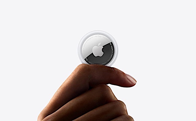
According to a report from The Information, it’ll resemble a slightly thicker AirTag with an aluminum and glass exterior. The report suggests it’ll have two cameras (standard and wide-angle) for photos and video. It may also have three microphones and a (swoon) physical button. I love a physical button.
How is Apple going to pitch it? What is the non-creepy, not-nefarious selling point of a tiny listening device with cameras? As Engadget’s Devindra Hardawar puts it: Why attempt an unproven wearable? Especially when its own Watch and AirPods could already deliver a lot of what’s being rumored here.
The Information says Apple could release its AI pin as early as 2027, but it’s reportedly only in the very early stages and could still be canceled. Even if the Vision Pro and Watch eventually happened, the Apple Car and the Apple TV never did.
A group of non-Chinese investors will own 80 percent of it.
TikTok owner ByteDance has finalized a deal for its US entity. The majority of its stake is held by a group of non-Chinese investors. The deal was closed just before the Trump administration’s latest deadline to ban the app in the US unless it was divested from ByteDance. TikTok’s new investors will own 80 percent, with Oracle, Silver Lake and MGX, an Emirati-state owned investment firm, taking 15 percent each.
According to TikTok’s announcement, the joint venture will protect American users’ data with Oracle’s secure US cloud environment. It will also retrain TikTok’s algorithm using US users’ data and will be responsible for content moderation in the US. The new US TikTok also promises interoperability, ensuring users still get international content and, if they’re creators, viewers.
Bungie’s long-awaited Marathon will arrive on March 5. The 3v3 extraction shooter has a lot riding on it — but it looks pretty damn cool. You might remember Sony, Bungie’s parent company, previously committed to a September 2025 release. However, it delayed the game indefinitely last June after a mixed reception to its alpha and partially plagiarized visual assets.
It’s a very important game for both Bungie and Sony. The latter said Destiny 2 had not lived up to its expectations. It wants another hit like Helldivers 2, not another Concord.
If you’re thinking about getting a new graphics card this year, your window for doing so at a typical retail price has closed. What do you do if you want to upgrade to a new graphics card this year? If you’re sitting on an older GPU, the best advice we can give is to stick with your current hardware. On the other hand, if your current GPU is not up to running the games you want to play, consider buying a card with at least 12GB of VRAM. Then, well, read on for more tips and our top recommendations.
This article originally appeared on Engadget at https://www.engadget.com/general/the-morning-after-apple-might-be-making-its-own-airtag-sized-ai-wearable-121500060.html?src=rss
Following the shutdown of an alternative app store, Apple has accused the European Commission (EC) of using “political delay tactics” as an excuse to probe and fine the company, Bloomberg reported. Apple issued the statement preemptively as commission is reportedly preparing to blame Apple for the shutdown of third-party app store Setapp due to what the developer called “still-evolving and complex business terms.”
As part of an EU ruling, Apple was forced to allow third-party marketplaces for apps once the Digital Markets Act (DMA) took effect in 2024. Apple agreed to allow such stores, but implemented fees of €0.50 per installation if the number of downloads exceeded one million, among other rules.
In April 2025, the EC found Apple to be in “non-compliance” with the DMA over rules on “steering” users to alternative payments and levied a $500 million fine. In June last year, Apple said it would change its pricing for third-party App Stores to a five percent revenue share called the Core Technology Commission (CTC).
However, Apple said that the EC has so far refused to allow those changes. In the meantime, a developer called MacPaw shut down its fledgling Setapp store, saying Apple’s terms “don’t fit Setapp’s current business model” due to the complexity. As a result, the EC will reportedly rule that Apple hasn’t addressed the key issues it raised regarding business terms, including their complexity.
“The European Commission has refused to let us implement the very changes that they requested,” Apple said in a statement to Bloomberg. “In October, we submitted a formal compliance plan and they have yet to respond. The EC is using political delay tactics to mislead the public, move the goal posts, and unfairly target an American company with burdensome investigations and onerous fines.”
In reply, an EC spokesperson told Engadget that it’s in “constant” contact with Apple with the aim of finding a DMA-compliant solution. “The Commission’s main objective is that gatekeepers operate in full compliance with the DMA. The Commission is available to discuss and work with gatekeepers to achieve full compliance. In this context, the Commission has been in a constant dialogue with Apple to solve all pending issues, while also listening to developers from all over the world. We remain committed to this exchange to find a DMA compliant solution.”
This article originally appeared on Engadget at https://www.engadget.com/big-tech/apple-accuses-europe-of-delay-tactics-following-alternative-app-store-collapse-124701591.html?src=rss
How well does your local AI system handle the pressure of multiple users at once? While most performance tests focus on single-user scenarios, they often fail to capture the complexities of real-world, multi-user environments. Alex Ziskind explores how concurrency testing reveals the true scalability and efficiency of local AI systems in a recent video that […]
Decluttering your home doesn’t mean emptying it. The real transformation happens when you replace bulky, single-purpose objects with designs that work harder, look better, and take up less mental space. Minimalist home decor swaps prioritize intention over accumulation, choosing pieces that blend function with form so seamlessly they feel like they’ve always belonged there. Each item earns its place not through compromise but through clarity.
These seven swaps prove that less isn’t about deprivation. It’s about choosing objects that serve multiple roles, disappear when not in use, or turn everyday rituals into moments worth noticing. From shoehorns that vanish into the background to mirrors that double as vases, each design replaces clutter with calm. Your space becomes easier to navigate, simpler to maintain, and infinitely more intentional in how it supports your daily life.
1. Invisible Shoehorn
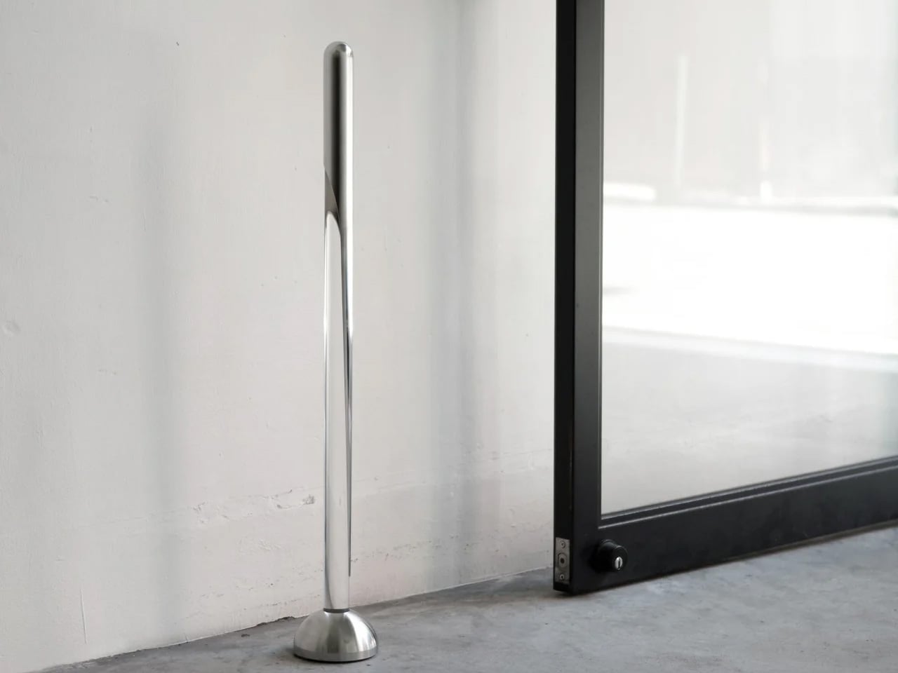
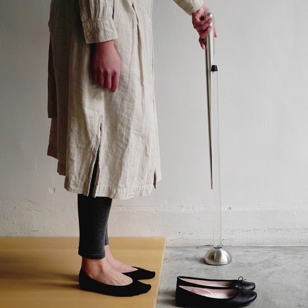
Most shoehorns live in that awkward space between useful and ugly. They lean against walls, slide under furniture, or get tossed into closets where you can never find them when your hands are full. This shoehorn takes a different approach entirely. Its long stainless steel body handles the practical work of protecting your footwear and your lower back, while its transparent stand makes the whole thing look like a sculptural accent rather than a utilitarian tool.
The magic happens when you step back and realize you’re not looking at a shoehorn at all. The clear stand holds the polished metal at just the right angle, creating visual interest without announcing its purpose to everyone who walks past your entryway. It replaces the need for a separate decorative object while solving the chronic problem of where to put the shoehorn when you’re done with it. You get function and form occupying the same footprint.
The transparent design hides the shoehorn in plain sight, eliminating visual clutter.
The extended length means you can put on shoes without bending or straining your back.
The polished surface slides smoothly without catching on delicate socks or stockings.
What We Dislike
The transparent stand may require occasional cleaning to maintain its clarity.
Some might prefer a shorter version for travel or smaller spaces.
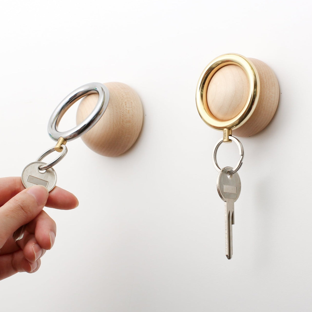
2. Key Holder Wakka
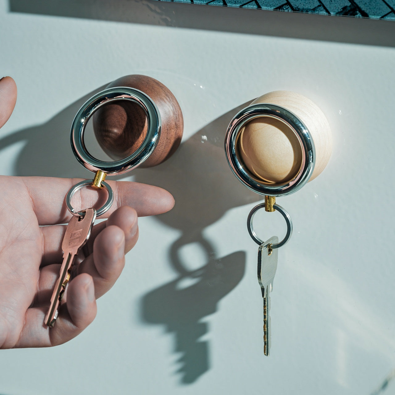
Keys create chaos in ways that seem disproportionate to their size. They end up on kitchen counters, buried in bags, or tossed onto random surfaces throughout your home. The Wakka Key Holder turns the simple act of putting your keys away into something you’ll actually want to do. The wooden base anchors the design with natural warmth, while the magnetic ring creates a satisfying connection that you can hear and feel.
That audible tap when metal meets magnet becomes a tiny ritual that marks your arrival home. The sound itself is calming, almost meditative, turning a forgettable action into a moment of intentional pause. The key ring works independently when you need it, and the wooden base stands alone as a sculptural element even when the keys are gone. This swap replaces messy key bowls or hooks that accumulate clutter with a singular object that does one thing exceptionally well.
The powerful neodymium magnet keeps keys secure without fumbling.
The brisk tapping sound creates a satisfying sensory experience.
Available in Silver/Maple and Silver/Walnut to match different interior styles.
What We Dislike
The magnetic system is only compatible with the included keyring design.
The wooden base requires a dedicated surface spot rather than wall mounting.
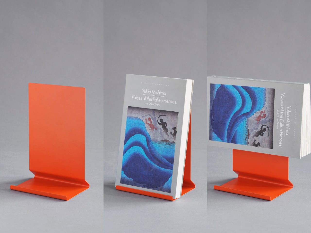
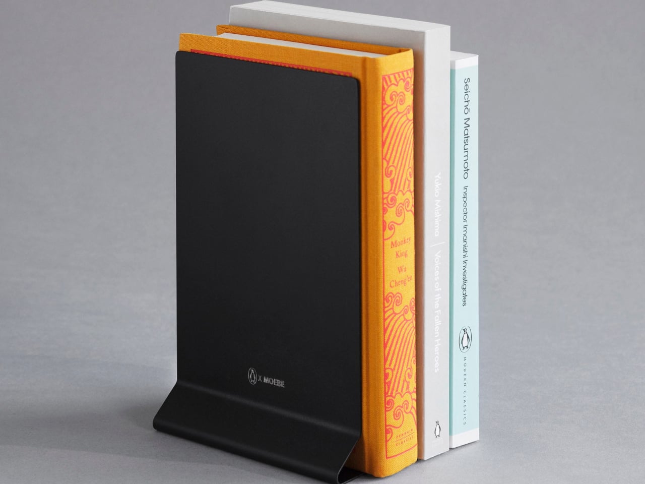
3. Penguin x MOEBE Book Stand
Books pile up in ways that make spaces feel chaotic even when everything else is tidy. Stacks lean precariously on nightstands, current reads disappear into shelves, and bookmarks slip out when you’re trying to remember your place. This bent steel stand treats books as objects worth displaying rather than just storing. It holds volumes open for reading, props single books upright for visibility, or works in pairs as bookends, depending on your needs.
The single-sheet construction means no visible fasteners or complicated assembly to wrestle with. The matte finish in stainless steel, cream, black, or Penguin orange stays visually quiet while the angled base supports different book thicknesses without wobbling or tipping. It replaces bulky bookends, flimsy wire stands, and the habit of leaving books face-down to hold your place. Your reading material gets a dedicated home that makes returning to the page feel natural.
What We Like
The versatile design works as a reading stand, display prop, or bookend.
The seamless bent steel construction creates clean lines without hardware.
Multiple color options coordinate with different interior aesthetics.
What We Dislike
The minimal footprint works best with standard book sizes.
Pairs are needed for full bookend functionality.
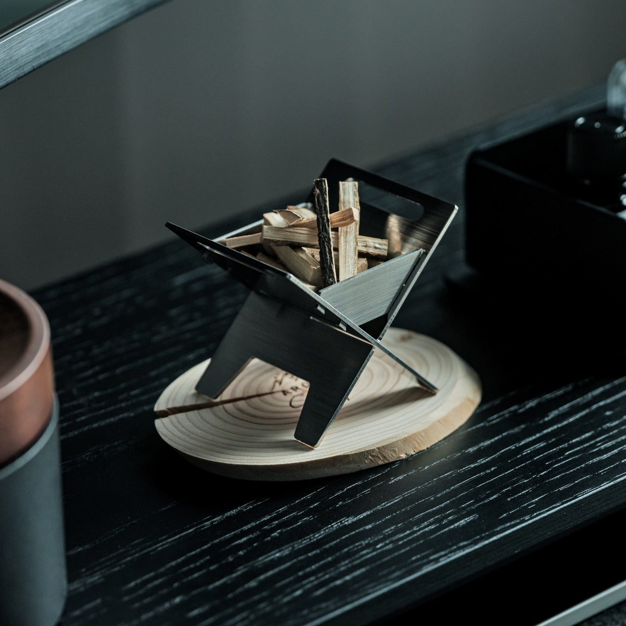
4. Miniature Bonfire Wood Diffuser Set
Traditional diffusers either look clinical or try too hard to blend in, taking up counter space without contributing much to the room’s atmosphere. This miniature bonfire flips that equation completely. The stainless steel construction creates a tiny sculptural fire pit that doubles as an essential oil diffuser, with miniature firewood pieces that spread fragrance as gently as an actual forest breeze. The camping aesthetic brings outdoor calm indoors without requiring commitment to literal nature decor.
The real versatility shows up when you realize the trivets transform the whole setup into a functional pocket stove. You can use it to warm small amounts of food or create an authentic camping experience right at your table. This single object replaces conventional diffusers, decorative candles, and even emergency heating elements. The rust-resistant material means it lasts, and the bundled firewood pieces with their tiny tying knots add handmade charm that mass-produced diffusers can’t match.
The rust-resistant stainless steel ensures lasting durability.
The included trivets convert the diffuser into a functional pocket stove.
The Mt. Hakusan essential oil captures authentic forest fragrance.
What We Dislike
The compact size limits oil capacity for larger rooms.
The campfire aesthetic may not suit all interior styles.
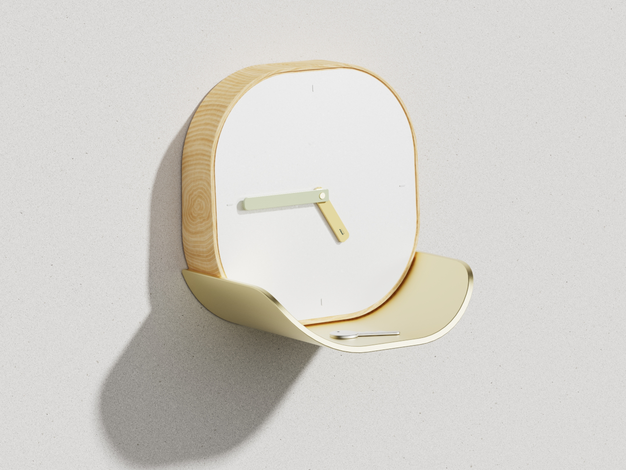
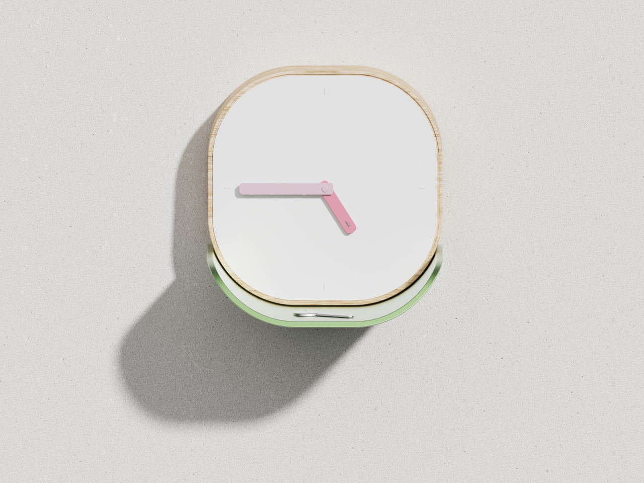
5. Lotus Clock
Wall clocks usually do one thing, and catchall dishes do another, which means you end up with both competing for wall and surface space. The Lotus Clock merges these functions into a single design that draws inspiration from nature’s problem-solving. The curved metal tray sits beneath the clock face like a lotus leaf collecting morning dew, creating a natural resting spot for keys, coins, and the small items that usually scatter across entryway tables.
The biomimetic approach makes the dual functionality feel intentional rather than forced. The wooden frame features soft rounded corners that read as approachable, while the clean white face keeps time-reading effortless even from across the room. The broad flat hands coordinate with the tray’s finish, whether you choose soft gold or gentle green, creating visual harmony between timekeeping and storage. This swap eliminates the need for separate wall clocks and entryway organizers, freeing up both vertical and horizontal real estate.
What We Like
The integrated tray provides dedicated storage for daily carry items.
The biomimetic design feels both poetic and practical.
Multiple colorway options allow personalization while maintaining minimalist aesthetics.
What We Dislike
The tray size limits what can be stored there comfortably.
Wall mounting is required, which may not work for renters.
6. ClearFrame CD Player
Physical media creates display challenges that streaming never will. CD collections sit in drawers or bulky towers that broadcast “clutter” even when organized. The ClearFrame CD Player reframes music as something worth exhibiting. The crystal-clear polycarbonate body turns the disc and album artwork into a miniature gallery, while the exposed black circuitry invites you to appreciate the engineering as part of the aesthetic rather than something to hide away.
The transparent design means the player becomes part of your decor, whether it’s playing or silent. Bluetooth connectivity, seven-hour battery life, and wall-mount capability give it flexibility that traditional players lack. It works on shelves, desks, or mounted as wall art, adapting to your space rather than demanding accommodation. This swap replaces both oversized stereo systems and hidden-away music players with something that celebrates physical media while taking up minimal space and maximum attention.
The transparent polycarbonate showcases both album art and internal engineering.
Bluetooth connectivity and a rechargeable battery offer placement flexibility.
Multiple mounting options adapt to different room configurations.
What We Dislike
The focus on CDs excludes vinyl collectors.
The transparent design shows dust and fingerprints more readily.
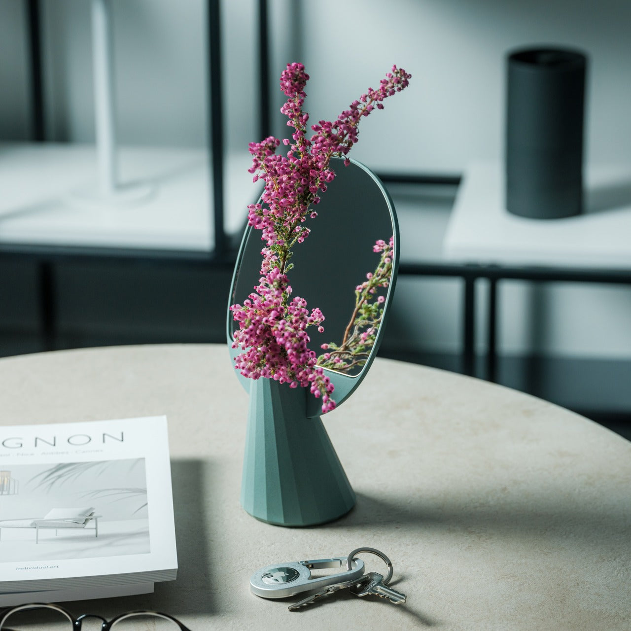
7. JewelVase Mirror Stand
Mirrors, accessory storage, and vases typically occupy separate zones in your home, each claiming surface area and visual attention. The JewelVase collapses these categories into a single polyhedron form that functions as all three. The mirror reflects light and lets you check your appearance, the structure holds rings and bracelets, and the basin accepts water for fresh flowers. Each function enhances the others rather than competing for dominance.
The bioplastic construction contains rice husks, bringing material sustainability into the minimalist equation without sacrificing durability. The unique angled shape creates visual interest that earns its spot on any desk, table, or shelf, while the reflective surface doubles whatever beauty you place in front of it. Even pouring water becomes a small meditative ritual when the mirror shows you the flower from both sides simultaneously. This swap eliminates multiple accessories, consolidating them into one elegant object that does more with less.
The multipurpose design combines a mirror, an accessory stand, and a vase.
The bioplastic material incorporates sustainable rice husk content.
The polyhedron shape creates sculptural presence without bulk.
What We Dislike
The vase capacity suits single stems rather than large arrangements.
The angled mirror may not work for full-face viewing.
Making Space by Choosing Better
These seven swaps share a common philosophy. They refuse the false choice between function and beauty, instead insisting that thoughtful design delivers both simultaneously. Each piece earns its place by doing more than one thing well, by disappearing when appropriate, or by transforming mundane tasks into moments worth savoring. Your space becomes less about what you’ve removed and more about what you’ve chosen to keep.
Decluttering through minimalist swaps creates lasting change because you’re not fighting against your needs. You’re meeting them with objects designed to take up less room, require less maintenance, and contribute more to the atmosphere you’re trying to create. The result feels lighter, not because you’re doing without, but because everything present is pulling its weight. That’s where real minimalism lives, in the space between empty and intentional.
The Galaxy Z Fold 8 is poised to set a new standard in foldable smartphones, delivering notable advancements in performance, durability, and user experience. Scheduled for release in mid to late August, this flagship device aims to address user expectations while maintaining a competitive starting price of $1,999. With its innovative features and refined design, […]
What if you could achieve 90% of your productivity gains by focusing on just 10% of the options available to you? It sounds almost too good to be true, but in the ever-expanding world of artificial intelligence, this principle holds remarkable weight. In this breakdown, Jeff Su walks through how a handful of AI solutions […]
What if your compact single-board computer could handle modern gaming, 3D rendering, and video encoding, all on an ARM platform? Interfacing Linux explores how the Orange Pi 6 Plus, a seemingly modest ARM-based device, can achieve this by integrating external GPUs through its M.2 PCIe interface. But this isn’t just a plug-and-play solution. From power […]
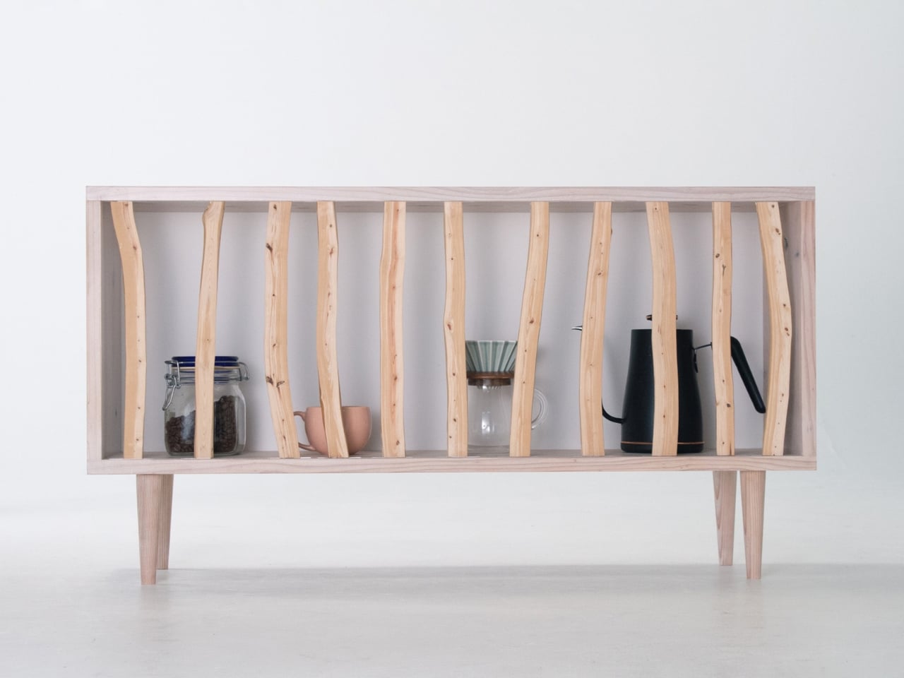
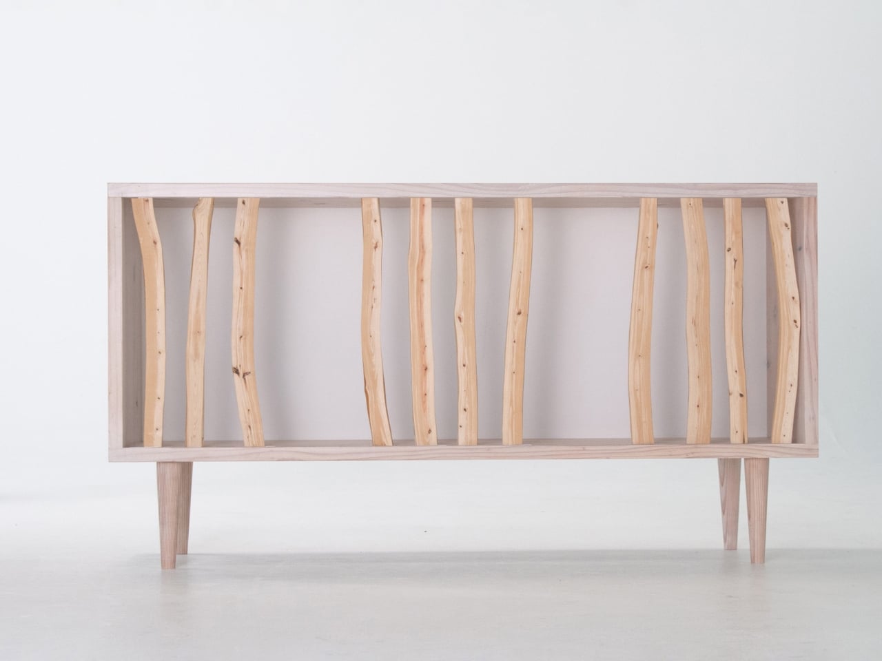
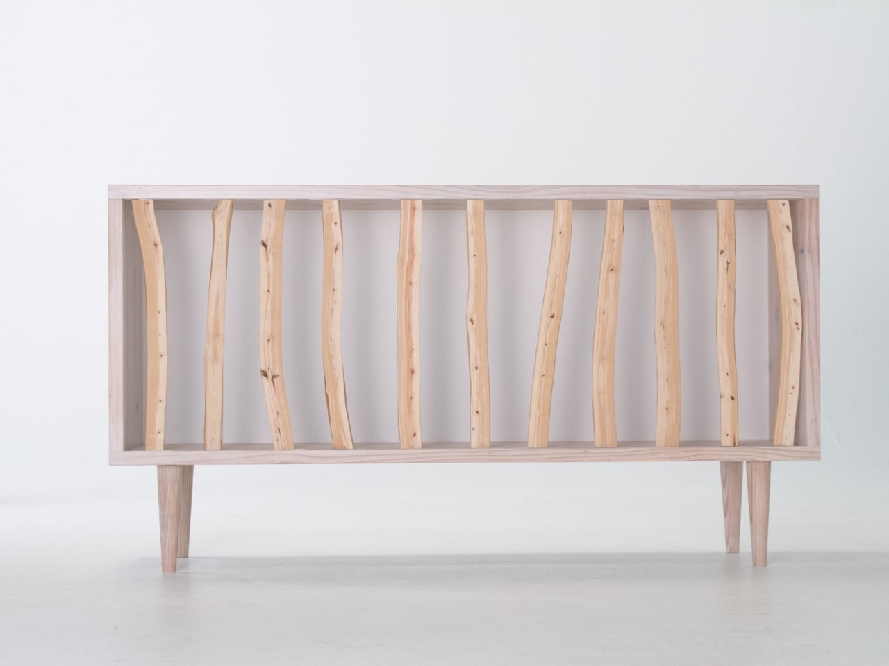
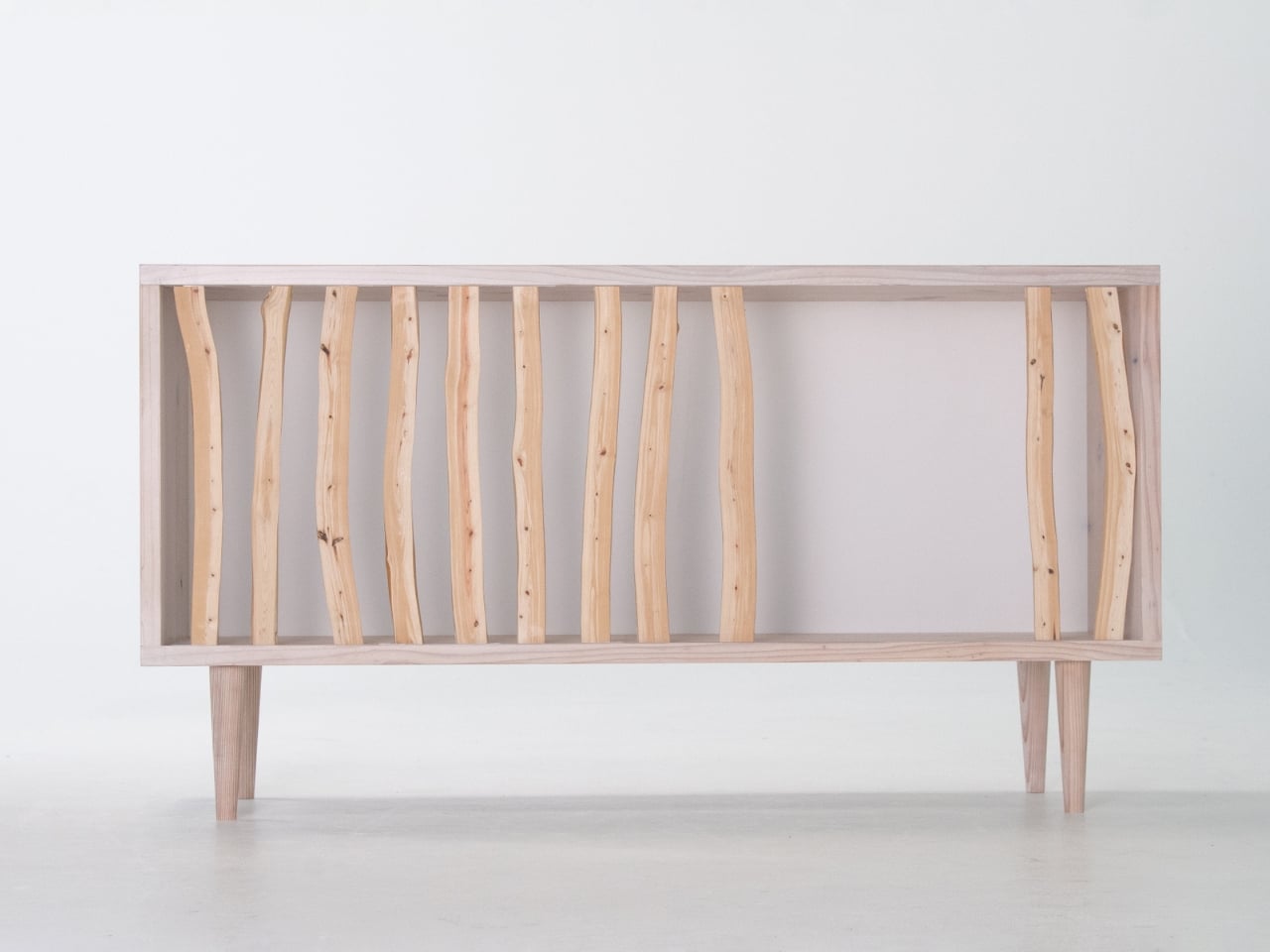
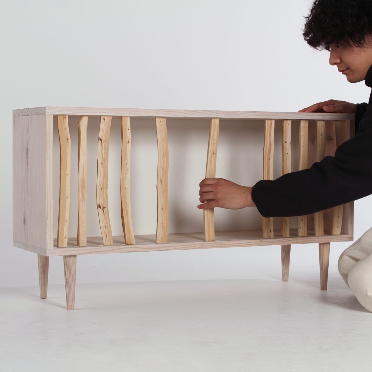
There’s something deeply satisfying about furniture that refuses to stay in one place. Not in the sense that it walks around your living room, but in how it adapts, shifts, and changes with you. Taishi Sugiura’s Hayashi Cabinet does exactly that, blurring the line between functional storage and something far more poetic.
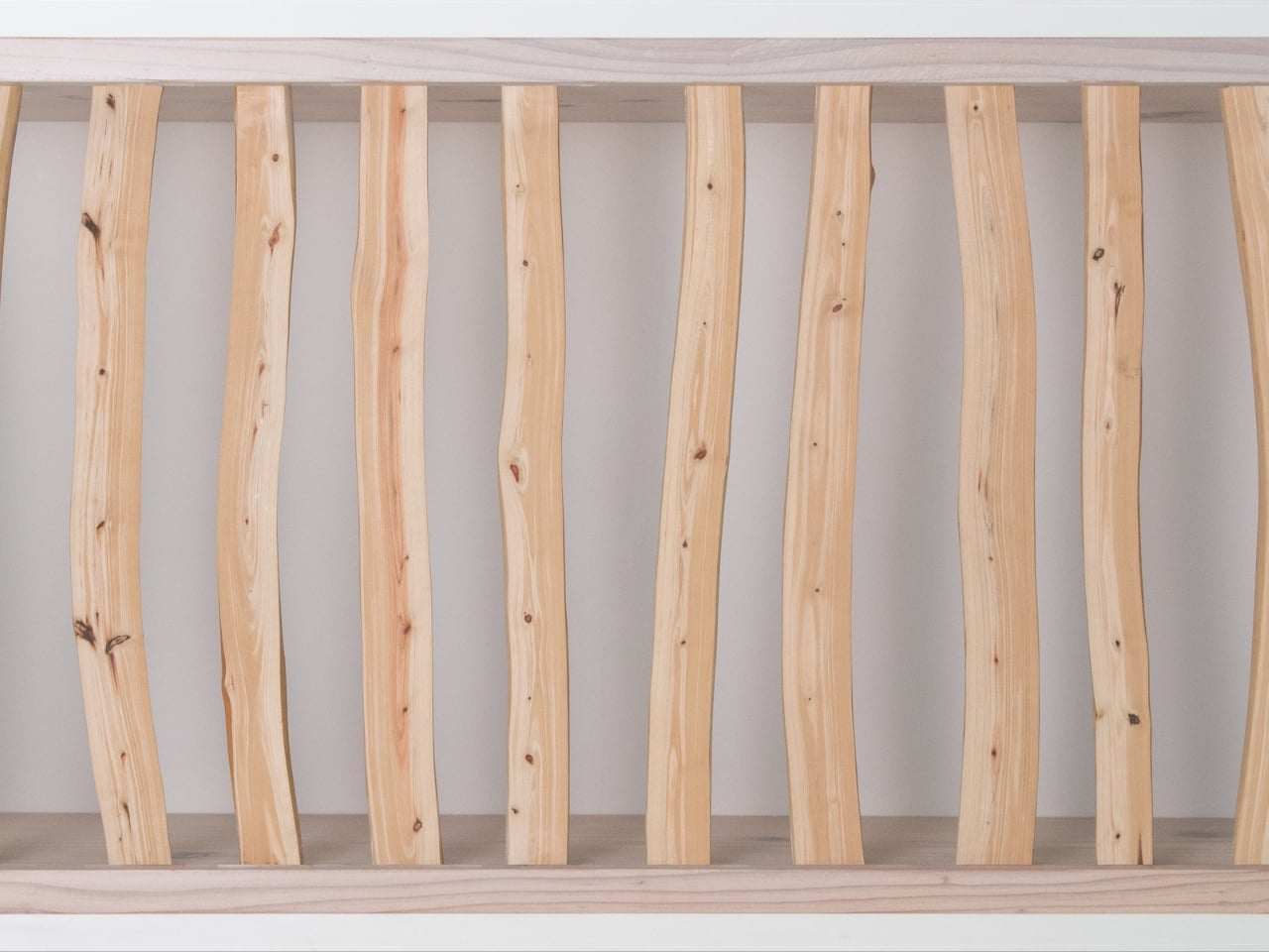
The word “Hayashi” translates to “forest” in Japanese, and once you see this piece, the name makes perfect sense. Instead of traditional cabinet doors or panels, Sugiura uses actual Japanese cypress branches arranged across the front of the frame. These aren’t decorative touches glued on for aesthetic appeal. They’re the real deal, thinned branches that would typically be left discarded in the mountains after forest management. Sugiura saw potential where others saw waste.
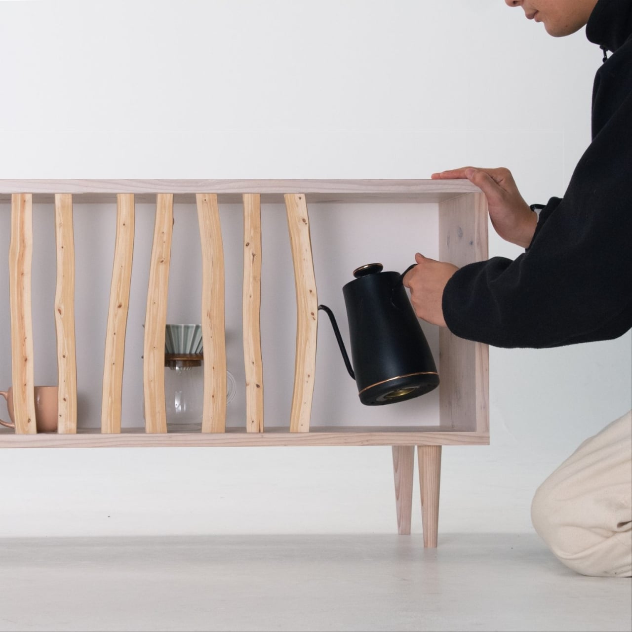
What makes the Hayashi Cabinet genuinely clever is its movability. Each branch can slide left or right along the cabinet frame, letting you customize the openness or privacy of your storage space. Want to show off that vintage record collection? Slide the branches apart. Need to hide some clutter? Push them together. It’s like having adjustable blinds, except way cooler and made of wood.
This design philosophy stems from traditional Japanese spatial concepts. Think about shoji screens and sliding doors in Japanese homes, elements that define space without rigidly locking it down. Sugiura brings that same flexibility to furniture, creating something that responds to your changing needs rather than forcing you to work around it. Some days you want minimalist display, other days you need concealment. The Hayashi Cabinet doesn’t judge either choice.
The materials tell their own story. Japanese cypress branches have these gorgeous tight grains and natural curves that you’d never find in standard lumber. They’re inherently asymmetrical, which means no two cabinets will ever look identical. As light filters through the gaps between branches throughout the day, the shadows shift and dance, transforming the piece from static furniture into something almost kinetic. It’s the kind of detail that makes you notice your own furniture, which sounds strange until you realize how rarely that actually happens.
Sugiura studied at Nagoya University of Arts, and his material-first approach runs through all his work. Before designing the Hayashi Cabinet, he created the Kintoun Kits, playful modular construction sets that won a JID NEXTAGE silver prize. That same curiosity about how people interact with objects translates beautifully into this domestic context. It’s not just about looking good on an Instagram feed. It’s about living with something that genuinely adapts to you. We’re already flooded with mass-produced, one-size-fits-all storage solutions but here’s a piece that celebrates imperfection and individuality. The branches aren’t perfectly straight. They don’t align in rigid rows. They breathe.
There’s also an environmental angle worth noting. Using thinned cypress branches addresses a real problem in Japanese forestry, where these materials typically get abandoned as too difficult or low-value to process. By turning them into design features rather than treating them as scraps, Sugiura gives them new life and purpose. It’s sustainable design that doesn’t announce itself with green marketing buzzwords but simply makes smart material choices.
The beauty of the Hayashi Cabinet lies in its restraint. It could easily tip into gimmicky territory with all those moving parts, but Sugiura keeps the overall design clean and understated. The frame stays simple, letting the natural cypress branches become the focal point. And because you’re the one deciding how open or closed the front becomes, you’re essentially co-designing the piece every time you adjust it. The Hayashi Cabinet doesn’t need batteries or WiFi. It just needs you to slide some branches around. Simple, tactile, human. That’s the kind of interaction design that endures long after the tech trends fade.
Apple is preparing to release iOS 26.3 ahead of its usual schedule, with the update expected to roll out on January 26 or 27, 2026. Currently in its second beta phase, this update focuses on bug fixes, performance improvements, and minor refinements, rather than introducing major new features. The timing of this release is significant, […]
What if you could transform hours of tedious research into polished, professional outputs in a fraction of the time? In this overview, Paul J Lipsky explores how the integration of Perplexity and NotebookLM creates a seamless workflow that redefines what’s possible in research and content creation. Imagine starting with raw, unstructured data and ending with […]