
Your car’s dash cam might be illegal in some states — Here’s how to check
Dash cam laws vary from one state to the next. Check the laws of states you'll be driving through.
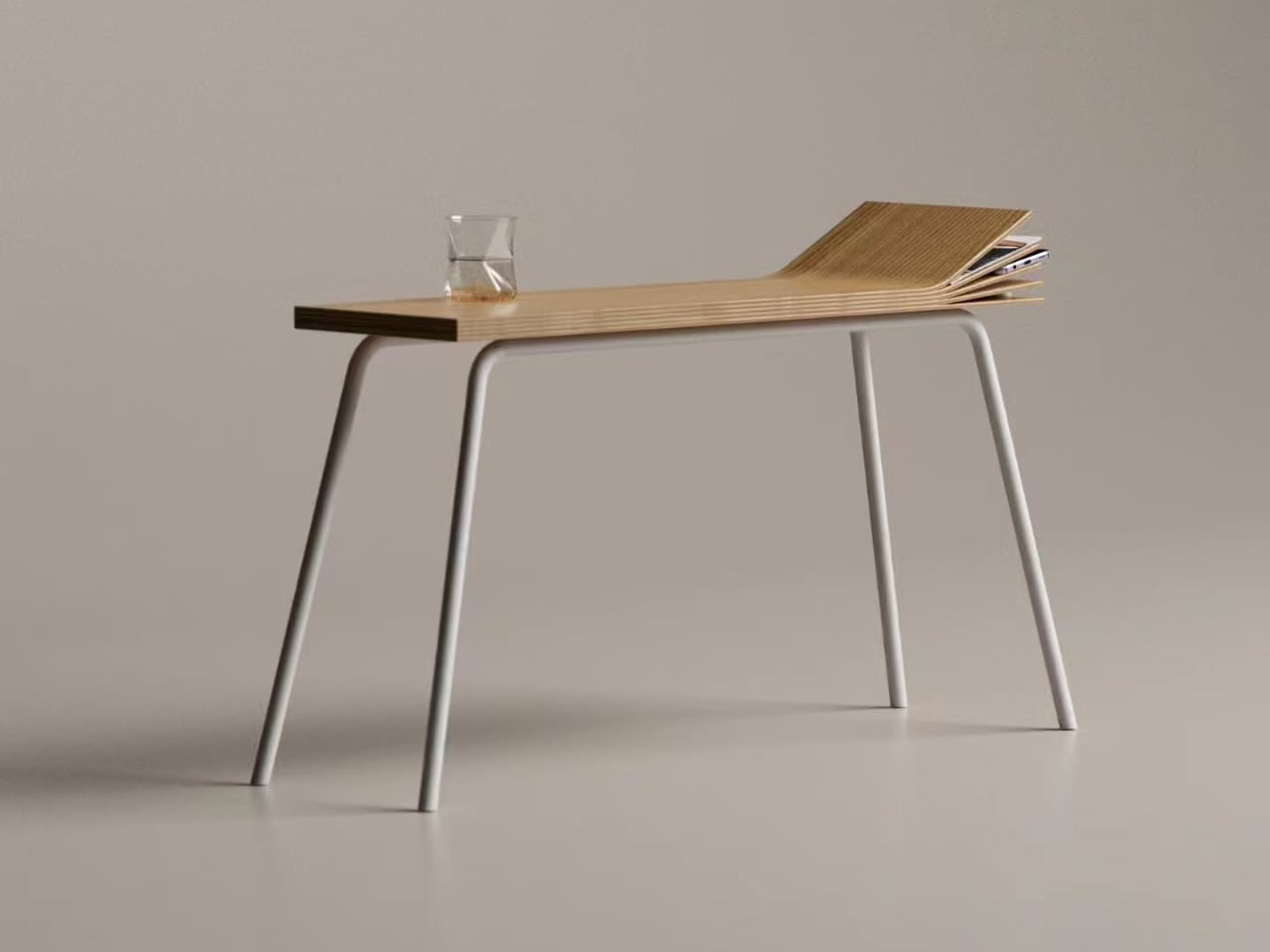
Most furniture is designed to stay put. It sits in a corner, holds your lamp, or supports your coffee cup, and asks nothing of you beyond basic acknowledgment. Console tables, in particular, tend to be the most ignored category in any room. They’re the utilitarian afterthought you dress up with a vase and a scented candle and then completely forget about. That’s why when a piece of furniture actually makes you stop mid-scroll and stare, it deserves a proper conversation. Deniz Aktay’s Flitter Console Table is worth that conversation.
The first thing you notice is that the tabletop doesn’t behave the way a tabletop is supposed to. Rather than lying flat across its entire length, the surface fans out at one end into a spread of layered wooden sheets, fanning open like the pages of a book someone has just let go of, or like a hand of cards splayed mid-shuffle. It’s an image that takes a second to fully process, because your brain keeps trying to categorize it as something recognizable before giving up and just letting it be exactly what it is: a genuinely new idea.
Designer: Deniz Aktay

The construction is plywood, and Aktay uses it with clear intentionality. The visible edge layering, that characteristic striping you see in exposed plywood cross-sections, becomes a deliberate design feature along the fanned end. Each layer is distinct, readable, and beautifully warm against what appears to be a light oak or birch veneer on the surface. The material choice isn’t incidental. Plywood is what allows those individual sheets to fan and separate without the design collapsing into something clunky. The thinness of each layer is essential to how the whole thing reads visually, light and feathered rather than stacked and heavy.
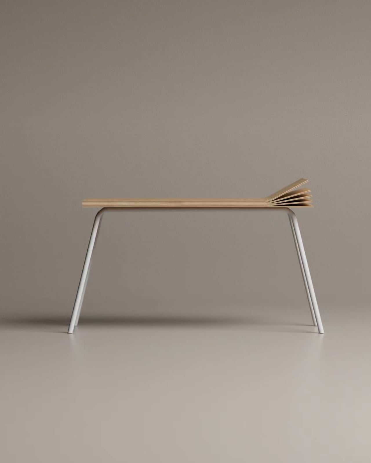
The base grounds all of this in a completely different register. Slim, white tubular metal legs splay outward at a slight angle, giving the table a stance that feels alert rather than static. They’re simple to the point of near-invisibility, which is exactly the right call. Any more visual weight in the base and the fanned top would lose its sense of lift. As it stands, the table seems to hover rather than sit, the warm wood floating above the pale floor with minimal interruption from the structure below.
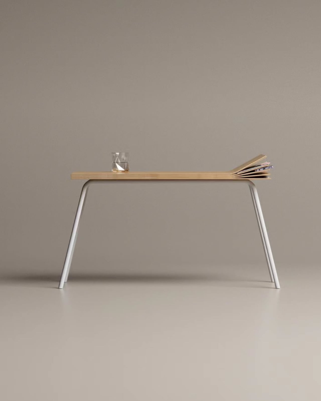
The part that genuinely impressed me when I looked more closely at the images is that the fanned layers aren’t just decorative. The gaps between them are functional storage, wide enough to slot in magazines, books, or a tablet. The storage doesn’t announce itself. It’s worked into the structure so naturally that you might not even register it as a feature until you see a laptop tucked neatly between the sheets. That’s the kind of design thinking that separates a concept render from something that could actually live in a home. Aktay solved the console table’s eternal problem, that it holds things on top but rarely within, without adding bulk, drawers, or shelves. He just opened the surface up.
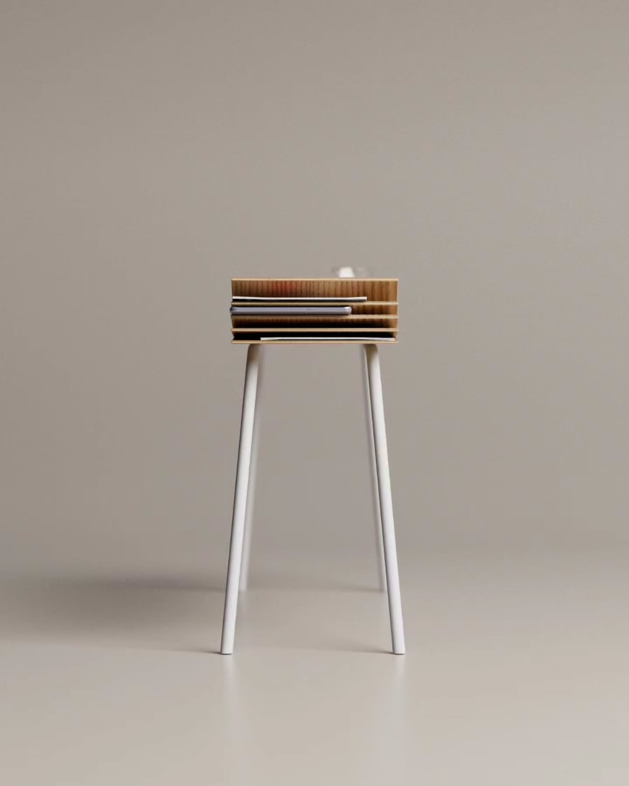
Seen from the end, the Flitter is almost unrecognizable as a console table. The fanned layers compress into what looks like a compact, striated block, geometric and architectural. Rotate your view to the side and it stretches out into something long and minimal with one quietly dramatic detail. The design rewards every angle differently, which is rare, and a little thrilling. Console tables as a category don’t usually excite me. They’re functional, they’re necessary, and occasionally they’re pretty, but very rarely are they surprising. The Flitter is surprising without being theatrical. It doesn’t shout. It just quietly does something no other table in the room is doing, and then sits there looking calm about it.
Deniz Aktay established his Stuttgart-based studio DEZIN in 2020 with a focus on pure lines and modern minimalism, often with a multifunctional purpose. The Flitter Console Table lands exactly on that brief, and then some. It’s the kind of piece that makes you reconsider what furniture is actually allowed to do.
The post A Console Table With Wooden Pages Built Into Its Surface first appeared on Yanko Design.


I’m not a huge fan of traveling or camping solo. That’s me. Many out there – if you’re reading it, you could be one of them – prefer to go solo. If you have the cash and the desire to go camping in a van designed just with your solitary adventures in mind, then this latest one from Wellhouse Leisure is worth your time. This is a Mitsubishi Delica D2, also badged as Suzuki Solio, which has been tuned into a micro camper van with a pop-up roof.
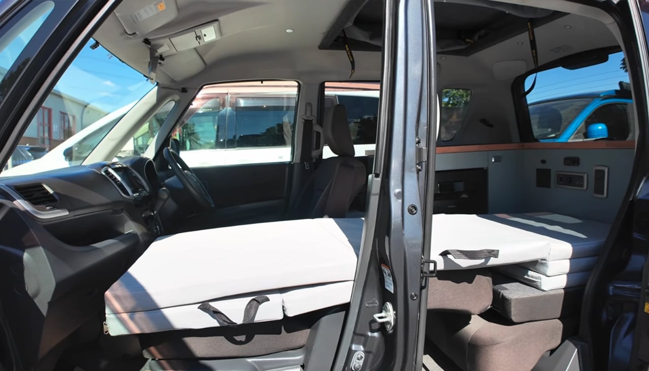
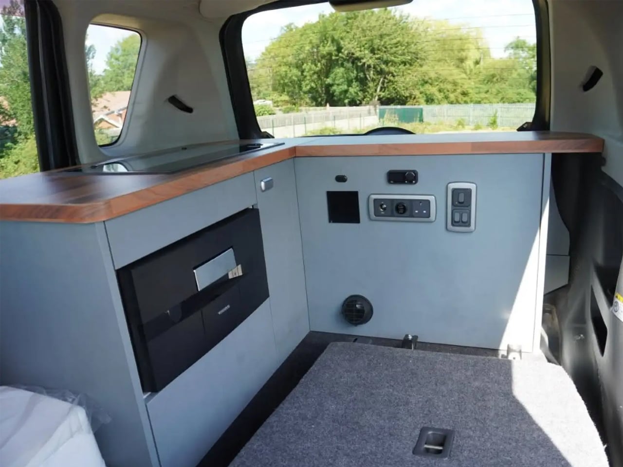
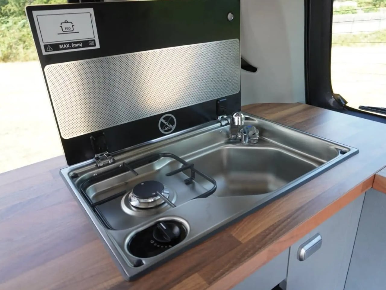
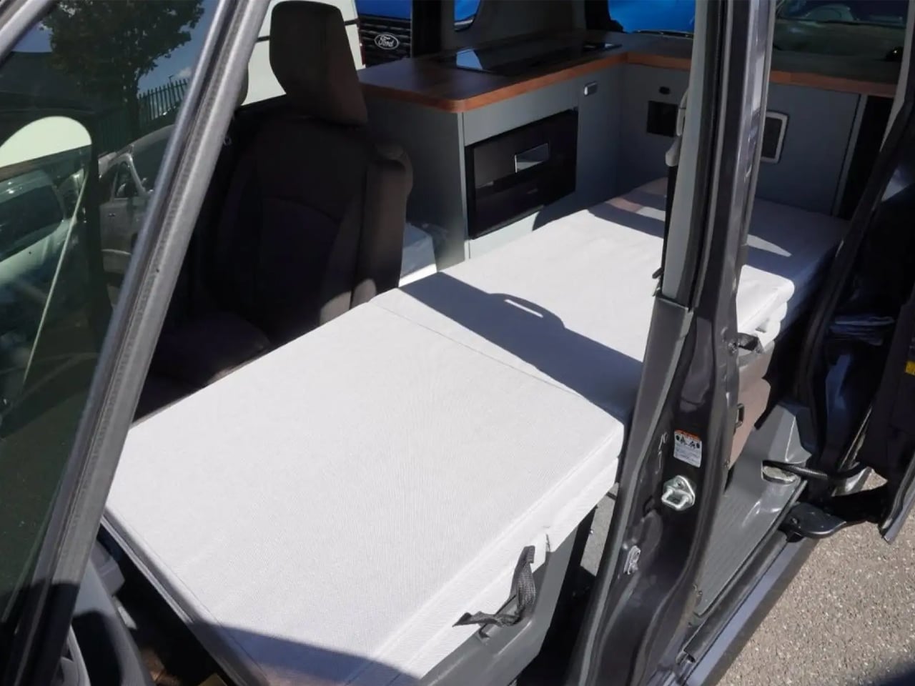
Measuring only 3.7 meters long, the van is a compact deception. From the outside, it gives out nothing. But when the doors are flung open, the versatile interior can leave you mesmerized. The van has been equipped with a swivel passenger seat and a solo, crash-tested seat at the back. The two can lie flat to combine into a bed when the night calls. The interior is complete with an L-shaped kitchen and a portable toilet; you can use it indoors.
Designer: Wellhouse Leisure


The vehicle itself is an affordable entry into mobile living space. Priced roughly around £19,500 (approximately $26,000), varying based on the model. According to Wellhouse Leisure, the camper van comes in 2WD and 4WD hybrid powertrain options and essential motorhome features to go with it. Prioritizing storage and functionality, the 3.7-foot-long van opens up significant headroom with the pop-top roof. Approximately 6.5 feet of headroom, allowing a tall adventurer to stand up comfortably to change clothes and stretch their legs.
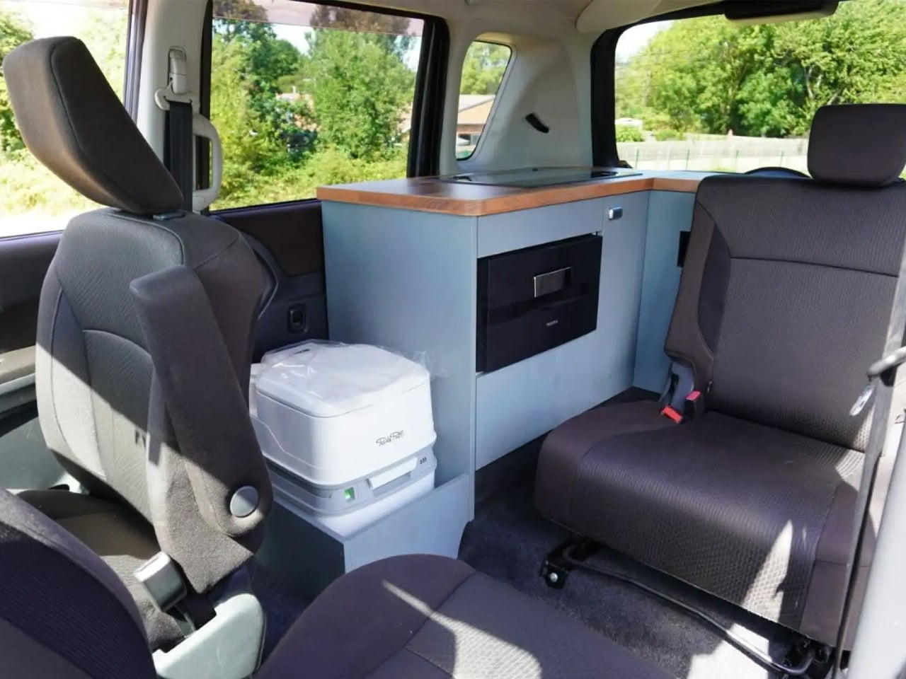
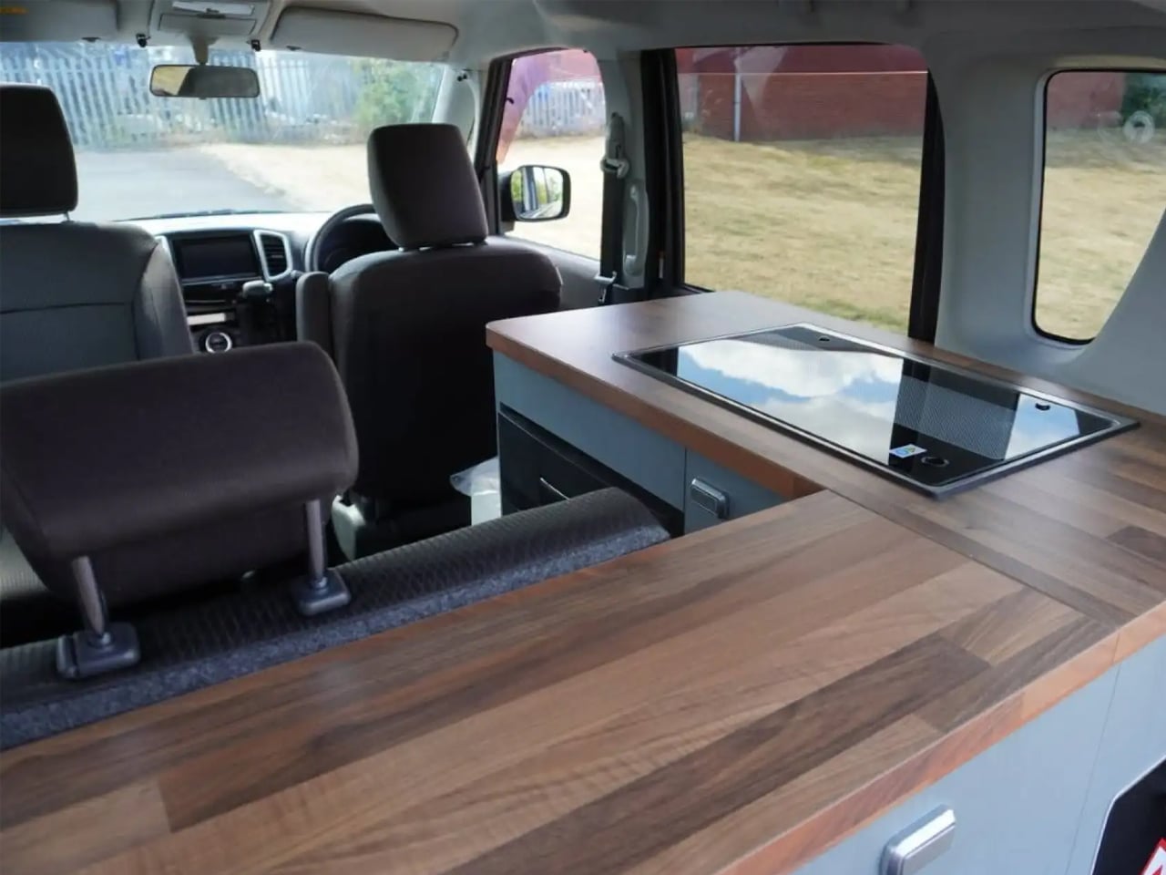
For safety and cross-ventilation without allowing bugs inside, the pop-up section includes mesh screens. This also permits natural light into the van, which houses an L-shaped rear kitchenette accessible with the open tailgate. To make it functional, it comes with a hob, sink, and a 20-liter drawer fridge is provided as well. The swiveling passenger seat and the rear chair can together be paired with a pop-up table to create a dining and lounging area. And when it’s time to sleep, the passenger seat and the rear seats fold flat, and the padded infill cushion creates a long single bed that can accommodate a 6-foot person with ease.
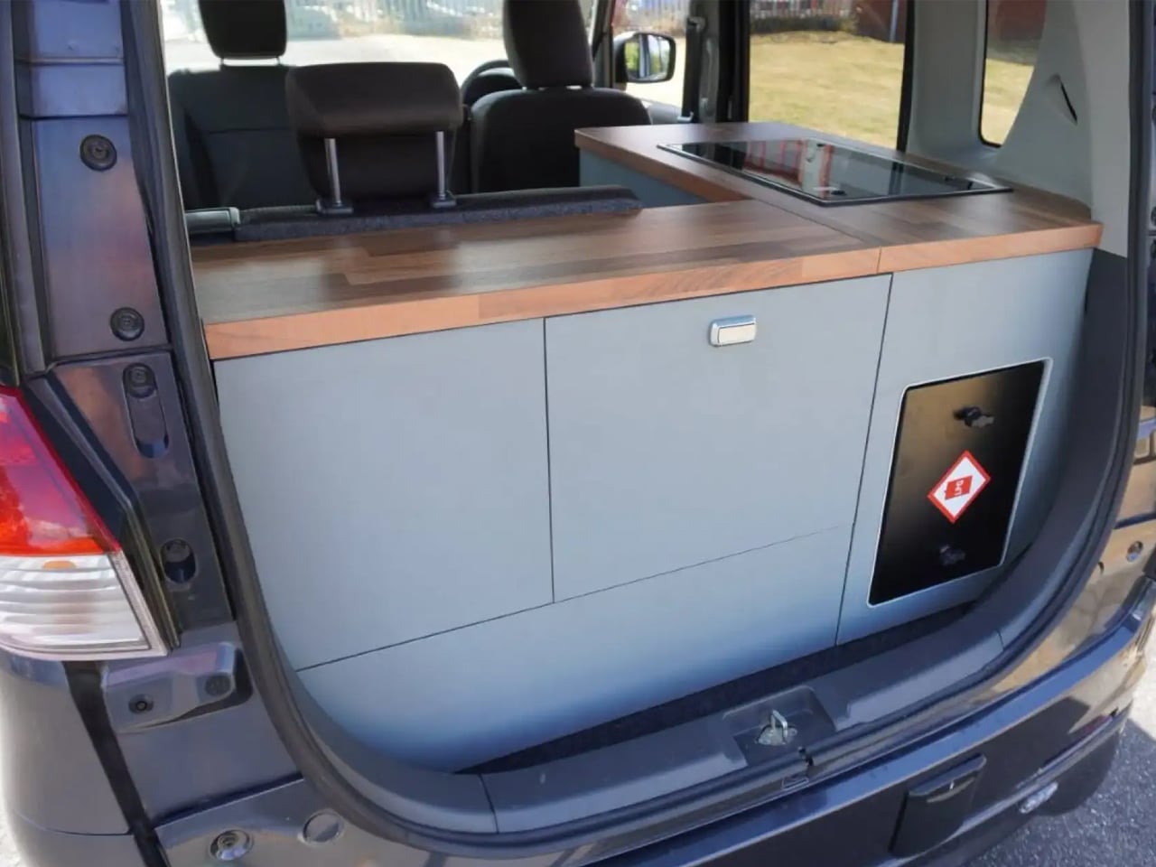
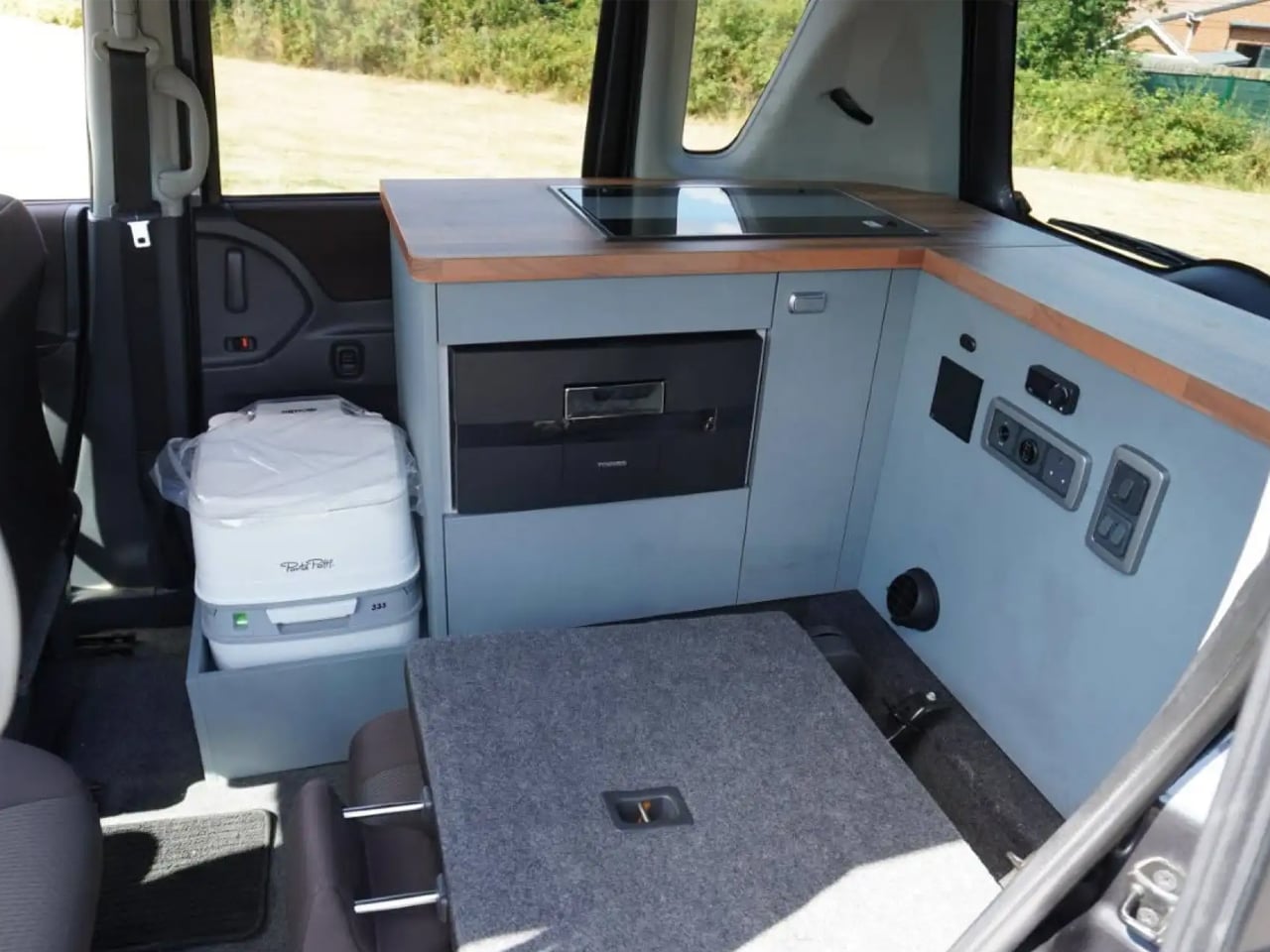
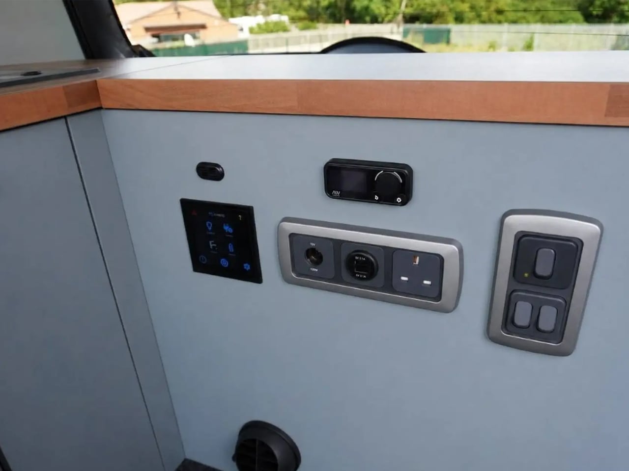
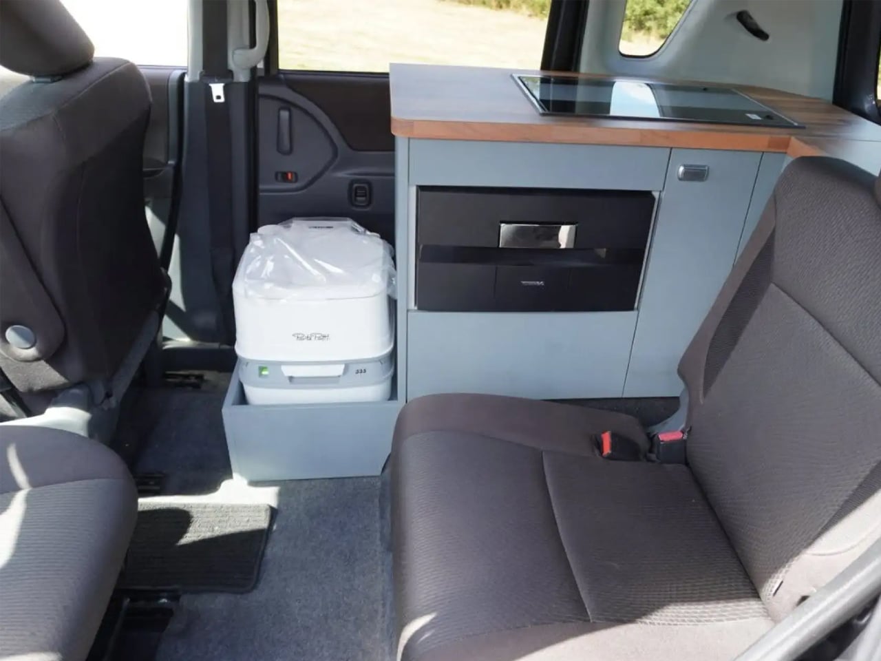
Just behind the driver seat is the chemical toilet seat. It can be used by slightly turning the driver’s seat forward even when the bed is laid out. It can be emptied after use from the outside of the vehicle; this nifty hack means you don’t have to carry it through the interior. The storage inside is taken care of with under-seat compartments and a special bedding storage section created above the portable toilet. For its ability to square up for more than a weekend, it features a removable water tank, solar panel regulator, and full electrical system.









The post Wellhouse Leisure’s Tiny Mitsubishi Delica is a Solo Camper With Pop-Up Roof and Full Kitchen first appeared on Yanko Design.
High-end audio amplifiers tend to get bigger, heavier, and more expensive in the pursuit of performance headroom that most recordings will never fully demand. The formula is familiar: more transformer capacity, larger capacitor banks, thicker panels, and bigger heat sinks, all folded into a single imposing chassis. It’s an engineering approach that works, but it also introduces a fundamental compromise that most manufacturers quietly accept rather than solve.
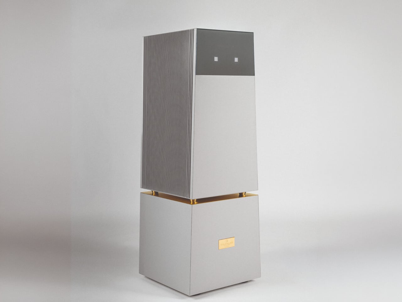
The Goldmund Telos 9800 doesn’t accept it. For the first time in the Telos line, the power supply and amplification stages occupy completely separate enclosures, each allowed to do its single job without the electrical and mechanical interference that sharing a chassis inevitably introduces. Two interconnected volumes, one devoted entirely to power supply and one to amplification, form what Goldmund describes as the most advanced amplifier the company has ever made.
Designer: Goldmund
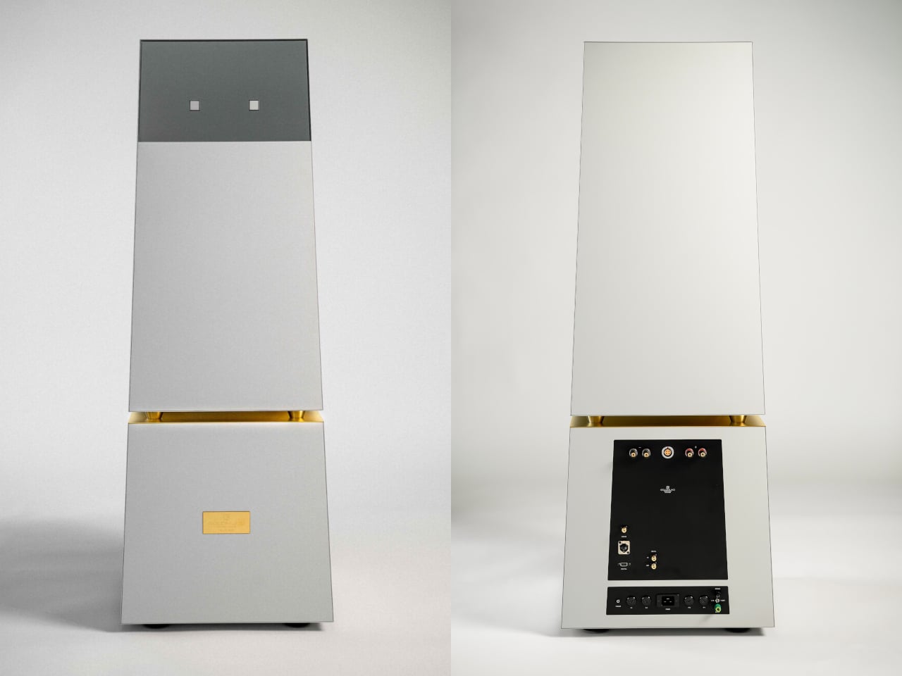
The power supply chassis is built around a 10 kVA transformer and a 648 mF capacitor bank, the largest Goldmund has ever engineered. That stored energy reserve exists not to push volume louder but to handle the sudden, intense current demands of complex musical passages and difficult loudspeaker loads without the amplifier flinching. The amplification stage draws from that reservoir freely, stable down to a 1-ohm load and fully galvanically isolated from its source.
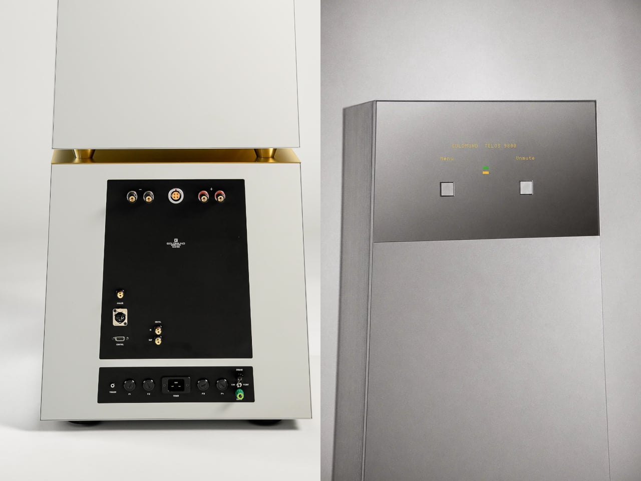
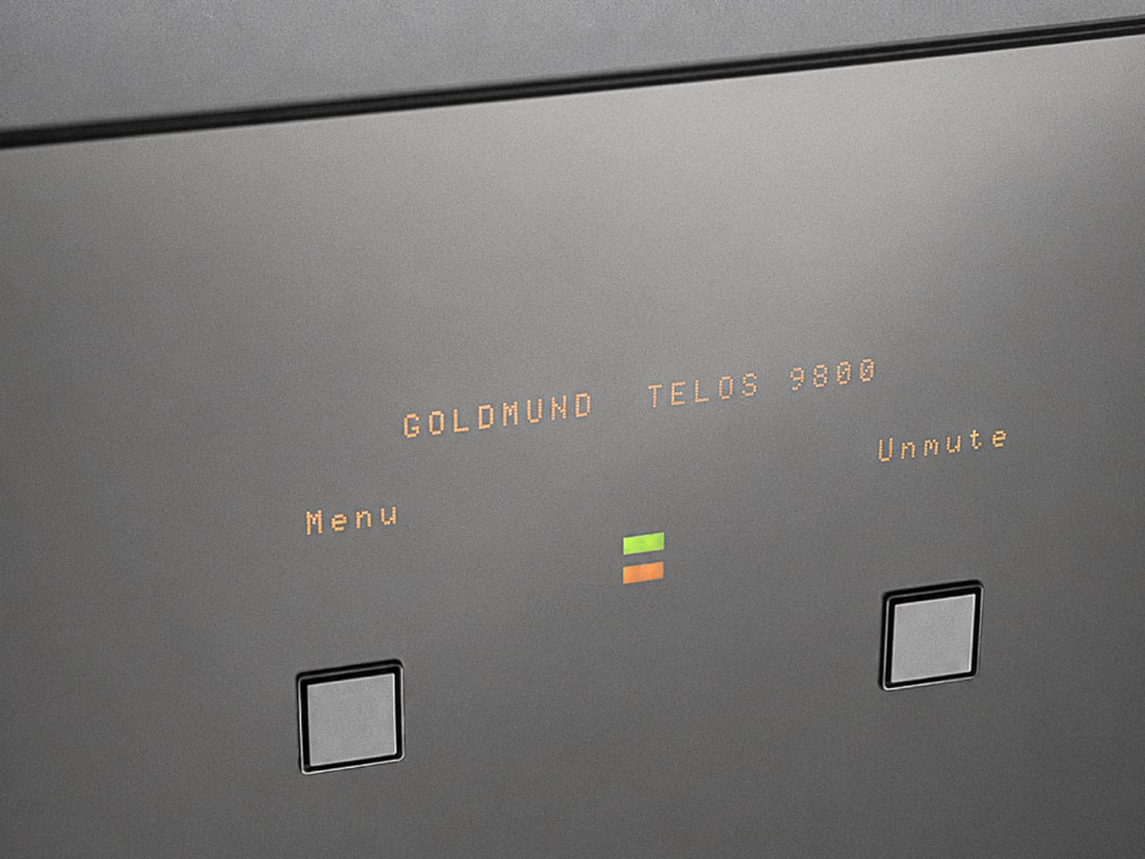
Both chassis are machined from micro-blasted aluminium with 15 mm thick side panels and 40 mm thick radiator sections that function as passive heatsinks through natural convection. There are no fans, no active cooling components. A single gold plate marks the junction between the two volumes, a discreet visual signal where one enclosure ends and the other begins. Gold-plated copper terminals and screws appear at connection points throughout. The construction is available in grey or black.
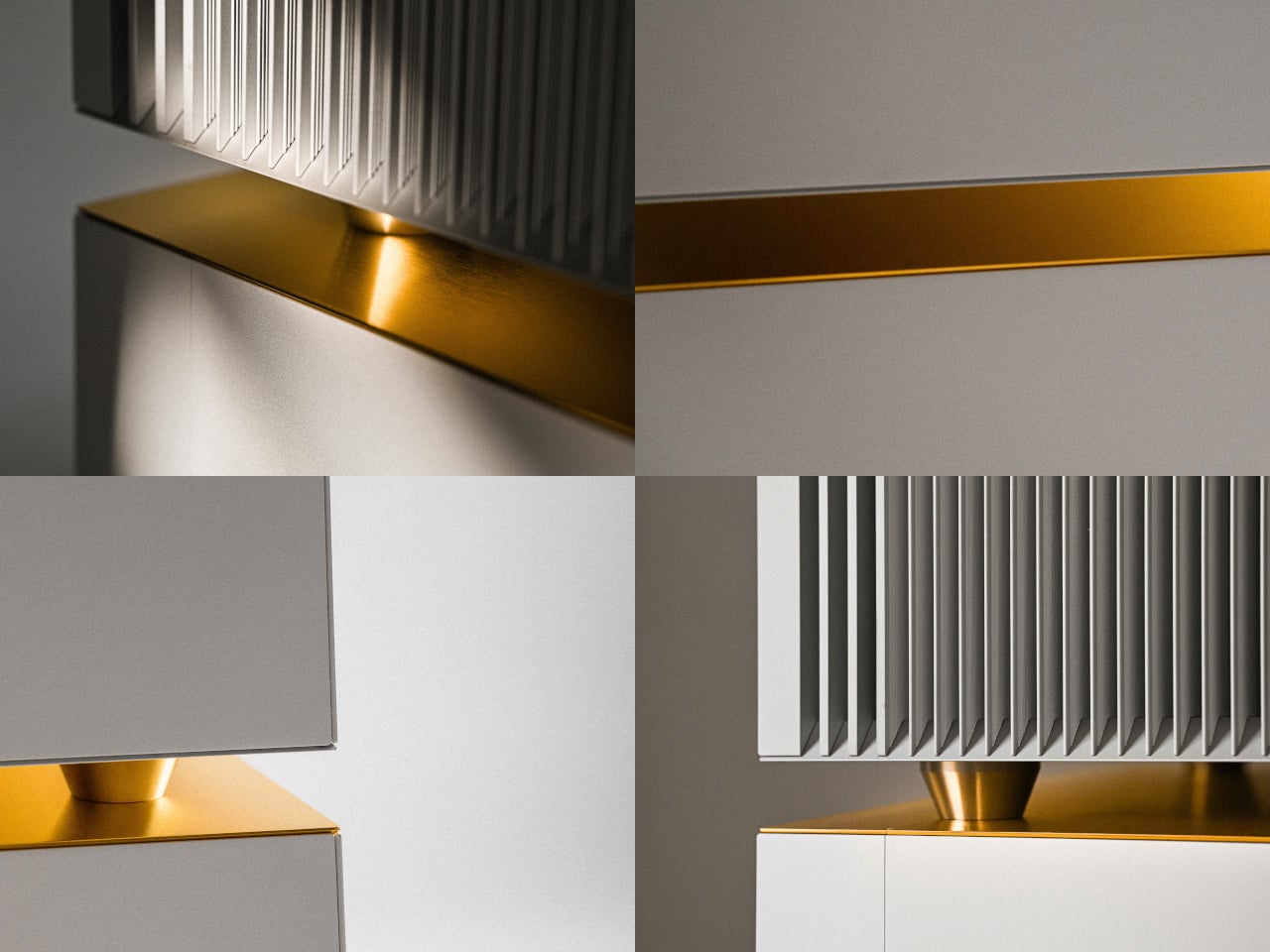
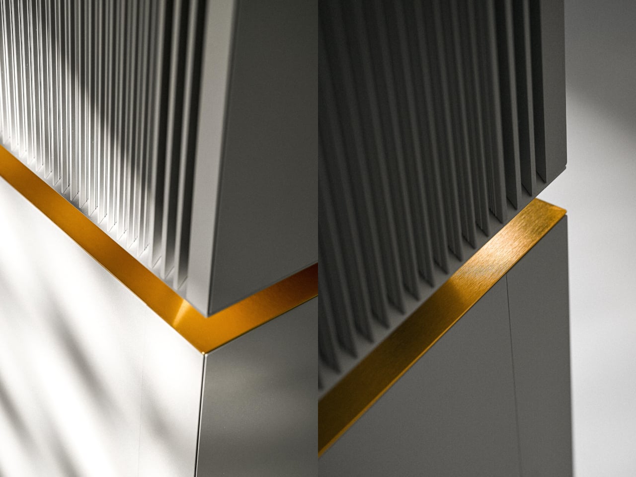
The Telos 9800 is a monoblock, meaning each unit drives a single channel. A stereo pair requires two of them, bringing the combined weight to 720kg and the combined cost to approximately $1 million USD. Goldmund specifies that installation requires at least two trained technicians with appropriate lifting equipment, which may be the most understated sentence in any modern audio product launch.
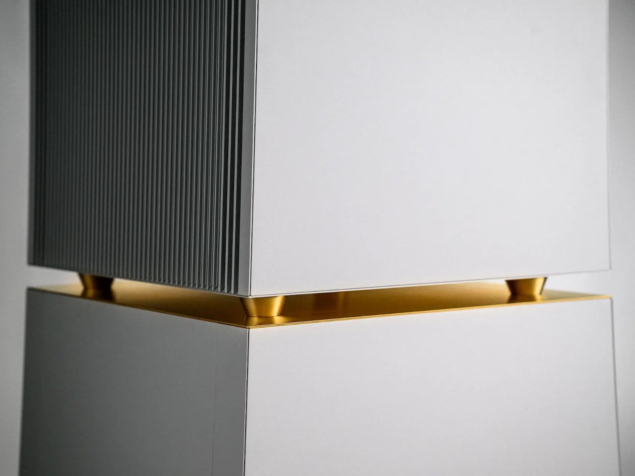
At 1,367mm tall, the Telos 9800 stands in a room rather than sitting in it. The separation of functions into two physically distinct objects transforms an engineering decision into something closer to sculpture. Most amplifiers hide their internal architecture behind a single front panel. The Telos 9800 makes the architecture the design.
The post Goldmund’s $500,000 Amp Is as Much a Sculpture as It Is a Machine first appeared on Yanko Design.

Apple’s rumored iPhone Ultra, its anticipated debut in the foldable phone market, has sparked widespread interest and debate. This device is expected to combine Apple’s renowned design philosophy and ecosystem with the flexibility of foldable technology. However, questions linger about Apple’s approach: will the company fully embrace the foldable form factor, or will it limit […]
The post Why Apple’s $2,000+ iPhone Ultra Might Be the Most Controversial Phone of the Year appeared first on Geeky Gadgets.
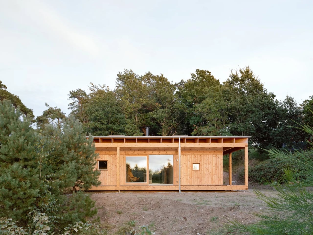
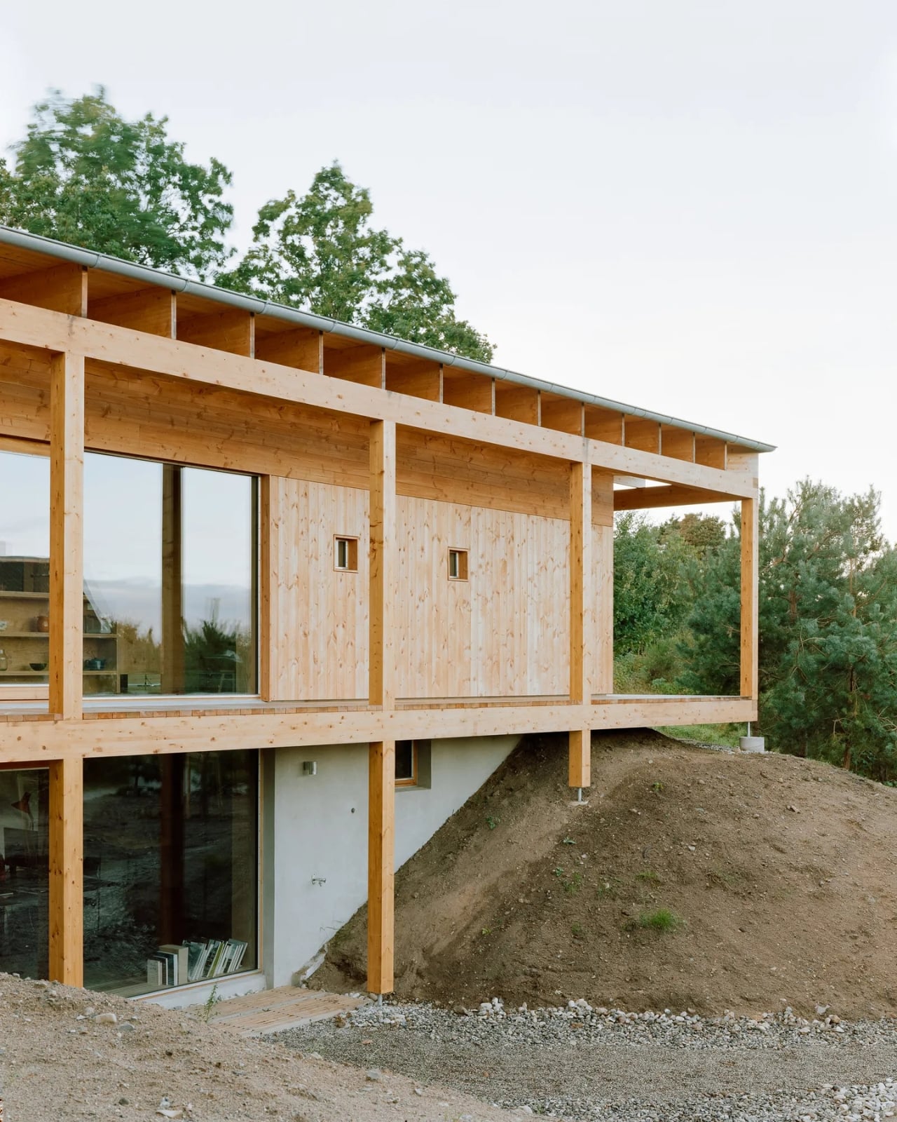
The moment you see a photograph of the House in Ebeltoft, you notice the roof first. It sweeps wide over the structure like a sheltering arm, its deep overhangs extending far past where conventional logic might permit. Underneath it, a timber-paneled house sits low against the Danish landscape as if it grew there on purpose. Designed by Høyer Arkitektur in collaboration with interior designer Maria-Therese Grant, this 140-square-meter family home manages to feel both elemental and quietly radical at once.
Ebeltoft is a small town on a moraine peninsula in eastern Jutland, the terrain formed during the last Ice Age by glacial activity that carved meltwater valleys and left behind rolling hills, Scots pine scrub, and sandy ridges. The architects chose not to soften this setting. The house sits on one of those elevated plateaus, fully exposed to sky and wind, as though it arrived at a kind of acceptance about exactly where it was placed.
Designer: Hoyer Arkitektur
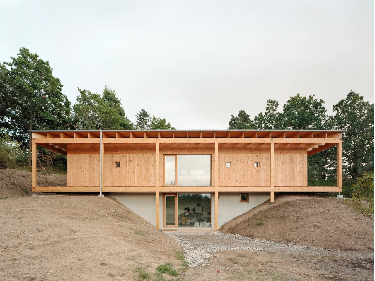
That relationship with the landscape is not incidental. The large roof overhang is designed to counterbalance the forces of the surrounding terrain, creating a structural tension between the house and its environment. The architecture doesn’t compete with the moraine; it answers it.
Inside, the plan abandons corridors and hallways entirely. Twelve individual rooms, each measuring 3.6 by 3.6 meters, are arranged within a column-and-beam timber structure around a central atrium made of gravel and glass. The atrium opens to all four compass directions simultaneously. River stones cover the floor. A bare-branched tree stands at the center. It reads less like a design feature and more like a courtyard pulled from a much older architectural tradition. The light pulls through from every angle.
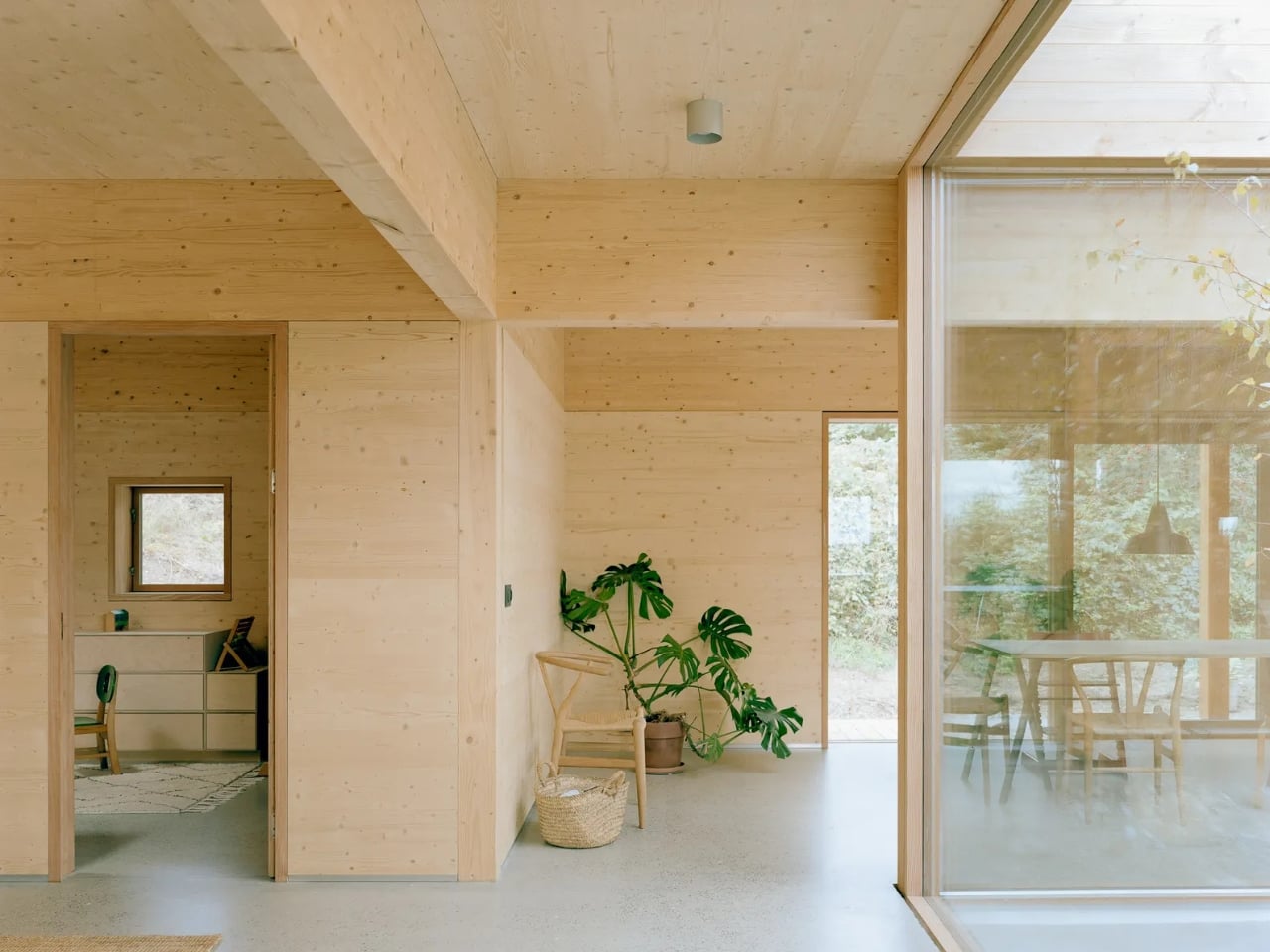
The modular system is where the house gets genuinely compelling as a concept. Because the roof is supported entirely by the outer walls, none of the interior partitions carry any structural load. Any wall can be removed and rebuilt as the family’s circumstances shift over time. A child grows up, a home office becomes unnecessary, life rearranges itself. The house accommodates all of it without requiring a renovation in the conventional sense.
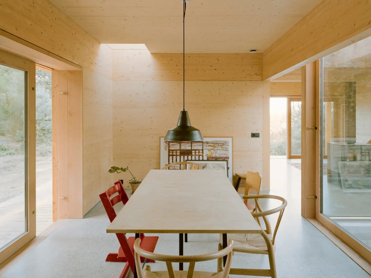
Residential architecture rarely trusts a family to know what they will need over the course of a decade. Most homes are built around a fixed idea of how people live, and when that idea changes, the house doesn’t. Høyer Arkitektur took a different position: they built a container for a life, not just a moment in it. That is a genuinely generous design decision, and one that takes more confidence than building something visually spectacular.
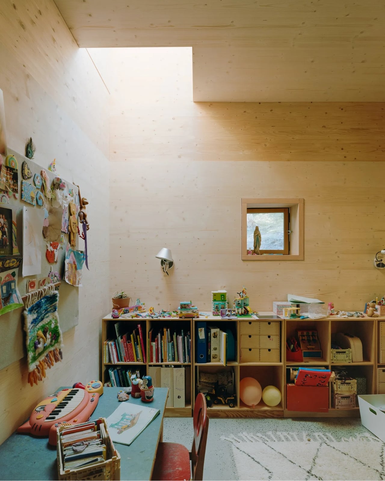
The material palette is equally considered. Unfinished spruce CLT covers both the exterior cladding and the interior walls, pale and honest, with no pretense of finish or permanence. Kitchen cabinetry is pale pine. The structure remains visible throughout, including in the covered exterior zone where the column-and-beam rhythm continues past the enclosed rooms. Nothing is concealed that doesn’t need to be.
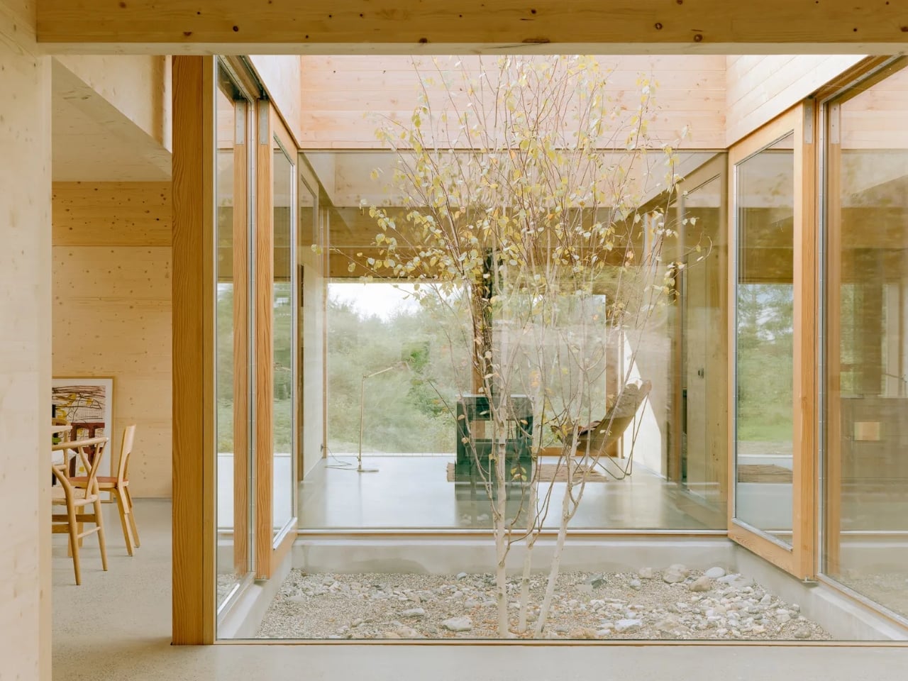
Høyer Arkitektur describes their practice as gentle architectural construction combined with atmospheric spatial thinking. The description is fair, but it undersells the ambition here. A house that asks you to reconsider how flexibility and permanence might coexist in the same structure is not simply gentle. It is patient. And patience in architecture is far rarer than drama.
The House in Ebeltoft will not enter the same conversation as a landmark cultural building or a starchitect’s latest provocation. It doesn’t need to. It is 140 square meters on a Danish hillside, built of timber, centered on gravel and sky, asking very quiet questions about what a home is actually for. Those questions tend to stay with you longer than the loud ones.
The post Inside the 140sqm Danish House With No Hallways, Just Sky first appeared on Yanko Design.

Google DeepMind and OpenAI have unveiled two significant updates in the AI landscape: Gemini 3.7 Flash and GPT-5.6 Ultra-Fast Mode. According to Universe of AI, Gemini 3.7 Flash builds on its predecessor with a notable 43.6% code quality success rate and excels in tasks like long video understanding, where it outperforms comparable models. Meanwhile, GPT-5.6 […]
The post How Gemini 3.7 Flash Defeats GPT-5.6 Terra at Long Context appeared first on Geeky Gadgets.

The Samsung Galaxy Tab S12 series is poised to make a significant impact in the tablet market with its expected release later this year. Comprising two models, the Galaxy Tab S12 Plus and Galaxy Tab S12 Ultra, the series emphasizes internal advancements over external redesigns. The most notable change is Samsung’s decision to integrate MediaTek’s […]
The post Same Design May Hide Huge Samsung Galaxy Tab S12 Ultra IUpgrades appeared first on Geeky Gadgets.