PROS:
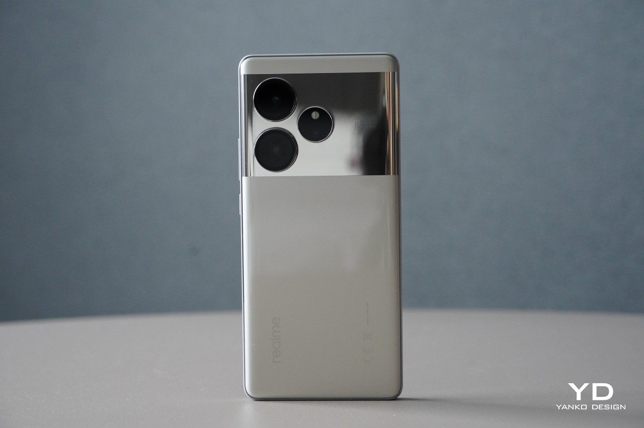
- Elegant and stylish design, especially the Nebula Silver color
- Supports a micro SD card for external storage
- 50MP autofocus front camera can do 4K UHD videos
CONS:
- Processor is a downgrade compared to Chinese model
- No wireless charging
- Glossy bottom plate is a smudge magnet (Space Brown, Sunset Gold)
AI is the buzzword in the tech industry, with mainstream media picking up on it and sometimes not in a good way. All the benefits that the technology brings, however, are for naught if only a select few can afford to use it. AI on smartphones promises quality-of-life improvements and exciting creative features, but only if you have the latest and greatest models with powerful specs and matching high prices. Fortunately, AI on mobile is such a hot topic that manufacturers are bringing those features to almost any new device. That’s pretty much the premise of the OPPO Reno 12 Pro, specifically the global edition that the brand just launched, one of the first few to advertise these AI benefits on what some would consider a mid-range model. But is it a potent combination or is the experience hampered by the Reno 12 Pro’s hardware? We take the phone for a spin to bring you the answers.
Designer: OPPO
Aesthetics
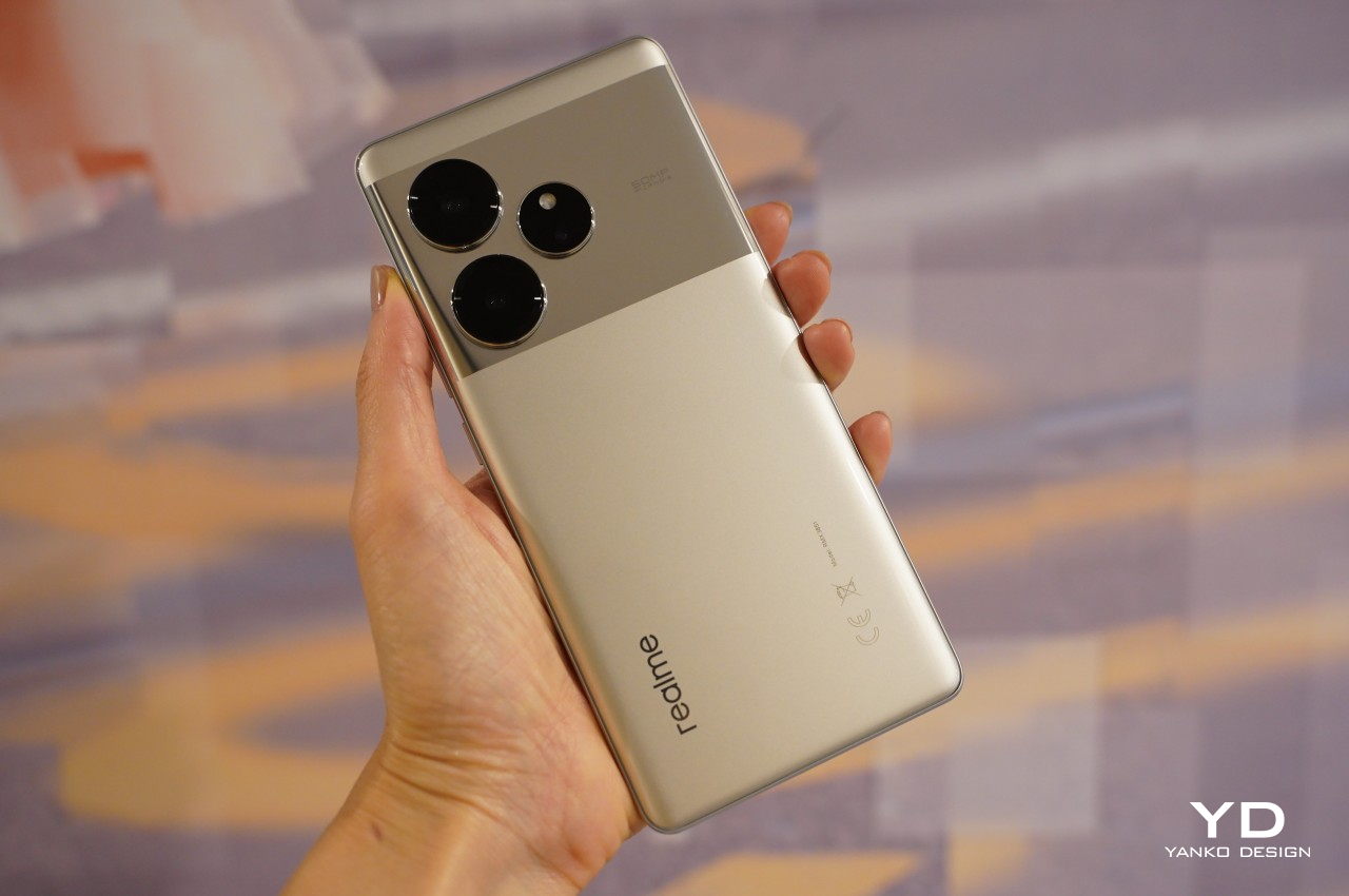
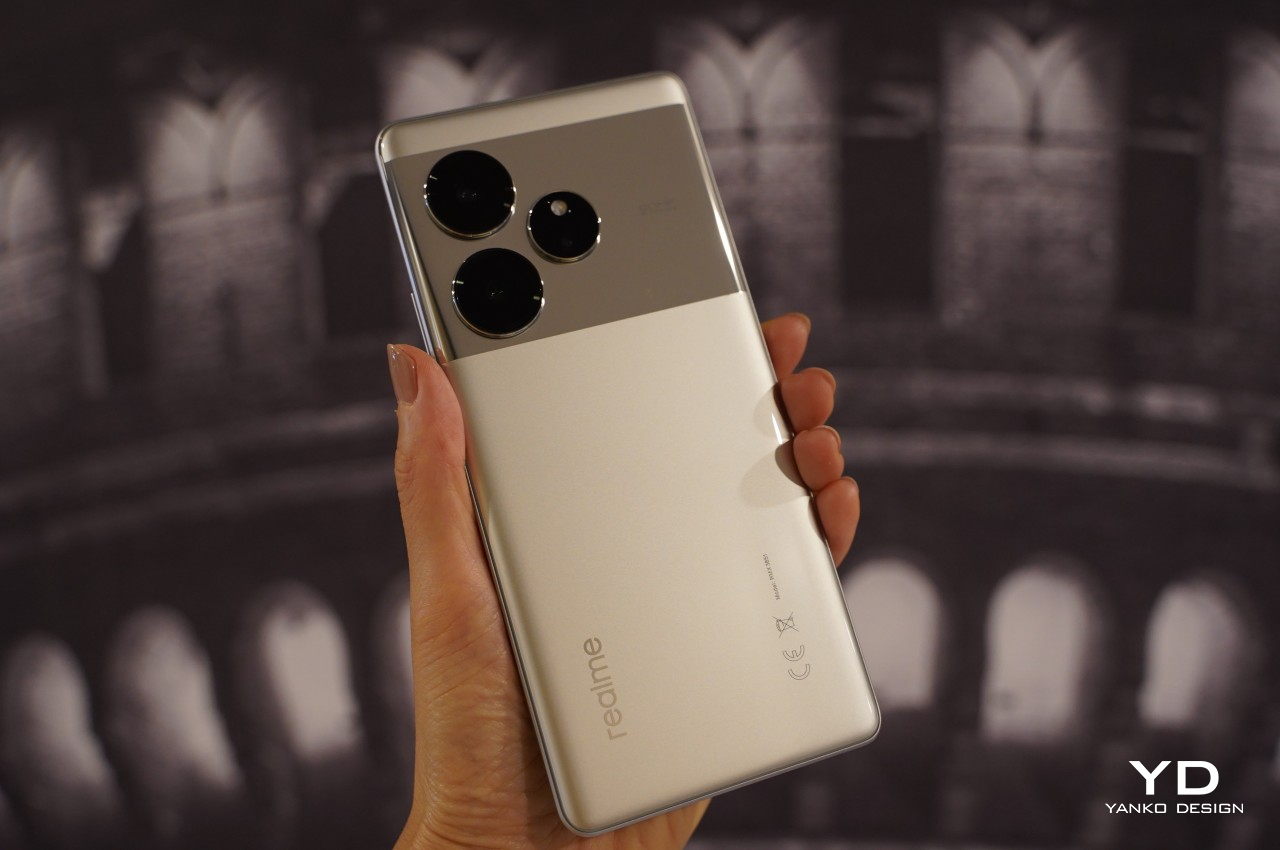
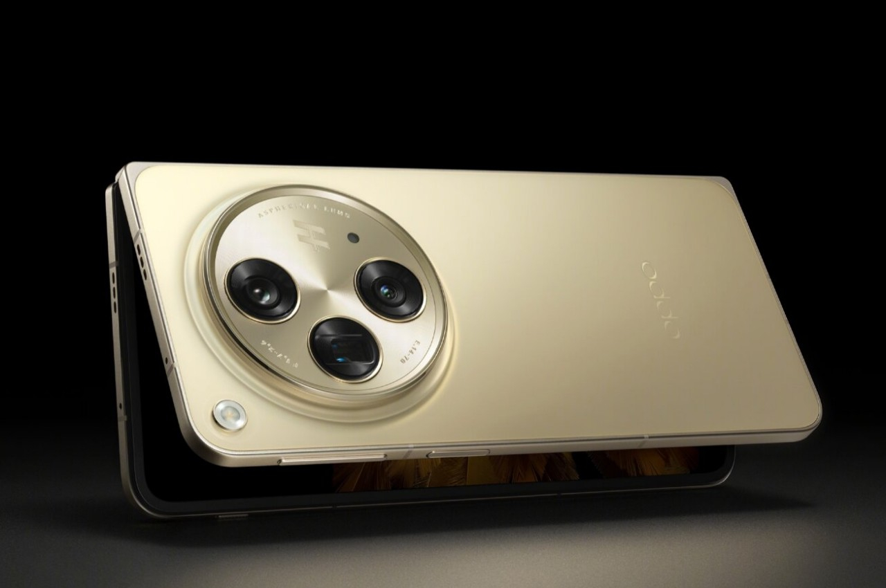
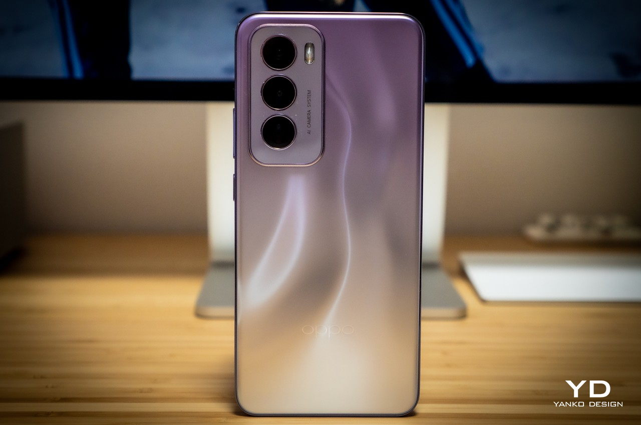
Companies avoid using the label “mid-range” or “mid-tier” for good reason. They often come with the connotation of lacking quality and appeal, which is definitely not something that can be said for the Reno 12 Pro. Right off the bat, you’ll be surprised by how enchanting the phone is, especially the Nebula Silver colorway we received for this review. OPPO utilizes what it calls Fluid Ripple Texture that gives the phone’s back a 3D visual effect of liquid gently moving underneath the glass. It even has something like a parallax effect that gives the illusion that there’s truly some solid mass despite having a completely flat surface. The play of light, shadow, and colors has a mesmerizing effect that gives the phone a more stylish and elegant air.
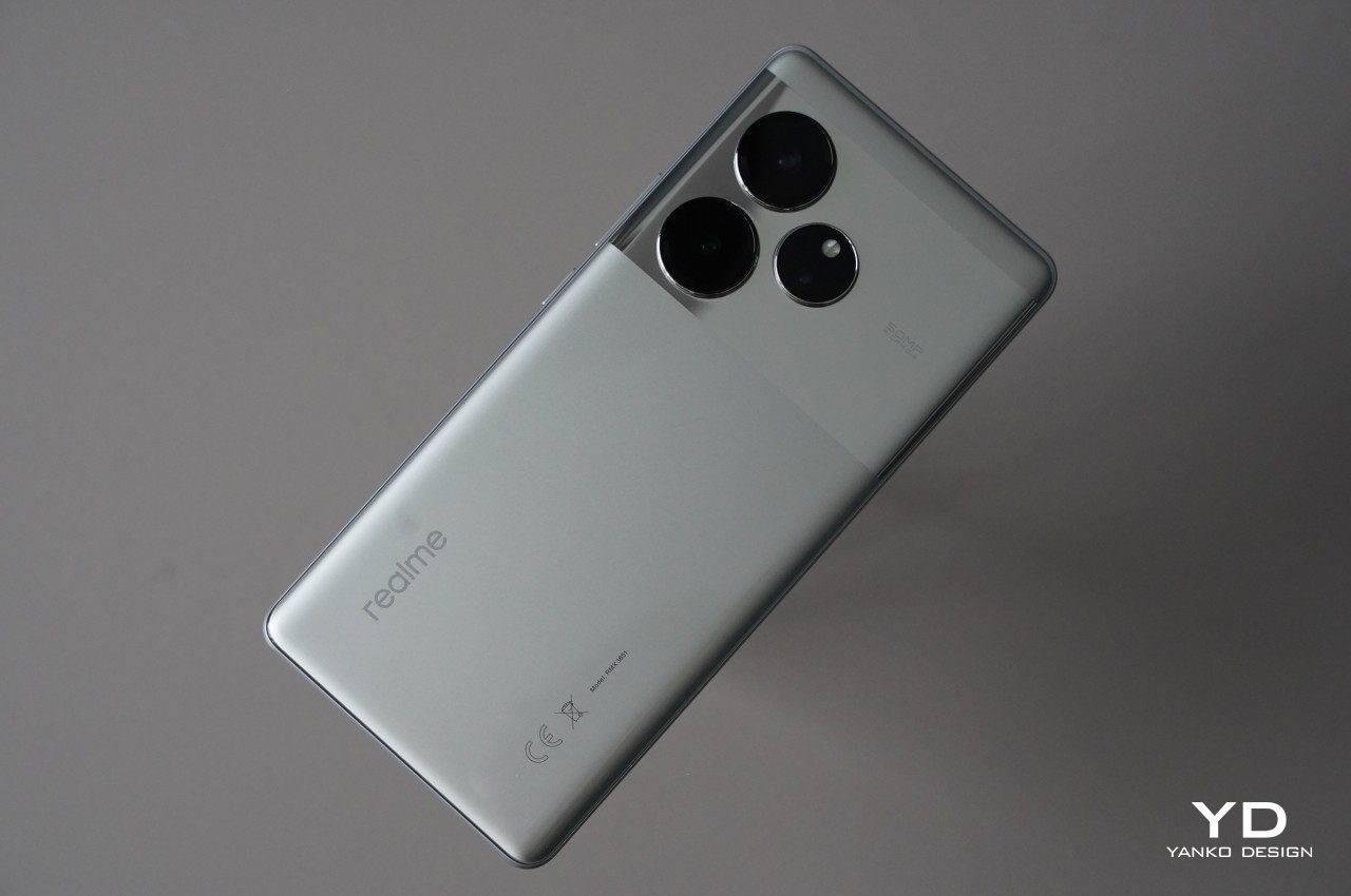
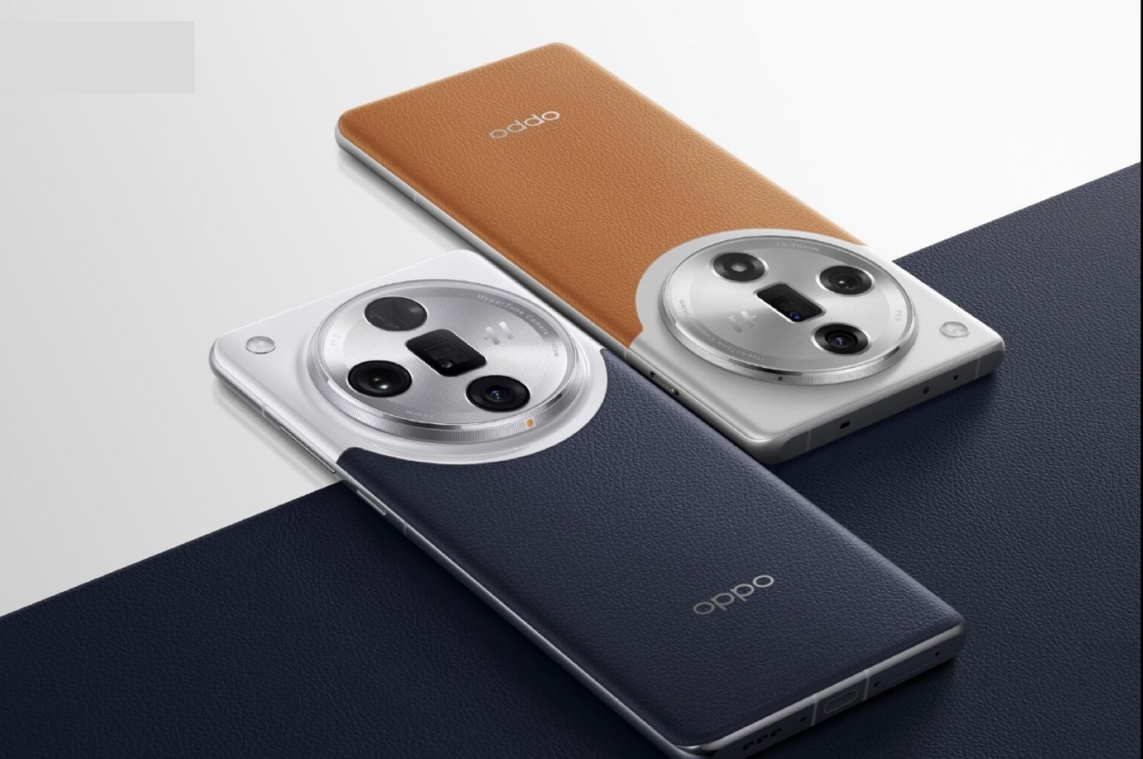
The other two color options, Sunset Gold and Space Brown, are no less attractive but have a different approach. They use a two-tone design that combines a matte section and a smaller glossy area separated by a chic metal-like ribbon running across the width of the phone. It’s a familiar composition, only arranged upside-down, giving the Reno 12 Pro a distinctive look. Unfortunately, this design has one rather critical flaw, the glossy part will always be where your palm rests, which means it will always have oils and smudges whenever you hold it.
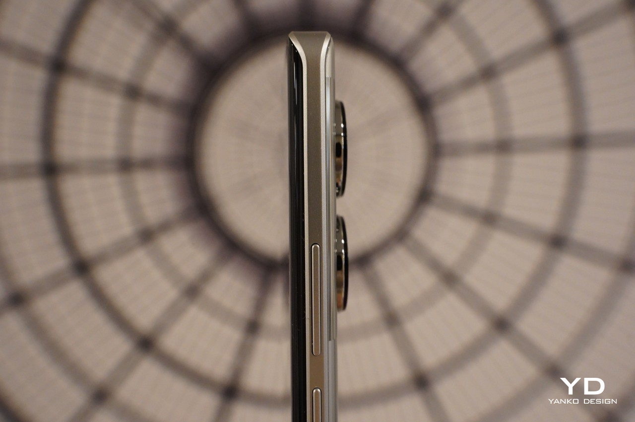
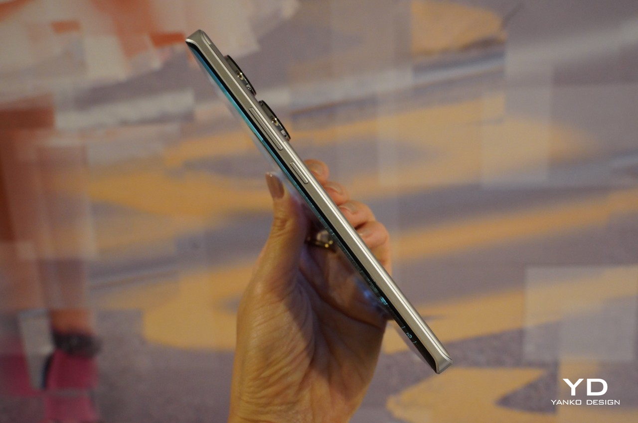
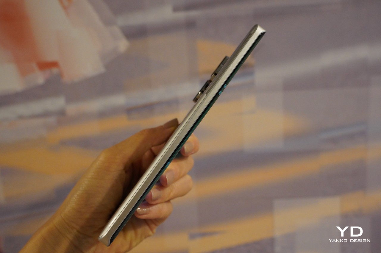
The phone’s flat edges give it a modern look and its reflective surface gives the impression of a metallic nature. It is, however, a sleight of hand, given how the material is actually a new proprietary alloy that OPPO promises has the same durability but with less weight. All in all, the OPPO Reno 12 Pro definitely has a striking presence that’s almost on par with more expensive flagships.
Ergonomics
Given the phone’s large size, it’s almost shocking that the OPPO Reno 12 Pro weighs only 180g. Part of that is probably thanks to the absence of “real” metal in the frame, utilizing OPPO’s High-Strength Alloy Framework instead. On the one hand, this gives the phone a lightweight body that lessens the strain on your hand. On the other hand, no pun intended, it sometimes makes the phone feel a bit flimsy, lacking the substance you’d find on premium handsets.
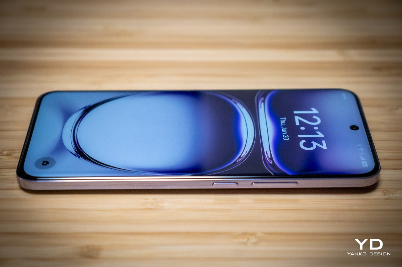
Smartphone designs these days either go for flat edges or the more traditional curved screens, but the OPPO Reno 12 Pro finds a rather curious middle ground. Its sides are quite flat, but the screen isn’t exactly the same. It has a very minimal curvature not only on the left and right sides but also top and bottom but never goes over the edges. OPPO says this design delivers that same immersive viewing experience without the accidental touches that curved screens are notorious for. Along with more rounded corners, this design offers comfort and confidence in your grip, making for a more pleasurable smartphone experience.
Performance
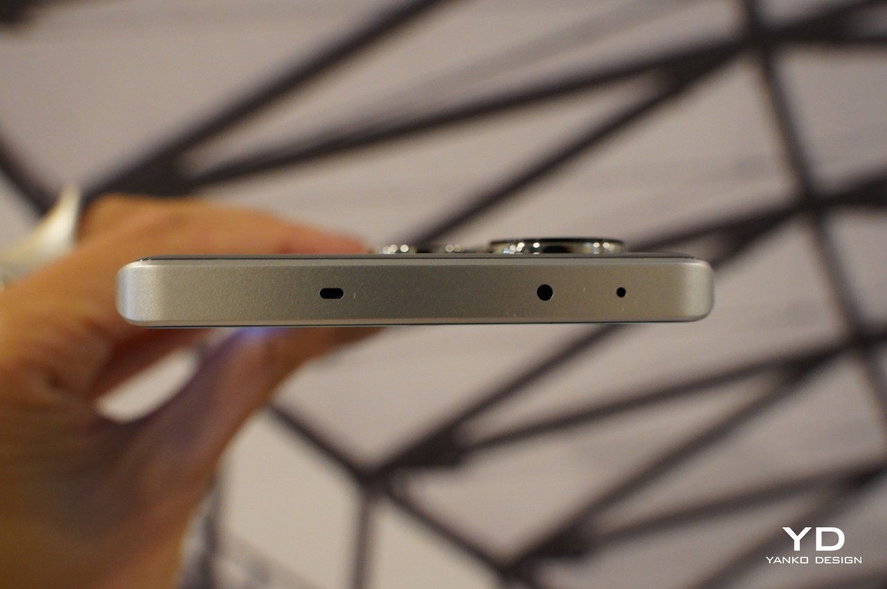
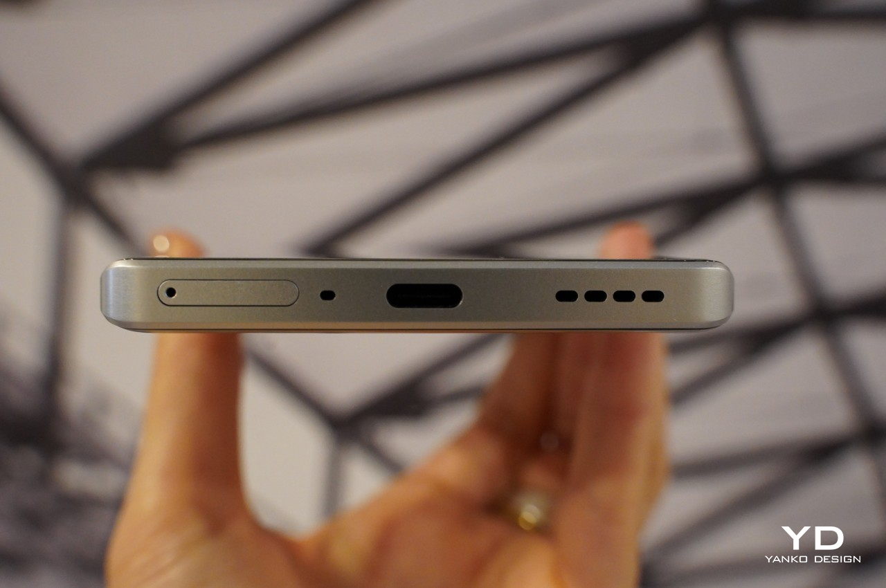
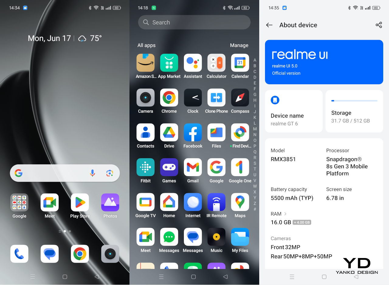
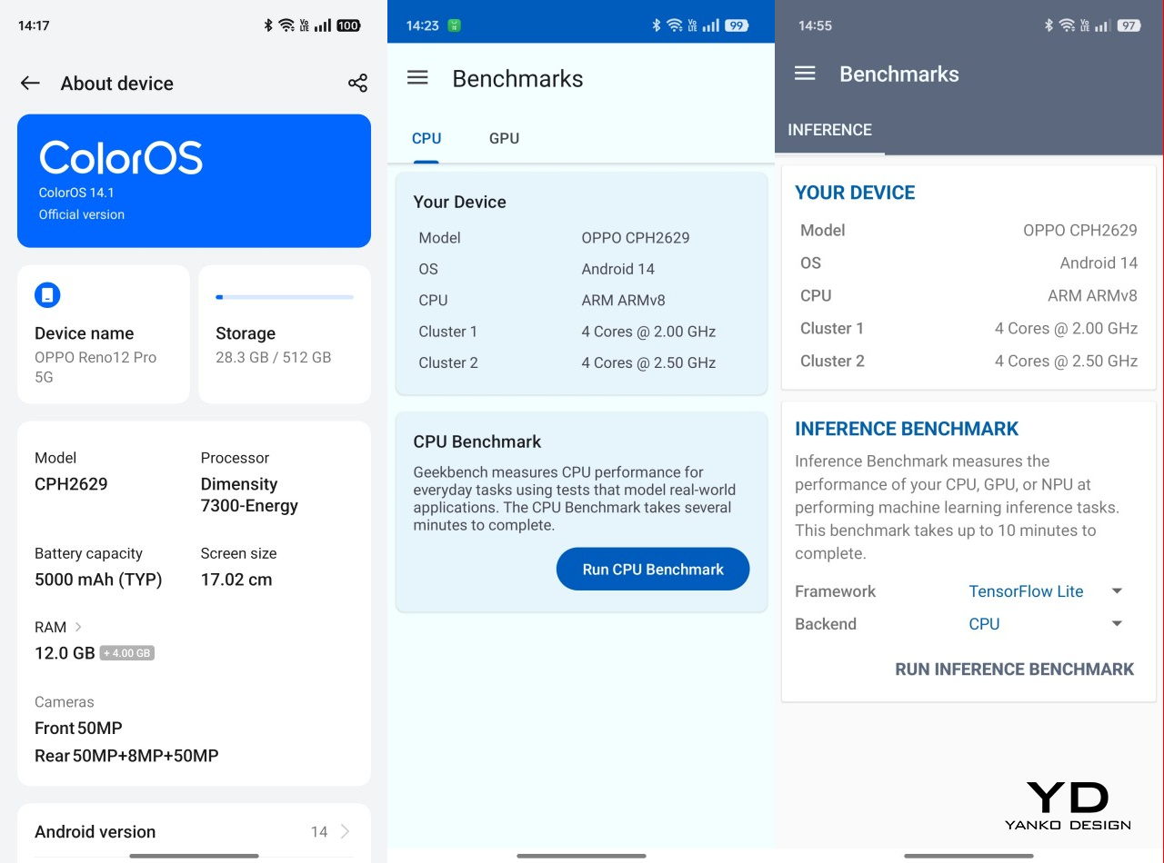
The OPPO Reno 12 Pro isn’t exactly new but it is only now making its way to global markets. That journey, however, seems to have taken a toll on the handset, and OPPO decided to use a custom MediaTek Dimensity 7300-Energy. This variant of the processor is geared towards more efficient battery use, but it’s still based on a rather mid-range silicon line. Fortunately, the phone still performs admirably, especially with 12GB of RAM, though you might see some stuttering or dropped frames in more intensive games. In exchange, however, OPPO gives the Reno 12 Pro a feature that’s all but gone from smartphones these days: a microSD card slot sharing space with the second SIM card slot.
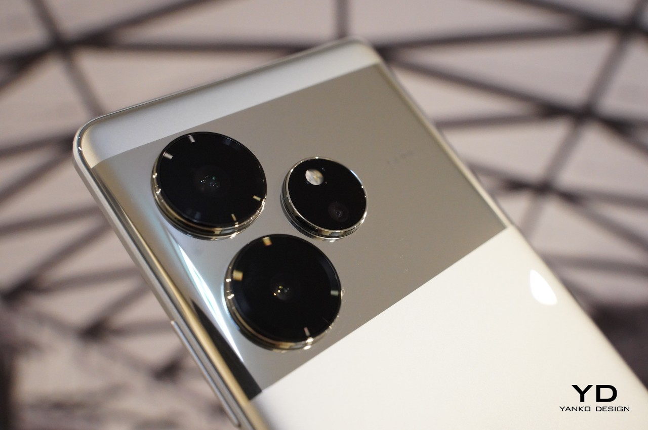
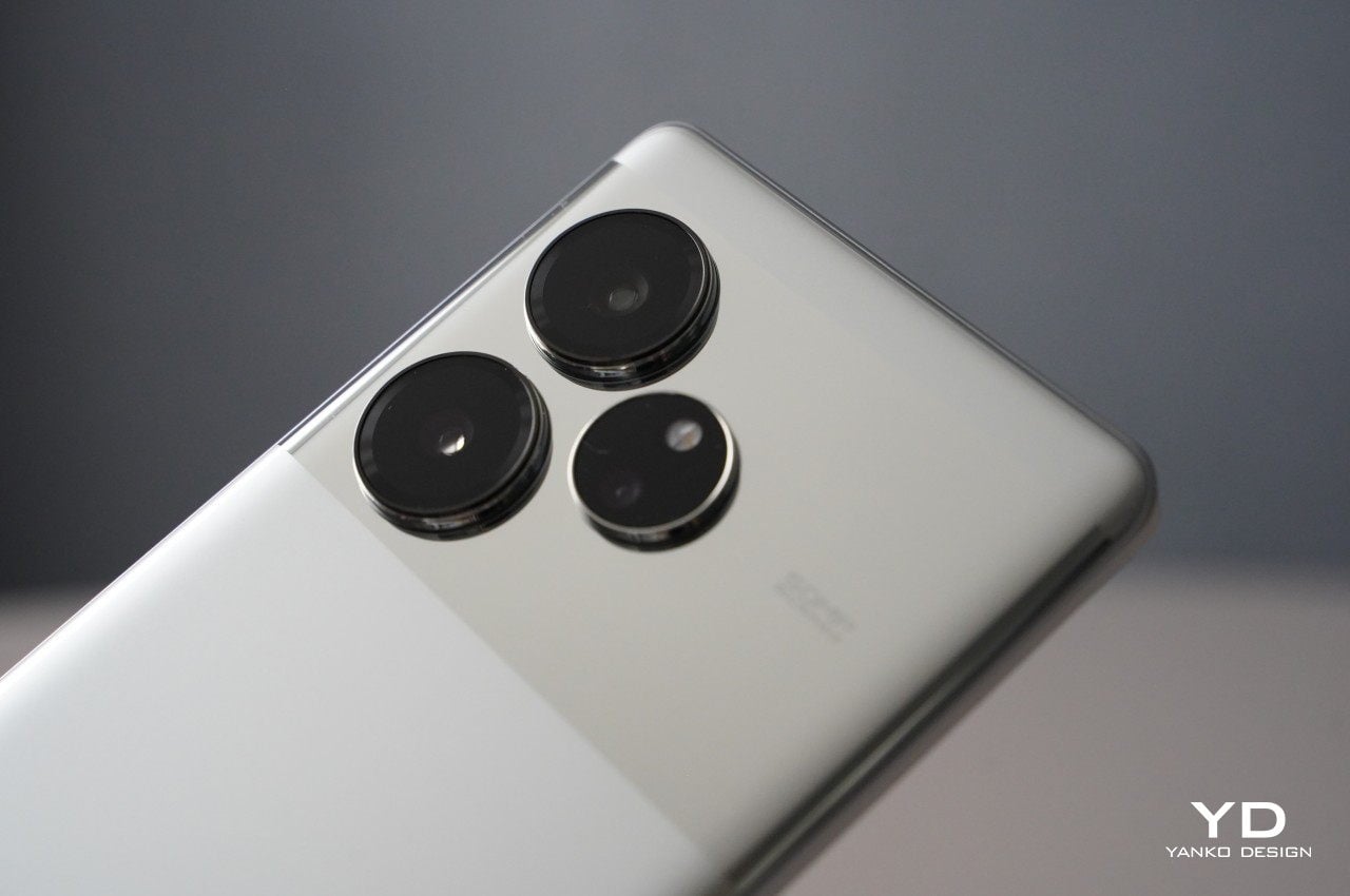
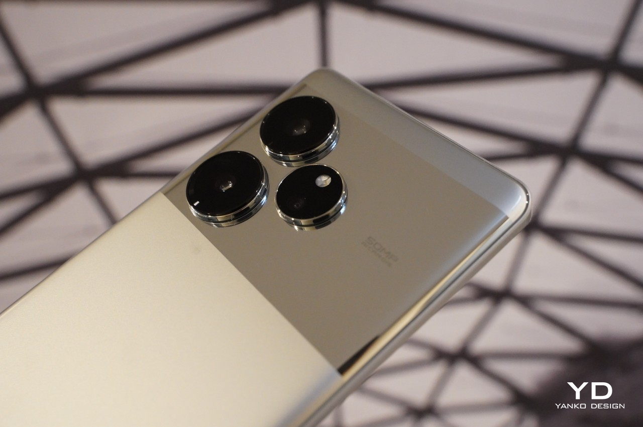
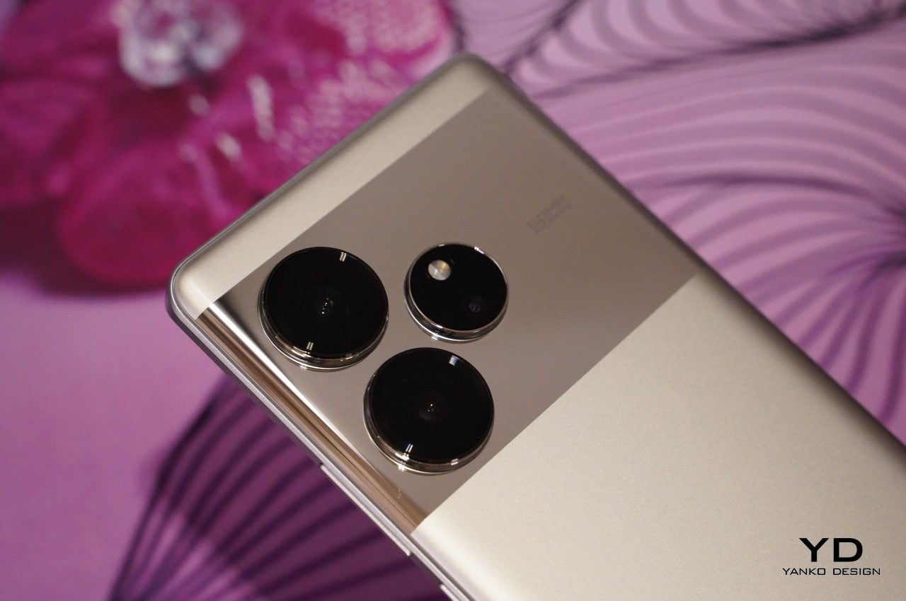
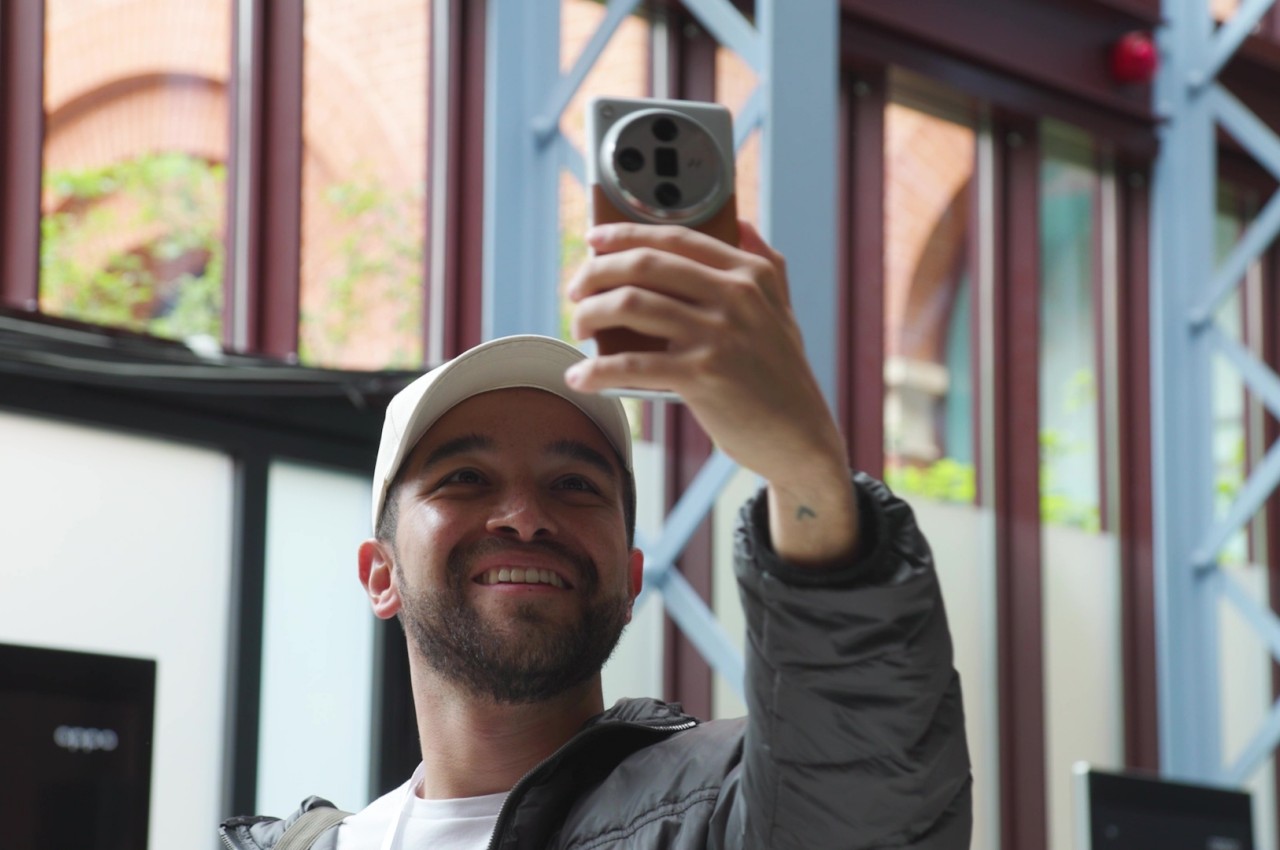
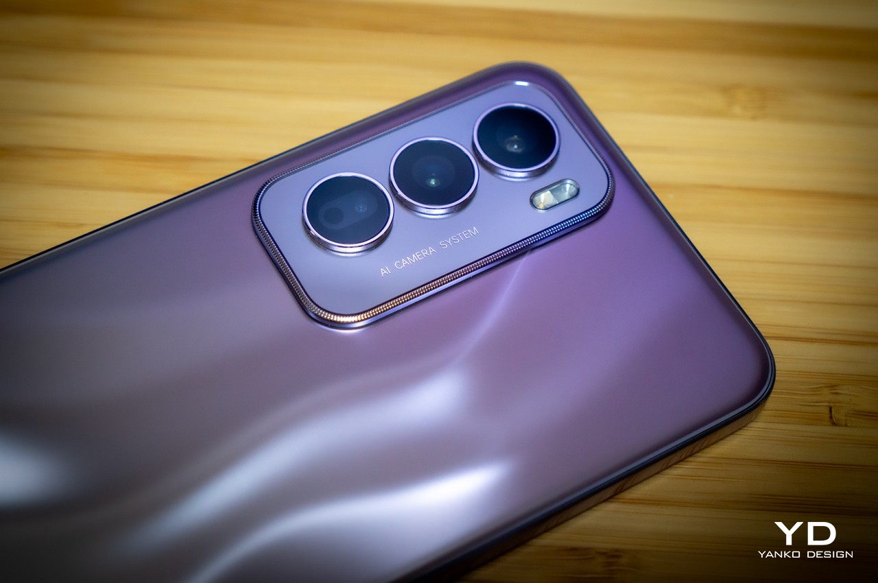
Like any other smartphone these days, OPPO takes great pride in the Reno 12 Pro’s imaging system, and for good reason. It boasts two 50MP sensors, one for the main wide shooter and another for telephoto. These high-performance cameras produce impressive images, even on overcast days, bringing rich detail and accurate colors to every shot. These two cameras also work together to deliver beautiful bokeh effects in portrait mode, creating an accurate separation of foreground and background and giving the latter a pleasant blur. Sadly, the 8MP ultra-wide camera barely holds a candle to these two, but it thankfully still gets the basics right. Even more impressive, however, is the 50MP front-facing camera that not only has autofocus but can even take videos in 4K UHD quality.


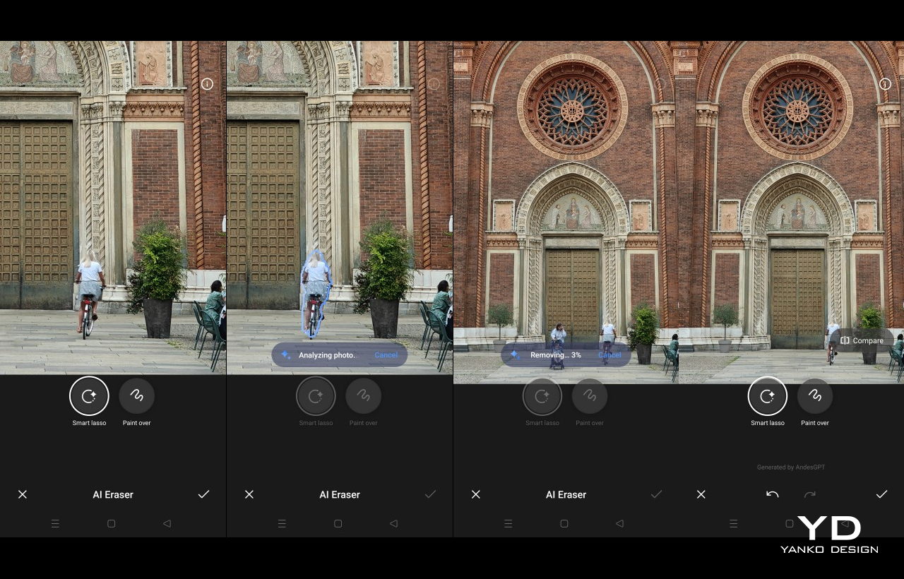
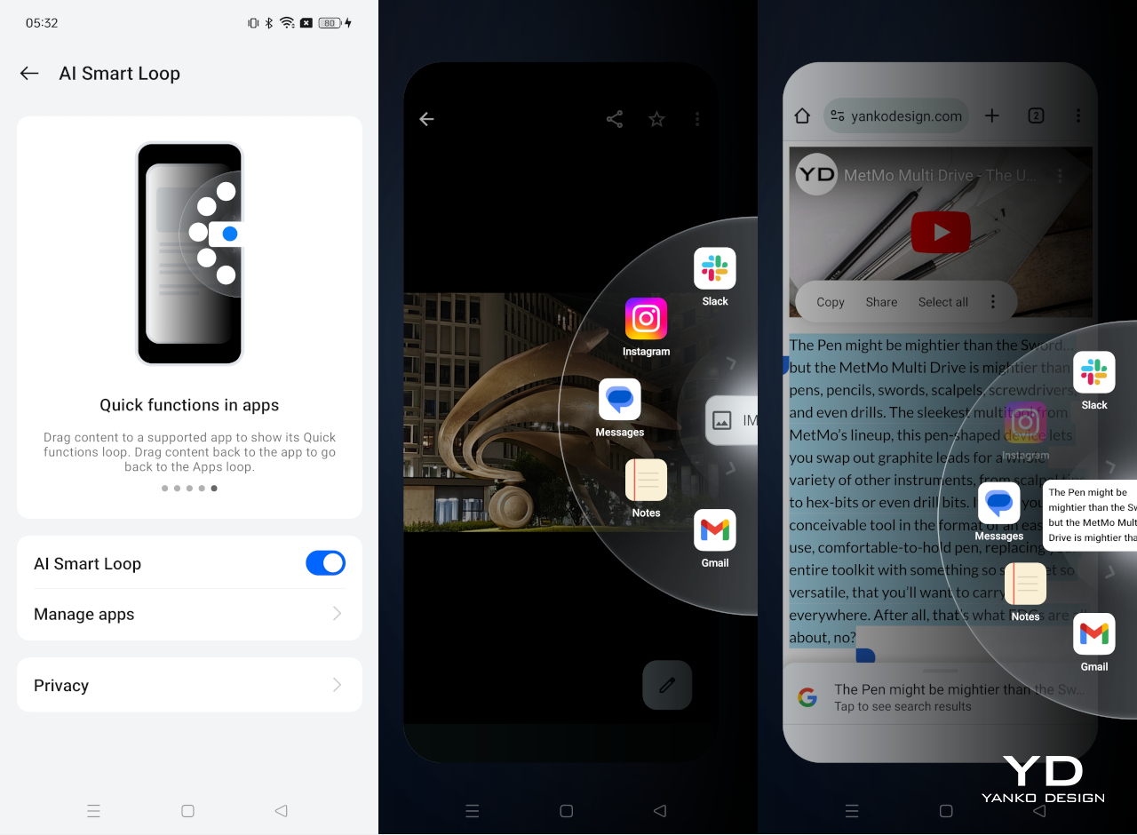
Given that the main selling point of this generation of the Reno family is AI, we definitely have to say a few words about it. At the time of this writing, the rollout of some of the features is still ongoing or scheduled, but the complete set is definitely something worth waiting for. You have a combination of generative AI features across the board, from intelligently handling the performance of the phone to tweaking your photos to match a certain appearance with the AI Studio. Leveraging the power of Google Gemini, The Reno 12 Pro features an AI sidebar that can analyze the content displayed on the screen and offer relevant tools for it. It can, for example, summarize a long article into a few bullet points, recommend a text to post on social media, or even speak out the contents of a website. This is just the tip of the iceberg for the AI features that OPPO is bringing to everyone who can afford it, and the Reno 12 Pro’s price point makes sure of that.

Sustainability
While OPPO has had strong advocacy for the use of sustainable processes and materials on its phones, it’s not easy to see that on the OPPO Reno 12 Pro, at least not directly. It doesn’t mention any use of recycled materials, for one, and its new alloy material is unsurprisingly a big secret. It wouldn’t be surprising, however, if it had a considerable amount of plastic in the mix, which would be on par with most mid-range phones.
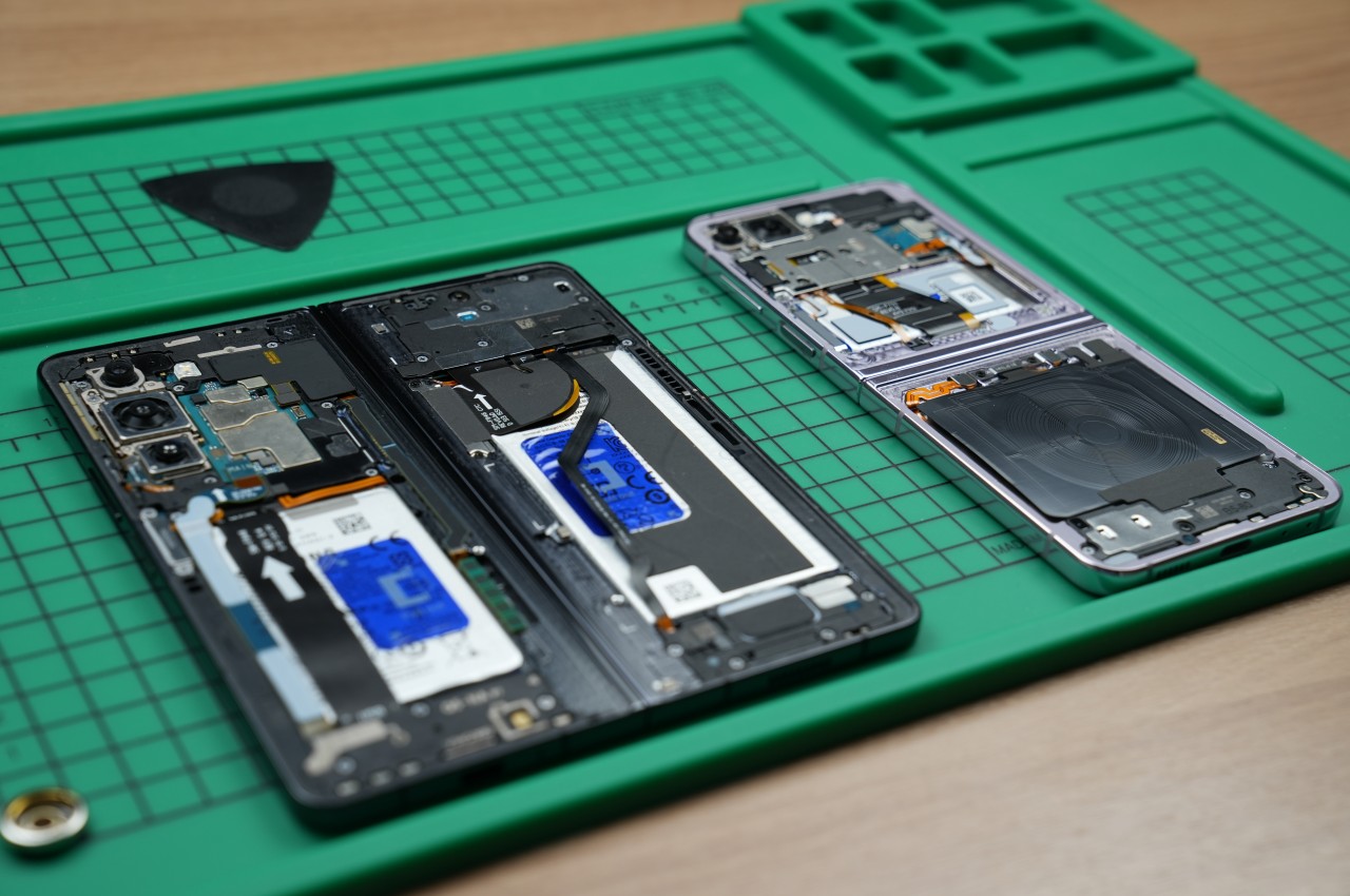
Instead, the company focuses more on the durability and longevity of its design, ensuring that the phone won’t meet an untimely end that quickly. It uses the latest Corning Gorilla Glass Victus 2 protection for the screen and boasts an IP65 dust and water resistance rating. Curiously, OPPO also talks about a biomimetic cushion for internal parts inspired by the structure of a sponge, further protecting sensitive components from bumps and falls. That said, only a proper teardown will reveal the true nature of that new protective layer.

Value
The OPPO Reno 12 Pro is quite a looker and it boasts plenty of AI features you’d only hear about on premium flagships. At the same time, it delivers a decent performance, especially for one that has the marks of a mid-tier market smartphone. The question, however, is whether all of these are worth the price OPPO is asking for.
To be fair, it isn’t asking for much, depending on the market. The Pro model goes for 599 EUR, roughly $650, which is far below the latest high-end offerings. That said, it isn’t the only player in this particular field, and OPPO is even up against the venerable Google Pixel 8a. The question then becomes one of availability as well as preferences, especially when it comes to the custom OPPO ColorOS Android experience. At the moment, though, the Reno 12 Pro is one of the few mid-range phones to offer such a variety of AI-powered features, but that number will only grow in the months ahead, giving OPPO plenty of competition in this space.
Verdict
There’s no escaping AI, at least for now, and it isn’t just in powerful PCs or the Web. Smartphones are the next arena for AI, whether you like it or not, but only if it’s something that more people can obtain and, more importantly, enjoy. Phone and chip manufacturers are naturally more interested in flexing their muscles to showcase powerful hardware to support advanced AI processes, but these won’t land in most people’s hands that easily.
The OPPO Reno 12 Pro represents a new breed of smartphones that is making AI more accessible to the masses with more wallet-friendly options. But it isn’t just its AI prowess that sets this phone apart. Its striking design is definitely a head-turner, and its promise of durability increases trust not only in the phone but also in OPPO’s brand. It definitely has some tough competition ahead, but at least for now, it is leading the pack with its combination of power, gracefulness, and, more importantly, price.

The post OPPO Reno 12 Pro Review: Making AI Affordable in a Stylish Design first appeared on Yanko Design.