PROS:
- Slim and comfortable design
- Bright and crisp internal and external displays
- Outstanding battery capacity, backed by fast wired and wireless charging
- Great main and telephoto camera for a foldable
CONS:
- Feels more like a small upgrade over the Magic V5 than a major generational leap
- Ultrawide camera is decent, but not as impressive as the main and telephoto cameras</li?
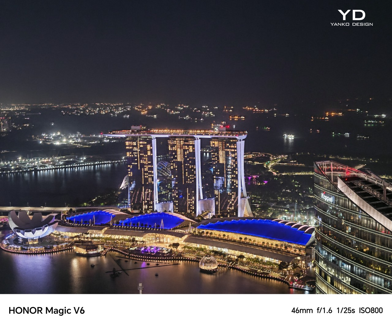
Honor unveiled its latest foldable, the Honor Magic V6, at MWC 2026 back in March. Now, three months later, the phone is starting its global rollout in Malaysia and Singapore. That shift from launch event to retail availability is where the real test begins, because foldables have reached a point where being thin or flashy is no longer enough on its own.
The Magic V6 does not completely rethink what Honor has already been doing with its book-style foldables. Instead, it builds on a formula that already worked well, pushing it further with a bigger battery, a slim and comfortable design, and a hardware package that feels unusually complete for a foldable. After spending time with it, the Honor Magic V6 feels less like a dramatic reinvention and more like a careful refinement of what Honor already got right.
Designer: HONOR
Aesthetics
Foldables still have a habit of looking oddly cautious. For devices built around one of the most dramatic ideas in modern consumer tech, they often arrive in the safest shades possible. Black, grey, silver, maybe a muted blue if a brand is feeling adventurous. The color choice itself is usually limited, which can make many foldables feel more sterile than stylish. Honor is one of the few brands that has tried to bring a little more personality into the category, and the Magic V6 sticks with that idea.
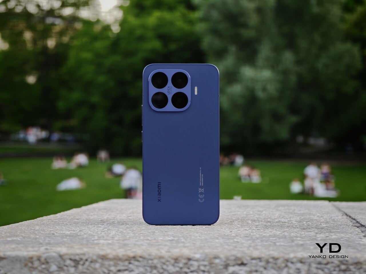
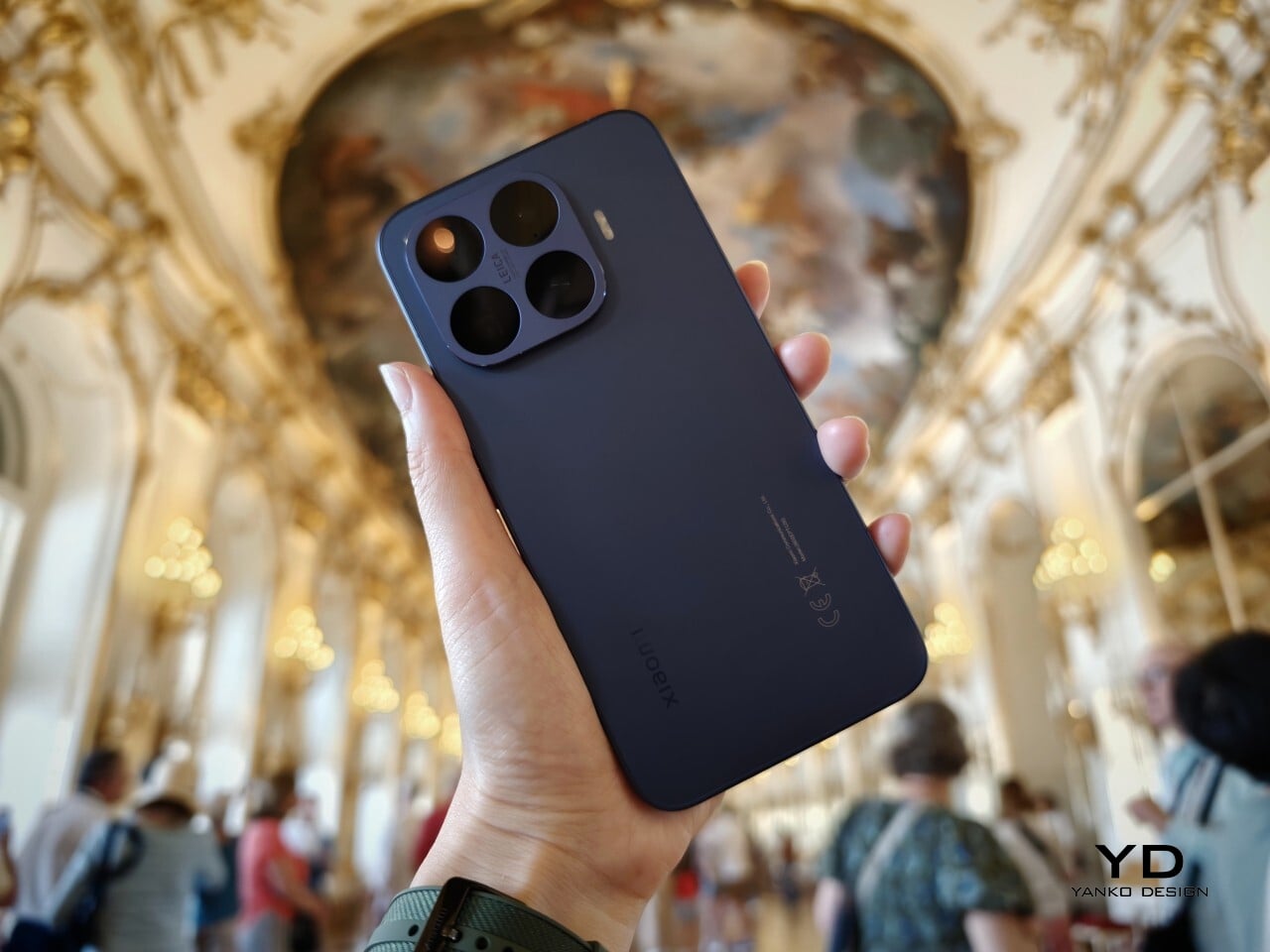
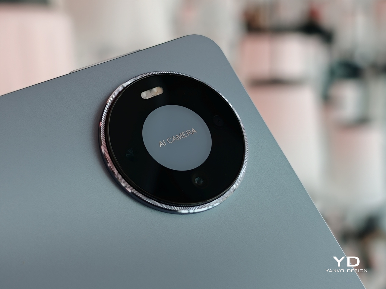
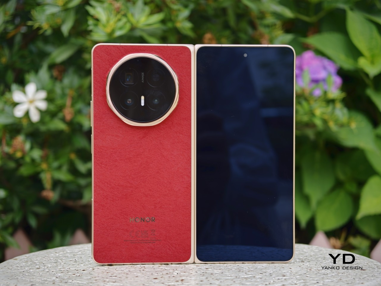
At first glance, the Magic V6 looks very similar to the Magic V5. The overall silhouette is familiar, the octagonal camera module is still there, and even the color direction feels like a continuation rather than a reset. This is clearly not a redesign for the sake of it. Honor seems comfortable with the look it has established for the Magic V line, so the V6 feels more like a polished follow-up than a fresh visual statement.
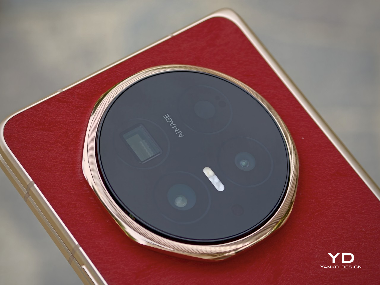
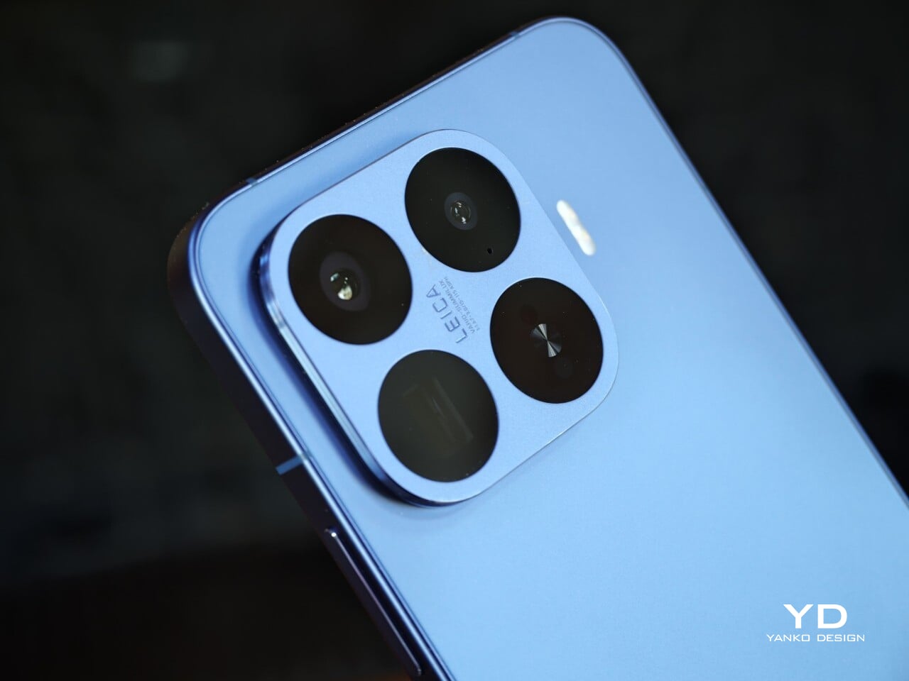
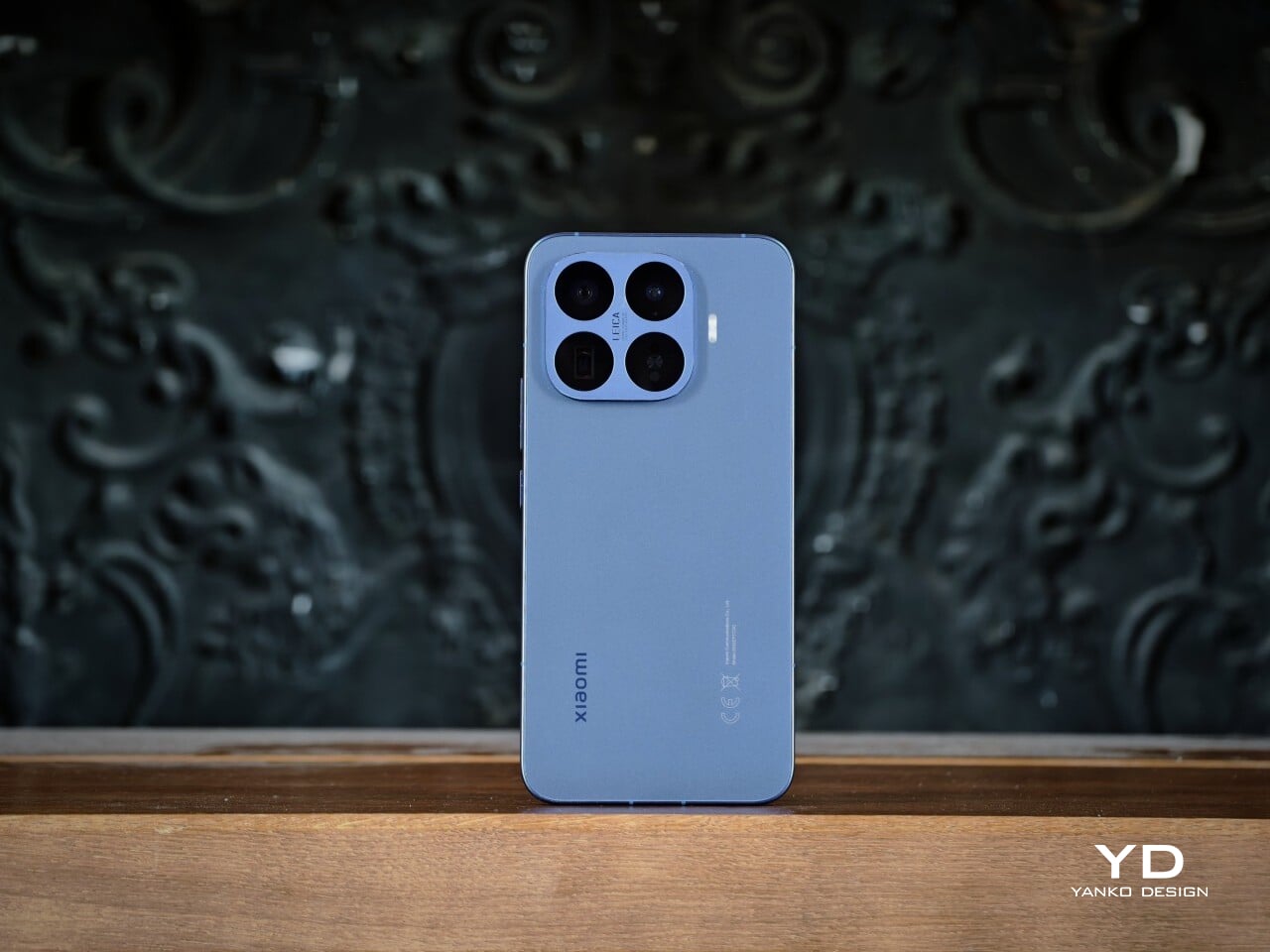
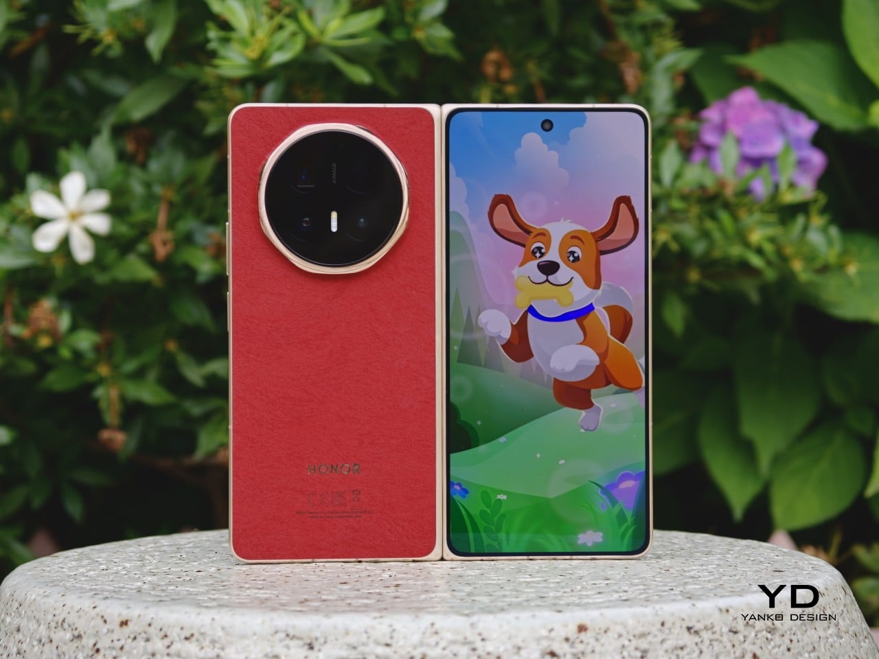
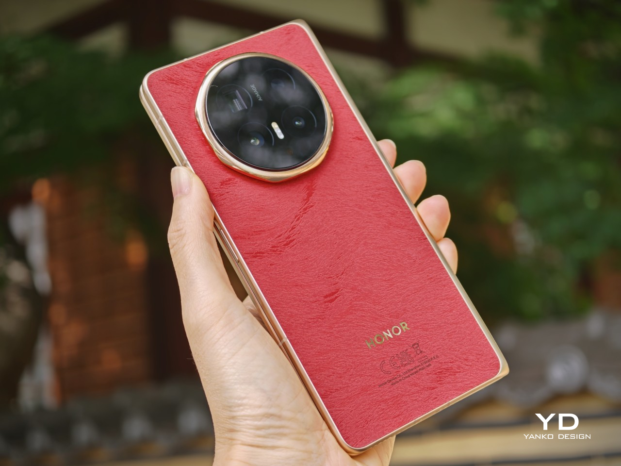
The finishes do a lot of the work in giving the phone its character. Honor offers the Magic V6 in four colors, and they feel more thought-through than the usual selection in this category. The red version I received is the most striking, with a soft-touch finish, a subtle hairline pattern, a gold frame, and a matching gold camera ring that make it feel a little warmer and more expressive than most foldables. The gold version goes in a different direction with a crisscross pattern that gives the back more texture and a slightly dressier look. If you want something more restrained, the white and black versions are there too.
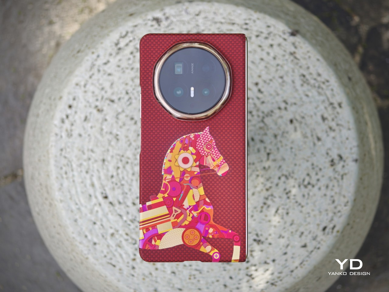
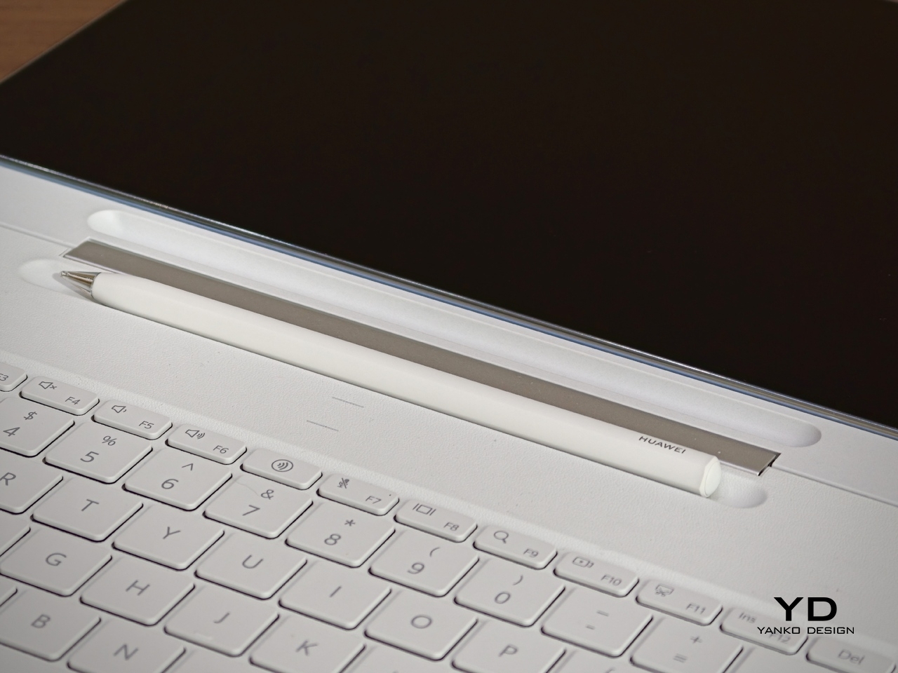
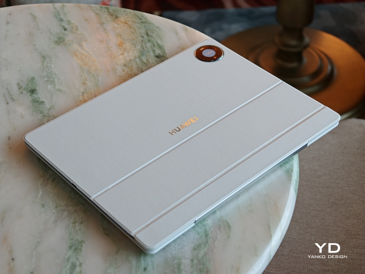
Honor has also paid attention to the accessories. Each color comes with a matching case with a built-in kickstand, while the optional Special Edition case adds a bit more flair. Designed with Yoni Alter, it uses red aramid fiber and a colorful mosaic-style horse motif, while also adding built-in magnetic support. It is a small detail overall, but it suits the phone. The Magic V6 may not change Honor’s foldable design language, but it does show that the company is still putting real thought into how this series looks and feels.
Ergonomics
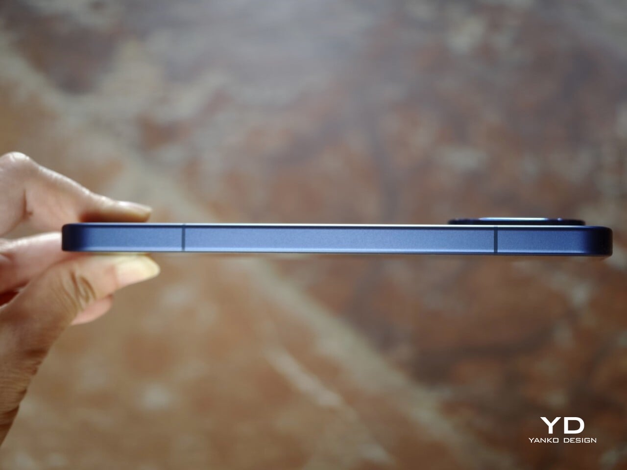
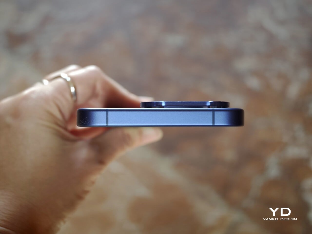
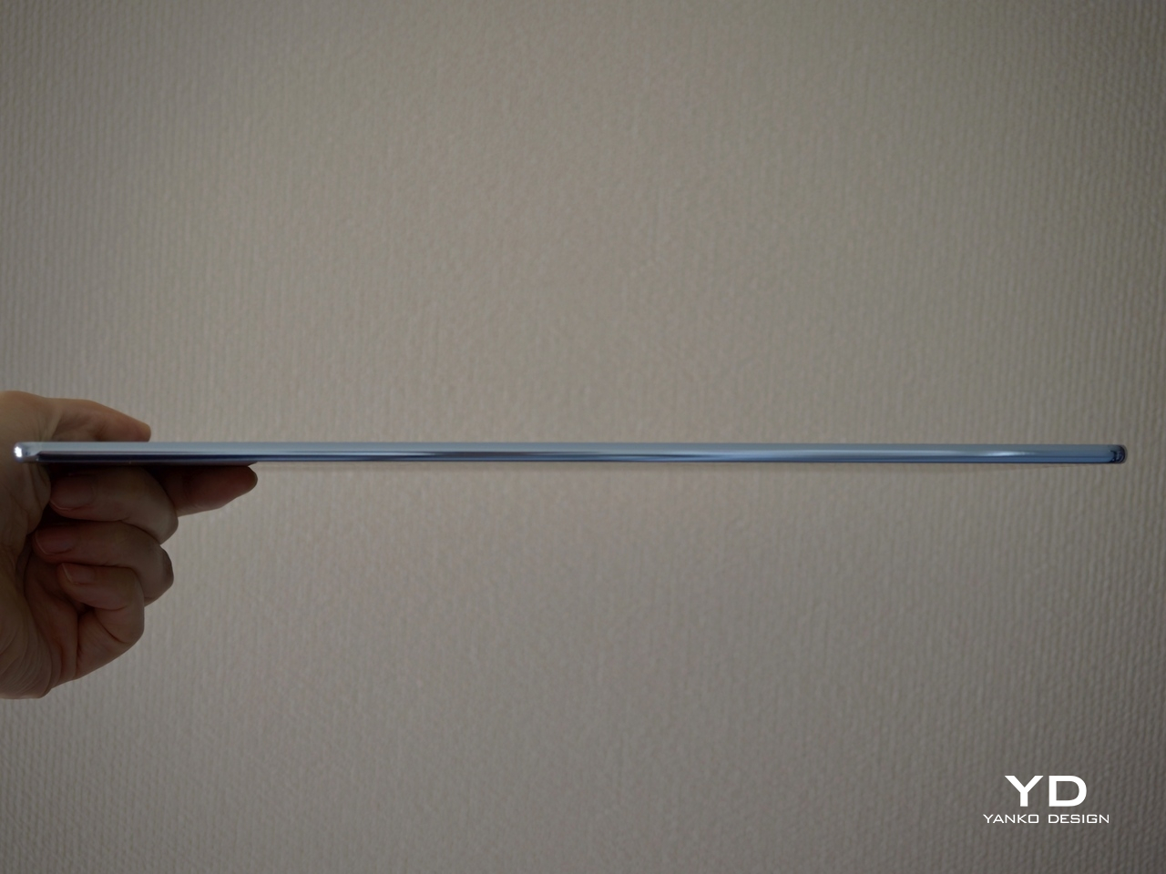
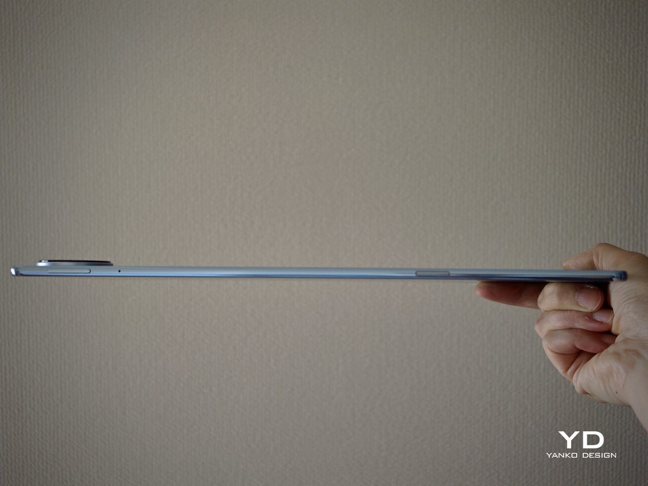
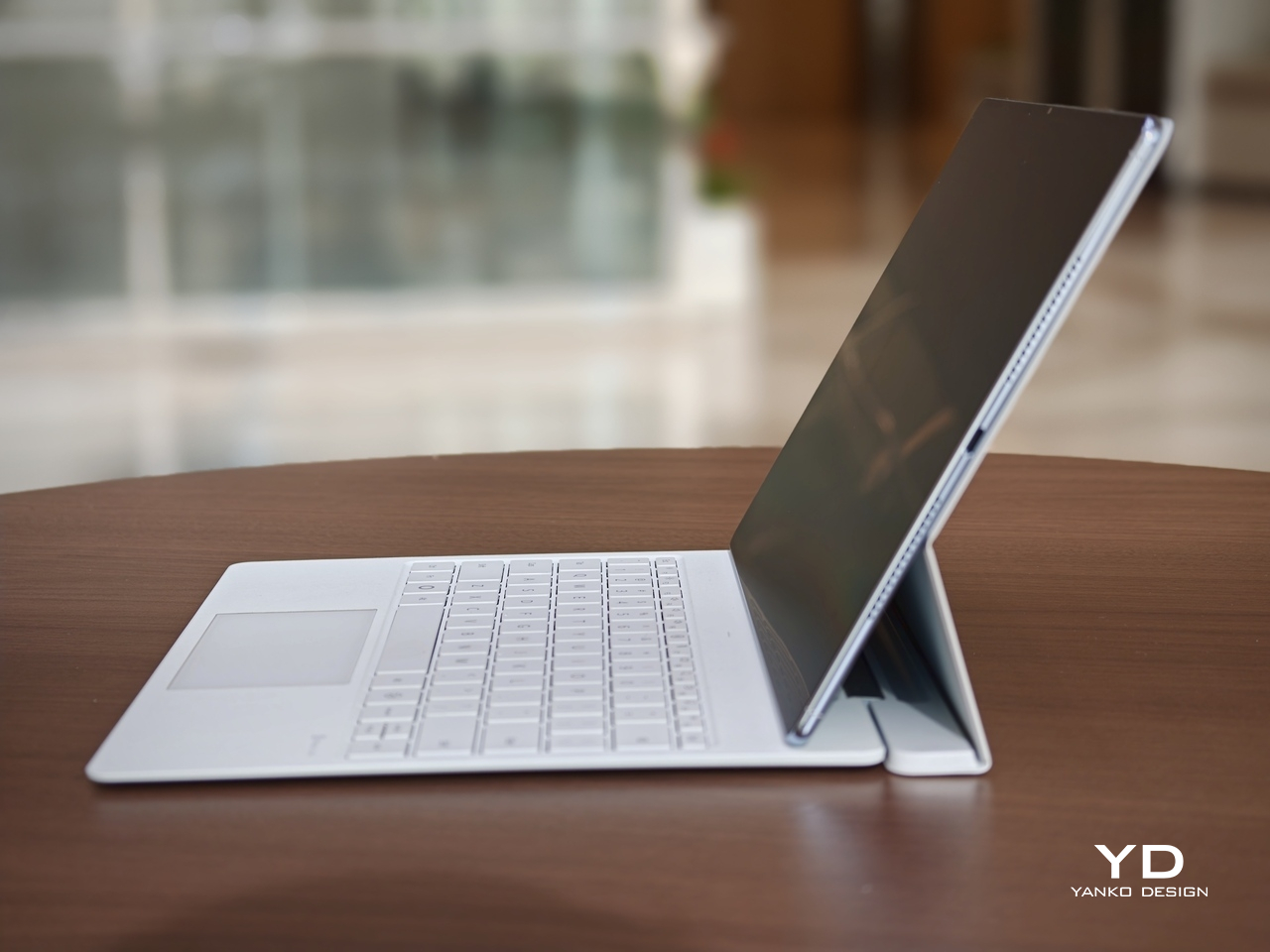
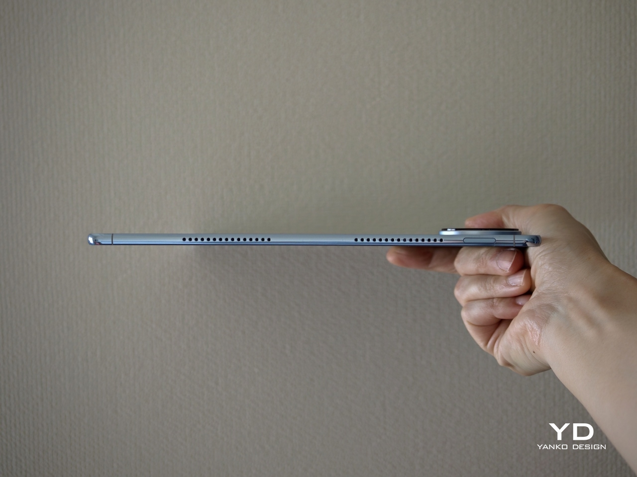
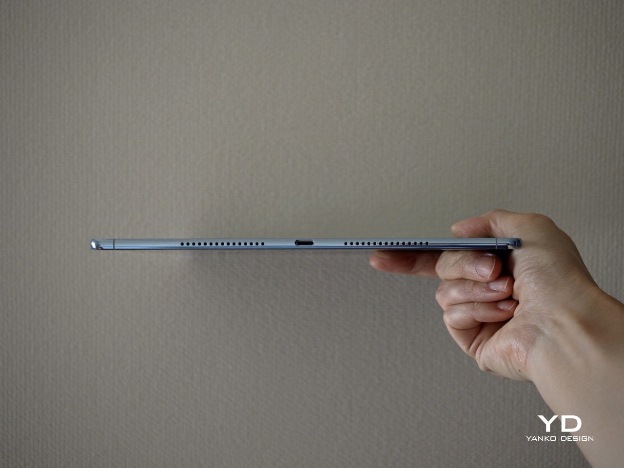
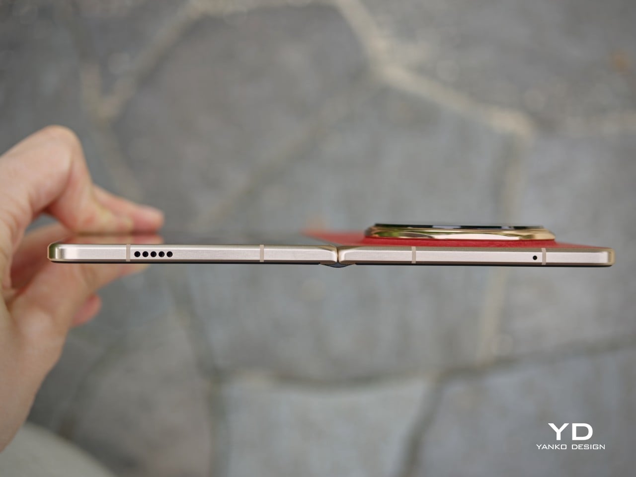
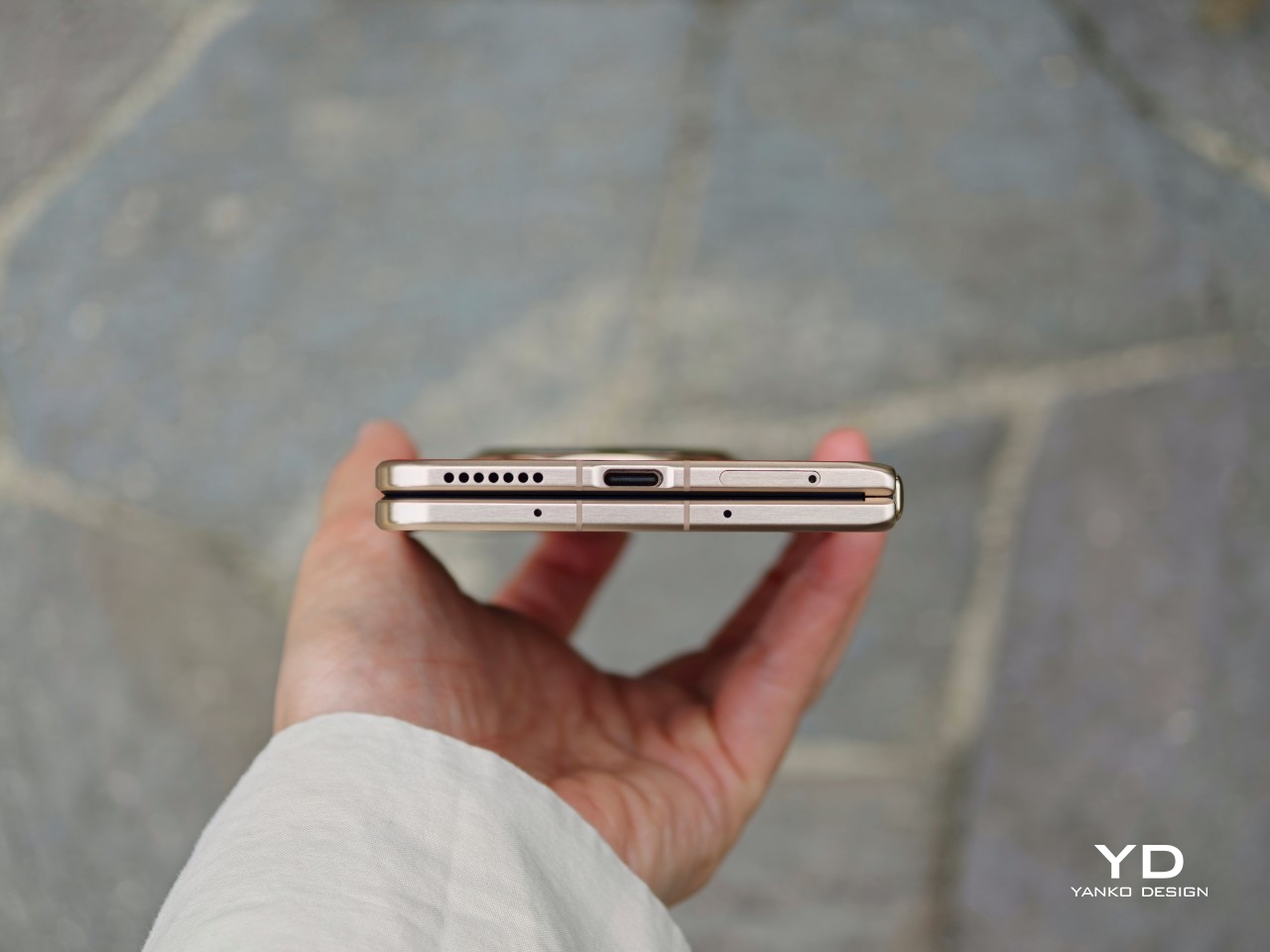
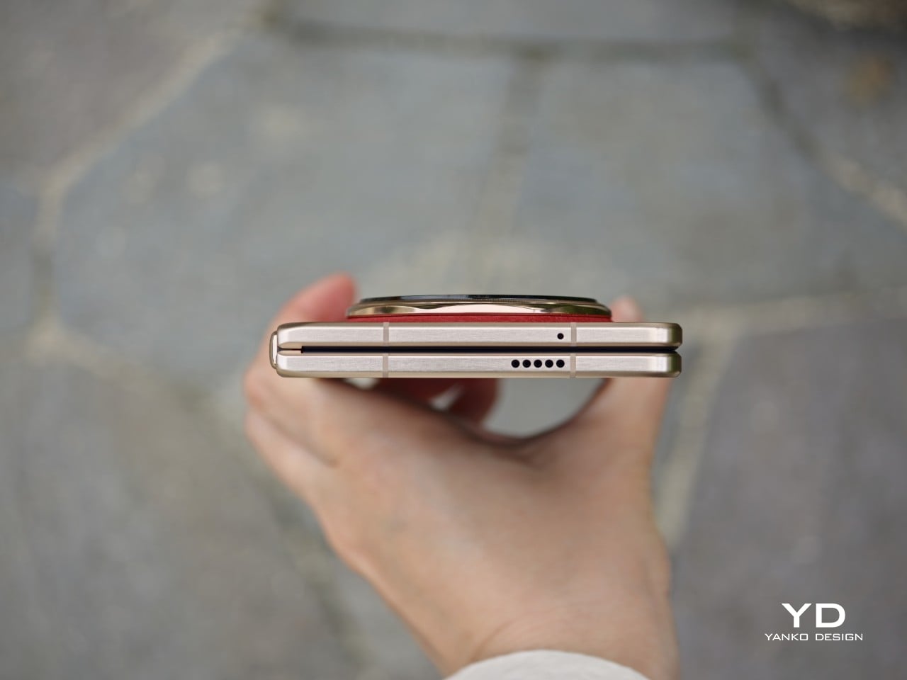
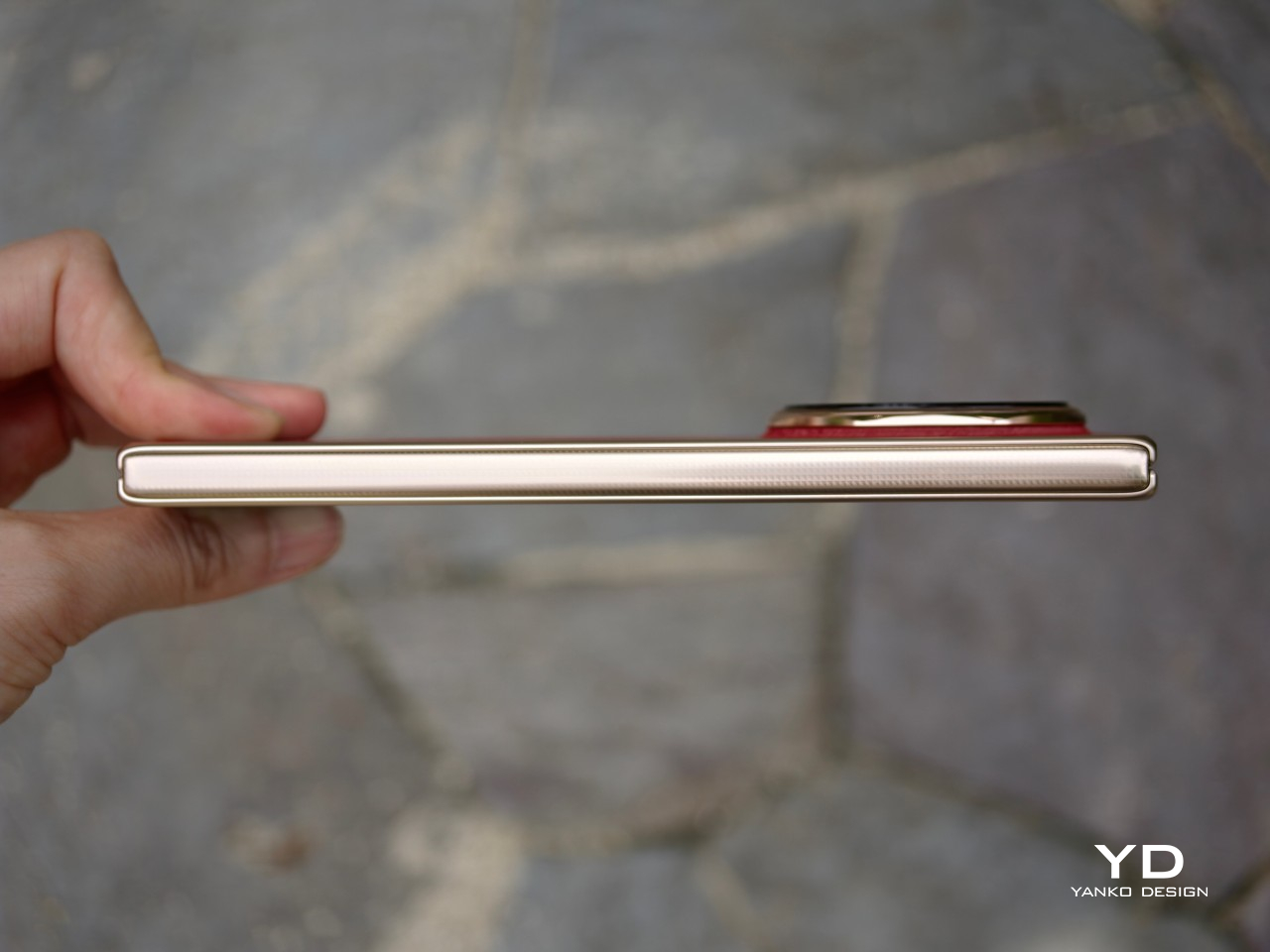
The ergonomics feel more like a refinement of the previous model, and I think that is a good thing. To me, the Magic V5 was already the most ergonomic book-style foldable around, so Honor did not really need to rethink the formula. What it has done instead is rework the internal architecture to fit what is currently the biggest battery in a foldable phone while still keeping the Magic V6 among the thinnest in the category.
There are slight differences depending on the color. The white version is the thinnest and lightest, measuring 156.7 x 74.5 x 8.75 mm when folded and just 4.0 mm when unfolded, with a weight of 219g. The other color variants are slightly thicker at 9.0 mm folded and 4.1 mm unfolded, and they weigh 224g.
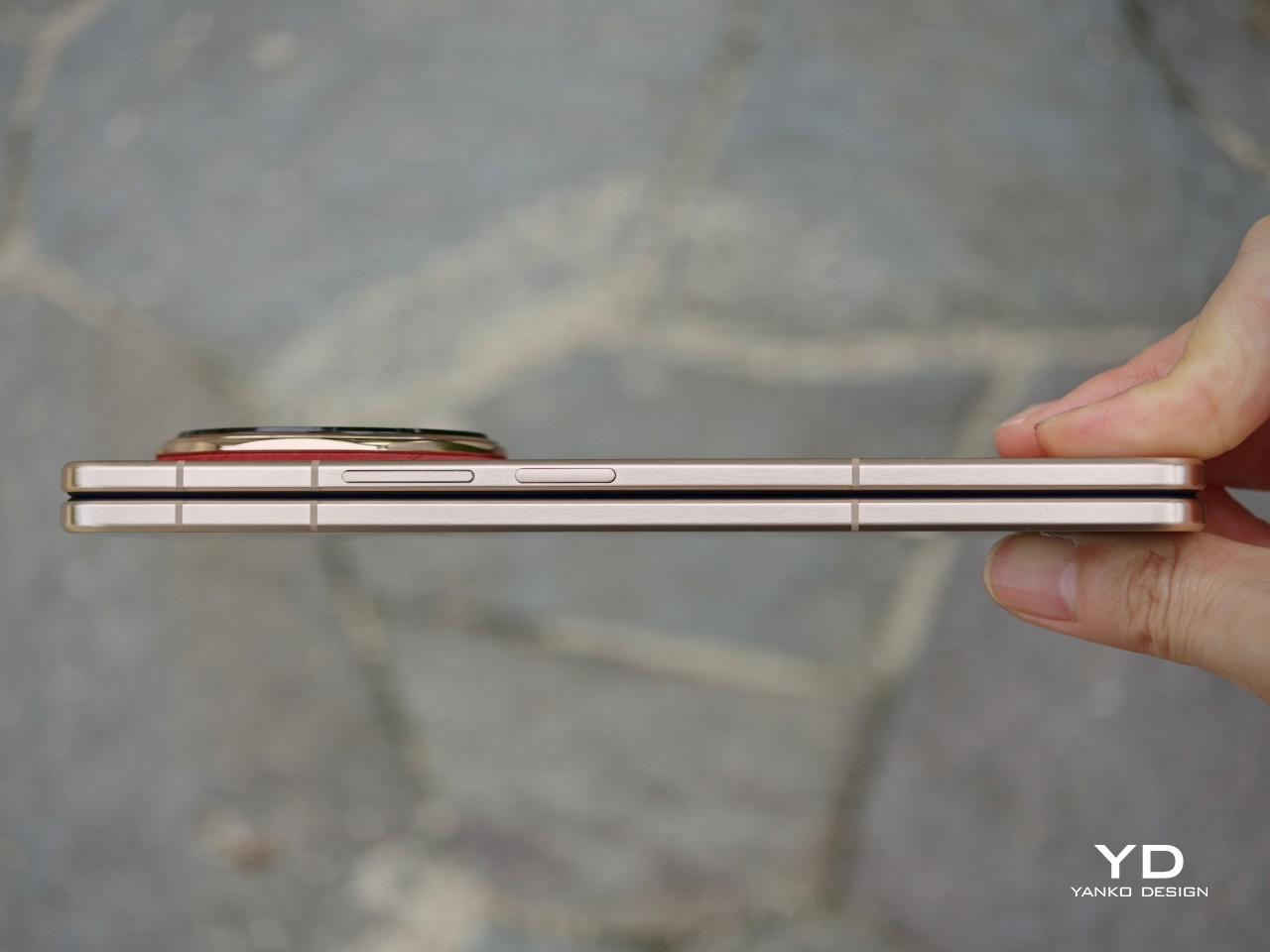
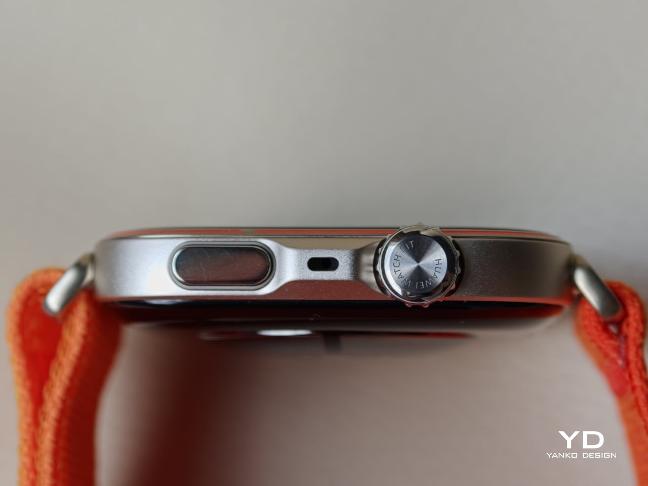
In use, the Magic V6 still feels like one of the most comfortable foldables around. The hinge feels secure and firm, and opening and closing it feels fluid and well-judged. The frame is now flat, but the edges are ever so slightly curved, so it does not dig into your hand. The volume rocker and the power button, which also doubles as the fingerprint scanner, are placed where they are easy to reach. You can also customize the double press on the power button, which is a nice little touch in daily use.
What I like most is that the Magic V6 does not really feel like a typical large book-style foldable when it is closed. Folded shut, it feels surprisingly close to a regular slab phone, which makes it much easier to use casually throughout the day. It is this kind of refinement that makes the Magic V6 so easy to live with day to day.
Performance
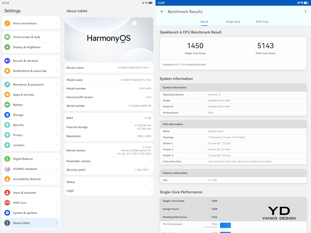
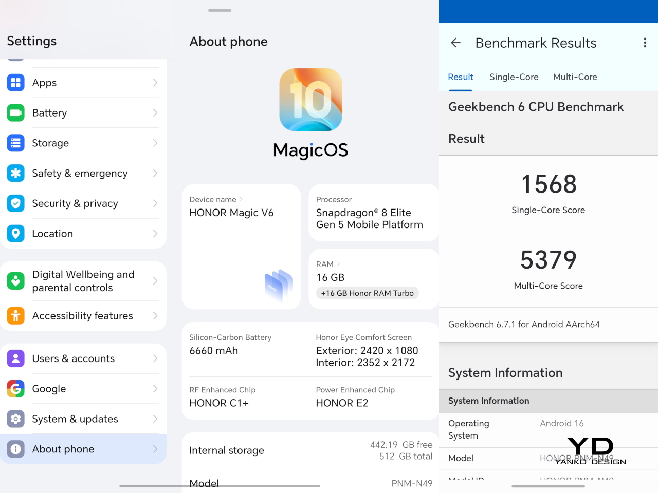
The Magic V6 is powered by the Snapdragon 8 Elite Gen 5, which puts it right where a flagship should be in 2026. It is paired with 16GB of RAM and 512GB of storage, although other configurations are available depending on the market. There is no real issue here with multitasking or with playing demanding AAA titles. Apps open quickly, moving between tasks feels smooth, and the phone has the kind of power that lets the larger display feel properly useful rather than overambitious.
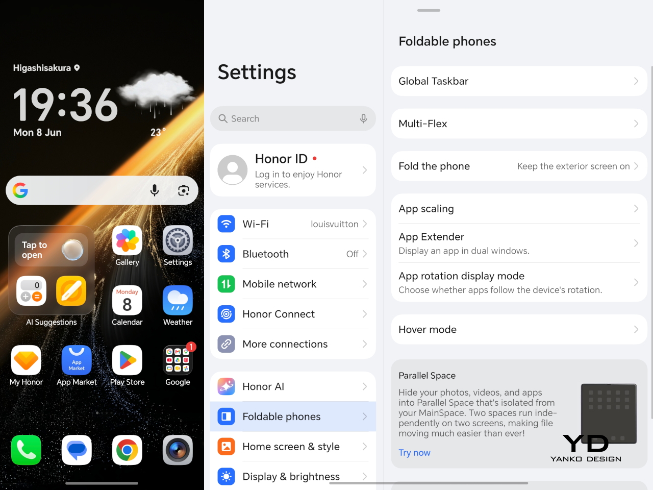
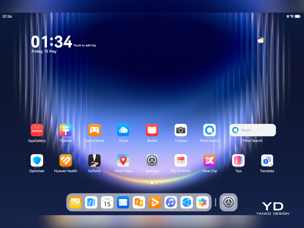
Software is often where foldables either come together or start to feel more awkward than they should. The Magic V6 runs MagicOS 10 based on Android 16, and as with Honor’s recent devices, the focus seems to be on giving users plenty of AI features and cross-platform connectivity. Honor is leaning quite hard into interconnectivity with Apple devices. Using Honor Connect, the Magic V6 supports two-way notification sync with iPhones and iPads, while an Apple Watch can display messages and notifications from both devices. Through Honor WorkStation, the phone can also connect to a Mac and act as an extension of the desktop environment, with support for wireless screen casting, content transfer, and one-tap file sharing, including original-format Moving Photo.

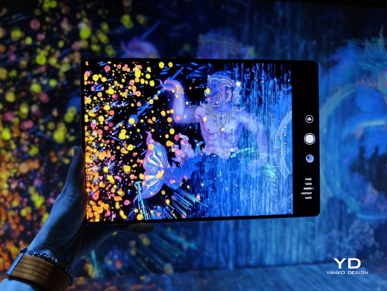
On a foldable, though, the more important question is whether the software makes good use of the larger screen, and here the Magic V6 feels well equipped. Multitasking on the V6 is solid. The inner display gives you enough room to run apps side by side without things feeling cramped, and the phone has more than enough power to keep everything moving smoothly. On a device like this, that matters just as much as raw specs, because a foldable only really makes sense if the larger screen feels genuinely useful in everyday use.
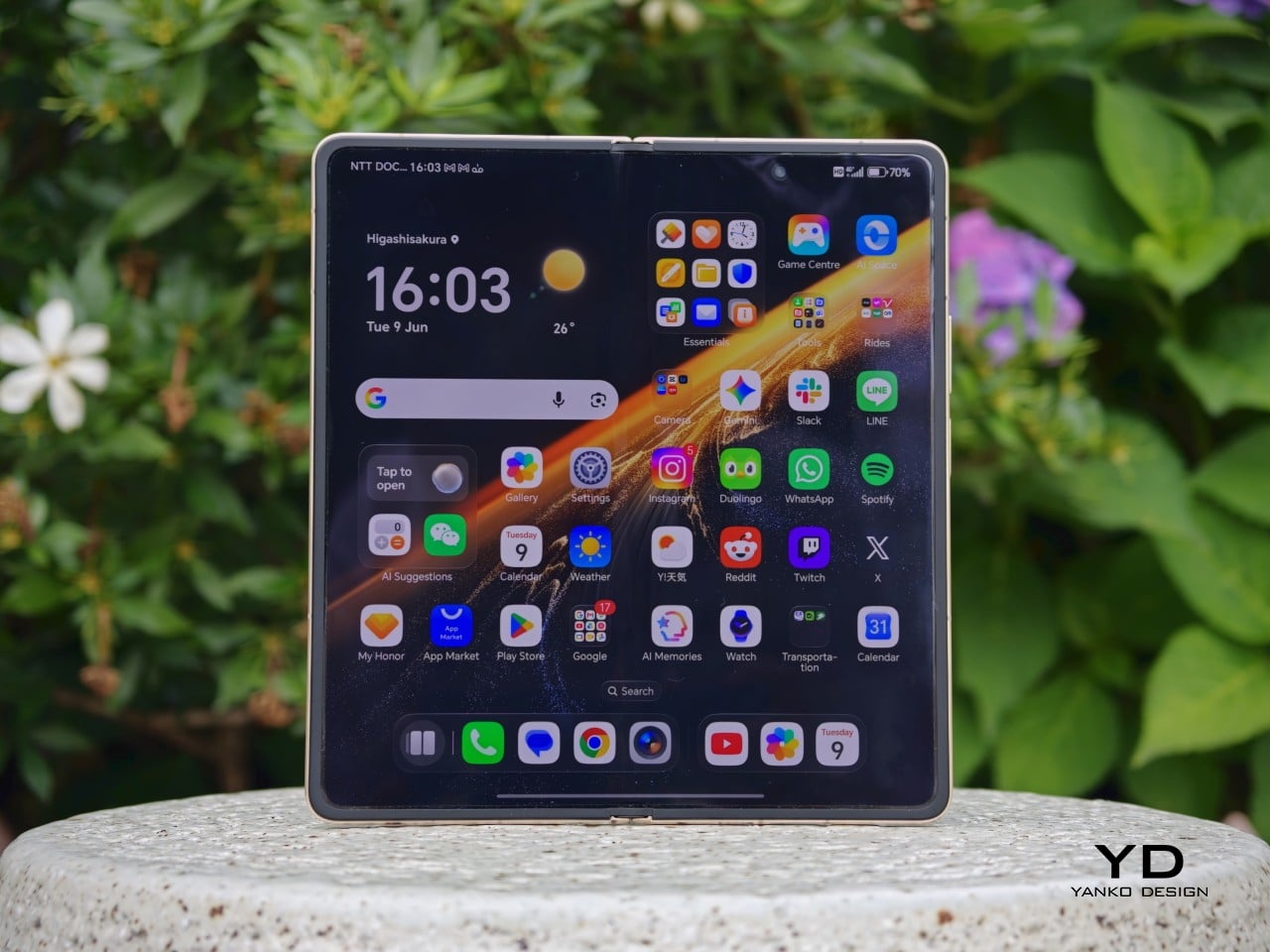
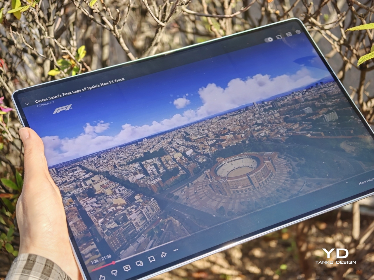
Honor has equipped the Magic V6 with a 6.52-inch 2420 x 1080 AMOLED outer screen and a 7.95-inch 2352 x 2172 AMOLED inner display, and both are vivid, sharp, and fluid. Both panels support a 1 to 120Hz LTPO refresh rate, with up to 5,000 nits on the inner display and 6,000 nits on the outer, alongside eye comfort features such as 4320Hz PWM dimming. In use, the displays are excellent. The crease is barely noticeable, though not quite as invisible as on Oppo’s Find N6. The stereo speakers are also plenty loud and punchy, which suits the phone well for video and games.


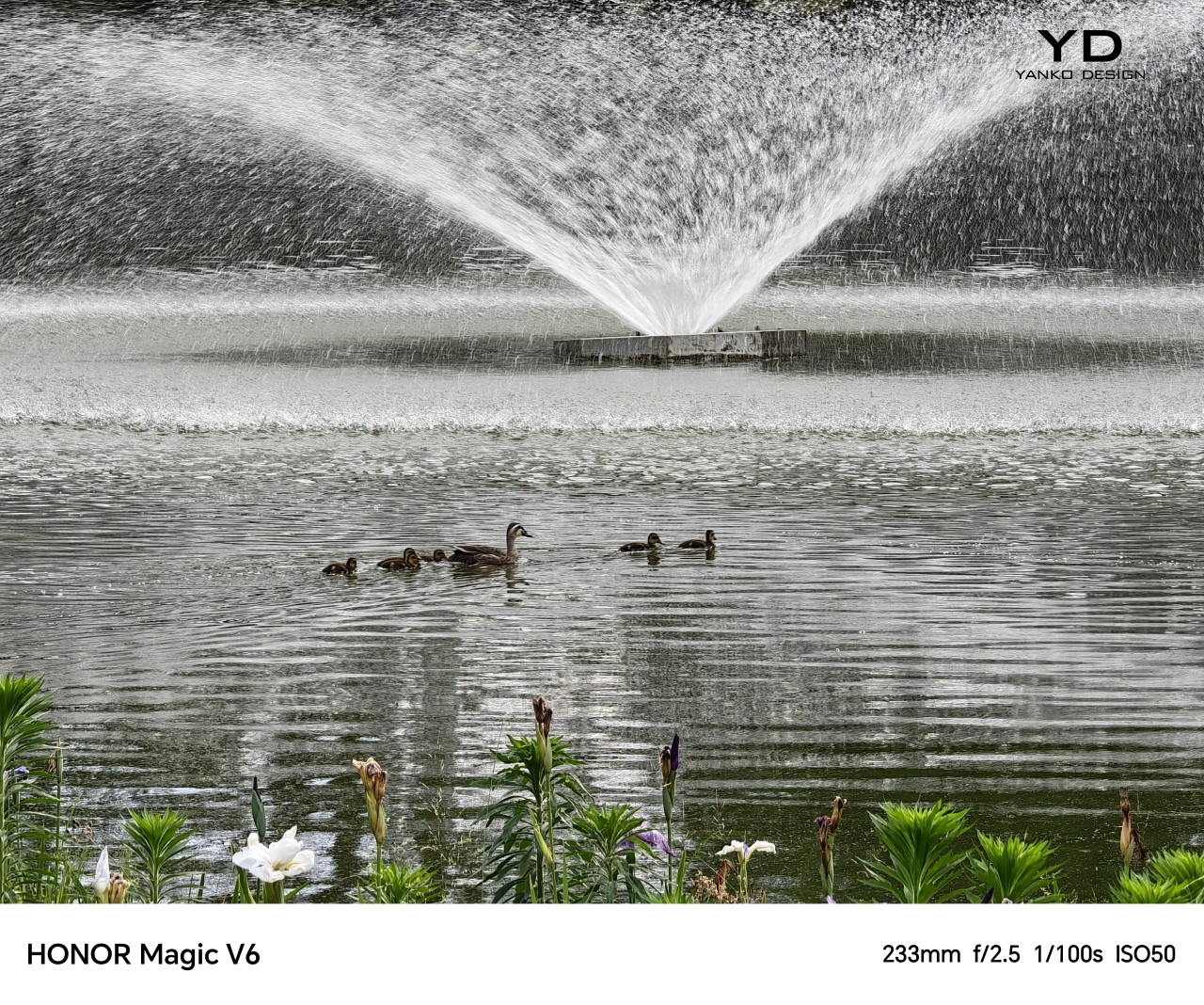
The Magic V6 comes with a 50MP main camera with an f/1.6 aperture and OIS, a 64MP telephoto camera with an f/2.5 aperture, a 1/2-inch sensor, and OIS, and a 50MP ultrawide. On paper, that is a solid setup for a foldable, especially in a category where cameras have often felt like one of the first compromises.
In practice, the main and telephoto cameras are both strong for a foldable. Images come out sharp, colors are pleasing, and the overall look tends to lean a little on the brighter side. The ultrawide is satisfactory, though it does not stand out in quite the same way as the other two cameras.


Battery life is one of the Magic V6’s biggest selling points. Honor has managed to fit a 6,660mAh silicon-carbon battery into a foldable that is still among the thinnest in its class, while the 1TB version in China goes even further with a 7,150mAh battery. That is a huge battery even by slab flagship standards, never mind in a foldable.


Charging is strong too, with support for 80W wired and 66W wireless charging on the global model. A foldable this slim with this much battery capacity and this level of charging support is still unusual, and it is a big part of what makes the Magic V6 feel so easy to trust as an everyday device.
Sustainability
When it comes to foldables, durability can still be a concern for some people. Honor is clearly aware of that. The outer screen uses silicon nitride-based Nano Crystal Shield glass with up to 5,600 ultra-precise coating layers, while the inner display uses UTG flexible glass and is said to be 33 percent more impact resistant than the Magic V5. It is also rated for 500,000 folds.
The Magic V6 also comes with IP68 and IP69 ratings, which is the kind of protection you would more often expect from a slab flagship than a foldable. Honor is also promising seven major OS updates, which helps strengthen the long-term ownership story. What would make that sustainability angle more complete is greater use of sustainable materials, which is still an area where Honor could do more.
Value
Value is always a tricky part of the conversation with foldables because these devices are expensive by nature. No one is buying something like the Magic V6 because it is a bargain. Honor is beginning its wider rollout in Malaysia and Singapore. In Malaysia, the Magic V6 is priced at RM 7,699 for the 16GB RAM and 512GB storage version, which works out to roughly US$1,920 at a simple direct conversion. At that price, it is still very much a premium purchase, but the hardware does a lot to justify it. You are getting a slim and comfortable design, strong performance, large and bright displays, a huge battery, fast charging, and a durability story that feels more complete than what many foldables have offered in the past.
Value still depends on what you want from a foldable. If battery life, ergonomics, and high-end hardware matter most to you, the Magic V6 makes a very strong case for itself. If software polish is your top priority, some rivals may still feel a little more mature. Even so, the Magic V6 feels like a foldable that gives you a lot of substance for the money, not just novelty.
Verdict
The Magic V6 feels like Honor refining a formula that was already working well. It does not try to reinvent the book-style foldable, but it improves on the parts that matter most. The design still has personality, the ergonomics are excellent, the displays are strong, and the battery is genuinely standout for this category. The main and telephoto cameras are also better than what many people might expect from a foldable, which helps round out the overall package.
It is not without a few caveats, though. The software still does not feel quite as polished as the very best in the category, and the price places it firmly in ultra-premium territory. Even so, the bigger picture is very easy to like. If you want a foldable that feels slim, practical, powerful, and unusually easy to live with, the Magic V6 makes a very convincing case for itself.
The post Honor Magic V6 Review: Big battery, slim body, refined experience first appeared on Yanko Design.