PITAKA Is Letting the World Design Its Next Phone Cases, Royalties Included. Here’s How To Participate

Tech accessories have hit a curious inflection point. The last year trained us to worship thinness and glass, but somewhere between the tenth identical ‘Air’ or ‘Edge’ smartphone and the fifteenth glossy case, a countermovement quietly took root. Texture matters again. Grip, weave, and tactile identity are no longer afterthoughts, they’re the differentiators that keep objects from sliding into the sea of sameness. PITAKA, a brand built on aerospace-grade aramid fiber and what it calls “fusion weaving,” has spent years proving that phones don’t have to feel like jewelry-store display pieces. Now, with the launch of “Weave the Next, Weave Our World,” the company is turning that philosophy outward, inviting designers worldwide to imagine the surfaces and visual languages that will define the next generation of tech we carry, hold, and interact with every day.

Launching April 24th, 2026, the competition is framed explicitly around the intersection of technology and art, which is less marketing speak and more PITAKA’s operational DNA. The brand’s cases have always leaned hard into material science, using woven aramid fibers (the same stuff in bulletproof vests and aircraft components) that are five times stronger than steel and a fraction of the weight. But strength alone doesn’t sell. What makes PITAKA cases notable is the texture vocabulary they’ve developed over years of refining weave patterns, experimenting with 600D and 1500D aramid densities, and pushing techniques like “fusion weaving,” where multiple patterns coexist on a single loom to create intricate, layered surface designs. “Weave the Next, Weave Our World” extends that exploration beyond the company’s internal design studio and into the hands of students, professionals, and independent creators who might see texture, pattern, and tactility from entirely different cultural or aesthetic starting points.

Click Here to Submit Now. Hurry, Competition Ends: May 25, 2026.

The Brief

Nordic Knit Dream

Drifting Shadows

PITAKA’s “Weave the Next, Weave Our World” global design competition invites designers to create texture and visual language systems for the brand’s future product series, positioned explicitly at the intersection of technology and art. Participants choose from four thematic directions: “These Moments,” which captures the raw beauty and shifting rhythms of the natural world; “Timeless Threads,” weaving stories of culture, memory, and human journeys; “Beyond Tomorrow,” exploring visionary futures where innovation reshapes daily life; or “Roots of Rhythms,” celebrating the textures, symbols, and spirit born from each land’s heritage. The competition aims to explore emerging global trends in tactile and visual design, strengthen PITAKA’s art-tech identity, and potentially commercialize winning designs through royalties, co-branding, and official recognition.

How To Participate

  1. Visit the official competition website or Dribbble page to submit your entry
  2. Provide participant information and upload your texture designs
  3. Include a written design explanation with your submission
  4. Entries will be evaluated through a combination of professional jury review and public voting
  5. Winners will be announced and showcased in an online exhibition

Competition Dates

  • Competition Launch: April 24, 2026
  • Submission Period: April 24 – May 25, 2026
  • Judging Period: May 26 – May 31, 2026
  • Winners Announcement: June 9, 2026

Jury Panel

  • Qiongzhi Xie (Artist; Founder of Daxing Jizi Studio)
  • Matteo Menotto (Head of Design, Prints & Textile Accessories at Bulgari)
  • Sarang Sheth (Editor-in-Chief, Yanko Design)
  • James (Founder / CEO, PITAKA)

Important Information

The most compelling entries are likely to do three things at once:

  1. Treat texture as a system, not a single image
    PITAKA’s products live across multiple form factors, so a strong entry will propose a visual/tactile system that can scale and adapt, not just a one-off pattern.
  2. Anchor the concept in one of the four themes without being literal
    “These Moments” does not need a photo-real print of a wave; “Roots of Rhythms” does not need a direct copy of a folk motif. Abstraction, distillation, and translation into a tech-accessory context will matter.
  3. Consider manufacturability and user experience
    Even in a speculative competition, the jury includes industrial design and brand leadership. Textures that look stunning in render but collapse in real material or feel uncomfortable in hand will likely be deprioritized.

If you already experiment with materials, parametric patterns, or culturally rooted visual systems, “Weave the Next, Weave Our World” is essentially an invitation to push that work into a space where it might actually ship.

Click Here to Submit Now. Hurry, Competition Ends: May 25, 2026.

Click Here to Submit Now. Hurry, Competition Ends: May 25, 2026.

The post PITAKA Is Letting the World Design Its Next Phone Cases, Royalties Included. Here’s How To Participate first appeared on Yanko Design.

Lymow One Plus Review: The Tank Got an Engineering Degree

PROS:


  • LiFePO4 battery rated 2,000+ cycles outlasts all lithium-ion competitors

  • Heated cameras eliminate morning fog and dew navigation issues

  • 1,785W motor handles thick, wet, overgrown grass without bogging

  • Cyclone Airflow deck lifts flattened grass for a cleaner cut

  • Self-cleaning tracks and redesigned hub motors reduce long-term maintenance

CONS:


  • Blades, batteries, and chargers not cross-compatible with Gen 1

  • Pre-order starts at $2,699, $300 more than the Gen 1 launch price

RATINGS:

AESTHETICS
ERGONOMICS
PERFORMANCE
SUSTAINABILITY / REPAIRABILITY
VALUE FOR MONEY

EDITOR'S QUOTE:

The Lymow One Plus is the robot mower that finally makes traditional mowing obsolete.

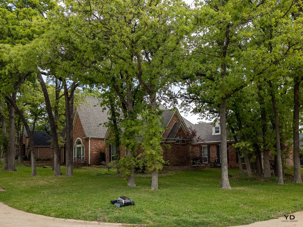
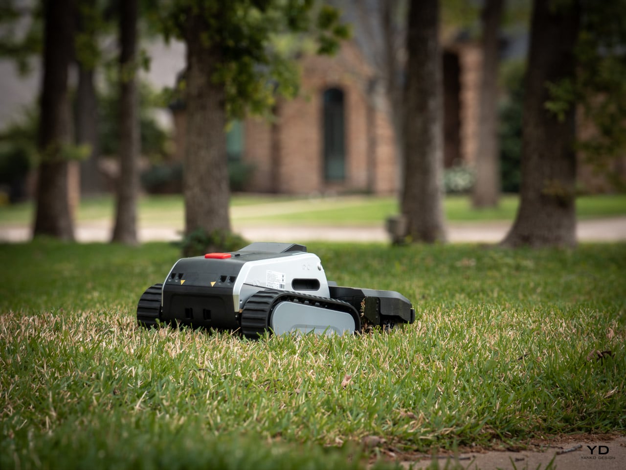
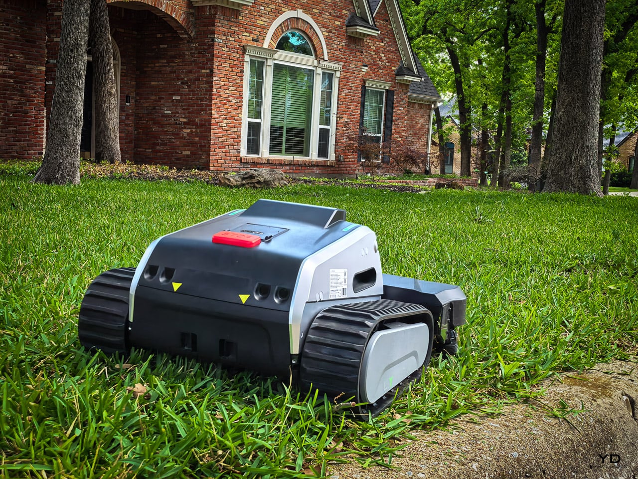
When I reviewed the original Lymow One last August, I called it nimble, powerful, and reliable. It was the first robot mower I had tested that did not just shave my lawn with tiny razor discs. It actually mowed. Real rotary blades, tank treads, and the kind of cutting power that could handle thick St. Augustine grass without flinching. On my property, with 32 massive oak trees creating GPS dead zones and physical obstacle courses that make other robot mowers throw in the towel, the Lymow One earned its spot.

But first-gen hardware always comes with rough edges. The bottom-mounted charging contacts turned into mud magnets. The cameras fogged up during early morning dew. If you cranked the speed to maximum in a treed section, this thing would literally try to climb the trunk. I learned that lesson the hard way. It is those exact war stories that made the mapping and setup process for this new One Plus the very first thing I scrutinized. I began by mapping my 6,777 square foot property via the app, which serves as the foundation for the performance results that follow.

Designer: Lymow

Click Here to Buy Now: $2699 $2999 ($300 off). Hurry, deal ends in 48-hours!

Lymow collected feedback from the entire first production run and, instead of shipping a minor refresh, completely re-engineered the machine for its CES 2026 debut. The result is the Lymow One Plus: same tank-track DNA, same dual rotary blade philosophy, but with targeted fixes for every friction point Gen 1 owners identified. I have been running the One Plus on the same property, same 32 oaks, same slopes, and same thick grass, for several weeks now. This is not a fresh review. It is a direct continuation from someone who knows exactly where the Gen 1 fell short.

How I’m Testing the Lymow One Plus

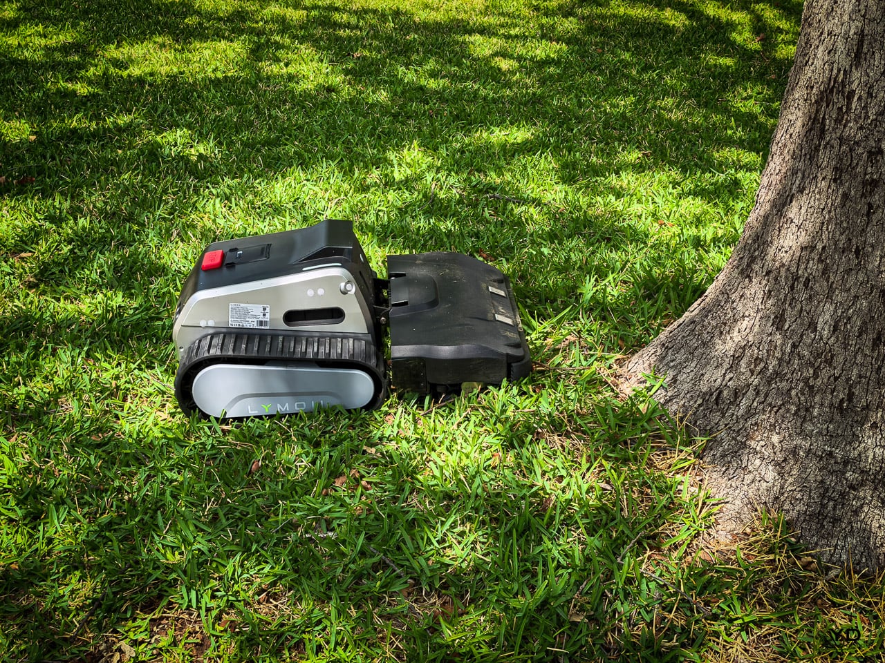
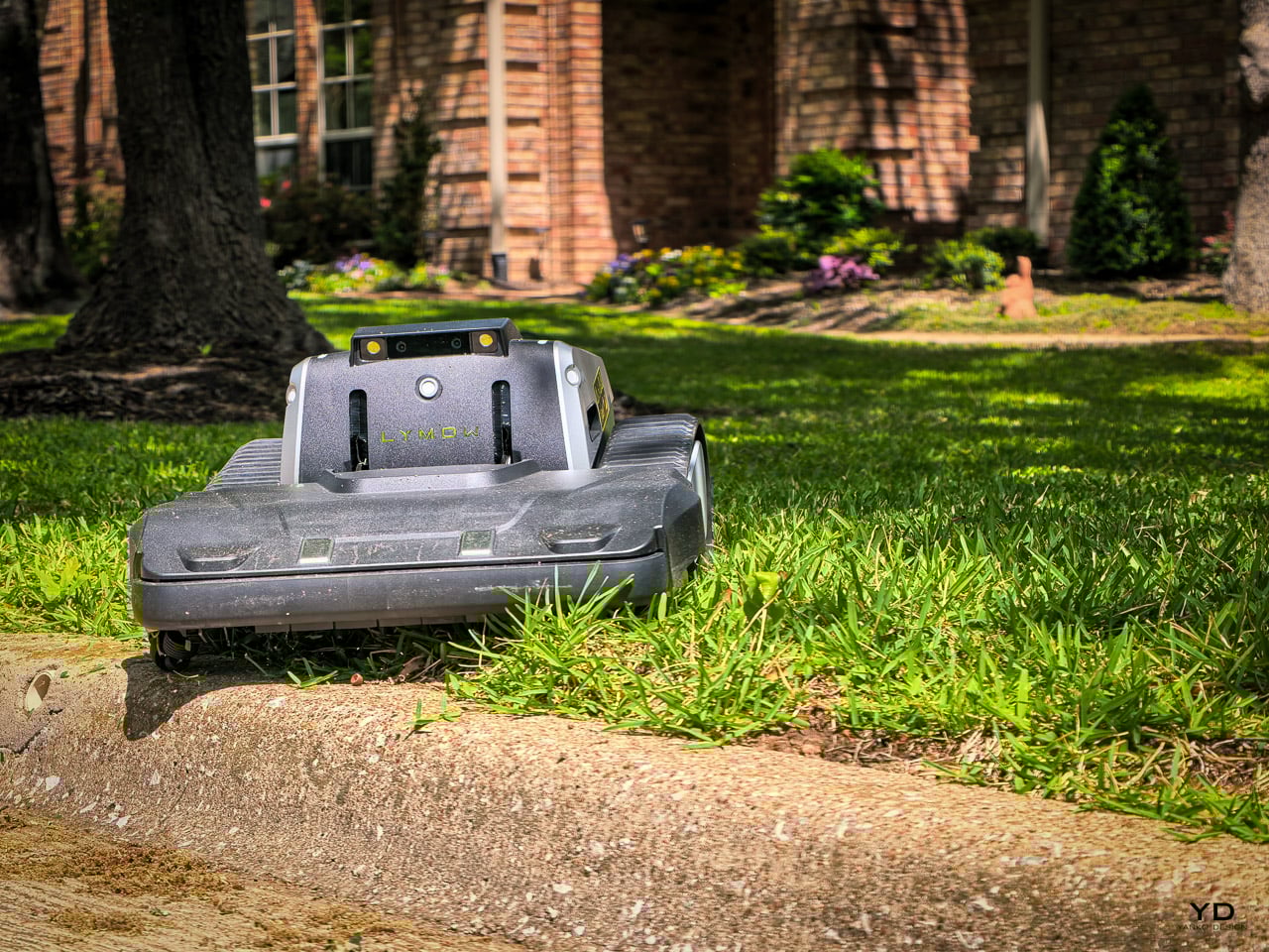
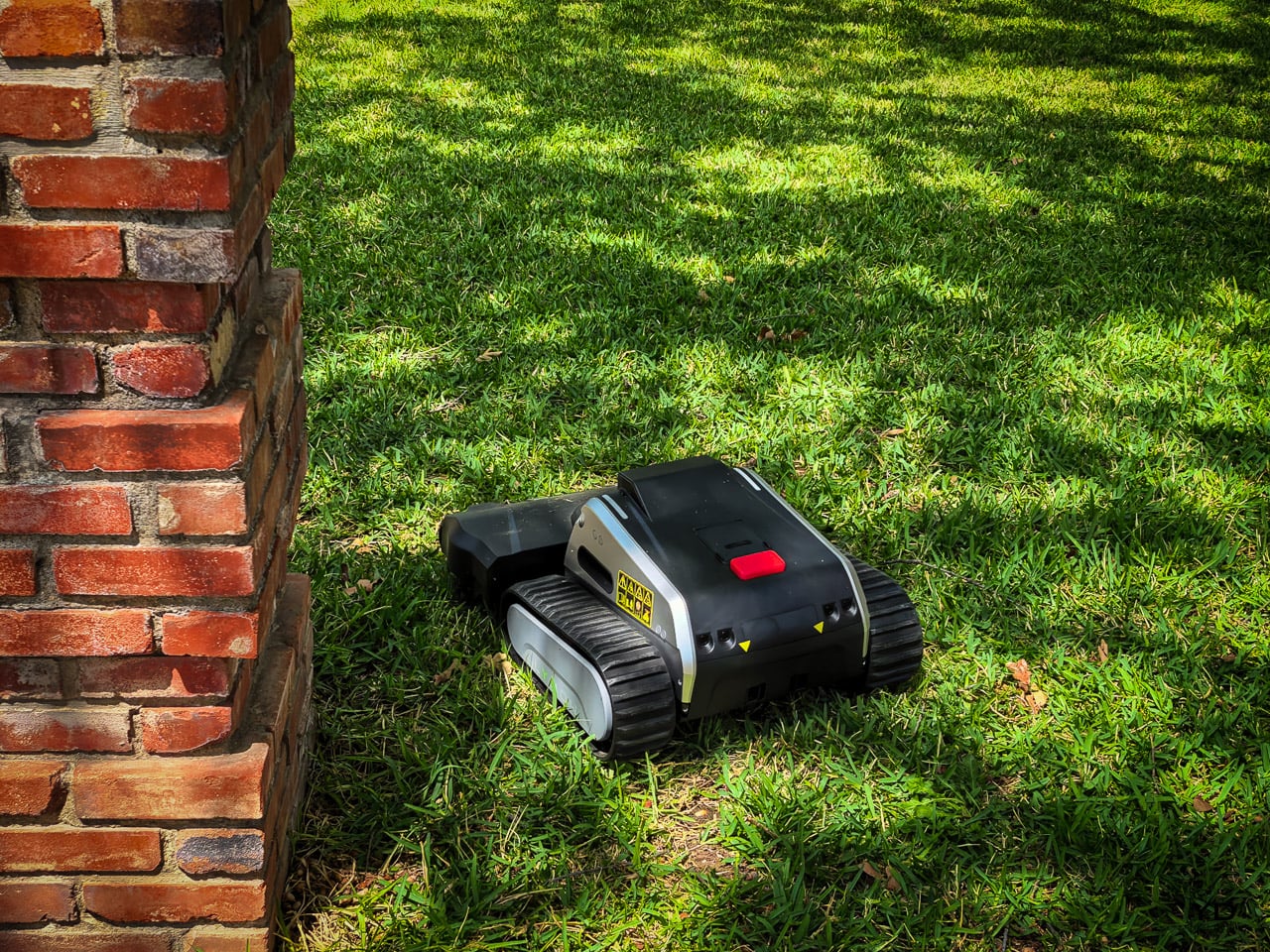
To give this mower a proper workout, I started with the wire-free setup and mapping process. Since this system does not require a perimeter wire, the initial installation is relatively straightforward. I began by driving the mower like a remote-control car to define the boundaries of my 6,777 square foot property, which served as the foundation for the weeks of testing that followed. My test property in central Texas features 32 mature oak trees that create GPS dead zones across roughly half the yard and exposed root systems that have defeated every wheeled robot mower I have tested.
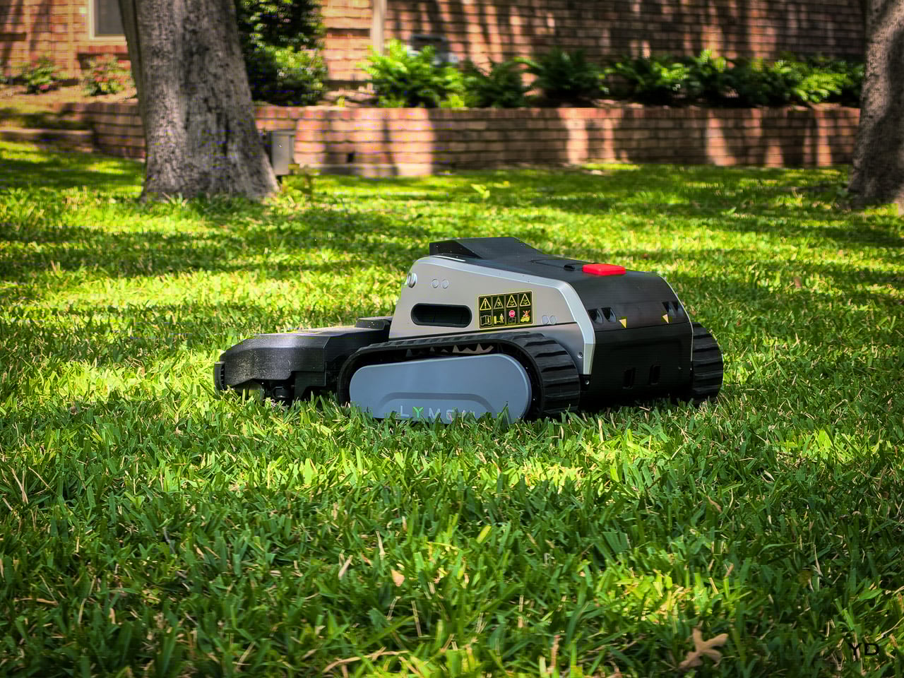
Design/Ergonomics

The transition from a traditional mower to a robot requires a shift in how you think about your yard. As I noted in my original Lymow One review, the setup is the most critical part of the user journey. For this review, I mapped my 6,777 square foot property entirely via the app.

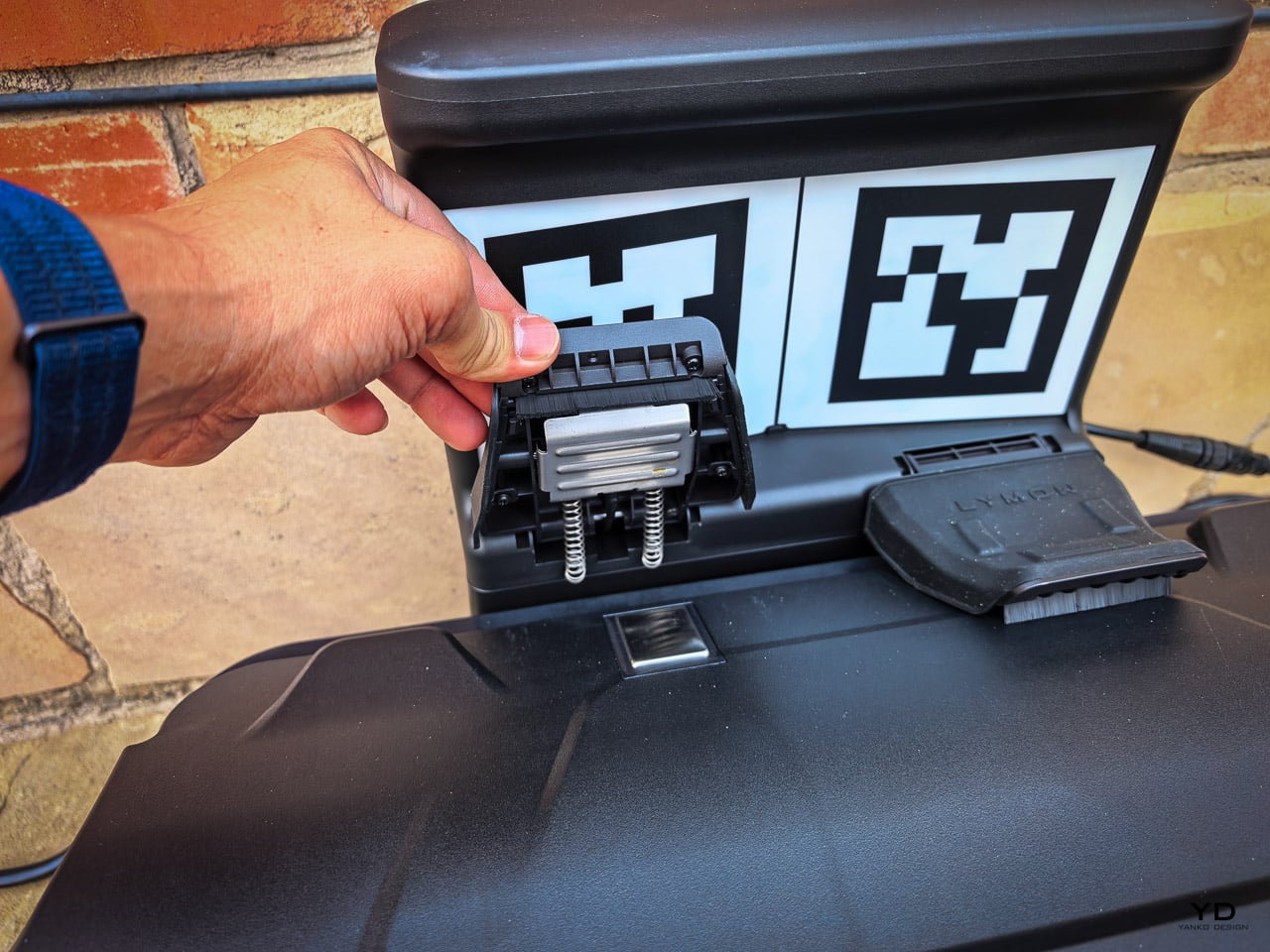
LySee 2.0: The Cameras Can Finally See in the Morning

My property is the worst-case scenario for robot mower navigation. Thirty-two mature oaks with canopies thick enough to block satellite signals across half the yard. The original Lymow One’s RTK-VSLAM hybrid handled this better than any GPS-only mower I had tested, seamlessly handing off between satellite positioning in the open sections and visual navigation under the canopy. The transition was nearly invisible.

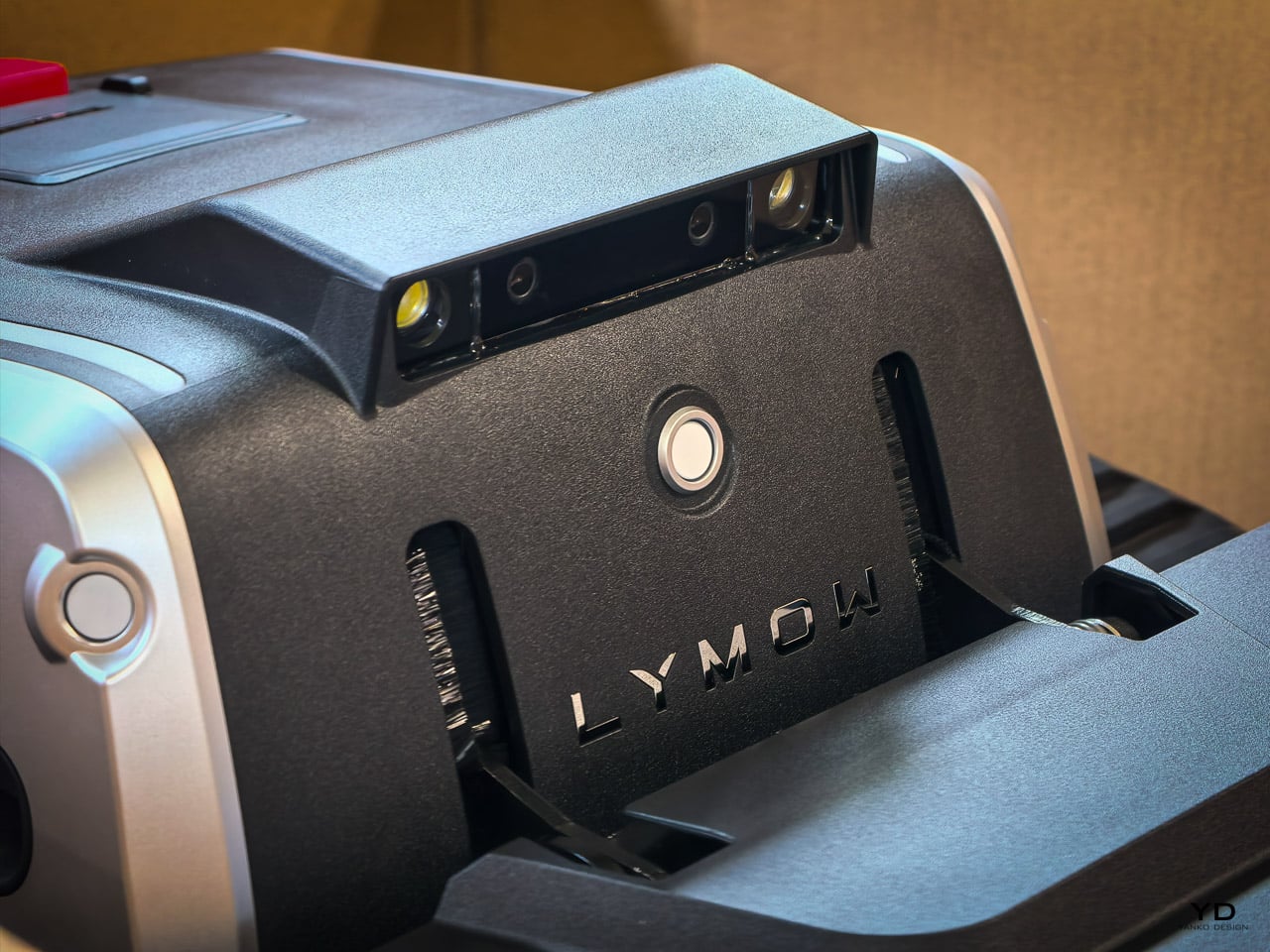
The weak spot was early morning. Texas humidity and morning dew would fog the stereo cameras during those pre-dawn sessions, and the visual system would degrade until the lenses warmed up. I noticed occasional “drift” under the heavy canopy during early runs that corrected itself once the sun burned off the moisture.

The One Plus addresses this directly with integrated heating elements in the camera housings. The lenses maintain a temperature above the dew point. This prevents condensation from forming in the first place. During my testing, the cameras stayed clear even in high humidity conditions.

The obstacle avoidance system has undergone extensive training to improve its real-world performance. Instead of just identifying objects, the mower now uses a combination of AI vision and ultrasonic sensors to determine how to handle obstacles. For smaller items like garden hoses or sprinkler heads, the AI recognizes the object and steers clear. For more complex terrain challenges like large oak roots or uneven ground, the ultrasonic sensors provide precision distance data that allows the mower to navigate the crossing safely without getting stuck. While the cameras identify everything from yard clutter to pets, it is important to note that all image processing happens locally on the mower. No video data is sent to the cloud, providing a layer of privacy for your home.

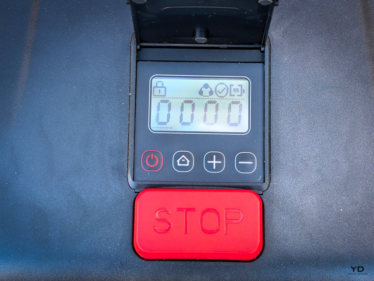
Interactive Status Display

The One Plus features a built-in LCD screen that provides real-time status updates directly on the machine. By separating this display from the LySee camera system, Lymow has made it easier to check battery levels, connection status, and current operation modes at a glance without needing to pull out your phone.

Heated cameras are not something you can isolate in a single controlled test. Fog, dew, and humidity vary day to day, and the real proof shows up over weeks of early morning sessions, not one dramatic before-and-after. I will be updating this section as I accumulate more pre-dawn runs throughout the spring, comparing the One Plus’s FPV clarity and navigation confidence to what I experienced with the Gen 1 under similar conditions. Obstacle avoidance around oak roots, garden hoses, and yard clutter will get the same ongoing treatment. Check back for updates as testing continues.

Performance

LyCut 2.0: The Blades Got Meaner, the Deck Got Smarter

The original Lymow One ran a 1,200W peak motor that I praised for tackling thick St. Augustine at my preferred 3,000 RPM “slow and steady” setting. At that speed, the blades cut clean and the yard looked professional. Crank it to 6,000 RPM for quick touch-ups and the power was there when I needed it.

The One Plus bumps peak power to 1,785W. That is a 50% increase, and the practical difference shows up in the worst-case scenarios: dense spring growth that has not been cut in two weeks, wet grass that clumps and resists cutting, or the thick patches near the base of my oaks where grass grows wild between root systems. The Gen 1 could handle most of this. The Gen 2 should handle all of it without the blade speed dropping under load.

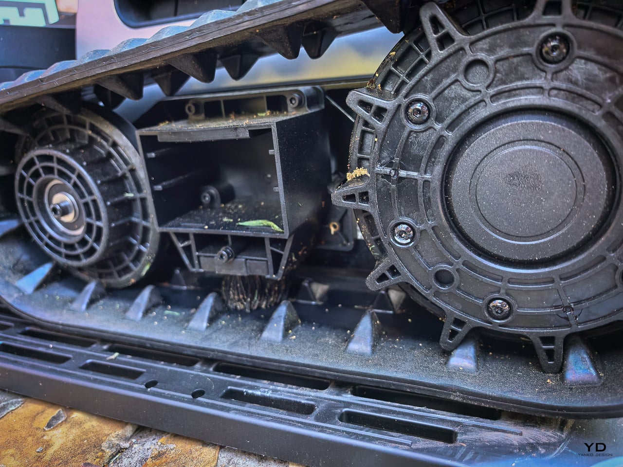
But the bigger story is the new Cyclone Airflow system in the LyCut 2.0 deck. The original cutting deck was a standard floating dual-rotary setup. It worked, but “laid-over” grass, which are blades bent flat by foot traffic, rain, or the mower’s own tracks, would sometimes pass under the blades uncut. You would see patches where the grass was creased but not trimmed.

The redesigned deck creates a vacuum effect that pulls flattened grass upright just before the SK5 steel blades make contact. It is the difference between cutting what is standing and cutting everything. The blades themselves remain the same SK5 tool steel with 50 HRC hardness, now backed by a floating cutting deck that adapts to terrain variations independently from the chassis. Cutting height stays adjustable from 1.2 to 4.0 inches, and the 16-inch width covers serious ground on each pass.

I ran my usual test: I walked a grid pattern across a section of thick St. Augustine to flatten it, then sent the One Plus through. The Gen 1 would leave visible creased patches where the grass had been pushed flat by foot traffic. You would see these sad little stripes where the blades passed right over without cutting. The One Plus left a noticeably cleaner finish on the same test. It is not perfect, because nothing short of a reel mower handles fully matted St. Augustine flawlessly, but the improvement is real. The worst laid-over patches that the Gen 1 would completely miss now get at least partially caught. You can see the airflow pulling blades upright before the cut happens if you watch closely from the side.

What Early Adopters Reported (and What I Actually Found)

Three issues surfaced consistently in early 2026 user feedback: pathfinding “world tours” where the mower takes massive detours between zones, tread scuffing on wet turf during multi-point turns, and an app refresh bug that requires force-closing to see updated battery percentages. I went looking for all three. None of them showed up.

The One Plus navigated between my front and back yards through the narrow side channels without any detours or wasted battery. This model introduces significantly expanded multi-zone capability, allowing you to manage and customize up to 80 or more distinct zones. This is a major plus for complex properties with isolated grass patches or different landscaping requirements. You can set specific schedules and cutting heights for each area individually, which gives you much more granular control than the previous generation.

Tread scuffing was not an issue either. I ran multi-point turns on wet St. Augustine after morning rain, which is the exact scenario early adopters flagged, and saw no tearing or lasting marks. The tracks compress the grass temporarily, but it bounces back within a few hours. On established turf, this is a non-issue.

The app refresh bug is the only one I cannot fully rule out yet. I have not encountered it personally, but I also have not been obsessively checking battery percentages mid-session. I will keep an eye on it, though so far the app has shown accurate, real-time status every time I have opened it.

Sustainability

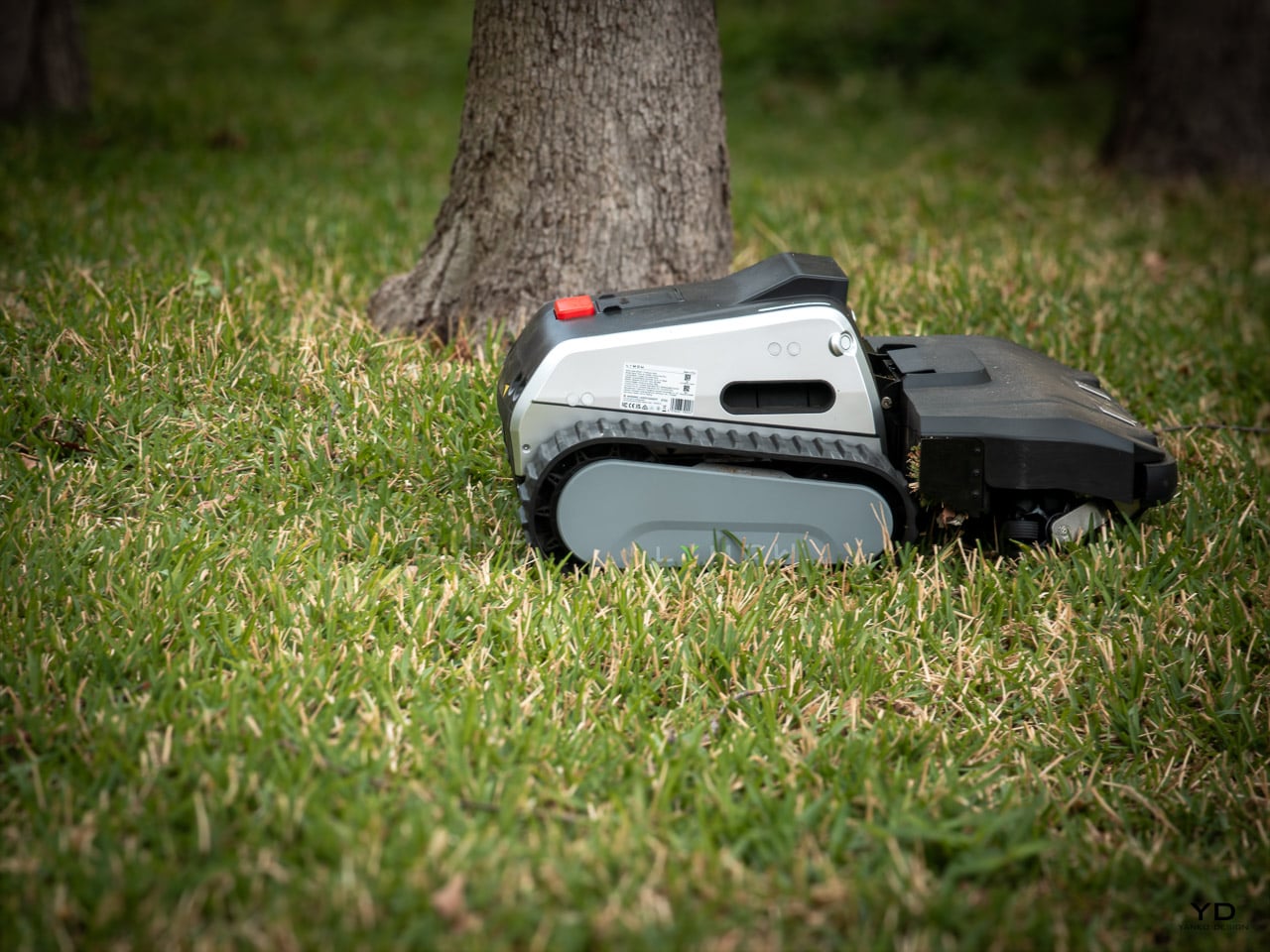
Self-Cleaning Tracks and Motors Built for the Long Haul

The original Lymow One’s tank treads were its signature feature and they performed exactly as advertised on slopes, roots, and uneven ground. However, over months of daily use, grass clippings and small gravel could accumulate inside the wheel wells. While not catastrophic, this was a maintenance item that added up and was reported by Gen 1 owners as a source of mechanical strain on the hub motors.

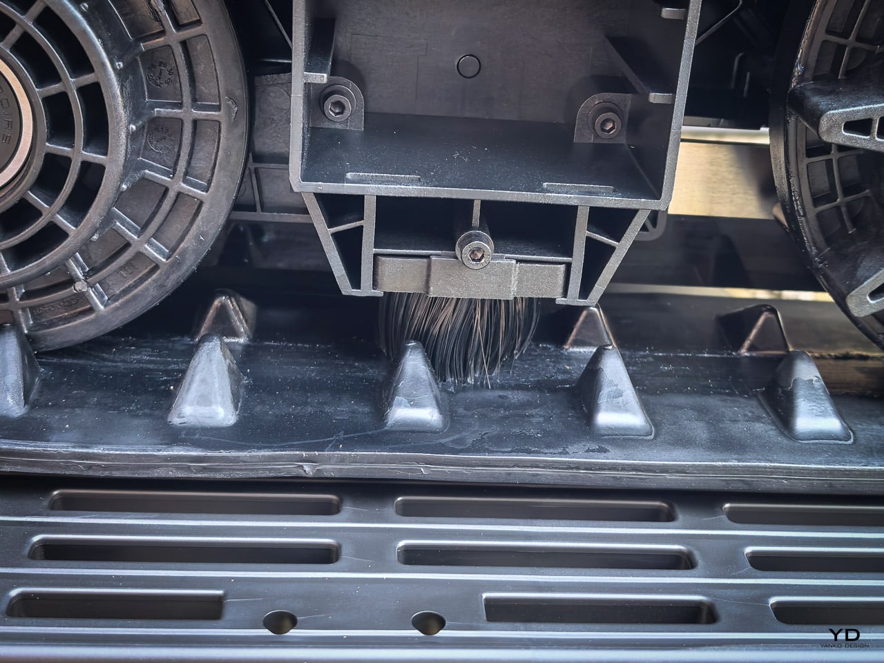
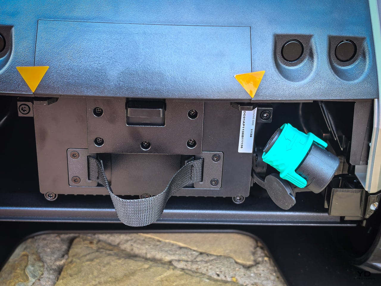
The One Plus addresses these concerns with self-cleaning side brushes that sweep debris out of the wheel wells during operation and a detachable track cover that allows for deeper cleaning without tools. Most importantly, Lymow completely redesigned the drivetrain with more robust motors. These improved hub motors feature 200% higher rigidity, meaning they are built to handle the constant stress of climbing 45-degree slopes without the mechanical fatigue that could shorten the lifespan of the machine. In my testing on steep embankments, the drive system felt noticeably more stable and sounded smoother under load.

The Efficiency of the 5A and 10A Fast Chargers

While the 5A charger serves as a more affordable entry point, covering approximately 1.1 acres per day, the high-performance 10A fast charger is the standard for those with larger properties. The 10A unit refills the LiFePO4 battery (15,000 mAh) from 10% to 90% in about 90 minutes. This allows for up to three mowing cycles per day, covering a total of 1.73 acres. Providing both options gives users the flexibility to choose the setup that best fits their yard size and budget.

The LiFePO4 chemistry remains the same, which is the right call. Standard lithium-ion batteries start losing meaningful capacity after two to three years of daily cycling. LiFePO4 at 2,000+ cycles means the battery should outlast the useful life of the machine. At $2,899, knowing you will not face a $500 battery replacement in year three is a real cost of ownership advantage.

The operating temperature range is also worth noting. It allows for 1 degree F to 134 degrees F for discharge and 37 degrees F to 134 degrees F for charging. That covers everything from an early spring morning to a Texas August afternoon without battery management concerns.

Value/Verdict

Is the One Plus Worth It

At a starting pre-order price of $2,699 for the 5A version, which sits $300 above the Gen 1’s launch price, or $2,899 for the 10A model, the Lymow One Plus brings substantial hardware upgrades to the table. That delta buys you the top-mounted charging system that eliminates the single most annoying maintenance task, a 50% power bump that shows up in thick spring growth, heated cameras for reliable early morning navigation, self-cleaning tracks, improved hub motors, and access to a professional-grade 10A fast charger. For anyone upgrading from the Gen 1, Lymow’s exclusive program offering up to 40% off or a trade-in makes the math straightforward. The charging fix and fast charger alone would justify it.

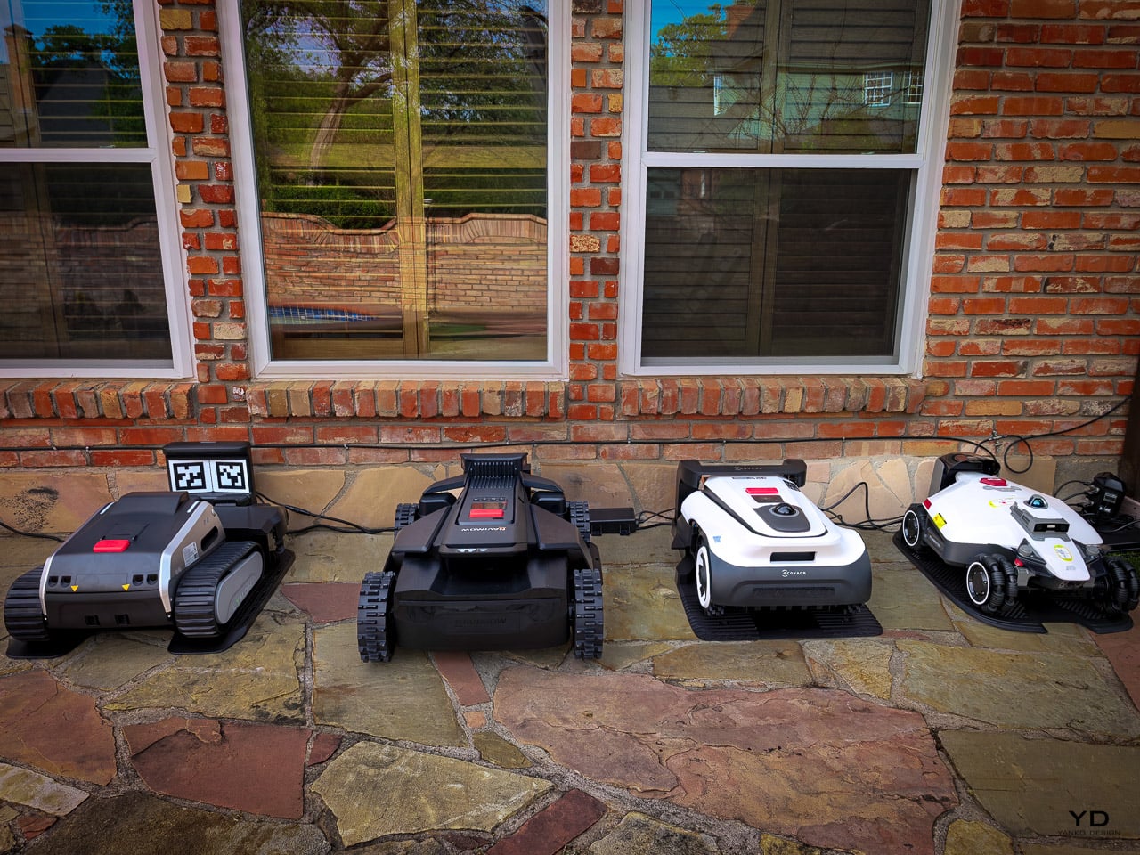
Compared to the competition, the value equation holds up. The Navimow X450 retails for $2,999 and is an AWD powerhouse with a class-leading 17-inch cutting deck. While its 84 percent slope rating is impressive for a wheeled machine, it cannot match the raw mechanical grip of the Lymow tracks on loose soil or 100 percent inclines. It also relies on standard lithium-ion batteries. This means you will likely see capacity degradation years before the Lymow battery shows its age.

The ECOVACS GOAT A3000 is the more budget-friendly pick at $2,099 to $2,499, but you sacrifice significant cutting width and the ability to handle anything beyond a standard suburban slope. Even the Mammotion LUBA 3 AWD, which features a similar tri-fusion navigation system, still uses wheels and standard lithium-ion chemistry. By choosing the One Plus, you are getting nearly triple the battery cycle life because of the LiFePO4 cells. While other packs might require a replacement after five or six years of use, this battery is designed to outlive the mower itself.

The LiFePO4 battery is the hidden value play that most spec comparisons miss. At 2,000+ cycles, you are looking at five to seven years of daily use before meaningful capacity loss. Every competitor in this price range uses lithium-ion chemistry rated for 500 to 800 cycles. Over a five-year ownership window, the Lymow saves you a $400 to $600 battery replacement that the others will eventually require. Factor that into the purchase price and the One Plus is actually the cheapest option to own long-term for properties that need tracked, heavy-duty mowing.

Pricing, Availability, and the Upgrade Program

The Lymow One Plus is available for pre-order at $2,699 for the 5A model and $2,899 for the 10A model, representing a $300 discount off the eventual retail prices. The 5A model covers 1.1 acres per day, and the 10A model covers 1.73 acres per day with faster charging.

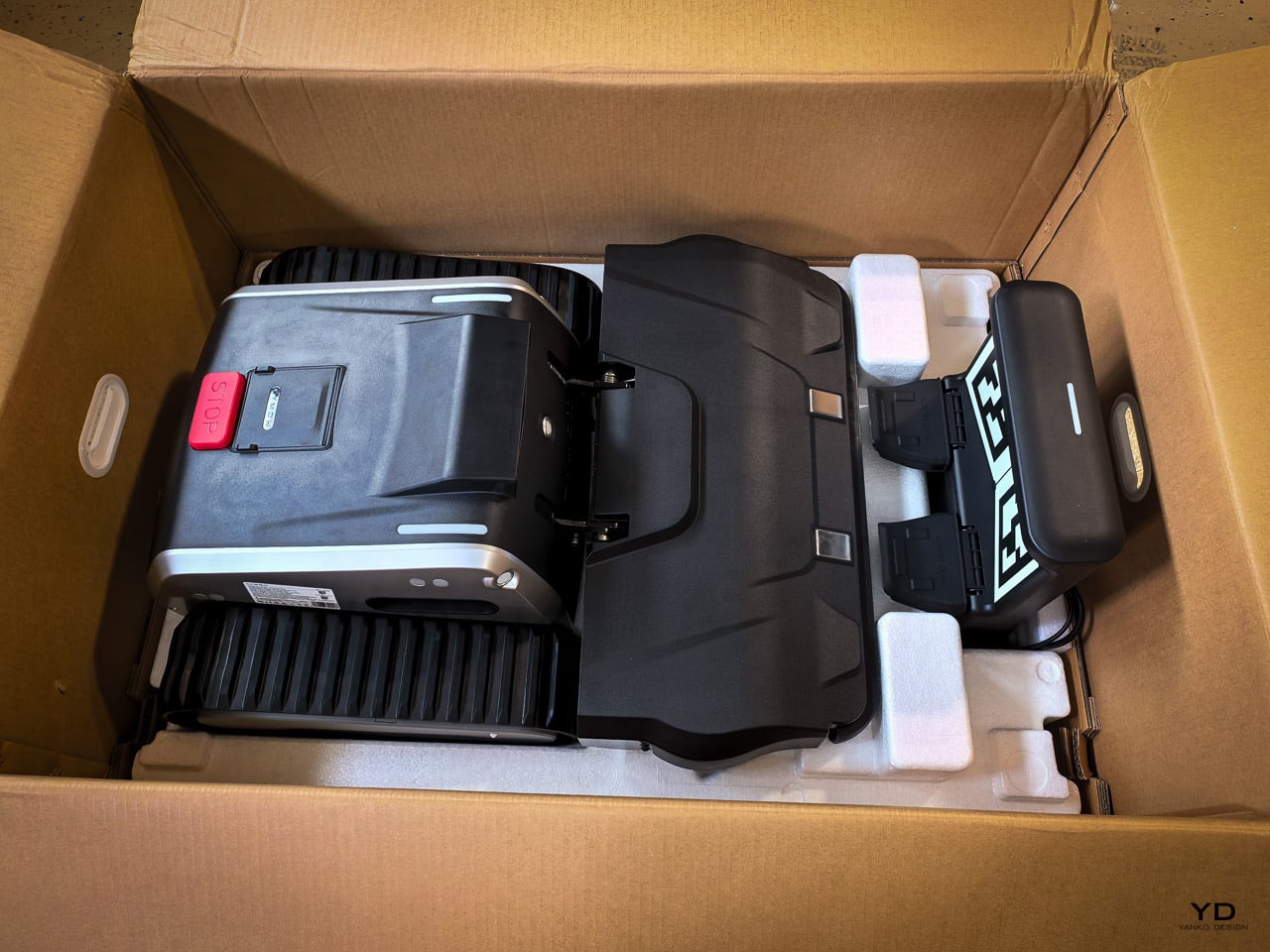
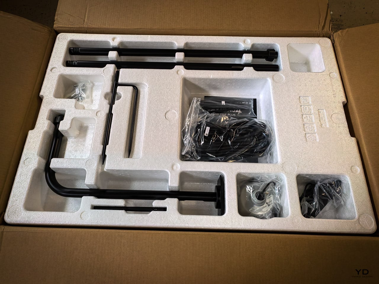
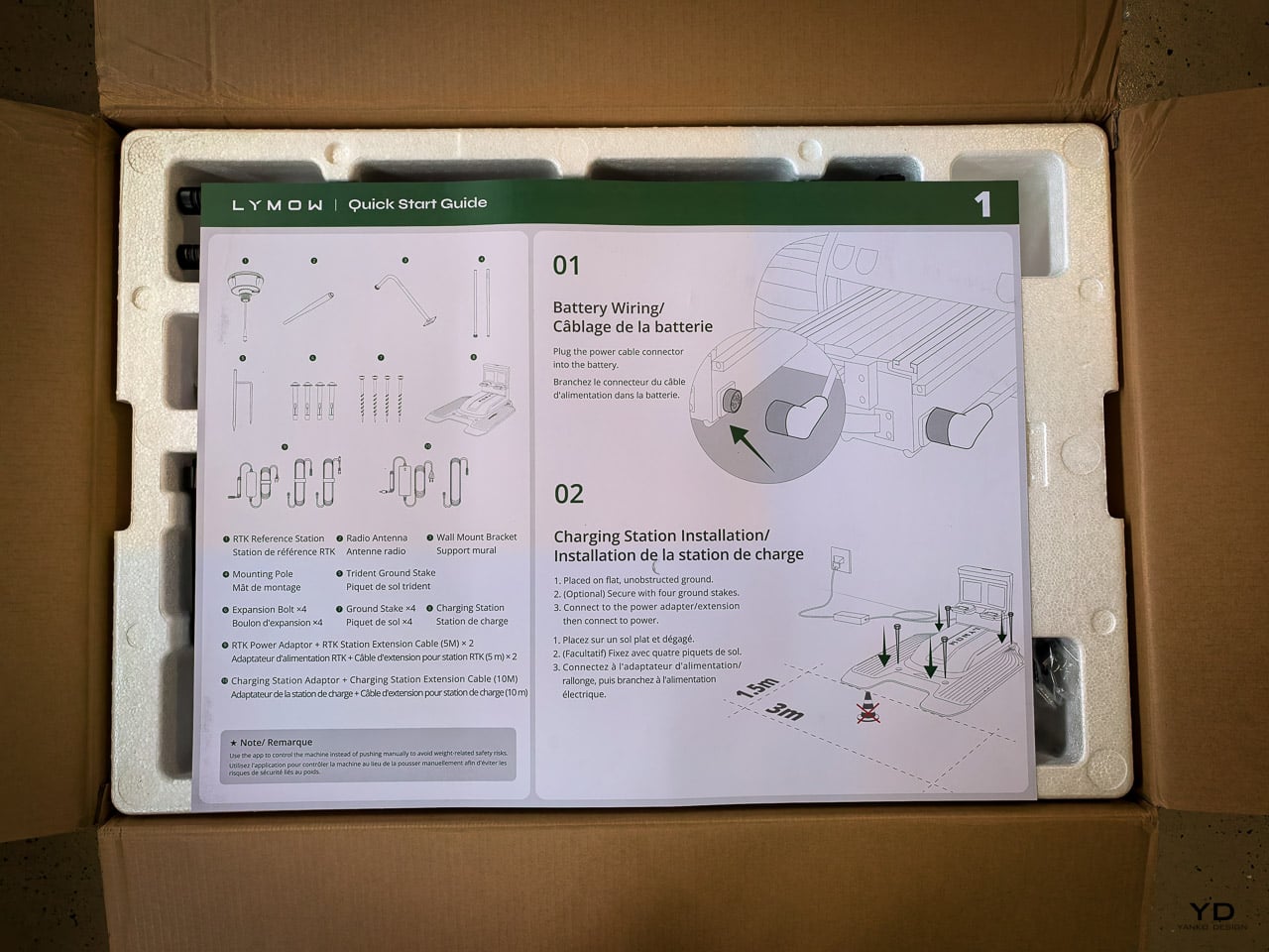
US shipping begins April 20 for both versions. Canadian shipping starts April 15 for the 5A and May 18 for the 10A. The box includes the mower, charging station with adapter and 10m extension cable, RTK reference station with antenna and mounting hardware, and documentation.

For existing Lymow One owners, the company is running an exclusive upgrade program with up to 40% off or a trade-in option for the One Plus. One important note for Gen 1 owners planning to upgrade: blades, batteries, and other accessories are not interchangeable between the two models. The One Plus uses redesigned components throughout, so do not count on carrying over spare parts from your original machine.

The Verdict

The Lymow One Plus is what the original should have been. That is not a knock on the Gen 1, which I still think was a genuinely impressive first attempt at a tracked rotary robot mower. But the Plus fixes the things that made daily ownership frustrating: the charging contacts that required constant maintenance, the cameras that could not see through morning fog, and the previous charging limitations. Every major pain point I identified in my original review got a direct, engineered solution.

I will continue updating the heated camera section as spring testing progresses. But the core mowing experience, the cut quality, the terrain capability, and the autonomous reliability are the best I have tested in this category.

FAQ

What changed from the original Lymow One to the One Plus?

The biggest changes are the top-mounted charging contacts (moved from the bottom), 50% more peak cutting power (1,200W to 1,785W), and the Cyclone Airflow cutting deck. Hardware reliability has also been a major focus, with the addition of heated camera housings for all-weather navigation, a self-cleaning track system, and improved hub motors that have been completely redesigned for better long-term durability. Additionally, the One Plus offers a professional-grade 10A fast charger as a new configuration option.

Can the Lymow One Plus handle steep slopes?

It’s rated for 45 degrees (100% incline), the highest in the consumer market. The improved hub motors with 200% higher rigidity are designed to maintain traction without mechanical fatigue on sustained climbs.

Are Lymow One and One Plus accessories interchangeable?

The tracks are actually compatible between the two models, so you can keep those as spares. However, the blades, batteries, and chargers are not interchangeable because the One Plus uses upgraded components throughout the power system.

How long does the battery last?

The LiFePO4 battery provides approximately three hours of runtime per charge and is rated for 2,000+ cycles, significantly outlasting standard lithium-ion batteries.

Does it work without RTK signal?

It can mow small areas (0.025 to 0.037 acres) for up to 10 minutes without RTK, which covers brief signal drops but isn’t intended for sustained operation without the reference station.

Is there an upgrade program for Lymow One owners?

Yes. Lymow offers up to 40% off or a trade-in for original owners. Check the Lymow website for eligibility details and trade-in terms based on your unit’s serial number.

Click Here to Buy Now: $2699 $2999 ($300 off). Hurry, deal ends in 48-hours!

The post Lymow One Plus Review: The Tank Got an Engineering Degree first appeared on Yanko Design.

Why Most AI Productivity Tools Still Fail After the Meeting

Design Mindset, Yanko Design’s weekly podcast powered by HiDock this week, it is 20 episodes in and showing no signs of slowing down. Hosted by Radhika Seth, the show premieres every week with conversations that dig into the minds behind the products shaping how we work, create, and communicate. This episode brings in a guest who fits that mission precisely.

Sean Song is the founder and product lead of HiDock, a company with deep roots in audio DSP engineering whose technology has powered over 500,000 devices across smart homes, automotive, and enterprise communication systems. Their hardware, the HiDock P1, rethought how professionals capture conversations through their own earbuds, with no bots, no awkward announcements, no friction. With HiNotes 3.0, the team has made a far more ambitious move, tackling the part of the productivity problem the industry has largely left untouched. Sean thinks about productivity the way a designer thinks about systems, as a behavioral architecture challenge, and that’s exactly what this conversation gets into.

Explore HiNotes 3.0 Here

The Productivity Paradox and Cognitive Load

Sean opens the episode with a number that should stop anyone mid-scroll: research suggests that almost 44% of action items are missed after meetings. His argument is that the tools built to fix this have been solving the wrong problem entirely. “We have built some of the most sophisticated recording and transcription technology and products in history, and we are still leaving meetings with a list of things we never act on,” he says. “I come to believe that the real productivity crisis was never about capturing, never about transcription. It is all about what happens in the silence after the meeting.”

What makes this more than a product pitch is the neurological framing Sean brings to it. Meetings, in his view, are among the most computationally heavy tasks the human brain performs, comparable to driving, because vision, hearing, and real-time language generation are all running simultaneously. “It’s duplex, it’s fully duplex. I output, I input, I output, I input and my brain is calculating my next word. It’s just like the large language model predicting the next token.” After a long meeting, your brain is, as he puts it, “out of sugar.” Taking accurate notes under those conditions is genuinely hard, and executing on them afterward, when you’re already depleted, is harder still.

The Evolution of Productivity Tools and Product Philosophy

HiDock spent years building enterprise communication tools, and for a long time the assumption was simple: deliver clear audio, solid recording, and eventually a clean AI-generated summary, and the job is done. Sean’s reckoning with that assumption came from a place that was personal before it was professional. He describes being a devoted “GTD guy” since the late 1990s, carrying the Get Things Done philosophy across every platform from Palm to BlackBerry to iPhone. “After years of being a GTD guy, it helped nothing to my career. I didn’t perform better. I didn’t achieve more.” The tools were fine. The system was the problem.

That realization resurfaced when Sean was using HiNotes and recognized the same pattern playing out again in his own product. “A good transcription is not enough. A good summary is not enough. Taking notes is not enough. We need to extract the pearls inside the notes and help the user to manage after the meeting.” From there, the team’s design focus shifted from delivering beautiful text to understanding what users were actually trying to accomplish, which was getting work done across the full arc of a meeting’s life, including the silence that follows it.

Design Principles for Effective Productivity Tools

One of the most interesting distinctions Sean draws is between consumption apps and productivity apps, and why the design logic that works beautifully for one actively undermines the other. For consumption, he says, “laziness wins. Always, like social apps, Snapchat, picture apps. You just do one click, everything done.” For productivity, his position is the opposite. “Discipline wins. Because this is another belief that guides me to build everything, HiDock and HiNotes, which keeps human in the loop.” The principle runs through every hardware and software decision the team makes. Physical actions like a key push or a long hold are built in deliberately, because that tiny moment of effort is what creates cognitive ownership of the information being captured.

Context sits alongside discipline as a guiding force. The story behind HiNotes 3.0’s timestamp-linked action items came from a dinner at a traditional omakase restaurant in Japan. Months later, what Sean remembered from the experience was a conversation with the chef about his training and his master. The food itself had faded. “So this brought to me that we should not only give the user a to-do, we need to give the user the context.” The visual architecture of the software reflects the same thinking: a consistent three-pane interface, maintained even when only two panels are logically needed, because the stability reduces cognitive load and builds what Sean calls “solid reliability” over time.

HiNotes 3.0

Capturing Creativity and Fragmented Ideas

Scheduled brainstorming, Sean argues, is one of the less honest myths in modern work culture. “Many brainstorm meetings do not generate good ideas. Good ideas came from when you walk, when you drive. And when you swim or after you swim, when you’re taking a shower, those are creative moments.” The friction of capturing an idea in those moments, unlocking a large phone, finding the right app, waiting for it to load, is enough to kill the thought entirely. Whisper Notes was built around precisely that gap: an instant, low-friction way to record ideas wherever they arrive, with HiNotes 3.0 handling the synthesis, pulling scattered voice recordings from across the day into a single coherent summary.

The question of which AI model does that synthesizing led HiDock to a decision that runs counter to most of the industry. HiNotes 3.0 gives users access to seven frontier models including GPT, Claude Sonnet, and Gemini Pro, switchable on a per-meeting basis. Most tools make a single model choice and bury it. Sean’s reasoning comes back to the human-in-the-loop philosophy: “Different content may require different summarization, even may require different characteristic values of the large language models.” He describes Claude as “probably more philosophical and decent and pays attention to details,” Gemini as “probably more creative and probably more up to date,” and frames the act of selecting a model as a form of intentional engagement with the content. The effort, for Sean, is always the point.

Whisper Note Aggregation

Rapid Fire Round: Quick Takes

The rapid fire round is where Sean’s worldview comes through in its most concentrated form. His pick for the most overrated productivity tool is AI agent tools, marketed as capable of everything but, in his experience, delivering nothing meaningful for most people in practice. The habit he’d want every professional to adopt is “check alignment,” a ritual he runs after every meeting and town hall: “Do I make myself understood? Are we on the same goal?” His most honest moment in the segment comes when asked about his own biggest follow-through failure. Leading a 50-person startup, he has missed the personal onboarding of roughly 15 new employees despite having promised himself he would handle it himself.

On what hardware design understands that software consistently ignores, his answer is immediate: “Tactile and sensation matters. So you cannot just build a piece of plastic or a piece of metal. Even plastic or metal, there are textures, there are tactile sensation feelings that connect you and your consumers.” The one thing he would strip from modern meetings is social distance, the polite friction that slows down directness and alignment. Asked for the single greatest enemy of execution in one word, his answer lands as a kind of provocation: notes. As he puts it, “as long as you take notes, it helps you execute.” Coming from the founder of a meeting intelligence company, it is both a confession and a design brief rolled into one.

Design Mindset drops every week on Yanko Design. For anyone looking to go deeper into HiNotes 3.0 and the hardware that brings it to life, have a look here.

Explore HiNotes 3.0 Here

The post Why Most AI Productivity Tools Still Fail After the Meeting first appeared on Yanko Design.

Ex-BlackBerry Designer Is Calling Out Everything That’s Wrong With Modern Phones

Design Mindset is Yanko Design’s weekly podcast, powered by KeyShot, the 3D rendering and visualization software that helps designers test how products feel, not just how they look. Hosted by Radhika Seth, the show goes deep into the philosophy and process behind world-class products, sitting down with the designers and founders who actually built them. Episode 19, premiering this week, is one of the most thought-provoking conversations the series has produced yet.

Joseph Hofer is the founder of Hofer Studio, where he consults with hardware entrepreneurs on building profitable, world-class product portfolios. Before that, he spent over a decade at BlackBerry as senior industrial designer, establishing the look and feel of the iconic Bold family and shaping devices like the Q10, Z10, and the BlackBerry Passport. His work spans over sixty design and utility patents, touching products that have sold over twenty-one million units and generated upward of $3.1 billion in revenue. More recently, he’s been the design force behind the Clicks Communicator, a physical-keyboard phone that launched at CES and challenges the smartphone status quo from the ground up.

Download your Free Trial of KeyShot Here

Designing Within Human Limits and Intentional Use

Joseph opens the conversation with something that sounds almost poetic but lands with the weight of a core design principle, saying that “most of the objects we use every day quietly train us. They teach us how to hold them, how long to focus, how patient we need to be. When design ignores human limits, it drains us. When design respects them, it almost feels like care.” He critiques what he calls “sticky” experiences, the kind that benefit companies at users’ expense, arguing that the real question designers should be asking is whether a product helps people become a better version of themselves, or whether the company simply wins after ten years of draining them.

His case against the modern smartphone is pointed. Everything phones have become reactionary devices, he says, describing the experience of opening one to send an email and somehow finding yourself fifteen minutes deep in a reel, asking yourself how you got there. Big tech, in his view, has deliberately shaped products to increase screen time and sell more through ads. His philosophy runs in the opposite direction: good design should prompt intention before action, not exploit the absence of it.

Integration as Core Design Principle

One of the more revealing details Joseph shares early on is that at BlackBerry, the design team’s official title wasn’t “Industrial Design.” It was Design Integration. That framing stayed with him. “Integration is probably the word, the action that I look to do well in every project I work on,” he says, adding that a product can be really strong in one area but fall flat in others if you’re only focused on a single dimension. Great design, strong UX, and poor profit economics don’t add up to a sustainable company. Economics, manufacturing, cost, and complexity all have to be part of the thinking from the start.

His advice to technical founders reflects the same logic. Many of them start with a breakthrough innovation and then go looking for a market to push it into, which he sees as working in the wrong direction. The better path is to step back, clearly analyze the problem bubbling up from the market, shape an experience that solves it, and then let the technology marry with that. Letting one run too far ahead of the other is how good innovations end up as products nobody uses.

The Clicks Communicator: Intentional Mobile Interaction

The Clicks Communicator is the most direct physical expression of Hofer’s philosophy. It was the first phone he designed in ten years after BlackBerry, and the central idea is a complete inversion of how smartphones currently work. Rather than an app grid that presents notifications and pulls users in reactively, the Communicator prompts users to decide what they want to do first, then acts on it. Physical keys map to intentional shortcuts: pressing K calls a specific contact, pressing I opens Instagram only when the user has consciously chosen to. “It flips it from being reactionary to intentional,” Joseph says simply.

He’s also clear that the product’s appeal isn’t nostalgia. A lot of the customers aren’t even BlackBerry users, he notes; they’re younger people who simply want a different relationship with their mobile device. The Communicator sits within what he sees as a broader 2025 trend of “intentional tech,” products designed to decouple from the everything-phone model and serve one specific purpose well. Adding a 3.5mm headphone jack and a removable SD card wasn’t feature-stacking for its own sake either; those choices are signals to a specific audience that the team is listening and cares about them.

Recognizing Quiet Ideas and Process Discipline

When Radhika points out that the BlackBerry keyboard now feels like it was always inevitable, Hofer pushes back immediately. “Sometimes these quiet ideas that feel obvious or become obvious actually took a lot of effort and iteration to get there,” he says, describing the motto his team lived by: think, build, test. The keyboard’s evolution wasn’t a single stroke of insight; it was a response to real constraints. As iPhones pushed screens larger, BlackBerry faced intense pressure to shrink keypads, which meant switching from oval keys to square ones, losing the tactile separation users relied on. The innovation was subtle: raising a curved edge on each square key to preserve the feeling of the oval, essentially hiding a reference to the old shape inside the new form. Speed tests, accuracy tests, user sentiment on different options, all of that grinding iteration is what produced something that feels natural.

He applies the same thinking to simplicity broadly. Designing for a ten-year-old, he argues, is one of the most useful principles any designer or founder can adopt. If you can’t explain the product to a ten-year-old, it’s too complicated. He tested this literally the night before the recording, sitting down with his eight-year-old daughter to ask about her CD player. Her answer was that it had way too many buttons. Her ideal? Three: power, volume up, volume down. Six identical-feeling buttons with in-mold graphics that disappear in the dark told a clear story about what the designers had gotten wrong.

Restraint as Confidence and Commercial Strategy

The tension between restraint and visibility is something Hofer takes seriously. He doesn’t frame minimalism as a virtue in itself. “Clarity is actually an even stronger word,” he says, arguing that a vanilla product solving a vanilla problem will simply go unnoticed. The goal isn’t to be quiet; it’s to solve a real, specific problem so well that the product becomes the only answer for a particular group of people. A phrase he came up with captures where he’s trying to take the companies he works with: from viral products to vital ones, products that customers genuinely need in their lives because of the difference they’ve made.

That philosophy maps directly onto commercial outcomes. A product that meets the emotional and functional needs of a user, reduces cognitive load, lasts longer, and has lower return rates naturally builds a brand that draws people in without needing to be aggressively sold. “When products are just better,” he notes, “they need to be marketed and sold maybe less. That’s an effect on your bottom line.” His work at Hofer Studio is less about crafting beautiful objects and more about asking founders what commercial success actually means to them and building backwards from that.

When the rapid-fire round asks him to describe restraint in design in a single word, his answer arrives without hesitation: confidence. “What does obviousness create? It creates confidence. I know how to enter this experience. I know how to start this product. I feel more confident with it in my life.” It’s a fitting close to a conversation that consistently returned to the same idea: that the design decisions nobody notices are usually the ones that took the most care to make.


Design Mindset drops every week on Yanko Design. Catch Episode 19 in full wherever you listen to podcasts. For a free trial of KeyShot, visit keyshot.com/mindset.

Download your Free Trial of KeyShot Here

The post Ex-BlackBerry Designer Is Calling Out Everything That’s Wrong With Modern Phones first appeared on Yanko Design.

“Stop Treating Designers as Tools”: Ayush Singh on Ownership, Burnout and Speaking Up in Indian Brands

Yanko Design’s weekly podcast, Design Mindset, continues to bring raw, unfiltered conversations about what it really means to work in design today. Episode 18, Powered by KeyShot, tackles a topic many Indian designers experience but rarely discuss openly: the uncomfortable gap between what brands promise about design investment and what actually happens behind closed doors. Each week, the podcast peels back the layers of design practice, exploring not just the creative work but the professional realities that shape it.

This week’s guest, Ayush Singh Patel, brings a perspective shaped by years at the intersection of ambition and reality. Currently Associate Director of Industrial Design at Noise, where he leads audio and accessories categories, Ayush previously spent time at boAt Lifestyle, leading five sub-brands and contributing to the design of everything from wireless headphones to smartwatches to grooming products. His experience spans the full product lifecycle, from concept to launch, but more importantly, he’s navigated the complex dynamics of being an in-house designer in India’s explosive consumer tech ecosystem. What unfolds in this conversation is a candid examination of derivative design, creative ownership, and what it takes to push for genuine innovation when the system is built for speed and cost efficiency.

Download your Free Trial of KeyShot Here

From “Glorified Localization” to Building Design Credibility

The conversation opens with a striking admission from Ayush: “I joined brands that proudly call themselves design driven, expecting to lead innovation. Instead, I found myself in meetings where the brief was literally make it look like this western brand, but make it cheaper. That’s not design leadership, that’s glorified localization. The real question isn’t whether Indian brands invest in design. It’s whether they invest in their own design vision or just outsource the thinking and ask internal teams to clean up the execution.”

Ayush’s own hiring story reveals how this dynamic begins. He wasn’t selected for his industrial design expertise or technical knowledge. “All they liked was the kind of portfolio work that I put out on Instagram and Behance, and they liked those pretty images. So there was no technicality in my interviews. They just wanted that sort of outcome for their products.” It took nearly a year and a half to convince stakeholders of what he could actually contribute beyond aesthetics. His first real opportunity came through rendering. In 2018-2019, e-commerce was entirely image-based, and conceptual renders performed exceptionally well. “Anything that was sold online on platforms like Amazon or Flipkart was truly image-based, right? Everything was about how glorified of a concept you can showcase.” The results were immediate: sales increased because customers were convinced to buy what they perceived in those images, not the reality of the products. This success created the opening for deeper design involvement.

The Strategic Path from CMF to Original R&D

Once sales growth validated design’s commercial impact, Ayush introduced CMF (Color, Material, Finish) as the next frontier. “I came and said there’s a thing called CMF design. So you can start with something as small as color. You don’t have to pay a lot of money, you can talk to the Chinese manufacturers, you can add those colors. And then obviously, it will change the game completely, because now people will have more options to buy from.” The Indian market’s aesthetic inexperience became an advantage. Consumers were looking for cheap technology that looked different, and without established reference points for good or bad aesthetics, bold CMF choices stood out on crowded e-commerce platforms.

The impact was substantial. “Through colors, we crossed over that thing where design can be weighed down, not in terms of aesthetics, but colors. And that’s what made the company grow from almost 90 crore revenue to 200-300 crore revenue.” The next step involved tweaking aesthetics of Chinese-sourced products with small mold modifications. “The reception from the customers was bonkers. It did not lead to as much sales because obviously it drove the costs a little high. But the way people understood that there’s something beyond buying a product from China and launching it, they saw in and out development, right? Someone cared about every bit of visuals that went out. There were specific colorways, people were somehow glorifying luxuriousness.” This gradual proof of concept finally convinced leadership to commit resources. From 2022 onwards, the company began developing its own products, marking a shift from localization to original design.

“Think Inside the Box”: Design Process for Fast-Paced Markets

Ayush’s philosophy directly contradicts traditional design education. “I’ll say something controversial here. Since design school, you’re somehow pushed to think outside the box, which is obviously a place where you can actually drive some sort of innovation. But if you work in a company that’s going for mass production, catering to large audiences at a fast pace, these consumers are not normal consumers. They’re not faithful to you. There are so many brands in the same market, so you have to innovate as fast as possible. And obviously, if you understand the market, innovation comes with time.” The solution challenges design orthodoxy: “The shortest way for you to reach innovation is change the outer aesthetics. If you think outside the box, you incur a lot of R&D costs. That will go through numerous approvals, numerous discussions back and forth from your manufacturing units. And that’s basically a lead time of one and a half to two years. In that time, there’ll be five to ten competitors who will come and go.”

The practical framework becomes clear: “We realized it’s a place where we need to set up our process in which we think inside the box, because an earphone or a speaker will look like an earphone or speaker. That’s the example I give to any person I ever hired. If you’re trying to design a car, it will look like a car. You cannot make it look like a plane.” The design process itself had to be restructured to bypass sketching and go straight to 3D. “There’s no point for us to sit down and make a sketch and me going to a founder who has nothing to do with the design process, who doesn’t care about why it takes you so much time. He only cares about: have you made something for me that I can produce.” Perhaps most revealing is Ayush’s assessment of what the job actually entails: “Design is the easy job. Design is literally five percent of what I actually do. Ninety-five percent is, irrespective of whether it’s a design by me or my team, I have to go and meet so many people from different teams who don’t care about what it took you to make this design. And just go there and be open-ended to receiving any kind of feedback and just sell that design. Being a great designer doesn’t mean you can design something, it’s how well you can sell it to other people.”

The Copy-Paste Reality and Cultivating Real Creativity

The copy-paste culture creates fundamental challenges for original work. “When there’s no good design, there’s no bad design, then there’s only the design that is known. So what you see is what you can weigh. Any person who’s beyond design will never be able to appreciate that as something new. And for a company that’s super price-critical, for a company that wants to innovate every six months, they’ll only want a bet that’s tried and tested.” When given explicit instructions to copy, Ayush developed a strategy of creative resistance: “I’ll be put in a position by a certain CXO or member I’m reporting to, basically laid out saying copy this. And I would come up being smart enough, trying to make a window, and I’d say okay, I’ll copy this, but I’ll give you my understanding of what it should look like. And then I would be basically thrashed, and they would say no, I told you to copy this. So I would end up going as close as it is to the inspiration, but I was still trying to stay away from it. The winning situation for me is how well can I sell that this looks like that, but it’s not the same, but this will work for you.”

The impact on designers working in these environments is profound. “We’re basically finishing up all the resources left for aesthetics, because there’s no innovation to back it up, right? So there will be a time where I’ll end up using all the innovations in terms of CMF at that given price tag. And the next people who take my position will not have anything left to innovate on. The people who I hire as interns or full-timers will come and explore the same thing that we did three years back. You’re following the same pathway that I did ten years back or five years back. So you’re bound to make the same mistakes to reach there.” His advice to his team reflects the only path he’s found to sustained growth: “The only way you can cultivate creativity is by doing something beyond what you’re getting paid for. I would just ask these people working with me to spend more time outside. The real work for a designer begins after the nine to five. Once you go back home, the kind of people you interact with, the kind of platforms you sit on, maybe Yanko Design, maybe Behance, any platforms that can somehow make you ask a question. People used to ask me, how are you able to execute things so fast? I optimized my working by making so many mistakes in my personal projects that I can go to my office next morning and do the same thing in half an hour.”

Speaking Up: From Skill to Creator

For Ayush, the path to changing the industry starts with designers finding their voice. “I think for designers to speak up. In a room, I’ve been the biggest introvert my entire life. But I realized if I don’t speak up, no one will care about design. And it’s on the place of basically shouting design, not just talking about it. Being in a place where you can speak up, and just taking that narrative, just start with being the face of design in the company. Maybe you’re in a junior role or a senior role, start sharing opinions. Even the people working within my team at the moment are very shy in terms of sharing opinions to a founder or to a person from a different team. They’ll slide in my DMs and say, this is what I feel. And I say you should be open about it. If you don’t share it, they will never respect your opinions.”

The fundamental shift needed is in how designers are perceived. “At the moment, designers are seen as skills rather than creators. That’s the one narrative that I’m completely against and I try to push off. People should start seeing you as creators, because if they believe you’re a skill, then they’ll always try to guide you to do a certain thing, maybe copying designs or just following exactly what they’re asking you to do. In that process, you’ll burn out faster than anything because you’re trying to follow someone else’s vision of something. You’re just becoming a tool in between. Better than being a tool, you become a creator when you start speaking out and defending everything you’ve learned.” When challenged to prove an in-house team could outperform an expensive European consultancy, Ayush’s answer centers on empathy and collaboration: “An in-house team can always win through a solution which I call just talking to people. Any person who’s somehow involved in the process, if you truly talk to them and empathize and learn their side of work in the process, then you can create a solution that’s not only good-looking but also satisfying their needs.” His mentoring philosophy distills to a single essential quality: “The cheat sheet is, how much do you love it? That’s the biggest cheat sheet. If you’re not in love with it in India, you will not sustain. And a love beyond boundaries, a love that cannot be sacrificed, a love that you never turn away from.”

The conversation reveals an uncomfortable truth about design investment in India’s fast-growing consumer tech sector. The issue isn’t whether companies use the word “design” in their marketing or mission statements. The question is whether they empower internal teams to think or simply execute, whether they’re building design capabilities or just design departments. Ayush’s journey from rendering specialist to R&D leader demonstrates that change is possible, but it requires designers to be strategists, salespeople, and advocates as much as creatives. It demands proving commercial value repeatedly, speaking up even when it’s uncomfortable, and cultivating skills outside of work hours that will never appear in any job description.

For designers navigating similar environments, Ayush’s experience offers both validation and a roadmap. The constraints are real, the frustrations legitimate, but within those limitations, there’s still room to push boundaries, build trust, and gradually shift the conversation from “make it cheaper” to “make it ours.” You can connect with Ayush on LinkedIn or book a mentoring session with him on ADPList, where he’s been recognized as one of the top ten mentors multiple times.

Design Mindset premieres every week, bringing honest conversations about what it really takes to build a design career in today’s industry. Episode 18 is Powered by KeyShot, the 3D rendering and visualization software helping in-house design teams compete with the visual quality of global agencies.

Download your Free Trial of KeyShot Here

The post “Stop Treating Designers as Tools”: Ayush Singh on Ownership, Burnout and Speaking Up in Indian Brands first appeared on Yanko Design.

Infinix NOTE Edge Review: Visible Luxury

PROS:


  • Distinctive material finishes feel intentional, tactile, and far removed from generic glass phones.

  • Curved AMOLED display integrates seamlessly into the frame with excellent visual balance.

  • Slim profile paired with large battery delivers comfort without sacrificing endurance.

  • Weight distribution feels centered, stable, and comfortable during long daily use.

  • Design language prioritizes subtle luxury over flashy, trend-driven aesthetics.

CONS:


  • Performance prioritizes consistency over raw power for demanding mobile gaming.

RATINGS:

AESTHETICS
ERGONOMICS
PERFORMANCE
SUSTAINABILITY / REPAIRABILITY
VALUE FOR MONEY

EDITOR'S QUOTE:

A design-led smartphone where materials, texture, and restraint create a genuinely premium visual identity.
award-icon

The Infinix NOTE Edge doesn’t announce itself through volume. It doesn’t rely on aggressive angles or oversaturated finishes to command attention. Instead, it arrives with a quieter confidence, the kind that reveals itself slowly as light shifts across its surface and the hand adjusts to its form.

I’ve spent time with devices that prioritize specification lists over tactile experience, and the NOTE Edge represents a deliberate departure from that approach. Infinix has made choices here that suggest an understanding of what makes an object feel considered rather than merely assembled. The 7.2mm profile isn’t thin for the sake of a number on a spec sheet. It’s thin because that dimension allows the curved display to flow into the frame without creating awkward transitions or compromising grip. The fact that a 6,500mAh battery fits inside without adding bulk says something about the internal engineering priorities.

What interests me most about this device isn’t any single feature. It’s how Infinix has leaned into a specific material language, treating the phone less like a piece of consumer electronics and more like a fashion object, with finishes that reference gemstones, textiles, and luxury accessories rather than the gradient glass that dominates this category. The NOTE Edge wants to be noticed, but it doesn’t want to shout. That tension between presence and subtlety defines the entire experience.

Design and Ergonomics

The Silk Green finish on our review unit operates differently than most smartphone surfaces. It’s a leather-like treatment with a texture evocative of luxury handbags, absorbing light rather than bouncing it back indiscriminately. Indoors, the color reads as deep and muted, almost forest-like in its saturation. Move outside, and the green opens up, revealing warmer undertones that shift depending on the angle of observation. This isn’t a static color. It’s a material that responds to its environment, and that responsiveness gives the phone a character that glass-backed devices simply can’t replicate.

The texture matters as much as the color. There’s no cold shock when you pick it up from a table. Fingerprints don’t accumulate the way they do on glossy surfaces. After extended use, the back panel still looks intentional rather than smudged.

Infinix offers alternative finishes that pursue a different aesthetic entirely. The Lunar Titanium, Stellar Blue, and Shadow Black variants use a cat-eye stone inspired treatment that creates visible movement as the phone tilts. Light doesn’t just reflect from these surfaces. It travels across them, producing shifting patterns that never quite settle into a fixed appearance. The finish has enough grip to feel secure without becoming tacky, and it maintains that feel whether your hands are dry or slightly damp. The effect is dramatic without crossing into garish territory, and it demonstrates that Infinix isn’t limiting itself to a single design vocabulary.

The 3D curved 1.5K AMOLED display integrates with the frame through a transition that eliminates the hard edge found on flat-screen devices. The curve is calibrated to reduce perceived width while maintaining usability across the entire display surface. Ultra-narrow bezels, with the bottom edge measuring just 1.87mm at its narrowest point, push content closer to the physical boundary of the device. The 6.78-inch panel feels immersive without forcing the body to expand beyond comfortable one-handed reach. A 120Hz refresh rate keeps motion smooth, 10-bit color depth renders gradients without visible banding, and 4500 nits of peak brightness means outdoor visibility doesn’t require cupped hands or squinting. Gamers benefit from a 2800Hz instant touch sampling rate that registers inputs faster than most users can perceive.

The interaction layer adds functional touches without cluttering the physical design. A dedicated One-Tap button on the frame provides customizable shortcuts to features like the flashlight, camera, or FOLAX AI assistant. The Active Halo Lighting around the rear camera module glows softly in response to notifications, calls, and charging status, with adjustable colors and stepless dimming. Neither element demands attention, but both reward users who engage with them. An integrated IR blaster lets you control TVs, air conditioners, and other appliances directly from the phone. eSIM support, a first for Infinix devices, adds flexibility for travelers and dual-SIM users who’d rather not swap physical cards. Availability varies by region and model, so check the official Infinix website to confirm eSIM support in your market.

Weight distribution deserves specific attention. A 6,500mAh battery creates density that could easily pull the phone off balance, making it feel top-heavy during vertical use or awkward during extended sessions. The NOTE Edge avoids this entirely, with mass centered in the chassis so scrolling, typing, and camera work all feel stable.

The glass-to-frame transition reinforces that sense of cohesion. There’s no lip or ridge where materials meet. Your grip flows uninterrupted around the device, which matters more than it might seem during the first few minutes of handling. Over hours, that seamlessness translates to reduced fatigue. The phone disappears physically while remaining visually present, which is exactly the balance a design-forward device should achieve. Corning Gorilla Glass 7i protects the curved display surface, and IP65 dust and water resistance means the materials can handle exposure to the elements without requiring constant caution.

Software and User Experience (XOS 16)

XOS 16 plays a bigger role in how the NOTE Edge feels than you might expect. Built on Android 16, the interface doesn’t compete with the hardware for attention. It supports it. Transitions stay smooth, layouts feel intentional, and nothing about the experience pulls focus away from what you’re actually doing on the phone.

The Glow Space design language shows up in subtle ways rather than obvious visual tricks. Depth effects, layered wallpapers, and motion cues work especially well with the curved display, giving the interface a sense of dimension without becoming distracting. It pairs naturally with the phone’s physical form, which matters when you’re swiping one handed or shifting between apps quickly. After a few hours, the software fades into the background, which is exactly what good interface design should do.

Haptics feel restrained and precise. Taps register cleanly. Gestures feel confident without being exaggerated. There’s enough feedback to reinforce interaction, but not so much that it becomes noise. Combined with the curved edges and balanced weight, the software contributes directly to how comfortable the device feels over long sessions.

Infinix’s AI layer works best when it stays quiet. System level optimization, background task management, and two-way AI noise reduction operate without demanding attention. The noise cancellation works in both directions, cleaning up background sound on your end while also filtering what you hear from callers. That restraint fits the overall tone of the NOTE Edge.

Longevity is where XOS 16 quietly strengthens the value of the device. Infinix commits to three years of OS updates and five years of security patches, which changes how you think about living with the phone long term. This isn’t software designed to feel fresh for a few months and then age out. It’s built to remain stable, secure, and familiar well beyond the initial ownership window.

Performance and Camera

The MediaTek Dimensity 7100 5G handles daily use without calling attention to itself. Swiping, launching apps, and unlocking all register instantly. It’s the kind of platform that does its job and stays out of the way.

That consistency holds over longer sessions. I kept messaging, maps, and media apps running simultaneously and never felt the system hesitate or dump background processes. The interface stayed responsive after hours of mixed use, which matters more than benchmark numbers when you’re navigating an unfamiliar city or bouncing between work threads and personal messages. Heat management impressed me more than raw speed. Extended navigation, casual gaming, and heavy browsing didn’t produce the kind of warmth that makes you shift your grip or set the phone down. The chassis stayed comfortable against my palm throughout full afternoon sessions. Infinix clearly tuned this device for sustained operation rather than brief bursts of peak performance.

Signal stability reinforces that dependability. Infinix’s UPS 3.0 Super Signal Technology focuses on low-frequency cellular bands, the 615 to 960 MHz range that travels farther and penetrates obstacles better than higher frequencies. These are the signals that actually reach you in elevators, underground parking garages, and concrete-heavy buildings when everything else drops off.

The engineering behind it involves physically larger antenna components. Infinix increased the radiation arm area of the main low-frequency antenna by 50 percent and the auxiliary antenna’s radiation wall by 30 percent. That translates to a 1.5 to 2 dB gain in low-frequency reception, which sounds modest on paper but shows up clearly in practice. Calls held steady in places where I normally expect a brief dropout. Data kept flowing in basement-level parking where other phones tend to stall while searching for signal.

It’s the kind of reliability you only notice when it’s missing.

The camera follows that same practical mindset. It’s built to produce usable results without demanding expertise.

This is a dual camera setup. The 50MP main sensor handles all meaningful imaging work, while the secondary lens exists for depth separation in portrait shots.

The 50MP main sensor handles everyday situations with consistent color accuracy from shot to shot. Outdoor images retain detail without oversaturating, and indoor shots keep skin tones natural under mixed lighting. Low light performance benefits from Infinix’s AI RAW imaging algorithm, which lifts shadow detail without flattening contrast or blowing highlights. Texture stays intact where other processing tends to smooth everything into mush. You don’t need to fight the camera or babysit settings. Point, shoot, and move on works more often than not.

Live Photo Mode captures a three-second window around each shutter press, giving you motion instead of a single frozen frame. It’s useful for candid moments, pets, or scenes where timing matters. Exporting as GIFs, setting captures as live wallpapers, or sharing to iPhones via NFC makes the feature feel integrated rather than bolted on. The implementation suggests Infinix thought about how people actually use these clips rather than just checking a feature box.

Video recording stays predictable and clean. Footage looks solid in good light, motion doesn’t introduce distracting jitter, and audio capture handles casual recording without issues. Nothing here feels experimental or unfinished.

Audio and Sound Performance

Sound is handled by a dual stereo speaker system co-engineered with JBL, and it’s immediately noticeable once you stop defaulting to headphones. Volume comes up without harshness, and the tonal balance stays intact even when you push it higher than you normally would for casual listening. There’s actual separation here, with dialogue staying forward in videos and podcasts while music doesn’t collapse into a single flat plane.

Infinix leans on a five-magnet acoustic system and a high-elasticity silicone rubber diaphragm, which sounds technical until you use it. Bass has presence without rattling, mids stay clean, and highs don’t spike in a way that fatigues your ears over longer sessions. The diaphragm flexibility contributes to that balanced output, absorbing vibrations that would otherwise muddy the low end. The 360-degree symmetrical sound field matters more than I expected, especially when you’re watching something without holding the phone perfectly straight. Audio stays consistent whether the phone is resting on a table, propped up, or held casually in one hand. That positional flexibility makes the speakers feel genuinely usable rather than an afterthought.

Sustainability and Longevity

Battery capacity tells only part of the endurance story. The 6,500mAh cell in our review unit (6,150mAh in certain regional configurations) provides multi-day operational potential under moderate use patterns. This isn’t about chasing screen-on time records. It’s about eliminating the anxiety that comes with uncertainty around whether a device will last through an unpredictable day.

In practice, that translates to roughly 22 hours of continuous video playback or 26 hours of outdoor navigation before you need to reach for a cable. When you do need to refuel, 45W All-Round FastCharge gets you to 50% in about 27 minutes and a full charge in just over an hour. Bypass Charging routes power directly to the system board during gaming or navigation, which keeps the battery out of the thermal loop and reduces heat buildup during extended plugged-in sessions.

Long-term battery health becomes relevant when capacity numbers reach this scale. Infinix claims the battery retains more than 80% capacity after 2,000 full charge cycles, equivalent to over six years of typical daily use. The company also cites self-healing technology that repairs micro-damage through dynamic recrystallization during low-current recovery. These aren’t marketing abstractions. They’re engineering claims with testable outcomes, and they suggest the multi-day endurance you experience initially should hold over the ownership cycle rather than eroding within the first year. The durability framing extends beyond just the battery. Material choices across the device suggest consideration for how surfaces age, how components withstand repeated stress, and how the phone maintains its character over months rather than weeks.

XOS 16, built on Android 16, runs the software side. Infinix commits to three years of OS updates and five years of security patches, which represents the longest support window the NOTE series has offered. That commitment matters for a device positioned around longevity.

Value

The NOTE Edge occupies a market position that doesn’t get enough attention. It’s a design-forward midrange device, which means it competes on material quality and user experience rather than processor benchmarks or camera sensor counts. For users who prioritize how a phone looks and feels over how it performs in synthetic tests, the value proposition here is substantial.

What you receive for the price includes premium-feeling materials, balanced ergonomics, multi-day battery endurance, and a display that rivals more expensive devices in clarity and immersion. The Dimensity 7100 5G provides capable daily performance without generating the heat or power consumption of flagships processors. The camera handles real-world scenarios reliably. None of these elements represents a compromise.

The fashion-led color palette means the NOTE Edge appeals to users who want their technology to reflect personal aesthetic preferences. This isn’t a device that disappears into generic smartphone uniformity. It makes a statement.

Wrap Up

The Infinix NOTE Edge succeeds because it understands what it’s trying to be. It’s a considered object that prioritizes material quality, ergonomic refinement, and visual identity over the metrics that dominate most smartphone conversations.

The Silk Green finish exemplifies the approach. It’s a material choice that affects how the phone looks, how it feels, how it ages, and how it responds to its environment. Nothing about it exists in isolation. Every decision connects to a broader vision of what a design-forward smartphone should offer. That coherence is rare, and it’s what separates the NOTE Edge from devices that feel like committees designed them.

For users who’ve grown tired of phones that feel like interchangeable glass rectangles, the NOTE Edge represents an alternative worth serious consideration. Infinix has demonstrated that visible luxury and practical usability can coexist in the midrange segment. The result is a device that you’ll want to use, want to look at, and want to keep using long after the initial appeal of any new purchase typically fades.

The post Infinix NOTE Edge Review: Visible Luxury first appeared on Yanko Design.

iF Design Award Makes Sustainability 20% of Your Score: What Designers Need to Know in 2026

Yanko Design’s podcast, Design Mindset, continues to bring compelling conversations with design leaders who are shaping the future of the industry. Powered by KeyShot, the show premieres weekly, offering listeners deep dives into the minds of innovators, strategists, and visionaries. Episode 15 tackles one of the most critical shifts happening in design today: how sustainability has moved from a nice-to-have checkbox to a core measure of design excellence itself.

This week’s guest is Lisa Gralnek, a brand builder with 25 years of experience who currently serves as U.S. Managing Director and Global Head of Sustainability and Impact for iF Design, a respected member of the international design community since 1953 and host of the prestigious iF Design Award. Lisa’s journey spans work with giants like Adidas and the Boston Consulting Group, giving her a unique vantage point on how sustainability has evolved from corporate afterthought to design imperative. In this conversation, she reveals how one of the world’s most prestigious design competitions is fundamentally redefining what “good design” means.

Download your Free Trial of KeyShot Here

Embedding Sustainability into iF Design’s Evaluation Framework

When asked about the decision to make sustainability one-fifth of the iF Design evaluation framework, Lisa shared her pride in the initiative. iF Design has been operating since 1954 and now spans nine disciplines across 93 categories, from product and packaging to branding communications, UX, UI, service systems, architecture, and interior architecture. The shift was deliberate and structural: iF Design moved from a general “impact” criterion to explicitly isolating environmental and social sustainability as 20% of the score. Commercial impact was repositioned into differentiation, one of their five criteria, allowing them to “really single out the environmental and social ramifications of a design.” This alignment reflects the iF Design Foundation’s core mission to advance design for a better world.

The design thinking process involved convening a Sustainability Working Group of eight experts from around the world who bring deep, often sector-specific sustainability expertise. “We work together to figure out what is the process, what is the questions, what are the certifications and accreditations we’re acknowledging, as well, most importantly, I would say, of supporting the jurors as they go through this process as well,” Lisa explained. The group co-developed processes, discipline-specific optional questions, recognized certifications and accreditations, and on-site juror support aimed at consistency, rigor, and education for both entrants and jurors. This collaborative approach ensures that sustainability evaluation remains both credible and practical across vastly different design categories.

Distinguishing Authentic Impact from Greenwashing

One of the biggest challenges facing any sustainability evaluation is distinguishing genuine innovation from performative claims. Lisa explained how the first year revealed significant gaps: jurors felt skeptical not about sustainability itself but about making accurate judgments with insufficient information. At that first jury, sustainability experts were on the ground for only the second year, and the feedback was clear. Entrants weren’t providing enough detail in the character-limited impact field for jurors to make informed decisions, whether they were discussing environmental impact, social impact, or business impact.

The solution was to embed three optional questions into every discipline, sometimes tailored at the category level, along with a selectable list of objective global, regional, and industry-led certifications. These questions remain optional because iF’s mandate focuses on rewarding good design rather than punishing inadequate submissions. Lisa gave a concrete example of how this helps identify hollow claims: when a television or computer monitor entry discusses sustainable packaging in the sustainability field, it raises red flags because the entry itself is about the product, not the packaging. In packaging specifically, iF piloted requesting a bill of materials (BOM) or digital product passport (DPP) to quickly validate claims about recycled content, compostability, low-impact inks, and water-saving processes. Interestingly, packaging entries dipped this year, raising the question of whether increased scrutiny discouraged greenwashing or simply affected submission rates.

“Fewer, Better” as a Design and Consumption Ethos

Lisa’s philosophy around sustainable design cuts to the heart of overconsumption. She candidly admitted that if she were being a radical sustainabilityist, “none of us needs anything. None of us needs anything anymore.” She recalled an interview on The Economist after the 2008 financial collapse where experts insisted people needed to buy, that society needed to incentivize consumption. But consuming our way out of financial collapse, she argues, represents the capitalistic model and business operating system of the world without necessarily serving the planet or people. Her first jury experience brought this reality into sharp focus: walking into the warehouse where 50% of the 10,000 to 12,000 annual entries are physically displayed, she burst into tears. The sheer volume of stuff human beings create, all in service of capitalism’s engine, became overwhelming when viewed through a sustainability lens.

So what does “fewer, better” actually mean in practice? Lisa explained it operates on two levels: individual conscious consumption choices and organizational design decisions. At the designer and company level, it means thinking through the circular R ladder: what can we refuse, rethink, reduce, reuse, repair, recycle, refurbish, or resale? “Fewer, better is like, I think it’s less extractive and more regenerative,” she explained. This approach shifts the entire paradigm from novelty-driven production cycles to necessity-driven design that prioritizes extending product lifecycles and reducing resource pressure. Even digital alternatives and AI, which some propose as solutions, carry their own massive environmental footprints, making the “fewer, better” ethos essential regardless of the medium.

The Shift from “Nice-to-Have” to Imperative

Lisa has been passionate about sustainability since early in her career, leaving fashion after nine years because she’d lost appreciation for the craft amid the luxury sector’s excesses. She attended graduate school intending to return and work on sustainability in luxury, but graduated into the 2008 financial collapse when sustainability wasn’t even a conversation starter. Her time at Boston Consulting Group revealed the depth of corporate resistance: she vividly remembers asking a snack food company CEO about greening their packaging supply chain at a luncheon and being laughed at by both the CEO and a senior partner. Whether the dismissal stemmed from her being a young woman among older men or the sheer absurdity they perceived in the question, she witnessed this pattern repeatedly across retail, travel and tourism, consumer packaged goods, and fashion. The consistent message: sustainability is awesome, so long as it doesn’t cost margin or sales.

Yet Lisa sees a significant shift happening now, driven primarily by consumers. Awareness of climate change, planetary degradation, and social unfairness has grown dramatically, particularly as social media makes information more accessible regardless of which news sources people consume. Most people globally now recognize there’s a problem and understand that action is needed. There’s also a compelling business case, as demonstrated by Walmart’s LED transition 15 to 18 years ago. Despite enormous upfront costs to change every light bulb in every warehouse and retail store, the head of sustainability reported a payback period of just three and a half weeks in energy savings. “So often you just need to make the change and people are so scared and teams are so siloed and you know people are afraid like you can’t be afraid and the business case is almost oh almost always there to do better,” Lisa observed.

Technology’s Double-Edged Sword: E-Waste and Hope

When asked about sustainable design trends she wished would disappear, Lisa pointed to a concerning paradox: our increasing dependence on technology. E-waste is burying us, with most electronic waste filled with rare earths that are extremely difficult to mine and controlled by very few players. This issue increasingly surfaces in geopolitical conversations and international trade negotiations yet remains underrepresented in sustainability discourse. Lisa referenced a presentation at South by Southwest where visuals showed the number of dump trucks filled with e-waste every hour that the world creates and deposits into landfills. These landfills poison water sources and ground soil, creating massive downstream pollution and health impacts. Everything exciting and technological, while representing the direction the world is heading, simultaneously presents this enormous environmental problem.

Yet within this challenge lies genuine hope. Lisa expressed excitement about the increase in repairability, recyclability, upgradability, and upcyclability in electronics, whether discussing car batteries, e-bike batteries, mobile phones, speakers, or computer interfaces. The momentum isn’t moving fast enough and integration remains incomplete, but the trajectory points toward keeping electronics in use longer and reducing waste. This trend represents designers and companies genuinely rethinking product lifecycles and moving away from planned obsolescence. Lisa’s realistic optimism captures the mindset she sees among sustainability leaders across disciplines: they’re very realistic about where we are and where we’ve been, but they’re willing to fight for transformation in the future. They recognize that future transformation only becomes possible when action starts today, with imperfect solutions, uncomfortable conversations, and puzzle pieces that contribute to a larger systemic change.

Design Mindset, Powered by KeyShot, premieres every week with new conversations exploring the minds shaping the future of design. Listen to the full episode with Lisa Gralnek to hear more insights on sustainability and how it plays a pivotal role in shaping iF Design’s outlook.

Download your Free Trial of KeyShot Here

The post iF Design Award Makes Sustainability 20% of Your Score: What Designers Need to Know in 2026 first appeared on Yanko Design.

DigiEra OmniCore at CES 2026: NAS That Searches Files Like ChatGPT

For most designers and filmmakers, storage is the quiet problem that never gets a mood board. Projects start on phones, move through cameras and laptops, and end up scattered across drives and cloud folders that you half remember naming six months ago. CES 2026 is full of AI-driven devices and next-gen connectivity, but DigiEra’s booth is interesting because it treats storage as part of the creative environment, not just a spec to tick off on a spreadsheet.

The lineup tells a single story across four products. OmniCore is the modular, all-flash AI NAS that wants to be the studio’s private brain. Endura is the rugged field drive that can live in a bag without babying. Portable Hub SSD is the tiny block that turns a phone or camera into a serious capture and editing station. The Diamond Magnetic Portable SSD is the piece that lives on the back of an iPhone, turning storage into something closer to jewelry than IT gear.

Designer: DigiEra

OmniCore: AI NAS as a Private Studio Brain

The pain of hunting for assets across old drives and cloud accounts is real. OmniCore is DigiEra’s answer, a modular all-flash AI NAS designed to sit in a studio and quietly index everything. It supports up to 80 TB of SSD storage across eight 2.5-inch SATA bays and two M.2 slots, all hot-swappable, so the box can grow with a studio instead of being replaced every time a project spikes in size or a client asks for all the raw footage from three years ago.

OmniCore is not just a fast box of drives. A Rockchip RK3588 CPU, 16 GB of LPDDR5 RAM, and a 6 TOPS NPU let it run AI tasks locally, from automatic image tagging and semantic search to transcription, document analysis, conversational chat, and clip generation. That means a designer can type “blue packaging concept with foil logo” and have the NAS surface relevant shots, instead of scrolling through folders named final underscore final underscore v3.

The privacy-first angle matters here. OmniCore is designed to work fully offline, with no cloud dependency, which is important when client work, unreleased campaigns, or personal archives cannot leave the building. Dual LAN ports, including 2.5 GbE, and Wi-Fi 6 support let it serve multiple editors or designers at once without feeling like a bottleneck, and Docker support means it can host custom tools alongside its own AI engine for people who need more than a basic file server.

The physical experience is part of the design. The cube-like form factor with front-loading SSD modules makes storage feel tangible and approachable, more like a card catalog than a server rack. Drives slide in and out on small trays, so expanding from a few terabytes to tens of terabytes is a matter of minutes, not a weekend migration project where everything has to stop. For small studios, that kind of modularity is as much a design decision as a technical one.

Endura Portable SSD: Rugged Speed with a Material Story

Endura is the drive that lives in the camera bag and follows people to shoots. DigiEra bills it as the world’s first portable SSD with an aluminum–carbon-fiber shell, rated IP65 for water, dust, and shock resistance. That combination of materials gives it a technical, motorsport-like feel, while also signaling that it can handle being tossed into a backpack, clipped to a rig, or dropped on a sidewalk without needing a protective case wrapped around a protective case.

Under the shell, Endura uses USB 3.2 Gen 2×2 over USB-C, delivering up to 2,000 MB/s read and 1,800 MB/s write speeds in capacities from 512 GB to 4 TB. For photographers dumping RAW stills between locations or filmmakers backing up cards on set, that means less time watching progress bars and more time shooting, with a drive that looks like it belongs in a design-conscious kit and can survive the environments where most shoots actually happen.

Portable Hub SSD: One Block to Replace the Dongle Pile

The Portable Hub SSD is the antidote to the usual tangle of hubs, drives, and chargers. It wraps the same 20 Gbps SSD core in a compact aluminum block that also acts as a hub, combining high-speed storage, PD fast charging, and extra USB-C connectivity. Plug it into a phone, tablet, or laptop, and it becomes both a scratch disk and an expansion port, turning one cable into a complete mobile workstation.

The fold-out USB-C plug and side ports make it particularly friendly to iPhones and USB-C cameras. Instead of hanging a drive and a hub off a gimbal or handheld rig, one block adds space for ProRes or LOG footage and passes power through to keep the phone or camera alive. For designers who sketch on tablets or edit on ultraportables, it is the kind of object that quietly simplifies the everyday carry, handling data and power from a single point without adding bulk or visual noise.

Diamond Magnetic Portable SSD: Storage as Visible Accessory

The Diamond Magnetic Portable SSD is the piece that never leaves the phone. It snaps magnetically to the back of an iPhone 15 or 16 Pro and records 4K 60 FPS ProRes video directly to external storage, lifting the ceiling on how long you can shoot without cages, rigs, or bulky battery grips. For content creators who rely on their phone as a primary camera, that is a big shift in what is possible with a pocket-sized setup.

The diamond-encrusted, circular design makes the drive look closer to a compact mirror or piece of jewelry than a tech accessory. Underneath, it still runs USB 3.2 Gen 2×2 over USB-C at up to 2,000 MB/s read and 1,800 MB/s write, in capacities up to 4 TB. That mix of performance and visual polish means it can stay on the phone in a meeting, a shoot, or a café without feeling out of place, turning storage into something you actually want to show rather than hide in a pocket until needed.

DigiEra at CES 2026: Turning Storage into a Creative Toolkit

OmniCore anchors the studio as a private, AI-enabled brain that knows where every file lives and can answer questions in natural language. Endura and Portable Hub SSD handle the messy middle, moving data safely and quickly between cameras, phones, and laptops, with materials and form factors that feel deliberate rather than generic. The Diamond Magnetic SSD lives on the phone, turning storage into something you actually want to show. That is DigiEra’s real story at CES 2026: storage treated not as an afterthought or a cloud subscription, but as a set of designed objects that respect the way creative work actually moves through the day, from the pocket to the field to the desk and back.

The post DigiEra OmniCore at CES 2026: NAS That Searches Files Like ChatGPT first appeared on Yanko Design.