Ex-BlackBerry Designer Is Calling Out Everything That’s Wrong With Modern Phones

Design Mindset is Yanko Design’s weekly podcast, powered by KeyShot, the 3D rendering and visualization software that helps designers test how products feel, not just how they look. Hosted by Radhika Seth, the show goes deep into the philosophy and process behind world-class products, sitting down with the designers and founders who actually built them. Episode 19, premiering this week, is one of the most thought-provoking conversations the series has produced yet.

Joseph Hofer is the founder of Hofer Studio, where he consults with hardware entrepreneurs on building profitable, world-class product portfolios. Before that, he spent over a decade at BlackBerry as senior industrial designer, establishing the look and feel of the iconic Bold family and shaping devices like the Q10, Z10, and the BlackBerry Passport. His work spans over sixty design and utility patents, touching products that have sold over twenty-one million units and generated upward of $3.1 billion in revenue. More recently, he’s been the design force behind the Clicks Communicator, a physical-keyboard phone that launched at CES and challenges the smartphone status quo from the ground up.

Download your Free Trial of KeyShot Here

Designing Within Human Limits and Intentional Use

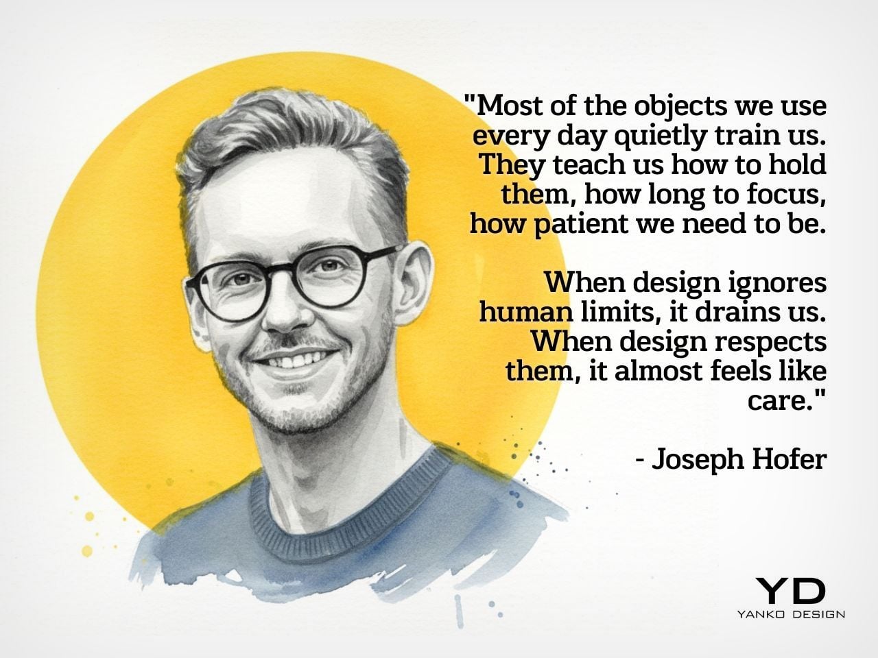
Joseph opens the conversation with something that sounds almost poetic but lands with the weight of a core design principle, saying that “most of the objects we use every day quietly train us. They teach us how to hold them, how long to focus, how patient we need to be. When design ignores human limits, it drains us. When design respects them, it almost feels like care.” He critiques what he calls “sticky” experiences, the kind that benefit companies at users’ expense, arguing that the real question designers should be asking is whether a product helps people become a better version of themselves, or whether the company simply wins after ten years of draining them.

His case against the modern smartphone is pointed. Everything phones have become reactionary devices, he says, describing the experience of opening one to send an email and somehow finding yourself fifteen minutes deep in a reel, asking yourself how you got there. Big tech, in his view, has deliberately shaped products to increase screen time and sell more through ads. His philosophy runs in the opposite direction: good design should prompt intention before action, not exploit the absence of it.

Integration as Core Design Principle

One of the more revealing details Joseph shares early on is that at BlackBerry, the design team’s official title wasn’t “Industrial Design.” It was Design Integration. That framing stayed with him. “Integration is probably the word, the action that I look to do well in every project I work on,” he says, adding that a product can be really strong in one area but fall flat in others if you’re only focused on a single dimension. Great design, strong UX, and poor profit economics don’t add up to a sustainable company. Economics, manufacturing, cost, and complexity all have to be part of the thinking from the start.

His advice to technical founders reflects the same logic. Many of them start with a breakthrough innovation and then go looking for a market to push it into, which he sees as working in the wrong direction. The better path is to step back, clearly analyze the problem bubbling up from the market, shape an experience that solves it, and then let the technology marry with that. Letting one run too far ahead of the other is how good innovations end up as products nobody uses.

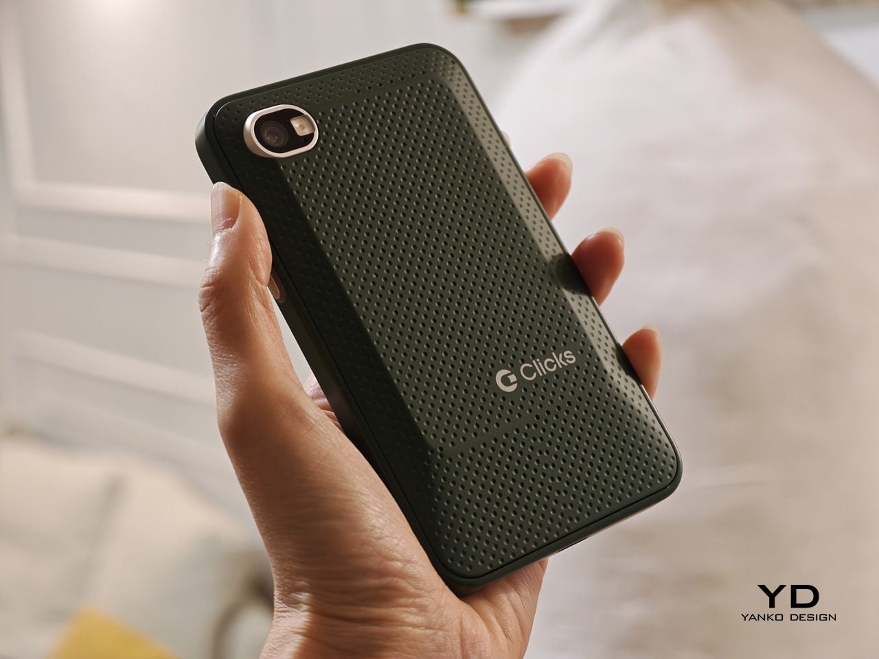
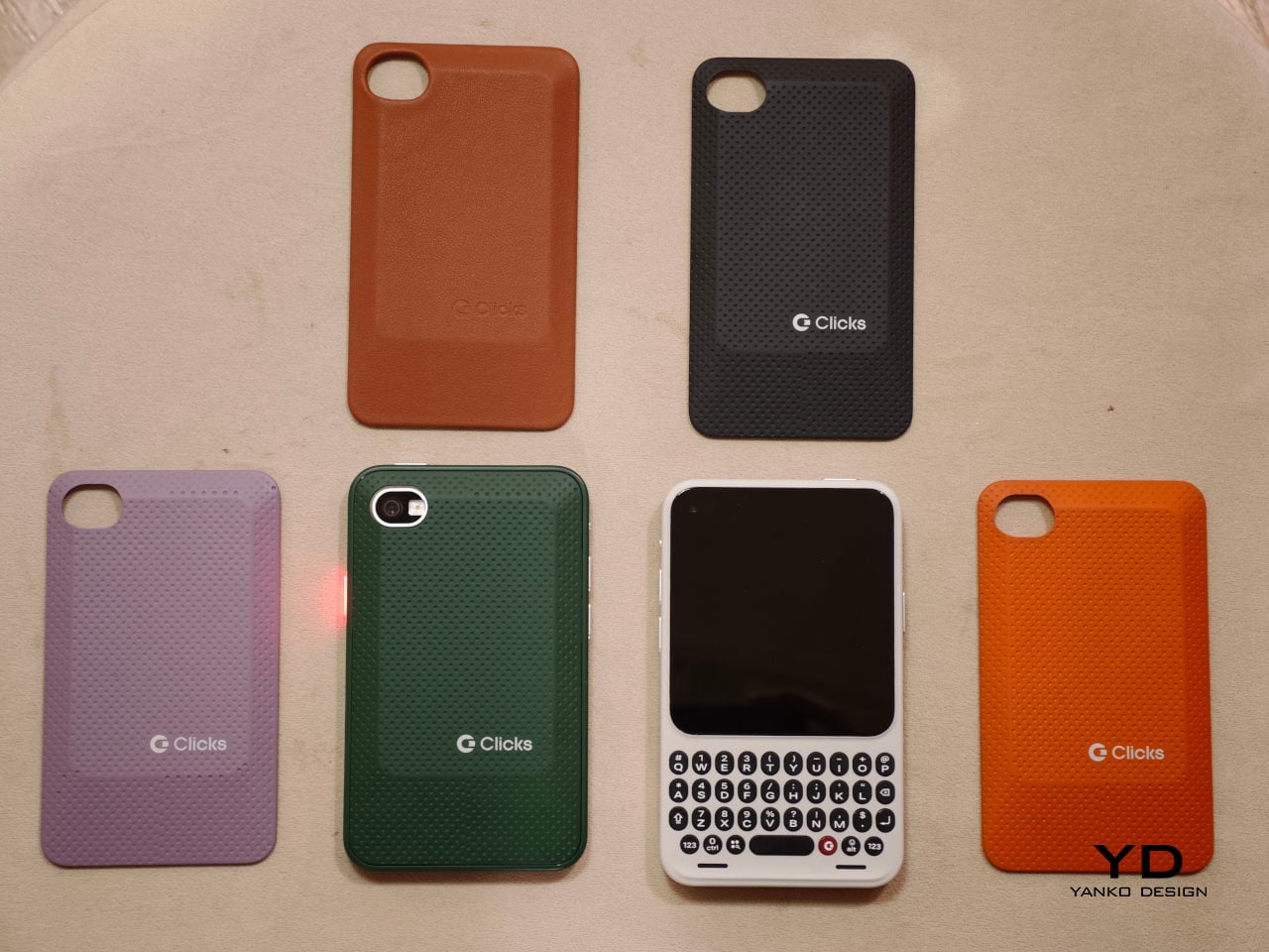
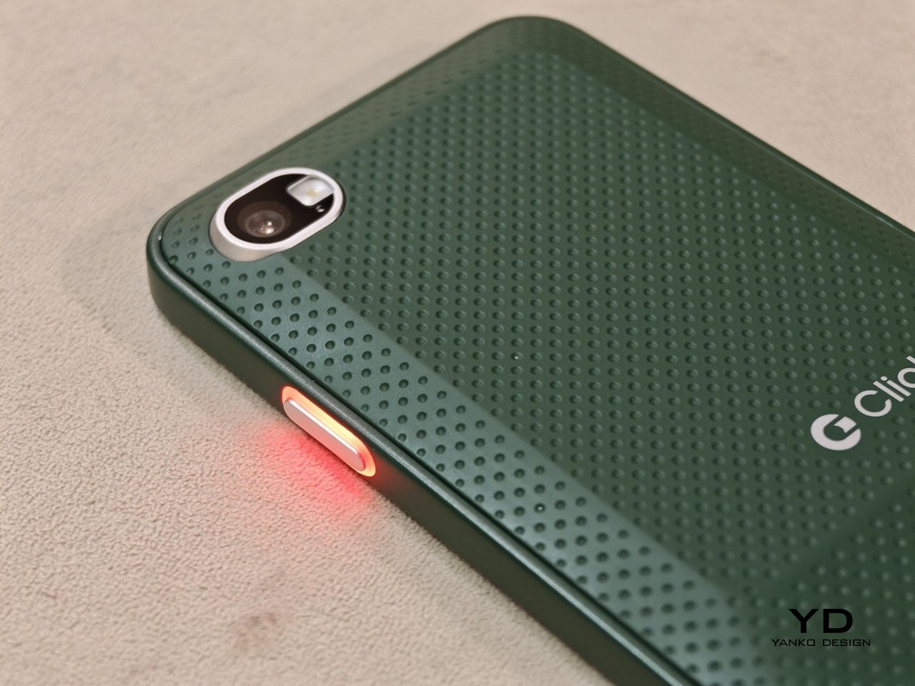
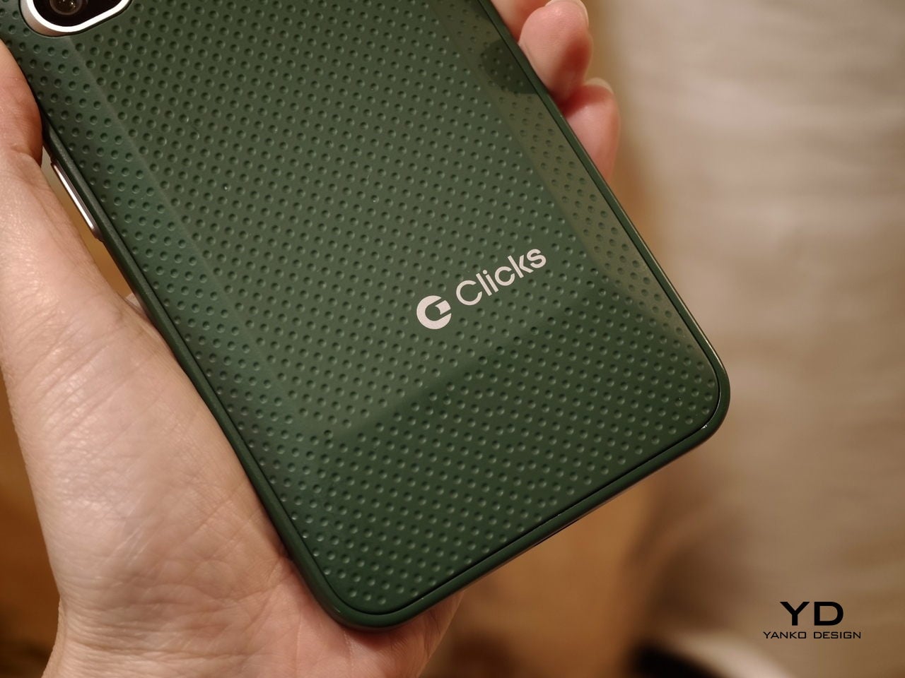
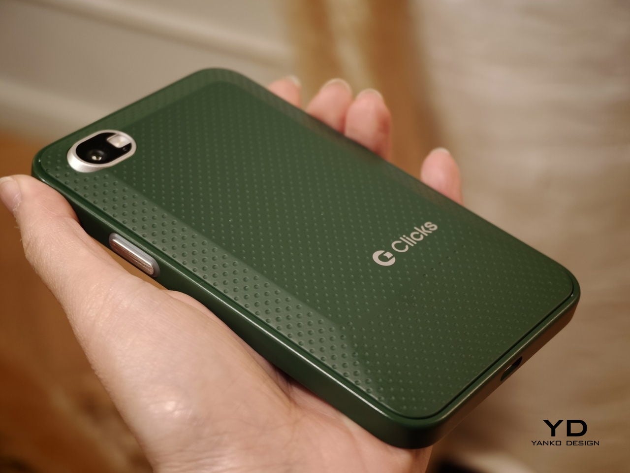
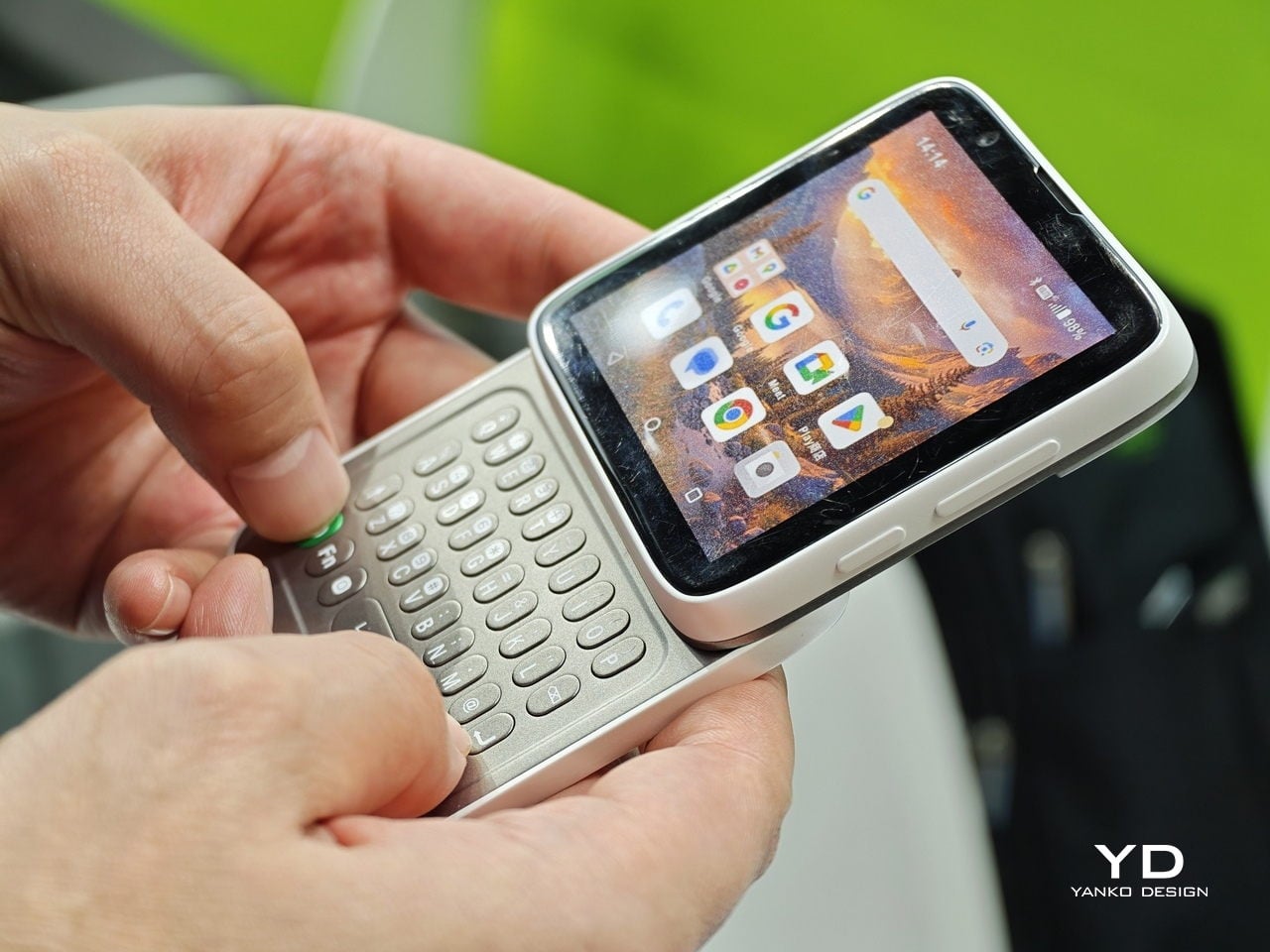
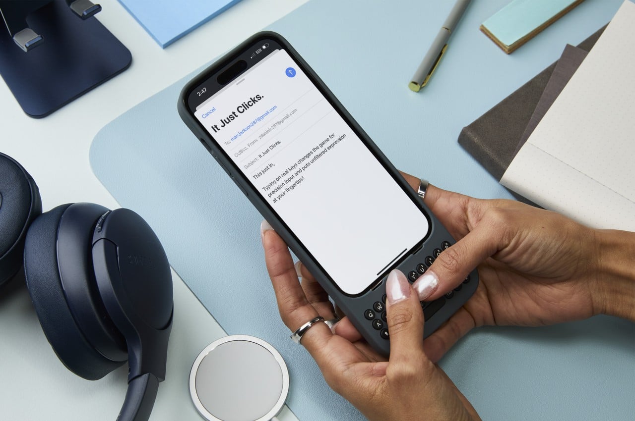
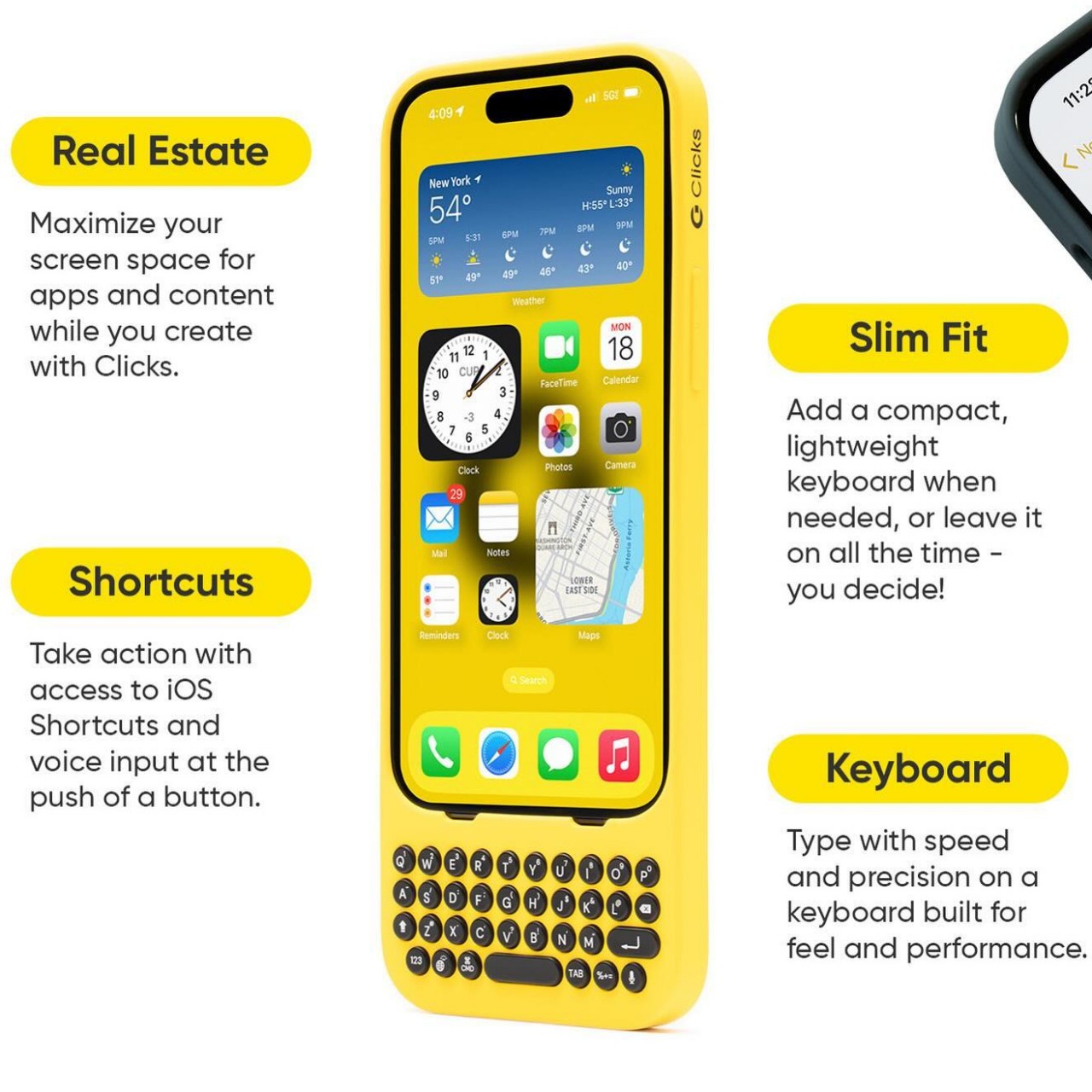
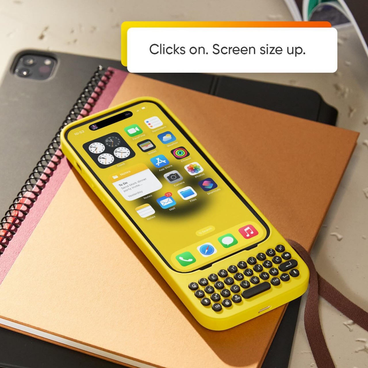
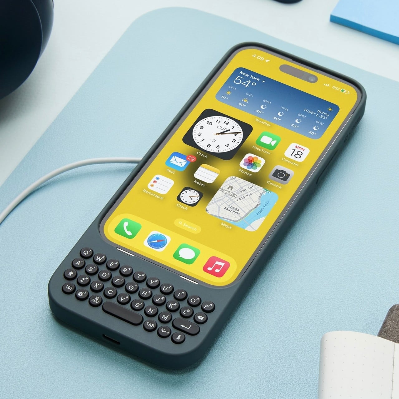
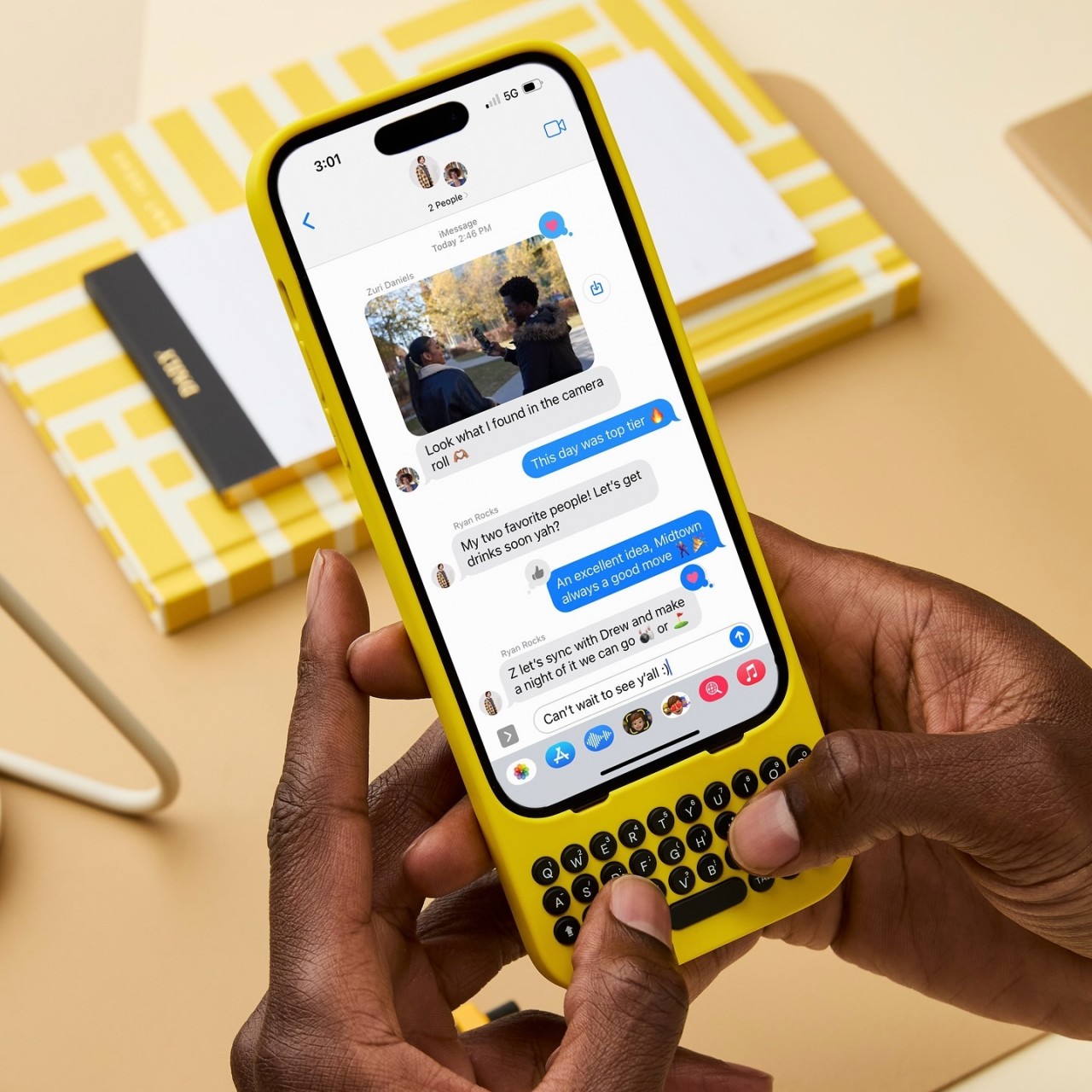
The Clicks Communicator: Intentional Mobile Interaction

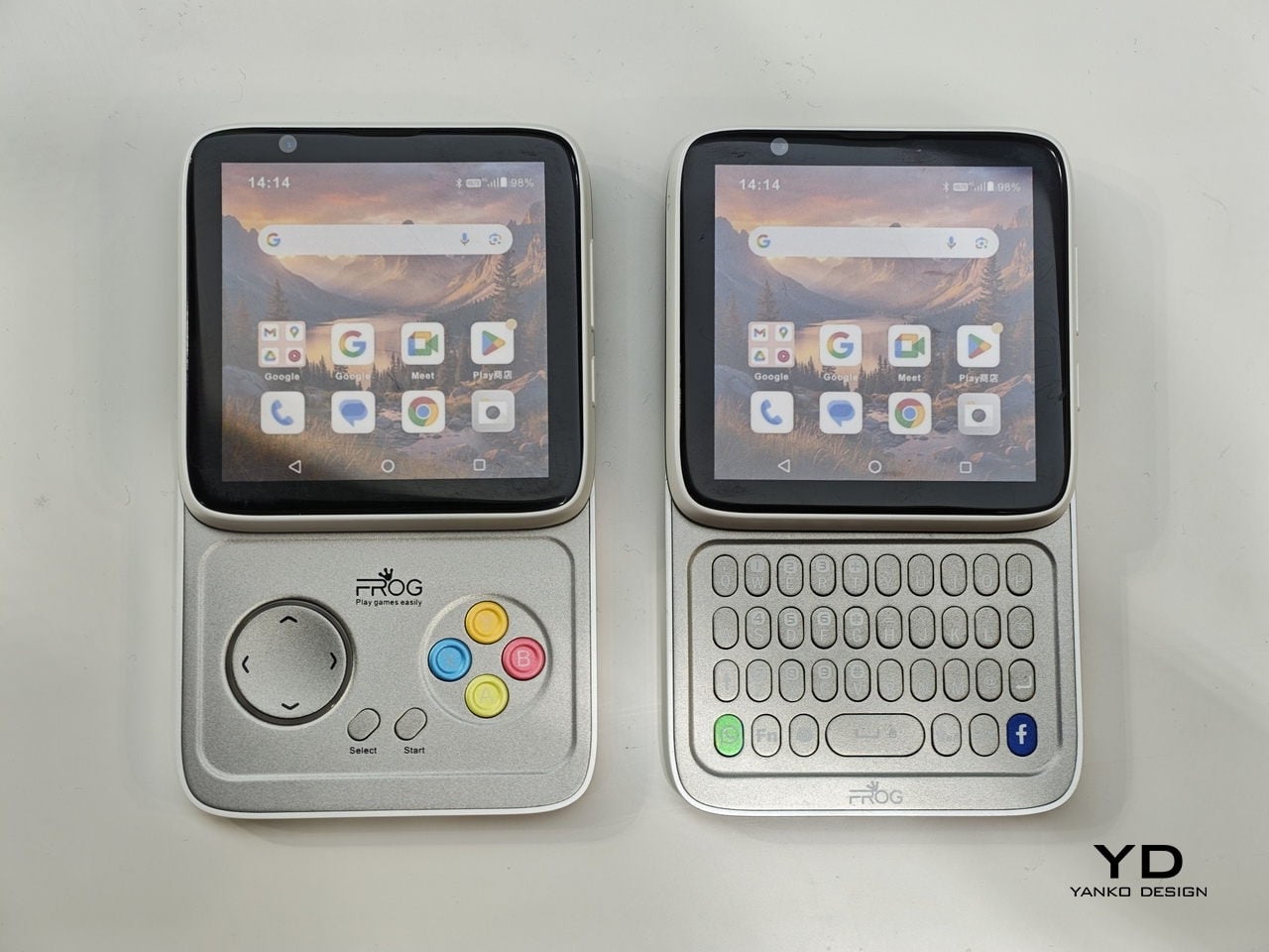
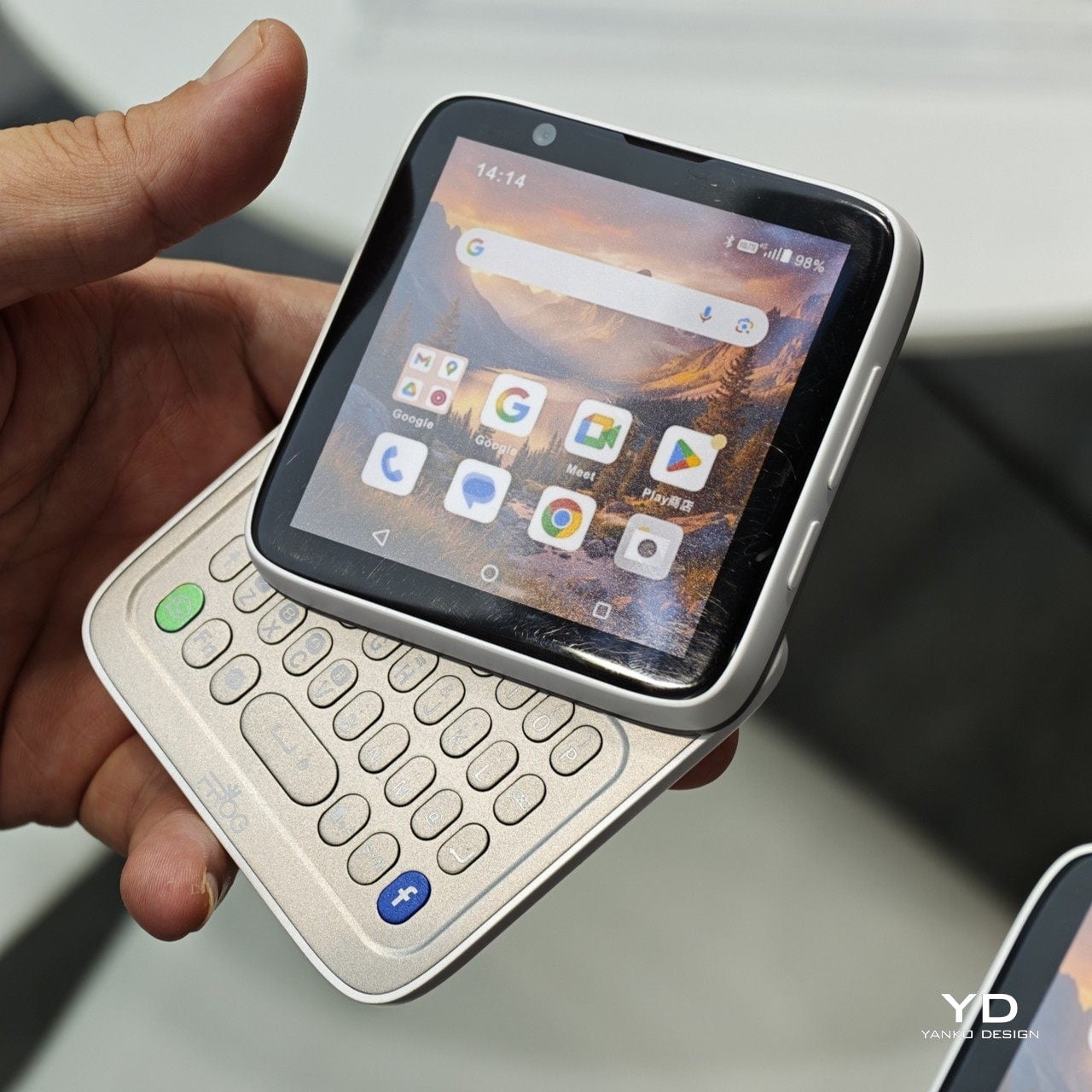
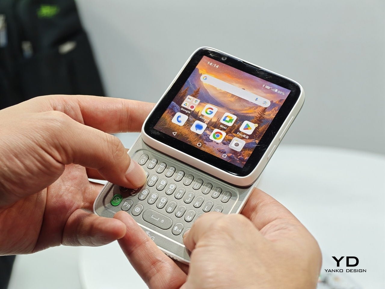
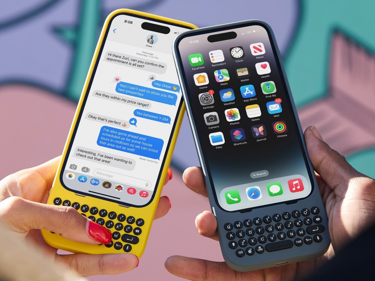
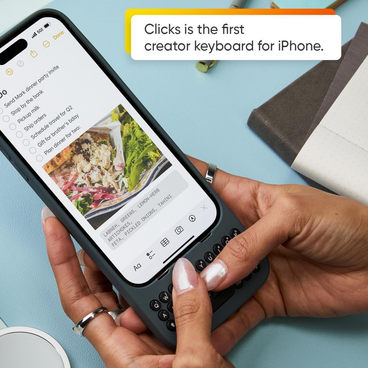
The Clicks Communicator is the most direct physical expression of Hofer’s philosophy. It was the first phone he designed in ten years after BlackBerry, and the central idea is a complete inversion of how smartphones currently work. Rather than an app grid that presents notifications and pulls users in reactively, the Communicator prompts users to decide what they want to do first, then acts on it. Physical keys map to intentional shortcuts: pressing K calls a specific contact, pressing I opens Instagram only when the user has consciously chosen to. “It flips it from being reactionary to intentional,” Joseph says simply.

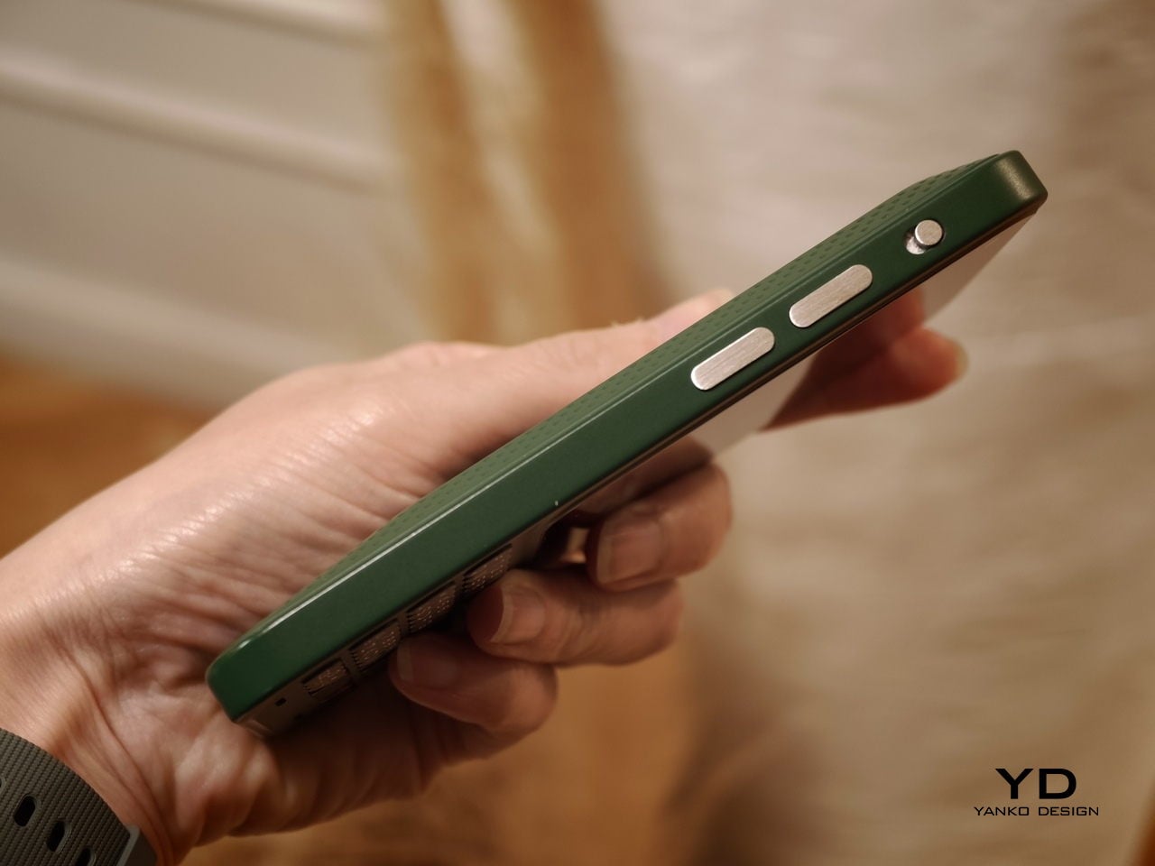
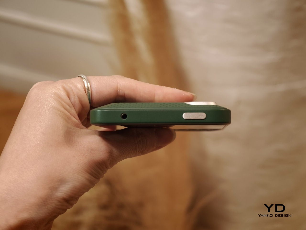
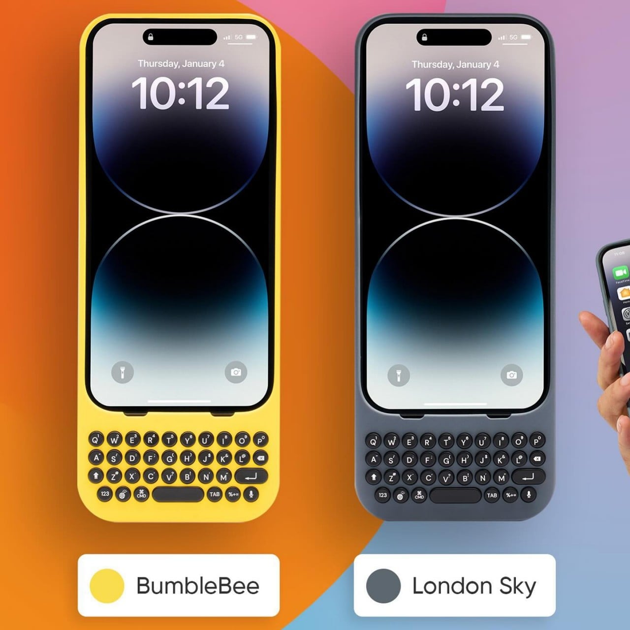
He’s also clear that the product’s appeal isn’t nostalgia. A lot of the customers aren’t even BlackBerry users, he notes; they’re younger people who simply want a different relationship with their mobile device. The Communicator sits within what he sees as a broader 2025 trend of “intentional tech,” products designed to decouple from the everything-phone model and serve one specific purpose well. Adding a 3.5mm headphone jack and a removable SD card wasn’t feature-stacking for its own sake either; those choices are signals to a specific audience that the team is listening and cares about them.

Recognizing Quiet Ideas and Process Discipline

When Radhika points out that the BlackBerry keyboard now feels like it was always inevitable, Hofer pushes back immediately. “Sometimes these quiet ideas that feel obvious or become obvious actually took a lot of effort and iteration to get there,” he says, describing the motto his team lived by: think, build, test. The keyboard’s evolution wasn’t a single stroke of insight; it was a response to real constraints. As iPhones pushed screens larger, BlackBerry faced intense pressure to shrink keypads, which meant switching from oval keys to square ones, losing the tactile separation users relied on. The innovation was subtle: raising a curved edge on each square key to preserve the feeling of the oval, essentially hiding a reference to the old shape inside the new form. Speed tests, accuracy tests, user sentiment on different options, all of that grinding iteration is what produced something that feels natural.

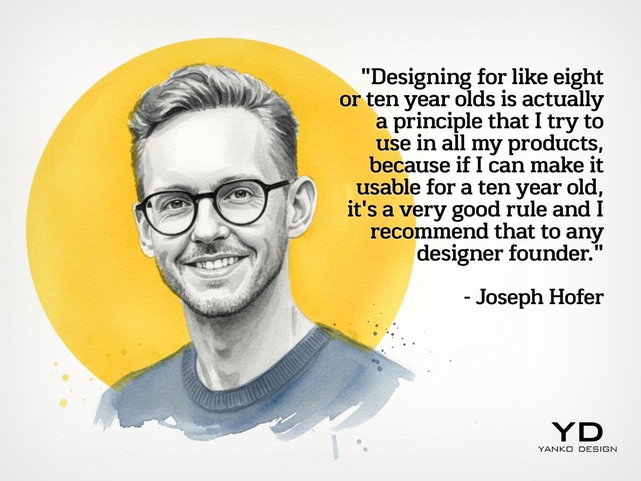
He applies the same thinking to simplicity broadly. Designing for a ten-year-old, he argues, is one of the most useful principles any designer or founder can adopt. If you can’t explain the product to a ten-year-old, it’s too complicated. He tested this literally the night before the recording, sitting down with his eight-year-old daughter to ask about her CD player. Her answer was that it had way too many buttons. Her ideal? Three: power, volume up, volume down. Six identical-feeling buttons with in-mold graphics that disappear in the dark told a clear story about what the designers had gotten wrong.

Restraint as Confidence and Commercial Strategy

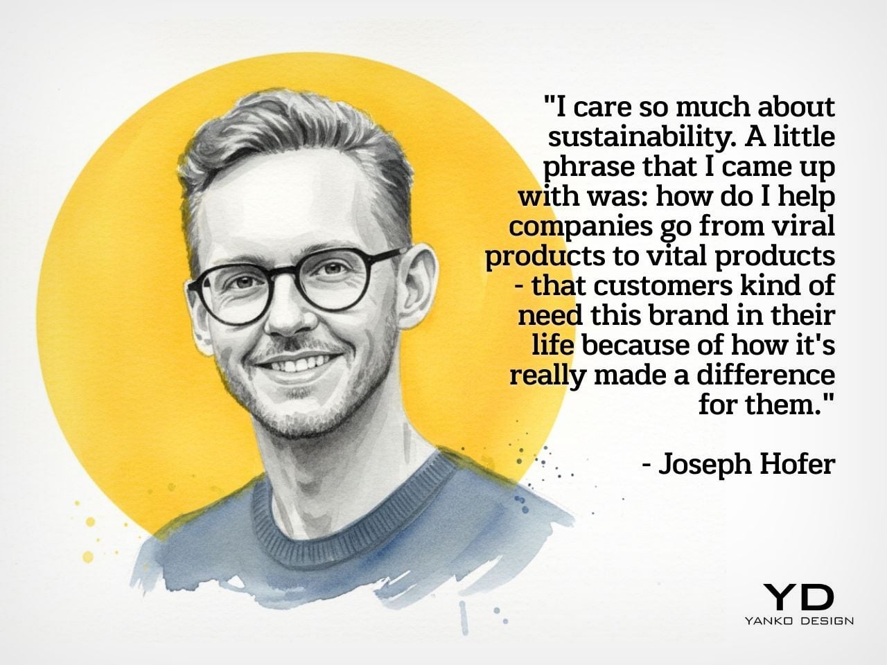
The tension between restraint and visibility is something Hofer takes seriously. He doesn’t frame minimalism as a virtue in itself. “Clarity is actually an even stronger word,” he says, arguing that a vanilla product solving a vanilla problem will simply go unnoticed. The goal isn’t to be quiet; it’s to solve a real, specific problem so well that the product becomes the only answer for a particular group of people. A phrase he came up with captures where he’s trying to take the companies he works with: from viral products to vital ones, products that customers genuinely need in their lives because of the difference they’ve made.

That philosophy maps directly onto commercial outcomes. A product that meets the emotional and functional needs of a user, reduces cognitive load, lasts longer, and has lower return rates naturally builds a brand that draws people in without needing to be aggressively sold. “When products are just better,” he notes, “they need to be marketed and sold maybe less. That’s an effect on your bottom line.” His work at Hofer Studio is less about crafting beautiful objects and more about asking founders what commercial success actually means to them and building backwards from that.

When the rapid-fire round asks him to describe restraint in design in a single word, his answer arrives without hesitation: confidence. “What does obviousness create? It creates confidence. I know how to enter this experience. I know how to start this product. I feel more confident with it in my life.” It’s a fitting close to a conversation that consistently returned to the same idea: that the design decisions nobody notices are usually the ones that took the most care to make.


Design Mindset drops every week on Yanko Design. Catch Episode 19 in full wherever you listen to podcasts. For a free trial of KeyShot, visit keyshot.com/mindset.

Download your Free Trial of KeyShot Here

The post Ex-BlackBerry Designer Is Calling Out Everything That’s Wrong With Modern Phones first appeared on Yanko Design.

Carriers Want This BlackBerry-Style Phone – I Tried It at MWC

When Clicks unveiled the Clicks Communicator at CES 2026, the device immediately stood out in a sea of look-alike smartphones. It pairs a physical QWERTY keyboard with a communication-first philosophy that feels intentionally different from the current slab phone crowd. Clicks also shared several specifications at the time, yet it did not confirm exactly when the phone would launch.

At a Mobile World Congress (MWC) off-site event in Barcelona, Clicks offered a clearer update on where the Communicator stands today. The company used the event to signal that the project is progressing beyond the early reveal phase. It positioned the Communicator as moving steadily toward launch.

Designer: Clicks

Clicks showcased the Communicator to media and potential partners, and I had the opportunity to briefly go hands-on with the device. The unit on display was still a mockup rather than a final production model. Even so, it offered a useful glimpse at how the hardware direction is taking shape.

In hand, the Communicator feels nice and compact, and it sits comfortably in the palm. The balance feels considered, and the overall shape makes it easy to grip without feeling slippery or awkward. Typing also felt comfortable during my short time with it, which is the “make or break” moment for any keyboard phone.

The build felt solid, even in mockup form. One of the most interesting design touches is a magnetic, swappable back panel that snaps on with a confident fit. That modular detail gives the phone a more personal, tool-like vibe, and it suggests Clicks is thinking about long-term ownership rather than quick upgrades.

According to Adrian Li, founder and CEO of Clicks, the Communicator has generated significant interest from the industry over the past few months. Li said the company has been approached by several mobile carriers as well as major retailers that are interested in bringing the device to market. For a young hardware company entering the competitive smartphone space, that attention could be critical.

Carrier partnerships in particular could play a decisive role in the Communicator’s success. While some niche smartphones rely primarily on direct online sales, carrier support can expand a device’s reach through retail stores and bundled service plans. Li noted that Clicks is currently in discussions with potential carrier partners as it explores different distribution strategies for the phone.

Although the prototype shown at MWC was not yet fully functional, the hardware design already reflects the Communicator’s core idea of efficient communication. The device features a compact 4-inch class AMOLED display positioned above a physical backlit QWERTY keyboard. The keyboard is designed to deliver tactile feedback for fast, accurate typing, and it also supports gesture controls for scrolling and navigation.

Under the hood, the Communicator is powered by MediaTek’s Dimensity 8300 processor and runs Android 16. That combination should provide access to the full Android app ecosystem while keeping the experience centered on messaging and productivity. The phone is expected to ship with 256GB of internal storage and support microSD expansion of up to 2TB, which is increasingly rare in modern smartphones.

The rest of the hardware stays firmly in modern smartphone territory. The Communicator includes a 50 MP rear camera with optical image stabilization, plus a 24 MP front camera for video calls and selfies. A 4,000 mAh silicon carbon battery powers the device, with support for USB-C charging and Qi2 wireless charging.

Connectivity options include 5G, Wi Fi 6, Bluetooth, and NFC. A combination of nano SIM and eSIM support gives users flexibility when choosing carriers. The Communicator also retains a 3.5mm headphone jack, which will matter to power users and anyone who still prefers wired audio.

Clicks is building several software features around the phone’s communication first pitch. The device includes a Message Hub that aggregates conversations from multiple messaging platforms into a single interface, which should reduce app hopping. A customizable notification light known as the Signal LED can display different colors depending on which contact or app is reaching out.

Despite its productivity focus, the Communicator is not meant to be a limited-function device. Clicks positions it as either a primary smartphone for users who prioritize messaging or a secondary device that complements a larger entertainment-focused phone. That flexibility could be a key part of its appeal, especially for people who want a more focused tool without giving up modern apps.

As for when the Communicator will reach consumers, Clicks says more information is coming soon. According to the company, the official launch date will be revealed in roughly two months. Until then, the Communicator remains in the promising middle ground between concept and product.

For now, the Communicator blends nostalgia with modern smartphone capabilities in a way that feels deliberate rather than gimmicky. The compact in-hand feel, comfortable typing, and sturdy build are encouraging signs, even if this was not yet a final unit. If carrier and retail interest continues to build, Clicks may be on track to ship a device that serves people who still value fast typing and focused communication in an increasingly distraction-heavy mobile world.

The post Carriers Want This BlackBerry-Style Phone – I Tried It at MWC first appeared on Yanko Design.

This Square Phone Rotates Open to a BlackBerry or Game Boy Setup

Smartphones have gotten pretty good at being the same thing. Every year, they get a little taller, a little thinner, and a little more difficult to tell apart in a lineup. That’s fine for most people, but it does make MWC 2026 feel like a bit of a slog, until you spot something genuinely weird on the show floor, like a square phone that rotates open to reveal either a physical keyboard or a game controller underneath.

The iFrog RS1 is about the size of a closed fist, built around a 3.4-inch square display that sits on top of a rotating lower section. Twist it open, and you get one of two things depending on which variant you’re holding: a full QWERTY keyboard with raised, tactile keycaps, or a gamepad with a D-pad, a four-color face button cluster, and Select/Start buttons. Both run Android on a MediaTek Helio G18 chipset, with storage and RAM left open for whoever configures the platform.

Designer: FROG

That last part matters. iFrog is an ODM, or original design manufacturer, which means the RS1 is less a finished retail product and more a concept that carriers or brands can take and build on. The hardware is the pitch. Everything else is a conversation, which also explains why no pricing or release date was announced at MWC.

Of the two variants, the keyboard is the more predictable crowd-pleaser. There’s a genuinely underserved group of Android users who never stopped wanting physical keys. The BlackBerry crowd never fully disbanded, and phones like the Unihertz Titan have quietly built followings on exactly that. If you’ve ever tried composing a long email on a touchscreen while standing on a moving train, the appeal needs no further explanation.

The gamepad version is a stranger proposition, and honestly, the more interesting one. Running Android means emulation is an obvious draw, and the handheld gaming community noticed immediately. The visual comparison that kept surfacing online was the Motorola Flipout, a 2010 Android phone with a square body and rotating keyboard. There’s something both flattering and sobering in that parallel, since the Flipout was beloved by a small group and largely ignored by everyone else.

There are some caveats, though. No shoulder buttons on the gamepad variant rules out a lot of titles that need them. The swivel hinge is the structural heart of the design and also the part most likely to wear down. iFrog is new enough that questions about long-term software support are fair ones to ask, and the 3.4-inch screen is a genuine trade-off, not a quirk.

Still, the RS1 is a good reminder that the design space for phones is wider than what’s on shelves. It fits in a pocket and in the palm of a hand. It has buttons. It does a trick. What nobody knows yet is whether any of that adds up to something people actually want to live with.

The post This Square Phone Rotates Open to a BlackBerry or Game Boy Setup first appeared on Yanko Design.

Clicks QWERTY keyboard iPhone case brings back the joy of typing

Remember the days when you could swiftly type a long response on your phone in just seconds? Even if you didn’t own a BlackBerry, our amazing human brains managed to evolve to adapt to the esoteric T9 input, resulting in a flurry of thumbs hammering out text at mind-blowing speeds. Just like with pen and paper, there are benefits to having physical keys to type with, including muscle memory, accuracy, and sheer satisfaction. Those are the joys that this new case is trying to bring to the iPhone by snapping on a full yet tiny QWERTY keyboard that gives creators the power to turn text into stories, quickly and accurately.

Designers: Michael Fisher and Kevin Michaluk

Although the BlackBerry is now a footnote in history, there was a time when it was the de facto standard of productivity. It’s a bit ironic that its most iconic feature is all but a memory today when text is even more critical in mobile life. From notes to todos to captions to messages, we type plenty of text on our touchscreen smartphones, which painfully drives home the fact that these smooth, flat surfaces have terrible ergonomics and haptics for such an activity. There have been a few attempts at resurrecting the BlackBerry or at least bringing the physical QWERTY keyboard to smartphones, but Clicks is trying to differentiate itself by projecting a fun and creative character that’s more in line with today’s creators.

For one, the cases distance themselves from the drab and serious styles of business-minded BlackBerry clones by embracing colors and curves, whether it’s the yellow Bumblebee or even the gray London Sky. Perhaps to avoid any litigation like its forebears, Clicks adopts circular keys with some spacing in between, giving the keyboard a more whimsical appearance. Regardless of the design, the Clicks QWERTY case has the same mission as all other QWERTY cases before it, bringing a familiar sensation to upgrade the typing experience. Best of all, the keyboard no longer eats up half your screen, leaving room for more content.

Using the case itself is as simple as pie. You slide the iPhone in from the top, carefully align the Lightning or USB-C connector, and snap the top on. The case doesn’t have a battery of its own, which makes it lighter and cheaper, so it draws power from the iPhone itself. It does support pass-through charging so you don’t have to remove the case just to charge the iPhone. The one drawback of its simple design is that MagSafe accessories won’t stick to it, but you can still enjoy wireless charging on a flat horizontal surface.

The Clicks QWERTY keyboard case is compatible only with the iPhone 14 and iPhone 15 models, though their availability won’t happen all at the same time. The $139 price tag is going to be debatable, especially for those who aren’t yet convinced of the advantages of having a physical keyboard at the cost of making a tall phone even taller. But for creators who find themselves always pecking at their phone’s screen, this quirky accessory is a done deal.

The post Clicks QWERTY keyboard iPhone case brings back the joy of typing first appeared on Yanko Design.