5 Tiny Homes That Prove Small Spaces Can Still Have It All

The conversation around tiny homes keeps shifting. What started as a fringe lifestyle experiment now reads as genuine design ambition, with builders pushing layouts harder, finding space where there wasn’t any, and refusing to treat square footage as the ceiling on comfort. The five homes on this list are built proof of that shift. Each one solves a different problem. Taken together, they make a compelling case that small living doesn’t demand sacrifice.

Across 16 to 34 feet, these builds cover everything from ultra-mobile nomad rigs to a home confident enough to fit a bathtub and a dishwasher in the same floor plan. Some prioritize affordability. Others chase the kind of finish that would look right in a full-sized house. What ties them together is doing more with less, refusing to let square footage set the terms, and making a strong case for what the category is becoming.

1. Adirondack
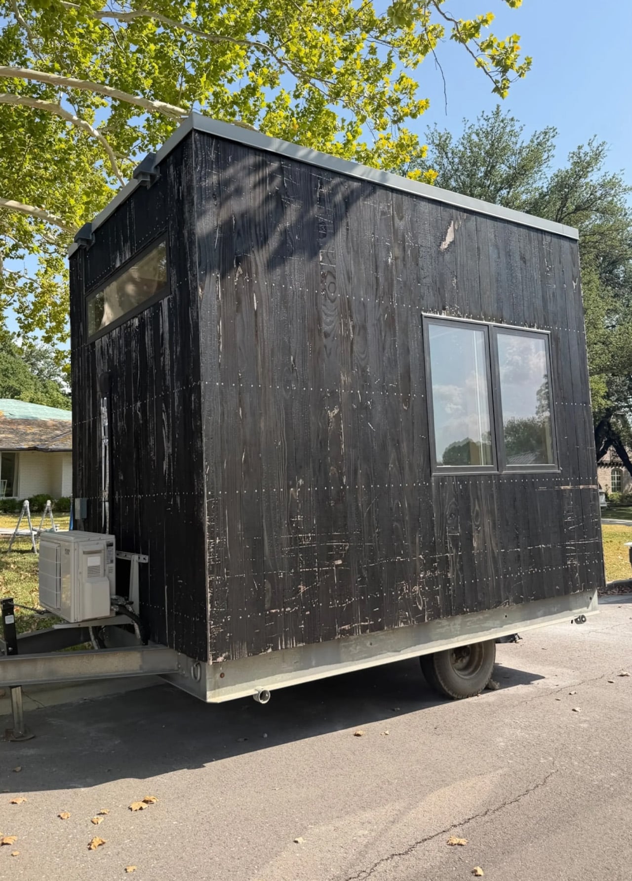
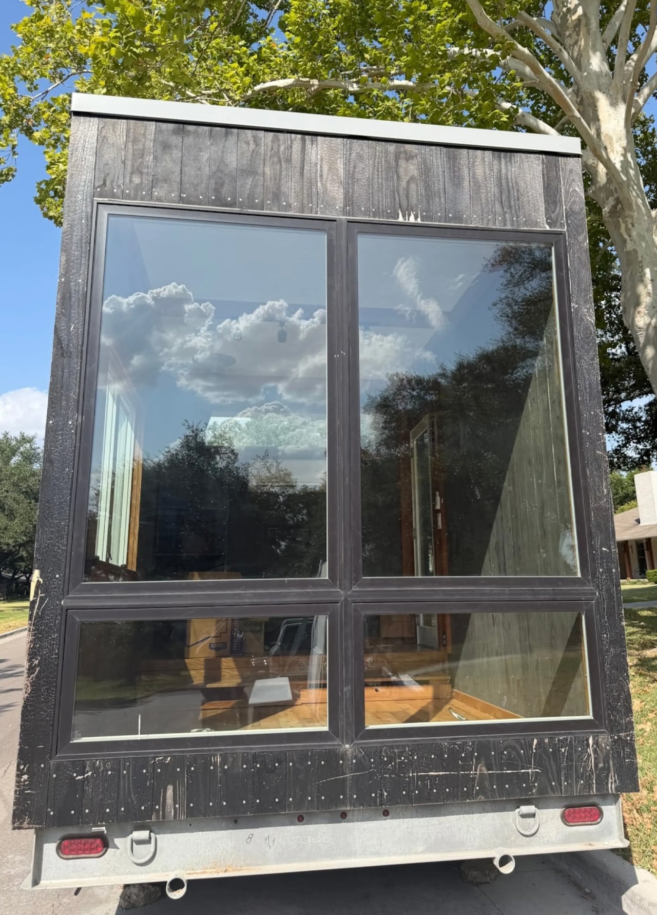
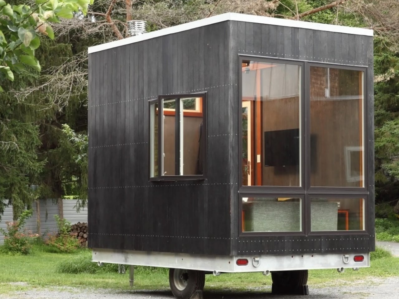
The Adirondack looks like it survived a forest fire and came out better for it. That charred exterior is the first sign that Cubist Engineering is playing a different game. Priced at $39,500, it’s among the more accessible builds in the current market, but affordability isn’t the most interesting thing about it. The bed is hidden beneath the floor, which means the main living area spends the day as an actual living area rather than doubling as a bedroom no one ever leaves completely made.

That kind of decision changes how a small space feels to inhabit. You get a floor plan that reads as genuinely open because nothing is anchored in the middle of it. The charred timber exterior also does real work beyond aesthetics, weathering in a way that improves with exposure rather than degrading. For someone entering tiny living for the first time and looking for a layout that punches above its price point, the Adirondack makes a clear and persuasive case for what smart space planning can actually look like.

What we like:

  • A bed that disappears beneath the floor gives the main level a sense of openness that fixed sleeping arrangements simply can’t match
  • $39,500 is one of the lowest price points for a build this considered

What we dislike:

  • The underfloor bed mechanism adds a moving part that will need attention over the life of the home
  • The charred aesthetic is a strong visual commitment that won’t translate to every landscape or setting

2. Nido 5.5
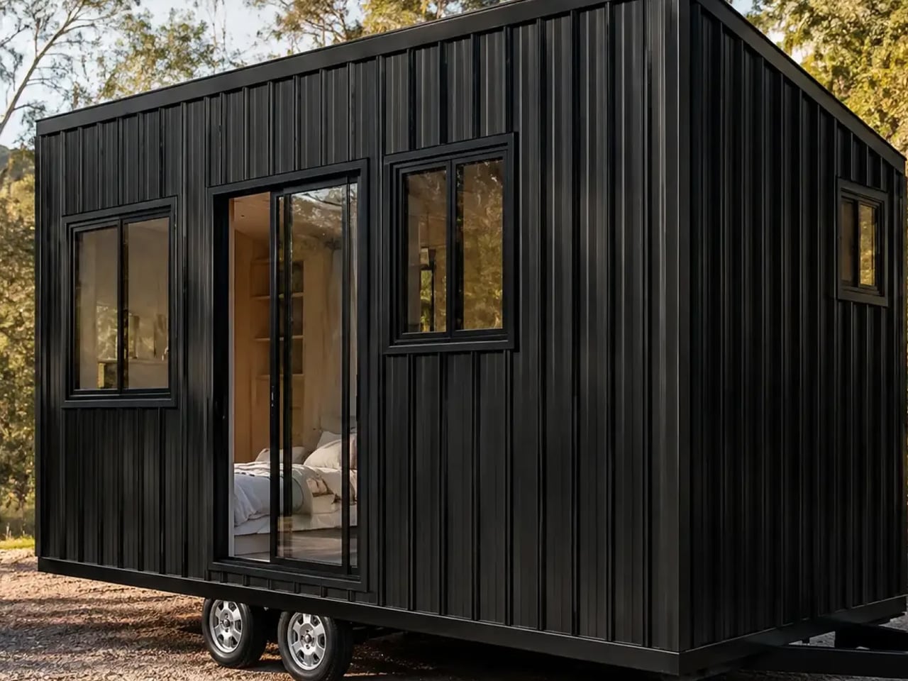
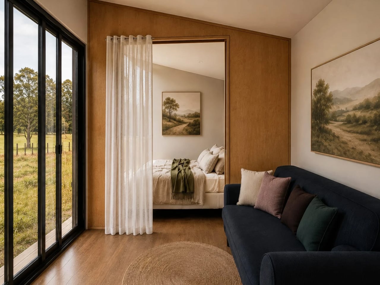
Tiny Tect Tiny Houses is a Queensland-based builder run by husband-and-wife team Ben and Alison, and their latest model is the smallest thing the studio has ever shipped. At 18 feet, it lands just under the psychological threshold where most builders start making concessions on proportion. Ben and Alison didn’t. For a duo whose previous work already operated at a compressed footprint, building smaller wasn’t about starting from scratch. It was about distilling what they already knew.

At $64,000, this is the kind of build that rewards people who know what they actually need from a home rather than what they think they do. For solo dwellers or couples who want genuine mobility without dragging a large trailer behind them, the 18-foot format is worth taking seriously. The Queensland provenance also means the build has been designed with warm, humid conditions in mind, a practical advantage for anyone placing it in a similar climate from day one.

What we like:

  • Husband-and-wife builders bring a different kind of accountability to a build than a larger production studio would
  • 18 feet with finished proportions is a difficult thing to pull off, and this team has the track record to back it

What we dislike:

  • $64,000 for 18 feet is a premium that buyers will be measuring against larger, cheaper alternatives
  • A Queensland-climate build may need adjustments for colder placements at higher latitudes or elevations

3. The Sunrise
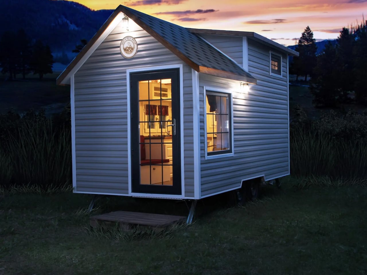
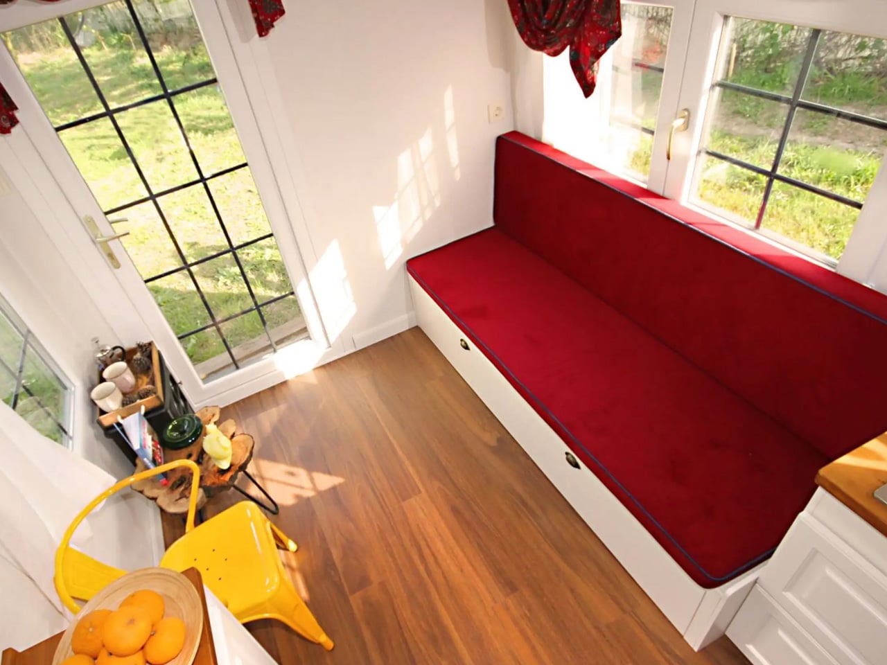
The tiny home movement has been quietly drifting toward bigger. Floor plans stretch, footprints grow, and somewhere along the way the original appeal- freedom, mobility, a lighter relationship with where you live- gets quietly traded for more counter space. The Sunrise doesn’t do that. At 20 feet, it holds the size line and builds everything around the people who actually want to move, the ones who treat the road as a feature rather than a limitation they’re working around.

For anyone chasing genuine mobility without settling for a camper van interior, the Sunrise offers a credible middle path. It’s a proper home layout, not a converted box, but at 20 feet it stays light enough and short enough to tow without special permits or a truck upgrade. The design philosophy here is coherent all the way through: this is a home for people who want to go somewhere, and everything about it reads as a decision made in service of that premise rather than against it.

What we like:

  • 20 feet keeps it genuinely towable without sacrificing an interior that reads as a home rather than a vehicle
  • The clarity of the nomad-first design brief gives this build a focus that more feature-loaded homes often lose

What we dislike:

  • A layout optimized for travel will deprioritize some domestic comforts that stationary tiny homeowners expect
  • Two people is the practical sleeping limit, which rules it out for small families or anyone who hosts regularly

4. Ellice
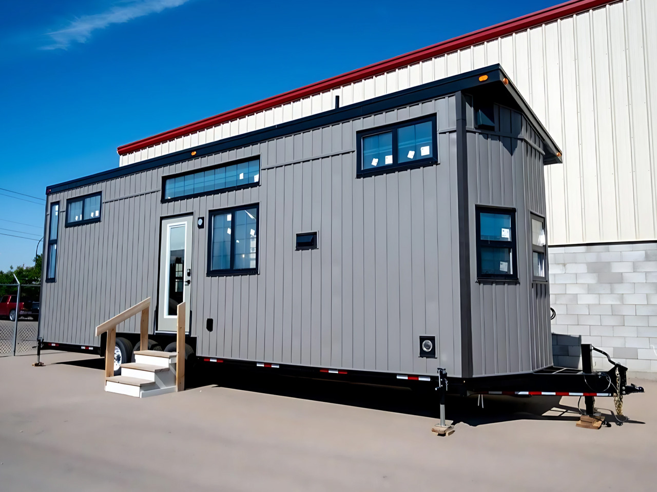
Tiny homes have a reputation for asking a lot of you. Give up the tub. Forget the dishwasher. Learn to love a twin mattress. Teacup’s Ellice doesn’t agree with any of that. At 34 feet, it’s the largest build on this list, and it uses that length deliberately, fitting a dishwasher, a full bathtub, and a king-sized bed into the same floor plan without the layout feeling like a negotiation. The Ellice is what a build looks like when a designer decides compromise is optional.

The bathtub alone puts it in a different category. Full soaking tubs are almost always the first thing cut in tiny home design, surrendered to the bedroom or kitchen in the volume math. Teacup kept it, and that decision cascades into what kind of life this home makes possible. For someone moving out of a full-sized house without any interest in leaving their evening routine behind, the Ellice removes the most common objection to tiny living without having to inflate the floor plan to do it.

What we like:

  • A king-sized bed and a bathtub in the same build is genuinely rare territory for a home on wheels
  • The dishwasher signals a full domestic life, not a stripped-down one

What we dislike:

  • 34 feet limits the range of sites where this can park and restricts how easily it repositions
  • The larger footprint demands a capable tow vehicle, which adds real cost to the ownership equation

5. Petite Pelican
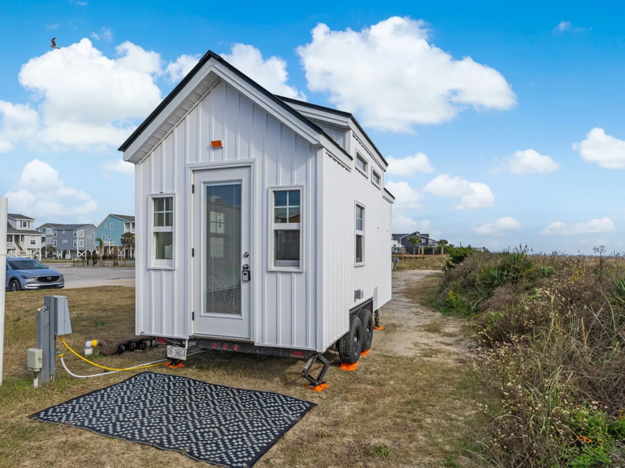
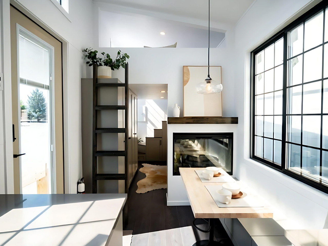
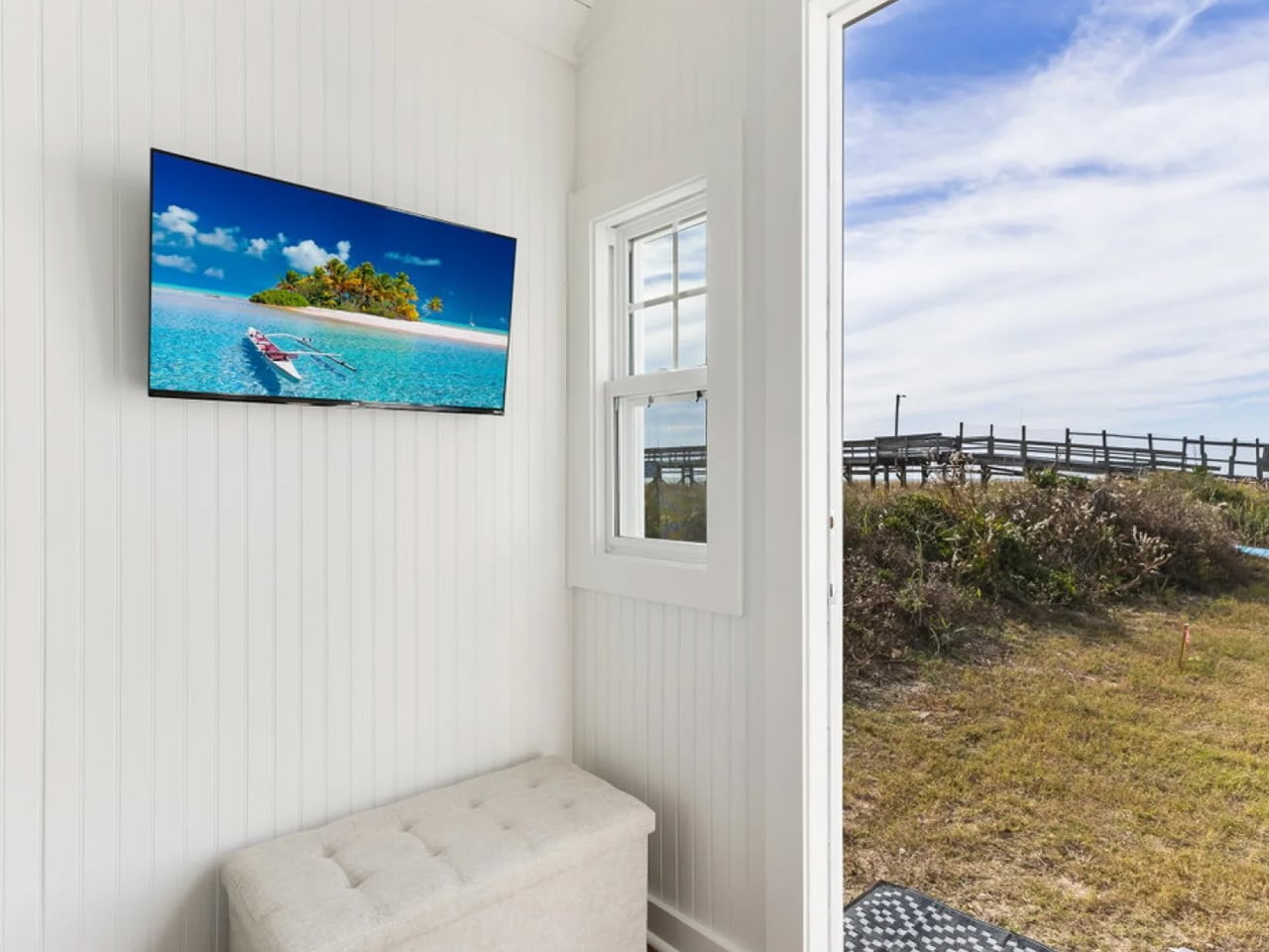
At just 16 feet long, the Petite Pelican fits a full kitchen, bathroom, loft bedroom, and sleeping for four into 128 square feet of main-level living, with another 60 square feet in the loft above. White board-and-batten siding meets a black metal gable roof on the outside. Inside, sage green cabinets and butcher block counters anchor a galley kitchen built around a full-size fridge and freezer. It rides on a double-axle trailer, currently listed in North Carolina for $60,000.

If you’ve assumed a mobile tiny home can’t sleep more than two people without feeling like an imposition, this layout is worth studying. A daybed with a pullout trundle handles two guests at the main level, while the loft holds a double bed lit by clerestory windows on both sides. The underside of the staircase becomes open shelving for the kitchen, a detail that turns dead space into daily function. For a turnkey rental property or a genuinely livable first home, the Petite Pelican makes the number of people it sleeps feel almost unreasonable given the footprint.

What we like:

  • Sleeping four inside 128 square feet without the layout feeling strained is a real design achievement
  • A full-size fridge and freezer make this livable in a way that most 16-foot builds simply aren’t

What we dislike:

  • Sixteen feet leaves very little room for storage beyond what’s already been built into the shell
  • A curtain instead of a glass shower partition feels like a step down at the $60,000 price point

The Size Was Never The Problem

Five homes, five different definitions of having it all. For the Adirondack, it’s a floor that opens to reveal a bed. For the Ellice, it’s a bathtub nobody asked you to surrender. For the Petite Pelican, it’s four people sleeping comfortably inside 128 square feet. The headline makes a claim, and each build answers it on its own terms, solving a different problem without leaning on the others to make the case.

Small spaces have always had the potential to hold more than the square footage suggests. What these five homes add to that argument is specificity. A hidden bed. A loft lit by clerestory windows. A nomad shell that stays mobile without going minimal. The category is past novelty. These builds are what it looks like when designers stop apologizing for the size and start treating it as the whole point.

The post 5 Tiny Homes That Prove Small Spaces Can Still Have It All first appeared on Yanko Design.


A Side Table That Actually Hides Books in Plain Sight

Most side tables are liars. They show up looking clean, then gradually become the household surface nobody planned for: stacked magazines, a charging cable, three remote controls, and that one book you’ve been meaning to finish for six weeks. The table itself never had a real answer for any of it, just a flat top and occasionally a drawer that rattles. The clutter isn’t a behavior problem. It’s a design problem, and most furniture refuses to admit it.

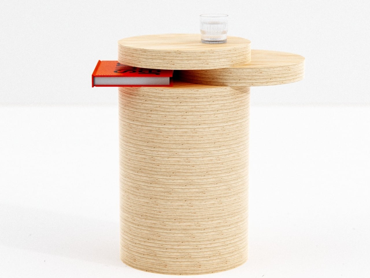
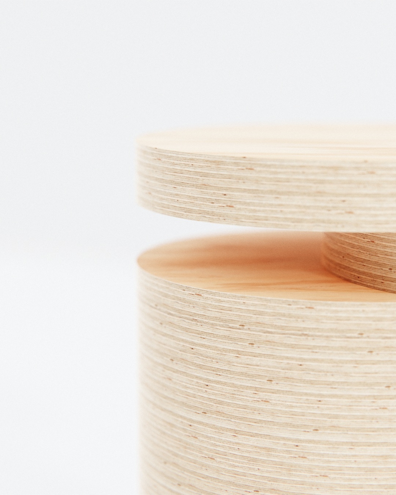
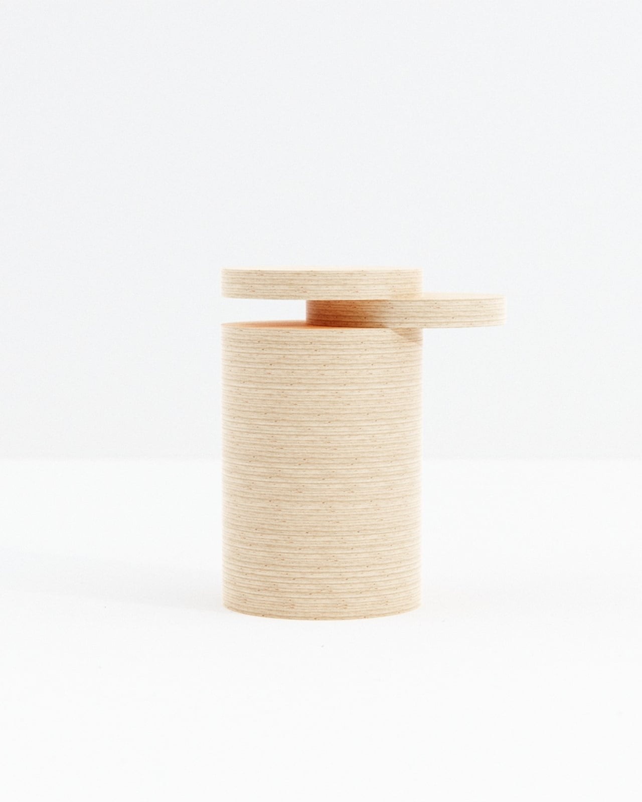
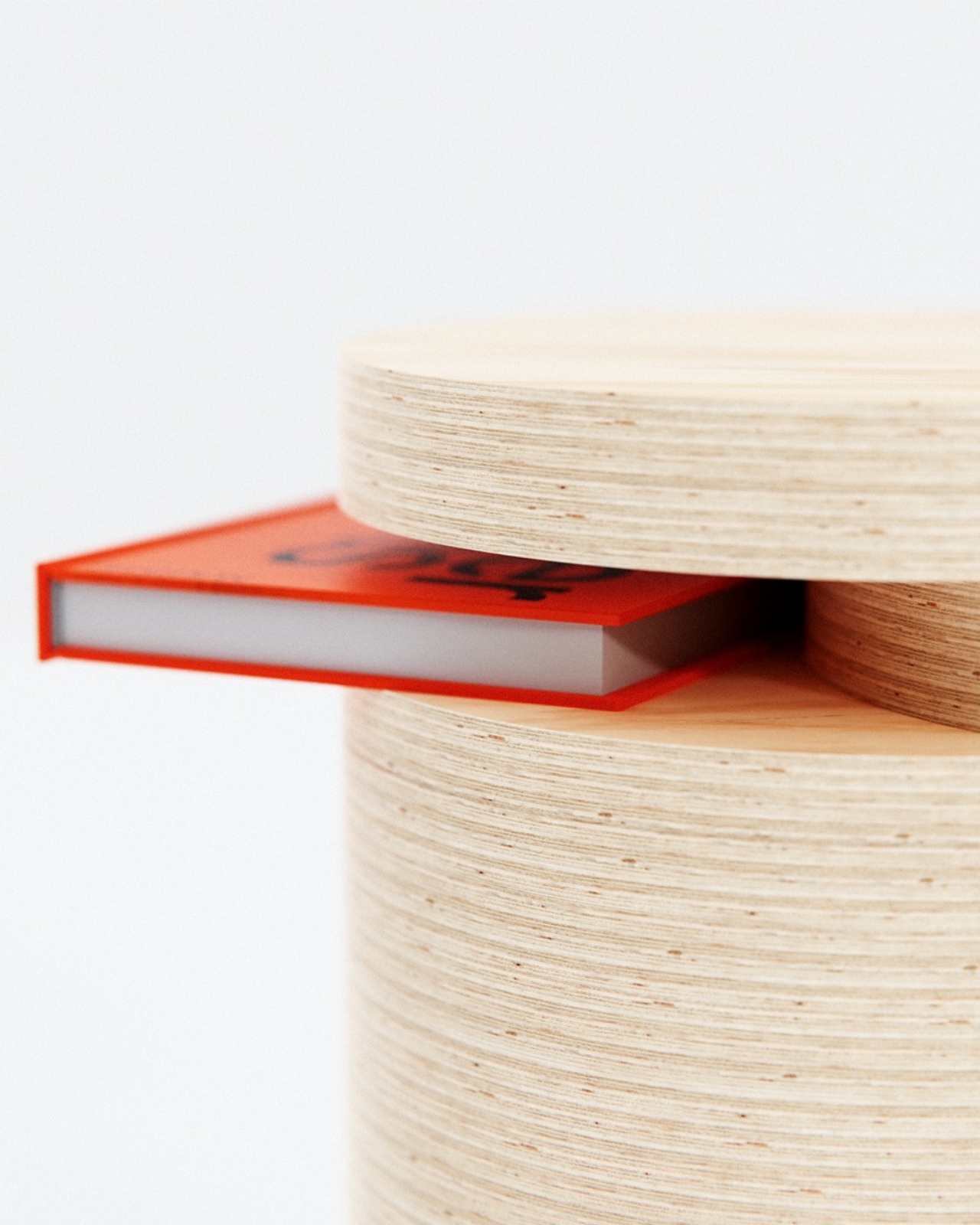
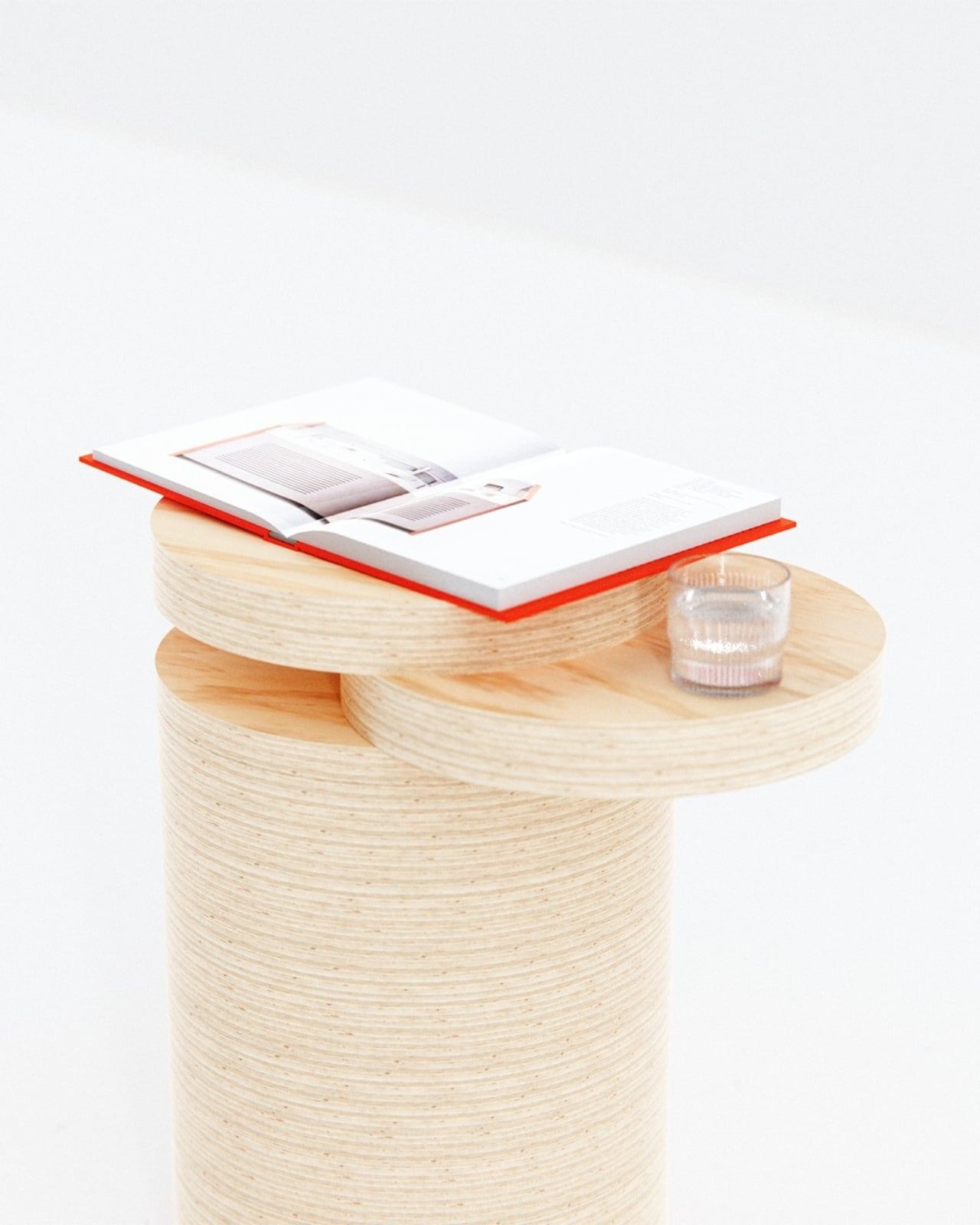
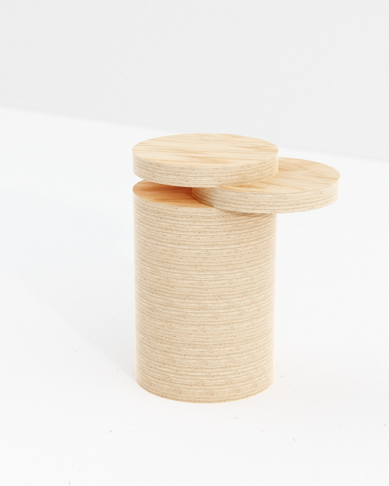
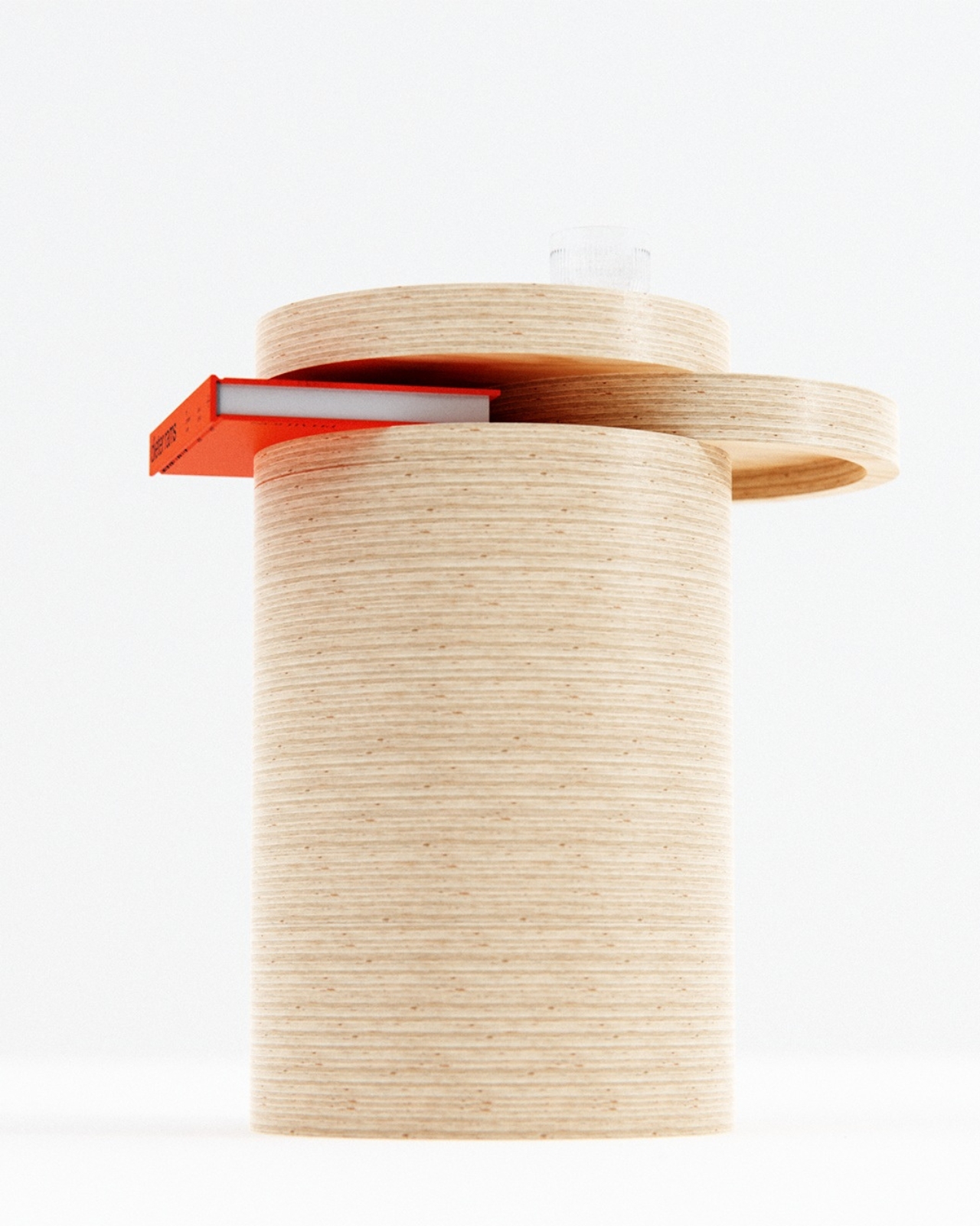
Liam de la Bedoyere, the designer behind Bored Eye Design, built the Nudge Side Table around a different premise. The storage isn’t added to the table. It is the table. A thick cylindrical column of stacked plywood discs rises straight up, and near the top, two large circular platforms sit at slightly different heights, offset from each other just enough to open a horizontal slot between them. That slot fits a book. No drawer, no shelf bracket, no hinge. The gap does the work, and the gap only exists because one disc was deliberately nudged out of alignment with the other.

Designer Name: Liam de la Bedoyere (boredeye design)

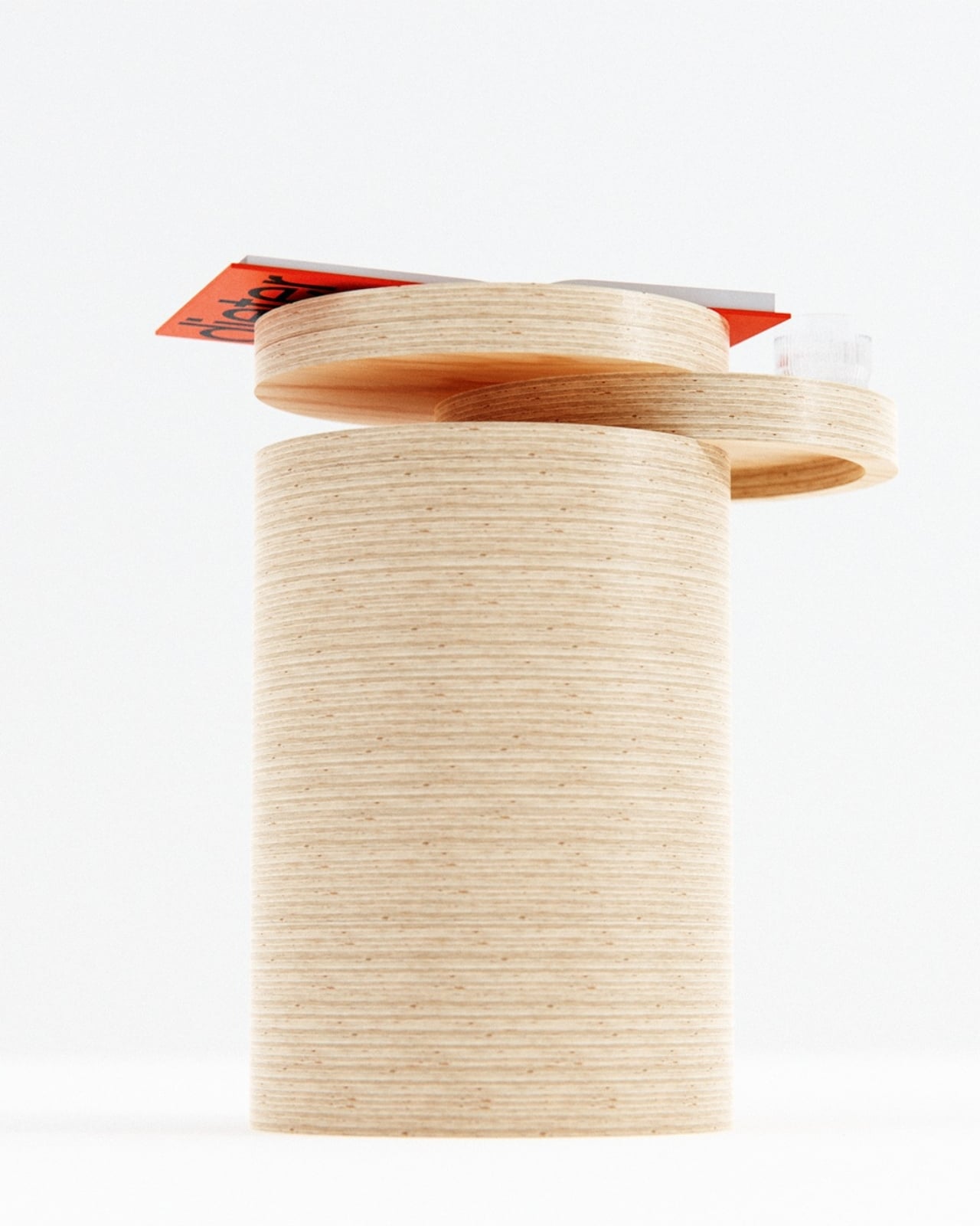
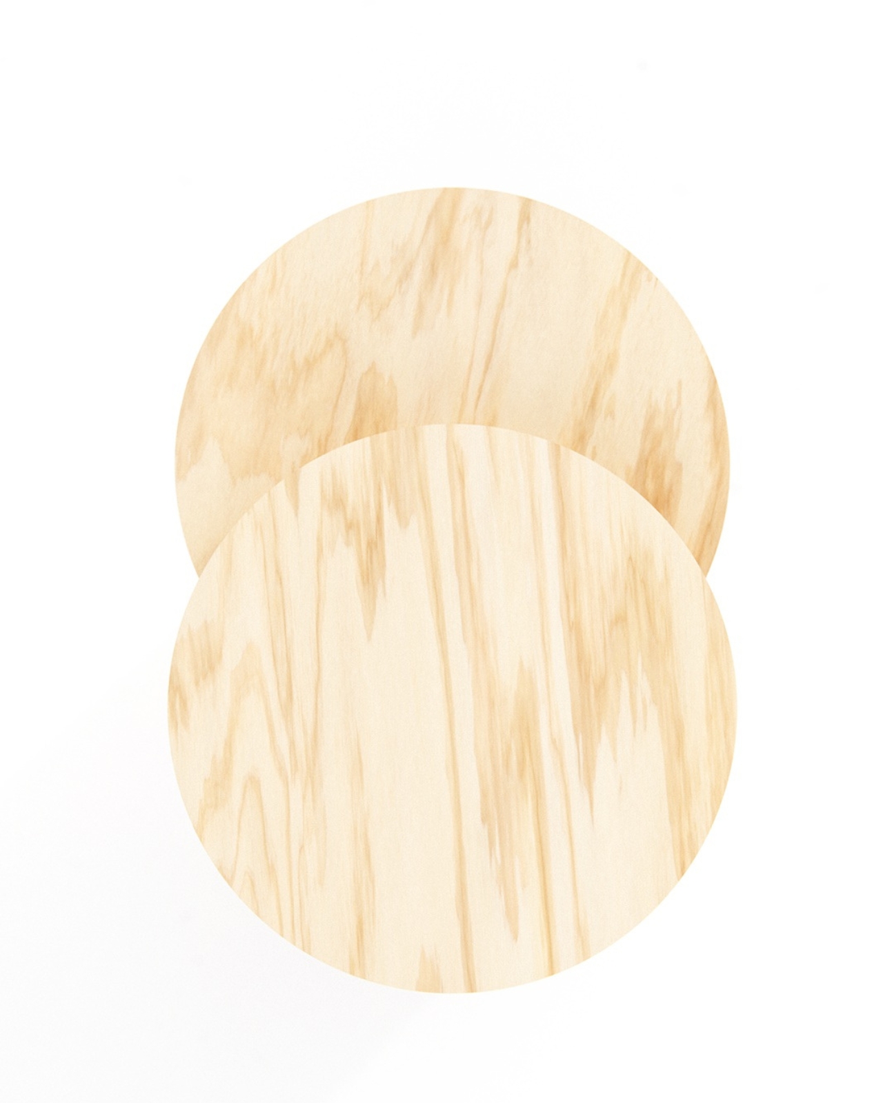
The material choice earns its place here. Plywood is not a compromise; it’s a decision. Looking at the cylindrical body of the Nudge table, every individual layer is exposed on the curved surface, running around the column in thin parallel lines like growth rings on a cross-section of a tree. Up close, the texture reads almost geological, warm and stratified, with the natural variation in the pine grain showing through the smooth flat tops of both platforms. From above, the two circles overlap partially in a configuration that looks less like furniture and more like a Venn diagram drawn by someone who actually cared about geometry.

The proportions matter a lot here. The column is wide enough to feel substantial without being squat, and tall enough that the offset platforms land at a genuinely useful height next to a sofa or armchair. The upper disc sits slightly higher and further back; the lower disc projects forward, and the book rests in the slot between them, its spine flush with the edge. From the front, a bright red cover peeking out of the gap adds exactly the kind of color accent the natural pine needs. De la Bedoyere didn’t paint anything or add contrast artificially. He let the objects that live on the table do that instead, which is a confident move.

From certain angles, the silhouette is almost totemic. Two thick circles floating above a ribbed cylinder, slightly misaligned, the book suspended horizontally between them. It photographs like sculpture, but it functions without any instruction required. You look at it and immediately understand where the book goes. That kind of instant legibility is harder to achieve than it sounds, especially when the mechanism is structural rather than applied.

I keep thinking about what this table refuses to include. No joinery hardware buried inside the column. No shelf underneath with a lip to prevent things from sliding off. No rubber feet dressed up in brushed metal. The cylindrical form is self-contained, the platforms are the table, and the offset between them is the storage. Every potential addition was apparently considered and then left out, which is a discipline that most furniture design at any price point genuinely struggles with.

De la Bedoyere has been working through this problem across several pieces now. His Notch table earlier this year carved a vertical slot into a set of solid wooden legs for the same purpose. The Nudge table arrives at a similar conclusion through a completely different construction logic, stacking instead of subtracting, horizontal storage instead of vertical, two surfaces instead of one. Same stubbornness about keeping things elemental, different answer.

Side tables rarely attract this level of structural thinking. They get treated as the afterthought of the living room, bought last and replaced first. The Nudge table argues that the piece sitting closest to how you actually spend your time at home deserves more than a flat top and a prayer. Sometimes the most useful thing a designer can do is move one circle slightly to the left and let the gap speak for itself.

The post A Side Table That Actually Hides Books in Plain Sight first appeared on Yanko Design.
This 266-Square-Foot Shipping Container in Ohio Comes With a Private Hot Tub, a Fireplace, & Its Own Forest

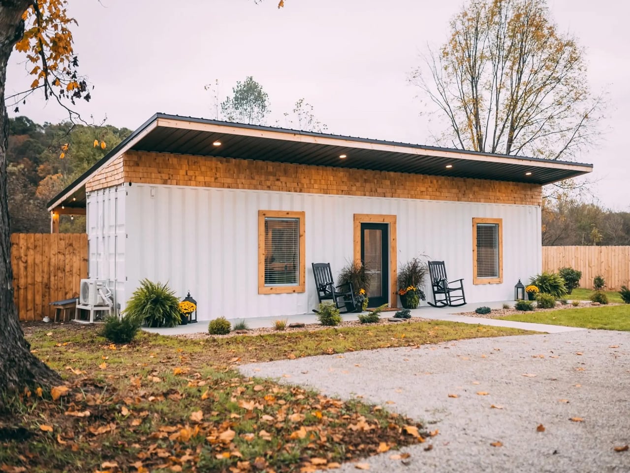
266 square feet of shipping container sitting in an Ohio forest shouldn’t feel like somewhere you’d want to spend a weekend — and yet, somehow, the Luna Cottage does exactly that. Tucked into the heart of Hocking Hills, right on the edge of Wayne National Forest, this two-person retreat is far more considered than its industrial origins might suggest.

Built by Hocking Hills Cottage Company, it sits among four secluded properties near Old Man’s Cave, each anchored by a private hot tub, each betting on the idea that less space can still mean a better experience.

Designer: Hocking Hills Cottage Company

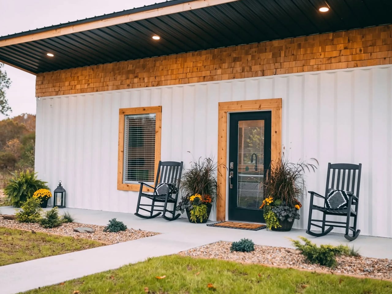
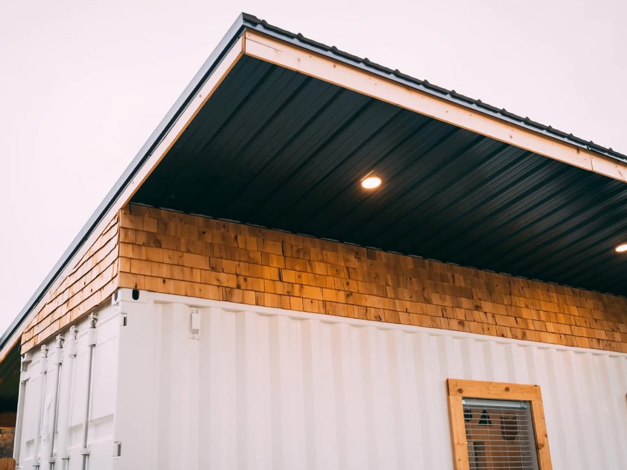
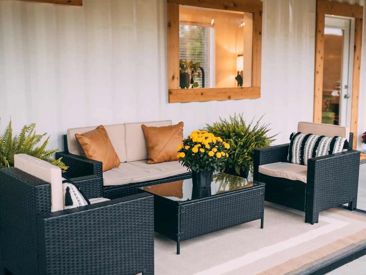
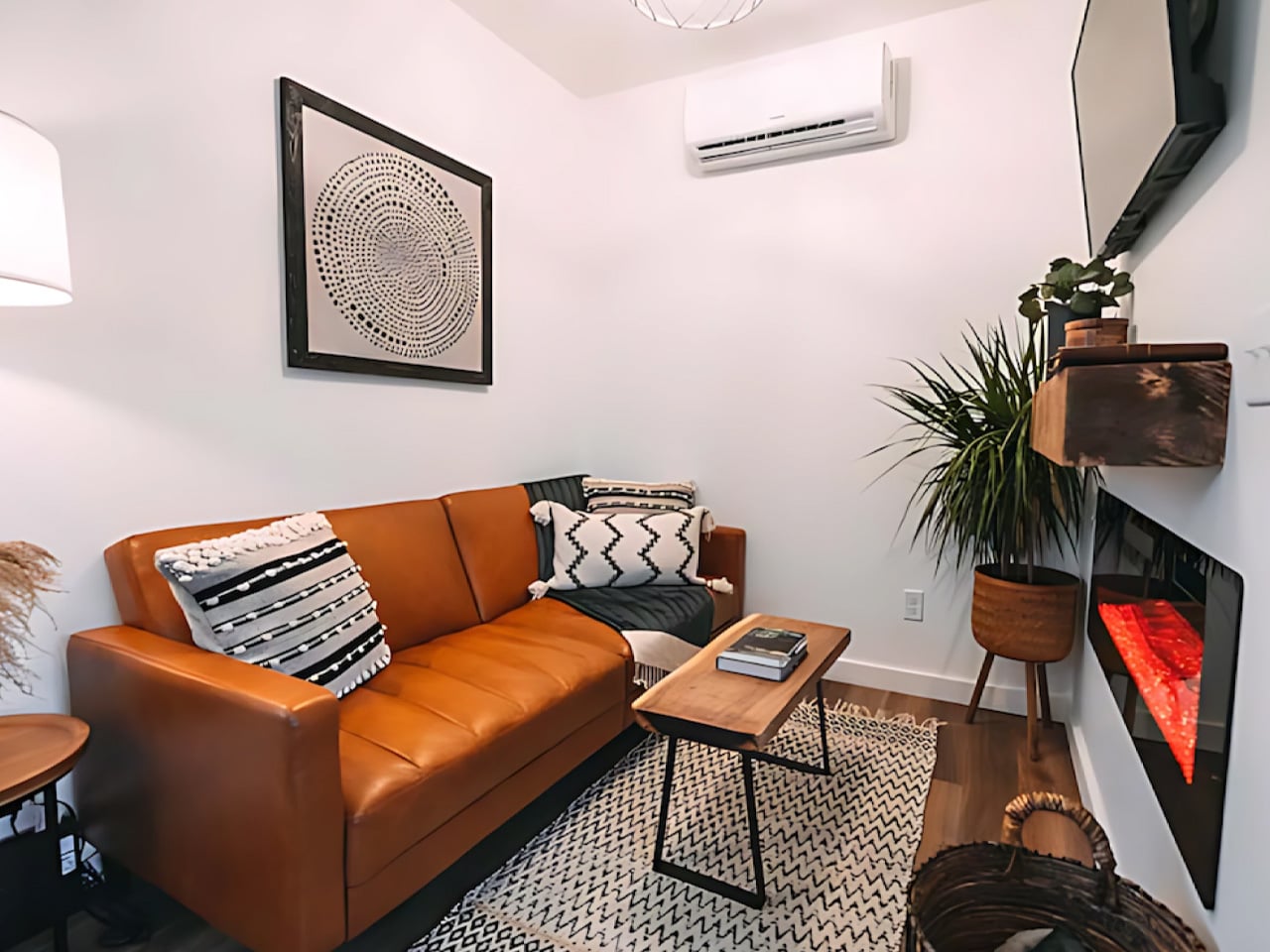
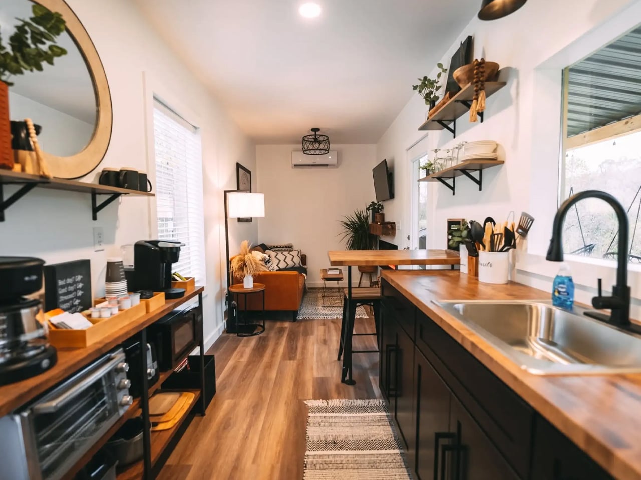
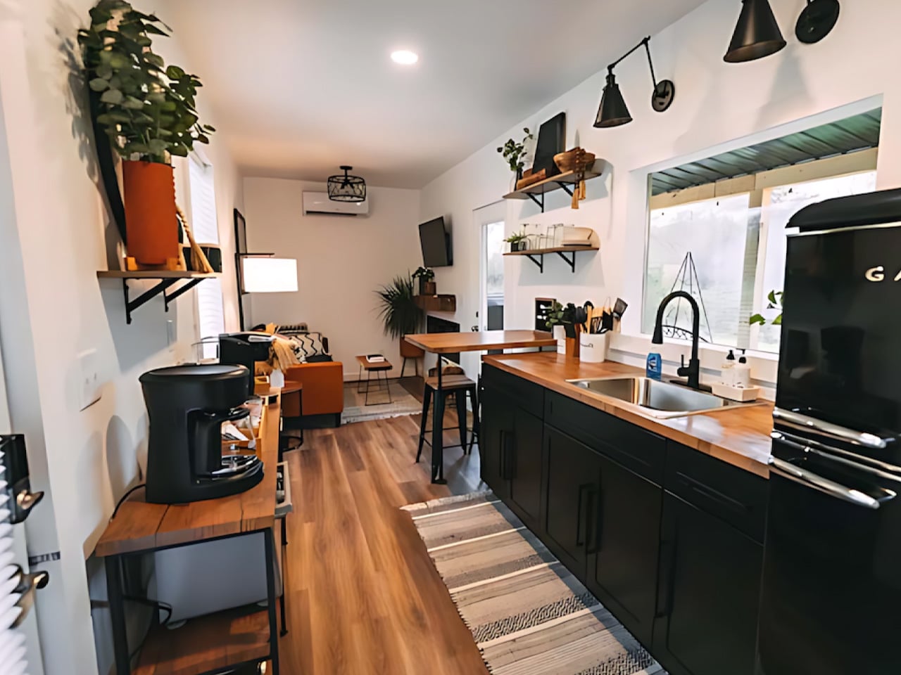
The exterior is immediately striking — a clean white container with a covered porch that softens its hard geometry against the surrounding tree line. Inside, the single bedroom and bathroom layout strips away the excess. What remains is a living room with a sofa, coffee table, and electric fireplace; a kitchen stocked with a cooktop, microwave-oven-air-fryer combo, and refrigerator; and a coffee, tea, and hot-cocoa bar that signals the designers thought carefully about the rhythms of a morning here. A mini-split keeps the climate in check regardless of the season. Roku TV and WiFi are present, but they feel secondary — the kind of amenities that exist if you need them, not ones that define the space.

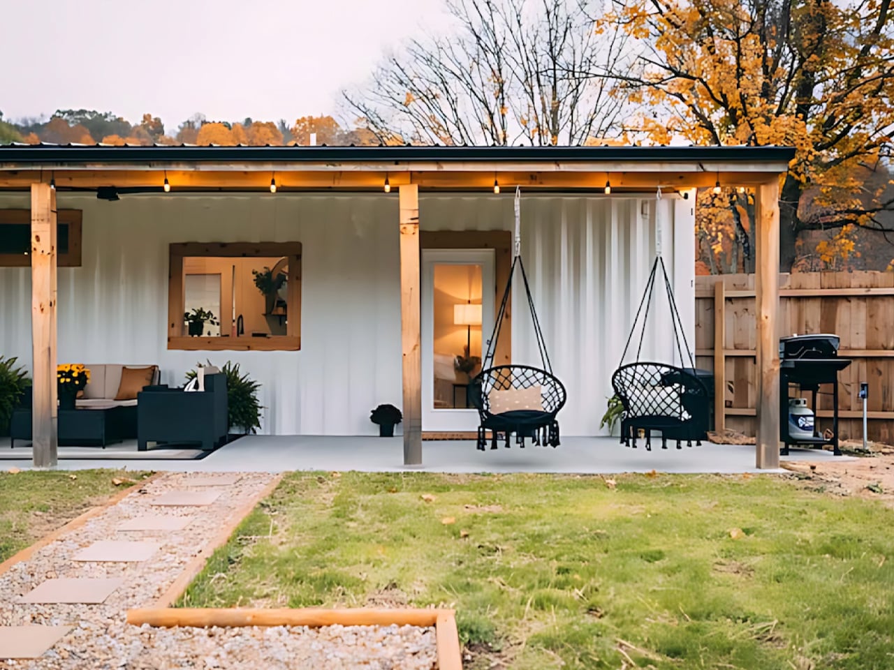
What the Luna Cottage understands is that the real draw is outside its walls. A Master Spa hot tub and a fire pit anchor the outdoor experience, giving guests a reason to sit still and actually inhabit the landscape around them. The flat, easy-access driveway — suitable for any vehicle — removes the logistical friction that often makes rural stays feel more effortful than restorative. For two people looking to decompress, the setup is uncomplicated in the best way.

Pet-friendly and deliberately intimate, the Luna Cottage occupies a specific niche that the broader hospitality industry still hasn’t fully figured out: the micro-stay that doesn’t ask you to sacrifice comfort for concept. Shipping containers have become a familiar shorthand for alternative living, but they rarely land with this level of warmth. Here, the industrial bones are present but never cold.

The wood tones, the fireplace glow, the porch framing a slice of forest — it all coheres into something that feels genuinely lived-in rather than staged. In a region known for its gorges, caves, and waterfalls, the Luna Cottage earns its place not by competing with the landscape but by giving you the right place to return to after it.

The post This 266-Square-Foot Shipping Container in Ohio Comes With a Private Hot Tub, a Fireplace, & Its Own Forest first appeared on Yanko Design.
VAIO’s Multi-Flip laptop is back after a decade, and it’s not cheap

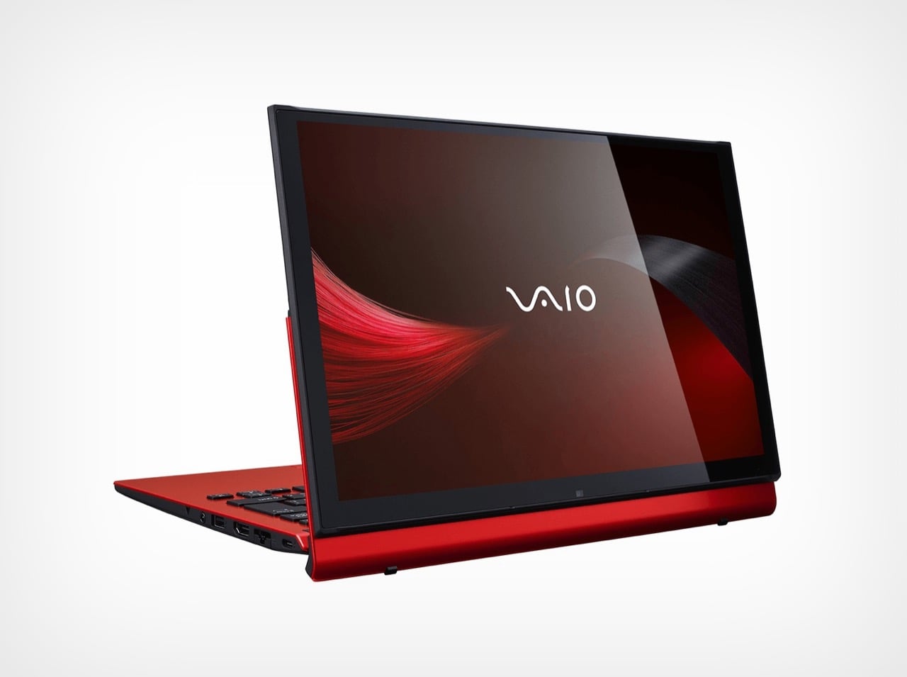
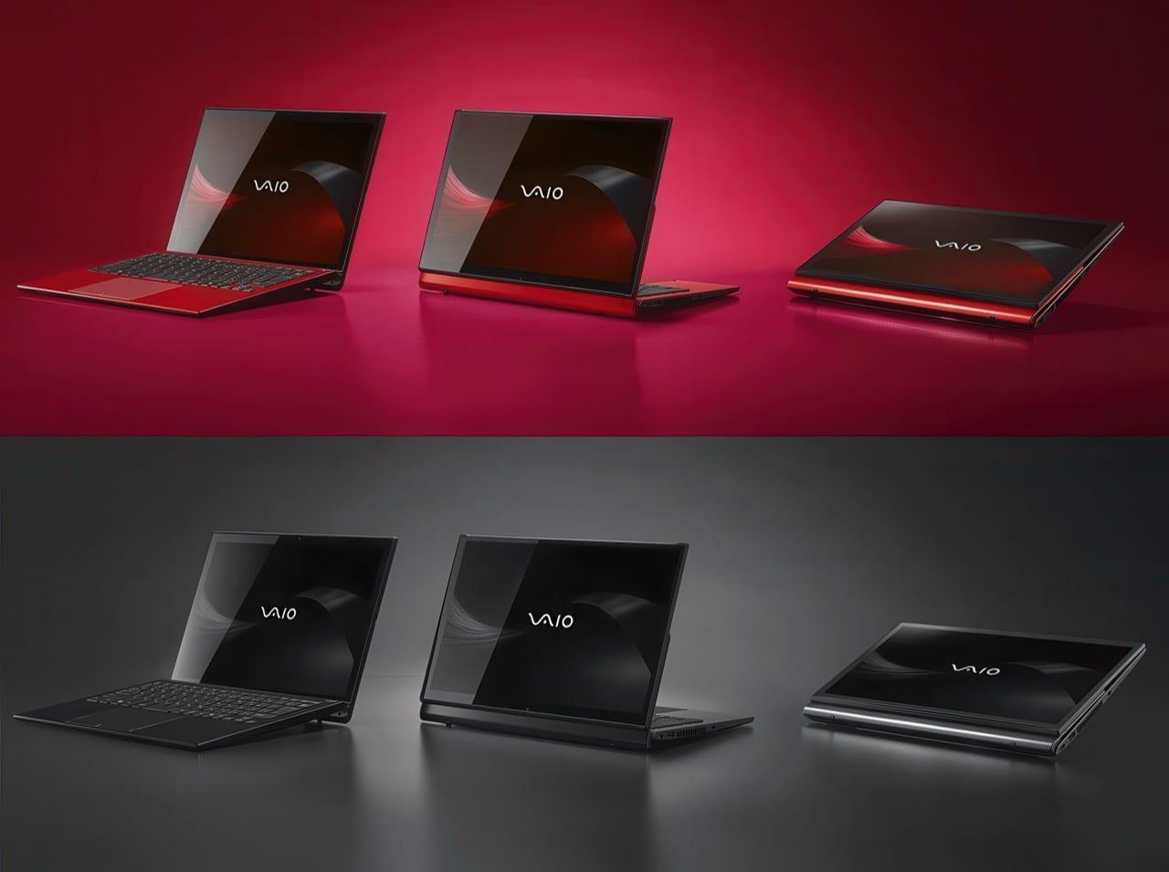
Count how many times you have flipped your convertible into tablet mode this year. I am guessing the number sits closer to zero than to ten, and the reason is that your palms end up resting on a live keyboard, which feels like holding a cat backwards. VAIO’s fix is a 13.3-inch laptop called the VAIO T, whose display rotates 180 degrees on a pivot in the center of the lid so the keyboard folds away inside instead of facing the world. The mechanism rides on two urethane sheet hinges with the display cable sandwiched between them, locked by VAIO’s first magnetic retention system. Prototypes got flexed by hand over 20,000 times before anyone signed off on it.

This is the Multi-Flip Mechanism, and VAIO has not built one since the Z Flip in 2016. Sony launched the idea on the VAIO Fit 13A in 2013 and lost the format war to Lenovo’s cheaper, simpler 360-degree hinge, the one every convertible still uses today. The double hinge instinct has not stayed buried either. Acer flirted with something similar at IFA 2026 through Project DualPlay Mini, a gaming handheld that splits open on a second hinge to expose a keyboard, part of our best of IFA 2026 coverage. The VAIO T is the first product co-developed since Nojima acquired VAIO in January 2025, and the first entry in a range the company calls VAIO Next. Pricing starts at 374,000 yen, about $2,400, with nothing announced for markets outside Japan.

Designer: VAIO

The three modes sound simple until you try describing them without waving your hands around. Fold the top half of the display toward you from a normal open laptop and you land in view mode, screen facing outward for a meeting or a presentation while the keyboard sits underneath doing nothing. Keep folding and the lid closes flat with the display on top, and you have a tablet, minus the part where your palm rests on a row of keys. VAIO says the urethane sheet hinges and the sandwiched display cable were the hard part to get right, since a flexible cable running through a rotating joint fails in ways a fixed one never does. The magnetic retention is new to this generation and exists to stop the whole assembly from drifting loose between shapes.

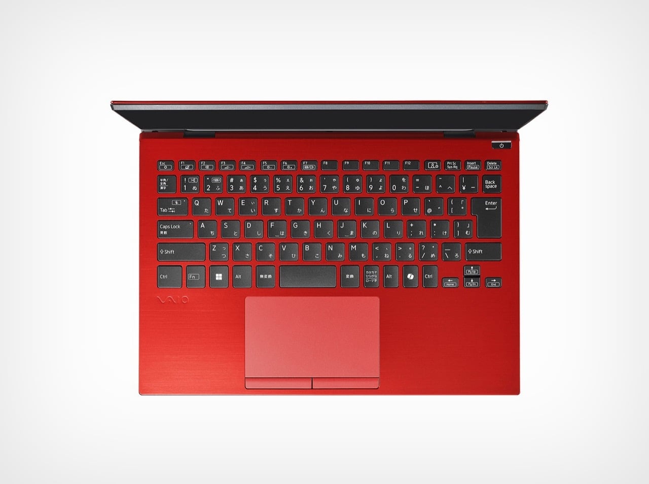
VAIO also used the relaunch to pull its favorite color story back out. Kachi-iro is a near black indigo made by pounding dyed cloth, worn by samurai centuries ago because the name sounds like the Japanese word for victory, and VAIO has been putting it on flagship machines since a special edition SX12 back in 2021. The T ships in fine black and fine red as standard, with a Kachi-iro Special Edition reserved for the VAIO Store and paired with the fastest chip on offer, an Intel Core Ultra X7 358H with a stronger integrated GPU. Everyone else chooses between the eight core Core Ultra 5 325 and the sixteen core Core Ultra 7 356H. It is a small flourish, but it tells you exactly which customer VAIO is chasing.

The rest of the spec sheet is competent rather than dramatic, which is fine, since the hinge is doing the talking. The 13.3-inch touchscreen runs at 2560 by 1600 in a 16:10 frame, glossy, built on VAIO’s flash surface glass, an odd choice for a machine designed around showing your screen to someone across a table, since that is exactly when glare shows up uninvited. Memory tops out at 64GB on the Core Ultra 7 configuration, storage climbs to a 2TB PCIe 5.0 SSD, and an optional battery claims around 18 hours of video playback under Japan’s generous JEITA 3.0 standard.

None of it comes cheap, and none of it comes to the US. The base configuration starts at 374,000 yen, close to $2,400, for a Core Ultra 5 with 16GB of memory and a 512GB drive, before you add storage, the bigger battery or an English keyboard as paid extras. VAIO has not announced any plan to sell the T outside Japan, so this is a laptop most of us can admire through a browser window and nothing else. I would also gently point out that a glossy panel is an odd choice for a machine built around showing your screen to someone across a table, since that is exactly the moment glare tends to show up uninvited.

Still, the interesting part of this story was never really the spec sheet. It is that a company selling laptops for a living looked at its own back catalog, found the mechanism everyone else abandoned a decade ago, and decided the abandoned one was actually correct. Lenovo’s hinge won the market. VAIO’s hinge is making the argument that winning the market and solving the problem were never quite the same fight.

The post VAIO’s Multi-Flip laptop is back after a decade, and it’s not cheap first appeared on Yanko Design.