Ergonomic mouse concept oddly looks like a familiar home appliance

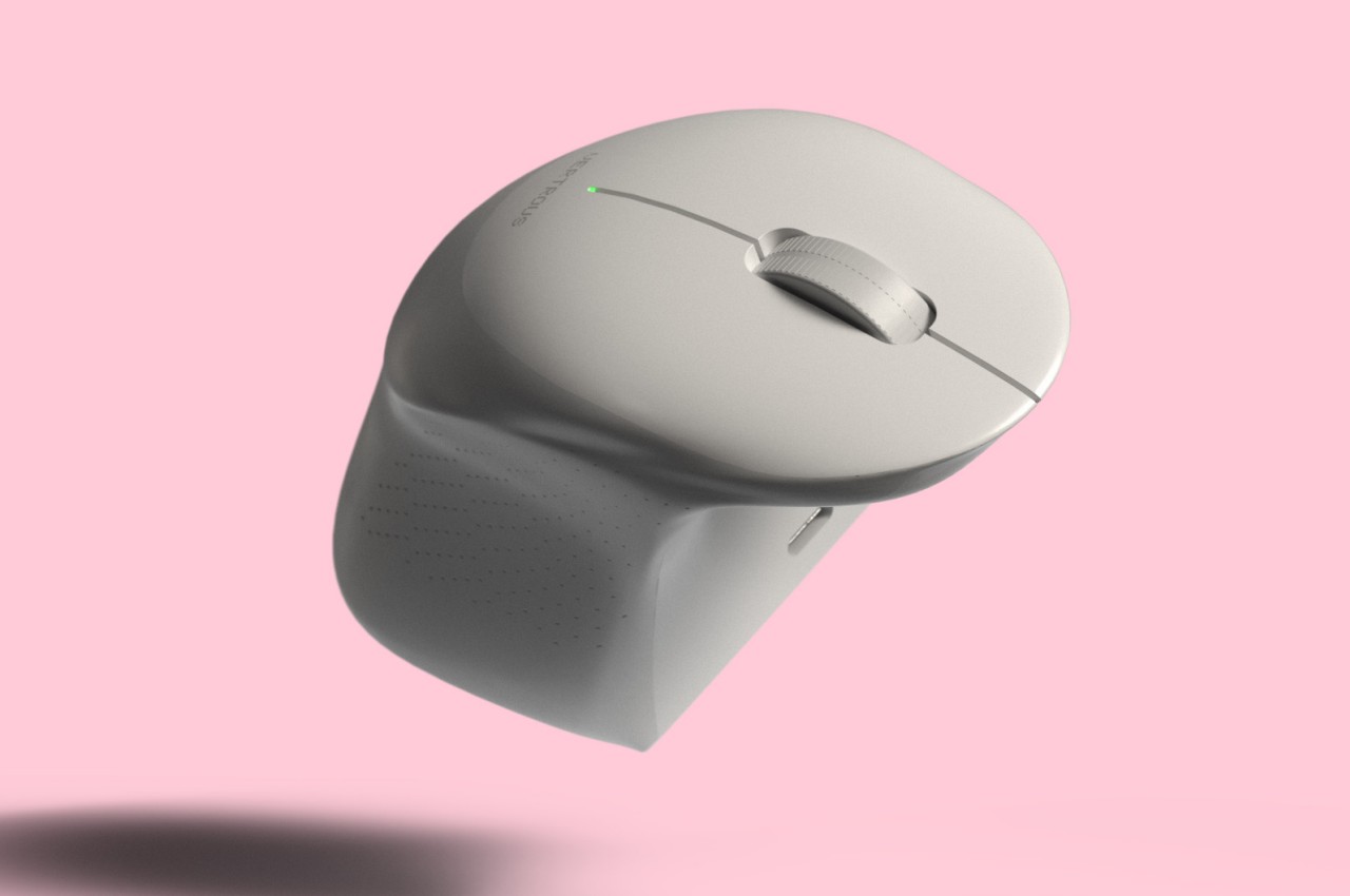
Computer mice have been around for decades, and despite their form making no objective sense, they remain the most basic and most common pointing device that we now use intuitively. The core design of the mouse hasn’t changed significantly since its inception, which unfortunately means they’re still one of the biggest causes of repetitive strain injury or RSI for many people. Ergonomic mice are starting to gain traction, particularly the vertically oriented designs that promise a more natural and comfortable grip for your hand. This device concept builds on that same premise, but the execution is a bit puzzling considering how it looks less like a mouse and more like a miniature clothes iron.

Designer: Pranav Kuber

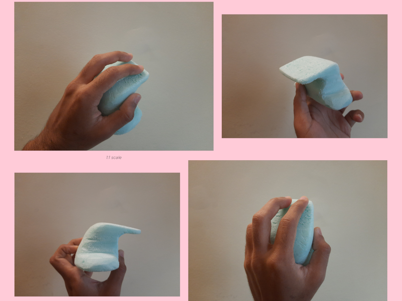
The rationale behind vertical mice is that the normal orientation of human hands has the palms facing inward rather than downward. With a regular mouse, users are forced to keep their hands at an unnatural angle, whether or not they’re moving the mouse at that moment. Of course, a vertical mouse would still need to provide the basic functions of a conventional mouse, which includes left and right buttons as well as a scroll wheel.

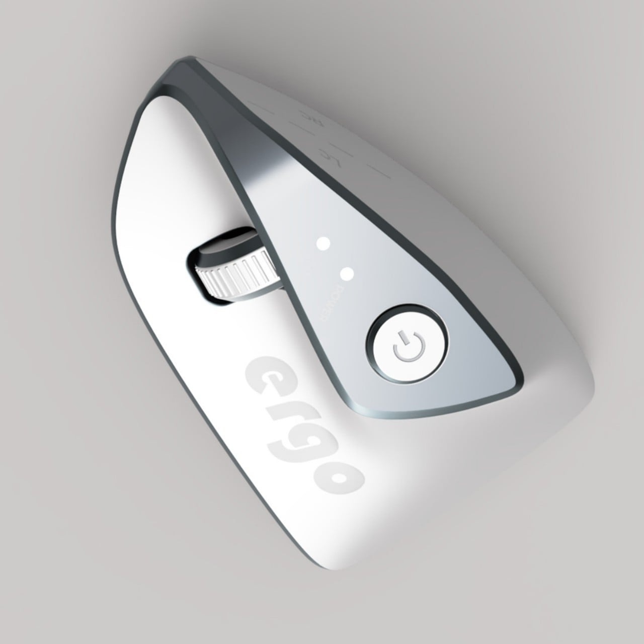
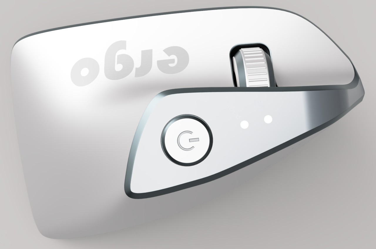
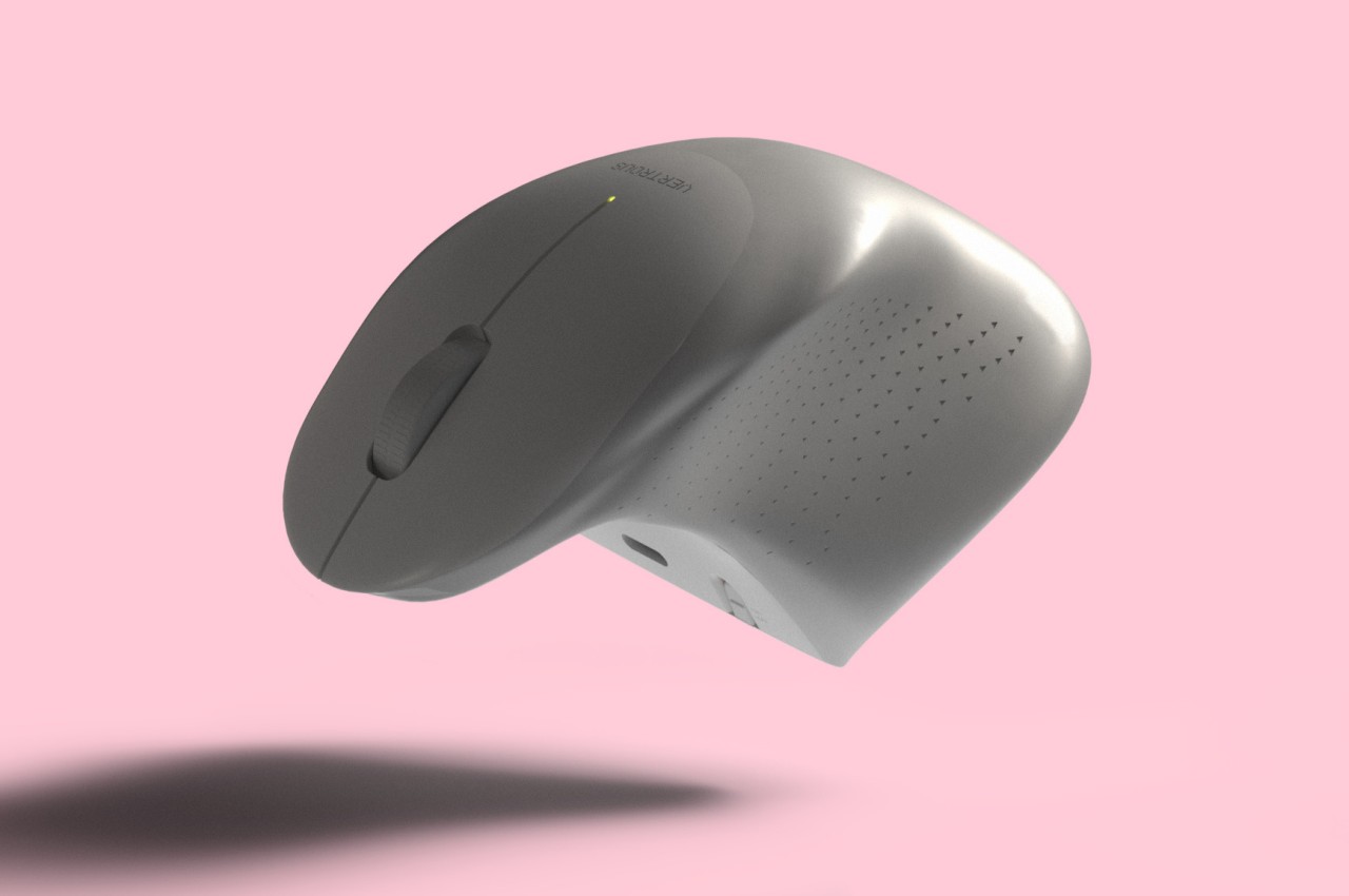
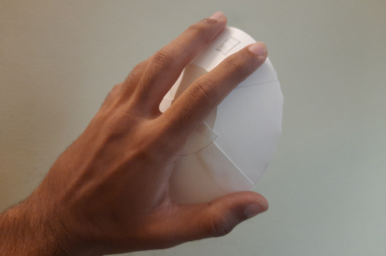
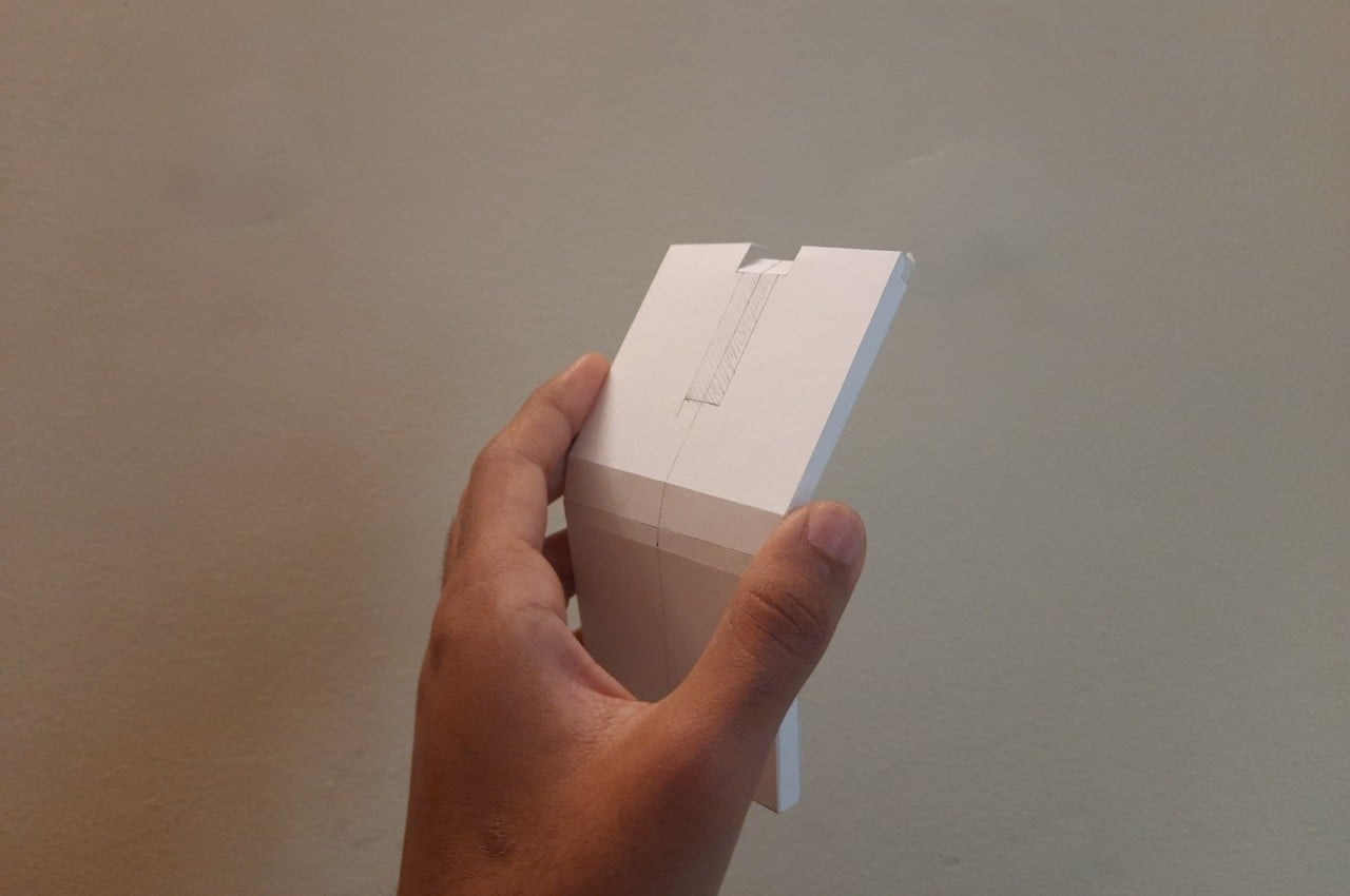
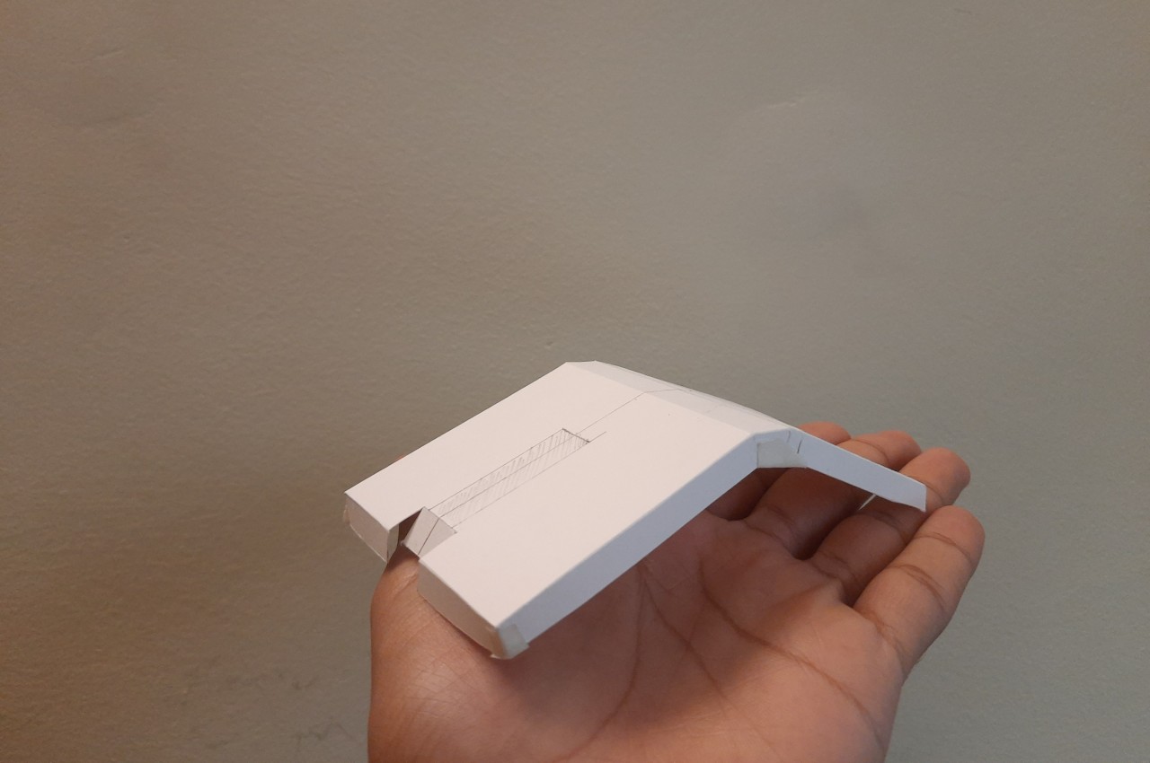
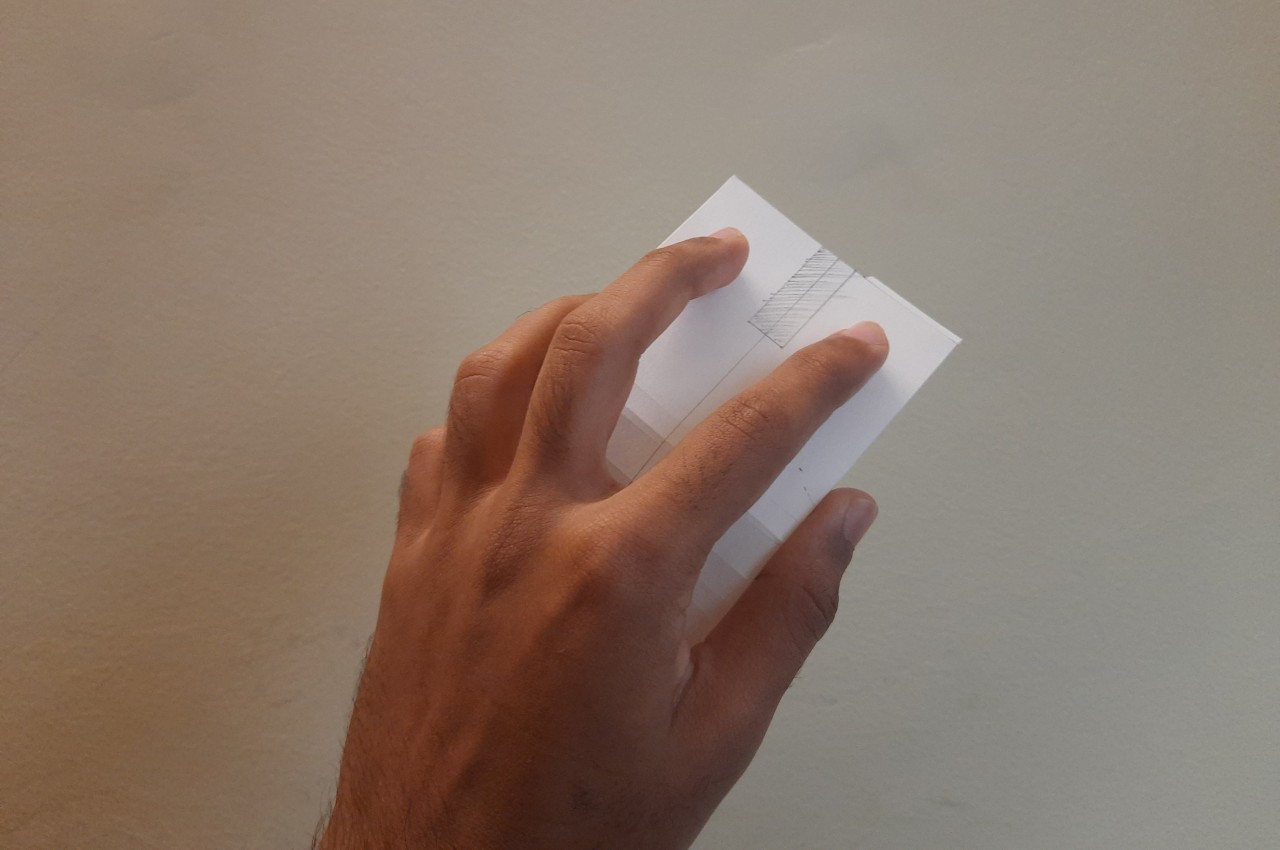
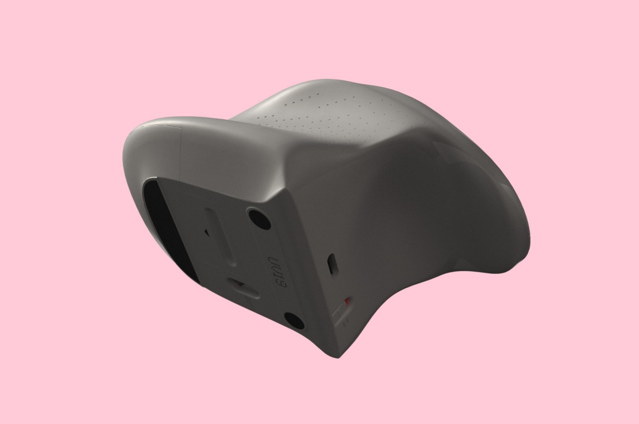
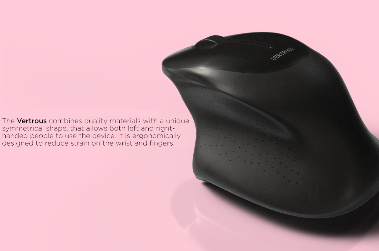
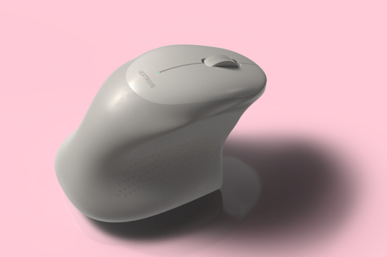
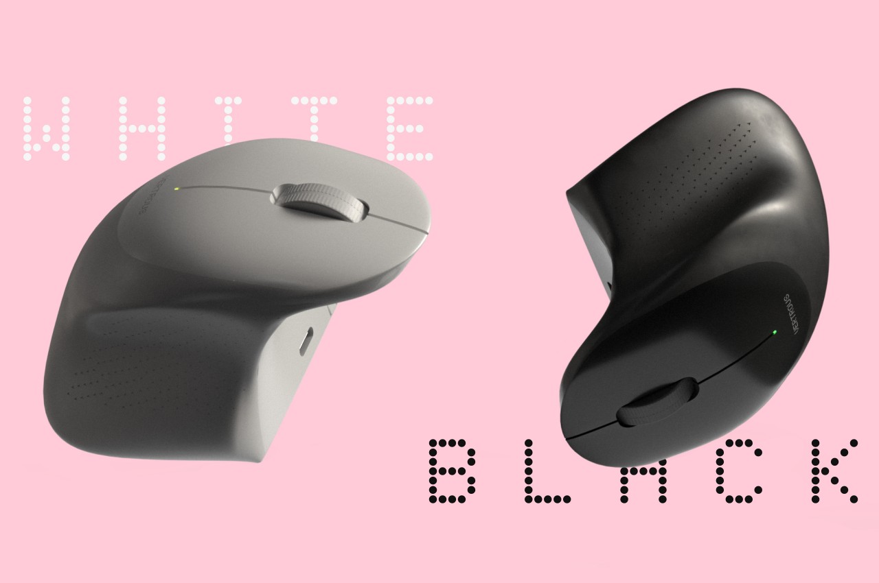
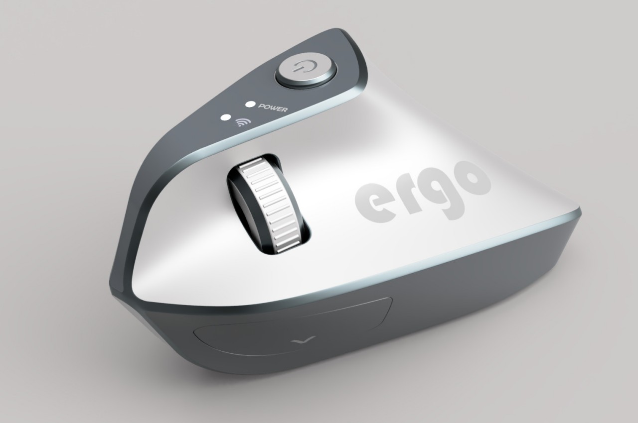
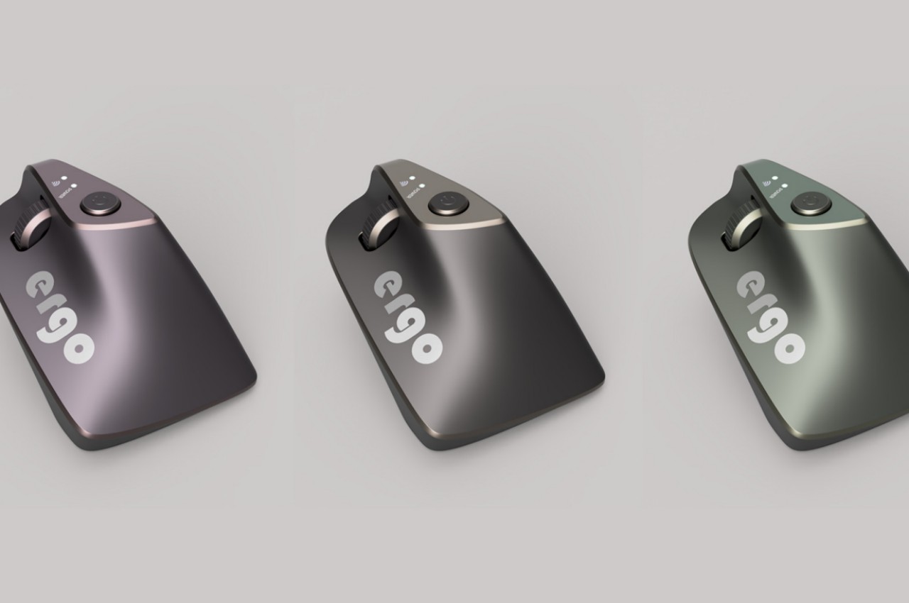
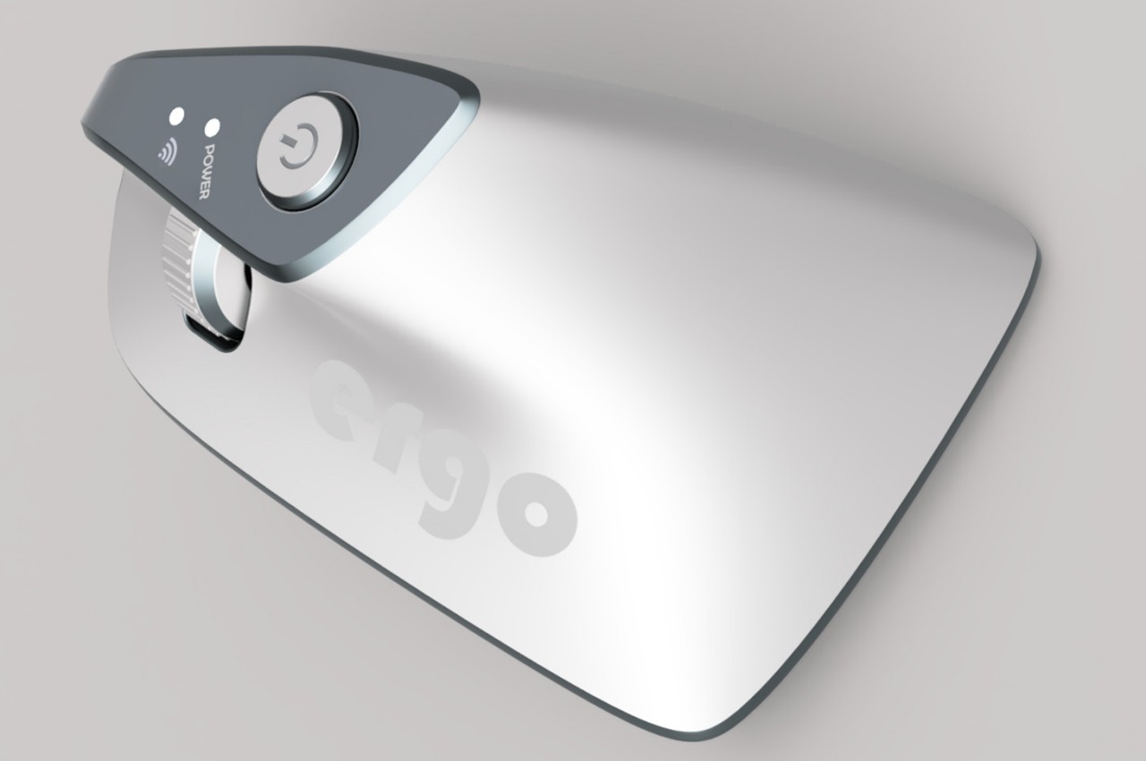
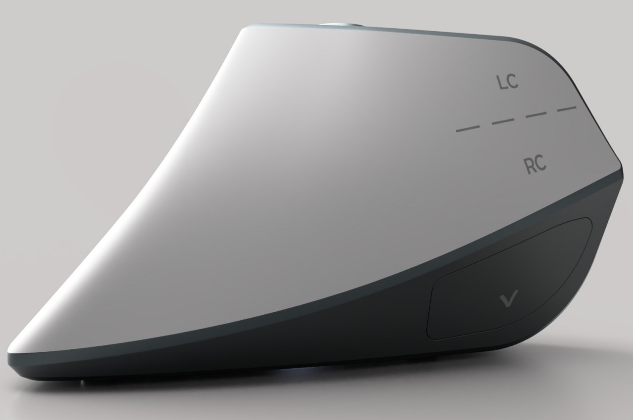
At first glance, the Ergo ergonomic mouse concept is just like any other vertical mouse now available for purchase, but examining its form and silhouette generates a slightly different image. The top plane’s wide surface tapers sharply toward the front, while the wide middle section looks rectangular when viewed from above. If not for the actual bottom of the mouse, which merges two vertical sides like the keel of a ship, the Ergo looks almost like a clothes iron, albeit one without a handle to grip.

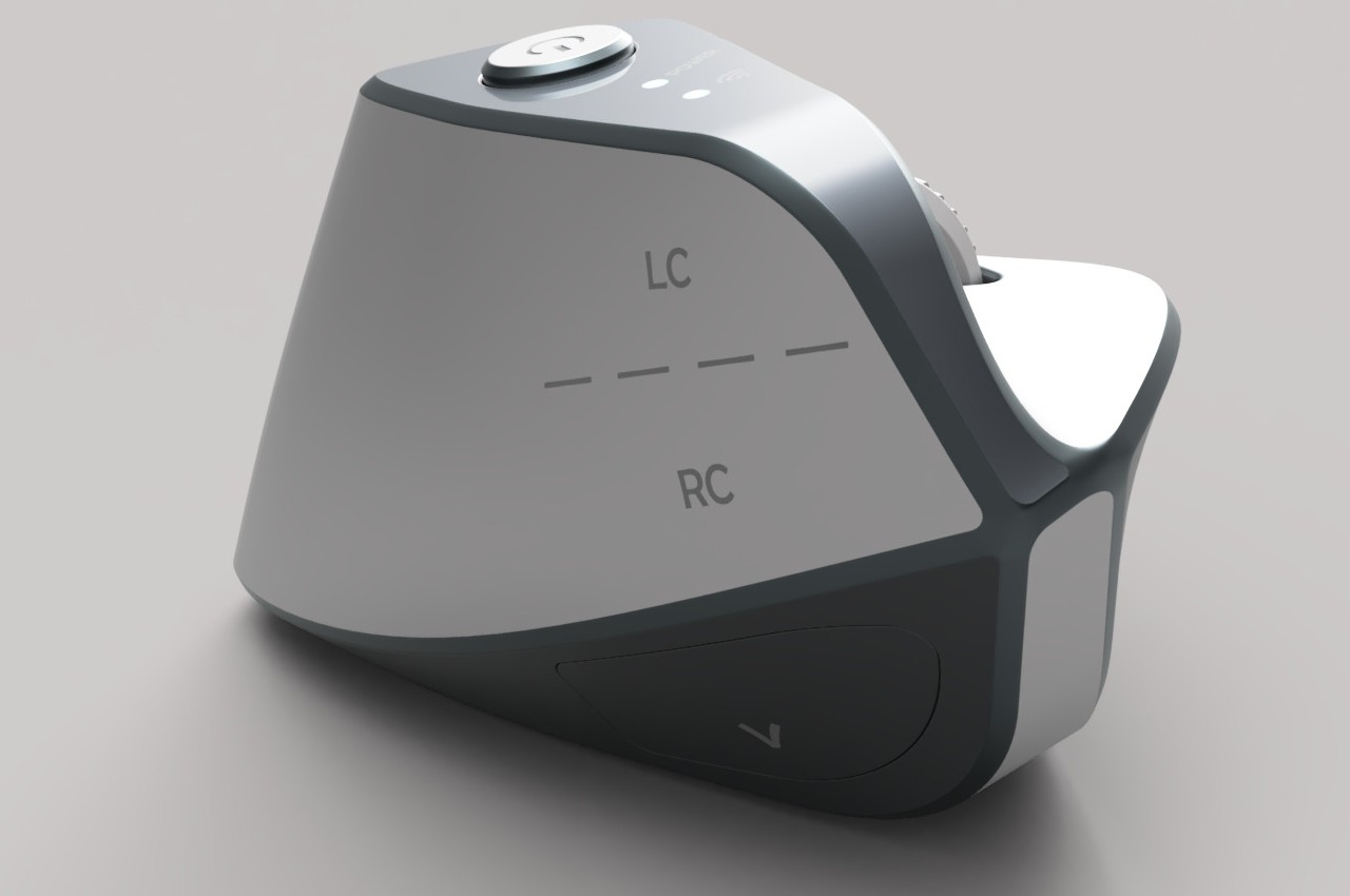
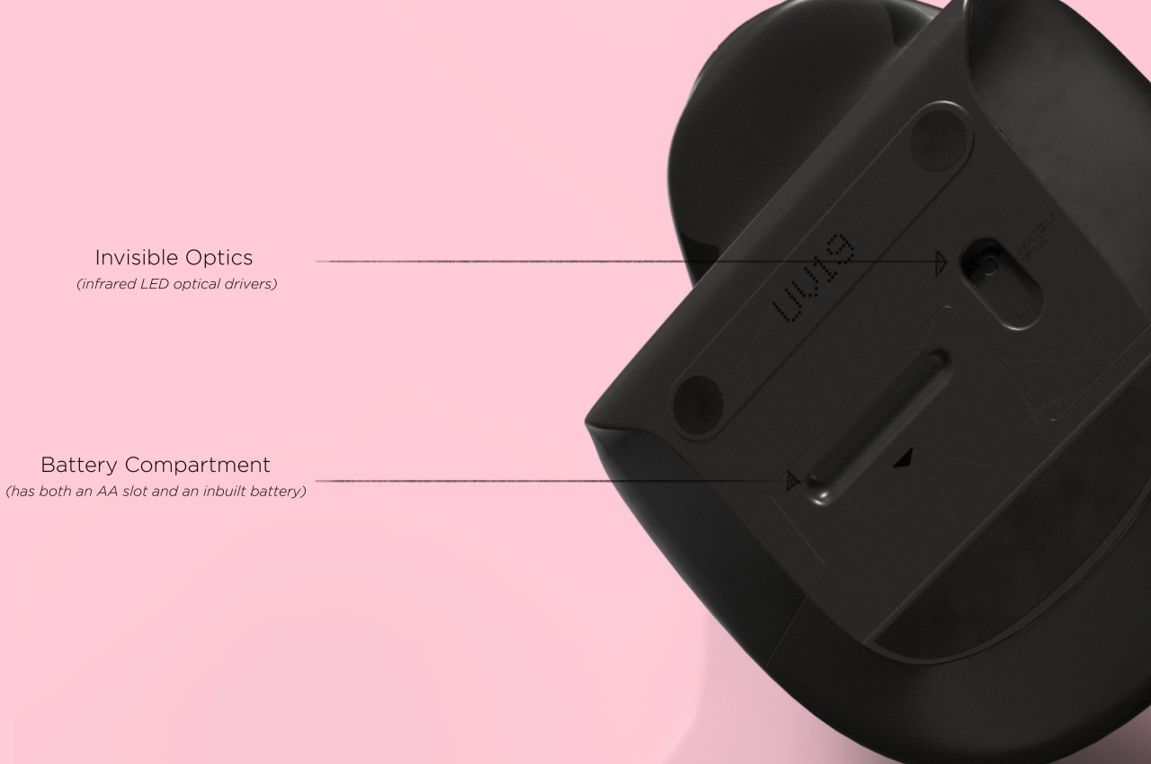
Aside from the peculiar shape, the mouse design also raises a few other questions. The buttons on the outer or right side are clearly marked, but they don’t look like buttons you can physically click at first glance. The position of the mouse wheel on the opposite side is even more puzzling, as it will require a lot of swinging movement from the thumb that could actually put more strain on its joint. The rather wide rear might also make it harder to grasp the mouse, potentially resulting in more discomfort in the long run.

The post Ergonomic mouse concept oddly looks like a familiar home appliance first appeared on Yanko Design.

Ergonomic mouse concept gives left-handed users the comfort they deserve

The vast majority of computer products are designed to favor the biggest groups of users, sometimes to the exclusion of the minority. We’re not speaking about accessibility for persons with physical disabilities, but that is especially true for them as well. Even just the common keyboard and mouse are designed with the presumption that they will be used by right-handed people. And while ambidextrous mice do exist, those tend to sacrifice comfort for the sake of a symmetrical design. That doesn’t have to be the case, as this concept design tries to prove, promising both comfort as well as proficiency, regardless of which hand you hold it with.

Designer: Sameeraj Dronamraju

There has been an increasing awareness and demand for ergonomic mice, sadly due to the equally rising cases of computer-related injuries. But while there are plenty of ergonomic designs now available, most of them only cater to right-handed users. You’d be lucky if the manufacturer produced a left-handed design, but most don’t because of the costs involved in another product with only a few minor differences.

The proper solution would be to mix ergonomics and symmetry to create a mouse that is comfortable to hold for both kinds of people. Vertrous, a portmanteau of “vertical” and “ambidextrous,” takes its cue primarily from the plethora of ergonomic mice now in existence, most of which adopt a vertical design that attempts to reduce the strain placed on the wrist by offering a more natural grip. But rather than have your hand holding it sideways, you almost grip it like a claw, with your index and middle fingers still resting on top.

At the same time, the mouse’s shape is more or less equally balanced on both sides. Great care is taken to ensure that textured areas are found on both sides, so no one hand has the advantage over the other. That said, there are some features that can really be found in only one place, like the power button, but that’s really a minor detail that has no significant impact on the use of the mouse itself.

While Vertrous does present an interesting solution, there are still some considerations left unanswered by the design. For example, gripping the mouse like a claw could actually end up being more uncomfortable and strenuous than a regular mouse. The symmetrical design also leaves out features like extra buttons that would normally be found only on one side, an absence that many power users will feel acutely. These aren’t flaws per se but more like points for further improvement, paving the road for the day that we finally land on a standard ergonomic mouse design that will really leave no one out, whichever hand they prefer to use.

The post Ergonomic mouse concept gives left-handed users the comfort they deserve first appeared on Yanko Design.

Apple Vision Pro Air Typing experience takes a small step toward usability

It’s truly mind-blowing to see virtual objects floating before our eyes, but the magic and illusion start to break down once we try to manipulate those objects. Input has always been a tricky subject in mixed reality, either because we can’t see our actual hands or we can’t feel what we’re supposed to be touching, which is physically nothing. Until the perfect haptic feedback gloves become a reality, we have to make do with tricks and workarounds to make input less awkward and more convenient. That’s especially true with typing on air, and Apple is apparently using some special techniques to offer a more usable experience on the Vision Pro mixed reality headset.

Designer: Apple (via Brian Tong)

Apple’s first teaser for the Vision Pro headset and visionOS platform didn’t show typing of any sort. It focused, instead, on icons, windows, and menus, virtual 3D objects that are easier to interact with using hand gestures. Of course, sooner or later you will be faced with the need to input text, and the usual method of voice recognition won’t always cut it. visionOS, fortunately, does include a virtual floating keyboard like other VR systems, but the way you use it is quite special and, to some extent, ingenious.

For one, you can interact with the keyboard like you would any part of the Vision Pro’s interface, which is to look at the UI element to focus on it and then use hand gestures. In this case, pinching a letter is the equivalent of selecting it, just like what you’d do for menu items or icons in visionOS. It makes the gesture grammar consistent, but it’s also an awkward way to type.

You can also “peck” at the keys with your fingers, making you feel like you’re typing on air. The difference that the Vision Pro makes, however, is that it tricks your eyes into believing you’re actually pressing down on those keys. Thanks to Apple’s flavor of spatial computing, hovering your real-world finger on a virtual key makes that key glow, and tapping on it results in an animation that looks like the key is actually moving down, just like on a real keyboard. There’s also a haptic sound, similar to the clicking sound effect you’d normally hear on an iOS virtual keyboard, to complete that audiovisual illusion.

Of course, your fingers aren’t actually hitting anything physical, so there’s still a disconnect that will probably confuse your brain. The visual effect, which is really only possible thanks to spatial computing, is still an important step forward in helping our minds believe that there’s a “real” three-dimensional object, in this case, a keyboard, right in front of us. It’s not going to be the most efficient way to input text, but fortunately, you can connect a wireless keyboard to the Vision Pro and you’ll be able to see your actual hands typing away on it.

The post Apple Vision Pro Air Typing experience takes a small step toward usability first appeared on Yanko Design.

Samsung Galaxy S24 Ultra flat screen design will improve the S Pen experience

Samsung has quite a large number of smartphone models in the market, but few have reached notable fame more than the Galaxy Note series. And yes, that includes the one that burst into flames. Although that brand of stylus-bearing smartphones has officially been retired, its spirit lives on in the “Ultra” model of Samsung’s Galaxy S flagship. Call it by any other name, these devices were designed with one unique feature that very few phones have to date: an active stylus for scribbling notes and even making art. That said, there is perhaps some irony that these phones’ screens aren’t designed to take full advantage of that feature, at least in some edge cases, literally. That might finally change with the Galaxy S24 Ultra next year which will be ditching a rather old design convention to hopefully give the S Pen an edge, pun intended.

Designer: Samsung (via David Martin)

Once upon a time, smartphone screens whose edges curved to the side were regarded as a sign of premium and stylish design. There was indeed a hint of elegance, not to mention manufacturing excellence, at seeing the screen disappear to edges, not unlike an infinity pool. It was also a visual trick to make at least the side bezels disappear, though in reality they’ve just been pushed down nearer to the frame. Today, however, that design seems to be showing its age and the trend is leaning more towards completely flat screens and edges.

On stylus-enabled smartphones like the Galaxy Note line and the more recent Galaxy S Ultra models, those curved edges are more liabilities than assets. Technically, a part of the screen “falls off” the edges and can’t be reached by the S Pen without sliding off. Depending on the app, that might be precious screen real estate wasted, and there have been awkward moments when the tip just slips off and ruins your momentum.

According to recently leaked photos, the Galaxy S24 Ultra next year will finally address one of the pain points of avid S Pen users. The screen seems to be completely flat on all sides this time around, which means that owners will have access to the full width of the screen. This design actually benefits all types of content since there will be no interface elements or images that will look distorted at the edges.

The rest of the phone, however, will retain the design from this year’s Galaxy S23 Ultra, at least based on those same photos. That meant it would still have curved left and right edges, while the top and bottom are completely flat. There’s also no change in the camera design, though the hardware is, of course, expected to see some upgrades. This goes in line with leaks last month that the Galaxy S24 series will take a more iterative approach to its design, largely keeping the same aesthetic while slapping flatter screens on top.

The post Samsung Galaxy S24 Ultra flat screen design will improve the S Pen experience first appeared on Yanko Design.