Apple’s $1,999 iPhone Duo Costs the Same as a Budget MacBook, iPhone, Watch, and AirPods Combined

Price comparison between the iPhone Duo, MacBook Neo, iPhone 17e, Watch SE3, and AirPods Pro 3

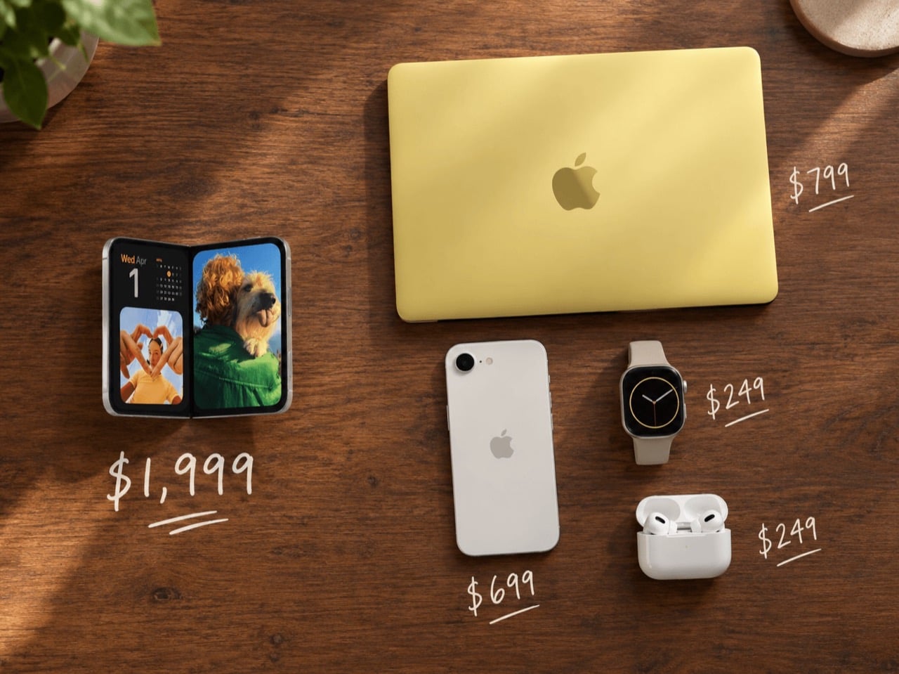
Apple’s first foldable, the iPhone Duo, costs $1,999 for 256GB. That same money also buys four other Apple products with change left over: a 512GB MacBook Neo at $799, an iPhone 17e at $699, an Apple Watch SE 3 at $249, and AirPods Pro 3 at $249. Add it up and you land on $1,996, which is three dollars short of one folding phone. I ran the numbers twice because it looked like a typo. It’s not a typo, it is Apple’s live price list as of September 2026, and the distance between the cheapest thing Apple makes and the most expensive thing Apple makes has never been this wide.

Nobody at Apple decided the phone should cost more than the computer. It happened the way most design inversions happen, one component at a time. Folding glass, a custom hinge, titanium, a second display and a 2nm A20 Pro stack up until you arrive at $1,999 and call it a flagship. Meanwhile the MacBook Neo shed Touch ID, MagSafe and a backlit keyboard to reach $599 in March, before creeping to $699 in June. One product was optimized upward until it became jewelry, the other was optimized downward until it became a school supply, and the two now sit in the same online store 1,300 dollars apart.

The Ladder Apple Built Backwards
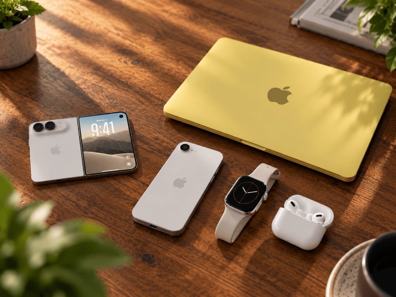
The iPhone Duo, MacBook Neo, iPhone 17e, Watch SE3, and AirPods Pro 3 placed on a wooden table, eye level shot

For most of the iPhone’s history, the price ladder ran in a predictable direction. Laptops cost more than phones, because laptops did more work and carried more metal, glass and cooling hardware. The first MacBook launched in May 2006 at $1,099, which is roughly $1,750 today after inflation, while phones were largely carrier freebies bundled into two-year contracts. That relationship held, loosely, for two decades. It just quietly broke, and the break happened inside a single product lineup rather than across the industry.

What makes the inversion worth dwelling on is that Apple built both ends of it on purpose. The MacBook Neo was engineered down to a price, stripped of the backlit keyboard, fast charging and MagSafe that would normally be standard on a $700 laptop, so that Apple could compete with Chromebooks and entry Windows machines. The iPhone Duo was engineered up to a price, layered with every expensive material Apple had available, and our own coverage of the Duo’s launch called it the biggest redesign of the iPhone since the home button disappeared in 2017. The Apple Watch SE 3, meanwhile, is the one product in this stack that got frozen in place, launched alongside the Apple Watch Series 11 and Ultra 3 last September and left untouched at this year’s keynote entirely.

What $1,996 Actually Buys
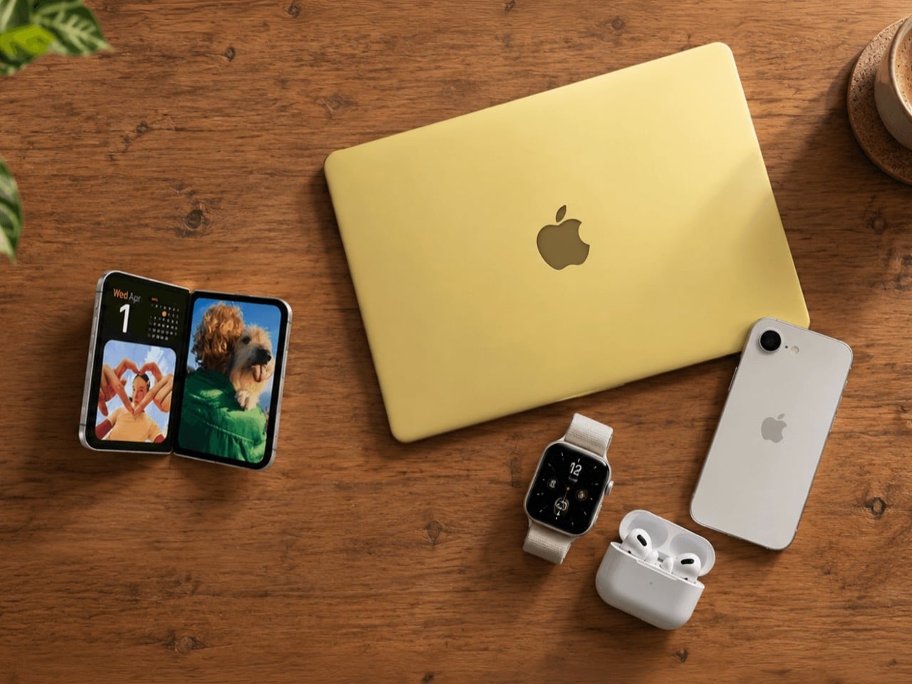
The iPhone Duo, MacBook Neo, iPhone 17e, Watch SE3, and AirPods Pro 3 placed on a wooden table.

Run the alternative stack and it holds together as a genuinely complete kit rather than a novelty math exercise. The 512GB MacBook Neo gives you a 13-inch Liquid Retina display, an A18 Pro chip, and up to 16 hours of battery in a recycled aluminum shell, for $799. The iPhone 17e covers the phone slot at $699, currently the cheapest new iPhone Apple sells after the rest of the lineup went up $100 on September 9. The Apple Watch SE 3 adds a wrist device with an always-on display and 18-hour battery for $249, and AirPods Pro 3 close the loop at $249 with active noise cancellation, a custom heart rate sensor, and live translation built in.

That is a laptop, a phone, a watch and a pair of earbuds, touching every screen size Apple makes, for three dollars less than one folding phone. It is worth being honest about what that stack gives up. None of those four devices fold, none of them run the A20 Pro, and the SE 3 skips the electrocardiogram and blood oxygen sensors that the pricier Apple Watch Series 12 carries. But as a snapshot of how far Apple’s floor and ceiling have drifted apart, it is hard to beat, and it is proprietary math nobody else appears to have bothered running.

The Hinge Is Doing the Expensive Work
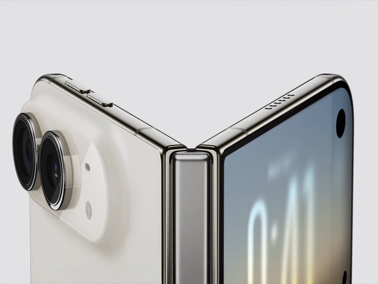
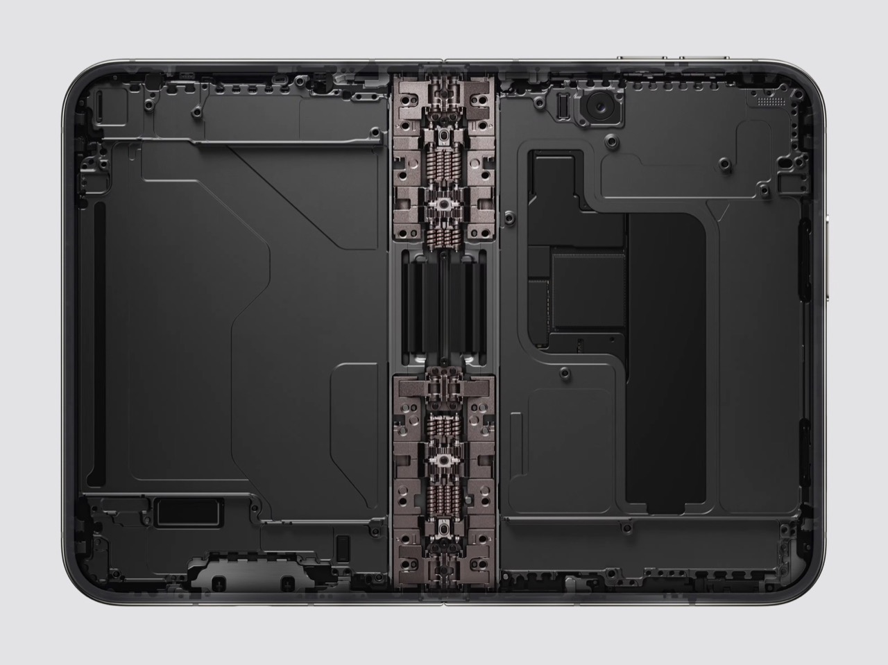
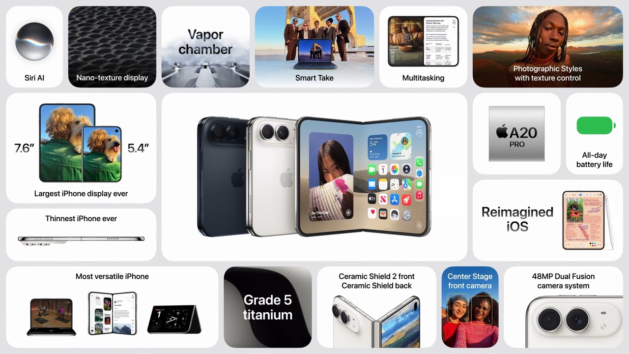
The thing actually driving the $1,999 sticker is not marketing, it is the hinge, and Apple spent real engineering years proving it. The folding display uses a scratch-resistant coating, a polymer cover layer Apple says is up to 40% stiffer than materials used for similar applications, multiple layers of high-strength glass, and a titanium plate underneath, all wrapped around a custom hinge designed to minimize the crease that plagues rival foldables. That is a lot of material science stacked into one seam, and it is the primary reason a Duo cannot be priced anywhere near a Neo.

Apple paired that hinge with an A20 Pro built on a 2-nanometer process, its first chip at that node, delivering what Apple claims is 35% higher sustained performance than the iPhone 17 Pro thanks to a new cooling system built for a thinner chassis. None of that is padding. A folding OLED stack with a titanium frame genuinely costs more to manufacture than a fixed aluminum body, and first-generation folding hardware from any brand has always carried a premium while yields improve. The fair comparison is not Duo versus cheap Apple gear, it is Duo versus other folding flagships, and our own breakdown of what the Duo got right that Samsung still hasn’t found it costing exactly $100 more than the Galaxy Z Fold8’s $1,899.

Nobody Asked For a Missing Middle
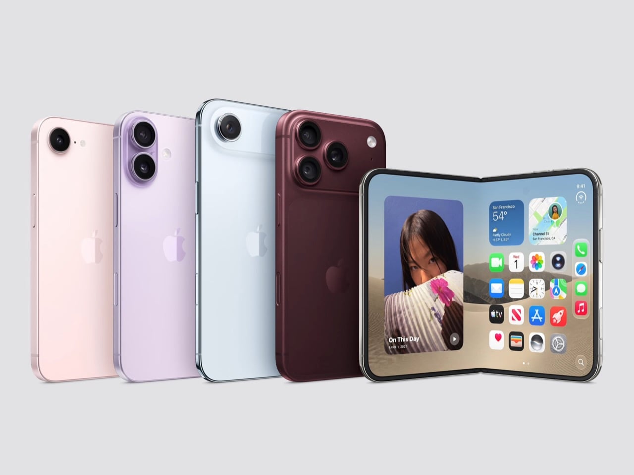
What turns this from an interesting price gap into a strange one is what Apple left out of the September 9 keynote entirely. There is no standard iPhone 18, no iPhone 18e, no iPhone Air 2, all reportedly pushed to spring 2027. Anyone who wants a new iPhone before then chooses between $1,199 for the Pro and $1,999 for the Duo, with nothing built to sit between those two numbers this year. Apple has effectively removed the middle rung of its own ladder at the exact moment the top and bottom rungs drifted furthest apart.

That gap is where the $1,996 stack might just appeal to the Apple fan who has a strict budget to work with. It fills the space Apple’s own lineup left empty, assembling a complete household of devices for less than the price of the one device Apple actually wants you looking at this fall. None of that makes the Duo a bad phone, and folding glass this durable was never going to be cheap. It does mean that for one more season, the most interesting purchase decision at Apple has nothing to do with which iPhone to buy, and everything to do with whether you buy an iPhone at all.

The post Apple’s $1,999 iPhone Duo Costs the Same as a Budget MacBook, iPhone, Watch, and AirPods Combined first appeared on Yanko Design.
5 Things the iPhone Duo Got Right That Samsung Still Hasn’t

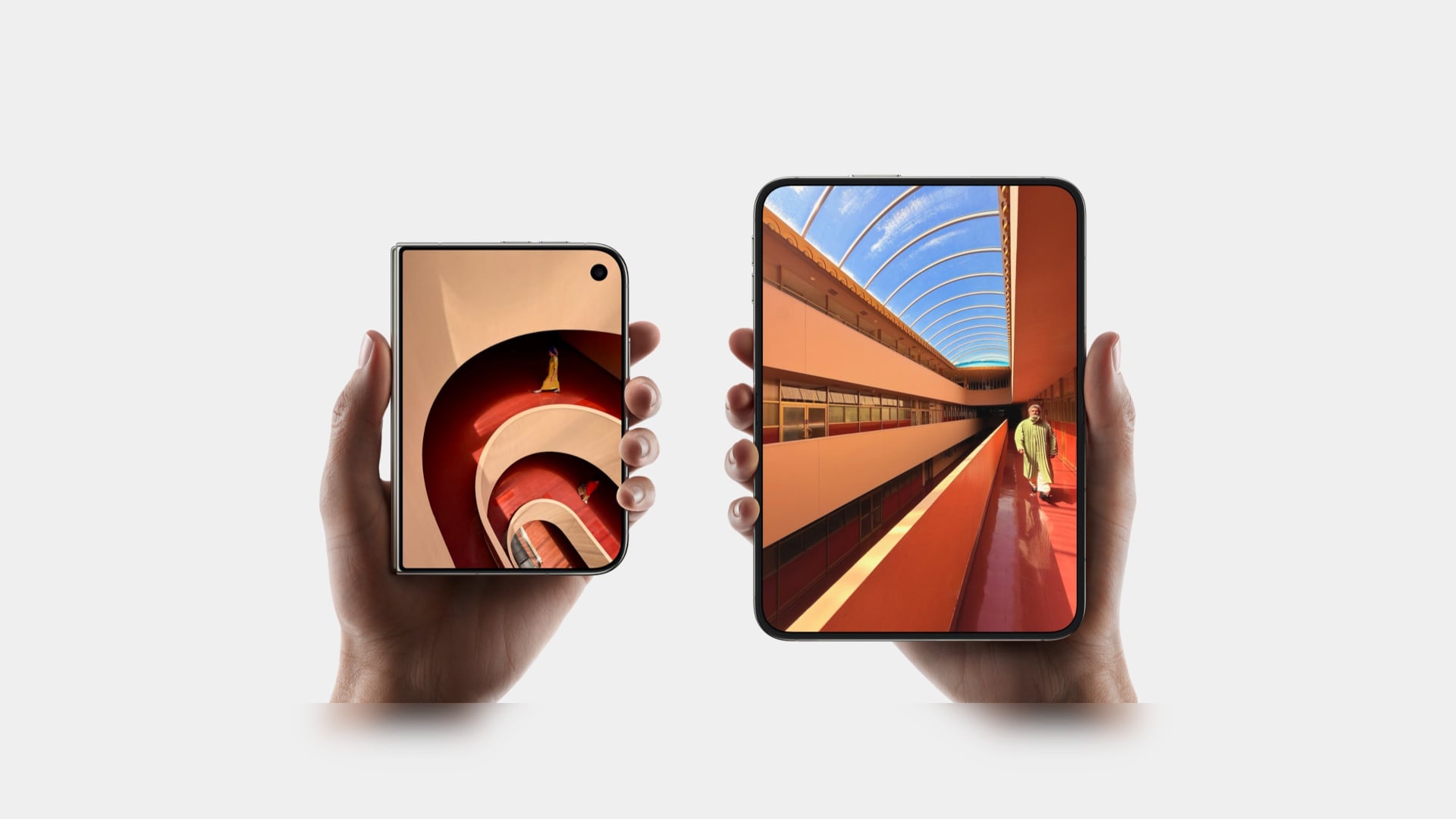
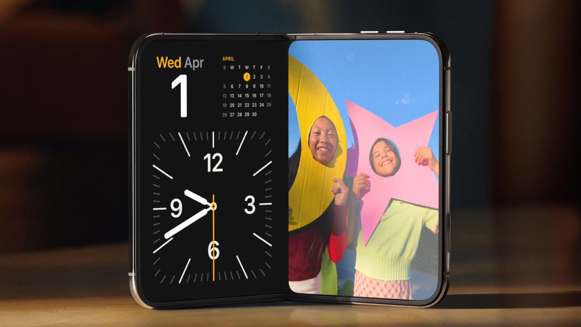
Samsung has had the folding phone conversation to itself for six years now, tweaking hinges, shrinking creases, and figuring out what a cover screen is even for. Apple waited, watched, and let its rival make every mistake first. That patience shows in the iPhone Duo, a first-generation foldable that skipped straight past problems Samsung’s Galaxy Z Fold8 still hasn’t fully solved.

None of that comes cheap, though. The Duo starts at $1,999 and costs more than the Fold8’s $1,899.99, weighs in at roughly nine ounces against the Fold8’s seven, and folds up thicker in your pocket, besides. Samsung still wins those arguments outright, and we’ll get back to that later. But set weight and price aside, because here are five places where Apple’s first foldable actually beat Samsung’s eighth attempt.

Designer: Apple

The Camera That Disappears

A foldable phone’s whole pitch is the screen, one continuous surface that opens up into something closer to a small tablet. Every notch or punch-hole cut into that surface breaks the illusion a little, reminding you that the software is still working around a sensor buried in the glass. Samsung’s Galaxy Z Fold8 has never quite escaped that compromise, even eight generations in.

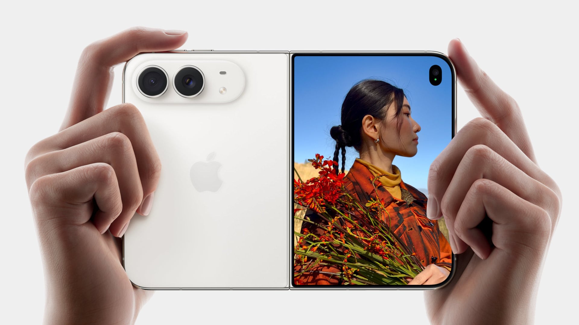
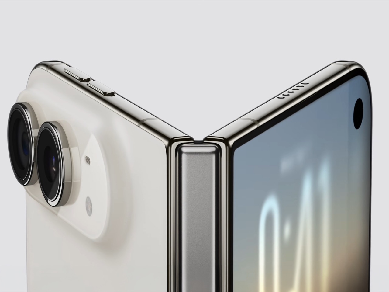
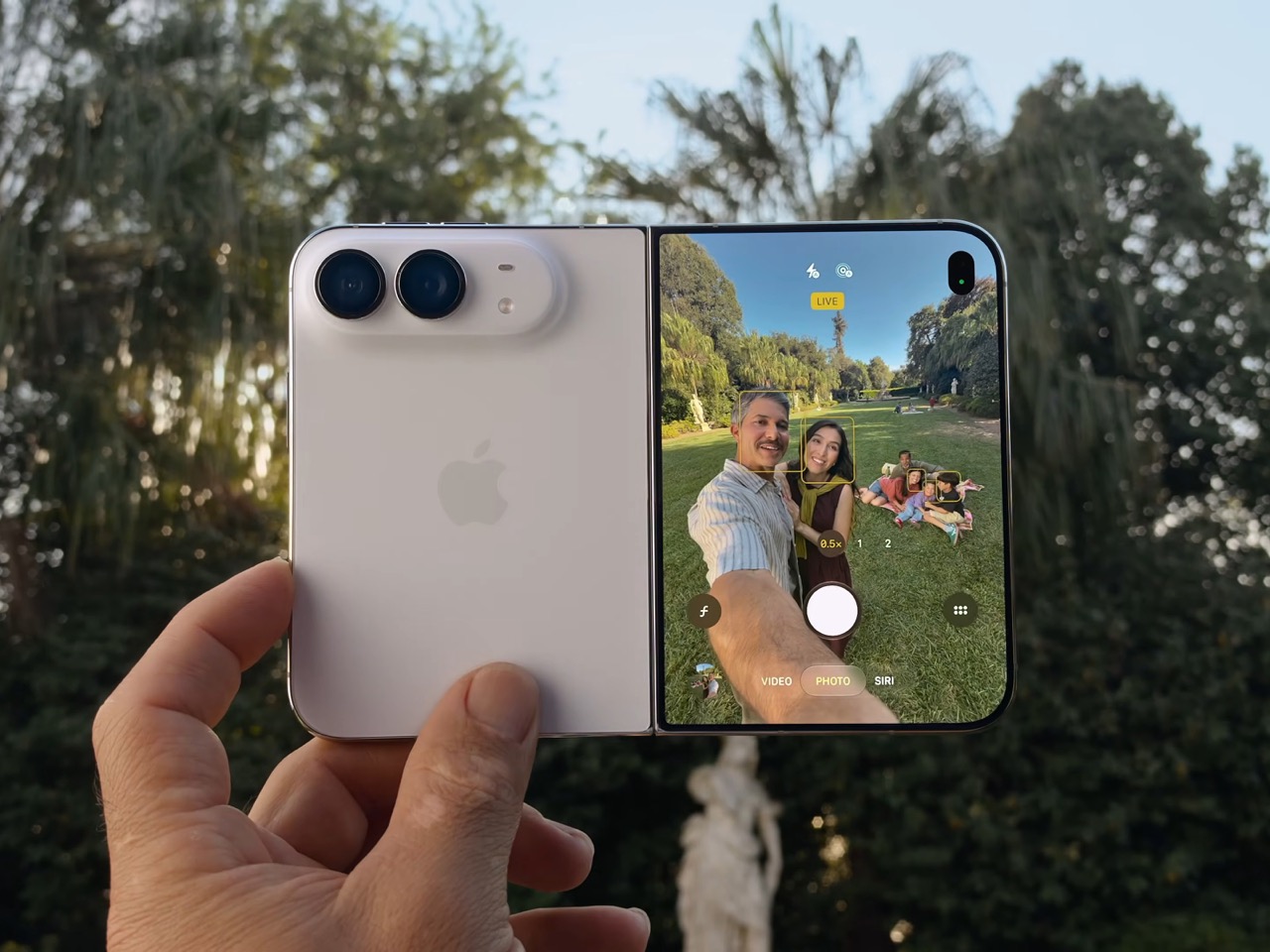
The Galaxy Z Fold8 carries a 10-megapixel camera punched into both the inner and cover displays, a hole you notice every time the screen lights up. The Duo takes a different route entirely, tucking its inner selfie camera under the panel itself so nothing interrupts the display when you’re watching a movie or scrolling through photos with both halves open. The outer screen keeps a single, smaller cutout.

A Stylus Samsung Gave Up On

Samsung built its whole Note legacy around the S Pen, then carried that stylus into the first few generations of the Galaxy Z Fold before quietly dropping it this cycle. Neither the Galaxy Z Fold8 nor the Galaxy Z Fold8 Ultra bring it back, leaving a gap for anyone who used to sketch, sign, or jot notes onto that big inner display. It’s a strange retreat for a company built on that exact feature.

Samsung Galaxy Z Fold6

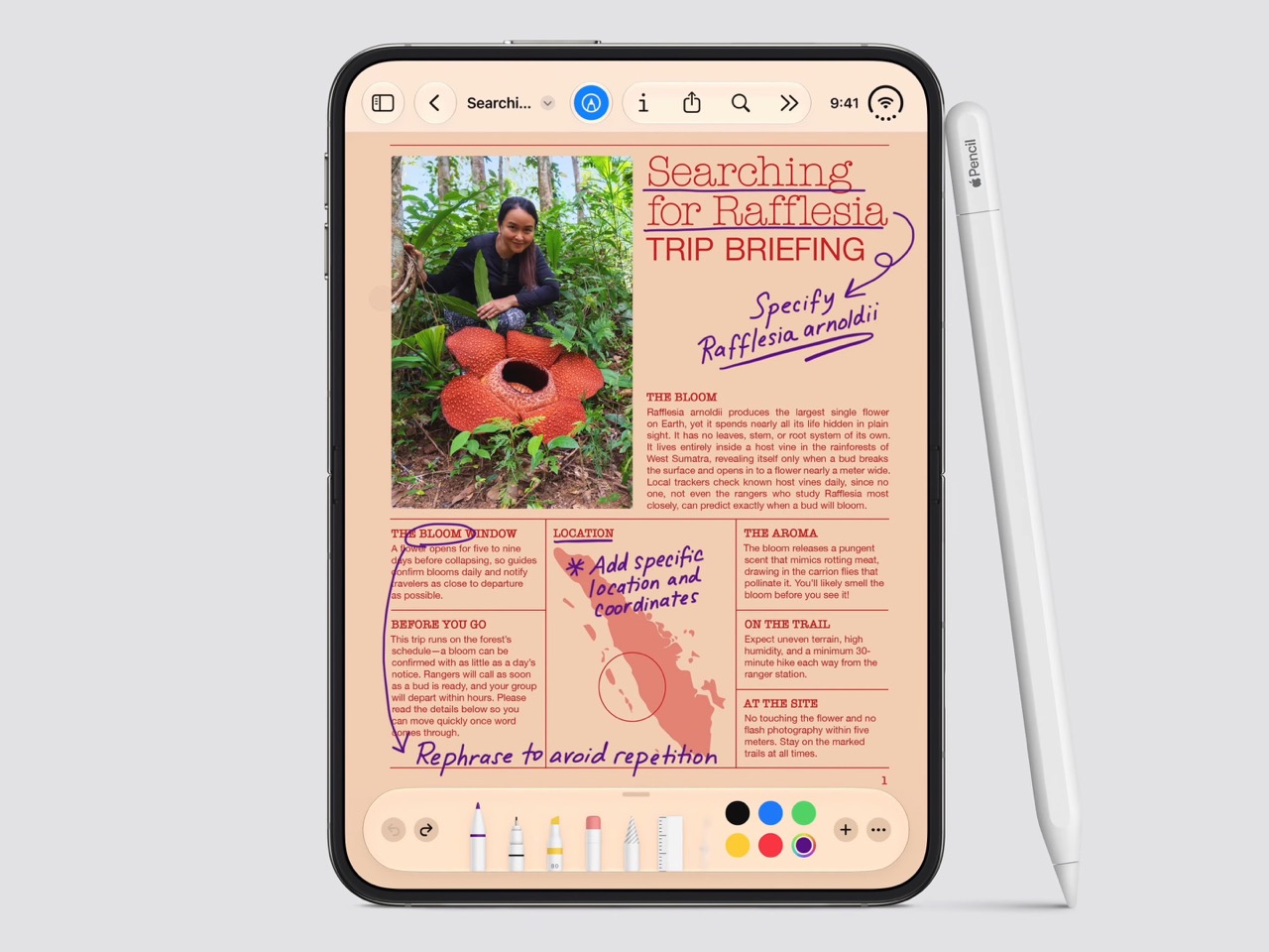
Apple Pencil support changes that, working on both the 5.4-inch cover screen and the 7.6-inch inner display, once it arrives. Dual-screen support lands through a software update later this year rather than at launch, so early buyers will have to wait a bit for the full experience. Still, it means signing a document or sketching an idea won’t require unfolding the phone first, something Samsung’s lineup can no longer offer.

Built to Survive the Mess

Dust is the part of durability testing everyone forgets about until it’s too late, and a folding hinge is the worst possible place for grit to sneak into. Water resistance ratings get all the marketing attention, but the dust half of an IP rating tells you whether sand at the beach or fine construction dust will actually make it past the seals and start scratching at the mechanism underneath.

The iPhone Duo carries an IP68 rating, meaning the seal is dust-tight; nothing gets through, full stop. The Galaxy Z Fold8 only manages IP48, which covers water fine but leaves that dust digit low enough that fine particles, sand, and powder aren’t actually kept out. For anyone who takes their foldable to a beach, a workshop, or just a dusty backpack, that gap matters more than it looks.

Room for Everything You Shoot

A foldable’s bigger inner screen practically begs you to shoot more video and drag around heavier files, whether that’s 4K footage, a stack of RAW photos, or a library of apps you’d never bother installing on a regular phone. Storage stops being an afterthought pretty quickly once you’re using the extra screen real estate the way it’s meant to be used, for actual creative work instead of just bigger icons.

Apple tops out the iPhone Duo at 2TB of storage, double what the Galaxy Z Fold8 offers at its 1TB ceiling. That’s the difference between planning around your camera roll on a long trip and simply forgetting storage exists as a problem. For anyone who treats their foldable as a mobile production tool rather than a bigger email client, that extra headroom ends up mattering more than the megapixel count.

Fighting the Fold’s Oldest Flaw

The crease down the middle of a folding screen has been the one problem no manufacturer has fully cracked, Samsung included, no matter how many generations they’ve shipped. Apple’s approach to the Duo’s hinge stacks a nano-texture matte layer over glide-adhesive glass and backs the whole assembly with a titanium plate, an engineering answer to a problem that’s mostly been treated as unavoidable elsewhere in the industry.

Early impressions from outlets with briefing access suggest the crease is still visible. Nobody’s claiming otherwise, but it doesn’t catch your finger or your attention the way it does on most rivals, the Galaxy Z Fold8 included. That’s worth flagging as an early read rather than a verified result, since neither phone has landed in reviewers’ hands yet. Outdoor glare handling gets similar praise, though the real test comes once these ship.

What Samsung Still Gets Right

None of this makes the Galaxy Z Fold8 a bad phone, and Samsung still wins the arguments that matter most to plenty of buyers. It’s $99.01 cheaper, noticeably lighter at roughly seven ounces against the Duo’s nine, and thinner whether it’s folded shut in your pocket or opened flat on a desk. Those are real, measurable advantages, not consolation prizes.

Apple iPhone Duo

Samsung Galaxy Z Fold8

What you’re really choosing between is a phone that’s been refined for eight generations and one making its very first attempt, price and weight included. A first try that already beats its rival on a camera, a stylus, a durability rating, storage, and a hinge design is a strong opening argument, whatever it costs to get there. Samsung’s turn to respond comes next year.

The post 5 Things the iPhone Duo Got Right That Samsung Still Hasn’t first appeared on Yanko Design.

This 2.58oz MOFT Case Guards, Props, and Grips an iPhone Duo at Once

A folding phone creates a folding problem for accessory makers, and MOFT’s answer for the iPhone Duo is to lean into that shape rather than fight it. The Dynamic Folio wraps the Duo in a single continuous flap of vegan leather that does triple duty, guarding the shell from scratches, propping the phone up on demand, and giving your hand something secure to hold onto. One fold, three jobs, no extra parts bolted on.

That fold takes its cue from origami, the same paper-based logic MOFT has applied to its iPad cases for years. Here it collapses down to a razor-thin 0.07 inches and adds just 2.58 ounces to the phone, numbers that matter enormously on a device already carrying two screens and a hinge. The case disappears into pocket space rather than fighting for it, staying close to the Duo’s own profile instead of doubling it.

Designer: MOFT

Unfold that flap, and it becomes a kickstand positioned dead center on the back of the phone, a deliberate placement that keeps the Duo balanced rather than tipping toward one edge. Four viewing angles come out of that single hinge point, covering both portrait and landscape orientations. One of those positions lays the phone nearly flat, built specifically for reading in bed or setting the Duo on an uneven surface without it sliding away.

That same centered geometry solves a smaller but real annoyance. Most phone grips assume you’re right-handed, forcing lefties to awkwardly reposition their thumb. Because the fold sits in the middle rather than off to one side, switching hands takes no adjustment at all. It’s a detail easy to overlook in a product photo but immediately noticeable the first time you actually use it one-handed on a crowded train.

Color plays into the case’s identity as much as its geometry. Rather than a single flat shade, the Dynamic Folio pairs contrasting tones between its exterior and the interior of the fold itself, so the moment you deploy the stand, a second color flashes into view. It’s a small piece of theater built into a purely functional motion, turning something as mundane as propping up your phone into a tiny visual reveal.

Wireless charging still works with the case installed, and the vegan leather shell is built to protect both the Duo’s inner and outer displays from scratches, not just the one you’d normally think to guard. At $69.99, the Dynamic Folio also marks the opening move in a larger accessory lineup MOFT has planned around the Duo, with a modular protective case, a rotating grip stand, and a card wallet still to come before the end of the year.

The post This 2.58oz MOFT Case Guards, Props, and Grips an iPhone Duo at Once first appeared on Yanko Design.
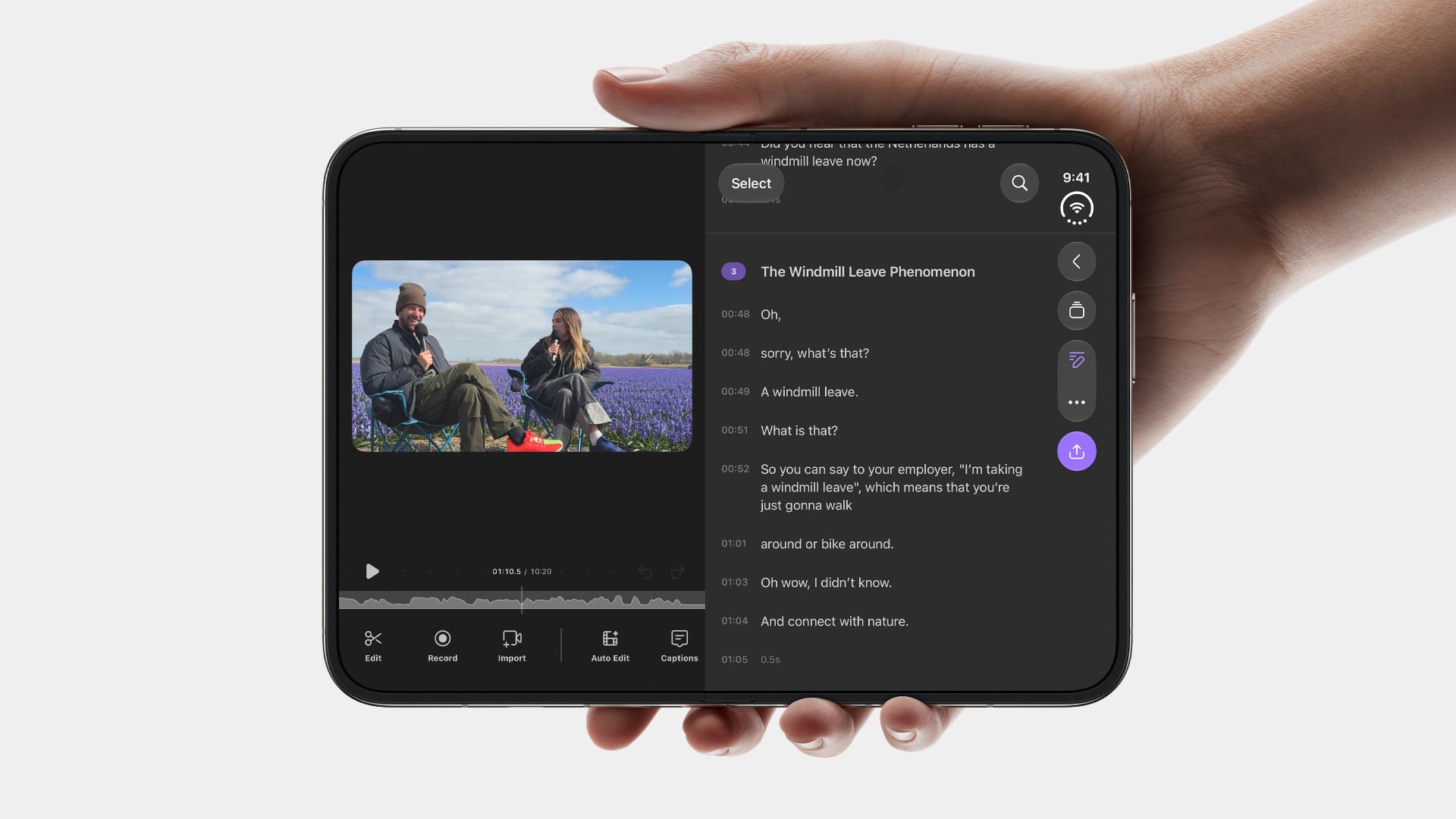
This Single UI Trick Might Sell More iPhone Duo Units Than Any Android Foldable

Let me be clear. There’s no universe in which I think 2 thousand dollars is the right price for a smartphone. The fact that it folds, or that John Ternus called it an ‘intelligent hub’ doesn’t justify a price tag that’s reserved for gaming laptops. However, when I saw the Duo open for the first time in Apple’s keynote, I definitely sat up a bit and embodied the Leonardo DiCaprio meme where he snaps and points at the screen. Something caught my eye, and in those brief seconds, I forgot that the iPhone Duo costs $1999 USD.

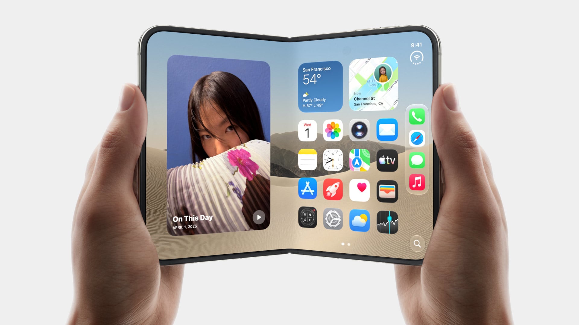
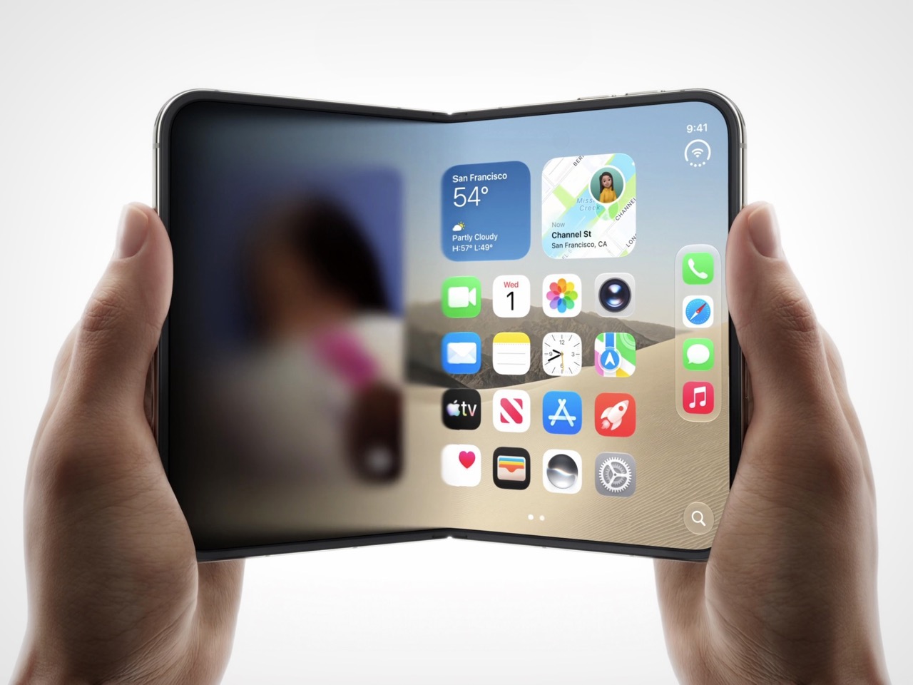
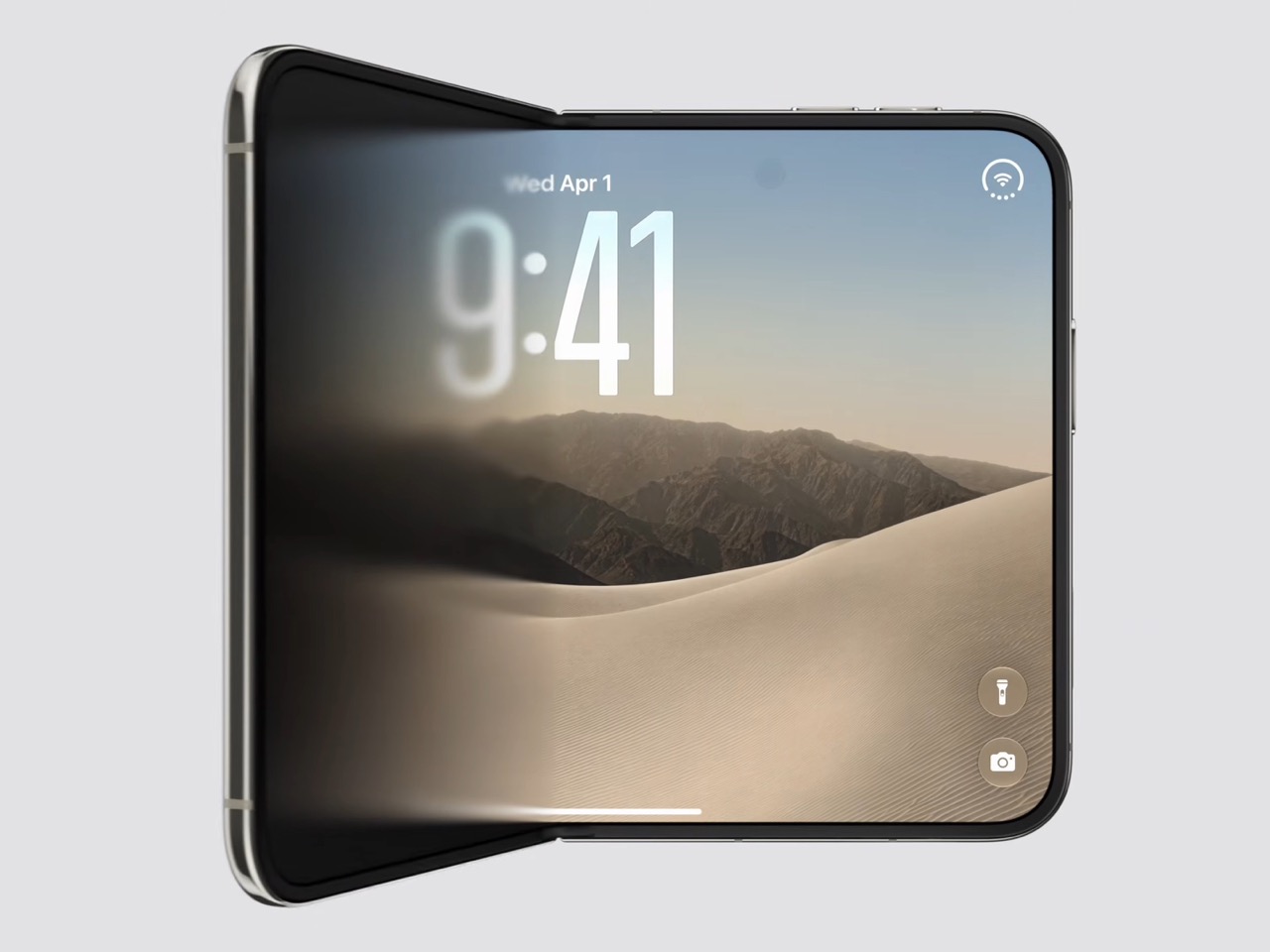
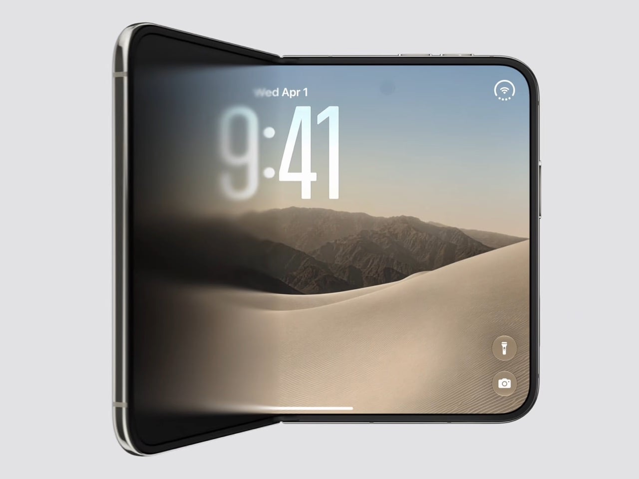
Go to the comments section of any tech blogger interacting with the iPhone Duo and you’ll see the same response – “Whoever designed that opening closing UI animation deserves a raise.” Apple managed to do something so fundamentally different from any smartphone out there, it made the iPhone Duo truly feel a class apart. Open (or close the phone) and a section of the display magically disappears and reappears from a digital ether. It doesn’t feel like your phone’s screen is expanding the way it does on the Pixel Fold or the Galaxy Z Fold 8. It feels like the flap of your phone is basically a piece of frosted glass, overlaying over a phone screen that’s already there. Words fail to describe how beautiful it looks, but literally everyone had the same visceral reaction for the first time seeing Apple pull off this digital optical illusion. It’s gorgeous, and for some people it might just be the deciding factor between buying an Android foldable or the iPhone Duo.

Designer: Apple

Royole debuted the first foldable phone in 2018. The Flexpai didn’t push too many units, it wasn’t from a reputed brand either which meant zero brand recall or trust. Still, it made waves for being the first to crack the foldable format. Samsung soon followed, with their first foldable the following year. So, effectively since 2019, the world has asked itself A. whether Apple will ever launch an iPhone… and B. What will Apple do so differently that it’ll absolutely capture the minds and hearts of the entire market. We found out the answers to both yesterday.

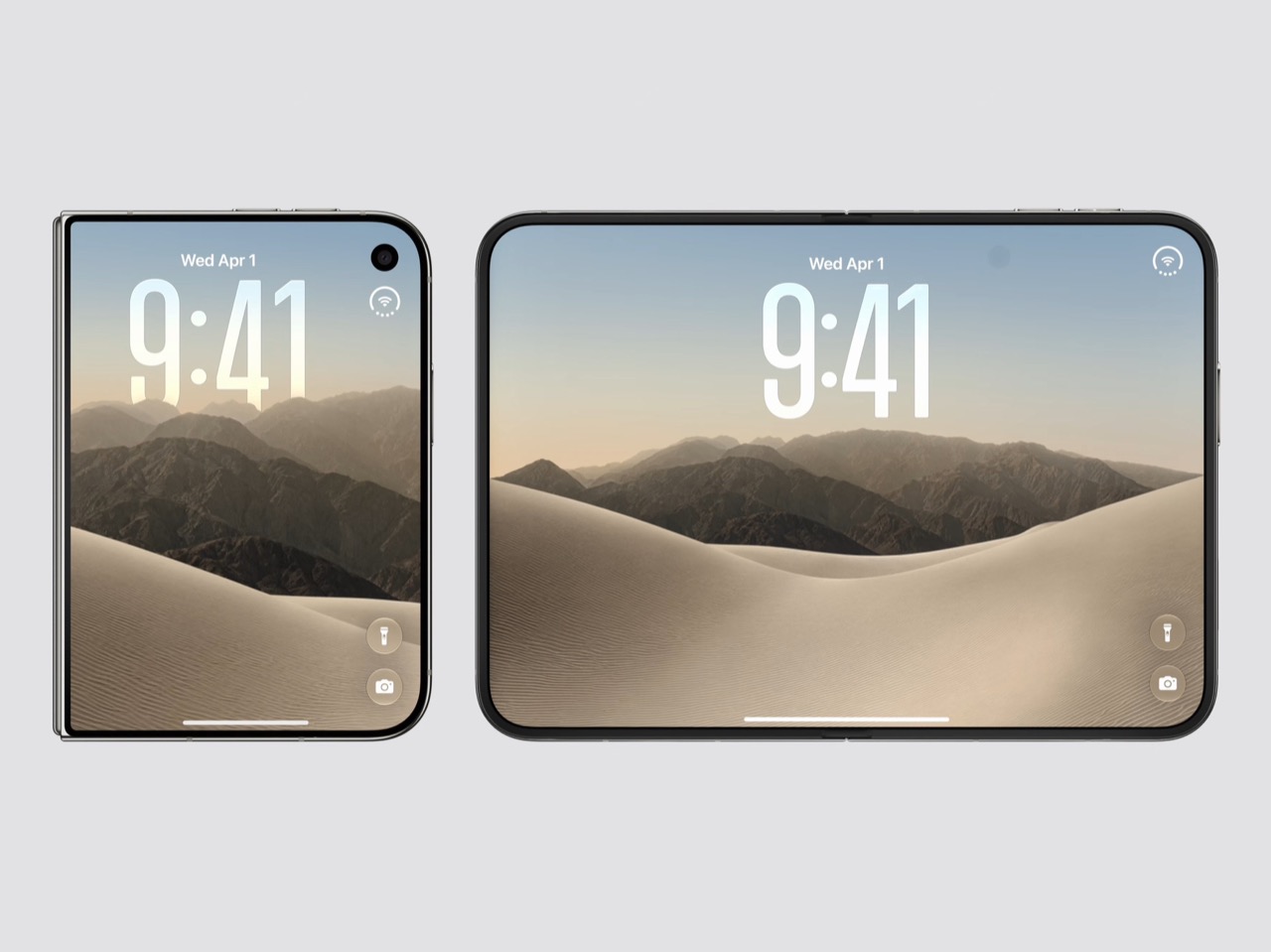
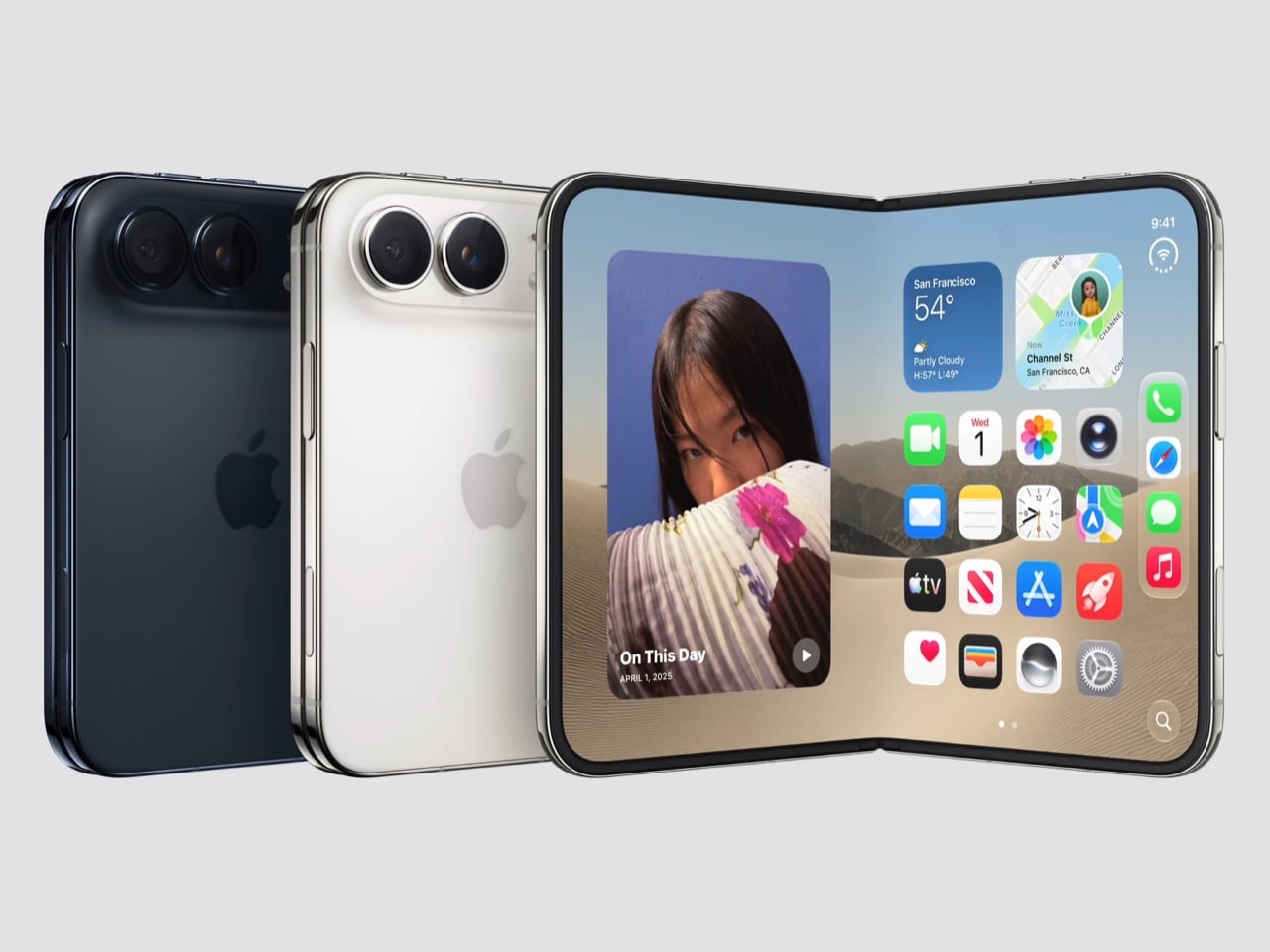
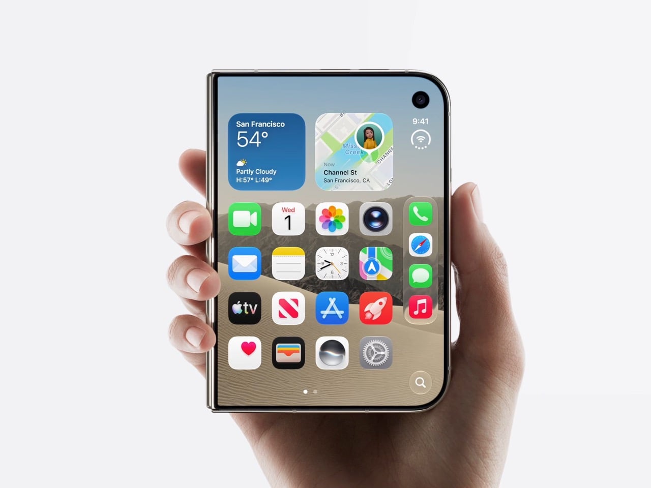
The “Different” manifests itself in a few ways. For starters, the iPhone Duo is much wider than most foldables, which opt for a tall design that results in a weird square-ish screen when opened. The Duo’s approach is a more passport-style aspect ratio, with a 1:1.4 format which sits right in the middle of a 2:3 and a 3:4 design. This wide body means a more usable screen experience in both closed and open variants, with the same aspect ratio carrying across open and closed formats – something every interface designer will cry tears of joy over.

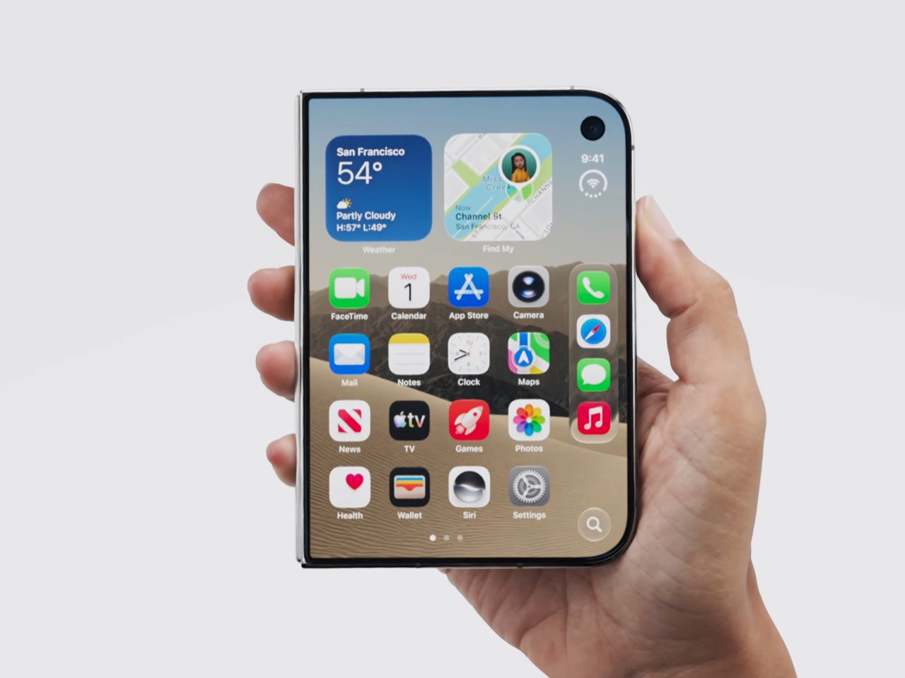
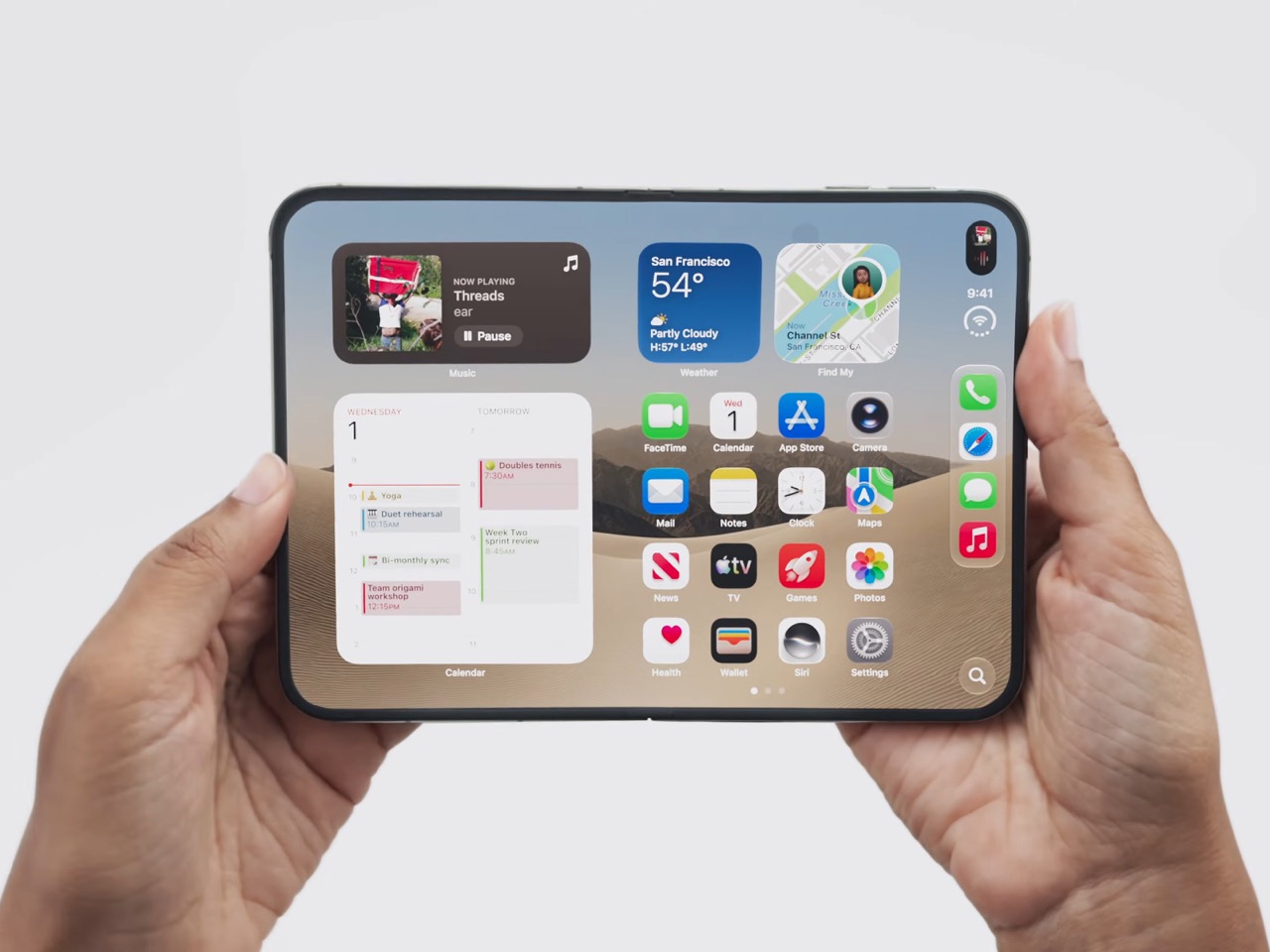
This unique form factor required designing the OS to operate differently too. While every iPhone, iPad, and even MacBook has centered itself around the bottom horizontal app dock, the Duo shifts the dock to the right, making it vertical instead. The dynamic island becomes vertical too, and the entire experience (while it requires a learning curve) is designed for seamless single-hand use, or even double hand use without needing to switch hand position. The power button on the right edge packs TouchID too, pretty much consolidating every important hardware and software detail to the right of the screen now. Great for right-handed folks, but the lefties might object to this strange exclusion.

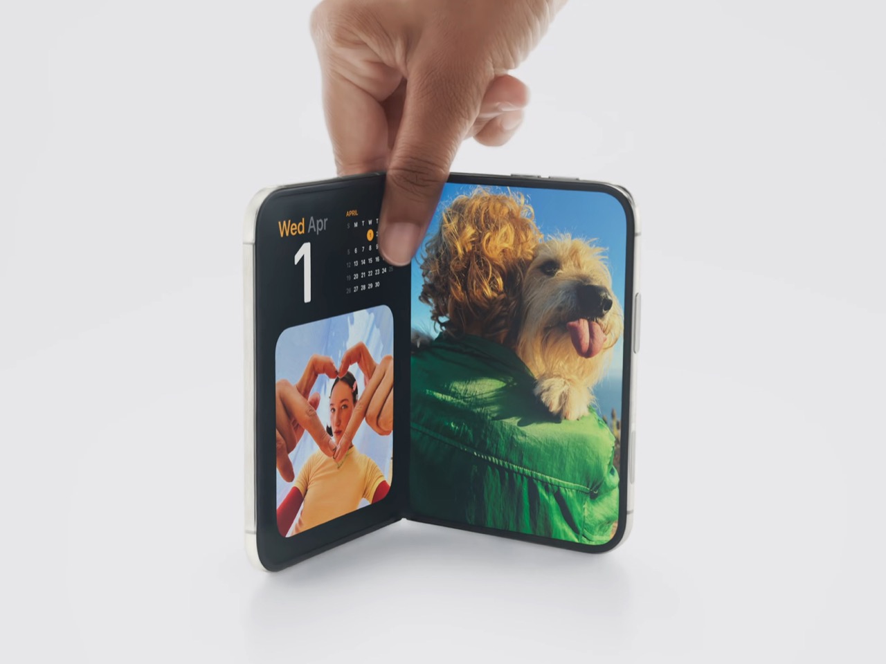
The most impressive “different,” however, is how your phone responds to you opening it. Every foldable till now has resorted to the simple trick of either A. having the folded screen power on when unfolded, or B. having the screen on, but the icons/elements arrange themselves to match the new layout. Apple’s approach was different, leaning heavily into its use of the glass effect from last year’s iOS 26 rollout. The animation feels almost like flipping a piece of frosted glass, revealing the iPhone’s screen once the phone’s folded all the way open or closed. Technically, there’s nothing Apple did that was groundbreakingly different with the interface – but this one little animation was enough to really captivate the hearts of every single person who saw the keynote.

Will the Duo be a runaway success? It’s difficult to predict this early, but the iPhone Air and the Vision Pro were (by Apple’s own standards) extremely underwhelming. Pair that with the fact that people already trust foldables less and you get a pretty bleak forecast for the iPhone Duo. But here’s where I’m inclined to believe that it might sell well. Samsung’s Galaxy Z Fold 8 is currently outperforming its Ultra counterpart. People REALLY seem to enjoy the flat and wide foldable, and the Z Fold 8’s $1899 price tag hasn’t been an overwhelming deterrent so far. For anyone who has the money and the appetite for a foldable, the iPhone Duo might just end up blowing demand for the Z Fold 8 (and the Xiaomi 18 Fold) out of the water. At just hundred bucks more than Samsung’s counterpart, the Duo really packs a one-two punch with a competitive price match, and more importantly, that gorgeous glasslike open/shut animation. I’m not saying the animation is the reason people will buy this phone, but it’s easily a compelling reason for anyone looking to throw near 2K on a folding device.

The post This Single UI Trick Might Sell More iPhone Duo Units Than Any Android Foldable first appeared on Yanko Design.

Nomad’s Leather Folio Turns Your iPhone Duo Into A $1999 Bifold Wallet

The folio case for smartphones remains an entirely boomer product offering. Having a case with a flap that covers your screen and needs to be folded open like a book to answer calls or use your phone is an innately ‘old-soul’ experience. The flap protects your screen but it also obscures it. Fold the flap to the back and it reveals your screen but blocks your camera. It isn’t for millennials or Gen-Z phone owners, but for anyone who wears reading glasses, this folio style case is as addictive as their generation’s Candy Crush habit. With Apple launching the iPhone Duo just yesterday, Nomad developed a similar folio style case for the Apple foldable.

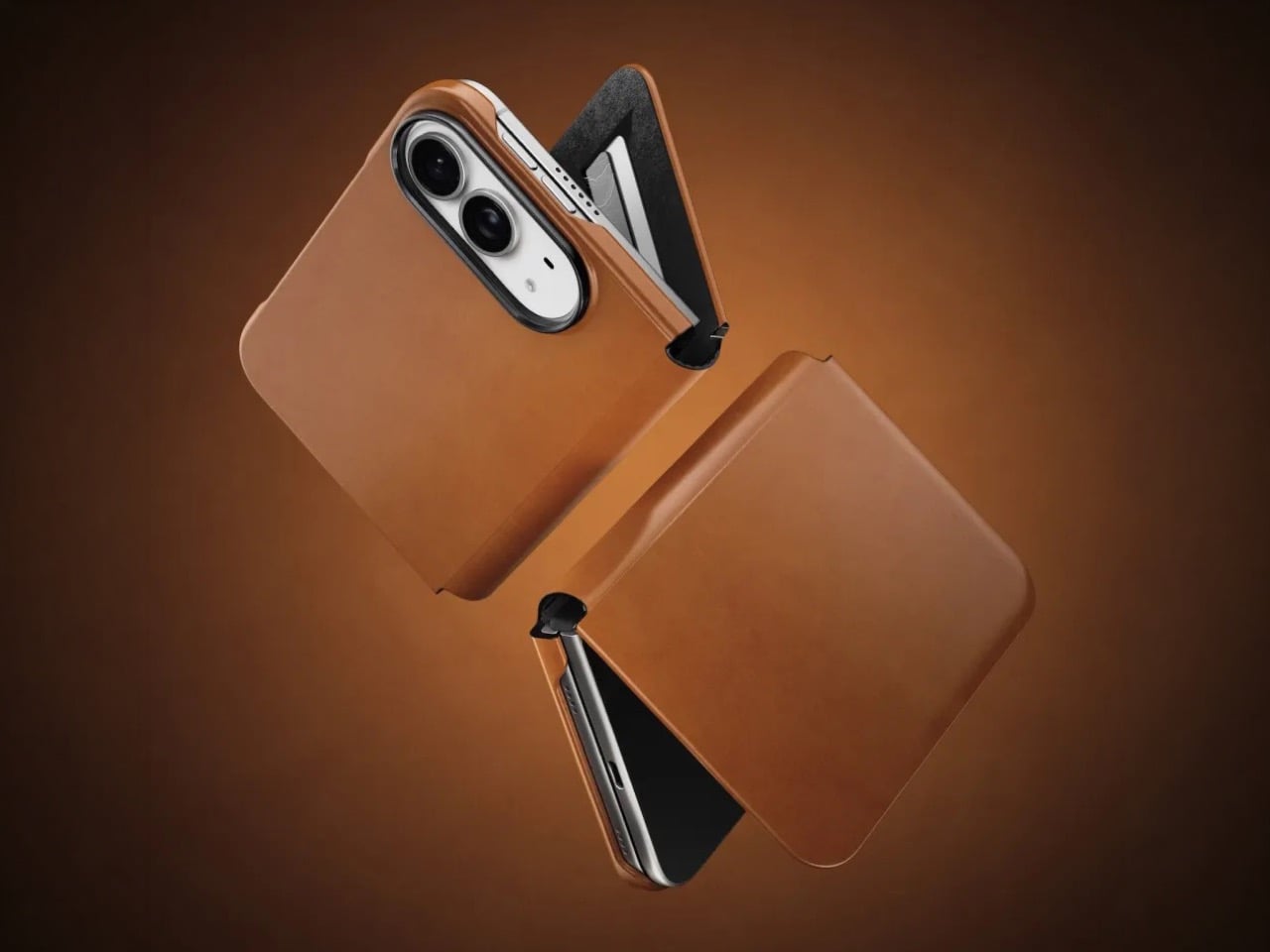
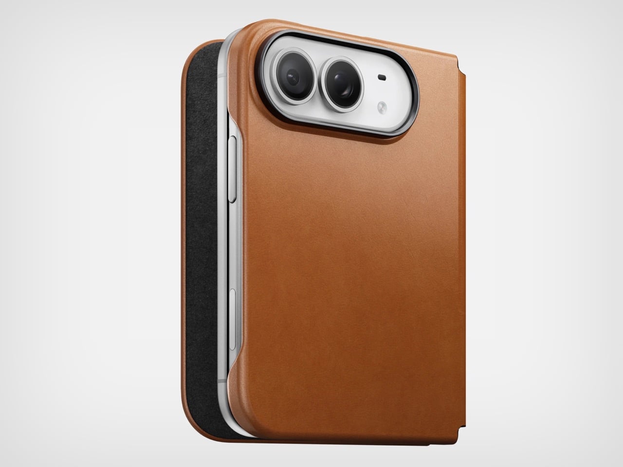
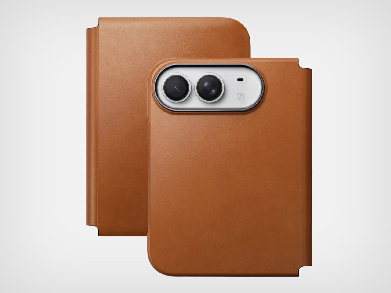
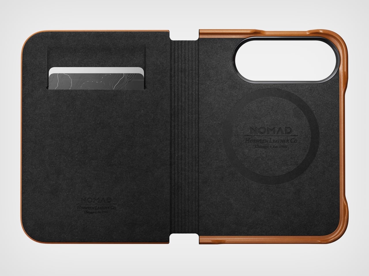
Nomad’s Folio case for the Duo is a strange little thing. While most folio cases turn candybar phones into bifolds, Nomad’s case sort of turns it into a trifold, if you will… or a bifold with a partition. The case is a single-piece leather and plastic design, created to wrap your phone not just from the back but also the front. The front flap magnetically snaps to your phone’s outer display, and lets you open your phone in two ways – firstly, by just disengaging the flap to see the outer screen, but also by disengaging the flap and outer screen together to see the inner screen… and like any good folio case, the flap’s inside packs a card-holder for your payment, ID, and access cards so you don’t need a MagSafe wallet ruining your iPhone Duo’s design.

Designer: Nomad

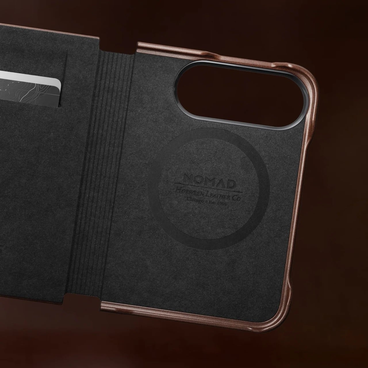
Like all of Nomad’s leather cases, this one’s made from Horween leather, crafted from a single piece of hide that’s been tanned, bent, crimped, and buffed to absolute beauty. The leather gracefully wraps around the edges, keeping the buttons exposed and accessible, while also covering the hinge in a way that creates that bifold feeling. The leather then transitions upwards ever so slightly before cutting off to a plastic lip around the camera bump, cushioning your phone’s precious shooters from accidental drops and bumps.

On the inside, the leather’s reinforced by a microfiber layer that protects the iPhone’s glass panels from damage. Sure, Apple touts Ceramic Shield on both the front and back, but nothing breaks your heart faster than seeing a cut or a scratch running down the glass body from abrasive action caused by objects in your pocket or even your table. Meanwhile, a slot on the front stores two cards from the looks of it, so your iPhone Duo doubles as a card holder beyond what Apple Pay already lets you do.

Like all good leather cases, this one’s designed to age gracefully with time. Chances are, if you’re an iPhone Duo buyer, you will probably use this phone as your ride or die for another 2 years. In that time, Nomad says the case will patina gorgeously with time, aging uniquely based on how you use the phone. Luckily, the case isn’t too expensive. Priced at $129, you can grab the Nomad iPhone Duo Traditional Folio in one of three colors – Saddle, Rustic Brown, and Black, with global shipping starting November 14th.

The post Nomad’s Leather Folio Turns Your iPhone Duo Into A $1999 Bifold Wallet first appeared on Yanko Design.
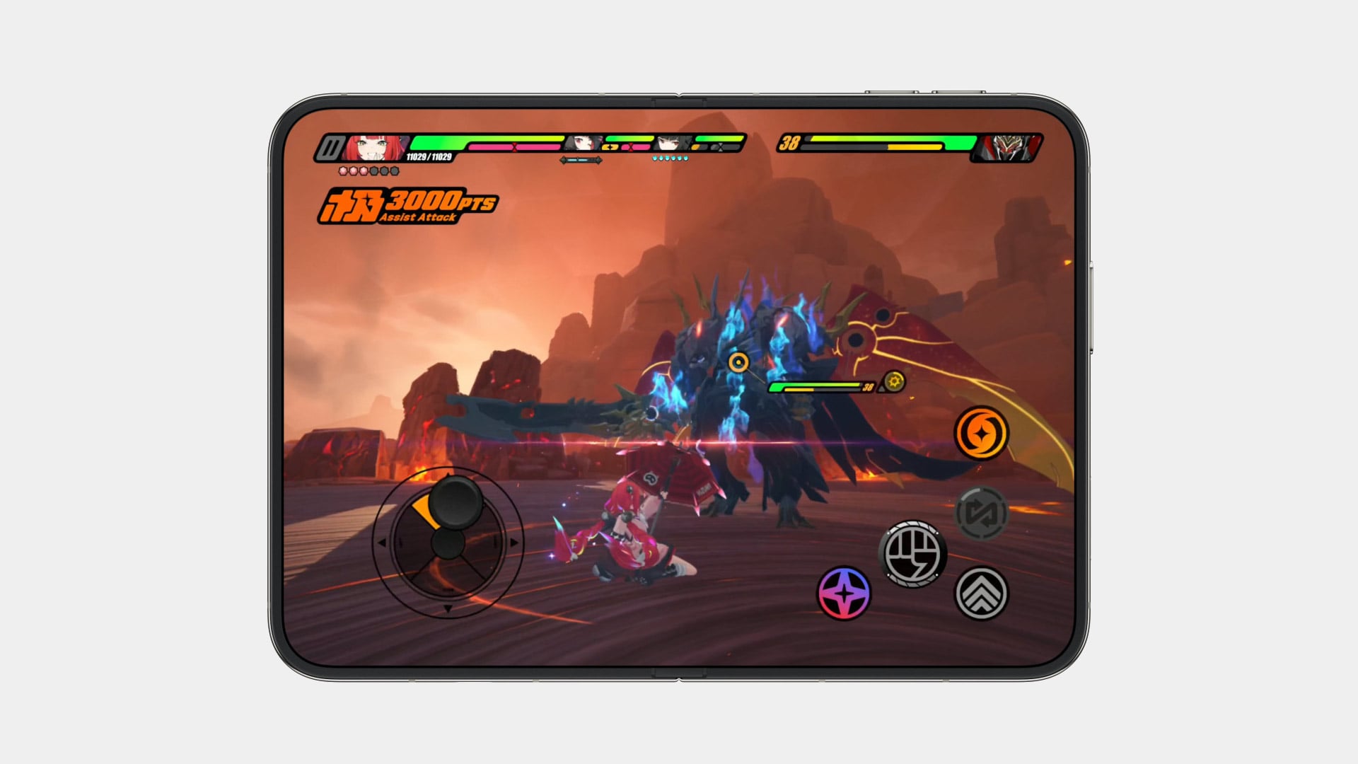
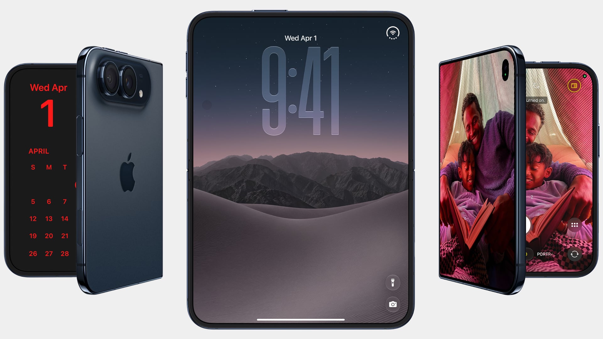
The iPhone Duo just killed the Dynamic Island, the SIM tray, and the demand for an iPad Mini

Spare a thought for the iPad Mini, which had a perfectly good career until this morning. Apple’s $1,999 iPhone Duo arrives October 23 with a 7.6-inch inner display that takes Apple Pencil with USB-C later this year and runs two apps side by side, which covers roughly everything the Mini was for, except the Mini does not fit in your jeans. It also killed the dynamic island, swapping it for a punch hole outside and a FaceTime camera tucked under the inner screen. And it killed the SIM tray worldwide, because the thinnest iPhone ever made had no room left for sentiment.
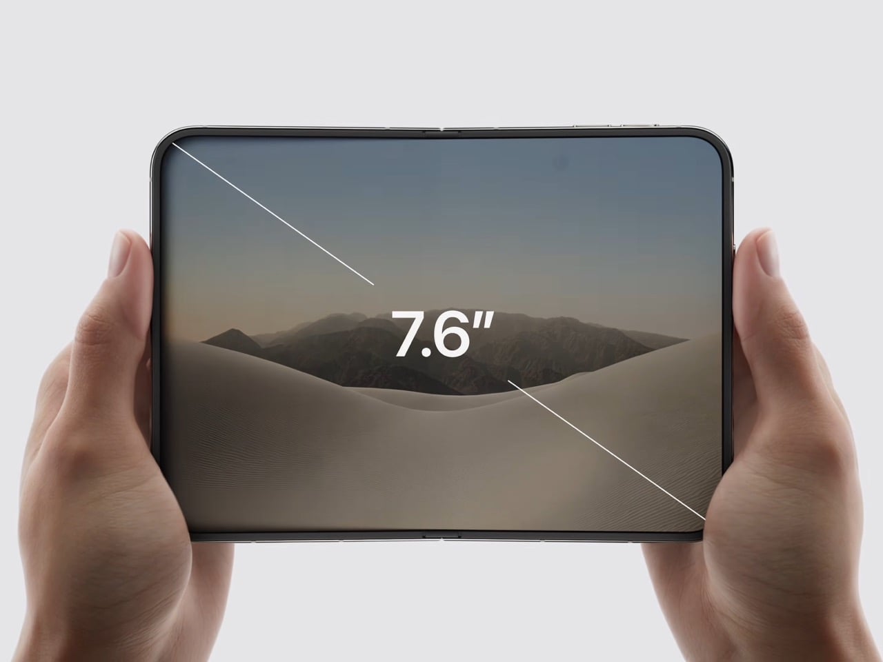
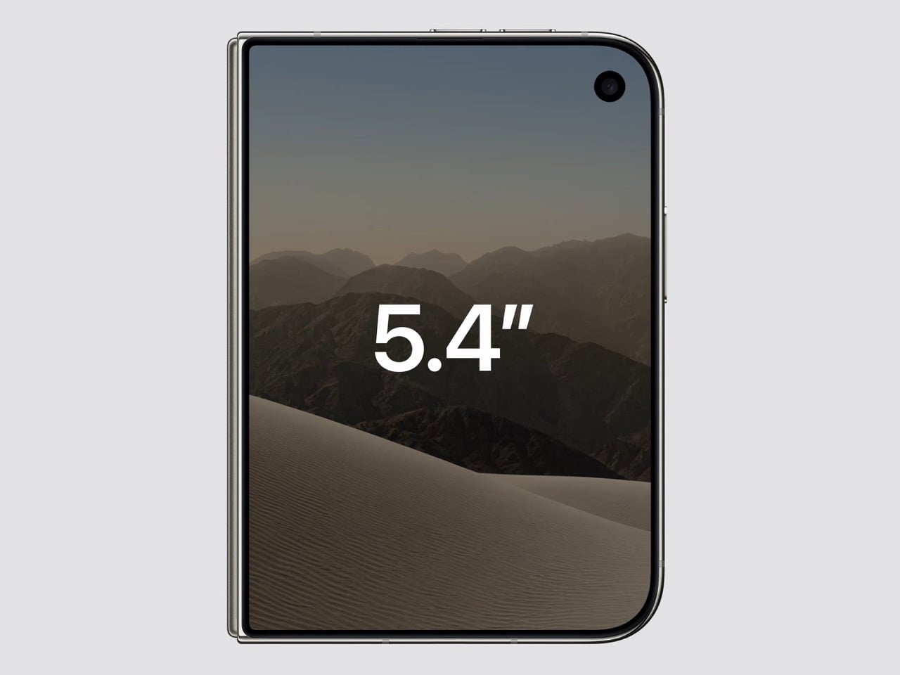
Apple never announces any of this. It ships the replacement and lets the old thing stop making sense on its own schedule. The Duo is a whole product built out of things Apple decided to stop carrying, and the interesting part is how little you miss any of them once you see what moved into the empty space. John Ternus called it the most transformational change to iPhone since the original, which I not only agree with, I think I’d take it a step further by saying – this is such a dramatic leap for the iPhone that it stops being an iPhone. It isn’t an iPad either. It’s something completely different.

Designer: Apple

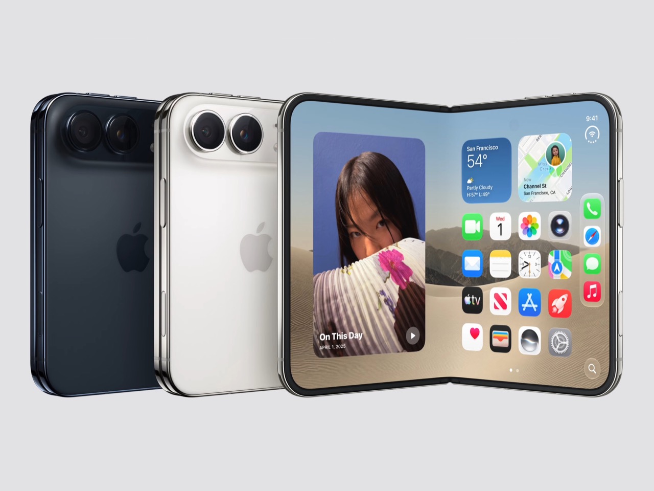
Apple refused to build a squarish slab that happens to close, and said so from the stage, calling out rivals whose square inner screens box movies into oversized black bars. The Duo lands at roughly passport size, with an asymmetric profile: two rounded corners on the right, squared geometry at the hinge. That asymmetry does something clever, because it tells your hand which edge to open before your brain gets involved. It reads like a small hardcover you want to crack open, which is a strange compliment to pay a phone. Somebody fought for that shape in a review meeting, and I am glad they won.

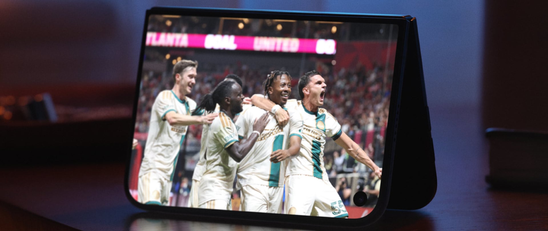
Both displays share a single aspect ratio, which is the decision the whole product rests on. Closed, the 5.4-inch outer panel delivers 90 percent of an iPhone 18 Pro’s screen area, so it works as a complete phone rather than a notification window. Open, the 7.6-inch inner canvas runs 50 percent larger than an 18 Pro Max. Because the proportions match, content scales between the two instead of reflowing awkwardly every time you fold, and the movie you started on the cover screen simply gets bigger. Every foldable before this one asked you to accept a jarring transition, and Apple designed the jarring part out.

Content flows between the two displays as the phone opens, expanding out of the cover screen and settling into the larger canvas without a stutter. I would put that transition ahead of anything Samsung, Google or Oppo has shipped on a folding device, and it is the single most beautiful piece of UI in the category right now. The matched aspect ratio is what makes it possible, because there is no reflow to disguise, only a scale. Controls stay locked in place along the side while the content grows around them. Watching it happen is the closest a phone has come to feeling like sleight of hand.

The crease is the thing people notice first on a foldable, and Apple has more or less made it disappear. A matte nano-texture finish across the inner display cuts glare and flattens how the fold reads, so the eye stops finding the seam. It also solves the other foldable complaint nobody talks about, which is the cheap plastic feel of a folding panel under your fingertip. Real glass sits above and below the display, and the whole stack is built to stop the panel distorting after a few thousand folds. Nine years of waiting bought Apple a fold you have to hunt for.

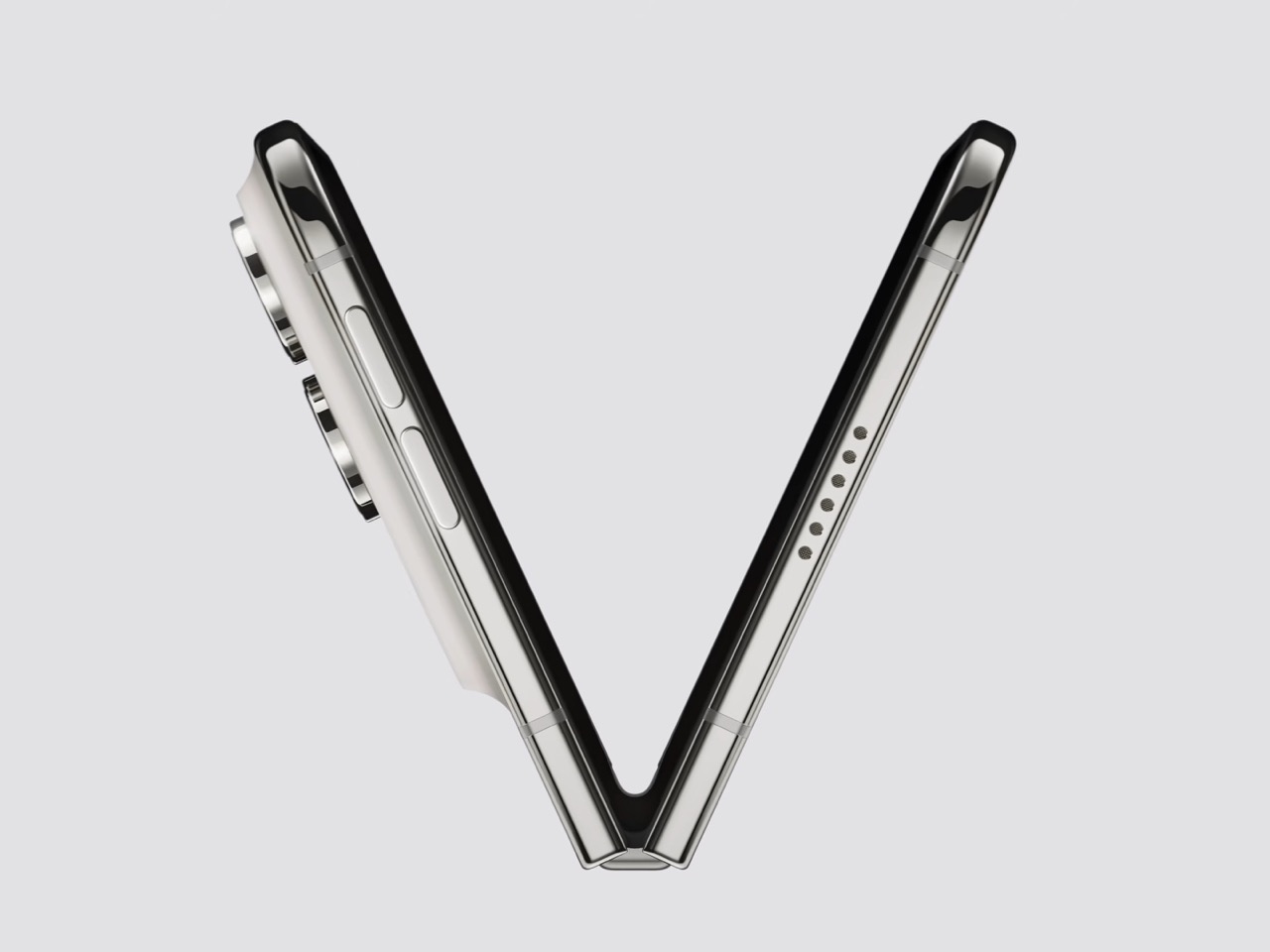
Grade 5 titanium forms the frame, polished to a mirror finish and broken by a hinge cover in contrasting micro-blasted texture. That pairing is the sharpest visual detail on the object, a bright reflective body interrupted by one matte band at the spine, and it gives the closed device a piece of jewelry quality that photographs beautifully in star white. Ceramic Shield protects the back, Ceramic Shield 2 the front, and the whole thing carries an IP68 rating. Pulling that dust and water rating across a moving joint is genuinely difficult engineering. The night sky colorway, a deep navy, is the one I would actually buy.

The dock is vertical now. iOS 27 moved essential controls to the side of the screen, freeing vertical space for content and landing the buttons under your thumb, which rewrites a layout convention Apple has held since 2007. The status bar compresses into a corner and the Dynamic Island turns sideways along the edge of both displays. Every first-party app had to be relaid out to make this coherent, and the fact that it still reads unmistakably as iOS is the real achievement here. Nobody outside Apple would have been permitted to move that dock.

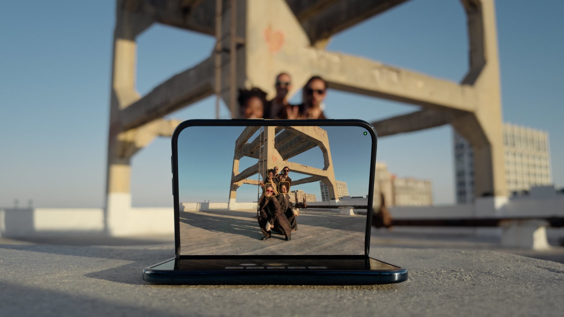
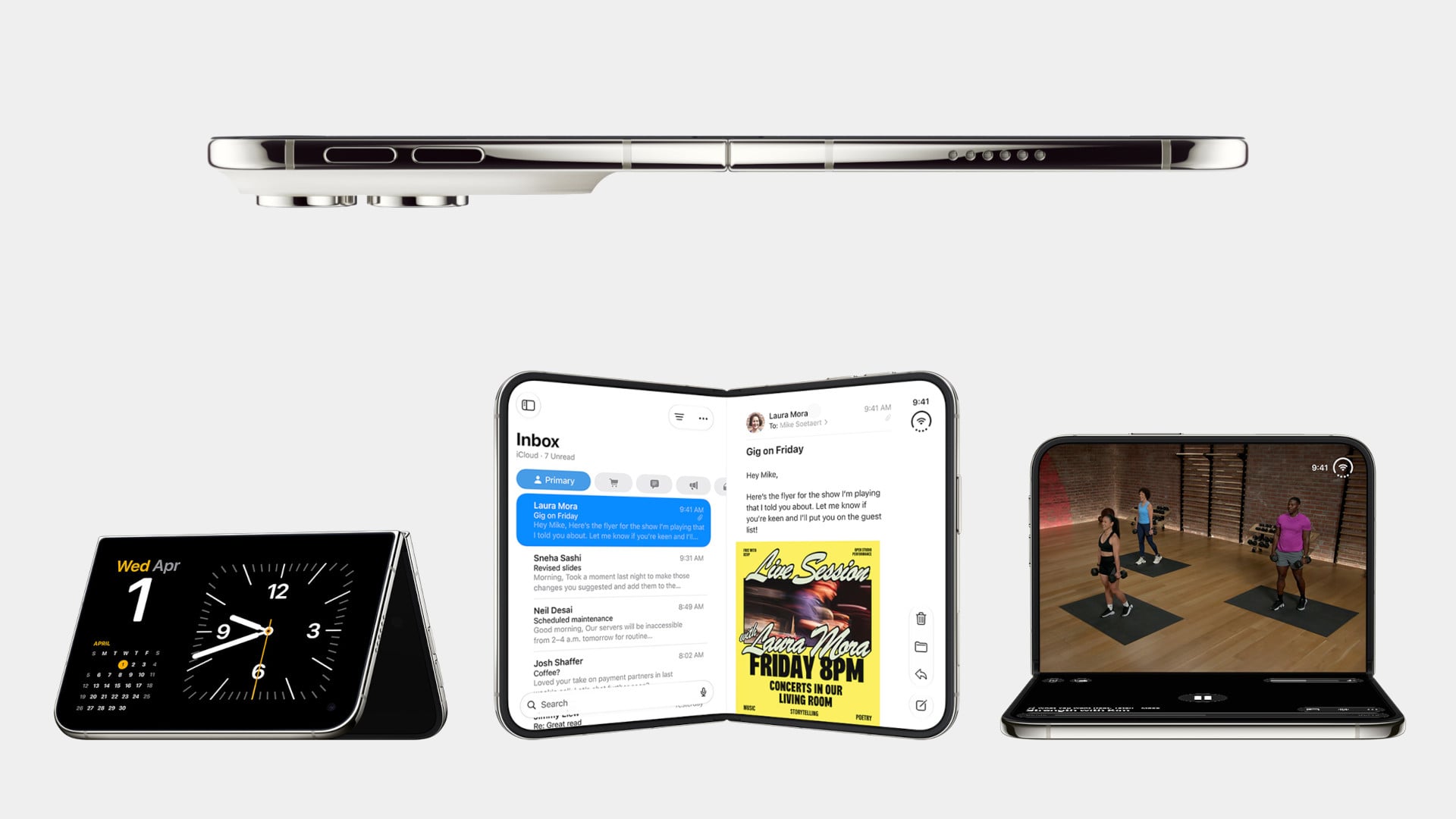
Fold it halfway and iOS slides content away from the crease, giving you a laptop-style prop for video calls, a hands-free camera rig, and a bedside alarm face that wakes you with a gentle glow. StandBy now runs even when the phone is off charge, turning it into a photo frame or widget hub the moment you set it down. The speakers retune themselves depending on how far apart the two halves are sitting. One device, half a dozen legible postures, all of them designed rather than discovered by users after launch. The alarm clock pose alone will sell a few thousand units.

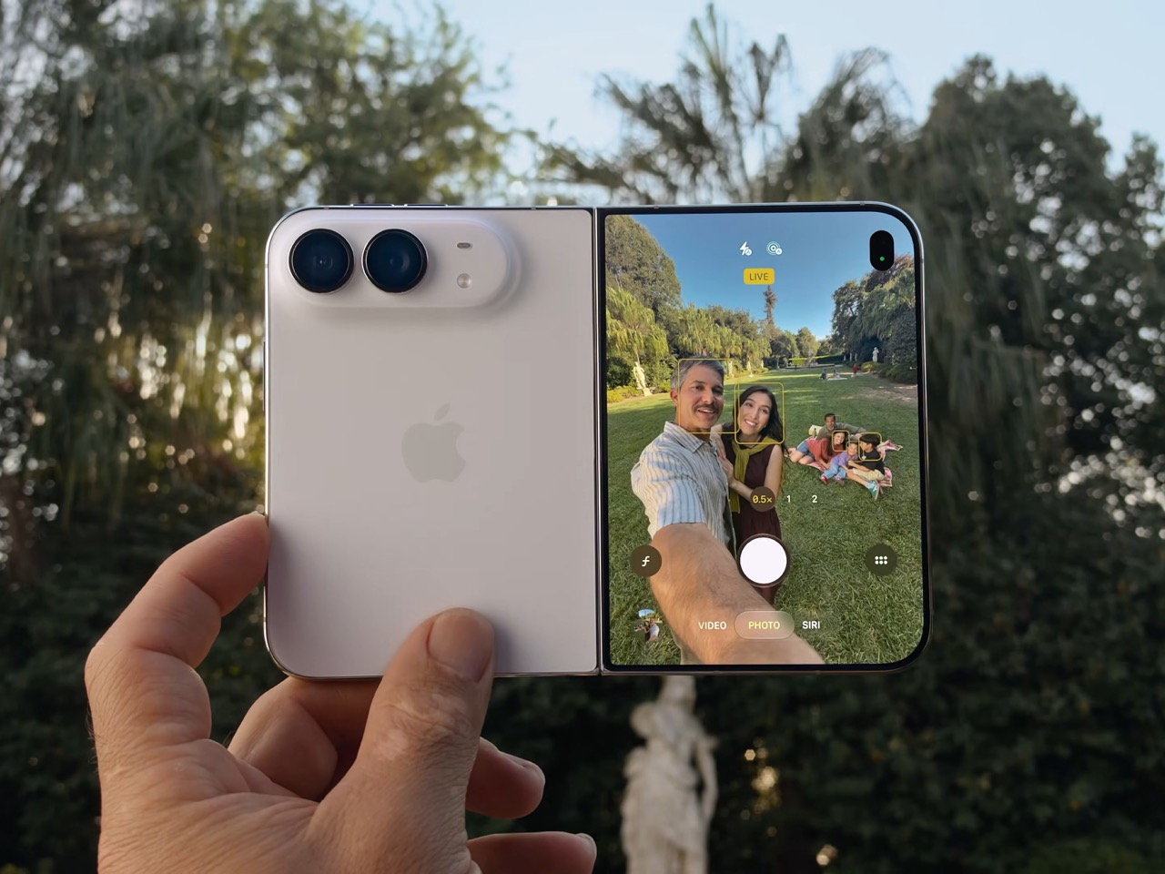
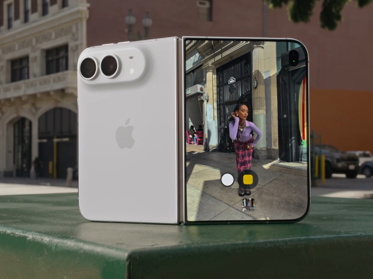
The cameras take advantage of having a second screen. Duo Preview throws a live feed onto the outer display so your subject can see themselves and fix their own framing, which ends a decade of “can you take it again.” Kid Cue plays Peanuts animations to make toddlers look at the lens. Smart Take watches the scene and fires the shutter once everyone is finally posed, killing the timer scramble. A 48MP Fusion Main with a 2x telephoto handles the actual imaging, alongside the same 48MP Ultra Wide found on the iPhone 18 Pro.

Going eSIM only across every market freed the internal volume for one battery per side, managed so the pair behaves as a single cell, delivering 31 hours of video on the inner display and 44 on the outer. I will miss the tray as a traveler, and I also suspect Apple has wanted it gone for years, because a physical port punched through the frame is a liability on a device chasing IP68 across a hinge. A20 Pro drives both panels, and fast charging reaches 50 percent in around 20 minutes. Some deletions are grief. This one is mostly relief.

Touch ID in the side button is a real step back from Face ID on a two thousand dollar phone, and it exists because a TrueDepth array had nowhere to live. Apple Pencil support arrives later this year rather than at launch, which softens the iPad Mini argument for a few months. The bezels look chunky beside a Galaxy Z Fold 8, and the folded body still reads thick in the hands-on shots. At $1,999, a hundred dollars over the Fold 8 and five hundred under what everyone predicted, Apple showed up nine years late and priced like it was early. Pre-orders open October 16.

The post The iPhone Duo just killed the Dynamic Island, the SIM tray, and the demand for an iPad Mini first appeared on Yanko Design.