This Sharp-Cornered Lithuanian Home Only Exists Because Planning Rules Wrecked the Original Design

Most architects fold when the rules change. The Trim House by Polish firm KWK Promes, completed in 2025 in a forested suburb of Vilnius, Lithuania, is exactly that kind of project. It began in 2016, when KWK Promes, led by Robert Konieczny, won a closed competition to design a luxury single-family home on a wooded plot in suburban Vilnius. The site carried its own quiet history, once dotted with interwar wooden cottages that had long since disappeared, leaving behind open ground and a loose scatter of trees. What followed was a straightforward brief and an optimistic timeline. Then, mid-design, local planning regulations changed everything.

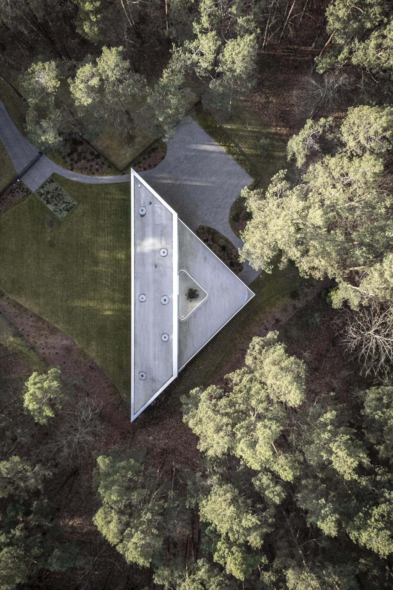
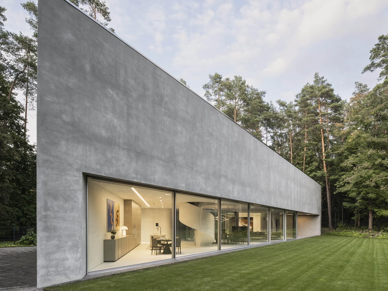
The allowable building footprint was slashed in half. The driveway was also repositioned, now cutting directly through the garden. The client’s instinct was to abandon the site altogether. KWK Promes had a different idea. Rather than retreat, the firm persuaded the client to stay, reduce the total area by 40%, and let the new constraints rewrite the geometry entirely. The result was a triangular floor plan, precise, deliberate, and oddly inevitable once you see it.

Designer: KWK Promes

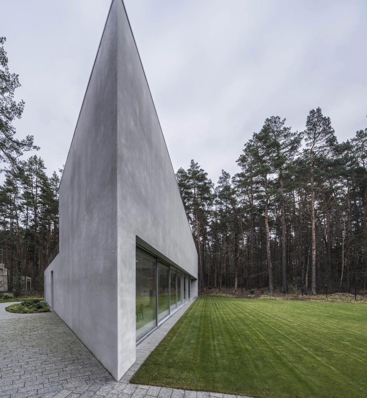
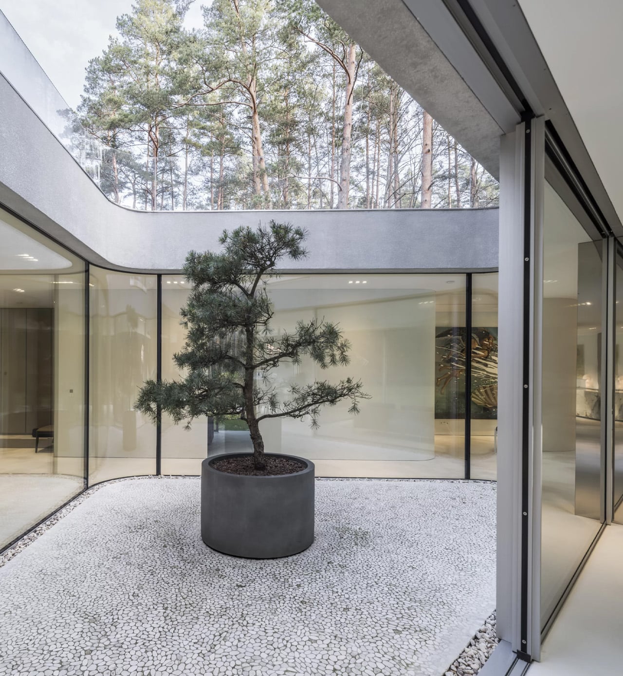
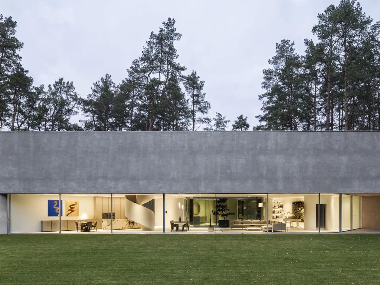
The name does exactly what it says. The house was trimmed. And in being trimmed, it became something far more interesting than the original design might have been. Spanning 299 square meters, the Trim House is a composition of concrete and glass, its sharpest corner cutting through the landscape like an ocean liner carving through ice. The most dramatic elevation reads almost like a flatiron building scaled down to domestic life, angular, taut, and satisfying in a way that’s hard to place. The surrounding pine trees press close, softening what could have felt severe.

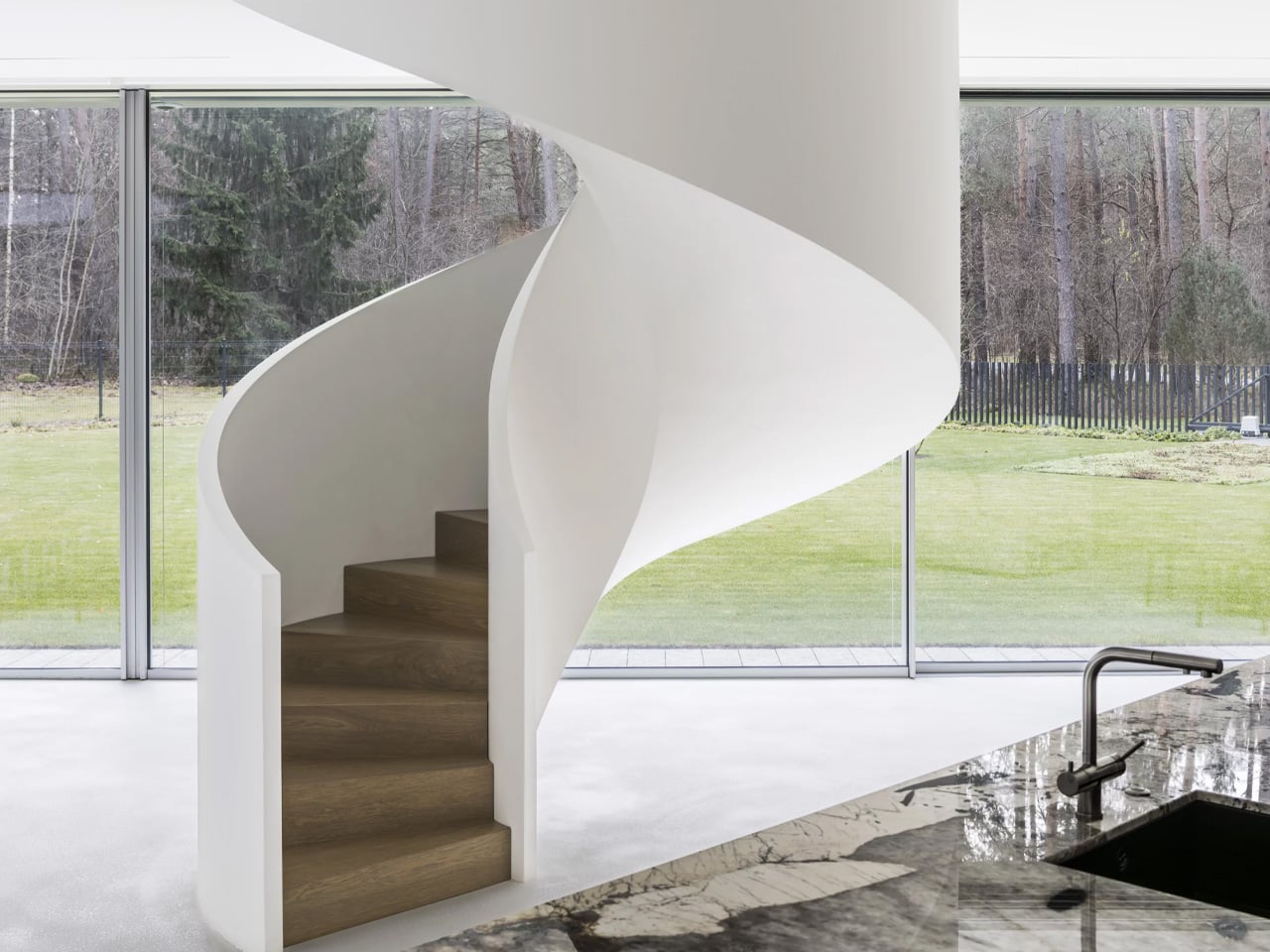
Inside, the two-level plan is organized around a central patio that pulls daylight deep into the heart of the structure. The ground floor holds the living spaces and opens seamlessly into the garden, while the raised first floor contains the private bedrooms, each with access to a terrace that sits above the ground-floor volume. The section plays the two zones off each other, the social, grounded, garden-facing level below, and the quieter, more elevated, view-oriented rooms above. Privacy and nature, held in careful balance.

What makes the Trim House worth paying attention to isn’t just its sculptural confidence. It’s the story behind the form. Constraints aren’t obstacles but essential drivers of innovation, as KWK Promes put it. The Trim House makes that argument with concrete and glass, and it’s hard to argue back.

The post This Sharp-Cornered Lithuanian Home Only Exists Because Planning Rules Wrecked the Original Design first appeared on Yanko Design.

A Gaming Executive Said “Build Me a Crystal House.” This Is What 7,300 sq. ft. of Pure Glass Looks Like

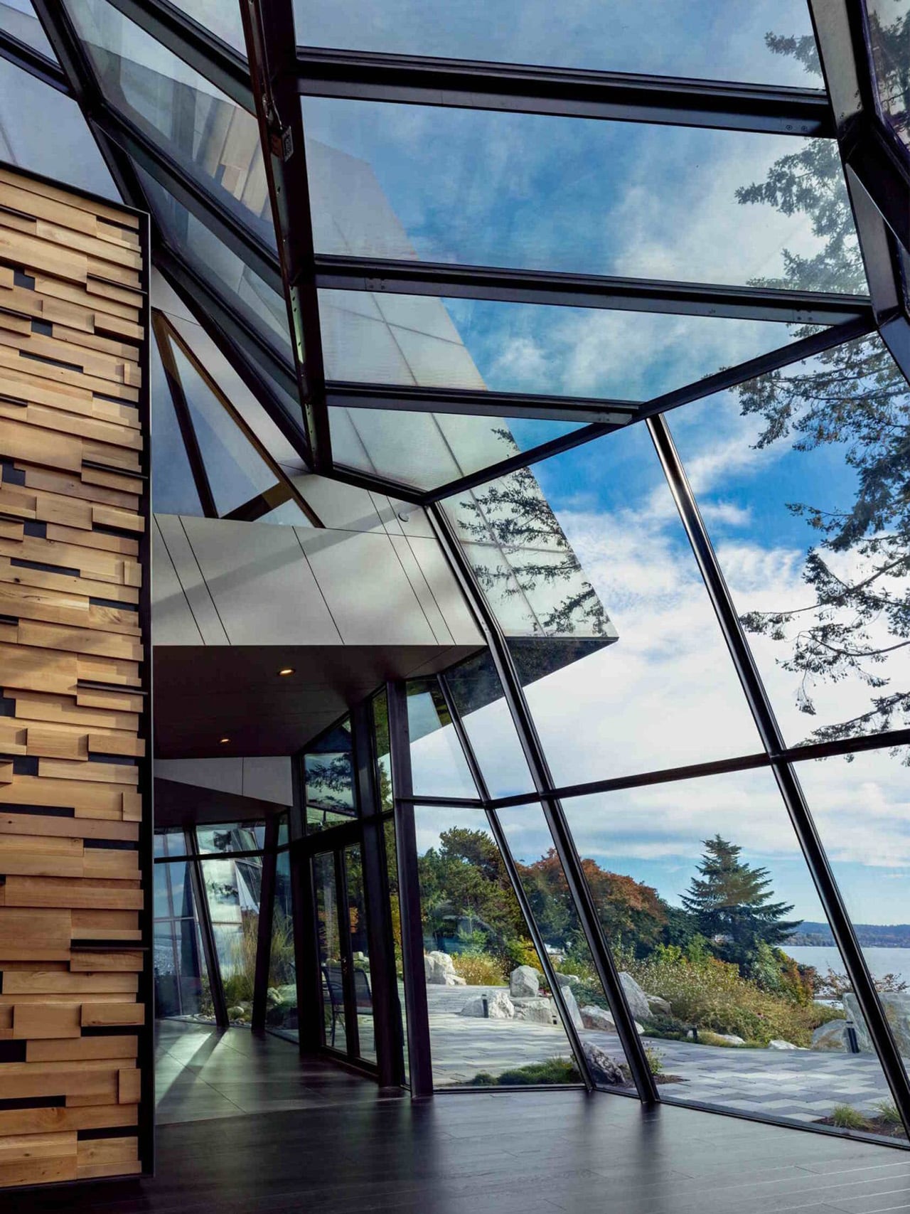
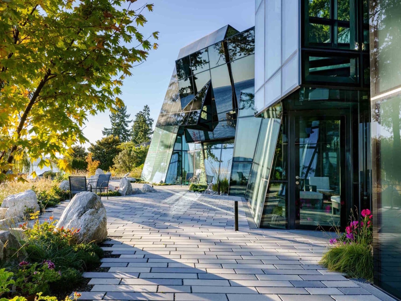
Glass is the most psychologically loaded material in architecture. It promises transparency and delivers ambiguity, reads as weightless while demanding extraordinary structural engineering, and has the strange property of making a building simultaneously present and absent depending on where you stand and what the light is doing. Architects have been exploiting these contradictions since Joseph Paxton’s Crystal Palace in 1851, and the conversation has never really stopped. F-House, a private residence on Lake Washington in Kirkland, Washington, designed by Goble Berriman Design with facade specialist Pulp Studio, pushes that conversation to a place most residential architects would consider genuinely unreasonable.

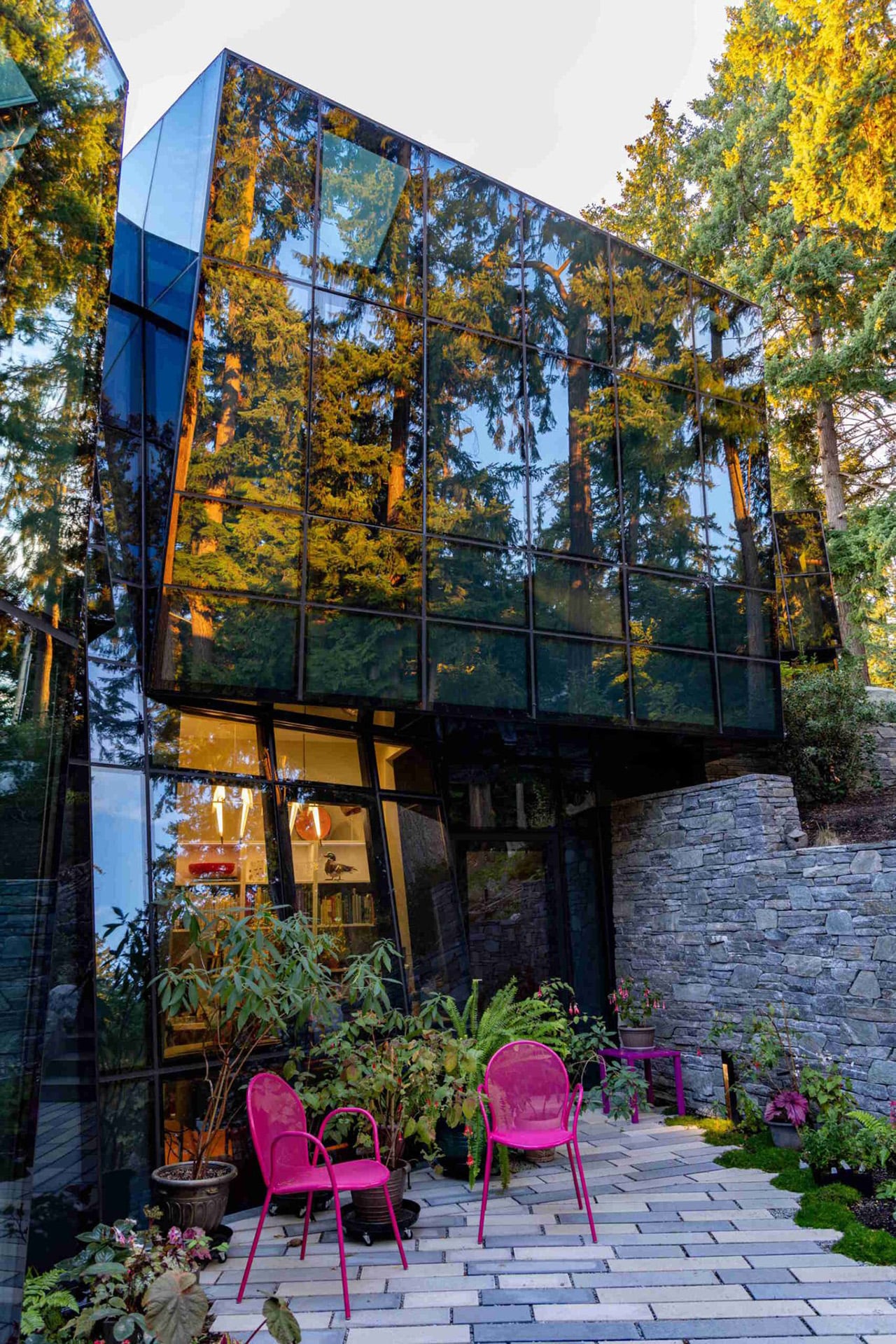
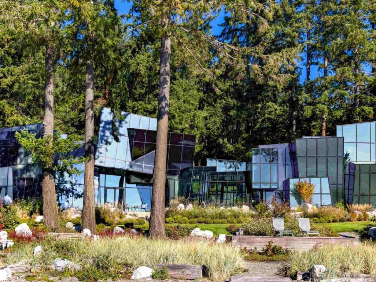
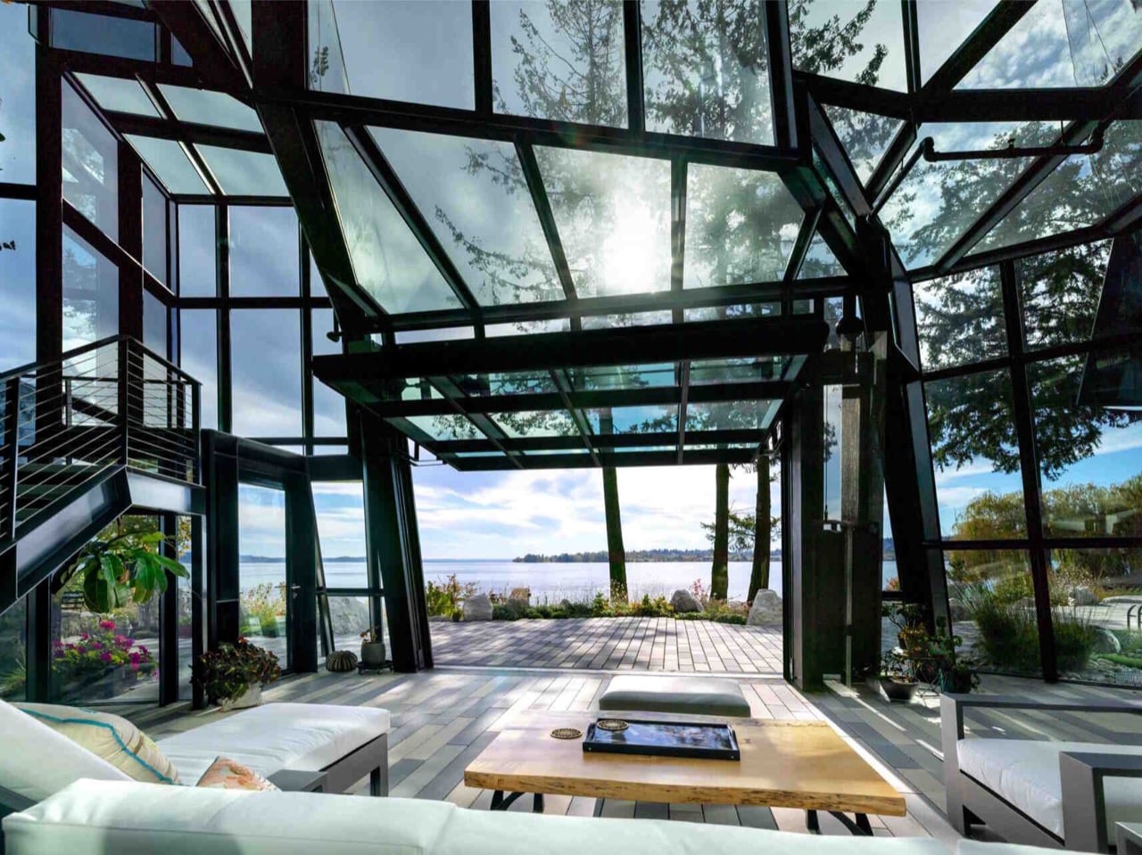
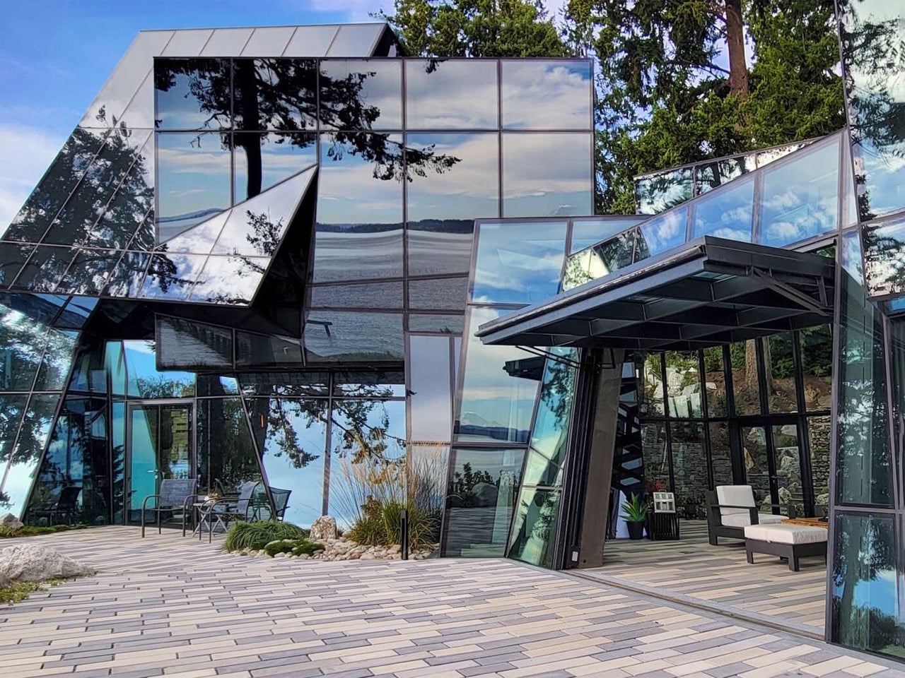
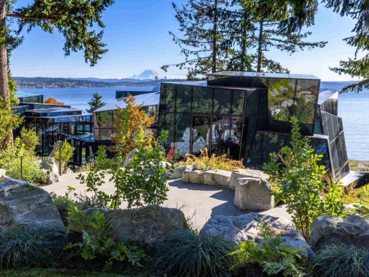
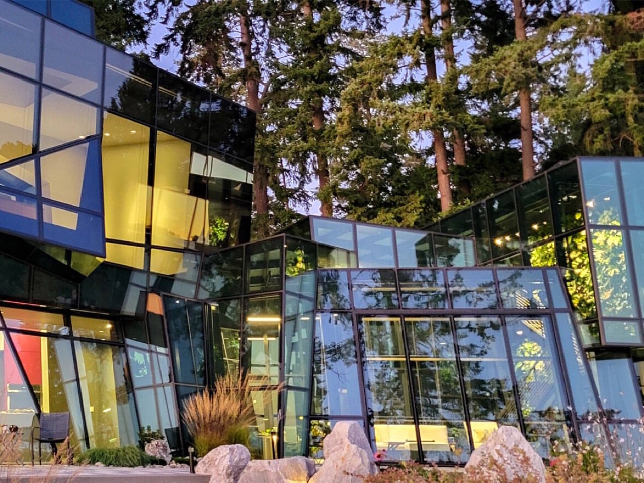
The brief, issued by a client working in the computer gaming industry, was a single directive: build a crystal house. What followed was years of design development, engineering collaboration, and custom fabrication to produce a home with zero conventional exterior cladding. Every surface is glass, cut into angular, irregular panels that assemble into a faceted form inspired by shattered ice erupting through terrain. The steel structure supporting all of it is hidden. The fixings are concealed. Even drainage details disappear behind custom direct-to-glass printed borders, because Goble Berriman understood that one visible downspout would break the entire illusion.

Designer: Goble Berriman Design & Pulp Studio

The pedigree behind this project deserves context. Stuart Berriman spent years at The Jerde Partnership working on large-scale mixed-use developments across Asia before co-founding Goble Berriman. Partner Angus Goble was a founding member of Front Inc., a leading facade consultancy whose client list included Frank Gehry, OMA, Herzog and de Meuron, and SANAA. That lineage matters here, because F-House reads less like an ambitious residential project and more like a commercial-grade facade engineering exercise that happens to contain bedrooms. The crystalline exterior geometry, which shifts from mirror-flat reflectivity to deep angular shadow depending on the hour, is the kind of work you expect from firms operating at institutional scale, not on a private lakeside lot in Kirkland.

The home spans 7,300 square feet and sits surrounded by natural rock formations and dense Pacific Northwest greenery, with Mount Rainier visible across the water. That landscape pairing is doing real compositional work. The hard, faceted glass skin reads against the softness of the firs and boulders as a deliberate counterpoint, the same logic that makes mineral specimens so visually arresting when you set them against organic matter. The building doesn’t try to blend into its site. It announces itself as something foreign to the natural order, which, given the crystal brief, is precisely correct.

The thermal and privacy engineering required to make a fully glazed house actually livable is where the project earns its most serious design credibility. Double silver-coated glass handles the main residence, while solar-protected glass was selected for the winter garden. Low-emissivity coatings regulate temperature across the envelope, and custom dot-pattern shading improves energy performance without introducing visible blinds or screens that would compromise the exterior reading. Each glass unit is a layered assembly with an air gap and Saflex interlayers that can shift from clear to opaque, giving occupants control over privacy without resorting to curtains. Insulated spandrel panels handle transitions where solid construction was unavoidable. The result is a house that performs like a thermally responsible building while looking like it was assembled from a single continuous material.

The interior layout is organized around a winter garden that acts as a central divider, separating the main residence from the studio and garage, the latter featuring a glazed hangar door. A continuous skylight stretches from the entry through to the dining area and garden terraces, and a glass bridge connects to the master bedroom, turning what would ordinarily be a corridor into a suspended, luminous passage. Goble Berriman ran the entire project through a shared 3D model across every consultant and contractor, and the homeowner navigated the design in VR goggles long before construction began. By the time the building was finished, it felt entirely familiar to the client, confirmation that years of immersive pre-visualization had done their job in a way that no flat drawing ever could.

F-House sits in a tradition of glass architecture that runs from Mies van der Rohe’s Farnsworth House through Philip Johnson’s New Canaan Glass House and into the parametric facade work of the last two decades. What separates it from most of that lineage is the refusal of orthogonal geometry. There are no flat planes meeting at right angles here, no clean curtain wall logic. Every panel is its own negotiated shape, and the whole facade behaves more like a cut gemstone than a building skin. Whether that reads as the most literal client brief ever executed, or as a genuinely new formal proposition for residential glass architecture, probably depends on where you’re standing and what the light is doing. On the shores of Lake Washington with Mount Rainier in the background, I’d argue it’s both.

The post A Gaming Executive Said “Build Me a Crystal House.” This Is What 7,300 sq. ft. of Pure Glass Looks Like first appeared on Yanko Design.

Everything in 2026 Is Disposable – Here’s 5 Sustainable Trends Are Designed to Last Centuries

The age of disposable green is over, as in 2026, sustainability means permanence. You no longer design for short lifecycles or rapid replacement, as you design to last. True ecological responsibility now aligns with architectural endurance, where reduced carbon impact comes from buildings meant to perform for centuries, not decades. Longevity becomes the most effective form of environmental care.

This approach values material honesty and graceful ageing. You select materials that mature with time rather than degrade. High-performance envelopes and timeless spatial planning deliver stronger aesthetic and functional return on investment. The home becomes a legacy that is biophilic, resilient, and enriched by time, not destined for waste.

1. Consider Materials that Endure

In 2026, true luxury lies in materials that never demand replacement. You move beyond synthetic composites and trend-driven finishes toward material honesty. Natural stone, solid wood, and metal are chosen not for immediate impact, but for their ability to remain relevant across decades. Sustainability here is quiet, embedded, and inseparable from longevity.

This approach delivers long-term return on investment. While solid stone, reclaimed hardwood, and heavy-gauge metals require a higher upfront cost, their lifespan offsets both financial and environmental impact. Unlike surfaces that degrade, natural materials improve with age. Patina becomes value. Time itself turns into an aesthetic layer, enriching the space rather than diminishing it.

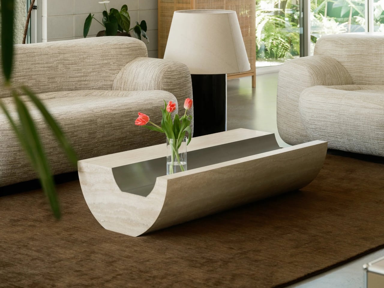
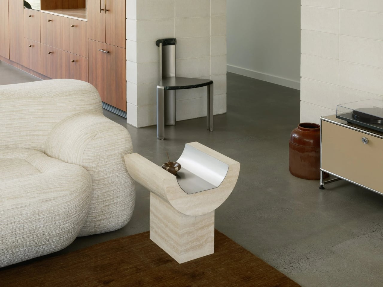
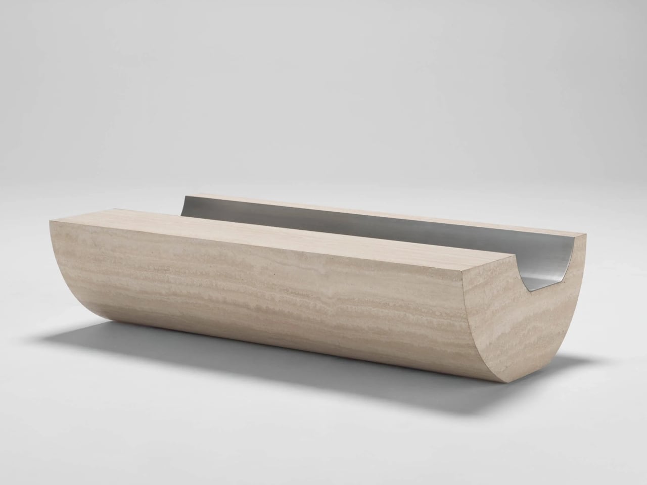
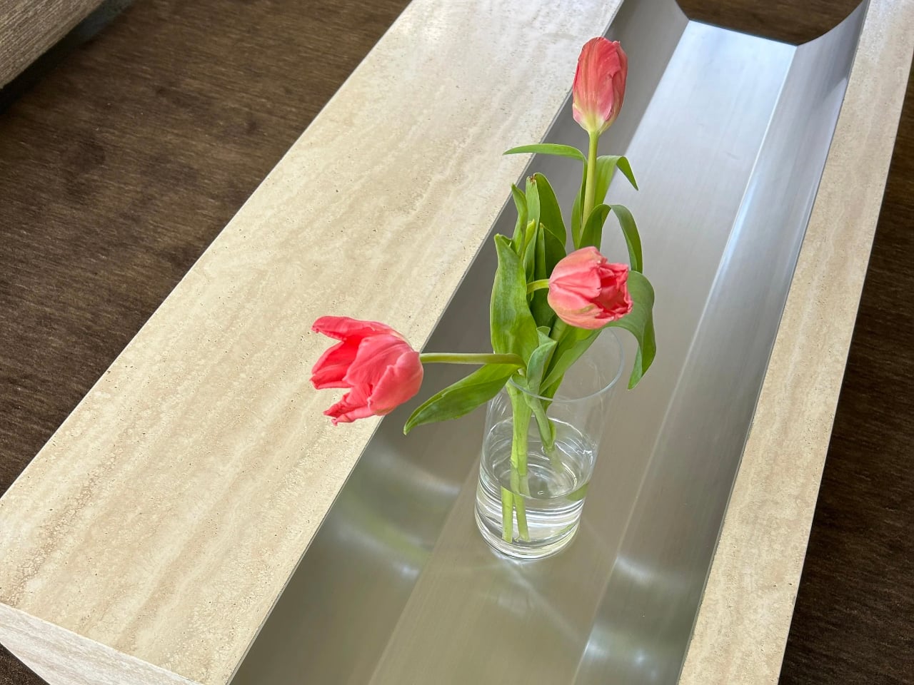
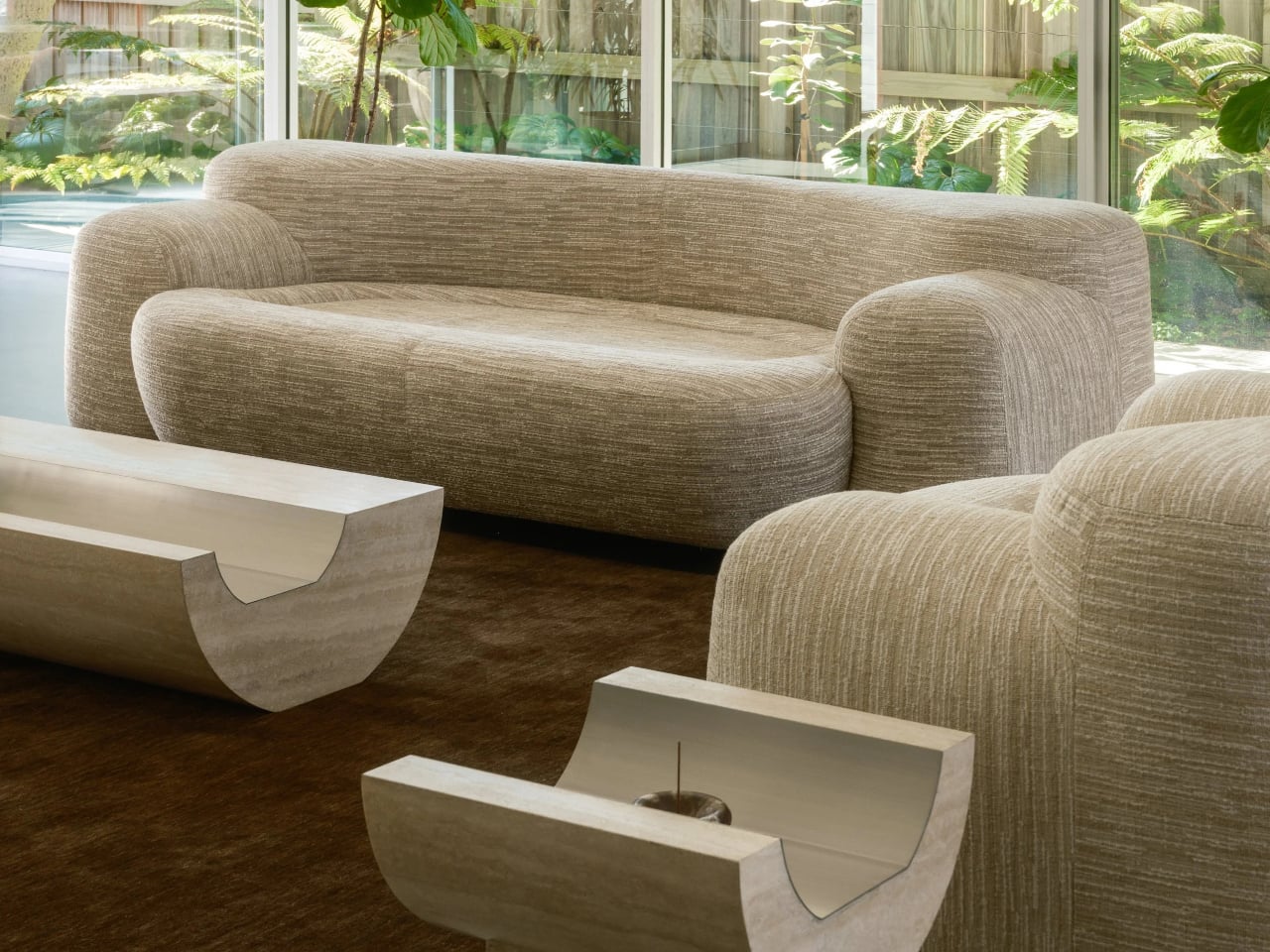
Stone furniture is often associated with visual weight, but its true strength lies in longevity. Coffee Table 01 and Side Table 01 by Tom Black are designed with a sense of permanence firmly in mind, utilizing Italian travertine not as surface decoration but as a structural element. Rather than relying on applied finishes or thin veneers, each piece is carved from solid stone, ensuring durability, stability, and resistance to trends. The curved underside of Coffee Table 01 subtly lifts the form while maintaining a robust footprint, and the metal-lined trough is not ornamental but precisely integrated, reinforcing the table’s architectural integrity.

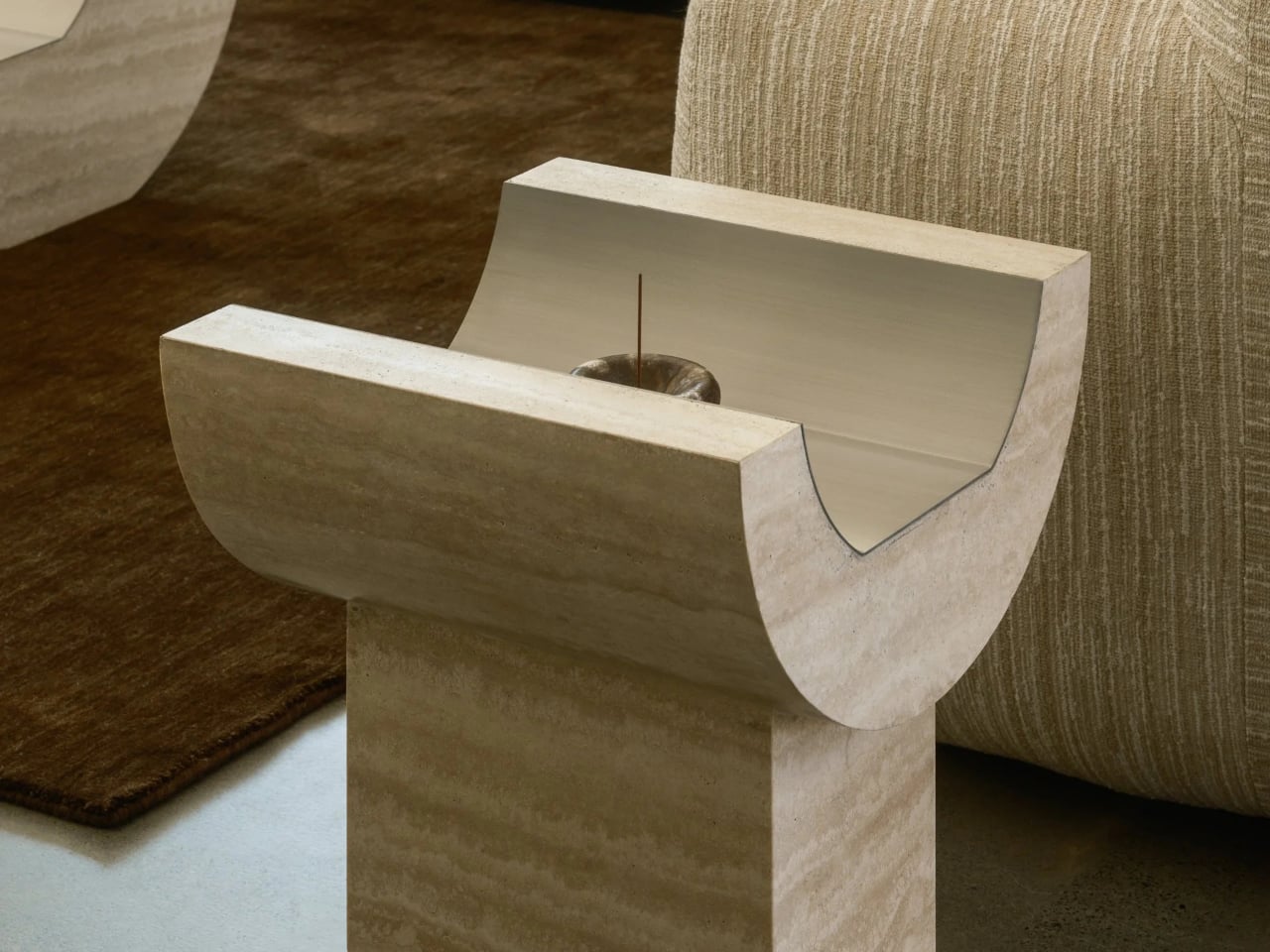
Side Table 01 continues this built-to-last philosophy through a grounded, plinth-based composition. The rectangular base anchors the curved upper element, creating a balanced, load-bearing relationship between parts. Together, the warm veined travertine and brushed metal inlay speak to materials chosen for ageing well, developing character over time rather than wearing out. These tables feel less like temporary furnishings and more like enduring fixtures or objects that are designed to outlive interiors and remain relevant through their material honesty and structural clarity.

2. Focus on Thermal Efficient Envelopes

Longevity extends far beyond surface finishes; it is embedded in the performance of the building envelope. Homes that regulate internal comfort through passive means remain functional and relevant over time. When thermal efficiency is designed into the shell, the building relies less on mechanical systems and adapts more naturally to its environment.

By combining high-thermal-mass materials with advanced insulation, the structure maintains temperature stability while reducing long-term energy demand. Equally critical are the invisible layers or triple-glazed systems and vapor-permeable membranes that protect against moisture, decay, and material fatigue. These hidden investments safeguard structural integrity, ensuring the building performs reliably and endures for generations.

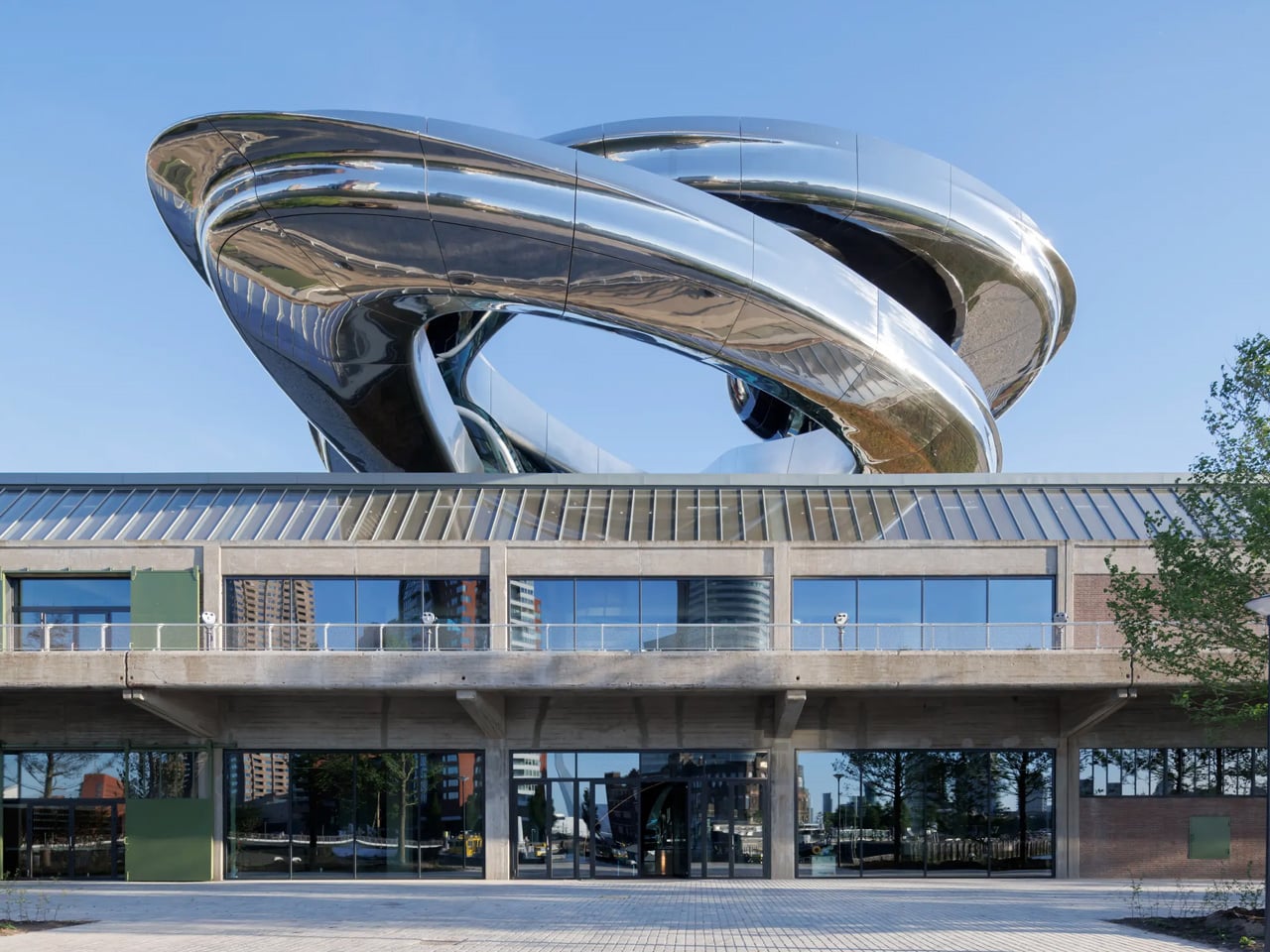
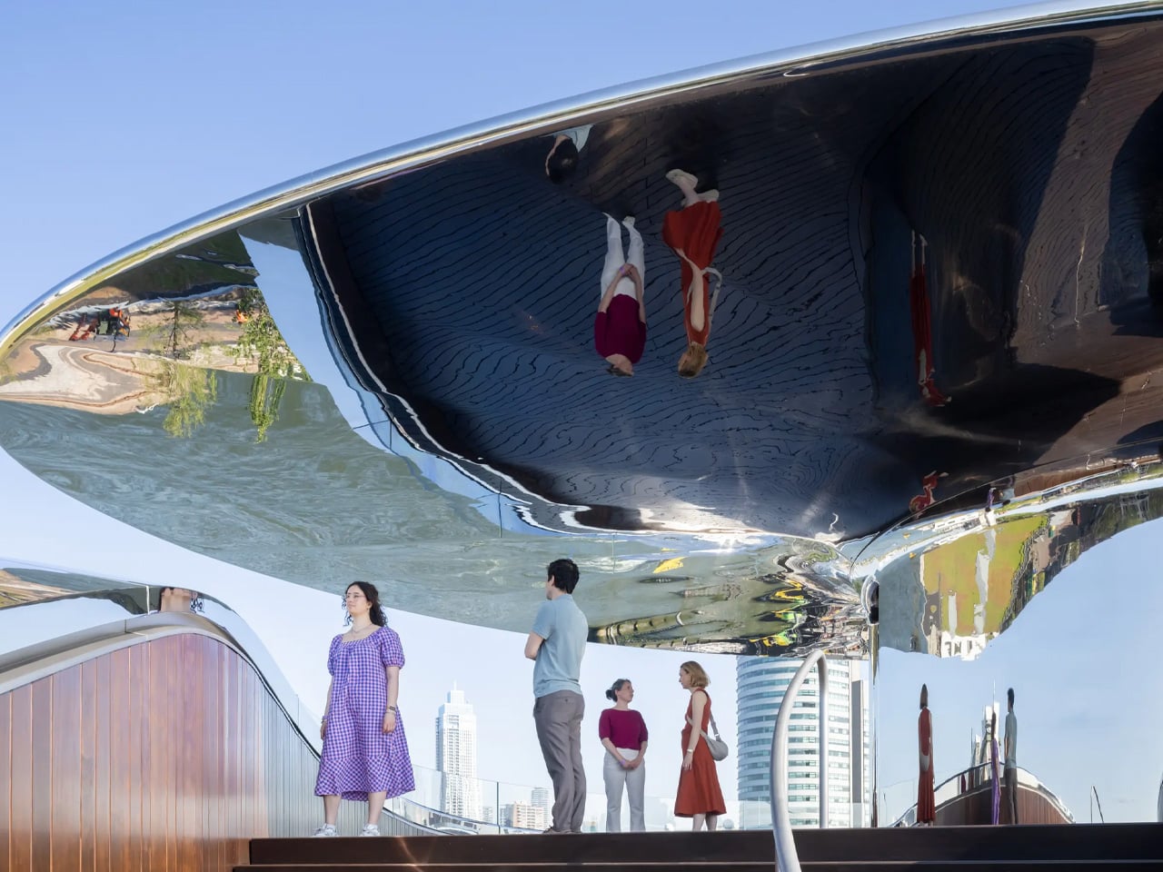
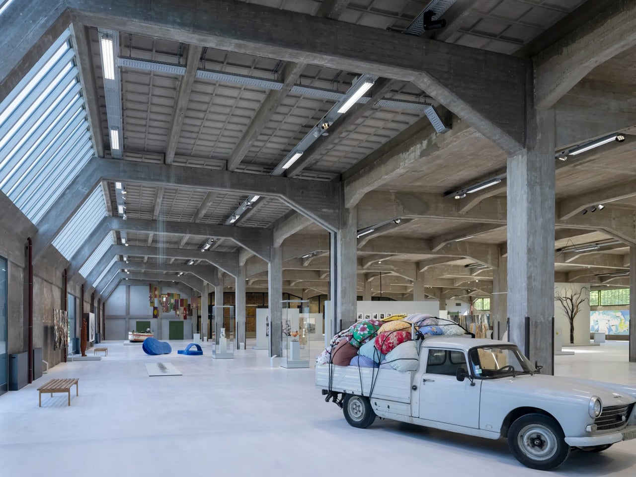
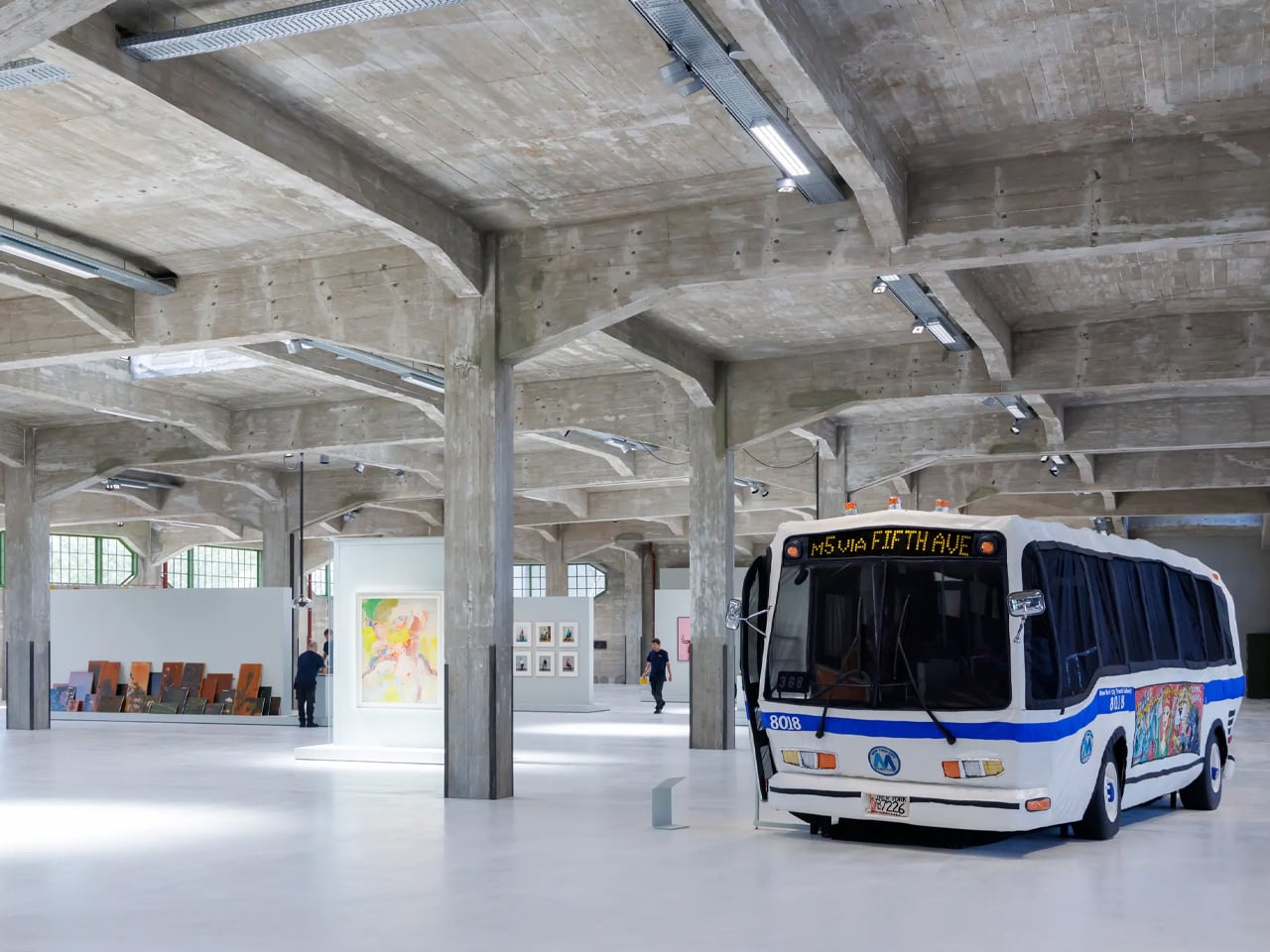
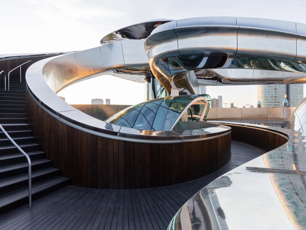
A century-old warehouse on Rotterdam’s Katendrecht peninsula has been transformed into the Fenix Museum of Migration by MAD Architects, with particular emphasis on upgrading the building’s energy performance through its façade. Rather than replacing the historic envelope, the design carefully enhances it, retaining the original industrial shell while improving thermal efficiency. This approach preserves the building’s identity while reducing heat loss, controlling solar gain, and supporting long-term energy performance suited to a contemporary public museum.

The upgraded façade works as a high-performance layer, integrating improved insulation and modern glazing within the existing structure. By strengthening the building envelope instead of rebuilding, it, the project significantly lowers energy demand for heating and cooling. This façade-led strategy demonstrates how adaptive reuse can align heritage preservation with environmental responsibility, proving that historic buildings can meet present-day efficiency standards without compromising their architectural character.

3. Future-Ready Spatial Planning

A building remains relevant when its spaces can adapt, and multipurpose furniture plays a key role in enabling this flexibility. Future-proof planning embraces “loose fit” interiors – open, non-prescriptive layouts that allow furniture, rather than walls, to define function. Generous proportions and strategically placed utility cores create fluid spaces that can be reconfigured as needs change.

Multipurpose furniture supports this adaptive sequencing by allowing rooms to shift use without structural intervention. A living area can become a workspace, or a guest room can transform into a family suite through modular, convertible elements. This approach encourages multi-generational living and ageing in place, offering long-term social value while preserving the emotional continuity of the home.

Turn your sleeping area into your office with this rotating furniture

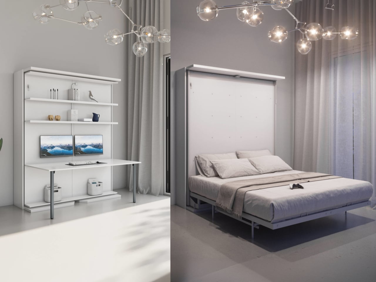
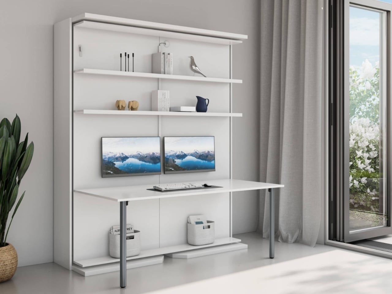
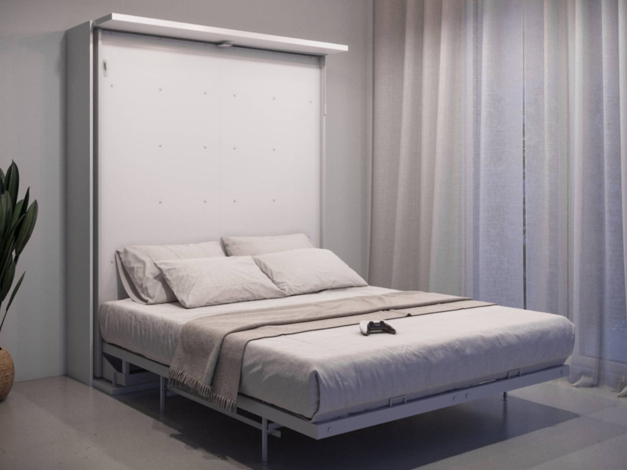
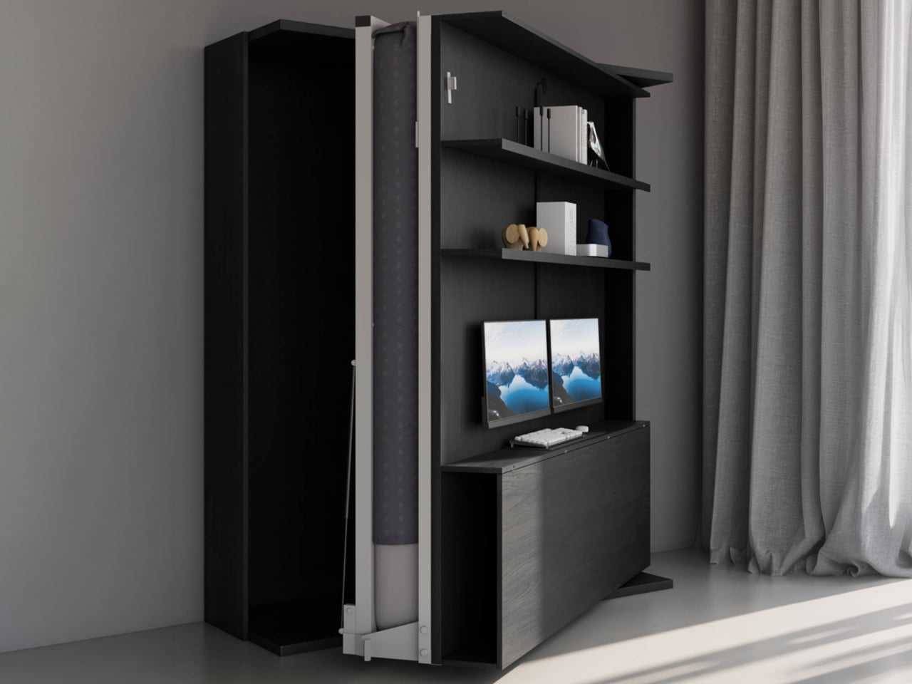
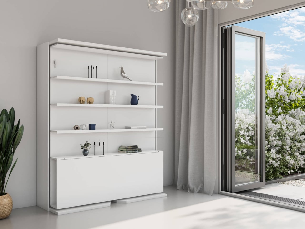
Living in a small space makes multipurpose furniture essential rather than optional, especially when durability and long-term use are priorities. Well-designed modular pieces are built to adapt over time, reducing the need for constant replacement. The Compatto Rotating Office Murphy Bed with Desk reflects this built-to-last approach by combining multiple functions into a single, robust system that responds to evolving lifestyles while maximizing limited floor area.

Designed for repeated daily use, the unit transforms smoothly from bed to workspace through a series of controlled rotations. The wide desk supports monitors, TVs, and all-in-one computers, while integrated storage and cable management ensure long-term functionality without clutter. Though it requires DIY assembly, its solid construction and thoughtful engineering make it a lasting investment. When work ends, the system folds away to reveal a queen-size Italian memory foam Murphy bed, proving that durability and adaptability can coexist in compact living.

4. Precision in Joinery Details

Luxury is expressed through detail, particularly at points where materials meet. Precision detailing and shadow gaps define contemporary craftsmanship, allowing buildings to age gracefully while remaining practical. Thoughtfully resolved junctions support easier maintenance, ensuring that performance and appearance can be preserved over time without invasive interventions.

By avoiding permanently bonded finishes and instead using mechanical fixings and shadow gaps, materials are allowed to move independently. This repair-friendly approach enables individual components to be replaced without disrupting entire surfaces. Beyond function, refined joinery carries aesthetic value, signaling intentional design and craftsmanship. Such care fosters a lasting emotional connection with the space, reducing the impulse for frequent renovation and reinforcing the idea of architecture as a long-term investment.

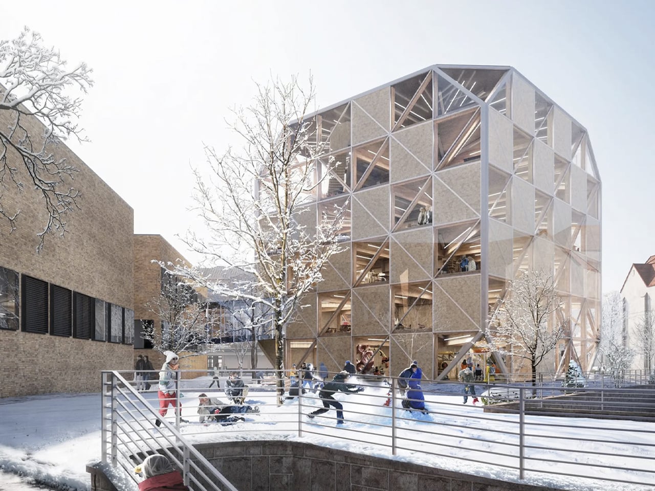
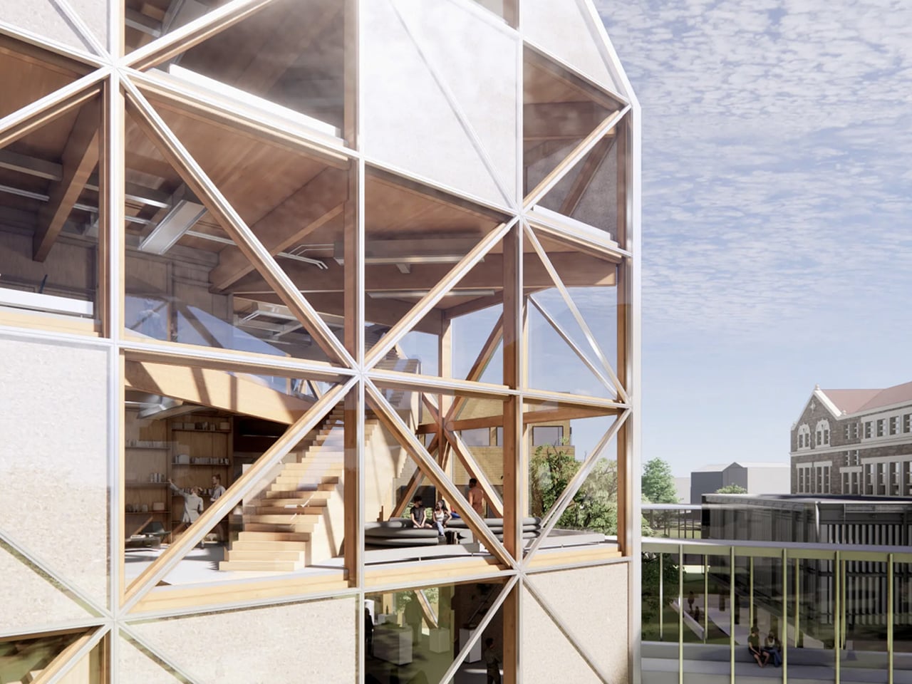
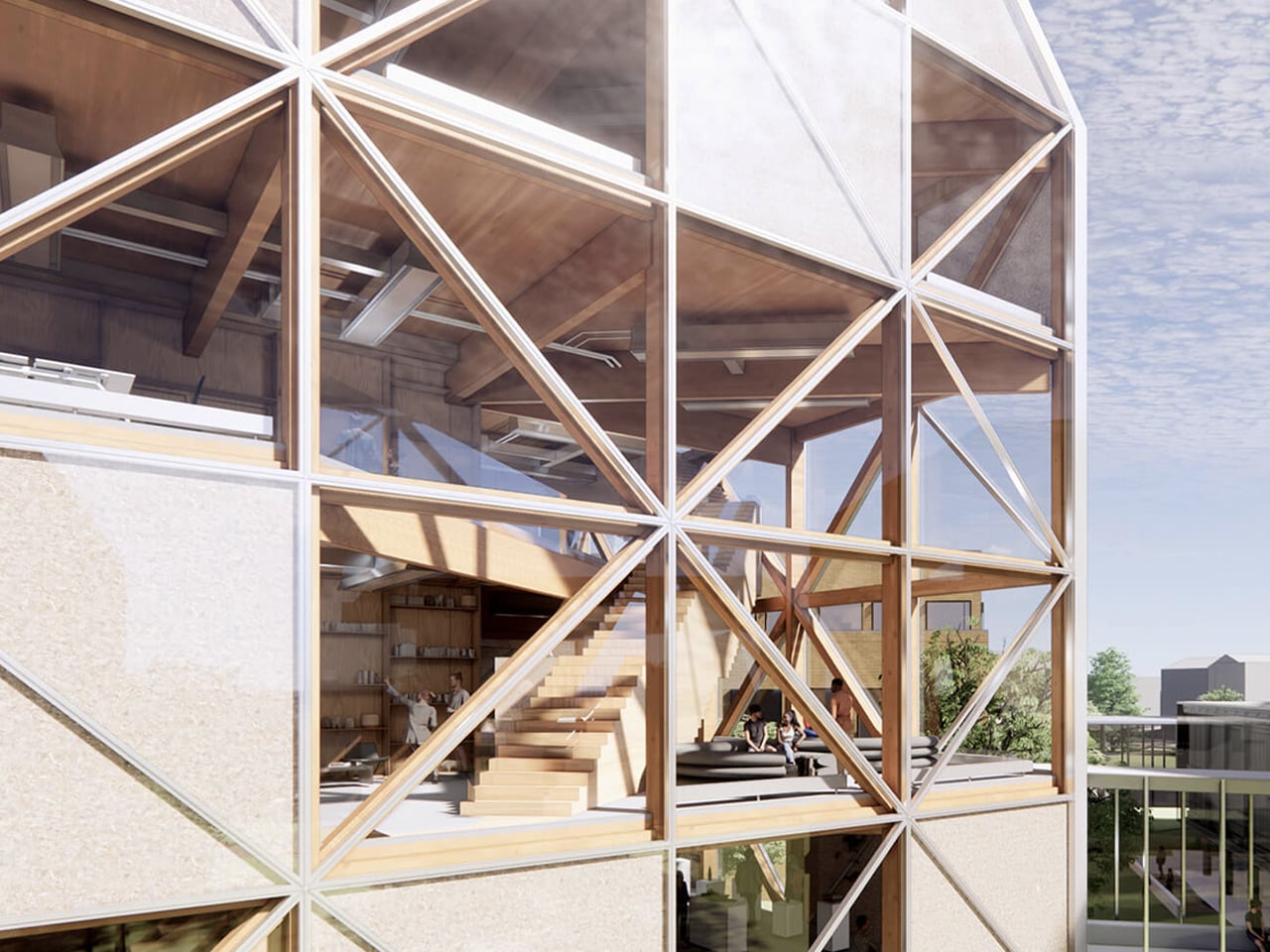
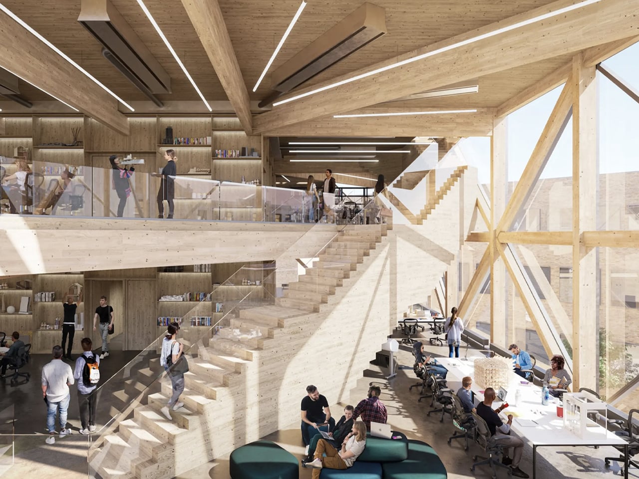
Renowned design studio Bjarke Ingels Group (BIG) has unveiled plans for an innovative timber academic building for the University of Kansas’ School of Architecture and Design. Named the Makers’ KUbe, the project combines advanced engineered wood with principles drawn from traditional Japanese joinery to create a visually striking and environmentally responsible structure. The building features a mass-timber frame insulated with hemp-based material and wrapped in a refined glass envelope, allowing the natural character of the wood to remain visible while enhancing daylight and thermal performance. A deliberately pared-back aesthetic exposes mechanical, electrical, and plumbing systems, reinforcing the building’s educational purpose and material honesty.

Spanning approximately 50,000 square feet, the Makers’ KUbe is organized across six flexible floors with open-plan studios that encourage collaboration. A central staircase links the spaces, while facilities include 3D-printing labs, robotics workshops, and a café. Designed with a timber diagrid structure that minimizes concrete use, the building integrates rooftop solar panels and rainwater harvesting. Engineered timber ensures high fire performance, demonstrating durability alongside sustainability.

5. Explore Cultural Roots in Design

Longevity emerges when architecture is deeply connected to its cultural and geographical context. By integrating regional vernacular traditions and time-tested spatial principles such as Vastu, buildings gain a depth that extends beyond stylistic modernism. This grounding allows architecture to feel inherently aligned with its surroundings rather than imposed upon them.

Orienting spaces according to established principles of flow and balance fosters psychological comfort and a lasting sense of harmony. The use of locally sourced stone and timber further strengthens this connection, reducing environmental impact while visually anchoring the structure to its setting. Together, cultural alignment and contextual materiality create architecture that feels enduring, relevant, and inseparable from its landscape.

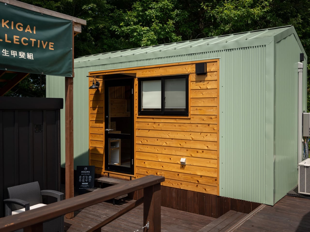
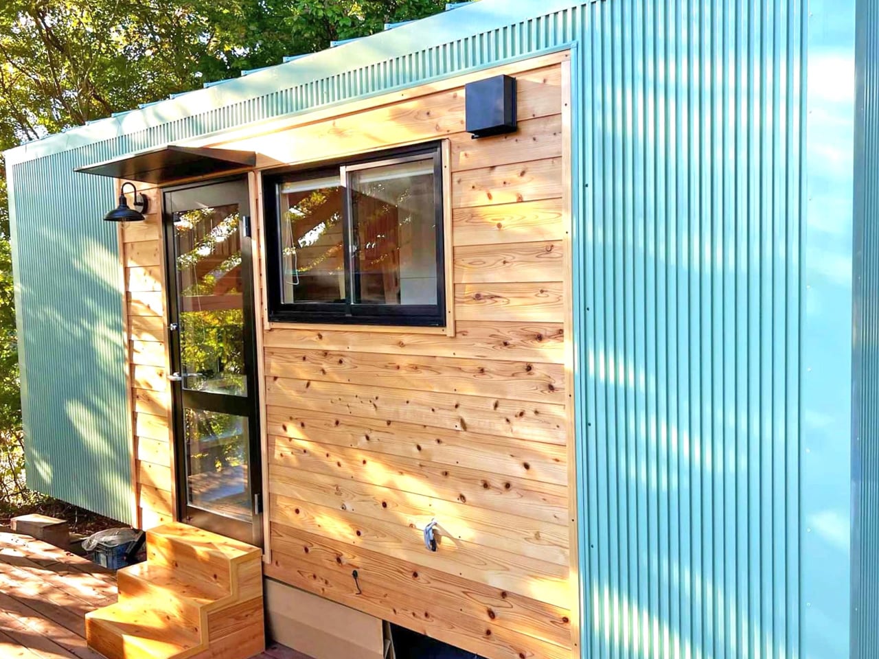
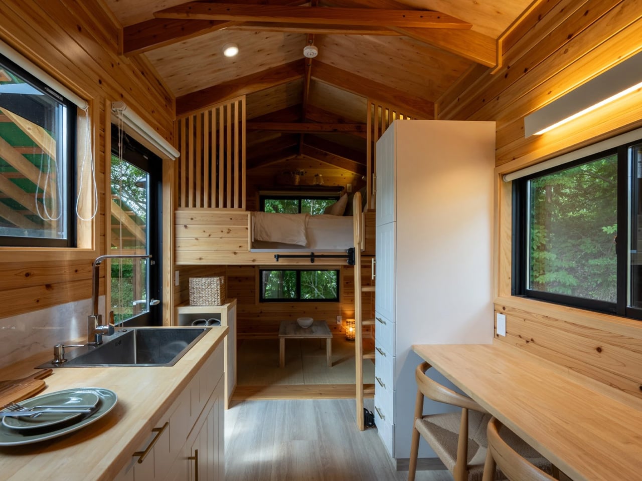
The tiny house movement has found a distinctive expression in Japan through Ikigai Collective, which creates homes that harmonize traditional aesthetics with modern minimalism. The Nozawa exemplifies this approach, reflecting authentic Japanese design rooted in local craftsmanship rather than imitation. Measuring just 20 feet in length, the compact dwelling contrasts with the larger North American tiny homes, proving that thoughtful design can make efficient use of space without sacrificing comfort. Every inch of the home is purposeful, demonstrating how simplicity and attention to detail can transform a modest footprint into a fully livable environment, aligning with European sensibilities that prioritize efficiency and functionality.

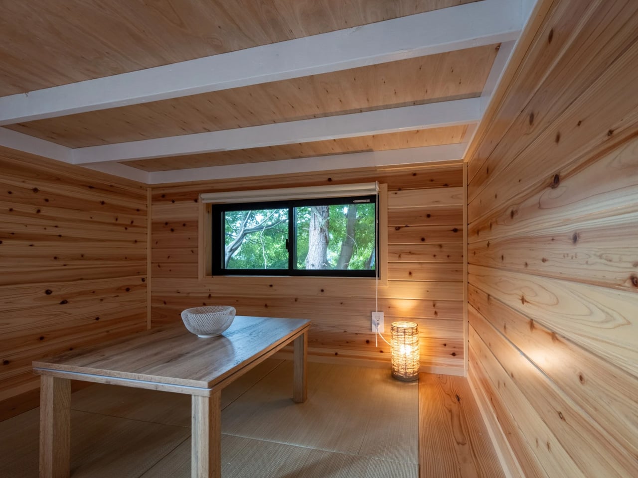
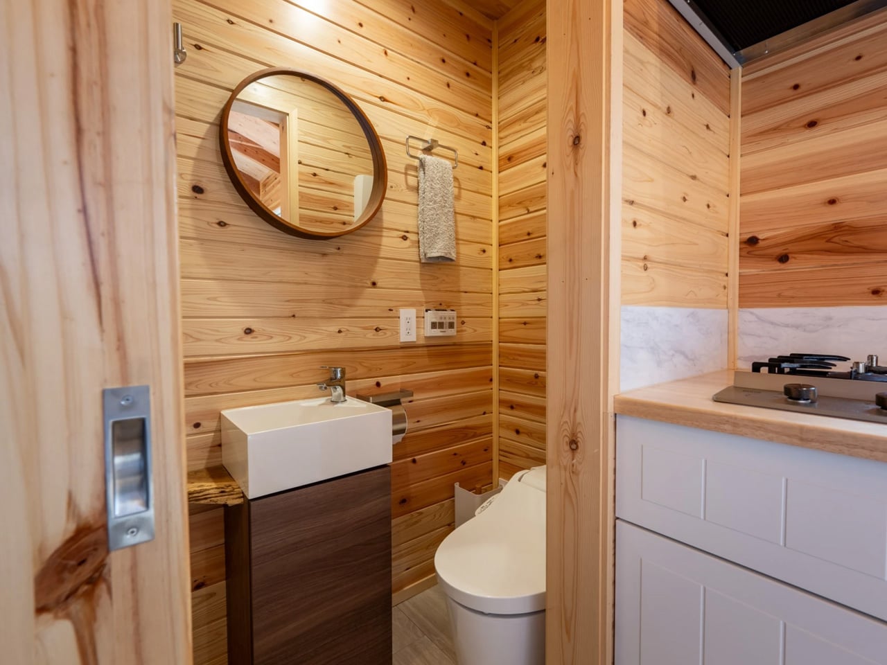
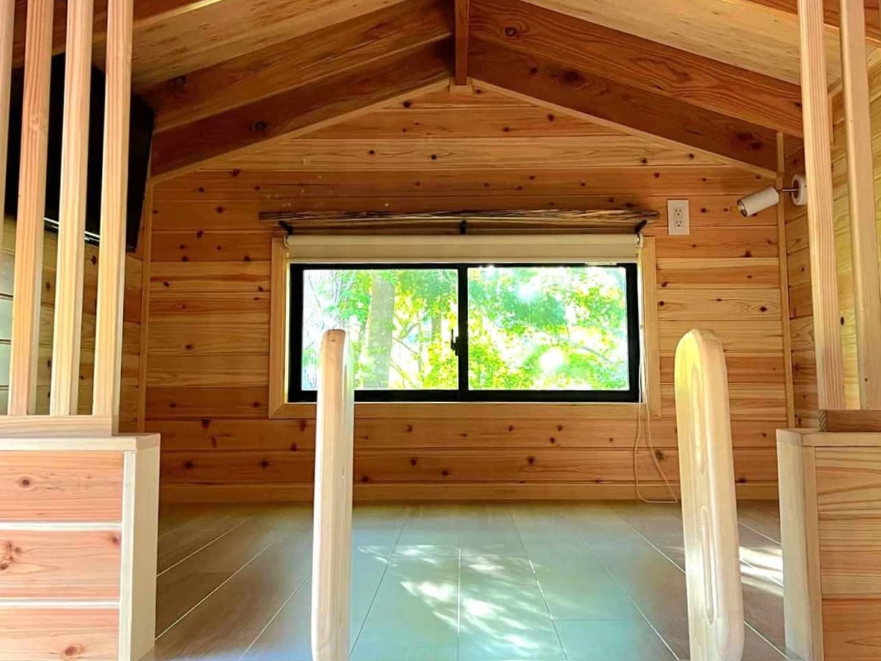
The exterior combines durable steel cladding with wooden accents, while the interior immerses residents in warm timber surfaces, creating a grounded, inviting atmosphere. The two-level layout features a tatami-style living area, a well-equipped kitchen, an efficient bathroom, and a loft bedroom with storage and a double bed. This design balances cultural heritage with contemporary living, offering a complete, intimate home for two that honors Japanese traditions while embracing modern minimalism.

The 2026 design shift emphasizes true longevity, moving beyond superficial eco-labels toward enduring architecture. By prioritizing authentic materials, adaptable spaces, and precise construction, homes are crafted to last and be cherished across generations. True luxury lies in the assurance of a resilient, high-performance sanctuary that contributes meaningfully to the built environment.

The post Everything in 2026 Is Disposable – Here’s 5 Sustainable Trends Are Designed to Last Centuries first appeared on Yanko Design.

5 Homes That Prove You Don’t Need More Space to Live In Style

Architectural thinking is steadily shifting away from oversized, underused spaces toward a more intentional design philosophy. Luxury is now defined by the quality of spatial flow, thoughtful proportions, and the authenticity of materials, rather than by sheer scale.

By eliminating the unnecessary, a deeper relationship emerges between the built environment and its natural context. This process of refinement creates homes that feel calm, immersive, and closely connected to their surroundings. Such spaces deliver lasting value through clarity, comfort, and enduring design relevance. The move toward smaller, well-crafted environments reflects a conscious design approach that prioritizes meaning, performance, and long-term experiential value over excess.

1. Light as Architecture

In compact environments, light becomes a primary architectural material rather than a functional afterthought. Careful modulation of daylight and artificial illumination shapes perception, atmosphere, and movement, transforming limited space into a refined and calming sanctuary. The goal shifts from brightness to balance, where light enhances form, texture, and emotional comfort.

Vertical glazing strategies draw in changing natural light, subtly extending spatial boundaries without increasing area. At night, layered lighting is woven into the architecture through recessed coves and low-level washes. This approach softens edges, reduces visual fatigue, and creates a gentle rhythm of movement, allowing the space to unfold gradually through light.
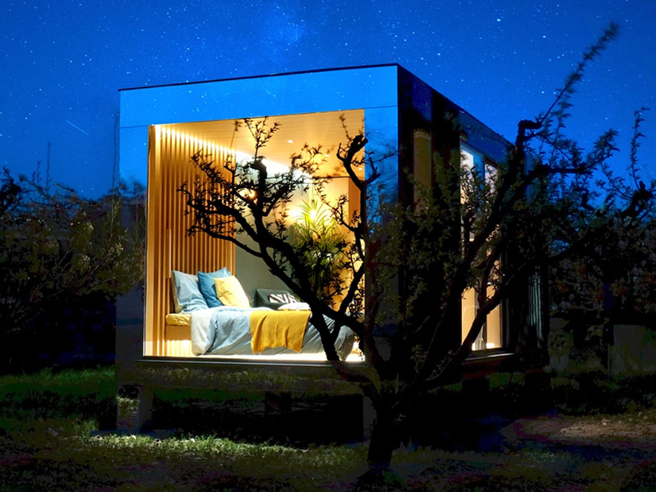
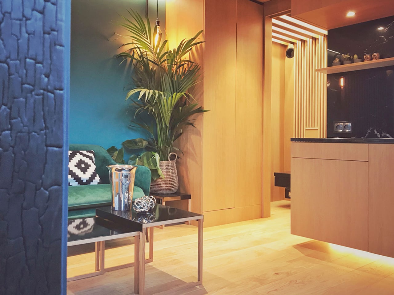
As domestic spaces increasingly accommodate multiple functions, lighting has become central to shaping comfort and usability within the home. Novablok’s Mini Blok addresses this shift through a design that prioritizes natural illumination as a defining architectural element. Fully glazed façades allow daylight to enter from multiple angles, ensuring the interior remains bright and visually open throughout the day. This generous access to light reduces reliance on artificial sources while creating an atmosphere that feels calm, expansive, and closely attuned to its surroundings. The transparency also strengthens the connection between interior and exterior, allowing changes in weather and daylight to influence the living experience subtly.
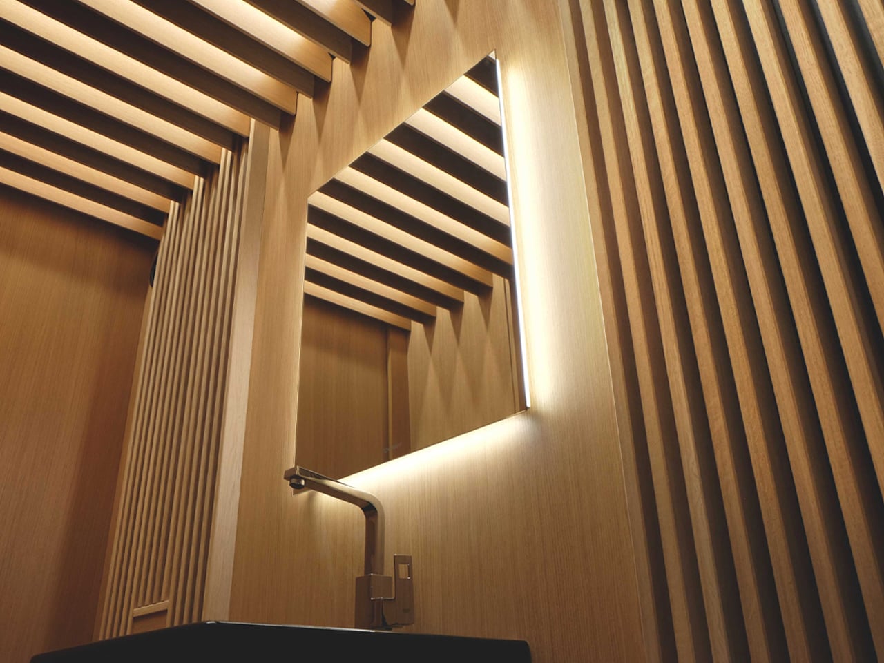
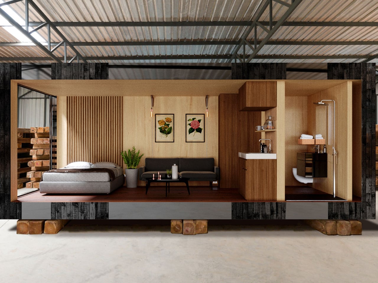
Internally, the controlled simplicity of the structure allows light to move freely across surfaces, enhancing spatial clarity despite the compact footprint. Optional interior finishes in light-toned wood further soften and diffuse daylight, preventing glare while maintaining warmth. Carefully integrated electrical lighting complements natural light after sunset, ensuring the space remains functional without disrupting its serene character. The result is a home environment where light actively shapes mood, rhythm, and everyday living.

2. Precision Over Volume

In compact spaces, every dimension carries intention, making precision the core of design value. The focus shifts from creating volume to investing in quality, where materials and details are selected for their long-term sensory and experiential impact. Thoughtful allocation of resources enhances durability, tactility, and visual depth, proving that refinement delivers greater value than scale.

Authentic materials such as natural stone and carefully finished wood replace broad applications of lesser finishes, allowing surfaces to age with character. Clean detailing, including shadow gaps and refined junctions, removes visual clutter. This disciplined approach creates architecture that feels calm, honest, and enduring, where quality itself becomes the strongest return on investment.
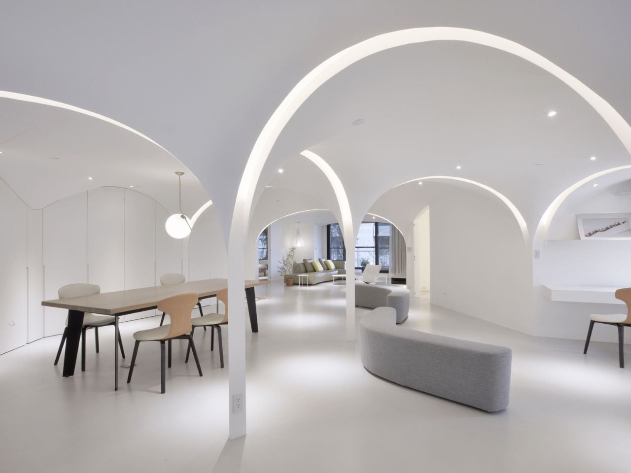
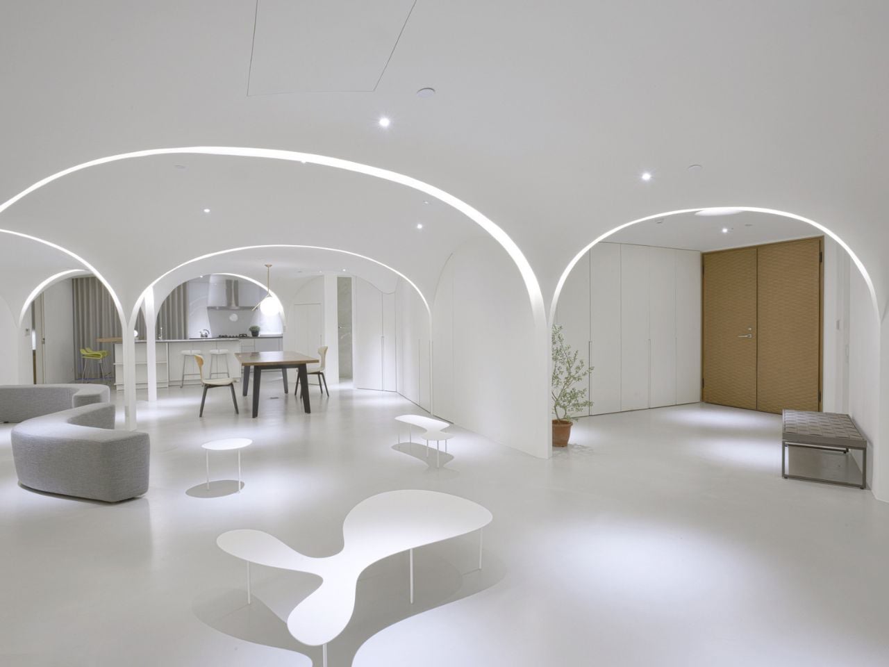
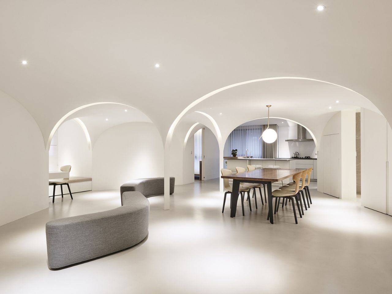
In the dense urban fabric of Taichung City, where apartment layouts often follow rigid, compartmentalized formulas, this residence has been thoughtfully reimagined by Very Studio | Che Wang Architects into a calm and uplifting retreat. The designers transformed a conventional Taiwanese unit – previously defined by interior-facing public spaces – into a light-filled environment shaped by flowing geometries and restrained materiality. Rather than pursuing dramatic visual statements, the project focuses on cultivating a gentler spatial experience, emphasizing comfort, clarity, and sensory balance as core design principles.
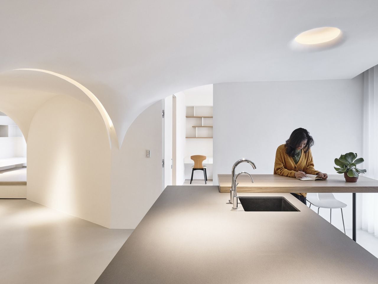
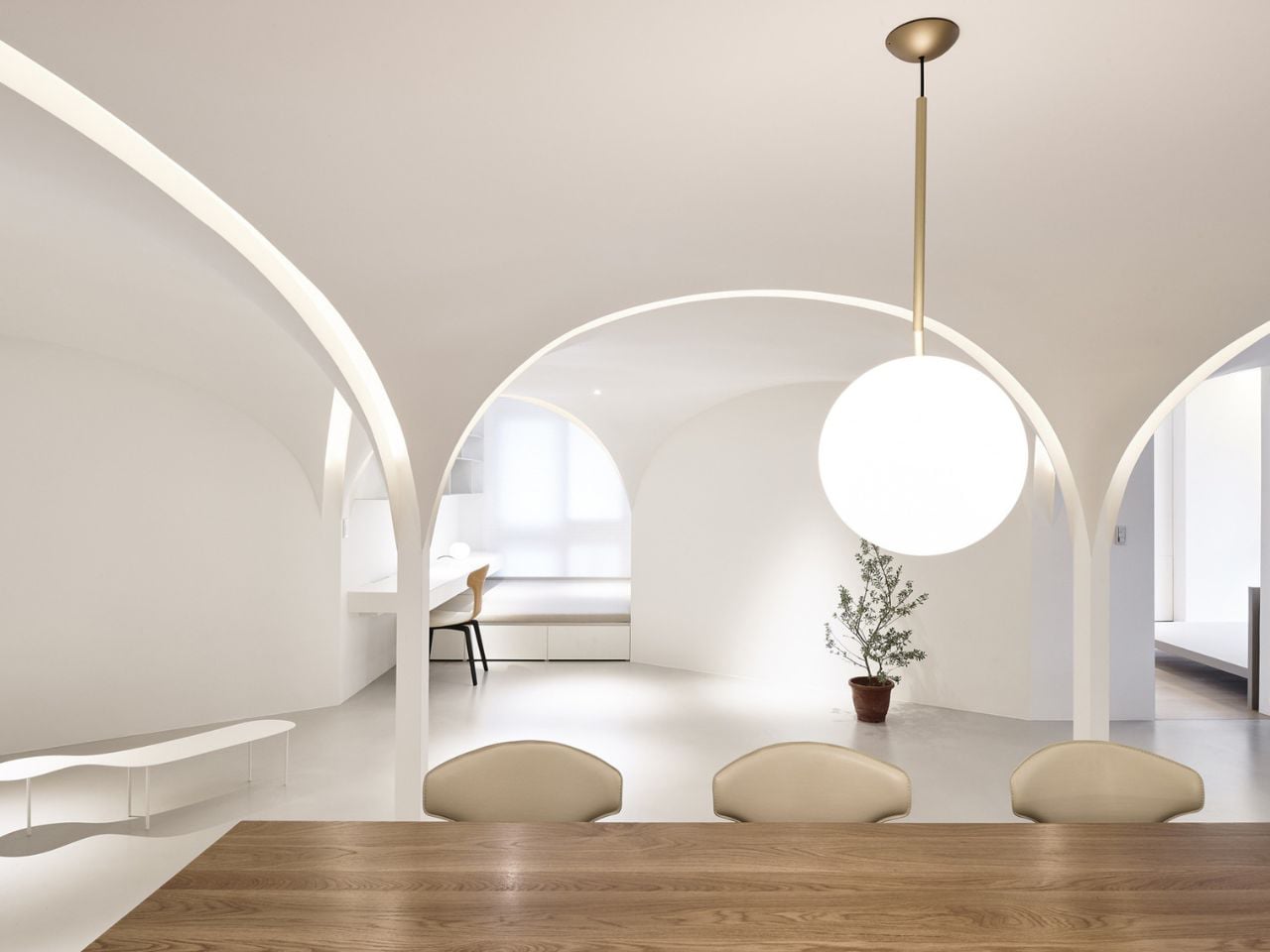
Prior to renovation, the living and dining areas were enclosed at the center of the plan, limiting daylight and ventilation to a single southern opening. The architects overturned this logic by introducing a pentagon-based spatial order that replaced rigid corners with angled walls. This new geometry extends sightlines, softens light, and encourages natural airflow. Openings on multiple sides now allow sunlight and air to circulate evenly, while subtle acoustic and lighting strategies define functional zones. The result is a minimal yet atmospheric home that prioritizes wellbeing through light, air, and thoughtful spatial organization.

3. Adaptive Spatial Flow

In refined, compact homes, flexibility becomes the foundation of spatial planning. Rather than fixed functions, spaces are designed as a sequence of experiences that respond fluidly to changing lifestyles. This “loose-fit” approach allows the home to evolve over time, supporting both privacy and openness without unnecessary expansion.

Integrated joinery is treated as architecture, not add-on furniture. Floor-to-ceiling storage defines zones, controls clutter, and enhances environmental performance. At the core, concealed sliding panels and pivoting elements enable spaces to transform effortlessly—from focused work areas to generous gathering zones. This intelligent adaptability maximizes use, reduces material excess, and aligns spatial efficiency with long-term sustainability.

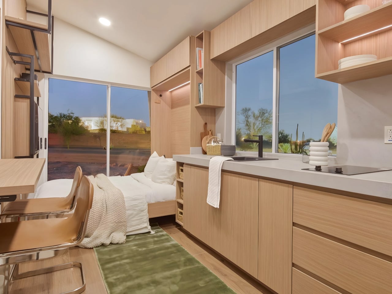
At just 26 feet in length, the Vettel Haus challenges conventional ideas of comfort and scale, yet Tamen Arq’s design for myHAUSING demonstrates how thoughtful architecture can transform extreme compactness into spatial generosity. Clad in engineered wood and built on a double-axle trailer, the home is fully mobile while maintaining a sense of permanence through careful detailing. Inside, abundant natural light enters through precisely positioned windows, dissolving any perception of constraint and allowing the interior to feel open, calm, and well-proportioned despite its modest footprint.
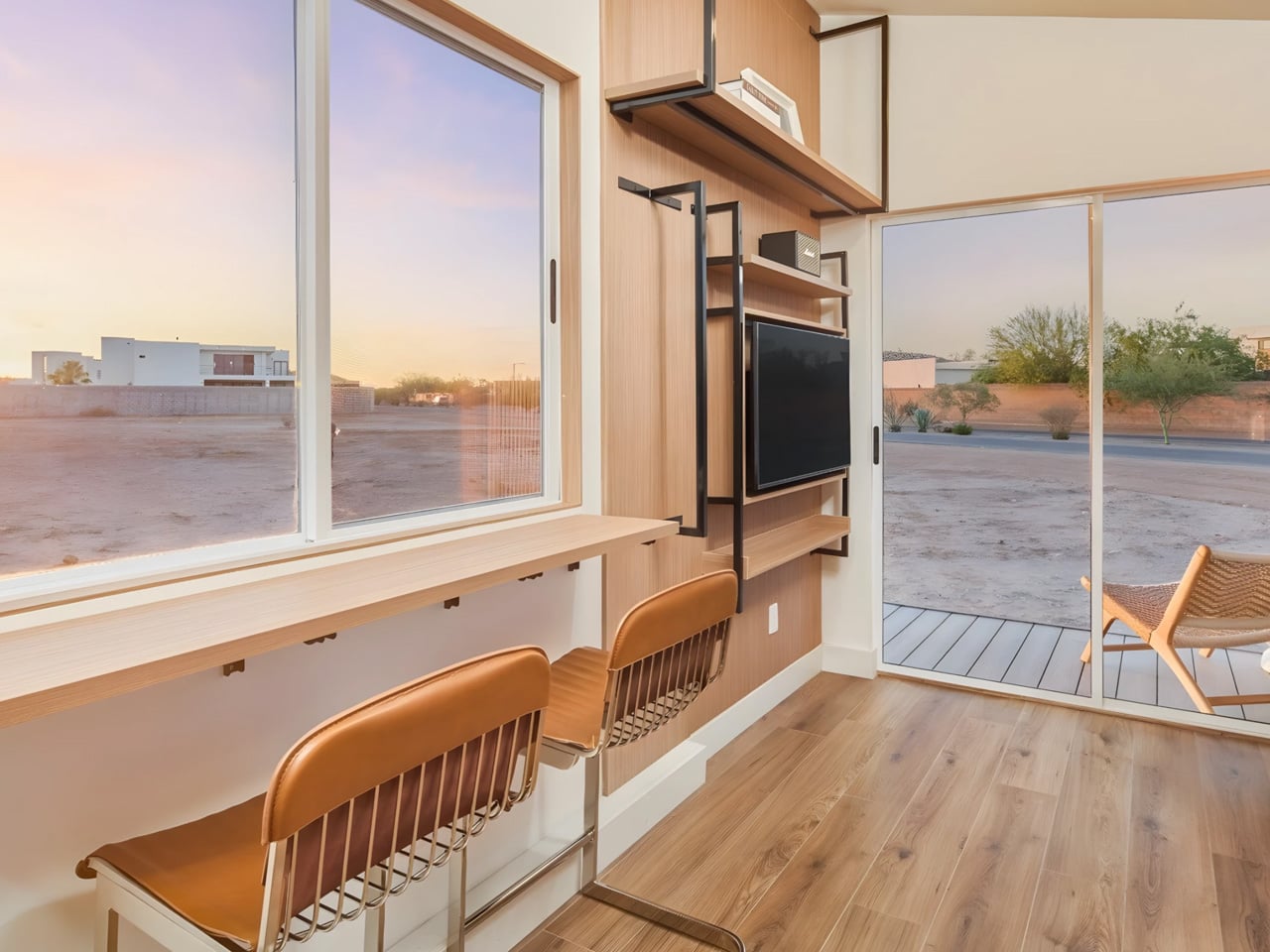
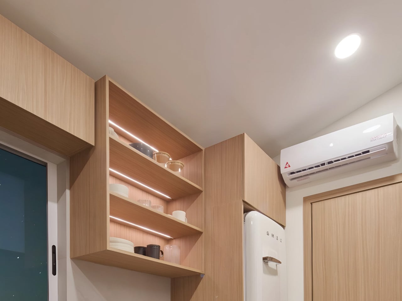
The interior layout is defined by intelligent flexibility rather than compromise. The bedroom seamlessly doubles as the living area, with a bed that functions as seating, integrated shelving that maintains visual clarity, and a discreetly placed television. Two separate entrances enhance circulation and usability, while a covered porch extends daily living outdoors. Concealed storage and custom millwork further support an uncluttered environment, proving that spatial quality is driven by design intelligence, not square footage.

4. The Biophilic Cocoon

Contemporary luxury is increasingly defined by closeness to nature rather than physical scale. More compact homes make it possible to organize living spaces around courtyards, gardens, or carefully composed views, fostering a continuous dialogue between interior and exterior. This approach creates environments that feel immersive, calm, and naturally grounded.

Openings are designed as deliberate frames, drawing the landscape inward and turning everyday views into living compositions. The home becomes an extension of its surroundings, not a disruption. With a smaller building envelope, advanced insulation and passive solar strategies can be applied more precisely, resulting in superior thermal comfort, energy efficiency, and long-term environmental performance.
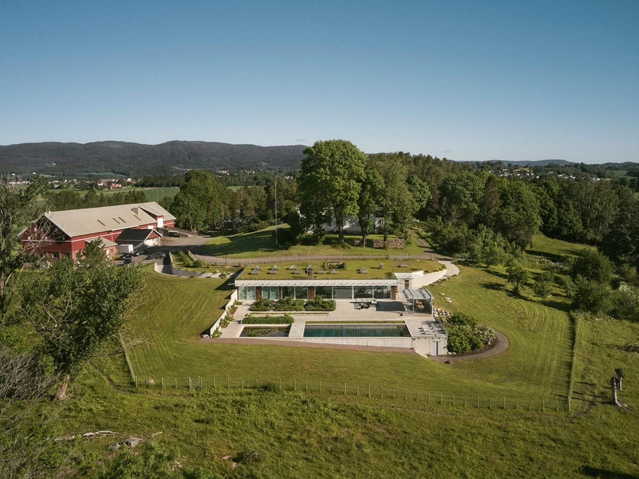
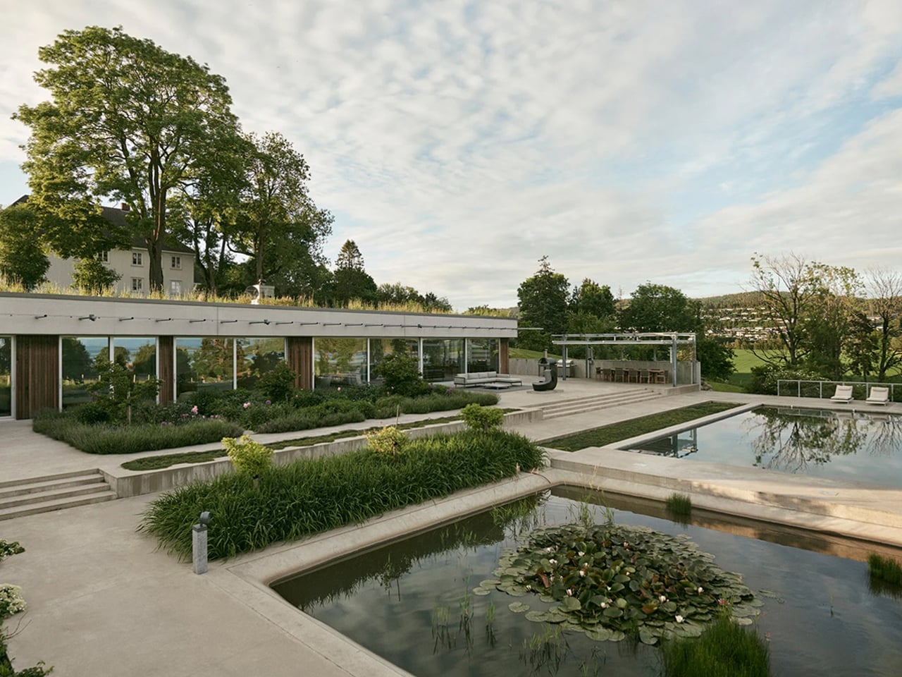
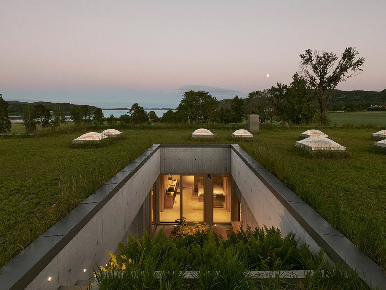
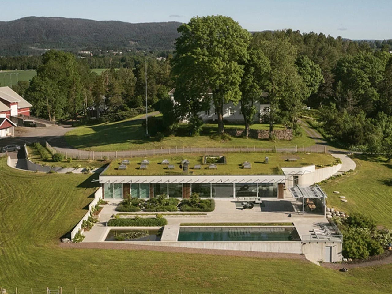
Villa Aa is a biophilic countryside residence in Norway that demonstrates how architecture can exist in quiet harmony with its natural setting. Designed by C.F. Møller, the home draws directly from the landscape, embracing the principles of organic architecture rather than imposing itself on the terrain. A green roof follows the slope of the hillside, allowing the villa to recede almost invisibly into its surroundings. Set within a protected area near the Oslo Fjord, the residence responds sensitively to environmental and regulatory constraints, ensuring the landscape remains largely undisturbed for future generations.
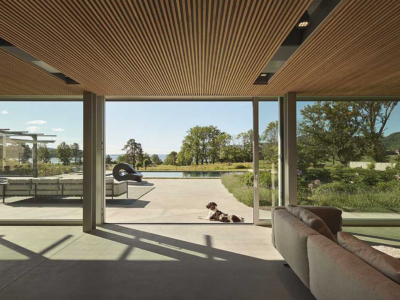
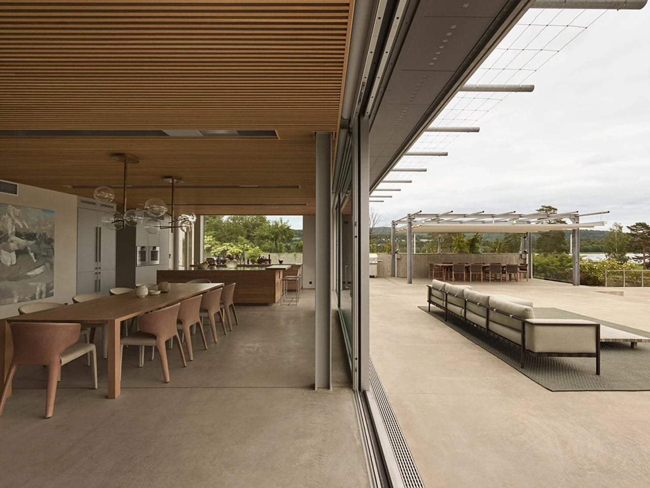
Biophilia continues throughout the interior, where spaces flow seamlessly between garden courtyards, work areas, and living zones. Expansive sliding glass façades dissolve boundaries between indoors and outdoors, framing uninterrupted views of the fjord. Skylights aligned along shared axes connect interior rooms to the planted roof above, while natural materials such as cedarwood, concrete, and steel create a tactile dialogue between the built environment and nature.

5. Minimalism with Depth

Minimalist design gains richness when informed by cultural and philosophical frameworks that value balance, rhythm, and flow. Concepts such as negative space and energetic movement introduce nuance, allowing simplicity to feel intentional rather than reductive. These references enrich the spatial experience, lending contemporary minimalism a quieter yet more resonant character.

Space is treated as an active design element, not an absence. Purposeful voids allow light, air, and life to move freely, creating moments of pause and reflection within the home. This approach supports longevity in design, where forms and materials are chosen for endurance and relevance. Downsizing becomes a thoughtful legacy that is rooted in timeless values with global, lasting appeal.
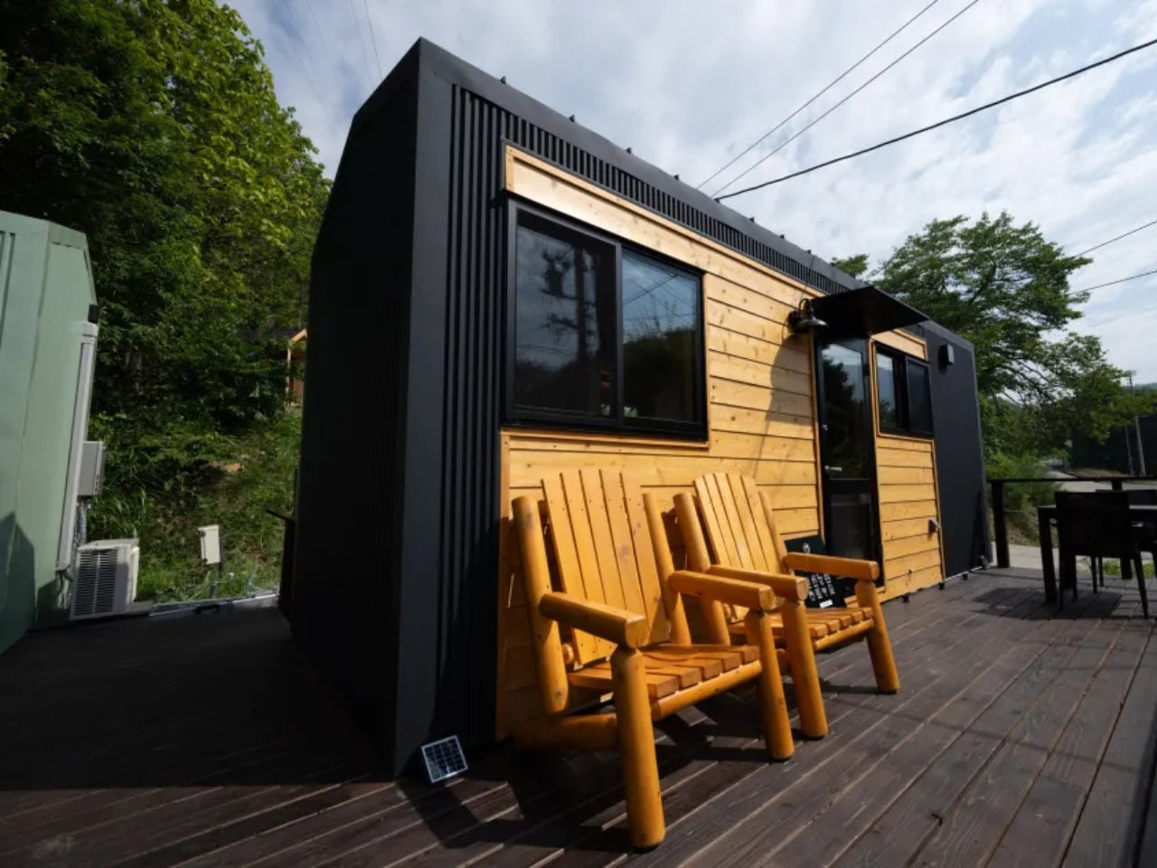
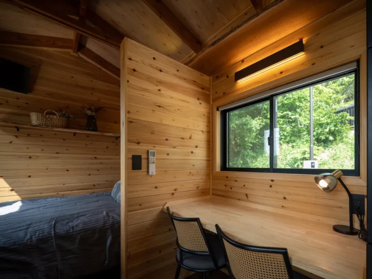
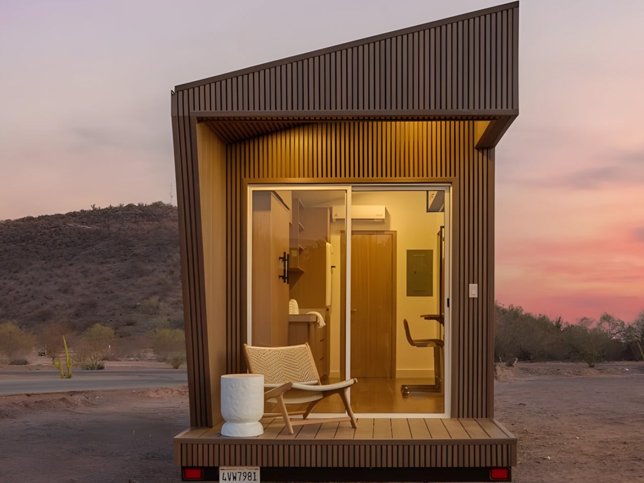
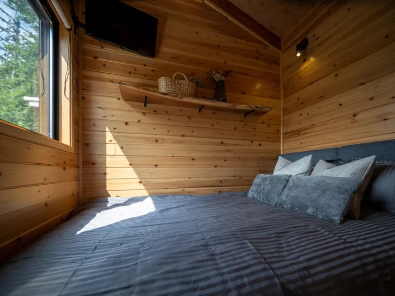
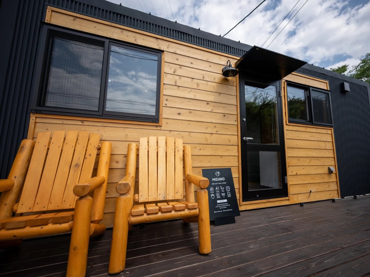
The Mizuho home by Ikigai Collective presents a refined vision of compact living rooted in Japanese minimalism and mindful design. Created as a contemporary tiny house, it blends traditional Japanese aesthetics with modern construction technologies within a carefully considered footprint. Designed for one or two occupants, the home prioritizes simplicity, calm, and efficiency, offering an environment that encourages intentional living rather than excess. Built in collaboration with local craftsmen in Nozawaonsen, the Mizuho reflects a strong commitment to quality, authenticity, and thoughtful detailing throughout.
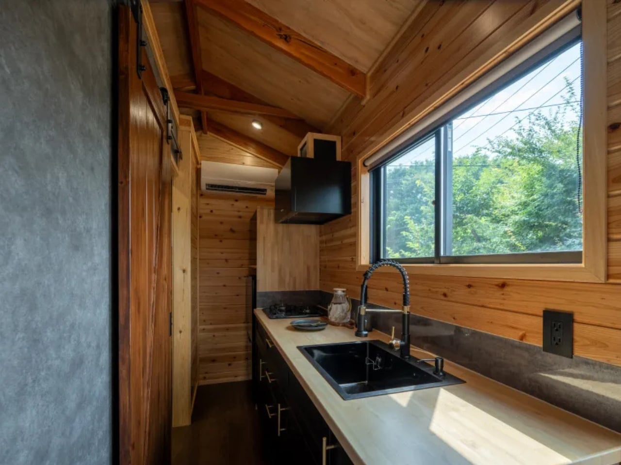
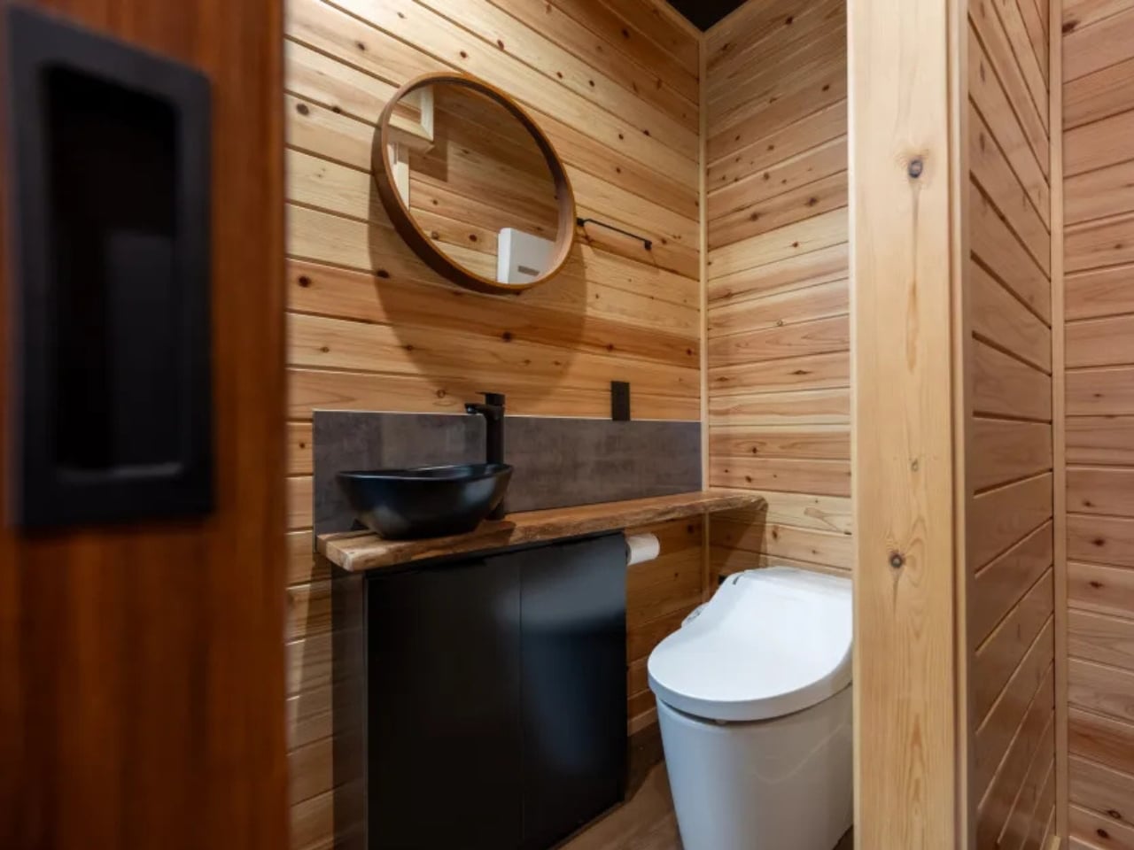
Inside, the open-plan layout allows the living, sleeping, and working areas to coexist seamlessly without feeling constrained. A flexible desk transforms into a dining surface, while integrated storage maintains visual clarity. The compact yet highly functional kitchen and serene bathroom further enhance daily comfort. Durable Galvalume steel cladding, full insulation, and customisation options ensure the home adapts easily to varied climates, making the Mizuho a quietly resilient and deeply considered place to live.

Luxury downsizing reflects architectural maturity, where value is defined by lived experience rather than scale. Through honest materials, precise detailing, and strong biophilic ties, compact homes become meaningful sanctuaries. The power of less lies in intent—creating sustainable, refined spaces that enrich daily life far beyond excess.

The post 5 Homes That Prove You Don’t Need More Space to Live In Style first appeared on Yanko Design.
This Japanese-Inspired Garden Studio in California Is Doing Three Jobs at Once

The name says two. The building delivers three. Tucked behind a 1912 home in Fairfax, California, Two-Fold Studio is the latest project from San Francisco-based practice ONO, founded in 2020 by Max Obata and Tyler Noblin, and it might be one of the most quietly considered small structures the firm has produced yet.

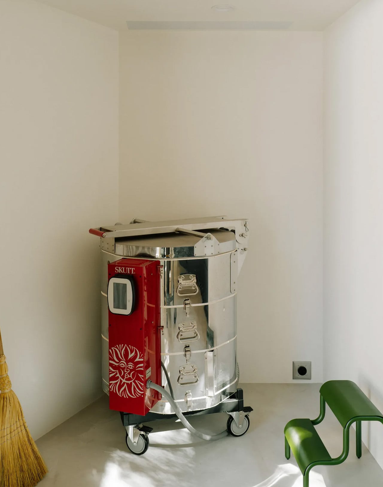
The client, a general contractor and a ceramic artist who also teaches Pilates, came to ONO with a precise brief: build a pavilion that could hold a Pilates studio, a ceramics workshop complete with kiln, storage, and kitchenette, and, when the occasion calls for it, a guesthouse. Three programmes, one 800-square-foot structure, and a yard full of trees that weren’t going anywhere. The architects delivered on all counts.

Designer: ONO

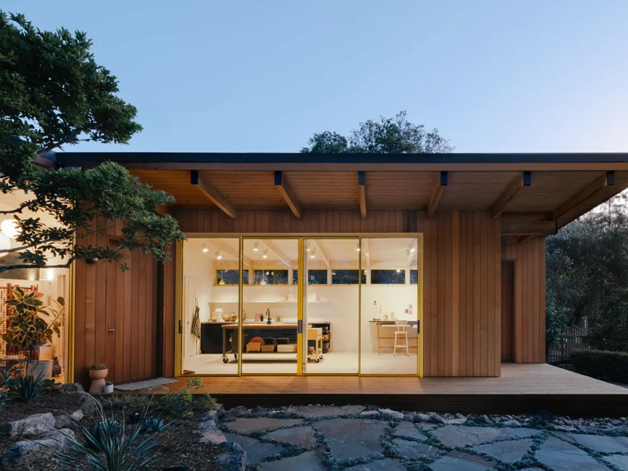
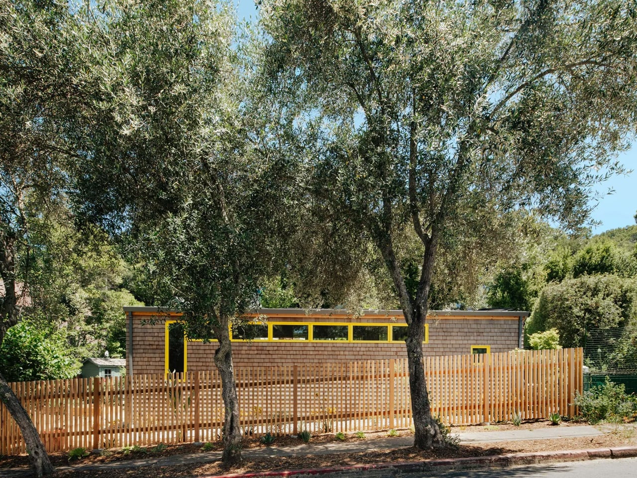
Rather than bulldoze the site into submission, ONO bent the building around it. The structure contorts into an L-shape, folding around the pre-existing trees to maintain the yard’s existing character. The form then becomes a kind of frame, a viewing pavilion, in ONO’s words, taking direct reference from the Ryoan-ji Rock Garden in Kyoto. The relationship between building and landscape isn’t incidental here; it’s the whole point.

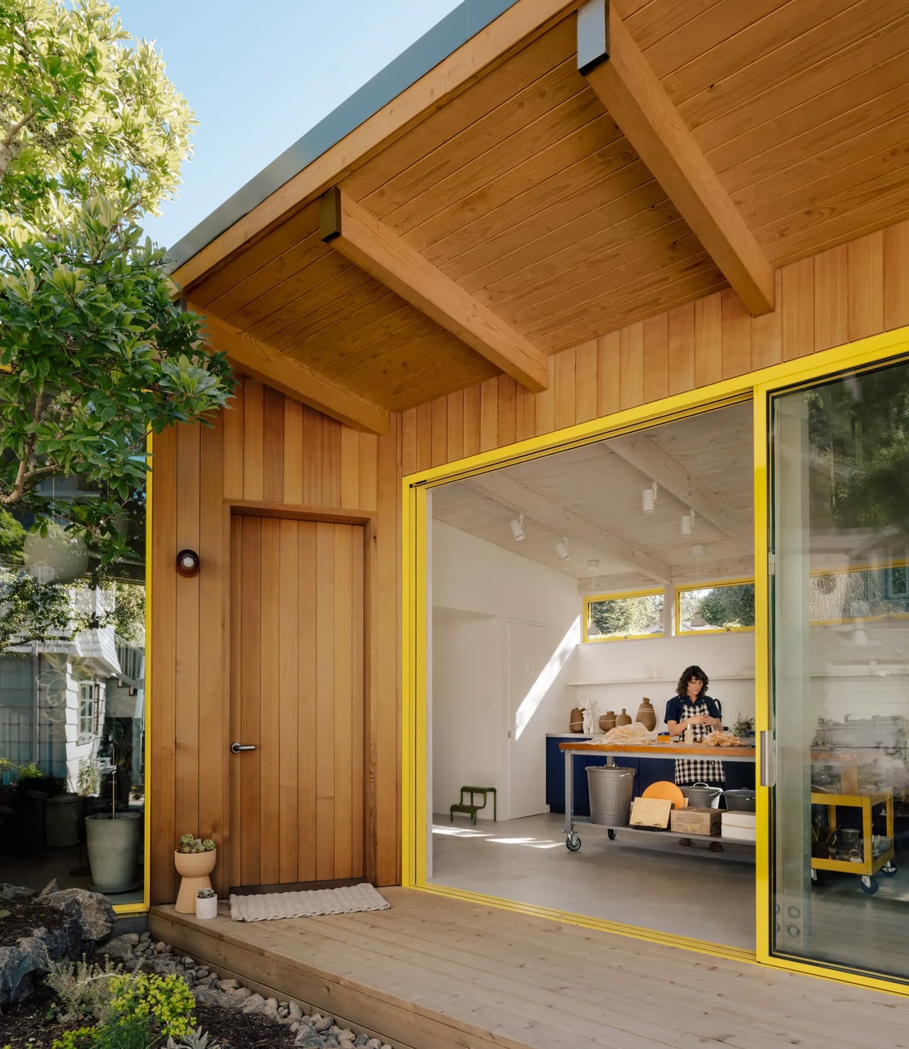
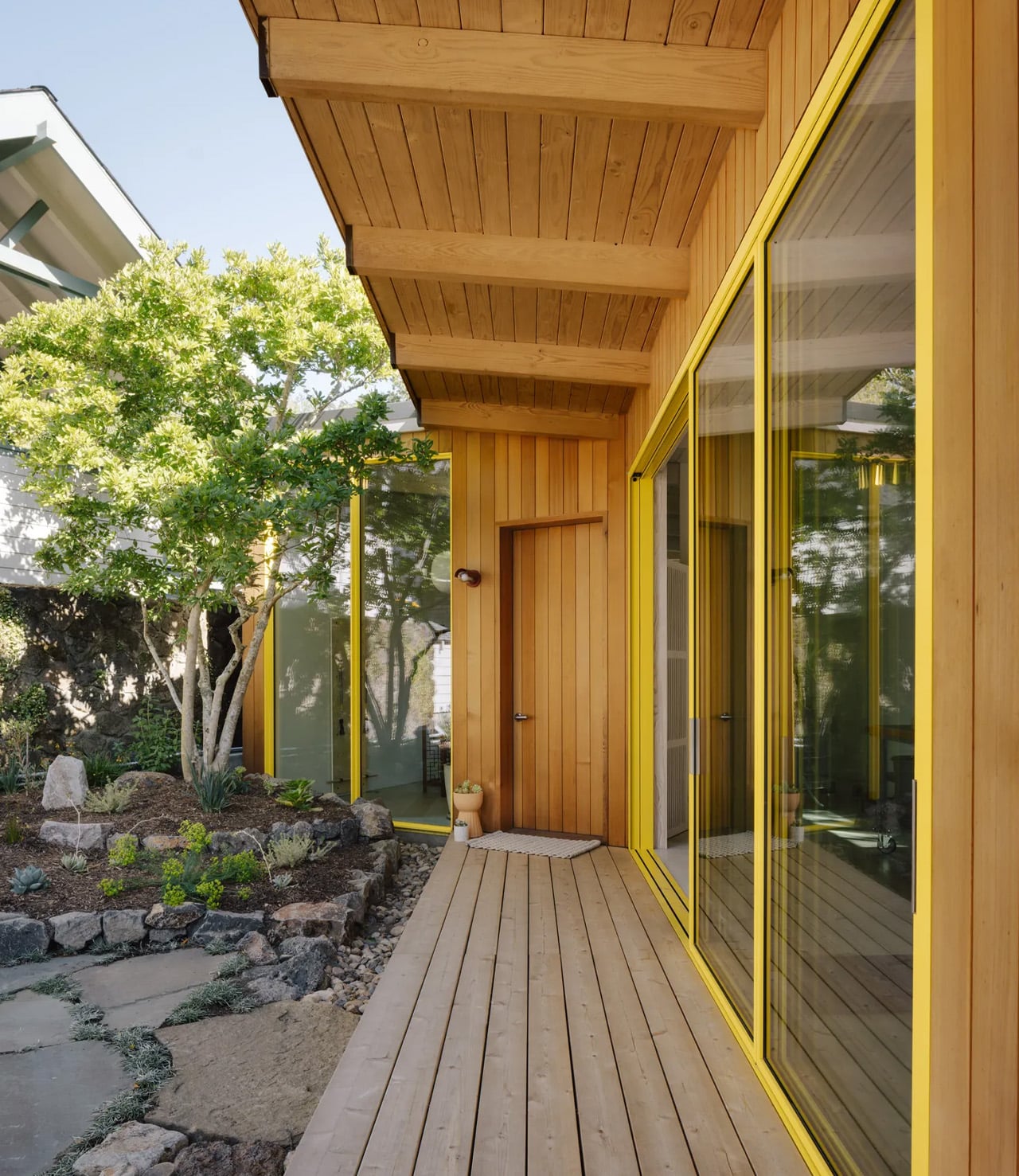
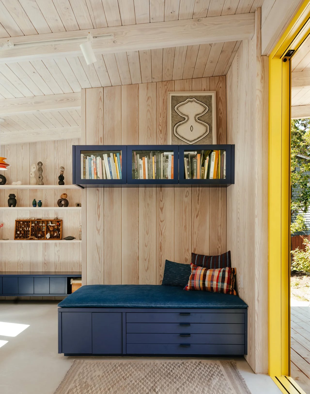
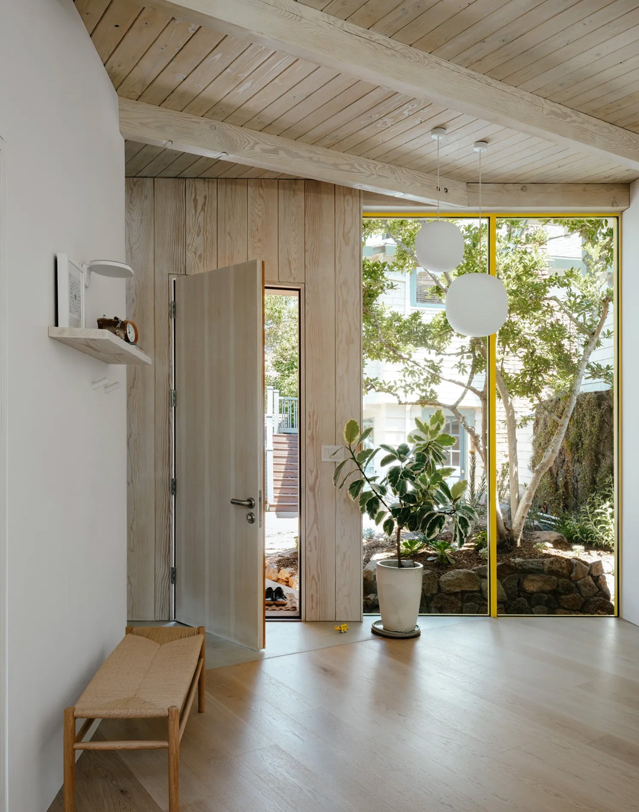
On the outside, the building reads modestly. Cedar shingles tie it back to the original home, keeping the new structure from announcing itself too loudly against the surrounding hills. Sliding glass doors, cheerfully framed in yellow powder-coated aluminum, open one side of the building entirely to the outdoors, creating a small patio underlined by the roof’s generous overhang. The yellow wasn’t arbitrary. Obata has noted that the client works in bold colour in her ceramics, so the palette needed to hold its own.

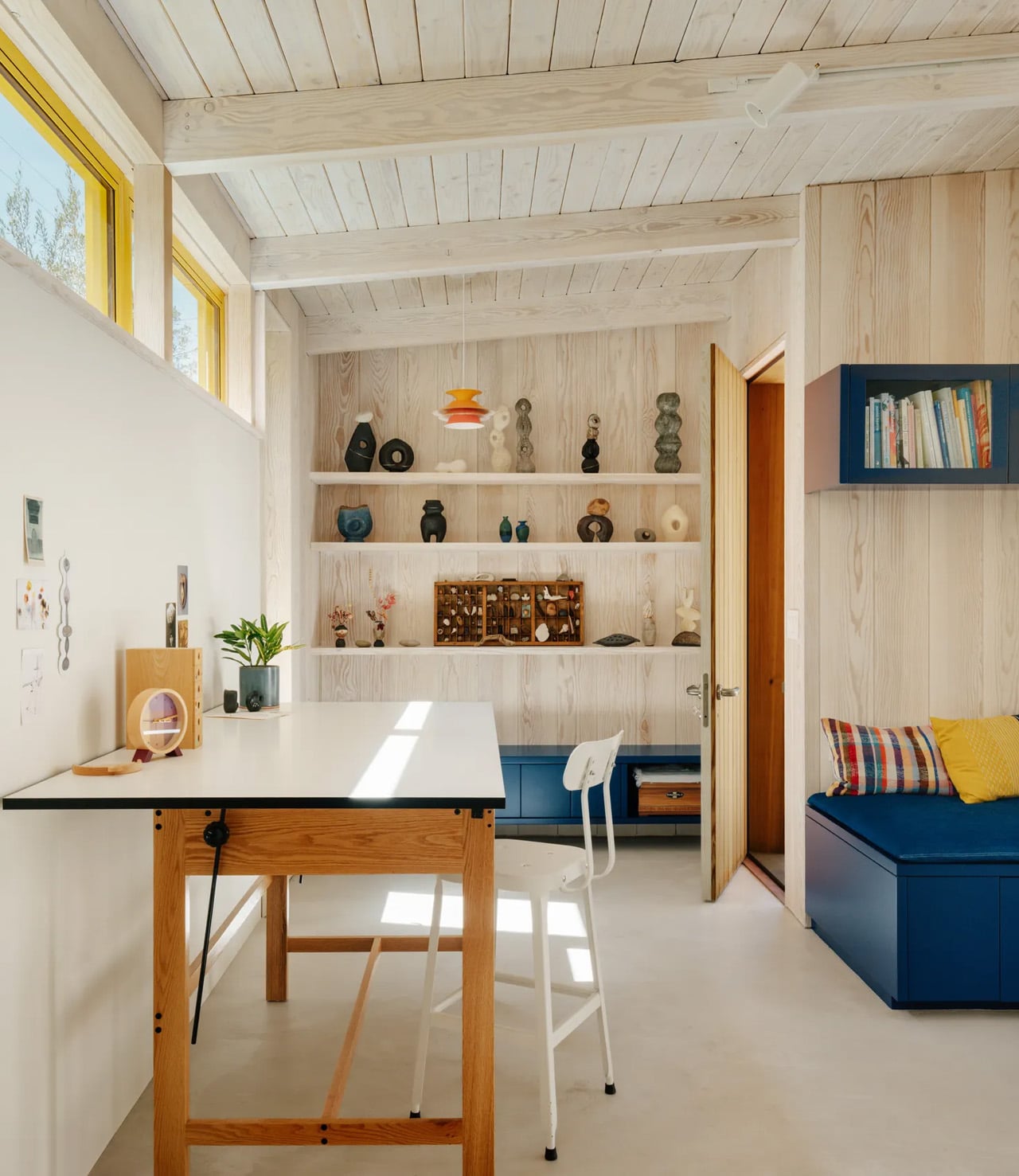
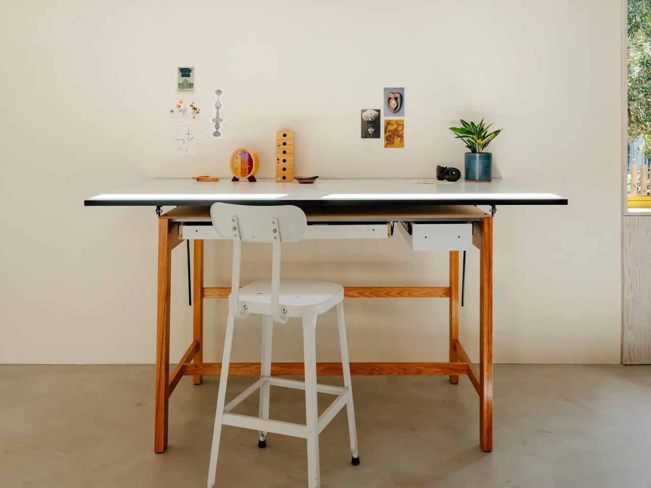
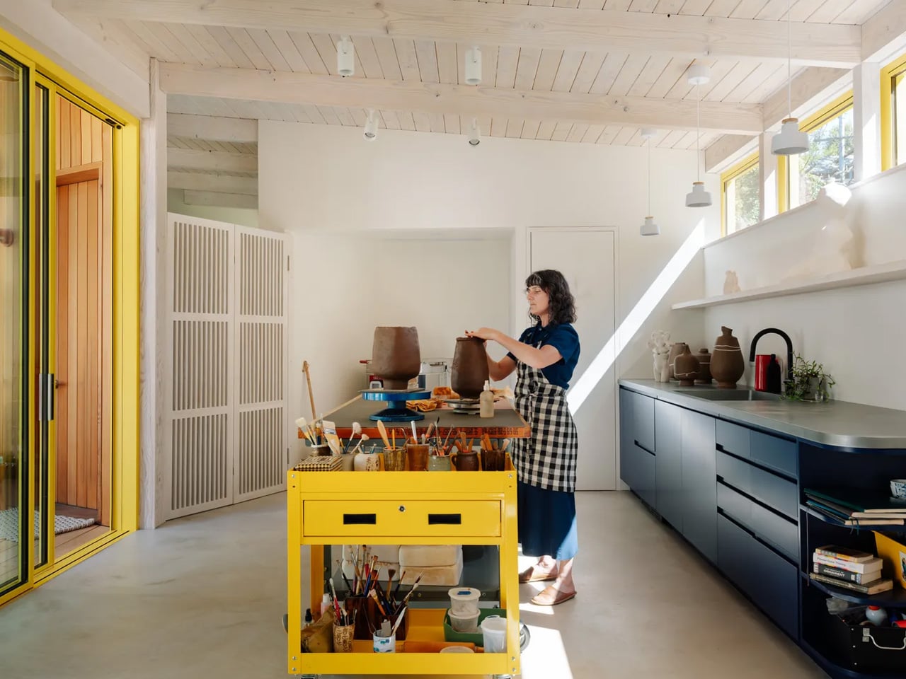
Step inside, and the two halves of the studio read distinctly but feel continuous. The Pilates side is warm and spare, finished in wood that flows through to a bathroom lined in plaster, a softer material that adds texture without breaking the natural language of the space. The ceramics side opens wider, with blue cabinets, exposed ceiling beams, and zinc countertops chosen specifically for the way they’ll patina into a silvery blue over time. A long work desk doubles as a kitchen counter, adjacent to a kiln neatly tucked into a wall niche.

Clerestory windows flood the ceramics studio with light while maintaining privacy from the street. In summer, with the sliding doors thrown open, afternoon light comes in late and high, ideal, as Obata puts it, for working well into the evening. Two-Fold is small, specific, and built entirely around the person who uses it. That’s what makes it memorable.

The post This Japanese-Inspired Garden Studio in California Is Doing Three Jobs at Once first appeared on Yanko Design.
A Tiny Cabin in Hungary Is Quietly Rewriting Hospitality

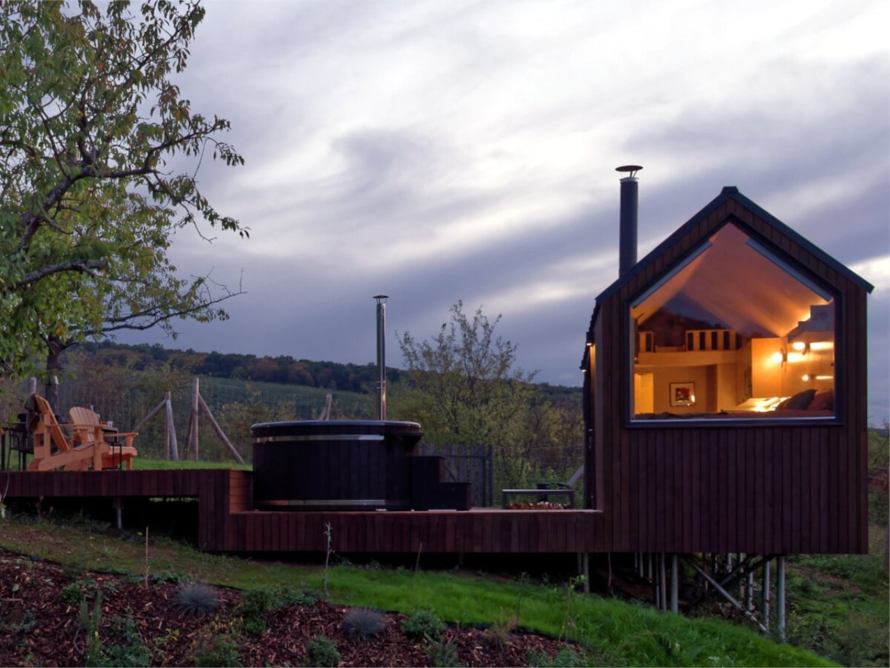
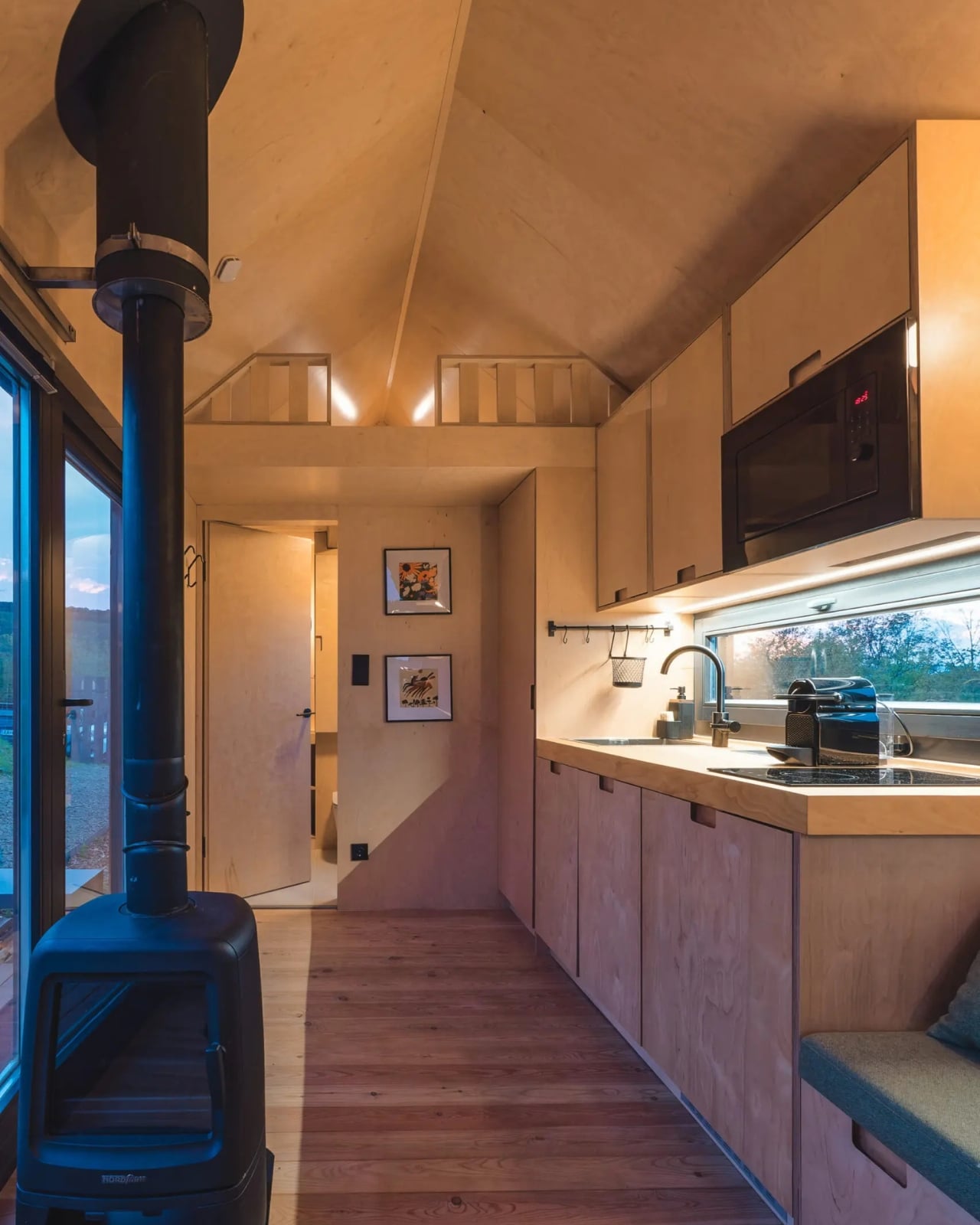
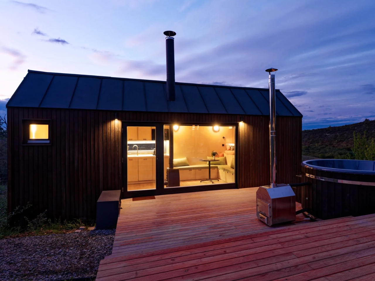
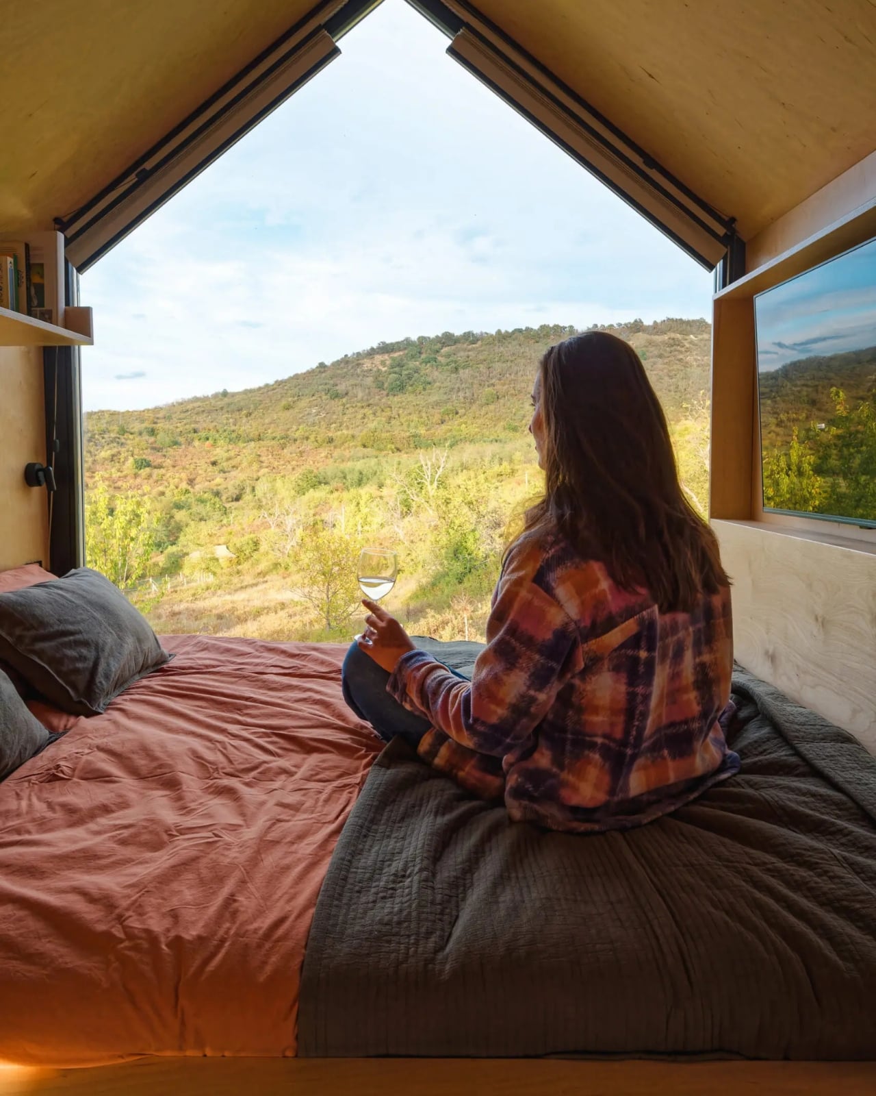
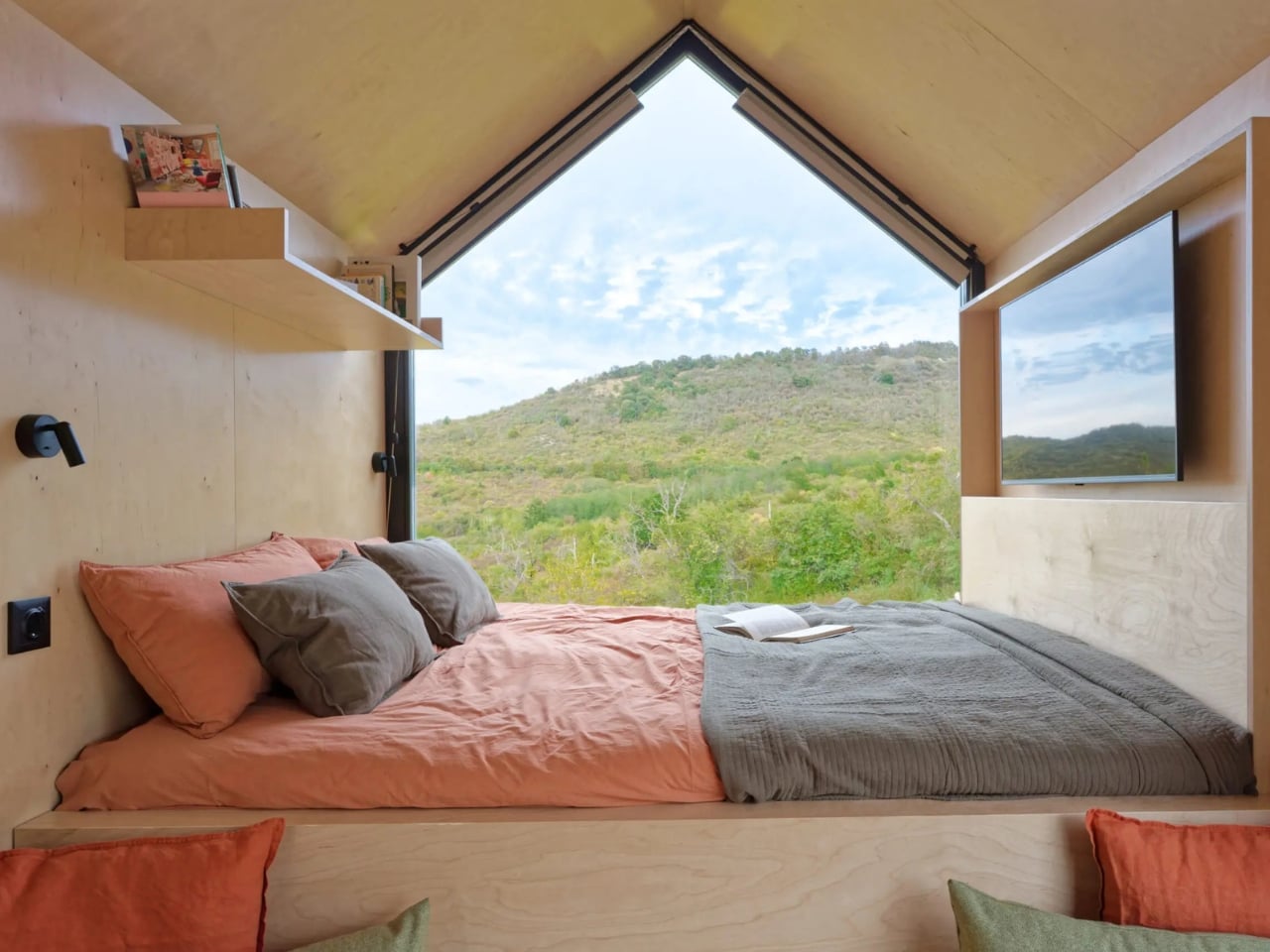
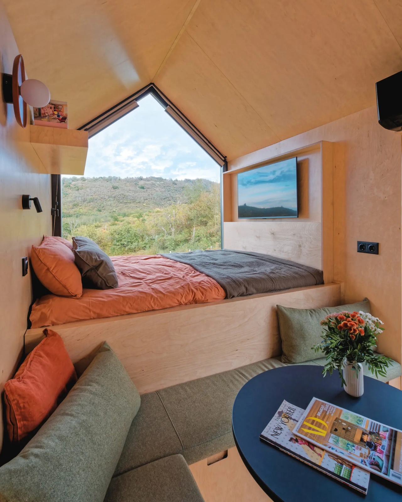
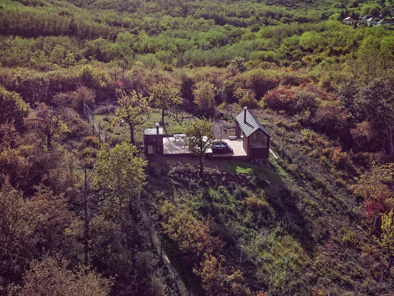
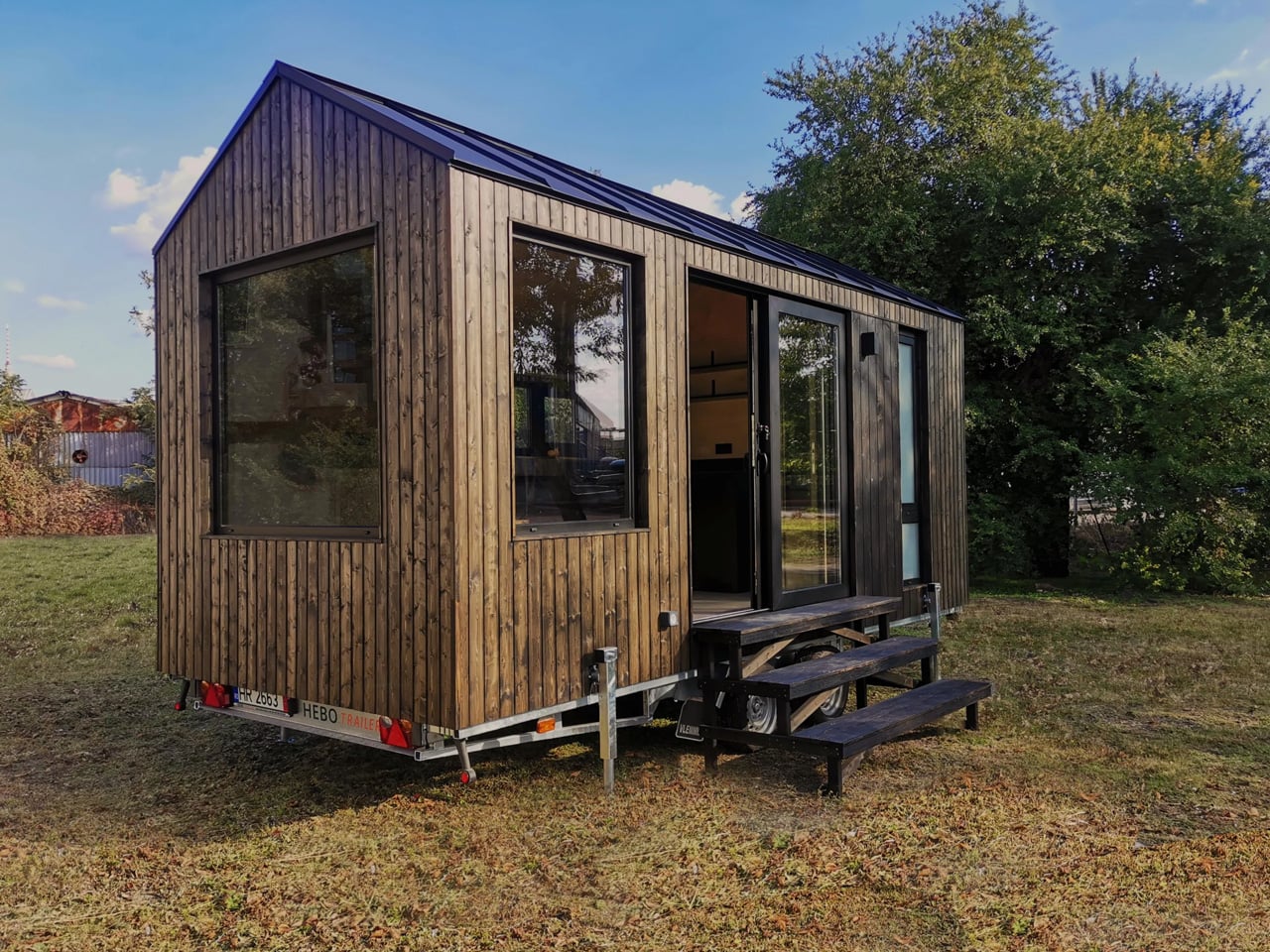
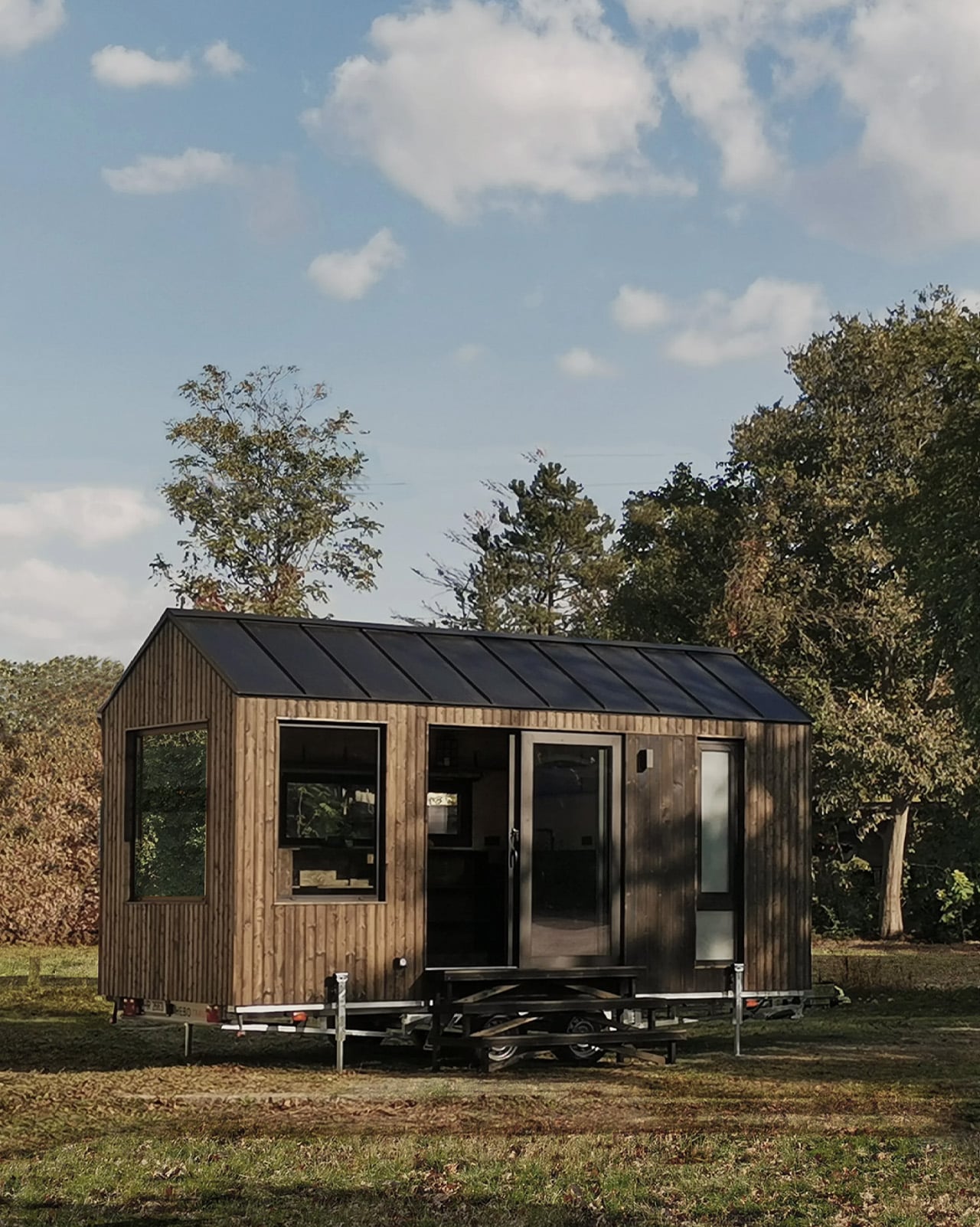
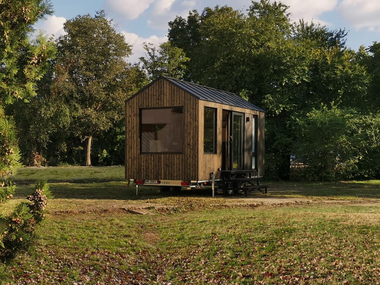
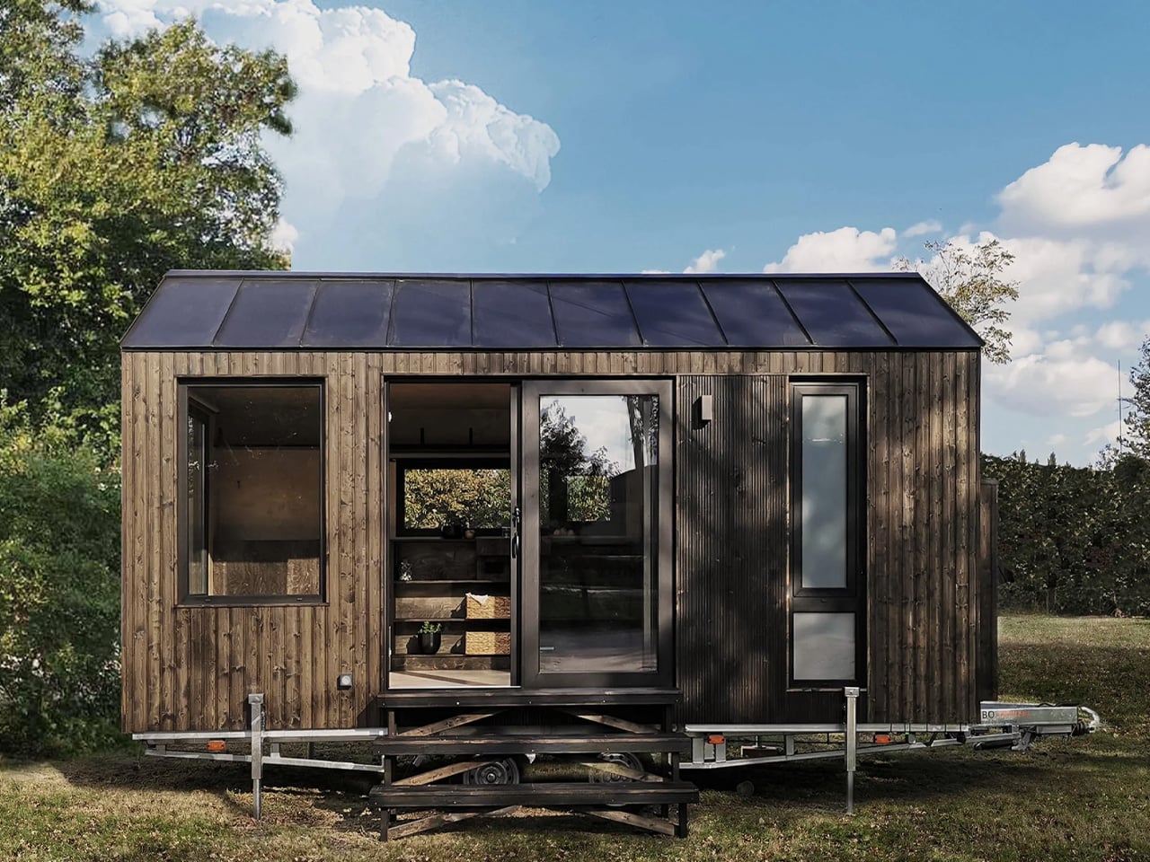
The cabin that keeps showing up in my feed sits in the forested hills of northern Hungary, and once you see it, it is genuinely hard to unsee it. NestOff, designed by architect and interior designer Péter Kotek, is a prefabricated micro-retreat measuring just 20 square meters. On paper, that sounds like a significant compromise. In practice, it reads like a very calm, very confident argument that most of us have been taking up far too much space for far too long.

I have a complicated relationship with the micro-living conversation. It tends to swing between two exhausting extremes: the breathlessly optimistic content creator who insists that 18 square meters is “more than enough space for everything,” and the architecture critic who reminds us, correctly, that small spaces have historically been a symptom of poverty rather than a lifestyle choice. NestOff somehow sidesteps both camps entirely. It is not pretending to be a permanent home, and it is not selling you a fantasy of radical simplicity. It is a retreat. A considered, intelligently designed retreat, tucked between trees in Romhány in northern Hungary, and it wears that identity with genuine confidence.

Designer: Peter Kotek

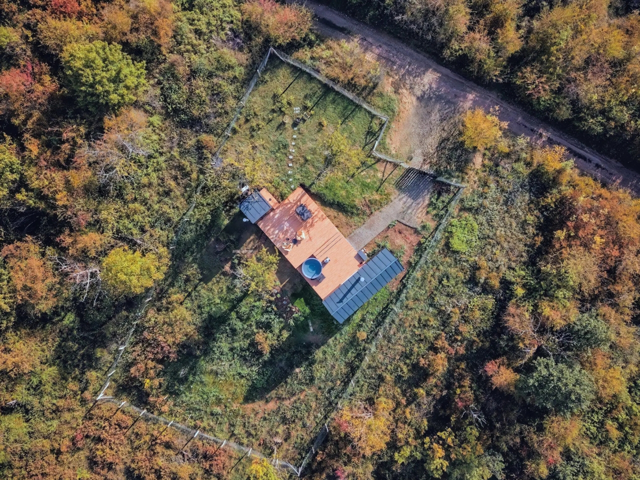
Kotek worked with cabin fabricator Tajga-Depo to partially build the structure off-site, which meant better precision, reduced material waste, and a significantly shorter construction timeline on location. The cabin sits on ground screw foundations rather than poured concrete, and that decision matters more than it might initially seem. It means the structure can eventually be relocated without leaving a scar on the landscape beneath it. In an era when “eco-conscious design” has become something of a branding exercise, NestOff actually follows through on the promise. The land remains largely undisturbed. That is a genuinely rare thing to be able to say.

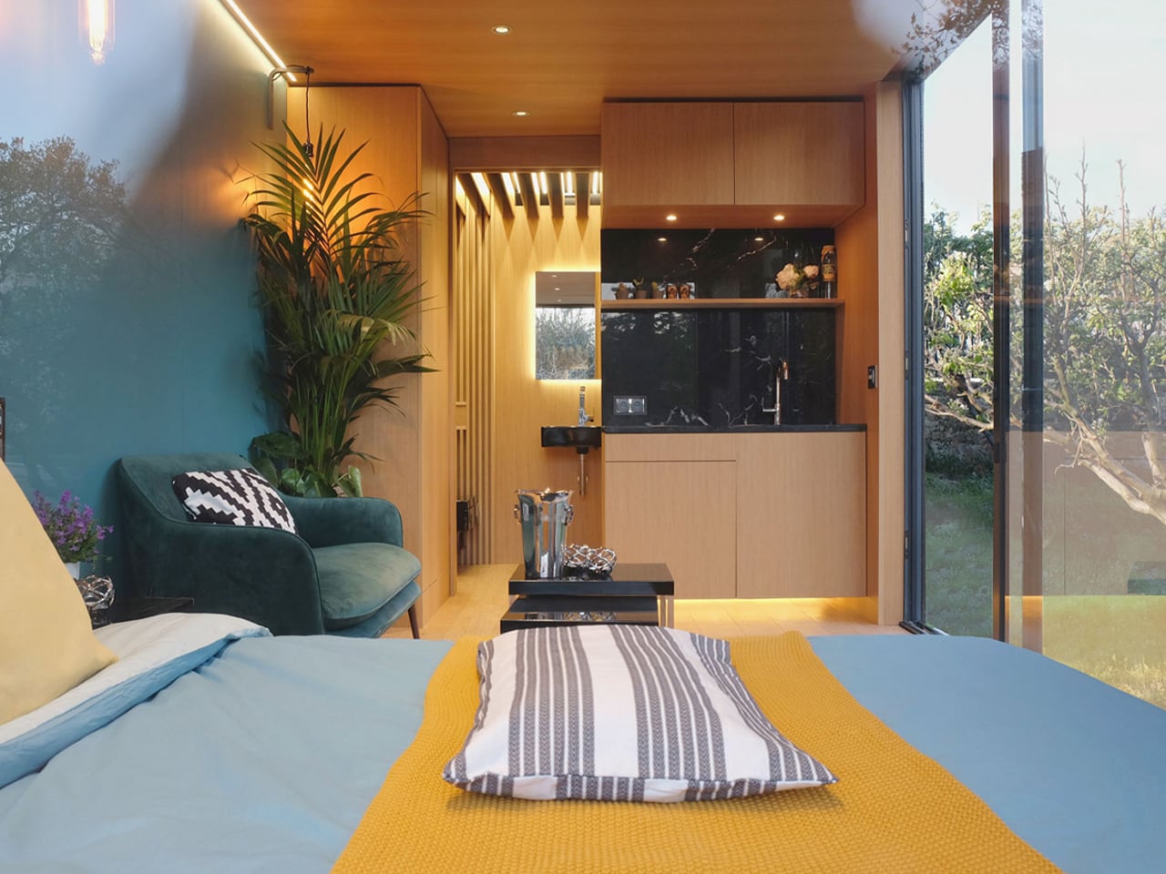
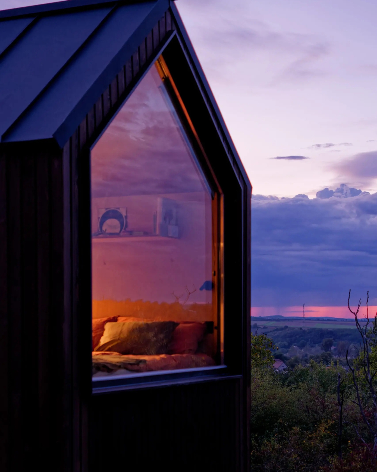
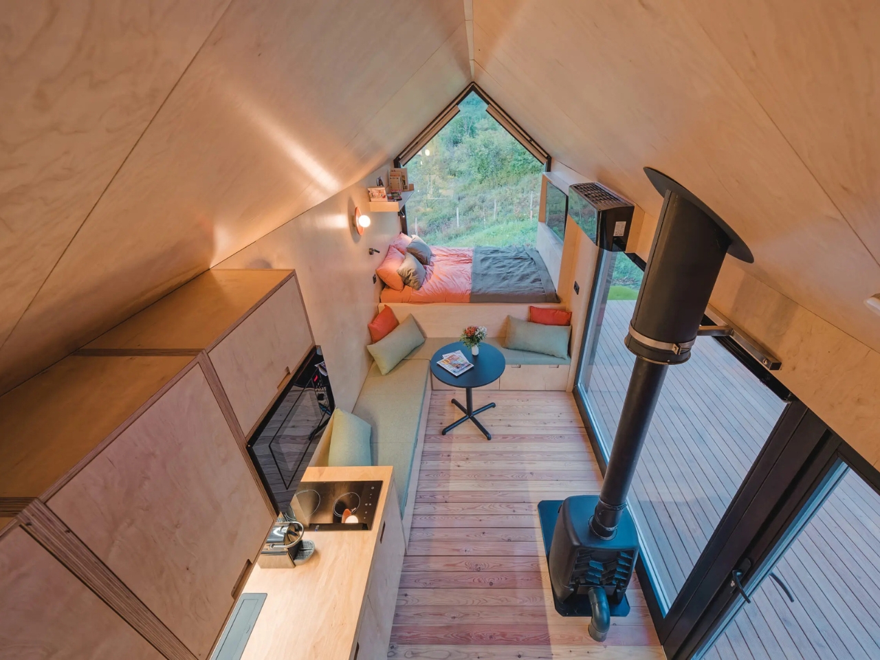
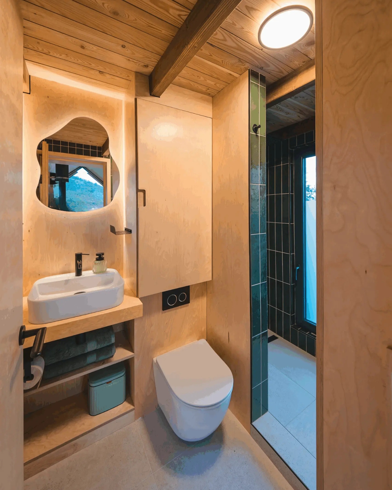
Inside, birch plywood covers the walls, ceilings, and built-in furniture, giving the space a warm and continuous quality that feels more like inhabiting a well-crafted object than occupying a room. The panoramic opening does exactly what a good view should do: it pulls the outside in without letting the outside overwhelm the interior. You are still in an enclosed, protected space, but the valley stretches out in front of you like a second room you never had to build or pay for. Kotek clearly understood that in a cabin this size, the view is not a bonus feature. It is structural.

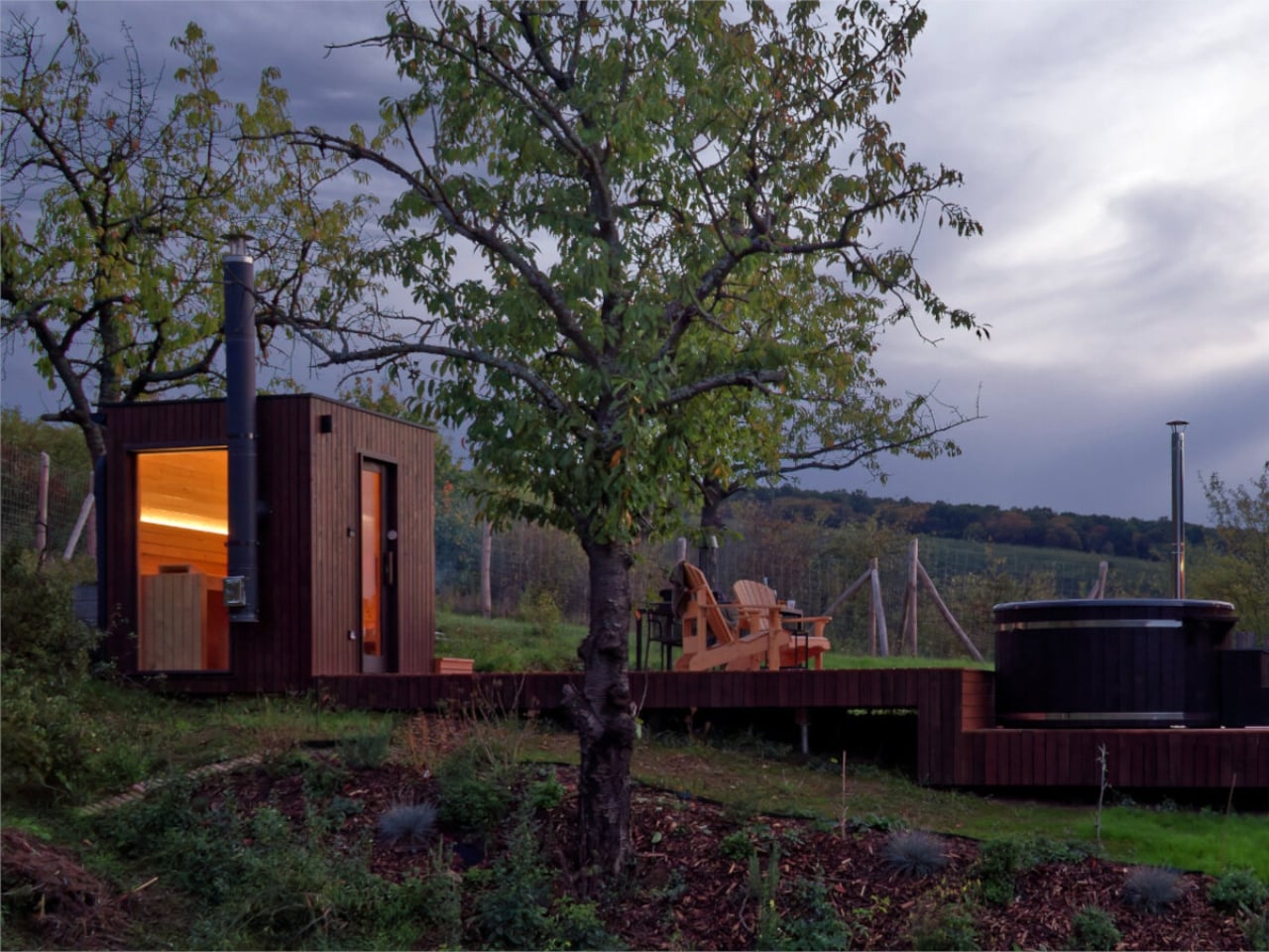
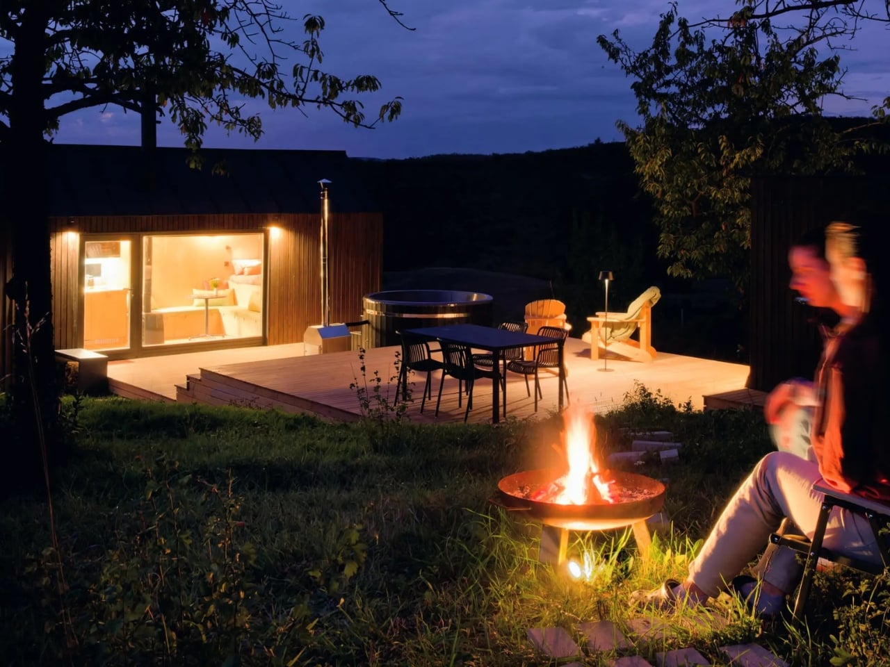
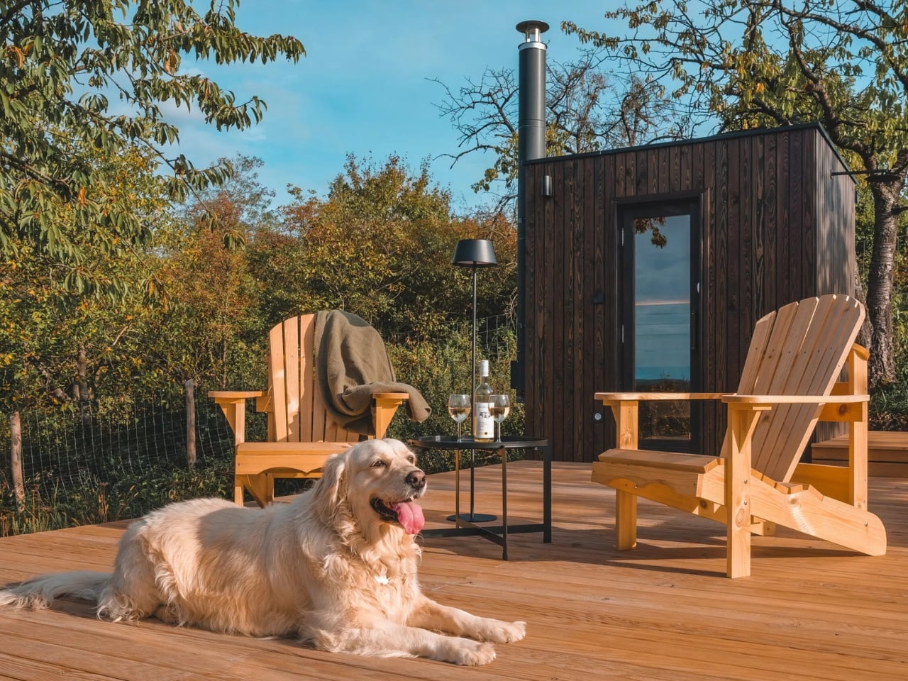
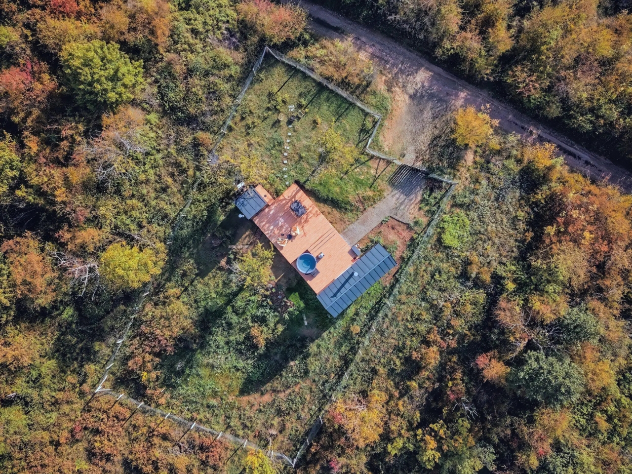
The outdoor program is where NestOff gets particularly interesting. Two black timber vertical board cabins, the main unit and a separate sauna structure, are connected by a tiered larch deck. A hot tub sits alongside it. The sequence of spaces, moving from the interior out to the deck and then to the sauna and back, creates a rhythm of use that feels more deliberate than most full-sized hotels ever manage to achieve. Rest, bathing, sitting outside, going back in. It is not complicated. It is just very well thought out.

I keep returning to the question of what we actually need from a retreat. Not a vacation, which tends to involve airports, itineraries, and the performance of relaxation, but a genuine retreat. My honest answer is: not much. A bed. A meaningful view. Hot water. A reason to put the phone away. NestOff covers all of it within 20 square meters and a larch deck, and it does so without apology. That is not a failure of ambition. That is ambition pointed firmly in the right direction.

The micro-cabin category is crowded right now. Everyone from Scandinavian design studios to Silicon Valley-adjacent startups has something competing in that space. What separates NestOff from the noise is its complete absence of performance. It is not trying to impress you with a feature list or a manifesto. It is trying to give you a few nights in the Hungarian hills with nowhere else to be, and it is quietly very good at that one thing. Sometimes, that really is the whole point.

The post A Tiny Cabin in Hungary Is Quietly Rewriting Hospitality first appeared on Yanko Design.
Foshan’s Forgotten Warehouses Got a Rooftop Park Under Floating Domes

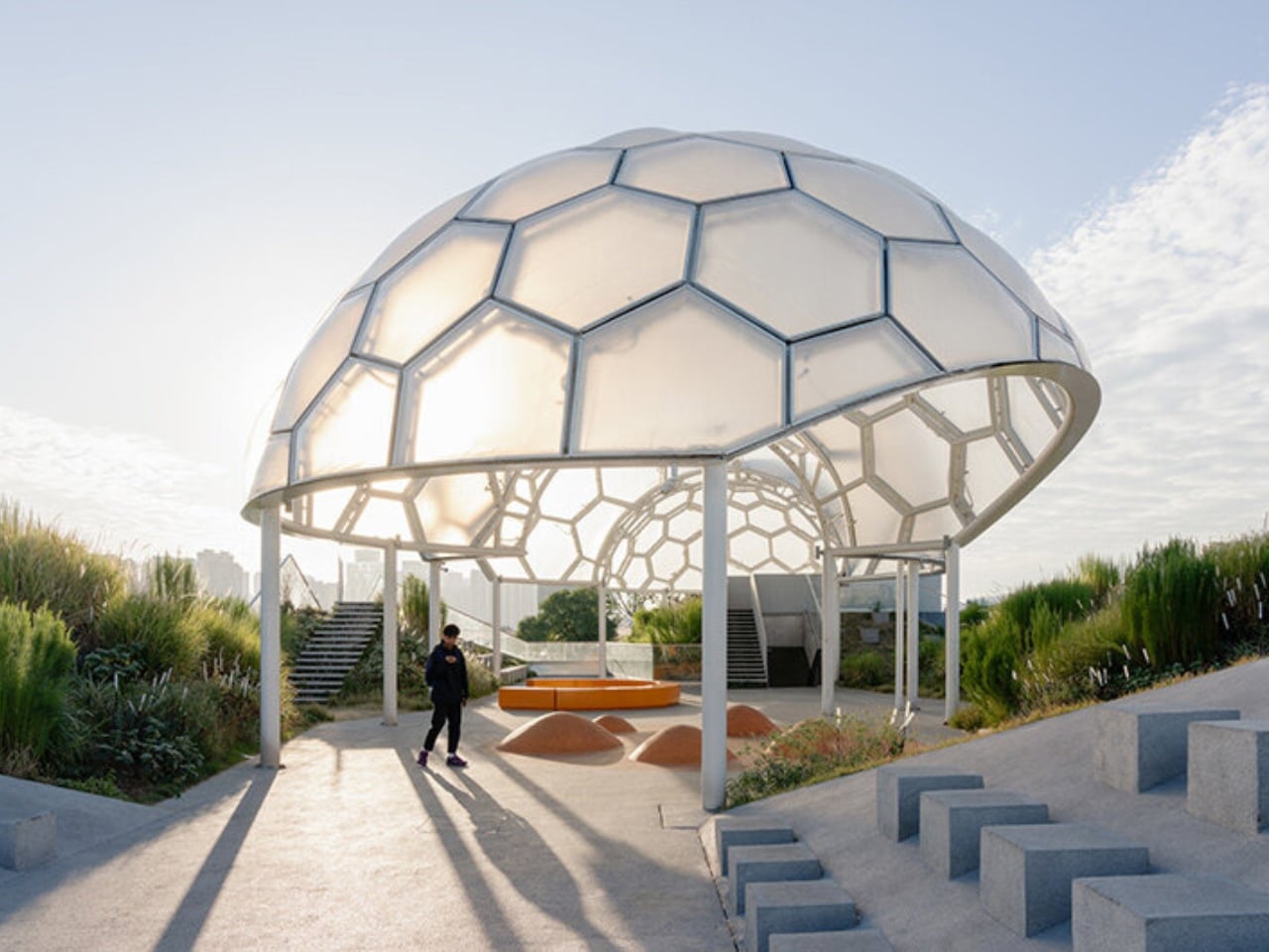
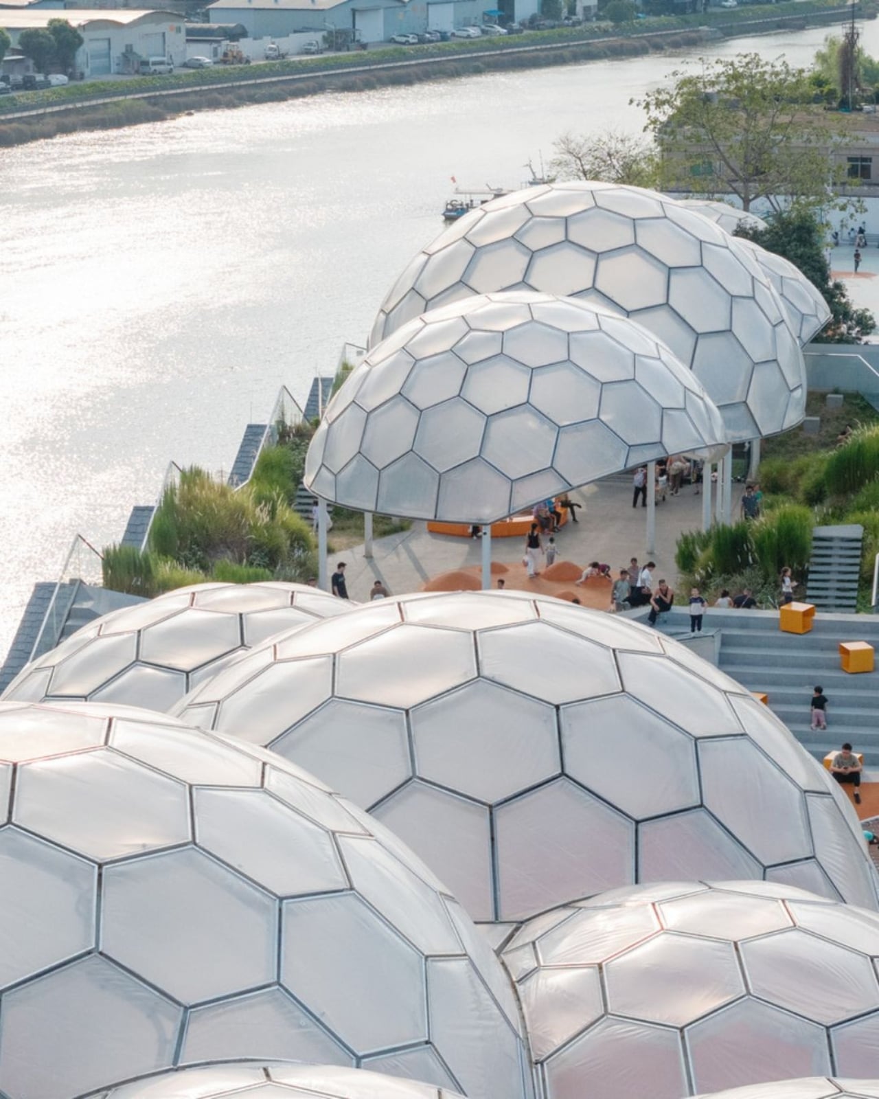
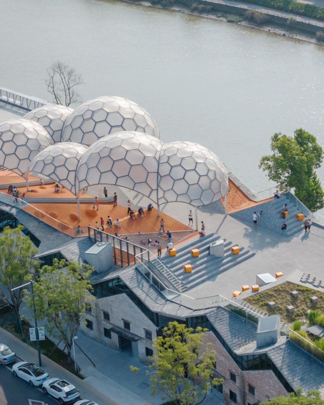
Somewhere along the Huadi River in Foshan, China, a cluster of old grain storage warehouses has been turned into one of the most quietly poetic pieces of architecture I’ve seen all year. The Yongping Warehouse Renovation, completed in 2025 by Guangzhou-based Atelier cnS, is exactly the kind of project that makes you stop scrolling and actually look.

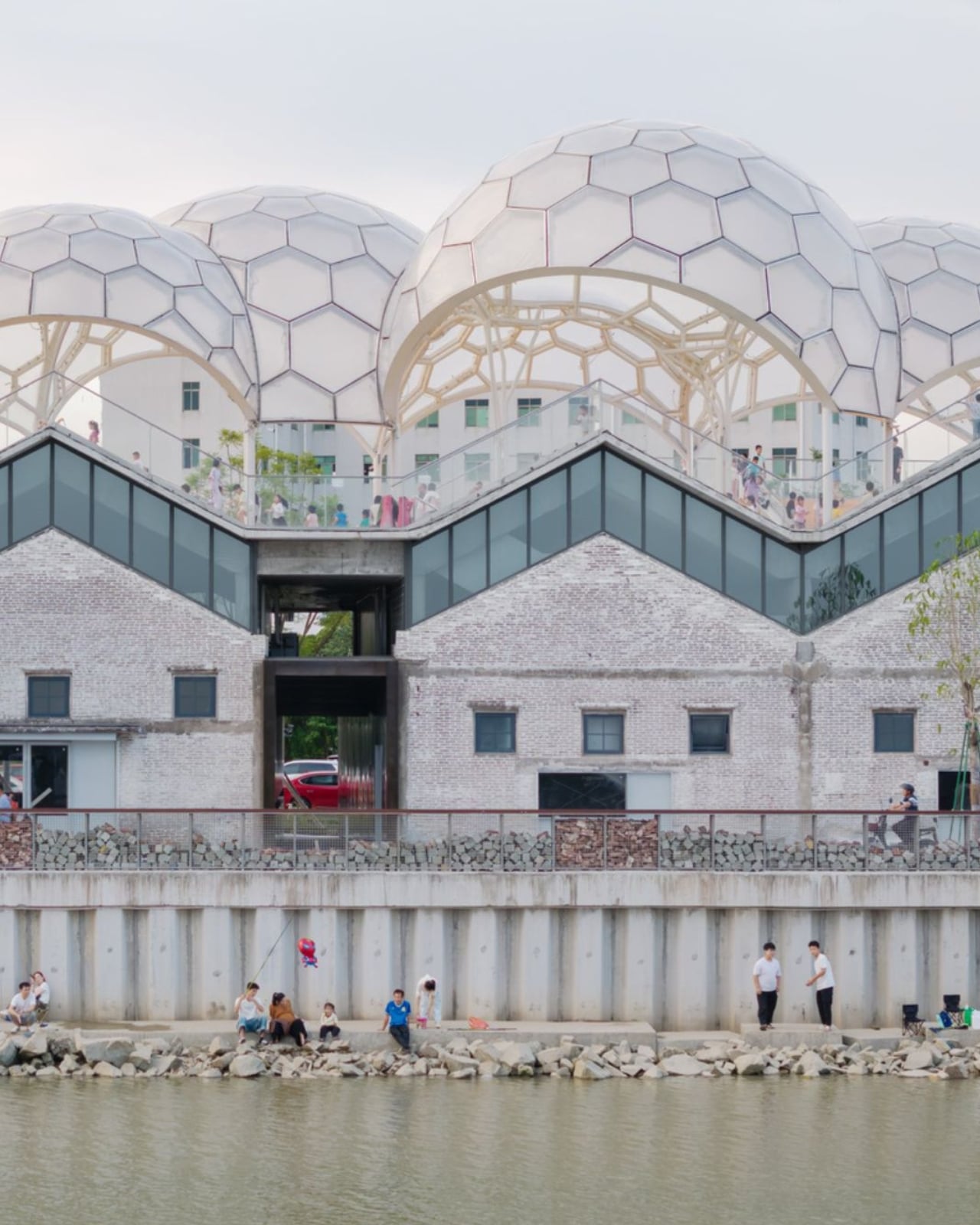
The site sits in Dali Town, Nanhai District, a former industrial pocket of the Pearl River Delta that’s been gradually shedding its factory-town skin in favor of something more livable and publicly accessible. These particular warehouses, lined up along the riverfront, were derelict grain storage buildings with no obvious future. Not exactly glamorous source material. But Atelier cnS didn’t flinch, and the result is a project that earns its attention without asking for it loudly.

Designer: Atelier cnS

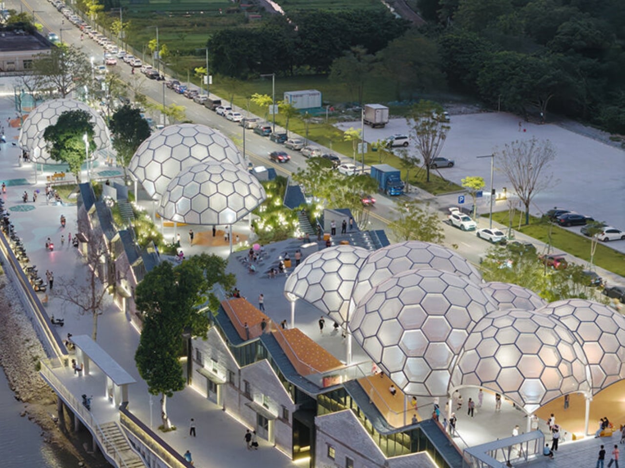
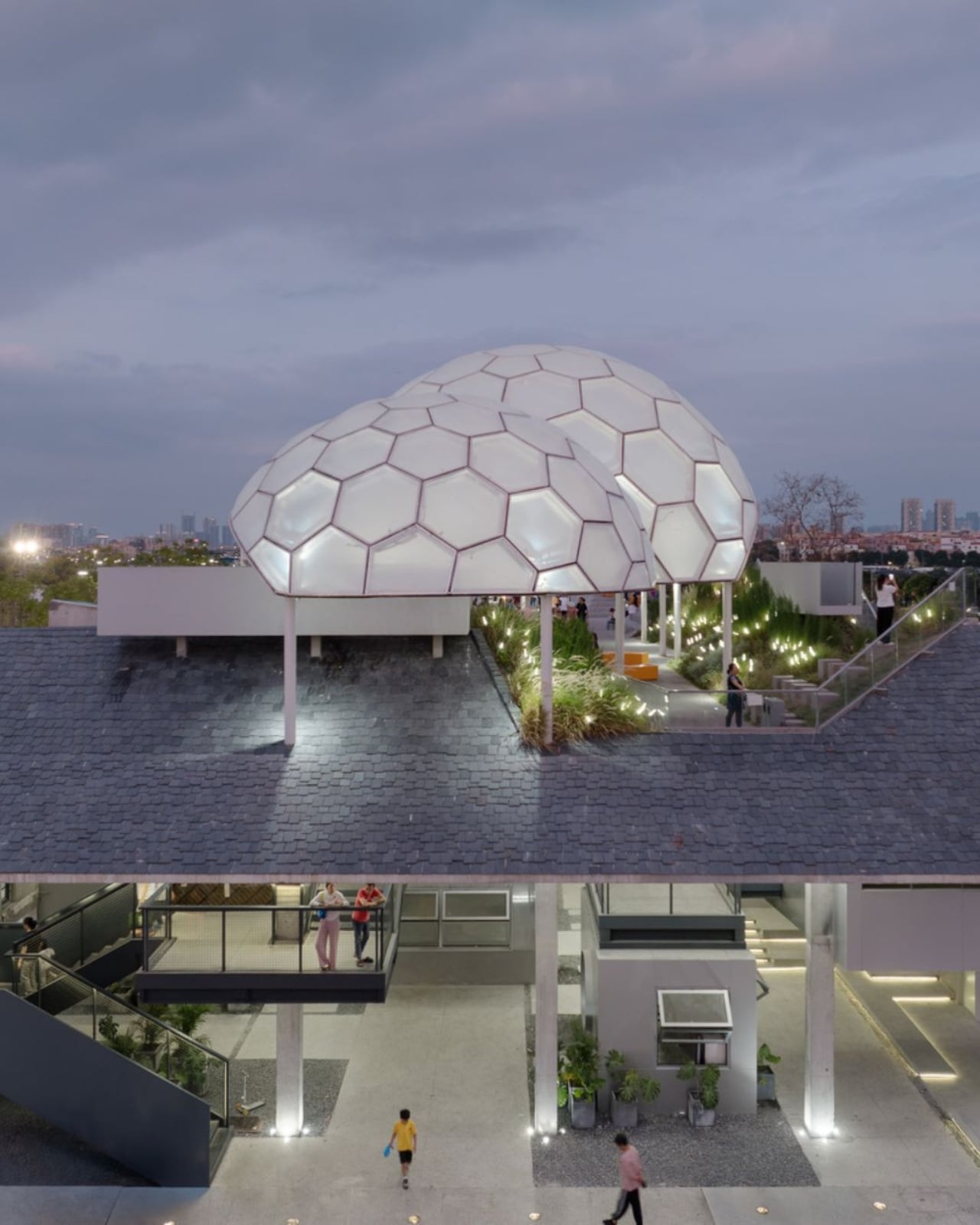
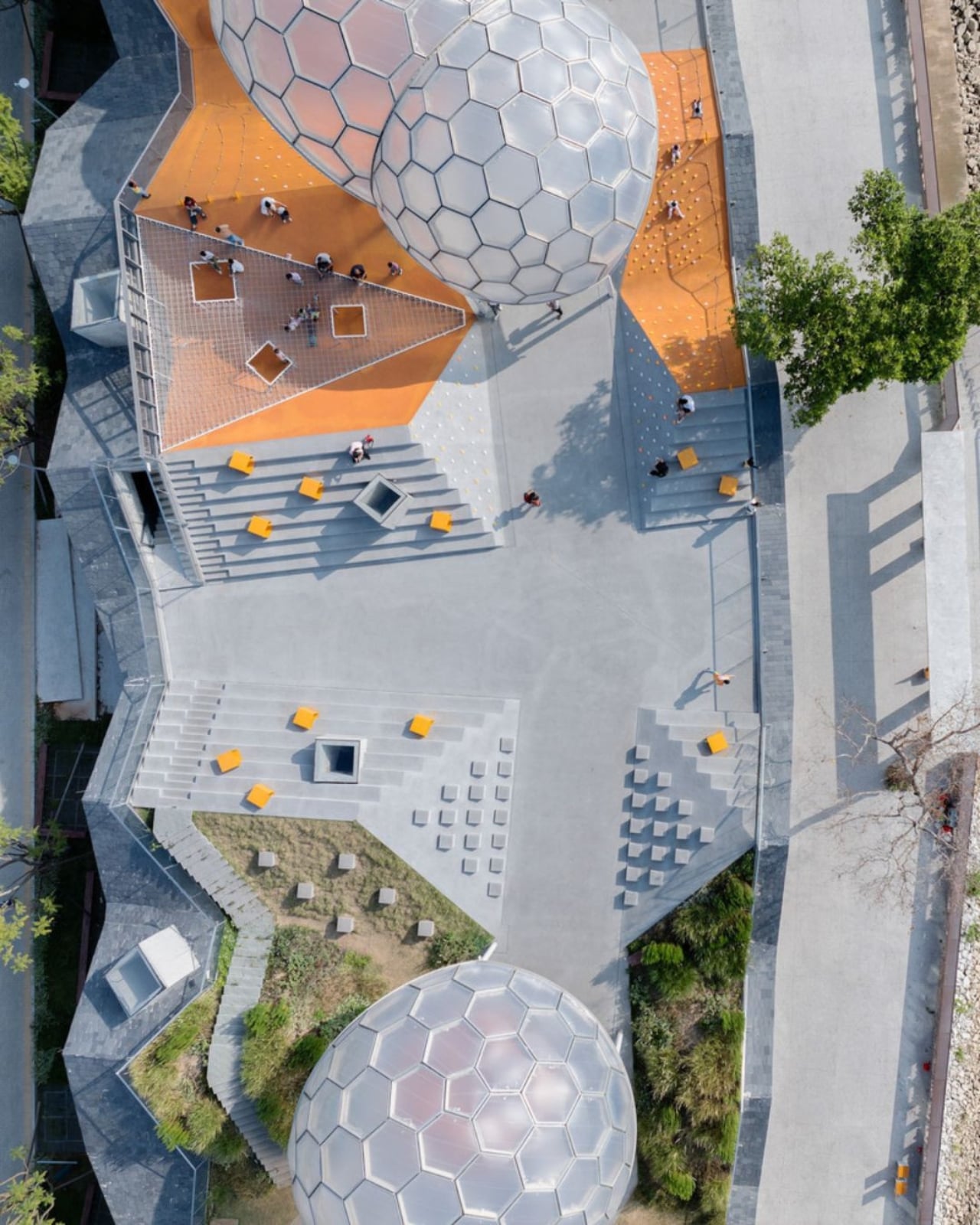
Because the site has a narrow footprint, the architects pushed the public space upward, placing a landscaped rooftop park above the commercial interiors below. Vertical programming isn’t a new idea, but what makes Yongping feel different is how thoughtfully the transition between levels was handled. The gaps between warehouse blocks weren’t sealed or filled in. Instead, they were preserved and widened into passageways, so as you move through the building, you catch glimpses of the river framed by walls before the whole view opens up at the top. It’s a slow reveal, and it’s deliberate.

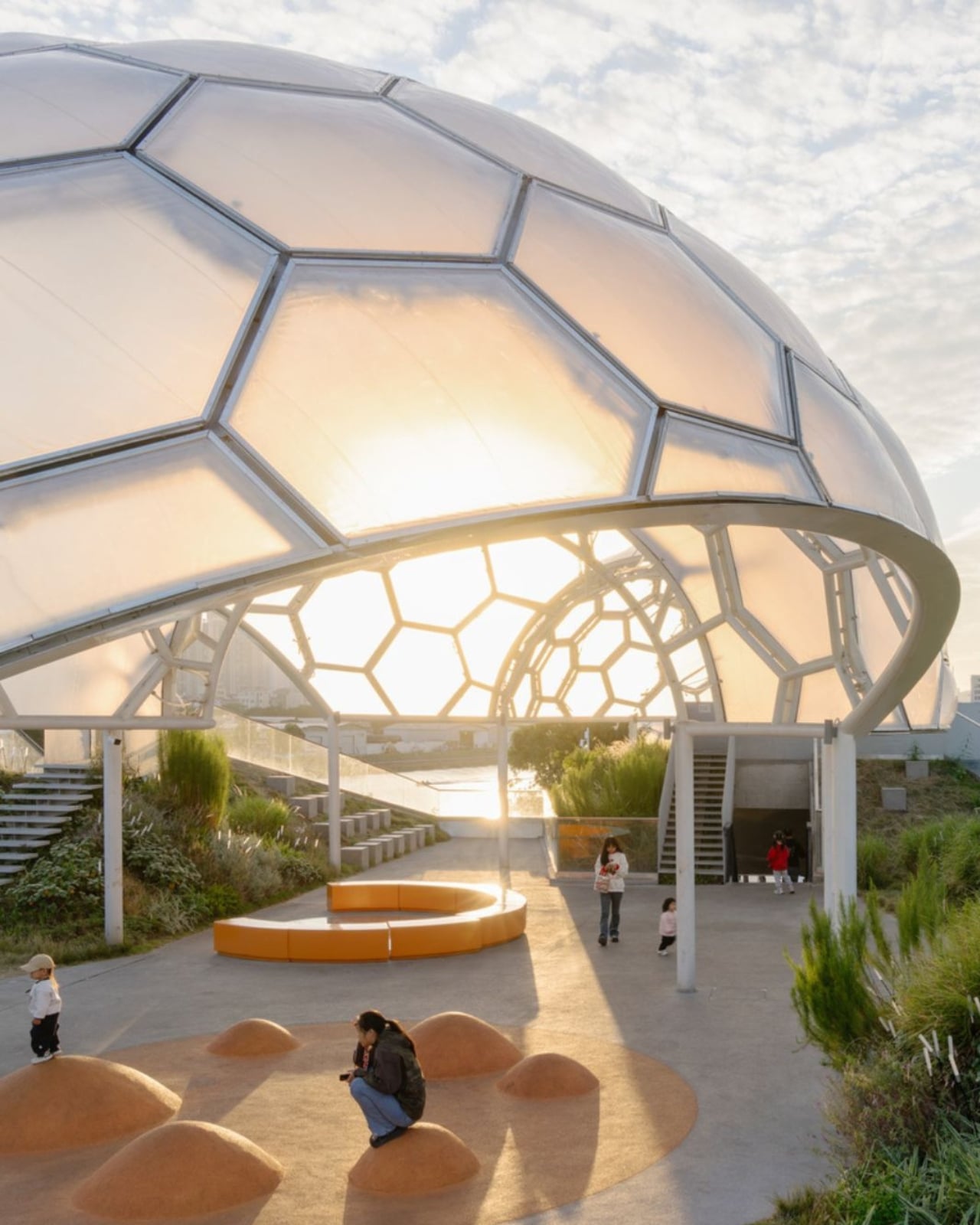
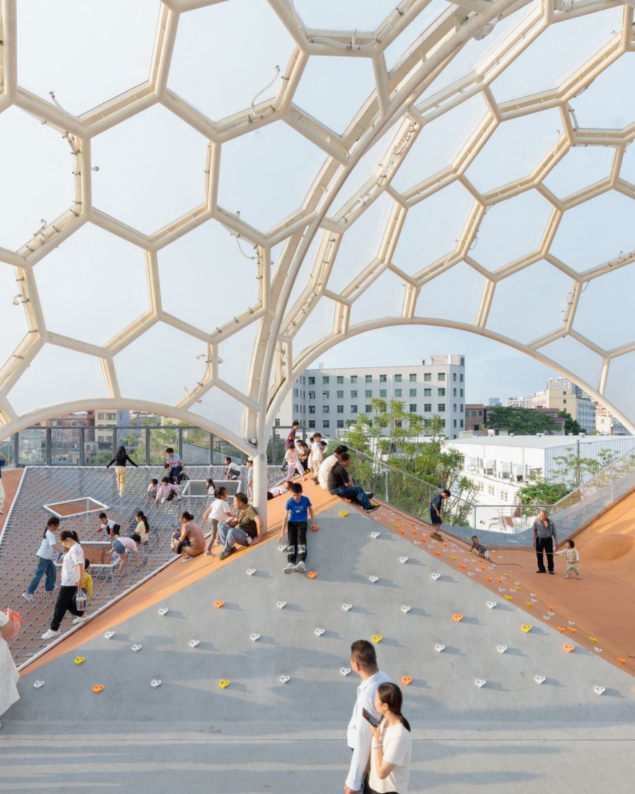
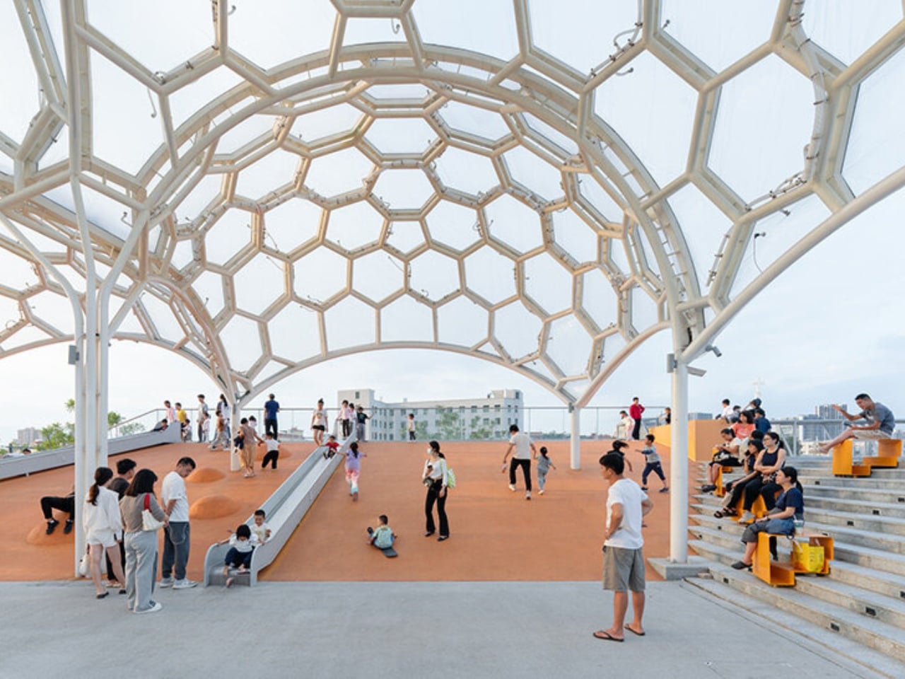
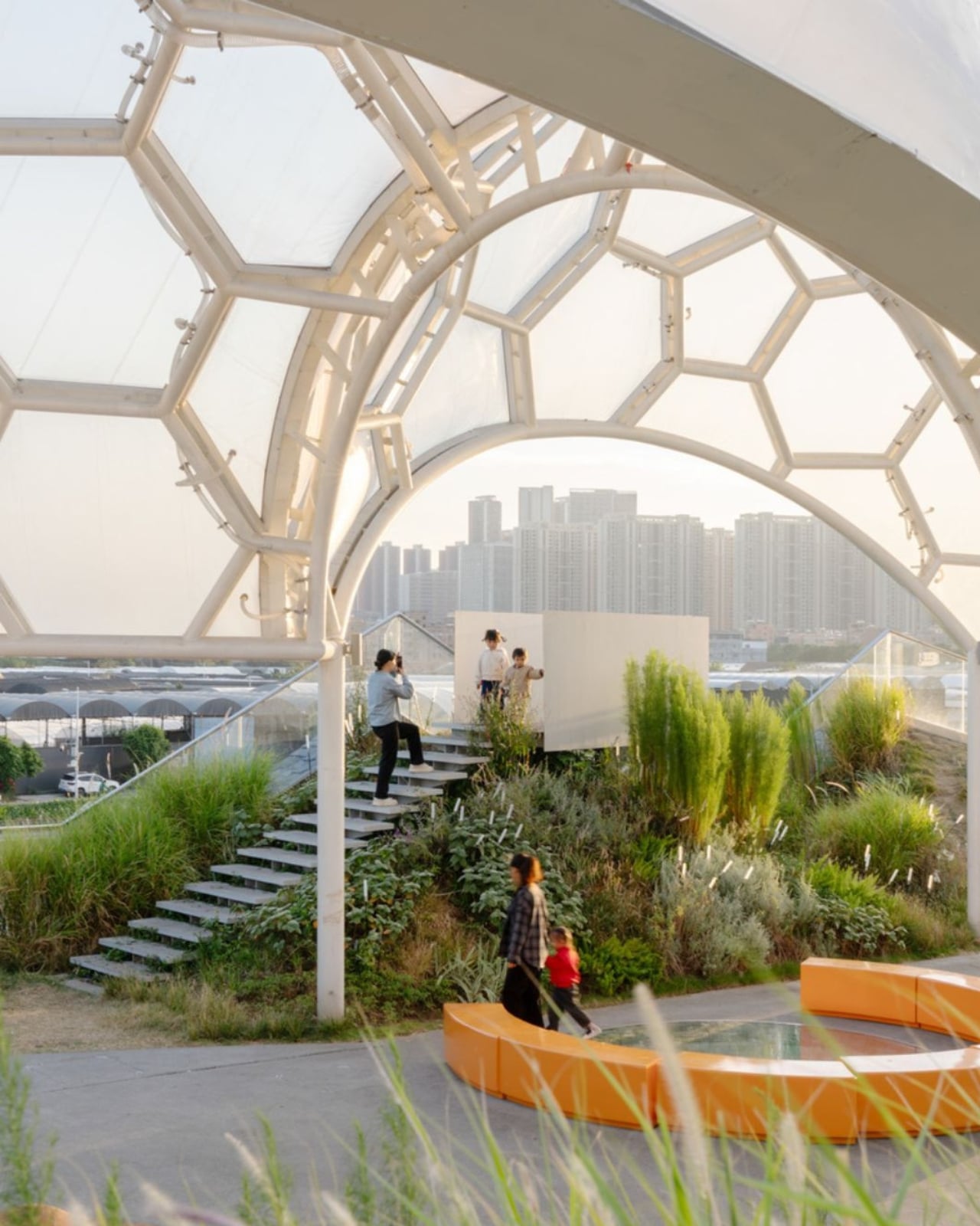
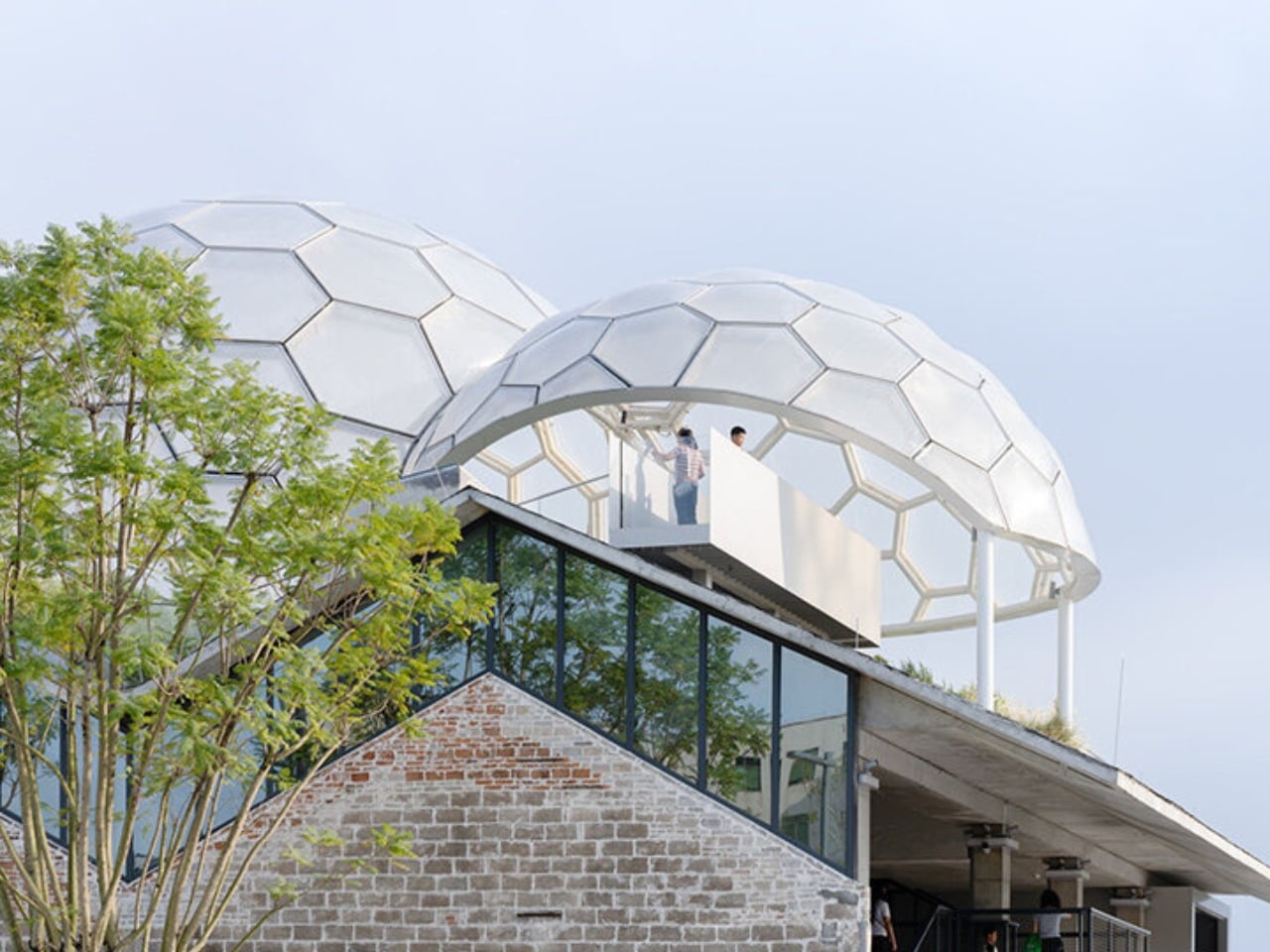
And then there are the canopies. A series of translucent, domed structures built from hexagonal frames cluster across the roofline like a quiet gathering of clouds. Atelier cnS actually named the project “A Wisp of Cloud” over Huadi River, and the photos earn that name completely. The domes are light-diffusing, casting shade without blocking river views. They create zones for sitting, moving, and play without ever feeling like they’re closing the space in. They look like they arrived gently, rather than being imposed on the building below them.

The rooftop itself is shaped into slopes, steps, and play surfaces that echo the original pitched forms of the warehouse roofs. It’s one of those details that most visitors probably won’t consciously register, but it’s exactly the kind of architectural memory that makes a renovation feel grounded rather than gratuitous. The old buildings aren’t being pretended out of existence. The new design is in active conversation with what was there before.

I’m genuinely drawn to this project because it gets the balance right in a way that many adaptive reuse projects don’t quite manage. Too often, the renovations that attract the most attention are the ones where the new design overwhelms the original structure, turning the old building into nothing more than a convenient shell. Yongping avoids that trap. The warehouses are still very much present. Their bones dictate the rhythm, the circulation, and some of the visual language of the final result. You can feel the history of the place without having to read about it first.

Atelier cnS has been developing this kind of thinking for years. The studio’s earlier work on elevated public circulation, including a “roof-hopping” design approach explored in their White House Guesthouse project, signals a long-running interest in finding new life in existing structures. Yongping feels like a maturation of that sensibility. More refined, more integrated, and more tuned in to the texture of a neighborhood mid-transition.

The project spans 4,311 square meters, and it’s worth noting what it does beyond the architecture itself. Turning a commercial renovation into a publicly accessible rooftop park, in a district shifting away from its industrial past, is a real act of generosity. A park on a roof could easily read as a private amenity. Here, it reads like a gift to the neighborhood, a place to walk, rest, and look out at the river without needing a reason to be there.

Architecture doesn’t always need to announce itself to be worth paying attention to. The Yongping Warehouse Renovation is understated, purposeful, and lit from above by a cluster of translucent domes that look, from a distance, exactly like a wisp of cloud over the river.

The post Foshan’s Forgotten Warehouses Got a Rooftop Park Under Floating Domes first appeared on Yanko Design.
This 25sqm Australian Tiny House Feels Anything But Small

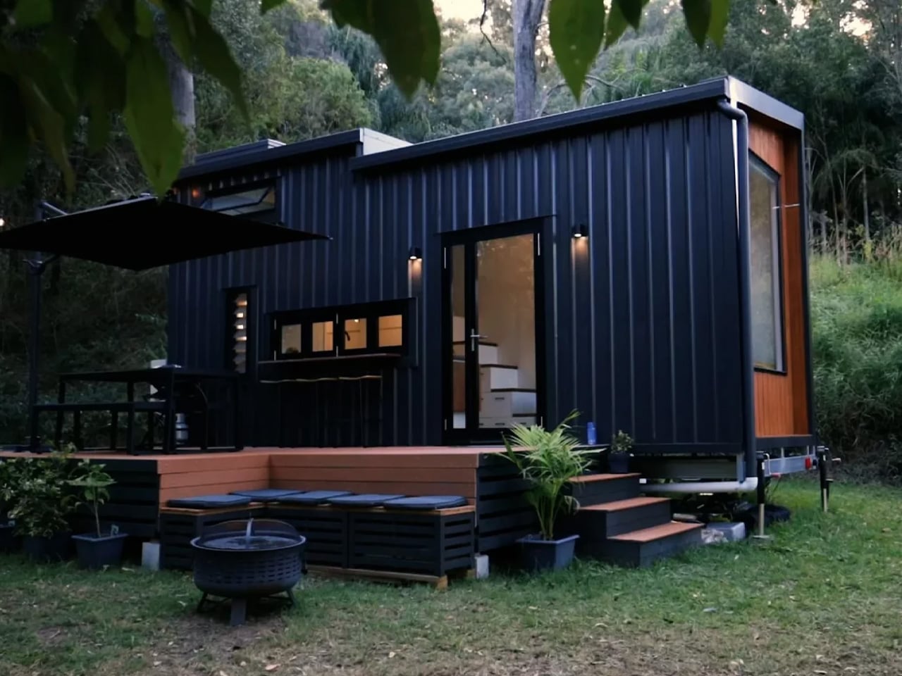
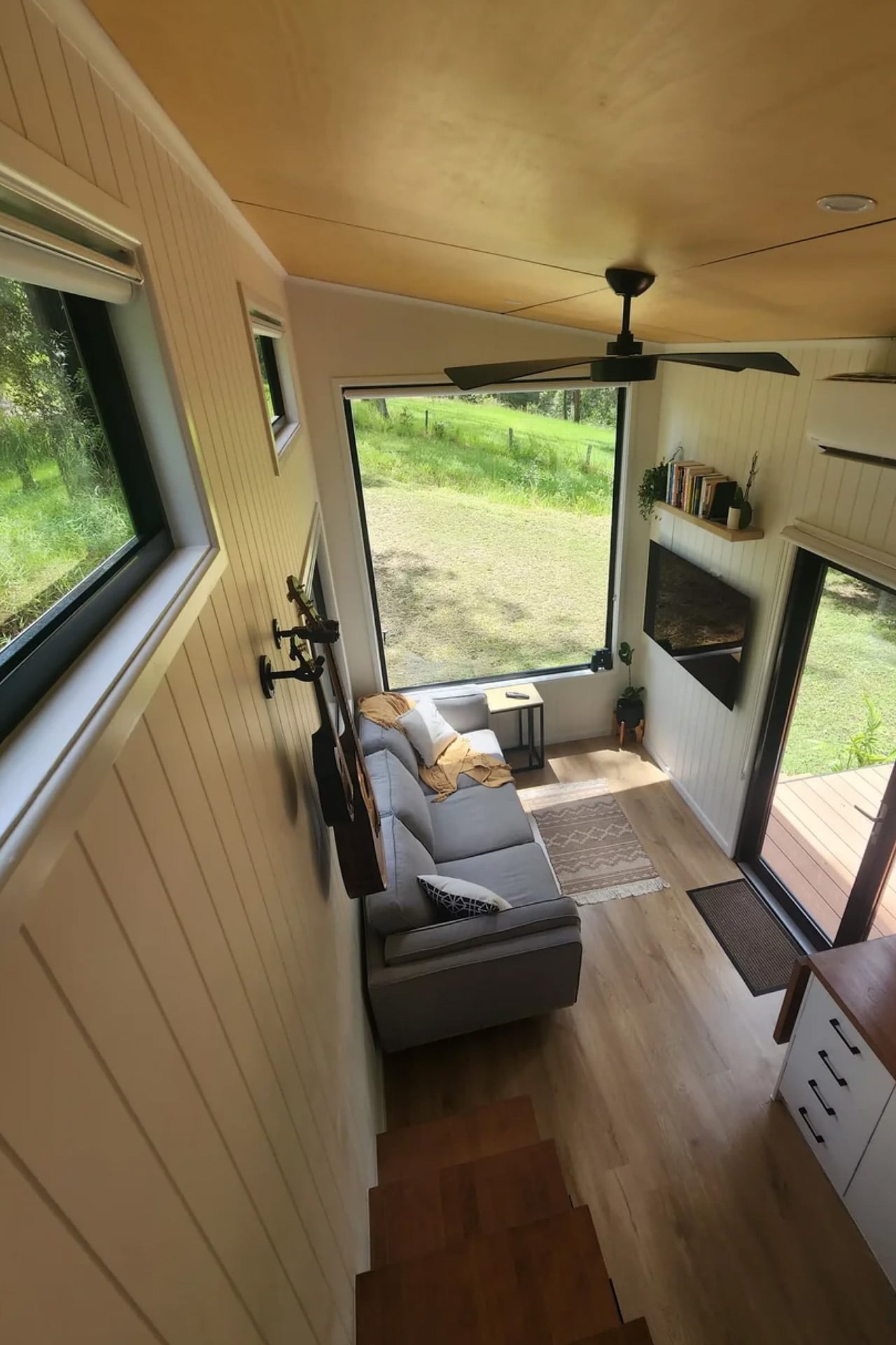
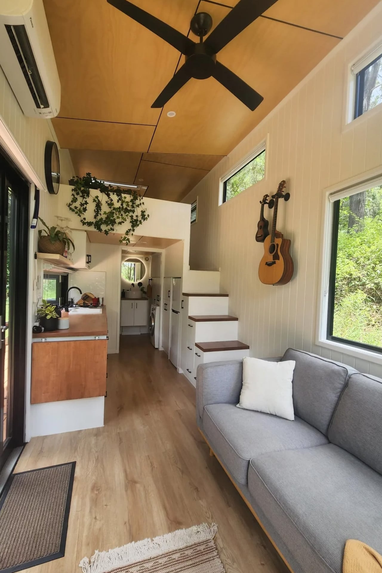
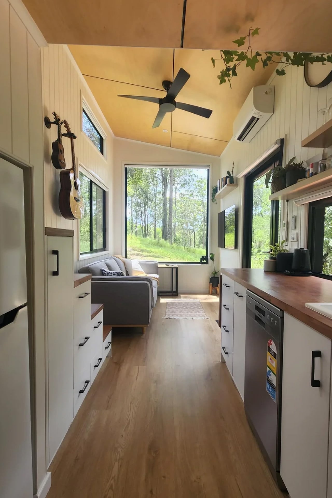
The best tiny homes don’t feel small; they feel edited. Removed Tiny Homes, a Queensland-based builder, has built its entire identity around that idea, and the Currumbin is arguably where it lands best. Named after the coastal suburb on the Gold Coast, the Currumbin is the most popular model in the builder’s lineup, and it’s easy to see why. Sitting on a triple-axle trailer, it measures 7.2 metres long, 2.4 metres wide, and stands 4.3 metres tall, coming in at 25 square metres of liveable space. For a home that technically fits on a trailer, it carries itself with surprising generosity.

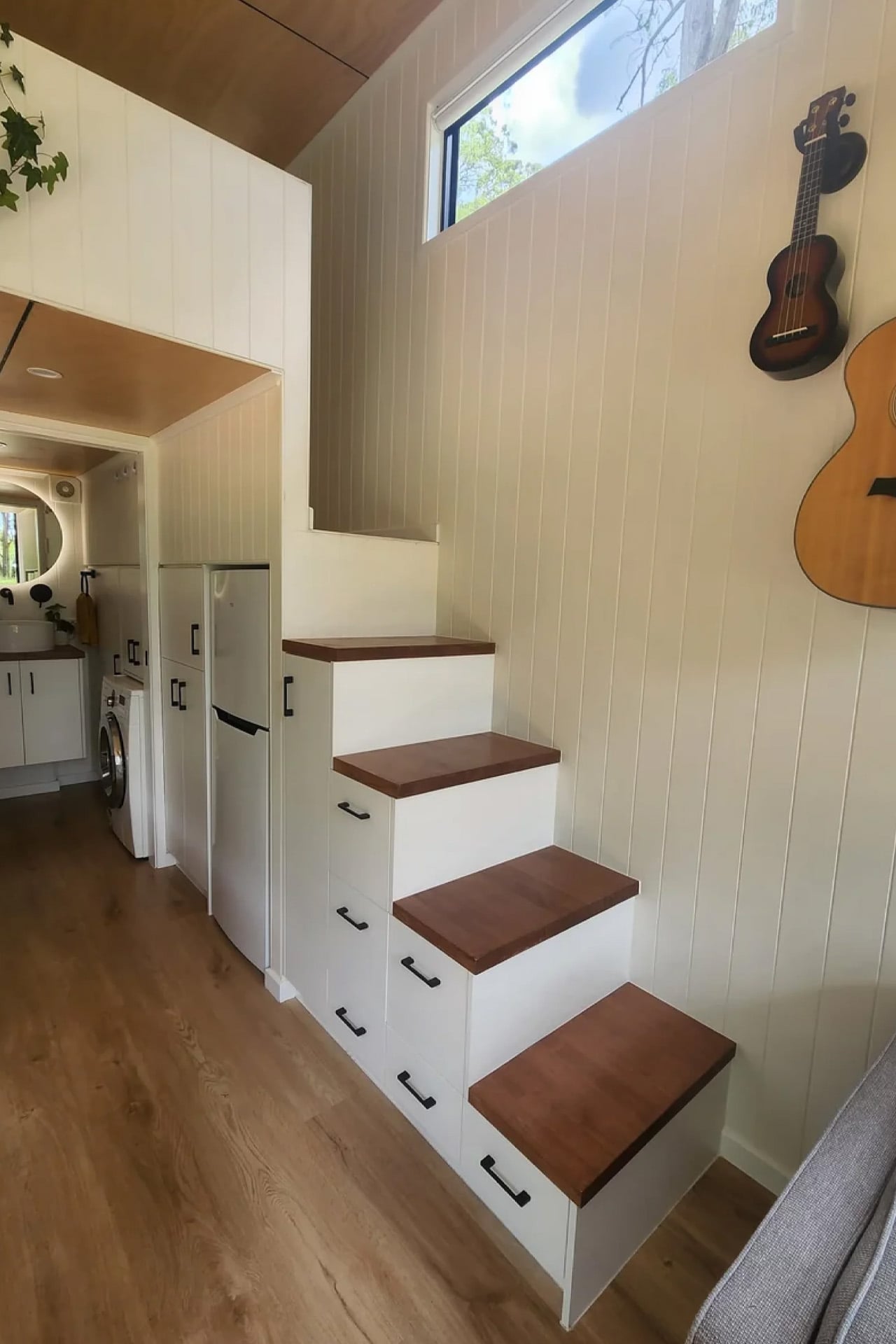
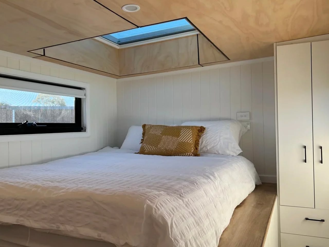
The layout is designed with couples and downsizers in mind. A loft bedroom sits above the living zone, accessed via a standing-height walkway and staircase, the kind of considered detail that separates a well-designed tiny home from a glorified caravan. A skylight overhead floods the sleeping area with natural light, giving the loft an almost meditative quality. Two layout options are available, letting buyers tailor the floor plan to how they actually live, rather than forcing a compromise.

Designer: Removed Tiny Homes

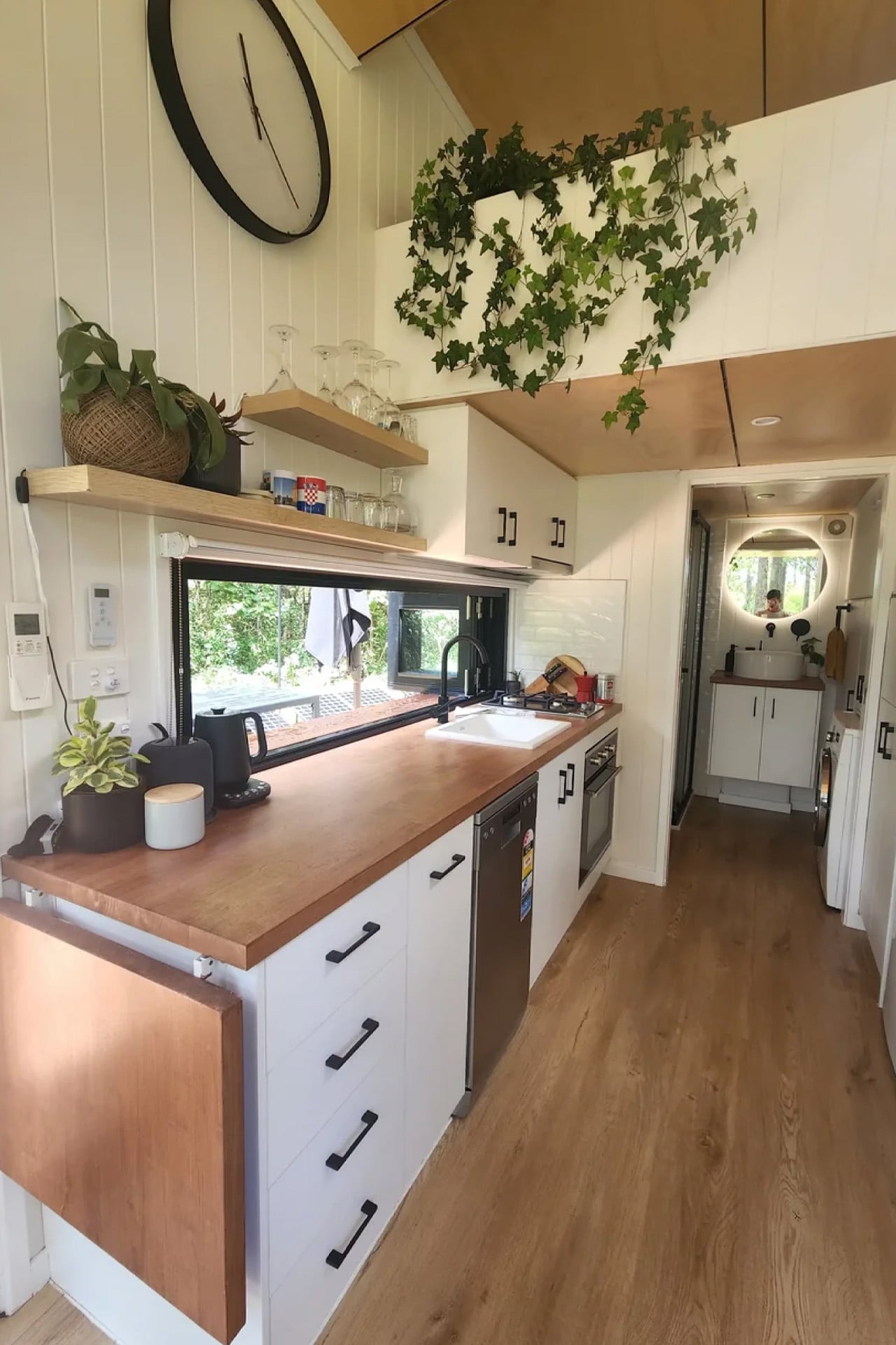
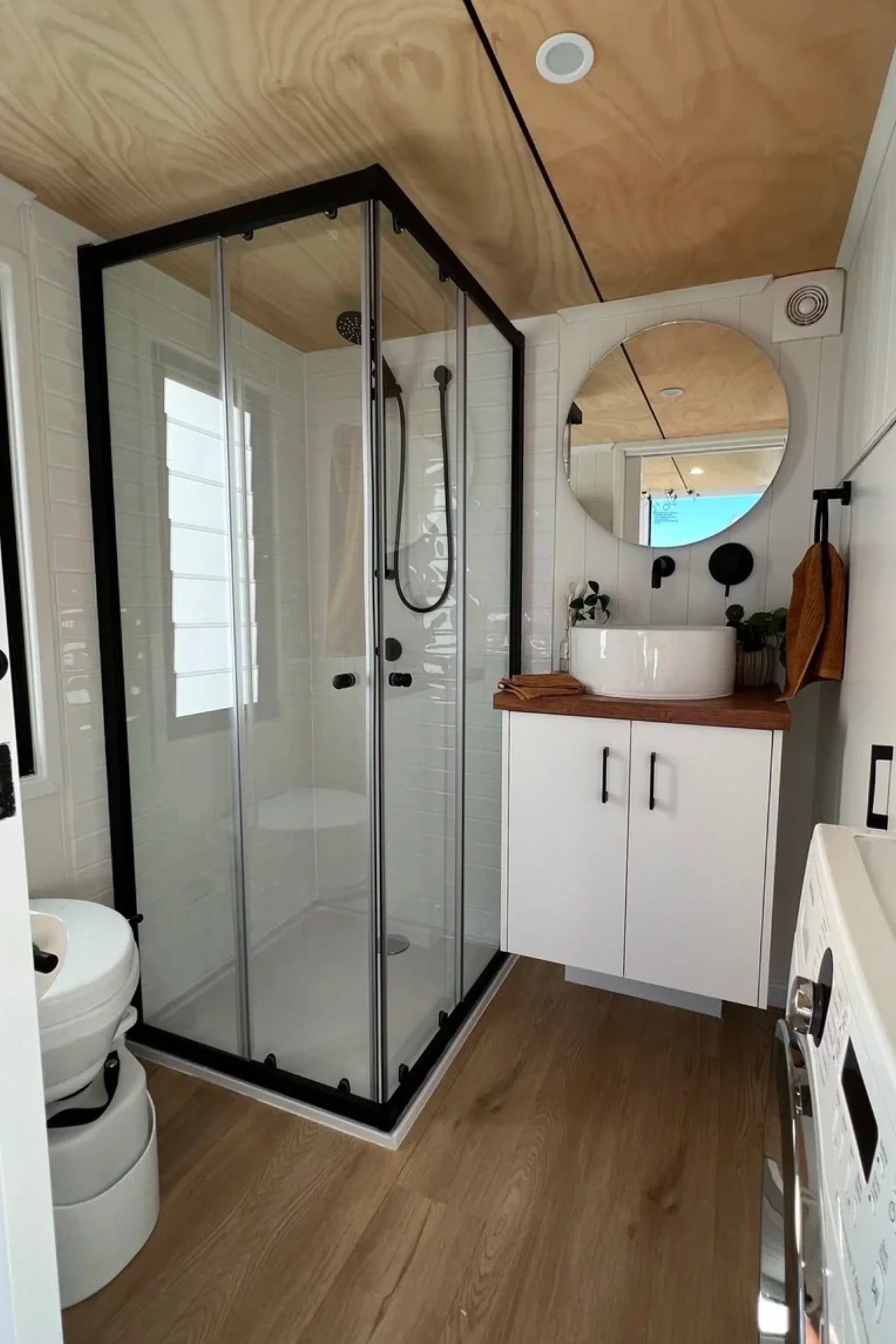
Downstairs, the kitchen takes centre stage. A large picture window anchors the cooking space, framing the outdoors like a piece of art. The interior features VJ panelling customisable in different tones, wood-like vinyl board flooring, and white walls and ceiling set against black windows, a palette that feels calm and resolved without trying too hard. It’s the kind of interior that photographs well, but more importantly, lives well.

Strategically placed expansive windows provide the interior with ample light, making it feel cosy and bright, a critical move in a home this scale, where the relationship between inside and outside does the heavy lifting. Priced from $128,990, the Currumbin sits at the entry point of Removed’s Classic range, yet it doesn’t feel like a starting point. It feels considered from end to end. The brand’s philosophy of building homes that help people “disconnect from the noise” with calm, clarity, and craftsmanship at the core is felt in every decision, from the stair storage to the picture window placement.

The Currumbin’s success has since led Removed to develop the Currumbin 9.6, a 31.4-foot follow-up that moves the bedroom downstairs with a full walkthrough en-suite bathroom, catering to those who’d rather skip the loft entirely. But the original 7.2 remains the sweet spot. Small enough to move, large enough to mean something.

The post This 25sqm Australian Tiny House Feels Anything But Small first appeared on Yanko Design.
Jantzen’s EV Station Turns the Desert’s Worst Feature Into Its Power

Electric vehicles have been gaining ground steadily, but one of the more stubborn problems hasn’t been the cars themselves; it’s been finding somewhere to charge them when you’re far from a city. In a high desert environment, that problem gets considerably more pointed. The open stretch between towns can be long, the heat unforgiving, and the typical charging infrastructure designed with urban convenience in mind rather than remote landscape realities.

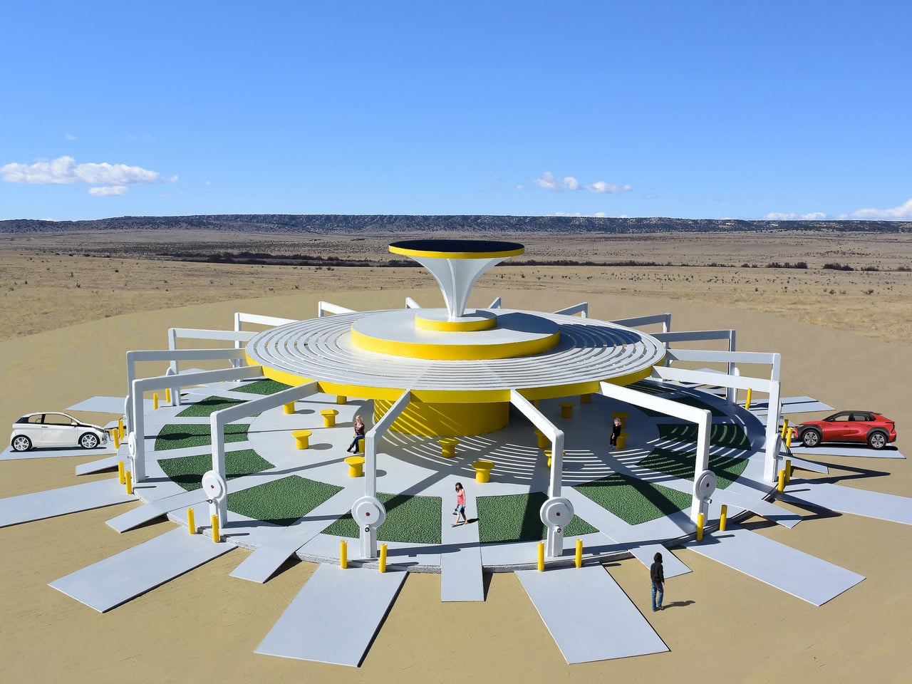
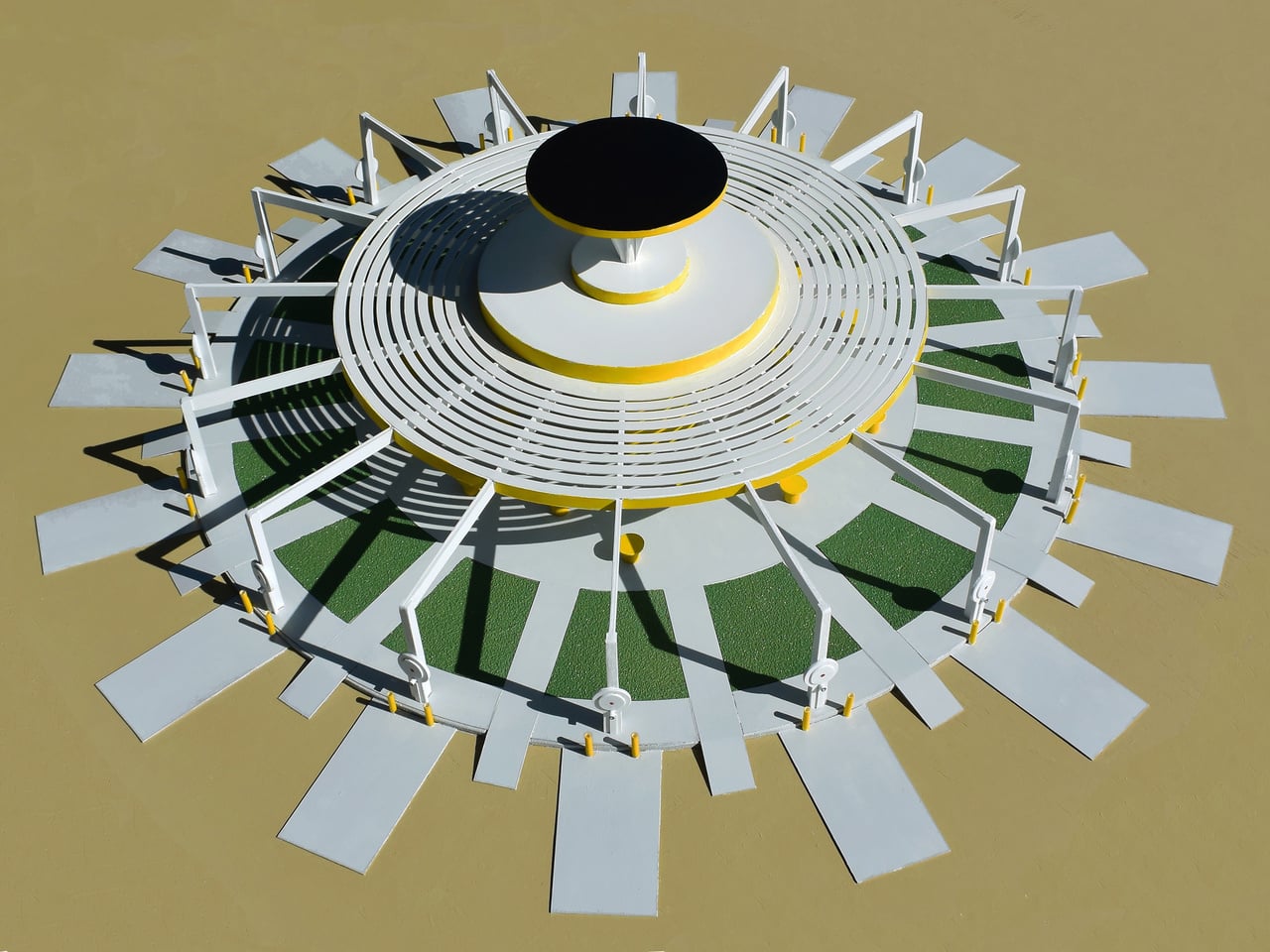
Designer Michael Jantzen, based in Santa Fe, has been exploring exactly this gap with his proposal for the High Desert Charging Station, a large steel solar-powered facility conceived specifically for hot, sunny desert environments. The design doesn’t try to transplant a suburban charging setup into an unfamiliar context. It takes the desert’s most defining characteristic, its relentless sun, as the primary resource.

Designer: Michael Jantzen

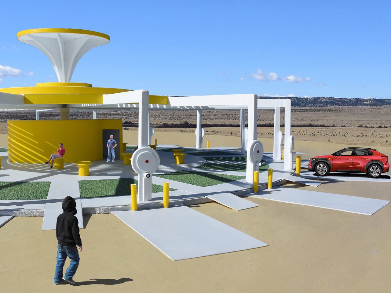
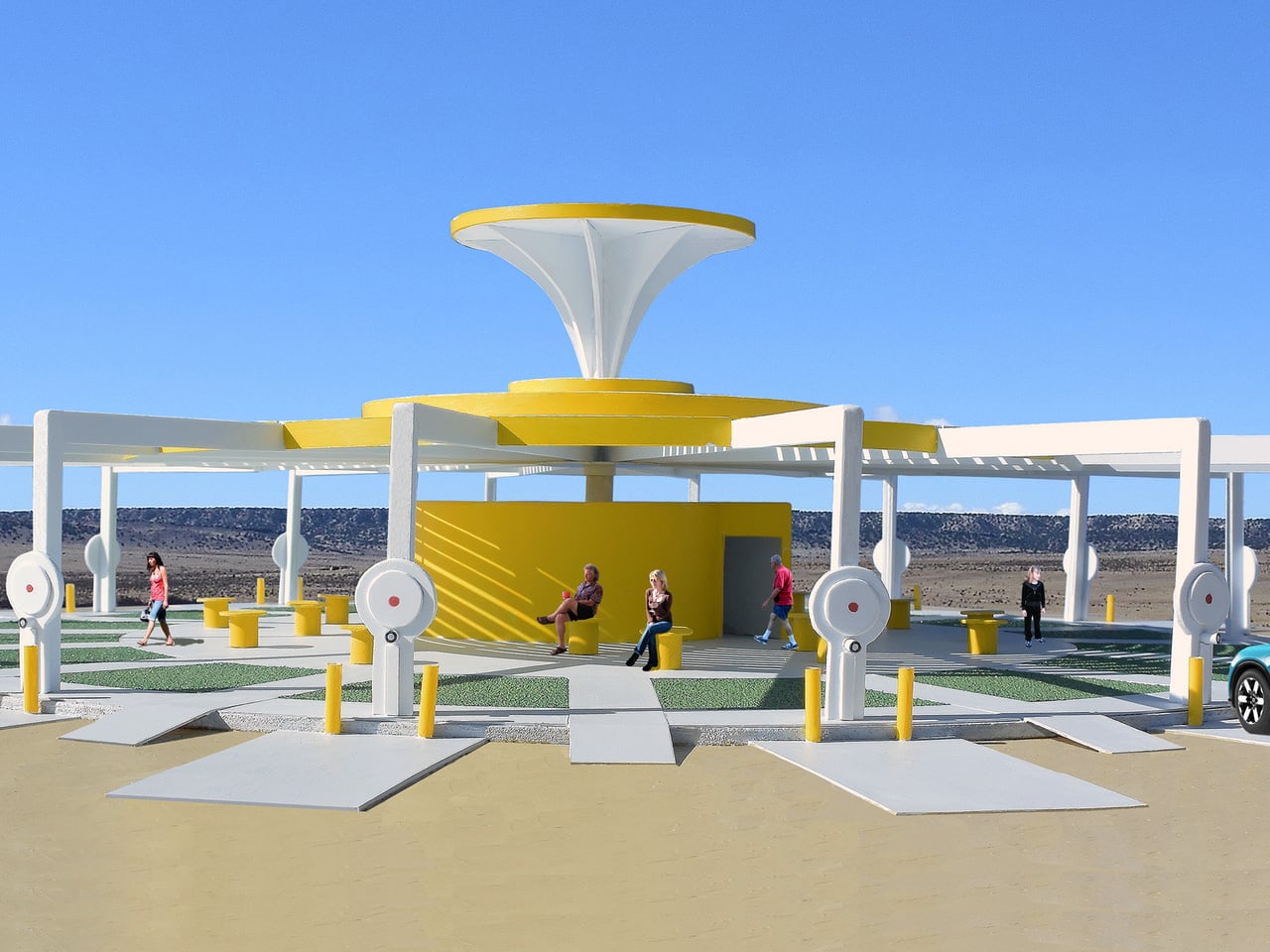
The structure is built around a circular plan, with a large solar panel disc elevated on a tapered central pedestal. Sunlight converts directly into electricity for the vehicles below. When generation exceeds demand, the excess feeds back into the local power grid. When the sun isn’t enough, the grid returns electricity to the station, keeping all 16 charging spots running regardless of conditions.

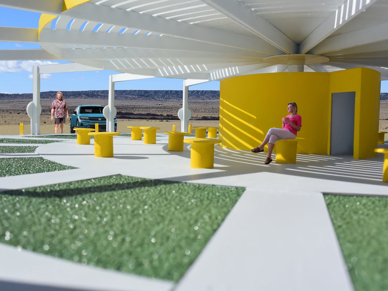
Those 16 spots are arranged symmetrically around the facility’s perimeter, each one marked by a concrete docking pad, a pair of yellow security bumpers, and a dedicated charging pedestal. Walkways connect each spot inward toward the center, threading through alternating patches of synthetic green grass that bring a small but deliberate contrast to the surrounding landscape. It’s a reminder that the design intends to do more than just charge cars.

Jantzen intends the walkways and ground-level layout to feel more like a destination than a service stop. The synthetic grass patches introduce a note of green into an otherwise arid setting, and the circular plan gives the facility a clear sense of orientation. You pull in, follow a path inward, and arrive at a shaded space at the center. The sequence is deliberate.

That’s where the shade canopy comes in. The open steel framework radiates outward from the central core, creating a covered space beneath the solar panel above. Drivers aren’t expected to stand in the open desert heat while their vehicles charge. They can move inside, where yellow cylindrical seats and a restroom built into the central structure make the wait genuinely more comfortable.

The whole thing is conceived as a landmark as much as it is a facility. Jantzen describes the conceptual logic as electricity flowing from the sun, down through the structure, and into the vehicles below, a visible cycle that gives the station a coherent narrative from top to bottom. That kind of intentionality is what separates it from the standard box-and-cable approach that dominates most existing charging infrastructure.

EV adoption in remote and rural areas still lags, in part because the charging infrastructure hasn’t caught up with demand. A proposal like this doesn’t solve that shortfall outright, but it does ask a more useful question than most: not how to transplant an existing model into the desert, but how to let the desert itself dictate what the design becomes.

The post Jantzen’s EV Station Turns the Desert’s Worst Feature Into Its Power first appeared on Yanko Design.
At 130 Sq Ft, This Multifunctional Tiny Home Fits Everything You Actually Need

There’s a philosophy embedded in the Shoji tiny home that goes beyond architecture. “Enjoy, sleep, relax, cook, work, connect, disconnect. Do only what truly matters.” That’s the ethos of Bulgarian firm Koleliba, the award-winning tiny living brand behind one of the most quietly striking small homes to come out of Europe in recent years.

Completed in November 2022 and sited in Brittany, France, the Shoji is Koleliba’s S Tiny model, measuring just 130 sq ft (12 sq m) and stretching only 5.5 meters (18 ft) in length. Designed alongside architect Hristina Hristova, the home sits on a double-axle trailer, making it fully mobile without sacrificing an ounce of intention. The name itself is a nod to the Japanese aesthetic: clean lines, natural materials, and a deep respect for negative space.

Designer: Koleliba

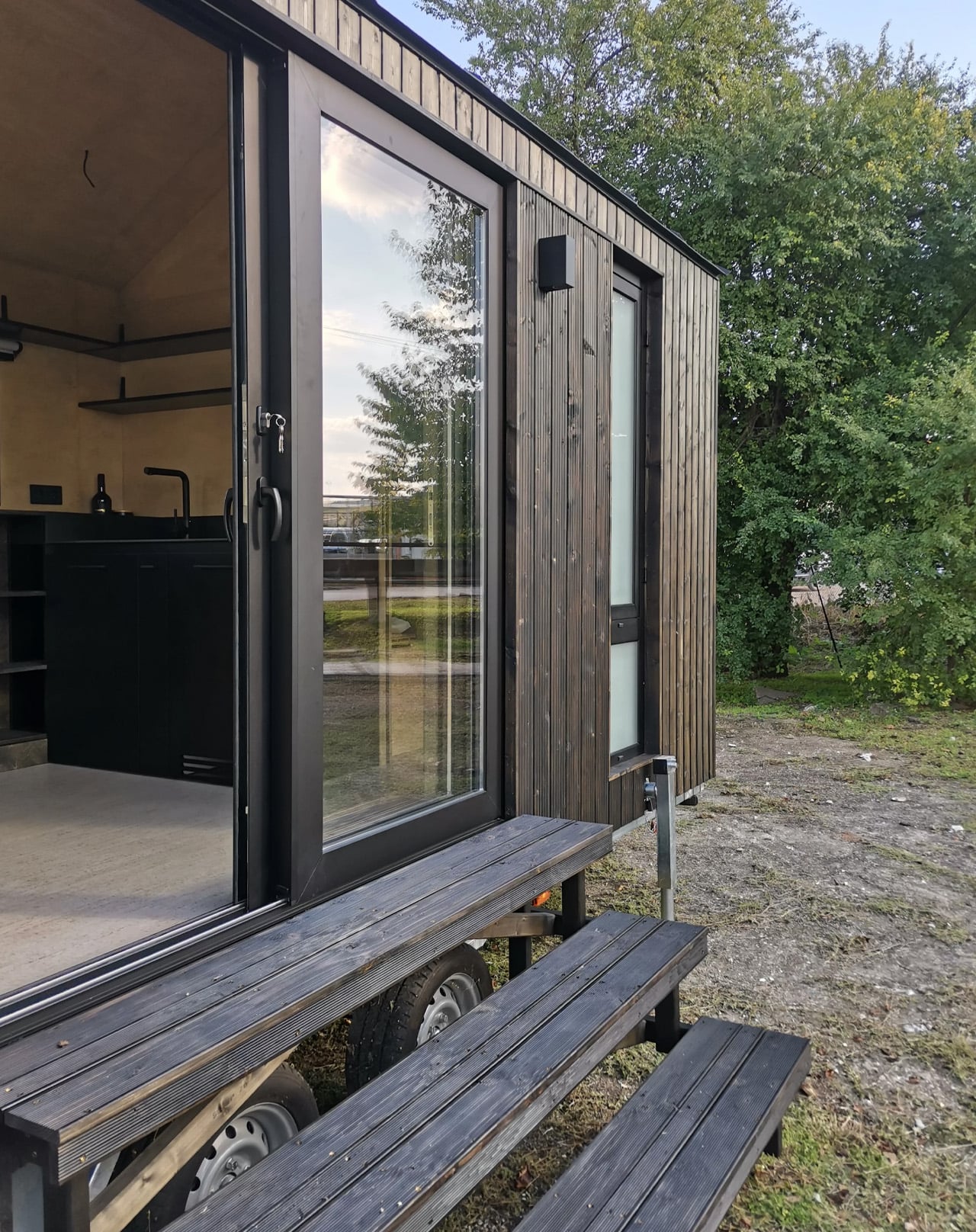
From the outside, the Shoji is finished in vertical timber siding topped with a metal roof, punctuated by expansive windows and sliding glass doors that dissolve the boundary between inside and out. It’s the kind of exterior that looks equally at home in a forest clearing or a countryside field, modest at first glance but considered in every detail.

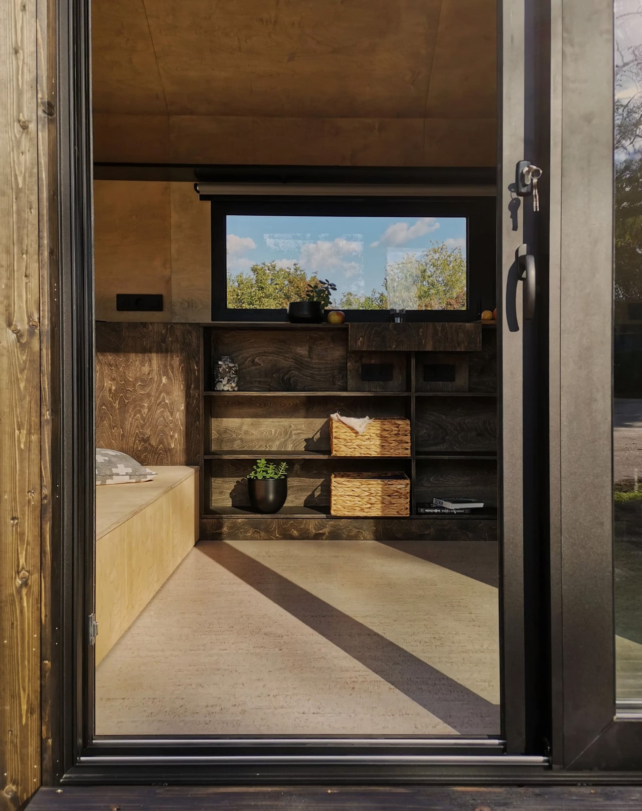
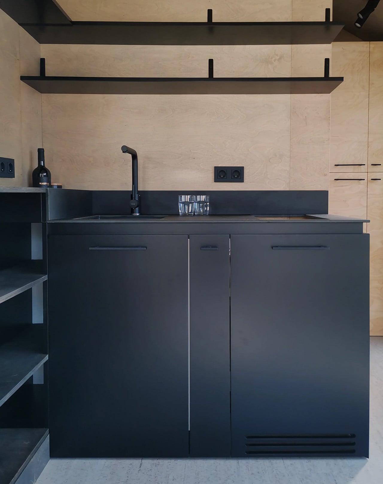
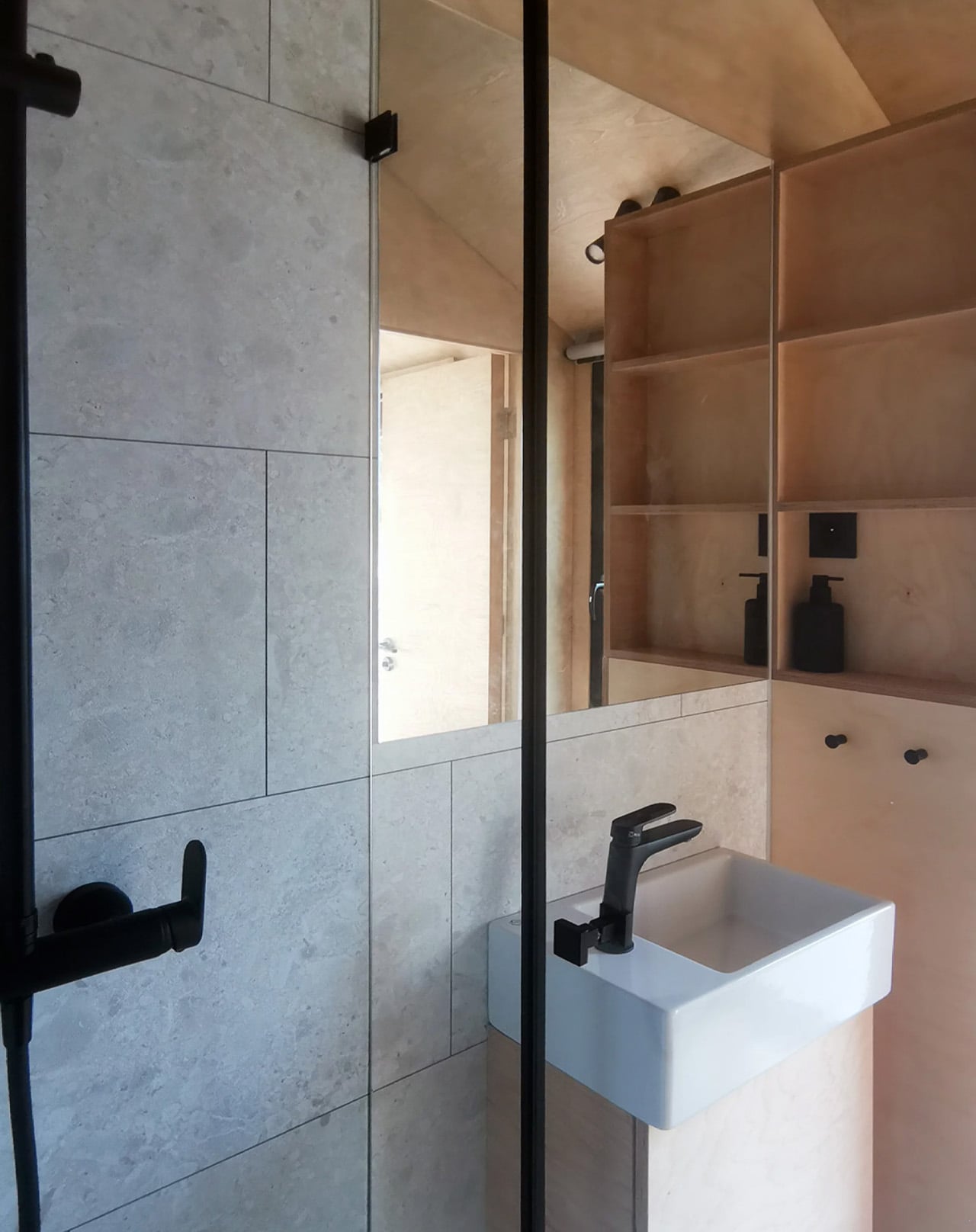
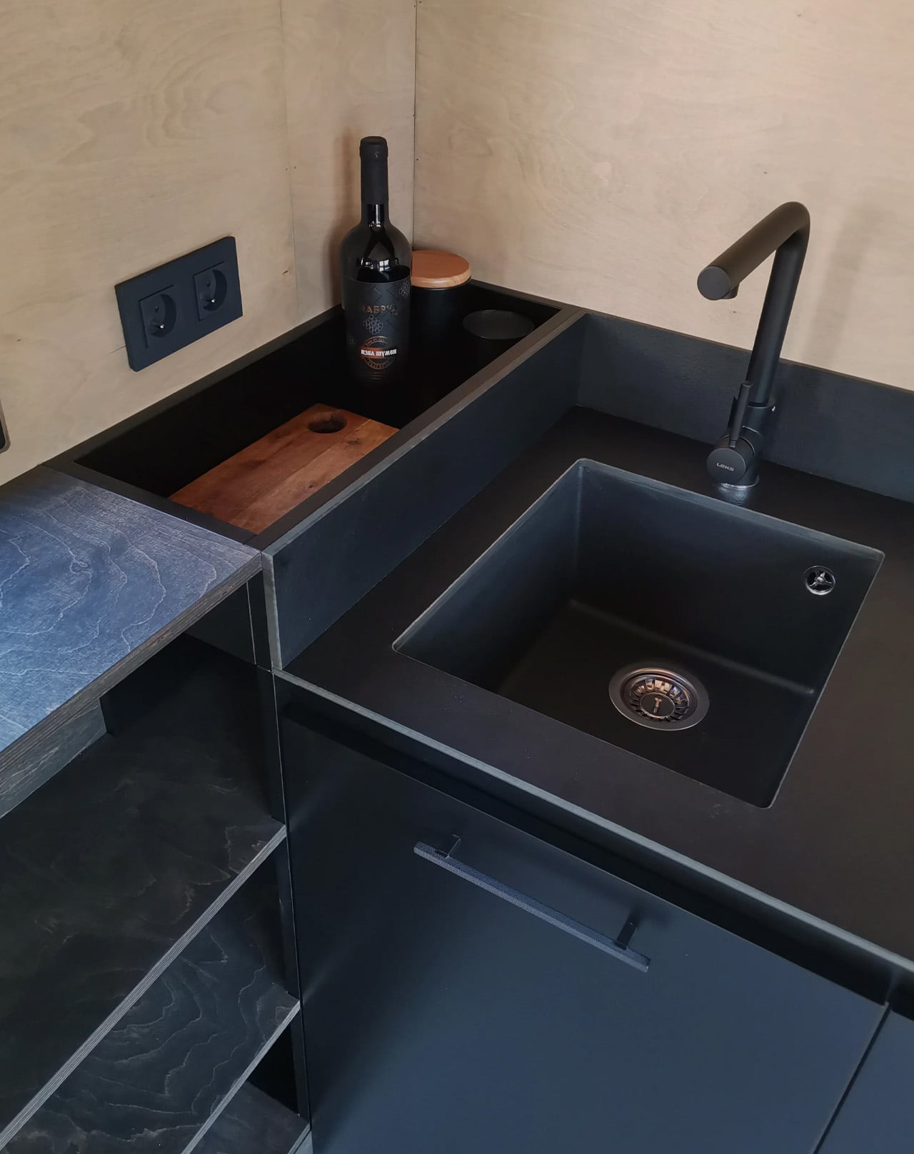
Step inside, and the birch plywood interior wraps the space in warmth. One of Koleliba’s defining signatures is designing furniture as a seamless continuation of the interior itself, so the Shoji never feels like a box stuffed with objects. A U-shaped couch converts into a queen-size bed. There’s a dedicated home office desk, essential kitchen appliances, a washing machine, and a roomy shower, all packed into a footprint that defies logic. Electric floor heating and solid winter insulation mean the home is genuinely livable year-round, not just a warm-weather escape.

A full-length black floating shelf runs the length of one wall, the kind of detail that could easily overwhelm a small space but instead anchors it, giving the interior a gallery-like calm. Everything here feels deliberate, placed without excess. The Shoji’s owner, Jonathan Guennoc, put it best: “Our SHOJI home is the most spacious not spacious space.” That contradiction is exactly the point. Koleliba didn’t design a house with things left out. They designed a home where nothing is missing.

The Shoji has since inspired a follow-up, the Shoji 2, building on the original with improved features and a lighter design. But the original remains a benchmark, proof that at 130 square feet, the right design doesn’t ask you to compromise. It asks you to reconsider what you actually need.
The post At 130 Sq Ft, This Multifunctional Tiny Home Fits Everything You Actually Need first appeared on Yanko Design.