Cheap knives and great knives can share a steel type, a similar price bracket, and even a similar silhouette, yet one gets carried every day for years while the other sits in a drawer after a month. The difference rarely comes down to one dramatic failure. It comes down to five small decisions that most buyers never learn to check for, decisions about lock geometry, screw heads, pivot bearings, dimensional proportion, and low-light findability. Spend enough time with a stack of 2026 releases side by side and the pattern gets impossible to unsee.
I spent the better part of last week breaking down those five decisions using five knives currently earning their keep in pockets around the EDC community, each one chosen because it executes a single detail without compromise. None of these are the flashiest releases of the year, and none needed to be. What ties them together is a kind of restraint, the willingness to spend real machining time and material cost on a part of the knife most buyers never think to inspect. A locking mechanism gets tuned for years of one-handed use rather than a flashy debut video. A screw gets sized and disclosed rather than hidden behind a proprietary driver. That restraint is expensive to execute and easy to skip, which is exactly why so few knives manage all five at once.
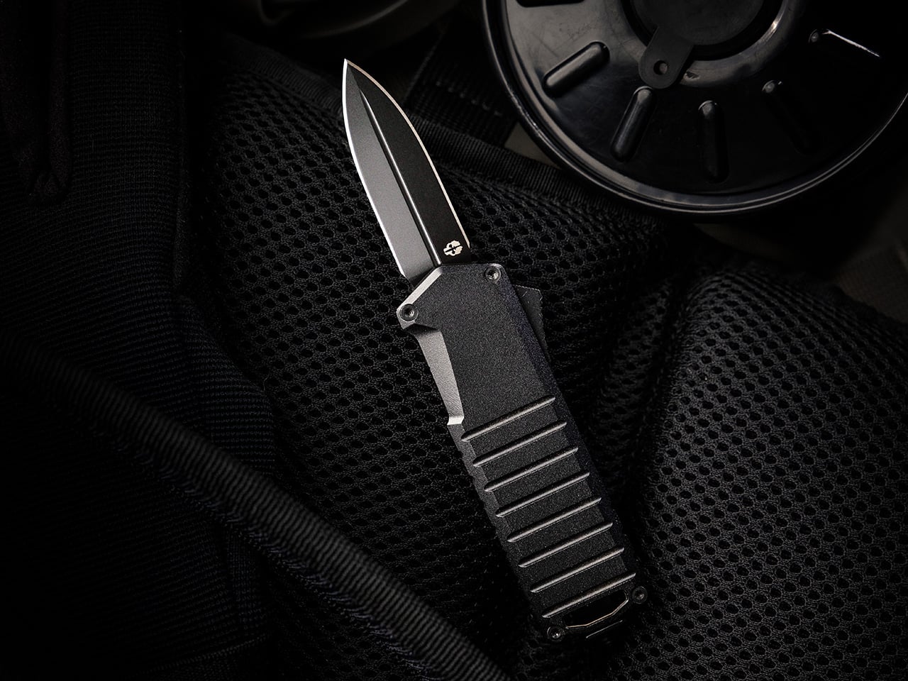
1. The Lock: Why Button and Crossbar Mechanisms Made the Liner Lock Feel Dated
Liner locks and frame locks have one quiet flaw nobody talks about until they’ve sliced a thumb pad on a fast close. To fold the blade back down, your fingers have to reach across its path and nudge the lock out of the way, which is fine ninety nine times out of a hundred and a genuine hazard on the hundredth. Button locks and crossbar locks solve this by moving the release off the blade’s line entirely. Press a button or pull a bar mounted on the spine, and the blade drops shut without your fingers ever crossing the edge. It sounds like a minor ergonomic tweak until you realize it’s the same logic that made Benchmade’s AXIS lock a cult favorite for two decades, just freed up for everyone else to build on now that the patent has expired. That single expiration is why crossbar and button locks have exploded across mid-tier knives in the last two years, and why a lock type that used to signal premium exclusivity now signals a maker who’s simply paying attention.
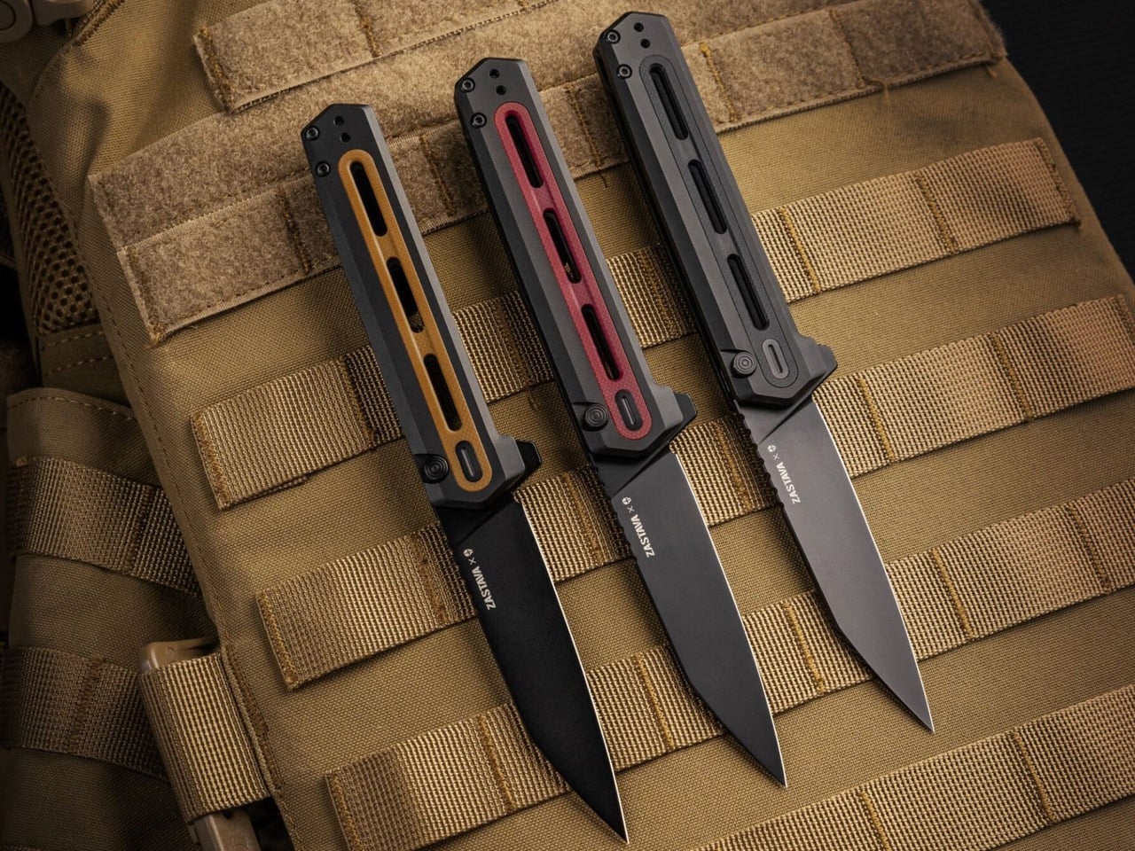
Tekto’s F4 Echo, a collaboration with Zastava Arms USA that leans hard into the gunmaker’s rifle heritage, runs exactly this kind of button lock, and it’s tuned well enough to matter. Press the button and the CPM S35VN blade drops free with none of the mushy half-engagement that plagues cheaper button locks, then a flick of the flipper tab snaps it back open with the same crisp confidence. Closing it is a one-handed motion, thumb on the button, palm rolling the spine shut, no crossed fingers anywhere near the reverse tanto edge. It’s a satisfying click too, the kind that turns into an idle fidget habit whether there’s anything to cut or not. At $199.99 it isn’t chasing budget-tier button locks racing to the bottom on price. It’s proof the mechanism has fully arrived at the mid-tier, executed with a materials upgrade to match, and Tekto clearly built it for people who’ll notice the difference immediately.
Click Here to Buy Now: $170 $199.99 (15% off with code YANKO). Hurry, deal ends in 48-hours! Free FedEx 2Day shipping within the USA.
2. The Pivot: Why Ceramic Bearings Turned Washers Into a Warning Sign
Pull apart any budget folding knife from a decade ago and you’ll almost always find phosphor bronze or Teflon washers wrapped around the pivot, a setup that works fine until grit, lint, or a humid afternoon gets between the layers. Washers rely on flat surface contact, so any contamination turns a smooth flip into a gritty drag that needs a hard wrist snap to force open. Ceramic bearings solve this by replacing that flat contact with a caged ring of hardened balls that roll instead of scrape, cutting friction dramatically and staying consistent even when the knife is dirty. They also can’t rust the way steel bearings eventually do, so a knife that’s been caught in the rain still deploys glassy smooth a year later. This used to be the detail separating a $50 knife from a $300 one, and in 2026 that gap has mostly closed. Once ceramic bearings became cheap to source and simple to cage correctly, there was no honest excuse left for a stiff pivot at any price.
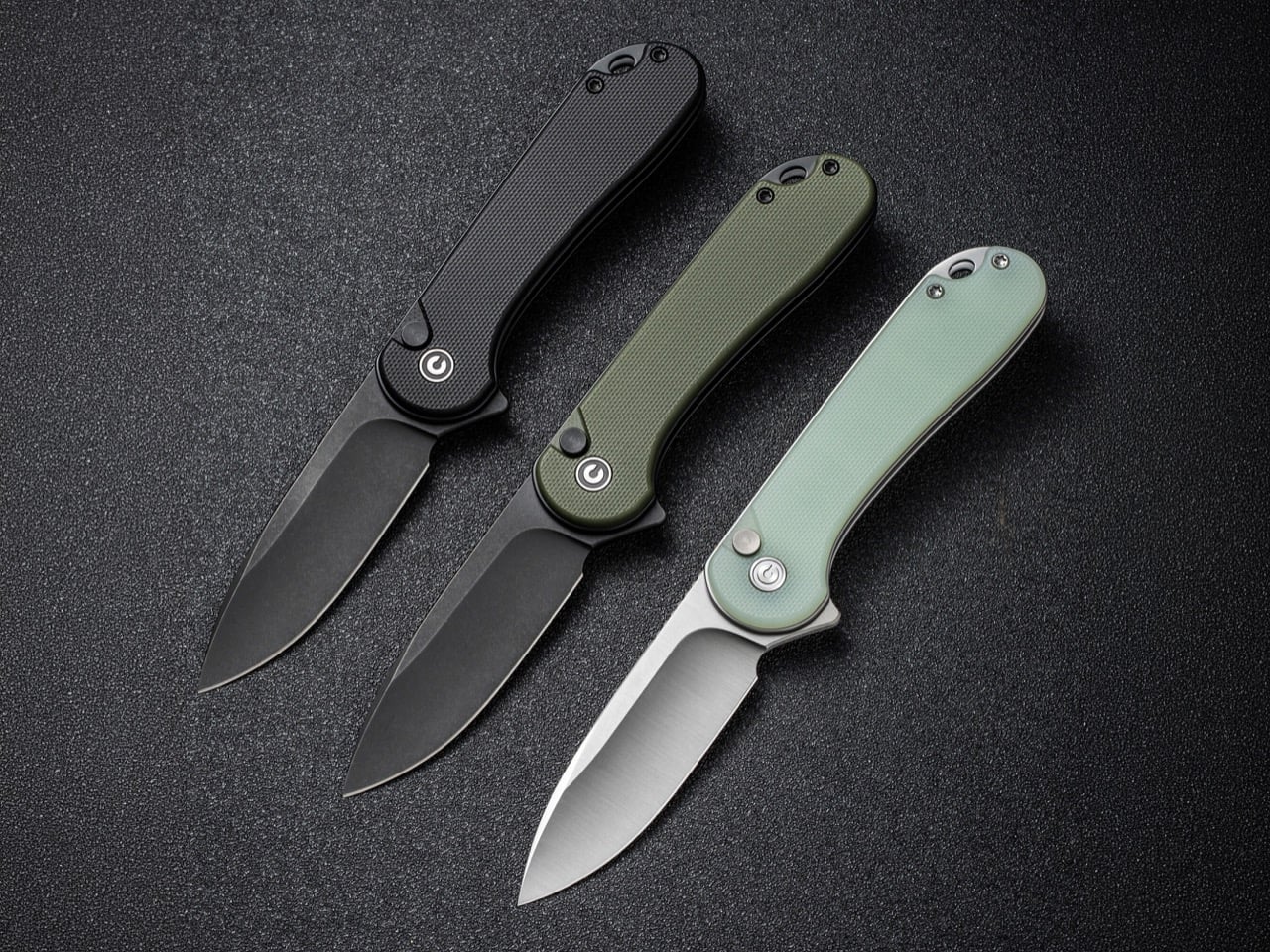
Civivi’s Elementum earned its reputation as the reset button for budget EDC largely by being one of the first sub-$50 folders to ditch washers for a caged ceramic ball bearing pivot outright. The Elementum II carries that same pivot forward while adding a tuned button lock, and the bearing underneath does most of the work on how the knife actually feels in hand. Flick it open and it glides with none of the initial stiffness a washer knife needs to work through, and the closing motion rides that identical smooth pivot rather than some separate mechanism bolted on for the button. At 2.96 inches of Nitro-V steel and under $100 across most configurations, it’s proof the bearing upgrade never had to live exclusively at the premium end of the market. Civivi more or less forced the rest of the budget category to either match that pivot or explain why they hadn’t.
3. The Glow: Why Tritium Slots Separate Findability From Decoration
Tritium vials are sealed glass tubes filled with a radioactive gas that emits a faint, self-powered glow for roughly 25 years with no batteries and no charging required, and EDC makers have been drilling slots for them since around 2020. Plenty of that early adoption was pure theater, vials tucked into handle scales where your palm covers the glow the moment you pick the knife up, or embedded on a blade spine where they serve no purpose beyond looking tactical in a product photo. A well-placed slot solves an actual problem instead. Drop a knife in a dark bag, a glove box, or beside a bed at 2am, and a tritium vial is the difference between patting around blind and spotting a faint green dot exactly where you left it. Vials run $15 to $40 each, so a maker adding two of them made a deliberate call. Decoration gets bolted on wherever there’s leftover space, while findability gets placed exactly where your eye needs to land first.
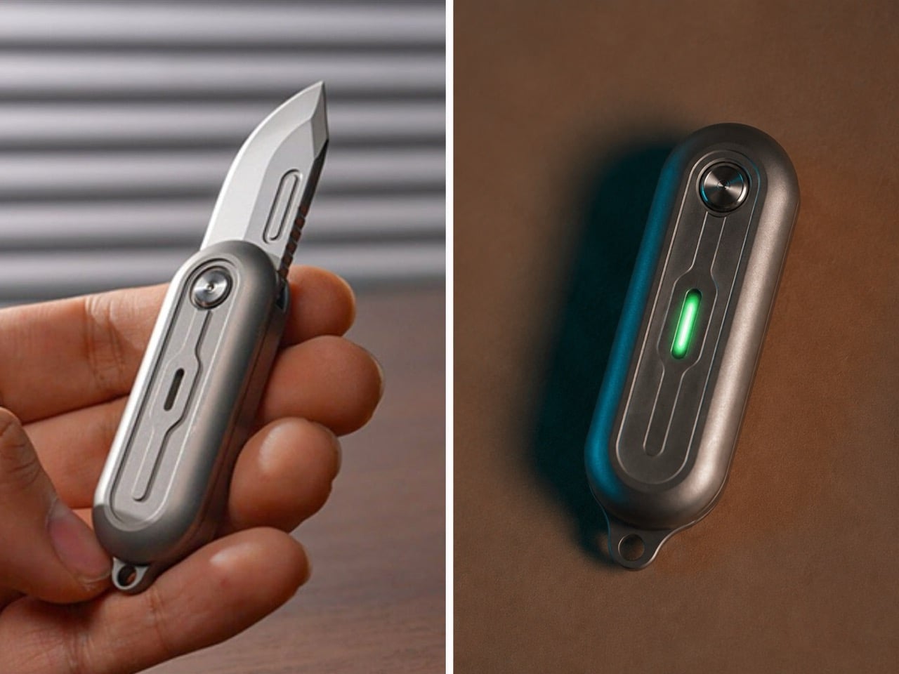
TiNova II puts that logic to its intended use. The two tritium slots sit on the flat faces of its Grade 5 titanium scales, and depending on the finish, you get either raw sandblasted titanium letting the glow read plainly or a black-coated version that makes those same vials do most of the visual work in a dark pocket or bag. At 2.54 inches closed and just 59.3 grams, this is a knife built for keychain duty first, exactly the kind of small object that goes missing in a junk drawer or backpack pocket without a locator built in. The D2 steel blade deploys with a 360 degree spin off a ball bearing pivot, more fidget toy than tactical folder, but the tritium slots keep it from being purely a novelty. It’s a genuinely small detail on a genuinely small knife, and it’s exactly the kind of detail that separates a maker thinking about how the object gets used at night from one just checking a spec sheet box.
4. The Footprint: Why 8 Inches Became the Serious EDC’s Sweet Spot
EDC has spent the better part of a decade chasing extremes in either direction, keychain folders under 4 inches closed competing with hard-use tank knives pushing past 9 inches open, both categories treating size as the headline spec. Somewhere in the middle sits a range most serious knives have quietly converged on, an overall open length around 8 to 8.3 inches paired with a blade close to 3.5 inches. That proportion isn’t an accident or a coincidence across brands. It’s large enough to give a full four-finger grip real purchase on the handle, yet compact enough to disappear into a front pocket without printing through the fabric or announcing itself in a waistband. The blade length lands right at the edge most carry jurisdictions still consider reasonable, long enough for food prep, package handling, and cordage work without crossing into knife-you-have-to-explain territory. Novelty chases a headline number. Dimensional maturity chases the number that actually gets carried every day.
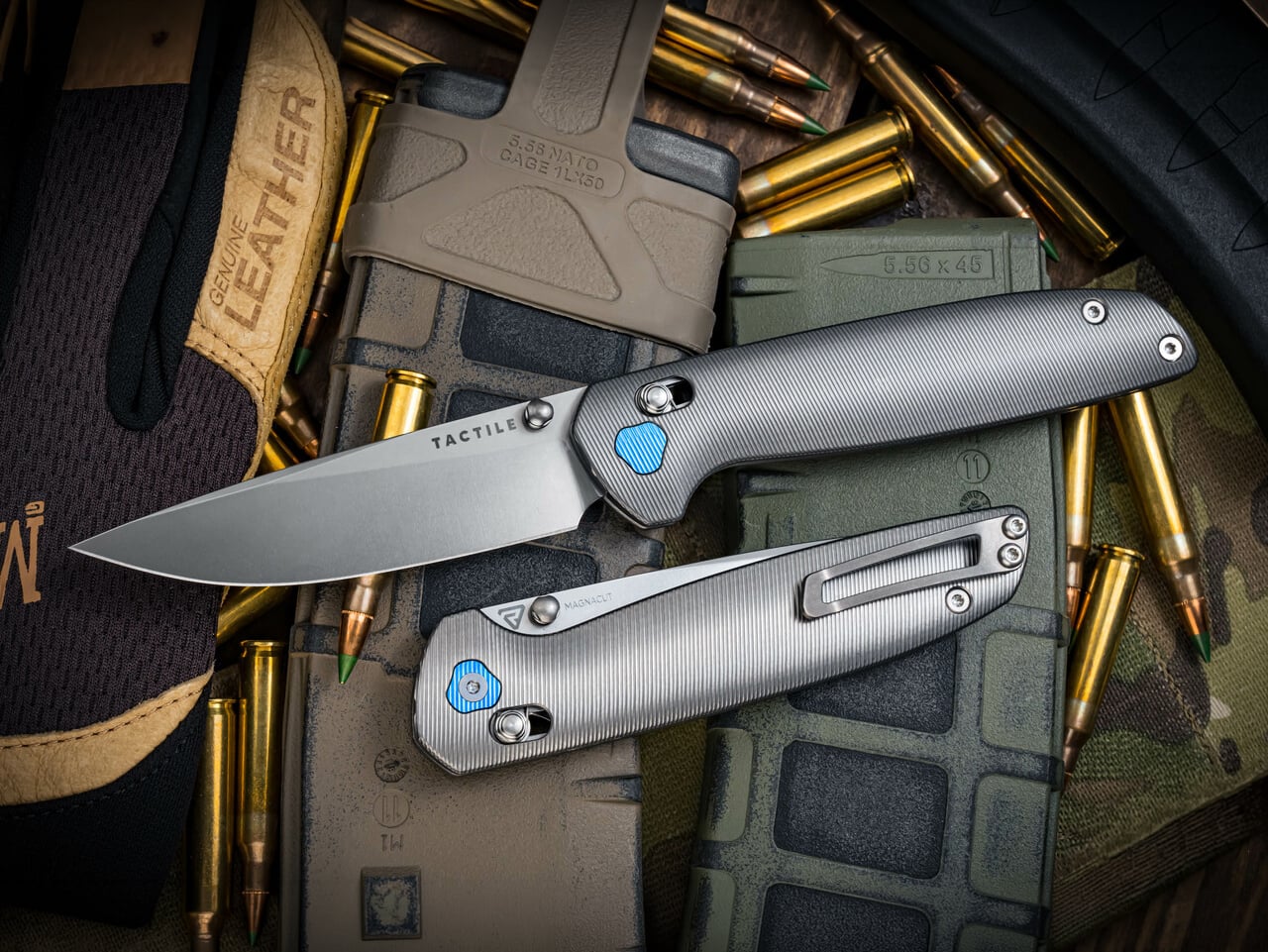
Tactile Knife Co.’s Maverick sits almost exactly on that mark, running 8.18 inches open with a 4.7 inch closed length and a 3.5 inch CPM MagnaCut blade that splits the difference between edge retention and rust resistance better than almost anything at this price. Richard Rogers designed the knife’s tri-lobe handle shape specifically to fill a full-size hand without adding bulk, and the crossbar lock keeps the release off the blade’s path the same way the better button locks do, so drawing and closing it one-handed never feels like a negotiation. At 3.9 ounces in titanium, it carries with enough presence to feel substantial without dragging a pocket down, which is the entire argument for this dimensional range in one knife. Tactile built it in Dallas alongside its better-known pen line, and the proportions read like a team that already understood exactly where the size ceiling for daily carry actually sits.
5. The Fastener: Why Torx Screws Signal a Maker That Expects You to Stick Around
A screw head sounds like the last thing worth judging a knife on, but it quietly tells you how a maker feels about your relationship with the tool over the next decade. Torx resists cam-out under torque, distributes pressure evenly across the star pattern, and doesn’t strip the way a Phillips head does after the third disassembly. Cheaper knives lean on Phillips because the drivers are everywhere, or worse, they use a proprietary bit tucked into a tiny plastic bag that gets lost within a month, quietly forcing you back to the store when the pivot finally needs a clean. The real tell in 2026 isn’t whether a knife uses Torx at all, since most premium builds do by now. It’s whether the maker actually tells you the size. A listed T6 or T8 is an invitation to keep the knife running for years. A vague “tool included” is a maker who’s already planning for you to lose it and buy another knife instead.
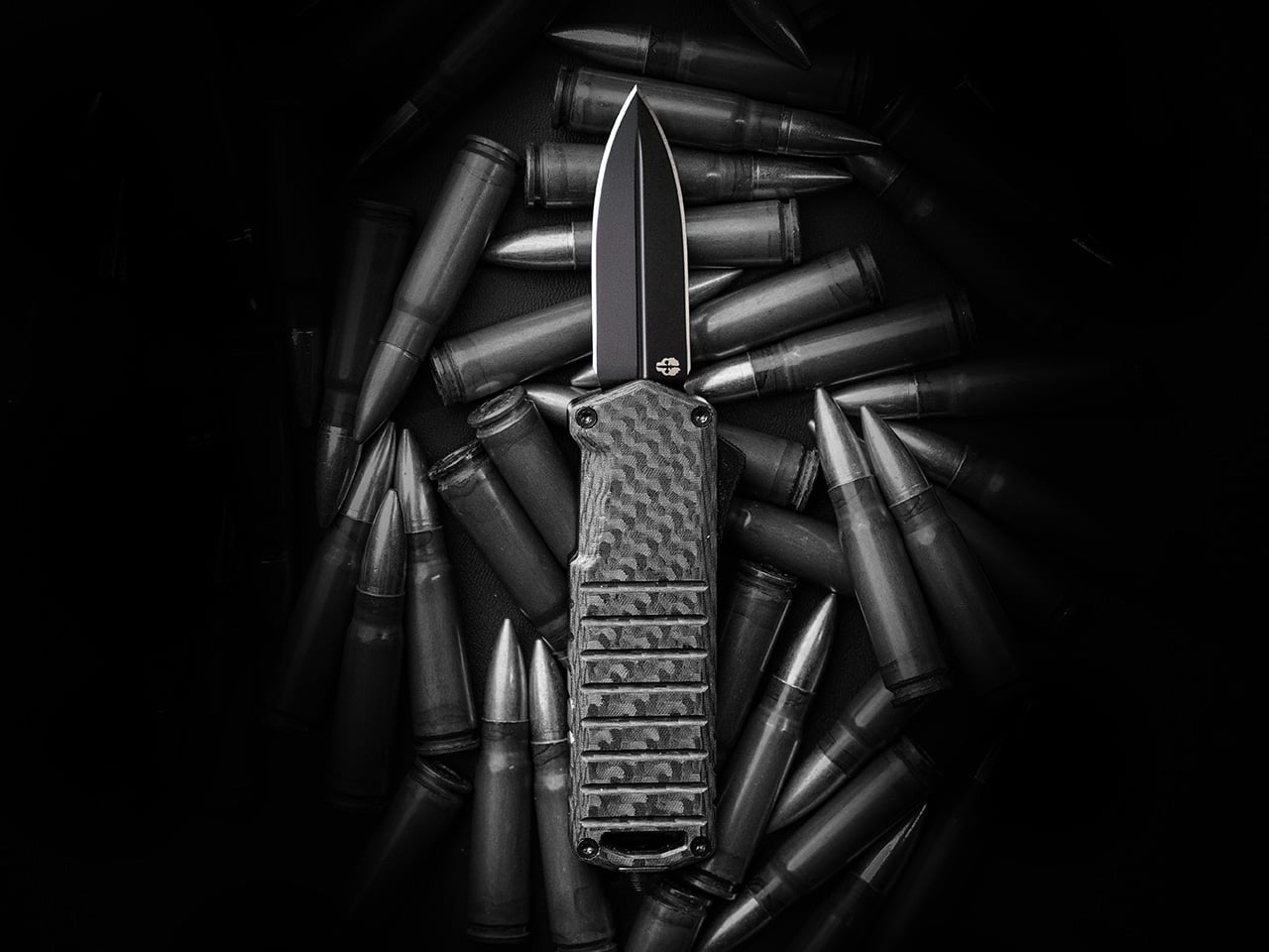
Tekto builds the A2 Badger around that same philosophy, running Torx head screws visible on all four corners of the chamfered aluminum handle rather than hiding the hardware or pressing it in permanently. That transparency matters more than usual here, since the Badger is an OTF, a mechanism with more moving parts than a standard folder and one that benefits from an owner who’s actually willing to open it up and relube the slide over time. At 2.18 ounces with a titanium coated D2 blade under two inches, the Badger was built specifically to slip past the length restrictions that plague OTF knives in restrictive states, and Tekto backs that engineering with a full warranty against material or manufacturing defects. Standard Torx hardware on every corner means an owner can actually service the thing rather than just carry it until something inside finally gives out. It’s a small, unglamorous decision, and it’s exactly the kind that separates a knife built to last from one built to sell once.
Click Here to Buy Now: $119 $139.99 (15% off). Hurry, deal ends in 48-hours! Free FedEx 2Day shipping within the USA.
The post The 5 Details Every Great EDC Design Shares in 2026 first appeared on Yanko Design.