The Children’s Bed Adults Keep Wishing Came in Their Size

Most children’s furniture falls into one of two camps: purely practical pieces that look like they belong in a hospital ward, or aggressively themed designs slathered in cartoon characters that parents quietly regret within a year. Gaudutė Žilytė, a product designer based in Vilnius, Lithuania, had no patience for either when she created the SAULUTĖ bed, and the result is the kind of children’s furniture that adults actually covet.

The name nods to Saulė, the Baltic sun goddess and one of the most enduring symbols in Lithuanian folk culture, representing life, warmth, and protection. It’s an apt reference for a bed designed with a child’s comfort and safety at its center, though what makes SAULUTĖ remarkable is that it earns that reference without leaning on it. The design does the heavy lifting.

Designer: Gaudutė Žilytė
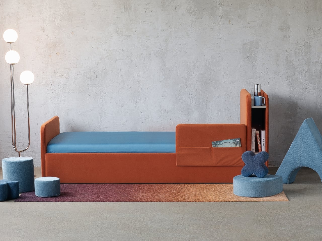
The first thing you notice is the color. A rich terracotta orange upholstery wraps the entire frame, paired with a cooler blue mattress surface that creates a contrast that feels deliberately considered rather than randomly cheerful. It reads warm without being sugary. The palette is one of those design decisions that ages well, which matters a lot when you’re buying furniture for a child who will spend most of a decade in the same room.
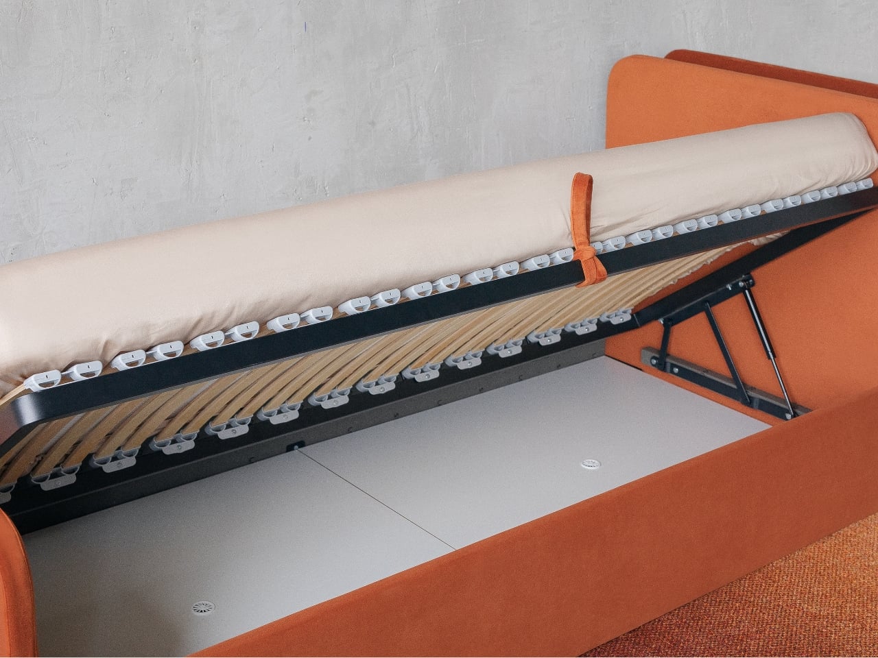
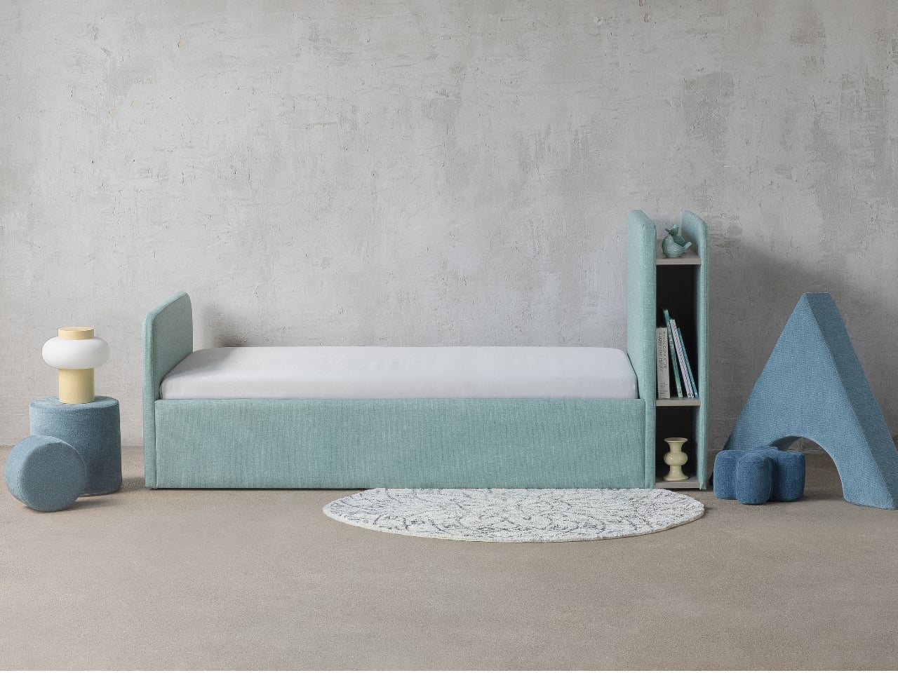
The silhouette is low and grounded, almost daybed-like in its proportions, giving the piece a visual lightness that typical beds don’t have. The overall form is soft and rounded at the edges, a shape that reads as playful without resorting to novelty. Žilytė describes the design as playful and minimalist, and that combination is harder to pull off than it sounds. Minimalism has a tendency to go cold. Playfulness has a tendency to go chaotic. SAULUTĖ sits neatly at the intersection of both without tipping into either.
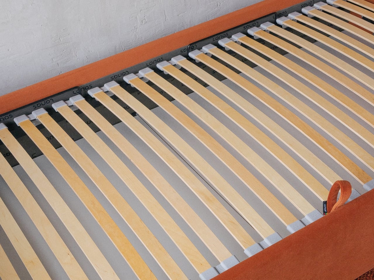
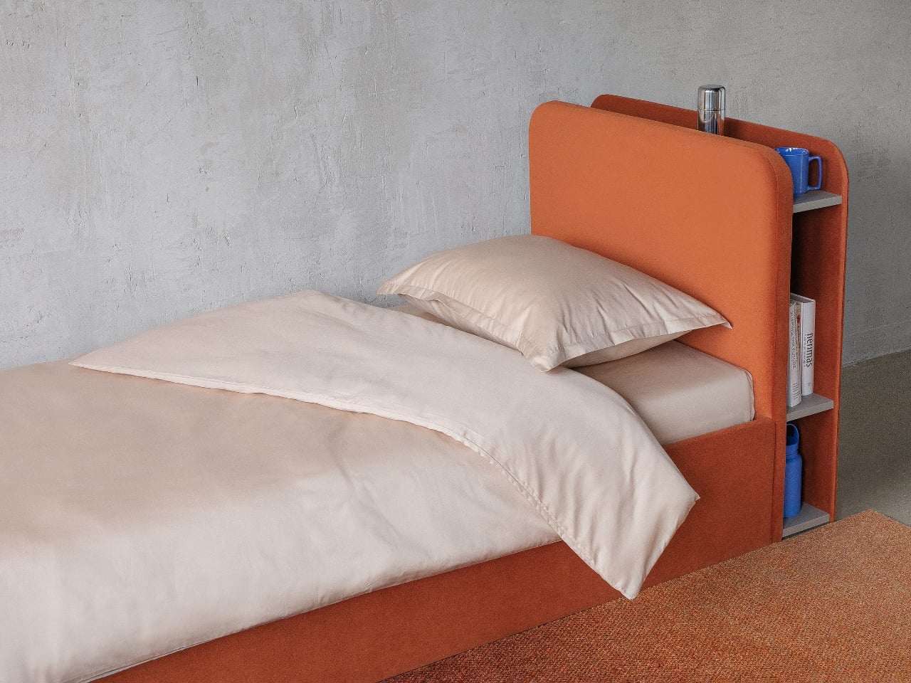
The real intelligence, though, is in the functionality. A built-in shelf sits integrated into the headboard, designed to hold books, a nightlight, or whatever small objects make a child’s bedtime feel like theirs. This is not a decorative gesture. It replaces the need for a separate nightstand in rooms where space is almost always limited, and it keeps the essentials within arm’s reach without cluttering the floor. In a child’s room, that kind of spatial thinking matters enormously.
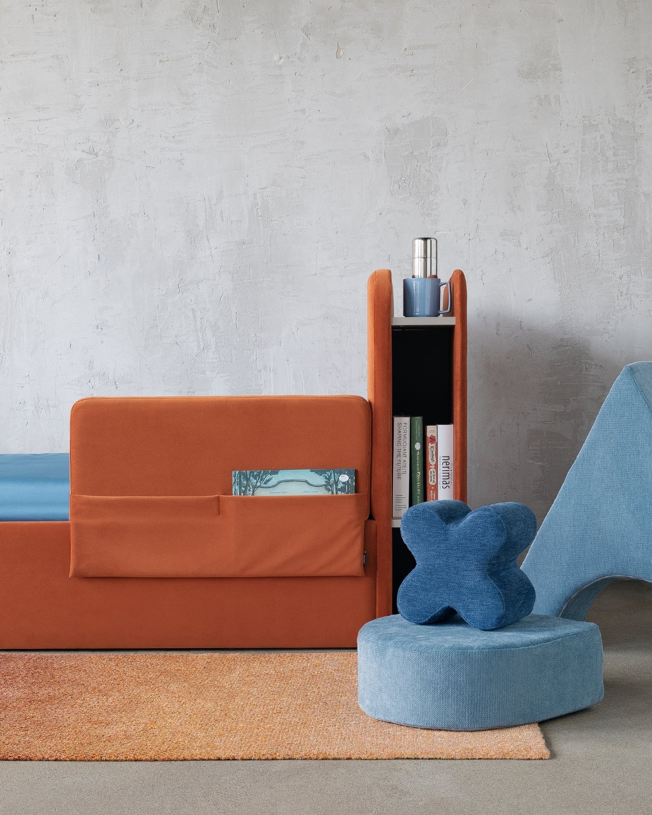
Then there’s the protective side wall, a guardrail built into the design that keeps younger children safe during sleep without looking institutional or industrial. A lot of safety additions to children’s furniture read as afterthoughts, bolted-on solutions that disrupt the visual integrity of the piece. Here, the guardrail is absorbed into the overall form. It looks like it belongs. It looks like it was always supposed to be there.
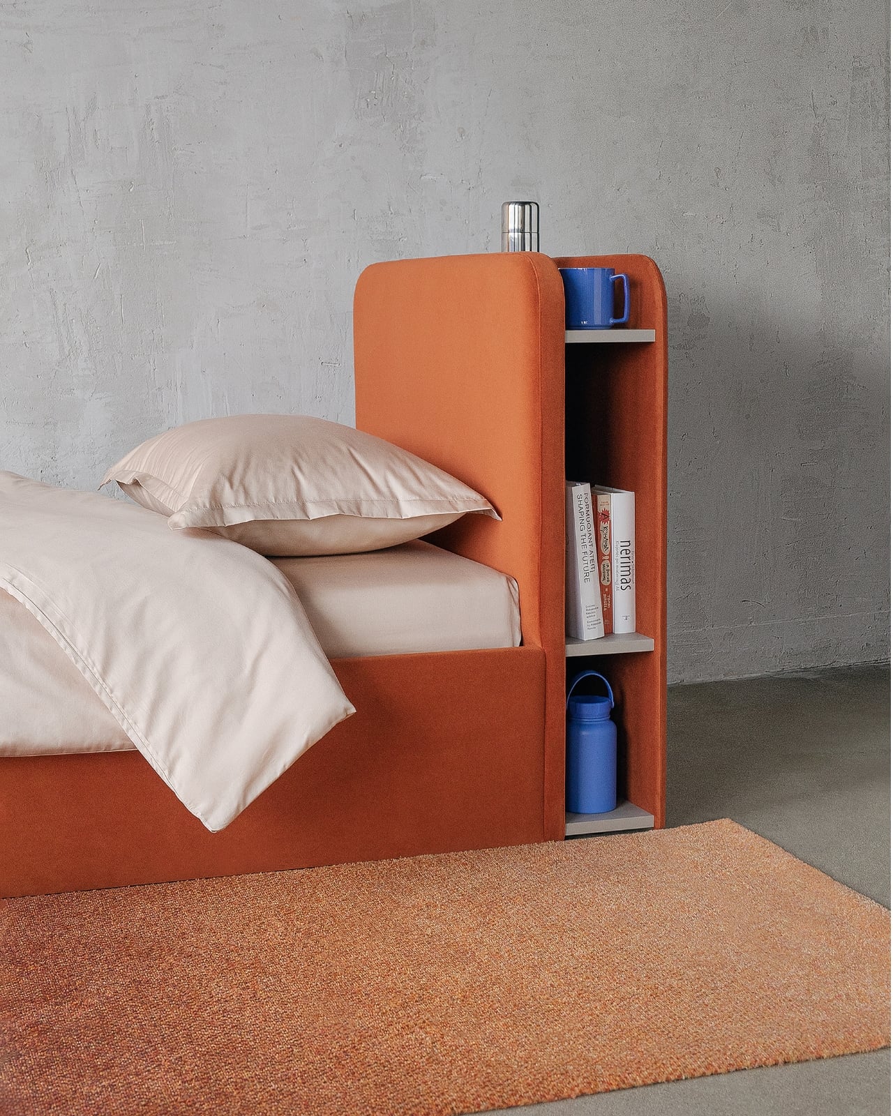
What Žilytė has understood, and what a surprising number of furniture designers miss when it comes to children’s spaces, is that function and form are not competing priorities. The shelf is functional, yes, but it also breaks up the headboard in a way that makes the overall silhouette more interesting. The protective wall adds safety, but it also frames the sleeping area, giving the bed a sense of enclosure that children intuitively find comforting. Every practical decision contributes to the design rather than fighting against it.
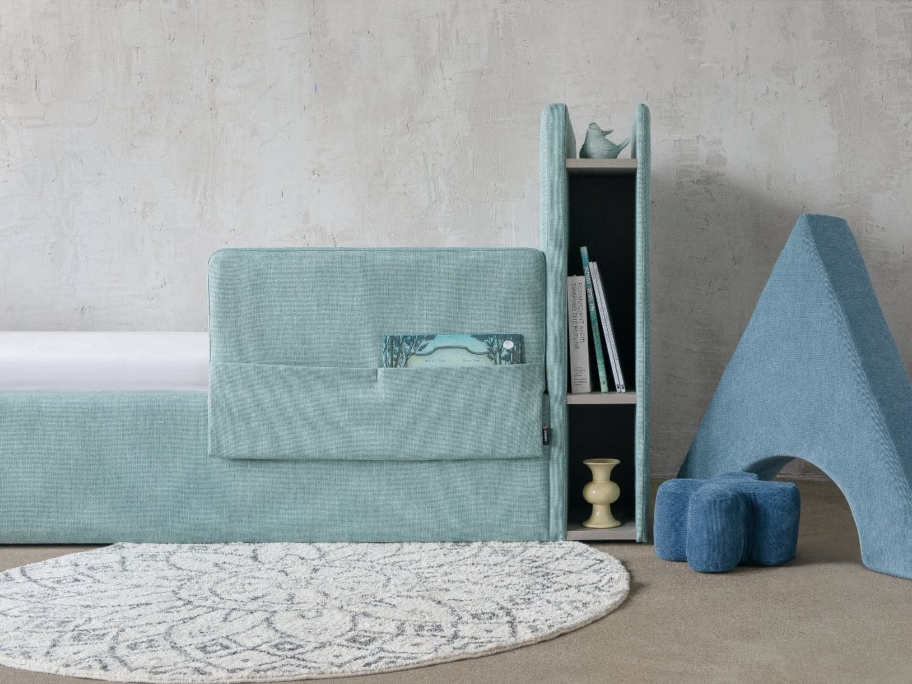
SAULUTĖ is available in two sizes, which means it works for both younger children and teenagers, a lifespan that most children’s beds never manage to cover. The design is deliberately neutral enough to grow with the child, which is a courtesy to both the family budget and the environment. Furniture that lasts longer is, by default, furniture that performs better.

Few things in furniture design are as genuinely satisfying as a piece that has clearly been thought through from every angle. Not just aesthetically, not just practically, but both at once. SAULUTĖ manages to be a beautiful object that also happens to serve a child’s actual daily life. That’s not a low bar. In children’s furniture, it’s almost revolutionary.
The post The Children’s Bed Adults Keep Wishing Came in Their Size first appeared on Yanko Design.

This Retro Apple IndyCar Livery Looks Like The Perfect Next Step After The Company’s F1 Partnership

Apple loves racing. Apple TV just became the exclusive US home of Formula 1. Apple funded a movie about Formula 1 that made more money than most actual Formula 1 teams see in a season. Apple even talked Porsche into repainting two race cars in a 46-year-old rainbow scheme this year. What Apple has not done, despite all that motorsport enthusiasm, is show up to IndyCar, which remains a genuinely weird oversight for a company that loves a good only-in-America story.

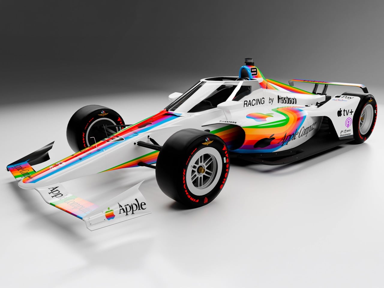
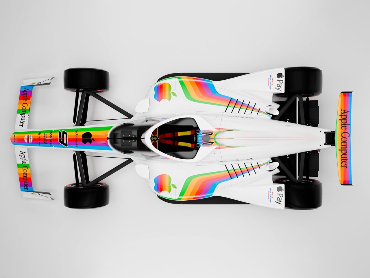
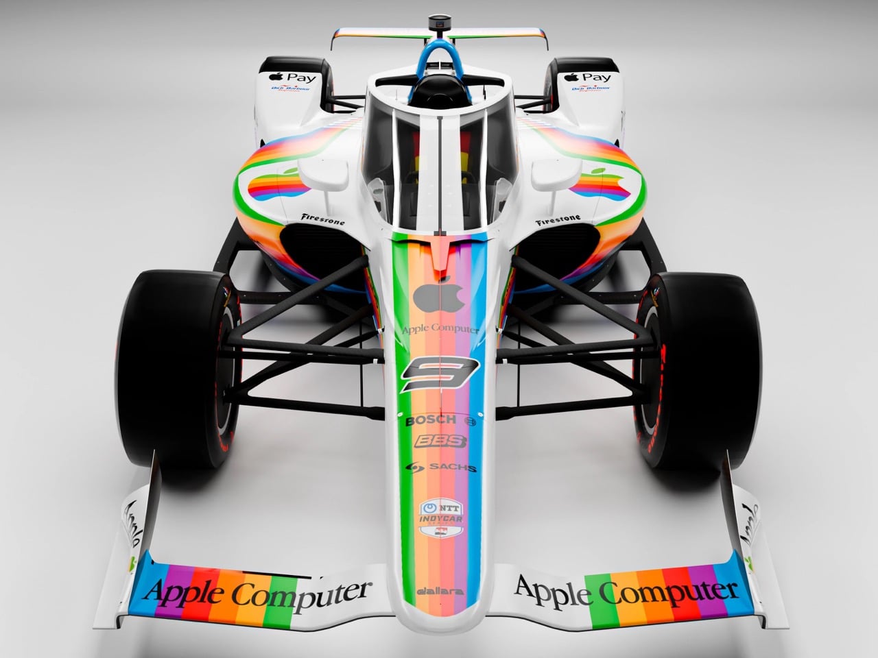
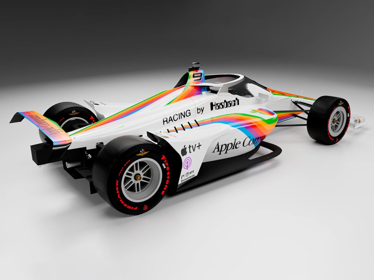
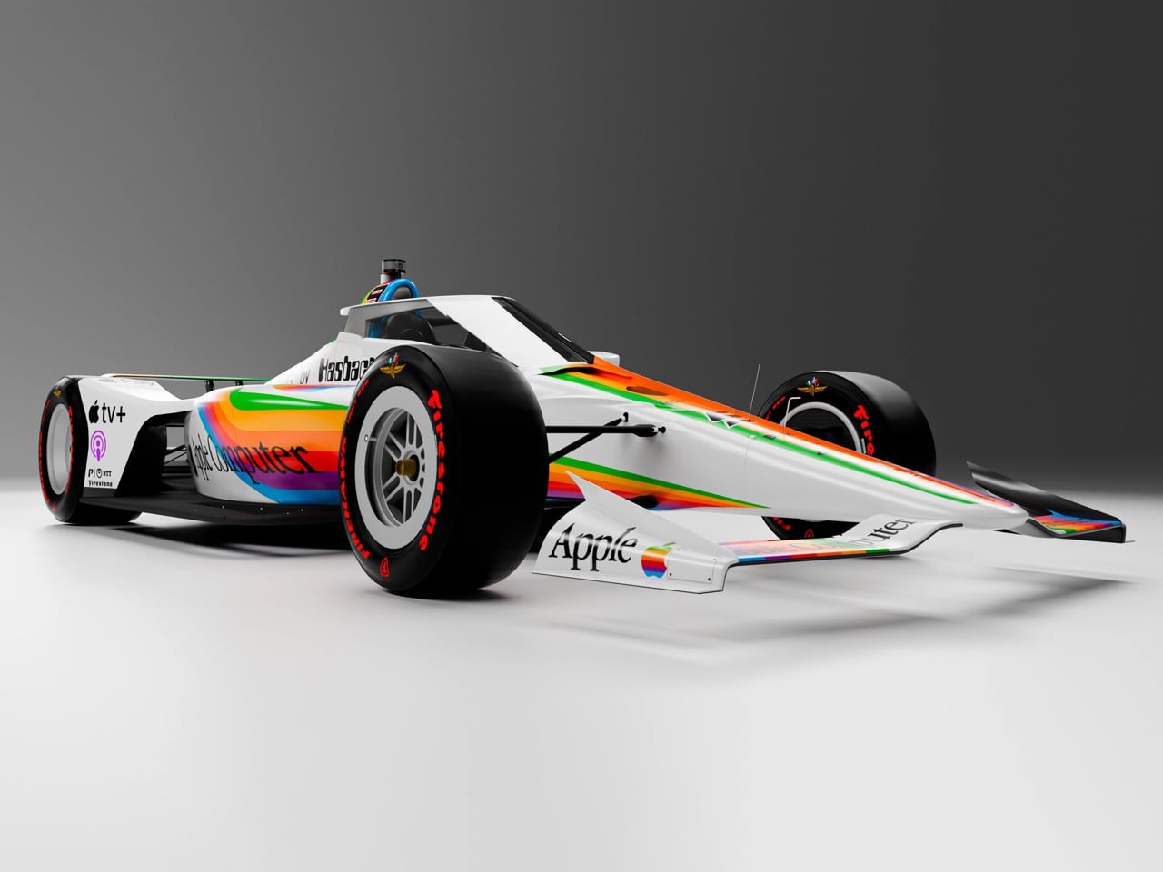
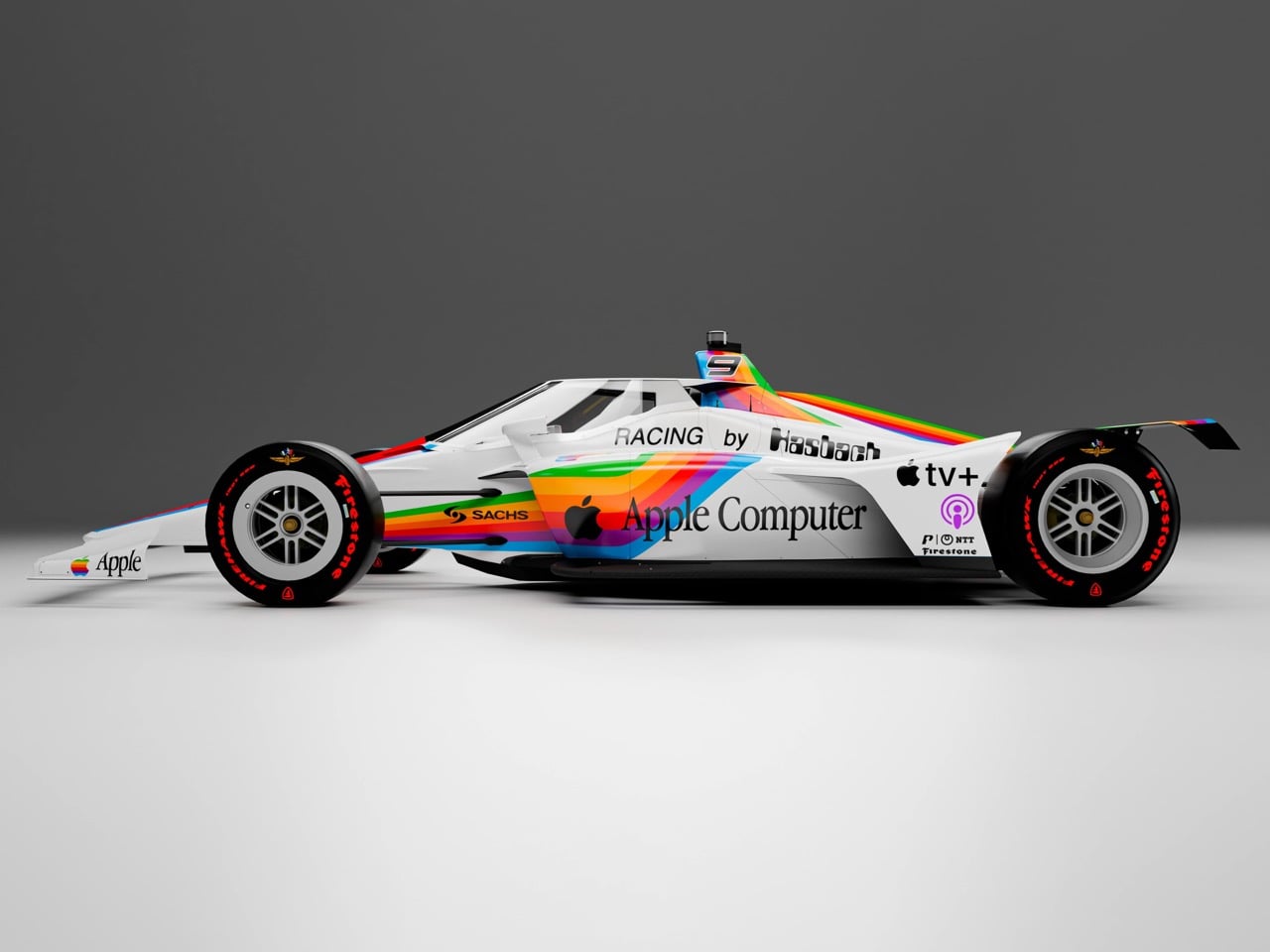
Designer Daniel Rodriguez decided to render the version Apple apparently hasn’t gotten around to yet. His concept dresses a Dallara IR-18 in the full spectrum of Apple history, from the 1977 rainbow stripes and Motter Tektura lettering down to modern Apple Pay and Apple TV+ badges sitting right next to them. It is a mashup of eras that has no business looking this good, but somehow does.

Designer: Daniel Rodriguez

The stripes themselves do something clever depending on where you look. The nose, wing endplates, and mainplane get the flat, hard-edged six-color treatment straight out of 1977, while the sidepods and engine cover run a soft, airbrushed gradient that looks like it was pulled off a modern Apple wallpaper. Seen from above, the two halves mirror each other perfectly, with rainbow spears launching off the sidepod intakes and racing back over the engine cover in a symmetry that feels distinctly Cupertino rather than distinctly IndyCar.

The words “Apple Computer” run down the nose in Motter Tektura, the quirky Austrian display face Rob Janoff picked in 1977 because its rounded letterforms echoed the curves of the apple mark itself. That typeface has been dormant on race cars for decades, and seeing it wrapped around a modern aeroscreen is a genuinely fun bit of type nerdery most viewers will feel before they can name it.

Rodriguez went really tongue-in-cheek with the sponsors. Apple Pay, Apple TV+, and Apple Podcasts logos sit shoulder to shoulder with the vintage six-color apple, like four different decades of the same company got dressed for the same race. Real IndyCar suppliers such as Bosch, BBS, Sachs, and Firestone fill out the rest of the livery, which keeps the whole thing grounded instead of drifting into pure fantasy render territory.

None of this happens in a vacuum, either. Apple actually had a rainbow racing moment already, back in 1980, when it sponsored a Porsche 935 K3 run by Dick Barbour Racing and driven by Bobby Rahal, Allan Moffat, and Bob Garretson. That car ran a short, unglamorous IMSA season, blew a piston at Le Mans, and wore a tail sticker that read “Don’t upset the Apple Car.” Porsche revived that exact livery this past May at Laguna Seca to mark 75 years of Porsche Motorsport and Apple’s 50th birthday, which is clearly the spark behind this whole concept.

The bigger question the render quietly asks is why IndyCar is still waiting. Apple has spent nine figures on Formula 1 rights and greenlit a Porsche throwback livery for a sports car series most Americans do not watch on Sunday afternoons. IndyCar runs ovals, street courses, and an actual American underdog story every single season, and it is about to roll out a lighter, faster Dallara IR-28 in 2028. If Apple wants a paddock that already looks this good in rainbow stripes, the invitation is right here.

The post This Retro Apple IndyCar Livery Looks Like The Perfect Next Step After The Company’s F1 Partnership first appeared on Yanko Design.
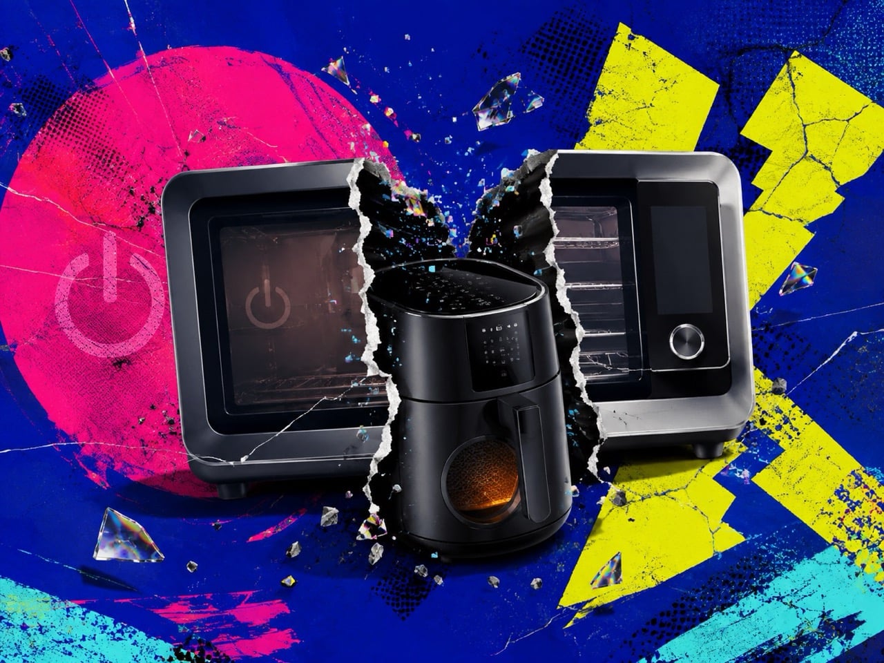
Weber Is Shutting Off the June Oven’s AI Camera, and a $90 Air Fryer Already Does The Same Thing

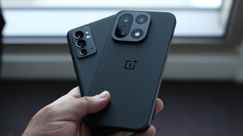
Somewhere in a warehouse in Illinois, someone at Weber is about to flip a switch that turns a $999 oven back into a very expensive toaster. On September 22, the June Oven loses its cloud, its app, and the camera trick that made it famous in the first place. You can still push the manual buttons. You just lose the part where the oven looks at your chicken thighs and quietly figures out what to do with them.

Here’s the kicker. That exact party trick, the camera that scans your food and picks a cook program for you, now lives inside air fryers that cost less than a nice dinner out. June invented food recognition cooking in 2015 for fifteen hundred bucks. A decade later you can buy the same basic idea for under a hundred dollars on Amazon. The technology didn’t get worse. It just stopped being special enough to protect.

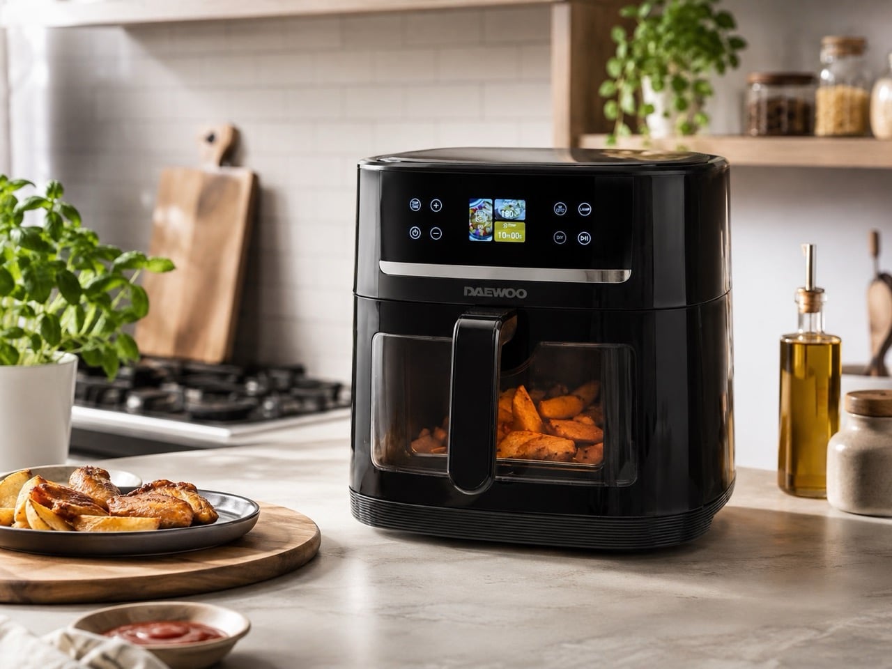
Daewoo Actuate

Weber hasn’t put out a press release about any of this, which tells you plenty on its own. Owners found out by email. Meanwhile the company has been actively expanding Weber Connect, the smart grilling platform June’s own engineers helped build, across its charcoal and gas lineup. So the message, whether Weber meant to send it or not, is that connected cooking tech is worth investing in when it’s attached to a grill, and worth quietly switching off when it’s attached to a toaster oven nobody’s manufacturing anymore.

Daewoo’s Actuate is the cheapest, dumbest version of June’s original idea, and I mean dumbest as a compliment. An internal camera peeks at whatever’s in the basket, matches it against twelve presets like chips, sausages, and chicken, and sets the time and temperature without asking you to tap through a menu. It runs about ninety to a hundred dollars depending on the retailer and the day. No app, no account, no subscription. It just watches your dinner and gets on with it.

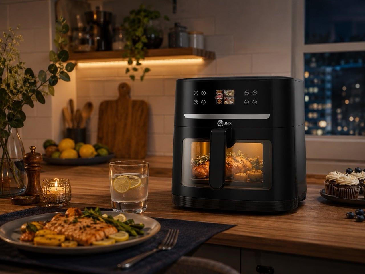
Culinix 8.5QT AI air fryer

Here’s where it gets fun. Culinix sells an 8.5 quart fryer in the US with an AI camera that recognizes twelve foods, and the list reads like it was lifted straight off Daewoo’s spec sheet. Chicken goujon. Fish finger. Beef joint. Chick pea. That is oddly specific British supermarket vocabulary to land on two unrelated product pages by coincidence. My guess is neither brand invented this camera module, they just bought the same one off a factory shelf and slapped their own logo on the box, the same way every USB charger secretly comes from three factories in Shenzhen.

Emerson skipped the camera entirely and gave its SmartVoice fryers ears instead. Say “cook pork chops” and it just does it, no app, no wifi, all the processing happening locally on the device. It’s not glamorous, but it solves a real problem for people who find touchscreens fiddly, whether that’s arthritis, low vision, or just being elbow deep in raw chicken and unable to tap anything. I’d argue this is the most quietly useful of the three schools, even though it’ll never trend on a gadget blog.

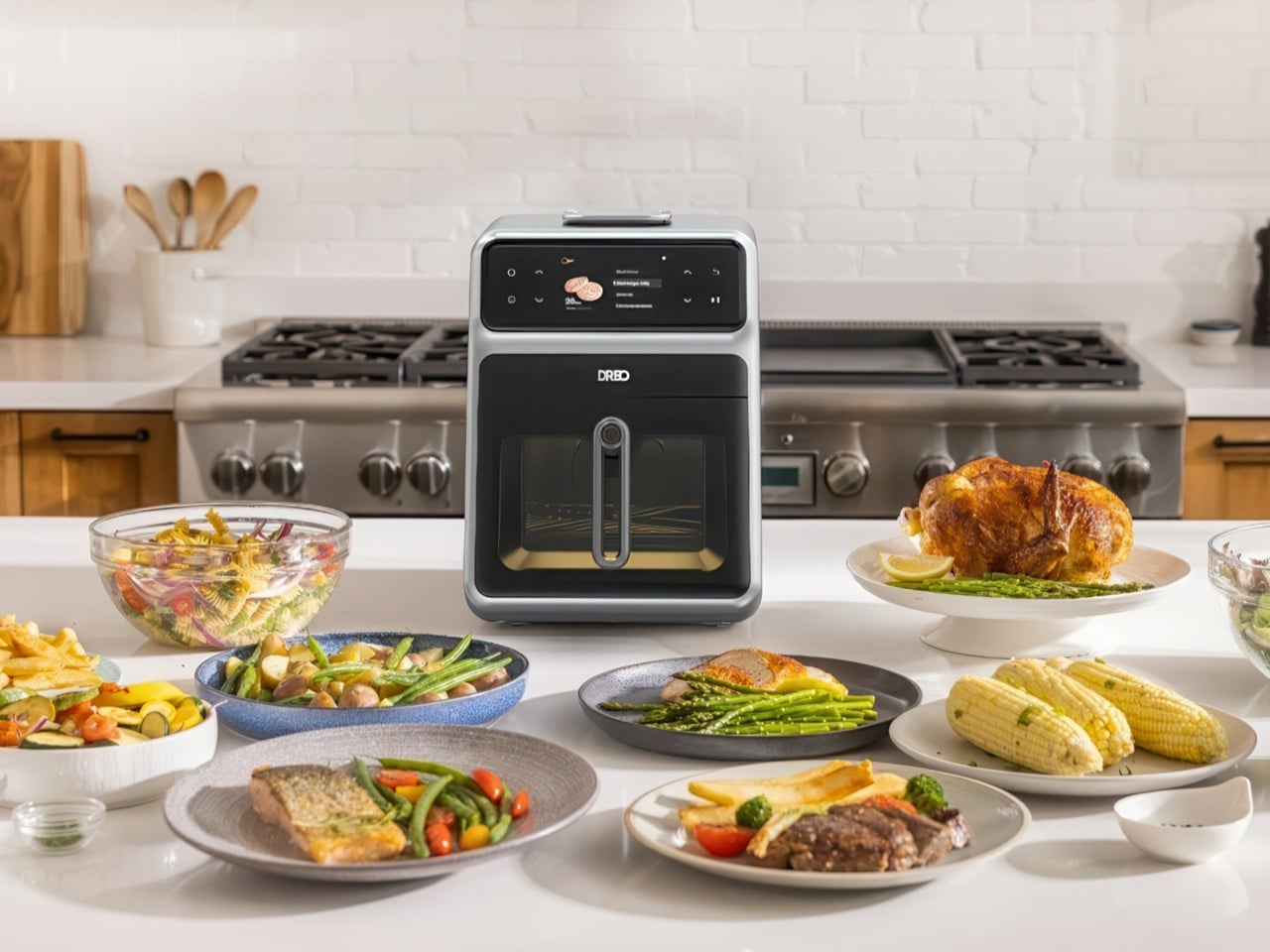
Dreo ChefMaker

Xiaomi and Dreo took the opposite bet and gave up on guessing entirely. Xiaomi’s Mijia Pro adds a water tank so it can steam and sous vide alongside the usual hot air, which actually changes the physics of what comes out the other end. Dreo’s ChefMaker goes further and sticks a probe straight into the meat, measuring real internal temperature instead of inferring anything from a camera. It’s the only method here that isn’t a guess.

Which brings us back to June. Anova’s newer oven has the same food recognition camera, except the feature only works if you’re actively paying a subscription. So the actual choice in 2026 isn’t camera versus voice versus probe. It’s whether you own the smarts in your kitchen outright, or you’re just renting them from a company that can turn them off the second it stops making sense on a spreadsheet.

The post Weber Is Shutting Off the June Oven’s AI Camera, and a $90 Air Fryer Already Does The Same Thing first appeared on Yanko Design.