A Stool, a Bookstand, and a Small Monument to Stillness

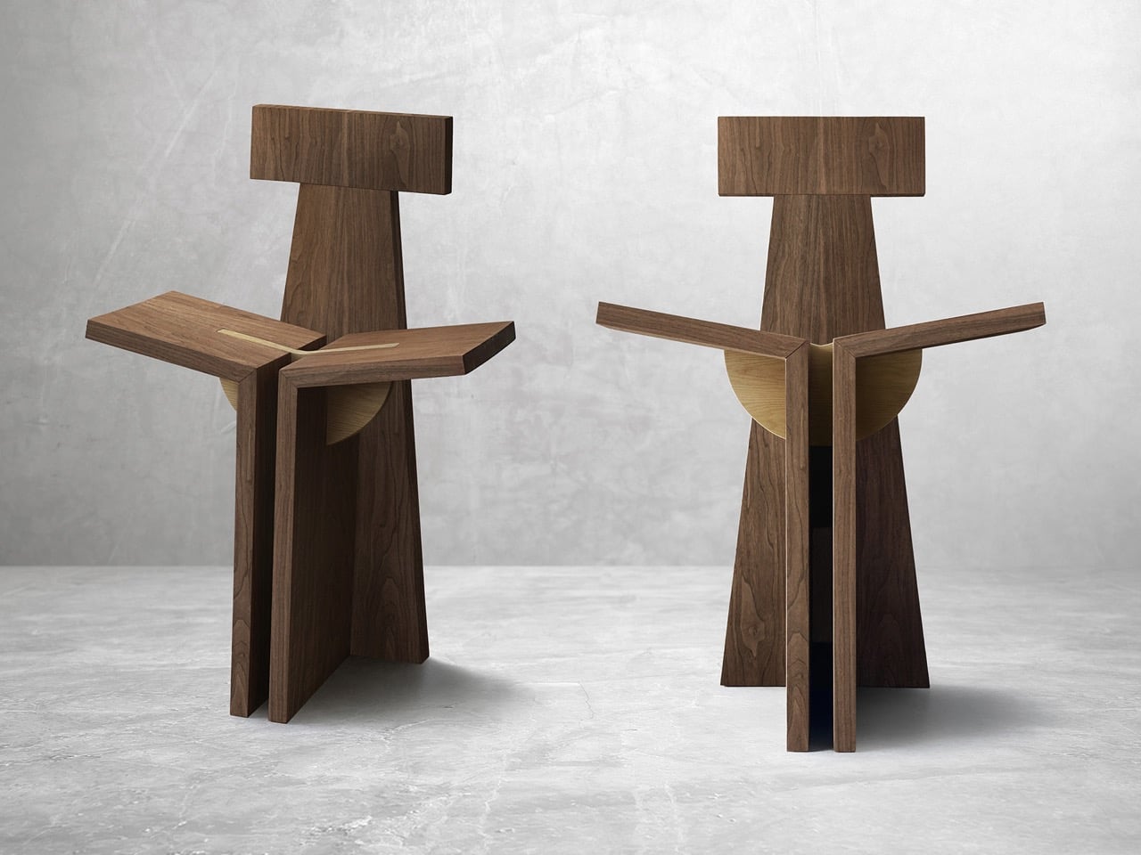
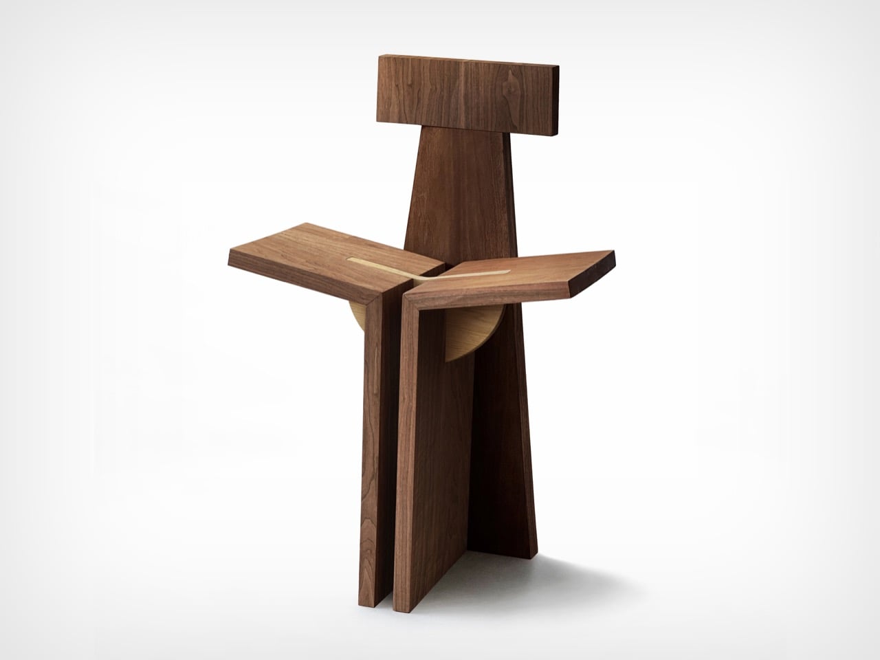
Guided by geometry, symmetry, and a quiet reverence for material, the Bookchair by Cass Saldanha sits somewhere between furniture, object, and architectural study. At first glance, it appears to be a stool. Look again, and it becomes something more deliberate: a sculptural support for an open book, a small monument to stillness, and an invitation to slow down in a world that rarely does.

The form is immediately striking. The Bookchair is not designed around softness or visual excess. Instead, it relies on precision. Every angle feels measured, every junction intentional, every line part of a larger geometric rhythm. Its silhouette carries the clarity of modernist thinking, but without feeling cold or overly industrial. There is warmth in the way the structure opens itself up, almost like a small piece of architecture scaled down to the size of a domestic object.

Designer: Cass Saldanha
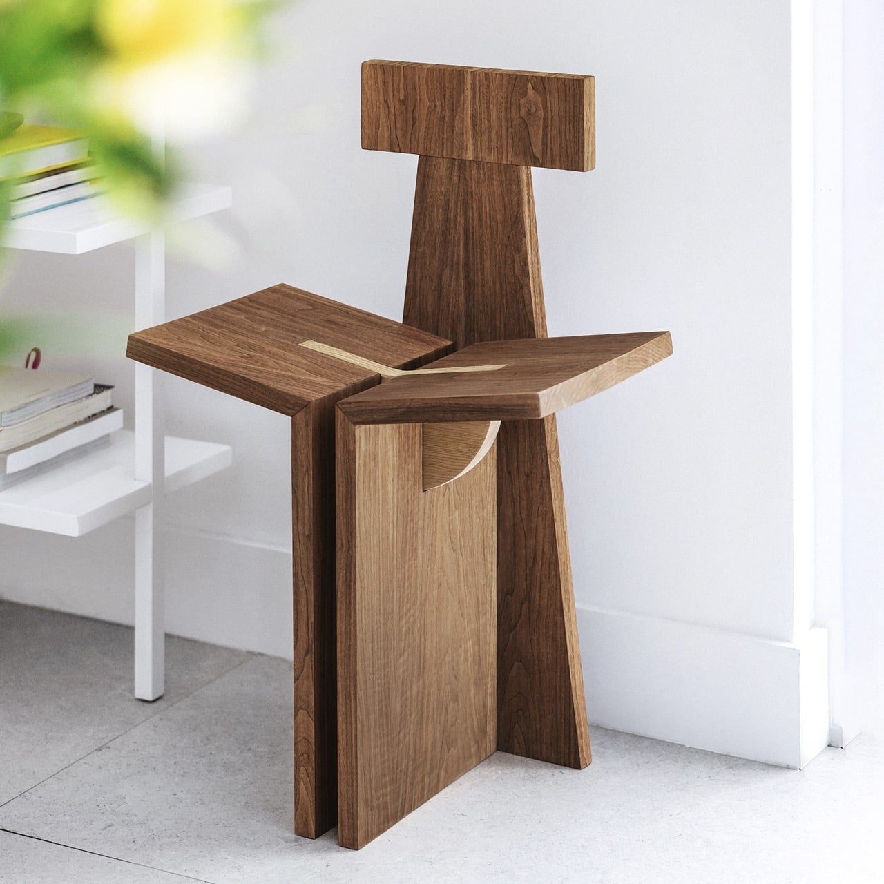
The design takes inspiration from Lina Bo Bardi, the Italian-Brazilian architect and designer whose work often balanced modernist rigor with Brazilian vernacular traditions, craft, and cultural honesty. That influence can be felt in the Bookchair’s refusal to separate structure from expression. Like Bo Bardi’s furniture, it does not treat utility and beauty as opposing forces. Instead, it allows function to become the source of sculptural character.

The Bookchair can be used as a normal stool, with its 18-inch height giving it a clear seating function. But its more poetic role is as a book display. Designed to cradle an open book, it transforms reading into a visual and spatial experience. A book placed on it does not simply rest there; it becomes part of the composition. The chair almost frames the written word, turning a casual object into a moment of attention. In this sense, the Bookchair is less about storage and more about pause. It asks the user to notice the book, the object, and the act of reading itself.
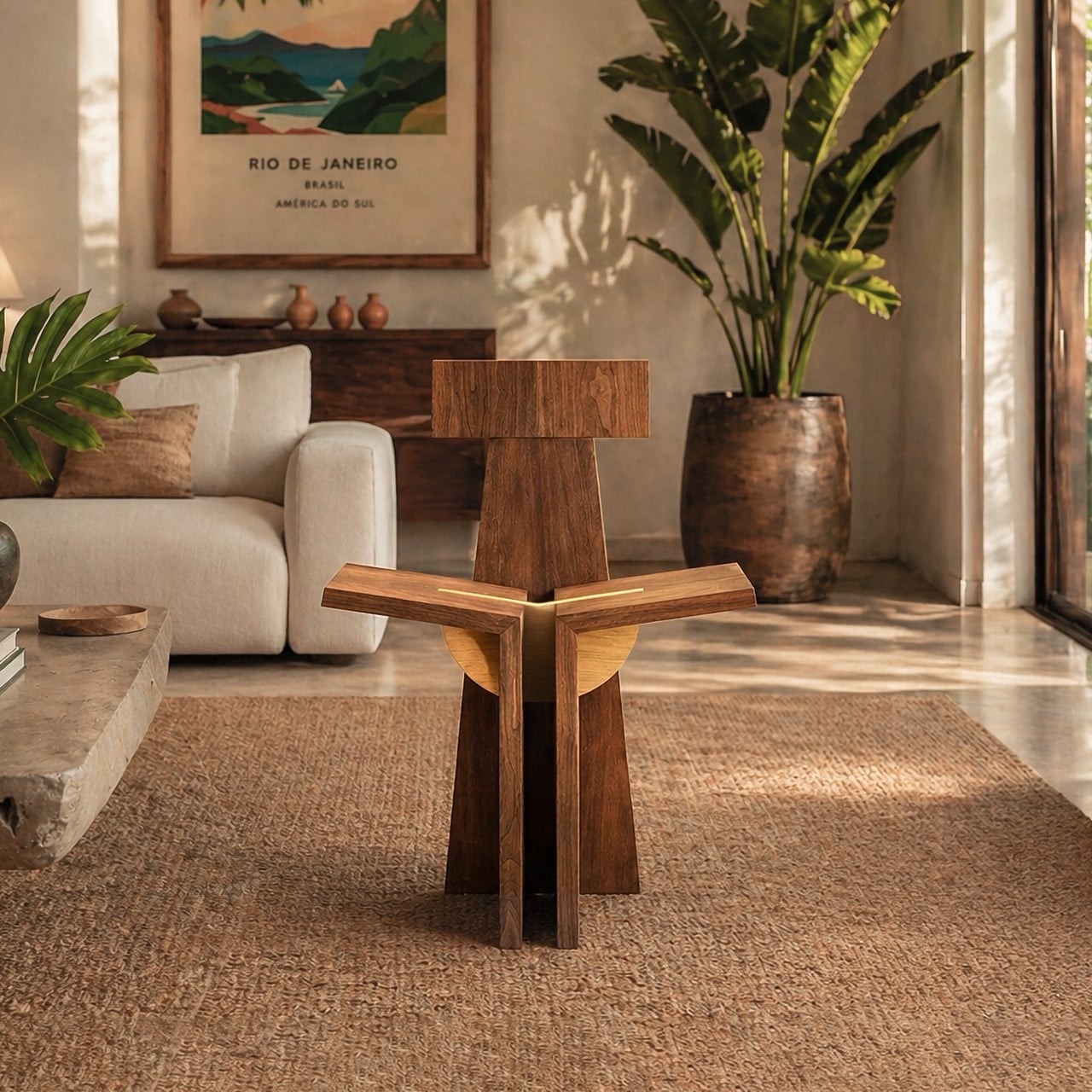
Materiality plays a major role in grounding the design. Crafted from solid white oak and European walnut, the piece balances tonal warmth with structural depth. The contrast between the woods gives the form a quiet richness without distracting from its geometry. At the center, an oak disc anchors the design, distributing force at the point where the three angled legs converge. This detail is both functional and visual, acting almost like a joint in a building or the keystone of a miniature structure.

The engineering is equally thoughtful. Four 1/3-inch brass rods are used as discreet tension relievers at key junctions, adding stability without interrupting the purity of the form. They are not decorative in the obvious sense, yet their presence adds another layer of refinement. The brass subtly acknowledges the forces moving through the object, making the structure feel honest rather than hidden.
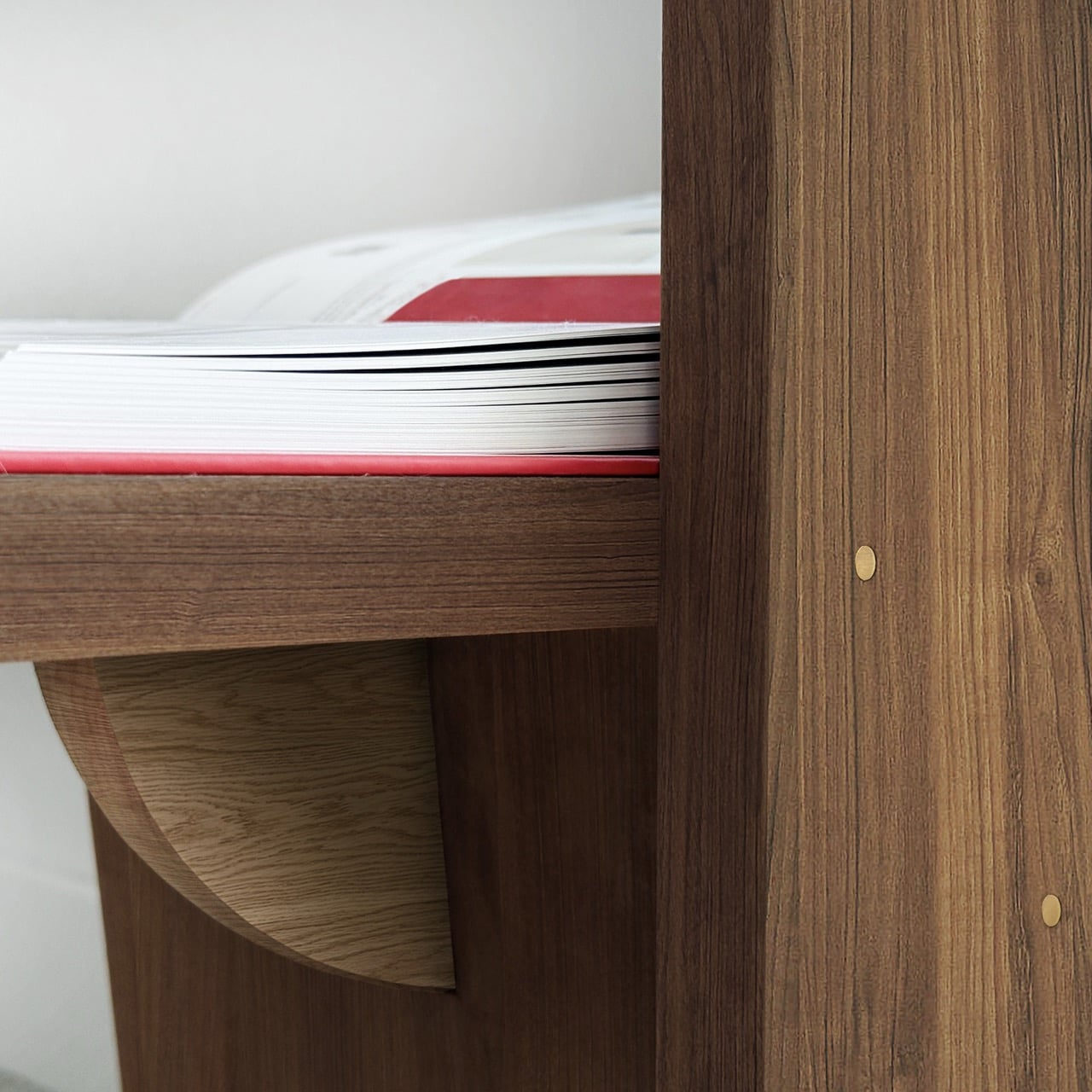
Each surface is hand-finished with natural oils, giving the wood a matte, luminous quality. This finish preserves the tactile essence of the material, allowing the grain, tone, and texture to remain central to the experience. It is a piece that seems meant to be touched as much as seen.

What makes the Bookchair compelling is its ability to hold multiple identities at once. It is a stool, but not just a stool. It is a bookstand, but not merely a display piece. It is functional, but its function feels almost ceremonial. By combining modernist clarity, Brazilian design sensibility, careful joinery, and sculptural restraint, the Bookchair becomes an object to use and contemplate. The Bookchair offers something quieter and more enduring, demonstrating how design can create rituals through even the smallest gestures. A place to sit. A place to rest a book. A place to pause.
The post A Stool, a Bookstand, and a Small Monument to Stillness first appeared on Yanko Design.


Bürstner’s new modular Mercedes Sprinter RV offers privacy bedroom, and more living space

Compact, luxury motorhomes with smart space-enhancing features really have a market of their own. This domain is dominated by Germany-based Bürstner, which surprised us first with the Habiton camper van last year. The concept van home debuted a modular interior layout that residents could change according to their requirements during the day or night. Now, continuing from where it began, the builder of comfortable and practical motorhomes has launched the Signature SMT model.

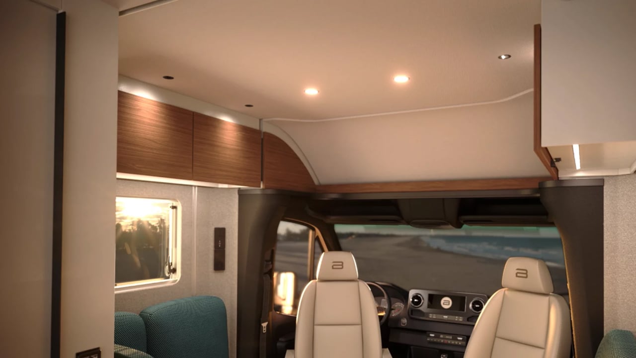
The interesting mobile home is based on a Mercedes-Benz Sprinter chassis and has a layout that can have an open, unobstructed view or a privacy shutter along the kitchen, closing the rear bedroom when you are sharing the motorhome with friends or even members of the family. Since the entire concept of the interior is based on space-maximization and modularity, Signature made from fiberglass for a durable and lightweight form factor, features a raised roofline at the front.

Designer: Bürstner

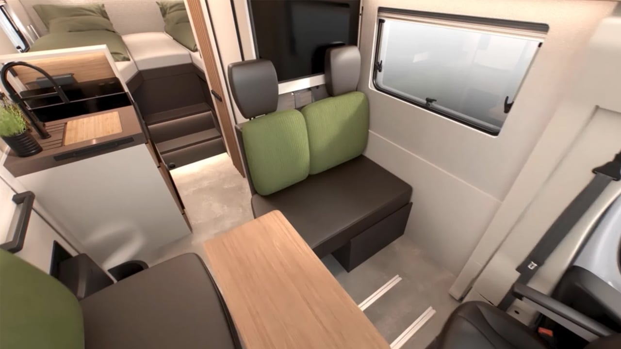
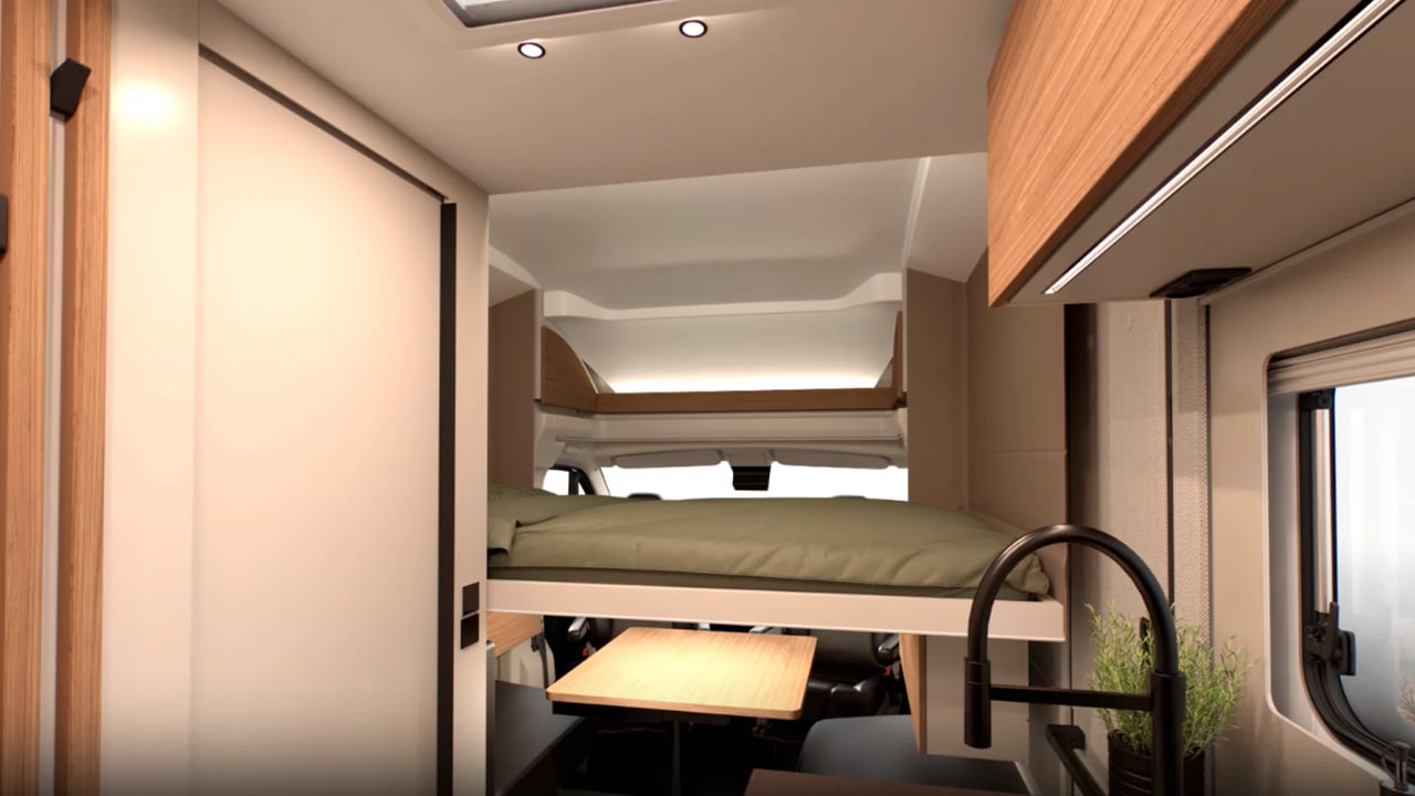
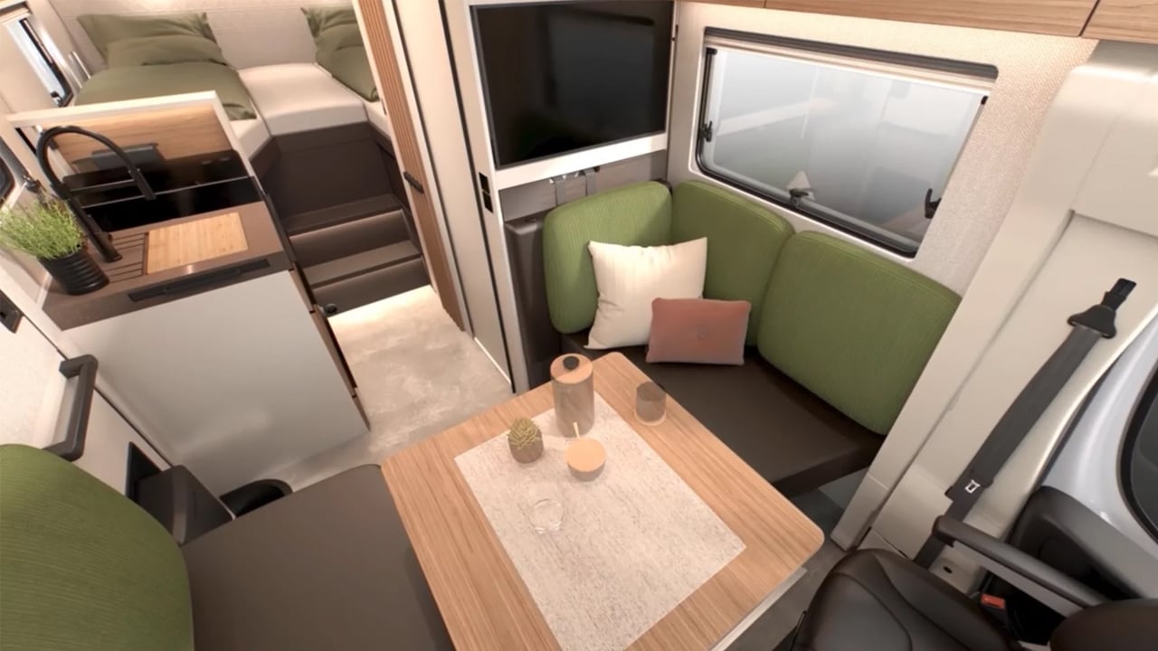
This modification allows a drop-down bed to sit comfortably at the increased height. Below, you have the dinette that is formed by swiveling cabin seats and a bench across the aisle. The space here is naturally lit with a full-width skylight above. The transformable front lounge makes way for a 76 x 51-inch drop-down double bed at night. And when the daylight strikes and you’re leaving the bed, the ceiling bed retracts – disappearing completely from sight – opening the lounge area for dining and communication.

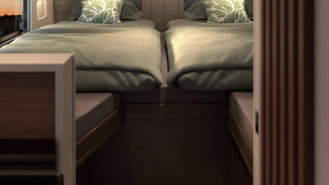
An option for a twin or queen bed (with springs and a comfort mattress) sleeping area is designated again toward the back of the cabin, with the modular kitchen and space-saving bathroom taking up the space in the middle. The bedroom features custom-designed back panels and a wardrobe for storing your clothing essentials. The Signature offers sleeping space for up to four people conveniently.

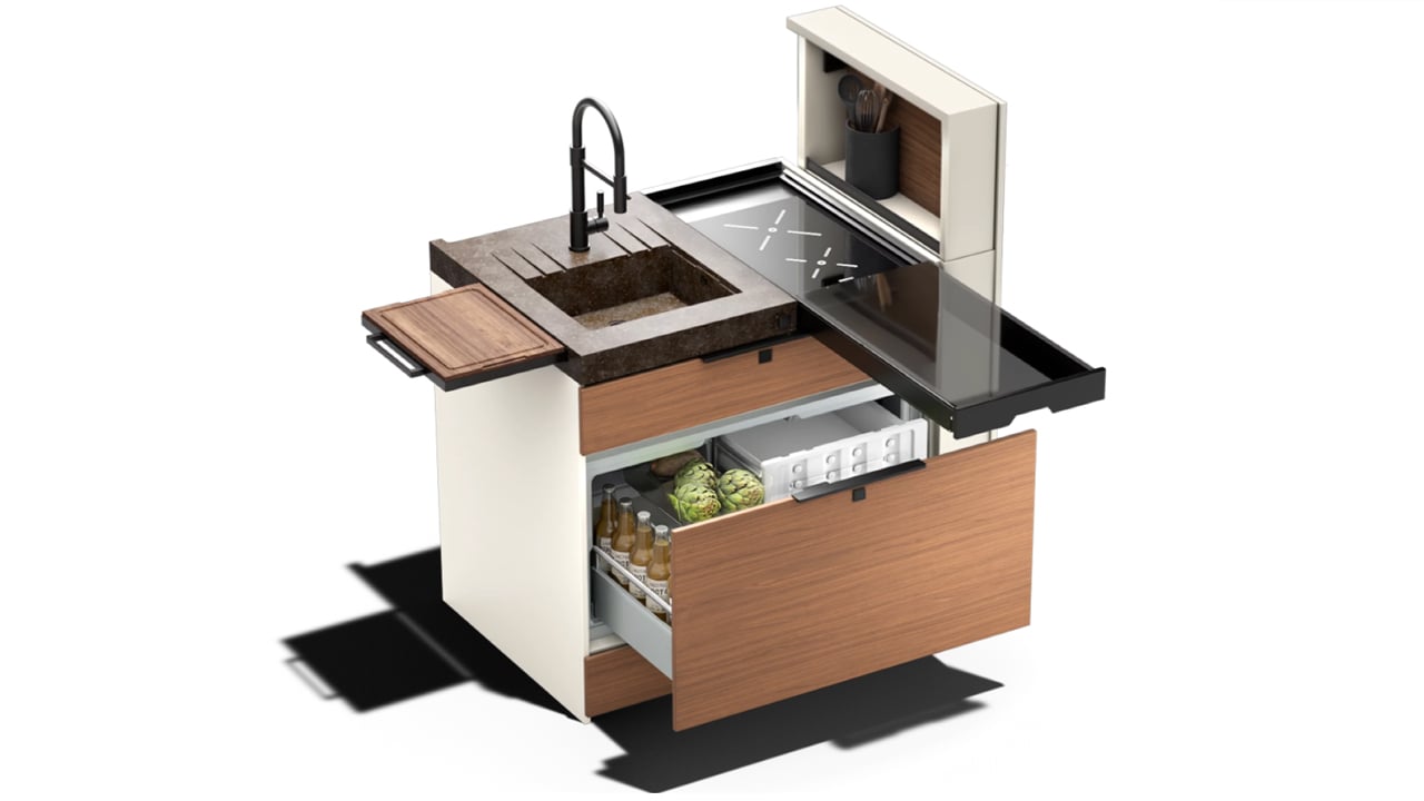
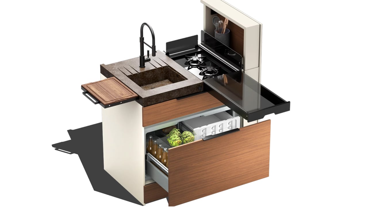
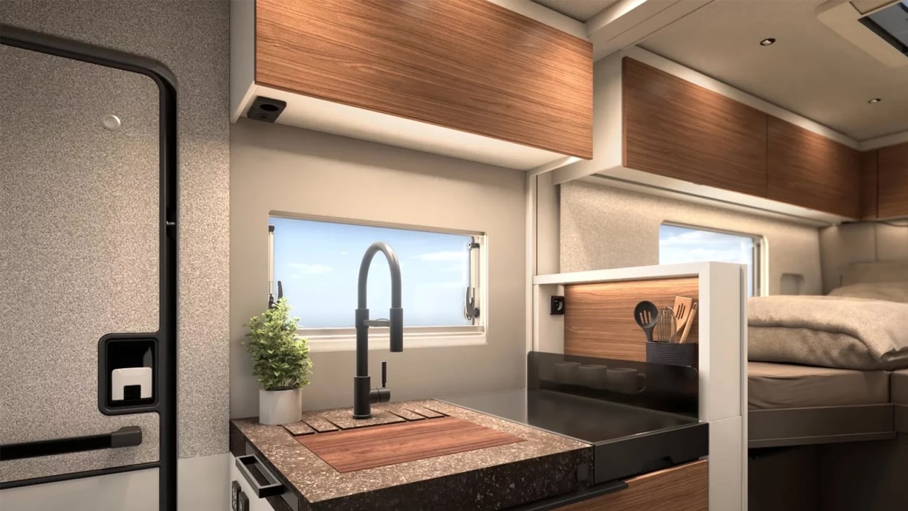
The premium, modular kitchen isn’t really designed to transform like the lounge or the bathroom (we will discuss in a bit), but it is designed with some interesting retractable options of its own to really zap the mind. The kitchen revolves around an induction hub in the center and two extendable worktops on either side of it. An electrically retractable shelf lifting straight up to the roof on the right shows your stored items, while a practical refrigerated drawer, featuring a 138L freezer compartment, finds place below the main countertop. When raised, the retractable shelf, in conjunction with a sliding door, doubles as a divider wall, allowing privacy in the bedroom behind.

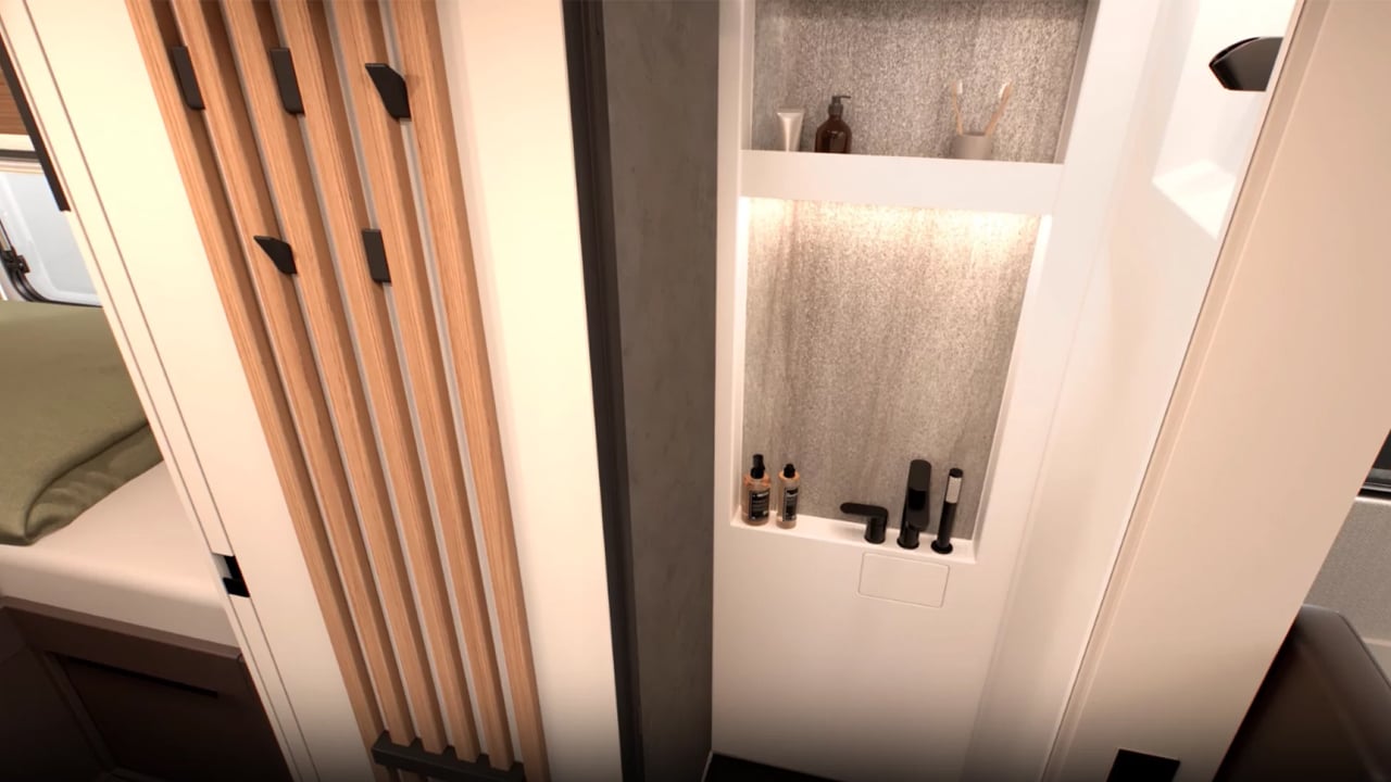
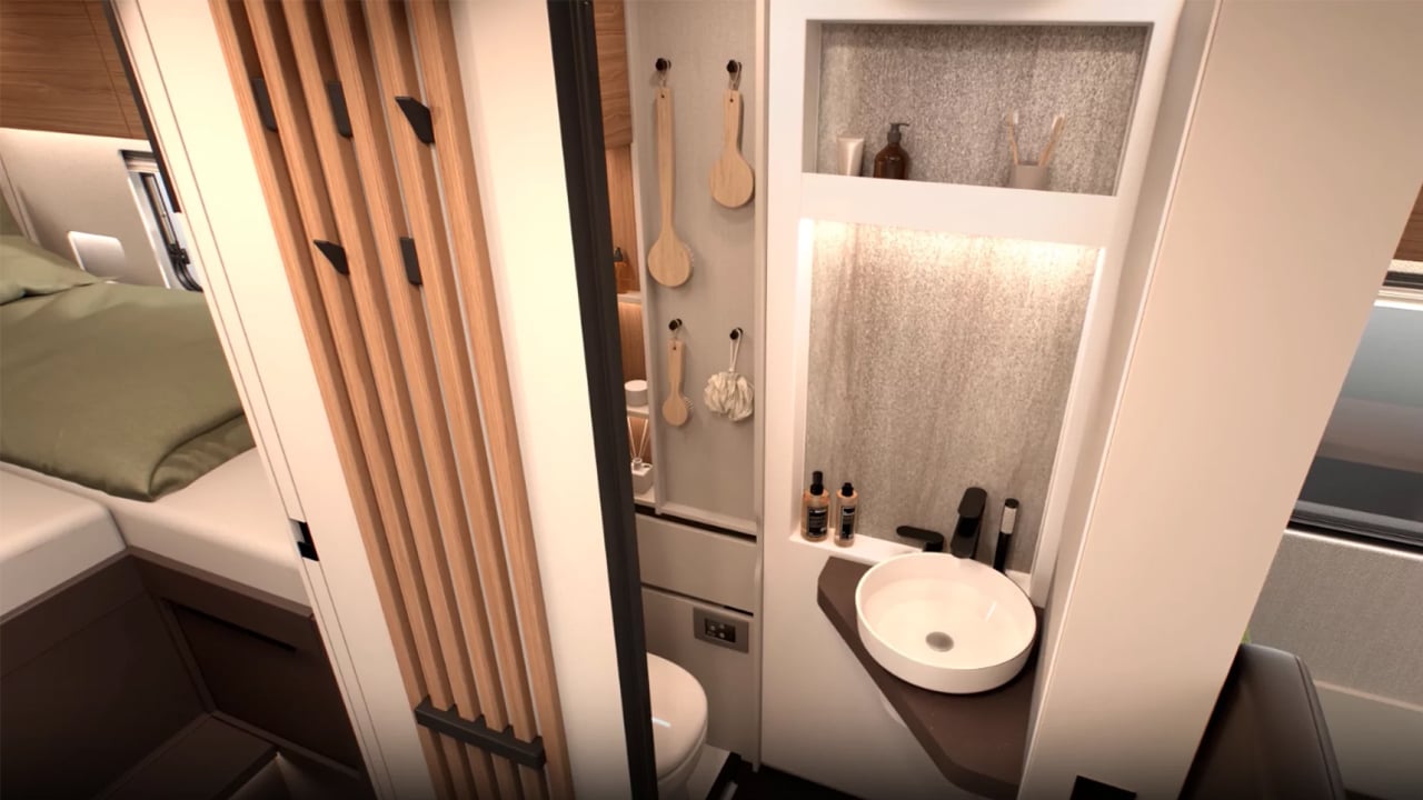
Available in a choice of 735 and 766 cm lengths in white and stone-grey colors, the Signature motorhome comes with another interesting transforming space: the bathroom. It is placed right behind the driver and comes with a sliding front wall that retracts toward the Cassette toilet to store away the sink integrated into it. The space outside now is reserved for the shower, which the user can use without having to think of fitting into a small bathroom space already occupied by a fixed sink and toilet.

Designed to go where your camper van adventure demands, the Signature SMT is provided with a 150 Ah lithium battery, a 200-liter fresh water tank, and a diesel heating option. The pricing for the base 735 cm model starts at €93,999 (US$107,000), while the bigger 766 cm Signature would cost around $110,000.


The post Bürstner’s new modular Mercedes Sprinter RV offers privacy bedroom, and more living space first appeared on Yanko Design.
Colombia’s Most Important New Building Isn’t in Bogotá

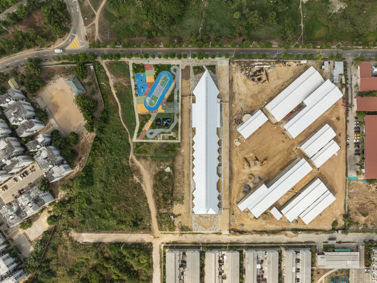
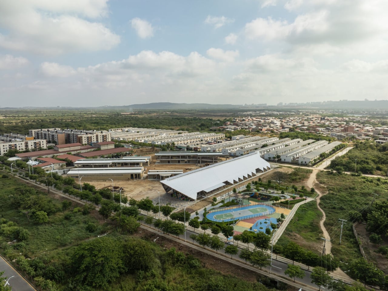
Most cultural centers get built as cultural centers. They show up polished and purposeful, eventually becoming the kinds of places that exist for people who already feel at home in cultural spaces. The Villas de San Pablo Cultural Center in Barranquilla, Colombia, was designed with an entirely different intention, and it shows.

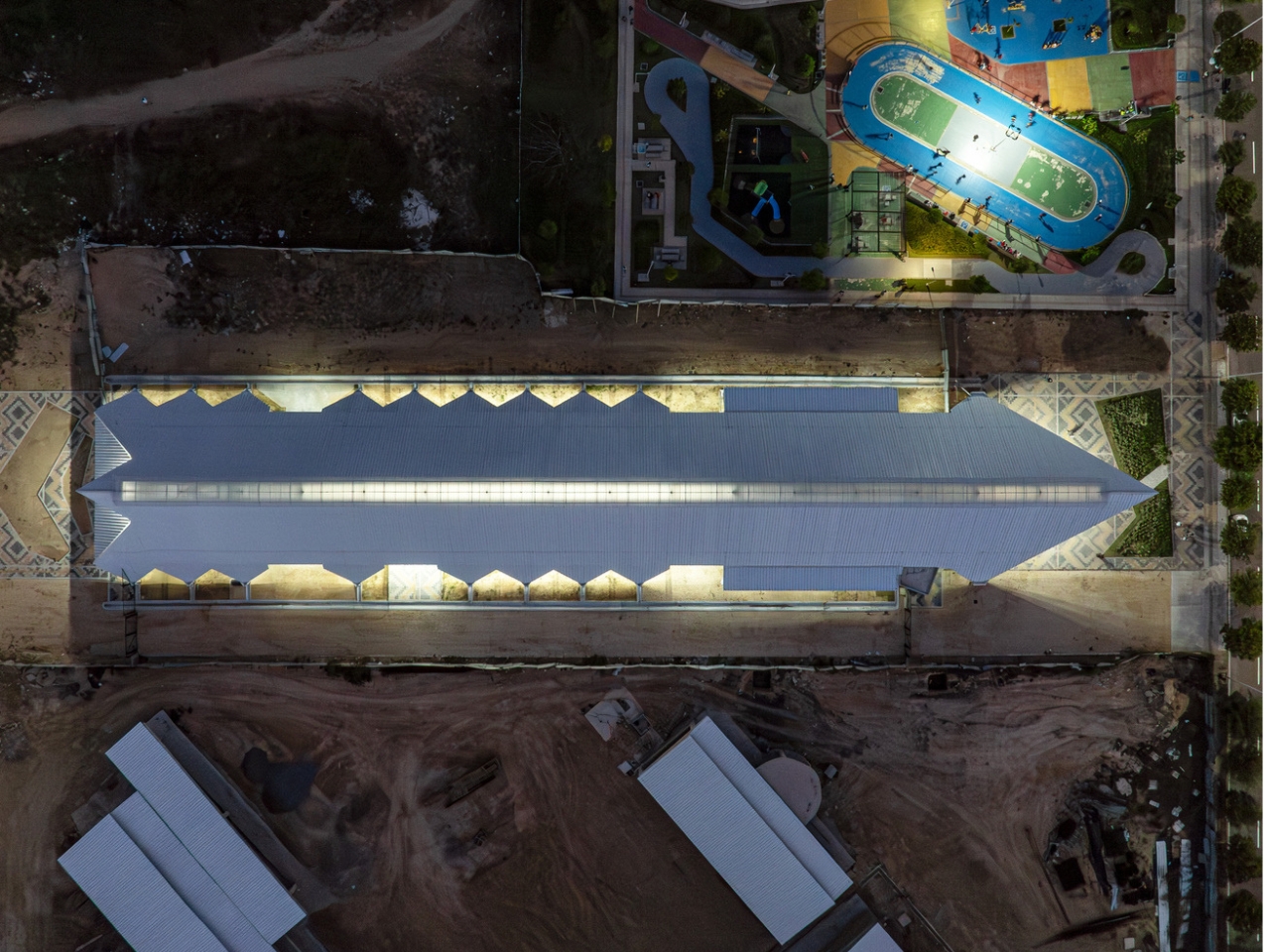
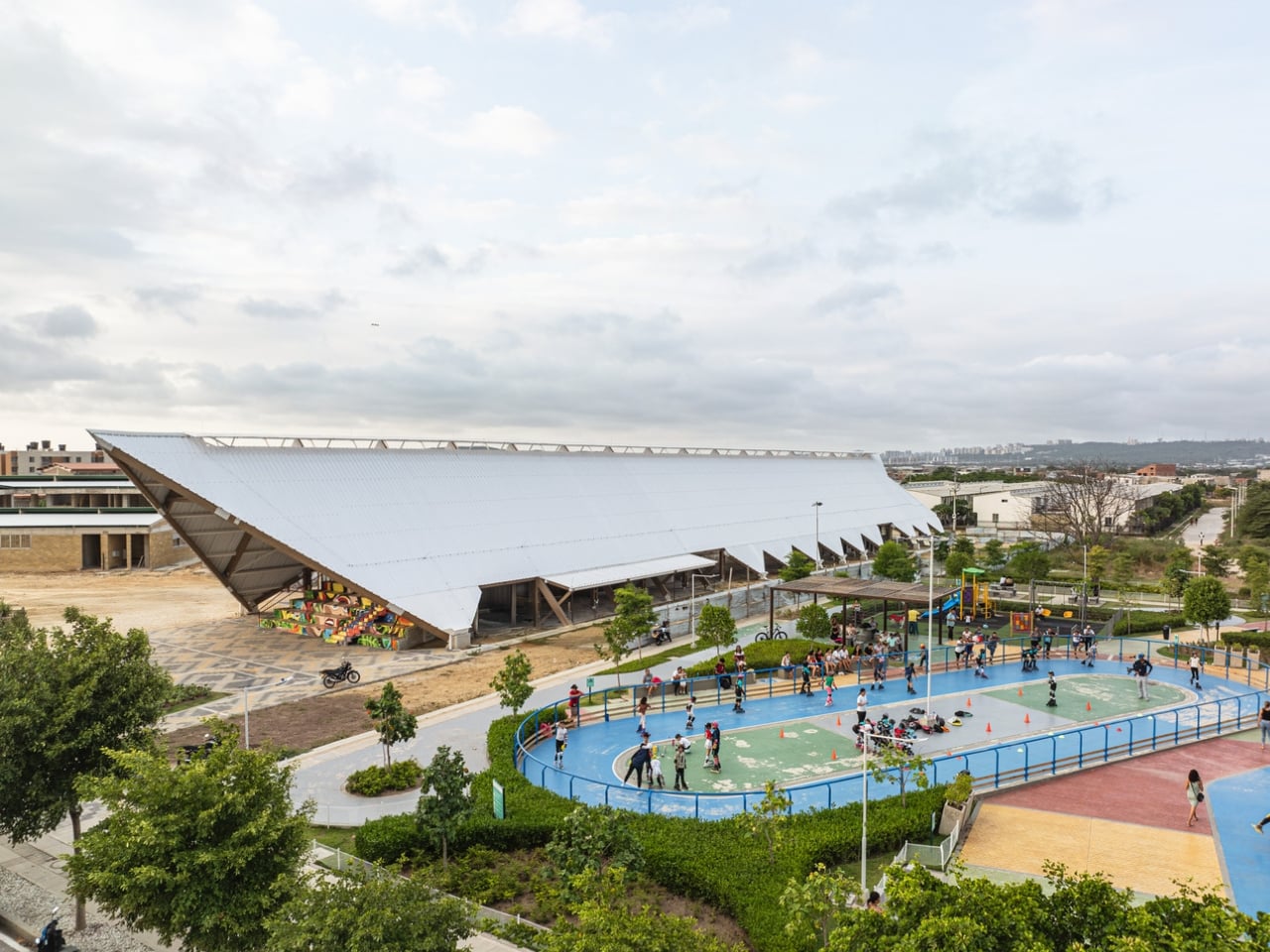
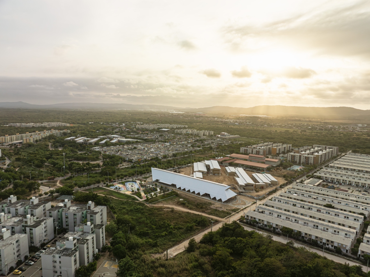
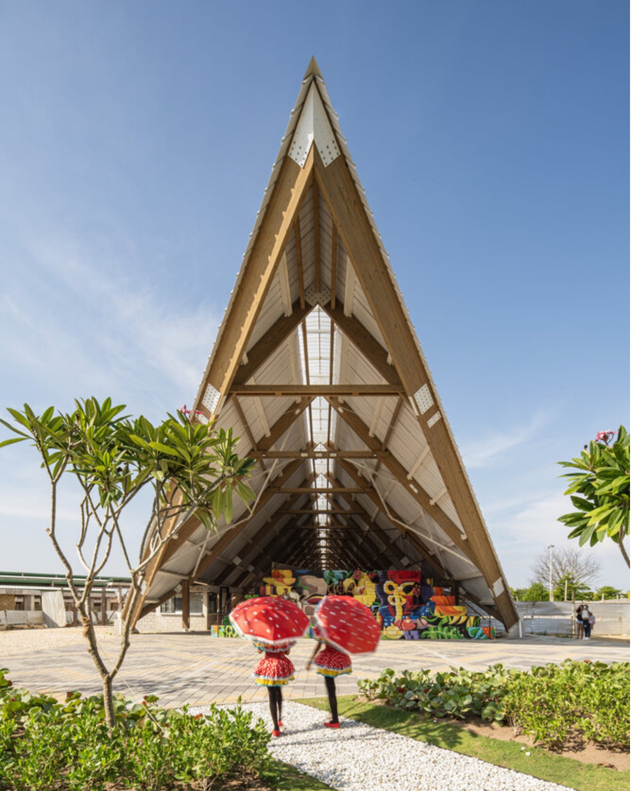
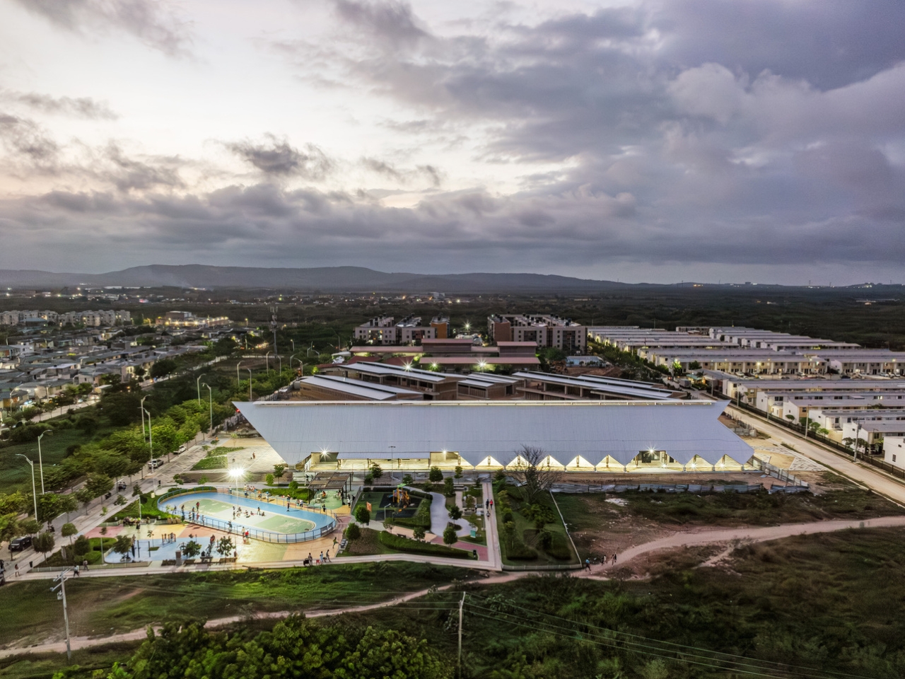
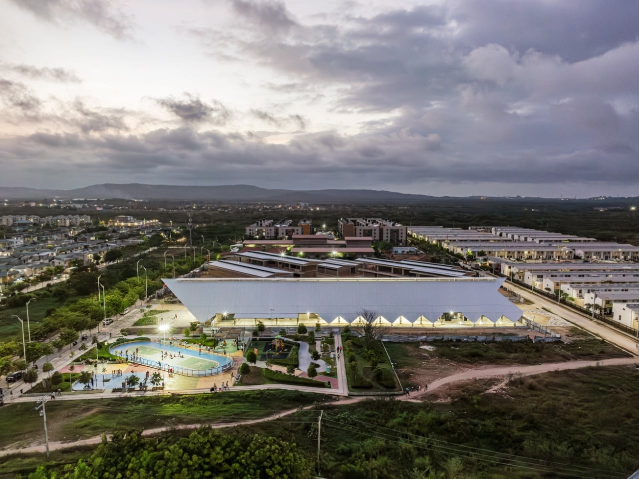
Completed in 2025 by ETH Zurich architects Hubert Klumpner and Diego Ceresuela Wiesmann alongside Colombian architect Alejandro Restrepo Montoya of UPB Medellín, the 2,200-square-meter center sits in the southwest of Barranquilla, a neighborhood planned for more than 20,000 housing units and predominantly home to displaced families, migrants, and low-income residents. The design team has said that the challenge was not simply to build an urban facility in a social housing neighborhood, but to formulate infrastructure capable of supporting an urban process marked by displacement, migration, and the need to rebuild community. That framing alone sets this project apart from most architectural commissions.

Designers: ETHZ + Alejandro Restrepo Montoya (Photos by Alejandro Arango Escobar)

I think about that phrase, “rebuild community,” often. It gets used so loosely that it risks becoming meaningless. But when you look at how this project came together, the word carries real weight. The design process was participatory, involving residents, community leaders, artists, universities, and public institutions, all working together to shape a space that reflected the neighborhood’s own identity rather than an imported aesthetic vision. The building didn’t just land in a community. It was authored, at least in part, by one.

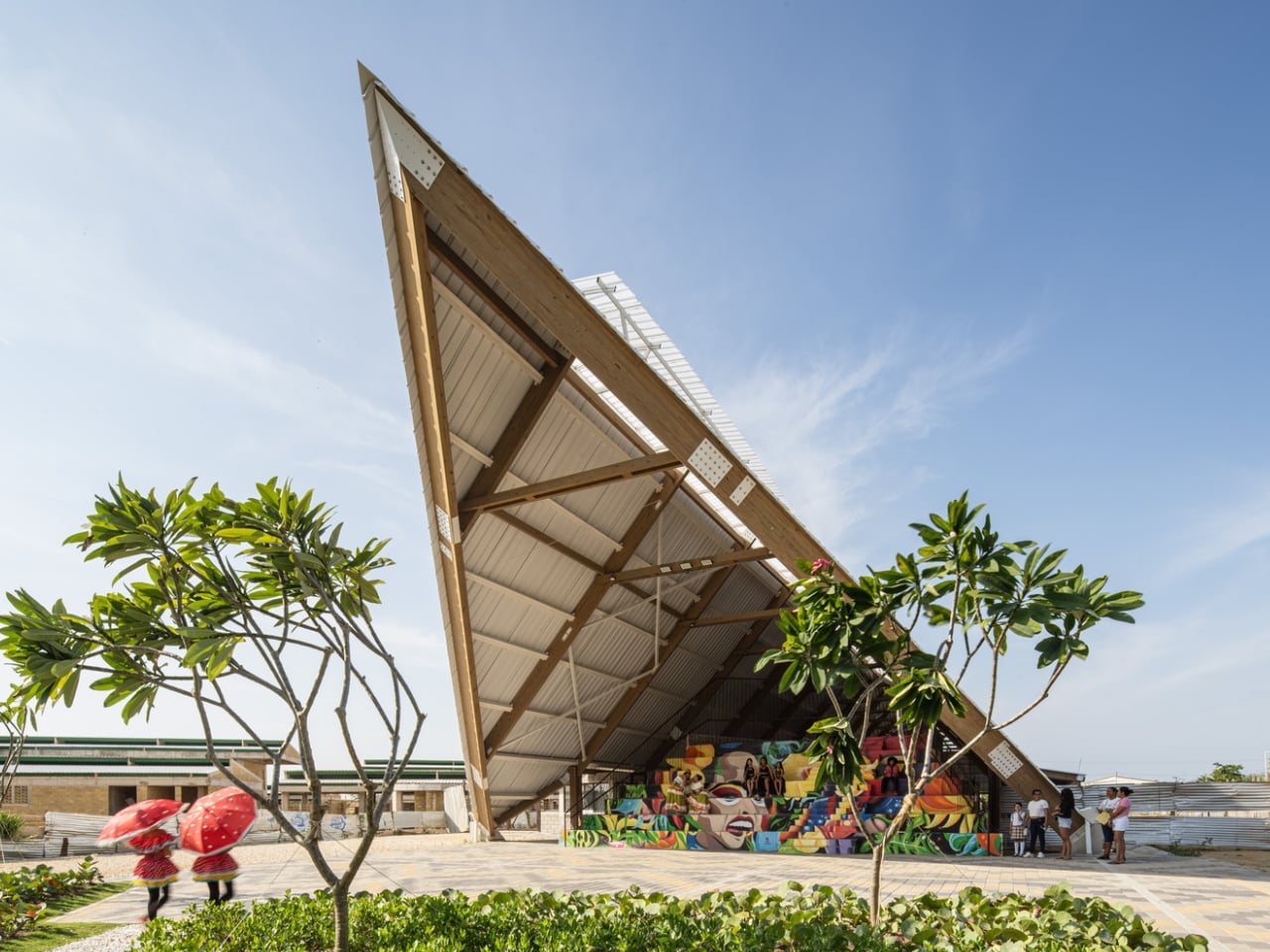
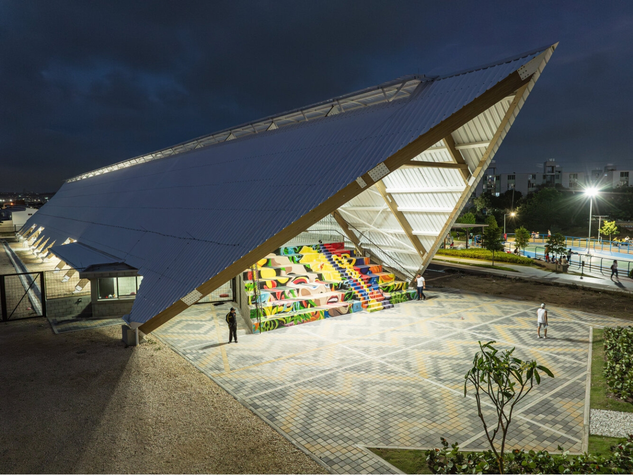
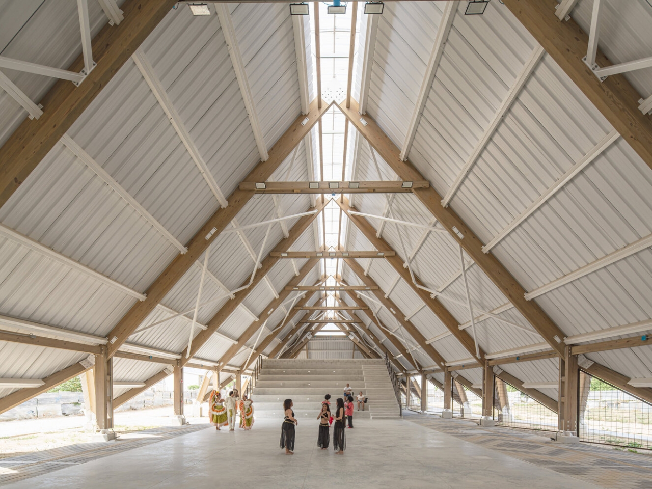
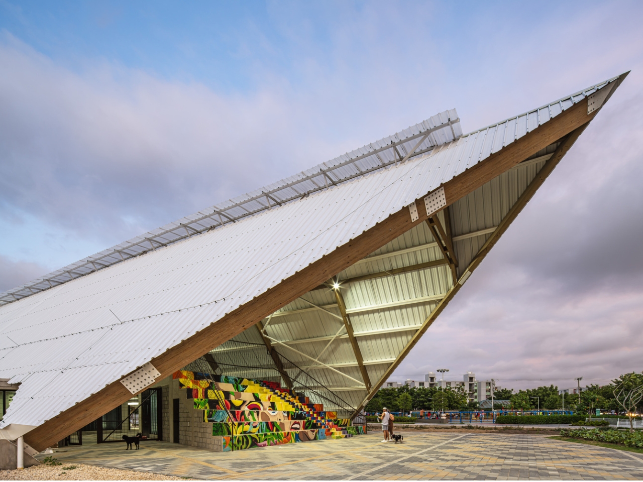
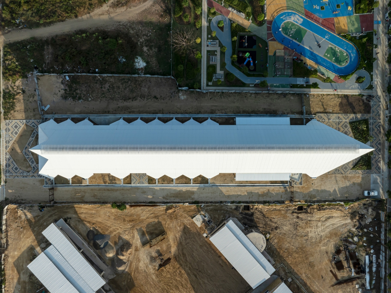
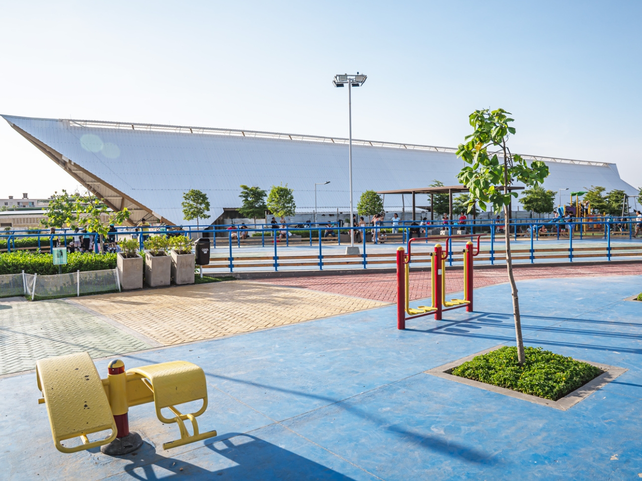
The result is an architecture that reads as both humble and generous. The centerpiece is a continuous lightweight canopy that serves as the structural and symbolic heart of the building, providing shade and shelter against Barranquilla’s hot, arid climate. The city deals with intense solar radiation and seasonal rains, so this isn’t a design flourish for the sake of it. It’s a practical move that communicates something clearly: the physical comfort of the people who will actually use this space matters. You’d think that would go without saying, but in the long history of public architecture built for low-income communities, it very often does not.

Beyond the building itself, Villas de San Pablo has been developed around a 20-Minute City model, a walkable neighborhood concept that places essential services within reach without forcing families into long daily commutes. The cultural center slots into that framework as a hub combining programming with a maker’s space approach, weaving together elements of indigenous Carnival culture, digital tools, and economic development into a single interconnected vision. The idea that a cultural center can also be an economic catalyst for its own neighborhood is one I find genuinely exciting.

What strikes me most about this project is how directly it challenges the persistent idea that design quality gets distributed to places that can afford prestige. Thoughtful, well-resourced architecture tends to cluster in wealthy areas, which means the communities who might benefit most from it consistently get the least of it. Villas de San Pablo is a quiet but deliberate counter-argument to that pattern. It makes the case that rigorous, people-centered design belongs precisely where displacement and social complexity are highest, not as a gesture of charity, but as a matter of course.

The collaboration between ETH Zurich and local Colombian architects is also worth pausing on. Not because global-local partnerships are unusual, but because of how they worked here and for how long. The project ran from 2018 to completion in 2025, with sustained support from the Swiss Secretariat for Economic Affairs, the Fundación Santo Domingo, and the Municipality of Barranquilla. That kind of long-term institutional commitment, years of engagement before a single slab was poured, makes a real difference in the depth of what gets built.

The Villas de San Pablo Cultural Center does not look like a monument. It looks like a place people can actually use, in all the ordinary and extraordinary ways a community needs a gathering space to function. That, more than any signature gesture, was always the point.

The post Colombia’s Most Important New Building Isn’t in Bogotá first appeared on Yanko Design.
Insta360 X6 Leak Reveals a Shorter, Stockier Body, and I Have Battery Concerns

The internet has spent actual years begging for a mini smartphone. Compact flagships, tiny bezels, something that fits in a single palm without needing a spreadsheet to justify the screen size. Samsung teased it, forums campaigned for it, and every rumor cycle ends the same way, with a phone that somehow got taller instead of smaller. Insta360 looked at all that unmet demand and, whether on purpose or by accident, decided to answer it in the one product category nobody was petitioning about. Their upcoming X6 leaked this week, and the headline isn’t just the spec bump, it’s the shape. Shorter. Stockier. A real departure from the elongated body the X series has worn since the X3.

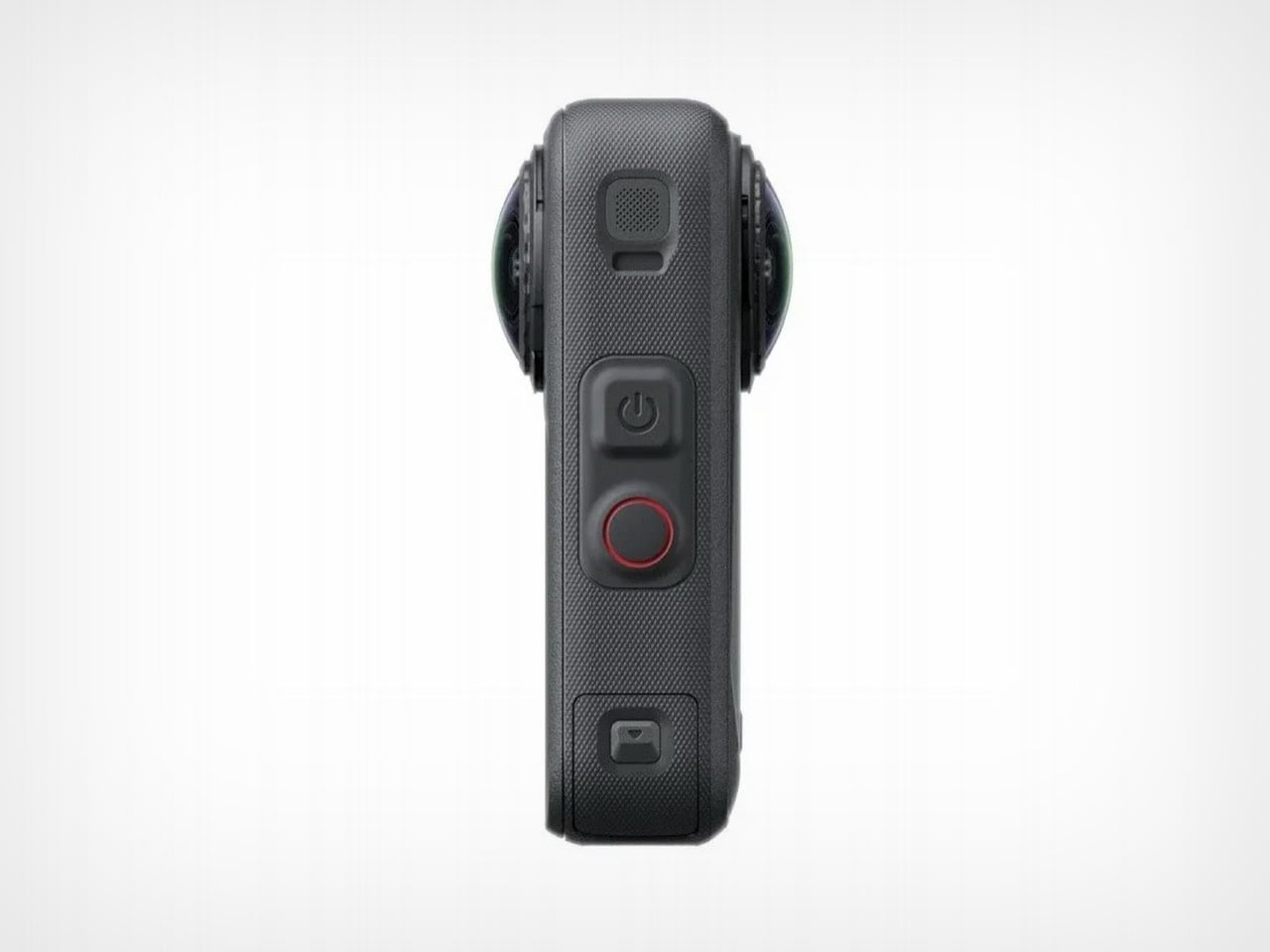
Roland Quandt of WinFuture broke the story, spotting the camera listed early at a retailer alongside official marketing images that confirm the redesign in full. The X6 keeps the dual fisheye lens setup on front and back for capturing 360 degree footage, along with the small side mounted display that’s handled preview and settings duties since earlier generations. What’s changed is everything around that formula. Performance climbs to 8K at 50 frames per second in full 360 mode, up from the X5’s 30fps ceiling. Pricing leaks put the base model at 689 euros, with an Essentials Bundle running 789 euros. No official launch date has surfaced yet, though a retail listing at this stage usually means an announcement isn’t far behind.

Designer: Insta360

Nobody asked Insta360 for a smaller camera specifically, but the timing scratches an oddly similar itch to the mini phone conversation. We wanted small and premium in our pockets, they’re apparently delivering small and spherical instead, and the resemblance to a standard action cam silhouette is doing a lot of the visual work here. Gone is the candy bar proportions that made the X5 and X3 instantly recognizable from across a gear bag. In its place sits something that could plausibly be mistaken for a GoPro at a glance, at least until you clock the second lens staring back at you from the rear.

That shrink isn’t free – the X5’s battery wasn’t tucked into a corner somewhere convenient, it ran along nearly the entire length of that longer chassis, functioning almost like a structural spine as much as a power source. Compress the spine and you’re left with a real engineering decision to make. Either the cell itself shrank, sacrificing some runtime in the process, or Insta360 found a differently shaped battery that fits the new footprint without giving up capacity, or there’s some internal repackaging happening that redistributes components in ways this product line hasn’t tried before.

None of this has been confirmed yet, and that’s precisely the fun part of covering a leak this early. The images give us the exterior story clearly enough, right down to the reshaped corners on that side display and a button layout that looks reorganized to fit the tighter shell. What they don’t give us is a teardown, a battery spec sheet, or any hint of how Insta360 is managing thermals for a higher frame rate inside a smaller volume. Cramming more compute into less space usually means better heat engineering somewhere, or a compromise the company hasn’t disclosed. We’ll be watching for the official reveal, because this is the kind of redesign that deserves receipts, not just render leaks.

The post Insta360 X6 Leak Reveals a Shorter, Stockier Body, and I Have Battery Concerns first appeared on Yanko Design.