The soundbar has become the default home theater upgrade for anyone who doesn’t want to fill a room with floor-standing speakers and receiver cabinets. It’s a sensible trade-off, but most soundbars operate as completely passive objects once they’re set up, reflecting nothing about what’s actually playing or offering any real interaction beyond a remote nobody can ever find. The visual side of the experience has always been an afterthought.
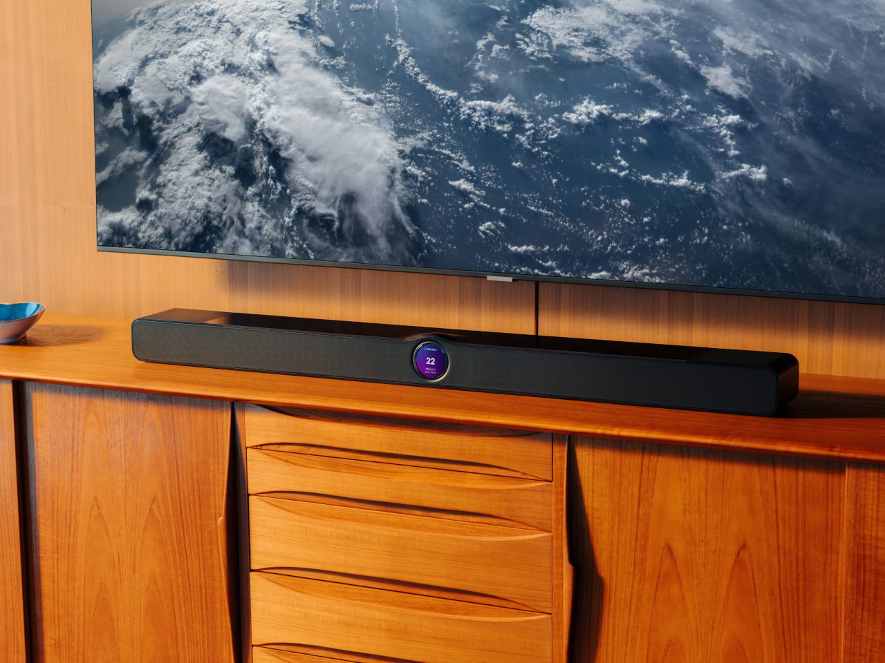
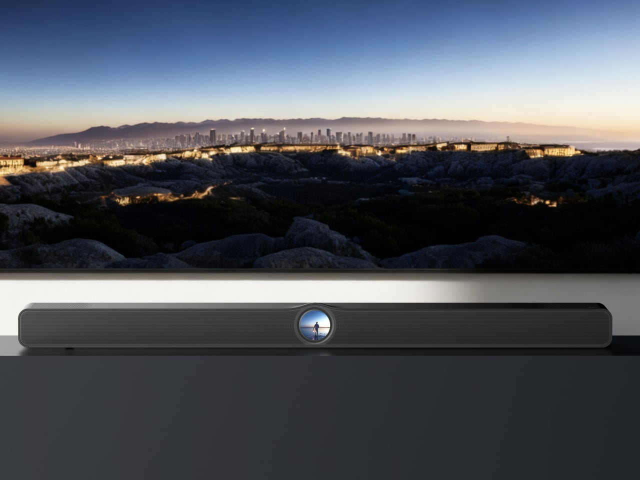
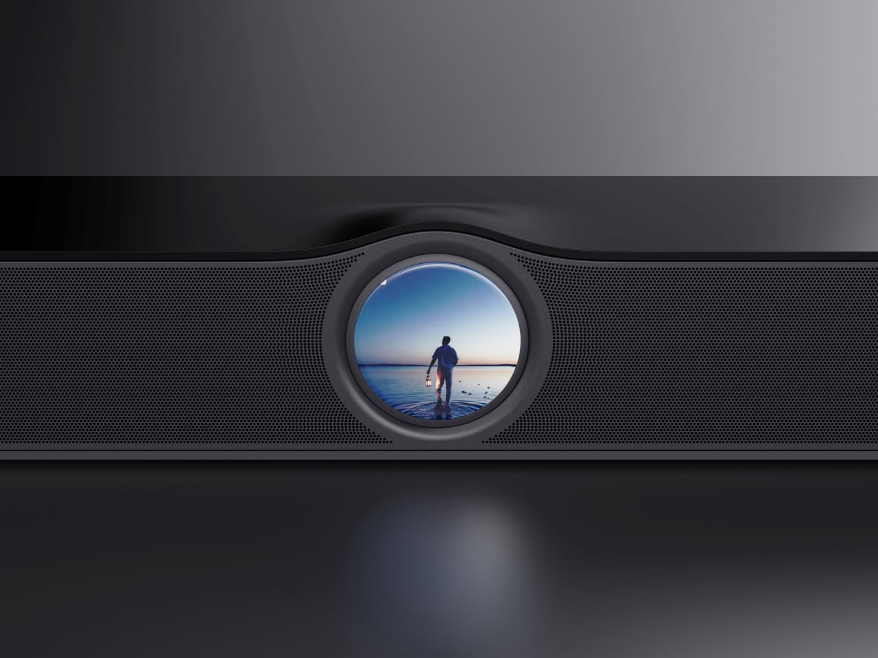
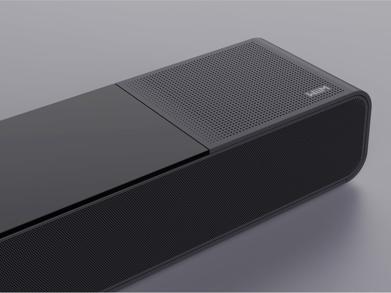
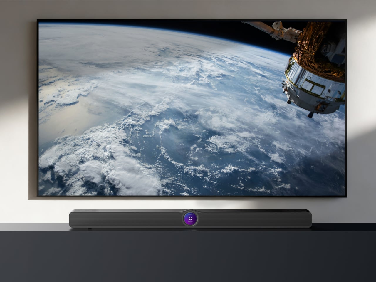
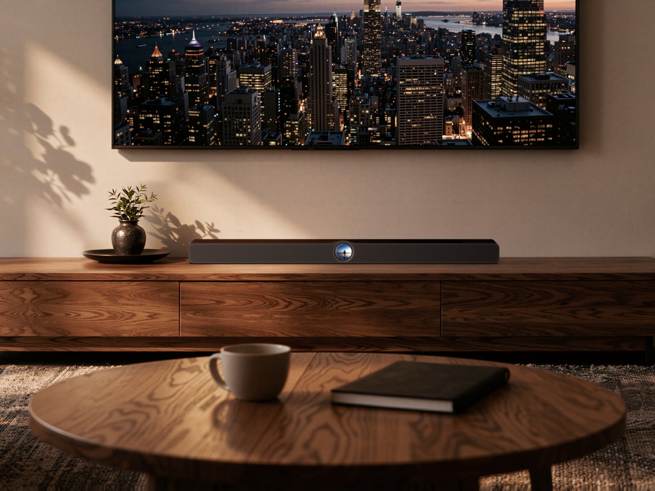
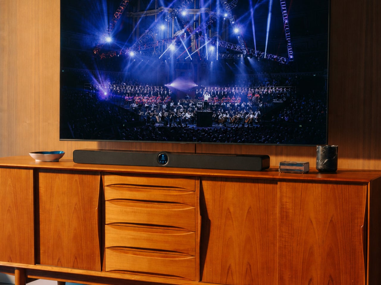
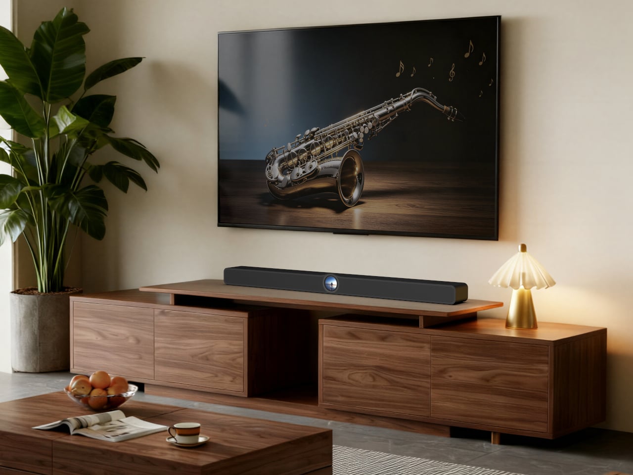
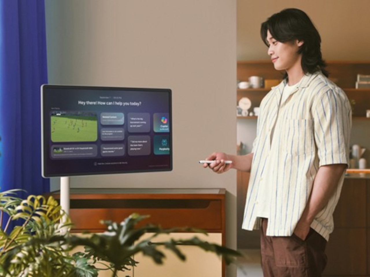
WiiM is entering the soundbar market for the first time with the WiiM Bar, and the defining choice it made is a 2.1-inch round touch display embedded in the center of the bar’s front face. That decision drives the entire product concept, making the soundbar itself a point of interaction rather than something you control exclusively from your phone or a remote that lives behind a couch cushion.
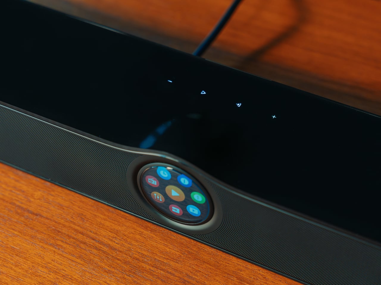
The glass-covered round display sits within a gentle wave-shaped recess on the bar’s surface, showing album art, track info, the time, EQ settings, Smart Presets, and Recently Played content in a format readable from across the room. A tap plays, pauses, skips, switches sources, or selects an EQ profile without reaching for anything else. Clock faces and dynamic wallpapers take over when nothing’s actively playing.
Sonically, the WiiM Bar delivers a true 3.0.2 Dolby Atmos configuration using an eight-driver array: three front mid-woofers, three front tweeters, and two full-range drivers on top that fire upward for height effects. Four passive radiators, two on the front and two on the rear, extend the bass response. The system peaks at 135W and includes HDMI eARC alongside optical, line-in, and configurable USB audio connections.
RoomFit auto-correction measures the acoustic characteristics of the space and adjusts the output accordingly, so placement against a wall doesn’t work against the sound. A Clear Voice mode uses AI-powered dialogue separation in real time, which is genuinely useful for anyone who reaches for subtitles not because a show is quiet, but because the mix buries speech under effects. Night Mode keeps that clarity intact at lower volumes.
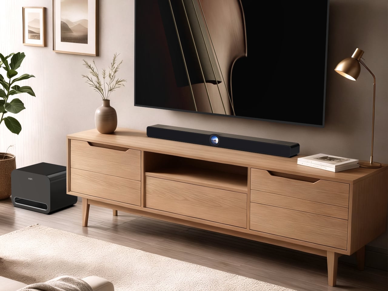
The 3.0.2 configuration is a starting point rather than a ceiling. Compatible WiiM devices can be added wirelessly as surrounds and a subwoofer, taking the system to a full 5.1.2 home theater without additional wiring. The WiiM Home App manages EQ, Smart Presets, and multi-room grouping, letting the bar sync with WiiM Amp, Ultra, Pro, and Mini devices across the rest of a home.
Streaming reaches over 20 services through the app, with direct casting via Spotify Connect, TIDAL Connect, Qobuz Connect, Google Cast, Roon, and Amazon Music Cast. Wi-Fi 6E covers all three bands, Ethernet offers a wired fallback, and Bluetooth 5.4 with LE Audio handles device pairing. A USB host port lets the bar serve a personal media library to other WiiM and DLNA devices on the network.
The WiiM Bar ships in July 2026, priced at $479, available for pre-order now through wiimhome.com, Amazon, and select retail partners. For a market full of soundbars that treat control as an afterthought and expansion as an expensive aftermarket exercise, it offers a fairly direct argument: an on-device touch interface, honest Dolby Atmos performance, and a clear path to a proper surround setup whenever the moment calls for it.
Touchscreens have been quietly making their way into almost everything around us. From car dashboards to kitchen appliances, the tap-and-swipe interface that once defined smartphones has spread into nearly every product category imaginable. It’s reached a point where finding a device without a screen feels more unusual than finding one with it. Designers just keep finding new surfaces to embed them on.
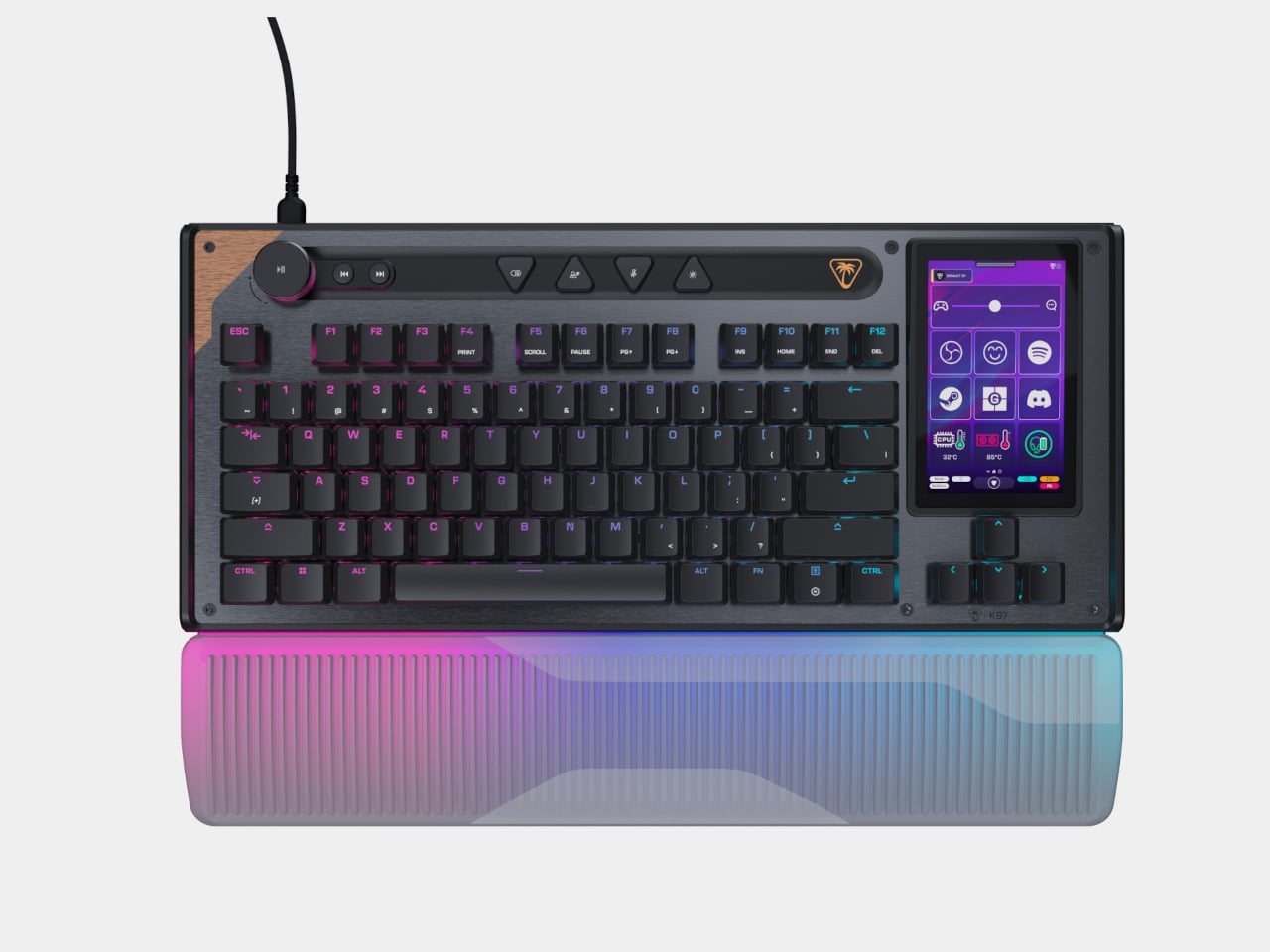
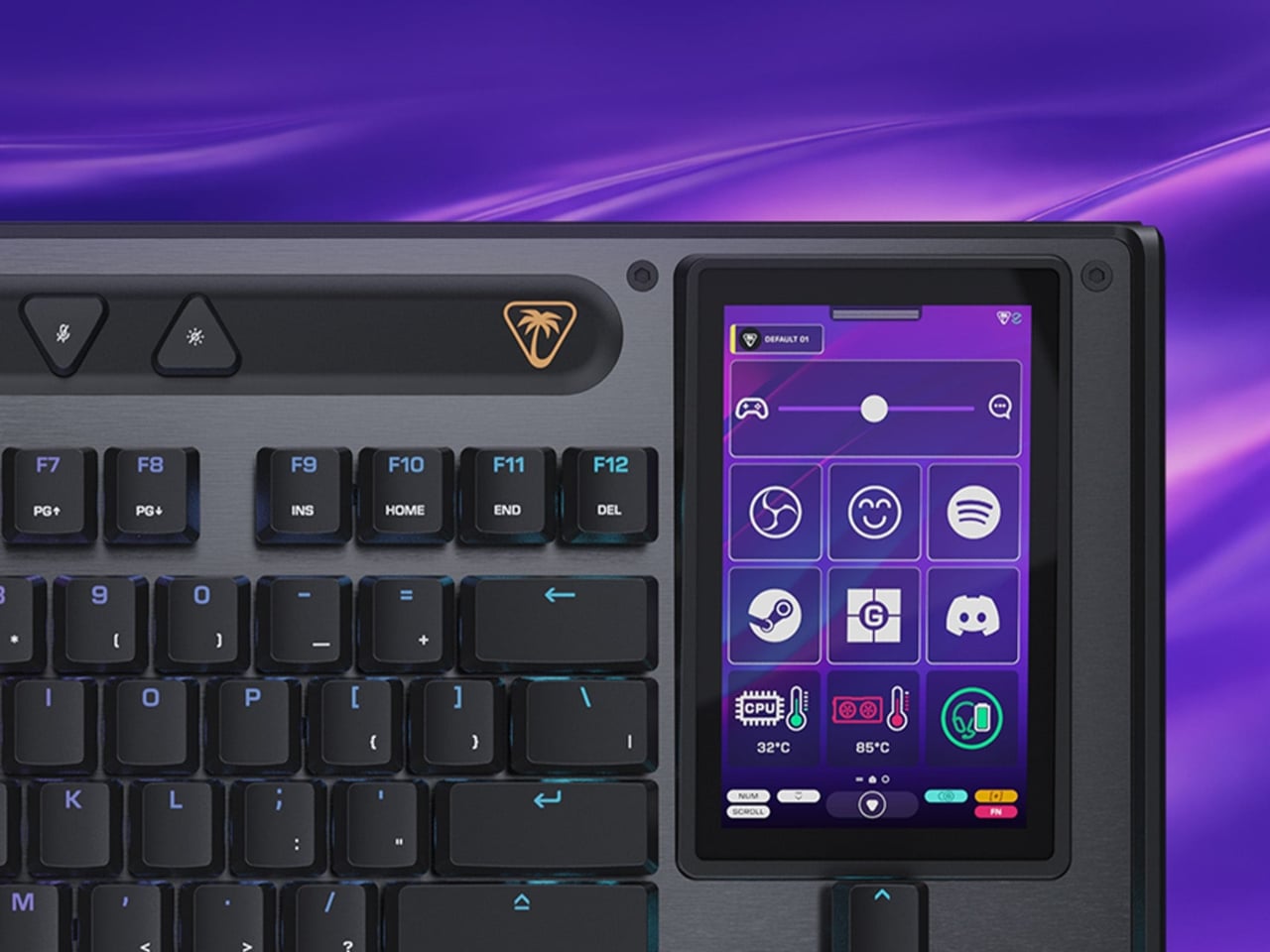
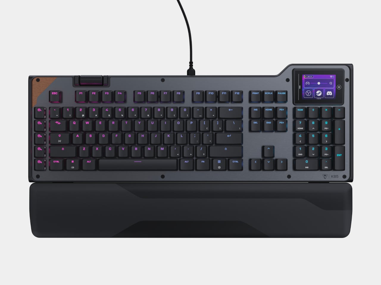
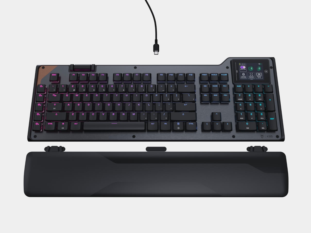
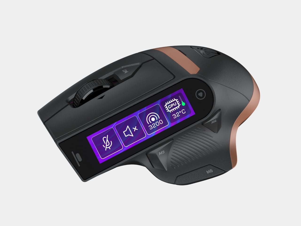
Turtle Beach’s all-new Command Series is the latest proof of that. The lineup includes, among other things, two keyboards, the KB7 and the KB5, plus a wireless mouse, the MC7, each with an embedded Command Touch Display. For gamers, streamers, and multitaskers who are constantly juggling tasks at once, having a dedicated control surface right where your hands already rest makes for a genuinely practical setup.
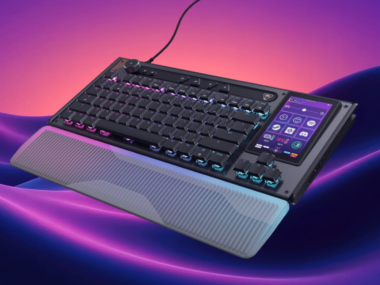
The KB7 is the flagship, a tenkeyless board with a 4.3-inch Command Touch Display built into it. Think of it as a Stream Deck fused onto your keyboard, letting you swap profiles, trigger macros, manage audio, or push OBS scene changes with a tap. For streamers bouncing between a game and broadcast software, it removes a good chunk of extra hardware and window-switching.
Its Titan low-profile Hall Effect switches have adjustable actuation down to 0.1mm with Rapid Trigger support, and the keyboard runs at an 8K polling rate with 0.125ms latency. The slim 29mm chassis is aluminum-reinforced, with double-shot PBT keycaps, textured WASD keys, and an illuminated detachable wrist rest. Dual modular rails let you dock the KP7 add-on keypad for an expanded layout. The KB7 is priced at $199.99.
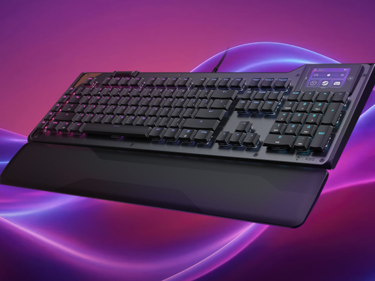
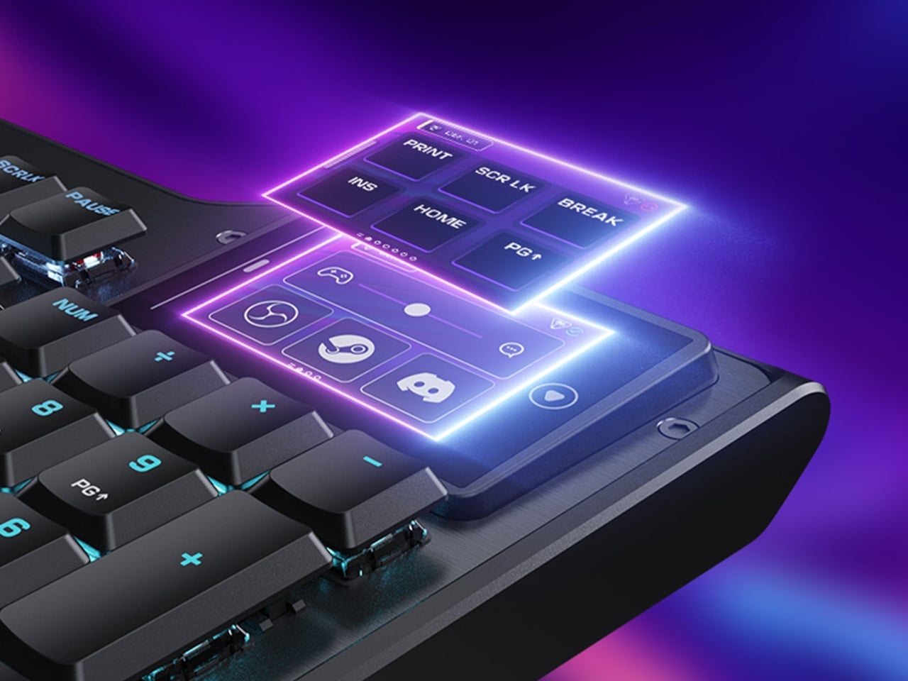
The KB5 is the full-size option at $149.99, offering the numpad that the KB7 leaves out. Its touchscreen shrinks to 2.4 inches but still handles OBS integration, profile switching, and macro control. Titan low-profile mechanical switches actuate at 1.2mm, backed by ReacTap technology for faster resets. Five dedicated macro keys, a detachable wrist rest, and 8K polling round it all out.
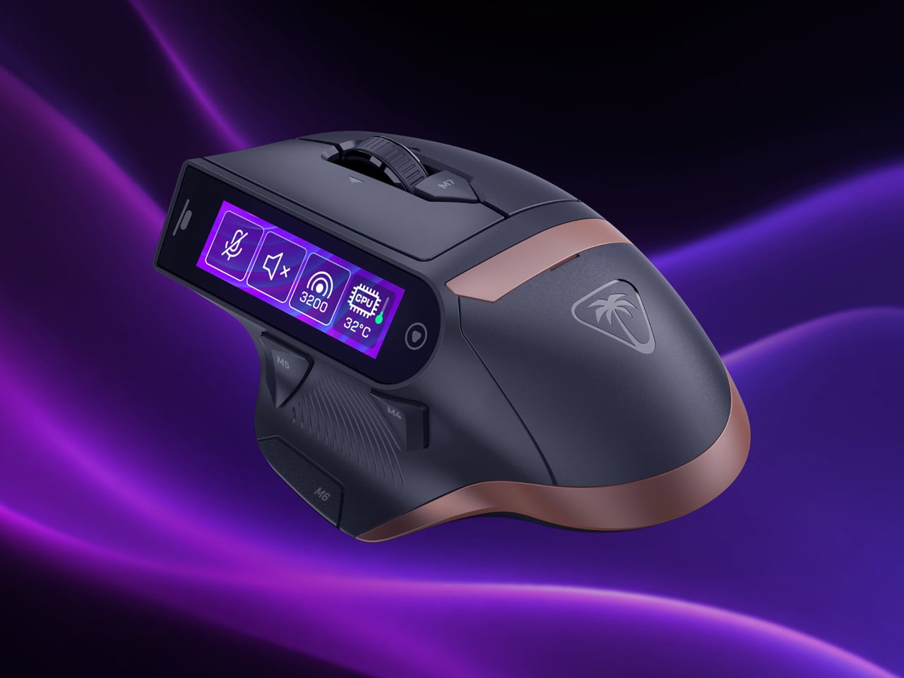
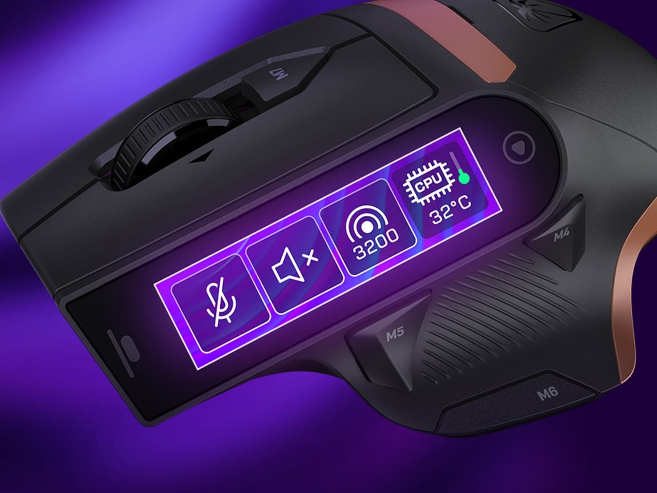
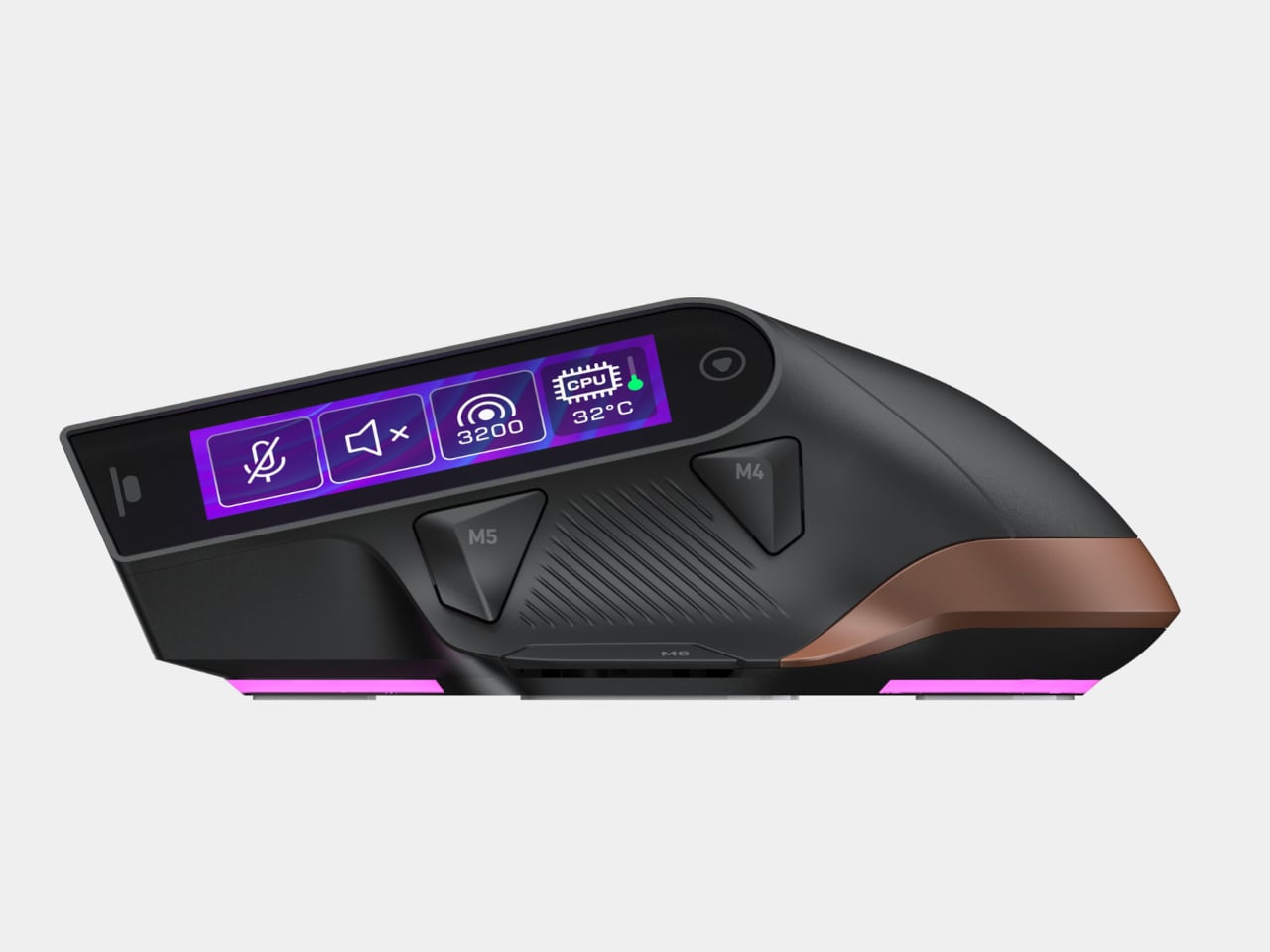
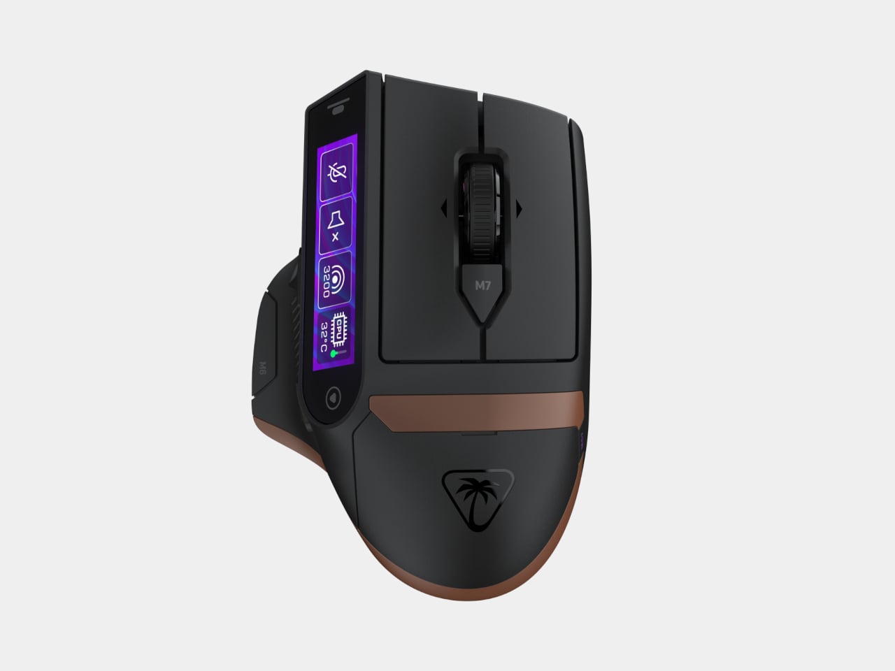
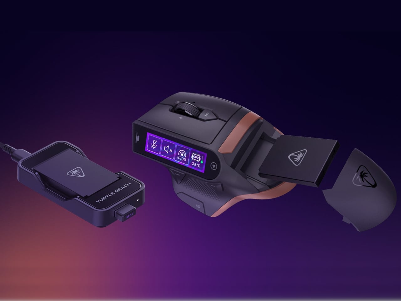
Then there’s the MC7, the device that makes you look twice. It’s a wireless gaming mouse with its own 2.25-inch touchscreen, and it works much the same as the keyboard displays. On the fly, you can adjust DPI, switch between five onboard profiles, mute your mic, or trigger OBS scene changes without breaking your grip or pulling your attention away from whatever’s on your screen.
Under the hood, the MC7 has the Owl-Eye 30K DPI optical sensor, Titan Optical switches, and tri-mode connectivity across 2.4GHz wireless, Bluetooth, and USB wired. Two hot-swappable 1000mAh batteries with a charging dock keep it running indefinitely, with each cell lasting up to 10 hours. It’s priced at $159.99 and launches globally on July 19, 2026, two months after the keyboards.
All three are already up for pre-order at turtlebeach.com. Together, the KB7, KB5, and MC7 form an ecosystem built on the idea that the peripherals you hold every day can surface controls without making you reach for anything else. Touchscreens have ended up in some strange places over the years, but a mouse grip might actually be one of the more intuitive ones.
AI has become a permanent fixture in how we work, but accessing it still feels strangely clumsy. Most of the time, it means opening yet another browser tab, typing a prompt into a chat window, waiting for a response, then copying it somewhere else. The irony is thick: tools designed to save time end up buried under the same pile of windows and notifications they were supposed to help manage.
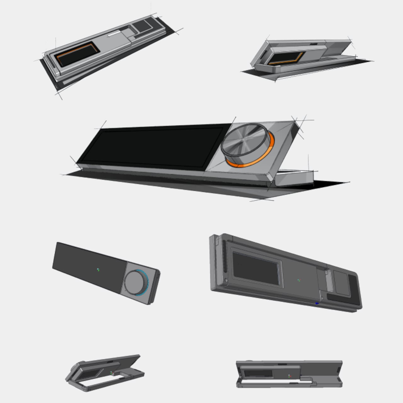
The DECOKEE Quake approaches this problem sideways, and the solution is physical. It is a desktop terminal built around an 8.88-inch ultra-wide IPS touchscreen and a single rotary control knob, designed to sit alongside a keyboard rather than compete with the monitor above it. Everything about the form factor suggests a device that wants to be glanced at, tapped, and spoken to, not stared at for hours.
Pick it up and the construction registers immediately. The body is CNC-machined aluminum alloy with an anodized matte finish, a material choice that gives the Quake a density and coolness that plastic peripherals simply cannot replicate. A transparent backplate on the rear adds a subtle design signature, while the adjustable stand lets the screen tilt anywhere from flat to 60 degrees. At roughly 800g, it has enough heft to stay planted on a desk without feeling like an anchor.
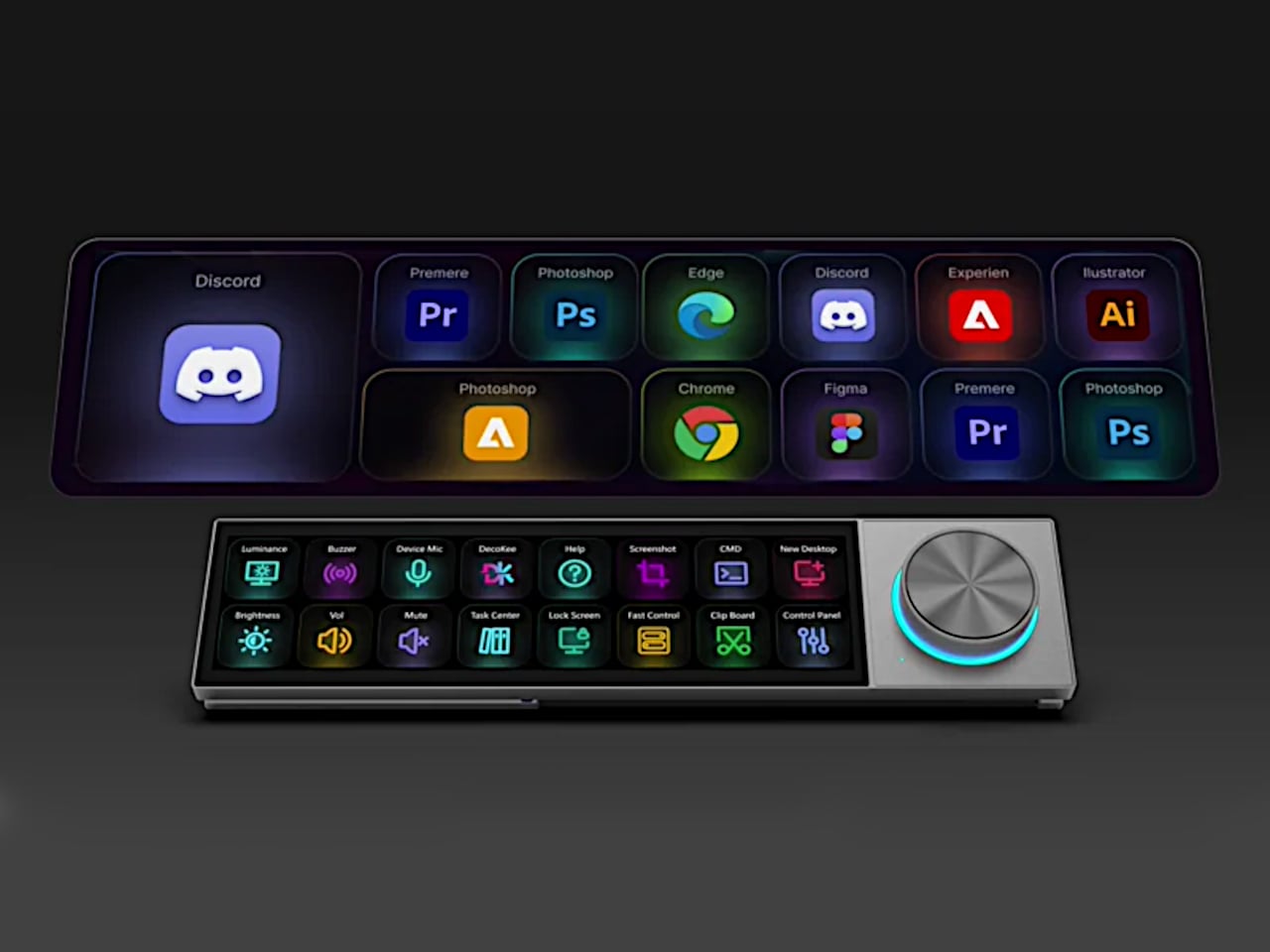
That ultra-wide screen has a 1920×480 resolution at 450 nits or brighter, and its unusual aspect ratio turns out to be a deliberate design decision. Rather than mimicking a small monitor, the panel is shaped for control surfaces: rows of customizable touch shortcuts, status dashboards, system stats, and meeting interfaces laid out horizontally. The rotary knob beside it offers infinite rotation with a push-button click and an RGB light ring that changes color based on what mode the Quake is operating in, turning a simple input device into a status indicator.
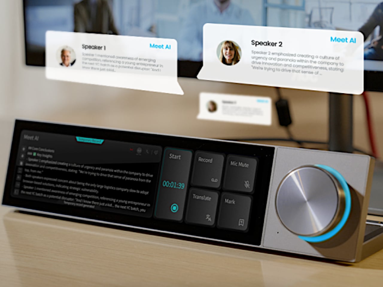
Where the Quake earns its “AI copilot” label is in meetings. Tap a button, and it begins recording through a built-in far-field microphone with noise reduction, then auto-generates a structured transcript and summary when the call ends. Ten summary templates let the output match the context, whether it is a standup, a client call, or a brainstorm. Real-time translation covers 17 languages, and a system-level mic mute button works across every app on the computer, not just Zoom or Teams.
Beyond meetings, holding the knob and speaking activates a conversational AI layer with over 100 configurable assistant roles. Ask it to generate a shortcut layout for Photoshop, and it builds one on screen, ready to use. Ask for a translation, a compliance check, or a math solution, and the response appears on the Quake’s display without ever pulling focus from the main monitor. The same voice input can produce custom wallpapers and emojis, though the novelty of AI-generated desktop art will vary by taste.
The feature list stretches further than expected for a device this compact. A system monitoring mode displays real-time CPU, memory, and network stats. A Discord overlay gives gamers channel and mute controls without alt-tabbing. Home Assistant integration (through API setup) allows single-tap smart home control from the touchscreen. There is even a music player with a vinyl-inspired interface that connects to Spotify or plays local files, which is a charming if unexpected addition to a productivity device.
What makes the Quake interesting as a design object is the underlying argument it makes about where AI belongs on a desk. Not trapped inside a browser tab, not buried in a notification, but sitting in a physical surface with tactile controls and a screen that stays visible. Whether that argument holds up after months of daily use is something only shipped units will answer.
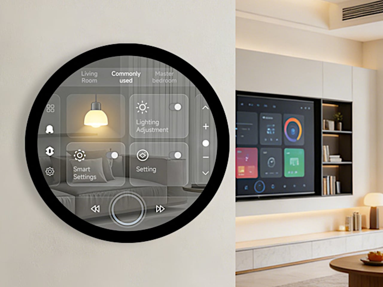
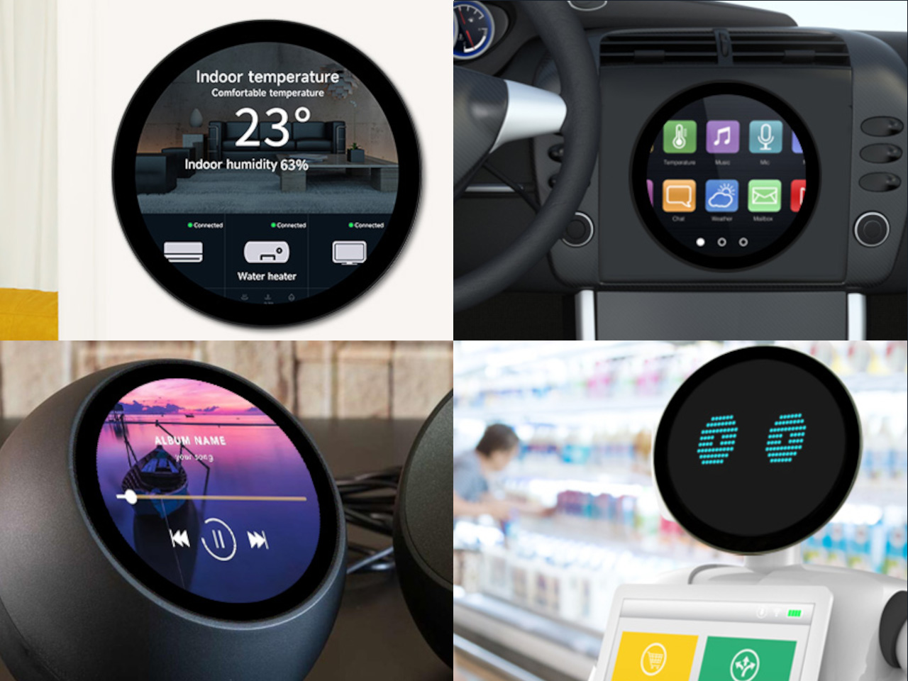
Circular interfaces keep showing up in design. Thermostats, smart speakers, automotive dials, wearable-inspired dashboards, the circle feels friendly and “instrument-like” in a way that rectangles don’t, especially when the goal is a glanceable, ambient piece of hardware rather than something you stare at for hours. The problem is that most prototyping hardware is rectangular, so designers either fake a round interface on a square screen or spend weeks sourcing a custom circular panel.
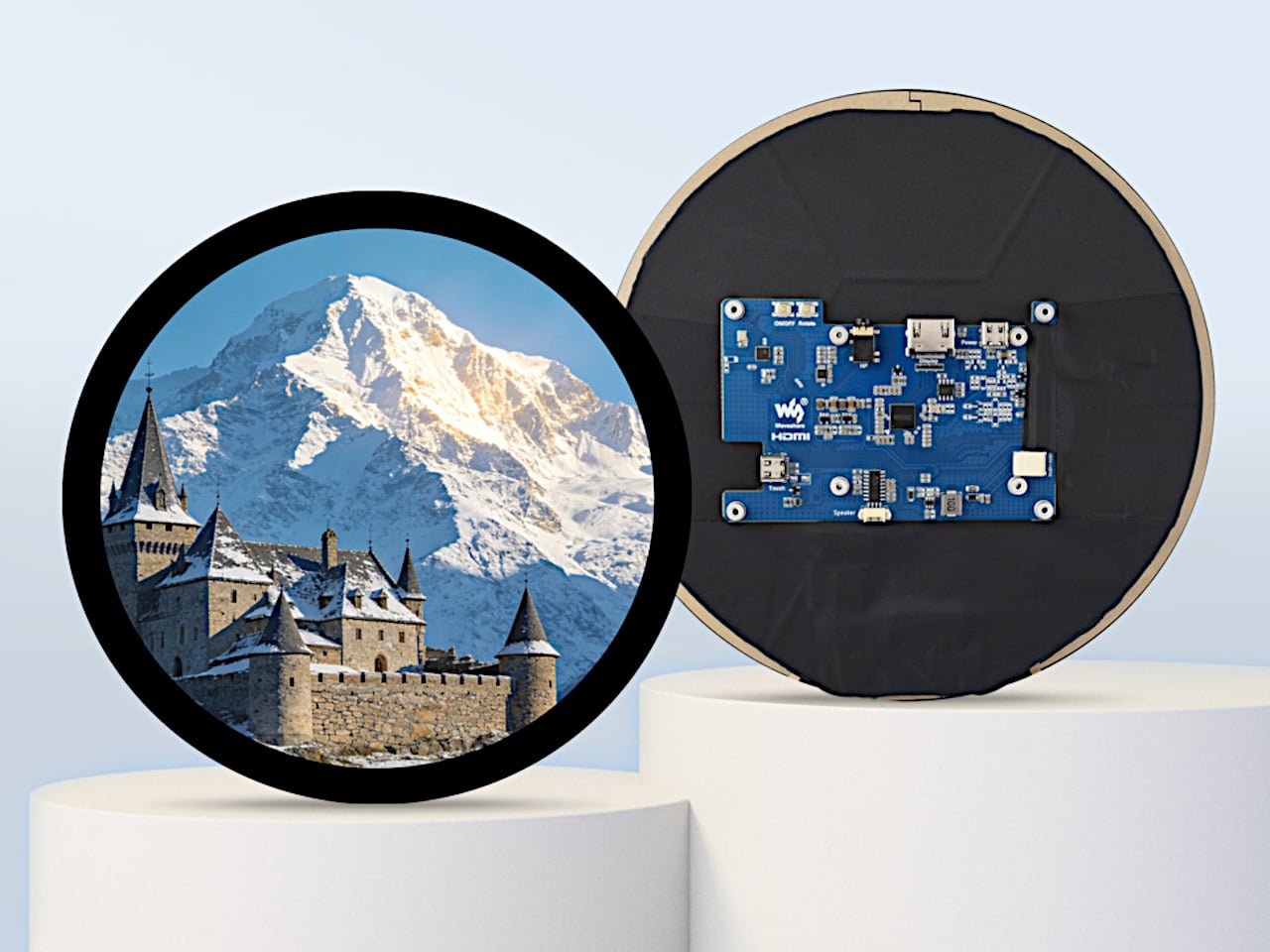
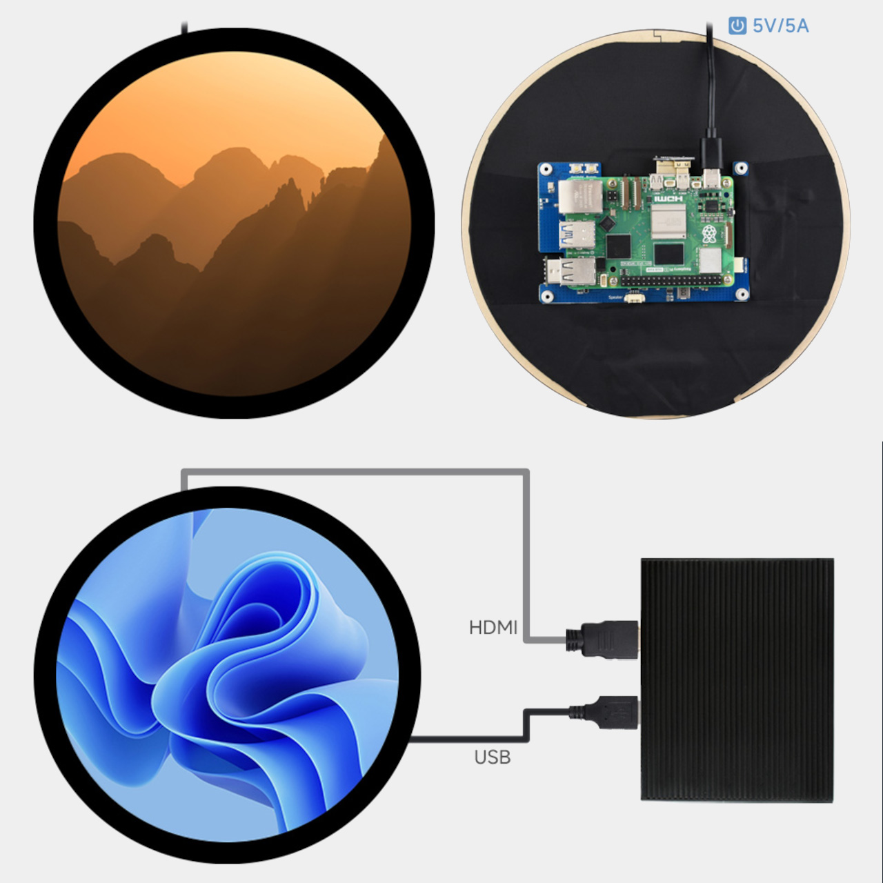
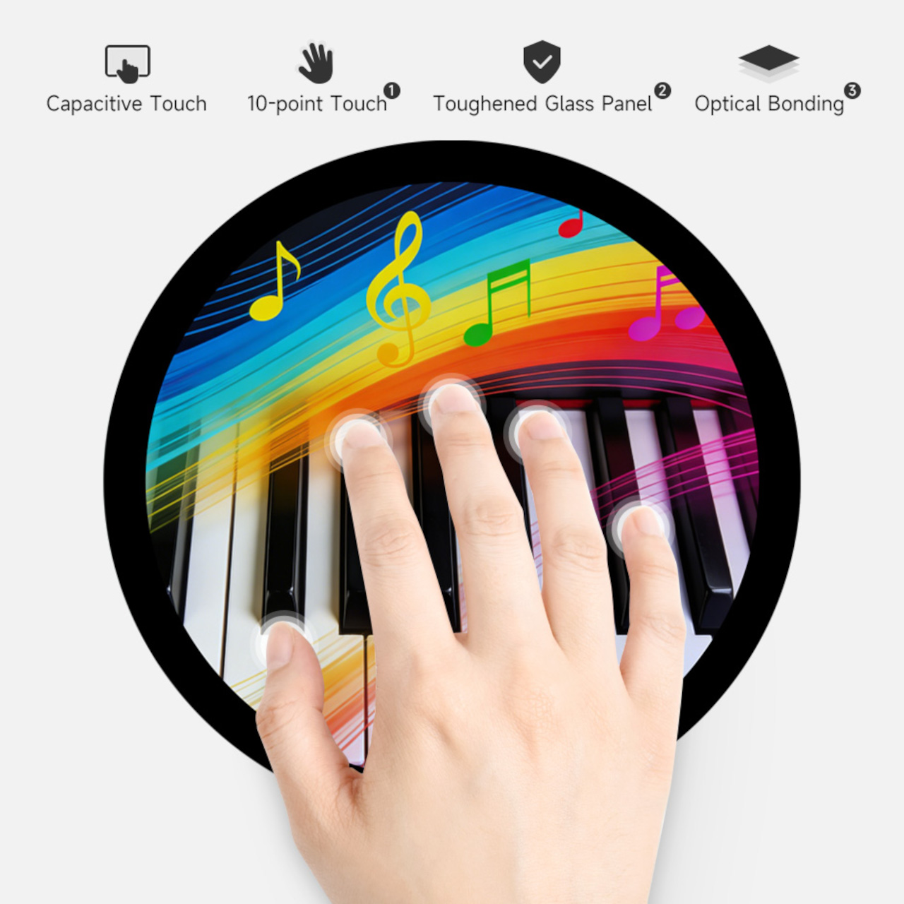
Waveshare’s 7-inch round touch display tries to remove that bottleneck. It’s a 1080×1080 IPS panel with 10-point capacitive touch, optical bonding, and toughened glass, all in a circular form factor that connects to a host device over HDMI with a separate USB-C cable for touch data. The premise is simple: treat it like a normal monitor and touchscreen, then build whatever circular UI you want on top of it.
The spec choices that matter for actual design work are mostly about reducing friction. HDMI video input and USB-C touch make the display behave like a standard external monitor to any device that supports it, so you’re not writing drivers or fighting kernel modules before you can see your UI on screen. Waveshare claims driver-free operation on Windows 11 down to Windows 7, plus Raspberry Pi OS with full 10-point touch, and Ubuntu and Kali with single-point, which is more than enough for early-stage prototyping.
Brightness is rated at 800 cd/m², with a 160-degree viewing angle from the IPS panel. For a prototype that’s going on a wall, into a vehicle mock-up, or onto a demo table for a client presentation, that combination means the display stays legible from reasonable distances and off-angle views. The optical bonding also closes the air gap between the glass and the LCD, so it reads more like a laminated consumer screen than a development board display, which makes a quiet difference when you’re showing work to someone who doesn’t build hardware for a living.
The small onboard controller adds a few practical tools: a physical touch rotation button for flipping between portrait and landscape without touching software, and a backlight adjustment that can be controlled via software. There’s also a 3.5mm audio jack and a 4PIN speaker header if you want to add sound to the build. None of these are headline features, but they’re the kind of things that accelerate iteration without requiring extra components or hacks.
Platform support stretches from Raspberry Pi 3 all the way through Pi 5, plus NVIDIA Jetson boards for more compute-intensive builds, and standard Windows PCs for larger installations or kiosk-style demos. That breadth means the same display can serve a lightweight Pi-based smart-home prototype one week and a Jetson-powered vision demo the next.
A circular screen goes beyond novelty into a very different product personality. Having an off-the-shelf option that handles touch, connects over standard cables, and doesn’t require driver work means designers can spend time on the actual interaction and enclosure instead of fighting the hardware stack to get a circle on screen.
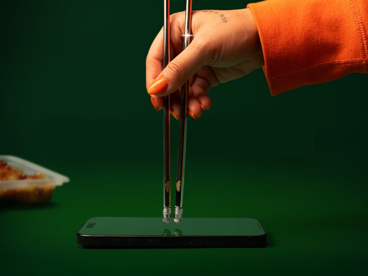
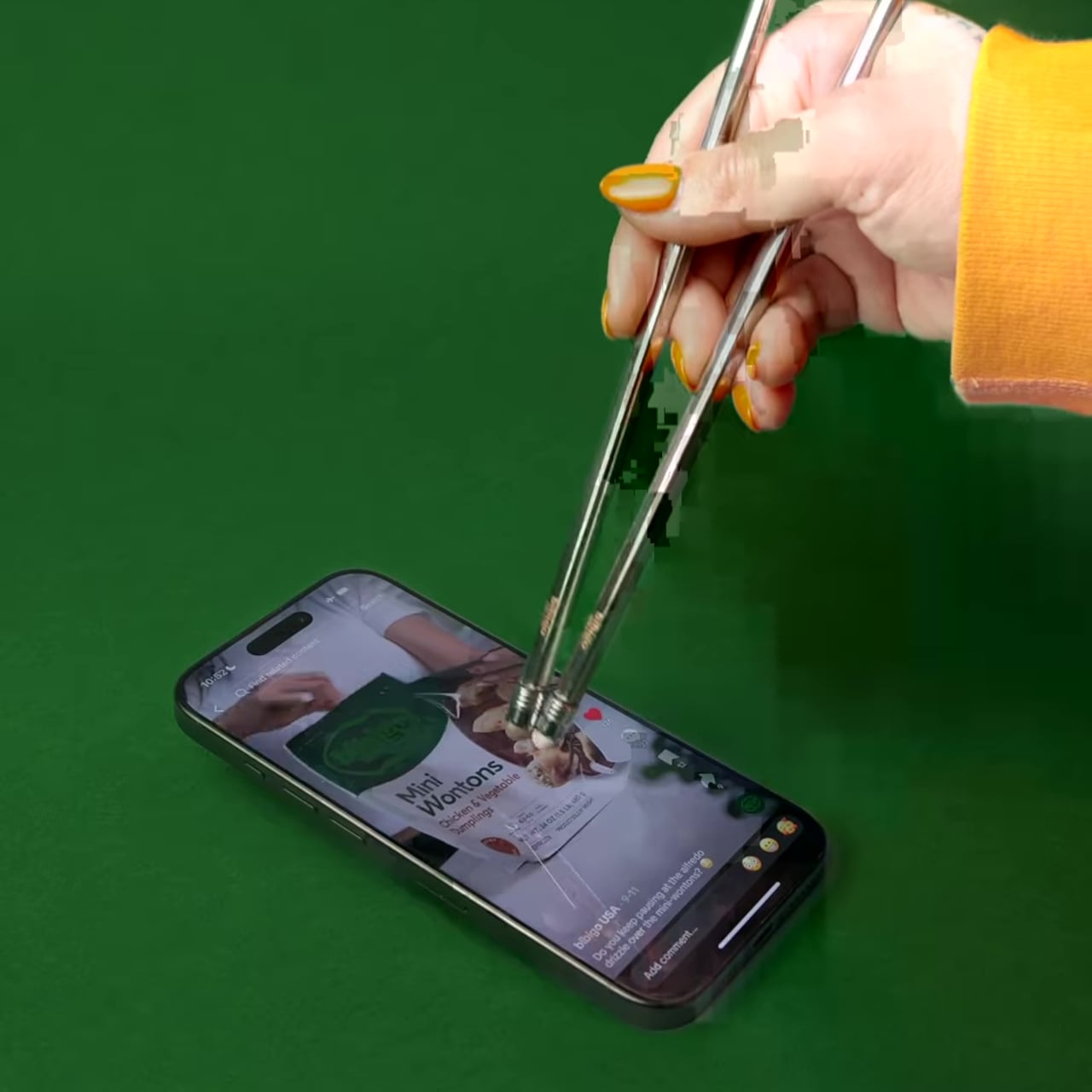
There’s a greasy phone screen somewhere in your immediate past. Maybe it was a dumpling, maybe it was a bowl of noodles, maybe it was something with a suspiciously orange sauce. Either way, you were eating and scrolling at the same time, and the evidence is still on the glass. Nobody’s proud of it, but according to a survey bibigo ran through Angus Reid, 96% of Americans have used their phone while eating, so at least you’re in excellent company.
bibigo, the Korean food brand behind what the internet has collectively decided are its favorite dumplings, decided to design for the habit instead of lecturing about it. ScrollSticks are dual-ended chopsticks with touchscreen tips, one end for picking up food and the other for tapping, swiping, and scrolling on a phone. The premise is simple: two dedicated ends for two different jobs, keeping the oil and sauce where they belong.
The research behind the launch is basically a monument to relatable chaos. Beyond the 96% who’ve scrolled while eating, 66% do it often during at least one meal a day. Nearly three in four people report frustrations: 41% are frustrated by getting their hands or phones dirty, 30% struggle to hold a phone comfortably while eating, and 28% can’t keep their screen clean. ScrollSticks are bibigo’s answer to all of the above, which is either very clever or a sign of the times, possibly both.
The design logic is straightforward. You eat with the food end, then flip the chopsticks and use the touchscreen-compatible tips to tap and scroll without transferring dumpling residue onto the glass. The tips work with capacitive touchscreens, so it’s not just poking the screen with metal but actually registers as a touch. One tool, two dedicated functions, and your screen stays marginally more dignified.
The cleaning situation is also handled better than you’d expect from what sounds like a novelty item. The touchscreen tips unscrew from the chopsticks, so you can dishwasher or sink-wash the metal body just like any other silverware. That modularity is doing serious practical work here. A touchscreen-tipped chopstick that you can’t properly clean would be a different, worse product.
bibigo frames ScrollSticks as part of its “food-tainment” innovations, which is a word that exists now and apparently describes branded objects that blur eating and entertainment culture. The previous entry in that line was the bibigo Dashboard Kitchen. ScrollSticks are sillier and more useful, which is a hard combination to pull off.
The chopsticks are a limited-edition drop, and the window is short. That’s fitting for something that is partly a product and partly a cultural artifact: a small, polished admission that dinner and doomscrolling are now the same meal, and if the phone is staying at the table, at least the screen deserves better than a dumpling-flavored fingerprint in the corner.
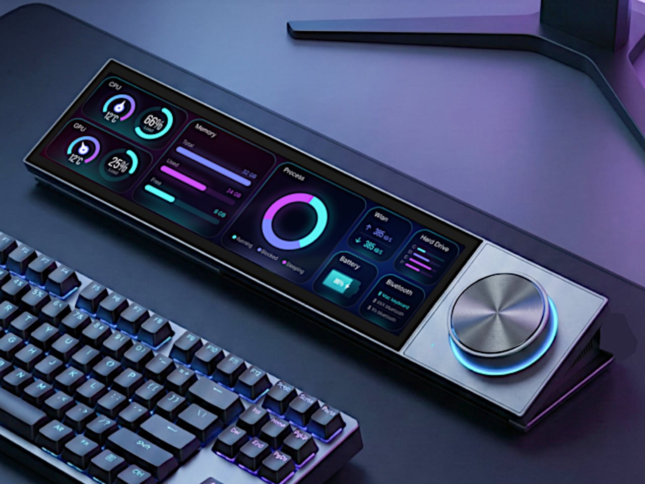
Most desks accumulate a scattered collection of control devices over time. There’s the keyboard and mouse, maybe a Stream Deck for shortcuts, a volume knob for your speakers, a phone running smart home apps, and a separate remote for the desk lamp. Each solves a specific problem, but together they create a landscape of disconnected gadgets competing for space and attention. The monitor sits above it all, while everything underneath becomes a tangled mess of cables and redundant functions.
UltraBar X tries to consolidate that chaos into a single, modular strip that lives under your monitor. Built around a long, wedge-shaped bar with an ultra-wide display, it acts as a command center for your computer, applications, and even your smart home devices. Instead of a fixed product, it works more like a platform where you snap on magnetic modules to build the exact control surface your desk needs.
The central piece is CoreBar, a low, seven-inch display wedge-shaped bar tilted at forty-five degrees so it’s easy to glance at without adjusting your posture. The screen shows clocks, system stats, app icons, and customizable scenes that change based on what you’re doing. Tap the screen to wake your PC, jump between apps, or trigger macros, all from a touch interface that sits right where your hands naturally rest.
What makes the system feel different is how the magnetic modules expand it. DotKey snaps onto the side and brings a cluster of Cherry MX mechanical keys for shortcuts and macros. KnobKey adds a precision rotary dial that clicks crisply as you turn it, perfect for adjusting volume, brush size, or timeline scrubbing. VivoCube is a tiny controller with its own AMOLED screen and switches, small enough to hold or dock alongside the bar.
Of course, there’s also SenseCube, the environmental sensing module. Inside its small triangular shell are millimeter-wave radar and sensors for light, temperature, humidity, and vibration. This gives your desk a kind of ambient awareness, letting it detect when you sit down, notice changes in lighting, or respond when the room gets too warm. The workspace starts to feel less static and more responsive without constant input.
A typical morning might look like this. You walk up to your desk and tap CoreBar to wake the PC, which also brings up a layout tuned for writing and email. The mechanical keys are mapped to window management shortcuts, while the knob handles scrolling through long documents. Later, a single press shifts CoreBar into a design layout, and pretty much the same modules now control brush size, zoom, and layers in Photoshop or Illustrator.
The system doesn’t stop at the screen. Through its network connection, CoreBar can talk to Philips Hue lights to adjust the room based on your focus mode, or trigger a Sonos playlist with a single tap on an icon. The same bar that manages your open apps can also dim the lights or change the soundtrack, turning your desktop into a bridge between your computer and the rest of your space.
What keeps the experience from feeling overwhelming is how the software handles it. CoreBar runs a custom system with an app store and a library of templates for different workflows. Programmers get layouts for terminal, debugging, and IDE shortcuts. Designers get knobs and keys for brushes and layers. Streamers get scene controls and quick mutes. These templates bundle icons, animations, and logic, so you can load a complete setup without building from scratch.
That said, the modular approach means the system can grow over time. You can start with just CoreBar and add modules as you figure out what you actually need, swapping them in and out as your workflow shifts. The QuantumLink magnetic protocol means modules snap on, get recognized instantly, and can be reconfigured in seconds without tools or menus.
UltraBar X is made for people who enjoy shaping their tools rather than accepting whatever default interface their operating system provides. It doesn’t replace your keyboard or mouse, but it gives the space under your monitor a clear job beyond collecting dust and cable clutter. For anyone tired of juggling separate devices or hunting through nested menus, a modular bar that can sense, adapt, and consolidate feels like a thoughtful step toward desks that work the way you do.
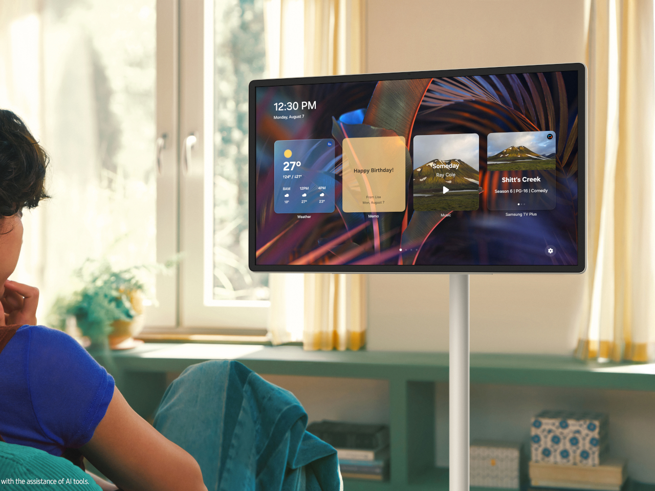
TVs stay bolted to walls where they were installed years ago. Monitors sit on desks connected to power outlets and computers through cables that limit how far they can go. Tablets work anywhere, but shrink everything down to sizes that feel cramped during longer sessions. Most screens plant themselves in one spot and expect you to come to them instead of moving to where you actually need them.
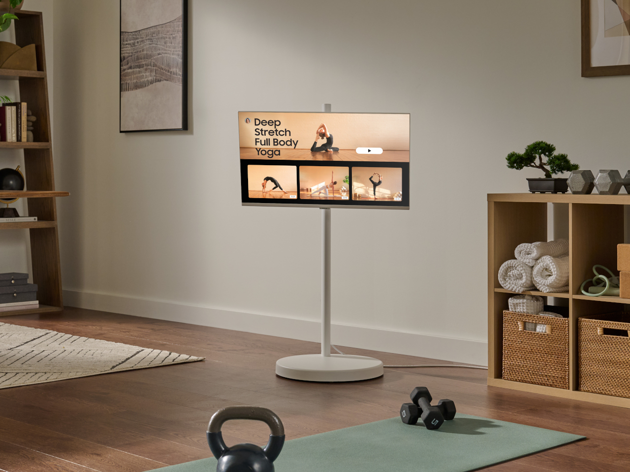
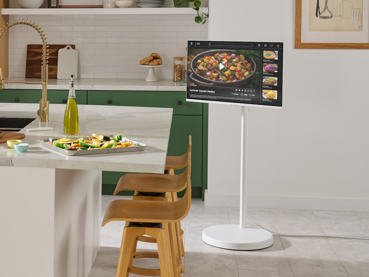
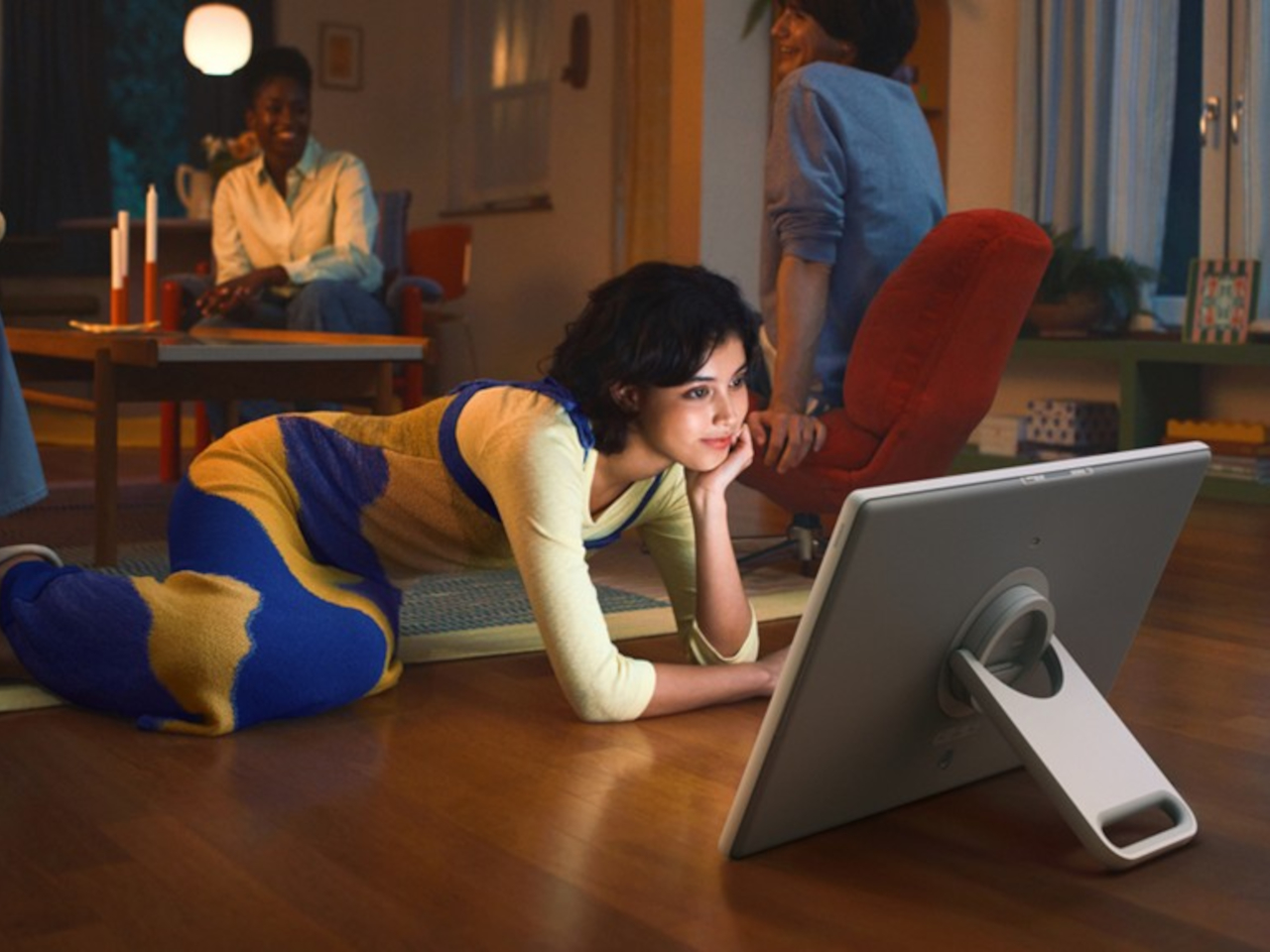
Samsung’s Movingstyle lineup builds screens meant to follow you around instead of staying put. The twenty-seven-inch touchscreen and thirty-two-inch M7 monitor both roll on stands with wheels hidden underneath, so moving them between rooms takes minimal effort. The smaller version also detaches from its stand completely and runs on battery for three hours when you carry it by the handle built into the kickstand.
The touchscreen model weighs enough to feel substantial but not so much that carrying it around feels like a workout. The white finish and slim bezels keep it looking clean rather than gadget-heavy. The kickstand holds the battery and all the internal components in one integrated module, which means fewer parts that could fail over time compared to designs that scatter everything separately.
Touch response works smoothly for tapping through menus, swiping between apps, or sketching directly on screen when ideas need capturing quickly. The same screen works just as well from across the room when you’re using the remote to browse shows. This dual approach handles both close-up work and relaxed viewing without requiring different devices for different situations.
The M7 grows to thirty-two inches with 4K resolution, positioning itself more as a rolling workstation. The stand adjusts height and tilts the screen to whatever angle works best. Wheels roll quietly across floors, whether you’re moving over hardwood or carpet. The power cable runs through the stand’s column to keep everything tidy instead of trailing along the floor waiting to get tripped over.
Both screens run Tizen OS with access to Samsung TV Plus for streaming without subscriptions, Gaming Hub for playing console games through cloud services, and the Art Store displaying museum-quality pieces when the screen sits idle. User profiles keep recommendations separated, so everyone in the house gets content matched to what they actually watch instead of a jumbled mix.
The smaller Movingstyle might start in the kitchen, showing recipes during breakfast prep, roll to the living room for afternoon video calls, then end up in the bedroom for late-night shows. The M7 could sit in the home office all week for work, then roll out to the patio for weekend movie nights or into the workout space for following along with fitness videos.
Ports sit centered on the back panel instead of scattered along edges, which keeps cables organized and the rear view clean when the screen sits visible from multiple angles. Both models switch between landscape and portrait orientation smoothly, useful for vertical content or using the Movingstyle as a presentation tool during meetings.
The Movingstyle lineup treats screens as objects that should follow your routines instead of forcing you to build schedules around where they happen to be installed permanently. The combination of touchscreen interaction, battery-powered portability, and rolling mobility brings genuine flexibility to spaces where fixed installations would limit how and when you actually use them. Samsung’s approach feels overdue for technology meant to serve daily life.
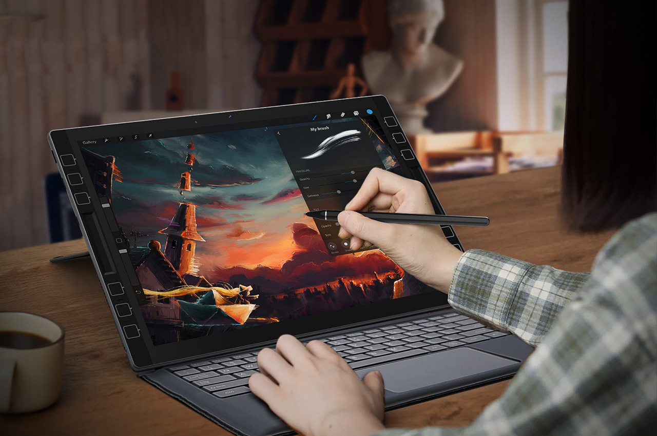
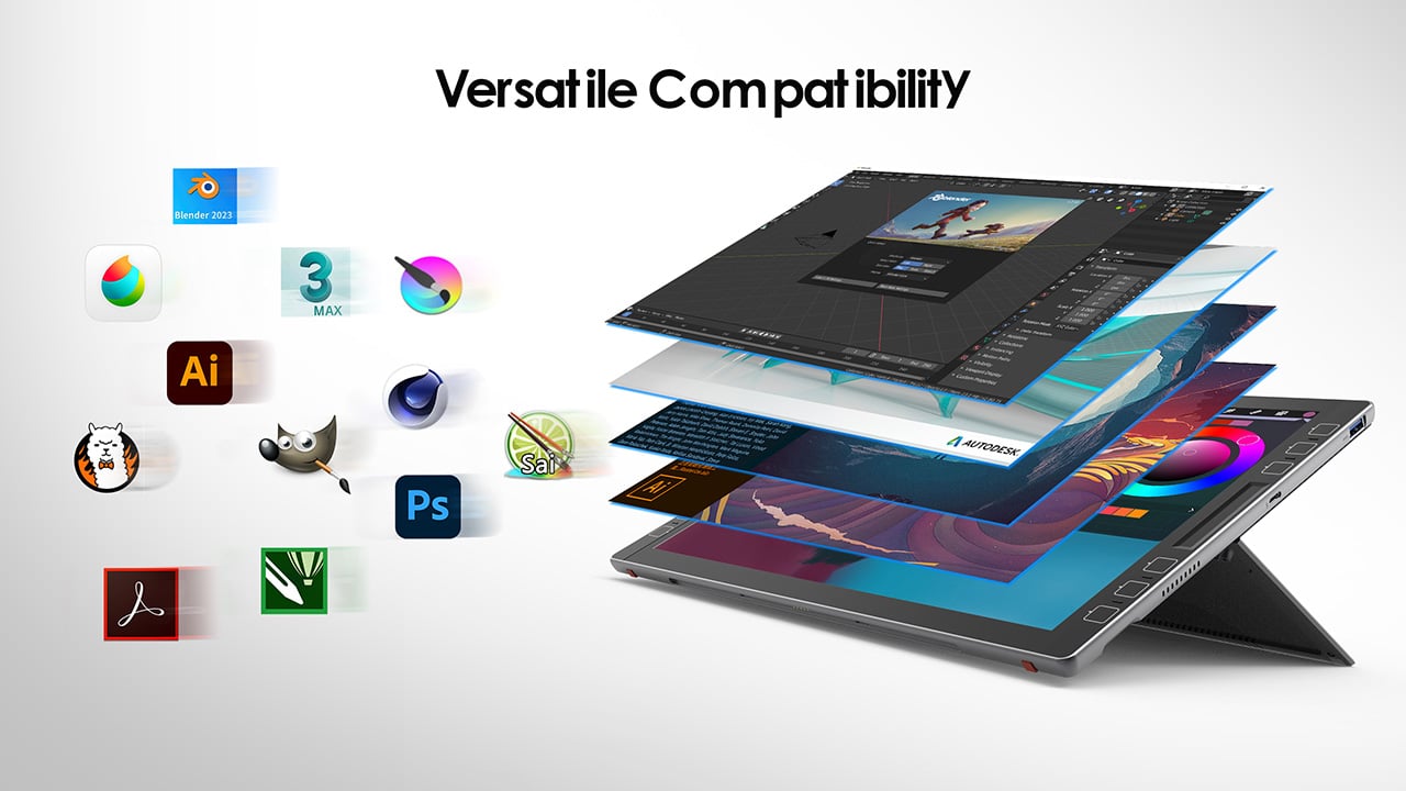
Under most normal circumstances, I wouldn’t be talking smack about the iPad Pro like this… but the LincStudio S1 Tablet offers some distinct advantages over its Apple-based counterpart. It’s bigger, has a 2K touchscreen with multitouch input, also comes with a highly precise Wacom stylus, runs Windows on a 4-core Intel i7 processor, and lets you use a whole slew of desktop-based software and apps to create content. That means you can carry your existing PC workflow onto the LincStudio S1, use AI-based programs with your workflow, and even rely on the 12 customizable shortcut keys on either side to cruise through work. When all’s said and done, 65W charging comes in exceptionally handy, letting you quickly juice your tablet for another round of design iterations… because creativity never takes a holiday, right?
Can’t use my favorite drawing software on iPad? Try LincStudio!
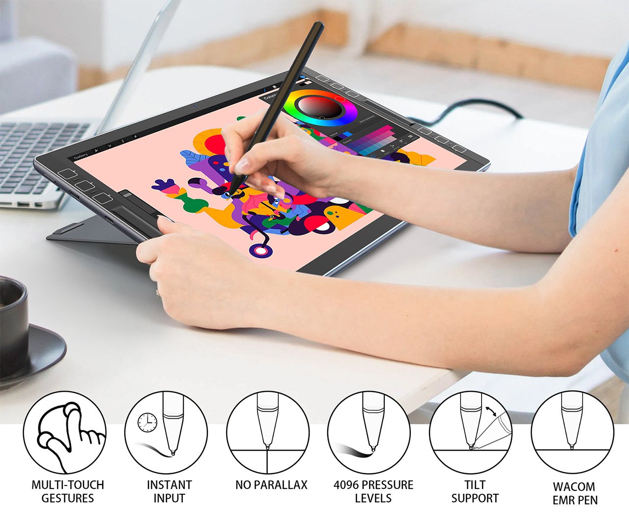
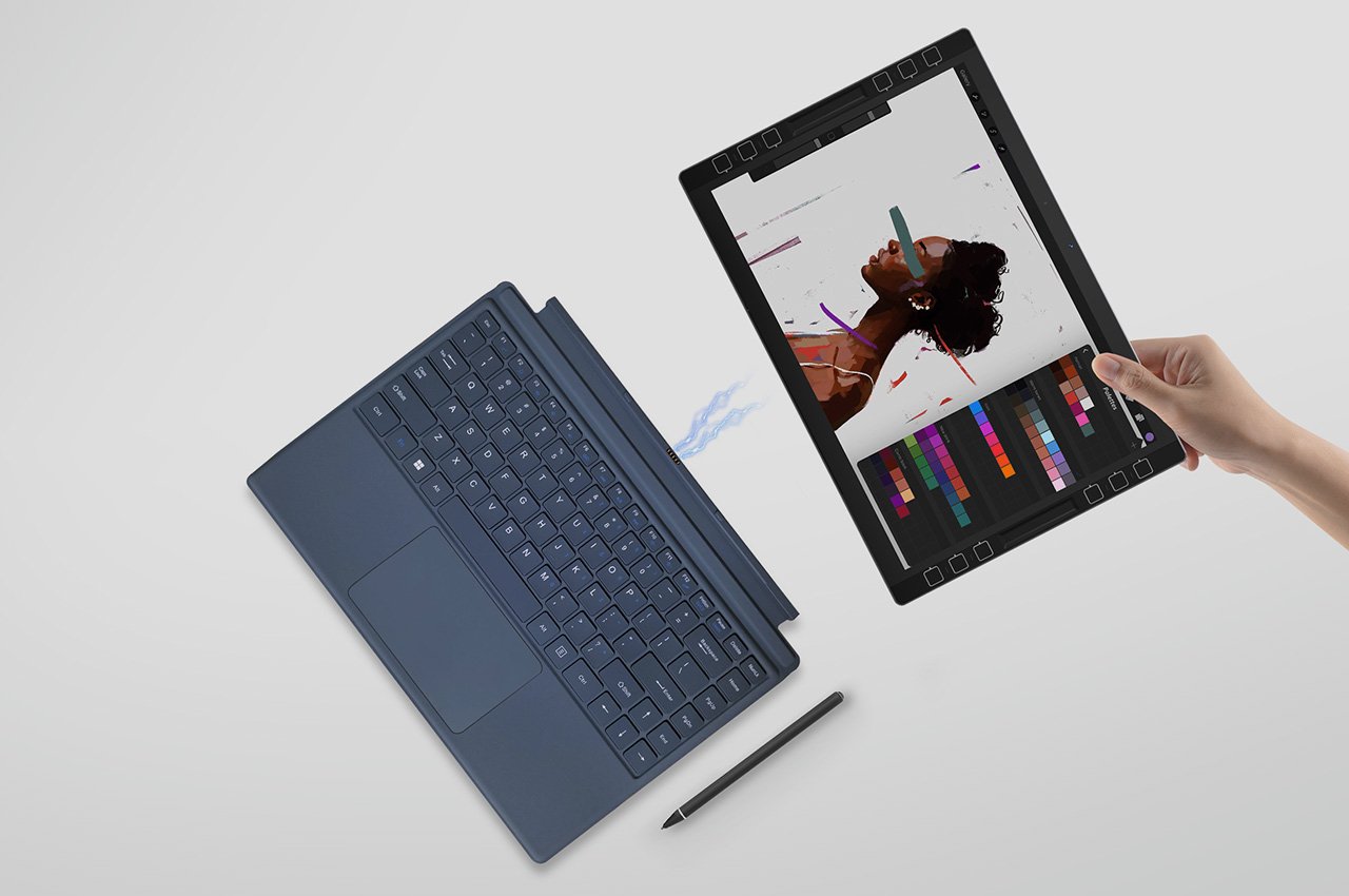
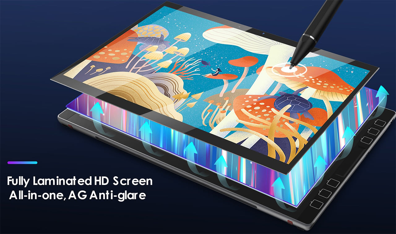
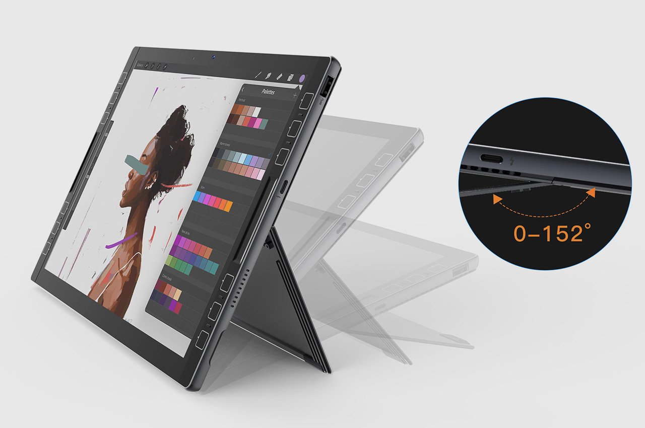
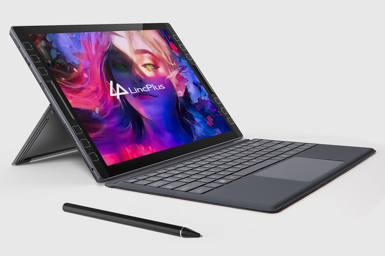
The perfect hybrid between a tablet and a laptop, the LincStudio S1 was designed keeping artists, 3D modelers, animators, designers, architects, or anyone in the creative profession in mind. Slim enough to fit into most laptop bags and weighing a paltry 1.1 kilograms, the LincStudio S1 comes with its own kickstand that lets you prop it up, giving you the freedom to use it in a variety of angles based on the kind of work you’re doing. A companion Wacom Shinonome stylus gives you precise control over your workflow, whether you’re sketching, reviewing detailed blueprints, or just taking notes, but if you do want to switch to a more traditional laptop-inspired typing experience, a keyboard connector at the bottom lets you snap on any keyboard, turning the LincStudio S1 into a makeshift laptop.
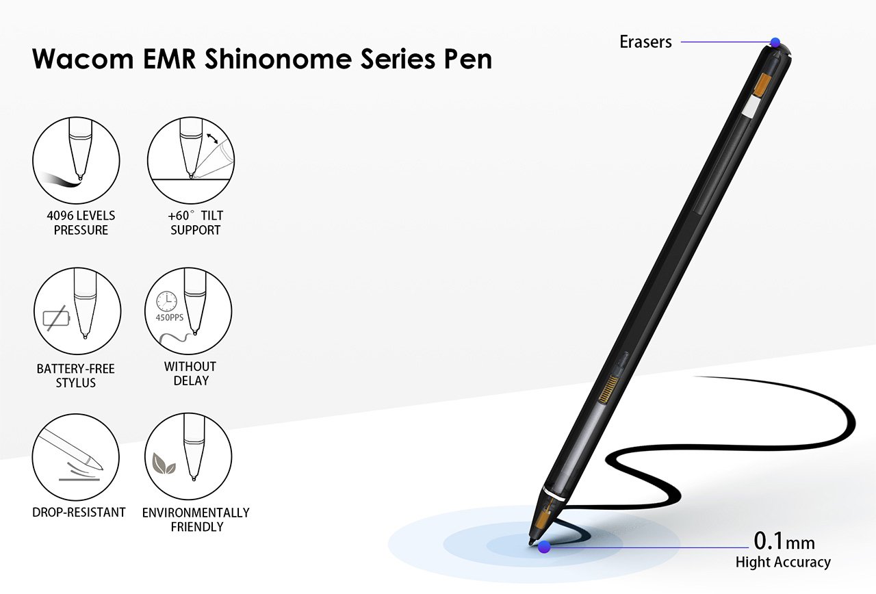
Wacom EMR Shinonome Series Pen
The problem with current tablets is that they get one crucial thing wrong – the operating system. A tablet isn’t supposed to be an enlarged phone, so the fact that it runs a version of a smartphone OS like Android or iPadOS just doesn’t make any sense. Where the LincStudio S1 differs is in recognizing this and giving creators the familiar Windows OS but in the avatar of a touchscreen tablet. The LincStudio S1’s 13-inch screen is perfect for sketching, editing, modeling, post-production, or any creative workflow, with support for multitouch that lets you interact with the Windows interface in a new way.
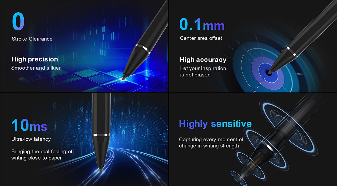
However, a tablet is only as good as the stylus it comes with, and the LincStudio S1 packs Wacom’s cutting-edge Shinonome EMR stylus. The stylus runs on electromagnetic resonance technology instead of capacitive technology, which gives it a winning combination of precision, responsiveness, and resolution over most standard styluses. Designed to be just as precise as Apple’s own Pencil, the Wacom Shinonome has 10-millisecond instant input (without parallax), comes with 4096 pressure levels, 450PPS resolution, and even has tilt support, making it a game-changer in illustration or sculpting apps.
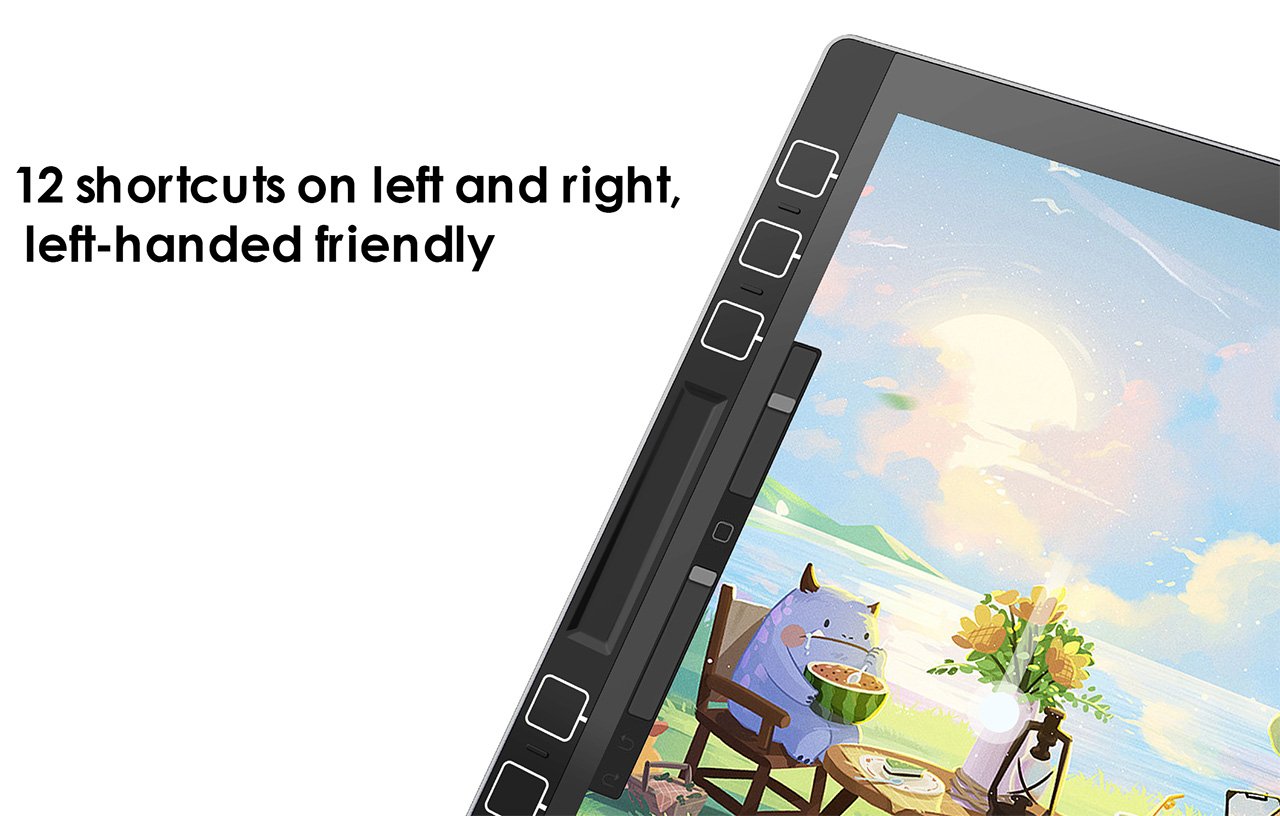
Meanwhile, the tablet sports dedicated shortcut buttons on its sides, allowing you to assign macros/functions to them that are specific to each program. Sort of like a Wacom tablet, you can use these shortcuts to perform certain tasks, toggle between brushes (in Photoshop), and play with parameters like brush size, opacity, screen brightness, volume, etc. The shortcuts are laid out on both the left and right side, allowing for ambidextrous use along with the stylus.
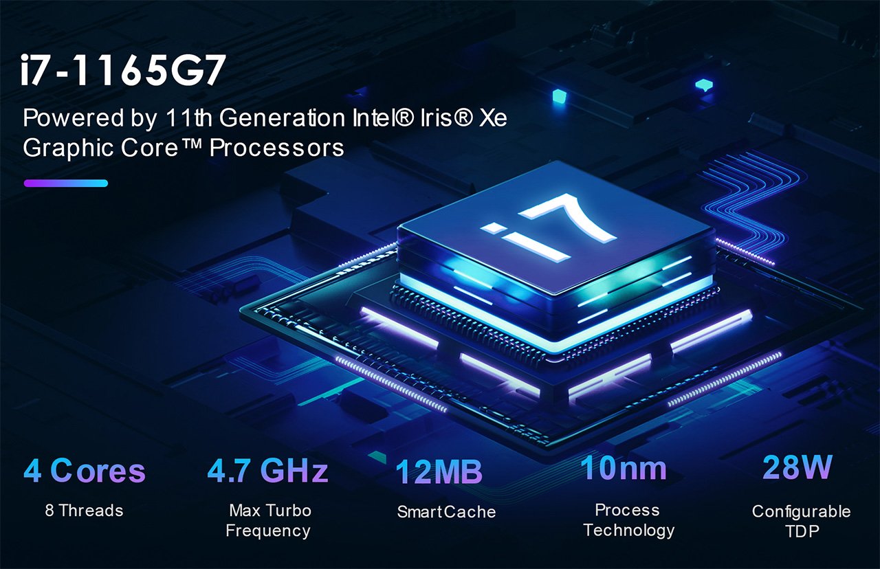
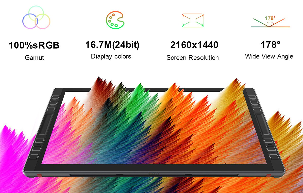
The LincStudio S1 itself comes with a sizeable 13-inch display boasting a resolution of 2160×1440, a 100% sRGB gamut, 16.7 million colors, and a wide 178° viewing angle. It’s powered by an 11th-gen Intel i7 processor, has 16GB RAM and 512GB storage, and comes running Windows 11 Pro right out of the box. In keeping with the ambidextrous design, the tablet has dual speakers, along with thunderbolt USB-C ports on both the left and right side. There’s also a USB-A port on one side for plugging in wireless peripherals or flash storage, and a 3.5mm jack for good measure, letting you connect speakers or headphones to your S1.
The tablet starts at a heavily discounted $895, which includes the Wacom stylus along with a Windows 11 Pro subscription (and is also significantly larger than most other tablets). In contrast, Microsoft’s Surface Pro 9 has similar specs, but with a whopping $1700 price tag (and the Surface Slip Pen sold separately). Apple’s no different, with a sizeable $1200 price tag for the 256GB 12.9-inch model, but an extra $79 for the pencil, $299 for the Magic Keyboard, and the inability to run desktop programs. The iPad Pro also famously lacks a kickstand, which the LincStudio S1 proudly includes in its design, and while the iPad Pro maxes out at 20W of charging, the LincStudio offers 65W charging capabilities, letting you juice your battery much faster than the competition. Perfect for creatives looking to get more hands-on with their workflows, the LincStudio offers the best of both laptop and tablet worlds.
Magnetic attachments allow more freedom where to use the transmitters
Eye-catching touch screens allow for showing brand logos in addition to recording information
Supports both real-time streaming and on-board recording
CONS:
Extra strong magnets can easily pinch the skin if not careful
RATINGS:
AESTHETICS
ERGONOMICS
PERFORMANCE
SUSTAINABILITY / REPAIRABILITY
VALUE FOR MONEY
EDITOR'S QUOTE:
Magnetic attachments and customizable touch screens add incredible value to an already excellent wireless microphone.
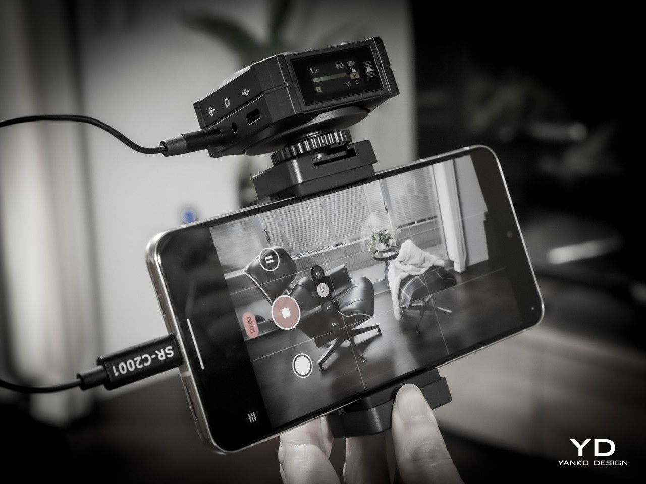
With plenty of focus being lavished on cameras, optics, and image sensors, you’d almost think that all we have on our heads are eyes. While the visual quality of content is definitely important, it’s also easy to demonstrate how poor or even no audio can completely ruin an experience. Audio recording equipment, particularly microphones, sometimes comes as an afterthought, a decision that filmmakers and creators often immediately regret. Finding the right mic can be a daunting experience, especially when you’re forced to choose between small lavaliers with discrete designs but barely passable recording and large mics with studio quality but distracting sizes. The Saramonic BlinkMe B2 promises to save you from that dilemma with the promise of a small yet distinctive design and unbeatable audio recording, so we naturally had to put it through the test to see how it measures up to real-world use.
Designer: Saramonic
Aesthetics
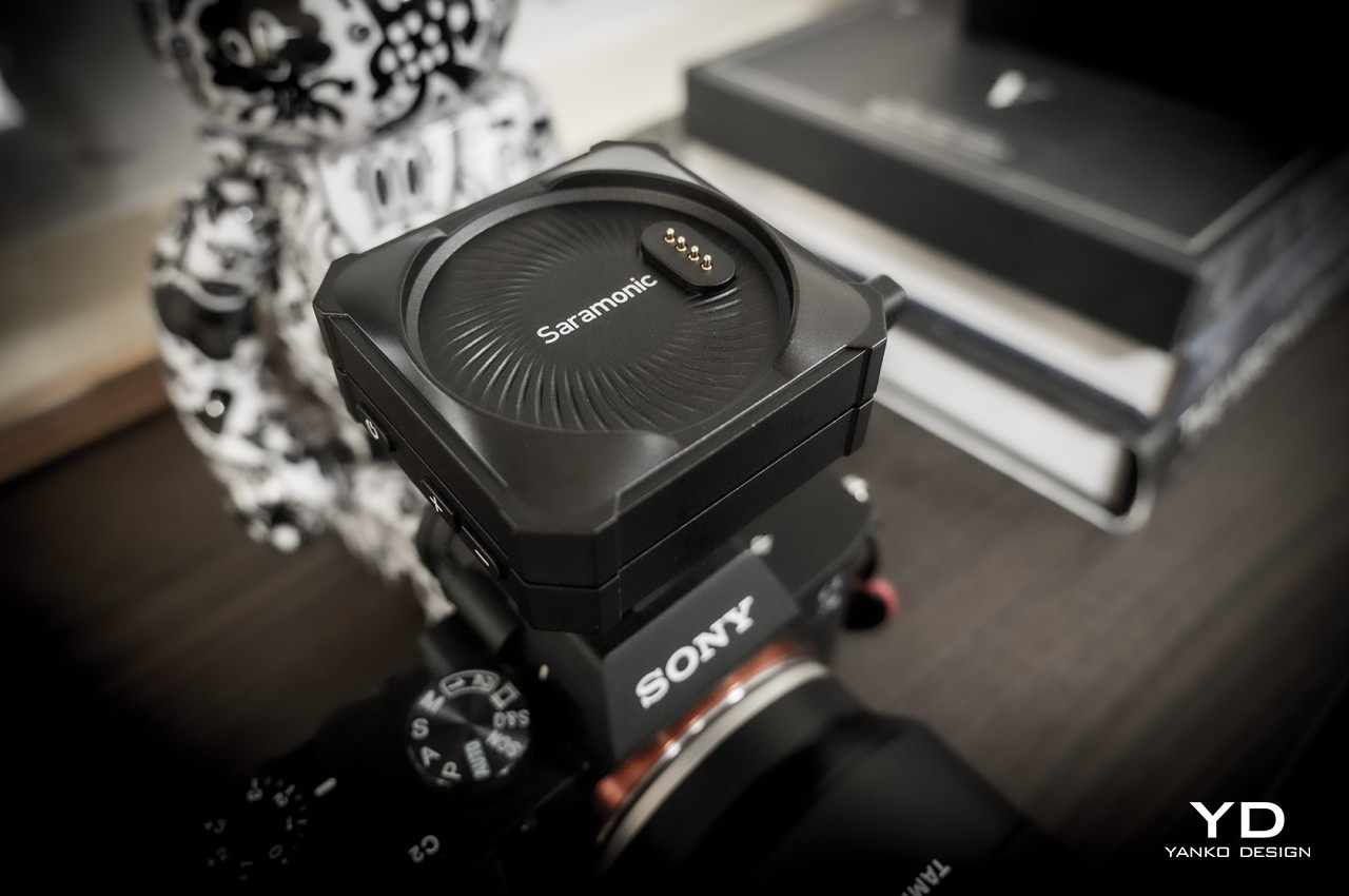
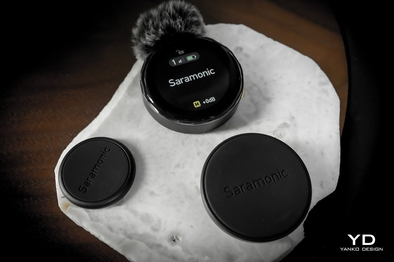
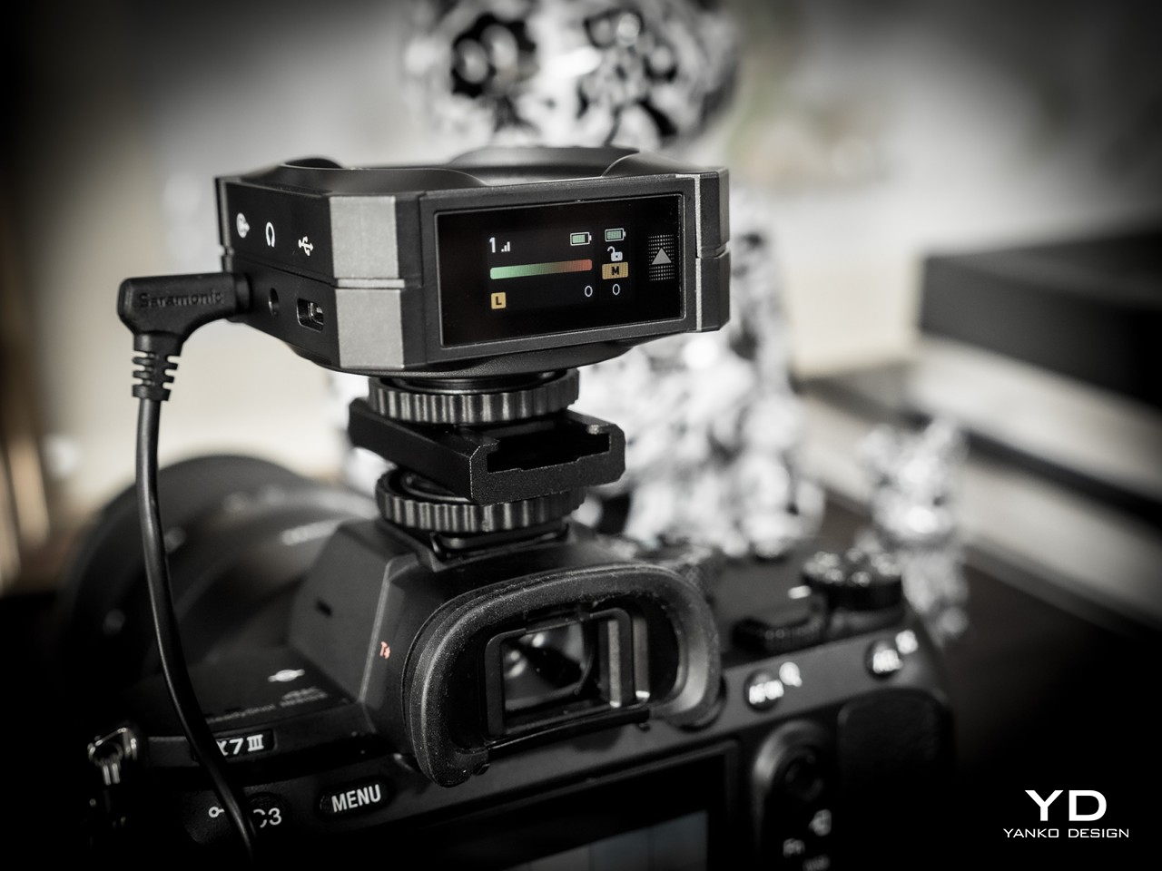
If you were expecting a small clip or some small rectangular box, you’ll be pleasantly surprised that it isn’t the case at all. The entire Saramonic BlinkMe B2 system comes in a rather unique package that is closer to some hi-tech gadget than what you’d normally see in wireless microphones. When joined together, the three parts look like a short square box with two smaller discs at the top and the bottom. You’ll probably be too focused on production to actually appreciate how distinctive the BlinkMe B2 looks, but it definitely puts the product a level higher than its peers.
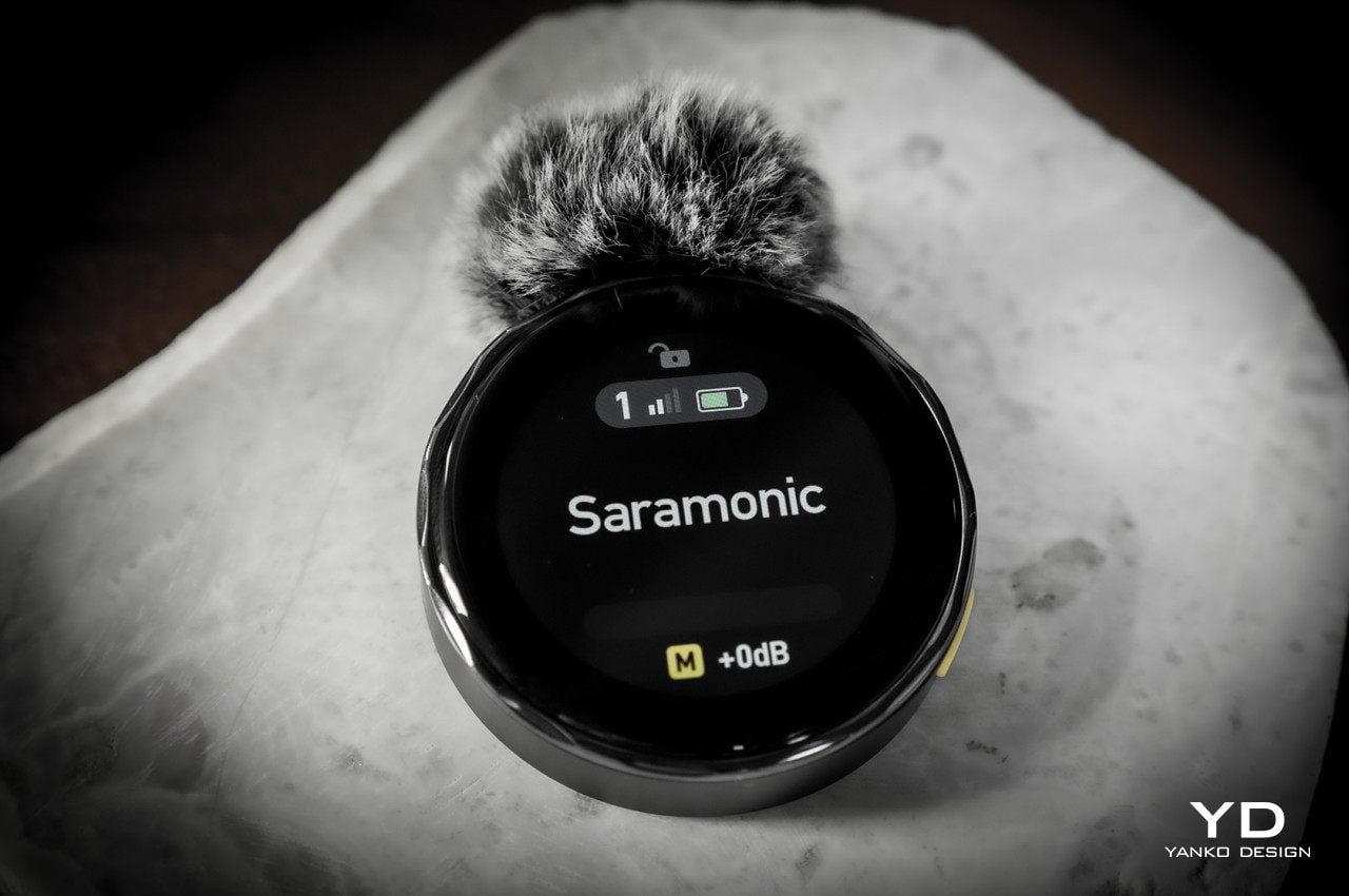
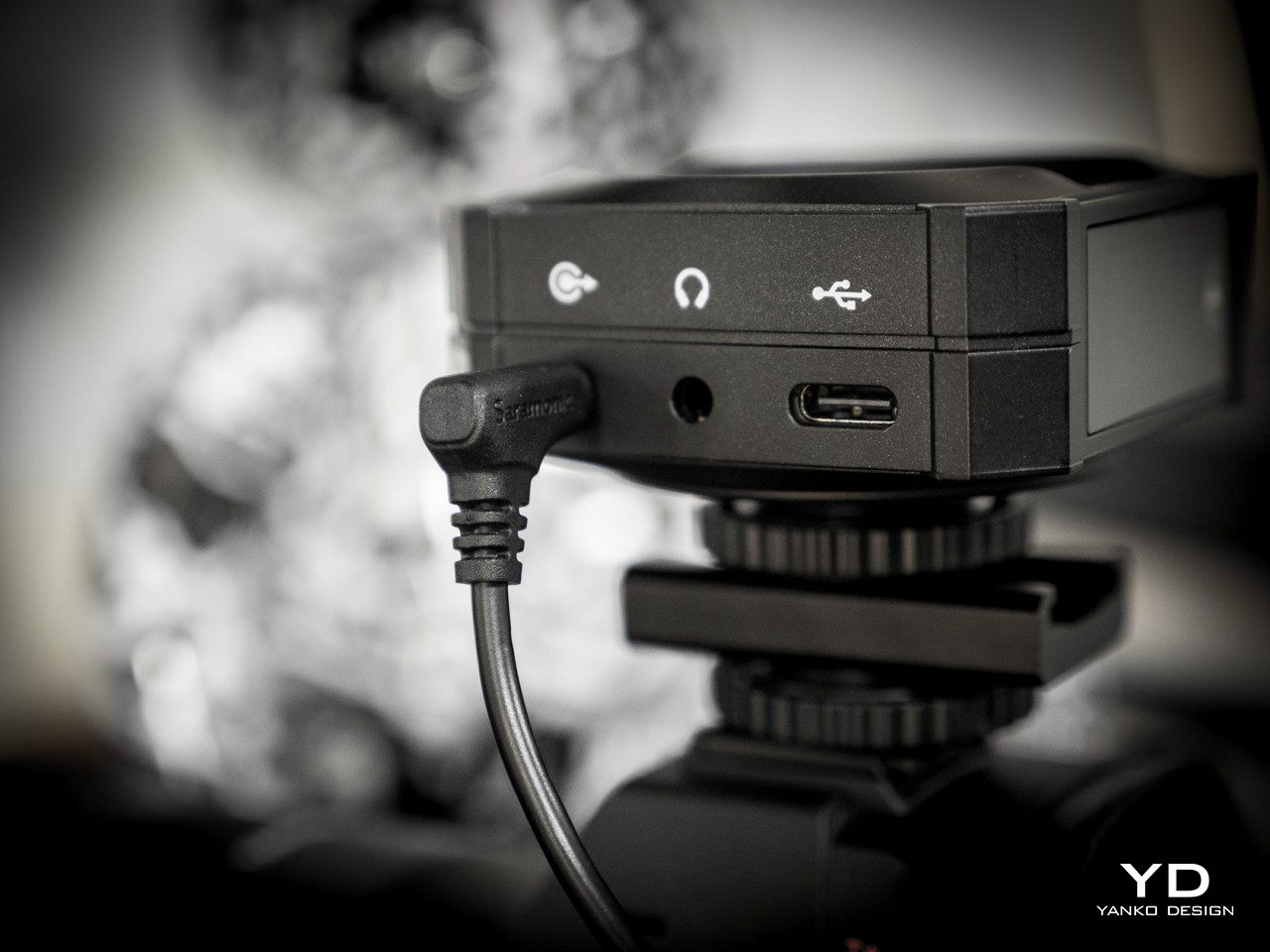
The wireless mic’s personality, however, really shines the moment you use it, particularly when you separate these three pieces. You’ll immediately discover that they aren’t held down by flimsy locking mechanisms that get in the way but only by the sheer power of very strong magnets. These make it easy to remove the transmitters from the receiver base while still holding them securely when not in use or when charging. Once you pull off the transmitters, however, you immediately see the most visible feature that makes the BlinkMe B2 extra special.
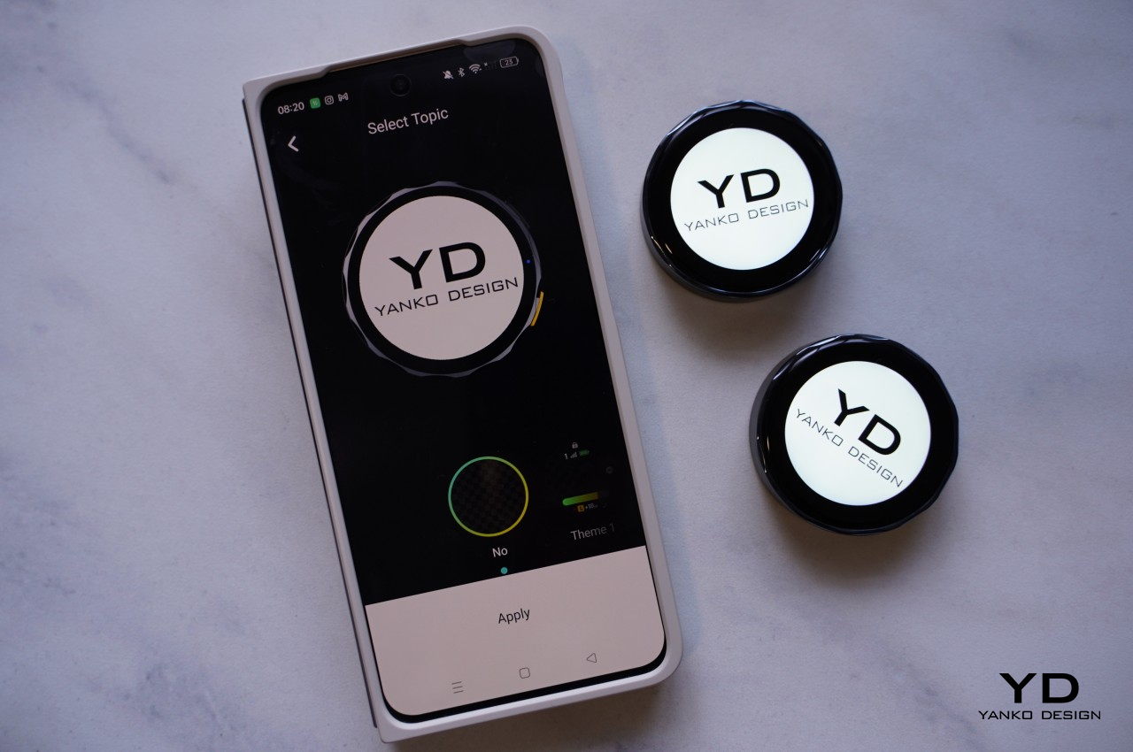
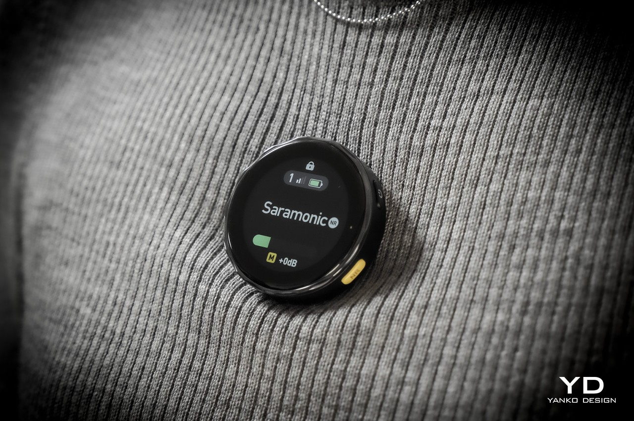
Both transmitters have circular touch screens covering their faces, making them look like smartwatches without straps. In fact, you operate them exactly like smartwatches, swiping and tapping through controls and options. There are, of course, also physical buttons on the side that, unsurprisingly, might also remind you of smartwatch buttons. This is more than just an embellishment, though. While it’s definitely dandy to see the mic’s gain levels from a distance as you record an interview, its real value shines when you realize that you can actually customize what’s shown on the screen.
In essence, you can upload your studio’s logo or any other graphic (that fits a circle area) from the Saramonic mobile app to the transmitters and have it always on display while shooting. Considering how conspicuous this disc-shaped mic will be on your chest, it’s a great opportunity to do some subtle advertising. Conversely, that also means that the BlinkMe B2 transmitter will always be visible, though not everyone will actually realize that it’s a mic and presume it’s just some sort of fancy LCD badge.
Ergonomics
Saramonic’s use of magnets and touch screens isn’t just for show. They actually make the BlinkMe B2 one of the easiest wireless microphones to use. Need to start recording almost immediately? Simply pop off the transmitters. Need to charge one of the little pucks? Just have them snap back onto the top of the receiver. And since the transmitters can record audio on their own, you don’t even have to worry if you accidentally left the cables that would connect the receiver to a camera. It’s as simple as that.
Operating the three pieces themselves is a piece of cake thanks to the touch screens, though there are also physical buttons for the most important actions you need to have quick access to. What actions would those be? Actually, you get to decide that since you can customize what each button does through the Saramonic mobile app. The distinctive yellow button on the transmitters, however, has a single function, and that’s to toggle Noise Reduction on or off. That color might seem garish, but you won’t miss it even in a dark environment.
The magnets on the transmitters aren’t just a one-trick pony. Thanks to this design, you can easily stick the transmitters anywhere on a shirt, not just the edges. The package comes with four magnetic attachments that let you sandwich clothing between these two discs, though there’s also a magnetic clip in case you do need to go old school. You can even stick it to doors, posts, and any other metallic surface if you want to keep it out of the way. One word of caution, though. The magnets are so strong that you risk pinching the skin of your finger or, worse, certain body parts if you’re not careful how you connect two pieces together.
For all its ease of use, this magnet-based design does have one drawback. To charge the transmitters, you have to attach them to the receiver, which functions as the charging station. You can’t charge them independently using some accessory, so you’ll probably want to keep tabs on their battery levels. Given how the receiver is usually mounted on top of a camera, it also means you can charge only one transmitter at a time. Then again, if you do need to charge both, you’ve probably stopped recording anyway.
Performance
If we stopped at the BlinkMe B2’s unique aesthetic, people would simply pass it off as a pretty face. Fortunately, that is definitely not the case, because Saramonic’s smartest wireless definitely punches above its weight. You get clear and usable audio recordings even when there’s some busy activity around you, as we ourselves experienced on the hectic CES 2024 floor.
Even more impressive is that neither the signal nor the quality actually drops from a distance, even with some obstacle between the transmitter and the receiver, making it an excellent tool for sports or action footage. With the transmitter’s built-in recording functionality and 8GB of storage each, you don’t even have to worry when the stream does get cut off. As a bonus, the transmitter also has a “Safety Track” that’s recording at -6dB that’s meant to buffer against clipping and distortion, ensuring you will always have usable audio no matter the condition.
With wireless mics, battery life becomes just as important as audio quality, and fortunately, the BlinkMe B2 doesn’t skimp in that area either. Of course, Saramonic’s advertised 24 hours for the receiver and 8 hours for the transmitter are a tad too generous, but even hitting 22 hours and 6 hours, respectively is already quite an accomplishment. They charge fast, too, so you can be up and running for an additional hour with just a few minutes charge.
As mentioned earlier, controlling all the pieces of the BlinkMe B2 system is as easy as pie thanks to the sensitive touch screen. The transmitters, in particular, operate almost like smartwatches, with a swipe from the top revealing quick toggles and a swipe from the bottom going back to the main screen. The only slight complication is the smaller screen on the receiver, which is better used for displaying information rather than controlling the device. All in all, the BlinkMe B2 offers an unbeatable experience, not just in the quality of audio it produces but especially in the unique features it offers.
Sustainability
Saramonic introduced many features in the BlinkMe B2 that you won’t find in other wireless microphone systems, and thankfully, they’re all useful and essential to delivering an excellent audio recording experience. Unfortunately, that also makes the design of the device a little bit more complicated, which also means that repairs are going to require more specialized skills and components.
Although a wireless mic such as this is expected to be able to weather different environments, the presence of screens actually puts their durability at more risk. And the use of plastics and less eco-friendly materials are present all around, though not surprising considering it’s still the status quo in consumer electronics. Hopefully, the day will come when Saramonic puts sustainability as a major bullet point on its marketing material, allowing creators to make great content while also feeling good about their positive impact on the planet’s future.
Value
The Saramonic BlinkMe B2 is hardly a cheap kit, setting you back at about $249. There are definitely more accessible streaming mics in the market right now, with some of the popular ones just under $200. That said, those also have plenty of flaws of their own, like taking the form of a traditional mic that you need to place on a table. If you need something that can go the distance, literally, there are few that can outdo the BlinkMe B2.
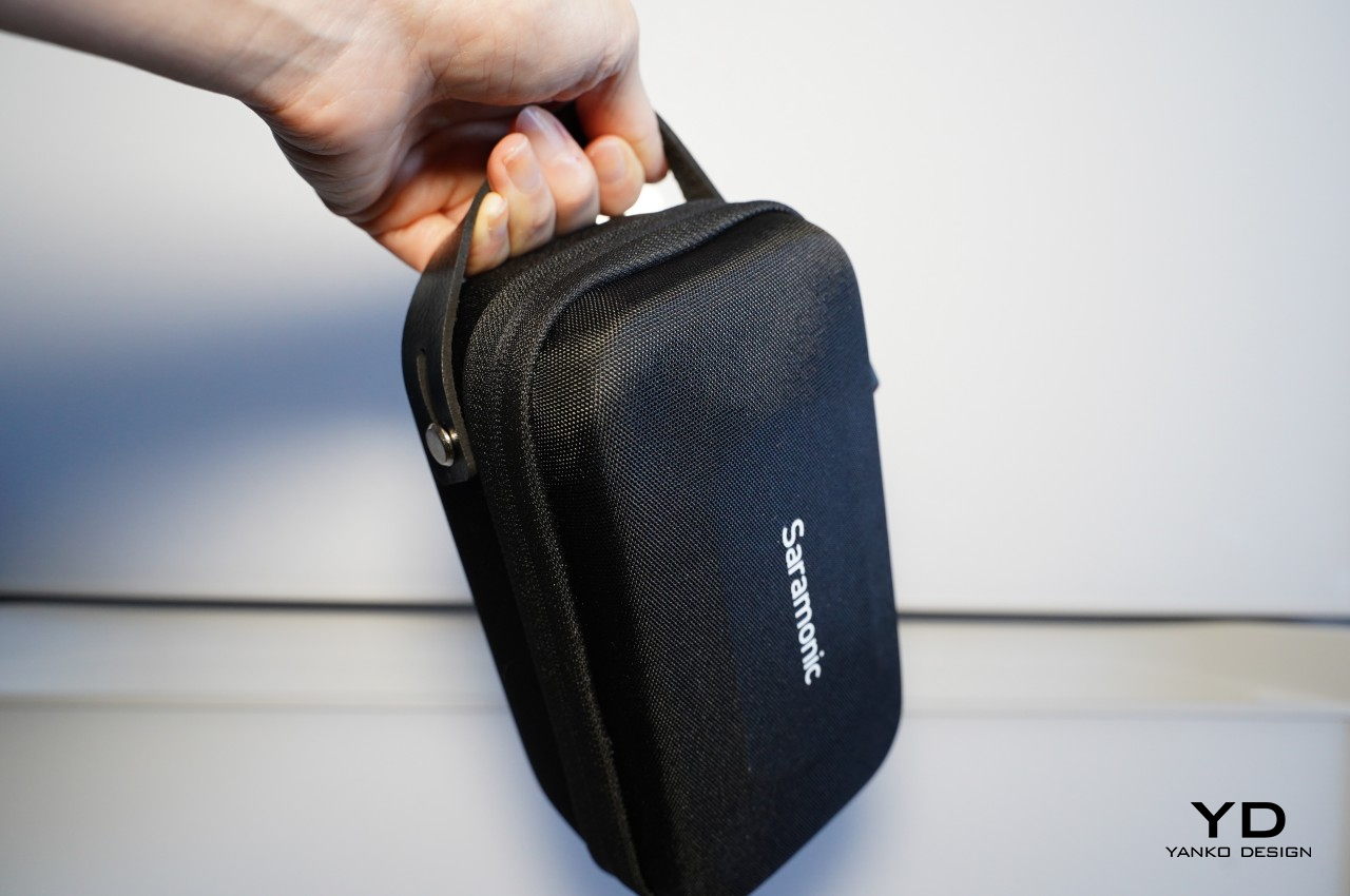
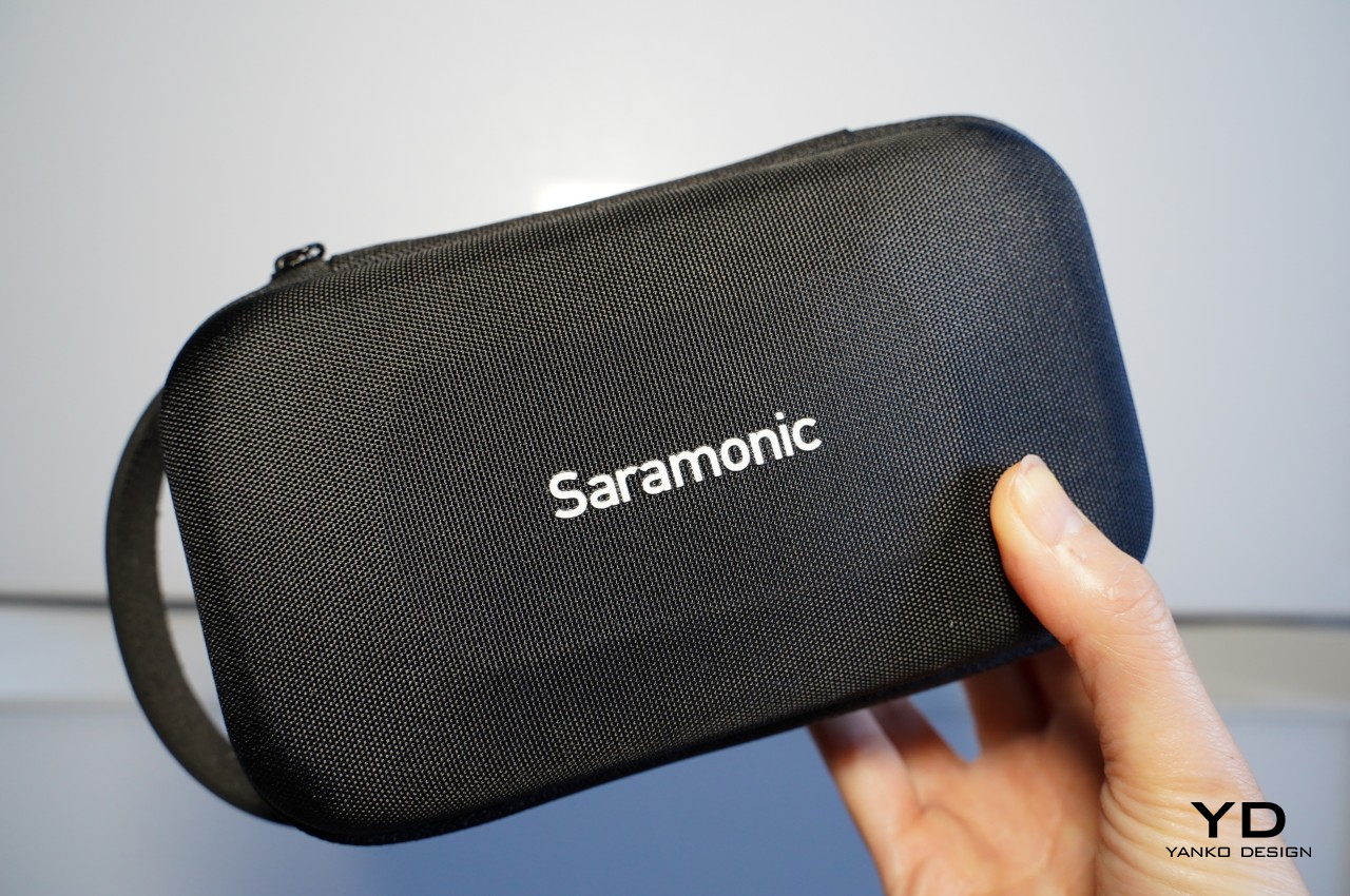
The audio clarity and volume are just impressive, especially considering how crazy it always is at CES in Las Vegas. The fact that it can deliver more than just decent recordings at great distances is a huge boon for those who want to record more dramatic footage from a safe distance. Magnets make using and placing the transmitter easier and more hassle-free, and the ability to turn these recording devices into advertisements is definitely a great help for creators and studios. Even better, that price includes an entire kit, from four magnetic attachments to two magnetic clips to even a handy carrying case that lets you bring your precious equipment with security and convenience.
Verdict
It’s almost too easy to take the importance of quality audio for granted until that dreaded moment when you realize you barely recorded anything intelligible. Reliable audio that you can use is even more critical for those moments that will never come to pass again, including interviews you might not be able to retake. It’s in those moments that you’ll wish you had an audio recorder you could also rely on, just like your camera or smartphone.
The Saramonic BlinkMe B2 smart wireless microphone system is definitely ready to step up to the challenge. It breaks away from mic design conventions to deliver a product that has just enough tech to deliver convenience and a unique aesthetic without overburdening the user with inessential details and options. It’s powerful, a little bit quirky, and, most importantly, reliable, delivering quality audio recordings even in the most trying conditions. Yes, it’s also a bit pricey, but it’s an investment that will pay for itself throughout the coming years of creating high-quality audiovisual content.