The Hinge Nightmare: Why Apple’s iPhone Ultra Fold Could Face Major Delays

Apple’s much-anticipated entry into the foldable smartphone market, the iPhone Fold Ultra, has encountered a significant obstacle. The device, which aims to blend innovative technology with Apple’s renowned design philosophy, is facing critical issues with its hinge durability. These challenges not only threaten to delay its release but also cast doubt on Apple’s ability to […]
The post The Hinge Nightmare: Why Apple’s iPhone Ultra Fold Could Face Major Delays appeared first on Geeky Gadgets.
A Design Student Finally Fixed the Pill Organizer

Over half of all Americans have a prescription, and 1 in 5 take medication multiple times a day. That’s not a niche demographic. That’s most of the people you know. And yet the objects we rely on to manage that medication have barely evolved. The standard pill organizer, bulky, color-coded, and tedious to sort, was designed for a countertop, not a life in motion.
Ashley Gyurich, an industrial design student at Western Michigan University, decided that wasn’t good enough. Her Spring 2024 project, Harmony Smart Pill Storage, started with a specific and underserved user in mind: the active person, the traveler, the one who is always moving and always managing. Someone who loves new experiences, prioritizes health, and takes medication throughout the day to manage ongoing conditions. Someone for whom every existing option falls short in some fundamental way.
Designer: Ashley Gyurich

The problem, as Gyurich mapped it, splits cleanly into two camps. Alert-style dispensers handle the notification side reasonably well, but they’re too large for travel, complicated to set up, and require tedious weekly sorting. Travel pill cases go the other way: compact and easy to open, but with no alert system and limited capacity. Both solve part of the problem while ignoring the rest. Harmony sets out to address it whole.

The result is a compact, clamshell-style organizer with eight compartments, a classic hinge opening, and a soft blue-gray body made of soft-touch plastic. It fits into a travel bag or clips onto one via a flexible silicone carry strap, and its rounded, tactile form feels closer to a premium tech accessory than anything you’d find in a pharmacy aisle. The easy-open push button sits on top with a contrasting color and texture for visibility, and a rubber non-slip base keeps things stable and spill-free when the case is open. The whole object communicates the same idea: designed for your hands and your bag, not a medicine cabinet.

The three-part alert system is where the design earns its “smart” label. When it’s time to take a medication, Harmony responds on three fronts at once. A pulsing light ring on the top of the case flashes visually. Speakers on the bottom play an audible alert. A digital notification goes out to all connected devices. You can be on a flight, mid-workout, or back-to-back in meetings, and Harmony still finds a way to reach you. Once you’re ready, you press the tactile button to access your medication and silence the alerts. Each compartment also has four indicator lights that show exactly how many of each medication to take, removing any guesswork from the process.

Setup runs through an app, where you log medications including time, quantity, and case location. No weekly sorting ritual, no day-labeled slots to fill in order. Fill the compartments however works for you, and the system keeps track. USB-C charging with indicator lights handles the power side, and a notification alerts you when the battery runs low, so the device is never quietly dead when you need it most.

Gyurich’s design philosophy starts with a single question: why? Not just how a product functions, but why it should exist in the form it takes, and whether that form actually serves the person using it. For Harmony, the answer kept pointing back to the active user, the one whose day doesn’t pause at a fixed time for medication management. That specificity of focus is what separates a thoughtful design from a product that technically works but never gets used.

Medication nonadherence is a genuine and documented problem. Most of the design attention in the space has gone toward clinical or institutional solutions rather than personal ones. Harmony is a rare piece of consumer health design that meets the user where they actually are, somewhere between the airport gate and a packed schedule. It belongs in your bag, on your desk, and in the larger conversation about what everyday health tools can and should look like.

The post A Design Student Finally Fixed the Pill Organizer first appeared on Yanko Design.

Gabe Newell’s Inkfish Submersible Uncovers Unknown Species in the Hadal Zone

Gabe Newell, co-founder of Valve and creator of the gaming platform Steam, has expanded his interests into deep-sea exploration through his marine research organization, Inkfish. His team, equipped with the DSSV Pressure Drop and the submersible Bakunawa, has explored the hadal zone, where pressures exceed 1,000 times those at sea level. Among their discoveries are […]
The post Gabe Newell’s Inkfish Submersible Uncovers Unknown Species in the Hadal Zone appeared first on Geeky Gadgets.
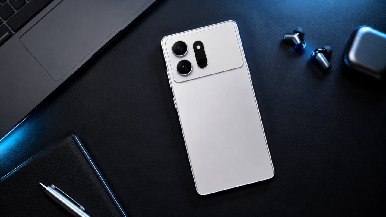
Infinix HOT 70 Blends AI, Style, Durability
AirPods Pro 3 vs Pro 2: Should You Actually Upgrade in 2026?

Eight months after Apple shipped the AirPods Pro 3, the comparison has quietly shifted. Nobody is really debating whether the Pro 3 are good. They are. The more interesting question, the one actually driving search traffic right now, is whether the Pro 3 are worth it when the Pro 2 can be had for around $167 renewed, and when both models share the same H2 chip.
That last part matters more than it sounds. Apple’s decision to keep the H2 chip in the Pro 3 means both generations run the same core software features, including everything arriving with iOS 26. That’s not a knock against the upgrade. It’s just a useful signal about where Apple actually spent its engineering effort this cycle. The answer is the body.
Design: Apple

The AirPods Pro 3 ship with a redesigned fit system, adding foam-infused ear tips across all sizes and a new extra-extra-small option for a noticeably deeper seal. That revised fit is doing real work. It’s part of why independent testing from RTINGS shows the AirPods Pro 3 outperforming the Pro 2 on noise isolation, especially with street-level and mid-frequency noise. The ANC improvement is real, and most of it comes from better physics, not a completely overhauled processing stack.

Then there’s the durability jump. IP57 replaces IP54, meaning the AirPods Pro 3 can survive submersion in a meter of water for up to 30 minutes, compared to the AirPods Pro 2’s more modest splash resistance. If you work out in the rain or tend to leave things near water, that’s a quiet but meaningful upgrade. Battery life lands at eight hours with ANC on, a clear step up from the Pro 2. Worth noting, though: using the heart-rate sensor drops that figure to roughly 6.5 hours per charge, so those gains are conditional depending on how you actually use the earbuds. Which brings us to the feature doing most of the marketing heavy lifting.

The heart-rate monitor is the AirPods Pro 3’s most discussed addition, and it’s genuinely well-implemented. You can track over 50 workout types on iPhone alone, without an Apple Watch, logging heart rate and calorie burn throughout. If both devices are present, Apple’s system pulls from whichever sensor is giving more reliable data at the time. That’s a thoughtful design call.
But here’s the thing. If you already wear an Apple Watch, the heart-rate sensor in your ears becomes a nice backup, not a reason to upgrade. The people for whom this feature is genuinely transformative are iPhone-first fitness users who aren’t wearing a watch, or people who prefer fewer devices on their body during a workout. For everyone else, it reads more like product ambition than personal necessity.

So where does the AirPods Pro 2 still hold its ground? Almost everywhere a casual listener, commuter, or Apple Watch owner actually lives. The H2 chip delivers the same spatial audio, the same call quality baseline, and the same hearing health features, including the hearing test and hearing aid mode. At $167 renewed, the Pro 2 offers a level of performance that would have been considered flagship just two years ago.
The AirPods Pro 3 are the better earbuds. They fit better, block more noise, last longer on a charge, and carry the kind of health-sensor integration that signals where Apple wants this product category to go. But better earbuds and better value are not the same thing, and in May 2026, that distinction matters.

If you don’t own AirPods Pro yet, the Pro 3 are the ones to get. If you already own the Pro 2 and they still fit and function well, this is not a compelling upgrade unless the heart-rate tracking or the improved seal solves a real problem for you. At $167 renewed, the AirPods Pro 2 remain one of the most capable earbuds at their price, chip-for-chip. Apple builds excellent products. It also builds excellent arguments for buying last year’s excellent products at a discount.

The post AirPods Pro 3 vs Pro 2: Should You Actually Upgrade in 2026? first appeared on Yanko Design.
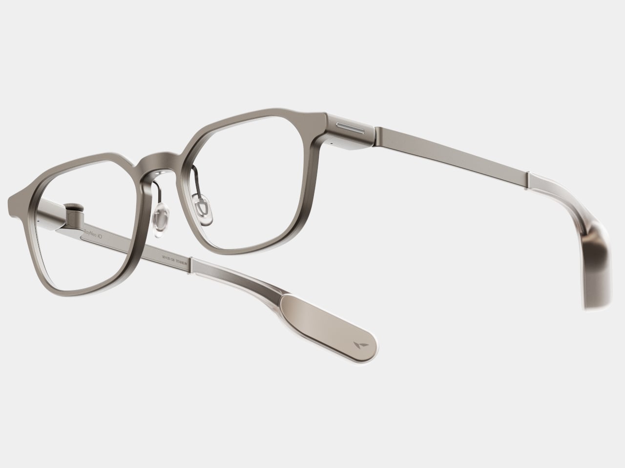
Finally Thinner: Apple Watch Ultra 4 Leaks Reveal a Major Design Shakeup

The Apple Watch Ultra 4 is poised to undergo its most significant redesign in four years, signaling a pivotal moment for Apple’s flagship smartwatch. This update is not merely cosmetic; it reflects a deliberate strategy to enhance both functionality and user experience. By seamlessly blending its rugged identity with innovative health features, the Ultra 4 […]
The post Finally Thinner: Apple Watch Ultra 4 Leaks Reveal a Major Design Shakeup appeared first on Geeky Gadgets.
Pope Leo calls for AI to serve humanity and not concentrate power

Hidden Steam Controller Settings Most Gamers Miss

The Steam Controller stands out for its remarkable adaptability, offering gamers a host of features designed to cater to diverse playstyles. Among its standout capabilities are virtual menus, which allow you to assign multiple commands to a single input area, such as the trackpad. This feature is especially useful in games with intricate control schemes, […]
The post Hidden Steam Controller Settings Most Gamers Miss appeared first on Geeky Gadgets.
8 Best Home Objects So Cleverly Designed They Make Your Entire Furniture Setup Look Boring

The most interesting objects in a room are rarely the loudest ones. They are the ones that sit quietly in plain sight, behaving like one thing until you look closely and realize they were always something else. A table that swallows a book. A clock that hides its own hands. A speaker tucked inside a tin dollhouse from the 1930s. The best design of 2025 and 2026 is hiding in plain sight, and it is hiding on purpose.
This listicle exists for the person who finds more satisfaction in a well-considered object than in a loud one. Every product here has a second identity — a behavior, a trick, or a material logic that reveals itself slowly. Some are available to buy right now. Some are concepts that deserve to exist in production. All of them share the same quality: they make you stop, look again, and want one.
1. NjommNjomm


Say the name out loud, and you already understand the concept. NjommNjomm, by Stuttgart-based designer Deniz Aktay, is a cuboid coffee table made from sustainable plastics with a bevelled internal compartment that does something no coffee table has managed before: it makes a book appear to vanish inside it. Slide the right-sized book into the slot, and the table appears to swallow it whole, the pages disappearing into the body of the furniture with an optical sleight of hand that stops every person who walks into the room.
What makes it work beyond the trick is the restraint of the form. Nothing about the NjommNjomm announces itself. The exterior is clean, minimal, and almost unremarkable until the moment it is not. The cuboid shape also means the table can be repositioned vertically, giving it a flexibility most coffee tables never offer. For anyone who stacks books on every surface and has quietly given up apologizing for it, this is the table that finally takes their side. It is currently a concept by dezinobjects, and it is the right place to start.
What We Like
- The optical illusion is genuinely surprising every single time someone encounters it
- Works horizontally and vertically, making it adaptable to smaller living spaces
What We Dislike
- Currently, it is a concept with no confirmed production timeline
- The slot is most effective with books of a specific size
2. Portable CD Cover Player


The Portable CD Cover Player does exactly what its name promises, and the effect is completely disarming. It looks like a CD sleeve. It sits like a CD sleeve. Then you realize it is the player itself. The entire device is designed around the silhouette of the packaging that physical music has always lived inside, turning the most overlooked part of the format into an object. For anyone who still has a collection gathering dust on a shelf, this reframes the entire relationship with the format in a single glance.
There is a specific kind of satisfaction in owning something that makes people pick it up and ask what it is. The Portable CD Cover Player earns that reaction every time it is left on a desk, a shelf, or a coffee table. It brings the physical music experience back without demanding space or ceremony, fitting into a bag or slotting between records with equal ease. Three remain in the YD shop, which is not a large number, and the kind of detail worth noting before moving on.
Click Here to Buy Now: $199.00
What We Like
- The cover-as-player concept turns a format’s most discarded element into the product itself
- Compact form factor slots naturally into an existing music collection without demanding its own space
What We Dislike
- Only three units are currently available in the YD shop
- Technical specifications for battery life and connectivity are not listed
3. Ghost Clock


Istanbul-based designer Fatih Demirci took a simple question — what if a clock tried to disappear — and turned it into one of the most quietly compelling wall objects of 2025. The Ghost Clock stretches a thin fabric over the hour and minute hands without restricting their movement. The result is two slow-moving bumps that creep around the face of the clock, telling the time and refusing to tell it at the same time. The concept is drawn from the way objects look under drapery, and the reference earns every bit of the eerie quality it produces.
You cannot read the Ghost Clock with the precision a meeting demands, and that is the point. It is a wall object that removes the anxiety from timekeeping and replaces it with something stranger and more honest — a gentle reminder that time is moving without forcing you to count how fast. In a bedroom or a reading corner, this presence is more useful than precision. It is a concept by Fatih Demirci, and it deserves to exist in every room that takes itself a little too seriously.
What We Like
- The fabric-over-hands mechanism is deceptively simple and visually arresting from across the room
- Shifts the emotional register of timekeeping without removing its function entirely
What We Dislike
- Not suited for precision timekeeping and should not be the only clock in a working space
4. Sail Away Tranquility Mobile


DRILL DESIGN is an award-winning Japanese studio, and the Sail Away Tranquility Mobile is the kind of object that explains why it has that reputation. Three interlocking triangles — one lightweight aluminum, one polished steel, one warm walnut — are hand-balanced at a workshop in Ashikaga City, Tochigi Prefecture, until the whole structure finds a perfect equilibrium. Then it sits on your desk and does almost nothing. Until the air shifts, and the triangles begin to move in response, and you realize you have been watching it for considerably longer than you intended.
The secret of the Sail Away Mobile is that it is kinetic without demanding anything from you. No batteries, no charging, no interaction required. The movement comes from the air in the room, which means it is always slightly different and always responding to something real. Weighing just 80 grams and requiring no tools to set up, it is genuinely easy to live with. As a desk object, a housewarming gift, or a quiet act of calm placed in a room that moves too fast, it earns the space it occupies.
Click Here to Buy Now: $129.00
What We Like
- Entirely passive movement with no power source needed — the room does the work
- Handcrafted in Japan with meticulous material balance across three distinct and contrasting materials
What We Dislike
- The gentle movement requires some ambient air circulation to be fully appreciated in still rooms
5. Verse Chair


Most chairs do one thing. The Verse Chair by Liam de la Bedoyere does two, and the second one is so specific and considered that it reframes the entire object. The 3D-printed chair has a curved seat designed for ergonomic comfort, but beneath the seat lies a sharp-angled V-shaped base proportioned precisely to hold a book open at the page you left it. Set the book down mid-chapter, and the chair holds it. Come back later, and the page is exactly where you stopped. The chair remembers for you.
The name Verse refers both to the line-by-line process of 3D printing and the V-shaped form of the base, which is the kind of naming discipline most designers do not manage to pull off. The chair does not shout its bookmarking function. It holds the book quietly, at floor level, in the structure of the legs, visible only when you know to look for it. For anyone who reads in the same chair every day, this is the version of that chair designed specifically around that habit.
What We Like
- The book-holding function is built directly into the structural logic of the chair, not added to it
- The name connects form, manufacturing process, and purpose into one coherent idea
What We Dislike
- Currently a concept and not available for purchase
- The bookmarking function works most reliably when the chair remains in a fixed position
6. BGN 11


Teenage Engineering has made a sampler that plays only Gregorian chants and a PC chassis with retro-futuristic proportions, so it should come as no surprise that they also made working speakers out of 1930s tin dollhouses. BGN 11, a collaboration with Toronto-based craft collective Bentgablenits, transforms ten salvaged pressed-metal toy buildings — a chapel, a corner shop, a living room, an ice cream parlor — into working TE OD-11 speaker units. Each one was hand-altered, rewired, and reupholstered to broadcast ambient compositions matched to its specific setting.
Only ten units were ever made, shown for three days at a Shopify creative space on Greene Street in Soho, New York, in June 2025. They are gone. BGN 11 sits in this roundup not as something to acquire but as proof of a design argument: that the most interesting audio object is one that makes you forget it is an audio object. A dollhouse murmuring like a congregation. A corner shop that chimes. The speaker disappears completely into the story of the building it lives inside.
What We Like
- Each unit delivers a specific narrative through both its visual form and its audio content simultaneously
- The collaboration between Bentgablenits’ tactile craft and Teenage Engineering’s acoustic precision produces something neither could have made independently
What We Dislike
- The ambient compositions are matched to each specific unit and are not user-configurable
7. Invisible Shoehorn


The Invisible Shoehorn is the most committed object in this roundup. Where other pieces here have hidden functions or optical tricks, this one has a single purpose and has dedicated its entire design language to not being seen while performing it. Made from transparent acrylic, it is built to vanish against any backdrop — a shelf, a closet floor, a basket by the door. Its clear body and ergonomic curved form make it read as a small sculpture before it reads as a tool, and the moment you actually need it is the moment it stops being invisible.
There is a specific kind of confidence in designing something intended to be overlooked. The Invisible Shoehorn sits in a space and contributes nothing visually until the moment it contributes everything functionally, then returns to transparency. For a hallway or entryway that takes its aesthetic seriously, this is the version of the object that belongs there. The ergonomic curve makes it genuinely comfortable and easy to grip, and the transparent material means it works equally in any color palette.
Click Here to Buy Now: $299.00
What We Like
- Transparent acrylic construction genuinely disappears against almost any surface or backdrop
- The ergonomic curve makes it comfortable to use without compromising the minimal, tool-free visual
What We Dislike
- Transparent acrylic shows fingerprints and requires regular cleaning to maintain the invisible effect
8. Magician’s Rope


Close the roundup with the table that should not hold anything, but somehow holds everything. Magician’s Rope, by designer Hanqi Jia, earned recognition at the NY Design Awards by doing something structurally improbable and making it look completely inevitable. A single continuous red metal line bends, loops, and crosses itself into a structure that supports a transparent tabletop. It looks like a drawing. It looks like a gesture caught mid-motion. It does not look like a table, which is precisely why it is such a considered one.
The red line is the detail that holds the whole thing together conceptually. Red, in most design contexts, demands attention. Here it asserts itself visually while the overall form stays quiet — the line says look at me, while the rest of the table says I will be here whenever you need me. The transparent top reduces the visual footprint significantly, making it a strong choice for smaller rooms or spaces already doing a lot of visual work. It is a concept by Hanqi Jia, and it earns the closing position in this list.
What We Like
- A single continuous red metal line achieves structural integrity through elegance rather than bulk
- The transparent top reduces the table’s visual presence dramatically in smaller or busier rooms
What We Dislike
- The red line is a defining feature that will not integrate easily into every interior palette
The Best Objects Don’t Explain Themselves
Every object in this list shares the same quality: it does something you did not expect it to do. The table eats the book. The clock hides the time. The shoehorn disappears. The dollhouse plays a sermon from a tin chapel. None of them announces their second nature from across the room. You have to live with them, look closely, or accidentally slide a paperback into the wrong slot before discovering what they actually are.
That quality — the hidden behavior, the withheld function, the object that rewards attention — is increasingly rare when most products explain themselves loudly and immediately. These eight do not. They ask you to slow down, look again, and sit with something that has more going on than it first appeared. That is a reasonable thing to ask of the objects you choose to keep around you.
The post 8 Best Home Objects So Cleverly Designed They Make Your Entire Furniture Setup Look Boring first appeared on Yanko Design.