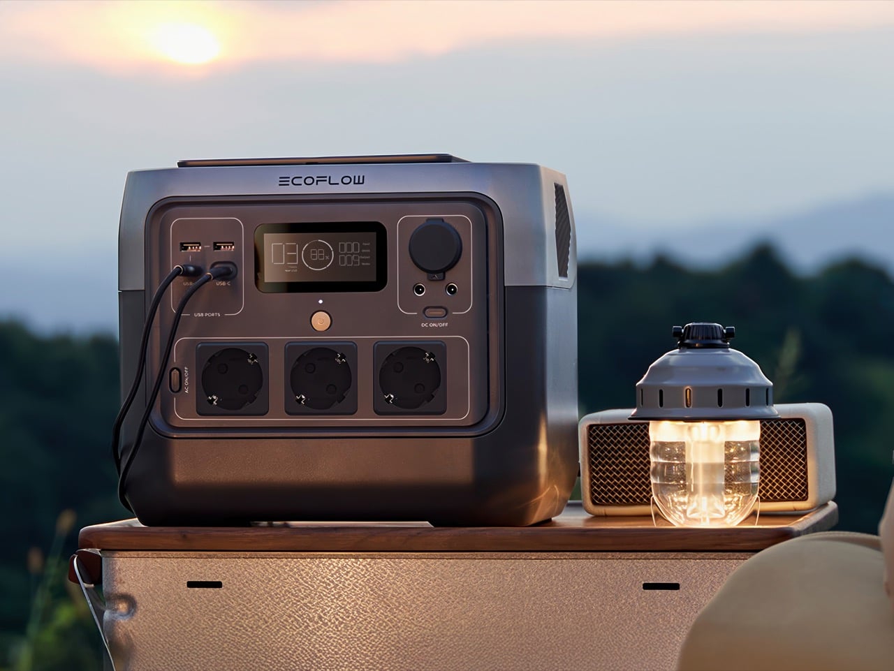
The Must‑Have Portable Power Station Setup Every Household Should Own For Storms And Blackouts

This is not a normal cold snap. The polar vortex that usually stays locked over the Arctic has split and sagged south, dragging temperatures in parts of the Midwest and East Coast to levels that feel closer to the Far North than to cities where millions live. Across affected regions, the results have been immediate and severe. Hypothermia deaths in Louisiana. Rolling blackouts. Ice storms that shatter tree limbs and bury power infrastructure under frozen weight. Nearly 250,000 people in Tennessee alone woke up this week without electricity, and utilities are warning that repairs could take days.

If you are watching the forecast from a warm, lit room, it is worth asking what happens if your block goes dark. Your thermostat stops, your phone begins to drain, your internet dies, and you lose access to weather updates and family check‑ins just when you need them most. For people in small apartments or older homes without backup systems, this is not a thought experiment, it is the reality playing out at this moment. A compact, indoor‑safe power station is one of the few tools that can soften that blow, quietly keeping phones, medical devices, and a few essential lights running while the grid catches up.
Click Here to Buy Now

Why the Mid‑Size Power Station Makes Sense for Most Households

Portable power stations fall along a spectrum, and most of them do not fit the use case of a typical household facing a winter outage. The small units, typically in the 200 to 300 watt‑hour range, are barely larger than heavy‑duty power banks. They can charge phones and tablets, maybe run a laptop for a few hours, but they lack the capacity and output to keep anything more demanding alive. A router pulls too much. A CPAP machine drains them in a single night. A small electric blanket finishes them off in two or three hours. They are fine for a day hike or an overnight car trip, but in a multi‑day blackout during freezing weather, they run dry too quickly to matter.

On the other end, the large systems in the 2,000 to 4,000 watt‑hour class are designed for off‑grid living, RV installations, or whole‑home backup with automatic transfer switches. They can run refrigerators, sump pumps, and multiple high‑draw appliances at once, but they weigh 50 to 100 pounds, cost as much as a used car, and take up serious floor space. For someone in a studio apartment or a rented house, they are impractical both financially and logistically.

The mid‑size tier, roughly 700 to 1,000 watt‑hours with 800 watts of continuous output, occupies the useful middle ground. These units are light enough to move with one hand, affordable enough to justify as a one‑time purchase rather than a major investment, and powerful enough to keep the essentials running for several days if used carefully. They are not designed to replace the grid. They are designed to bridge the gap between when the grid fails and when it comes back online, which is exactly the scenario playing out across the East Coast right now.

What the River 2 Pro Brings Over Its Predecessor

We reviewed the standard EcoFlow River 2 a couple of years back and liked it for what it was: a genuinely portable, well‑designed 256 watt‑hour unit that charged fast and looked good doing it. The dual‑tone design was sharp, the handle redesign made it easier to store, and the price was right for weekend adventurers. But 256 watt‑hours is just not enough capacity to be useful in a real emergency. You could maybe get through one cold night if you were very, very careful.

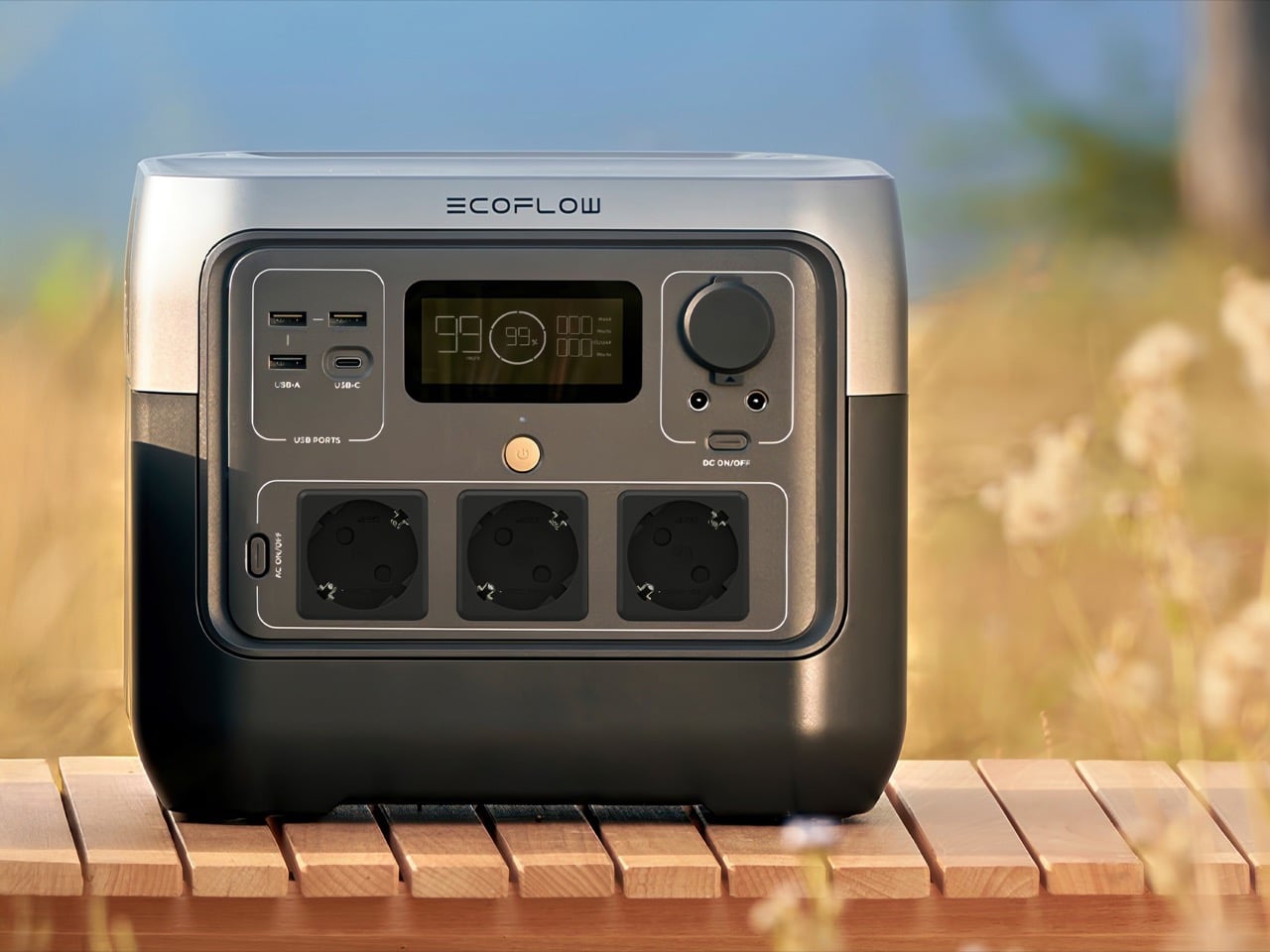
The Pro triples that to 768 watt‑hours and bumps the continuous AC output from 300 watts to 800 watts, all while adding only about 11 pounds to the overall weight. That capacity jump is not incremental, it is transformational. Now you are talking about running a CPAP for multiple nights, keeping a router alive for over a week of intermittent use, and still having juice left for phone charging and LED lights. The original River 2 was a nice‑to‑have for camping trips. The Pro is something you can actually rely on when the infrastructure around you stops working.

EcoFlow also stuck with LiFePO₄ chemistry, which is the right call here. These cells handle temperature swings better than standard lithium‑ion, they are safer, and they are rated for over 3,000 cycles before they start losing capacity. If you are buying this as a piece of emergency gear that might sit unused for months or years at a time, that longevity matters. This is not a gadget you replace every couple of years. It is something you buy once and forget about until the lights go out.

70 Minutes from Empty to Fully Charged

EcoFlow has been pushing fast charging as a selling point across their lineup for a while now, and in the River 2 Pro it is not just a spec sheet flex, it is genuinely useful. The unit goes from dead to full in about 70 minutes off a standard wall outlet. In normal times, that is convenient. During a rolling blackout, it is the difference between a functional backup and a paperweight.

Think about how most grid failures actually play out in populated areas. Power does not just drop and stay off for three days straight. It flickers. It comes back for an hour, goes out again, comes back for two hours overnight. If your power station takes five or six hours to charge, you are constantly playing catch‑up and never actually filling the tank. With the River 2 Pro, every time the grid comes back on, you have a realistic shot at getting back to 100 percent before it drops again. That changes the whole strategy of how you manage an outage.

The unit also takes up to 220 watts of solar input, so a pair of decent folding panels can top it off in four or five hours under good sun. Winter solar is sketchy, clouds and short days mean you are not going to get reliable full charges, but even partial sun can stretch your runtime by enough to matter. It is not a primary charging method in January, but it is a useful fallback if the outage drags on longer than expected.

What It Costs and How That Compares

Online pricing on the River 2 Pro right now is hovering around the $315 mark, depending on where you shop. The MSRP is technically $549, but there’s almost always a discount running somewhere.

Compare that to a Jackery Explorer 1000 V2, which offers about 1,070 watt‑hours and usually runs $500 to $600. Or the Bluetti AC180, which is in the same ballpark for capacity and price. The River 2 Pro is giving you about 70 percent of the capacity at roughly half the cost, which for most apartment and small‑home use cases is the right tradeoff. You are not powering a refrigerator for a week either way, so the extra 300 watt‑hours does not fundamentally change what you can do. What changes is whether you can justify the expense as a one‑time purchase or if it feels like a luxury you will never pull the trigger on.

The really small units, the 200 to 300 watt‑hour boxes, run $150 to $250. So you are paying maybe $100 to $150 more to triple your capacity and double your output. That is an obvious upgrade if you are serious about emergency preparedness. The giant 2,000+ watt‑hour systems start north of $1,200 and climb fast from there, which is a completely different budget conversation.
What It Can Actually Power During an Outage

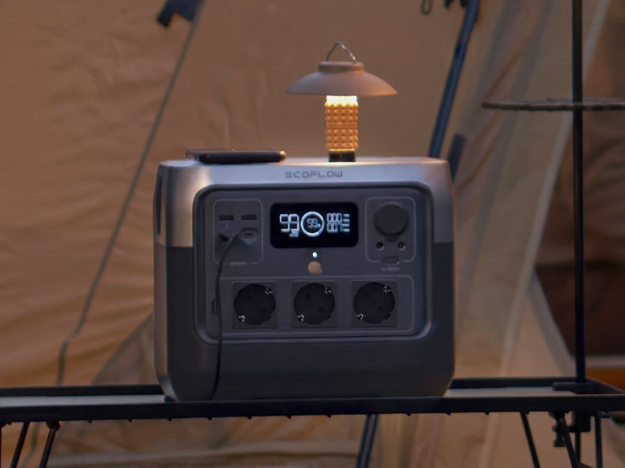
The numbers on a spec sheet do not always translate clearly to real‑world use, so it helps to think in concrete scenarios. A fully charged River 2 Pro, used carefully, can sustain:

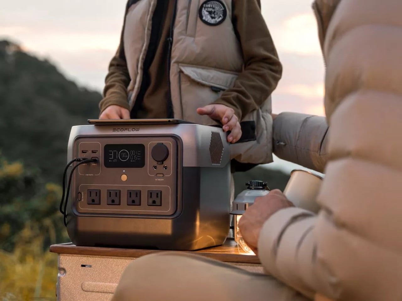
Communication and information: A smartphone pulls maybe 10 to 15 watt‑hours per full charge. You could recharge your phone 50 times off a full River 2 Pro. A typical Wi‑Fi router and modem together draw 15 to 25 watts while they are on. Run them three hours a day to pull weather updates, check news, coordinate with family, and you are using about 60 watt‑hours daily. That gives you a week and change of intermittent connectivity from a single charge.

Medical devices: A CPAP machine is slightly trickier because the power draw varies wildly depending on your model and settings. If you are running a basic unit without the heated humidifier, you might pull 30 to 40 watts. With the humidifier cranked, that can jump to 60 watts or more. Let us say you are at 40 watts for eight hours a night. That is 320 watt‑hours per night, so you get two full nights of sleep therapy before you need to recharge. Not great if the power is out for a week, but enough runway to get through the worst of a storm without ending up in an ER.

Targeted warmth: Low‑wattage electric blankets and heated throws usually run 50 to 100 watts. A 75‑watt throw for three hours in the evening is 225 watt‑hours. Combine that with CPAP and phone charging and you are looking at maybe 600 watt‑hours total per day, which gives you a full day of decent comfort before you need to think about recharging.

Lighting: LED lighting is almost free by comparison. A 10‑watt bulb for five hours a night is 50 watt‑hours. You could light up a small apartment every night for a week and barely dent the battery.

The key here is prioritization. You shouldn’t be running everything at once. Keep the critical stuff alive, lights, communication, medical devices, and use targeted warmth instead of trying to heat the whole space. That is what makes a mid‑size unit like this viable, and truly accessible to the vast population who can divert sub-$500 on a moment’s notice. The power station might be tiny, but it forces you to be smart about power – which is exactly what you need to do in a real outage anyway.

Need More Power? Just Buy A Second One And Connect Them

One feature that does not get talked about enough is that you can actually chain two River 2 Pro units together for expanded capacity. EcoFlow builds this into their ecosystem, so if you find yourself consistently running up against the limits of a single 768 watt‑hour unit, you are not stuck buying a completely different, more expensive system. You just add a second River 2 Pro and suddenly you are working with over 1,500 watt‑hours of usable capacity. That is enough to stretch a multi‑day outage without obsessively rationing every watt, or to run slightly higher‑draw appliances that a single unit would struggle with.

The math here is quite interesting because it gives you a more flexible upgrade path than most power station ecosystems offer. Instead of dropping $1,200 to $1,500 on a single large unit right out of the gate, you can start with one River 2 Pro, see how it performs in real‑world use, and then add a second one later if you need the extra capacity. You end up spending around $630 total for a combined system that gives you more modularity than a single giant battery box. If one unit dies or needs servicing, you still have backup power. If you only need light capacity for a short trip, you take one and leave the other at home. That kind of flexibility is genuinely underrated.

It also means the River 2 Pro scales better for different household sizes and needs. A single person in a studio apartment might never need more than one unit. A family of four in a larger house might find that two units let them cover essentials in multiple rooms without running extension cords everywhere or constantly shuffling devices between outlets. The ability to grow the system incrementally, rather than making one big all‑or‑nothing purchase decision, makes it a lot easier to justify the initial investment and adapt as your needs change.

How to Use It Effectively in Cold Weather

Store and operate it indoors. LiFePO₄ cells can discharge in cold temperatures, but they should not be re-charged when the internal temperature is below freezing.

Most modern power stations, including the River 2 Pro, have battery management systems that will flat‑out refuse to charge if the cells are too cold. So keep the unit inside, away from exterior walls and drafty windows, and you will be fine.

Turn things off when you are not using them. That sounds obvious, but in the chaos of a blackout it is easy to leave the router on all day or forget a phone plugged in after it hits 100 percent. The River 2 Pro has a small parasitic draw just from being powered on, so if you are not actively using an outlet, shut it down and save every ounce of power you can.

And for the love of all that is holy, do not try to heat your apartment with this thing. Yes, the 800‑watt continuous output can technically run a small space heater. Yes, the X‑Boost mode can push that to 1600 watts for short bursts. But a 1,500‑watt space heater will drain the entire battery in about 30 minutes. That is not a strategy, that is just lighting your stored energy on fire. Layer up, use blankets, deploy a low‑watt heated throw for targeted warmth if you need it, but resistive heating is a losing game with battery power.
What It Cannot Do

The River 2 Pro is not a whole‑home backup system. It will not keep your refrigerator running for days, it will not power your furnace, and it definitely will not run a sump pump if your basement starts flooding. If those are your needs, you are shopping in the wrong category. You want a 2,000+ watt‑hour system, probably with a transfer switch and professional installation, and you are going to spend a lot more money.

The usable capacity is also not quite the advertised 768 watt‑hours. Independent testing puts the real‑world output closer to 620 watt‑hours, which is about 81 percent of the rated capacity. That is normal for the industry, battery management systems always hold back some reserve to protect longevity, but it is worth knowing so you do not plan your runtime calculations around the full number.

And while the unit is rated for 3,000+ cycles, that assumes you are not constantly hammering it from zero to 100 percent under extreme conditions. If you want to maximize lifespan, try to keep the charge between 20 and 80 percent when you can, and store it at around 50 percent if it is going to sit unused for months. Treat it like a piece of infrastructure, not a toy, and it will last you a decade.

Preparing Before the Next Storm

Hundreds of thousands of people are sitting in the dark tonight while the cold keeps piling on. More are watching the forecast and realizing their block could be next. The grid is not built for this. It was not designed to handle ice storms in places that rarely freeze, or sustained cold snaps in cities where winter is usually mild. And when it fails, the gap between “uncomfortable” and “dangerous” closes fast.

A power station like the River 2 Pro does not fix the underlying problem. It does not make the grid more resilient, and it does not replace the need for serious infrastructure investment. What it does is give you a buffer. A way to keep the essentials running while you wait for the repair crews to get the lines back up. A way to avoid the kinds of decisions that turn a bad night into a genuine emergency.

For $315, that is not a bad insurance policy to have sitting in your closet, charged and ready, before the next storm rolls in.

Click Here to Buy Now

The post The Must‑Have Portable Power Station Setup Every Household Should Own For Storms And Blackouts first appeared on Yanko Design.
Korg Phase8 Is a Cyberpunk Kalimba for Producers Who Are Bored of Regular Synths

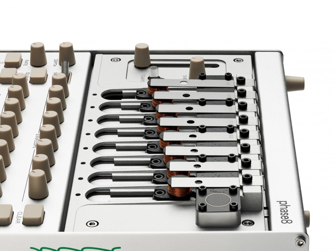
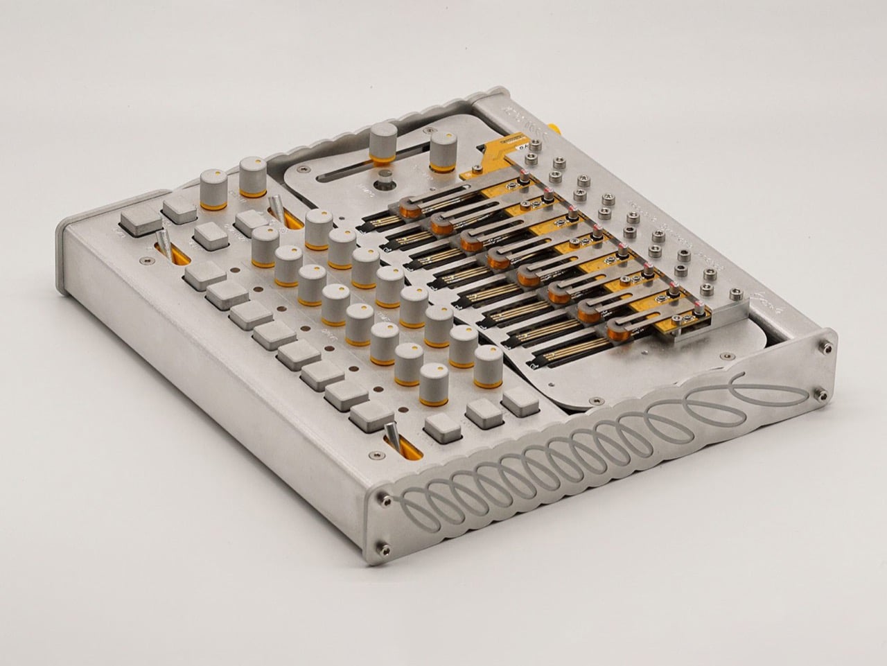
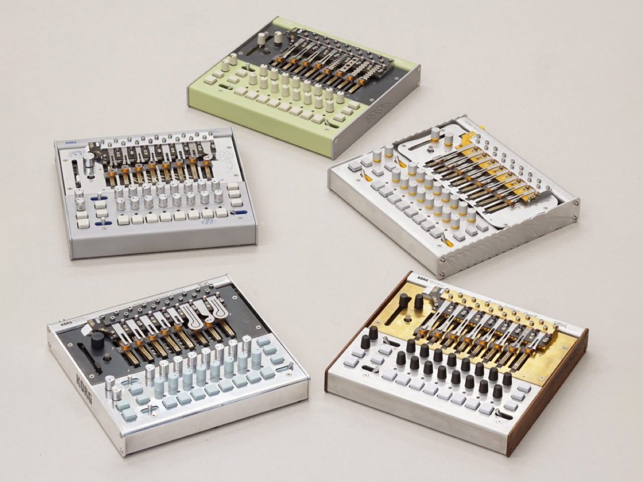
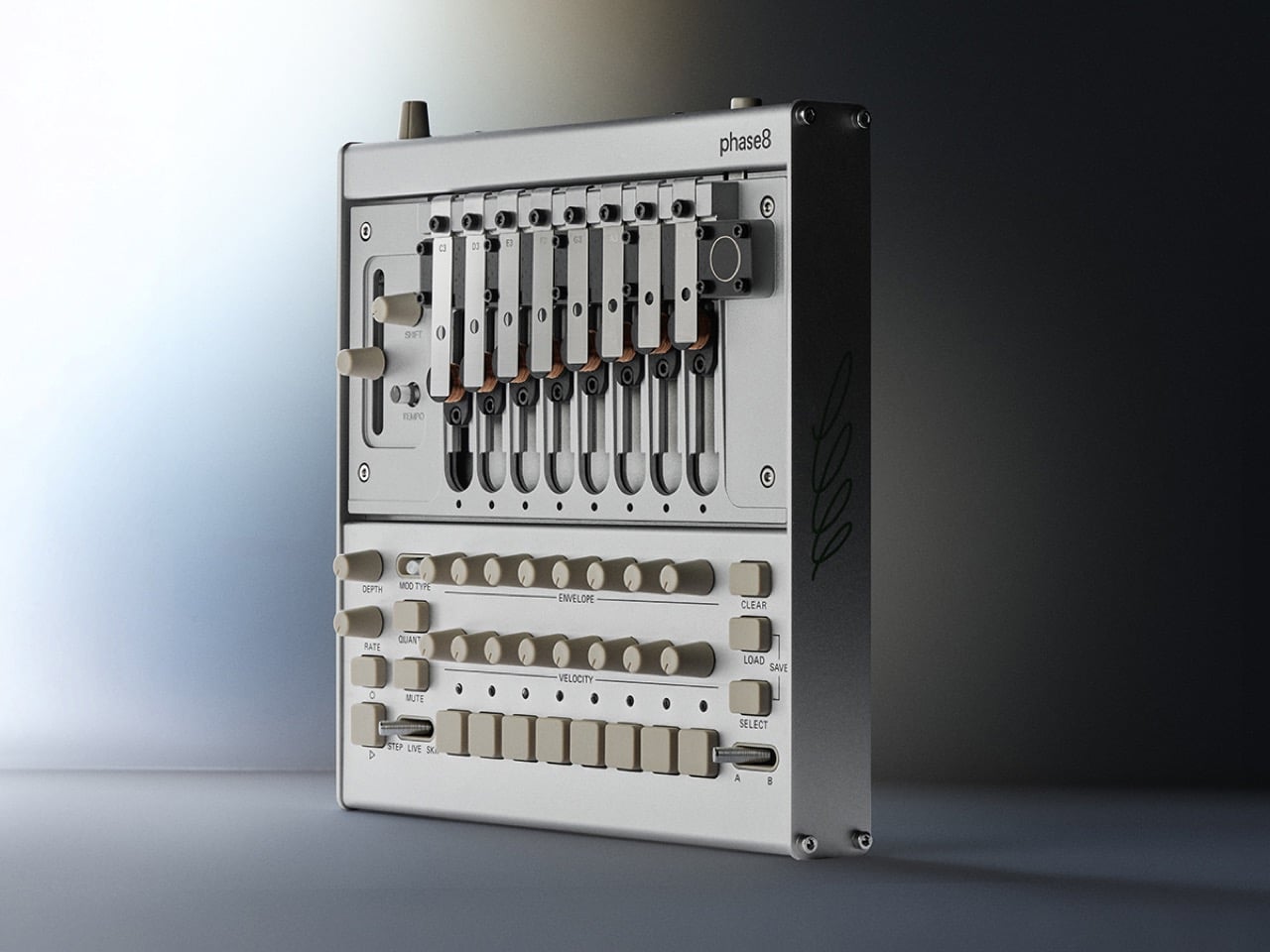
On first glance, Korg’s Phase8 looks like something Love Hultén might have dreamt up after a late night with a kalimba and a soldering iron. It has that same altar like presence, where every screw and surface feels intentional, and the exposed steel bars read more like a kinetic sculpture than a row of notes. You do not just see an instrument, you see a machine that wants to be played, prodded, and prepared with whatever objects are lying around your studio.

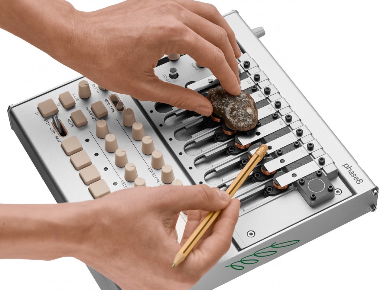
The result is a tabletop artifact that feels half lab instrument, half folk relic. Phase8 invites the same sort of ritualistic interaction Hultén builds into his one off consoles and synth shrines. You can sequence it like a modern groovebox, but it really comes alive when your hands, a pencil, or even a river stone start interfering with those vibrating tines.

Designer: Korg

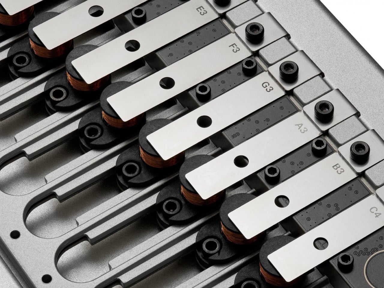
This whole thing runs on what Korg is calling “Acoustic Synthesis,” which is a fancy way of saying it hits stuff. Under each of those eight steel resonators sits an electromagnetic hammer that physically strikes the bar when triggered. A capacitive pickup then captures the resulting acoustic vibration and sends it back into the synth engine for shaping. It is a completely different path from the usual oscillator-filter-amp chain. The entire unit weighs a solid 1.71kg and measures just 231mm wide, giving it the dense, purposeful feel of a piece of lab equipment, not a lightweight music toy.

That physical interaction model is the entire point. Korg explicitly tells you to pluck, mute, and strum the resonators. They even encourage placing found objects on them to create new textures. An “AIR” slider on the side lets you boost or dampen the raw acoustic response, effectively mixing between the pure electronic signal and the sound of the physical object vibrating in the room. This haptic approach is a clever rebellion against the menu-diving and screen-staring that defines so much modern gear. It demands your physical attention.

Of course, this is a Tatsuya Takahashi project, so the experimental nature is backed by serious engineering. It has a polymetric sequencer, full MIDI and USB-C implementation, and even CV input for talking to modular rigs. At $1,150, it is not an impulse buy, but it also signals that Korg sees this as a proper studio centerpiece. They built an instrument that feels alive because, in a very real sense, its sound generation depends on physical, vibrating matter.

The post Korg Phase8 Is a Cyberpunk Kalimba for Producers Who Are Bored of Regular Synths first appeared on Yanko Design.

Meet The SP40 Restomod Speedster: The Minimalist Carbon Hot Rod Redefining Retro Car Design

The best custom builds do not just remix old ideas. They ask what those ideas would look like if they were born today, with access to current tools, materials, and manufacturing processes. The SP40 Restomod Speedster is that question answered in carbon and billet. It takes the stance and spirit of a 1930s streamliner, that long, low, purposeful shape built for speed rather than comfort, and reimagines it through the lens of modern coachbuilding. The body is a series of massive, unbroken surfaces. The cockpit is minimal and driver-focused. The whole thing looks like it was designed on a computer, then machined to tolerances measured in microns.

There is a specific audience for this kind of work. People who buy hand-wound watches even though their phones keep better time. People who collect midcentury furniture not because it is trendy, but because the joinery and proportions feel right. People who understand that restraint is harder than excess, and that the best designs are the ones where nothing feels arbitrary. The SP40 sits at the intersection of automotive history and contemporary craft. It is not trying to fool anyone into thinking it is from another era. It is trying to capture what made that era compelling, then execute it with the precision and materials available right now.

Designer: Iconic Auto Sports

You can see that precision in the bodywork, which is almost certainly a full carbon fiber monocoque. Look at the rear clamshell; getting a single piece of carbon that large to lay perfectly without waves or distortion is an engineering feat in itself. This is not kit-car fiberglass with a carbon wrap. This is structural, aerospace-grade material science applied to a shape that feels impossibly organic. The entire car probably weighs less than 950 kilograms, which fundamentally changes how it would drive. All the visible suspension components up front are likely CNC-milled from aluminum, with geometry dialed in using modern kinematic software. It is a level of finish that blurs the line between a car and a piece of kinetic sculpture.

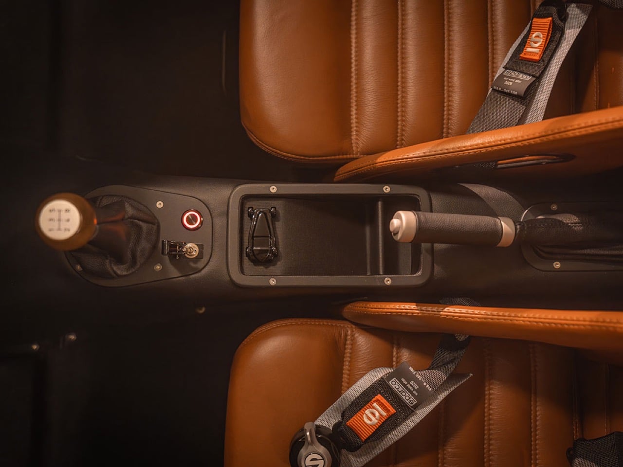
That philosophy carries right into the cockpit, which is a masterclass in tactile design. The gated manual shifter, with its wooden knob, is the centerpiece. It promises a mechanical, deliberate shifting action that modern paddle-shift systems simply cannot replicate. The dashboard is a simple plank of wood with classic analog gauges, a direct rejection of the screen-centric interiors that dominate the industry. Every control, from the toggle switches to the pull-handbrake, feels chosen for its physical feedback. It is a space designed for the act of driving, where your connection to the machine is through direct, mechanical inputs. The Sparco harnesses are not just for show; they are a clear signal of the car’s performance intent.

Underneath it all, the powertrain has to be something modern and potent. The side-exit exhaust and the big opening in the lower front grille point toward a forced-induction setup, probably a compact, high-revving V8. Something like a supercharged LT4 crate engine would provide around 650 horsepower with reliable, accessible torque, turning this lightweight chassis into an absolute weapon. Those wheels are a perfect metaphor for the whole project: they have the solid, functional look of vintage aero discs, but the turbine-like slots and two-tone finish are thoroughly contemporary. This car is a rolling thesis statement, arguing that technology’s best use is not to isolate the driver, but to perfect the analog connection we fell in love with in the first place.

The post Meet The SP40 Restomod Speedster: The Minimalist Carbon Hot Rod Redefining Retro Car Design first appeared on Yanko Design.

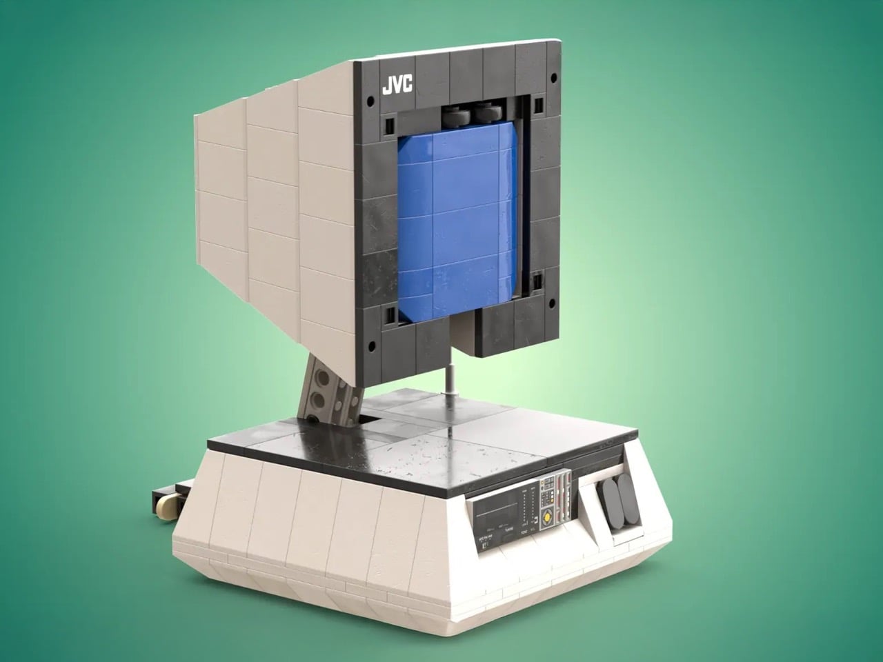
The JVC Pyramid TV That Defined Retro Futurism in the 70s Now Wants to Be a LEGO Set

Before flat screens colonized every wall and surface, televisions had personality. They came in wild shapes and bold colors, designed by people who believed consumer electronics could be sculpture. The JVC 3100R Video Capsule, produced throughout the 1970s, exemplified this philosophy. Its pyramid form and space-helmet aesthetic made it a favorite among collectors of “space-abilia,” that peculiar category of objects inspired by Apollo missions and science fiction films.

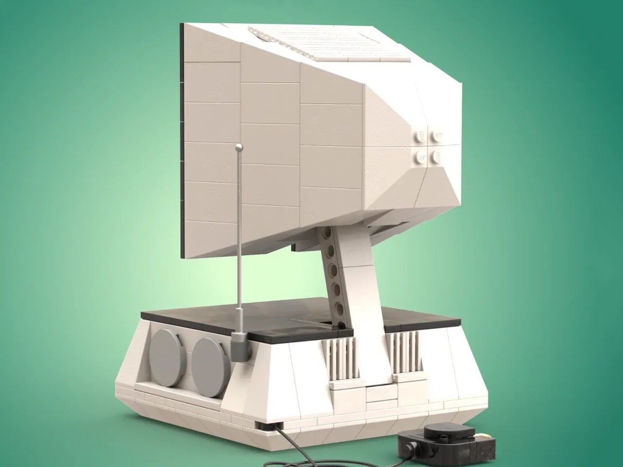
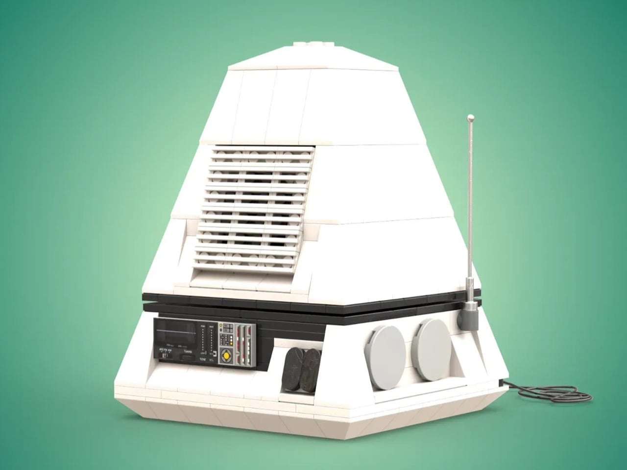
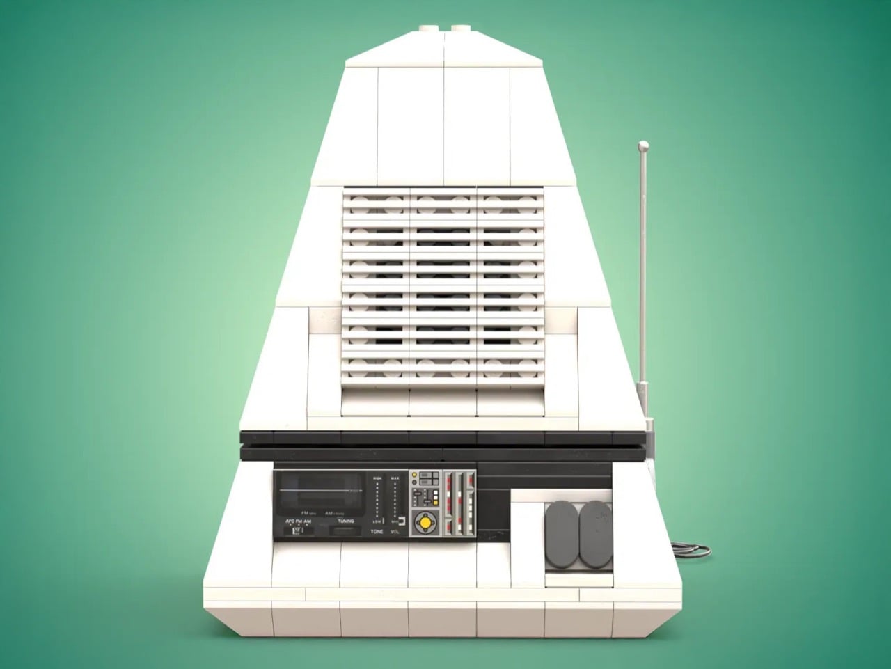
Enter DocBrickJones, a LEGO builder who has recreated this vintage icon in remarkable detail. His LEGO Ideas submission captures everything from the angled white body to the frequency gauge on the control panel. The project needs 10,000 supporters to be considered for production, but it’s currently sitting at just over 200. For anyone who appreciates when design took risks, or when LEGO tackles interesting real-world objects, this pyramid-shaped tribute deserves a closer look.

Designer: DocBrickJones

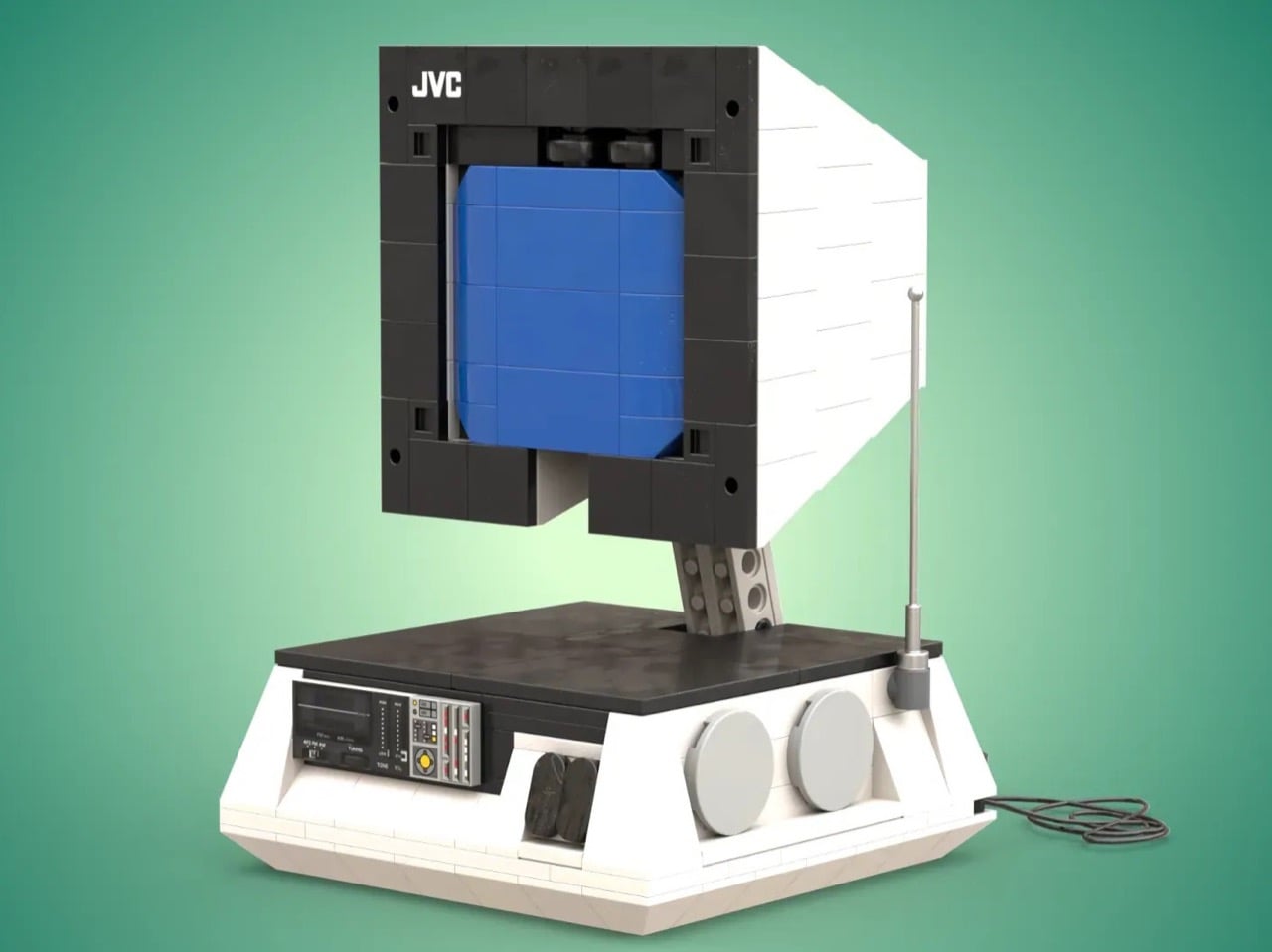
The original 3100R combined a 6-inch black and white CRT screen with an AM/FM radio in a package that could transform. Collapsed into pyramid mode, it functioned as a radio. Truncate that pyramid by opening the top section, and suddenly you had a television. The design language borrowed heavily from the cultural moment: the black and white color scheme echoed Saturn rockets, while the pyramid geometry nodded to San Francisco’s Transamerica Pyramid skyscraper, completed just a year before the 3100R hit shelves. This was 1972, when the Apollo program still dominated headlines and anything vaguely space-themed sold like crazy. JVC understood the assignment.

What makes DocBrickJones’ LEGO version impressive is how he’s translated analog curves and slopes into a medium that fundamentally works in right angles. The angled faces of the pyramid base use carefully placed slope bricks to maintain clean lines. The blue-tiled screen sits recessed behind a dark gray frame, complete with speaker grills and control dials. There’s even a telescoping antenna in light gray and a brick-built power cable trailing from the base. These details matter because they demonstrate an understanding of what made the original compelling: the interplay between smooth surfaces and functional elements, the visual weight of that wide base supporting a delicate screen assembly, the contrast between the pristine white body and the technical-looking control panel.

The current LEGO Ideas lineup skews heavily toward nostalgic tech objects. The Polaroid OneStep camera, the classic typewriter, even the Atari 2600 have all found success by appealing to adults who remember when consumer electronics felt tactile and specific rather than generic and touchscreen. The 3100R fits this pattern perfectly, maybe even better than some approved projects. It represents a specific design philosophy from a specific moment when optimism about technology translated into physical form. You looked at a 3100R and thought about the future, even if that future was technically just watching grainy UHF broadcasts.

LEGO Ideas operates as a democratic platform where fan-created designs compete for official production. Submit a project, gather 10,000 supporters within a set timeframe, and LEGO reviews it for potential manufacturing. The newly minted JVC 3100R build currently sits at 207 votes and needs to hit the 1,000 vote margin to reach the next stage, which means there’s plenty of runway for this design to find its audience. Voting costs nothing beyond a free LEGO account, and successful projects get produced as official sets with the original creator receiving royalties and credit. The platform has launched everything from the Saturn V rocket to the Medieval Blacksmith, proving that niche appeal can translate into mainstream success. If you want to see this space-age pyramid sitting on store shelves next to other design-focused sets, the voting link lives on the LEGO Ideas website. The 3100R deserves a second act, this time in brick form.

The post The JVC Pyramid TV That Defined Retro Futurism in the 70s Now Wants to Be a LEGO Set first appeared on Yanko Design.

Mercedes-Benz Vision Iconic: Solar Paint That Generates 7,450 Miles of Range Annually

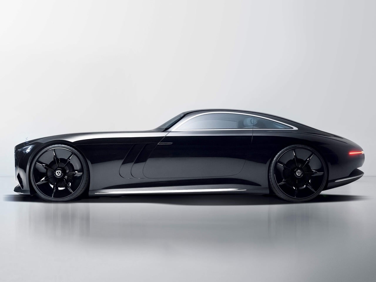
In most concept cars the paint is just a color. On the Mercedes-Benz Vision Iconic, the paint is a powertrain component. Beneath that mirror black surface lies solar paint, a wafer thin photovoltaic skin that turns every curve and contour into an active energy source, capable of adding thousands of miles of range each year under ideal conditions. The result is a car that charges itself while it poses, while it cruises, even while it sleeps in a garage flooded with sunlight, generating a mind-boggling 7,450 miles of range annually based on ideal conditions.

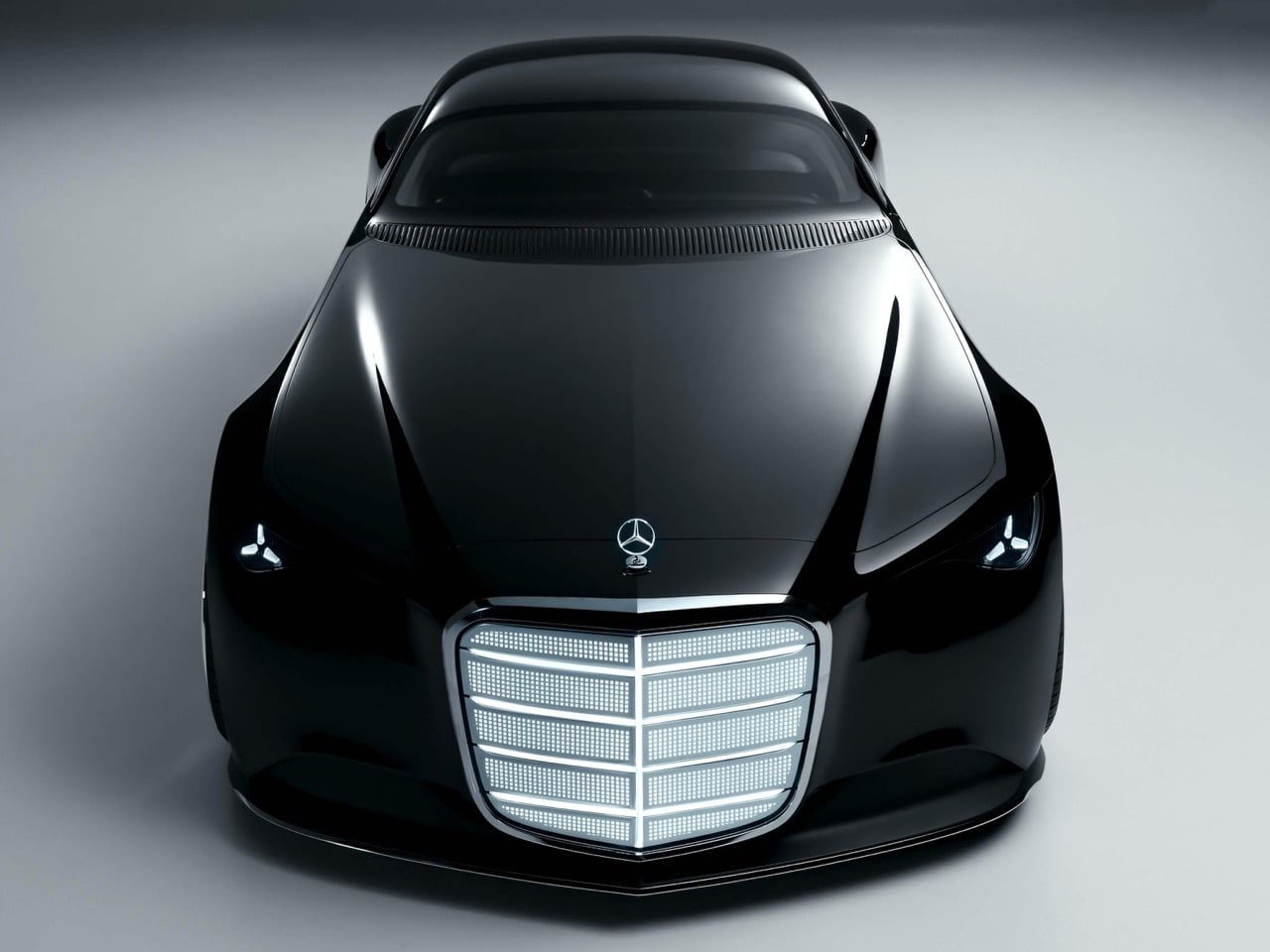
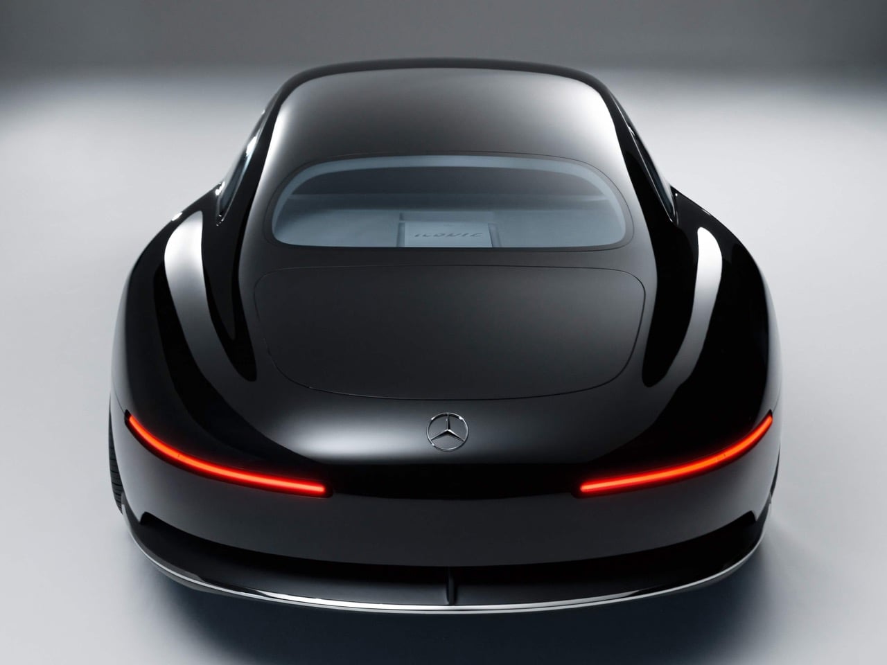
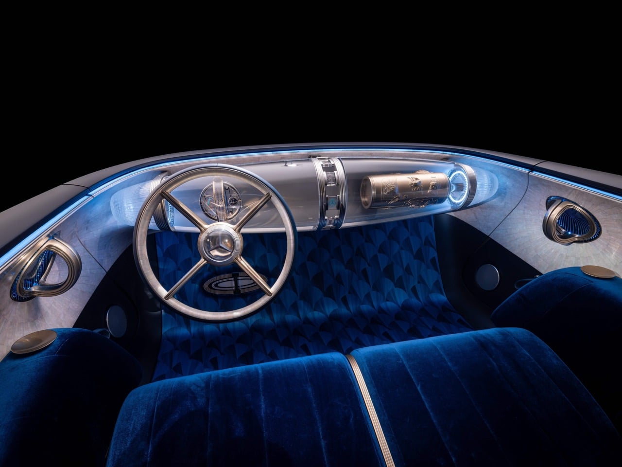
That technology wraps a body shaped like a vintage dreamscape. Mercedes pulled proportions from its 1930s icons, with a near vertical grille, extended hood, and fastback silhouette that hides the electric skateboard underneath. The grille glows with animated pixels, the hood star lights up, and the entire form is finished in reflective black that emphasizes sculptural surfaces over character lines. Inside, the cabin becomes a velvet lined theater with brass accents, floating glass displays, and neuromorphic computing that makes autonomous driving 90 percent more efficient. Solar energy meets Art Deco in a manifesto for sustainable luxury. Chief Design Officer Gorden Wagener created the concept as his creative conclusion before leaving the company, ensuring his “Sensual Purity” philosophy persists beyond his tenure. The strategy acknowledges that luxury customers buy emotional experiences rather than mere transportation. Technology serves that experience instead of overwhelming it.

Designer: Mercedes-Benz

This car is essentially Wagener’s mic drop, a final, definitive statement on his “Sensual Purity” design philosophy before his departure in January 2026. For years, he’s talked about this bipolarity of emotion and intelligence, and the Vision Iconic is its physical manifestation. The emotion comes from the sheer presence of the thing, its sculptural surfaces and historical nods. The intelligence is the bleeding-edge tech humming beneath the surface. It’s a perfect symbiosis. This concept cements his legacy, proving that his focus on physical clay modeling to perfect proportions and surface language can produce something that feels both classic and futuristic. It’s a powerful farewell that will shape the company’s aesthetic for years to come.

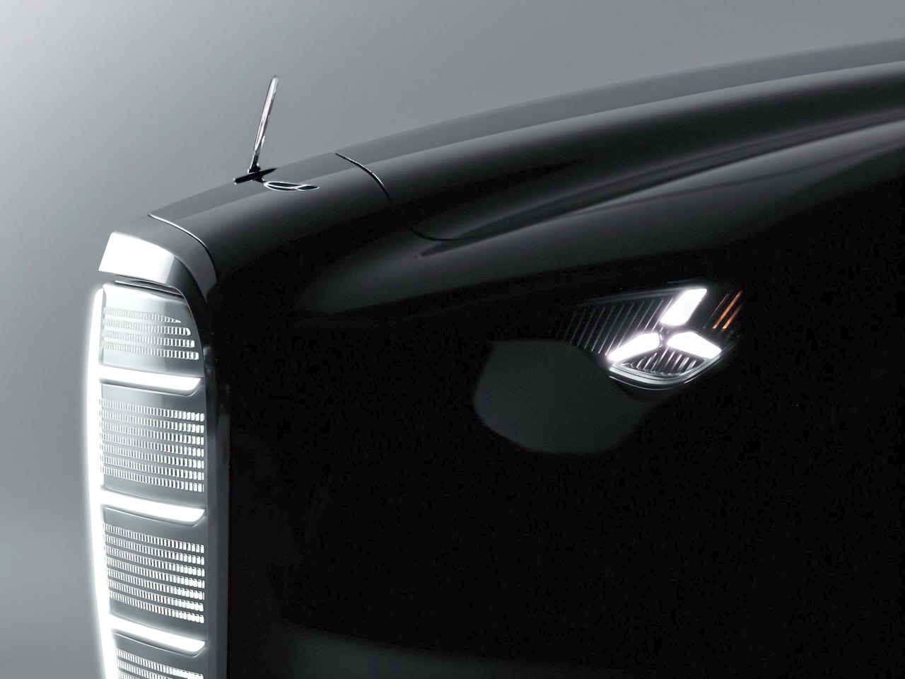
You can’t miss the grille, which is clearly the centerpiece of the new corporate face. It’s a direct homage to the upright, proud grilles of 1960s icons like the W108 S-Class and the W100 600 Pullman, but reinterpreted for the digital age. The structure is built from light, with a pixel-graphic lattice that can animate, giving the car a dynamic presence even when stationary. This isn’t just a styling gimmick; it’s a strategic move to ground the brand’s electric future in its rich heritage, preventing its EVs from looking like generic appliances. The illuminated three-pointed star on the hood reinforces this connection. The rest of the body is a study in minimalism, with clean, flowing lines that emphasize the car’s monolithic, sculptural quality.

Inside, the team pursued what they call a “hyper-analog” experience, which is a brilliant response to the industry’s obsession with sterile, screen-dominated interiors. The cabin is a lounge, not a cockpit, an idea enabled by its Level 4 autonomous capabilities. A continuous bench seat is wrapped in deep blue velvet, and details are rendered in polished brass. The centerpiece is the “Zeppelin,” a floating glass structure on the dash that houses a mix of analog-inspired instruments and digital displays, creating a layered, artistic effect. It feels opulent and tactile, a reminder that luxury is about materials and craftsmanship, not just pixel density.

For Wagner and Mercedes-Benz, the Vision Iconic is a manifesto. Mercedes is declaring that its electric future will not be one of compromise. The car’s entire technological ecosystem is built to support its aesthetic ambitions. The neuromorphic computing, which reduces the power needs of autonomous driving tasks by a staggering 90 percent, is what allows for such sophisticated self-driving without a crippling range penalty. The steer-by-wire system frees up the interior packaging, enabling the lounge-like atmosphere and allowing designers to maintain those classic long-hood proportions. Every piece of tech has a purpose that serves the overall vision of creating a desirable, beautiful object that also happens to be a highly advanced electric vehicle.

The post Mercedes-Benz Vision Iconic: Solar Paint That Generates 7,450 Miles of Range Annually first appeared on Yanko Design.

These LEGO Brick Crocs Cost $150 and Look Exactly as Weird as You’d Expect

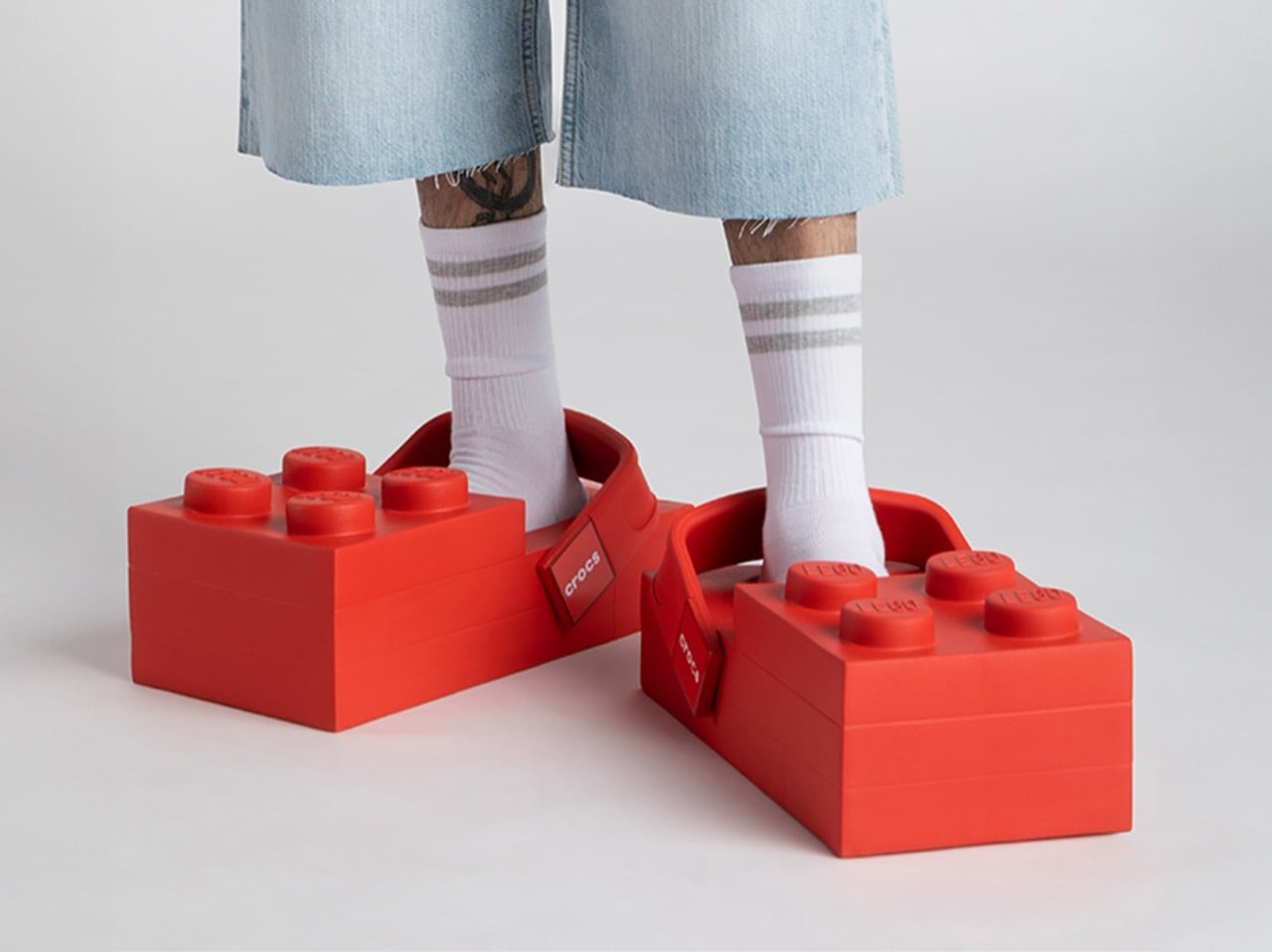
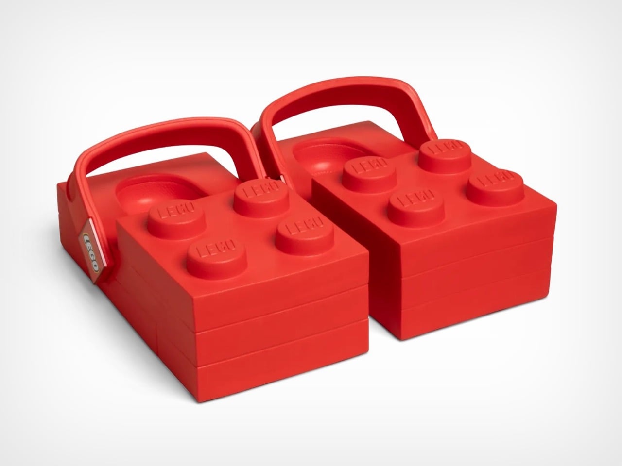
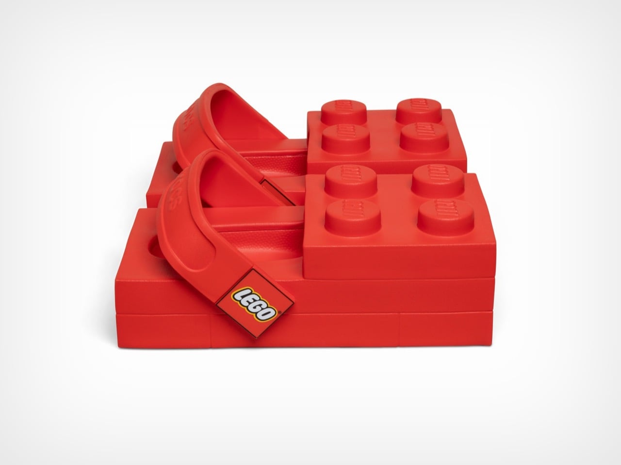
The LEGO Brick Clogs are not subtle. They are not refined. They are giant red rectangles that you strap to your feet, complete with four oversized studs jutting from the top like a toddler’s building block scaled up for adult wear. This is footwear that makes no apologies for its absurdity. Your feet disappear entirely into chunky brick shapes that add inches of height and pounds of visual weight, transforming your lower legs into what looks like a sight gag from a cartoon.

Both LEGO and Crocs seem thrilled by how ridiculous this looks. The design commits fully to the brick concept, maintaining the rectangular shape from every angle and ensuring that yes, you will absolutely look like you raided a giant’s toy chest. The studs aren’t decorative accents. They’re prominent, impossible to miss, and stamped with the LEGO logo so everyone knows exactly what you’ve done to your feet. Crocs even admits these aren’t meant for all-day wear, which feels like the understatement of the year when you’re essentially walking on building blocks.

Designers: LEGO X Crocs

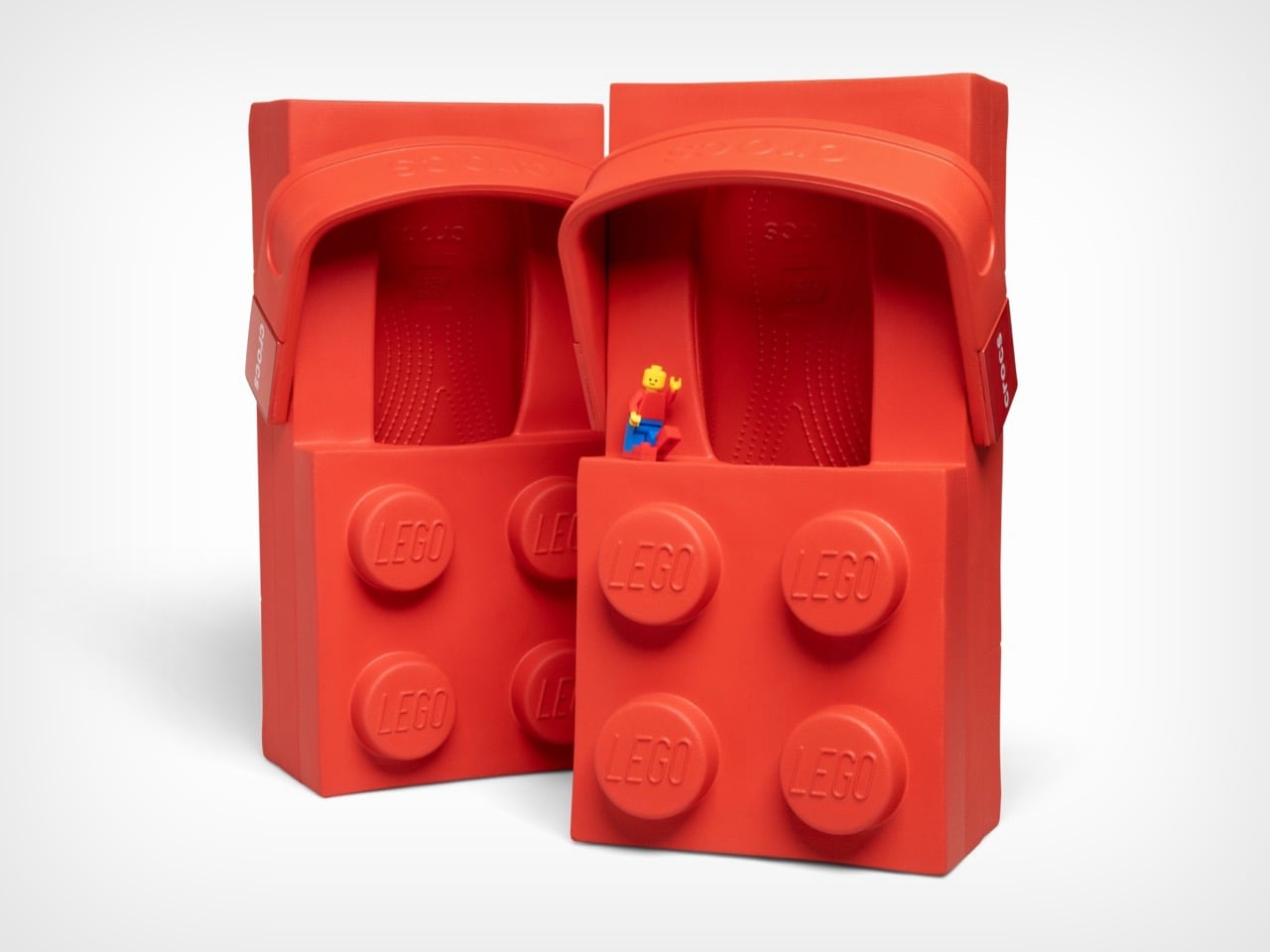
These launch February 16th at $149.99 on Crocs’ site and $199.99 on LEGO’s store, a price discrepancy nobody seems able to explain. They’re available in women’s sizes 7 through 12 and men’s sizes 5 through 13, which means a decent range of people can participate in this social experiment. Each pair includes a LEGO minifigure wearing matching tiny brick clogs because apparently the joke needed extending beyond your actual feet. The shoes use Crocs’ standard Croslite foam material, so they’ll presumably be comfortable despite looking like orthopedic nightmares. The heel strap pivots just like regular Crocs, with one side branded LEGO and the other Crocs, because why choose when you can advertise both brands simultaneously.

From a design perspective, these things are fascinating disasters. The 2×4 brick silhouette creates a platform that extends well beyond normal shoe boundaries, adding considerable visual bulk to an area of the body that most footwear tries to streamline. The four studs on top serve zero functional purpose but dominate the entire aesthetic, sitting roughly where your toes would be if your feet were actually brick-shaped. Inside, you get standard Crocs Croslite foam, the same cushioned EVA material that made the brand famous for comfort. The heel strap pivots like any other Croc, with Crocs branding on one side and LEGO on the other, a small detail that somehow makes the whole package feel even more committed to the bit.

Rapper Tommy Cash debuted them at Paris Fashion Week on January 21st, which tracks perfectly. These needed a runway moment, needed to exist in a context where people expect the unexpected. The fashion world has spent decades normalizing increasingly bizarre footwear, from Balenciaga’s platform Crocs to various luxury brands’ takes on chunky dad shoes. The LEGO Brick Clogs fit right into that lineage while simultaneously mocking it. They’re high fashion and low culture colliding at maximum velocity, wrapped in a bright red package that costs as much as a decent pair of running shoes.

The multi-year partnership promises more releases beyond this initial brick clog, with additional drops planned for spring 2026. Both companies hint at customizable Jibbitz charms made from actual LEGO brick plastic, which could genuinely be interesting if they figure out the attachment mechanism. The collaboration might seem random until you consider that both brands built empires on letting people express themselves through unconventional means. LEGO gives you infinite creative possibilities with plastic bricks. Crocs gave the world permission to prioritize comfort over convention and then added holes for decorative charms. Put them together and you get footwear that dares you to take it seriously while simultaneously proving it doesn’t care if you do.

The post These LEGO Brick Crocs Cost $150 and Look Exactly as Weird as You’d Expect first appeared on Yanko Design.

This Insane Vertical MMO Mouse Packs 10 Thumb Buttons And A 45-Degree Grip For Your Wrist

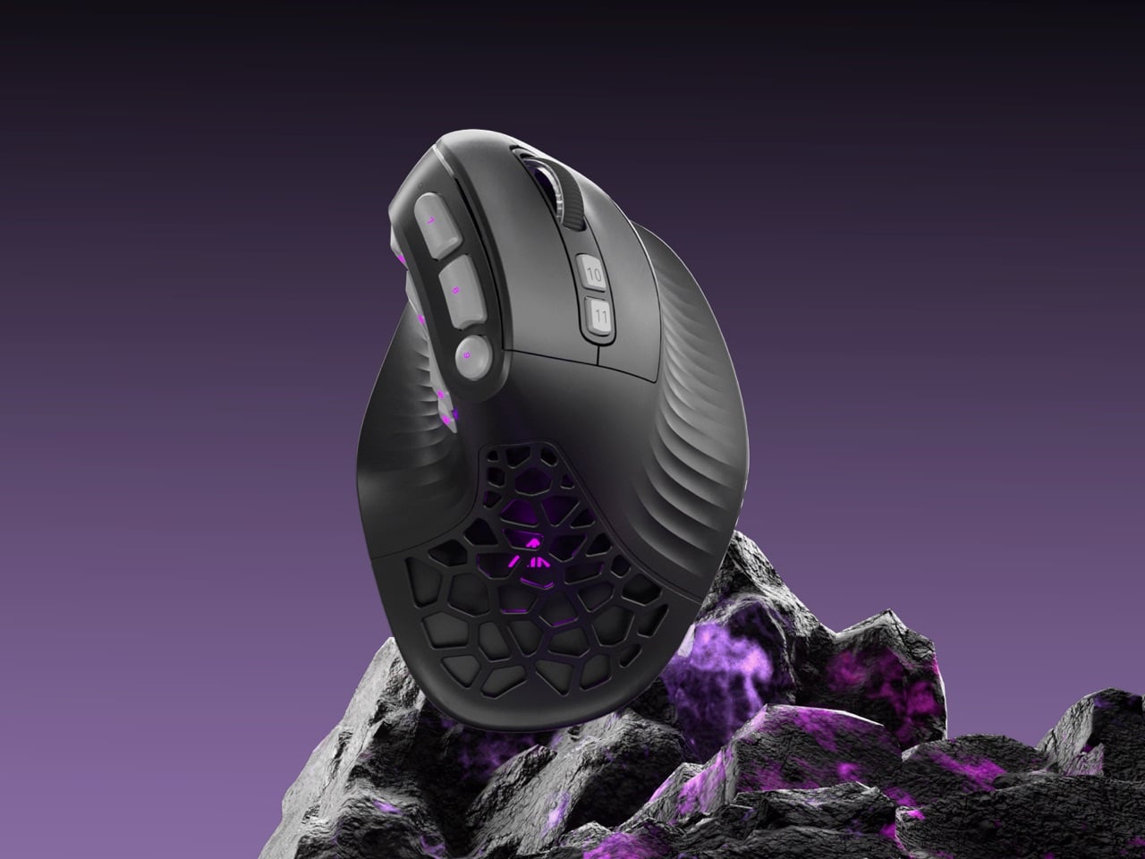
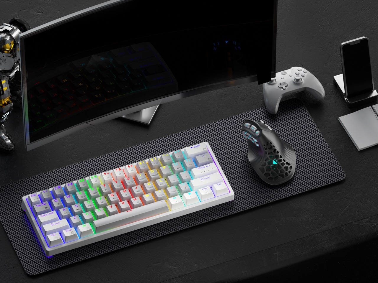
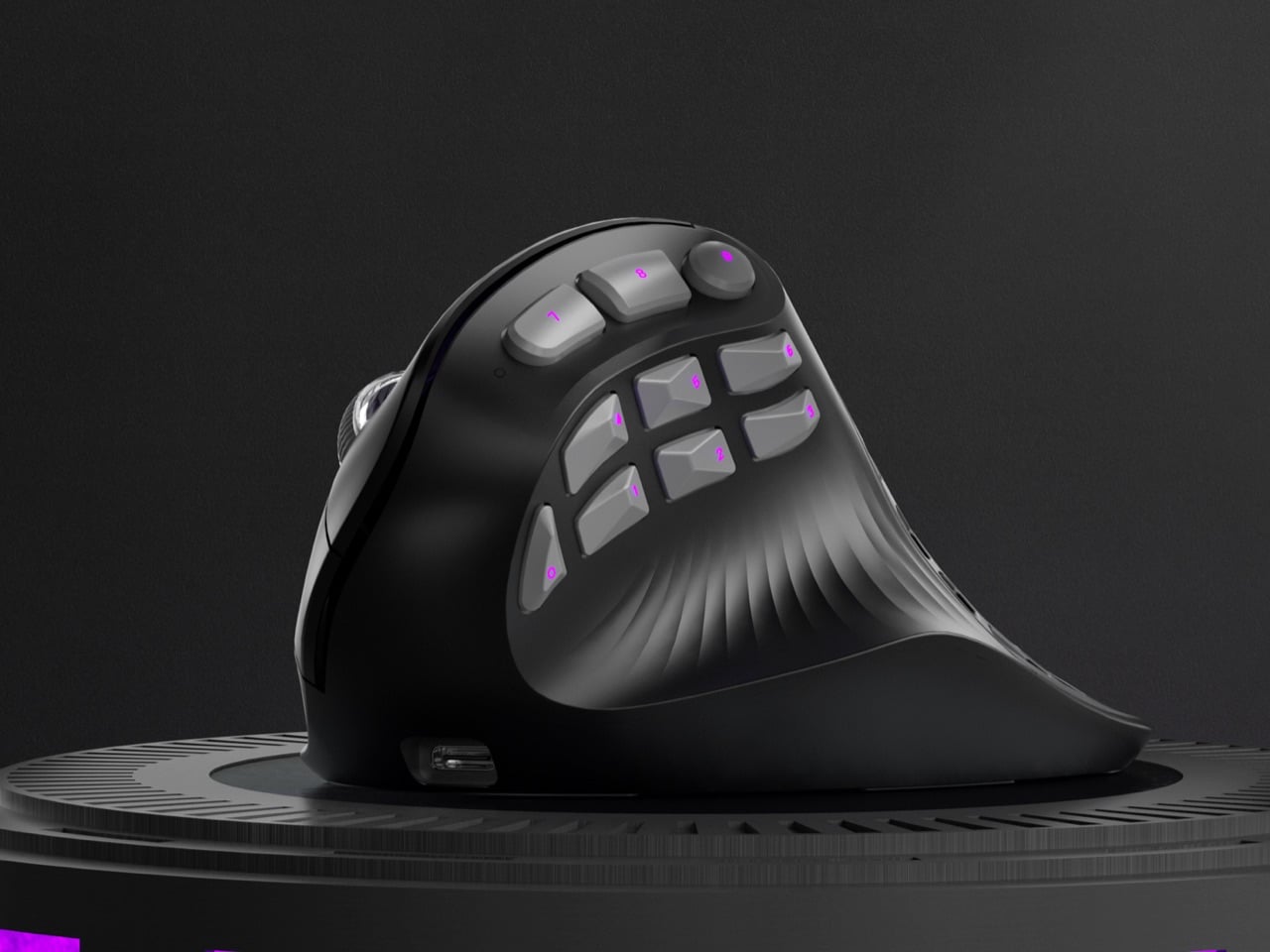
Vertical mice promise ergonomic relief. MMO mice deliver tactical control. Pick one, because the market says you can’t have both. Except SOLAKAKA apparently didn’t get that memo. The E9 Pro arrives as the first vertical MMO mouse, featuring a 45 degree ergonomic grip alongside a 10 button thumb panel that would make World of Warcraft players weep with joy. It feels like the peripheral equivalent of discovering your favorite coffee shop also serves excellent ramen.

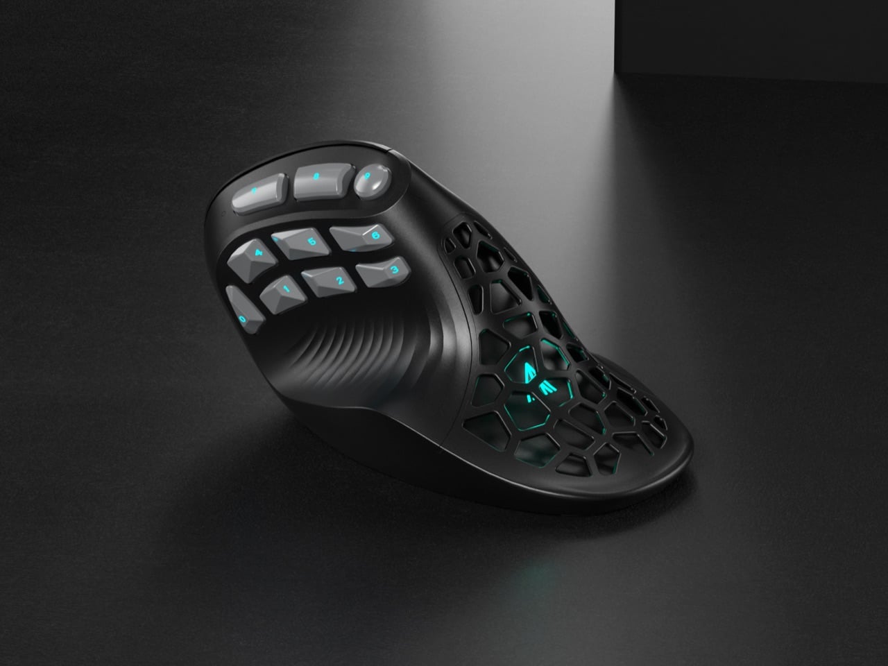
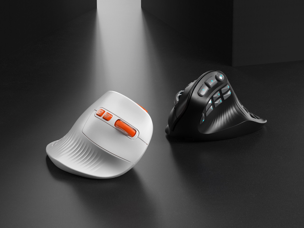
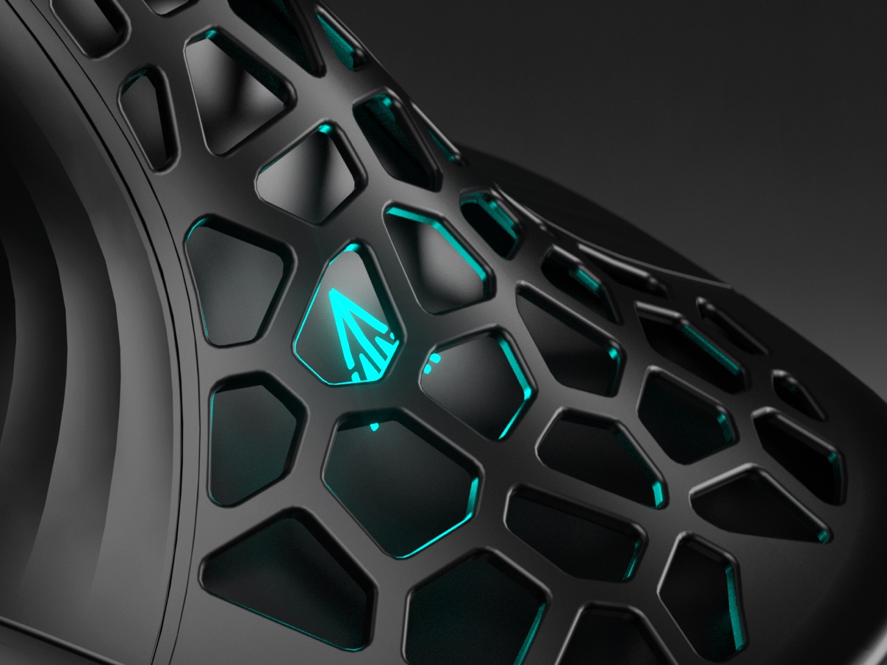
The design centers on a tactical thumb zone where all 10 side buttons follow the natural arc of your thumb movement. No stretching, no hunting, just muscle memory doing its thing. The vertical orientation keeps your wrist in a handshake position rather than the pronated twist that causes repetitive strain. A grille style cutout pattern ventilates the palm rest while dropping weight to 97 grams, and the PAW3395 sensor handles up to 36,000 DPI for people who like their precision surgical. Offered in understated black gray and louder white orange colorways, the E9 Pro targets anyone who refuses to choose between comfort and capability.

Designer: SOLAKAKA

Click Here to Buy Now: $69 $89 ($20 off) Hurry! Only 41 left of 850.

You just have to admire the silhouette for a second. Most ergonomic mice look like orthopedic devices that got lost on the way to the pharmacy. The E9 Pro, however, still reads as a performance machine. Its shell is all sharp planes and deliberate curves, giving it a confident, architectural presence on a desk. That grille cutout on the palm rest is a brilliant piece of multi-tasking design; it slashes weight, creates a distinct visual identity, and provides some welcome ventilation for those marathon gaming sessions. It’s a design that feels both aggressive and intelligent, which is a tough needle to thread.

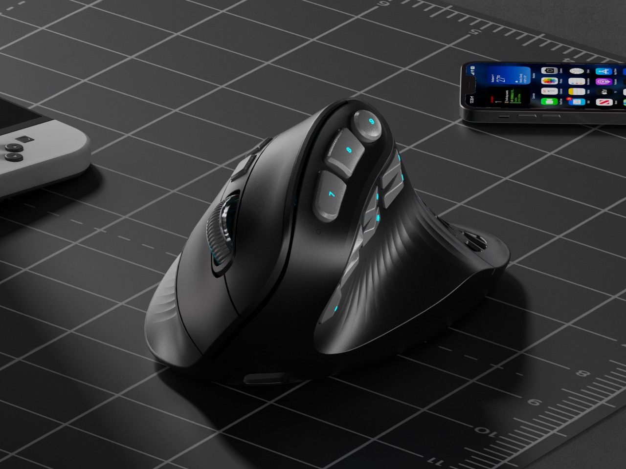
That 45 degree tilt is the perfect middle ground, offering a natural handshake grip that takes the strain off your forearm without feeling as alien as some of the more extreme 90 degree vertical mice. You can feel the logic behind it instantly. SOLAKAKA says they landed on this angle after 300 hours of testing across gaming, coding, and design, and it shows. The sculpted palm and thumb supports provide a secure anchor for your hand, letting you relax your grip instead of constantly pinching the mouse. It feels less like you’re holding a device and more like the device is an extension of your hand’s natural posture.

But let’s be real, we’re all here for that thumb cluster. Ten buttons on a vertical mouse sounds like a recipe for chaos, but the execution is incredibly clever. Instead of a boring grid, the buttons are laid out in a gentle arc that follows the natural sweeping motion of your thumb. It’s a racetrack for your digit, with each button acting as a distinct landmark. This is a massive leap forward for muscle memory, turning what could be a fumbling mess into an intuitive control panel. For anyone juggling macros, creative tool palettes, or complex skill rotations, this layout is a game changer.

And the performance hardware inside is absolutely top-tier. The PixArt PAW3395 is the same flagship sensor you find in elite esports mice, capable of a wild 36,000 DPI, 650 IPS tracking, and 50g of acceleration. This isn’t an ergonomic mouse with gaming parts bolted on; it’s a legitimate performance mouse built on an ergonomic chassis. The polling rate ramps up to 8,000 Hz in wired mode for near-zero latency, and the tri-mode connectivity gives you the freedom to switch between a lag-free 2.4 GHz dongle, Bluetooth, and a direct USB C connection. A beefy 1000 mAh battery keeps the whole operation running for ages.

This brings us to the weight. Vertical mice with this many features often have some heft, easily tipping the scales at 120 grams or more. The E9 Pro comes in at a nimble 97 grams, and that makes a world of difference. The lighter weight, combined with the ergonomic grip, means less inertia and less torque on your wrist when you’re making fast, sweeping movements or quick flick shots. It’s a detail that shows a deep understanding of how ergonomics and performance are intertwined. That grille isn’t just for looks; it’s a core part of a thoughtful weight-reduction strategy that pays off every time you move the mouse.

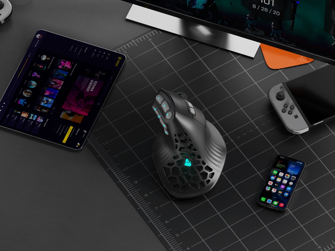
The whole package comes in two distinct flavors. The black and gray model is pure stealth, ready to blend into a professional workstation or a minimalist gaming setup. Then you have the white and orange version, which looks like it drove right off a sci-fi movie set, with vibrant orange accents highlighting the buttons and grille. It’s a fantastic bit of personality. Through its Kickstarter campaign, the E9 Pro is available for around $69 for early backers, which is an incredibly competitive price for a mouse that’s not just entering a category but creating a new one. This is one of those designs that feels so right, you wonder why nobody did it sooner.

Click Here to Buy Now: $69 $89 ($20 off) Hurry! Only 41 left of 850.

The post This Insane Vertical MMO Mouse Packs 10 Thumb Buttons And A 45-Degree Grip For Your Wrist first appeared on Yanko Design.

The Most Addictive EDC Tool of 2026: A $45 Magnetic Fidget Knife You Can’t Put Down

Most utility knives work perfectly fine. They cut boxes, strip packages, slice tape, then disappear into drawers or pockets until the next mundane task arrives. They’re functional, reliable, forgettable. The problem isn’t that they fail at their job. The problem is they offer nothing beyond the cut itself, no texture or personality, no reason to reach for them when they’re not strictly necessary. They exist in a utilitarian void where efficiency trumps experience.

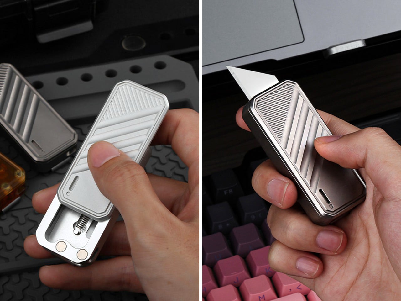
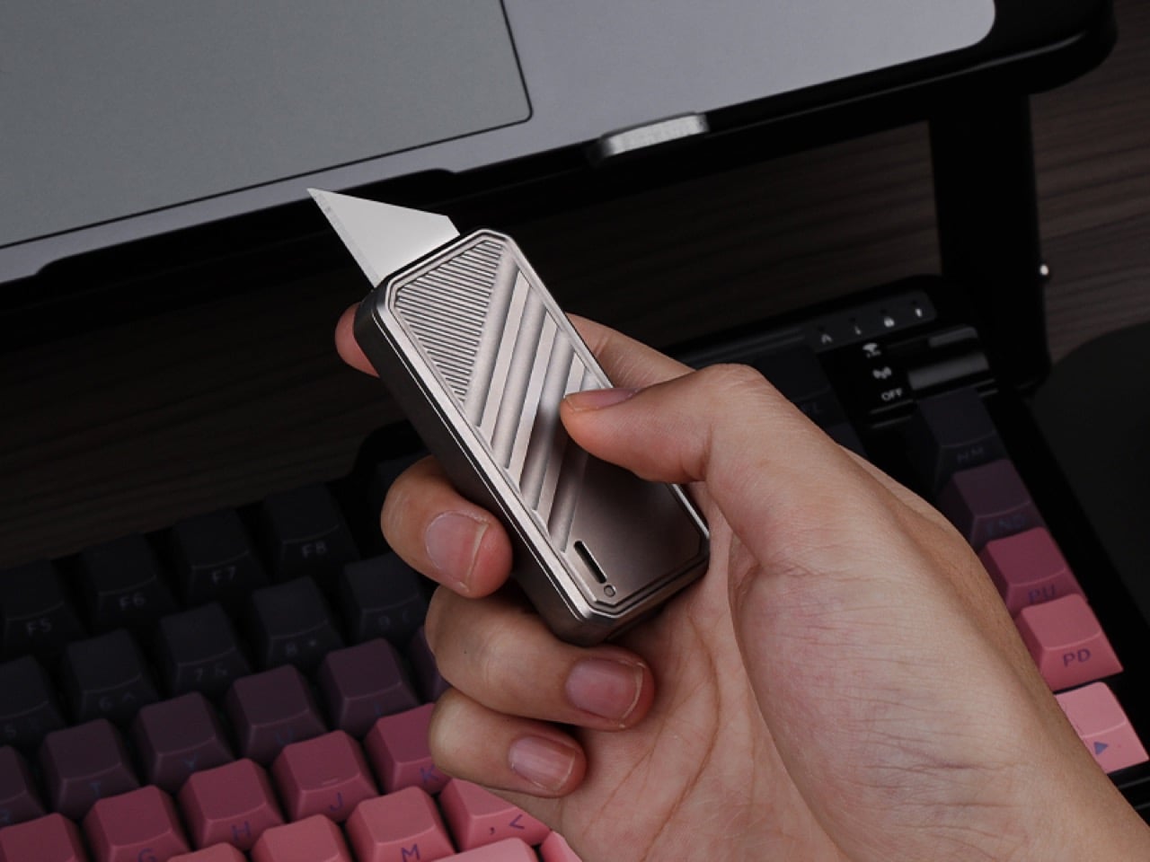
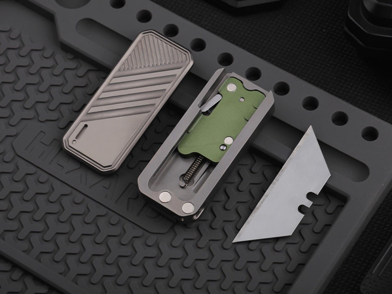
DeckShiv by ActMax takes a different approach entirely. This magnetic fidget slider utility knife was designed to stay in your hand long after the cutting is done. The sliding mechanism deploys and retracts a standard utility blade, but the real story lives in the magnetically guided movement itself. Every slide forward feels intentional, controlled, deliberate. Every return journey happens smoothly, pulled back by magnetic force into a soft, satisfying click. It’s a utility knife that doubles as a fidget device, built for people who appreciate tactile feedback in their everyday tools.

Designer: ActMax

Click Here to Buy Now: $45 $55 (18% off) Hurry! Only 32 of 120 left.

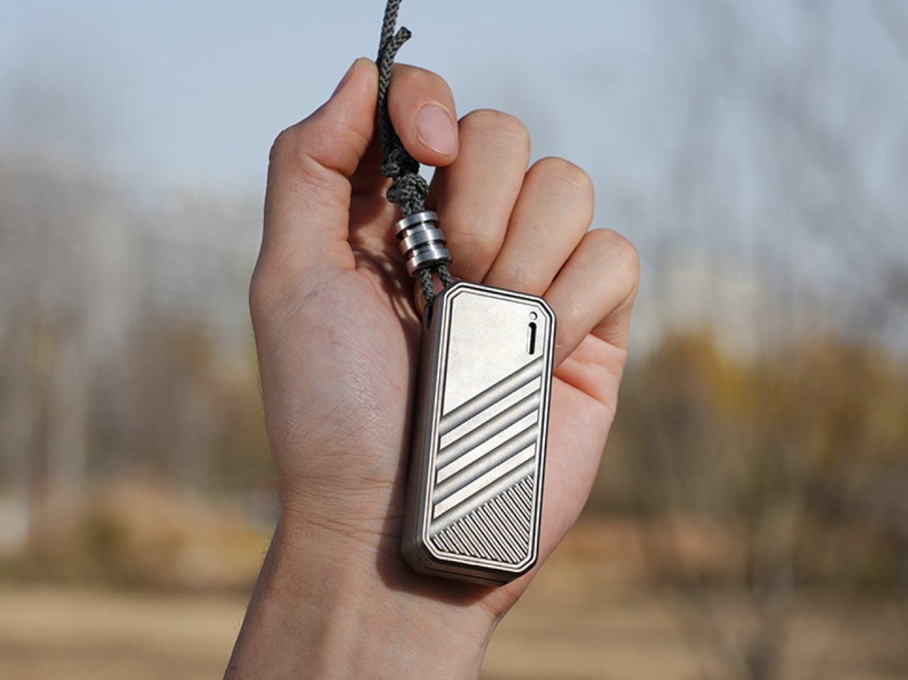
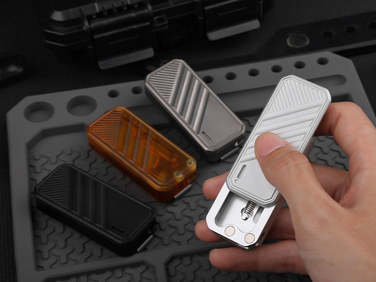
The slider doesn’t just glide loosely; magnets guide the path with a controlled drag that lets you precisely meter out blade exposure. When you let go, that same system pulls the blade back home without any of the jarring snaps common in cheaper auto-retractors. The whole package is just 67mm long by 29mm wide, a palm-sized 12mm thick, so it feels more like a Zippo than a piece of hardware. The body is covered in CNC-machined diagonal lines that give your thumb a natural track to follow, a smart touch that makes the action feel even more intuitive.

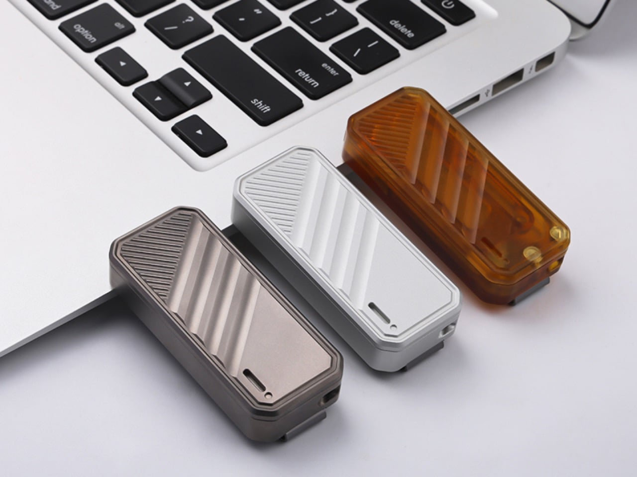
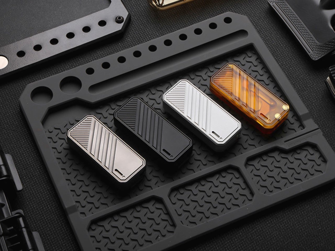
Of course, that whole tactile experience changes depending on what you’re holding. The titanium alloy version has a satisfying heft that adds a certain gravitas to the sliding motion; its momentum feels deliberate and smooth. Dropping down to the aluminum alloy model shaves off significant weight for a much lighter carry, making the action feel a bit quicker and snappier. Then there’s the PEI option, a high-performance polyetherimide that feels warm to the touch and has a unique, semi-transparent amber look. The choice isn’t just cosmetic, it fundamentally alters the knife’s presence and the feedback you get from the mechanism.

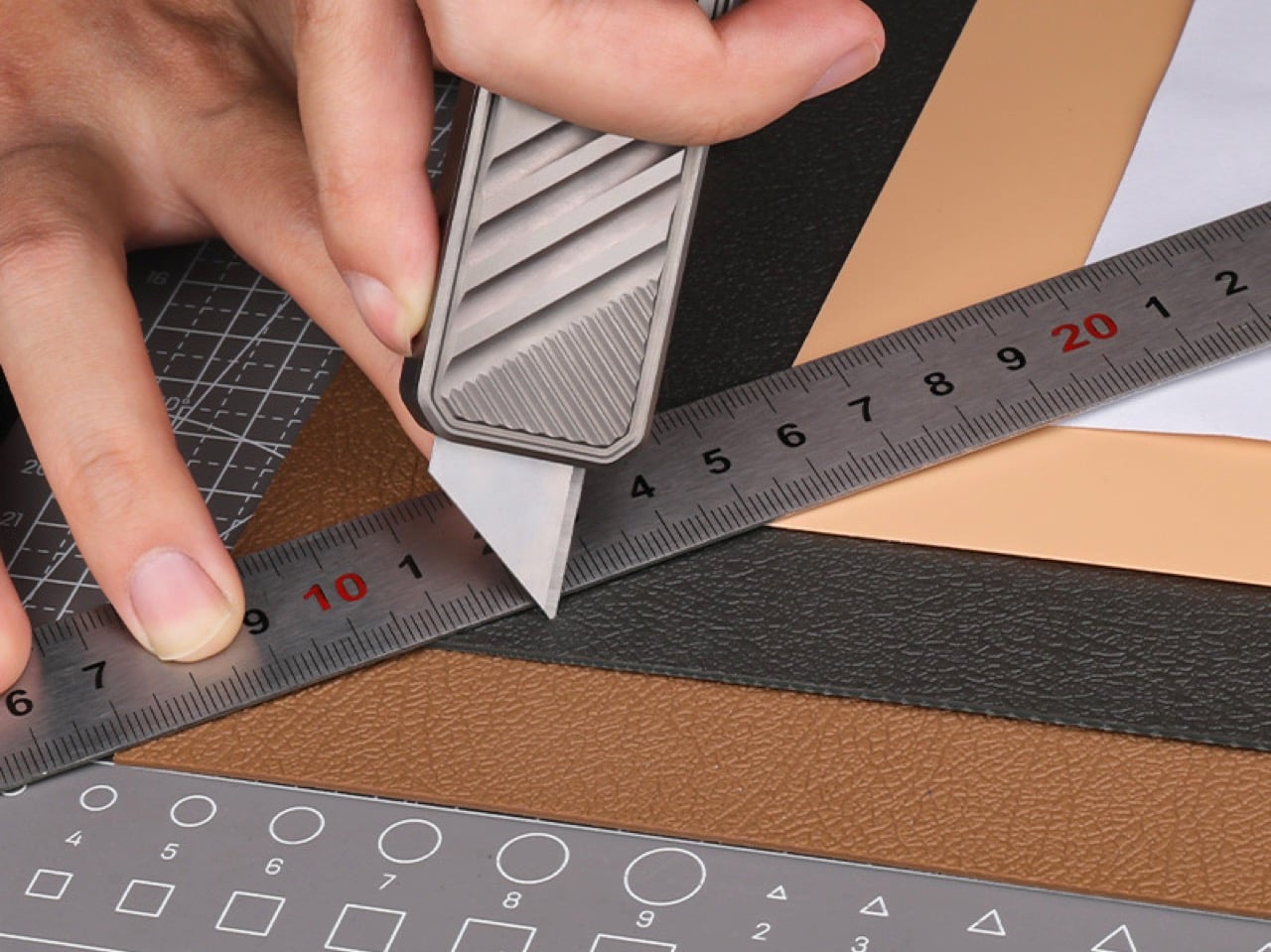
For all the fidget-friendly engineering, it still needs to cut things. ActMax wisely stuck with standard SK5 utility blades, the trapezoidal workhorses you can find anywhere. The blade itself is seated magnetically, which is a clever bit of design that completely eliminates the annoying rattle you get with a lot of replaceable-blade knives. It feels solid, locked in place until you decide to remove it. Because the blade only extends as far as you push, there’s little chance of accidental full deployment, a crucial safety feature for a tool designed to be handled constantly.

And you’ll be swapping blades often if you’re actually using it on cardboard. The process here is dead simple, taking about two seconds with no tools. The same magnetic system that holds the blade secure also makes it easy to pop out and replace. This is one of those small quality-of-life details that becomes a huge deal with long-term use. There’s nothing worse than having to hunt down a tool just to maintain your tool, and ActMax completely sidestepped that headache.

The body itself is clearly built for the long haul, especially the titanium version, which is famously resistant to corrosion and abuse. This feeds directly into a more sustainable ownership model; instead of tossing an entire knife when the edge dulls, you’re only swapping out a small, recyclable sliver of steel. The real genius, though, is its travel-readiness. Pop the blade out, and the DeckShiv body becomes a completely harmless metal slider. The TSA won’t look twice at it, meaning you can carry the handle in your pocket and just buy a new blade for a couple of bucks when you land. That’s a level of everyday practicality most fixed-blade EDCs simply can’t offer.

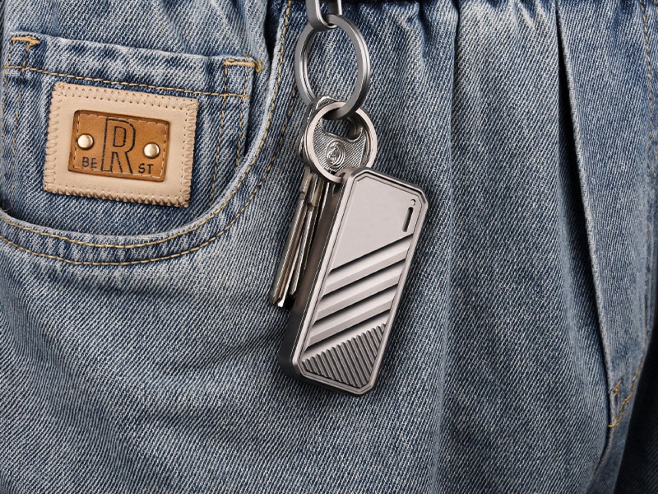
The final decision really comes down to aesthetics and carry style. You can get the titanium and aluminum versions in either a raw metal or a stealthy black finish, while the PEI comes in its natural amber hue. There’s a small slot for a 1.5mm by 6mm tritium vial if you want a constant low-light glow, plus a removable pocket clip and a keychain loop. The Kickstarter pricing is aggressive, starting at $45 for aluminum and topping out at $75 for titanium, with free worldwide shipping starting June 2026.

Click Here to Buy Now: $45 $55 (18% off) Hurry! Only 32 of 120 left.

The post The Most Addictive EDC Tool of 2026: A $45 Magnetic Fidget Knife You Can’t Put Down first appeared on Yanko Design.
Meze’s $799 Strada Headphones Use Magnetic Ear Pads and Hand-Carved Wood (And They’re Gorgeous)

Romanian audio craftsmen Meze Audio have built their reputation on a simple philosophy: headphones should be as beautiful to look at as they are to listen to. The 99 Classics proved this formula with their vintage-inspired warmth, while the Liric pushed boundaries with planar magnetic technology. Now, the Strada arrives as something different: a closed-back dynamic that feels less like a nostalgic throwback and more like a confident step forward.

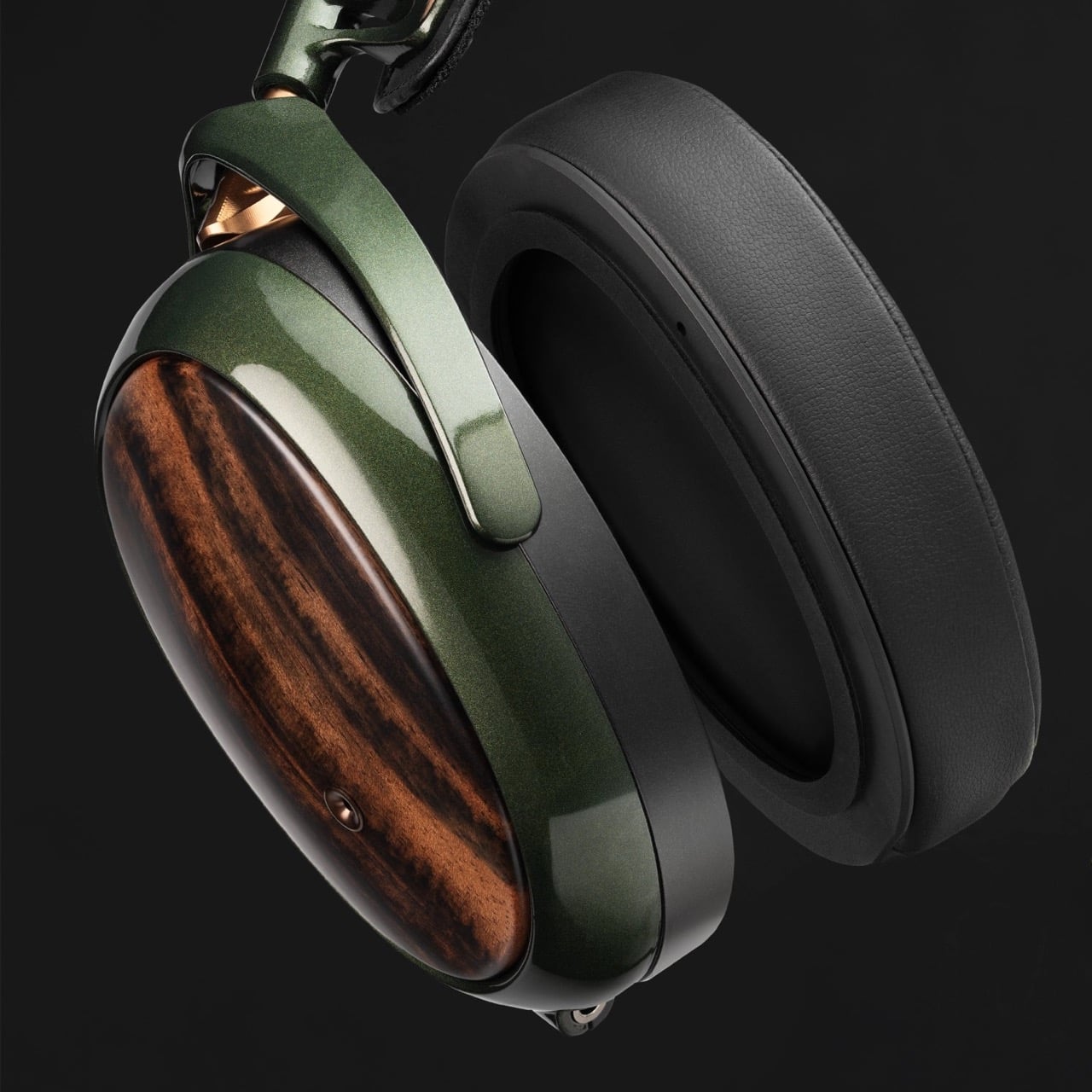
At $799, the Strada occupies that fascinating middle ground where serious audio performance meets daily practicality. The hand-crafted Macassar ebony earcups remain unmistakably Meze, but the deep metallic green magnesium frame signals a design evolution. This is Meze refining their aesthetic without abandoning their roots, creating a closed-back headphone that promises isolation and intimacy without sacrificing their signature approach to build quality and musicality.

Designer: Meze Audio

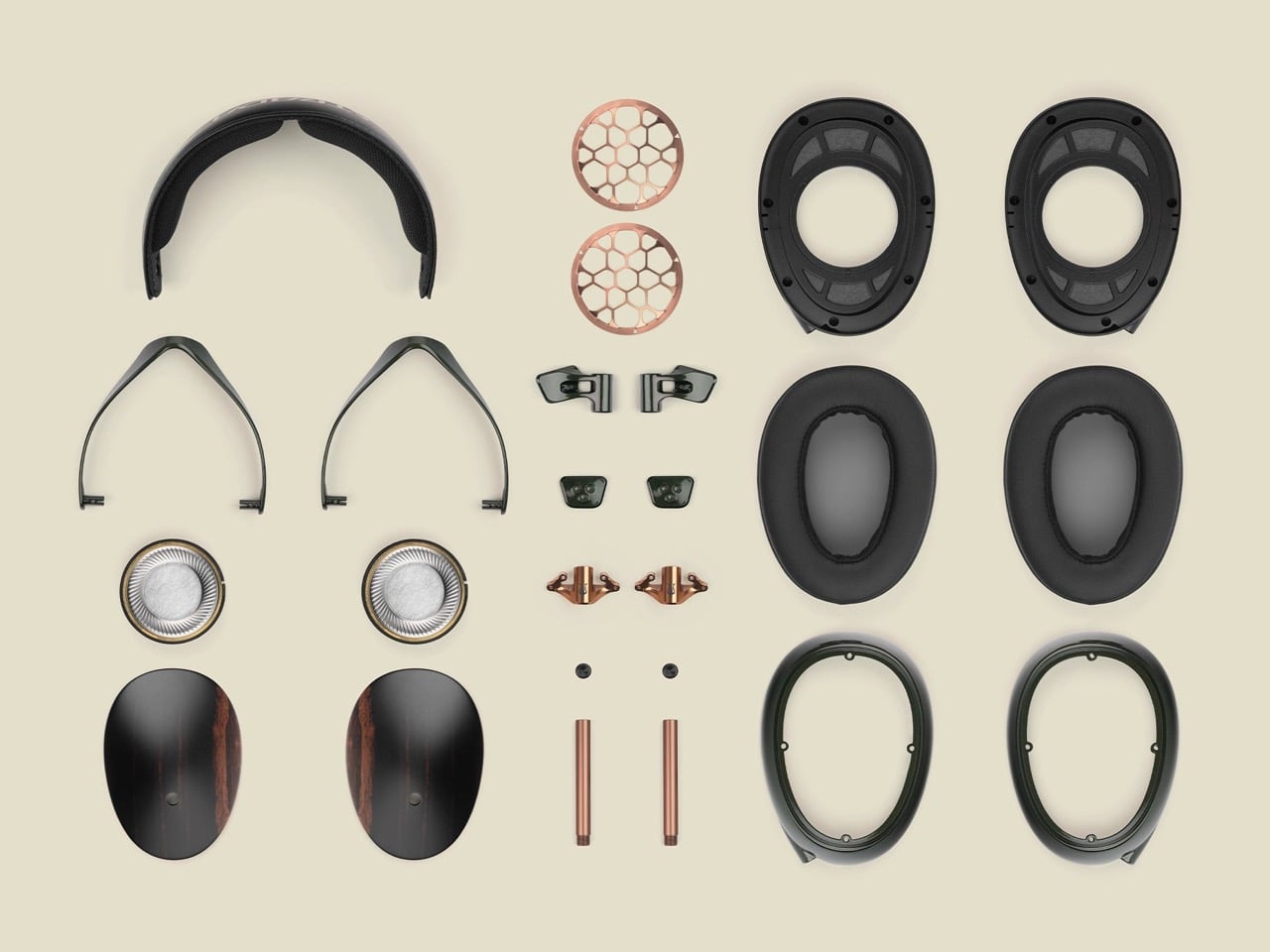
Those 50mm dynamic drivers pull from the 109 Pro’s DNA but get retuned specifically for closed-back acoustics. Frequency response spans 5Hz to 30kHz, which sounds impressive until you remember that what matters is how flat or colored that response curve actually is. Sensitivity hits 111 dB SPL/mW at 1kHz with 40Ω impedance, meaning your phone will drive these adequately but they’ll really open up with proper amplification. Meze claims a tonal balance that leans slightly warm with controlled bass emphasis, neutral mids, and extended treble that avoids the typical closed-back veil. Translation: they want you listening to music, not hunting for detail.

That carbon fiber-reinforced cellulose dome keeps the diaphragm light while maintaining stiffness for clarity in the upper registers. The semicrystalline polymer torus surrounding the dome gets coated with beryllium via physical vapor deposition, which increases rigidity without adding mass. Precision-cut grooves at 45.5-degree angles across the torus help control resonance, while a copper-zinc alloy stabilizer ring dampens unwanted vibrations. These aren’t revolutionary techniques but they’re expensive ones, the kind of iterative refinement that separates competent drivers from excellent ones. You’re paying for obsessive attention to mechanical behavior at frequencies most people can’t even hear.

The magnetic ear pad system solves a problem most manufacturers ignore. Ear pads wear out. They compress, they accumulate oils and sweat, they eventually need replacement. Traditional attachment methods range from annoying clips to outright glued-on disasters that require heat guns and prayers. Meze’s magnetic mounting creates a perfect acoustic seal while making pad swaps completely tool-free. This ties directly into their sustainability pitch, which feels genuine rather than performative given their history of fully serviceable designs. Every component here can be replaced individually. The headband padding, the frame sliders, the cables, even those gorgeous ebony cups. You’re buying something meant to be repaired rather than discarded.

Each pair carries unique grain patterns, the tiger-stripe figuring that makes this particular hardwood so prized in furniture and musical instruments. Beyond aesthetics, the density and internal structure provide acoustic benefits. Wood naturally dampens certain resonances while allowing others to breathe, creating a different sonic character than plastic or metal enclosures. Whether you can actually hear this difference remains a subject of fierce debate in audiophile circles, but the material choice signals intent. Meze wants these to feel like heirloom objects, something you hand down rather than upgrade away from.

The metallic green finish represents the most visible departure from Meze’s typical palette. Their previous models leaned heavily into warm metallics: the gold and walnut of the 99 Classics, the bronze accents across their lineup, the copper hardware that became a signature detail. This cooler, more contemporary green suggests a brand aging gracefully, shedding some retro affectation without losing craft. The multi-layer paint process adds depth to the magnesium frame, giving it a subtle metallic sheen that catches light differently depending on angle. It’s restrained in a way that premium consumer electronics rarely manage, avoiding both the sterile minimalism of pro audio gear and the gamer-aesthetic excess that plagues too many “premium” headphones.

The competitive landscape at $799 gets brutal. Focal’s closed-backs bring French tuning philosophies and beryllium tweeters. Sennheiser offers German engineering precision and decades of refinement. Dan Clark Audio delivers cutting-edge planar technology with acoustic metamaterials. Meze’s pitch sidesteps the technology arms race entirely. They’re selling craftsmanship, serviceability, and a specific vision of what premium headphones should feel like to own and use daily. Whether that resonates depends entirely on what you value. If replaceable drivers and hand-painted frames matter less than the latest acoustic innovations, look elsewhere. But if you want something that feels built rather than manufactured, something designed to age beautifully rather than obsolete quickly, the Strada makes its case clearly.

The post Meze’s $799 Strada Headphones Use Magnetic Ear Pads and Hand-Carved Wood (And They’re Gorgeous) first appeared on Yanko Design.
Belkin’s New Switch 2 Docking Case Has a 10,000mAh Battery That Lets You Charge While Shut

The best gaming accessories solve problems you didn’t know you had. Before you use them, the old way seems fine. After you use them, going back feels like torture. Belkin’s new Charging Case Pro for Nintendo Switch 2 falls squarely into this category.

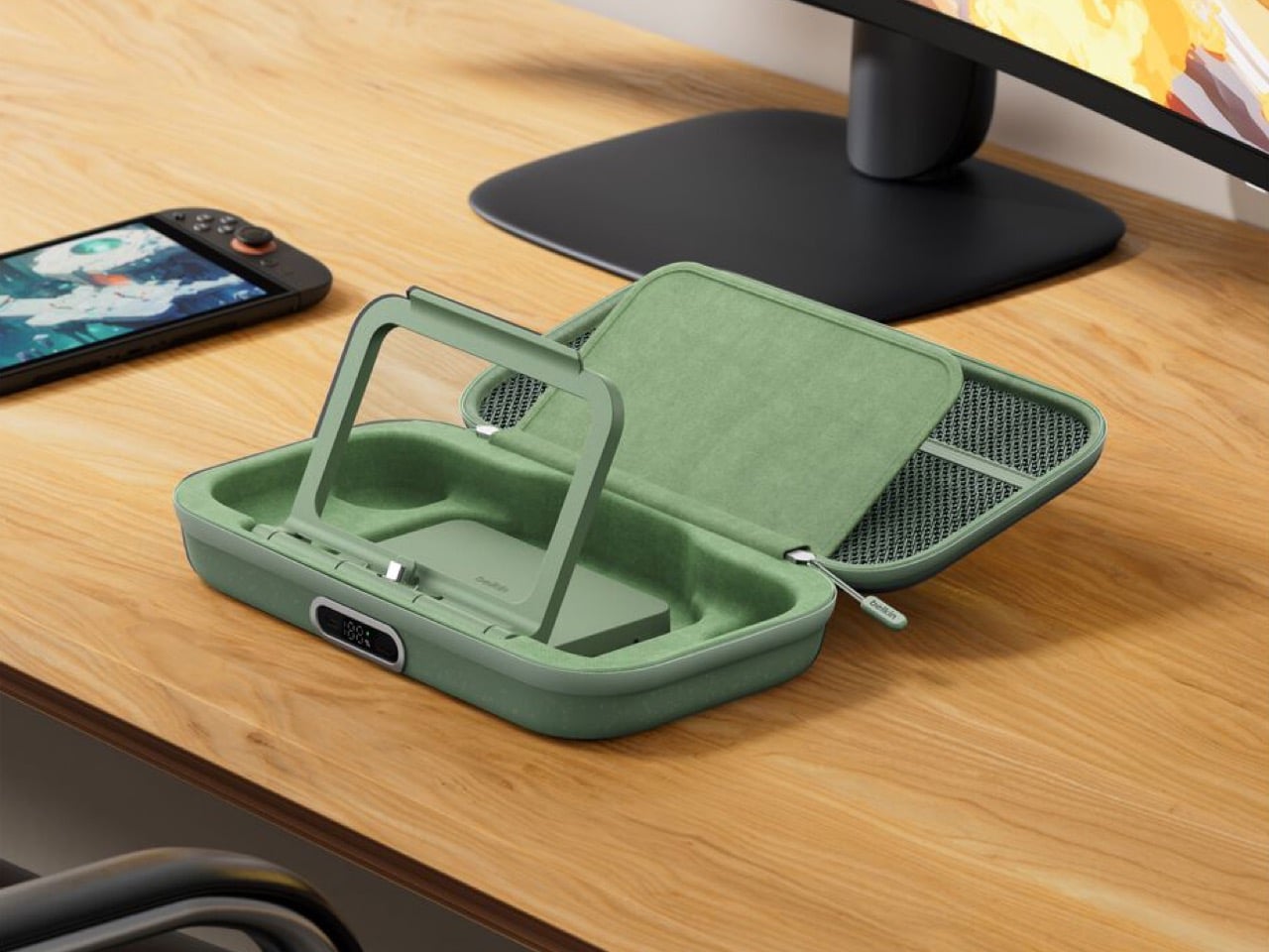
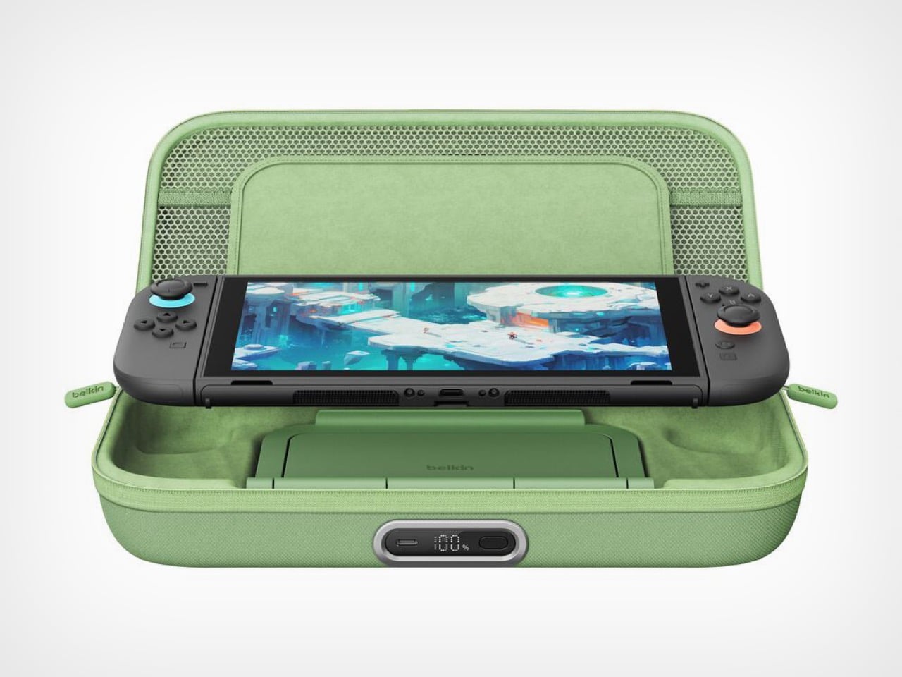
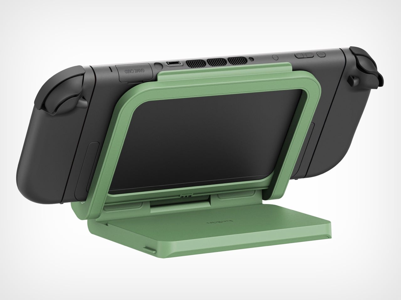
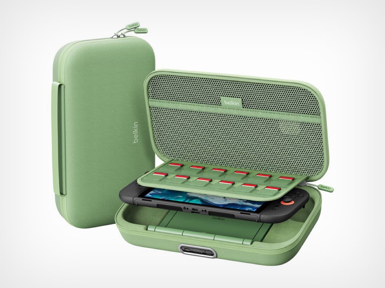
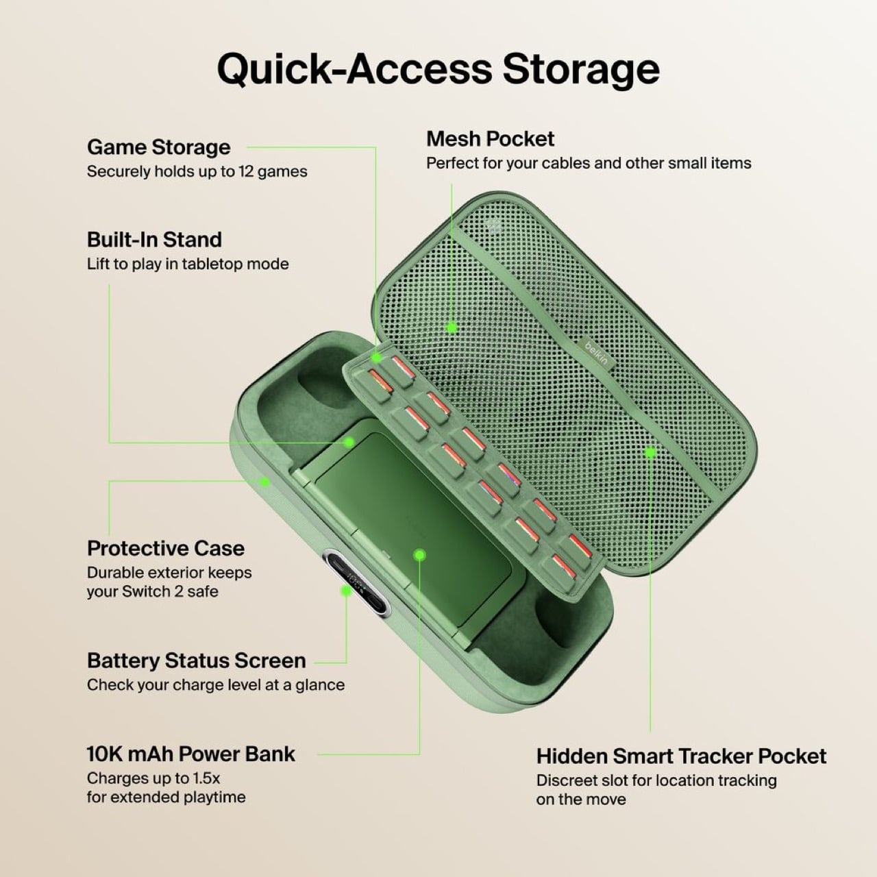
The original Charging Case launched last June with a solid concept: protect your Switch 2 and keep it powered during long trips. But Belkin’s designers clearly listened to user feedback and spotted the pain points. The Pro version addresses nearly every frustration from the first generation. You can charge the battery without unzipping the case. You get a proper integrated stand instead of relying on the console’s kickstand. There’s even a battery level display so you’re never guessing how much juice remains. These aren’t revolutionary features individually, but together they transform a good accessory into an essential one.

Designer: Belkin

Having to unzip your case, fish out the battery pack, plug it in separately, then put everything back together just to charge overnight is the kind of stupid friction that kills products. The external USB-C port fixes this entirely. Leave your Switch 2 inside, plug one cable into the front, done. The little OLED display shows precise battery percentage, which actually matters when you’re deciding whether to top up before a three-hour flight or risk it.

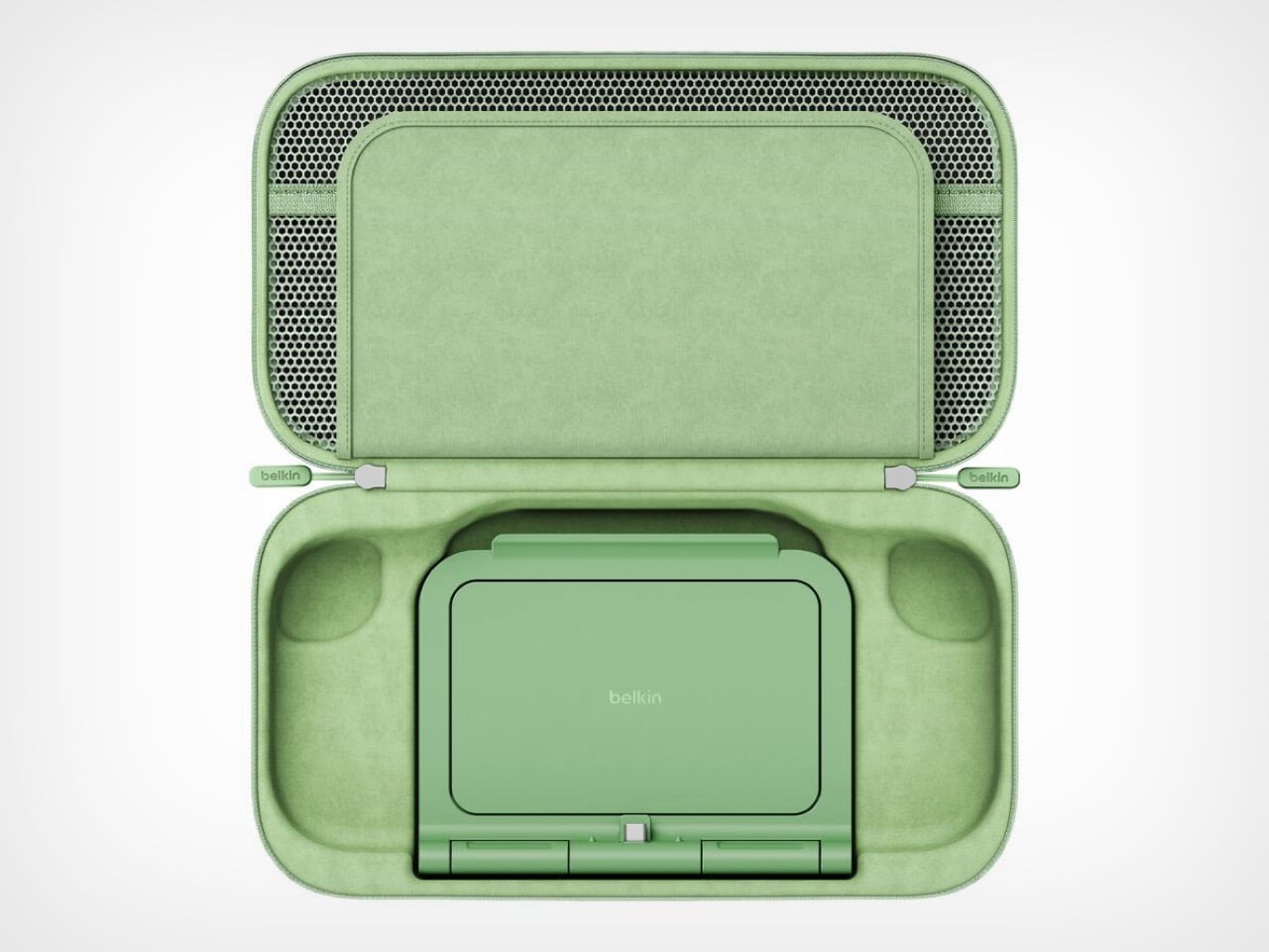
The 10,000mAh battery doubles as an adjustable stand with a built-in USB-C connector. The Switch 2 slots onto it like the official dock and starts charging immediately at whatever viewing angle works. The original version forced users to balance the console on its mediocre kickstand while a cable dangled between device and battery. One approach solves the problem. The other creates new ones.

Belkin claims 1.5 full charges from the 10,000mAh capacity, translating to 12 to 15 extra hours depending on what’s running. Graphically intensive games like Zelda sequels will drain faster than pixel art indie platformers, but either way that’s enough power to cross the Atlantic twice before needing an outlet. For a case this compact, the capacity-to-size ratio makes sense. A bigger battery would mean carrying a brick.

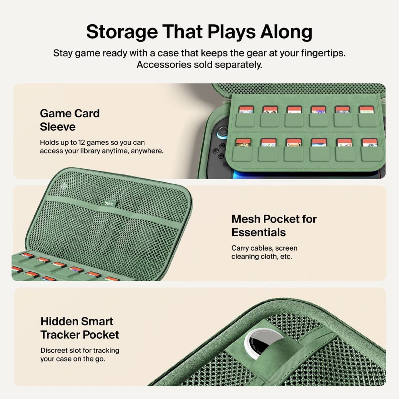
Twelve individual game cartridge slots sit under a flip-down cover, each one molded to prevent rattling. A mesh pocket handles cables and microfiber cloths. Belkin included a hidden compartment sized exactly for an AirTag or Tile tracker. Considering a fully loaded case with console represents about $500 of hardware, location tracking becomes a practical feature rather than a gimmick. People lose things. Expensive things get stolen. Planning for that shows sensible product design.
Three colorways: sage green, black, sandy beige. The green matches Nintendo’s brand aesthetic. Black hides wear better over time. The beige photographs well but might show dirt faster than the darker options.

Charging $99.99 means a $30 jump from the original’s $69.99 price. That’s a 43% increase, which sounds aggressive until you itemize the changes. External charging port. Battery display. Integrated stand with direct connection. Better storage. Refined build quality throughout. Spread $30 across those improvements and the math works. Belkin could have pushed $120 easily and still moved units. They left money on the table, frankly.
This reads like version 2.0 engineering instead of the lazy incremental updates most companies ship. Belkin rebuilt the internal layout, redesigned the battery for dual purpose use, and solved actual user complaints instead of adding RGB lighting or whatever. Most “Pro” accessories just mean “black version, higher price.” This one actually earns the name.

Own the original and it works fine? Skip this. Shopping for your first Switch 2 charging solution or fed up with your current setup? Start here. It’s up on Belkin’s site now, probably hitting Amazon within a week because that’s how 2026 works.

The post Belkin’s New Switch 2 Docking Case Has a 10,000mAh Battery That Lets You Charge While Shut first appeared on Yanko Design.