When a Photographer Builds a Fortress: John Dessarzin’s Brutalist Jungle Sanctuary in Costa Rica

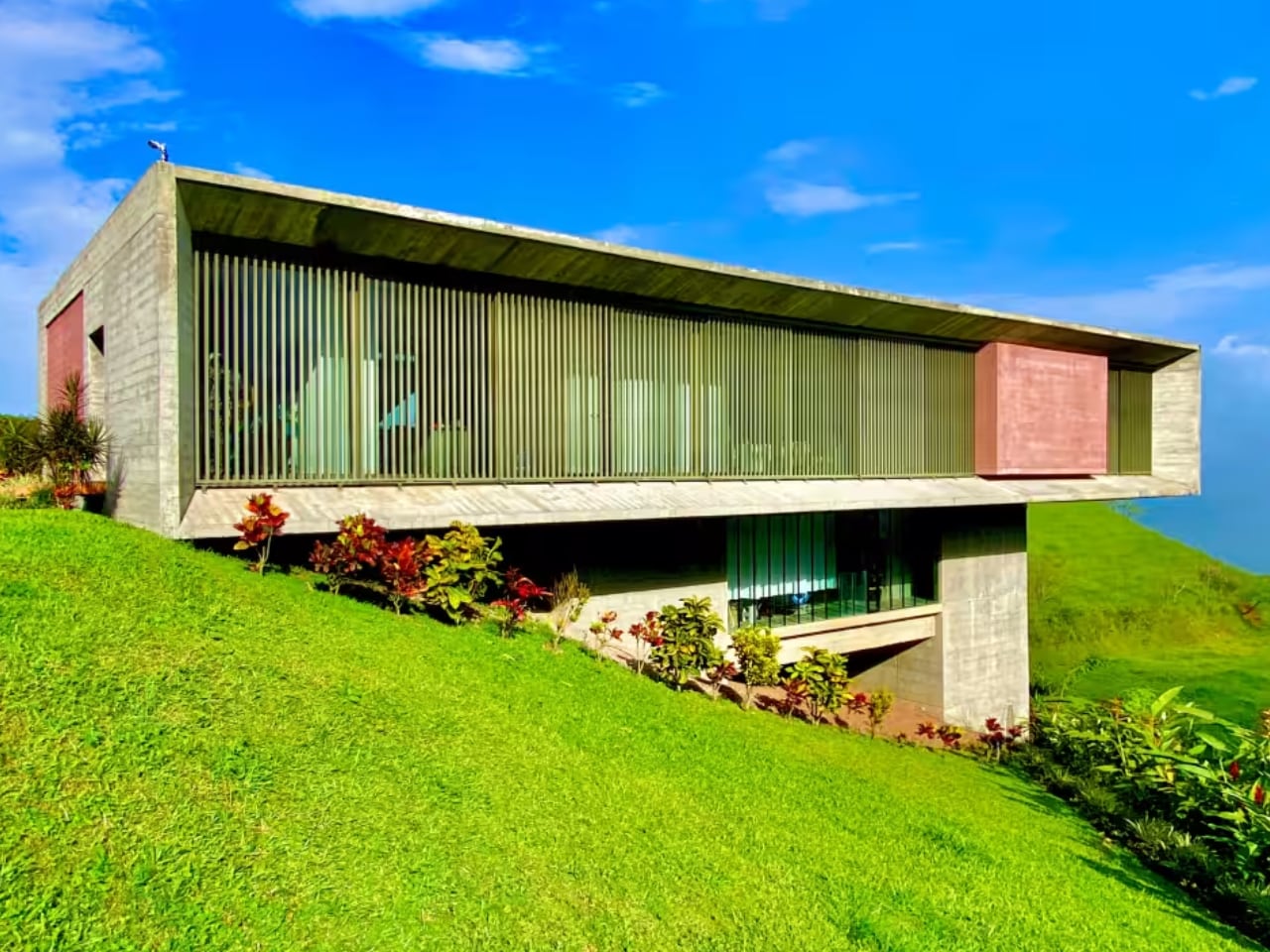
When a National Geographic photographer designs his sanctuary, the lens doesn’t disappear. John Dessarzin’s Brutalist compound in Atenas, Costa Rica, frames the jungle like a permanent viewfinder: all concrete, steel, and calculated sightlines. Perched on a cliff bordering a protected bird sanctuary in the Central Valley, the 2017 residence rejects the neoclassical templates that dominate the region in favor of raw materiality and seismic resilience.

Designer: John Dessarzin

Dessarzin collaborated with noted Costa Rican architect Jaime Rouillon to create a cantilevered complex that includes a two-bedroom main house and three guest villas. The property, now listed at $2.195 million as Dessarzin relocates to Portugal, stands as a study in what happens when photographic composition dictates architectural form. There are no visible neighbors, no decorative flourishes, no concessions to tropical vernacular. Only exposed concrete, industrial glass, and the unfiltered sounds of the jungle.

This isn’t architecture that accommodates the landscape. It’s architecture that isolates and amplifies it.

Material Honesty on Unstable Ground

Rouillon’s design philosophy centers on “honesty to materials,” and here that principle translates to a building with zero wood: only poured concrete, metals, and glass.

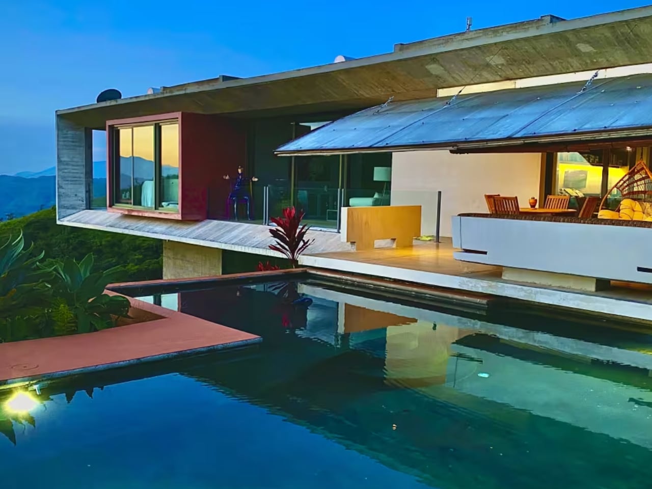
The decision wasn’t purely aesthetic. Costa Rica sits on the Pacific Ring of Fire, where seismic activity demands structural rigor. Shear walls anchor the main house to the cliff face, distributing lateral forces through a foundation designed to absorb rather than resist movement. The cantilevered upper level, which houses the primary living space and infinity pool, floats above the slope without appearing precarious. It’s a balancing act that requires precise engineering hidden within minimalist form.
John Dessarzin

Rouillon, whose portfolio includes high-end custom residences like Casa Val and Casa Las Olas, brings a postmodern sensibility to Costa Rican site conditions. His work fuses horizontality with floating roof planes, creating compositions that read as sculptural objects rather than shelters.

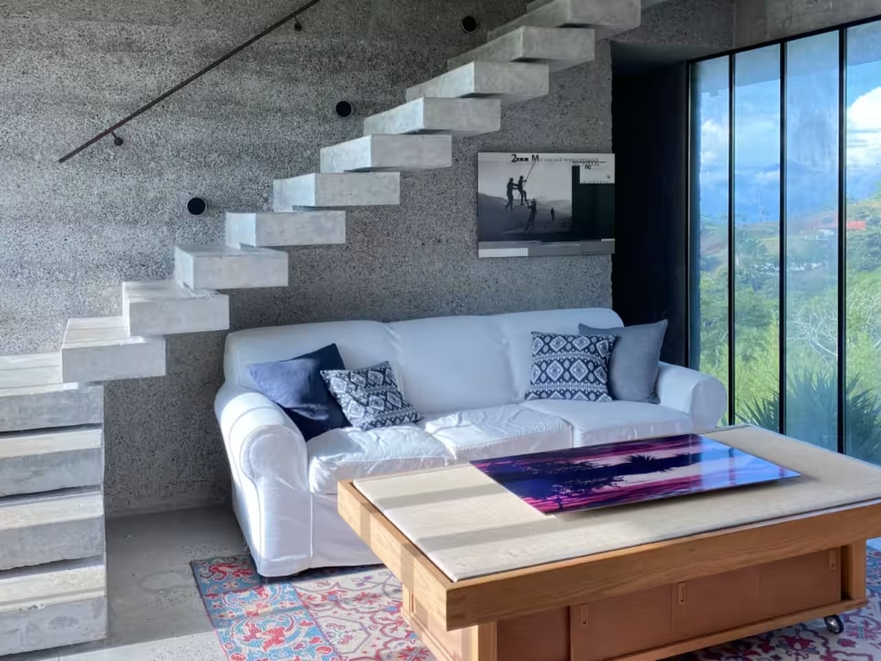
In Dessarzin’s compound, that approach manifests as a series of stacked volumes that step down the hillside, each level offering unobstructed views toward the Central Valley. The exposed concrete weathers visibly, accumulating stains and patina that reinforce the material’s permanence rather than diminish it. The textural contrast between raw concrete and industrial glazing establishes the visual language. There are no mediating elements: no stucco cladding, no painted surfaces, no decorative screens. Every material performs its structural role without cosmetic enhancement.

The result feels less like a residence and more like infrastructure repurposed for habitation. Which aligns with Dessarzin’s stated goal: a space that prioritizes utility and sensory immersion over comfort signaling.

What distinguishes Rouillon’s execution here is the restraint. Brutalism often tips into heaviness, where mass becomes oppressive. This design maintains lightness through proportion and transparency, using glass expanses to dissolve boundaries between interior and exterior while the concrete frame remains legible.

Spatial Choreography Across Elevation

The main house organizes two bedrooms across vertical zones: an upstairs primary suite and a downstairs guest suite, with a dedicated office studio that once served Dessarzin’s photography practice.

The upper level opens onto a patio and infinity pool, both positioned to eliminate sightlines to neighboring properties. The spatial logic prioritizes controlled exposure: maximizing connection to the sanctuary while maintaining seclusion from the surrounding development. Circulation between levels feels deliberate, with each transition offering reframed views of the canopy and valley below.

John Dessarzin

Dessarzin added three guest villas to support Airbnb operations. A three-bedroom, two-bath unit for families. A studio villa with en-suite for couples. A compact one-bedroom casita at the entrance for solo travelers. The villas operate independently from the main house, distributed across the hillside to preserve privacy while sharing access to the broader landscape.

This fragmentation (separating program into discrete volumes rather than consolidating under a single roof) amplifies the sense of inhabiting terrain rather than a building. The design avoids conventional hierarchies. There’s no grand entrance sequence, no central courtyard organizing movement. Instead, pathways and terraces establish a loose network where orientation depends on topography and view corridors.

It’s a composition that privileges wandering over procession.

The Photographer’s Eye Encoded in Concrete

Dessarzin’s National Geographic background permeates the spatial organization. Every major window functions as a framing device, isolating specific landscape elements: a particular tree canopy, a slice of valley, a section of sky, all with the precision of a telephoto lens. The infinity pool acts as a foreground element that extends the visual plane toward the horizon, a technique borrowed from photographic composition where layered depth creates dimensionality. Rouillon’s horizontal roof planes reinforce this effect, establishing strong lines that guide the eye outward rather than upward.

The prioritization of light follows photographic logic. Morning sun illuminates the primary suite, while afternoon light floods the upper living area and pool terrace.

Dessarzin positioned glazing to capture specific solar angles throughout the year, treating daylight as a variable input that changes the character of each space across seasons. Shadows from the concrete structure migrate across interior surfaces, creating time-based patterns that wouldn’t exist in a conventionally finished building. The house operates as a light meter calibrated to tropical latitude, where extreme brightness and deep shade occur simultaneously.

Dessarzin describes the surrounding homes as “nothing special.” The dismissal is rooted in their reliance on neoclassical templates that ignore site-specific conditions. His residence rejects that imported vocabulary entirely, opting for a design language that foregrounds geology, climate, and ecological context.

The contrast is stark. Where neighbors deploy columns and arches, Dessarzin’s compound presents unadorned planes and cantilevers. It’s an architectural critique delivered through form rather than rhetoric, arguing that luxury in this setting means unmediated access to the landscape, not decorative reassurance.

The design also acknowledges the owner’s eventual absence. Dessarzin built the property to function as both personal sanctuary and rental asset, structuring the villas to generate income independent of his occupancy. Now, as he relocates to Portugal, the compound transitions from lived project to market commodity. That shift underscores a broader tension: can architecture this specifically calibrated to one person’s vision maintain its integrity under different ownership?

Lifestyle Economics and the Expat Market

Atenas attracts expats from the US, Canada, Germany, and the Netherlands, drawn by climate, cost of living, and proximity to San Jose’s international airport (40 minutes) and Pacific beaches (one hour).

Dessarzin’s decision to sell reflects rising operational costs and the demands of managing Airbnb rentals. The property functions as both retreat and business, and those roles don’t always align.
Maintenance for an all-concrete structure in tropical humidity requires specialized attention, and the remote location limits service access. The $2.195 million asking price positions the compound within Costa Rica’s luxury market, where architectural distinction commands premiums. For design-focused buyers, the property offers a rare synthesis: earthquake-proof engineering, Brutalist materiality, and immersive access to protected nature.

The trade-off is operational complexity and aesthetic uncompromising. This isn’t a turnkey residence that adapts easily to diverse tastes. It’s a fixed statement that rewards occupants who share Dessarzin’s priorities or are willing to engage the architecture on its own terms.

The post When a Photographer Builds a Fortress: John Dessarzin’s Brutalist Jungle Sanctuary in Costa Rica first appeared on Yanko Design.
Beekeeb Toucan: The Split Ergonomic Keyboard Built for Travelers

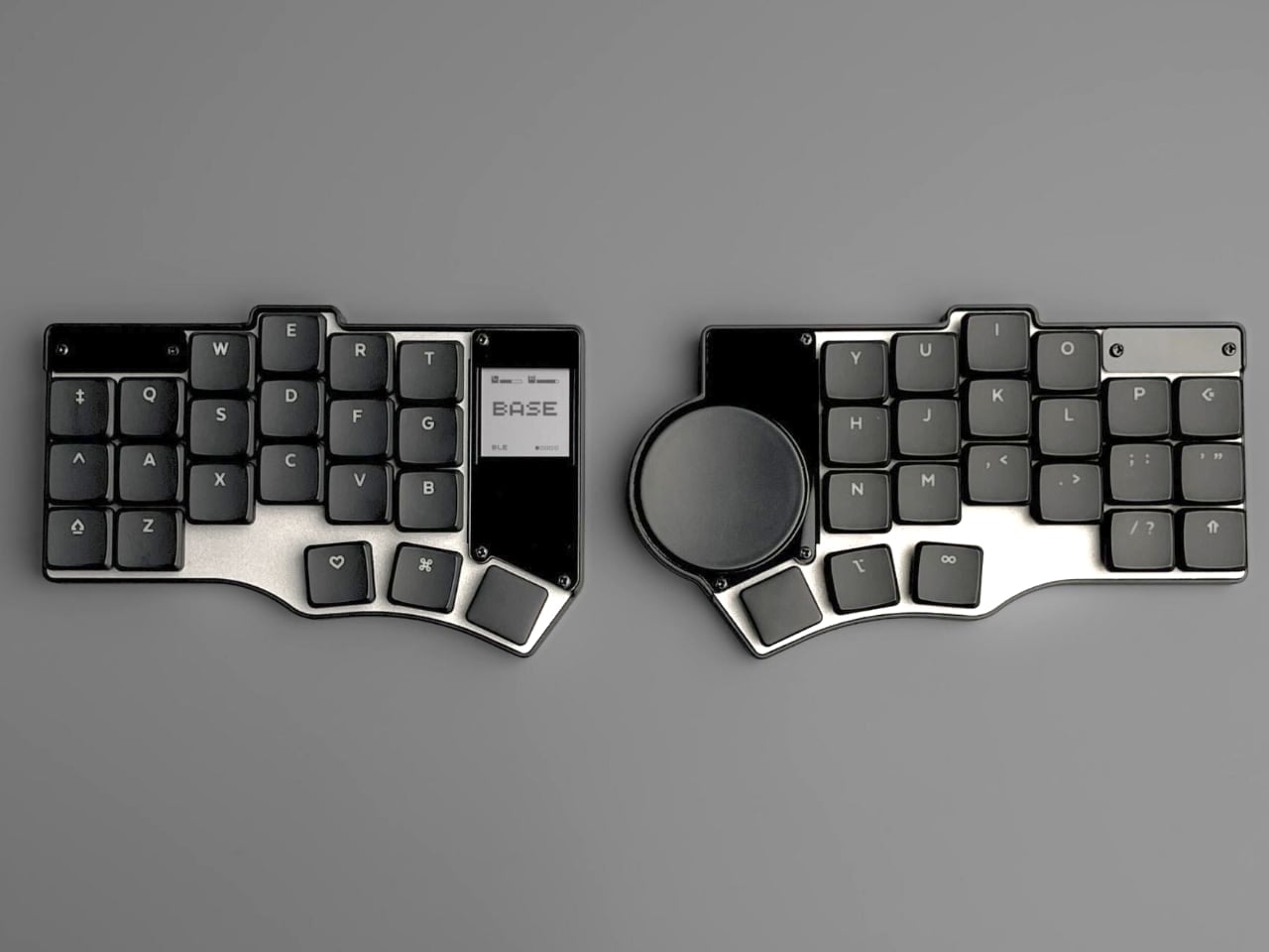
The Beekeeb Toucan asks a question that ergonomic keyboard enthusiasts have been wrestling with for years: why should comfort stay home? Split keyboards and columnar layouts have long belonged to desk-bound workers, their benefits tethered to permanent workstations and cable management systems. This 42-key wireless design challenges that assumption.

Designer: Beekeeb

Two halves sit independently, angled outward to match natural shoulder width. Keys follow a columnar stagger rather than traditional row offset. Each key positions directly beneath a finger’s natural arc of movement. These principles are well-established in ergonomic design, but the Toucan’s interpretation focuses on what most split keyboards treat as secondary: portability without compromise.

Engineering Movement Into Ergonomics

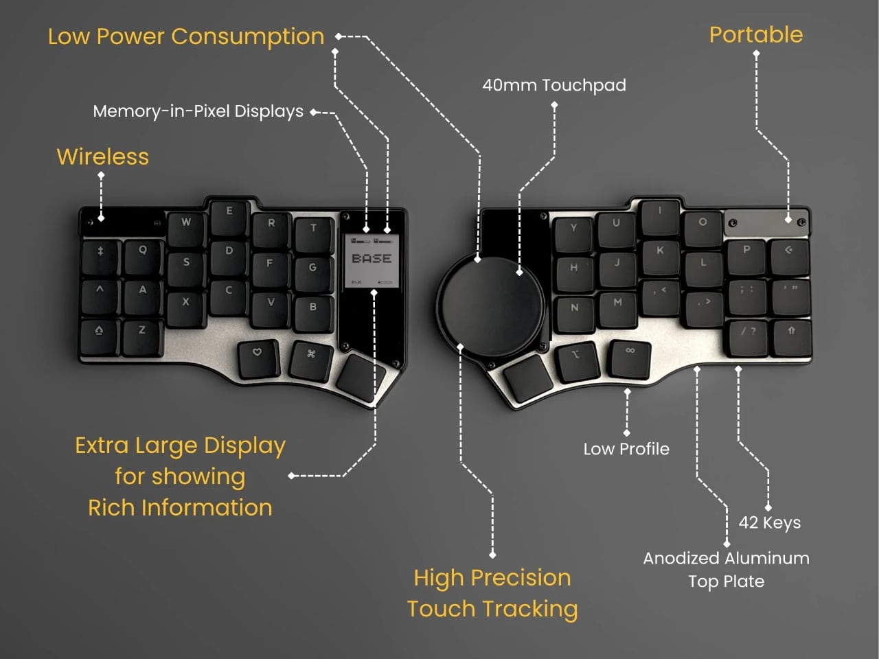
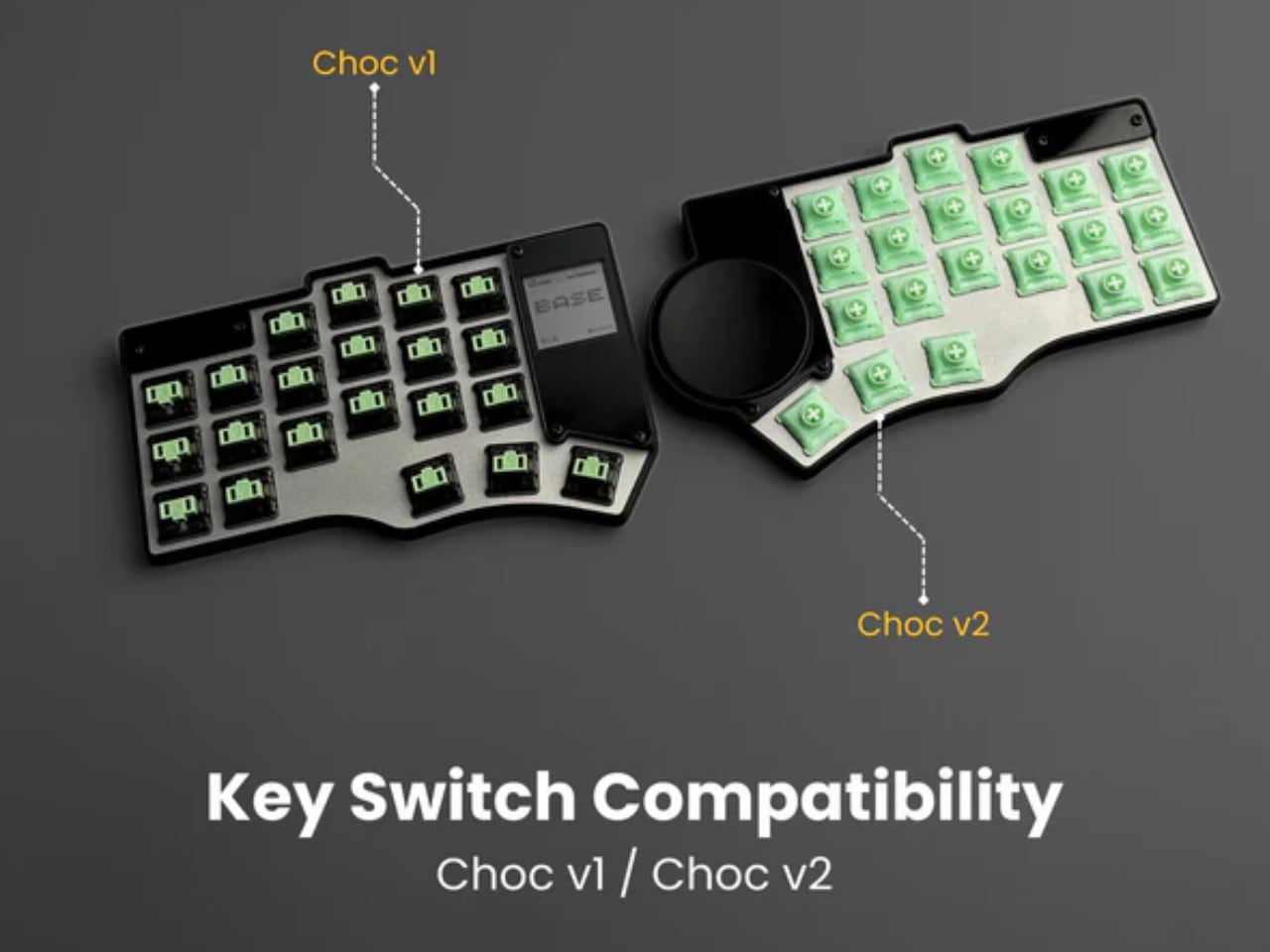
Material choices reveal priorities. An anodized aluminum top plate provides structural rigidity and premium typing surface, while 3D-printed construction sheds weight from the bottom case. This hybrid approach answers the specific demands of travel: constant packing, unpacking, shifting between surfaces that may or may not be level. The result weighs significantly less than comparable mechanical keyboards yet maintains the solid feel necessary for confident typing. Low-profile Kailh Choc V1 switches keep everything close to the desk surface, reducing wrist extension while preserving tactile feedback.

The columnar stagger deserves particular attention. Traditional keyboards offset keys horizontally because that layout accommodated typewriter mechanisms, not human anatomy. But fingers move more naturally up and down than side to side. Aligning keys in vertical columns adjusted for each finger’s length reduces lateral reaching and finger curling. Small reductions compound significantly over hours of use.

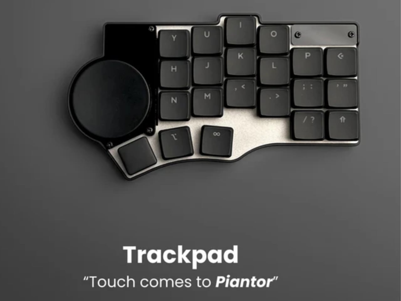
Placing a 40mm circular touchpad on the right keyboard half solves a familiar problem for anyone who has tried maintaining ergonomics while traveling. Laptop trackpads force users to center their body with the screen, pushing the keyboard into asymmetric position. External mice require desk space and introduce reaching movements that negate split layout benefits. The Toucan’s integrated trackpad keeps both hands on home position. Cursor control becomes thumb movement rather than arm extension, maintaining portability while eliminating separate pointing devices through the Cirque GlidePoint sensor’s precision tracking in a compact footprint.

This integration matters particularly for mobile work environments where desk space is limited or nonexistent. Coffee shop tables. Airplane tray tables. Hotel desks. These spaces punish conventional ergonomic setups that sprawl across multiple square feet, but the Toucan consolidates typing and pointing into two connected halves that adapt ergonomic principles to constrained real estate.

Efficiency Through Component Selection

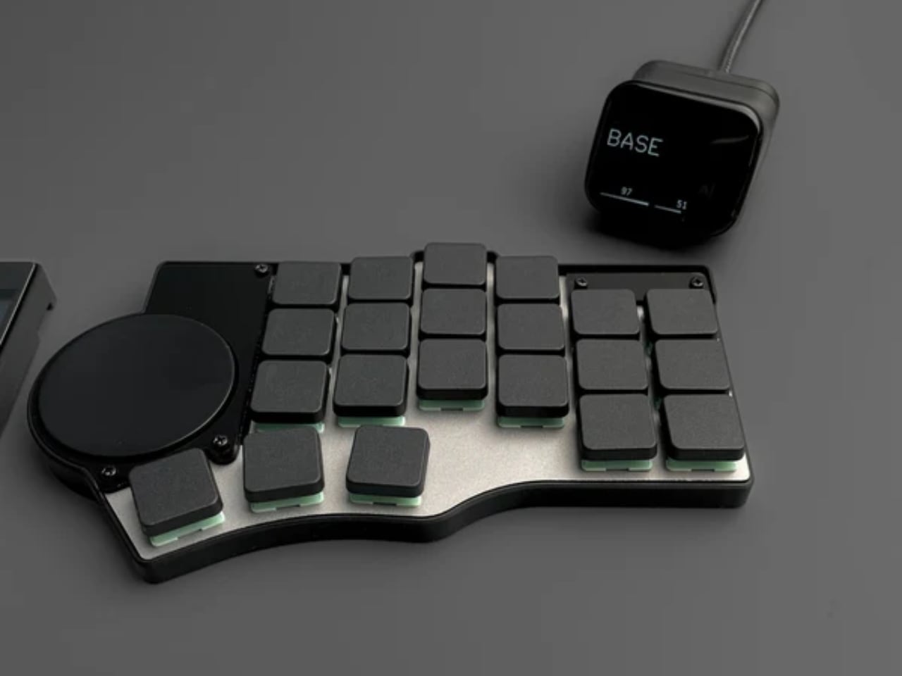
The memory-in-pixel display on the left half exemplifies the keyboard’s efficiency-focused design. This technology, borrowed from smartwatch engineering, updates only changed pixels rather than refreshing the entire screen, dramatically reducing power consumption compared to conventional displays. Battery life can extend to 4,000 hours on a modest 1,500 mAh cell when paired with ZMK firmware. That figure is not theoretical. ZMK optimizes wireless efficiency through aggressive power management, putting the keyboard into deep sleep between keystrokes and waking instantly when needed.

The open-source nature allows users to customize power profiles, though even default settings deliver weeks or months between charges depending on usage patterns. Beyond efficiency metrics, the display serves practical ergonomic purposes: current layer information, battery status, and connectivity indicators appear without requiring users to memorize LED blink patterns or consult software. This immediate feedback reduces cognitive load and maintains workflow continuity, particularly valuable when switching between devices or adjusting layouts on the fly.

ZMK firmware provides more than power efficiency. Open-source programmability allows users to adapt the keyboard to their specific ergonomic needs rather than conforming to preset layouts. Key positions can be remapped to reduce finger stretching. Frequently used combinations consolidate to single keys. Custom layers accommodate different tasks without abandoning muscle memory. This flexibility becomes particularly valuable for users with specific ergonomic requirements. Someone with limited finger mobility can consolidate modifier keys to thumb clusters, while a user prone to repetitive strain can spread common key combinations across multiple fingers. The ability to experiment with different configurations without hardware limitations transforms the keyboard from static tool into adaptive interface.

The open-source heritage traces back through the Piantor to the Cantor design, demonstrating how community-driven development can accelerate ergonomic innovation. Each iteration addresses real-world feedback from actual users, refining dimensions, switch positions, and feature integration based on practical experience rather than marketing assumptions.

Compromises and Considerations

Split keyboards traditionally require users to choose between portability and features. Compact designs sacrifice programmability or build quality, while feature-rich options become too bulky for travel. The Toucan attempts to resolve this through modular availability options: DIY kits at $189 appeal to enthusiasts comfortable with soldering and assembly, offering the lowest entry price while maintaining complete control over switch selection and build quality. Pre-soldered options at $298 eliminate assembly complexity but still require sourcing keycaps and switches separately. Fully assembled units with switches and keycaps push toward $352, competing directly with established options like the ZSA Voyager at $365.

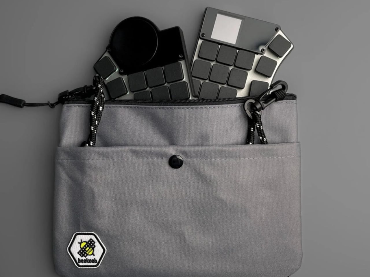
That pricing positions the Toucan as a considered purchase rather than impulse buy. However, the Voyager lacks wireless connectivity and integrated pointing, requiring additional purchases for equivalent functionality. The Keychron Q13 Max, while more affordable at $250, weighs substantially more and uses wired connection that limits portability. The optional carrying bag reflects practical travel considerations. Split keyboards create packing challenges with two separate pieces, exposed switches, and electronics. A purpose-designed case protects components while keeping both halves together during transit.

The Toucan does not eliminate all compromises inherent to portable ergonomics. The 42-key layout requires layers for numbers, function keys, and special characters, creating a learning curve for users accustomed to dedicated keys for every function. This cognitive overhead can temporarily reduce productivity during the transition period. The Choc V1 switch ecosystem offers fewer options than standard MX switches. While tactile, linear, and clicky variants exist, enthusiasts seeking specific force curves or exotic switch types will find selection limited. Keycap availability similarly constrains customization, with Choc spacing requiring dedicated sets that cost more and offer fewer aesthetic options than MX keycaps.

Battery procurement adds friction to the purchase process, as shipping regulations prevent Beekeeb from including batteries. Users must source compatible cells separately. While standard hobby batteries work, this extra step complicates what should be straightforward unboxing. These limitations reflect genuine constraints rather than oversights. Compact layouts inherently sacrifice dedicated keys for portability, niche switch formats will always offer less variety than dominant standards, and battery shipping restrictions affect all manufacturers equally. Understanding these trade-offs helps potential users evaluate whether the Toucan’s strengths align with their specific needs.

Portable Ergonomics as Design Goal

The fundamental proposition the Toucan advances: ergonomic benefits should not require permanent workstation installations. Coffee shop workers, digital nomads, frequent travelers, and anyone who splits time between multiple locations have historically chosen between comfort and mobility. Heavy split keyboards stay home. Laptop keyboards cause strain but pack easily.

By packaging columnar layout, split design, integrated pointing, and extended battery life into travel-friendly form factor, the Toucan suggests a third option. Ergonomics become portable. The setup that reduces wrist strain at a home desk can accompany users to temporary workspaces without requiring compromises in either direction.

Whether this approach succeeds depends on individual priorities. Users who value maximum key count, premium switch feel, or comprehensive keycap selection will find the Toucan’s compromises too limiting. Those who prioritize portability above all else might find even this compact design too complex compared to minimalist 40% layouts. But for workers who move between locations while maintaining significant typing demands, the Toucan addresses a genuine gap. It proposes that ergonomic design can serve movement rather than constraining it, that comfort can travel alongside laptops and cables rather than waiting at dedicated desks.

The question is not whether everyone needs this approach. It is whether enough people recognize they have been making unnecessary compromises.

The Beekeeb Toucan is available for pre-order starting at $189 for DIY kits, with shipments beginning in December. Pre-assembled options with switches and keycaps reach approximately $352.

The post Beekeeb Toucan: The Split Ergonomic Keyboard Built for Travelers first appeared on Yanko Design.

Hongqi HS6 PHEV: Where Art Meets Engineering in China’s Record-Breaking Luxury SUV

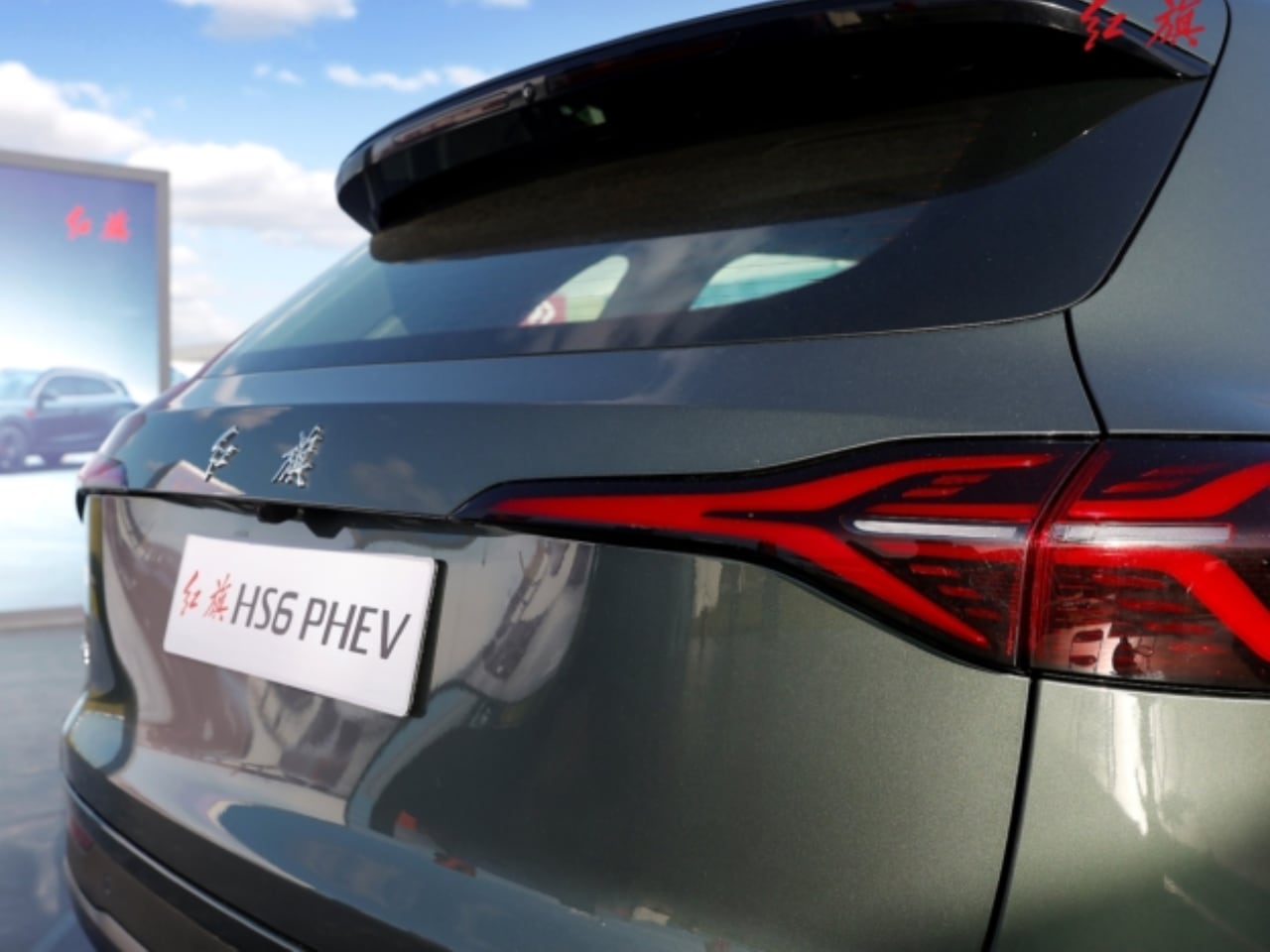
FAW’s Hongqi brand just proved that plug-in hybrid SUVs can go the distance. The Hongqi HS6 PHEV set a Guinness World Record by traveling 2,327.343 kilometers on a single full charge and fuel tank without refueling, departing from Shangri-La on October 30 and arriving in Guangzhou on November 3. The achievement surpassed previous record holders including Chery’s Fulwin T10, establishing new benchmarks for plug-in hybrid range capability. But beyond the impressive range figures, this 5-seater SUV makes its strongest statement through two areas where Chinese automakers are increasingly competing with global luxury brands: exterior design presence and interior craftsmanship.

Designer: Hongqi

A Grille Designed by Rolls-Royce Royalty

The Hongqi HS6 PHEV’s front fascia bears the unmistakable signature of Giles Taylor, the former Rolls-Royce chief designer who now leads Hongqi’s design direction. The closed grille reinterprets traditional Chinese design language through the lens of British ultraluxury aesthetics, featuring a waterfall design with 12 vertical chrome strips that create a sculptured, three-dimensional effect rather than the flat appearance common in many electric and hybrid vehicles. Each strip catches light differently as you move around the vehicle, creating visual depth that changes with viewing angle and ambient lighting conditions.

The vertical chrome elements flow from top to bottom in a cascading pattern, clearly echoing the iconic Rolls-Royce grille treatment, with Hongqi’s signature red brand logo anchoring the composition. This approach solves a design challenge facing many plug-in hybrid and electric vehicles: how to maintain brand identity and visual presence when traditional grilles are no longer needed for cooling. Rather than simply blanking off the grille area or adding fake vents, Taylor and the Hongqi design team have created a distinctive design element that serves as both brand signature and sculptural statement.

The HS6 PHEV measures 4,995mm in length, 1,960mm in width, and 1,760mm in height, with a 2,920mm wheelbase. These dimensions place it firmly in the mid-size luxury SUV segment, competing with vehicles like the BMW X5, Mercedes-Benz GLE, Toyota Highlander Hybrid, and Lexus RX Hybrid in terms of physical presence and market positioning.

Interior: Where Functionality Meets Premium Comfort

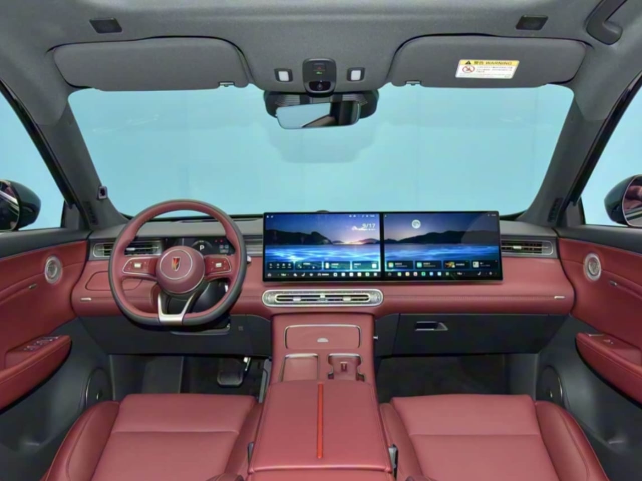
Step inside the HS6 PHEV and you encounter a layered dashboard design that prioritizes both technology integration and visual sophistication. The design team created distinct horizontal layers that separate different functional zones while maintaining cohesive aesthetics. An integrated dual-screen setup spans the upper dashboard section, consisting of a central control screen and a dedicated co-pilot entertainment screen. This is complemented by a digital instrument cluster behind the three-spoke multi-function steering wheel.

Physical buttons have been nearly eliminated in favor of digital controls, a hallmark of modern Chinese luxury design that maximizes clean surfaces and reduces visual clutter. The transmission selector is mounted on the steering column, freeing up valuable center console real estate for practical features like 50W wireless charging for mobile phones, dual cupholders, and access to an onboard refrigerator. A 12-speaker audio system is distributed throughout the cabin for balanced sound delivery across all seating positions.

The Zero-Gravity Front Passenger Experience

The standout interior feature is the zero-gravity co-pilot seat, which goes beyond the typical power adjustment and heating functions found in this segment. While all seats in the HS6 PHEV support electric adjustment, ventilation, and heating functions, the front passenger seat adds an integrated legrest and a 10-point massage system. This level of front passenger pampering is more commonly found in luxury sedans than SUVs, positioning the HS6 PHEV as a vehicle designed for both drivers and passengers who value comfort on longer journeys.

The rear seats also feature electric adjustment, ventilation, and heating capabilities, ensuring premium comfort extends throughout the cabin. The standard trunk offers 503 liters of capacity, with an additional 49 liters of hidden storage space. Folding the rear seats expands total cargo volume to 1,977 liters.

Performance and Range: The Record-Breaking Formula

Power comes from a 1.5-liter turbocharged engine producing 110 kW (148 hp) and 225 Nm of peak torque, with a thermal efficiency of 45.21%. Consumers can choose between two-wheel and four-wheel drive configurations, both with a top speed of 205 km/h. Combined system power outputs are 168 kW (225 hp) for the two-wheel drive version and 369 kW (495 hp) for the four-wheel drive variant.

Battery options include 23.9 kWh and 39.5 kWh lithium iron phosphate packs, offering CLTC pure electric ranges of 152 km, 250 km, and 235 km depending on configuration. The hybrid design combines electric efficiency for daily commuting with fuel flexibility for longer journeys, particularly valuable in markets like China where charging infrastructure varies significantly by region. Comprehensive ranges reach 1,580 km, 1,650 km, and 1,460 km according to Chinese news outlet Sohu. Curb weight varies from 2,040 kg to 2,285 kg depending on battery and drivetrain configuration.

Global Ambitions

Pre-sale is scheduled to begin November 15 in China, but Hongqi’s ambitions extend well beyond the domestic market. The brand is planning international expansion into Europe and the Middle East, positioning the HS6 PHEV as evidence that Chinese automakers can compete in premium segments where design execution, luxury features, and engineering credibility matter as much as specifications.

The HS6 PHEV represents Hongqi’s strategy of combining record-breaking engineering capability with design leadership from one of the luxury automotive world’s most respected figures. Giles Taylor’s influence is evident throughout the vehicle, from the Rolls-Royce-inspired grille to the sophisticated interior execution. The sculptured grille and premium interior features position the vehicle as a credible alternative to established luxury SUVs, with the added benefit of plug-in hybrid efficiency and impressive total range.

For buyers seeking a luxury SUV that doesn’t compromise on either electric driving capability or long-distance flexibility, the HS6 PHEV’s Guinness World Record provides tangible proof of its engineering credentials, while the design details demonstrate that Chinese automakers are increasingly competitive in the premium segments where aesthetic execution matters as much as performance numbers.

The post Hongqi HS6 PHEV: Where Art Meets Engineering in China’s Record-Breaking Luxury SUV first appeared on Yanko Design.
Make It So: LEGO’s 3,600-Piece U.S.S. Enterprise NCC-1701-D Is the Ultimate Trek Tribute

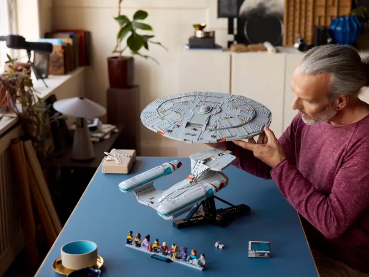
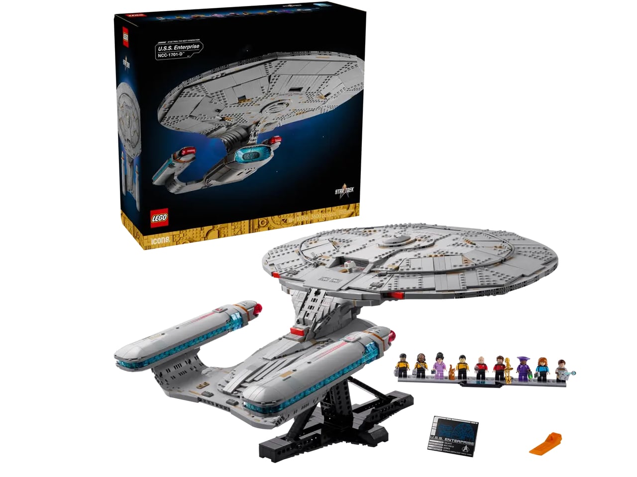
Trekkies, clear your coffee tables. LEGO is launching the U.S.S. Enterprise NCC-1701-D, and this isn’t your childhood spaceship set. At 3,600 pieces and two feet long, this is the Galaxy-class flagship from Star Trek: The Next Generation rendered in meticulous brick form. It’s designed for adults who grew up watching Picard sip Earl Grey and want that same starship commanding their desk space.

Designer: LEGO

The set drops November 28, 2025 for $399.99, and LEGO isn’t holding back on the details. This is the definitive brick-built version of arguably the most beloved Enterprise design, complete with screen-accurate proportions, functional saucer separation, and enough minifigures to staff the bridge. Whether you’re a lifelong Trekkie or a design enthusiast who appreciates iconic sci-fi aesthetics, this set delivers serious display presence.

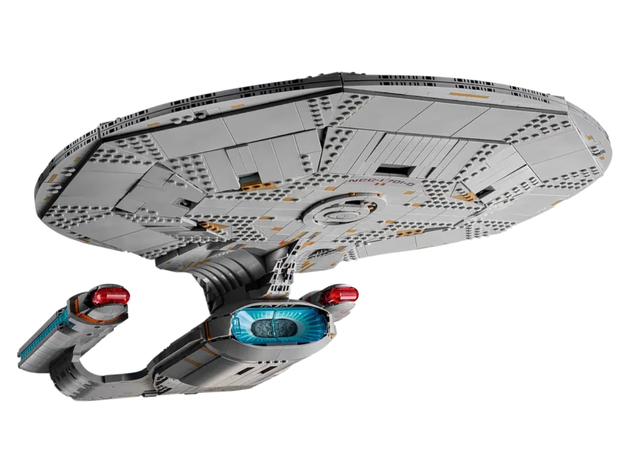
What makes this release special is how LEGO balanced accuracy with buildability. The Enterprise-D has always been a challenging design to capture because of its smooth, sweeping lines and distinctive saucer-meets-engineering-hull silhouette. LEGO’s designers nailed it, creating a model that reads instantly as Picard’s ship from any angle while maintaining the satisfying tactility that makes LEGO builds so rewarding.

Design Accuracy Meets Functional Features

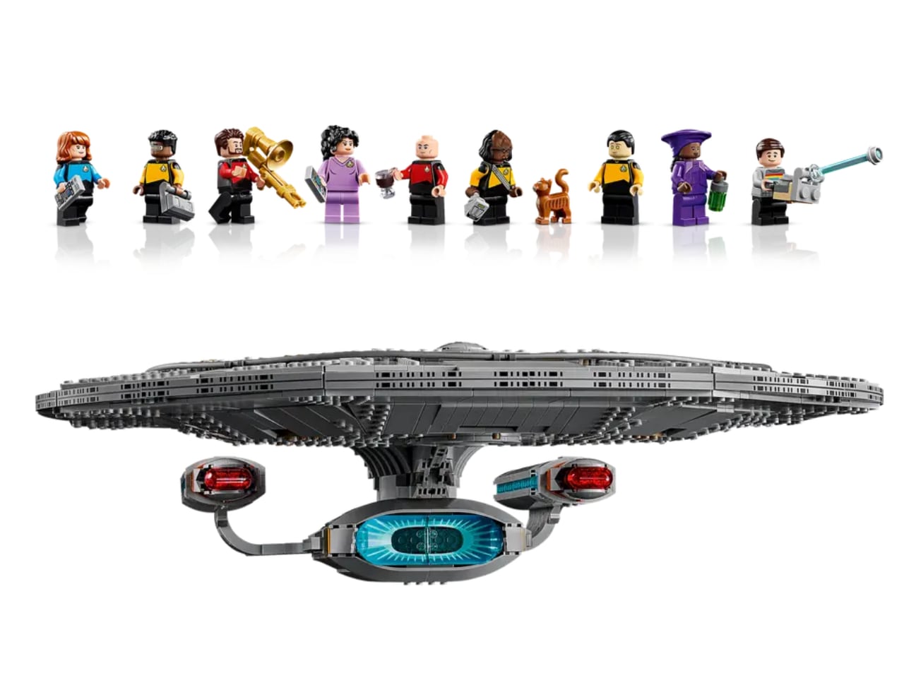
The centerpiece feature is the detachable command saucer. Just like in the show, the saucer section separates from the secondary hull, letting you recreate one of the Enterprise-D’s most dramatic maneuvers. This isn’t just a cosmetic trick; the engineering required to make a sturdy separation mechanism while maintaining the ship’s graceful lines shows real design sophistication. The connection points are hidden beautifully, so the joined ship looks seamless.

LEGO captured the Enterprise-D’s signature warp nacelles with striking fidelity. The red and blue detailing on these engines is instantly recognizable to any TNG fan, and seeing them rendered in brick form with proper color gradients and proportions is genuinely impressive. The nacelle pylons sweep back at the correct angle, and the overall stance on the included display stand gives the ship that dynamic, forward-leaning energy that made the original VFX model so memorable.

Built for Interaction and Display

This isn’t a static model locked behind glass. The rear shuttlebay opens to reveal two Type-15 Shuttlepods tucked inside, ready for away missions. These tiny craft are surprisingly detailed for their scale, complete with proper hull markings and recognizable silhouettes. Being able to physically open the shuttlebay and extract these little vessels adds a layer of interaction that transforms the model from sculpture to storytelling tool.

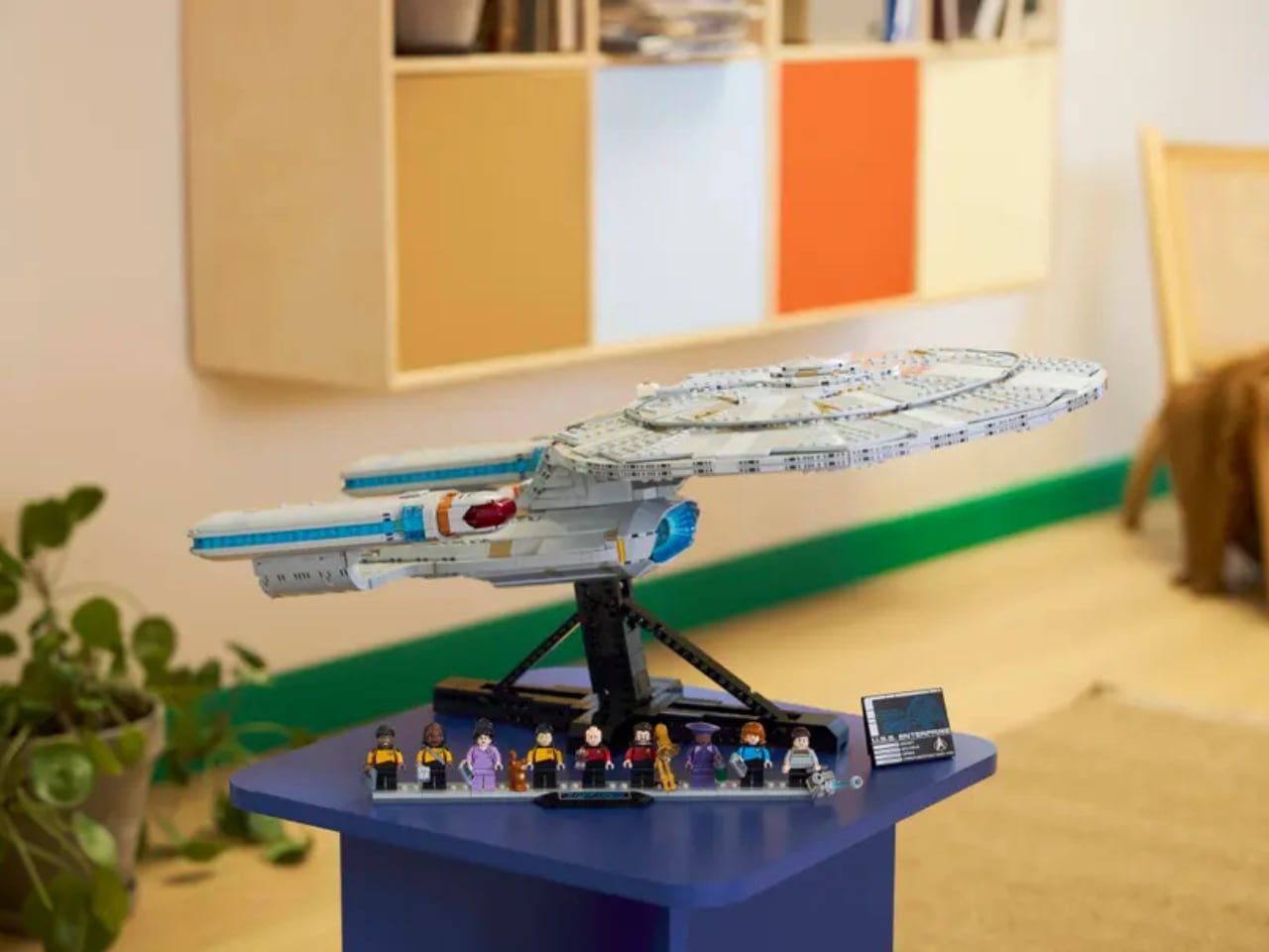
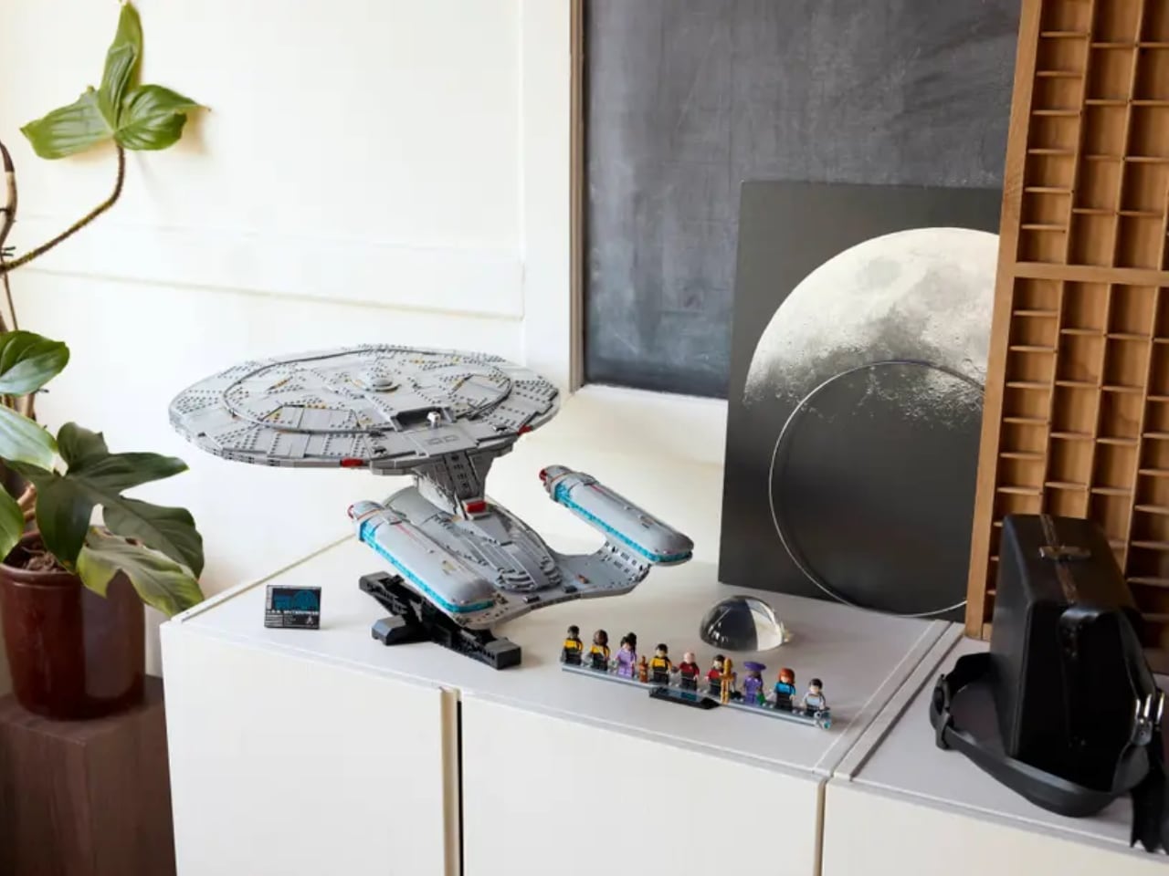
The angled display stand deserves special mention. Rather than a boring flat base, LEGO designed a stand that tilts the Enterprise at a dramatic angle, as if banking into warp speed or executing a tactical maneuver. A schematic plaque with ship statistics sits at the base, adding that museum-quality presentation polish. This stand transforms the model into a legitimate piece of desk art rather than just a toy on a shelf.

For builders who want every construction detail at their fingertips, the LEGO Builder app provides 3D digital instructions alongside the printed manual. You can rotate, zoom, and view assembly steps from any angle on your phone or tablet, which is genuinely helpful for a build this complex and detailed.

The Crew You Need

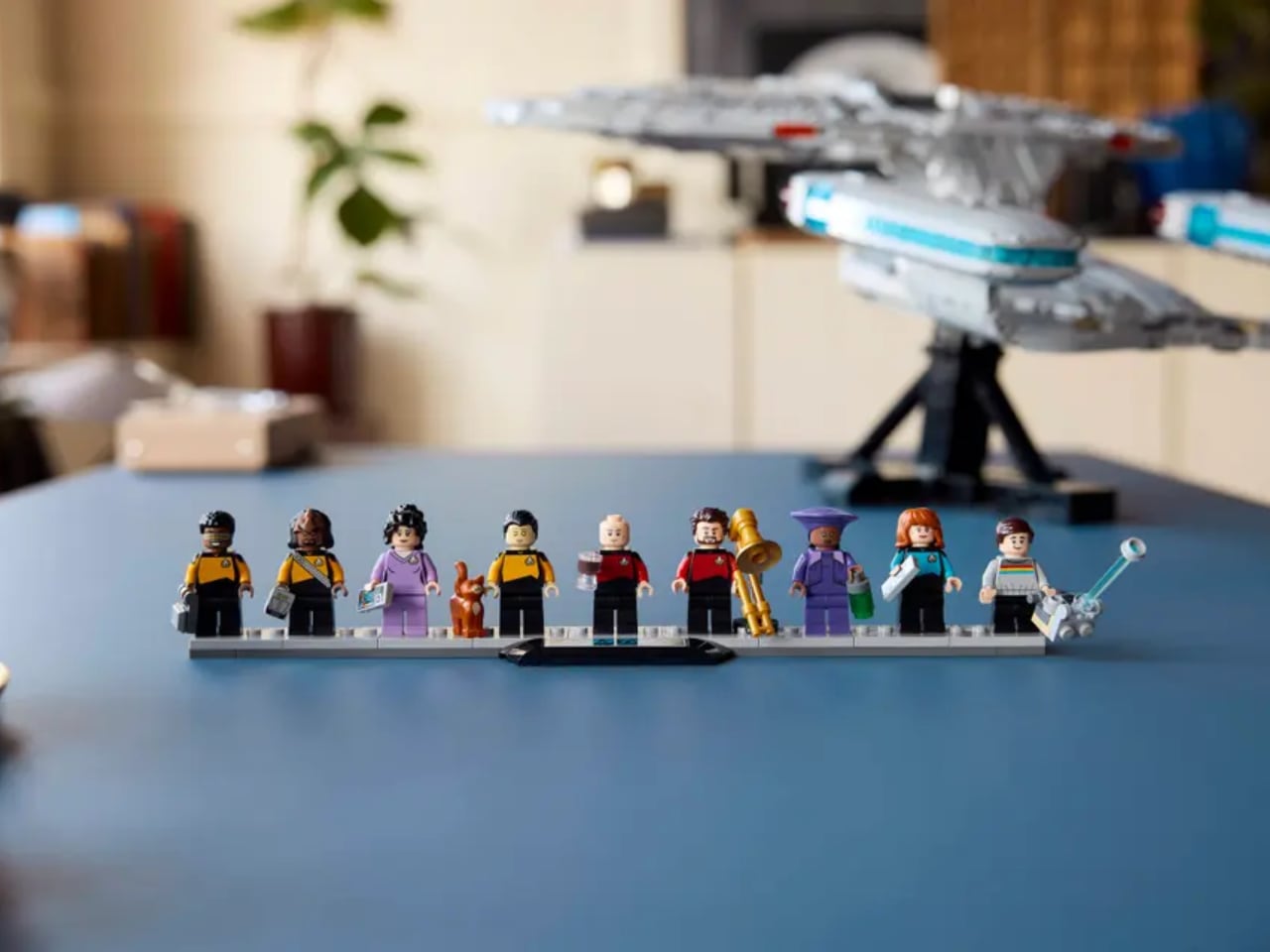
Nine minifigures ship with the set, representing the iconic TNG bridge crew plus a few beloved supporting characters. You get Picard (with teacup, naturally), Riker (complete with trombone and stand for jazz night), Worf, Data (with his cat Spot), Dr. Crusher, Geordi, Troi, Guinan, and Wesley Crusher. Each figure comes with custom accessories that reference their character perfectly. Data gets Spot, the cat he famously cared for while learning about emotions. Picard gets his Earl Grey tea. Riker gets his trombone because of course he does.

The accessory selection goes deep: phasers, tricorders, PADDs, engineering cases, even a portable tractor beam generator. LEGO clearly consulted with people who know this show inside and out, choosing items that feel authentic to the TNG universe rather than generic sci-fi props. These aren’t just decorative additions; they’re storytelling tools that let you recreate specific episodes or imagine new adventures.

Collectability and Display Presence

At 24 inches long, 19 inches wide, and 11 inches tall (including stand), this Enterprise commands serious real estate. That scale is intentional. This is designed to be a showpiece, the kind of build that anchors a room and starts conversations. The detailing holds up to close inspection, which is exactly what a centerpiece model needs to do. From across the room it reads as a sleek, powerful starship. Up close, you appreciate the clever techniques LEGO’s designers used to achieve those curves and gradients within the constraints of rectangular bricks.

For serious collectors, LEGO is offering a bonus Type-15 Shuttlepod as a gift with purchase during the launch window, plus other limited-time bonuses like Classic Animation Scenes. The set also earns 2,600 LEGO Insiders Points, which is a nice bonus for people already invested in LEGO’s ecosystem. With only 10,000 sets produced initially (per LEGO’s typical Icons limited run strategy), this will likely appreciate in value for those who keep it sealed.

The U.S.S. Enterprise NCC-1701-D represents everything LEGO’s Icons line does best: taking beloved cultural touchstones and translating them into buildable, displayable art. This isn’t a toy, though it has playful elements. It’s not quite a model kit, though it requires serious building skill. It exists in that sweet spot where nostalgia, design appreciation, and hands-on creativity converge. For $399.99, you’re getting 3,600 pieces of carefully engineered brick design that lets you spend hours building, then years displaying. That’s a fair trade for the flagship of the Federation.

The post Make It So: LEGO’s 3,600-Piece U.S.S. Enterprise NCC-1701-D Is the Ultimate Trek Tribute first appeared on Yanko Design.

This Smart Ring Captures Your Thoughts With a Touch

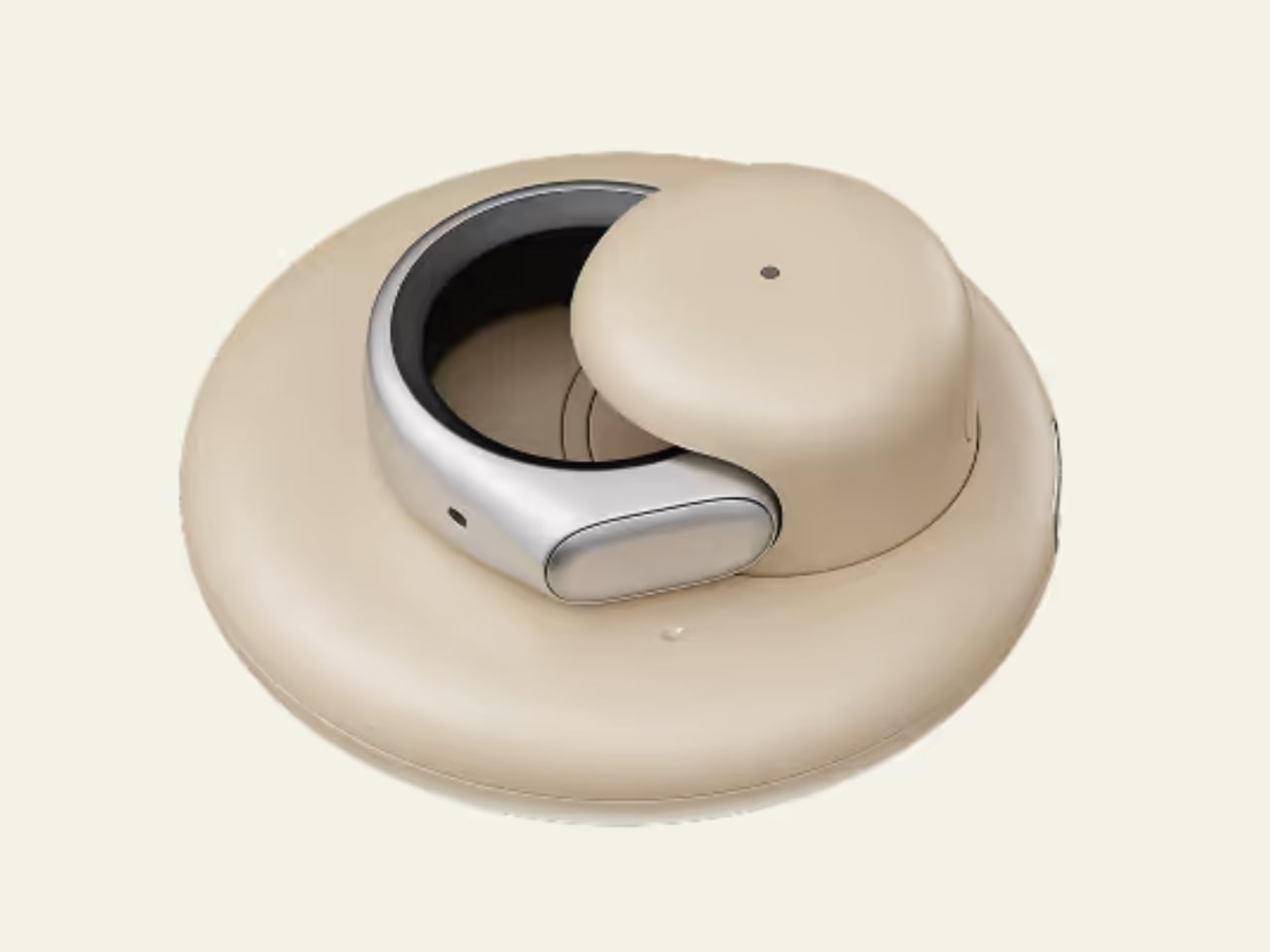
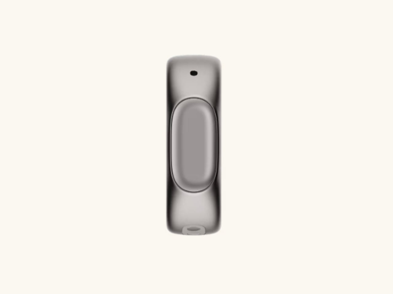
Capturing a sudden idea while walking used to mean pulling out your phone or awkwardly talking into earbuds. The Stream Ring from Sandbar offers a more discreet solution: a voice-activated smart ring worn on your index finger that records thoughts with a simple touch. Announced on November 5, 2025, the device combines voice recording, AI transcription, and music control in a form factor designed to disappear into your daily routine.

Designer: SandBar

Sandbar, a New York City-based interface company founded by former Meta employees Mina Fahmi and Kirak Hong, positions the Stream Ring as what they call “a mouse for voice.” Both founders previously worked at CTRL-Labs, a neural interface startup Meta acquired in 2019, and bring additional experience from Kernel, Magic Leap, and Google. Their latest venture has already raised $13 million from True Ventures, Upfront Ventures, and Betaworks.

Voice Recording Designed for Privacy

The Stream Ring’s microphone only activates when you press the touchpad on its surface. This privacy-first design means the device is never passively listening, addressing one of the main concerns people have with always-on voice assistants.

The ring provides haptic feedback to confirm when it’s recording, giving you tactile reassurance that the microphone is active. According to Sandbar, the whisper-sensitive microphone works in various acoustic environments, from quiet rooms to busy streets. The device can record locally without a mobile connection, storing your voice notes until you sync with the iOS app.

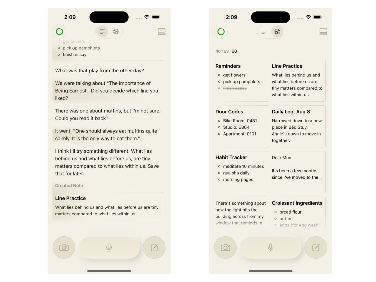
Once connected, the app provides real-time AI transcription, converting your voice recordings into searchable text. This offline capability means you can capture thoughts even when your phone is out of reach or turned off, making the ring genuinely useful for those moments when ideas strike at inconvenient times. Beyond basic transcription, the Stream Ring includes what Sandbar calls “Inner Voice AI.” This feature aims to create a personalized AI that mimics your own voice and cadence, turning the interaction into something that feels more like thinking out loud than talking to a chatbot. The system automatically organizes and edits your notes, handling the organizational work in the background while you focus on developing ideas.

Dual Functionality: Voice and Music

While voice recording is the primary function, the Stream Ring doubles as a music controller. A single tap plays or pauses your audio, a double tap skips to the next track, and swiping adjusts volume. These controls work with Spotify, Apple Music, podcast apps, and any connected headphones, giving you quick access to playback functions without reaching for your phone.

The inclusion of music controls serves a practical purpose beyond convenience. Even if Sandbar’s AI services were to shut down in the future, the Stream Ring would still function as a media controller, ensuring the hardware retains value independent of the company’s ongoing software support.

Aluminum, Glass, and Resin Construction

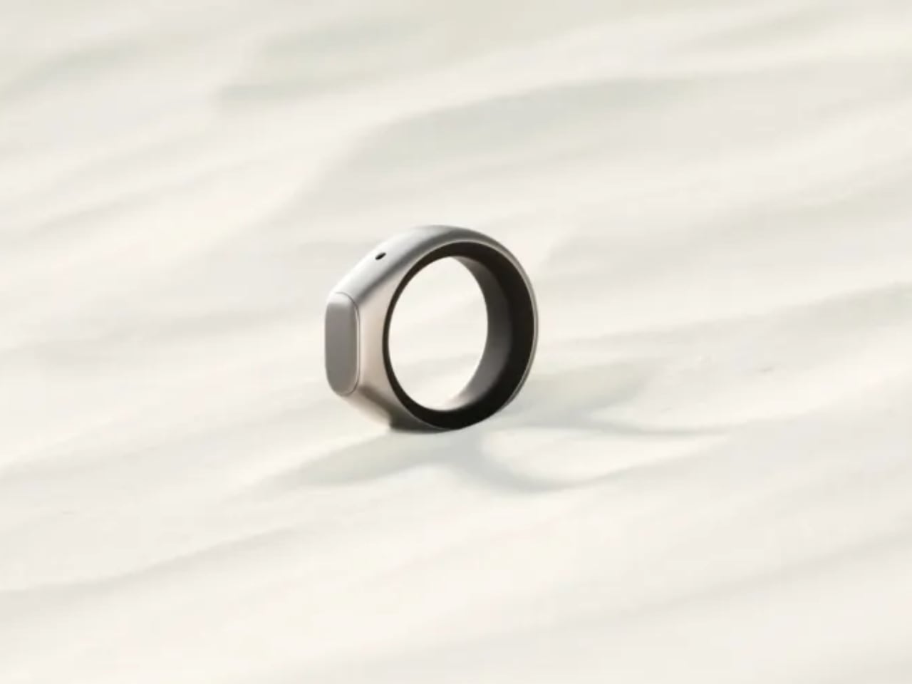
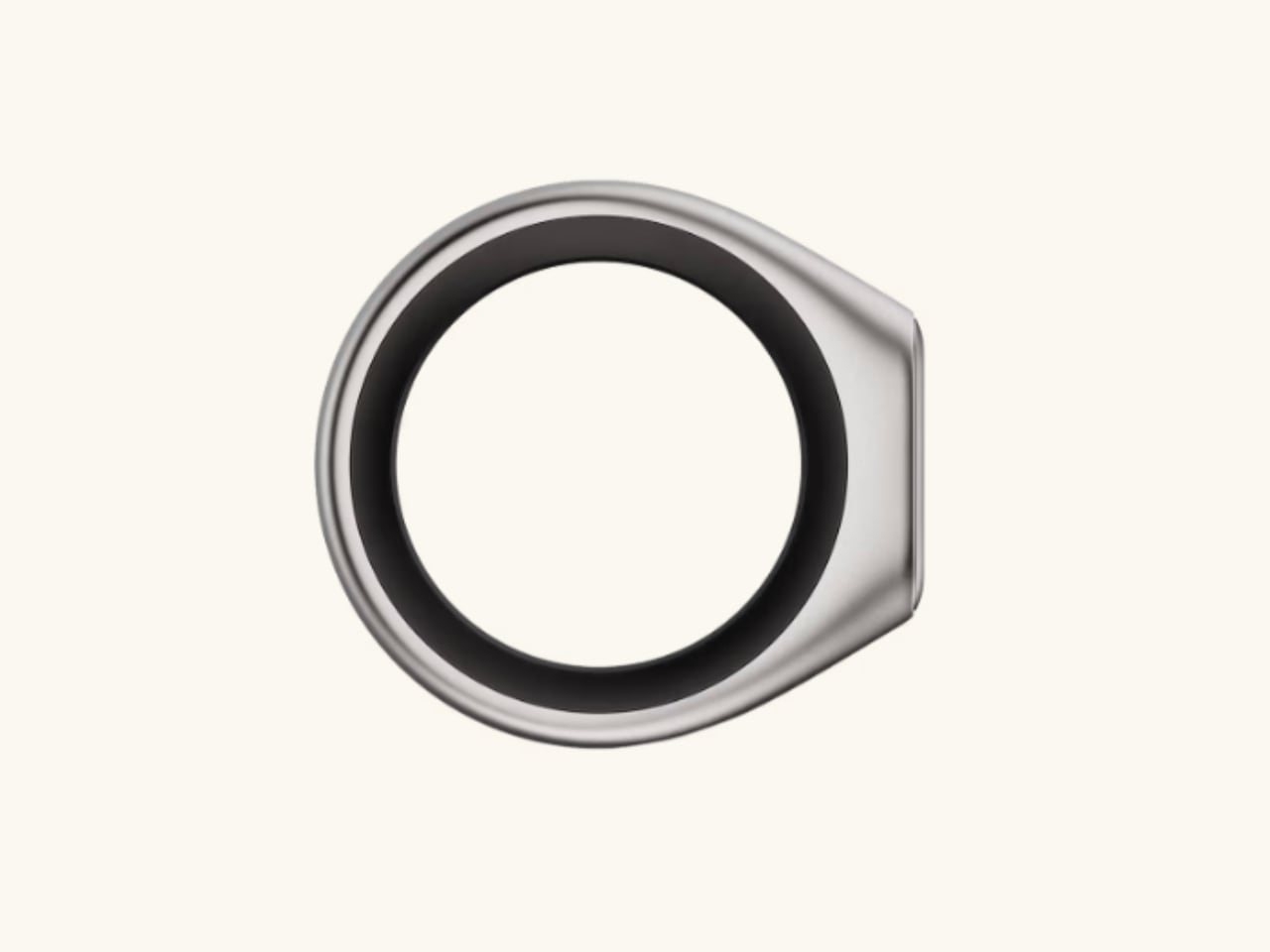
The Stream Ring features an aluminum exterior available in silver or gold finishes, with a black resin interior and a glass touchpad. Sandbar designed it to be worn on the index finger of your dominant hand, where the touchpad remains easily accessible for quick activation.

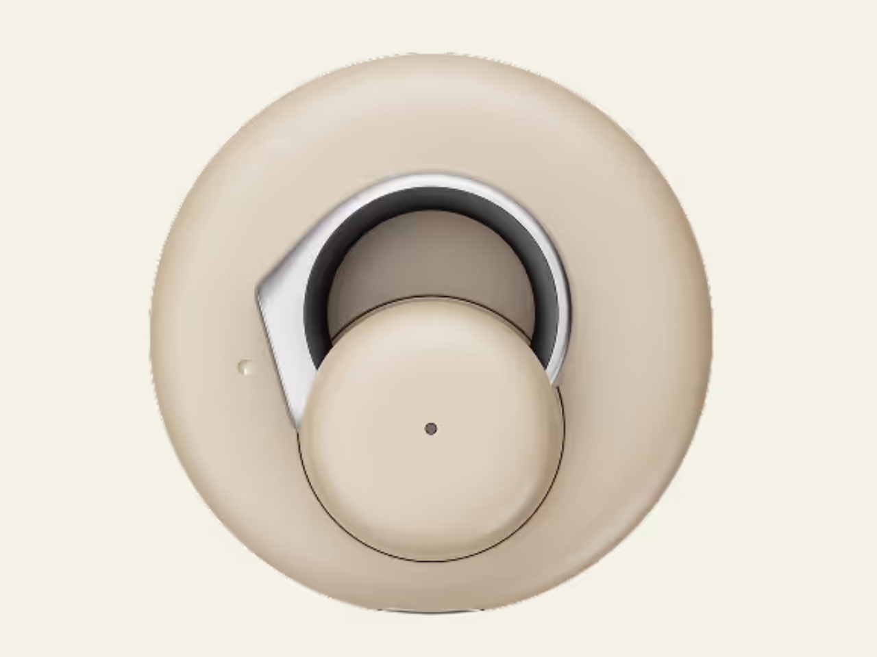
The ring comes in sizes 5 through 13, and every preorder includes a free sizing kit to help you find the right fit before the final product ships. The device is splash-proof, meaning it can handle rain and handwashing, but Sandbar explicitly notes it’s not designed for swimming. Battery life is rated for all-day use, and the ring charges via USB-C.

Notably, the Stream Ring includes no health tracking features, setting it apart from fitness-focused rings like the Oura Ring. This omission is intentional: Sandbar designed the device specifically for productivity and voice interaction, not wellness monitoring.

Pricing and Market Position

The Stream Ring is available for preorder now, with the silver version priced at $249 and the gold version at $299. Preorders are refundable and limited in quantity, with shipping scheduled for Summer 2026.

Sandbar offers a subscription service called Stream Pro for $10 per month, which includes unlimited notes and chats plus early access to new features. Preorder customers receive three months of Stream Pro free, and a free tier remains available with unlimited notes but limited chat functionality.

At this price point, the Stream Ring positions itself between basic smart rings and premium wearables. It enters a growing market of AI-powered devices but differentiates itself by focusing on productivity rather than health tracking, discretion over display, and privacy-conscious design. The ring form factor offers complete discretion compared to earbuds or smartwatches, and the touch-to-activate microphone addresses privacy concerns that have slowed adoption of always-listening devices.

How It Compares to Other Smart Rings

The Stream Ring enters a market where most wearables focus on health tracking or general AI assistance. Oura Ring and Ultrahuman Ring prioritize sleep tracking, heart rate monitoring, and fitness metrics. Amazon’s Echo Loop (now discontinued) offered Alexa voice control, while the Friend pendant positions itself as an always-listening AI companion.

Sandbar differentiates itself by focusing exclusively on productivity and privacy. The touch-to-activate microphone addresses privacy concerns that plagued always-listening devices, and the lack of health sensors keeps the device focused on its core purpose: capturing and organizing thoughts. For users who want a fitness tracker, the Stream Ring isn’t a replacement for dedicated health wearables. For those frustrated by pulling out their phone to jot down ideas, it offers a different solution than existing options.

Potential Limitations

Several aspects of the Stream Ring remain unverified until independent reviews appear. Battery life is rated for all-day use according to Sandbar, but real-world performance across different usage patterns won’t be confirmed until the device ships. The company currently supports only iOS, with no confirmed timeline for Android compatibility, potentially limiting early adoption among Android users.

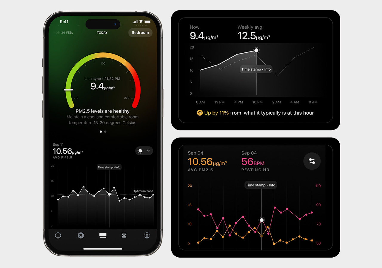
Ultrahuman Home continuously monitors formaldehyde levels in your living space and sends timely nudges when the levels cross the recommended threshold.

The absence of health tracking may disappoint users who expect multi-function wearables. Privacy claims depend on trust in Sandbar’s encryption and data handling practices, though the company has not yet published detailed information about data export options or third-party audits of its security implementation. The ring’s splash-proof rating excludes swimming and showering, limiting its use compared to fully waterproof wearables.

Accessibility considerations remain unclear from the initial announcement. The tactile feedback when recording begins could benefit users with hearing differences, and the touch interface may work for some users with dexterity limitations, but specific accessibility features have not been detailed.

From Neural Interfaces to Voice Rings

“I wanted to capture my thoughts while walking without pulling out my phone or speaking loudly into my AirPods,” Mina Fahmi, Sandbar’s CEO, told reporters at the announcement. The frustration with existing solutions for capturing thoughts on the go drove the development of the Stream Ring.

That philosophy reflects a broader trend in interface design: making technology invisible while keeping it accessible. Rather than positioning the Stream Ring as an AI companion or digital assistant, Sandbar frames it as a “self-extension,” a tool that augments your capabilities without imposing a separate personality or interaction style. The distinction matters because it shapes expectations about how you interact with the device.

Whether this philosophy resonates with consumers will become clearer when the first units ship next summer. For now, the Stream Ring represents one company’s bet that people want discrete voice capture more than they want another fitness tracker on their finger.

The post This Smart Ring Captures Your Thoughts With a Touch first appeared on Yanko Design.
Toyota Walk Me: The Robot Chair That Climbs Stairs and Folds Into Your Trunk

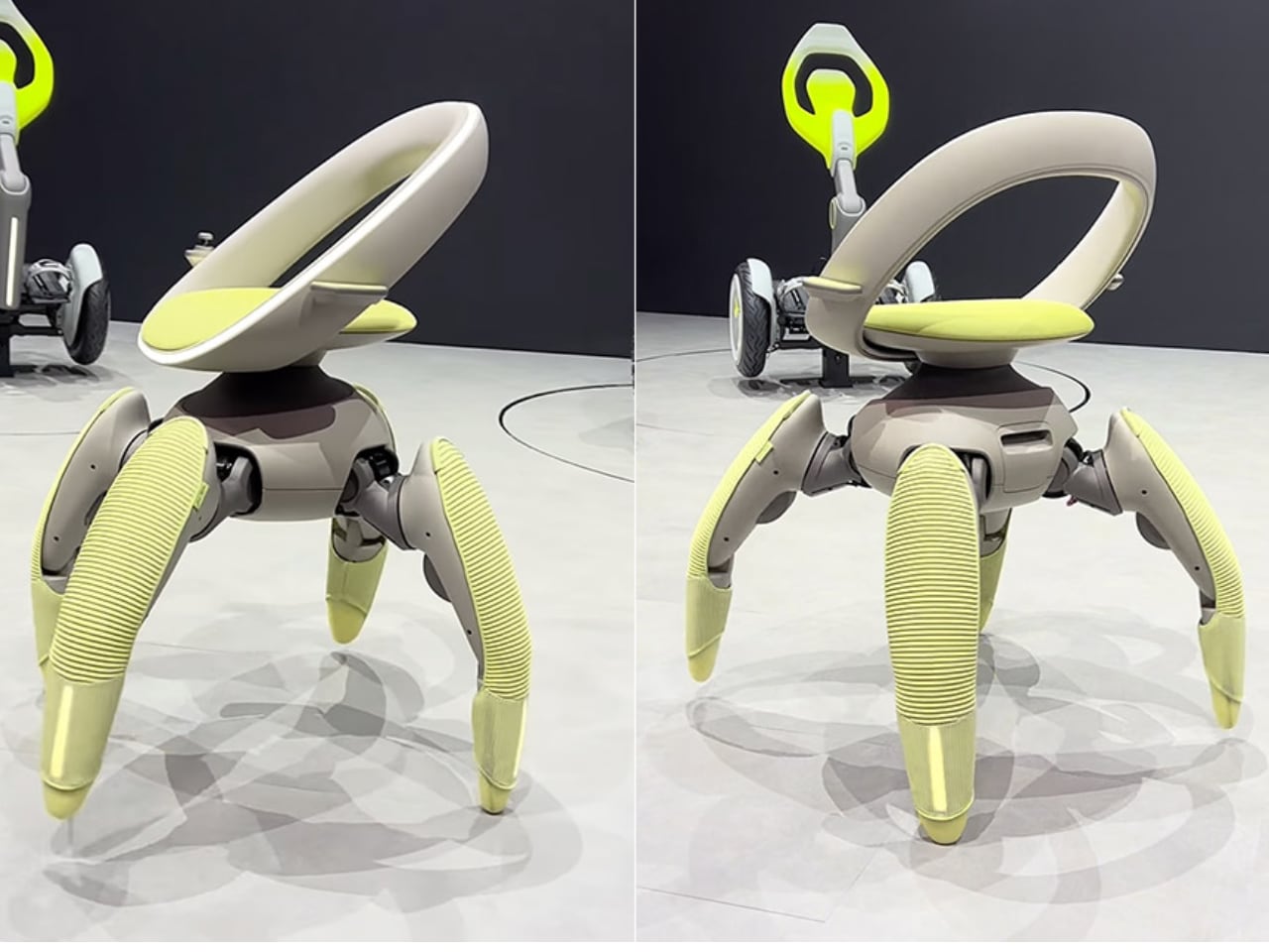
Stairs have long been the nemesis of wheelchair users, turning simple errands into logistical nightmares and limiting access to countless spaces. Toyota’s answer to this mobility challenge doesn’t roll on wheels at all. Instead, the Walk Me concept, unveiled at the Japan Mobility Show 2025, walks on four robotic legs that can climb stairs, navigate uneven terrain, and fold themselves into carry-on luggage when not in use.

Designer: Toyota

A New Kind of Movement

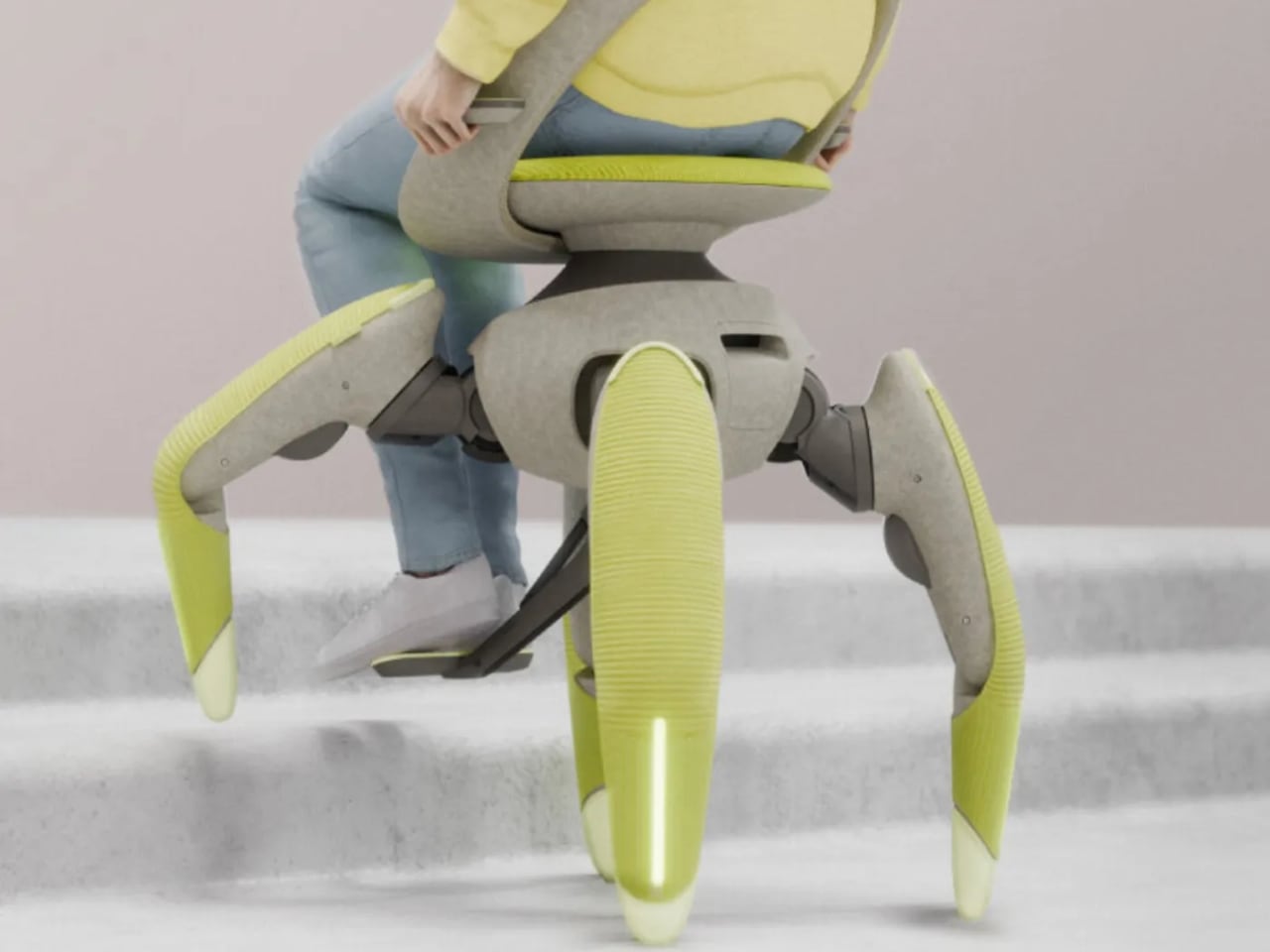
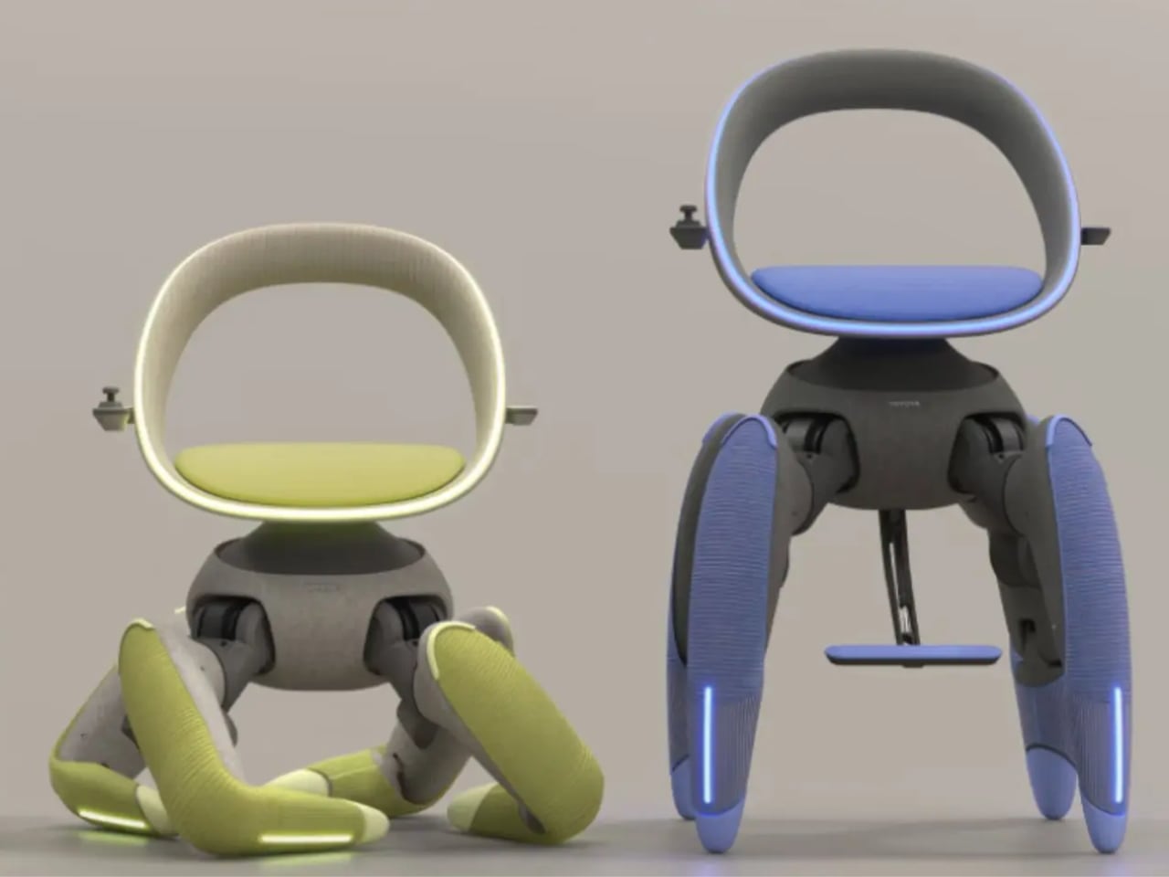
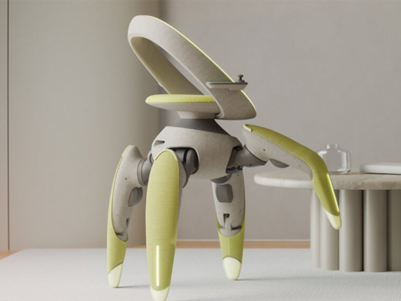
Walk Me replaces traditional wheelchair wheels with biomimetic robotic limbs inspired by goats and crabs, animals known for their sure-footed navigation of challenging terrain. Each of the four independently motorized legs is covered in soft, pastel-colored material that hides the hardware and sensors underneath, making the technology feel approachable rather than clinical. When Walk Me encounters stairs, the front legs test the step height before pulling the chair upward while the rear legs generate thrust and support, creating a smooth climbing sequence that maintains user stability throughout the ascent.

LiDAR sensors and cameras continuously scan surroundings, allowing the chair to navigate obstacles like rug edges, scattered toys, and threshold transitions between rooms. Weight sensors ensure the user remains centered before any major movement, while collision radars stop the chair immediately if something crosses its path. Even when balance shifts unexpectedly, the system automatically widens its stance and adjusts the seat position to prevent tipping.

Comfort, Control, and Autonomy

Walk Me’s seat is designed to adjust to the user’s shape. The curved backrest supports the spine, while small side handles allow for manual steering. Users can twist the handles to turn or press integrated buttons for direction control.

For hands-free operation, voice commands like “kitchen” or “faster” enable the onboard computer to map a path or adjust stride speed. A small display on the armrest shows battery level and distance traveled, keeping essential information at a glance. The system uses smart algorithms and balance control to ensure smooth movement across complex surfaces.

The entire chair operates on a compact battery hidden behind the seat, which provides enough power for a full day of activity. Charging is as simple as plugging it into a wall outlet overnight. Built-in sensors monitor every joint, and if overheating occurs, the chair automatically shuts down and notifies the user.

Compact Design for Daily Life

Perhaps Walk Me’s most striking capability is its folding mechanism. With a single button press, the legs retract telescopically, the knees bend, and the chair compacts itself into carry-on size within thirty seconds. This makes it convenient to store in a car trunk or beside furniture, and when reactivated, the legs extend again while the balance system recalibrates automatically.

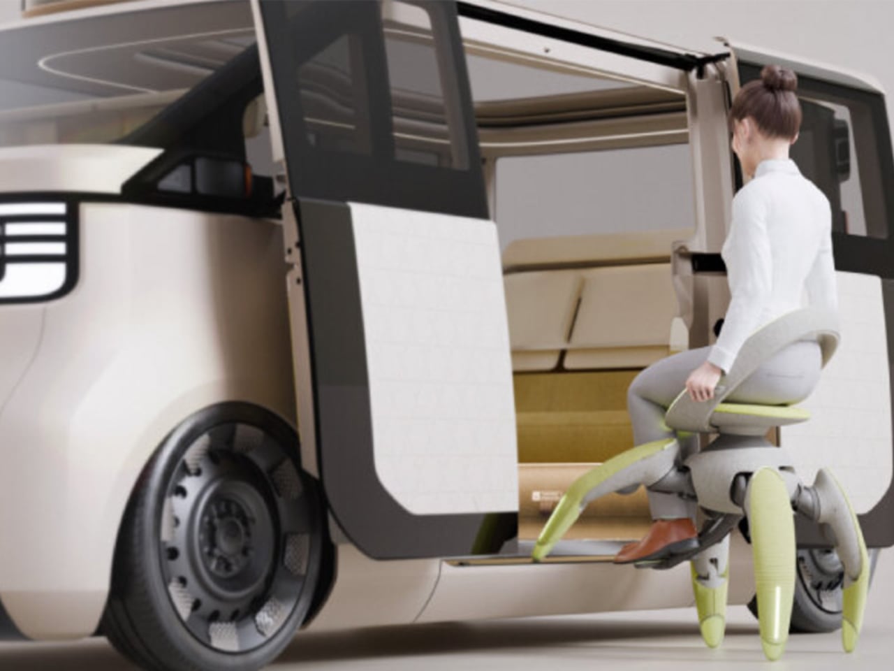
The chair’s adaptability extends to vehicle transfers and traditional Japanese living spaces. Walk Me can lift users into vehicles by raising itself on tiptoes, aligning with car doors, and tilting forward to facilitate seamless transfers without assistance or transfer boards. On tatami mats, the legs squat down to lower the seat to mat level, accommodating the floor-sitting culture common in Japanese homes.

Toyota designed Walk Me for practical, real-world use, from Japan’s elevated homes and narrow hallways to outdoor garden paths. The concept addresses the everyday challenges faced by people with reduced mobility, whether climbing stairs, moving over uneven ground, or transitioning into vehicles. By merging robotics, AI, and human-centered design with biomimicry principles, Walk Me represents an approach to assistive technology that prioritizes independence across diverse environments.

Beyond Prototype Status

Walk Me remains a prototype with no announced production timeline. Yet its debut at the Japan Mobility Show 2025 suggests a future where assistive devices are not limited by terrain, architecture, or even wheels. By replacing traditional mobility solutions with intelligent, lifelike motion, Toyota’s Walk Me challenges existing designs fundamentally and offers not just movement, but freedom.

The post Toyota Walk Me: The Robot Chair That Climbs Stairs and Folds Into Your Trunk first appeared on Yanko Design.
A Documentary Journey Through Frank Lloyd Wright’s Revolutionary Architecture

Frank Lloyd Wright didn’t just design houses. He created living philosophy, spaces where architecture and nature become one seamless experience. These homes represent different chapters in his revolutionary career, each one pushing the boundaries of what residential architecture could achieve.

Designer: Frank Lloyd Wright

Fallingwater: Living with the Waterfall

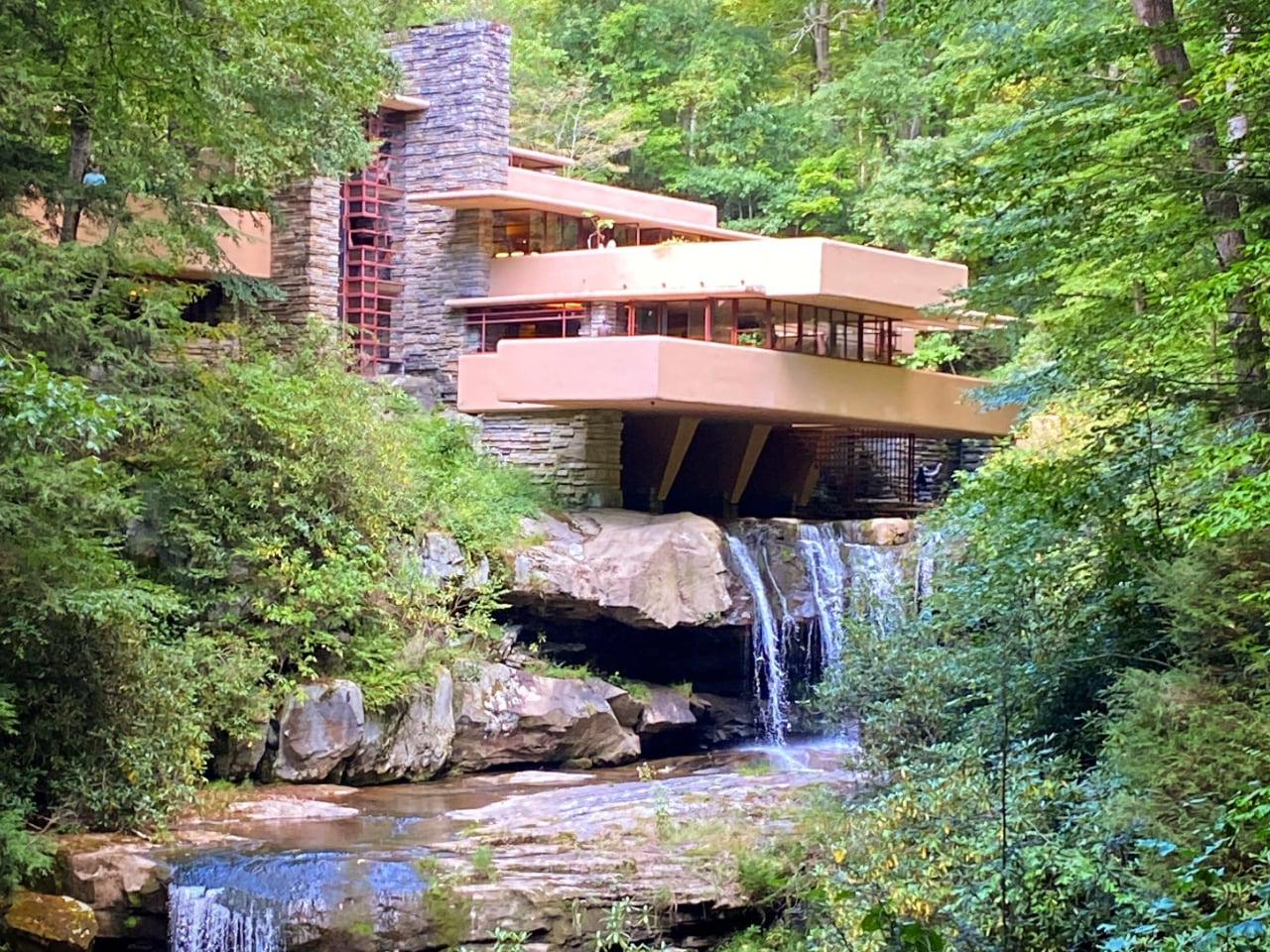
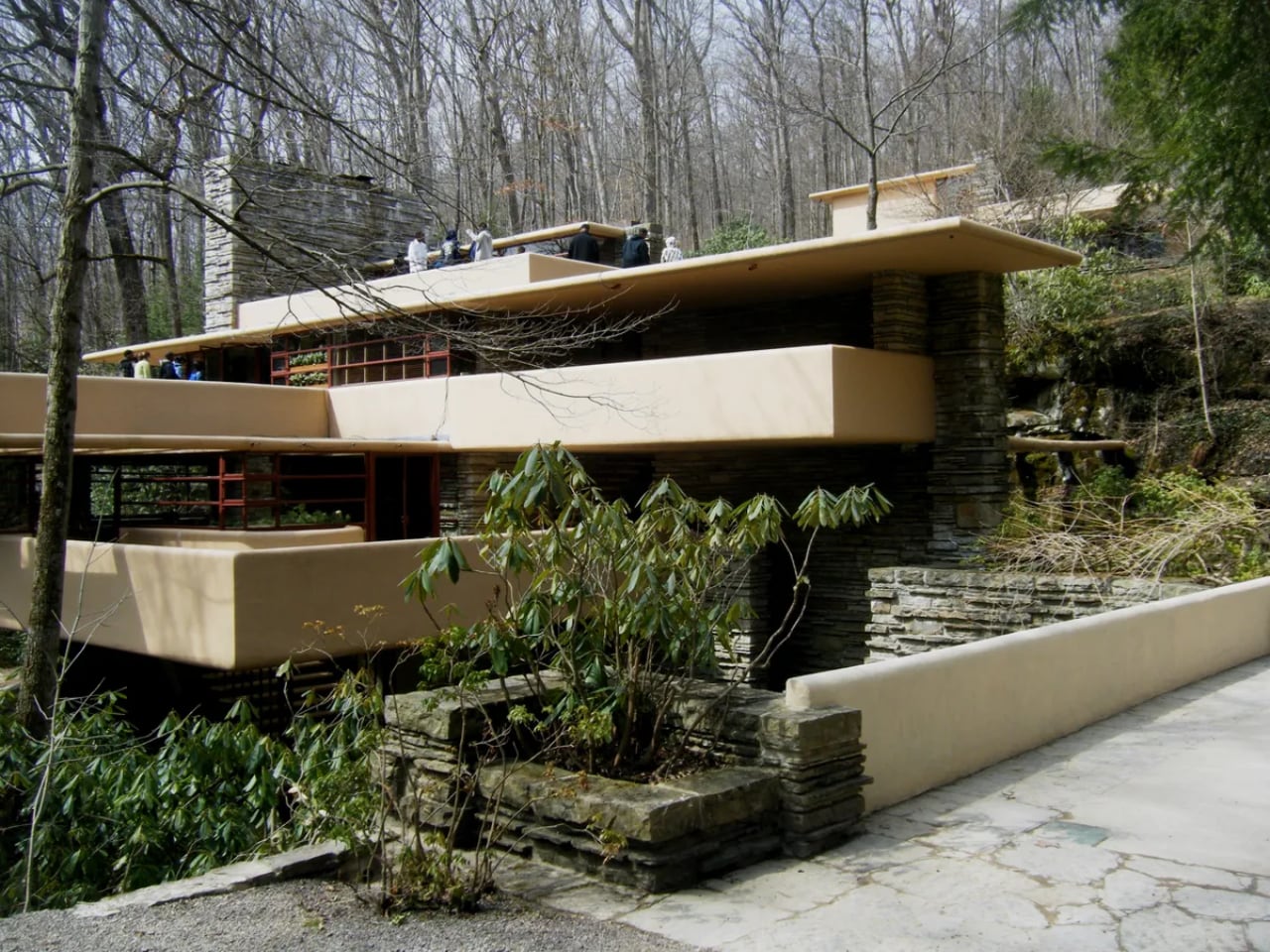
When Edgar and Liliane Kaufmann commissioned Wright to design their Pennsylvania weekend retreat, they expected a house with a view of their favorite waterfall. Wright had other ideas. He placed the entire structure directly above Bear Run’s cascading waters, explaining simply: “I want you to live with the waterfall, not to look at it.”

Concrete terraces cantilever dramatically beyond their supports, mimicking the natural rock ledges of the stream below. Locally quarried Pottsville sandstone anchors the vertical elements to bedrock, while floor-to-ceiling glass in continuous bands eliminates traditional corners entirely.

A suspended staircase descends from the living room directly to the stream, inviting residents to move freely between architecture and nature. Wright even incorporated the original picnic boulder into the design, making it the hearth of the living room fireplace.

The exterior color came from an unexpected source. Wright selected an ocher shade after finding a dried rhododendron leaf on site during construction. Low ceilings create his signature compression effect before releasing into larger spaces, making the modest square footage feel both intimate and expansive.

Taliesin West: The Desert Masterwork

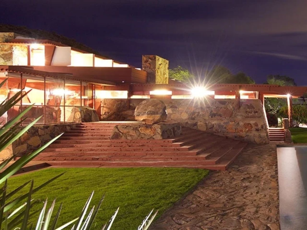
Wright established his winter home and architectural laboratory in the Sonoran Desert, building almost entirely by hand with his apprentice community. They developed a unique desert masonry technique, setting local boulders and sand into concrete forms to create walls that appear to grow from the Arizona landscape itself. The complex became far more than a residence.

Wright’s private quarters feature a distinctive triangular prow, while the sprawling campus includes a drafting studio, board room, music pavilion, and cabaret theater. The cabaret theater is considered one of Wright’s most accomplished interior spaces. Canvas roofs originally filtered desert light into ever-changing patterns throughout the day, though later replaced with more permanent materials. Wright treated Taliesin West as a living experiment, continuously revising and rebuilding sections each winter until his death.

He even stayed here while overseeing construction of the Guggenheim Museum in Manhattan, and the greenhouse still features scalloped glass windows left over from that famous project.

Ennis House: Hollywood’s Mayan Temple

Charles and Mabel Ennis wanted something extraordinary on their Los Angeles hillside, and Wright delivered his largest textile block experiment. Thousands of patterned concrete blocks rise in stepped terraces like a Mayan ziggurat, each one featuring intricate geometric patterns inspired by Puuc architecture from Uxmal, Mexico. Wright’s revolutionary textile block system wove steel reinforcement through cavities between blocks like threads on a loom, creating both structure and ornament simultaneously.

A loggia runs the length of the house with pairs of textile-block columns, while inside, a bronze hood fireplace features Maya motifs and the only surviving gilded glass-tile mosaic Wright created for his residential work. The fortress-like presence and exotic aesthetic made it a Hollywood favorite.

Blade Runner immortalized the dramatic spaces, using them to create a vision of dystopian futures that somehow felt ancient and advanced simultaneously.

Toy Hill: The Circular Experiment

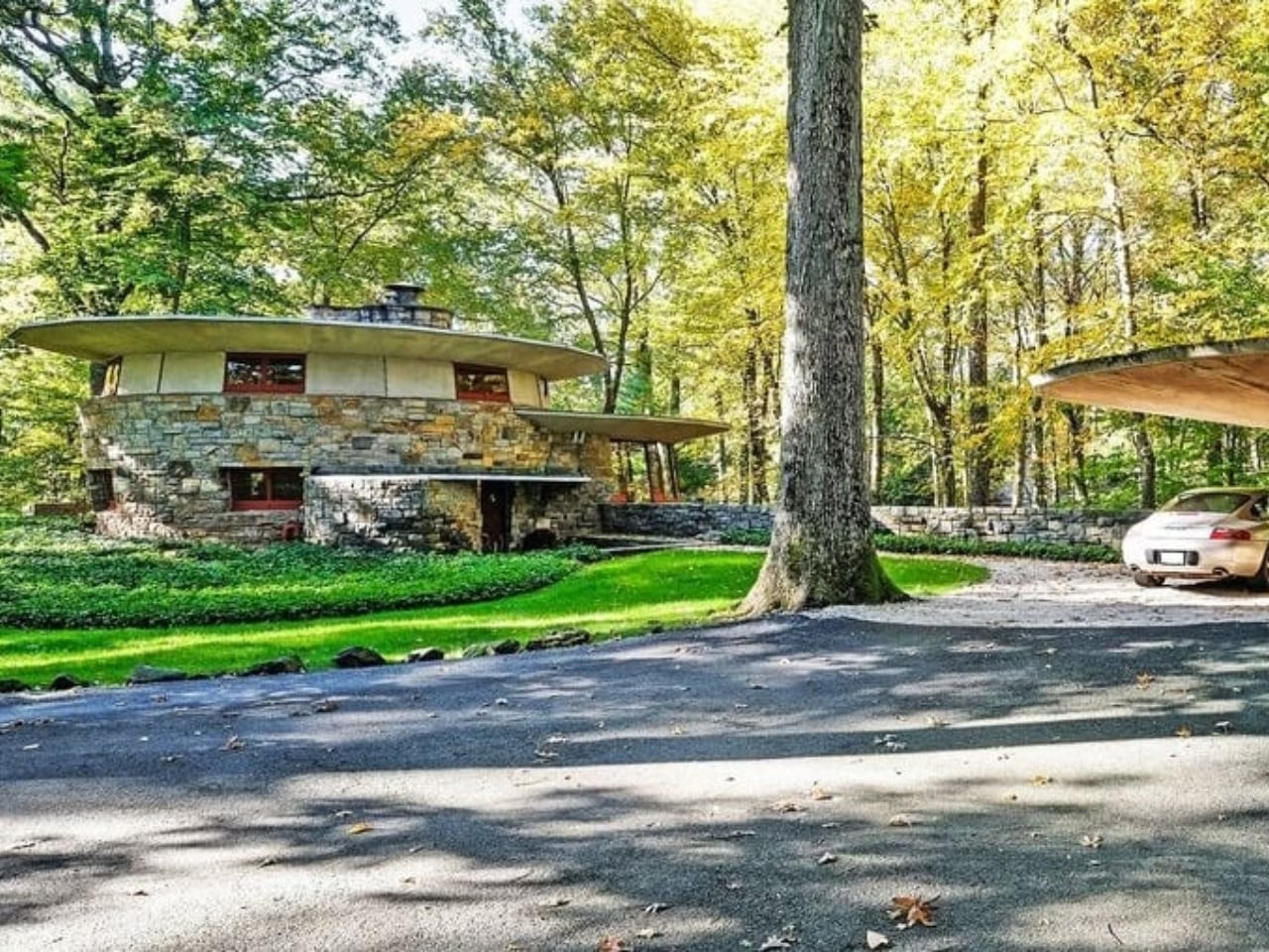
Sol Friedman, a toy maker seeking a home north of Manhattan, became the client for one of Wright’s most playful geometric experiments. Two intersecting polygons form the main structure, with every element (walls, furniture, even the bedrooms) following strict circular discipline. Radial lines divide the floor into precise geometric sections extending from floor to ceiling.

Built-in furniture incorporates this geometry into every detail, creating what Wright called “pizza slice” bed arrangements with trapezoidal sleeping spaces. Stone walls tilt inward rather than standing vertical, requiring custom cabinetry with irregular drawer shapes. A mushroom-shaped carport supported by a single concrete pillar demonstrates Wright’s structural daring.

Despite the modest budget typical of his Usonian housing vision, the home achieves extraordinary character through geometric innovation and locally sourced materials.

Tirranna: The Guggenheim’s Residential Echo

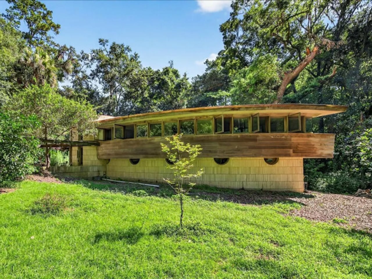
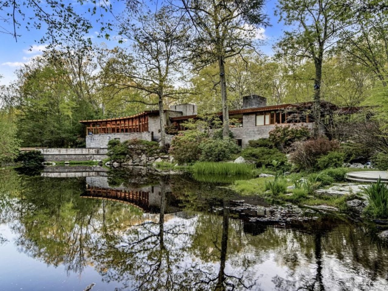
John and Joyce Rayward commissioned one of Wright’s largest residential projects on their Connecticut estate, which they named using an Aboriginal Australian word meaning “running waters.” The horseshoe design mirrors Wright’s famous Fallingwater in both name and philosophy, positioned near the property’s natural waterfall and pond. Wright worked on Tirranna while simultaneously designing the Guggenheim Museum, and the home became a residential expression of that spiral aesthetic.

Photo: UdorPhotography

Philippine mahogany paneling throughout creates warm interiors, while Cherokee red Colorundum concrete floors provide Wright’s signature accent color. The couple later requested an observatory addition above the master bedroom, and the wine cellar occupies what was originally designed as a bomb shelter. Renowned horticulturist Frank Okamura, credited with reviving the bonsai tradition in America through his Brooklyn Botanic Garden work, transformed the grounds into spectacular gardens.

Landscape architect Charles Middeleer also contributed to the expansive estate design.

Circular Sun House: Wright’s Final Vision

The Norman Lykes House carries profound significance as the last residence Wright designed before his death in the late fifties. His devoted apprentice John Rattenbury completed construction years later, then returned decades after that for extensive renovation that transformed the original design into the luxury residence that exists today.

Wright positioned the home on a Phoenix hillside overlooking Palm Canyon, boldly facing downtown Phoenix rather than turning inward like his other desert houses. Overlapping concentric circles create flowing spaces without traditional hallways, while rose-tinted concrete and steel casement windows frame dramatic valley views. The crescent-shaped pool surrounded by mother-of-pearl tile creates an outdoor space as sculptural as the architecture.

Half-moon lunette windows across the facade and circular cutouts in the courtyard parapet reinforce the geometric theme throughout. Italian rose marble adorns the master bathroom, while Philippine mahogany walls and slate floors create interiors that feel simultaneously ancient and futuristic.

Unity Temple: The First Modern Building

After lightning destroyed Oak Park’s original wood-framed Unitarian church, Wright proposed something revolutionary: a house of worship built entirely from poured-in-place reinforced concrete. Wright himself was a lifelong Unitarian whose uncle served as a distinguished minister. The material was unprecedented for religious architecture.

Wright asked, “Why then the steeple of the little white church? Why point to heaven?” Instead, he built what he called “a temple to man, appropriate to his uses as a meeting place.” The inscription above the entrance declares: “For the worship of God and the service of man.”

The perfect square sanctuary embodies unity, with everyone seated close to the pulpit. Amber-tinted leaded glass skylights flood the space with warm, natural light.

Wright’s compression and release sequence takes visitors through low, dark entry passages before ascending into the bright, soaring sanctuary. Many historians consider this spatial experience the birth of modern architecture.

Wright Home and Studio: Where It All Began

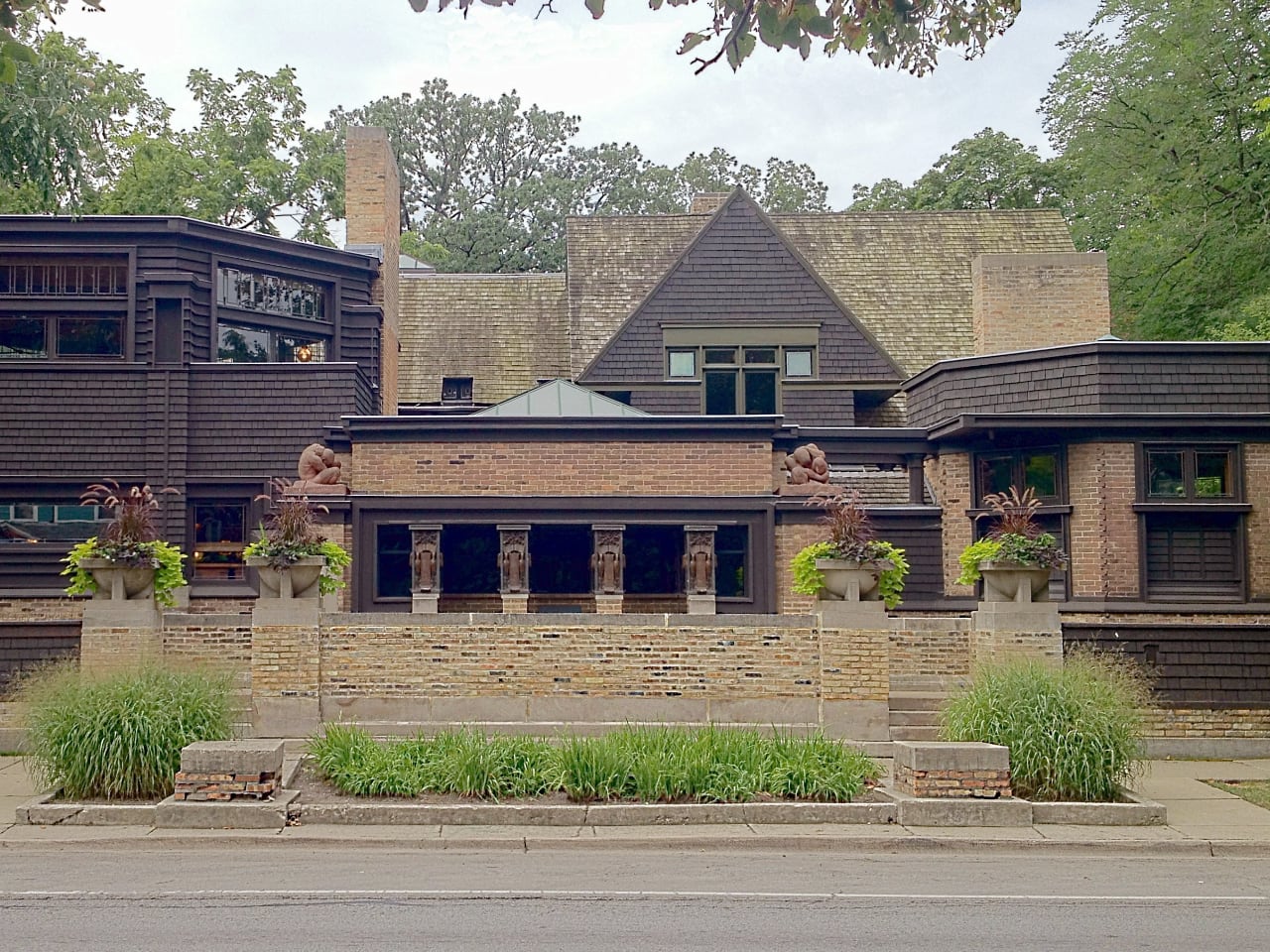
Wright’s Oak Park home served as his personal laboratory and the birthplace of Prairie School architecture. The building evolved continuously as his family grew and his practice flourished, with hundreds of projects taking shape in these spaces over two decades. The playroom addition revolutionized thinking about children’s spaces.

A high barrel-vaulted ceiling with skylight, windows positioned at child height, a built-in piano, and an enormous Arabian Nights mural created an environment specifically designed to nurture young imagination. Wright believed spaces profoundly impact child development and designed accordingly. The studio addition marked Wright’s architectural maturation.

An octagonal library provides unique geometry and natural light, while the drafting room features a balcony suspended by chains from above. This creates a dramatic structural statement. Even the entry sequence shows Wright’s emerging genius, with visitors ascending an elevated terrace before passing through a low covered loggia.

The columns appear to be cast iron but are actually painted plaster, demonstrating Wright’s early experiments with material illusion.

Organic Architecture Philosophy

These homes document Wright’s seven-decade evolution from Victorian-influenced beginnings to radical geometric experiments. His organic architecture unified every project through consistent principles: buildings should grow from their landscape using natural materials, spaces should flow freely rather than being compartmentalized, and every detail must integrate into the total design.

Wright pioneered techniques that transformed American residential architecture. These include cantilevered construction, open floor plans, built-in furniture, radiant floor heating, carports, and corner windows.

His influence shaped California Modernism, mid-century modern design, and contemporary sustainable architecture. Millions have toured these homes since they opened as museums and historic sites. Wright’s vision continues teaching new generations that architecture can enhance human life by connecting us more deeply to nature, to beauty, and to each other.

The post A Documentary Journey Through Frank Lloyd Wright’s Revolutionary Architecture first appeared on Yanko Design.
Honda’s EV Outlier Concept Looks Like It Was Poured From Liquid Chrome

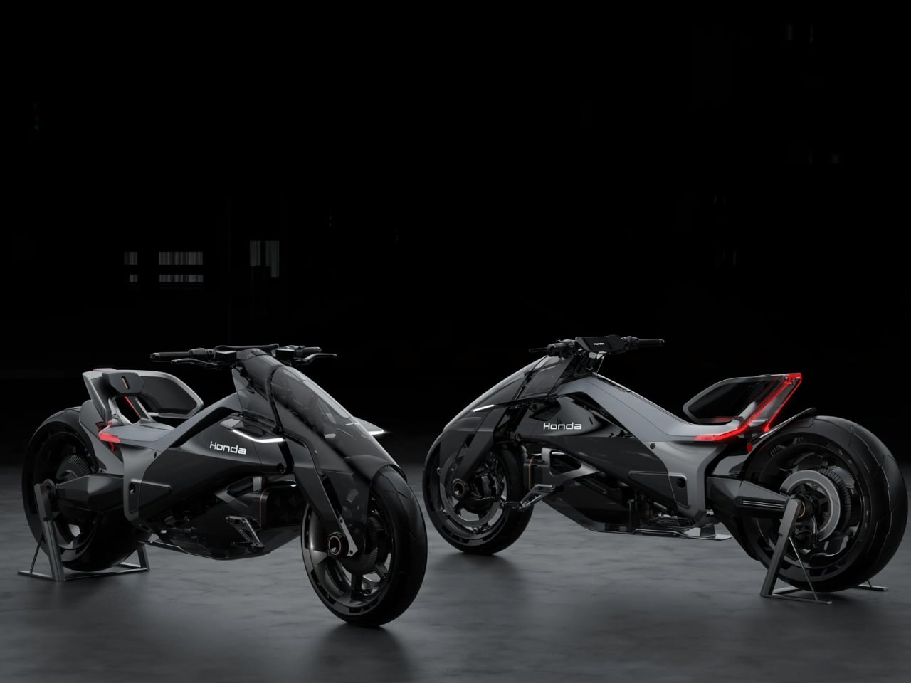
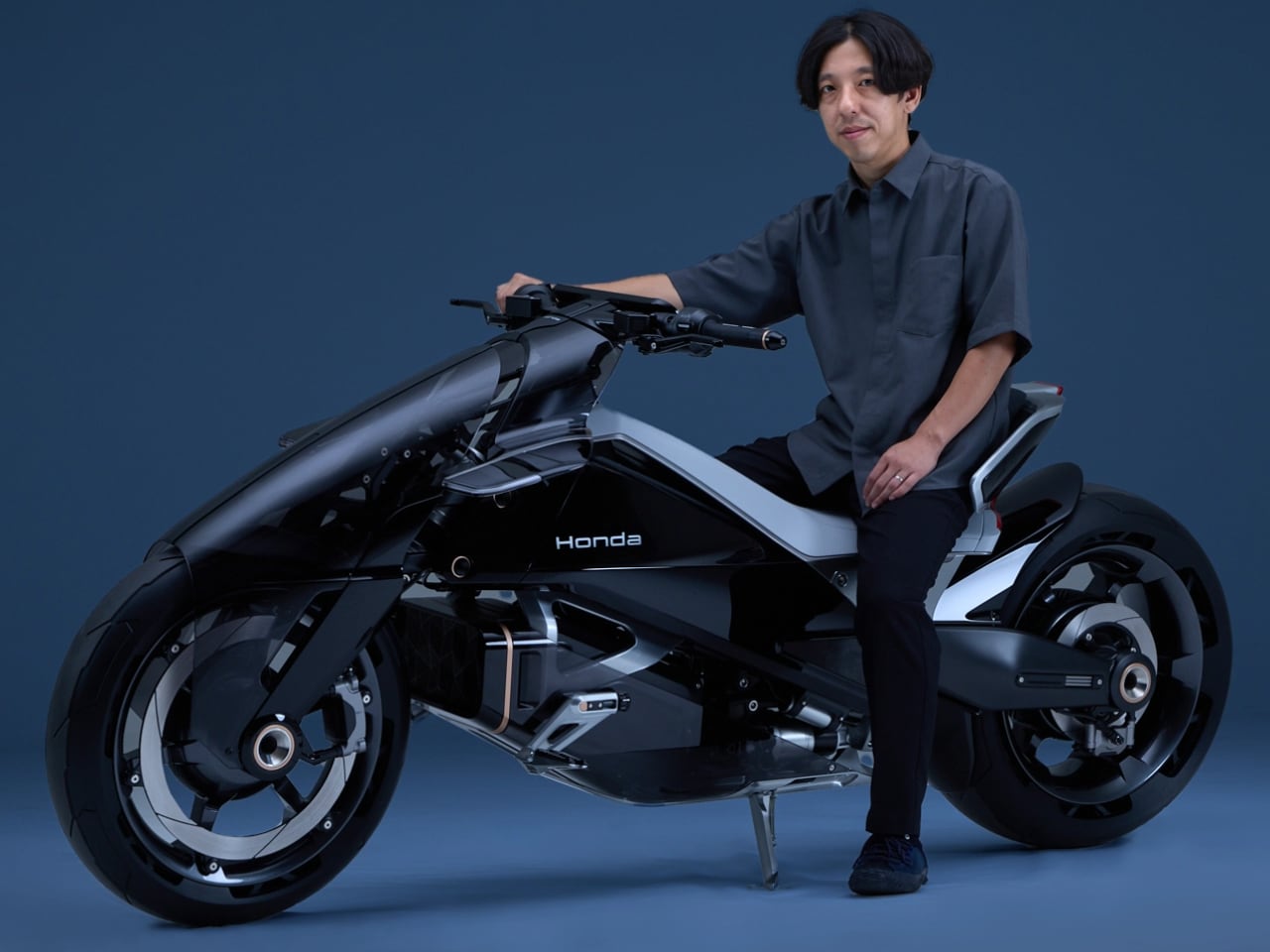
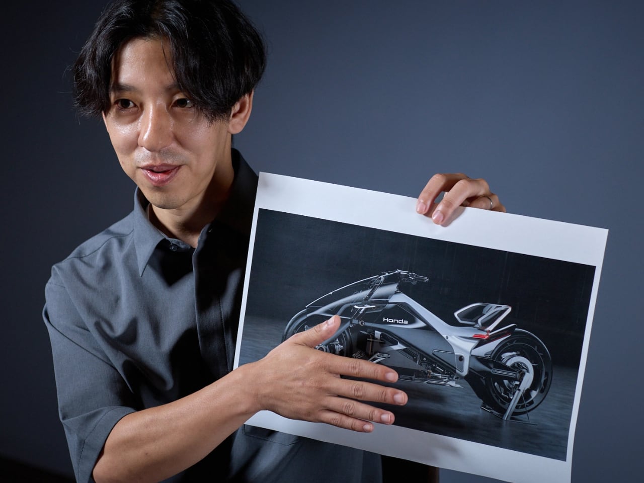
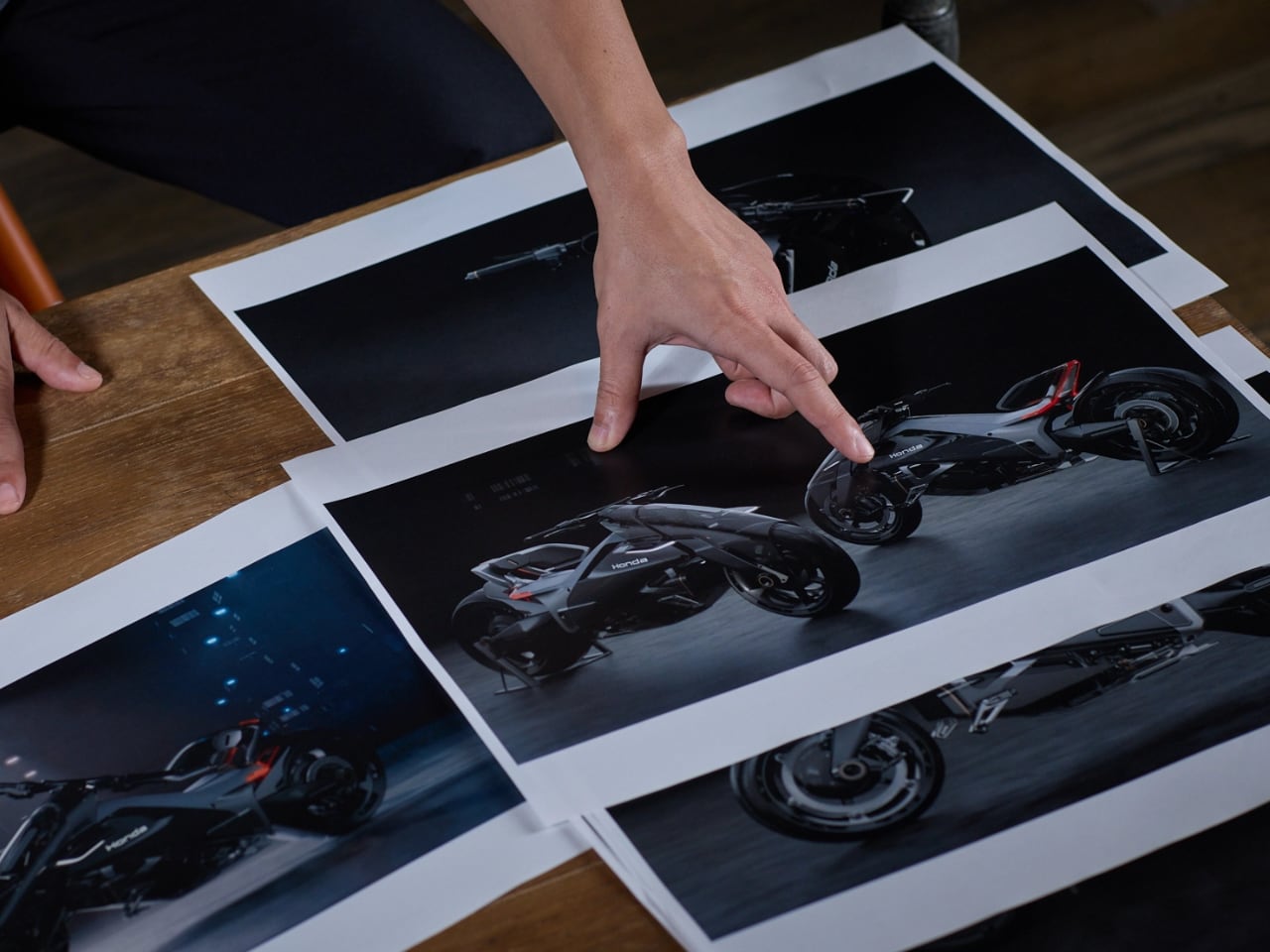
At the 2025 Japan Mobility Show, Honda unveiled something that makes every other electric motorcycle look like it’s wearing a costume. The EV Outlier Concept reimagines what happens when you stop thinking about motorcycles as machines you sit on top of, and start thinking about them as machines you become part of.

Designer: Yuya Tsutsumi

Designer Yuya Tsutsumi built the Outlier around what Honda calls “Gliding and Ecstasy” – two contrasting riding sensations that could only exist in an electric motorcycle. “Gliding represents a riding feel with a sense of gliding, leveraging the uniquely smooth power delivery and quietness of an EV,” Tsutsumi explains. “Ecstasy is an emotional riding sensation resulting from the instant responsiveness, acceleration, and immense torque only possible with motor drive.”

These opposing experiences, combined with the ultra-low riding position, form the three pillars driving every design decision on this bike.

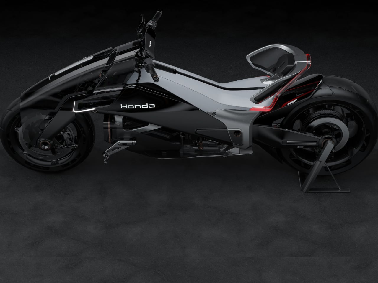
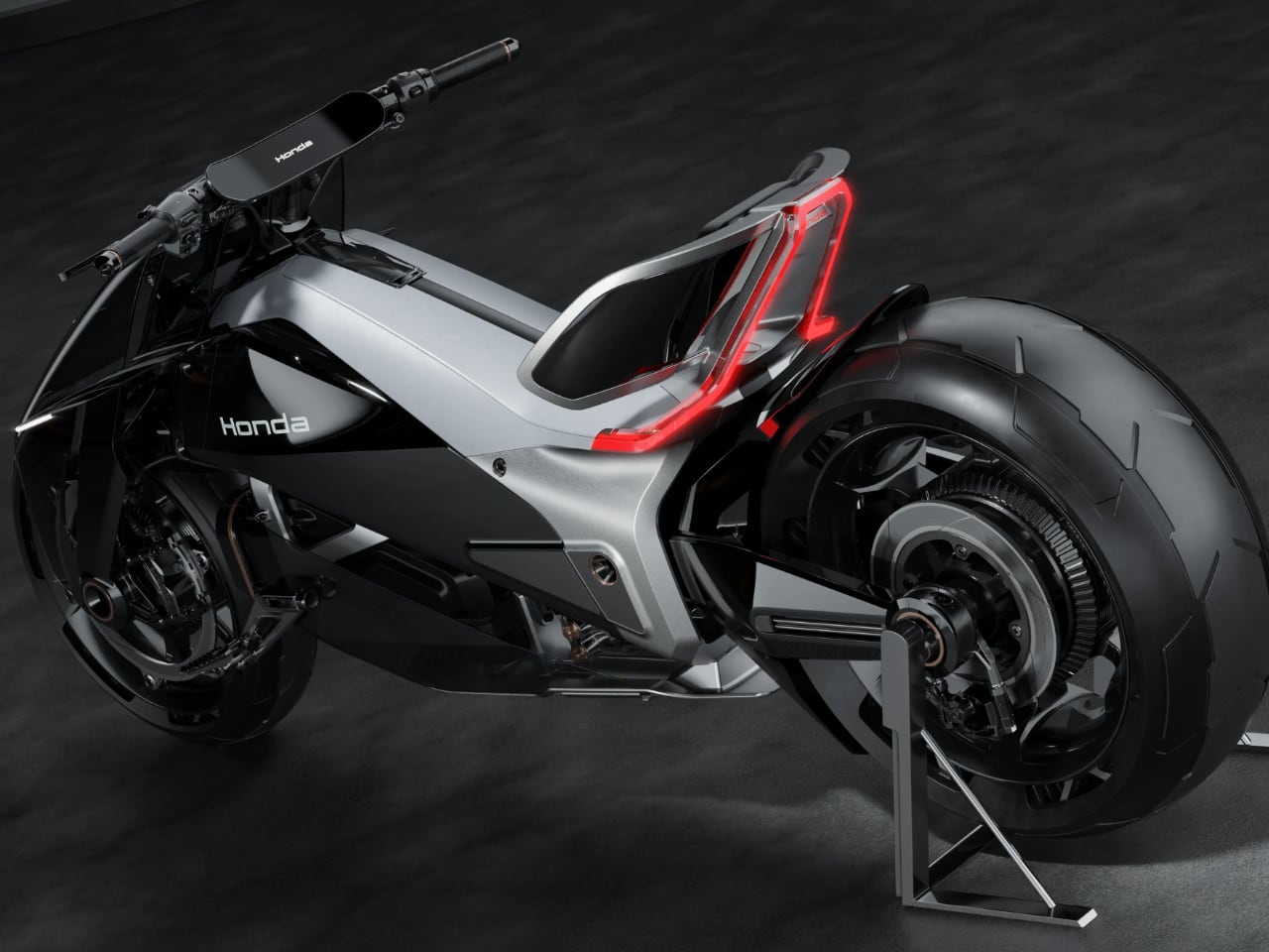
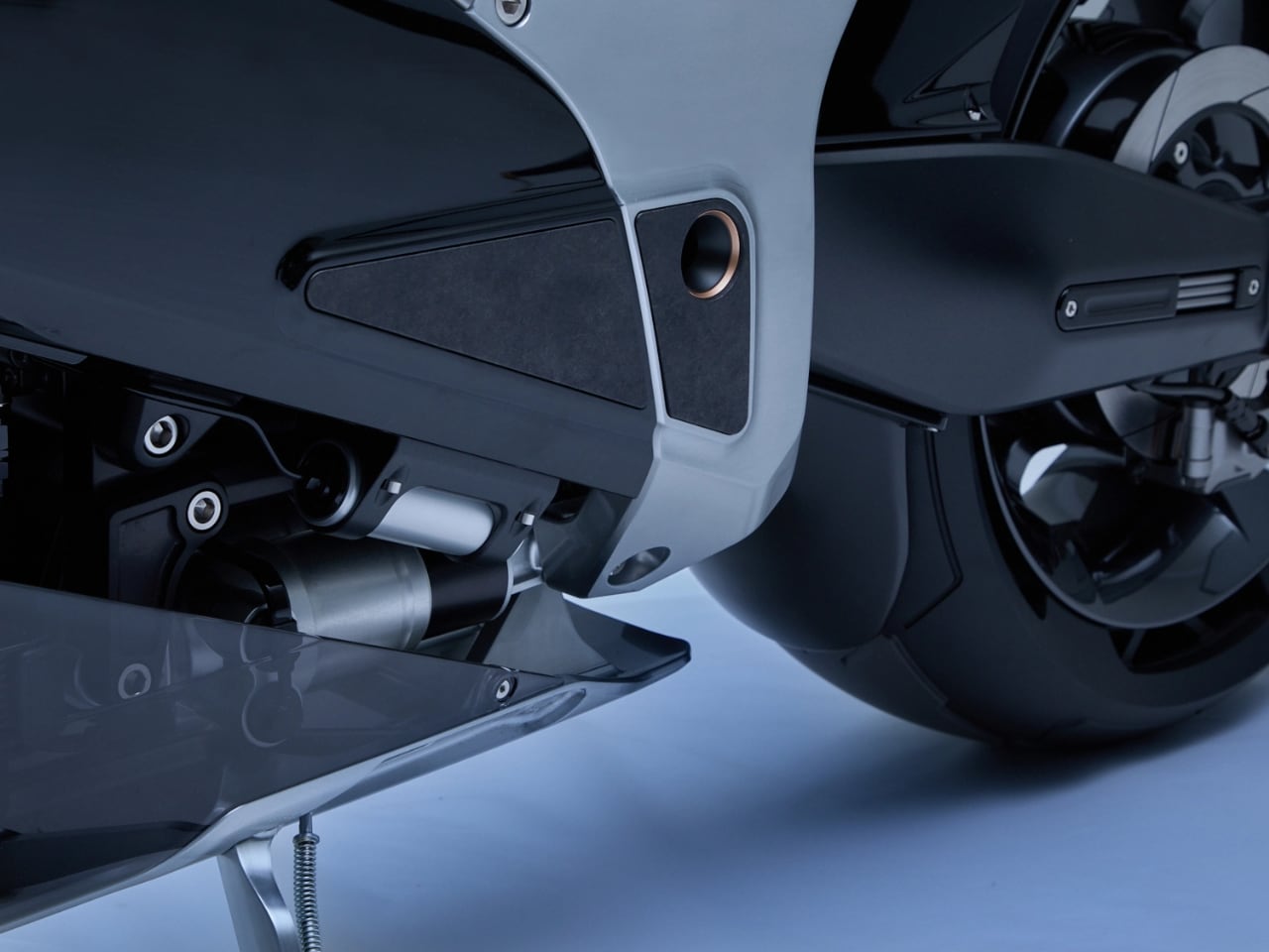
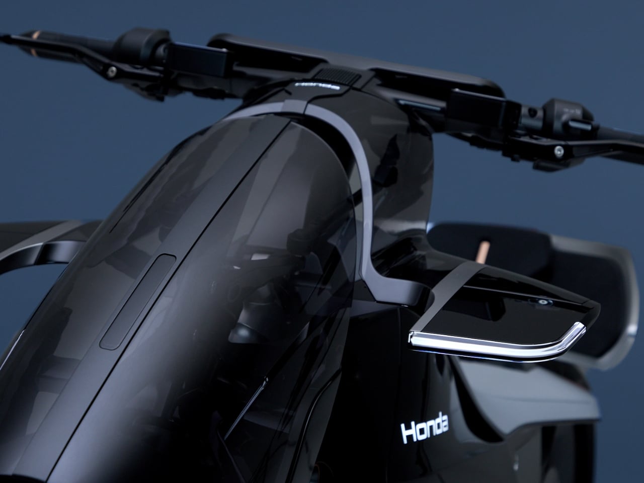
Tsutsumi calls it “Precision of Intrinsic Design.” Strip away the philosophy speak and here’s what that means: every curve exists because of what’s underneath. The battery sits in the center, visible through smoked transparent panels. Electronic components separate with surgical clarity. Nothing hides. Everything reveals itself.

This transparency invites you to understand how electric motorcycles actually work. You see the battery. You see where components live. You understand the architecture at a glance. When you can see how something works, you develop a different relationship with it. The engineering becomes part of the experience instead of something hidden behind plastic fairings.

Form That Flows Instead of Attacks

Most motorcycles have faces that glare at you. Sharp angles. Predatory headlight eyes. The traditional motorcycle front end declares dominance over the road.

It’s aggressive design language inherited from decades of combustion engine packaging requirements that no longer exist. The Outlier rejects all of that.

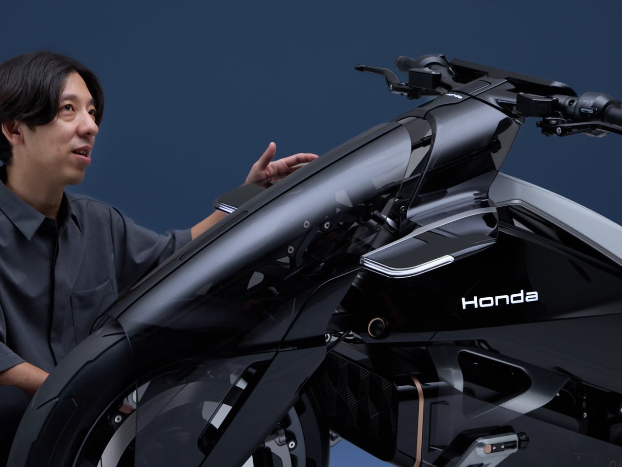
The flowing hood curves over the front like liquid metal frozen mid-pour. It hovers. It glides. Look at how it catches light in those product shots and you’ll see what I mean: this bike looks less like it wants to attack the road and more like it wants to dance across it. The answer is this flowing, organic form that feels more alive than mechanical.

The lightweight mix of metal and plastic creates a structure that looks simultaneously solid and ethereal. Substantial but not heavy. Technical but not cold. The frame uses metal for structural integrity. Body panels use plastic for flexibility and those transparent sections. Everything gets optimized for its specific purpose, creating a bike that feels more like sculpture than machinery.

The smoked transparent panels serve a dual purpose: they create that ethereal aesthetic while letting you see exactly how the bike is constructed. You understand the architecture at a glance. The battery placement. The component separation. The structural logic.

This visual honesty creates a different relationship with the machine.

The Seated Experience Changes Everything

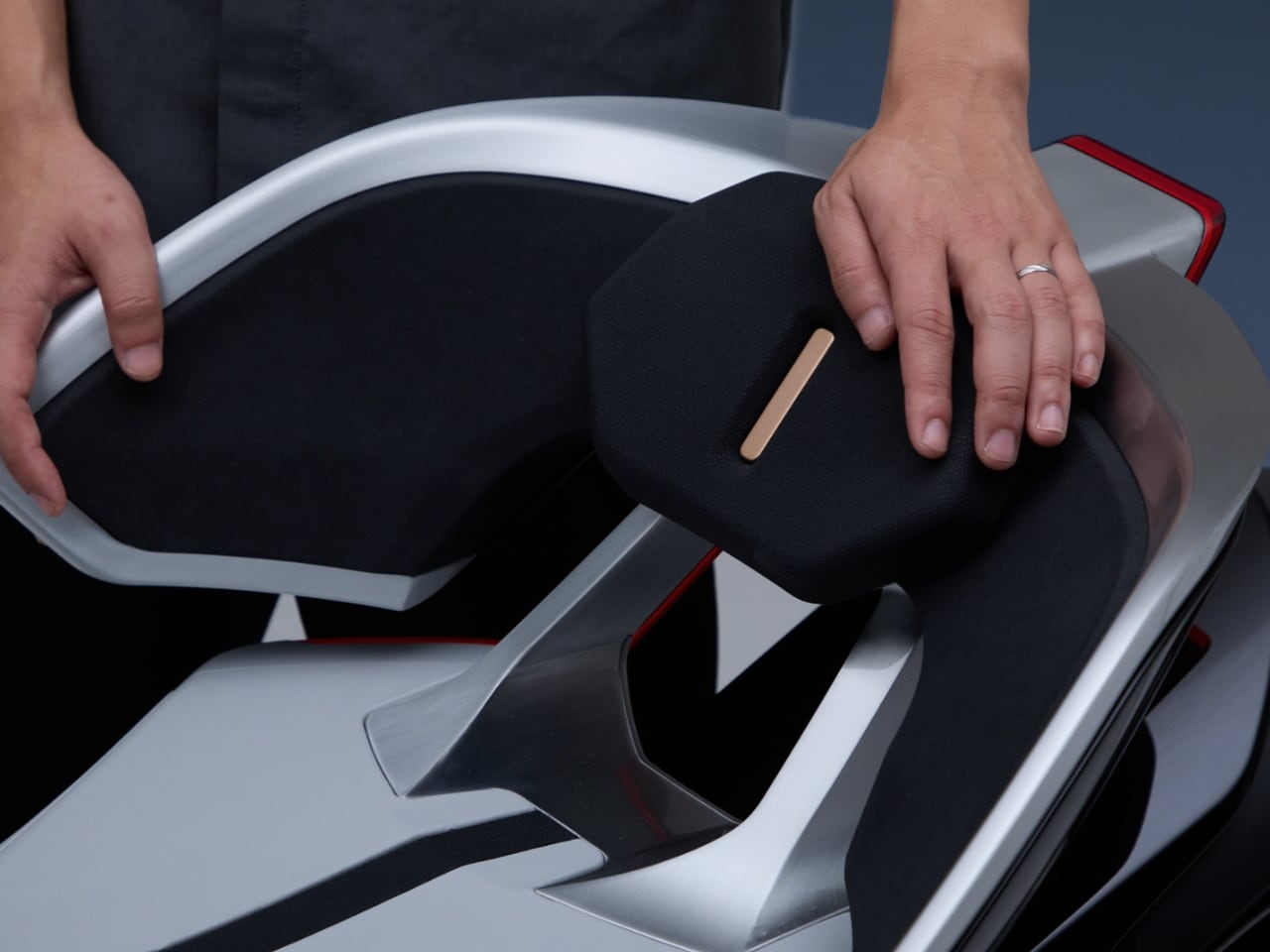
The bucket-style seat merges with what used to be the engine panel, dropping the rider remarkably low. But Honda engineered this backrest for more than comfort.

“This backrest not only absorbs the massive acceleration of the motor drive but also enables a new handling sensation where the rider pivots through corners using their hips as an axis,” Tsutsumi notes.

You’re not just sitting lower – you’re controlling the bike through an entirely different kinematic relationship. It delivers a riding sensation unlike any existing motorcycle, evoking both surprise and excitement. The horizontal suspension system enables this ultra-low positioning while maintaining full travel and control. A singular frame connects the front assembly to the seat, eliminating unnecessary structure.

You sit closer to the pavement. Your center of gravity drops. The bike feels planted and stable without sacrificing agility.

Most motorcycles compromise: you either get low and sacrifice suspension performance, or you get proper suspension and sit higher. The Outlier’s engineering eliminates that compromise entirely.

When your seating position drops this low, the visual experience changes. The horizon line shifts. Objects approach differently. Your peripheral vision processes motion at new angles. These aren’t subtle changes. They fundamentally alter how riding feels, turning every corner into a new sensory experience and every straightaway into a different relationship with velocity.

In-Wheel Motors Rewrite the Physics

The motors live inside the wheels themselves.

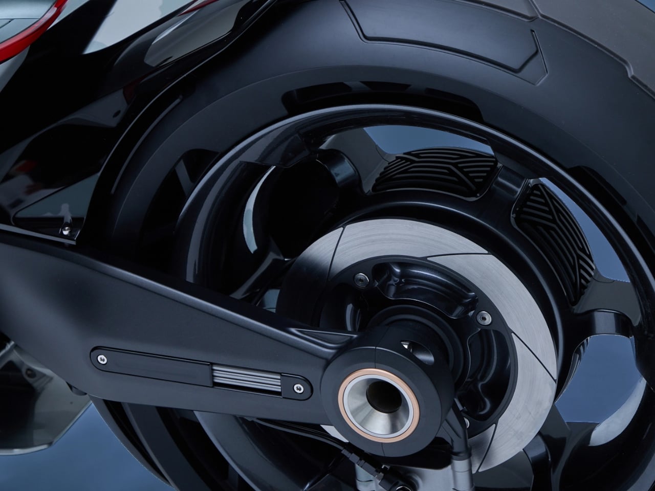
Front and rear, the power delivery happens at the contact patch instead of transferring through chains, belts, or shafts. This fundamental architecture change eliminates mechanical loss between power source and road contact. Every watt generated goes directly to moving you forward. Independent control of front and rear torque delivery enables handling dynamics impossible with traditional powertrains.

The system can redistribute power between wheels in real time based on traction, lean angle, and rider input. You get the kind of intelligent power delivery that would require impossibly complex mechanical systems on a traditional bike. Here, it’s just software controlling two motors.

Clearing the entire center section of the bike opens up possibilities beyond just battery placement. That centrally-located battery pack creates ideal weight distribution without compromising ground clearance or aesthetics. The modular body components break apart for maintenance and upgrades. Want to upgrade the battery pack when better cells become available? The modular design accommodates that. Need to service or replace a motor? Pull the wheel assembly.

Honda designed this as a platform for flexible development, not a static concept frozen in show car amber. Honda is testing ideas that could fundamentally change how production electric motorcycles get designed, maintained, and upgraded over their lifespans.

The Digital Interface Eliminates Physical Compromises

Traditional motorcycle mirrors stick out like ears. They catch wind. They vibrate. They show you a blurry approximation of what’s behind you.

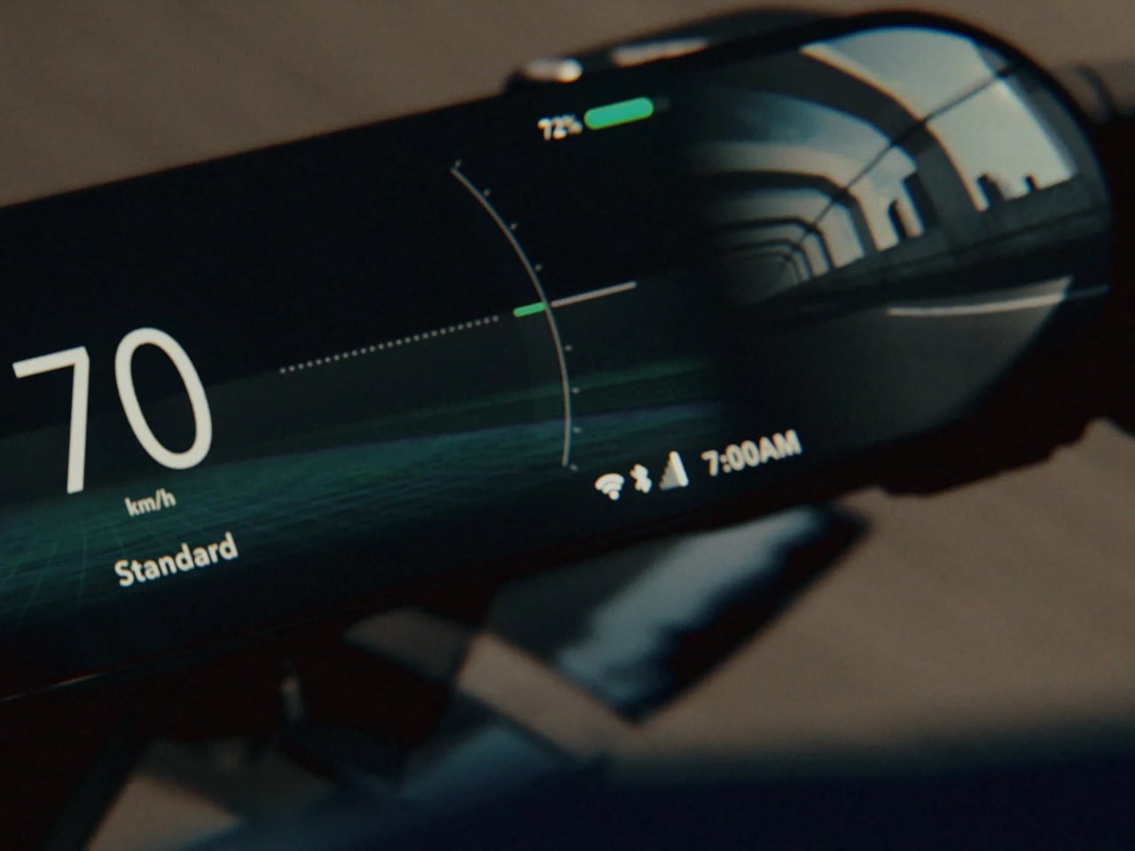
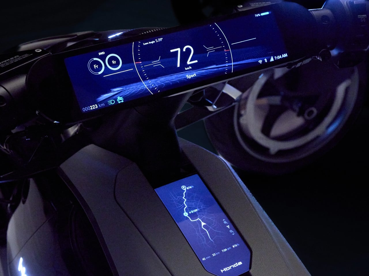
The Outlier uses cameras instead, feeding two digital displays with more information than mirrors could ever provide. That thin, wide digital meter replaces side mirrors entirely. The main screen shows speed and essential data. The sub-screen tracks torque delivery, weight balance, and real-time power distribution between front and rear motors.

When you switch riding modes, the lower display shows real-time changes in the drive status and output characteristics of the front and rear motors, letting you experience the distinctive character of electric propulsion. The GUI displays lean angle in real time, shows front and rear wheel movement based on road conditions, and adjusts torque distribution accordingly.

Honda envisions this connecting to riders’ personal data, adapting control systems to individual skill levels and even suggesting destinations based on your schedule and preferences. It’s ambient intelligence applied to motorcycle riding.

The system shows you how the bike thinks and responds to your inputs. You see the torque split. You see the weight transfer. You understand what the machine is doing in real time.

This represents the shift from mechanical feedback to digital augmentation. Traditional motorcycles communicate through vibration, sound, and physical sensation. Electric motorcycles eliminate most of that analog feedback. The Outlier replaces it with visual information that gives you even more insight into what’s happening.

Some riders will hate this. Others will embrace it as evolution.

But you can’t argue with the data density: those screens tell you more about the bike’s behavior than any traditional instrument cluster ever could. The camera feeds provide clearer rear vision than mirrors, especially in rain or at night when traditional mirrors become nearly useless.

The digital meter displays adapt to riding conditions. Bright sunlight triggers high-contrast modes. Night riding shifts to subdued displays that don’t destroy your vision. Track mode emphasizes performance data. City mode prioritizes navigation and traffic awareness. The interface learns from your riding patterns and surfaces relevant information based on context. This kind of intelligent adaptation would be impossible with mechanical instruments.

What This Actually Means

Honda isn’t putting this into production tomorrow.

The EV Outlier serves as a testbed to explore ideas that might show up in future production models. In-wheel motors. Transparent body panels. Ultra-low seating positions. Camera-based vision systems. Modular construction for easy updates. Some of these ideas will make it to showroom floors. Others will evolve into different solutions.

The concept exists to question what becomes possible when you stop trying to make electric motorcycles look and feel like traditional motorcycles.

Most electric motorcycles take existing designs and adapt them for electric powertrains. They preserve the visual language of combustion engines even when those visual cues no longer correspond to physical requirements. You get bikes with fake tanks covering batteries and motors positioned where engines used to live, even though that placement no longer serves any functional purpose.

Honda took a different approach: what if we designed an electric motorcycle from first principles?

Tsutsumi acknowledges the challenge: “For ICE models, there has long been an established theory of beautiful proportions backed by years of motorcycle design experience. The EV Outlier Concept deliberately breaks away from that convention.”

Breaking those proportions wasn’t reckless experimentation – it was necessary to make the unique characteristics of an EV more appealing. The team repeatedly verified the balance of wheelbase and height, exploring new proportions that make electric advantages visible and visceral.

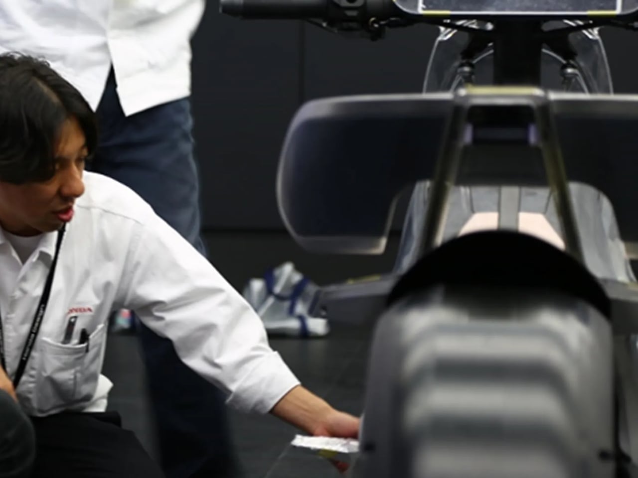
The design process itself reflects this willingness to break conventions. “This project involved not only motorcycle designers in Japan, but also designers from the Power Products division and overseas design members,” Tsutsumi explains. “Centering on the theme ‘What value can only be realized through electrification?’, we thoroughly embraced a Waigaya approach, freely exchanging opinions.”

That cross-functional collaboration – bringing together motorcycle designers, power products engineers, and international perspectives – created a development process unlike typical mass production cycles.

What would it look like if we let the technology dictate the form instead of forcing new technology into old shapes?

The answer flows and curves and reveals its inner workings through transparent panels. It sits low and positions the rider closer to the sensation of speed. It eliminates traditional components like mirrors and visible motors in favor of integrated cameras and in-wheel power delivery.

Whether you love this design or hate it, you can’t ignore what it represents.

Honda is asking what motorcycles become when you stop making them look like motorcycles. That willingness to start fresh, to build from first principles rather than adapt old templates, is what makes the Outlier concept genuinely significant beyond its show car aesthetics.

The post Honda’s EV Outlier Concept Looks Like It Was Poured From Liquid Chrome first appeared on Yanko Design.
Louis Erard Brings Astro Boy to Swiss Watchmaking

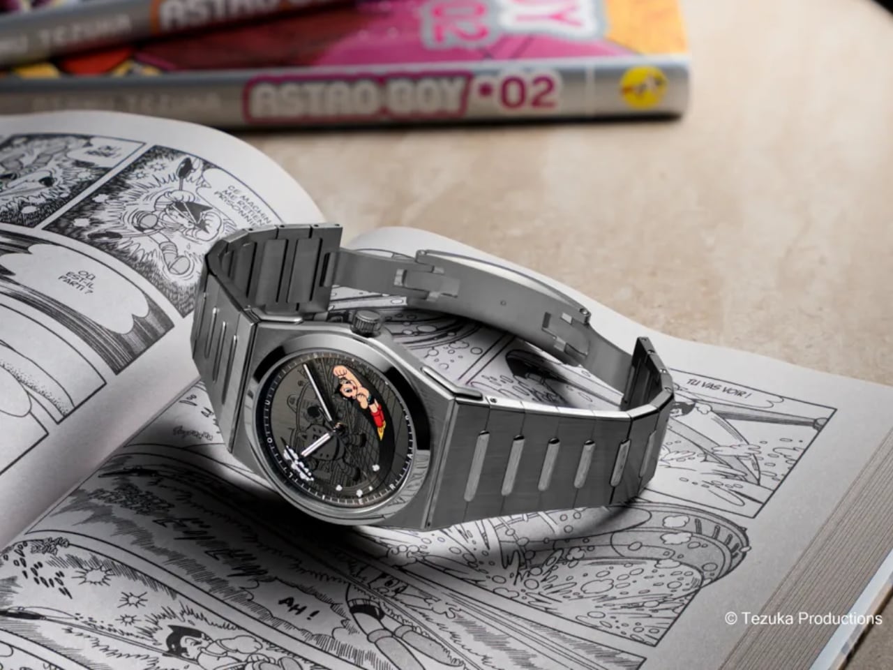
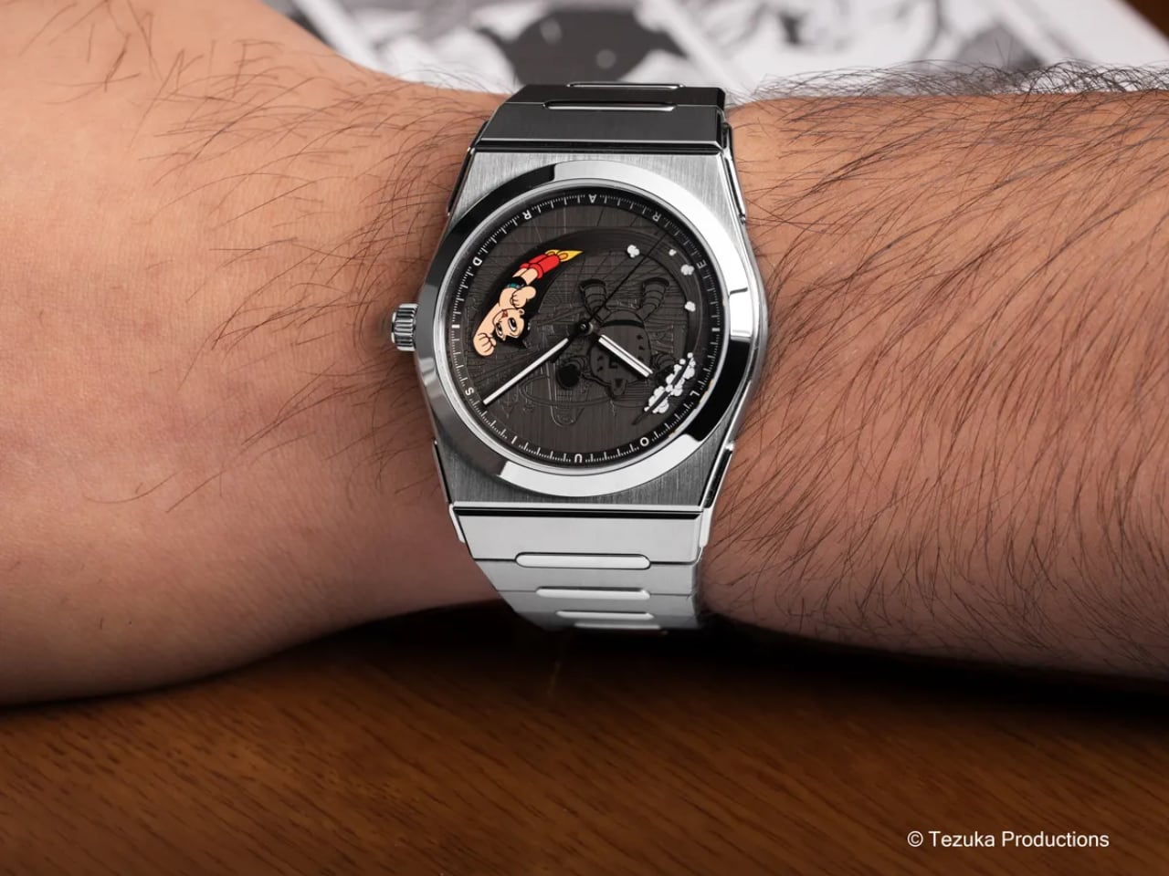
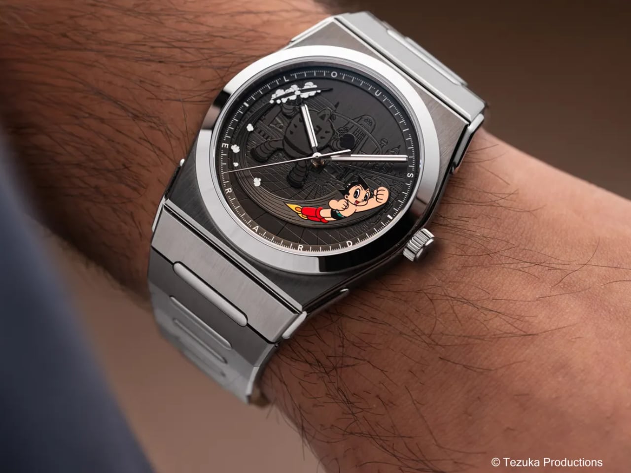
Manuel Emch still remembers rushing home from school to catch the latest Astro Boy episode. That childhood ritual, shared by millions across generations, now finds its way onto your wrist through Louis Erard’s latest collaboration with Tezuka Productions. This isn’t just another licensed character watch. It’s a thoughtful exploration of how nostalgia, craftsmanship, and cultural heritage can coexist on a 40mm canvas.

Designer: Louis Erard x Tezuka Productions

The Dial: Layered Storytelling in Metal and Color

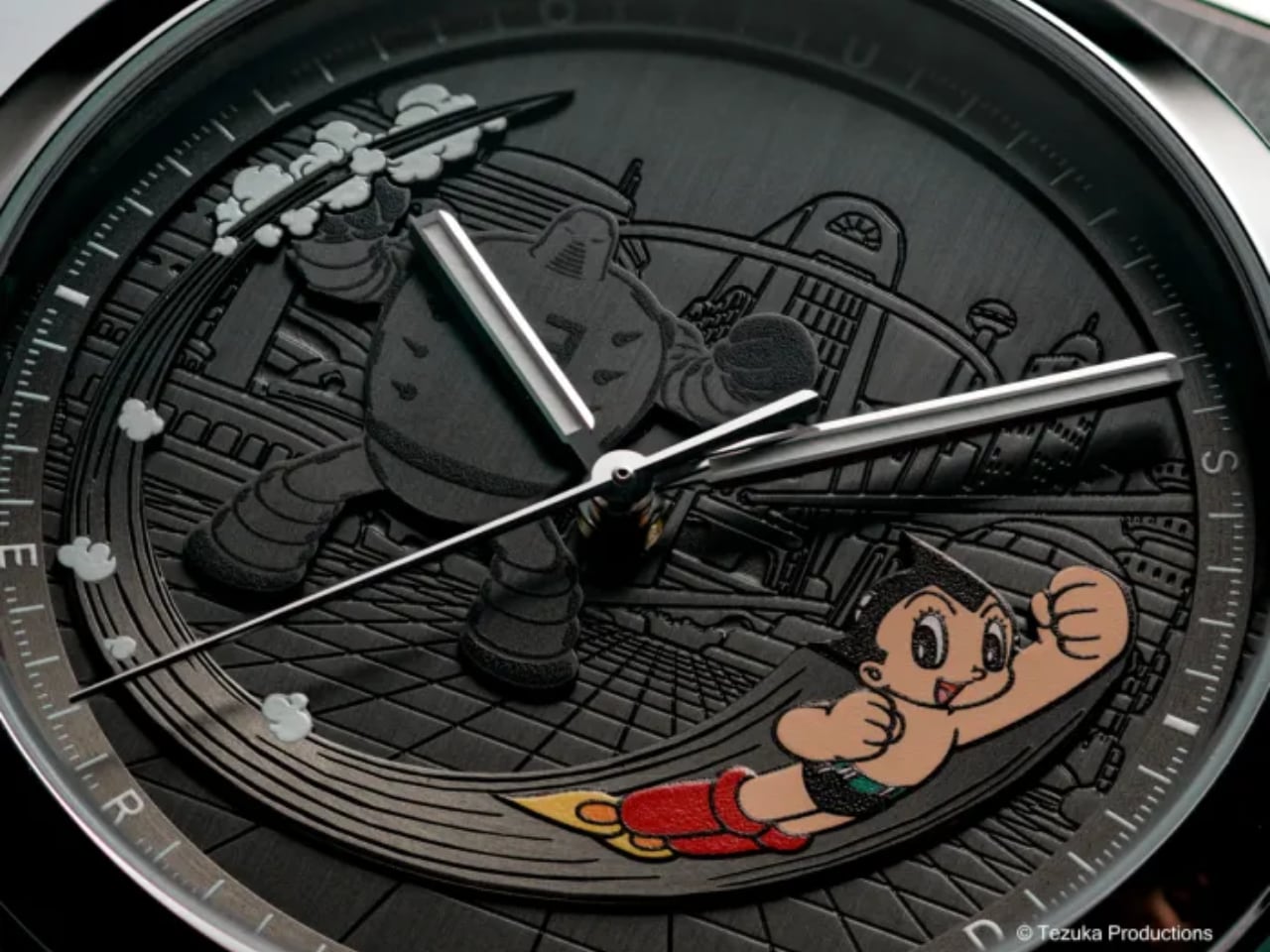
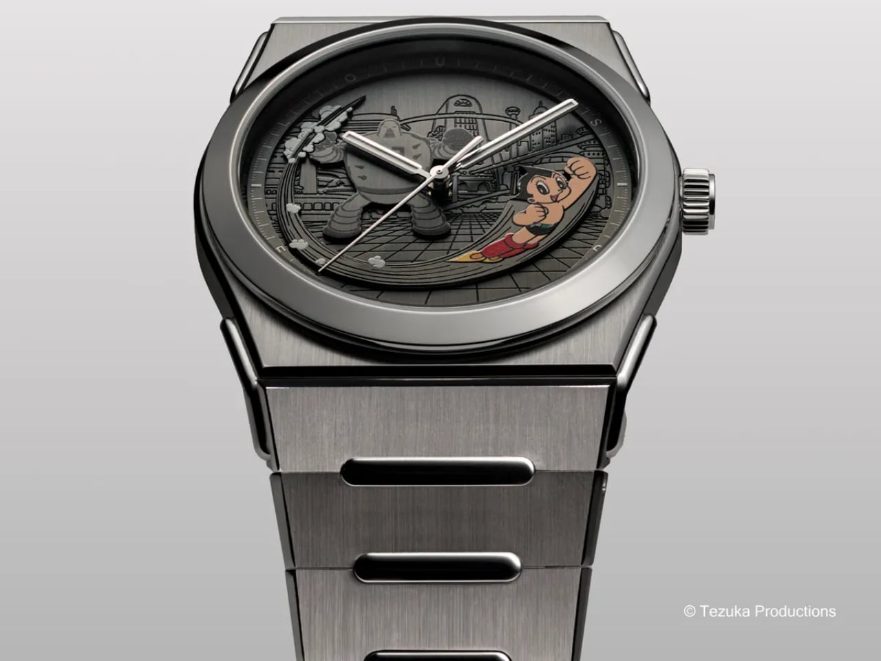
The dial construction here deserves your attention. Louis Erard didn’t simply print Astro Boy’s image and call it done. Instead, the brand created a multi-layered stage where each element exists in three-dimensional space. The base dial carries Metro City’s vertical satin-brushed finish, stamped with the iconic urban backdrop that defined Osamu Tezuka’s futuristic vision. Those parallel lines create texture and depth while staying subtle enough that Astro Boy and the villain read clearly. The stamped buildings and urban elements provide context without becoming busy. This textured foundation provides depth before you even notice the characters.

Astro Boy himself appears as a fully applied element, not a flat print. He bursts from the six o’clock position in full color, captured mid-flight with his signature red boots and determined expression. Behind him, a monochrome robot villain looms in black, creating visual tension between hero and threat. The satin-brushed finish on these applied elements creates distinct shadow lines that change with wrist angle. This isn’t decorative layering for its own sake. Louis Erard built genuine depth into the dial architecture, with the Metro City backdrop recessed, the robot villain raised slightly, and Astro Boy’s appliqué sitting highest. The hands float above all of it without visual interference.

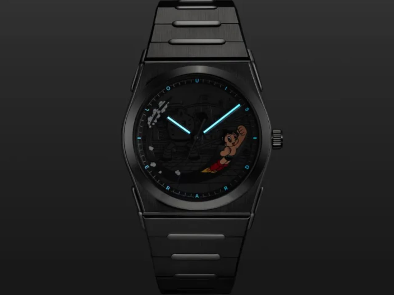
The artwork comes from Tezuka Productions’ archives, based on early illustrations by the manga master himself. A raised circular rehaut frames the scene, printed with a white minutes track and filled with Super-LumiNova C1 for blue nighttime glow.

What makes this dial work is restraint. There are no indexes cluttering the composition. No date window interrupting the narrative. The rhodium-plated hands with diamond-cut edges float above the scene without competing for attention. With Super-LumiNova C1 on just the hands and minutes track, the watch remains legible at night while Astro Boy stays visible in color against the dark dial. If they’d added lume plots or traditional indexes, this balance would collapse into visual noise. The blue glow complements rather than competes with the manga artwork. Louis Erard understood that when your dial tells a story, everything else should step back and let it speak.

The Case: 2340 Architecture Meets Hybrid Materials

The 2340 case represents Louis Erard’s first integrated bracelet design, and it brings legitimate technical interest to the table. The case body uses brushed titanium, keeping weight down to levels that disappear on your wrist. The crown, bezel, and lugs switch to polished steel, creating contrast without the flashy two-tone look that dominated the 1980s.

At 40mm in diameter and 8.95mm thick, the proportions work for most wrists without making compromises. The case shape follows the integrated bracelet design language that’s dominated sports watch design since the Royal Oak rewrote the rules. Louis Erard’s interpretation doesn’t reinvent this formula, but the execution is clean. The transitions from case to bracelet flow smoothly, and the finishing quality on the alternating brushed and polished surfaces shows attention to detail.

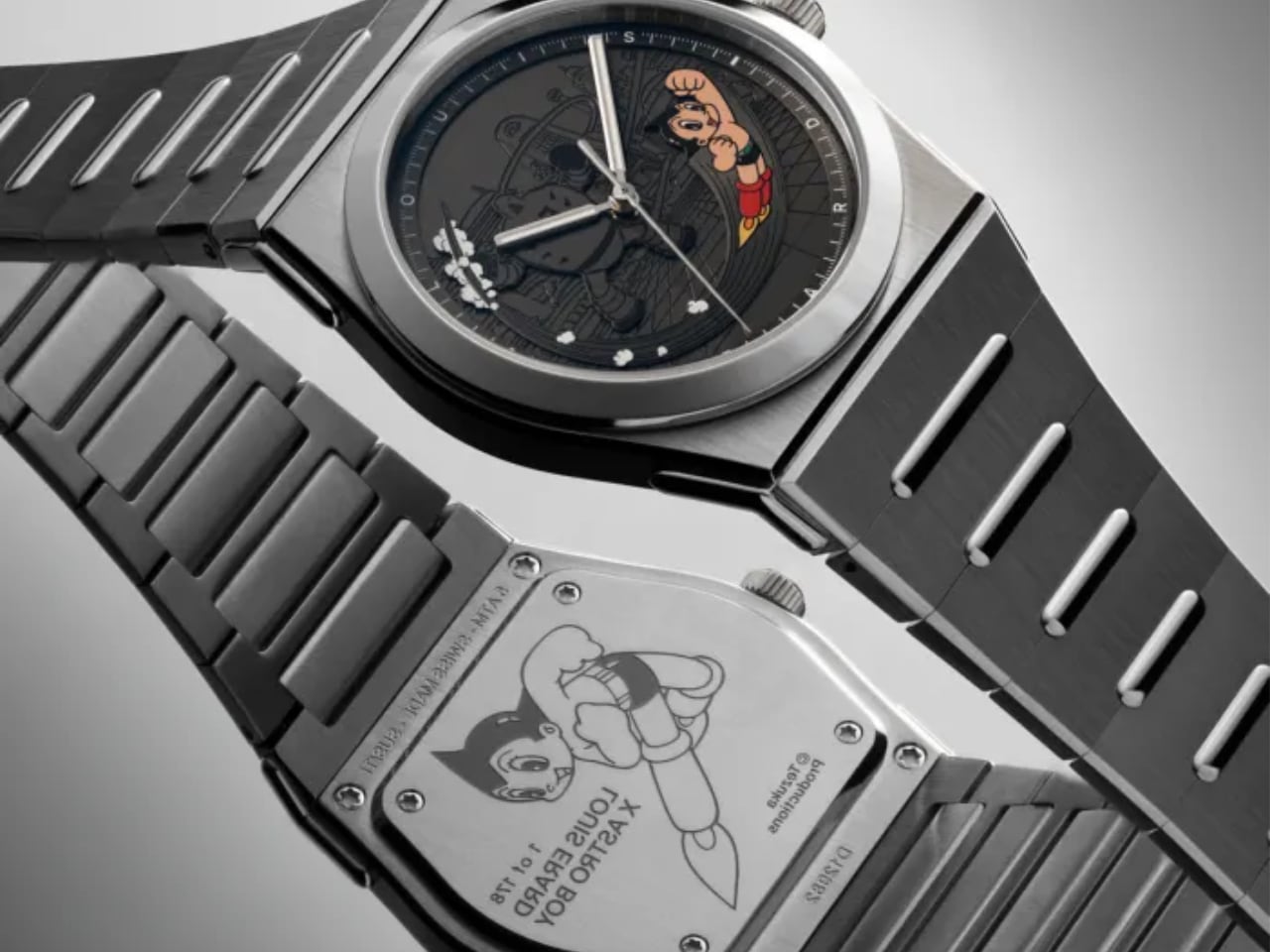
The sapphire crystal carries anti-reflective treatment on both sides, which matters more than most people realize. When your dial features this much visual information, glare becomes your enemy. Louis Erard addressed this properly. The caseback features a custom Astro Boy engraving showing him in his classic flying pose with the Louis Erard collaboration text. The engraving quality shows crisp detail with good depth, a nice touch for collectors even if you won’t see it during normal wear.

Water resistance sits at 5 bar (50 meters), which translates to splash resistance in practical terms. This isn’t a dive watch, and the hybrid titanium-steel construction makes that clear. It’s designed for daily wear with careful handling near water.

The Bracelet: Three Years of Development Shows

Louis Erard spent three years developing this integrated bracelet, and that investment shows in the details. The links combine brushed titanium and polished steel in a pattern that mirrors the case treatment. The 2340 case handles the integrated bracelet challenge by echoing the case angles without copying Genta’s Royal Oak geometry. The alternating brushed and polished surfaces on both titanium and steel create visual rhythm down the bracelet, and the link width taper from 28mm at the case to 20mm at the clasp looks proportional rather than forced.

Each link tapers from 28mm at the case to 20mm at the clasp, following the gradual taper that helps a watch hug your wrist naturally. The butterfly folding clasp uses a spring-blade mechanism rather than traditional push-button deployment. This approach provides smoother operation and reduces the number of moving parts that could wear over time. Torx screws handle the bracelet attachment points, signaling serious intent about secure attachment over easy adjustment. You’ll need the proper tool for sizing, but you also get more secure connections than traditional spring bars.

The bracelet length measures 220mm total, accommodating most wrist sizes with proper link removal. The titanium construction keeps overall weight down despite the integrated design’s typically chunky appearance. When you pick up the watch, the lightness surprises you given the visual mass.

What This Collaboration Actually Means

Louis Erard positions this release as more than a one-off character watch. Manuel Emch frames it as the first step in a long-term creative direction, working with cultural references that shaped his generation. The 2340 case becomes a canvas for these collaborations, with Astro Boy leading a planned series that will include video games and other cult icons from collective memory.

The limited production of 178 pieces ties to Astro Boy’s atomic power level in the original manga (100,000 horsepower, which somehow equals 178 pieces in collaboration logic). At CHF 3,990 before taxes, the pricing sits below the CHF 4,000 threshold while delivering legitimate watchmaking through the Sellita SW300-1 élaboré grade movement. That automatic caliber provides 56 hours of power reserve and runs at 28,800 vibrations per hour, which translates to reliable daily performance.

The Design Verdict

This collaboration succeeds because it respects both the source material and the craft of watchmaking. Louis Erard understood that dial storytelling requires hierarchy, contrast, and negative space. They resisted the temptation to fill every millimeter with manga references, keeping the composition focused on Astro Boy’s dynamic pose against a thoughtfully detailed backdrop. Tezuka Productions provided original artwork rather than generic licensing assets. Louis Erard invested in three-dimensional dial construction rather than taking the easier print-and-forget route. The 2340 case architecture provides a solid foundation that could support future collaborations without feeling like a gimmick.

The watch will connect most strongly with the generation that grew up watching Astro Boy, the same people who now have the disposable income to spend four thousand Swiss francs on nostalgia. But even without that emotional connection, the technical execution and finishing quality deliver enough substance to justify the price. The dial craftsmanship alone demonstrates why Swiss watchmaking maintains its reputation, even in an entry-level collaboration piece.

Louis Erard x Astro Boy Ref. 35123TA23.BMT12 arrives as a 178-piece limited edition at CHF 3,990. It launches with the 2340 integrated case in brushed titanium and polished steel, housing a Sellita SW300-1 automatic movement. The applied dial elements create three-dimensional storytelling depth, while the three-year-developed bracelet proves that even character collaborations can demonstrate legitimate horological craft.

The post Louis Erard Brings Astro Boy to Swiss Watchmaking first appeared on Yanko Design.
Lexus LS Goes Bold: Three Radical Concepts Redefine Luxury Space

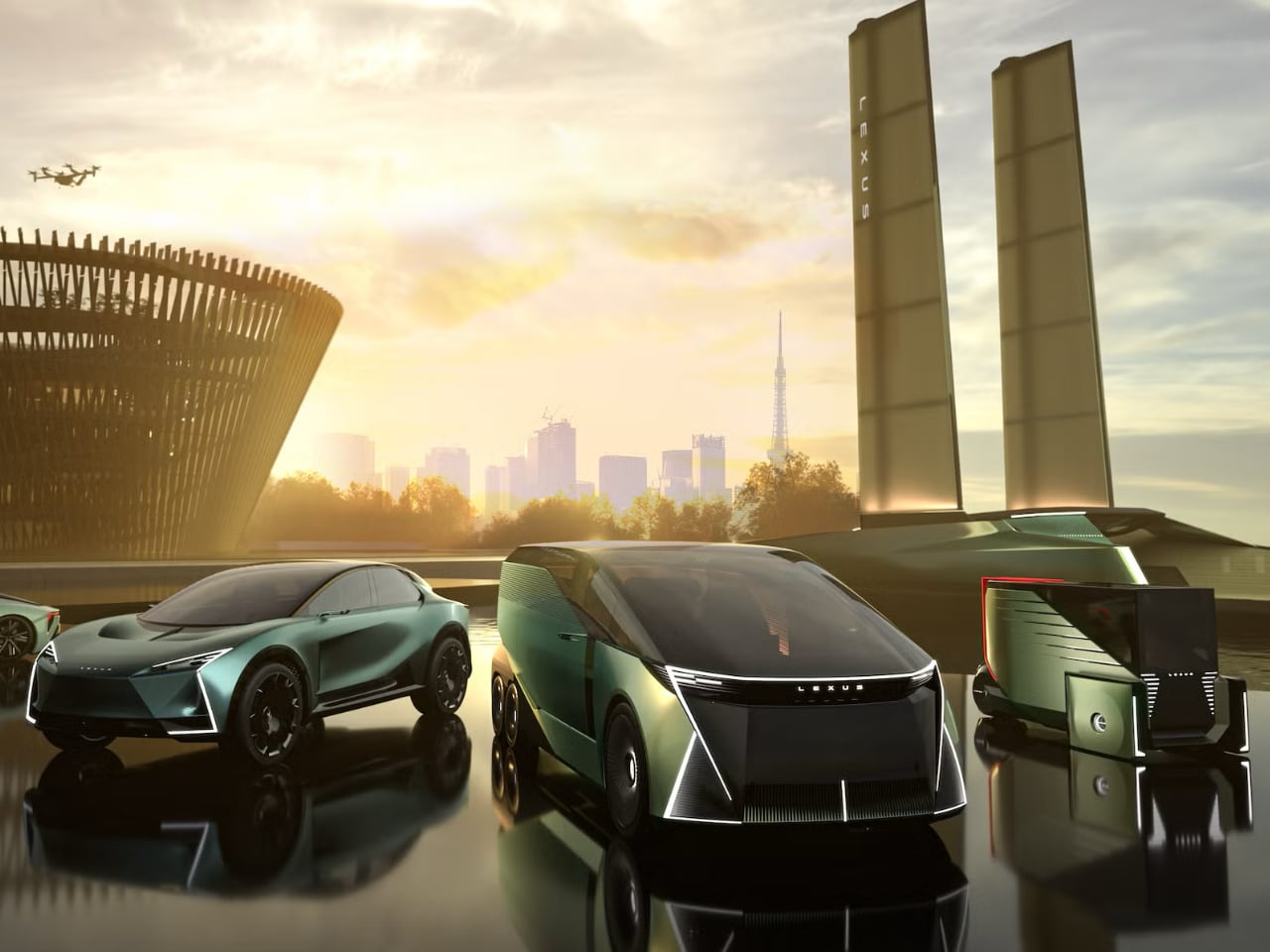
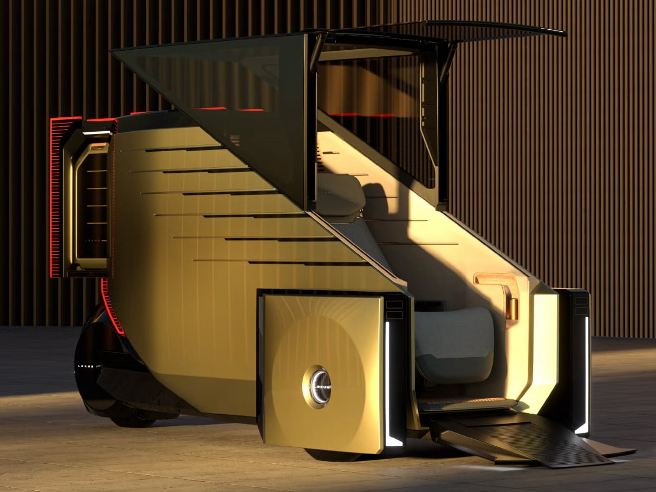
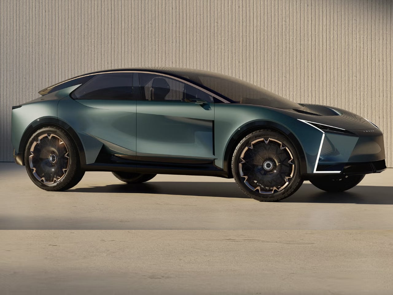
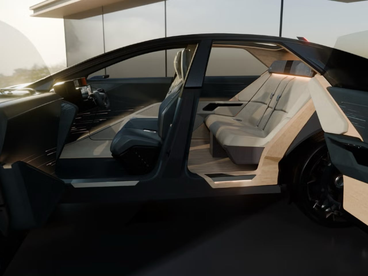
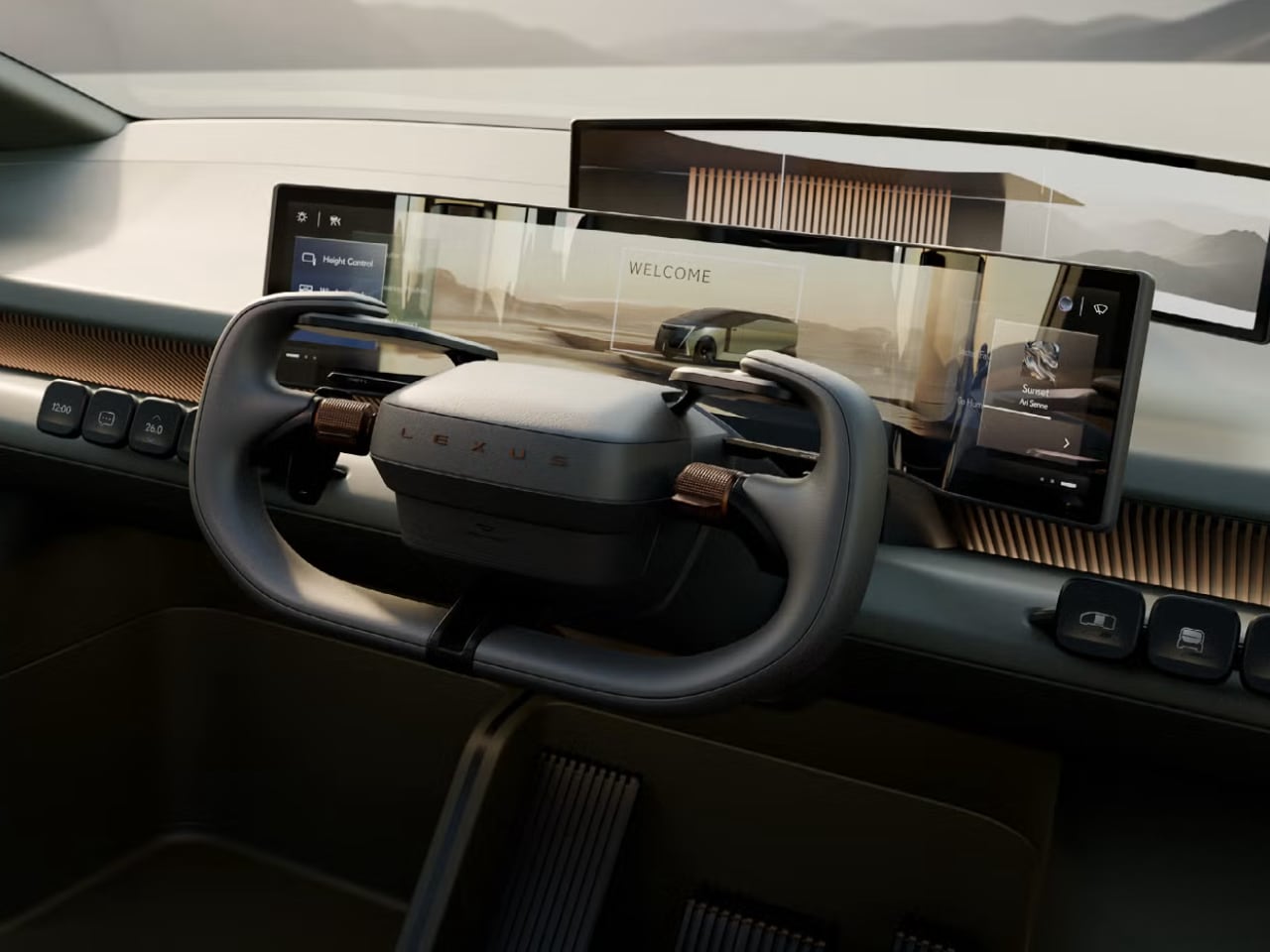
When Lexus rolled three radically different concepts onto the floor of the 2025 Japan Mobility Show, each wearing the LS badge, the message was clear: the future of luxury isn’t about four doors and a trunk anymore. A six-wheeled van with a convertible day bed in the third row. A single-seat autonomous pod that looks like it escaped from Minority Report. An SUV coupe that might actually see production. These are Lexus’s answers to a market that no longer wants what the LS was built to be.
Designer: Lexus

The context makes the radical pivot necessary. Much like Taylor Swift, the Lexus LS was born in 1989 and went on to redefine its category, but unlike the pop icon, the luxury sedan’s star has dimmed considerably in recent years. The brand sold fewer than 3,000 units annually in the US for the past three years, losing market share even against rivals facing the same headwinds. In September, Lexus announced a “final year tribute” for the existing fifth-generation car, effectively confirming what industry watchers already knew. The sedan era is ending, but the LS name still carries tremendous cachet and brand value as the badge that launched Lexus itself.

Rather than let that heritage fade, Lexus chose to reimagine what “LS” could mean. The three concepts presented in Tokyo replace “Luxury Sedan” with “Luxury Space,” each interpreting that brief in dramatically different ways.

The Six-Wheeled Van That Dares to Dream

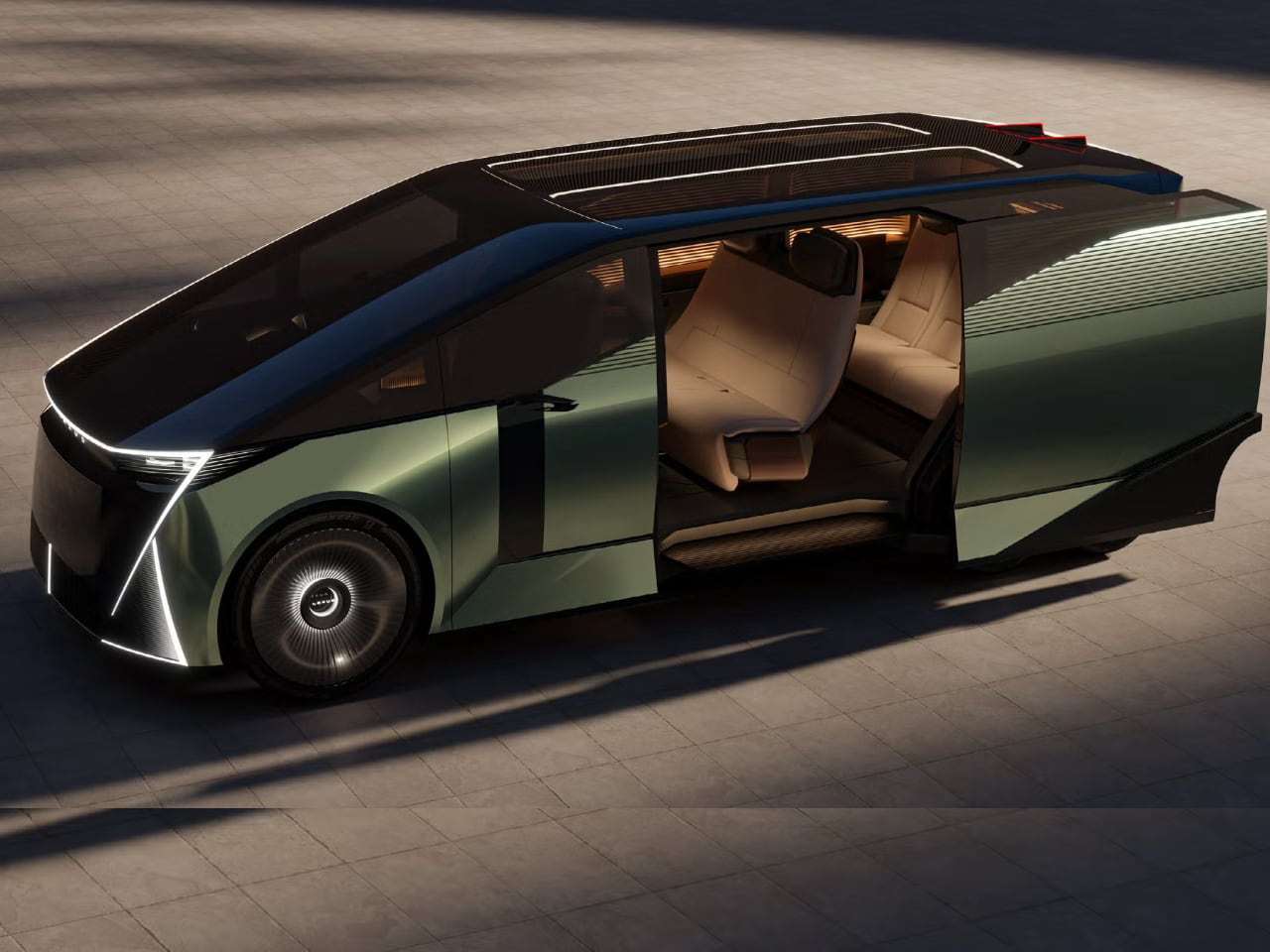
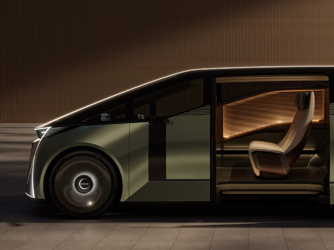
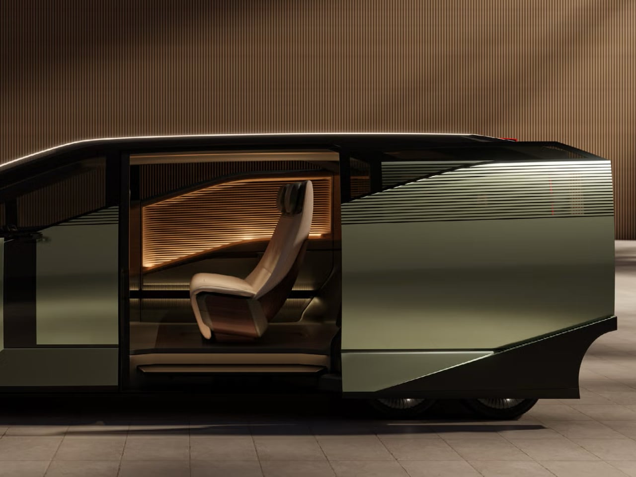
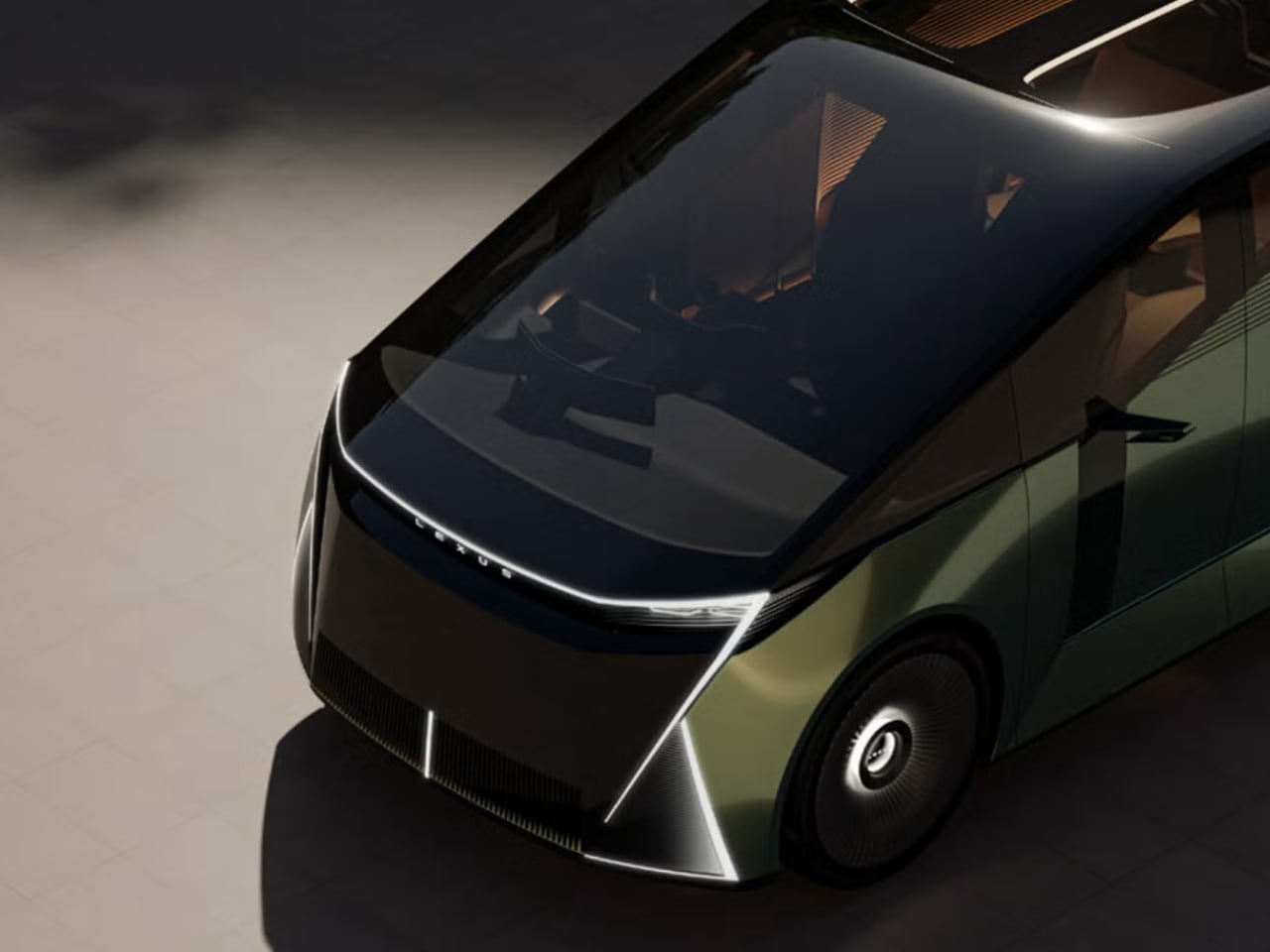
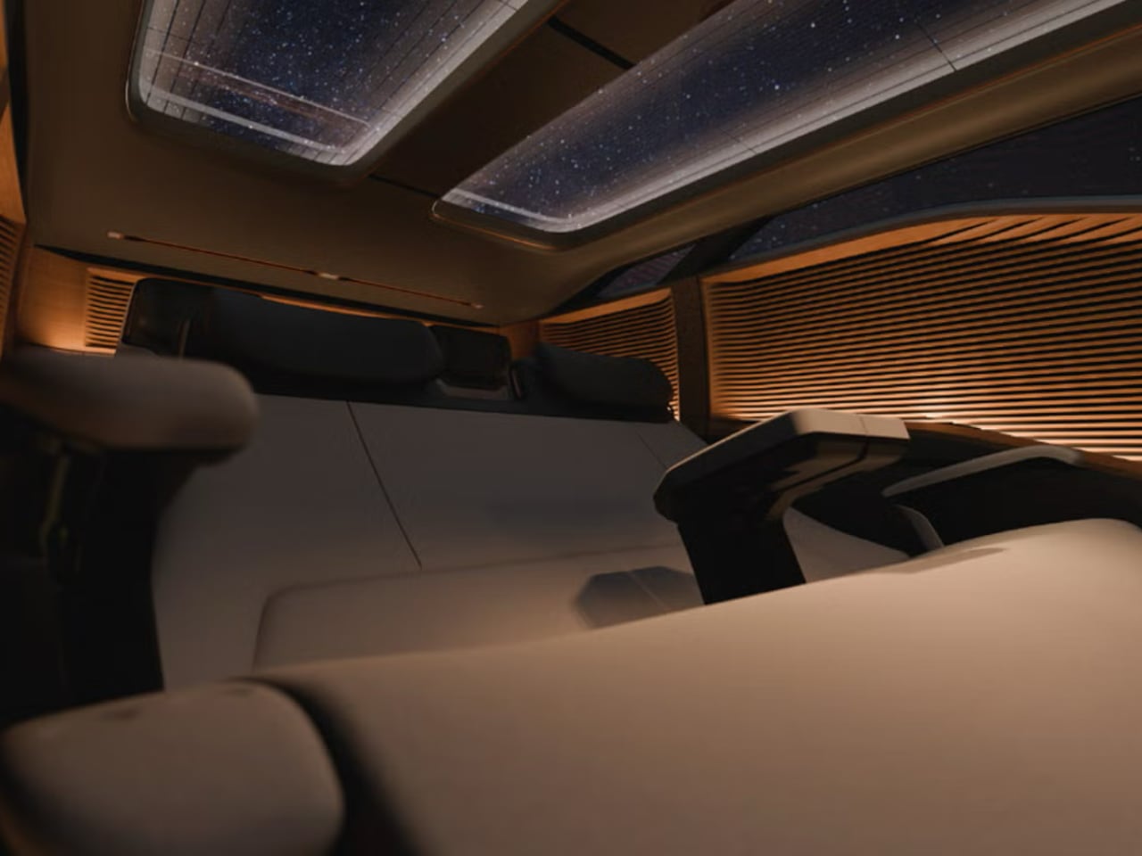
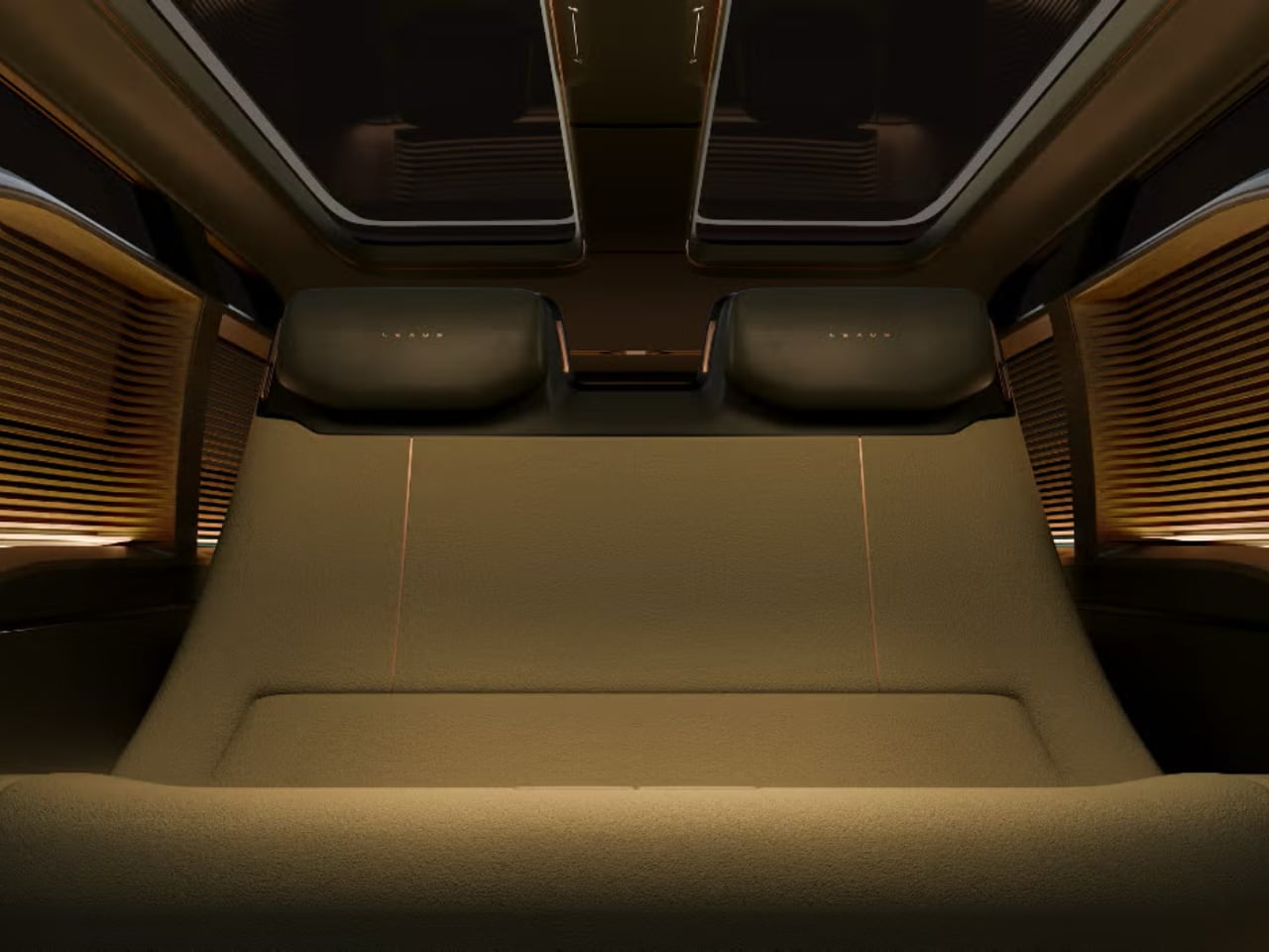
The LS Concept, revealed via teaser images a couple weeks before the show, represents the most audacious reinvention of the luxury minivan formula yet attempted. This isn’t a tarted-up people mover with captain’s chairs and a nicer badge. This is a six-wheeled statement piece that looks more like a land yacht than a family hauler, with proportions that dwarf the luxury minivans currently popular in markets like China.

Much of that impact comes from the wheel configuration itself. Four smaller wheels cluster at the rear while two larger ones handle steering duties up front, creating what observers have called a “backwards Tyrell P34 look.” It’s probably the only time a Lexus van will be compared to a 1970s Formula 1 car, but the reference fits. The wheel arrangement does more than look interesting. The additional rear wheels potentially distribute weight more effectively across the long wheelbase required for three comfortable rows, while the larger front wheels maintain steering precision and road presence.

The exposed wheel arches feature chrome or polished metal trim that catches light and emphasizes the mechanical complexity underneath, celebrating the engineering rather than hiding it behind body panels. Sharp character lines run the length of the vehicle’s flanks, creating distinct upper and lower volumes. The greenhouse sits atop a substantial lower body, with blacked-out pillars creating a floating roof effect that’s become common in luxury vehicles but feels fresher here thanks to the unconventional proportions. The front fascia maintains Lexus’s spindle grille signature but stretches it horizontally rather than vertically, creating a wider, more planted stance that suits the van’s substantial dimensions. LED lighting elements integrate into the bodywork with minimal interruption, suggesting a future where lighting becomes part of the surface rather than discrete components bolted to the structure.

Inside, the LS Concept seats six across three rows, with the first row offering a somewhat bench-like layout while the second and third rows feature individual thrones upholstered in what appears to be premium materials. The interior demonstrates a deliberate progression from functional to luxurious as passengers move rearward, with the driver zone maintaining traditional automotive ergonomics while the rear rows transition into lounge-style seating that prioritizes comfort over conventional automotive packaging. The material palette appears to blend warm earth tones in the seating surfaces with cooler metallic accents on structural elements, creating separation between soft touch points and hard architecture.

The third row takes the concept furthest, with armrests that detach to allow the seats to convert into a reclining day bed configuration. The leg rest extends while the seat backs transition closer to flat, creating a genuine rest space rather than the token reclining function found in conventional three-row vehicles. This transformation suggests Lexus studied yacht interiors and private aviation more than automotive precedents, prioritizing the ability to fully relax during extended travel over maximizing passenger count.


The lighting design throughout the cabin uses vertical striping patterns that echo traditional Japanese shoji screens, with illuminated surfaces creating ambient glow rather than point-source lighting. These vertical elements repeat on the exterior as well, establishing a consistent design language that bridges interior and exterior spaces. The dashboard features nested screens in a layered configuration that suggests depth rather than the typical flat panel array, with physical controls integrated around the displays rather than banished to capacitive touch zones. Despite the futuristic styling, this isn’t an autonomous fantasy. The LS Concept features a proper steering wheel flanked by a pair of screens and a pleasing number of actual physical buttons, suggesting Lexus envisions this as something a human would actually drive.
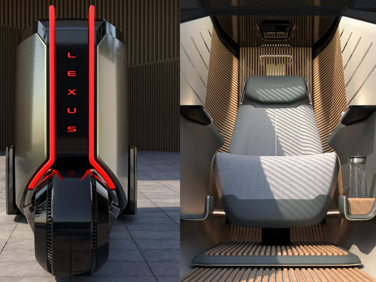
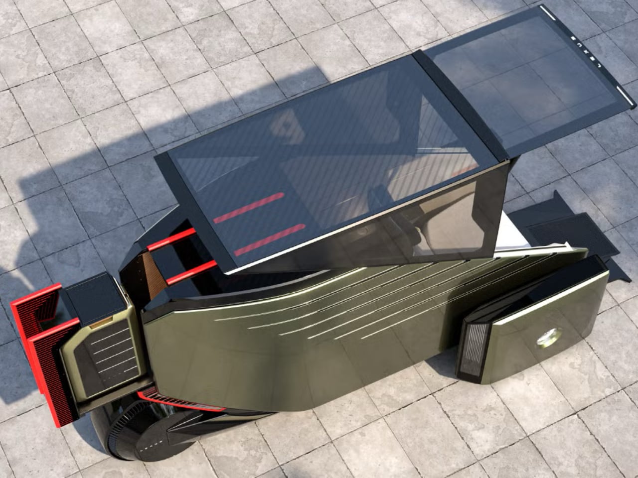
The Micro: When Personal Mobility Gets Absurdly Personal

If the six-wheeled van represents luxury maximalism, the LS Micro swings to the opposite extreme. This single-seat autonomous vehicle exists as pure concept exploration, the kind of mobility solution that automakers love to sketch but rarely build.

The Micro appears to run on three wheels based on the revealed images, with a vertically oriented battery pack or cargo compartment mounted along its spine that can slide out for easy access. This central spine element serves as both functional storage and visual anchor, creating a clear organizational logic for the compact vehicle’s interior packaging. The exterior surfaces flow in continuous curves broken only by minimal character lines, with the transparent canopy creating an almost bubble-like greenhouse that maximizes interior volume perception while maintaining a compact exterior footprint.

The seating position looks genuinely comfortable rather than compromised, with a warm cocoon-like environment and touchpad controls integrated into both armrests in a configuration that recalls Captain Picard’s chair on the bridge of the Enterprise. The seat itself appears to wrap around the occupant in a 270-degree embrace, with padding that extends beyond typical automotive bolstering to create a genuine relaxation space rather than just transportation seating. Lexus even managed to fit multiple cupholders into the compact package, a luxury amenity not afforded to Galaxy-Class starship captains. The material treatment suggests a mix of technical fabrics and soft leather, with the touchpad controls finished in what appears to be brushed metal or high-quality plastic that maintains tactile feedback despite the digital interface underneath.

The color palette inside the Micro stays deliberately neutral, with warm beiges and soft grays dominating to create a calming environment rather than the typical concept car explosion of saturated hues. Ambient lighting appears integrated into the structural ribs of the canopy, washing the interior with indirect illumination that changes the space’s mood without creating harsh shadows or glare. The exterior styling leans heavily into sci-fi territory, with smooth surfaces and minimal details that wouldn’t look out of place in Minority Report, though given that film is now set just 29 years in the future, perhaps that’s less of a compliment than it once was.

Lexus describes the Micro as “micro-mobility that allows you to move freely in small streets and alleys of cities” and “a relaxing space for a new value of private travel experience.” That use case suggests ride-hailing services in dense urban environments rather than personal ownership. Given the autonomous technology requirements and the narrow market appeal, both scenarios remain theoretical for the foreseeable future. The Micro’s compact dimensions and autonomous capabilities could theoretically allow it to access areas traditional vehicles cannot, from pedestrian-friendly zones to narrow historic district streets. The single-seat configuration eliminates the social dynamics and scheduling compromises inherent in shared mobility, offering a middle ground between private car ownership and riding in someone else’s vehicle.

The Coupe: The One That Might Actually Happen

Of the three concepts, the LS Coupe stands the best chance of reaching production. Industry watchers have speculated for more than half a decade that the fifth-generation LS’s successor would take the form of a high-end crossover rather than another traditional sedan, and this concept bears all the hallmarks of that rumored vehicle.

The design melds the elevated seating position and easy entry of an SUV with the flowing roofline and proportions of a sedan, complete with a trunk rather than a hatchback opening, though Lexus describes it more as an extending shelf than a conventional cargo area. Four doors provide access to what appears configured as a four-seat interior, though the rear bench looks like it could accommodate a third passenger without much compromise. In a premium touch reminiscent of Rolls-Royce, the rear doors open backwards for easier entry and exit.

The interior continues design themes Lexus explored in the Sport Concept coupe revealed the same day, with a colorway divided between the driver and passenger areas to create distinct zones within the cabin. The driver side appears finished in darker, more focused tones that emphasize the task of driving, while the passenger side transitions to lighter, more relaxed materials that signal the leisure aspect of luxury travel. This asymmetric approach represents a departure from the typical automotive interior that treats both front occupants identically, acknowledging that driver and passenger have fundamentally different relationships with the vehicle.

The seating surfaces showcase what appears to be a combination of perforated leather in high-wear zones and smooth textile panels in areas that benefit from stretch and comfort. The perforation pattern isn’t just functional ventilation but creates a geometric texture that catches light differently depending on viewing angle, adding visual interest without relying on contrasting stitching or piping. The rear seats maintain the same material approach but appear to offer more adjustment range and cushion depth, confirming this vehicle prioritizes rear passenger comfort despite its four-seat configuration.

Nested instrument panel screens sit in front of a yoke-style steering control rather than a traditional wheel. The screen configuration potentially hints at a future instrument and infotainment layout designed to rival BMW’s Neue Klasse digital interface approach, though production versions typically dial back the concept car ambition. The layering of these displays creates a sense of depth behind the yoke, with primary driving information appearing to float in the foreground while navigation and vehicle status occupy background layers. Physical controls appear concentrated on the center console and steering yoke spokes, maintaining tactile interfaces for frequently used functions rather than forcing everything through touchscreen menus.

The exterior proportions demonstrate careful attention to the balance between SUV utility and sedan elegance. The roofline starts its descent behind the B-pillar, creating a fastback silhouette that maintains rear headroom while achieving a lower drag coefficient than a traditional SUV profile. The rear haunches swell slightly outward from the cabin, muscular shoulders that suggest performance capability without resorting to aggressive body cladding or fake vents. The wheel arches appear sculpted into the body rather than applied as separate elements, creating a cohesive surface that flows from front to rear without interruption. The strongest indicator of production intent comes from an observation about what the concepts include rather than what they promise. The LS Coupe features visible seatbelts in all the marketing imagery and show floor presentations, a detail neither the six-wheeled van nor the autonomous Micro show.

What Luxury Space Actually Means

These three concepts reveal Lexus’s challenge and opportunity in equal measure. The LS name carries enough brand equity to justify continuation, but the original brief no longer works in a market that has decisively moved away from large luxury sedans.

By reinterpreting the badge as “Luxury Space” rather than “Luxury Sedan,” Lexus creates room to explore what premium personal mobility could mean across multiple form factors and use cases. The six-wheeled van targets the ultra-luxury multi-passenger market that traditional minivans never quite captured, the Micro explores personal urban mobility as a premium experience, and the Coupe directly addresses the luxury crossover segment that has cannibalized sedan sales industry-wide. Whether any of these concepts reach production remains uncertain, but the LS Coupe’s seatbelts and rumors of a high-end crossover successor suggest at least one interpretation of “Luxury Space” will make it to dealerships.

Each concept also reflects different regional market priorities. The six-wheeled van speaks directly to Asian luxury markets where chauffeur-driven vehicles remain popular and rear passenger comfort takes priority over driver engagement. The Chinese market in particular has embraced luxury MPVs in ways Western markets never did, with vehicles like the Mercedes V-Class and Lexus LM commanding premium prices and generating substantial sales volumes. The Micro addresses urban mobility challenges most acute in dense Asian and European cities where parking costs remain prohibitive and congestion pricing schemes make large vehicles increasingly expensive to operate. The Coupe takes the safest bet by pursuing the luxury crossover segment that currently dominates premium vehicle sales globally.

Every luxury brand from Bentley to Rolls-Royce now offers or plans to offer a high-riding crossover, recognizing that buyers want elevated seating positions and practical cargo space more than they want low-slung driving dynamics. The LS Coupe’s sedan-influenced proportions and trunk configuration position it as a more sophisticated alternative to the increasingly common luxury SUV, offering crossover practicality without abandoning the design language that made Lexus sedans distinctive. For a nameplate that once redefined luxury sedans, this evolution from four doors to multiple futures seems fitting.

The post Lexus LS Goes Bold: Three Radical Concepts Redefine Luxury Space first appeared on Yanko Design.