reMarkable Paper Pro review: Writing in color is nice, but it’ll cost you

It’s wild to think the reMarkable 2 debuted in March 2020, a time now more famous for other reasons. A lot has changed in the four-plus years since, and now it’s time for its successor, the reMarkable Paper Pro. The third-generation, distraction-free writing slate gets a color e-paper display as well as a raft of other equally notable improvements. That includes a bigger screen, faster internals and an active stylus for a more paper-and-pen-like experience. But this much more tech comes at a higher price, so let’s answer the question: Is it worth it?

reMarkable is the standard bearer for devices straddling the gap between the analog and digital. It’s an e-paper slate with a stylus (and optional keyboard) that lets you read, write and edit your own documents and PDFs. The focus is on giving you a tool that’ll act like paper and pen or a word processor rather than anything more fully-featured. That way, you can focus on whatever you’re doing without the distractions a full computer, tablet or phone offers. If there was a way to make “medium tech” sound not like an insult, I’m sure reMarkable would wear it proudly.

The new reMarkable Paper Pro measures 196.6 x 274.1 x 5.1mm, making it roughly an inch taller and a quarter-inch wider than its predecessor, the reMarkable 2 (188 x 246 x 4.7mm). But it doesn’t feel that much bigger, thanks to plenty of effort made to shrink the bezels around the display. And the left band (the chin when using the device in landscape mode) has been eliminated altogether here. All of that room has been made to accommodate the Paper Pro’s headline feature: an 11.8-inch Canvas Color screen.

I prefer tablets that have a slightly more austere design than where the industry has been for the last few years. The reMarkable 2 was one of many slates aping the then-current iPad’s rounded off corners and sides that never felt right. The Paper Pro is a delightful correction, with sharper lines and squarer corners that gives the device some much-needed visual rigidity. The edge band is also inlaid with grooves that, designer Mats Solberg explained, has two useful benefits beyond looking good. First, it evokes the idea you’re holding a sheaf of paper in your hand, and second, it adds some grip to a device that’s surprisingly thin.

The inside of the Paper Pro has been given a thorough upgrade as well, with a new 1.8GHz Cortex A53 processor paired with 2GB of RAM and 64GB of storage. This is underpowered compared to any smartphone from the last decade, but don’t forget the reMarkable doesn’t need that much grunt. It’s still a big leap ahead of the rM2, which was packing a 1.2GHz dual-core chip with 1GB of RAM and 8GB of storage. The battery’s a lot beefier, too, leaping up from the 3,000mAh of the rM2 to 5,030mAh here. It needs to be, given this is also the first reMarkable with a backlight, making it the first model you can use in dark rooms without a lot of grief.

Image of reMarkable’s Paper Pro on a table.
Daniel Cooper for Engadget

To be clear, the new size and the switch from a passive stylus to an active one means none of your existing reMarkable accessories are compatible with Paper Pro. The accessory connector is on the backplate rather than the edge, and the new stylus is magnetically charged. So when you’re pricing one of these up, bear in mind that you’ll need a whole new set of extras, too.

As soon as you turn on the Paper Pro, you’ll notice the leap in performance compared to its predecessor. At the risk of damning this thing with faint praise; If the reMarkable 2 felt like a fancy ereader, then this feels more like a slow tablet. The faster internals and display mean the experience is a lot more responsive and snappy, with far less delay between action and result. There are even little animations during the setup process and unlocking the device with a six-digit code feels like you’re unlocking a phone.

The Paper Pro uses a modified version of E Ink’s Gallery 3 technology called “Canvas Color.” Each pixel in the display holds a series of particles: White, Cyan, Magenta and Yellow. These can be combined to make eight solid colors (Red, Green, Blue, Cyan, Yellow, Magenta, White and Black) or, with dithering, up to 20,000 different shades therein. The analogy the company uses is in the CMYK inks found in most printers and newspaper presses.

Image of reMarkable’s Paper Pro on a table.
Daniel Cooper for Engadget

The end result is a display with visible, if muted, color reproduction with some limitations you’ll need to work around. If you’re making handwritten amendments to a document, you’ll need blue, cyan, magenta or red. Because yellow, green, gray and cyan are irritatingly faint when you write with a thin nib on existing text. The inverse is true for highlighting, where the gentler colors are better.

There’s no big difference in readability between the Paper Pro (229 ppi) compared to its predecessor (226 ppi). But I can’t quite shake the nagging feeling that the smaller, older device has sharper text when I’m looking at it. Your mileage may vary.

Because of how much new tech has been crammed inside the Paper Pro, you’ll find scrolling speeds are much faster. When I used the reMarkable 2, I felt I could see its processes taking place in real time. You know, “Identify input, process input, send command to screen, refresh screen,” with a notable delay. Here, any lag feels more like a result of the e-paper display’s natural limitations and slow refresh rate rather than slow processing speed.

Plenty of work has been done by the reMarkable team to reduce the latency between the pen and the display. Even after the addition of the color screen, which necessitated some compromise, the input lag was cut from 22ms on the rM2 to 12ms here. Similarly, there’s no lag when you’re typing as there could sometimes be when you were using the older slate. If there’s one thing I’m still not sure about, it’s that when writing in color, the text doesn’t initially render in the color you’ve chosen. Your first blast of scrawling pops up in gray and it’s only after the screen refreshes that it reloads in the correct color.

Image of reMarkable’s Paper Pro on a table.
Daniel Cooper for Engadget

There’s one other thing that I want to draw attention to, and it’s a subtle thing but well worth pointing at. A lot of time and effort has gone into ensuring that handwritten notes and highlights can work seamlessly with text inputs. For instance, if I’m typing something and feel the need to highlight, underline or draw a ring around the word with the pen, I can. If I then have to go back and amend that text later, it’s easy enough to expect the handwritten additions to become unmoored from the text. But reMarkable has done the hard work to ensure that it all remains in place — it’s a subtle piece of engineering, but one I deeply appreciate.

Paper Pro is the first reMarkable with a backlight, and its inclusion here is very much “better late than never.” I’ve often enjoyed writing notes with the reMarkable 2, but found it frustrating that it’s unusable in darker environments. That both the slate and the new Type Folio are now backlit – activated by tapping the top right corner of the screen — means that’s no longer an issue. The light emitted from both is in my experience gentle rather than eye-searing, even when I pushed everything to maximum. Fundamentally, you’ll be able to use this in a dark room or on an airplane with the cabin lights dimmed without any stress or eye strain.

Like its predecessors, the Paper Pro comes with a choice of stylus. What separates the Marker and Marker Plus is that the latter, as before, has an active surface on top, allowing you to use it as an eraser. Make an error, and all you have to do is flip it over to get rid of your boo-boo, whereas with the Marker you’ll need to select the erase tool from the menu.

Image of reMarkable’s Paper Pro on a table.
Daniel Cooper for Engadget

But while you might not notice much of a difference at first blush, plenty has changed on the inside. The older reMarkable styluses were passive, enabling you to use a number of compatible third-party styli in their place. This time around, both versions are active — full of technology to help orient the pen and communicate with the tablet for faster processing. It connects magnetically to the “right” hand side, wirelessly charging from the slate like the Apple Pencil.

Ironically, a lot of effort has gone into ensuring that, despite the raft of changes between this model and its predecessor, you’ll struggle to notice the difference. I’ve seen some folks saying that the new Marker has a harder tip and that as the display is rougher, it’s less fun to use. I’m not sure my experience matches that, and every time I compare the two, I feel like it’s more or less the same.

As for the Marker’s battery life, no matter how hard I tried, I couldn’t get this thing to run out of juice under what I’d describe as normal use. An hour or two a day for more than a week and I never managed to run the stylus flat — hell, I barely got the Paper Pro’s battery to half in that time.

reMarkable has launched a new Type Folio for the Paper Pro, which is about 1.1 inches wider and deeper than its predecessor. That extra space affords you a palm rest and a bigger margin around the outside of the keyboard, but nothing too dramatic in terms of changes to the keys. You do now get an Escape key, which exits a document and goes back to the homepage. There’s also a new Icon Toggle, which when activated will remove the icons from the screen to further reduce distractions.

Image of reMarkable’s Paper Pro on a table.
Daniel Cooper for Engadget

Now, I’m a big fan of the old Type Folio, finding that it made the right compromises for a travel keyboard. Its main keys were properly sized and spaced so my muscle memory carried over from my regular keyboard to this one and back again. The compromises, like the half-height function row and narrow non-character keys, were the right ones to make. Given the Paper Pro’s bigger size, its Type Folio can spread those extra keys out a little further to give the whole thing room to breathe. It’s better than it was before, but what we had before was no slouch.

The reMarkable Paper Pro is available to order today, priced at $579 with the standard Marker and $629 if you want the Marker Plus. You can add a case from $89, but a full leather version will set you back $179. If you want to add the Type Folio, which I’d say is a key way of making the reMarkable truly useful, you’ll need to pay an additional $229.

The company has, however, decided to keep the reMarkable 2 around as a lower-cost option, selling it for $379 with a standard Marker. Given the reMarkable 2 has topped our e-ink tablet buyer’s guide for several years, it’s still a solid choice if the Paper Pro is too rich for your blood.

There are a decent number of e-paper tablets floating around the market right now, with the majority of them offering monochrome screens. In our e-ink tablet Buyer’s Guide, we named the reMarkable 2 the best option for most people. If you’re looking for a slate with a color display, your options are the Paper Pro, or the Kobo Libra Color and the elegantly named Onyx Book Tablet Note Air 3 C.

Kobo’s device is much more portable than the Paper Pro, but that’s because the Kobo is primarily designed to be an ereader. Its smaller seven-inch screen is squarely in ereader territory, and while there’s a notebooks feature that allows you to write freehand as much as you want, it’s never going to be able to compete with the Paper Pro’s 11.8-inch screen on that front. The Libra Color will be a better option for those who primarily want to take notes in and mark up ebooks — Kobo’s library is nearly as robust as Amazon’s Kindle library, and you can digitally mark up any book you buy from Kobo without restriction.

Onyx’s Boox Note Air 3 C is more akin to the Paper Pro in size, but it’s decidedly not suitable if you want to work in a more distraction-free environment. The Note Air 3 C, like most other Boox devices, are full Android tablets with E Ink screens, so nothing’s stopping you from going online or even attempting to watch a YouTube video. Even if distractions aren’t an issue for you, the Paper Pro’s streamlined interface makes it much easier to use — for both newbies and those familiar with these devices. Boox devices will appeal more to tinkerers and the most tech-savvy among us because there are a lot of settings you can play around with to make a device like the Note Air 3 C as capable as you need it to be. The Paper Pro keeps things relatively simple, making it more approachable overall.

Image of reMarkable’s Paper Pro on a table.
Daniel Cooper for Engadget

Look, you just know that there are some folks who’ll look at the Paper Pro’s price and spec list, compare that to a base-model iPad and laugh themselves into a coma. The point is that this isn’t a generic tablet but a device that’s been consciously designed to do fewer things better. So, we’re going to judge this thing on and by its own merits, rather than as a typical tablet.

I’m a big fan of reMarkable’s devices because they offer a way for me to focus in a way that my ADHD brain struggles to do otherwise. If I’m feeling overwhelmed and need to eliminate distractions, then stealing myself away with a device like this really can help. There’s no easy way for me to swipe away from my work to check Reddit or YouTube, helping me stay on track. And given how popular these devices are, I’m sure I’m not the only person who feels this way.

If, however, you’d still like to dip a toe into this water but don’t want to spend that much, then there is good news. reMarkable is keeping the 2 around as an entry-level unit, priced at $379 with the standard marker and because for all of the good things the Paper Pro does, none diminish the long list of good qualities the reMarkable 2 has.

On one hand, you have a device that’s whip-fast, eminently capable at the things that it can do and now has a bigger screen that renders colors. On the other, I cannot pretend that it’s not a pricey piece of kit, especially when you bundle in the Type Folio. Naturally, if your budget can stretch to that sort of cash and you really do need a way to work without distractions, I think it’s worth it.

This article originally appeared on Engadget at https://www.engadget.com/mobile/tablets/remarkable-paper-pro-review-writing-in-color-is-nice-but-itll-cost-you-173024590.html?src=rss
Design Meets Culture: The Porsche x Almond Surfboard Collection

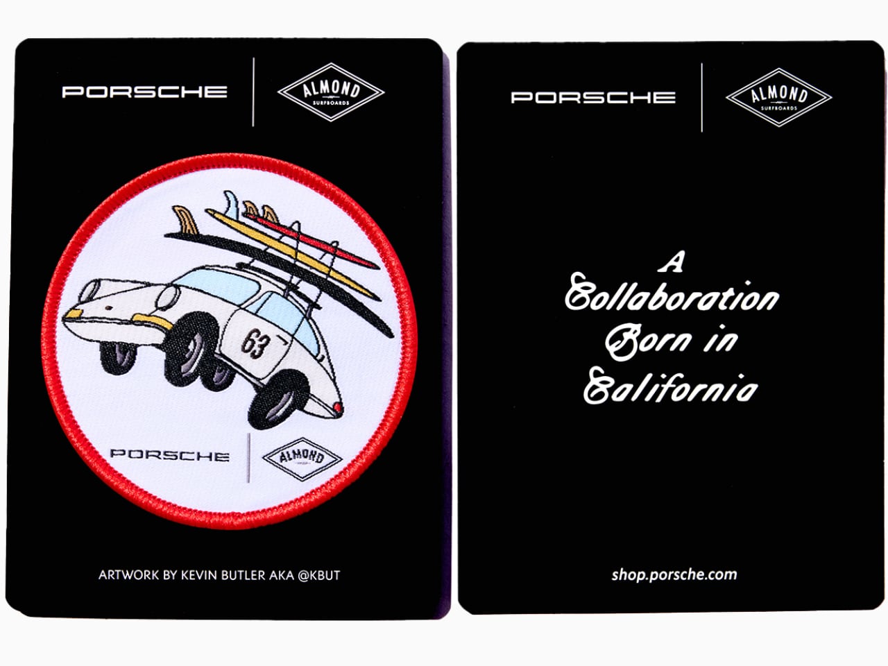
When Porsche partnered with Almond Surfboards to create a limited-edition surfboard collection, it was an inspired fusion of German engineering and California surf culture. This collaboration merges precision design and a laid-back lifestyle in a collection that balances craftsmanship with bold, iconic aesthetics.

Designers: Porsche + Almond collection

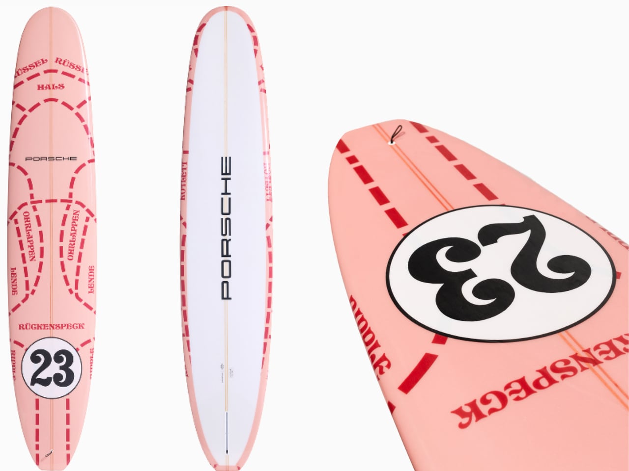
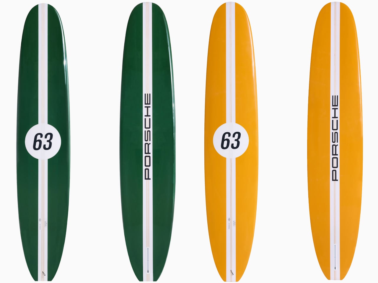
Each board is hand-shaped in Costa Mesa, California, and showcases the iconic Porsche 911 colors from the 1960s: Bahama Yellow, Irish Green, and Polo Red. These bold, classic hues evoke the timeless appeal of Porsche’s storied motorsport past. Additionally, the Pink Pig livery, famously featured on the 917/20 at Le Mans, injects a sense of playful rebellion, bridging a connection between race tracks and ocean waves.

The attention to detail extends beyond color. Each board is meticulously numbered with 63, paying homage to the debut year of the first Porsche 911. These boards are designed for peak performance, crafted to carve through waves with the same finesse that a Porsche car cuts through corners.

Iconic Liveries: A Visual Legacy

Porsche’s racing liveries have left an indelible mark on motorsport culture. The Pink Pig livery, first introduced at Le Mans in 1971, caused a sensation with its butcher-style markings, a nod to fun and boldness in racing design. While it didn’t take first place, the livery remains unforgettable. Porsche’s knack for creating visual identities that speak beyond speed is part of what makes its designs iconic.

Other liveries, such as Gulf Racing and Martini Racing, tell their own stories of endurance and triumph on tracks like Le Mans and the World Endurance Championship. These designs represent Porsche’s relentless pursuit of innovation and excellence, and now, those same livery styles are reflected in the surfboard collection—offering Porsche fans a chance to connect with the brand in an entirely new way.

Numbers That Matter: The Significance of 63

The number 63 carries deep significance for Porsche, symbolizing the birth of the 911 in 1963. This number isn’t merely a historical reference—it reflects Porsche’s enduring philosophy of design and innovation. On the surfboards, the 63 serves as a reminder of Porsche’s legacy and how that spirit has been translated into everything from cars to lifestyle products.

Personally, the number 911 has long been significant in my life. Over a decade ago, I managed to score a mobile phone number that starts with 917 and ends with 911—a perfect numerical tribute to one of Porsche’s most famous models. Every time I give out my number or see it on my business card, it feels like a small but meaningful connection to Porsche’s history.

Crafting the Boards: Surf Meets Precision Engineering

The shaping process of the surfboards in the Porsche x Almond collection mirrors the craftsmanship seen in Porsche’s cars. Each board is shaped from polyurethane foam, reinforced with basswood stringers, and wrapped in fiberglass cloth. The combination of these materials delivers durability, performance, and aesthetic beauty. Just like Porsche’s vehicles, each board is crafted with purpose, delivering on form and function.

Almond’s influence is felt deeply here, as their approach to surfboard crafting draws on the traditions of California surf culture. Known for their hand-shaped boards and commitment to craftsmanship, Almond brings a design ethos rooted in authenticity, simplicity, and a connection to the ocean. This influence transforms the boards into more than sporting equipment—they represent a lifestyle. Almond’s surf culture emphasizes longevity and timeless style, blending seamlessly with Porsche’s commitment to performance and precision.

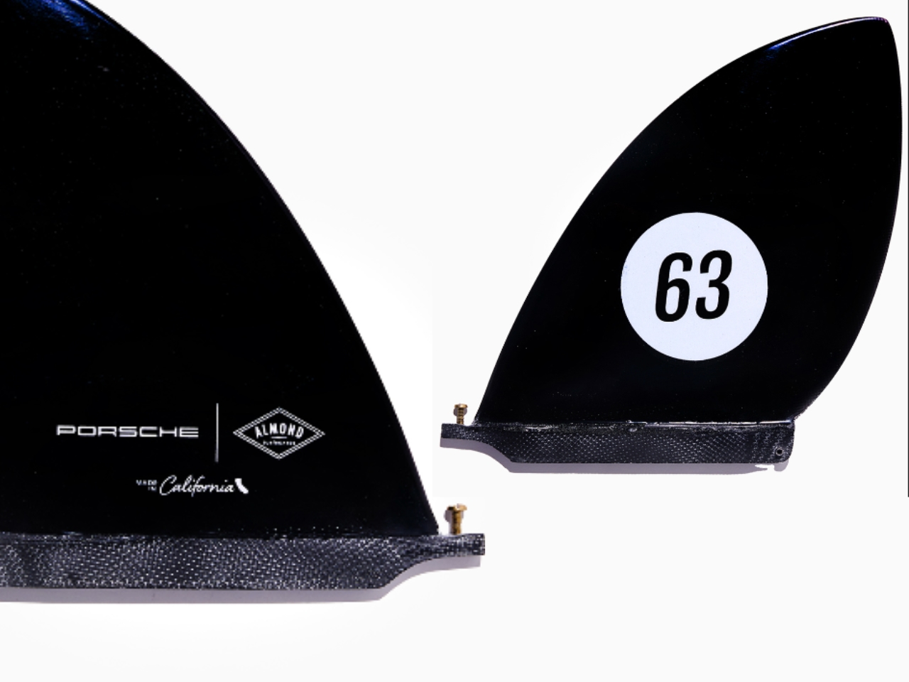
The hand-foiled fiberglass fins are a nod to Porsche’s engineering precision. Crafted from 36 layers of fiberglass, these fins reflect a focus on fine detail, much like the assembly of a high-performance car engine. The inclusion of custom wooden wall brackets for display reminds us that these surfboards, much like Porsche’s vehicles, are as much art as they are machines for performance.

A Personal Connection: Pikes Peak and Porsche’s Racing Spirit

In 2016, I was fortunate to experience firsthand Porsche’s racing heritage on a drive I’ll never forget. While scaling Pikes Peak in a Macan GTS, wrapped in liveries designed to reflect Porsche’s racing history, I had the surreal honor of seeing my own name emblazoned on the car. This wasn’t just a typical drive—it was a full immersion into Porsche’s racing spirit, taking me from Pikes Peak to Mount Evans, a journey that pushed the Macan GTS and my own driving skills to their limits.

The livery on the Macan GTS was designed to reflect Porsche’s legacy at Pikes Peak. It’s a vivid reminder of how Porsche integrates its heritage into every aspect of its modern vehicles, creating a sense of continuity between the brand’s past, present, and future. Porsche’s emphasis on precision, balance, and driver engagement could be felt in every twist and turn of the climb.

Surfboards as Lifestyle: Porsche’s Expanding Design Language

What makes the Porsche x Almond surfboards special is how they expand Porsche’s design language beyond the road. These boards are an extension of Porsche’s identity. The Bahama Yellow, Irish Green, and Polo Red colors signify past 911 models and represent Porsche’s ability to merge motorsport heritage with contemporary design aesthetics.

Almond’s surf culture influences the design of these boards by bringing a sense of authenticity, simplicity, and connection to nature. The boards are shaped by hand, emphasizing craftsmanship, just as Porsche’s vehicles are assembled with precision. This collaboration showcases how Porsche’s design philosophy can transcend its automotive roots and enter new realms, like surfing, while staying true to the brand’s core values.

Porsche’s visual identity has always been about creating a lasting impression, from racing stripes to the Pink Pig motif. The Porsche x Almond collection is the next step in that journey, extending the brand’s influence from the race track to the waves of California.

The post Design Meets Culture: The Porsche x Almond Surfboard Collection first appeared on Yanko Design.

The Bose SoundLink Home brings ‘premium’ audio to a small and portable package

Bose launched a new wireless portable speaker on Tuesday. The SoundLink Home is a relatively small addition to the lineup with “premium sound” and around nine hours of battery life for $219.

The SoundLink Home is quite “mini” for a home-branded speaker: 8.5 inches high, 4.4 inches wide and 2.3 inches deep. It weighs 1.93 lbs (0.88 kg). It shouldn’t be hard to tote it from room to room or find an open spot on a desk or table.

A small size often means compromised audio, but Bose promises its dual passive radiators will produce “deep bass that fills any room.” The company also says it has “premium sound” with “great acoustics.” The company can squeeze surprisingly powerful sound into small packages, as evidenced by its SoundLink Flex lineup (more on that in a second).

A person using the Bose SoundLink Home speaker while cooking in a kitchen.
Bose

The SoundLink Home forgoes Bose app access, so you’ll need to tweak your source audio if you want to adjust EQ levels. In addition to Bluetooth 5.3 (including multipoint!), it lets you attach a USB-C cable for wired input. The speaker also has a built-in mic to use for voice assistant access or as a speakerphone for calls.

You can use its bundled USB-C cable for charging, too, and Bose says it will go from empty to full in around four hours. You can link it wirelessly with a second unit for a stereo setup.

As its photos indicate, it’s a snazzy-looking little speaker. Its body is made from anodized aluminum, and it has a “high-quality” fabric grille and a built-in stand.

The Bose SoundLink Home is available now exclusively on the company website. You can buy it in gray and silver colorways. The speaker costs $219 and (at least for me) shows shipping available immediately.

The Bose SoundLink Flex defying gravity as it sits on an angle against desert brush on a rocky hillside. Product lifestyle marketing image.
Bose

The company recently updated its SoundLink Flex, a pill-shaped portable speaker that’s one of Engadget’s picks for the best Bluetooth speakers. Unlike the first version (and the SoundLink Home), this second-gen model now connects to the Bose app. There, you can make EQ adjustments and store stereo pairing connections with other compatible Bose speakers. The new version supports AAC and aptX audio codecs and comes in a new Alpine Sage colorway.

The new model also gains a shortcut button (similar to the one on the SoundLink Max). Like that model, the button on the Flex is customizable through the app.

The second-gen SoundLink Flex is available now for $149.

This article originally appeared on Engadget at https://www.engadget.com/audio/speakers/the-bose-soundlink-home-brings-premium-audio-to-a-small-and-portable-package-171006213.html?src=rss

The first new Game Pass titles for October include Inscryption and Sifu

While there's a much bigger title coming to the service later in the month, Xbox has revealed the first five Game Pass additions for October. Among them are some newcomers to the new Game Pass Standard tier. 

Baseball sim MLB The Show 24 and the enjoyable narrative game Open Roads were already on Game Pass Ultimate, PC Game Pass and Game Pass for Console (which is no longer available unless you were grandfathered in). They'll join the Standard library on consoles on October 2 alongside Sifu. That captivating brawler is also coming to Game Pass Ultimate and PC Game Pass.

Two other games will hit all versions of the service save for Xbox Game Pass Core in the coming days (have we talked about how needlessly convoluted the Game Pass setup is lately?). Physics-based party brawler Mad Streets will join the lineup on October 7, followed by Inscryption on October 10. That creepy roguelike deck-builder is one of our picks for the best horror games you can play right now.

Inevitably, Xbox will be removing some games from the library in the coming days to make way for the newcomers (and also because various licensing deals will be coming to an end). On October 15, it will yank Dyson Sphere Program, Everspace 2, From Space, F1 Manager 2023 and Scorn.

As ever, Xbox will add more titles to Game Pass in the back half of the month, including a lil' under-the-radar one a few people might have heard of called Call of Duty: Black Ops 6. That one will not be on the Standard tier any time soon, however.

This article originally appeared on Engadget at https://www.engadget.com/gaming/xbox/the-first-new-game-pass-titles-for-october-include-inscryption-and-sifu-165518640.html?src=rss

US labor board accuses Apple of violating employees’ rights

Apple has been in hot water with the National Labor Relations Board (NLRB) since 2022 when the company was accused of union-busting. It agreed to review its labor practices last January, but the NLRB determined that Apple had violated workers’ rights soon after. Today, the NLRB strikes again, accusing Apple of anti-union practices, denying employees the right to discuss wages and even signing illegal nondisclosure, noncompete and confidentiality agreements.

Truth be told, this is pretty much the same song and dance covered since 2022. These complaints originate from former Apple employees Cher Scarlett and Ashley Gjøvik. They claimed that Apple prohibited wage discussion and that CEO Tim Cook aimed to punish leakers, respectively. Gjøvik also alleged that it prevented staff from talking to reporters.

Apple provided a statement to Reuters, which first reported on this complaint. The company claims it always honors employees’ rights to discuss wages, hours and working conditions. Should Apple not settle the case, an administrative judge will hear it in January.

This article originally appeared on Engadget at https://www.engadget.com/big-tech/us-labor-board-accuses-apple-of-violating-employees-rights-164643503.html?src=rss

Prime Day deals include an Echo Pop bundle with a smart light bulb for only $18

Amazon Prime Day is getting really close now and the deals spigot has been turned on. Case in point? There’s an Echo Pop bundle that includes a TP-Link Tapo smart light bulb for just $18. This is a discount of more than 70 percent.

The Echo Pop is Amazon’s latest entry-level device in the smart speaker category. It typically costs $40 on its own, adding more luster to today’s sale. The semi-spherical speaker is a great fit for small spaces, like dorm rooms and bedrooms. The Echo Pop includes Amazon’s AZ2 Neural Edge processor for on-device machine learning tasks which, of course, allows full access to Alexa.

The speaker also pairs with Eero mesh routers to extend a home network’s range by “up to 1,000 square feet.” This is a decent smart speaker for beginners, with one caveat. The Echo Dot is available in multiple colors, and some are quite fetching, but this deal is only for the standard black/charcoal model.

Of course, this bundle also includes a Tapo smart light bulb. This is another entry-level device, though it’s not exactly bare-bones. The bulb can display 16 million different colors, which makes for unique lighting effects. Once connected, users can ask Alexa to dim the lights, raise the lights or change colors.

A single light bulb doesn’t make for a smart home, per se, but this will allow consumers to experiment with some adjacent features. It’s also a good way to gauge how much energy will be saved by going with smart appliances, as Tapo bulbs use around 60 percent less power when compared to standard bulbs.

Follow @EngadgetDeals on Twitter for the latest tech deals and buying advice in the lead up to October Prime Day 2024.

This article originally appeared on Engadget at https://www.engadget.com/deals/prime-day-deals-include-an-echo-pop-bundle-with-a-smart-light-bulb-for-only-18-163317796.html?src=rss

Sony expands its LinkBuds line with new open earbuds, ANC earbuds and a speaker

In early 2022, Sony took a gamble on a unique design for open-design earbuds. The company built tiny buds with a circular, donut-shaped speaker that were designed to be worn all day. It then followed those with a more "traditional" set, the LinkBuds S, just a few months later. That second model delivered a lot of the key features from the flagship WF-1000XM5, but at $100 less. 

Now Sony is expanding the LinkBuds line once again, adding three new options with very different designs. A second-gen version of the LinkBuds are now called LinkBuds Open (pictured above), with an all-new design debuting alongside them in the LinkBuds Fit. Lastly, there's a LinkBuds Speaker that allows you to automatically switch the audio between it and a set of earbuds as needed.

My key gripe with the original LinkBuds is that they weren't very comfortable. Sony did well to pack in a ton of features, including tapping your face in front of your ear for the onboard controls (Wide Area Tap). However, the rigid casing for the ring driver was too firm and the earbuds overall didn't stay in place that well. To address this, the company redesigned the "fitting supporter" for the LinkBuds Open, opting for a more common fit wing shape off the top edge. Sony also says it reduced the size of the second-gen model to further assist with a more comfortable fit.

Inside, Sony built a new 11mm ring driver that's still open at the center for an inherent transparency mode. Thanks to a carefully selected high-compliance diaphragm and a powerful magnet, the LinkBuds Open can better replicate clear highs and mids along with louder, richer bass, according to Sony. The company also upgraded the earbud chip to its Integrated Processor V2, the same component that's found inside the WF-1000XM5. Sony says this update should provide connectivity that's more stable compared to the LinkBuds.

Sony also extended the battery life on the LinkBuds Open, offering up to eight hours on a charge. That's up from five and a half on the first model. What's more, the quick charge feature now gives you an hour of use in three minutes, as opposed to 90 minutes of playback in 10 minutes on the original version. Sony included a fit check tool in its new app this time, allowing you to have the positioning analyzed with a photo (Sony has done this before with other models). Other key specs include an IPX4 rating and multipoint Bluetooth.

The LinkBuds Open are available for preorder today for $200, $20 more than the 2022 model. They're available in black, white and Olivia Rodrigo-collab purple (purple is US only). There are additional colors of case covers ($20) and additional fitting supporters ($10) to further customize your look. Those are available in blue, green, pink, purple and black.

LinkBuds Fit
Sony

The new LinkBuds Fit are a completely new design and the successor to the LinkBuds S. Based on consumer polling, Sony determined that fit and comfort were the two primary concerns for its customers. So, the company used its analysis of "extensive ear shape data" for the new curves. The earbuds are smaller and shorter, and a new Air Fitting Supporter is hollow to make it more flexible. Plus, a new ear tip is here to further enhance overall comfort.

Inside, a new Dynamic Driver X handles the audio, powered by the WF-1000XM5's Integrated Processor V2 chip that also assists with the active noise cancellation (ANC). That component also enables a new Auto Ambient Sound mode that automatically adjusts transparency audio based on your surroundings and an Auto Noise Canceling Optimizer that tweaks ANC in real time — all aided by dual noise sensor tech and multiple microphones. Sony called the ambient sound quality on the LinkBuds Fit the "best-in-class," which is a lofty claim when you consider the high bar Apple set with the AirPods Pro.

Battery life is slightly shorter than the LinkBuds S at five and a half hours. That's 30 minutes less than that previous model. Other key specs include an IPX4 rating and multipoint Bluetooth. Like the LinkBuds Open, you'll tap on the side of your face by your ear for the onboard controls (Wide Area Tap). 

The LinkBuds Open are available for preorder today for $200, the same price as the LinkBuds S was at launch. They're available in black, white, green and Olivia Rodrigo-hued purple (purple is US only). There are additional colors of case covers ($20) and additional fitting supporters ($10) to further customize your look. Those are available in blue, green, pink, purple and black.

LinkBuds Speaker
Sony

The third member of the LinkBuds trio isn't another set of earbuds, it's a speaker. The LinkBuds Speaker is a small, portable Bluetooth speaker with an IPX4 rating and built-in loop for hanging it up. You can expect up to 25 hours of battery life and a 10-minute rest on the charging dock will give you 70 minutes of use. The driver setup includes a woofer, a passive radiator and a tweeter, and Sony says the speaker is tuned for "well-balanced... pleasant and clear sound that does not tire the listener." There's a top-mounted microphone for calls that's flanked by volume and playback controls. A Quick Play button lets you get the music going with a single button press. 

The key feature of the LinkBuds Speaker is Auto Switch with compatible Sony earbuds. Those include the new LinkBuds Open and Fit, but the LinkBuds S and WF-1000XM5 are also on the list. The speaker's hand-off tool will work with the WH-1000XM5 headphones, too. Just like it sounds, the feature allows you to quickly swap the audio between headphones or earbuds and the LinkBuds Speaker. You can also use the Sound Connect app to set routines for the speaker so that things happen automatically during the day based on your schedule. You can set Auto Switch to occur daily when you're heading out to the gym or office, for example.

The LinkBuds Speaker is available for preorder today for $180 in black and grey color options. A charging dock is included in the box, but the speaker is only available in the US at this time.

During this new LinkBuds series launch, Sony is replacing its Headphones Connect app with a new one called Sound Connect. Starting today, all headphones which were compatible with the old app will now work with this new software. What's more, ULT speakers and the new LinkBuds Speaker will also work with Sound Connect. If you have Headphones Connect installed, you'll automatically change over the next time the app updates.

Sound Connect provides a much-needed redesign and a UI that looks more modern than the aging aesthetic of Headphones Connect. All of the key settings are right on the main screen and the app will provide tips for headphone and earbud use on the Discover tab.

For LinkBuds Open and LinkBuds Fit, the app delivers a few unique features that should make your life easier. First, there's a built-in voice control tool that allows you to control the earbuds with a "Hey Headphones" command. It's just like Bose offers on its new QuietComfort Earbuds. You can use it to control music, adjust volume, enable/disable ANC and check battery life. Taking a page out of Apple's book, Sony will also enable head gestures for accepting or rejecting calls on its two new sets of earbuds. An Auto Battery Save feature will disable things like EQ, DSEE upscaling, Speak to Chat and Voice Control to conserve energy when you hit 20 percent remaining. Lastly, a Background Music Effect can simulate less distracting sound as if it were playing in a bedroom, living room or cafe.

A full review of the LinkBuds Open, LinkBuds Fit and LinkBuds Speaker is in progress. Stay tuned to that detailed evaluation in the coming days. 

This article originally appeared on Engadget at https://www.engadget.com/audio/headphones/sony-expands-its-linkbuds-line-with-new-open-earbuds-anc-earbuds-and-a-speaker-160045247.html?src=rss

Pebblebee’s new item trackers works with both Apple and Google ‘Find My’ networks

Apple’s Find My network and Google’s Find My Device are both smart tracking solutions to help us prevent losing our items, but devices made for one aren’t typically compatible with the other. However, Pebblebee is changing this by introducing its Pebblebee Universal, a trio of rechargeable item trackers that work with both Apple and Google systems.

The Pebblebee Universal line includes three products: the Pebblebee Clip Universal, Pebblebee Card Universal and Pebblebee Tag Universal. The Clip tracker is the standard model and is great for tracking all kinds of bags and keys. The Card tracker fits inside wallets and passports to prevent losing valuables. Finally, the Tag Universal is Pebblebee’s smallest rechargeable tracker, which will fit almost anywhere. We featured the Pebblebee Clip in our best Bluetooth tracker guide. It performed well in our tests and works as an excellent AirTag alternative.

Being able to connect to either the Apple or Google networks makes the Pebblebee Universal line of trackers much more versatile. Founder and CEO Daniel Daoura says these trackers are part of the company’s “mission to create one connected global ecosystem for all.” Note that if you set up your Pebblebee Universal tracker to connect to the Apple Find My network, you’ll have to perform a factory reset to use the other network in the future. All connections to the tracker are end-to-end encrypted, meaning only you get to see where it is. Pebblebee Universal trackers are currently available for $35 per tracker. They’re being sold on Pebblebee’s website, Best Buy stores, and Best Buy's official website.

This article originally appeared on Engadget at https://www.engadget.com/computing/accessories/pebblebees-new-item-trackers-works-with-both-apple-and-google-find-my-networks-160043182.html?src=rss

eBay will stop charging seller fees in the UK

As of today, eBay consumer-to-consumer (C2C) sellers in the UK will no longer have to pay selling fees for any domestic purchases. The company had first tested free selling for pre-owned clothes earlier this year. Using the data from this test, eBay decided to open the floodgates.

In addition to the initial test in the UK, eBay also removed seller fees in Germany for domestic sales. In today’s announcement from eBay, CEO and President Jamie Iannone said that doing so can “strengthen our marketplace by lowering the barriers to C2C selling, which improves the breadth and depth of inventory on eBay.” However, Iannone also mentioned that the company will begin implementing a “buyer-facing fee” early next year.

Among the reasons cited for the removal of seller fees was that the UK is home to hundreds of millions of unused items. Iannone believes that sellers would be more inclined to set up shop on eBay if they didn’t have to spend money just to list items and not worry about the company taking a percentage of the money received after a sale. The breadth of items coming from consumers rather than just professional sellers could make the marketplace “more vibrant.”

eBay also faces competition from Vinted and Depop, two newer ecommerce platforms that don’t charge seller fees. Vinted, in particular, is a second-hand marketplace primarily for clothes, and eBay removing seller fees for clothes is a direct answer to the rival company. Depop, owned by Etsy, has also been growing. Thus, it’s not a surprise that eBay is following its competitor’s footsteps.

The announcement also mentioned more changes and improvements, such as a “streamlined listing process,” an improved local pickup process and a better wallet experience through eBay Balance. eBay plans to share more details on its future plans at the next Global All Hands event.

This article originally appeared on Engadget at https://www.engadget.com/home/ebay-will-stop-charging-seller-fees-in-the-uk-155751915.html?src=rss

The unsealed New Mexico Snapchat lawsuit alleges the company ignored child safety

On September 5, New Mexico Attorney General Raúl Torrez filed a lawsuit against Snap. Torrez claimed that Snapchat has become a platform rife with sexual exploitation, child grooming and other dangerous behaviors. That legal complaint was heavily redacted, but today, Torrez announced in a press release that he has filed an unsealed complaint, which goes into detail on how Snap allegedly knowingly created an environment that exposed children to sexual predators.

The unredacted accusations include how Snap employees encountered 10,000 sextortion cases each month. Still, the company never warned users because it did not want to “strike fear” among them. The statement also mentioned that Snap employees regularly ignored user reports related to grooming and sextortion. An account with 75 separate reports remains active, and Snap refused to touch any of this content, citing “disproportionate admin costs.”

Snapchat’s disappearing messages have long been a draw of the platform, but the suit alleges that they lull users into a false sense of security. Therefore, predators find it easier to solicit explicit images from users before extorting them for money, or these images will be sent to friends and family.

The unredacted complaint also notes that Snapchat’s “Quick Add” feature was suggesting adult strangers to minors, and Snap Map also lets adults find minors’ accounts. Quick Add was even proven to be dangerous as a New Mexico man, Alejandro Marquez, had used it to lure and rape an 11-year-old girl, as mentioned in the complaint.

The complaint also alleges that Snap's upper management routinely ignored former trust and safety employees who pushed for additional and improved safety mechanisms. CEO Evan Spiegel “prioritized design” over safety and even refused to preserve abusive images for review and for law enforcement to use as proof. The company also didn’t keep its child sex abuse images database updated, even rolling back changes and deleting evidence of matches.

Even worse, predators using Snapchat have taken to creating a “Sextortion handbook” to teach others how to target users at schools. Compounded with the fact that 90 percent of all reports are ignored and 30 percent of victims never received any assistance from Snap, predators could essentially roam freely.

That’s not the only issue New Mexico is concerned with. The complaint also accuses Snap of tolerating drug and gun sales. Drug dealers freely used the platform to advertise their wares without repercussions while also gaining “a huge amount of subscribers.” Teens have even died after using drugs they bought after seeing them advertised on Snapchat.

As harmful as these dangers are, Snapchat makes it difficult for parents to monitor their children’s Snapchat use, as only 0.33 percent of teens have joined the Family Center. Snapchat also doesn’t truly verify a user’s age, allowing fake birthdays to pass inspection. This contradicts Snap’s claims that it doesn’t let children under 13 years old use the app.

Based on these accusations, it would be easy to conclude that Snapchat is a dangerous platform for underage users. The National Center on Sexual Exploitation’s Director of Corporate and Strategic Initiatives, Lina Nealon, said: “In my conversations with law enforcement, child safety experts, lawyers, survivors, and youth, I ask them what the most dangerous app is, and without fail, Snap is in the top two.”

In a statement Snap sent to Engadget last month when the lawsuit was filed, the company claimed to be diligently removing bad actors and working with law enforcement. Today, Snap provided the following statement in regards to the unsealed complaint:

"We designed Snapchat as a place to communicate with a close circle of friends, with built-in safety guardrails, and have made deliberate design choices to make it difficult for strangers to discover minors on our service. We continue to evolve our safety mechanisms and policies, from leveraging advanced technology to detect and block certain activity, to prohibiting friending from suspicious accounts, to working alongside law enforcement and government agencies, among so much more.

We care deeply about our work here and it pains us when bad actors abuse our service. We know that no one person, agency, or company can advance this work alone, which is why we are working collaboratively across the industry, government, and law enforcement to exchange information and concept stronger defenses."

This article originally appeared on Engadget at https://www.engadget.com/big-tech/the-unsealed-new-mexico-snapchat-lawsuit-alleges-the-company-ignored-child-safety-154235977.html?src=rss