Imagine looking up at a city skyline and knowing that inside those towers, food is growing, water is being harvested from clouds, and entire communities are thriving in harmony with nature. The Eden Rise Vertical Eco Living Community is not just a building proposal. It is a bold reimagining of what a city can be when architecture becomes an ecosystem rather than an object.
The project tackles one of Chicago’s most urgent urban challenges: food deserts. In many neighborhoods, especially low-income ones, access to fresh and nutritious food is limited. Grocery stores are scarce, healthy options are expensive, and residents often rely on convenience stores or fast food. Eden Rise flips this reality by embedding vertical farms directly into a mile-high tower, allowing fresh produce to be grown where people live. Food no longer travels miles to reach a plate. It moves floors.
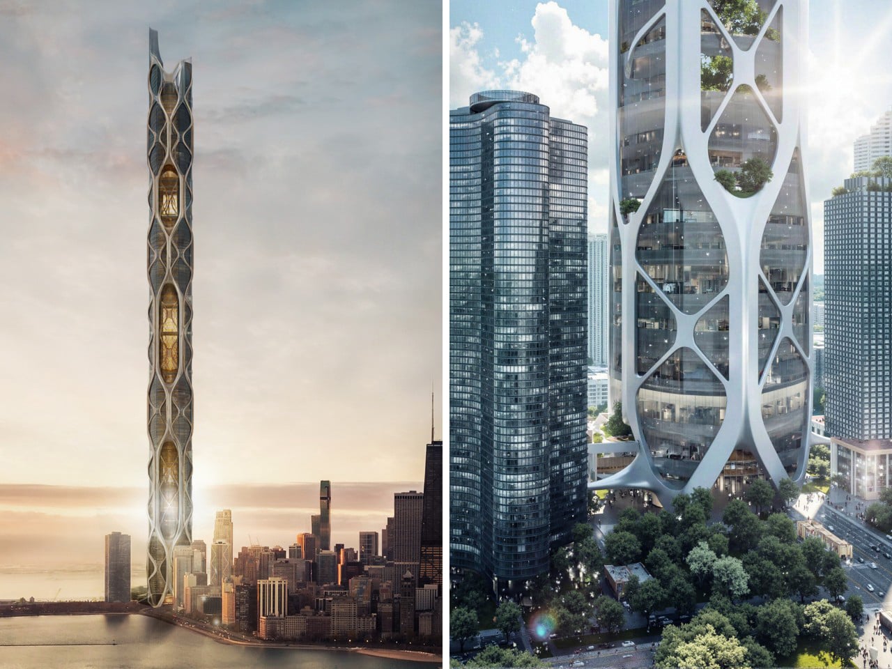
Designer: Yuhan Zhang and Dreama Simeng Lin
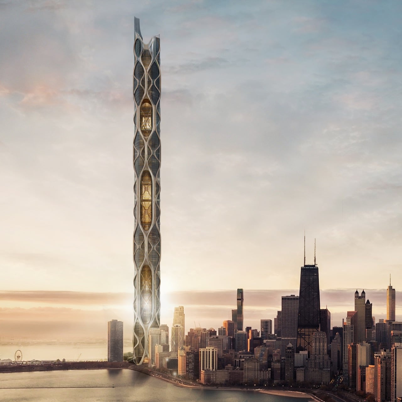
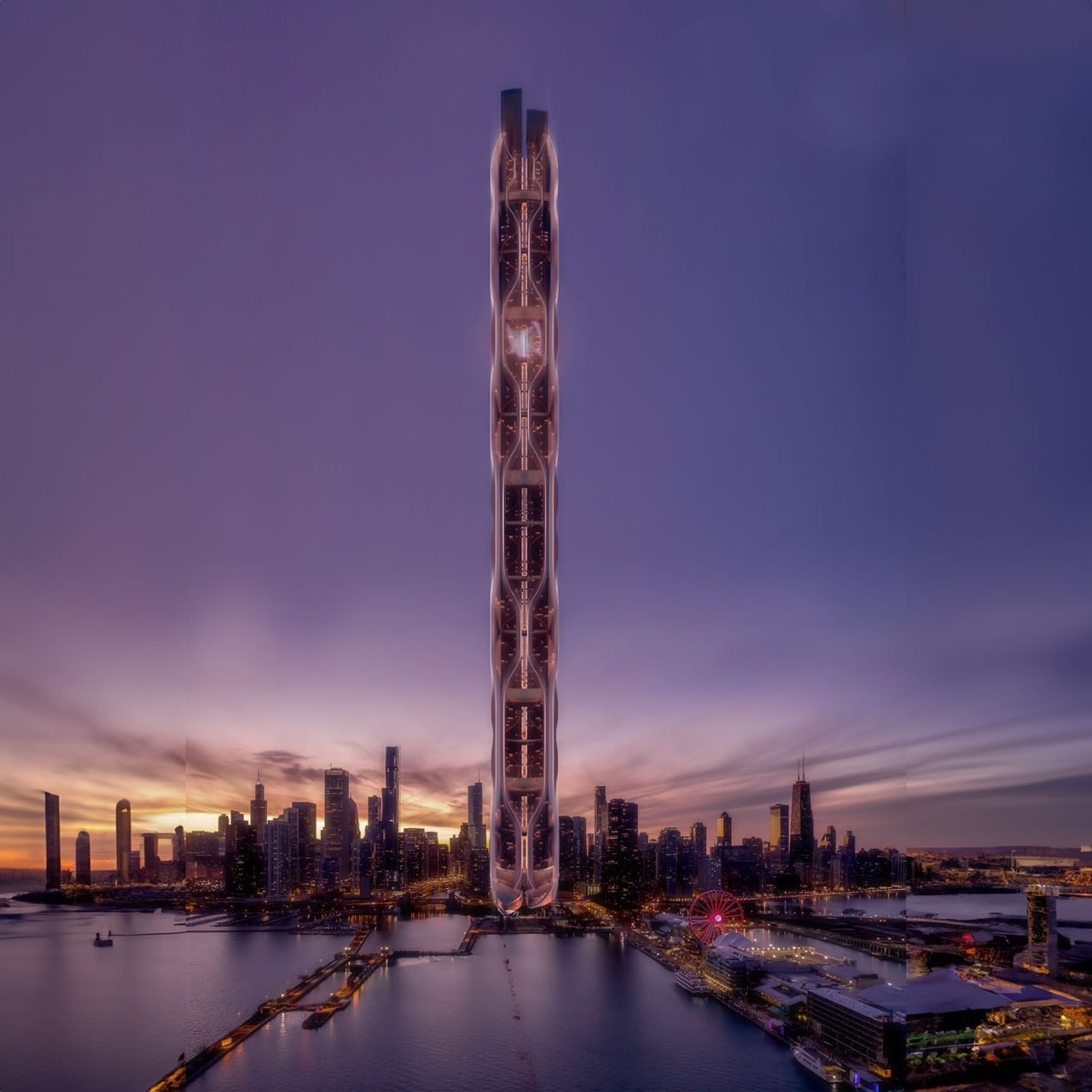
The tower’s design is as poetic as its purpose. Inspired by the fluid form of a water droplet, its organic silhouette reflects Chicago’s relationship with water while symbolizing life, renewal, and sustainability. This fusion of natural inspiration and urban ambition transforms the structure into a vertical extension of the city’s green belt, suggesting a future where skylines are defined not just by height but by ecological intelligence.
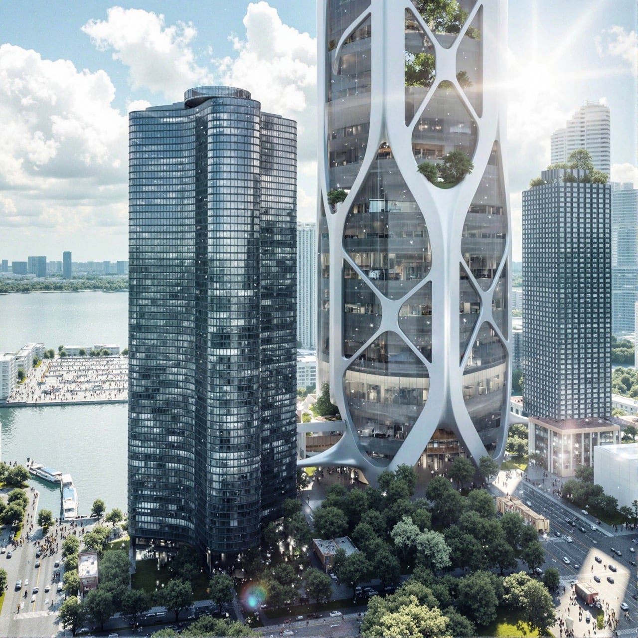
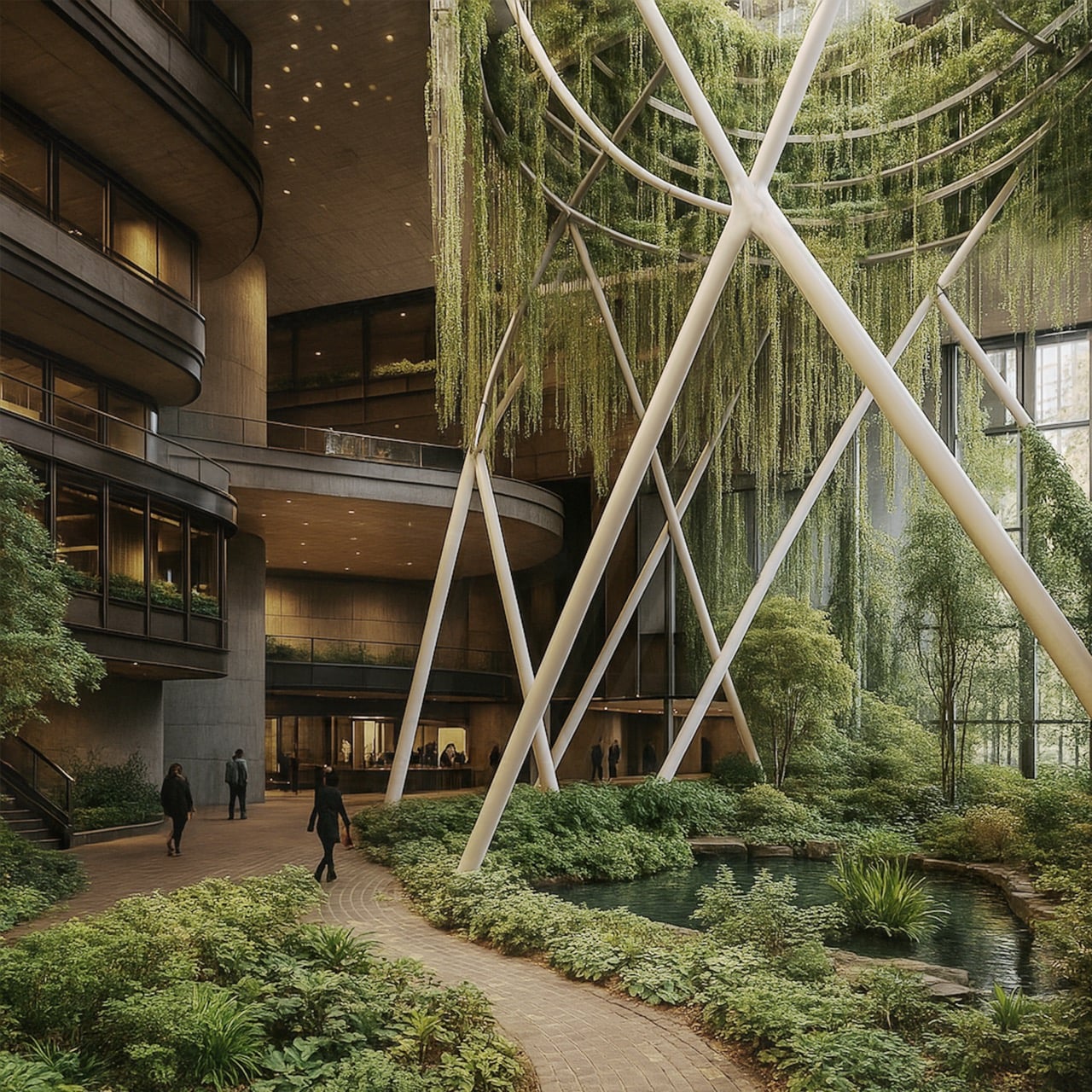
Inside, Eden Rise functions like a city stacked vertically. Homes sit alongside offices, hotels, schools, and recreational spaces, creating a complete lifestyle environment within a single structure. Residents can wake up, work, learn, relax, and socialize without ever needing to commute across town. Schools integrated throughout the tower ensure education is woven into everyday life, while hotels welcome visitors to experience this futuristic ecosystem from panoramic heights. It is urban life condensed, connected, and reimagined.
Scattered throughout the structure are sky terraces that act as elevated parks in the clouds. These lush communal spaces give residents places to gather, breathe, and reconnect with nature despite living in a dense vertical environment. They are not decorative add-ons but essential social and environmental anchors that support well-being and community interaction.
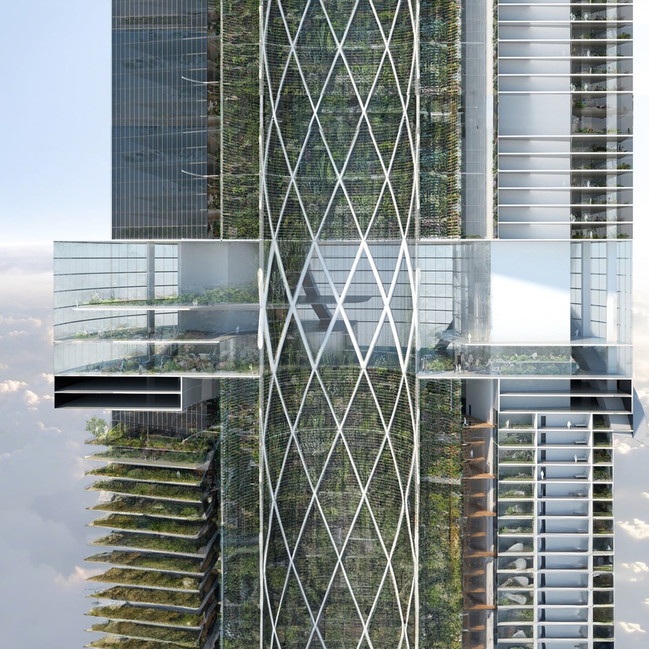
What truly sets Eden Rise apart is its seamless integration of advanced green technologies. Vertical farms in the core supply fresh food. Rainwater collection and cloud harvesting systems recycle water efficiently. Wind turbines built into the exoskeleton generate renewable energy. Natural ventilation and a breathable atrium maximize airflow and daylight, reducing energy use while improving indoor comfort. Each system works together like organs in a living body, turning the tower into a self-sustaining organism.
The engineering behind this vision is equally striking. Four conjoined towers are reinforced by layered bracing systems that provide structural depth and stability. A diagrid pattern spans multiple stories, weaving a network of structural lines that balance strength with elegance. Within this framework, an inner void allows light and air to travel deep into the building, ensuring that even its core feels open and alive.
Eden Rise is more than an architectural proposal. It is a manifesto for the future of cities. It shows how design can confront inequality, reduce environmental impact, and restore the relationship between urban life and nature. In this vision, skyscrapers no longer dominate the landscape. They nourish it.
If realized, the Chicago skyline would no longer be just a symbol of economic power. It would become a symbol of sustainability, equity, and imagination rising together.
The post The Mile-High Tower That Grows Food, Harvests Clouds, and Heals Chicago first appeared on Yanko Design.