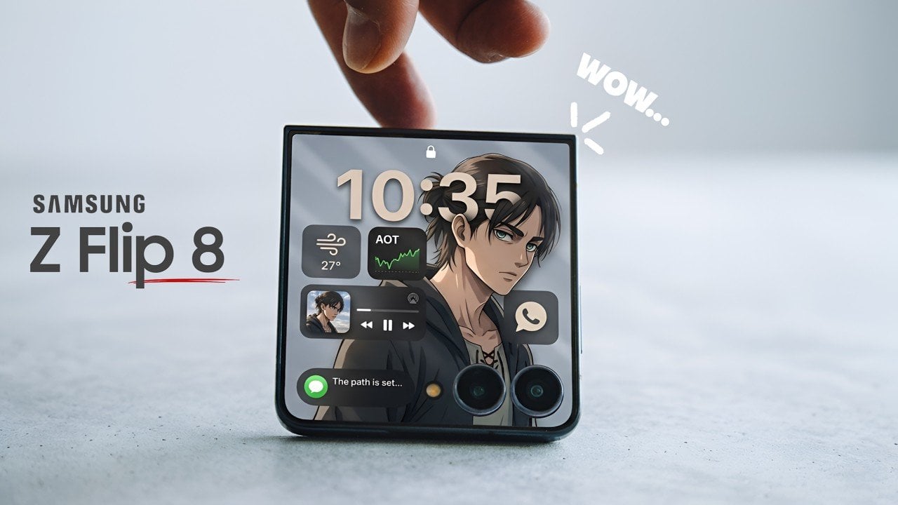
The Samsung Galaxy Z Flip 8, set to debut at the Samsung Galaxy Unpacked event in July 2026, represents a deliberate step forward in foldable smartphone technology. While its outward appearance closely mirrors that of its predecessor, the Z Flip 7, this latest iteration focuses on incremental refinements rather than dramatic overhauls. Samsung’s strategy underscores […]
Nissan’s twin-motor system in Formula E was a new innovation that pushed the boundaries of electric racing technology. By using a regulatory loophole, the team developed a design that combined one motor’s traditional propulsion role with another acting as a kinetic energy storage device, similar to a flywheel. This setup allowed the car to recover […]
IKEA has entered the smart home market with a focus on the Matter over Thread standard, designed to enhance device compatibility and network stability. Over three months of testing, A Smarter House has examined IKEA’s offerings, including the ALPSTUGA Air Quality Sensor, which not only monitors CO2 levels in real time but also serves as […]
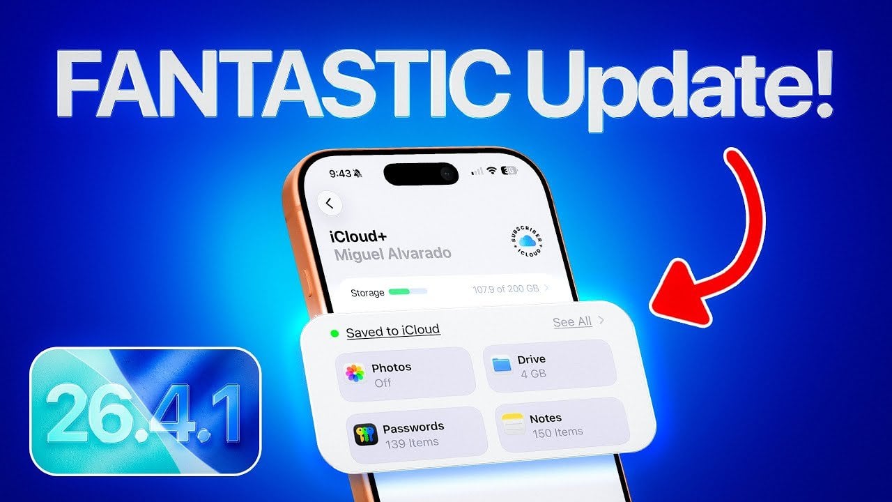
Apple’s iOS 26.4.1 brings a host of improvements, focusing on enhanced security, optimized performance, and greater stability. This update addresses critical bugs and introduces refinements that aim to improve the overall functionality of your device. Whether you’re concerned about protecting your data, extending battery life, or making sure smoother operation, this update delivers meaningful enhancements […]
Apple has officially released iOS 26.5 Beta 2 for developers, with a public beta expected to follow shortly. This update emphasizes minor refinements, bug fixes, and performance enhancements rather than introducing major new features. Alongside iOS, Apple has also updated its other operating systems, including iPadOS, macOS, tvOS, watchOS, HomePod OS, and VisionOS. These updates […]
Many creators have already switched from Adobe Premiere to DaVinci Resolve, and now the developer, Blackmagic Design, is going after Lightroom and Photoshop. The Australian company just unveiled DaVinci Resolve 21 in beta at the NAB 2026 broadcast convention with a brand new page called Photo designed to let you do things like crop and color-correct still images. At the same time, the new version introduces video AI tools that can age a subject or reshape their facial features.
DaVinci Resolve has always let you edit photos as clips on a video timeline, but now it's greatly simplified with the Photo page. You can import and manage photographs, including RAW files from Canon, Fujifilm, Nikon and Sony, directly into the new page. Then, you adjust them using the node-based Color page that offers similar and arguably even more powerful tools than Adobe's Lightroom.
Just as with video, the Color page includes primary color correction, curves, qualifiers and power windows (along with noise reduction, sharpening and more). However, Resolve's node-based workflow really shines for photo editing. You can add nodes in series or parallel to build complex grades, then save them to apply to other images or an entire photo album. You can also reframe and crop images at their original source resolution and aspect ratio, without affecting the original image quality.
Steve Dent for Engadget
The LightBox view lets you see an entire album with grades applied. "Select any image and grade it live while seeing the results update across the whole collection in real time. Filter by graded, ungraded, star rating, flag and clip color," Blackmagic Design explains in a press release. Albums, meanwhile, let you build collections like you do in Lightroom. Those also appear as timelines in the Color, Cut and Edit pages for easy access.
For pro photographers, the Color page includes camera controls that let you tether a Sony or Canon camera to Resolve for live image capture, while adjusting settings like ISO, exposure and white balance. You can save capture presets to "lock in a consistent look before customers shoot," according to Blackmagic.
Other Resolve tools also work with the Photo page, like the AI Magic Mask that lets you make one click selections of an object or person. It's also possible to do advanced VFX on still photos using Resolve's Fusion page, or add OpenFX or FusionFX filters directly on the Photo page. Finally, you can collaborate with others using Blackmagic Cloud, though that does require a paid subscription.
I briefly tested the Photo and Color tools and, as someone who's admittedly familiar with DaVinci Resolve, I found it easy to grasp. It's simple to import and organize images (easier than Lightroom in my opinion) and is as powerful as Lightroom's Develop page for most adjustments, though I really missed the latter's "Clarity" tool. The node based workflow is powerful, and Resolve makes it easier to apply adjustments to multiple images. When you're ready to export, that's done through a special photo-only version of the "Export" page and is relatively intuitive as well. Whether or not I'll cancel my Photoshop/Lightroom subscription remains to be seen, however.
Blackmagic Design
On top of the Photo page, Blackmagic Design introduced a number of new features for video and VFX as well. Among the most interesting are a series of AI tools for facial adjustments. The AI Face Age Transformer tools lets you analyze a face, enter the subject's age and adjust the age offset slider to add things like wrinkles and facial fullness. You can also change the way a subject looks through the AI Face Reshaper tool that lets you adjust the eyes, nose, mouth, eyebrows and overall face shape. Plus, you get an AI Blemish Removal feature that reduces the appearance of superficial skin imperfections like acne, discoloration and large pores, while retaining the skin's natural texture.
Another tool that will no doubt be popular is AI UltraSharpen that can upscale video "to make previously unusable footage sharp in higher resolutions," according to the company. It can also be used to improve slight focus errors. Meanwhile, the AI Motion Deblur fixes slightly blurred images, making it particularly useful for slow motion and freeze frame shots.
Other key new upgrades, to name just a few, include the ability to edit Fusion effects from within the Cut and Edit pages, the addition of the Krokodove library of compositing tools and new immersive VR tools for delivery to platforms like Meta Quest and YouTube VR. Most of the new features are available in Blackmagic Design's free version of DaVinci Resolve, though a couple of tools (AI Magic Mask and Film Look Creator) are only available with the paid, $295 DaVinci Resolve Studio version. A complete list of new features is here and you can download the free and paid versions here.
This article originally appeared on Engadget at https://www.engadget.com/apps/blackmagics-davinci-resolve-21-takes-on-adobe-lightroom-with-a-new-photo-page-053034084.html?src=rss
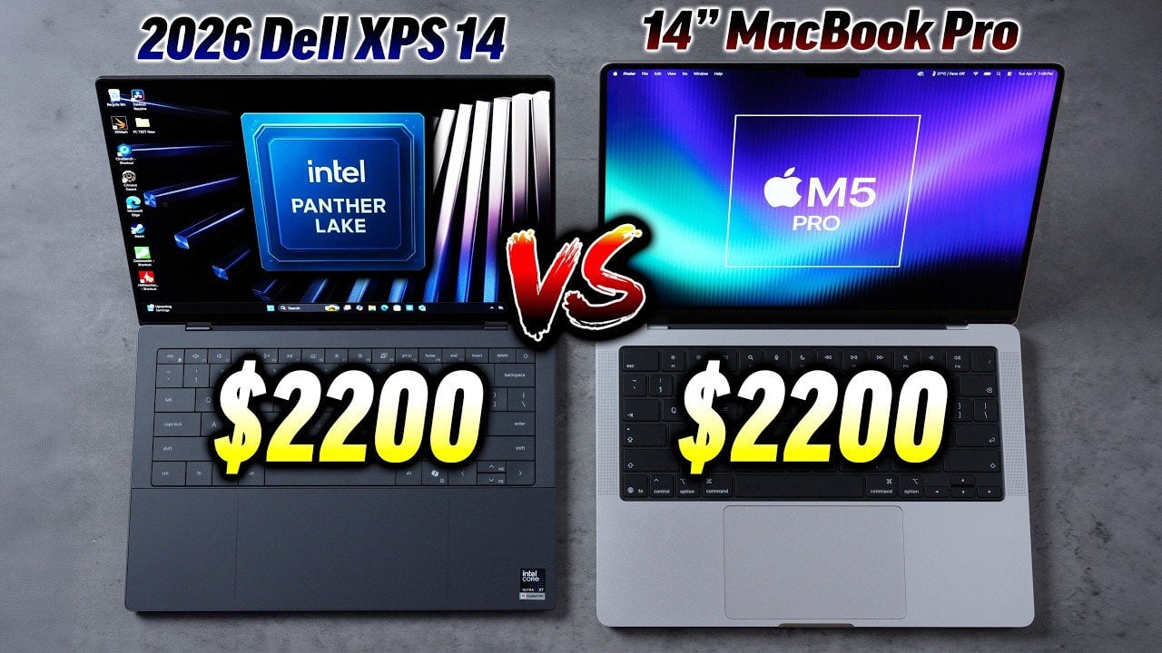
The Dell XPS 14, powered by Intel’s Panther Lake chip, enters the premium laptop market as a direct competitor to Apple’s M5 Pro MacBook Pro. Both devices cater to professionals and tech enthusiasts seeking high performance and sleek design. While the XPS 14 showcases impressive features, it faces challenges in matching the MacBook Pro’s superior […]
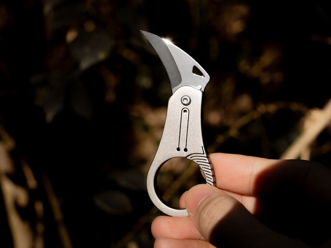
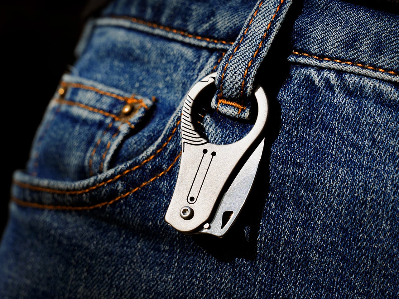
Hawks don’t cut with force. They grip with precision, using curved talons that naturally guide prey into the cutting path while the arc of the claw does the work. That geometry has been proven in harvesting tools, marine rigging knives, and rope work for centuries, but the EDC market keeps defaulting to straight blades that demand downward pressure rather than working with natural hand motion. Curved blades slice with less effort, grip flexible materials without slipping, and concentrate force at the point of contact in ways a straight edge simply cannot replicate. The form factor exists in karambits and hawkbills, but those tools tend to be aggressive, oversized, and built for hard use rather than keychain carry.
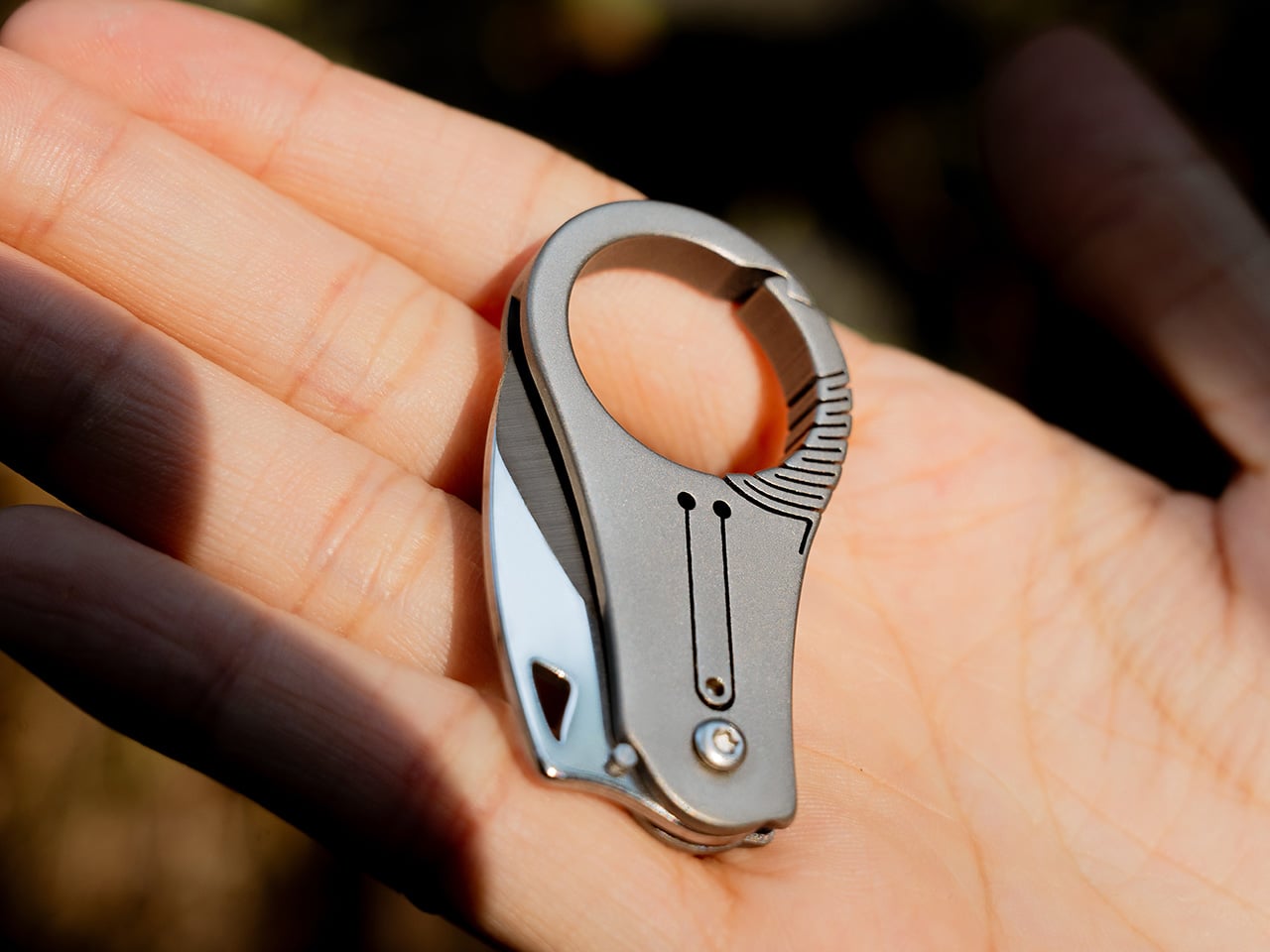
Edgelet’s SpearEdge takes that talon geometry and compresses it into a 66.3mm titanium folder designed for controlled pull cuts in everyday tasks. The curved spine and sharp tip follow the motion your hand already makes when you pull a blade through packaging, cordage, or tape. The finger ring adds stability points to prevent slips, the detent system provides tactile feedback during deployment, and the whole thing weighs almost nothing on a keychain. The blade is 7Cr steel, the handle is titanium, and the open keyring slot at the tail allows instant attachment without tools. Early bird pricing on Kickstarter starts at $29, with free shipping on all rewards.
Edgelet’s previous knife, the ScytheBlade, earned a spot in Yanko Design’s Best EDC Knives of 2025 for its curved talon profile and 46mm frame, but users consistently reported the handle felt too small during extended use. The SpearEdge addresses that directly by stretching to 66.3mm open (up from 46mm) and adding a finger ring grip system that gives your thumb and forefinger actual purchase on the tool. Closed length measures 47.7mm with a 5mm thickness, with a blade geometry tailormade for pull cuts rather than straight-edge slicing. The 7Cr steel blade can be touched up with any basic sharpener, which separates it from tungsten-tipped competitors like the BITZ that hold an edge longer but can’t be resharpened in the field.
The cutting sequence happens in two phases. The sharp tip pierces materials first, allowing precise entry when you’re opening packages without damaging contents or cutting cordage without fraying the ends. Once the tip penetrates, the curved edge guides the cut in a smooth arc that reduces resistance and grips flexible materials to prevent slipping, which straight blades cannot replicate. The micro-curved spine follows natural hand motion during a pull cut, turning geometry into mechanical advantage. Edgelet tested this extensively on tape, rope, and packaging materials, all of which resist straight blades by pushing away from the edge rather than staying engaged during the cut. The talon profile keeps constant contact with the material as you pull, which is why hawkbill and karambit geometries have dominated rope work and marine rigging for centuries.
The finger ring creates a stability point that prevents the tool from rotating or slipping during use, critical when operating a blade this small with only thumb and forefinger pressure. You can apply controlled force without worrying about misalignment, and the ring doubles as a secondary grip surface when repositioning mid-cut. Titanium handle construction keeps weight minimal and corrosion-resistance high, while the pivot tension and detent system provide audible clicks when the blade locks into open or closed positions. That tactile feedback confirms the blade has seated properly, reducing accidental deployment or closure during carry. The detent ball engages a notch in the blade tang, creating enough resistance to keep the knife shut in your pocket but light enough to deploy with a thumbnail flick on the jimped wheel.
The open keyring slot at the tail threads directly onto keys, carabiners, or lanyards without split rings or additional hardware. Titanium construction keeps the knife light enough to genuinely disappear on a keychain rather than creating a bulge or hotspot against your leg. The folded profile stays slim at 5mm, comparable to two stacked house keys. Edgelet designed this for people who have tried carrying full-sized EDC knives and found them too heavy, too bulky, or legally questionable depending on local blade-length restrictions. Urban carry, travel, and office environments all favor tools that stay under the radar while remaining functional. The curved blade geometry also suits anyone cutting packaging, cordage, or flexible materials where straight blades tend to push rather than slice.
The SpearEdge is currently live on Kickstarter with early bird pricing starting at $29, with standard pricing at $32 for a single unit. All rewards include free shipping worldwide. Add-ons are available, including replacement blades for $9.90, a titanium bottle and can opener for $14.99, and an EDC carry pouch for $5.99. The SpearEdge ships globally starting June 2026. The SpearEdge works as a primary carry for minimalists or as a backup blade for those already carrying a larger folder but wanting something lighter on a secondary keychain or bag loop. If you’ve used the ScytheBlade and wished for more cutting edge and better grip, this delivers both without adding meaningful bulk.
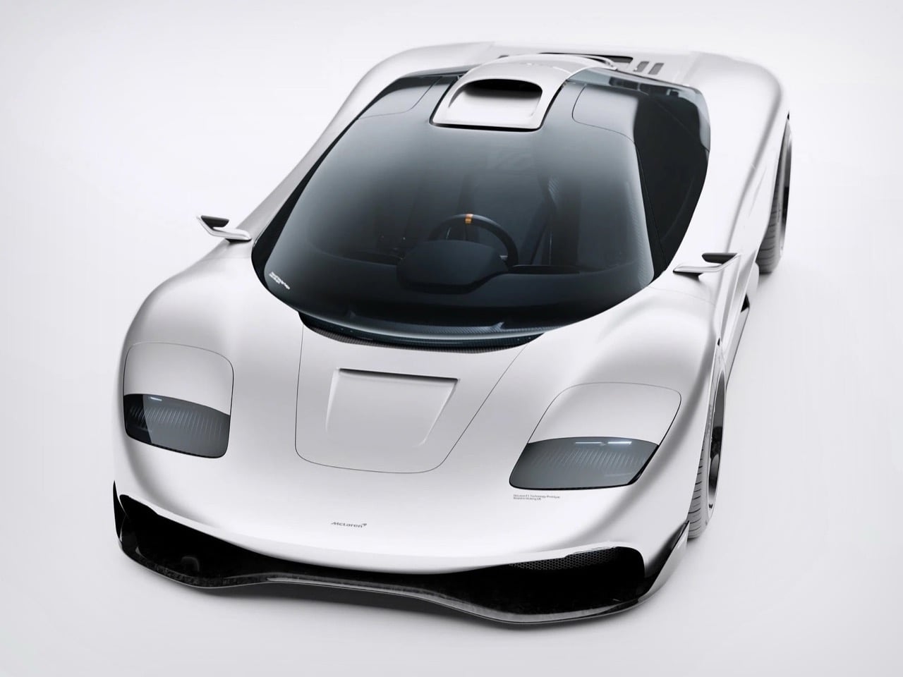
What does a McLaren F1 look like when you strip away the constraints of 1990s manufacturing technology but keep the design philosophy intact? That was the challenge Kevin Andersson set for himself when he began reimagining the iconic supercar as a personal design study. The original F1 was the product of specific limitations: Gordon Murray’s engineering team worked with the tools, materials, and aerodynamic understanding available in the early 1990s, and the car’s form emerged from that context. Andersson’s concept operates in a different world, one where carbon fiber monocoques are routine, where Formula 1 suspension systems inform road car design, and where Blender can generate photoreal renders that communicate design intent with startling clarity.
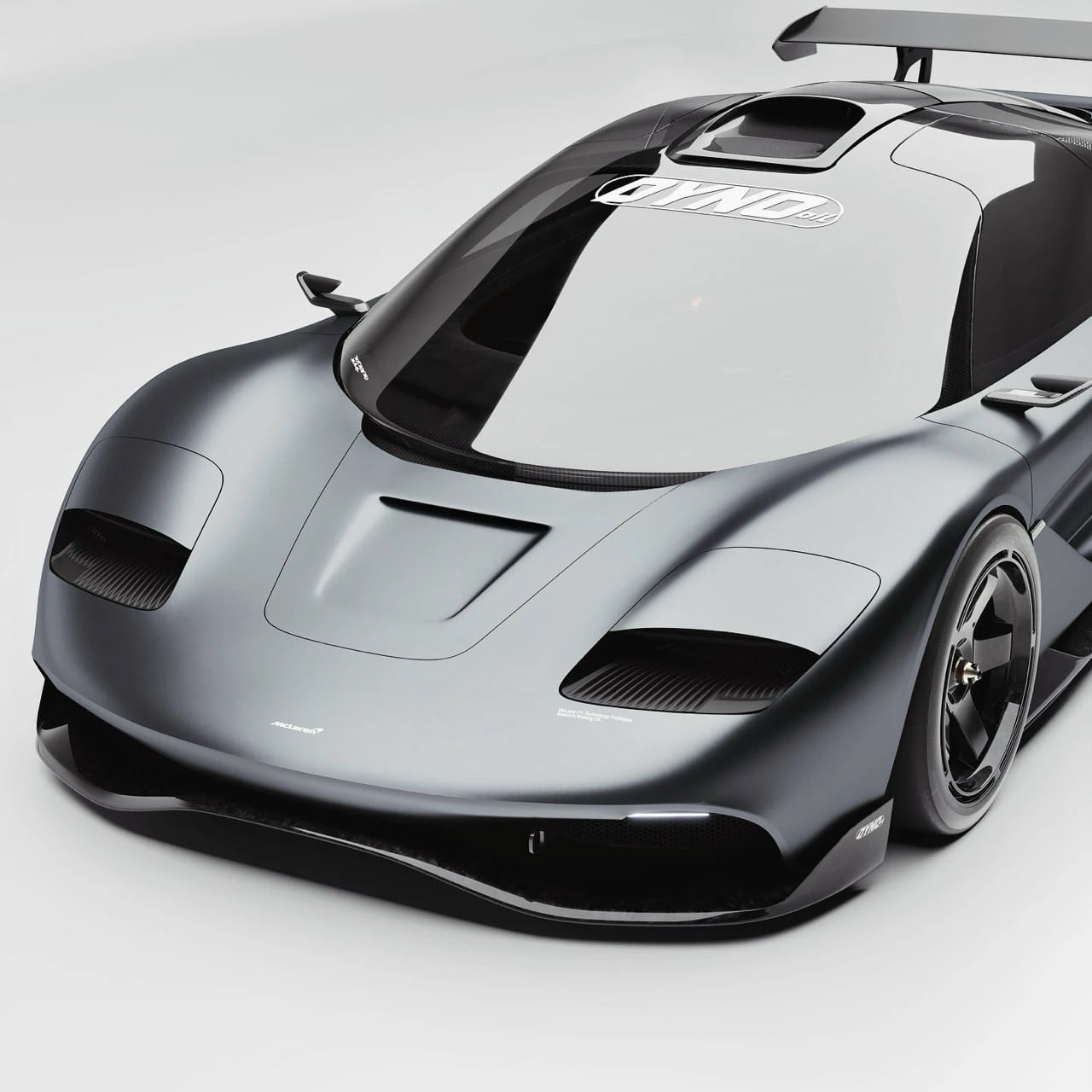
The reimagined F1 maintains the sacred proportions of the original while evolving its surface language into something more contemporary. The long hood remains, a visual reminder that this car houses a naturally aspirated engine positioned just behind the driver. The greenhouse retains the cab-forward stance that made the original F1 look like it was moving even when parked. The rear haunches are muscular without being cartoonish, and the whole package reads as a single, cohesive form rather than an assembly of disparate parts. Andersson’s renders, shot in both glossy white and menacing dark gray, show a car that could plausibly emerge from McLaren’s design studio today if the brand decided to revisit its analog past.
Designer: Kevin Andersson
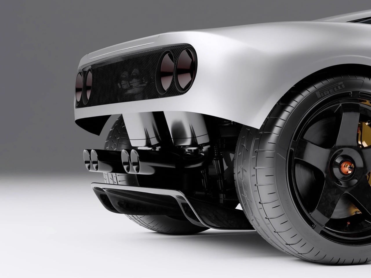
Andersson began with the monocoque, the structural skeleton that defines a car’s fundamental character. His design uses an exposed carbon fiber tub that references contemporary Formula 1 construction, with integrated mounting points for pushrod suspension components visible in the cutaway renders. The suspension itself draws directly from modern F1 technology, using inboard-mounted dampers and pullrod geometry at the front, pushrod at the rear. Gold-anodized brake calipers grip carbon-ceramic rotors, a functional nod to the original F1’s gold-lined engine bay. The exhaust system, rendered in titanium with a purple-blue heat patina, exits through centrally mounted tips that echo the original car’s triple-pipe signature.
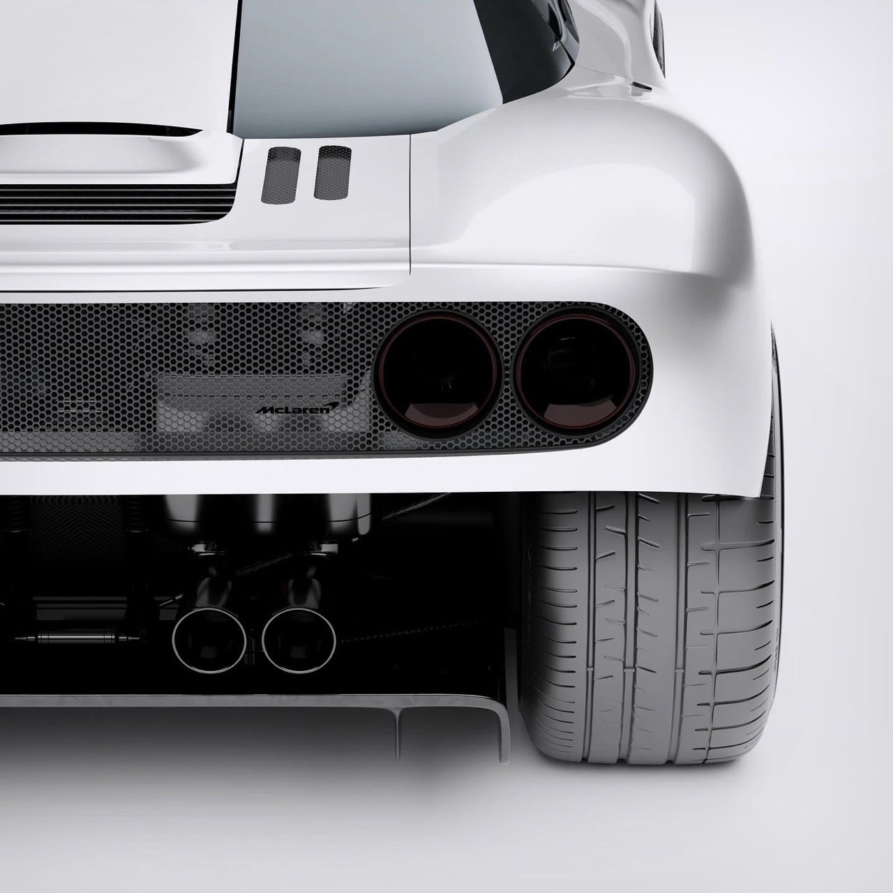
The exterior form language walks a careful line between heritage and modernity. Andersson retained the original F1’s defining visual cues: the teardrop cabin, the prominent side air intakes, the dihedral doors (he kept the distinctive upward-swinging doors rather than the gullwing configuration). The headlights are recessed horizontal units that recall the original’s pop-up lights without literally reproducing them. The front splitter and rear diffuser are far more aggressive than anything Gordon Murray would have approved in 1993, a reflection of three decades of aerodynamic development in motorsport. The rear wing deploys from a recess in the engine cover, maintaining clean lines when retracted but providing genuine downforce when needed.
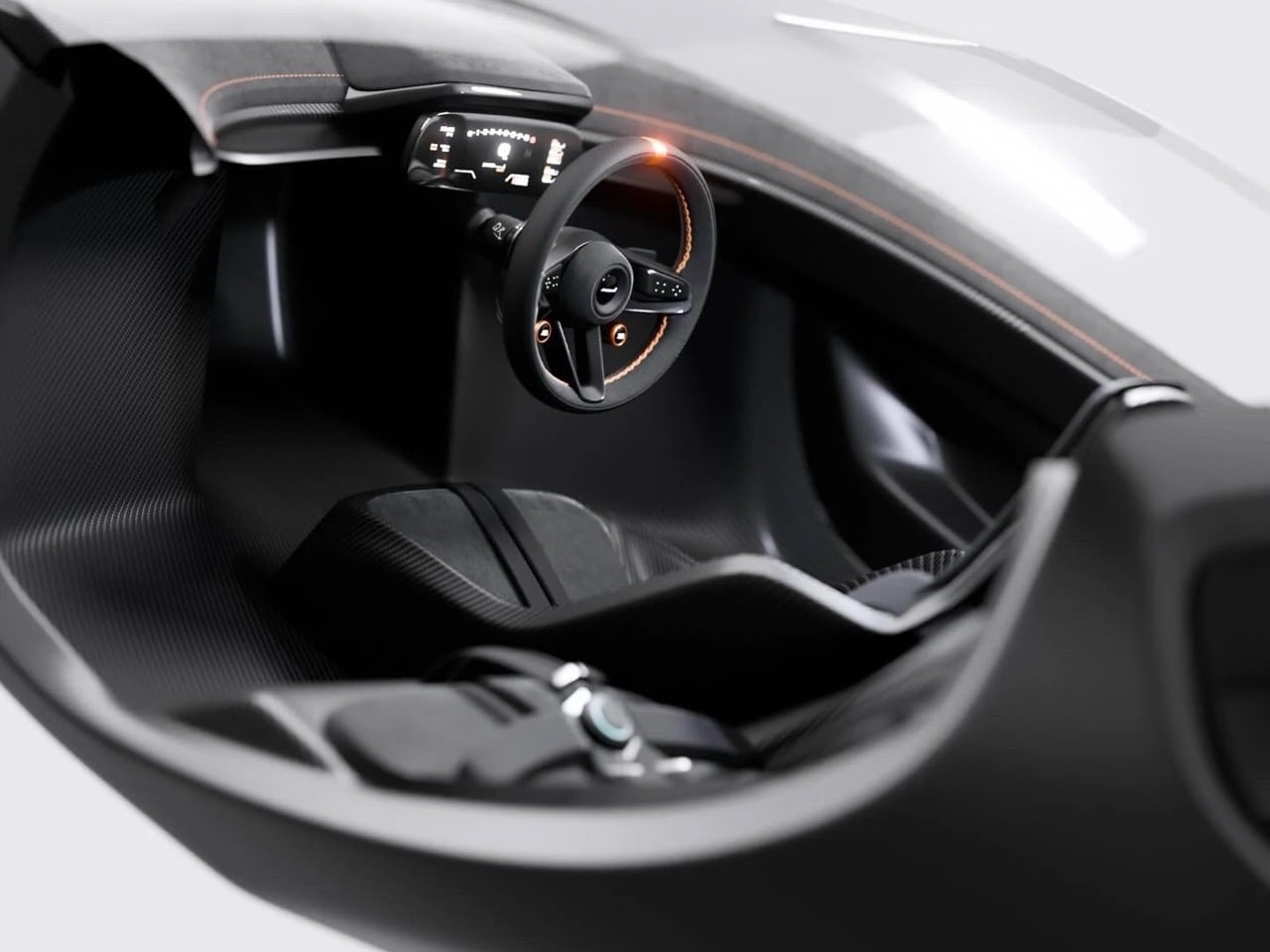
Inside, the central driving position remains sacred. Andersson designed a minimalist cockpit wrapped entirely in carbon fiber, with two flanking passenger seats positioned slightly rearward in the classic McLaren F1 three-seat configuration. The steering wheel is a flat-bottomed carbon unit with integrated controls and orange anodized paddle shifters. The instrument cluster is a single curved digital display that spans the width of the dash, showing speed, revs, and telemetry data with the clarity of a modern race car. Orange contrast stitching runs throughout the black leather trim, providing visual warmth without compromising the cockpit’s focused, technical atmosphere. The six-point harnesses are mounted directly to the carbon tub, reinforcing the competition intent.
Andersson’s eight-month journey from initial concept to final renders demonstrates what’s possible when a talented designer commits to a genuinely thoughtful reinterpretation rather than a superficial homage. His McLaren F1 Reimagined preserves the original’s analog soul while embracing the materials, manufacturing techniques, and aerodynamic understanding that define contemporary hypercar development. The renders communicate a car that Gordon Murray might actually approve of, a genuine evolution of his original vision rather than a pastiche. Whether McLaren itself will ever revisit the F1’s central-seat, naturally aspirated philosophy remains unlikely, but Andersson has shown what that future could look like if they did.
Streaming hasn’t killed physical media. It’s made us crave it more. CDs are back in rotation, showing up in record stores, apartments, and design studios with a renewed sense of purpose. Some of it comes down to sound: a format that doesn’t compress or buffer. A lot of it is about the object itself. A disc, a sleeve, a machine worth looking at. Things that feel considered in a world that mostly isn’t.
The players featured here range from transparent sculptures to boombox revivals, from minimalist concept blocks to award-winning portables with genuine design credentials. Each one has a clear point of view. Whether you’re rebuilding a hi-fi setup or just want something to put a CD in that doesn’t feel like a relic, this list proves that the format and the hardware around it can be genuinely beautiful. Seven players. Seven reasons to press play.
1. ClearFrame CD Player
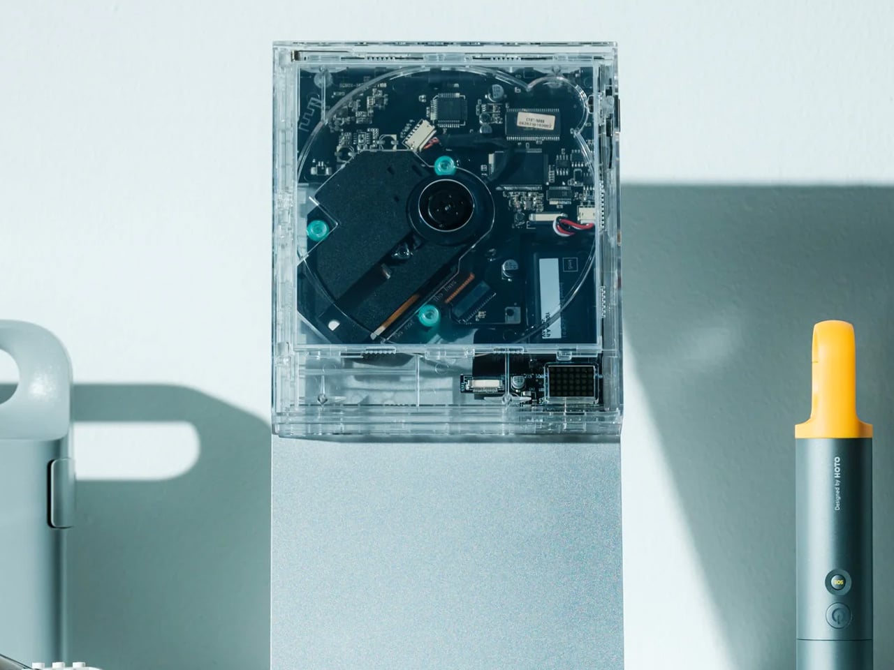
Most CD players hide their engineering. The ClearFrame does the opposite, wrapping everything in crystal-clear polycarbonate so the circuit board becomes part of the experience. The result sits somewhere between gadget and display piece: you see the disc spin, the components work, the music moves through the machine. It’s built for people who love the ritual of physical media and want that ritual to look good doing it, on a shelf, a desk, or mounted on a wall.
Slide in the disc and prop the album sleeve in the front window. The ClearFrame turns your favorite record into a framed display. With Bluetooth 5.1, a seven-hour rechargeable battery, and multiple playback modes, it’s practical enough to go wherever you do. The square silhouette keeps things gallery-clean while the exposed circuitry underneath adds texture and personality. It’s the kind of object that makes you want to rebuild a CD collection just to have something worth putting on display.
The transparent body doubles as an album frame, making the sleeve a visible part of the experience
Bluetooth 5.1 and a seven-hour battery make it genuinely portable without sacrificing the display concept
What We Dislike
The clear polycarbonate housing will show fingerprints and dust more readily than any solid casing
Wall mounting requires a separately purchased bracket, which adds to the overall cost
2. Bumpboxx BB-777
The BB-777 doesn’t whisper. It makes a statement. Bumpboxx pulled directly from the GF-777, one of the most iconic boomboxes of the 1980s, and rebuilt it for the present day. Stretching 29.6 inches across with dual cassette bays, four large front-facing drivers, a long analog tuner strip, and two telescoping antennas, it reads instantly as the kind of machine that belongs center stage. CD, cassette, radio, Bluetooth: a format-agnostic system that refuses to stay in the background.
At 270W, it fills a room without asking permission. The wide horizontal body, the carry handle, the spacing of the controls — every detail is faithful to the original without veering into nostalgia-trap territory. The BB-777 plays CDs, cassettes, and the radio while connecting wirelessly via Bluetooth. It’s designed to be heard and seen in equal measure, the kind of system that changes the energy of whatever space it lands in. Not a background device. A destination.
The faithful ’80s aesthetic is executed with full commitment, not as a gimmick or a costume
270W output paired with multi-format playback makes it a genuine room-filling entertainment system
What We Dislike
At 29.6 inches wide, it demands a significant and very specific amount of physical space
The maximalist retro aesthetic won’t suit every interior or every taste
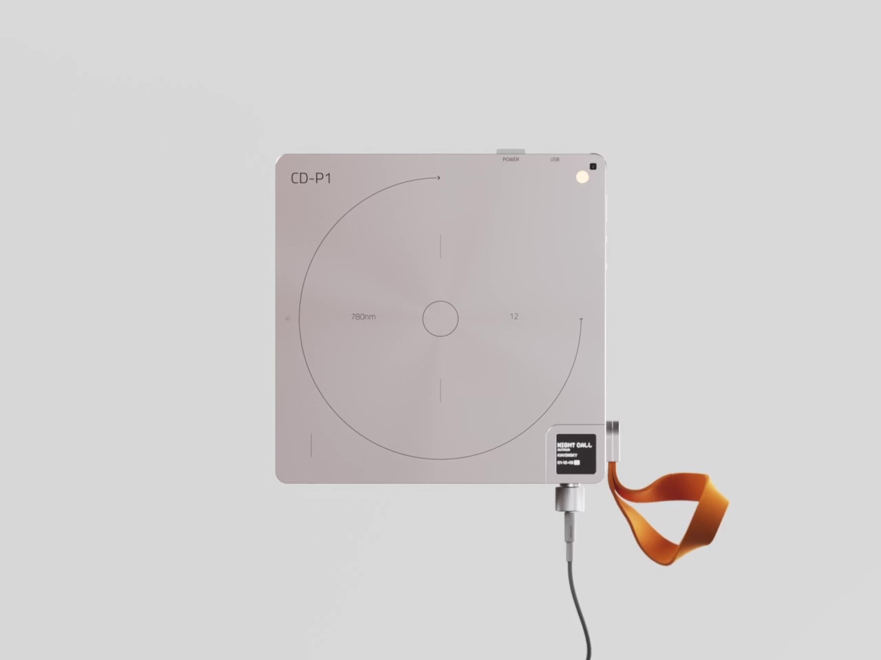
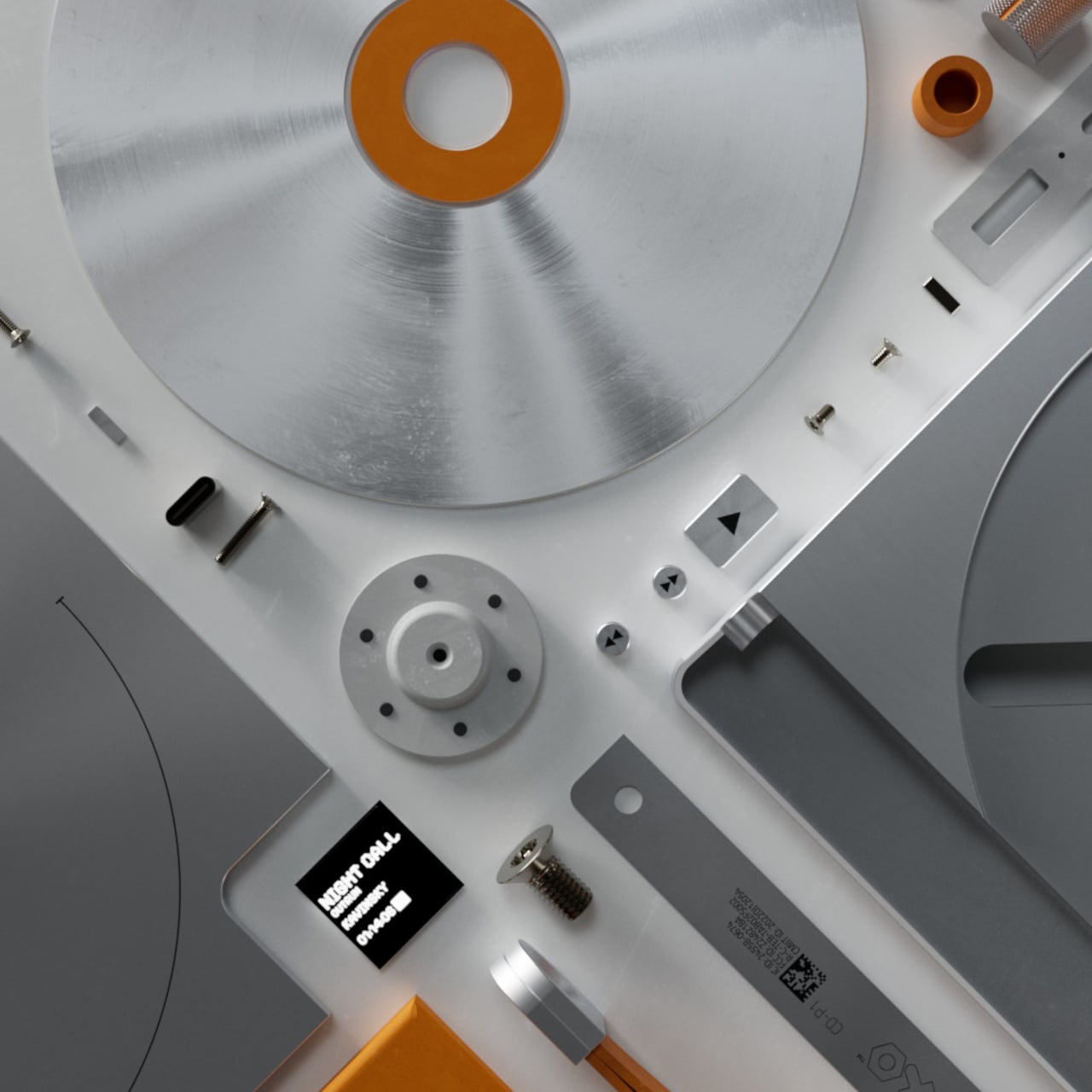
3. CD-P1
This concept takes Teenage Engineering’s most recognizable quality, restraint, and applies it to a format that usually gets treated as background technology. The result is a metallic square block with almost nothing readable on its surface. The CD bay barely announces itself, just a thin circle scored into the top face, until you realize the entire top surface lifts as one. For a machine built around spinning discs, the absence of visual noise is startling and exactly right.
Every control element earns its place. A volume knob disappears into one of the rounded corners, flush with the body until your fingers find it. The headphone jack breaks from the minimalist logic: a small knurled cylinder jutting from the bottom edge, textured and tactile, almost inviting you to pull or twist it. The concept leaves some functional details open, but the design language is unambiguous. This is what a CD player looks like when you refuse to make compromises anywhere.
What We Like
The volume knob hidden inside a rounded corner is a quietly brilliant piece of design thinking
The metallic square format sits in any space without drawing unnecessary attention to itself
What We Dislike
As a concept, key functionality and production specifications remain unconfirmed
The extreme minimalism may make basic operations less intuitive in everyday use
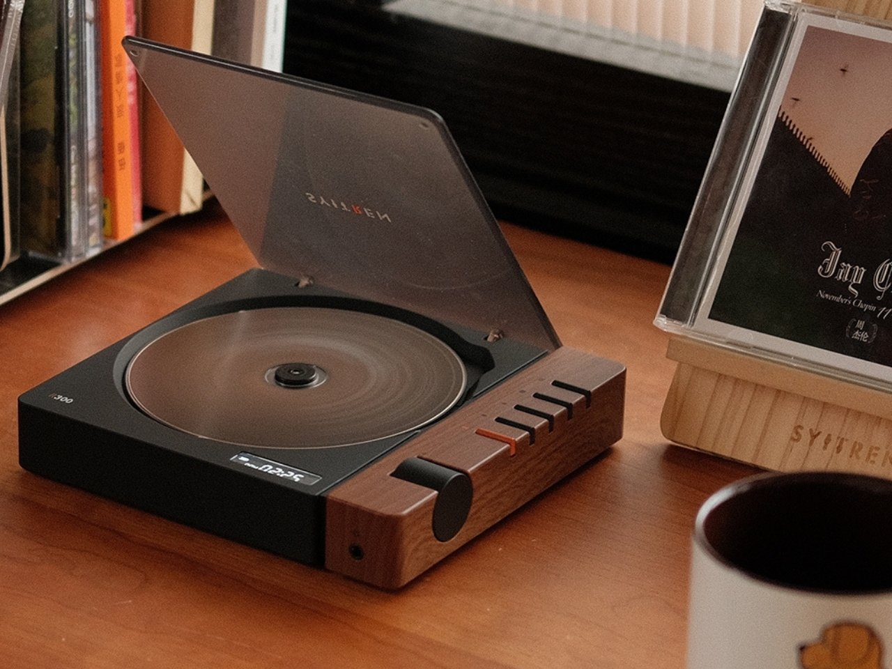
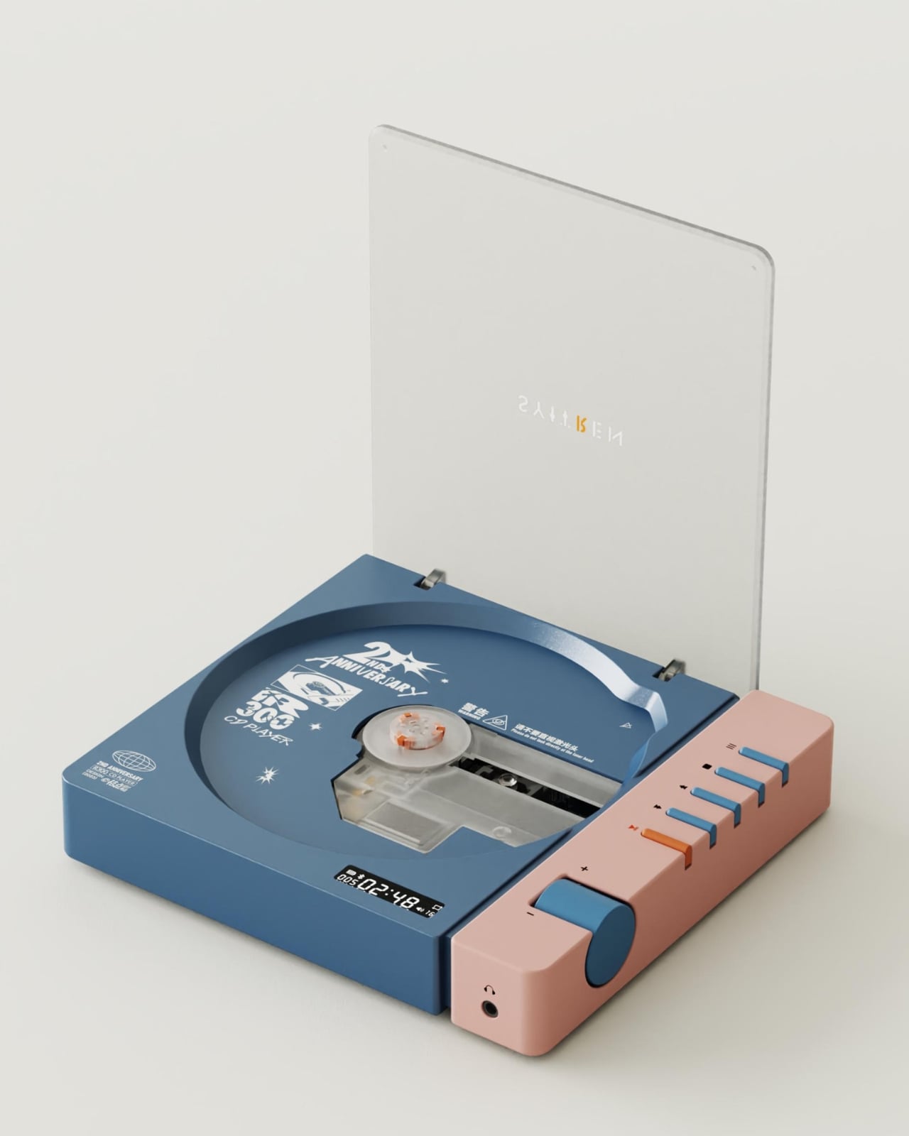
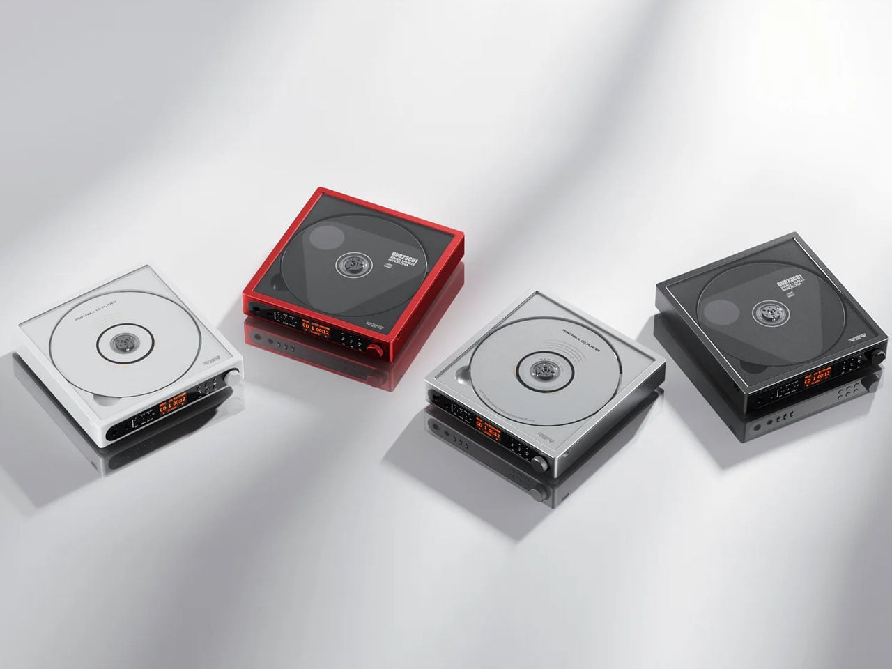
4. SYITREN R300
The R300 arrived wearing its intentions clearly. Those finish options, wood grain, clean white, and a fruit green that has no business looking as good as it does, signal that audio equipment doesn’t need to default to satin black to be taken seriously. A MUSE Design Gold Award in the Audio and Video Devices category validated what you can already see: this is a player that understood the brief and executed it with genuine care for the object.
The dynamic area button on the right side is designed for intuitive, tactile control, the kind of physical interaction you want from a portable you pick up and put down regularly. It supports CD, CD-R, and CD-RW formats, covering virtually every disc in most collections. Whether it sits on a kitchen shelf or a coffee table, the R300 settles into a space without looking like an afterthought. It carries the quiet confidence of a product that knows exactly what it is.
What We Like
The fruit green finish is a bold, deliberate choice that actually earns its place in any room
The MUSE Design Gold Award reflects a product that delivers well beyond the surface of its aesthetics
What We Dislike
Three colorway options may still feel limiting for those wanting something more singular or custom
The retro-leaning design language will resonate more naturally with some aesthetics than others
5. Portable CD Cover Player
This one solves a problem most people didn’t know they had: what to do with the album art while the music plays. The CD Cover Player keeps the sleeve front-facing while the disc spins, turning a listening session into something closer to a gallery moment. A built-in speaker and rechargeable battery mean you can carry it from room to room or hang it on a wall. It shifts how you relate to your collection by making the visual half of it fully visible.
The minimalist form keeps everything balanced. Nothing competes with the artwork’s framing. Music becomes visual here, and that’s deliberate. There’s real value in slowing down enough to look at what you’re listening to, and the Cover Player builds that pause into its design. Whether it sits on a desk or mounts like a picture frame, it handles both functions without compromise, suiting anyone who thinks of their CD collection the same way they think about the art on their walls.
Displaying the album cover while music plays adds a genuinely new dimension to the listening ritual
The wall-mountable design functions as striking home decor even when music isn’t playing
What We Dislike
The wall mount bracket is sold separately, which adds to the overall cost of the experience
The built-in speaker, while practical, may not satisfy more critical or discerning listeners
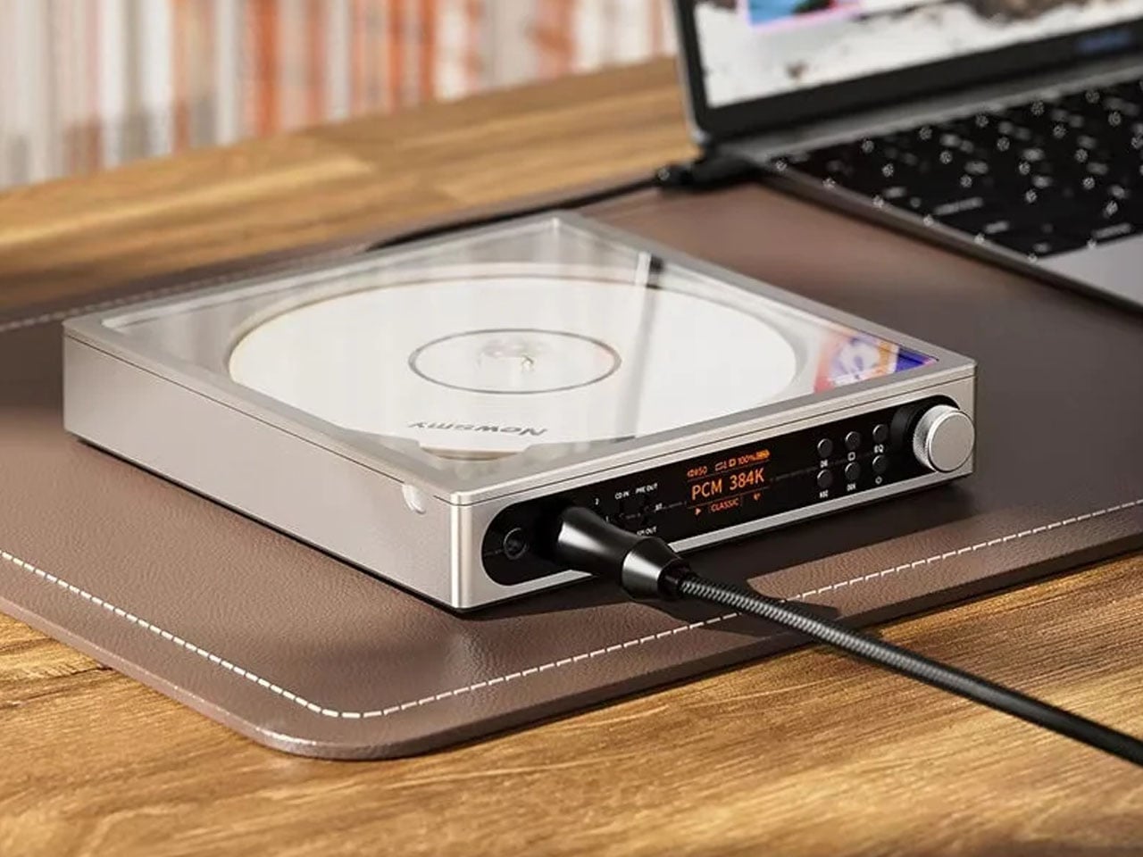
6. FiiO DM15 R2R
The DM15 R2R is where the CD revival gets serious. FiiO built this successor to the DM13 around a compact aluminum chassis with a transparent top panel that lets you watch the disc spin, a small but satisfying detail for anyone drawn to the physicality of the format. The R2R discrete ladder DAC architecture underneath is the real draw, bringing a level of engineering to a portable form that most standalone players at this size simply don’t attempt.
Beyond disc playback, the DM15 R2R works as a full USB DAC outputting up to 32-bit/384kHz PCM and native DSD256, figures that put it well above what its compact size suggests. A seven-hour rechargeable battery handles long sessions wire-free, while optical, coaxial, 3.5mm, and balanced 4.4mm outputs cover every system you’re likely to connect it to. For anyone building a physical media setup around sound quality, this is the component that makes everything around it perform better.
What We Like
R2R discrete ladder DAC architecture is genuinely rare to find in a portable CD player at any price
USB DAC mode at 32-bit/384kHz PCM and native DSD256 extends its usefulness well beyond CDs
What We Dislike
The depth of technical specification may exceed what casual listeners need or want from a portable
The understated aluminum chassis, while elegant, won’t appeal to those wanting a more expressive object
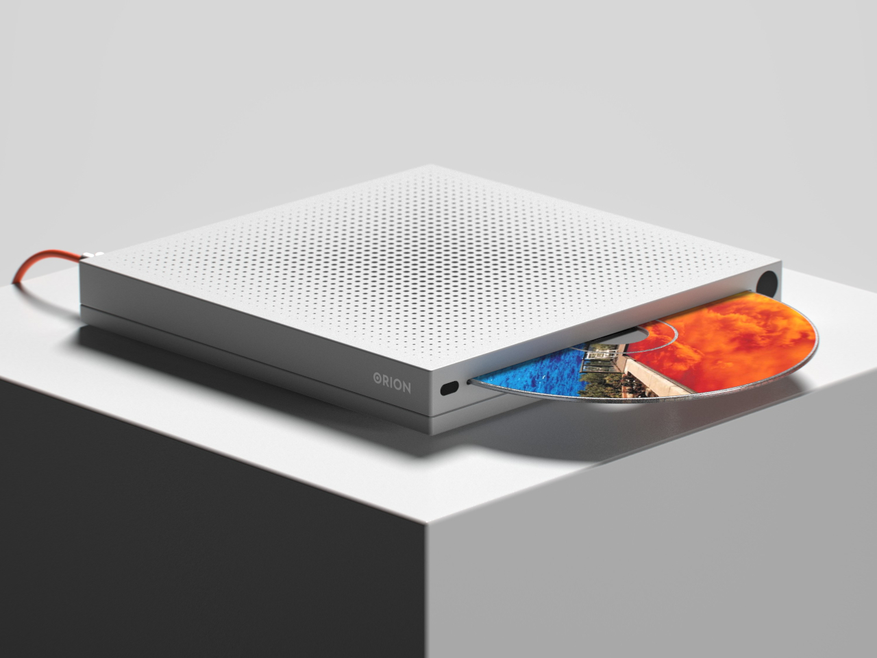
7. Orion
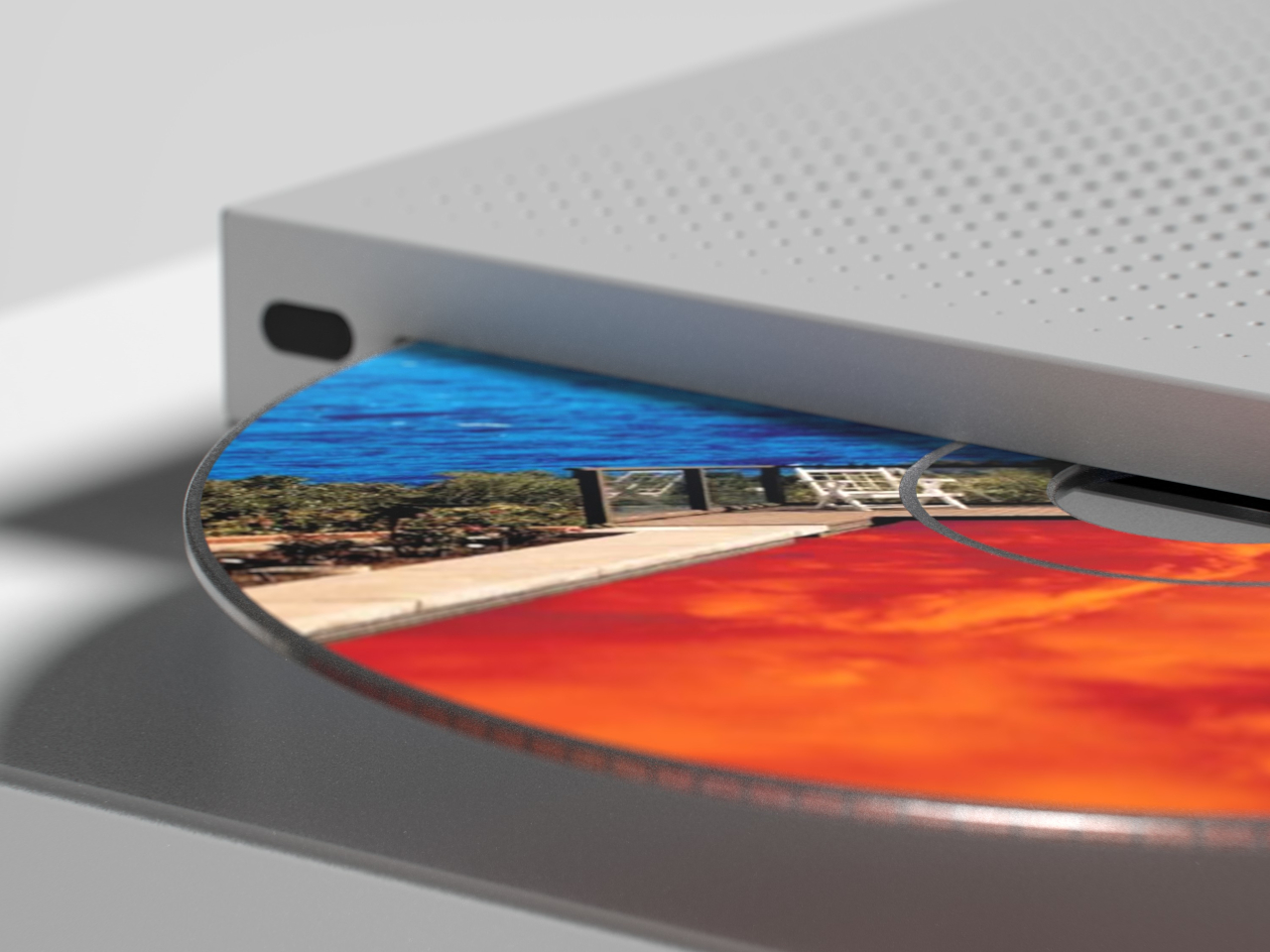
Designed by Vladimir Dubrovin, the Orion doesn’t bother with flaps or hinged lids. You slide the disc in through a thin front slot, and that’s it. A powder-coated metal body gives it an industrial calm, with almost nothing on the surface to distract from its form. An eject button, an IR receiver at the front, a power socket at the back — the controls are so reduced they barely register. It’s the kind of restraint that takes more confidence to execute than decoration ever would.
What keeps it from tipping into cold territory is the top surface. The perforations up there follow a parametric logic: holes grow larger toward the center, then taper back out toward the edges. The pattern was generated using Grasshopper 3D, a node-based parametric system that creates a logical relationship between each perforation and its proximity to the device’s outer contour. It’s a quiet flourish in an otherwise clinical design — the one place where the Orion lets geometry do the talking, and it’s enough.
What We Like
The parametric perforation pattern is engineered with genuine logic, making it feel earned rather than decorative
Front-loading slot design removes all mechanical clutter, keeping every surface clean and purposeful
What We Dislike
As a concept, it remains unproduced with no confirmed specifications or release timeline
The extreme restraint in controls may feel inaccessible to those who prefer tactile, readable interfaces
The Disc Is Back. And It Brought Better Hardware With It.
The CD player doesn’t need defending anymore. These seven designs make the case without argument: physical media is back, and it looks better than ever. Whether you want transparency, volume, minimalism, or award-winning color, there’s a player here that fits the shelf space and the listening habit. The format never lost its quality. It just needed the hardware to catch up with what the moment demands.
Put a disc in something beautiful and see what happens. The ritual is still there, the sleeve, the track listing, the deliberate act of choosing a record and committing to it. These players don’t compete with streaming. They offer something streaming can’t: a reason to sit still and listen. That’s the real comeback. Not nostalgia. A better way of paying attention to music you already love.