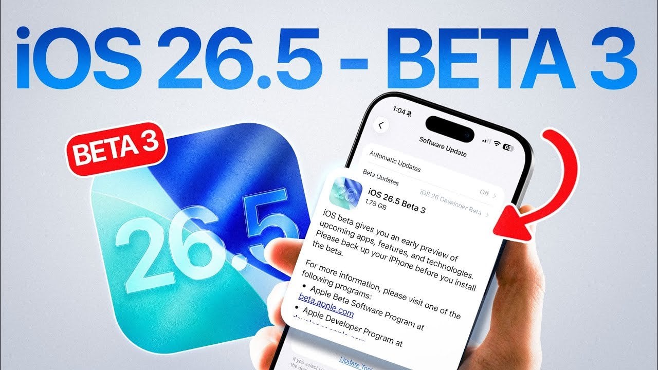
Apple has officially rolled out iOS 26.5 Beta 3 for developers, marking a critical step in its ongoing software development process. A public beta release is anticipated within the next 24-48 hours, consistent with Apple’s established weekly beta schedule. This update emphasizes performance improvements, hints at potential new features and aligns with updates across Apple’s […]
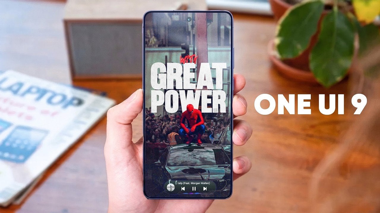
Samsung’s One UI 9, built on Android 17, introduces a comprehensive suite of updates aimed at enhancing usability, design and functionality. With improvements spanning file sharing, widgets, notifications, and more, this update is crafted to elevate your smartphone experience. The video below from TechTalkTV gives us more details on the rumored changes, organized to help […]
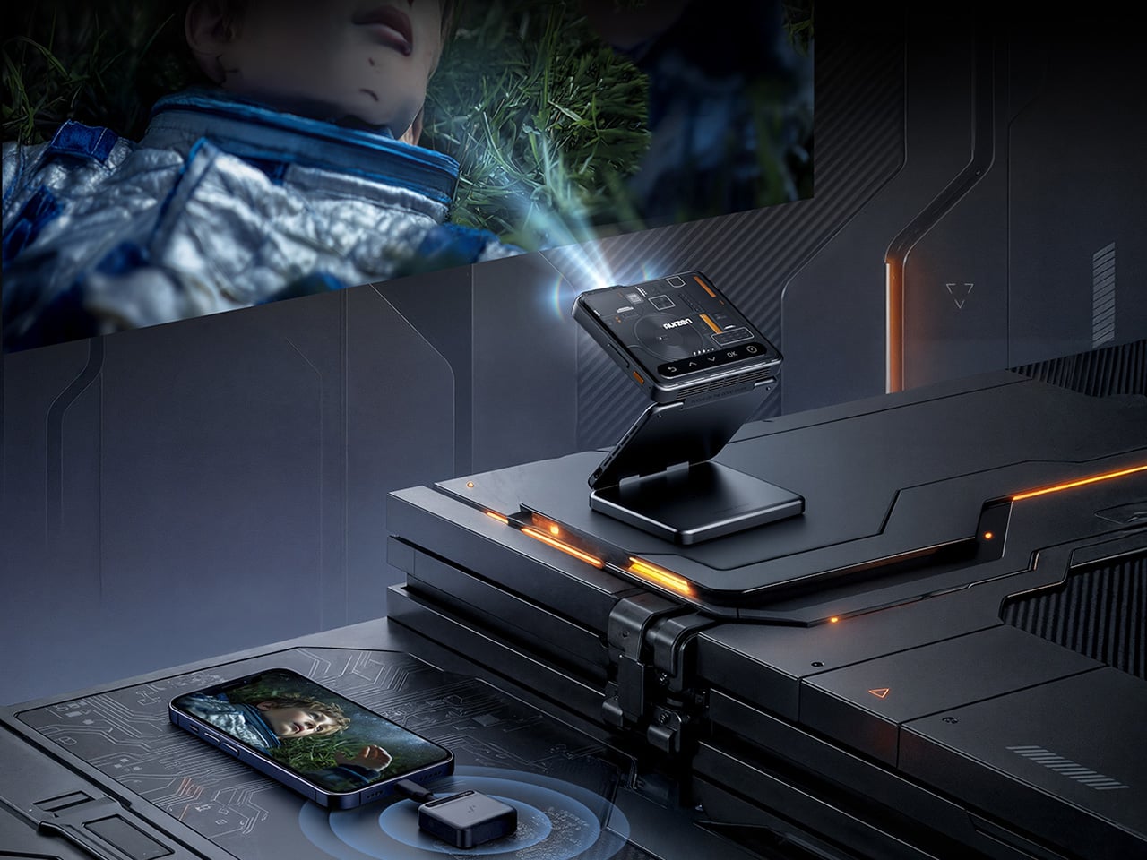
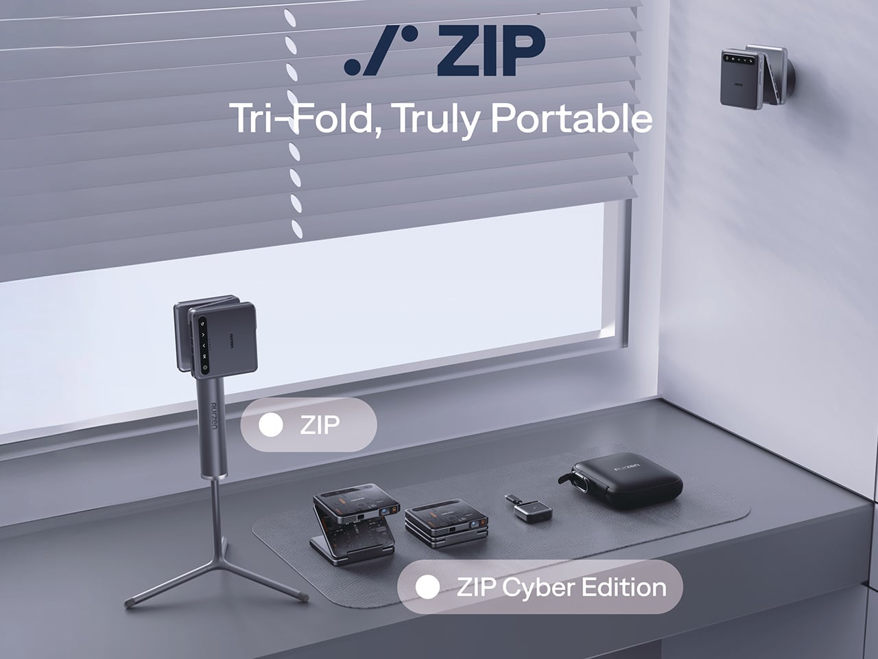
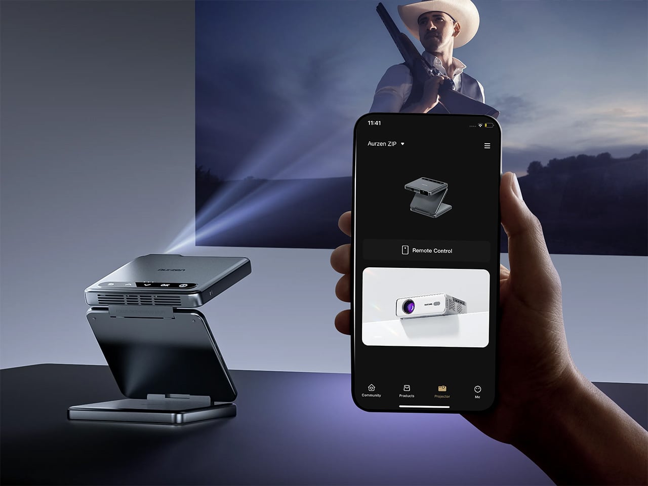
Cyberpunk stopped being a design aesthetic and became a lifestyle signifier somewhere between Blade Runner 2049 and your neighbor’s RGB-lit battlestation. We’ve seen the look applied to everything from gaming chairs to mechanical keyboards, but most of it reads like cosplay rather than genuine industrial design. Aurzen’s ZIP Cyber Edition, a limited-run variant of the tri-fold projector that debuted at IFA last year, sidesteps the usual neon-drenched clichés in favor of something that feels engineered rather than decorated. Circuit-board texturing runs across the matte black chassis, orange accent lighting traces the fold lines, and the entire device collapses down to pocket size without losing any of the visual intensity. This one was designed for people who buy gadgets the way sneakerheads buy limited drops.
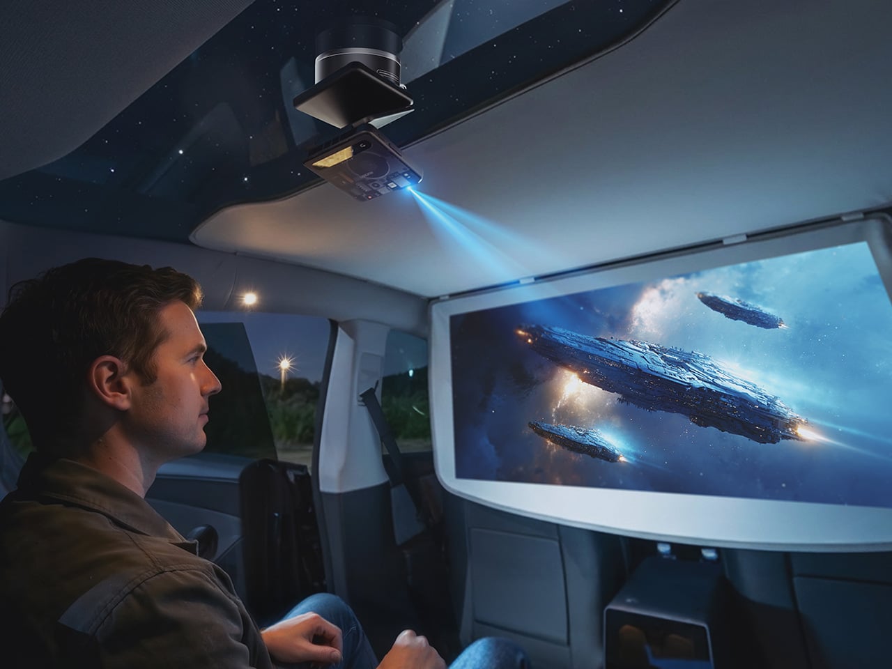
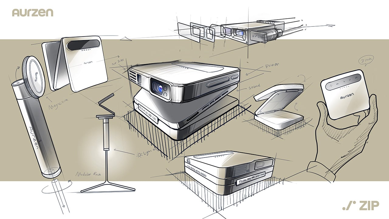
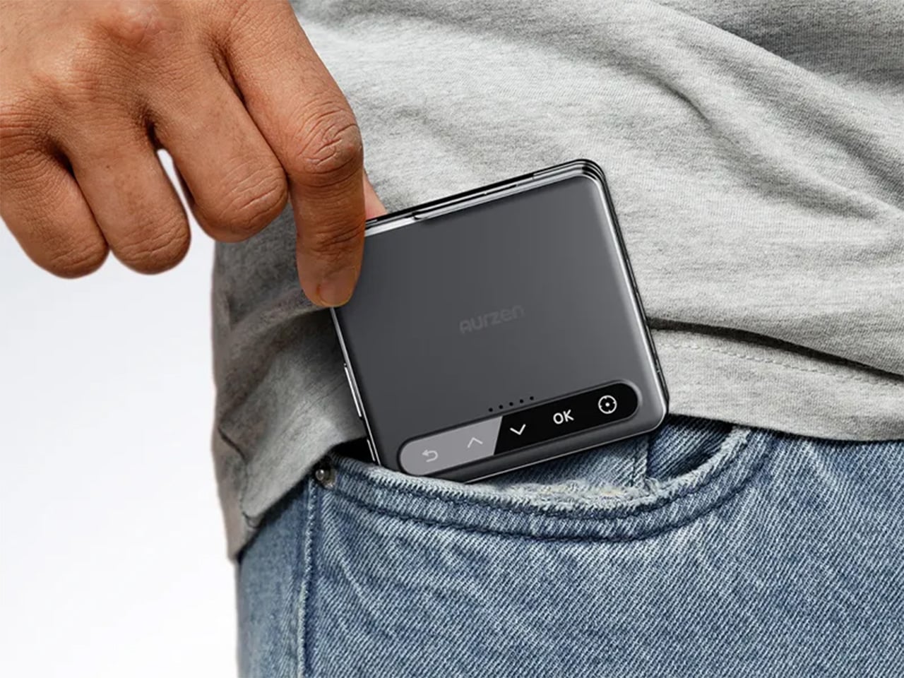
The Cyber Edition shares the same core DNA as the standard ZIP: a tri-fold DLP projector measuring 3.31 x 3.07 x 1.02 inches when folded, powered by a 5000mAh battery good for about 90 minutes of runtime. You get 100 ANSI lumens in Turbo mode, native 720p resolution, ToF autofocus that calibrates 30 times per second, and Bluetooth 5.4 for wireless mirroring. What sets the Cyber Edition apart is the finish, the material detailing, and the fact that Aurzen produced it as a numbered limited release. The modular accessory ecosystem (magnetic mounts, power bank stands, USB-C streaming dongles) turns it into a configurable projection rig rather than a one-trick device. It’s the kind of gadget that belongs on a pegboard wall next to your EDC knife and custom-keycapped keyboard.
That sense of distinction starts with the physical design. The ZIP Cyber Edition folds into a compact square footprint that can slip into a jacket pocket, side pouch, or sling bag without demanding the kind of space most portable projectors still require. The tri-fold mechanism gives it a kinetic quality that makes opening and positioning the device part of the experience. On a table, shelf, or bedside surface, it does not sit there like a generic electronics block. It unfolds with intent, revealing a built-in stand that helps angle the projector quickly for casual viewing. The styling reinforces that experience. The surface graphics resemble a miniature control panel, the orange accents break up the dark body with a subtle sci-fi energy, and the overall silhouette feels sleek enough to pass for a concept gadget pulled from a design render.
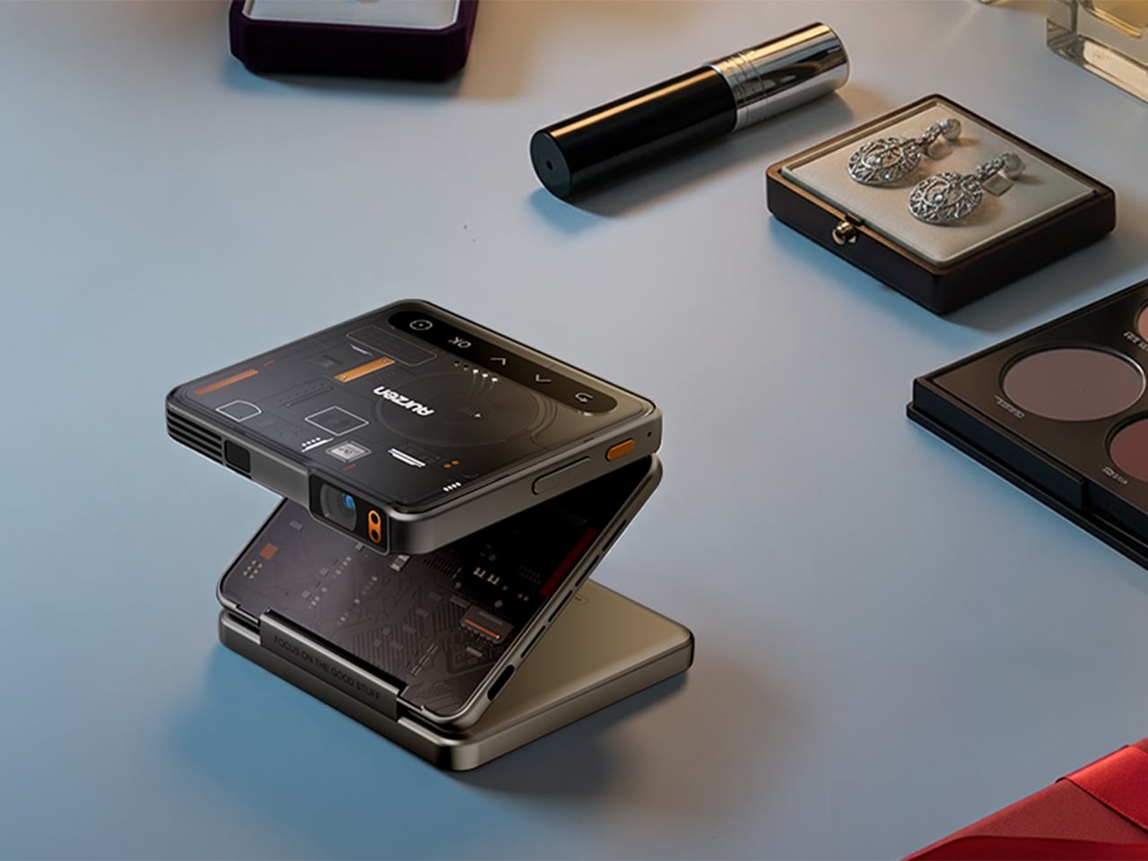
Aurzen makes it clear that the Cyber Edition should be understood as a playful, gift-worthy tech object, and that framing makes sense. The supplied lifestyle assets lean into two different but complementary worlds. In one, the projector sits among headphones, a smartwatch, wireless earbuds, and a camera, framed like part of a modern everyday carry kit. In another, it appears alongside cosmetics and jewelry, presented as something stylish enough to belong in a gift spread rather than a utilitarian tech flat lay. That duality works in its favor. The ZIP Cyber Edition has enough gadget credibility to attract enthusiasts, but enough visual charm to feel approachable for gifting, especially for people who appreciate design-forward electronics that spark curiosity the second they come out of the box.
The modular accessory ecosystem gives this projector added functionality that you wouldn’t normally see in this category. Phones have accessory ecosystems – projectors, not so much… maybe just a tripod mount or a cleaning cloth. Instead of treating the ZIP as a sealed, standalone device, the company has built a set of accessories that turn it into a more flexible projection tool. The CastPlay Pro dongle connects through USB-C and is positioned as the quick route to content, making it easier to start watching without a complicated setup process. Then there is the MegaPlay dual-side mount, which uses a vacuum-lock base to attach securely to smooth surfaces such as glass, mirrors, and desks, followed by magnetic mounting that snaps the projector into place in a second.
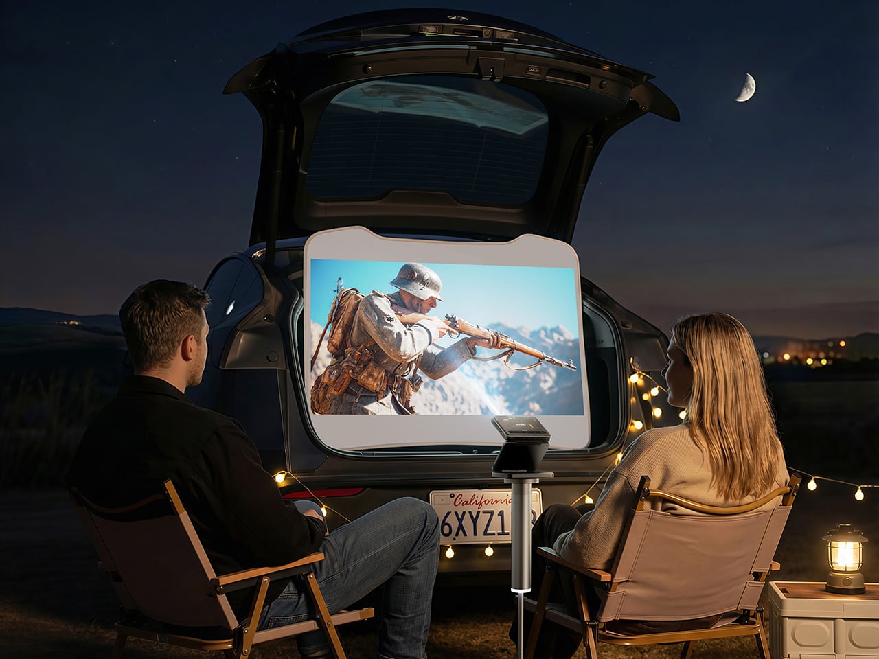
Aurzen also offers the PowerPlay 3-in-1 stand, which doubles as an adjustable stand and a 10,000mAh power bank. That kind of accessory feels particularly well matched to the ZIP’s identity. Portable gadgets always benefit when their support hardware feels as intentional as the main device, and here the stand does more than prop the projector up. It extends runtime, offers multiple height levels, and helps the ZIP move between different environments with less friction. Taken together, these accessories give the Cyber Edition a modular personality that aligns neatly with the audience Aurzen is chasing, early adopters and gadget enthusiasts who enjoy experimenting with how their devices fit into daily life. There is a lot of appeal in a product that can move from a desk setup to a bedroom wall to a travel bag without feeling out of place in any of them.
That flexibility also helps clarify what kind of projector this is. Aurzen is not positioning the ZIP Cyber Edition as a traditional home cinema centerpiece. The better framing is that it behaves like a compact projection gadget with a sense of cool whimsy. It is easy to imagine it being used for casual streaming, spontaneous bedroom projection, dorm setups, travel use, or simply as a conversation-starting piece of hardware that people enjoy showing off. That’s because a lot of portable electronics succeed by becoming part of a lifestyle rather than by winning a spec-sheet arms race. The Cyber Edition leans into personality, portability, and modularity, which gives it a lane of its own in a category that often defaults to plain white boxes and interchangeable styling.
The strongest thing Aurzen has done with the ZIP Cyber Edition is recognize that design can be a feature in itself. Plenty of compact projectors promise convenience, and some promise performance, but very few seem interested in becoming objects people would actually want to collect, display, or gift. This one feels built for that exact purpose. The cyberpunk-inspired finish gives it character, the tri-fold construction gives it novelty, and the accessory ecosystem gives it room to evolve beyond a single-use gadget. For tech enthusiasts who enjoy hardware with a little personality and a lot of portability, the ZIP Cyber Edition feels like the kind of release that earns attention on sight and keeps it once you start exploring how it fits into everyday routines.
The Aurzen ZIP Cyber Edition is available now directly from Aurzen’s official website at $399.99, with a limited-edition production run and numbered units so you know you’re part of an exclusive clique. Although the limited edition status demands a higher price tag, YD readers can use the code 40AURZENZIP to get a whopping 40% off, bringing the price down to $239.99. And just in case you’re reading this after the Cyberpunk variant runs out, the standard Aurzen ZIP is up for grabs too, in Titanium Gold and Dark Gray.
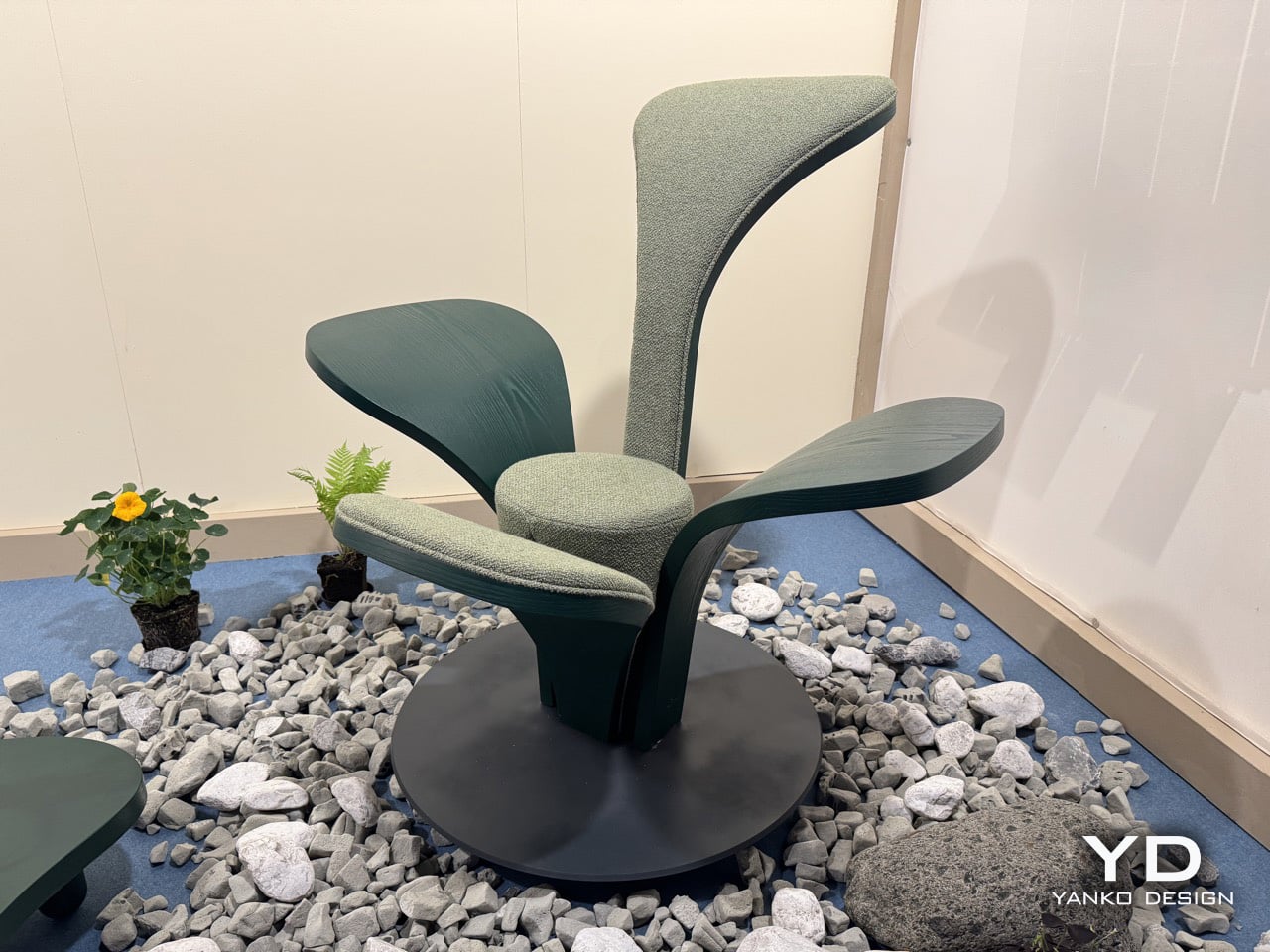
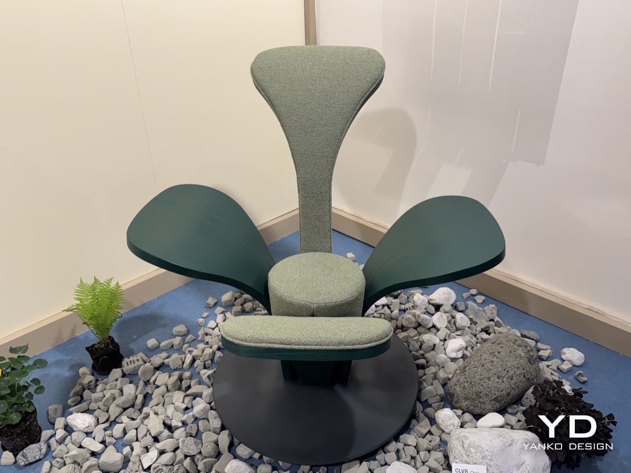
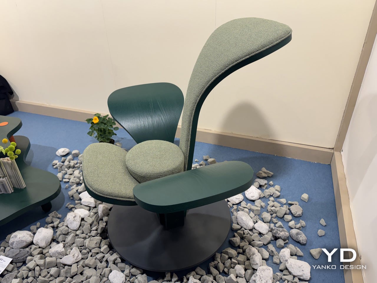
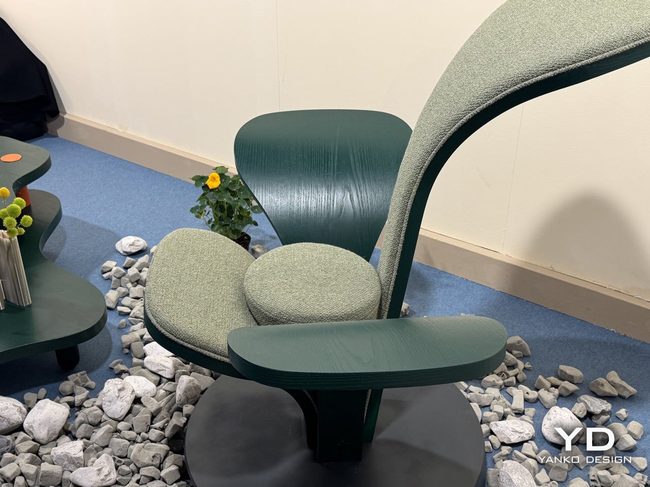
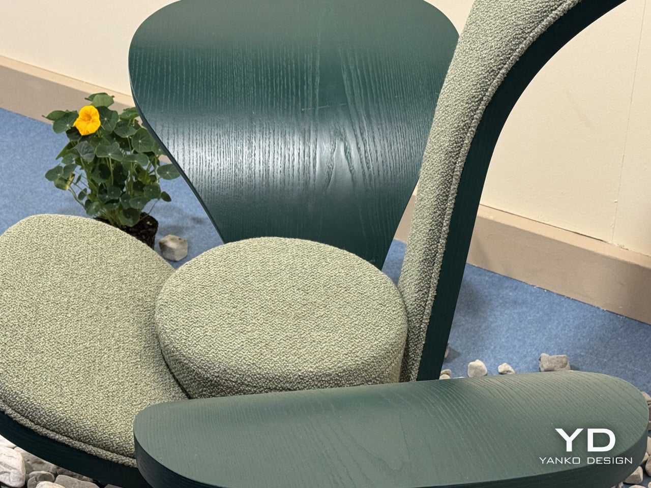
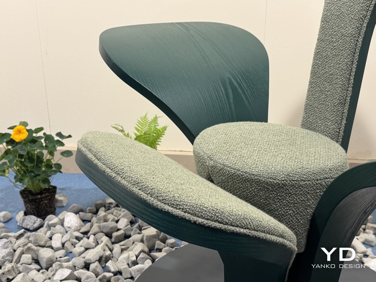
The armchair has been one of the most contested territories in furniture design for over a century, from Alvar Aalto’s bent plywood experiments to Arne Jacobsen’s Swan Chair. Designers keep returning to the seated form as a test of where material technology and formal imagination currently meet. Beltrame Breuil, an architectural practice based in Tarvisio and Vienna, took their turn at Salone Satellite 2026 with a chair that brings alpine botany directly into that conversation. Their furniture brand Picule presented CLVR, a seat assembled from four bent-wood leaf forms rising from a circular steel base, and it is the kind of debut that reminds you why Salone Satellite exists.
Two of CLVR’s four leaves are upholstered in a mossy, boucle-like forest green textile, covering the tall backrest and the lower front surface where the body settles. The other two are left as bare stained wood, their grain visible under the deep green finish, extending outward from the center like wings. All four share one curvature and one design logic, shaped by bent wood, which is what holds the composition together despite its apparent asymmetry. The design is coherent because its grammar is consistent, even as the function of each leaf changes.
The circular steel plate at the base functions as a pedestal, grounding the organic spread of the leaves and lending the piece a measured architectural gravity. At 112 cm tall and 125 cm wide, CLVR reads as a statement lounge object first and a chair second. It has the presence of a small throne, designed to anchor a room rather than disappear into it. The scale is deliberate, positioning the chair as a piece of functional sculpture that occupies its space with confidence.
Picule is Beltrame Breuil’s way of funneling architectural discipline into objects scaled for domestic life. The studio’s Tarvisio base sits in Italy’s northeastern corner, where the Julian Alps press against the Austrian and Slovenian borders. That geography gives CLVR its conceptual grounding; this is a studio that builds in that landscape, not one pulling a leaf motif from a mood board. The alpine forest inspiration feels earned, and it gives the chair a story that goes beyond its form.
The bent-wood forming technique reinforces that connection, requiring an intimacy with the material that keeps the work tethered to craft. The chair’s forest green palette, running across bare wood and woven textile in two calibrated tones, holds the composition together as one chromatic idea rather than a collage of parts. It’s a thoughtful detail that shows how completely the studio considered the object from every angle, ensuring the material and color choices support the core concept.
Beltrame Breuil is presenting the full Picule collection, including the CLVR chair, at Salone Satellite 2026. You can find it in Hall 5 at Stand E10 at Fiera Milano, Rho, through April 26. The photos do a fair job of capturing the silhouette, but the bent-wood grain and the textile’s tactile quality are things that land most clearly when you are standing right in front of it. Go see it before the fair closes.
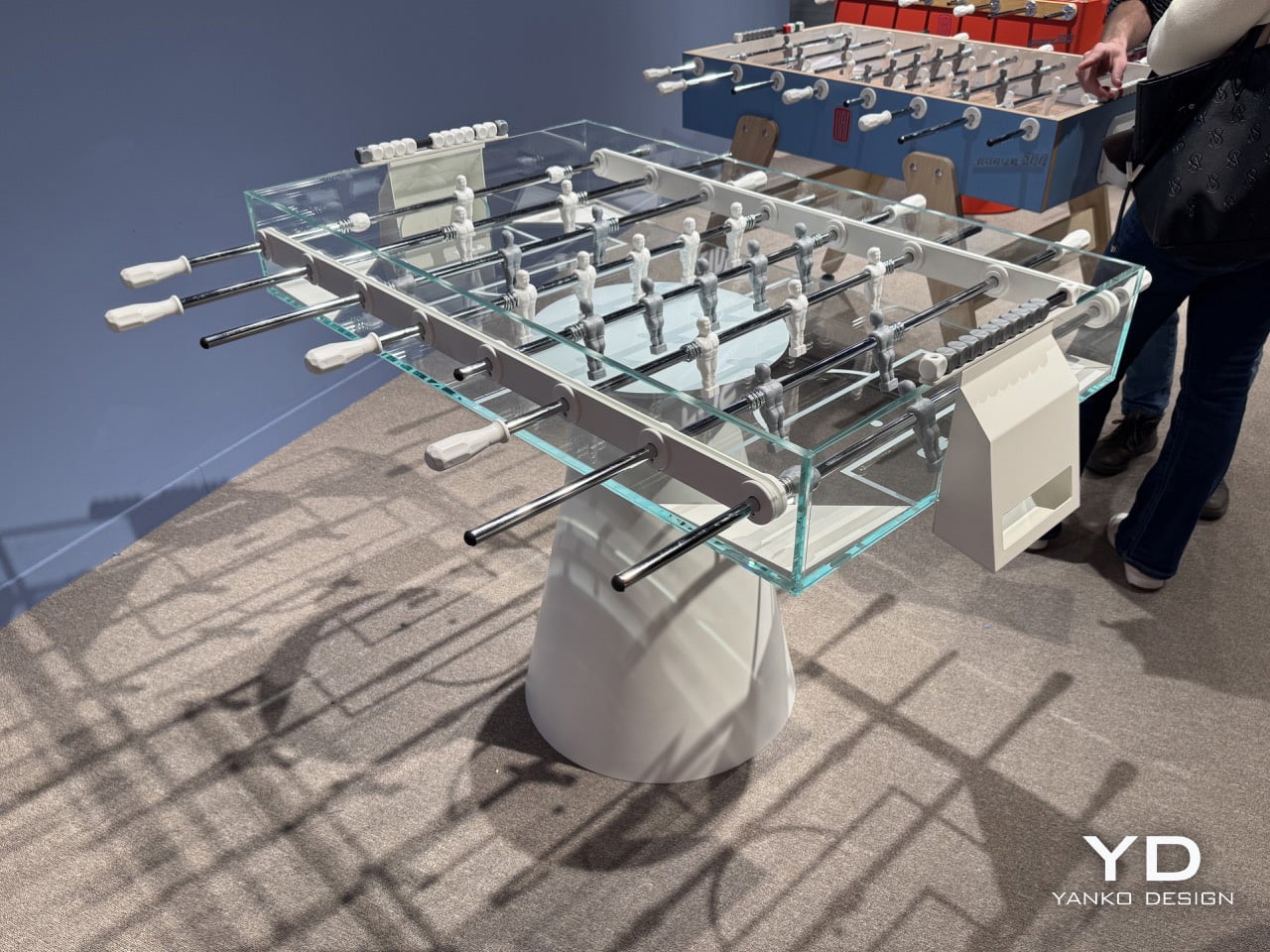
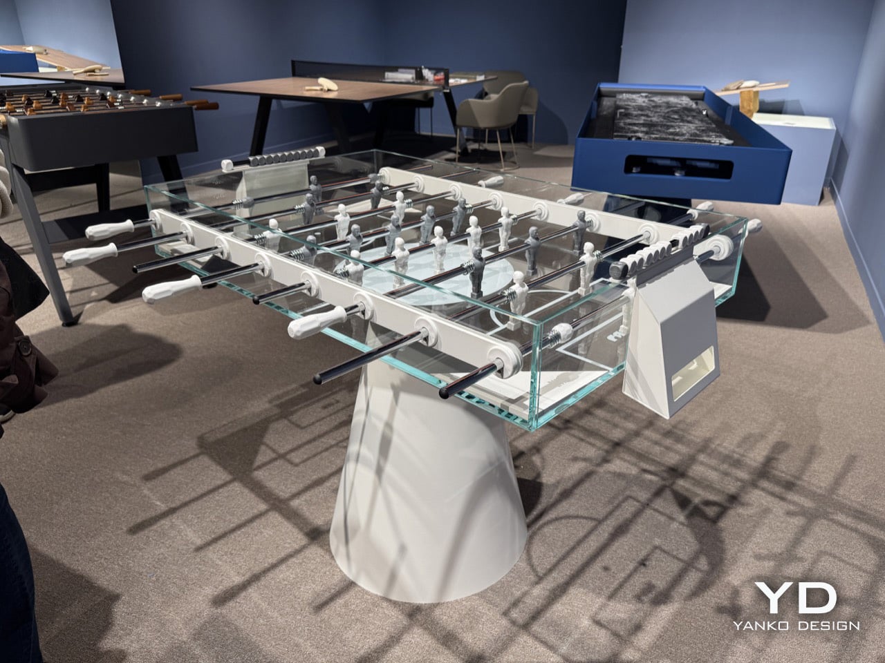
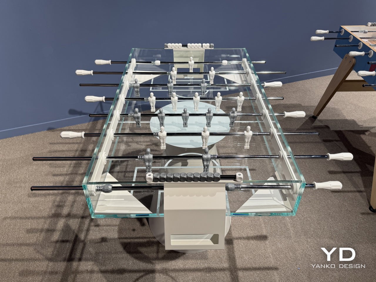
The early 2000s had a very clear idea of the future. Think of films like *Minority Report* with its PreCrime headquarters, all white rooms and glass interfaces where everything looked seamlessly bonded rather than bolted together. Or *I, Robot*, which pushed that look even further with its glossy USR tower and Audi concept car, a world that had erased any sign of how things were actually made. That aesthetic has aged remarkably well, but it’s a territory most game furniture never touches, usually favoring rich materials over making things look like they are barely there. Basaglia + Rota Nodari are the exception, and Ghost, their foosball table for FAS Pendezza, is the proof.
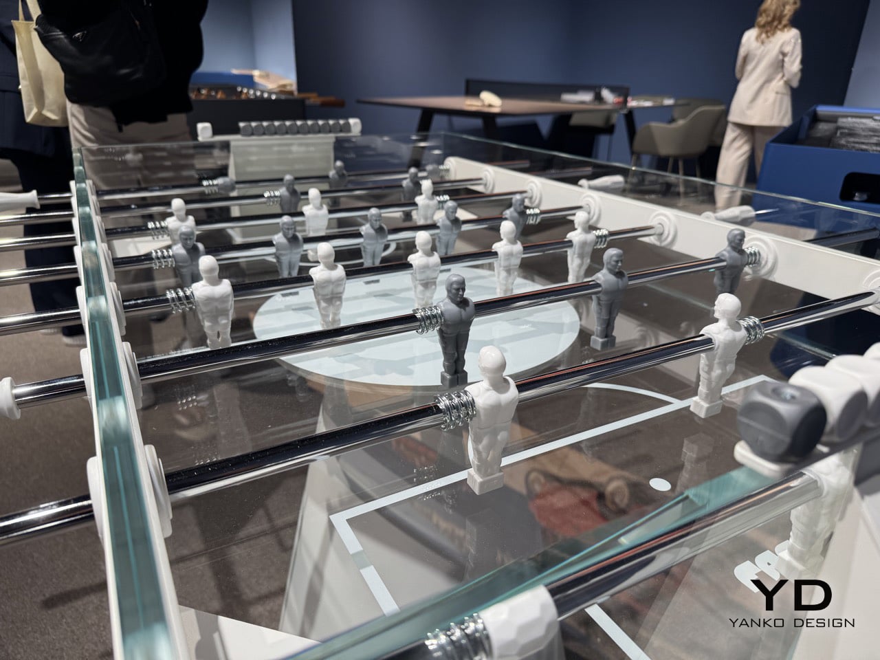
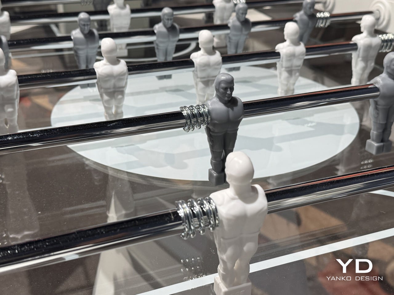
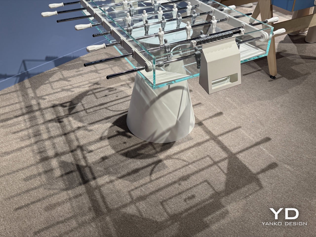
The table itself is built from thick tempered glass, laminated at 12 and 9 mm, with a playing field that’s 114.5 by 70.5 centimeters, and it’s made entirely in Italy. Its body is bonded with a special adhesive, so there are no visible screws or bolts anywhere in the frame. That’s a key decision, because if you saw hardware, the whole ghost-like vibe would fall apart. A clean, conical white metal base holds up the floating glass volume, while chrome rods and two-tone players complete a color scheme that’s intentionally minimal. At 8,900 euros, it’s priced as a piece of design, and it earns it on looks alone before a single ball gets dropped.
Designers: Basaglia + Rota Nodari for FAS Pendezza
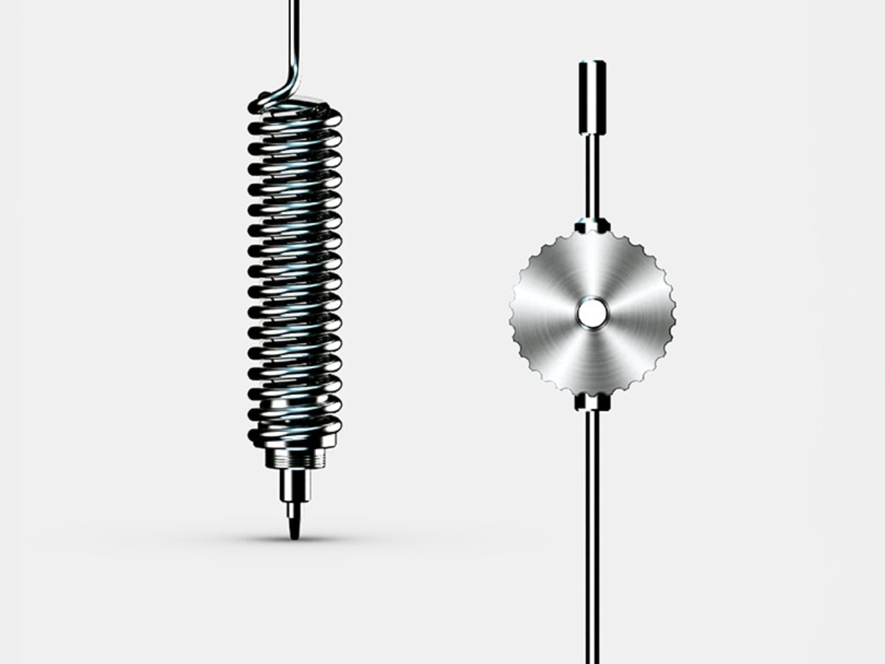
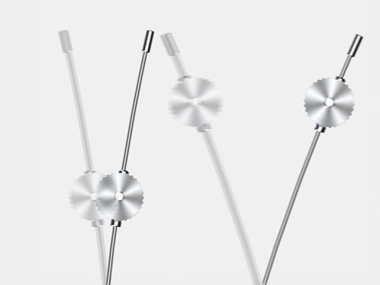
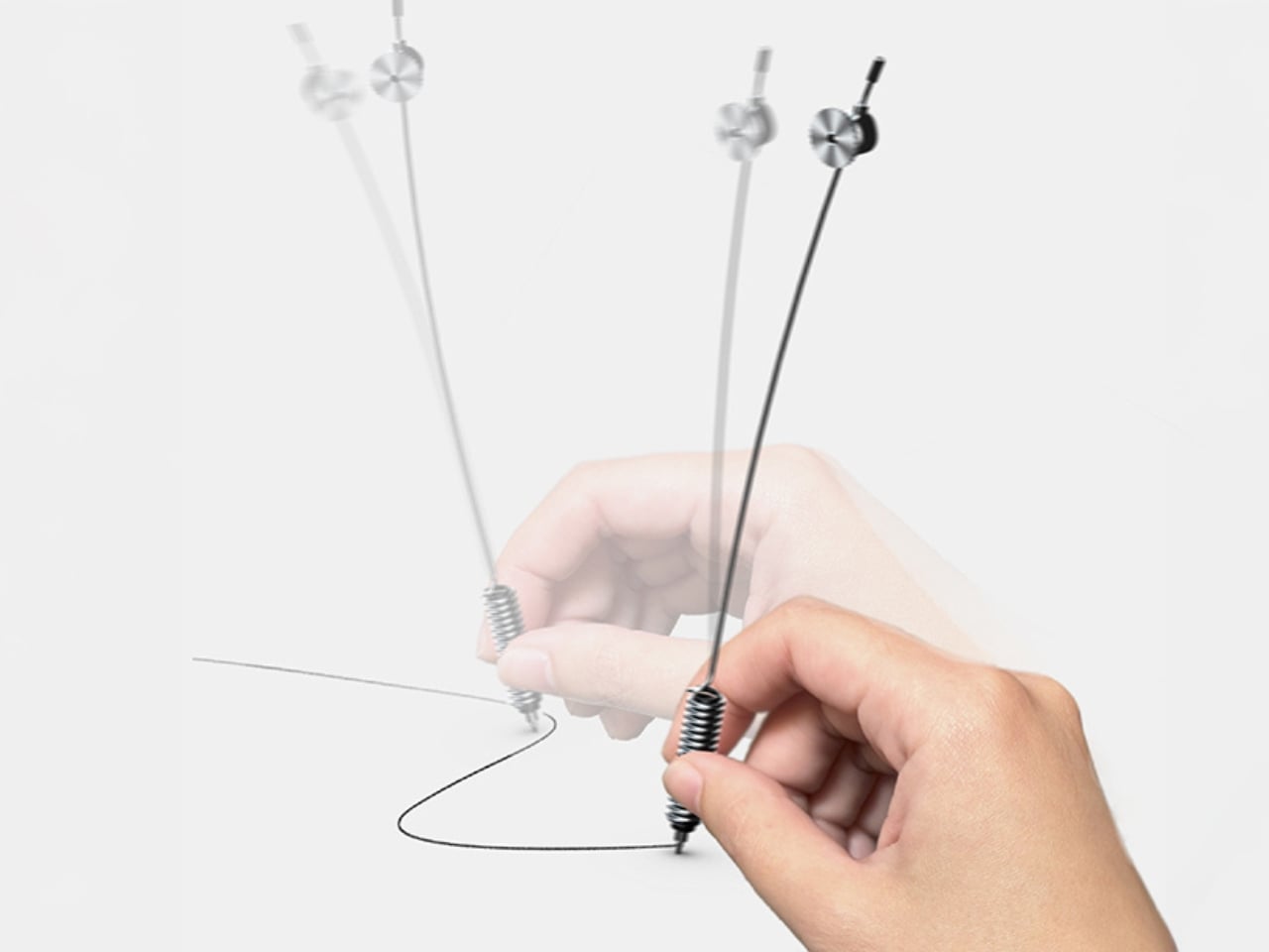
Even the players, made of white and gray resin, look like they belong in this sci-fi world. They’re somewhere between a medical illustration and a concept-car sketch, simplified to the point of anonymity. That’s exactly why they work. If they were in conventional team colors, the table would feel like just another piece of recreational equipment. Instead, these figures feel closer to the NS-5 robots of *I, Robot* than to any real athlete, which helps keep the whole look clean and unified. The chrome coil springs connecting them to the rods are the one little nod to mechanical texture, and they look almost like jewelry against all that glass.
But what really captures you are the detailed shadows the Ghost projects on the floor, if paired with the right lighting. At Salone Satellite, Ghost casts an incredible wireframe shadow on the floor, like it’s drawing a blueprint of itself in real time. Pitch markings are printed beneath the crystal surface, so they appear to float inside the glass instead of sitting on top. From any angle in the FAS Pendezza booth, you can see right through the structure, with the players and chrome rods suspended against the room itself. The name makes perfect sense when you see it in person.
FAS Pendezza is presenting Ghost at Salone Satellite this week as part of Milan Design Week 2026, in a booth where the table’s shadow alone justifies the detour. Seeing it alongside the rest of the brand’s lineup confirms Ghost as a deliberate formal departure rather than FAS Pendezza’s default register. The studio, Basaglia Rota Nodari, launched in 1997 with a stated ambition to build objects that convey emotion beyond their function, and Ghost may be their sharpest expression of that intent to date. For those who have already left Milan, Ghost is available in white and black finishes and retails at €8,900.
SpaceX and AI company Cursor have struck a new partnership that could see the owner of X buy the AI company for $60 billion later this year. "SpaceXAI and @cursor_ai are now working closely together to create the world’s best coding and knowledge work AI," SpaceX wrote in a post on X.
SpaceXAI and @cursor_ai are now working closely together to create the world’s best coding and knowledge work AI.
The combination of Cursor’s leading product and distribution to expert software engineers with SpaceX’s million H100 equivalent Colossus training supercomputer will…
According to SpaceX, the deal allows for it to either invest $10 billion into the company known for its AI coding tool, or acquire it entirely "later this year" for $60 billion. If an acquisition were to happen, it's not clear at what point Cursor could officially join the fold of Elon Musk's rapidly expanding and increasingly enmeshed web of companies. SpaceX bought xAI, the billionaire's AI company that also controls X, earlier this year. SpaceX is currently getting ready to go public this summer in what will likely be the biggest initial public offering (IPO) in history.
Cursor, which has reportedly been in talks to raise its own $2 billion round of funding, is known for its AI coding tool of the same name that's become the vibe coding platform of choice for many developers. It allows people to use either its own models or those from other leading AI companies, including OpenAI, Google, Anthropic and xAI.
In a statement, Cursor said its partnership with SpaceX will "accelerate our model training efforts" while addressing infrastructure-related issues that have slowed it down in the past. "We've wanted to push our training efforts much further, but we've been bottlenecked by compute," the company said. "With this partnership, our team will leverage xAI's Colossus infrastructure to dramatically scale up the intelligence of our models for coding and beyond."
This article originally appeared on Engadget at https://www.engadget.com/ai/spacex-and-cursor-strike-partnership-that-might-end-in-a-60-billion-acquisition-232131487.html?src=rss
Anthropic's buzzy announcement about using AI to improve cybersecurity earlier this month was met with plenty of skepticism. However, Mozilla shared some details that support use of the company's special Claude Mythos Preview model as a way to protect critical services. Using Mythos helped Mozilla's team find and patch 271 vulnerabilities in the latest release of the Firefox browser. "So far we’ve found no category or complexity of vulnerability that humans can find that this model can’t," the foundation said.
The blog post from Mozilla feels like a positive sign for Anthropic's Project Glasswing. Obviously the AI company would want to put itself in the best possible light while presenting its own initiative, but there's something encouraging about hearing the benefits from a third party. Mozilla also noted that in its time with Claude Mythos, the AI wasn't able to turn up any bugs that a human wouldn't have been able to find, given enough time and resources, which indicates that AI isn't presently able to do more to crack cybersecurity protections than a person can.
An organizaion successfully using AI for good is certainly a refreshing change of pace in tech news. And for those Firefox users who aren't personally interested in applying any generative AI in their browsing, Mozilla has given the option to turn it all off for the past several months.
This article originally appeared on Engadget at https://www.engadget.com/ai/mozilla-says-it-patched-271-firefox-vulnerabilities-thanks-to-anthropics-claude-mythos-224330023.html?src=rss
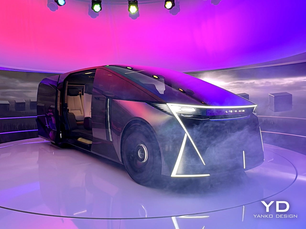
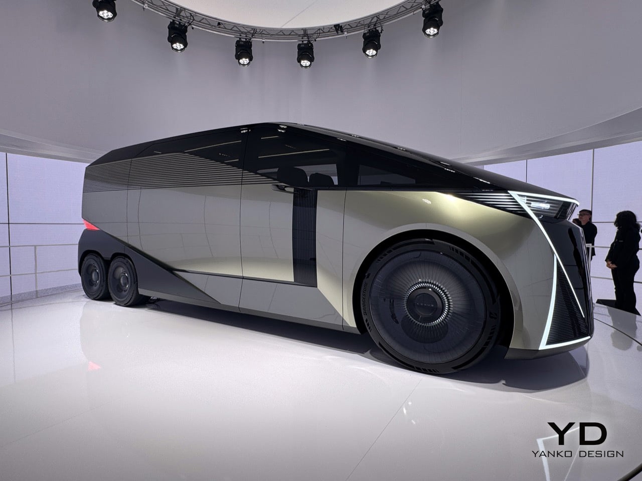
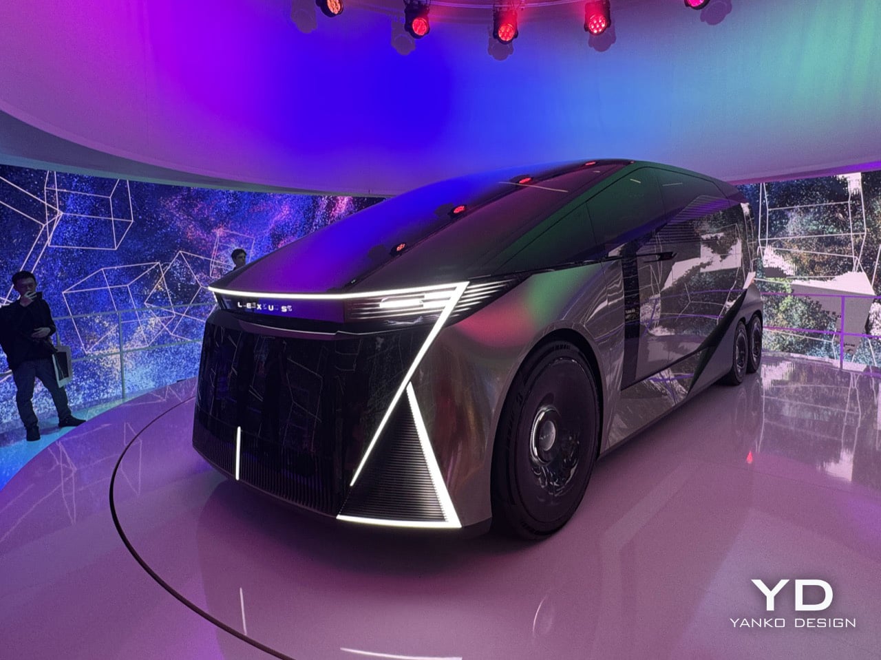
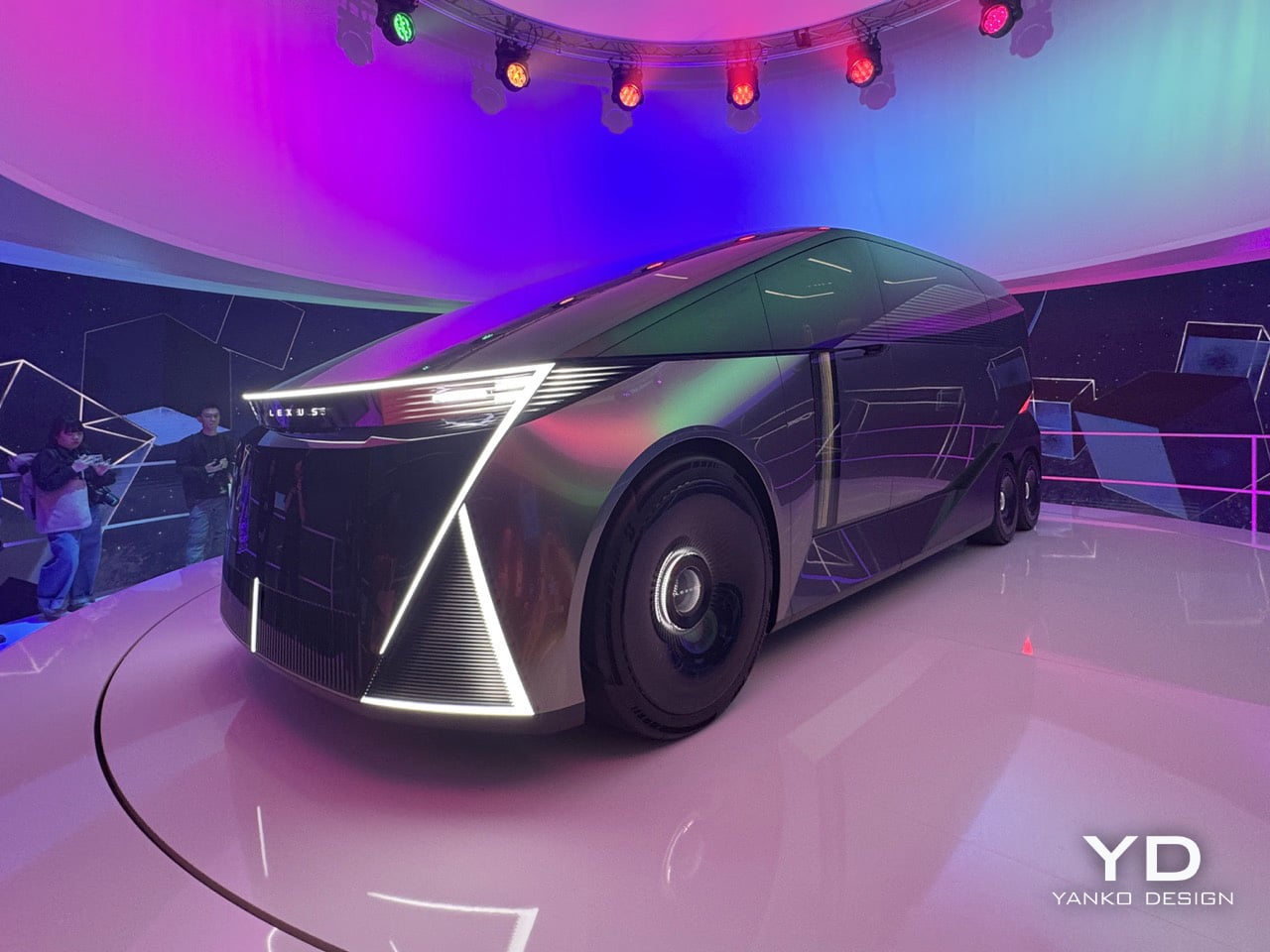
Six wheels on a Lexus, at a furniture fair in Milan, sounds like either a provocation or a punchline. At this year’s Milan Design Week, Lexus is betting it’s the former. The brand rolled into Superstudio Più in the Tortona district with its LS Concept, a long-body, flat-roofed, twin rear-axle machine that first appeared at the Japan Mobility Show in 2025. It’s a chauffeur-driven vehicle built entirely around the passenger, and it’s Lexus’s clearest statement yet about where its flagships are going. In fact, Chief Branding Officer Simon Humphries said it plainly: the “S” in LS no longer stands for Sedan. It stands for Space.
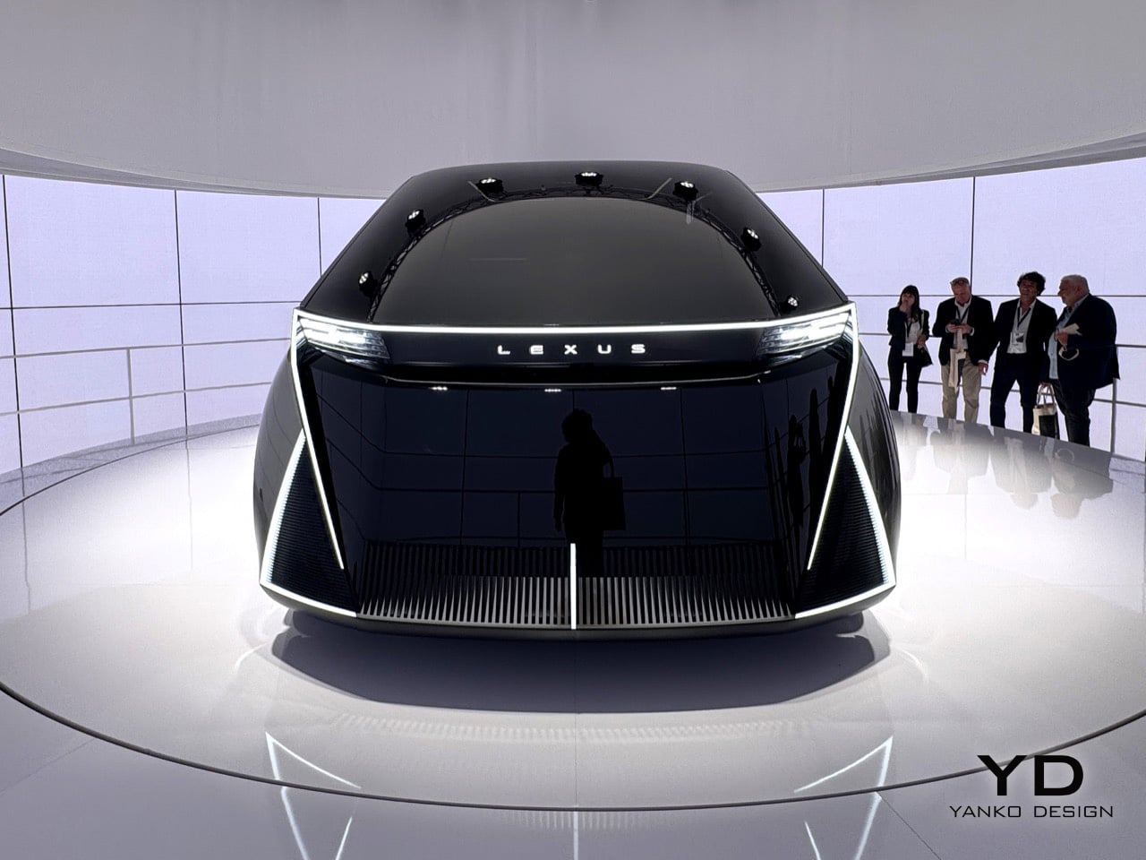
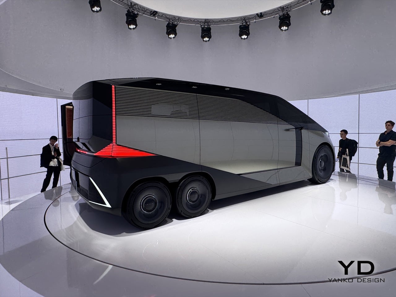
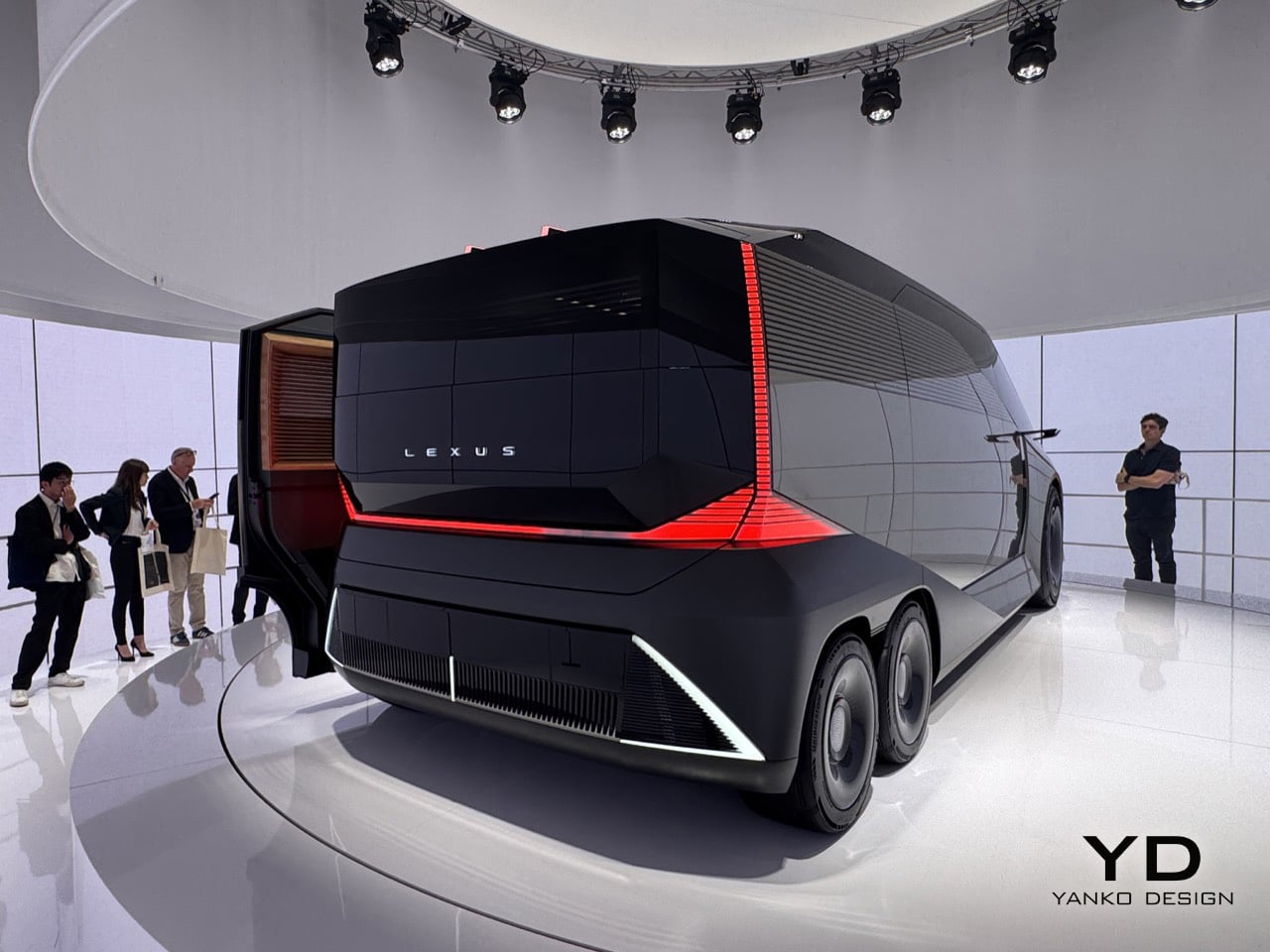
The car sits inside an installation called SPACE, a fittingly simple name for a big idea. The LS Concept is wrapped in a cylindrical LED screen that’s always moving, cycling through textures and color palettes that wash over the car’s matte metallic finish. The whole thing sits on a low turntable, rotating slowly so you can take in every angle while the screen behind it blurs the line between the vehicle and its environment. From the back, the body is dark and geometric, with red light cleanly tracing the corners and the LEXUS wordmark centered like a final statement. The front has no grille at all, just a wide bar of white light, a dark glassy face, and some sharp diagonal cuts at the lower corners. The side profile is what really sells the scale of it all; the greenhouse is so long and flat it forces you to rethink what a luxury car is supposed to look like.
Designer: Lexus
You’ll notice those sharp diagonal white light signatures at the corners of both the front and back, and they do a great job of anchoring your eye so you don’t get lost in all that surface area. The front is an exercise in restraint, especially for Lexus. There are no intakes, no heritage cues, and definitely no spindle grille, which defined the brand’s look for fifteen years. Instead, a single, clean bar of white light carries the Lexus name across the top, and below it, dark glass sweeps down like a theater curtain. The back is just as clean, with black geometric planes and red light tracing the corners so precisely it feels more like sculpture than taillights. There’s also a louvered panel on the rear quarter that looks both cool and functional, the kind of detail you have to go back and look at a second time.
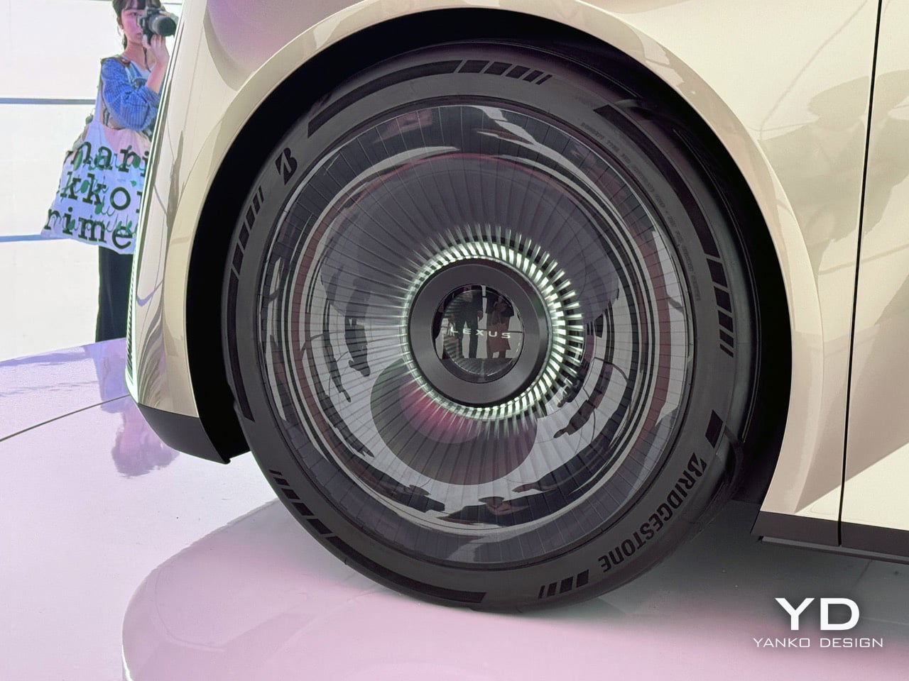
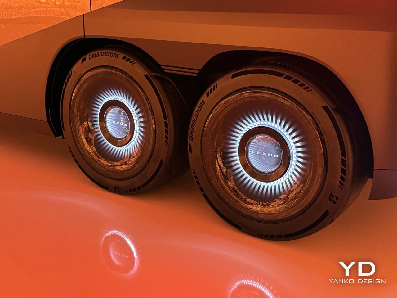
The twin rear wheels are probably the first thing that throws you off, but the more you look at them, the more they make sense. A six-wheel layout, something you usually see on overland vehicles or high-end coaches, lets Lexus pack in a huge amount of interior volume without the big wheel arches that eat up space in most long cars. The turbine-style wheel covers keep the look clean, where normal spokes would have ruined the effect. When you see it from the side, the lower body looks like a single sculpted piece, and the way it tucks under itself makes the whole thing feel like it’s floating. Lexus is basically saying that a vehicle with the footprint of a small bus can be the next word in luxury, and after a few minutes, you start to believe them.
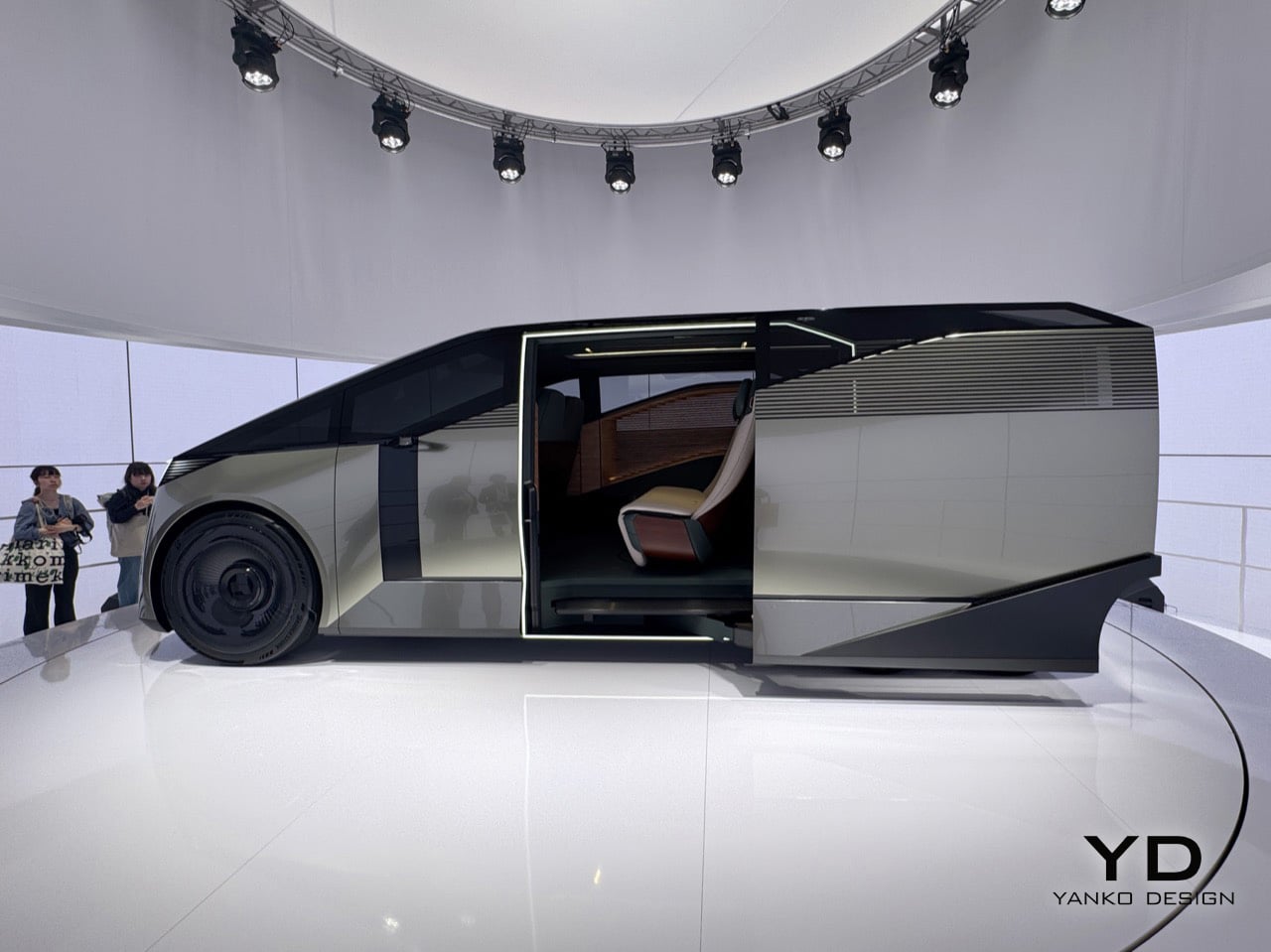
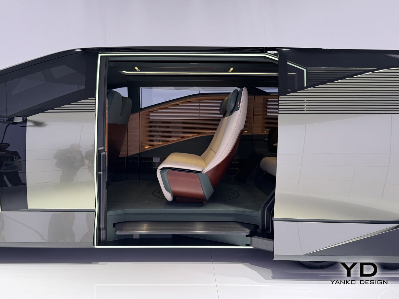
Step through the door, framed in a bright white light, and you see what they mean by hospitality. A slatted wood panel runs up the entire wall of the cabin, a single rear seat is finished in cream and burgundy leather, and the floor is so open you get the sense it was designed for standing as much as sitting. The real achievement here is how Lexus managed to package so much genuine room inside; it feels more like a small, well-designed living space than a stretched-out car. Whether any of this makes it to production is anyone’s guess, and Lexus seems happy to leave that question hanging in the air.
What Lexus is showing here is a clear signal of where its design thinking is headed, and that alone makes it one of the most interesting things you can see in Milan this year. If you want to see it for yourself, you can experience the SPACE installation and the Lexus LS Concept at the Daylight Hall in Superstudio Più, located in the Tortona district, from April 21st to the 26th.
If you asked most people to name a Yamaha product, you’d probably get piano, guitar, or motorcycle long before anyone said pen. And yet here we are, talking about a writing instrument from one of the most iconic music and motor companies in the world. The Swing Scribe is not a gimmick. It’s a genuinely fascinating piece of design thinking, and it deserves far more attention than it’s been getting.
Part of Yamaha’s Scribe Tool Design 2024 project, the Swing Scribe is a collaboration between Yamaha Corporation and Yamaha Motor designers based in the US. The project’s premise is simple but surprisingly profound: in an age saturated with digital tools, what happens when you return to something as primitive as writing? And more importantly, what can you add to it, not to make it smarter or faster, but to make it more felt?
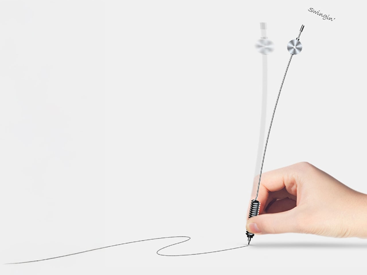
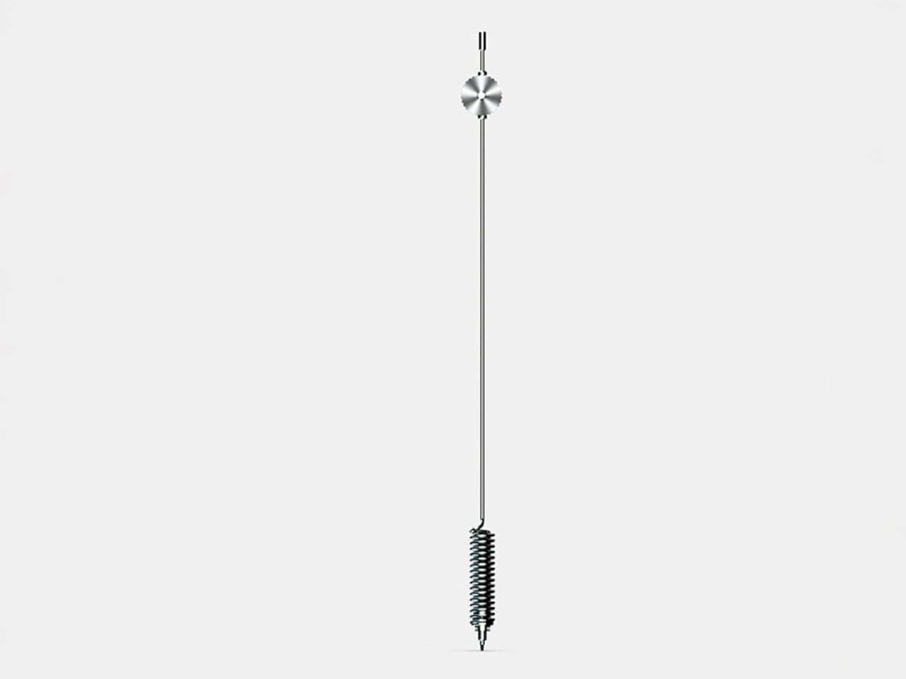
The Swing Scribe answers that question with a pen that behaves like a metronome. The design draws its inspiration from the quill, one of the oldest writing instruments in history. As you write, the natural wobble of the feather gives the pen rhythm through a small amount of air resistance. Yamaha took that phenomenon and made it intentional. A weighted tip is attached to a metal bar, and as you write, it swings. The small pendulum force produced by the weight and the movement gives a rhythm to the pen and the way it flows, feeding that beat back into your hand.
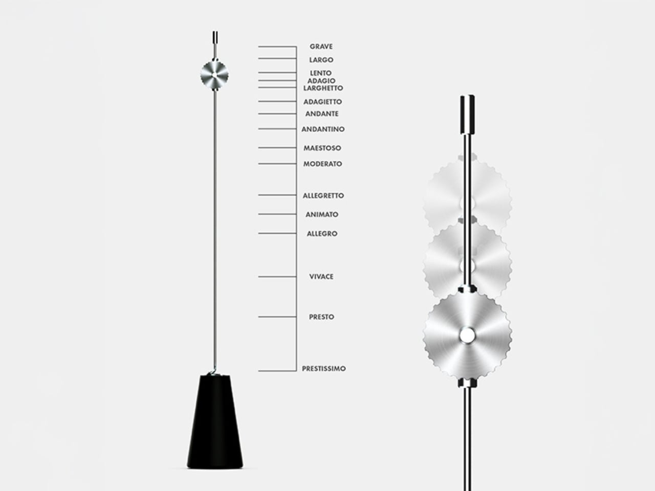
What’s particularly clever is the degree of control built into it. You can slide the weight along the bar to change the arc of the swing, adjusting resistance and tempo to match how you’re feeling at any given moment. Slow and contemplative? Let it swing wide. Fast and focused? Pull the weight closer. It sounds like a small, quiet thing, but it genuinely reframes the act of writing as something that has a beat, a pace, its own kind of mood.
This is deeply Yamaha. The company has a long-standing design philosophy rooted in the Japanese concept of Kando, which translates roughly to emotional excitement or deep resonance. The goal isn’t just functionality. It’s feeling. It’s the reason a Yamaha piano doesn’t only produce notes but creates a whole physical experience for the player, something that connects the body to the sound. The Swing Scribe takes that same philosophy and applies it to a writing tool.
I’ll admit my first reaction was skepticism. A pen that swings on a metal arm sounds like something you’d appreciate in a design exhibit and then immediately set down. But the more I thought about it, the more it made sense. We’ve spent years optimizing handwriting out of our lives. Keyboards are faster. Voice memos are easier. Dictation tools have gotten good enough to be genuinely useful. And yet journaling, sketching, hand-lettering, and analog note-taking are having a real cultural moment right now. People aren’t returning to pen and paper purely out of nostalgia. They’re returning because it feels different from every other thing they do. Because it slows them down in a way that makes room for actual thinking.
The Swing Scribe leans into that completely. It doesn’t try to make handwriting more efficient. It makes it more deliberate, more sensory, more present. And it does all of this with a mechanism that is elegant in its simplicity. No batteries, no Bluetooth, no companion app. Just physics. Not everything needs to be optimized. Some things are better when they resist you slightly, when they swing a little off-center, when they remind you that creating something by hand is its own reward. Yamaha, of all companies, probably understood that long before the rest of us caught up.
Cash App, the banking and payments app run by Block, has added support for parent-managed kids accounts. The new accounts include key benefits from the service's normal account, with an eye towards teaching financial literacy to younger users ages 6 to 12. Cash App first allowed teenage users on its platform in 2021.
As part of the "expanded Cash App Families experience," eligible legal guardians and parents can create managed accounts that offer "a dedicated place on the platform to send allowances, set aside savings, and track spending for their child, kickstarting their path to financial independence," Cash App says. Adults managing these accounts will be able to set up recurring transfers, see how their child is spending and do things like lock their child's account to prevent transactions. Kids will get a custom debit card and the ability to receive payments from up to five trusted accounts, though notably they won't be able to access Cash App itself.
Today, we're launching Cash App accounts for kids age 6-12. Parents manage the accounts. Kids get to learn about safety, start saving for goals, and design and use their own debit card.
Cash App says managed accounts are designed for kids 6 through 12. Once those kids turn 13, Cash App says parents will be able to choose to convert their account to a "sponsored account" to unlock more features, like the ability to send and receive payments, invest in stocks or trade crypto. Those sponsored accounts are technically still monitored and controlled by a parent or legal guardian, but they do give 13-year-olds more control over how they use their money.
A parent-managed account for kids is not a new idea in the fintech space, though Cash App is trying to reach a younger audience than some of its competitors. Venmo rolled out access to its payment platform to teens between the ages of 13 to 17 in 2023. Separately, both Apple and Google also offer their own kids accounts in Google Wallet and Apple Cash Family.
This article originally appeared on Engadget at https://www.engadget.com/apps/cash-app-now-supports-accounts-for-kids-6-12-210651025.html?src=rss