This LEGO Harvey Specter Office Has the Basketball Collection, the Painting, and Yes, Even Donna

Harvey Specter kept a chess set on his office coffee table. It was never really explained, never made into a plot point, just always there, sitting on the glass surface between Harvey and whoever was about to lose an argument. It suited the room perfectly. The whole space was engineered as a performance of control: the signed basketballs, the glass desk with nothing to hide behind, the painting of his mother as the one admitted vulnerability in an otherwise impenetrable presentation. Production designers on Suits understood that Harvey’s office had to do half his character work for him before he even spoke.

Gentvilas, building on the LEGO Ideas platform, understood the same thing. The chess set makes it into the brick version. So does the painting. So do the basketballs, rendered as a satisfying row of orange LEGO spheres along a dark wood shelf. Donna sits at her reception desk out front, composed as ever. Harvey and Mike are positioned mid-conversation inside the glass-walled inner office, and Jessica is stepping through the door with the specific energy of someone who already knows what you did. The forced-perspective window view, a microscale Central Park and skyline built to suggest height, finishes the illusion.

Designer: Gentvilas

The build splits cleanly into two zones. Donna’s curved reception desk anchors the entrance, built from smooth grey elements with a transparent blue front panel that captures the cool, corporate modernism of the Pearson Hardman lobby perfectly. Her desk is stocked with a monitor, stacked books, and a small flower vase, the kind of considered personal touches that tell you this is someone’s space, not just a gatekeeping station. Step past the dark wood doorframe and you’re in Harvey’s inner office, where a glass-topped desk sits center stage, black leather seating flanks a low coffee table, and the basketball shelf runs the full length of the side wall. Gentvilas has used transparent blue elements throughout for the glass surfaces, a smart and consistent material choice that gives the whole build a visual coherence the show’s set designers would appreciate.

My favorite detail, though, is that painting. Harvey’s mother is a complicated figure in the show’s emotional architecture, and the fact that Gentvilas rendered her as a custom decal, painting a duck at an easel while young Harvey watches, and hung it exactly where it belongs on the back wall, is the kind of deep-cut accuracy that separates a fan-made tribute from a generic office diorama. The builder notes that the actual painting couldn’t be reproduced due to copyright considerations, so this bespoke interpretation is entirely original, and honestly, it works just as well.

The forced-perspective exterior is the other standout move. A microscale build outside the windows creates a convincing illusion of height, with a tiny Central Park visible in the skyline, making the model feel like it genuinely occupies a Manhattan high-rise rather than sitting on someone’s display shelf.

Suits found a second life on Netflix in 2023, pulled in an entirely new generation of fans, and spun off into Suits LA. The timing for a LEGO set feels right. This MOC is currently gathering supporters on the LEGO Ideas platform, where builds need to cross 10,000 votes to trigger an official LEGO review. You can head to the LEGO Ideas page here and cast your vote.

The post This LEGO Harvey Specter Office Has the Basketball Collection, the Painting, and Yes, Even Donna first appeared on Yanko Design.
This Tiny Home Has No Loft, No Stairs, and Honestly No Compromises

Most tiny homes play the same card — stack a loft above everything, make it work. Removed Tiny Homes had a different idea. Their flagship model, the Tallebudgera, skips the ladder entirely, landing on a single-floor layout that feels less like a workaround and more like a deliberate design choice. It’s a tiny home built for the way people actually want to live.

Named after a creek on Queensland’s Gold Coast, the Tallebudgera sits on a triple-axle trailer and wraps itself in Colorbond steel roofing and wall cladding, punctuated by plywood feature panels that give it warmth without trying too hard. A sliding glass door and a generous run of windows pull in natural light and airflow, making the interior feel far bigger than its footprint on paper. The 9.6 model measures 29.5 feet long and 7.8 feet wide — compact enough to travel, generous enough to live in.

Designer: Removed Tiny Homes

Step inside, and the interior doesn’t feel like a compromise. Tongue-and-groove wall panels pair with a plywood ceiling and vinyl flooring to build a palette that’s grounded and considered. The living area makes room for a full sofa and wall-mounted TV, while the kitchen rolls out a breakfast bar that doubles as a dining space — the kind of layout that makes a single room feel like two. There’s nothing gratuitous here. Every surface earns its place.

The bedroom is tucked at the rear, accessible either through the bathroom or via its own sliding door — a small planning decision that makes a real difference to how the space breathes. It sleeps two comfortably, with built-in wardrobes handling storage without eating into floor space. The bathroom itself comes with a full walk-in shower, and a dedicated laundry rounds out the amenities. This is a home that covers the basics without making you feel like you’ve settled.

The Tallebudgera 9.6 is priced at US$94,500. Removed Tiny Homes, based in Brisbane, builds each home to order and delivers across Australia, with a custom design package included at no extra cost. The model has already appeared at both the Hawkesbury Tiny Home Expo in Sydney and the Brisbane Tiny Home Expo, picking up attention from people who didn’t expect to be convinced. The Tallebudgera isn’t trying to be everything — it’s trying to be enough. And in a market full of novelty, that restraint might be its smartest feature.

The post This Tiny Home Has No Loft, No Stairs, and Honestly No Compromises first appeared on Yanko Design.
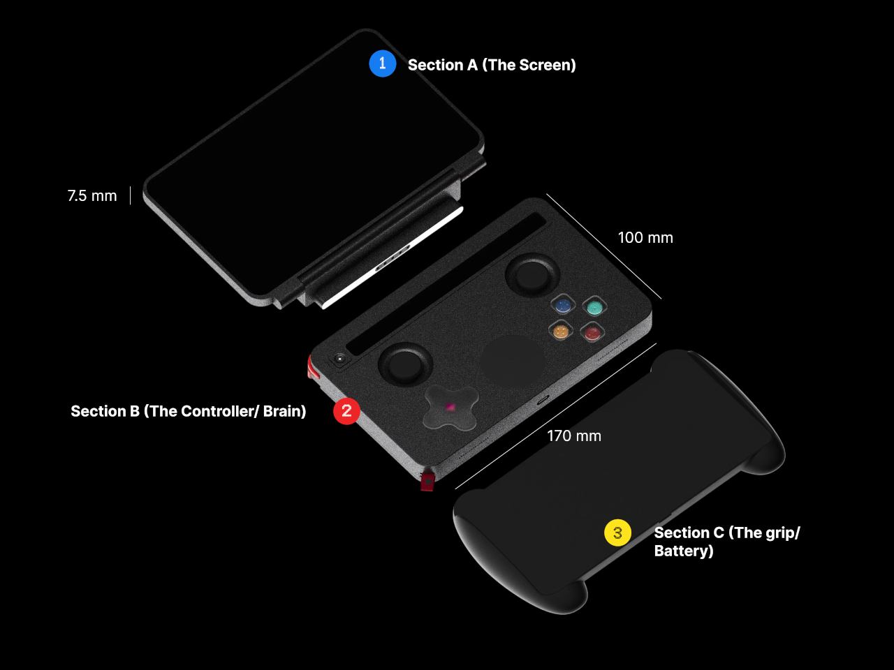
This Chair Turns Fragmented Structure Into Ergonomic Support

Aerise is a seating concept that reimagines how structure, support, and movement can coexist within furniture design. Seating has long followed rigid forms and familiar construction systems, where stability is often achieved through heavy frames and static surfaces. Aerise challenges this conventional approach by introducing segmentation as a more fluid and adaptive method of support. Instead of treating seating as a singular fixed structure, the project explores how interconnected elements can work together to create a system that feels lighter, more responsive, and visually dynamic while still maintaining ergonomic comfort and stability.

The project began with an exploration into the relationship between structure and the human body. Seating is one of the most familiar objects in everyday life, yet its design is deeply influenced by posture, proportion, material behavior, and the way the body interacts with support systems over extended periods of time. Aerise investigates what happens when structure is no longer viewed as a rigid shell, but rather as a collection of coordinated parts working together in balance. This shift transforms the chair from a static object into a more fluid system that adapts visually and functionally to the body’s natural posture.

Designer: Dhruvisha Shah

The primary inspiration for the project came from the dragonfly and the unique characteristics of its segmented exoskeleton. Despite its lightweight form, the dragonfly demonstrates exceptional control, precision, and agility in movement. Its body is composed of interconnected sections that provide both strength and flexibility simultaneously, allowing the insect to move with remarkable balance and efficiency. Aerise draws from these principles and translates them into a seating system that embodies similar qualities of controlled support and visual lightness.

This inspiration is most clearly reflected in the chair’s segmented backrest. Rather than relying on a continuous solid surface, the backrest is divided into repeated modular elements that function together as a cohesive support system. Each segment corresponds to different zones of the spine, creating targeted areas of support while collectively forming a fluid and uninterrupted silhouette. This modular arrangement introduces a rhythmic visual language that echoes the structure of the dragonfly’s body while also enhancing ergonomic responsiveness.

The flowing geometry of the chair further reinforces this sense of continuity and movement. Soft curves guide the body naturally into a reclined posture, allowing the seating experience to feel intuitive and relaxed rather than forced or rigid. The reclined angle was carefully considered to balance comfort with structural integrity, ensuring that the chair maintains a stable presence while still appearing visually lightweight. This sense of suspension is amplified by the minimal framework and elevated form, giving the chair an almost floating quality despite its structural strength.

The leg positioning also plays an important role in translating the dragonfly’s balanced alignment into furniture form. Angled supports create stability while maintaining a sense of openness beneath the chair, preventing the structure from appearing heavy or grounded. These subtle details contribute to the overall perception of lightness and precision that defines Aerise as a concept.

At its core, Aerise explores segmentation not simply as an aesthetic gesture, but as a functional support strategy. Each individual element contributes independently to the user’s comfort while simultaneously operating as part of a larger interconnected system. The chair demonstrates how fragmented structures can still create cohesion, and how flexibility and stability do not need to exist in opposition. Through this approach, Aerise proposes a new perspective on seating design, one where support is adaptive, structure feels fluid, and visual lightness becomes an integral part of the experience rather than just a stylistic choice.

By drawing from the natural intelligence of biological systems, Aerise transforms the principles of segmentation, balance, and exoskeletal construction into a refined seating concept that feels both contemporary and intuitive. It is an exploration of how nature-inspired structures can influence not only the appearance of furniture, but also the way it supports and interacts with the human body.

The post This Chair Turns Fragmented Structure Into Ergonomic Support first appeared on Yanko Design.
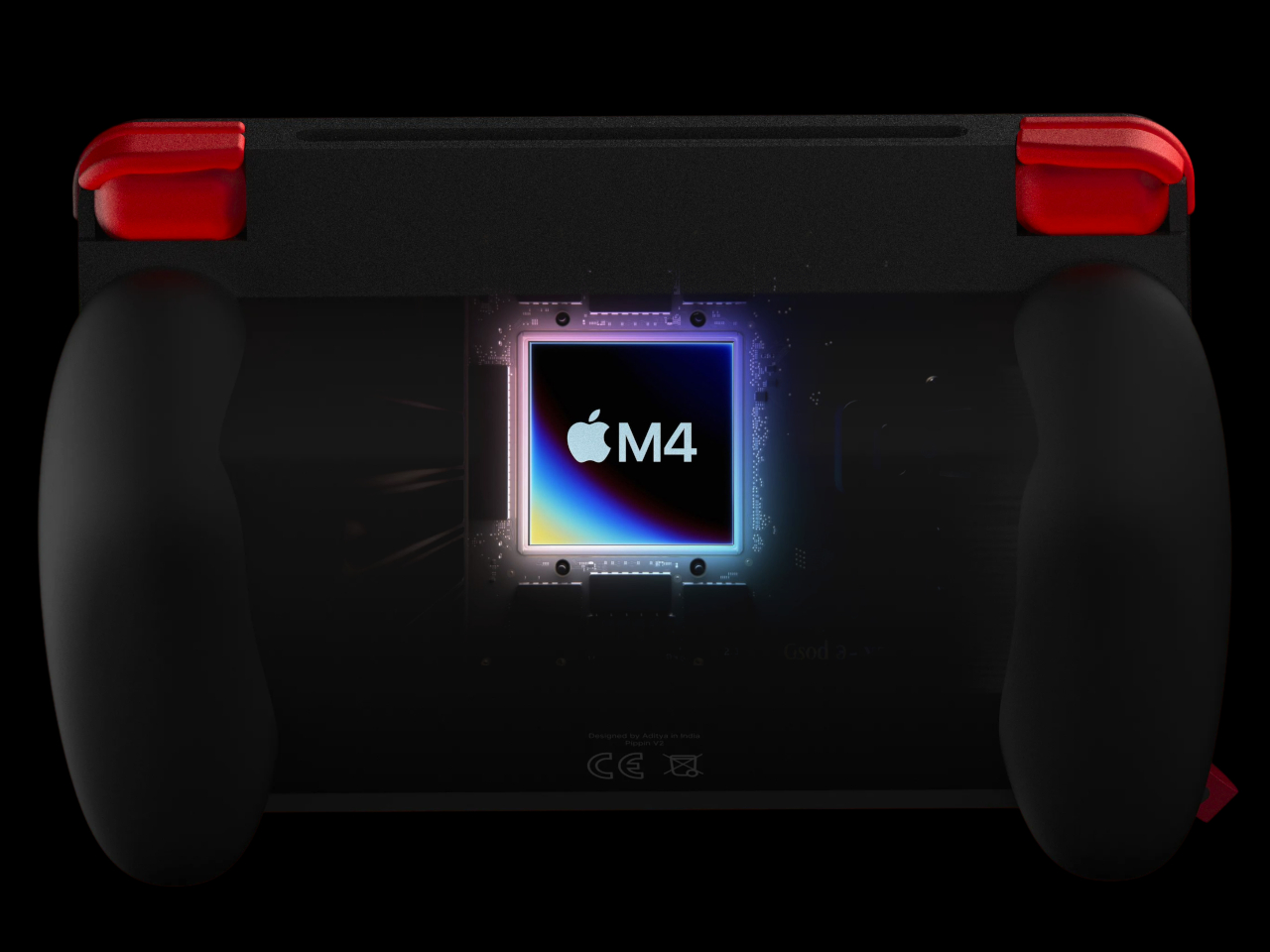
Eufy Just Built a Robot Vacuum With a Built-In Fragrance Air Freshener, and it’s Absolute Genius

The champagne-bronze cylindrical base station in Eufy’s product photos does something most robot vacuum marketing images fail to do: it makes the thing look like it belongs in a well-designed home. The category has long defaulted to black plastic towers and aggressive venting grilles, the visual language of utility appliances that you hide in a laundry closet. Eufy’s Omni S2 system has clearly been styled to sit in the open, the tall dock finished in warm metallic tones that read more like a Dyson or a premium air purifier than a cleaning robot. That aesthetic ambition signals something about where Eufy wants to position this product, and it’s worth paying attention to.

The hardware underneath backs up the posturing. The S2 runs 30,000 Pa of suction through a multi-cyclone airflow system that Eufy calls AeroTurbo 2.0, pairs it with a HydroJet 2.0 roller mop that self-cleans during operation, and adds a fragrance diffuser capable of dispensing Citrus and Basil or Bamboo and Sage throughout the room as it works. The CleanMind AI navigates without a LiDAR tower, recognizing over 200 obstacle types through RGB vision, and the accompanying UniClean station handles dust collection, mop washing, drying, and refilling across a 68-day maintenance window. This is Eufy’s bid to be taken seriously at €1,499, competing directly against Roborock and Ecovacs flagships that have owned the top shelf for the last few years.

Designer: Eufy (Anker Innovations)

The fragrance diffuser deserves more than a passing mention because it represents a genuine category first. No flagship from Roborock, Ecovacs, or Narwal has shipped this feature, and the fact that Eufy built it into the robot rather than the dock is a deliberate design choice. The diffuser module is interchangeable, with three scent options available at launch, and it activates on request rather than running continuously, which is the right call. A robot that dumps fragrance into every room on every cleaning cycle would get exhausting fast. Treating it as an on-demand ambient feature gives the user control over the experience, and that restraint reflects a level of UX thinking that budget-era Eufy products rarely demonstrated.

The CleanMind AI system powering the S2’s navigation is equally notable for what it eliminates. Removing the LiDAR turret, that rotating sensor tower that sits on top of most premium robots, was Eufy’s defining engineering bet with the S1 generation, and it paid off both aesthetically and practically. The S2’s low, angular profile fits under more furniture than competitors with turrets, and the RGB-based vision system now handles over 200 object categories, up from roughly 100 in the S1 Pro. The second product image Eufy released shows this in action: cables, slippers, cups, and folded towels each flagged with category icons as the robot plots its path around them. The visual is almost diagrammatic in its clarity, and it communicates the system’s capability faster than any spec sheet would.

The generational jump from the S1 Pro to the S2 is substantial on paper. Suction goes from 8,000 Pa to 30,000 Pa, the mop system gains additional pressure and rotation speed, the dock expands from 10-in-1 to 12-in-1 automation, and the maintenance interval stretches to 68 days. Eufy received a CES 2026 Innovation Award Honoree for the S2 before it had even launched commercially, which at minimum confirms that the industry was paying attention. Whether real-world performance matches the specification sheet is a question only extended testing will answer, and early reviews from European outlets suggest the mopping performance is genuinely competitive while obstacle avoidance still has occasional gaps with small or low-contrast objects.

At €1,499, the Omni S2 is priced squarely against the Roborock S8 MaxV Ultra and Ecovacs Deebot X2 Omni, robots that have held the premium conversation for the better part of two years. Eufy’s strongest argument is not that it out-specs those competitors in every category, but that it packages competitive cleaning performance inside a system that looks like it was designed for the room it operates in, adds an ambient experience layer nobody else offers, and maintains that 68-day hands-off window that turns a high-maintenance appliance into something that actually recedes into the background. The robot vacuum category has spent years chasing full automation as its north star. Eufy’s move is to ask what happens after you get there, and the answer, apparently, smells like bergamot and lychee.

The post Eufy Just Built a Robot Vacuum With a Built-In Fragrance Air Freshener, and it’s Absolute Genius first appeared on Yanko Design.
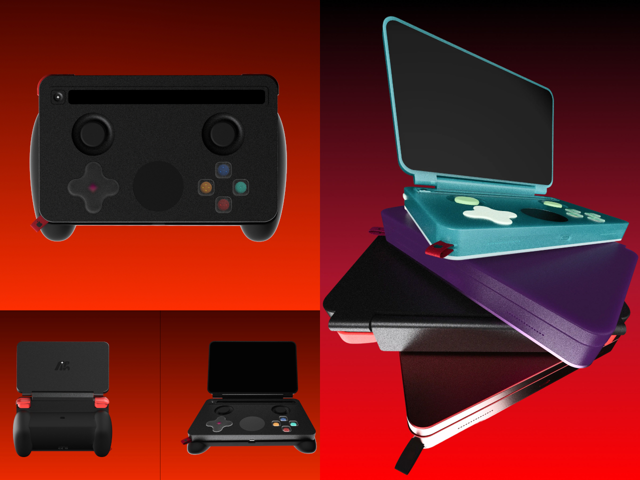
Gantri’s Helia Finally Makes Wireless Lamps Worth Buying

Every lamp in your home is tethered to a wall. Most of us have made peace with that, tucking cords under rugs, running them behind furniture, pretending they aren’t there. We’ve accepted the cord as the price of light. But Gantri and Ammunition just launched something that makes you realize how much quiet compromise we’ve been living with.

Helia is Gantri’s new wireless lighting platform, designed in collaboration with Ammunition, the San Francisco studio behind some of the most considered product design of the last decade. What makes Helia more interesting than your average rechargeable lamp is that it isn’t a product, it’s an architecture. A shared internal system that lives inside every light in the collection: a battery, customizable LED modules, a touch-sensitive control board, and a charging puck. The whole thing is modular, meaning the same technological core can be wrapped in an entirely different shell and still belong to the same family. Achille Biteau, director of industrial design at Ammunition, put it plainly: “all of a sudden you have that same platform that can be used on a range of designs. It could be in the hundreds or the thousands of designs.”

Designer: Gantri x Ammunition

The practical result is a collection of lights that sit on small polished stainless steel charging pucks, lift off with a single gesture, and go wherever you need them. Beside the bed, across the room, out to the patio, onto the dining table. No unplugging. No relocating a power strip. Just pick it up and go. The interaction is so simple it almost feels obvious, which is usually the sign that something was designed very carefully.

I’m going to be real: cordless lamps have existed for a while, but they’ve mostly been an exercise in compromise. They tend to be dim, plasticky, and styled like a product that knows it’s a second-rate option. The Helia-powered collection doesn’t feel like that. Ammunition brings a seriousness of intent to these forms that portable lighting rarely gets. The studio has won the Cooper Hewitt National Design Award for Product Design and has been named one of Fast Company’s Most Innovative Companies in Design five times over. That pedigree shows. The Drift collection feels sculptural, the Pier collection feels architectural, and the Eave reads almost like a proposition about what a lamp’s silhouette could be. These are lights that don’t look like they’re apologizing for not being plugged in.

The system is also designed to scale, and that’s one of the details that separates a good product from a genuinely interesting platform. For homes, the single charging puck does the job perfectly. For restaurants, hotels, or any hospitality space that needs multiple lights ready at once, Gantri offers a six-port charging tray. The imagery of someone carrying a tray of softly glowing lights to a dinner table, like a modern version of candlelight service, is one of the most quietly compelling visuals to come out of a design launch in recent memory.

Gantri founder Ian Yang has described the project as returning light to what he calls its “older state,” one that lives with you, moves with you, and shapes how you experience a space in a more human way. That framing resonates. For most of human history, light was carried. Torches, lanterns, candles. We only stopped moving it around when electricity offered us a more convenient option. The cord was a feature that quietly became a limitation.

The bigger story here is that Helia isn’t just powering three collections. Gantri’s manufacturing platform is opening up so other designers can build their own wireless lights using the same internal system. That makes this less of a product launch and more of the beginning of an ecosystem, which is exactly the kind of ambition that tends to age well. Wireless lighting has been hovering at the edges of serious design conversations for years. Gantri and Ammunition may have just pulled it to the center.

The post Gantri’s Helia Finally Makes Wireless Lamps Worth Buying first appeared on Yanko Design.
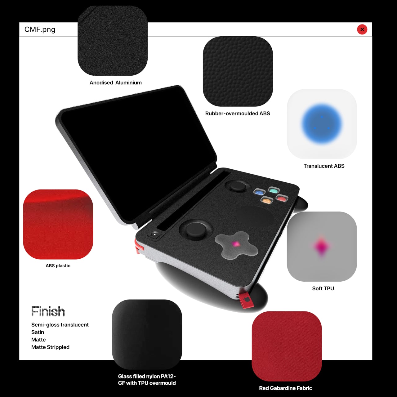
400 Square Feet, Two Private Bedrooms, and Zero Apologies — Meet the Halcyon Grand

There’s a version of small living that doesn’t ask you to give anything up. Fritz Tiny Homes has been chasing that idea since day one, and with the Halcyon Grand, they’ve come the closest to nailing it. It’s their largest model to date, 400 square feet of considered, unhurried design that feels less like a compromise and more like an upgrade.

The Halcyon Grand measures 44.5 by 10.5 feet and ships as a certified Park Model RV, meaning it lives on wheels but doesn’t feel like it. The main floor spans 350 square feet, with a 50-square-foot loft tucked above, a split that gives the home two genuinely private bedrooms without the usual tiny home trade-offs. The king master suite sits at one end, wrapped in floor-to-ceiling glass, a sliding patio door opening onto a covered deck, and a full wall wardrobe with storage built into the bed frame. The loft is its own world, a queen bedroom that closes off completely from the rest of the home, something Fritz says was a direct response to what their clients kept asking for.

Designer: Fritz Tiny Homes

The kitchen and dining area anchor the middle of the plan. There’s a table for four with integrated storage underneath, a full-sized kitchen designed to actually cook in, and a hall closet most apartments would envy. Fritz fitted the bathroom with 6’10” ceilings, reportedly inspired by their first Halcyon Grand client, who stands 6’7″, and the space comes standard with a soaker tub, with the option to upgrade to a custom concrete and glass walk-in shower. A washer/dryer combo is included, with room to swap in a full side-by-side unit if needed.

Throughout, the finishes lean into warmth: custom concrete tile, hardwood floors, timber detailing, dimmable LED lighting, and custom millwork that makes every inch feel intentional. Fritz Tiny Homes, the Alberta-based family company founded by craftsman Kevin Fritz and Heather Fritz, who sits on the National Tiny Home Builders Committee, has always built to a higher standard than the category typically demands, and the Grand is the clearest expression of that yet.

For those who’d rather skip the wheels, the Halcyon Grand is also available as the Modular Grand, engineered for permanent foundation placement and built to meet local building codes on both sides of the border. Pricing starts at $330,225 CAD (approximately $239,507 USD), with limited availability in 2026. This isn’t a tiny home that asks you to live small. It asks you to live better.

The post 400 Square Feet, Two Private Bedrooms, and Zero Apologies — Meet the Halcyon Grand first appeared on Yanko Design.
Momentum Studio’s Perpetual Calendar Clicks Into Each Day Like a Gear

Most people check the date by glancing at a phone, a laptop corner, or a watch. There’s no shortage of ways to know what day it is, yet somehow that information rarely feels anchored to anything. It arrives in a notification, floats on a lock screen, and disappears the moment you look away. The calendar has become the most forgettable object in modern life.

Momentum Studio, a German design firm, is treating that problem with a very physical antidote. The Momentum Calendar is the fifth object in the studio’s Object Collection, approaching timekeeping as a deliberate act rather than a passive glance. It’s a perpetual calendar machined from solid aerospace aluminum that requires you to move a marker by hand each morning, turning date-checking into something closer to a ritual.

Designer: Momentum Studio

The calendar sits as a stepped aluminum block, angled so both tracks face you at once. The top holds 12 scalloped arches, one for each month, where a smooth cylindrical marker rests in a gentle depression. The front runs 31 ribbed channels numbered across the days, where a flower-shaped marker with corrugated edges clicks into each position like a gear finding its tooth.

That’s where the haptic element matters, and it’s more meaningful than it sounds. There’s something grounding about reaching over each morning to nudge a metal marker one slot further, feeling the resistance as it settles into place. It takes two seconds, but those two seconds make the date something you’ve done rather than something you’ve simply glanced at from across the room.

The studio calls it “a physical manifestation of time,” which might read as a lofty claim until you consider how little physical presence calendars have anymore. The Momentum Calendar doesn’t tell you the date so much as invite you to acknowledge it. On a desk or a shelf, it works as both a functional object and a sculptural piece, without pretending to be anything else.

The aluminum body reinforces that sense of permanence. Momentum Studio describes all objects in the collection as milled from solid blocks of aerospace aluminum, and the Momentum Calendar carries that weight literally. It’s the kind of material that makes something feel like it belongs on a shelf for good, rather than something you’d swap out seasonally. The ridged texture adds depth without veering into decoration.

The First Edition is limited to 100 numbered pieces, with each unit’s position in the run engraved onto the back. What’s interesting is that the calendar’s entire premise depends on you showing up for it every single day. A phone calendar stays current because a server keeps it that way. This one is only accurate because you chose to make it so, which might be the most honest thing any calendar has attempted.

The post Momentum Studio’s Perpetual Calendar Clicks Into Each Day Like a Gear first appeared on Yanko Design.