5 Best Surreal Bookstores That Make You Forget You’re Inside a Building

A bookstore should do more than sell books. At its best, it alters how you perceive the act of reading, the space around you, and the relationship between the two. The five bookstores in this list abandon conventional retail interiors entirely. They borrow from astronomy, geology, wetland ecology, and mountain landscapes to create spaces where the architecture becomes as absorbing as anything on the shelves. These are rooms that make you forget walls exist.

What connects them is a shared refusal to treat books as products needing display. Instead, each project treats the book as a spatial protagonist, something that informs the shape of ceilings, the curve of shelves, and the way light enters a room. From a portal to deep space in Jiangsu to a mountaintop perch above a river canyon, these bookstores prove that the most effective retail design does not sell to visitors. It transports them.

1. X+Living Bookstore

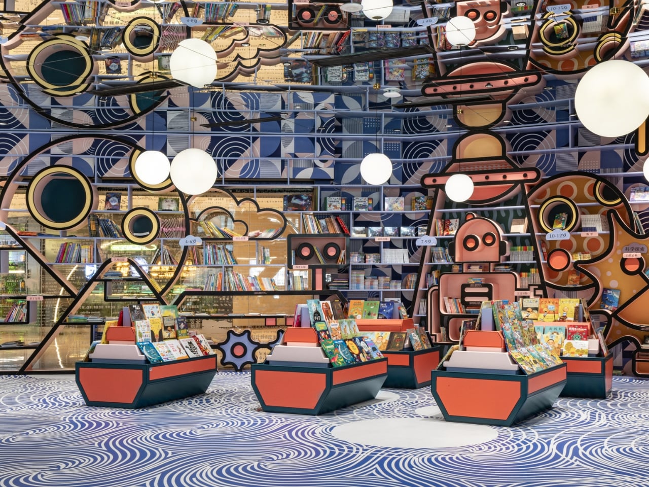
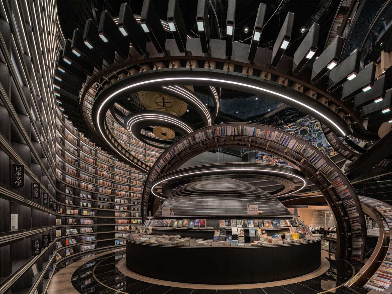
Located in Jiangsu Province and completed in 2023, this bookstore by Li Xiang of X+Living studio is the furthest thing from a cozy reading nook. The space is built around massive three-dimensional structures that resemble astronomical instruments, concentric rings, and geometric forms inspired by celestial mechanics, reimagined as bookshelves and display zones. Books sit on these structures in positions that seem to defy gravity, creating the sensation of browsing a library adrift somewhere in deep space. The project won the 2025 Platinum A’ Design Award in Interior Space and Exhibition Design, which signals how far the concept pushes beyond conventional bookstore interiors.

The spatial ambition is the story here. Most bookstore designers work with shelving grids and lighting schemes. X+Living built a set piece. The concentric ring structures occupy the room not as furniture but as architecture within architecture, turning navigation into an experience of orbiting through layers of books arranged on curving, tilted surfaces. The scale of the installation relative to the room makes it impossible to separate the act of browsing from the act of inhabiting the space. Visitors are not walking through a store. They are moving through a constructed universe that happens to contain books.

What we like

  • The astronomical instrument forms function as both structural shelving and immersive scenography, collapsing the boundary between retail and installation art.
  • The Platinum A’ Design Award validates a level of spatial ambition that most bookstore designs never attempt, let alone execute at this scale.

What we dislike

  • The dramatic structures may prioritize visual spectacle over browsing comfort, making it difficult to linger and read in a space designed to overwhelm.
  • Wayfinding through concentric, gravity-defying shelving is disorienting by design, which can frustrate visitors looking for specific titles rather than an experience.

2. Toyou Bookstore

Wutopia Lab designed Toyou bookstore inside a red-brick building by Jean Nouvel in Shanghai’s Huangpu district, using traditional Chinese garden techniques as spatial logic rather than decoration. The interior is organized around two abstract mountains, “Big You” and “Little You,” which form interlocking cave-like spaces out of burgundy perforated aluminum panels and white artificial stone. The “Little You” mountain greets visitors at the entrance as a glowing white bookshelf, while the larger “Big You” mountain houses the main reading and living areas behind layers of bookshelves that create new views at every turn.

The garden-design principle at work here is “a view at every step,” and the architects execute it with the kind of precision that makes each transition between spaces feel composed rather than accidental. A circular “secret place” sits between the two mountains as a private reading zone, while hidden metaphors (a well, a dripping spring) reference classical Chinese poetry. Lead architect Yu Ting has described the bookstore as a tool for understanding Shanghai itself, a miniature cultural complex that accepts readers and non-readers alike. The result is a space that feels ancient and contemporary at once, where cave walls are made of perforated aluminum and mountain peaks are bookshelves.

What we like

  • The garden-design approach creates a sequence of spatial discoveries that rewards slow movement and repeated visits rather than efficient browsing.
  • Wutopia Lab’s decision to house the bookstore inside a Jean Nouvel building creates a layered dialogue between two architectural languages.

What we dislike

  • The cave-like enclosures and perforated panels limit natural light penetration, which could make extended reading sessions uncomfortable without careful artificial lighting.
  • The density of metaphor (mountains, wells, springs, caves) risks reading as overwrought to visitors unfamiliar with Chinese garden-design traditions.

3. Xixi Goldmye Bookstore

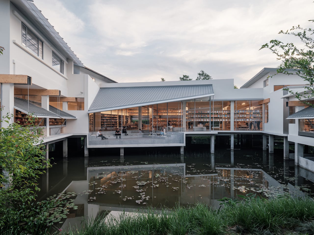
What started as a forgotten 20-year-old office building in Hangzhou’s wetlands is now one of the most compelling adaptive-reuse bookstores in China. Atelier Wen’Arch stripped the structure to its bare concrete columns, dismantled the existing roof and wall systems completely, and rebuilt an 880-square-meter space that opens generously to the surrounding Xixi National Wetland Park. The U-shaped building, once closed off and disconnected from its natural setting, was completed in April 2025 as a structure that treats the wetland landscape as its primary interior surface.

The defining feature is a system of laminated pine timber “book beams” that intersect with the original concrete columns and extend outward in measured cantilevers. These double-beam elements integrate lighting and air conditioning return channels between each timber pair, turning mechanical infrastructure into an architectural rhythm that runs through the entire interior. The beams frame views of the wetland, so the surrounding nature becomes a living artwork visible from every reading position. The structural intervention aligns with the original building grid while introducing warmth and human scale to what was once sterile office space. It is renovation as reinterpretation, where the old bones inform a new spatial logic.

What we like

  • The “book beam” system transforms structural engineering into the primary design language, making infrastructure legible and beautiful rather than hidden.
  • Opening the formerly closed U-shaped plan to the wetland park turns the surrounding landscape into the bookstore’s most powerful design element.

What we dislike

  • Wetland-adjacent construction faces ongoing humidity and moisture challenges that will test the longevity of the laminated pine timber beams.
  • The remote wetland location, while scenic, limits foot traffic compared to urban bookstores, raising questions about long-term commercial viability.

4. Xinglong Lake Citic Bookstore

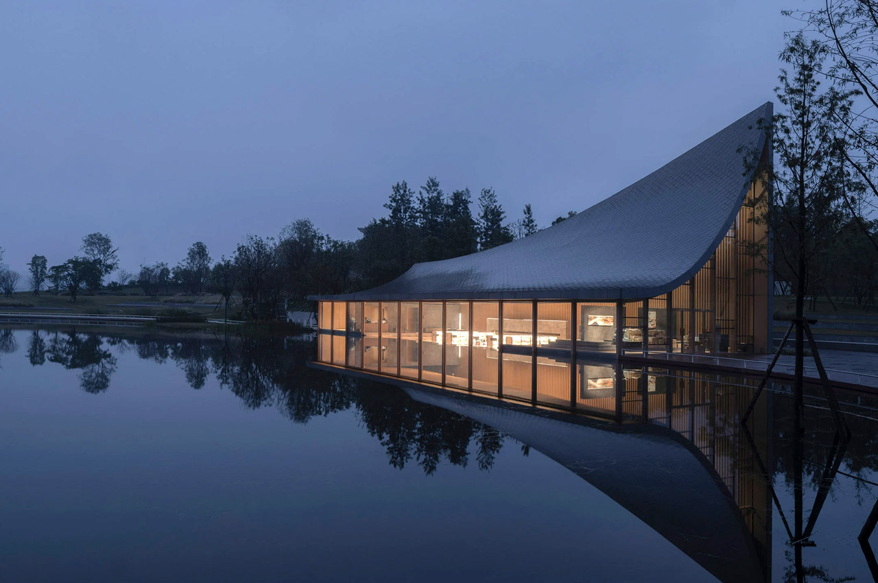
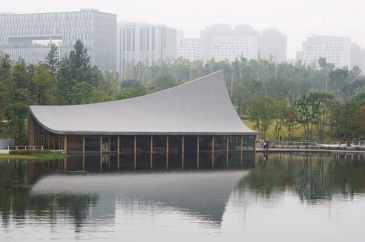
MUDA Architects designed this waterfront bookstore around a single image: a book falling from the sky. The rectangular structure sits at the edge of Xinglong Lake in south Chengdu, and its swooping roof extends for 3 meters with both ends elevated at different heights (16 meters at the southwest, 7.5 meters at the northeast). The curve mimics a nearby grass slope, creating a continuous visual line between the built form and the landscape. Massive windows extend below the waterline, merging the reading interior with the surface of the lake.

The roof is the architectural argument. Its curved surface reinterprets the pitched roof of traditional Chengdu vernacular architecture while functioning as a structural analog for the pages of an open book. The asymmetric elevation creates interior volumes that shift dramatically from one end to the other, high and cathedral-like at the southwest, compressed and intimate at the northeast. That gradient gives each section of the bookstore a different spatial character without partition walls. The underwater windows are the most disorienting detail: readers seated near the water level see the lake from inside it rather than above, which dissolves the expected boundary between interior and landscape in a way that no amount of floor-to-ceiling glazing can replicate.

What we like

  • The asymmetric roof creates a gradient of spatial experiences within a single open interior, from expansive to intimate, without any walls.
  • Below-waterline windows dissolve the boundary between the reading space and the lake, producing a perspective that no conventional glazing strategy can achieve.

What we dislike

  • The roof’s dramatic curvature dominates the structure so completely that the bookstore’s identity is inseparable from a single architectural gesture, leaving little room for the interior to develop its own language.
  • Waterfront and below-waterline glazing demand constant maintenance and waterproofing attention that will compound as the building ages.

5. Nujiang Grand Canyon Bookstore

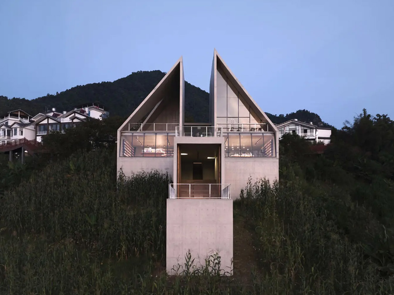
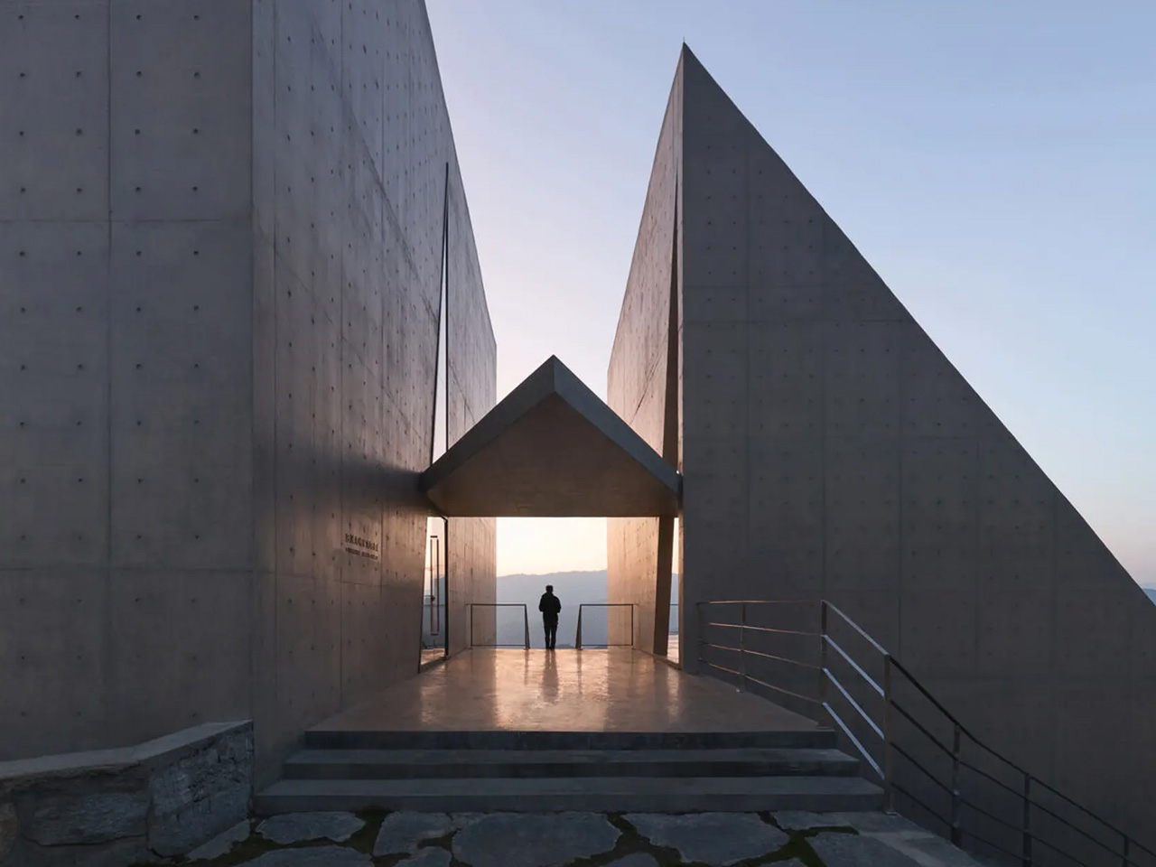
Perched on top of the Gaoligong Mountains in Yangpo Village, the Nujiang Grand Canyon Bookstore is built to feel like it belongs to the terrain rather than sitting on it. The structure extends outward from the mountainside like a sharp arrow, a form that references the Lisu people’s historical connection to crossbows. Reinforced concrete and locally sourced materials anchor the building to the slope while keeping its environmental impact low, and wall openings frame specific views of the Nujiang River and surrounding peaks.

The architectural intelligence is in how the building negotiates the slope. Rather than flattening the site or building a conventional foundation, the structure adapts its footprint to the mountain’s gradient, creating a subtle sense of elevation that rises with the terrain. The framed canyon views through the wall openings function as curated compositions rather than generic panoramas, each one selecting a specific relationship between river, peak, and sky. The combination of contemporary concrete construction and local material traditions creates an object that reads as both modern and rooted, a building that could not exist anywhere else. For a bookstore, that site-specificity is the rarest quality of all: a space where the location is not a backdrop but the reason the architecture exists.

What we like

  • The arrow-like form references Lisu cultural heritage in a structural gesture rather than a decorative motif, embedding local identity into the building’s shape.
  • Framed wall openings curate specific canyon views as compositions, turning the landscape into a series of deliberate artworks rather than a passive backdrop.

What we dislike

  • The remote mountaintop location, while spectacular, creates significant accessibility challenges for visitors without private transport.
  • Reinforced concrete construction on a steep mountain slope carries long-term structural monitoring requirements that increase maintenance complexity.

When The Room Is The Story

These five bookstores share one conviction: that the space around a book matters as much as the words inside it. A celestial instrument in Jiangsu, a pair of abstract mountains in Shanghai, timber beams framing a wetland in Hangzhou, a roof shaped like a falling book in Chengdu, and an arrow launched from a mountaintop above the Nujiang River. None of these projects treats architecture as a container. Each one treats it as content.

The best bookstores have always understood that reading is a spatial act. Where the body sits, what the eyes see between paragraphs, how light changes across an afternoon, these conditions shape the experience of a book as much as the typography on the page. These five take that understanding and build entire worlds around it. Walk into any of them, and the building becomes the first chapter.

The post 5 Best Surreal Bookstores That Make You Forget You’re Inside a Building first appeared on Yanko Design.

This Concept Makes Reading a Physical Ritual, Not an App Reminder

The intention to read a physical book more often usually gets buried under phones, streaming, and vague guilt about never finishing that stack on the nightstand. Reading is not just opening a book; it is a whole arc from deciding to start to actually making it through chapters without drifting away. Lead is a small family of objects designed to sit around a book and quietly support that arc.

Lead is a design concept that treats reading as a story with a beginning, rising action, climax, and resolution. The name is a contraction of “Let’s read” and the first word of the slogan “lead back to the era of reading,” and the system uses three products, Bookeeper, Candle, and Quill, to give each phase of a reading session its own physical cue instead of relying on app notifications you will probably dismiss.

Designers: Yoo Chaeyeon, Kwon Eui Hwan, Yang Jinoo, Lee Sooyeon, Ha Seongmin

Coming home, you drop your book into Bookeeper, where it sits hidden behind a calm green panel. Earlier, you set a time to read, and as that moment approaches, the base lifts and the book slowly emerges from behind the screen. Instead of a phone notification buzzing and vanishing, the book itself appears, a quiet reminder that this is the slot you promised yourself you would actually use.

Candle is a slim vertical light that links to Bookeeper by default, then switches into timer mode with a twist of its ring. Before you dive into the pages, you set how long you want to read, and Candle becomes both atmosphere and clock. As you move through chapters, you can sense how your pace matches the time you set, adjusting speed without feeling chased by a digital countdown ticking in the corner.

When a line or idea sticks, Quill is a smart pen that lets you write by hand in a notebook or margin, then flip into scan mode to store that text on a device later. It has two main modes, transcription and scan, so you can copy favourite phrases, jot down reflections, and then capture them without breaking the flow. A bookmark element on the back lets Quill rest in the book when you pause.

All three objects share dark bases and a calm, translucent green for the parts that move or light up, so they feel like a family without shouting for attention. The interactions are borrowed from analog reading rituals, taking a book off a shelf, lighting a candle, picking up a pen, but layered with just enough technology to guide habit without dragging you back to a screen.

Lead is less about adding gadgets to the reading table and more about designing a gentle structure around a physical book. Bookeeper brings you back at the right time, Candle holds the space and the clock, and Quill helps you remember why the session mattered. When reading often gets squeezed between notifications and feeds, a trio of objects that simply lead you back to the page feels like a quietly radical idea.

The post This Concept Makes Reading a Physical Ritual, Not an App Reminder first appeared on Yanko Design.

MG Raiser Doubles Up Your Manga Shelf Without Hiding the Back Row

Bookshelves quietly go from single row to double row, especially for manga where volumes multiply quickly. The front row looks great, the back row disappears behind it, and you end up playing memory games to remember which volume is hiding behind which spine. Collectors accept this as the price of a growing library, even though it makes browsing and rearranging annoying and means half your collection is essentially invisible unless you pull out the front row.

MG Raiser from MangaGuardian is a tiny shelf adapter that takes that double-row habit and makes it less painful. It is a compact L-shaped stand that lets you display two rows of manga in the same footprint, with the back row raised just enough to stay visible. Simple plastic geometry aimed squarely at overcrowded shelves, it solves a niche problem that anyone with more than 20 volumes has quietly dealt with at some point.

Designer: MangaGuardian

Sliding a few MG Raisers onto a shelf and lining up volumes, the front row sits where it always has, but the back row now rides on a small platform. You can still read every spine, which makes it easier to grab the next volume or rediscover something you forgot you owned. You get roughly twice the capacity in that section without turning the back row into a black hole where titles go to be forgotten.

The block-lift function is where the design gets a bit more clever. The back row and the Raiser act as a single movable unit, so when you want to reorganize you can pull out the entire raised row at once and drop it somewhere else on the shelf. For people who like to re-theme shelves, group arcs, or rotate what is on display, that small interaction saves time and keeps stacks from collapsing mid-move.

Each MG Raiser holds up to 10 items, typically five in front and five in back, with 84 mm width, 170 mm depth, and 150 mm height tuned for standard tankōbon-sized manga. The same proportions work for other similarly sized things, small paperbacks, light novels, or even game cases, so the design quietly extends beyond its original niche and could help anyone trying to squeeze more out of limited shelf space.

MangaGuardian sells other components like MG Tana and MG Sora for more elaborate setups, but MG Raiser stands on its own as a drop-in upgrade. You can use a couple in a single cube, line up several across a long shelf, or mix them with plain rows. It respects whatever furniture you already have, which is important when your shelves are already full of things you care about.

MG Raiser is unapologetically aimed at manga fans, yet the underlying idea, a raised second row that moves as a block, could help anyone trying to squeeze more out of a bookshelf without turning it into chaos. It is the kind of small, almost remedial design move that feels obvious once you see it, and that is usually a sign the designers were paying attention to how people actually live with their stuff instead of just offering another decorative shelf cube.

The post MG Raiser Doubles Up Your Manga Shelf Without Hiding the Back Row first appeared on Yanko Design.

Apple Music releases limited-edition coffee table book version of 100 Best Albums

When you’re searching for a definitive “best of” list, especially relating to music, you probably search for it on YouTube or streaming services like Spotify or Apple Music. You don’t really look for a book to read since it’s missing the multimedia aspect that comes with most of these lists. But if it’s a very pretty, limited edition coffee table book, you probably might consider getting that instead.

Designer: Apple Music

That’s what Apple Music is hoping for with the release of Apple Music: 100 Best Albums, a companion to the list that they have previously published online. The list was compiled by their team of experts together with some artists like Pharrell Williams, Charli XCX, J Balvin, and Maren Morris. You can own this list presented in a minimalist but expensive looking book that you can display at home for bragging rights. Actually reading it is another thing of course.

The book has the album cover on one side and then the liner notes and in-depth analysis on the other side. It has a custom-designed translucent acrylic slipcase with the Apple Music logo etched on it. It has a linen hardcover debossed with the logo and the edge of the pages are golden gilded. The back of the case has the edition number and inside you have the hand-numbered ex libris.

The reason for the numbers indicated is that there will only be 1,500 pcs produced so they emphasize the limited nature of this item. That’s also the reason why the price tag for this coffee table book is pretty expensive. It is now available for pre-order for those willing to shell out $450 for it. I will probably stick to reading the list online and streaming it on my music service of choice.

The post Apple Music releases limited-edition coffee table book version of 100 Best Albums first appeared on Yanko Design.

“Exposed” book strap lets you display your reading materials

One of the things I make sure when I go out of the house is that I have a book with me, in case of “reading emergencies”. Most of the time though I just stick it inside my bag since my bag is usually big enough to hold multitudes. But for those who don’t usually carry bags big enough to hold a book or two, an alternative to just carrying around that book should be available.

Designers: MAEKAN x DSPTCH

The MAEKAN x DSPTCH Book Strap is that option for those who still want to carry around books or those who want their reading material to be on display. It is big, or rather, long enough to hold things like books, magazines, and even tablets and laptops. It is one way to “show off” that you still read printed media or at least carry them around in case you need to read one.

The book strap is made from a herringbone seatbelt webbing that is around 1″ long and mil-spec webbing. The elastic horizontal strap can be stretched to accommodate whatever it is that you’ll be carrying while the two vertical straps are adjustable. You can place the items in it and then adjust to secure. It is able to carry items between 8 and 16 inches. It is an exposed strap design so you have to make sure that you secure the items by adjusting according to what you’ll place “inside”. But you can also use it for a book bag that doesn’t have straps, in case you don’t want it to be that exposed.

As someone who has a lot of small things inside my bag along with books and my gadgets, the original design for this will definitely not work for me. I might also be paranoid that something will fall out although it seems like it’s designed for that not to happen. But it will definitely appeal to a certain segment of the reading market.

The post “Exposed” book strap lets you display your reading materials first appeared on Yanko Design.

Top 5 Essential Reading Accessories Every Bibliophile Must Own

The word that perfectly defines me, and is a major part of my identity is ‘Bibliophile’. I’m a bibliophile through and through! Give me a good book, and I’ll be tucked away in a corner with it for hours on end, completely detached from reality and immersed in the fictional world. My love for books means I own a lot of them, and I love coming across functional and adorable products that make my reading experience smoother and more fun. We’ve curated a collection of clever and must-have products that every bibliophile needs in their arsenal. From a transparent bookmark that holds your book open for you at all times, to a nifty reading light you can clip onto your book – these fun yet functional products will improve your reading experience by manifolds.

1. Bookish Bookmark

This ingenious little design is called the Bookish Bookmark, and it provides you with a smooth and hands-free reading session, ensuring your book stays open while you read it. You don’t need to adopt any uncomfortable workarounds to keep your book open while reading or performing other tasks while doing so. It has a clear transparent design, making it great for those who follow cookbooks while preparing meals.

Click Here to Buy Now: $65

Why is it noteworthy?

If you’re a true blue bibliophile, and you like to display your books at home, then the Bookish Bookmark is the product for you. You can keep your book open, adding an aesthetically pleasing element to your desk, coffee table, or bookshelf on account of its transparent design.

What we like

  • Lets you showcase your beloved books in an organized and attractive style

What we dislike

  • The bookmark seems to be too large for small books and isn’t an ideal option for those who like small and subtle bookmarks

2. Japanese Lantern Candle

If you like spending your evenings curled up with your favorite book in the warm light of a candle, then you may want to consider purchasing the Japanese Lantern Candle. This beautiful little candle is inspired by the Japanese ‘chouchin’ lantern, and it offers some soft yet generous illumination to your reading sessions.

Click Here to Buy Now: $69

Why is it noteworthy?

The Japanese Lantern Candle draws inspiration from the iconic Japanese lantern design. The age-old lantern was modernized, creating a surreal lighting solution with a calming glow. The product is handcrafted by artisans in Kurashiki, Japan, making it a veritable collectible.

What we like

  • The outer wax doesn’t melt too fast, creating a clear body on the lantern candle

What we dislike

  • The candle does have an open flame, so make sure you don’t place your books too close to it, for fear of catching fire

3. Bowie 2.0

Every book lover needs a trustworthy and dependable reading light, and I do swear by Bowie 2.0. This clever reading light not only offers illumination to the pages of your book but the room as well. The light looks like a leather fashion accessory, that you can easily clip onto the left and right sides of your book cover.

Why is it noteworthy?

The light’s strap features LEDs, which offer a soft and warm glow, that is powerful enough to let you read in the dark. The strap illuminates the pages with a warm LED light, allowing you to read easily and peacefully. You can turn the pages and move about without the light causing any issues.

What we like

  • Equipped with touch-sensitive brightness settings, that let you adjust the LED brightness

What we dislike

  • Some people may find it inconvenient and annoying to hold a book with a clipped-on reading light

4. The Ptolomeo Bookshelf

Created by Bruno Rainaldi, the Ptolomeo Bookshelf is a beautiful ode to books, and the people who love to read. The bookshelf is designed especially for bibliophiles, serving as a rejuvenated and refreshing variant of the traditional bookshelf. The revamped design converts an everyday bookshelf into a fascinating design object, bordering on an art piece.

Why is it noteworthy?

The bookshelf is freestanding, amped by a clean and minimal form, which disappears or becomes ‘invisible’ as you fill it up with books! Ptolomeo’s thin and narrow shelves seem to vanish once you place books in them. The mesmerizing piece creates the impression of a stack of books floating in the air.

What we like

  • The bookshelf seems to “mock the law of gravity”, creating a playful illusion
  • Functional and sturdy furniture piece, plus amped with good aesthetics

What we dislike

  • It is a large and space-consuming piece, not well-suited for smaller homes

5. Reference Bookend

Designed by Henry Julier, the Reference is a minimal and classy bookend, designed for those who love to showcase their favorite books. The bookend was created to be a problem-solving tool, facilitating greater connections between the product, and the people who use it. The bookend features a round top flange offering users enough material to hold onto while adding books and adjusting it.

Why is it noteworthy?

Light bookends are tough to adjust with heavy books, hence the Reference was created to function as a sturdy, heavy, and stiff sheet steel bookend that doesn’t need downward pressure to firmly hold onto the books. The Reference Bookend is also quite easy to pick up and put down as and when needed, owing to its unique form.

What we like

  • The sturdy form that holds the books without any external pressure or support

What we dislike

  • The aesthetics of the bookend are pretty somber and sober, and may not appeal to everyone’s tastes

The post Top 5 Essential Reading Accessories Every Bibliophile Must Own first appeared on Yanko Design.

3D vases pop up from this book to add some minimal geometric designs to your home decor

Flowers are things of beauty, whether it’s a single stem or a dozen heads. They have a naturally enchanting appearance that almost makes them feel like they come from a different world, one that’s filled with color, magic, and dreams. Those are the things that fairy tales are made of, so it’s not surprising that flowers often play an important role in these literally fantastic stories, even if just to create that mystical atmosphere. It may just be fiction, but you can bring a bit of that magic to your home with this elegant book that transforms into an enchanting pop-up vase that makes it look like your flowers are magically growing from the book, creating an atmosphere of awe and wonder at every turn of the page.

Designer: Hideaki Miyauchi

Click Here to Buy Now: $39

A vase is traditionally made of glass, ceramic, clay, or even plastic, basically any rigid material that creates a stable vessel for flowers to stand in. These are also naturally water-resistant since the plants will need water to survive longer. The last thing you’d expect is for a vase to be made out of paper, let alone one that pops out from a book like one of those kids’ fairy tale books, but that’s exactly the enchanting story that this Flowery Tale vase wants to tell.

When you turn over the cover, you’re immediately greeted by a 3D silhouette of a vase cut out from the pages of the book. Turn the page and you’ll behold yet another vase design, equally graceful and beautiful as the first. A third design awaits you on another page, giving you the power to choose how you’d like the day’s floral arrangement to be. Even better, you can turn the book upside and it will still work as a proper vase, which means you have six possible variations to choose from.

The magic behind it is actually the glass tube that you insert into the spine of the book to hold the flower and the bit of water to keep the plant alive for a few more days. The tube can be inserted right side up or upside down and it will work just fine. All vase designs, however, have a narrow silhouette on the “top” and a larger shape at the “bottom,” so you can choose which side to use depending on the volume of the flowers you intend to place.

The pages of the book are made from 100% natural pulp paper, but you don’t have to fret about accidentally splashing it with water thanks to the “OK Rain Guard” water-resistant coating applied to the material. Whether you want to highlight a single flower or impress with a bouquet, this creative Pop-up Book Vase will set the perfect stage for your design and the epic story that is your life.

Click Here to Buy Now: $39

The post 3D vases pop up from this book to add some minimal geometric designs to your home decor first appeared on Yanko Design.

Electronic 3D book concept helps visually impaired kids feel the magic of fairy tales

Reading is already a difficult task for people with visual impairments, but it’s especially challenging when it comes to material that involves a lot of visual elements. Adults might have not much of a problem visualizing those words in their minds, but children who are still developing their mental libraries will probably have a harder time. Fairy tales and fictional books with fantasy elements are examples of these highly visual materials, and simply hearing the narration or feeling the words through Braille feels rather insufficient to capture the emotions and magic of the stories. This electronic book concept tries to offer an equally magical experience that makes the objects and scenes pop out from the book, almost literally.

Designers: Subin Kim, Yujeong Shin, Seungyeon Lee

It’s pretty amazing how blind and visually impaired people can read a book while sliding their hands across seemingly random dots, almost like magic. But the text on a page doesn’t exactly show the images associated with the words, relying on your imagination to conjure up those associations mentally. Of course, that comes almost like second nature for those with normal eyesight, but the visually impaired, especially younger ones, need a bigger boost to help match words with shapes and objects.

bbook is a concept for an electronic 3D book that provides all the necessary tools for a child with visual impairments to not only make sense of but also enjoy such fantastical books. It has an audio component that reads the book out loud, with large tactile buttons that let the reader skip forward or backward as desired. There’s also a dynamic Braille “page” where dots rise and sink as the words change.

1

The most interesting part of the book, however, is the fabric-like material on the opposite page. This soft material would also rise to create bumps but not as words in Braille but as actual three-dimensional objects related to the story being told. It could be Snow White’s apple, Cinderella’s glass slipper, or the wolf in Little Red Riding Hood. In addition to the educational value of this feature, it also helps make the story feel even more magical.

Every part of the 3D book was designed so that a visually impaired individual could use it without assistance. Even the charging indicators are elevating dots rather than LEDs so they can feel how much more time it needs. bbook also has a rather interesting feature where each individual story is inserted into the device like a USB stick, making each tale a memorable and magical experience.

The post Electronic 3D book concept helps visually impaired kids feel the magic of fairy tales first appeared on Yanko Design.

Unique Book-mounted Reading Light lets you get a few chapters in without waking anyone

Sitting atop your book sort of like a halo, the Bowio 2.0 is a genius reading light that illuminates your pages and not your entire room. The light, styled like a leather fashion accessory, clips onto the left and right sides of your book cover, while LEDs built into its strap cast a soft glow that’s powerful enough to let you read in the pitch dark.

In an era dominated by OLED displays, it’s refreshing to see a book-light like the Bowio make the kind of impact it’s making. Now in its second edition, the Bowio 2.0 builds upon the success of its predecessor which raised over half a million dollars from 7000 backers back in 2021. The world’s most funded book light is back for round two, with a few improvements to its design, craftsmanship, and functionality.

Designers: Anıl Ercan and SozumDogan

Click Here to Buy now: $59 $74 (20% off). Hurry, only 8/1140 left! Raised over $200,000.

The format of the Bowio 2.0 remains unchanged for the sole reason that it works so brilliantly. Sitting on your book like a golden arch, the Bowio 2.0 shines warm LED lights at your pages, allowing you to read, turn pages, and move around without having the light cause you or anyone discomfort. The Bowio 2.0 clips onto each end of your book (and is long enough to fit larger books or even board games like DnD), with multiple LEDs that cast a warm diffused glow that doesn’t cause any shadows, helping you read clearly. It attaches directly to your book, unlike other body-worn reading lights, which means you can adjust yourself without worrying about the light’s orientation going askew, and like its predecessor, the Bowio 2.0 has touch-sensitive brightness settings built in that let you adjust the LED brightness to suit your needs.

Bowio GameLight is specifically designed for Game Masters, it fits seamlessly with both carton and wooden screens.

Craftsmanship is one of Bowio 2.0’s highlights, with varieties spanning both vegan and genuine leather options. No matter which material you pick, the Bowio’s stitching and edge-finishing are impeccable, and the leather has just the right amount of stiffness to hold its shape no matter how you use it. Metal buckles on both ends separate the LED strip from the Bowio 2.0’s magnetic clip, and N52 neodymium magnets in the clips on each side help the Bowio 2.0 firmly grasp onto both paperback and hardbound books. High CRI LEDs offer better color rendering than regular LEDs, and draw power from a battery pack that gives it up to 95 hours (depending on the brightness setting) of use on a full charge. You can run your Bowio on 1.5V rechargeable batteries, charging them through a built-in USB-C port, or use disposable AAA batteries that are more readily available.

The Bowio 2.0 campaign is seeing a pretty good response right off the bat, which gives me hope for a human race that still prefers offline entertainment like reading and gaming (it even got an Honorable Mention at the 2023 LIT Lighting Design Awards). The self-proclaimed book light attaches onto board games too, allowing you to play in dimly lit environments, and each Bowio 2.0 ships with a tabletop standing accessory if you opt for its ‘Gamer’ edition. For the avid bookworm, the Bowio 2.0 is available in pastel or colorful vegan leather editions, along with an Alcantara synthetic leather variant. However, if you’re looking for something more au naturel, you’ve got variants made from cowhide in regular, suede, and even textured variants to resemble snake or croc leather… and finally a 24K gold gilded leather book light for elite bookworms. Each Bowio 2.0 comes packaged in a classy plastic-free kraft carton box that can easily be composted/recycled, and ships globally.

Click Here to Buy now: $59 $74 (20% off). Hurry, only 8/1140 left! Raised over $200,000.

The post Unique Book-mounted Reading Light lets you get a few chapters in without waking anyone first appeared on Yanko Design.