
In co-op shooter Lazy River, peeing in the pool turns guests into zombies
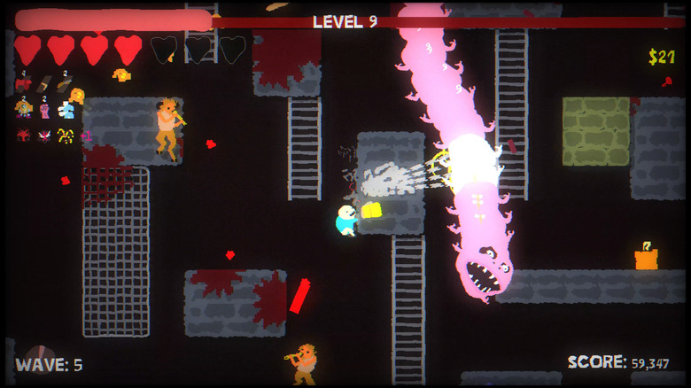
Peeing in the pool is extra dangerous in co-op shooter Lazy River.
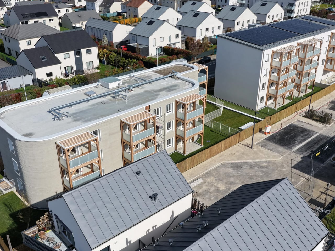
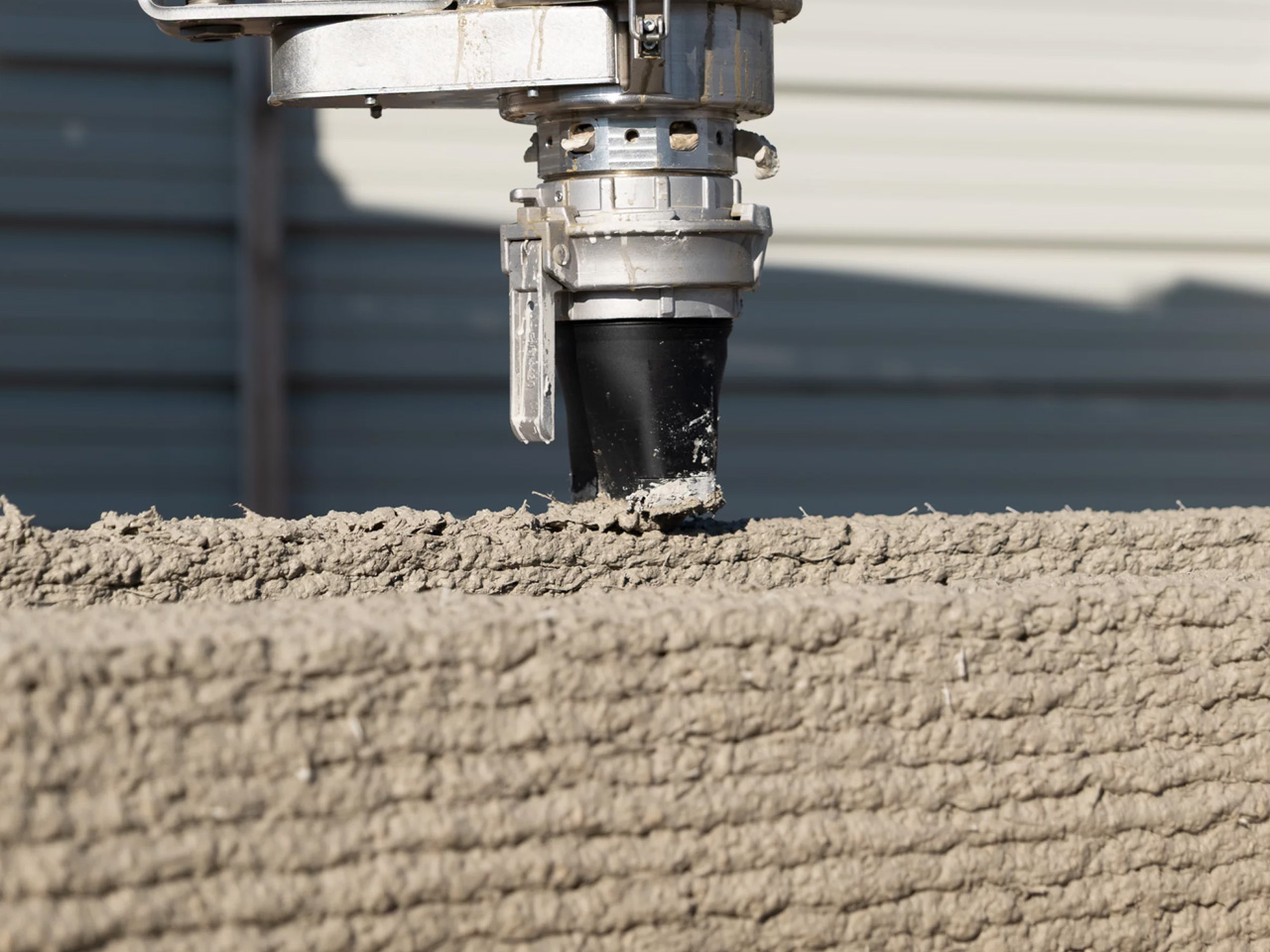
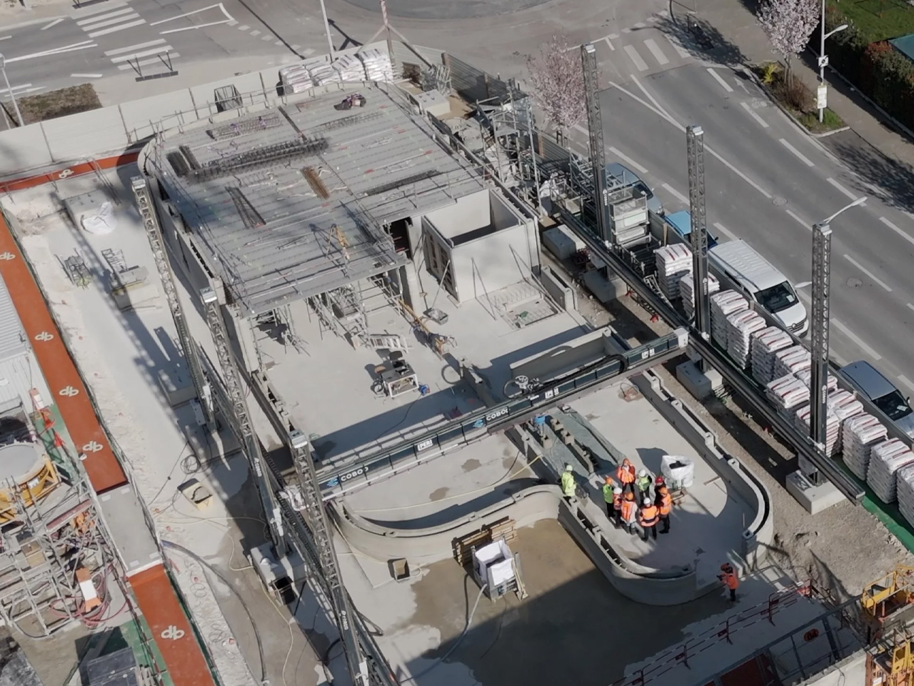
Something significant happened in Bezannes, France — and the construction industry should be paying close attention. ViliaSprint², Europe’s largest 3D-printed apartment building, has been completed, and it arrives less as a proof of concept and more as a genuine blueprint for what housing could look like moving forward. Developed by Plurial Novilia, designed by HOBO Architecture, and printed by PERI 3D Construction using a COBOD BOD2 printer, this is the kind of project that makes you reconsider what a building even is.
The numbers are striking. Twelve social housing apartments across three floors, 800 square meters of living space — all printed on-site in just 34 days, down from an originally planned 50. That alone would be a headline. But what makes ViliaSprint² genuinely remarkable is that it’s the first building in France where both the load-bearing structure and every wall were printed directly on-site, with 100% of all loads transferred through the 3D-printed walls. No hybrid workarounds. No conventional skeleton hiding beneath the surface. The printer did the heavy lifting, quite literally.
Designer: Plurial Novilia & HOBO Architecture
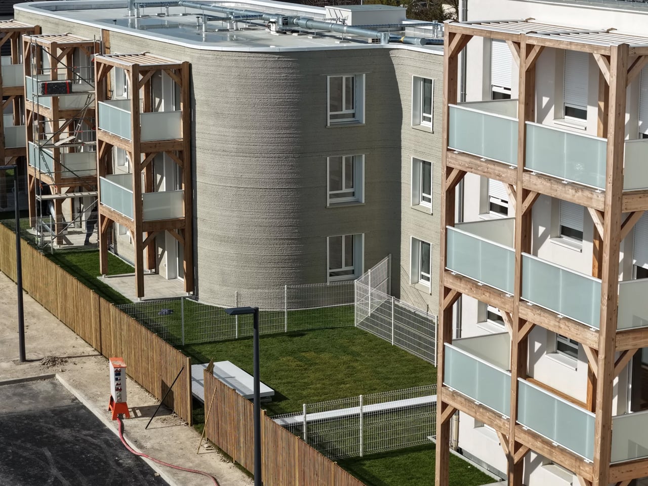
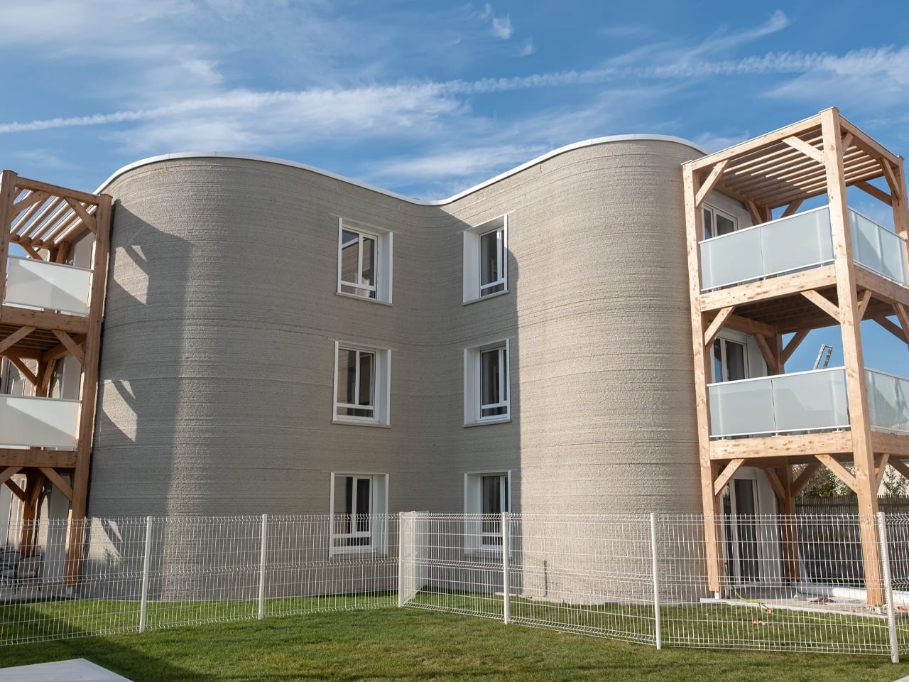
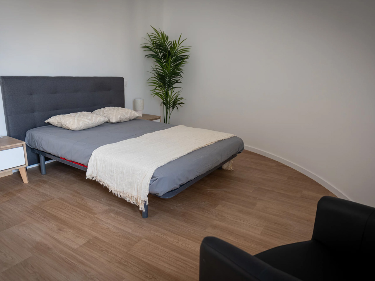
HOBO Architecture’s design leans into the honesty of the medium. The building’s rounded geometry — fluid curves that would cost a fortune to achieve through conventional formwork — is made possible precisely because a machine, not a tradesperson, is doing the forming. It’s design that could only exist with this technology, which is a rarer claim than it sounds. Timber balcony structures offset the weight of the concrete shell, adding warmth to a building that could otherwise read as cold and industrial.
Sustainability is baked into the structure rather than retrofitted onto it. The optimized curved form saved roughly 10% of concrete volume. Holcim supplied the printable concrete using its TectorPrint technology within the CO₂-reduced ECOPact range, reinforced with synthetic macro fibres. Perlite insulation, 500 square meters of photovoltaic panels, and a hybrid gas-heat pump system by Atlantic Systèmes push the building to around 60% energy self-sufficiency — fully compliant with France’s RE2020 2025 green building targets.
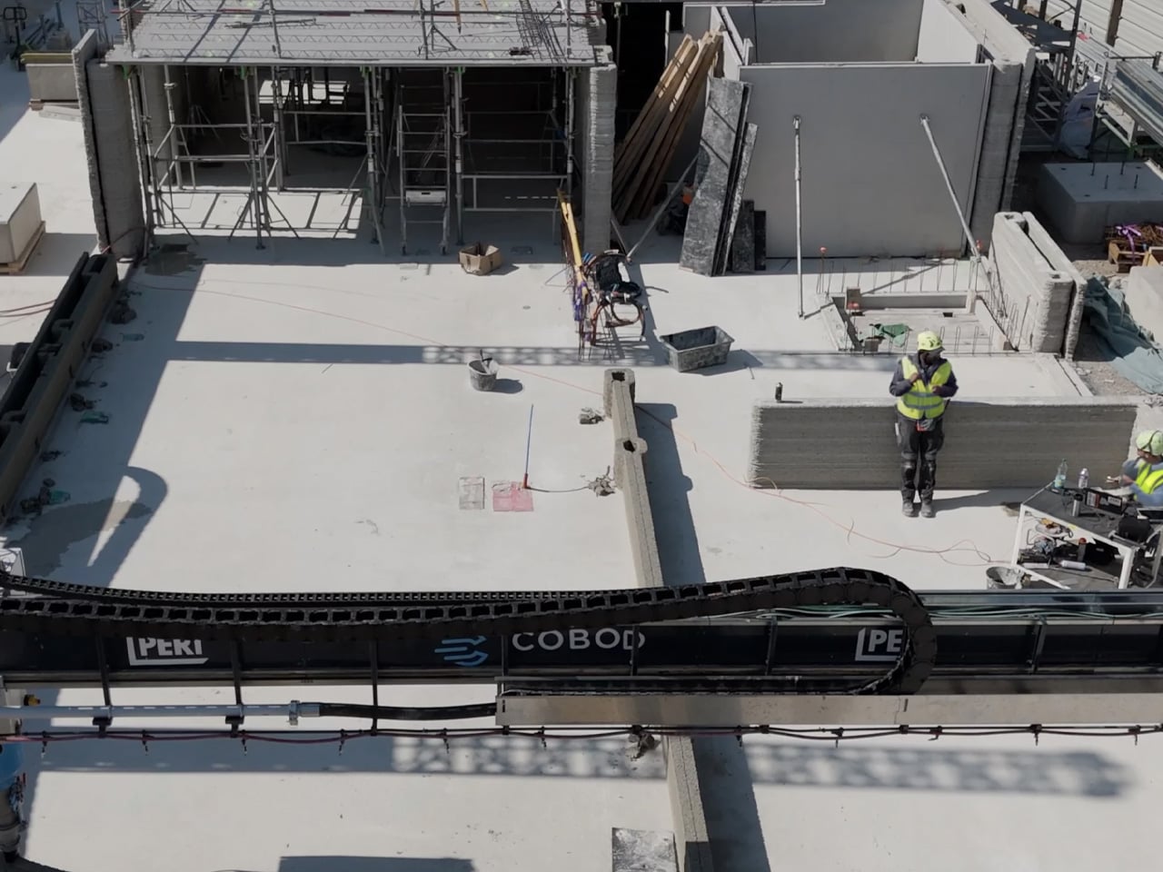
The building sits directly beside a conventionally constructed twin, built by the same developer simultaneously, as a live comparison. The 3D-printed version finished three months ahead. It also required only three workers to erect the walls, compared to six for the conventional build — a meaningful detail as the construction industry faces deepening skilled labor shortages.
Plurial Novilia is already planning the next move: roughly 40 apartments, two printers running simultaneously, with a target to cut print time by a factor of four. ViliaSprint² isn’t the destination. It’s the proof that the destination is real.
The post Europe’s Largest 3D-Printed Apartment Building Just Changed Everything first appeared on Yanko Design.



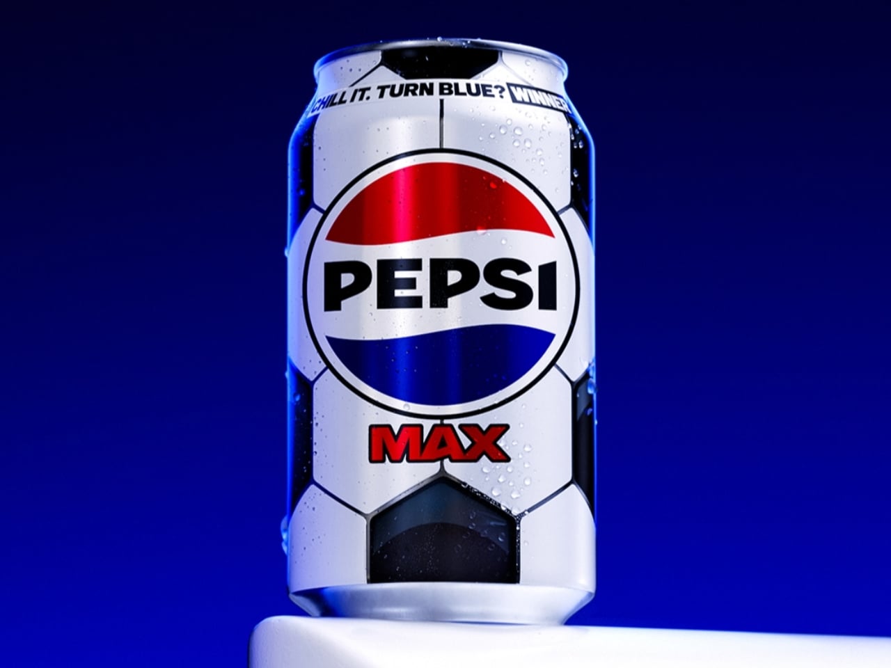
Most of us don’t think twice about the can we grab from the fridge. You reach, you pop, you drink. But Pepsi Max is betting that at least some of us will stop, look twice, and maybe even squeal a little when the can in our hand starts changing colour right before our eyes.
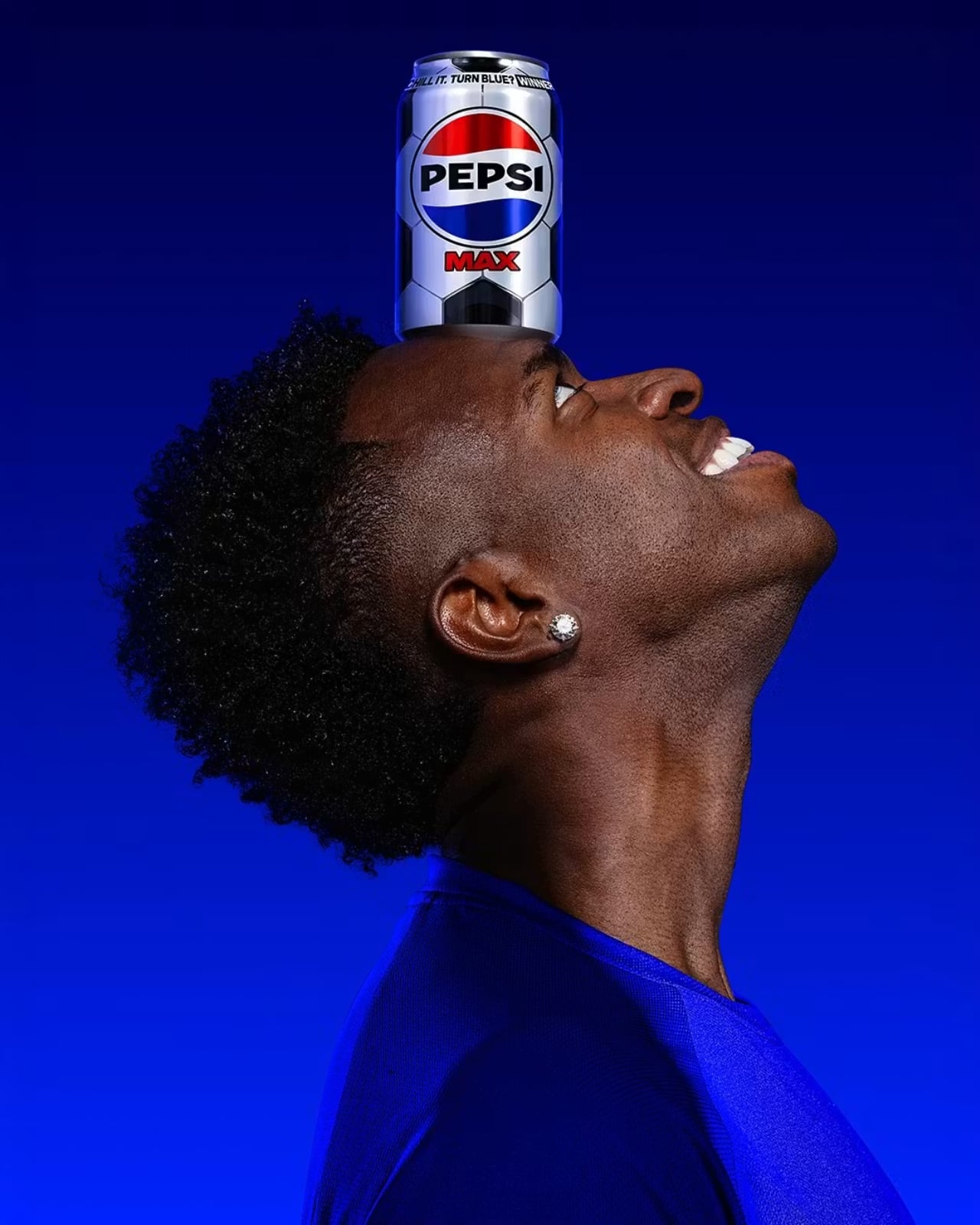
That’s the premise behind Pepsi Max’s new Perfect Chilled variant, launched as part of the brand’s wider Pepsi Football Nation campaign ahead of the 2026 FIFA World Cup. Out of 86 million football-themed cans hitting shelves across the UK, only 150,000 carry something extra: thermochromic ink that begins to shift at 12°C and turns a full, vivid blue at 8°C, the temperature Pepsi considers optimal for drinking. In other words, the can tells you when it’s ready.
Design: Pepsi
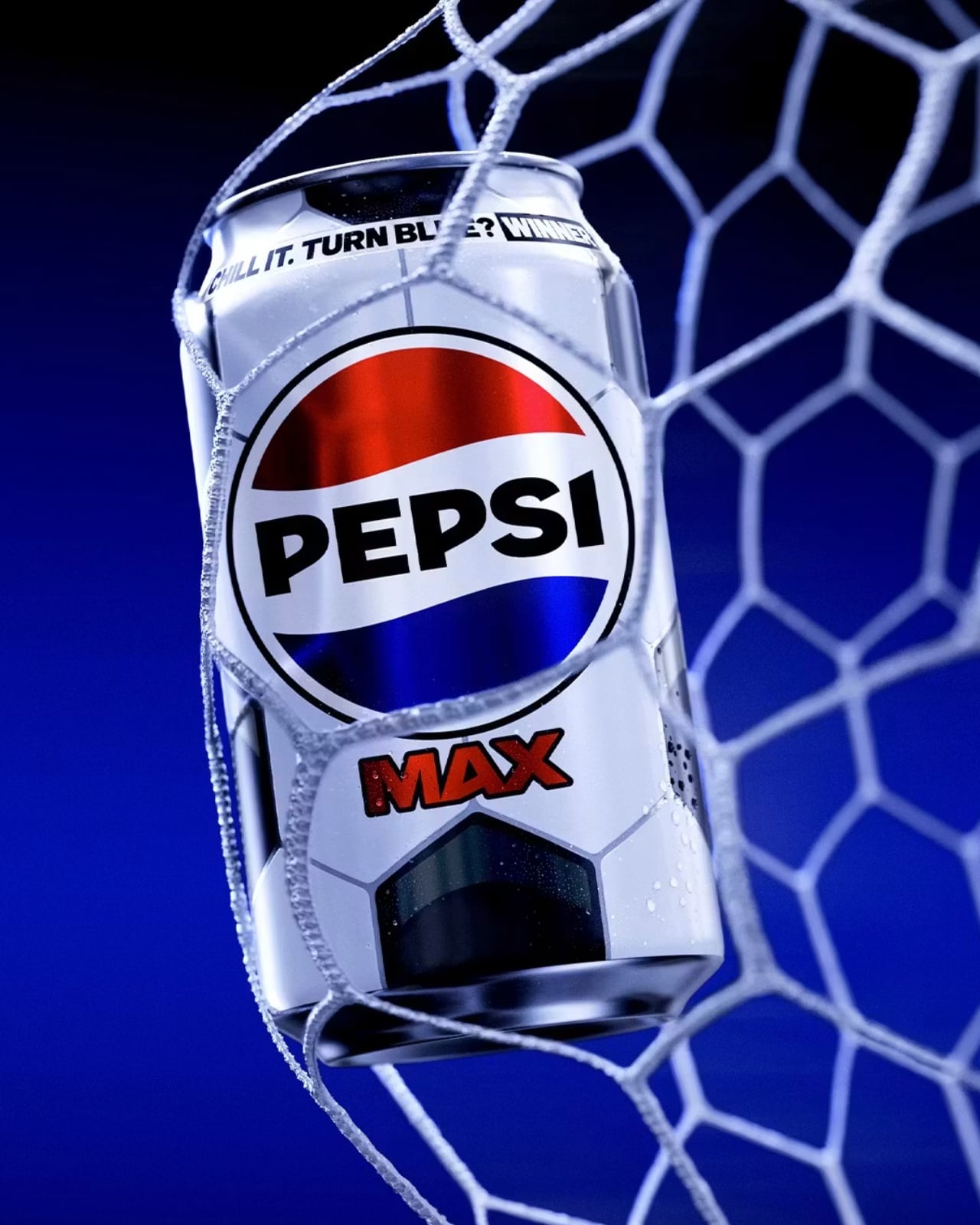
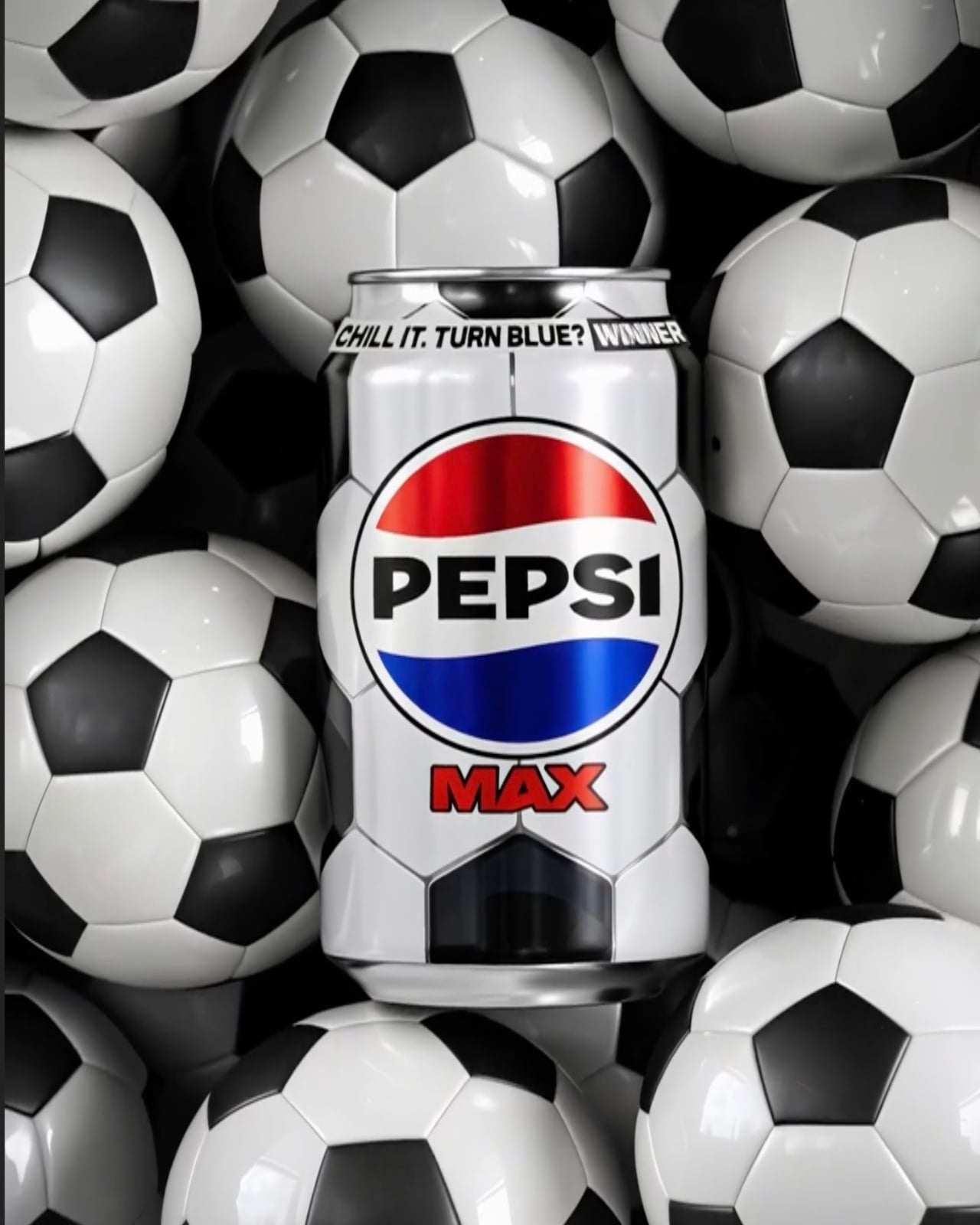
The design itself is clean and considered. The 330ml can wears the classic black-and-white pentagon pattern of a traditional football, a smart visual shorthand that doesn’t need any explanation. It’s immediately recognisable, seasonally relevant, and works beautifully with the colour-change mechanic. The graphic language is minimal without being plain, and the blue reveal against the black-and-white base is genuinely satisfying. When that blue kicks in, it’s not subtle. It’s the kind of visual shift that makes you want to show someone standing next to you.
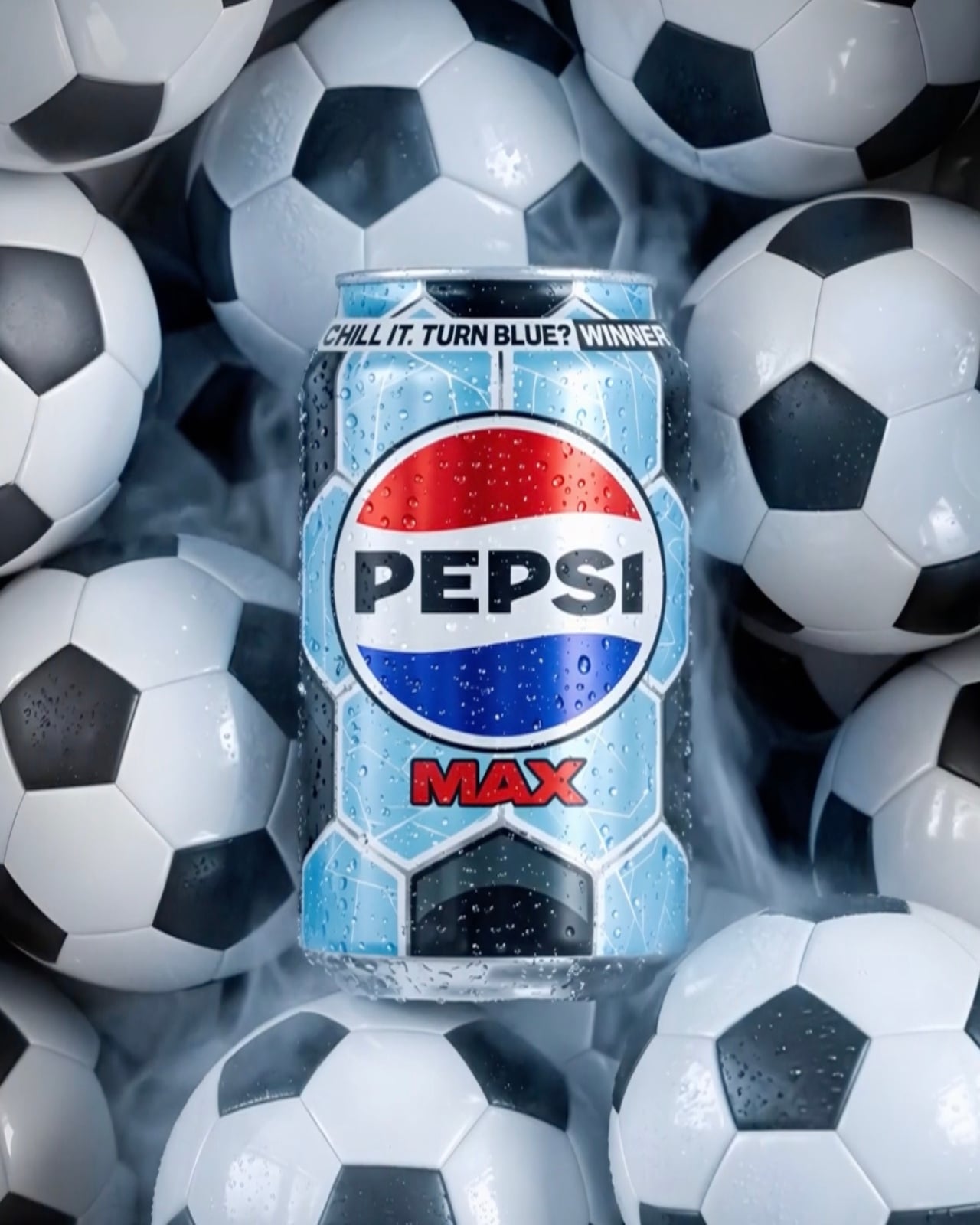
The Perfect Chilled variant also doubles as a prize trigger. Finding one means you’re entered into a competition where prizes include £5,000 towards a home entertainment bundle, football tickets, Pepsi Football Nation merchandise, and vouchers. So the colour change does two things at once: it signals peak drinking temperature, and it reveals whether you’re holding a winner. That’s a neat piece of design thinking, making a single moment do a lot of heavy lifting without feeling gimmicky.
I’ll admit I have a soft spot for thermochromic packaging. It made waves in mainstream consumer consciousness back in the 2000s with Coors Light’s cold-activated mountains, and various brands have been picking it up ever since. But Pepsi’s version feels more purposeful than most. Rather than just being a party trick, the temperature cue here is tied to a genuine product promise: that Pepsi Max is best at 8°C, and the can will tell you when you’ve hit it. That’s functional design, not just fun design, and the difference matters.
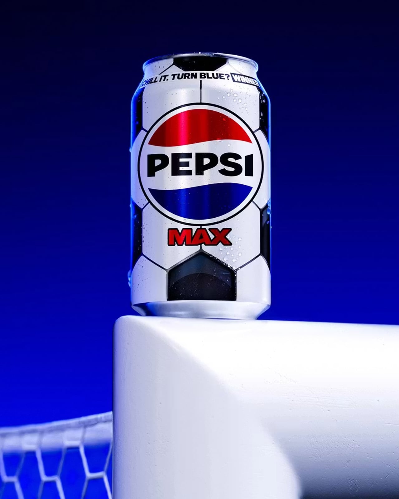
The scarcity piece is where the campaign gets genuinely clever. At 150,000 Perfect Chilled cans out of 86 million, the odds aren’t outrageous, but they’re not guaranteed either. It creates just enough tension to make you actually look at the packaging, which is something brands have been desperately trying to achieve in the era of eyes-down, scroll-while-shopping retail behaviour. When your product can make someone pause on the way to the checkout, you’ve done something right.
Pepsi didn’t stop at the can, either. The campaign includes a browser extension for Chrome and Firefox that replaces the word “soccer” with “football” on any webpage, a nod to the ongoing, completely unresolvable debate that football fans clearly feel strongly enough about to install software over. It’s a small touch, but it speaks to the same sensibility running through the whole campaign: know your audience, and then give them something that feels made for them specifically.
Packaging rarely gets the cultural credit it deserves. It’s the thing you throw away, the design you never frame, the object that lives in your hand for about four minutes before it goes in the recycling. But at its best, it does what this Pepsi Max can does: it turns a routine moment into a small, unexpected experience. For a product that’s been on shelves since the 1990s, making a can feel exciting again is no small feat. And if the price of admission is putting your Pepsi in the fridge before a football match, well, you were probably doing that anyway.
The post Pepsi Max’s New Can Turns Blue When It’s Cold Enough to Drink first appeared on Yanko Design.