
Android stuck in Safe Mode? Here’s how to turn it off
You're just a few taps away from getting your Android phone out of safe mode and back to normal.
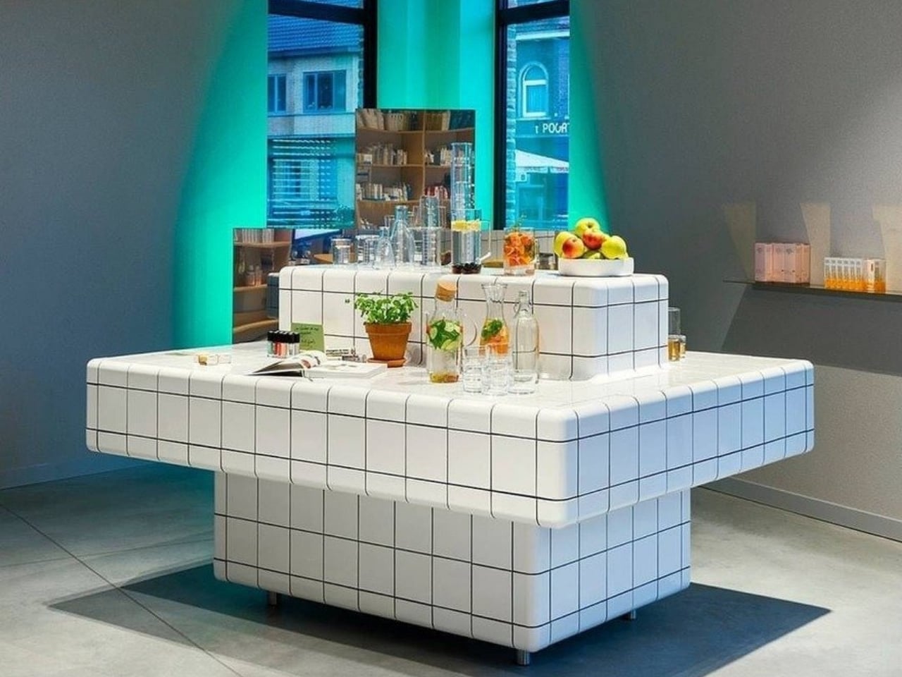
Every home renovation eventually runs into the same unglamorous moment: the corner. You pick the perfect subway tile, the right grout color, the exact sheen you wanted, and then you hit a wall edge or a shower bench, and suddenly there’s a metal trim strip or a mitered cut that never quite lines up. That gap, the visible seam where two tiled surfaces meet at an angle, is the actual problem here. It’s the detail contractors work around and homeowners quietly learn to live with, because until now, nobody made tile designed to solve it.
Three Dutch industrial designers apparently got tired of that compromise decades before it became a talking point in American renovation circles. Arnout Visser, Erik Jan Kwakkel and Peter van der Jagt first sketched the idea in the 1990s, then spent years refining it before launching their brand, DTILE, in 2010. Their fix wasn’t a new glaze or a trendy shape, it was going after the transition itself: instead of making flat tiles and leaving corners, edges and curves to whoever installs them, why not design those connecting pieces as part of the system from the start?
Designers: Arnout Visser, Erik Jan Kwakkel and Peter van der Jagt
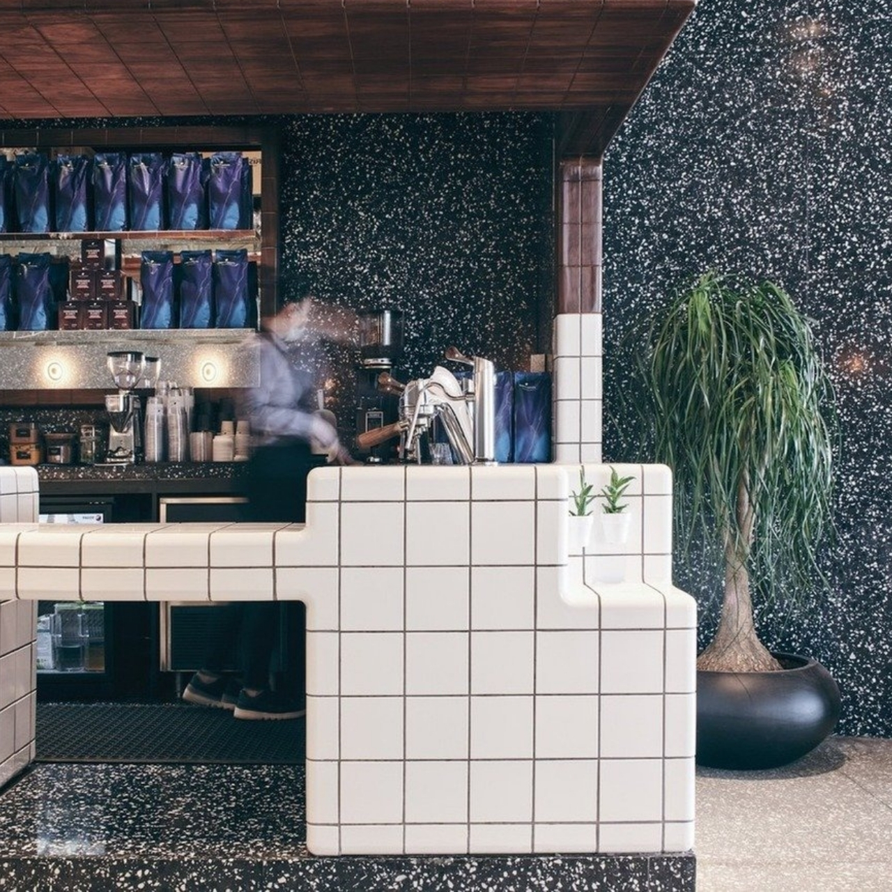
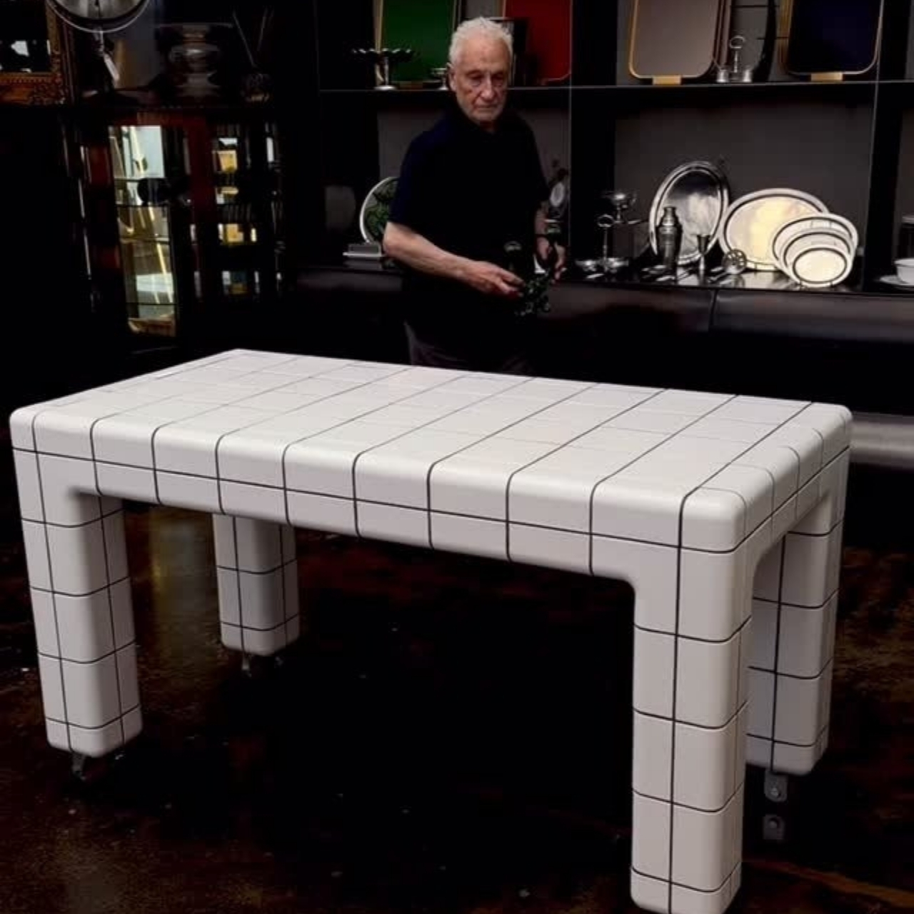
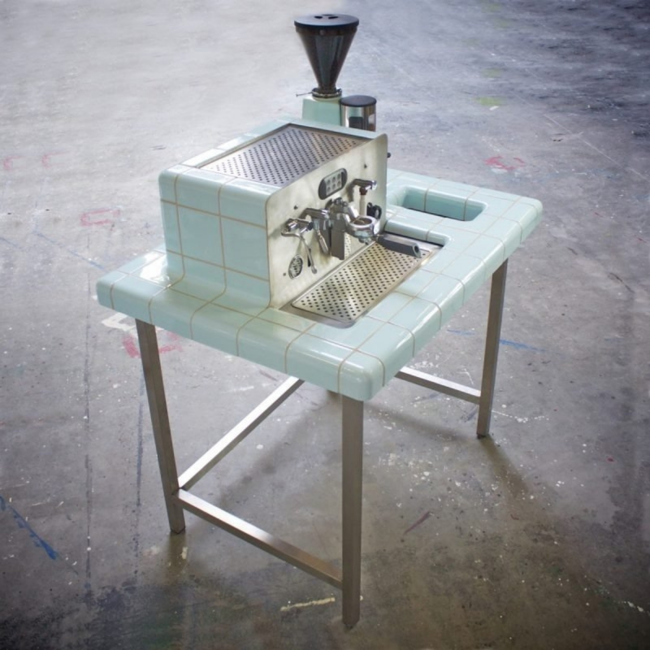
DTILE’s collection includes curved pieces, corner pieces, edge pieces and dedicated transition tiles that let a tiled surface wrap around a three-dimensional shape without a single trim strip or exposed seam. A tiled bench curves into a tiled wall. A shelf grows directly out of the surface, tiled in the same material, with no caulk line announcing where one plane ends and another begins. There are even utility tiles built to house hooks, vents, electrical outlets and small drawers, so the practical guts of a bathroom or kitchen disappear into the same continuous surface as the decorative tile itself.
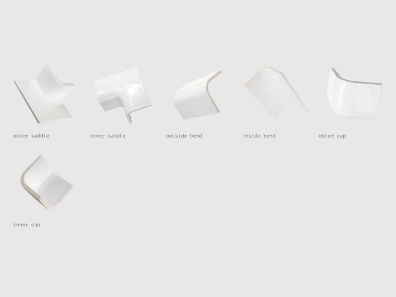
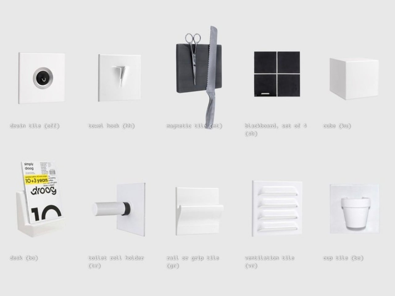
I think what makes this genuinely interesting isn’t the curves, it’s the restraint behind them. A lot of “innovative” tile products lean on flashy glazes or novelty shapes to justify their price tag. DTILE’s whole pitch is about removing something instead of adding it: removing the visual noise of trim, removing the awkward grout lines where two tile runs meet at an angle, removing the little compromises that every tiler quietly accepts as unavoidable. That’s a much harder problem to solve than a pretty pattern, and it shows a level of patience you don’t see often in a category that mostly competes on color drops and moodboard aesthetics.
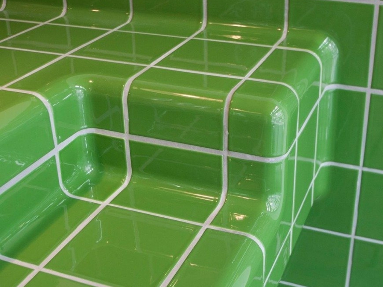
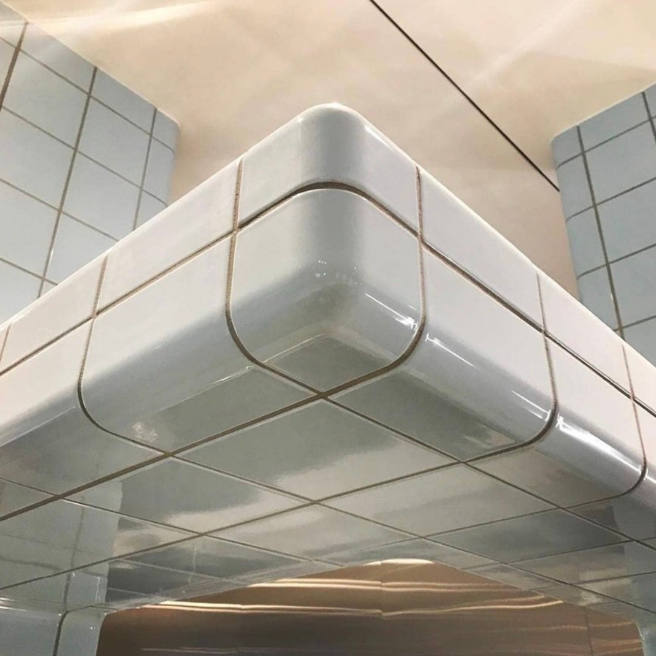
It also fits a shift I’ve noticed in how Americans are approaching renovation right now. Open shelving, curved vanities, integrated niches, the whole “quiet luxury” aesthetic that’s dominated design media the past couple of years, all of it depends on surfaces reading as seamless. A trim strip breaks that spell instantly. DTILE essentially manufactures the illusion that high-end designers have been faking with expensive custom millwork and slab material. If a system like this makes its way into more US bathroom remodels, it could change how contractors price out anything involving a curve or a corner, because the workaround stops being a workaround.
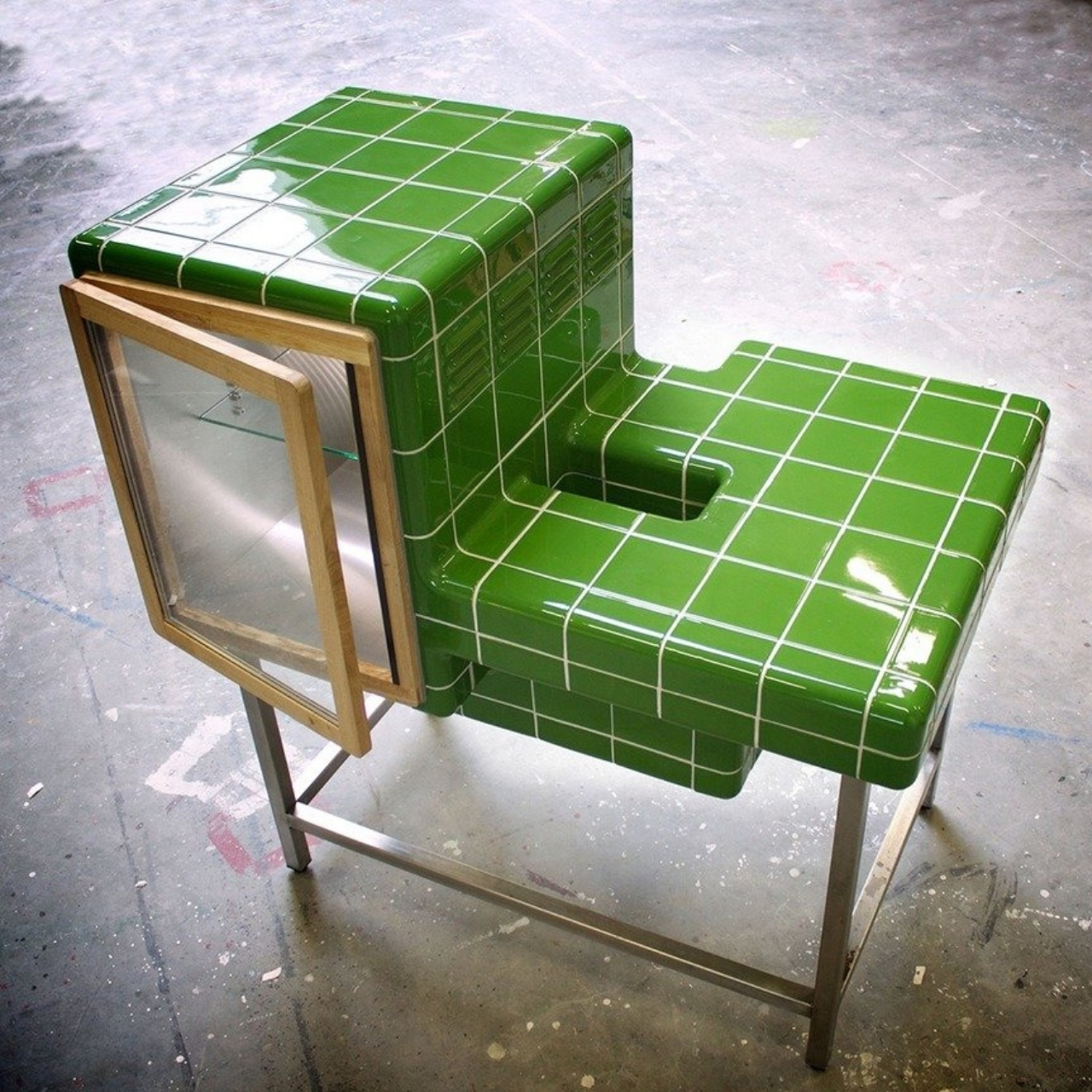
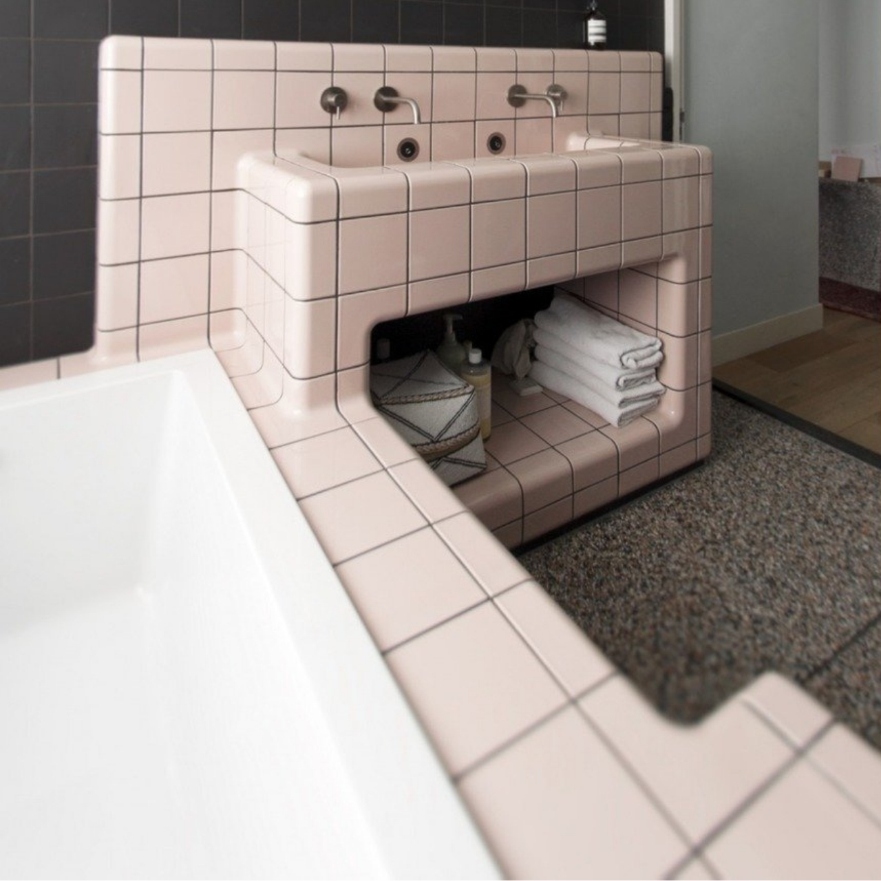
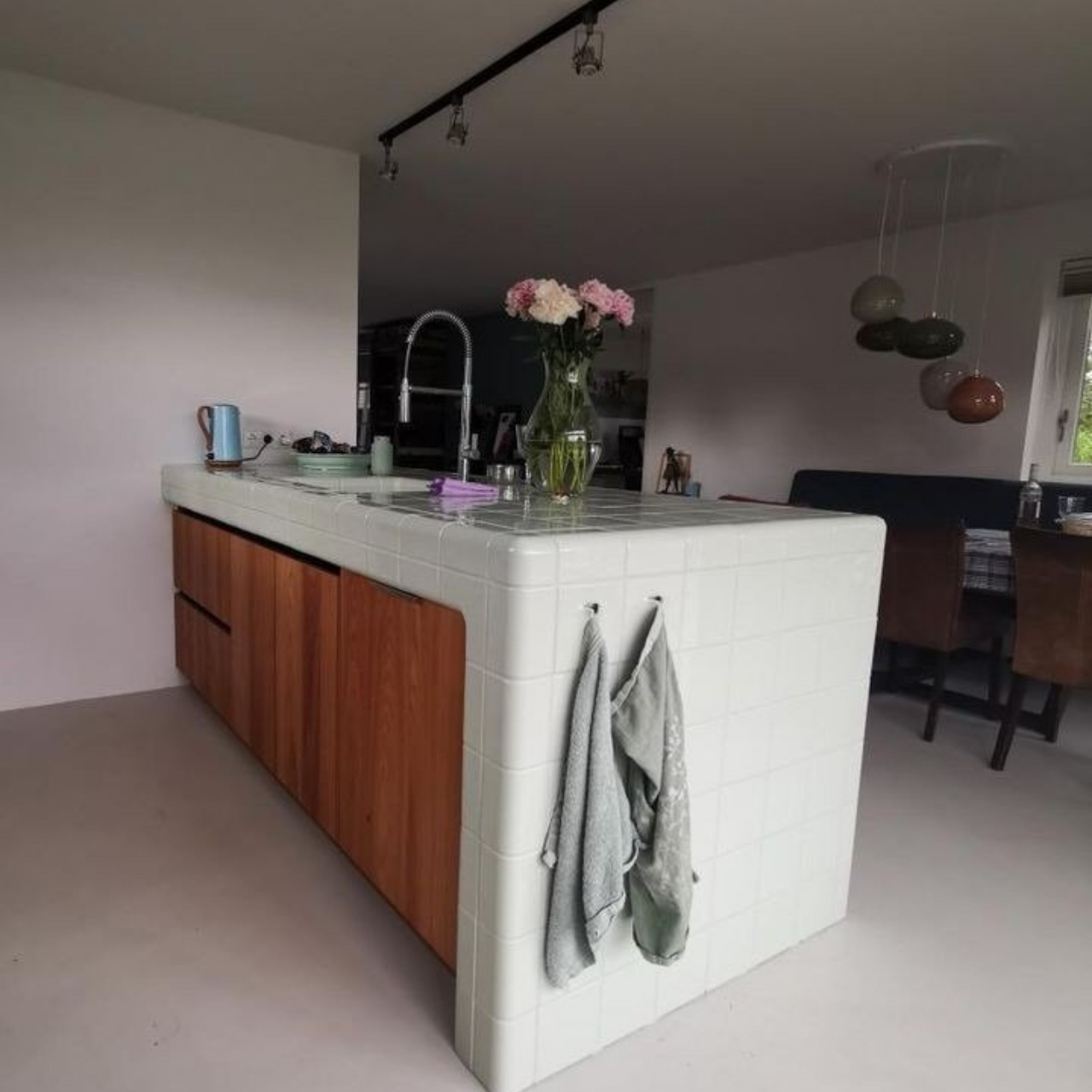
The trio didn’t stop at design either. They built their own factory in Velp, in the Netherlands, with a high-pressure ceramic press that lets them cast these irregular shapes at a scale a small design studio usually can’t manage. That in-house manufacturing decision is part of why the product now ships to more than fifty countries instead of staying a clever concept in a design school portfolio. Plenty of good ideas die in the prototype phase because nobody wants to deal with production. This one didn’t, and that persistence is honestly more impressive to me than the tiles themselves.
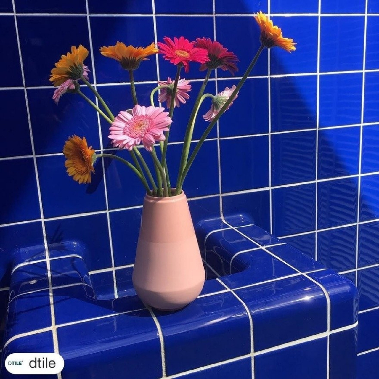
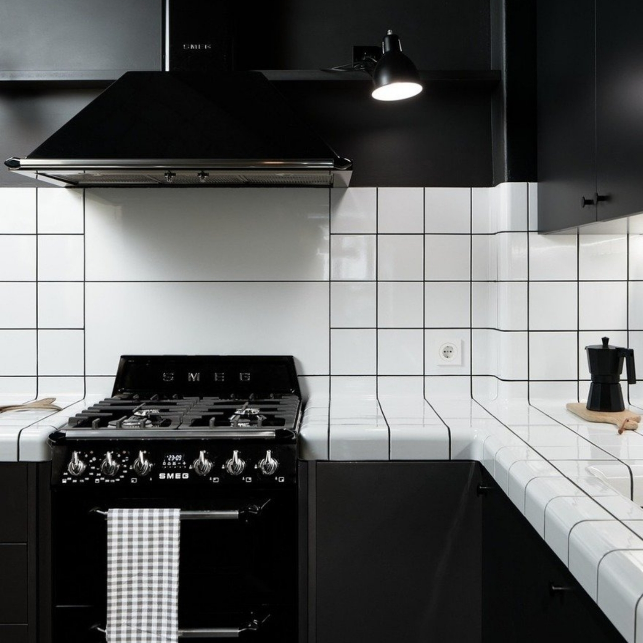
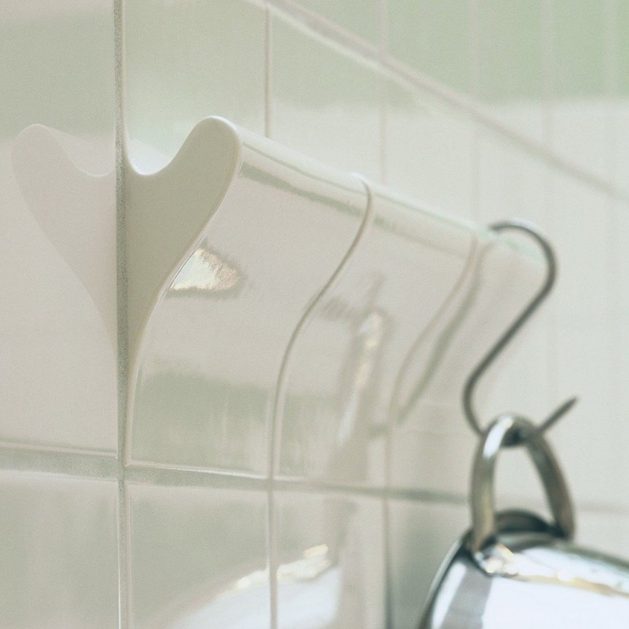
None of this means DTILE is about to show up at your neighborhood tile showroom next weekend. Specialty systems like this tend to arrive in the US through high-end architecture firms and boutique importers long before they hit big box retailers, if they ever do. But the underlying idea, that the ugliest, most compromised parts of a build deserve as much design attention as the parts everyone photographs, is worth paying attention to regardless of what’s sitting in your local Home Depot aisle. The corner seam has been a fact of life in tiling for as long as tile has existed. This is the first system I’ve seen actually end it.
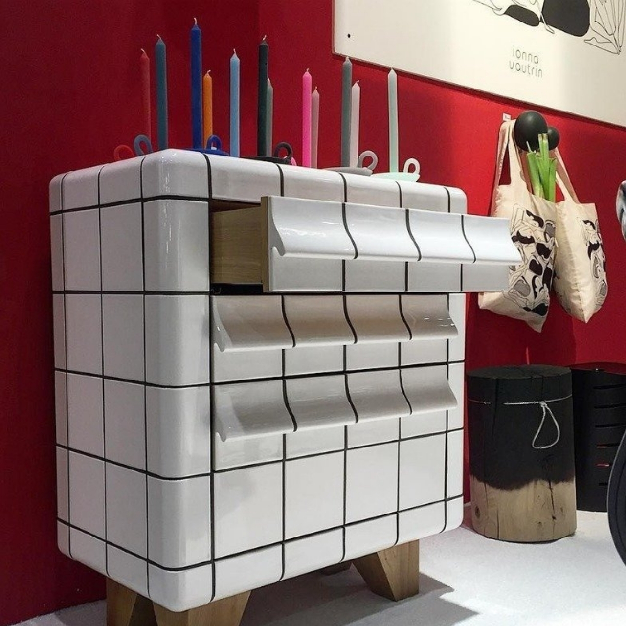
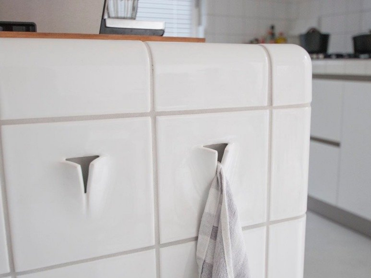
The post The Tile System That Finally Ends Ugly Corner Seams first appeared on Yanko Design.


There is something almost deceptive about the Muskoka Island Spa. From the outside, it looks exactly like the sort of modest cabin you might expect to stumble across on a wooded island in northern Ontario. Its dark green walls sit quietly beneath the trees, punctuated by small yellow-trimmed windows and capped with a familiar pitched roof. Nothing about it immediately announces luxury. That restraint is precisely what makes stepping inside so unexpected.
Located on a small island in Muskoka Lakes, Ontario, the 525-square-foot structure began life as an ice storage hut before Toronto-based architecture studio PARTISANS transformed it into an intimate thermal spa. Rather than erasing the cabin’s history, the designers chose to preserve much of its original exterior character. The old timber door remains at the entrance, solid and substantial, while the gabled form and original roof structure continue to define the building. Even after its transformation, the little green cabin still belongs convincingly to the landscape around it.
Designer: PARTISANS
The spa experience begins before that timber door is opened. An outdoor stone shower sits among the surrounding rock and trees, offering the first hint that the familiar cabin exterior is concealing something far more sculptural. Once inside, the atmosphere changes almost immediately. Cedar curves across walls and ceilings. Granite rises from the floor. Warmth, cold water, steam, and quiet resting spaces are arranged within a footprint barely larger than many city apartments.
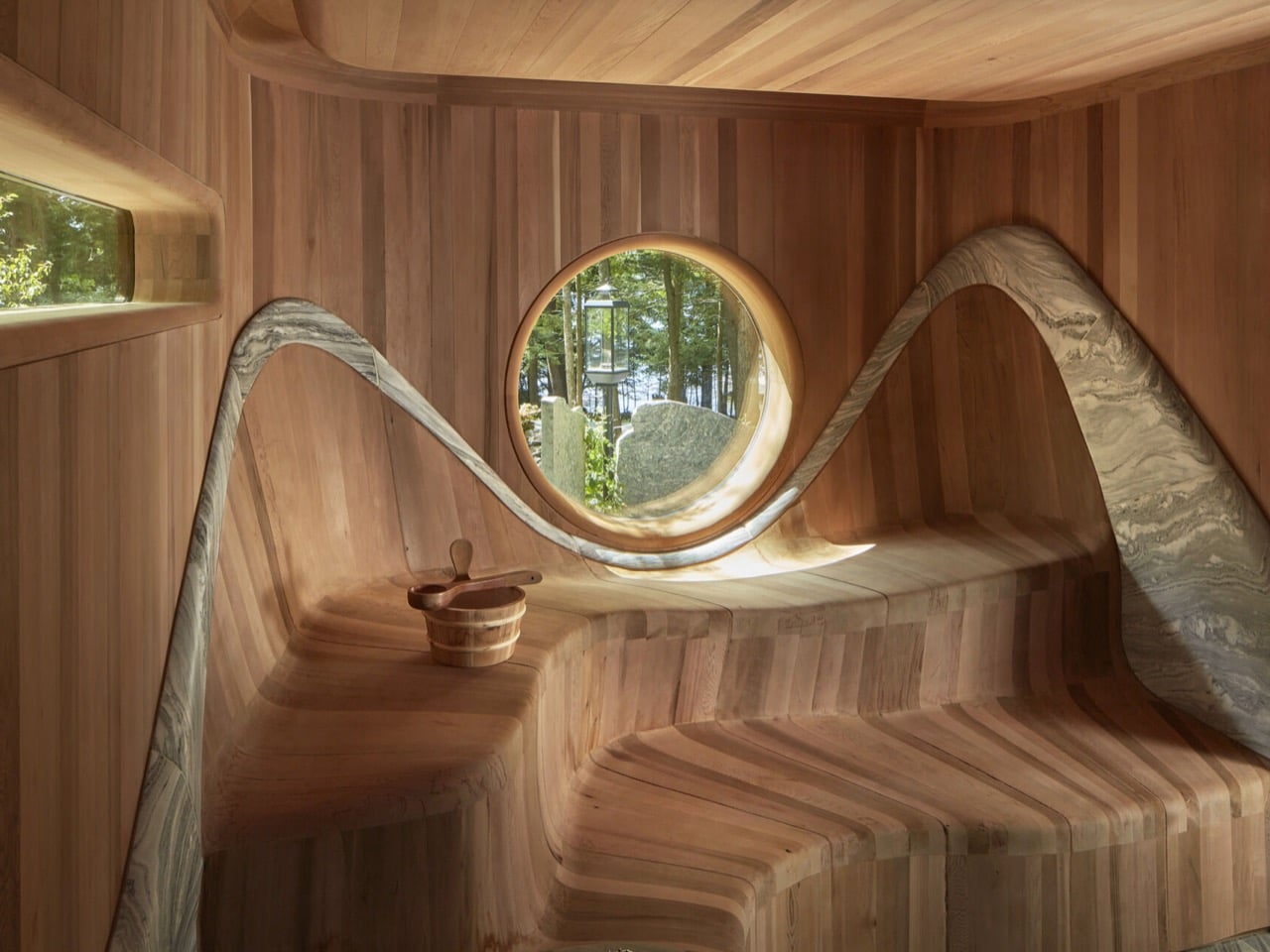
Within those 525 square feet, PARTISANS managed to fit a sauna, a cold plunge, a combined shower and steam room, and a massage room, along with smaller amenities tucked carefully into the edges of the plan. Their proximity becomes part of the experience. Visitors move through distinct changes in temperature, texture, and atmosphere within only a few steps. The heat of the sauna gives way to the shock of cold water, which transitions into enveloping steam and quieter spaces intended for rest.
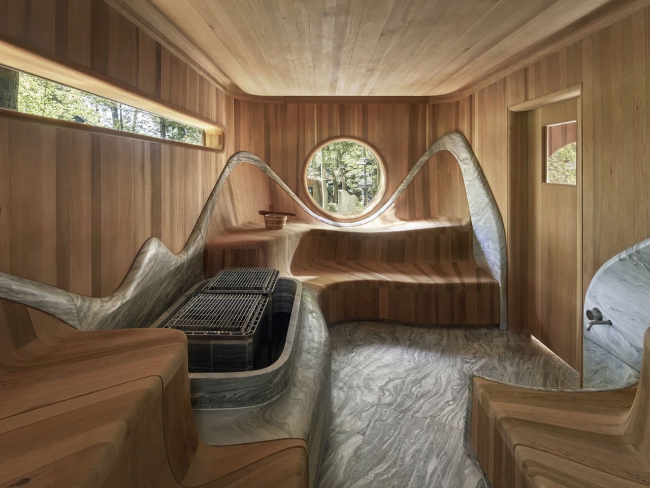
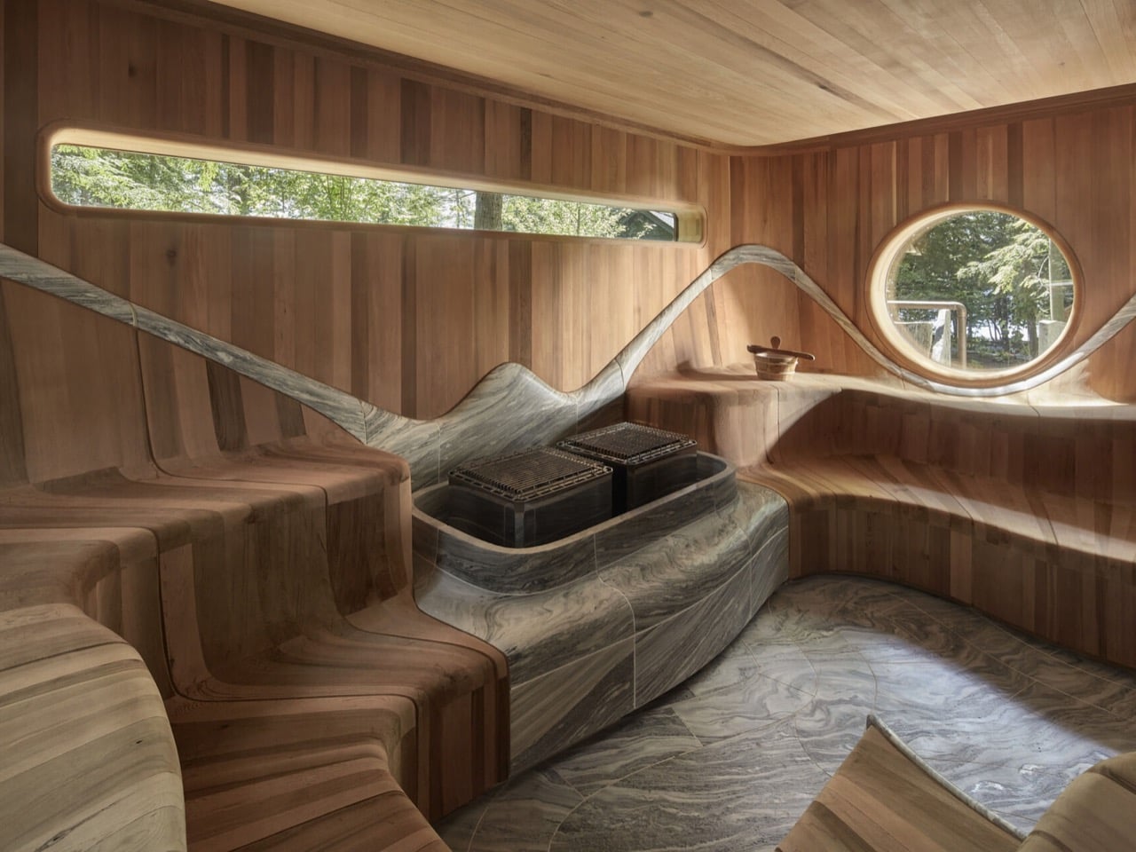
Much of the interior’s character comes from Canadian Shield granite, the same geological language visible across the surrounding Muskoka landscape. Large slabs cover the floor, their pale seams and irregular striations resembling exposed bedrock. In other areas, the granite appears to grow upward into the architecture itself. It forms seating, thresholds, basins, and sculpted edges rather than behaving like a decorative surface applied after the fact.
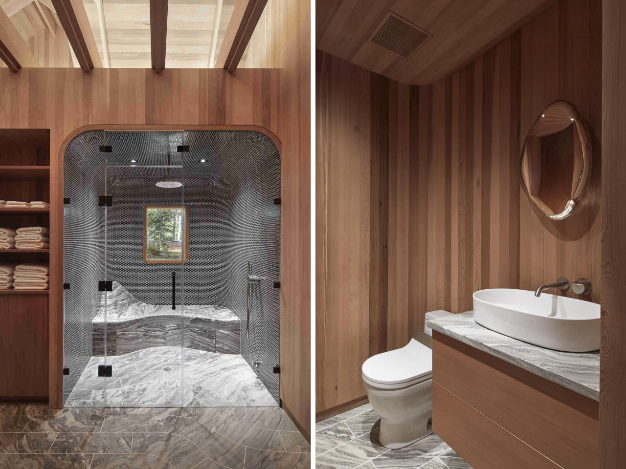
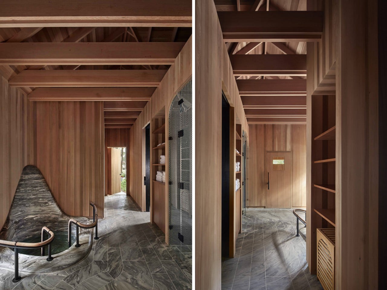
The cold plunge is perhaps the clearest expression of this idea. Carved from the same geological family of granite found around the island, it feels less like a conventional spa fixture and more like a pool discovered within the rock. Granite curves around the sauna heater and forms places to sit, lean against, and descend into the water, allowing the stone to shape the way the body moves through the space.
Against all that weight and coolness, custom-milled cedar introduces warmth. It wraps across the walls and ceilings in a continuous vertical grain, then shifts into ribs, curved planes, softened corners, benches and backrests. Inside the sauna, the cedar becomes almost architectural furniture, forming the enclosure as much as furnishing it. Stone feels dense, permanent and geological. Cedar feels warm, tactile and responsive. Together, they create an interior that seems to have been carved rather than assembled.
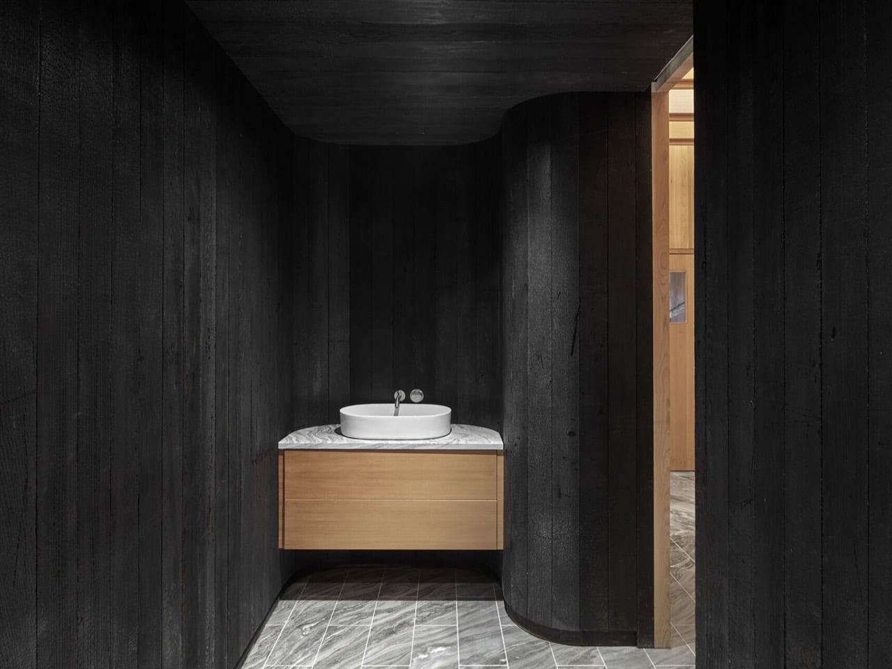
Achieving that sense of effortless continuity was anything but simple. Canadian Shield granite is exceptionally hard, and machining it reportedly wore down fabrication tools during the process. The curved timber and stone elements had to be developed as interconnected pieces, with digital milling followed by careful hand finishing. The island location made precision even more important. Without conventional road access, transporting heavy materials and adjusting complex components on site was difficult, leaving very little margin for improvisation once fabrication was complete.
That constraint encouraged an unusually integrated design process. Stonework, cabinetry, cedar surfaces, bathing elements, and mechanical systems were coordinated within a digital model so that every component could fit within the cabin’s limited dimensions. References to eroded rock formations, slot canyons, traditional landscape painting and sculpted timber interiors informed the eventual forms, creating a space that feels rooted in its location without becoming overly literal.
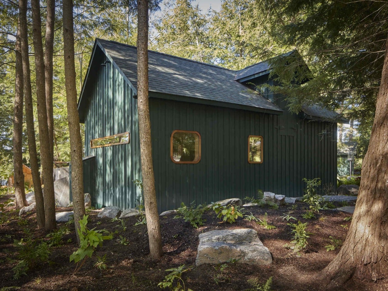
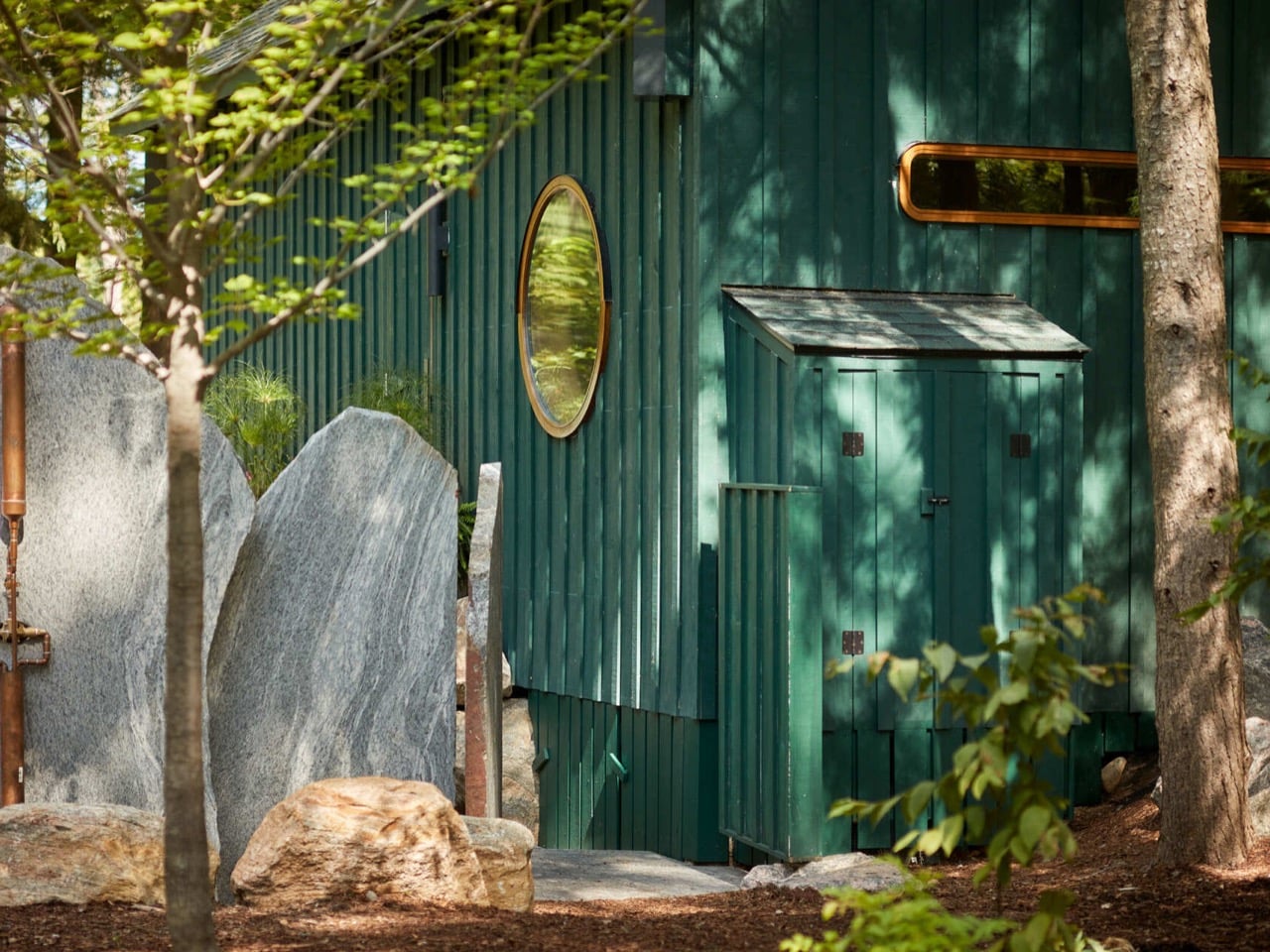
For all the sophistication inside, traces of the original ice hut are never far away. Look upward, and the familiar gabled volume is still there. The exposed roof structure remains visible. Small windows continue to frame pieces of the surrounding island, and the heavy old door continues to mark the transition between inside and out. The design does not attempt to disguise the building’s age or original purpose. Instead, those remnants give the new interior something to push against.
There is a satisfying irony in the change of function. A building that once existed to preserve ice is now centered around rituals of heat and cold. The same compact structure that once served a purely practical purpose now guides visitors through sauna heat, carved stone, cold water, steam, and massage.
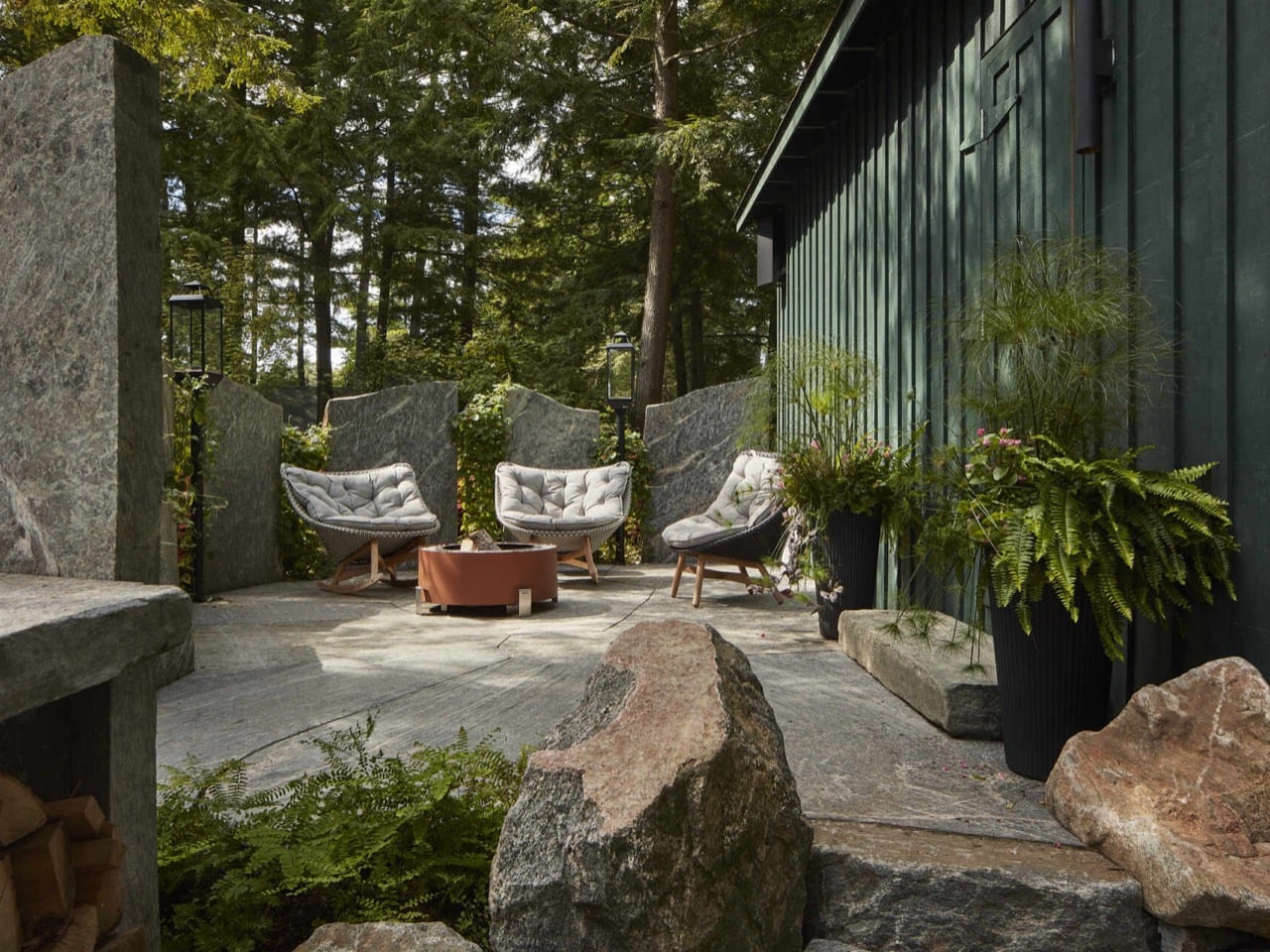
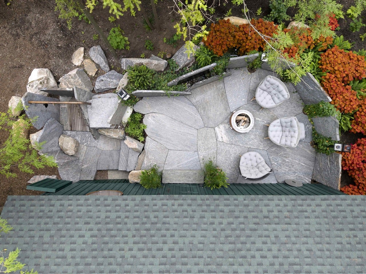
What makes the Muskoka Island Spa memorable is ultimately this tension between modesty and spectacle. From a distance, it remains a small green cabin tucked among trees and exposed stone. Inside, the architecture becomes fluid, tactile, and unexpectedly immersive. The granite beneath your feet feels connected to the rock outside. The cedar wrapping the room recalls the forest surrounding the building. Nothing needs to announce that connection because it is already present in the materials themselves.
The old ice hut has gained an entirely new life without being polished into anonymity. Its history is still visible, its scale remains humble, and its place within the island has barely changed. Yet behind that unassuming green exterior is a spa shaped by geology, craftsmanship, and the physical experience of moving between heat and cold. It is proof that transformation does not always require erasure. Sometimes the most interesting spaces begin by keeping exactly what was already there.
The post A 525-Square-Foot Cabin on this Wooded Island Delivers a Luxurious Spa Experience first appeared on Yanko Design.

No matter how you feel about generative artificial intelligence, you can’t deny the fact that it has democratized creativity. Whether you have design experience or an art background, or neither, you now have tools you can use to bring your creative juices to life. Popular English club Manchester City and PUMA developed a platform to help fans express their fandom through original kit designs, and now they’ve actually let one lucky fan’s concept become the club’s official third kit.
Manchester City’s 2026/27 Third Kit is the first AI-generated fan design to be worn by a professional football club on the pitch and sold commercially. It was created using the PUMA AI Creator, a tool that turns written prompts into full kit designs in just a few seconds. Lifelong Manchester City fan and photographer Elliott Lacey’s creation was chosen from more than 180,000 designs submitted on the platform.
Designer: Elliott Lacey and PUMA

For those not familiar with football (soccer, to American audiences), a club’s third kit is just as important as its home and away kits, and it sometimes even outsells the two, provided it’s well designed, of course. Lacey used the platform to design his submission during his lunch break, and PUMA brought it to life with the brand’s signature quality. The project reflects a broader push by the sportswear brand to blend technology, football culture, and fan community in a way that hasn’t really been attempted before at this level of professional sports.

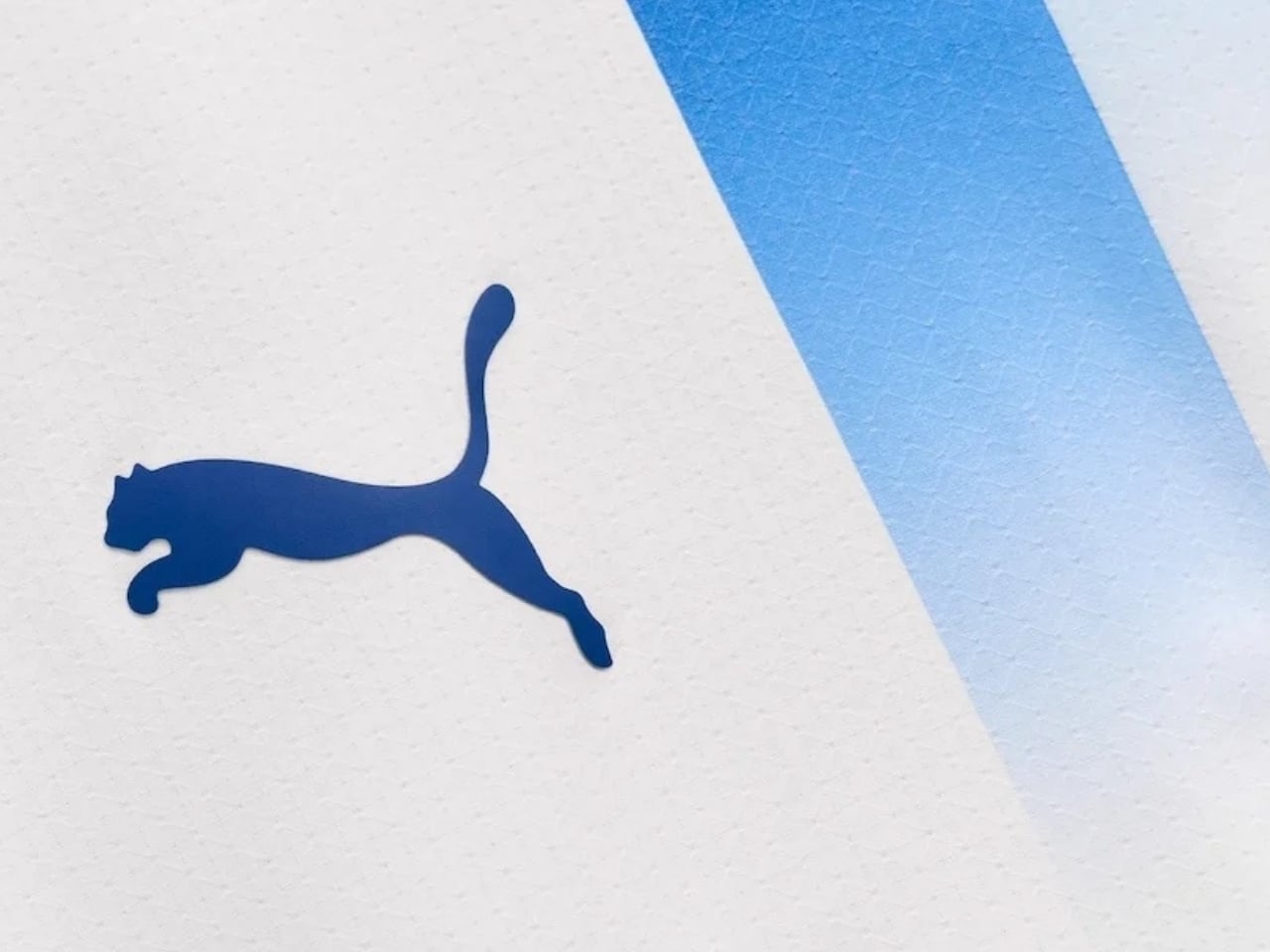
The design itself features a white base split by a central two-tone sash in sky blue and dark navy, finished with a gradient technique that shifts the pattern’s dimension depending on the light and viewing angle. Manchester City fans are used to seeing the club sporting an almost pure sky-blue kit, so this white base with blue accents, while still very much true to the club’s identity, feels like a refreshing twist.

What makes this launch even more compelling is the scale of fan involvement behind it. Over 180,000 designs were submitted through the PUMA AI Creator, generating 1.7 million platform ratings from supporters worldwide before the field was narrowed down to a final ten for a public vote. That kind of grassroots participation shows this wasn’t just a marketing gimmick, it was a genuine, global collaboration between a club and the people who love it most.

Manchester City’s marketing leadership framed the project as an extension of the deep bond between the club and its global fanbase, describing the initiative as a way of turning ordinary supporters into designers for a day, with AI as the bridge that made it possible. On the PUMA side, leadership described the collaboration as sitting squarely at the intersection of technology, football, and community, a rare combination that doesn’t come together often in professional sports branding.

For Lacey himself, the experience was described as surreal and deeply personal. Having grown up as a City supporter, he never expected that a design he put together on a lunch break would end up gracing the shirts of the players he idolized. It’s the kind of story that turns an everyday supporter into part of club history, and it’s exactly the sort of narrative that makes this kit special beyond its good looks.
For collectors, this kit represents something more than fresh apparel for the upcoming season. It’s a cultural milestone, the first tangible proof that AI-assisted design can move from novelty experiment to something worn by elite athletes and cherished by fans around the world. Owning one means owning a piece of a genuine “first” in sports history, not just another seasonal jersey.

Whether you’re a die-hard Cityzen, a design enthusiast curious about where AI creativity is headed, or simply someone who appreciates a good underdog story, this kit checks every box. It’s proof that passion, paired with the right tools, can turn an ordinary lunch break into a legacy moment. And as more clubs watch how enthusiastically fans embraced this process, don’t be surprised if Elliott Lacey’s story becomes the blueprint for how sports brands invite their communities into the creative process for years to come.

The post A Fan Actually Designed Man City’s Third Kit With Puma’s AI Platform first appeared on Yanko Design.

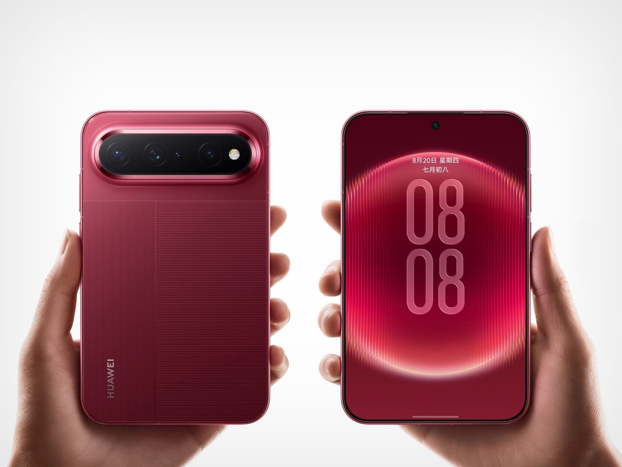
Seventy percent of Samsung’s record 1.44 million Galaxy Z8 series pre-orders went to the wide 4:3 model over the traditional tall one, a number that makes product planners cancel their afternoon meetings. Huawei saw it coming. The Pura X View, launched in China on August 20, is a slab phone with a 16:9.5 screen, no hinge, 6.68mm of thickness, and a 7,000mAh battery packed into 201 grams. Run the panel geometry and the body lands near 144 by 86mm, which is essentially the 2011 Galaxy Note’s 146.9 by 83mm with fifteen years of thinning applied on top. The first phablet just came back, and it skipped the hinge entirely.
Huawei shipped its first 16:10 phone in March 2025, roughly seventeen months before Samsung’s wide Fold 8 and eighteen before Apple’s expected iPhone Ultra. That head start counts for plenty editorially and almost nothing commercially, because the Pura X View runs HarmonyOS 7 without Google services and has no confirmed launch outside China. The width also brings a problem nobody involved has solved yet. Fold 8 reviewers keep flagging that one-handed typing on a wide cover screen demands a thumb stretch most people just do not have. Huawei is asking you to live inside that stretch full time, with no fold to escape into.
Designer: Huawei


I keep coming back to the battery number because it should not work the way it does. Cramming 7,000mAh into a 6.68mm body usually means a phone that feels like a coaster, but Huawei leaned on the extra width instead of stacking cells vertically, and the reported silicon-carbon anode chemistry lets the pack sit flatter than lithium-ion ever could. The screen-to-body math backs it up too, a claimed 96.1 percent with bezels measured at a uniform 1.05mm on all four sides, which is tighter framing than most flagships bother chasing. Around back, Huawei kept the pill-shaped camera bar and striped texture from the Pura X Max, so this reads as a family member rather than a one-off experiment.
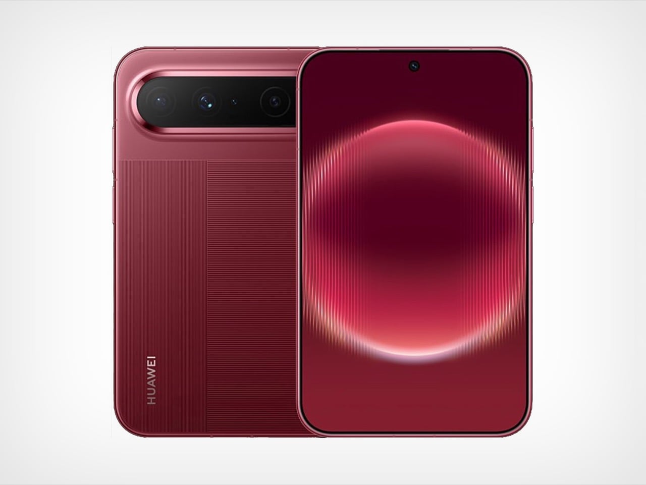
The historical parallel only gets stranger the closer you look at it. Samsung built the Galaxy Note on a 16:10 panel in 2011 specifically because it read and wrote better than 16:9, and that logic held until the LG G6 and Galaxy S8 dragged the entire industry toward 18:9 in 2017. At the start of that year, over 95 percent of phones sold still ran 16:9. Within about eighteen months it had nearly vanished, replaced by taller and taller screens that eventually made “phablet” sound like a word from a dead language. At 1.68:1, the Pura X View is actually squatter than any of those old 16:9 phones, closer in spirit to the doomed Dell Streak than to the Note it resembles in the hand.
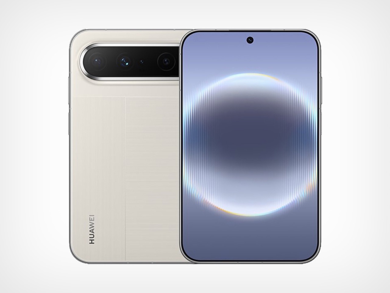
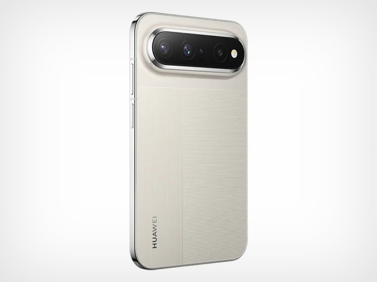
None of this makes the Pura X View an easy recommendation, and I would rather say that upfront than let the nostalgia do all the talking. Pricing remains unconfirmed, early Chinese estimates swing wildly between 4,499 and 7,500 yuan, and Huawei has a recent history of catching real backlash over Pura pricing. There is also no path to a Google-services version, which locks most of the world out regardless of cost. What the Pura X View does prove is that the tall screen was never physics, just a decade of consensus that Samsung and Apple are now both quietly abandoning. We covered the Pura X Max when it doubled down on this same wide logic inside a folding body, and the View feels like Huawei betting the shape works even better without the crease.
The post We just reinvented Phablets: Huawei’s Wide-body Pura X View feels oddly nostalgic to the touch first appeared on Yanko Design.