This Desk Hood Blocks Office Noise Without Walling You In

The rhythm of open offices is great until you need to concentrate or take a video call. The energy becomes noise, conversations drift across the floor, and people end up camping in meeting rooms or wearing noise-cancelling headphones all day. The ad hoc solutions never quite work, and what is missing is a middle ground, something more substantial than a desk but less isolating than a full pod.

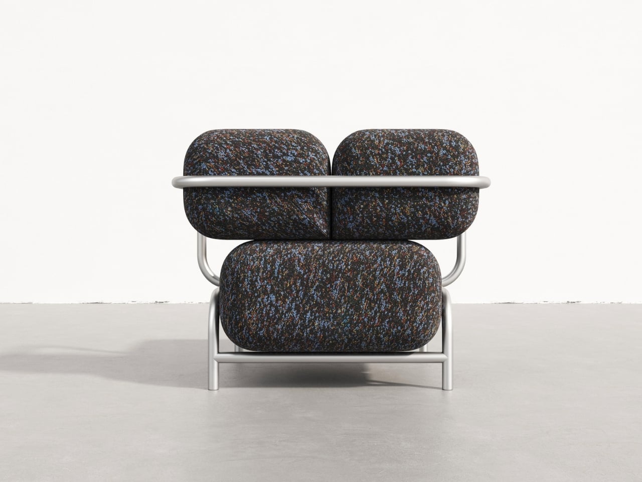
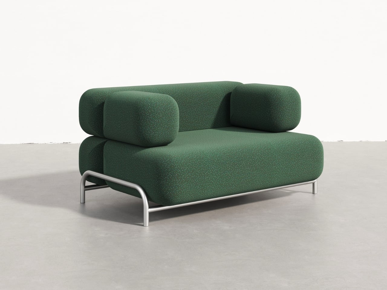
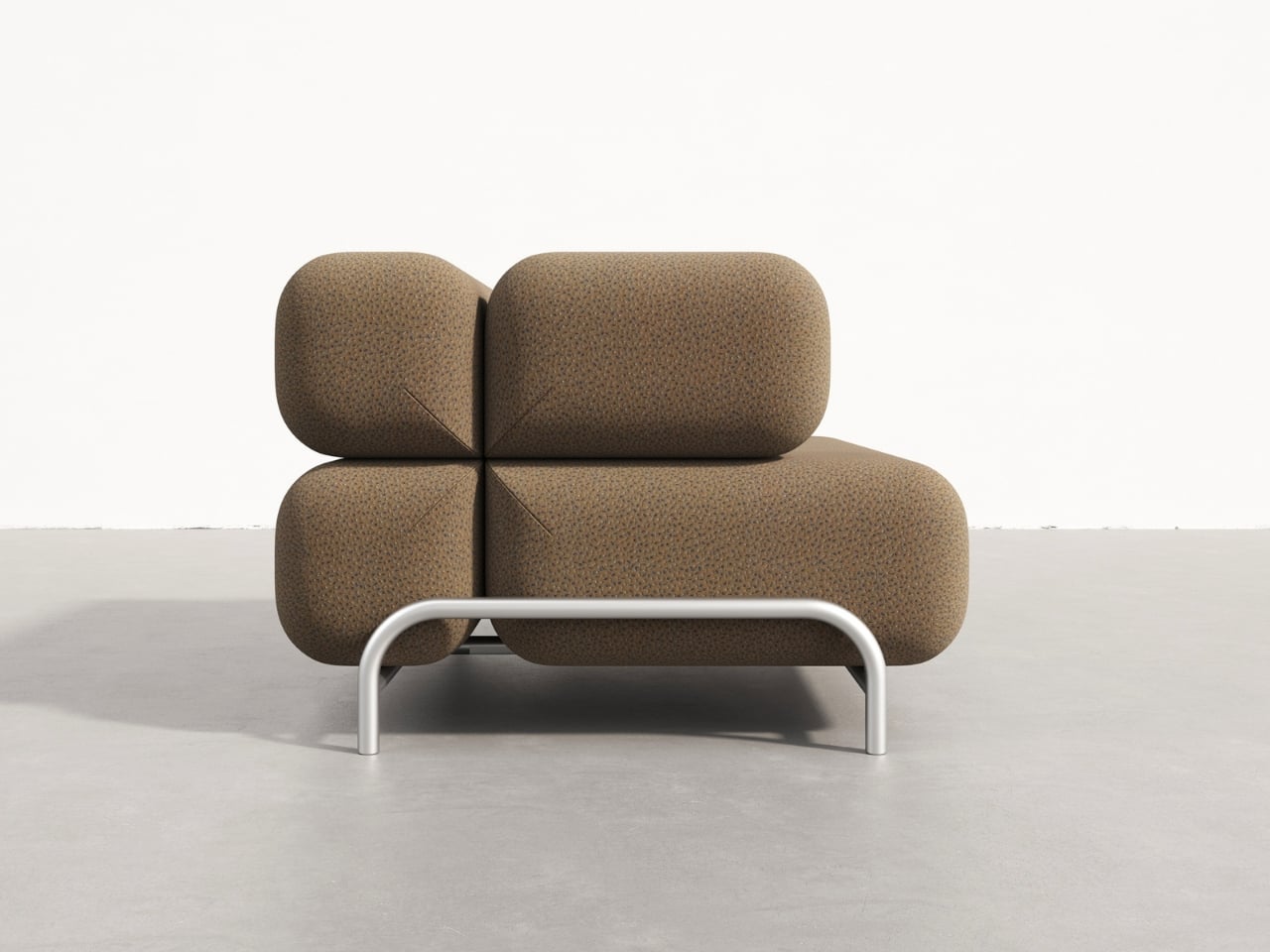
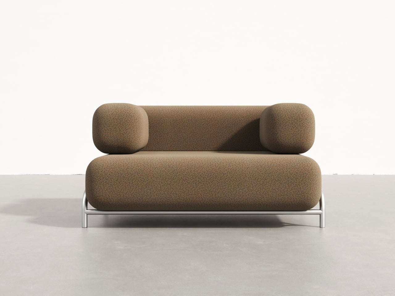
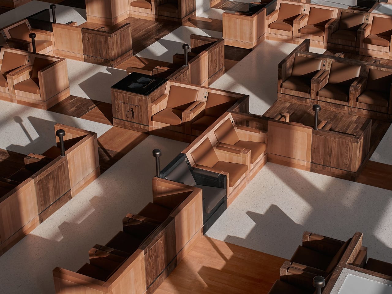
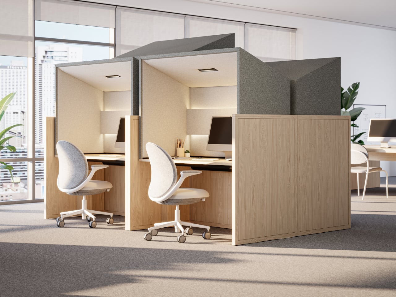
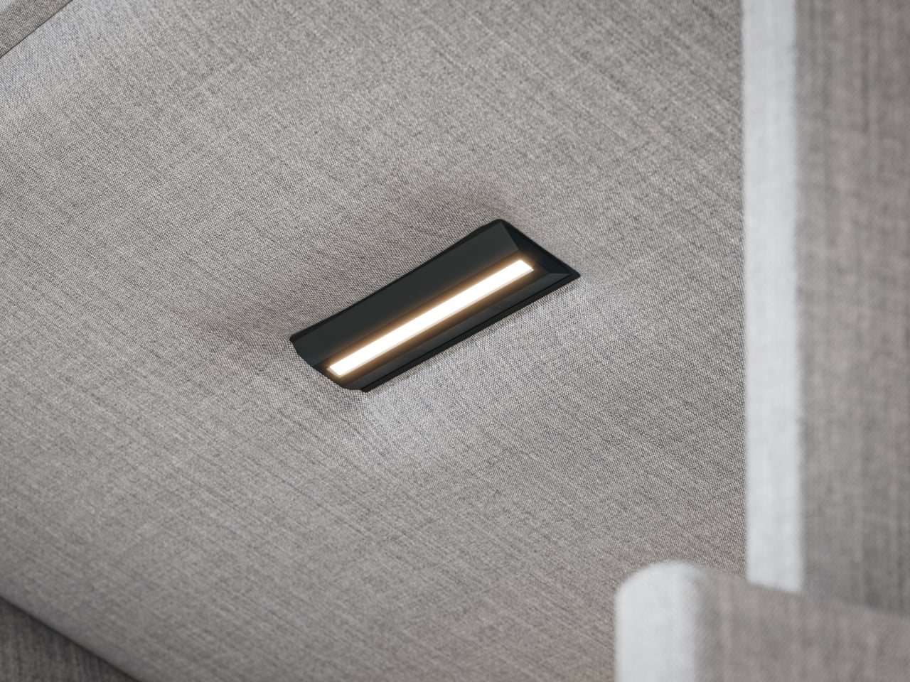
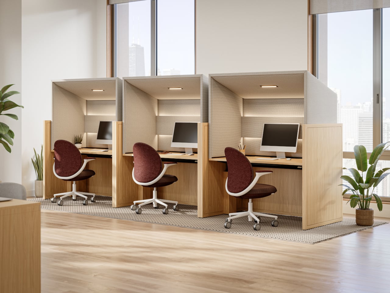
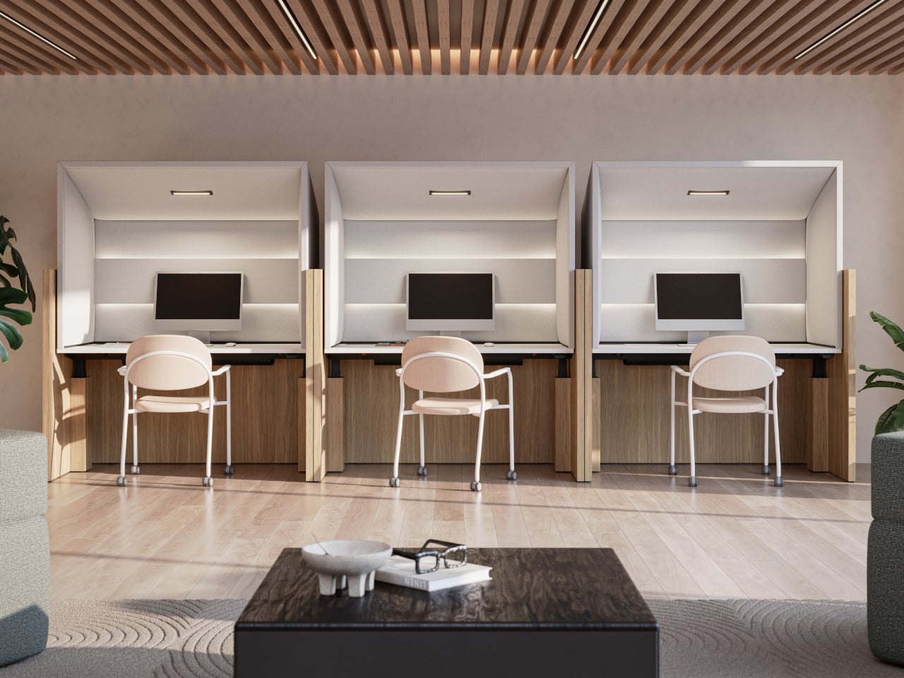
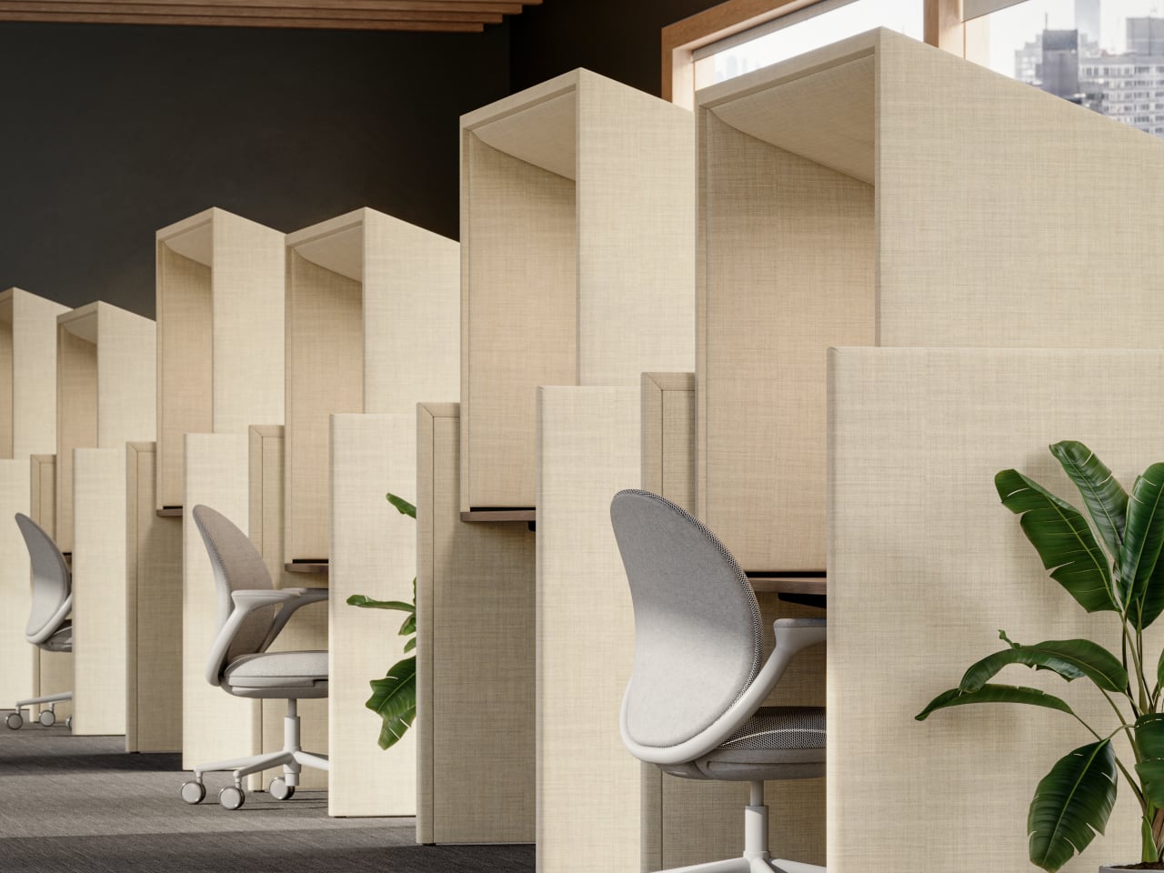
Canopy is KFI Studios and Gensler’s answer, a freestanding workstation that behaves like a tiny room inside the open plan. It combines a height-adjustable desk with an upholstered privacy hood, integrated lighting, and built-in power, creating a personal haven for focused work without walling people off. The hood wraps around like a small ceiling and sidewalls, softening ambient noise and blocking visual distractions while leaving you connected to the larger space.

Designer: KFi STUDiOS and Gensler

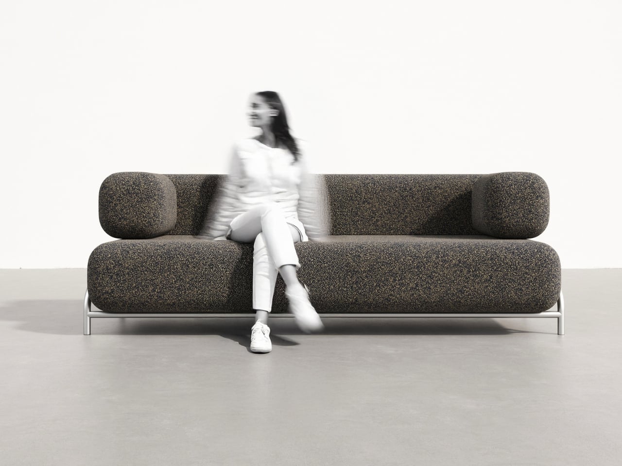
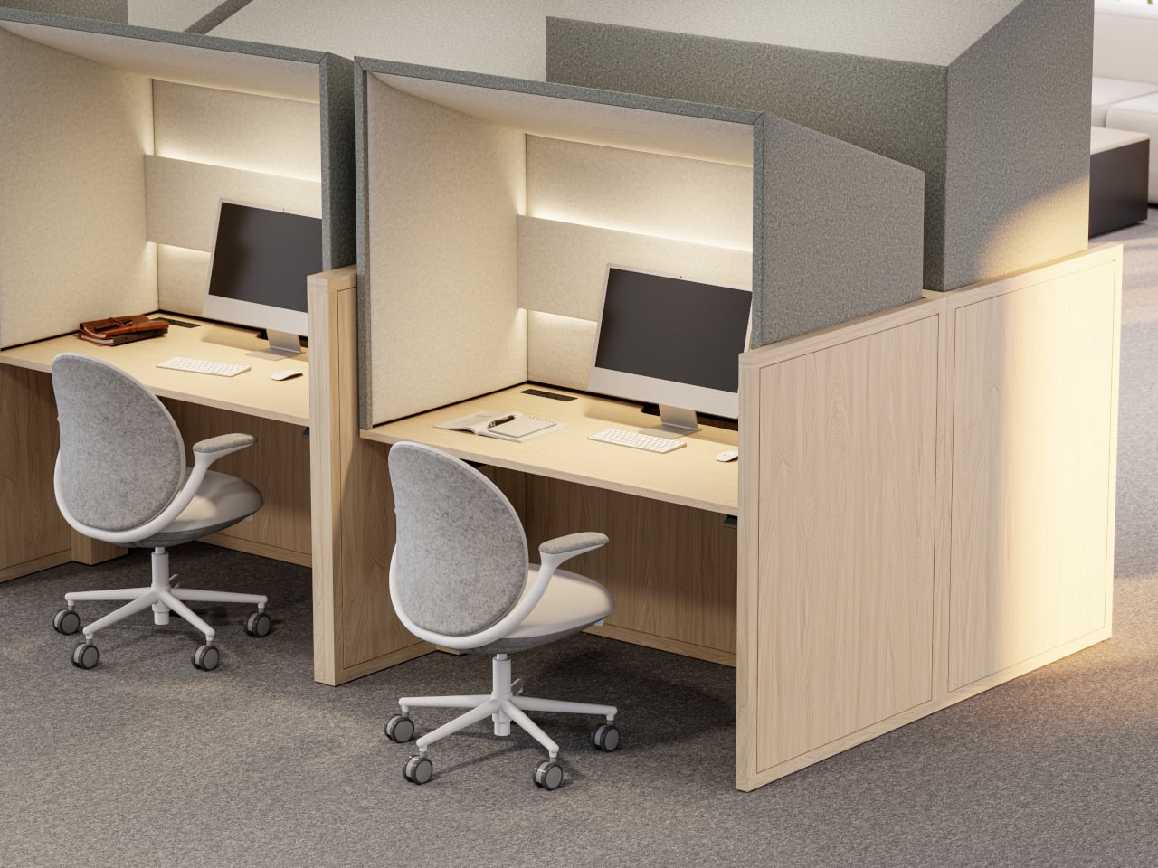
Arriving in a hot-desking office, you slide into a Canopy bay for heads-down work. The upholstered hood softens the hum of the floor, integrated lighting dials in for your screen, and the sit-stand surface adjusts to your height with intuitive controls and a digital readout. When it is time for a video call, you stay put, tweak the dimmable lighting for a ring-light effect, and skip the hunt for a quiet room.

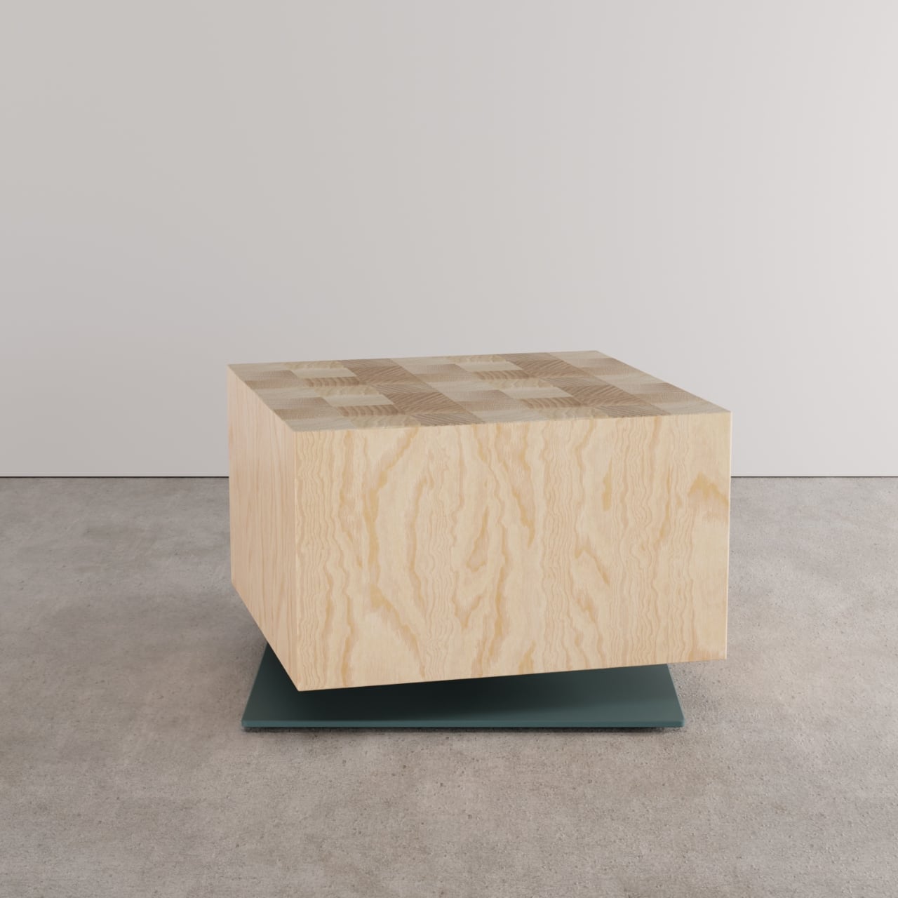
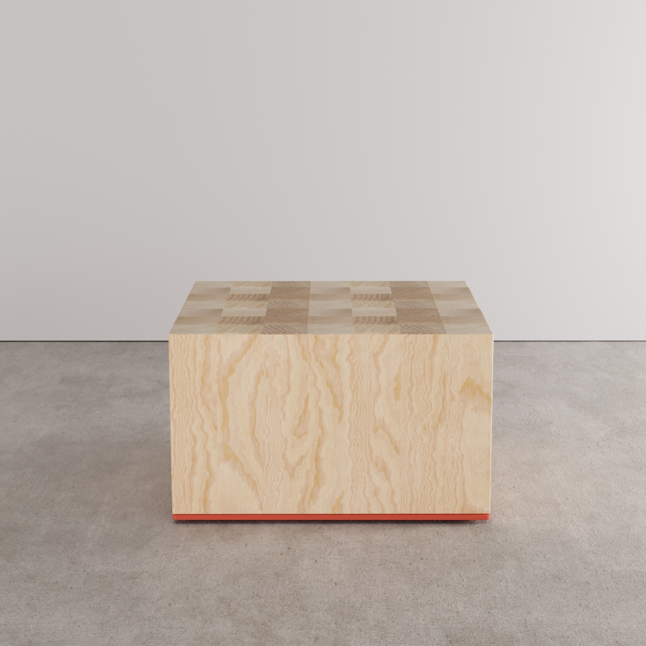
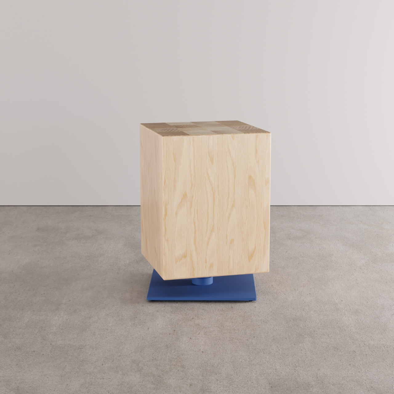
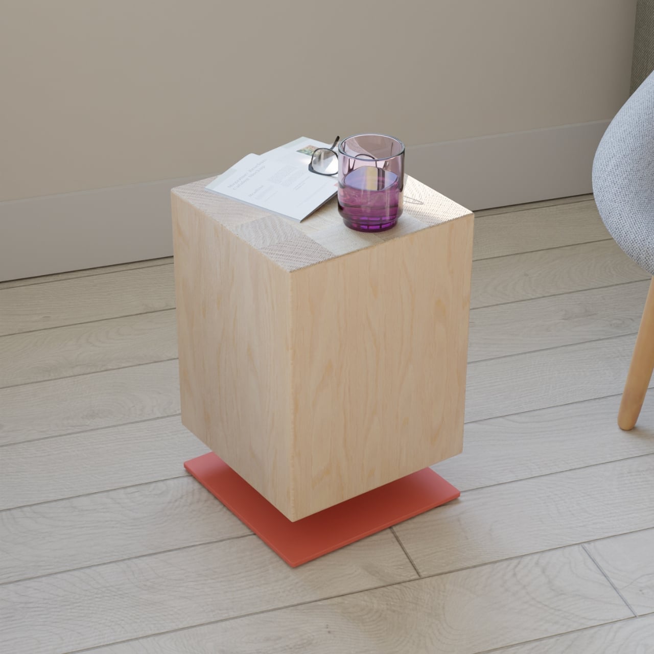
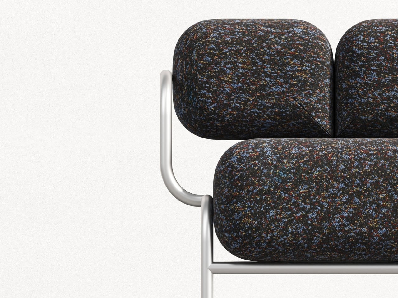
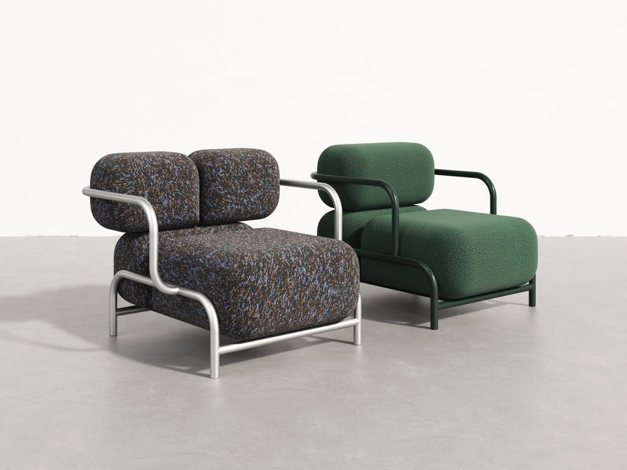
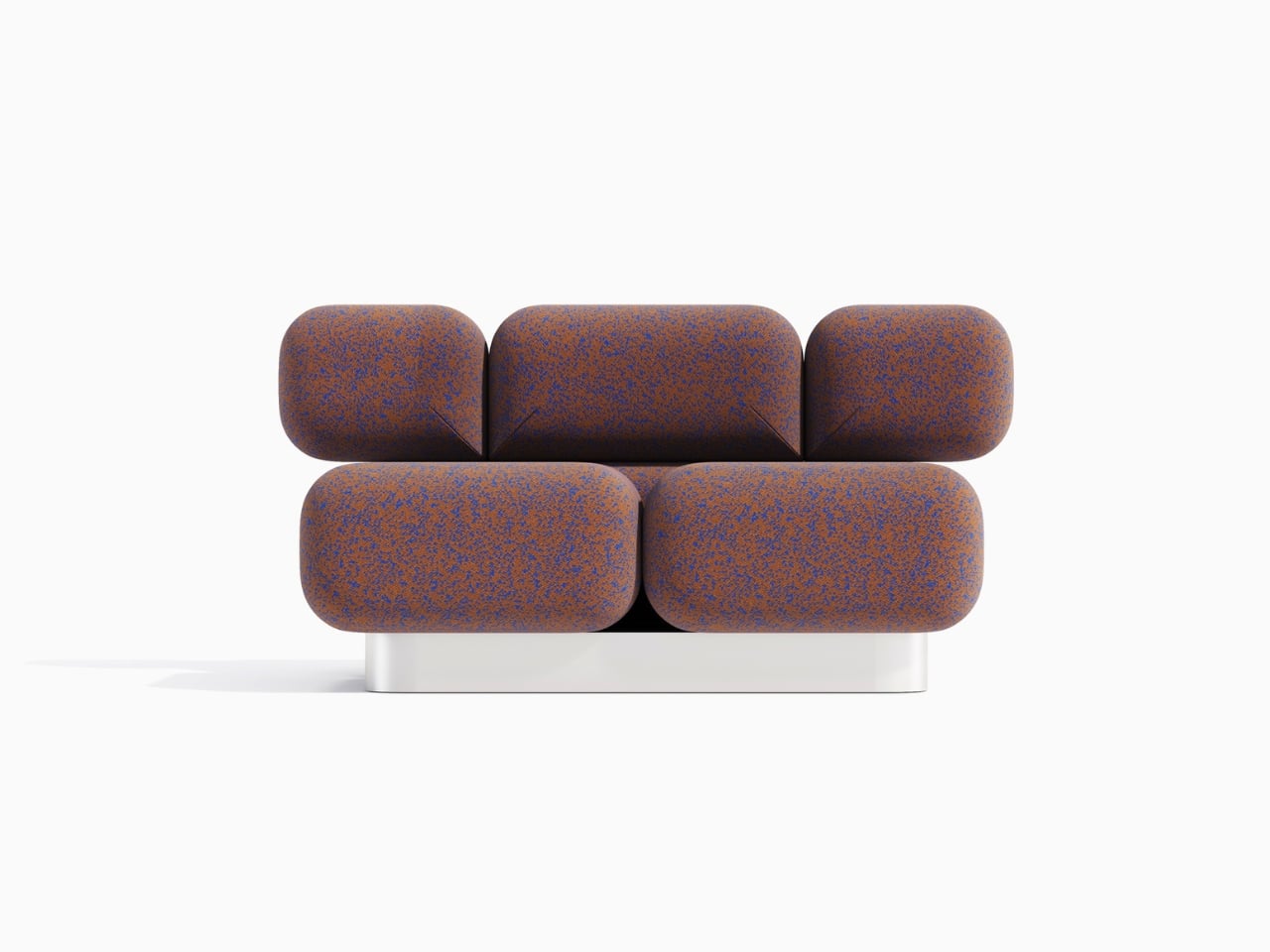
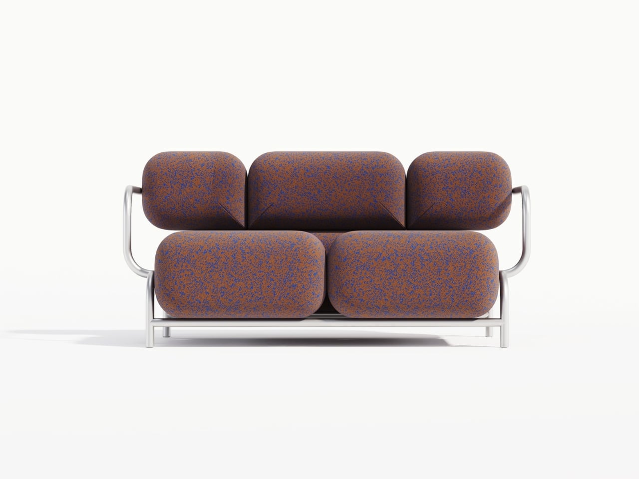
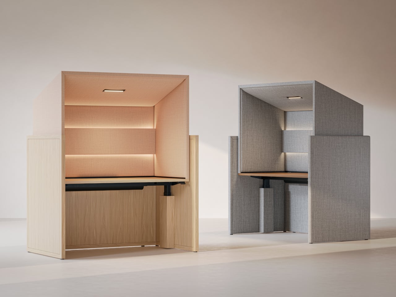
The fully upholstered hood gives a sense of boundary without feeling like a box. The lower surround can be wood veneer, laminate, or upholstery depending on how much warmth the interior needs. Because the hood interior and exterior can be mixed or matched in different fabrics, designers can tune how enclosed or open the station feels, from soft cocoon to crisp workstation, adjusting for brand or privacy levels.

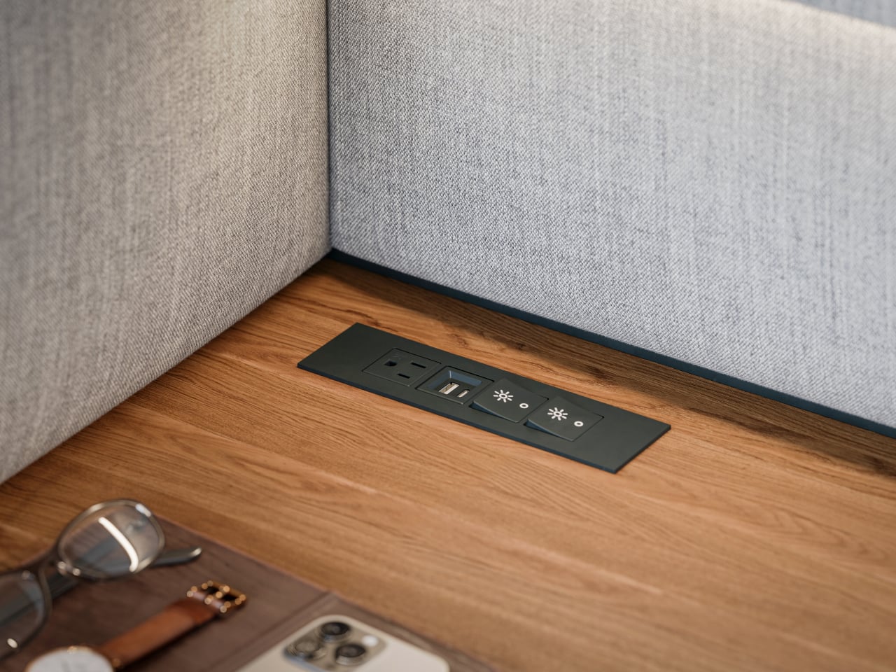
Integrated power and cable management keep laptops, monitors, and chargers from tangling on the surface. Optional occupancy sensors shut off lighting when the station is empty, a small nod to energy-conscious projects. The use of FSC-certified red oak, CertiPUR-US foam, and low-VOC laminates supports teams working toward sustainability metrics without making a fuss about it or requiring dedicated environmental consultants to justify the choice.

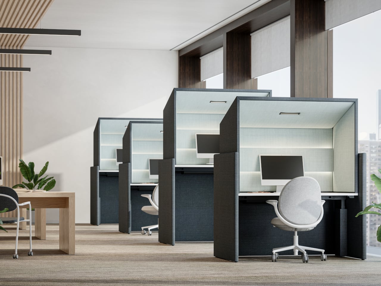
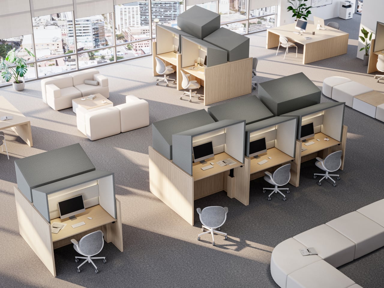
Canopy takes up more floor space per person than a bench, and in very loud environments it will not replace full acoustic rooms. Integrated lighting and sensors add components that need maintenance over time. It is a more premium, infrastructure-like piece that makes the most sense as part of a broader plan for how people move, focus, and recharge across a floor, not just as a random upgrade.

Canopy treats focus as something worth designing for, not just something people hack together with headphones and luck. By giving each person a small, height-adjustable, well-lit, and acoustically softened bay, it brings a bit of architectural calm into the open plan. Sometimes the most effective workplace upgrades are not new tools on the screen but better places to sit and think without everyone else’s conversations becoming the soundtrack.

The post This Desk Hood Blocks Office Noise Without Walling You In first appeared on Yanko Design.

These Steel Chairs and Lamps Look Like Sitting Inside a Pergola

Walking under a pergola or slatted canopy, sunlight breaks into stripes, and the structure feels more like a drawing in space than a solid roof. That rhythm of beams and shadows is both architectural and strangely calming, turning overhead shelter into something closer to a pattern you move through. Foln takes that outdoor language and shrinks it down into objects you can live with indoors.

Jiyun Lee’s Foln series is a family of three stainless-steel pieces: the Linear Chair, a floor lamp, and a wall lamp, all built from folded metal lines. Each element is made entirely of stainless steel, with dimensions that keep it slender and vertical. The project is less about adding another chair or lamp to the world and more about importing a structural idea into a domestic scale, treating furniture and lighting as small frameworks you inhabit or move around.

Designer: Jiyun Lee

Encountering the Linear Chair, you see a small framework first, a set of repeated uprights and crossbars that read like a fragment of pergola. Only when you get closer does the seat reveal itself as a crossing of beams, with the back continuing the same rhythm upward. It is clearly functional, but it also feels like sitting inside a drawing, surrounded by lines and the shadows they cast on the floor and wall behind you.

The floor and wall lamps extend the same language into light. The floor lamp becomes a vertical corridor where illumination travels up and down between nested frames, while the wall lamp compresses that idea into a compact cluster that hovers off the surface. In both cases, lighting is less about a glowing bulb and more about how brightness slips between the metal and onto nearby surfaces, treating the surrounding wall as part of the composition.

Foln changes as you move around it. From one angle, the lines stack and the pieces look dense, almost solid; from another, they open up and nearly disappear. The designer’s statement that shadows become architectural elements in their own right comes through when you realize the real composition includes the dark stripes on the floor and wall as much as the polished steel itself, rewriting the room with every shift in daylight.

Stainless steel, sharp geometry, and unpadded surfaces mean Foln is not chasing ergonomic softness or maximum light output. The chair will feel firm, and the lamps will behave more like ambient or accent pieces than task lights. That trade-off is intentional, prioritizing a contemplative, spatial experience over conventional comfort and placing the series closer to collectible design than everyday contract furniture you buy in bulk.

Foln reframes interiors as places where structure, light, and emptiness can be as present as color or texture. By borrowing the pergola’s rhythm and translating it into folded metal, the series turns a familiar outdoor gesture into a quiet indoor ritual. Rhythm is not only seen in the lines of steel but felt in the way light and shadow keep rewriting the room around them, turning simple objects into small, inhabitable frameworks that change how you read the space they sit in.

The post These Steel Chairs and Lamps Look Like Sitting Inside a Pergola first appeared on Yanko Design.

This Side Table Just Solved the Height Problem With One Twist

There’s something deeply satisfying about furniture that surprises you. The Turno side table from Leyma Design looks like a solid maple block perched on a colorful steel base, which already makes it visually interesting. But here’s where it gets good: you can adjust its height by simply turning the wooden body. No levers, no buttons, just a smooth twist that raises or lowers the table to exactly where you need it.

This isn’t just a clever party trick. It’s genuinely useful. Need your side table higher when you’re working from the couch? Give it a turn. Want it lower as a bedside companion? Twist it back down. The mechanism is built into the design so elegantly that you’d never guess it was there until someone shows you.

Designer: Leyma Design

The Turno marries two materials that shouldn’t work together but absolutely do. The solid maple top brings warmth and natural texture, with each piece showing off its unique grain pattern. The powder-coated steel base provides industrial edge and pops of color. It’s the kind of contrast that makes a piece feel considered rather than safe, like the designer actually thought about how these elements would interact in a real living space.

What makes Turno stand out in the oversaturated world of side tables is its refusal to overcomplicate things. The geometric form is clean and minimal, but not cold. The proportions feel just right, whether you’re looking at the compact version tucked beside an armchair or the larger size anchoring a seating area. This is furniture that works hard without looking like it’s trying too hard.

The color options deserve special attention. You can go bold with coral, sunny yellow, or deep navy bases that turn the table into a statement piece. Or you can choose more subdued finishes that let the maple do the talking. The ability to shift the mood of the entire piece through color choice gives Turno surprising versatility. The same table can feel playful in one finish and sophisticated in another.

Let’s talk about the checkerboard pattern on top. Made from alternating grain directions in the maple, it adds visual interest without being busy. It’s the kind of detail that rewards closer inspection, the thing you notice the third or fourth time you look at the piece rather than immediately. That restraint is rare and refreshing.

From a practical standpoint, side tables are often afterthoughts in furniture shopping. You need something to hold your coffee cup or book, so you grab whatever fits. Turno makes a case for being more intentional. Because it adjusts to different heights, it can serve multiple purposes across different rooms. That flexibility is particularly valuable for people in smaller spaces or those who like to rearrange frequently.

The design also works whether you’re using one table or clustering several together. Multiple Turno tables at varying heights create a modular coffee table situation that’s both sculptural and functional. You can separate them when needed or group them for impact. This kind of flexibility used to mean sacrificing aesthetics, but Leyma Design proves that’s a false choice. What’s particularly smart about this piece is how it bridges different design sensibilities. If your space leans Scandinavian minimal, the maple and clean lines fit perfectly. If you’re more into industrial vibes, that steel base speaks your language. Contemporary spaces benefit from the geometric form, while the natural wood keeps it from feeling too stark for warmer interiors.

The fact that Turno is still a concept on Behance rather than something you can buy tomorrow is almost frustrating. It represents the kind of thoughtful, adaptable furniture design that actually addresses how people live now. We move furniture around. We use rooms for multiple purposes. We want pieces that look good but also solve problems.

Leyma Design has created something that feels both fresh and timeless with Turno. The adjustable mechanism gives it tech appeal without requiring batteries or apps. The material choice and craftsmanship satisfy design purists. The color options and modularity speak to people who see furniture as self-expression. It’s a side table that manages to be several things at once without being confused about what it is.

The post This Side Table Just Solved the Height Problem With One Twist first appeared on Yanko Design.

This Sofa Looks Like Stone Boulders But Feels Like Clouds

There’s something beautifully contradictory about furniture that looks hard as stone but promises cloud-like comfort. That’s exactly what Mudu Studio has achieved with the Rokko Sofa, a design concept that takes inspiration from massive geological formations and transforms them into something you’d actually want to sink into after a long day.

Look at the Rokko series and you’ll immediately see the resemblance to smooth river stones or ancient boulders shaped by centuries of wind and water. But instead of cold, unyielding rock, these sculptural forms are generously upholstered cushions that capture the visual weight and monumentality of stone while offering the kind of comfort that makes you want to stay put for hours. The genius here is in that tension between appearance and reality, between what looks solid and immovable and what actually cradles your body.

Designer: Mudu Studio

The design plays with scale in an interesting way. These aren’t your typical sleek, minimalist cushions. They’re voluminous and bold, each one reading as a distinct sculptural element. Yet despite their substantial presence, the pieces don’t feel heavy or overwhelming in a space. That’s largely thanks to the contrast Mudu Studio creates with the base structure.

The frame options are where things get really interesting. The main collection features processed aluminum bases that are remarkably slender and airy. It’s almost like the massive cushions are floating, held aloft by these delicate metal structures. The visual lightness of the aluminum creates this wonderful illusion of defying gravity. You’ve got these boulder-sized forms that appear to hover just above the ground, supported by what looks like nothing more than bent wire (though obviously it’s engineered to be far sturdier than that).

For those who prefer a different aesthetic, there’s an alternative version with a podium base wrapped in stainless steel. This option grounds the piece more firmly, adding a sense of refined solidity that complements the cushions in a different way. Instead of floating stones, you get something more architecturally grounded, like sculptures placed on pedestals in a gallery.

The modularity of the system is another smart move. From the images, you can see everything from compact single-seaters to generous three-seater configurations. Some versions include wraparound armrests that echo the cushions’ rounded forms, while others keep things more open and flexible. The textiles shown range from earthy, tweedy textures that emphasize the geological inspiration to rich solid colors that take the design in a more contemporary direction.

What makes the Rokko particularly relevant right now is how it bridges multiple design movements. There’s definitely some postmodern playfulness in the exaggerated forms and the way different materials and aesthetics collide. But there’s also a nod to biophilic design, that growing interest in bringing natural forms and textures into our interiors. And the modular, configurable nature speaks to contemporary needs for flexible, adaptable furniture that can evolve with how we actually use our spaces.

The fabric choices visible in the renderings are particularly thoughtful. Those speckled, textured options genuinely evoke stone surfaces without being literal about it. They give the cushions visual depth and interest up close while reading as solid, substantial forms from a distance. It’s the kind of detail that elevates a concept from clever idea to genuinely covetable piece.

Right now, the Rokko exists as a concept looking for a manufacturer, which means these gorgeous renderings represent potential rather than reality. But that’s often how the most interesting furniture begins. Designers push boundaries with bold ideas, and the right manufacturing partner helps figure out how to translate vision into something people can actually purchase and live with.

For anyone who appreciates furniture that makes a statement without shouting, that brings sculptural presence without sacrificing comfort, the Rokko Sofa is definitely one to watch. It’s the kind of design that could easily become an icon if it finds its way to production. Those cushions that look like they were carved by ancient forces but actually cradle you in modern comfort? That’s the kind of paradox that makes design fascinating.

The post This Sofa Looks Like Stone Boulders But Feels Like Clouds first appeared on Yanko Design.

When Loss Becomes Something You Can Touch

There’s a particular kind of quiet that settles after a wildfire. Not peaceful, not comfortable, just a heavy stillness where something used to be. In January 2025, the Eaton Fire burned through Altadena in the foothills of Los Angeles for twenty-five days, taking nineteen lives and destroying more than 9,000 structures. It became the second most destructive wildfire in California history, leaving behind charred earth and the skeletal remains of trees that once shaded neighborhoods and backyards.

A year later, at Marta gallery in Los Angeles, 22 local artists and designers are doing something quietly radical with what’s left. The exhibition “From the Upper Valley in the Foothills” transforms salvaged wood from those burned Altadena trees into chairs, stools, benches, bowls, and other functional objects. Curated by sculptor Vince Skelly with material support from Angel City Lumber, the show runs through January 31st and offers a different kind of memorial.

Designer: Vince Skelly (curator)

This isn’t your typical tribute. There are no plaques, no somber photographs, no distance between you and the disaster. Instead, you’re invited to sit on it, hold it, contemplate it. The wood itself, sourced from species like Aleppo pine, cedar, coastal live oak, and shamel ash, carries visible traces of fire damage, smoke marks, and irregular grain patterns. Each piece holds a kind of double existence: both the tree it was and the home it might have shaded.

Skelly wanted the exhibition to feel like a true community response, so he focused on local designers and artists who each had their own experiences with the fires. The resulting collection is remarkably varied. Some pieces lean sculptural and contemplative, others embrace pure functionality. There’s Doug McCollough’s decorative bowl, Tristan Louis Marsh’s floral stool, and Base 10’s Watari bench, each handling the material’s history differently.

What makes this work compelling is the tension between destruction and creation. Angel City Lumber, a local mill that sources downed trees for community projects, collected the wood cleared from Altadena after the fire. By transforming debris into design objects, the exhibition reframes devastation not as an ending but as an uncomfortable, complicated beginning. The burned wood becomes a vessel for memory, loss, and whatever regeneration might look like.

Function here isn’t just practical. It’s conceptual. These chairs and benches aren’t simply places to rest, they’re propositions about how devastated spaces might once again support everyday life. The act of sitting on a stool made from fire-damaged oak becomes a small gesture of reclamation, a way of saying that what was lost can still hold weight, still serve a purpose, still matter.

The exhibition also raises quieter questions about the role of artists and designers during climate instability. Is it enough to make beautiful objects from catastrophe? Does craft honor the loss or aestheticize it? The show doesn’t offer easy answers, but it does suggest that making something useful from what remains is its own kind of resistance. There’s dignity in refusing to let devastation be the final word.

Marta’s presentation feels particularly resonant because it acknowledges that these objects are meant to be touched and experienced, just like the forests they come from. In an era when wildfires are becoming annual events and California’s landscape is increasingly defined by cycles of burning and rebuilding, this direct engagement feels necessary. The wood doesn’t let you forget what happened, but it also doesn’t let you look away.

What stays with you after visiting “From the Upper Valley in the Foothills” isn’t any single piece but the cumulative effect of seeing 22 different responses to the same material. Each designer grappled with the same scarred wood and found their own way through it. Some leaned into the damage, others smoothed it away. Some made monuments, others made chairs. Together, they create a portrait of a community trying to process an event that reshaped not just the landscape but the psyche of an entire city.

The exhibition is both memorial and workshop, grief and pragmatism sitting side by side. It suggests that sometimes the best way to honor what’s lost is to build something from the wreckage, to take what the fire left behind and give it a second life. Not as a replacement for what was, but as a reminder that even in the aftermath, there’s still wood to work with, still hands to shape it, still a future that needs furniture.

The post When Loss Becomes Something You Can Touch first appeared on Yanko Design.

This Designer Turns Children’s Imagination Into Furniture They Can Truly Own

One of the most powerful moments in the creative process is seeing an idea transform into something real. For a child, that moment carries even greater weight. It builds confidence, validates imagination, and reinforces the belief that creativity is not limited by age. Chair for Kids, a participatory design project developed by Taekhan Yun, captures this experience by translating children’s playful and imperfect drawings into fully functional and usable chairs that children can see, touch, and use every day.

Created in collaboration with students from an English school in Siem Reap, the project places children at the center of the design process. Rather than correcting or refining their ideas to fit adult notions of good design, the project embraces the rawness of children’s imagination. More than seventy children participated, each drawing their own version of a chair or stool as an initial exploration of form, balance, and function. These drawings were treated as genuine starting points rather than symbolic exercises.

Designer: Taekhan Yun

Collaboration played a key role throughout the process. Children gathered to look at and share each other’s drawings, discussing differences in shape, structure, and intention. They then worked in pairs to measure their own height and body dimensions, learning how scale and proportion affect comfort and usability. Based on these measurements, the children described the type of chair they wanted to make, introducing basic ergonomic thinking in an intuitive and accessible way. Each chair was designed specifically to fit the child’s own body, reinforcing the connection between design and lived experience.

To translate drawings into three-dimensional objects, the children created clay prototypes of their chairs. Clay was chosen for its low cost, accessibility, and ease of manipulation, allowing children to freely experiment with volume and structure. These models helped bridge the gap between imagination and fabrication and served as references for the final chairs produced by Taekhan Yun. The resulting forms retain the charm of the original drawings with crooked legs, unexpected angles, and playful proportions while remaining structurally sound and functional.

In the final stage, the children actively participated in finishing their chairs. Crayons were used to apply color directly onto the surfaces, transforming each piece into a personal expression of identity. Acrylic lacquer spray was then applied to seal the drawings, followed by varnish to protect the finish. This process preserved the spontaneity of the children’s marks while ensuring durability, resulting in furniture that feels joyful, expressive, and intentional.

Beyond individual expression, Chair for Kids also highlights the potential for scalability. The chairs are low-cost and easy-to-build designs that rely on simple materials and straightforward construction methods. This makes them well-suited for mass manufacturing and adaptation across schools, community centers, and educational environments, particularly in resource-constrained contexts. The project demonstrates how participatory design can produce furniture that is not only meaningful and educational but also practical, affordable, and replicable.

Each chair reflects the imagination of a single child while contributing to a collective outcome. Chair for Kids shows how design education rooted in participation and making can empower children, build confidence, and reimagine furniture as a tool for learning, inclusion, and creativity.

The post This Designer Turns Children’s Imagination Into Furniture They Can Truly Own first appeared on Yanko Design.

This Footstool Finally Fixes WFH Posture by Rocking Like a Toy

We’ve all been there. You’re deep into hour three of sitting at your desk, and suddenly you realize your feet are doing that weird thing where they’re contorted into some unnatural position that definitely wasn’t what your body had in mind. Maybe they’re tucked under your chair at an odd angle, or perhaps they’re desperately stretching for that one sweet spot on the floor that somehow feels less terrible than all the others.

Here’s the thing about traditional footstools: they’re rigid. They sit there in one fixed position, forcing you to adapt to them rather than the other way around. It’s like having a friend who only ever wants to meet at the same coffee shop, never considering that maybe, just maybe, you’d like a little flexibility in your life. Enter OTTO, a footstool by designer Woonghee Ma that takes its inspiration from the most unlikely source: the roly-poly toy. You know the one. That round-bottomed toy from childhood that always bounces back upright no matter how hard you knock it over. In Korea, it’s called Ottogi, which is where this clever little piece gets its name.

Designer: Woonghee Ma

The genius of OTTO lies in its convex base. Instead of planting itself stubbornly on the ground like every other footstool, it rocks. It moves. It responds to the way your body actually behaves when you’re sitting for long stretches. As you shift your weight and adjust your position throughout the day (because let’s be honest, no one sits perfectly still), the footstool moves with you, naturally settling into whatever position feels most comfortable in that moment.

Think about it: your body is constantly making tiny adjustments. Your legs shift, your posture changes, you lean forward to focus on something on your screen, then lean back when you’re thinking. Why should your footstool stay frozen in place while all this is happening? OTTO essentially becomes a dynamic support system rather than a static obstacle.

What really sells this design is how deceptively simple it looks. The structure consists of just four components: a circular table top, plywood legs with organic cutouts, a bowl-shaped footrest, and a bracket to hold everything together. The legs feature these beautiful curved openings that give the piece an almost sculptural quality, like negative space art that happens to be functional furniture. The top and footrest come in a bold coral-red that pops against the natural wood tone of the legs.

Assembly is refreshingly straightforward. Attach the legs to the bracket, set the top plate and footrest in place, and you’re done. No Allen wrenches, no confusing instructions with illustrations that look nothing like the actual parts, no leftover screws that make you question your entire assembly process. It’s designed to be easy to put together and just as easy to move around your space.

But here’s where OTTO gets even more interesting: versatility. Sure, it’s a footstool. But that top surface? Perfectly functional as a side table for your water bottle, phone, or that coffee cup that’s perpetually within arm’s reach. Need to hold some supplies while you’re working on the floor? OTTO’s got you. Want a low stool for kids or a casual seating option when friends come over? It can do that too.

The design speaks to a larger shift happening in how we think about furniture, especially in the work-from-home era. We’re moving away from rigid, single-purpose pieces toward objects that adapt to our needs rather than forcing us to adapt to them. OTTO embodies this philosophy beautifully. It’s not trying to correct your posture through force or rigid positioning. Instead, it works with your natural movements, offering support that feels intuitive rather than prescriptive.

There’s also something deeply satisfying about the aesthetic. The combination of natural plywood and that vibrant coral creates a look that feels both Scandinavian-minimal and playfully modern. It’s serious enough for a professional home office but fun enough that it doesn’t feel stuffy or overly corporate.

We’re now spending more time than ever sitting and staring at screens so maybe what we need isn’t more rigidity. Maybe what we need is furniture that understands that bodies move, preferences change, and comfort isn’t one-size-fits-all. OTTO gets it. And honestly? That roly-poly toy inspiration is pretty brilliant. Who knew the secret to better sitting was something we learned in kindergarten?

The post This Footstool Finally Fixes WFH Posture by Rocking Like a Toy first appeared on Yanko Design.

This Airport Lounge Turned Mondrian’s Boogie-Woogie into Wood Islands

Long layovers usually mean seas of identical metal chairs, bright signage, and constant motion that makes rest feel impossible. Even premium lounges often feel like slightly nicer waiting rooms, not places with a point of view beyond arranging seating in rows. Schiphol’s Lounge 2 sits in the flat Haarlemmermeer polder outside Amsterdam, which gave Beyond Space a specific landscape and design history to work with when redesigning the 1,000 square meter space.

The studio looked at that polder and the Dutch De Stijl movement it inspired, particularly Mondrian’s orthogonal paintings. His late Boogie-Woogie works are essentially abstractions of that landscape, grids of lines and colored planes forming rhythmic compositions. Beyond Space took those paintings as an organizing principle, using sequences of orthogonal lines and planes to define where and how people sit instead of just dropping furniture onto a floor.

Designer: Beyond Space

Entering the lounge, you realize you are not looking at rows of chairs but a low wooden city. Connected seats form islands of different sizes that plug into the existing architecture, creating pockets for solo travelers, pairs, and larger groups. You can choose a corner that feels tucked away, a spot with a direct runway view, or a cluster where a family can spread out without blocking circulation.

Instead of Mondrian’s red, yellow, and blue, the designers used solid wood from European tree species Mondrian once painted in his early landscape work. That swap keeps the De Stijl grid and rhythm but trades visual shouting for warmth and calm. In a terminal full of screens and branding, the consistent wood tones and leather upholstery act like a noise-cancelling layer without resorting to beige blandness.

The orthogonal layout hides surprising variety, armchairs with side tables, benches, back-to-back arrangements, and larger platforms for groups. Power outlets are integrated into the wooden blocks, so charging a laptop does not mean hunting for a wall socket or sitting on the floor. The grid gives order, but within it you can find a spot that matches how you actually want to wait.

Because seating follows a clear grid aligned with the architecture, it is easier to orient yourself and remember where you were sitting when you come back with coffee. The repetition of similar forms, combined with daylight from large windows and a neutral floor, creates visual tranquility rare in airports. It feels designed to let your brain idle instead of constantly scanning for threats.

The lounge treats waiting not as dead time to fill with more screens, but as a chance to sit in a space with a clear idea behind it. By abstracting the landscape outside and channeling Mondrian without copying his colors, Beyond Space turns a generic airport zone into a small wooden blueprint of Dutch design history that just happens to be comfortable between flights.

The post This Airport Lounge Turned Mondrian’s Boogie-Woogie into Wood Islands first appeared on Yanko Design.

This 1970s Kids’ Desk Flatpacked Before IKEA Even Existed

Here’s something to blow your mind: decades before IKEA convinced us all that assembling furniture with an Allen wrench was somehow fun, a visionary designer named Luigi Colani was already flatpacking children’s furniture in the 1970s. And get this, it wasn’t just about convenience. His Tobifant desk and chair set was actually genius problem-solving at its finest.

If you know anything about Luigi Colani, you know he was the king of curves and organic shapes. This is the guy who designed everything from streamlined trucks to futuristic cameras, always with that signature bio-design aesthetic. But with the Tobifant collection, created for West German children’s furniture brand Kinderlübke, he tackled a problem every parent faces: kids grow way too fast.

Designer: Luigi Colani

The Tobifant set came flatpacked (yes, in the ’70s!), but that was just the beginning of its brilliance. Made from beech plywood, both the desk and chair featured height-adjustable frames, so you could raise the seat, backrest, and writing surface as your child sprouted upward. Instead of buying new furniture every couple of years, parents could invest once and adjust as needed. It was sustainable before sustainability became a design buzzword.

Think about what a radical concept this was. It was a time when most children’s furniture was either cheap throwaway pieces or expensive heirlooms that kids outgrew almost immediately. Colani created something practical, beautiful, and adaptable. The furniture could literally grow with your child, which meant it could potentially serve them from toddlerhood through their early teens.

But wait, there’s more. Colani didn’t just stop at smart construction. He actually specified that each Tobifant desk should come with one kilogram of modeling clay and three wooden tools. Because apparently he understood that a desk isn’t just a place to do homework. It’s a creative laboratory, and kids need to be encouraged to make things, to experiment, to get their hands dirty (or clayey, as it were). How many furniture designers think about what happens after the sale? Colani was playing 4D chess while everyone else was still figuring out checkers.

The flatpack design wasn’t just about shipping efficiency, though that was certainly a bonus. It was about democratizing good design. By making the furniture easy to transport and assemble, Colani made it more accessible to regular families. This was thoughtful, human-centered design at work.

What’s really striking when you look at photos of the Tobifant set today is how modern it still looks. The clean lines, the warm plywood finish, the elegant simplicity of the adjustable mechanism… it could easily sit in a contemporary home without looking dated. That’s the mark of truly timeless design. While so much ’70s furniture screams its decade with harvest gold upholstery and chrome everywhere, the Tobifant feels almost minimalist in its restraint.

The set went into production in the late 1970s, and today surviving examples pop up on vintage reseller sites, often commanding impressive prices from collectors. It makes sense. Original Colani pieces are increasingly rare, and the Tobifant represents such a perfect intersection of form, function, and forward-thinking design philosophy.

What’s fascinating is how Colani’s approach predated so many trends we think of as recent innovations. Flatpack furniture? Check. Modular, adjustable design? Check. Sustainability through longevity? Check. Child-centered functionality that doesn’t sacrifice aesthetics? Double check. He was essentially doing what today’s best furniture startups are trying to do, except he did it before many of them were even born.

So next time you’re wrestling with those cryptic IKEA instructions, spare a thought for Luigi Colani and his Tobifant collection. He proved that flatpack furniture could be more than just affordable practicality. It could be beautiful, innovative, and genuinely improve how families live. That’s the kind of design legacy that deserves way more recognition than it gets.

The post This 1970s Kids’ Desk Flatpacked Before IKEA Even Existed first appeared on Yanko Design.