The Mechanical Keyboard Grew Up – And It’s As Smart As Your Laptop

Fifty years of keyboard design, and the basic contract never changed: switches under keycaps, keycaps under fingers, fingers making typos. The mechanical keyboard revival of the 2010s gave us better switches, heavier brass plates, and an entire hobbyist economy built around sound profiles and spring weights, but the object itself remained stubbornly analog in its ambitions. What’s shifted in 2025 and 2026 is the ambition. Boutique builders and hardware engineers are converging on a new idea: the keyboard as a control surface, a designed object with its own interface, its own visual language, its own intelligence. MelGeek, a Beijing-based custom keyboard brand with a decade of crowdfunded hardware behind it, just made that idea concrete with the Centauri80.

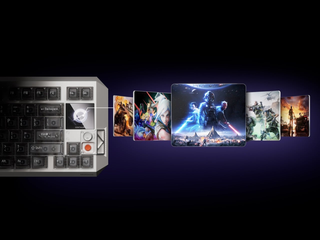
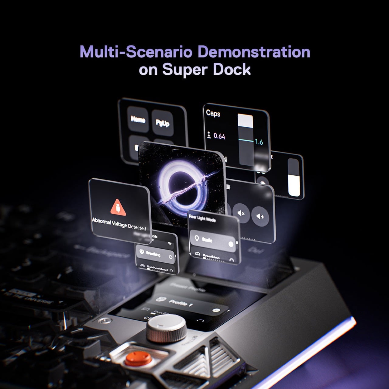
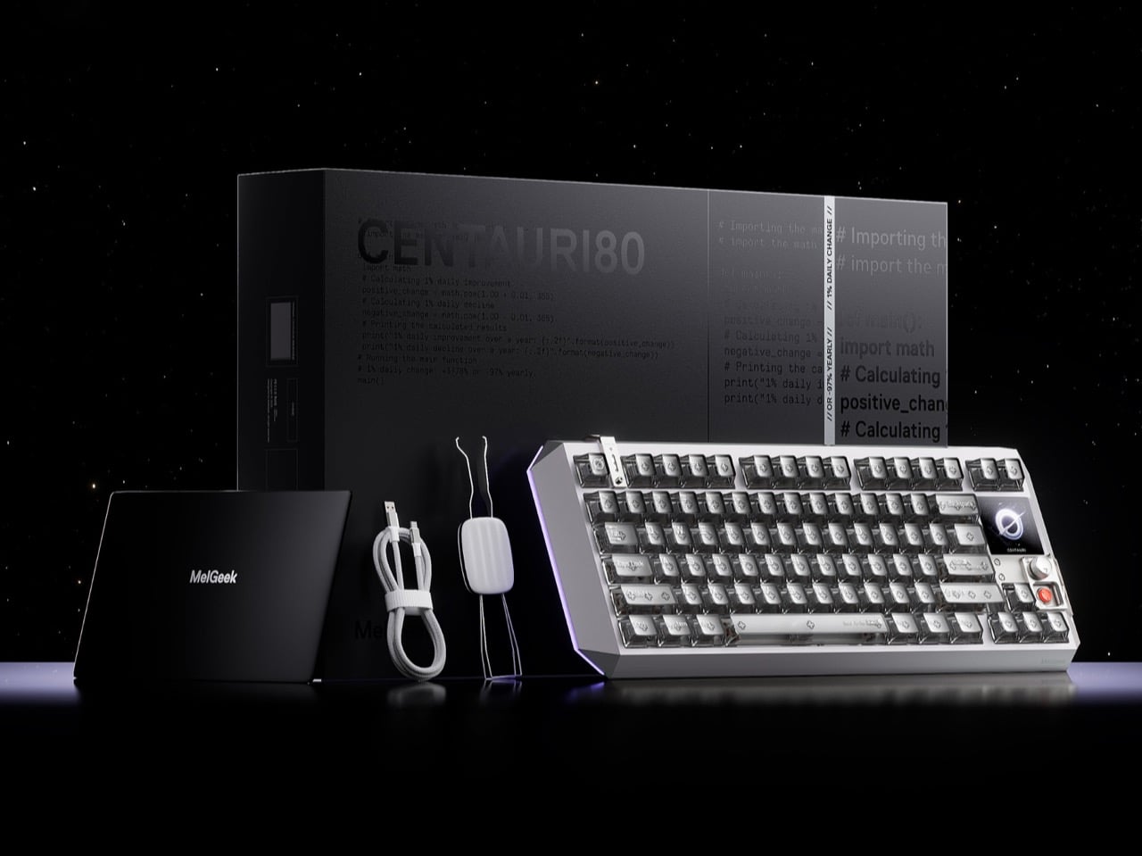
The Centauri80 is an 80% Hall Effect keyboard with a 1.78-inch OLED touchscreen embedded directly into the board, running at 325 PPI, which is the same pixel density as an Apple Watch face. A physical rotary encoder called the Super Dock sits beside it, letting you swap live wallpapers, toggle macros, and dial in lighting without alt-tabbing out of whatever you’re working in. Under the aluminum unibody, a distributed architecture of six microcontroller chips drives TTC Flip King magnetic switches to a 0.125ms latency at an 8000Hz polling rate. The whole thing retails at $299 from MelGeek’s own store, which puts it in a genuinely interesting position against the Wooting 60HE and the rest of the Hall Effect field.

Designer: MelGeek
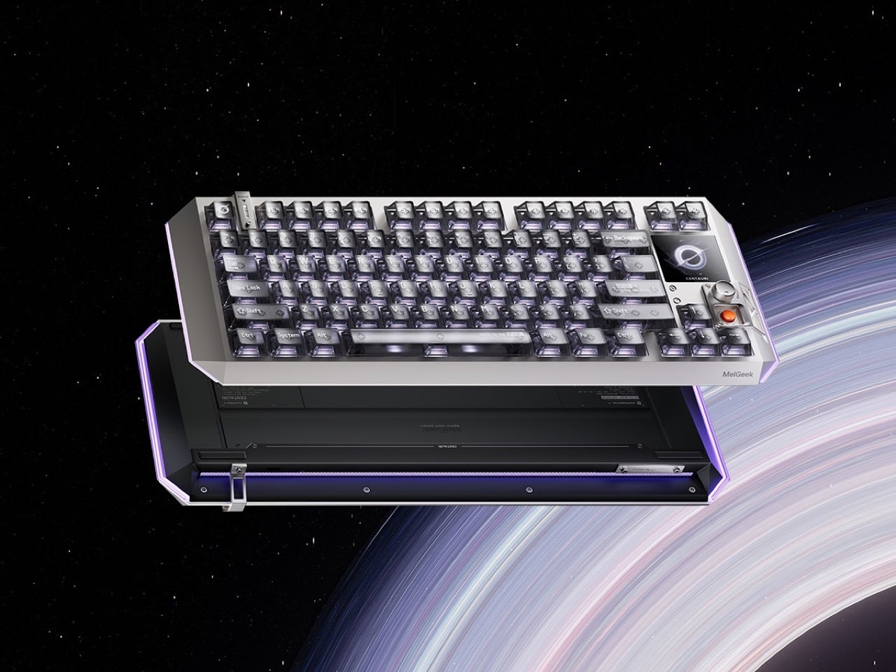
MelGeek opted for a suspended aluminum alloy unibody, which means the internal structure floats within the outer frame rather than bolting directly to it, reducing vibration transfer and keeping the sound profile controlled and intentional. The five-layer gasket-mounted acoustic structure underneath reinforces that choice: every keystroke travels through dampening foam, a silicone layer, and a carefully tuned plate before it reaches your ears as that deep, focused thud that keyboard people spend years and hundreds of dollars chasing. The design language draws openly from cyberpunk aesthetics, with MelGeek describing the Centauri80 internally as “a reimagined starship,” which sounds like marketing until you see the raking lines and deconstructed geometry and realize they actually earn that description. Transparent keycaps ship as default, showing the per-key RGB illumination through the caps themselves rather than just around them, and the three-sided 16 million color lighting system wraps the board in a glow that reads more like a designed accent than a gaming peripheral throwing up on itself.
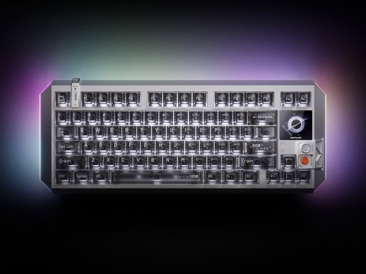

Traditional mechanical switches use metal contacts: two pieces of metal touch, the circuit closes, the keystroke registers. The problem is that metal contacts wear down, develop inconsistency over time, and can only register a keypress at one fixed point in the key’s travel. Hall Effect switches replace those metal contacts with magnets and sensors, reading the magnet’s position continuously as the key moves, which means the board can register a keypress at any point in the travel down to 0.1mm. That’s what rapid trigger means in practice: the keyboard resets and re-registers with every tiny movement rather than waiting for the key to physically return to a set reset point. For competitive gaming, where re-pressing a movement key a fraction of a second faster translates to a measurable advantage, this is the difference between winning and watching a killcam. MelGeek’s third-generation magnetic switch system adds a distributed architecture of one master chip and five processing chips, delivering what the company claims is 150% faster response than its previous generation, with an EMI shield engineered to cut cross-key interference by 60%.

Embedded into the upper right corner of the 80% layout, the 1.78-inch OLED runs at 325 PPI and 60Hz, handled entirely through the Super Dock rotary encoder beside it. Rotate to cycle through settings pages, press to confirm, keep typing. Live wallpapers, macro profiles, per-key lighting configurations, polling rate adjustments, all accessible on the keyboard itself without opening MelGeek’s Hive software. For someone running multiple macro profiles across different applications, having that switching surface physically on the board rather than buried in a system tray is a real quality-of-life improvement. For someone who sets their keyboard up once and forgets about it, the screen will display a wallpaper and nothing else, which is still a spectacular piece of hardware to stare at while pretending to work.
The Wooting 60HE, which more or less popularized Hall Effect keyboards for a mainstream gaming audience, sits at around $175 and offers rapid trigger without any display hardware. The Centauri80’s $299 asks for a $124 premium, and what you’re buying with that gap is the OLED screen, the rotary encoder, the unibody aluminum chassis, and the aesthetic ambition. The keyboard sits alongside the Wooting the way a beautifully machined mechanical watch sits alongside a Casio: both tell time accurately, one of them is also a statement about what objects are allowed to be. MelGeek has spent a decade building its reputation through crowdfunded custom boards and a community of gamers, coders, and creators who treat keyboards the way audiophiles treat headphones, and the Centauri80 is the clearest articulation yet of what that philosophy looks like at flagship scale.
The post The Mechanical Keyboard Grew Up – And It’s As Smart As Your Laptop first appeared on Yanko Design.


The $17,000 Micro Cabin That Makes Every Other Tiny Home Look Overpriced

I must admit there is a certain freedom in stripping things back to exactly what you need and nothing more. That’s the quiet confidence behind the Mantra, the newest micro cabin from Florida-based Simplify Further Tiny Homes — and at $17,000, it might just be the most straightforward shelter concept to come along in years.

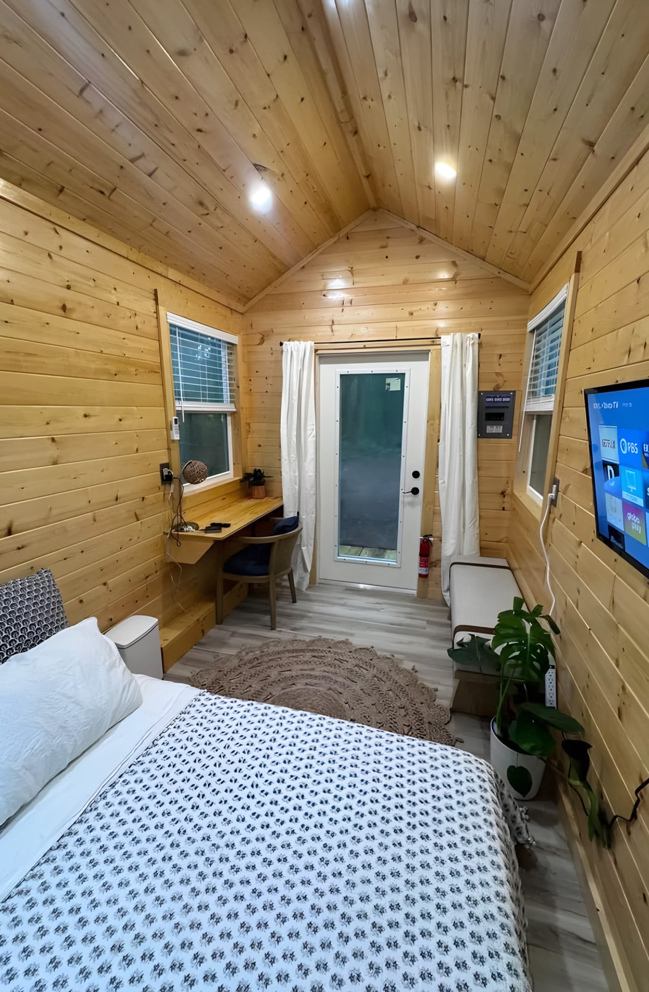
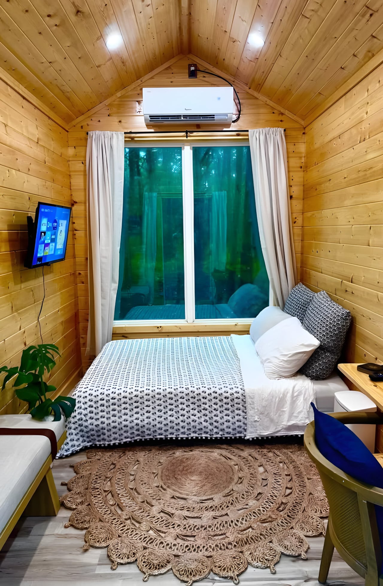
The Mantra measures 12 x 8 feet as a living unit, sitting on a double-axle trailer that brings its full length, porch included, to 16 feet (4.8 meters). The usable interior clocks in at just 98 square feet (9.1 sq m), which sounds tight until you see how it’s been organized. Everything lives in a single open room: a bed that doubles as a daybed, a desk and dining table, seating, a wall-mounted TV, and a mini-split air-conditioning unit. The whole thing sleeps up to two people.

Designer: Simplify Further Tiny Homes

What Simplify Further didn’t include is just as deliberate as what they did. There’s no indoor kitchen, no bathroom — a choice that keeps the footprint honest and the price point realistic. The Mantra was designed for people who want a serious shelter without the serious overhead: a glamping cabin, a backyard guest suite, an accessory dwelling unit, a dedicated work-from-anywhere office. It earns its role by not pretending to be something it isn’t.

On the outside, the cabin wears engineered wood cladding with pine tongue and groove accenting and a metal roof, materials picked for durability and a cabin aesthetic that doesn’t look out of place whether it’s parked in the woods or in a suburban backyard. The double-axle trailer base means it can be moved between sites without a production, which opens up use cases most permanent structures simply can’t compete with.

The $17,000 starting price is the number that tends to stop people mid-scroll, and for good reason. Most tiny houses, marketed as simple and affordable alternatives, have quietly crept into the $80,000 to $150,000 range. The Mantra pushes back on that without sacrificing the things that actually matter: climate control, a comfortable sleeping setup, and a design sensibility that doesn’t feel like an afterthought.

Simplify Further built their name on the idea that design and craftsmanship don’t require excess. The Mantra is that philosophy distilled. It’s not trying to replicate a house in miniature; it’s building something that knows exactly what it is. And in a market cluttered with overbuilt, overpriced micro dwellings, that clarity is worth more than the square footage.

The post The $17,000 Micro Cabin That Makes Every Other Tiny Home Look Overpriced first appeared on Yanko Design.

This 1,117-Brick LEGO Picasso Build Proudly Belongs on Your Living Room Wall

Cubism was, at its core, an act of radical fragmentation. Picasso and Braque looked at the world and decided that a single perspective was a lie, that the honest way to render a face was to show every angle simultaneously, cheekbone beside profile beside full-frontal stare, all collapsed into one electric, disorienting plane. The result was a new visual language built entirely from geometric shards, bold outlines, and colors that had no interest in behaving themselves.

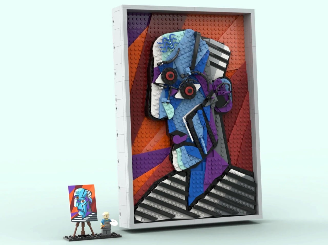
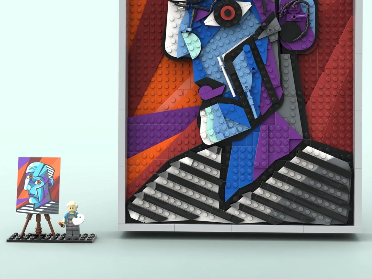
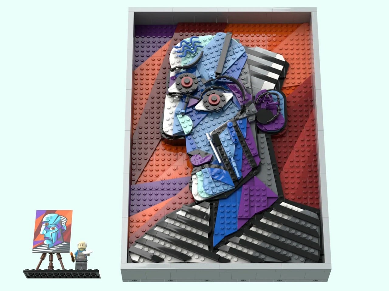
Which makes the literally cube-shaped LEGO brick the perfect medium to translate it. LEGO builder CountVitalCauliflower102 has submitted a 1,117-piece wall-hanging MOC (My Own Creation) to LEGO Ideas that recreates Picasso’s 1953 painting “The Great Painter Face” in brick form, and the moment you see it, something clicks. The angularity, the bold color blocking, the hard-edged geometry, it all lands with the kind of inevitability that makes you wonder why LEGO was focused on Monet and Van Gogh when Picasso’s work translate so perfectly into brick-based art.

Designer: CountVitalCauliflower102

The painting itself is an interesting choice, and a deliberate one. “The Great Painter Face” sits outside Picasso’s most celebrated canon, less famous than Guernica or Les Demoiselles d’Avignon, but it is precisely that underdog status that makes it compelling. The subject is rendered in profile with the full Cubist vocabulary: fractured planes, simultaneous perspectives, a face that is somehow also a diagram of a face. Its bold, high-contrast outlines and vivid color fields translate visually into brick zones with a clarity that a softer, more painterly work simply could not offer. The builder understood exactly what he was choosing, and why.

At 34 studs wide and 50 studs tall, roughly 27 by 40 centimeters, the panel is substantial enough to command a wall. The color story is where it immediately grabs you: sweeping diagonal fields of orange, red, and purple form the background, layered at angles that give the composition real energy and depth. Over that, the face emerges in blues, aquas, grey, and white, outlined in black with the bold authority of a stained-glass window. What makes this genuinely impressive from a building standpoint is that CountVitalCauliflower102 avoided the pixel-mosaic approach entirely, opting instead for whole plates and bricks to build continuous color planes, which is absolutely the right call for Cubism’s broad, confident geometry.

My favorite detail, though, is the parts usage in the facial features. The eyes are built around large circular elements with red centers staring out from dark gear-like surrounds, radiating exactly the kind of confrontational intensity Picasso put into his subjects. The wavy blue hair rendered in flexible LEGO tubing is a lovely touch, loose and organic against all that hard geometry. The ear is a cluster of curved and mechanical-looking pieces that somehow reads immediately as an ear while also looking like something you might find in a Technic gearbox. And then there is the nose: a single white bar element, almost dismissively simple, and absolutely perfect. The builder also solved some genuinely tricky structural problems, using Pythagorean geometry to achieve diagonal stud lines at precise integer intervals so that every angled section locks in at two secure endpoints rather than hanging off a single ratchet joint.

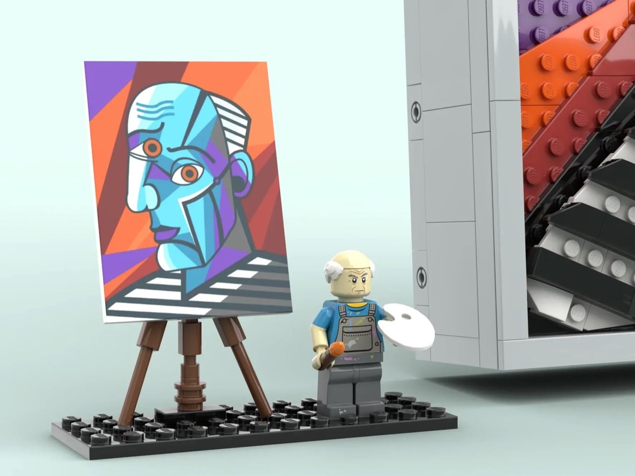
The set also includes a minifigure of Picasso himself, wearing paint-splattered overalls and a blue shirt, holding a brush with wet orange paint and a white mixing palette. He stands on a 12×4 black base alongside a brick-built easel displaying a miniature printed canvas of the original painting. It is a lovely piece of editorial wit: the master surveying his own recreation, the tiny figure dwarfed by the monumental panel beside him. The whole build can be displayed either propped on a surface or hung on a wall, with an optional grey frame that gives it that final gallery-ready finish.

LEGO Ideas is the official platform where fan-designed sets earn their shot at becoming real retail products. Any submission that crosses 10,000 supporter votes gets sent to LEGO’s internal review team, which evaluates it for potential production as a boxed set. CountVitalCauliflower102’s Picasso MOC is currently in the early stages of gathering support, with plenty of runway left on the clock. Given that LEGO has released Art sets celebrating Warhol, Hokusai, and even their own brick motif as wall art, a Picasso feels like a genuinely logical next chapter. If you want to help make that happen, you can head to the LEGO Ideas page and cast your vote.

The post This 1,117-Brick LEGO Picasso Build Proudly Belongs on Your Living Room Wall first appeared on Yanko Design.

Morocco’s Mohammed VI Tower: The Rocket That Rewrote Africa’s Skyline

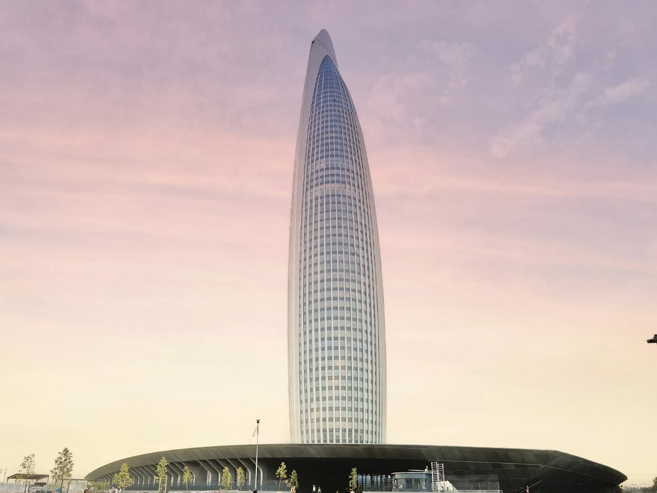
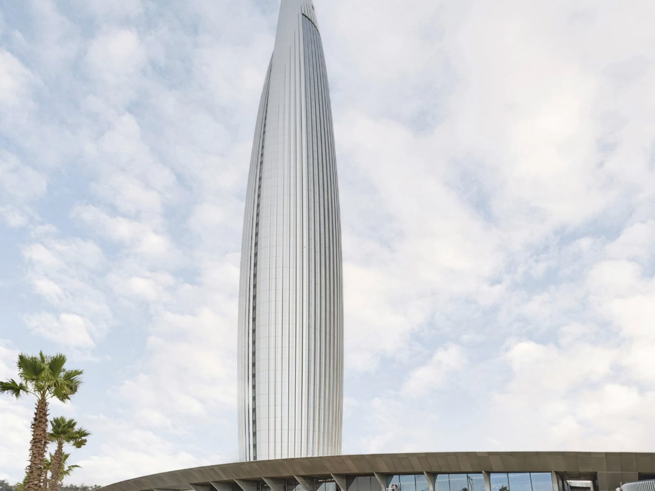
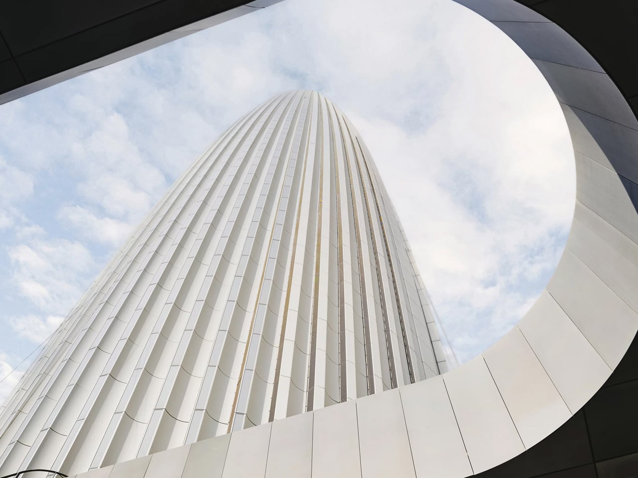
There are buildings, and then there are statements. The Mohammed VI Tower, inaugurated on April 23, 2026, in Salé, Morocco, belongs firmly in the second category. Rising 250 metres across 55 floors on the east bank of the Bouregreg River, it is now the tallest building in Morocco and the third tallest on the African continent. It did not arrive quietly. Visible from 50 kilometres in every direction, the tower has already redrawn the skyline that was once defined by centuries-old minarets.

The story behind it is as cinematic as the structure itself. Othman Benjelloun, the 93-year-old billionaire and chief executive of the Bank of Africa, conceived the idea decades ago after visiting a NASA facility ahead of the Apollo 12 mission. Standing before the Saturn V rocket, he saw not just a machine but a metaphor. That image, a rocket braced on its launchpad and ready to ascend, became the architectural soul of the tower. Spanish architect Rafael de la Hoz and Moroccan architect Hakim Benjelloun translated that vision into steel, glass, and concrete, producing a silhouette that reads like liftoff frozen in time.

Designer: Rafael de la Hoz and Hakim Benjelloun

The tower is far more than its form. Across its 102,800 square metres of floor area, it houses a Waldorf Astoria hotel, premium offices, high-end residential apartments, retail spaces, and a panoramic observation deck at its crown. Interior design was handled by Pierre Yves Rochon, with furniture and fittings curated by FLAMANT. The facade spans 70,000 square metres and integrates solar panels, while a tuned mass damper ensures stability at height. The building holds both LEED Gold and HQE sustainability certifications, setting a benchmark for green construction across the continent.

Construction began in July 2017 and was delivered by BESIX in a joint venture with TGCC, Six Construct, and the China Railway Construction Corporation, with a total cost of 3.5 billion Moroccan dirhams, roughly $700 million. The project forms the centrepiece of the Bouregreg Valley Development, a broader effort to transform Rabat into a city of international standing ahead of the 2030 FIFA World Cup, which Morocco will co-host.

Not everyone is celebrating at the same altitude. Critics point out that major investment continues to concentrate along Morocco’s Atlantic corridor, while inland regions contend with high unemployment and uneven public services. The tower, they argue, is a monument to ambition that has yet to translate into equity.

Still, as an act of architecture, the Mohammed VI Tower is difficult to argue with. Rafael de la Hoz and Hakim Benjelloun have given Morocco something rare: a building with a founding myth, a bold form, and the scale to match both.

The post Morocco’s Mohammed VI Tower: The Rocket That Rewrote Africa’s Skyline first appeared on Yanko Design.

Samsung Galaxy S27 Ultra Might Finally Break the 5,000mAh Barrier

Samsung Galaxy S27 Ultra Might Finally Break the 5,000mAh Barrier Battery lab photo showing silicon-carbon cell cycling tests after durability concerns seen during S26 Ultra trials.

The Samsung Galaxy S27 Ultra, once positioned as a potential benchmark for smartphone innovation, faces a complex interplay of advancements and limitations. While the device introduces several noteworthy upgrades, challenges in design, technology integration, and pricing strategies suggest that Samsung may be reserving its most fantastic features for the Galaxy S28 series. Below is an […]

The post Samsung Galaxy S27 Ultra Might Finally Break the 5,000mAh Barrier appeared first on Geeky Gadgets.

Posted in Uncategorized

Why Claude’s Design Agents Are Changing How AI Workflows Operate

Why Claude’s Design Agents Are Changing How AI Workflows Operate Diagram showing the six architectural patterns of Claude Design agents

Claude’s design agents are a method for building adaptable systems capable of responding intelligently to user needs, as explained by Sam Witteveen. A defining aspect of their architecture is agentic context grounding, which enables the agents to adjust outputs based on factors like user preferences, prior interactions and specific input details. For example, when generating […]

The post Why Claude’s Design Agents Are Changing How AI Workflows Operate appeared first on Geeky Gadgets.

Posted in Uncategorized