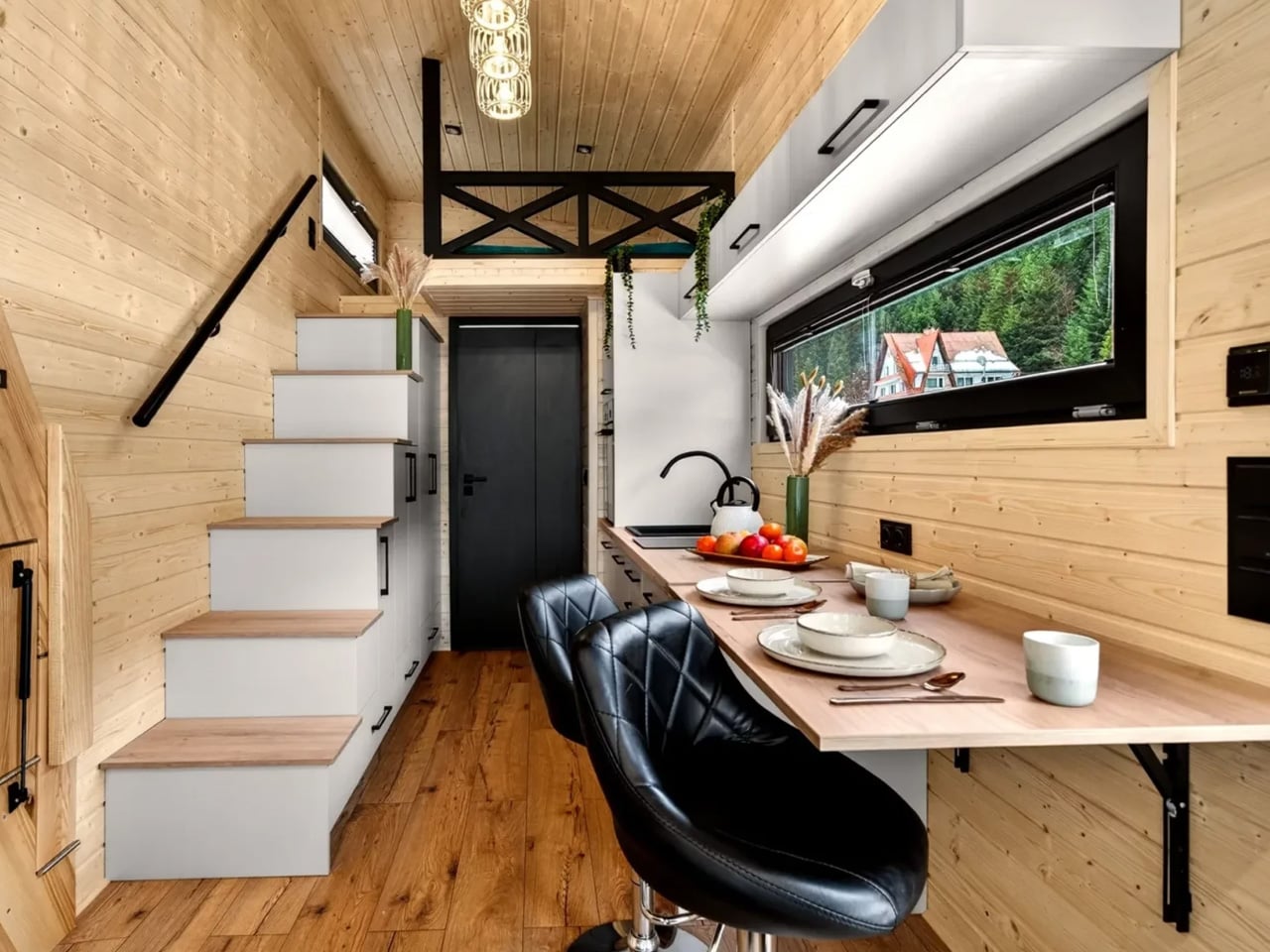
The first apartment is never really about square footage. It’s about the gap between the life you imagined and the room staring back at you. White walls, borrowed furniture, a kitchen where nothing is where it should be. Graduation gifts usually fill that gap with sentiment. These fill it with design. Ten objects chosen because they solve something real, look good doing it, and make a bare space feel considered.
None of them requires assembly instructions or a decorator on speed dial. They fit wherever there’s room, carry their weight in both form and function, and give the impression that whoever received them has been thinking about how to live well for longer than they have. That’s the point of a good graduation gift. Not something used once and forgotten. Something that makes the shuffle a little easier to land.
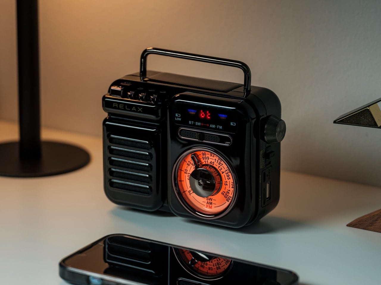
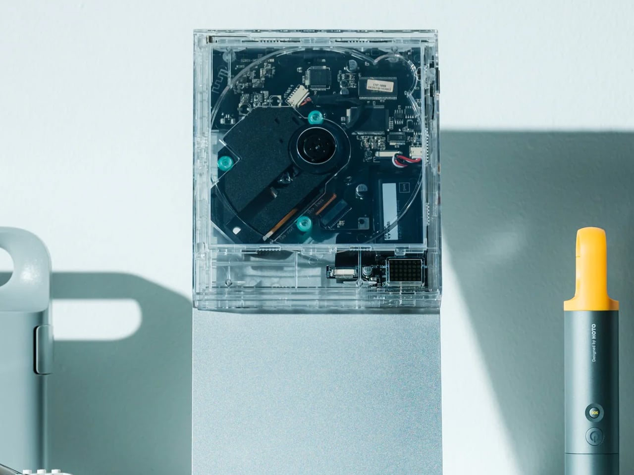
1. ClearFrame CD Player
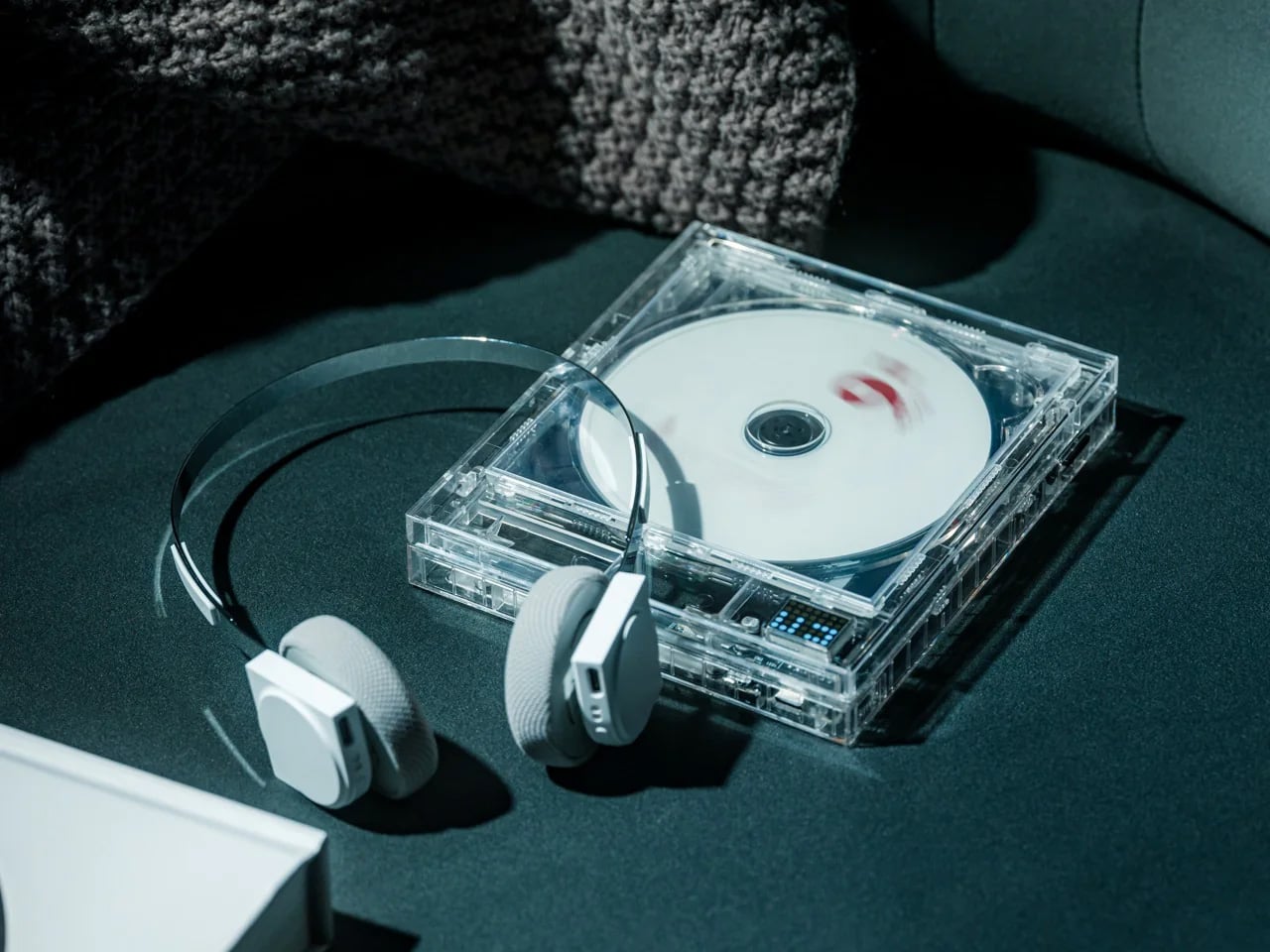
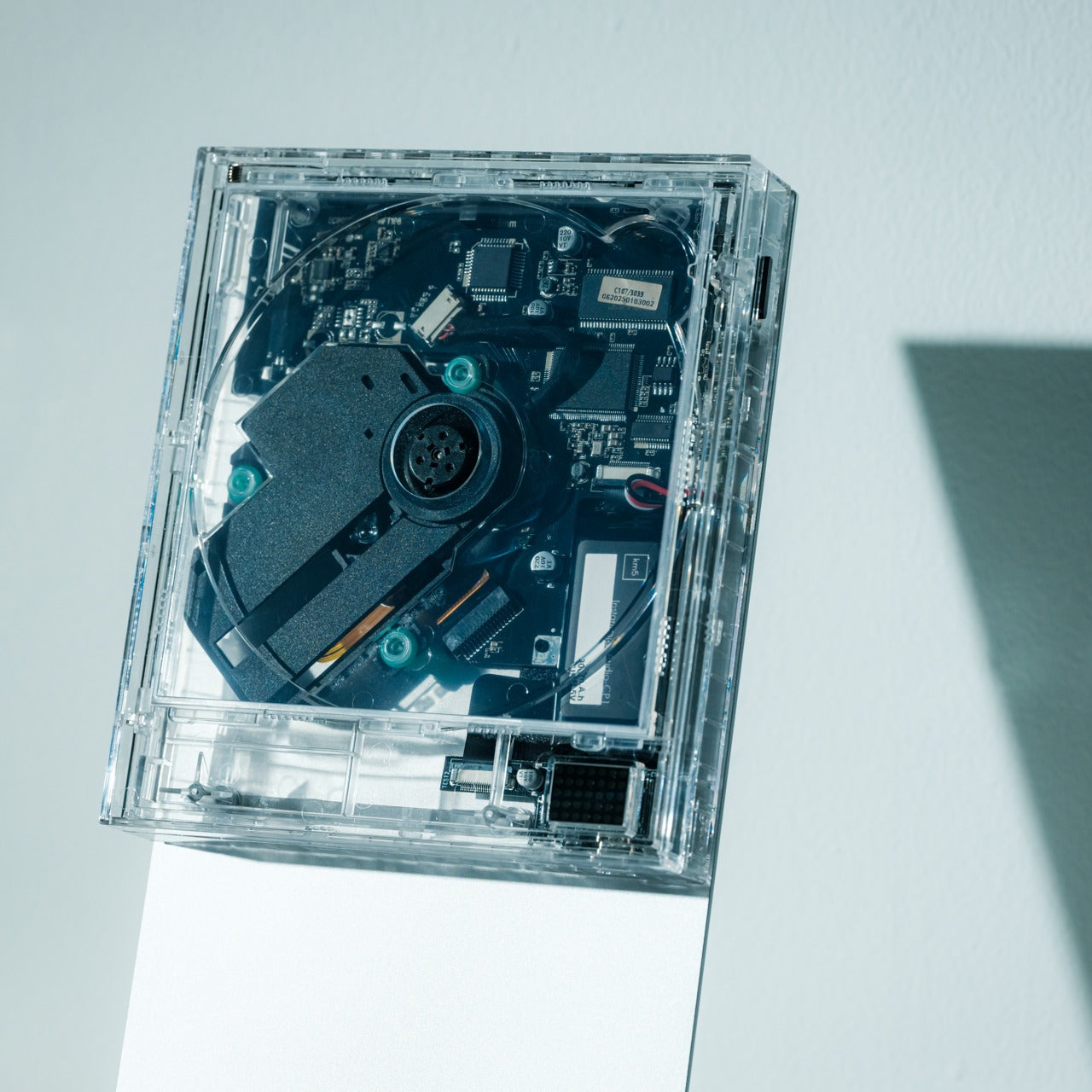
The ClearFrame CD Player is for the grad who already knows what they’re about. It plays physical CDs through a transparent frame that keeps the disc visible while it spins, turning the act of listening into something you can actually watch. In a generation that grew up on invisible streaming, there’s something genuinely refreshing about a music player that makes its mechanism the main event rather than hiding it behind a matte plastic casing.
A first apartment shelf rarely has any visual anchor in the early weeks. The ClearFrame takes up almost no visual weight while still giving a room a focal point worth looking at. It earns its place not just as a player but as an object with a point of view, which matters when you’re building a space from scratch, and everything you put in it says something about who you are before a single thing is hung on the walls.
Click Here to Buy Now: $200.00
What we like
- The transparent frame makes the spinning disc part of the visual experience, turning playback into something physical and deliberate in a way that streaming platforms never quite replicate.
- The compact, minimal footprint means it earns shelf or desk space without displacing other objects, sitting confidently without demanding the room be arranged around it.
What we dislike
- Getting real value from the ClearFrame requires an existing CD collection, which means it works best as a gift for someone already invested in physical music formats.
- The analog format is a deliberate choice that won’t resonate with graduates who have no interest in stepping back from digital and streaming convenience.
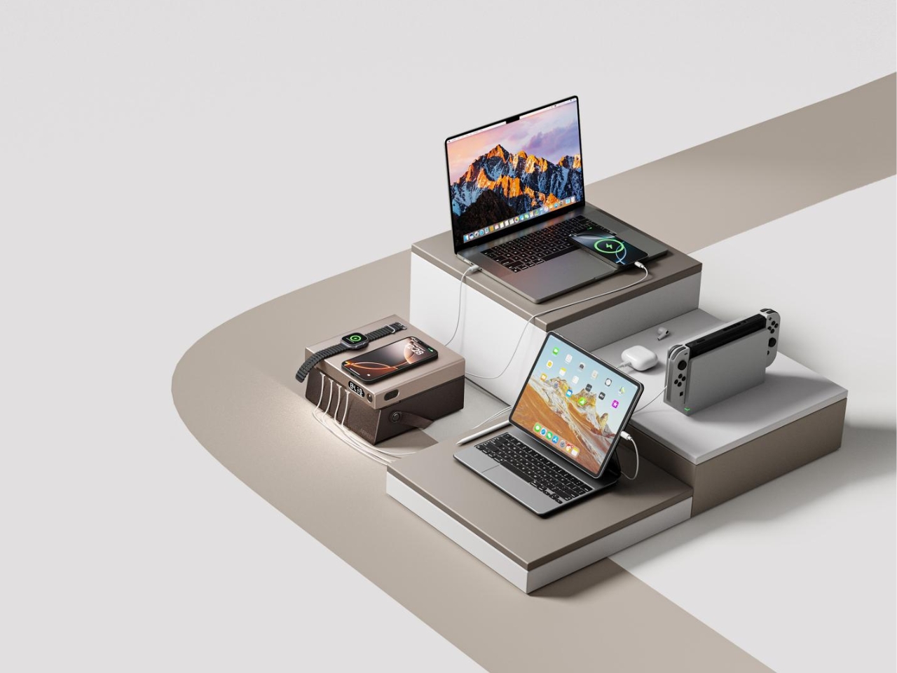
2. Rokform 3-in-1 Foldable Wireless Charging Stand
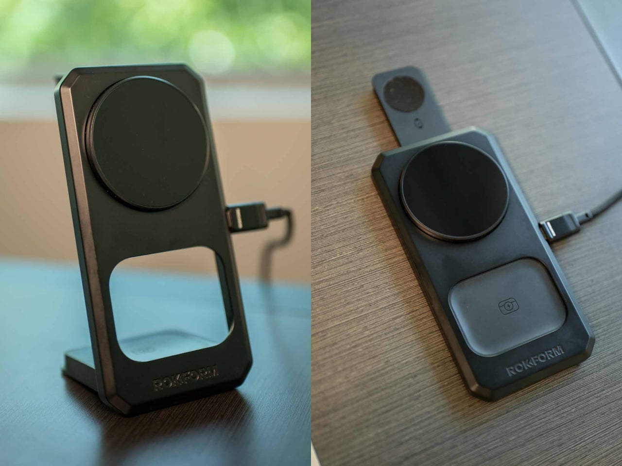
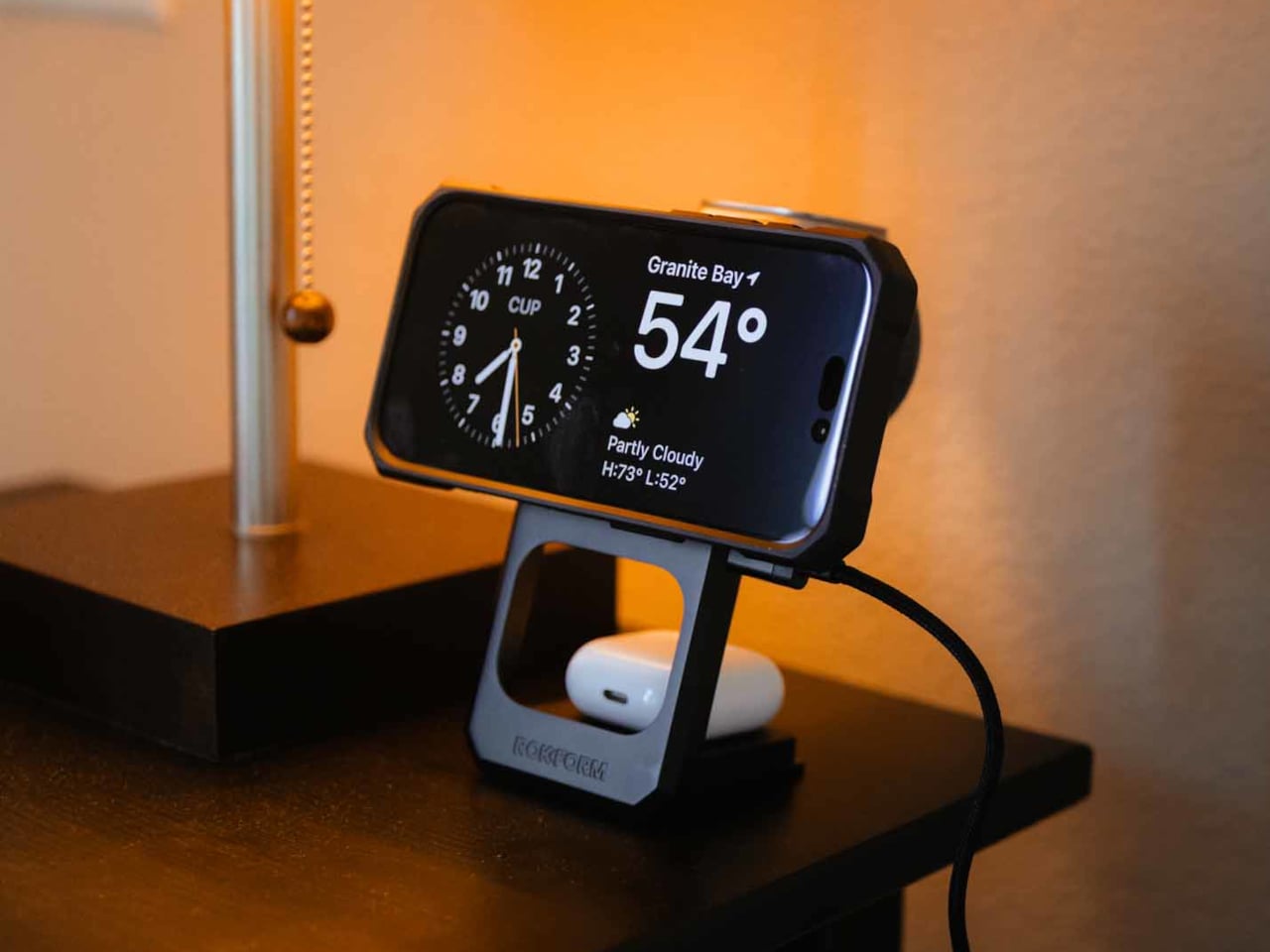
The nightstand problem in a first apartment isn’t about the nightstand. It’s about everything that ends up on it. Three devices, three cables, a different charger for each one, and a surface that looked intentional for exactly two days before it didn’t. The Rokform 3-in-1 Foldable Wireless Charging Stand replaces all of it with a single zinc alloy and glass unit that charges a phone at 15W, an Apple Watch from a fold-out arm, and earbuds on a separate pad. One cable in. Three devices done.
The build quality is the detail that separates this from the category it belongs to. Zinc alloy and glass don’t flex or slide. The stand stays exactly where you put it at midnight when you’re reaching for your phone by feel. For a grad setting up a bedside situation in a space that has no established routine yet, the Rokform removes one of the small daily frictions before it has a chance to become a habit. A charged phone, a charged watch, and a surface that looks considered rather than accumulated.
What we like
- A single USB-C cable powers all three charging surfaces simultaneously, collapsing an entire nightstand cable situation into one clean connection that takes thirty seconds to set up.
- Zinc alloy and glass construction put the Rokform in a different material category from the plastic pads that flex and slide, giving it a density and permanence that reads immediately in the hand.
What we dislike
- The Apple Watch arm is purpose-built for that ecosystem, which means anyone outside the Apple Watch world loses a full third of the unit’s function without a meaningful workaround available.
- At $100, the Rokform is priced above the average wireless charger, and those who only need to charge a single device will find the multi-device design hard to justify at that price point.
3. 3D-Printed Kumiko Panel
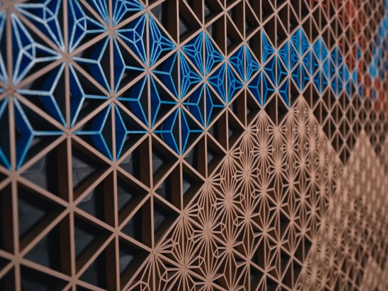

Traditional Kumiko panels are the kind of object that stops a conversation cold. The geometric latticework, built from interlocking wooden slivers without a single nail, has been a fixture of Japanese craft for centuries. Authentic wall-sized versions start around $2,700 and rarely leave galleries. This 3D-printed version by a Canadian maker — three months in the perfecting — brings that same hypnotic interplay of light and shadow to a first apartment wall at a fraction of the price and commitment.
A blank wall is the first problem every new apartment presents, and the last one anyone figures out how to solve. A framed print says something. A Kumiko panel says something else entirely — that the person who hung it knows exactly where they stand on craft, patience, and the kind of beauty that doesn’t need to explain itself. It catches light differently through the day, creates depth on a flat surface, and turns the emptiest wall in a room into the one everyone ends up standing closest to.
What we like
- The geometric latticework creates shifting light and shadow patterns that change with the time of day, giving a blank wall a visual life that no poster or print can replicate.
- At a fraction of the cost of authentic hand-carved Kumiko panels, it brings genuine craft-referencing design into a first apartment without the gallery price tag attached.
What we dislike
- The 3D-printed plastic construction lacks the warmth and material depth of traditional wood Kumiko, which may feel like a meaningful compromise to those familiar with the authentic version.
- The panel works best as a wall-mounted piece, which means hanging hardware and a commitment to a specific spot — something a first apartment with rental restrictions may complicate.
4. Ritual Card Diffuser
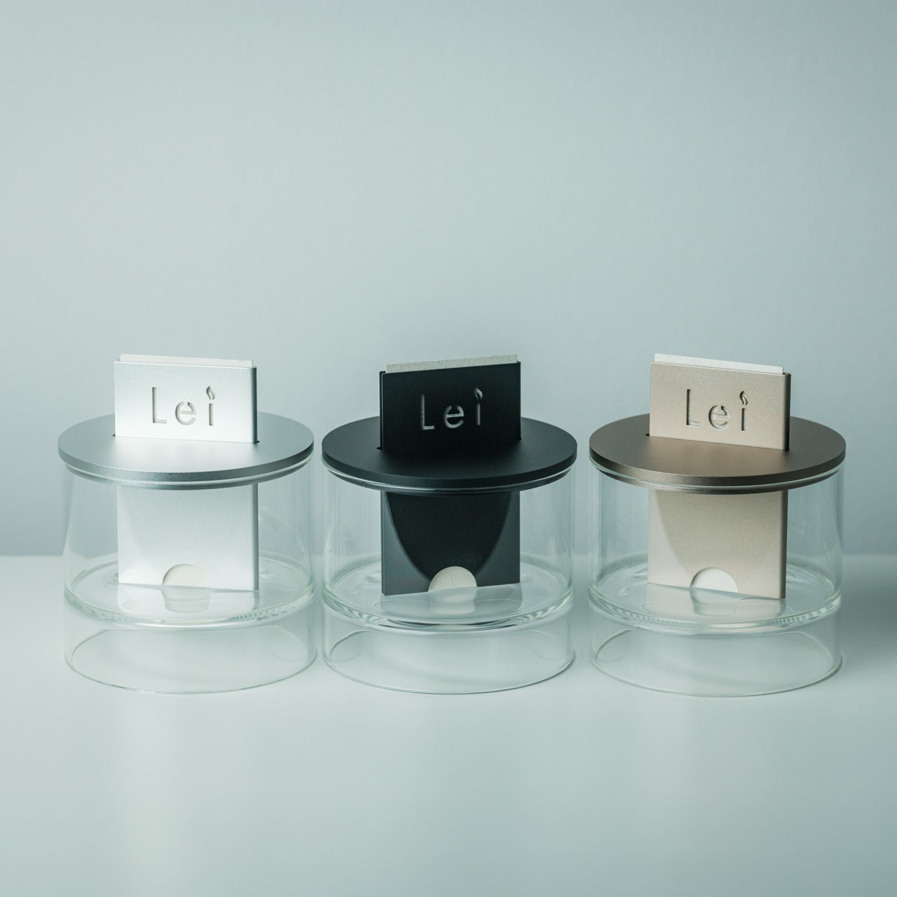
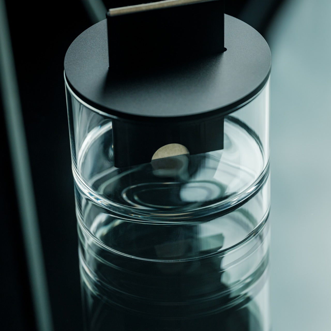
The first thing a new apartment needs isn’t furniture. It’s a scent that makes it feel like yours. The Ritual Card Diffuser from the Yanko Design shop uses fragrance cards to release scent gradually, building an atmosphere that doesn’t announce itself so much as settle in. No plug, no maintenance cycle, nothing that fights for counter space. It works in the background, the way the best objects do, making the room feel lived in before it actually is.
For a grad moving into their first real space, the Ritual Card Diffuser is less about fragrance and more about the idea that this room has been thought about. That effort matters. The card format keeps things clean and swappable, so the scent can shift with the season or the mood without committing to a single identity. For someone figuring out who they are in a new space, that flexibility lands exactly right from the very first week.
Click Here to Buy Now: $89.00
What we like
- The card system allows scent profiles to be swapped without replacing the unit, giving it flexibility that traditional reed diffusers simply cannot match as taste evolves.
- No cord, no heat element, and no liquid means it occupies no counter real estate and creates zero maintenance overhead in a space still being figured out.
What we dislike
- Replacement cards are a recurring cost that adds up over time and needs to be factored in when gifting this to someone on a tight post-graduation budget.
- The scent throw may feel subtle in open-plan spaces or rooms with high ceilings, where a stronger diffusion method might be more appropriate.
5. Orgdot N200 Desktop Speaker
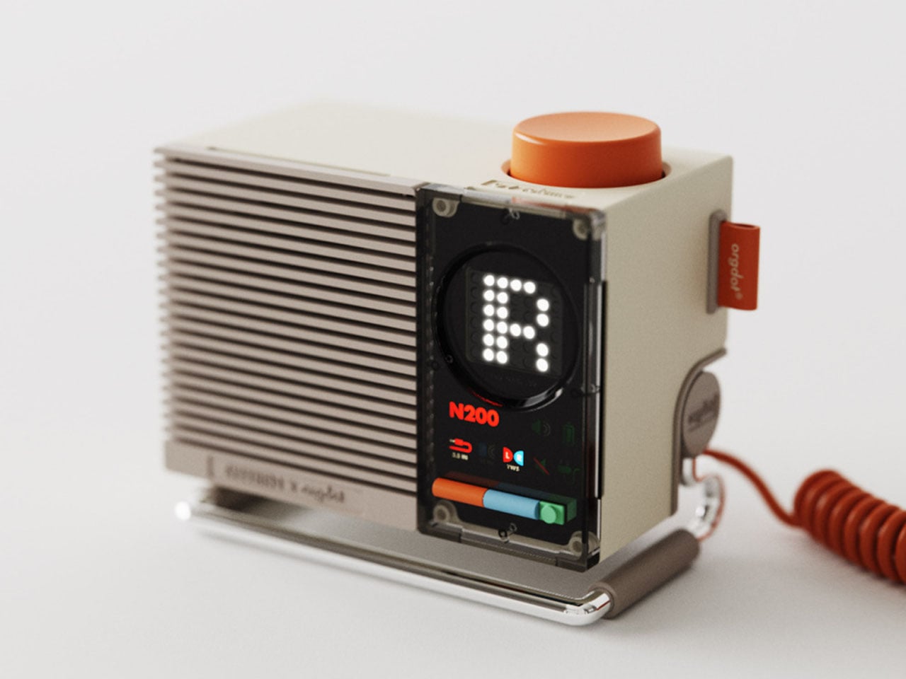
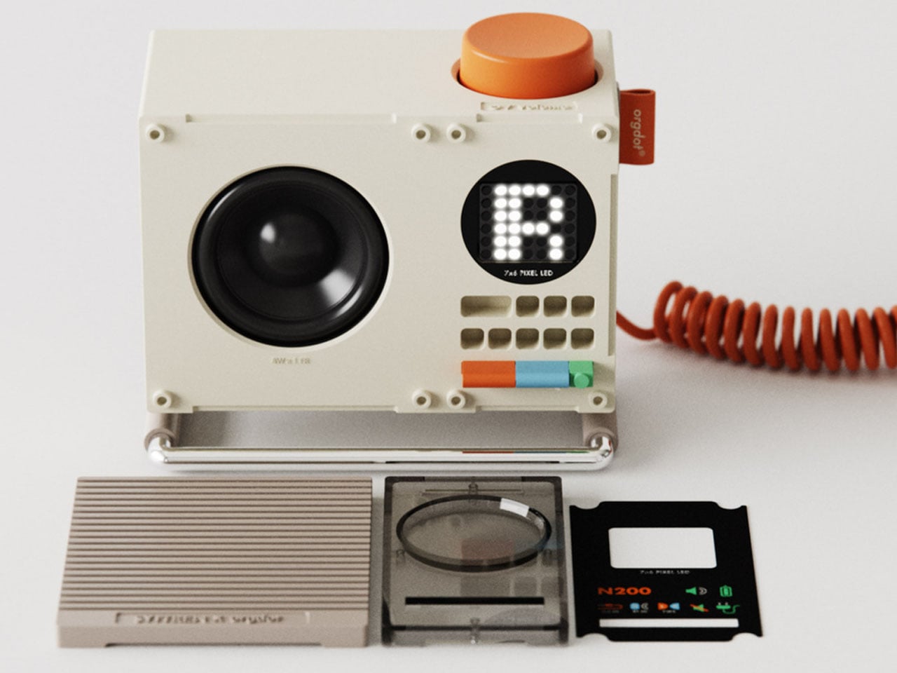
Bluetooth speakers are everywhere, but few carry this much personality. The Orgdot N200, designed by Shu Zhang, pulls from industrial and steampunk aesthetics in a way that sits closer to Teenage Engineering than anything you’d find at a big-box electronics retailer. Exposed mechanical elements and a retro-modern silhouette give it a design sensibility that reads just as well from across a room as it does up close. It connects wirelessly and earns whatever surface it lands on.
In a first apartment where the speaker is often the only real sound system in the space, the N200 carries that responsibility well. It fills the room visually before you’ve even pressed play, and that matters in a space that doesn’t have much else going on yet. Pairing it with the ClearFrame CD Player builds a small analog audio corner that looks curated rather than assembled. Two objects. Real presence. No interior design degree required.
What we like
- The retro-industrial design aesthetic gives a first apartment an instant visual anchor at desk or shelf level, doing decorative work that most Bluetooth speakers never attempt.
- Wireless Bluetooth connectivity removes the need for cable management entirely, keeping the surface clean and the setup honest to the minimalist silhouette the N200 projects.
What we dislike
- The distinctive aesthetic is a strong personal statement that reads very specifically, and it genuinely won’t suit every taste or complement every design direction a room might take.
- Desktop placement limits the direction the sound can effectively project, which may leave larger rooms feeling like the speaker is working harder than it should have to.
6. AromaCraft Clothes Brush

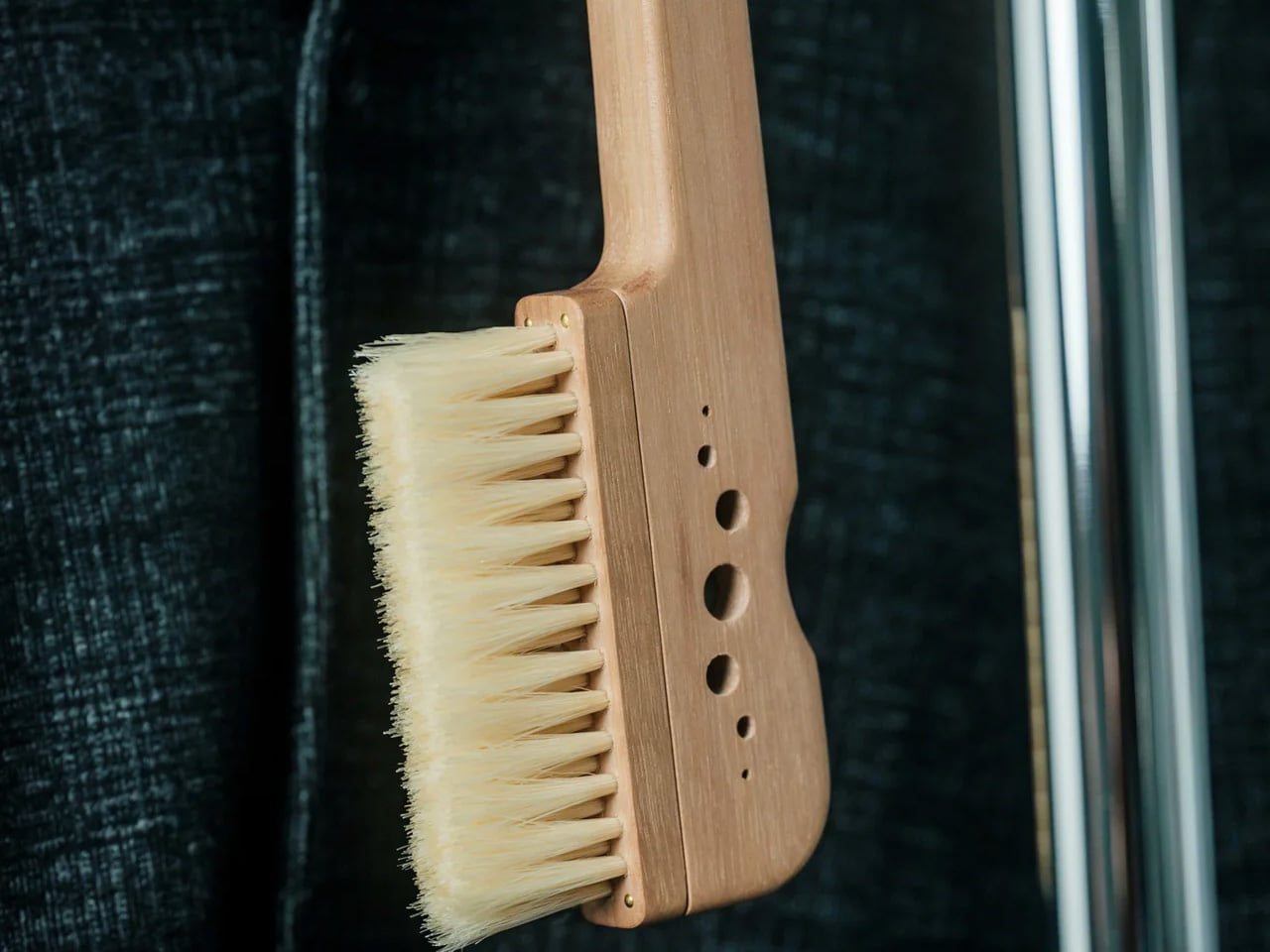
Lint rollers solve a problem. The Aromacraft Clothes Brush solves it better. It handles the everyday task of removing lint, dust, and the general debris of daily life from clothing while folding a subtle aroma element into the ritual. It’s a small but meaningful shift in how a mundane task feels, one that turns the two-minute pre-work brush-down into something closer to a considered grooming moment worth actually doing.
For a grad entering a professional world where first impressions matter more than they did in a lecture hall, getting dressed well becomes a new priority. The Aromacraft Clothes Brush handles the physical part and adds a sensory layer that a standard bristle brush simply ignores. It’s the kind of object that makes morning routines feel like they were designed rather than stumbled into. Small enough to store on any shelf, purposeful enough to reach for every single day.
Click Here to Buy Now: $149.00
What we like
- Combining garment care and scent into one object removes the need for two separate tools, which matters in a first apartment where counter and shelf space are genuinely limited.
- The aroma element reframes a utilitarian task as part of a morning ritual, which is a small but real shift in how a workday begins for someone newly navigating professional life.
What we dislike
- The aroma component will eventually lose its potency and need to be refreshed or replaced, adding a recurring step that a standard clothes brush simply doesn’t require.
- Graduates who are sensitive to fragrance or prefer entirely scent-neutral routines won’t benefit from the secondary function the Aromacraft is specifically built around.
7. RUNERO PRO Coffee Maker
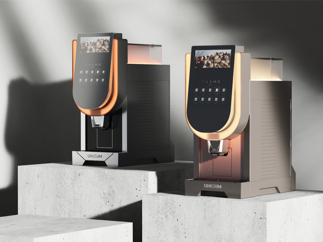
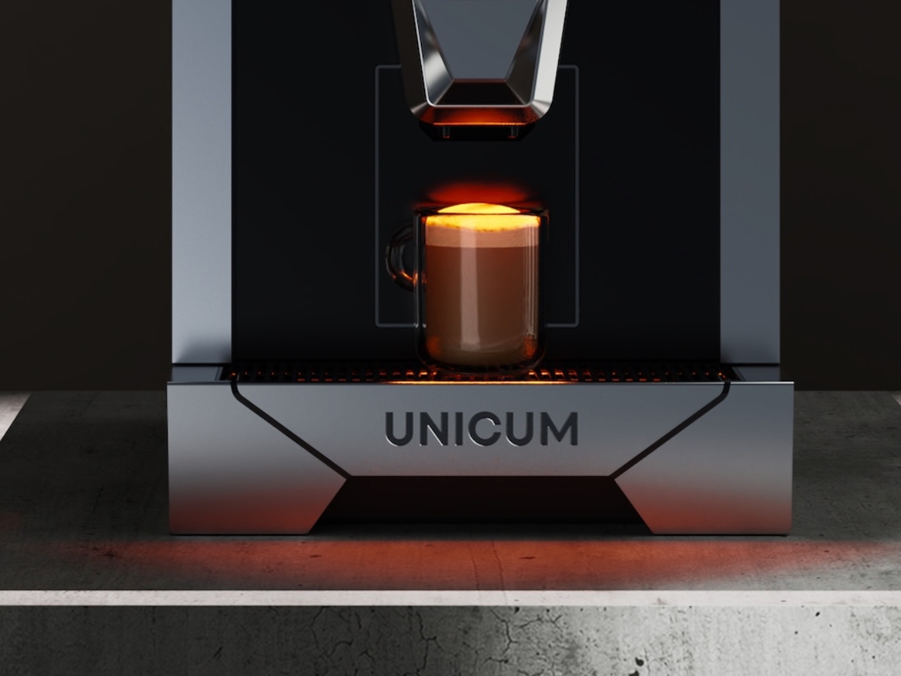
Designed by Ksenya Ilyukhina for Unicum, the RUNERO PRO lands in a kitchen and immediately makes the rest of the counter look like a placeholder. The brushed aluminum exterior is dense and considered, and the 15-inch LED touchscreen keeps controls front and center without adding visual clutter. Face ID recognition and voice control mean it learns how each person takes their coffee and starts acting accordingly, removing the ritual fumbling of a first-time morning routine from the equation.
The RUNERO PRO is not the kind of coffee machine you buy because you need coffee. You can get coffee anywhere. It’s the kind you buy because the kitchen is where a first apartment gets taken seriously, and the right appliance signals that you’re starting this chapter with real intention. For a grad who spent four years surviving on campus brews, landing a machine that knows their order from a glance changes the rhythm of every weekday morning.
What we like
- Face ID recognition and voice control make personalizing and recalling coffee preferences genuinely effortless, removing the repetitive manual input that most smart appliances still demand daily.
- The brushed aluminum construction and large touchscreen interface place the RUNERO PRO visually above the category of kitchen appliances it technically belongs to, which matters when the counter is also the room’s focal point.
What we dislike
- The high-tech interface adds meaningful complexity that may feel excessive for those who want a reliable, straightforward coffee machine without a learning curve attached to it.
- The premium build and integrated technology come at a price point that commits to the kitchen in a way that not every graduating budget can reasonably absorb in year one.
8. Fellow Stagg EKG Pro Kettle
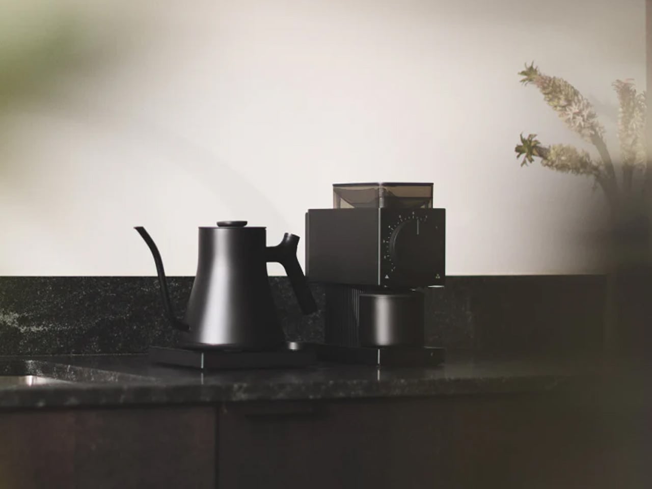
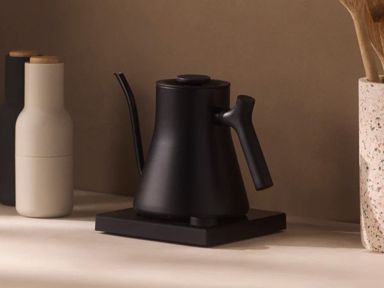
The Fellow Stagg EKG Pro has been the design world’s favorite electric kettle long enough to earn its reputation several times over. The gooseneck spout handles pour-over coffee with precision, but the design reads just as well when it’s sitting on the counter doing nothing at all. Matte finish, a handle that earns its curve, and temperature precision through a minimal dial interface. It’s the kettle that makes a first kitchen counter look like someone considered exactly what they put on it.
Alongside the RUNERO PRO, the Stagg EKG forms the second half of a morning kitchen that actually functions. Where the RUNERO handles the automated side of coffee, the Stagg gives control back over water temperature for pour-over, tea, or anything that asks for more precision than a standard kettle provides. For a grad building a first kitchen from the counter outward, both objects together say more about how they intend to live than most furniture choices ever could.
What we like
- Precision temperature control makes the Stagg EKG genuinely useful across pour-over coffee, tea, and any other preparation that demands more than a simple boil and pour.
- The gooseneck silhouette has earned its place as a design standard that transcends trend cycles, meaning it will still look right on the counter five years from now.
What we dislike
- The premium price point is a real consideration for a kettle, even one this well resolved, and it may feel difficult to justify against other first-apartment priorities competing for the same budget.
- The capacity is calibrated toward one or two people, which means it may feel undersized in shared living situations where multiple people need hot water at the same time.
9. TWIST Side Table
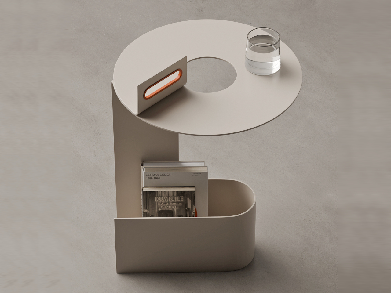
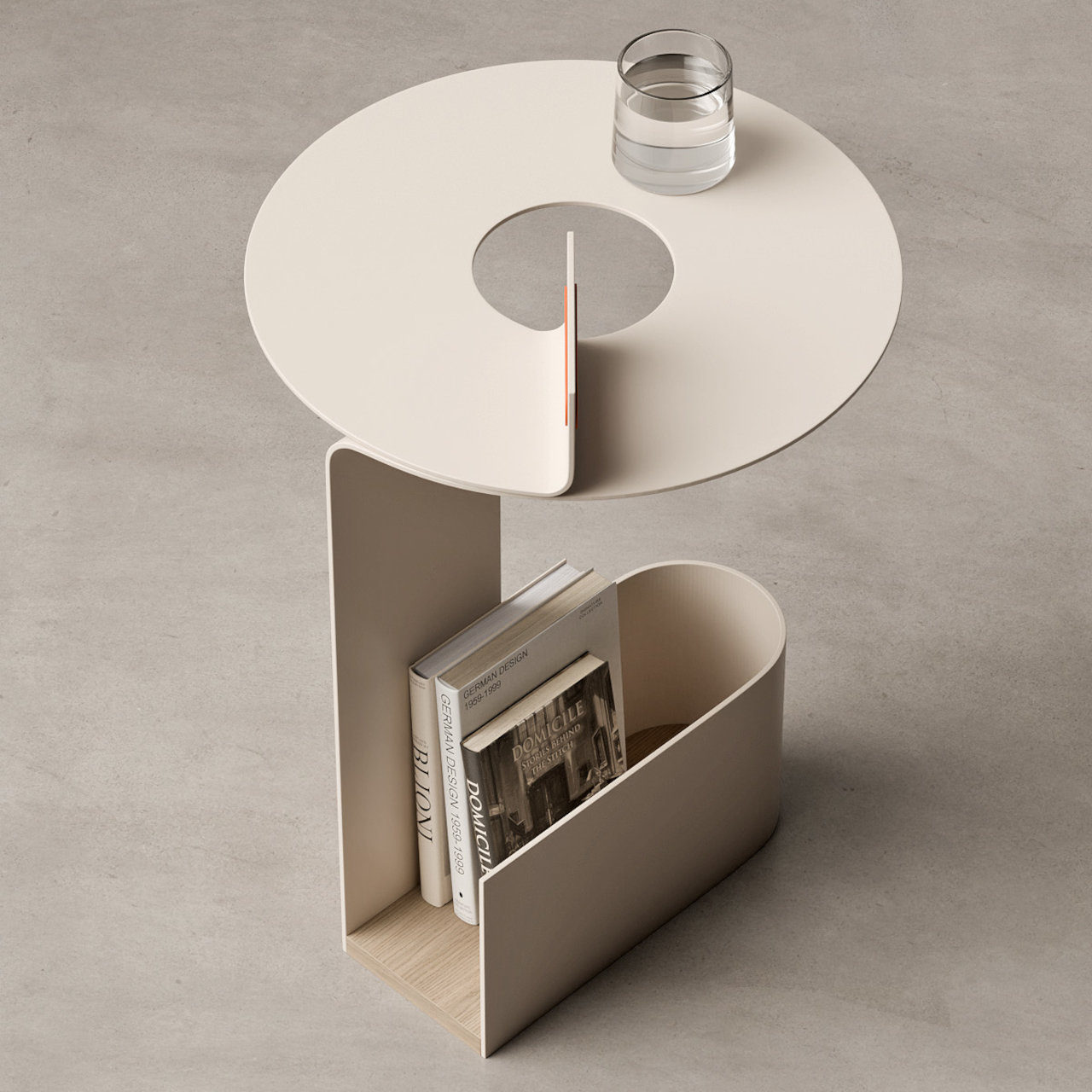
The TWIST side table is made from a single sheet of metal folded in a continuous loop to form a tabletop, an integrated storage ledge, and a carry handle in one uninterrupted gesture. The matte light beige body pairs with a pale wood base and a small orange accent at the handle. It weighs almost nothing visually. In a first apartment where every surface is being asked to do more than one job, the TWIST handles it without complaint, holding a drink, a book, a phone, and a spare set of keys without making any of it feel like a compromise.
The carry handle is not an afterthought. It’s part of the same metal loop that forms the table, which means the whole object relocates in one motion. From beside the bed to beside the couch to near the window where the light hits differently on a Sunday. For a grad whose first apartment still has furniture in flux, an object that moves as easily as the plan does becomes indispensable by the second week of living with it.
What we like
- The single-piece metal construction means the tabletop, storage shelf, and carry handle are all one continuous form, giving the TWIST a structural honesty that assembled furniture simply cannot match.
- The integrated handle makes relocation a one-handed, one-second decision, which matters in a first apartment where the ideal layout takes several months of trial to actually arrive at.
What we dislike
- The circular metal profile limits the usable surface area, which means anything larger than a mug, a book, or a phone asks for more real estate than the tabletop comfortably offers.
- The concept-driven design places aesthetics at the center of the object, and those who prioritize pure utility over visual intention may find other side tables a more practical first apartment investment.
10. Arca Modular Furniture System
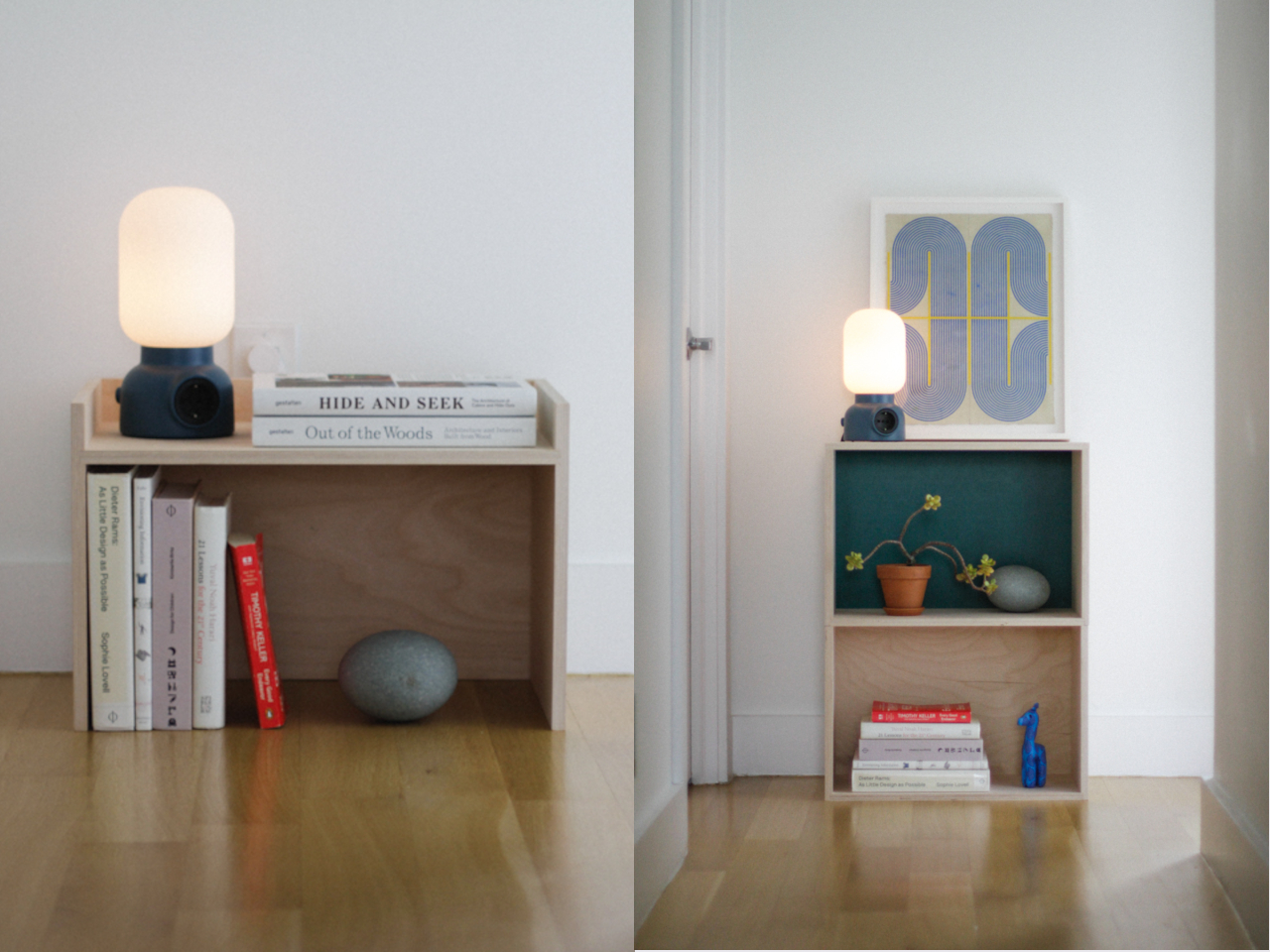
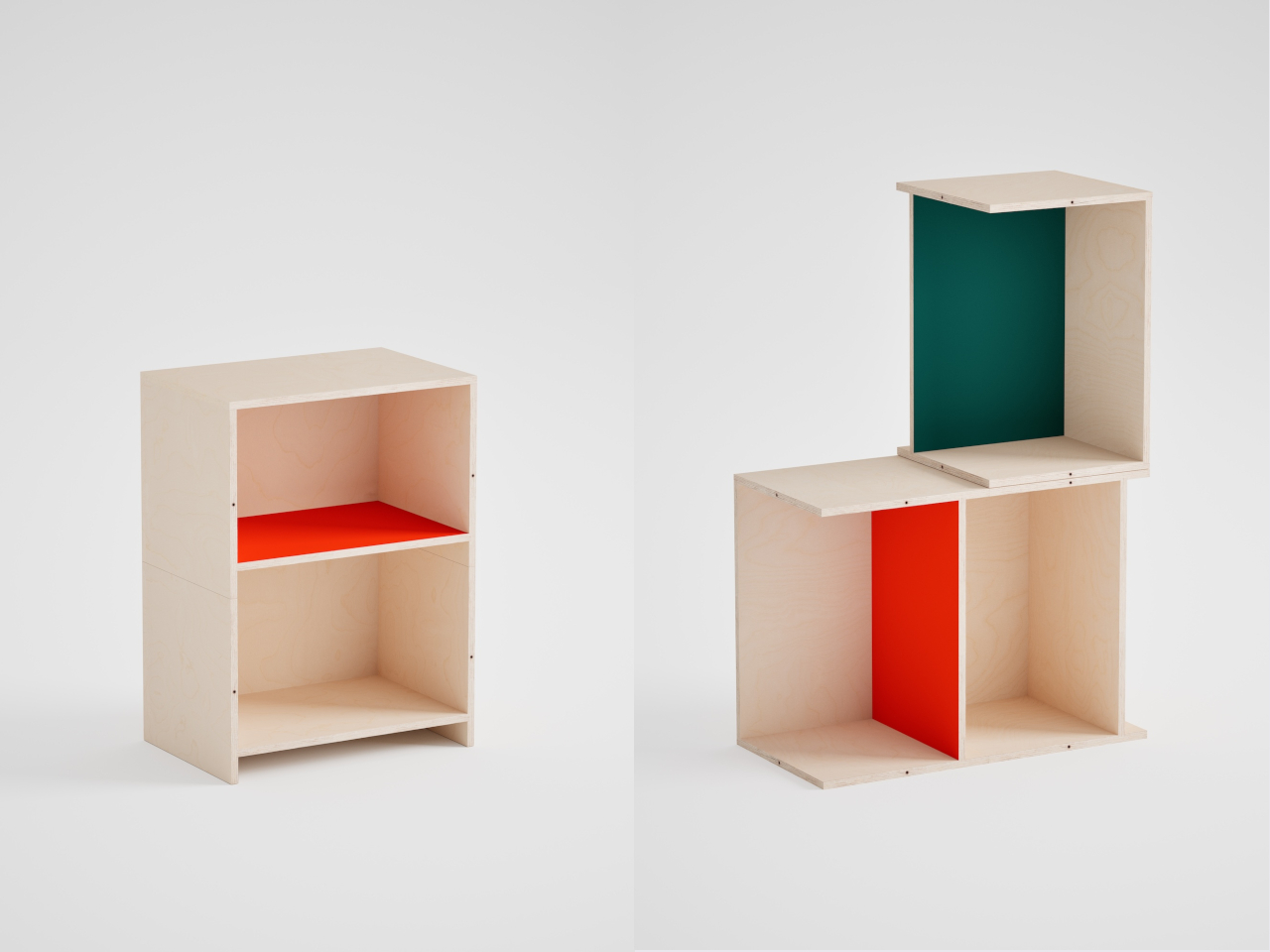
The Arca modular system from Elements Studio is the most practical thing on this list and possibly the most useful gift a 2026 grad can receive. Each piece works as a nightstand, a bench, a bookshelf, or a storage unit, depending on what the space needs that week. Stack them vertically for a shelf tower. Line them horizontally for a low credenza. Pull one out to use as a standalone stool. No tools required, no configuration that can’t be undone in sixty seconds.
The first apartment rarely stays the same for more than a few months. Roommates arrive and leave. Jobs change the schedule. A bedroom becomes a home office on Tuesday and a reading room by the weekend. The Arca grows with all of it because it was designed to. For a grad who is spending the next few years figuring out how they want to live, this is the furniture system that doesn’t ask them to decide right now. It just adapts, reconfigures, and moves with them into whatever comes next.
What we like
- The tool-free modular configuration means the entire system can be rearranged to serve a completely different function in under a minute, without any commitment to a permanent layout.
- The versatility across nightstand, shelf, bench, and storage roles effectively replaces several pieces of furniture with one considered system, which is a genuine win for a first apartment with limited floor space.
What we dislike
- The modular format works best as a set, and a single piece loses much of its system-level appeal, meaning the gift lands better when multiple units are given together rather than one at a time.
- The design language is deliberately restrained and neutral, which gives it broad compatibility but may feel too quiet for graduates who want their furniture to make a stronger visual statement.
The Shuffle Doesn’t Last. Good Design Does.
The first apartment doesn’t have to feel like a waiting room for the real thing. These ten objects treat it as exactly what it is — the beginning of a considered life, assembled one good decision at a time. Each one earns its place not because it fills space but because it solves something, holds its own visually, and gives whoever receives it the sense that they already know how they want to live. That confidence, quietly installed, is the real graduation gift.
The shuffle is part of it. Figuring out where the lamp goes, which corner becomes the morning corner, and what the kitchen means when it’s entirely yours. Good design makes that process feel less like a problem to solve and more like a space to settle into. These ten picks sit at that intersection, functional enough to matter from the first week, considered enough to stay relevant well past it.
The post 10 Best Graduation Gifts For 2026 Grads That Solve the First-Apartment Shuffle first appeared on Yanko Design.