Humans Once Read the Stars to Tell Time, This Watch Abstracts Them Into Typographic Asterisks

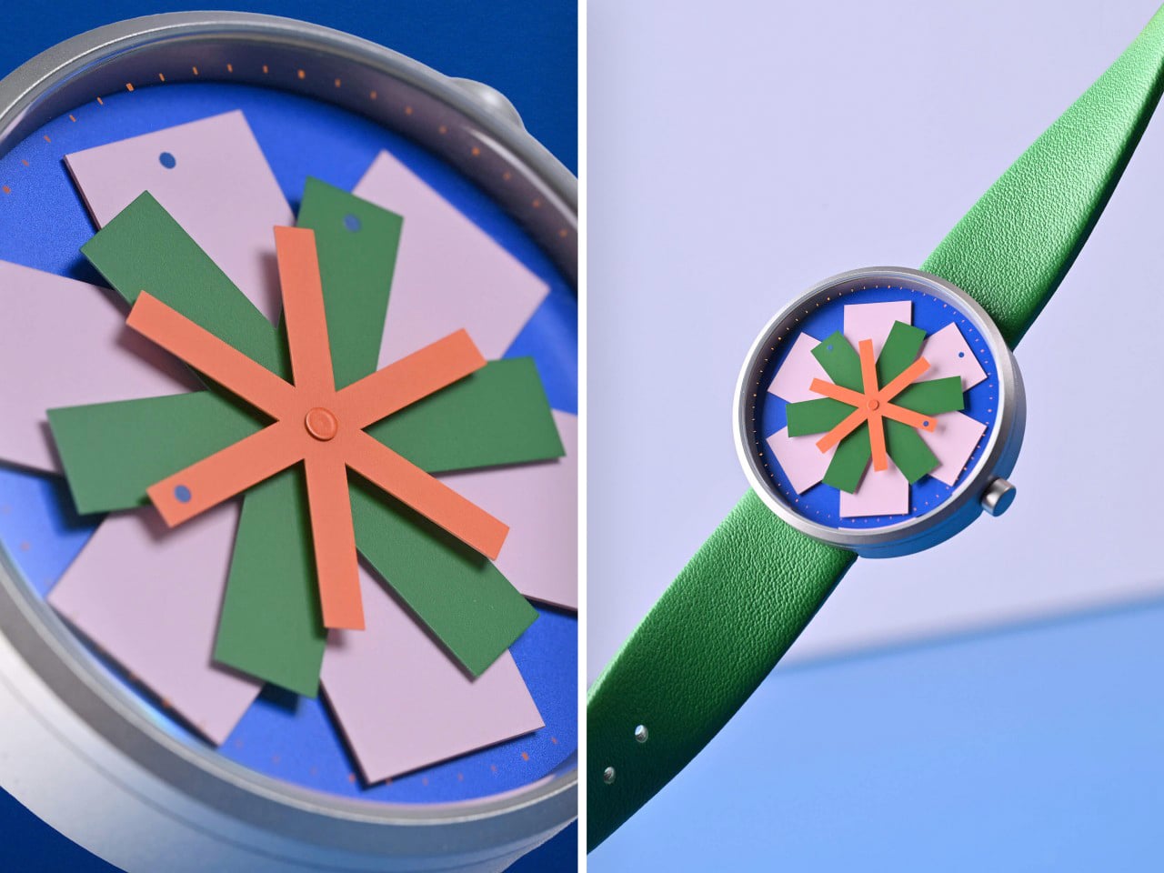
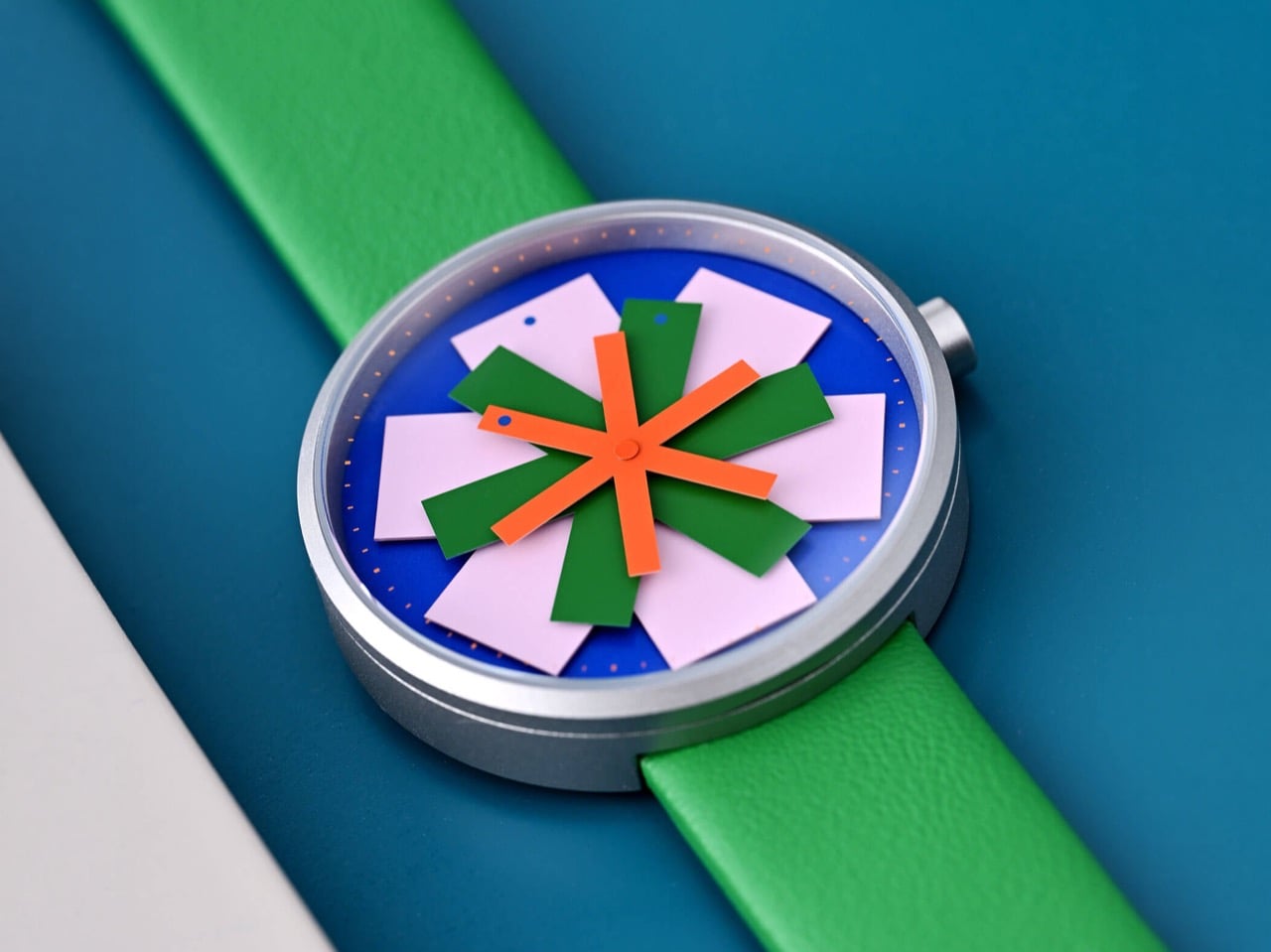
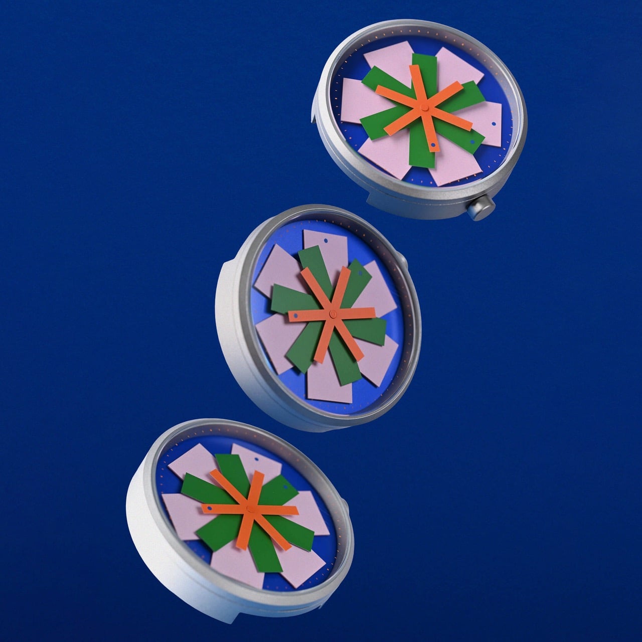
The asterisk earned its name from the Greek word for little star, and most of us spend our whole lives treating it as a footnote marker, the small thing that points at some other, more important thing. Raw Color, the Eindhoven studio behind STELLAR, looked at that humble little glyph and decided it deserved top billing. Their new watch for Anicorn’s Trio of Time series puts three asterisks right on the dial, in orange, green, and pink, and sets the whole lot spinning. It is the rare watch where the punctuation is the point.

Here is the clever bit. Each asterisk is a hand, and one arm on each carries a single colored dot, and that dot is what actually tells you the hour, the minute, and the second. The arms turn at their own speeds, so the dial keeps rearranging itself into loose, blooming star shapes that drift apart and then occasionally lock back into clean symmetry. Humans once stared up at actual stars to figure out what time it was and which way to sail home. STELLAR takes those stars, abstracts them into typography, scatters them across a cobalt face, and somehow still tells you it is quarter past three.

Designer: Raw Color (Christoph Brach & Daniera ter Haar)
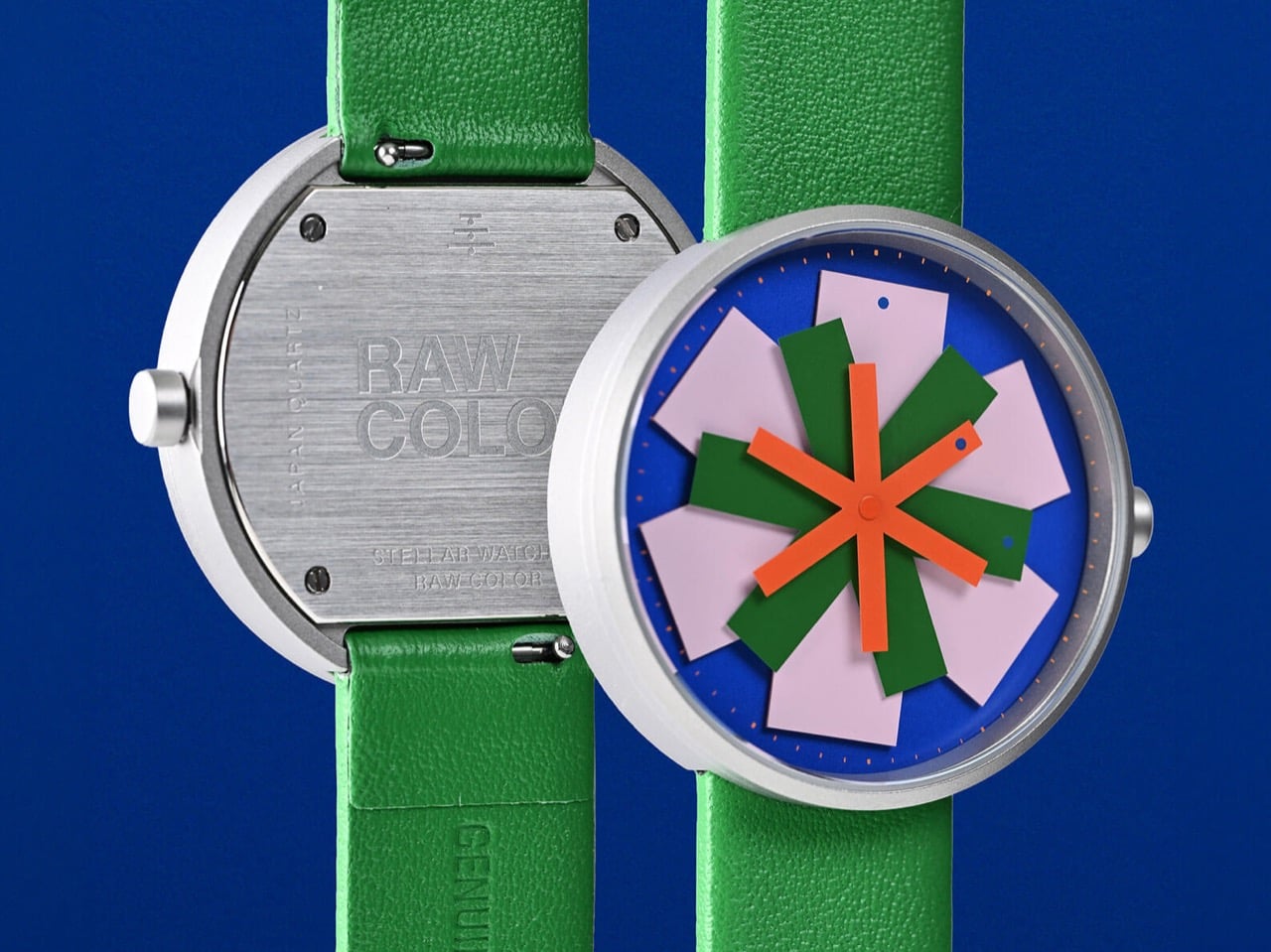
The studio behind it has spent years treating color as a material rather than a finishing touch, and that pedigree matters here. Christoph Brach and Daniera ter Haar have shaped work for Adidas, IKEA, Hermès, Samsung, and the Van Gogh Museum, with pieces sitting in the permanent collections of the Cooper Hewitt and the Stedelijk in Amsterdam. You can feel that discipline in STELLAR’s palette, where signal orange, bottle green, and pale lilac sit against a deep royal blue without any one of them shouting over the others. The colors are doing structural work, separating the three rotating layers so your eye can actually track which star belongs to which unit of time. It looks playful, almost Memphis, but the restraint underneath is the giveaway that grown-ups made this.
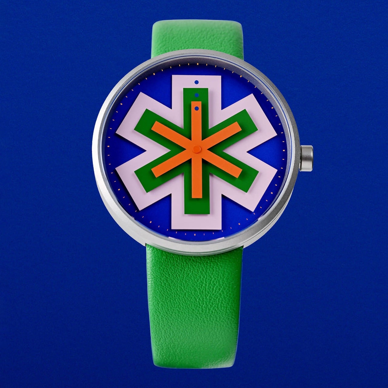
Anicorn’s Trio of Time platform exists precisely for experiments like this, inviting designers from different cities to reinterpret how a watch tells time, and STELLAR marks the project’s stop in the Netherlands. We covered the liquid-filled Time for Fun and the macOS-inspired Spinning Beach Ball from the same series, and the throughline is always conceptual mischief executed with real horological hardware. STELLAR keeps that promise. Under the graphic fireworks sits a Japanese Miyota 2035 quartz movement, a 39mm 316L stainless steel case that stays impressively thin at 8.7mm, mineral glass, and 5ATM of water resistance. The green leather strap runs 18mm and clicks on through Anicorn’s smart docking system, with a mismatched pink keeper and a blue accent near the buckle that feel entirely intentional.
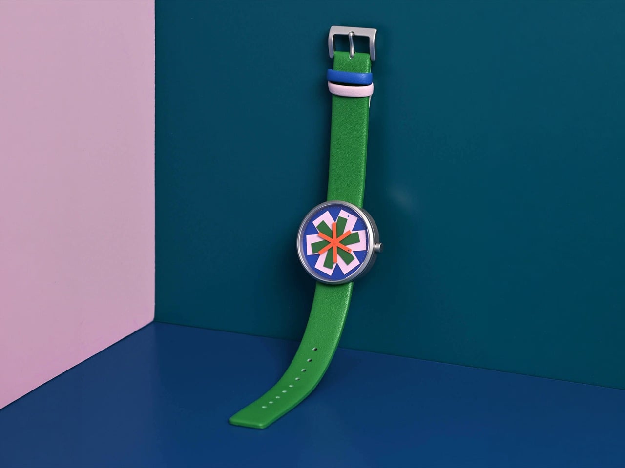
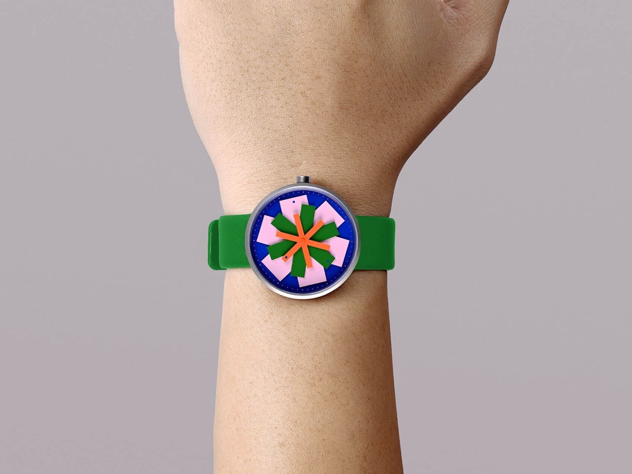
STELLAR is up for pre-order at 219 dollars with shipping slated for September 2026, which puts it squarely in the accessible end of design-object watchmaking rather than the collector-flex tier. I will be honest, this is a watch that asks something of you. The first few times you glance down, you will hunt for a pointer and find a flower, and you will have to teach your eye to chase the dots instead of the shapes. Whether that friction reads as delightful or annoying depends entirely on what you want from the thing strapped to your wrist. For anyone who likes the idea of telling time by reading a tiny constellation that reassembles itself all day long, the trade feels more than fair.

The post Humans Once Read the Stars to Tell Time, This Watch Abstracts Them Into Typographic Asterisks first appeared on Yanko Design.
G-Shock Just Turned a Japanese Paper Lantern Into Wearable Art

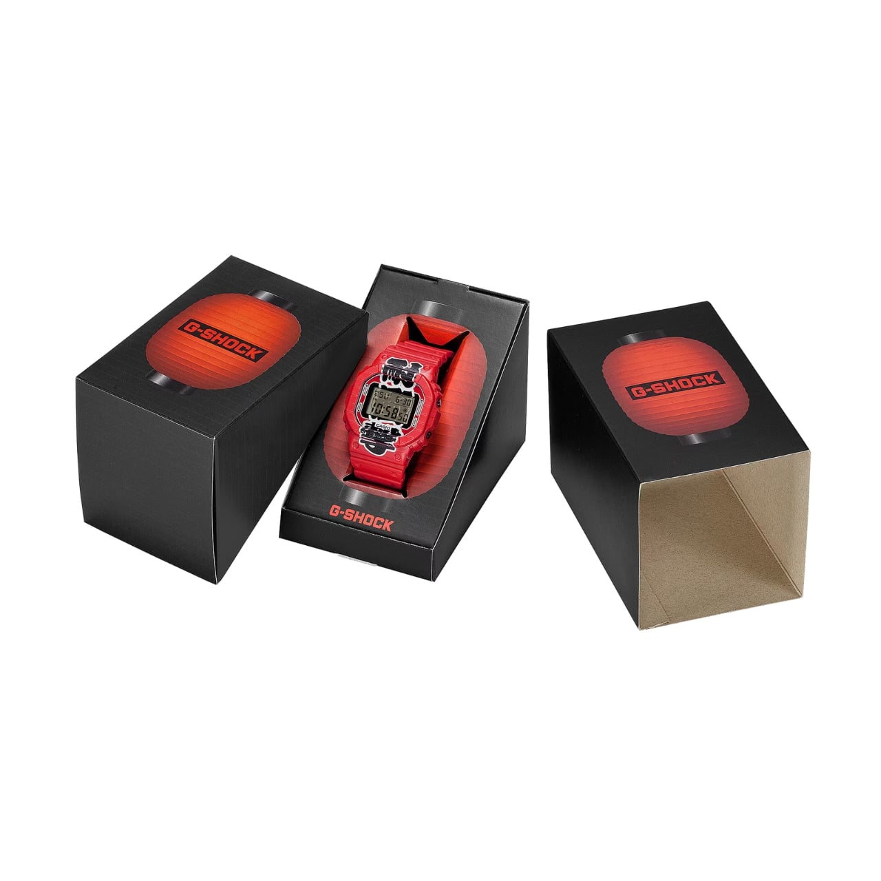
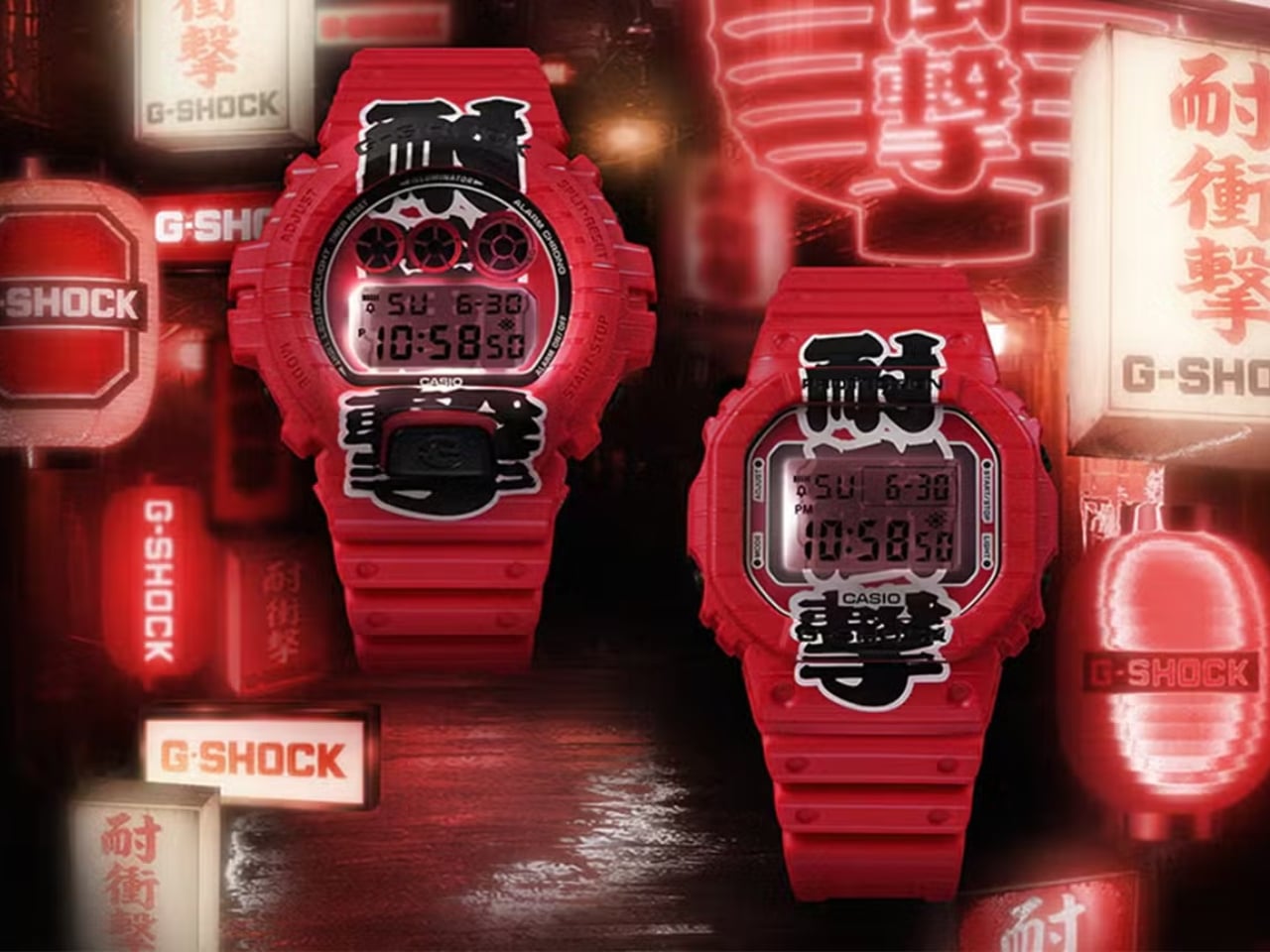
G-Shock has always known how to make a statement. From its reckless-by-design origins in 1983 to its cult status across military barracks, skate parks, and high-fashion runways, the brand has never really needed to justify itself. It just shows up. But with the new Aka-Chochin collection, built around the DW-5600AKA-4 and DW-6900AKA-4, G-Shock isn’t just showing up. It’s glowing.

The concept behind these two watches is, genuinely, one of the more thoughtful design moves I’ve seen from the brand in a while. “Aka-Chochin” translates to “red lantern,” a reference to the traditional paper lanterns that hang outside izakayas, the beloved Japanese taverns where people gather after long days for food, drinks, and the kind of conversation that only happens past 9 p.m. These lanterns, which date back to the early Edo period in the 17th century, weren’t decorative in the precious sense. They were practical and symbolic at once, signaling warmth, welcome, and the specific pleasure of slowing down. Casio took that idea and pushed it into two of its most iconic silhouettes.

Designer: G-Shock

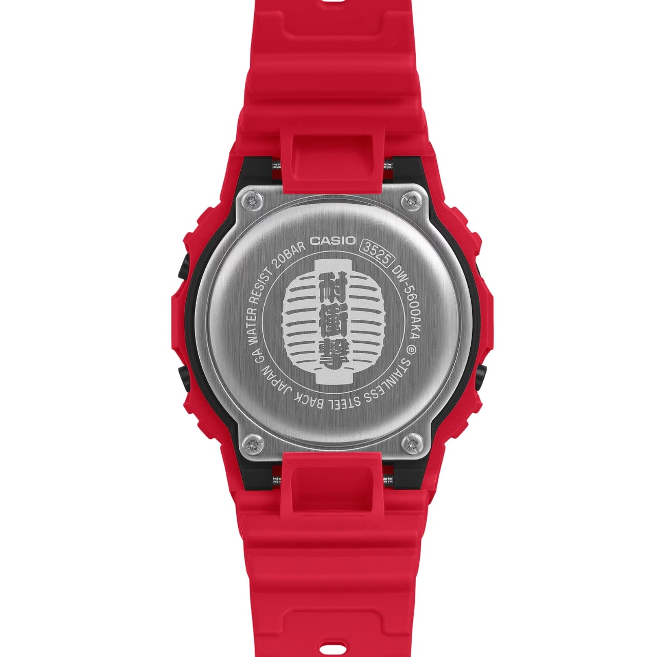
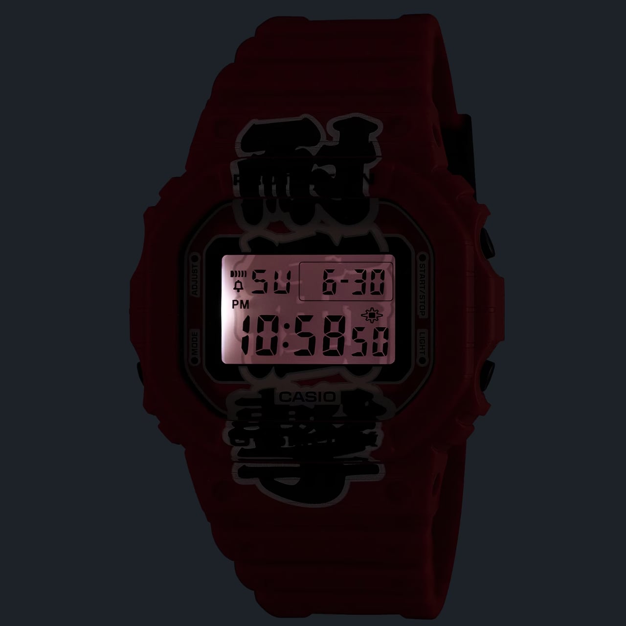
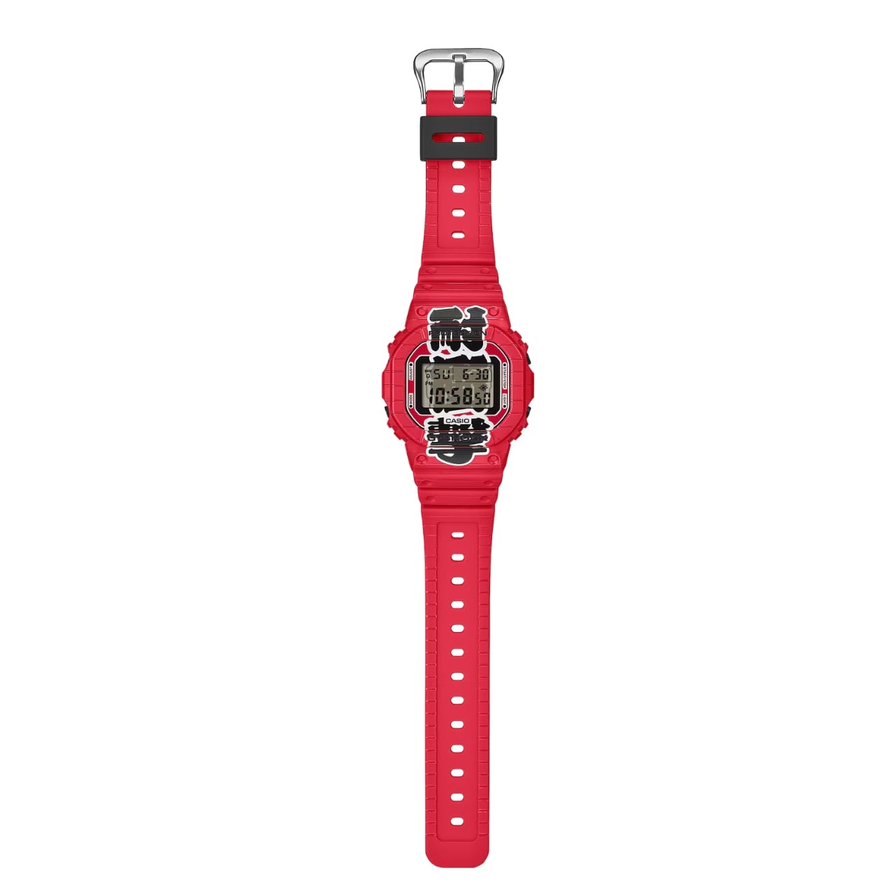
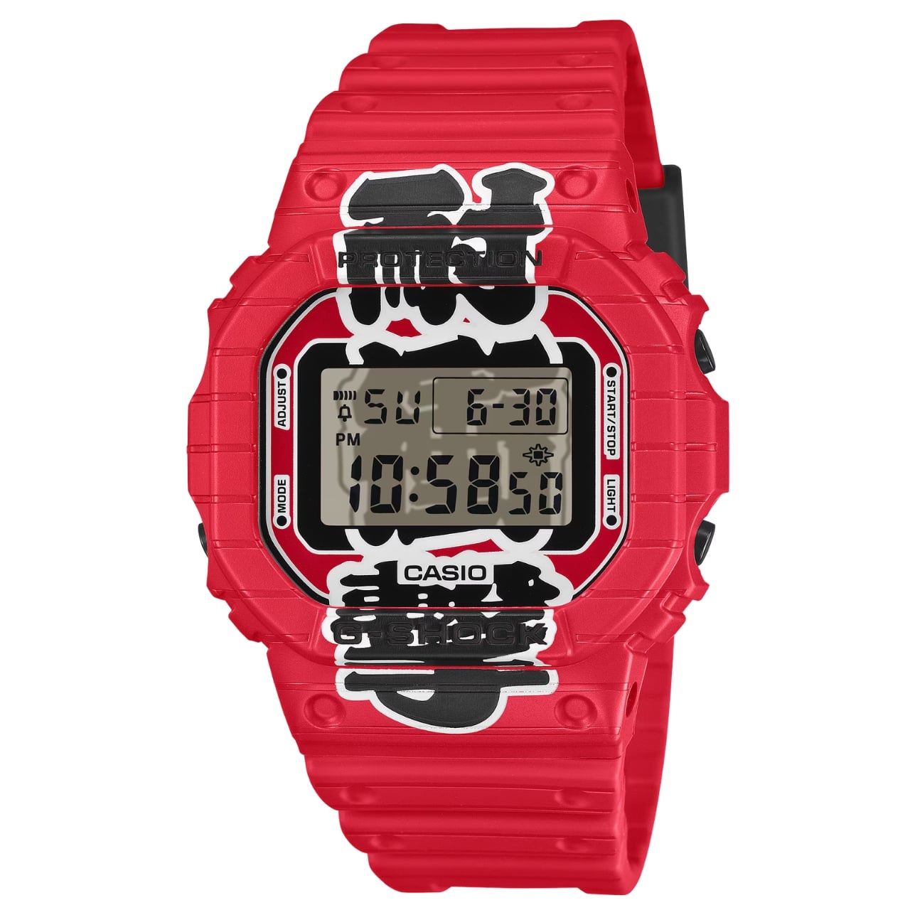
The result is unapologetically red. Not a subtle, wine-at-dinner red. A full-on, stop-what-you’re-doing red that covers the resin case, bezel, and band from top to bottom. On paper, it sounds like a lot. In practice, it earns its confidence. Both watches carry kanji characters down the face of the dial, reading “耐衝撃,” which means “shock resistance,” one of G-Shock’s founding promises. The characters are split between the bezel and the LCD display, and when the LED backlight activates, the two halves complete each other like a puzzle piece lighting up from within. It’s a detail you have to see in person to fully appreciate, and it’s the kind of thing that elevates a colorway from a gimmick to a genuine design choice.

The bezels on both models also feature hot-stamped grooves that mimic the ribbed texture of a paper lantern, and that same motif carries through to the edges of the strap. It’s not subtle, but it is cohesive. G-Shock committed to the bit, and the commitment pays off.

Now, I’ll say this upfront: the Aka-Chochin aesthetic is polarizing. All-red anything tends to divide opinion, and a digital watch in this colorway is not trying to blend in. If your instinct is to gravitate toward muted, understated timepieces, these are probably not for you, and that’s fine. But if you’ve ever wanted a watch that reads as confident and culturally curious at the same time, the DW-5600AKA-4 and DW-6900AKA-4 make a genuinely compelling argument.

The choice of silhouettes is also worth noting. The DW-5600 is essentially G-Shock’s origin story made physical, the square case that started everything, a design so clean and deliberate it has barely needed updating in four decades. The DW-6900 is its more expressive sibling, with that distinctive triple-window dial and wider case presence. Pairing both with the same concept gives collectors and casual buyers alike an entry point, whether you’re drawn to the classic restraint of the 5600 or the bolder graphic energy of the 6900.

At $190 each, neither watch is a budget impulse buy, but it’s not a stretch, either. G-Shock has always occupied that interesting middle ground between functional tool watch and cultural artifact, and the Aka-Chochin collection lands squarely in that territory. You’re not just buying a watch that tells time reliably. You’re buying into a very specific idea about where design, heritage, and streetwear culture converge.

Red lanterns were built to be seen at night, to cut through the dark and draw people in. G-Shock’s interpretation of that idea works for the same reason. Bold doesn’t have to mean reckless. Sometimes it just means knowing exactly what you want to say and saying it clearly, wrist and all.

The post G-Shock Just Turned a Japanese Paper Lantern Into Wearable Art first appeared on Yanko Design.

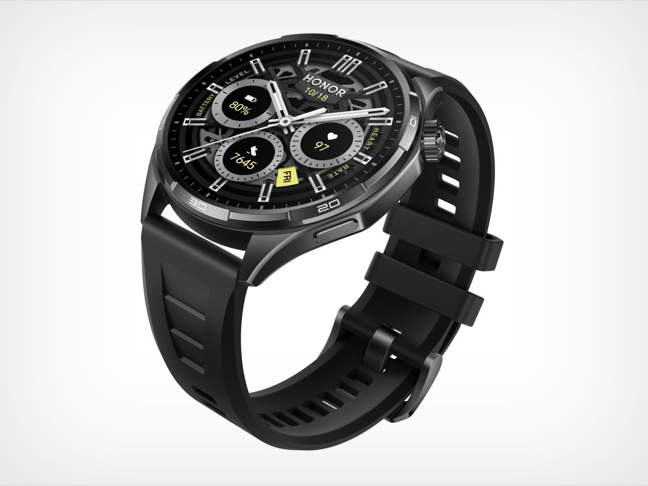
HONOR packed a 35-day battery into a 41g smartwatch – and nothing else comes close

Every smartwatch eventually comes off. The reasons vary: the charge ran out, the case dug in, the weight got old. Battery anxiety and wrist fatigue are the two great enemies of wearable compliance, and the industry has spent years solving one at the expense of the other. HONOR has taken a different approach with the Watch 6.

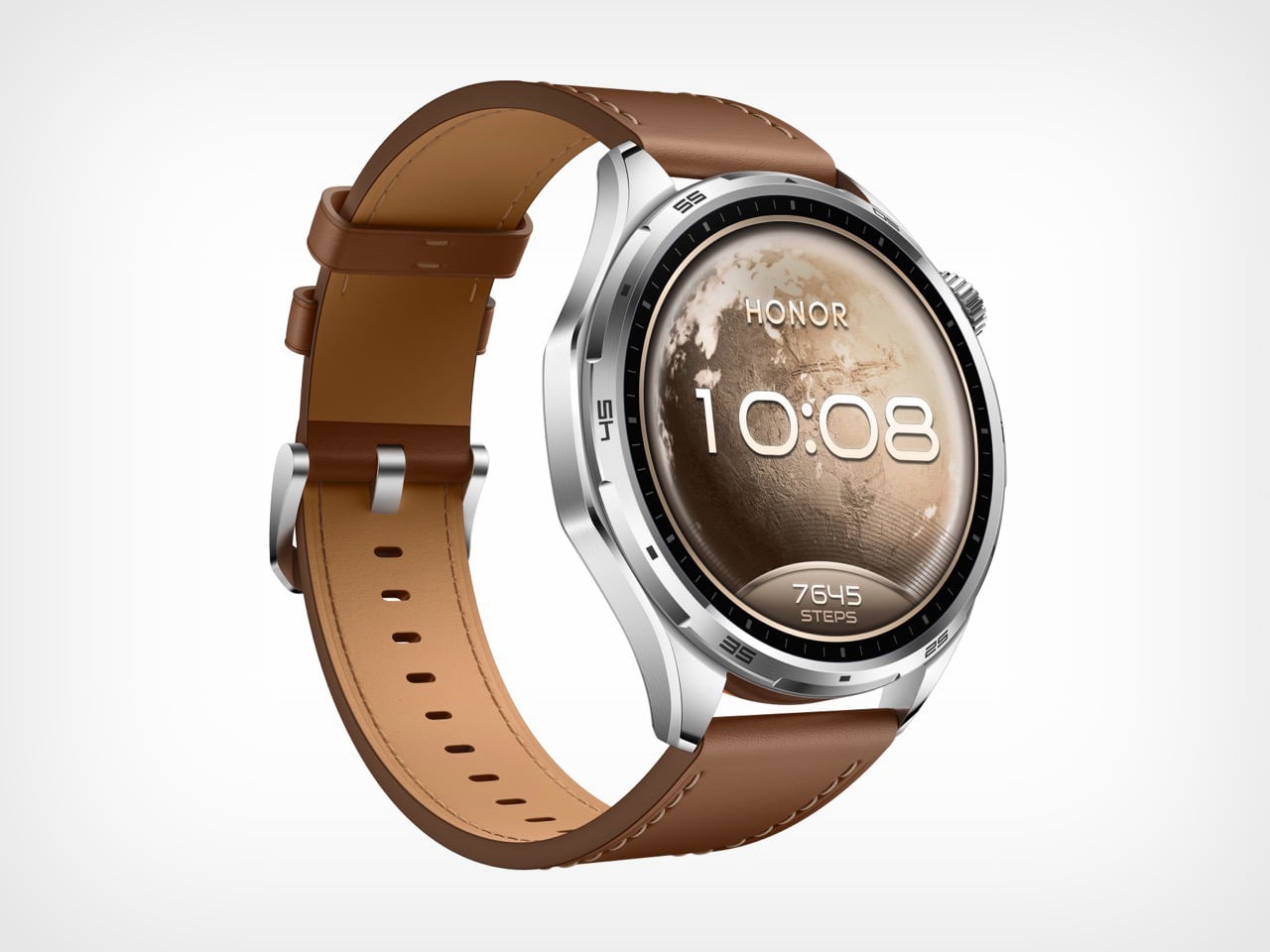
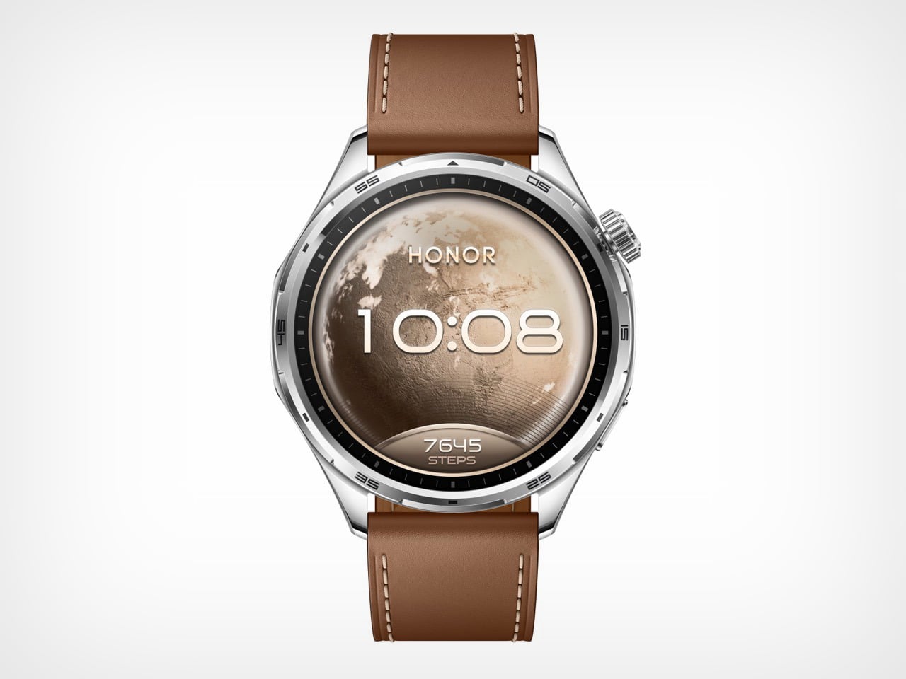
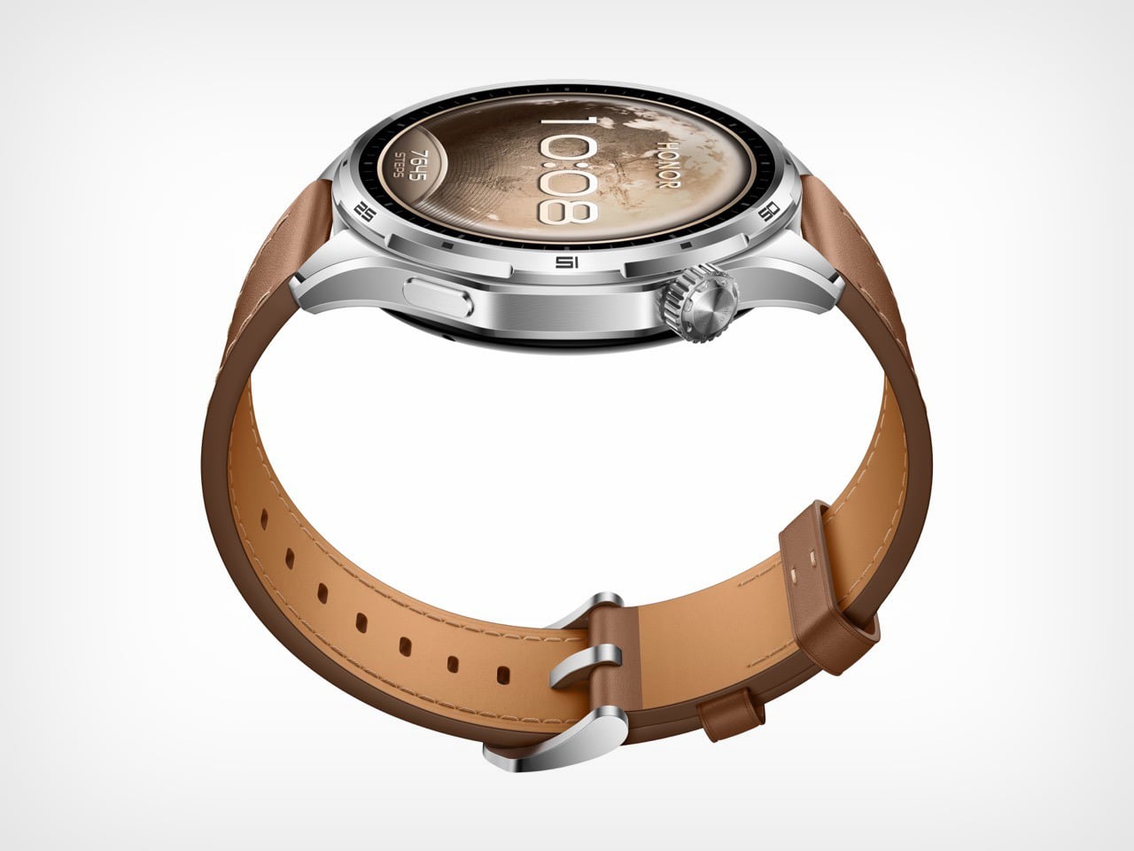
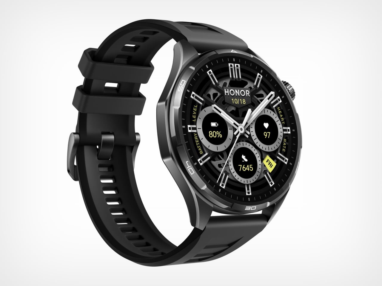
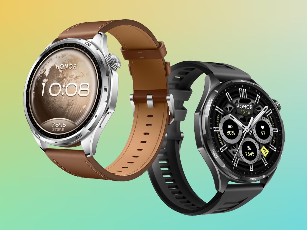
The case weighs 41 grams, which puts it in the same neighborhood as a set of car keys. The battery inside it is 980mAh, a capacity that delivers up to 35 days of use and has no comparable precedent in a smartwatch this light. HONOR achieved it through a sandblasted aluminium alloy construction, designed around a Racing Dashboard aesthetic that borrows visual tension from high-performance automotive design. The Watch 6 is built to stay on. And at 41 grams, there is very little reason to take it off.

Designer: HONOR

The wearable industry’s battery problem has always been architectural. Garmin solved it by making watches thick enough to house serious cells, producing devices that track ultramarathons flawlessly but look faintly ridiculous at a dinner table. Apple went the opposite direction, keeping the Watch Series ultra-slim and ultra-light while accepting that you will charge it every night like a phone. The Apple Watch Ultra 3 splits the difference with a 599mAh battery in a titanium case, and while that is genuinely impressive engineering, it still asks you to charge weekly and costs north of $700 for the privilege. Samsung’s Galaxy Watch 7 lands closer to HONOR’s price bracket but tops out around 425mAh, delivering maybe three days of real-world use. HONOR’s Watch 6 arrives at 980mAh and 41 grams, and neither of those numbers should coexist in the same sentence.

The secret is in the surface. HONOR’s construction process runs the aluminium alloy case through a precision sandblasting treatment that produces a finish comparable to titanium in texture and perceived premium-ness, without titanium’s weight penalty. This is the same category of material intelligence that made the Watch 5 Ultra’s grade 5 titanium case feel like such a statement at MWC 2025, except here HONOR is pulling the trick in reverse, making aluminium feel like it punches upward. The beveled edges add a three-dimensional quality to the 46.5mm round case that photographs well and catches light differently depending on angle, borrowing visual language from automotive air intakes in a way that feels considered rather than decorative. At 317 PPI on a 1.46-inch AMOLED panel hitting 3,000 nits of peak brightness, the display holds up in direct sunlight in a way that cheaper panels simply cannot.

Where the Watch 6 earns its credibility beyond the spec sheet is in the specificity of its sports intelligence. HONOR’s badminton mode tracks smash speeds, rally counts, and shot distribution in a way that goes well beyond the generic “racket sport” detection most smartwatches offer. The football mode generates heat maps and trajectory data that a Sunday league player will find genuinely useful, not just flattering. Trail running gets an AI coaching layer on top of dual-band six-star GPS, with route deviation alerts that matter when you are actually in the hills. These are features borrowed in spirit from Garmin’s sport-specific playbook, delivered at a price point Garmin has never seriously entertained.

The one honest caveat is software. HONOR’s proprietary MagicOS ecosystem has historically been the ceiling on what their hardware could achieve, and the Watch 5 Ultra illustrated that tension clearly when reviewers found the tracking data compelling but the platform limiting. The Watch 6 inherits that same closed loop, meaning your 35 days of biometric data lives inside the Honor Health app and nowhere else. For athletes already inside that ecosystem, that is fine. For anyone hoping to pipe data to Strava, Garmin Connect, or Apple Health with any consistency, it remains a friction point worth knowing about before you buy.

The post HONOR packed a 35-day battery into a 41g smartwatch – and nothing else comes close first appeared on Yanko Design.

This Solar Smartwatch Ran 9 Months on Battery, Then the Panel Kicked In

The smartwatch category has a battery problem it can’t seem to shake. Despite years of incremental improvements, most wearables still need to be charged every day or two, which is exactly the opposite of what a watch is supposed to be. A watch is supposed to be on your wrist and working, not sitting on a charging pad because you forgot to plug it in before bed.

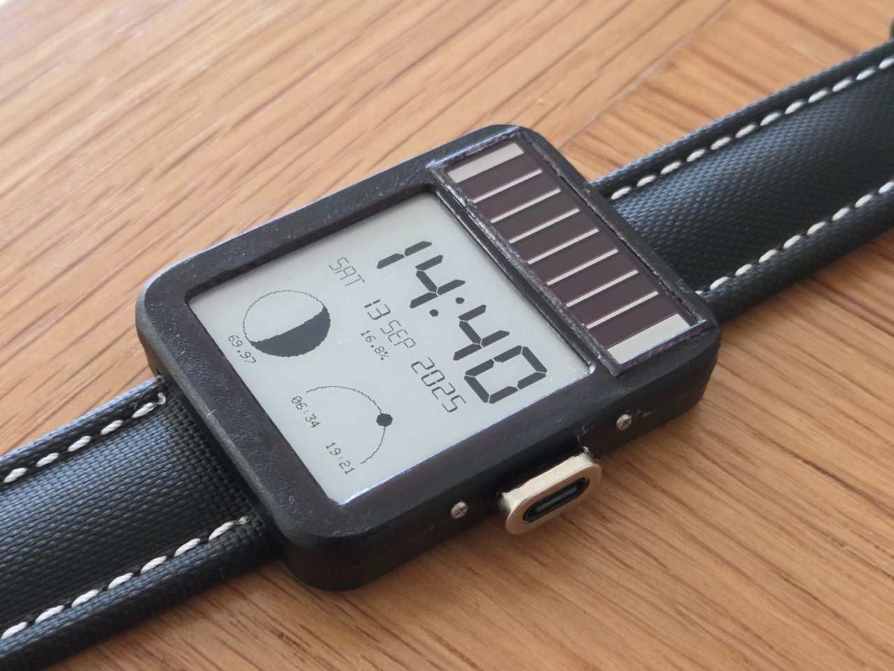
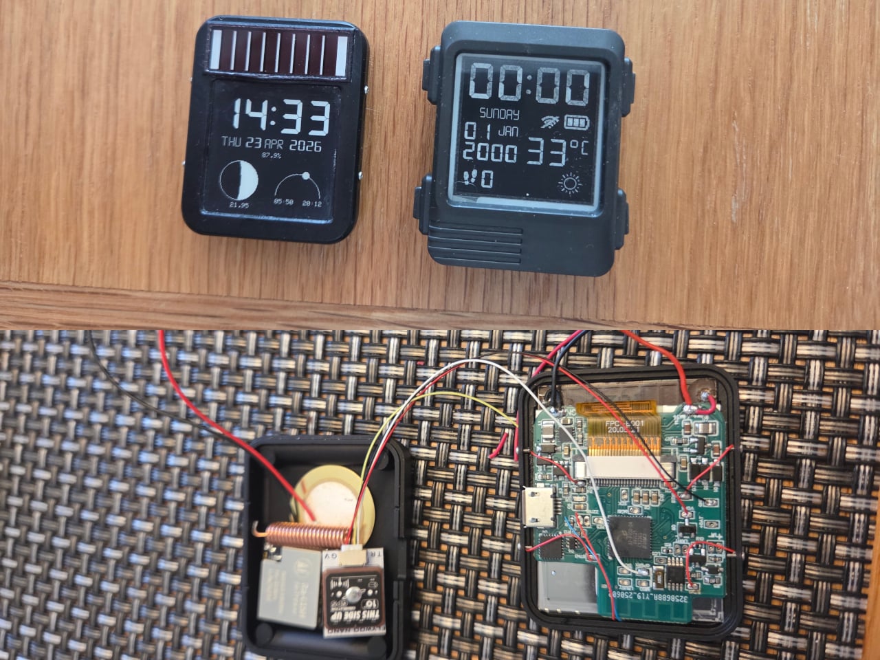
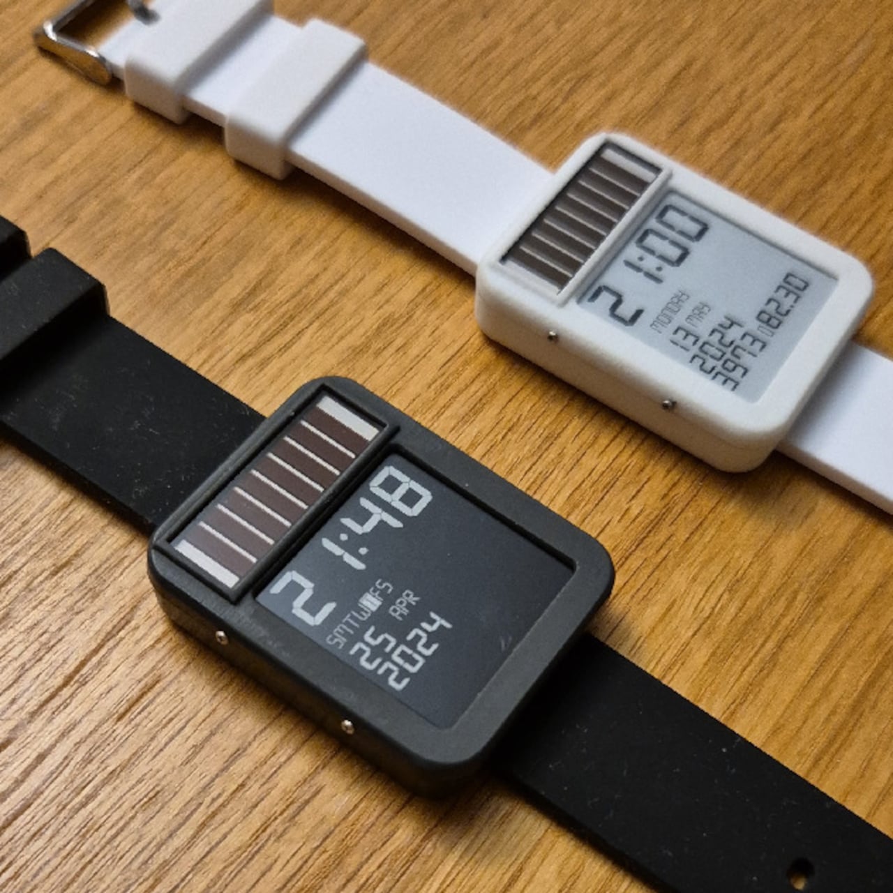
The LightInk is an attempt to solve that problem by going back to a design philosophy that worked decades ago: solar. The concept mimics the 90s solar digital watches that ran more or less indefinitely, but brings it into the present with an E-Ink display, an ESP32 microcontroller, WiFi, Bluetooth, LoRa radio, and a custom power management system built from scratch over several years.

Designer: Daniel Ansorregui

The project started in 2019 with a simple goal: build a solar-powered watch that could send LoRa packets to a receiver at home. After experimenting with early hardware and contributing display optimizations to the open-source Watchy project, the creator hit the limits of what off-the-shelf hardware could manage and built a custom PCB around a TPS63900 buck-boost converter, running the watch at 2.7V.

The biggest technical hurdle turned out to be the microcontroller itself. The ESP32 takes 28ms to boot, consuming around 1mA of current in the process, and that cycle was responsible for about 60% of the watch’s total power draw without contributing anything to the actual display update. The solution was to skip normal boot entirely and run code directly from the ESP32’s RTC memory via a wake stub.

That required reimplementing SPI communication from scratch within the RTC memory constraints, since no code outside that space can run during the stub phase. The payoff was significant: the entire boot, data send, and display update sequence now completes in under 1ms. Once the display is refreshed, the ESP32 immediately returns to deep sleep, saving an additional 1mA that would otherwise be consumed during light sleep.

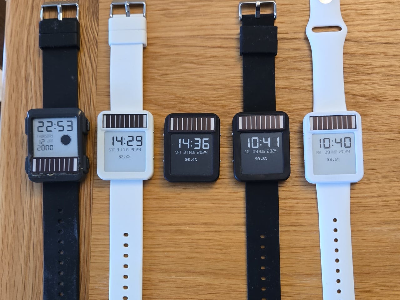
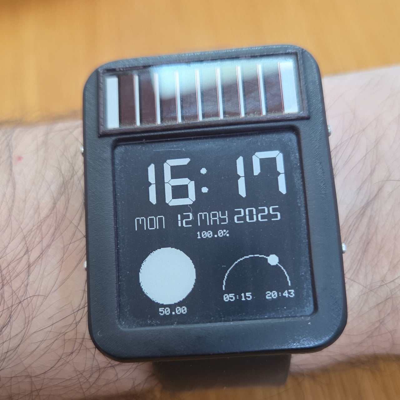
The result is a watch that runs for six to 10 months on a 100mAh battery, which is already an unusual number for a device this capable. Add the solar panel, similar in type to the kind found on pocket calculators, and the power equation starts to tilt toward indefinite. One hardware revision ran for nine months on battery alone before being retired for a newer build.

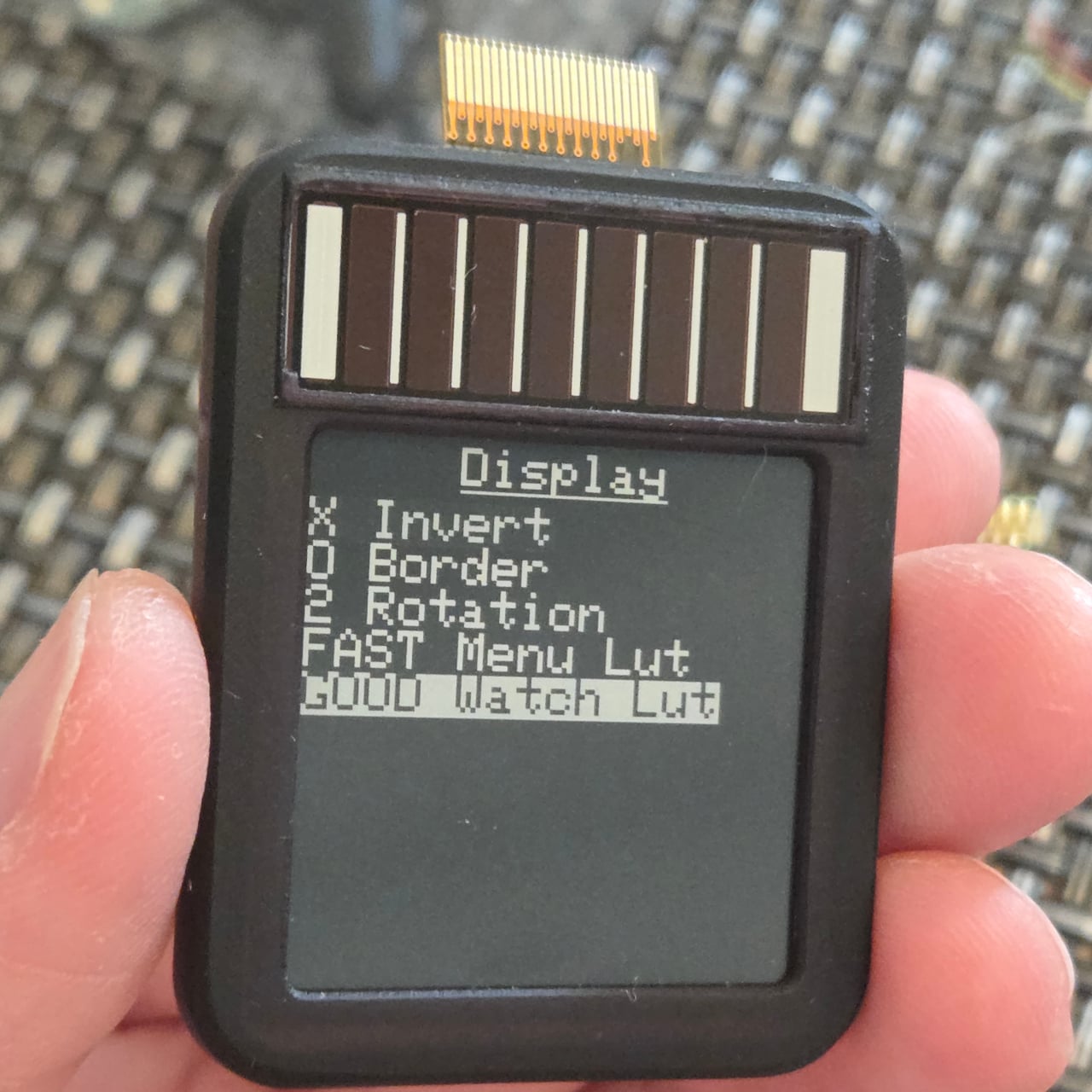
The 1.54-inch E-Ink display helps keep those numbers achievable. Electrophoretic displays only draw power when changing states and hold their image indefinitely without any power at all, which makes them an obvious fit for a watch face that updates once per minute rather than 60 times per second. Touch controls via the ESP32’s built-in capacitive touch capability handle navigation, making physical buttons unnecessary and allowing for a more compact case.

The watch supports WiFi, Bluetooth, and LoRa via a Wio-SX1262 radio module, and GPS can be added as an optional component, though the creator notes it wasn’t a particularly good idea given the space and power it consumes. The case is 3D printed in two pieces and accepts any standard 22mm wristband. Everything, including the firmware, PCB schematics, and case files, is open source and available on GitHub.

The post This Solar Smartwatch Ran 9 Months on Battery, Then the Panel Kicked In first appeared on Yanko Design.

Atari’s 1980 Arcade Classic Just Became a Limited Edition Automatic Watch

Gaming and watchmaking have been circling each other for years, trading collaborations that usually land somewhere between cynical and forgettable. The Hamilton x Call of Duty watch exists. The G-Shock x Street Fighter collection exists. Casio has licensed more IP than most studios at this point. Nubeo looked at all of that and apparently decided the only interesting move was to go deeper, not louder.

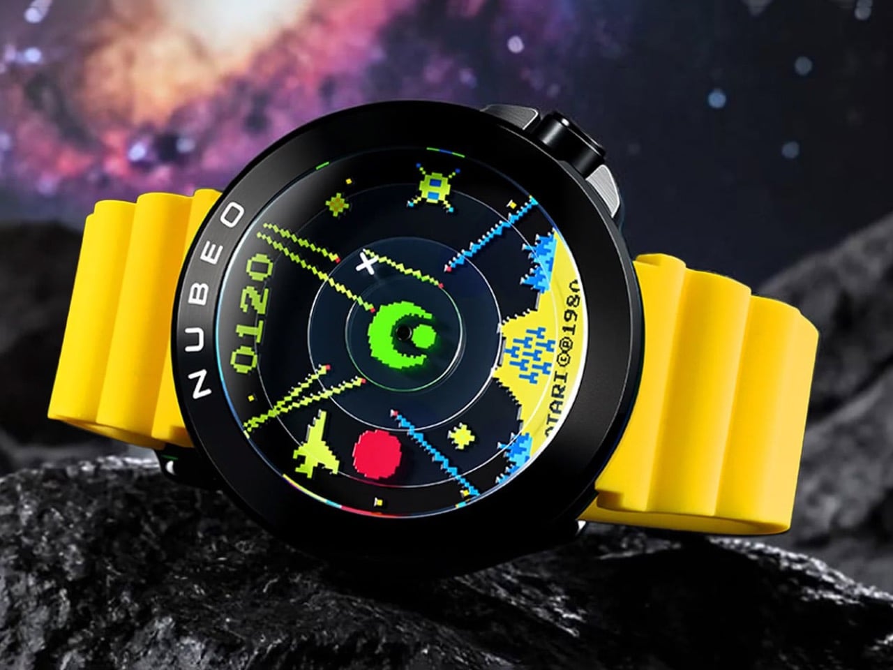
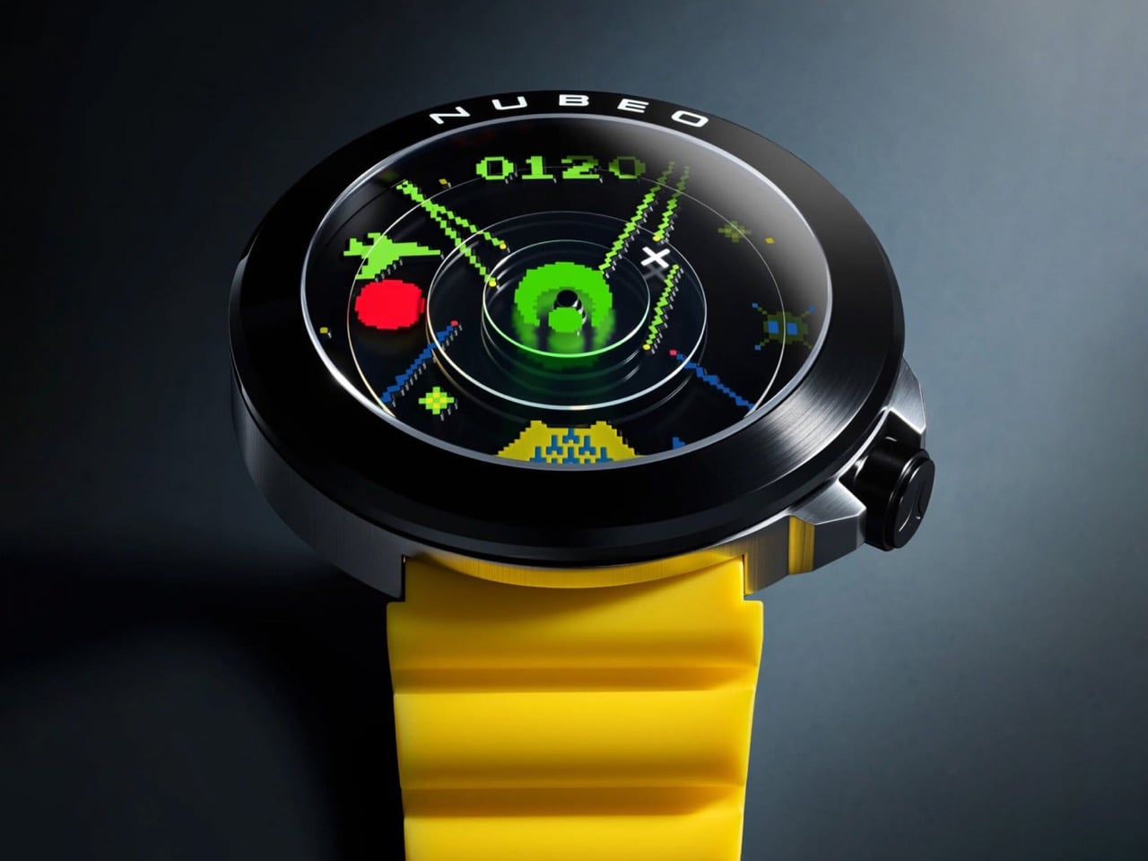
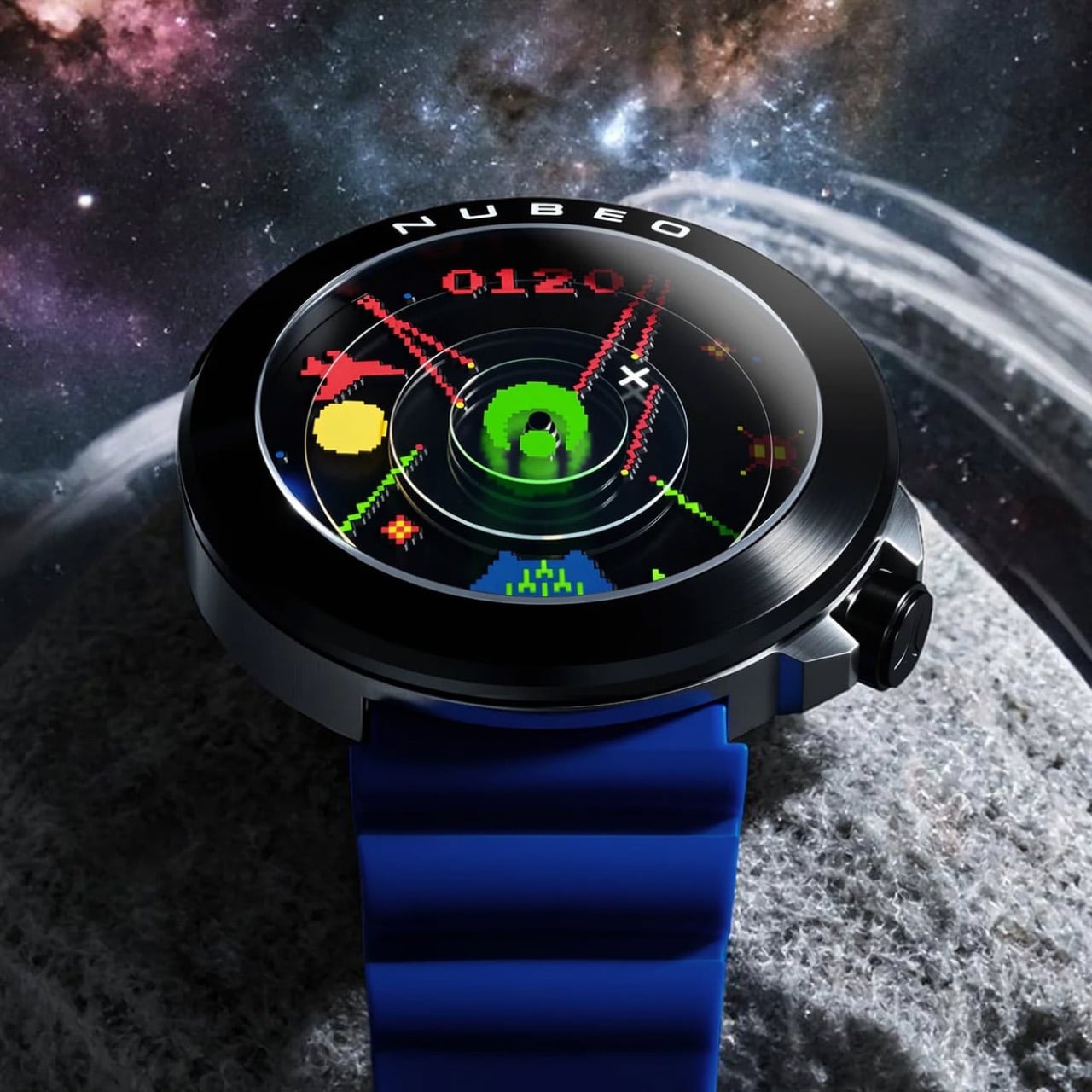
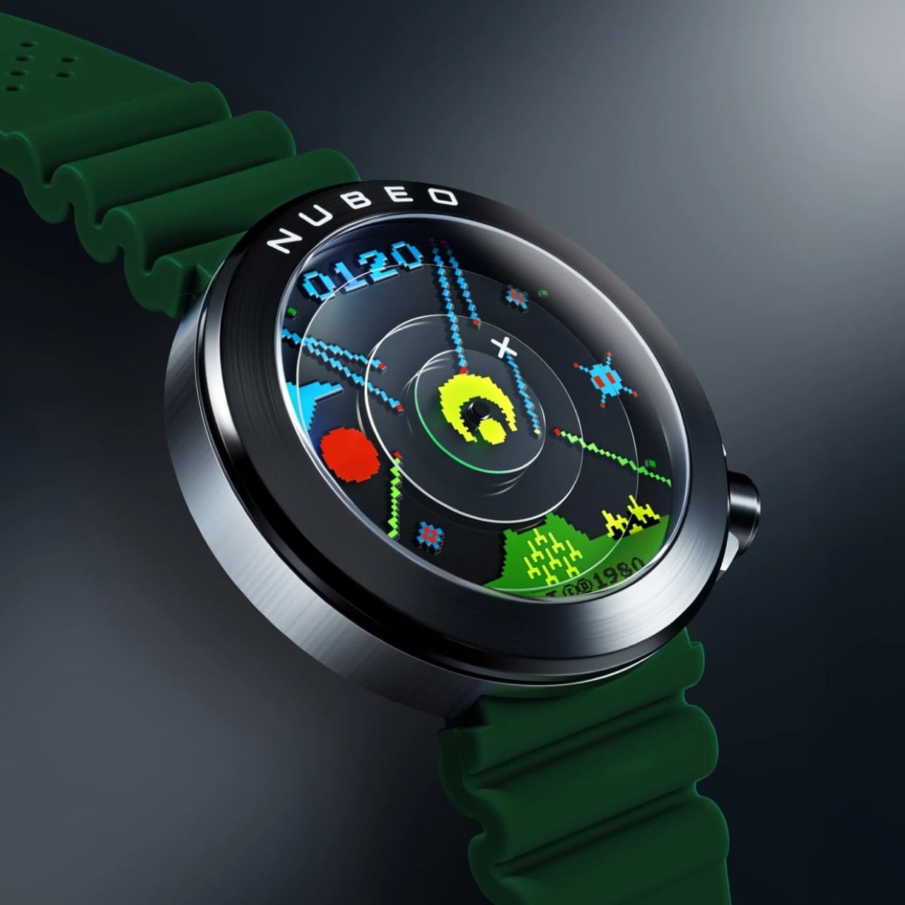
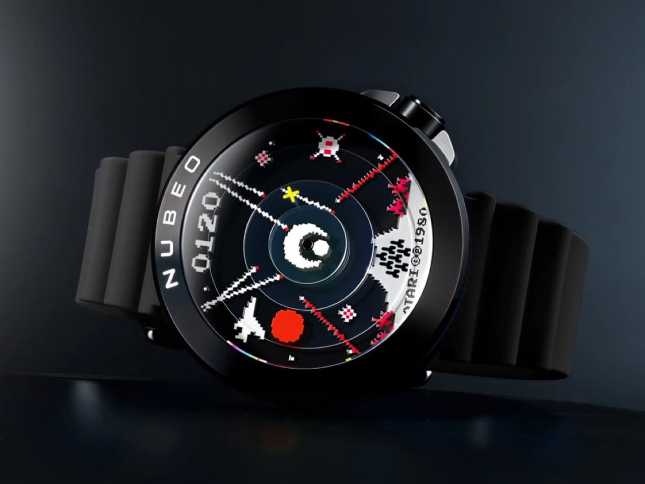
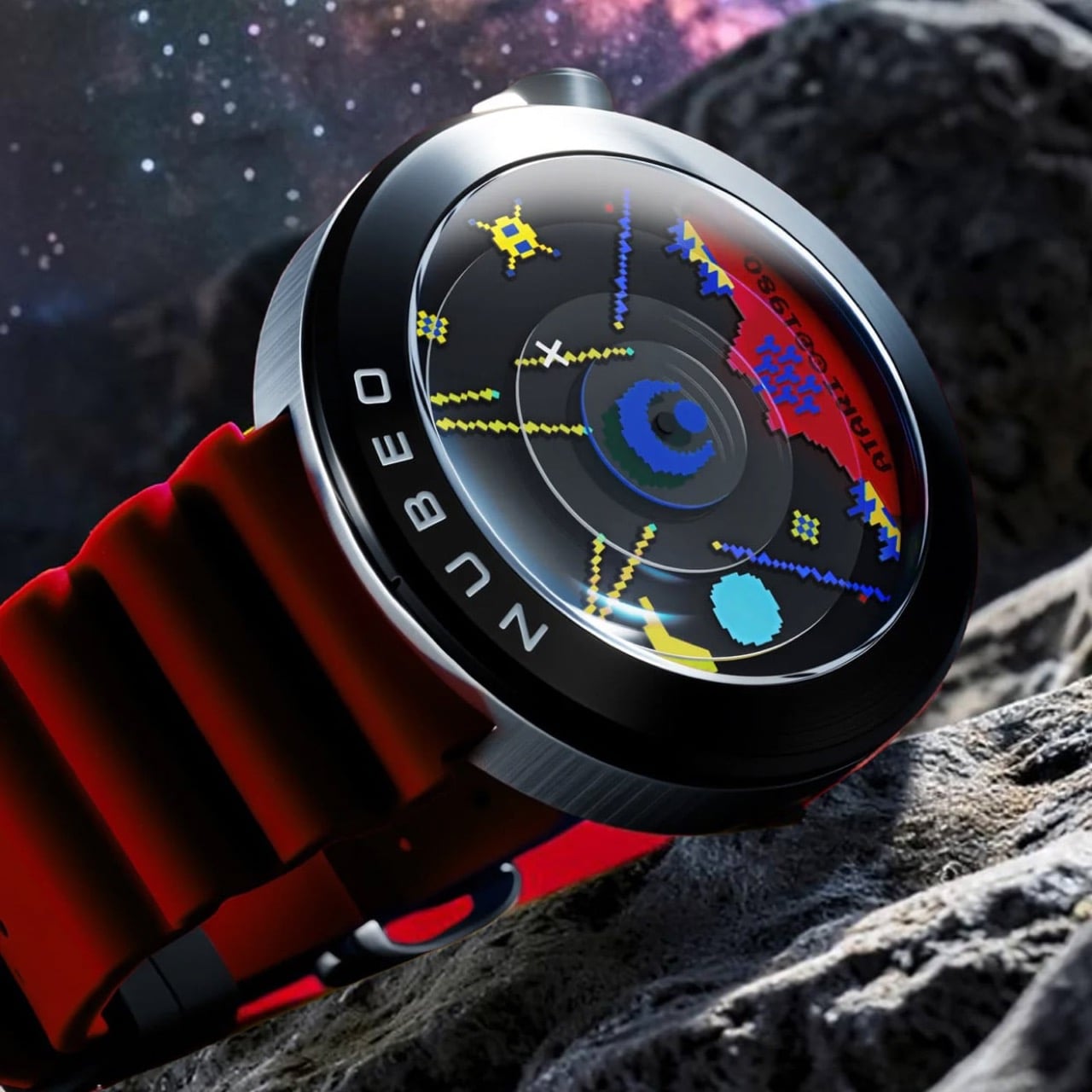
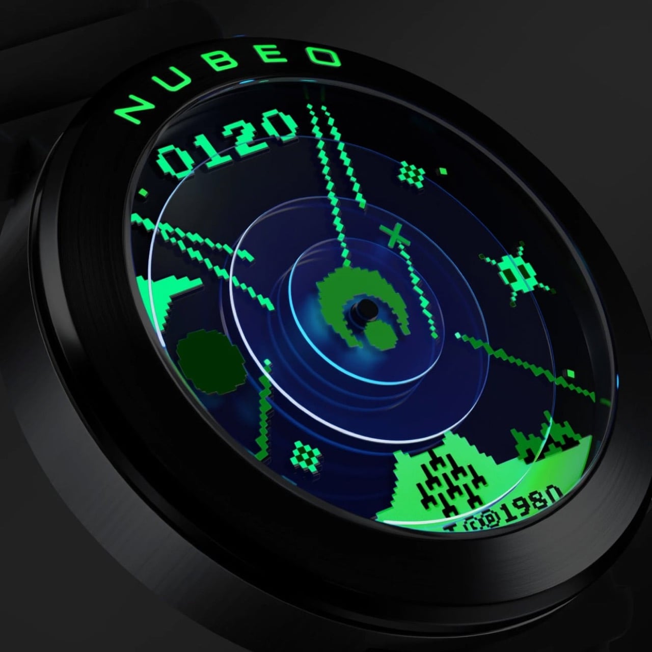
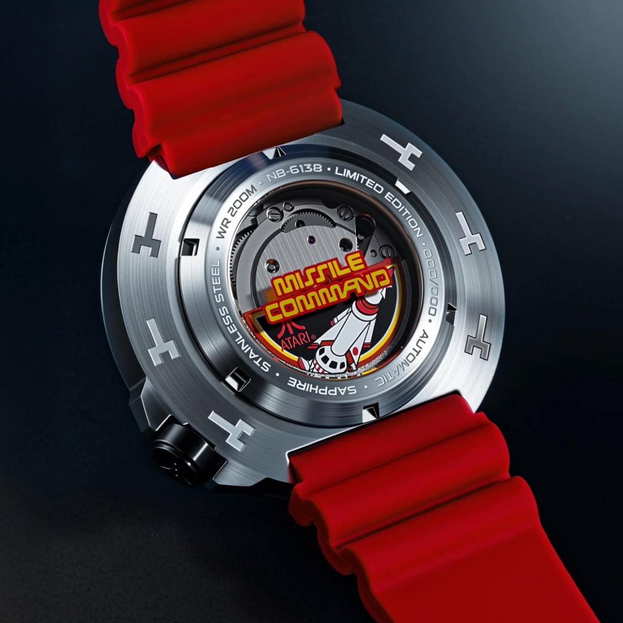
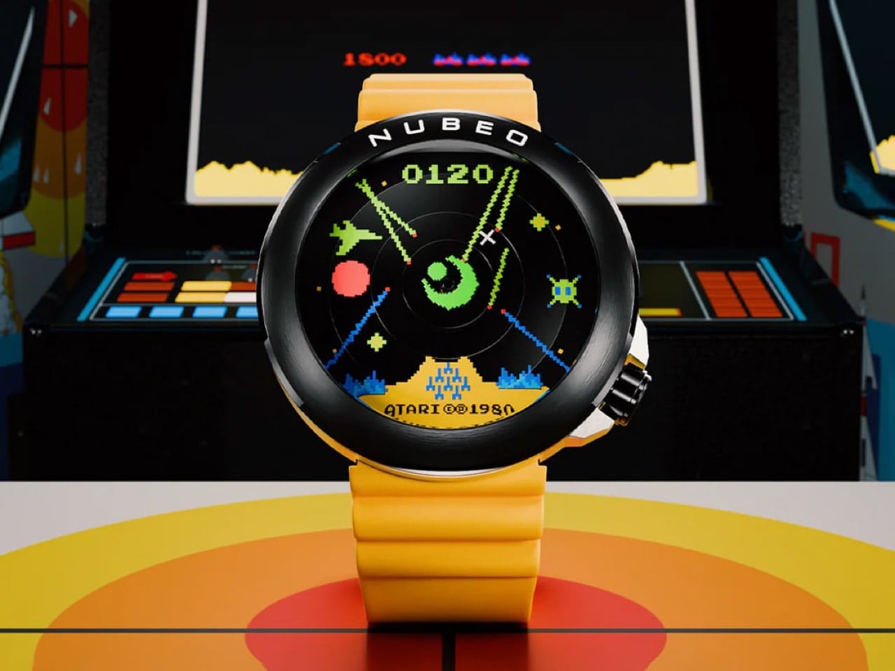
The Ventana Automatic Missile Command takes the full visual grammar of Atari’s 1980 arcade classic and builds it into a 50mm mechanical watch limited to 100 individually numbered pieces per colorway. The dial layers pixelated missile trails, fighter jet sprites, and a concentric radar system over a multi-disc mechanical assembly, with the “0120” score display anchoring 12 o’clock and the “Atari ©1980” copyright stamp sitting at 6. The exhibition caseback frames the Miyota 8215 automatic movement inside the original arcade cabinet artwork, giving the watch a second face as compelling as the first. Kill the lights and the Super-LumiNova does something unexpected: the full-color scene collapses into monochrome green, the exact phosphor glow of a 1980 CRT screen, and suddenly the whole design logic becomes obvious. Nubeo built five colorways at $500 each, Assault Yellow, Strike Green, Vector Red, Command Black, and the Impact Blue exclusive to Atari.com, and every one of them rewards that kind of attention.
Designer: Nubeo x Atari

Designer: Nubeo

Missile Command arrived in arcades in 1980 carrying a psychological weight that most games of its era never attempted. Designer Dave Theurer has spoken about the nightmares the project gave him during development, because the premise was deliberately unwinnable: nuclear warheads are falling on your cities, you can slow the assault but never stop it, and eventually the screen fills with fire. That Cold War dread, rendered in chunky pixels and trackball physics, made it one of the most culturally loaded games ever put into a cabinet. It migrated to the Atari 2600 and into living rooms across America, and an entire generation grew up memorizing its visual language: the radar rings, the missile trails, the pixelated cityscape at the bottom of the screen waiting to be vaporized. Nubeo clearly grew up with it too, and the Ventana is the design evidence.

A multi-layered disc system gives the scene genuine physical depth rather than the flat printed look that sinks most licensed watches. The concentric radar rings at center sit on a separate disc plane, catching light differently from the pixelated imagery surrounding them and creating a parallax effect that shifts as you move the watch. The central turret hub anchors the second hand and reads exactly as the game’s targeting reticle, while the minute hand carries an X crosshair and the hour hand a red sun symbol. These are not decorative flourishes bolted onto a standard layout. They are the timekeeping system rebuilt around the game’s iconography from the ground up, which is a fundamentally different design brief than most collaborations ever attempt.

Super-LumiNova was applied across the full dial surface, which means in daylight you are reading a full-color Missile Command scene in vivid greens, yellows, reds, and blues, and in darkness all of that color information drops away into a pure monochrome green glow that is a dead ringer for the phosphor output of a 1980 CRT monitor. The design team understood that the game existed in two visual registers, the color of the arcade cabinet screen and the green-tinted memory of everyone who played it in a darkened room, and encoded both into a single material decision. Every pixel, every missile trail, every sprite glows with the same uniform intensity, uniform in the way that analog phosphor was uniform, which is to say warm and slightly imprecise at the edges. That quality is almost impossible to fake with modern lume application and the fact that Nubeo pulled it off suggests this collaboration went well beyond a licensing agreement into something closer to genuine obsession.

Through the exhibition window you can watch the Miyota 8215 automatic rotor spin, but the real draw is the original Missile Command arcade cabinet artwork surrounding it, complete with the bold red and yellow logo treatment, the rocket imagery, and the Atari mark printed onto the inner caseback disc. The outer ring is engraved with the model reference NB-6138, the water resistance rating, the limited edition designation, and the individual piece number. Wearing this watch means carrying two museum-quality presentations simultaneously, one facing the world and one facing your wrist, which is an unusually generous design decision for a $500 release.

The hardware specifications match the ambition of the concept without overreaching. The 50mm stainless steel case runs 16mm thick, the Miyota 8215 is a Japanese automatic workhorse that stays reliably out of the way of the dial story, sapphire crystal with AR coating protects the scene, and the screwdown crown at 4:30 delivers 200M water resistance. The chunky segmented rubber straps in each colorway add a tactile sportiness that ties the whole package back to the arcade cabinet’s joystick-era aesthetic, and at 179 grams the watch has the kind of presence on the wrist that reminds you it is there. At $500 for a sapphire-crystalled, 200M-rated, individually numbered automatic with this level of dial craft, Nubeo found the third path that the gaming collaboration space rarely bothers looking for: mid-tier pricing with upper-tier design intent. All five colorways are available now at nubeowatches.com, with Impact Blue held exclusively at atari.com, and with production capped at 500 pieces total across all variants, the cities on your dial may be perpetually under attack but the watch defending them is built to outlast every arcade cabinet that ever ran the original game.

The post Atari’s 1980 Arcade Classic Just Became a Limited Edition Automatic Watch first appeared on Yanko Design.

The $429 PhantomX Watch Has Four Rotating Arms That Tell Time Like a $50,000 URWERK

URWERK builds watches that cost as much as a compact car. The Geneva-based studio has spent decades engineering satellite hour complications, where orbiting arms carry hour numerals into position around a central axis, revealing the current hour as they complete their circuit. It is horological theater at its most sophisticated, with collectors typically paying between $30,000 and $100,000 depending on the configuration. The wandering hour concept itself dates to 17th-century pocket watches, but URWERK transformed it into an entire brand identity that has spent the better part of three decades sitting behind a velvet rope. The visual language of satellite hours has remained firmly in luxury territory for nearly all of that time.

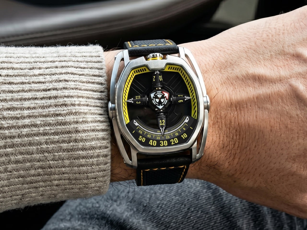
Mitico, a Hong Kong-based brand, just launched the PhantomX on Kickstarter at $399. It runs a four-arm satellite wandering hour system over a Miyota 9039 automatic, wrapped in a stainless tonneau case with a 3D star wheel mechanism that reveals only the current hour at any given moment. The campaign cleared 1,400% of its funding goal within days of going live. Something is clearly happening in independent horology right now, and the PhantomX is one of the most direct examples yet of the satellite hour complication finally escaping the velvet ropes. The gap between ambition and accessibility, in this category, is narrowing fast.

Designer: Mitico

Click Here to Buy Now: $429 $750 (43% off) Hurry! Only 12 days left.

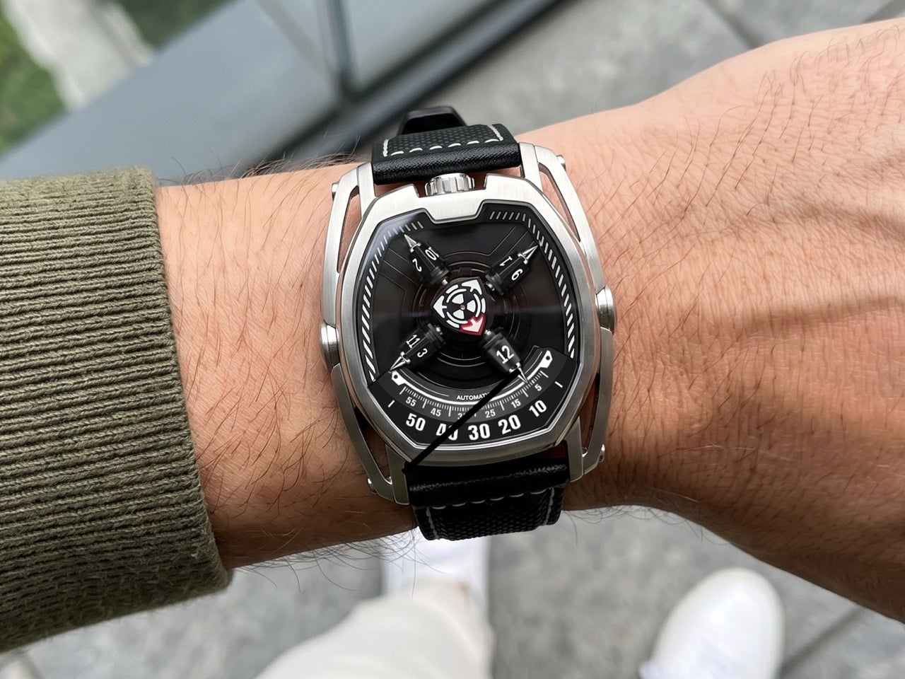
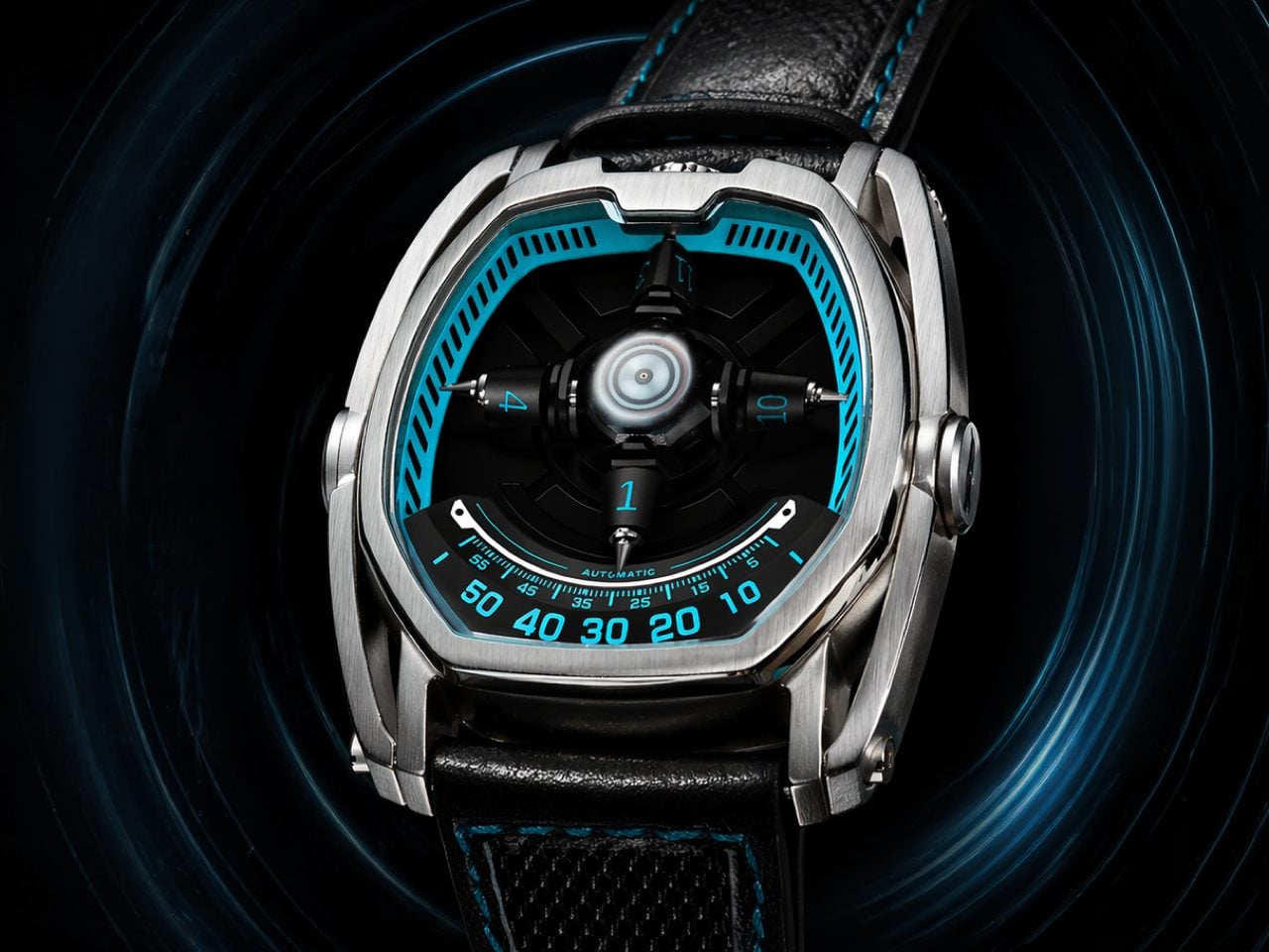
The wandering hour format has existed in some form since the 17th century, and Mitico’s interpretation adds a structural layer that separates the PhantomX from the current wave of indie satellite designs. Four arms orbit continuously around a central axis, each carrying three hour numerals on a sculpted 3D star wheel, with only the current hour numeral vertically aligned and fully visible at the dial center. Mitico calls this the “Only the Present Hour Revealed” concept, meaning the adjacent numerals stay tucked along the curved sides of the wheel, keeping the face uncluttered despite the mechanical complexity underneath. Time is read by finding the arm that has rotated into the central display position, then cross-referencing it against the clockwise 0-to-60 minute track. The result is a reading experience that demands a moment of engagement rather than a reflex glance.

A red triangular seconds hand sweeps steadily across the dial, acting as both a navigational beacon and a metronome for the entire orbital system. It gives the eye something to follow inside a display that is otherwise in constant, multidirectional motion, and the contrast between its singular sweep and the orbiting arms creates a layering effect that rewards watching rather than just checking. The dial center is sculpted with layered textures rather than left flat, adding mechanical depth that reveals itself at close range. Mitico applies high-intensity Swiss Super-LumiNova to the central time display, covering the rotating seconds, minute track, and hour indicators, for clear legibility in the dark. The upper inner dial ring gets standard-grade lume, providing a faint structural outline at night without competing with the primary display.

The tonneau-shaped stainless steel case measures 50.64mm wide by 43.32mm tall, with a case thickness of 15mm, dimensions that put this squarely in bold-statement territory. The skeletonized side architecture is machined to reduce visual bulk and overall weight while preserving structural rigidity, with every cutout doing double duty as both aesthetic element and structural support. Crown placement at 12 o’clock reduces wrist pressure during wear and allows more natural operation, one of those ergonomic decisions that sounds minor until you actually live with a conventionally crowned watch all day. A double anti-reflective sapphire crystal with a Mohs hardness of 9 sits over the dial, ensuring clarity from any angle. Water resistance is rated at 5 ATM.

The Miyota 9039 is a self-winding caliber running at 28,800 vibrations per hour with a 36-hour power reserve, and it is the right movement for a project at this price point. Miyota calibers in this family carry an established track record across the microbrand world, offering day-to-day reliability that lets a complex display module run on top without stress-testing the foundation. The 9039 carries no date complication, which is the correct call, because a date window would introduce visual noise into a dial already managing considerable simultaneous motion. Choosing a proven base over an untested proprietary caliber is the pragmatic engineering decision that separates a deliverable product from a concept. That the four-arm satellite module delivers stable, legible display on top of this foundation is the understated technical achievement at the center of the PhantomX.

The PhantomX arrives in ten colorways: Phantom Black, Arctic White, Solar Yellow, Stellar Blue, Nebula Green, Mars Orange, Flare Red, Abyss Blue, Orbital Brown, and Nova Purple, each carrying matching strap stitching and crown accent treatment across the same stainless case and movement platform. The strap is a nylon and genuine leather hybrid fitted with quick-release spring bars, so swapping requires no tools. Mitico estimates shipping to backers in August 2026, with the campaign running through June 13. At $399, the PhantomX is making the satellite hour complication accessible at a price point that no established watchmaker has approached at this level of mechanical ambition.

Click Here to Buy Now: $429 $750 (43% off) Hurry! Only 12 days left.

The post The $429 PhantomX Watch Has Four Rotating Arms That Tell Time Like a $50,000 URWERK first appeared on Yanko Design.

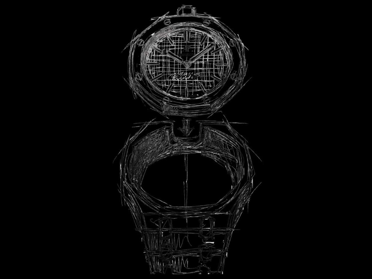
$95 Lambertus strap will turn the Audemars Piguet × Swatch Royal POP pocket watch into a wristwatch

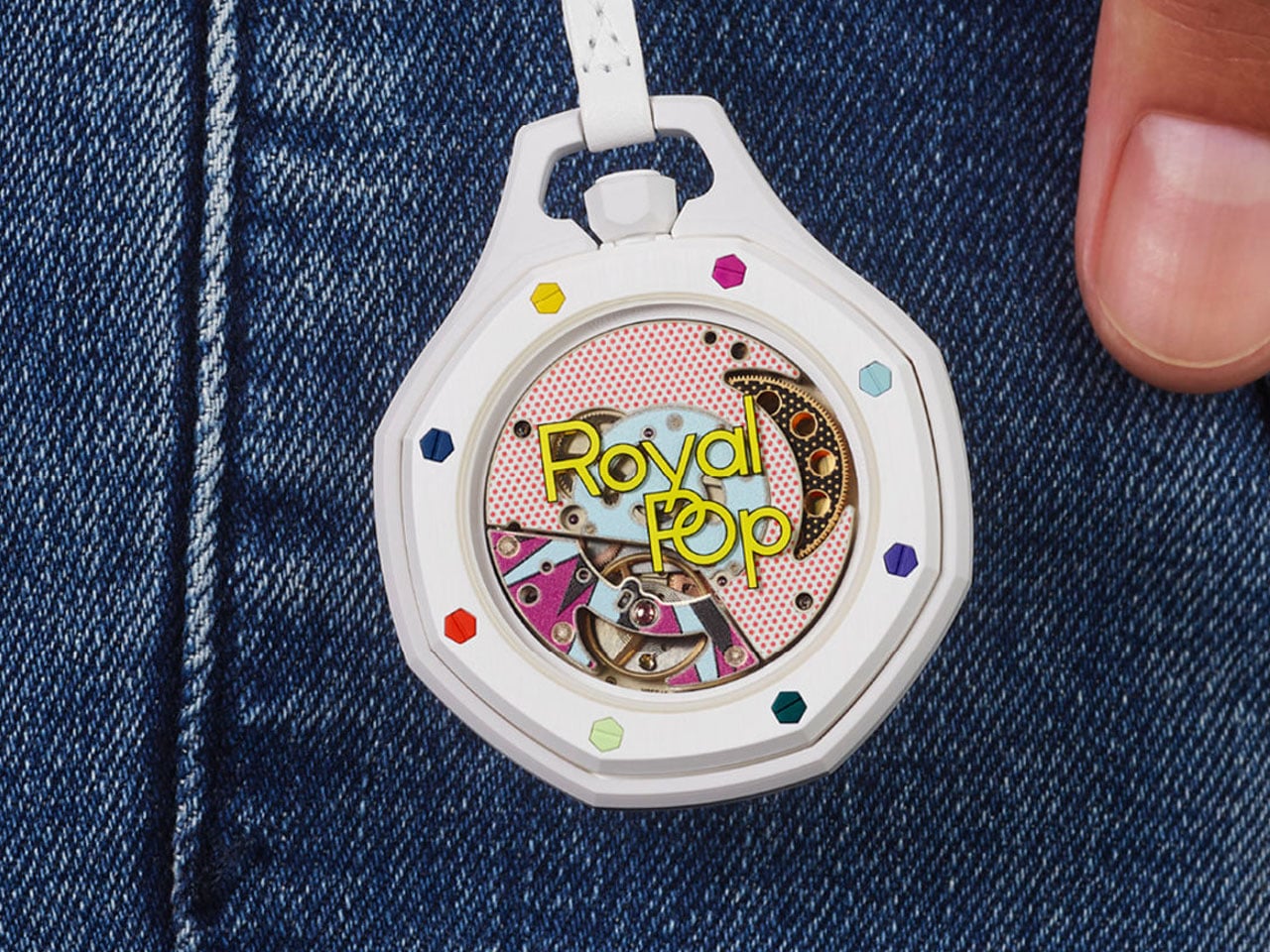
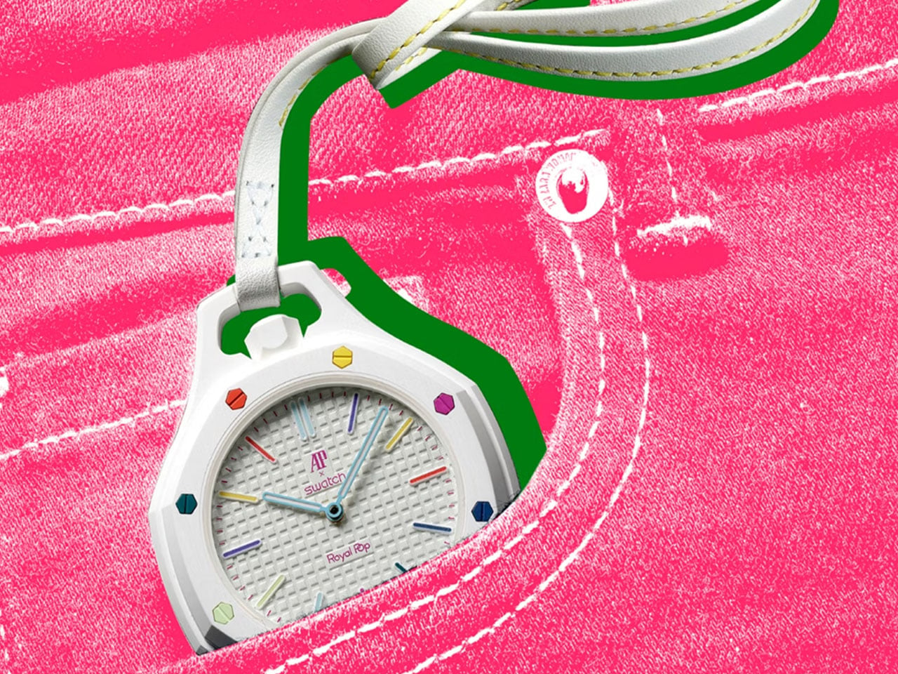
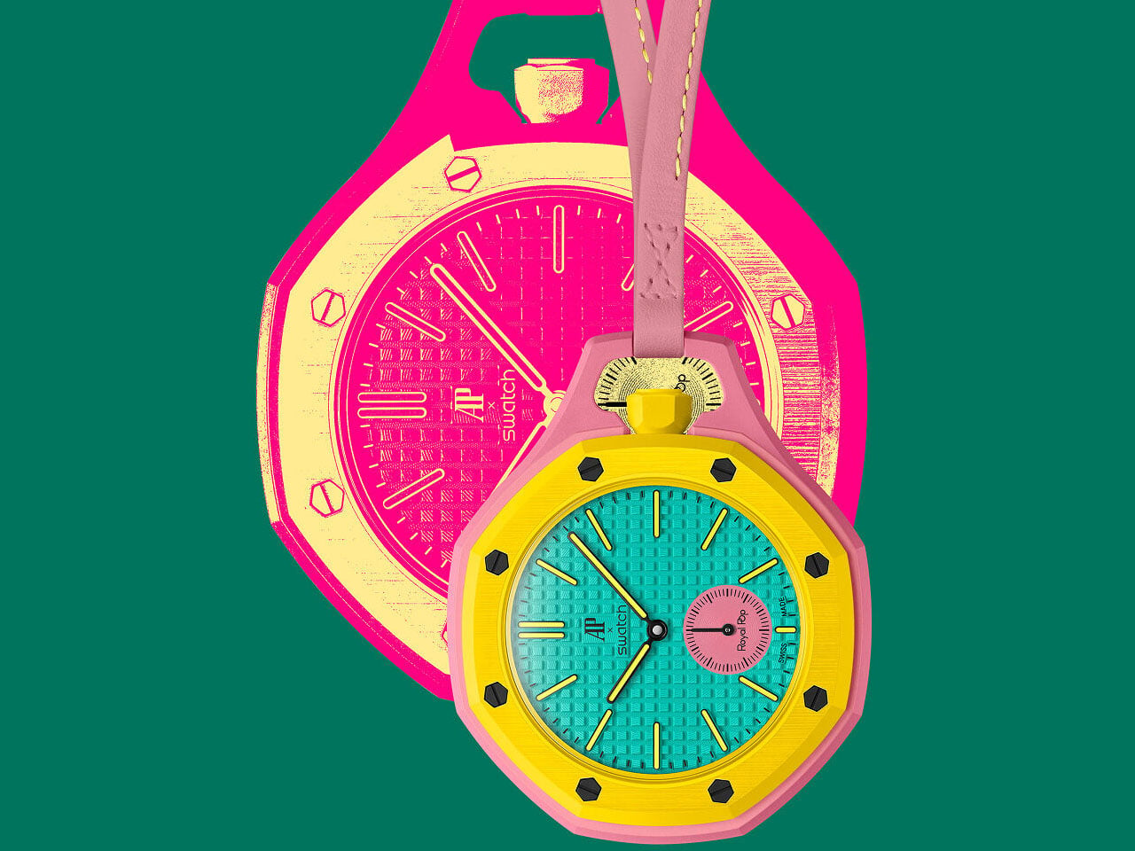
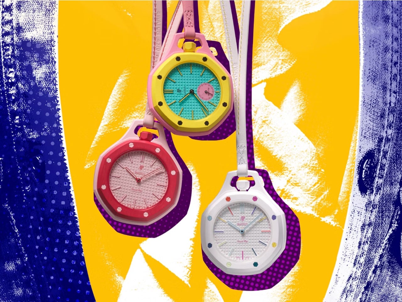
High-end collaborations, at times, give us meaningful outcomes that no matter how hard you try, you cannot sidestep. In my recent memory, Audemars Piguet x Swatch Royal Pop – a mindboggling amalgamation of the Royal Oak and the Swatch Pop – is definitely one such example. While everything is a Pop of color and high-end horology, what remains missing is the fact that this collaborative model is not meant to be worn on the wrist; it’s designed as a pocket watch, but one you’d definitely fall for even in 2026.

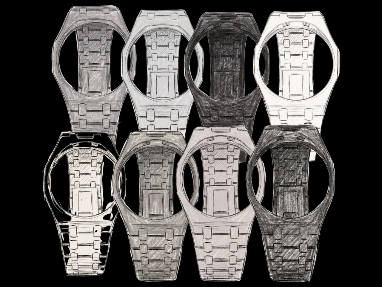
However, there is a school of thought comprising watch enthusiasts that believes the Royal Pop deserves to rest on the wrist. While the creators themselves don’t believe it, Lambertus, an independent maison, is a firm advocate that it should, and is therefore creating case-straps for the Audemars Piguet x Swatch Royal Pop, now going on pre-order, in whole, for $95 through the Royal Pop Wrist Bands website.

Designer: Lambertus

That amount will reserve a case-strap for you, but there’s a caveat. The creation of these straps has not kicked off the blocks at the time of writing. For the reservation price of $95, therefore, you are banking on Lambertus to carry out all the phases of development i.e., the roadmap from R&D, prototyping, final design, to manufacturing, with no clear deadline for assurance.

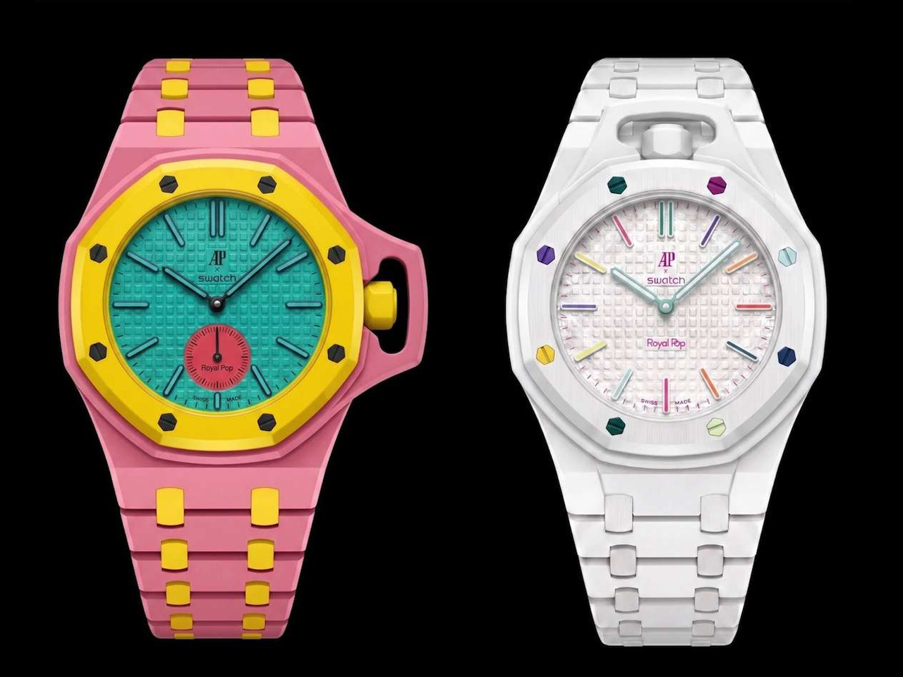
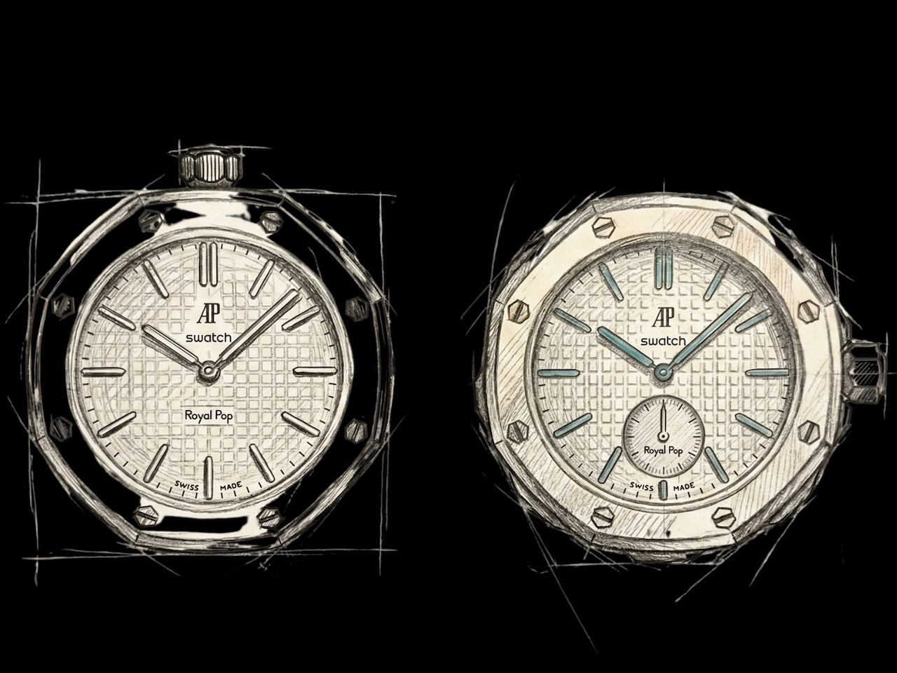
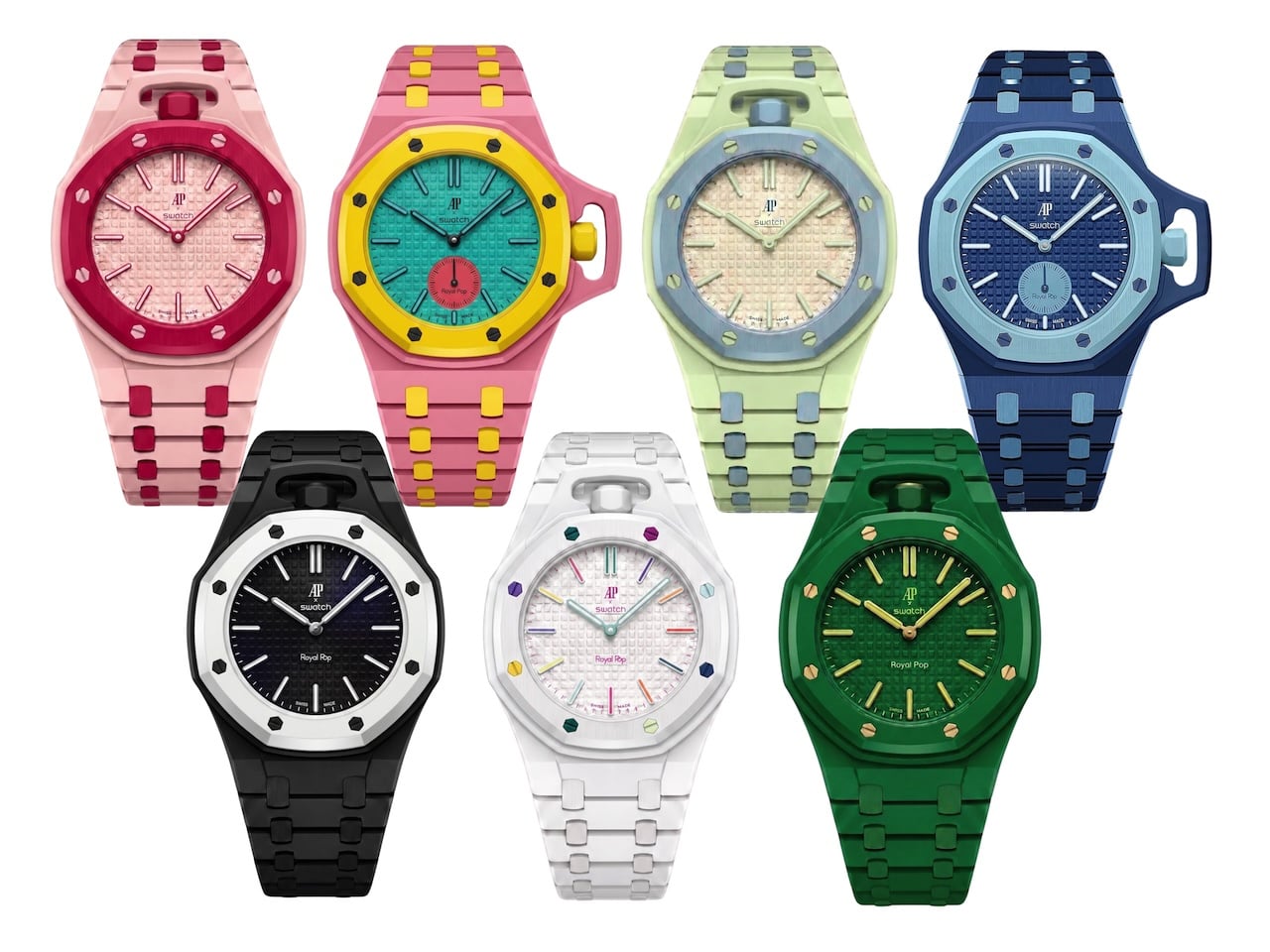
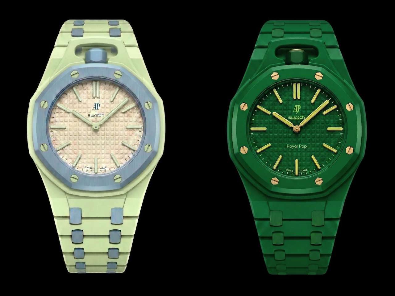
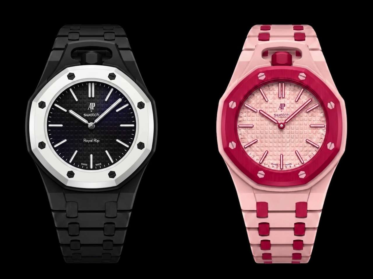
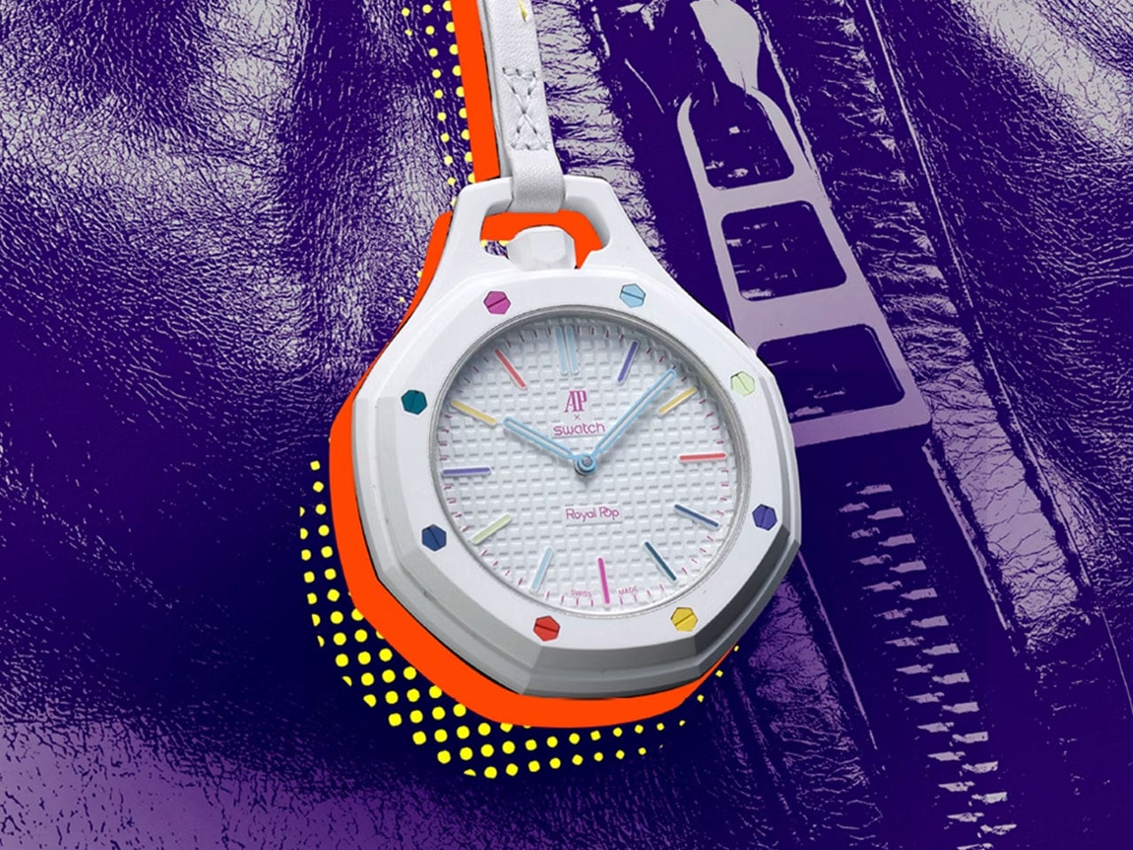
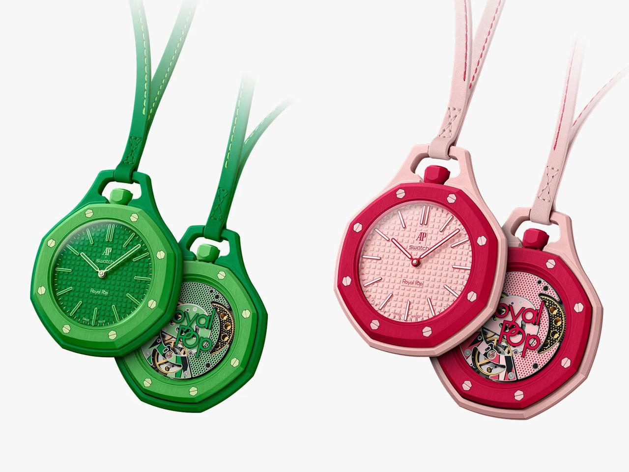
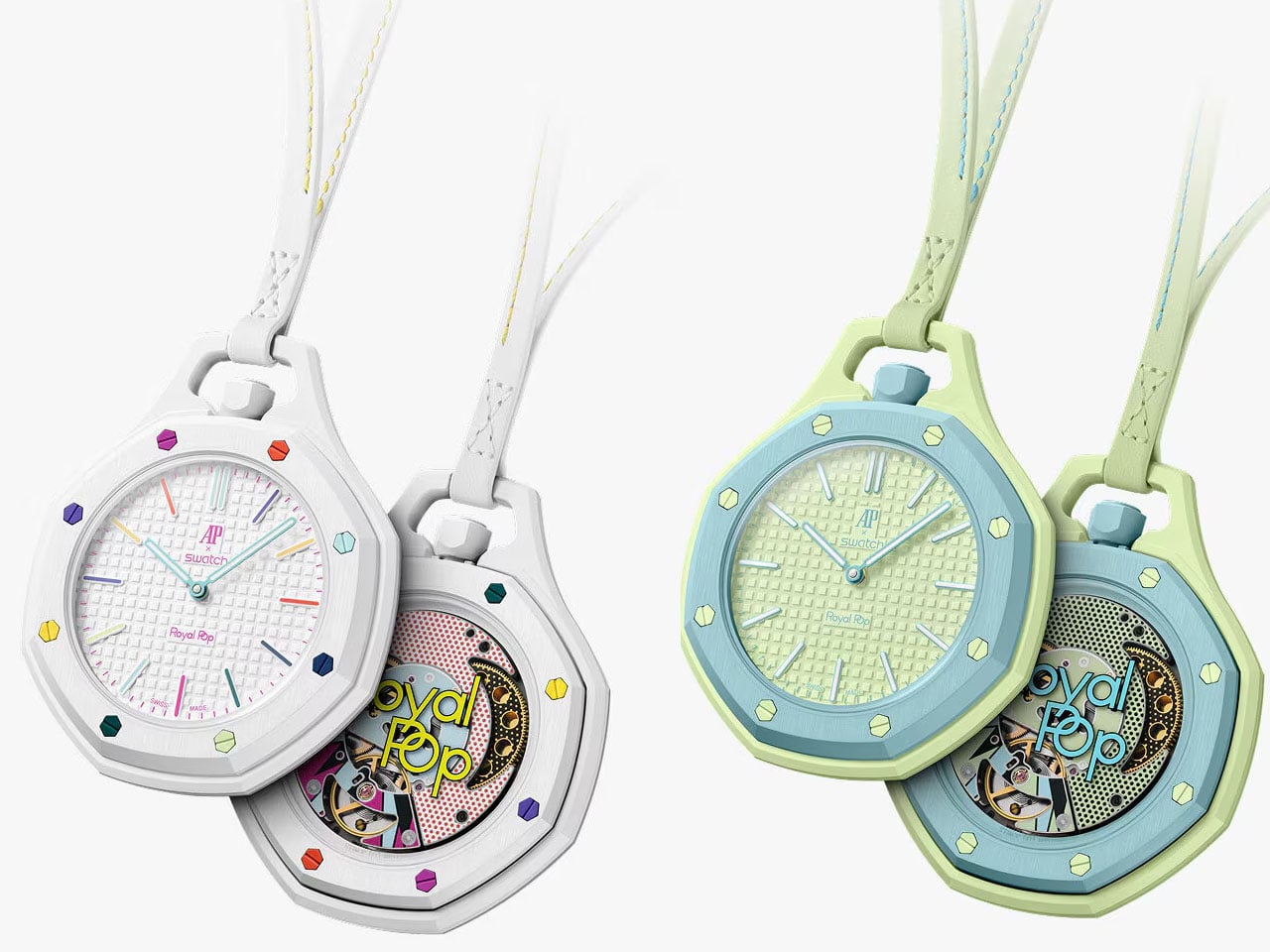
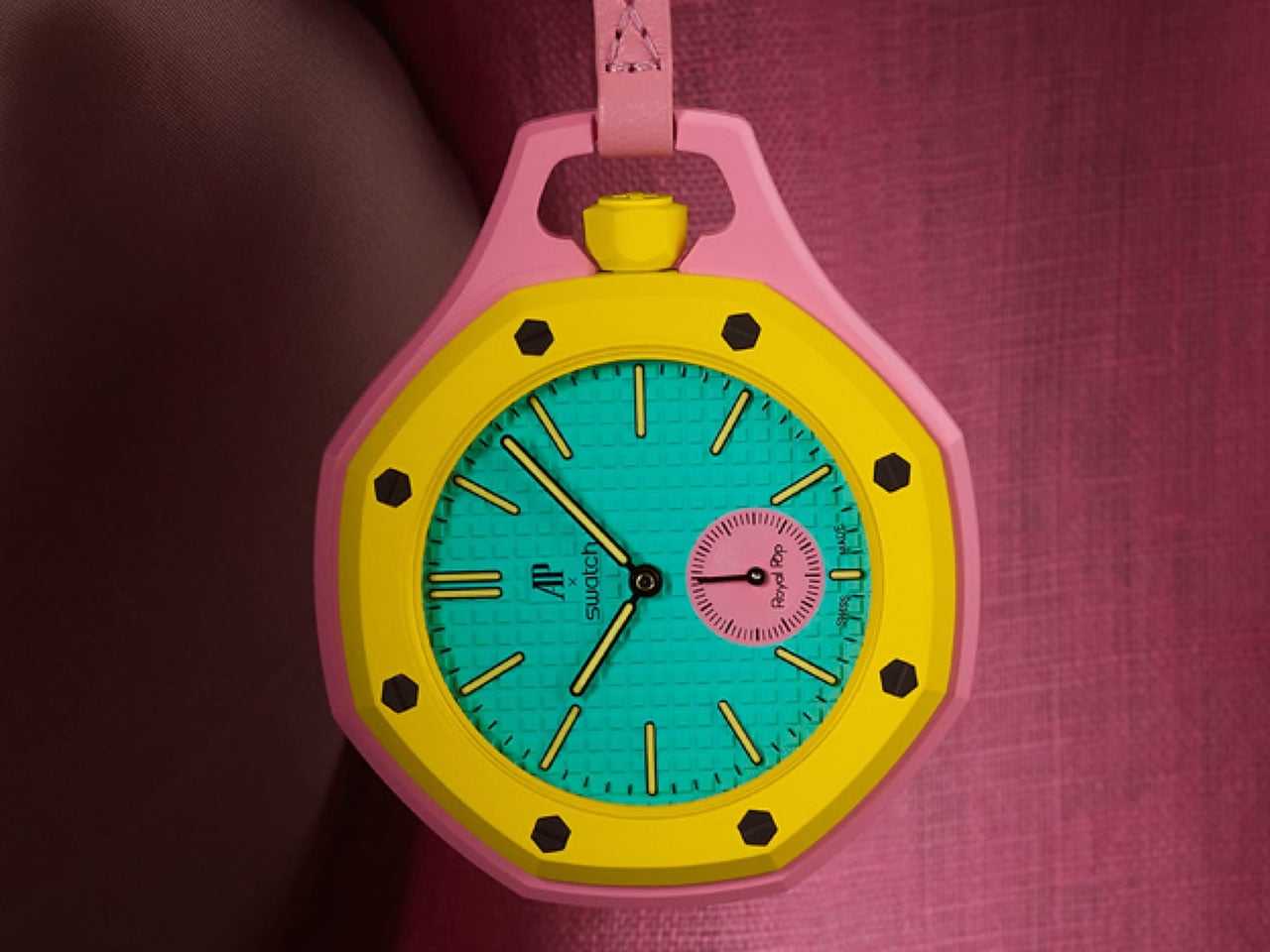
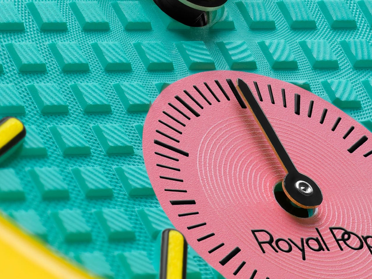
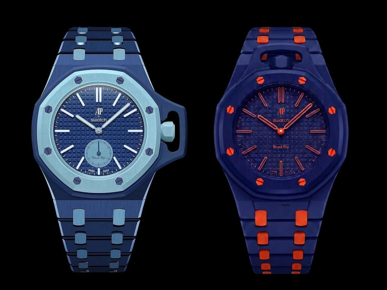
The Lambertus creation is called Chapter I. It’s now in the R&D, and should present, on development, as an excellent accessory to the AP × Swatch Royal Pop. The cult timepiece comes in eight different colorways and two design iterations: the Lépine and the Savonnette. The Lépine pocket watch is designed with hour and minute hands and a crown at 12 o’clock. It comes in six color options. Available in two colorways, the Savonnette Royal Pop, features a crown at 3 o’clock and along with the hour and minutes, also has a small second hand at 6 o’clock.

Since Lambertus has a vision to match everything in the Royal Pop portfolio to the T. It will also tailor the straps to match the eight colors of your pocket watch. Even commendable – or you may say requisite – is that the case-straps will be split in two models, like the AP x Swatch collaborative pocket watch itself. The Strap I of the Chapter I will come in six Lépine-style models and the Strap II in two options for the Savonnette-style watches.

Of course, from how it appears as of now, the machined, octagonal watch holder straps from Lambertus will let you snap in the AP x Swatch Royal Pop and flaunt it with passion. But how well the strap material (which remains unclear as I write), of the eight luxury designs in two crown orientations, complements the Bioceramic case of the actual watch is anybody’s guess. And if that’s not as premium as you would like to trust with your AP, we know where the $95 you put in is headed. To ensure the backers have little legal ground to confront, the Royal Pop Wrist Bands website puts out “Our Royal POP compatible straps and wristbands are not affiliated with, endorsed by, or sponsored by Audemars Piguet or Swatch Group,” in fine print.

The post $95 Lambertus strap will turn the Audemars Piguet × Swatch Royal POP pocket watch into a wristwatch first appeared on Yanko Design.

The colorful Audemars Piguet x Swatch Bioceramic Royal Pop watch can be worn in multiple ways

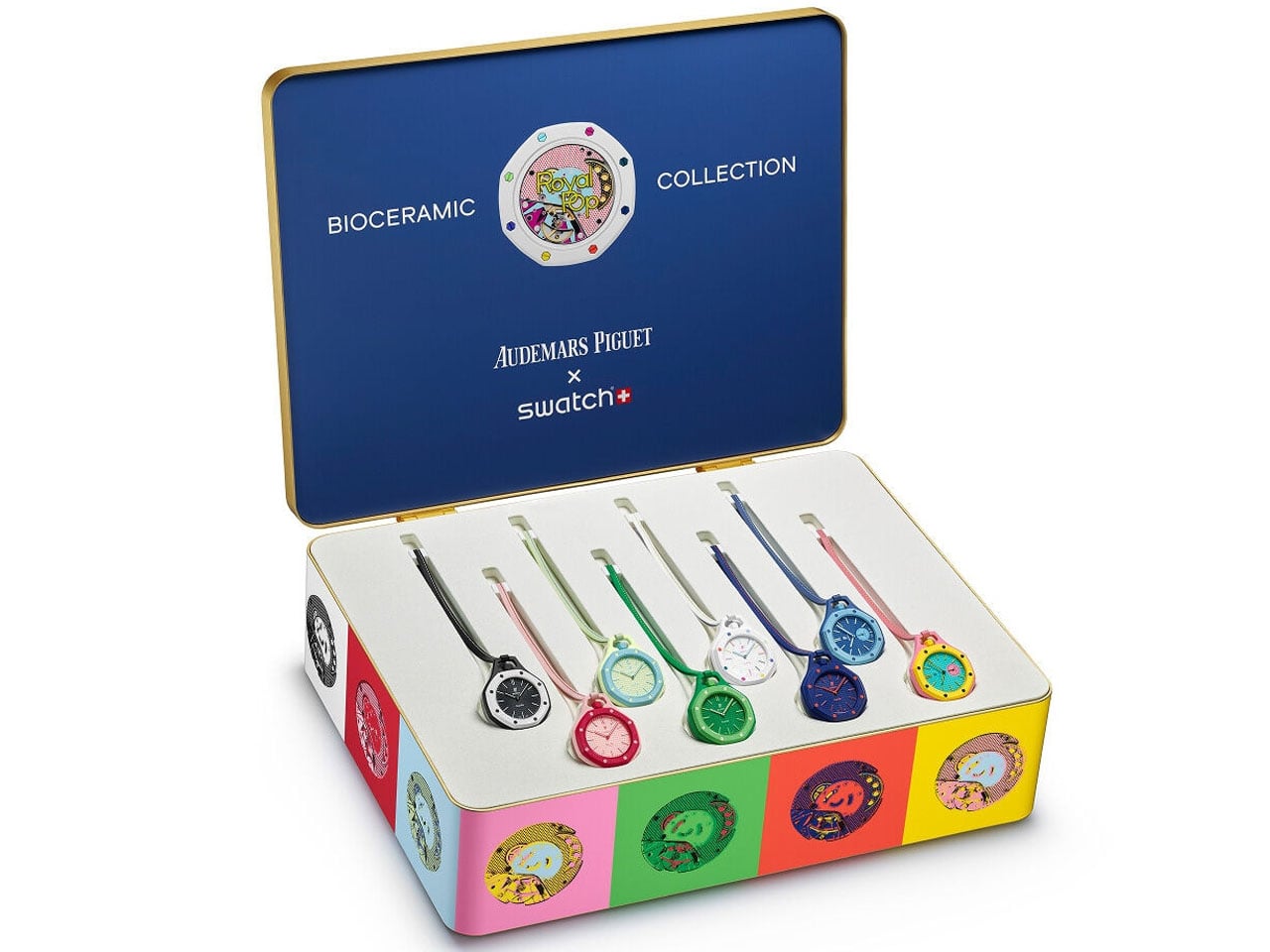
Since 1875, Audemars Piguet has been at the core of Swiss watchmaking, relentlessly blending luxury with bold designs in the Royal Oak. The avant-garde craftsmanship is now shared with Swatch to deliver a collaboration first Royal Pop in eight different models. The watch, designed to be worn in multiple ways, is not a traditional wristwatch, but a vision of an Instagram-worthy pocket watch. Don’t miss the pop of colors and the innovative audacity that underlie the ethos of this new collaborative timepiece when sharing a picture of it on your profile.

The eight colorful pocket watches by Audemars Piguet and Swatch are inspired by the former’s Royal Oak and the latter’s POP watches from the 1980s. This may be Swatch’s first partnership with AP, but the watchmaker has a history of making exciting collaborative models such as the Omega x Swatch MoonSwatch. While the new watches share the same Bioceramic case as the MoonSwatch, there are many differences, lets learn them in detail below.

Designer: Audemars Piguet  x Swatch

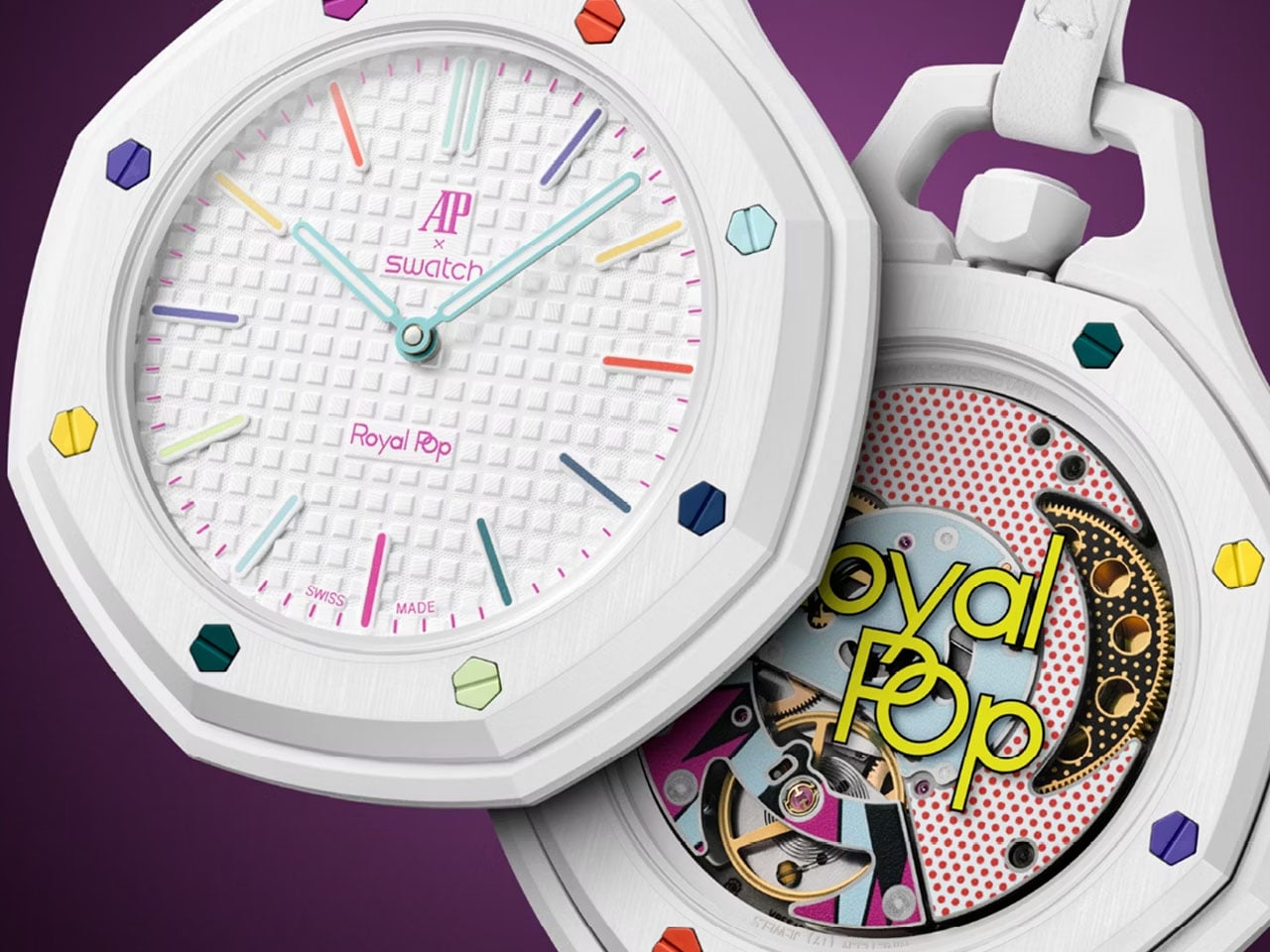
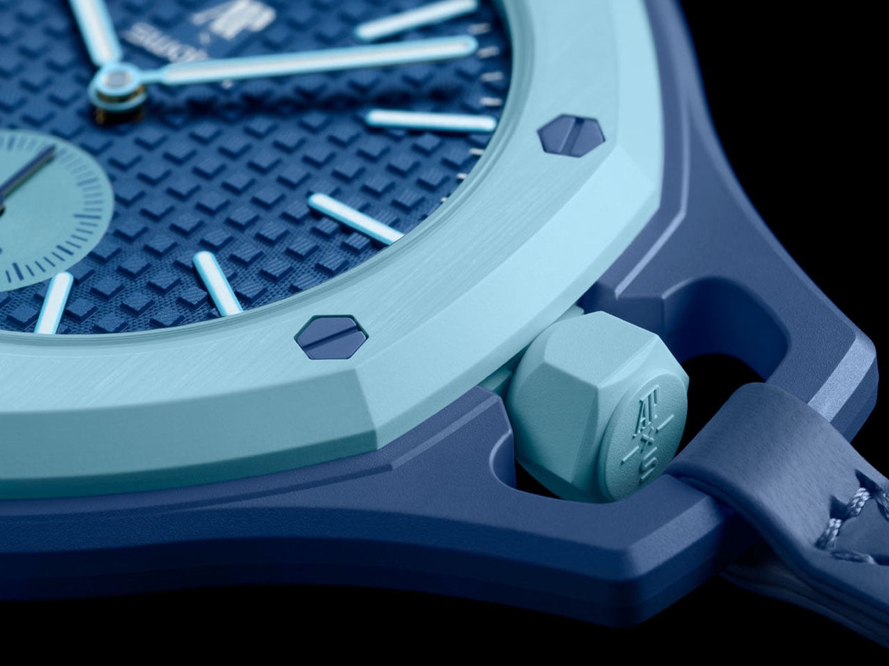
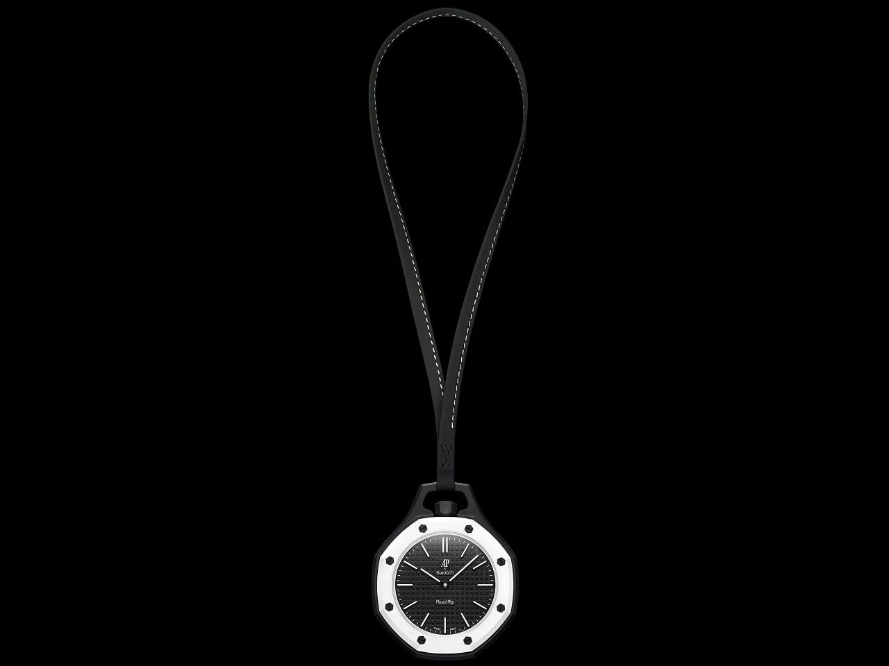
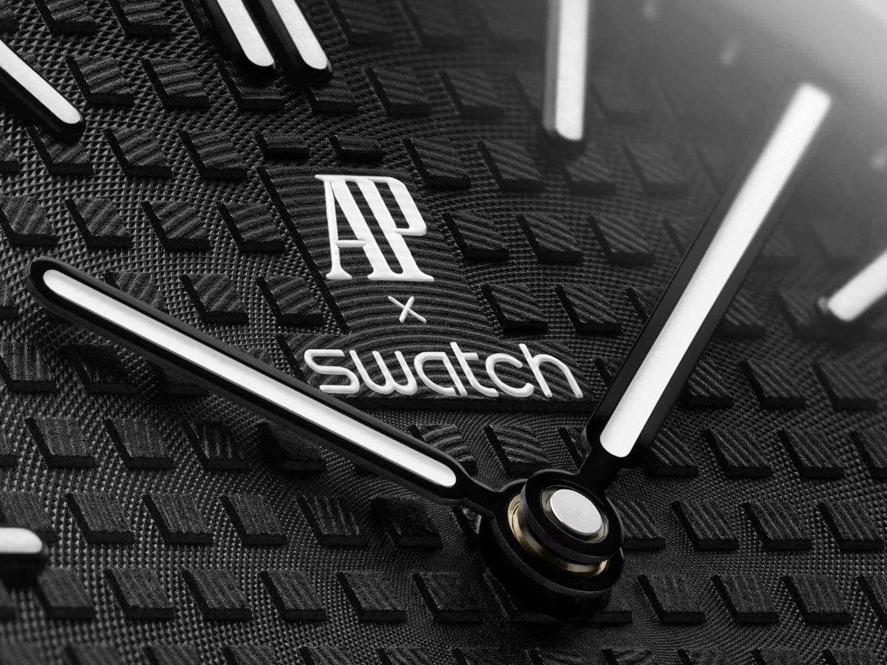
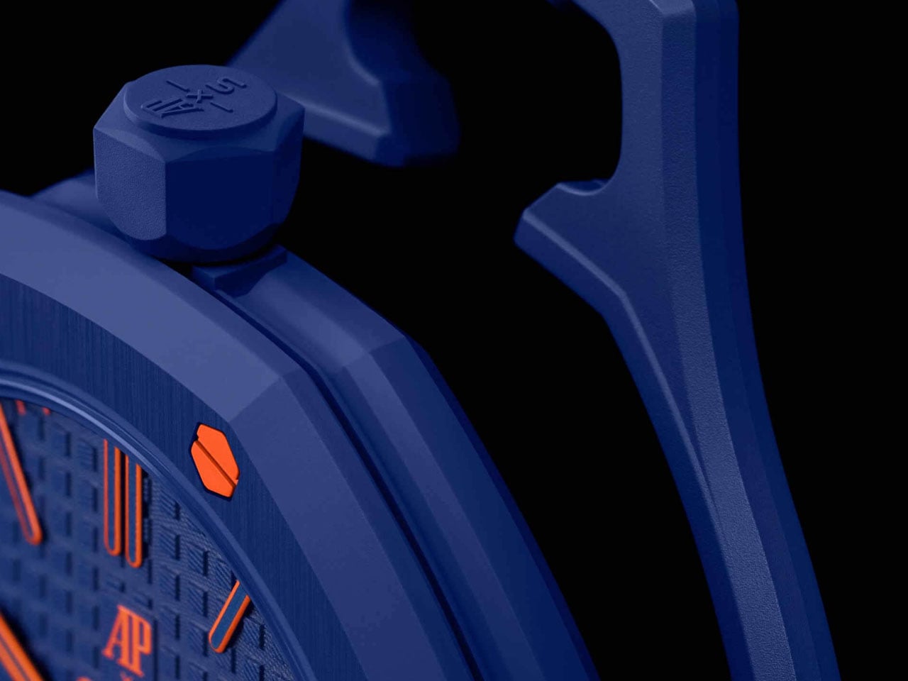
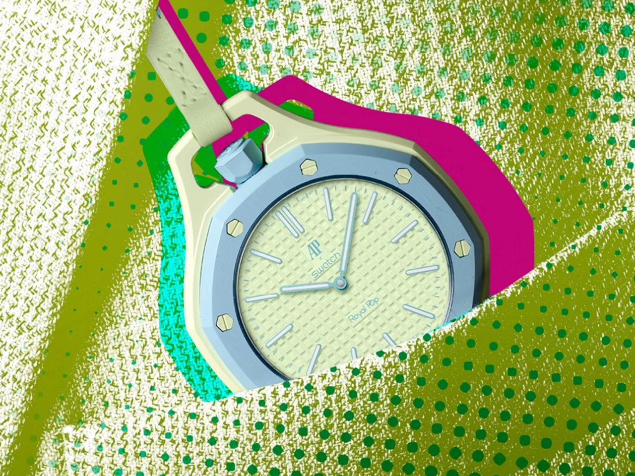
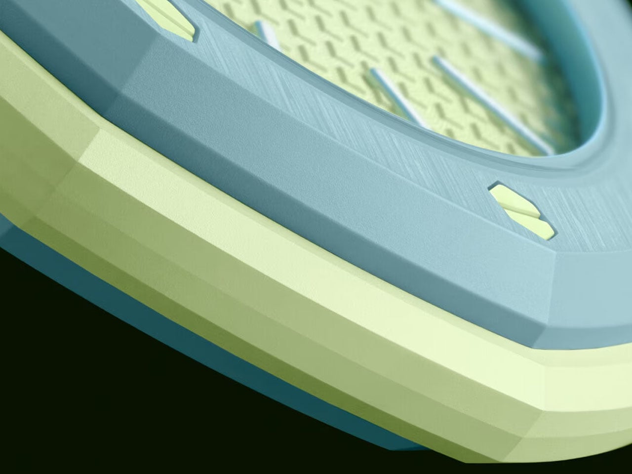
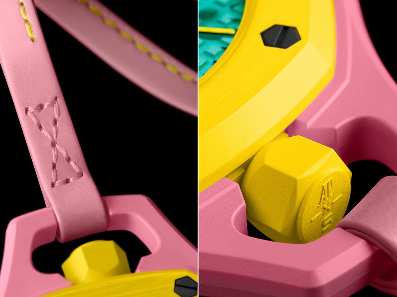
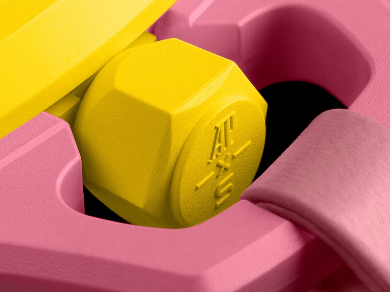
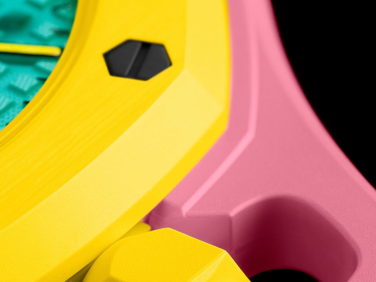
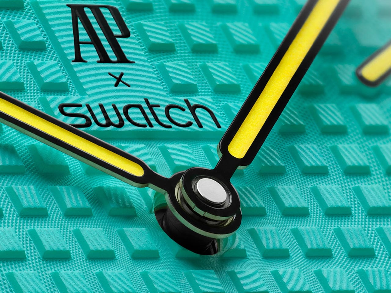
The joyful collaborative Royal Pop makes a statement with its bold colorways and the intent to give a new vision to the traditional way of wearing a watch. The watch features Swatch’s patented Bioceramic (a composite material) case, but the larger distinction – or similarity, if you may – is its Royal Oak inspiration. It has an octagonal bezel slapped with eight hexagonal screws, ‘Petite Tapisserie’ pattern on the dial, and comes with three lanyard lengths to wear it in different ways.

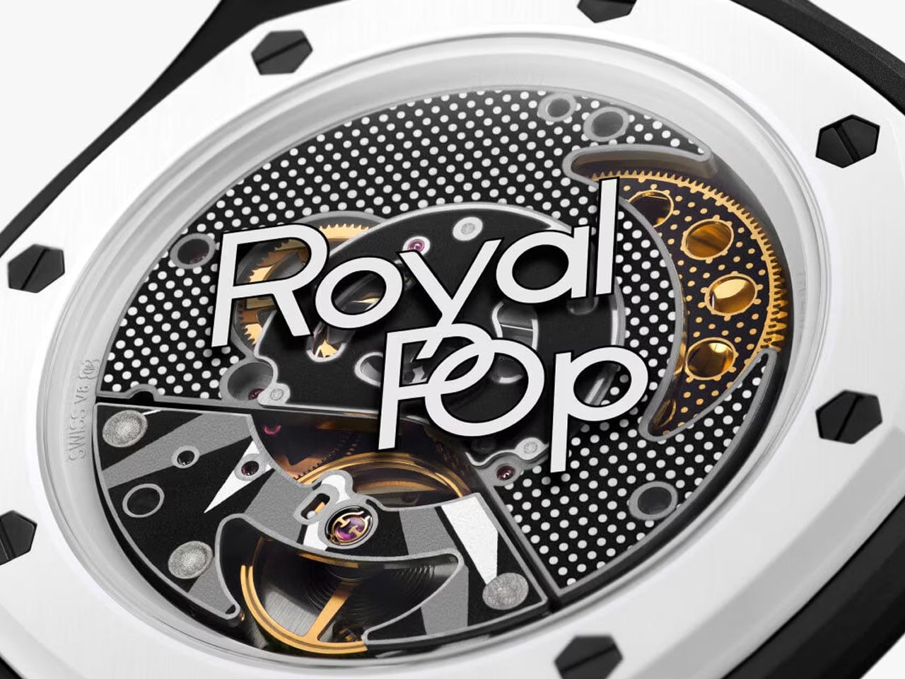
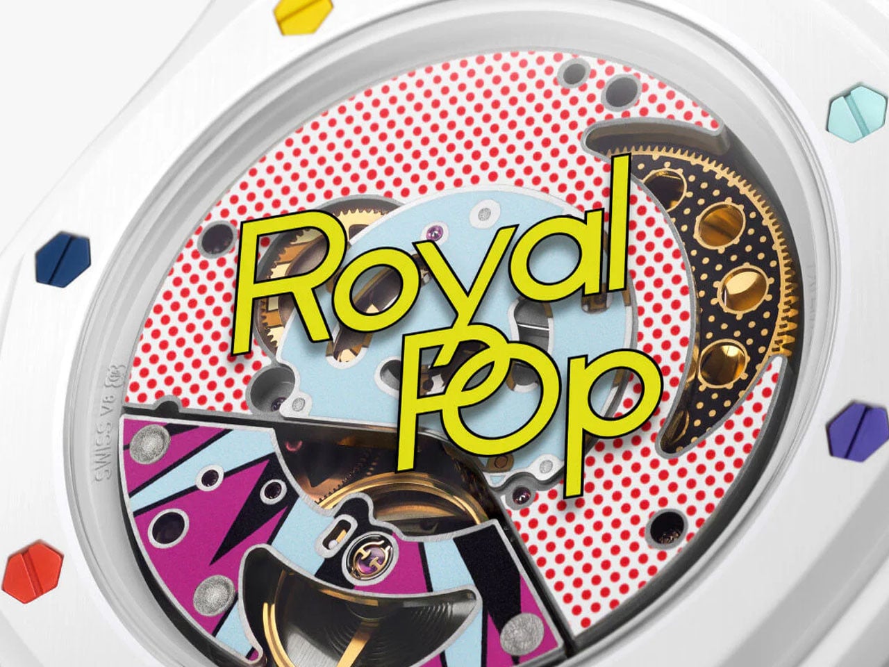
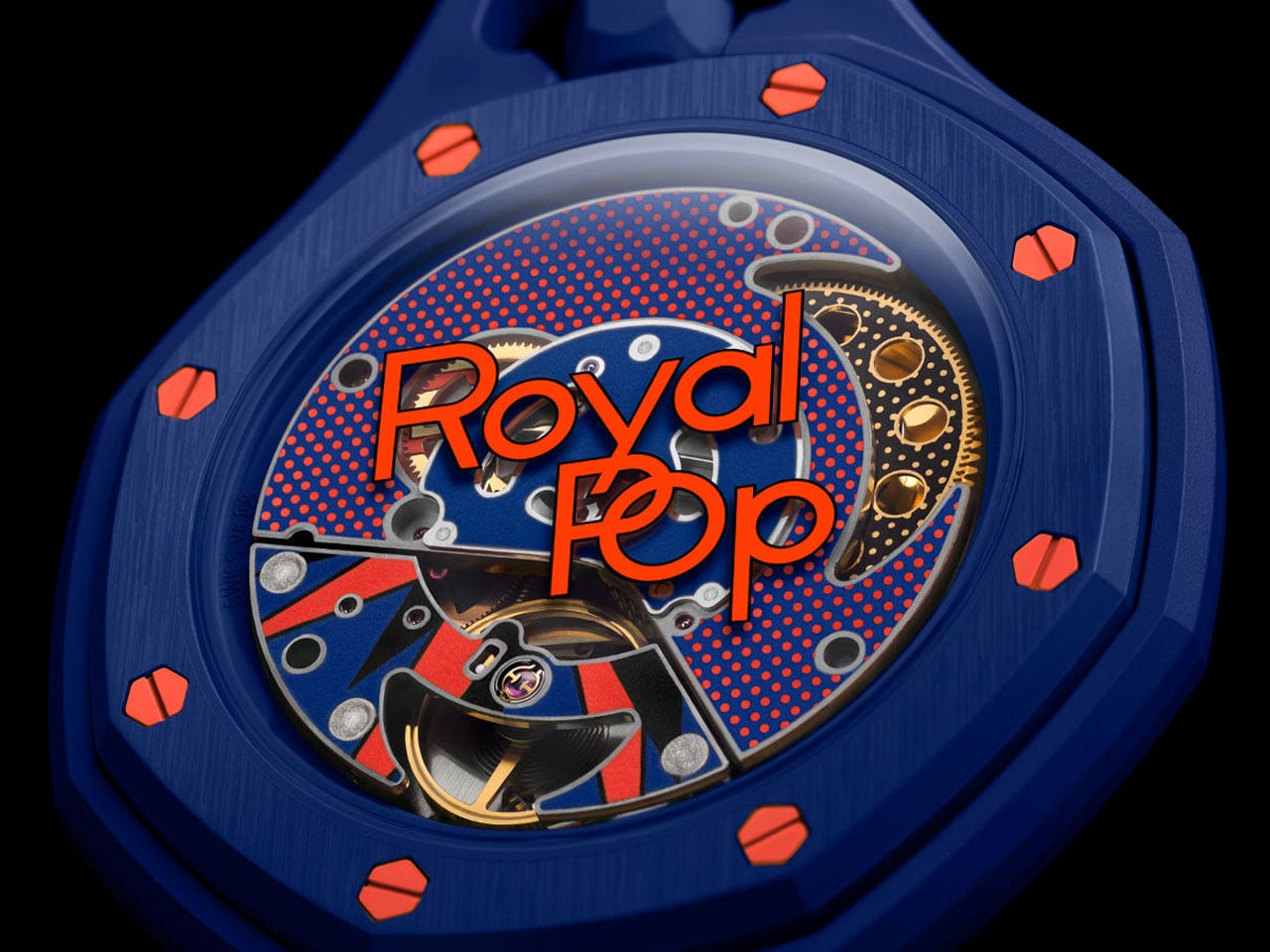
The colorful Bioceramic Royal Pop pocket watch with Royal Oak pedigree measures 40mm in diameter, and it is only 8.4mm thick. The hour and minute hands under the sapphire crystal feature Super-LumiNova for readability in the dark. Other interesting aspects of the Royal Pop are its see-through caseback and its innovative SISTEM51 movement, designed by Swatch.

As noted, the Audemars Piguet x Swatch Royal Pop comes in eight different models. These are further divided into two distinct configurations: Lépine and Savonnette. The six Lépine-style pocket watches feature hour and minute hands and a crown at 12 o’clock. Two Savonnette-style watches, on the other hand, have a crown placed at a more recognizable 3 o’clock position, and in addition to the hour and minutes, also have a small second hand at 6 o’clock.

Bioceramic Royal Pop pocket watch, as mentioned, is powered by Swatch’s hand-wound SISTEM51 movement, which is reportedly the only mechanical movement with a “100% automated assembly.” The movement features an anti-magnetic Nivachron balance spring along with laser-based precision adjustment set directly at the factory. It will provide the pocket watch with up to 90 hours of power reserve. The Bioceramic Royal Pop Collection is now available for purchase through selected Swatch stores, starting at $400 for the hour-and-minute versions. The model with a small second hand will cost you $420 before taxes.

The post The colorful Audemars Piguet x Swatch Bioceramic Royal Pop watch can be worn in multiple ways first appeared on Yanko Design.

G-Shock Just Dropped a Coca-Cola Watch for Its 140th Anniversary

There are some things that you know are fundamentally bad for you, but you can’t resist consuming them. Coke (the soft drink) is one such commodity, and especially during the summer season, it has become more of a necessity than an indulgence. The brand itself has been around for 140 years and has built itself into something that virtually everyone recognizes, from its logos and visual cues to its timeless ad campaigns. It has become a cultural artifact for well over a century, transcending beverage culture to become one of the most iconic brands in history.

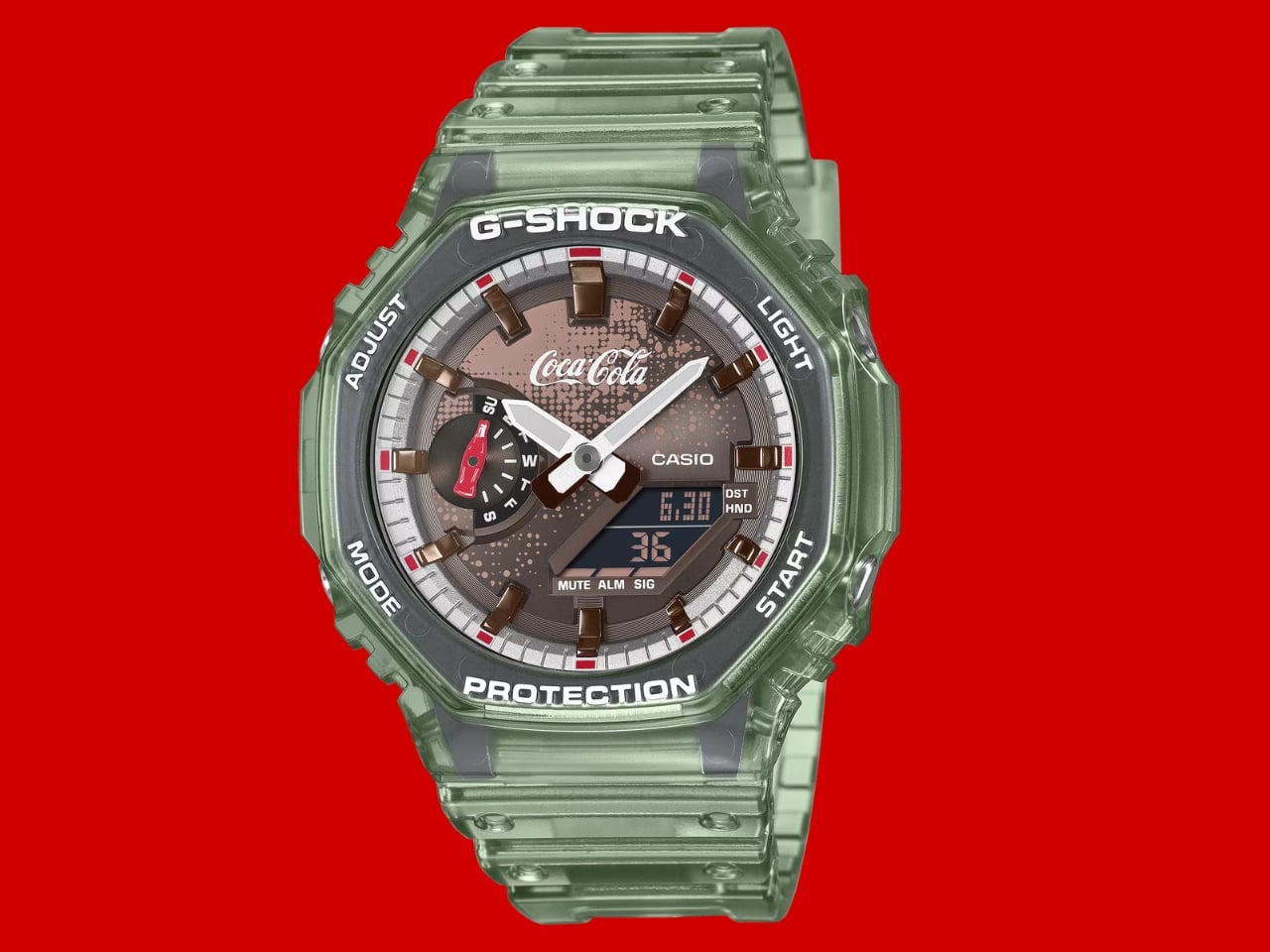
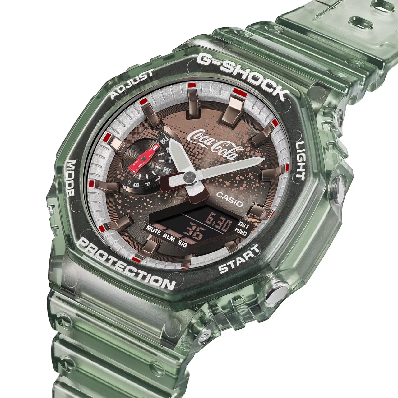
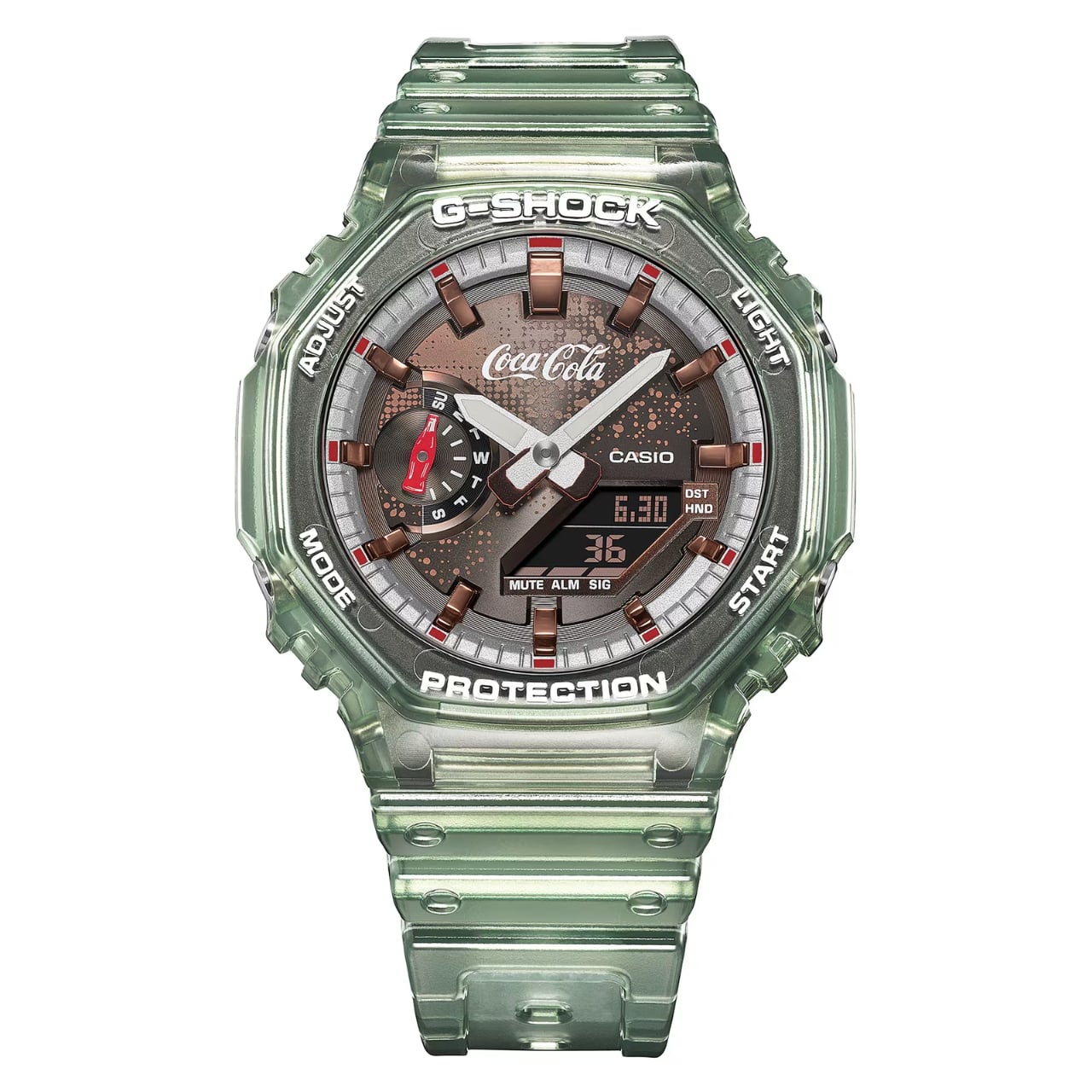
To celebrate this milestone, Coca-Cola has partnered with another recognizable global brand, G-Shock, to create a limited-edition collaboration. The GA-2100CC-3A is the first-ever Coca-Cola watch built on the analog-digital GA-2100 base, which has its own massive cult following in the watch community. Enthusiasts affectionately nicknamed the GA-2100 the “CasiOak,” a nod to its resemblance to the luxury Audemars Piguet Royal Oak, making it one of the most talked-about G-Shock models of the modern era.

Designer: G-Shock x Coca-Cola

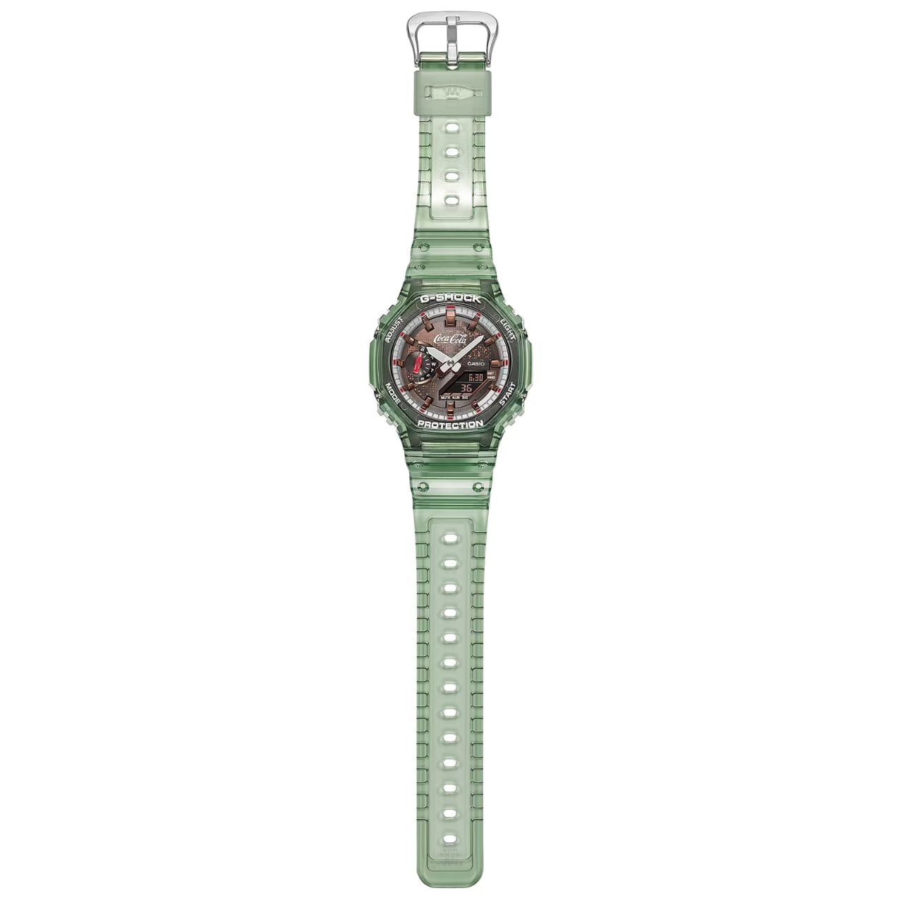
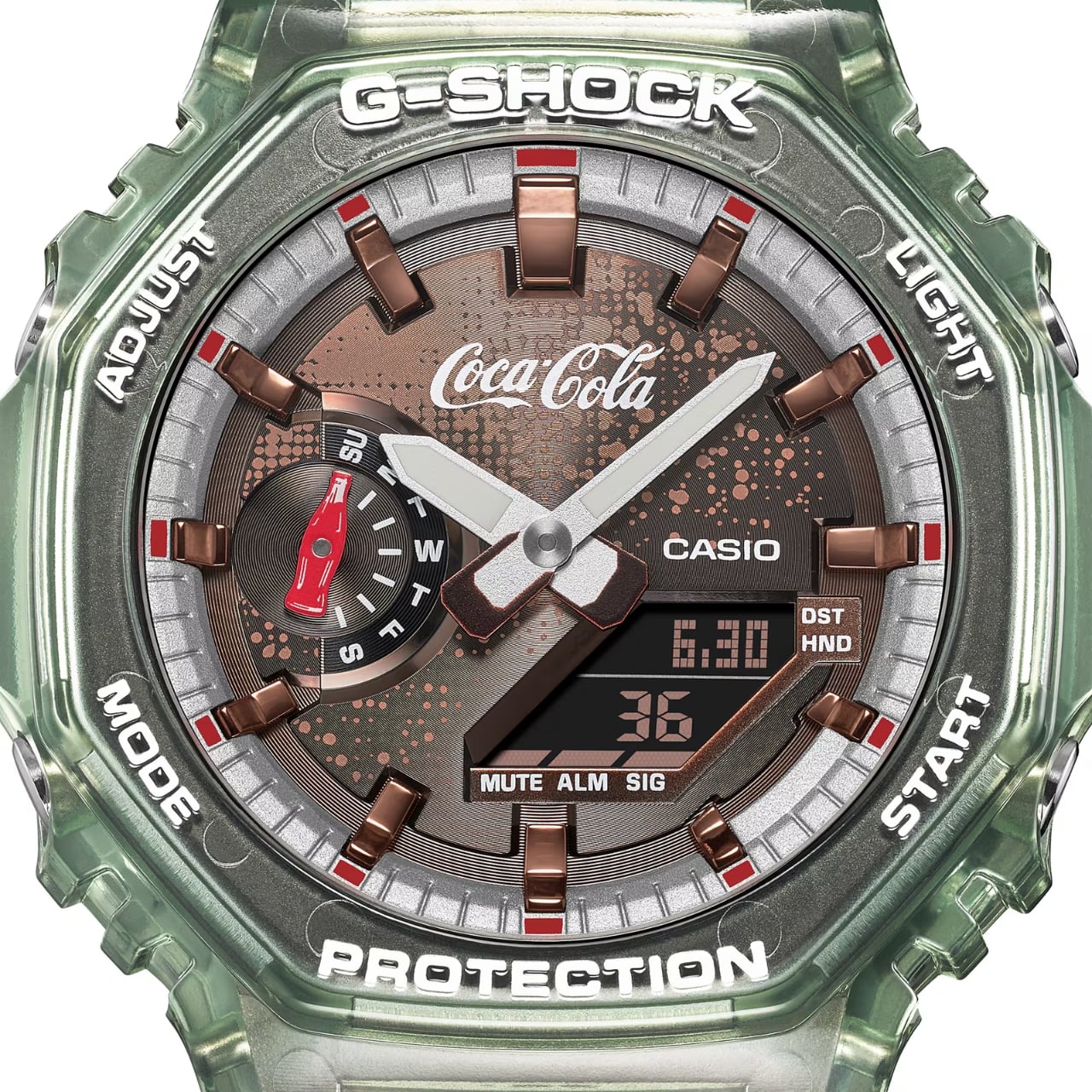
You would think that a Coca-Cola collaboration would have red and white splashed all over, but G-Shock took a more refined, classic approach. Instead of leaning into the brand’s signature bold palette, the design focuses on a translucent green bio-based resin that is directly reminiscent of Coca-Cola’s iconic vintage contour glass bottle. You do get minimalist splashes of red throughout the design, as it is of course the color most associated with the brand, but it’s tasteful rather than overwhelming. Instead of just slapping the logo on this wearable, you get smart design easter eggs that will delight the most die-hard of Coke fans.

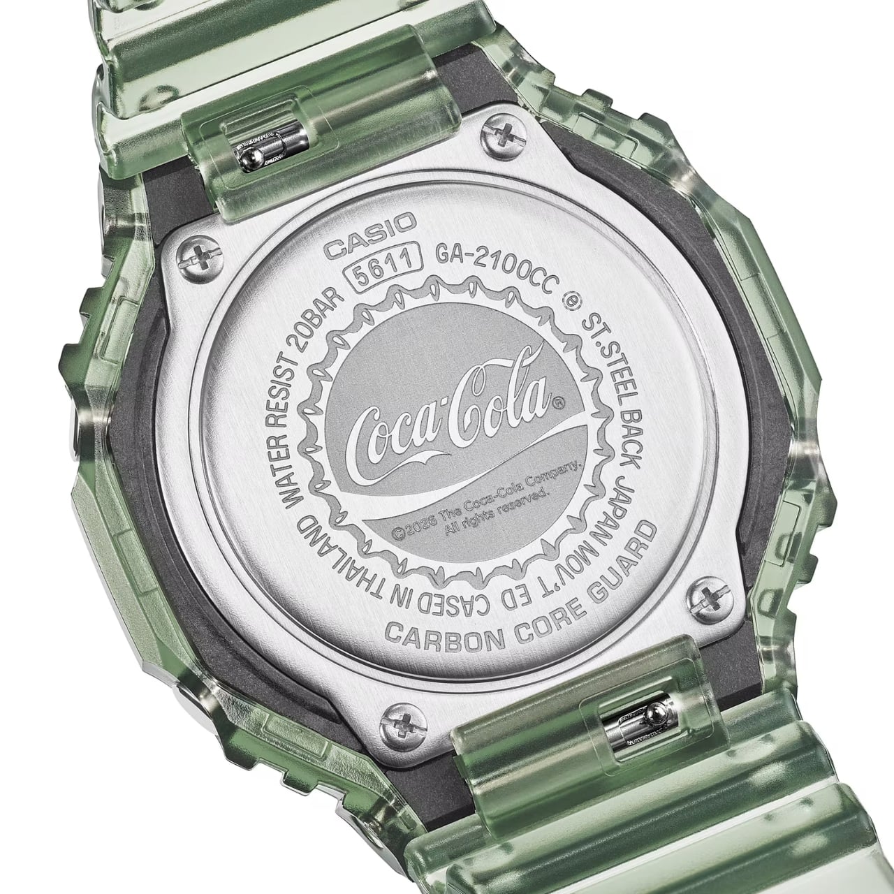
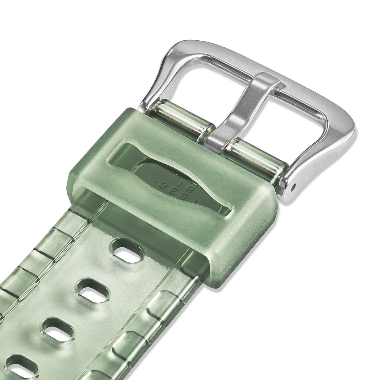
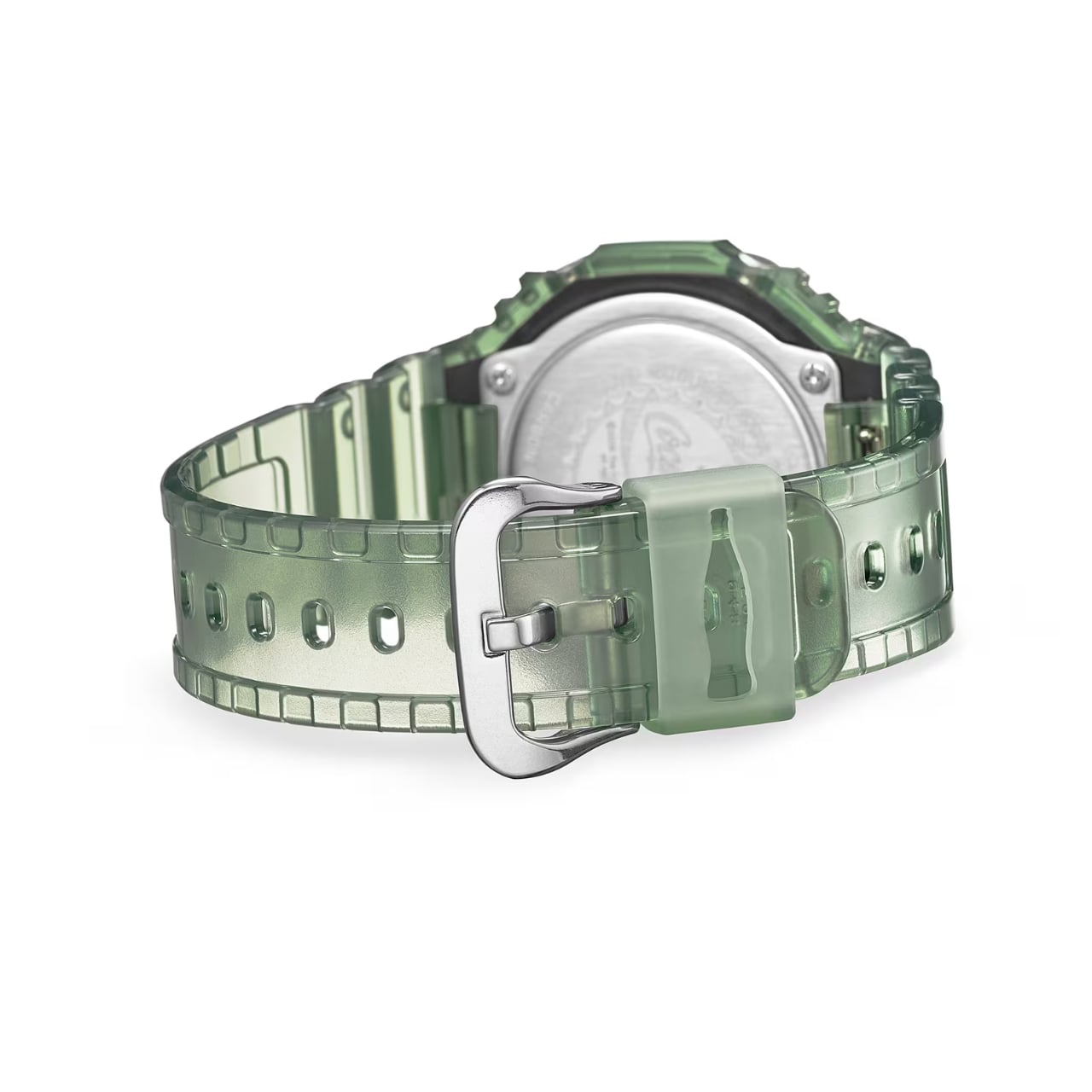
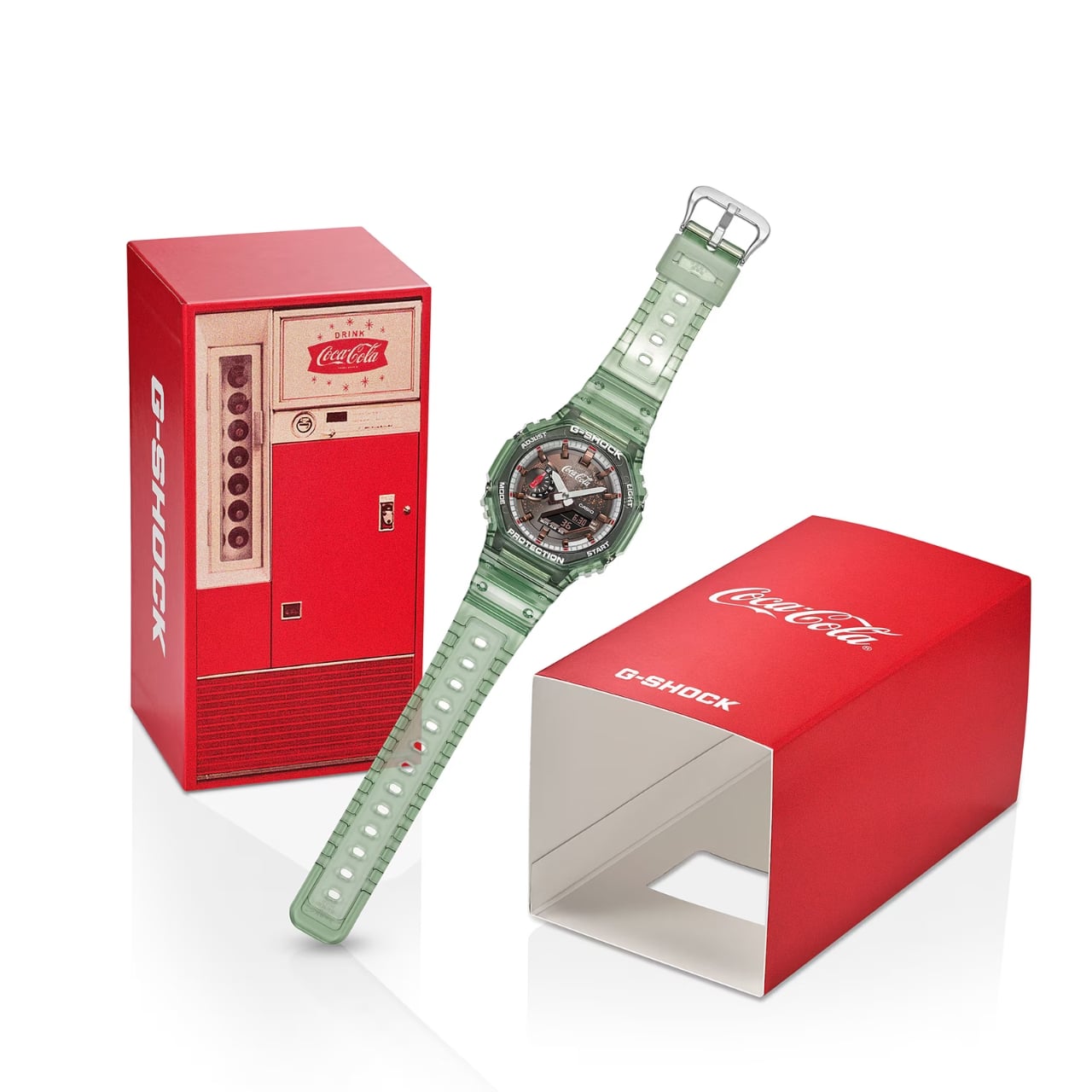
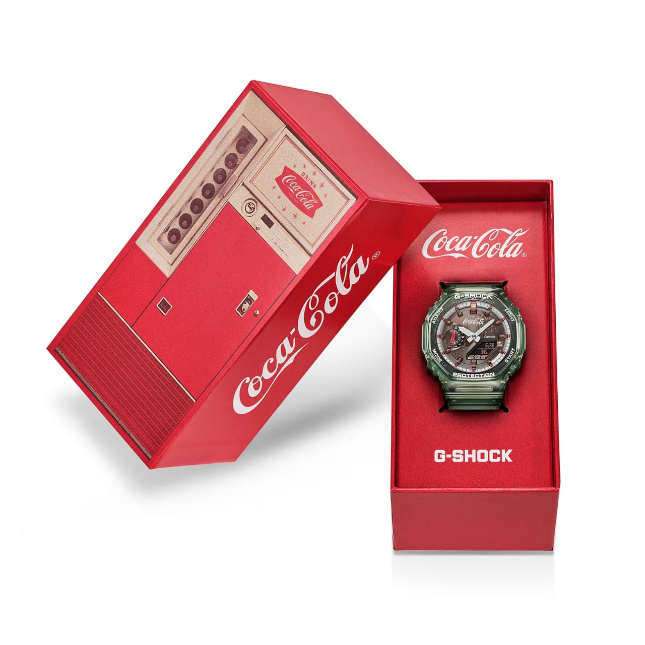
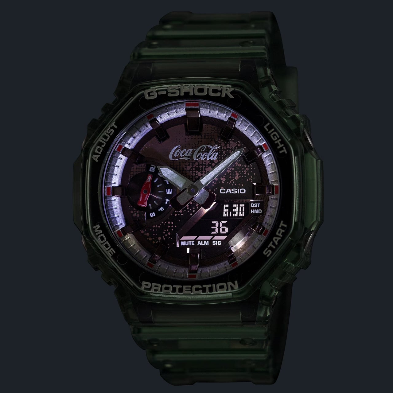
Both the bezel and band come in the aforementioned translucent green, with the dial receiving Coca-Cola-toned hues as well as printed graphics evoking the iconic bubbles from the soft drink’s fizz. At the 9 o’clock position, the date indicator hand is shaped like the brand’s beloved fluted glass bottle. That same bottle motif is carried over into the band loop as well, keeping the design cohesive and intentional. Flip the watch over and you’ll find the case back engraved with a bottle cap-inspired design, a subtle but brilliant finishing touch. The entire watch also arrives in exclusive special-edition packaging specifically created to commemorate the brand’s 140th anniversary, making it a complete collector’s package from the moment you open the box.

It’s also worth noting that the use of bio-based resin is not just a stylistic choice. It reflects a growing commitment to more sustainable materials in watchmaking. The GA-2100 series adopted bio-based resin in 2024, and it carries forward seamlessly into this collaboration, giving the watch a modern, eco-conscious edge that feels right at home in 2026.

In terms of technical specifications, you still get all the great hallmarks of the GA-2100 base, which has made it one of the more popular G-Shock models. It is shock resistant as well as water resistant for up to 200 meters. It comes equipped with the usual functions including a timer, stopwatch, and Double LED light, with an approximate battery life of 3 years. The case measures 48.5 × 45.4 × 11.8 mm and weighs in at 51g, slim and lightweight for a G-Shock, which has always been a big part of the GA-2100’s appeal.

The GA-2100CC-3A is priced at ¥27,500 JPY (approximately $175 USD) and is set to release in May 2026 via the Casio webstore. Given that this is a limited-edition piece tied to a once-in-a-generation anniversary, it’s the kind of watch that won’t sit on shelves for long.

Whether you’re a G-Shock collector, a Coca-Cola memorabilia enthusiast, or simply someone who appreciates thoughtful design collaborations, the GA-2100CC-3A checks every box. It’s nostalgic yet modern, playful yet polished, and honestly, much like the drink it celebrates, it’s the kind of thing you didn’t know you needed until it’s right in front of you.

The post G-Shock Just Dropped a Coca-Cola Watch for Its 140th Anniversary first appeared on Yanko Design.
Piaget Just Moved the Watch From Your Wrist to Your Neck

The watch industry has a well-earned reputation for doing the same thing over and over again, just with slightly thinner cases and flashier complications each year. So when a brand genuinely surprises you, it feels worth talking about. Piaget’s Swinging Pebbles, unveiled at Watches and Wonders 2026, did exactly that for me.

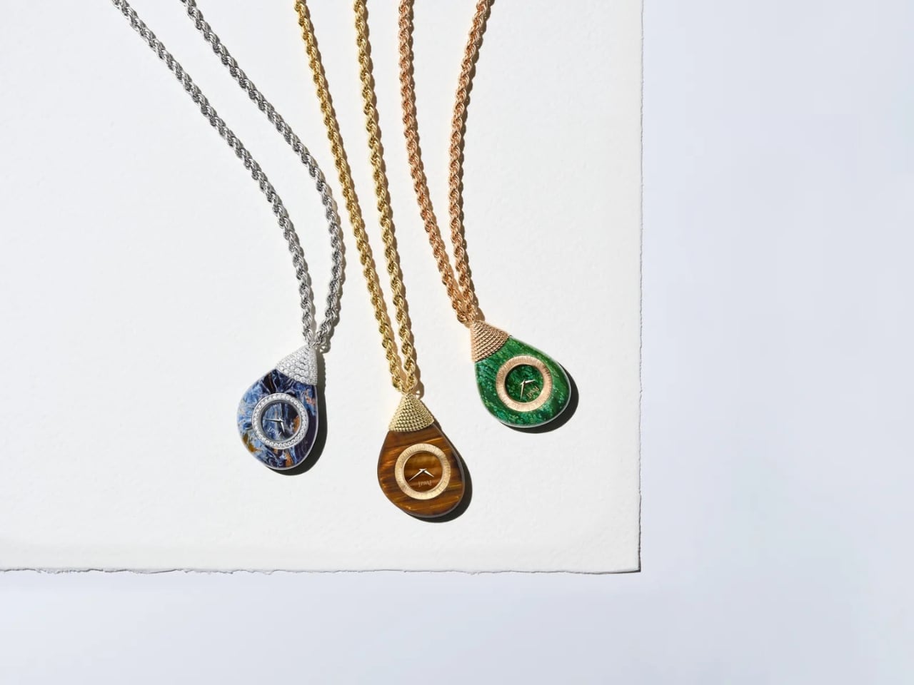
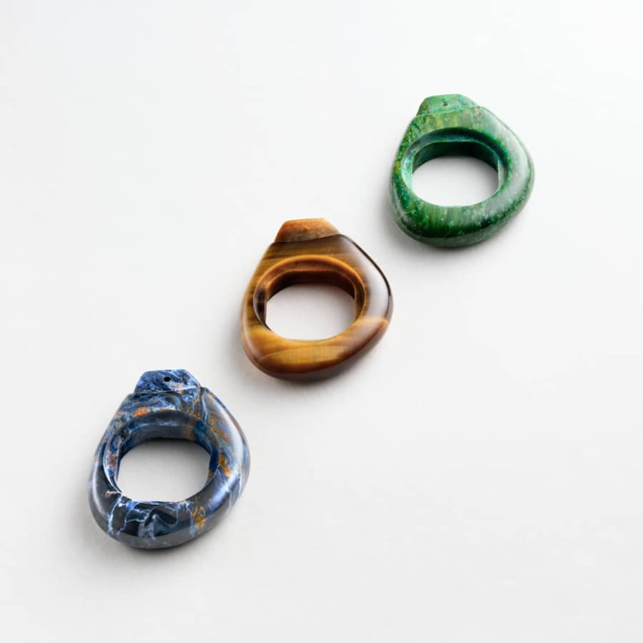
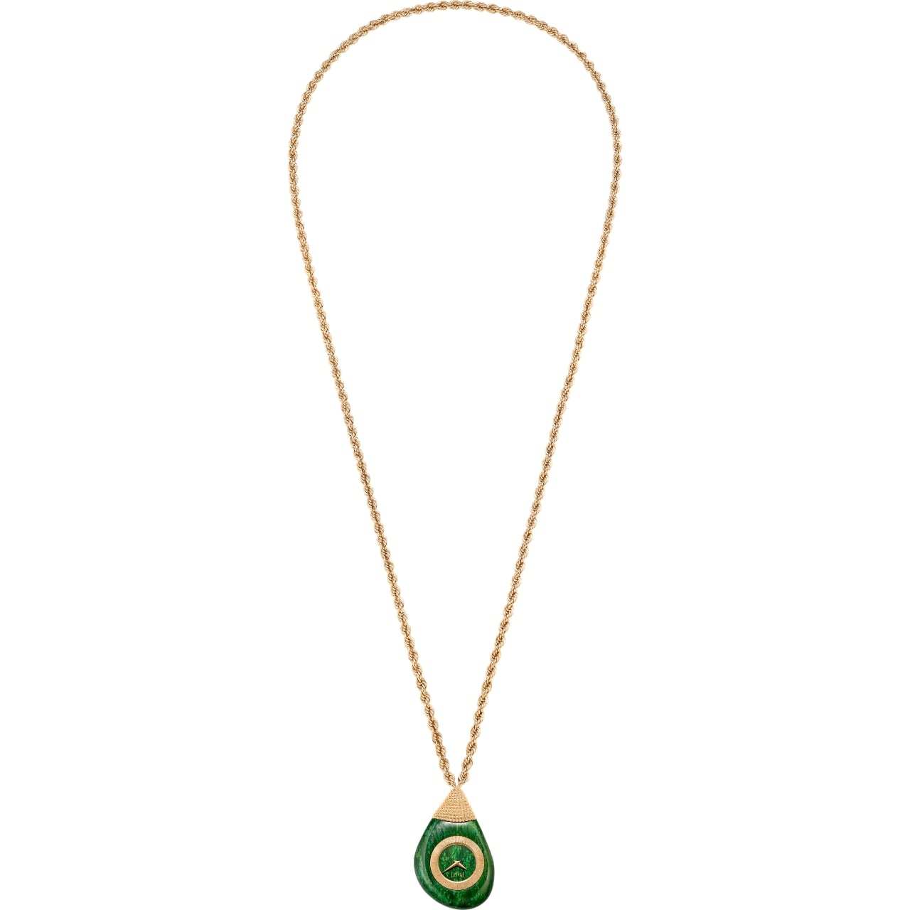
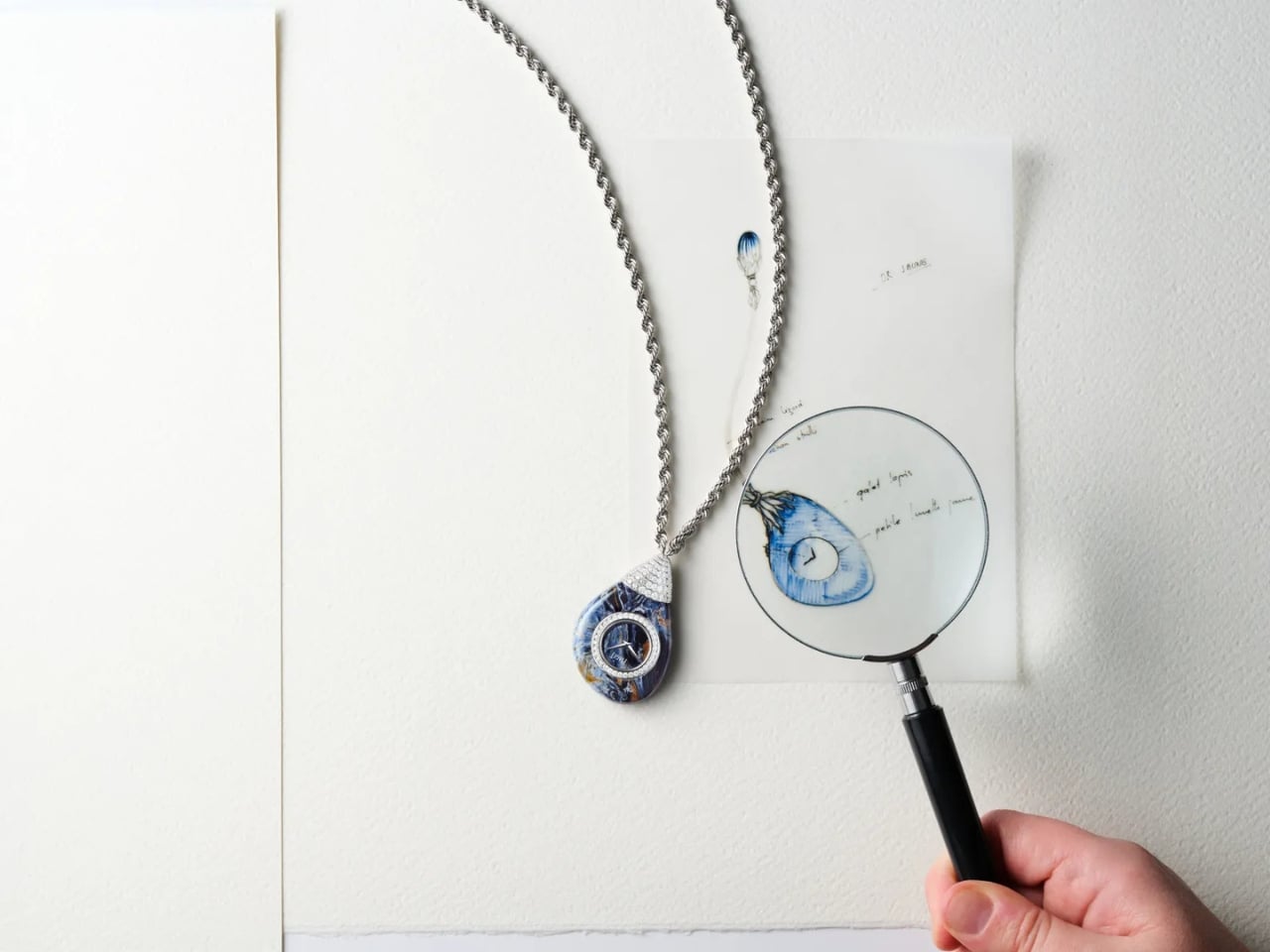
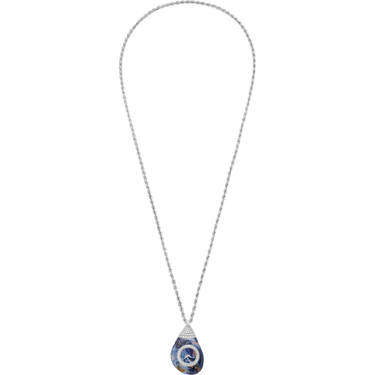
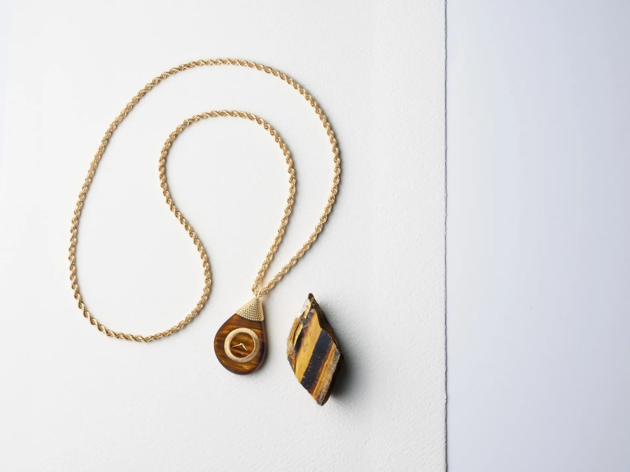
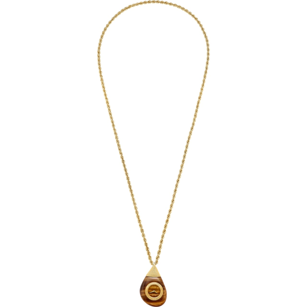
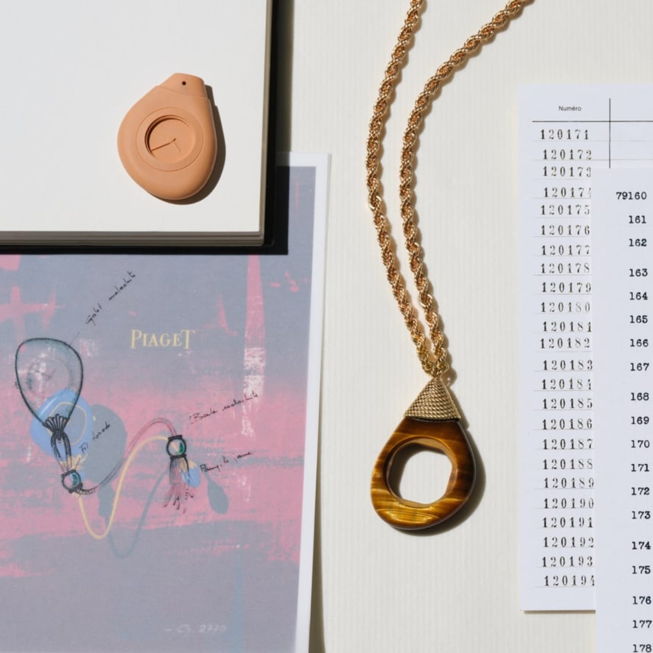
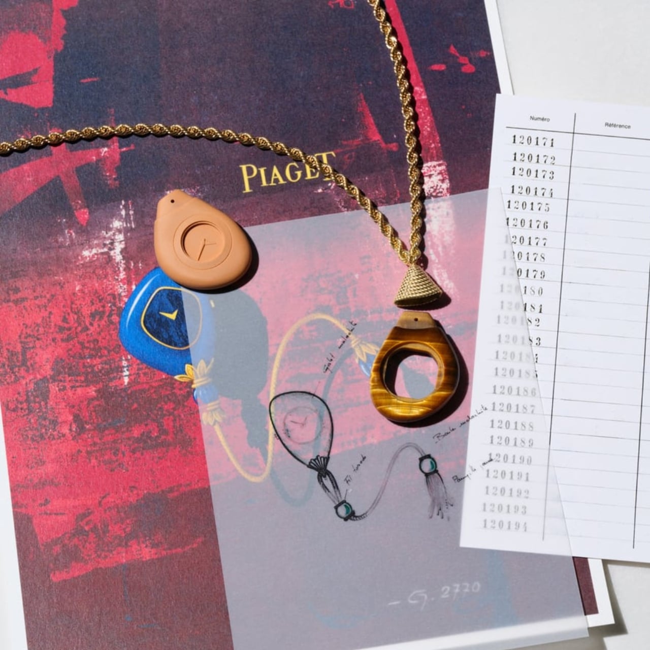
These are not watches you wear on your wrist. They’re pendant watches, sculpted entirely from a single slice of semiprecious stone and hung from sinuous twisted gold chains. The stone isn’t just decorative trim or a dial insert. The case itself is stone. The whole object is stone, hollowed out just enough to house a manufacture movement, then sealed back into a smooth, organic pebble shape. You clasp it, but you don’t strap it. It lives at your collarbone, not your pulse point.

Designer: Piaget

That shift alone deserves attention. The industry has spent decades debating millimeters of case diameter and whether 40mm is too big or too small for a modern watch. Piaget essentially said: what if none of that matters and the watch just hangs from your neck like a very beautiful rock? It’s a deeply different kind of confidence.
The collection comes in three stone varieties: golden tiger’s eye, grass-green verdite, and pietersite, each with its own mood and temperature. Tiger’s eye has that warm, chatoyant shimmer that catches light differently depending on your angle. Verdite is earthy and lush, the color of an old botanical illustration. Pietersite is the most dramatic of the three, with its stormy, swirling blues and golds that look like a weather system captured in mineral form. Choosing between them feels less like selecting a product variant and more like choosing a personal talisman.

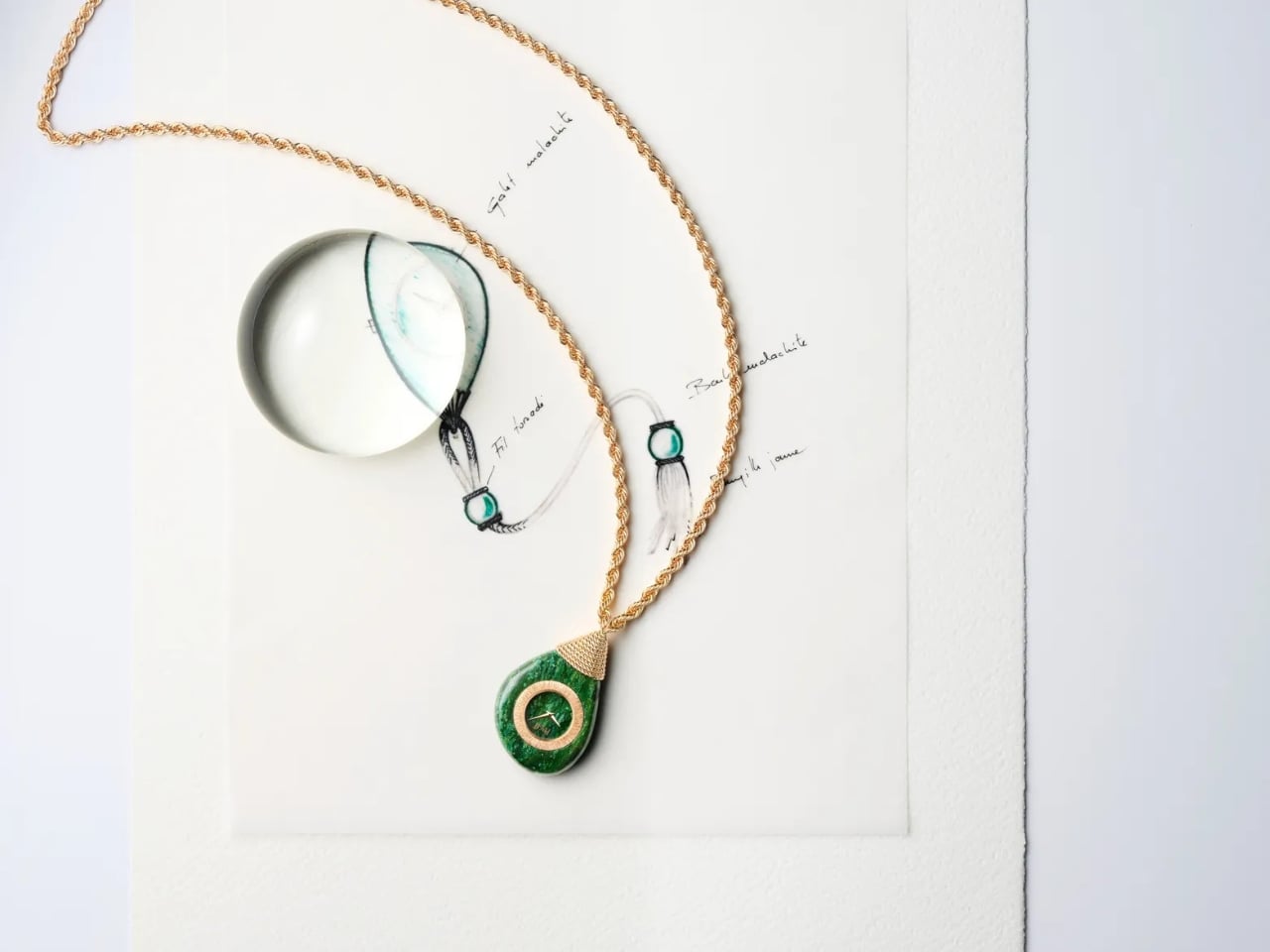
The design draws from two specific moments in Piaget’s archive. The first is the Swinging Sautoirs of the 1970s, a collection born in an era when watches were fused into coins, envelopes, and dice, and wearing one was a full sensory experience. The second is a lesser-known reference: Piaget’s asymmetrical kimono pocket watches from 1974, crafted in malachite and designed to rest in the palm like a smooth river stone. The Swinging Pebbles are clearly carrying those ideas forward, but they don’t feel like a costume. The connection to the archive is felt rather than announced.

Yves Piaget once said, “A watch is first and foremost a piece of jewellery.” The Swinging Pebbles are probably the most literal interpretation of that philosophy the maison has ever produced. The movement is almost beside the point, which is a strange thing to say about a Swiss luxury watch. But the pieces use a quartz caliber (the 355P), and I actually think that’s the right call here. Piaget didn’t let a mechanical complication turn these into something bulky or precious in the wrong way. They stayed committed to the object’s identity as jewelry, and the quartz movement quietly agrees to stay out of the way.

My personal take: this is the kind of design that makes you rethink what a watch category even is. Pendant watches exist at a rare intersection of horology, sculpture, and wearable art, and most brands either treat that intersection as a novelty or ignore it entirely. Piaget has always been the exception. They’ve been dressing dials in lapis lazuli, turquoise, and tiger’s eye since 1963, and this new collection feels like a natural exhale from six decades of accumulated stone fluency.

Whether or not you’d actually wear one is a separate conversation, and probably a deeply personal one tied to your relationship with jewelry, self-expression, and how much you enjoy being the most interesting person in the room. But as an object, as a design statement, as a piece of thinking about what a watch can be, the Swinging Pebbles are quietly radical. They’re not trying to modernize a classic. They’re trying to remind you that some classics were already ahead of their time.

The post Piaget Just Moved the Watch From Your Wrist to Your Neck first appeared on Yanko Design.