The search for signs of life on Mars continues to yield promising data. A first-of-its-kind wet chemistry experiment, published Tuesday in Nature, confirmed the presence of essential ingredients of life preserved in ancient Martian sandstones.
The molecules were found inside 3.5-billion-year-old sandstone. NASA's Curiosity rover collected the clay-filled rocks from an area called Glen Torridon, inside Mars' enormous Gale Crater. The rover's Sample Analysis at Mars (SAM) mobile instrument suite analyzed the data.
The experiment was unique as the first off-Earth study to use the chemical tetramethylammonium hydroxide (TMAH). The reagent allows Curiosity to break down larger organic molecules on the Martian surface, reducing them to something the rover's instruments can read.
It revealed the presence of over 20 different organic molecules. Among the data was confirmation of naphthalene and benzothiophene, some of the largest and most complex organic compounds discovered on the Red Planet. The experiment also yielded the first detection of a possible N-heterocycles, which DNA and RNA are built upon.
<p></p>
NASA
“That detection is pretty profound because these structures can be chemical precursors to more complex nitrogen-bearing molecules,” the paper’s lead author, Amy Williams, wrote in NASA’s announcement. “Nitrogen heterocycles have never been found before on the Martian surface or confirmed in Martian meteorites.”
As with previous discoveries of organic material on Mars, this one is not yet the smoking gun we've been waiting for. But it adds to a growing body of evidence that, at a minimum, the foundations of life as we know it were present on an ancient version of the planet. The study also confirms that organic material can survive on Mars for billions of years, which will encourage future experiments.
The paper's authors say the data will help NASA to optimize its second (and final) TMAH experiment on Curiosity. It also opens the door to future TMAH tests on the Rosalind Franklin Mars rover and the Dragonfly mission to Saturn's moon, Titan. Both missions are scheduled for 2028 at the earliest.
This article originally appeared on Engadget at https://www.engadget.com/science/space/nasas-curiosity-rover-found-promising-organic-chemicals-on-mars-174514375.html?src=rss
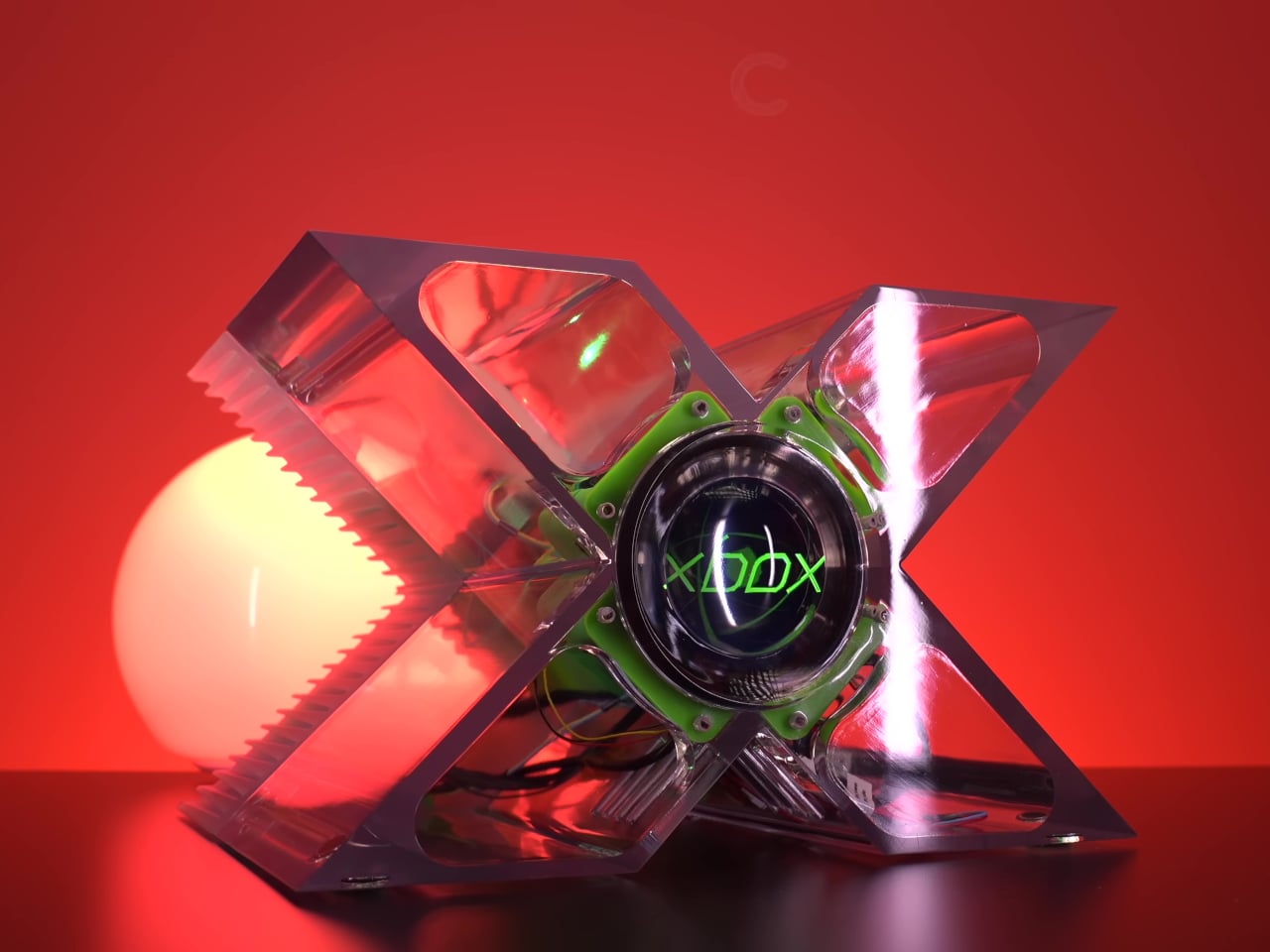
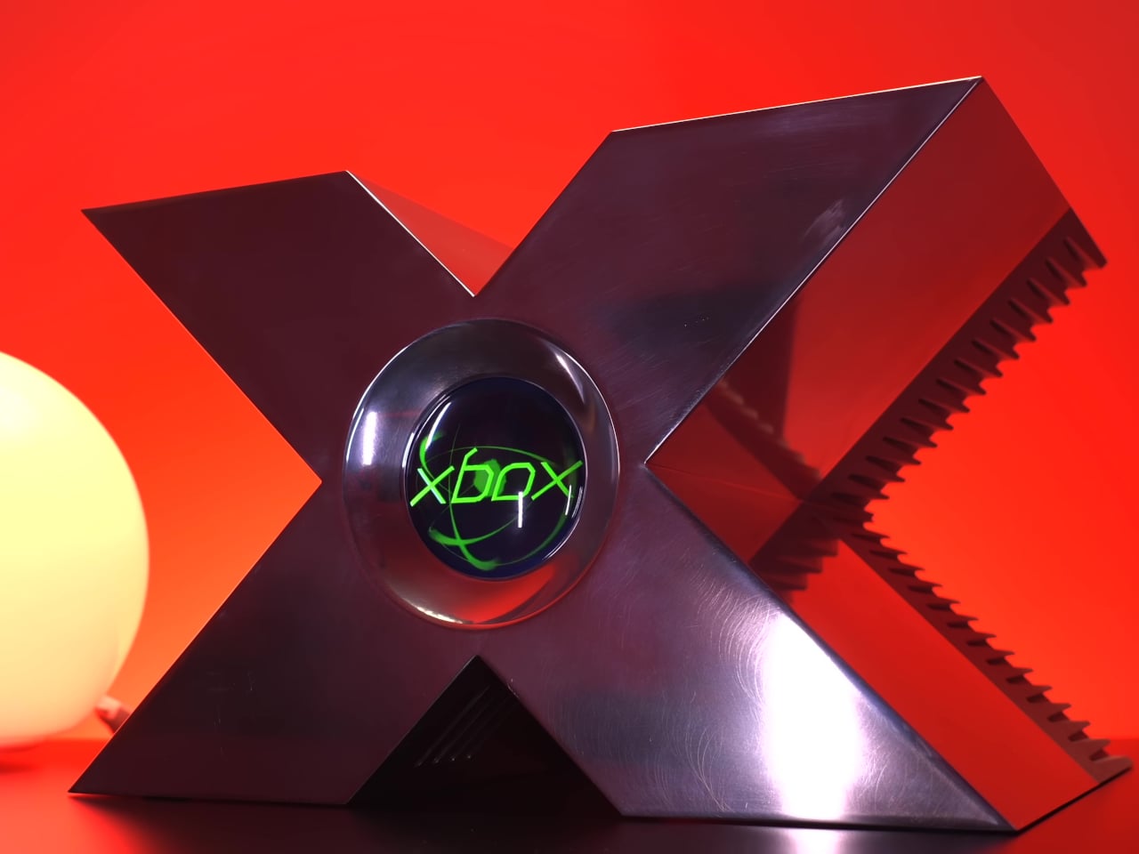
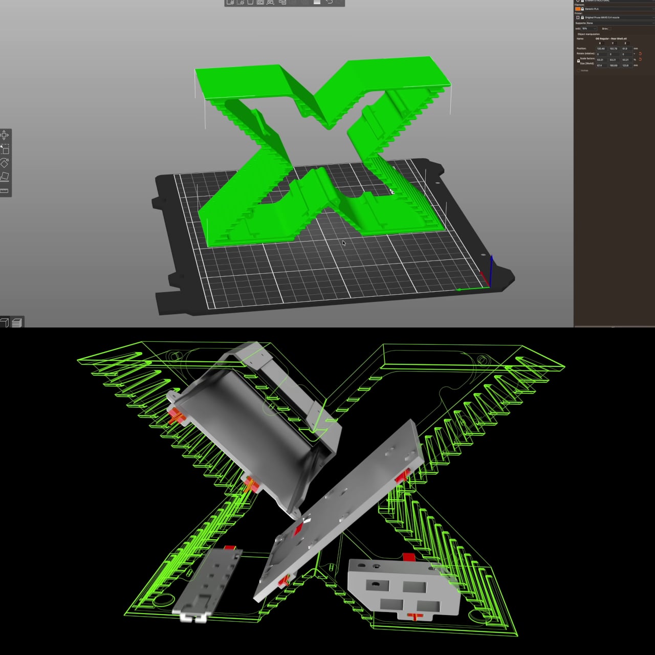
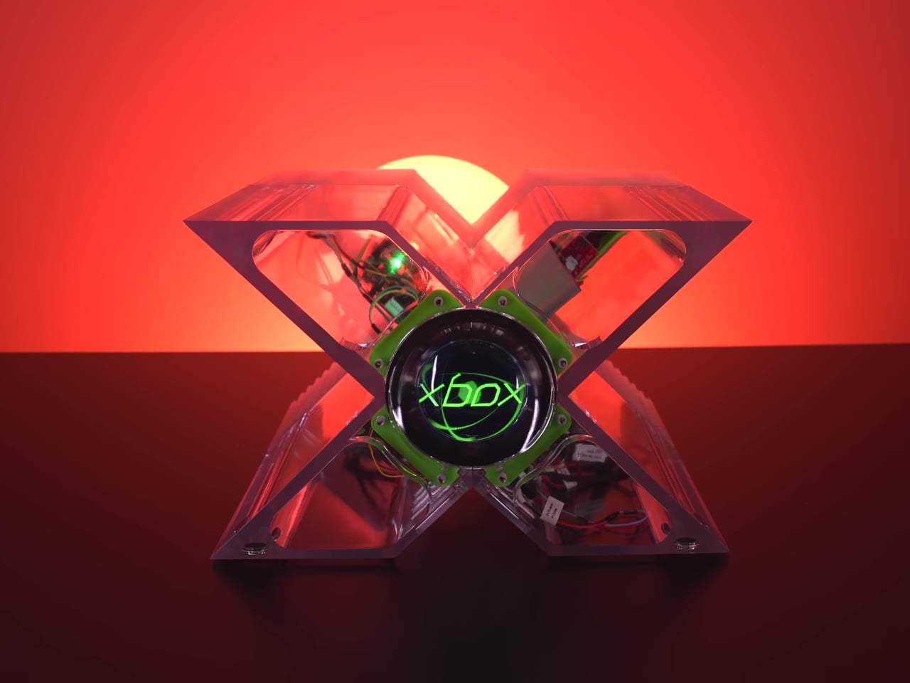
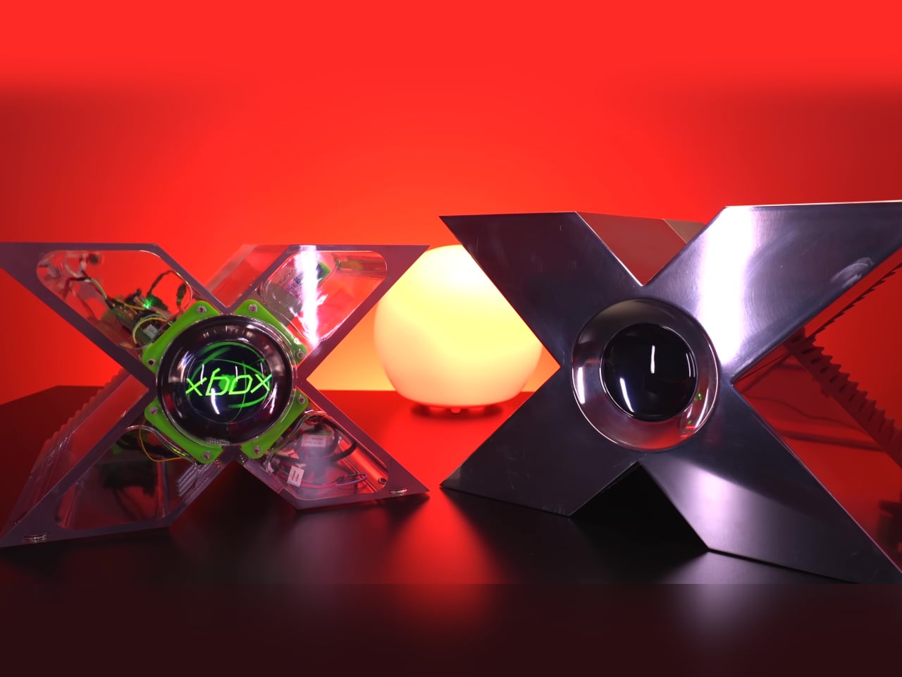
There are hardware designs from the early 2000s that still stop people cold, and the original Xbox prototype is near the top of that list. Revealed at GDC 2000 by Bill Gates and Seamus Blackley, it was a massive X carved from a single block of aluminum, reportedly costing around $18,000 per unit. It was a developer showcase piece that toured press conferences and wasn’t meant for production.
Tito of Macho Nacho Productions previously got as close as anyone has managed by building a functional aluminum replica, though the enclosure alone cost thousands of dollars in machining. It was impressive and historically faithful, but it wasn’t something you could attempt yourself. His new version takes the same idea and rebuilds it entirely around 3D printing, with accessibility as the primary goal.
The digital files are available through his online store, and the enclosure can be printed at home if you have a large enough machine, or sent off to a 3D printing service. It’s not a complicated sourcing challenge; different configurations accommodate different build approaches, giving hobbyists some flexibility in how they put it together. Either way, the barrier to entry has dropped considerably, which is the entire point.
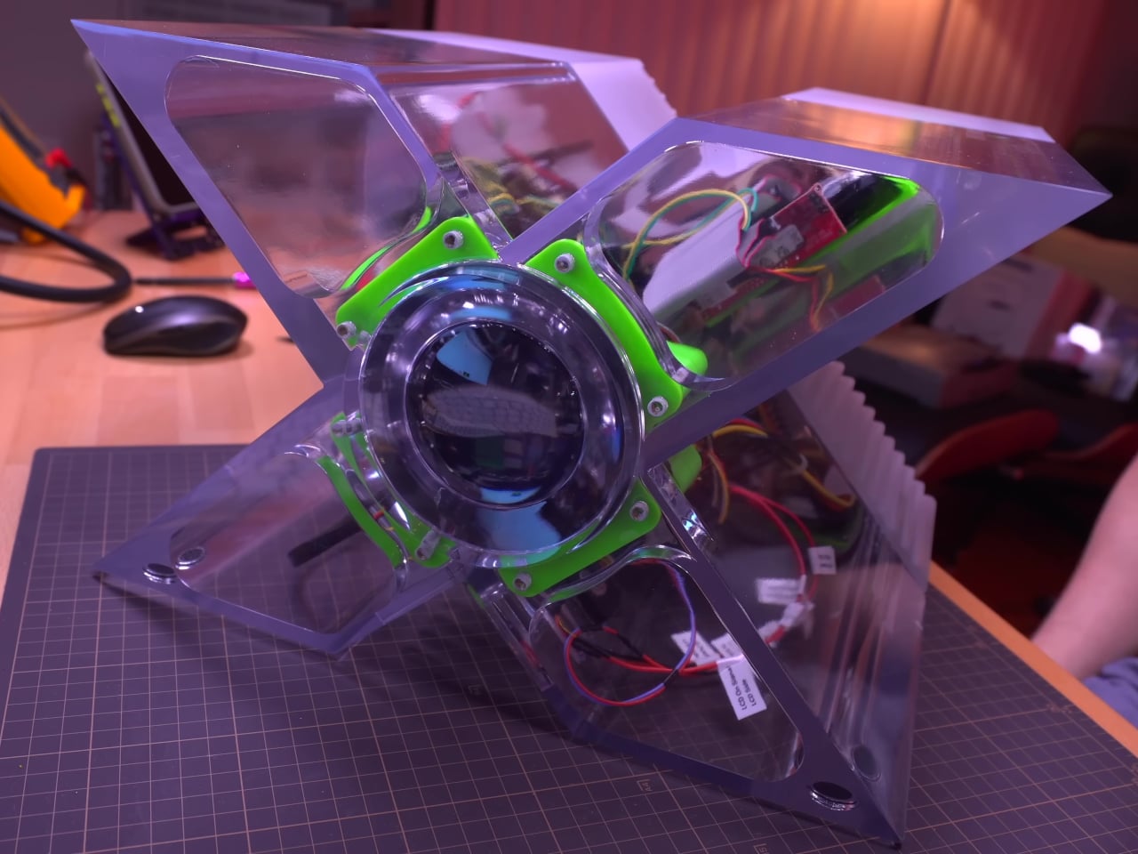
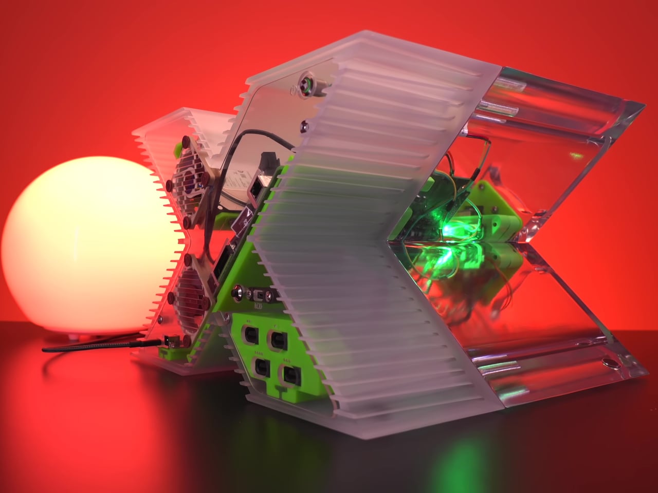
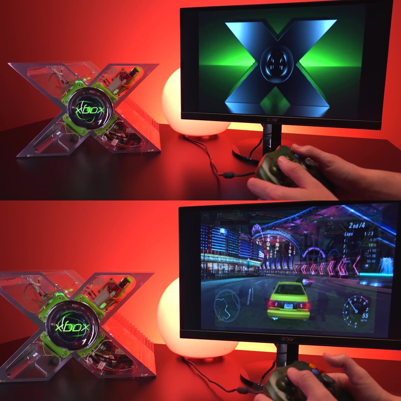
Getting the shell printed in clear resin produces a glass-like finish the aluminum build never had, and the transparency turns the internal components into part of the visual appeal. More significantly, this version finally matches the true dimensions of the original GDC prototype, a distinction the previous aluminum replica couldn’t make. For anyone interested in historical accuracy, that’s the more meaningful improvement of the two.
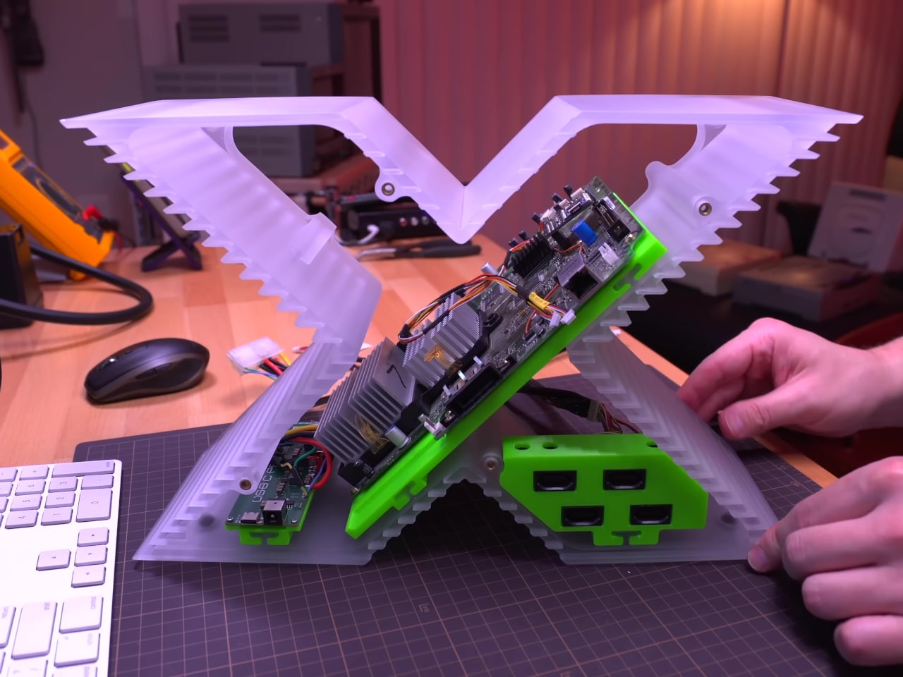
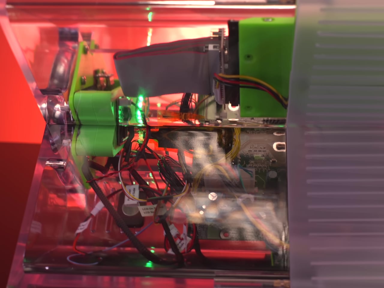
The original prototype didn’t have much at the center of its X besides a small green light. The replica replaces that with a round Waveshare LCD driven by a Raspberry Pi Pico 2 paired with a DVI sock. That combination lets the Pico push video to the round display without additional hardware, a compact solution that gives the build a much more animated presence than the original’s glow ever managed.
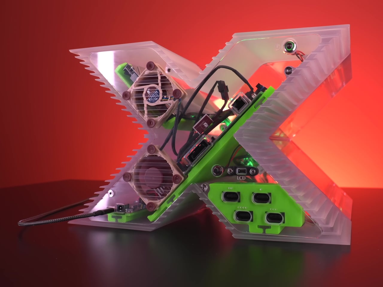
What makes this genuinely interesting beyond nostalgia is how deliberately it was rebuilt for the modding community rather than as a personal showcase. The print-friendly engineering turns what was previously a one-of-a-kind machined object into something with a shared community standard. Hobbyists don’t need access to a machine shop anymore to own one; they just need a printer, some patience, and a donor Xbox motherboard.
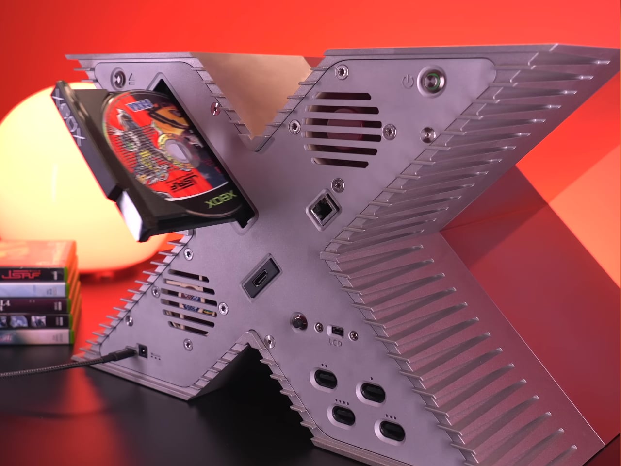
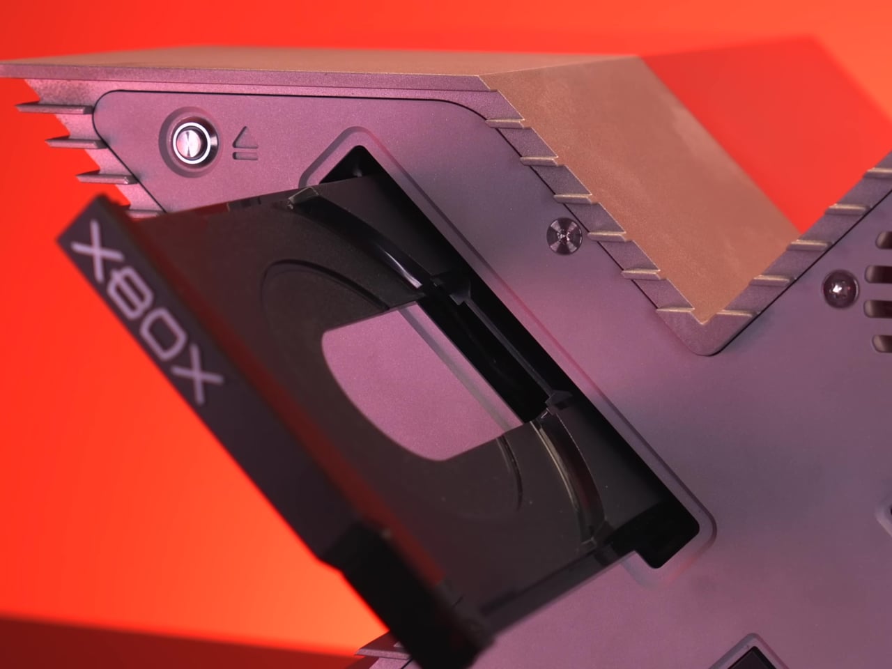
The build runs the original Xbox motherboard inside the new shell, keeping its gaming credentials intact. A modern USB-C power solution replaces the original Xbox’s notoriously oversized power brick, freeing up internal volume that the X-shaped enclosure genuinely needs. It’s a practical modernization that doesn’t ask you to give up the authenticity of running original hardware, which is exactly what this kind of replica demands.
The original X design was always more statement than product, a way of telling developers in 2000 that Microsoft was serious with hardware dramatic enough to make the point without words. The retail Xbox that followed looked nothing like it. Twenty-five years later, the modding community is effectively building the console Microsoft couldn’t, and making the files available to anyone willing to put in the work.
The relatively long wait for the third season of Silo is nearly over. Apple TV just announced the dystopian sci-fi hit returns on July 3, with episodes airing each Friday until September 4. We have long championed this show, calling it "another gem" for the platform.
The streamer has dropped a short teaser for the upcoming season and it confirms rumors of an increased focus on the "before times" via a storyline that was introduced in the finale of season two. The trailer depicts scenes from both time periods, as protagonist Juliette, played by Rebecca Ferguson, speaks in voiceover.
"Before we can know why we’re here. Before we can know everything is as it is. Before we know how it all will end, we need to understand how it all began,” she says, alluding to the creation of the various bunkers littered throughout the post-apocalyptic wasteland.
For the uninitiated, Silo is an adaptation of Hugh Howey's Wool series of books. It's primarily set in the titular silo, a society of around 10,000 people living deep underground. The show is sort of like Fallout, but without the radioactive monsters and nihilistic sense of humor.
Silo stars Ferguson, along with Tim Robbins, Common and Steve Zahn. Cast members joining the show for season three include Colin Hanks, Jessica Henwick and Ashley Zukerman. The show has already been renewed for a fourth and final season.
This is a busy summer for sci-fi on Apple TV. The second season of Dark Matter premieres on August 28, which is uncharted territory as the first season was based on a book that doesn't have a sequel. Star City, a spinoff of For All Mankind, premieres on May 29. This is the same day that For All Mankind concludes its fifth and penultimate season.
This article originally appeared on Engadget at https://www.engadget.com/entertainment/tv-movies/silos-season-3-trailer-takes-us-back-to-how-it-all-began-171033410.html?src=rss
Elbowing for attention alongside Vivo and Xiaomi, Oppo has finally launched its long-teased “ultra” version of its flagship smartphone. The Find X9 Ultra is another camera-first smartphone from Oppo, with an even more impressive spec sheet and a new array of accessories. We’re not even halfway through 2026 and we’ve been spoiled with choices, whether it’s the Galaxy S26 Ultra, the Xiaomi 17 Ultra (with or without Leica livery) or Vivo’s X300 Ultra.
The Find X9 Pro was already a powerful, capable camera phone. So, what’s changed with the Ultra? We’ve had the base device for over a week, but we’re waiting on the upgraded telephoto converter kit to land before we tackle a more in-depth review.
There are several design changes, starting with the two color options. Canyon Orange looks similar to Oppo’s recent flagship phones, with a subtle etched finish meant to replicate the Grand Canyon. Meanwhile, Hasselblad fans might prefer the other option: a woodland-themed Tundra Umber, inspired by the camera maker’s X2D. Oppo says this colorway channels “Scandinavian minimalism and the raw elegance of glaciers.” Together at last.
Image by Mat Smith for Engadget
Perhaps due to all the camera hardware, it’s a big, thick phone with the camera unit protruding noticeably from the back. The camera array on the Ultra now has a subtle hexagonal design, apparently a nod to camera history — and that Hasselblad partnership. That area has a circular, metal frame, like many of Oppo’s rivals. The edges of the camera unit are knurled, which helps you to grip the device when taking photos. Unlike Xiaomi’s recent Ultra phone, the ring doesn’t act as a zoom control, but Oppo and Hasselblad’s “Earth Explorer Kit” for the Find X9 Ultra adds a very understated camera grip with a zoom lever.
Putting last year’s Find X9 Pro next to the X9 Ultra, the Ultra model looks more modern, more advanced and more powerful. And it is. The Ultra has Qualcomm’s Snapdragon 8 Elite Gen 5 chip, a notable step up from the MediaTek Dimensity 9500 chip found on last year’s Find 9 Pro.
There’s also a 7,050mAh silicon-carbon battery that supports 100W SUPERVOOC charging. Oppo says it has included the “industry’s first” encapsulated thermal unit to keep temperatures under control when pushing the device hard, such as recording high-resolution video for extended periods. The display screams expensive Android flagship, too. The 6.82-inch 144Hz display can reach up to 3,600 nits of peak HDR brightness and drop to 1 nit in low-lit situations.
Image by Mat Smith for Engadget
It’s all about the cameras, however. The Find X9 Ultra’s main camera is a 200-megapixel sensor. At 1/1.12 inches, Oppo says it’s the largest 200MP sensor in a phone yet. It has a low f/1.5 aperture, too. This was my ‘main’ camera when I first started taking the X9 Ultra out to shoot sample photos. After all, bigger sensors mean more detail, and more ability to crop for tighter zoomed shots. With a mixture of streetlights, neon signs and more, I was impressed by the color accuracy. Oppo has embedded a new True Color Camera into the Find X9 Ultra’s camera module, which works across stills and video. Still, if you’re demanding punchy, high-contrast images, there’s an array of Hasselblad filters and effects for playing with, too.
Image by Mat Smith for Engadget
There’s also a 3x Telephoto camera, with another (different!) 200MP sensor and f/2.2 aperture. This is the camera that the new teleconverter lens attaches to. There’s something appealing about having an instant 3x zoom camera, even though it gets a little lost among the cropped focal-length equivalents in the camera app. In fact, Oppo claims that the Find X9 Ultra offers the equivalent of eight focal lengths. Sadly, I noticed some differences in color temperature and light sensitivity as the Find X9 Ultra hopped between all those camera sensors while I tested different zoom levels.
Images by Mat Smith for Engadget
The next camera is another telephoto, with an impressive 10x zoom with a 50 megapixel sensor. We’ve seen 10x zoom on phones before, like the Samsung Galaxy S23 Ultra, but never at such high resolution. Oppo added support for its Portrait mode here, even at full zoom. You can also crop in for a 20x zoom, but the results didn’t blow me away in early testing. At 10x zoom, though, I was impressed. That’s a lot of zoom before even thinking about attaching a teleconverter.
Oppo isn’t going quite as hard on video as its rival (and distant corporate relative) Vivo, but the Find X9 Ultra can capture 4K 60 fps video with Dolby Vision. It’s also the first Oppo smartphone capable of recording 8K video at 30 fps. For those looking to dig into video detail, Oppo has launched a new log profile, O-Log2. The company says this will help reveal greater shadow detail and reduce image smearing — it’s something else I’m itching to try once the teleconverter lands.
Images by Mat Smith for Engadget
Like Vivo's X300 Ultra, Oppo’s newest phone is certified for the Academy Color Encoding System (ACES), so videographers can integrate its footage into professional workflows. You can also load third-party LUTs (look-up tables) directly onto the device to monitor custom color grades in real time and see how they look in the on-device preview.
As is often the case with Chinese phone makers, there’s a lavish accessory kit to build on the smartphone’s shooting talents. Oppo’s Hasselblad Explorer case adds a two-stage focus button and the aforementioned zoom controls. The case has the same muted black and clay colors as the Tundra Umber edition of the Find X9 Ultra. Then there’s the new Hasselblad 300mm Explorer Teleconverter. The magnification ratio of the teleconverter has been increased from 3.28x on Find X9 Pro to around 4.3x on the Find X9 Ultra. The lens mounts directly onto the 200-megapixel 3x telephoto lens, upgrading it to a heady 13x optical zoom.
Image by Mat Smith for Engadget
This is also the biggest smartphone telephoto lens yet, dwarfing both the Find X9 Pro’s add-on and Vivo’s not-petite 400mm teleconverter. The companies chose different combinations of camera sensors and lenses, making spec sheet comparisons a little trickier, but Oppo’s latest accessory is certainly the largest thus far. I can’t wait to see how the Find X9 Ultra’s photos fare against images from the Vivo X300 Ultra, though. In the Find X9 Ultra’s favor, it has an iPhone 17 Pro-like touch-sensitive button for quickly launching the camera, something I missed on Vivo’s new flagship.
Unfortunately, there is no cross-compatibility among previous Oppo teleconverters and phones. The company says this is to ensure optimal image quality, but it’ll disappoint faithful Oppo fans hoping to carry over the expensive camera accessories from previous years. The company has learned some lessons from the Find X9 Pro, with a new telephoto adapter that can be left mounted on the phone without obscuring the other camera lenses.
On first impression, the Find X9 Ultra is shaping up to be another powerful camera phone, with another hard-to-actually-buy caveat. The Find X9 Ultra will arrive in parts of Asia and Europe. In the UK, it’s set to launch on May 8th, priced at £1,449 (roughly $1,959). While there’s no US release planned, we’ll update this story when we hear more details on the global launch. Once the telephoto add-on arrives, I’m excited to put it through its paces. I’ve got its rival from Vivo too, so it’s time for the battle of the teleconverters.
This article originally appeared on Engadget at https://www.engadget.com/mobile/smartphones/oppo-find-x9-ultra--50mp-10x-optical-zoom-telephoto-release-date-price-170052539.html?src=rss
Xbox is cutting the prices of both Game Pass Ultimate and PC Game Pass, effective immediately, but there’s one big caveat. First, the good news: Game Pass Ultimate now costs $23 per month, down from $30. PC Game Pass will now run you $14 a month instead of $16.50. The Xbox team noted in a blog post that prices may vary by region.
That’s a smart, much-needed decision. In a memo that leaked last week, new Microsoft Gaming CEO Asha Sharma expressed concern over the high price of Game Pass, stating that it “has become too expensive for players, so we need a better value equation. Long term, we will evolve Game Pass into a more flexible system which will take time to test and learn around." Sharma reiterated that publicly in a post on X.
Game Pass Ultimate has become too expensive for too many players. Starting today, we’re dropping the price from $29.99 to $22.99/month. Future Call of Duty titles will no longer join Game Pass Ultimate on day one. They will join this tier the following holiday after launch (about…
In October, Microsoft increased Game Pass Ultimate to $30 per month, which was a 50 percent price hike. It was the second time in 15 months that the company had jacked up the monthly fee, making it an unjustifiable expense for many. The price of a PC Game Pass subscription also rose by $4.50 per month, and now Microsoft is bringing that back down a bit too.
“Our players cover a wide breadth of geographies, preferences, and tastes, so while there isn’t a single model that’s best for everyone, this change responds to a lot of feedback we’ve gotten so far,” the Xbox team wrote. “ We’ll continue to listen and learn.”
There is one giant tradeoff here: new Call of Duty games will no longer be available on Game Pass Ultimate or PC Game Pass on day one. They’ll eventually hit those tiers about a year later, during the following holiday season. That means Call of Duty titles will be the only first-party Xbox games that don’t hit Game Pass on their release date.
This, of course, is an attempt to generate more revenue from one of the biggest gaming franchises in the world. Call of Duty is a major reason why Microsoft shelled out $68.7 billion to buy Activision Blizzard a few years back. While Call of Duty fans on PlayStation still had to pay full price for the last few annual releases to play them as soon as possible, Xbox and PC players have been able to hop in to them via Game Pass. (There’s still no sign of Call of Duty on Switch or Switch 2 as yet!)
There had been rumors that Microsoft would carve out Call of Duty from the current versions of Game Pass and give those tiers a price cut. Chatter suggests that the company may introduce yet another, higher-level Game Pass tier (or an add-on) that will include day-one Call of Duty games, but there’s no official word of that as yet.
This article originally appeared on Engadget at https://www.engadget.com/gaming/xbox/xbox-cuts-game-pass-prices-but-new-call-of-duty-games-will-no-longer-hit-the-service-on-day-one-163636536.html?src=rss
The single most impressive piece of technology I saw at CES this year was LG’s revamped Wallpaper TV, AKA the OLED evo w6. It’s about as thin as a typical pencil, it’s completely wireless and it packs in all of LG’s latest OLED technology, giving it incredibly rich colors and anti-reflective capabilities. We ended up giving the Wallpaper set our best TV of CES 2026 award, simply because it looked so damn good. Now, we finally know how much it costs: LG announced the 77-inch evo w6 will go for $5,500, while the 83-inch model will sell for $7,500.
Both sets are a $1,000 premium over the OLED evo G6 models, which are LG’s highest-end TVs without the company’s super-thin Wallpaper tech. While the thicker sets are obviously a better deal, there’s still something inherently impressive about the Wallpaper models. For many people, the simple “wow factor” of the evo W6’s design will be worth the extra $1,000.
If that all sounds too rich for your blood, LG’s mainstream OLED sets are far cheaper, starting at $1,399 for the 43-inch C6 set. And if you don’t need the latest OLED panels around, it’s worth keeping an eye out for deals around older models. I’ve seen 65-inch C5 sets for near $1,000, and 77-inch TVs for around $1,500. Those older sets will be a bit less bright, and probably show more reflections, but in a dim room they’ll still have all the benefits of OLED: Incredibly high contrast, and ridiculously dark black levels.
This article originally appeared on Engadget at https://www.engadget.com/general/lgs-super-thin-wallpaper-oled-tv-starts-at-5500-163415130.html?src=rss
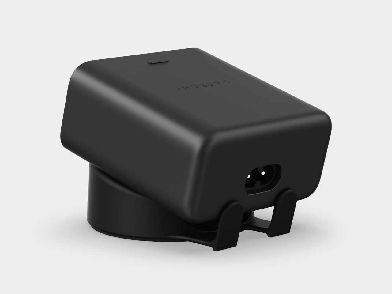
The charging brick has had something of a quiet revolution over the past few years. GaN technology has made them smaller, faster, and capable of handling a full laptop alongside a phone and earbuds without much trouble. What hasn’t changed is the experience of actually using one. You plug everything in, trust that it’s all working, and move on without knowing much beyond that.
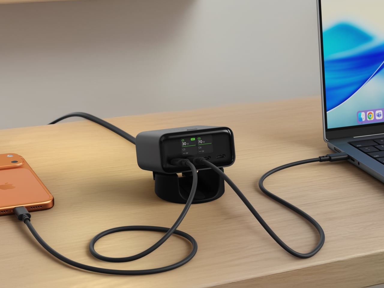
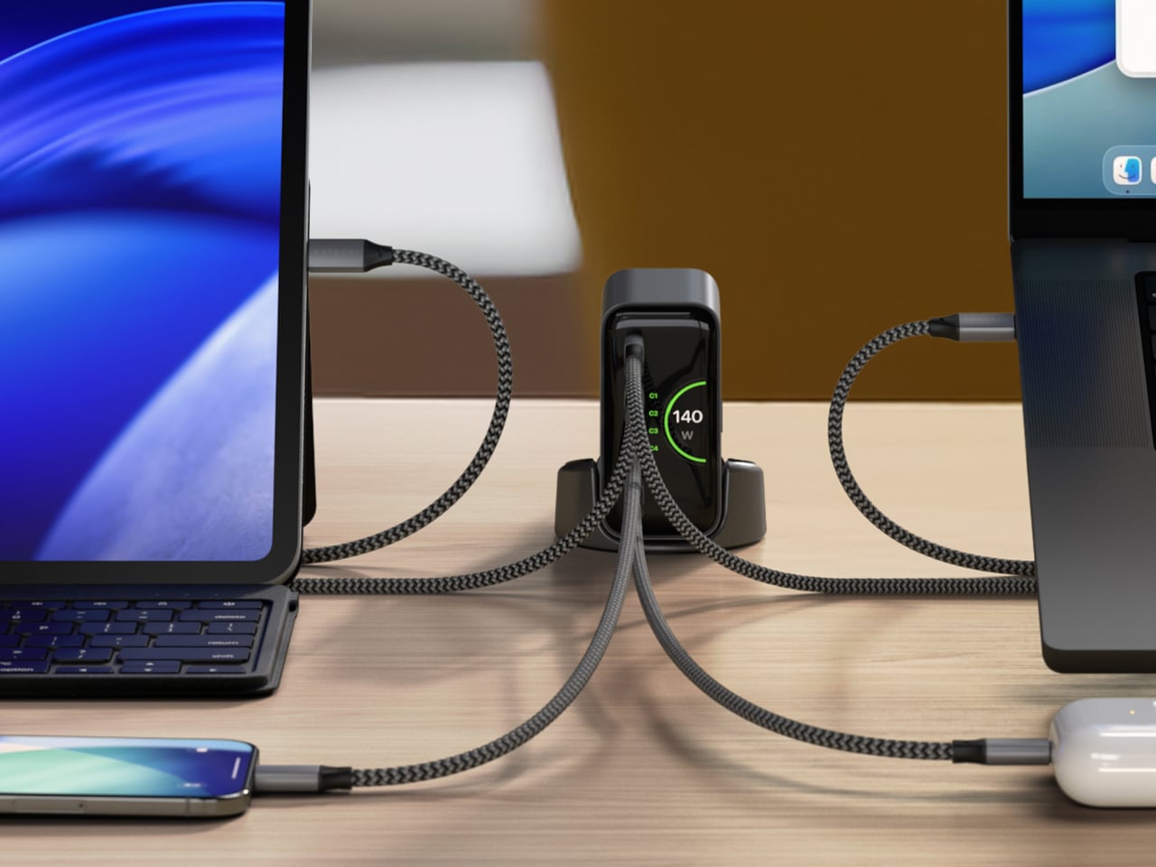
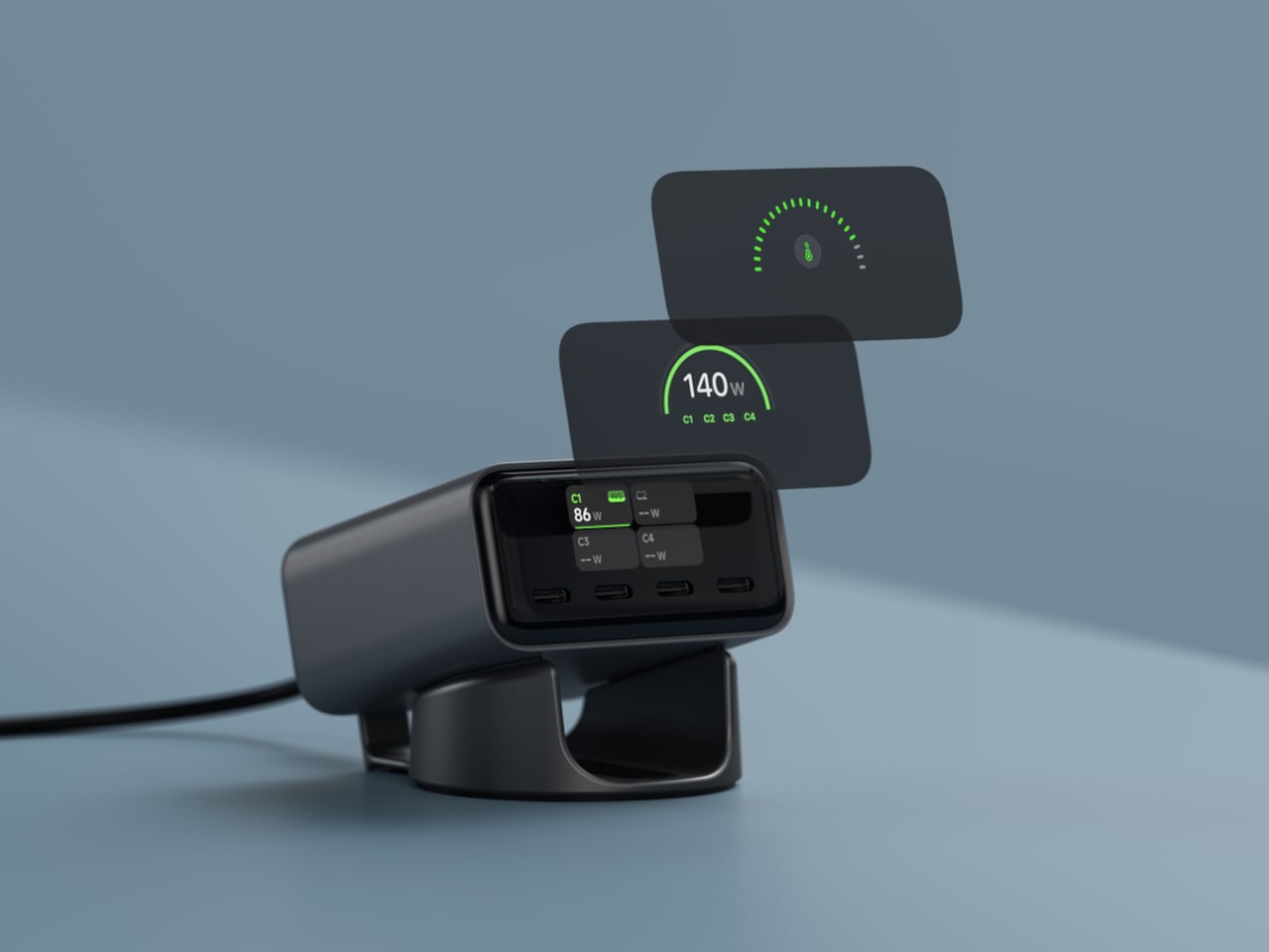
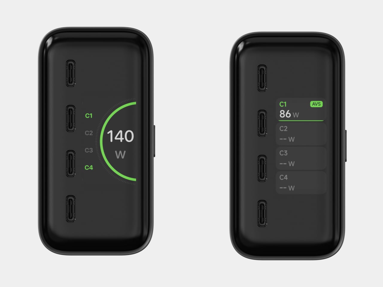
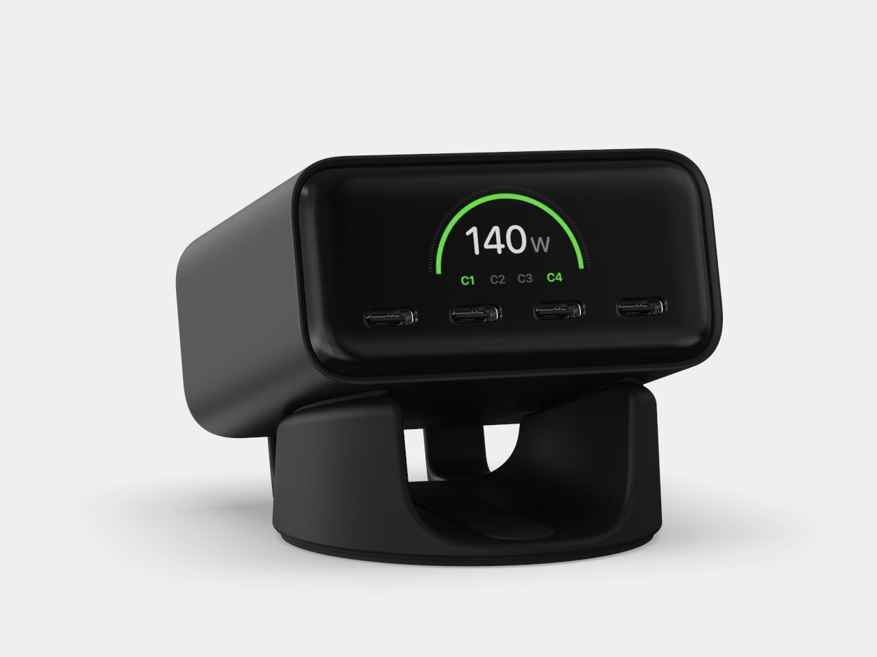
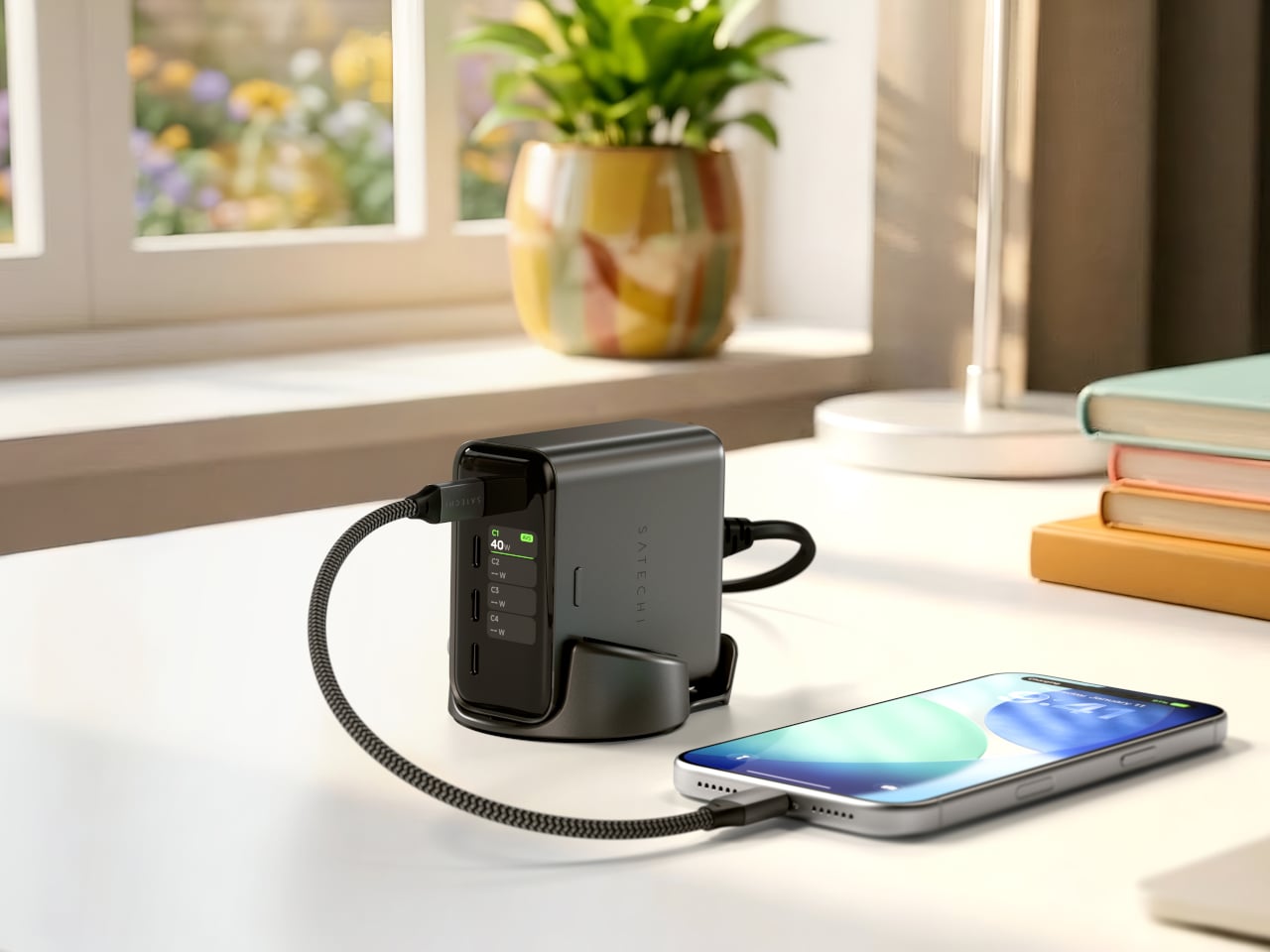
Satechi’s ChargeView 140W Desktop Charger takes a different approach to that last part. Built around a compact GaN hub with four USB-C ports, its most distinctive feature is a built-in digital display that shows real-time wattage across each port. Rather than treating power as something to tuck under a desk, Satechi designed the ChargeView to sit out in the open and show exactly what it’s doing.
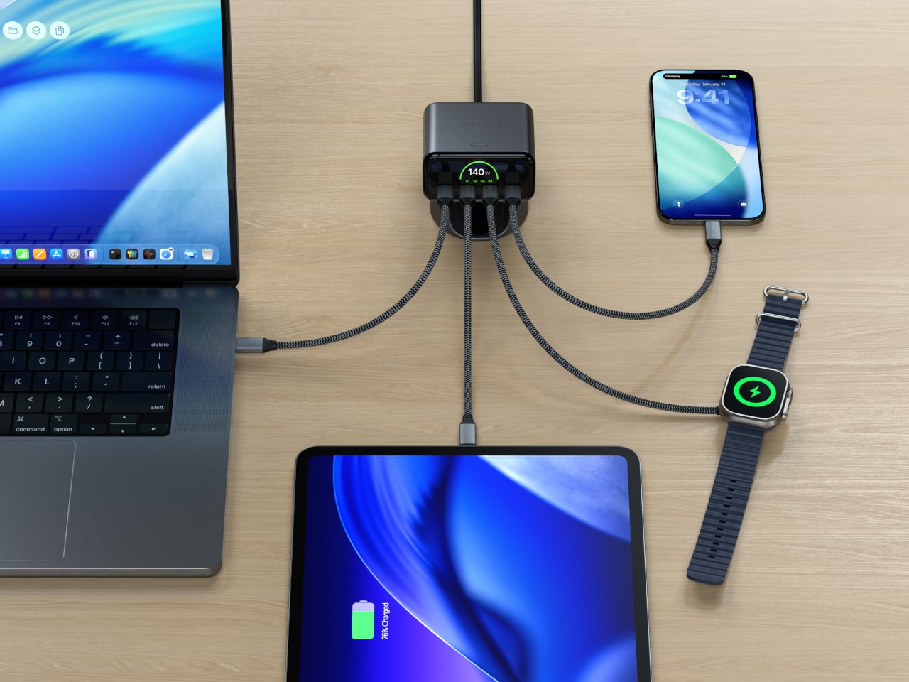
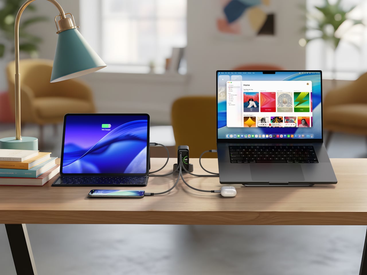
That display earns its keep quickly. With 140W split across four ports, the ChargeView can handle a MacBook Pro, a tablet, a phone, and a set of earbuds all at once. Knowing exactly how much wattage each device is drawing takes the guesswork out of multi-device charging, especially when your priorities shift midday, and you want to confirm that your laptop is still getting the power it needs.
The fast charging support for the latest Apple iPhones is worth calling out, too. USB Power Delivery supports fast charging for the latest Apple iPhones, and because the real-time display is right there on the charger, you can see whether a cable or configuration is limiting the charge rate without having to check your phone’s settings. It’s the kind of immediate feedback that most chargers simply don’t give you.
Under the hood, the ChargeView uses USB PD 3.2 with AVS, which helps optimize power delivery so connected devices receive appropriate output rather than a fixed stream of power. Built-in protections against overheating, overcurrent, and overvoltage run quietly alongside everything else, and the result is a charger that’s managing a fairly complex balancing act behind a display that makes it look simple.
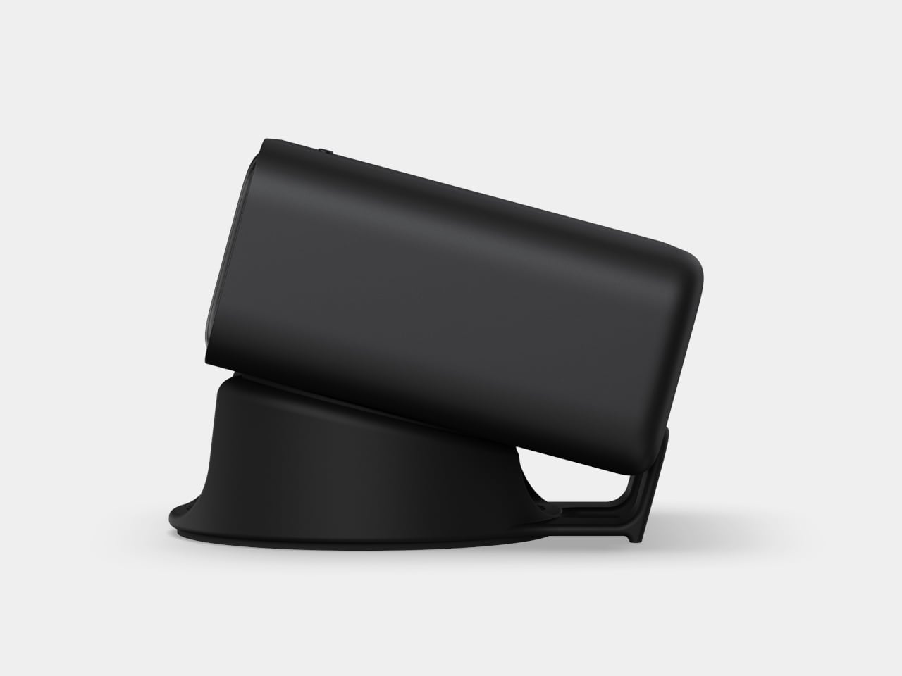
The physical form factor reflects the same thinking. It comes in a Space Black finish and ships with a precision stand that lets you orient it vertically to save desk real estate or lay it flat if cleaner cable routing is the priority. Most chargers are expected to stay on the floor or behind the furniture. The ChargeView is built for the desk, which changes what you expect from it.
Satechi has built its reputation on accessories designed to complement Apple products rather than just work alongside them. The ChargeView fits that pattern, its restrained and utilitarian form unlikely to look out of place next to a MacBook Pro or a monitor that costs ten times as much. It’s a product that clearly understands where it will be used and what it will sit next to.
At $99.99, the ChargeView sits at a premium over a basic four-port GaN charger, but that gap comes with the display, adaptive voltage management, and a design confident enough to live on the surface of your desk. For anyone who has quietly wondered mid-afternoon why their laptop battery hasn’t moved, having something that actually tells you what’s happening is worth paying more for.
Google announced today that it is upgrading the Gemini for Home service with a "continued conversations" feature. Continued conversation allows a user to have a natural discussion with the Gemini platform without prefacing every follow-up request with the "Hey Google" prompt. The microphone will remain active on a smart device for a few seconds after the Gemini AI assistant provides its reply. During that window, the lights on the hardware will pulse or glow, indicating that you can keep chatting normally with the chatbot without needing a wake word. Gemini should retain the context as the conversation progresses, which should allow it to provide the desired information faster without the need for a user to repeat key details.
The feature is rolling out today for all Gemini for Home voice assistant languages and in all supported regions. Continued conversations have to be manually enabled in the Google Home app through the settings menu under "Gemini for Home voice assistant." Google said that Gemini should be able to distinguish between follow-up questions addressed to the chatbot and other conversations happening in a room, but it should be interesting to track how successful that is given the past history of voice assistants unintentionally eavesdropping.
Continued conversation was an option under the Google Assistant platform, but it had more limited availability. Google has been preparing Gemini for Home as a replacement for Google Assistant platform since the fall.
This article originally appeared on Engadget at https://www.engadget.com/home/smart-home/google-now-lets-you-have-full-conversations-with-gemini-for-home-160000511.html?src=rss
Samsung is expanding the SmartThings connectivity platform to include many IKEA products. The company promises "seamless integration" with the furniture giant's Matter-over-Thread devices, which include stuff like smart lights, air quality sensors, remote controls and smart plugs.
This is great news for IKEA fans who want to bark orders at a smart assistant to turn the lights off and on, as Samsung says users will be able to "effortlessly incorporate" these gadgets into daily life. The SmartThings platform allows for advanced home automation routines.
Samsung
Samsung says it "built enhanced integrations" for IKEA's devices and that the two companies "conducted multiple rounds of validation to enhance connectivity stability and implemented a dedicated user experience within the SmartThings app for full compatibility." This should translate into a plug-and-play experience with minimal frustration.
The caveat here is that Matter is already supposed to offer a plug-and-play experience, without the need for this kind of intensive platform-specific work to get things going. IKEA customers have had serious problems connecting the company's Matter devices to networks. Matter is supposed to offer a comprehensive smart home integration solution to manufacturers, but that doesn't look to be working out.
Samsung has steadily been improving the SmartThings platform. It recently integrated Siri voice commands.
This article originally appeared on Engadget at https://www.engadget.com/home/smart-home/samsung-brings-smartthings-integration-to-ikeas-matter-devices-151819629.html?src=rss
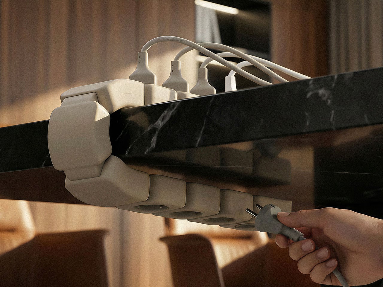
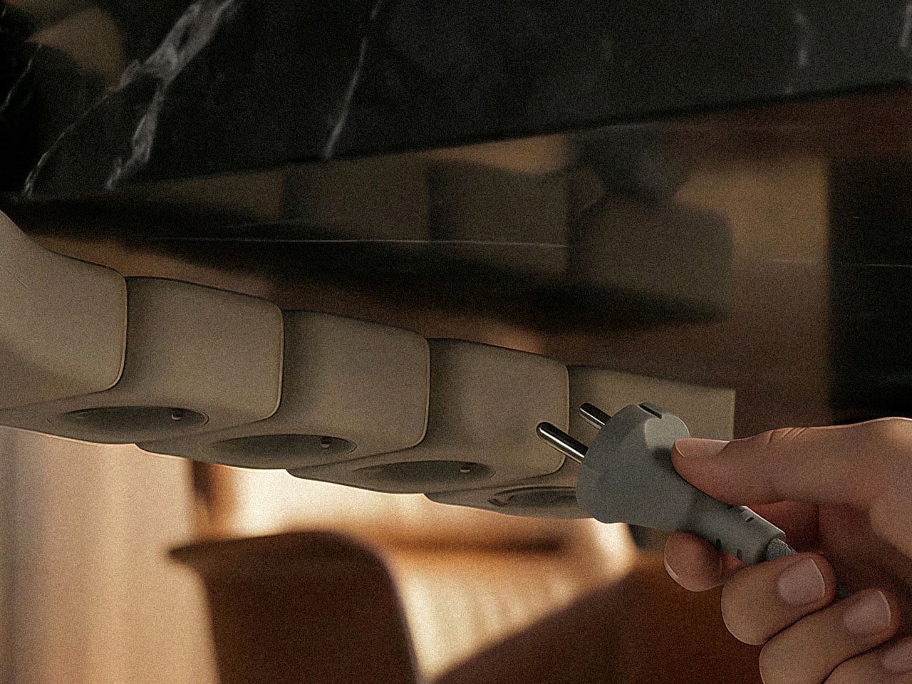
We’ve spent years upgrading our desks with sleeker materials, smarter layouts, and better ergonomics. But somehow, the humble power strip has remained stuck in the past design ethos. It still lives on the floor, tangled in cables, collecting dust, and forcing you to awkwardly reach under the desk every time your laptop needs juice. Edge: A Clamp-On Modular Power Solution, feels like one of those ideas that makes you wonder why it didn’t exist sooner.
Instead of treating power as something hidden away, Edge brings it right to the desk’s edge, exactly where your hands already are. The shift sounds simple, but it completely changes the interaction. No more bending down, no more blindly searching for an empty socket, and no more dealing with cables stretching across the floor. It turns power into something immediate and accessible, almost like an extension of the workspace itself.
A worthy winner at the New York Product Design Awards, the product leans heavily into flexibility. Rather than locking you into a fixed setup, Edge follows an “add power anywhere” philosophy. You can clamp it wherever it feels right, move it when your setup changes, and adapt it to different desks without any tools. Whether it’s a home office, a shared workspace, or even a temporary setup, the system adjusts without friction. What makes the clamp particularly clever is its over-center, self-locking mechanism. As it closes, it passes a neutral point and locks into place, making it resistant to loosening over time. That matters more than it sounds, especially when you consider the constant push and pull of plugging in devices, cables tugging from different angles, or the occasional bump. The extended contact surfaces further stabilize the grip, reducing wobble and keeping everything firmly in place.
Functionally, Edge splits its eight outlets across two sides. Four sit on top for quick, everyday access, perfect for devices you’re constantly plugging in and out. The other four are tucked underneath, designed for chargers and connections that stay put. It’s a small but thoughtful detail that keeps the surface cleaner and prevents cables from turning into a visual mess. Lifting the power strip off the floor also solves a range of problems you might not immediately think of. It reduces exposure to spills, keeps it away from cleaning water, and eliminates the risk of stepping on it or snagging cables with your chair. The modular segmented body adds another layer of refinement, helping distribute stress while allowing the form to adapt across different desk setups.
I love the idea of Edge, as it simply repositions itself in a way that makes sense for how we work today. And in doing so, it transforms a neglected accessory into something that feels intentional and surprisingly satisfying to use.