The Grocery Container That Finally Makes Reuse Actually Work

Walk into any supermarket and you’ll notice that the food gets a lot of attention, but the packaging it comes in? Almost none. We’ve become so accustomed to grabbing a plastic-wrapped chicken breast or a shrink-sealed block of cheese and tossing the container without a second thought that it has essentially become invisible. Which is exactly why Lars Biedermann’s ReLoopBox caught my attention the moment I came across it.

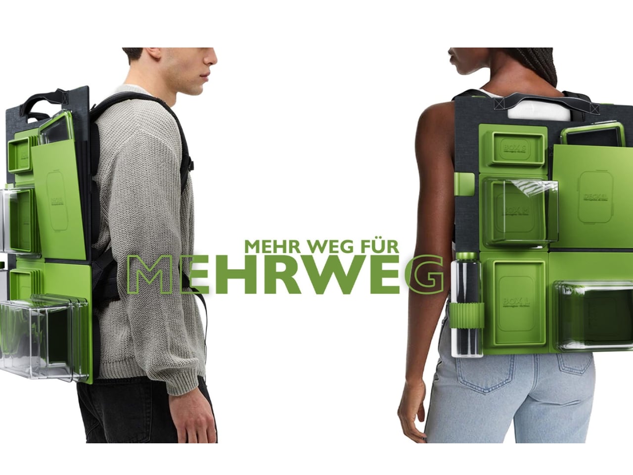
ReLoopBox is a circular, reusable container system designed to replace the disposable plastic packaging that floods our grocery stores, refrigerators, and eventually, our landfills. On the surface, it sounds like a straightforward sustainability pitch. But the more you look at it, the more you realize that Biedermann, an industrial design graduate from FH Joanneum in Austria, wasn’t just designing a container. He was designing a completely different logic for how food packaging should work.

Designer: Lars Biedermann
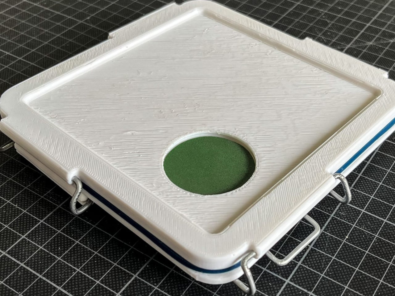
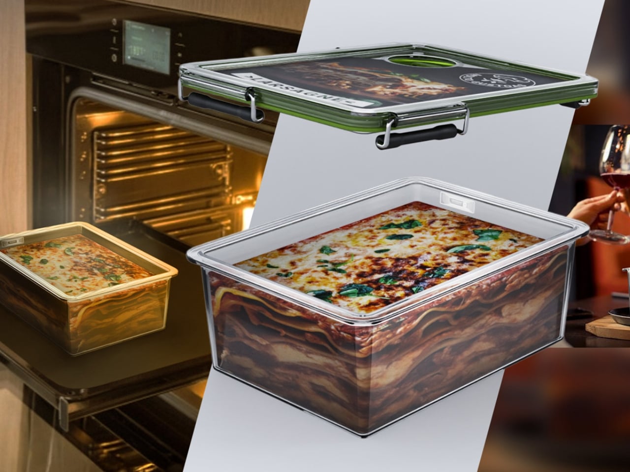
The system uses standardized, vacuum-sealed containers made from copolyester, silicone, and stainless steel. These aren’t flimsy alternatives to plastic wrap. They’re built to be durable, reusable, and returnable, meant to circulate between consumers, manufacturers, and retailers rather than taking a one-way trip to the bin. Each container is embedded with a digital chip that tracks it through the supply chain, handling inventory and logistics with minimal friction. It’s the kind of detail that quietly separates a thoughtful design from a well-intentioned one.
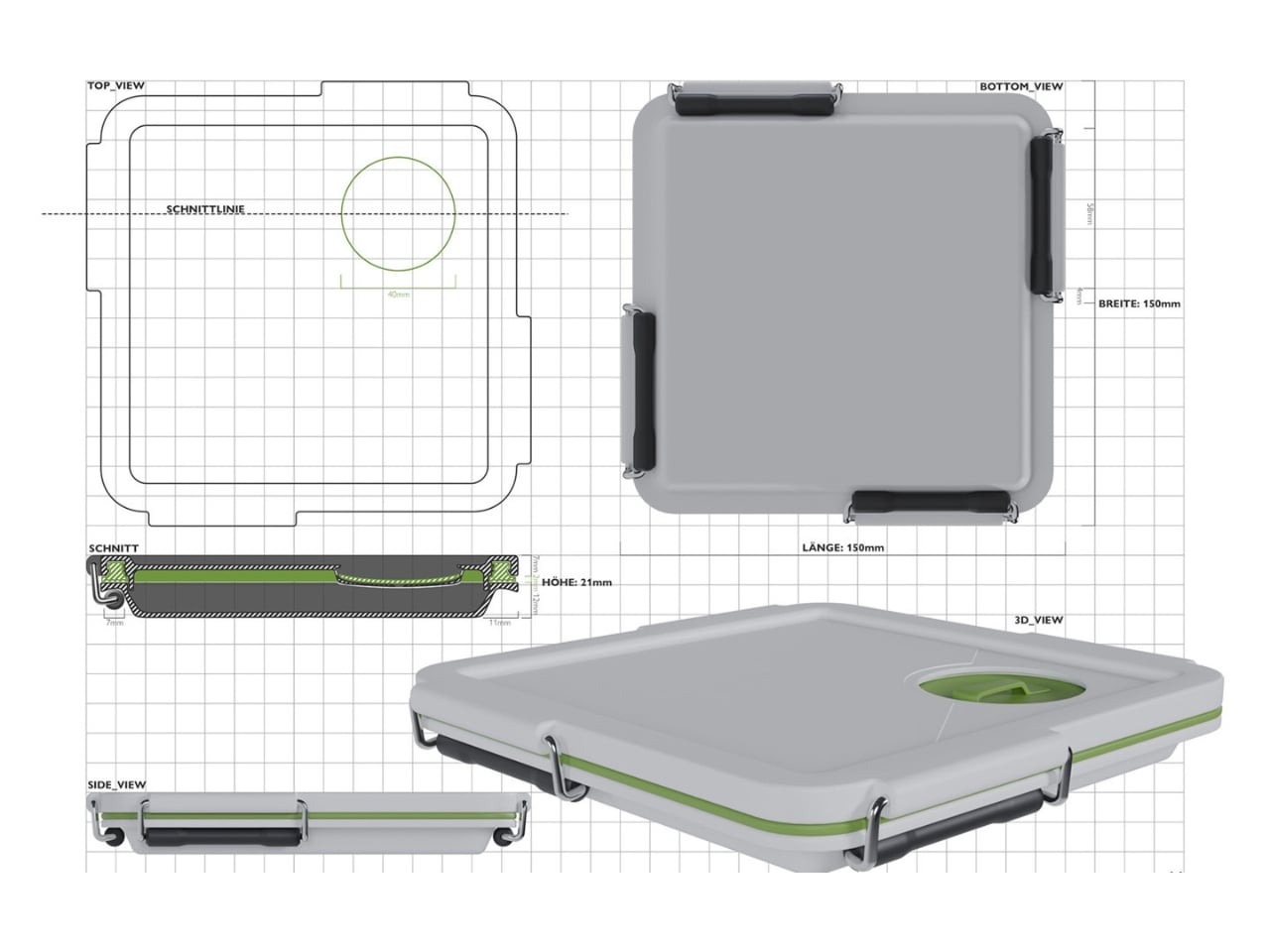
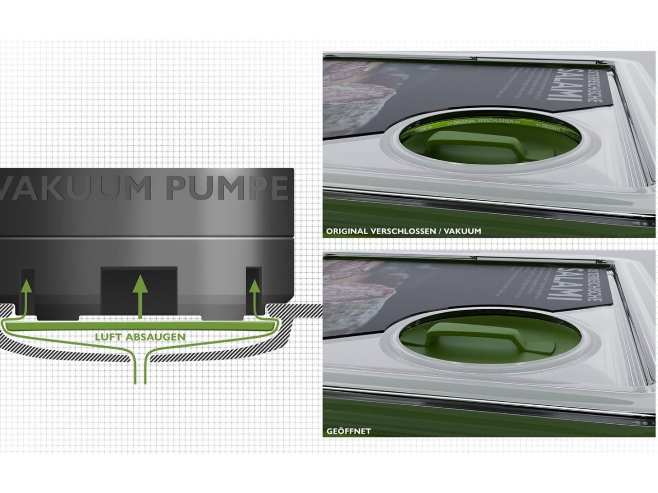
The vacuum seal is also doing real work here, and it’s worth noting. One of the grimmer realities in food sustainability is that a significant portion of what we buy never actually gets eaten. Food goes bad too quickly, and a lot of that comes down to packaging that doesn’t do much beyond keeping things contained for the journey home. A vacuum environment slows spoilage significantly, which means ReLoopBox isn’t just arguing against plastic waste. It’s also quietly taking aim at food waste. That’s two problems addressed through one design decision, and I appreciate when a solution earns its own complexity.
Aesthetically, the design is clean and considered, which matters more than people give it credit for. Sustainable products have historically struggled with an image problem. They tend to look corrective rather than desirable, like they’re asking you to make a sacrifice. ReLoopBox doesn’t carry that energy. It looks like something that belongs in a well-designed kitchen, which is probably the smartest thing Biedermann could have done. If a product doesn’t look good, it doesn’t get adopted, and if it doesn’t get adopted, the environmental argument is moot.
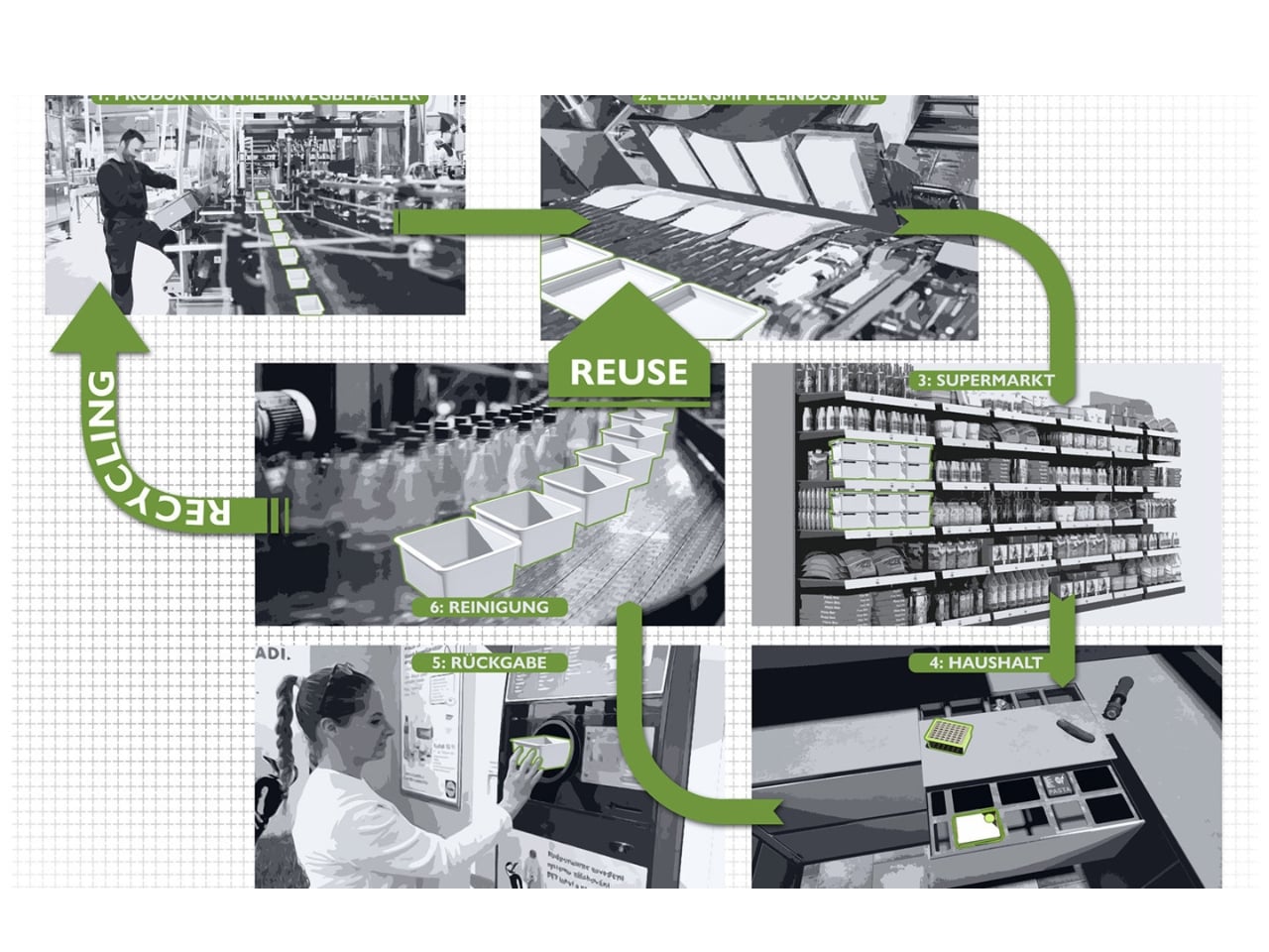
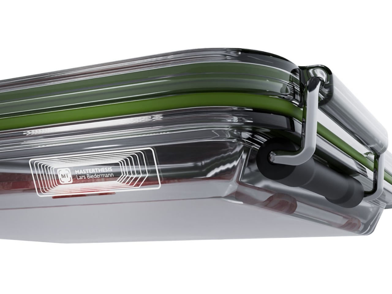
My honest take is that the real challenge for a system like this isn’t the design itself, which is genuinely impressive. It’s behavioral. Getting consumers to return containers, getting retailers to build the infrastructure to accept them, getting manufacturers to commit to a circular model instead of a linear one, that’s a much bigger lift than any design brief can anticipate. We’ve seen well-designed reuse programs come and go because the return loop is where things tend to fall apart. Biedermann seems to understand this, which is why the digital chip integration is such a critical piece of the system. It removes guesswork from the tracking process and makes the logistics side of the loop far more manageable.
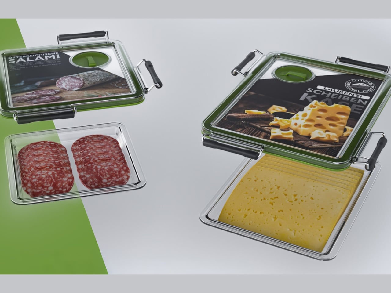
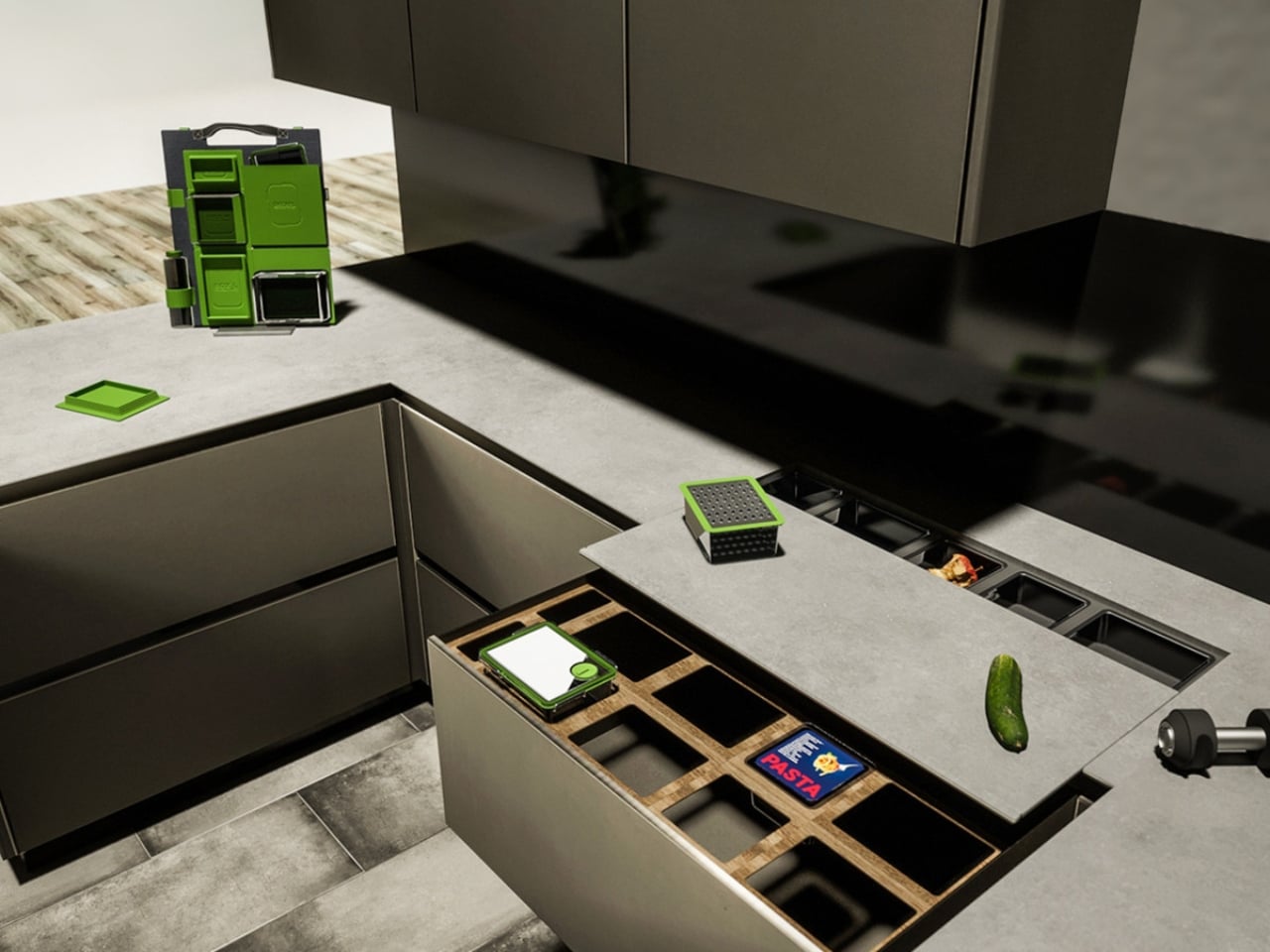
What makes ReLoopBox feel genuinely fresh isn’t that it proposes reuse. We’ve had reusable containers for decades. It’s that it proposes a reuse system, one that thinks about the full journey of a container rather than just the moment it sits on a shelf. Biedermann has described his practice as holistic design with a goal of contributing something positive to the world, and that philosophy is visible in every layer of this project.

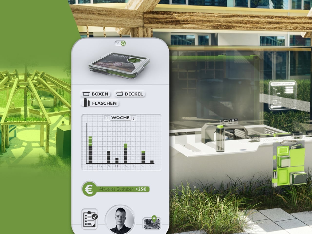
Whether ReLoopBox eventually scales into something we see in mainstream retail remains an open question. But as a piece of design thinking, it’s the kind of proposal that makes you look at the grocery aisle a little differently, and realize that even the most mundane objects are still waiting to be redesigned.
The post The Grocery Container That Finally Makes Reuse Actually Work first appeared on Yanko Design.


The Coffee Sleeve Reinvented From the Grounds Up

Every morning, millions of people grab a coffee to go and toss the paper sleeve into the trash without a second thought. It is a tiny object, easy to overlook. But that tiny object is part of a system that produces an estimated 16 billion disposable cups every year, sleeves included, and nearly none of it gets recycled. In the UK alone, cup sleeve recycling sits at roughly 2.8%, which is a polite way of saying almost everything ends up in a landfill.

That number has been sitting in the back of my mind ever since I came across GoBean, a design concept by Aranza V. Sanchez and Song Yeon Lee, two design students from Hochschule für Gestaltung Offenbach in Germany. The project recently earned a nomination for the Green Product Award, and when you look at what they have actually built, you understand why.

Designers: Aranza V. Sanchez & Song Yeon Lee

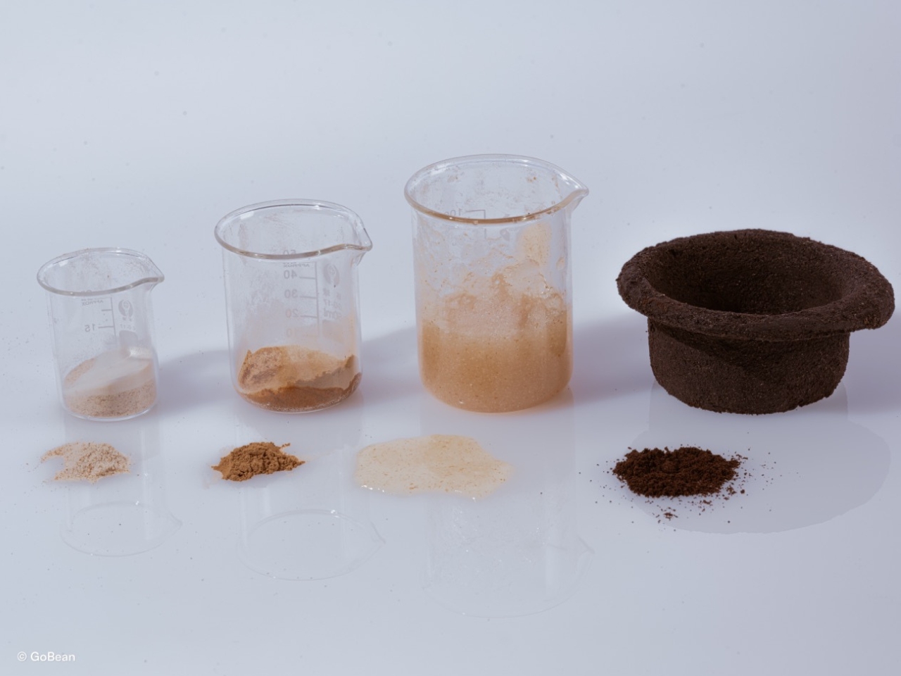
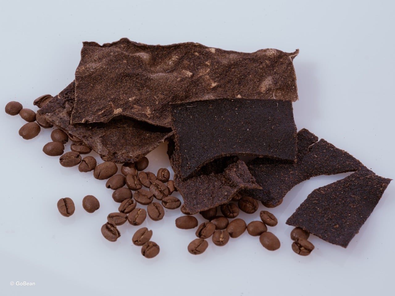
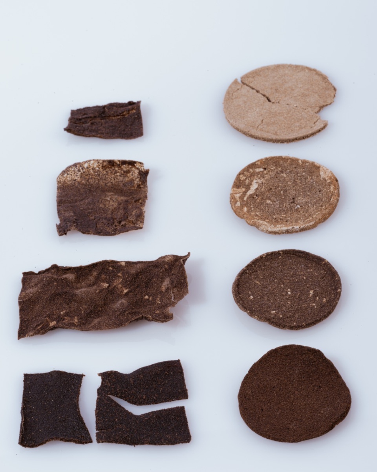
GoBean is a coffee cup sleeve made from coffee grounds. Not coffee-inspired, not coffee-colored. Actually made from the used, spent, leftover grounds that cafés collect and typically throw away. Combined with natural binders, the material becomes water and heat resistant, which matters quite a bit when your job is to wrap around a hot cup. It feels like a design idea so obvious that you wonder why it took this long to exist.

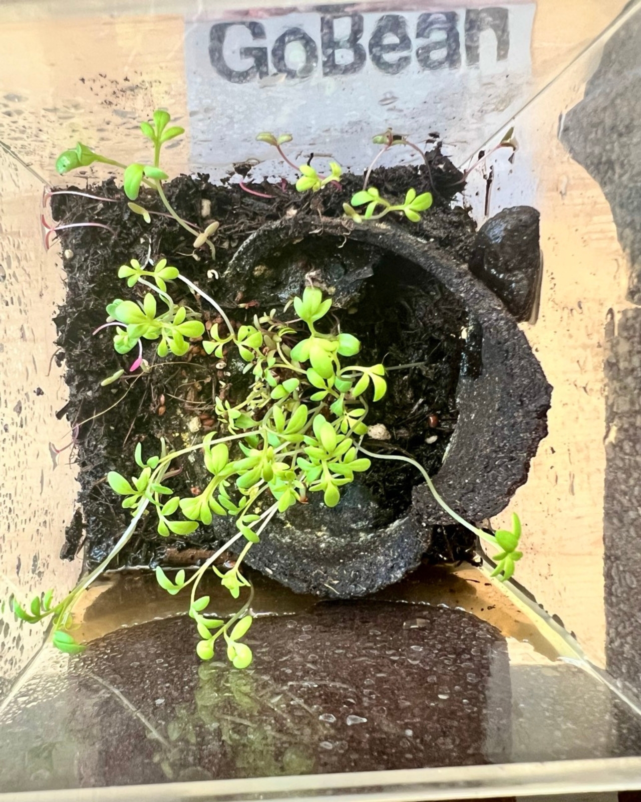
The material is 100% compostable and breaks down completely in about three weeks. If you would rather not compost it, you can plant it directly into soil. The sleeve, the thing that kept your fingers from burning on a Tuesday morning, becomes part of your herb garden by Friday. That circularity is not just a marketing point. It is genuinely elegant design logic.

What makes GoBean feel more serious than a typical student concept is the business model built around it. The idea is that cafés supply their own spent coffee grounds as the raw material for production. This turns waste into a resource, gives cafés a reason to participate, and keeps the material loop local. Designers often get credited for solving the object, but solving the system is harder, and Sanchez and Lee are clearly thinking about both.

I will admit, I have a complicated relationship with sustainable packaging projects. A lot of them promise a lot and deliver something that either does not perform as well, costs too much, or requires consumer behavior change that just is not going to happen at scale. GoBean avoids most of those traps by meeting the product exactly where it already exists. The sleeve still looks like a sleeve, fits like a sleeve, works like a sleeve. The only difference is where it comes from and where it goes afterward.

The Green Product Award tends to surface work that is genuinely trying to move the needle on material innovation rather than just putting a green label on something old. A nomination here carries a bit of weight, and GoBean fits the ethos of that kind of recognition.

It is also worth noting that this is a concept still in development, not something you can order from a café supplier today. That distinction matters. Student projects are exactly where this kind of thinking should live, unencumbered by the commercial pressures that usually flatten ideas before they can fully form. Whether GoBean eventually makes it to mass production will depend on all the less exciting stuff: manufacturing cost, supply chain logistics, regulatory approvals. None of which are guaranteed.

But as a vision of what disposable packaging could be, it is hard to argue with. The sleeve you use for ten minutes does not need to exist for a hundred years. That mismatch has always been the problem, and GoBean is one of the more elegant answers I have seen to it. Design does not always save the world, but sometimes it asks the right question. In this case, the question is simple: if your coffee sleeve is made from coffee grounds, has it ever really left the café?

The post The Coffee Sleeve Reinvented From the Grounds Up first appeared on Yanko Design.

Your Charger Is On Display for 23 Hours a Day, ORNA Designed for That

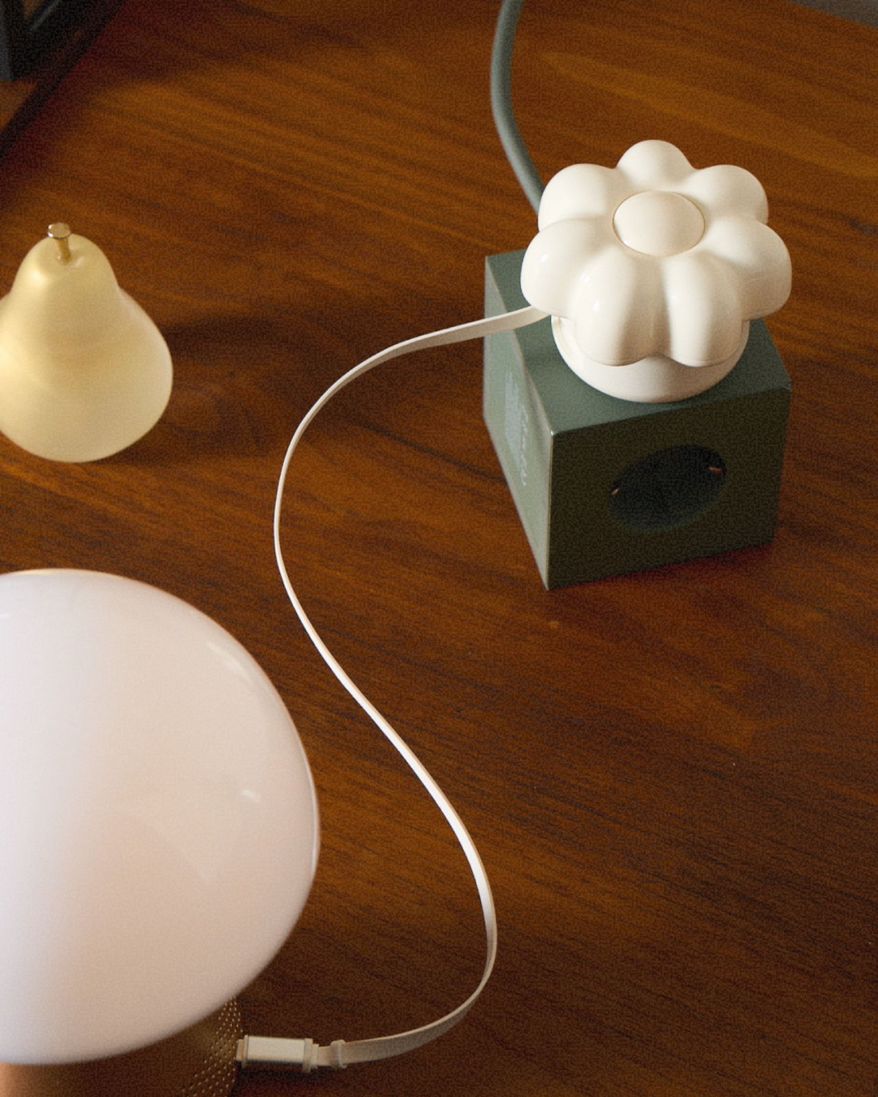
The wall charger is one of the most present objects in any home and one of the least considered. It sits on bedside tables, desk corners, and coffee tables for most of the day, then gets used for a few minutes and goes right back to being an uninvited presence. Nobody picks a charger because it belongs in their space. They pick it because it was cheap, available, and functional.

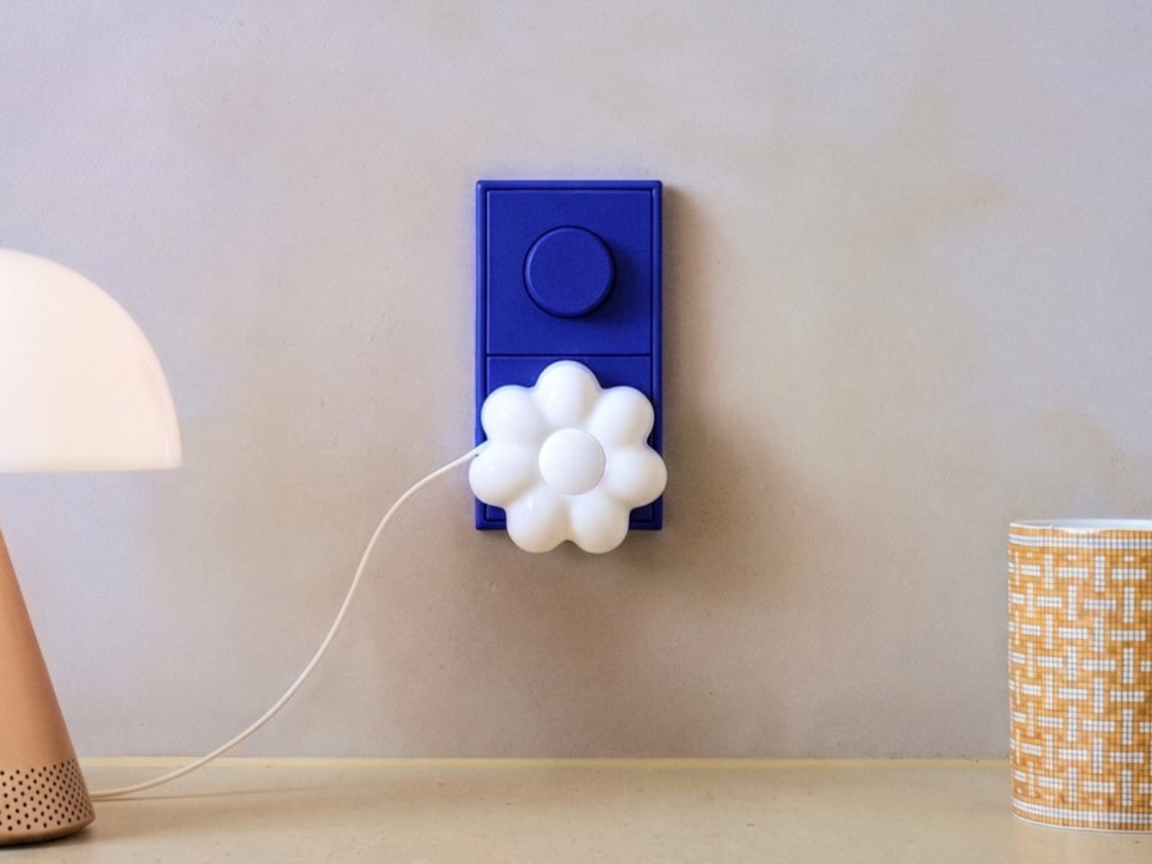
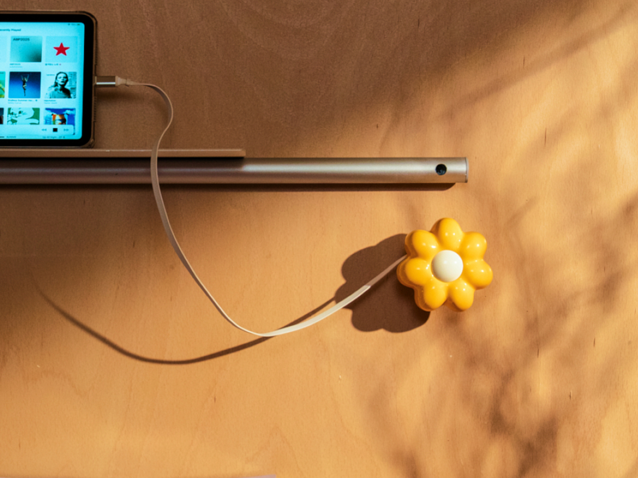
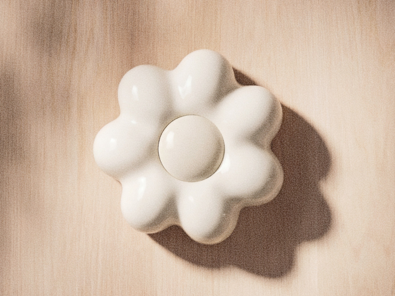
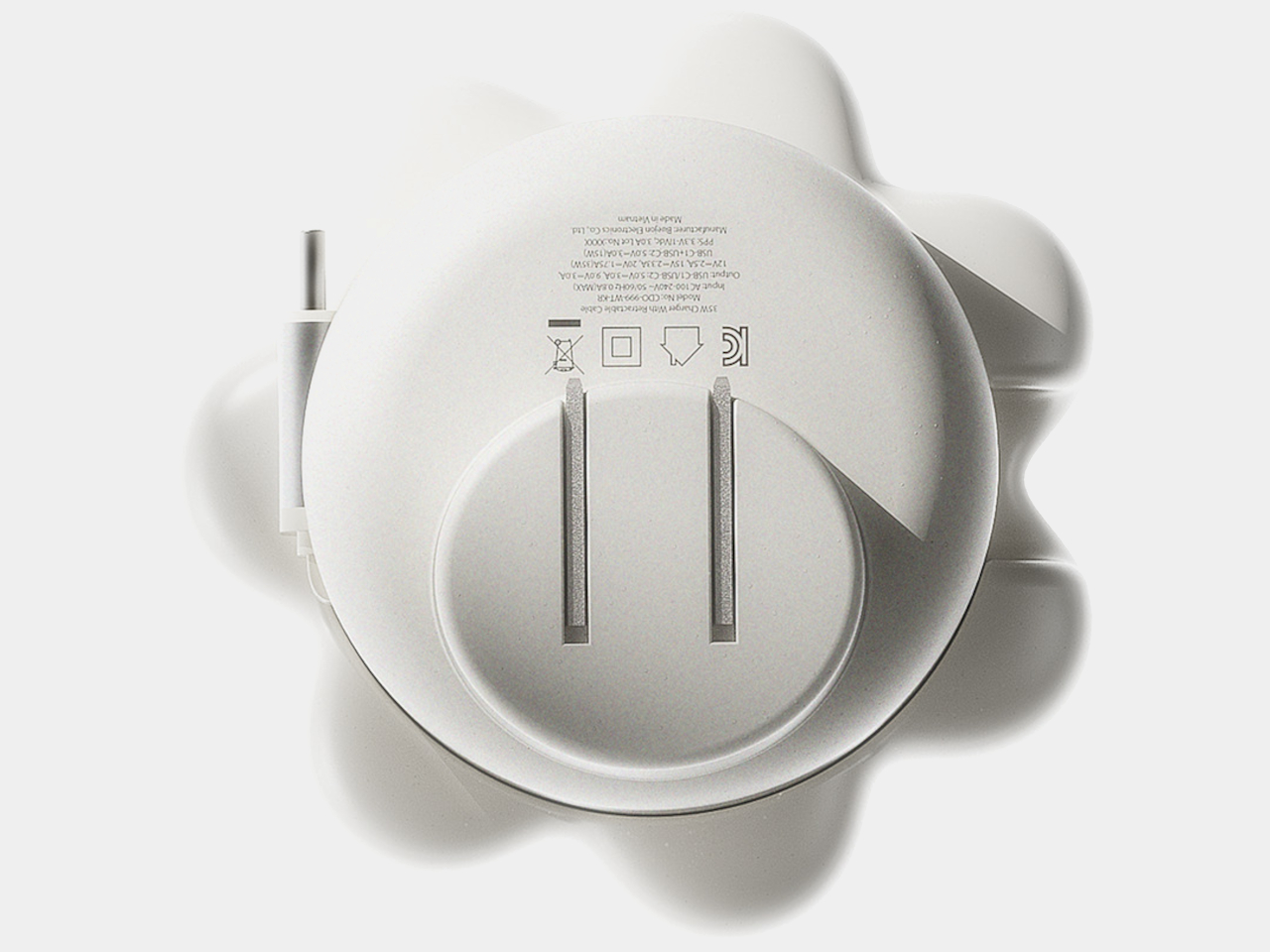
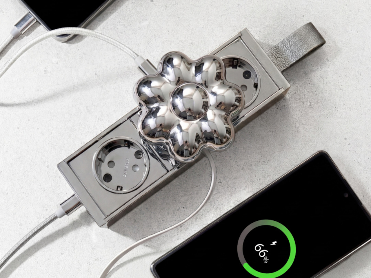
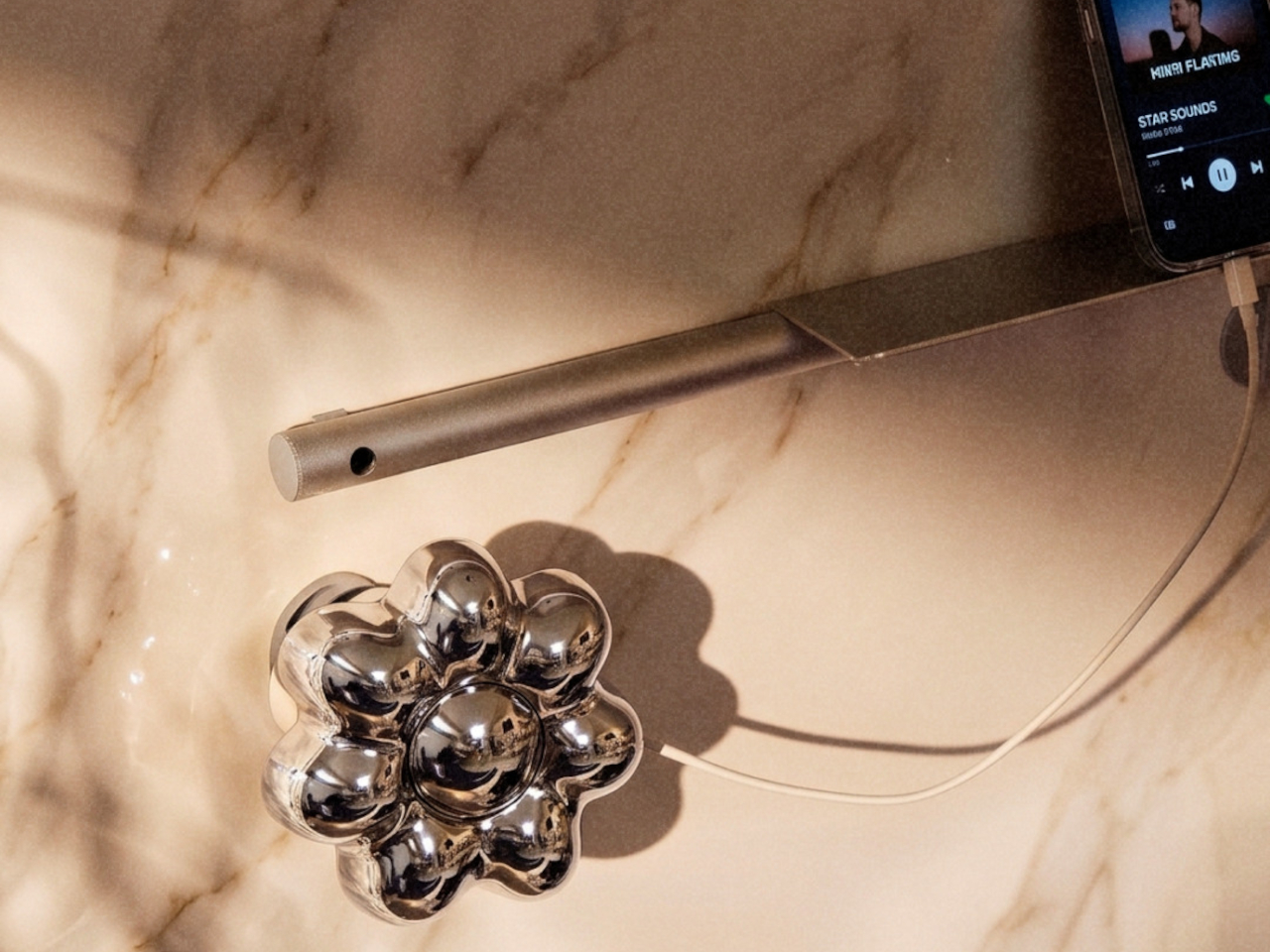
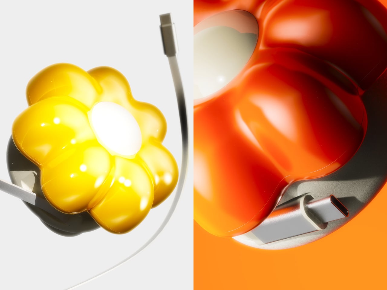
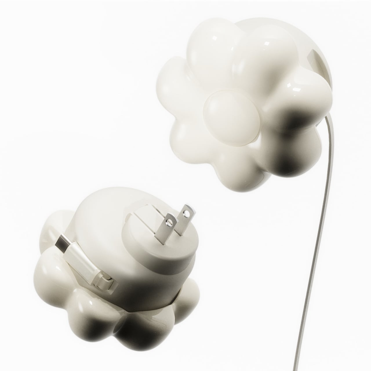
ORNA’s Objet Charger proposes a different starting point. It’s a 35W USB-C wall charger that treats the design of the object as seriously as the technology inside it. The key is a modular floral cover with a high-gloss, pop-art silhouette that attaches magnetically to the charger body and turns an overlooked utility item into a sculptural presence on any wall.

Designers: Kangnim Park, Jaehwa Lee, Jinsu & Jiwoong Studio for ORNA

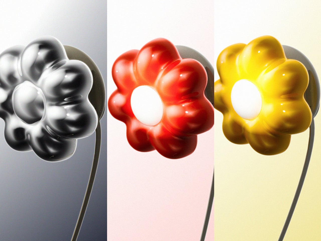
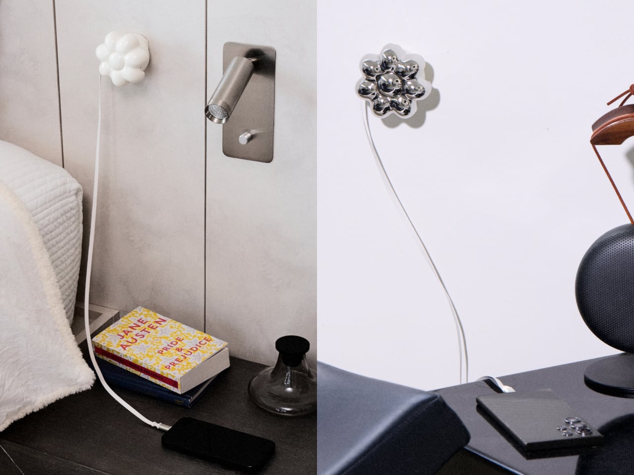
The cover is the part that gets swapped out to suit personal taste. Four versions are available: Daisy White, Sunflower Yellow, Marigold Orange, and Chrome Silver, each finished in a high-gloss surface that reads differently by room. The magnetic connection makes switching instant, which is part of what makes the concept work. Changing the personality of the object doesn’t require a new charger, just a different flower.

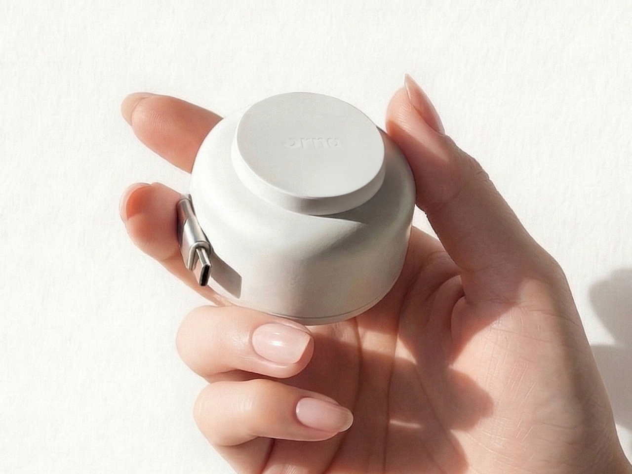
Underneath the sculptural exterior is a charger built for serious daily use. A one-meter USB-C cable is integrated into the body and retracts cleanly, so there’s no loose cord when the charger isn’t in use. A secondary USB-C port on the base handles a second device simultaneously, with the total output shared at 15W when both are active. Single-device charging peaks at 35W with full fast-charge protocol support.

The base of the charger was designed with the proportions of a traditional Korean Moon Jar in mind, a ceramic form known for the quiet completeness of its rounded body and the restraint of its surface. That design context matters more than it might sound. The charger is meant to occupy the wall the same way a carefully selected object occupies a shelf, present, purposeful, and unhurried.

Flower Objet covers are sold separately from the charger base, starting at $49 for the Daisy White and Sunflower Yellow finishes and $99 for the Chrome Silver variant. The modular logic means the same base stays in place for years while the floral cover changes with the seasons, the room, or simply a shift in taste. The foldable plug keeps the package compact enough to carry between rooms or pack into a bag without a trailing cable. It’s a long-term object, not a disposable tool.

ORNA frames the proportion of the charger’s daily existence as roughly 23 hours of visual presence for every one hour of active use. That framing captures why most chargers feel like failures: they’re designed entirely for the one hour and ignored for the 23. The Objet Charger is built for both, which is the kind of quiet attention most objects in our homes never receive.

The post Your Charger Is On Display for 23 Hours a Day, ORNA Designed for That first appeared on Yanko Design.
Why a $70 Screenless Camera Is the Most Interesting Gadget Right Now

A camera with no screen sounds like a step backward. It is, by design. And that’s exactly the point. We live in an era where every piece of technology is racing to give you more. More features, more connectivity, more reasons to stay glued to a display. And here comes a small, cheerful little camera doing the opposite on purpose. It’s almost rebellious, except it fits in your pocket and comes in Strawberry Splash.

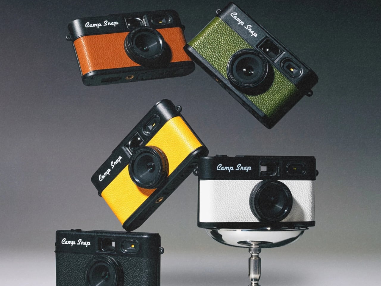
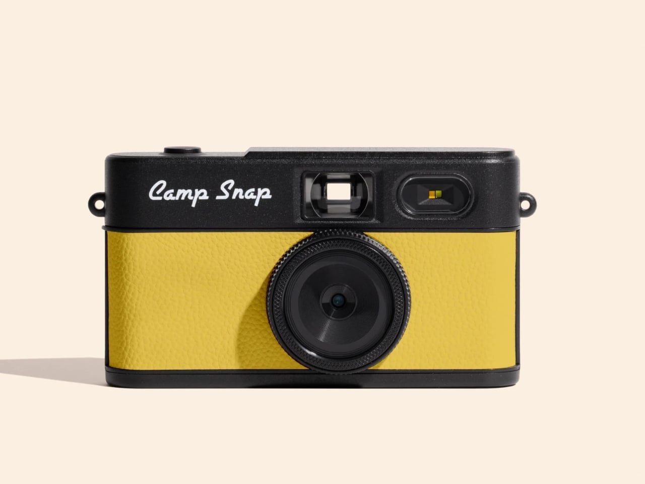
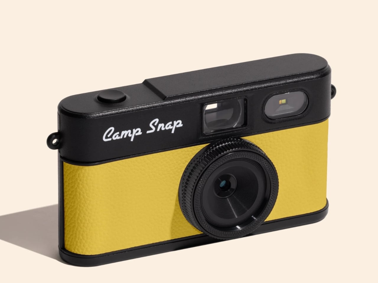
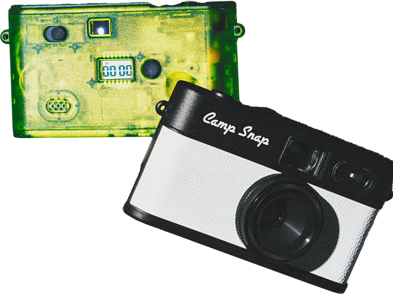
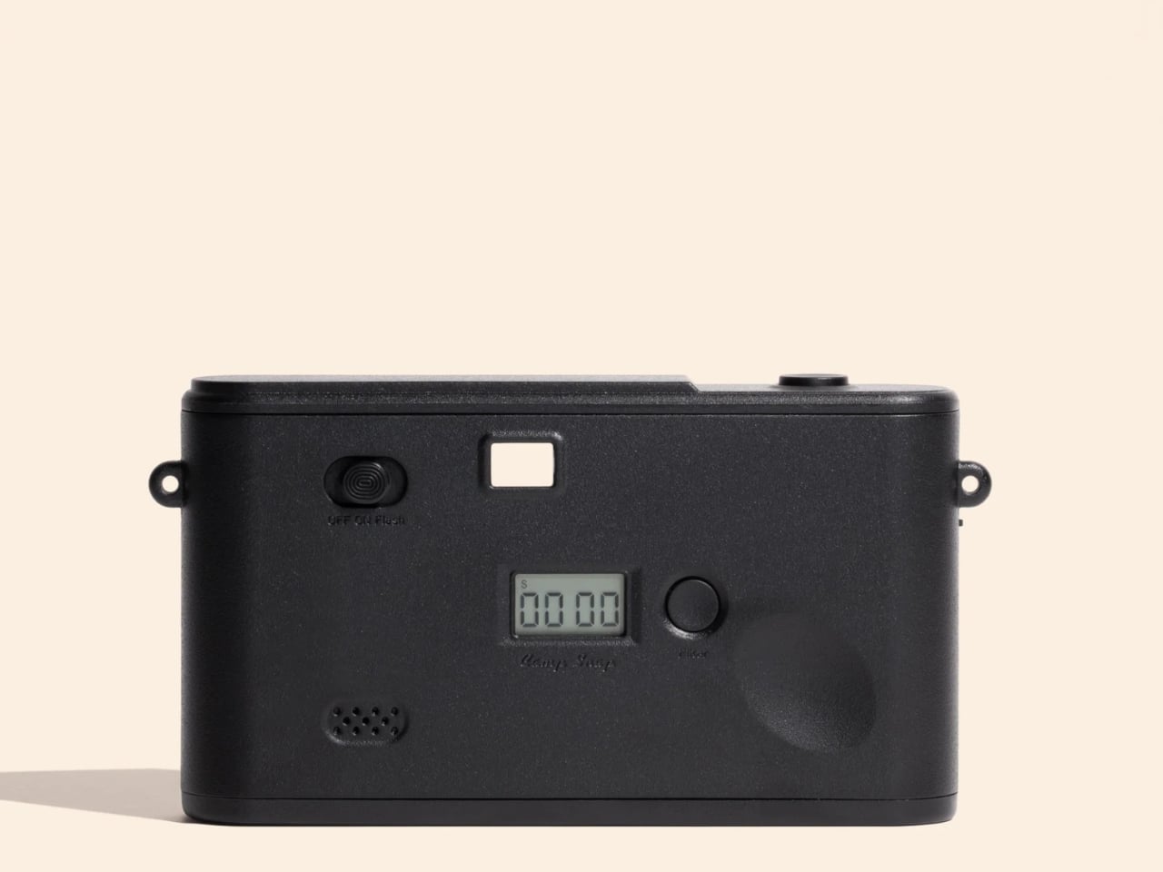
Camp Snap just released its second-generation screenless digital camera, the Camp Snap 2, and it’s already making the rounds on social media with the kind of low-key enthusiasm that feels genuine rather than manufactured. If you missed the original, here’s the short version: it’s a point-and-shoot with no rear LCD, no Wi-Fi, no app ecosystem, and no ability to review your shots before downloading them later. The whole pitch rests on the idea that not knowing what you captured is actually better for you.

Designer: Camp Snap

I’ve thought about this a lot, and I don’t think it’s a gimmick. We’ve spent years optimizing the act of photographing something into oblivion. We shoot, we review, we retake, we add a filter, we post, we check the likes. The photo becomes less about the moment and more about the performance of documenting it. The Camp Snap strips all of that away, and when you hold a camera you literally cannot scroll through, you start paying attention to the moment in a way that feels a little foreign at first, then oddly refreshing.
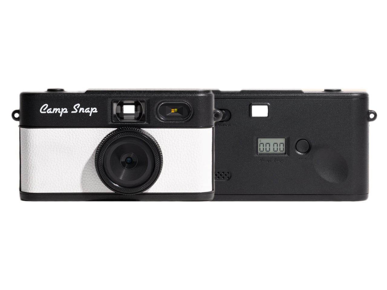
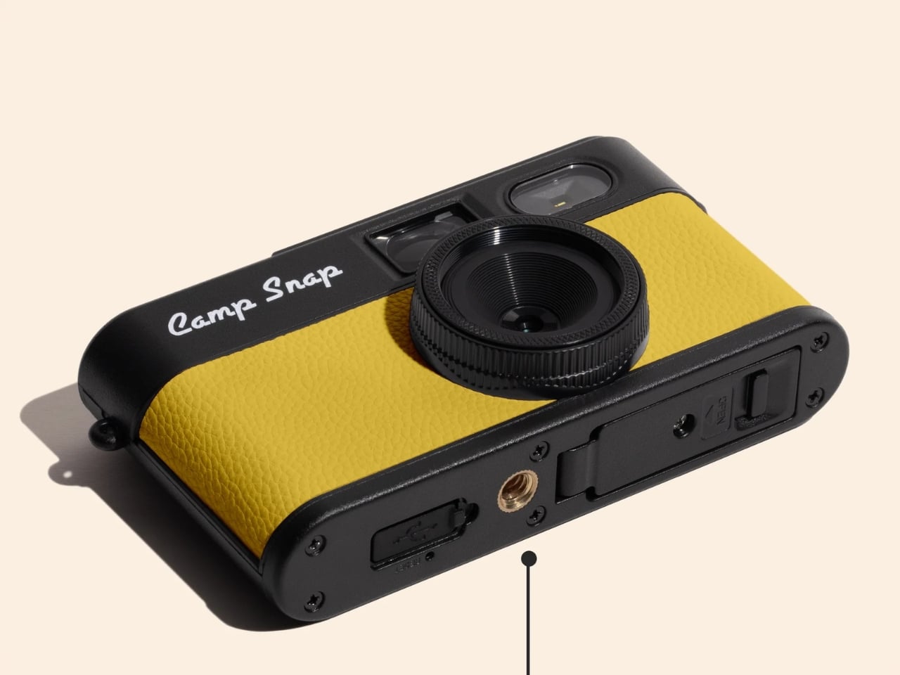
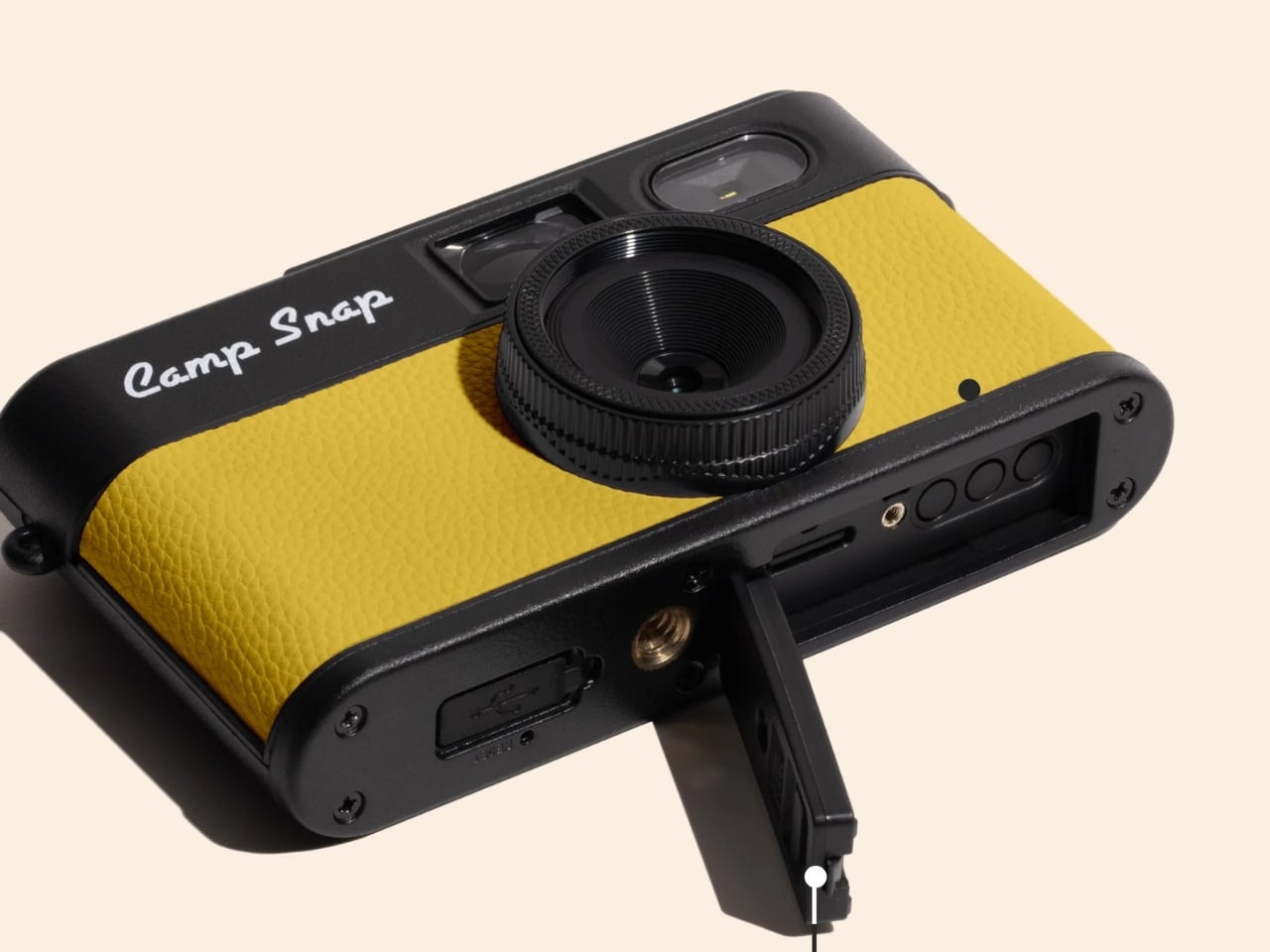
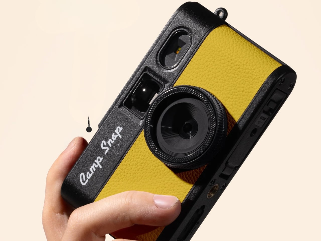
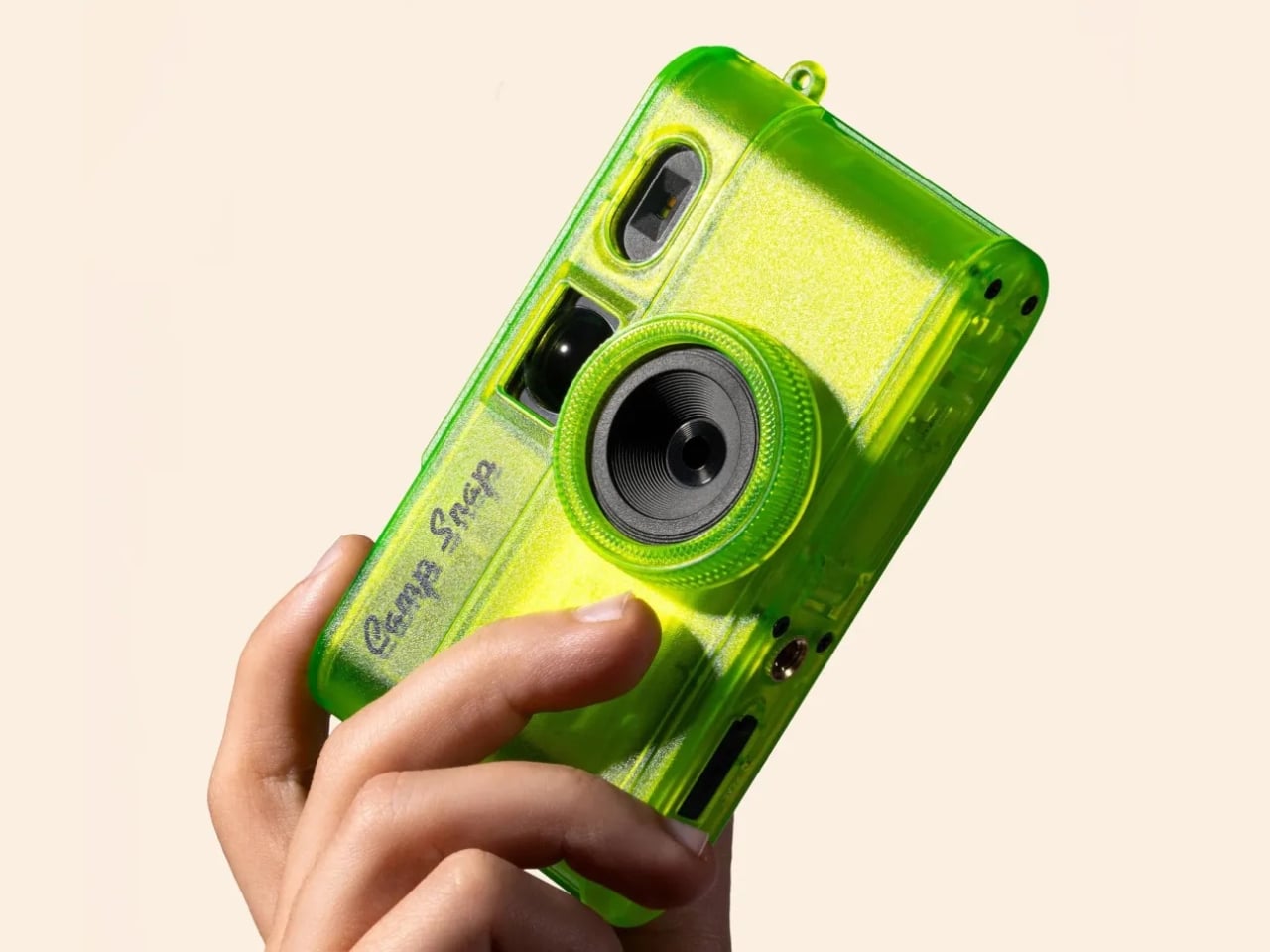
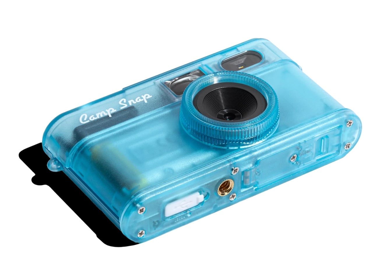
The Camp Snap 2 keeps everything that worked about the original and quietly fixes what didn’t. It’s 15% slimmer than the V1, which sounds minor until you actually slide it into a pocket and forget it’s there. The 8-megapixel sensor is unchanged, which will either bother you or not depending on what you’re looking for. The photos are not going to replace your iPhone shots. They’re warmer, a little imperfect, and have that slightly analog quality that makes you feel like you developed something rather than downloaded it.

The biggest upgrade is the filter button. On the original Camp Snap, switching filters required plugging the camera into a computer, which was a meaningful enough friction point that most people probably just left it on the default setting and moved on. The Camp Snap 2 now has a dedicated button on the back that cycles through six built-in looks: Standard, Vintage 1, Vintage 2, Vintage 3, Analog, and Black & White. No apps, no computer, just click until you land on the vibe you want. For anyone who bought the first version and felt mildly cheated by the filter situation, this is the update they were owed.

For families, Camp Snap also added a CampLock feature, which disables the filter button so younger users can’t cycle through settings accidentally (or intentionally). You unlock it by holding the button for ten seconds, which is the kind of low-tech solution that’s either charming or mildly annoying depending on the day.

The new model also supports 30.5mm screw-in filters, which opens up creative territory that feels almost comically ambitious for a camera of this nature. Wide-angle adapters, diffusion filters, star effects, macro attachments. It’s a camera designed to make you feel less precious about photography, and now it technically supports a whole accessory ecosystem. The tension between those two ideas is interesting, and I’m curious to see how people actually use it.

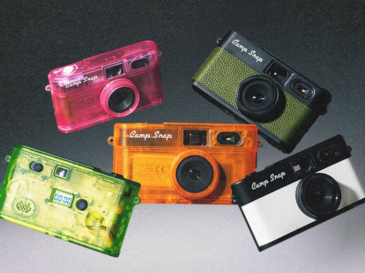
The Camp Snap 2 comes in nine colorways, including some jelly-style translucent options that hit the Y2K nostalgia button hard. Sunbeam Yellow, Tangerine Drift, Twisted Lime, and Strawberry Splash are doing a lot of visual heavy lifting here, and they look exactly like the kind of tech that lived in every locker in 2003. That’s not accidental. Camp Snap knows its audience includes adults who are as nostalgic for simpler devices as they are tired of their smartphones.

At $69.95, the Camp Snap 2 costs about the same as a dinner out, and it will probably be more memorable. It’s not asking you to quit your phone or adopt a new philosophy. It’s just a small, uncomplicated camera that asks you to look up more than you look down. For a lot of people, that might be worth exactly seventy dollars.

The post Why a $70 Screenless Camera Is the Most Interesting Gadget Right Now first appeared on Yanko Design.