Frankfurt’s Solar Lights That Look Better Than Your Living Room Lamp

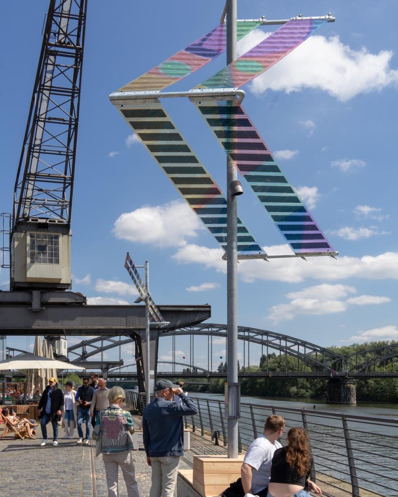
If you’ve ever walked along a riverbank at night and squinted up at a buzzing fluorescent streetlamp wondering who designed that thing and why, Munich-based duo ttal just made that question feel very urgent. Their installation Main Light, currently glowing along Frankfurt’s Weseler Werft as part of the World Design Capital Frankfurt RheinMain 2026 programme, is one of those rare projects that makes you rethink infrastructure entirely.

ttal, the design studio formed by Tobias Trübenbacher and Andreas Lang, built Main Light around a deceptively simple premise: public lighting doesn’t have to be ugly, energy-hungry, or ecologically reckless. The result is a self-sufficient solar installation that runs completely off-grid, no power lines buried underground, no permanent excavation, and no connection to the city grid whatsoever. It generates its own electricity through organic photovoltaic (OPV) solar films, those wonderfully colorful translucent panels that make the whole structure look like it belongs in a design museum rather than on a bike path. And that’s exactly the point.

Designer: Tobias Trübenbacher (ttal)
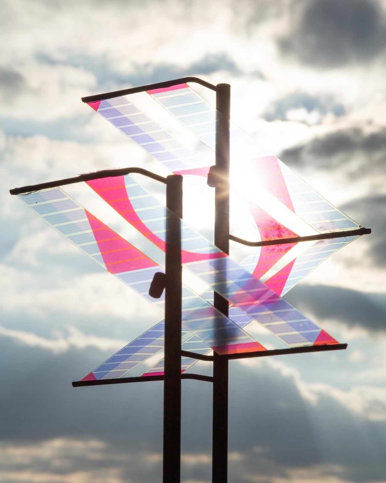
During the day, the solar surfaces catch the light and cast shifting, multicolored patterns across the riverbank. The horizontal stripes of the laminated solar cells aren’t hidden away or treated as a necessary evil. They’re the main visual event. The design essentially says: clean energy can be beautiful, and we should stop pretending otherwise. Trübenbacher, who was named Newcomer of the Year by the German Design Council at the German Design Award in 2023, has described design as a tool for social change, and Main Light reads exactly like that philosophy made physical.
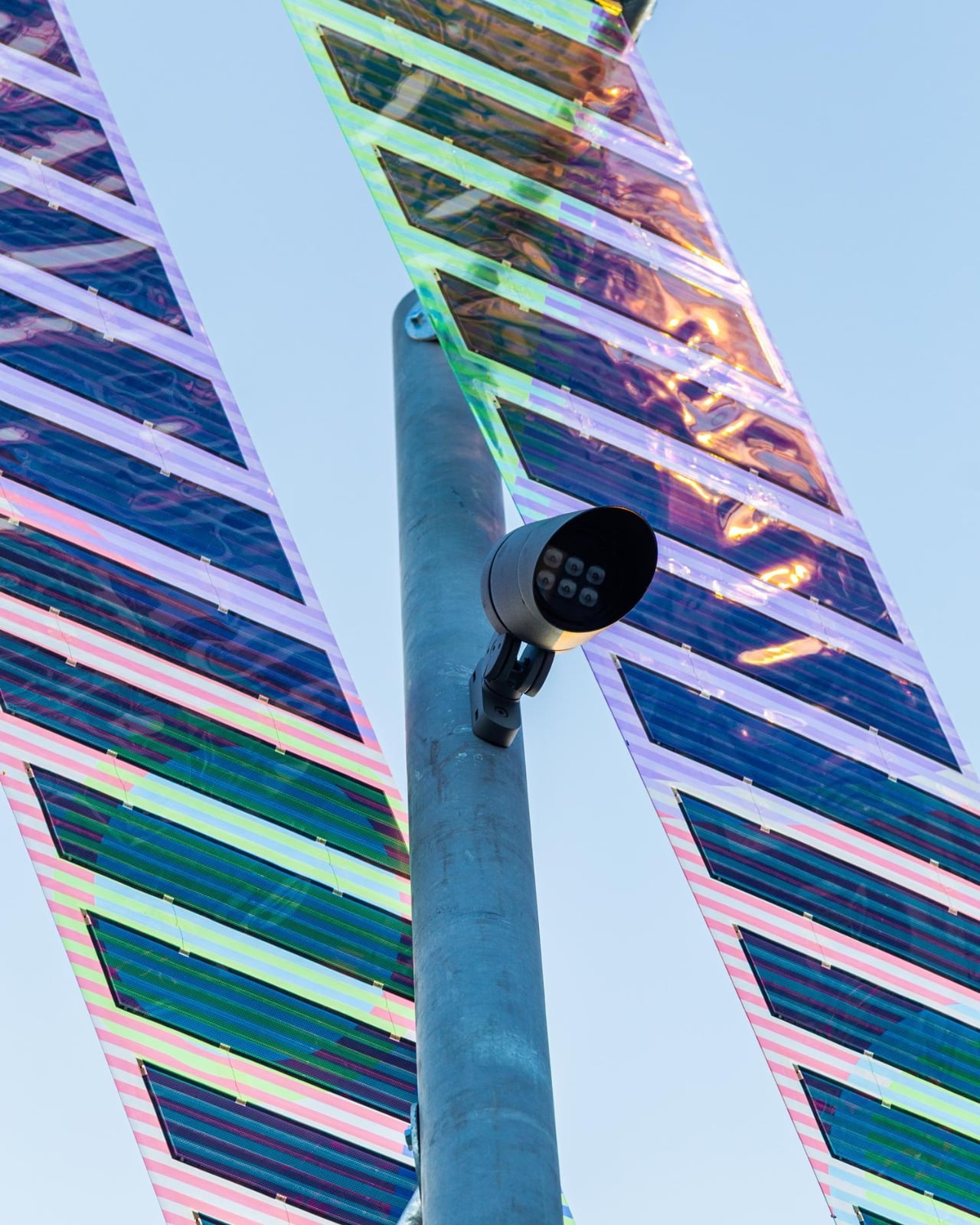
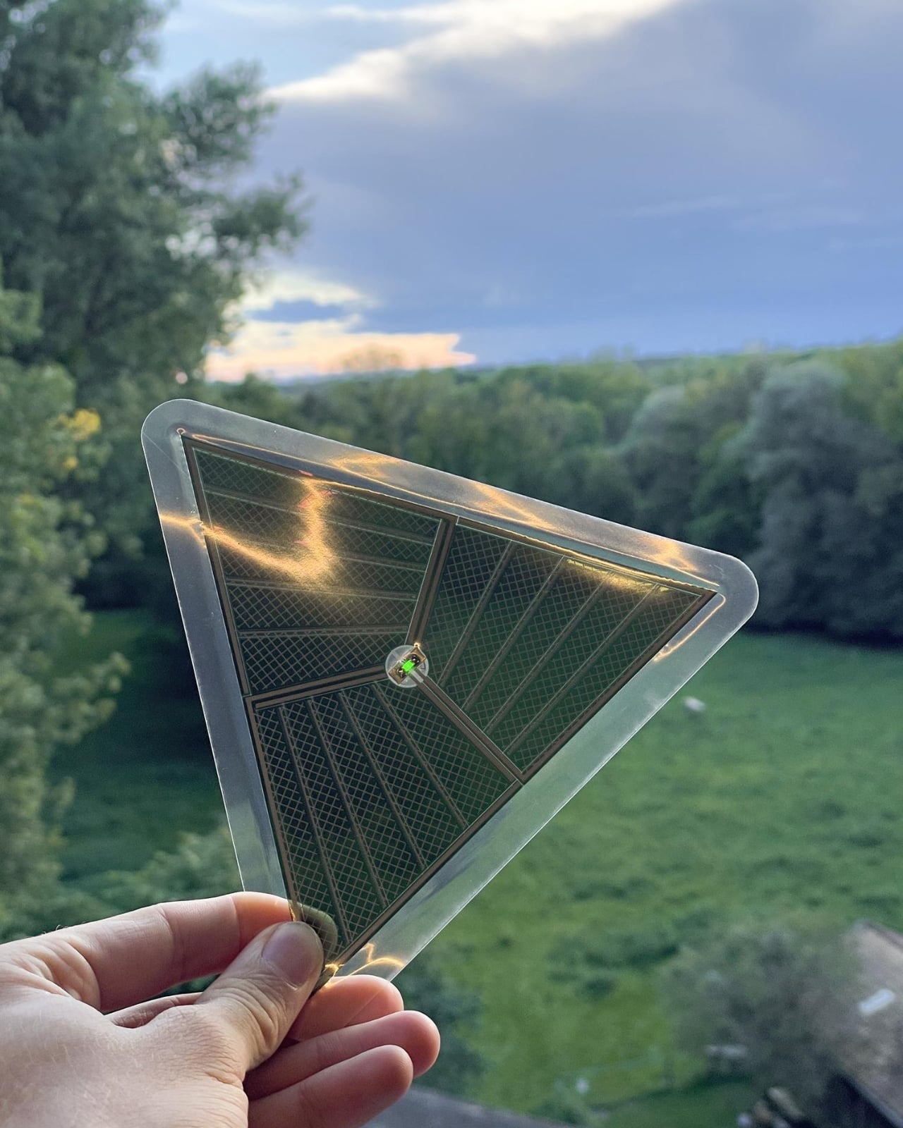
The ecological thinking goes deeper than solar panels, too. Main Light only switches on when a motion sensor detects a person nearby, meaning it doesn’t flood the riverbank with unnecessary light through the night. More quietly significant is its light spectrum. The installation deliberately avoids the blue-heavy frequencies common in most modern LED street lighting, opting instead for an insect-friendly spectrum that’s gentler on nocturnal ecosystems. Light pollution is one of those invisible crises we rarely talk about loudly enough, and seeing it addressed this thoughtfully in a public installation feels quietly radical.
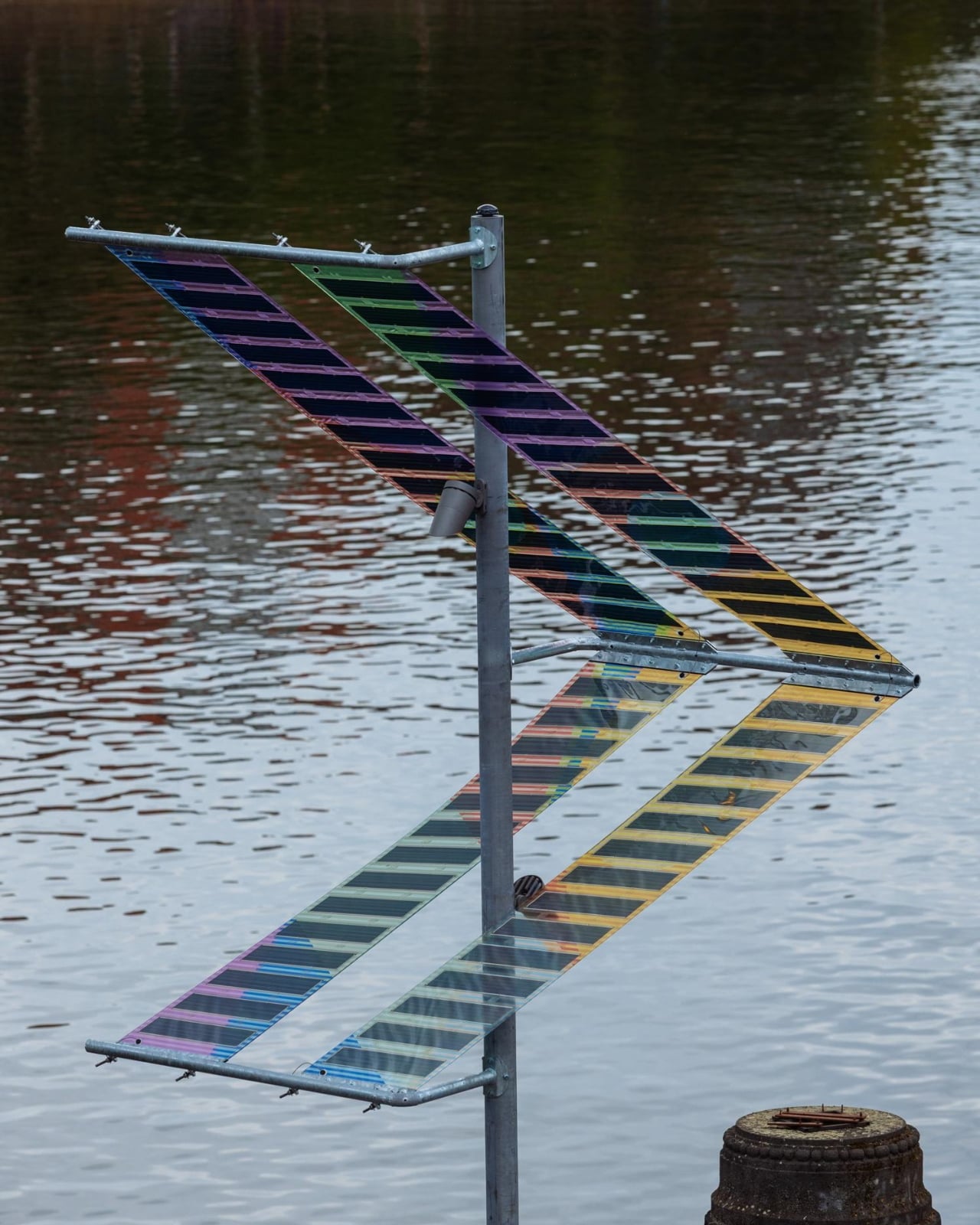
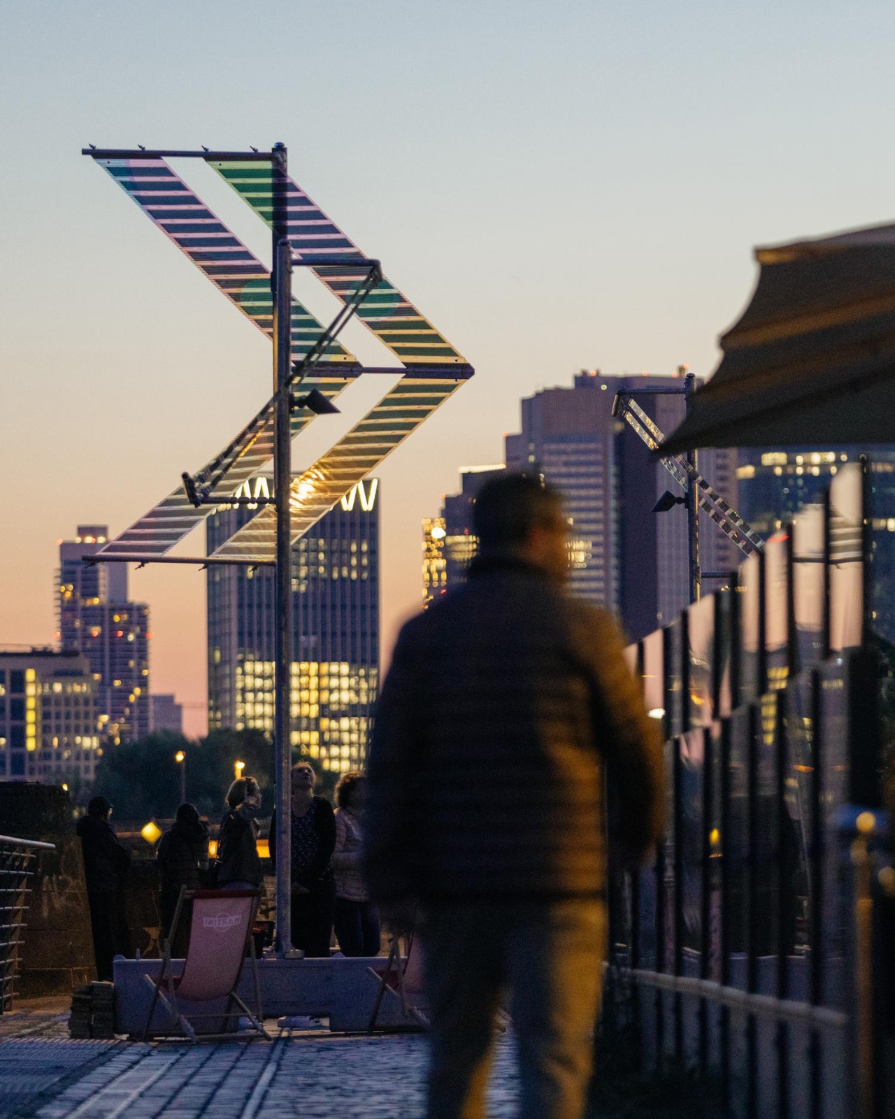
The structural decisions are just as considered. The foundations are reversible concrete bases that also function as urban furniture, places to sit, to pause, to look at the river. Trübenbacher and Lang worked with ewo GmbH on lighting and control technology, ASCA GmbH on the organic photovoltaic systems, and Schake GmbH on the steel construction. Four structures in total were installed near the Oosten restaurant, one large and three smaller units, running from May to November 2026.
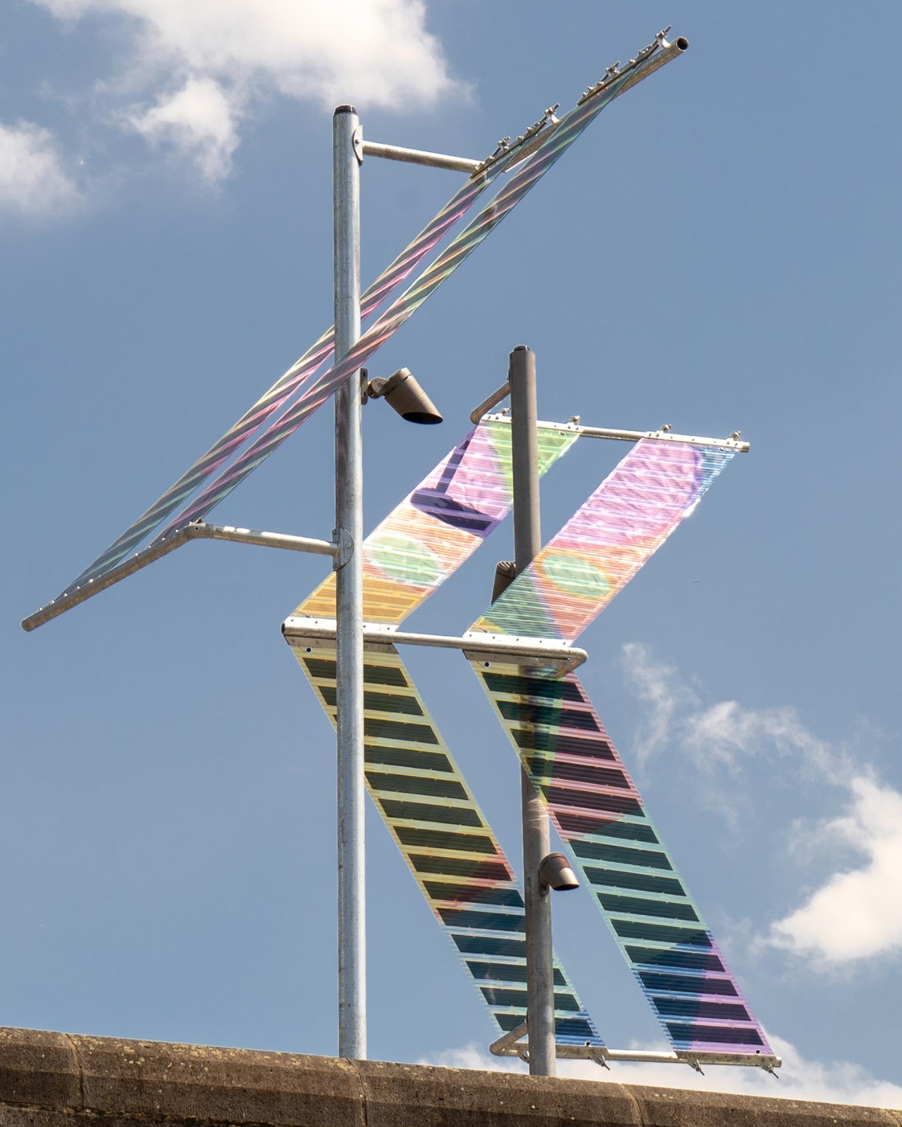
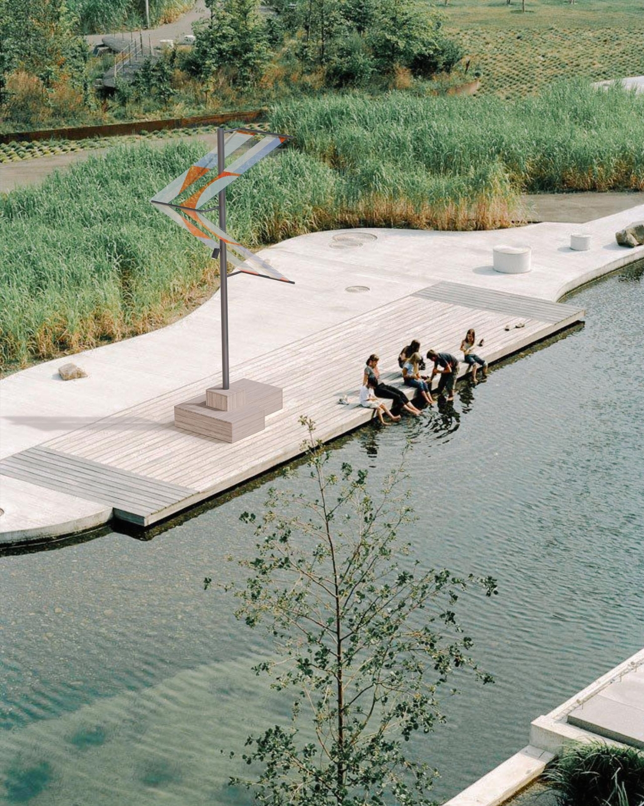
The installation sits within a broader conversation about what public infrastructure is allowed to look like. For too long, sustainability has been sold with a kind of visual apologetics, the clunky panel, the utilitarian form, the implicit suggestion that doing the right thing means sacrificing aesthetics. Main Light refuses that trade-off. The colored OPV panels turn the energy-generation process into something visible, even celebratory, a reminder that the transition away from fossil fuels doesn’t need to be grey and joyless.
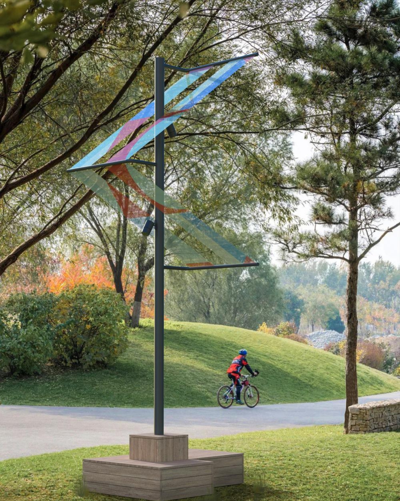
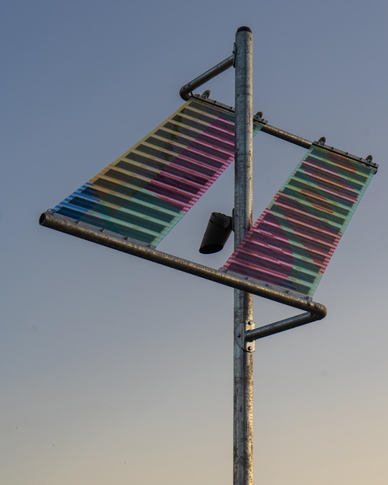
The duo is also running workshops and public events alongside the installation through the summer months, which matters. A beautiful object without discourse risks becoming wallpaper. The conversations ttal wants to start are about energy, public space, and who gets to decide what our streets look like. These aren’t niche design industry questions. They affect how livable, how safe, and how ecologically responsible our cities actually become.
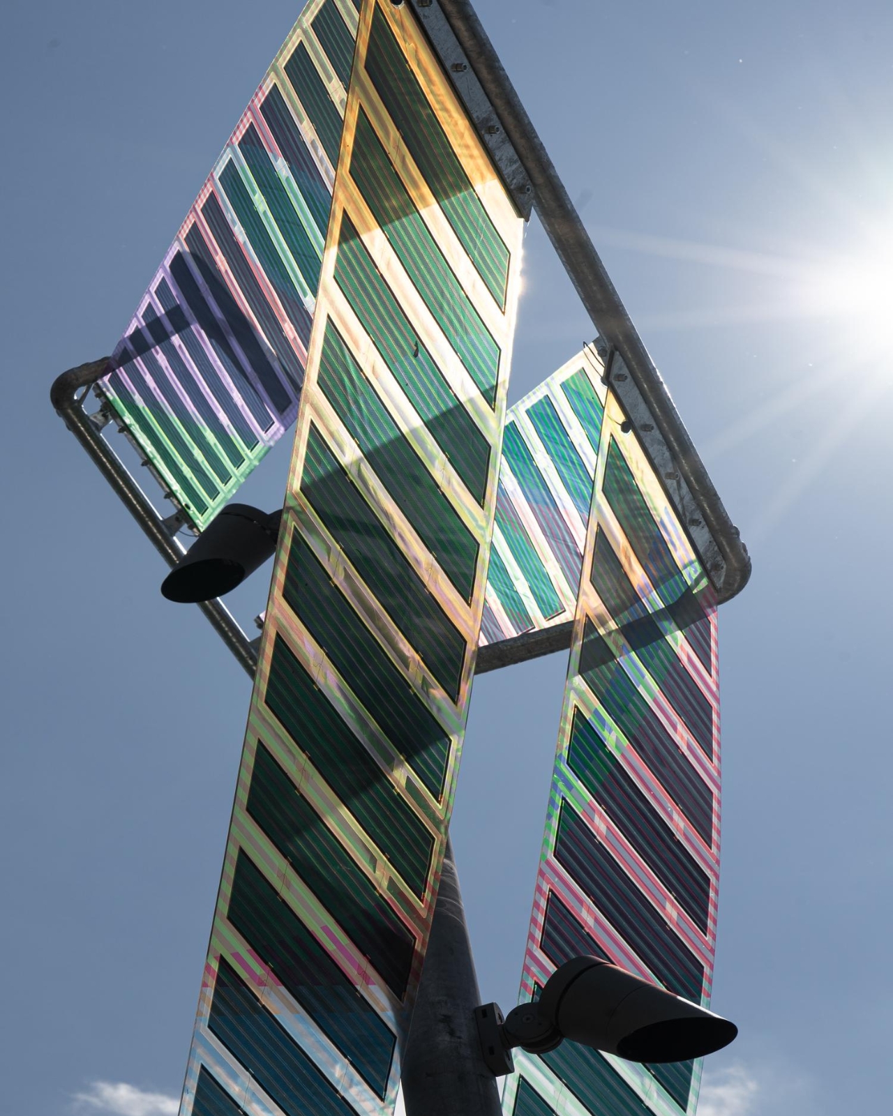
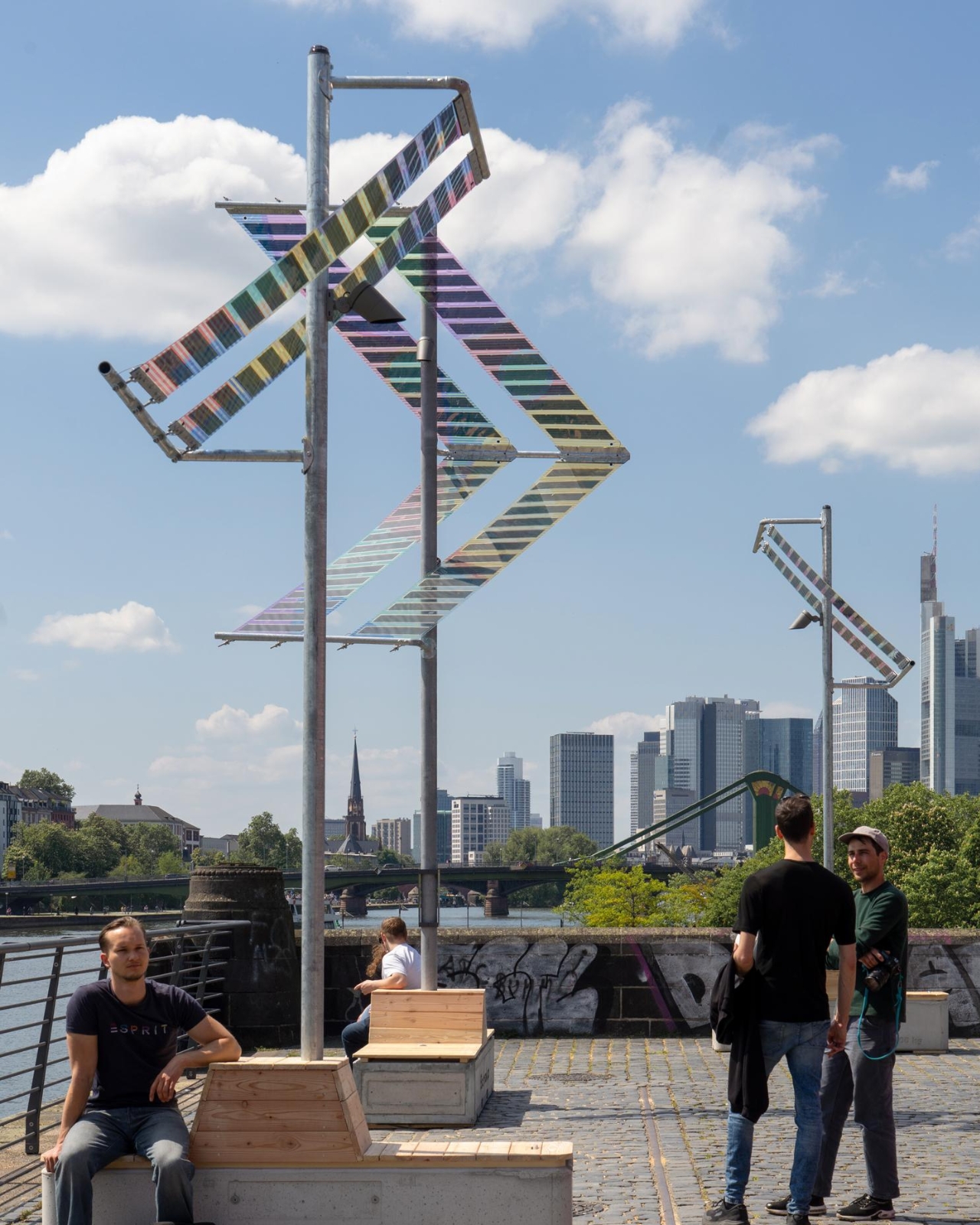
Cities across Europe and beyond are already reaching out about scaling the project, and it’s easy to see why. Main Light doesn’t require the ground to be torn up. It doesn’t need a power grid. It works, it glows, and it looks genuinely gorgeous against the Frankfurt skyline. The bike paths and riverbanks of the world deserve better than what they usually get. Trübenbacher and Lang have proven, at least along one stretch of the River Main, that we’re already capable of delivering it.

The post Frankfurt’s Solar Lights That Look Better Than Your Living Room Lamp first appeared on Yanko Design.


This Grungy Metal Case turns your iPhone 17 Pro into an iPod Classic

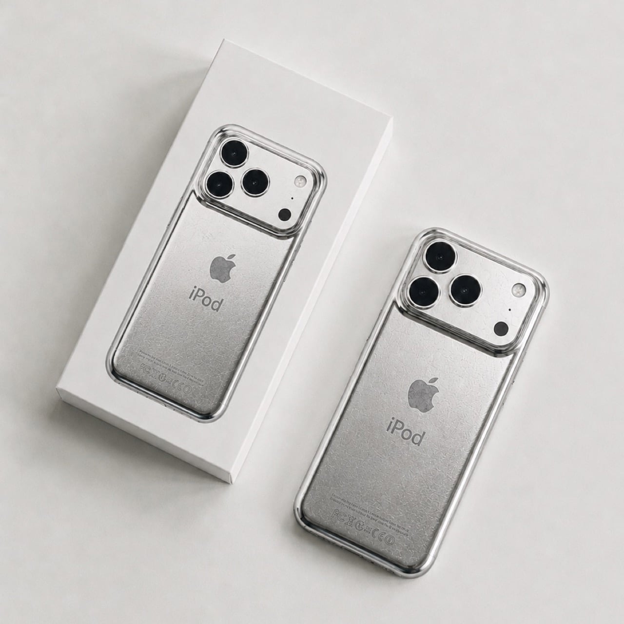
The original iPod (even the iPhone) was designed to scratch. Contrary to the idea of Steve Jobs and Jony Ive chasing perfection, the idea behind having an iPod that wears and tears with use was that A. it would be less of a hurdle to get you to upgrade, but also B. it would make each iPod uniquely different.

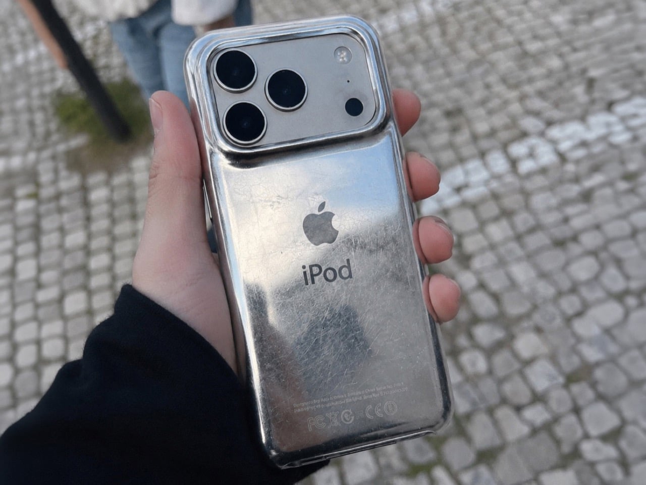
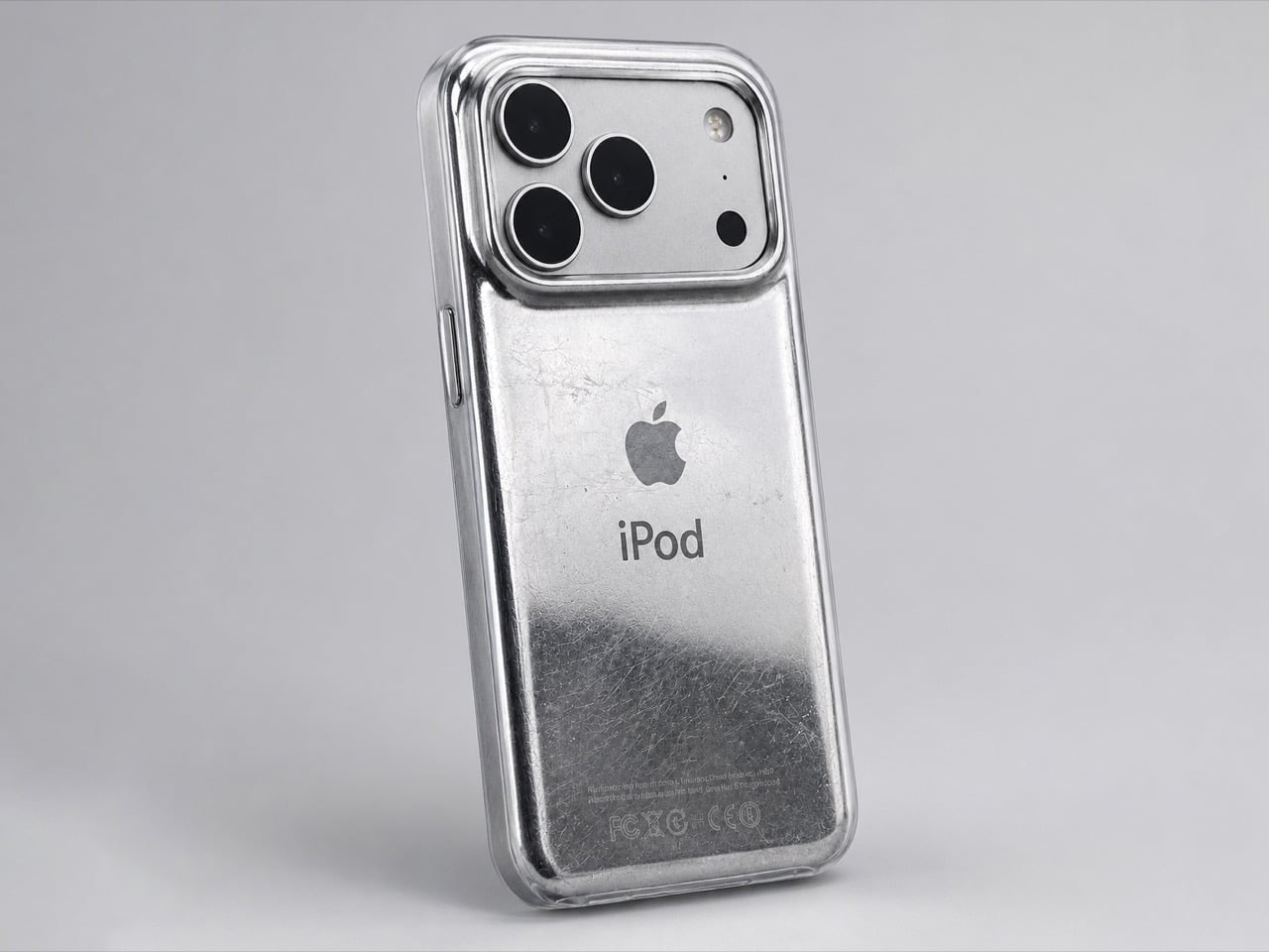
The term designers and craftspeople use to describe this phenomenon is ‘Patina’, it’s when iron rusts a certain way, when bronze oxidizes in a unique style, or when leather wears down in a distinct manner that’s unique to each individual product and how it’s used. The back of the iPod would scratch based on whether you’d keep it on tables or in pockets, whether your pocket had keys, whether you accidentally scuffed it against your belt buckle or the railing of a flight of stairs. That patina was ‘by design’, and even though the new iPhones don’t have that feature, David Delahunty designed a case that lets you relive exactly that.

Designer: David Delahunty

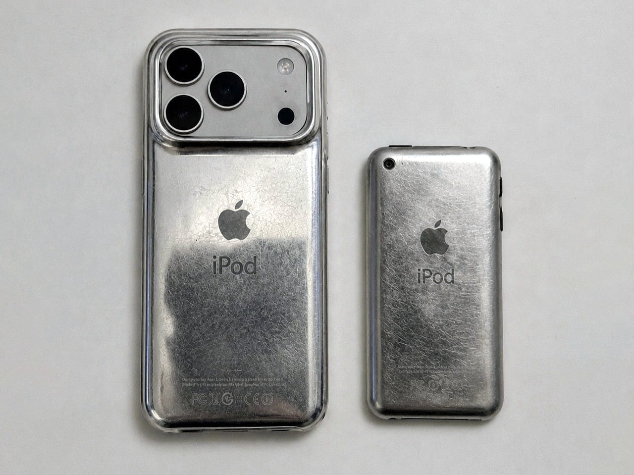
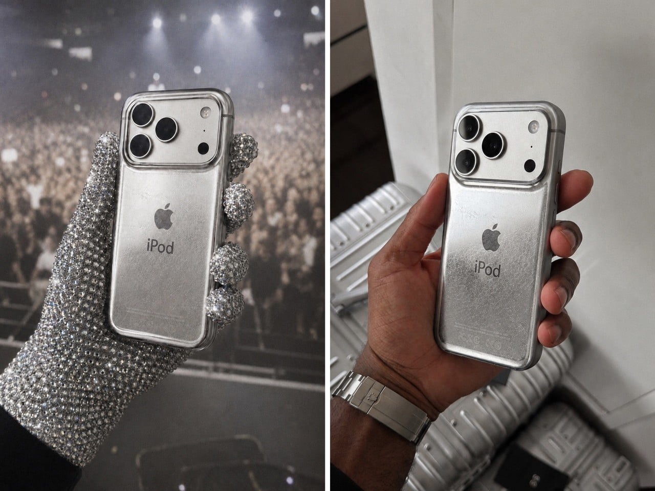
Rather simply put the iPod Classic iPhone 17 Case, this distressed metal case was designed to fit around any iPhone 17 Pro or Pro Max, giving your phone the same grunge-ish vibe. It has the exact same curved body that the iPod Classic had, making the product feel almost identical to the original when held in your hand (bye bye sharp edges on the iPhone, you won’t be missed). The case sports the same artwork on the back too, with an iPod symbol and the Apple logo, along with even the certification text at the bottom… but what steals the show are the scratches.

Now it’s difficult to say if Delahunty designed each case to be unique, but that’s because these are just conceptual… for now. The designer, who goes by ‘delahuntagram’ on social media, churns out unique ideas of quirky products (like this MS paint makeup kit or this Apple Spinning Wheel Tennis Ball). Some products end up making it to reality, like the MacOS Folder SSD that is now available for sale. With enough interest, I don’t see how such a product couldn’t hit the mainstream. Delahunty even rendered an image of Drake (although I choose to see MJ) holding the phone in his hand while wearing those bejewelled gloves.

It isn’t the first time the iPhone’s been used as a canvas for Apple-of-the-past. Spigen routinely releases cases that transform the iPhone into Apple icons like the Lisa/Macintosh, or the iMac G3, or even the original iPhone 3G. The ‘scratched’ iPod is a fairly new design take, and something you could totally expect from the mind of Delahunty. I wonder if the case has a faux 3.5mm jack just for kicks…

The post This Grungy Metal Case turns your iPhone 17 Pro into an iPod Classic first appeared on Yanko Design.
Coca-Cola Just Turned Its Iconic Bottle Into Chopsticks

If you visit most parts of East Asia and Southeast Asia, you will find something on almost every dining table, whether it’s at home or a public dining establishment: a pair of chopsticks. If you live there, then you learned to use them starting when you were a young child. If you’re visiting, then you will have to learn to use a pair when eating, or else you embarrassingly ask for other utensils. But in any case, chopsticks are part of every dining experience in that part of the world. They are more than just tools; they are a cultural staple, passed down through generations and deeply woven into the rituals of everyday life.

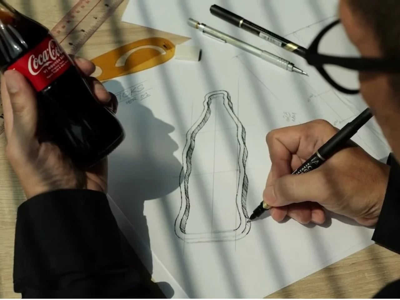
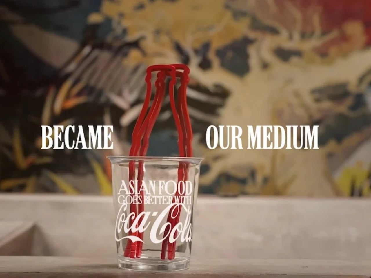
Wherever you live in the world, chances are you’re familiar with Coca-Cola’s iconic contour bottle, whether or not you drink it. Yes, there are cans and plastic bottles now, but even the latter has that distinct shape that was introduced in 1915 to make the brand identifiable wherever you see it, even if broken, even in the dark. That silhouette has since become one of the most recognizable forms in consumer branding history. Coke wants to bring the two together, as many parts of Asia don’t necessarily have the Coke bottle as a regular part of their dining table. So they decided to launch a campaign and create a product that would bridge the two worlds: CokeSticks.

Designer: Coca-Cola

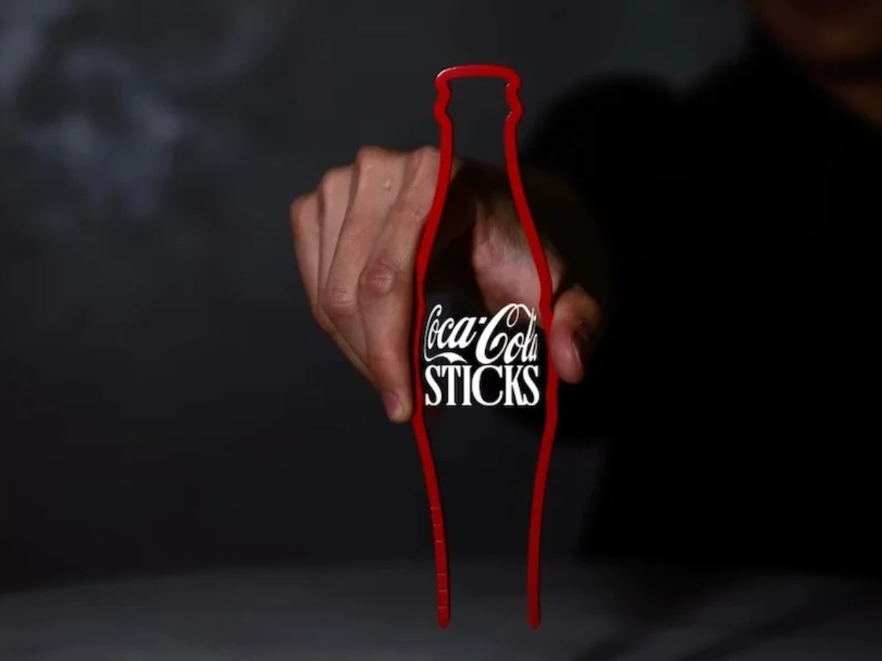
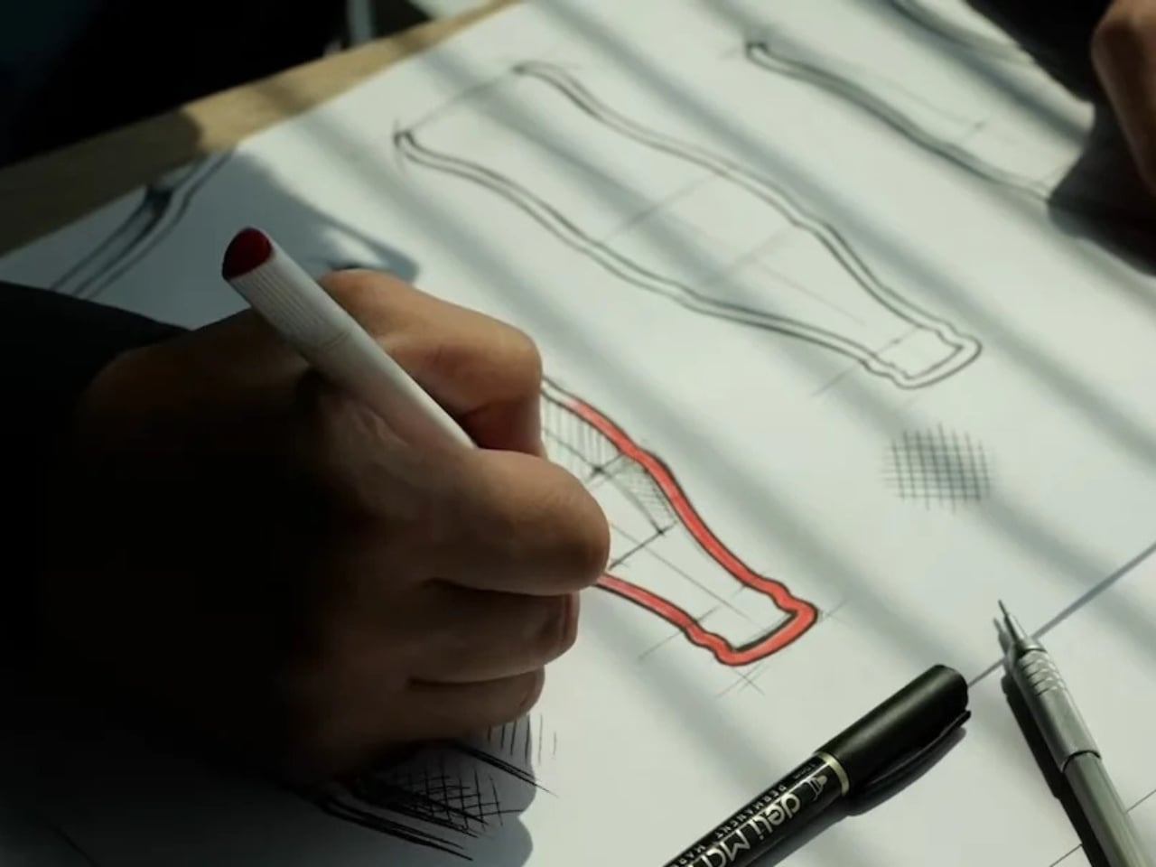
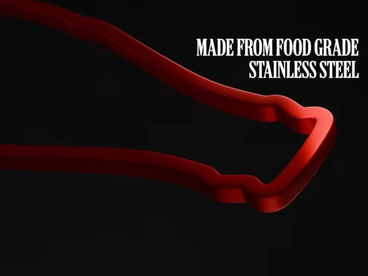
The product is just like what its name sounds like. It reimagines the famous contour bottle as chopsticks that people can actually use when eating. They’re not relying on a logo or any label, but purely on the power of its most iconic form and of course, the equally iconic Coke red color. It’s the kind of idea that feels both obvious and brilliant once you see it: strip away everything but the silhouette and the color, and the brand is still unmistakably there. It proves that this bottle is so distinctive that it can function as something else entirely, because it has its own design language that needs no introduction.

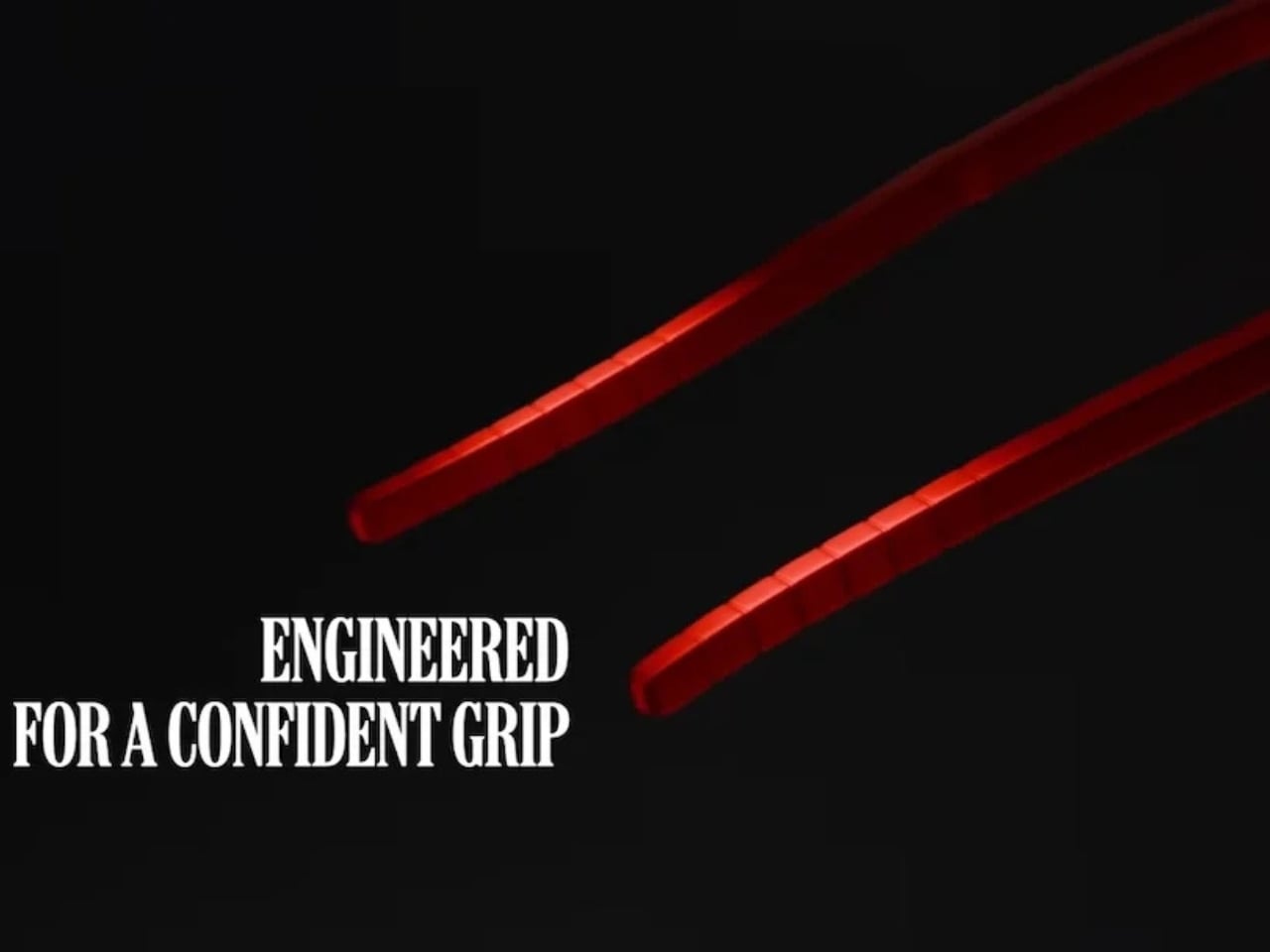
The CokeSticks are made from food-grade stainless steel and are designed to be fully usable despite their unconventional source of inspiration. They are also a clever crossover between packaging design and product design, which has been one of the brand’s strongest suits over the past decades. Coca-Cola has long understood that their bottle is more than just a container; it’s a visual icon, and CokeSticks is perhaps the boldest proof of that yet.

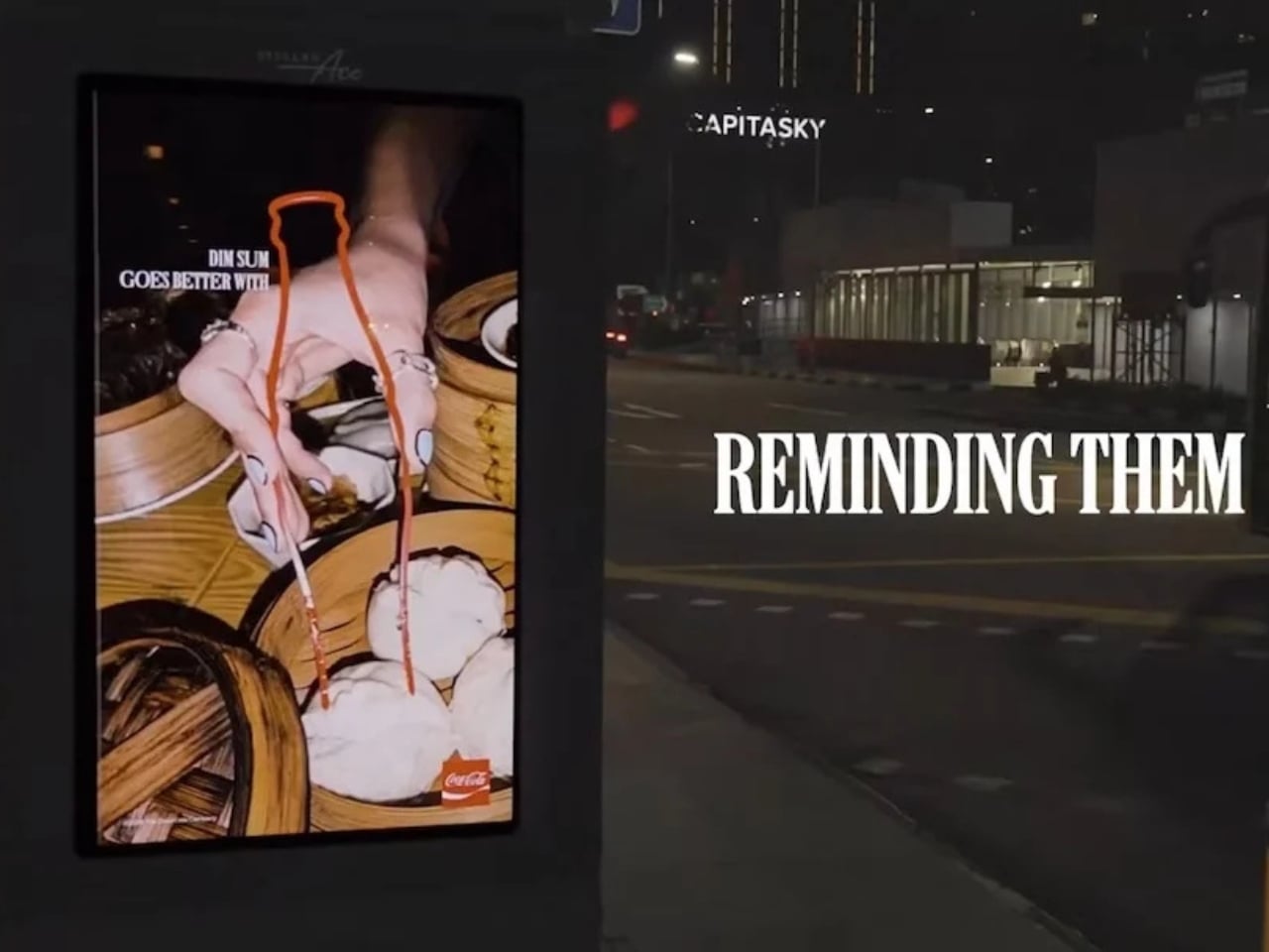
This concept and the campaign are also very specific to Asian dining culture, which goes to show that this is a market they really want to pick up, pun intended. The functional nature of the product can also be seen as both a branding exercise and an industrial design object. And if you’re a fan of the brand and love using chopsticks, then this could easily become part of your daily dining experience. It sits at a fascinating intersection: something that is both deeply familiar and completely new.

There’s also something satisfying about the idea that an object as everyday as chopsticks can carry that much brand storytelling. You don’t need the logo. You don’t need the label. Just those curves, that Coke red, and you already know exactly what you’re holding. It’s the kind of design thinking that collectors and design enthusiasts will appreciate, because it’s not just a gimmick. It’s a genuine extension of one of the world’s most iconic visual identities into a new, functional form.

Well, that is, if you’ll be able to get them. It doesn’t seem like something they’ll be selling anytime soon, as CokeSticks will be distributed to restaurants and food delivery experiences in the region. They are targeting this to reach 700,000 people, so hopefully, if you live in Southeast Asia, this will eventually make its way to your table.

The post Coca-Cola Just Turned Its Iconic Bottle Into Chopsticks first appeared on Yanko Design.