The Echo Chair Makes 3D Printing Feel Refined

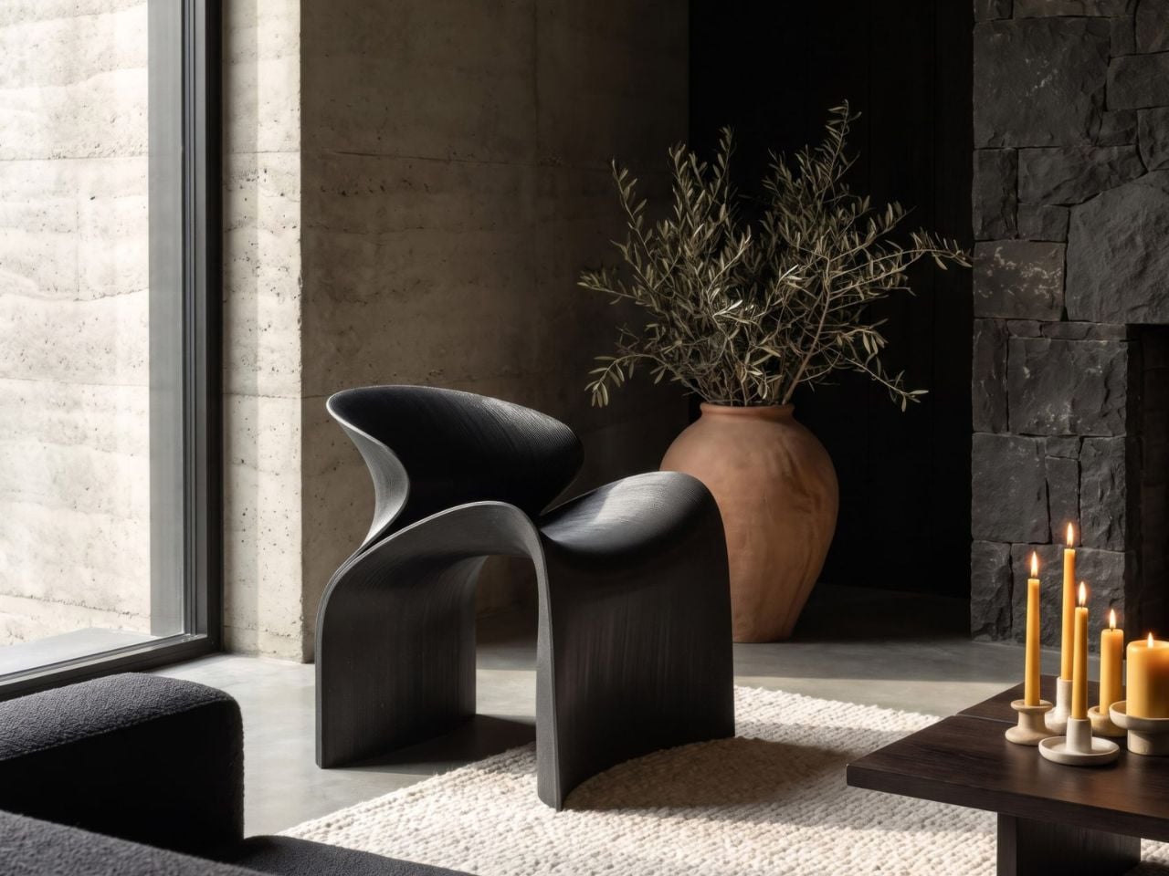
ZHA has collaborated with Spanish design brand Nagami to create the Echo Chair, a 3D-printed seat made from recycled plastic waste. Formerly known as Zaha Hadid Architects, the studio developed the chair through parametric design and large-scale additive manufacturing. Its form is fluid and sculptural, with an arched backrest that extends towards the floor and a seat that curves upwards at the sides.

The two parts look separate at first, but they are printed as one continuous piece. Both surfaces grow from the same structural edge and share the same underlying geometry. One becomes the seat, while the other rises to form the backrest and support.

Designer: ZHA and Nagami

This continuous construction gives the chair a clear sense of logic. The shape is doing several jobs at once: supporting the body, holding the structure together, and defining the overall visual character.

The Echo Chair was developed through an iterative research process at ZHA Lab and manufactured by Nagami, a brand known for its work in large-format 3D printing. The studios used recycled PETG sourced from industrial waste, including single-use medical plastics.

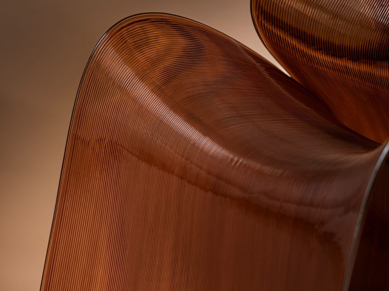
As the chair is printed layer by layer, the process leaves a ribbed texture across its surface. Those lines have been kept visible rather than hidden or polished away. That decision gives the chair much of its character. The texture follows the curves closely and makes the manufacturing process easy to read. It also gives the recycled plastic a more tactile, less generic appearance.
There is something useful in that honesty. The material is not being forced to look like timber, stone or metal. It keeps the visual qualities created by the printing process and uses them as part of the design. The surface does still reference natural materials in a subtle way. Its layered finish recalls mineral formations and carved stone, which helps the chair feel less industrial when placed in an interior.

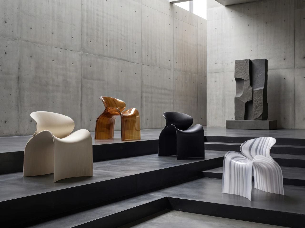
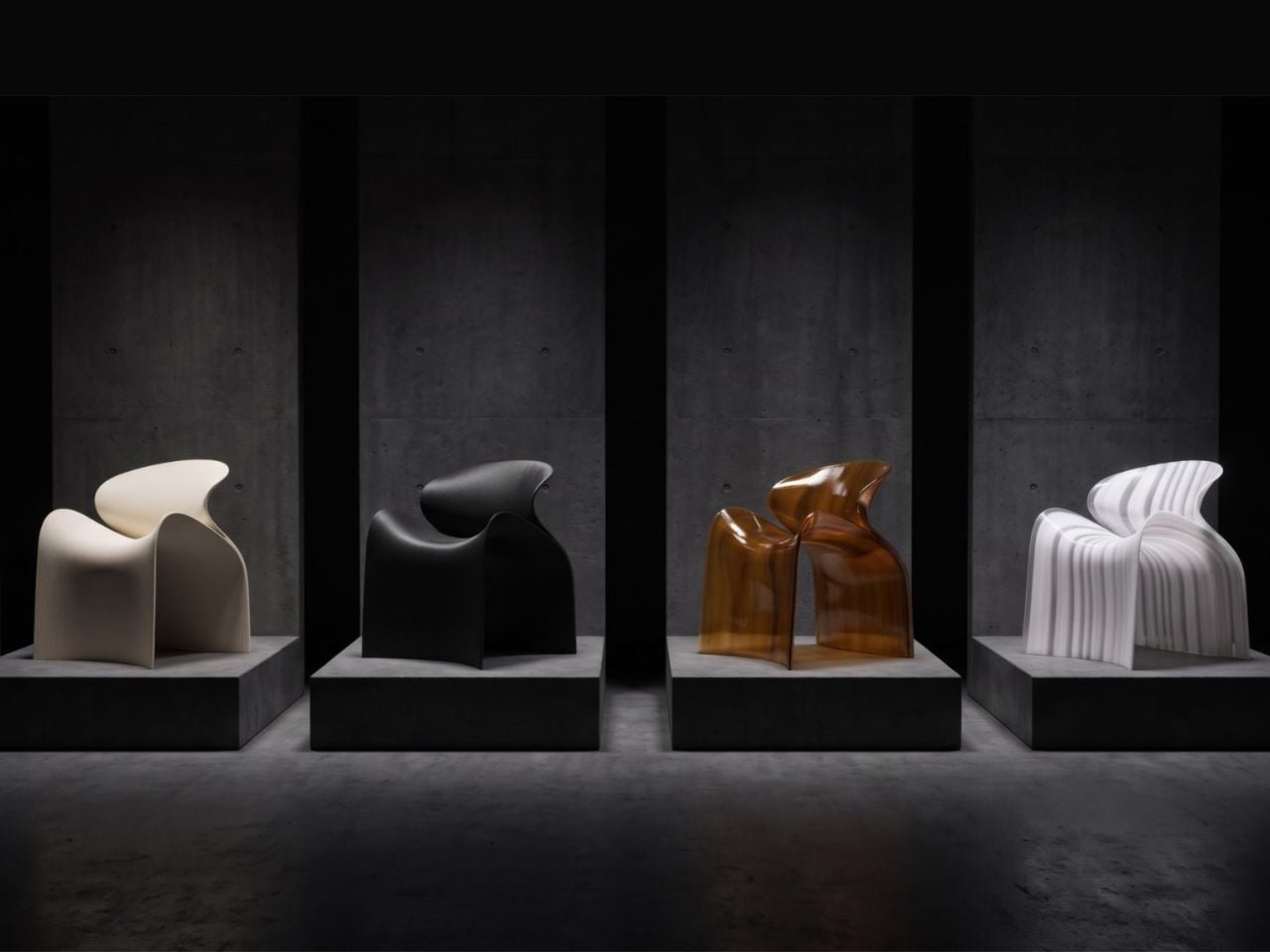
ZHA and Nagami developed four colourways for the chair: white, black, a white-to-translucent gradient and a caramel tone made using a bio-based cork composite. The colour choices help shift the mood of the design. White makes the form feel lighter and more architectural, while black gives it a stronger, more graphic presence. The translucent version draws attention to the printing layers, and the caramel finish adds warmth to what could otherwise feel like a very technical object.

The caramel version is especially successful because it softens the synthetic quality of the plastic. It feels easier to imagine in a home, hotel lobby or lounge space, rather than only in a gallery or design exhibition. According to ZHA project design director Sebastian Andia, the goal was to turn an abundant and overlooked material into something people would genuinely want to live with. That idea matters because recycled material alone is rarely enough to make a product successful. People still need to like the object, find it comfortable and see a place for it in their environment.
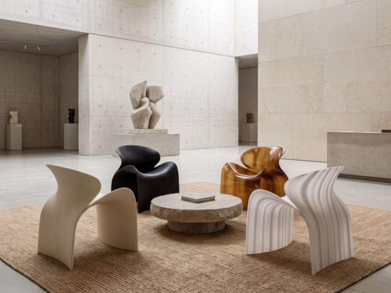
The Echo Chair handles this well. Its sustainable story supports the design, rather than becoming the whole design. The seat’s raised sides create a more enclosed sitting position, while the curved backrest gives the chair a supportive and almost cocooned feel. The shape is expressive, but it still looks usable. Its scale and neutral colour options also make it easier to place than the form might suggest. It has enough presence to work as a statement piece, yet it does not depend on bright colour or decoration to stand out.

The 3D-printing process allows the chair to be produced without visible joints or separate components. This gives it a seamless appearance and keeps the connection between the digital model and final object very direct.

That connection is one of the strongest parts of the project. The manufacturing process does not sit behind the design. It shapes the design. The ribs, curves and continuous structure all come from the same production method. Each part of the chair feels related because it has been developed through the same system.
The Echo Chair continues ZHA and Nagami’s existing collaboration. Nagami launched its first collection of 3D-printed chairs in 2018, which included two designs by the architecture studio. Their latest project shows how much more refined large-scale 3D printing has become. The chair feels less like a technical experiment and more like a finished product with a clear place in contemporary interiors.

The Echo Chair is currently on display as part of London Creates at The Truman Brewery. What makes the chair interesting is the way it brings together material, form and manufacturing without overcomplicating the idea. Recycled plastic is treated as a starting point for the design, rather than something that needs to be disguised.
The post The Echo Chair Makes 3D Printing Feel Refined first appeared on Yanko Design.


The Echo Chair Makes 3D Printing Feel Refined

ZHA has collaborated with Spanish design brand Nagami to create the Echo Chair, a 3D-printed seat made from recycled plastic waste. Formerly known as Zaha Hadid Architects, the studio developed the chair through parametric design and large-scale additive manufacturing. Its form is fluid and sculptural, with an arched backrest that extends towards the floor and a seat that curves upwards at the sides.

The two parts look separate at first, but they are printed as one continuous piece. Both surfaces grow from the same structural edge and share the same underlying geometry. One becomes the seat, while the other rises to form the backrest and support.

Designer: ZHA and Nagami

This continuous construction gives the chair a clear sense of logic. The shape is doing several jobs at once: supporting the body, holding the structure together, and defining the overall visual character.

The Echo Chair was developed through an iterative research process at ZHA Lab and manufactured by Nagami, a brand known for its work in large-format 3D printing. The studios used recycled PETG sourced from industrial waste, including single-use medical plastics.

As the chair is printed layer by layer, the process leaves a ribbed texture across its surface. Those lines have been kept visible rather than hidden or polished away. That decision gives the chair much of its character. The texture follows the curves closely and makes the manufacturing process easy to read. It also gives the recycled plastic a more tactile, less generic appearance.

There is something useful in that honesty. The material is not being forced to look like timber, stone or metal. It keeps the visual qualities created by the printing process and uses them as part of the design. The surface does still reference natural materials in a subtle way. Its layered finish recalls mineral formations and carved stone, which helps the chair feel less industrial when placed in an interior.

ZHA and Nagami developed four colourways for the chair: white, black, a white-to-translucent gradient and a caramel tone made using a bio-based cork composite. The colour choices help shift the mood of the design. White makes the form feel lighter and more architectural, while black gives it a stronger, more graphic presence. The translucent version draws attention to the printing layers, and the caramel finish adds warmth to what could otherwise feel like a very technical object.

The caramel version is especially successful because it softens the synthetic quality of the plastic. It feels easier to imagine in a home, hotel lobby or lounge space, rather than only in a gallery or design exhibition. According to ZHA project design director Sebastian Andia, the goal was to turn an abundant and overlooked material into something people would genuinely want to live with. That idea matters because recycled material alone is rarely enough to make a product successful. People still need to like the object, find it comfortable and see a place for it in their environment.

The Echo Chair handles this well. Its sustainable story supports the design, rather than becoming the whole design. The seat’s raised sides create a more enclosed sitting position, while the curved backrest gives the chair a supportive and almost cocooned feel. The shape is expressive, but it still looks usable. Its scale and neutral colour options also make it easier to place than the form might suggest. It has enough presence to work as a statement piece, yet it does not depend on bright colour or decoration to stand out.

The 3D-printing process allows the chair to be produced without visible joints or separate components. This gives it a seamless appearance and keeps the connection between the digital model and final object very direct.

That connection is one of the strongest parts of the project. The manufacturing process does not sit behind the design. It shapes the design. The ribs, curves and continuous structure all come from the same production method. Each part of the chair feels related because it has been developed through the same system.

The Echo Chair continues ZHA and Nagami’s existing collaboration. Nagami launched its first collection of 3D-printed chairs in 2018, which included two designs by the architecture studio. Their latest project shows how much more refined large-scale 3D printing has become. The chair feels less like a technical experiment and more like a finished product with a clear place in contemporary interiors.

The Echo Chair is currently on display as part of London Creates at The Truman Brewery. What makes the chair interesting is the way it brings together material, form and manufacturing without overcomplicating the idea. Recycled plastic is treated as a starting point for the design, rather than something that needs to be disguised.

The post The Echo Chair Makes 3D Printing Feel Refined first appeared on Yanko Design.

Michelangelo’s iconic David bust gets recreated in LEGO, turning plastic into sculpted marble

If you ever took a drawing class, you have met this face. Art schools spent about two centuries buying plaster casts of David’s head and parking them on shelves so students could sit there for six hours learning to render a nostril. The Victoria and Albert Museum owns a full size cast of the whole statue, and famously kept a plaster fig leaf on standby in case Queen Victoria dropped by and needed the shock absorbed. So David has been getting copied, shrunk, cast, and occasionally censored for a very long time. Turning him into a toy is not the sacrilege it sounds like. It’s basically the family business.

Which brings us to Ysien, a LEGO Ideas builder who decided the next material in that lineage should be ABS plastic. The build renders David’s head, neck, shoulders and upper chest as a classical bust, entirely in white, sitting on a proper stepped pedestal. No color, no minifigure, no cheeky accessories. Just light and shadow doing all the work, exactly like the plaster casts it descends from.

Designer: Ysien

The hair is the whole reason this MOC (My Own Creation) works. Hair is where sculptors get found out, because faces have anatomy underneath that you can reason your way through, while hair is a mass of overlapping nothing that somehow has to read as soft. Michelangelo’s answer was a tangle of deep drilled curls. Ysien’s answer is a genuinely absurd stack of curved slopes and half arch elements layered at varying depths, so each curl throws its own little shadow instead of flattening into texture. “The hair was one of the greatest challenges, with each curl contributing to the overall silhouette, depth, rhythm, and movement,” he says, which is a very polite way of describing what must have been several evenings of quiet suffering.

My favorite decision, though, is that the seams stay visible. Ysien could have chased a smooth marble finish and lost, because bricks do not do smooth. Instead he let the geometry become part of the sculpture, so the thing reads as a portrait from across the room and as unmistakable LEGO up close. The eyes get a similar treatment, built from inverted round elements that give David that vacant classical stare, which is a nice accident given the real statue has heart shaped pupils drilled into it. Monochrome white does the rest, forcing every bit of the anatomy to be described by shadow alone. There’s no piece count listed yet, although I wouldn’t be surprised if it was in the high hundreds.

Ysien’s David is currently sitting at just over 400 supporters with 424 days on the clock, which means there is a long road to the 10,000 votes that trigger an official LEGO review. LEGO Ideas is where fan builds get their shot at becoming retail sets, and this one deserves a look. The only thing I’d add is a black variant, because a basalt David would be an absolute menace on a shelf. You can head to the LEGO Ideas page and cast your vote!

The post Michelangelo’s iconic David bust gets recreated in LEGO, turning plastic into sculpted marble first appeared on Yanko Design.

Michelangelo’s iconic David bust gets recreated in LEGO, turning plastic into sculpted marble

If you ever took a drawing class, you have met this face. Art schools spent about two centuries buying plaster casts of David’s head and parking them on shelves so students could sit there for six hours learning to render a nostril. The Victoria and Albert Museum owns a full size cast of the whole statue, and famously kept a plaster fig leaf on standby in case Queen Victoria dropped by and needed the shock absorbed. So David has been getting copied, shrunk, cast, and occasionally censored for a very long time. Turning him into a toy is not the sacrilege it sounds like. It’s basically the family business.

Which brings us to Ysien, a LEGO Ideas builder who decided the next material in that lineage should be ABS plastic. The build renders David’s head, neck, shoulders and upper chest as a classical bust, entirely in white, sitting on a proper stepped pedestal. No color, no minifigure, no cheeky accessories. Just light and shadow doing all the work, exactly like the plaster casts it descends from.

Designer: Ysien

The hair is the whole reason this MOC (My Own Creation) works. Hair is where sculptors get found out, because faces have anatomy underneath that you can reason your way through, while hair is a mass of overlapping nothing that somehow has to read as soft. Michelangelo’s answer was a tangle of deep drilled curls. Ysien’s answer is a genuinely absurd stack of curved slopes and half arch elements layered at varying depths, so each curl throws its own little shadow instead of flattening into texture. “The hair was one of the greatest challenges, with each curl contributing to the overall silhouette, depth, rhythm, and movement,” he says, which is a very polite way of describing what must have been several evenings of quiet suffering.

My favorite decision, though, is that the seams stay visible. Ysien could have chased a smooth marble finish and lost, because bricks do not do smooth. Instead he let the geometry become part of the sculpture, so the thing reads as a portrait from across the room and as unmistakable LEGO up close. The eyes get a similar treatment, built from inverted round elements that give David that vacant classical stare, which is a nice accident given the real statue has heart shaped pupils drilled into it. Monochrome white does the rest, forcing every bit of the anatomy to be described by shadow alone. There’s no piece count listed yet, although I wouldn’t be surprised if it was in the high hundreds.

Ysien’s David is currently sitting at just over 400 supporters with 424 days on the clock, which means there is a long road to the 10,000 votes that trigger an official LEGO review. LEGO Ideas is where fan builds get their shot at becoming retail sets, and this one deserves a look. The only thing I’d add is a black variant, because a basalt David would be an absolute menace on a shelf. You can head to the LEGO Ideas page and cast your vote!

The post Michelangelo’s iconic David bust gets recreated in LEGO, turning plastic into sculpted marble first appeared on Yanko Design.

Vollebak Made a $3,995 Jacket for the End of the World

Vollebak has never been the kind of brand that plays it safe. Since launching in 2016, the British label has built a reputation for making gear that reads more like science fiction than seasonal fashion. Their products come with essays instead of product descriptions, and their material choices lean toward graphene, solar-charged fibres, and military-grade composites. So when their latest release landed with an acronym for a name and a price tag that could cover a month’s rent in most cities, most of us weren’t entirely surprised. Just a little stunned.

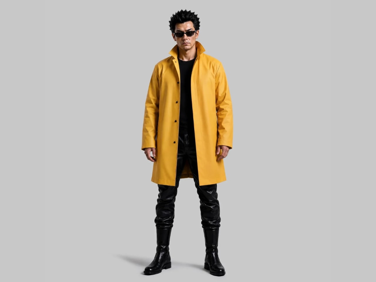
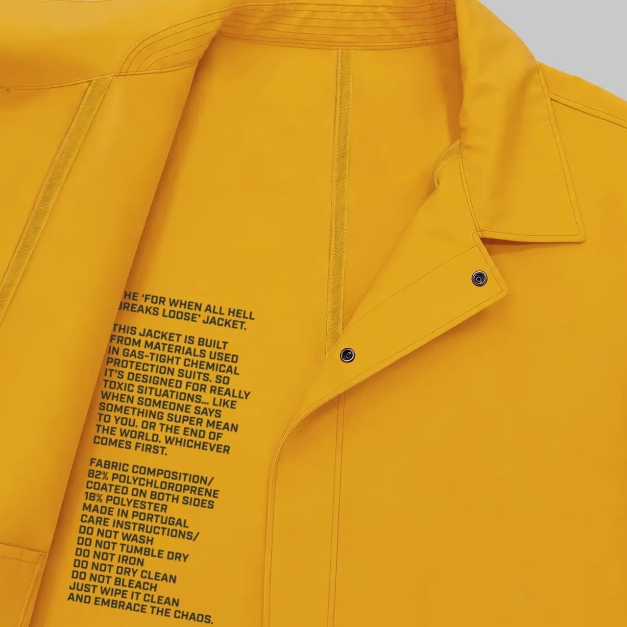
FWAHBL stands for “For When All Hell Breaks Loose.” That’s the actual name. Not a placeholder, not a working title, not a wink-and-nod provocation. The brand looked at the current state of the world and decided the most honest thing they could do was name a jacket after it.

Designer: Vollebak

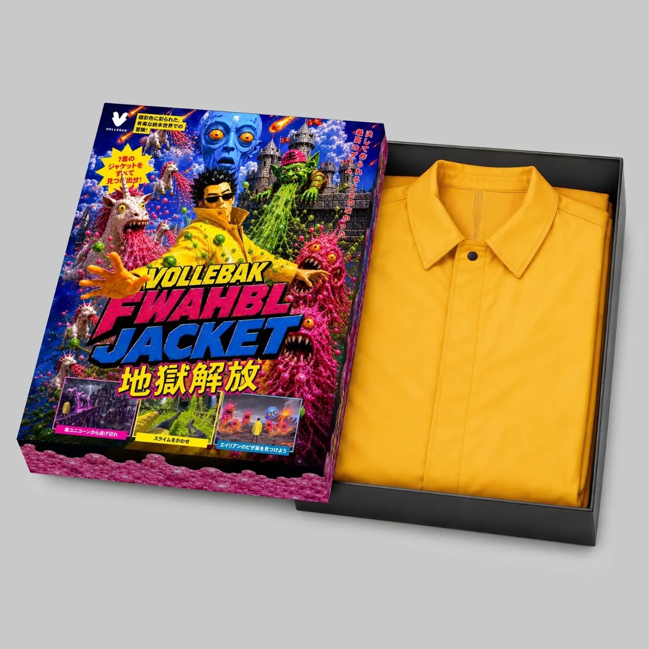
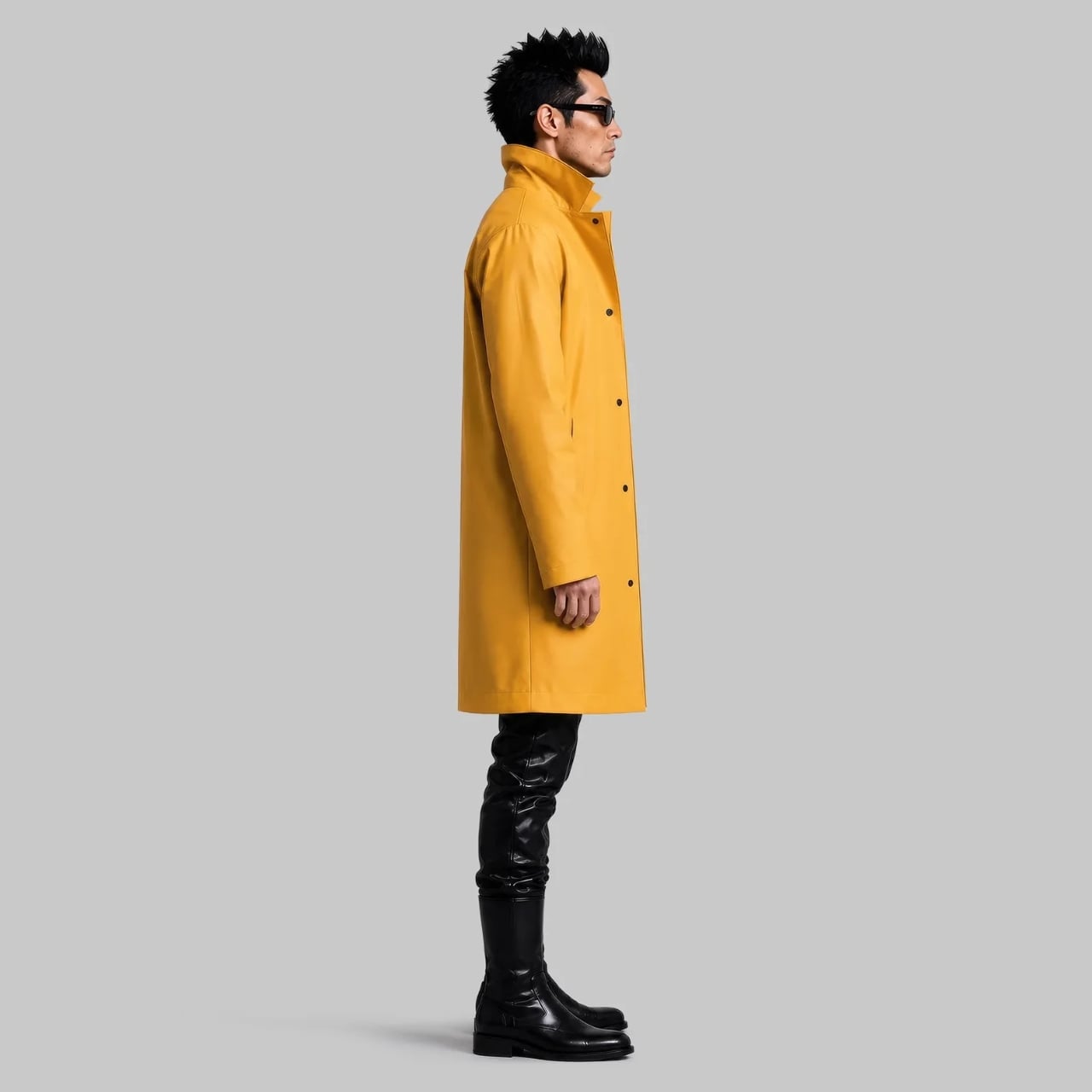
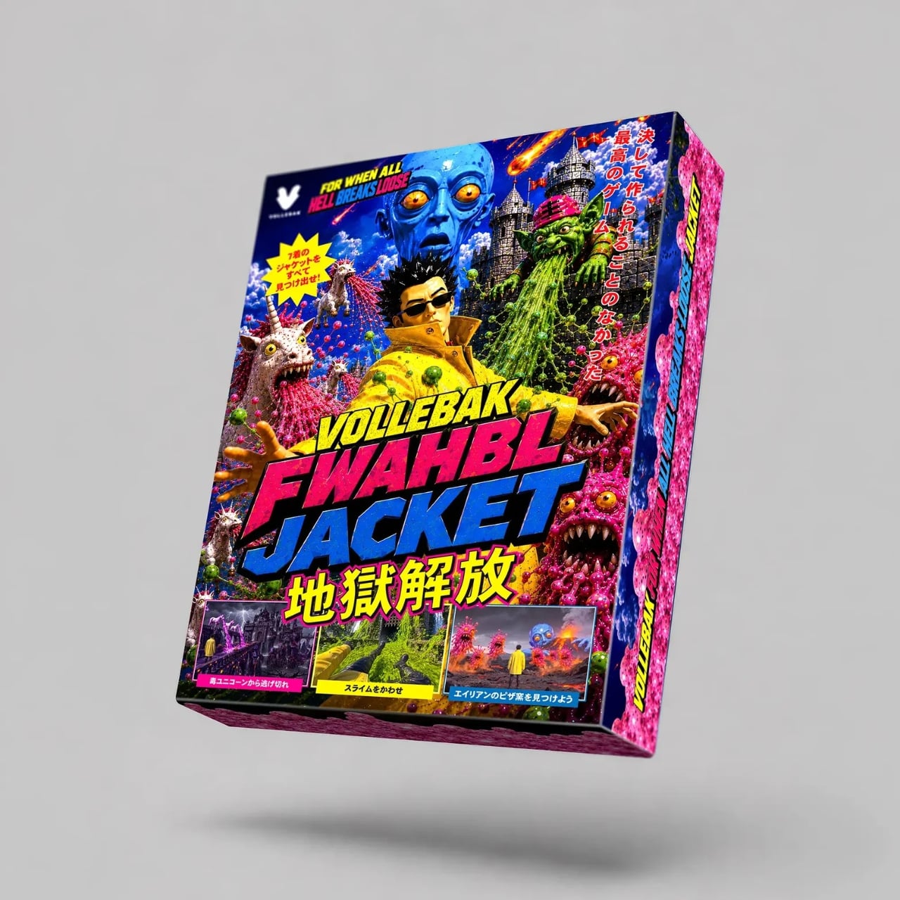
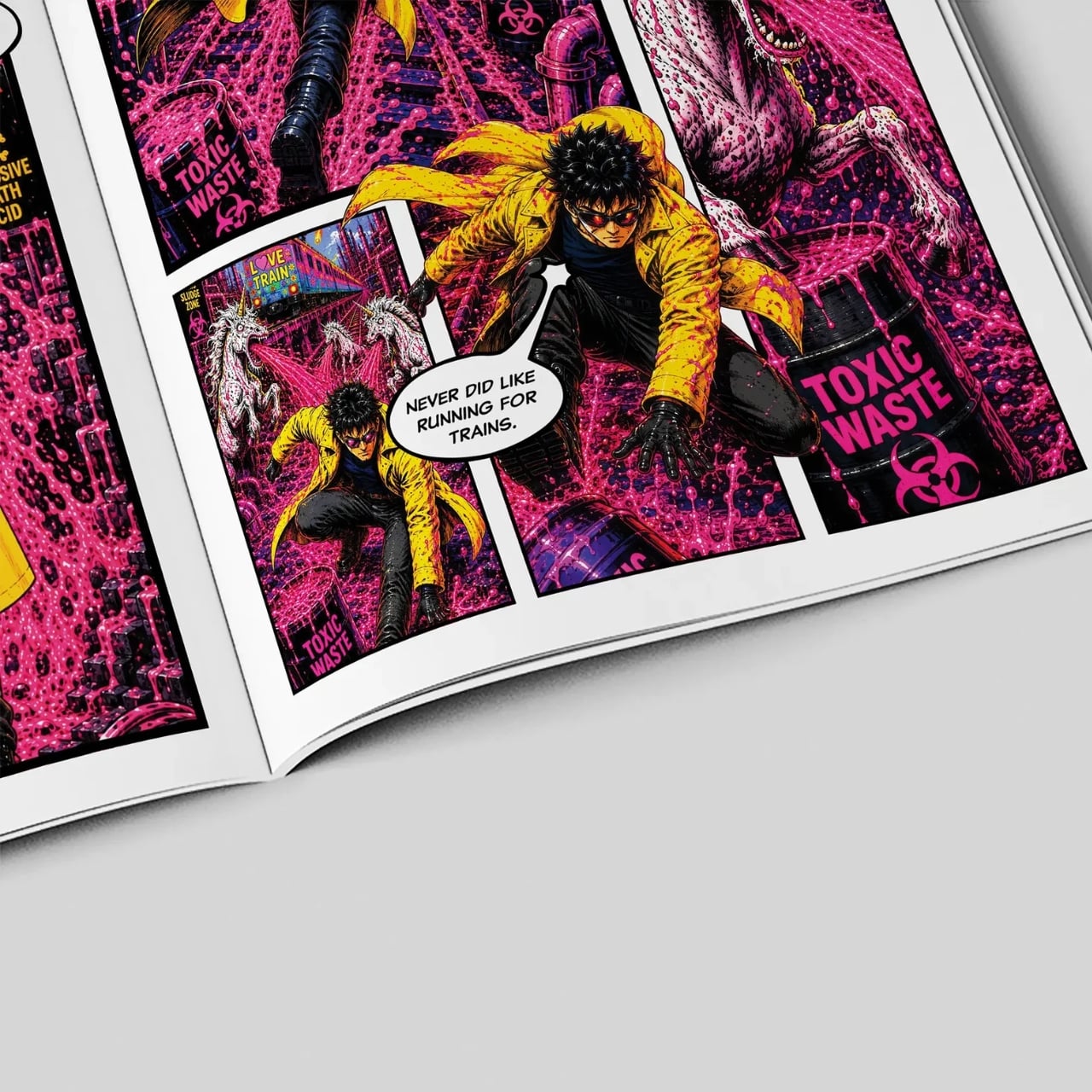
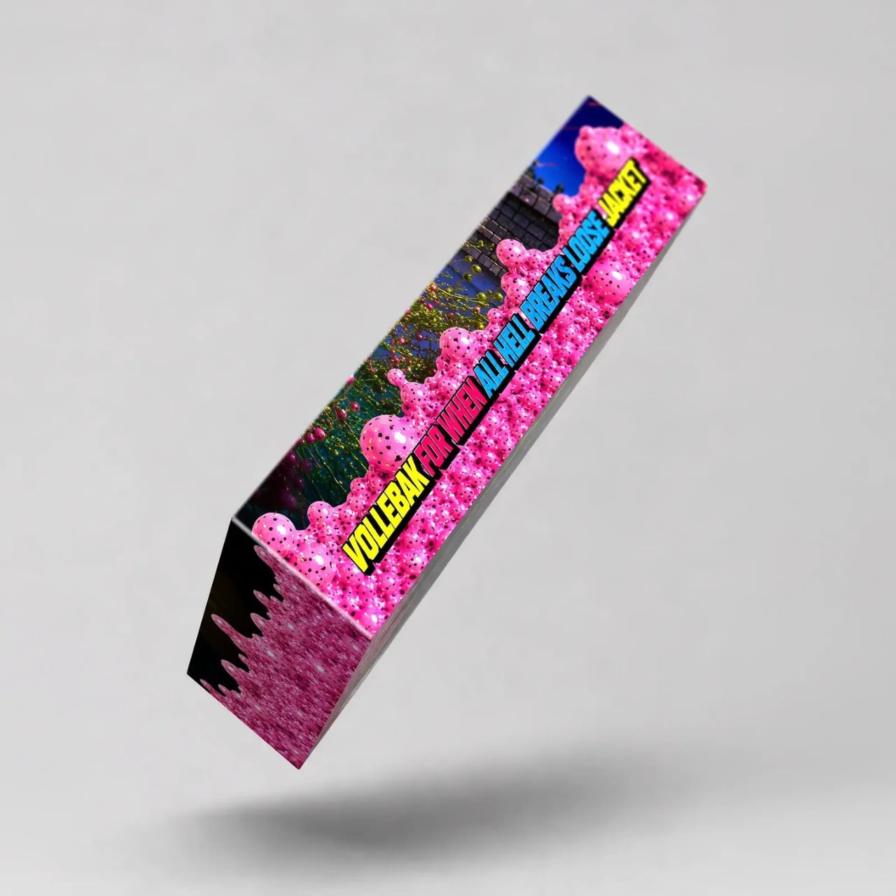
Only 10 of these exist. They’re priced at $3,995. They arrive in retro video game packaging alongside a comic book and a trailer for an upcoming game. The whole thing reads like a fever dream, and yet, once you look at what’s actually inside it, the jacket starts making a strange kind of sense.

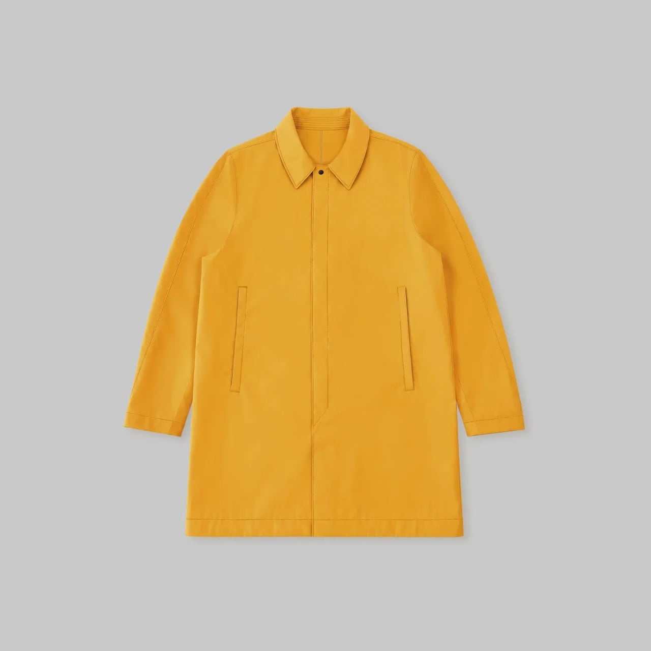
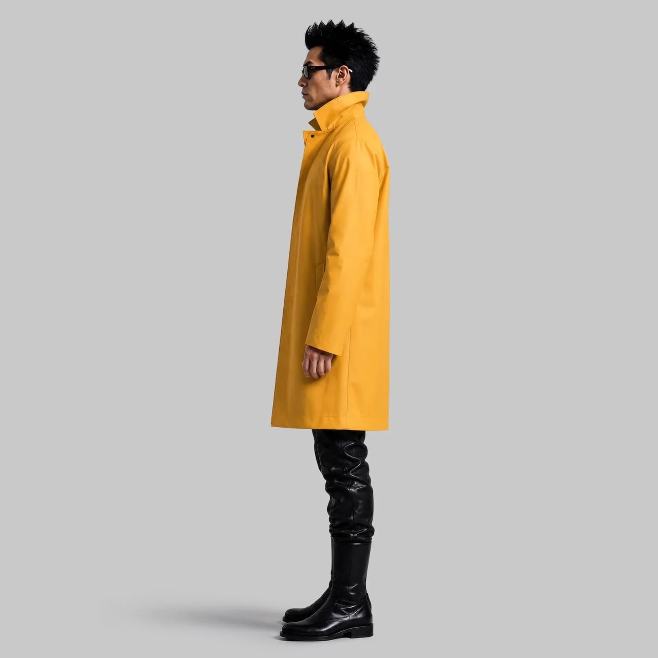
The material comes from Fothergill, a British manufacturer that has been producing protective gear for the military since 1847. The fabric is double-faced polychloroprene rubber coated over a woven polyester core, built to resist oils, chemicals, flame, and extreme weather. This isn’t performance wear with a dramatic name slapped on it. The engineering is real, even if Vollebak is quick to clarify that it isn’t certified safety equipment. What it is, they say, is clothing designed for extreme weather and existential dread. I appreciate the specificity.

A jacket that could theoretically withstand a chemical spill but comes dressed for a gallery opening is a very particular kind of product. The hazard yellow finish makes it look like something you’d find on a nuclear site inspector who also happens to have excellent taste. It’s alarming and considered at the same time, which feels very intentional. Vollebak’s whole design language leans into that tension, the idea that what we wear should be able to meet us at our worst, not just our most polished.

The narrative wrapped around the jacket is what separates it from a typical limited-edition fashion drop. Vollebak didn’t just make a jacket and photograph it on a rooftop. They built a universe: the comic book, the video game, the worldbuilding. The jacket becomes almost secondary to the story it’s trying to tell, which is either a genius move or a complete overreach, depending on how you feel about brands constructing mythology around outerwear. Personally, I find it more compelling than a seasonal lookbook ever manages to be. At least it commits to a point of view.

The collectible angle is also hard to ignore. Ten pieces worldwide isn’t a production run. It’s closer to an art edition, which raises the question of who actually buys this. Probably not someone planning to commute in it. Most likely it’s the kind of person who understands that certain objects carry cultural weight beyond their function, the same kind of person who collects a Helmut Lang archive piece or a first-edition sneaker that never touches the ground. Whether we call that fashion, collecting, or very expensive storytelling, the outcome is the same.

Objects that sit at the intersection of design, utility, and narrative have always existed, from limited-run furniture to bespoke motorcycles to museum-acquired concept cars. The FWAHBL Jacket fits that lineage more comfortably than it fits any fashion calendar.

Whether or not you’d wear it, or could, the jacket asks a useful question. How much are we expecting from the things we put on our bodies? Vollebak’s answer has always been: more. More protection, more engineering, more intention. The FWAHBL Jacket takes that philosophy to its logical, slightly unhinged conclusion. A trench coat for the end of things, made by people who clearly hope you never actually need it.

The post Vollebak Made a $3,995 Jacket for the End of the World first appeared on Yanko Design.