Xiaomi 17 Ultra Review: Lighter, Flatter, and Sharper Than Ever

PROS:


  • Excellent main and telephoto photo quality

  • Big and bright 6.9-inch LTPO AMOLED display

  • Strong performance

  • Improved ergonomic and stylish design

CONS:


  • Limiting macro use with a minimum focus distance of 30 cm

  • Noticeable warmth during camera use

RATINGS:

AESTHETICS
ERGONOMICS
PERFORMANCE
SUSTAINABILITY / REPAIRABILITY
VALUE FOR MONEY

EDITOR'S QUOTE:

The Xiaomi 17 Ultra is a camera-first flagship that finally feels balanced in the hand, and even more balanced in its image processing.

Within the renamed family, the Xiaomi 17 Ultra is the boldest expression of what Xiaomi thinks a 2026 flagship should be. It arrives globally as a big, confident phone that refuses to blend into the background. It is unapologetically camera-centric, and it is packed with specs that read like a wish list.  

On paper, Xiaomi has the ingredients to back that up. You get a 6.9-inch LTPO AMOLED display, a Leica-tuned triple camera system with a 200 MP periscope telephoto, and Qualcomm’s Snapdragon 8 Elite Gen 5. The global model carries a 6,000 mAh battery with 90W wired and 50W wireless charging, which is still a serious setup even before real-world testing.

Designer: Xiaomi

The camera hardware also shifts in meaningful ways, with the main sensor switching from Sony to OmniVision, and the zoom strategy changing from two telephoto cameras to one lens with continuous 75 mm to 100 mm optical zoom. So does the Xiaomi 17 Ultra deliver ultra-level performance where it counts. After two weeks with it, here is what I found.

Aesthetics

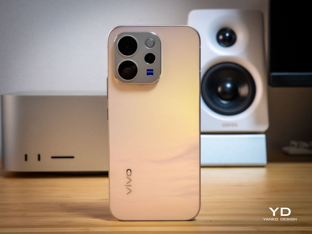
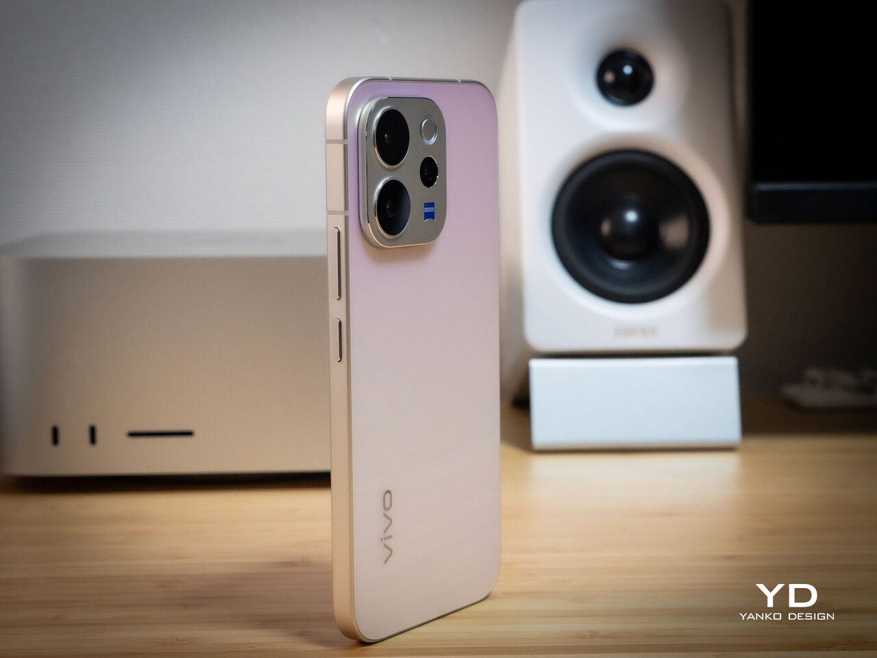
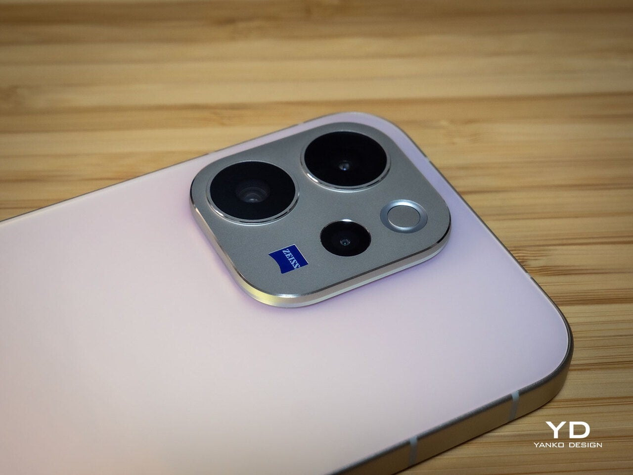
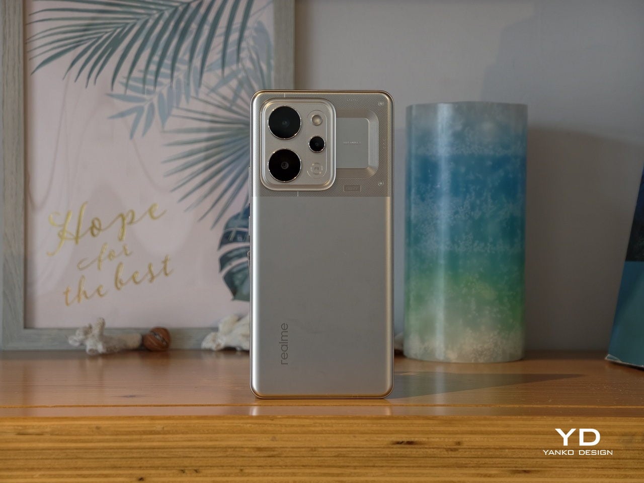
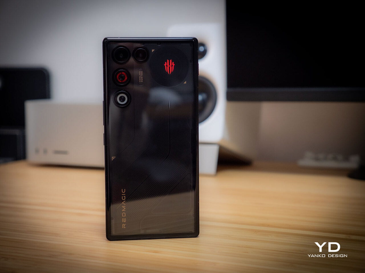
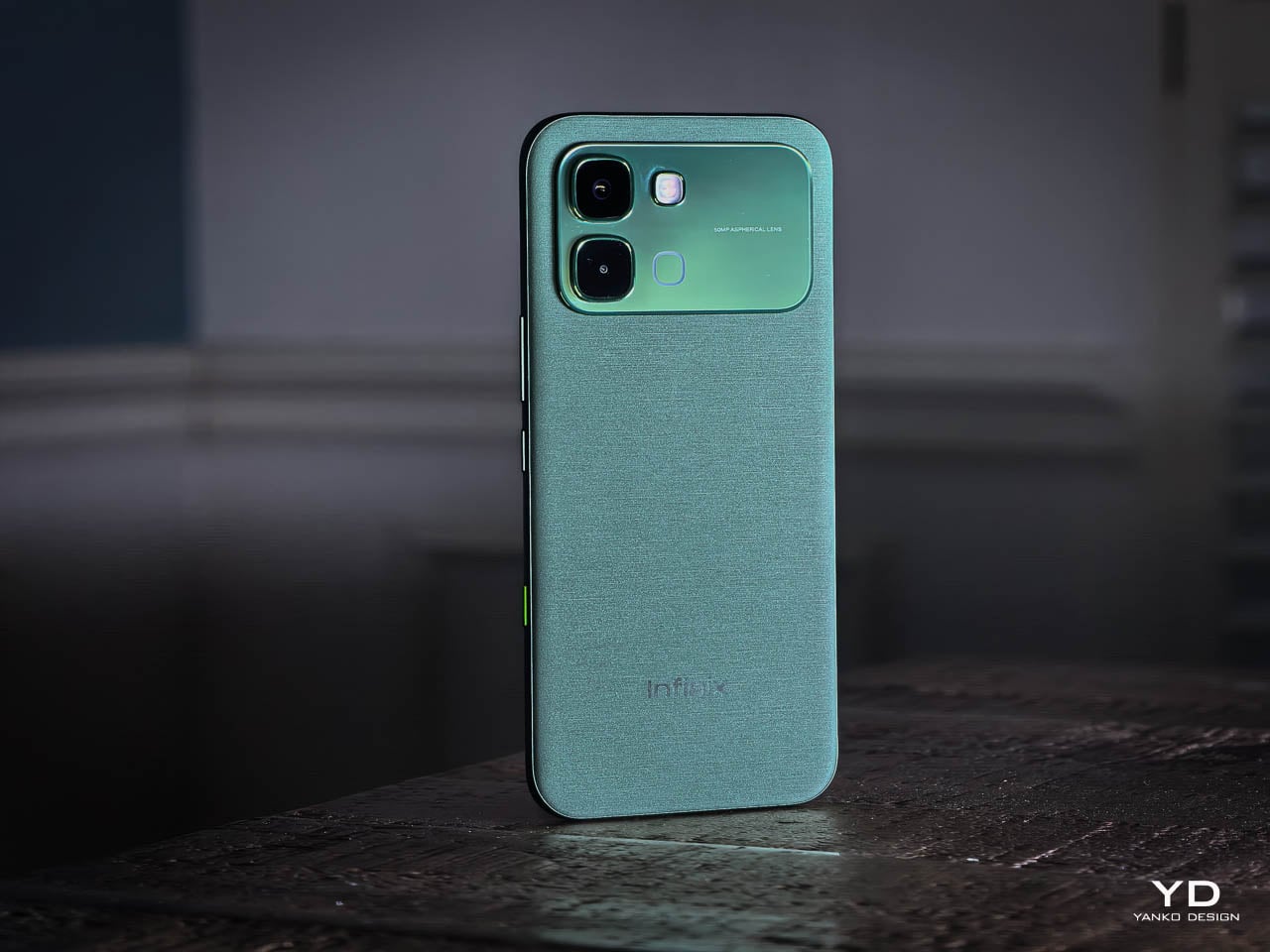
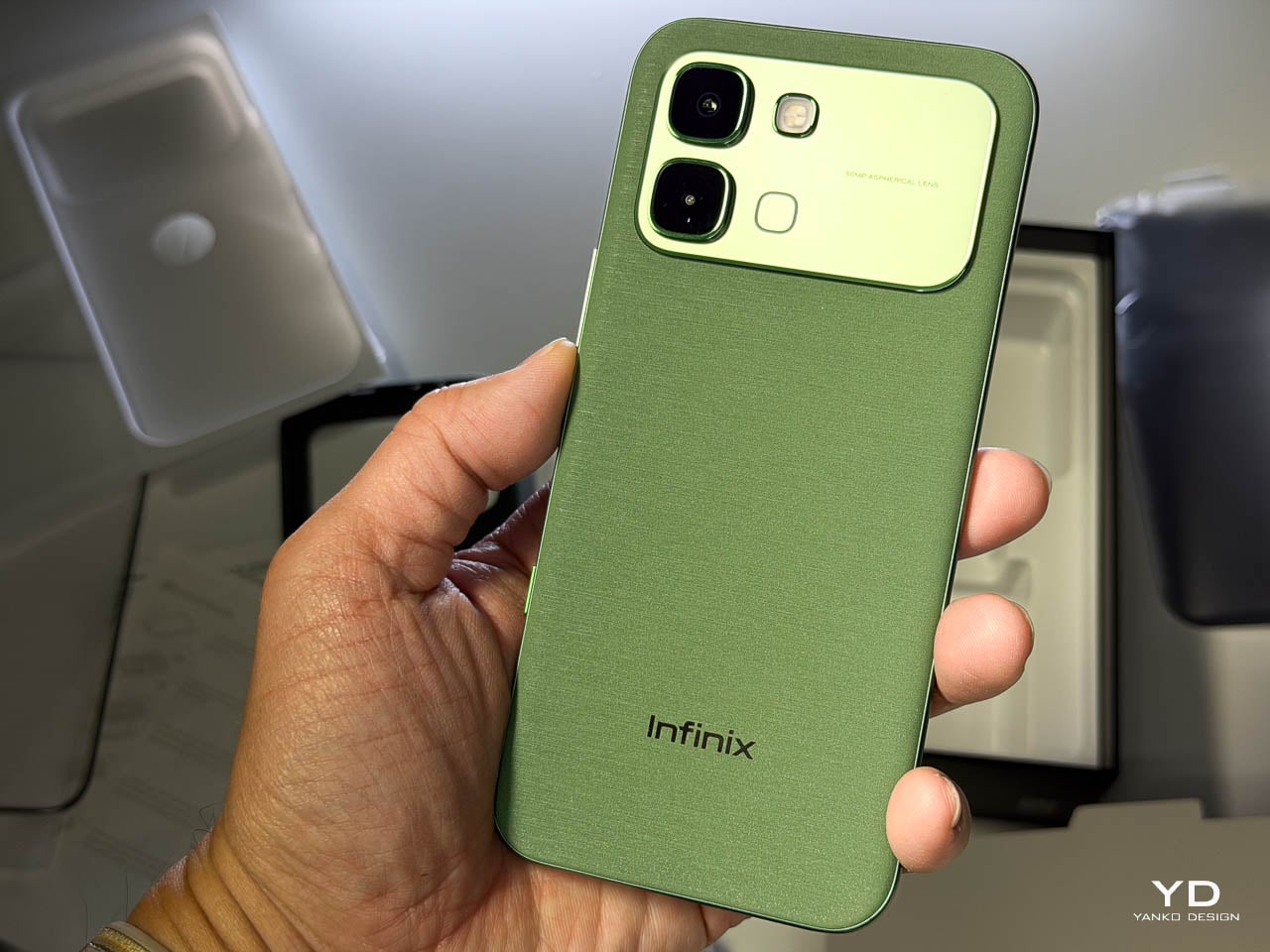
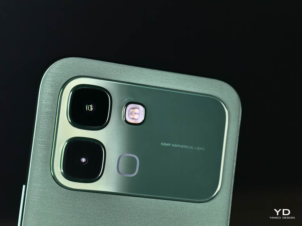
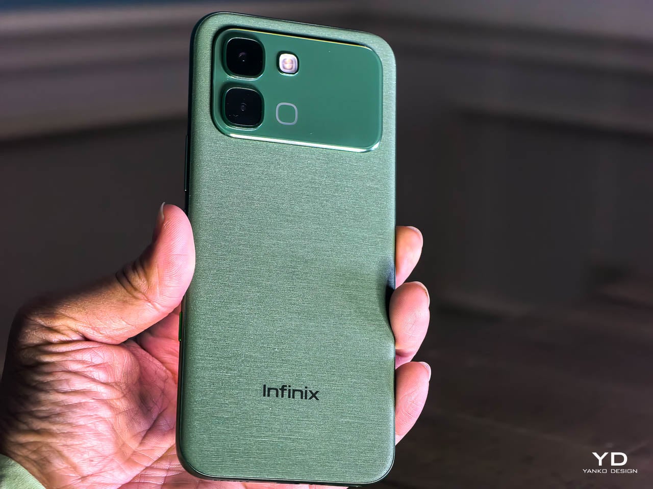
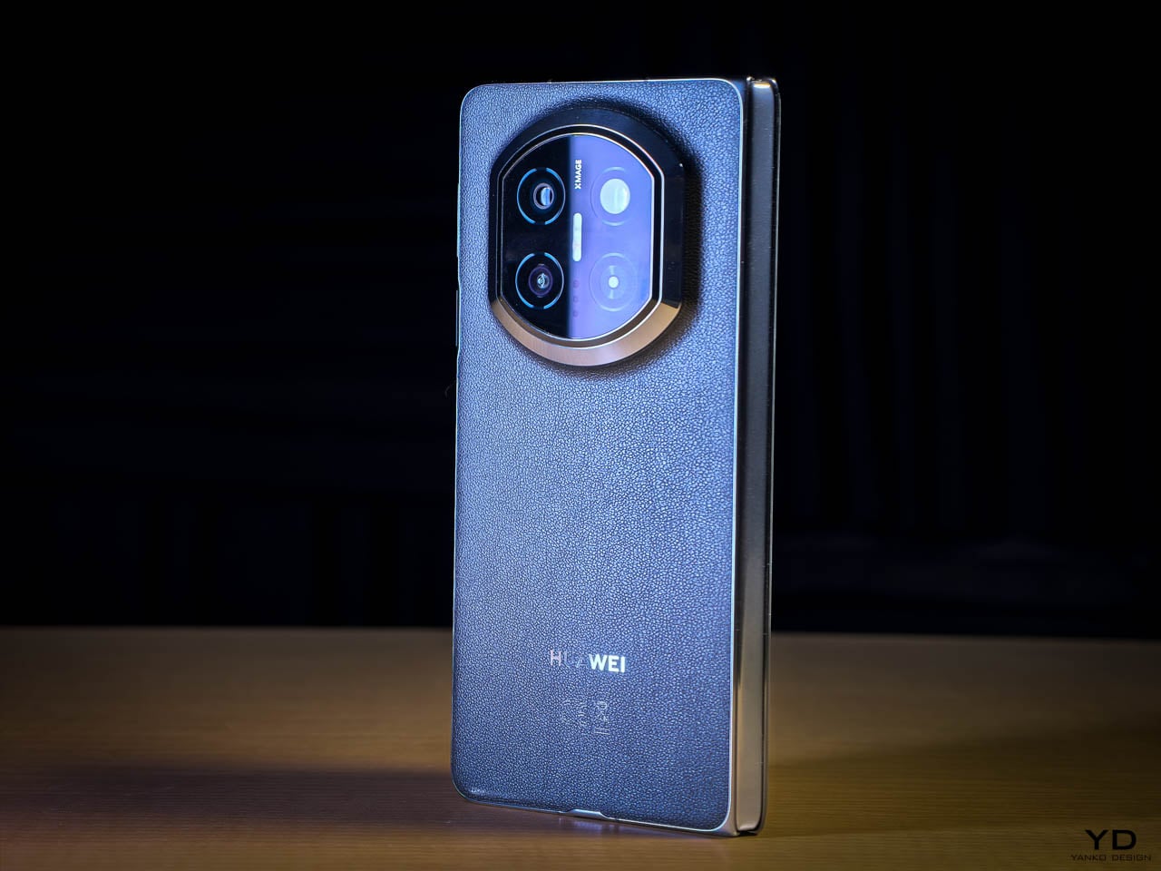
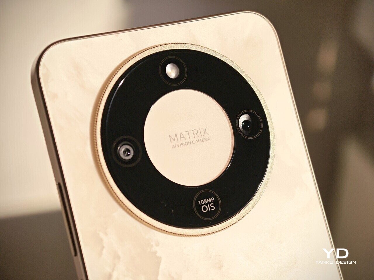
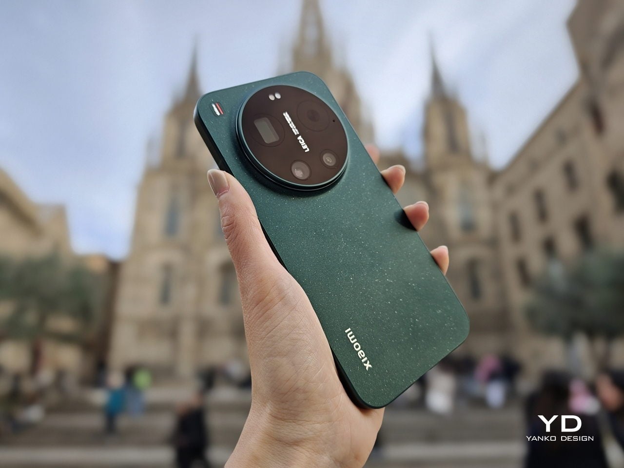
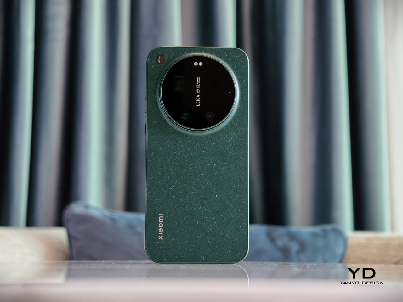
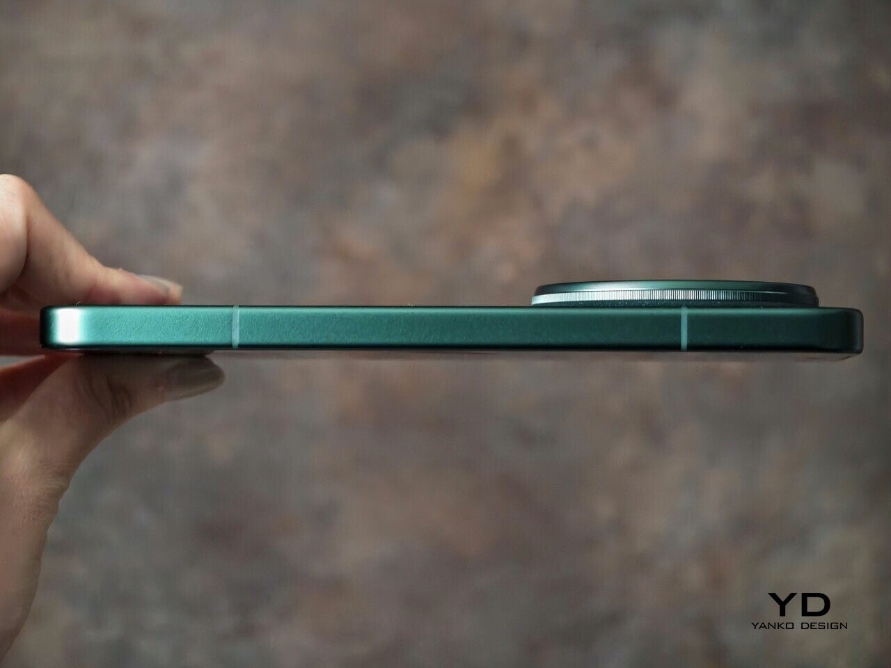
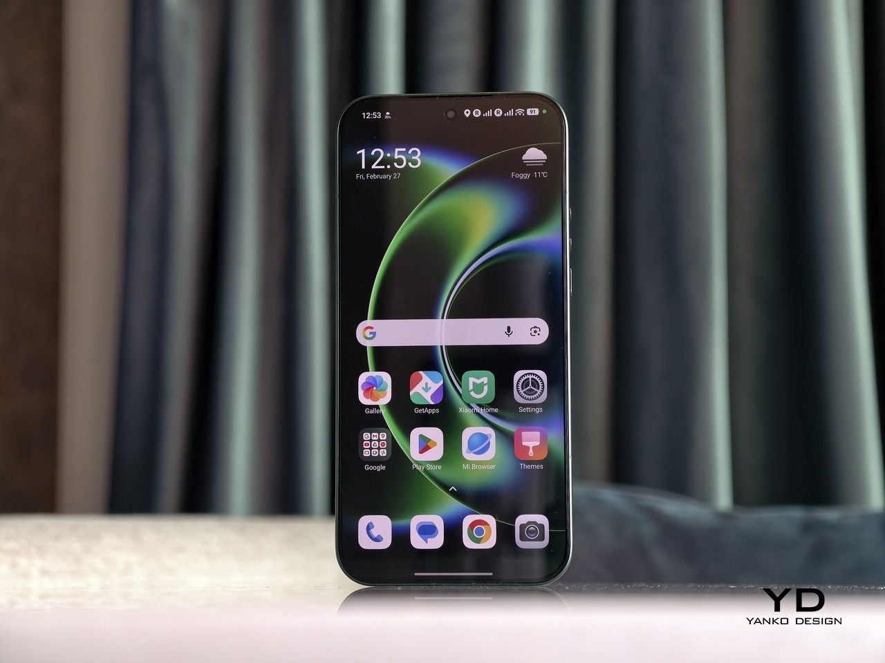
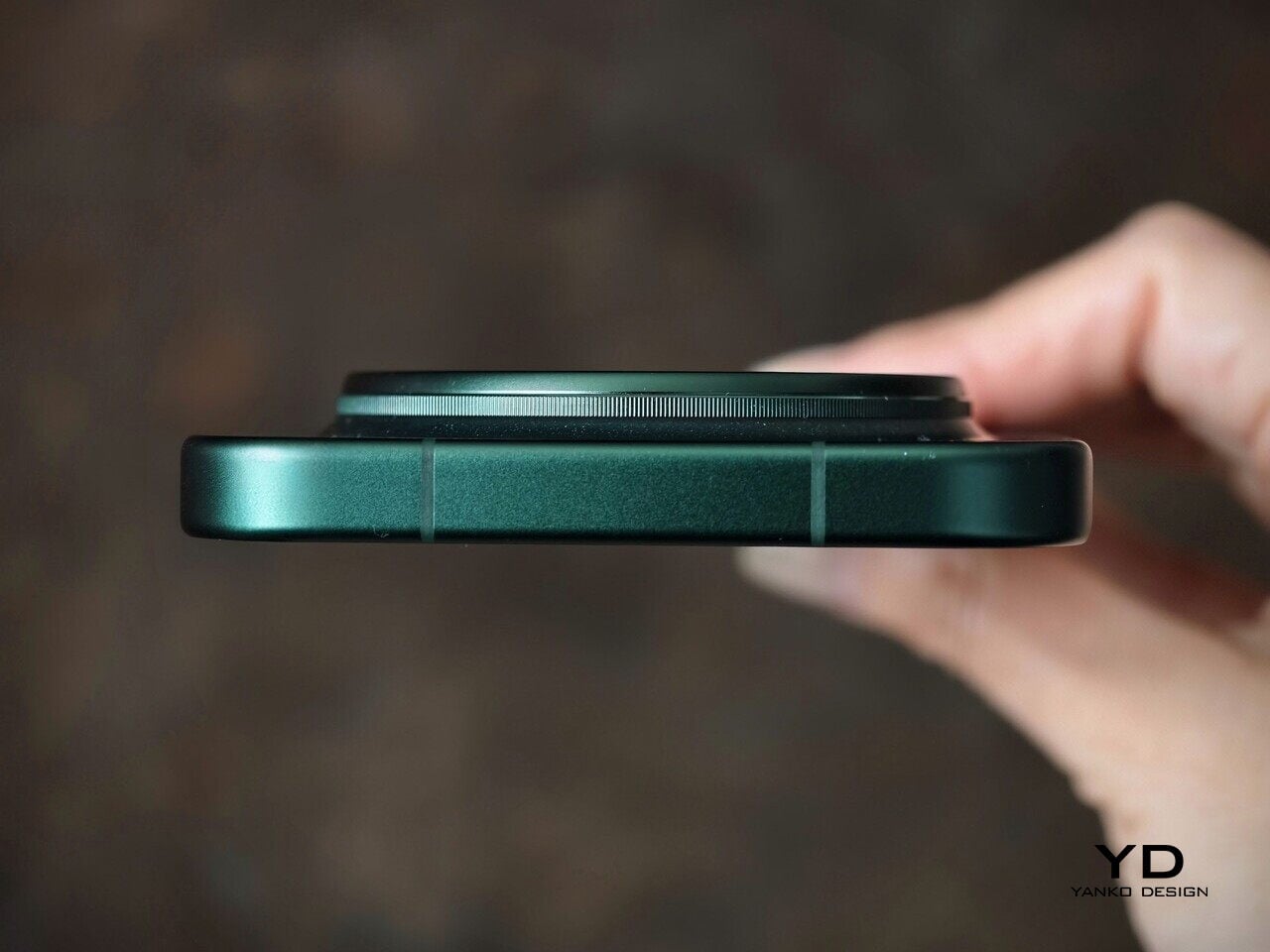
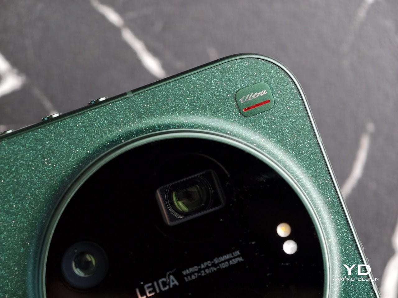
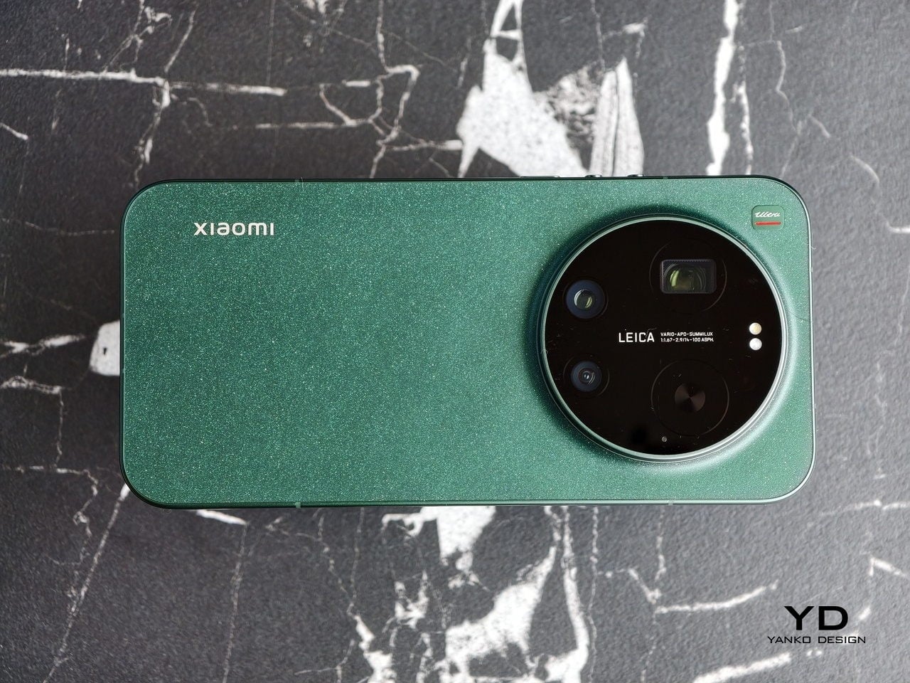
The Xiaomi 17 Ultra is not a phone that tries to disappear in your hand or your pocket. The gigantic circular Leica camera island still dominates the rear panel, just like on the previous model, but there is a subtle shift in design language. With a flatter back panel and flat side frame, the 17 Ultra leans into a cleaner, more minimal look than the Xiaomi 15 Ultra. The small Ultra logo with its red underline sitting above the camera bump adds a bit of character without turning the phone into a billboard.

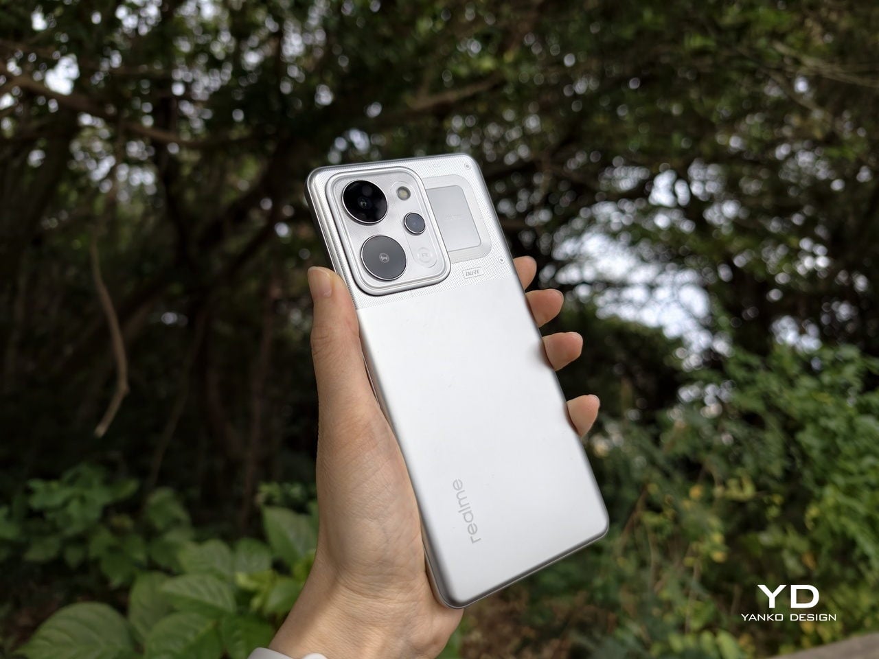
The color palette for the global model leans into classic tones. Xiaomi focuses on black, white, and green for most markets, skipping the violet shade that appears in China. The Starlit Green unit I received is the standout, with a deep moss green base and speckling that catches the light like a dusting of stars, which makes the name feel earned. The black option looks stealthy, but the red accent on the camera ring keeps it from feeling flat, while the white version goes for a high contrast look with the black camera bump and a silver ring and side frame to tie it all together. If you are coming from the Xiaomi 15 Ultra, the evolution feels more like refinement than reinvention, yet the 17 Ultra looks more cohesive and more modern from the rear.

Ergonomics

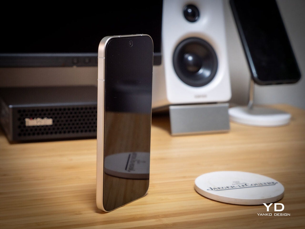
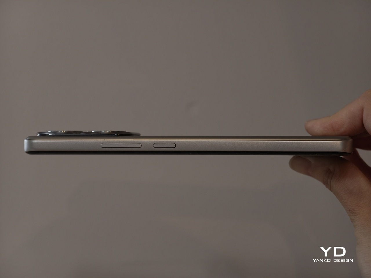
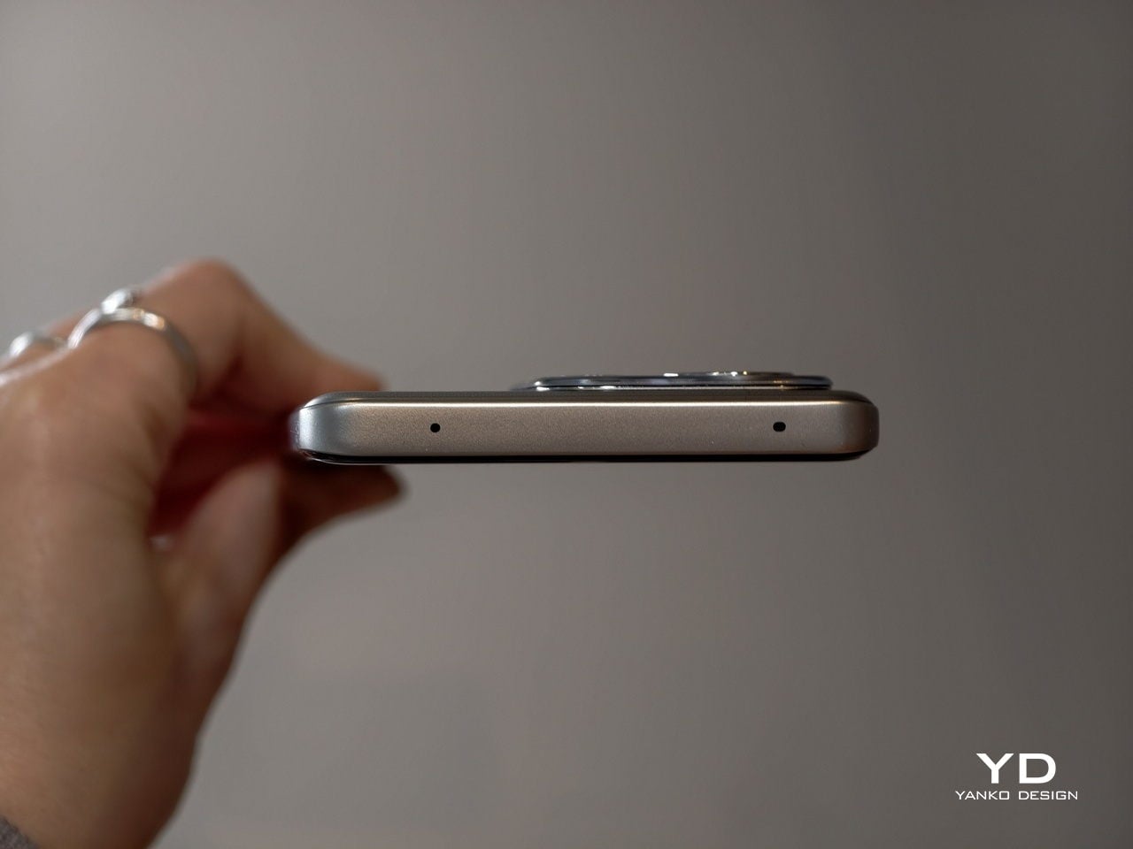
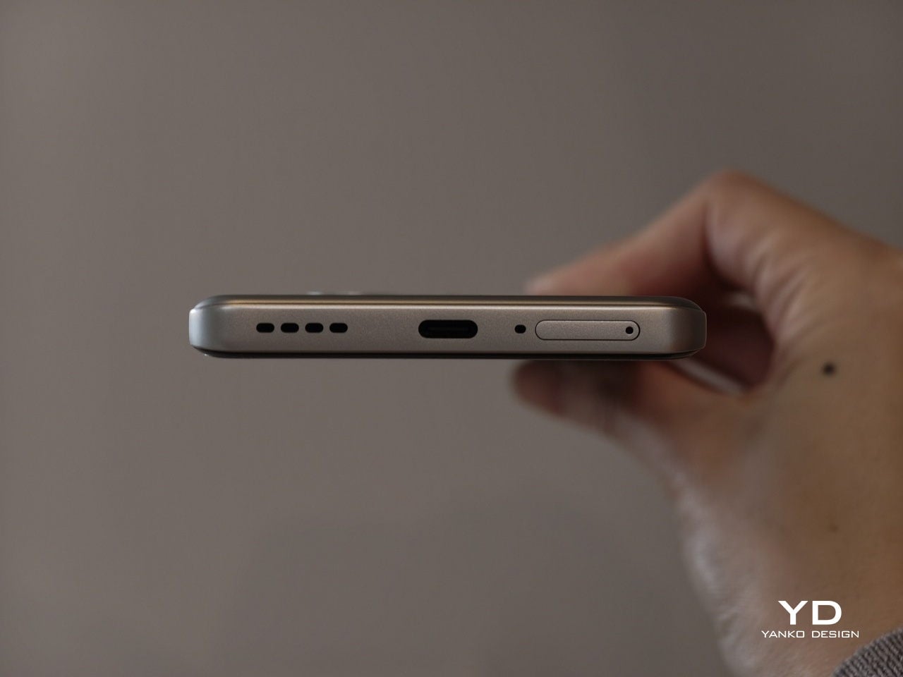
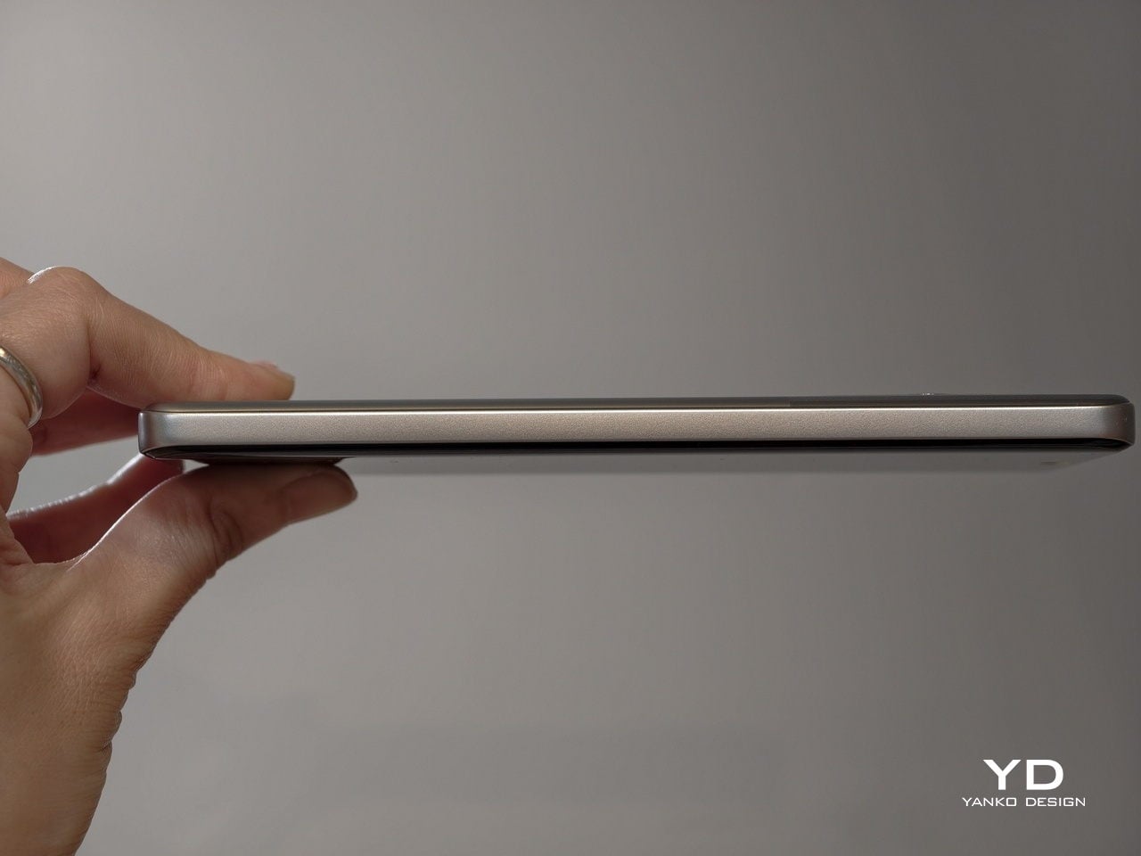
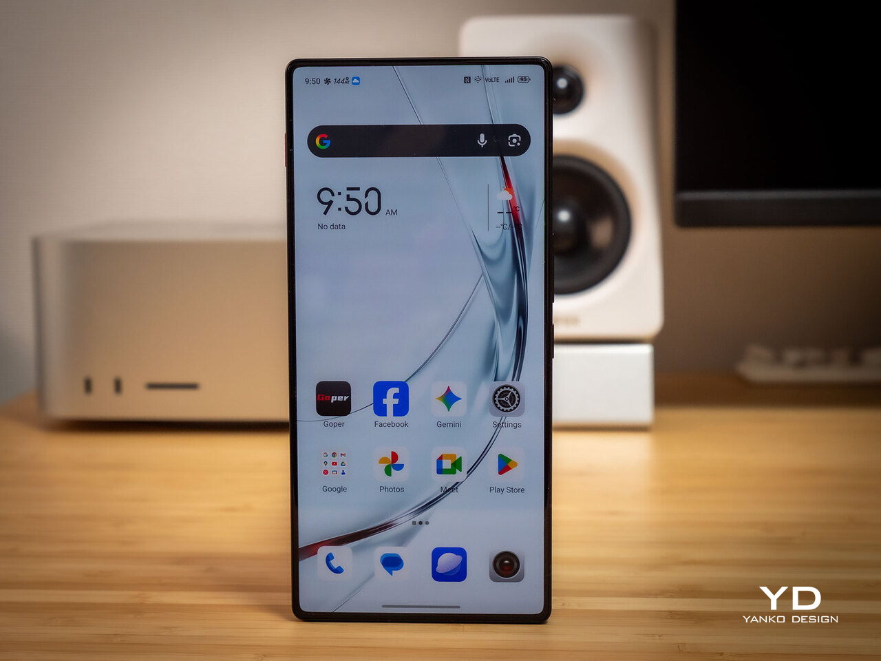
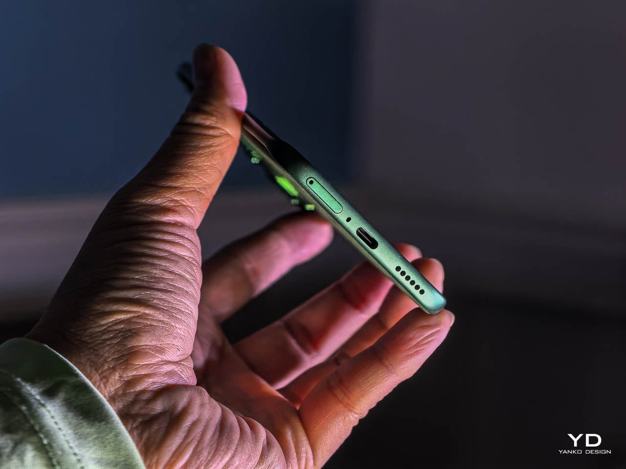
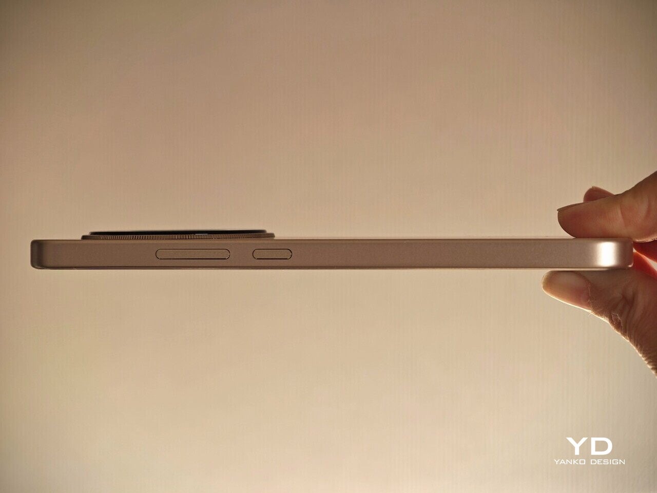
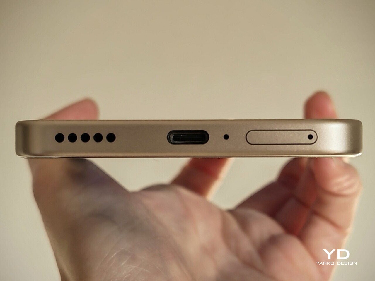
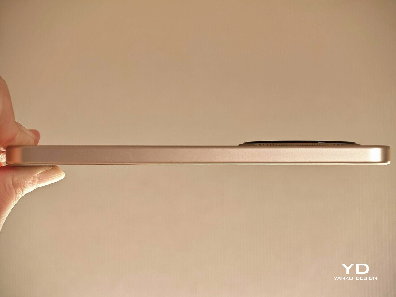
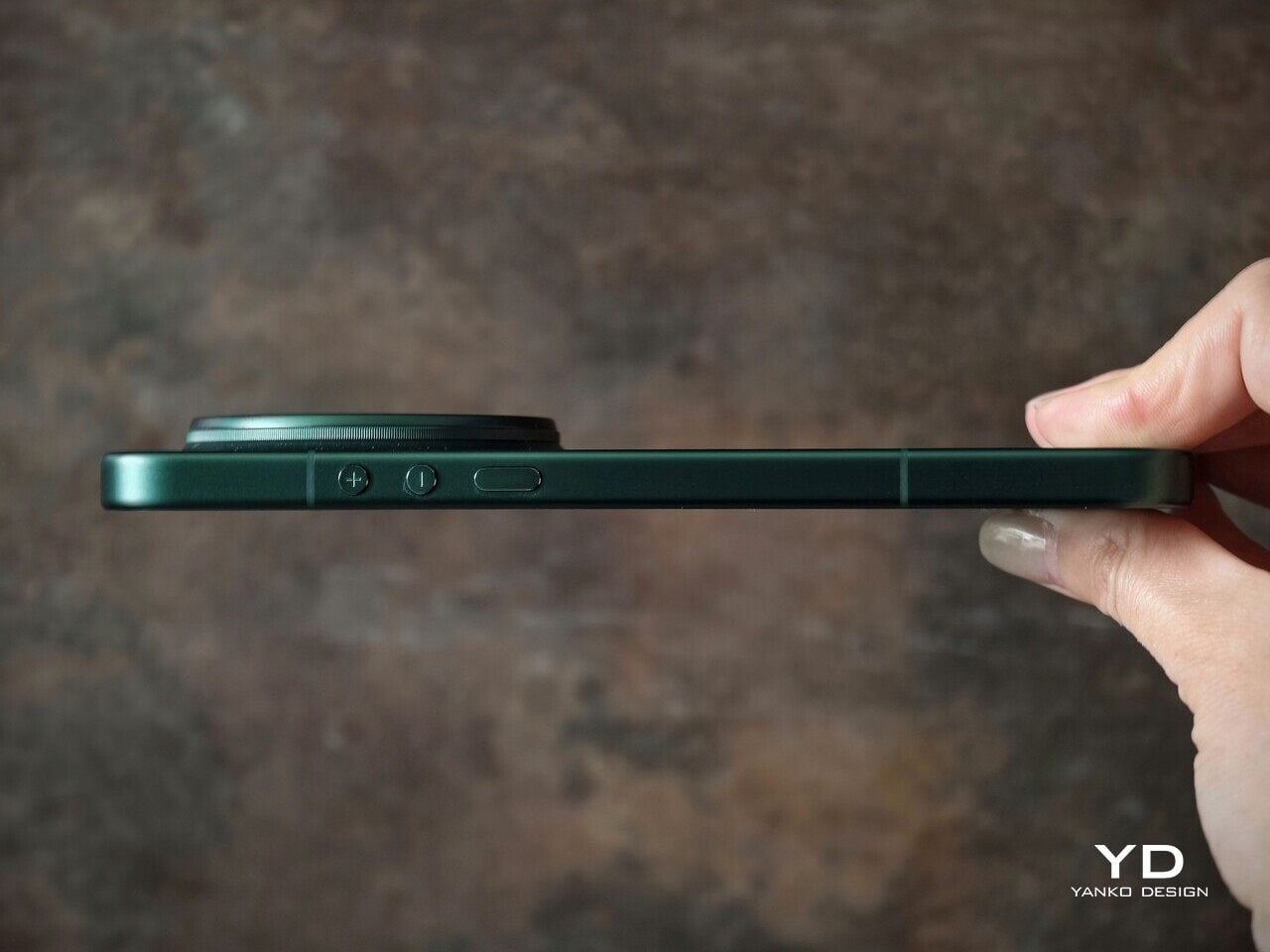
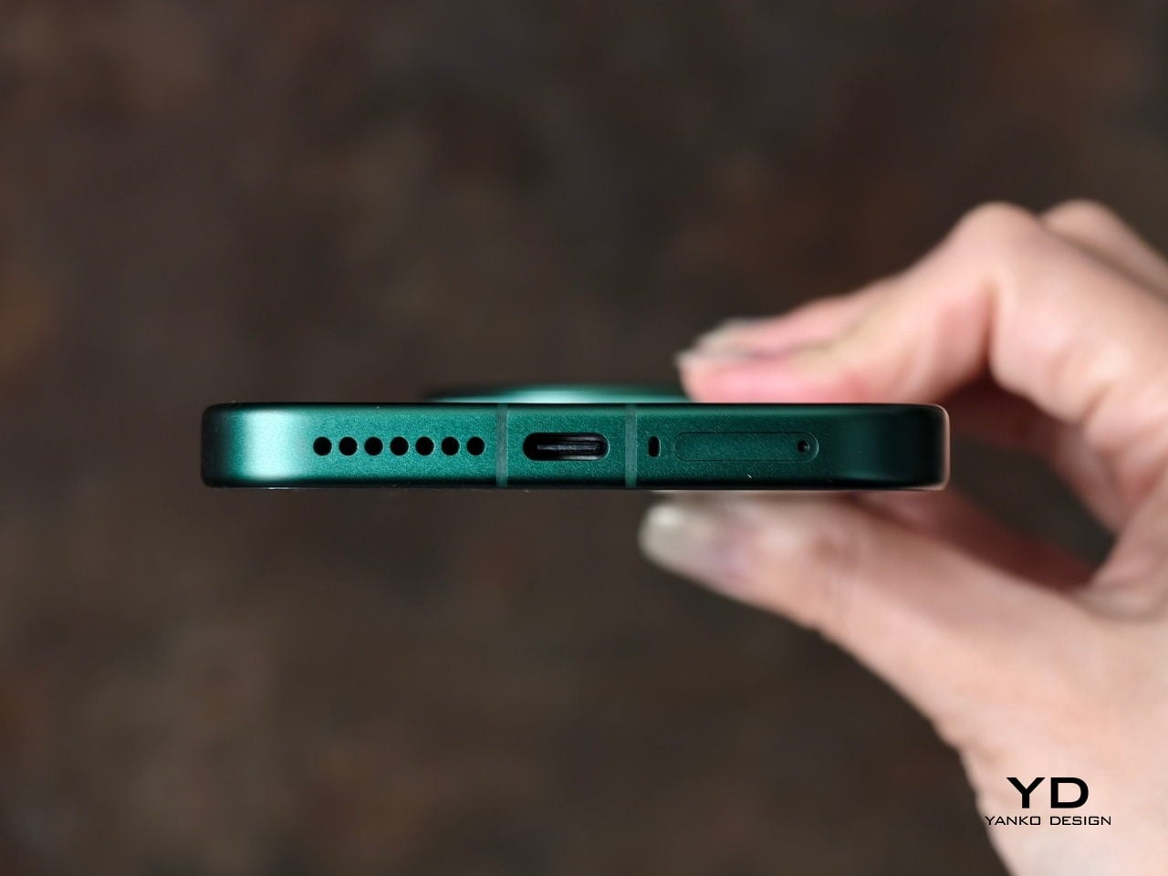
The first thing I expected to notice when I pick up the Xiaomi 17 Ultra is the weight and thickness. The phone uses a large battery, a complex camera stack, and a sturdy frame, and all of that adds up in the hand. That said, I was pleasantly surprised. At 8.29mm thickness and about 219g, Xiaomi managed to make the 17 Ultra the slimmest and lightest among its Ultra series. The device is still big and not exactly a lightweight phone, but it feels a lot more comfortable to hold than your eyes perceive.

Ergonomically, the device feels well-balanced in the hand, which is a welcoming improvement from the top-heavy feel you get from holding the Xiaomi 15 Ultra. Xiaomi 17 Ultra adapts a flat display, for the first time for its Ultra line, and helps with the grip. Because it’s well-balanced, the camera bump becomes a natural resting point on the back, which can actually improve grip. At the same time, this is not a one-handed phone in any universe, and if you are coming from something smaller, you will need to adjust how you hold it, how you pocket it, and even how you reach for the top corners of the screen.

The global Xiaomi 17 Ultra uses a 6,000 mAh silicon-carbon battery instead of the 6,800 mAh cell in the China model. Even with the smaller capacity, it should still be enough for a full heavy day for most people. Charging is excellent with 90 W wired and 50 W wireless, and the 90 W wired mode supports PPS or Programmable Power Supply, so you can get true fast charging with any PPS-compatible USB-C charger, not only Xiaomi’s own adapter.

Performance

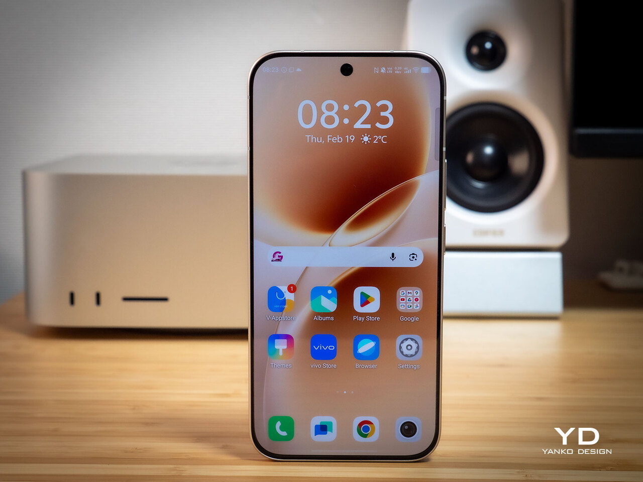
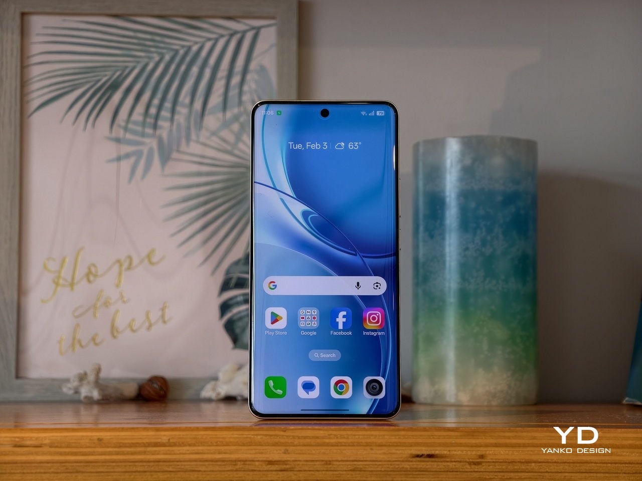
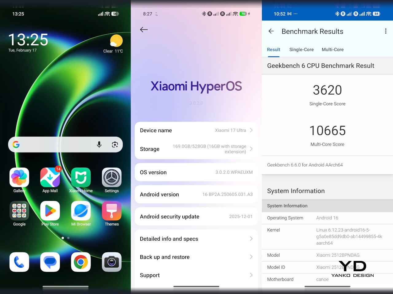
The display on the Xiaomi 17 Ultra is built to impress at first sight. It is a 6.9-inch LTPO AMOLED panel with 120 Hz refresh, a 1.5K class resolution at around 1200 x 2608 pixels, and a claimed 3500 nits peak brightness. It looks sharp and vibrant, and the huge screen makes movies, games, and photo editing feel more immersive. Xiaomi also adds TUV Rheinland certifications for low blue light, flicker-free performance, and circadian-friendly tuning, which are designed to reduce eye fatigue during long viewing sessions.

The Xiaomi 17 Ultra is powered by Qualcomm’s Snapdragon 8 Elite Gen 5 chipset, and the global configurations come with 16GB of RAM paired with either 512GB or 1TB of storage. It is genuinely nice to see a 1TB option offered globally, since that is still not something every flagship brings outside China. The phone flies through heavy multitasking, high refresh rate gaming, and demanding camera workloads without stutter. On the software side, it runs Android 16 with Xiaomi’s HyperOS 3, which is Xiaomi’s unified platform designed to feel lighter and more connected across phones, tablets, and other devices.

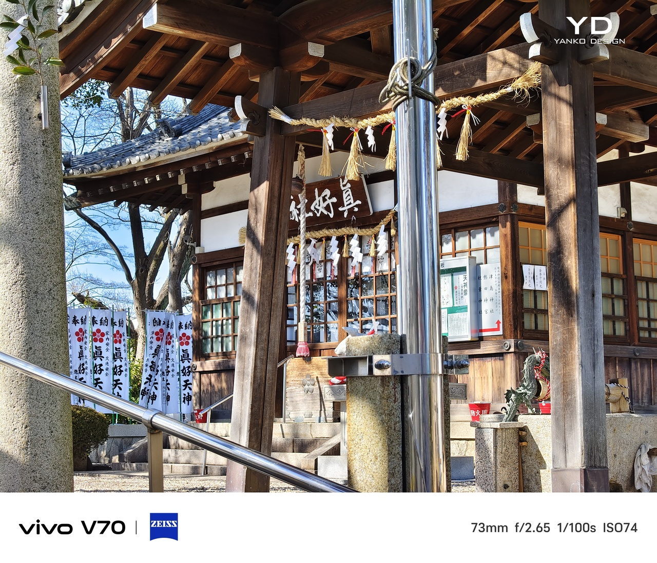
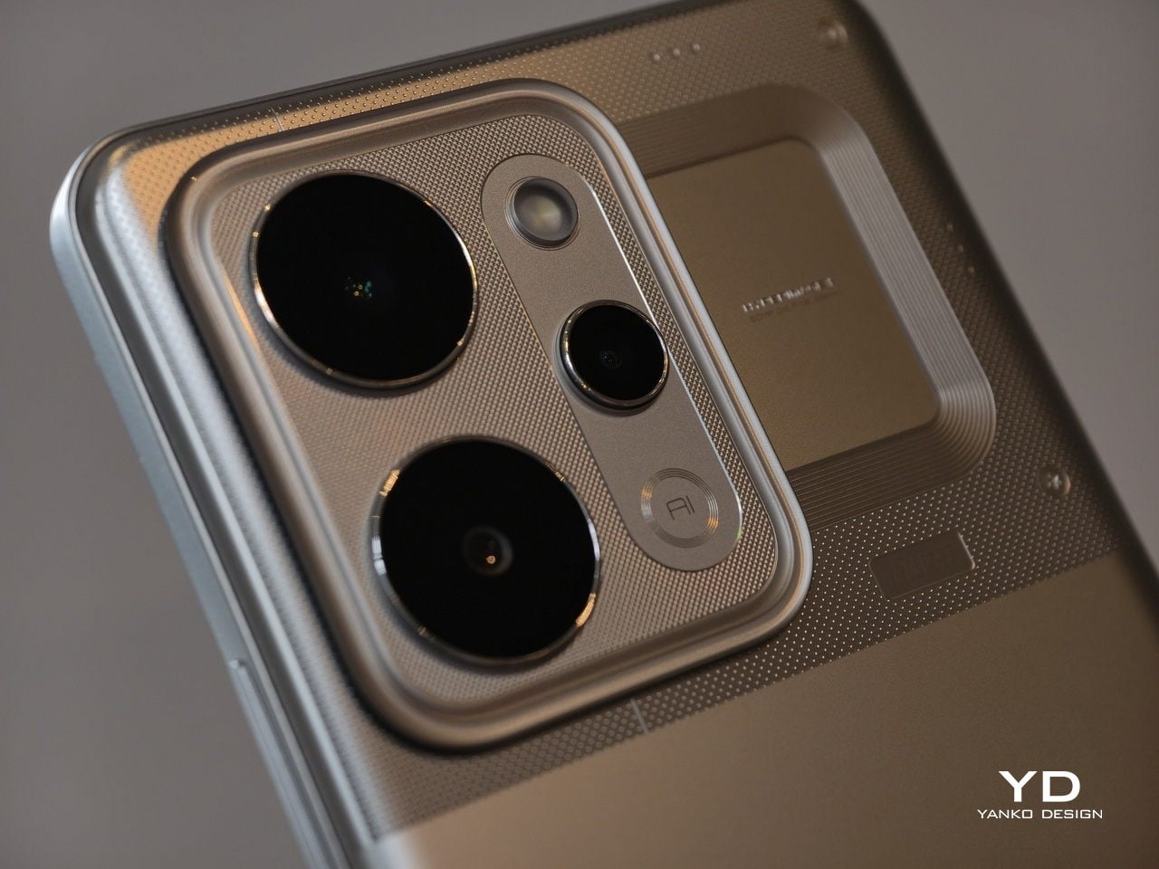
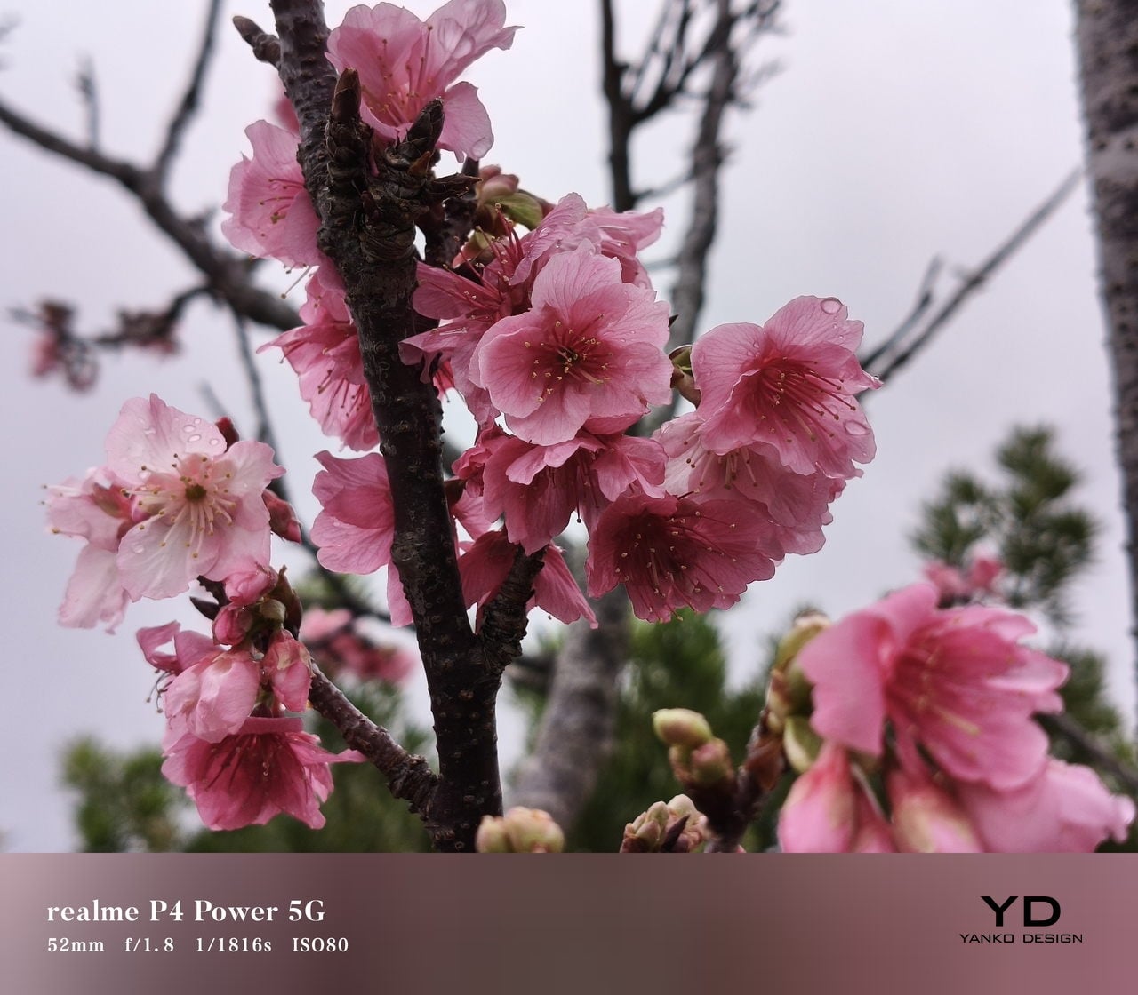
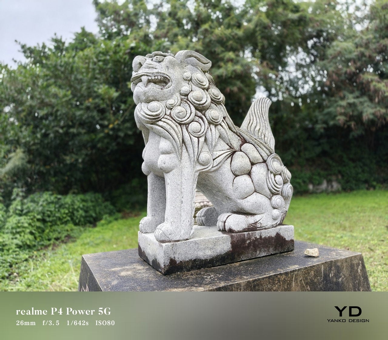
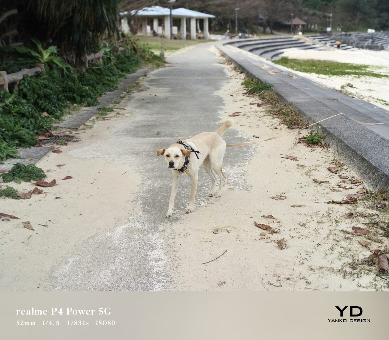
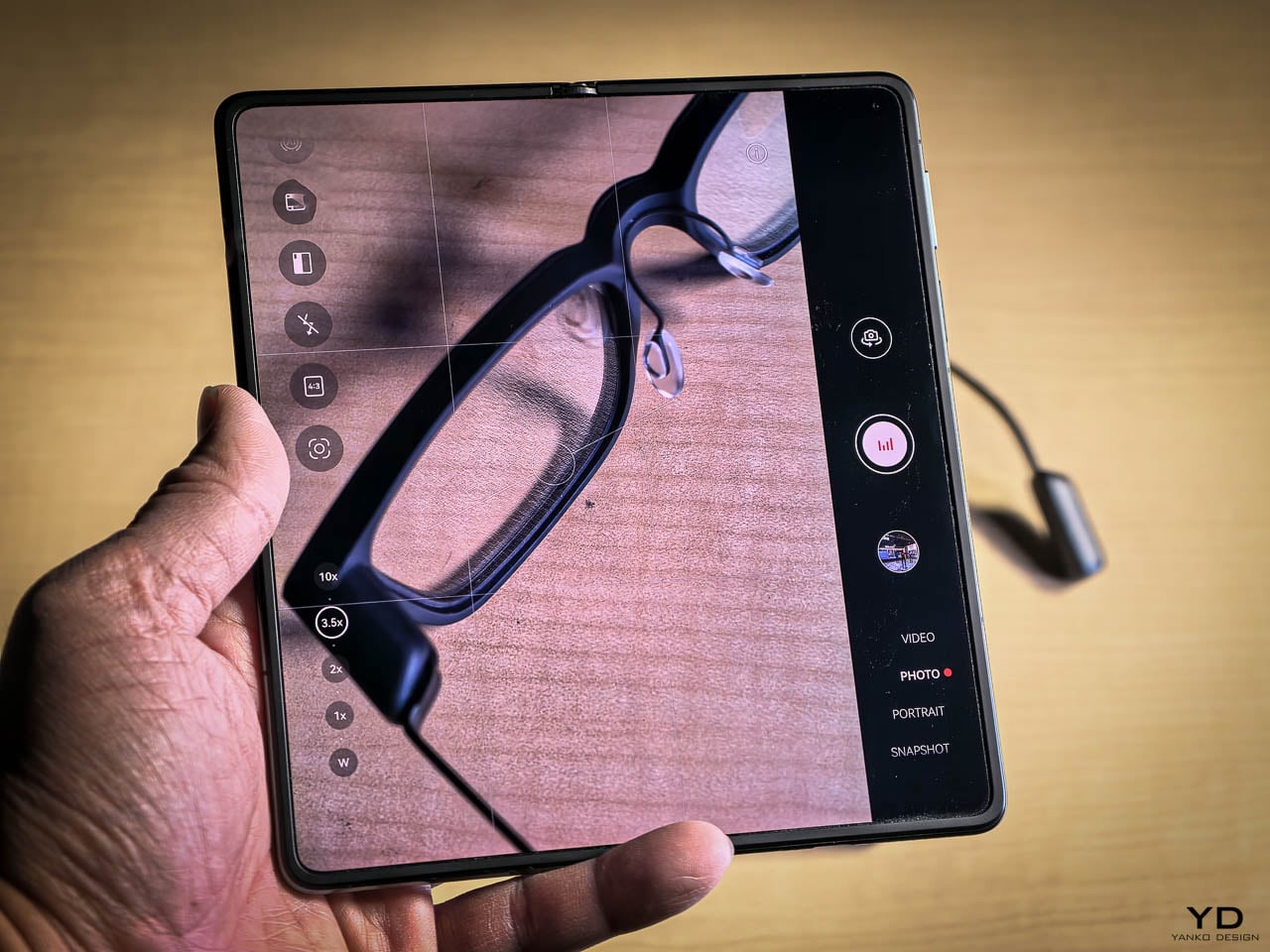
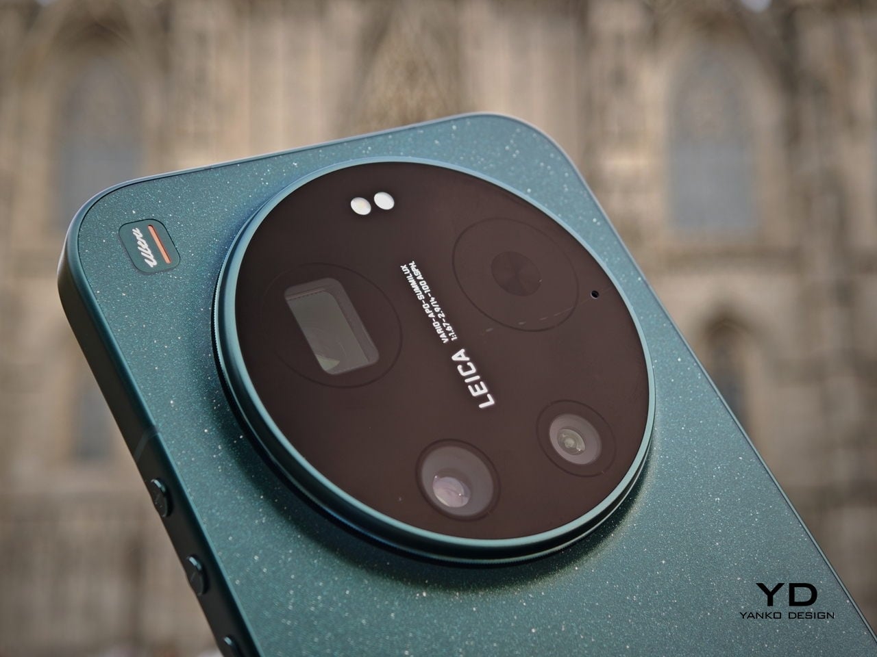
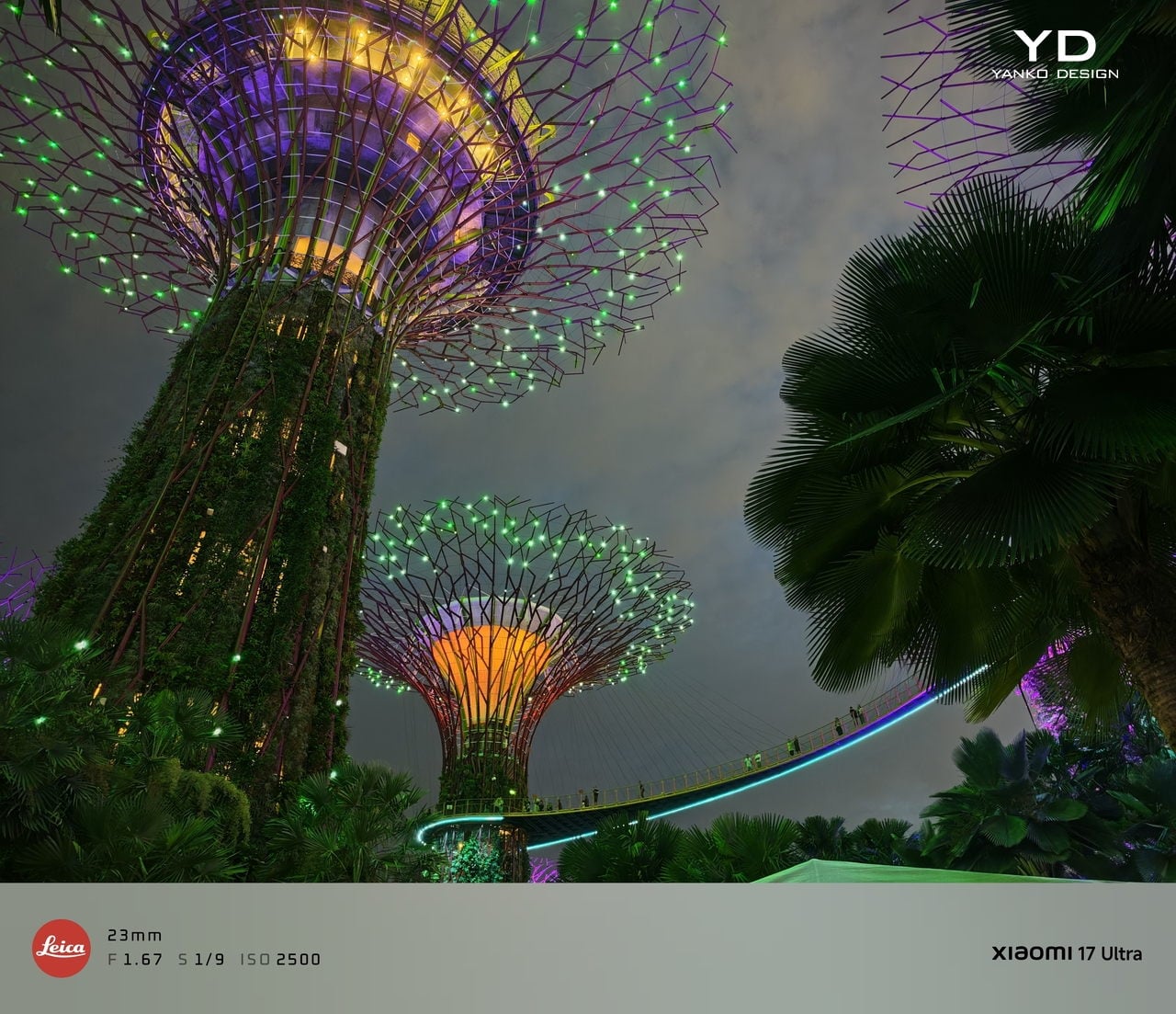
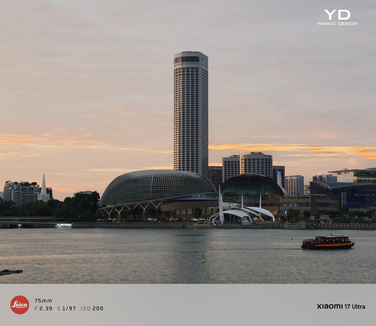
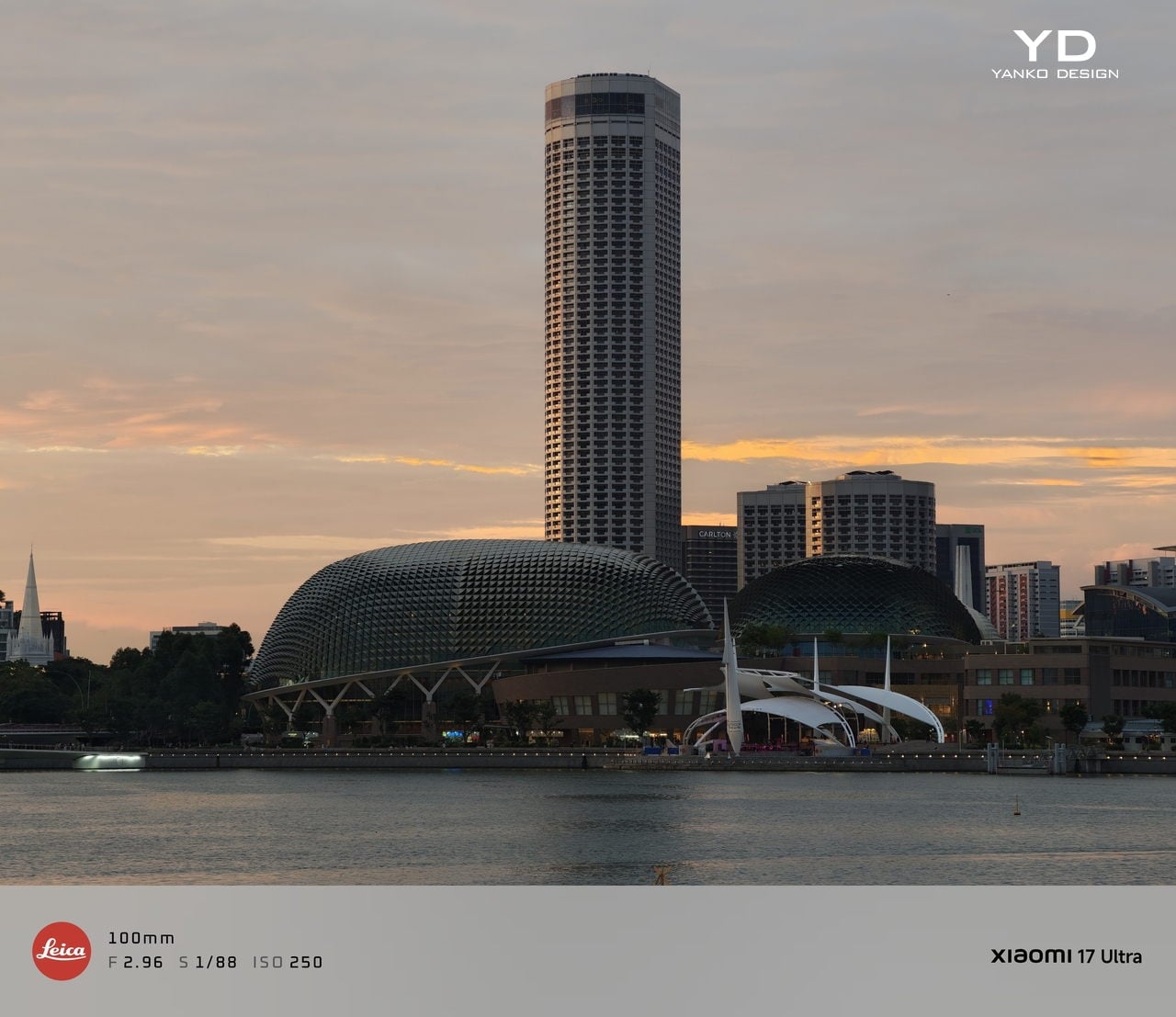
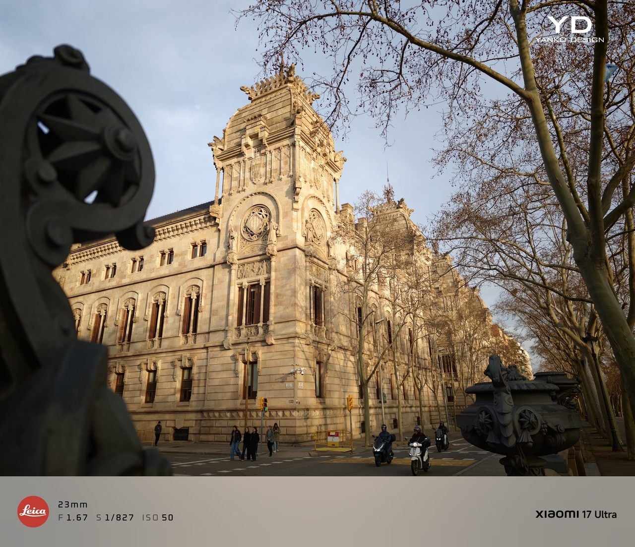
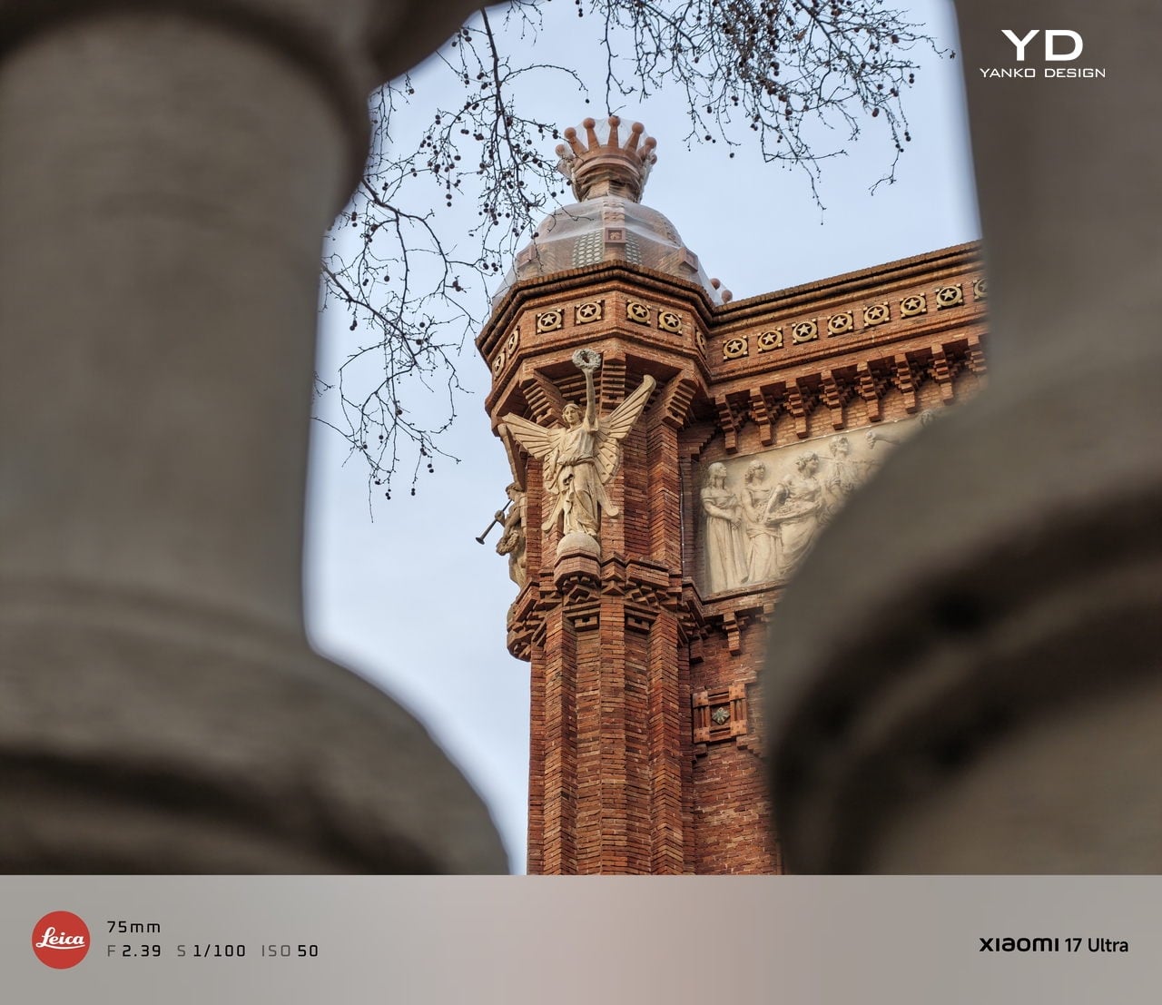
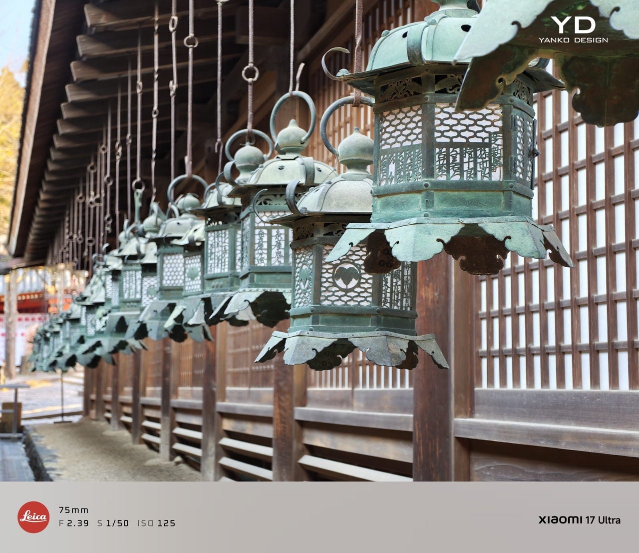
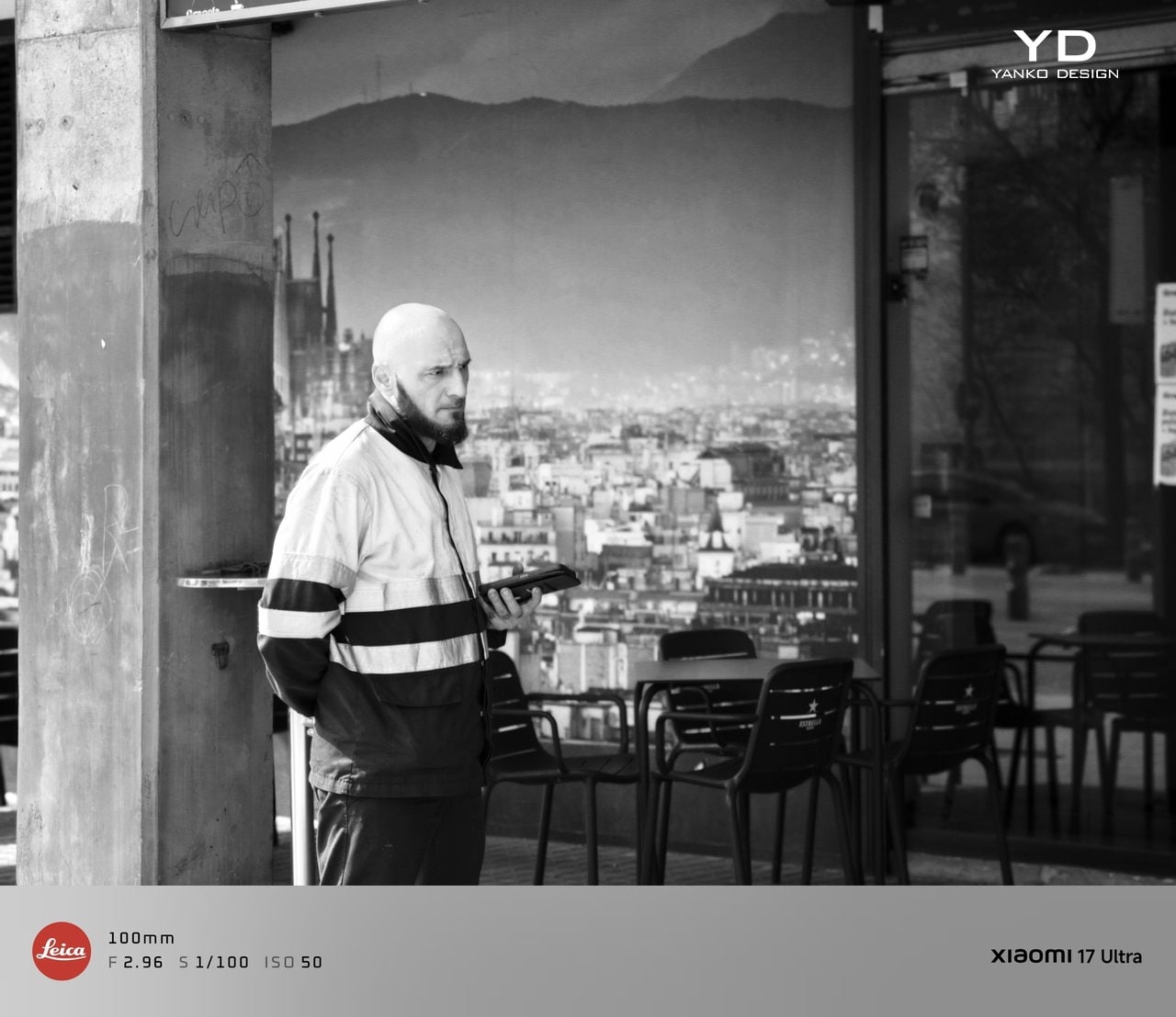
The camera system is where the Xiaomi 17 Ultra really tries to separate itself. Xiaomi drops the older quad camera approach and commits to a triple setup. The main camera is a 23-mm equivalent 50 MP unit with an f/1.67 aperture, OIS, and OmniVision’s Light Fusion 1050L sensor. The 75-100mm equivalent telephoto is a 200 MP periscope with OIS using Samsung’s HPE sensor, with a f/2.39-2.96 aperture. Rounding it out is a 50 MP 14-mm equivalent ultra-wide with an f/2.2 aperture using Samsung’s JN5 sensor.

23mm, Leica Authentic

75mm, Leica Vibrant

100mm, Leica Vibrant

On the main camera, Xiaomi pairs the Light Fusion 1050L sensor with LOFIC technology. LOFIC stands for Lateral Overflow Integration Capacitor, and it is designed to reduce highlight clipping by giving each pixel extra headroom before bright areas turn into flat white. In practice, it helps keep texture in skies and reflections while still holding onto shadow detail in high contrast scenes.

23mm, Leica Vibrant

200mm, Leica Authentic

Zoom is the other headline change. Instead of dual telephoto cameras, Xiaomi uses a floating lens structure to deliver continuous optical zoom from 75 mm to 100 mm, which makes it easy to pick between framing without obvious digital cropping. The limitation is that the range is fairly tight, so it is more about fine-tuning perspective than dramatically pulling faraway subjects closer. There is also a close-up trade-off, since the telephoto now focuses down to about 30 cm rather than the 10 cm I could get on the Xiaomi 15 Ultra, so it is less useful as a pseudo macro lens.

45mm, Leica Vibrant

100mm, Leica Vibrant

In real use, both the main camera and the telephoto produce excellent images with wide dynamic range, natural color, and strong detail in various lighting conditions. The images look clean rather than overprocessed or oversharpened. Portrait mode is especially flexible, offering eight focal lengths from 23 mm through 100 mm equivalents, with pleasant bokeh and strong separation, even if it can occasionally miss a fine strand of hair when I pixel peep. I also noticed the phone can get warm even after relatively short camera use, and hopefully Xiaomi can improve this with future updates.

75mm, Leica Vibrant

75mm, Leica Vibrant

100mm, Leica Vibrant

The ultrawide is solid but a step behind the main and telephoto in refinement. The upgraded 50 megapixel front camera with autofocus is a nice quality of life improvement, and it looks great in good light. In backlight or low light, selfies can come out a bit soft as the processing works harder to control noise.

The Xiaomi 17 Ultra’s triple camera system can shoot video up to 8K at 30 fps, and it also offers 4K at up to 120 fps, although the ultrawide tops out at 4K at 60 fps. The front camera can record up to 4K at 60 fps, which is plenty for vlogs and high-quality selfies. Dolby Vision is supported across the cameras, and Xiaomi also includes creator-friendly tools like LOG recording up to 4K at 120 fps with stabilization on, plus LUT import for quicker grading and a more consistent look.

100m, Leica Portrait

100mm, Leica Portrait,

100mm, Leica Portrait, B&W Hig Contrast Filter

In performance, the 17 Ultra generally produces sharp, well-exposed footage with a fairly wide dynamic range, and stabilization stays strong when I am walking or panning. Low-light video also holds up well, with impressive detail for a phone, thanks in part to the large main sensor. Autofocus is usually smooth, but it can struggle in tricky conditions like backlit scenes or low light, where it may hesitate or hunt before it locks.

The Xiaomi 17 Ultra China version gets a 6,800mAh battery, but globally, it comes with a 6,000mAh battery. It should last you a full day, even with heavy use. It supports 90W wired charge and 50W wireless charge. 90W wired charge is PPS, so you can take full advantage of fast charging with a PPS compatible charger, not just with Xiaomi’s proprietary brick.

Sustainability

Xiaomi’s sustainability story for the 17 Ultra is mostly about longevity rather than eco materials. The phone uses Xiaomi Shield Glass 3.0 on the front, and it carries an IP68 rating, which should help it survive years of drops, rain, and daily wear without needing an early replacement. That kind of durability matters because the most sustainable phone is often the one you do not have to replace early.

Software support strengthens that long-life angle. Xiaomi promises five major OS updates and six years of security updates, which is not class-leading, but it is enough to make long-term ownership feel realistic at this price. It also makes the phone a safer buy if you plan to keep it for several years or pass it on later. What Xiaomi does not really emphasize, at least from what I can find, is the use of recycled or more sustainable materials in the phone itself.

Value

For global buyers, the Xiaomi 17 Ultra starts at EUR 1,499, which is roughly $1,620 USD, for 16GB/512GB, with the 16GB plus 1TB configuration expected around EUR 1,699, roughly $1,840 USD. That puts it directly in the same bracket as the most expensive Samsung Galaxy and iPhone models. If you look at what the Xiaomi 17 Ultra offers, it is easy to see the value in hardware alone, especially in cameras, battery, and storage.

The challenge is that Xiaomi is not only competing with Samsung and Apple, but also with other camera-focused Android flagships that are expected to land this year. That means the 17 Ultra has to win on the full experience, not just its spec sheet, especially when buyers are cross-shopping within the same premium price tier. Even so, the 17 Ultra can justify its price if you care most about its Leica-tuned imaging, huge display, and fast charging rather than ecosystem lock-in.

Verdict

The Xiaomi 17 Ultra is one of the most complete camera-first flagships Xiaomi has shipped for the global market. It nails the fundamentals with a huge, bright display, top-tier performance, and charging that makes most rivals feel slow and old-fashioned. The bigger story is how coherent the imaging experience feels, since the main and telephoto cameras deliver natural color, wide dynamic range, and consistent results across lenses.

Of course, there are real trade-offs, too. The new 75 mm to 100 mm continuous zoom is great for framing, but it is not a massive jump in reach, and the longer minimum focus distance makes the telephoto less useful for pseudo macro shots than the Xiaomi 15 Ultra. The global price also puts it in direct competition with the biggest names, so this is no longer a value flagship by default.  Still, there is no doubt the 17 Ultra earns its Ultra name. It delivers a huge, gorgeous screen, genuinely fast charging, and one of the most enjoyable still photo experiences you can get on a phone, with Leica-tuned color that looks natural rather than overcooked. If those are your priorities, the Xiaomi 17 Ultra is an easy flagship to love.

The post Xiaomi 17 Ultra Review: Lighter, Flatter, and Sharper Than Ever first appeared on Yanko Design.

ASUS ROG Flow Z13 Kojima Productions Edition Review: Designed, Not Branded

PROS:


  • CNC machined artwork creates depth that printed graphics can't replicate

  • Carbon fiber and aluminum deliver genuine material contrast

  • Decennium Gold colorway builds a collaboration-specific design language

  • Thermal architecture integrates visibly into the surface composition

  • Multiple configurations give collectors several compositionally distinct angles

  • Shinkawa's design vocabulary translates to hardware without dilution

CONS:


  • Static chassis can't capture the kinetic energy of Shinkawa's illustrations

  • Tablet weight limits comfortable handheld use beyond fifteen minutes

RATINGS:

AESTHETICS
ERGONOMICS
PERFORMANCE
SUSTAINABILITY / REPAIRABILITY
VALUE FOR MONEY

EDITOR'S QUOTE:

Most limited editions wear an artist's name. The Z13 KJP wears an artist's hand.
award-icon

When the artist holds the pen, the object changes at a structural level. ASUS calls the ROG Flow Z13 Kojima Productions Edition a collaboration with Yoji Shinkawa, but the result reflects authorship rather than endorsement. Shinkawa drew the design elements directly. The angular chassis cutouts reference Ludens’ armor, the same character he originally created as Kojima Productions’ icon. The Decennium Gold colorway exists because Shinkawa chose it. The carbon fiber integration, the custom keycap typography, the vent laser etching: these trace back to his visual direction, not ASUS’s interpretation of it. The geometry, materials, and graphic hierarchy don’t feel applied to an existing chassis. They feel drawn into it.

Shinkawa himself described the process as designing a gadget that “belongs to Ludens” and integrating that into the PC design. That framing tells you where creative authority sat. The artist didn’t adapt to the hardware. The hardware adapted to the artist.

Kojima Productions as Design House

Calling Kojima Productions a game studio accounts for what the company ships, not what it builds. The studio’s visual identity, shaped primarily by Shinkawa since its founding, represents one of the most distinctive aesthetic vocabularies in entertainment. Shinkawa’s style blends bold brushwork with intricate mechanical detail: fluid motion rendered with precision, emotion conveyed through futurism. The characters, vehicles, and environments of Metal Gear Solid and Death Stranding share a visual language that’s immediately identifiable: heavy contrast, dynamic composition, mechanical forms that feel organic.

Ludens, the company’s mascot, embodies this philosophy. Designed as a collaboration between Kojima and Shinkawa, Ludens wears an “extravehicular creative activity” suit: part knight armor, part astronaut gear. The character represents “those who play” (Homo Ludens), and the visual design merges protective functionality with exploratory optimism.

The motto: “From Sapiens to Ludens.” The Z13 KJP’s tagline: “For Ludens Who Dare,” combining Kojima Productions’ philosophy with ROG’s established “For Those Who Dare.” Even the marketing language operates as a design decision.

The Chassis as Canvas

The CNC-milled aluminum chassis does something unusual for limited edition hardware: it uses premium manufacturing as the design medium rather than premium materials as decoration.

Angular cutouts carved into the aluminum reference Ludens’ armor plating. These aren’t applied graphics or printed textures. They’re machined into the body with tolerances you can feel with a fingernail. The cutting angles create shadow lines that shift with viewing angle, adding depth that flat surfaces can’t achieve.

The Decennium Gold colorway breaks from gaming hardware convention. ROG products typically live in blacks, dark greys, and aggressive reds. Shinkawa chose a palette that references neither typical gaming aesthetics nor typical Kojima aesthetics. It’s a new color vocabulary specific to this collaboration, one that reads as industrial warmth rather than decorative accent.

Vent laser etching creates a subtle pattern across thermal exhaust areas that reads differently depending on lighting. At a glance, it’s texture. Up close, it’s deliberate patterning that maintains the Ludens visual motif even on functional surfaces.

Surface Detail as System

The rear panel artwork is layered in three visual weights, each serving a distinct compositional role. Fine parallel lines establish a base grid across the aluminum while medium thickness strokes intersect at angles that echo Ludens armor plating. Deep black ventilation apertures anchor the composition as functional shadow fields. Some lines are laser etched while others are machined recesses, and the vents aren’t hidden beneath the artwork but integrated into it.

This is where the detail level becomes clear. The vent field doesn’t interrupt the art but completes it, with perforations radiating in controlled clusters. Horizontal exhaust lines align with printed striations, while thicker strokes deliberately break alignment to preserve composition. It reads less like decoration and more like a technical schematic of something operational.

Micro typography reinforces the illusion. “Ensure lock is tight” sits near the kickstand mechanism. “Do not touch lens surface” frames the rear camera. “Li polymer battery pack here” is printed as if this were an exposed prototype rather than a sealed device. The language mimics field equipment labeling. It creates narrative without becoming parody.

What elevates the rear panel from decoration to design system is physical depth. The CNC bevels catch and redirect light differently depending on the angle of incidence, so the composition’s visual weight shifts throughout the day without any element disappearing. Under diffuse lighting, flat artwork would lose definition. Machined geometry holds contrast even when the room goes dim.

Carbon Fiber as Material Language

The carbon fiber elements operate as material contrast rather than structural marketing.

The weave is visible and directional. Under angled light it shifts between matte absorption and subtle reflection, creating tonal variation that the aluminum can’t replicate. This is real carbon fiber, not printed simulation. It introduces organic texture into an otherwise machined surface vocabulary.

Placed adjacent to CNC milled aluminum, the fiber changes how the entire rear panel reads. Woven composite beside bead blasted metal creates tension between engineered precision and tactile irregularity. That pairing echoes Shinkawa’s broader design instincts. Mechanical forms feel inhabited rather than sterile. Armor suggests use rather than abstraction.

Thermal Architecture Shapes the Exterior

The Z13 KJP’s tablet form forces its cooling system to live within a flat plane rather than a hinged clamshell cavity.

ASUS integrates larger fans and a wider vapor chamber because the device lacks a traditional hinge exhaust path. An airflow channel under the display helps reduce touchscreen surface temperatures. These engineering decisions directly influence vent placement and rear panel geometry.

The diagonal vent cluster embedded in the carbon fiber panel isn’t arbitrary styling. It exists where airflow demands it. The long horizontal vent array on the aluminum side stretches across a composition already defined by linear etching. Function determines location. Design determines how it’s expressed.

The Z13 KJP treats cooling infrastructure as compositional material. The vents, channels, and exhaust geometry participate in the rear panel’s visual rhythm rather than interrupting it, which is why the thermal sections don’t read as engineering compromises from any distance.

Form Factor as Design Statement

The detachable keyboard format makes the Z13 KJP a design outlier among limited edition laptops.

Most collector hardware comes in clamshell form. You see it closed or open. The Z13 KJP presents differently depending on configuration. As a tablet, it’s a slate with the Ludens-inspired chassis as the primary visual element. With the keyboard attached, custom KJP keycaps and typography add detail at interaction distance. On a kickstand at an angle, it shows the chassis rear and carbon fiber panel simultaneously.

This multiplicity matters for display-oriented owners because each configuration foregrounds different design decisions, from the macro geometry of the rear panel to the micro detailing of keycap typography. Most limited edition hardware offers a single hero surface. The Z13 KJP offers several, and they’re compositionally distinct.

At 1.25 kilograms as a tablet and 1.72 kilograms with the keyboard attached, the Z13 KJP balances density with portability. Inside the 300.28 by 204.5 millimeter footprint at 14.56 to 14.99 millimeters thick sits an AMD Ryzen AI Max Plus 395 processor paired with Radeon 8060S graphics up to 80 watts, 128GB of LPDDR5X 8000 quad channel memory, and a 70Wh battery supporting 100 watt USB C charging with a 50 percent charge in 30 minutes claim.

Ports and Edge Composition

Edge design is where themed hardware often collapses into generic product. The Z13 KJP maintains consistency.

HDMI 2.1 FRL sits alongside dual USB4 ports supporting DisplayPort 2.1 and Power Delivery 3.0. A USB A 3.2 Gen 2 port anchors legacy connectivity. The microSD UHS II slot hides beneath the kickstand, an industrial design decision that preserves side silhouette integrity. Even the Command Center button is placed without disrupting the visual rhythm of the edge.

The port cutouts are clean and deliberate, preserving the angular language established on the rear panel rather than fracturing it. Negative space between each cutout prevents the edge from reading as a fragmented utility strip. Black rubberized edge guards introduce a darker boundary layer that frames the Decennium Gold aluminum, visually grounding the device while protecting high contact surfaces.

On a device this compact at 300.28 by 204.5 millimeters and under 15 millimeters thick, edge discipline determines whether the hardware reads as composed or cluttered. The Z13 KJP maintains its visual argument all the way to the perimeter.

Display as Primary Surface

As a tablet first device, the display isn’t a spec line but the dominant interaction surface and the largest uninterrupted plane on the hardware. Everything else on the Z13 KJP supports or counterbalances what happens on this 13.4 inches of glass.

The ROG Nebula Display runs at 2560 by 1600 resolution across a 16:10 WQXGA panel, 180Hz with 3ms response time and 500 nits of brightness, covering 100 percent of the DCI P3 color space. Gorilla Glass DXC provides the protective layer, which ASUS positions as glare resistant. In a tablet configuration where the screen faces ambient light directly, glare resistance becomes a design-critical material choice rather than a spec sheet footnote.

The glass side operates as deliberate counterweight to the rear panel’s visual density. Where the aluminum layers machined geometry, etched lines, carbon fiber, and micro typography into a complex composition, the display presents smooth, unbroken optical neutrality. That restraint is functional. The front surface stays quiet so it doesn’t compete with whatever content the owner puts on screen.

Ergonomically, the 16:10 aspect ratio provides vertical space for document work and browsing without forcing a width that compromises single-handed grip. When held as a tablet, the device balances expressive density on one side with functional clarity on the other, each surface serving a role the opposite can’t.

The Unboxing as Ritual

Limited edition hardware typically includes printed documentation and perhaps a numbered certificate. The Z13 KJP bundle creates a curated experience.

The carrying case uses the same Decennium Gold design language as the laptop. A flight tag bears ROG × KJP dual branding. A sticker sheet includes “For Ludens Who Dare” and branded designs that extend the aesthetic to wherever the owner applies them.

The centerpiece is the thank-you card. Front: Yoji Shinkawa’s original early sketches of the Z13 KJP, developmental drawings that preceded the final product. Back: personal messages from Hideo Kojima and Yoji Shinkawa with their signatures.

For a collector, this card may become the most valued item in the box. Original Shinkawa sketches of any kind command significant prices. Printed reproductions on a thank-you card aren’t originals, but they’re the closest most people will get to Shinkawa’s developmental process for this specific product.

The peripheral ecosystem extends the language: ROG Delta II-KJP headset, ROG Keris II Origin-KJP mouse, ROG Scabbard II XXL-KJP mousepad. All three bear Shinkawa-illustrated design elements. Sold separately, they allow the aesthetic to extend from the laptop to the entire workspace.

Living With the Design

Design analysis happens at arm’s length. Living with hardware happens at fingertip distance, and the Z13 KJP reveals different priorities depending on which distance you’re evaluating from.

The Decennium Gold finish reads as muted industrial alloy rather than jewelry. Under warm lighting it deepens slightly without turning brassy, and under cooler overhead light it holds its tone without washing out. That tonal stability means the device doesn’t shift personality depending on where you set it down. It looks the same on a coffee shop table as it does on a studio desk, which is rarer than it should be for hardware at this price point.

Fingerprints are the inevitable test. The bead blasted aluminum shows contact marks under direct light, particularly on the flatter surfaces between CNC channels. The machined geometry helps break up the visual uniformity that makes prints obvious on polished metal: shadow lines and textured transitions camouflage minor contact marks rather than highlighting them. The carbon fiber panel resists prints more effectively because the woven texture absorbs oils differently than the metal. Over a work session, the aluminum side shows use while the carbon fiber side stays visually cleaner.

At 1.25 kilograms in tablet mode, the Z13 KJP is honest about what it is. Extended handheld use past ten or fifteen minutes reminds you that there’s an AMD Ryzen AI Max Plus 395 and 128GB of memory packed inside a 14.56 millimeter chassis. The angular cutouts on the rear don’t create sharp pressure points against the palm because the CNC beveling rounds the internal edges enough to prevent digging. But the density concentrates in a footprint compact enough that you feel the weight per square centimeter more than you would on a larger device. The carbon fiber section provides a subtle grip advantage over the aluminum, with the woven texture catching skin differently at reading angles where hold confidence matters.

The CNC channels and etched line work invite a question most design pieces avoid: does precision age well? The machined recesses are shallow enough that casual dust isn’t immediately visible, but deep enough that compressed air works more effectively than a cloth for thorough cleaning. The vent apertures, which serve as compositional anchors from a design perspective, become maintenance zones from a use perspective. The rubberized edge guards show no visible wear patterns at high contact points, and their slightly softer surface provides meaningful grip improvement along the edges where you naturally hold the device when repositioning.

The kickstand deploys with firm, deliberate resistance that holds angles confidently. The hinge mechanism doesn’t feel fragile or provisional. When the device sits on its stand with the rear panel facing outward, the visual density of the artwork becomes ambient rather than demanding. You stop reading individual design decisions and start seeing a unified surface that happens to be more interesting than anything else on your desk.

Where the Translation Lands

What the hardware can’t fully capture is the kinetic energy of Shinkawa’s original illustrations. His drawings imply velocity and force through brushstroke dynamism, qualities that a static consumer electronics chassis isn’t built to reproduce. The etched line work creates layered visual complexity, but complexity isn’t motion. The silhouette doesn’t shift with posture. The energy remains implied rather than kinetic, frozen into surface detail rather than expressed through form.

Where the translation succeeds is in its commitment to depth. The design vocabulary lives inside the hardware’s structure rather than on its surface, which is why scrutiny rewards rather than punishes. Move closer and the layering intensifies. Change the lighting and the composition shifts weight without losing coherence. That durability under inspection is rare for any consumer electronics product, let alone one bearing an artist’s name.

A design theme needs its best angle and its ideal lighting. The Z13 KJP doesn’t have a weak configuration or a viewing distance where the intent falls apart, because the intent is embedded in the object itself. Whether the price premium over the standard Z13 is justified depends on how you value that kind of manufacturing commitment. But as a precedent for what artist collaborations in hardware can actually achieve, nothing in the laptop category has come this close to letting the original vision survive production intact. Pre-order starts today at ASUS Store.

The post ASUS ROG Flow Z13 Kojima Productions Edition Review: Designed, Not Branded first appeared on Yanko Design.

vivo V70 Review: A Concert Photographer’s Phone in Mid-Range Clothes

PROS:


  • Striking "Sunset Glow" Golden Hour design

  • 4K 60fps video recording on a mid-tier smartphone

  • Powerful 50MP ZEISS Super Telephoto Camera

  • Large 6,500mAh battery with super-fast 90W charging

CONS:


  • 8MP ultra-wide camera is decent but mediocre

  • No wireless charging

RATINGS:

AESTHETICS
ERGONOMICS
PERFORMANCE
SUSTAINABILITY / REPAIRABILITY
VALUE FOR MONEY

EDITOR'S QUOTE:

The vivo V70 proves that a clear camera identity and premium materials still matter at this price.

The mid-range smartphone segment is crowded in ways that make individual products hard to distinguish. Specs converge, designs flatten, and most phones feel interchangeable within days. vivo’s V70 enters that space with a clear point of view: a ZEISS-co-engineered telephoto camera tuned for stage photography and travel, a large battery built for long days, and a physical design that genuinely tries to look and feel like something worth keeping.

The v70 also introduces the Golden Hour edition, the most visually expressive option in the lineup, with an etched glass back, an aerospace-grade aluminum frame, and a ZEISS camera module with serious hardware inside. Running OriginOS 6 on a Snapdragon 7 Gen 4, it promises a telephoto-first camera experience for concerts and travel, backed by a 6,500mAh battery. Does the full package deliver on all of it? Read on.

Designer: vivo

Aesthetics

Of all the V70’s color options, the Golden Hour edition is the one most worth talking about. vivo uses a specialized chemical etching process to form micron-scale texture on the back glass, creating a diffuse reflection that reads as refined matte from a distance but reveals subtle warmth in direct light. It’s fingerprint-resistant and smooth without feeling slippery, a noticeably more considered finish than the glossy or painted backs that dominate this price tier.

What’s more surprising is that the back doesn’t stay a single color. Depending on the viewing angle and ambient lighting, it shifts toward a cooler, slightly bluish hue you wouldn’t expect from a finish called Golden Hour. That unexpected chromatic movement makes it more visually engaging than a standard gradient, the kind of surface detail that keeps catching your eye without you fully understanding why.

Around the front, the aerospace-grade aluminum alloy frame wraps a flat display with ultra-thin bezels measuring just 1.25 mm on the sides. Rounded corners soften the silhouette without cheapening it, and the flat screen is a deliberate departure from curved-edge designs that can distort content near the edges. The overall impression is controlled and considered rather than flashy, which suits the V70’s personality well.

On the back, the camera module is a rounded metallic rectangle sitting just 3.29mm above the surface, low enough that the phone doesn’t rock noticeably on a table. Three lens rings and a ZEISS badge keep the composition clean without feeling crowded. It’s a well-executed rear panel that reinforces the premium identity without needing extra ornamentation to make the point.

Ergonomics

At 194g light and 7.59mm thick in the Golden Hour configuration, the vivo V70 feels present without being heavy. The matte AG glass provides enough grip for confident one-handed use without a case, and the flat sides and rounded corners make it comfortable to hold at its screen size. Weight distribution is balanced, which matters more for all-day carry than any single spec on a data sheet.

The 3D Ultrasonic Fingerprint Scanning 2.0 is one of the more underrated features here. It works reliably with damp fingers, meaning no frustrating tap-and-retry cycle after a workout or a skincare routine. Best of all, it’s located a good distance away from the bottom, so you don’t have to precariously shift your hand from its natural holding position just to unlock the phone.

Performance

Under the hood, the vivo V70’s Snapdragon 7 Gen 4 with LPDDR5X memory and UFS 4.1 storage handles everyday tasks and multitasking without hesitation, and a 4,200mm² vapor chamber keeps sustained performance steady during longer camera sessions. It’s not a chipset that headlines benchmark charts, but it delivers consistent, smooth day-to-day performance, which is more relevant to what the V70 is actually designed for than theoretical peak numbers.

The 6.59-inch 1.5K OLED runs at 120Hz with 459 PPI and peaks at 5,000 nits local brightness, which holds up well in direct sunlight and makes reviewing photos outdoors genuinely practical. Colors are rich without being oversaturated, and the 1.07-billion color depth makes gradient-heavy AI-edited shots look smooth rather than banded. It’s one of the better mid-range displays available at this price tier right now.

The camera system’s two stars are the 50MP main and 50MP periscope telephoto. The main uses a Sony LYT-700V sensor with a 1/1.56-inch surface area and OIS, delivering consistent, detailed portraits across daylight and mixed lighting. The telephoto uses a 1/1.95-inch sensor with its own OIS and a periscope structure that enables 10x zoom in a compact body. Both cameras consistently outperform what you’d expect at this price.

Of the three rear cameras, the 8MP ultra-wide is where things get more ordinary. It’s functional for casual wide shots, but the gap in detail and dynamic range between it and the main and telephoto cameras is noticeable. Given the vivo V70’s travel ambitions, wide landscape shots will come out looking more ordinary than portraits taken at the same destination. The phone’s real camera personality clearly lives in the other two lenses.

AI Stage Mode is a genuine differentiator if you attend live events regularly. At 10x zoom from 10m to 20m away, the AI Image Enhancement Algorithm and AI Style Portrait Technology combine to pull facial detail and expression clarity from performers under challenging stage lighting. It won’t replace a dedicated camera at that distance, but for a phone that fits in your jacket pocket, the results hold up surprisingly well.

Video gets a meaningful upgrade with 4K 60fps, the first time the vivo V series has offered this, and footage looks cinematic when lighting cooperates. AI Audio Noise Eraser in post-editing selectively reduces wind noise, crowd chatter, or ambient sound from recorded clips. It sounds like a spec sheet bullet point until you actually try cleaning up a concert recording with it, and then it becomes a feature you’d miss on another phone.

Battery life is a genuine strength. The 6,500mAh BlueVolt battery with 90W FlashCharge handles a full day of heavy use and then some, including heavy video playback. Wireless charging still isn’t part of the package, though, which will matter to those who’ve built it into their daily routine, but fast wired charging and a genuinely large battery soften that trade-off considerably.

Sustainability

vivo commits to four generations of OS updates and 6 years of security patches for the V70, placing it firmly in the category of phones worth keeping rather than replacing every two years. That’s the most meaningful sustainability argument a phone can make, applying regardless of materials or recycling programs. Longer software support means slower obsolescence, and slower obsolescence means less electronic waste accumulating on a shelf somewhere.

IP68 and IP69 ratings, combined with what vivo calls 10-Facet Drop Resistance, lower the anxiety of carrying a polished phone through real conditions. IP69 covers high-pressure water jets, going well beyond typical rain scenarios. That durability confidence changes how casually you handle the phone day to day, and there’s something genuinely reassuring about owning a device you don’t have to constantly worry about.

The material choices also support long-term ownership. Aerospace-grade aluminum and etched AG glass age more gracefully than glossy plastic, which yellows, scratches, and starts looking tired within a year of daily use. The matte texture stays presentable with minimal cleaning, and IP68/IP69 combined with drop resistance gives the V70 a realistic chance of surviving the accidents that typically end mid-range phones early.

Value

The V70 packages premium design, a ZEISS telephoto-first camera system, a strong OLED display, fast charging, and long software support into a price tier that usually demands more compromises. The Golden Hour finish gives it a visual identity that stands above most phones at its price, and the combination of AI Stage Mode with ZEISS Multifocal Portrait focal lengths makes it genuinely specialized rather than just generically capable.

The 8MP ultra-wide is the honest weak spot, and travelers who rely heavily on wide shots will feel that gap. Wireless charging is also absent. But what the V70 does well, it does consistently, and the combination of a premium-feeling design, a capable telephoto system, and 6 years of security updates makes it a phone that’s easy to justify and hard to grow out of quickly.

Verdict

The vivo V70 in Golden Hour is one of the more cohesive mid-range phones available right now. The etched glass with its unexpected bluish shift, the aluminum frame, the ultrasonic fingerprint sensor, the bright 1.5K OLED, and the ZEISS telephoto and portrait system all work together in a way that makes the phone feel intentional rather than assembled from a spec sheet and a parts catalog.

The 8MP ultra-wide and the absence of wireless charging are unfortunate blemishes on what is otherwise a remarkably well-rounded package. Both are real trade-offs rather than dealbreakers, though, and the vivo V70 earns its place as a phone that’s genuinely hard to fault for what it costs, especially if portrait photography, concert shooting, and long battery life are what matter most to you.

The post vivo V70 Review: A Concert Photographer’s Phone in Mid-Range Clothes first appeared on Yanko Design.

Realme P4 Power Review: Battery Anxiety is Finally Dead

PROS:


  • Massive 10,001mAh battery with 80W wired fast charging

  • Bright and vibrant display

  • Solid mid-range performance

CONS:


  • Slightly heavier and chunkier compared to many mid-range devices

  • Ultra-wide and front-facing cameras are only average for the price

RATINGS:

AESTHETICS
ERGONOMICS
PERFORMANCE
SUSTAINABILITY / REPAIRABILITY
VALUE FOR MONEY

EDITOR'S QUOTE:

Realme P4 Power proves that killing battery anxiety is more useful than chasing benchmarks, wrapping a 10,001mAh cell, tough IP69 shell, and smooth performance into an honest mid‑range package.

Realme has built a reputation for pushing smartphone battery tech forward, from faster charging to bigger and more efficient cells. Instead of treating battery life as an afterthought, the brand has consistently tried to make it a headline feature that changes how often you actually need a charger. That focus has turned power and charging from a boring spec line into one of Realme’s main selling points.

The Realme P4 Power is the clearest expression of that idea so far. It packs a massive 10,001 mAh battery into a phone that still looks and feels familiar, then backs it up with 80W fast charging, 27W reverse charging, a bright 144Hz AMOLED display, and 5G performance aimed at everyday users and gamers alike. More than just another mid‑range phone with a slightly bigger battery, it’s a device built around the promise that you should be able to forget about battery anxiety for days at a time.

Aesthetics

The Realme P4 Power is a battery‑first phone that does not look like one at first glance. On the table, it reads as a modern, fashion‑driven slab rather than a chunky endurance tool, which is exactly what Realme is going for. It comes in two color variations, Flash Orange and Power Silver.

The upper third of the back panel has a distinctive pattern that creates an almost translucent effect, playing with reflections and depth when light hits it. The rectangular camera island is neatly integrated, with a clean ring‑based layout that avoids the oversized, fussy modules you see on some rivals. The overall look feels intentional and confident, not like a normal phone that accidentally got thicker to fit a bigger battery.

The design is more playful than minimalist, especially in the brighter Flash Orange variant, while Power Silver keeps a slightly more muted but still distinctive character. For a phone whose headline feature is a huge battery, it is surprisingly stylish and clearly aimed at people who care how their device looks on a desk or in a hand. Branding is present but not overpowering, so the rear stays relatively clean even with the layered graphics and that “under‑glass” pattern.

Ergonomics

Even when you pick it up, the P4 Power feels a little deceptive. This is not a featherweight device, coming in at about 219g and measuring 162.26 x 76.15 x 9.08mm. The large 10,001 mAh battery and sturdy build give it noticeable heft in the hand, and you will feel that if you are coming from a slim device. However, Realme has done a great job of balancing the mass so it does not feel awkward during normal use. For many users, the extra grams will be an acceptable trade‑off for the freedom from constant charging.

The shape helps more than the spec sheet suggests. The slightly curved 6.8‑inch display and curved‑edge back panel let your fingers naturally wrap around the device rather than pressing into a sharp edge. The matte back does a good job of hiding fingerprints and smudges, although it can feel a bit slippery, so a case might still be a smart idea.

The power and volume keys are within comfortable reach on the right side, so you do not have to stretch or shuffle the phone around to adjust volume or wake the screen. The in‑display fingerprint reader, on the other hand, sits quite close to the bottom of the display, which can make quick unlocks feel a bit forced, especially in one‑handed use. Overall, the build quality feels more premium than the price tag suggests, and ergonomics are good for a device built around such a large battery.

Performance

On the front, the P4 Power offers a quad‑curved 6.8‑inch AMOLED display with a resolution of 1280 × 2800 pixels and a maximum refresh rate of 144Hz. In practice, though, only a few native apps, such as Calculator, Compass, and Recorder, actually run at 144Hz, while most of the interface and third‑party apps stick to lower refresh rates.

Realme quotes typical brightness around 600 nits, a boosted mode up to 1800 nits, and a local peak figure of 6500 nits for small areas of the screen. In real‑world use, the display stays readable in harsh sunlight and bright outdoor conditions. The panel supports HDR10+ and 10‑bit color, so compatible streaming content looks rich, punchy, and pleasantly saturated.

Inside the P4 Power sits MediaTek’s Dimensity 7400-Ultra chipset. It is paired with 8GB or 12GB of RAM and 128GB, 256GB, or 512GB of UFS 3.1 storage. This combination places the phone firmly in the mid‑range. It is not chasing raw benchmark records, yet it is designed to deliver smooth performance in everyday tasks and mainstream games without obvious slowdowns or stutters.

Out of the box, the phone runs Android 16 with Realme UI 7.0 on top, and Realme also uses a dual‑chip approach. Alongside the main Dimensity processor, there is a dedicated Hyper Vision+ AI chip focused on display and gaming tasks, and there are a handful of AI image features such as AI Perfect Shot and 3D emoji. AI Perfect Shot recognizes faces and can fix closed eyes or awkward expressions by swapping in better face poses from other photos of the same person in your gallery, and AI also helps during gaming by quickly generating message replies in supported messaging apps so you can respond without fully dropping out of your game.

Battery life is the reason this phone exists. The 10,001mAh cell is dramatically larger than the 4,500 to 5,000mAh batteries found in many mainstream phones, and even bigger than the 6,000 or 7000mAh packs in endurance‑focused models. Realme achieves this using a third‑generation silicon‑carbon anode and a compact internal stacking design, which allows more capacity in roughly the same physical space.

In practical terms, this capacity is meant to deliver several days of mixed use. I used the Realme P4 Power as my primary device on a 3‑night, 4‑day scuba trip, with light screen time during the day, and it lasted the entire trip without a charge, still showing around 20 percent battery when I got back home. That kind of real‑world endurance is a clear step up from phones that need a nightly top‑up.

When you do need to charge, the P4 Power supports 80 W wired fast charging. It also supports 27 W reverse charging, so it can basically double as a power bank for your other gadgets when you are on the move.

The camera system on the P4 Power is straightforward. On the back, there is a 50MP main camera using Sony’s IMX882 sensor with optical image stabilization and an f/1.8 lens, paired with an 8MP ultra‑wide camera that offers a 112‑degree field of view. On the front, you get a 16MP selfie camera. For video, the main camera can record up to 4K at 30 fps, while the ultra‑wide and front‑facing cameras are capped at 1080p at 30 fps.

You can choose between Vibrant and Natural color modes. Natural mode is essentially a toned‑down look rather than a more accurate one, so it comes down to preference more than strict realism. The main camera takes good photos with pleasing detail and contrast in daylight, while the ultra‑wide is serviceable but nothing to write home about, with softer detail and more noise. The front‑facing camera delivers decent selfies that are fine for social media, though it does not stand out in this price range.

Natural Color Mode

Vibrant Color Mode

Portrait Mode

Sustainability

The oversized battery also has a clear sustainability angle. Because the 10,001 mAh cell gives you so much headroom, you are less likely to run it close to empty every day or charge it multiple times, which reduces the number of full charge cycles. Realme’s silicon‑carbon chemistry and battery management build on that, and the company claims the battery can retain over 94 percent of its original capacity after three years of typical use and around 80 percent after eight years.

The Realme P4 Power also leans on durability and software support. It is IP69, IP68, and IP66‑rated, so it is tested for dust tightness, high‑pressure water jets, and immersion, making it less likely to die from everyday splashes or rain. On the software side, Realme promises three major Android OS upgrades and four years of security patches, which is fine for a mid‑range phone but not class‑leading, and it slightly undercuts the otherwise long‑term hardware story.

Value

In India, the Realme P4 Power starts at around ₹25,999 (roughly $310) for the 8GB RAM and 128GB storage variant. That pricing puts it in the crowded lower mid‑range segment, where a lot of brands are fighting on specs and features. The Honor Win also features a 10,000mAh battery, but it is officially only available in China, so for most buyers, the P4 Power is the more accessible way to get this kind of battery size.

The phone is aimed at people who value endurance and reliability above camera experience or absolute thinness. That can include gamers, frequent travelers, delivery workers, content creators on the move, and anyone who is simply tired of carrying a power bank. At this price level, the P4 Power tries to stand out by solving a real‑world problem in a very direct way.

Verdict

The Realme P4 Power is a very focused product. It does not try to be the best camera phone or the thinnest fashion accessory. Instead, it aims to be the phone you do not have to think about charging, even on your busiest days. For many everyday users, that single promise can be more valuable than a slightly better zoom lens or a few extra benchmark points.

If your top priority is battery life, with smooth performance and a bright display for gaming and media, the P4 Power is an easy device to recommend in its price range. If you care more about advanced photography features, ultra‑lightweight design, or wireless charging, you may want to look at other options. For everyone else, this is a rare phone that tackles a common frustration head‑on and mostly succeeds.

The post Realme P4 Power Review: Battery Anxiety is Finally Dead first appeared on Yanko Design.

REDMAGIC 11 Air Review: Fan-cooled Gaming Flagship at Just 207g, $499

PROS:


  • Slimmer and lighter design for a gaming smartphone

  • Distinctive gaming aesthetic

  • Large 7,000 mAh battery with 80W fast charging

  • More Accessible price point

CONS:


  • No wireless charging

  • Mediocre 8MP ultra-wide camera

  • Basic IP54 dust and water resistance

RATINGS:

AESTHETICS
ERGONOMICS
PERFORMANCE
SUSTAINABILITY / REPAIRABILITY
VALUE FOR MONEY

EDITOR'S QUOTE:

The REDMAGIC 11 Air doesn't apologize for being a gaming phone, but wraps it in the slimmest, lightest package the brand has made yet.

Gaming phones have split off into their own design species, leaning into transparent backs, RGB lighting, and visible cooling that looks more like sci‑fi props than communication devices. The REDMAGIC 11 Pro, which we reviewed recently, took that to its extreme with a liquid‑cooling window showing coolant flowing like spaceship controls. It made a strong visual statement but was unapologetically a gamer’s machine first and everything else a distant second.

REDMAGIC 11 Air tries to keep the same esports‑grade performance, active cooling, and transparent style in a slimmer frame. It packs a Snapdragon 8 Elite, 7,000mAh battery, 6.85‑inch 144Hz OLED, and 24,000 RPM fan into a 7.85mm, 207g body. Whether this Air approach can balance hardcore gaming with something closer to everyday usability, or just becomes a slightly thinner version of the same uncompromising brick, is worth finding out.

Designer: REDMAGIC

Aesthetics

The moment you see the REDMAGIC 11 Air, it announces itself as a gaming phone. Phantom transparent black and Prism transparent white finishes expose stylized internals, circuit‑like etching, and RGB‑lit fan and logo elements. This is not subtle or generalist; it is a cyberpunk, sci‑fi motif that wants to sit next to mechanical keyboards rather than hide in a leather case.

Despite the gaming‑first aesthetic, materials feel more refined than expected. The aluminum alloy frame, Gorilla Glass front and back, and 7.85mm thickness give it a solid feel. It is positioned as the lightest in the REDMAGIC lineup, which matters compared to the heavier 11 Pro. The curves and 20:9 aspect ratio help it sit more naturally in the hand, even if the styling still clearly prioritizes gamers over minimalists.

RGB lighting and transparent elements add atmosphere without chaos. Fan and logo lights sync with in‑game audio, making the back feel alive during sessions, but both can be toned down or disabled when you want less conspicuous carry. That duality helps if you like the gaming aesthetic but occasionally need to bring the phone into neutral environments where flashing lights feel out of place.

Ergonomics

Living with the 11 Air daily, the slimmer and lighter design makes a real difference. Long landscape gaming sessions feel less fatiguing, and the phone slips into pockets more easily than expected, given the 6.85‑inch display. The curved back and aluminum frame help with grip, and the 20:9 screen ratio balances a wide gaming canvas with something that still fits in most hands without constant readjusting.

The large screen dominates the front with a 95.1% screen‑to‑body ratio and slim bezels. That is great for immersion, but leaves little room to rest thumbs without touching the screen during landscape play. Fortunately, the shoulder triggers take over some of that load, letting the screen act more like a viewfinder while the top edges handle key inputs when you need them most.

Controls are where the gaming focus becomes clear. The 520Hz physical shoulder triggers are tuned for low‑latency and now work in portrait and landscape, giving flexibility for different games. Combined with the 0809 X‑axis linear motor for 4D haptics, the phone feels more like a handheld console, especially when triggers are mapped to aiming or abilities through Game Space’s interface.

Outside of gaming, the transparent back and RGB accents may not suit every situation, but the size and weight make it easier to carry than the 11 Pro or older gaming phones. One‑handed use is still a stretch given the display size, but basic tasks like messaging and browsing feel manageable if you are already used to large phones or phablets.

Performance

At the core sits the Snapdragon 8 Elite paired with RedCore R4, LPDDR5X RAM, and UFS 4.1 storage. Clock speeds reach 4.32GHz on the Oryon CPU and 1,250MHz on the Adreno 830 GPU. The dedicated RedCore R4 and CUBE scheduling engine focuses on stable frame rates rather than just benchmark spikes, which matters more in sustained gaming, where consistency beats bursts.

The ICE Cooling System backs that up with a large vapor chamber, graphene thermal layers, and a 24,000 RPM turbo fan. Unlike the REDMAGIC 11 Pro’s dramatic liquid‑cooling window showing coolant flowing like sci‑fi, the REDMAGIC 11 Air hides cooling under the transparent back. It opts for slimness while still actively managing CPU and GPU temperatures during long sessions, which keeps performance from throttling halfway through a match.

The active cooling fan is audible when it spins up under heavy load. It is not loud enough to overpower game audio, but it is noticeable in quiet rooms. For a device prioritizing sustained performance, this is expected, and fan behavior can be tuned in Game Space if you prefer cooler operation or less noise during specific sessions or when gaming in shared spaces.

Cameras are solid without being the headline. The 50 MP main sensor with OIS delivers clean photos for social media and casual shots, and the 16 MP front camera handles selfies and video calls well enough. The 8MP ultra-wide camera is a bit of a disappointment in this day and age, but it’s not exactly terrible. These are clearly not camera‑phone specs, but they work fine for anyone who needs decent everyday photography alongside gaming.

Battery and charging are part of the performance story. The 7,000 mAh battery is generous in this slim chassis, going over a day with general use, and hours upon hours of binging video streaming at max brightness. The 80W fast charging refills quickly, while Charge Separation routes power to the motherboard during plugged‑in gaming, reducing heat and protecting battery health over time.

Worth noting is the absence of wireless charging. For a phone focused on performance and internal cooling, skipping wireless charging feels like a conscious choice to prioritize battery size, thermals, and layout. It is not a deal‑breaker with rapid wired charging, but it is worth keeping in mind if you are used to charging pads between sessions or overnight.

Sustainability

Durability starts with materials. The aluminum alloy frame, Gorilla Glass GG7i front, and Gorilla Glass 5 back give a solid, premium feel that should handle knocks better than plastic gaming phones. The combination of metal and tempered glass makes it feel built to survive being tossed into bags, dropped onto desks, and carried through crowds without showing age too quickly or feeling fragile.

IP54 dust and water resistance is a pragmatic compromise. For a device packed with vents, fans, and shoulder triggers, pushing water resistance higher would likely require trade‑offs in cooling capacity or thickness. The phone will survive light rain or dusty environments, but it is not meant for submersion or rough outdoor abuse, worth keeping in mind if you game near water or in harsh conditions.

Value

At launch, the REDMAGIC 11 Air starts at $499 ($529 in the US and Canada) for 12 GB + 256 GB and goes up to $599 ($629 in North America) for 16 GB + 512 GB. That puts it in upper mid‑range territory, but with hardware rivaling more expensive phones in gaming performance, especially when you factor in cooling, battery, and gaming‑specific controls that most flagships skip entirely.

Value shows up in what you get for that money. At this price, you are getting Snapdragon 8 Elite, active cooling with a 24,000 RPM fan and vapor chamber, 7,000mAh battery with 80W charging, 6.85‑inch 144Hz OLED, and 520 Hz shoulder triggers. Many similarly priced phones focus on cameras or slimness, leaving gaming performance to throttle once heat builds, so the 11 Air feels like a focused tool rather than a jack‑of‑all‑trades.

Of course, this focus narrows the audience. The transparent, RGB‑lit, cyberpunk design and heavy emphasis on Game Space features, triggers, and haptics make the 11 Air most appealing to mobile gamers. For someone who barely plays and cares more about camera versatility or minimalist aesthetics, much of what makes this device interesting will feel like overkill or actively off‑putting.

Contrasting it with the REDMAGIC 11 Pro helps clarify positioning. The Pro leans harder into showpiece territory with its visible liquid‑cooling window and heavier footprint, while the 11 Air trades some spectacle for slimness and lighter weight. For gamers who want REDMAGIC’s performance and style but prefer something easier to carry daily, the Air’s pricing and positioning make sense as a more practical but still gaming‑centric option.

Verdict

REDMAGIC 11 Air takes the brand’s familiar ingredients, transparent design, RGB accents, active cooling, shoulder triggers, and wraps them in a slimmer chassis that feels more manageable than previous monsters. It does not pretend to be a mainstream flagship, but within its lane of delivering stable high‑fps gaming and distinct visual identity, it hits targets convincingly. The flagship silicon, thermal management, and gaming controls make it hard to ignore if mobile gaming matters to you.

For people who treat mobile gaming seriously and who like the idea of a semi‑transparent, cyber‑mech slab with a fan inside more than a polished glass rectangle, REDMAGIC 11 Air makes a strong case. It will not convert everyone, and it is not trying to, but for the crowd it speaks to, it offers a rare mix of performance, personality, and practicality at a price undercutting many conventional flagships while still feeling like a purpose‑built tool.

The post REDMAGIC 11 Air Review: Fan-cooled Gaming Flagship at Just 207g, $499 first appeared on Yanko Design.

OBSBOT Tiny 3 4K PTZ Webcam Review: Audio As a First-Class Citizen

PROS:


  • Triple MEMS mic array with five specialized audio modes

  • Strong imaging quality with 1/1.28-inch 4K Dual All-Pixel PDAF sensor

  • AI Tracking 2.0 with intelligent framing and PTZ control

  • Extreme compactness with flagship-level specs

CONS:


  • Premium pricing

  • Feature depth may overwhelm casual users

  • Non-serviceable, integrated design

RATINGS:

AESTHETICS
ERGONOMICS
PERFORMANCE
SUSTAINABILITY / REPAIRABILITY
VALUE FOR MONEY

EDITOR'S QUOTE:

OBSBOT Tiny 3 treats audio and video as one design problem instead of forcing users to stack separate gear, creating a genuinely tiny studio that replaces an entire desk setup with one very capable box.

Most people who take video calls seriously have ended up stacking gear on their desks. A clip-on webcam, a clamped USB mic, software filters layered on top of each other, and a constant ritual of adjusting angles and leaning into microphones just to sound decent. Laptop webcams were never meant to carry this much weight, but the usual upgrade path still treats audio as something you solve separately, which means juggling two devices and hoping they play nicely together.

OBSBOT Tiny 3 approaches that problem differently. The 4K PTZ webcam wraps a triple MEMS microphone array, a 1/1.28-inch sensor, and a 2-axis gimbal into a compact, lightweight aluminum body. OBSBOT calls it a Tiny Titan, and claims it delivers studio-grade spatial audio, flagship imaging, and AI tracking in one very small package. Whether that actually holds up during everyday streaming, client meetings, and the occasional podcast is the question worth answering.

Designer: OBSBOT

Aesthetics

Walking into a room where the Tiny 3 sits on a desk, it reads less like a webcam and more like a miniature broadcast camera someone scaled down and parked on a tripod. The aircraft-grade aluminum alloy shell gives it an equipment-grade presence without being loud about it, landing somewhere between compact cameras and audio interfaces rather than the glossy plastic most peripherals use these days.

The proportions feel deliberately compact. At 37mm x 37mm x 49mm and 63g, it occupies roughly the same footprint as a large dice, but the dual-axis gimbal makes it clear this is meant to move and track rather than stare at one fixed angle. The satin metallic finish catches light softly without harsh reflections, and the minimal branding keeps it neutral enough to blend into creative or corporate setups without clashing with the rest of the gear.

The included storage case and adjustable mount feel like extensions of the same design language rather than afterthoughts tossed into the box. The case is compact and rigid, protecting the camera in transit without eating up bag space, while the mount uses clean lines and a friction hinge that feels considered. These details matter to people who care about how tools look both during use and while packed away, which describes exactly the kind of person likely to spend more on a webcam in the first place.

Ergonomics

Setup is quick enough that you can join a meeting within minutes of opening the box. Plug the OBSBOT Tiny 3 into a USB-C port, wait a few seconds for automatic driver installation, and the camera appears as a standard UVC device ready for Zoom or Teams. Downloading OBSBOT Center later unlocks deeper controls, but the basics work immediately without forcing you into a setup wizard when you are already five minutes late to a call.

Mounting options give flexibility without requiring proprietary hardware. The adjustable clip grabs laptop lids or monitor bezels securely, while the built-in 1/4-inch thread accepts any standard desk tripod or arm. This means the Tiny 3 can shift from a quick laptop travel setup to a permanent studio fixture without needing different stands, which keeps things simpler when your workspace changes or you move between home and office regularly.

The 2-axis gimbal handles tracking smoothly once it starts moving. Pan range reaches ±130 degrees controllable, tilt goes from 32 degrees up to 60 degrees down, and the gimbal moves at up to 120 degrees per second. In practice, the camera can follow you across a room, reframe when you stand up or sit down, or snap to preset positions without feeling sluggish or overeager, more like a quiet camera operator than a webcam you nudge by hand every few minutes.

Voice commands and gesture control keep your hands free when it counts. Saying “Hi Tiny” wakes the camera, and from there you can trigger tracking, zoom in or out, or park the gimbal in preset positions by voice. Gestures work similarly: a raised hand or quick motion toggles tracking or zoom without leaning forward to click software buttons. This feels genuinely practical once you are mid-presentation and do not want to break flow by reaching for a mouse or keyboard.

Performance

At the imaging core sits a 1/1.28-inch CMOS sensor with 50MP effective pixels behind an f/1.8 lens at a 24mm equivalent focal length. That sensor size is closer to what you would find in a decent smartphone camera than in most webcams, which immediately changes expectations for low-light noise, dynamic range, and how camera-like the footage feels compared to typical USB peripherals.

The OBSBOT Tiny 3 outputs 4K at 30 fps for sharp video, or drops to 1080p at up to 120 fps for ultra-smooth motion or slow-motion clips. That 120 fps mode is rare on webcams and genuinely useful for product demos, movement capture, or just making gesture-heavy content feel more cinematic. DCG HDR balances bright windows and dim rooms without the ghosting that makes some HDR modes unusable, which helps when you are stuck with mixed lighting.

Autofocus and exposure behave like a capable point-and-shoot rather than guesswork. Dual All-Pixel PDAF pulls focus quickly, whether you are showing a product, writing on a whiteboard, or pacing during a stream. ISO 100 to 12,800, capped at 6,400 in HDR mode, gives flexibility to stay clean in low light without the image collapsing into noise. Shutter speeds from 1/12,800 to 1/30 second handle fast motion or dim environments without aggressive software smoothing.

Audio is where the Tiny 3 genuinely stands apart from the field. The triple silicon MEMS microphone array includes one omnidirectional and two directional mics, operating at 24-bit sampling with 130dB SPL handling and a 69dB signal-to-noise ratio. In plain terms, the system captures quiet nuance and loud environments without clipping or filling the track with hiss, and noise reduction is strong enough to keep voices clear even in noisy spaces.

Five dedicated audio modes cover different scenarios without needing external hardware. Pure Audio delivers unprocessed stereo for music or ASMR. Spatial Audio enhances stereo separation for vlogs. Smart Omni balances voices and environmental sound for meetings. Directional focuses pickup in front while suppressing surrounding noise, ideal for solo podcasts. Dual-Directional captures front and rear while rejecting sides, built for interviews. Having all five built in lets you tune the mic to your environment instead of buying another device.

AI Tracking 2.0 brings framing intelligence you would usually need a camera operator to achieve. Human tracking offers Single, Group, and Only Me modes, the latter locking onto one person and ignoring distractions. Object tracking lets you box items in software and have the gimbal follow. Zone Tracking sets custom areas where tracking starts or stops. Auto Zoom adjusts framing from close-up to full body, while Face Framing detects which direction you are looking and shifts composition accordingly.

Sustainability

The aircraft-grade aluminum alloy body does more than look polished. Aluminum dissipates heat better than plastic, which keeps the camera cooler during long streams and reduces the risk of thermal issues or early component wear. The material also resists scratches and minor bumps better than glossy finishes, which matters when you are moving the camera between desk, bag, and tripod regularly without babying it.

The OBSBOT Tiny 3 is not user-serviceable in the traditional sense, but that trade-off buys integration and compactness. The non-removable gimbal, sensor, and mic array work as a single tuned system, eliminating external adapters, separate audio devices, and multiple mounting solutions. Over time, that reduces the number of peripherals cluttering your workspace and, eventually, the pile of obsolete gear heading toward e-waste when you simplify or upgrade.

Consolidation itself is a quieter sustainability angle. By combining high-quality video, spatial audio, and intelligent tracking in one device, the Tiny 3 can replace the typical webcam-plus-mic-plus-software stack many creators rely on. Fewer separate products to manufacture, package, ship, and discard adds up over the lifecycle of a setup, even if it is not the kind of sustainability story that comes with certification badges or bold recycled-material claims.

Value

With a $349 full price tag, the OBSBOT Tiny 3 sits in premium webcam territory. This is not an impulse replacement for a blurry laptop camera. It is aimed at people who make a living on video or spend enough time on calls and streams that a camera setup feels like professional infrastructure rather than just another peripheral. The price is higher than most consumer webcams, but it is also attempting significantly more than a fixed lens with a basic mic.

Value shows up through consolidation. At that price point, you get a 4K PTZ camera, triple-mic spatial audio system, and deep AI tracking in one device. Building something similar from separate pieces, a good standalone webcam, a quality USB microphone, plus software for tracking, can match or exceed that total when you add it up. The bigger benefit is simplicity: one cable instead of three, one piece of software, and one object on the desk instead of gear fighting for USB ports.

Comparing what $349 typically gets you elsewhere helps frame where Tiny 3 sits. At similar prices, you might find webcams with strong video but mediocre mics that still need separate audio solutions, or you might approach entry-level camera kits that require capture cards and external mics. Tiny 3’s combination of audio-first design, motorized PTZ tracking, and real-time AI framing is rare enough in this bracket that direct comparisons feel unfair in either direction.

The broader OBSBOT ecosystem adds value for people who grow into complex setups. Pairing the Tiny 3 with OBSBOT’s own Vox SE wireless mics, a physical OBSBOT Tiny Smart Remote 2, or adapters for HDMI and NDI output means the camera scales from simple desk calls to multi-camera streams without needing replacement. That spreads the initial investment over more scenarios and extends useful life, which looks more reasonable when you consider many people outgrow basic webcams within a year anyway.

Verdict

The OBSBOT Tiny 3 feels like a carefully engineered answer to the messy reality of modern video communication, where clear sound, smart framing, and reliable focus matter as much as raw resolution. The combination of a 1/1.28-inch 4K sensor, triple MEMS spatial audio, and a nimble PTZ gimbal packed into a, pardon the pun, tiny aluminum body makes it feel less like a webcam upgrade and more like a miniaturized studio camera that works over USB-C.

It is hardly the cheapest way to appear on screen, but it is one of the few that treats audio, video, and intelligence as a single design problem. For creators, educators, podcasters, and remote workers tired of juggling separate cameras and mics just to sound and look decent, the OBSBOT Tiny 3 makes a strong case for consolidating that setup into one very small, very capable box that disappears into the background while you get on with the work.

The post OBSBOT Tiny 3 4K PTZ Webcam Review: Audio As a First-Class Citizen first appeared on Yanko Design.

Infinix NOTE Edge Review: Visible Luxury

PROS:


  • Distinctive material finishes feel intentional, tactile, and far removed from generic glass phones.

  • Curved AMOLED display integrates seamlessly into the frame with excellent visual balance.

  • Slim profile paired with large battery delivers comfort without sacrificing endurance.

  • Weight distribution feels centered, stable, and comfortable during long daily use.

  • Design language prioritizes subtle luxury over flashy, trend-driven aesthetics.

CONS:


  • Performance prioritizes consistency over raw power for demanding mobile gaming.

RATINGS:

AESTHETICS
ERGONOMICS
PERFORMANCE
SUSTAINABILITY / REPAIRABILITY
VALUE FOR MONEY

EDITOR'S QUOTE:

A design-led smartphone where materials, texture, and restraint create a genuinely premium visual identity.
award-icon

The Infinix NOTE Edge doesn’t announce itself through volume. It doesn’t rely on aggressive angles or oversaturated finishes to command attention. Instead, it arrives with a quieter confidence, the kind that reveals itself slowly as light shifts across its surface and the hand adjusts to its form.

I’ve spent time with devices that prioritize specification lists over tactile experience, and the NOTE Edge represents a deliberate departure from that approach. Infinix has made choices here that suggest an understanding of what makes an object feel considered rather than merely assembled. The 7.2mm profile isn’t thin for the sake of a number on a spec sheet. It’s thin because that dimension allows the curved display to flow into the frame without creating awkward transitions or compromising grip. The fact that a 6,500mAh battery fits inside without adding bulk says something about the internal engineering priorities.

What interests me most about this device isn’t any single feature. It’s how Infinix has leaned into a specific material language, treating the phone less like a piece of consumer electronics and more like a fashion object, with finishes that reference gemstones, textiles, and luxury accessories rather than the gradient glass that dominates this category. The NOTE Edge wants to be noticed, but it doesn’t want to shout. That tension between presence and subtlety defines the entire experience.

Design and Ergonomics

The Silk Green finish on our review unit operates differently than most smartphone surfaces. It’s a leather-like treatment with a texture evocative of luxury handbags, absorbing light rather than bouncing it back indiscriminately. Indoors, the color reads as deep and muted, almost forest-like in its saturation. Move outside, and the green opens up, revealing warmer undertones that shift depending on the angle of observation. This isn’t a static color. It’s a material that responds to its environment, and that responsiveness gives the phone a character that glass-backed devices simply can’t replicate.

The texture matters as much as the color. There’s no cold shock when you pick it up from a table. Fingerprints don’t accumulate the way they do on glossy surfaces. After extended use, the back panel still looks intentional rather than smudged.

Infinix offers alternative finishes that pursue a different aesthetic entirely. The Lunar Titanium, Stellar Blue, and Shadow Black variants use a cat-eye stone inspired treatment that creates visible movement as the phone tilts. Light doesn’t just reflect from these surfaces. It travels across them, producing shifting patterns that never quite settle into a fixed appearance. The finish has enough grip to feel secure without becoming tacky, and it maintains that feel whether your hands are dry or slightly damp. The effect is dramatic without crossing into garish territory, and it demonstrates that Infinix isn’t limiting itself to a single design vocabulary.

The 3D curved 1.5K AMOLED display integrates with the frame through a transition that eliminates the hard edge found on flat-screen devices. The curve is calibrated to reduce perceived width while maintaining usability across the entire display surface. Ultra-narrow bezels, with the bottom edge measuring just 1.87mm at its narrowest point, push content closer to the physical boundary of the device. The 6.78-inch panel feels immersive without forcing the body to expand beyond comfortable one-handed reach. A 120Hz refresh rate keeps motion smooth, 10-bit color depth renders gradients without visible banding, and 4500 nits of peak brightness means outdoor visibility doesn’t require cupped hands or squinting. Gamers benefit from a 2800Hz instant touch sampling rate that registers inputs faster than most users can perceive.

The interaction layer adds functional touches without cluttering the physical design. A dedicated One-Tap button on the frame provides customizable shortcuts to features like the flashlight, camera, or FOLAX AI assistant. The Active Halo Lighting around the rear camera module glows softly in response to notifications, calls, and charging status, with adjustable colors and stepless dimming. Neither element demands attention, but both reward users who engage with them. An integrated IR blaster lets you control TVs, air conditioners, and other appliances directly from the phone. eSIM support, a first for Infinix devices, adds flexibility for travelers and dual-SIM users who’d rather not swap physical cards. Availability varies by region and model, so check the official Infinix website to confirm eSIM support in your market.

Weight distribution deserves specific attention. A 6,500mAh battery creates density that could easily pull the phone off balance, making it feel top-heavy during vertical use or awkward during extended sessions. The NOTE Edge avoids this entirely, with mass centered in the chassis so scrolling, typing, and camera work all feel stable.

The glass-to-frame transition reinforces that sense of cohesion. There’s no lip or ridge where materials meet. Your grip flows uninterrupted around the device, which matters more than it might seem during the first few minutes of handling. Over hours, that seamlessness translates to reduced fatigue. The phone disappears physically while remaining visually present, which is exactly the balance a design-forward device should achieve. Corning Gorilla Glass 7i protects the curved display surface, and IP65 dust and water resistance means the materials can handle exposure to the elements without requiring constant caution.

Software and User Experience (XOS 16)

XOS 16 plays a bigger role in how the NOTE Edge feels than you might expect. Built on Android 16, the interface doesn’t compete with the hardware for attention. It supports it. Transitions stay smooth, layouts feel intentional, and nothing about the experience pulls focus away from what you’re actually doing on the phone.

The Glow Space design language shows up in subtle ways rather than obvious visual tricks. Depth effects, layered wallpapers, and motion cues work especially well with the curved display, giving the interface a sense of dimension without becoming distracting. It pairs naturally with the phone’s physical form, which matters when you’re swiping one handed or shifting between apps quickly. After a few hours, the software fades into the background, which is exactly what good interface design should do.

Haptics feel restrained and precise. Taps register cleanly. Gestures feel confident without being exaggerated. There’s enough feedback to reinforce interaction, but not so much that it becomes noise. Combined with the curved edges and balanced weight, the software contributes directly to how comfortable the device feels over long sessions.

Infinix’s AI layer works best when it stays quiet. System level optimization, background task management, and two-way AI noise reduction operate without demanding attention. The noise cancellation works in both directions, cleaning up background sound on your end while also filtering what you hear from callers. That restraint fits the overall tone of the NOTE Edge.

Longevity is where XOS 16 quietly strengthens the value of the device. Infinix commits to three years of OS updates and five years of security patches, which changes how you think about living with the phone long term. This isn’t software designed to feel fresh for a few months and then age out. It’s built to remain stable, secure, and familiar well beyond the initial ownership window.

Performance and Camera

The MediaTek Dimensity 7100 5G handles daily use without calling attention to itself. Swiping, launching apps, and unlocking all register instantly. It’s the kind of platform that does its job and stays out of the way.

That consistency holds over longer sessions. I kept messaging, maps, and media apps running simultaneously and never felt the system hesitate or dump background processes. The interface stayed responsive after hours of mixed use, which matters more than benchmark numbers when you’re navigating an unfamiliar city or bouncing between work threads and personal messages. Heat management impressed me more than raw speed. Extended navigation, casual gaming, and heavy browsing didn’t produce the kind of warmth that makes you shift your grip or set the phone down. The chassis stayed comfortable against my palm throughout full afternoon sessions. Infinix clearly tuned this device for sustained operation rather than brief bursts of peak performance.

Signal stability reinforces that dependability. Infinix’s UPS 3.0 Super Signal Technology focuses on low-frequency cellular bands, the 615 to 960 MHz range that travels farther and penetrates obstacles better than higher frequencies. These are the signals that actually reach you in elevators, underground parking garages, and concrete-heavy buildings when everything else drops off.

The engineering behind it involves physically larger antenna components. Infinix increased the radiation arm area of the main low-frequency antenna by 50 percent and the auxiliary antenna’s radiation wall by 30 percent. That translates to a 1.5 to 2 dB gain in low-frequency reception, which sounds modest on paper but shows up clearly in practice. Calls held steady in places where I normally expect a brief dropout. Data kept flowing in basement-level parking where other phones tend to stall while searching for signal.

It’s the kind of reliability you only notice when it’s missing.

The camera follows that same practical mindset. It’s built to produce usable results without demanding expertise.

This is a dual camera setup. The 50MP main sensor handles all meaningful imaging work, while the secondary lens exists for depth separation in portrait shots.

The 50MP main sensor handles everyday situations with consistent color accuracy from shot to shot. Outdoor images retain detail without oversaturating, and indoor shots keep skin tones natural under mixed lighting. Low light performance benefits from Infinix’s AI RAW imaging algorithm, which lifts shadow detail without flattening contrast or blowing highlights. Texture stays intact where other processing tends to smooth everything into mush. You don’t need to fight the camera or babysit settings. Point, shoot, and move on works more often than not.

Live Photo Mode captures a three-second window around each shutter press, giving you motion instead of a single frozen frame. It’s useful for candid moments, pets, or scenes where timing matters. Exporting as GIFs, setting captures as live wallpapers, or sharing to iPhones via NFC makes the feature feel integrated rather than bolted on. The implementation suggests Infinix thought about how people actually use these clips rather than just checking a feature box.

Video recording stays predictable and clean. Footage looks solid in good light, motion doesn’t introduce distracting jitter, and audio capture handles casual recording without issues. Nothing here feels experimental or unfinished.

Audio and Sound Performance

Sound is handled by a dual stereo speaker system co-engineered with JBL, and it’s immediately noticeable once you stop defaulting to headphones. Volume comes up without harshness, and the tonal balance stays intact even when you push it higher than you normally would for casual listening. There’s actual separation here, with dialogue staying forward in videos and podcasts while music doesn’t collapse into a single flat plane.

Infinix leans on a five-magnet acoustic system and a high-elasticity silicone rubber diaphragm, which sounds technical until you use it. Bass has presence without rattling, mids stay clean, and highs don’t spike in a way that fatigues your ears over longer sessions. The diaphragm flexibility contributes to that balanced output, absorbing vibrations that would otherwise muddy the low end. The 360-degree symmetrical sound field matters more than I expected, especially when you’re watching something without holding the phone perfectly straight. Audio stays consistent whether the phone is resting on a table, propped up, or held casually in one hand. That positional flexibility makes the speakers feel genuinely usable rather than an afterthought.

Sustainability and Longevity

Battery capacity tells only part of the endurance story. The 6,500mAh cell in our review unit (6,150mAh in certain regional configurations) provides multi-day operational potential under moderate use patterns. This isn’t about chasing screen-on time records. It’s about eliminating the anxiety that comes with uncertainty around whether a device will last through an unpredictable day.

In practice, that translates to roughly 22 hours of continuous video playback or 26 hours of outdoor navigation before you need to reach for a cable. When you do need to refuel, 45W All-Round FastCharge gets you to 50% in about 27 minutes and a full charge in just over an hour. Bypass Charging routes power directly to the system board during gaming or navigation, which keeps the battery out of the thermal loop and reduces heat buildup during extended plugged-in sessions.

Long-term battery health becomes relevant when capacity numbers reach this scale. Infinix claims the battery retains more than 80% capacity after 2,000 full charge cycles, equivalent to over six years of typical daily use. The company also cites self-healing technology that repairs micro-damage through dynamic recrystallization during low-current recovery. These aren’t marketing abstractions. They’re engineering claims with testable outcomes, and they suggest the multi-day endurance you experience initially should hold over the ownership cycle rather than eroding within the first year. The durability framing extends beyond just the battery. Material choices across the device suggest consideration for how surfaces age, how components withstand repeated stress, and how the phone maintains its character over months rather than weeks.

XOS 16, built on Android 16, runs the software side. Infinix commits to three years of OS updates and five years of security patches, which represents the longest support window the NOTE series has offered. That commitment matters for a device positioned around longevity.

Value

The NOTE Edge occupies a market position that doesn’t get enough attention. It’s a design-forward midrange device, which means it competes on material quality and user experience rather than processor benchmarks or camera sensor counts. For users who prioritize how a phone looks and feels over how it performs in synthetic tests, the value proposition here is substantial.

What you receive for the price includes premium-feeling materials, balanced ergonomics, multi-day battery endurance, and a display that rivals more expensive devices in clarity and immersion. The Dimensity 7100 5G provides capable daily performance without generating the heat or power consumption of flagships processors. The camera handles real-world scenarios reliably. None of these elements represents a compromise.

The fashion-led color palette means the NOTE Edge appeals to users who want their technology to reflect personal aesthetic preferences. This isn’t a device that disappears into generic smartphone uniformity. It makes a statement.

Wrap Up

The Infinix NOTE Edge succeeds because it understands what it’s trying to be. It’s a considered object that prioritizes material quality, ergonomic refinement, and visual identity over the metrics that dominate most smartphone conversations.

The Silk Green finish exemplifies the approach. It’s a material choice that affects how the phone looks, how it feels, how it ages, and how it responds to its environment. Nothing about it exists in isolation. Every decision connects to a broader vision of what a design-forward smartphone should offer. That coherence is rare, and it’s what separates the NOTE Edge from devices that feel like committees designed them.

For users who’ve grown tired of phones that feel like interchangeable glass rectangles, the NOTE Edge represents an alternative worth serious consideration. Infinix has demonstrated that visible luxury and practical usability can coexist in the midrange segment. The result is a device that you’ll want to use, want to look at, and want to keep using long after the initial appeal of any new purchase typically fades.

The post Infinix NOTE Edge Review: Visible Luxury first appeared on Yanko Design.

Huawei Mate X7 Review: When a Foldable Finally Feels Finished

PROS:


  • Exceptionally thin foldable design that feels resolved and comfortable daily

  • Matched dual displays deliver consistent quality folded or unfolded

  • Camera system prioritizes realism, balance, and dependable everyday results

  • Strong battery life with fast wired and genuinely usable wireless charging

  • Thoughtful ergonomics make it feel like a phone first, foldable second

CONS:


  • HarmonyOS requires ecosystem flexibility and willingness to adjust workflows

  • Telephoto zoom range favors balance over extreme long distance reach

RATINGS:

AESTHETICS
ERGONOMICS
PERFORMANCE
SUSTAINABILITY / REPAIRABILITY
VALUE FOR MONEY

EDITOR'S QUOTE:

A foldable that finally disappears into daily life instead of demanding attention.
award-icon

The best foldables are the ones that stop asking for permission. After years of watching the form factor fight against itself, the Mate X7 arrives as something quieter: a device where restraint replaces spectacle, and compromise fades into the background. What makes it notable isn’t ambition. It’s resolution. The proportions feel considered. The materials feel deliberate. The hinge feels invisible in the way all good engineering eventually should. This is not a phone that announces itself as a foldable. It simply behaves like a flagship that opens when you need more space.

What makes the Mate X7 feel distinct is not how much it can do, but how deliberately its form has been resolved. From the first day, the Mate X7 felt less like a concept I needed to accommodate and more like a tool that quietly folded itself into my routine. That’s a subtle distinction, but it’s the one that matters most. This isn’t about novelty anymore. It’s about maturity.

Design and Ergonomics

Folded, the Mate X7 feels surprisingly ordinary in the best way possible. The thickness stays under ten millimeters, which means it slips into pockets without that familiar resistance most book style foldables still have. Unfolded, it measures approximately 4.5 millimeters. Both displays run at 2.4K resolution on LTPO OLED panels with adaptive refresh from 1 to 120 Hz, the outer screen peaking at 3,000 nits and the inner at 2,500 nits. The curved edges soften the contact points in your hand, and the weight feels evenly distributed rather than top heavy. I never found myself adjusting my grip to compensate for the hinge or camera module.

The black vegan leather rear panel changes how the phone sits in the hand. It’s softer than glass, warmer than metal, and far less prone to slipping during one handed use. Fingerprints don’t cling to it the way they would on a glossy surface. Over time, the leather develops a subtle patina rather than showing wear, which frames aging as character rather than damage. It feels like a material choice made for daily comfort, not display.

The redesigned camera module warrants more attention than it usually gets in foldable reviews because it does more than house optics. This shift away from the circular camera island feels less like a styling decision and more like a correction to how foldables have been carrying visual mass. The Time Space Portal design stretches vertically, which aligns with the natural proportions of a folded device instead of fighting them. It also spreads mass along the back rather than concentrating it near the top, which helps explain why the Mate X7 never feels top heavy in the hand. This design only works because Huawei re-engineered the camera system to fit within the physical constraints of a thinner foldable body, allowing it to read as a surface element rather than a mechanical bulge. What you end up with is a camera module that feels integrated into the body instead of attached to it. Paired with the leather rear panel, the camera module reads less like a hardware interruption and more like part of a continuous material composition.

The interface plays a quiet but important role in how the Mate X7 feels to live with. When the phone is folded, core interactions stay comfortably within thumb reach instead of drifting upward or outward. Unfolding the device doesn’t feel like switching modes so much as expanding the same workspace. Apps reflow predictably rather than rearranging themselves in ways that break muscle memory. That predictability matters because it reinforces the physical design choices. You unfold when you want more space, not because the interface forces you to. The software respects the hardware’s proportions, which is why the Mate X7 feels cohesive rather than clever.

Unfolded, the eight inch inner display changes posture more than behavior. You don’t suddenly use the phone differently. You simply see more of what you were already doing. Email triage feels less cramped. Reading long articles feels natural instead of compressed. The crease fades into the background quickly, and because both displays share the same resolution class, refresh rate range, and color tuning, the transition between folded and unfolded never feels like a downgrade or upgrade. It feels consistent.

That consistency is what makes the design work. The Mate X7 doesn’t force you to choose between screens. It lets you forget about the distinction.

Hinge and Durability

Foldables still live or die by trust. The Mate X7 builds that trust quietly. The hinge opens with steady resistance and closes with a controlled final movement. There’s no snap. No wobble. No audible feedback that makes you hesitate. After days of frequent folding and unfolding, it never felt looser or stiffer than it did out of the box.

Knowing there is a layered structure under the inner display changes how you interact with it. You stop hovering your fingers. You stop being overly careful. The screen responds like a screen, not like something you’re afraid to touch. That psychological shift is important, and it’s something many foldables still fail to achieve.

Water resistance doesn’t turn this into a rugged phone, but it removes anxiety from daily life. Light rain, splashes near a sink, condensation from a cold bottle. These moments no longer feel like threats. You don’t think about them. You keep using the phone.

Performance and Thermal Behavior

The Mate X7 uses a Huawei-designed chipset paired with an updated internal cooling system built specifically for the thermal constraints of a foldable chassis. Rather than emphasizing raw performance numbers, the focus here is sustained responsiveness and thermal stability during extended use. That design intent shows up immediately in daily operation.

Performance on the Mate X7 never called attention to itself, which is exactly what I want from a device in this category. Swiping, scrolling, and switching between apps felt effortless. I never found myself waiting for a transition or wondering if the system would keep up. Rather than chasing benchmark headlines, the platform here prioritizes consistency, keeping animations fluid, app launches quick, and daily use free from friction or compromise.

It’s clear that HarmonyOS isn’t just running on this hardware. It’s tuned for it. The software and silicon work together in a way that feels quiet rather than flashy. Menus respond the moment you touch them. Transitions between folded and unfolded states don’t stutter. High refresh rates stay smooth without feeling like the system is straining to maintain them. That kind of optimization is easy to overlook until you use a device where it’s missing.

When I put the Mate X7 through longer stretches of use, the thermal behavior became the real story. Video calls, heavy browsing, photography, and frequent multitasking ran together without noticeable heat buildup. The vapor chamber cooling system does its work invisibly. The phone stayed comfortable in my hand even during more demanding sessions, and I never found myself shifting my grip to avoid a warm spot. That matters more on a foldable because heat has fewer places to go. The Mate X7 handles that constraint well.

The result is a device that feels steady rather than startling. Performance here isn’t about peak numbers. It’s about consistency across hours of use, which is exactly what allows a foldable to function as a primary phone instead of something you second-guess.

Battery Life and Charging

The Mate X7 carries a 5,300 mAh silicon anode battery, with 66 W wired charging and 50 W wireless. In practice, that capacity translates to a full day of mixed use with time split between the outer and inner displays without feeling like a gamble. Even on heavier days, I wasn’t watching the percentage with concern by evening.

Charging reinforces that confidence. Wired charging is fast enough that short top ups meaningfully extend the day. Wireless charging is practical rather than symbolic. Together, they change how you plan your usage. You stop budgeting power. You start trusting the device to keep up.

That confidence is what allows a foldable to function as a primary phone instead of something you plan around.

Camera Experience

The camera system consists of a 50 megapixel main sensor with a variable physical aperture that opens to f/1.49, a 50 megapixel telephoto with 3.5x optical zoom housed in a vertical periscope structure, and a 40 megapixel ultrawide at f/2.2. Video captures at 4K.

The camera on the Mate X7 doesn’t ask you to think about it. You raise the phone, frame the shot, and trust the result. That trust builds quickly because the camera behaves the same way whether you’re indoors, outdoors, or somewhere in between. It doesn’t surprise you. It doesn’t overprocess. It just works, and that consistency is what allows photography to feel like a natural extension of using the phone rather than a separate task you have to manage.

The 50 megapixel main sensor handles light with a kind of patience you notice over time. In bright conditions, it holds back instead of pushing saturation or sharpening edges artificially. In low light, the variable physical aperture opens wider, which means the sensor gathers more light without relying entirely on software to compensate. The result is images that retain structure in shadows and control in highlights. Colors stay grounded. Skin tones stay believable. The camera doesn’t chase drama. It preserves what’s actually there.

The 50 megapixel telephoto uses a vertical periscope design, which is what allows it to exist inside a body this thin. At 3.5x optical zoom, the range feels deliberately restrained. It’s not trying to reach the moon. It’s trying to be useful at the distances where you actually want more detail. In practice, details hold together. Color stays consistent with the main sensor. Macro capability follows the same logic. You move closer and the lens responds without hunting or losing sharpness. It feels considered, not novelty driven.

Video capture at 4K benefits from the same restraint. The processing pipeline stays out of the way. High contrast scenes remain readable. Motion stays controlled without aggressive smoothing. Skin tones don’t drift toward artificial warmth or coolness. HDR processing handles mixed lighting without making the image feel overworked. The result is footage that looks balanced, not corrected. You notice this most when reviewing clips later. They look like what you saw, not like what the software decided you should see.

What ties all of this together is the vertical camera module. Because Huawei engineered the optics to fit a constrained space, the camera system doesn’t dominate the device. It doesn’t create a top heavy grip. It doesn’t force a thicker body. Instead, it sits inside the form as a functional element rather than a visual statement. That’s what allows the Mate X7 to feel like a phone that happens to take excellent photos, rather than a camera that happens to fold.

Software and Daily Use

The Mate X7 runs HarmonyOS, optimized specifically for foldable layout behavior and dual display continuity. Transitions between folded and unfolded states happen without disruption. Apps reflow logically. Multitasking feels natural rather than forced.

The absence of Google services remains a practical consideration, but it’s no longer the hard stop it once was for many users. Workarounds exist, and in daily use, most essentials are accessible. Whether that trade off is acceptable depends on your ecosystem priorities, but it no longer overshadows the hardware itself.

Sustainability and Longevity

Sustainability on the Mate X7 is less about messaging and more about what happens when a device is designed to survive years of repetition. A device that lasts longer is inherently more responsible. The Mate X7 feels built to survive years of daily use rather than a single upgrade cycle, largely because it avoids unnecessary complexity. Materials are chosen for strength. The hinge is engineered for repetition. The screens are designed to be used, not protected from the user.

That longevity changes the ownership equation. This doesn’t feel like a phone you replace quickly. It feels like one you settle into.

Value and Perspective

The Mate X7 sits firmly in premium territory, but its value comes from reduction rather than addition. Fewer compromises. Fewer warnings. Fewer behavioral adjustments. You’re not paying for spectacle. You’re paying for cohesion.

It feels less like a statement piece and more like a refined tool. For users willing to step outside familiar software ecosystems, the hardware experience justifies that decision.

Considerations

Living with the Mate X7 asks you to be intentional about your software habits. HarmonyOS is capable and well optimized for this hardware, but it operates outside the ecosystems most people have built their workflows around. That requires awareness, not compromise. Whether it fits depends on how tied you are to specific services and how willing you are to adjust.

This is not a device chasing peak numbers. The performance tuning here prioritizes stability over raw output, and that balance holds up well in daily use. In sustained, heavy scenarios, the ceiling does become visible, but it rarely surfaces during normal workflows. For users who push hardware constantly, it is worth understanding upfront. For everyone else, the experience remains smooth and dependable.

The 3.5x optical zoom is a deliberate choice, not a limitation hidden by marketing. It exists because a longer reach would have required a thicker body or a heavier module. If long range photography defines how you shoot, this restraint matters. If it doesn’t, the telephoto performs exactly as it should.

This is still a foldable. The engineering has matured, the materials have improved, and the confidence I felt using it was real. But a device that folds will always ask for a different kind of respect than one that doesn’t. This invites normal use, not careless use.

Final Thoughts

Living with the Huawei Mate X7 feels less like adapting to the future and more like finally arriving there. The device doesn’t ask for patience. It doesn’t demand care. It doesn’t rely on novelty to justify itself. It works.

That may be the most meaningful evolution in foldable design so far. It earns trust by disappearing into daily life and only reminding you it’s special when you need more space, more light, or more time.

That’s what a finished product feels like. In that sense, the Mate X7 feels less like the next foldable and more like the first one that understands what it’s supposed to be.

The post Huawei Mate X7 Review: When a Foldable Finally Feels Finished first appeared on Yanko Design.

Honor Magic8 Lite: The Lightweight Phone That Lasts Three Days

PROS:


  • Excellent multi-day battery life with a huge 7500 mAh cell

  • Lightweight feel for its size

  • Strong durability story with IP69K, IP68, IP66 ratings

CONS:


  • Snapdragon 6 Gen 4 performance is only mid-tier

  • Unimpressive camera performance

RATINGS:

AESTHETICS
ERGONOMICS
PERFORMANCE
SUSTAINABILITY / REPAIRABILITY
VALUE FOR MONEY

EDITOR'S QUOTE:

Honor’s Magic8 Lite trades raw speed for stamina and toughness, and in doing so becomes one of the few phones you can trust to stay light in your pocket and alive for days at a time

There are phones that chase benchmarks and spec sheets. Then there are phones that quietly decide to solve a very boring and very real problem, which is running out of battery at the worst possible time. The Honor Magic8 Lite belongs firmly in that second group, and that is exactly what makes it interesting.

From the moment you pick it up, the Magic8 Lite feels almost contradictory. It carries a huge 7500 mAh battery, yet it settles into your hand with the easy lightness of a much smaller phone. That contrast sets the tone for the whole experience and gives the phone a very specific kind of charm.

Designer: Honor

This is a device that wants to disappear into your day rather than dominate it. It is not trying to shout about performance or AI tricks, and it does not weigh you down in your pocket or your bag. Instead, it leans into battery endurance, a bright OLED display, and a surprisingly tough body that is happy to live without a case if you are brave enough to try.

This is not a flagship, and it does not pretend to be one. If you are chasing the fastest processor or the most experimental camera system, you will not find that here. What you do get is a phone that feels designed for regular people who want something light, long-lasting, and resilient, a phone that survives a few accidents and still looks good on the table at the end of the day.

Aesthetics

The Honor Magic8 Lite is a reminder that “Lite” does not have to look cheap. Honor uses a plastic frame and plastic rear panel, which helps keep weight in check despite the oversized battery and keeps the phone feeling approachable in the hand. The camera island design has been updated. You get a large circular module that sits high on the rear panel, almost like a watch face sitting on the spine of a book, which continues the design language from its predecessor.

Instead of a single black disc, Honor has adopted a ring-based layout for the Magic8 Lite camera island. The black outer circle houses two cameras and the LED flash, while the inner circle carries the “Matrix AI Vision Camera” text as a graphic centerpiece. The circle is bold enough that your eye goes straight to it, which instantly gives the phone a recognizable appearance from almost any angle. It feels more like a deliberate design motif than a simple camera bump, and that makes the back visually memorable.

The Honor Magic8 Lite is available in Forest Green, Midnight Black, Reddish Brown, and Sunrise Gold in some markets, each one giving the camera ring a slightly different personality. The Reddish Brown version features a vegan leather finish that adds warmth and tactility, while the others use a matte surface that keeps fingerprints under control. The Sunrise Gold option adds a subtle, waterpaint-like pattern that shimmers as you tilt it, giving the phone a more premium character than the materials list would suggest.

Ergonomics

On paper, a 6.79-inch phone with a 7500 mAh battery sounds like a brick waiting to happen. In the hand, the Magic8 Lite is more balanced than you might expect. At 189 grams and roughly 7.8 millimeters thick, it is not featherlight, yet it avoids the dense, top-heavy feel that big battery phones often suffer from.

The matte back panel and brushed metal-like frame both do a good job of resisting fingerprints and smudges. You can use the phone without a case, and it still looks clean at the end of the day, which fits the whole low-maintenance character of the device. The surfaces feel practical rather than precious, so you are less worried about babying it in everyday use.

The flat sides help with grip, while the curved edges at the back soften the transition into your palm. Since the phone leans toward the wider side, you will still want two hands for extended typing or navigation, especially if you have smaller hands. The weight distribution feels centered, so the phone does not constantly try to tip forward when you reach for the top of the screen.

There is one ergonomic misstep. The fingerprint scanner on the side is positioned very close to the bottom edge, which makes the movement from holding position to unlocking feel less natural. Your thumb has to dip down in a way that breaks the otherwise smooth hand position, and it takes a little getting used to if you are coming from a phone with a higher side sensor.

Performance

Inside, the Magic8 Lite runs on Qualcomm’s Snapdragon 6 Gen 4 with 8 GB of RAM and either 256 or 512 GB of storage. This combination sits firmly in the capable but not aggressive category. For messaging, social media, web browsing, and casual apps, the phone feels smooth enough, especially with the 120 Hz refresh rate helping animations and scrolling feel more fluid. You do start to feel the limits in heavier multitasking and demanding games.

Running MagicOS 9 on top of Android 15, the Magic8 Lite offers Google Gemini out of the box along with a suite of AI features, including AI photo editing tools and AI Translate. These extras sit quietly in the background until you need them, which suits the phone’s everyday focus.

The display is one of the Magic8 Lite’s strongest visual arguments. You get a 6.79-inch OLED panel with a resolution of 2640 x 1200 and a 120 Hz refresh rate. Honor quotes a theoretical peak around 6000 nits, and while you will not hit that number in regular use, outdoor visibility is excellent. The 3480 Hz PWM dimming also aims to make the display more comfortable for sensitive eyes during longer sessions.

Honor gives the Magic8 Lite a 108 MP main camera with a 1/1.67 inch sensor, optical image stabilization, and phase detect autofocus, paired with an ultrawide camera and a 16 MP selfie shooter. The main camera does a relatively good job in most everyday scenarios, delivering detailed images in good light. You can zoom up to 10x, but image quality drops off quickly, and the camera struggles to freeze motion, even in daytime, so it is best treated as a 1x to 2x camera for reliable results. The main camera can record video up to 4K at 30 FPS, and the results are good for the price range.

The ultra-wide camera performs as expected for this class. It is useful for landscapes and group shots, but detail and dynamic range are a step down from the main sensor, so you use it when you need the extra width rather than for pure image quality. The front-facing camera does a decent job, giving natural-looking skin tones and texture. For video recording, both ultra-wide and front cameras are capped at 1080p at 30FPS.

Battery life is the headline act, and the Magic8 Lite fully leans into it. The 7500 mAh silicon carbon battery is significantly larger than the 5000 mAh units that have become standard in many phones. Combined with the efficient Snapdragon 6 Gen 4, this translates into genuinely impressive endurance that reshapes how often you think about charging.

Portrait Mode

In mixed everyday use, you are looking at three full days with comfort, and four days or more if you are a lighter user. Long sessions of streaming, navigation, or social scrolling barely make a dent compared to what you might be used to. This phone simply does not provoke range anxiety, which makes it a very easy recommendation for anyone who hates watching the battery percentage.

Charging is handled by 66W wired fast charging, provided you use Honor’s SuperCharge standard. Some regions include the charger in the box, and others do not, so you may need to factor that into the overall cost. Once plugged in, the phone refuels quickly enough that even a short top-up before you leave the house can add several hours of real use, which fits perfectly with the “charge less, worry less” personality of the Magic8 Lite.

Sustainability

The Magic8 Lite approaches sustainability from a practical angle. The device carries IP69K, IP68, and IP66 certifications, which are unusually comprehensive for this class. That combination means full dust protection, resistance to high-pressure water jets, and safety during water immersion. In daily use, it translates into a phone that can handle heavy rain, spills, and rough handling while still functioning as normal.

Honor claims the Magic8 Lite boosts resilience with its industry-first Ultra Bounce Anti-Drop Technology. This system pairs ultra-tough tempered glass with a reinforced internal structure to better absorb everyday impacts. The idea is simple: keep the phone alive longer by surviving the kind of accidents that usually send devices to repair shops or landfills.

Value

The Honor Magic8 Lite is priced at £399.99, which works out to roughly $510 at current exchange rates. At that level, it sits in the crowded upper mid-range, where you can find phones with faster processors or more ambitious camera systems. What most of those rivals cannot match is the combination of huge battery, lightweight feel, and serious durability that the Magic8 Lite offers as a package.

If your priorities lean toward performance or advanced photography, you may find better raw specs for similar money. You are paying here for peace of mind, long gaps between charges, and a design that does not feel fragile in everyday use. For regular users who value stamina and resilience over benchmark scores, the overall value proposition is quietly compelling.

Verdict

The Honor Magic8 Lite is not the phone for spec chasers, and that is exactly its appeal. It is built for people who care more about getting through a long weekend on one charge than hitting the highest frame rates in the latest game. If you can live with “good enough” performance and the main cameras that are solid but not flagship level, you get a phone that feels light in the hand, tough in daily use, and genuinely low maintenance to own.

Where the Magic8 Lite really wins is in how all those choices line up around a single idea. The oversized battery, the bright and efficient OLED, the comprehensive water and drop protection, and the fingerprint-resistant finishes all work together to reduce friction in everyday life. It is the phone you grab when you are not sure where the next outlet is, or when you know it might get caught in the rain, and you do it without a second thought.

The post Honor Magic8 Lite: The Lightweight Phone That Lasts Three Days first appeared on Yanko Design.