Two Players, One Set: The DJ Concept Built for Connection

Most DJ setups are built for one person. One set of decks, one headphone jack, one vision for how the night should sound. That has always made DJing feel like a solo art form, even when it happens in a room full of people. Twin, a concept design by Eunjung Jang, myyung kyun seo, workplace 42, and kmuid graduate, challenges that assumption from the ground up, and it does so with one of the more elegant design ideas I’ve come across in this space.

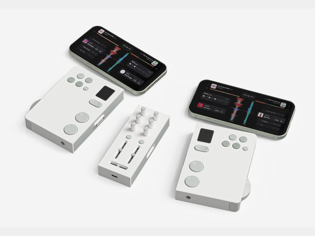
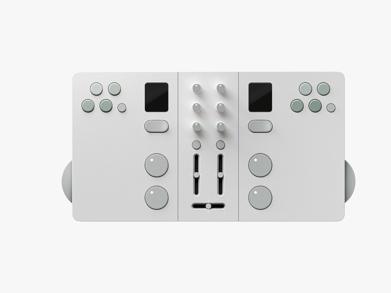
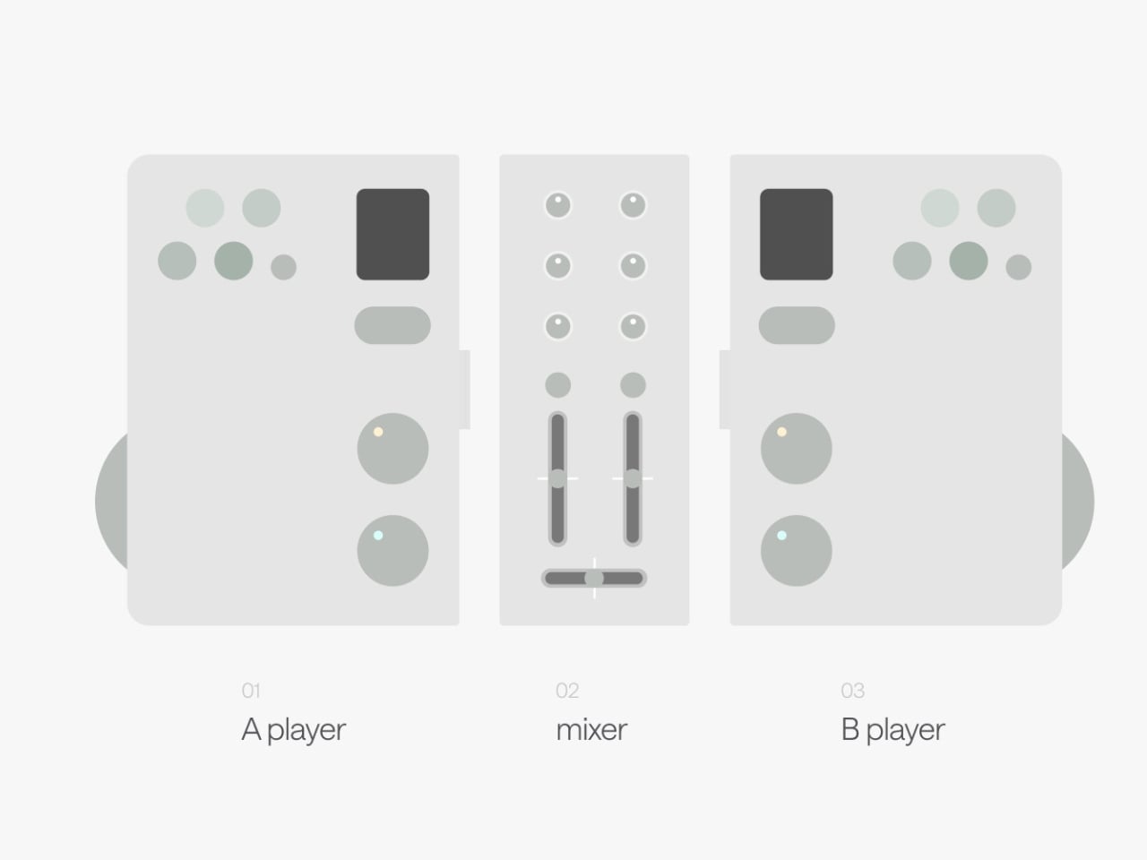
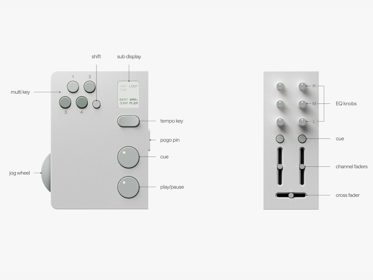
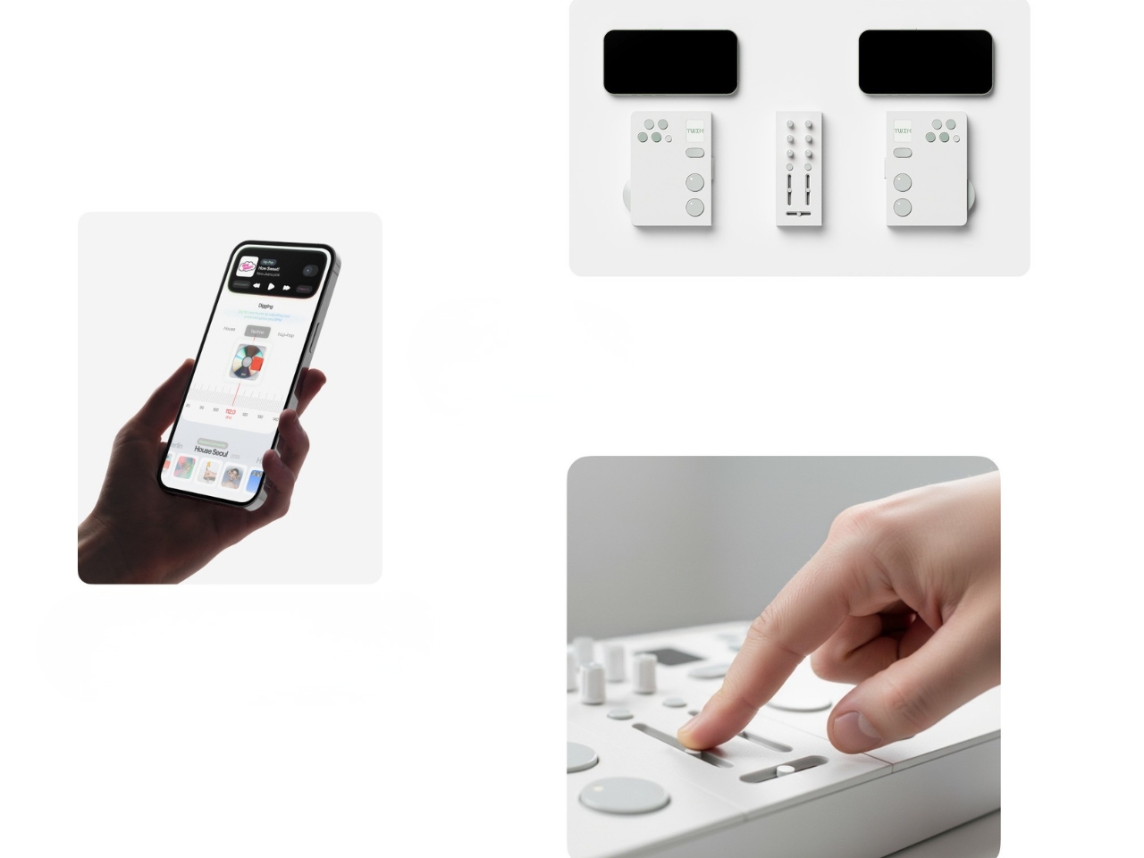
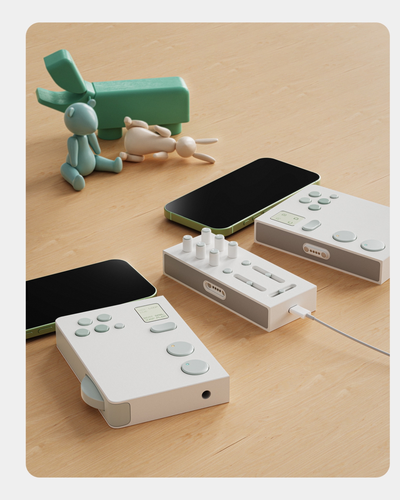
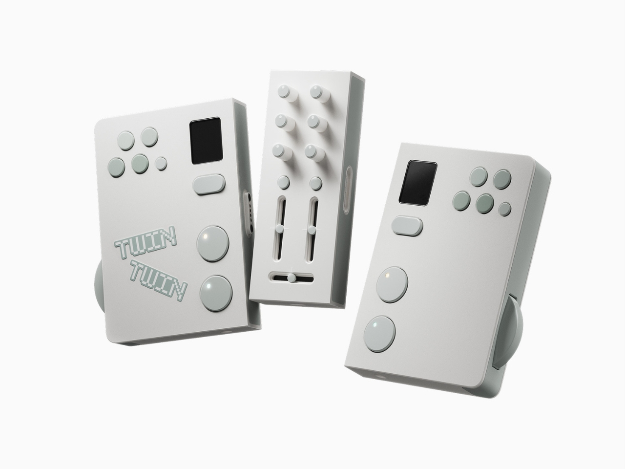
The premise is simple but kind of radical: two DJs, one device. Twin is a modular controller system made up of two mirrored player decks and a shared mixer at the center. Each player gets their own jog wheel, multi keys, sub display, tempo control, cue, play/pause, and hot cue functions. The mixer module in the middle gives both players access to EQ knobs, channel faders, and a crossfader. When connected, the whole system clicks together into one clean unit. When you want to go your separate ways, the modular sections split apart. The physical design of the hardware itself communicates the whole concept: together or apart, the choice is always yours.

Designers: Eunjung Jang, myyung kyun seo, workplace 42, kmuid graduate

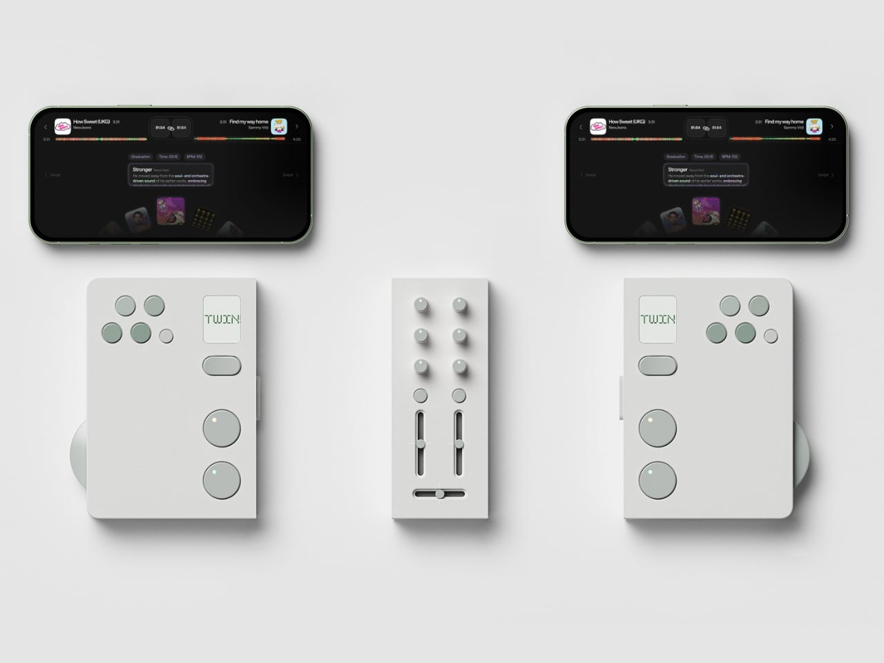
Design-wise, Twin is stunning in the way that restrained things often are. The palette is muted and deliberate, soft white surfaces with sage green accents on every button and control. It reads less like audio equipment and more like something you’d find at a thoughtful design boutique. That’s not a small thing. DJ gear has historically leaned toward the dark, chunky, and maximalist, which works for club installs but can feel genuinely intimidating on a bedroom shelf. Twin looks like it belongs in your living room, which I suspect is very much part of the point.

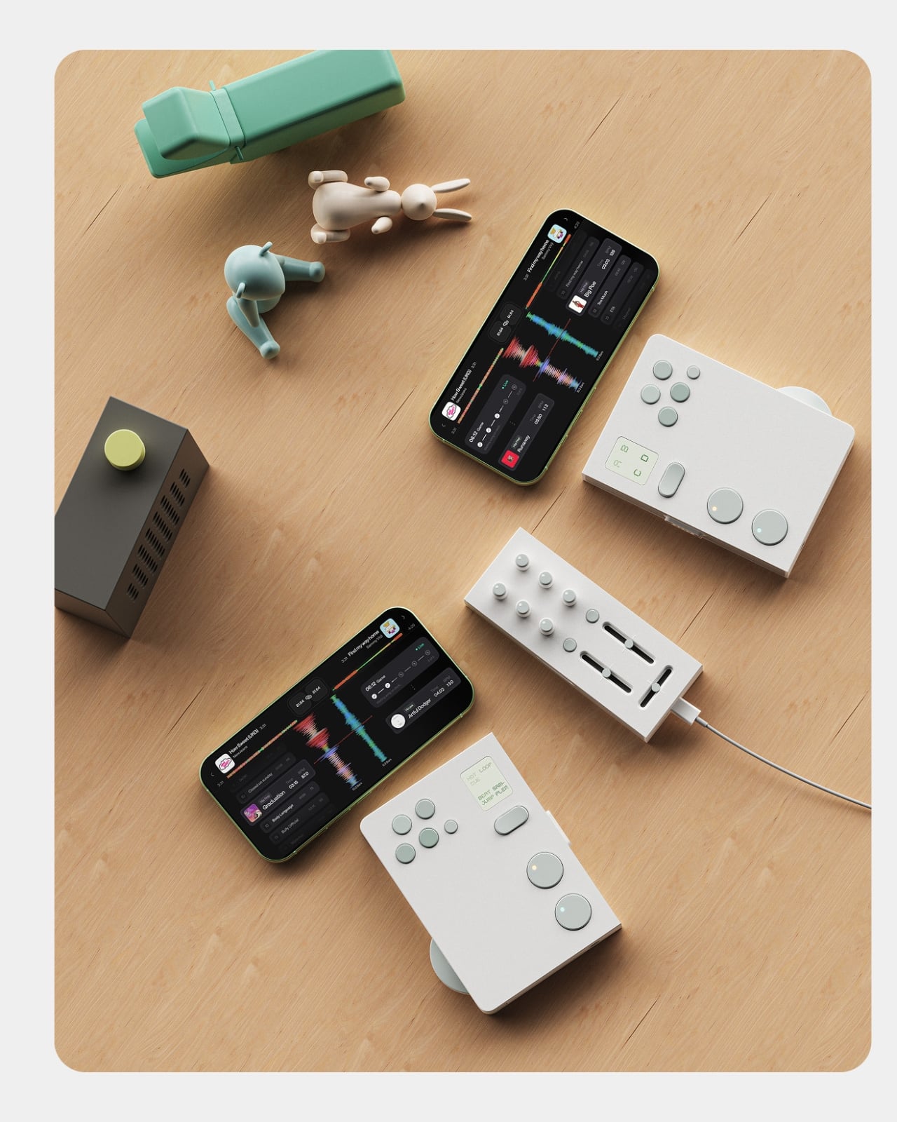
The companion app is where the concept gets more layered. It functions as a music discovery and preparation tool, letting users dig for tracks, organize mix sets, and explore music by genre or BPM. But the feature that really elevates the ecosystem is the host matching function. Once you’ve built your mix set, the app can connect you with another user whose taste overlaps with yours or even challenges it. You might find someone who plays in the same sonic neighborhood. You might find someone who pulls you somewhere you wouldn’t have gone alone. That’s a genuinely compelling proposition, because so much of what makes music culture feel alive is the exchange between people, not just the output.

The cultural observation sitting underneath all of this is sharp. The designers frame it as a shift from DJing as performance to DJing as personal culture, and that read is accurate. DJing has moved off the stage and into living rooms, rooftops, and small friend groups. It’s become a hobby the way cooking or photography is a hobby: creative, expressive, and something you naturally want to share with someone you like. Most existing hardware wasn’t designed with that in mind. The market is still dominated by solo setups built for beatmatching, not for conversation. Twin reframes the whole activity as something inherently collaborative, and the design backs that idea up at every level.

To be fair, this is still a concept. There’s no price, no release date, and no guarantee it ever makes it to production. The gap between a polished Behance presentation and a product you can actually hold in your hands is a wide one, and modular hardware with tight tolerances, seamless physical separation, and a fully realized app ecosystem is a genuinely hard engineering problem. But the idea itself is solid, and the execution at the concept stage is considered enough to take seriously. These are the kinds of concepts that tend to influence the industry even when they don’t ship.

Twin reads like a proposal for where DJ culture could go next. Not bigger, not more complicated, but more connective. Built around the belief that the best music moments happen between people, not just for them.

The post Two Players, One Set: The DJ Concept Built for Connection first appeared on Yanko Design.

Samsung’s ‘King of Sensors’: The Galaxy S27 Ultra’s Camera Just Leaked

Samsung’s ‘King of Sensors’: The Galaxy S27 Ultra’s Camera Just Leaked Samsung Galaxy S27 Ultra

The Samsung Galaxy S27 Ultra marks a pivotal moment in the evolution of Samsung’s flagship smartphones. After four generations of iterative improvements, Samsung has introduced a suite of meaningful upgrades that focus on camera innovation, ecosystem integration, and cross-platform functionality. These advancements aim to elevate your experience while addressing long-standing challenges in the premium smartphone […]

The post Samsung’s ‘King of Sensors’: The Galaxy S27 Ultra’s Camera Just Leaked appeared first on Geeky Gadgets.

Posted in Uncategorized

Ultimate Seedance 2 & Nano Banana 2 Workflow for Short Films With AI

Ultimate Seedance 2 & Nano Banana 2 Workflow for Short Films With AI Storyboard grid created in Nano Banana 2 with sequential frames that keep locations and props consistent.

AI filmmaking integrates structured processes with platforms like Seedance 2.0 and Nano Banana 2, as demonstrated by CyberJungle in their recent short film project. Seedance 2.0 enables detailed camera setups and consistent character modeling, while Nano Banana 2 emphasizes precise storyboarding and micro-shot planning. CyberJungle highlights how these platforms can be used together to handle […]

The post Ultimate Seedance 2 & Nano Banana 2 Workflow for Short Films With AI appeared first on Geeky Gadgets.

Posted in Uncategorized

Forget the iPhone 18 Pro: The $1,999 iPhone Fold (Ultra) Brings Touch ID and Apple’s Biggest Battery Ever

Forget the iPhone 18 Pro: The $1,999 iPhone Fold (Ultra) Brings Touch ID and Apple’s Biggest Battery Ever iPhone Fold

Apple is preparing to enter the foldable phone market with the highly anticipated iPhone Fold, set for release in December 2026. This device represents a significant step forward, combining advanced hardware with Apple’s renowned iOS ecosystem to deliver a premium experience. Designed for users who value both innovation and functionality, the iPhone Fold features a […]

The post Forget the iPhone 18 Pro: The $1,999 iPhone Fold (Ultra) Brings Touch ID and Apple’s Biggest Battery Ever appeared first on Geeky Gadgets.

Posted in Uncategorized

IKEA’s $7.99 Chair-Shaped Hooks Are Going Viral for the Second Time

Wall hooks are one of those home essentials that nobody really thinks about until they need them. Most are utilitarian at best and forgettable at worst, designed to hold things rather than be noticed. The category hasn’t changed much in decades, and the average hook aisle still feels like it’s catering to a warehouse. Most people end up choosing between something functional and something they’d actually want to look at.

IKEA has always been good at finding solutions for these small, overlooked problems, and the FJANTIG hooks are a pretty solid example of that. Designed by M. Mulder and M. Vinka, they’re miniature chair-shaped wall hooks that come in a pack of three and retail for just $7.99. They’ve been around for a while, but they’ve been quietly gaining momentum on social media, and it’s easy to see why.

Designers: M. Mulder, M. Vinka (IKEA)

Each of the three hooks takes the shape of a different miniature chair, with distinct backrest designs: one has vertical slats, another a solid panel, and the last a loop. They’re made from reinforced polypropylene in a matte black finish and sized just right to sit unobtrusively on any wall. The hook itself is the chair’s back, so you drape things over it just like a real chair.

They earn their keep quickly once you find the right spot. Hang a row in an entryway, and you’ve got an instant home for keys, dog leashes, and lightweight bags. Put them in a kid’s room for tiny backpacks and jackets. These hooks aren’t new and have been at IKEA for years, but social media attention is giving them an entirely unexpected second life online.

The spray-painting trick is probably the most useful thing to know about these hooks. Because they only come in black, a coat of primer followed by whatever color fits your wall can make them feel genuinely custom. You can brush-paint them for more detailed finishes, or try a wood-grain effect for a warmer, natural look. The polypropylene surface takes paint well, which opens up a surprising amount of creative options.

Designer: Victoria

At $7.99 for a set of three, they’re about as low-risk as home décor gets. Each hook measures roughly 4¾ inches tall, which means they’re genuinely miniature and won’t dominate a wall even when grouped together. Mounting hardware isn’t included, so you’ll need to pick up screws separately, and IKEA does note that the right fastener depends on your wall type. It’s worth using appropriate anchors to keep them secure.

What makes these hooks work beyond the novelty is that they stay interesting even when there’s nothing on them. That’s a rare quality for a functional object. Most hooks disappear into the wall when empty. These just sit there looking like a tiny curated display of chairs, which is probably why people keep buying multiple sets and spreading them across rooms, rather than keeping to just the one pack.

The post IKEA’s $7.99 Chair-Shaped Hooks Are Going Viral for the Second Time first appeared on Yanko Design.

Claude AI Just Learned How to Use Your Mouse & Keyboard

Claude AI Just Learned How to Use Your Mouse & Keyboard A phone and Mac showing a task moving between devices with Dispatch, keeping context without retyping details.

Claude Cowork 2.0 introduces direct computer control, a feature that allows users to assign tasks like managing files, navigating applications and drafting documents directly to the AI. According to Universe of AI, this system integrates with platforms such as Google Calendar and Slack while accommodating manual workflows when necessary. To ensure transparency and security, every […]

The post Claude AI Just Learned How to Use Your Mouse & Keyboard appeared first on Geeky Gadgets.

Posted in Uncategorized

iPhone 18 Pro Leak: The Variable Aperture Upgrade We’ve Been Waiting For

iPhone 18 Pro Leak: The Variable Aperture Upgrade We’ve Been Waiting For Diagram showing iPhone 18 Pro variable aperture blades opening and closing to change light and depth.

Apple is poised to elevate smartphone photography with the upcoming iPhone 18 Pro and Pro Max, addressing a critical challenge: low-light zoom performance. By integrating a variable aperture system and a larger aperture telephoto lens, these Pro models promise significant advancements in real-world photography, particularly in dimly lit environments. This marks a deliberate and strategic […]

The post iPhone 18 Pro Leak: The Variable Aperture Upgrade We’ve Been Waiting For appeared first on Geeky Gadgets.

Posted in Uncategorized

How to use Apple’s Playlist Playground to make AI-generated mixes

With the release of iOS 26.4, Apple Music's Playlist Playground can now generate playlists with the help of AI. Best of all, you don't need an Apple Intelligence-capable iPhone to take advantage of the new feature. As long as you're a US Apple Music subscriber with your language set to English, you can start using Playlist Playground right now. Here's how to get started. 

A pair of screenshots showing off Apple Music's new Playlist Playground feature.
Igor Bonifacic for Engadget

For the time being, there are two ways to access Playlist Playground. For the time being, the company is highlighting the feature within the "Top Picks for You" section of Apple Music's Home tab. If you don't see a shortcut there, Apple integrated the feature into the app's existing playlist creation tool. Just tap the new icon found in the Library tab. If you're new to Apple Music, the flow looks like this: 

  1. Open Apple Music. 

  2. Navigate to the "Library" tab.

  3. Tap the playlist creation button.

  4. Write a prompt describing the mood or style of music you want to hear. 

To help people get started, Apple provides a selection of sample prompts. One pro tip: it's possible to use metadata in conjunction with Playlist Playground. For example, after Apple Music generates a playlist, you can tell Apple's model to edit it by removing any songs released before 2016. Of course, you're also free to add and remove songs manually as you please. 

Once you're happy with your new playlist, Apple Music treats all Playlist Playground mixes like it does any other playlist, meaning you can save it to your Library, download for offline playback, play it from your Apple Watch and share it with friends and invite them to add songs.   

As of the writing of this article, Playlist Playground is a beta release only available to Apple Music subscribers in the US with their preferred language set to English. An iPhone or iPad running iOS 26.4, or an Apple Vision headset running visionOS 26.4 is also required.     

As Apple releases the feature in more countries and languages, we'll update this article. 

Yes, if you use Apple Music on Android, Playlist Playground is available there too.  

When generating mixes, Playlist Playground pulls from both trending data and your personal listening history. Along with other AI-powered Apple Music features like AutoMix and Lyrics Translation, Playlist Playground runs as part of the Apple Music service. That’s one of the reasons Apple can offer it outside of Apple Intelligence-capable devices. 


This article originally appeared on Engadget at https://www.engadget.com/entertainment/music/how-to-use-apples-playlist-playground-to-make-ai-generated-mixes-134500610.html?src=rss

HBO Max finally launches in the UK and Ireland

It’s been a long wait, but HBO Max has finally arrived in the UK and Ireland, rounding off the streaming service’s European expansion. Oscar-winners One Battle After Another and Sinners are both available to stream at launch, alongside Max Original shows like The Pitt. Season three of Euphoria arrives in April, and HBO Max is also home to mega-franchises like The Lord of the Rings and Harry Potter, both of which are celebrating their 25th anniversaries in 2026.

Starting today, March 26, UK audiences can choose from three plans. Basic with Ads costs £5 per month, and offers all HBO shows and select Warner Bros. movies at 1080p, with movies that first stream on HBO Max after their theatrical release excluded. Then there's Standard with Ads for £6 per month, which includes those straight-from-theaters releases and 30 downloads at the same resolution. Both can stream on two devices at a time.

For an ad-free experience you can purchase a Standard or Premium plan. The former has all titles available on two devices, up to 30 downloads and, obviously no ads. Finally, the most expensive £15 per month Premium plan allows streaming on four devices in up to 4K Ultra HD with Dolby Atmos. You also get 100 offline downloads on this tier. 

Eligible Sky TV customers will automatically have HBO Basic with Ads rolled into their packages at no extra cost, thanks to an expanded partnership between Sky and Warner Bros. Discovery. This extends to NOW Entertainment subscribers, who will find HBO Max integrated into the NOW app. HBO Max is also now home to TNT Sports in the UK, which streams over 50 matches in the Premier League, as well as being home to the UEFA Champions League and various other sporting competitions, including MotoGP and the Tour de France.

HBO Max launches in the UK as Warner Bros Discovery sets a date for the shareholder vote on its merger with Paramount Skydance, which was finally agreed last month. Netflix was paid a $2.8 billion fee for breaking up its initial well-documented deal to buy the historic studio.

This article originally appeared on Engadget at https://www.engadget.com/entertainment/streaming/hbo-max-finally-launches-in-the-uk-and-ireland-133406342.html?src=rss

Tomas Kral Made a Ruler You Can’t Quite Read on Purpose

Pick up the WAY ruler and the first thing you notice is that it feels exactly right. It’s small, made from anodized aluminum, and has the kind of weight and finish that signals intention without announcing itself. It’s the sort of object that sits comfortably in a shirt pocket or on the edge of a desk and looks like it belongs in both places. Then you look closer at the markings, and something shifts.

The inscriptions on the WAY don’t run in a clean, predictable line the way ruler markings are supposed to. They wind. They curve and drift across the surface of the aluminum like a path traced through a landscape, referencing, quite literally, the idea of small winding roads and the wandering nature of travel and discovery. The numbers and measurements are there, engraved directly into the material with digital precision, but they’re arranged in a way that asks you to slow down and actually read them rather than glance and move on. It’s legible. Just not immediately.

Designer: Tomas Kral

The engraving itself is worth paying attention to. Kral chose to cut the inscriptions directly into the anodized aluminum rather than printing or applying them as a secondary layer. That decision gives the markings a permanence and a tactility that you don’t get with most production objects at this scale. You can feel the grooves if you run a finger across the surface. The graphic quality of the lettering is considered without being decorative for its own sake. It reads as design that knows exactly what it’s doing, which is what makes the playfulness land rather than feel arbitrary.

The object is small enough to be considered an accessory as much as a tool. Kral has always worked at a scale that pays attention to how things actually live in your hands and in your space, and the WAY is consistent with that. It doesn’t try to be a statement piece in the way that some design objects do, where the visual drama is the whole point. The WAY is quieter than that. The drama is embedded in the detail, in that moment when you realize the markings are doing something unexpected and you have to orient yourself before you can use it.

That slight disorientation is the concept, and it’s a sharp one. There’s a real tension running through modern product design right now, one where the drive to make something visually striking starts to work against the thing it was actually built to do. We’ve all used something that looked incredible but made us work harder than we needed to. Packaging that’s beautiful but impossible to open. Interfaces that prioritize visual elegance over intuitive use. Apps designed to delight that end up frustrating. The WAY ruler doesn’t rail against any of that. It just holds up a small, well-made mirror to it. It’s more of a wink than a manifesto.

The difference between a provocation and a critique matters here. Kral isn’t punishing you for picking up the WAY. The experience of using it is still pleasant. The aluminum feels considered, the engraving is precise, and the object as a whole is genuinely lovely. He’s not making something bad on purpose to prove a point. He’s making something that’s slightly impractical in a very deliberate, very elegant way, and letting you sit with that paradox.

And he followed through on it. The WAY isn’t a prototype or a one-off shown at a design fair and then retired to a shelf. Kral produced a batch and sells them directly through his studio’s website. That matters. It means the object gets to exist in the world the way all good design should, in someone’s hand, on someone’s desk, doing its quiet, considered, slightly inconvenient thing in real life.

At a time when so much product design either chases pure utility or drifts so far toward aesthetics that it forgets what it was originally supposed to do, the WAY ruler manages to be a little bit about both. It’s funny, it’s beautiful, and it makes you think. A ruler, of all things. Leave it to Tomas Kral.

The post Tomas Kral Made a Ruler You Can’t Quite Read on Purpose first appeared on Yanko Design.