Muuto’s Minimalist Chair Hides A Tiny Heart In Its Details

There are few symbols more familiar than the heart. It appears everywhere, from children’s drawings to luxury branding, which is perhaps why designers rarely touch it. The shape carries so much cultural baggage that it can quickly slip into sentimentality.

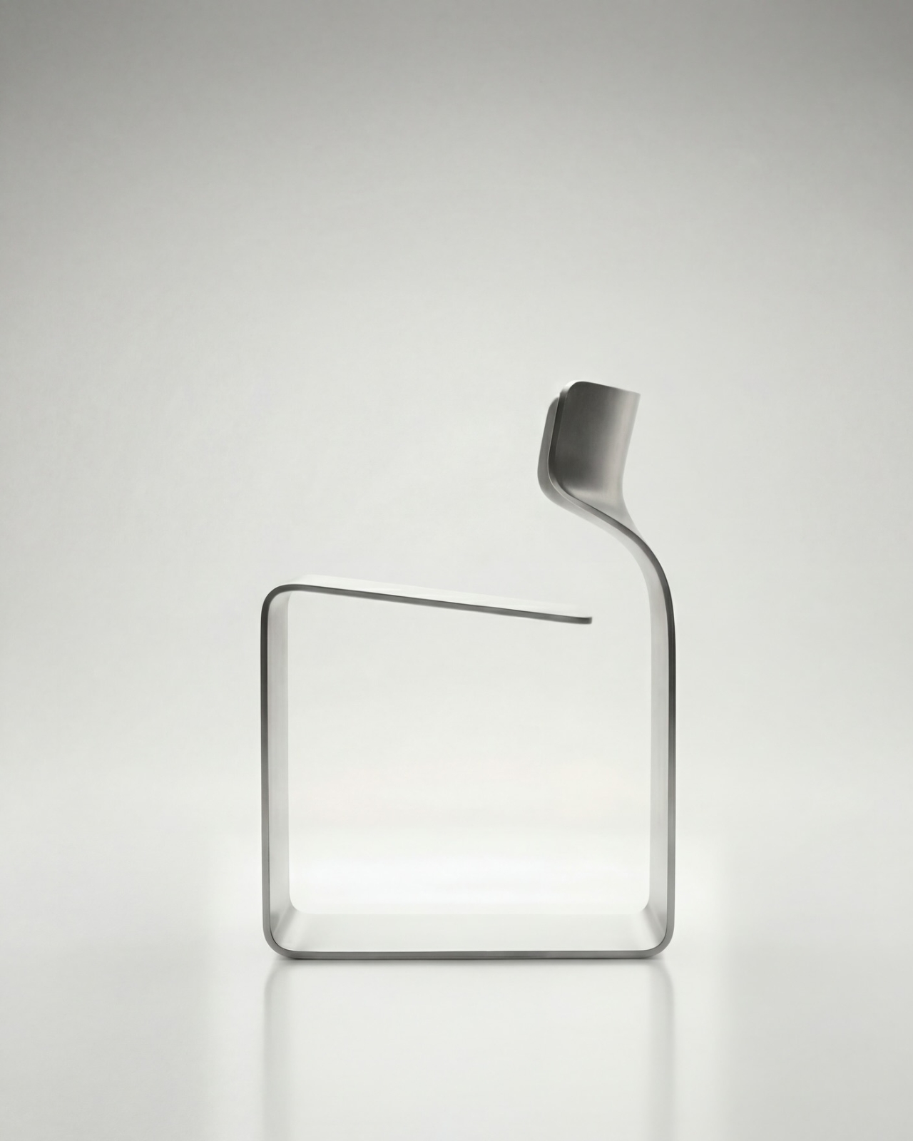
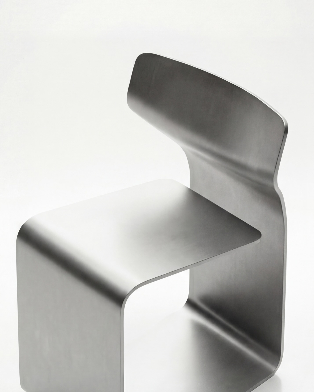
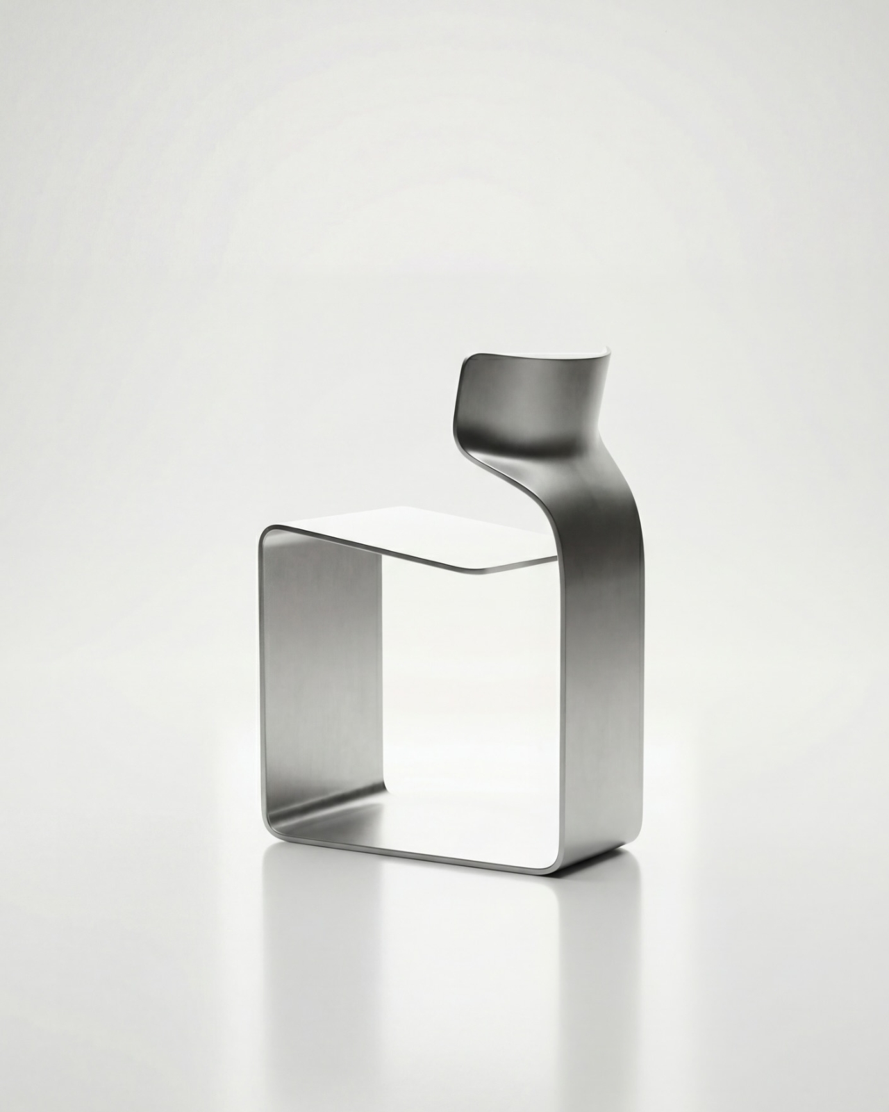
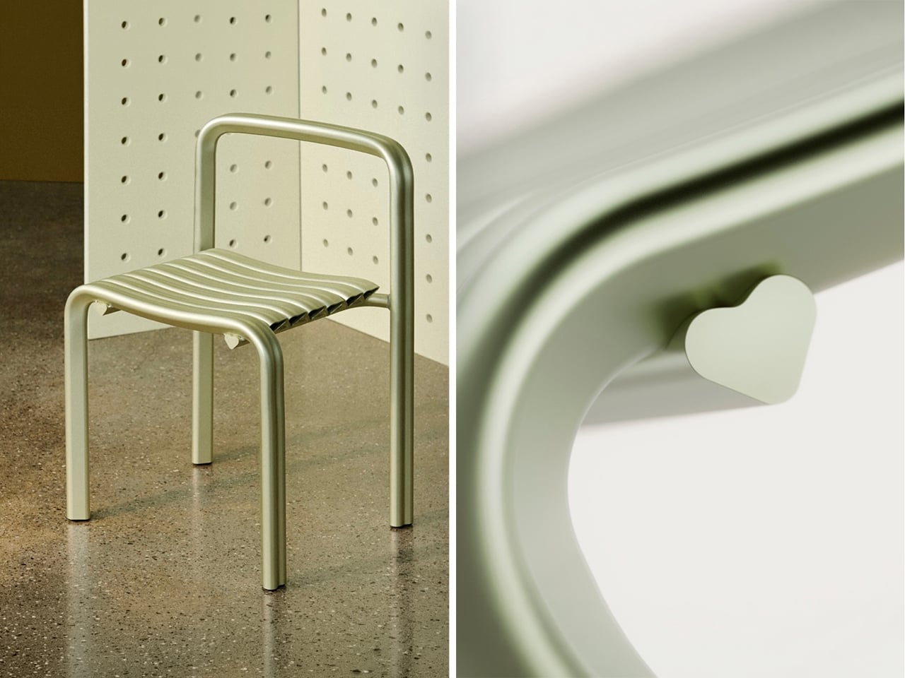
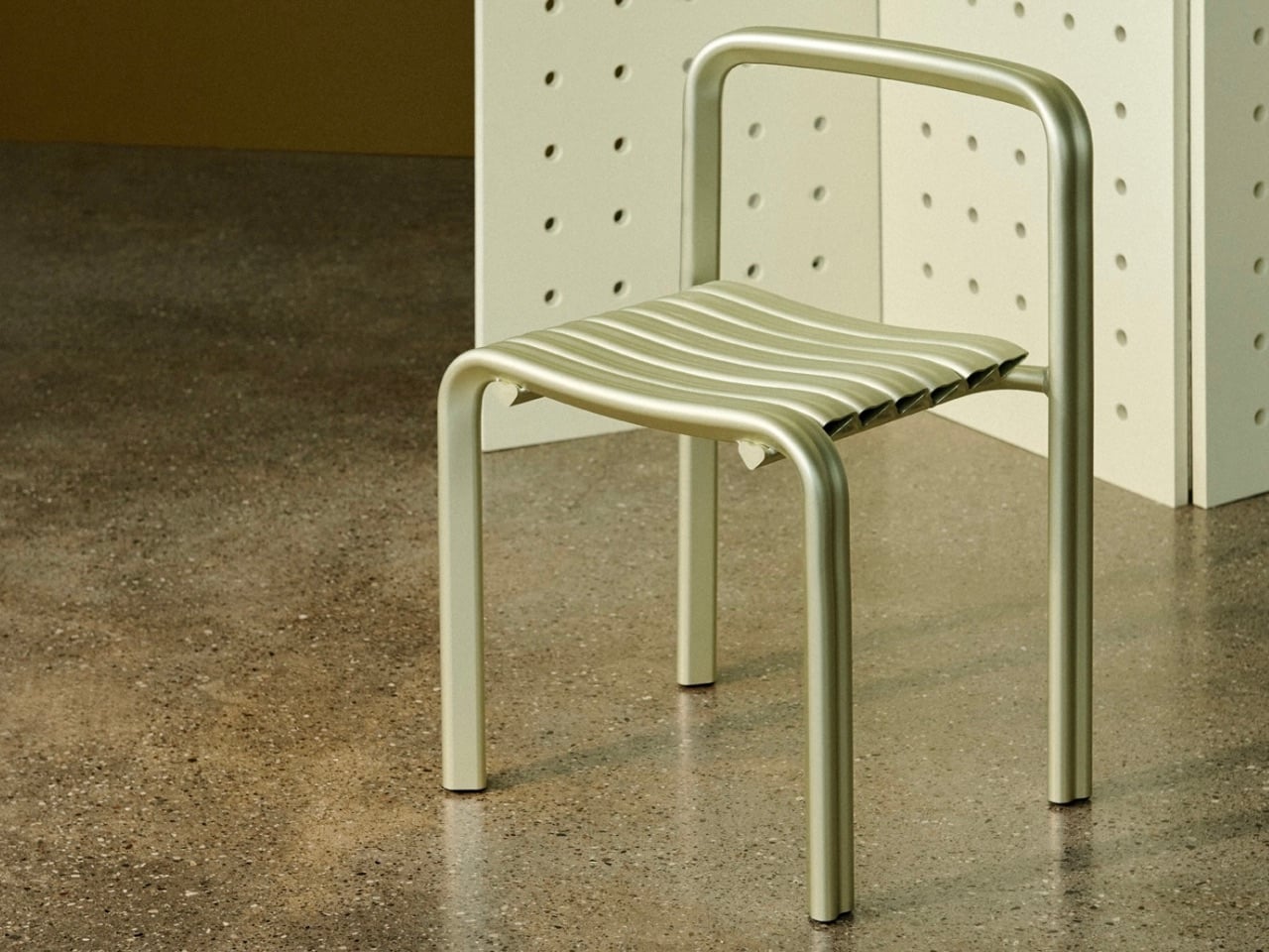
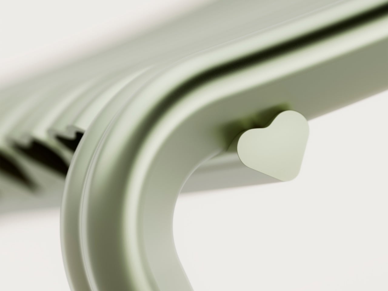
For its twentieth anniversary, Danish furniture brand Muuto decided to take that risk! Created with Copenhagen studio Spacon, the *Close to Heart* chair debuts during 3 Days of Design as part of Muuto’s anniversary programme, *Next Chapters in Scandinavian Design*. Limited to 150 pieces and produced in Denmark from extruded aluminium, the chair transforms the heart from a graphic symbol into a structural system. Every profile used to construct the chair is shaped like a heart.
Designer: Muuto and Spacon

The project began with a clear direction from Muuto, which was to avoid nostalgia. Rather than celebrating the past, the anniversary was framed as an opportunity to explore where Scandinavian design might go next. For Spacon partners Nikoline Dyrup Carlsen, Malene Hvidt, and Svend Jacob Pedersen, that conversation led unexpectedly to the heart.

What attracted the designers was not its symbolism alone, but its geometry. A heart combines two very different formal qualities within a single shape. One side is defined by a sharp triangular point, while the other is made up of generous curves. It is a shape that feels simple at first glance, yet becomes surprisingly intricate when examined closely.
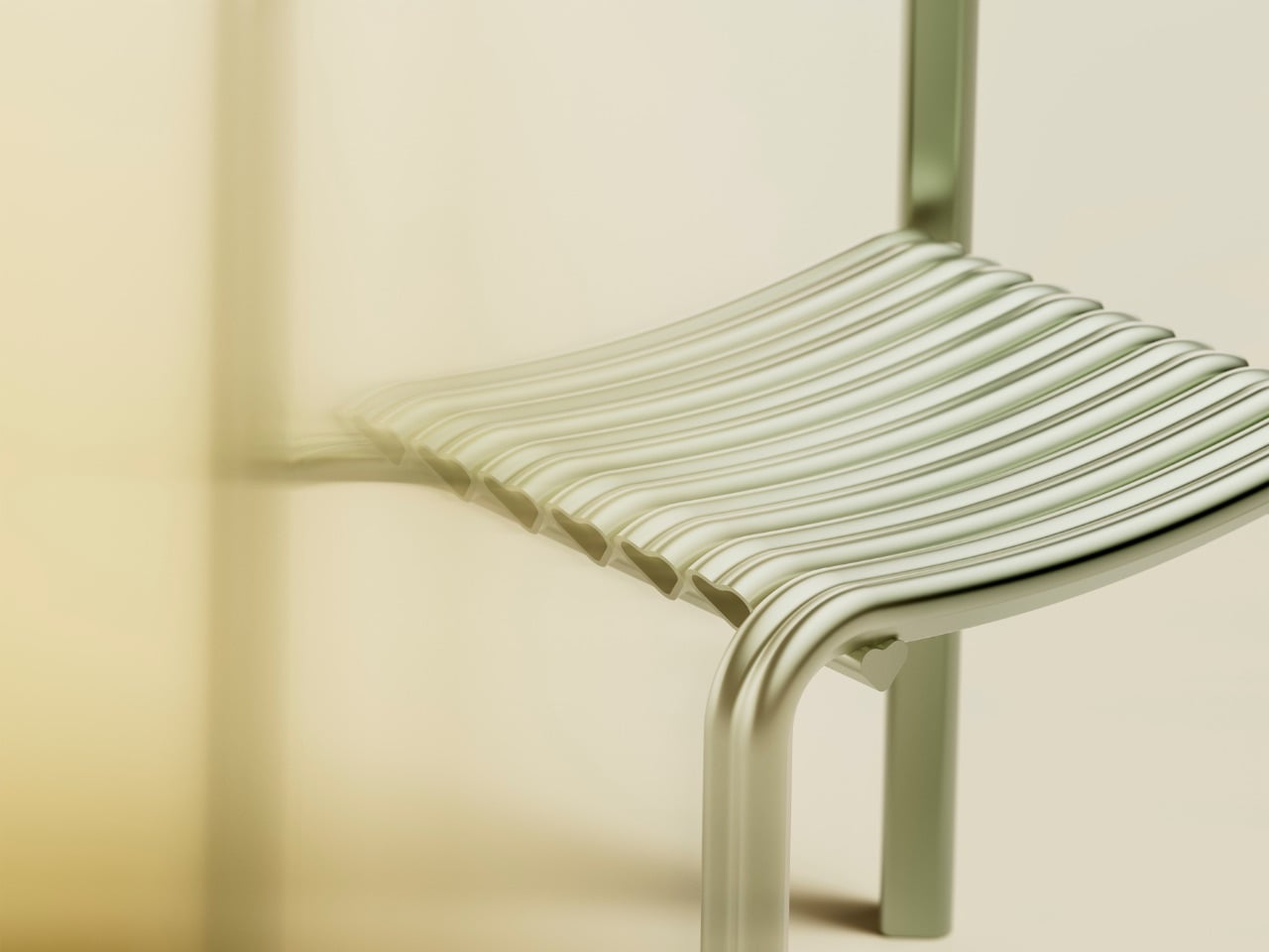
That balance between softness and precision carries through the entire chair. From a distance, the heart references are obvious. Up close, they begin to disappear into the construction, becoming part of the chair’s proportions, joints, and structure rather than decorative details.

Material selection played an equally important role. Extruded aluminium is typically associated with engineering and manufacturing efficiency, making it an unusual choice for an object built around one of culture’s most emotionally loaded symbols. Yet the designers found that the material’s characteristics aligned naturally with the concept. Its light weight and ability to accommodate smooth curves allowed the heart profile to be repeated throughout the chair without becoming visually heavy.

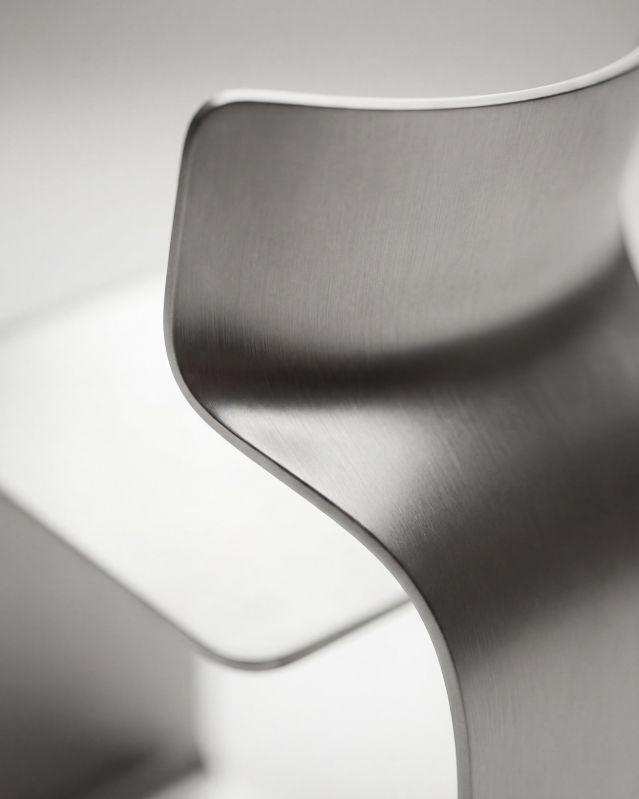
The anodized finish further softens the material’s appearance. Instead of presenting aluminium as hard or industrial, the treatment gives the surface a subtle depth that reacts to changing light throughout the day. Reflections become muted, colors from the surrounding environment are absorbed into the surface, and the material takes on a quieter presence.
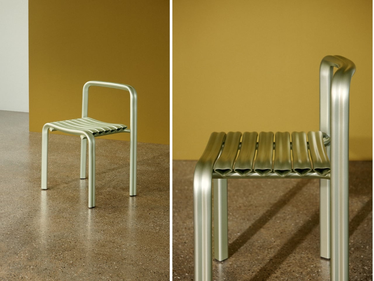
The chair sits within a broader collaboration between Muuto and Spacon centred on the relationship between technical systems and emotional experience. Muuto’s history is rooted in innovation and manufacturing development, while Spacon’s work frequently crosses between architecture, interiors, art, and craft. Close to Heart brings those interests together in a single object.

That intersection feels particularly relevant to how Scandinavian design is evolving today. The defining values remain familiar: experimentation, material honesty, and careful craftsmanship. What is changing is the willingness to embrace stronger narratives, cultural references, and emotional expression without treating them as separate from function.
The heart, surprisingly, proved to be a useful vehicle for that discussion. What could easily have become a novelty instead became a study in proportion, material, and manufacturing. The symbolism is impossible to ignore, yet the chair succeeds because it never relies on symbolism alone.

For Muuto and Spacon, the anniversary project is less about celebrating twenty years of design history than testing where design can go next. If Close to Heart is any indication, that future may involve a little more emotion, a little more playfulness, and a willingness to find sophistication in places designers have often overlooked.

The post Muuto’s Minimalist Chair Hides A Tiny Heart In Its Details first appeared on Yanko Design.
The Lounge Chair That Has No Welds, No Joints, and No Legs – Just One Bent Sheet of Metal

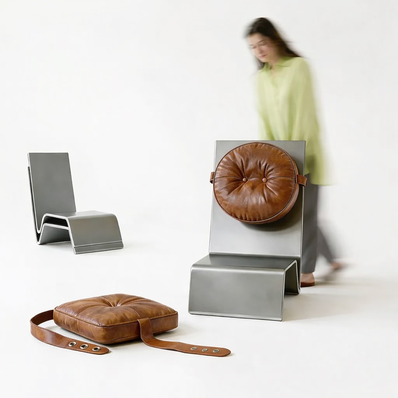
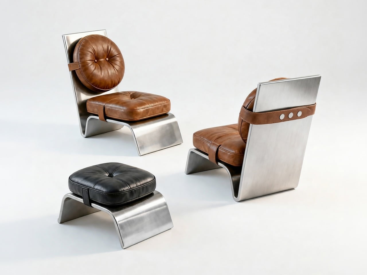
Sheet metal has been a furniture material for decades, but it almost always gets hidden. It becomes the internal skeleton, the underframe, the bracket buried beneath upholstery or lacquer. The design conversation rarely starts with the metal. Deniz Özdemir’s Arc One, an A’ Design Award-winning lounge chair developed in Istanbul between October 2025 and February 2026, turns that convention completely around, making the sheet metal the entire visible statement and letting the leather cushions play second fiddle to the structural drama underneath them.

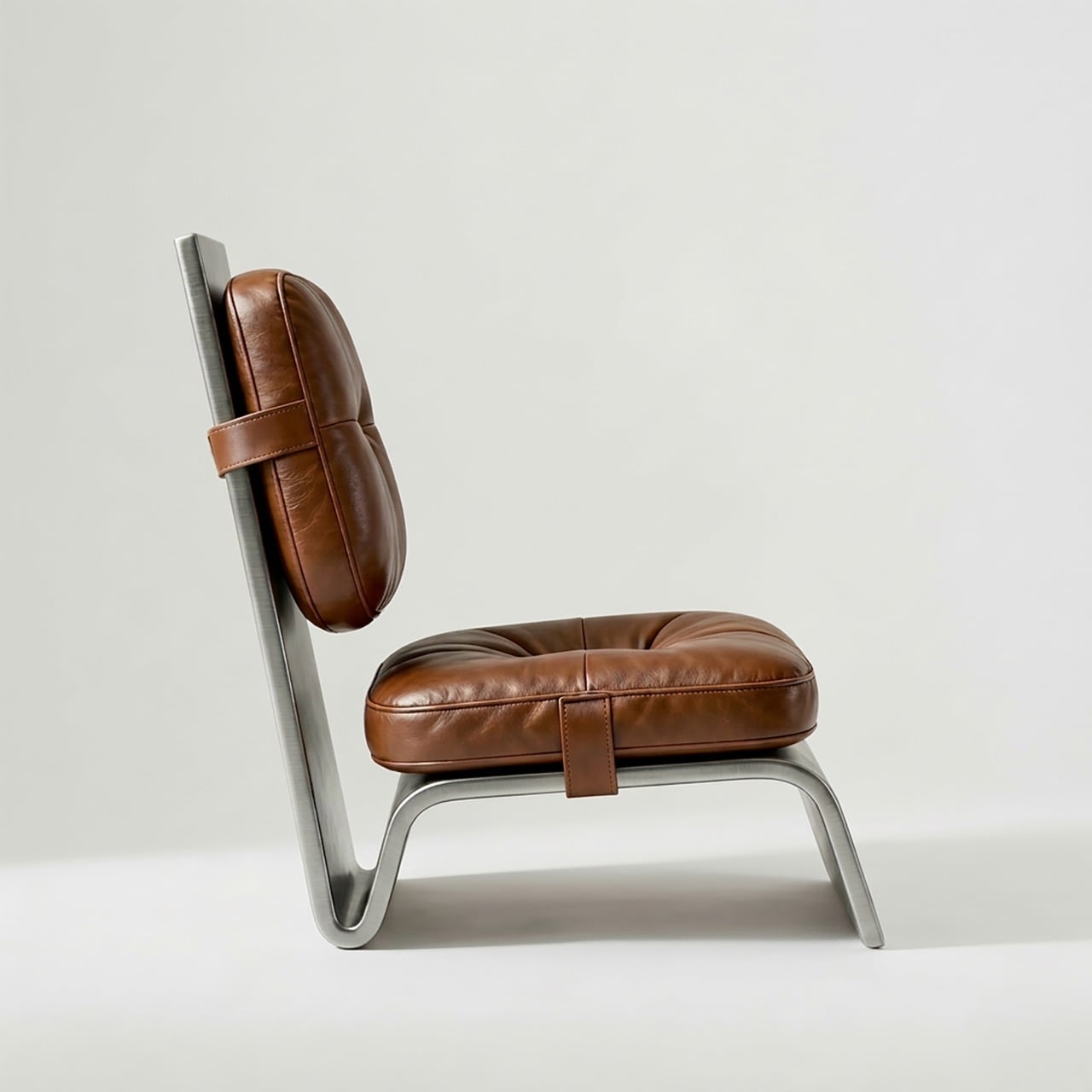
From the side profile, the Arc One reads as a single continuous gesture, one surface that sweeps from backrest plane through seat pan and curls forward into the base. No legs. No frame. No secondary structure of any kind. The bent metal does all of it simultaneously, and Özdemir arrived at that form using only laser cutting and CNC bending, two processes that leave no room for the kind of hand-finishing that usually disguises manufacturing decisions in premium furniture.

Designer: Deniz Özdemir

Most lounge chairs are assemblies, a frame joined to a seat shell joined to a base, each junction representing a production step, a potential failure point, and a logistics complication. Arc One eliminates all of that. The single-piece body requires no welding and no mechanical fastening, which means the bare frames stack flat for storage and transport, a logistical advantage that most furniture at this aesthetic level completely ignores. Özdemir’s research documentation notes that this directly reduces both production complexity and logistics volume, and looking at the photographs of the bare stacked frames, the practicality of that claim is immediately visible.

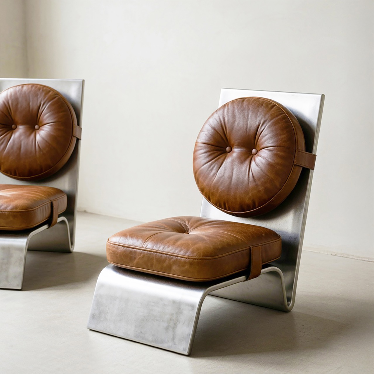
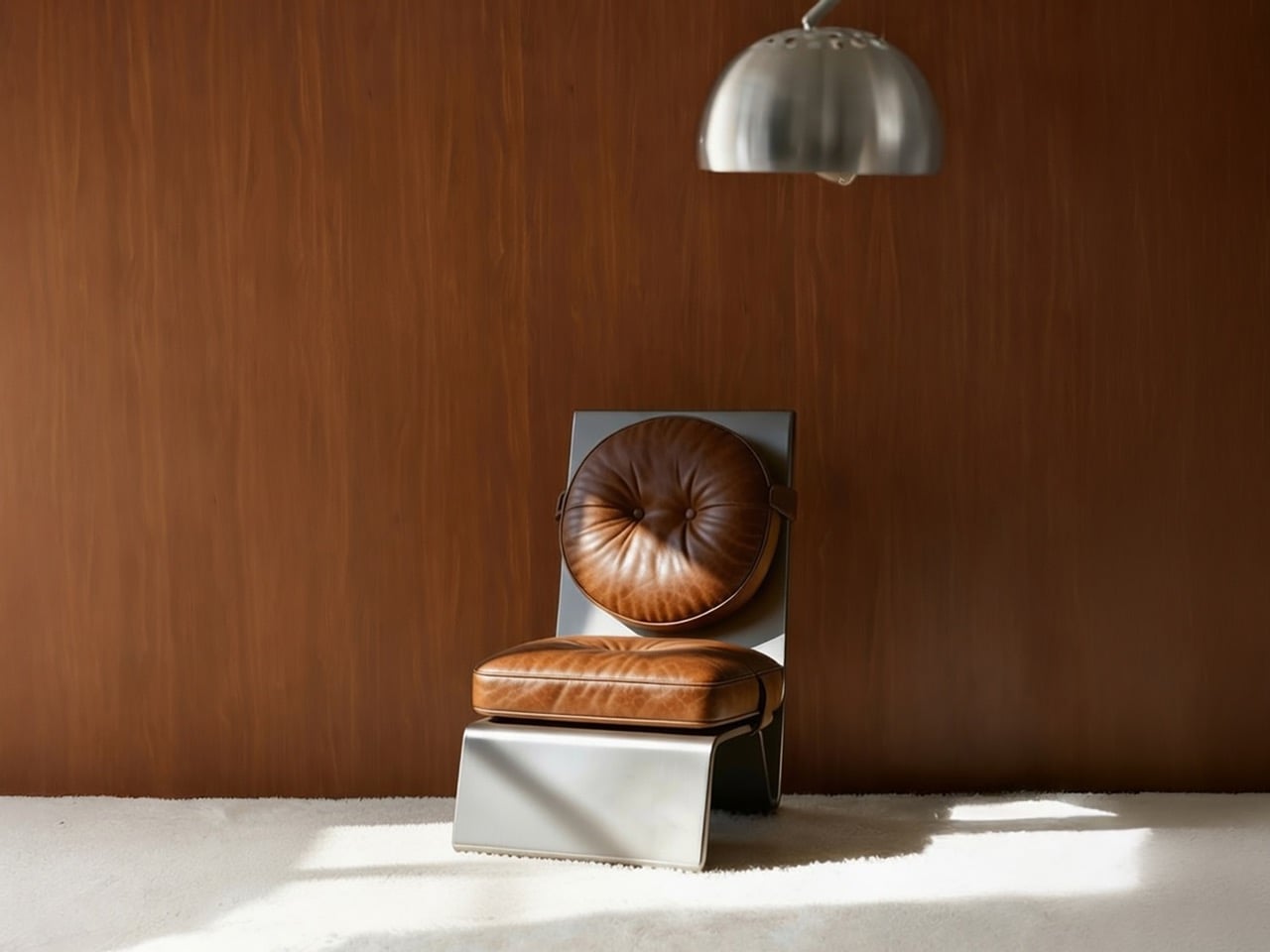
A round tufted back cushion and a square tufted seat cushion attach to the metal body via leather straps with snap fasteners, hardware that belongs more in a saddle shop than a furniture atelier. The strap details are visible and intentional, running horizontally across the metal surface with small riveted or snapped connections that read as honest joinery rather than disguised engineering. Remove the cushions entirely, and the bare metal frame is a genuinely severe object. Reattach them, and the warmth is immediate and complete, all without the metal structure yielding anything of its industrial character.

The cognac brown of the tufted leather against brushed raw metal is a pairing with serious mid-century pedigree, recalling the material confidence of Osvaldo Borsani’s work from the 1950s and 60s, where Italian designers routinely married industrial metal frames with generous upholstery without apologizing for either. The Arc One’s ottoman extends the family naturally, same bent-base logic scaled down, topped with a square tufted cushion that mirrors the seat in a different colorway.

At 650mm wide, 750mm deep, and 850mm tall, the proportions sit comfortably within lounge chair conventions without disappearing into them. The replaceable upholstery is the long-game move that most furniture at this price positioning forgets to make. Leather wears, tastes change, and a chair whose cushions can be swapped out for a different color or material is a chair with a genuinely extended lifespan. That decision transforms the Arc One from a sculptural object with a fixed personality into something closer to a platform.

The post The Lounge Chair That Has No Welds, No Joints, and No Legs – Just One Bent Sheet of Metal first appeared on Yanko Design.

This Chair Turns Fragmented Structure Into Ergonomic Support

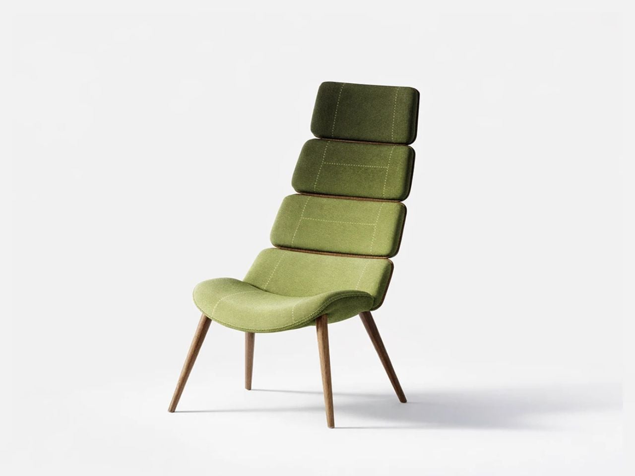
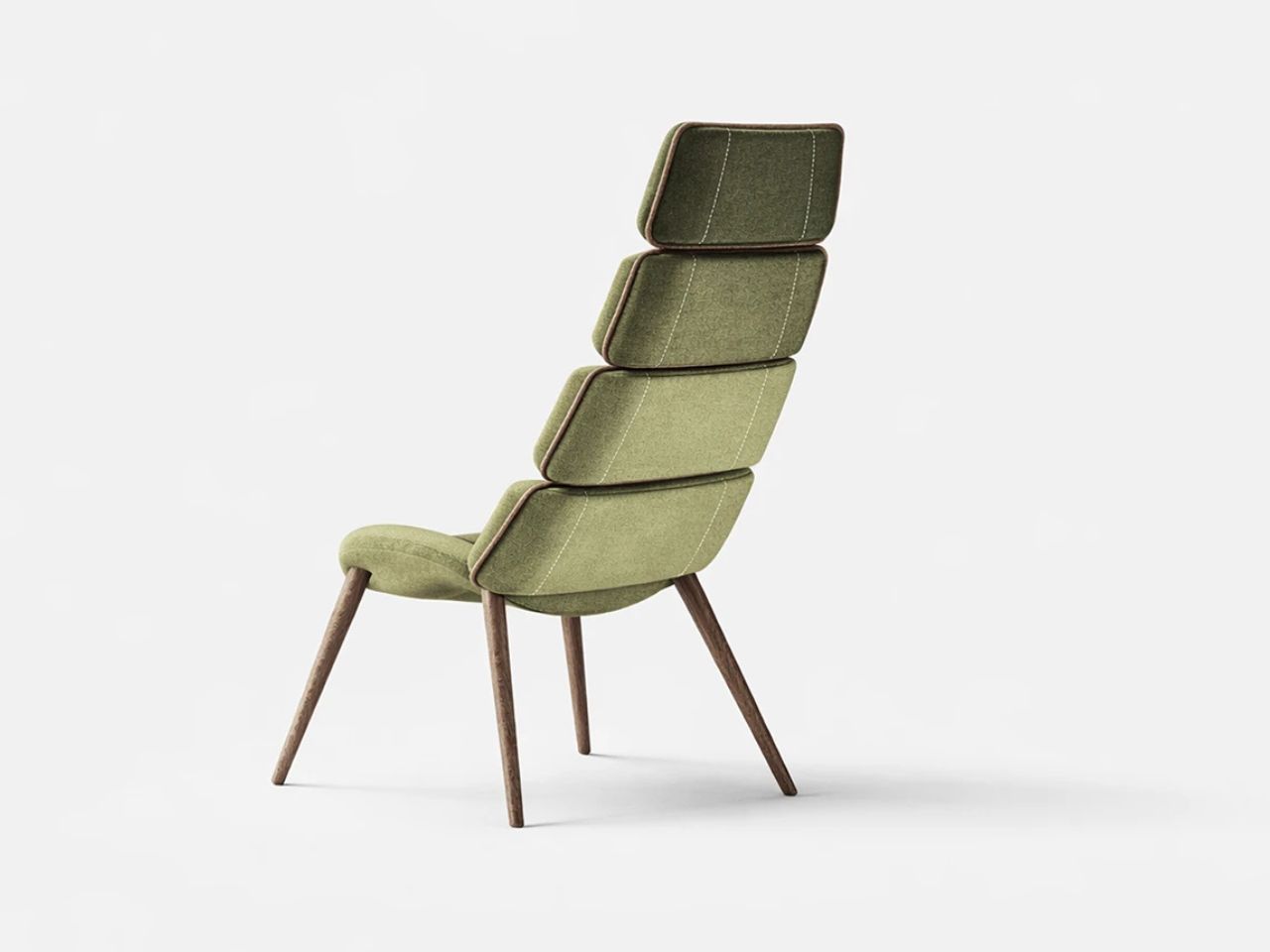
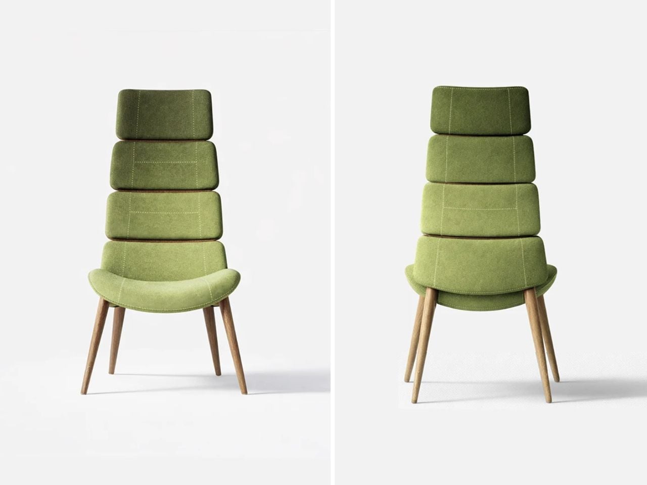
Aerise is a seating concept that reimagines how structure, support, and movement can coexist within furniture design. Seating has long followed rigid forms and familiar construction systems, where stability is often achieved through heavy frames and static surfaces. Aerise challenges this conventional approach by introducing segmentation as a more fluid and adaptive method of support. Instead of treating seating as a singular fixed structure, the project explores how interconnected elements can work together to create a system that feels lighter, more responsive, and visually dynamic while still maintaining ergonomic comfort and stability.

The project began with an exploration into the relationship between structure and the human body. Seating is one of the most familiar objects in everyday life, yet its design is deeply influenced by posture, proportion, material behavior, and the way the body interacts with support systems over extended periods of time. Aerise investigates what happens when structure is no longer viewed as a rigid shell, but rather as a collection of coordinated parts working together in balance. This shift transforms the chair from a static object into a more fluid system that adapts visually and functionally to the body’s natural posture.

Designer: Dhruvisha Shah

The primary inspiration for the project came from the dragonfly and the unique characteristics of its segmented exoskeleton. Despite its lightweight form, the dragonfly demonstrates exceptional control, precision, and agility in movement. Its body is composed of interconnected sections that provide both strength and flexibility simultaneously, allowing the insect to move with remarkable balance and efficiency. Aerise draws from these principles and translates them into a seating system that embodies similar qualities of controlled support and visual lightness.

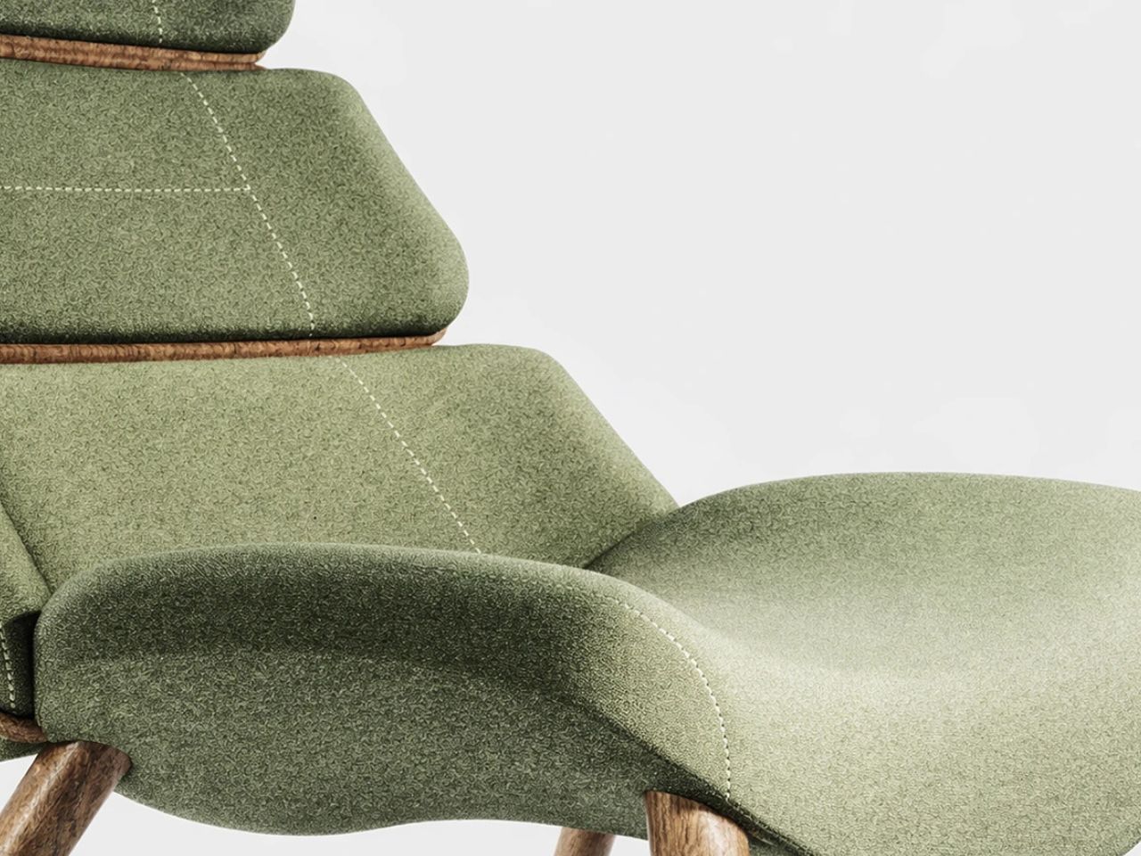
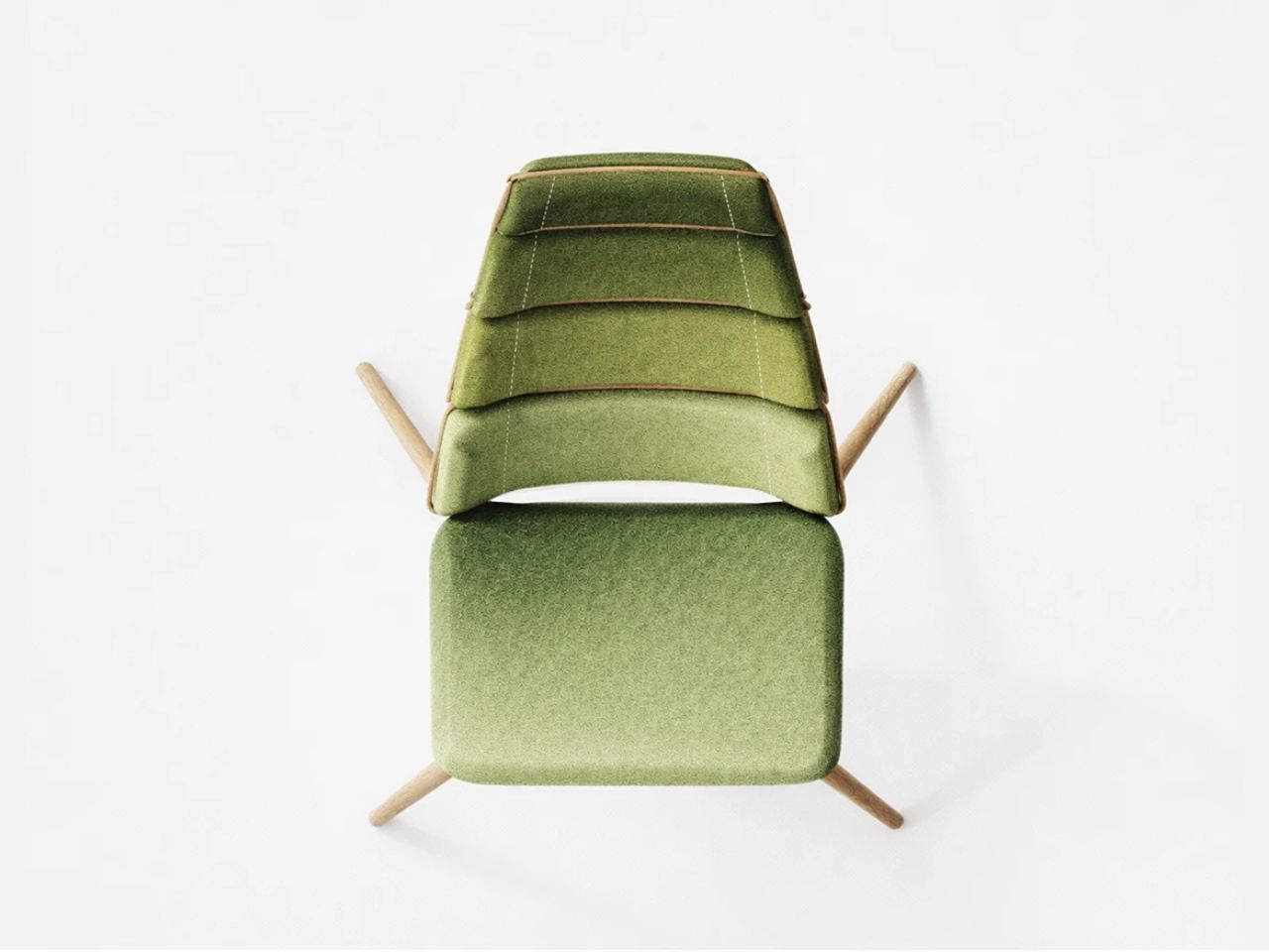
This inspiration is most clearly reflected in the chair’s segmented backrest. Rather than relying on a continuous solid surface, the backrest is divided into repeated modular elements that function together as a cohesive support system. Each segment corresponds to different zones of the spine, creating targeted areas of support while collectively forming a fluid and uninterrupted silhouette. This modular arrangement introduces a rhythmic visual language that echoes the structure of the dragonfly’s body while also enhancing ergonomic responsiveness.

The flowing geometry of the chair further reinforces this sense of continuity and movement. Soft curves guide the body naturally into a reclined posture, allowing the seating experience to feel intuitive and relaxed rather than forced or rigid. The reclined angle was carefully considered to balance comfort with structural integrity, ensuring that the chair maintains a stable presence while still appearing visually lightweight. This sense of suspension is amplified by the minimal framework and elevated form, giving the chair an almost floating quality despite its structural strength.

The leg positioning also plays an important role in translating the dragonfly’s balanced alignment into furniture form. Angled supports create stability while maintaining a sense of openness beneath the chair, preventing the structure from appearing heavy or grounded. These subtle details contribute to the overall perception of lightness and precision that defines Aerise as a concept.

At its core, Aerise explores segmentation not simply as an aesthetic gesture, but as a functional support strategy. Each individual element contributes independently to the user’s comfort while simultaneously operating as part of a larger interconnected system. The chair demonstrates how fragmented structures can still create cohesion, and how flexibility and stability do not need to exist in opposition. Through this approach, Aerise proposes a new perspective on seating design, one where support is adaptive, structure feels fluid, and visual lightness becomes an integral part of the experience rather than just a stylistic choice.

By drawing from the natural intelligence of biological systems, Aerise transforms the principles of segmentation, balance, and exoskeletal construction into a refined seating concept that feels both contemporary and intuitive. It is an exploration of how nature-inspired structures can influence not only the appearance of furniture, but also the way it supports and interacts with the human body.

The post This Chair Turns Fragmented Structure Into Ergonomic Support first appeared on Yanko Design.

The Furniture That Grows Like a Fractal

If you’ve ever watched a fern unfurl or zoomed into the edge of a snowflake, you already understand fractals, even if you’ve never called them that. They’re the patterns nature repeats at every scale, small details that echo the whole. Xubai Li took that idea and built furniture out of it, and the result is one of the more quietly radical pieces of design I’ve come across in a while.

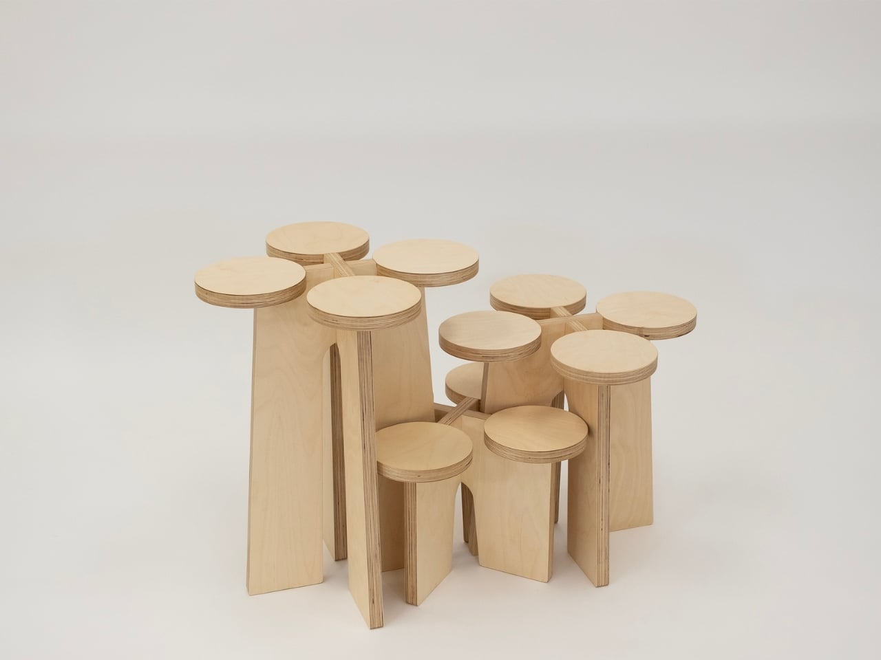
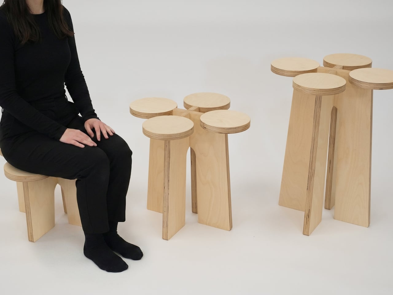
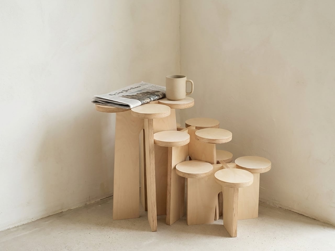
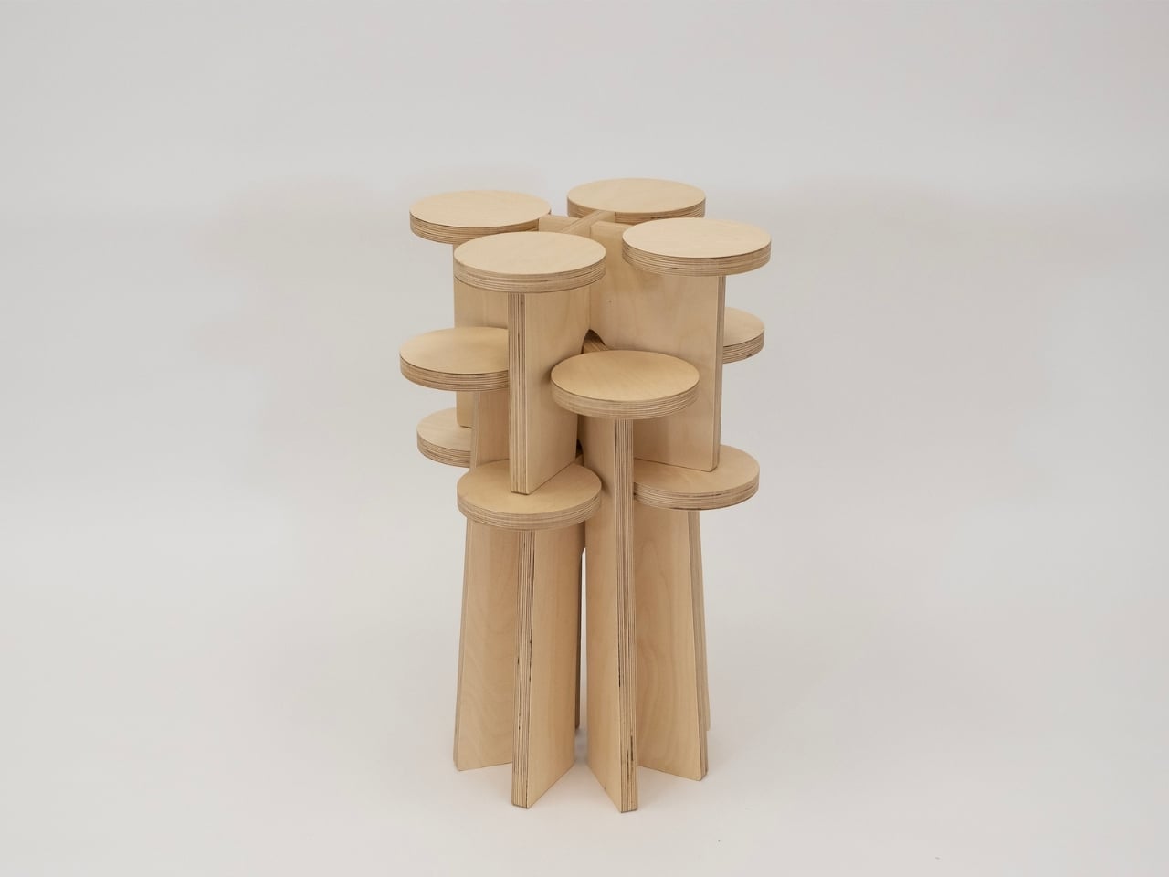
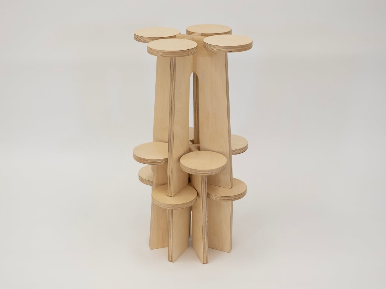
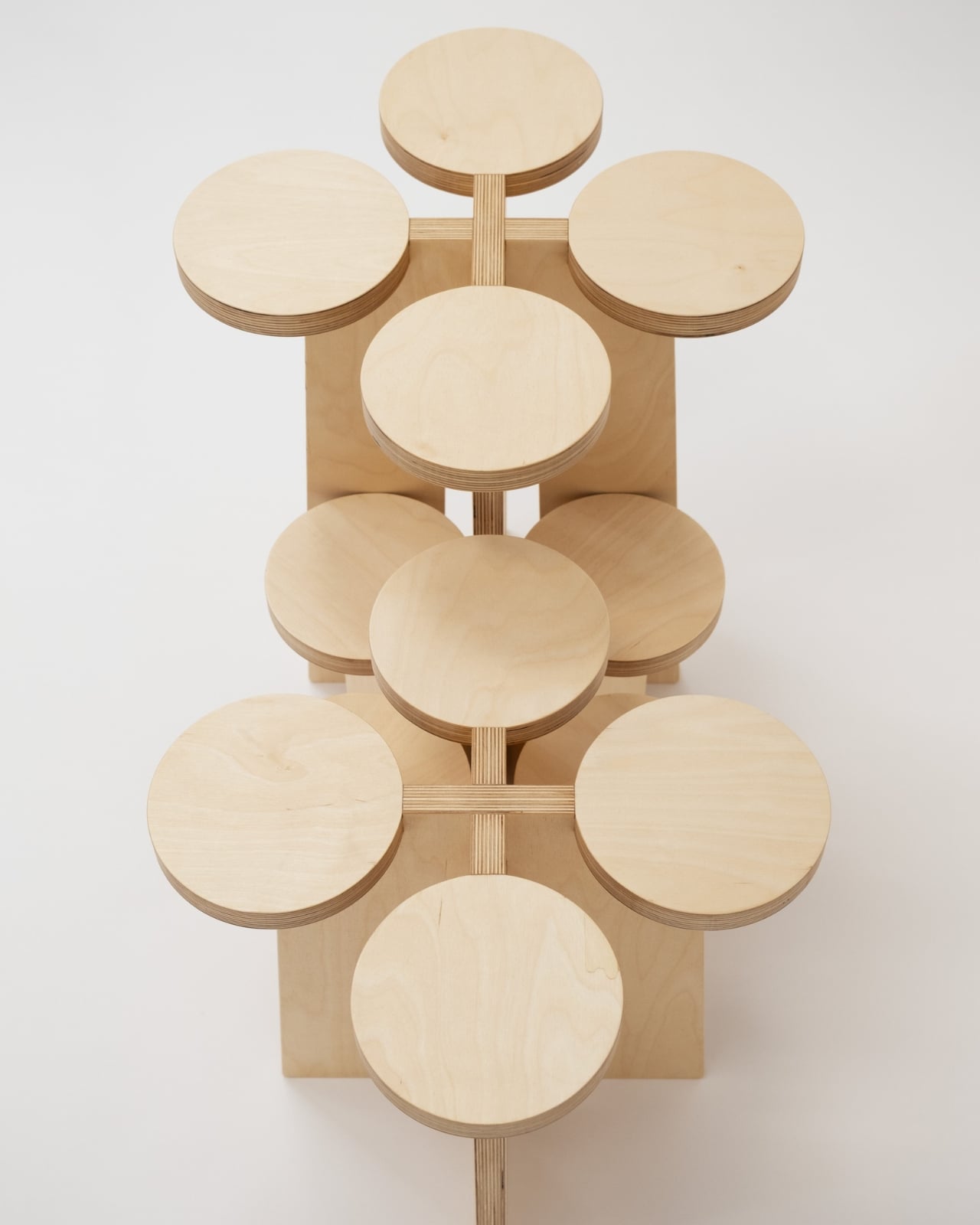
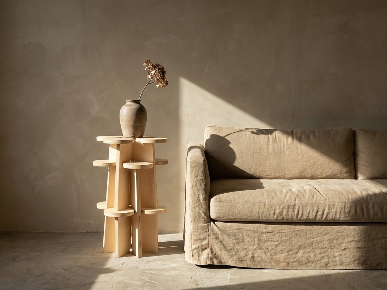
The Fractal System is a set of modular, nestable plywood objects that can function as stools, shelves, or stands, depending entirely on how you choose to arrange them. Each piece is non-directional, meaning there’s no designated top, bottom, or front. You can rotate them, stack them, slot them together, or spread them across a room. The configuration changes, and with it, so does the furniture’s entire personality. A tight cluster becomes a sculptural display unit. A single piece on its own reads as a clean, minimal stool. A sprawling arrangement along a wall becomes something that looks closer to an art installation than anything you’d find at a typical furniture store.

Designer: Xubai Li

Li, who holds an MFA in Furniture Design from the Rhode Island School of Design, was a featured designer at ICFF, and the Fractal System has since earned Silver recognition at both the NY Product Design Awards and the MUSE Design Awards. That’s the kind of trajectory that usually signals a designer to watch, not just a one-off project.

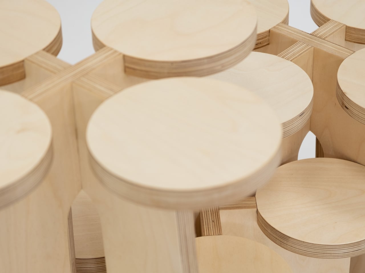
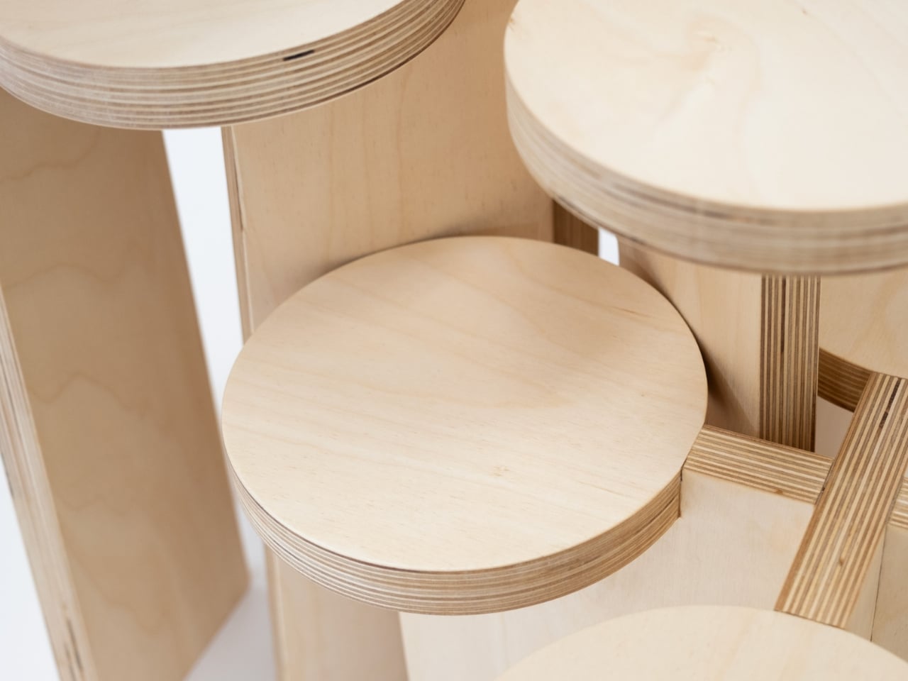
The design’s real appeal, to my eye, isn’t purely aesthetic, though the warm blond plywood with its exposed laminate layers is exactly the kind of material choice that ages well. It’s the philosophy underneath it. Most furniture is prescriptive. It tells you where to sit, where to put your coffee, how to organize your books. The Fractal System does the opposite. It hands you a set of components and essentially says, figure it out. That level of user agency is still surprisingly rare in furniture design, where modularity often comes dressed up in rigid systems and complicated instructions.

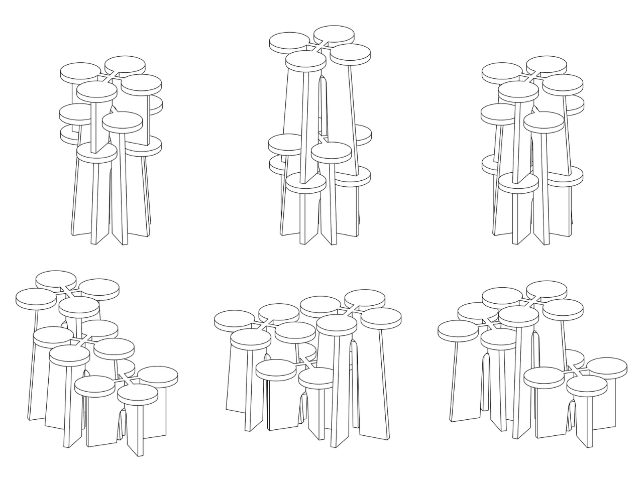
The fractal reference isn’t just a clever name, either. Fractals are defined by self-similarity, where the same pattern recurs regardless of scale. Li applies that principle structurally: the more units you add, the more the configuration begins to mirror the logic of a single unit, just expanded. You can see it clearly in the diagrammatic sketches, where each arrangement reads like a variation on the same underlying grammar. It’s rigorous without feeling academic, which is a genuinely difficult balance to strike.

I also think the timing matters. Right now, the design conversation is heavily focused on adaptability. Smaller living spaces, changing households, a collective skepticism toward buying things that only do one thing. The Fractal System fits into that shift without pandering to it. Li wasn’t designing for trends; the work clearly came from a place of genuine conceptual inquiry. The fact that it also happens to answer a real practical need is almost incidental, and that’s often the sign of the best kind of design.

From a collector’s standpoint, this is the sort of piece that rewards attention over time. It doesn’t announce itself loudly. Photographed in a corner with morning light and a ceramic mug balanced on one of the platforms, it looks like the kind of thing someone discovered in a Kyoto studio decades ago. Grouped tightly in a gallery setting, it reads as contemporary sculpture. That range of registers is genuinely hard to manufacture.

Xubai Li’s Fractal System is one of those designs that quietly shifts how you think about the objects around you. Not because it makes a statement, but because it asks a question: why does a piece of furniture only ever have to be one thing? I don’t have a neat answer to that. But I’m glad someone built the question into plywood and let the rest of us sit with it.

The post The Furniture That Grows Like a Fractal first appeared on Yanko Design.

The Glass Chair That Makes Every Other Chair Look Boring

Most chairs do their job quietly. They hold weight, fill space, and if we’re lucky, look decent in a photo. The Metal Affaire by Minimal Studio is not most chairs. It’s the kind of piece that makes you stop mid-scroll and wonder if someone just decided that furniture needed to be a little more daring.

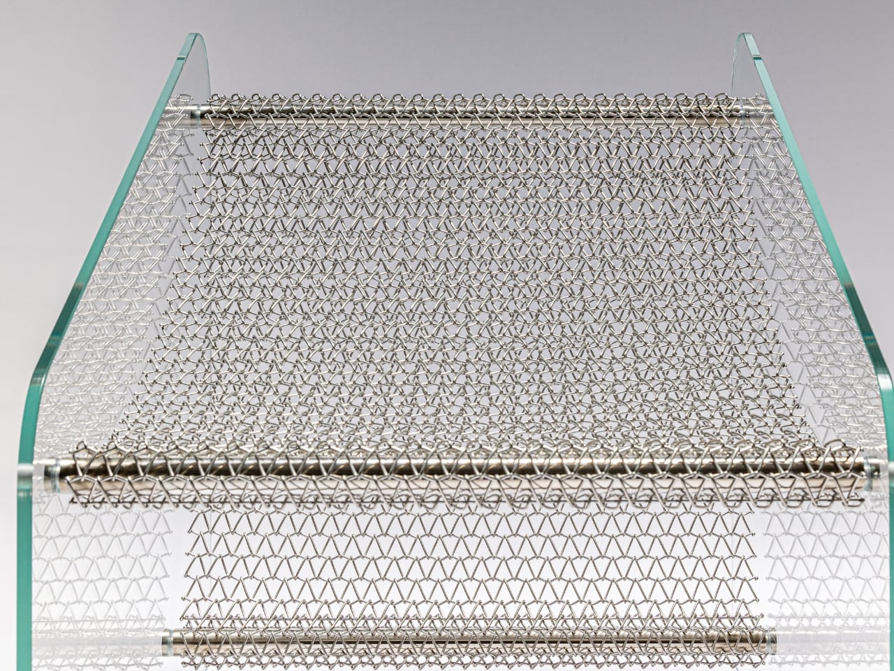
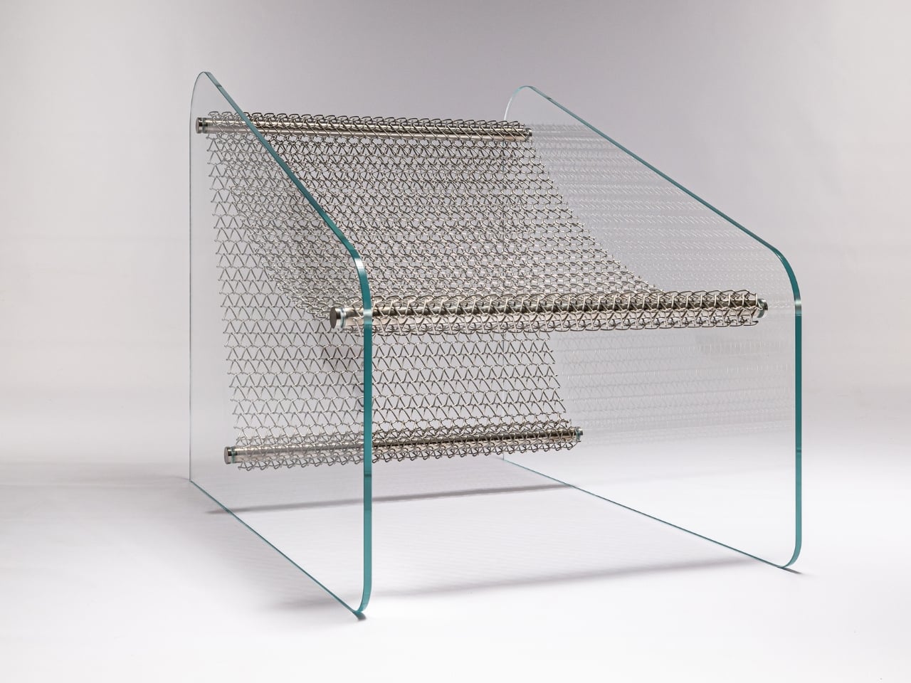
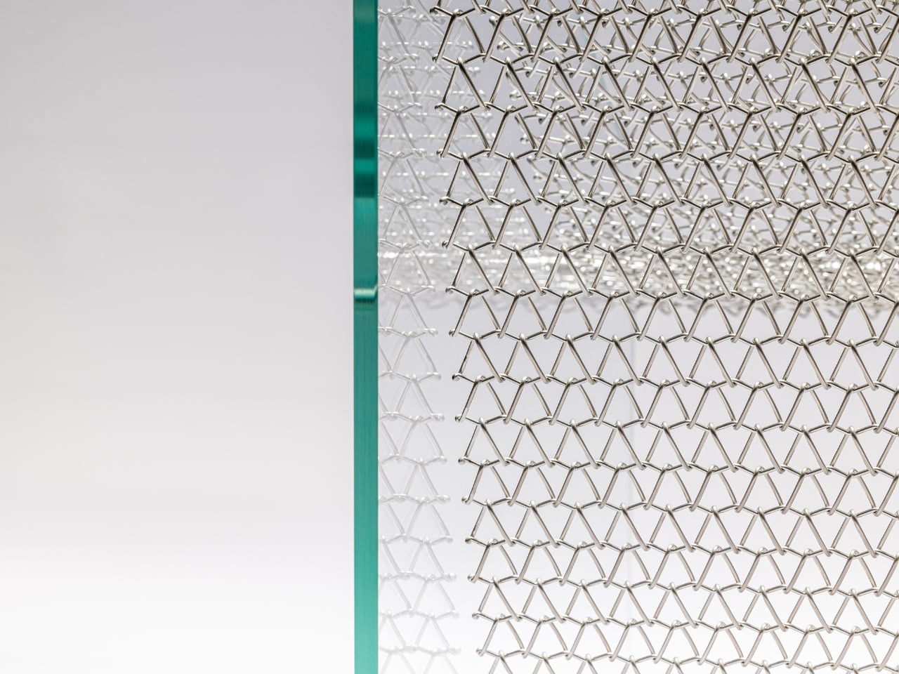
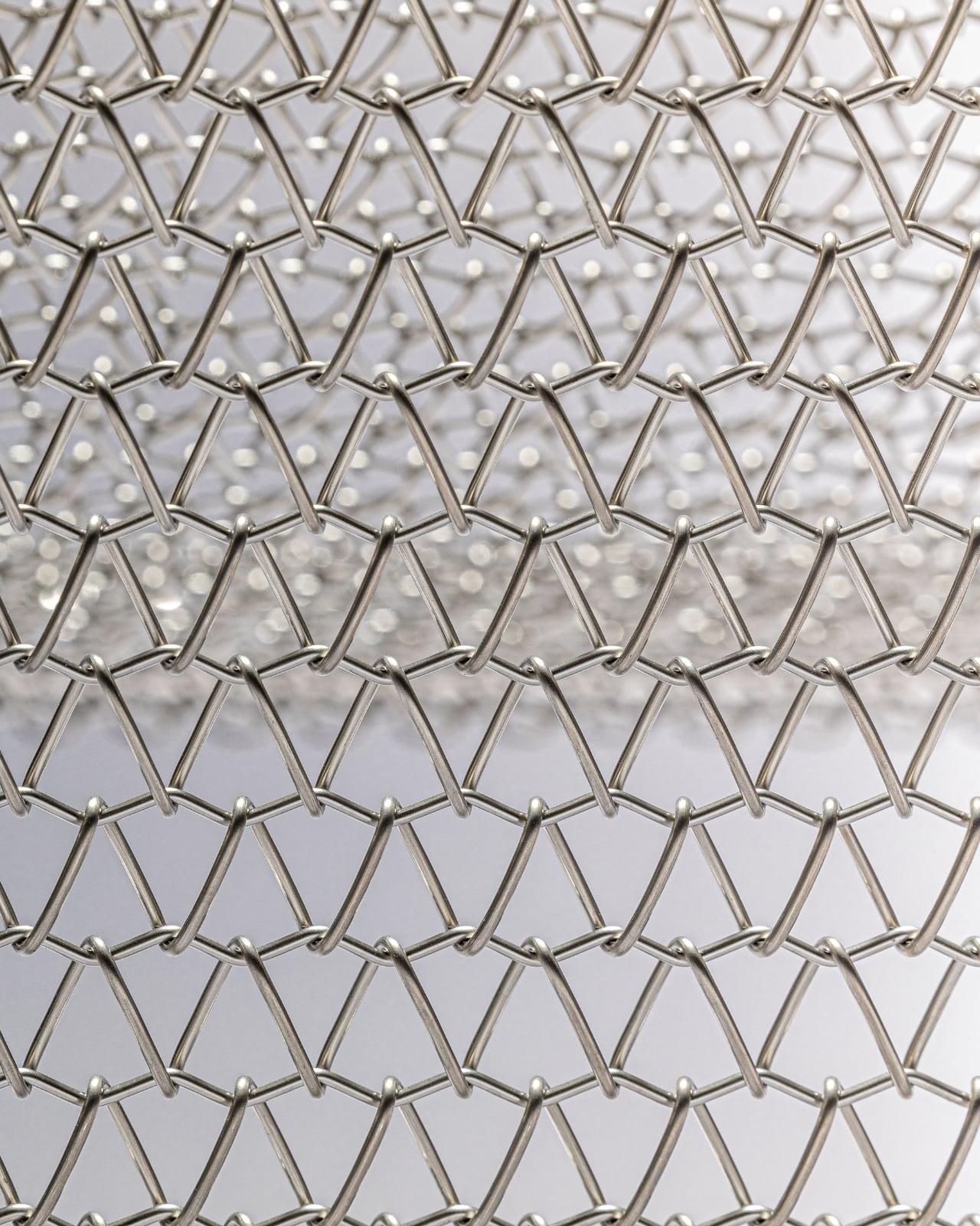
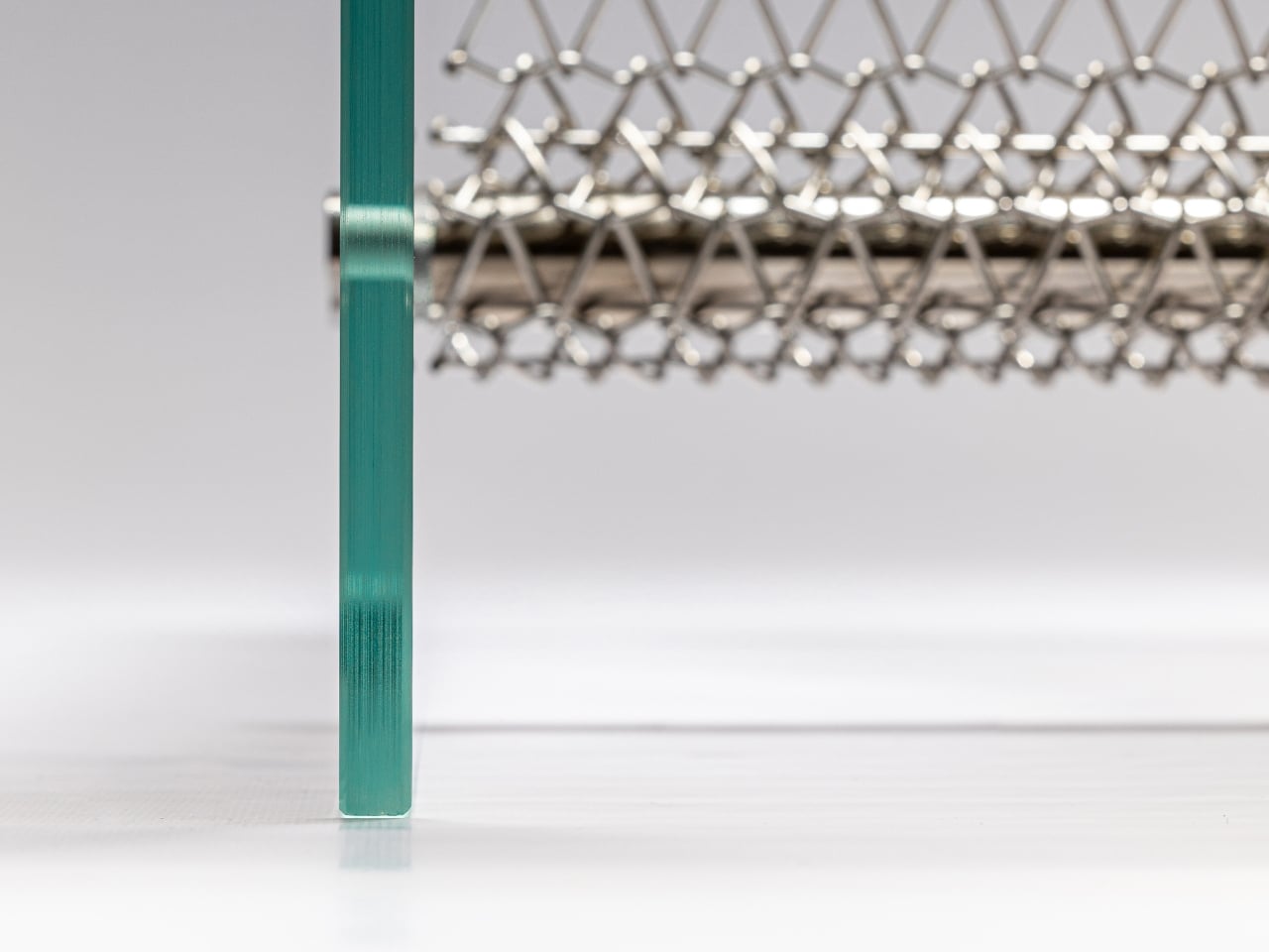
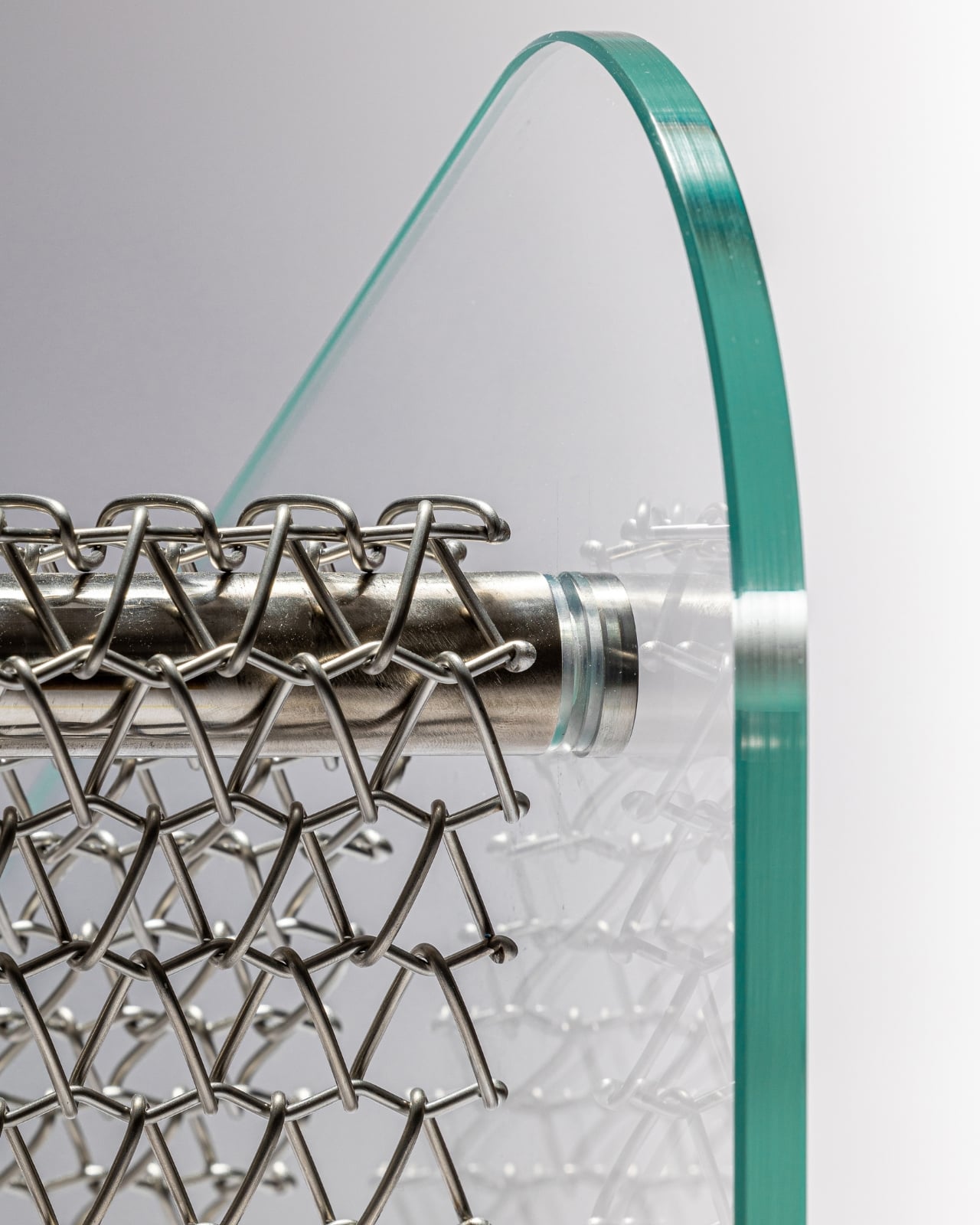
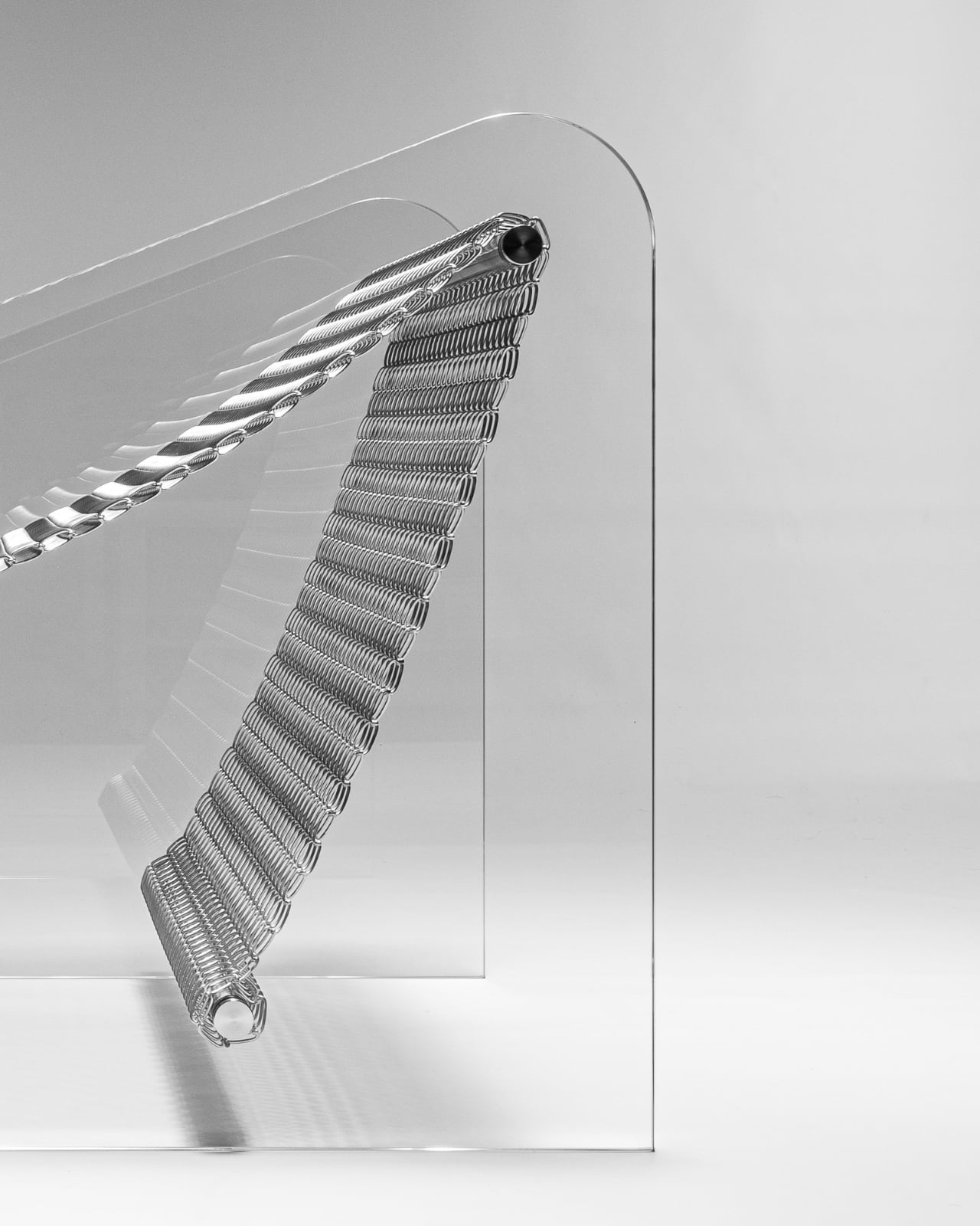
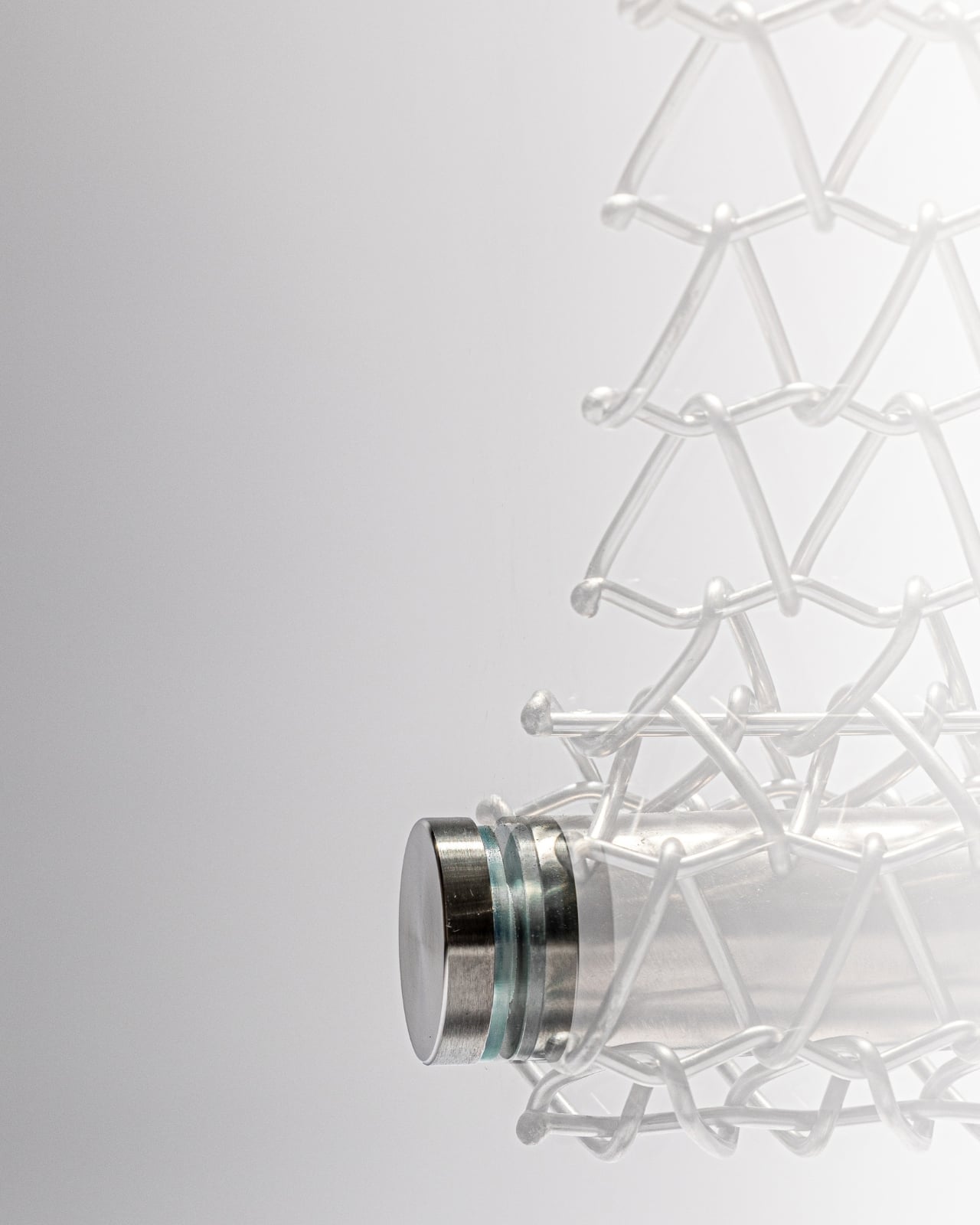
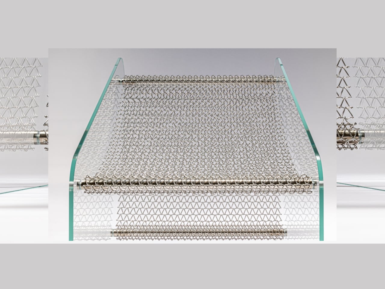
The Metal Affaire is an armchair made almost entirely of transparent laminated glass, supported by a metallic mesh base. Yes, glass. The kind of material you typically associate with windows and coffee tables, not with the thing you sit on during a long Sunday. But that counterintuitive choice is precisely what makes this design so compelling. It doesn’t try to blend in. It asks to be noticed, studied, and maybe even argued about.

Designer: Minimal Studio

Minimal Studio is a multidisciplinary design studio based in Mallorca, Spain, founded by David Martínez Jofre. The studio brings together architects, engineers, and interior designers, and their philosophy is rooted in one clear belief: simplicity is not the absence of thought. It’s the result of a lot of it. Their signature look leans into clean lines, neutral tones, and materials that let a space breathe, which is exactly what the Metal Affaire does visually. The glass shell gives the chair an almost weightless appearance, like it’s barely occupying space at all, while the metallic mesh base grounds it with enough structure to remind you it’s very much real.

The design concept comes from mimicry. The shape of the armchair echoes and mirrors its own materiality, the glass structure and the mesh base informing each other as if they grew into their final form together. That kind of design intention, where the form and material feel genuinely inseparable, is rarer than it should be. A lot of furniture design today prioritizes the photograph over the experience, optimized for an Instagram carousel rather than a living room. The Metal Affaire feels like the opposite impulse. It’s meant to be looked at closely, touched, questioned.

Of course, it raises the obvious reaction: can you actually sit in a glass chair comfortably? That’s a fair question, and it’s not one this design tries to brush off. The laminated glass is structural and load-bearing. The proportions (80cm high, 60cm wide, 60cm deep) are those of a proper armchair, not a sculptural prop. But to be honest, I don’t think comfortable seating is the only thing the Metal Affaire is asking you to think about. It’s asking whether a chair can be beautiful in the way a sculpture is beautiful, functional and considered and worth looking at from every angle.

The name itself is a bit of a wink. “Metal Affaire” suggests something indulgent, a rendezvous between industrial materials and refined design sensibility. And Minimal Studio leans into that duality without apology. The metallic mesh doesn’t try to hide itself or disappear behind the glass. It asserts its presence, and the contrast between hard structure and transparent surface is the entire point. Industrial and elegant at once, which is a balance that is genuinely difficult to achieve without one quality undermining the other.

There’s also something to be said about how the Metal Affaire interacts with light. Transparent glass in a room doesn’t behave the way solid furniture does. It shifts depending on the hour, the season, the angle. The chair you see at noon isn’t quite the same chair you see at dusk. That quality, the way it refuses to be static, gives it a liveliness that most furniture simply doesn’t have. It becomes part of the room’s atmosphere rather than just an object placed inside it.

Minimal Studio has been quietly building a body of work that challenges what “minimalism” actually means in furniture design. The Metal Affaire is the clearest expression of that challenge yet. Not minimal in the sense of boring, but minimal in the way that a perfectly constructed sentence is minimal. Nothing wasted, nothing missing, and somehow, exactly what it needed to be.

The post The Glass Chair That Makes Every Other Chair Look Boring first appeared on Yanko Design.

This Chair at Milan Design Week Looks Like a Forest Grew a Seat

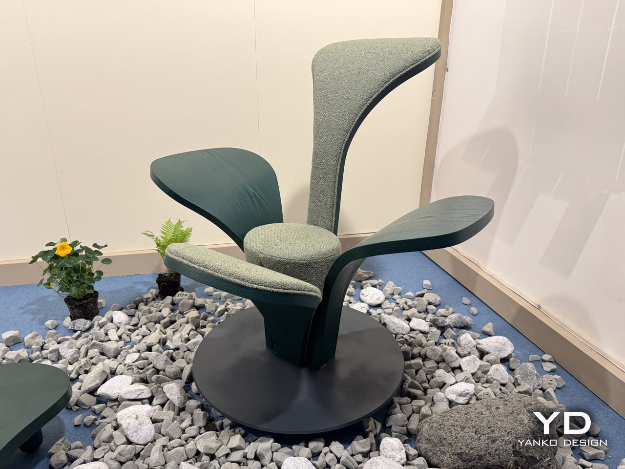
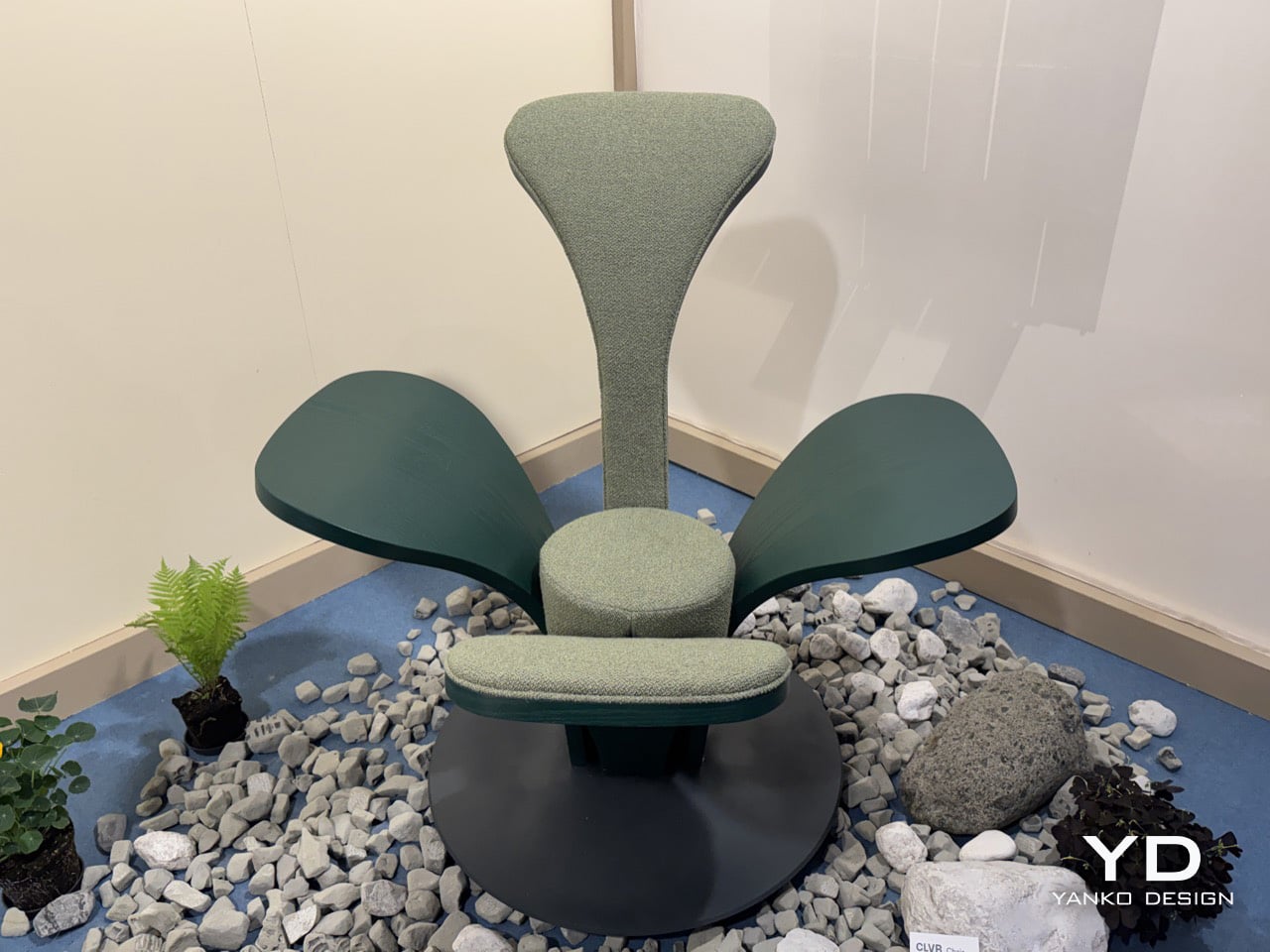
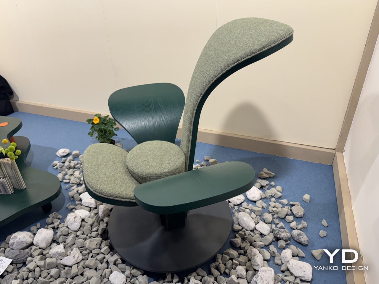
The armchair has been one of the most contested territories in furniture design for over a century, from Alvar Aalto’s bent plywood experiments to Arne Jacobsen’s Swan Chair. Designers keep returning to the seated form as a test of where material technology and formal imagination currently meet. Beltrame Breuil, an architectural practice based in Tarvisio and Vienna, took their turn at Salone Satellite 2026 with a chair that brings alpine botany directly into that conversation. Their furniture brand Picule presented CLVR, a seat assembled from four bent-wood leaf forms rising from a circular steel base, and it is the kind of debut that reminds you why Salone Satellite exists.

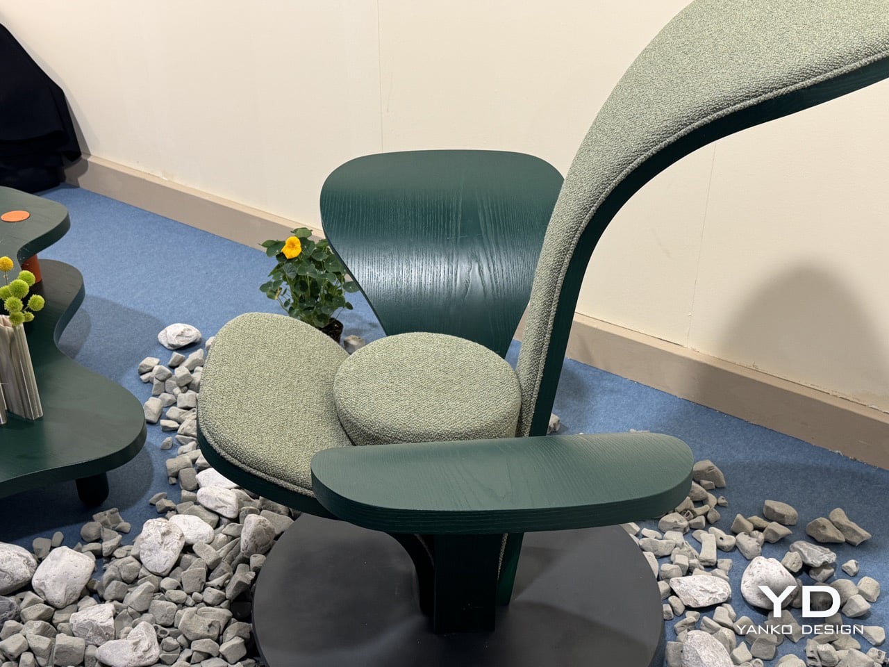
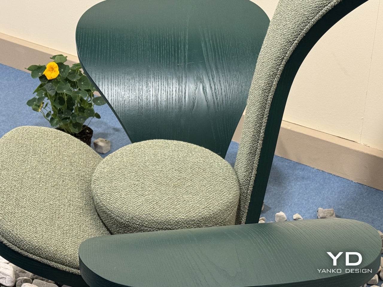
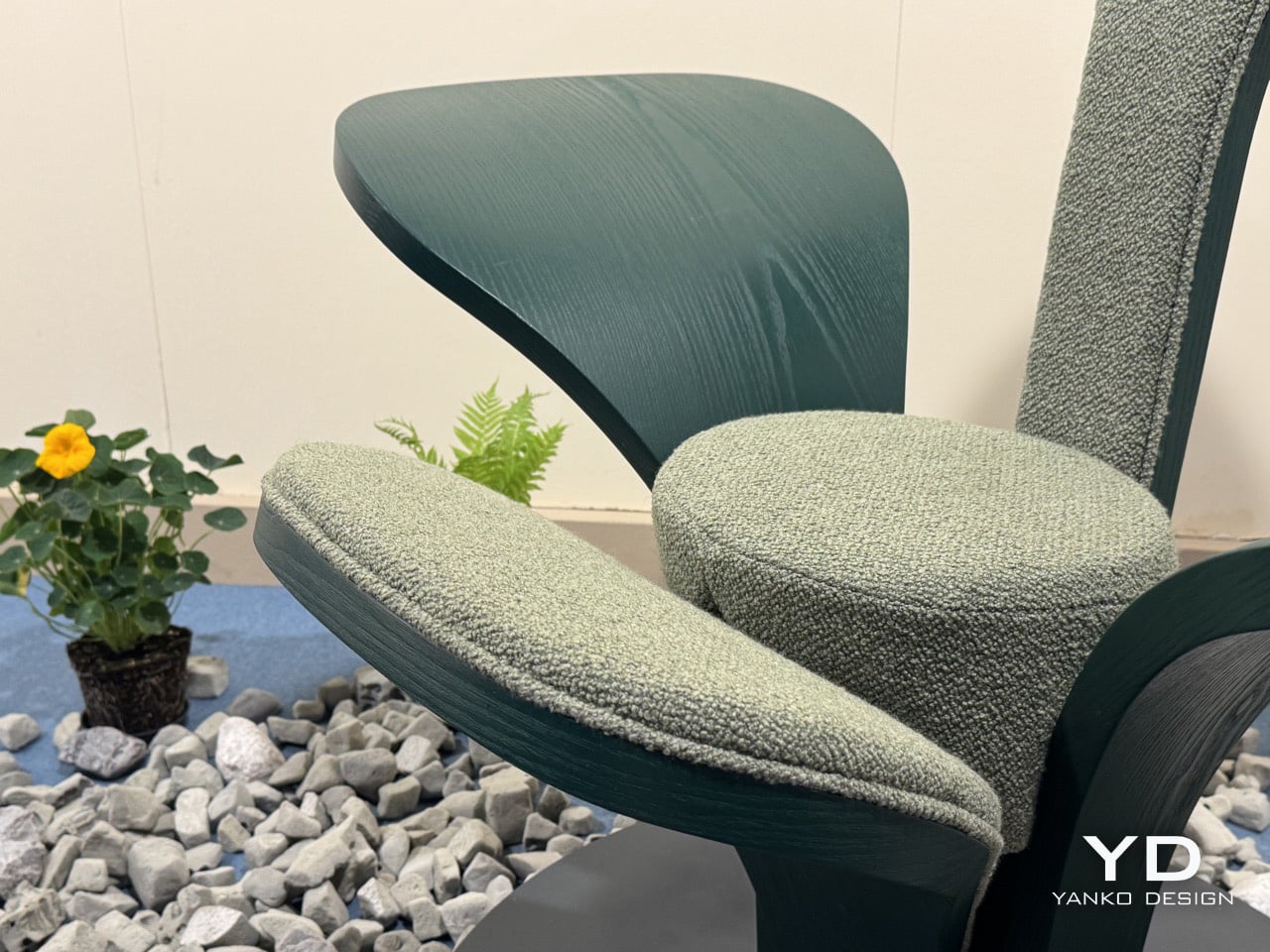
Two of CLVR’s four leaves are upholstered in a mossy, boucle-like forest green textile, covering the tall backrest and the lower front surface where the body settles. The other two are left as bare stained wood, their grain visible under the deep green finish, extending outward from the center like wings. All four share one curvature and one design logic, shaped by bent wood, which is what holds the composition together despite its apparent asymmetry. The design is coherent because its grammar is consistent, even as the function of each leaf changes.

Designer: Beltrame Breuil

The circular steel plate at the base functions as a pedestal, grounding the organic spread of the leaves and lending the piece a measured architectural gravity. At 112 cm tall and 125 cm wide, CLVR reads as a statement lounge object first and a chair second. It has the presence of a small throne, designed to anchor a room rather than disappear into it. The scale is deliberate, positioning the chair as a piece of functional sculpture that occupies its space with confidence.

Picule is Beltrame Breuil’s way of funneling architectural discipline into objects scaled for domestic life. The studio’s Tarvisio base sits in Italy’s northeastern corner, where the Julian Alps press against the Austrian and Slovenian borders. That geography gives CLVR its conceptual grounding; this is a studio that builds in that landscape, not one pulling a leaf motif from a mood board. The alpine forest inspiration feels earned, and it gives the chair a story that goes beyond its form.

The bent-wood forming technique reinforces that connection, requiring an intimacy with the material that keeps the work tethered to craft. The chair’s forest green palette, running across bare wood and woven textile in two calibrated tones, holds the composition together as one chromatic idea rather than a collage of parts. It’s a thoughtful detail that shows how completely the studio considered the object from every angle, ensuring the material and color choices support the core concept.

Beltrame Breuil is presenting the full Picule collection, including the CLVR chair, at Salone Satellite 2026. You can find it in Hall 5 at Stand E10 at Fiera Milano, Rho, through April 26. The photos do a fair job of capturing the silhouette, but the bent-wood grain and the textile’s tactile quality are things that land most clearly when you are standing right in front of it. Go see it before the fair closes.

The post This Chair at Milan Design Week Looks Like a Forest Grew a Seat first appeared on Yanko Design.

The 3D-Printed Chair That Moves With You, Not Against You

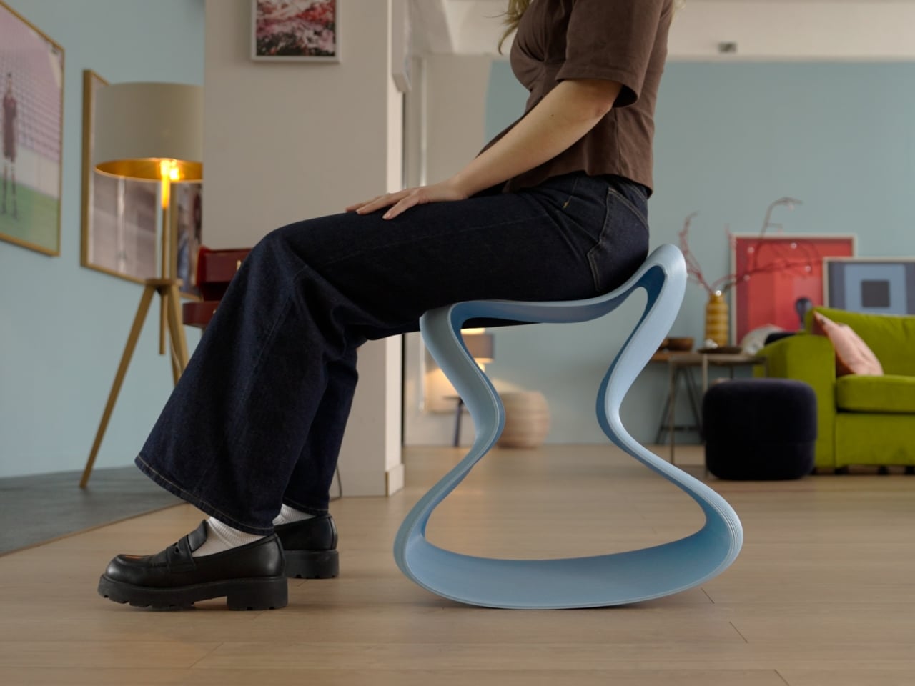
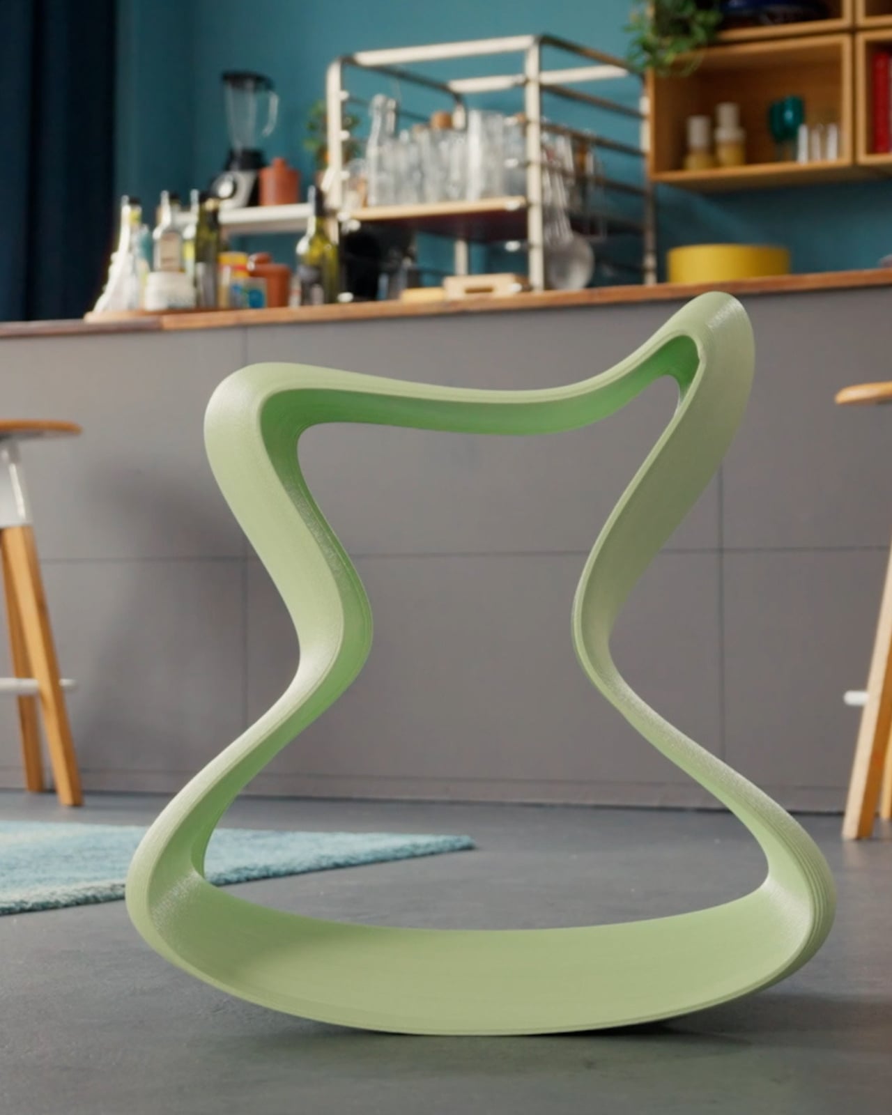
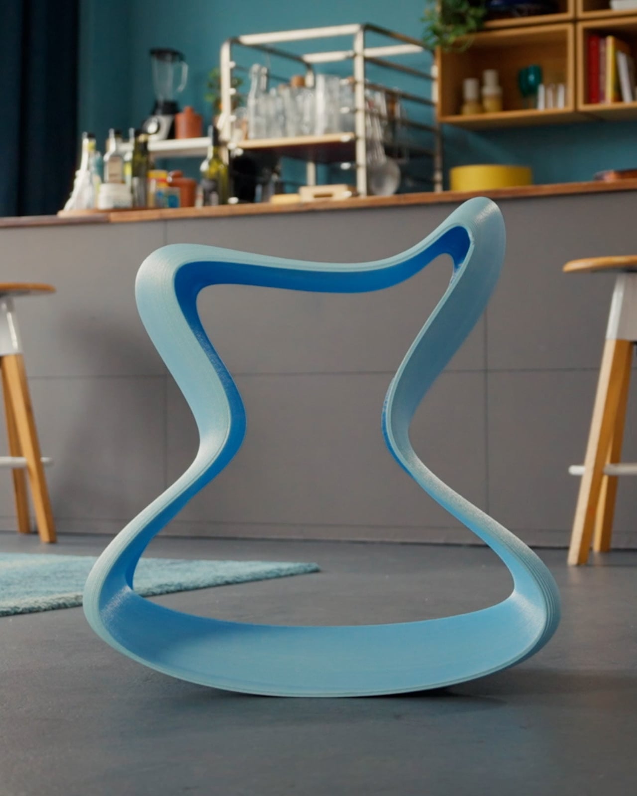
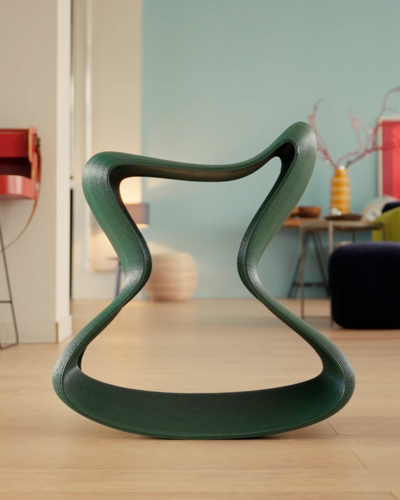
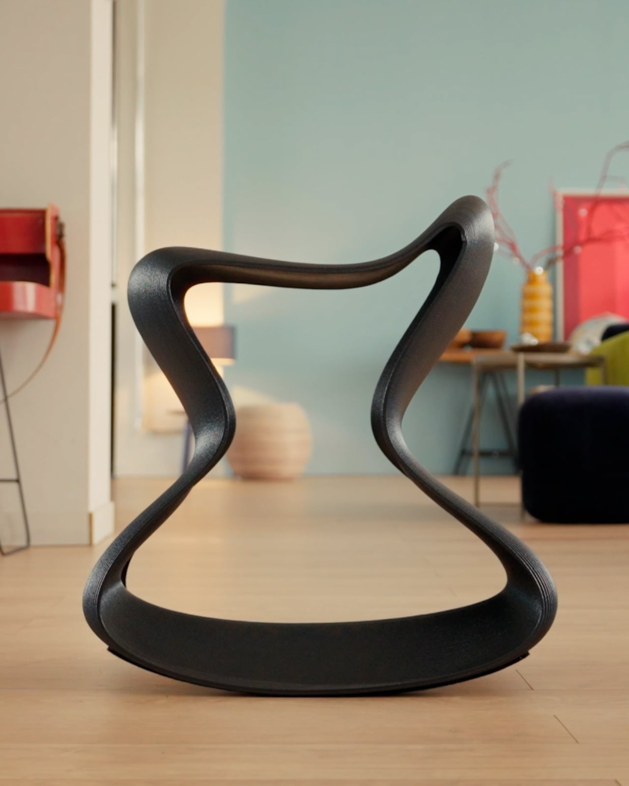
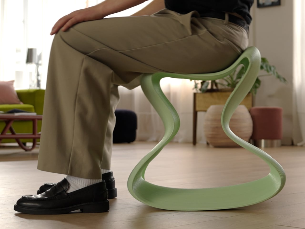
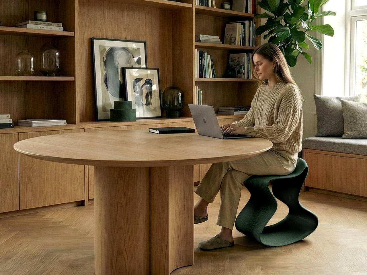
The first time I looked at the Flow Chair, I thought it was a sculpture. The sinuous, looping form bending into itself like a standing wave frozen mid-motion. No visible joints, no screws, no padding, no legs in the traditional sense. Just one continuous ribbon of material that somehow, impossibly, holds a person’s weight while gently rocking beneath them.

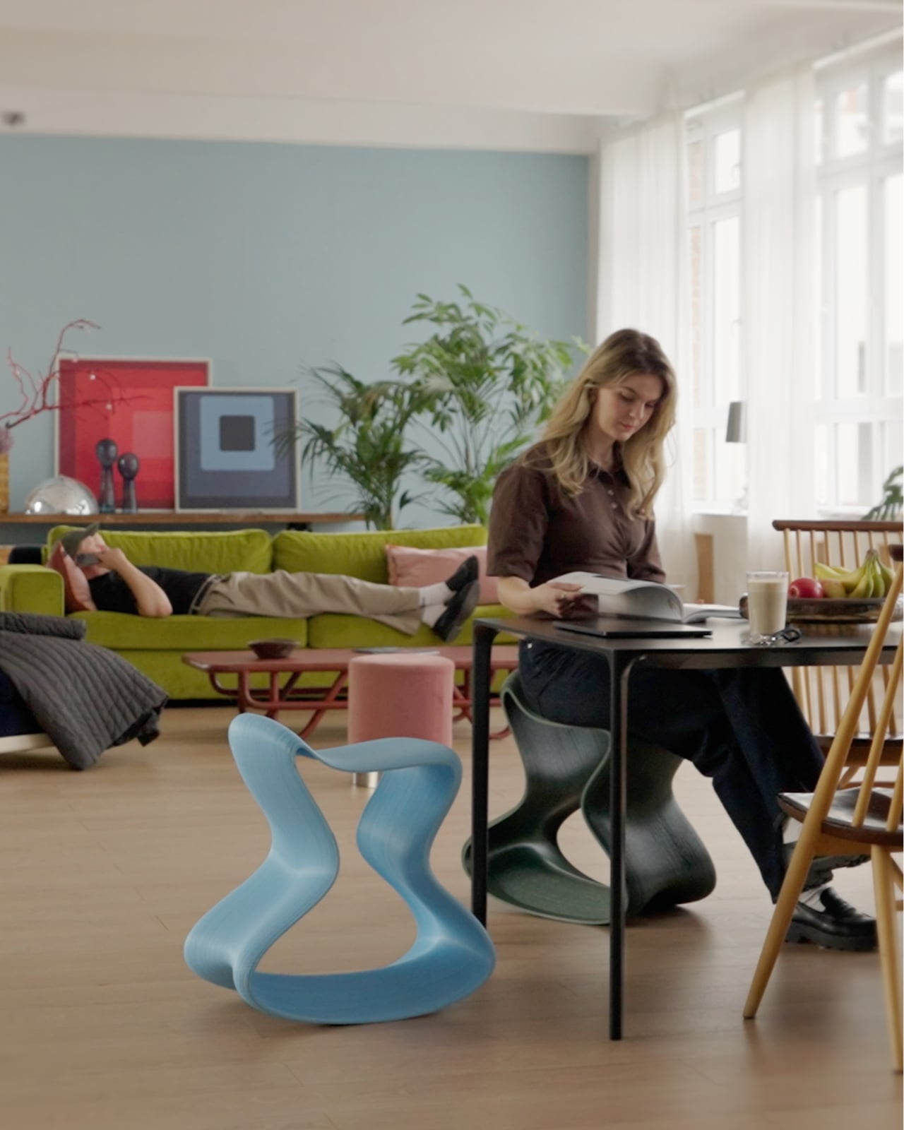
That last part surprised me. The Flow Chair, designed by Daniel Streilein and Henry Boy of the German studio Boldobjects, is not actually a chair in the way we typically think about chairs. It’s a rocking stool, and it functions through the intelligence of its shape rather than through any kind of mechanism. You shift your weight, and it responds. You lean forward to concentrate, and it follows. You settle back, and it adjusts. No moving parts. No knobs to turn. No assembly required. The geometry does all the work.

Designers: Daniel Streilein and Henry Boy (Boldobjects)

I’ve been thinking about this a lot lately, specifically the idea that so much of modern ergonomic furniture design has overcomplicated the act of sitting. We’ve added lumbar supports and pneumatic height adjustors and tilt-tension knobs, and yet most office workers still end the day with a stiff back and a neck that sounds like a bowl of cereal. The Flow Chair is a direct argument against all of that. Its proposition is simple: give the body room to move, and it will figure out the rest.

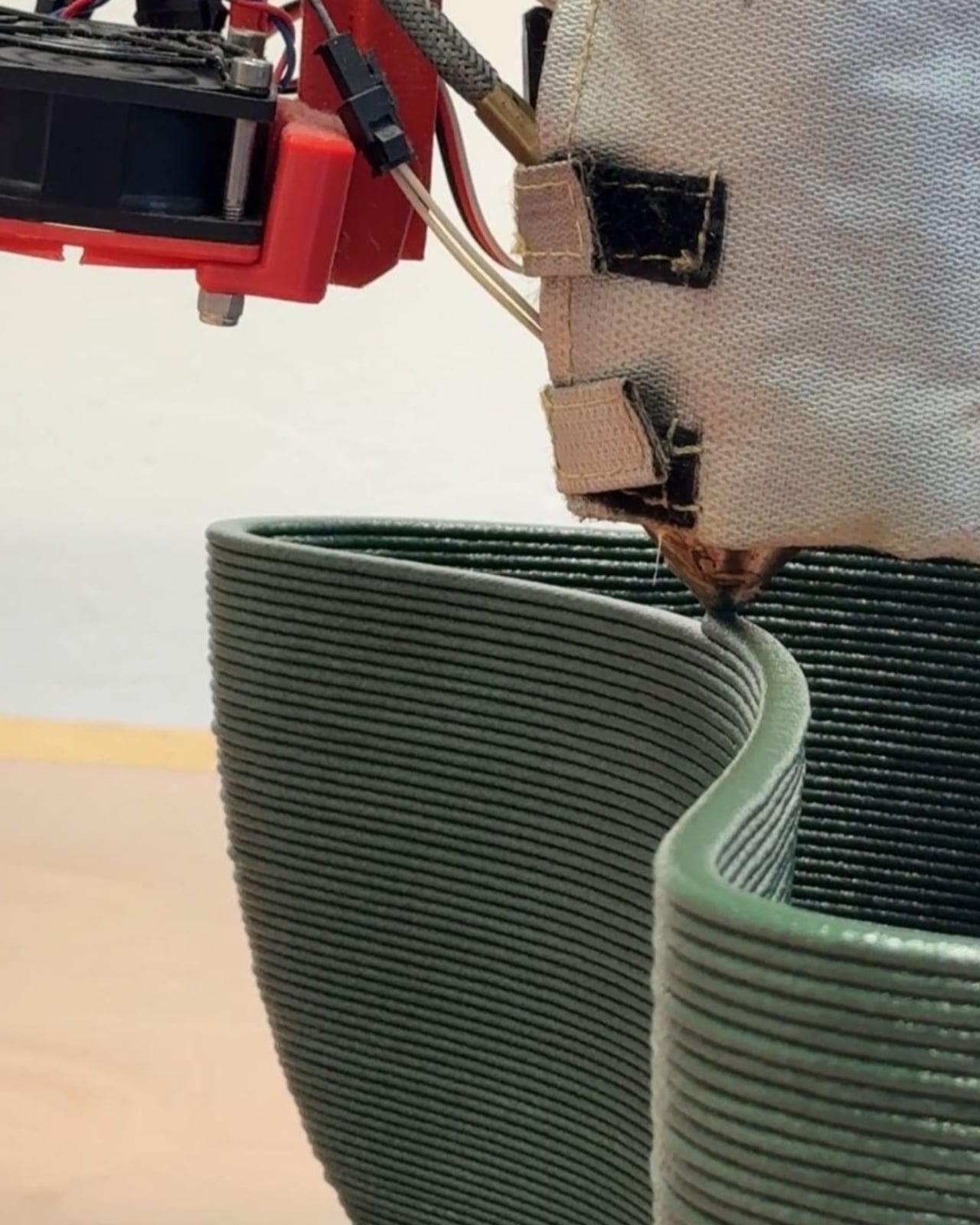
The manufacturing process is just as interesting as the design itself. The Flow Chair is produced using large-scale pellet 3D printing, a more industrial cousin of the desktop 3D printing most people are familiar with. This process allows for the kind of fluid, organic geometry that would be nearly impossible, and almost certainly cost-prohibitive, to achieve through traditional molding or casting. You can actually see the layer lines running across the surface of the chair, horizontal bands that trace the path of the print head as it built the form up from nothing. Most designers would treat those lines as a flaw. Streilein and Boy treat them as texture, a visual record of how the object came to be. I find that genuinely compelling. The chair doesn’t hide what it is.

What makes the sustainability story here worth paying attention to is that it isn’t just a marketing footnote. The Flow Chair is made from a single material: recycled PETG. No adhesives, no hardware, no secondary components of any kind. When the stool eventually reaches the end of its life, it can go back into the production cycle without complex processing. The branding is embossed directly into the base material rather than applied as a separate label. Even the decision to manufacture locally in Germany shortens the supply chain in a meaningful way. Every design choice reinforces the same intention, and that kind of coherence is rarer than it should be.

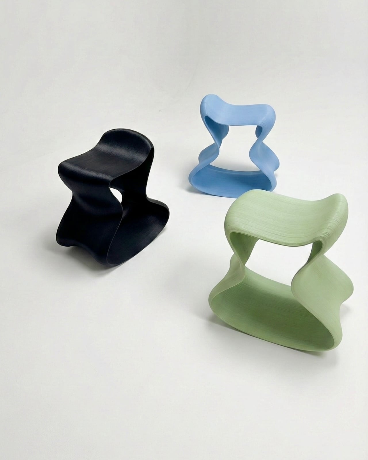
It also comes in a range of colors including deep forest green, powder blue, sage, and near-black, which tells you something about how Boldobjects is thinking about this object. It’s not purely a functional tool. It’s a considered, designerly thing meant to live in real spaces with real aesthetics. Looking at the photographs, it holds its own in a warm, book-lined study just as well as it does in an eclectic living room. That versatility is harder to engineer than it looks.

The Flow Chair sits, if you’ll allow the pun, at an interesting intersection. It belongs in a conversation about sustainable materials and digital fabrication, yes, but it also belongs in a conversation about what good design actually feels like to live with. Not just to look at. Not just to Instagram. To actually use, day after day, in the small and ordinary act of sitting down. That turns out to be a higher bar than most furniture ever clears.

The post The 3D-Printed Chair That Moves With You, Not Against You first appeared on Yanko Design.

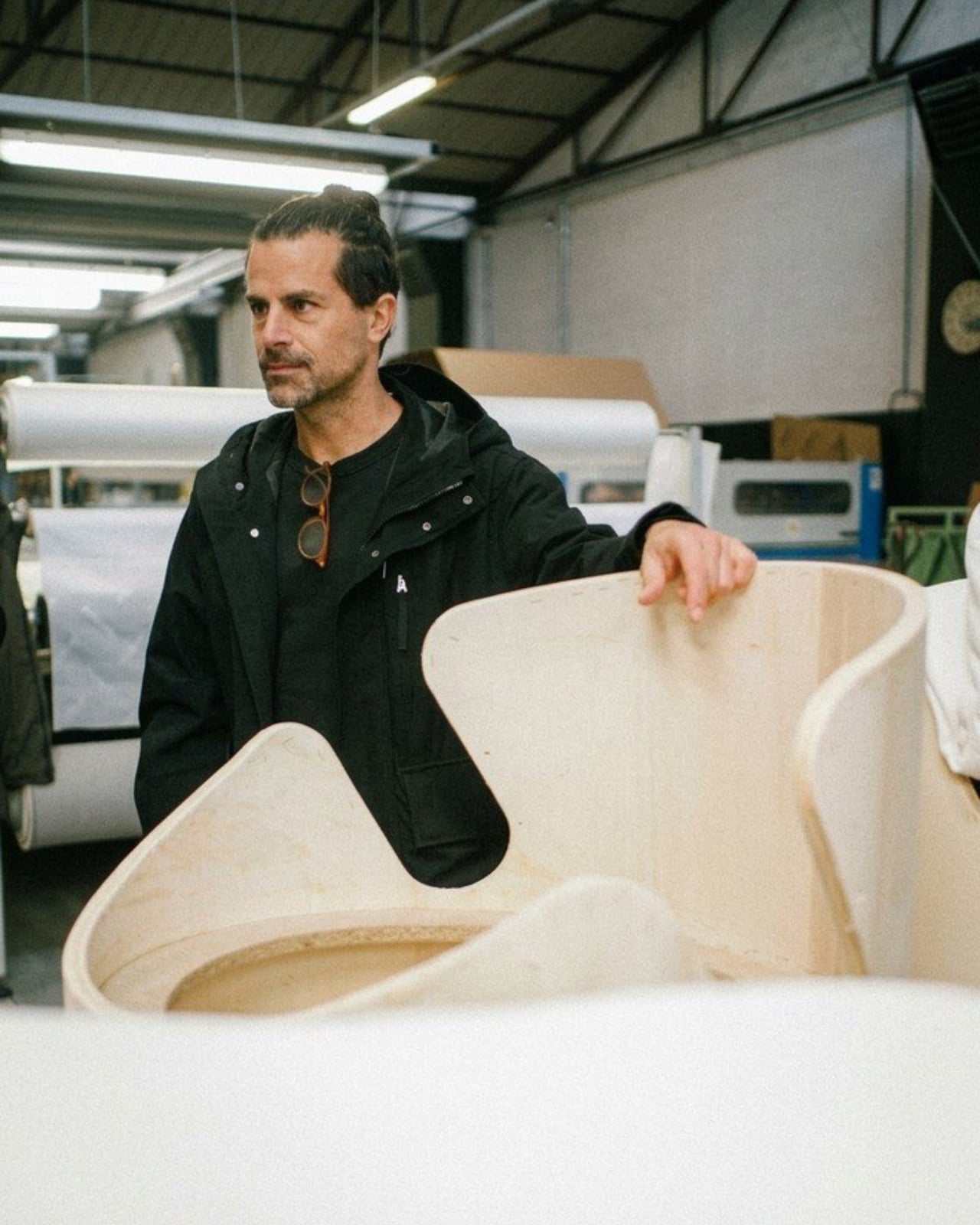
Raw-Edges Just Designed a Chair That Needs Zero Fasteners

Upholstery has been done the same way for centuries. Foam gets glued, tacked, or stapled onto a frame, and that’s more or less the end of the story. It’s functional, it’s reliable, and it’s almost never questioned. London-based Raw-Edges Design Studio decided it was worth questioning.

Yael Mer and Shay Alkalay, the duo behind Raw-Edges, have built their entire creative identity around exactly this kind of thinking. Founded in 2007 after the two met at the Royal College of Art, the studio has spent nearly two decades treating everyday objects as unsolved puzzles worth reopening. Their latest experimental chair design is a perfect example of how they operate: take a convention that everyone has accepted without debate, strip it down to first principles, and see if a smarter answer has been sitting there all along. The answer, in this case, is a notch.

Designer: Raw-Edges Design Studio

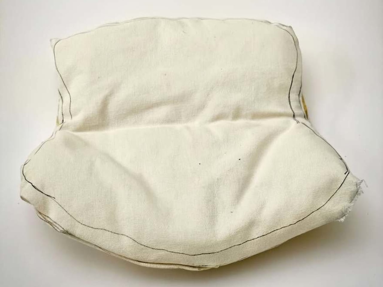
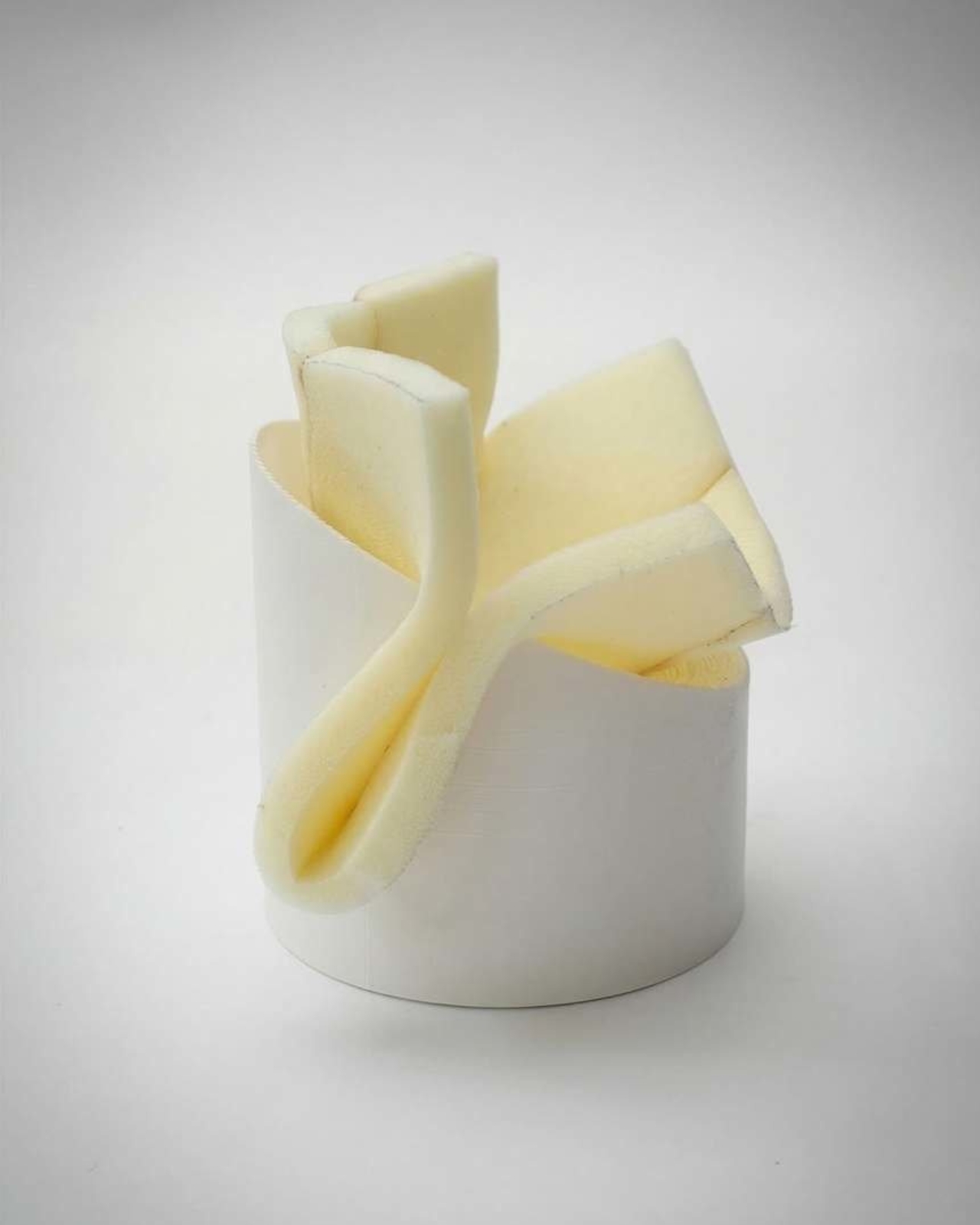
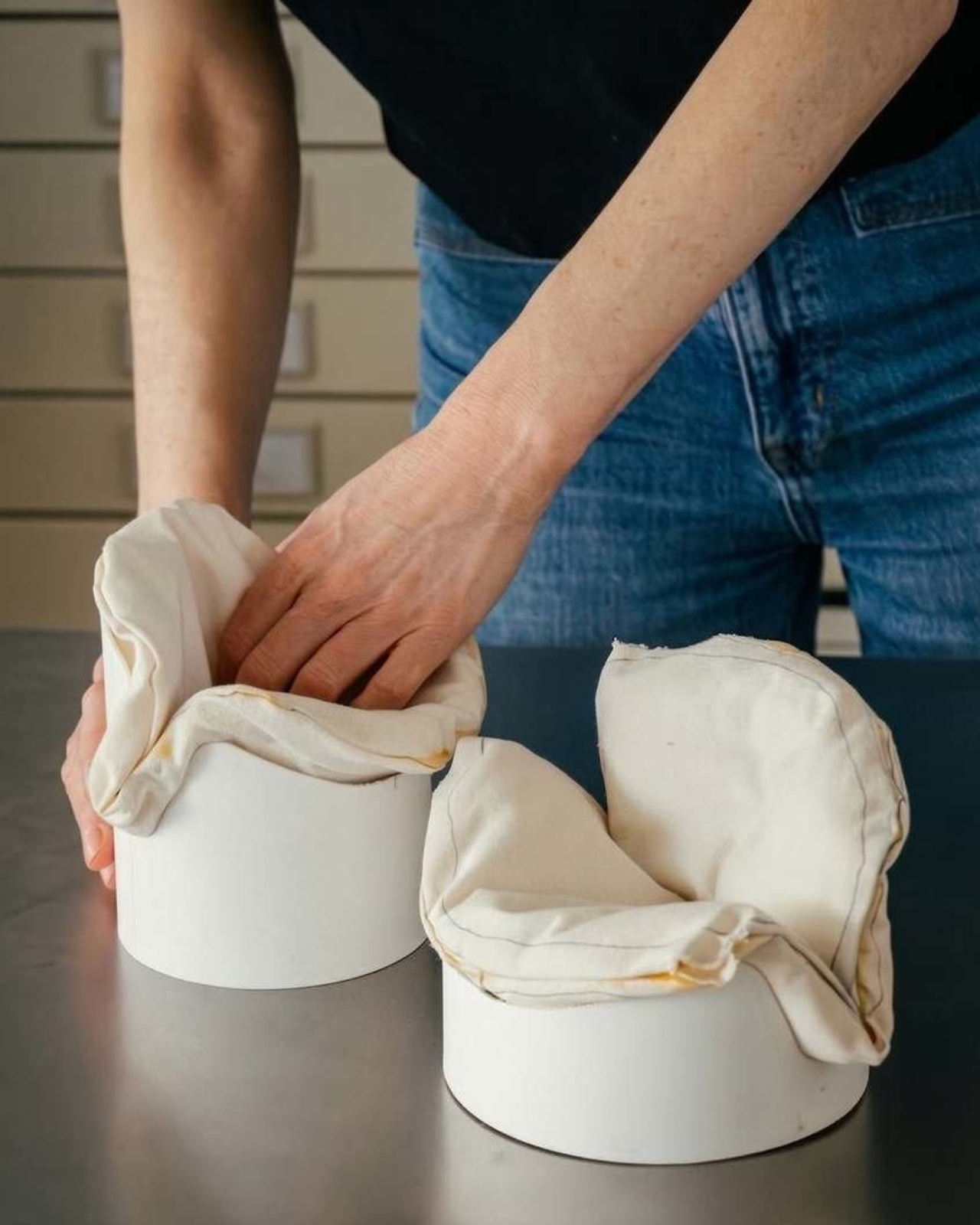
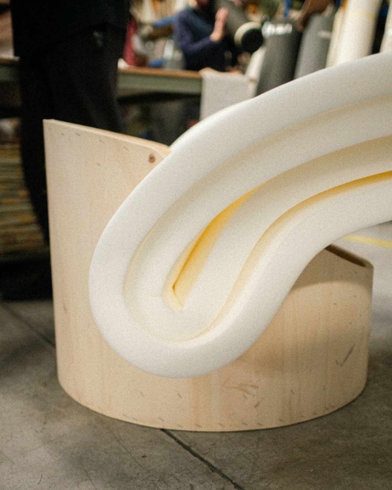
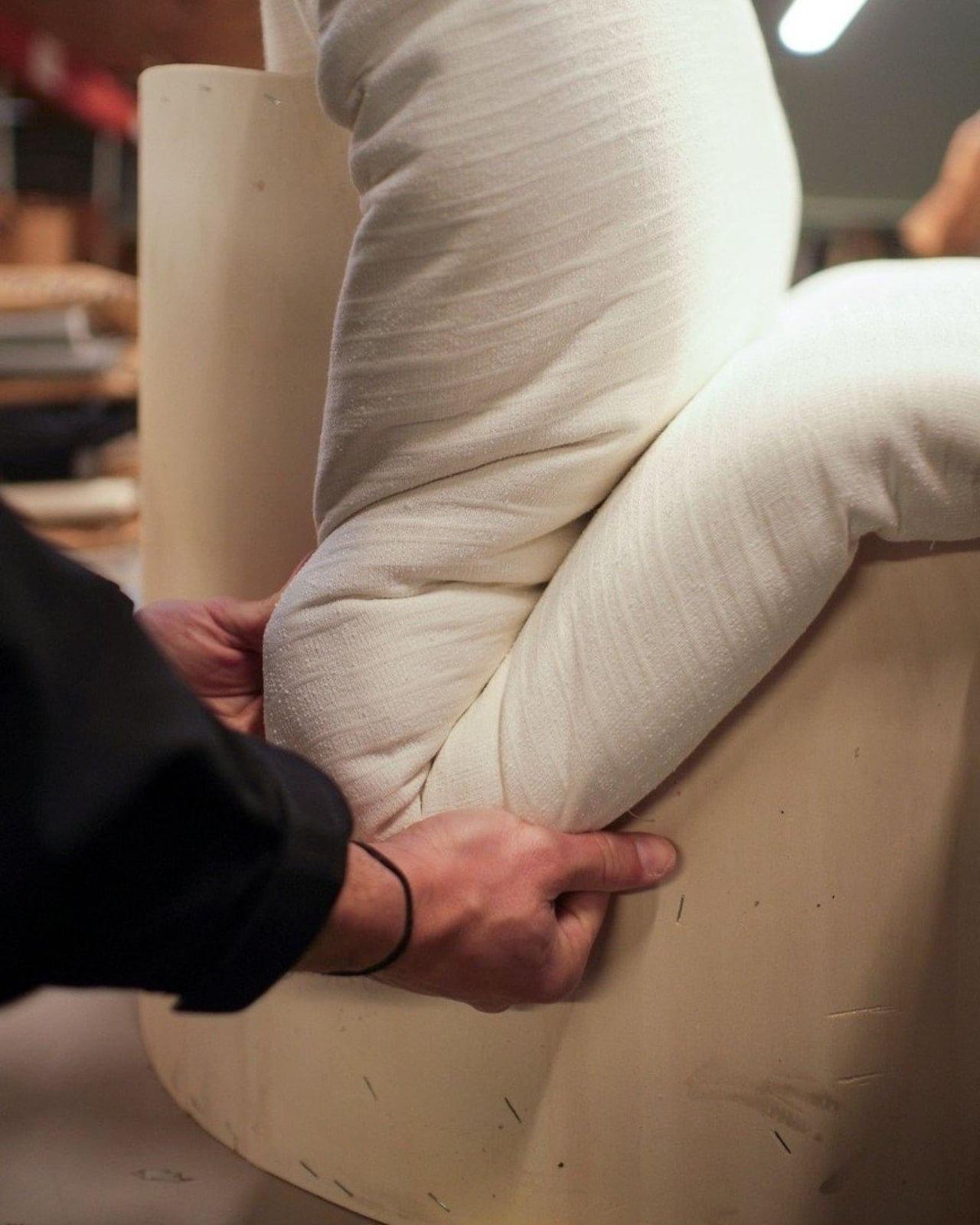
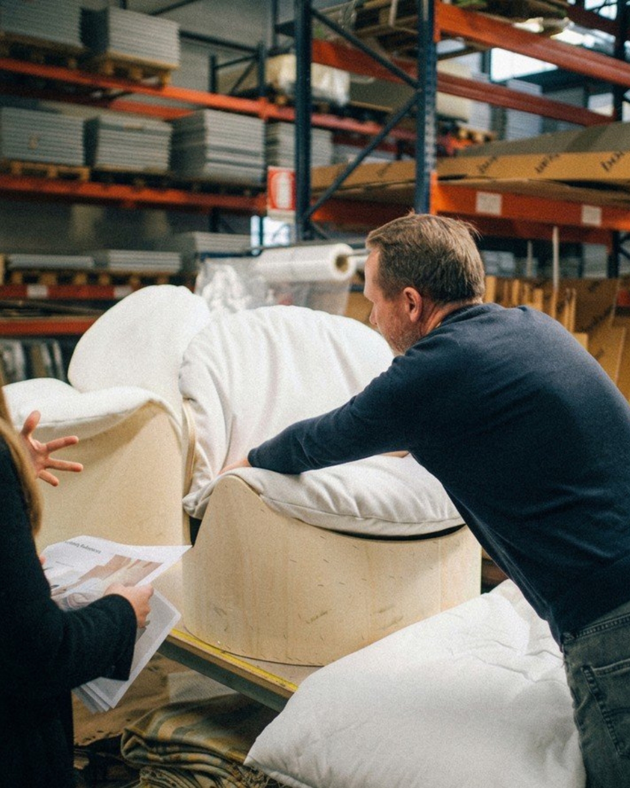
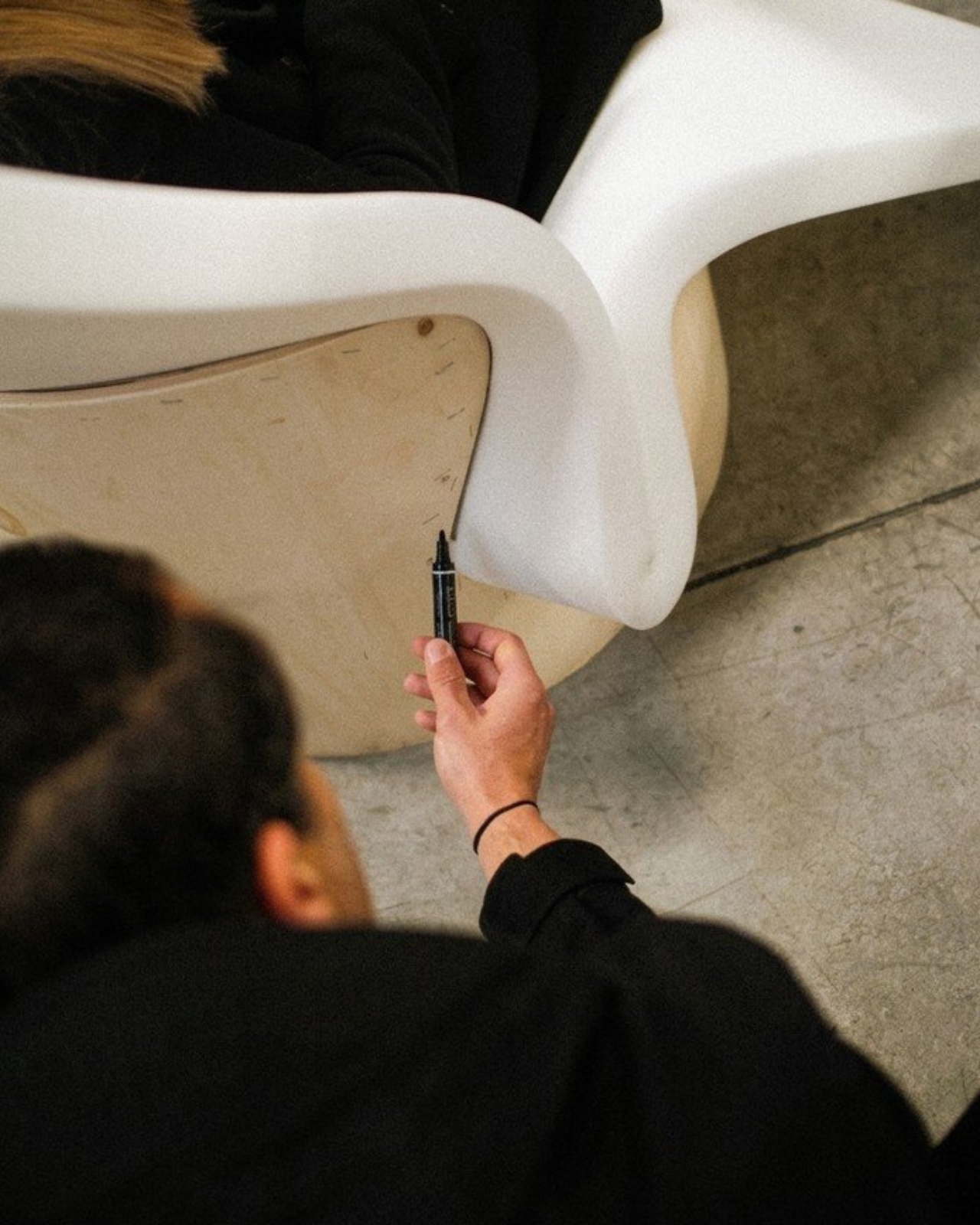
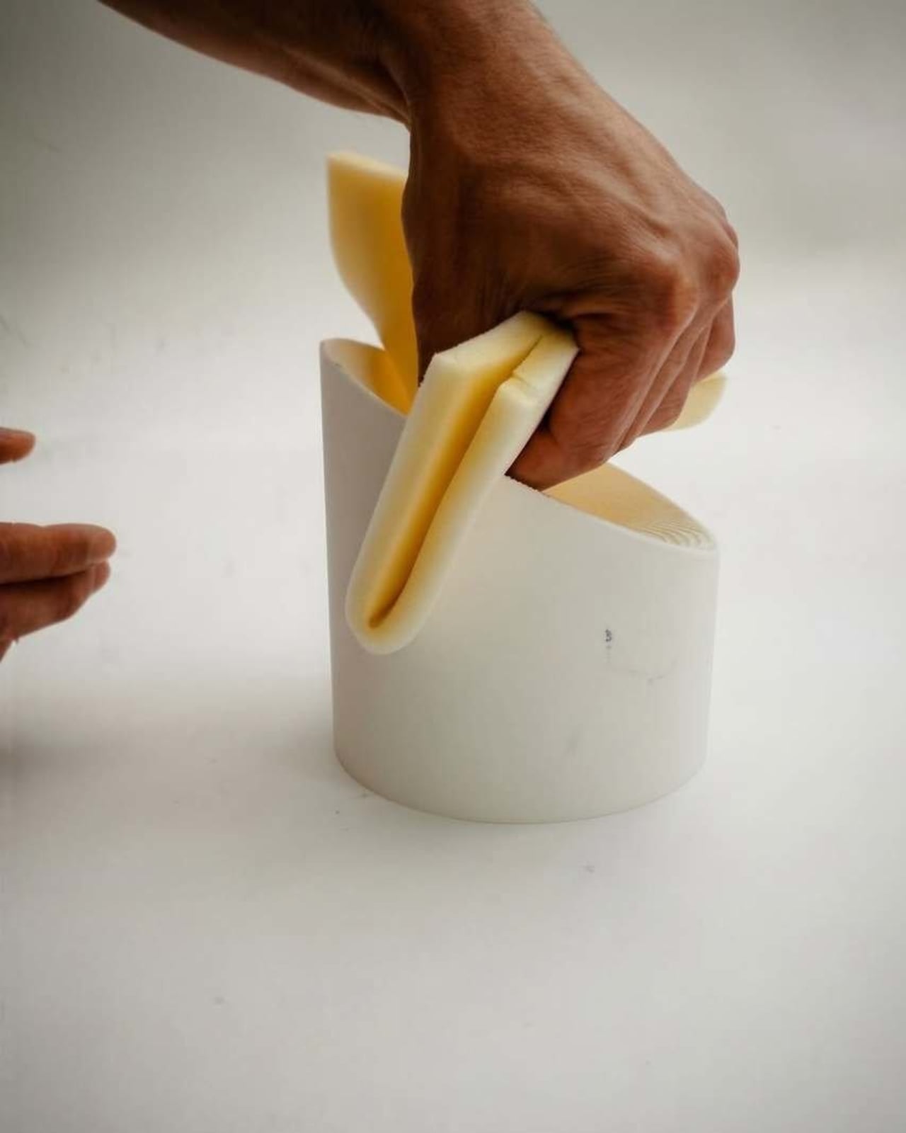
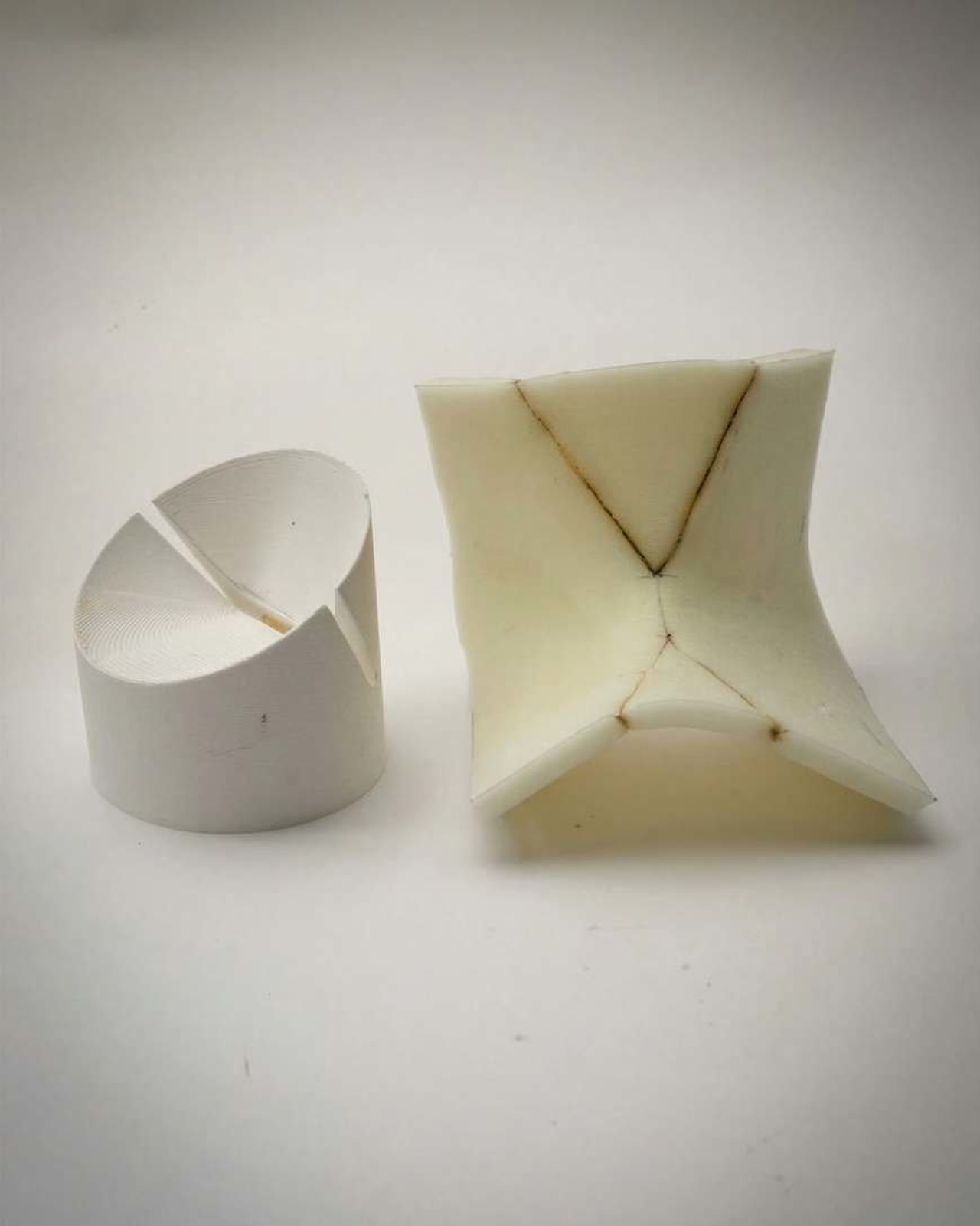
The chair, still unnamed and currently in the design phase, uses no adhesives, no tacks, no staples, none of the usual fasteners that hold most upholstered furniture together. The wooden frame is carved with a deliberate groove, and the upholstered foam cushion is simply wedged into it. Friction does the rest. The whole thing holds together through the logic of fit rather than the intervention of hardware. It sounds almost too simple, and that’s kind of the point.

I keep thinking about why this feels so satisfying to look at, and I think it comes down to the fact that we’ve been conditioned to accept over-engineering as a sign of quality. More parts, more steps, more materials, more adhesives: these feel like indicators of a serious product. Raw-Edges pushes back on that quietly. The notch solution is elegant precisely because it asks less of the chair, not more. It treats the materials as intelligent components that can work together without being forced.

This thinking is very on-brand for Raw-Edges. Their work sits comfortably in the permanent collections of MoMA, the Vitra Design Museum, and The Art Institute of Chicago, and the studio has collaborated with names like Louis Vuitton, Vitra, Stella McCartney, and Moroso. They’ve won the A&W Designers of the Year award, a Wallpaper Design Award, and were named Designers of the Future at Design Miami/Basel. None of that happened by accident. It’s the result of a studio that consistently asks questions other designers tend to skip over.

Their philosophy, as they describe it, begins with humble experimentation and a search for unconventional principles. That’s a gracious way of saying they don’t assume the current answer is the best one. The project is being developed in collaboration with Italian furniture company Bolzan, which strongly suggests this isn’t destined to stay a prototype forever. A saleable product feels like the logical next step, and that’s worth getting excited about.

The implications here also stretch beyond aesthetics. A chair held together by friction rather than glue or staples is, by nature, easier to take apart. The foam can be removed, replaced, or recycled separately from the frame. In a design culture increasingly preoccupied with repairability, longevity, and what happens to products at the end of their lives, this approach carries real practical weight. And it doesn’t feel like a sustainability talking point bolted onto a product after the fact. It feels like an idea that was right from the start.

Furniture design doesn’t often make headlines outside trade publications and design weeks, but this concept deserves a wider audience. Not because it’s flashy, and not because it’s about to show up in every furniture showroom next season, but because it demonstrates that design thinking is still genuinely capable of surprise. Sometimes the most powerful idea is a groove in a piece of wood and the confidence to trust it.

The post Raw-Edges Just Designed a Chair That Needs Zero Fasteners first appeared on Yanko Design.
The ZERO Chair Has No Welds, No Joints, No Apologies

Most chairs are built on compromise. You stack the legs, screw the seat, bolt the back, and somewhere in that assembly, a little bit of the original idea gets lost to the necessity of structure. Davide Bozzo’s ZERO Chair refuses to play that game entirely.

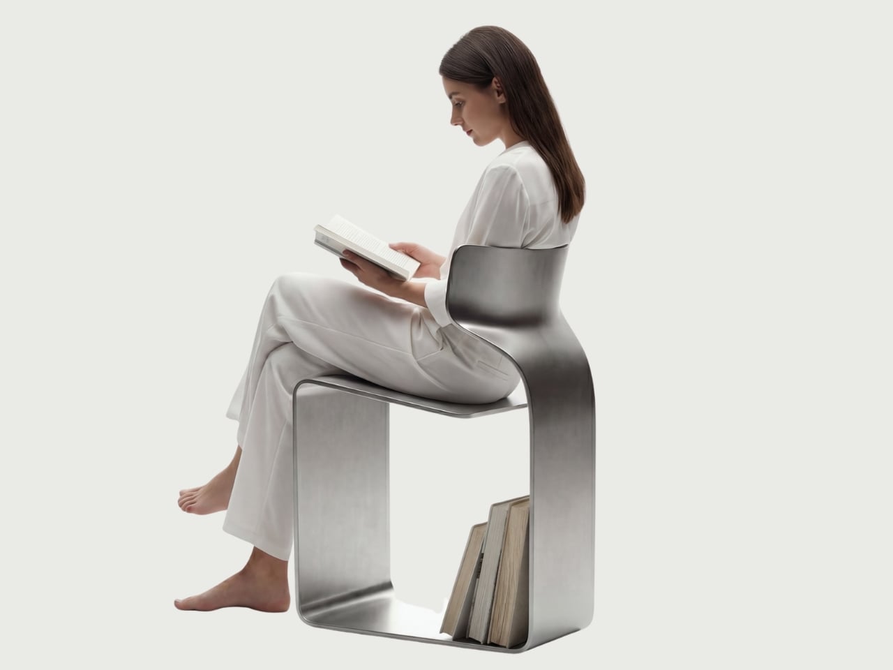
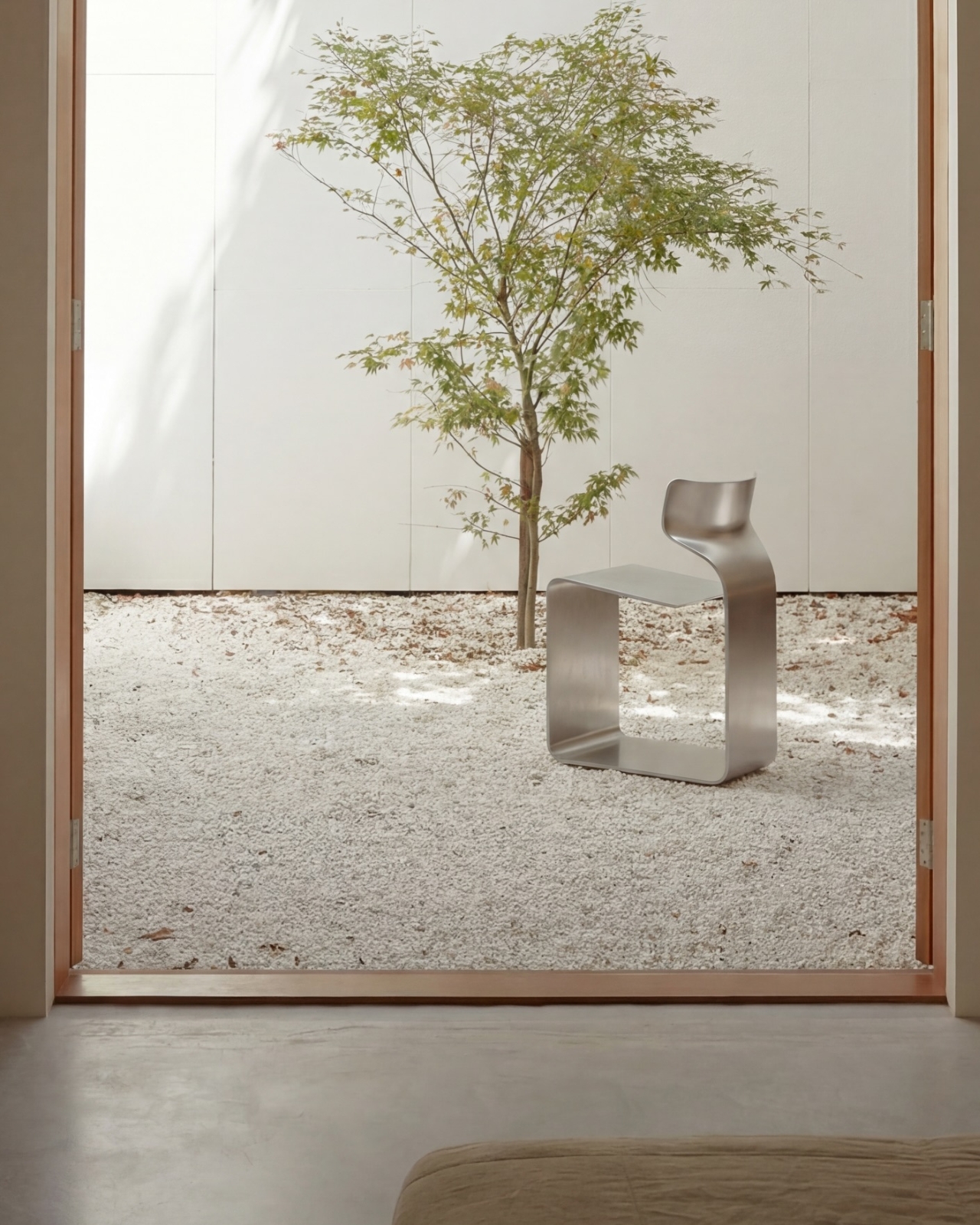
The concept is almost confrontationally simple: one single ribbon of metal, bent and curved into a complete chair. No welds holding two pieces together. No joints disguised under upholstery. No hardware quietly doing the heavy lifting behind the scenes. Just one continuous piece of material pushed into a form that includes the base, the cantilevered seat, and the backrest all at once. The name isn’t branding. It’s a philosophy.

Designer: Davide Bozzo

Looking at the photographs, the first thing I kept circling back to was the sheer audacity of the backrest. It doesn’t connect to the base through hidden brackets or clever joinery. It simply rises from the same ribbon, curving upward and backward in a motion that looks more like a wave caught mid-break than anything you’d typically call furniture. It’s graceful in a way that makes you slightly suspicious of it. How is this thing holding anyone’s weight?

The answer lies in what Bozzo describes as structural tension. Form doesn’t just follow function here. It is the function. The material itself carries the engineering logic. Every curve has a reason, and every bend is calculated to distribute load through the continuity of the form rather than through added components. It’s the same principle behind suspension bridge cables or the way a curved shell is structurally stronger than a flat panel. Applied to a chair, it feels almost radical.

I’ll be honest. My first instinct was skepticism. A single-piece metal chair sounds like one of those design school exercises that makes for great renderings but falls apart under real scrutiny. But looking at the close-up photographs, especially the one capturing the S-curve where the seat meets the backrest, you start to believe it. The brushed metal finish shows actual material depth and actual intentionality in how the surface was treated. This isn’t a concept render floating in a void. It has weight and presence.

That said, I do have questions. Comfort is conspicuously absent from the conversation. Metal, even beautifully formed metal, is hard. The cantilevered seat gives some flexibility, which should help, but a chair without cushioning asks something significant of the person sitting in it. Bozzo’s design makes a statement about material honesty and structural purity, which I respect deeply, but at some point a chair has to be sat in. That’s the tension that makes it interesting rather than just pretty.

The piece also reads as a quiet counterargument to the current era of maximalist furniture. We’ve spent years surrounded by bouclé armchairs, curved velvet sofas, and furniture dressed up in layers of texture and warmth. Bozzo’s chair strips all of that away and asks whether furniture can earn your attention through restraint and engineering alone. My honest opinion? It can. Whether it earns a place in your living room is a different question entirely.

The chair also does something that doesn’t get discussed enough in design coverage: it makes the negative space part of the design. The open rectangle formed by the base creates a void that’s almost as deliberate as the metal itself. In the lifestyle image set against a Japanese garden backdrop, that void frames the gravel and ground beyond it. The chair becomes a viewfinder. That’s not accidental. That’s a designer who understands that what you leave out is just as powerful as what you put in.

Bozzo has been building a reputation for material-forward work. His stainless steel pet bowl Dune explored similar ideas around fluid curves in a single medium, but the ZERO Chair feels like a significant step up in ambition. It’s the kind of piece that stops you mid-scroll, makes you set your phone down, and actually think. That, more than any material specification, is probably the point.

The post The ZERO Chair Has No Welds, No Joints, No Apologies first appeared on Yanko Design.
Desire Paths, Plywood, and a Stool That Gets It

Have you ever noticed the worn-down patches of grass in a park where people have chosen to walk instead of staying on the designated path? That’s a desire path, and urban planners have a complicated relationship with them. Some see them as a nuisance, proof that people refuse to follow the plan. Others see them as data, clear evidence that the original design missed something. Fabrício Reguelin Auler falls firmly in the second camp, and his Shortcut Stool is one of the more thoughtful pieces of furniture I’ve come across in a while.

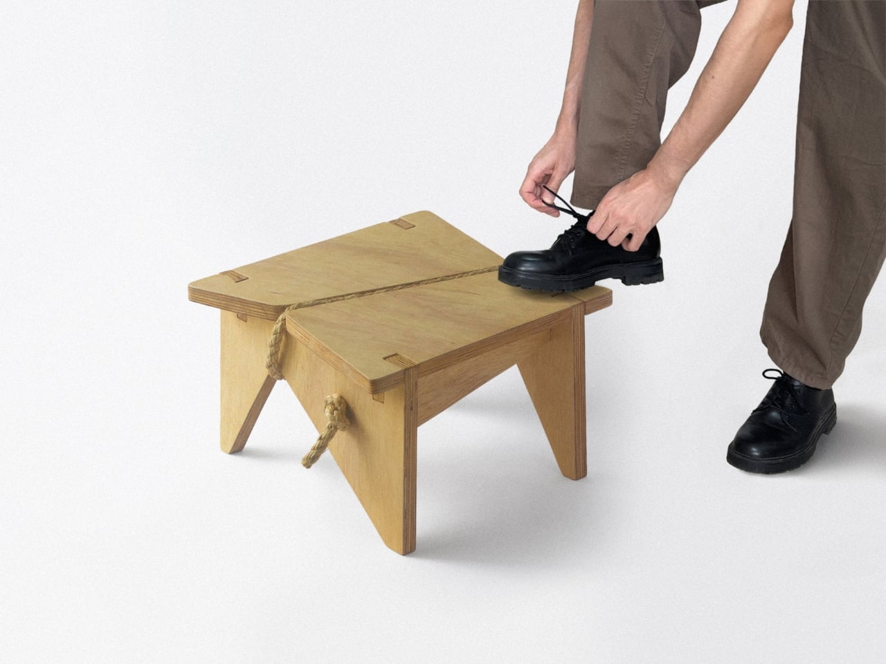
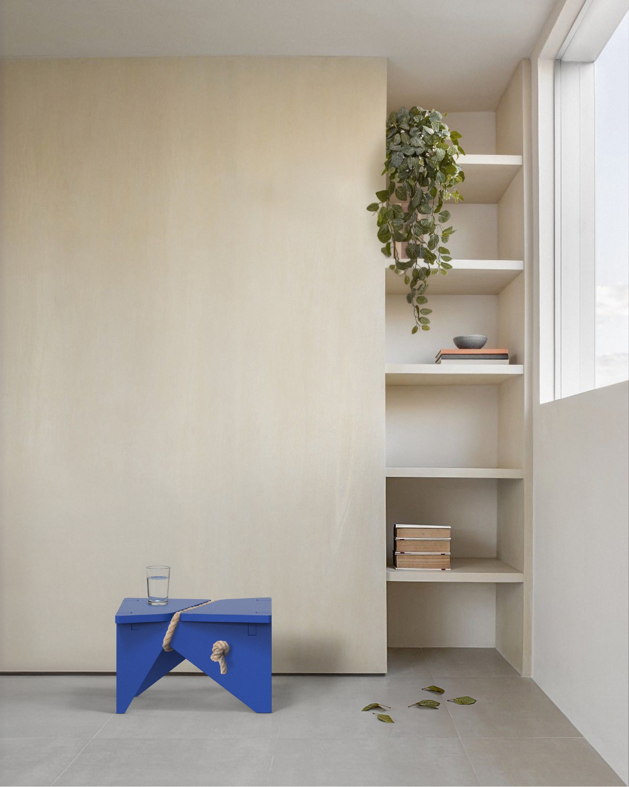
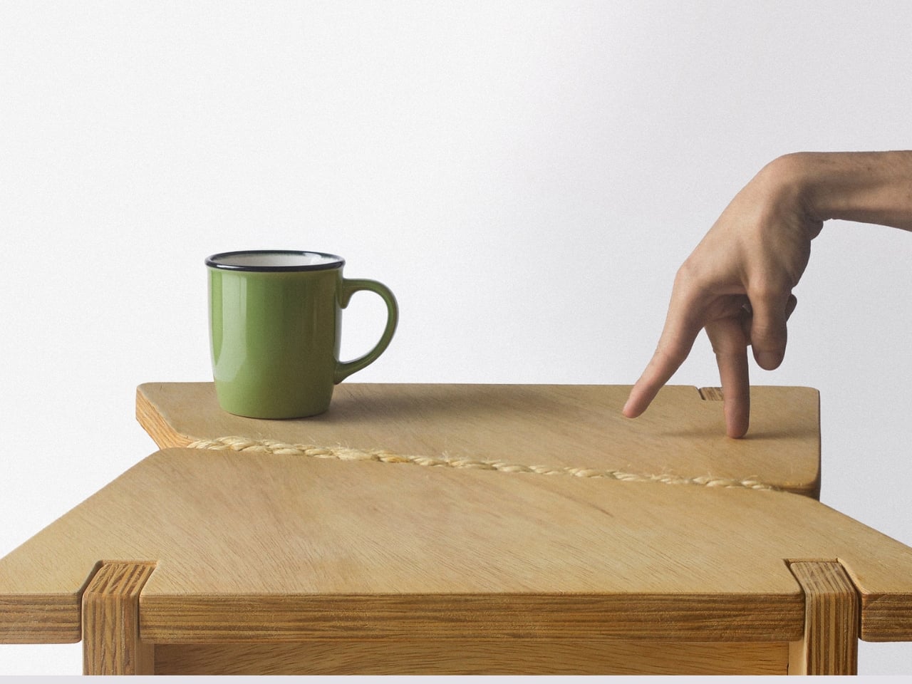
The concept behind the Shortcut Stool (or Atalho Bench, as it’s also known) is deceptively simple: what if furniture was designed around the way people actually use it, rather than the way designers intended? That means acknowledging all the small, unconscious behaviors we exhibit at home. Sitting on the very edge of a stool instead of the center. Resting a bag on it before finding somewhere better. Perching on it for thirty seconds while tying a shoe. Using it as a surface for a glass of water when every other surface is occupied. None of this is “correct” use. And yet, all of it is completely normal.

Designer: Fabrício Reguelin Auler

This is where I think a lot of furniture falls short. Design, especially at the higher end of the market, tends to be prescriptive. There’s an implied right way to use a piece, and deviating from it can feel almost disrespectful. Reguelin Auler flips that thinking entirely. The Shortcut Stool doesn’t pretend that people will interact with it perfectly. It welcomes the imperfection, and that’s genuinely refreshing.

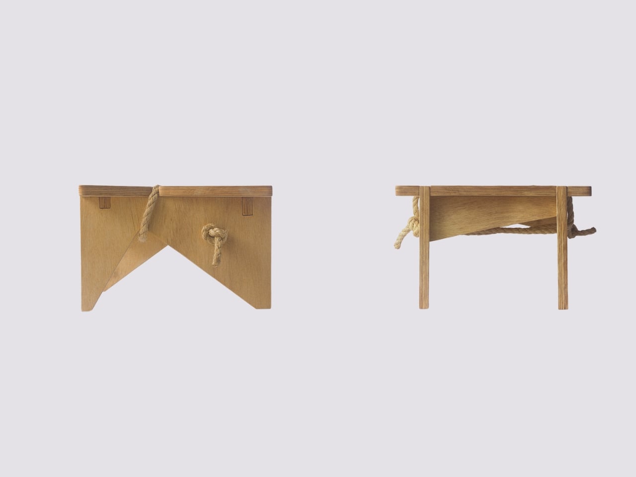
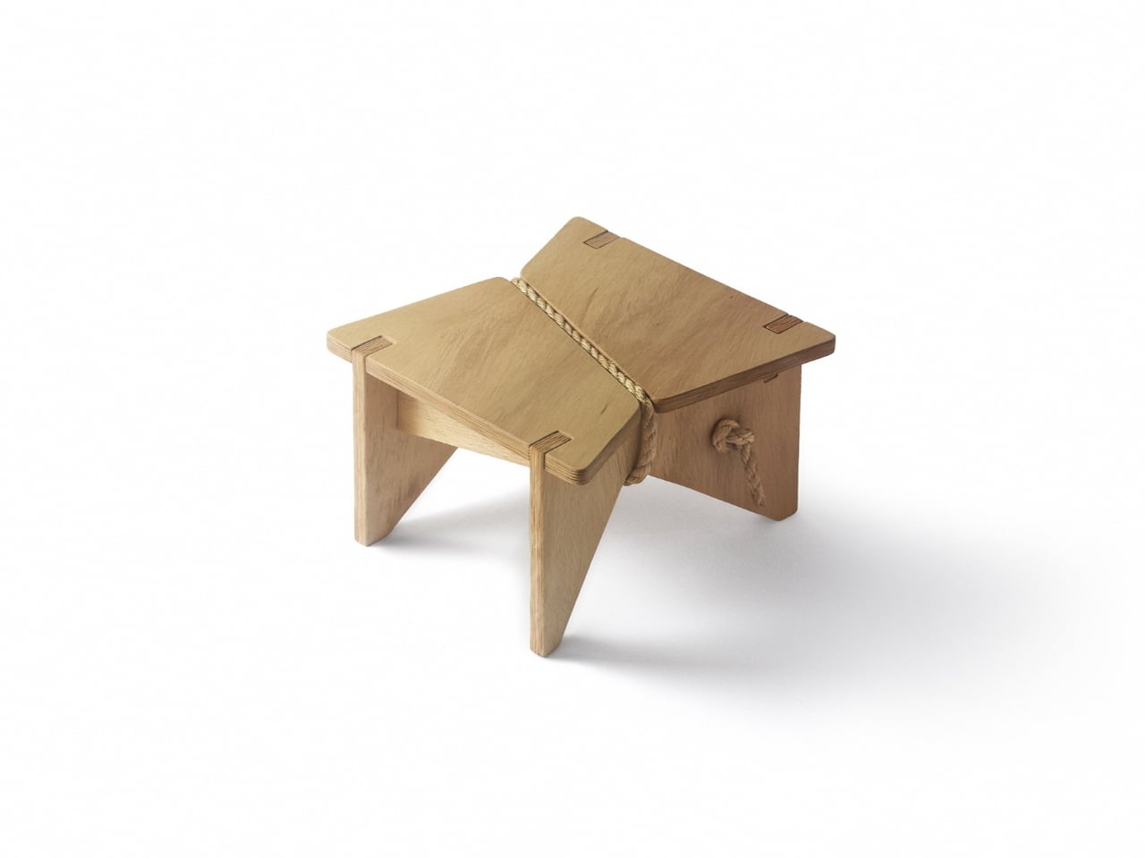
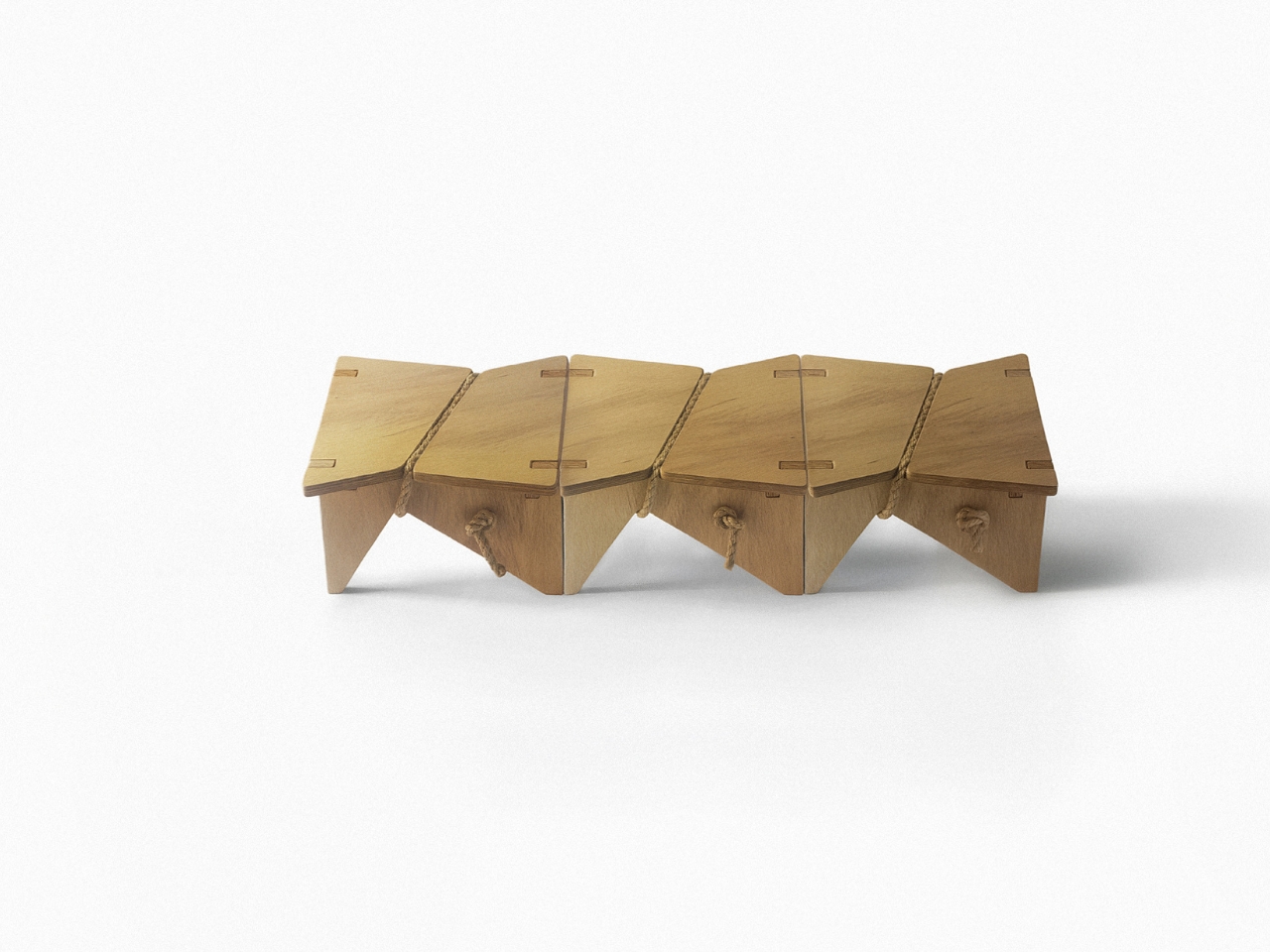
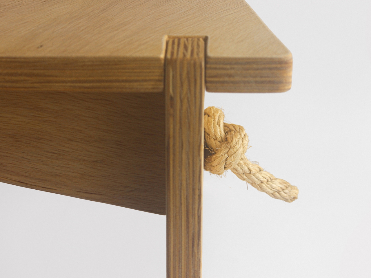
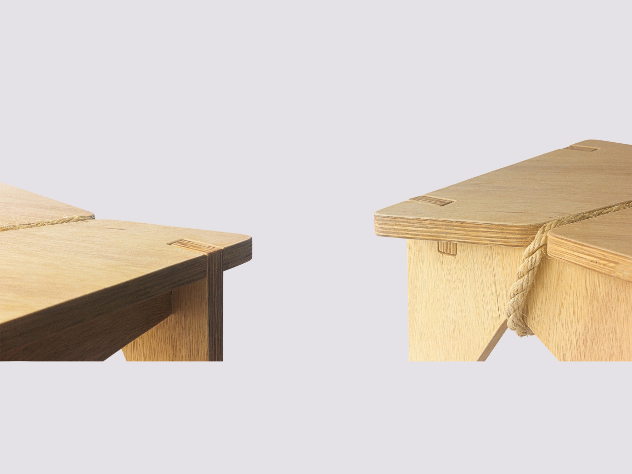
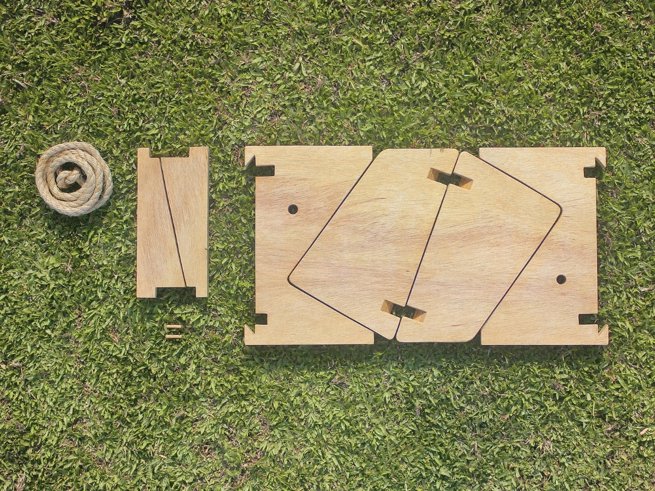
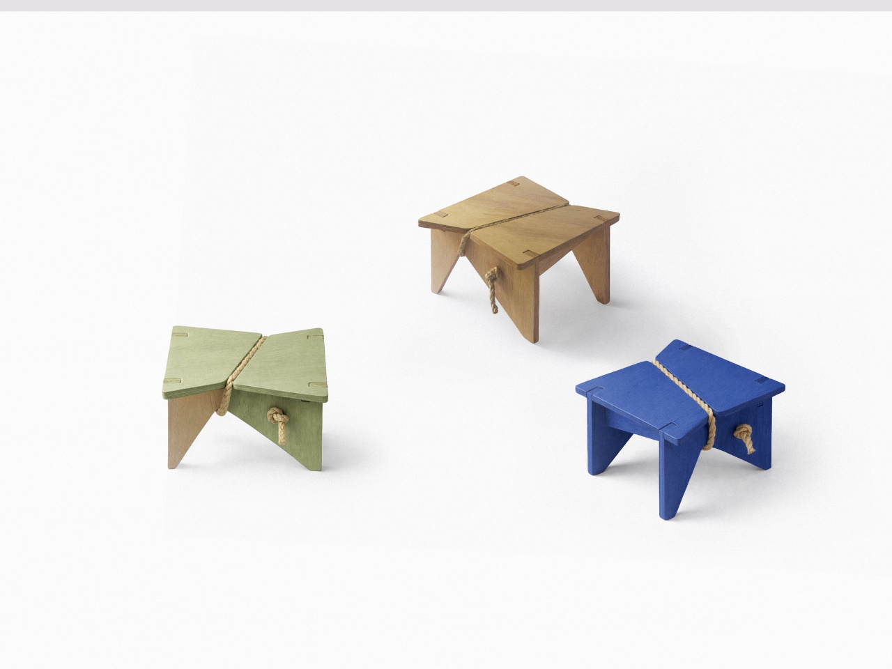
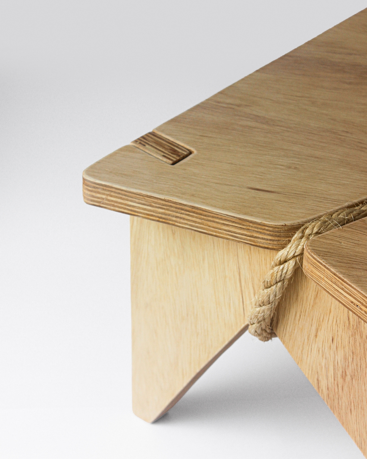
Materially, the piece holds its own. It’s made from marine pine plywood, assembled through a system of interlocking joints that require no screws, bolts, or complicated hardware. What holds it all together is tensioned sisal rope, and this is the detail that makes the whole thing click, visually and structurally. The rope isn’t decorative in the way that so many “natural element” additions can feel forced. It’s actually doing the work, reinforcing the structure while giving the stool a texture that you want to reach out and touch. It makes the design feel honest, which is appropriate given what the piece is trying to say.

The modular nature of it is worth mentioning too. Single units can be connected to form a longer bench configuration, which means the Shortcut Stool scales with need rather than requiring you to commit to one fixed form. The flat-pack assembly and disassembly is straightforward, making it easy to move, store, or reconfigure. It comes in natural pine as well as painted versions in a deep cobalt blue and a muted sage green, both of which look sharp in context. The blue one especially has a kind of confident visual energy that punches well above the stool’s modest size, which is something I didn’t expect from a plywood bench.

What strikes me most is how the Shortcut Stool manages to make a philosophical argument without being heavy-handed about it. It’s not a design that comes with a manifesto attached. You can simply look at it, use it, and decide it works. But if you sit with the concept for a moment, there’s a bigger idea underneath: that the gap between how objects are designed and how they’re actually lived with is rarely addressed honestly in product design. Most things are built for ideal conditions. This stool was built for real ones.
It also raises a question I keep returning to: how many products in our homes are quietly working against us because they were designed without accounting for how people actually behave in real time? The Shortcut Stool is a small answer to a larger problem, and I appreciate that it arrives without fanfare, just plywood, rope, and a clear point of view. Fabrício Reguelin Auler has made something that earns its place in a home not by demanding attention, but by already understanding you. That’s a rare quality in any object.

The post Desire Paths, Plywood, and a Stool That Gets It first appeared on Yanko Design.