This Vase Has a Glass Lattice That Lets Stems Find Their Own Angle

Flower arranging gets credit for being meditative and creative, but for most people, it’s actually a bit of a guessing game. Stems slide around, flowers lean in unexpected directions, and what started as a simple bouquet ends up looking haphazard, no matter how much you fiddle. Most vases don’t help much; they hold the water, hold the stems, and leave the rest up to you.

That’s the problem that Rila, a 2026 vase by London- and Düsseldorf-based studio nikola & florian, quietly tries to solve. Rather than leaving every stem to fend for itself, the design adds structure that guides flowers into place without forcing them into any fixed arrangement. The idea isn’t to make flower arranging feel like a chore but to let it happen almost on its own.

Designer: Nikola Gaytandjiev and Florian Neubacher (nikola & florian)

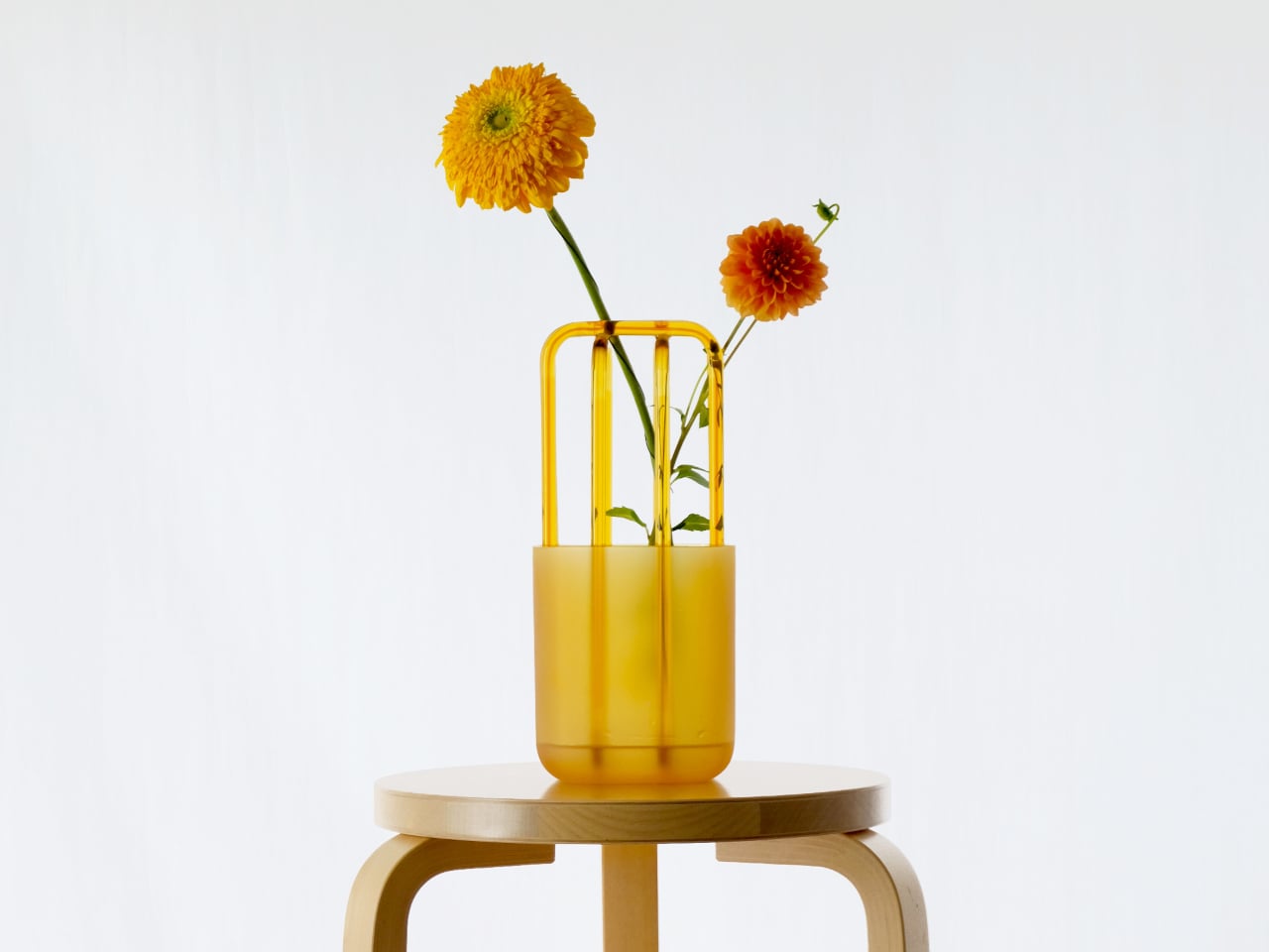
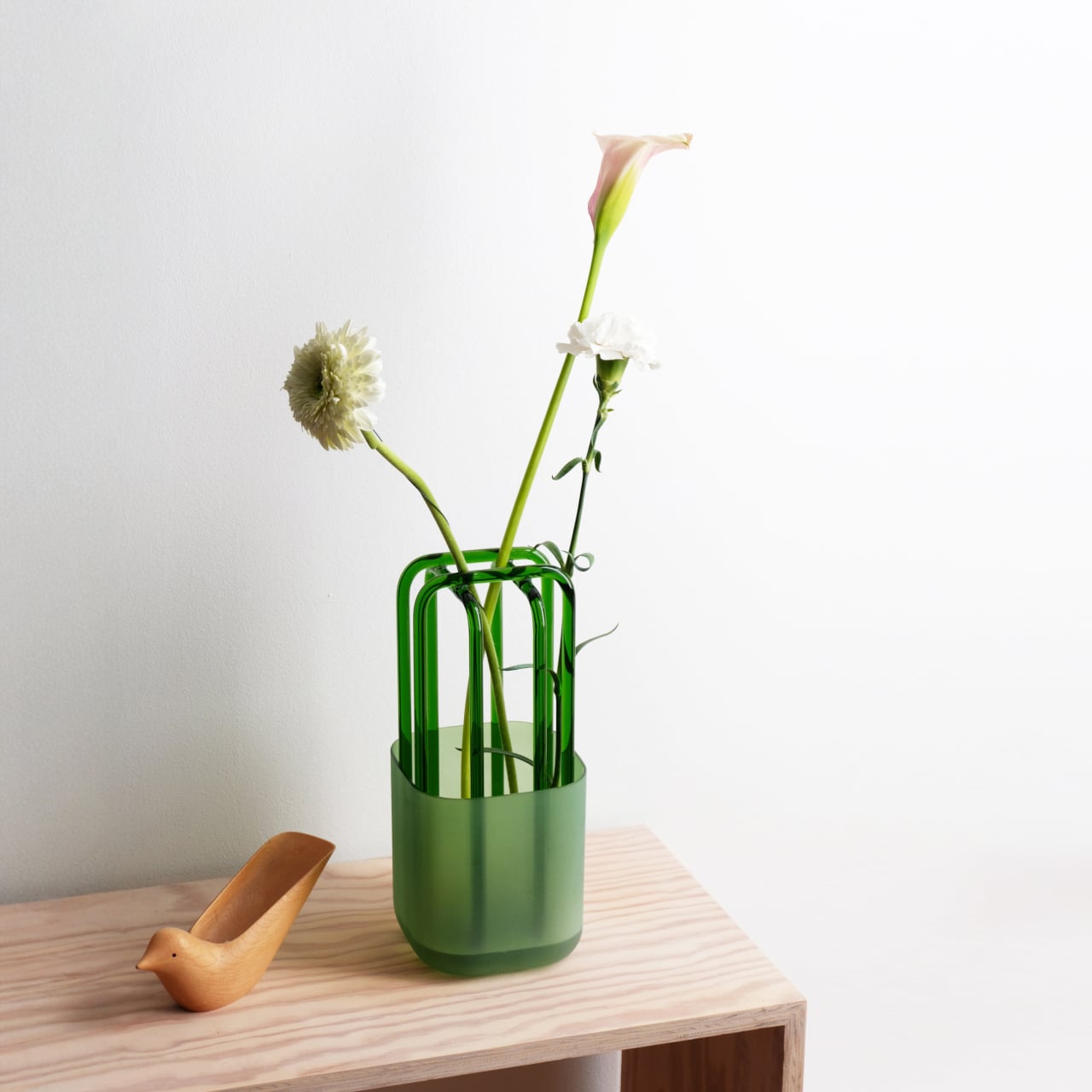
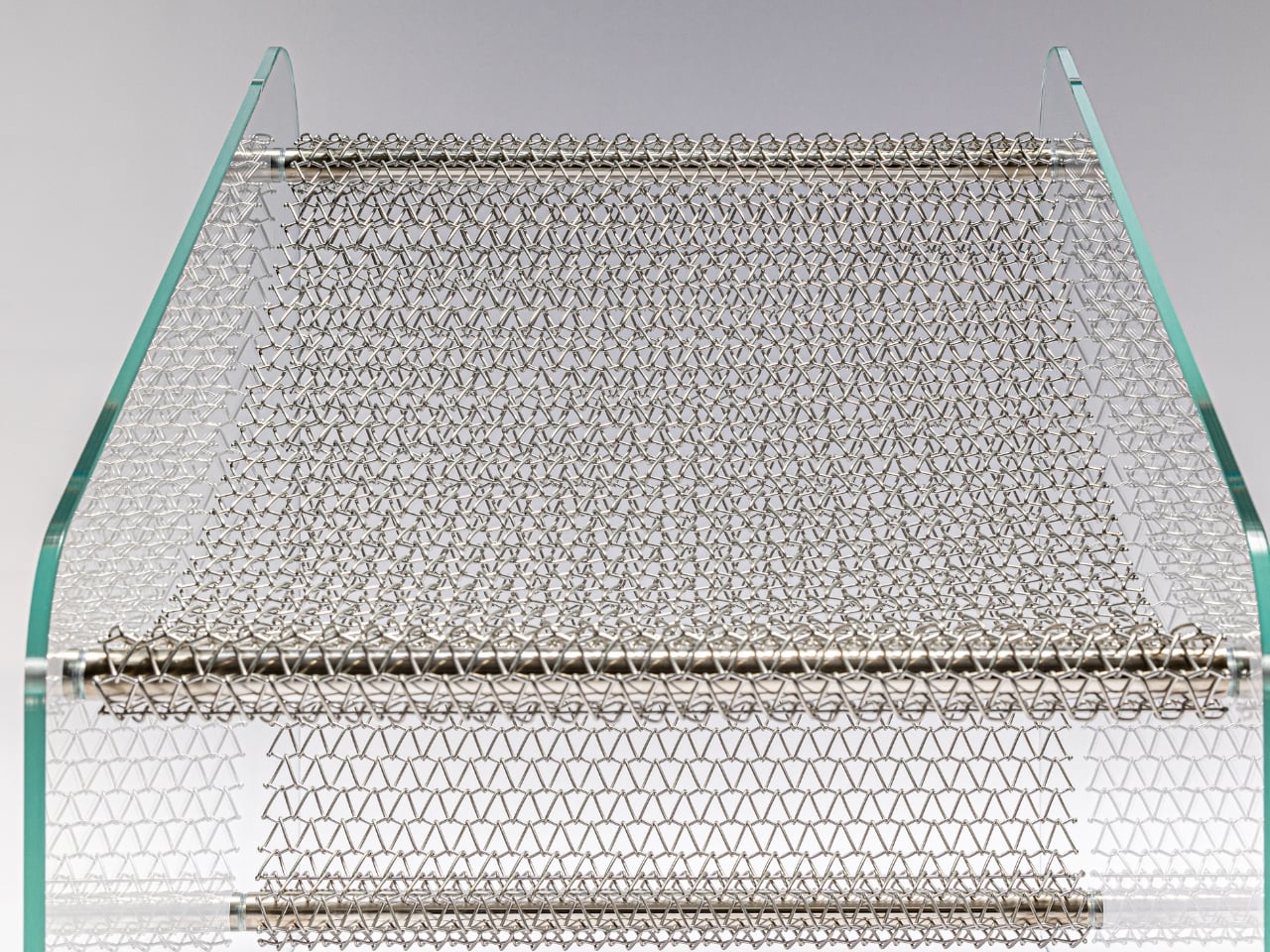
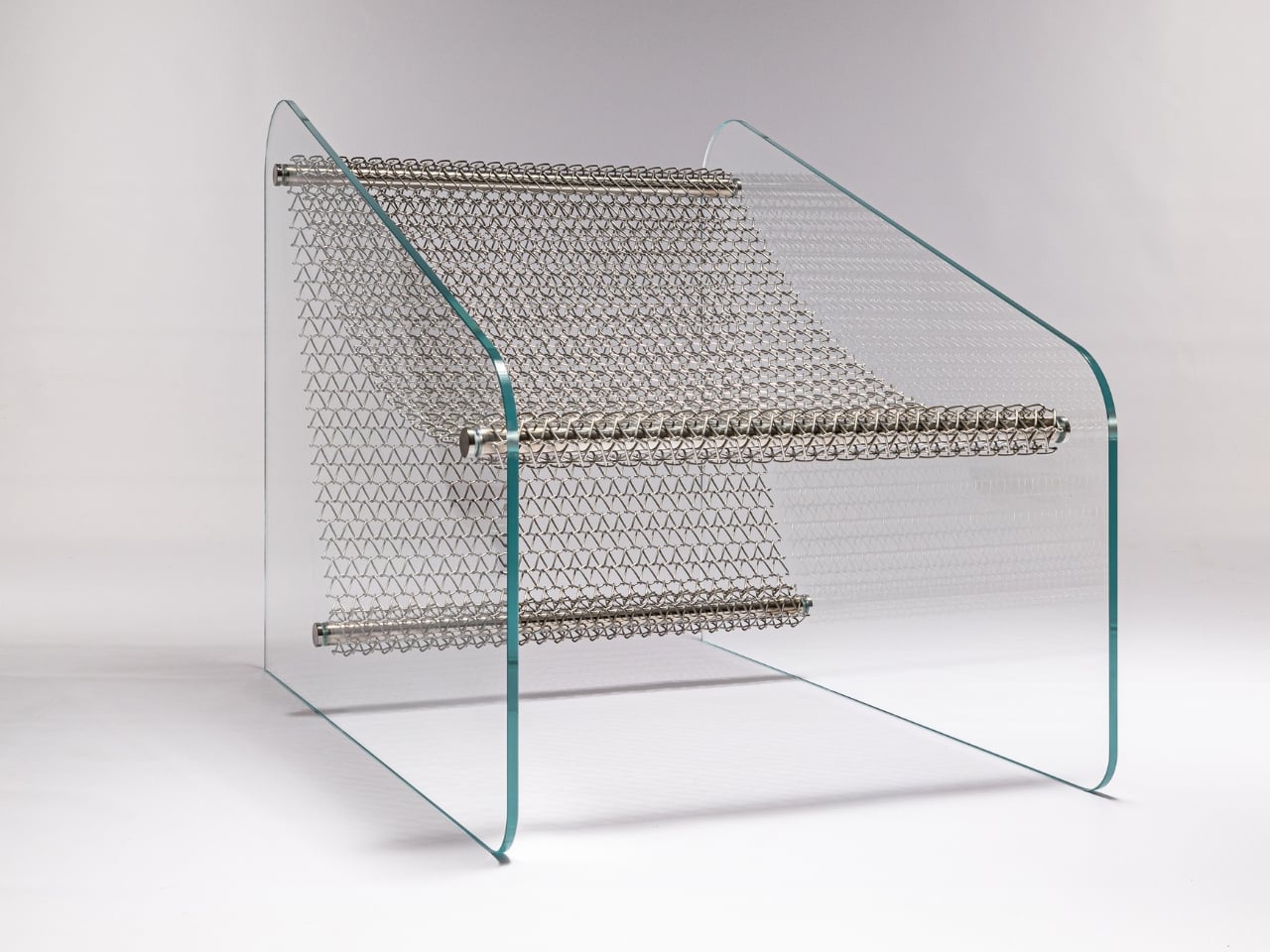
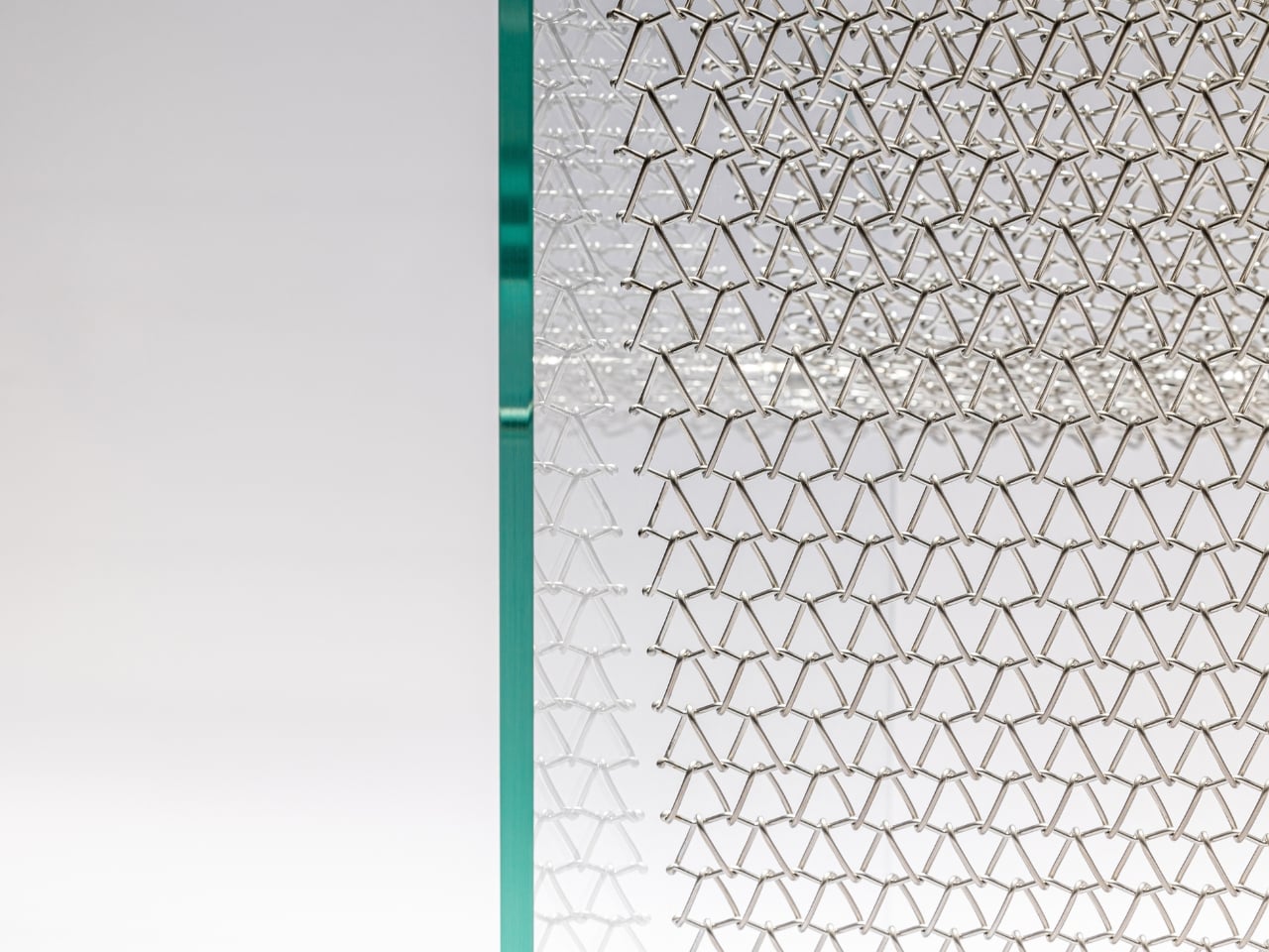
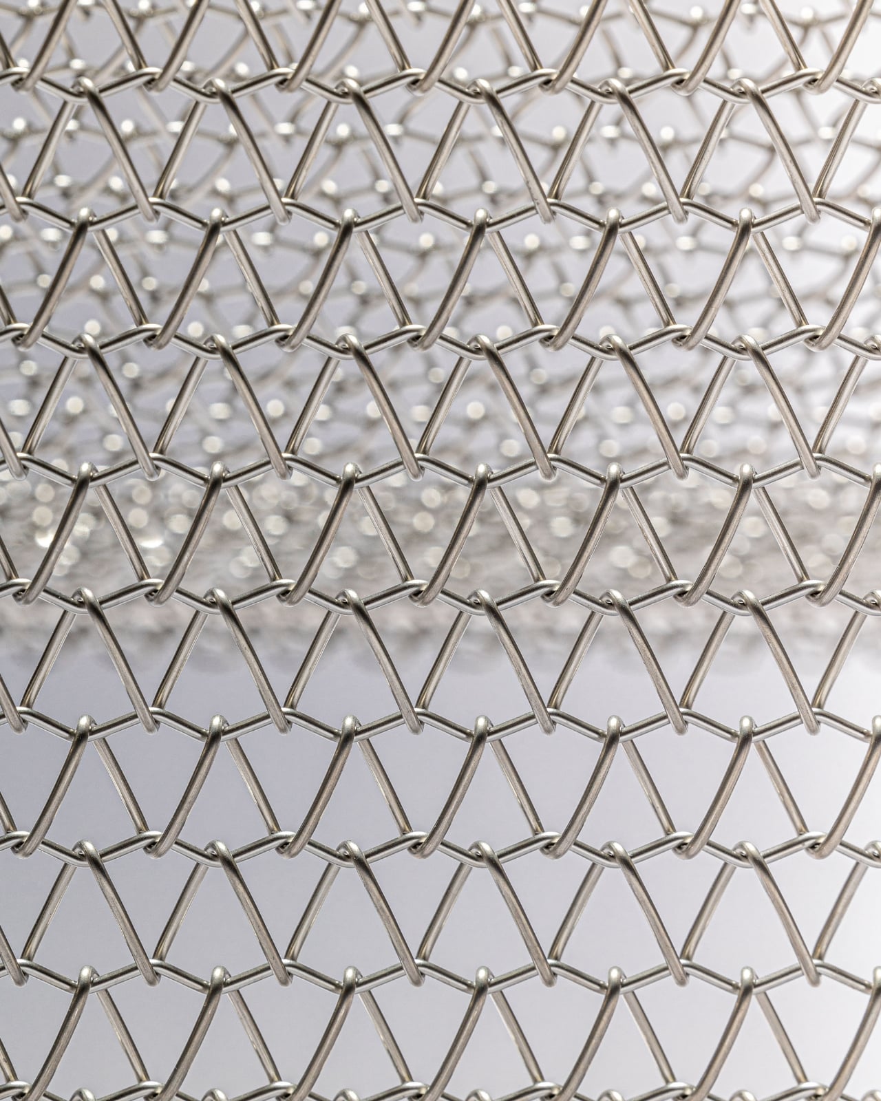
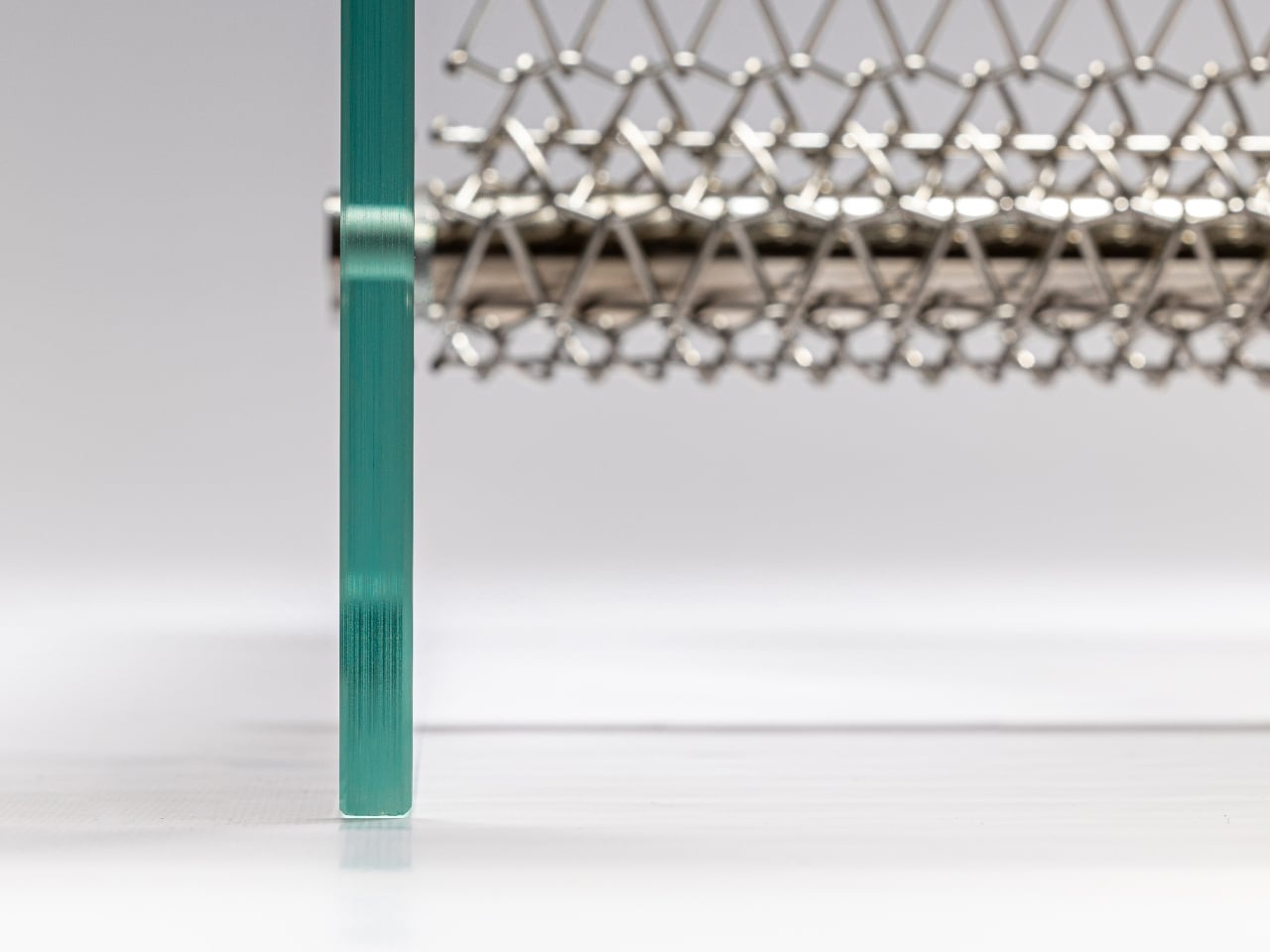
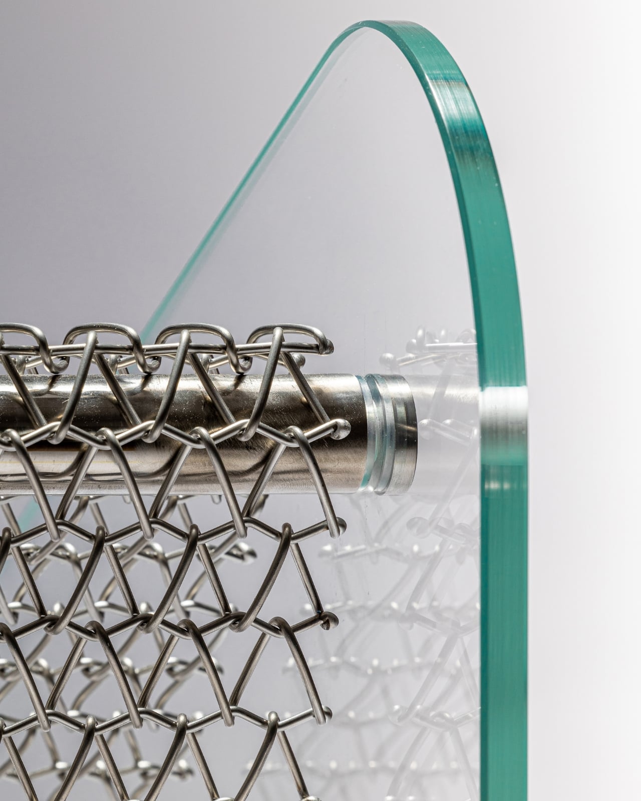
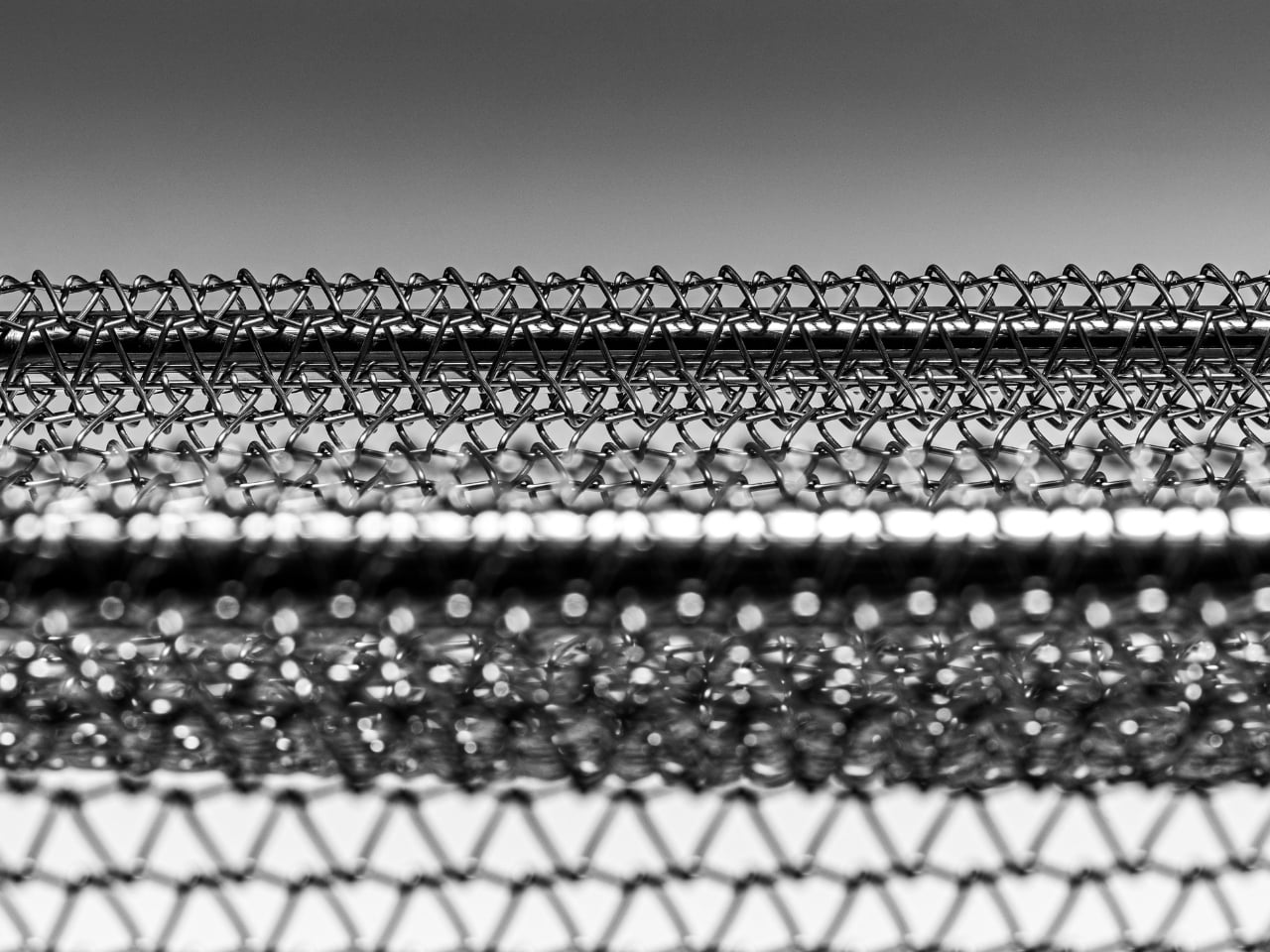
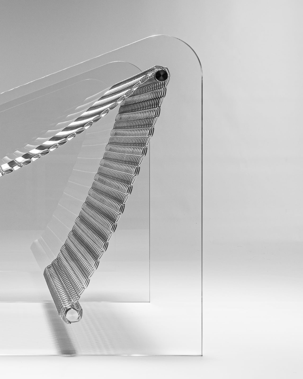
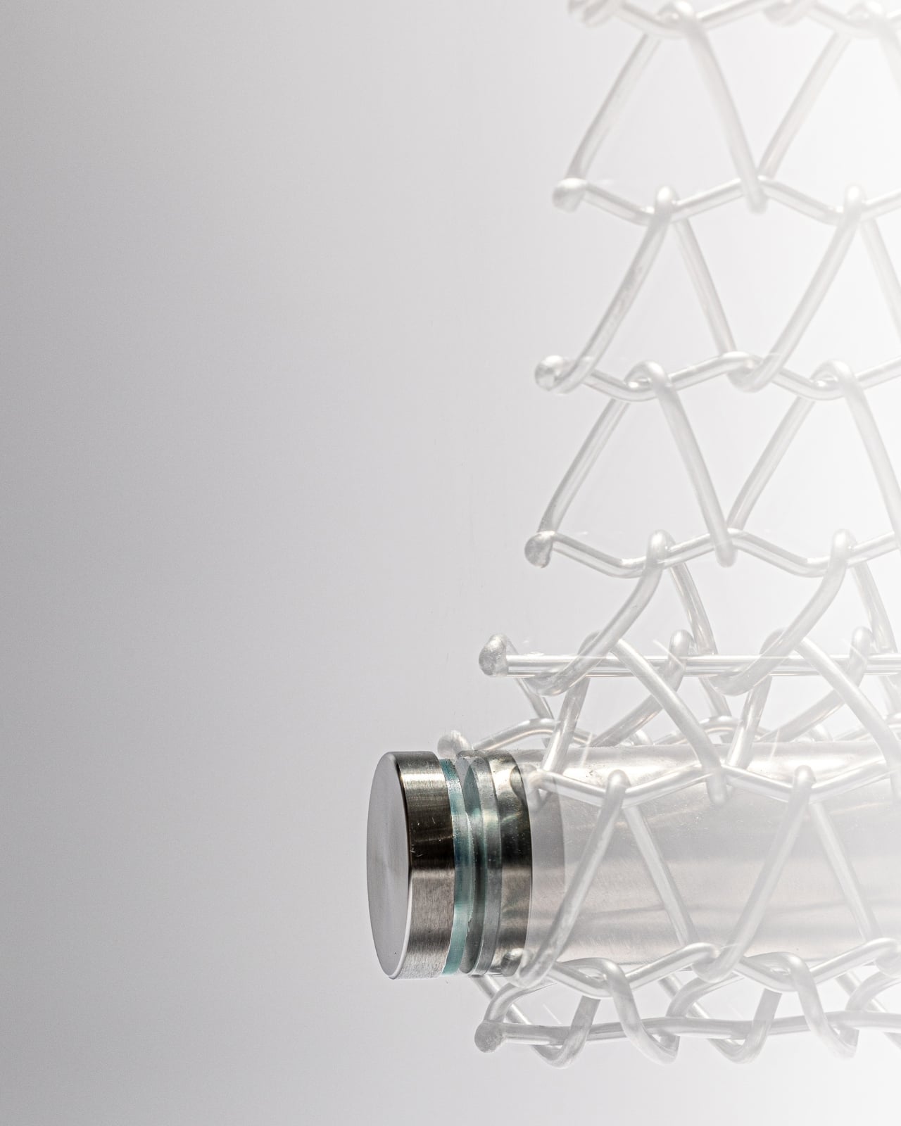
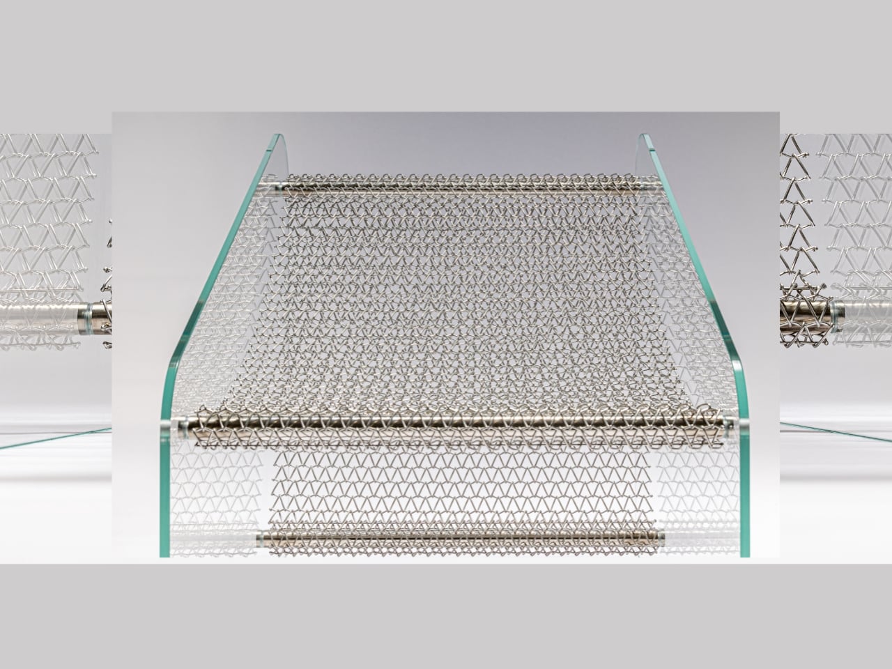
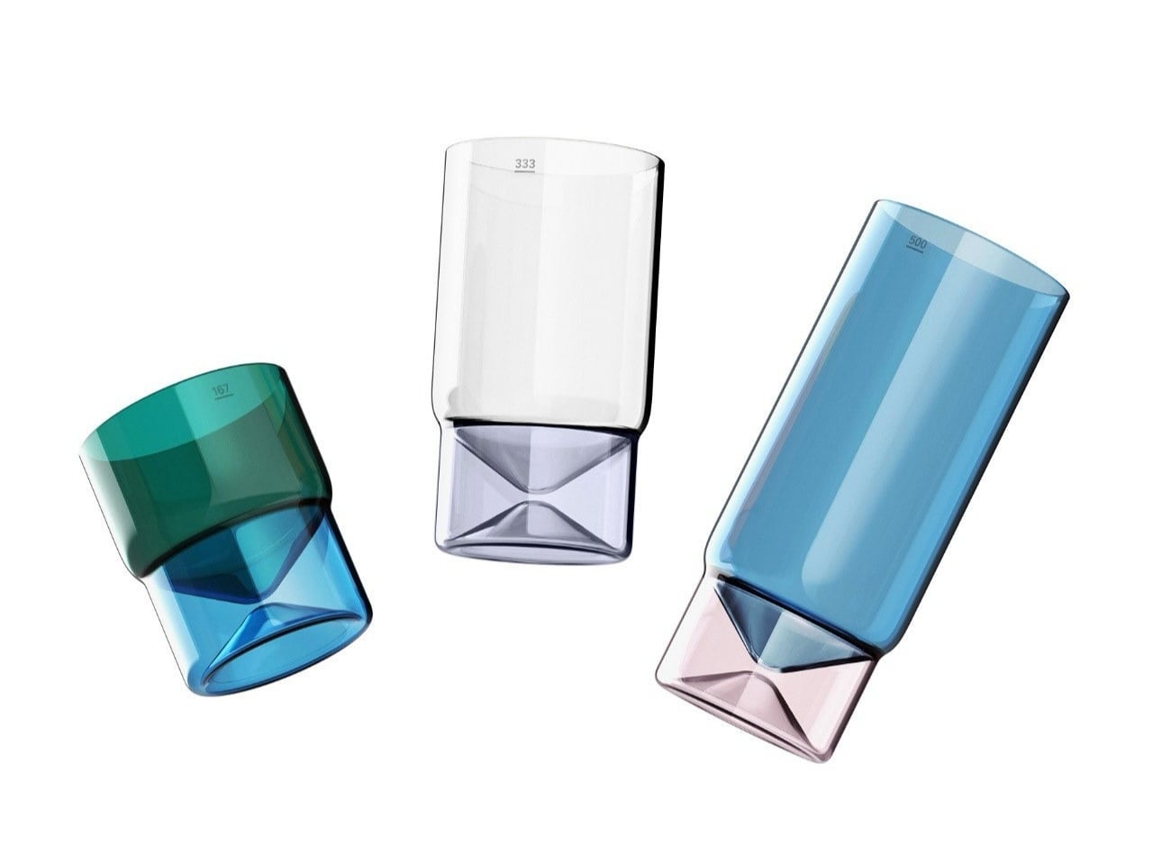
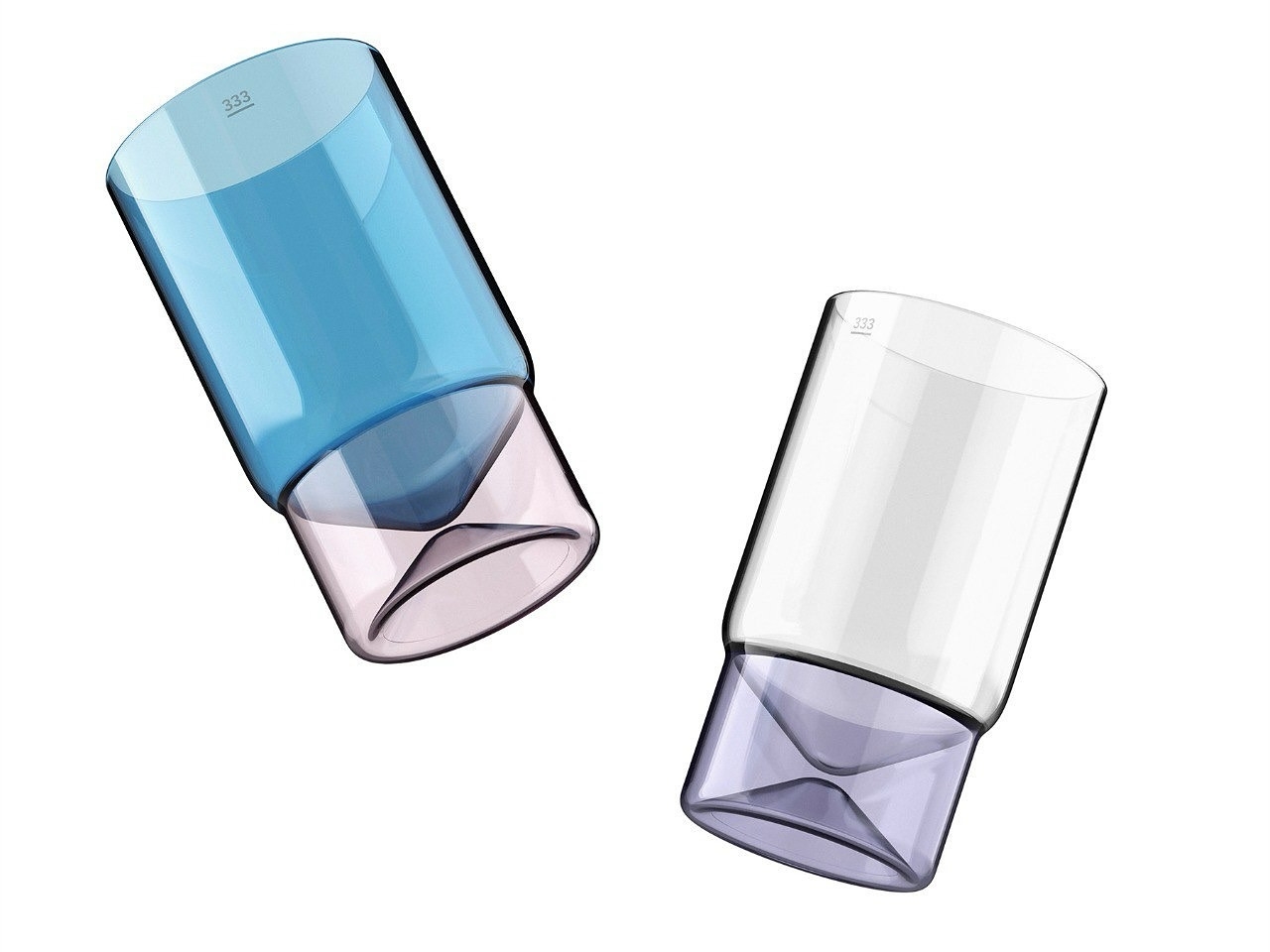
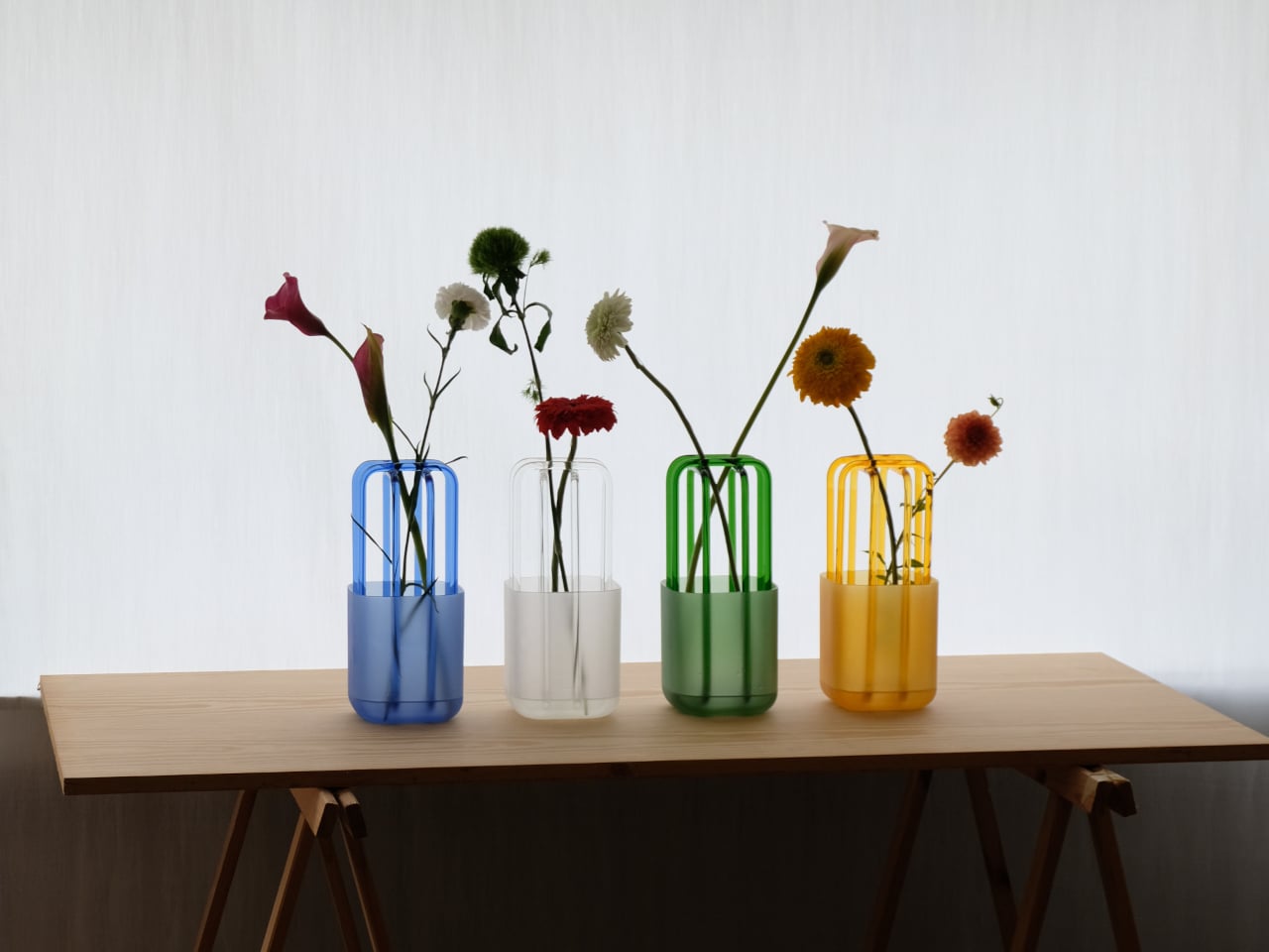
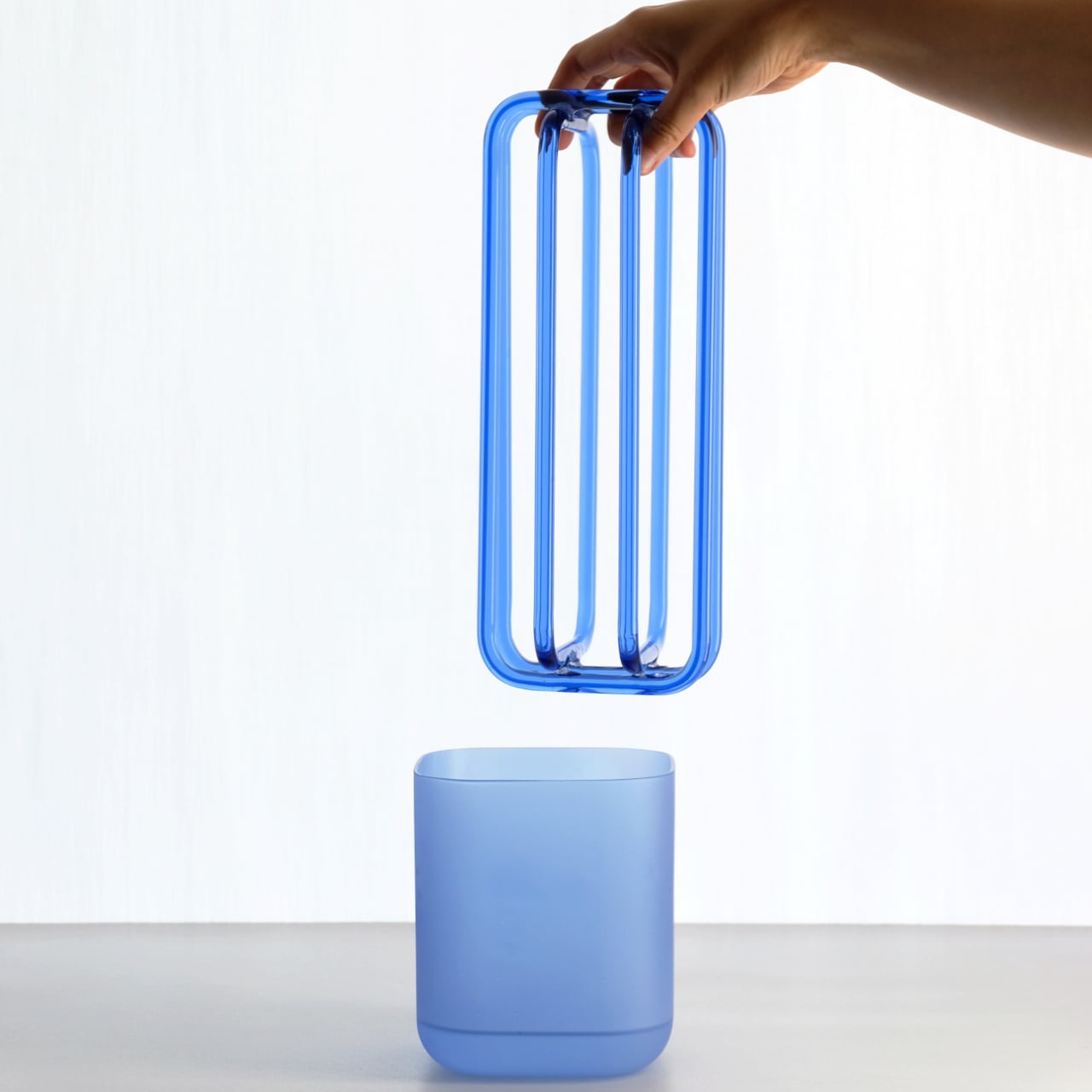
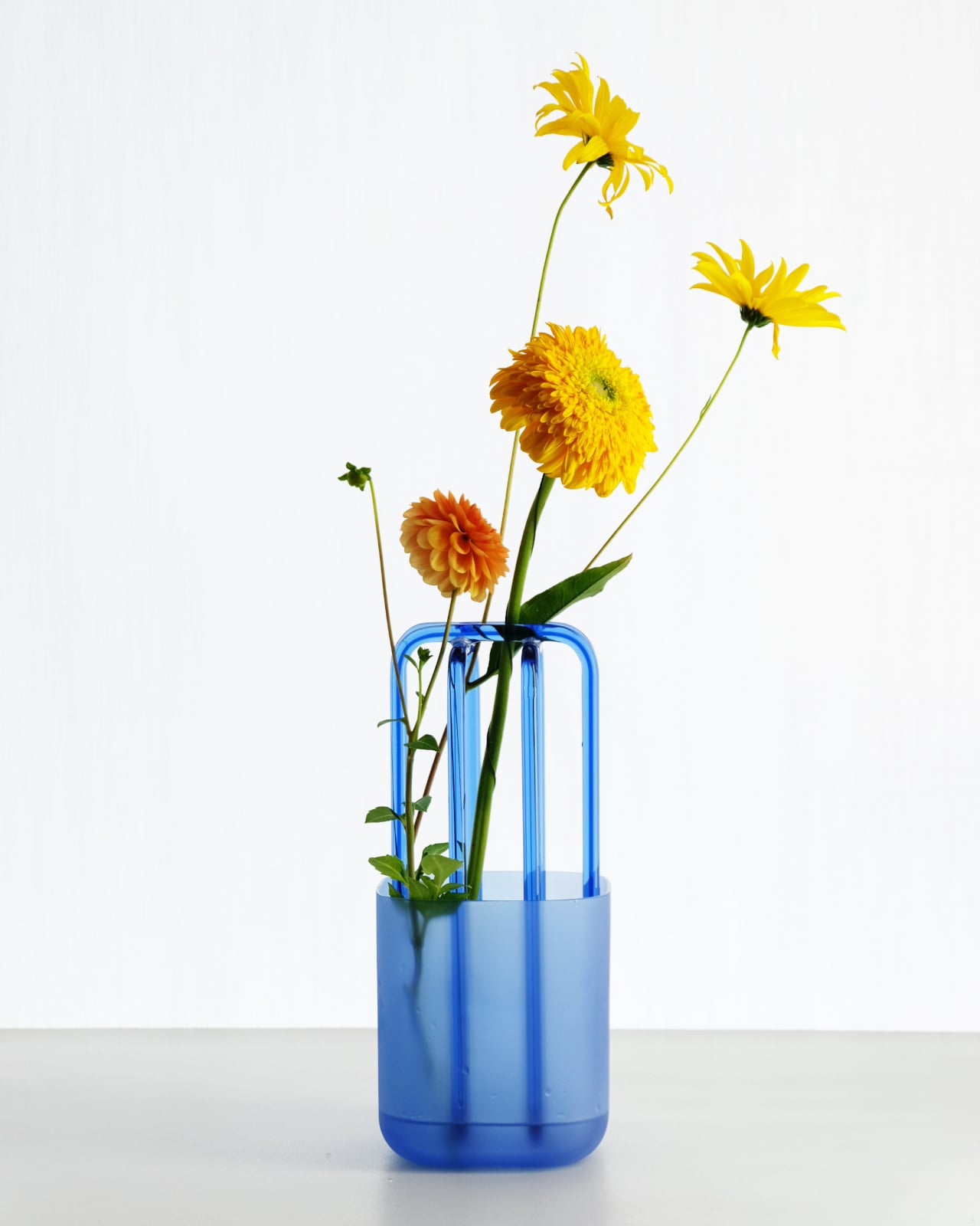
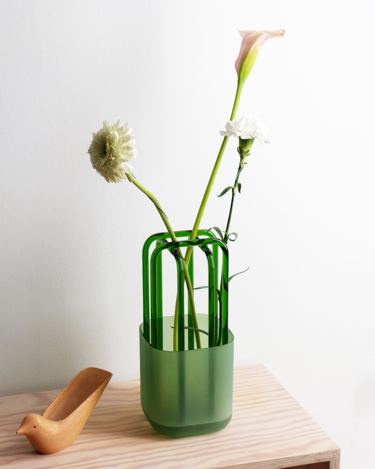
The vase consists of two separate pieces: a frosted glass vessel that holds water, and a clear glass structure that sits right inside. The structure has a net-like form, with arched glass rods that gently space and guide each stem as it passes through, without locking anything into place. The two pieces lift apart, which makes the whole thing simple to clean.

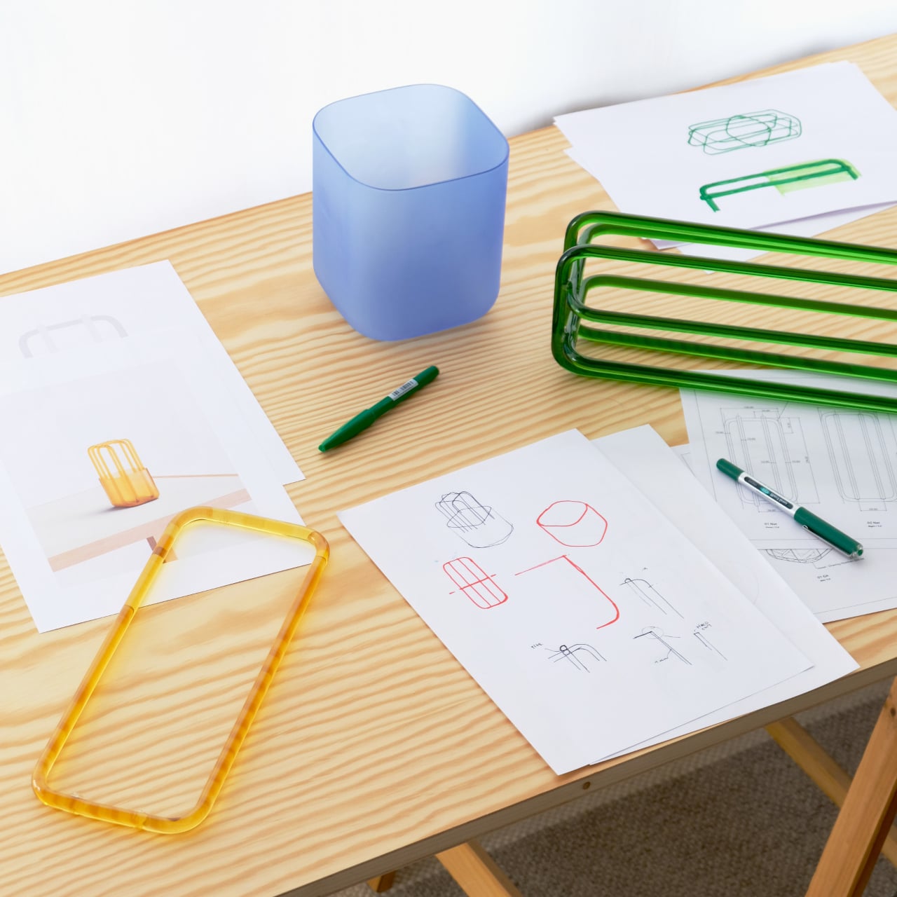
Both parts are made from borosilicate glass, chosen for its strength and optical clarity. What makes the pairing interesting is the contrast between them: the frosted vessel has a soft, muted look and a slightly tactile surface, while the clear structure above lets light pass straight through. That interplay of opacity and transparency gives the object a quiet visual richness that most flower holders don’t have.

In practice, using Rila feels less like a task and more like something you’ll stop thinking about. Drop a few stems through the lattice, and each one finds the angle it naturally wants. You don’t end up with a perfectly symmetrical arrangement, and that’s kind of the point. The flowers get room to look like themselves, with the structure providing just enough order.

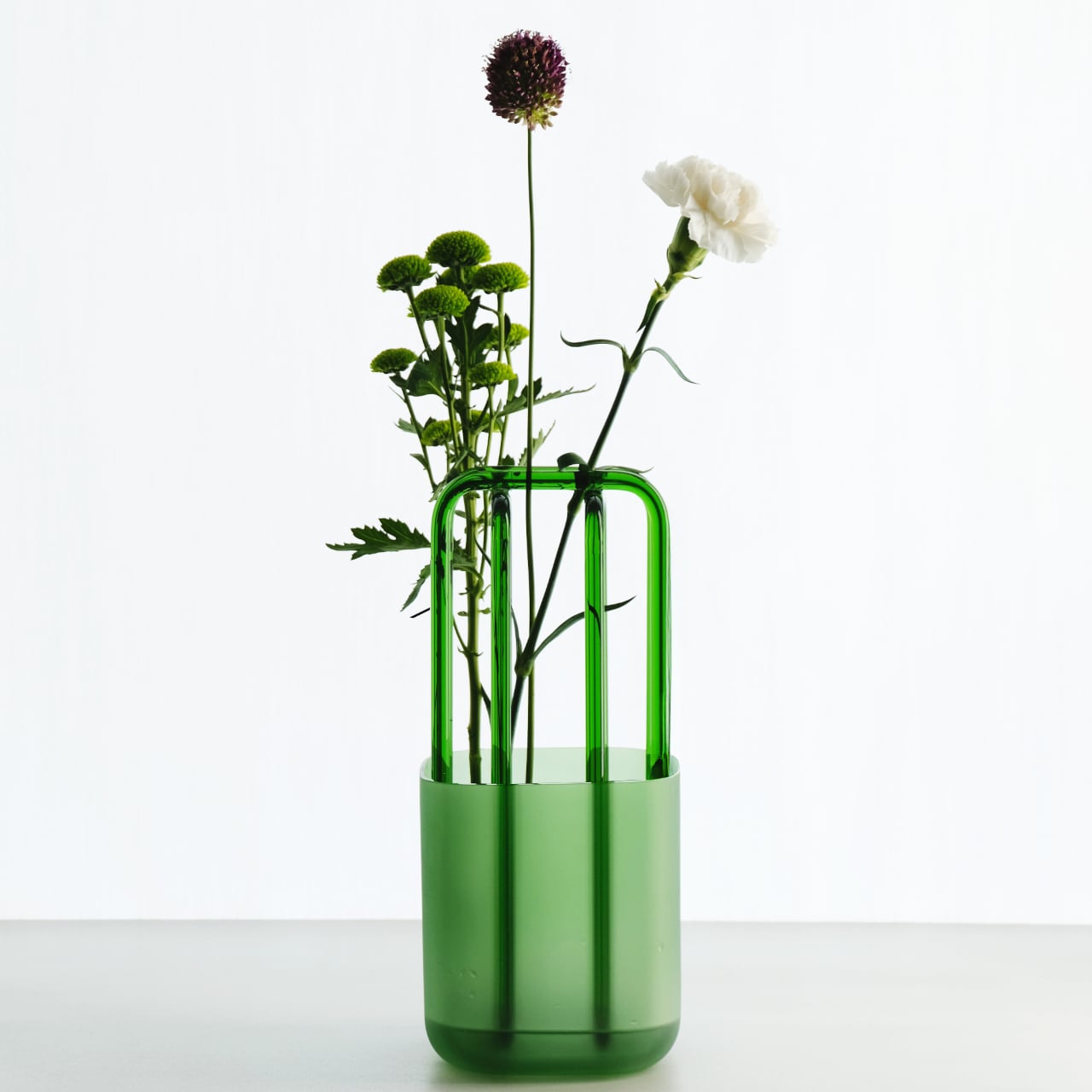
Rila comes in a handful of colorways, with matching tones running through both the frosted vessel and the clear structure. Blue, green, amber, and white are among the available options, each creating a slightly different mood without changing the fundamental character of the piece. The frosted base absorbs and deepens whatever color it carries, while the transparent structure stays open and light, keeping things airy.

What makes Rila particularly easy to live with is that it earns its place in a room even on days when there aren’t any flowers in it. The frosted vessel and clear glass structure together form an object with enough sculptural character to hold attention on its own. You’d place it on a side table the same way you’d display any other piece you genuinely liked.

The post This Vase Has a Glass Lattice That Lets Stems Find Their Own Angle first appeared on Yanko Design.

The Glass Chair That Makes Every Other Chair Look Boring

Most chairs do their job quietly. They hold weight, fill space, and if we’re lucky, look decent in a photo. The Metal Affaire by Minimal Studio is not most chairs. It’s the kind of piece that makes you stop mid-scroll and wonder if someone just decided that furniture needed to be a little more daring.

The Metal Affaire is an armchair made almost entirely of transparent laminated glass, supported by a metallic mesh base. Yes, glass. The kind of material you typically associate with windows and coffee tables, not with the thing you sit on during a long Sunday. But that counterintuitive choice is precisely what makes this design so compelling. It doesn’t try to blend in. It asks to be noticed, studied, and maybe even argued about.

Designer: Minimal Studio

Minimal Studio is a multidisciplinary design studio based in Mallorca, Spain, founded by David Martínez Jofre. The studio brings together architects, engineers, and interior designers, and their philosophy is rooted in one clear belief: simplicity is not the absence of thought. It’s the result of a lot of it. Their signature look leans into clean lines, neutral tones, and materials that let a space breathe, which is exactly what the Metal Affaire does visually. The glass shell gives the chair an almost weightless appearance, like it’s barely occupying space at all, while the metallic mesh base grounds it with enough structure to remind you it’s very much real.

The design concept comes from mimicry. The shape of the armchair echoes and mirrors its own materiality, the glass structure and the mesh base informing each other as if they grew into their final form together. That kind of design intention, where the form and material feel genuinely inseparable, is rarer than it should be. A lot of furniture design today prioritizes the photograph over the experience, optimized for an Instagram carousel rather than a living room. The Metal Affaire feels like the opposite impulse. It’s meant to be looked at closely, touched, questioned.

Of course, it raises the obvious reaction: can you actually sit in a glass chair comfortably? That’s a fair question, and it’s not one this design tries to brush off. The laminated glass is structural and load-bearing. The proportions (80cm high, 60cm wide, 60cm deep) are those of a proper armchair, not a sculptural prop. But to be honest, I don’t think comfortable seating is the only thing the Metal Affaire is asking you to think about. It’s asking whether a chair can be beautiful in the way a sculpture is beautiful, functional and considered and worth looking at from every angle.

The name itself is a bit of a wink. “Metal Affaire” suggests something indulgent, a rendezvous between industrial materials and refined design sensibility. And Minimal Studio leans into that duality without apology. The metallic mesh doesn’t try to hide itself or disappear behind the glass. It asserts its presence, and the contrast between hard structure and transparent surface is the entire point. Industrial and elegant at once, which is a balance that is genuinely difficult to achieve without one quality undermining the other.

There’s also something to be said about how the Metal Affaire interacts with light. Transparent glass in a room doesn’t behave the way solid furniture does. It shifts depending on the hour, the season, the angle. The chair you see at noon isn’t quite the same chair you see at dusk. That quality, the way it refuses to be static, gives it a liveliness that most furniture simply doesn’t have. It becomes part of the room’s atmosphere rather than just an object placed inside it.

Minimal Studio has been quietly building a body of work that challenges what “minimalism” actually means in furniture design. The Metal Affaire is the clearest expression of that challenge yet. Not minimal in the sense of boring, but minimal in the way that a perfectly constructed sentence is minimal. Nothing wasted, nothing missing, and somehow, exactly what it needed to be.

The post The Glass Chair That Makes Every Other Chair Look Boring first appeared on Yanko Design.

This 50 sq.m. Glass House in Ukraine Has a Reed Roof 3X Its Size

Three small structures stand on a private estate in central Ukraine, each barely reaching 50 square meters. The Guesthouse Under the Reed Roof by Kyiv-based YOD Group challenges everything visitors expect from traditional architecture. Completed in 2026, these vacation homes take the Ukrainian mazanka and transform it into something entirely unexpected. The mazanka has defined rural Ukrainian landscapes for generations, its whitewashed walls and thatched roofs speaking to centuries of vernacular building practices.

The traditional approach relied on thick clay walls, regular plastering, and natural materials harvested from surrounding fields. Families would replaster their homes each season, an act of maintenance that doubled as a cultural ritual. The pursuit of cleanliness and light shaped every design decision. YOD Group studied these patterns and extracted their essence rather than their literal forms. The architects asked what the mazanka represented beyond its physical attributes.

Designer: YOD Group

Their answer manifests in floor-to-ceiling glass walls that replace solid clay entirely. Transparency becomes the new language of light and order. The thatched roof grows enormous, stretching beyond typical proportions to become the project’s primary statement. Its sculptural form dominates each guesthouse, creating a silhouette that recalls both traditional headwear and organic mushroom caps emerging from the earth. The roof floats above transparent walls, appearing almost detached from the structures it shelters.

Volodymyr Nepiyvoda, managing partner at YOD Group, describes their approach as terroir design. The philosophy moves past simple material selection or nostalgic references. The team decoded cultural meanings embedded in rural architecture, understanding the mazanka as a living system rather than a frozen artifact. This perspective allowed them to honor tradition while pursuing radical innovation. The glass boxes invite the Ukrainian countryside inside, erasing boundaries between domestic space and natural surroundings.

Heavy wooden doors provide entry points, grounding the ethereal glass structures with tactile weight. Interior furnishings by Noom maintain the contemporary aesthetic while supporting local design networks. Mykhailo Lukashuk photographed the guesthouses in winter, capturing how the oversized reed roofs hover above snow-covered ground. The images reveal structures in constant dialogue with their environment, changing with the weather and season.

The design team of Volodymyr Nepyivoda, Dmytro Bonesco, Natalia Tymoshenko, and Yana Rogozhinska distilled centuries of building knowledge into these compact forms. They created architecture that respects heritage without becoming trapped by it. The guesthouses prove that tradition and innovation need not oppose each other. Cultural memory can fuel contemporary expression when architects approach vernacular architecture as philosophy rather than prescription. These transparent homes wrapped in outsized thatched roofs represent a new chapter in Ukrainian design, one that looks backward and forward simultaneously.

The post This 50 sq.m. Glass House in Ukraine Has a Reed Roof 3X Its Size first appeared on Yanko Design.

This Platinum-Winning Glass Stacks Like a Chalice

There’s something incredibly satisfying about a drinking glass that just feels right. You know what I mean: the perfect weight in your hand, a shape that fits naturally to your lips, and maybe even a little something extra that makes you smile every time you reach for it. Austrian designer Florian Seidl gets this, and his Cali glassware series just won a Platinum A’ Design Award, proving that even the simplest everyday objects deserve serious design love.

The Cali series comes from Officina Endorfino, Seidl’s creative playground where curiosity meets experimentation. These aren’t your standard kitchen glasses. Made from borosilicate glass (the same stuff used in lab equipment and high-end cookware), they’re surprisingly lightweight yet durable enough to handle hot and cold liquids without breaking a sweat. But what really catches your eye is how they play with light and perception. The material’s unique properties create captivating reflections that mess with your sense of volume and weight, making each glass look almost sculptural on your table.

Designer: Florian Seidl

What makes this collection particularly clever is its stackable design. The glasses come in three distinct sizes that nest together beautifully, solving that eternal kitchen cabinet space problem we all deal with. But Seidl didn’t just think about storage. The way these glasses stack actually references the elegant form of a chalice, giving them a subtle sophistication that elevates your everyday water or morning juice into something more special.

Seidl brings an interesting background to this project. With years of experience across various industries, including automotive and product design, he knows how to balance form with function. His multidisciplinary approach shows in the Cali series, where practical considerations never overshadow the aesthetic vision. Each glass manages to have personality without being fussy, and functionality without being boring.

The sustainability angle is worth mentioning too. While the glasses themselves are built to last (borosilicate glass is notably resistant to thermal shock and everyday wear), the packaging gets its own eco-friendly treatment with recycled cardboard. It’s a thoughtful touch that shows consideration for the entire product lifecycle, not just the glamorous end result.

What strikes me most about Cali is how it represents a growing shift in design culture. We’re moving past the idea that everyday objects should just blend into the background. Instead, designers like Seidl are asking why our daily rituals shouldn’t involve beautiful, well-considered pieces. Your morning coffee, your afternoon iced tea, your evening wind-down beverage all of these moments can be enhanced by thoughtful design that respects both your practical needs and your aesthetic sensibilities.

The Platinum A’ Design Award recognition is particularly significant here. This isn’t a participation trophy. It’s an acknowledgment from design professionals that Cali represents something genuinely special in the kitchenware category. The award highlights how the series addresses contemporary needs for space-efficient, versatile solutions while pushing creative boundaries in material exploration.

For anyone who cares about the objects they live with (whether you’re a design enthusiast, a minimalist who values quality over quantity, or simply someone who appreciates when things are done right), the Cali series feels relevant. It’s not about status or showing off. It’s about recognizing that the small choices we make about our everyday surroundings actually matter. They accumulate into an environment that either energizes us or drains us, delights us or just exists.

Seidl’s work with Cali suggests that good design doesn’t require complexity or gimmicks. Sometimes it’s about understanding a material deeply, respecting functional requirements completely, and then adding just enough personality to make something memorable. The result is a drinking glass series that works beautifully in practice while looking like something you’d want to display even when you’re not using it. That’s the kind of everyday magic worth celebrating.

The post This Platinum-Winning Glass Stacks Like a Chalice first appeared on Yanko Design.

Hourglass-like Lamp Changes Lighting When You Flip It Upside Down

Most table lamps quietly disappear into the background, doing their job without much thought. There is the usual formula: a base, a stem, a shade, and how they become part of the furniture, you stop noticing. JAL from Barcelona studio Som by Mos leans into that ordinariness on purpose, then uses a very small twist to make the everyday feel a bit more deliberate and less forgettable.

JAL is a table lamp built around two glass cones joined tip to tip, like a clear hourglass. The bulb sits inside this double cone so it appears to float in the air, and the whole piece is available in transparent or frosted glass. The only other visible element is the cable, which comes in different colors and quietly sets the tone.

Designer: SOM by MOS

Placing JAL with the bulb facing upward on a sideboard, it behaves like a familiar table lamp, throwing light onto the wall and ceiling. Flip it so the bulb points downward, and it turns into more of a glowing object that pools light on the surface below. That simple rotation changes how you use the lamp, from reading companion to ambient accent.

The clear-glass version makes the bulb and its reflections the main event, better suited to a living room corner or a shelf where you want a bit of sparkle. The frosted version softens everything, turning the hourglass into a diffuse glow that feels more at home on a bedside table or a quiet desk. The form stays the same, but the way it holds light shifts with the finish.

Som by Mos offers a selection of cable colors, so the one strong line cutting through the glass can either disappear or become a graphic detail. A neutral cable lets the lamp fade into a minimal setup, while a bolder color makes it feel more playful. Those small decisions, orientation, glass type, cable, are how the lamp becomes “whatever you want it to be.”

Som by Mos talks about objects that are not just used but experienced and interpreted. JAL fits that idea because it does not force a single reading. It is a lamp you can turn, soften, or sharpen with tiny choices, and over time, those choices are what give it personality. Loud lighting fills rooms with fixtures demanding attention, but a quiet hourglass of glass and light can feel like exactly the right kind of “just another lamp.”

The post Hourglass-like Lamp Changes Lighting When You Flip It Upside Down first appeared on Yanko Design.

Someone Made a Flat-Pack Stool from Glass That Loops Like Frozen Water

Flat-pack furniture is usually shorthand for budget compromises, cardboard boxes stuffed with dowels, and Allen keys that disappear the moment you need them. It is something you tolerate for convenience rather than admire, defined by getting furniture to your door cheaply rather than making you excited about assembly. The tension between wanting sculptural pieces and needing things that can actually ship and fit through narrow stairwells rarely gets resolved gracefully.

Tide Stool treats flat-pack as a starting point for luxury instead of a constraint. Designed by Vinayak Syam for DreamDeadline Works and produced by House of Sach, it is built from toughened glass legs, precision 3D-printed joinery, and hand-finished upholstery. The structure rises from a flat kit into a flowing form, shaped by curves and loops rather than brute-force mass, with the name being very much intentional.

Designer: Vinayak Syam

Instead of chunky wooden legs, Tide uses transparent glass fins that fold and loop around a central axis, carrying load through geometry. The panels curve out and back in, sharing weight across their profiles, so strength comes from the path the glass takes rather than thickness. It flips the usual hierarchy where glass is treated as fragile skin and heavier materials are trusted with structural work.

Receiving Tide as a flat set of glass pieces and joinery turns assembly into a building ritual rather than a chore. Slotting the fins into 3D-printed nodes lets you watch the structure emerge from motion, where overlapping curves and visible joints become part of the composition. The design makes those connections part of the visual language, so engineering reads as an aesthetic feature rather than something to hide.

The upholstered top sits above the glass base as a soft disc that comes in more than thirty colour finishes. Upholstery is offered in fabric and vegan leather, with Deep Sienna being the leather option and the rest using elevated textiles. That palette lets the same glass base feel quiet and monochrome in one space or warm and expressive in another, without losing its sculptural identity.

Flat-pack construction makes shipping and moving easier, especially for people who rearrange or relocate often, yet once assembled, the stool reads as a single object rather than a kit. The toughened glass and looping geometry give real load-bearing confidence while keeping the footprint visually light. It is the rare piece that respects both logistics and living rooms without asking you to choose between practicality and presence.

Tide turns apparent fragility into a quiet expression of resilience. The transparent legs, visible joinery, and soft seat work together to make strength feel like a product of balance and flow rather than heaviness. For anyone tired of choosing between sculptural furniture and flat-pack practicality, a glass stool that arrives as parts and stands like a tide frozen mid-rise feels like a surprisingly thoughtful middle ground.

The post Someone Made a Flat-Pack Stool from Glass That Loops Like Frozen Water first appeared on Yanko Design.

Iris Sconce: Hand-Shaped Glass Wall Light Where No Two Are Identical

Most LED sconces are thin metal plates and diffusers, designed to disappear into a wall and quietly meet a lumen spec. That approach is efficient but rarely memorable. The Iris Sconce by Siemon & Salazar is the opposite, a fixture that leans into glass and bronze as expressive materials and treats light as something sculpted rather than simply emitted, turning a functional wall mount into a small piece of living craft.

The studio describes Iris as a piece that uses mottled clear thick glass and a cast-bronze heat sink to balance ancient craft with a forward-looking spirit. Each sconce is shaped by hand, with molten crystal poured directly and manipulated immediately, so no molds are used and no two patterns are alike. The result is a fixture that feels more like a living object than a repeated product, where the character comes from the glass itself.

Designers: Caleb Siemon, Carmen Salazar

The glass is lead-free crystal that starts as a glowing pool poured from a crucible, then worked while still hot to create ripples, grooves, and thickness variations. That hot-forming process, without molds, means each disc has its own outline and internal weather. For a designer or homeowner, that translates into a wall of light where every piece has a slightly different voice, and where the surface feels more like water frozen mid-flow than a stamped shade.

The cast-bronze element at the center acts as both a heat sink for the LED and a visual anchor. Its rough, hammered surface contrasts with the smooth glass, and it reads like a pupil, a seed, or a small meteor embedded in crystal. The bronze conducts heat away from the LED, but it also brings warmth and weight to the composition, grounding the otherwise ethereal glass and giving the sconce a core you can read even from across the room.

The thick, textured glass behaves more like a lens than a shade, bending and scattering light into a halo on the wall. The LED sits behind the bronze center, so light spills around it into the glass and then out into the room as a corona of streaks and soft gradients. The effect is less about a beam and more about a field, turning a blank wall into part of the fixture itself.

Iris is sized to work as a single focal point above a mirror or as a series along a corridor, and it can be mounted on walls or ceilings. Because no molds are used, grouping several creates a field of related but non-identical eyes or flowers, which suits projects where lighting is meant to be seen. The integrated LED keeps the profile relatively shallow, and the bronze heat sink means the fixture can run for years without fading.

Iris reminds you that even a code-compliant LED fixture can carry the marks of molten glass and cast metal. Each sconce is genuinely unique, not just in finish but in shape and pattern. For people tired of flat panels and generic cylinders, it feels like a small argument for bringing a bit of studio craft back into the everyday act of turning on the lights, where every time you flip a switch, you are also lighting up a piece that was poured, shaped, and cooled into something one of a kind.

The post Iris Sconce: Hand-Shaped Glass Wall Light Where No Two Are Identical first appeared on Yanko Design.

Alma Light’s Totem I Turns Fluted Glass Into a Glowing Column

Floor lamps usually sit in the corner, trying not to be noticed until you need them. They’re functional objects first, designed to throw light where you need it and stay out of the way the rest of the time. Most look like afterthoughts, with utilitarian bases and fabric shades that blend into whatever room they occupy. That works fine for ambient lighting, but it means the lamp contributes almost nothing to how a space feels.

Alma Light’s Totem I takes a different approach, treating the floor lamp as a vertical presence that can anchor a room rather than just fill it with light. Designed by Cristian Cubiñá, it borrows the idea of totems as ascending symbols and translates that into a tall, slender column of fluted glass. The lamp stands 150 centimeters high and only 15 centimeters wide, creating a luminous vertical line that projects light outward while occupying almost no floor space.

Designer: Cristian Cubina for Alma Light

The glass cylinder is the defining feature. Made from transparent fluted borosilicate glass, it catches and diffuses light through vertical ridges that run the entire length. The fluting gives it a subtle retro feel, like classical columns or vintage fluorescent fixtures, but refined into a single, clean silhouette. When lit, the ridges create soft striations of light and shadow, adding texture to what would otherwise be a simple glowing tube.

The structure itself is minimal. A circular iron base in either textured black or satin bronze grounds the lamp, while a matching cap sits at the top. The finishes give you flexibility depending on the room. The bronze version adds warmth and works beautifully against wood paneling or patterned tile, while the black finish lets the lamp recede into darker, more minimalist spaces.

The light source is a 150-centimeter T8 LED tube that runs the full length of the glass, projecting light in 360 degrees. The lamp is designed to really illuminate a space rather than just provide accent lighting, which sets it apart from most floor lamps that focus light upward or downward. The result is a warm, enveloping glow that fills the room without harsh shadows or directional glare.

What makes Totem I genuinely versatile is how well it adapts to different interiors. In the photos, it stands against wood paneling in a historic room, anchors a corner in a contemporary living room with teal seating, and complements a minimal lounge with soft armchairs. It can either act as a sculptural focal point or blend quietly into more complex settings.

The lamp works particularly well in spaces where vertical elements matter. Hotel lobbies, restaurant waiting areas, and large residential rooms benefit from the way Totem I emphasizes ceiling height and creates a strong vertical gesture without cluttering the floor. It’s the kind of piece that changes how a room feels the moment you switch it on.

The post Alma Light’s Totem I Turns Fluted Glass Into a Glowing Column first appeared on Yanko Design.

When Trays Become Magic: Bo Zhang’s Shadow-Dancing Lightware

You know those moments when something so simple makes you stop and stare? That’s exactly what Bo Zhang is doing with his latest collection, and honestly, it’s kind of mind-blowing. Lightware is a series of transparent glass trays that don’t just sit there looking pretty (though they do that too). They actually play with light and shadow to create this ever-changing visual experience that transforms depending on where you stand, how the light hits them, and what surface they’re resting on.

If you caught wind of Zhang’s previous work, the Ripples collection, you already know he’s got a thing for messing with our perception. But where Ripples played with color-shifting optical illusions through hexagonal folded forms, Lightware takes a completely different approach. This time, it’s all about harnessing the science of polarizing film and glass to create what I can only describe as shadow choreography.

Designer: Bo Zhang

The genius here is in the subtlety. Zhang, who founded his studio Desz Office in New York back in 2019, has always been about creating pieces that interact with people on both visual and emotional levels. With Lightware, he’s tapping into something we usually take for granted: the way light moves through transparent objects. By layering polarizing film within the glass structure, these trays generate dynamic geometric patterns that shift and dance as you move around them or as the light source changes throughout the day.

Picture this: you set one of these trays on your coffee table in the morning. The sunlight streaming through your window casts one pattern. By afternoon, with the light coming from a different angle, it’s transformed into something completely new. Move it to another surface, and the shadows beneath it create yet another composition. It’s like having functional art that never gets boring because it literally never looks the same twice.

What’s really cool is that Zhang isn’t just making pretty objects for the sake of it. His design philosophy revolves around the idea that good artwork should have a soul, not be a cold entity. These trays are practical (you can actually use them to hold your keys, jewelry, or whatever), but they’re also conversation starters, meditation pieces, and honestly just really satisfying things to look at.

The recognition is rolling in too. Lightware recently won the NYCxDesign Awards 2025 Honoree in the accessories category, adding to Zhang’s growing list of accolades that includes being named one of UNESCO’s “100 Future Artists” and getting featured in Design Miami’s DMBX project. The design world has definitely been paying attention to what he’s doing, with features in publications like Vogue, Interior Design magazine, and Design Milk.

What I love about this collection is how it bridges the gap between tech-savvy innovation and accessible design. You don’t need to understand the science of polarization to appreciate these trays (though if you’re curious, polarizing film works by filtering light waves in specific directions, creating those mesmerizing patterns). You just need to be someone who appreciates when everyday objects transcend their basic function and become something more.

Since we live now with a lot of digital stimulation, there’s something refreshing about analog magic. Lightware offers this quiet, contemplative kind of wonder. It reminds us that transformation doesn’t always have to be loud or flashy. Sometimes the most captivating changes happen slowly, subtly, right in front of us, as naturally as light moving across a room.

Zhang’s work with Lightware proves that innovation in design isn’t always about reinventing the wheel. Sometimes it’s about looking at something as fundamental as a tray and asking, “What if this could do more?” The answer, in this case, is a collection that turns functional objects into portals of perpetual surprise, where shadows become art and transparency reveals hidden complexity.

The post When Trays Become Magic: Bo Zhang’s Shadow-Dancing Lightware first appeared on Yanko Design.

Gorgeous titanium-coated drinking glass makes every drink a visual and gustatory treat

It’s almost too easy to take for granted the vessel we’re drinking from. After all, we’re definitely more interested in the taste of our drink, unaware that the material our glass or cup is made of can actually have an adverse effect on the very taste we’re so fixated on.

And that glass you’re drinking from? It might not even be pure glass but mixed with some metals to reinforce the material, metals that also affect the taste or, worse, affect our bodies.

If you’re searching for the perfect glassware, you don’t have to look far because we have just the perfect design for this very purpose. Stunningly beautiful and faithful to your flavors, this small piece of glassware is able to recreate the magnificent Aurora lights right in your hand, turning every sip into a memorable experience.

Designer: Progress Design

Click Here to Buy Now: $58.50 $65 (10% off at checkout). Hurry! Black Friday deals end in 48 hours.

Drinking glasses are a common sight in many households, whether they’re for “regular” beverages or alcoholic drinks. Clear as they might appear, some of these are mixed with some metals to produce certain colors or effects.

And while these metals aren’t so dangerous to our health, they do have negative effects on the taste of the drink.

It is almost as if you can’t combine beauty and taste in a glass, but that theory has been proven false with PROGRESS’ Rex Rock glassware.

Skilled craftsmen from Shizuoka, Japan harness the same technologies and processes used in making space-grade equipment like satellites to process titanium of the highest purity to reinforce the glass and coat its inner surface.

This rare form of pure titanium doesn’t release metal ions that mess with the flavor of the drink inside. In fact, it actually works to enhance the taste by breaking down unpleasant flavors.

Pure titanium is also regarded to be the most human-friendly and safest kind of metal because it rarely changes over time. That means no staining, no odors, and completely hygienic.

Pure titanium alone, as impressive as it already might be, isn’t enough to create an unforgettable drinking experience. This drinking glass takes the design even further by reproducing the mesmerizing colors of the rainbow and of the majestic Aurora lights.

This feat is made possible by making extremely precise cuts and changes to the glass’ thickness down to nano levels. Pouring drink into the glass results in a shimmering effect that’s comparable to the soothing glow of the aurora, a bonfire, or a murmuring stream, imagery that calms the heart and soothes the soul.

Stop worrying about the safety and taste of your drink and start enjoying the flavors and the dazzling visuals offered by this pure titanium-reinforced glassware. Whether it’s liquor, soda, or even just ice-cold water, this stunning drinking glass will turn the activity into a joyful and reinvigorating experience, rich in flavor and color.

Click Here to Buy Now: $58.50 $65 (10% off at checkout). Hurry! Black Friday deals end in 48 hours.

The post Gorgeous titanium-coated drinking glass makes every drink a visual and gustatory treat first appeared on Yanko Design.