This Is the Tiny House the Short-Term Rental Market Has Been Waiting For

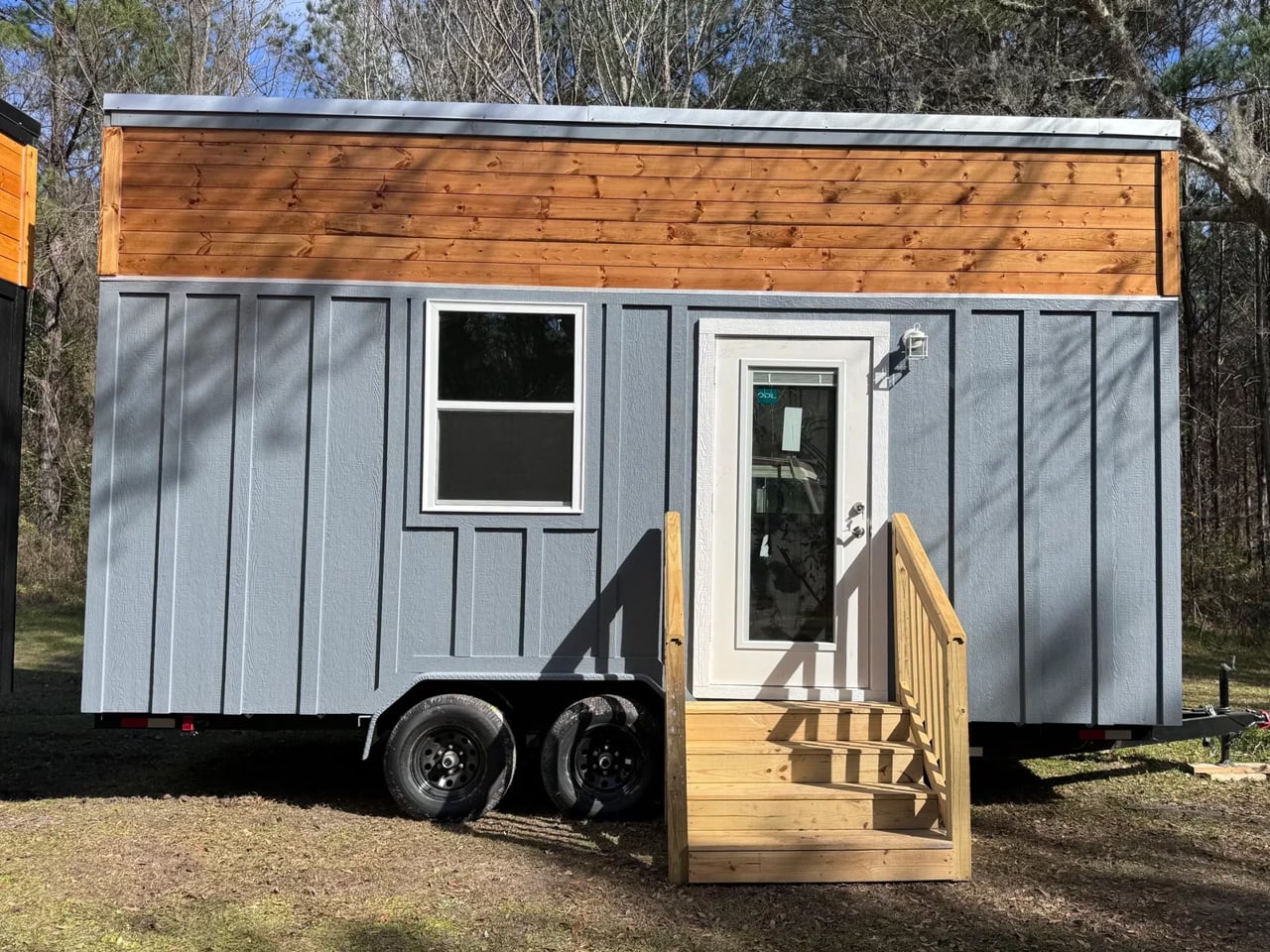
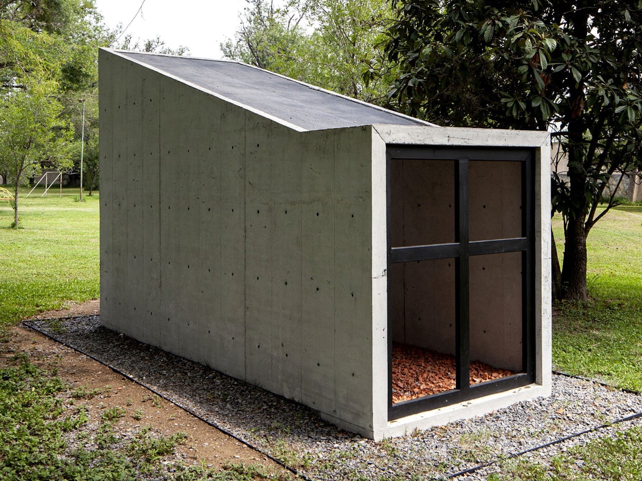
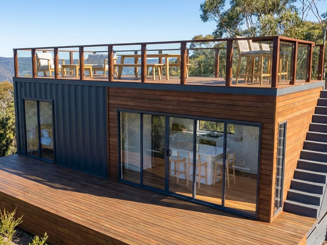
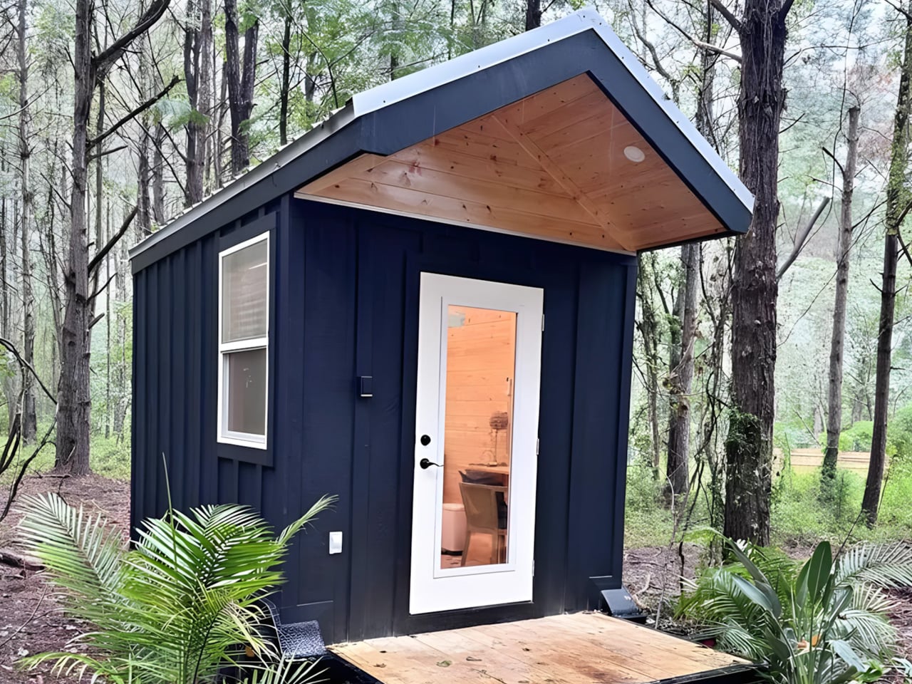
I truly love a well-designed tiny home — one that doesn’t just compress living into a smaller footprint but genuinely rethinks how space can work harder. The Rasa by Simplify Further Tiny Homes is exactly that. Born from three years of hands-on Airbnb hosting experience and 16 active listings, this 20-foot home on wheels isn’t a design exercise. It’s a tested, refined answer to what guests actually need and what hosts actually want.

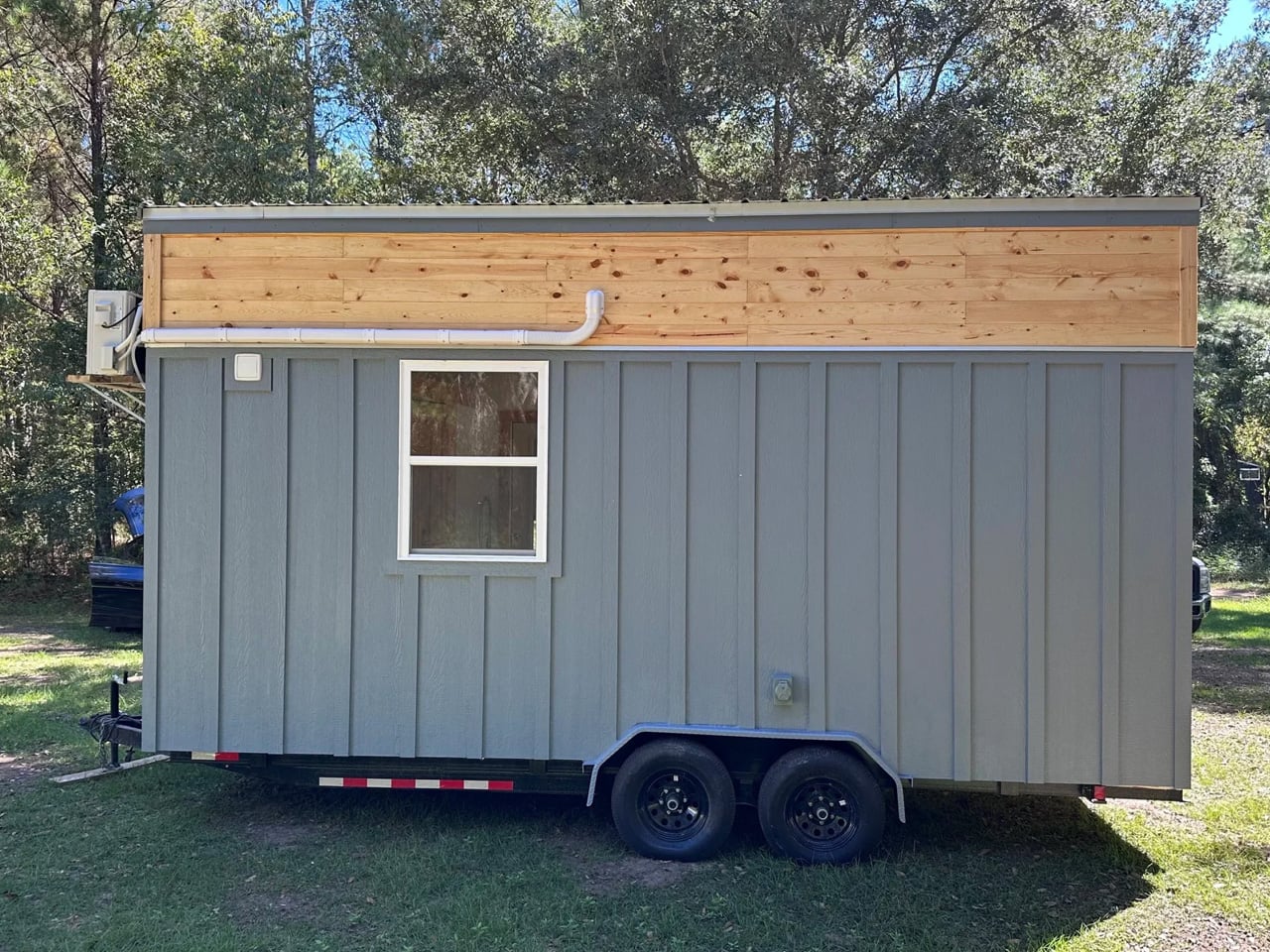
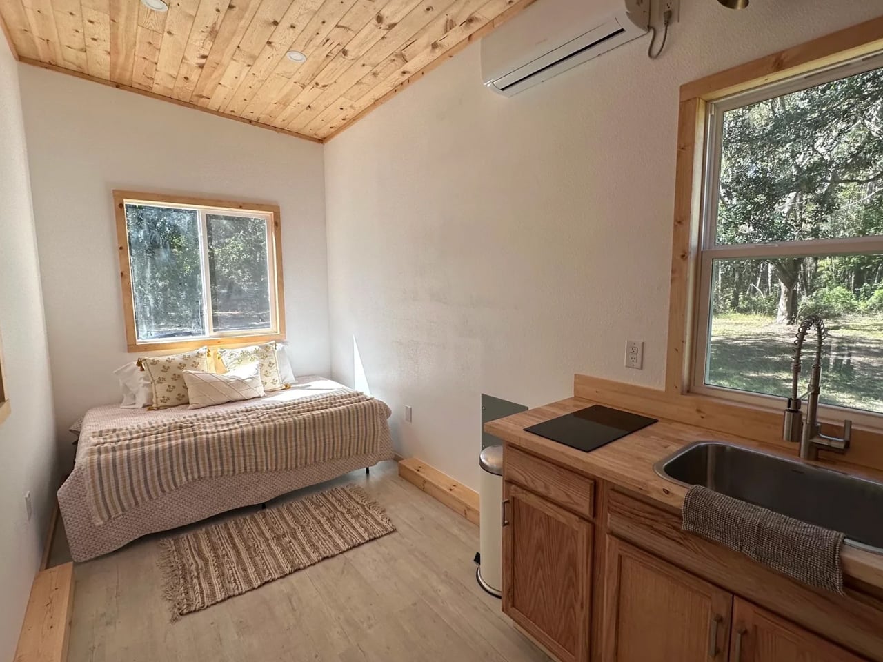
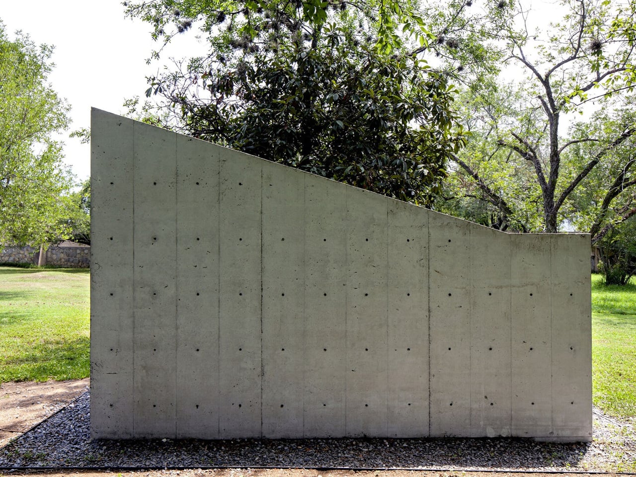
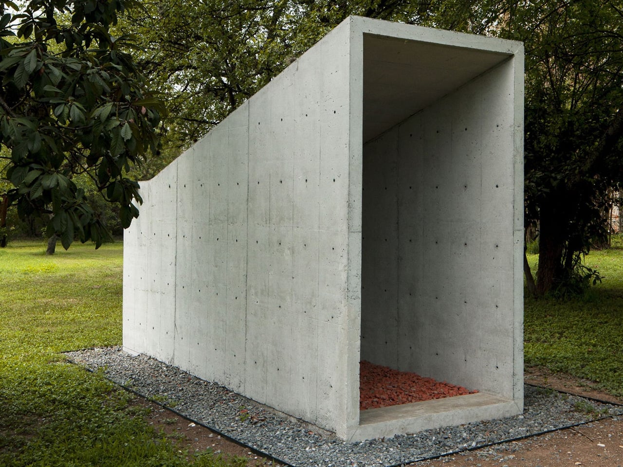
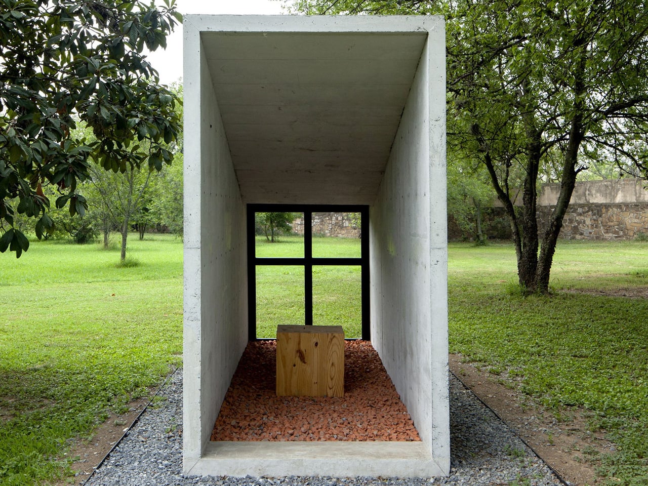
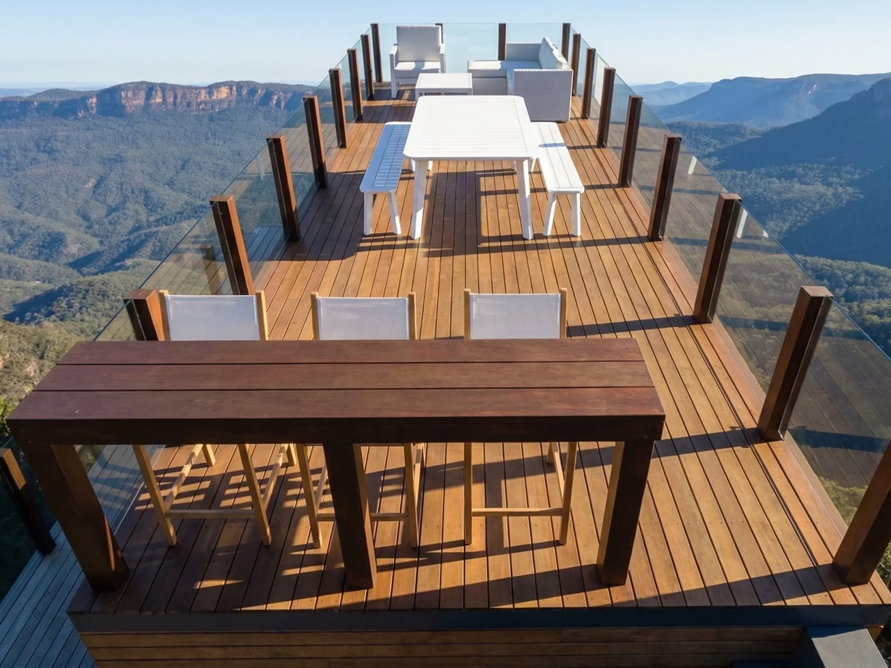
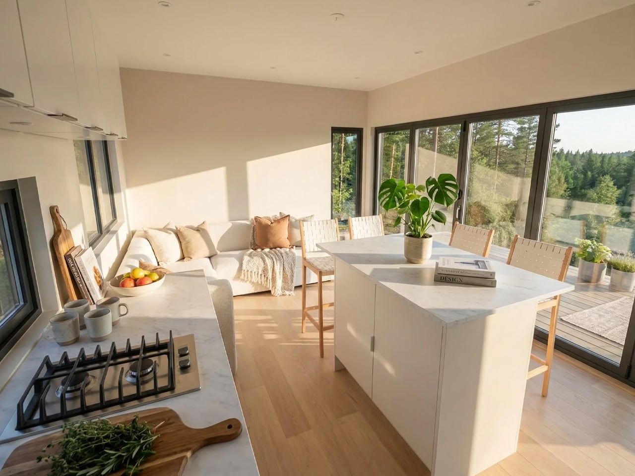
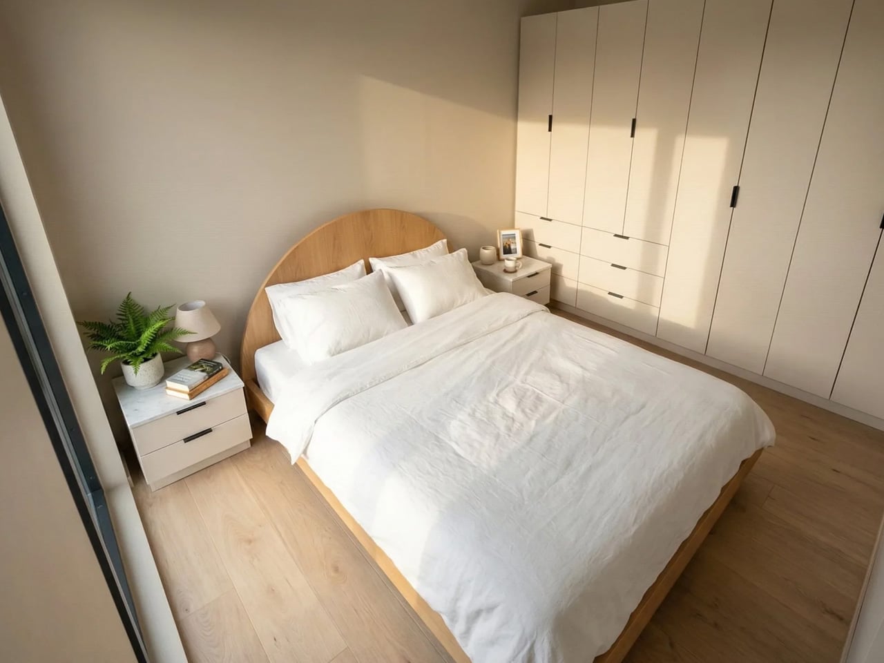
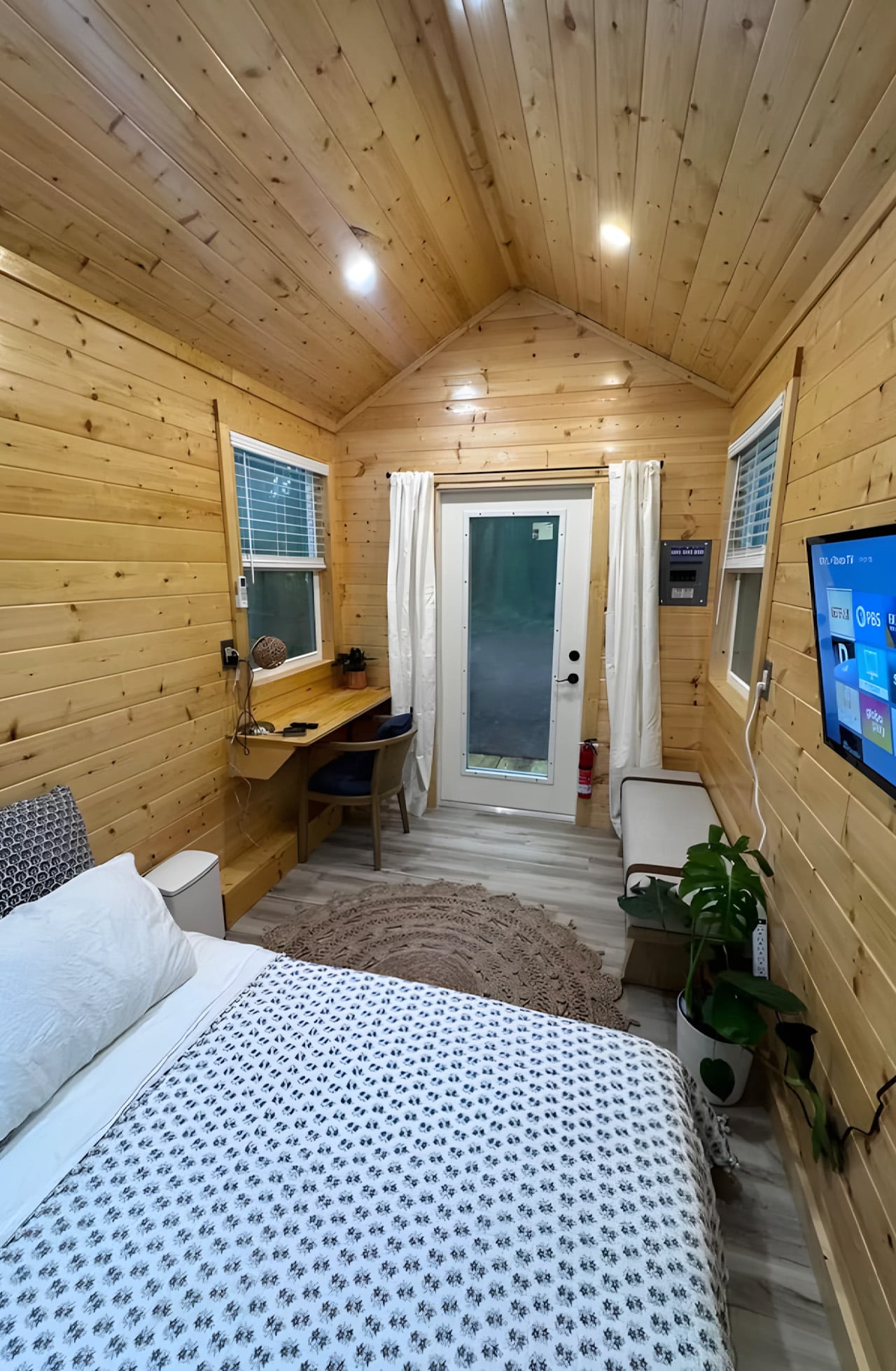
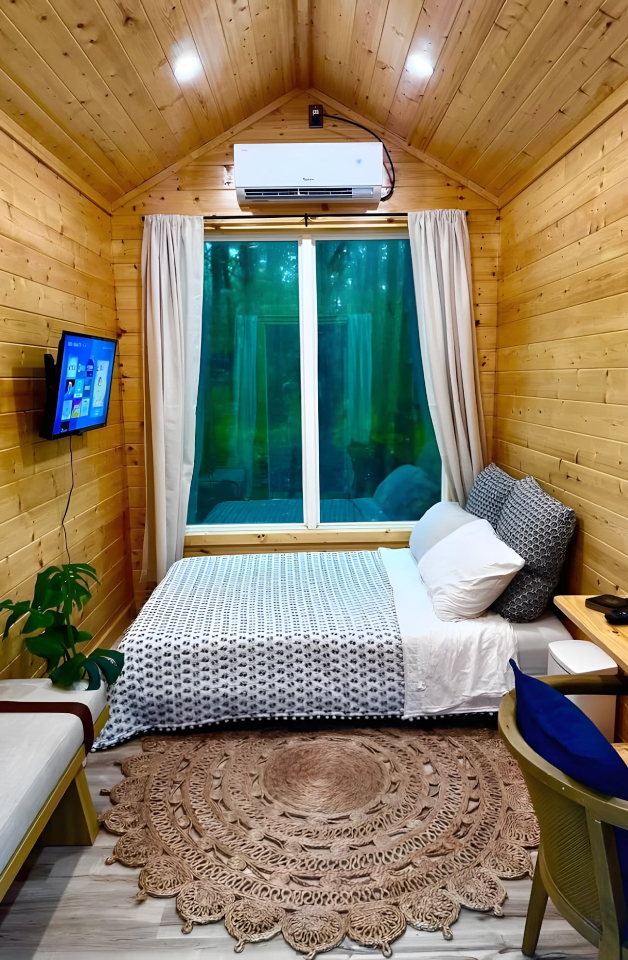
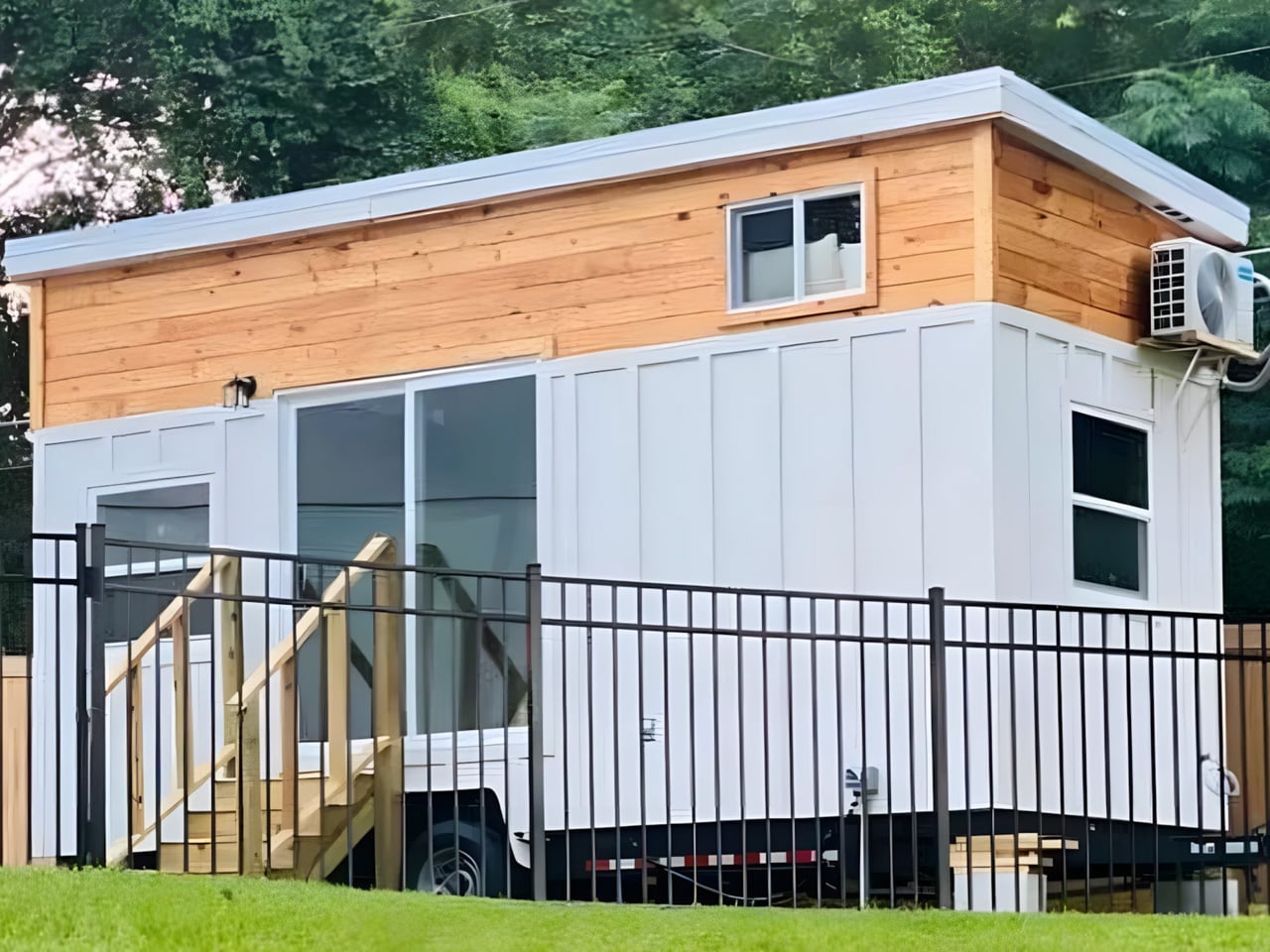
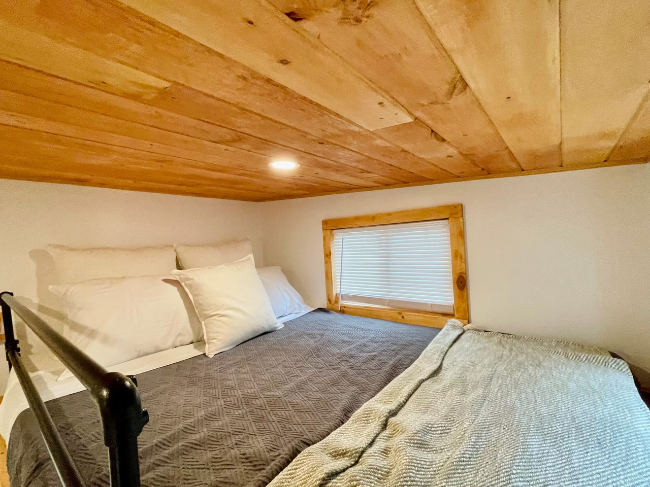
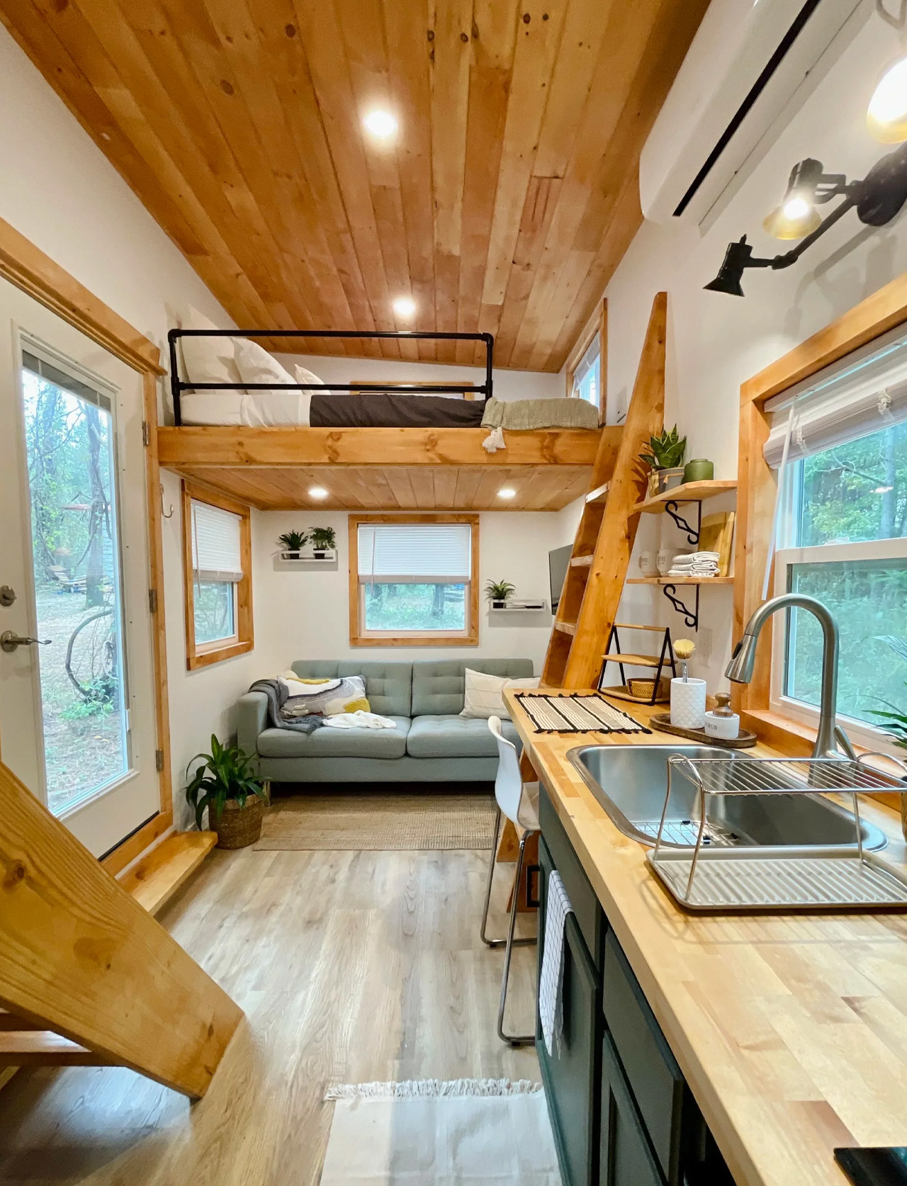
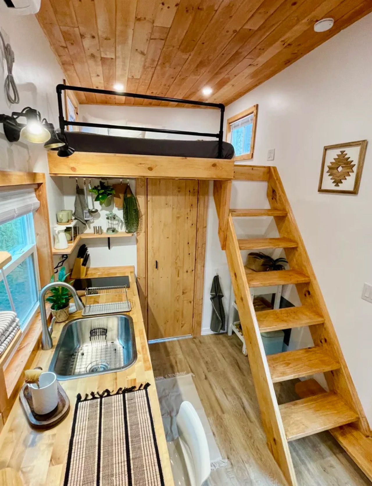
At 224 square feet, the Rasa measures 8 feet wide, 20 feet long, and stands 13 feet 6 inches tall. Those numbers might sound modest until you realize the layout sleeps up to six people across two queen-sized sleeping lofts. A 7×8-foot master loft accessible via open stairs, and a 7×5-foot second loft reached by ladder. The height under the lofts clears 6 feet 4 inches, which means the main living level doesn’t feel compressed; it feels considered. Black metal railings frame the lofts with a clean, architectural edge that keeps the interior from tipping into cabin territory.

Designer: Simplify Further Tiny Homes

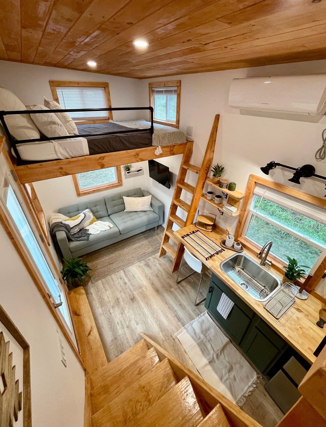
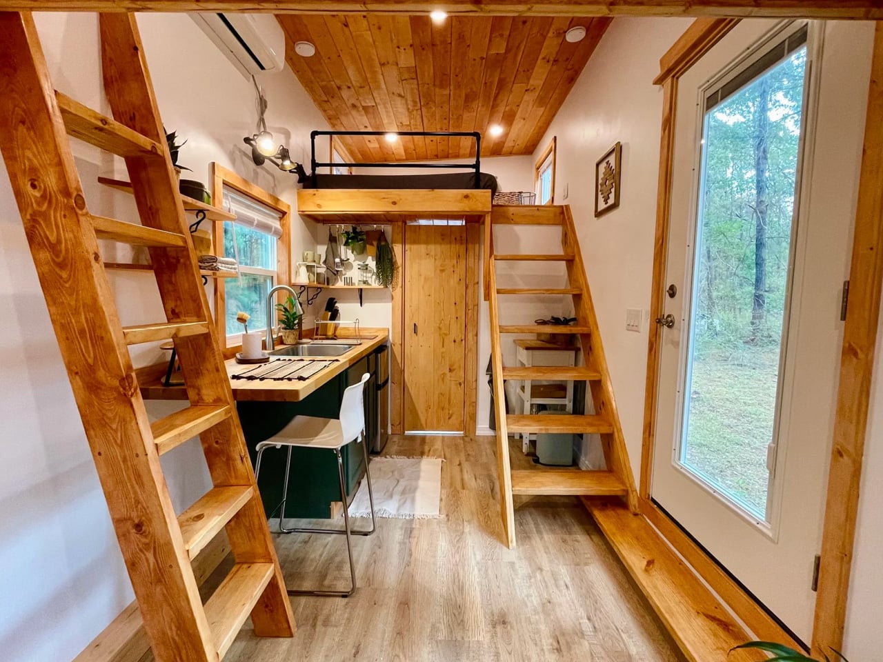
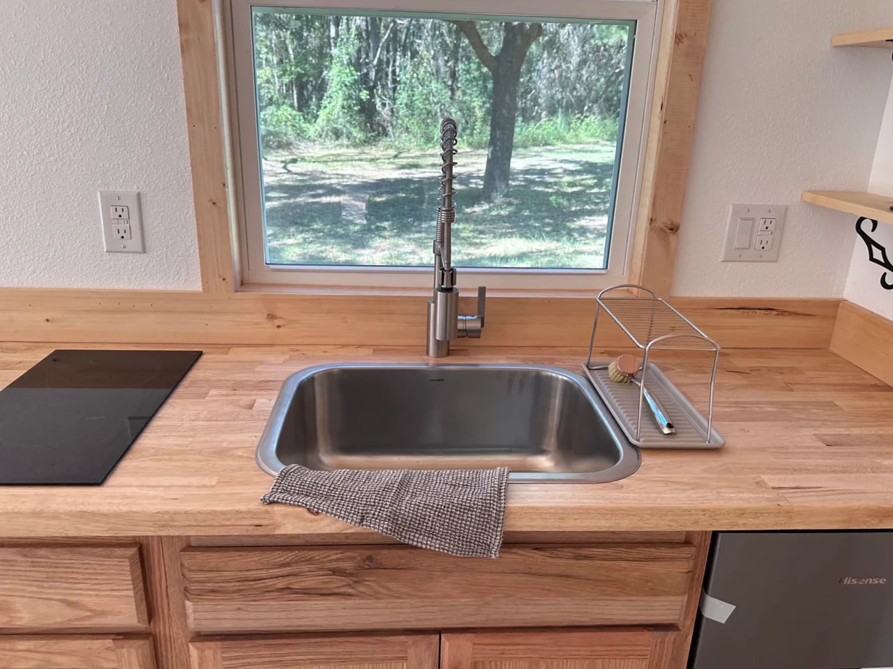
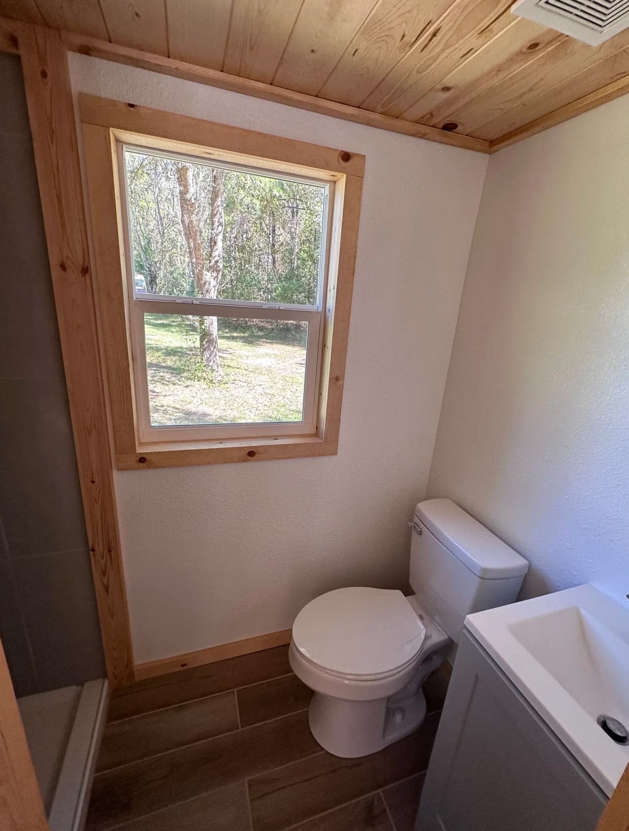
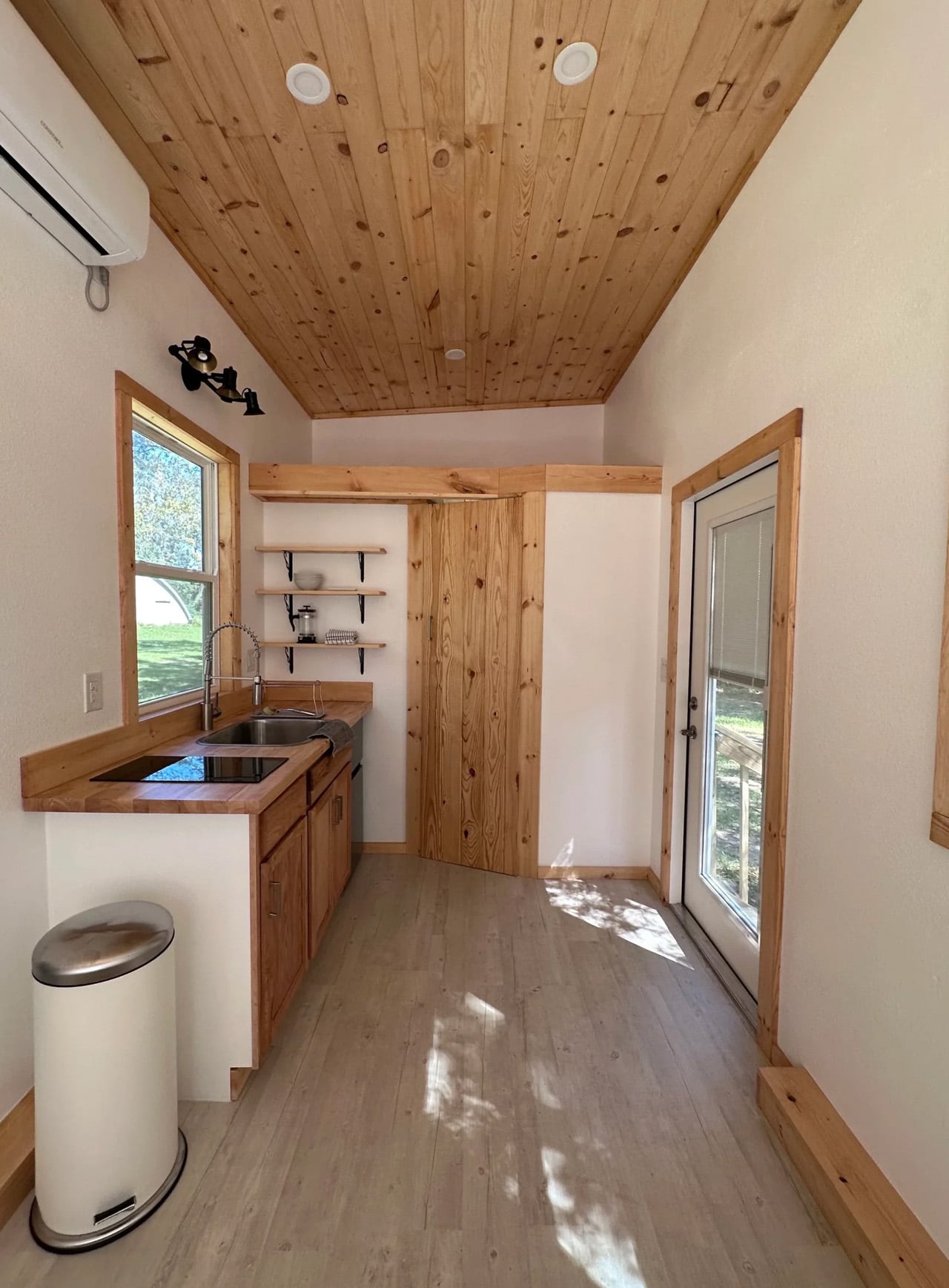
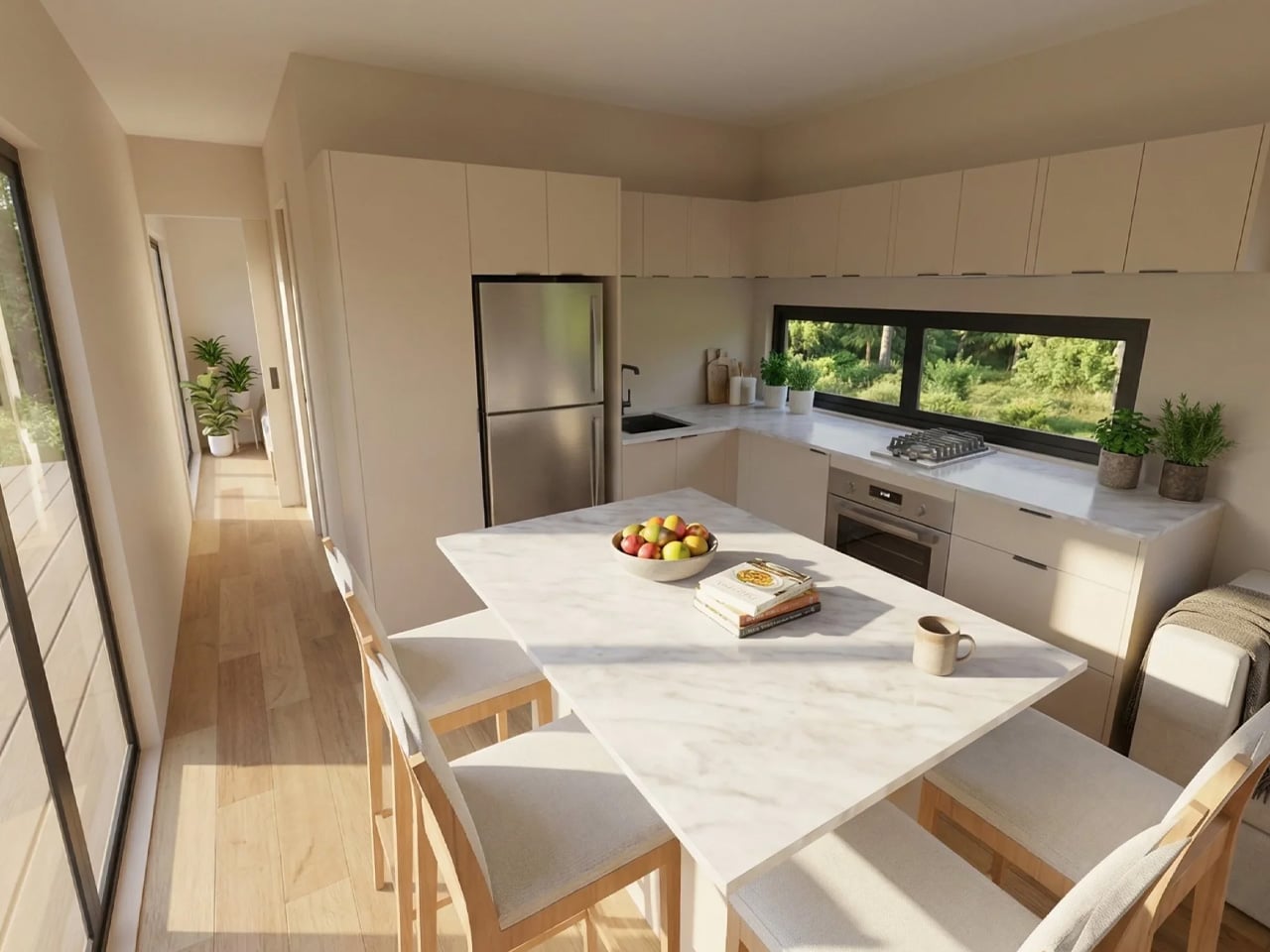
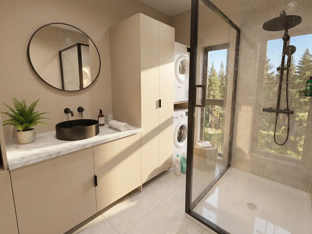
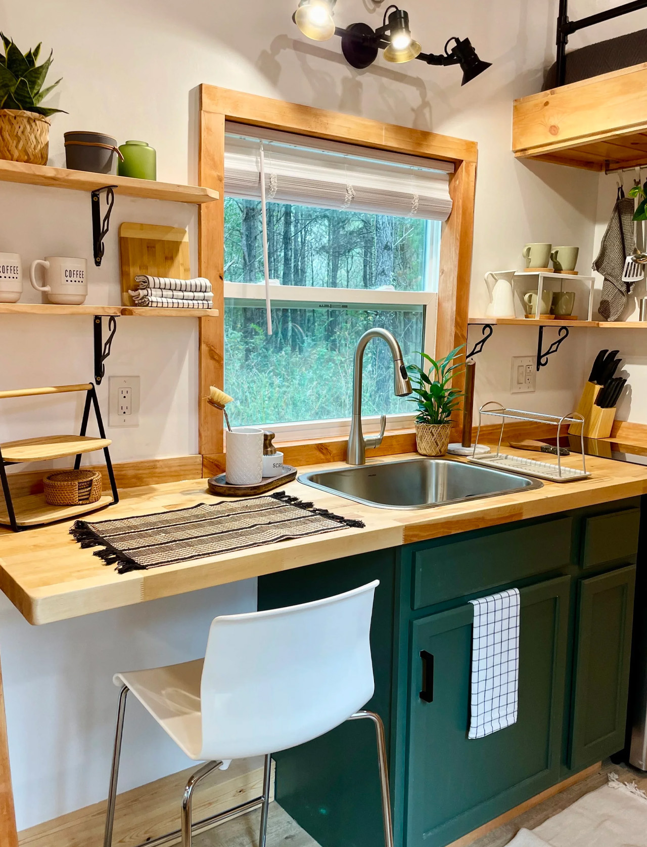
The kitchen punches above its weight. A two-burner electric cooktop, mini fridge, and a pull-down stainless steel sprayer sink cover the essentials without crowding the counter. Built-in barstool seating lines one side, though Simplify Further will swap that out for additional cabinetry if storage matters more than a social kitchen setup. The bathroom follows the same logic: shower stall, vanity, flush toilet, and storage, all functioning without the usual trade-offs that plague tiny home bathrooms. Nothing is squeezed. Everything has a place.

What makes the Rasa genuinely interesting is its design origin story. Simplify Further didn’t sit down with a mood board. They sat down with data. Three years of short-term rental hosting taught them what makes turnover fast, what keeps maintenance low, and what makes guests leave five-star reviews.

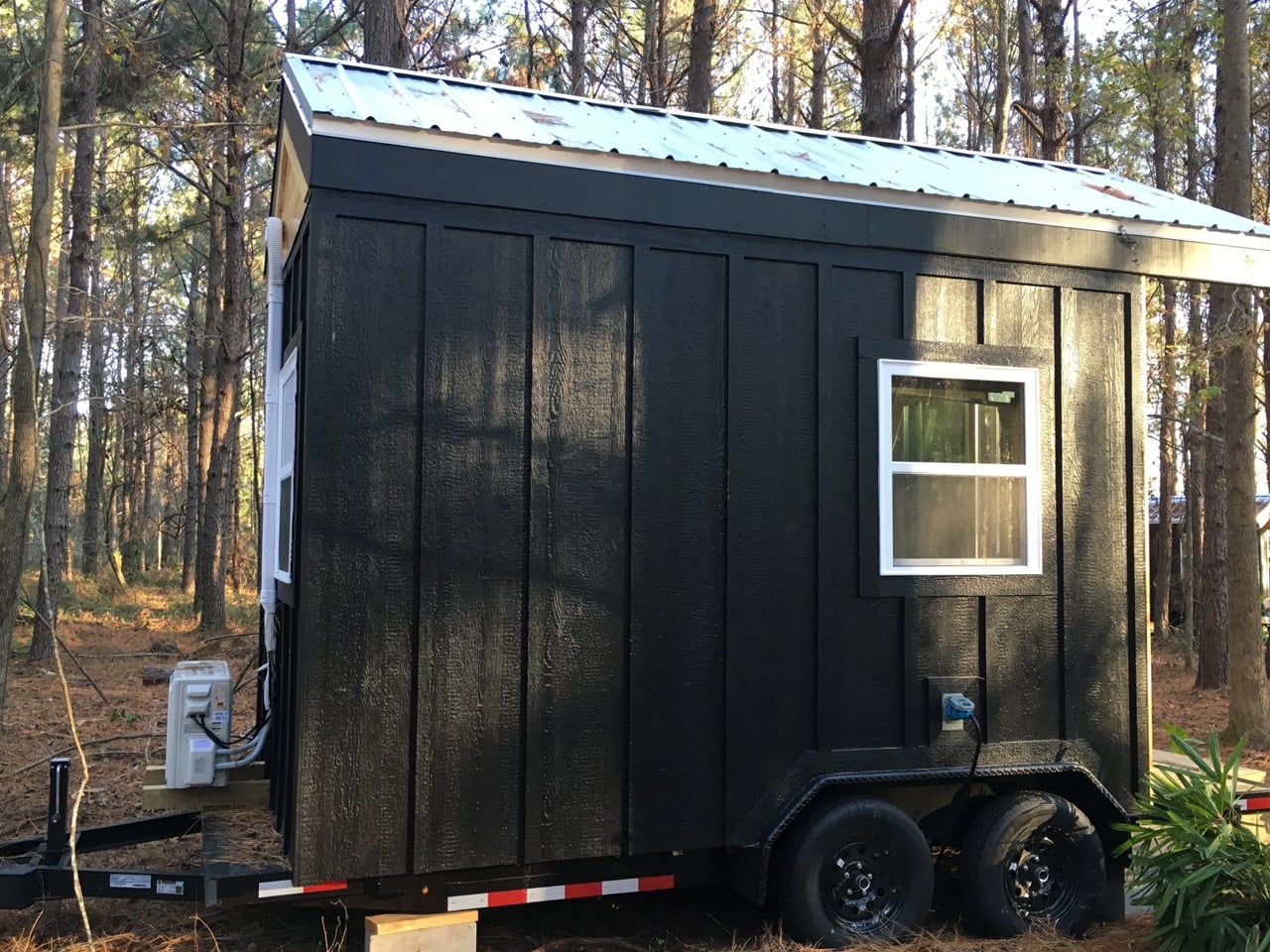
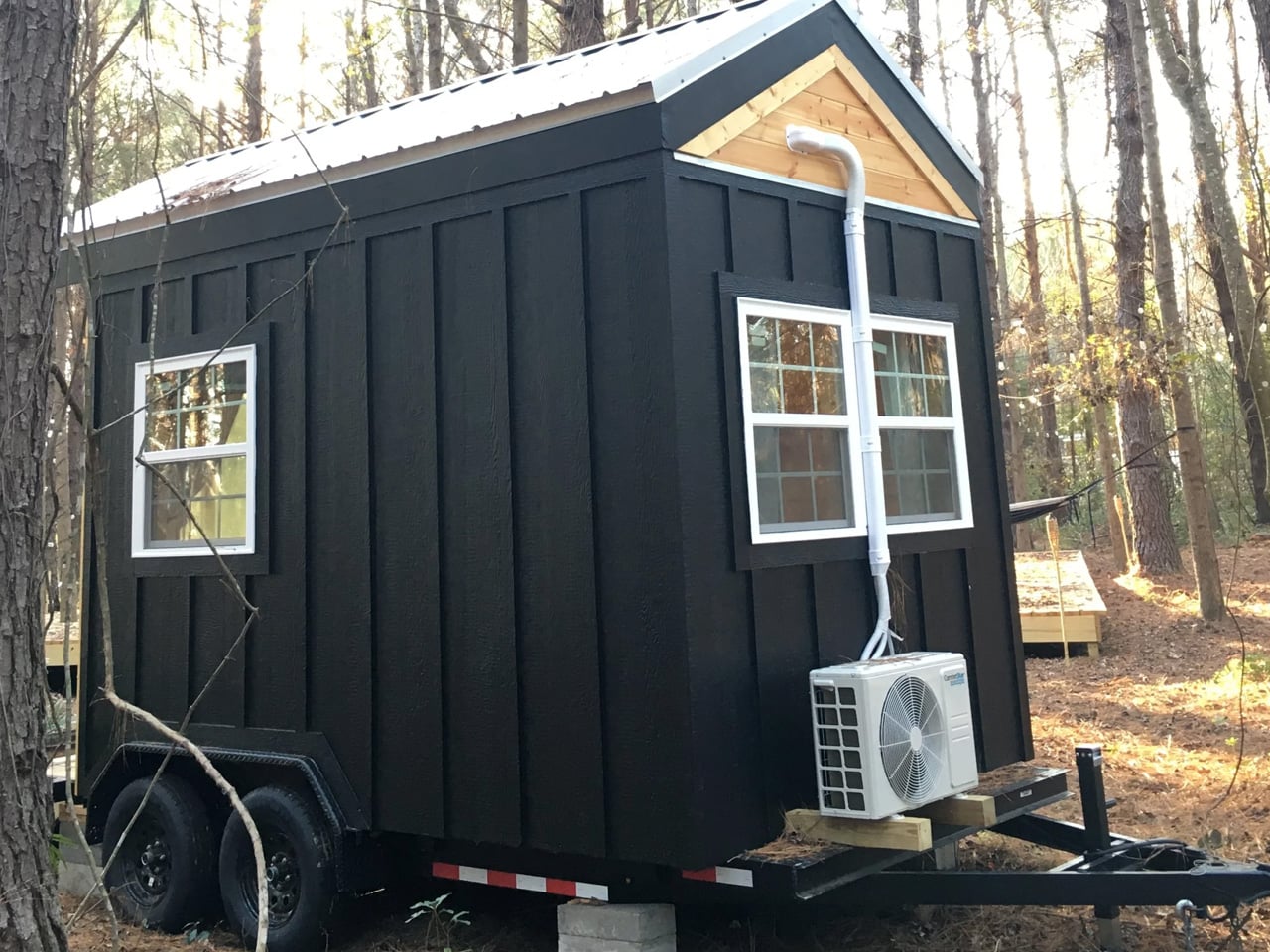
The result is a home where minimalism isn’t aesthetic posturing. It’s an operational strategy. Clean lines mean easy cleaning. Durable materials mean fewer call-outs. A NOAH-certified RV chassis means it can legally move, park, and host across a wide range of properties.

Simplify Further has now delivered over 100 tiny homes nationwide, earning a 3-time Best In Show and Best Tiny Home award at the Florida Tiny Home Festival, alongside a BBB Accredited A+ rating. The Rasa is the flagship that makes that reputation legible. It’s a tiny home that thinks like a busi

The post This Is the Tiny House the Short-Term Rental Market Has Been Waiting For first appeared on Yanko Design.

This $30,000 Tiny Home Puts the Bed on the Ground Floor and the Price Below Every Competitor

At just $30,000, the Shanti by Simplify Further Tiny Homes might be the most honest tiny home on the market right now. No gimmicks, no inflated square footage promise, just a clean, well-built 20-foot home on wheels that does exactly what it says it will. For a space category that has a habit of creeping toward six figures before you’ve even added a kitchen, the Shanti lands like a breath of fresh air.

The Shanti measures 8’5″ wide, 20 feet long, and stands 13’6″ tall, translating to 133 square feet of main-level living space. Unlike most tiny homes where sleeping is relegated to a loft you have to climb into every night, the Shanti puts the queen-sized bed on the ground level — a decision that alone sets it apart. The loft exists, but it’s purely for storage, which makes the Shanti a natural fit for older residents, guests, or anyone who’s simply done negotiating with a ladder.

Designer: Simplify Further Tiny Homes

Inside, the layout is deliberately open. A kitchenette, a bathroom with a shower stall, a flush toilet, and a mini sink round out the essentials without overcomplicating the floor plan. Upgrade options include shiplap interior walls, a washer/dryer combo unit, and full furnishing — meaning a move-in-ready Shanti fully finished starts at $35,000, which remains remarkably low for a certified build. The entire structure is NOAH certified as an RV and sits on a hand-built chassis with thick gauge steel, double axles rated at 5,000 lbs each, trailer brakes, and DOT-approved highway lighting — built to travel, not just to sit.

Simplify Further, based out of Lake Butler, Florida, built the Shanti as their very first model, and it’s arguably still their most versatile. The company describes it as a blank canvas, and the use cases back that up: guest house, mother-in-law suite, home office, Airbnb rental, teen housing, healing arts studio, or emergency shelter. Several Shanti units have already been listed on Airbnb near Florida’s crystal clear springs, giving prospective buyers a chance to actually sleep in one before committing.

For a builder that has delivered over 100 tiny homes nationwide and holds a 3-time Best in Show award from the Florida Tiny Home Festival, the Shanti is a quiet statement. It’s proof that the best entry point into tiny living doesn’t have to compromise on quality — it just has to be honest about what space you actually need.

The post This $30,000 Tiny Home Puts the Bed on the Ground Floor and the Price Below Every Competitor first appeared on Yanko Design.

This Charred Timber Cabin on the Sázava River Was Built From the Ruins of the One It Replaced

Most architects would have cleared the site and started fresh. Mimosa Architekti did the opposite. Perched on the banks of the Sázava River in Prosečnice, Czech Republic, Between the Rock and the River is a retreat born from ruin, designed to make peace with its past.

The story begins with a fire. The original cabin burned down, leaving behind only its stone plinth — a rugged, load-bearing pedestal that the architects chose not to demolish but to build upon. That decision, more than any other, defines the entire project. The plinth isn’t a footnote; it’s the foundation — both literally and conceptually. It lifts the new timber structure above the floodplain, offering protection from the river’s seasonal moods while granting the cabin an elevated sense of perspective. Slide open the shutter facing the water, and you’re rewarded with an uninterrupted view of the rapids, the boulders, and the kingfishers skimming the surface.

Designer: Mimosa Architekti

The exterior is wrapped in charred larch cladding — a nod to the Japanese yakisugi technique, where timber is scorched to enhance its durability and resistance to the elements. It’s a material choice that reads as both pragmatic and symbolic. The blackened skin mirrors the charred history of the site, turning an act of destruction into a design principle. From a distance, the cabin appears almost to dissolve into the dense pine forest surrounding it, its dark silhouette blending with shadow and bark.

Step inside, and the palette shifts entirely. The wooden frame is clad on the interior with spruce wood panels — warm, pale, and luminous against the darkness of the exterior. The contrast is deliberate: rough and weathered on the outside, soft and considered within. It creates a sense of crossing a threshold, of leaving the exposed landscape behind and entering something more sheltered and human in scale.

The cabin occupies a narrow strip of land between the riverbank and rising cliffs — a site defined by constraint and compression. Mimosa Architekti responded not by fighting the geography but by working within it. The result is a structure that feels inevitable, as though it could only ever exist in this exact spot. Designed in 2020 and completed in 2025, the project took five years to realize — and you can sense that patience in every detail. Between the Rock and the River isn’t a cabin that shouts. It whispers — in the language of scorched wood, old stone, and moving water.

The post This Charred Timber Cabin on the Sázava River Was Built From the Ruins of the One It Replaced first appeared on Yanko Design.

This Moscow Forest Garage Is Really a Sculpture Gallery for Cars

Not every garage is built to store cars — some are built to celebrate them. For them, Russian architecture studio ATRIUM has completed the ‘Garage for Car Collection’— a 200 square meter structure tucked into a wooded private estate on the outskirts of Moscow that treats its automobiles less like machines and more like museum-worthy objects.

The project is the latest addition to a private estate, ATRIUM, originally designed in the early 2000s, which includes a manor house and guest house. Rather than a standalone commission, this garage continues a deliberate architectural lineage — only this time, the brief called for something far more layered. The building doesn’t just store cars. It functions as a curated vehicle gallery, a home gym, a business meeting space, a lounge, a mud room, and even a ski rack room — all unified under a single, fluid envelope.

Designer: ATRIUM

The form that holds all of this together is drawn from the Möbius strip. A continuous ribbon-like gesture wraps around the site, organizing the program across three levels. At ground level, a glazed exhibition space — framed by expansive facades with ultra-thin profiles on the north and south sides — puts the vehicle collection on full display. The ribbon then ascends diagonally to a rooftop outdoor workout terrace, while descending below grade into a gym and office, where discreet ground-level apertures pull in natural light without disrupting the building’s clean exterior reading.

Materiality is where ATRIUM’s precision really shows. The exterior is clad in seamless white Corian — a surface that evokes aerodynamic engineering — while wood and copper warm up the interior spaces. The contrast is intentional: the building reads as something athletic and mechanical from the outside, intimate and refined from within. It’s a space that mirrors the cars it shelters.

What makes the project genuinely remarkable, though, is what wasn’t touched. Every existing tree on the wooded plot was preserved, with the building’s footprint carefully negotiated around the forest. In a field where development and ecology tend to work against each other, ATRIUM treats the surrounding woodland as a collaborator rather than an obstacle. The underground expansion minimizes the building’s visible impact on the landscape, letting the structure feel as though it surfaced from the forest floor rather than was imposed upon it.

Completed in 2024, the project was designed in 2020 by a team led by Anton Nadtochiy and Vera Butko. It has since been named a finalist at the World Architecture Festival 2025 in two categories: Completed Buildings – Transport, and the Small Project Prize — recognition that confirms what the building itself already suggests: the garage, as a typology, has been quietly, elegantly reimagined.

The post This Moscow Forest Garage Is Really a Sculpture Gallery for Cars first appeared on Yanko Design.

This Rotating Solar House Grows Fish and Plants Entirely on Its Own

Aquaponic gardening has been getting a lot of attention as a more sustainable way to grow food, especially in urban settings where arable land isn’t exactly plentiful. The concept pairs fish and plants in a closed-loop system where each supports the other, cutting out synthetic fertilizers and reducing water waste. Most implementations, though, tend to be utilitarian and aren’t built to handle seasonal changes without significant supplemental energy input.

That’s the problem Michael Jantzen’s Eco-Aquaponic House was designed to tackle. Built as a public exhibit for a botanical garden, it functions more like a machine than a greenhouse, engineered to grow fish and plants together in an energy-efficient and largely self-sustaining way. Jantzen, whose work merges art, architecture, technology, and sustainable design, has been experimenting with this kind of thinking for over 50 years.

Designer: Michael Jantzen

The system works on a simple but elegant biological loop. Fish waste is cycled through the roots of the surrounding plants as a natural fertilizer. The plants filter the water, which then returns to the fish tank. The cycle repeats continuously with minimal outside input, keeping both fish and plants alive. It’s the kind of closed-loop food production that makes conventional growing methods look rather wasteful by comparison.

What makes the structure particularly clever is how it manages growing conditions year-round without demanding much energy. Six sections rotate around a central pivot point, each serving a different climate function. Two insulated panels wrap around the interior during cold nights to retain heat. Two shade screen sections shield the plants on hot days. Two glass sections open to let in outside air when conditions allow.

The passive thermal management doesn’t stop there. Built around the perimeter of the stationary base are large tubes filled with a heat-retention material that absorbs solar energy during the day and releases it slowly at night, helping keep the fish and plants warm through winter without relying on active heating systems. Those same tubes also moderate daytime temperatures, preventing the interior from overheating when the sun is strong.

On top sits a sun-tracking solar cell array that follows the sun throughout the day, supplying most of the structure’s electrical needs, including the large lamp hung over the central fish tank. Small windows built into the glass sections allow for additional ventilation control when the glass is in the closed position, letting you fine-tune interior conditions depending on what the fish and plants need at any given time.

Inside, plant trays are built into the perimeter of the structure, forming a ring of greenery around the central cylindrical fish tank. Visitors to the botanical garden can get a sense of the system from the outside, or arrange private tours for a closer look from inside through the rear entry door. As a public exhibit, it’s designed as much to teach people about aquaponic gardening as it is to actually grow. It’s a growing facility that takes care of itself season after season, with very little outside intervention required.

The post This Rotating Solar House Grows Fish and Plants Entirely on Its Own first appeared on Yanko Design.

Two Concrete Walls and No Electricity Make This Tiny Chapel Unforgettable

Most buildings erase what came before them. This one didn’t. That’s exactly what Mexican studio S-AR has achieved with its Oratory Chapel in Santiago, Nuevo León, a compact sacred space set within a sprawling garden that breathes new life into a demolished predecessor.

The project began with an act of demolition. A preexisting chapel on the same site was taken down, but rather than discarding its materials, S-AR retained them and worked them back into the new construction. The result is a structure that operates as a continuation rather than a replacement — the old chapel doesn’t disappear; it reassembles itself into something fresh, its fragments carrying forward a spatial and material dialogue between past and present.

Designer: S-AR

Architecturally, the chapel is a study in precision and restraint. Two reinforced concrete walls, each just 8 cm thick, rise at variable heights along a diagonal axis and support a slab only 6.5 cm deep, forming what reads almost like a tunnel — a narrow, directional passage that channels both movement and contemplation. The formwork follows a 30.5 cm modulation, and the holes left by the wall’s constructive system are deliberately left unfilled, allowing light and air to filter through the structure like something between architecture and screen.

This handling of light is where the chapel finds its spiritual character. Without electricity or artificial utilities, the building relies entirely on natural illumination. Light enters through the voids in the concrete, drifting across surfaces in patterns that shift with the hour and season. It turns the act of sitting inside the chapel into something inherently tied to time — not just sacred time, but the slow, physical time of the garden and the sky surrounding it.

S-AR, the Monterrey-based studio known for its material rigor and contextual sensitivity, has built a reputation for working with concrete in ways that feel more geological than constructed. The Oratory Chapel continues that lineage. Its walls don’t feel poured so much as grown from the site. At just a few square meters, it’s one of the smallest things the studio has made — and possibly one of the most considered.

In an era where sacred architecture often reaches for scale and spectacle, this small chapel in a big garden does the opposite. It compresses everything down to two thin walls, a sliver of a roof, and the light that passes between them. That, it turns out, is enough.

The post Two Concrete Walls and No Electricity Make This Tiny Chapel Unforgettable first appeared on Yanko Design.

This $156K Tiny Home Is Essentially a Tiny Mansion With a Party on Its Roof

The tiny home movement has long wrestled with one stubborn contradiction: how do you downsize without actually feeling like you’ve given something up? Brisbane-based builder Removed Tiny Homes has a compelling answer with the Solace — a wide-body, rooftop-equipped micro-dwelling that reframes what small living can look and feel like.

The Solace sits within Removed Tiny Homes’ newly launched Tiny Mansion collection, a premium lineup designed for people who are genuinely drawn to intentional living but aren’t willing to sacrifice comfort, space, or a little luxury to get there. It’s a category of architecture that’s quietly shifting the tone of the entire tiny home conversation — less rustic escape, more elevated lifestyle choice.

Designer: Removed Tiny Homes

At its core, the Solace is built on a triple-axle trailer and measures 10 meters (32.8 ft) long and 3.4 meters (11.1 ft) wide, making it notably broader than most tiny homes on the market. That extra width is immediately felt inside — the layout is open, breathable, and free of the cramped compromises that often define the category. There are no loft sleeping arrangements here. Instead, the single bedroom is a proper retreat, fitted with a king-size bed and a floor-to-ceiling wardrobe that spans the entire right wall. A private glass entrance door connects the bedroom directly to the outdoors, adding a hotel-suite quality that feels anything but modest.

The kitchen and living spaces carry the same thoughtful confidence. Clean lines, full-scale proportions, and modern finishes give the interior a sense of permanence rather than temporariness. The exterior wraps in a combination of corrugated metal and timber, a pairing that reads as both industrial-modern and grounded in natural warmth.

What truly sets the Solace apart is what sits above and below. A large ground-floor deck wraps the front of the home, while an expansive rooftop terrace crowns the structure, generous enough for outdoor dining, lounging, and genuinely hosting guests. It’s a design move that effectively doubles the usable living space without adding a single square foot to the floorplan. That’s smart architecture.

Pricing starts at approximately USD $155,800, with customization options available for those who want to personalize the build. Early buyers can also access a Luxury Living Upgrade Pack, valued at over AUD $30,000, which adds a fully tiled bathroom, optional skylights, and stone kitchen worktops. The Solace doesn’t ask you to romanticize sacrifice. It asks something far more interesting: what if living smaller actually meant living better?

The post This $156K Tiny Home Is Essentially a Tiny Mansion With a Party on Its Roof first appeared on Yanko Design.

The $17,000 Micro Cabin That Makes Every Other Tiny Home Look Overpriced

I must admit there is a certain freedom in stripping things back to exactly what you need and nothing more. That’s the quiet confidence behind the Mantra, the newest micro cabin from Florida-based Simplify Further Tiny Homes — and at $17,000, it might just be the most straightforward shelter concept to come along in years.

The Mantra measures 12 x 8 feet as a living unit, sitting on a double-axle trailer that brings its full length, porch included, to 16 feet (4.8 meters). The usable interior clocks in at just 98 square feet (9.1 sq m), which sounds tight until you see how it’s been organized. Everything lives in a single open room: a bed that doubles as a daybed, a desk and dining table, seating, a wall-mounted TV, and a mini-split air-conditioning unit. The whole thing sleeps up to two people.

Designer: Simplify Further Tiny Homes

What Simplify Further didn’t include is just as deliberate as what they did. There’s no indoor kitchen, no bathroom — a choice that keeps the footprint honest and the price point realistic. The Mantra was designed for people who want a serious shelter without the serious overhead: a glamping cabin, a backyard guest suite, an accessory dwelling unit, a dedicated work-from-anywhere office. It earns its role by not pretending to be something it isn’t.

On the outside, the cabin wears engineered wood cladding with pine tongue and groove accenting and a metal roof, materials picked for durability and a cabin aesthetic that doesn’t look out of place whether it’s parked in the woods or in a suburban backyard. The double-axle trailer base means it can be moved between sites without a production, which opens up use cases most permanent structures simply can’t compete with.

The $17,000 starting price is the number that tends to stop people mid-scroll, and for good reason. Most tiny houses, marketed as simple and affordable alternatives, have quietly crept into the $80,000 to $150,000 range. The Mantra pushes back on that without sacrificing the things that actually matter: climate control, a comfortable sleeping setup, and a design sensibility that doesn’t feel like an afterthought.

Simplify Further built their name on the idea that design and craftsmanship don’t require excess. The Mantra is that philosophy distilled. It’s not trying to replicate a house in miniature; it’s building something that knows exactly what it is. And in a market cluttered with overbuilt, overpriced micro dwellings, that clarity is worth more than the square footage.

The post The $17,000 Micro Cabin That Makes Every Other Tiny Home Look Overpriced first appeared on Yanko Design.

Morocco’s Mohammed VI Tower: The Rocket That Rewrote Africa’s Skyline

There are buildings, and then there are statements. The Mohammed VI Tower, inaugurated on April 23, 2026, in Salé, Morocco, belongs firmly in the second category. Rising 250 metres across 55 floors on the east bank of the Bouregreg River, it is now the tallest building in Morocco and the third tallest on the African continent. It did not arrive quietly. Visible from 50 kilometres in every direction, the tower has already redrawn the skyline that was once defined by centuries-old minarets.

The story behind it is as cinematic as the structure itself. Othman Benjelloun, the 93-year-old billionaire and chief executive of the Bank of Africa, conceived the idea decades ago after visiting a NASA facility ahead of the Apollo 12 mission. Standing before the Saturn V rocket, he saw not just a machine but a metaphor. That image, a rocket braced on its launchpad and ready to ascend, became the architectural soul of the tower. Spanish architect Rafael de la Hoz and Moroccan architect Hakim Benjelloun translated that vision into steel, glass, and concrete, producing a silhouette that reads like liftoff frozen in time.

Designer: Rafael de la Hoz and Hakim Benjelloun

The tower is far more than its form. Across its 102,800 square metres of floor area, it houses a Waldorf Astoria hotel, premium offices, high-end residential apartments, retail spaces, and a panoramic observation deck at its crown. Interior design was handled by Pierre Yves Rochon, with furniture and fittings curated by FLAMANT. The facade spans 70,000 square metres and integrates solar panels, while a tuned mass damper ensures stability at height. The building holds both LEED Gold and HQE sustainability certifications, setting a benchmark for green construction across the continent.

Construction began in July 2017 and was delivered by BESIX in a joint venture with TGCC, Six Construct, and the China Railway Construction Corporation, with a total cost of 3.5 billion Moroccan dirhams, roughly $700 million. The project forms the centrepiece of the Bouregreg Valley Development, a broader effort to transform Rabat into a city of international standing ahead of the 2030 FIFA World Cup, which Morocco will co-host.

Not everyone is celebrating at the same altitude. Critics point out that major investment continues to concentrate along Morocco’s Atlantic corridor, while inland regions contend with high unemployment and uneven public services. The tower, they argue, is a monument to ambition that has yet to translate into equity.

Still, as an act of architecture, the Mohammed VI Tower is difficult to argue with. Rafael de la Hoz and Hakim Benjelloun have given Morocco something rare: a building with a founding myth, a bold form, and the scale to match both.

The post Morocco’s Mohammed VI Tower: The Rocket That Rewrote Africa’s Skyline first appeared on Yanko Design.

The Forest Came First. The House Came Second. That Was Always the Plan.

Most architects are handed a site and told to make something of it. Luiz Volpato was handed a forest and told not to ruin it. House 17-JB, completed in 2022 within the Jardins do Batel condominium in Curitiba, southern Brazil, grew out of a deeply personal brief: a client of Italian descent, a self-professed architecture enthusiast, wanted to find not just land, but the ‘right’ land.

Together with the office, they eventually settled on a plot defined by two non-negotiable conditions — a protected native forest and a dramatically steep topography. Those constraints didn’t limit the project. They became it.

Designer: Luiz Volpato Architects

With occupation restricted to just 30% of the 2,300 square metre plot, and that footprint concentrated along the front portion of the land, the design team was forced to think vertically. The solution was elegant: four overlapping volumes, two elevated and two semi-underground, stacked in direct response to the terrain’s fall and the density of vegetation surrounding the site. The result is a 1,113 square metre home that feels both monumental and discreet, as if the building grew from the hillside rather than being placed on top of it.

Architecturally, the project sits at the intersection of modernism and brutalism, drawing on structural clarity, constructive rationality, and an honest approach to material selection. The material palette tells its own story: moss green upholstery, warm timber millwork, and stone surfaces work together to blur the boundary between inside and out. Natural textures sit alongside smooth finishes, creating an interior that reads as fluid and quiet rather than loud or performative.

On the upper floors, the intimate volume houses the suites and a family living area, with balconies positioned precisely at the height of the tree canopy. Living among the treetops rather than looking up at them is a subtle but powerful distinction, one that shapes the daily experience of the house in ways that no floor plan can fully capture.

The project has since gained international recognition, featured in Edra Magazine No. 5, launched in Milan. It is a fitting acknowledgment for what is, at its core, a study in restraint. Luiz Volpato and his team, alongside project coordinator Pablo Quintela, never tried to compete with the forest. They listened to it instead. House 17-JB is a reminder that the best architecture doesn’t impose a vision on a site. It finds the vision that was already there, waiting to be built.

The post The Forest Came First. The House Came Second. That Was Always the Plan. first appeared on Yanko Design.