This Portuguese Tiny Home on Wheels Sleeps Six and Looks Better Than Your Apartment

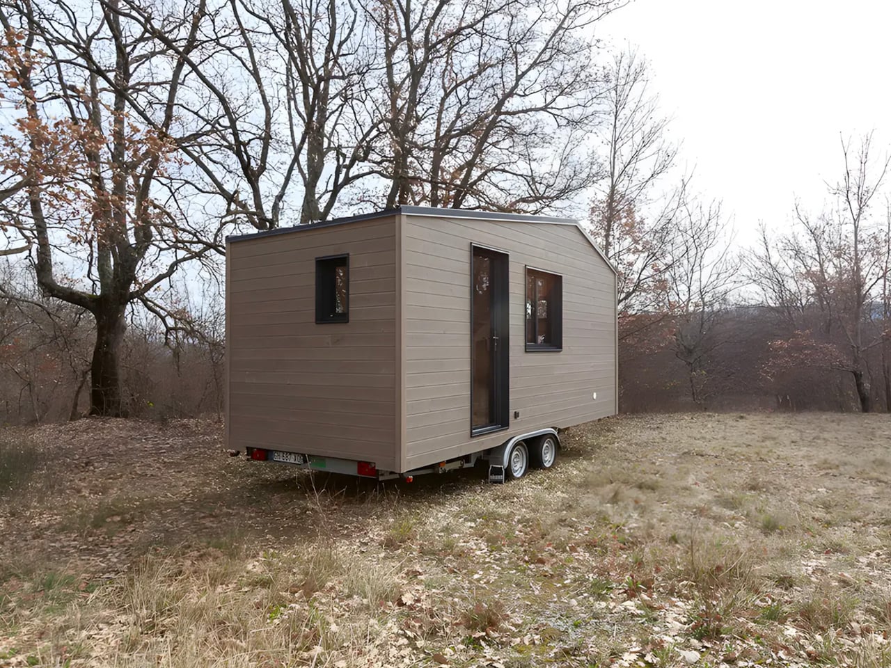
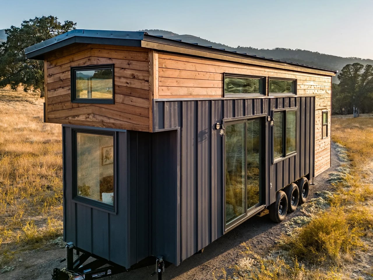
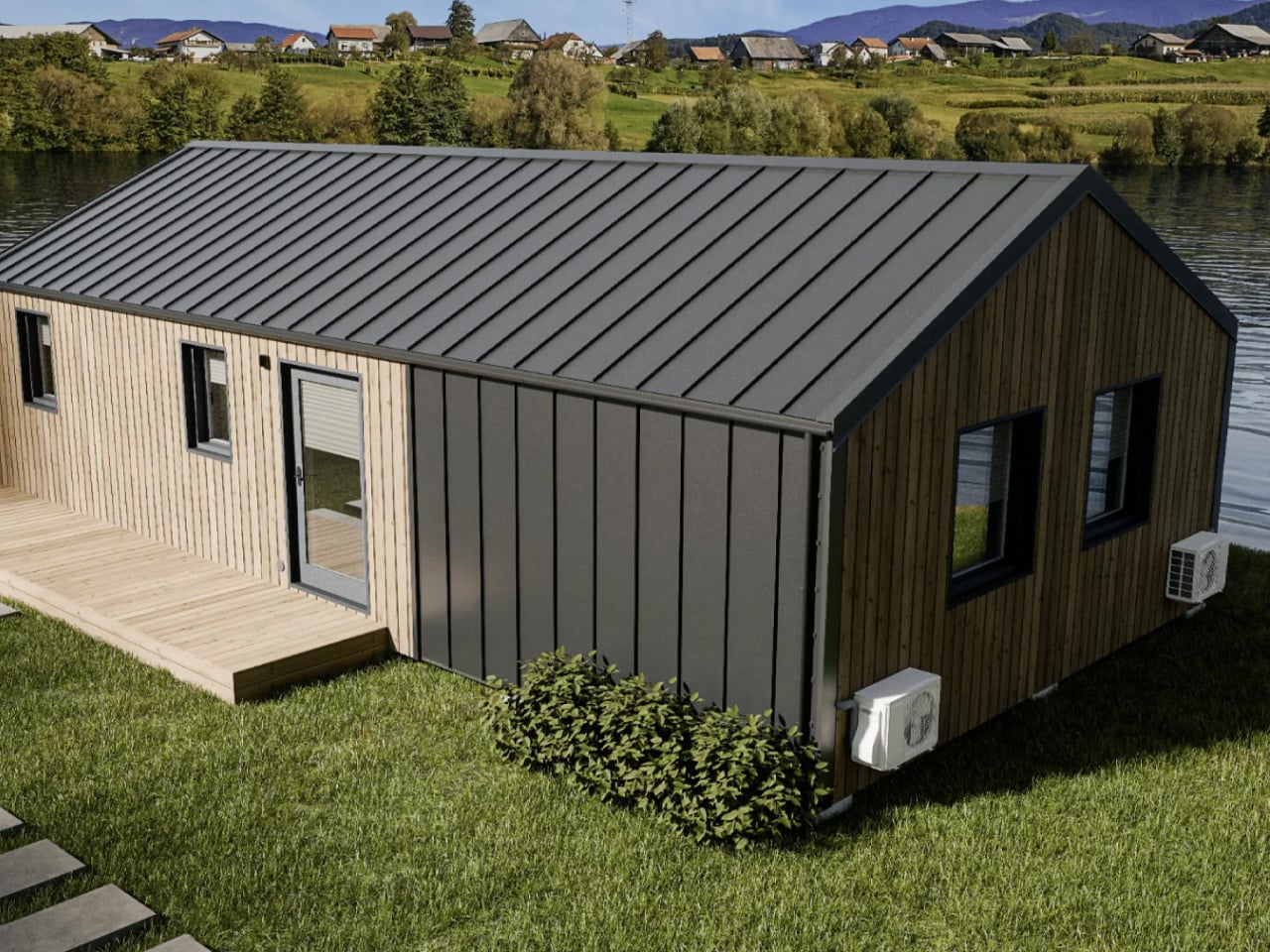
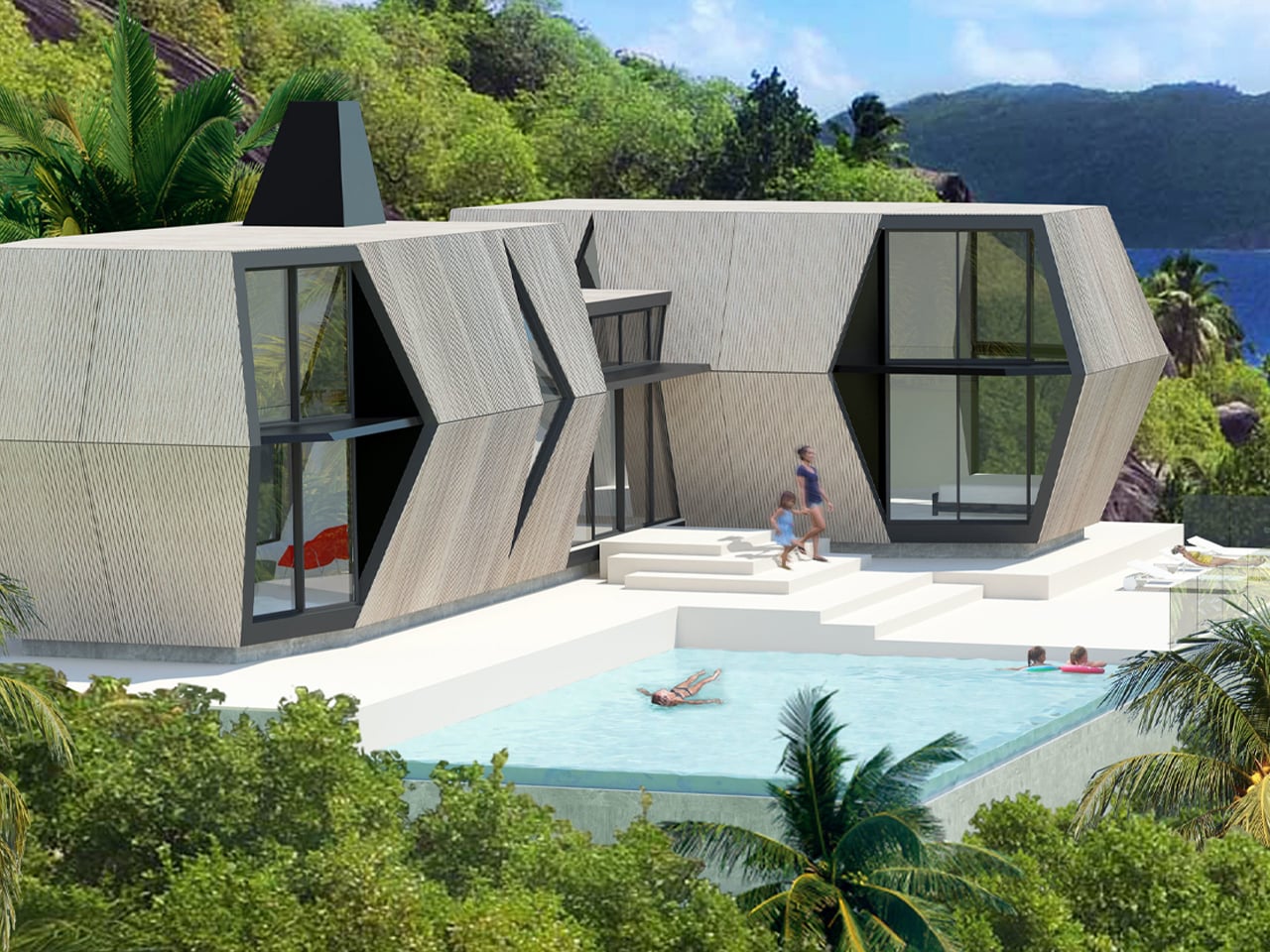
Portugal has long exported culture, cuisine, and craftsmanship. Now, it’s quietly exporting a new kind of living — one that fits on a trailer. The Gerês is Casagaea’s most ambitious tiny home to date. Named after one of Portugal’s most breathtaking national parks, the Gerês is built on a double-axle trailer stretching just 7.8 meters (25.7 ft) in length — compact enough to tow, generous enough to actually live in.

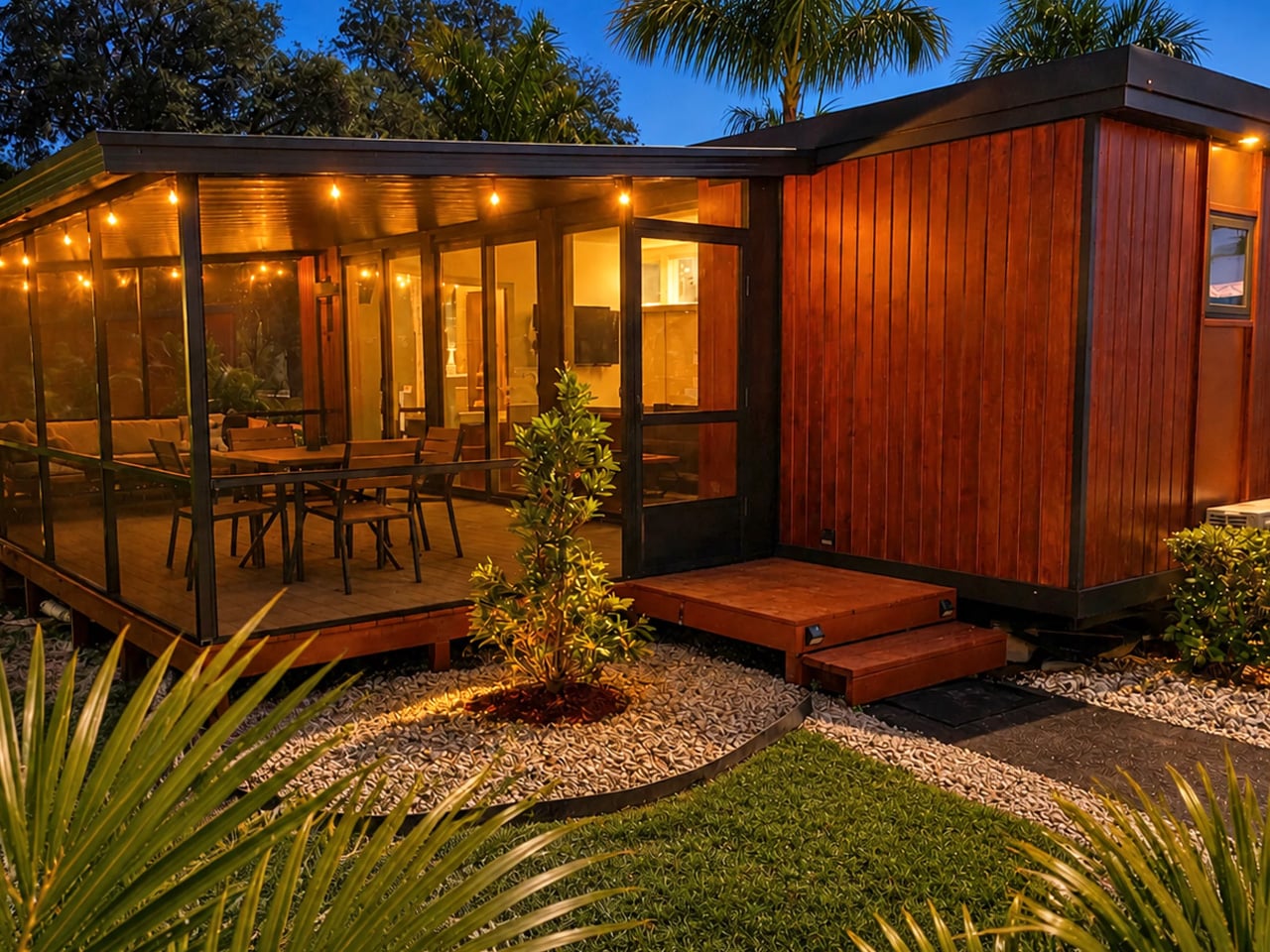
The exterior is clad in engineered wood that ages gracefully, with a small storage box tucked near the tow hitch — a quiet, practical detail that tells you everything about how thoughtfully the whole thing has been considered.

Designer: Casagaea

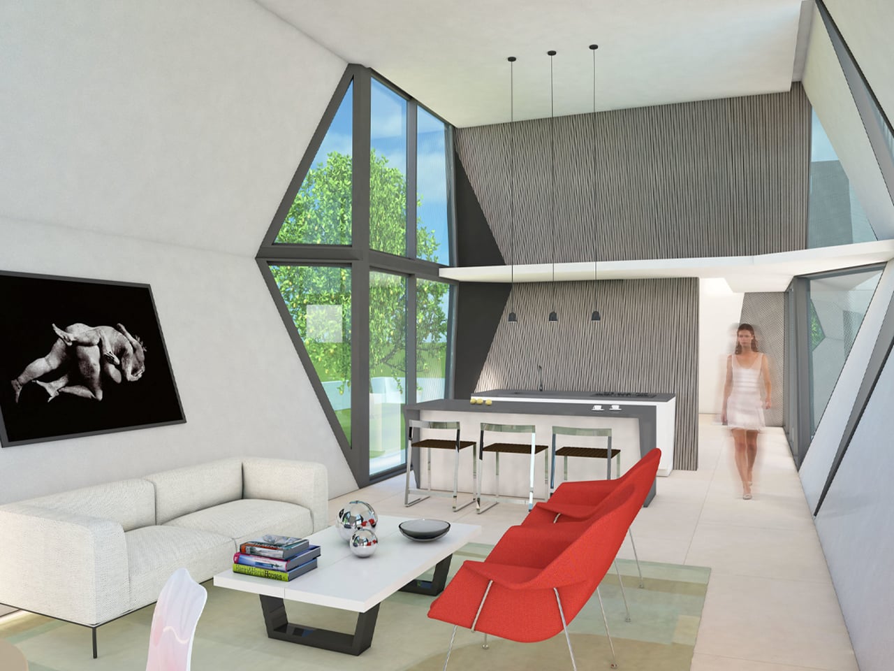
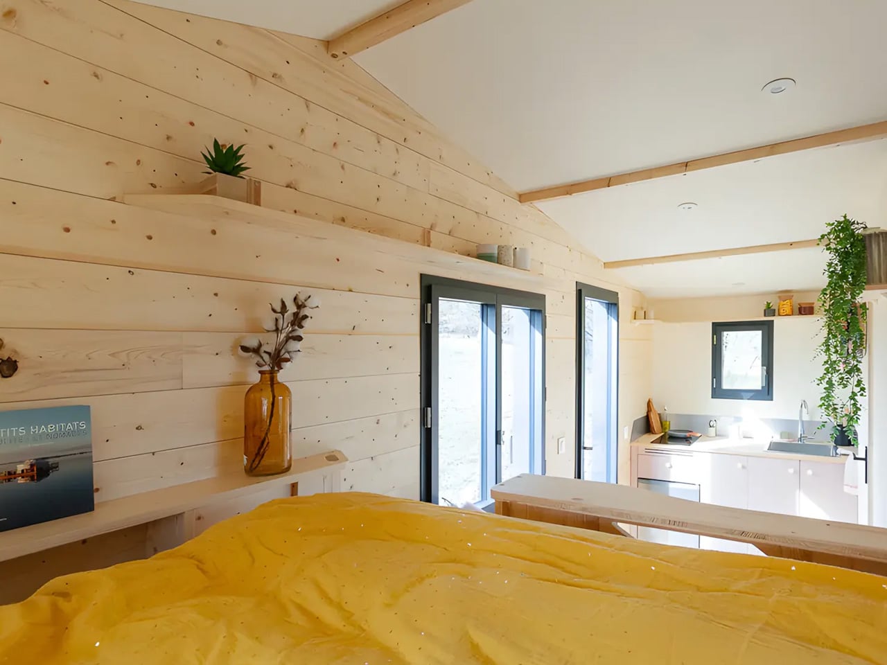
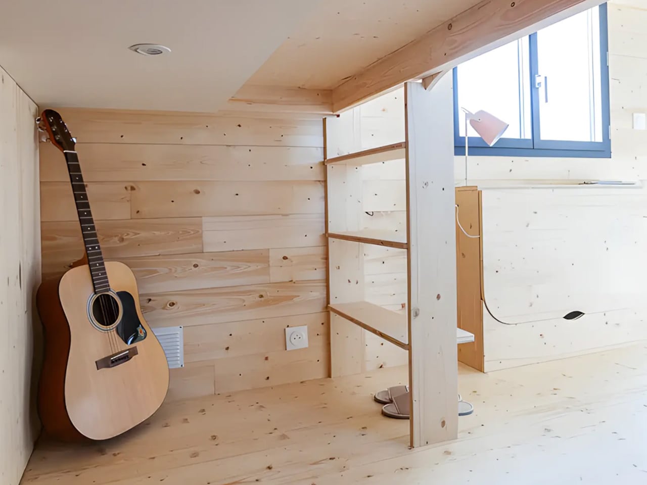
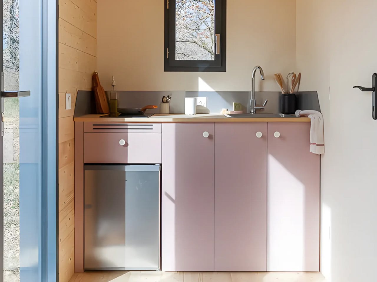
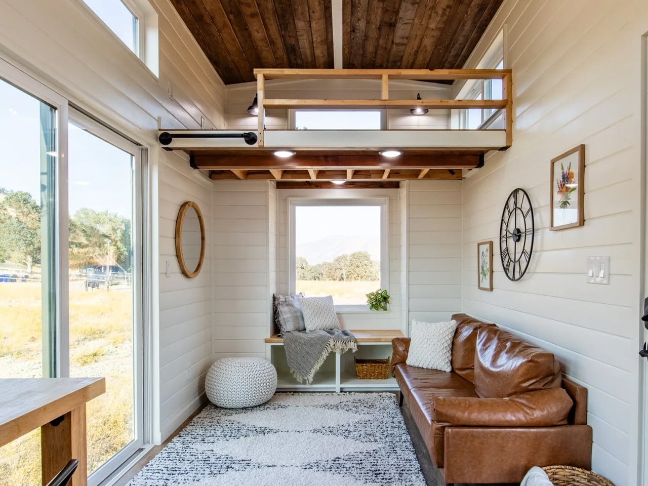
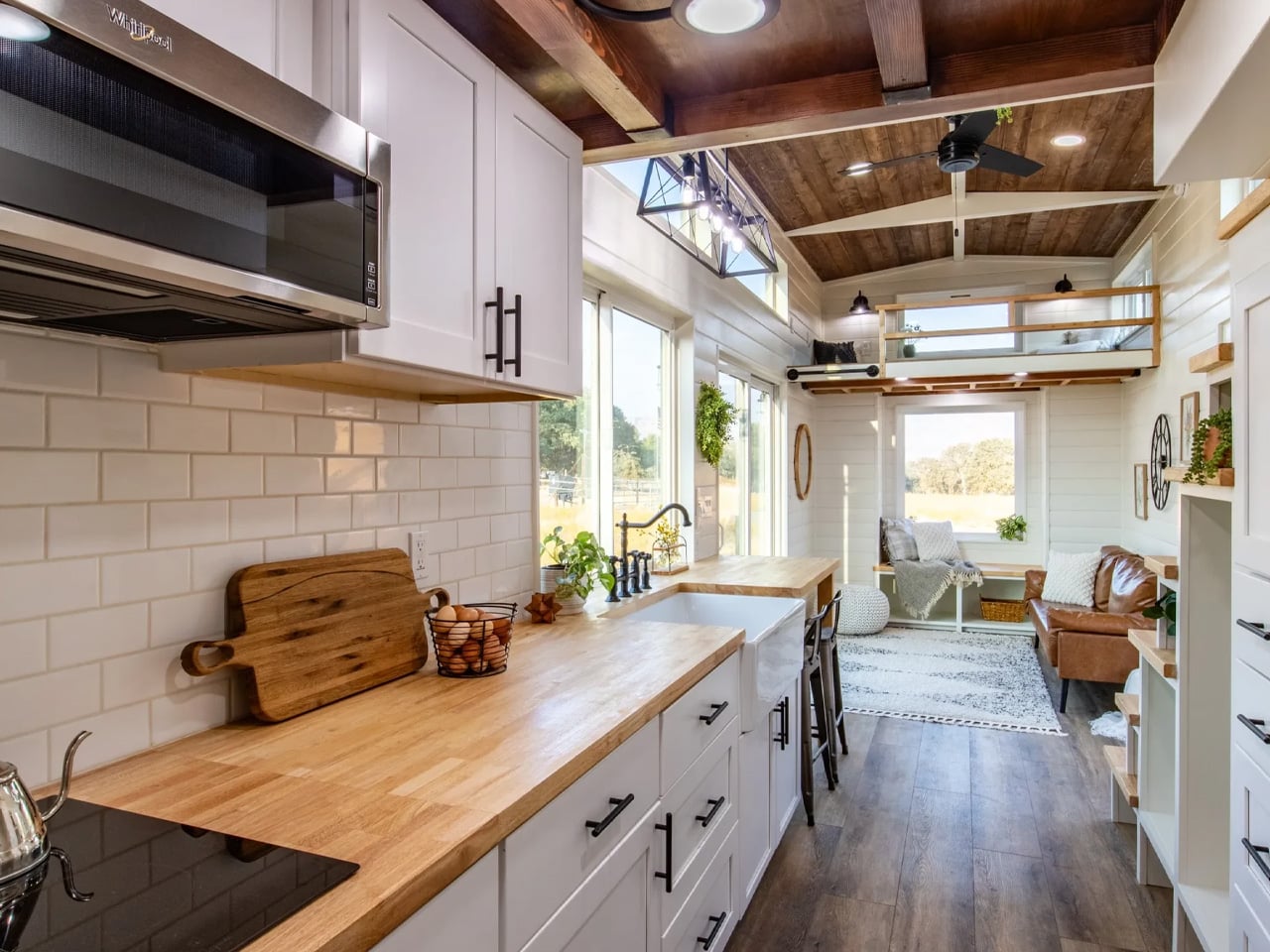
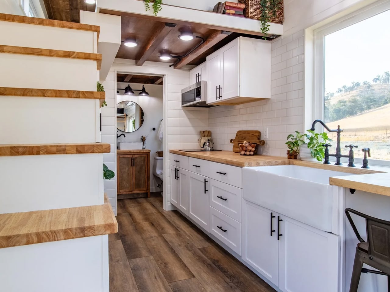
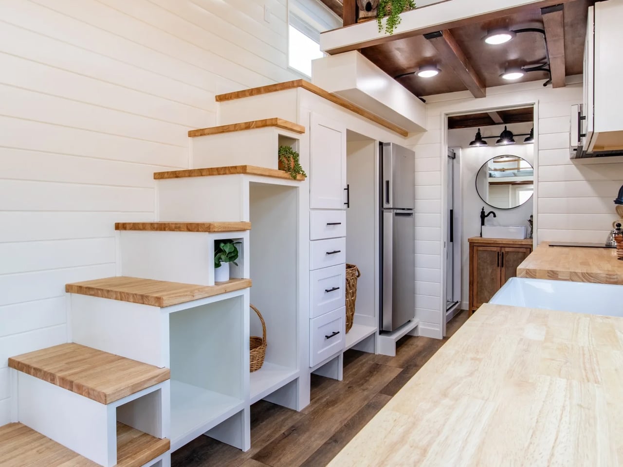
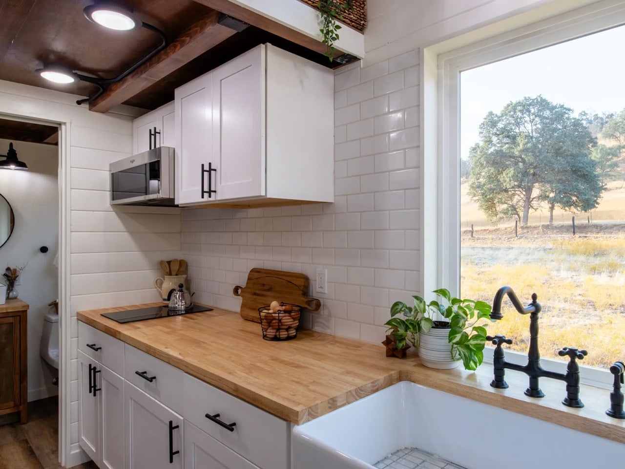
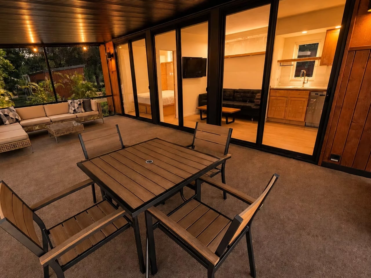
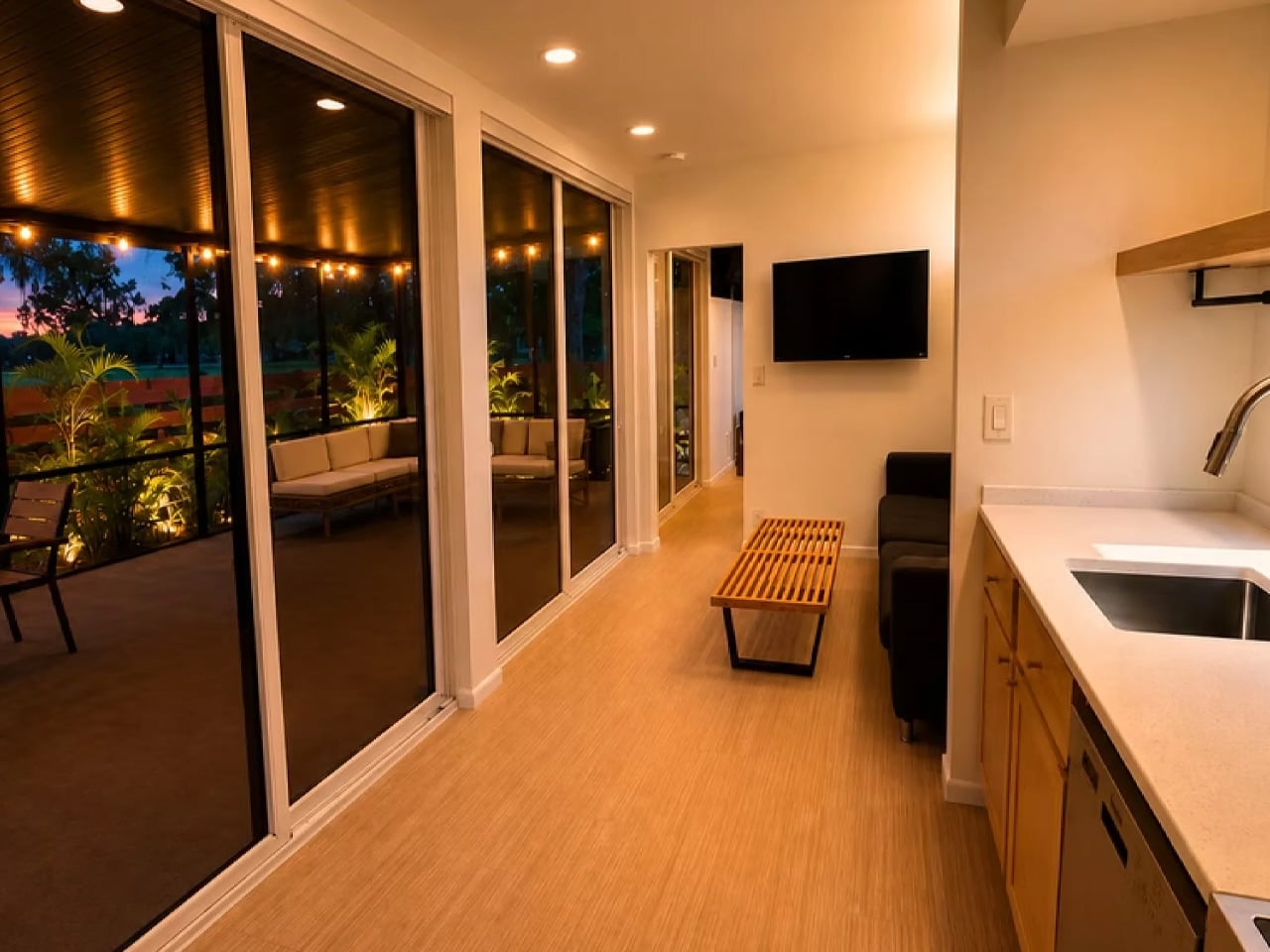
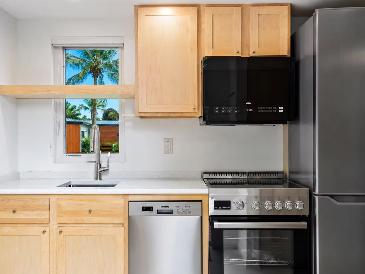
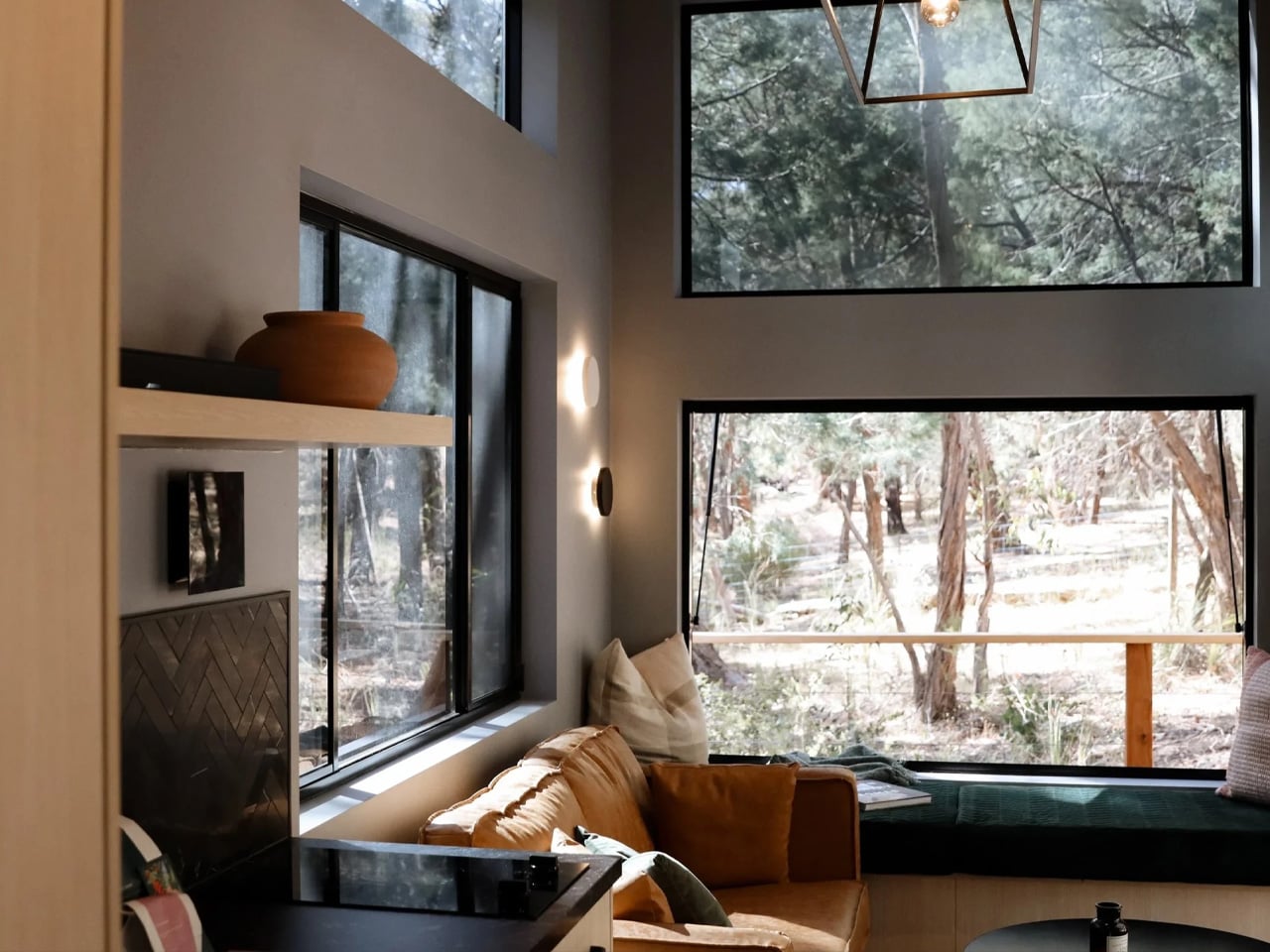
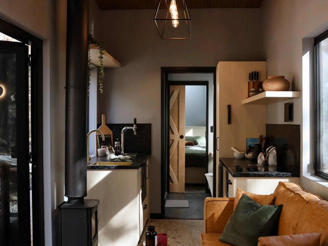
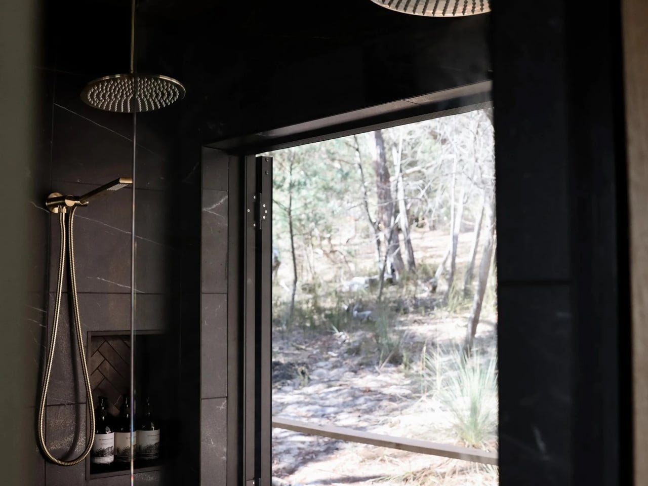
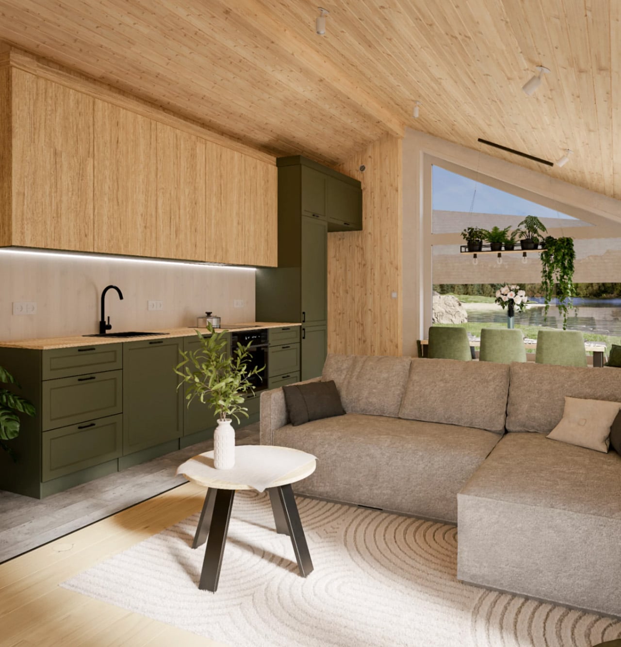
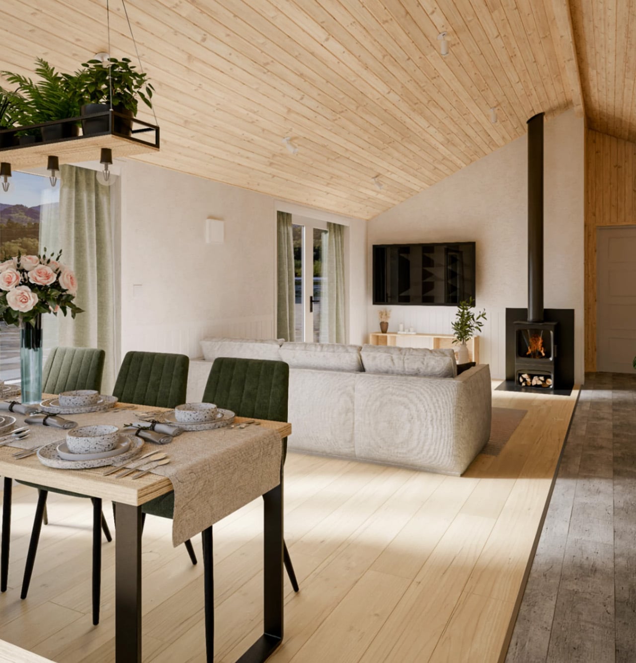
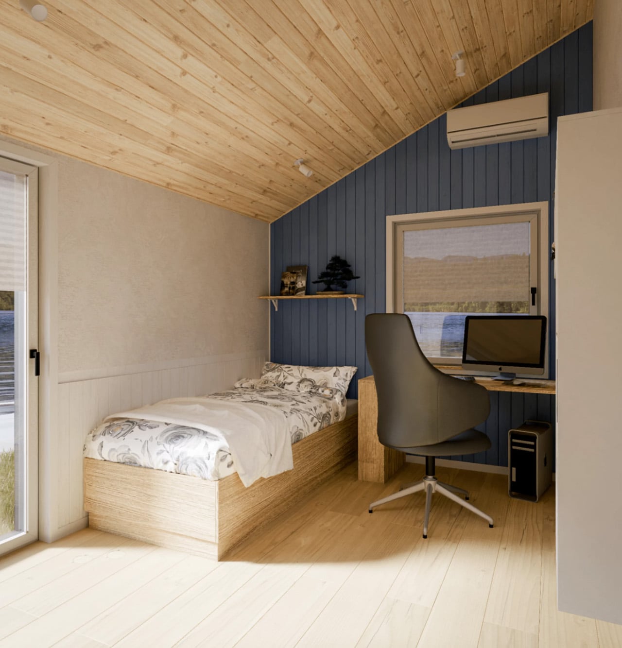
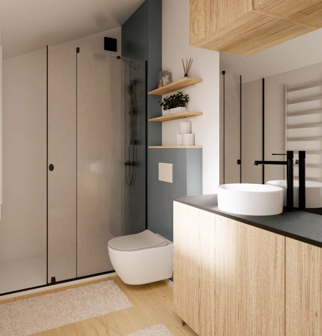
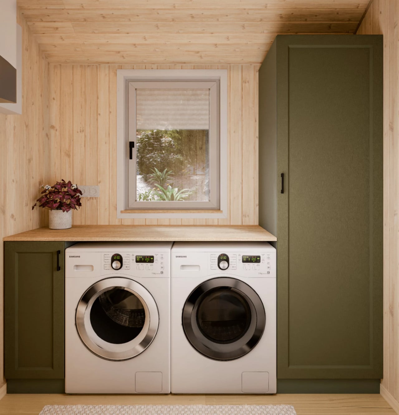
Step inside and the 30 square meters (322 sq ft) feel surprisingly unhurried. The layout centers on an open-plan kitchen and living area, the kind of space that rewards the people who believe a home doesn’t need to be large to feel alive. The kitchen includes a breakfast bar that seats two — a social anchor in a compact floorplan — while the bathroom sits neatly off to the side. The interior leans into simple wood finishes throughout, which keeps the warmth tangible and the aesthetic clean without veering into the sterile.

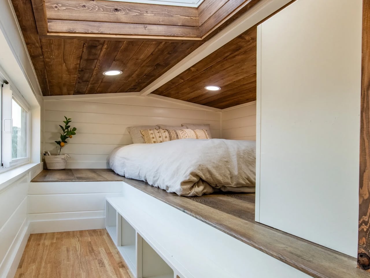
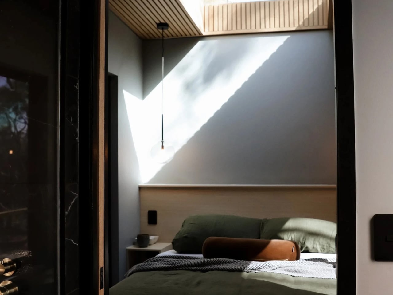
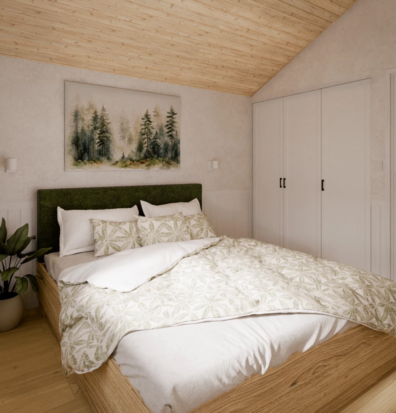
What makes the Gerês genuinely surprising is its sleeping capacity. The home sleeps up to six adults — two bedrooms do the heavy lifting, with the living area stretching to accommodate two more when needed. For a structure that can be hitched to a truck and moved across the country, that’s a remarkable feat of spatial thinking. It doesn’t feel like a compromise. It feels like a decision — one made by people who understand that mobility and comfort don’t have to cancel each other out.

Casagaea also offers optional off-grid upgrades, which open the Gerês up to placements far beyond the reach of traditional infrastructure. Whether parked at the edge of a pine forest or settled on a rural plot in the Alentejo, the home carries its context well. The engineered wood cladding doesn’t fight the landscape — it joins it.

The tiny home movement has produced no shortage of novelty concepts that look better in renders than in reality. The Gerês sits in a different category. It’s a road-ready home built by a Portuguese studio that seems less interested in hype and more interested in the long game — designing spaces that hold up not just aesthetically, but in the day-to-day texture of actual life. That restraint, in a category prone to excess, might be its most compelling design feature of all.

The post This Portuguese Tiny Home on Wheels Sleeps Six and Looks Better Than Your Apartment first appeared on Yanko Design.
The Tommy Tiny House Is Proof That Six People Don’t Need Much Space

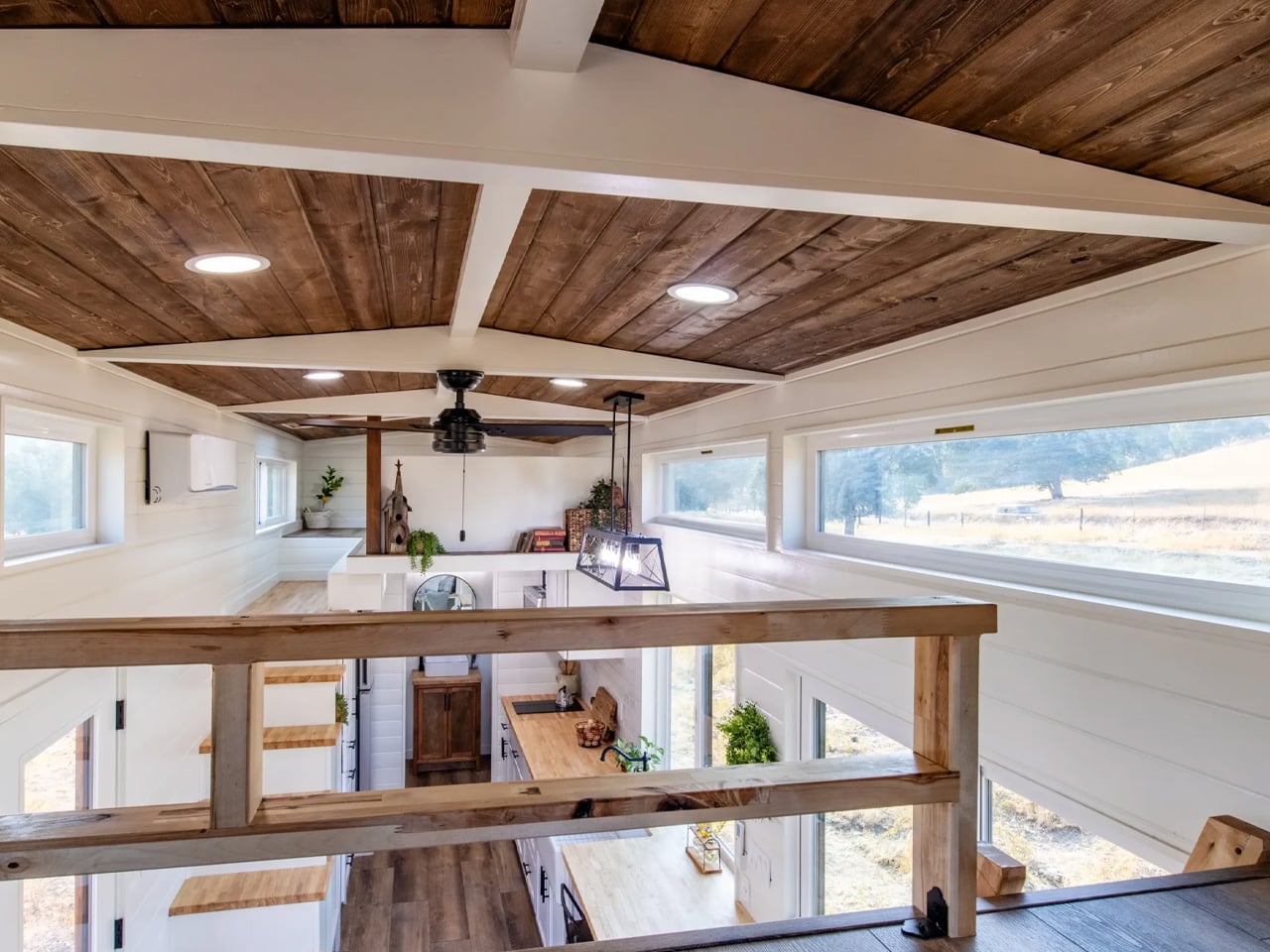
Six people, one trailer — and nobody had to sleep on the floor. The Tommy tiny house by Craft House is a dual-loft mobile home that sits at just 23.6 feet long and 8.2 feet wide, yet somehow manages to sleep six people without making anyone feel like they drew the short straw. Built by the Poland-based European builder with facilities in Ireland and Austria, it’s the kind of small-space design that doesn’t ask its occupants to settle.

The exterior sets the tone before you even step inside. Thermo-pine cladding meets standing-seam metal siding and roofing in a pairing that reads as quietly considered rather than trying too hard. Double-glazed windows line the façade, and a large sliding glass door at the rear floods the interior with natural light. Mounted on a double-axle trailer, the structure is road-ready without looking like it belongs on one.

Designer: Craft House

Inside, the aesthetic lands somewhere between a Scandinavian cabin and a boutique hotel room — a combination that sounds odd until you see it. Engineered hardwood floors run underfoot, tongue-and-groove spruce lines the walls and ceiling, and black steel railings cut through the warmth with just enough edge to keep things from veering cozy. The layout covers a living area, a full kitchen, and a bathroom fitted with a glass-enclosed tiled shower, floating vanity, and electric radiator. Underfloor heating and smart air conditioning handle year-round comfort without asking the homeowner to think too hard about it.

The dual-loft configuration is where the Tommy earns its reputation. The primary loft sits above the kitchen end and is reached by a staircase with built-in storage tucked beneath each step. The second loft uses a space-saving folding wooden ladder that presses flat against the wall when the space isn’t in use — a detail that speaks to the level of intention in the design.

Both sleeping quarters come with timber surrounds, proper mattresses, safety railings, and small bedside touches that make each one feel like a destination rather than a compromise. Add in the living room sofa bed, and the Tommy comfortably accommodates six.

It runs on a standard RV-style hookup, with off-grid capability available as an option for those who want to take the freedom element seriously. Pricing starts at approximately $52,000 USD, scaling upward depending on configuration and finish level. For a structure not much longer than a generous parking space, the Tommy makes a strong case. Craft House built something that doesn’t ask its occupants to live smaller — just smarter.

The post The Tommy Tiny House Is Proof That Six People Don’t Need Much Space first appeared on Yanko Design.
This Carbon-Negative Neighborhood in the Netherlands Is Rethinking Affordable Housing

Architecture has long been one of the planet’s most significant contributors to carbon emissions. ORGA, a Dutch studio, is challenging that reality head-on with a carbon-negative neighborhood prototype built in the village of Marknesse, Netherlands — and the results are worth paying attention to.

Commissioned by housing association Mercatus, the project consists of 12 affordable rental homes designed specifically for first-time buyers and low-income households. From the outset, the goal was to minimize environmental impact at every stage — not as an afterthought, but as the foundation of every design decision made.

Designer: ORGA

Marknesse sits in a region historically defined by its ‘Delft Red’ aesthetic: red clay bricks and orange-red roof tiles. Rather than abandon that visual identity, ORGA reinterpreted it through a modern lens, swapping out high-carbon materials for natural, renewable alternatives. The result is something rare in contemporary construction — a structure that stores more carbon than it produces. The architects also wove local ecology into the design, incorporating wooden chimneys that double as nesting sites for bats.

The numbers behind the project are striking. The prototype achieves a 76% share of bio-based and circular raw materials. Nearly everything is sourced from renewable materials, with the exception of the concrete foundation and essential components like windows and fasteners. It’s an approach that echoes projects like the 3D-printed Lib Earth House Model B in Japan, which similarly replaces cement with soil-based mixtures to reduce material impact.

Construction efficiency was also a priority. The homes are built using prefabricated timber elements manufactured off-site and assembled on-site, a method that dramatically cuts construction time while reducing local disruption. This mirrors what’s been seen in mass timber projects like the 230 Royal York tower in Toronto, where prefabrication trimmed months off the build schedule.

Inside, the timber framing is insulated with wood fiber and other natural materials, enabling a completely foil-free, vapor-permeable construction. There are no synthetic plastic wrapping layers. Instead, the wall system is breathable — designed to passively regulate moisture and temperature without air conditioning or mechanical intervention. The building essentially manages its own climate.

To close the loop on long-term sustainability, each home was cataloged using the Madaster Material Passport, an online dossier that tracks all materials and their applications. Residents also received user manuals to help them maintain and eventually repurpose components of the home. What ORGA has built in Marknesse is more than a prototype. It’s a proof of concept that bio-based, affordable, and carbon-negative architecture can coexist — and that meaningful ecological design doesn’t have to come at the cost of accessibility.

The post This Carbon-Negative Neighborhood in the Netherlands Is Rethinking Affordable Housing first appeared on Yanko Design.
A Designer Just Gave the Sandwich Maker the Concept It Deserved

Small appliances are the forgotten middle children of industrial design. We obsess over espresso machines and standing mixers, but the humble sandwich maker? It usually gets whatever plastic shell a product team could push through engineering fast enough to hit a price point. That’s exactly why Dogac Can Sagirosmanoglu’s sandwich maker concept caught my attention, and I suspect it’s catching a lot more than mine.

Sagirosmanoglu is a Lead Industrial Designer based in Istanbul, and he posted this concept project on Behance, where the numbers speak for themselves: over 560,000 views and more than 4,000 appreciations. For a sandwich maker concept. That response says less about novelty and more about something the design community rarely applies to small countertop appliances: genuine intention.

Designer: Dogac Can Sagirosmanoglu

The concept is presented under the Beko name, though it exists as a portfolio project rather than an officially announced product. That distinction matters, but it doesn’t make the design any less compelling. If anything, it makes it more interesting. A designer working within the constraints of a real brand’s visual language, applying that kind of care to a product category that nobody asked him to elevate, is a different kind of creative statement than a fully unconstrained concept. It says something about what he thinks good design actually owes the everyday object.

The design itself carries the kind of restraint that only looks effortless after a lot of work. Clean lines, a minimal form language, and a clear understanding that this object will live on someone’s kitchen counter, which means it has to look right whether it’s in use or not. Most sandwich makers are things you hide in a cabinet. This one looks like it was designed to stay out. That shift in thinking, from kitchen tool you tolerate to one you actually want to see, is a more significant design decision than it sounds.

There’s also something honest about the proportions. This isn’t a concept that drifts into fantasy, all floating surfaces and materials that will never survive a production line. It feels buildable. Considered. The kind of design where you can tell the person behind it was asking whether every decision was earning its place, rather than simply asking whether it looked good in a render.

I’ll admit I’m personally drawn to small appliance design right now. We’ve reached a moment where the home, and specifically the kitchen, has become a genuine expression of identity for a lot of people. Social media has made countertops aspirational real estate. The appliances sitting on them aren’t invisible anymore, and the industry is only just beginning to catch up to that shift. Concepts like this one feel like someone who understands that change and is designing accordingly, even before the brief exists to demand it.

It’s also worth noting that this kind of work, a concept developed with real brand context and real production sensibility, is increasingly how design culture moves forward. The conversation doesn’t only happen at Milan or in the pages of Wallpaper. It happens on Behance, where a designer in Istanbul can rack up half a million views on a sandwich maker concept and start a conversation that ripples through the industry. That’s genuinely exciting, and more democratizing than most design institutions would like to admit.

The bigger question this concept raises is why we settled for so long. Kitchen appliances are touched multiple times a day. They shape the experience of a space we spend real, meaningful time in. A sandwich maker that someone put thoughtful effort into isn’t a luxury, it’s just respect for the user. And once you see a design that gets it right, the ones that don’t become very difficult to look at.

Sagirosmanoglu’s sandwich maker concept doesn’t solve every problem with small appliance design. But it makes a compelling argument that someone should be trying. Whether or not it ever gets made, that argument is already winning.

The post A Designer Just Gave the Sandwich Maker the Concept It Deserved first appeared on Yanko Design.

10 Best Graduation Gifts For 2026 Grads That Solve the First-Apartment Shuffle

The first apartment is never really about square footage. It’s about the gap between the life you imagined and the room staring back at you. White walls, borrowed furniture, a kitchen where nothing is where it should be. Graduation gifts usually fill that gap with sentiment. These fill it with design. Ten objects chosen because they solve something real, look good doing it, and make a bare space feel considered.

None of them requires assembly instructions or a decorator on speed dial. They fit wherever there’s room, carry their weight in both form and function, and give the impression that whoever received them has been thinking about how to live well for longer than they have. That’s the point of a good graduation gift. Not something used once and forgotten. Something that makes the shuffle a little easier to land.

1. ClearFrame CD Player

The ClearFrame CD Player is for the grad who already knows what they’re about. It plays physical CDs through a transparent frame that keeps the disc visible while it spins, turning the act of listening into something you can actually watch. In a generation that grew up on invisible streaming, there’s something genuinely refreshing about a music player that makes its mechanism the main event rather than hiding it behind a matte plastic casing.

A first apartment shelf rarely has any visual anchor in the early weeks. The ClearFrame takes up almost no visual weight while still giving a room a focal point worth looking at. It earns its place not just as a player but as an object with a point of view, which matters when you’re building a space from scratch, and everything you put in it says something about who you are before a single thing is hung on the walls.

Click Here to Buy Now: $200.00

What we like

  • The transparent frame makes the spinning disc part of the visual experience, turning playback into something physical and deliberate in a way that streaming platforms never quite replicate.
  • The compact, minimal footprint means it earns shelf or desk space without displacing other objects, sitting confidently without demanding the room be arranged around it.

What we dislike

  • Getting real value from the ClearFrame requires an existing CD collection, which means it works best as a gift for someone already invested in physical music formats.
  • The analog format is a deliberate choice that won’t resonate with graduates who have no interest in stepping back from digital and streaming convenience.

2. Rokform 3-in-1 Foldable Wireless Charging Stand

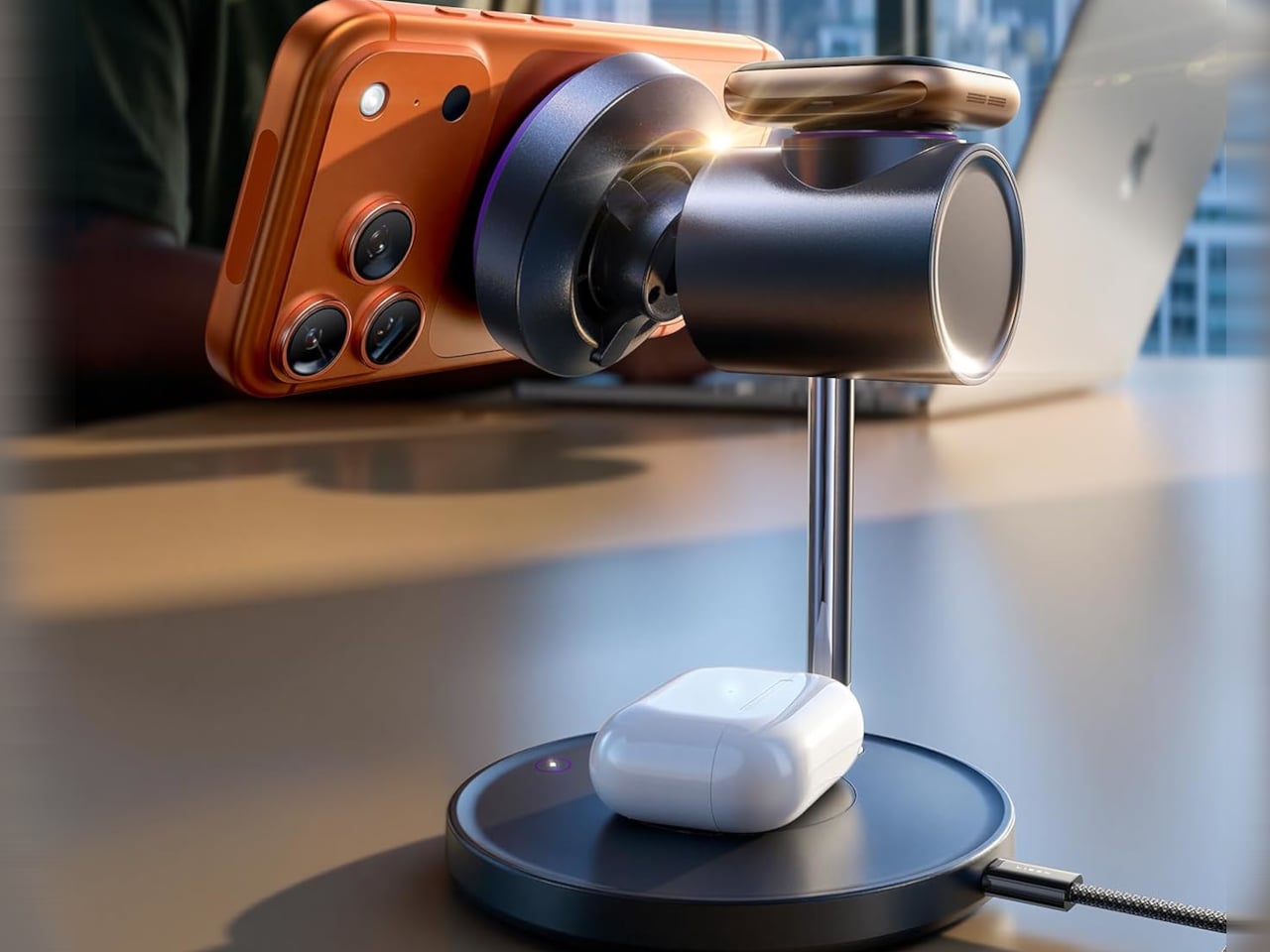
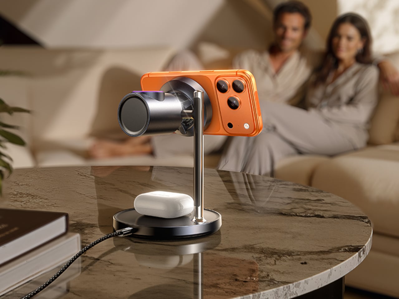
The nightstand problem in a first apartment isn’t about the nightstand. It’s about everything that ends up on it. Three devices, three cables, a different charger for each one, and a surface that looked intentional for exactly two days before it didn’t. The Rokform 3-in-1 Foldable Wireless Charging Stand replaces all of it with a single zinc alloy and glass unit that charges a phone at 15W, an Apple Watch from a fold-out arm, and earbuds on a separate pad. One cable in. Three devices done.

The build quality is the detail that separates this from the category it belongs to. Zinc alloy and glass don’t flex or slide. The stand stays exactly where you put it at midnight when you’re reaching for your phone by feel. For a grad setting up a bedside situation in a space that has no established routine yet, the Rokform removes one of the small daily frictions before it has a chance to become a habit. A charged phone, a charged watch, and a surface that looks considered rather than accumulated.

What we like

  • A single USB-C cable powers all three charging surfaces simultaneously, collapsing an entire nightstand cable situation into one clean connection that takes thirty seconds to set up.
  • Zinc alloy and glass construction put the Rokform in a different material category from the plastic pads that flex and slide, giving it a density and permanence that reads immediately in the hand.

What we dislike

  • The Apple Watch arm is purpose-built for that ecosystem, which means anyone outside the Apple Watch world loses a full third of the unit’s function without a meaningful workaround available.
  • At $100, the Rokform is priced above the average wireless charger, and those who only need to charge a single device will find the multi-device design hard to justify at that price point.

3. 3D-Printed Kumiko Panel

Traditional Kumiko panels are the kind of object that stops a conversation cold. The geometric latticework, built from interlocking wooden slivers without a single nail, has been a fixture of Japanese craft for centuries. Authentic wall-sized versions start around $2,700 and rarely leave galleries. This 3D-printed version by a Canadian maker — three months in the perfecting — brings that same hypnotic interplay of light and shadow to a first apartment wall at a fraction of the price and commitment.

A blank wall is the first problem every new apartment presents, and the last one anyone figures out how to solve. A framed print says something. A Kumiko panel says something else entirely — that the person who hung it knows exactly where they stand on craft, patience, and the kind of beauty that doesn’t need to explain itself. It catches light differently through the day, creates depth on a flat surface, and turns the emptiest wall in a room into the one everyone ends up standing closest to.

What we like

  • The geometric latticework creates shifting light and shadow patterns that change with the time of day, giving a blank wall a visual life that no poster or print can replicate.
  • At a fraction of the cost of authentic hand-carved Kumiko panels, it brings genuine craft-referencing design into a first apartment without the gallery price tag attached.

What we dislike

  • The 3D-printed plastic construction lacks the warmth and material depth of traditional wood Kumiko, which may feel like a meaningful compromise to those familiar with the authentic version.
  • The panel works best as a wall-mounted piece, which means hanging hardware and a commitment to a specific spot — something a first apartment with rental restrictions may complicate.

4. Ritual Card Diffuser

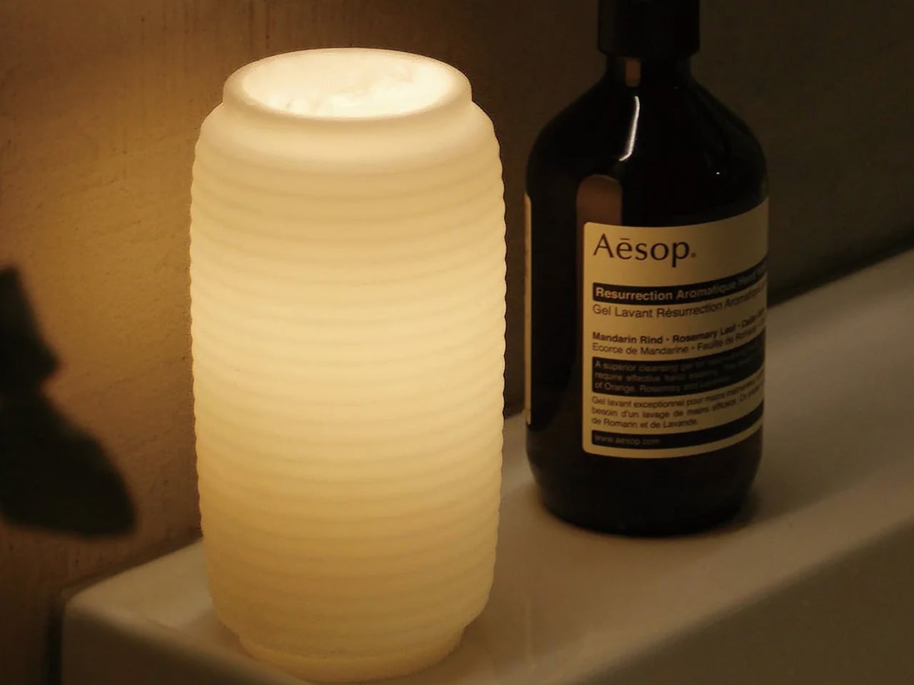
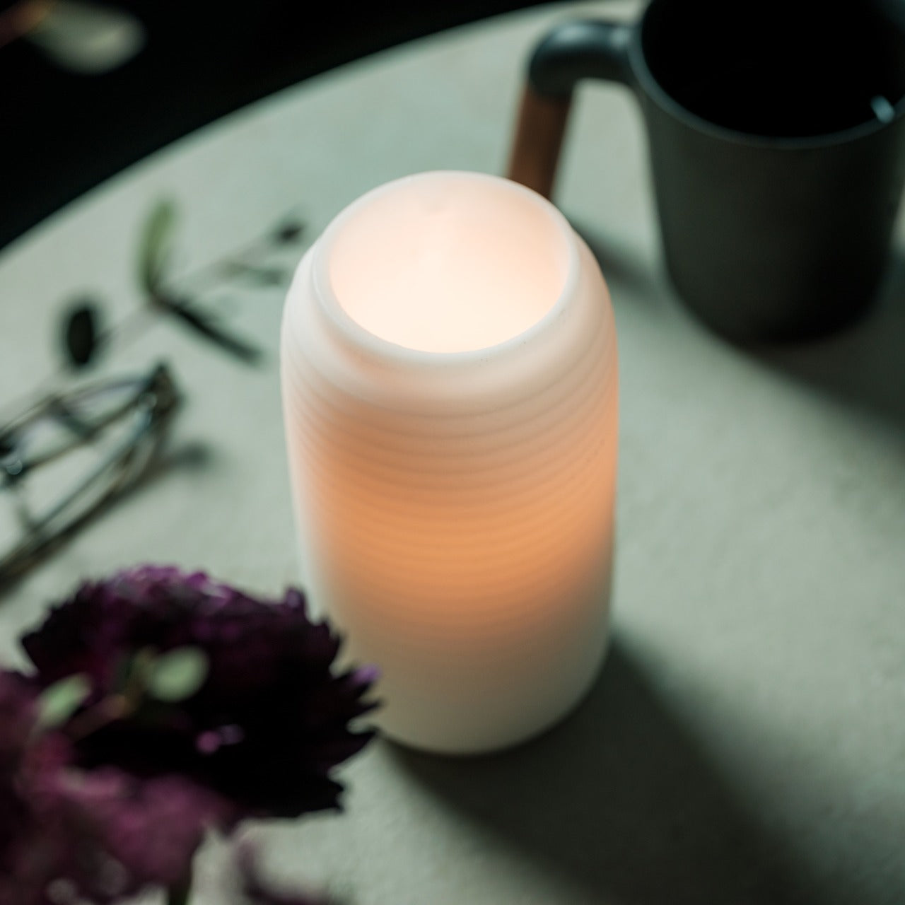
The first thing a new apartment needs isn’t furniture. It’s a scent that makes it feel like yours. The Ritual Card Diffuser from the Yanko Design shop uses fragrance cards to release scent gradually, building an atmosphere that doesn’t announce itself so much as settle in. No plug, no maintenance cycle, nothing that fights for counter space. It works in the background, the way the best objects do, making the room feel lived in before it actually is.

For a grad moving into their first real space, the Ritual Card Diffuser is less about fragrance and more about the idea that this room has been thought about. That effort matters. The card format keeps things clean and swappable, so the scent can shift with the season or the mood without committing to a single identity. For someone figuring out who they are in a new space, that flexibility lands exactly right from the very first week.

Click Here to Buy Now: $89.00

What we like

  • The card system allows scent profiles to be swapped without replacing the unit, giving it flexibility that traditional reed diffusers simply cannot match as taste evolves.
  • No cord, no heat element, and no liquid means it occupies no counter real estate and creates zero maintenance overhead in a space still being figured out.

What we dislike

  • Replacement cards are a recurring cost that adds up over time and needs to be factored in when gifting this to someone on a tight post-graduation budget.
  • The scent throw may feel subtle in open-plan spaces or rooms with high ceilings, where a stronger diffusion method might be more appropriate.

5. Orgdot N200 Desktop Speaker

Bluetooth speakers are everywhere, but few carry this much personality. The Orgdot N200, designed by Shu Zhang, pulls from industrial and steampunk aesthetics in a way that sits closer to Teenage Engineering than anything you’d find at a big-box electronics retailer. Exposed mechanical elements and a retro-modern silhouette give it a design sensibility that reads just as well from across a room as it does up close. It connects wirelessly and earns whatever surface it lands on.

In a first apartment where the speaker is often the only real sound system in the space, the N200 carries that responsibility well. It fills the room visually before you’ve even pressed play, and that matters in a space that doesn’t have much else going on yet. Pairing it with the ClearFrame CD Player builds a small analog audio corner that looks curated rather than assembled. Two objects. Real presence. No interior design degree required.

What we like

  • The retro-industrial design aesthetic gives a first apartment an instant visual anchor at desk or shelf level, doing decorative work that most Bluetooth speakers never attempt.
  • Wireless Bluetooth connectivity removes the need for cable management entirely, keeping the surface clean and the setup honest to the minimalist silhouette the N200 projects.

What we dislike

  • The distinctive aesthetic is a strong personal statement that reads very specifically, and it genuinely won’t suit every taste or complement every design direction a room might take.
  • Desktop placement limits the direction the sound can effectively project, which may leave larger rooms feeling like the speaker is working harder than it should have to.

6. AromaCraft Clothes Brush

Lint rollers solve a problem. The Aromacraft Clothes Brush solves it better. It handles the everyday task of removing lint, dust, and the general debris of daily life from clothing while folding a subtle aroma element into the ritual. It’s a small but meaningful shift in how a mundane task feels, one that turns the two-minute pre-work brush-down into something closer to a considered grooming moment worth actually doing.

For a grad entering a professional world where first impressions matter more than they did in a lecture hall, getting dressed well becomes a new priority. The Aromacraft Clothes Brush handles the physical part and adds a sensory layer that a standard bristle brush simply ignores. It’s the kind of object that makes morning routines feel like they were designed rather than stumbled into. Small enough to store on any shelf, purposeful enough to reach for every single day.

Click Here to Buy Now: $149.00

What we like

  • Combining garment care and scent into one object removes the need for two separate tools, which matters in a first apartment where counter and shelf space are genuinely limited.
  • The aroma element reframes a utilitarian task as part of a morning ritual, which is a small but real shift in how a workday begins for someone newly navigating professional life.

What we dislike

  • The aroma component will eventually lose its potency and need to be refreshed or replaced, adding a recurring step that a standard clothes brush simply doesn’t require.
  • Graduates who are sensitive to fragrance or prefer entirely scent-neutral routines won’t benefit from the secondary function the Aromacraft is specifically built around.

7. RUNERO PRO Coffee Maker

Designed by Ksenya Ilyukhina for Unicum, the RUNERO PRO lands in a kitchen and immediately makes the rest of the counter look like a placeholder. The brushed aluminum exterior is dense and considered, and the 15-inch LED touchscreen keeps controls front and center without adding visual clutter. Face ID recognition and voice control mean it learns how each person takes their coffee and starts acting accordingly, removing the ritual fumbling of a first-time morning routine from the equation.

The RUNERO PRO is not the kind of coffee machine you buy because you need coffee. You can get coffee anywhere. It’s the kind you buy because the kitchen is where a first apartment gets taken seriously, and the right appliance signals that you’re starting this chapter with real intention. For a grad who spent four years surviving on campus brews, landing a machine that knows their order from a glance changes the rhythm of every weekday morning.

What we like

  • Face ID recognition and voice control make personalizing and recalling coffee preferences genuinely effortless, removing the repetitive manual input that most smart appliances still demand daily.
  • The brushed aluminum construction and large touchscreen interface place the RUNERO PRO visually above the category of kitchen appliances it technically belongs to, which matters when the counter is also the room’s focal point.

What we dislike

  • The high-tech interface adds meaningful complexity that may feel excessive for those who want a reliable, straightforward coffee machine without a learning curve attached to it.
  • The premium build and integrated technology come at a price point that commits to the kitchen in a way that not every graduating budget can reasonably absorb in year one.

8. Fellow Stagg EKG Pro Kettle

The Fellow Stagg EKG Pro has been the design world’s favorite electric kettle long enough to earn its reputation several times over. The gooseneck spout handles pour-over coffee with precision, but the design reads just as well when it’s sitting on the counter doing nothing at all. Matte finish, a handle that earns its curve, and temperature precision through a minimal dial interface. It’s the kettle that makes a first kitchen counter look like someone considered exactly what they put on it.

Alongside the RUNERO PRO, the Stagg EKG forms the second half of a morning kitchen that actually functions. Where the RUNERO handles the automated side of coffee, the Stagg gives control back over water temperature for pour-over, tea, or anything that asks for more precision than a standard kettle provides. For a grad building a first kitchen from the counter outward, both objects together say more about how they intend to live than most furniture choices ever could.

What we like

  • Precision temperature control makes the Stagg EKG genuinely useful across pour-over coffee, tea, and any other preparation that demands more than a simple boil and pour.
  • The gooseneck silhouette has earned its place as a design standard that transcends trend cycles, meaning it will still look right on the counter five years from now.

What we dislike

  • The premium price point is a real consideration for a kettle, even one this well resolved, and it may feel difficult to justify against other first-apartment priorities competing for the same budget.
  • The capacity is calibrated toward one or two people, which means it may feel undersized in shared living situations where multiple people need hot water at the same time.

9. TWIST Side Table

The TWIST side table is made from a single sheet of metal folded in a continuous loop to form a tabletop, an integrated storage ledge, and a carry handle in one uninterrupted gesture. The matte light beige body pairs with a pale wood base and a small orange accent at the handle. It weighs almost nothing visually. In a first apartment where every surface is being asked to do more than one job, the TWIST handles it without complaint, holding a drink, a book, a phone, and a spare set of keys without making any of it feel like a compromise.

The carry handle is not an afterthought. It’s part of the same metal loop that forms the table, which means the whole object relocates in one motion. From beside the bed to beside the couch to near the window where the light hits differently on a Sunday. For a grad whose first apartment still has furniture in flux, an object that moves as easily as the plan does becomes indispensable by the second week of living with it.

What we like

  • The single-piece metal construction means the tabletop, storage shelf, and carry handle are all one continuous form, giving the TWIST a structural honesty that assembled furniture simply cannot match.
  • The integrated handle makes relocation a one-handed, one-second decision, which matters in a first apartment where the ideal layout takes several months of trial to actually arrive at.

What we dislike

  • The circular metal profile limits the usable surface area, which means anything larger than a mug, a book, or a phone asks for more real estate than the tabletop comfortably offers.
  • The concept-driven design places aesthetics at the center of the object, and those who prioritize pure utility over visual intention may find other side tables a more practical first apartment investment.

10. Arca Modular Furniture System

The Arca modular system from Elements Studio is the most practical thing on this list and possibly the most useful gift a 2026 grad can receive. Each piece works as a nightstand, a bench, a bookshelf, or a storage unit, depending on what the space needs that week. Stack them vertically for a shelf tower. Line them horizontally for a low credenza. Pull one out to use as a standalone stool. No tools required, no configuration that can’t be undone in sixty seconds.

The first apartment rarely stays the same for more than a few months. Roommates arrive and leave. Jobs change the schedule. A bedroom becomes a home office on Tuesday and a reading room by the weekend. The Arca grows with all of it because it was designed to. For a grad who is spending the next few years figuring out how they want to live, this is the furniture system that doesn’t ask them to decide right now. It just adapts, reconfigures, and moves with them into whatever comes next.

What we like

  • The tool-free modular configuration means the entire system can be rearranged to serve a completely different function in under a minute, without any commitment to a permanent layout.
  • The versatility across nightstand, shelf, bench, and storage roles effectively replaces several pieces of furniture with one considered system, which is a genuine win for a first apartment with limited floor space.

What we dislike

  • The modular format works best as a set, and a single piece loses much of its system-level appeal, meaning the gift lands better when multiple units are given together rather than one at a time.
  • The design language is deliberately restrained and neutral, which gives it broad compatibility but may feel too quiet for graduates who want their furniture to make a stronger visual statement.

The Shuffle Doesn’t Last. Good Design Does.

The first apartment doesn’t have to feel like a waiting room for the real thing. These ten objects treat it as exactly what it is — the beginning of a considered life, assembled one good decision at a time. Each one earns its place not because it fills space but because it solves something, holds its own visually, and gives whoever receives it the sense that they already know how they want to live. That confidence, quietly installed, is the real graduation gift.

The shuffle is part of it. Figuring out where the lamp goes, which corner becomes the morning corner, and what the kitchen means when it’s entirely yours. Good design makes that process feel less like a problem to solve and more like a space to settle into. These ten picks sit at that intersection, functional enough to matter from the first week, considered enough to stay relevant well past it.

The post 10 Best Graduation Gifts For 2026 Grads That Solve the First-Apartment Shuffle first appeared on Yanko Design.

At 9.6 Metres, the Cabarita Might Be the Most Livable Tiny Home on Wheels

There’s a version of tiny home living that still feels like a proper home — not a camper van with aspirations, not a studio apartment on wheels, but something genuinely livable. The Cabarita by Removed Tiny Homes sits squarely in that category. It’s a two-bedroom towable built on a triple-axle trailer, measuring 9.6 metres long, 2.4 metres wide, and 4.3 metres high, totalling 33 square metres of considered space. The numbers alone don’t tell the story — the layout does.

Removed Tiny Homes is a Brisbane-based builder with a straightforward philosophy: tiny living shouldn’t mean compromise. The Cabarita is the clearest expression of that thinking. Downstairs, you get a full bedroom and a bathroom fitted with a glass-enclosed shower, vanity sink, and flushing toilet, plus a separate laundry area with a washer and dryer. The kitchen and living room flow together under a high ceiling with a large picture window that pulls the outside in — a detail that does a lot of heavy lifting in a compact floor plan. Upstairs, a generous loft functions as the second sleeping zone, giving the layout enough separation to actually feel like a two-bedroom home rather than a converted storage space.

Designer: Removed Tiny Homes

What makes the Cabarita worth paying attention to isn’t just how it looks — it’s how thoroughly it’s been thought through. The standard model includes high-efficiency air conditioning and gas hot water, and for those who want to live off-grid, Removed Tiny Homes offers three upgrade packages: solar power systems, rainwater tanks, and multi-stage water filtration. The trailer dimensions are calibrated so the home can be towed without requiring special permits, which keeps the mobility genuinely practical rather than theoretical.

The design language is unfussy — clean lines, warm timber, natural light prioritised over decoration. Nothing is trying to prove itself. The Cabarita reads as a home for someone who’s done the math on what they actually need versus what they’ve been conditioned to want. At approximately USD $97,800, it’s not cheap in absolute terms, but relative to the property market it was designed as an alternative to, the numbers land differently.

The tiny home space is crowded with concepts that photograph well and compromise everywhere else. The Cabarita isn’t that. It’s a workable, well-proportioned home that happens to be towable — and that distinction matters more than any design trend currently circulating.

The post At 9.6 Metres, the Cabarita Might Be the Most Livable Tiny Home on Wheels first appeared on Yanko Design.
Japan’s Cleverest $7 Kitchen Gadget Puts Produce Bags to Work

Most of us have a drawer, a cabinet corner, or a crumpled bag stuffed inside another bag where we hoard the thin plastic produce bags from the supermarket. We keep them with the best of intentions, planning to use them for lining small bins, picking up after pets, or wrapping shoes in a suitcase. Then we forget they’re there until they’ve multiplied into a soft, crinkly heap that takes up more space than it probably should. Japanese housewares brand Marna has a different idea about what to do with those bags, and it fits in the palm of your hand.

The K821 Trash Bag Holder is a compact, foldable frame, the kind of small object that makes a specific problem visible the moment you see the solution. You open it up, drape a produce bag over it, and suddenly that flimsy bag has structure. It becomes a functional mini trash container, perfect for food scraps, small kitchen waste, or anywhere you need a quick, low-stakes bin that won’t take over your counter space. When you’re done, fold the holder flat and tuck it away. That’s it. That’s the whole thing. And that restraint is exactly what makes it brilliant.

Designer: Marna

Marna has been making products like this since 1872, when they were founded in Tokyo as Japan’s first Western-style brush manufacturer. Over 150 years later, their guiding principle is still “Design for Smiles,” and the company has collected wins from the iF Design Award, the Red Dot Design Award, and Japan’s Good Design Award. They’re not a brand trying to disrupt anything or rebrand your lifestyle. They make small, careful objects that quietly solve the friction points of daily living, the kind of things you only notice when they work.

The Trash Bag Holder is a perfect example of that approach. It doesn’t reinvent anything. It just notices something most designers walk past without a second thought: produce bags are already in your kitchen, you already feel mildly guilty about them, and right now you’re probably doing nothing about it. Marna offers a bridge between that guilt and some actual action, and the bridge costs almost nothing.

The design also functions in multiple directions, which is easy to underestimate at first. Open it up for trash, yes, but you can also hold it open while you bag sauce or liquid scraps you want to contain before tossing. It closes too, which means if you’re not ready to empty it yet, bugs stay out. Each feature on its own seems minor, but together they feel almost generous.

The broader conversation this taps into matters, even if the product itself is almost aggressively humble. Kitchen waste habits are one of those areas where the gap between what we intend and what we actually do is enormous. People buy elaborate composting systems, zero-waste starter kits, and countertop canisters they find charming in October and abandon by February. Marna’s approach is the opposite: meet people where they already are, with the materials they already have, and just make it slightly easier to do the right thing. No subscription required.

It’s also worth pausing on the visual language here. The K821 doesn’t announce itself. It doesn’t come in eight colorways or sit on your countertop as a design statement. It folds flat and disappears when not in use, and that kind of modesty is a form of design confidence I genuinely respect. Not everything needs to perform.

I have a real soft spot for Japanese kitchen objects, and this falls squarely into the category of things I didn’t know existed until I saw them and then immediately thought: obviously. The best small-scale design tends to feel inevitable in hindsight. It solves a problem so cleanly that you forget the problem ever existed in the first place.

The Marna K821 is available on Marna’s website. It will not change your life. It will probably just make one corner of your kitchen slightly less annoying, and your produce bags slightly more purposeful. In 2026, that feels like more than enough.

The post Japan’s Cleverest $7 Kitchen Gadget Puts Produce Bags to Work first appeared on Yanko Design.

The Surya Is the Tiny House That Finally Makes Single-Level Living Worth It

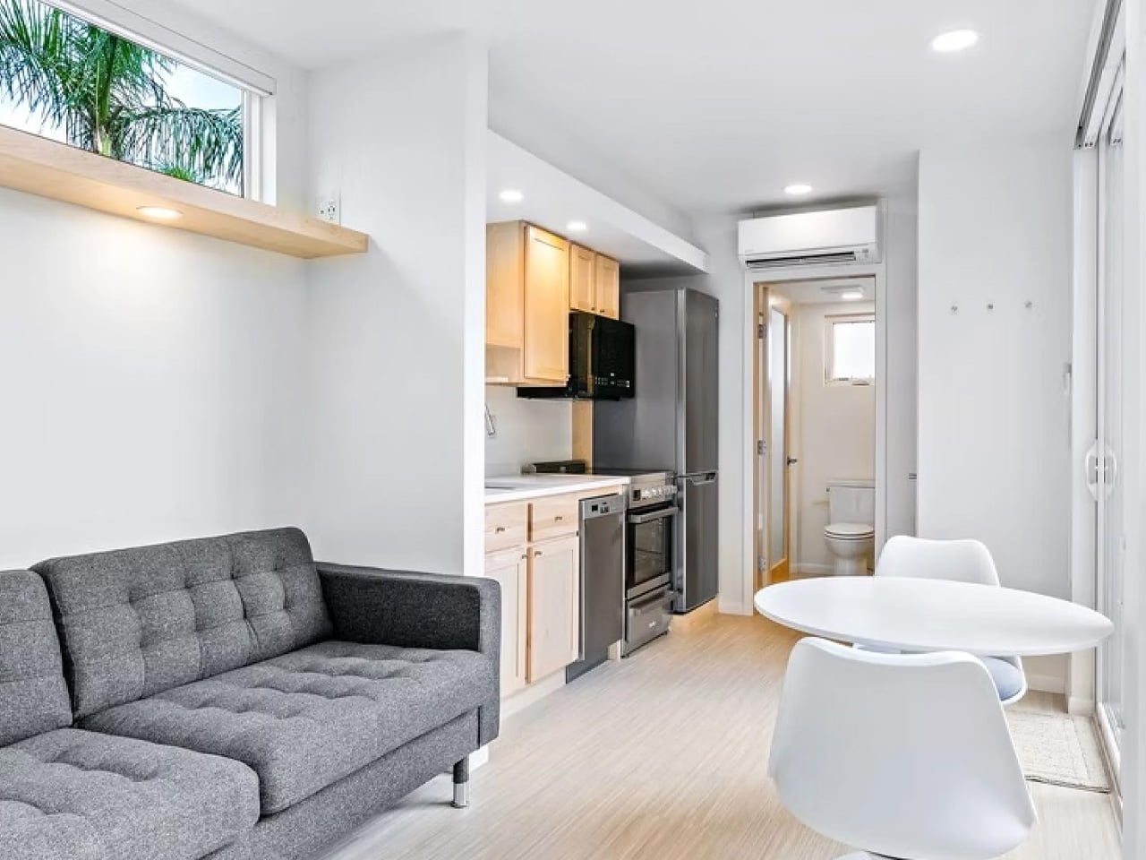
I love a home that fits everything you need into 256 square feet without making you feel like you’re compromising. The Surya tiny house by Florida-based Simplify Further Tiny Homes does exactly that — a single-level, 32-foot build that sits somewhere between a well-considered home and a design statement.

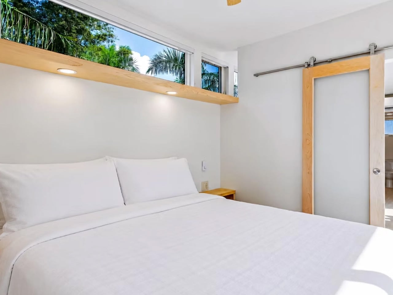
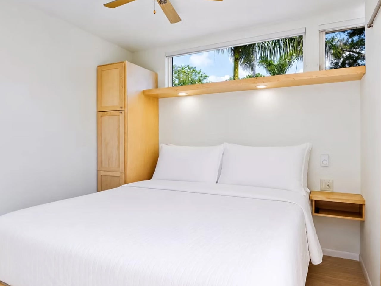
Named after the Sanskrit word for “sun,” the Surya carries that warmth through every inch of its interior. Where most tiny homes lean heavily into the loft layout, the Surya takes a different route — keeping the bedroom on the main level with enough room for a queen-sized bed. It’s a practical choice that makes the space feel less like a cleverly packed suitcase and more like an actual home you’d want to live in full-time.

Designer: Simplify Further Tiny Homes

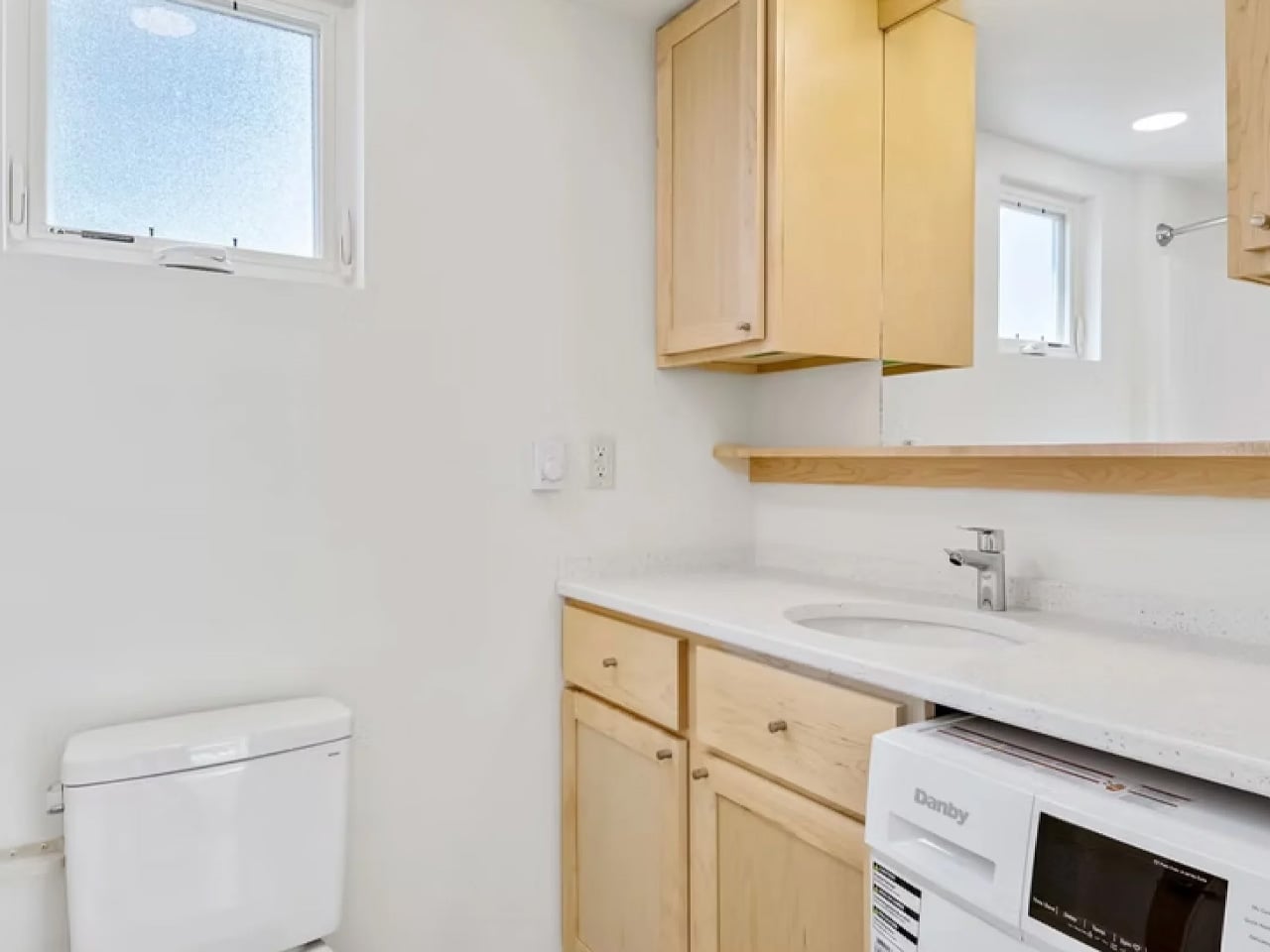
The layout reads cleanly. A well-equipped kitchen anchors one end of the build, a full bathroom sits in the middle, and a spacious living area opens up toward the other end — offering a flexible 5×7-foot floor plan that works as a lounge, a workspace, or an extra sleeping area depending on how you configure it. There’s no loft in the standard model, though Simplify Further offers the option to add one or two for households that need the overhead real estate.

At 8 feet wide and 13.6 feet tall, the Surya is built on a bumper-pull trailer with a hand-built chassis, thick-gauge steel, double axles rated at 7,500 pounds each, trailer brakes, and DOT-approved highway lighting. It ships nationwide and carries NOAH certification as a recreational vehicle — a detail that matters when it comes to parking, financing, and insurance. Starting at $75,000, the price reflects the build quality, with a one-year limited warranty on workmanship included.

Simplify Further isn’t a newcomer to the space. The Lake Butler, Florida-based builder holds a BBB Accredited A+ rating and has taken home the Best Tiny House award at Florida’s Tiny Home Festival — not once, but twice. Their builds have also been featured across media outlets and the broader tiny home community, which speaks to a level of craft that goes beyond the spec sheet.

The Surya isn’t trying to be everything for everyone. It’s designed for couples or small households who want full-time livability, a guest house with real presence, or a short-term rental that actually converts bookings. For those drawn to the single-level lifestyle, it makes a convincing case that a smaller floor plan doesn’t have to mean less life.

The post The Surya Is the Tiny House That Finally Makes Single-Level Living Worth It first appeared on Yanko Design.

90,300 Empty Offices Are Becoming Apartments Across the US. “Adaptive Reuse” Just Hit Critical Mass.

Across America, downtown office towers sit half lit and half leased, their elevators still running, their HVAC systems still humming, their floorplates waiting for people who are never fully coming back. At the same time, rents keep climbing, vacancy stays tight in the places people actually want to live, and homelessness pushes further into public view in city after city. The contradiction is so stark it barely needs interpretation. The office building has too much space and hardly any occupants. Millions of prospective homeowners, however, have no permanent place to call their residence.

More than 90,300 apartments are now planned through office-to-residential conversions across the U.S., marking a dramatic expansion of adaptive reuse at the exact moment cities need housing most. For years, adaptive reuse lived in architecture circles as a smart, sustainable idea. If you’ve ever seen an old warehouse repurposed into a club, a factory into an office space, or a tiny rural church into a quaint home, that’s adaptive reuse – the ability to take a structure and adapt your needs around it without demolition and rebuilding. Now it is entering the market at national scale, and forcing cities, developers, and designers to answer a blunt question. When housing demand is urgent and office demand has collapsed, how long can empty office buildings maintain the status quo instead of transforming into meaningful housing?

From Virtue to Volume

RentCafe’s March 2026 report confirmed what a lot of people in real estate and architecture had been watching build for years: 90,300 U.S. apartments are currently mid-conversion from former office buildings. That figure is up 28% year over year from 70,600 units in early 2025, and it is nearly four times the total recorded in 2022. New York City alone has 16,358 units in the pipeline. Washington, D.C. follows with 8,479. Chicago has 4,360. Los Angeles, 4,340. Dallas, 3,966. Denver, 2,991. Philadelphia, 2,697. Atlanta, 2,642. Cleveland, 1,771. Cincinnati, 1,770. Three cities, Philadelphia, Denver, and St. Louis, more than doubled their pipelines in a single year, recording year-over-year jumps of 119%, 114%, and 110% respectively. Office conversions now account for 47% of all 193,900 future adaptive reuse projects nationwide, up from 42% the year before. The pipeline is approaching 100,000 units and shows no sign of slowing.

The real-estate press has covered this exhaustively, and fairly, as a finance story. Vacancy rates hovering near 20%, physical occupancy in office buildings sitting around 50-55%, loan maturities forcing owners to act. The incentives are real. New York City offers tax exemptions of up to 90% for converted buildings that designate at least 25% of units as affordable housing. Los Angeles passed its Citywide Adaptive Reuse Ordinance in February 2026, rewriting zoning rules to make the process significantly less painful. The policy environment is, for the first time, actually moving in the same direction as the market.

But here is the thing almost nobody is writing about: this is, at its core, a design problem. A brutal, fascinating, genuinely unsolved design problem. And the 90,300 number only looks tidy from the outside.

The Floorplate Doesn’t Care About Your Floor Plan

Image Credits: Gensler

Walk into a typical Class B office building from the 1980s or 1990s, and you are standing on a floorplate that might run 25,000 to 40,000 square feet. The structural core, housing elevators, stairwells, and mechanical shafts, sits somewhere in the middle. Windows ring the perimeter. Everything between the core and the glass is open, column-interrupted, and completely indifferent to the concept of a bedroom.

Residential building codes in most U.S. cities require natural light and ventilation in every habitable room. That is a reasonable ask for a building designed around people sleeping in it. It is an architectural puzzle when your building was designed around people sitting at desks under recessed lighting for eight hours and going home.

The further you get from the perimeter windows, the darker and more unusable the space becomes for residential purposes. Architects working on these conversions are solving this in a few different ways. Some carve light wells through the floorplate, essentially punching holes through multiple stories to bring daylight deep into the plan. Others reorganize the unit layout so that bedrooms and living spaces claim the window line, while kitchens, bathrooms, corridors, and storage absorb the windowless interior. Some projects rezone that dead center space entirely, turning it into shared amenity areas, lobbies, or co-working zones that don’t require natural light by code.

None of these solutions are clean. All of them require an architect to fundamentally rethink what a floor plan can be when the building has already decided its own geometry.

Pipes, Cores, and the Part That Really Costs Money

Office buildings run their plumbing infrastructure in centralized wet walls, concentrated near the core, because nobody on a 30,000 square foot trading floor needs a bathroom in the southeast corner. Apartments, by contrast, need kitchens and bathrooms distributed across every unit, which means new drain lines, new vent stacks, and new penetrations through concrete slabs that were poured without any of that in mind. On a large building, this is closer to surgery than renovation. The structure has to accommodate changes its engineers never anticipated, and every floor compounds the cost.

This is partly why the conversion wave took so long to arrive despite the office vacancy crisis being years in the making. The economics only started making sense when office asset values dropped far enough that the acquisition cost left room for the renovation budget a real conversion actually requires.

What Kind of City Does This Build?

The embodied carbon argument for adaptive reuse is well established at this point. Demolishing a building and rebuilding it releases all the carbon locked into its existing steel, concrete, and glass, materials whose production already happened and cannot be undone. Keeping the structure and changing its use is, from a climate accounting standpoint, one of the most effective things the construction industry can do.

There is a longer-term design question buried inside the 90,300 number, though. Office buildings were placed, massed, and programmed for a specific kind of urban life: daytime population density, ground-floor lobbies designed for badge-tap arrivals, parking structures calibrated for 9-to-5 peaks. Converting them into housing changes the rhythms of the neighborhoods around them. Ground floors that were lobbies become storefronts, or stay lobbies and deaden the street. Parking structures sized for daily commuters become oversized and awkward for residents who do not own cars.

The cities that will get this right are the ones treating conversion as a neighborhood redesign project, not a building-by-building transaction. Los Angeles’s new ordinance is a start. New York’s tax incentives are a start. The design discipline this moment actually demands, though, is urban, not just architectural.

Adaptive reuse at 90,300 units is no longer a niche. It is the dominant form of new housing supply in several major American cities. The question the industry spent two decades asking, whether it works, has been answered. The question now is whether it produces cities that are genuinely good to live in, and that one is still very much open.

Data sourced from RentCafe’s 2026 office-to-apartment conversion report, based on Yardi Matrix data.

The post 90,300 Empty Offices Are Becoming Apartments Across the US. “Adaptive Reuse” Just Hit Critical Mass. first appeared on Yanko Design.
The Koala Bear Is the Tiny Home Built for People Who’d Rather Move Than Settle

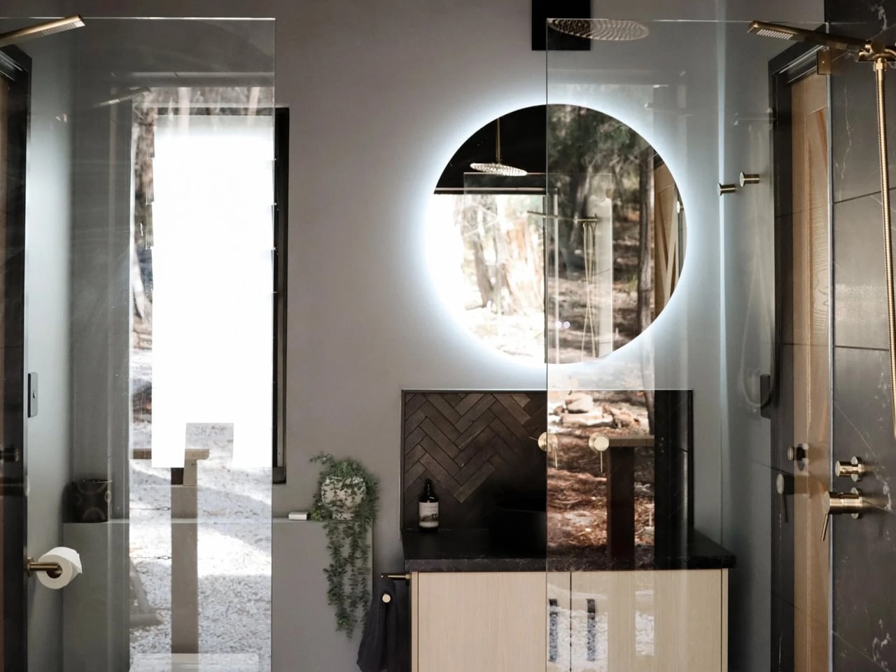
There’s a certain kind of freedom that only comes when you stop trying to fit your life into more square footage than you actually need. Rolling Bear Tiny Homes understood that when they built the Koala Bear, a compact, mobile dwelling designed specifically for solo adventurers and couples who’d rather wake up to a new view than a fixed address.
Rolling Bear Tiny Homes is a custom builder based in Richmond, British Columbia, operating under the umbrella of Rolling Bear Construction Inc. The brand has built a reputation across BC for crafting tiny homes that don’t compromise on quality, and the Koala Bear might be the clearest expression of that philosophy yet. At 26 by 8.5 feet, it packs up to 250 square feet of thoughtfully designed living space into a form that’s road-ready and genuinely livable.

Designer: Rolling Bear Tiny Homes

The interior doesn’t feel like a compromise. Custom joinery, premium finishes, and artisanal detailing run throughout, giving the Koala Bear an aesthetic that reads more like a well-edited apartment than a mobile shelter. The layout includes a comfortable bedroom, a fully equipped kitchenette, and a living area designed around how people actually move through a small space, not just how it photographs. Every inch is accounted for without ever feeling claustrophobic.

On the technical side, the Koala Bear is built to exceed both CAD Z240 RV and Canadian Building Code guidelines, and it’s constructed to meet NOAH certification standards. That matters more than most buyers initially realize. It’s the difference between a home that holds up through BC winters and one that doesn’t. A state-of-the-art HVAC system and a sustainable water-heating solution handle year-round climate control, while a full suite of energy-efficient appliances keeps utility costs low.

For solo travelers and couples, the appeal goes beyond the specs. The Koala Bear is built around the idea of flexibility, the ability to be parked along a coastline one season and nestled near a mountain trail the next. Rolling Bear offers delivery and setup services, which removes a significant logistical barrier for first-time tiny home buyers.

Priced at approximately at US$87,000 with financing available, the Koala Bear sits at an accessible entry point for the Rolling Bear lineup. For what it offers, craftsmanship, mobility, and a design sensibility that doesn’t ask you to sacrifice style for size, it makes a compelling case that the best homes aren’t always the biggest ones. Sometimes, they’re exactly the right size.

The post The Koala Bear Is the Tiny Home Built for People Who’d Rather Move Than Settle first appeared on Yanko Design.