FlowSence Just Built the Coffee Scale That Teaches You to Brew

Making good pour-over coffee feels like being asked to juggle while blindfolded. You’re managing water temperature, grind size, pouring rhythm, and extraction time all at once, but you can’t actually see what any of those variables are doing to your final cup. You taste the result, shrug, and wonder if you should have poured slower or used hotter water. Then you try again tomorrow with a completely different outcome.

FlowSence, designed by Hyeokin Kwon, is built around a simple insight: brewing doesn’t have to stay invisible. Most of us learn coffee through trial and error because we lack the sensory training to connect what we taste with what we did. We might know our coffee tastes weak or bitter, but translating that into actionable changes requires experience we haven’t built yet. Tools like TDS meters offer numbers, but numbers without context just add another layer of confusion.

Designer: Hyeokin Kwon

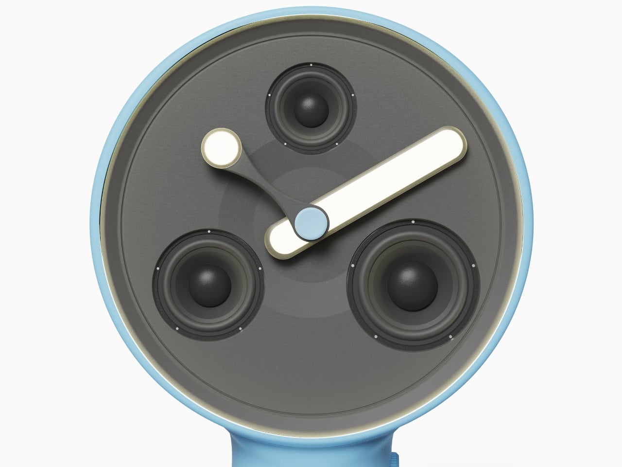
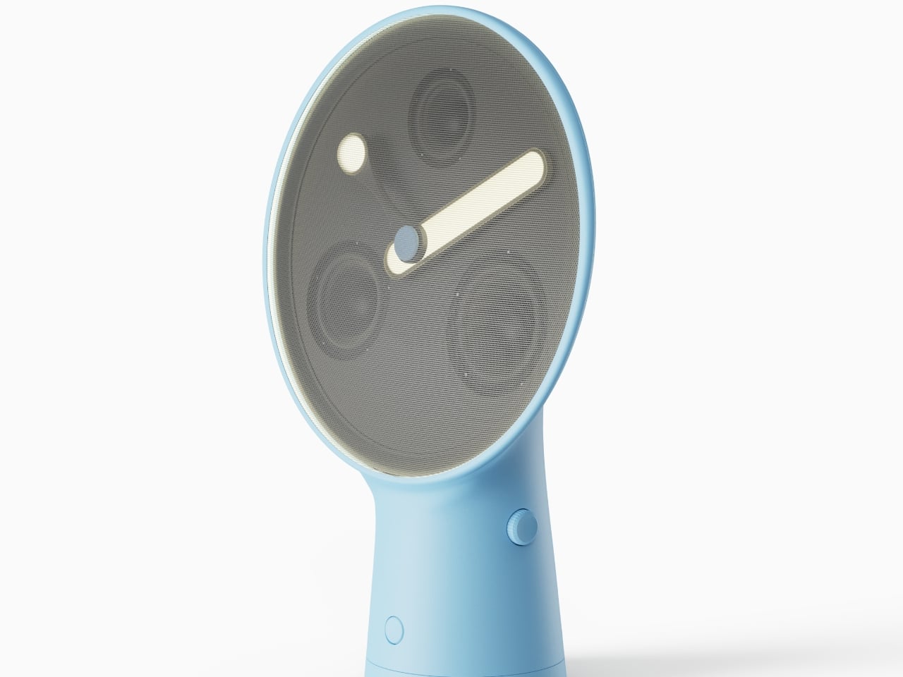
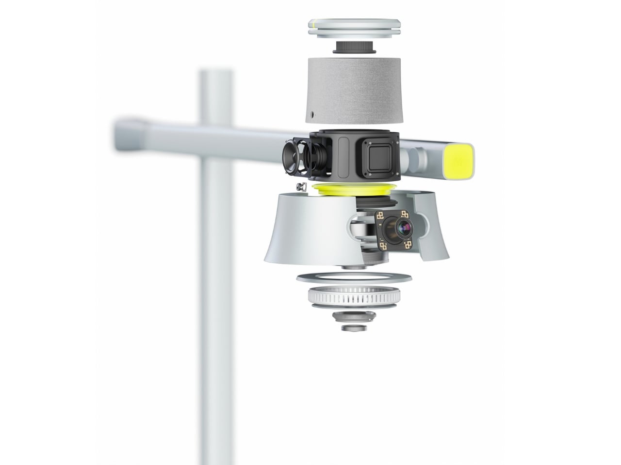
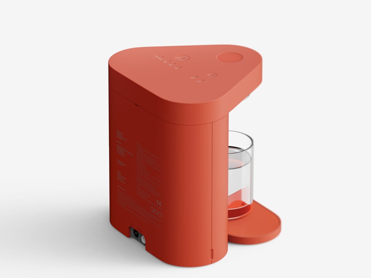
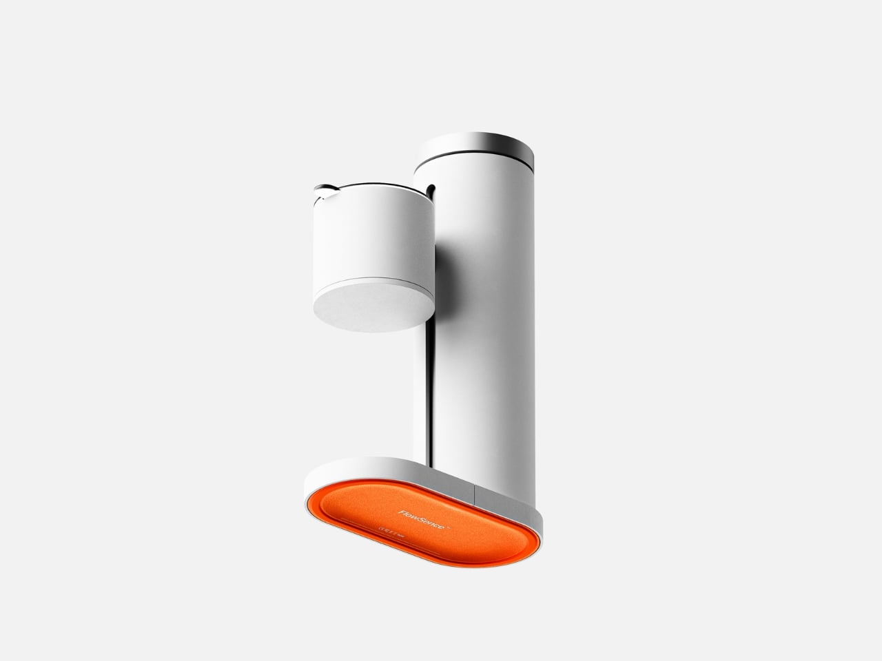
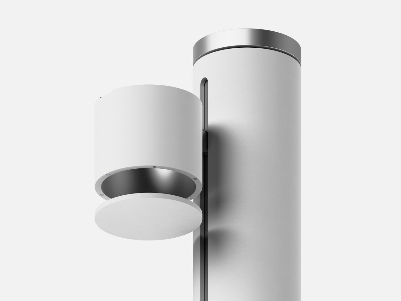
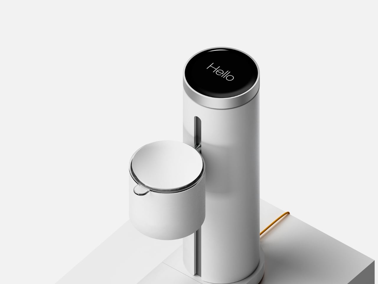
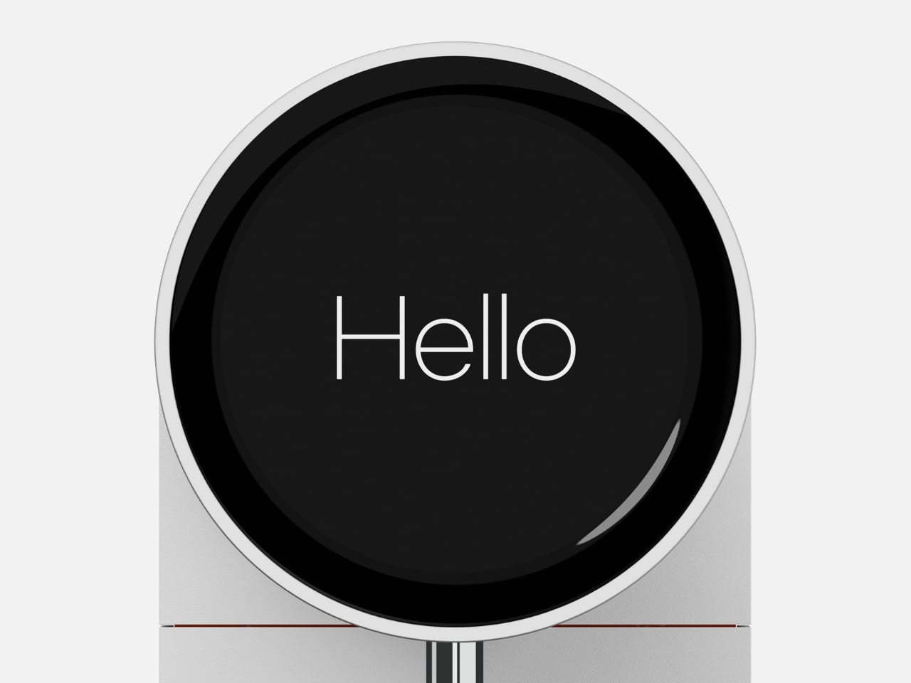
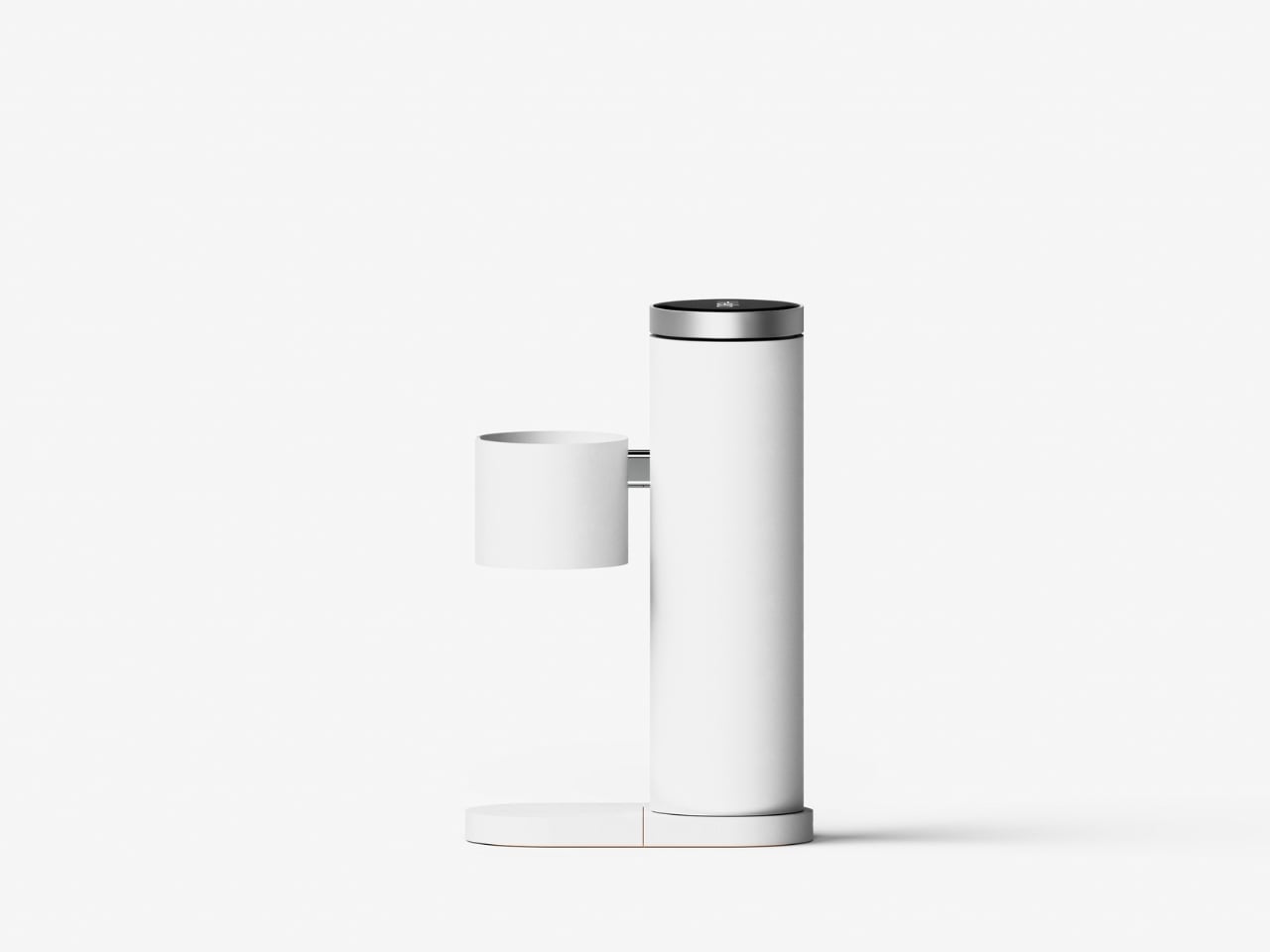
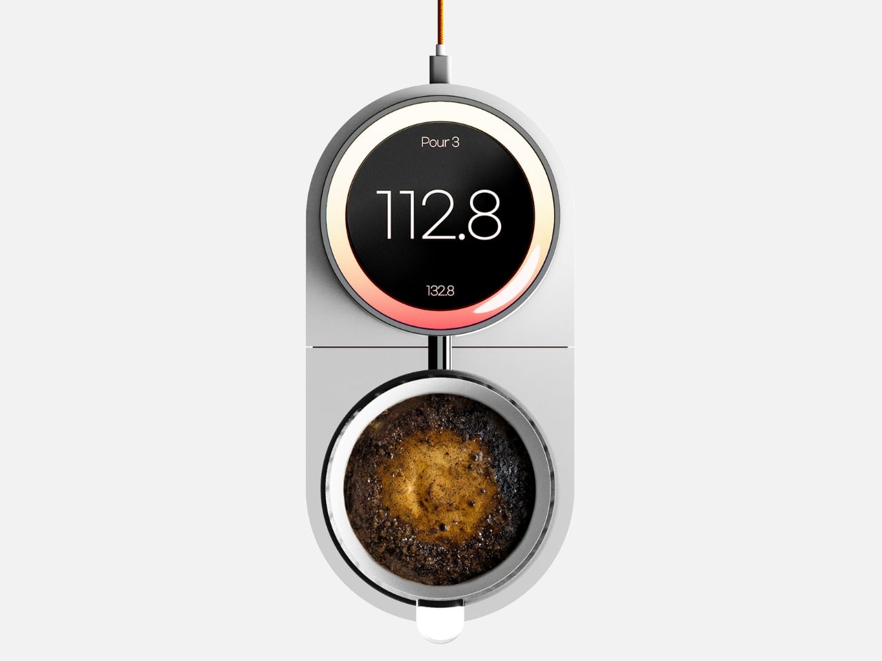
What makes FlowSence different is that it refuses to automate your brewing. Instead, it acts like a patient coach standing beside you, translating the invisible parts of extraction into something you can actually see and understand. While you pour, it measures weight, temperature, and flow in real time, then visualizes those changes on a 4-inch round OLED display. You stay in control of the kettle, but now you can watch your pouring rhythm, notice when your flow rate drops, and start connecting your physical movements to what’s happening in the cup.

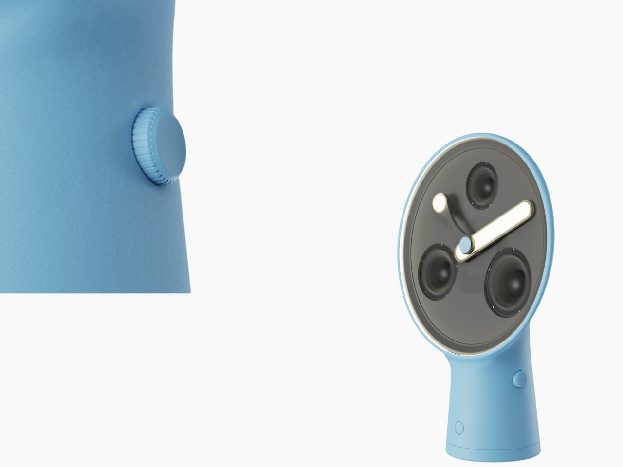
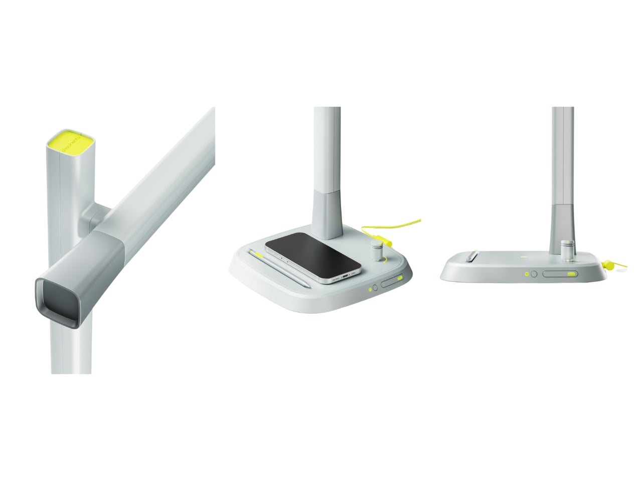
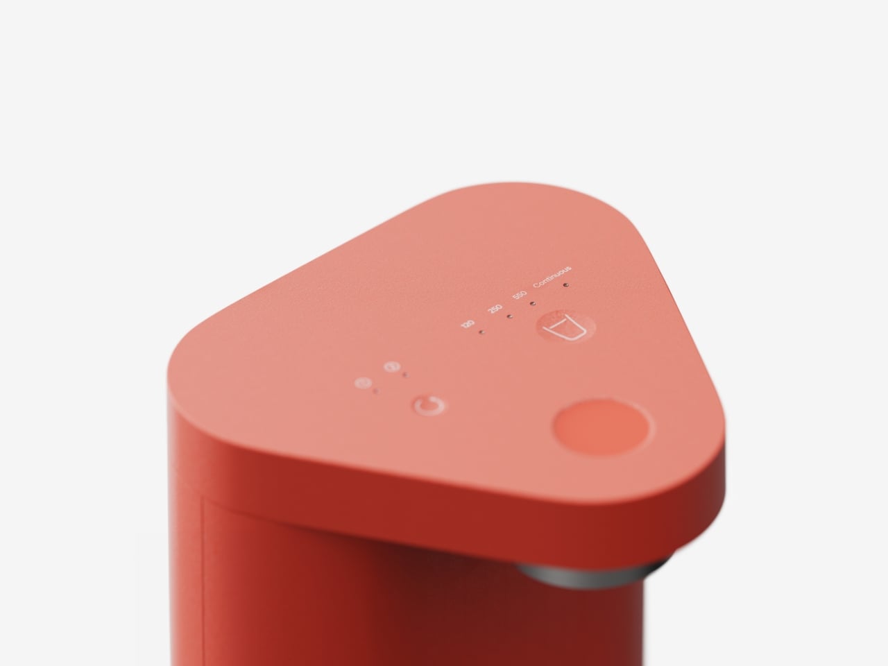
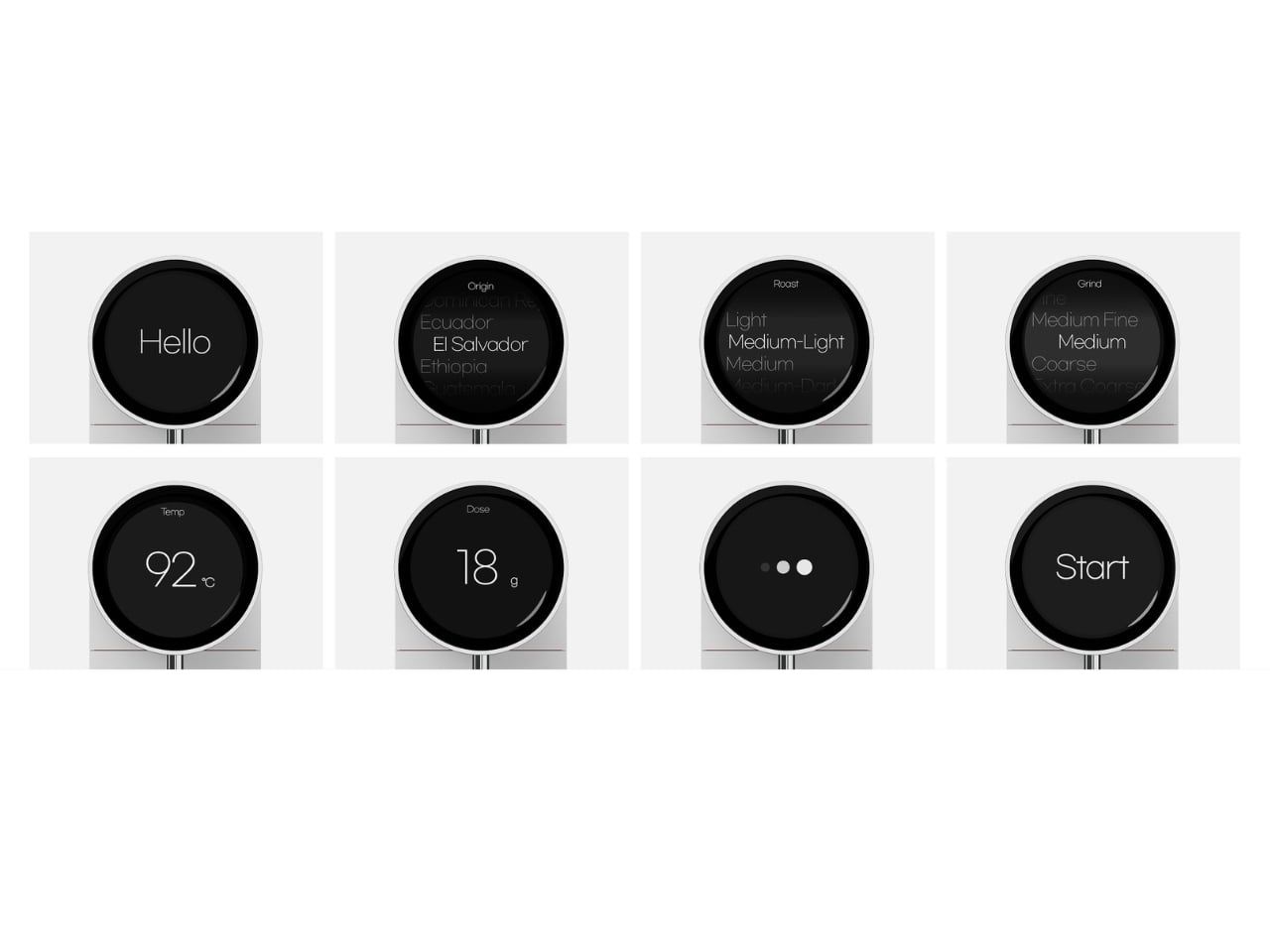
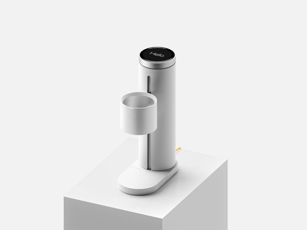
The interface starts with a rotary dial that lets you input the basics: coffee origin, roast level, grind size, water temperature, and dose. Turn to adjust, press to confirm. Once you’ve set your parameters, an AI-generated recipe appears, giving you a suggested approach based on what you’ve told it about your beans. From there, brewing begins, and the screen shifts into feedback mode.

This is where the learning happens. Instead of just showing you a timer and a weight, FlowSence tracks your pouring behavior and presents it visually. You can see whether you’re pouring steadily or in uneven bursts. You can spot the moment your water temperature drops too much. You start to notice patterns in your technique, which means you can actually correct them. Over time, your pours become more consistent, not because the machine took over, but because you’ve learned what consistency looks like.

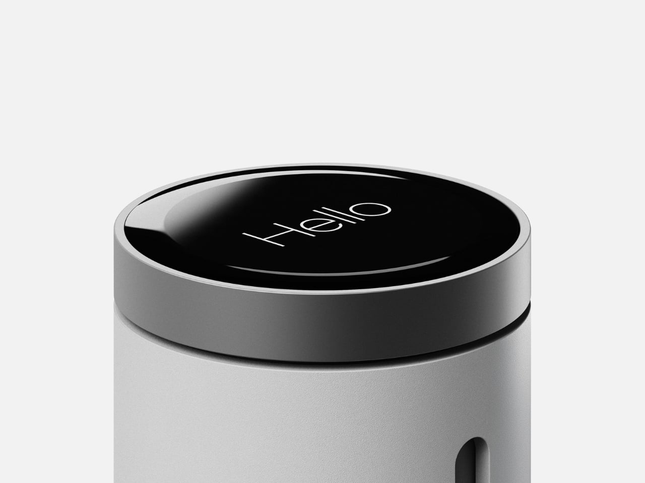
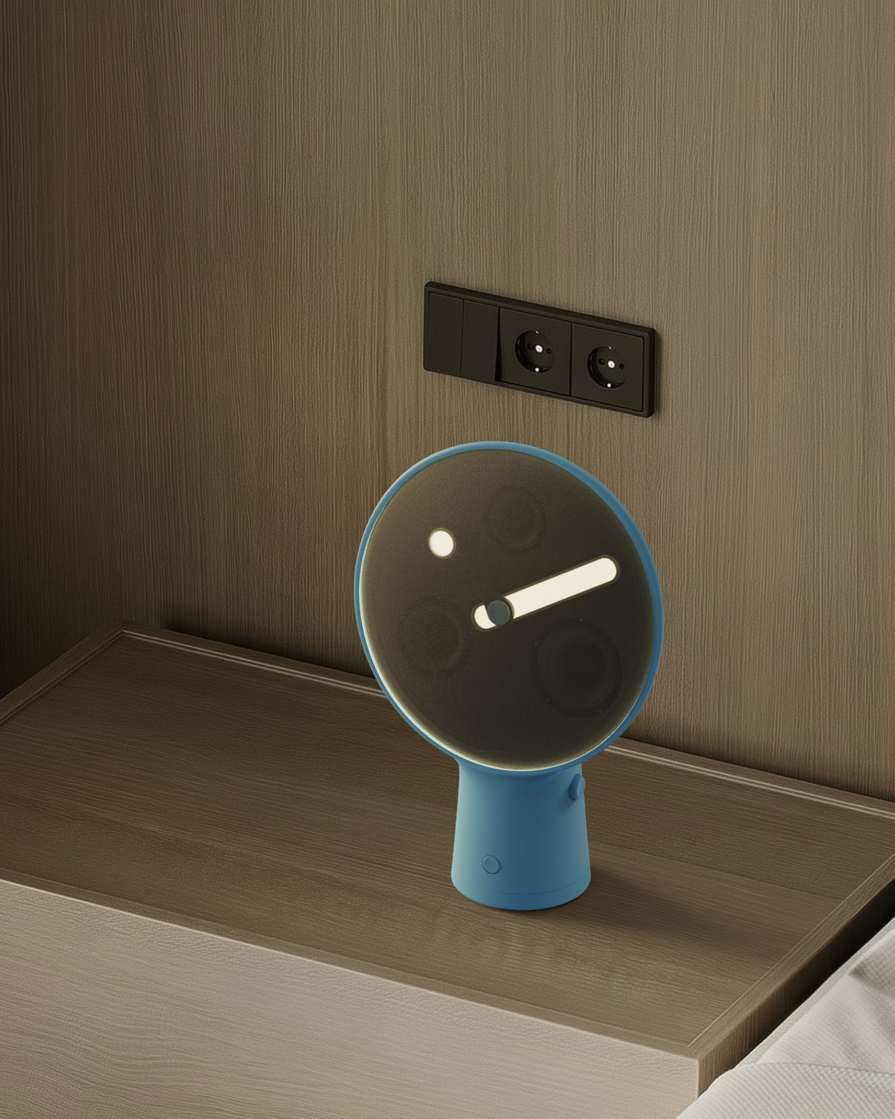
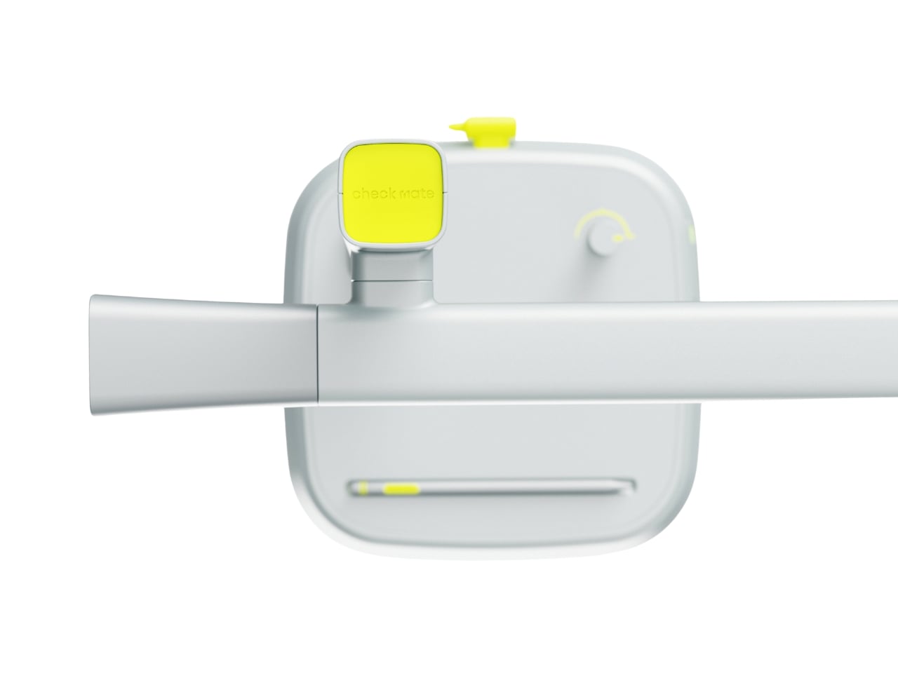
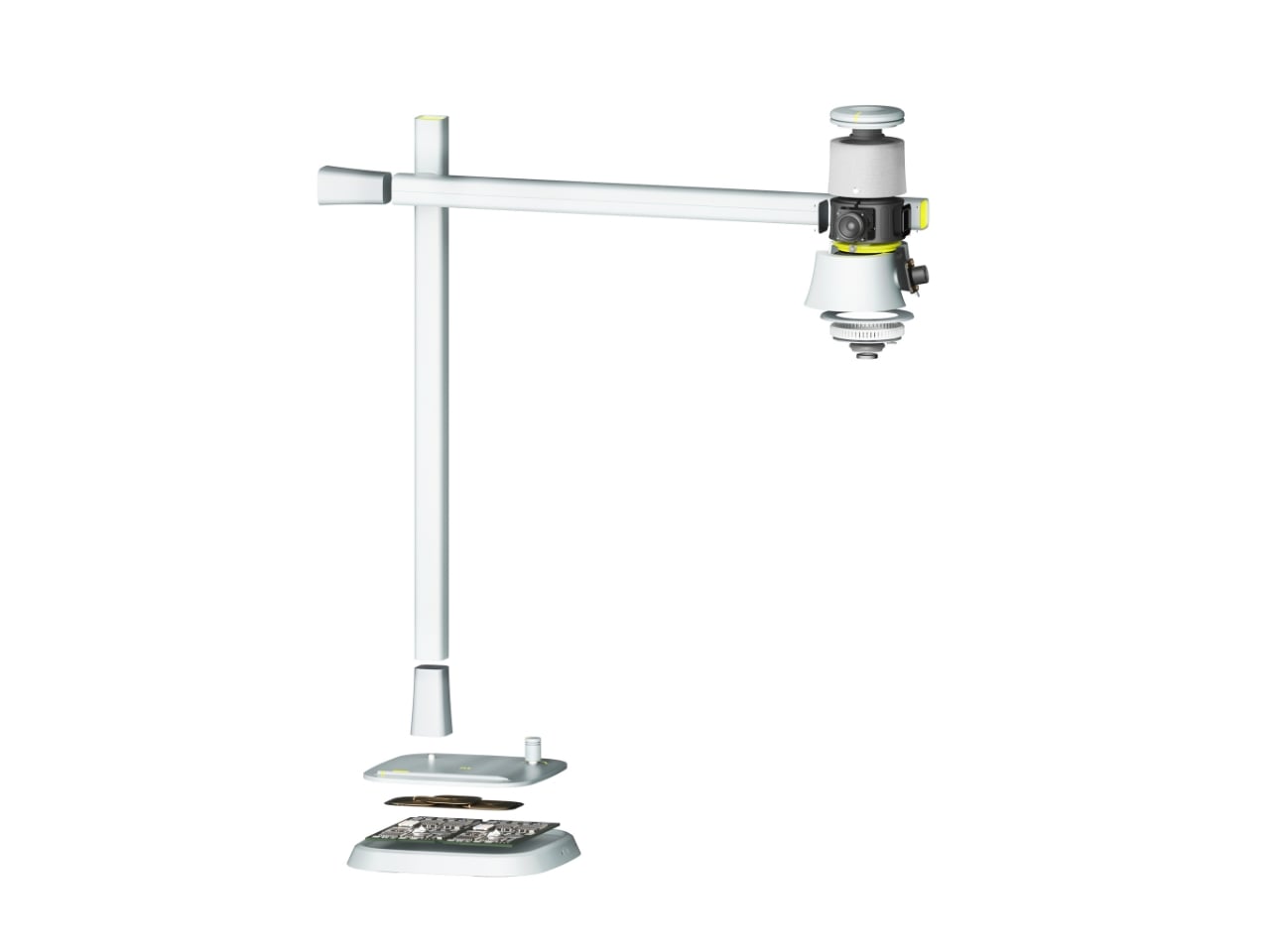
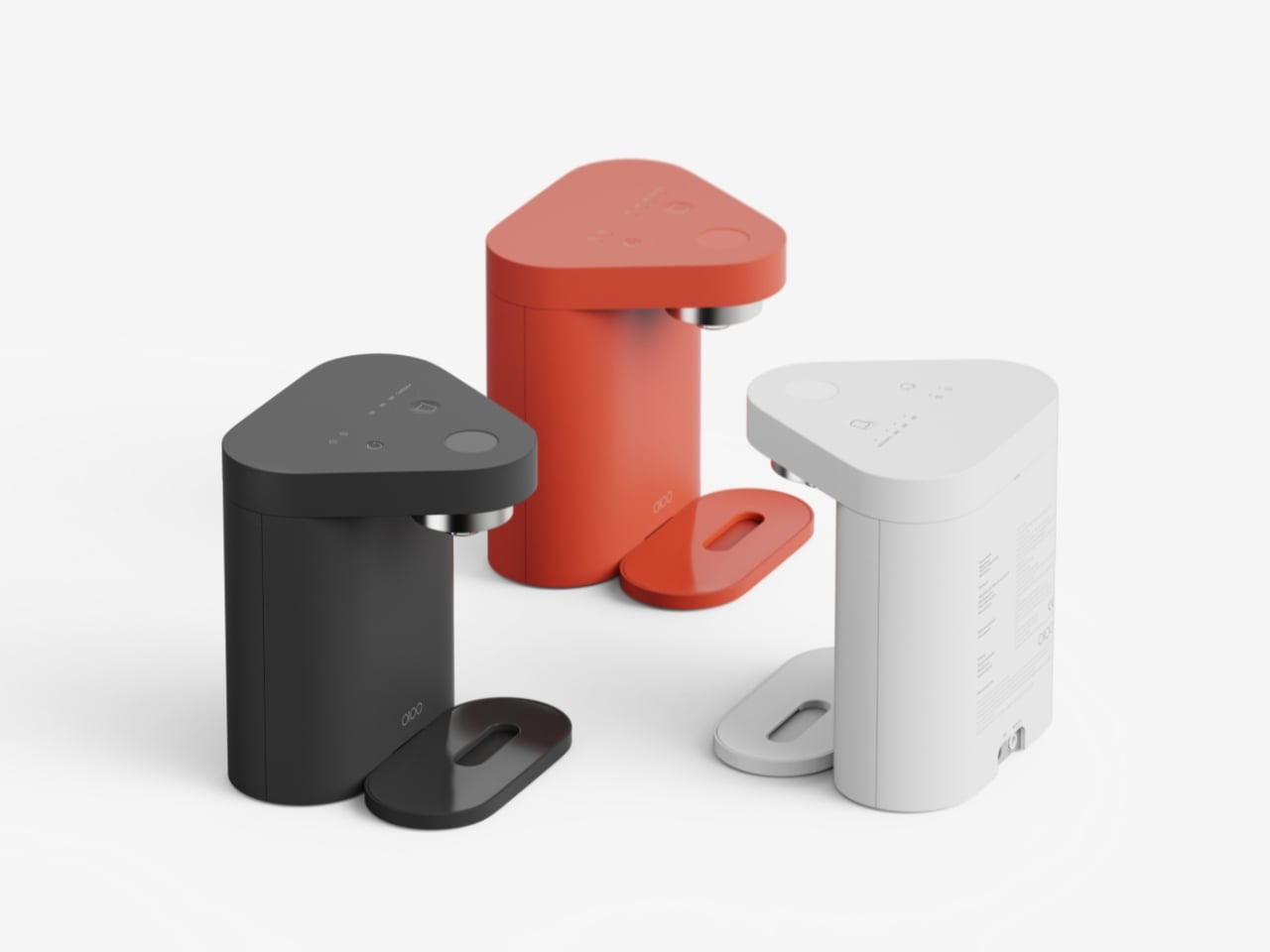
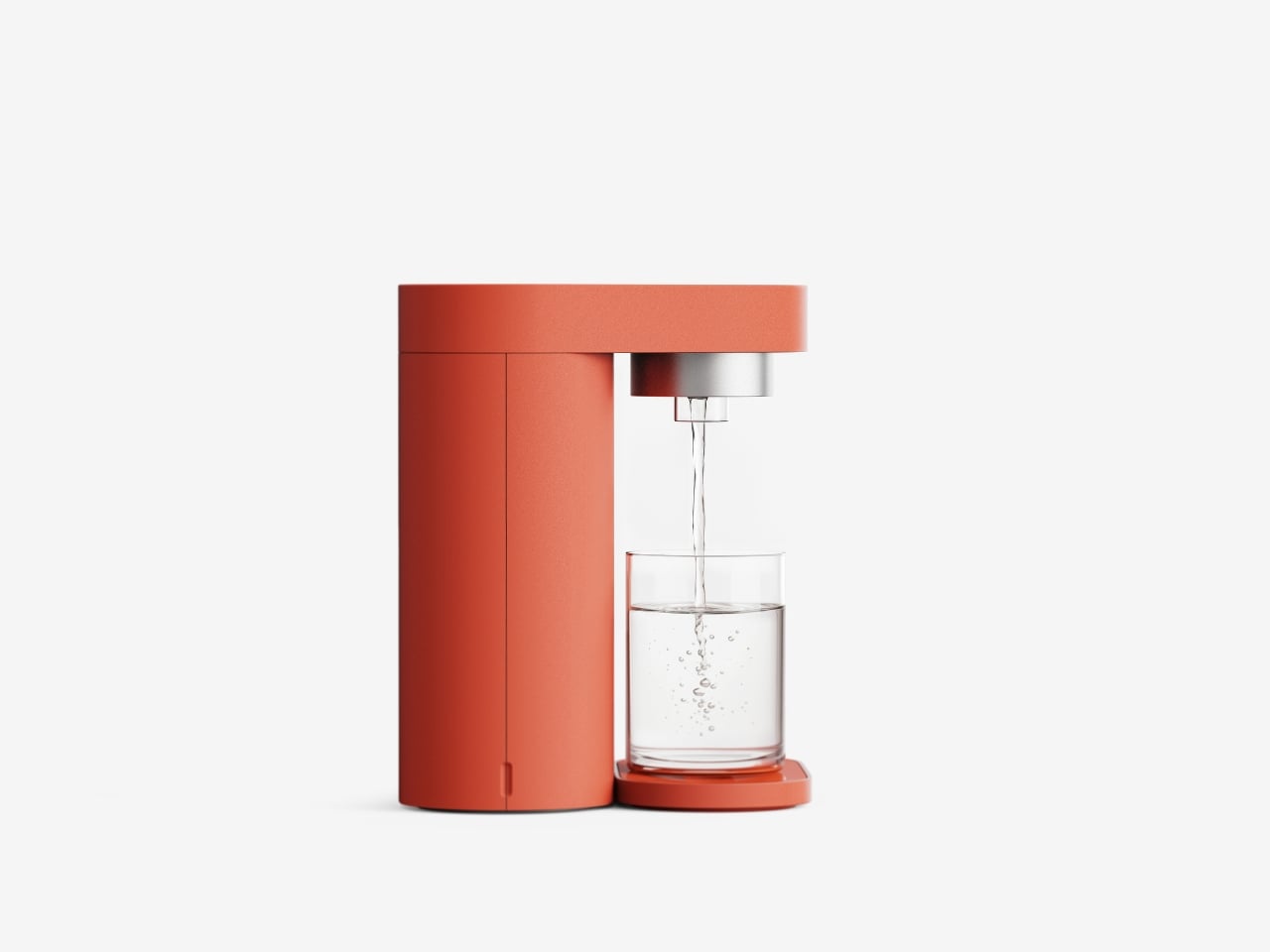
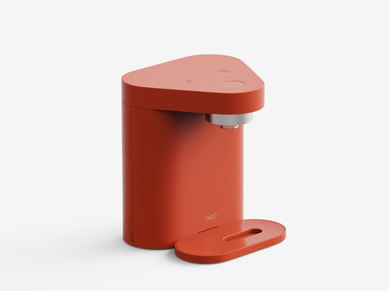
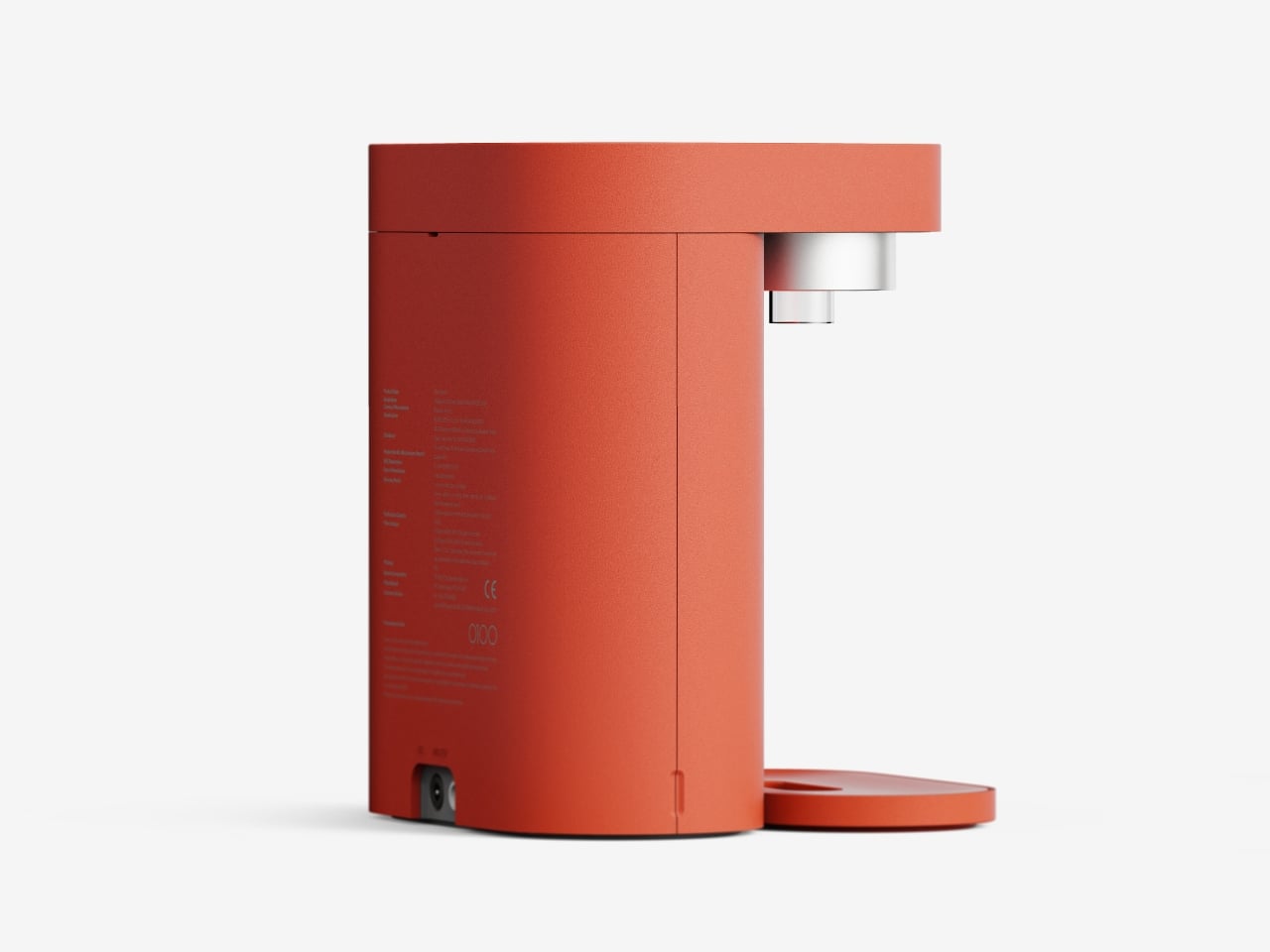
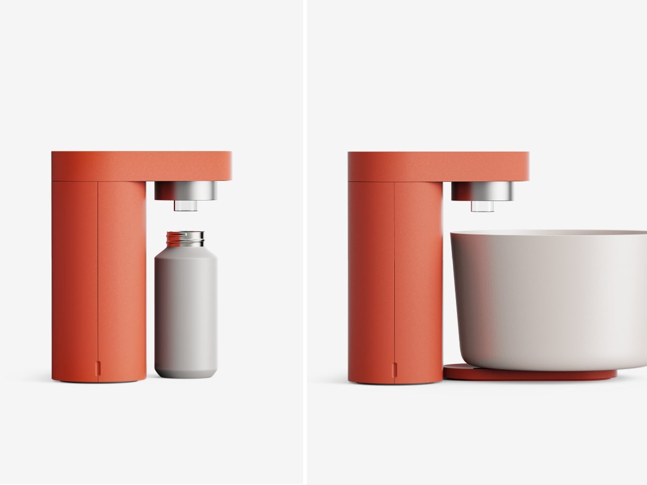
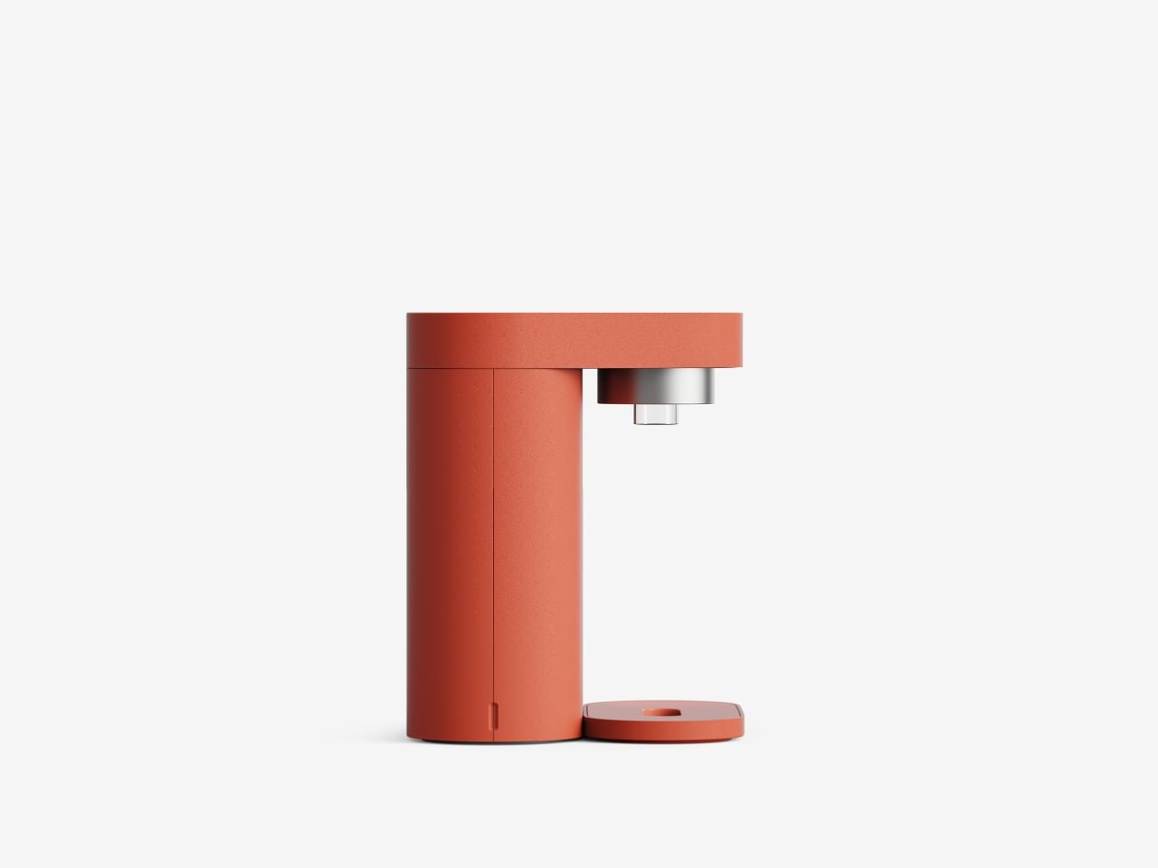
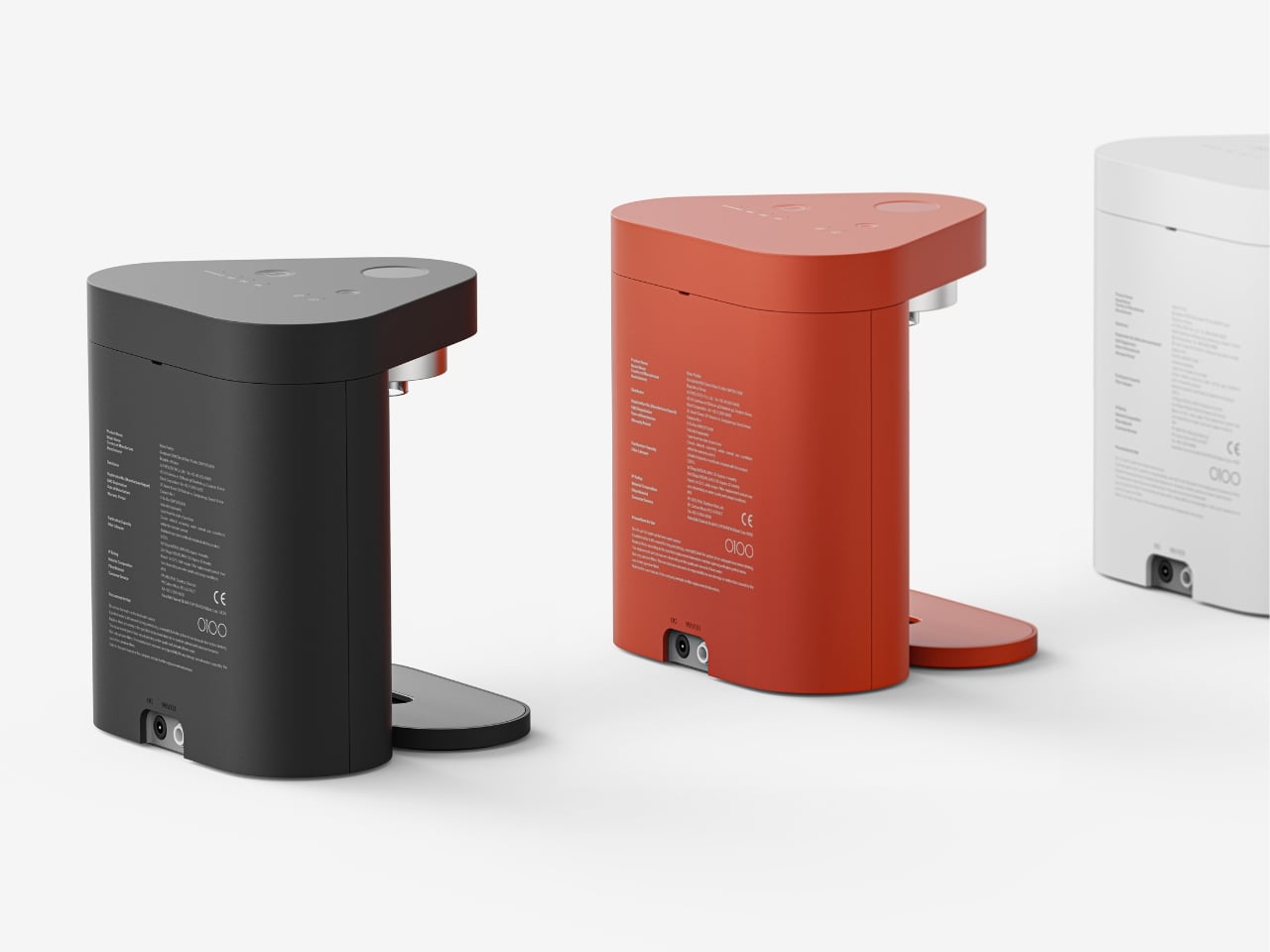
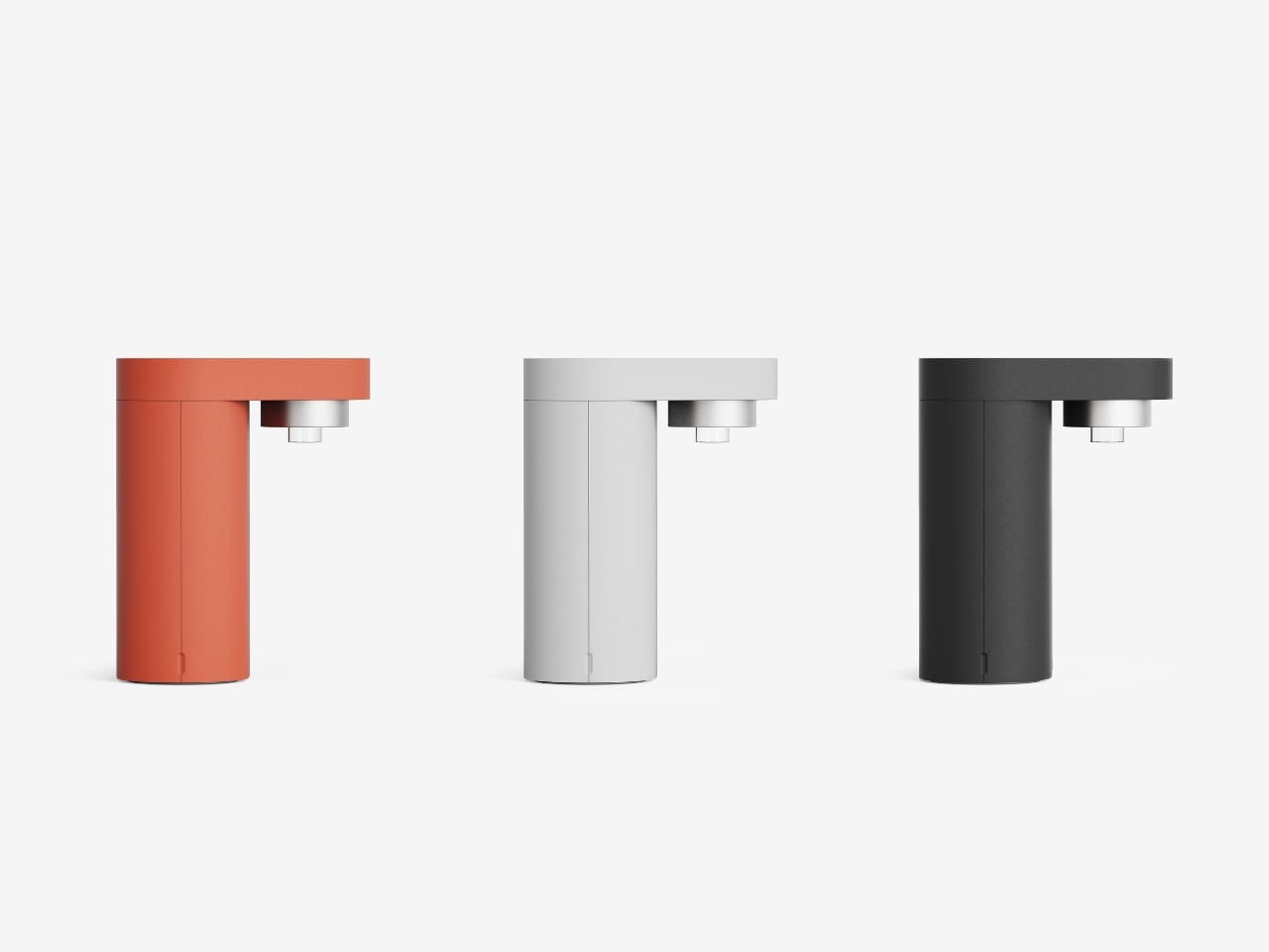
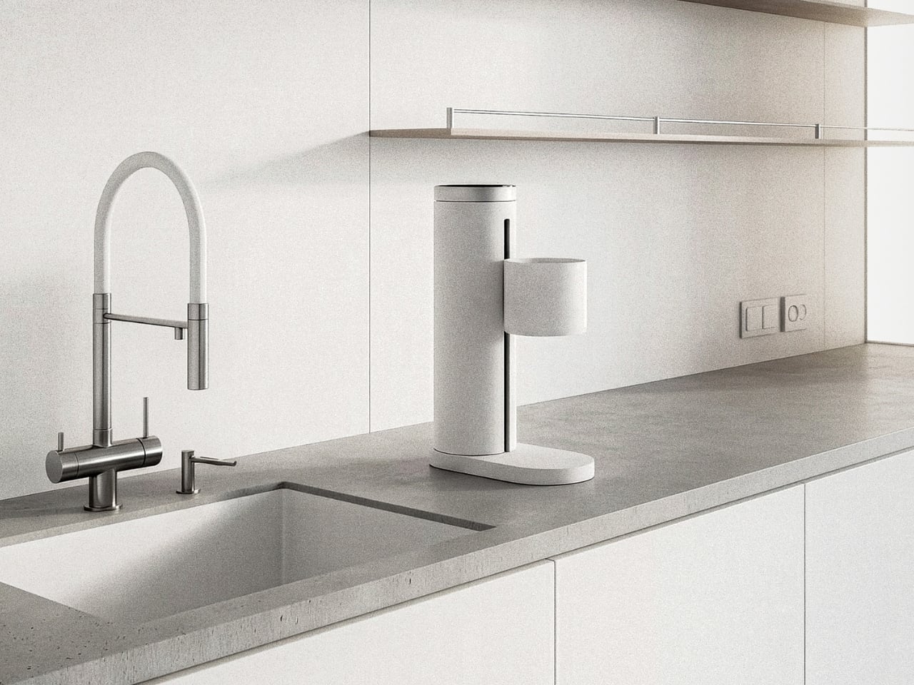
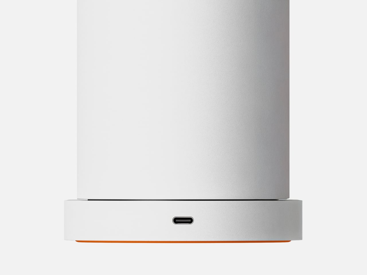
The physical design supports this learning-centered philosophy. The machine is compact and vertical, built from aluminum alloy and heat-resistant composite materials. A cylindrical body houses the measurement tech, with a side-mounted cradle holding your brewing vessel and a weighted base that keeps everything stable. That pop of orange on the base isn’t just aesthetic, it’s a visual anchor that makes the tool feel approachable rather than clinical. The whole thing connects via Wi-Fi and Bluetooth, runs on USB-C power, and draws less than 10 watts. It’s not trying to dominate your counter or complicate your setup.

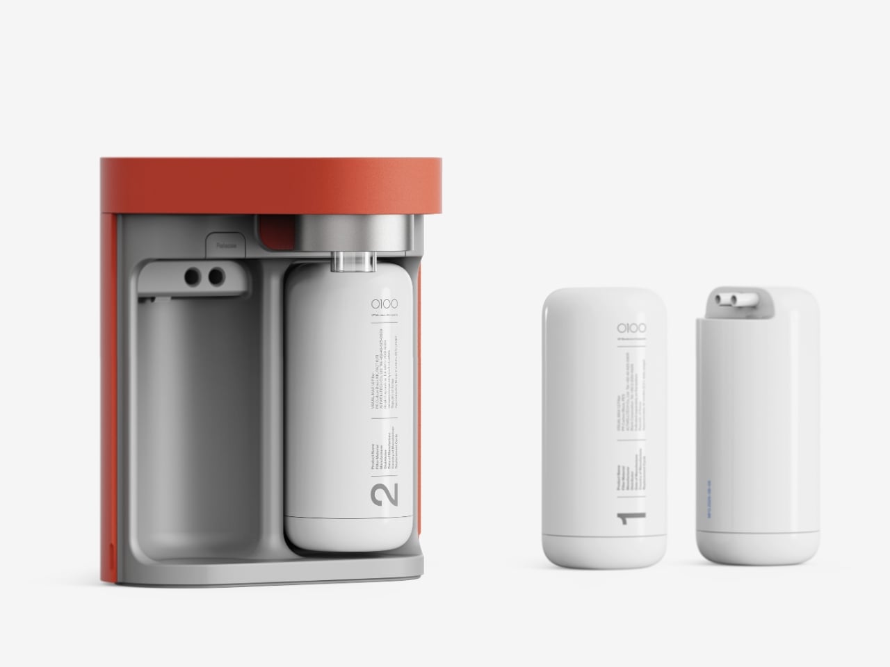
The packaging reflects the same clarity. When you open the box, the side profile of FlowSence is immediately visible, showing you its structure before you’ve even lifted it out. Components are arranged in sequence, so the unboxing process doubles as an introduction to how everything fits together.

What FlowSence really offers is a shift in how we think about coffee tools. Most brewing gadgets either do everything for you or leave you completely on your own. FlowSence lives in the middle. It gives you real-time information and visual feedback, but it doesn’t take the kettle out of your hand. The goal isn’t a perfect robotic pour. The goal is helping you understand what a good pour feels like so that eventually, you don’t need the screen anymore.

For people who’ve felt stuck in their coffee routine or intimidated by the complexity of manual brewing, that’s a meaningful difference. You’re not just making coffee. You’re learning a skill that actually sticks, supported by a tool designed to make the invisible visible. And maybe that’s the kind of coffee gadget we’ve been missing all along.

The post FlowSence Just Built the Coffee Scale That Teaches You to Brew first appeared on Yanko Design.

A Typewriter-Inspired Calculator in Vibrant Coral Red Just Stole Our Heart

There’s something beautifully ironic about the fact that we carry supercomputers in our pockets, yet the humble calculator refuses to die. And if designer Mariana Bedrina has her way, maybe it shouldn’t. Her GIA calculator concept doesn’t just crunch numbers. It makes you want to crunch numbers.

At first glance, the GIA looks like it time-traveled from a 1960s Italian design studio, stopped briefly in 2026 to pick up some modern tech, and landed on your desk with a personality. The inspiration comes from Olivetti typewriters, those gorgeous mechanical machines that made office work feel like an art form. Remember when tools had character? When objects didn’t just function but made you feel something? That’s what Bedrina is tapping into here.

Designer: Mariana Bedrina

Create your own Aesthetic Render: Download KeyShot Studio Right Now!

The design plays with contrasts in the most satisfying way. Soft-touch plastic meets metal-edged keys, creating something that looks simultaneously retro and contemporary. The calculator has a folding stand that props up the display at an angle, giving it this almost laptop-like presence on your desk. But what really sells the concept is the attention to tactile pleasure. Each button press promises a rhythmic click, that same satisfying feedback that made typewriters so addictive to use. There’s a reason mechanical keyboard enthusiasts spend hundreds of dollars chasing that perfect keystroke sound.

The GIA comes in a color palette that pulls directly from Olivetti’s most vibrant era. We’re talking coral red, electric blue, and that particular shade of lime green that somehow works when it absolutely shouldn’t. These aren’t the muted, “professional” colors we’ve been conditioned to accept in office supplies. They’re joyful. They’re loud. They demand to be noticed. The display even greets you with “HELLO” in a pixelated font that adds to the charm.

But here’s what makes this concept more than just a pretty nostalgic exercise. It recognizes something we’re only now starting to articulate: digital minimalism has left us craving physical objects again. We got so efficient, so streamlined, so invisible in our technology that we forgot how much we enjoy touching things, hearing things, seeing colorful things on our desks that aren’t just glowing rectangles.

The GIA positions itself as both a functional tool and a form of self-expression. Bedrina describes it as fitting equally well in office spaces and home studies, which tracks. This isn’t trying to be invisible professional equipment. It’s trying to be a conversation starter, a mood lifter, something that makes the mundane task of calculating expenses or balancing budgets feel less soul-crushing. There’s also something refreshingly analog about committing to a single-purpose device. Your phone can calculate, sure, but it can also distract you with seventeen notifications while you’re trying to figure out if you can afford that vintage lamp. A dedicated calculator keeps you focused. Add genuine design appeal, and suddenly you have an object that earns its place in your space.

The typewriter-inspired button layout is particularly clever. Those rounded keys with metal frames aren’t just aesthetic choices. They reference a specific era of design when Italian manufacturers proved that office equipment didn’t have to be boring. Olivetti’s typewriters were status symbols, objects people genuinely loved. They appeared in films, in photographs, in the hands of writers who could have afforded anything but chose these specific machines because they were beautiful.

Whether the GIA calculator will ever move beyond concept to production remains to be seen. The market for premium calculators exists but it’s niche. Yet seeing this design reminds us why concepts matter. They push against the current, question assumptions, and suggest possibilities. They ask: what if our tools brought us joy again? What if functional objects could also be emotional ones?

In a landscape dominated by minimalist design and disposable electronics, the GIA feels almost radical in its commitment to personality, color, and tactile pleasure. It suggests that maybe we don’t have to choose between functionality and delight. Maybe our calculators can have character. Maybe math doesn’t have to be boring, even when it’s just math.

The post A Typewriter-Inspired Calculator in Vibrant Coral Red Just Stole Our Heart first appeared on Yanko Design.

The AI Tennis Robot That Plays 3 Sports Better Than Your Friends

You know that feeling when you want to practice your serve but no one’s available to hit with you? Or when you’re playing a casual match with friends and everyone’s arguing about whether that ball was in or out? Designer Jaehong Jeon has created something that might just solve both problems, and it happens to look like the friendliest little robot you’ve ever seen.

ORVY is a court-centered companion robot that’s basically the Swiss Army knife of racket sports. This isn’t some clunky, industrial-looking machine that screams “future dystopia.” Instead, it’s got this adorable, minimalist design that looks like a friendly elephant decided to become a sports assistant. The rounded white body sits low to the ground on wheels, with what almost looks like a trunk extending forward. It’s the kind of design that makes you want to pat it on the head and say “good robot.”

Designer: Jaehong Jeon

Create your own Aesthetic Render: Download KeyShot Studio Right Now!

But here’s where it gets really interesting. We’re living in a moment where tennis courts are becoming increasingly flexible spaces. Pickleball is exploding in popularity across North America and Europe, and padel is gaining serious traction too. Courts that used to be dedicated solely to tennis are now being repurposed and shared among multiple sports. ORVY was designed specifically for this new reality of multi-use sports venues.

The robot operates in three different modes, each addressing a specific need. In “Following” mode, ORVY acts like that friend who’s always down to hang out. It tracks players around the court during pickleball and padel games, moving quietly along the sidelines without getting in the way. Think of it as your personal sports documentarian, except instead of just recording, it’s gathering data and learning your playing style.

Switch it to “AI Referee” mode, and ORVY becomes the neutral third party every friendly match needs. Using vision sensing technology, it tracks scores and makes accurate calls about whether balls are in or out. No more disputes, no more “I’m pretty sure that was on the line” arguments. The robot watches, learns the movements of both players, and can even simulate their playing styles for later analysis. It’s like having Hawk-Eye technology, but for your weekend games.

The “AI Coach” mode is where ORVY really shines for solo practitioners. When you’re training alone, it delivers balls and analyzes your movements in real time, providing feedback on your technique. You can select your desired opponent type and playing style, and ORVY adjusts accordingly. Want to practice against someone who hits with heavy topspin? ORVY’s got you. Need to work on your response to a serve-and-volley player? It can simulate that too.

What’s brilliant about the design is how Jeon drew inspiration from Wimbledon’s famous all-white dress code. Just as that tradition maintains visual focus during play, ORVY’s clean white exterior allows it to blend into the court environment without becoming a distraction. It’s there when you need it, but it doesn’t demand attention. The neutral color scheme also conveys a sense of reliability and trustworthiness, which is exactly what you want from equipment making judgment calls in your games.

This isn’t just about having a cool gadget on the court. ORVY represents a shift in how we think about sports technology and AI assistance. Rather than replacing human interaction, it’s designed to enhance solo practice and casual play. It fills the gaps when you can’t find a hitting partner or when you want objective feedback without hiring a coach. The timing couldn’t be better. As courts become shared spaces and new racket sports continue to grow, having adaptive technology that can serve multiple functions across different games makes perfect sense. ORVY isn’t locked into serving just one sport or one purpose. It’s flexible, which is exactly what modern sports facilities need.

Looking at this design, you get the sense that the future of sports technology doesn’t have to be intimidating or exclusive. It can be approachable, versatile, and yes, even kind of cute. ORVY manages to pack sophisticated AI capabilities into a form that feels more like a helpful companion than a complicated machine. And in a world where technology often feels like it’s racing ahead of us, that’s a refreshing change of pace.

The post The AI Tennis Robot That Plays 3 Sports Better Than Your Friends first appeared on Yanko Design.

This Designer Just Built the Sleep Device Insomniacs Always Wanted

We’ve all been there. It’s 2:47 AM, and you’re staring at your ceiling, mentally calculating how many hours of sleep you’ll get if you fall asleep right now. Spoiler alert: that math never helps. Designer JeJun Park clearly understands this universal struggle, because Re:M tackles the insomnia problem from a completely fresh angle.

At first glance, Re:M looks like it wandered out of a minimalist’s dream. It’s got that soft baby blue finish that feels calming just to look at, and an oval speaker face that tilts upward like it’s ready to have a conversation with you. But here’s where it gets interesting. This isn’t just another white noise machine or smart alarm clock trying to do everything at once. It’s what Park calls a “sleep care object,” which is honestly a much better way to think about it.

Designer: JeJun Park

Create your own Aesthetic Render: Download KeyShot Studio Right Now!

The most brilliant design choice? Those numbers you obsessively check at 3 AM? Gone. Instead of a traditional clock face with digits taunting you about lost sleep, Re:M shows time through just a simple dot for the hour and a line for minutes. It sounds almost too minimal, but that’s exactly the point. When you’re not fixating on the exact time, you stop doing that awful mental math about your dwindling sleep window. You just… let go. The clock becomes ambient, flowing, present but not demanding your attention.

The whole device is built around this philosophy of removing anxiety triggers. Those aluminum dome speakers aren’t just there to look pretty (though they definitely do). They pump out everything from white noise to nature sounds, creating an audio cocoon that blocks out the neighbor’s dog or street traffic. You know that feeling when you’re camping and the gentle sounds of a stream or rustling leaves just knock you out? That’s what Re:M is going for, minus the mosquitoes and uncomfortable sleeping bag.

What really sets this apart from other sleep gadgets is how thoughtfully Park has considered every interaction. Notice there’s basically one button on the entire device? That’s because all the fiddly controls live in the companion app. You’re not fumbling with multiple buttons in the dark or accidentally blasting sound at full volume. The power button is tucked discreetly out of sight, and that side dial handles volume adjustments with precision that touchscreens could never match. It connects via Bluetooth, so you can fine-tune everything from your phone during the day, then just tap the device to turn it on at night.

Even the wake-up experience got a redesign. Instead of a jarring alarm, Re:M gradually increases both nature sounds and a gentle brightening light. It’s like having a sunrise on your nightstand, coaxing you awake instead of startling you into consciousness. Anyone who’s ever been jolted awake by a blaring alarm knows how that sets the tone for your entire day. The practical touches are there too. USB-C charging means you can power it with the same cable as your phone or laptop, and a small LED dot tells you the charging status without being intrusive. The device stands on a stable base with subtle grip pads, so it’s not going anywhere if you reach for it groggily at night.

What I really appreciate about Re:M is that it doesn’t try to be everything to everyone. It’s not tracking your REM cycles, syncing with seventeen other devices, or promising to revolutionize your entire life. It’s simply designed to help you fall asleep more easily and wake up more gently. That singular focus feels almost revolutionary when every product seems to wants to be your all-in-one solution. Park has created something that addresses a real problem (we’re all sleeping terribly) with thoughtful design rather than more technology. Re:M proves that sometimes the best solution isn’t adding features, but carefully removing the things that stress us out. And honestly? In our overstimulated, always-on world, that might be the most innovative thing of all.

The post This Designer Just Built the Sleep Device Insomniacs Always Wanted first appeared on Yanko Design.

When Your Desk Lamp Becomes Your Study Partner: Check Mate

We’ve all been there. You’re three hours into a study session, hunched over your desk with tabs multiplying like rabbits, your phone buzzing with notifications, and that nagging feeling that you’re not actually retaining anything. Digital learning promised us flexibility and endless resources, but sometimes it feels more like drowning in information while learning nothing at all.

A new concept design called Check Mate is tackling this exact problem, and it’s making waves in the design community for all the right reasons. Created by a team of seven designers (Dongkyun Kim, Jaeryeon Lee, Eojin Jeon, Noey, Jaeyeon Lee, Jagyeong Baek, and Jimin Yeo), this concept reimagines what a study companion could look like if we actually designed for how people learn in the digital age. While you can’t buy it yet, the ideas behind it are definitely worth paying attention to.

Designers: Dongkyun Kim, Jaeryeon Lee, Eojin Jeon, Noey, Jaeyeon Lee, Jagyeong Baek, Jimin Yeo

Create your own Aesthetic Render: Download KeyShot Studio Right Now!

The name itself is clever. “Check Mate” borrows from chess, evoking that decisive moment of victory, but it’s also wonderfully literal. This concept envisions a device that genuinely acts as your learning mate, checking in on your progress and helping you actually achieve those goals instead of just feeling busy. The design language speaks to this dual nature with a clean, minimalist aesthetic in soft gray tones, punctuated by shots of energizing yellow that feel like highlighting the important bits in a textbook.

What makes this concept compelling is that the designers didn’t just jump to solutions. They actually did their homework (pun intended) by researching what digital learners need and where current methods fall short. Their field research identified some uncomfortable truths: digital learning can create passive attitudes, make us susceptible to misinformation, and ironically, despite all our access to information, contribute to declining literacy levels. We’re getting really good at searching and depending on AI, but are we actually learning?

The proposed device looks deceptively simple. At first glance, it’s an elegant desk lamp with an adjustable arm and a cylindrical head wrapped in fabric, giving it a softer, more approachable vibe than your typical tech gadget. But the concept goes deeper, packing some serious multitasking capabilities into that minimal form. The lamp head would rotate and adjust, there appears to be a projection or camera system integrated into the design, and the base doubles as a wireless charging pad. Those yellow accents aren’t just for looks either, they’re envisioned as tactile interaction points that make the technology feel more human and less intimidating.

Where Check Mate really shines as a concept is in how it reimagines the learning experience. The visualization shows it functioning as a projection device that could display educational content, video calls with instructors, or interactive annotations directly onto your workspace or wall. Imagine highlighting text on actual paper and having that integrate with your digital notes, or being able to project your screen large enough to actually see what you’re working on without squinting at a laptop.

The concept addresses one of digital learning’s biggest weaknesses: that narrow, passive relationship we have with our screens. By proposing a way to bring information into your physical space and allowing for more natural interaction, it suggests learning could feel less like staring into the void and more like an active, engaging process. You wouldn’t just be consuming content, you’d be working with it in a space that feels comfortable and personal.

The packaging design in the concept presentation deserves a mention too. Everything is shown organized in a beautifully designed kit with that signature yellow and gray color scheme. It’s the kind of unboxing experience that would make you feel like you’re opening something important, not just another gadget. There’s a psychological element to that. When something looks and feels intentional, we treat it more seriously. As a concept, Check Mate represents the kind of forward thinking we need more of in the education technology space. It pushes conversations forward about how we should be designing for learning, how technology could support rather than distract, and what the future of education might actually look like when we stop thinking about it as just “Zoom, but make it fancier.”

The reality is that digital learning isn’t going anywhere. Remote work, online courses, and hybrid education models are here to stay. So maybe concepts like Check Mate can inspire the tools we actually need, devices designed for this reality instead of just adapting what we already have. The best part? It suggests that the answer isn’t more screens or more apps, it’s smarter integration of digital and physical spaces, and technology that adapts to how we naturally learn rather than forcing us to adapt to it.

The post When Your Desk Lamp Becomes Your Study Partner: Check Mate first appeared on Yanko Design.

This Tiny Water Purifier Rethinks Design for Small Spaces

There’s something refreshing about design concepts that actually understand how we live. The SAI Lite water purifier from Superset Design is one of those rare concepts that doesn’t just look good in renderings but actually makes sense for real kitchens. Especially if that kitchen happens to be, like mine, not exactly spacious and can be cluttered at times.

The name SAI comes from the Korean word for “narrow space,” which tells you everything you need to know about the design philosophy here. This concept is the successor to the original SAI Pro, and the team took an already compact design and stripped it down even further to its absolute essentials.

Designer: Superset Design

Create your own Aesthetic Render: Download KeyShot Studio Right Now!

What caught my eye first is that distinctive rounded triangular shape. It’s not just designers being quirky for the sake of it. That form comes directly from the internal layout of two filters and a control module arranged in the most spatially efficient way possible. The footprint literally doesn’t get any bigger than the diameter of those two filters, which means you’re not sacrificing counter space for empty air.

Here’s where the thinking gets really smart. Instead of designing a water purifier that can accommodate every possible container you might own, the team at Superset Design asked a better question: what do people actually use in small apartments and single-person households? Spoiler alert, it’s not giant stockpots and mixing bowls. It’s cups, tumblers, small pots, and maybe a water bottle. So that’s exactly what this concept was designed around.

This is the kind of practical thinking we need more of in product design. Too often, appliances are built for some idealized version of how we’re supposed to live rather than how we actually do. SAI Lite flips that script. The height is calibrated for the vessels you’ll realistically fill every day, creating proportions that feel balanced and purposeful rather than arbitrarily compact.

The interface concept deserves attention too. On the top surface, you’ll find three main controls: a filter replacement reset button, a water capacity control, and the dispensing button. But instead of cluttering the surface with every possible setting, the designers proposed something called Progressive Disclosure. Functions you only need during initial setup or rarely touch are tucked away behind a long press or an extra interaction layer. The result is a control surface that looks clean and feels immediately intuitive when you’re just trying to fill your morning coffee cup.

This approach to interface design is something we see in good software all the time but rarely in physical products. It respects the fact that most of the time, you want to do one simple thing: get water. Everything else can wait in the background until you actually need it. The aesthetic is minimalist without being cold. That terracotta orange finish gives it personality and warmth, and the smooth, rounded edges make it feel approachable rather than intimidating. It’s the kind of object that could sit comfortably next to your other kitchen essentials without screaming for attention, yet it’s distinctive enough that you’d probably want to keep it visible rather than hidden away.

Looking at the concept renderings, you can see how efficiently everything is packed. The two cylindrical filters sit side by side with the control module, all contained within that triangular envelope. There’s no wasted space, but it also doesn’t feel cramped or difficult to access when you need to change filters. What makes SAI Lite compelling as a design concept isn’t just that it’s small. Plenty of products are small. What makes it work is that every decision, from the shape to the height to the button layout, stems from a clear understanding of the actual problem it’s solving. This is design that respects your space, your daily habits, and your time.

There’s something genuinely appealing about seeing designers propose objects that know exactly what they are and do that one thing exceptionally well. SAI Lite isn’t trying to be everything to everyone. It’s conceived for modern living spaces where every inch counts and simplicity isn’t just aesthetic, it’s essential. Whether this concept makes it to production or not, it’s the kind of thoughtful design thinking that pushes the industry forward. It challenges manufacturers to reconsider who they’re actually designing for and what those people truly need in their daily lives.

The post This Tiny Water Purifier Rethinks Design for Small Spaces first appeared on Yanko Design.

MITO Just Built an Air Purifier That Drives Itself to Dirty Air

If you’ve ever felt frustrated by your air purifier sitting uselessly in the corner while your bedroom air gets stale, you’re not alone. Traditional air purifiers have a fundamental flaw: they camp out in one spot and hope for the best. But what if your air purifier could actually move to where the problem is? That’s exactly what MITO does, and it’s kind of brilliant.

Created by designers Yukang Seo, Kyuil Baek, Hakyoun Kim, and Semi Oh, MITO reimagines air purification as a living ecosystem rather than a static appliance. The name itself comes from mitochondria, those tiny powerhouses inside our cells that keep everything running. Just like its biological namesake, MITO acts as the energetic core of your home’s air quality, sensing changes and responding in real time.

Designers: Yukang Seo, Kyuil Baek, Hakyoun Kim, Semi Oh

Create your own Aesthetic Render: Download KeyShot Studio Right Now!

Here’s how it works: MITO consists of two components that communicate with each other. The Sensor Cells are compact air quality monitors you place in different rooms throughout your home. They’re constantly measuring CO₂, particulate matter, and volatile organic compounds. When the air quality drops below your set threshold, these little devices light up with red LEDs and display clear graphics telling you exactly what needs to happen. High CO₂? Time to open a window. Too much dust or VOCs? The purifier is on its way.

That purifier is the Core Cell, an AI-powered autonomous unit that literally drives itself around your home. Using LiDAR mapping, cliff sensors, and object recognition cameras, it navigates between rooms like a very sophisticated Roomba, except instead of cleaning your floors, it’s cleaning your air. When a Sensor Cell detects pollution in the bedroom, the Core Cell charts a course and heads there to handle intensive purification.

What makes MITO genuinely innovative is that it doesn’t pretend full automation is the answer. The designers recognized something most smart home products ignore: sometimes you actually need to open a window. No amount of fancy filtration can replace fresh air when CO₂ levels climb too high. So instead of promising to do everything for you, MITO creates what the designers call a “hybrid air ecosystem.” It tells you when manual ventilation is necessary, then steps in to purify once you’ve done your part.

The design philosophy draws inspiration from 1960s Japanese Metabolist architecture, which viewed cities as living organisms that grow and transform with their environment. It’s a fitting reference for a product that literally adapts to your living space. The Core Cell even has magnetically attached housing panels you can swap out, letting it visually adapt to different rooms like an organism changing its outer layer.

Aesthetically, MITO looks nothing like the clunky white boxes or fake wood grain towers cluttering most homes. The Core Cell has a sleek, organic form with ribbed side panels where air flows in and a circular top vent where purified air flows out. The Sensor Cells are compact, rounded rectangles with LED-lit displays that show everything from the time to cute house icons when ventilation is needed. When air quality is good, they quietly display a clock face and blend into your space like minimalist decor.

The system learns as it operates, building an understanding of your home’s airflow patterns and pollution habits. Maybe your kitchen always needs attention after dinner, or perhaps your home office gets stuffy by mid-afternoon. MITO picks up on these patterns and optimizes its route accordingly. It’s this combination of learning, reacting, and growing together with your habits that the designers built into the brand’s core values.

In multi-room scenarios, MITO really shows its intelligence. With three rooms on one floor, it uses data from multiple Sensor Cells to prioritize which space needs attention most urgently. While one room ventilates naturally through an open window, MITO might be intensively purifying another room’s air, all while the third Sensor Cell continues monitoring and waiting its turn.

It’s refreshing to see a product that doesn’t oversell the magic of automation. MITO acknowledges that smart homes still need smart humans. By clearly communicating what it can and can’t do, and by working in partnership with simple human actions like opening windows, MITO offers something that feels more realistic and ultimately more useful than products promising to handle everything invisibly. Sometimes the best technology isn’t the kind that does everything for you, but the kind that works with you, breathing and adapting like a living thing in your home.

The post MITO Just Built an Air Purifier That Drives Itself to Dirty Air first appeared on Yanko Design.

Rebug: The Toy That’s Getting Kids Off Screens and Into Bugs

Remember when catching fireflies in a jar was peak childhood entertainment? Yeah, me neither, because apparently we’re all too busy doom-scrolling. But here’s the thing: a group of designers just created something that might actually get today’s kids to put down their tablets and start chasing butterflies instead. And honestly? It’s kind of brilliant.

Meet Rebug, an urban insect adventure brand that’s basically the lovechild of Pokemon Go and a nature documentary. Created by designers Jihyun Back, Yewon Lee, Wonjae Kim, and Seoyeon Hur, this isn’t your grandmother’s butterfly net situation. It’s a whole ecosystem of beautifully designed products that make bug hunting feel less like a science project and more like the coolest treasure hunt ever.

Designers: Jihyun Back, Yewon Lee, Wonjae Kim, Seoyeon Hur

Create your own Aesthetic Render: Download KeyShot Studio Right Now!

The backstory here is actually pretty important. We’re living through what experts are calling “nature-deficit disorder,” which sounds made up but is very real. Studies show that kids who spend time outside are happier, more focused, and way less anxious than their indoor counterparts. But between screens and city living, most children today are more likely to recognize a YouTube logo than a dragonfly. The research is genuinely alarming: kids in urban areas with frequent smartphone use are significantly less likely to do things like bird watching or insect catching. Which, you know, makes sense when you think about it. Why chase bugs when you can watch someone else do it on TikTok?

But Rebug flips the script. Instead of fighting against technology or pretending cities don’t exist, it works with both. The product line is this gorgeous collection of bug-catching tools in these dreamy pastels and neon brights that look more like designer home accessories than kids’ toys. There’s a translucent pink funnel catcher, a sky-blue observation dome that works like a tiny insect hotel, and my personal favorite: the Ripple Sparkle.

This thing is genuinely clever. It’s a device that attracts dragonflies by mimicking water ripples with a rotating metal plate. Dragonflies are naturally drawn to polarized light on water, so this gadget basically speaks their language. No chemicals, no tricks, just pure science-based attraction. The insects come to investigate, kids get to observe them up close, and then everyone goes their separate ways unharmed. It’s like speed dating for nature education.

What really gets me about Rebug is how it bridges the digital and physical worlds without being preachy about it. The brand includes this whole archiving system with colorful record cards and an app interface where kids can document their finds. Instead of just telling children to “go outside and play,” it gives them a mission. How many insects did you meet today? Where did you find that beetle? The app turns each discovery into a collectible moment, which, let’s be real, is exactly how kids’ brains work these days.

The visual design is also doing the most in the best way. The branding uses this electric yellow, hot pink, and bright blue color palette that feels more streetwear than science kit. The graphics pull from three sources: actual insect shapes, children’s scribbles, and digital glitch effects. That last one is particularly smart because it literally visualizes the brand’s whole mission of shifting kids from digital errors to natural wonders. It’s the kind of layered design thinking that makes you go “oh, they really thought about this.”

And here’s what makes this feel so timely: Rebug proves that urban spaces aren’t nature deserts. You don’t need to drive to a national park to find wildlife. There are ecosystems thriving on your sidewalk, in your local playground, in that patch of grass between buildings. Research shows that urban families often don’t realize these opportunities exist or don’t see meaningful ways to interact with city nature. Rebug hands them the tools, literally and figuratively, to start looking differently at their environment.

Could a beautifully designed bug kit actually combat screen addiction and nature disconnect? Probably not single-handedly. But it’s a start, and more importantly, it’s a conversation starter about what childhood exploration can look like in 2025. Plus, those product photos are absolutely gorgeous, which never hurts when you’re trying to convince people to try something new. Sometimes the best design solutions don’t reinvent the wheel. They just make you excited to get off the couch.

The post Rebug: The Toy That’s Getting Kids Off Screens and Into Bugs first appeared on Yanko Design.

This Modular Chair Transforms Into 3 Designs With One Sphere

Remember when you were a kid and every toy was an invitation to build something new? Designers Sihun Lim and Hyeonggyun Han are bringing that same playful spirit to furniture with their PLA modular chair concept, and honestly, it’s the kind of design that makes you wonder why all furniture isn’t this fun.

The PLA project is built around a simple but brilliant idea: what if you could customize your chair the same way you’d snap together building blocks? At the heart of each design is a spherical connector module that acts like a universal joint, letting you attach different seat backs, legs, and structural elements to create wildly different chair styles. It’s furniture that refuses to be just one thing, and in our era of tiny apartments and ever-changing aesthetics, that flexibility feels genuinely exciting.

Designers: Sihun Lim, Hyeonggyun Han

Create your own Aesthetic Render: Download KeyShot Studio Right Now!

What really sets this concept apart is its unapologetic space theme. Lim and Han didn’t just create modular chairs; they created modular chairs inspired by the cosmos, and that choice transforms what could have been a purely functional exercise into something that sparks imagination. The three main designs (cleverly named O1-P, O2-A, and O3-L) each take inspiration from different space exploration imagery, turning everyday seating into conversation pieces.

The O3-L sunbed takes inspiration from satellites orbiting in space, complete with distinctive panels that evoke solar arrays. The design has this wonderful industrial edge to it, with metal connecting elements that create visual interest while serving the practical purpose of holding everything together. When viewed from above, it really does resemble a satellite, right down to the way the components radiate from that central spherical hub.

Then there’s the O2-A chair, which draws from Saturn’s iconic silhouette. When you look at it from the side, you can see how the designers translated those distinctive planetary rings into flexible curves that wrap around the central sphere. The result is a chair that feels both organic and architectural, with legs that flow in elegant arcs. It’s the kind of piece that would look equally at home in a sleek office or a retro-futuristic cafe.

The O1-P stool channels the moment a lunar rover touches down on the moon’s surface. The body of the rover becomes the seat, while the landing legs translate into the stool’s four individually configurable legs. It’s that perfect intersection of form following function and function following fantasy. You can practically imagine Neil Armstrong’s voice as you pull up a seat.


The color palette is another smart choice. Instead of playing it safe with neutrals, the designers went bold with electric blues, coral pinks, and eye-popping lime greens. These aren’t colors that fade into the background; they’re colors that announce themselves. Combined with the metallic silver pipes and connector elements, the chairs have this retro-futuristic vibe that feels fresh rather than dated. It’s very “The Jetsons meet contemporary Scandinavian design.”

Beyond the aesthetic appeal, there’s something genuinely progressive about the modular approach. We live in a world drowning in disposable furniture, where a wobbly chair leg often means the whole thing ends up in a landfill. With the PLA system, you could theoretically swap out broken parts, reconfigure your setup as your needs change, or completely transform your chair’s personality with new modules. It’s furniture that grows with you rather than becoming obsolete.

The designers describe PLA as embracing the concept of “Universe,” suggesting infinite possibilities for decorating and shaping according to imagination. That might sound a bit grandiose, but when you look at how the same central sphere can anchor completely different chair personalities, the metaphor tracks. It’s about giving users creative agency over their environment, letting them become co-creators rather than just consumers.

Of course, this is still a concept design, which means we can’t run out and buy one tomorrow. But that’s actually what makes projects like this so valuable. They push the conversation forward about what furniture could be, challenging both manufacturers and consumers to think beyond the static pieces we’ve accepted as normal. Whether or not the PLA system ever makes it to production, it’s already succeeding at its most important job: making us reimagine the everyday objects in our lives as canvases for creativity and play.

The post This Modular Chair Transforms Into 3 Designs With One Sphere first appeared on Yanko Design.

5 KeyShot Renders With Lighting So Perfect, You Wish They Were Real Products

There’s something magical about watching a design concept come to life before it ever physically exists. That’s the power of KeyShot Studio, the rendering software that lets designers test their wildest ideas, play with materials and lighting, and present their visions with stunning photorealistic clarity. For those of us who obsess over beautiful objects and dream about perfectly curated spaces, KeyShot renders are like candy for the eyes: they show us what could be, all wrapped up in gorgeous visuals that make us think, “I need that in my life right now.”

This collection of KeyShot-rendered concepts proves that the best designs don’t just look good; they solve real problems with style and wit. From furniture that fits in a suitcase to clocks that respect your rental deposit, these five concepts showcase how designers are reimagining everyday objects through a minimalist lens. Each piece started as an idea, was meticulously crafted in KeyShot, and emerged as something we’re genuinely excited about. Whether you’re a design collector, a function-obsessed minimalist, or someone who just appreciates when smart meets beautiful, these concepts will make you fall in love with the art of possibility.

Create your own Aesthetic Render: Download KeyShot Studio Right Now!

1. Carousel Chair by Alessandro Pagura

When I see that a piece of furniture needs to be assembled if I buy it, I immediately back away because I am not the brightest when it comes to following instructions and using various tools. But if the promise is that it’s as easy as building a Lego set (which isn’t always that easy TBF), I might reconsider. The Carousel Chair concept by Alessandro Pagura promises that all you need is an Allen key to set it up and that it’s actually pretty accessible.

The pieces are made from standard plywood and off-the-shelf hardware, and once put together, you get a simple and minimalist chair with clean, rounded lines and a distinctive segmented backrest. The curved seat design is probably meant to make your tush a bit more comfortable even when sitting on it for a long time. This isn’t just eye candy for your space but ingeniously practical. The entire chair breaks down and tucks neatly into a suitcase, requiring only an Allen key for assembly. No complex instructions, no specialized tools, no stress. It also brings the spirit of DIY accessibility, democratizing furniture design and making it more open and shareable through open-source CNC plans.

2. Wall Clock by Marc Senar

Say goodbye to wall damage and hello to effortless style with this genius suction-mounted wall clock concept. Crafted from smooth, durable plastic with an organic, pebble-inspired silhouette, this timepiece is a renter’s dream and a perfectionist’s best friend. No screws, no drill holes, no dust clouds, and definitely no noise: just peel, press, and you’re done. The innovative suction system adheres securely to any smooth surface, making it perfect for bathroom tiles, kitchen backsplashes, or glossy bedroom walls where you’d never dare break out the power tools.

Envisioned in soft, sophisticated colorways including crisp white and warm amber orange, this concept clock brings a playful yet refined touch to any space. The clean face features easy-to-read numerals with contrasting hands (love that pop of orange!), while the gently curved form adds sculptural interest without overwhelming your aesthetic. Whether you’re decorating a rental apartment, refreshing a spa-like bathroom, or simply avoiding another DIY disaster, this design concept shows how functional pieces can respect both your walls and your sanity. Time-telling has never looked this stress-free.

3. RW Tea Candle by Design in Depth

Roll the dice on ambiance with this clever candle holder concept that takes the gamble out of mood lighting. Inspired by the iconic shape of a gaming die, this sleek metallic cube features the classic dot pattern on its sides while the top surface holds three tea light candles in perfectly positioned wells. Crafted with a sophisticated matte finish, it’s a playful nod to chance and risk, but the only thing you’re betting on here is creating the perfect cozy atmosphere. No odds, no stakes, just pure flickering flame and conversation-starting style.

This design concept transforms an everyday object into sculptural art that’s equal parts functional and fun. The geometric precision and minimalist aesthetic make it a stunning centerpiece for modern interiors, while the cheeky dice reference adds personality and edge. Imagine it gracing your coffee table during game night, adding drama to a bookshelf display, or bringing unexpected whimsy to a sophisticated dinner setting. For collectors who appreciate design with a sense of humor and anyone who loves when form meets witty function, this dice candle holder concept proves that the best designs know how to play.

4. Ennea Light by Have Not

The Ennea Light concept reimagines illumination as pure geometry, where nine perfectly arranged spheres create a mesmerizing grid of light and shadow. Supported by sleek chrome legs that give it an almost whimsical stance, this sculptural lamp is designed to be as versatile as it is beautiful. The genius lies in its dual personality: face it toward a wall and it becomes soft ambient lighting that bathes your space in a dreamy glow, or turn it forward to showcase those glowing orbs as a statement art piece. Available in glossy black, pure white, or luminous configurations, each sphere works in harmony to create depth and visual rhythm that feels both futuristic and timeless.

This design concept embodies minimalist philosophy through mathematical precision and balance. The name “Ennea” (Greek for nine) celebrates the power of repetition and order, where individual points of light unite into a cohesive plane that feels greater than the sum of its parts. Perfect for design collectors who appreciate the intersection of form and function, or anyone drawn to pieces that transform a room’s entire atmosphere. Whether perched on a sideboard, bedroom shelf, or modern console, the Ennea Light concept proves that sometimes the most captivating designs are built on the simplest foundations: perfect spheres, precise spacing, and the magic of light.

5. SETTIME by Design Woork

This SETTIME concept reimagines how we experience the passing of time through ultra-minimalist design that’s more art object than alarm clock. With its sleek circular profile and impossibly thin silhouette, this timer device distills functionality down to its purest essence. The face features a clean, uncluttered surface with subtle controls tucked discreetly along the side, while the overall form takes inspiration from a perfectly balanced water droplet. Available in sophisticated monochrome options of deep black or crisp white, the concept comes in packaging as elegant as the product itself, with a beautifully simple line drawing that captures the device’s graceful proportions.

Designed for those who appreciate when technology knows how to disappear into the background, this SETTIME concept would be equally at home on a minimalist desk, modern kitchen counter, or serene bedroom nightstand. The ultra-slim profile means it takes up virtually no space while making maximum visual impact, proving that timekeeping devices don’t need to shout to be noticed. For design collectors who value restraint and refinement, or anyone tired of cluttered, over-designed tech, this concept shows how beautiful simplicity can be when every element serves a purpose. Time, distilled to its most elegant form.

Create your own Aesthetic Render: Download KeyShot Studio Right Now!

The post 5 KeyShot Renders With Lighting So Perfect, You Wish They Were Real Products first appeared on Yanko Design.