Metro 2033 and Metro: Last Light remasters are getting free next-gen updates this month
Take a trip down memory lane with the first two games in the series.
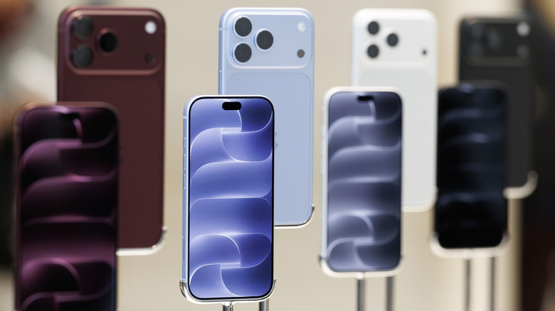
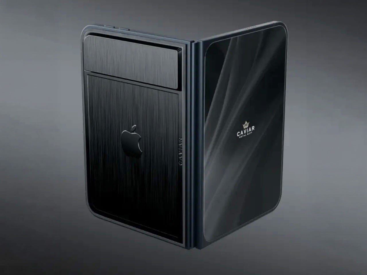
Imagine sitting at a table with friends and whipping your phone out. Your friends see it’s a foldable… then as you unfold it, the animation looks suspiciously like the iPhone Duo. Your friends are impressed, they designate you as the group photo taker… and you tell them regrettably that your iPhone Duo has no cameras. Then you add… not only does it not sport any cameras, it also costs fourteen grand.
To be honest, that scenario is entirely imaginary. Mainly for a bunch of key reasons. Caviar built this version of the iPhone Duo for privacy, championing what they call “Privacy, Minimalism, and a Refined Masculine Style.” Someone who sees truth in that ethos isn’t designated photographer material. And if they were, shelling 14k on a phone means you probably have a few extra grand to hire a photographer wherever you go. The only reason someone buys this hare-brained version of the iPhone Duo is because they can. Plain and simple.
Designer: Caviar Global
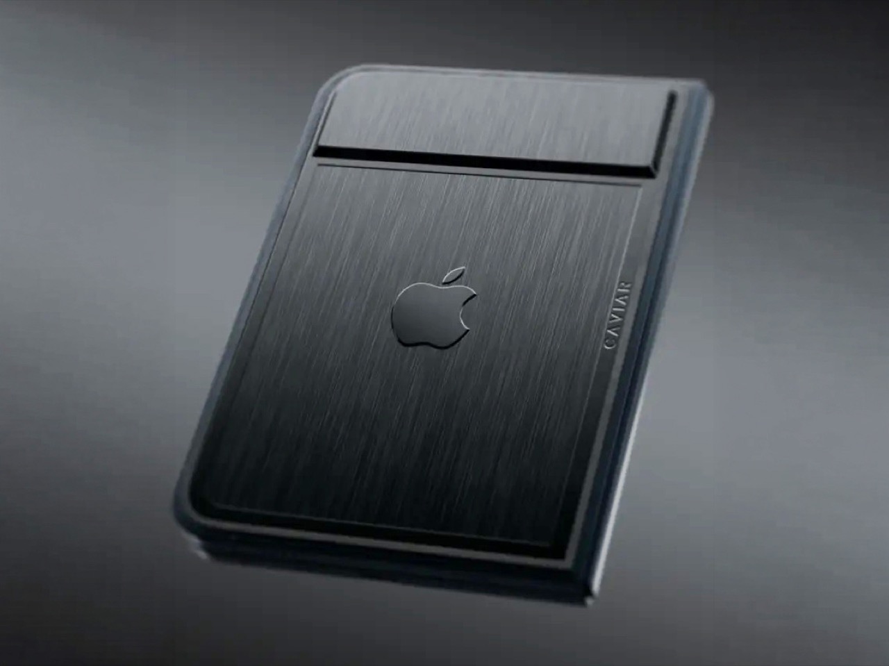
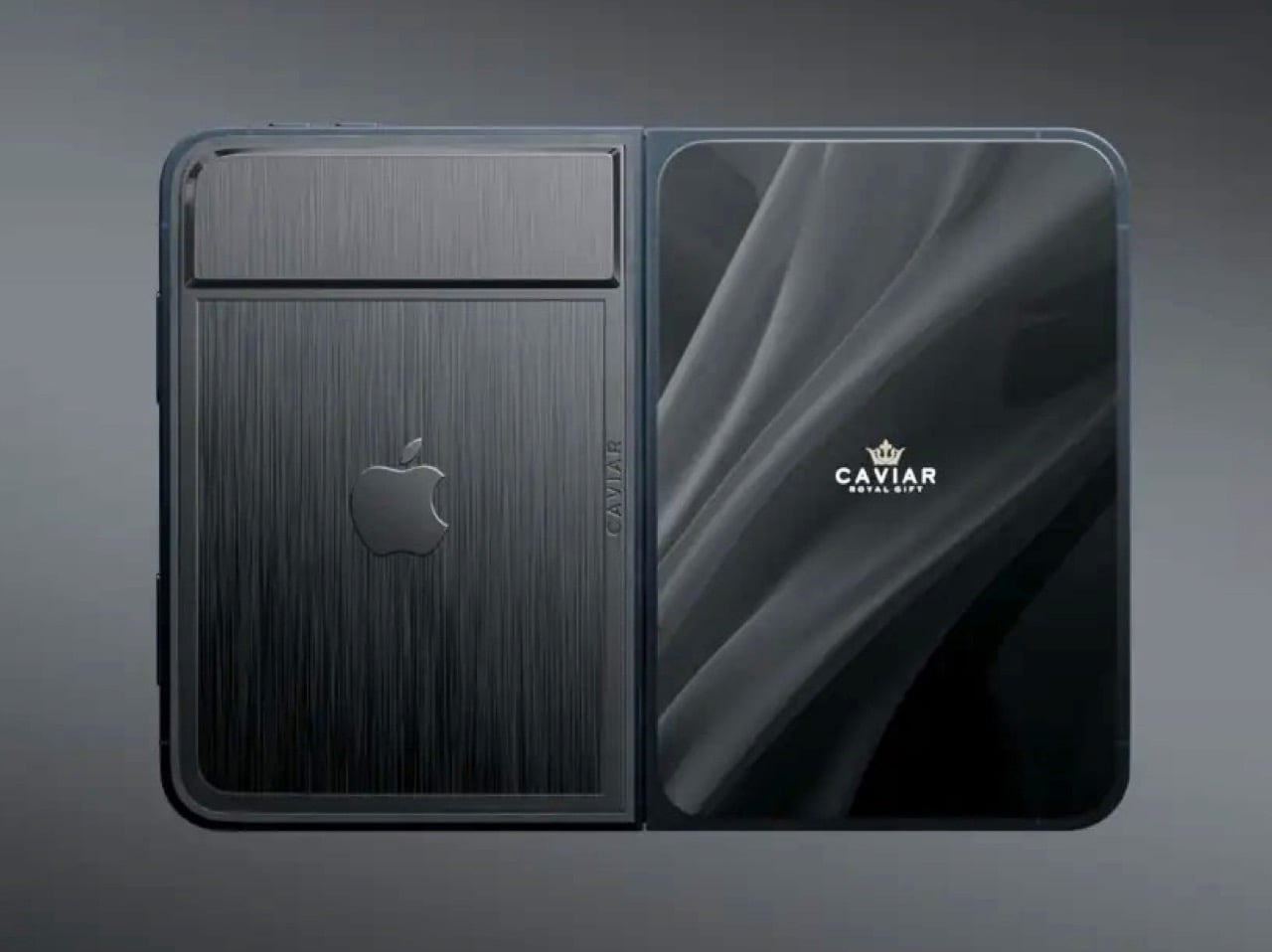
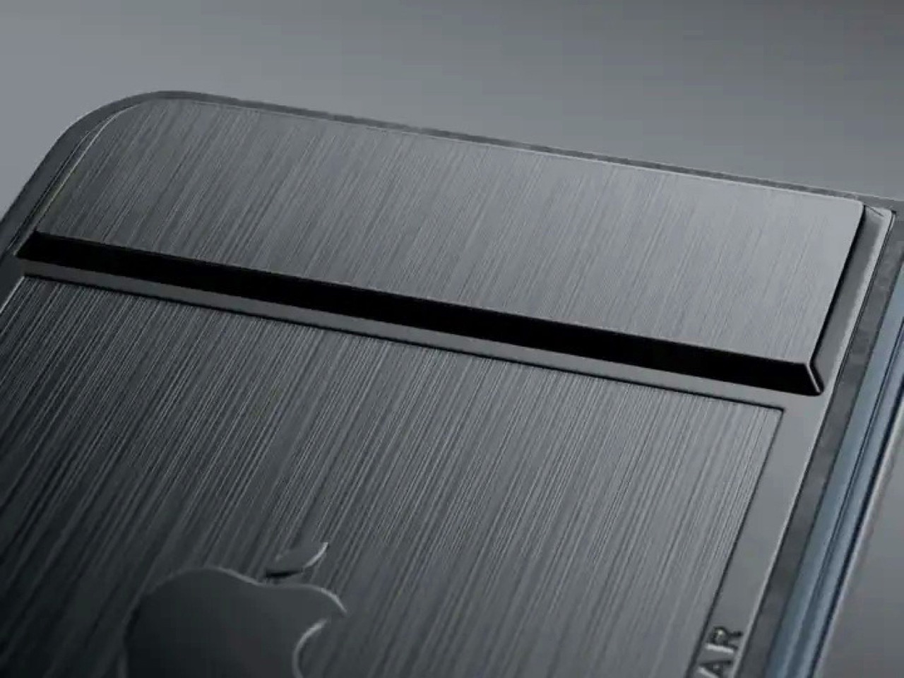
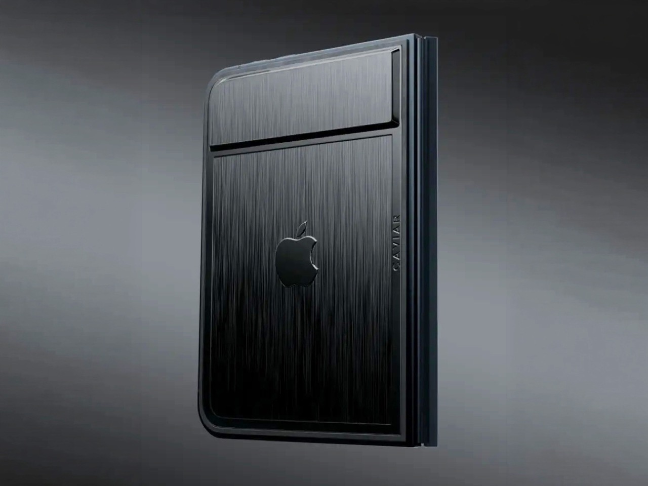
Removing the camera stack from the back of the iPhone Duo does something unexpected: the phone becomes genuinely beautiful. That rear panel, normally dominated by the triple-lens module, turns into a single flat sheet of satin-finished black titanium. No bumps, no rings, no glass circles competing for visual real estate, just one uninterrupted surface that shifts character depending on the light hitting it. Caviar calls the inspiration “supersonic aviation aesthetics,” which sounds like marketing speak until you actually look at the product photos. A blacked-out Apple logo sits flush in the titanium, the Caviar crown marks the opposite panel in a swept fabric-like texture, and the whole thing looks less like a phone and more like a prop from a very expensive spy film.
Apple’s decision to use Touch ID for the iPhone Duo, abandoning Face ID, turns out to be what makes Caviar’s camera-free execution actually hold up. A Face ID phone needs its front camera array to function as a biometric sensor, so pulling that out would mean a very pretty device that cannot unlock. Touch ID lives in the frame rather than behind the screen, so Caviar could strip the entire camera stack, front hole-punch and rear module both, without breaking anything fundamental. Based on product images, the inner display on the Ultimate appears completely clean, no hole-punch interrupting the screen, which makes the inside as seamless as the outside. Two separate design decisions from two separate companies ended up fitting together better than either could have planned.
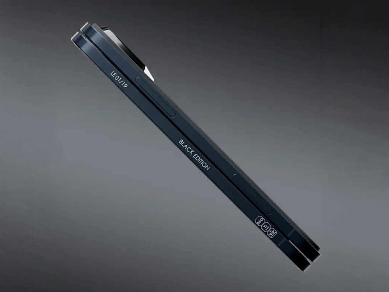
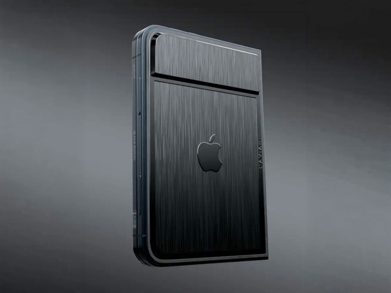
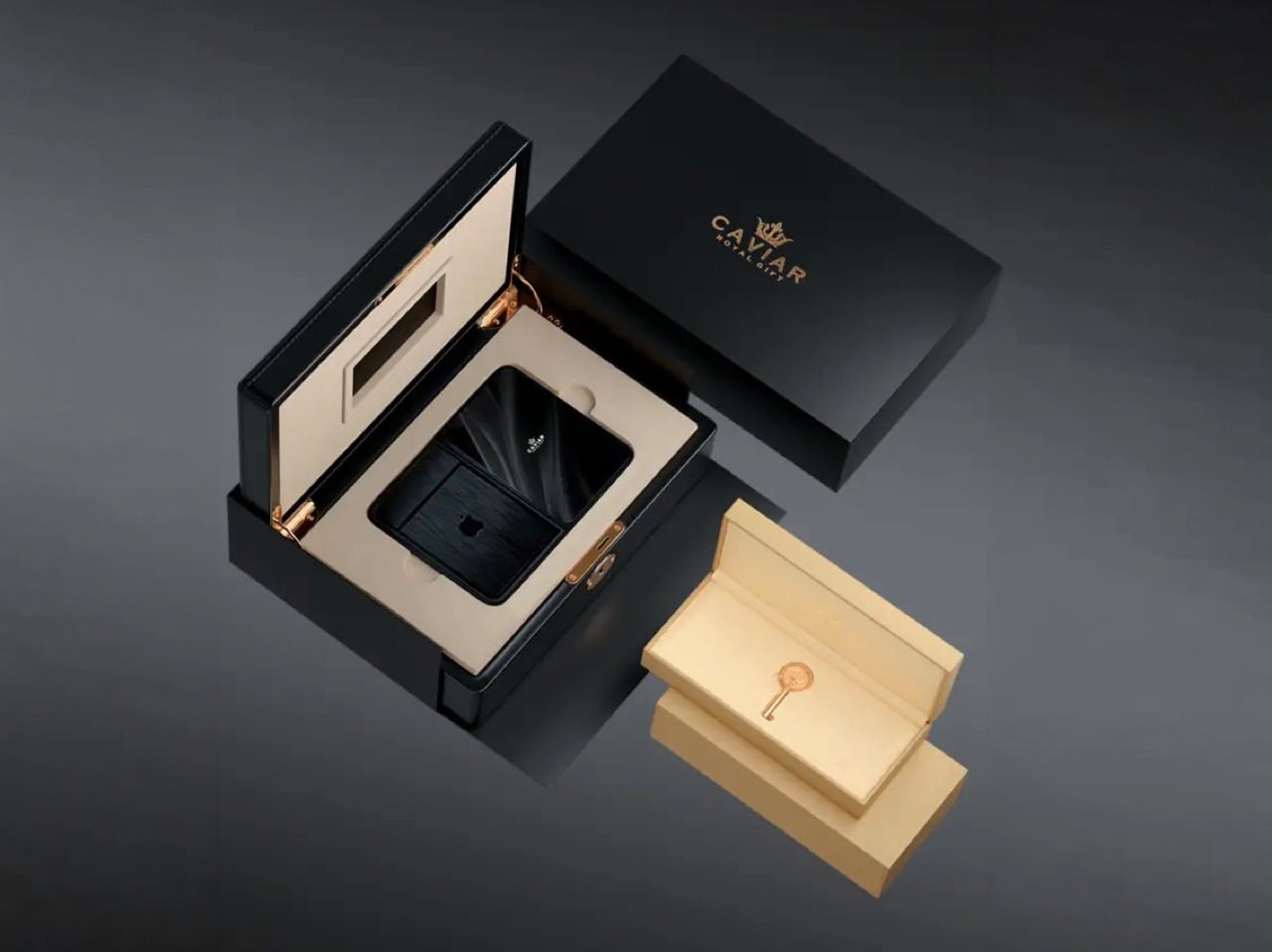
Caviar made 19 of these total. Each unit ships in a custom lockable black luxury box, presented the way a jeweler presents a watch rather than the way Apple ships a phone. A smaller gold-colored wooden case inside holds what appears to be a gold-plated commemorative coin, the kind of object that exists purely to make the unboxing feel like a ceremony. The side of the phone is engraved with a serial number too, for exclusivity. Caviar knows exactly who they are selling to, and made sure the packaging matches the energy.
Caviar has been doing this for years, taking flagship Apple hardware somewhere Apple would never go, for clients who appreciate the gesture. The formula is consistent: start with the most premium Apple product on the market, make it rarer, make it more dramatic, and let the price be the final statement. We have covered their gold-plated and titanium iPhone builds here before, and none of them committed this hard to stripping features as a form of self-expression. At $13,990 for 19 units (mind you, that’s just the 512GB variant), the Ultimate is the purest version of the Caviar argument: a phone that costs seven times its base price because it does less, and somehow makes that sound like the point.
The post Would you pay $14,000 for an iPhone Duo without any cameras? first appeared on Yanko Design.
Design Mindset, Yanko Design’s weekly podcast, premieres every week with a new guest and a single animating question: what does it actually take to think differently about a design problem. The show is 23 episodes in, and this episode turns its attention to fine watchmaking via someone who arrived in the industry with no allegiance to its conventions. If a mechanical watch didn’t exist today, and a designer received the brief cold, would they give it hands, a crown, a flat dial? That question opens the conversation and also describes exactly what our guest spent 16 years answering in practice. The result is Ressence, a brand whose watches look like nothing else on the wrist.
Benoît Mintiens is a Belgian industrial designer who, before he ever touched a watch, designed high-speed trains, aircraft cabins, medical devices, leather goods, and even hunting guns. He founded Ressence in 2010, the name a contraction of Renaissance of the Essentials. The Type Three BB2 won the 2024 Red Dot Award Best of Best, and 2026 brought the same recognition to the TMN. His watches are designed in Antwerp, made in Switzerland, produced in limited editions each year, and worn by people who believe the future is brighter than the past. He is a designer who walked into one of the world’s most convention-bound industries and simply refused to accept what he found there.
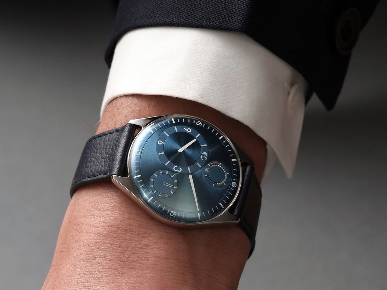
When people ask Benoît how he designs a watch, the answer he gives is never the one they expect, because he starts with the relation between the user and the watch rather than with the movement itself. “Usually I start not with the watch. I start with the relation between you and the watch, and that is, I think, a very important step that very often is forgotten.” Most brands were created by watchmakers who always build from the inside out, from the movement to the wearer. As a designer, Benoît works in the opposite direction, from the user inward to the movement. That physical 180-degree reversal of process changes everything about what a watch ends up looking and feeling like.
Designing the relationship is, in Benoît’s view, fundamentally an ergonomic exercise, rooted in a deep study of physiology and how people interact with objects. The ultimate measure of success is disappearance: “The best product is the one you forget when you use it. Invisible. I’m using it, but I’m not even aware of it.” He tells customers who buy a Ressence that he hopes they forget quickly that they are wearing it, and that forgetting is the proof the design worked. In the rapid-fire round, he completes the sentence “the future belongs to designers who stop asking how to make things and start asking” with five words: “How do you want to feel.” That question is where every Ressence begins.

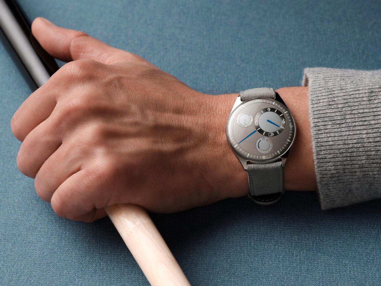
Until the quartz crisis of the 1970s, watchmaking was about precision, quality, and reliability. When quartz movements arrived at a fraction of the cost of mechanical ones, the industry had to reinvent itself to survive. “Watchmaking has found a way to survive by adding this emotional layer on top of their brands, on top of their physical products. It’s not so much about the physical product anymore. And that’s a pity, I think, as a designer.” Any product, Benoît argues, needs to pass through the survival-of-the-fittest logic of natural evolution to reach the next generation. Watchmaking’s functional evolution largely stopped at the quartz crossroads, and Ressence is attempting to pick it up from there.
A product is defined by multiple dimensions: aesthetics, ergonomics, technique, social context, and production. In watchmaking, only the aesthetic dimension has shifted from brand to brand, and the underlying system architecture has been frozen for two hundred years. Ressence repositions every dimension at once. “The way we show the time, the ergonomics, is actually what defines the aesthetics. Is actually the way we make them. Is actually the technique that lies behind. All these things are intertwined, and they all together create what I call this new paradigm.” The whole has to be logical and coherent, or as Benoît puts it, you end up with a Frankenstein.
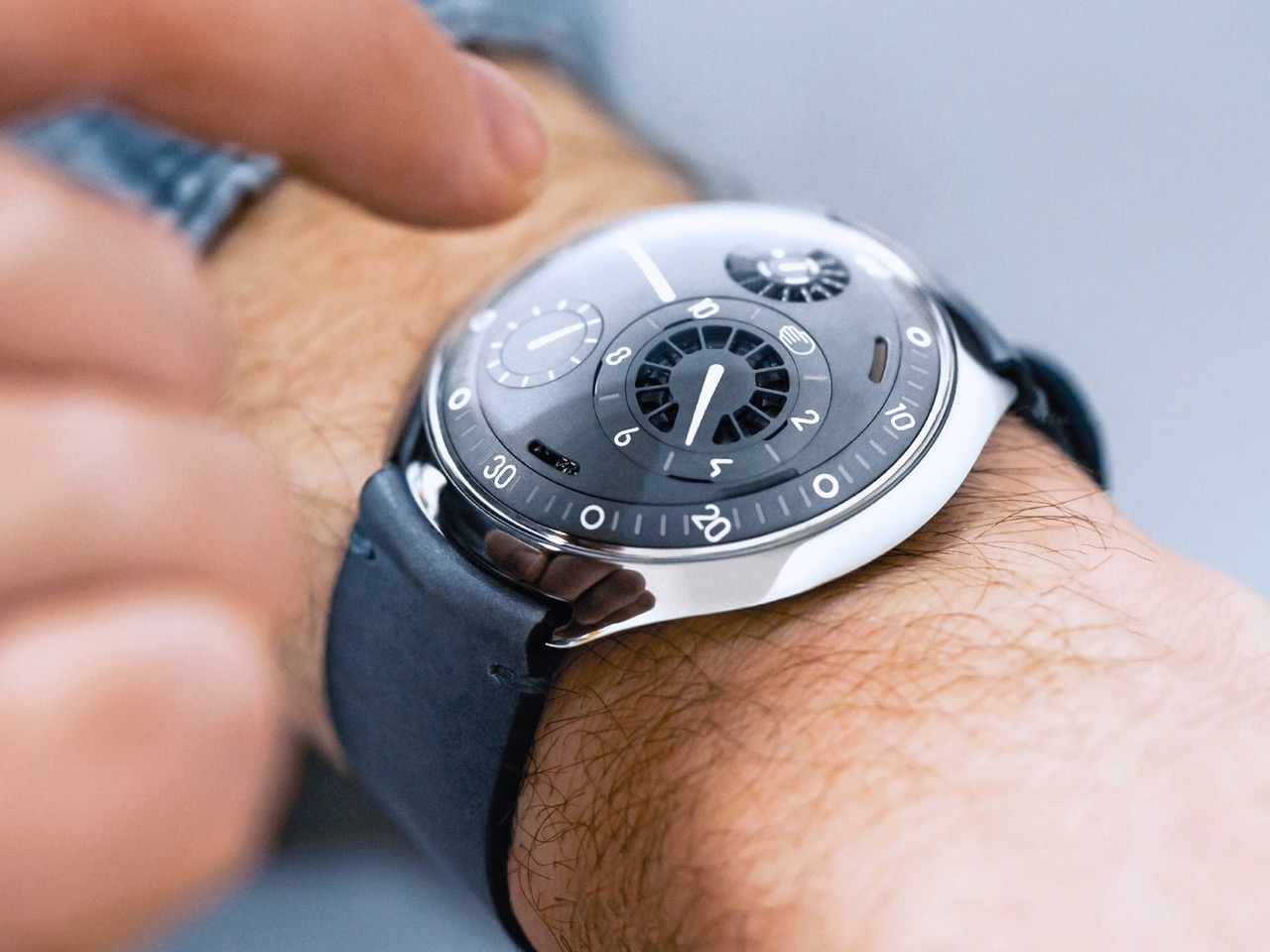
Asked why people still choose to wear mechanical watches when a phone tells time more accurately and without winding, Benoît offers a concept he has been developing for years. “I call it the empathy for gears. We have, as humans, we have empathy for gears.” He builds toward the idea through a Titanic thought experiment: a survivor on floating debris must choose which of two strangers in the water to save, the one he spoke with during the voyage, or the one whose language he could never understand. “As a human, you pick the one you have a relation with.” Products operate by the same logic, and we form bonds most naturally with what we can understand and relate to.
A circuit board is opaque; the workings of a mechanical watch are graspable, even to someone with no technical knowledge. “That is the magic of mechanical watches, is that we feel close to them. Let’s not forget, they tick, they make a sound. They need care. You need to wind them. All these elements will generate a bond between you and the product. And that is why I’m a strong believer in mechanical watches.” Each quality that makes a mechanical watch demanding, the winding, the servicing, the ticking, deepens the relationship between wearer and object. That depth of feeling, Benoît argues, is a human need, and it deserves to be designed for.
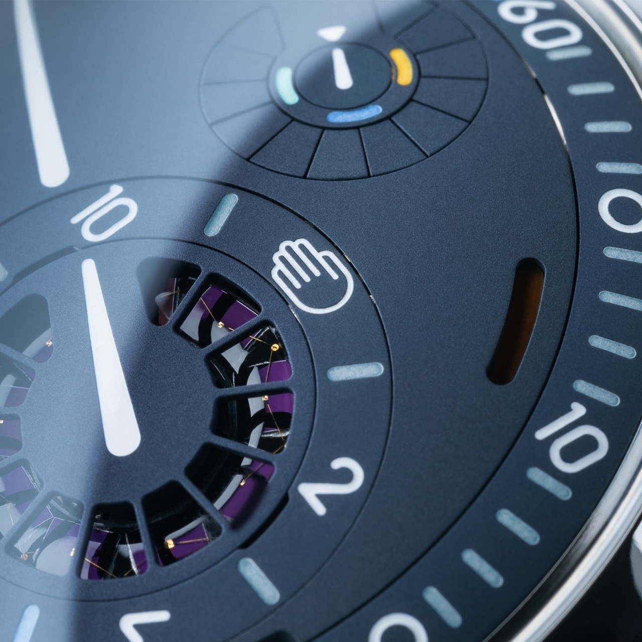
Ressence positions itself as a high-end brand, with Benoît drawing a specific distinction between high-end and luxury. Luxury is decorative and emotional, selling prestige and story; high-end means technically and functionally sophisticated, in service of the person using it. “We would believe that a product gets its relevance, its reason of existence, through the way or the quality the product is executing its function.” The most visible outcome of that philosophy is the Ressence Orbital Convex System, or ROCS, which replaces traditional hands with rotating discs requiring approximately 200 components where a standard watch uses four. The design brief Benoît imposed on himself back in 2008, years before the brand existed, made the mandate clear from the start: “Ressence needs to be original, but not marginal.”
The oil-filled dial, defining models from the Type 3 to the Type 7, has an origin in personal memory. Benoît traces it to childhood Mediterranean sailing trips, navigating overnight to Corsica guided only by an oil-filled ship’s compass in the days before GPS. “This image of the compass, an oil-filled system with inside a mechanical thing that turns around, showing the north. I’m pretty sure this has been the thing that has burned in my brains, and I believe the idea of the Type Three must have come from there.” Oil inside the Type 5 diver eliminates refractions between oil, sapphire, water, and dive mask, delivering a clear dial at any depth. The functional improvement is exactly the point: a diver watch you can actually read underwater.
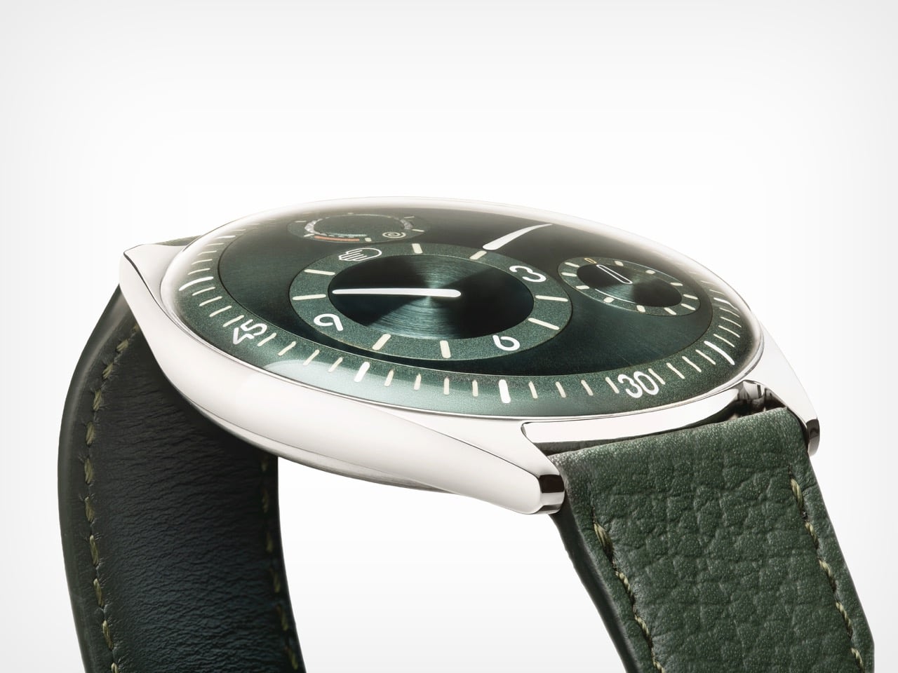
Getting enough watches from suppliers is, after 16 years of operation, still the hardest thing Ressence faces as an organization. A single watch contains around 400 custom-made parts at extreme precision tolerances, and the Ressence dial is curved in three dimensions where almost every other watch is flat, requiring five-axis machining. Some parts pass through twelve different specialized companies before reaching a watchmaker’s desk. “If today I need more watches and I order them, I will only have them in between nine months and two years. There is no industry like that.” Those lead times explain the prices, the waiting, and the limited annual runs; the scarcity is structural, a consequence of producing something this technically complex as an independent brand.
Benoît is clear-eyed about products and unhurried about brand moving forward. Ressence has a product plan mapped for the next eight years, but brand recognition is the harder work and cannot be forced. “Stick to your vision, and move on and be coherent. I think that’s the central thing.” The reference brands held up as aspirational in watchmaking took fifty years to reach that position, and it was a consequence of what they did, not something they actively pursued. On materials, Benoît describes a fascination with mammoth ivory recovered from Siberia, finding its structure “very, very, very beautiful.” Ressence can be found at ressencewatches.com, on Instagram, and in Antwerp, where visitors are always welcome.
The post Ressence Doesn’t Want Your Watch to Look Like a Watch first appeared on Yanko Design.


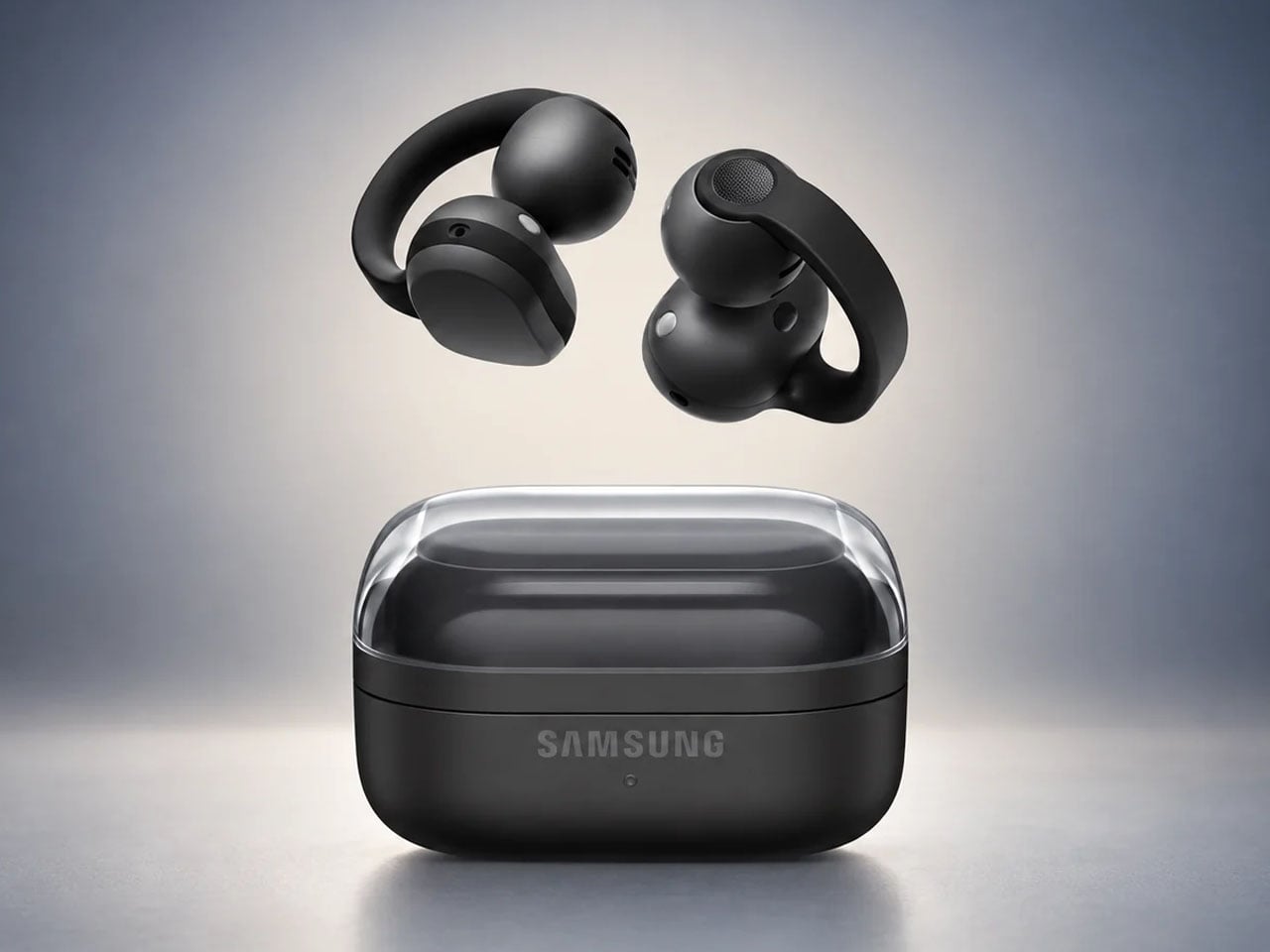
Clip-on earbuds have arrived in a big way, giving another versatile way to enjoy music whether you’re in the gym or making your way to the busy metro station. Rather than shoving the eartips deep down the ear canal, these buds are more comfortable and keep you aware of the environment at all times.
Huawei FreeClip 2 arrived late last year to turn up music lovers’ interest in this form factor, followed by the swanky CMF Clip Pro’s. Sennheiser jumped on the bandwagon with the Accentum Clip, and recently Bose came up with their second generation clio-ons. Predictably, Samsung has pulled the trigger with its first-ever clip-on wireless earbuds dubbed Galaxy Buds On, and they look impressive.
Designer: Samsung
So how are the Galaxy Buds On different from the other flagship clip-on buds in the tightly contested market? Do they have what it takes to bring to the active audio community what they desire out of such open-ear earbuds?
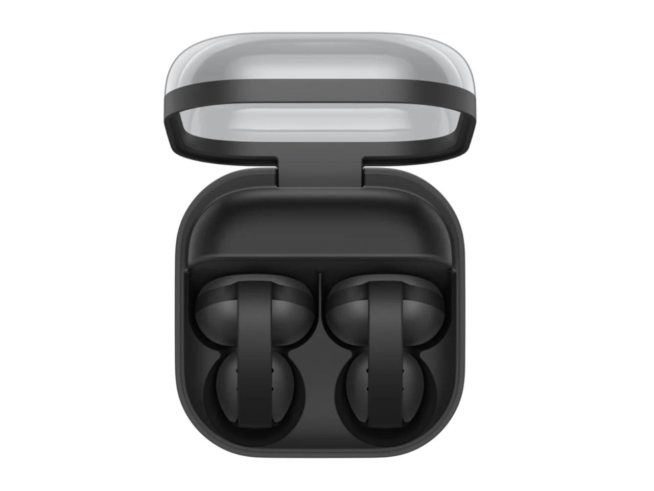
Samsung’s approach for this form factor is focused on rethinking how the bud sits on the ear. The Galaxy Buds On use an open-ear clip design that leaves the ear canal unobstructed, allowing wearers to listen to music while staying connected to conversations, traffic, or other sounds around them.
Samsung says it studied different ear shapes and ran simulations to determine the positioning of the speakers and battery. A larger contact area helps distribute pressure, while the elasticity of the connecting band is tuned to keep the buds stable during movement. That makes the design particularly relevant for walking, commuting and workouts where awareness matters as much as audio.
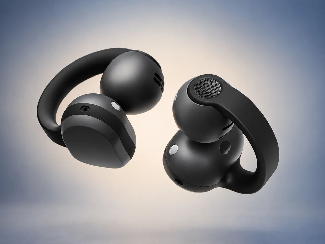
The audio hardware is also more considered than the unusual silhouette might suggest. Samsung has fitted the Buds On with TwinBoost speakers designed to emphasize lower frequencies, addressing one of the perennial challenges of open-ear audio – producing convincing bass without sealing the ear canal. An Audio Leakage Reduction system is intended to keep music from spilling excessively into the surroundings.
In conjunction, the automatic volume control adjusts playback according to the environment. Samsung claims up to 9.5 hours of continuous music playback from the earbuds, which puts the focus firmly on everyday usability rather than making the clip form factor a novelty.
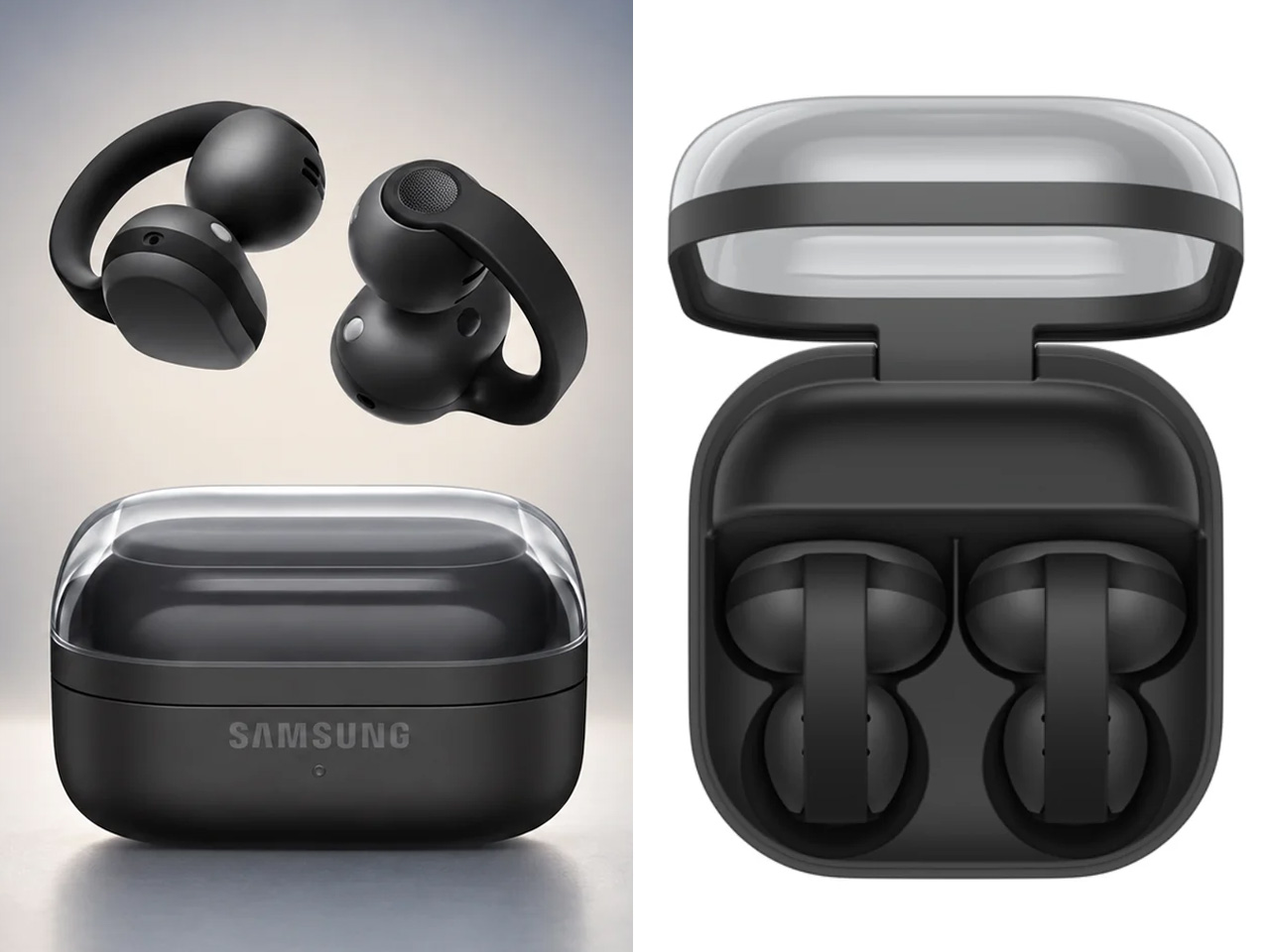
The more interesting bit happens when the Buds On are paired with a compatible Galaxy device. Samsung has integrated several Galaxy AI features, turning the earbuds into something closer to a hands-free interface. Users can launch Gemini Live through a voice command, while Quick Voice Memo allows a long press on the earbud to start recording without reaching for the phone. Those recordings can subsequently be searched through Bixby, provided the required Galaxy AI-supported device, Voice Recorder, and Bixby setup is in place.
Head Gestures take the hands-free idea further. Nodding or shaking the head can be used for actions such as answering or ending calls, dismissing alarms, or interacting with message notifications. For calls, the Buds On use three microphones alongside a bone-conduction-based Voice Pickup Unit and machine learning to isolate the wearer’s voice from surrounding noise. They are powered by Qualcomm’s Snapdragon S7 Gen 1 Sound Platform and a Class-D amplifier.
Samsung will launch the Galaxy Buds On in South Korea on October 27 in black for 299,000 won (roughly $220). A wider international rollout is planned, although regional pricing and availability have not yet been announced.
The post Samsung Galaxy Buds On let you listen to music without blocking your ears first appeared on Yanko Design.

I’m the kind of person who can set down my keys, turn around, and immediately forget where they went. Wallets, earbuds, and bags have a way of disappearing at the least convenient moment, too. A smart tracker can spare you a frantic search, but only if its battery is working and its location can still be found. That makes battery life and the ability to locate an item beyond your phone’s immediate range just as important as a good-looking design.
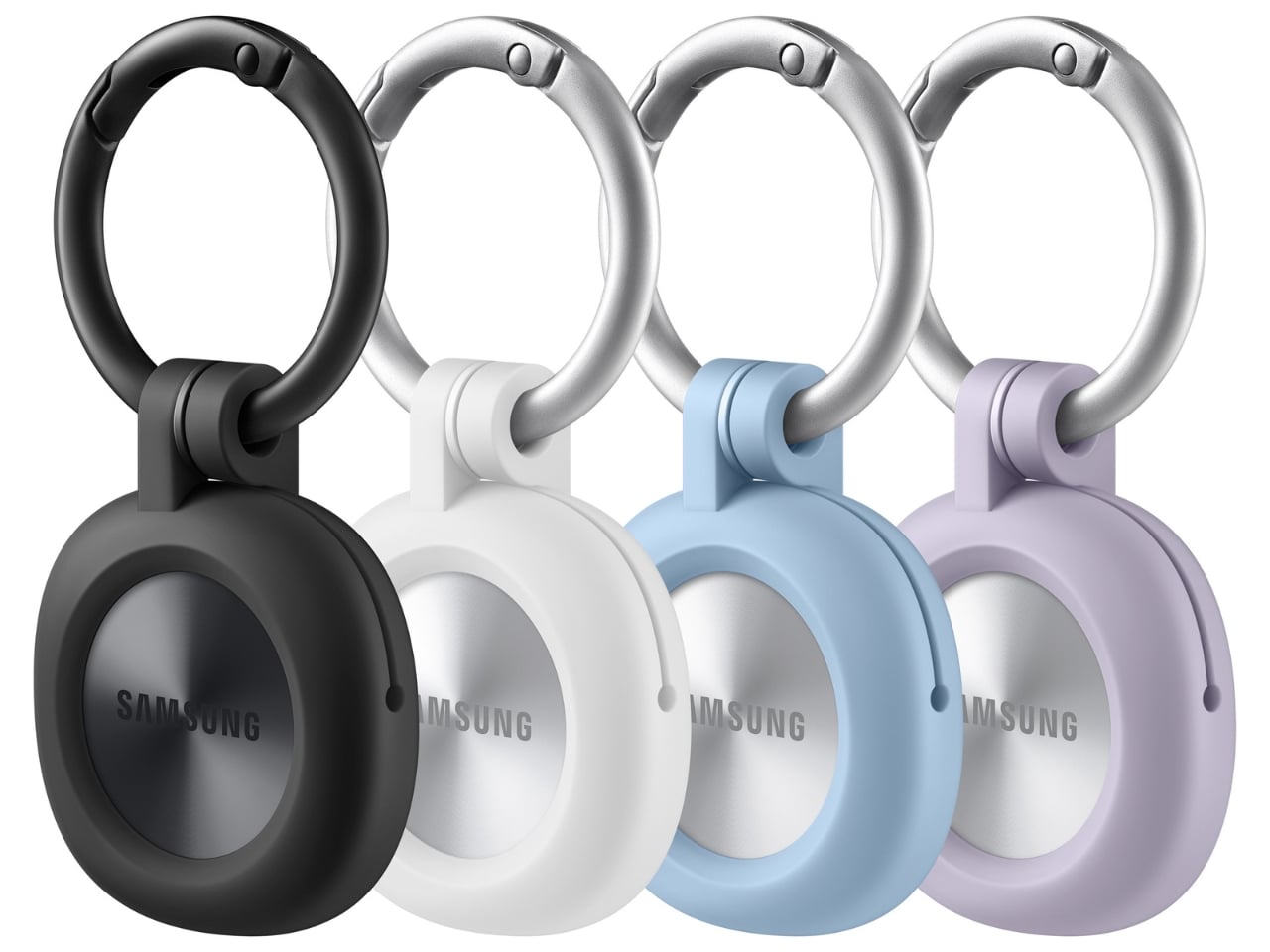
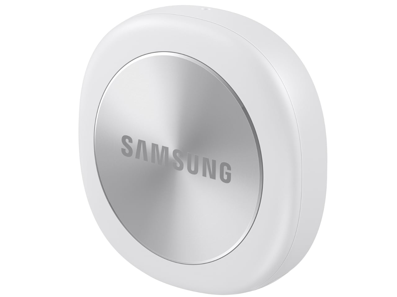
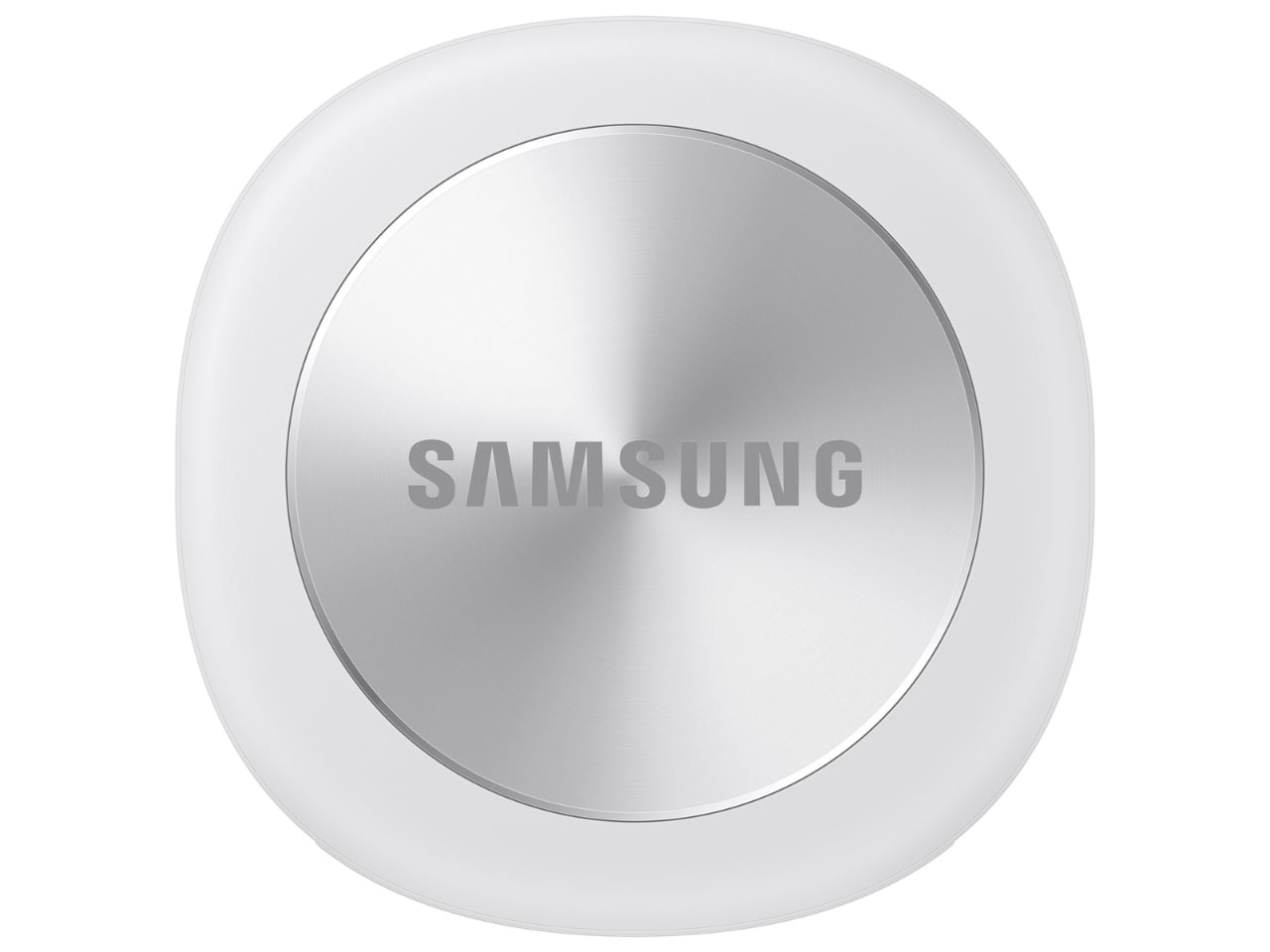
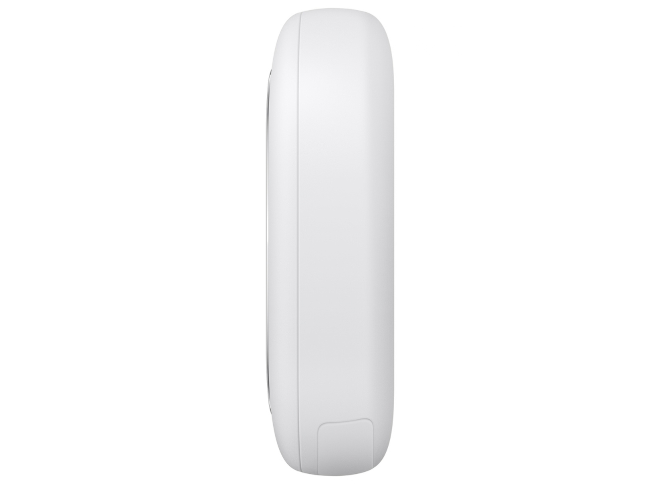
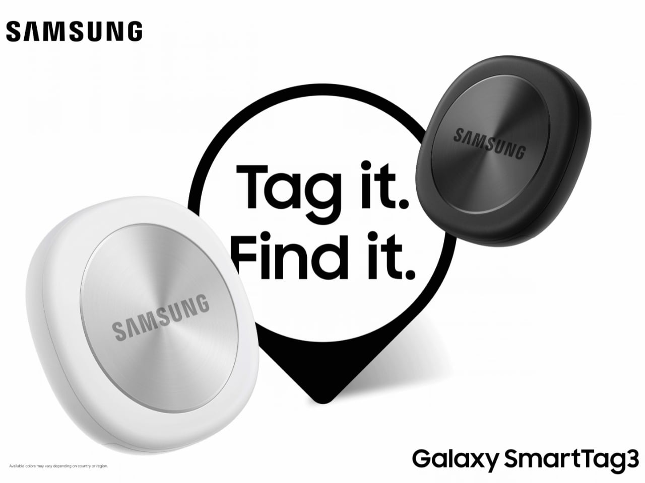
Designed by Samsung, the Galaxy SmartTag3 aims to address those everyday frustrations in a smaller package. Its rounded, nearly square shape gives it a clean look, while its reduced size should make it less noticeable on the things you carry. That matters more than it might seem. A tracker attached to a set of keys needs to be easy to live with every day, not just useful on the rare occasion those keys go missing.
Design: Samsung
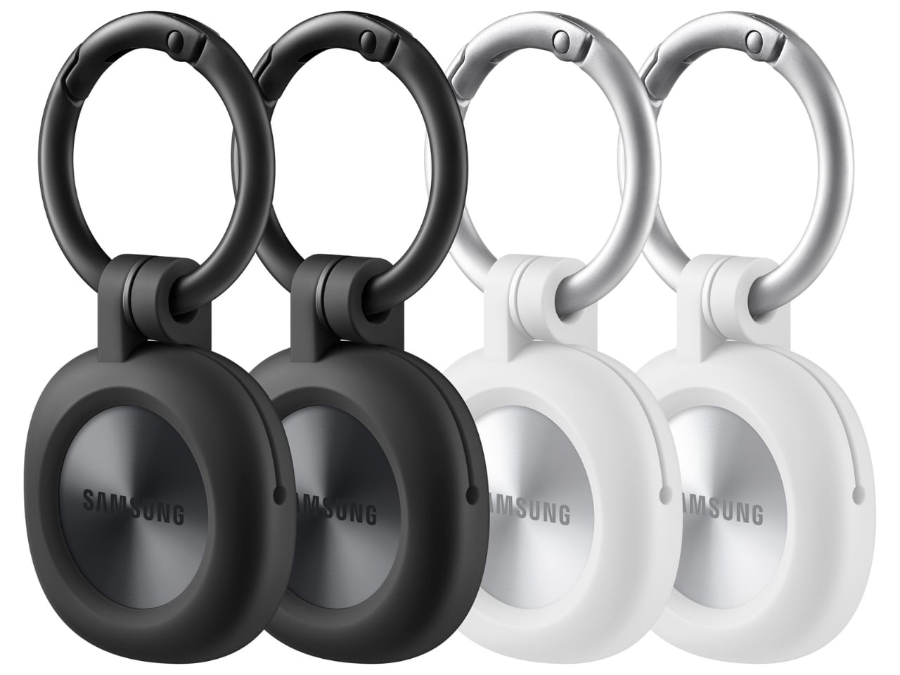
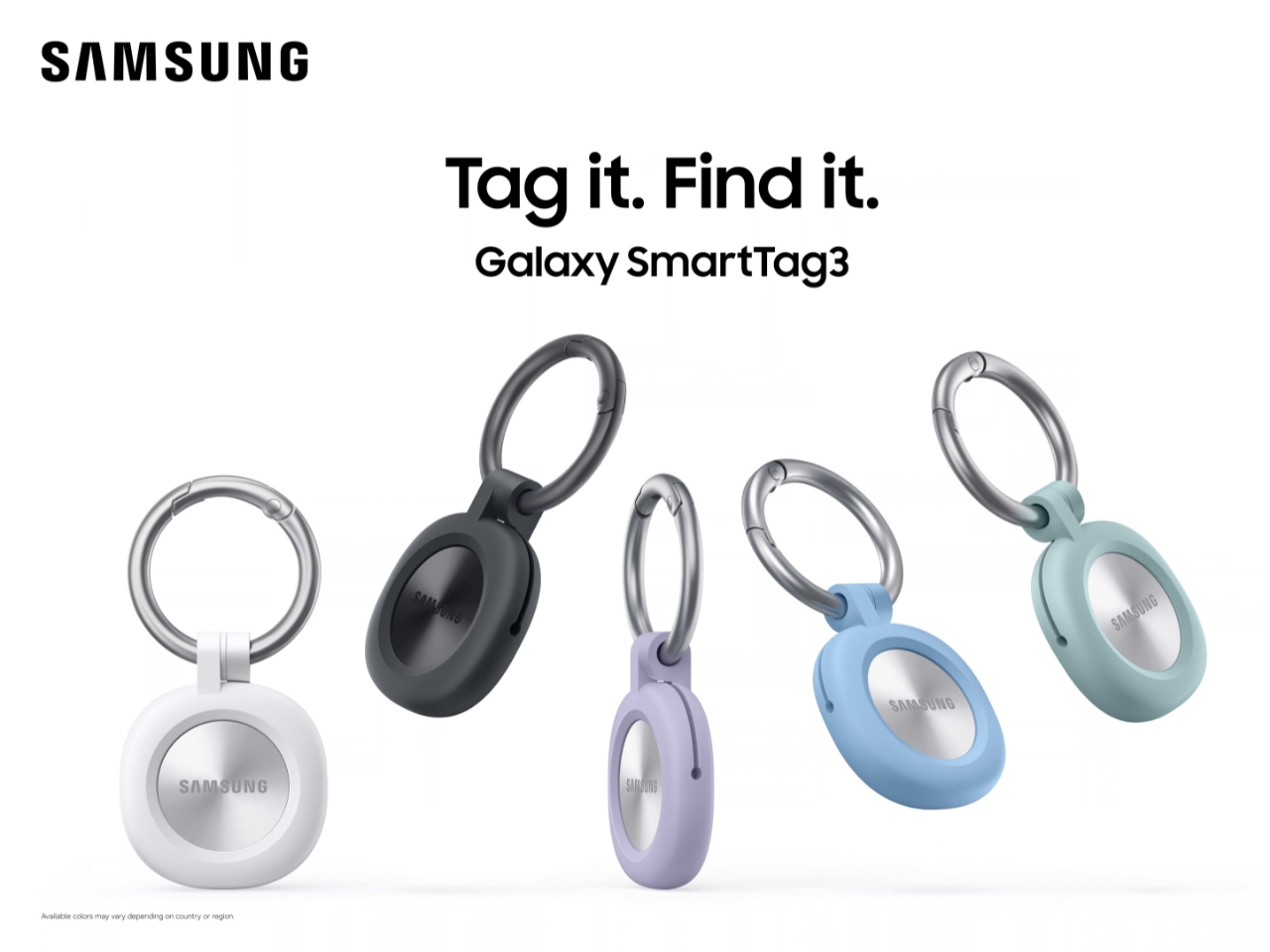
The change in shape also raises a practical question: how will you attach it to your belongings? Samsung offers a silicone case with an integrated keyring and a loop case, giving users different ways to secure the tracker to keys or a bag. The smoother outline may look better on its own, but anyone buying one for their keys should consider which attachment will work best.
Samsung says the SmartTag3 is 35% smaller by volume and 33% lighter than its predecessor. It also retains an IP67 rating, indicating resistance to dust and water under specified test conditions. That offers reassurance if the tag gets caught in the rain, though it does not mean the device is waterproof in every situation.
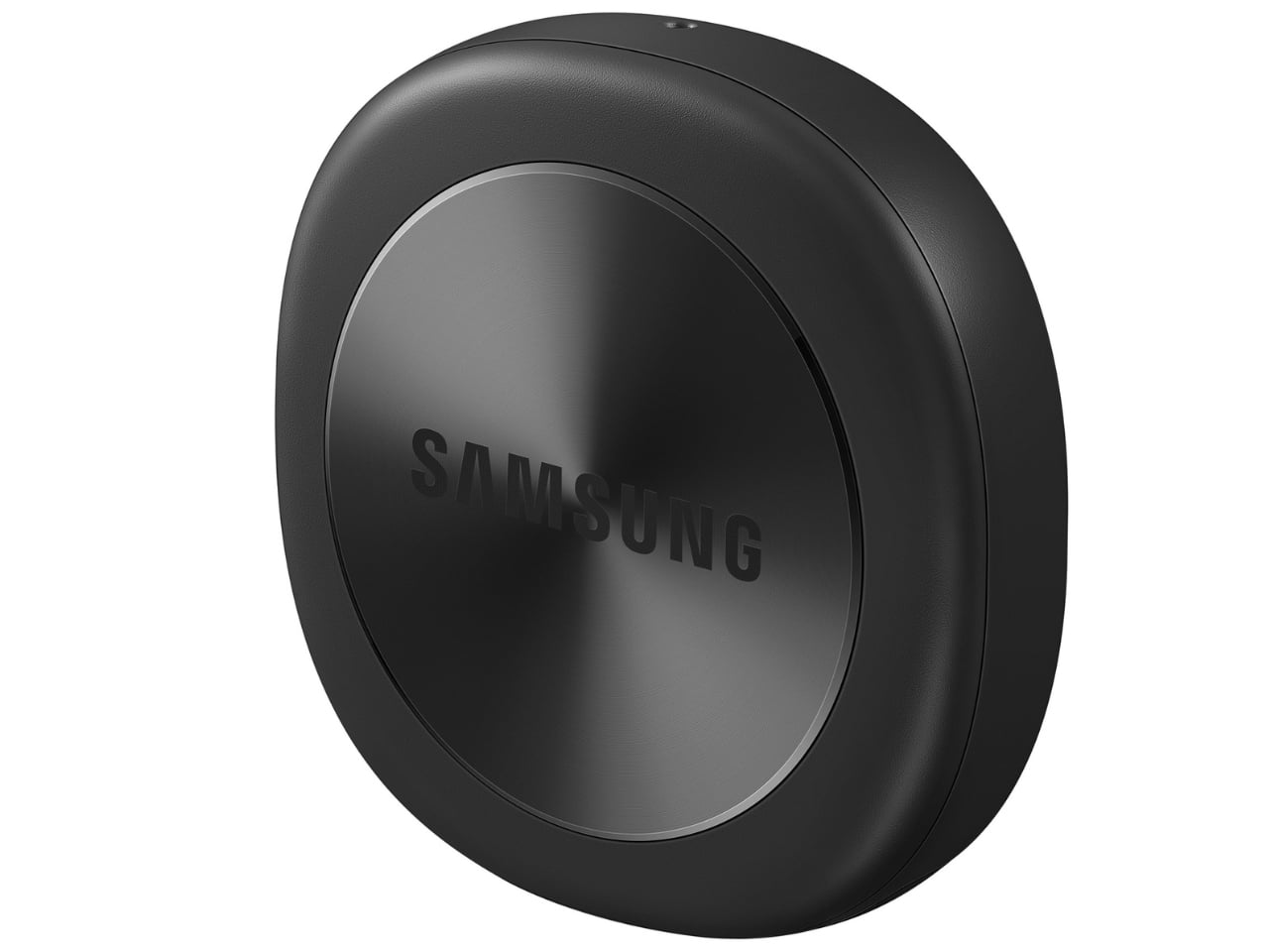
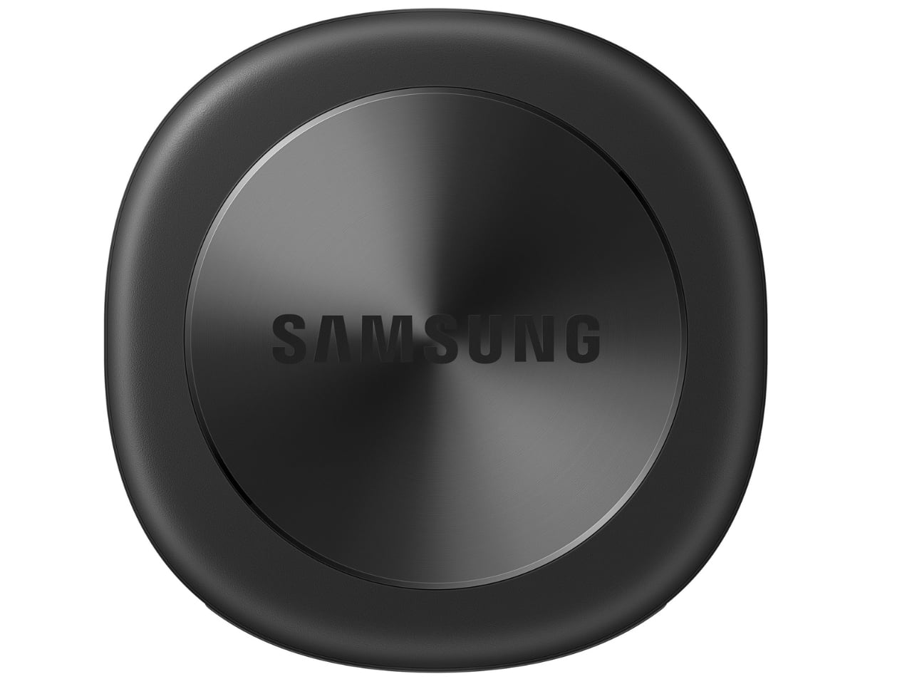
Battery life may be the more meaningful upgrade for anyone who has discovered a dead tracker while looking for a lost item. Samsung says the SmartTag3 can run for up to 550 days under standard usage or up to 790 days in Power Saving Mode. Those figures are based on Samsung’s testing, not a promise that every user will get the same result. Still, a tracker that needs attention less often is less likely to let you down because you forgot to check its battery.
Finding something nearby should be easier, too. Compass View uses Bluetooth 6.0 Channel Sounding to provide distance and directional guidance from up to 60 meters away, about three times farther than on the previous model, according to Samsung. It could help you narrow down where to look before you’re close enough to spot the missing item. Compass View is not available on iOS.
The other finding features are intended to help in different situations. If you leave a tagged bag behind, a Left Behind Alert could prompt you to go back for it, although that feature is also unavailable on iOS. Place Notification is designed to alert you when a tagged item enters or leaves an area you define. Location History and Movement Detection Alert may provide additional clues about where an item has been or whether it has moved. Together, these tools could help you notice a problem sooner and narrow down where to look.
Lost Mode addresses a different problem: helping someone return an item they find. With a compatible phone, a finder can scan the tag using NFC to see the contact information or short message you have registered. That could be useful for a bag left at a café or luggage separated from you during a trip. When an item is beyond your phone’s range, however, location updates depend on nearby participating Galaxy devices. The SmartTag3 should not be treated as a continuous, real-time GPS tracker.
The SmartTag3’s appeal is the combination of a compact design, long claimed battery life, and features that help at several stages of a search. It cannot prevent you from leaving your keys behind, and its alerts will not replace paying attention to your belongings. But if it helps you catch a forgotten bag before you get home, or gives you a useful clue when something disappears, it has done what a well-designed tracker should: made a small, stressful problem easier to manage.
The post Samsung’s SmartTag3 Refuses to Die at 790 Days Battery Life first appeared on Yanko Design.