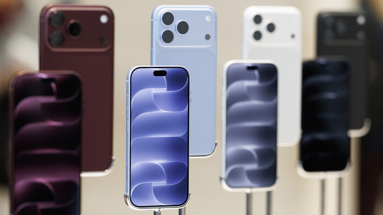
Designers Already Prototype Hardware – Now They’re Prototyping Demand Too

Every product that finds its way onto these pages eventually meets the same crossroads: the moment a designer takes the thing public. For physical product creators chasing something original enough that established retailers won’t touch it, Kickstarter remains the most democratic proving ground available. The platform has hosted more than 654,000 campaigns since 2009, drawing over $8.5 billion in pledges from more than 23 million backers, with 2025 marking its strongest year on record. That momentum creates a seductive and specific trap: creators see the platform’s gravity and assume a beautiful product with a compelling story will naturally convert into backers. A crowdfunding agency called TCF (The Crowdfunding Formula), which holds Kickstarter Premier Partner status and has facilitated more than $520M raised across campaigns, has spent years watching that assumption fail in real time, and what they built to counter it is one of the more disciplined pre-launch processes in the business.

TCF’s methodology, recently published in full detail, centers on a single observation that most campaigns never act on: interest and purchase intent are not the same signal. Emails, follows, and comments cost nothing to give, which is why none of them predict whether a product sells. Validation asks for money, not opinions, and a small deposit on a product that does not exist yet is the closest available proxy for a real backer, because the act of paying is what carries the information, not the amount. The resulting data resolves three decisions most creators make by guesswork: the price, the positioning, and the audience, all settled before a campaign page exists, before ad spend, and before the outcome is locked in, because those are the three things most likely to break a launch and the three most often decided by assumption. It is a design methodology applied to the market, and it deserves the same respect that designers already extend to physical prototyping.
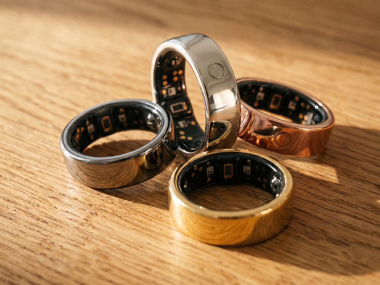
Circular Ring 2

How a $2 Deposit Separates the Buyers from the Browsers

The process runs on Prelaunch.com. A product page goes live showing the product, the visuals, what it does, how it works, and the characteristics that make it different, with no price. Visitors who want to know more leave their email address, which is the interest signal and only that. A second page then opens, presenting the price alongside an offer: put down a deposit today and receive a discount when it launches. Someone who pays has moved from liking the product to paying for a product with no campaign page, no ship date, and no reviews. Someone who does not pay is interested but not convinced, and that is a result too.

The pushback the deposit mechanism reliably attracts is predictable: does $2 actually prove anything about future purchase behavior? The deposit is the part people push back on, but the $2 is not the point. The act is the point. Getting up, finding a card, and typing the numbers in for something with no campaign page, no ship date, and no reviews is a different order of behavior from tapping a heart, and the people who do it are the closest thing to your future backers that exists before you have any. The Circular Ring 2, a smart health ring, funded in just four minutes and crossed $2.5 million in pledges in under 40 days. Products that open with that kind of velocity tend to do so because the audience already knows it wants the thing, and that certainty is built long before a campaign goes live.
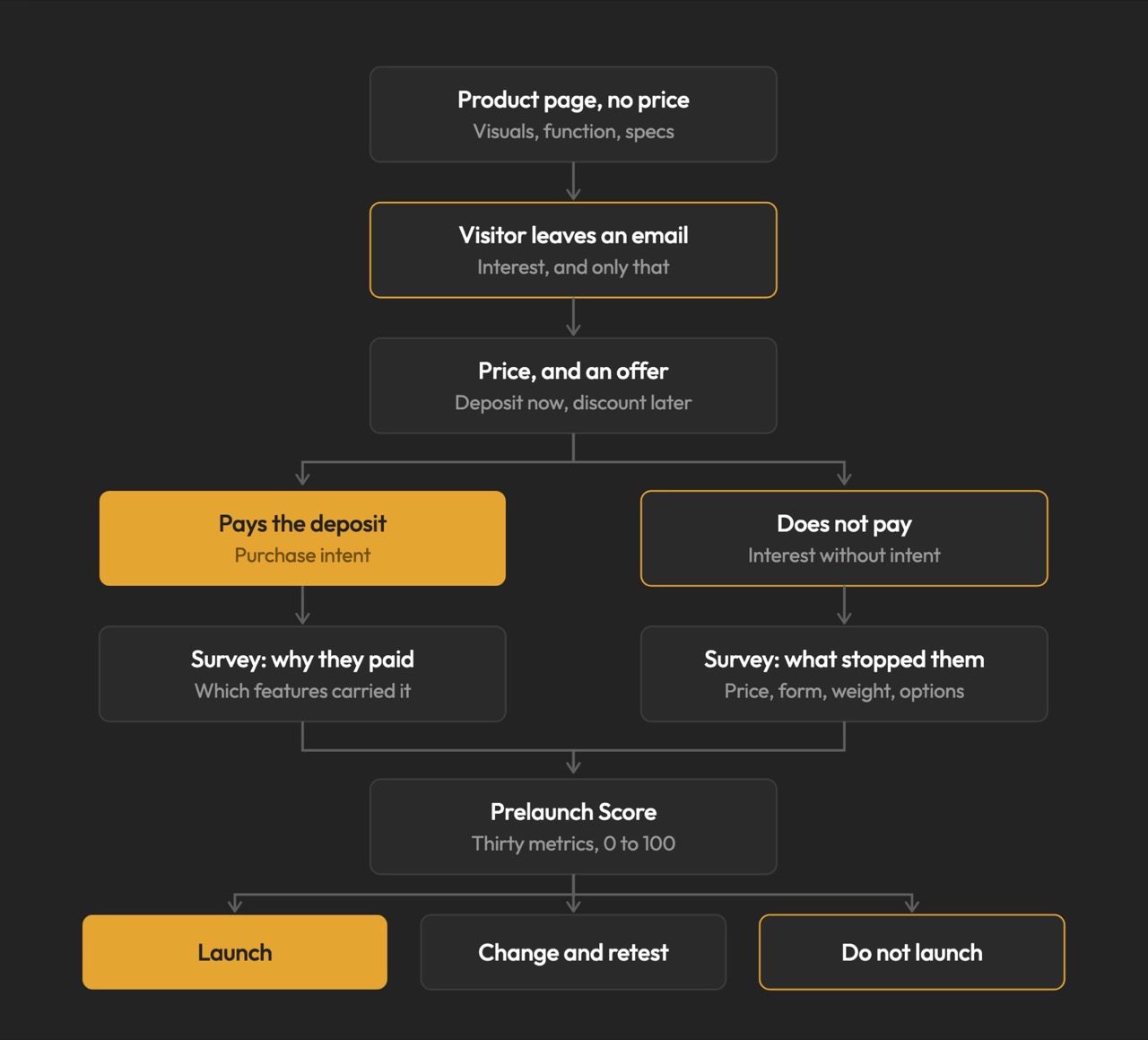
Image Credits: TCF

The Rejection Data Is the Brief

The survey is where validation stops being a scoreboard and starts being useful. From the people who reserved, you learn what actually moved them: whether it was the color, the form, a specific function, the price, or the promise, and which features are carrying the product versus which ones you have been overselling. From the people who left an email and then did not pay, you learn something you cannot get anywhere else: exactly where you lost them, and what would change their mind. The color they wanted was not there. The shape was wrong. It looked too heavy. The price was too high. These are the people who were close enough to care and honest enough to walk away, and their answers are a list of things you can fix before the fix costs anything.

This is co-creation in the most literal sense: meeting your potential buyers before you launch, and letting them tell you what to build. A creator who learns that 60% of their non-converting subscribers balked at weight has a design brief, not a marketing problem. A creator who discovers that two colorways were widely expected but absent has a specification list, not a gap in their ad copy. The survey turns a theoretical audience into an actively contributing one, delivering feedback while the product can still absorb it. Kickstarter’s most successful campaigns tend to share that structure: they do not open to strangers, they open to people who were already consulted.
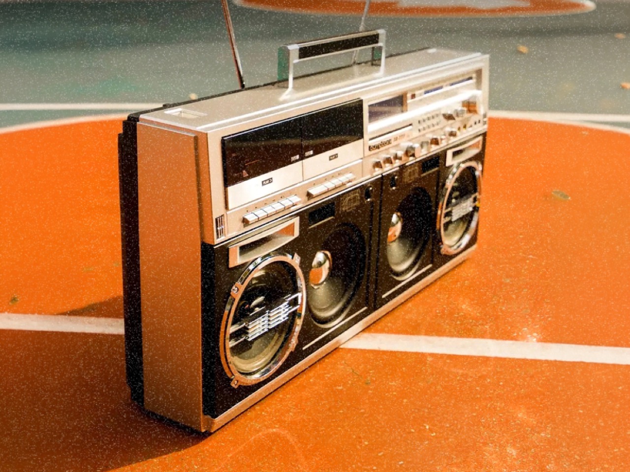
BB-777 Boombox

Why Validation Doesn’t Always Mean Lowering Your Price

Creators tend to assume validation exists to talk them down. It does not. One agency ran validation on a pet product priced at $30 a unit, and the data showed the right price was $40. The creator had been leaving money on the table, and no amount of instinct would have told them that, because instinct in that situation almost always argues for the safer, lower number. No stated-preference survey, no focus group, and no amount of social engagement would have surfaced it, because stated preference and paid behavior are different instruments measuring entirely different things. Validation is where you settle positioning and audience rather than guessing at them, running price variations, testing different messaging, and finding which audience responds before you have committed to a single frame of campaign video. The point is to find the price, the position, and the audience that let the product reach its full potential, and then launch into that.

The validated price sets reward tiers, and the early discount tested during validation is a trigger that has already been watched working, rather than one you hope will. The reserver surveys told you which characteristics did the persuading, which decides your headline, your hero shot, and the order of your video. You are not inventing arguments for the product; you are repeating the ones your buyers already made. Running price variations and messaging tests before a single production decision is committed changes the campaign from a bet into a brief. The learning does not expire when the campaign closes. A validated price, position, and audience are the same three things an e-commerce store runs on, which is what lets a product keep scaling after the campaign instead of peaking with it.
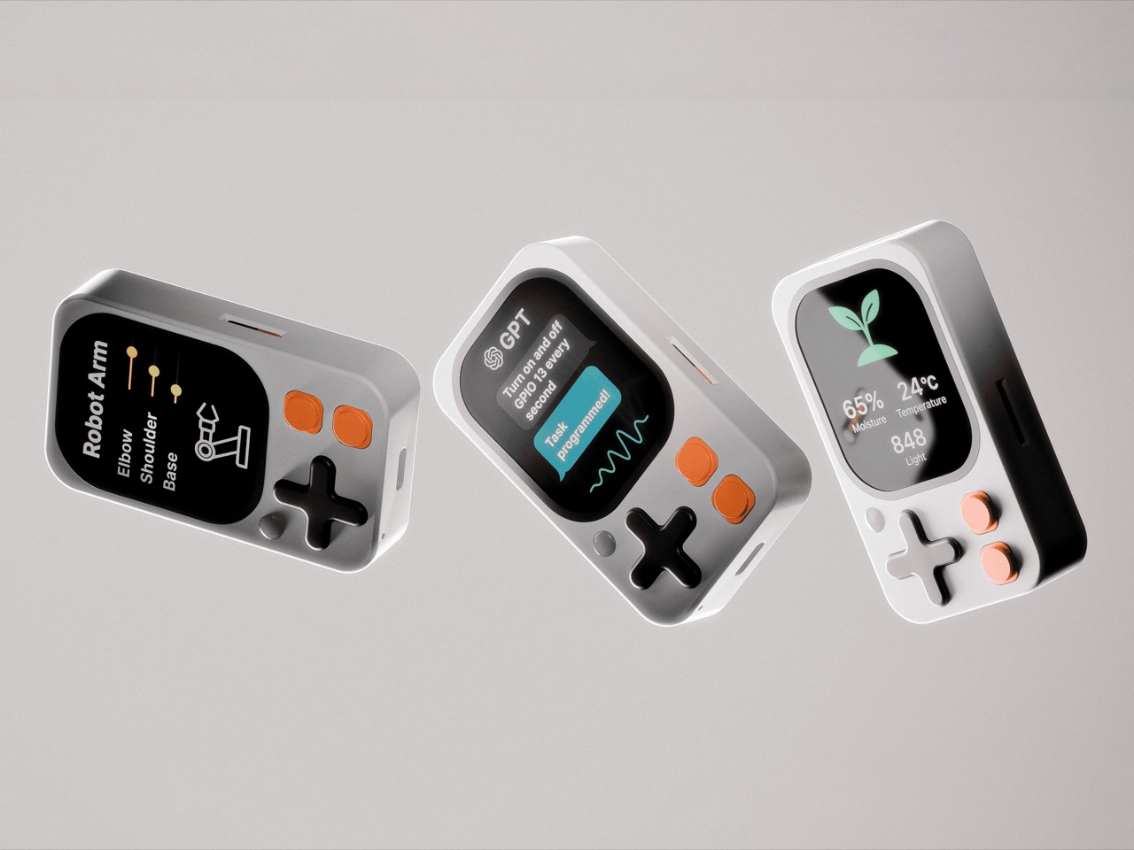
Kode Dot

The Designer’s Instinct Problem and Why Demand Needs Its Own Prototype

The design process and the validation process ask for decisions in different orders, and that difference matters more than it first appears. A designer who arrives at a product through material, form, and function is not naturally thinking about reservation rates. Validation is the design loop pointed at the three things a physical prototype cannot test: what people will pay, how the product should be framed, and who it is really for. Designers already accept this discipline everywhere else; nobody tools up an injection mold without a prototype. A “do not launch” result from this process is a success, saving a creator a year, a production run, and the damage of a public failure. A careful launch protects more than the person running it; it protects the shared resource of backer trust, which every quiet project erodes.

The question worth answering before a launch is not how big a campaign you can build. It is what you can prove before you build it. Whether that discipline becomes standard practice across the crowdfunding ecosystem or remains the habit of the more methodical subset of creators, the underlying argument is one any designer can recognize. You do not ship a mechanism you have not tested. Treating the market as the final untested component, rather than an assumption baked into launch day, is the shift the methodology is asking for. Across hundreds of millions of dollars raised in crowdfunding projects, the cases where testing these three things costs more than getting them wrong are functionally nonexistent.

The post Designers Already Prototype Hardware – Now They’re Prototyping Demand Too first appeared on Yanko Design.
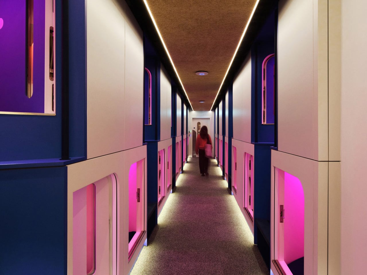
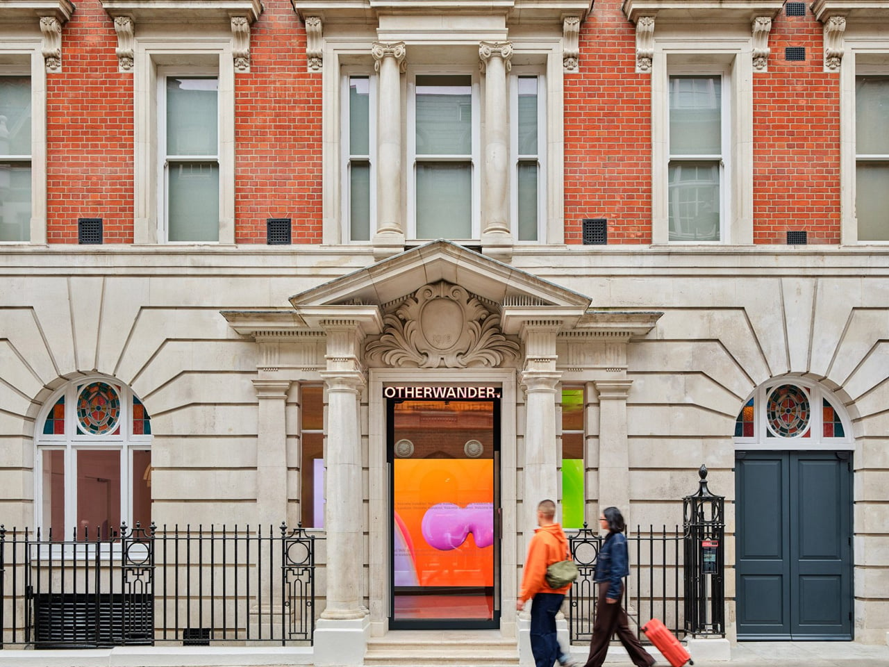
London’s Coolest Capsule Hotel Proves Budget and Beautiful Aren’t Opposites

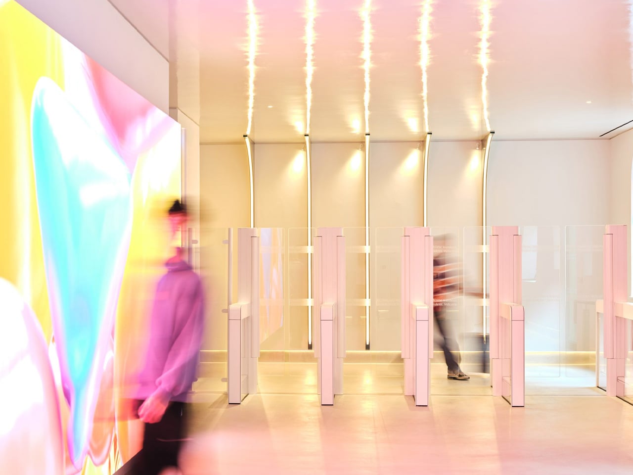
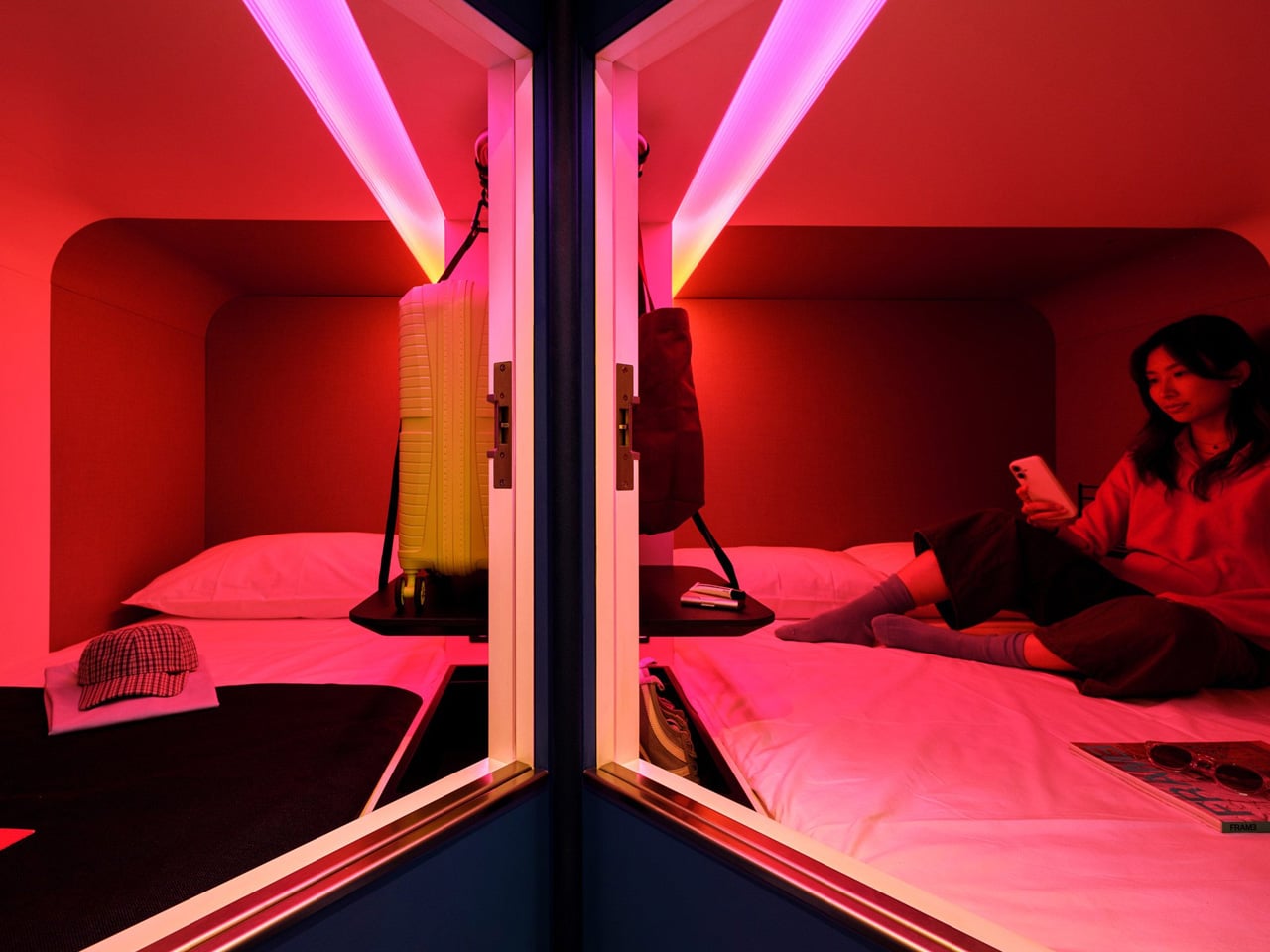
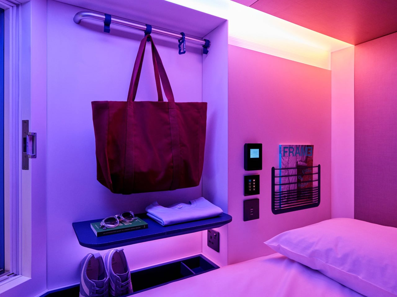
London has a new answer to affordable city-centre stays — and it looks nothing like the hostels that came before it. SODA, the London-based architecture studio, has transformed a former backpacker hostel near Oxford Street into Otherwander Soho, a high-density capsule hotel built around 566 sleeping pods the brand calls “nests.” The result is something closer to a boutique hotel than a budget bed, a place that takes the Japanese capsule typology and reframes it for a generation that refuses to choose between cost and quality.

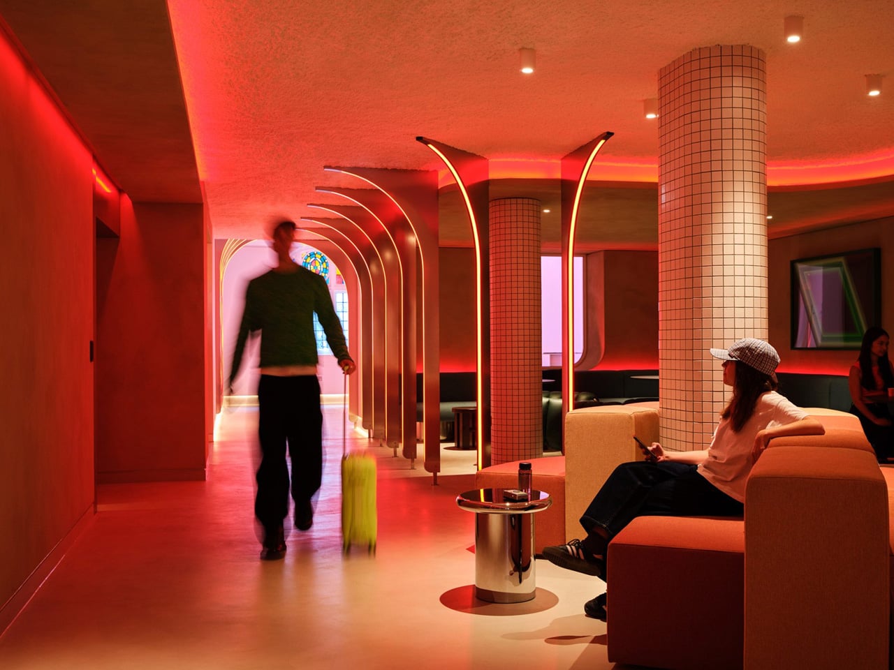
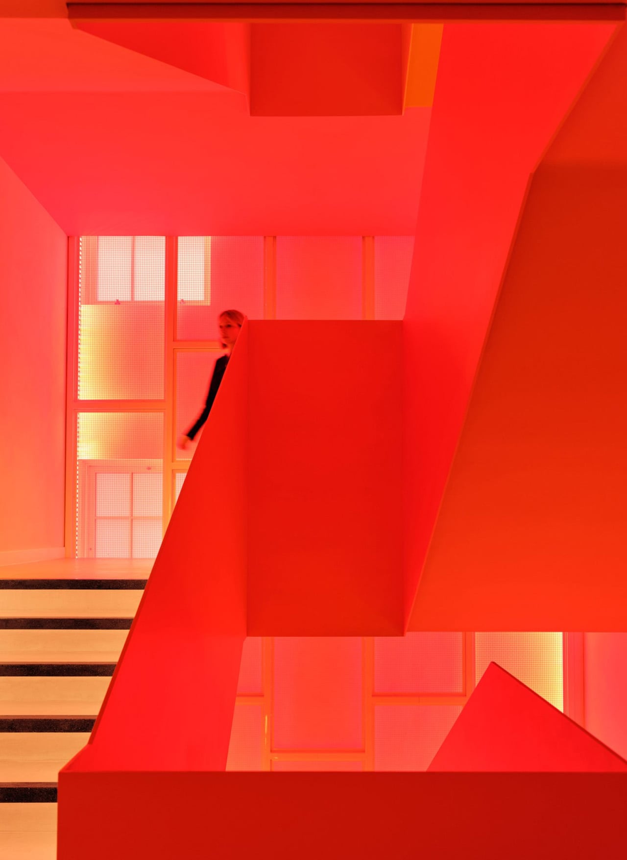
The building itself carries history. Otherwander occupies a pair of early 20th-century structures close to Oxford Street, and SODA’s approach respects that lineage without being precious about it. The facade references the neighbourhood’s material vernacular — hand-laid arched brick details and corbelled window reveals draw from the surrounding Soho streetscape — while the interiors do not attempt to play it safe. Vibrantly coloured social spaces, curved lines, and warm strip lighting push back against the beige neutrality that defines most budget accommodation. A colourful staircase threads the floors together, giving the building a sense of vertical life.

Designer: SODA

SODA director Ryan Holland was clear about the brief from the start. “The aim was to provide affordable, high-density accommodation without compromising the guest experience,” he told Dezeen. The target guest is Gen Z and younger independent travellers — people who are design-literate, location-driven, and unwilling to trade aesthetics for a lower room rate. Each nest is private and soundproofed, with the entire guest journey — check-in, room control, checkout — managed through a phone. It’s a frictionless model designed for people who already live this way.

What SODA gets right here is the balance between compression and comfort. The pods are compact by necessity, but the shared spaces are generous in feeling — designed to do the social heavy lifting that a private nest cannot. It’s a deliberate split: retreat into the pod, expand into the communal. The vibrancy of the common areas makes the smallness of the sleeping space feel intentional rather than compromised.

Capsule hotels have existed at the fringes of Western hospitality for years, mostly as novelty or last resort. Otherwander Soho changes the conversation. Located at 92 Dean Street, it plants itself at the centre of one of London’s most culturally loaded postcodes and dares you to think of it as anything less than a destination. SODA hasn’t just renovated a hostel — they’ve made the case that density and design aren’t opposites.

The post London’s Coolest Capsule Hotel Proves Budget and Beautiful Aren’t Opposites first appeared on Yanko Design.
The 1969 Lamp Nobody Knew They Needed Is Back

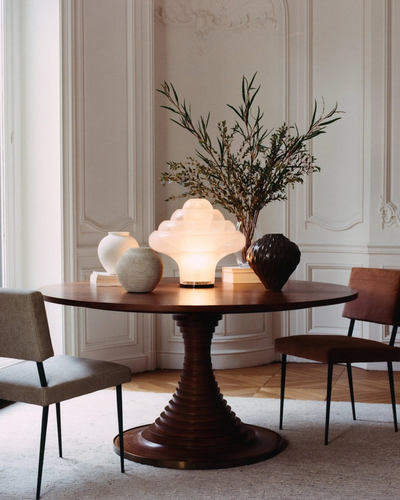
Most statement lighting presents a familiar dilemma. A lamp can give a room personality, but the more attention it demands, the harder it can be to live with everything around it. Furniture starts to feel like a supporting cast. Even the lamp’s glow can seem secondary to its silhouette. Gubi’s reissued Lotus lamp offers a more appealing proposition: a piece with enough presence to change the mood of a room, without making the room feel like a showroom.

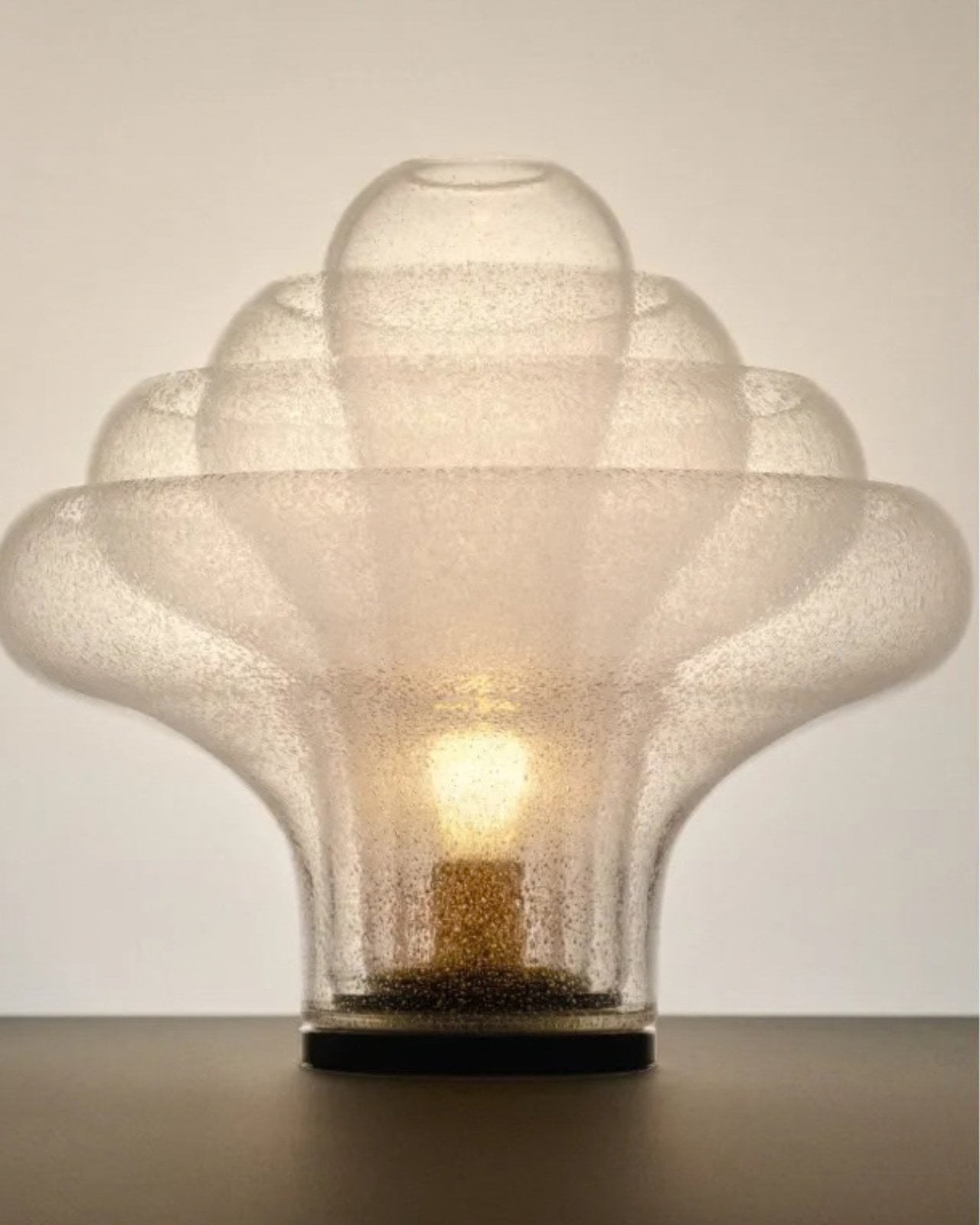
Designed by Carlo Nason in 1969, the Lotus lamp belongs to a period when designers were willing to treat lighting as sculpture. Nason’s fluency with glass is central to its appeal, and Gubi’s reissue brings that idea back into view more than half a century later. It is easy to see why the design has returned now. Plenty of contemporary interiors look polished, yet oddly reluctant to have fun. A lamp with a little imagination can do more for them than another carefully chosen neutral.

Designer: Carlo Nason

What makes Lotus interesting to me is the difference between being distinctive and being loud. Its flower-inspired identity gives you a way into the design, but it does not require an entire room to follow the theme. You can appreciate the botanical reference without surrounding it with curved chairs, patterned wallpaper, and a vase of matching flowers. That restraint matters. The best objects leave space for the lives unfolding around them.

Glass also changes how we read a lamp. A metal shade tends to draw a firm outline; glass has a more elusive presence, especially when light enters the picture. It can feel substantial and delicate at once. Nason built a career around exploring what the material could do, and Lotus carries that curiosity into an everyday object. I like the idea of a lamp that rewards a second look when it is switched off, rather than disappearing until evening.

Of course, reissuing a decades-old design invites a fair question: Are we drawn to the lamp itself, or to the comforting idea of owning a piece of design history? Vintage references can become a shortcut to taste. A recognizable date and designer’s name do some of the work that the object should be doing on its own. Lotus earns more attention when you set that pedigree aside and imagine it in an actual home, beside the books you have not put away and the chair you sit in every night.

That is where its value as a design object becomes clearer. A good lamp changes a space twice: once as an object you notice during the day, and again when you turn it on. The Lotus makes a case for treating those experiences as connected rather than choosing one over the other. It asks to be seen, but the point of bringing a lamp home is still to live with its light.

There is a broader reason this reissue feels timely. So much shopping for the home now happens through images that reward instant impact. A dramatic silhouette can stop a scroll, even if it would be exhausting across the room from your couch. The more useful test is slower. Would you want to see it on a rainy Tuesday? Would it still hold your attention once you stopped photographing it? Lotus strikes me as the kind of design that could pass both tests.

It also offers an alternative to the notion that a room has to speak in one consistent style. An older Italian design can sit comfortably among newer pieces if you let it be a point of contrast rather than the start of a complete makeover. That is a more personal approach to decorating. Most homes accumulate meaning over time, through choices made for different reasons and at different moments.

Gubi did not need to invent a new kind of lamp to make lighting feel fresh. Reintroducing Nason’s 1969 design is a reminder that an object can have a strong point of view without turning the rest of your home into a backdrop. For anyone caught between the sensible lamp and the memorable one, Lotus makes a persuasive argument for wanting both.

The post The 1969 Lamp Nobody Knew They Needed Is Back first appeared on Yanko Design.

Nobody Expected a Dumpster to Be the Coolest Bag

Anyone who has seen me carry my huge tote bag probably wonders how I can find anything inside it. To be honest, it takes me a few seconds, and sometimes even a few minutes, to dig through the seemingly bottomless pit. The bag is deep, and I tend to carry a lot of stuff. Sure, bag organizers are available, but when I am in a hurry, it is easier to toss everything inside and sort through it later. You could say I sometimes go dumpster diving in my own bag when I need to find something.

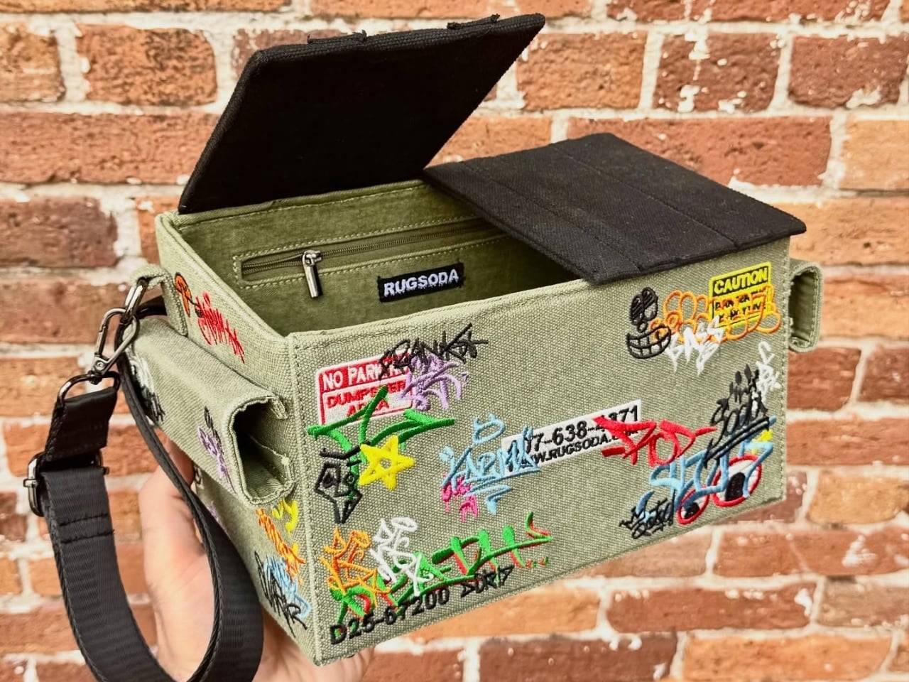
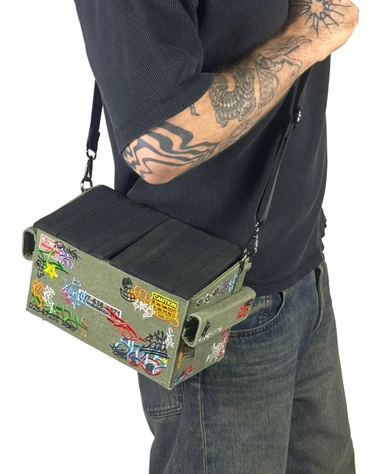
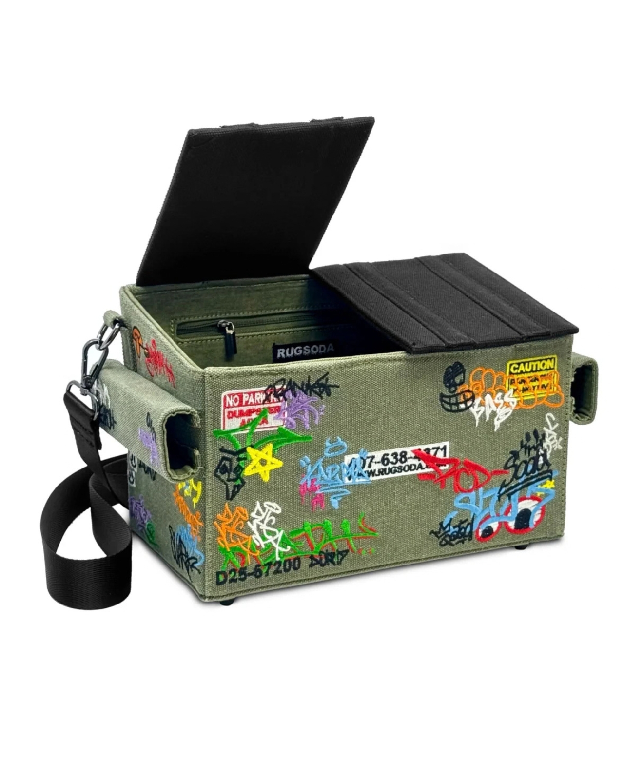
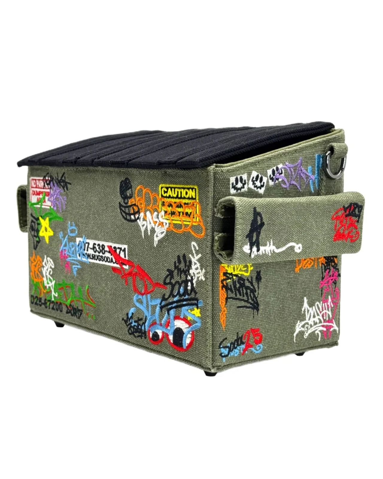
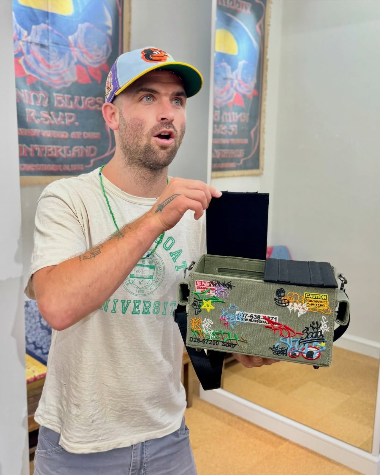
Rugsoda takes that idea literally with its unusual Dumpster Bag. The canvas shoulder bag is shaped like a miniature commercial dumpster, the kind you might see behind a restaurant, apartment building, or other business. Instead of holding garbage, however, it is designed to carry your everyday essentials. Its squared-off shape gives it a more structured appearance than a typical tote bag, while its relatively compact size makes it easier to search for your phone, wallet, keys, or other small items.

Designer: Rugsoda

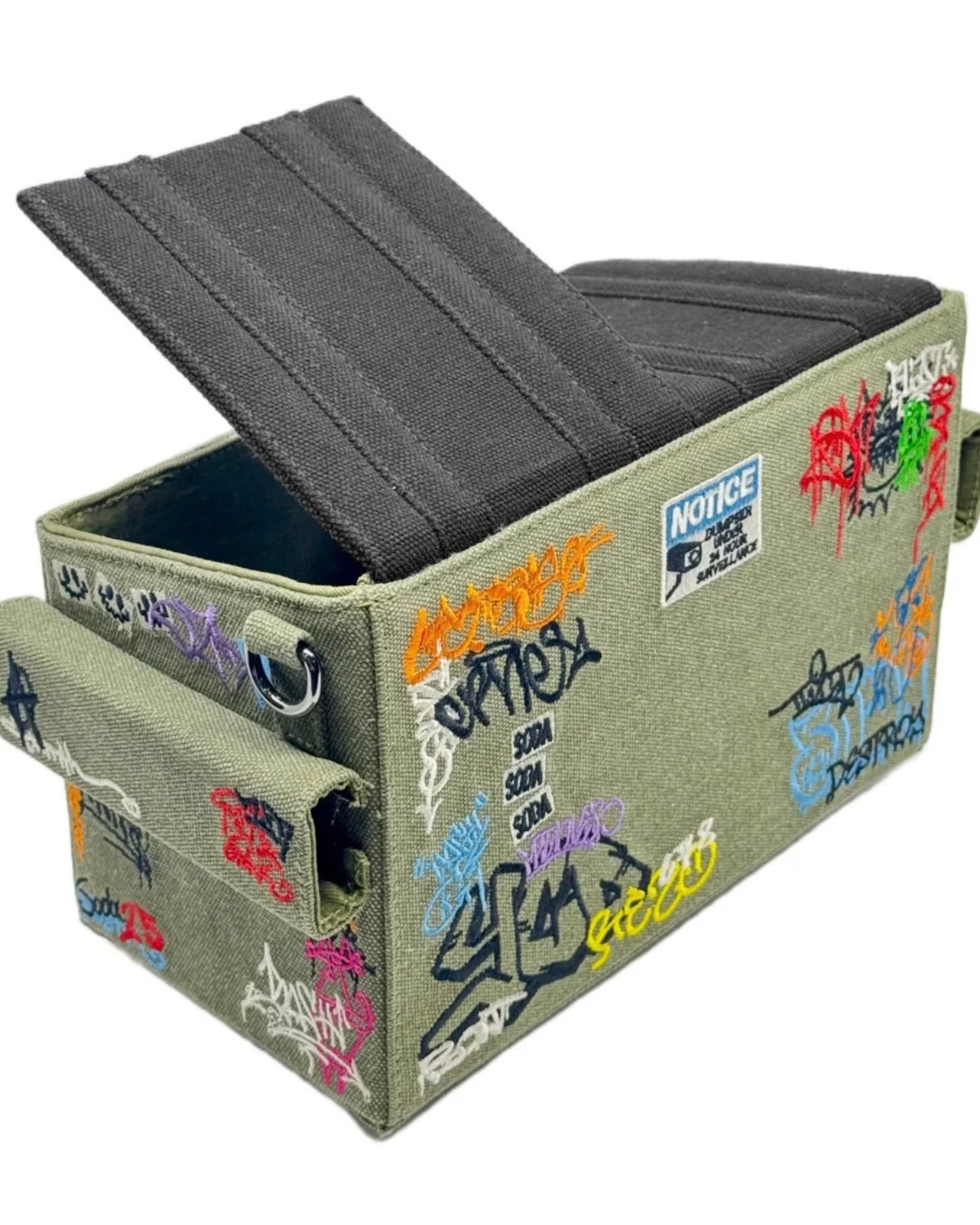
The Dumpster Bag is indeed designed for everyday use, but it also functions as a fashionable and sculptural conversation piece. Its recognizable three-dimensional form transforms an object associated with clutter, waste, and urban back alleys into a wearable accessory. The design is especially eye-catching because it does not simply feature a printed dumpster graphic. The entire bag is constructed to resemble one, complete with flip-up lids, a boxy profile, and urban-inspired embroidered graffiti.

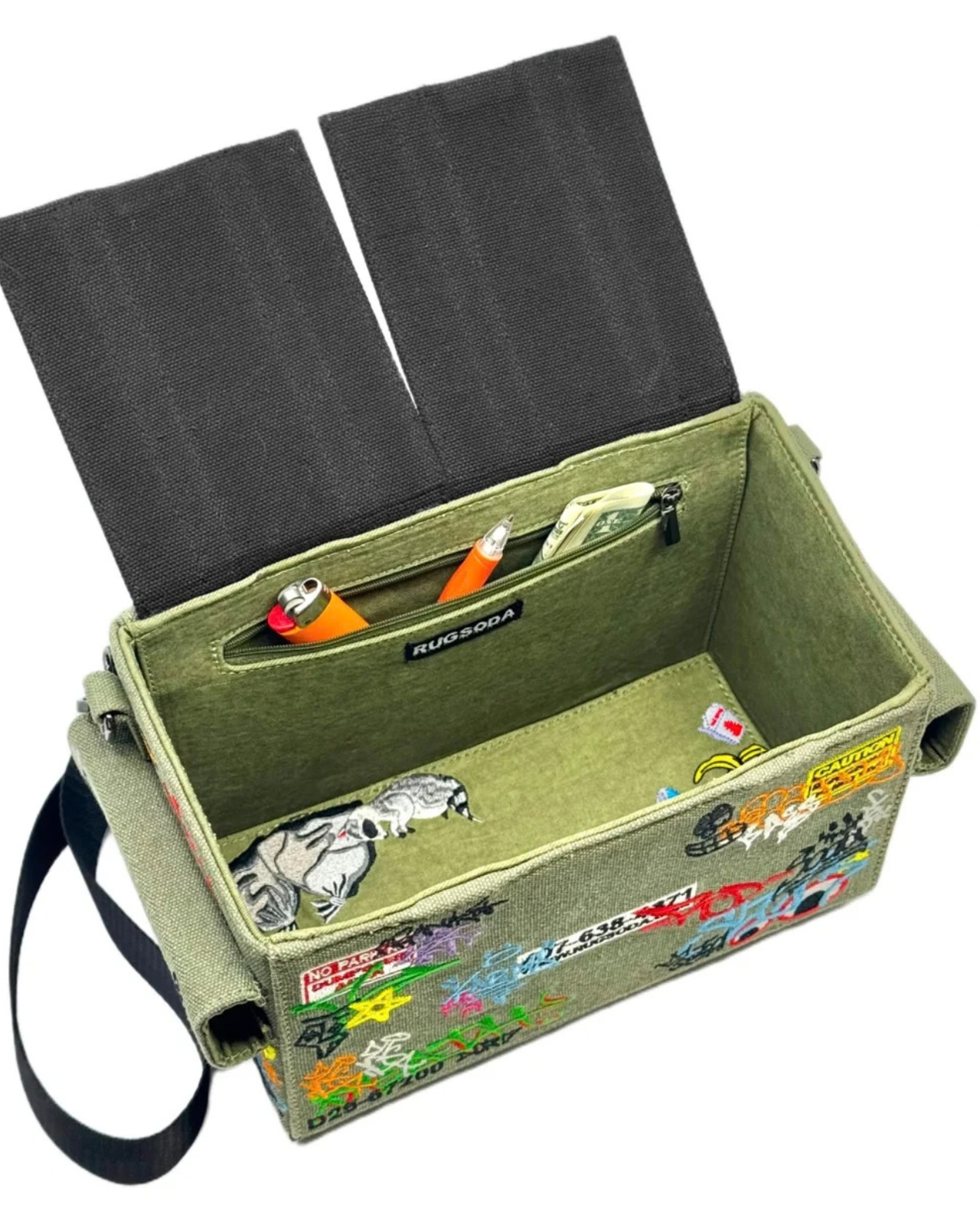
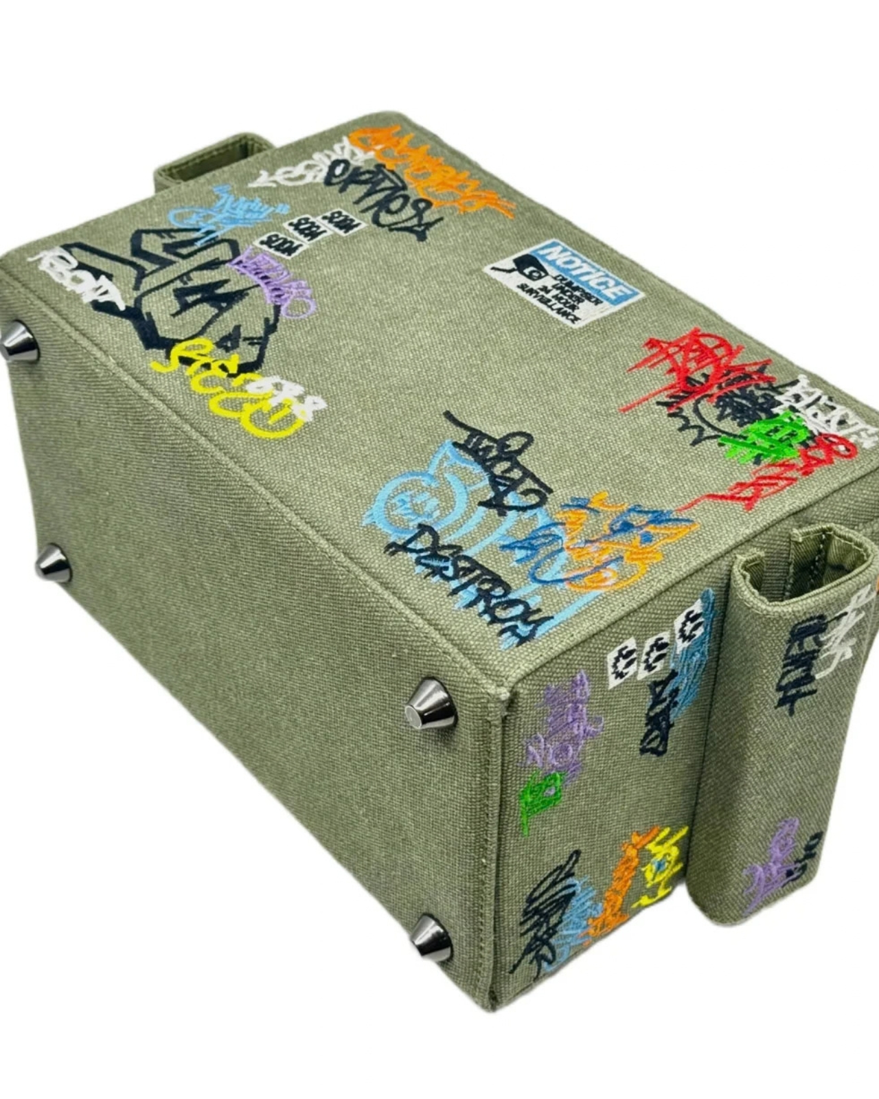
That graffiti treatment gives the bag a street-art sensibility and connects it to the real-world objects that inspired it. It also adds texture and visual interest to the canvas surface. The embroidery helps the design feel more like a crafted art piece than a novelty costume accessory, while the dumpster shape keeps its sense of humor intact. The flip-up lids feature magnetic closures that help keep your belongings secure while reinforcing the dumpster illusion. The magnetic fastening also allows for quick access when you need to reach inside. An adjustable shoulder strap gives you the option of carrying the bag over one shoulder or across your body, depending on how you want to wear it.

Several smaller details make the design even more enjoyable. Inside the bag, an embroidered raccoon serves as a hidden surprise, referencing the animals often associated with rummaging through trash. The bottom studs are more than decorative accents, too. They help keep the canvas base slightly elevated when you place the bag on a flat surface, which can reduce direct contact between the bottom of the bag and the ground.

Although the Dumpster Bag has a firm, boxy silhouette, its canvas construction gives it a softer, more tactile quality. The material keeps the bag from feeling like a rigid plastic container and contributes to its casual, handmade character. The canvas may also allow the shape to relax or lose some structure if the bag is heavily loaded, so it is better suited to everyday essentials than to carrying a large amount of gear.

Measuring 12 by 7 by 6 inches, the bag is compact enough for daily use while offering more room than a tiny evening bag. That size should accommodate items such as a smartphone, wallet, keys, sunglasses, cosmetics, and other small necessities. It is not intended to replace a roomy tote or a practical work bag, but it can be a useful alternative for people who want to carry less without sacrificing personality.

Rugsoda’s Dumpster Bag is also part of a broader design approach that turns familiar objects into functional textile pieces. The designer has created other bags inspired by playful, everyday forms, including dice and spray-paint cans. In each case, the object’s identity is preserved through its shape rather than reduced to a surface pattern.

Dumpsters are not usually considered glamorous objects, which is precisely what makes this bag such an entertaining fashion statement. It takes something associated with waste and gives it a new purpose as a wearable accessory. The result is a bag that offers practical storage, a memorable silhouette, and plenty of opportunities for conversation. For anyone tired of carrying a shapeless tote or looking for an accessory that does more than blend into an outfit, the Dumpster Bag offers a literal alternative to the usual carryall.

The post Nobody Expected a Dumpster to Be the Coolest Bag first appeared on Yanko Design.