BIG Wraps Dymak’s Headquarters in Solar-Powered Timber

BIG’s new headquarters for Danish material supplier Dymak turns environmental performance into architecture. Rather than treating sustainability as a technical layer hidden within the building, the studio makes it central to the project’s form, materiality and identity.

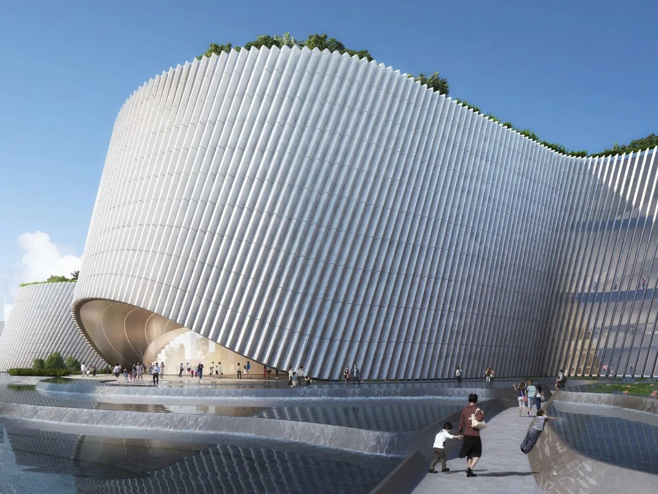
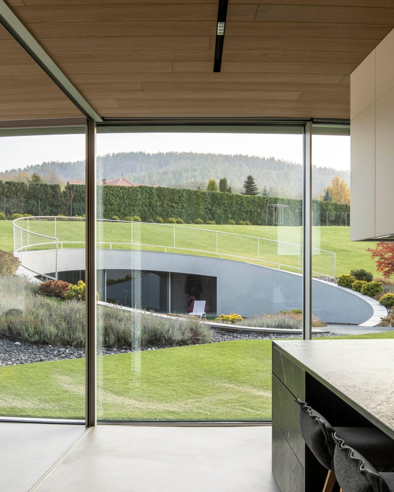
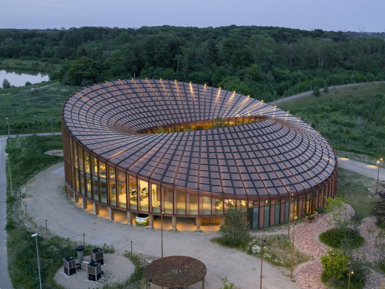
Located beside Glisholm Lake in Odense, Denmark, the 2,800-square-metre headquarters is organised as a circular mass-timber structure around an open-air courtyard. Above it, an undulating roof rises and falls across the building, creating a form that recalls a Möbius strip. The result is sculptural and highly recognisable, but it is also shaped by practical concerns.

Designer: BIG
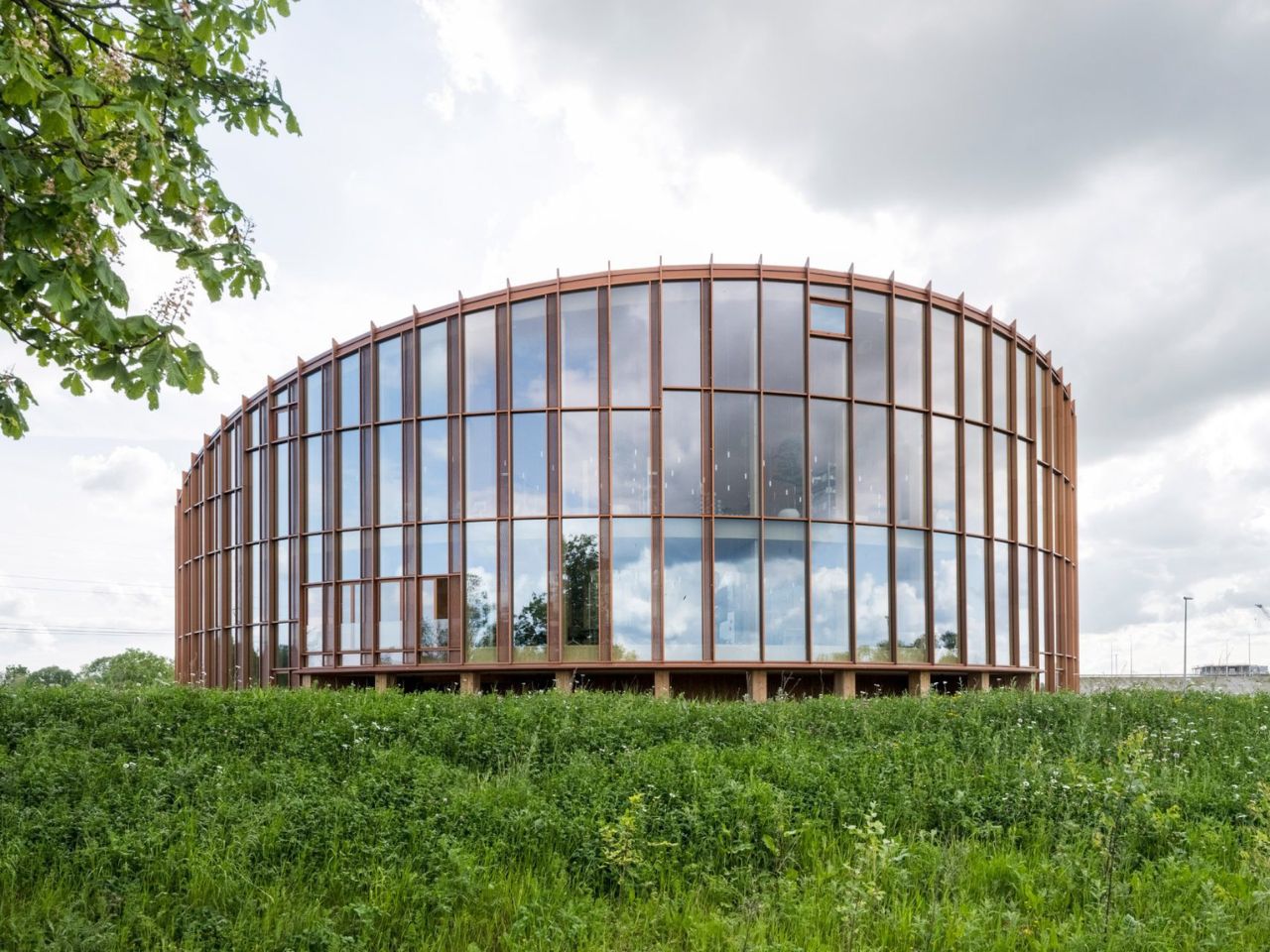
The roof rises towards the north to open views of the lake and surrounding forest, while sloping towards the south to provide shade and reduce solar heat gain. Its surface is covered with 880 custom-shaped photovoltaic panels, turning the roof into both an energy-producing system and the building’s main visual feature.

This combination of performance and spectacle is characteristic of BIG. The studio often transforms practical constraints into clear architectural gestures, and the Dymak headquarters follows the same approach. Solar orientation, shading and landscape views are not treated as separate problems. Instead, they are brought together within one continuous form.

The project also functions as a full-scale showcase for Dymak’s material portfolio. Mass timber forms the primary structure, while clay, cork, eelgrass and recycled paper fibres are used throughout the building. These materials are not displayed as isolated samples. They appear across the floors, ceilings, walls and structural elements, allowing visitors to experience them through texture, sound and scale.
BIG describes the building as a “living catalogue”, and the phrase captures its dual role. It is both a workplace and a demonstration of what Dymak’s materials can achieve. The architecture becomes part of the company’s identity, communicating ideas of craftsmanship, sustainability and material innovation.

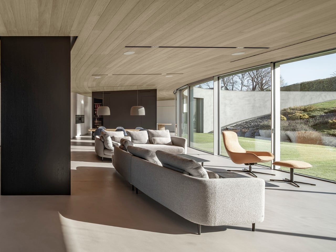
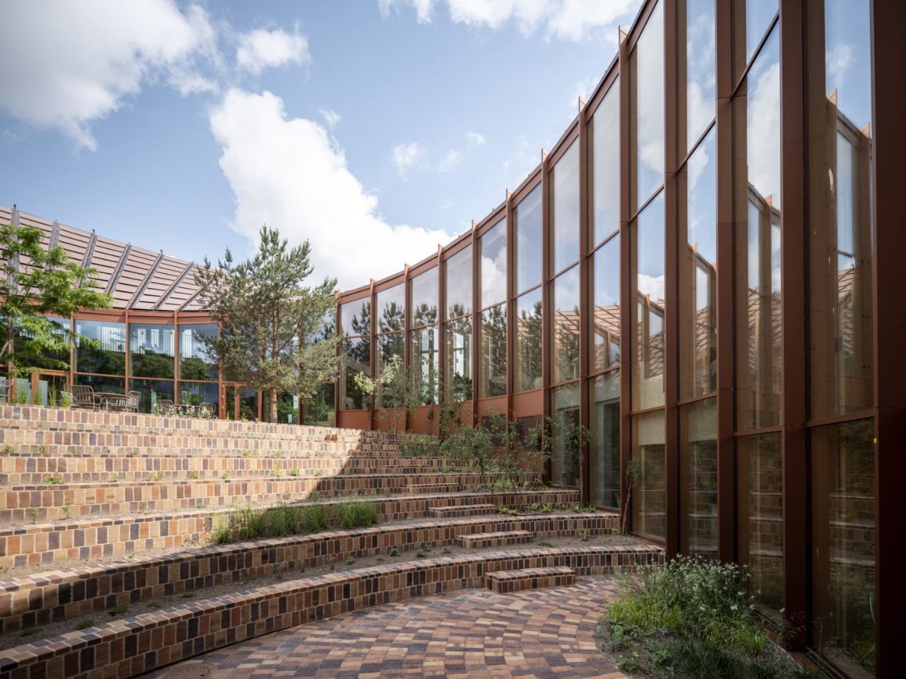
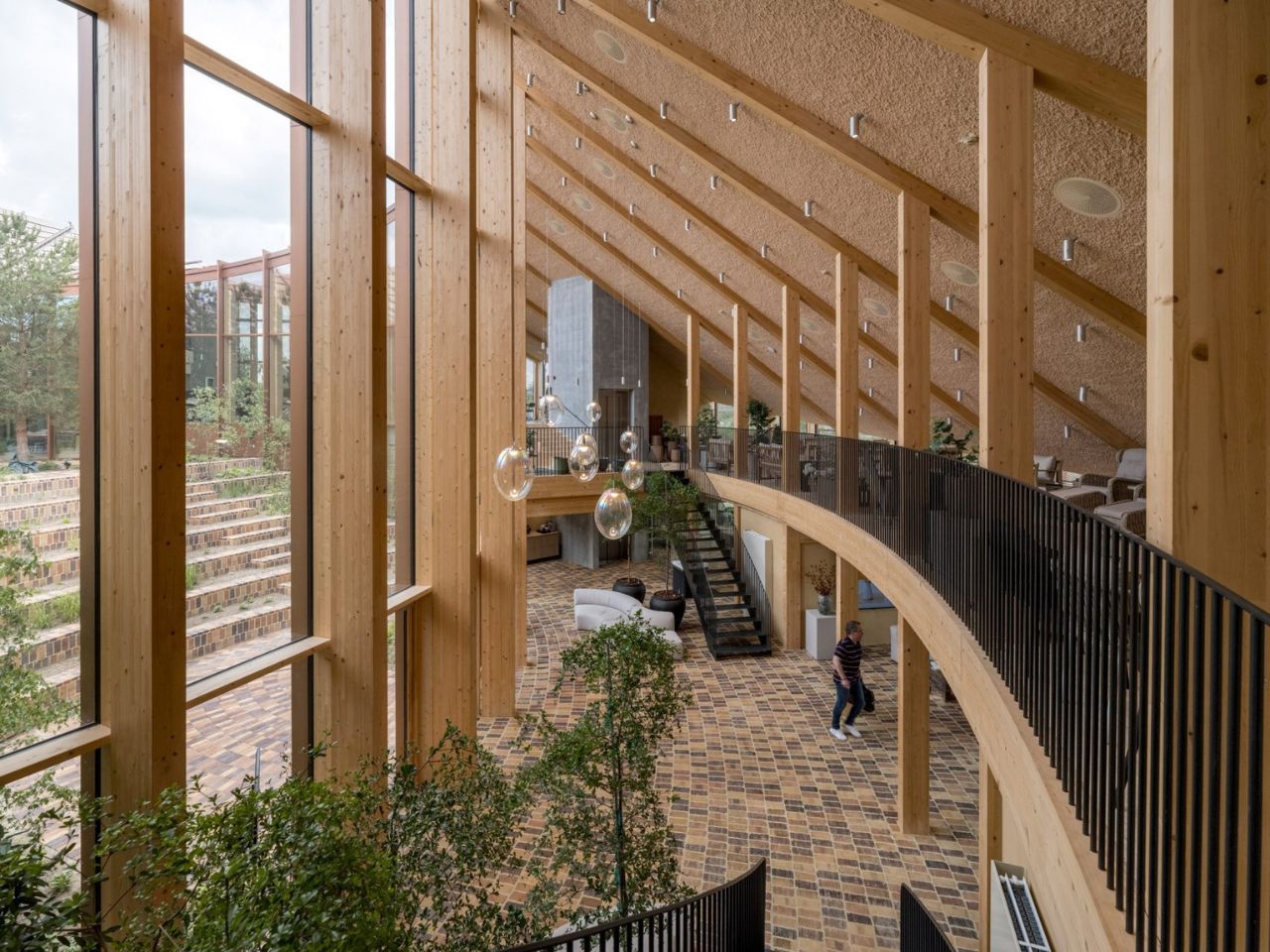
This gives the headquarters a warmer atmosphere than the polished glass-and-steel language commonly associated with corporate buildings. Timber remains visible, brick-tiled flooring extends across interior and exterior spaces, and natural fibres soften the ceilings. The materials create a sense of tactility that reinforces the company’s focus while making the workplace feel less formal.

At the same time, the building clearly operates as a branding tool. Its solar roof, natural finishes and landscaped spaces present Dymak as environmentally responsible and forward-looking. Sustainability is not simply part of the building’s performance; it becomes part of the company’s public image.
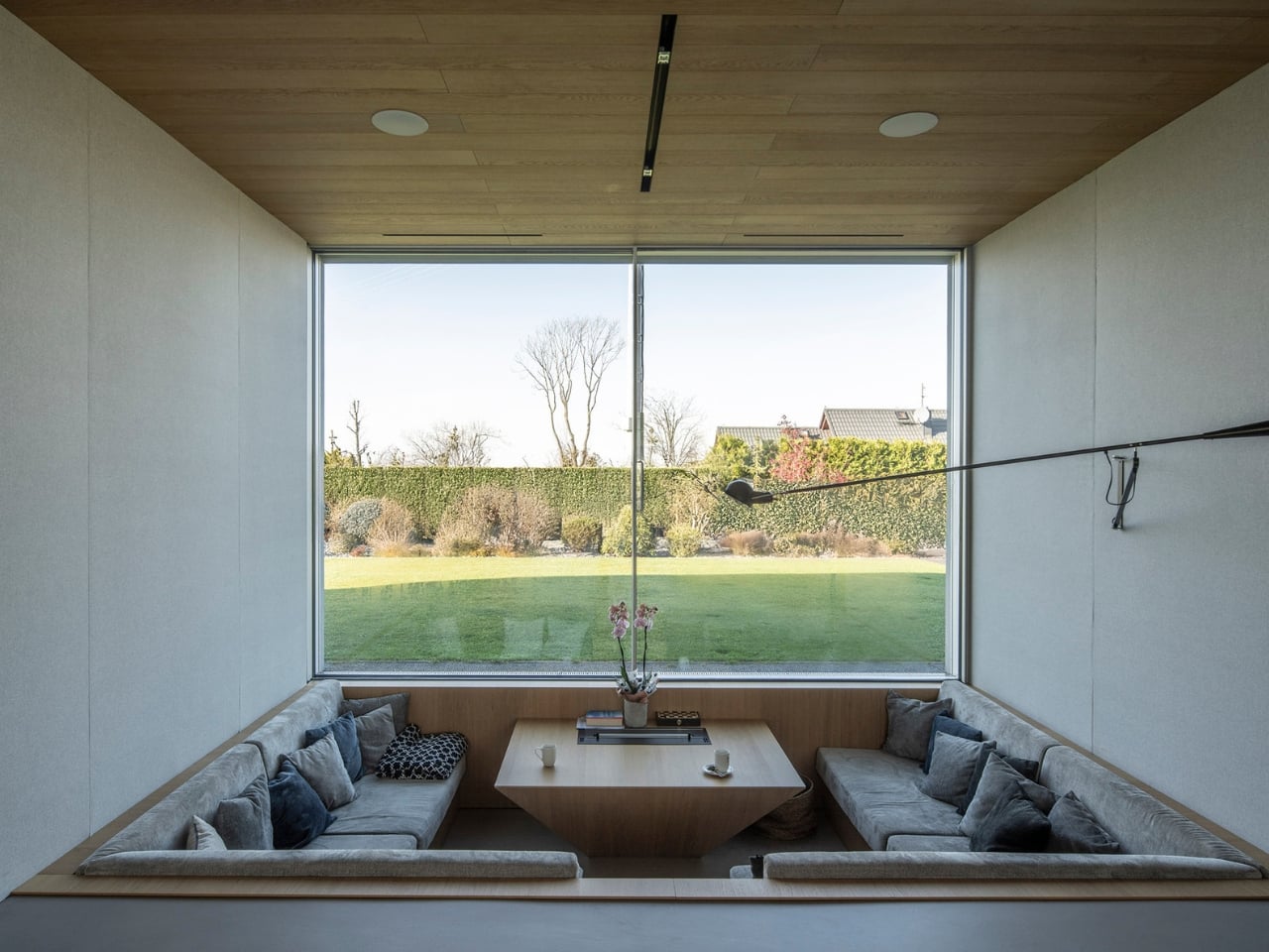
At the centre of the circular plan is a landscaped courtyard conceived as a green amphitheatre. Planted terraces and stepped seating create space for informal meetings, gatherings and moments of rest. The courtyard is surrounded by glazing, allowing daylight and vegetation to remain visible from the surrounding interiors.

Unlike the dramatic roof, the courtyard does not rely on a strong visual metaphor. Its value is more direct. It creates a protected outdoor space, brings nature into the workplace and offers an alternative to desks and enclosed meeting rooms. Brick flooring continues across the threshold, reducing the distinction between inside and outside and making the garden feel like an extension of the office.

The ground floor contains a showroom, photo studio and fitness facilities, while the upper level includes open-plan workspaces, meeting rooms and lounge areas. A mezzanine connects the two floors, and the circular layout creates a continuous route around the courtyard.
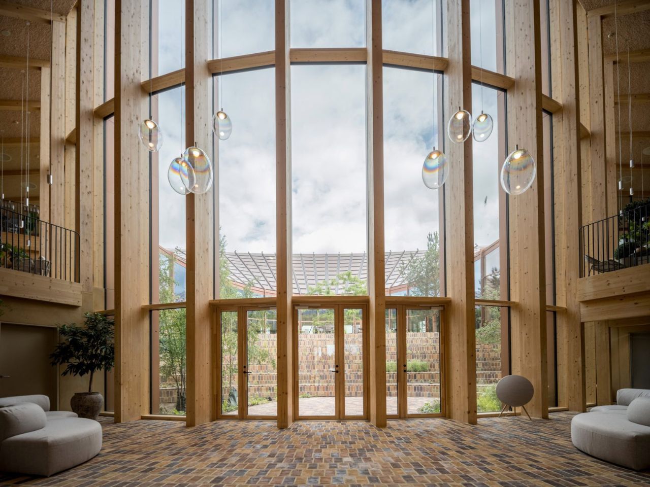
The headquarters succeeds most when its sustainable ideas are experienced rather than simply announced. The warmth of timber, the shaded interiors, the continuity of the brick flooring and the presence of landscape all influence how the building feels in everyday use.

Still, the roof is likely to dominate how the project is remembered. Its Möbius-strip form is visually striking and easy to communicate, but it risks overshadowing the building’s quieter achievements. The use of low-carbon and bio-based materials, the creation of shared social spaces and the careful relationship with the surrounding landscape may ultimately be more significant than the headline image.
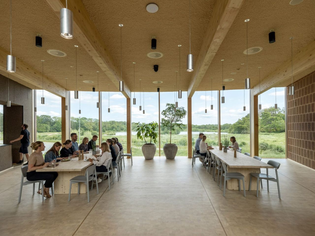
The project is not a universal model for office design. Its custom roof, circular plan and carefully selected materials make it highly specific to Dymak. Yet this specificity is also what makes it persuasive. By presenting timber, clay, eelgrass and recycled fibres within a polished corporate environment, the headquarters shows that low-carbon materials can support both technical performance and architectural ambition.

BIG’s Dymak headquarters does not attempt to disappear into the Danish landscape. It performs, advertises and turns sustainability into a statement. Its strength lies in showing that environmental responsibility can shape not only how a building performs, but also how it looks, feels and represents the organisation within it.

The post BIG Wraps Dymak’s Headquarters in Solar-Powered Timber first appeared on Yanko Design.
This 1970s Japanese Home Tore Out Every Wall and Came Back Better Than Ever

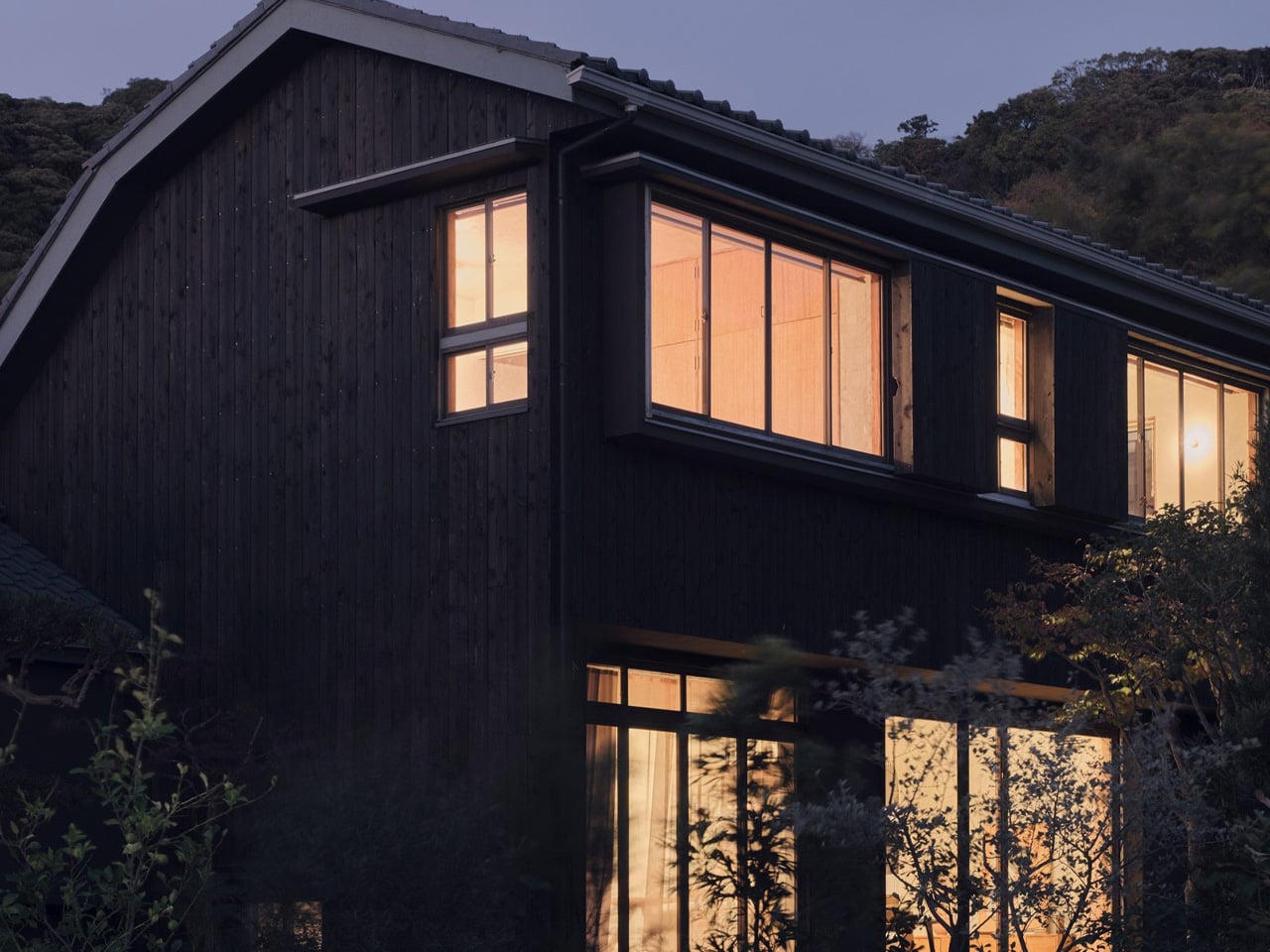
Renovation is harder than building from scratch. You inherit someone else’s decisions — structural, spatial, aesthetic — and you’re asked to make them feel new without erasing what made them worth saving. Studio HYAN understood that with the Green Sandwich House, a 1970s home in Hayama, south of Tokyo, renovated for the studio’s own founders: architect Anna Naganuma and designer Shohei Hasegawa.

The starting point, as Hasegawa puts it, was inheritance rather than demolition. “Preserving a 1970s house wasn’t the goal in itself; we wanted to read the potential of the existing frame and update it for how we live today.” That clarity of intent matters. A lot of renovations get lost between nostalgia and novelty. This one knew exactly what it was doing.

Designer: Studio HYAN

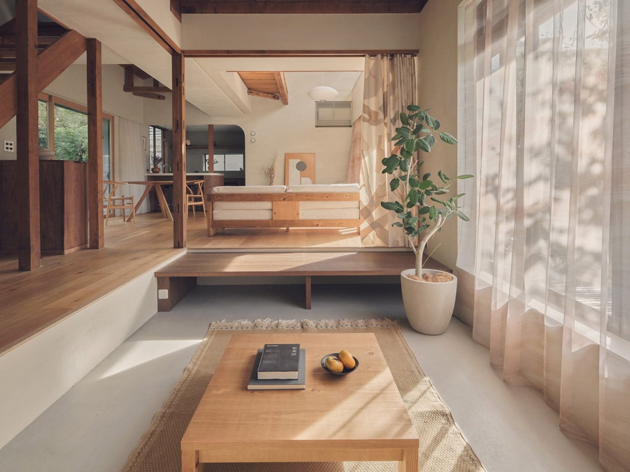
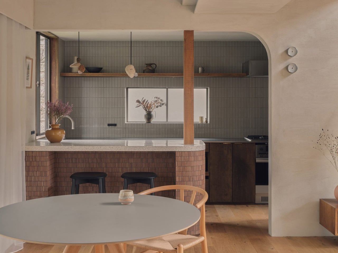
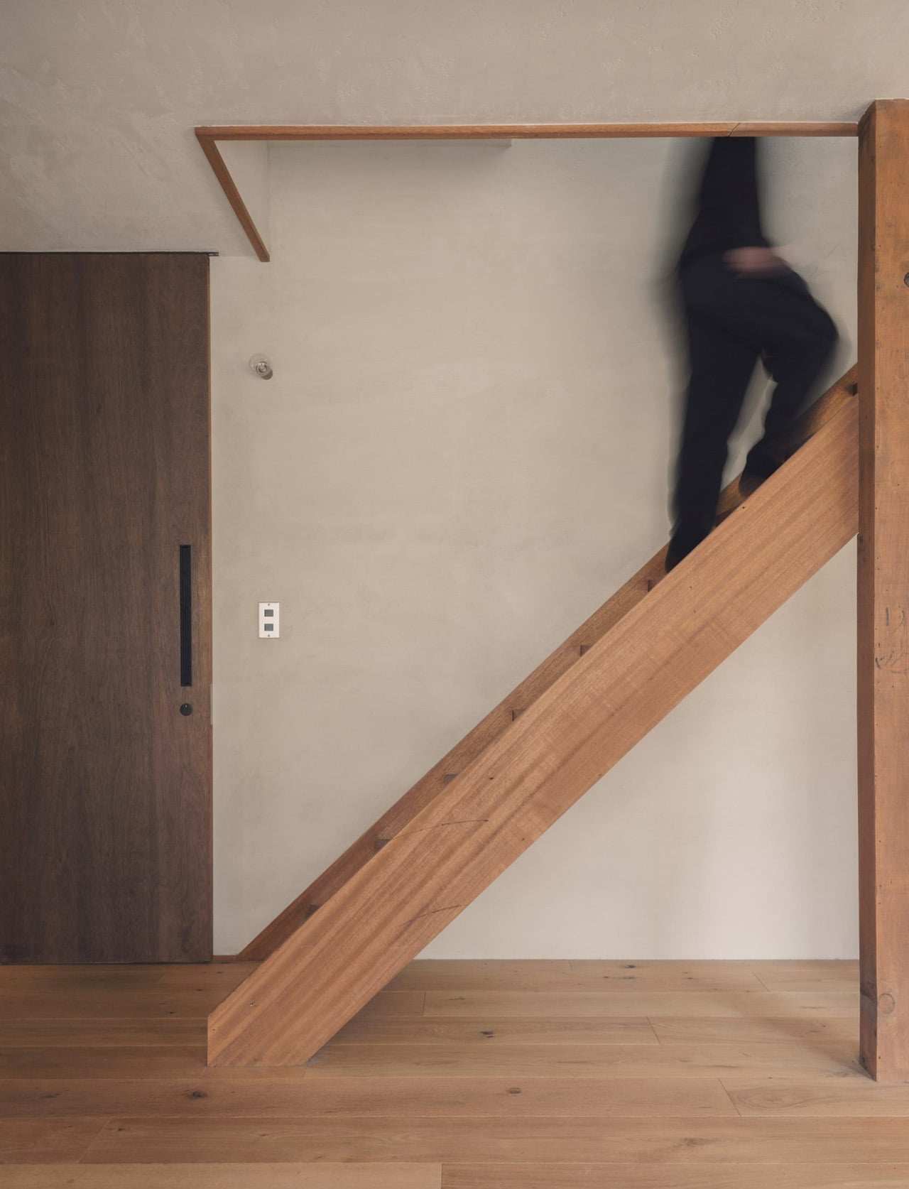
The home required significant structural reinforcement to meet modern seismic codes — a constraint HYAN turned into an opportunity. Rather than hiding the work, they built around it. The retained timber columns and roof beams are left exposed throughout, quietly tracing where the old partition walls once stood. The structure becomes the architecture. Almost every internal partition on the ground floor was removed, replaced by a single, flowing living, dining, and kitchen space where zoning is handled through changes in floor level and ceiling height rather than walls.

The living area occupies a double-height volume beside the kitchen and dining zone, while the floor steps down slightly to form a lounge with a daybed nook, closed off when needed by patterned curtains. It’s a spatial move that feels considered rather than open-plan for its own sake. Work, daily life, hosting — everything overlaps naturally, the way it actually does in a home people live in fully.

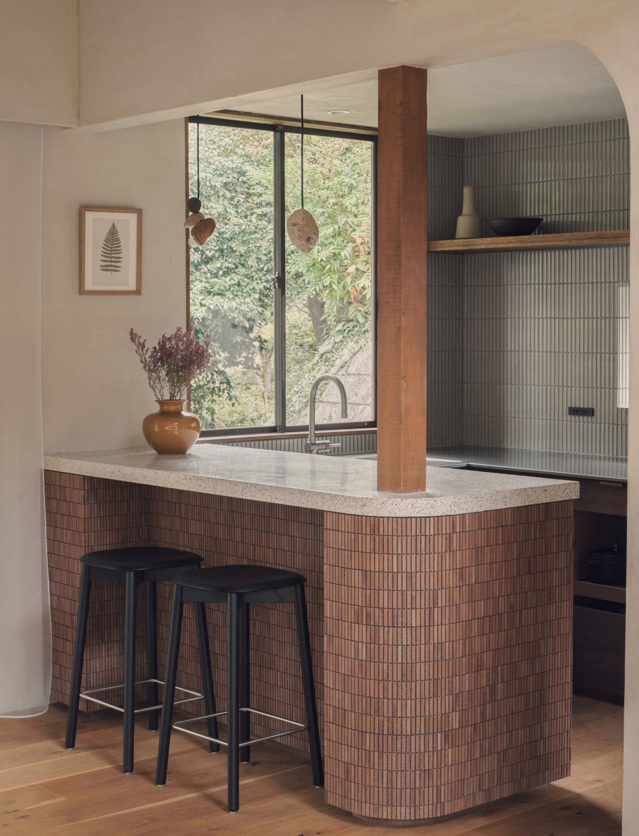
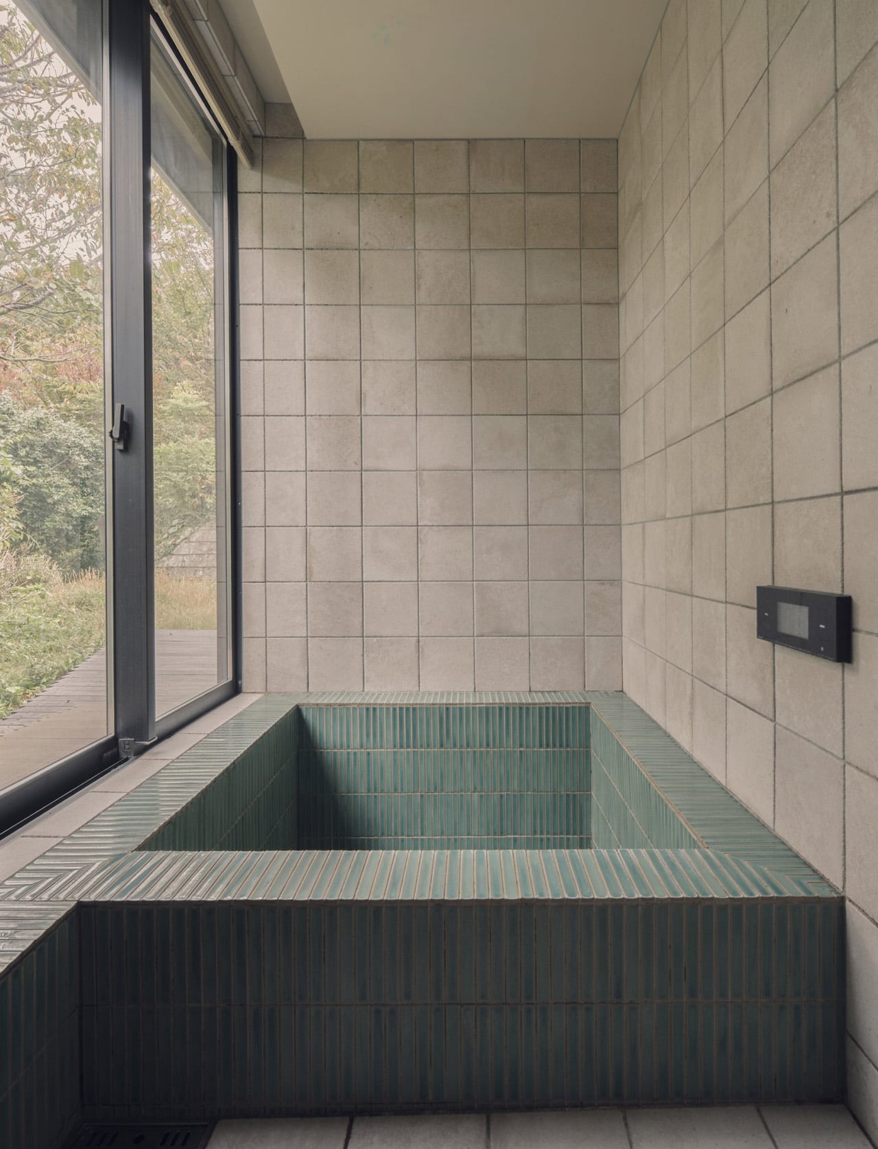
Materials carry the warmth the bare frame alone couldn’t. Pale plastered walls, timber floors, coloured tiles and terrazzo in the kitchen and bathroom — a restrained palette chosen for how surfaces catch light through the large windows and surrounding trees rather than for how they photograph. The wooded hills of Hayama are present throughout the day in the way the light shifts across those surfaces, tying the interior to the landscape without a single piece of statement furniture doing the heavy lifting.

Upstairs, the more private rooms — bedrooms, a study overlooking the double-height living space below — step back from the openness of the ground floor without feeling disconnected from it. Hasegawa describes the house not as a finished work but as one that grows with daily life. For a home this attuned to how its spaces breathe and change with the seasons, that feels exactly right.

The post This 1970s Japanese Home Tore Out Every Wall and Came Back Better Than Ever first appeared on Yanko Design.
A Natural History Museum That Actually Looks Like Nature

Museums have a reputation problem. For decades, they’ve been temples of quiet reverence: boxy, imposing, slightly intimidating buildings that seem to announce, before you’ve even walked through the door, that you should already be taking notes. So when a museum opens that genuinely looks like the Earth just pushed it out of the ground, it’s worth paying attention.

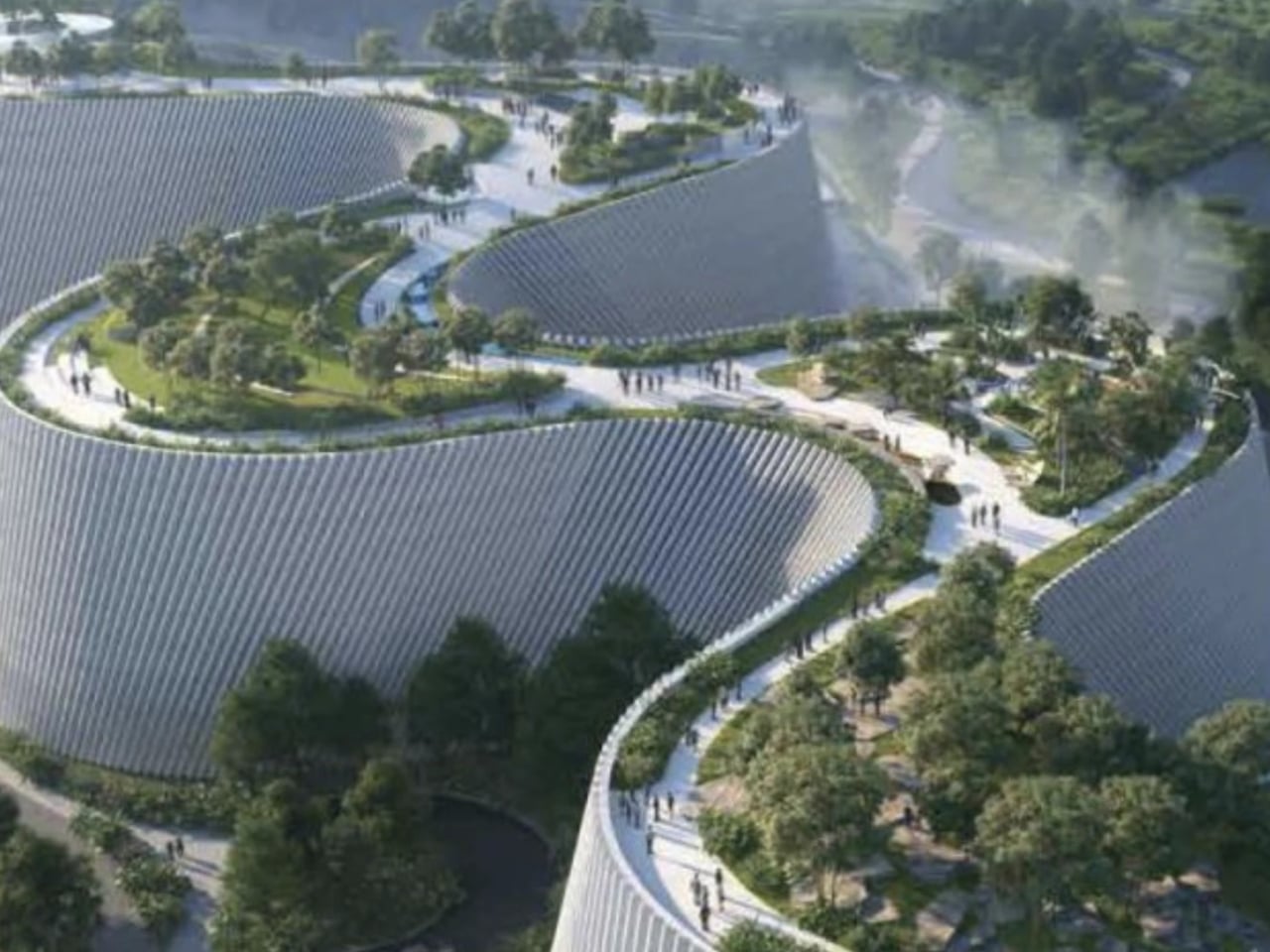
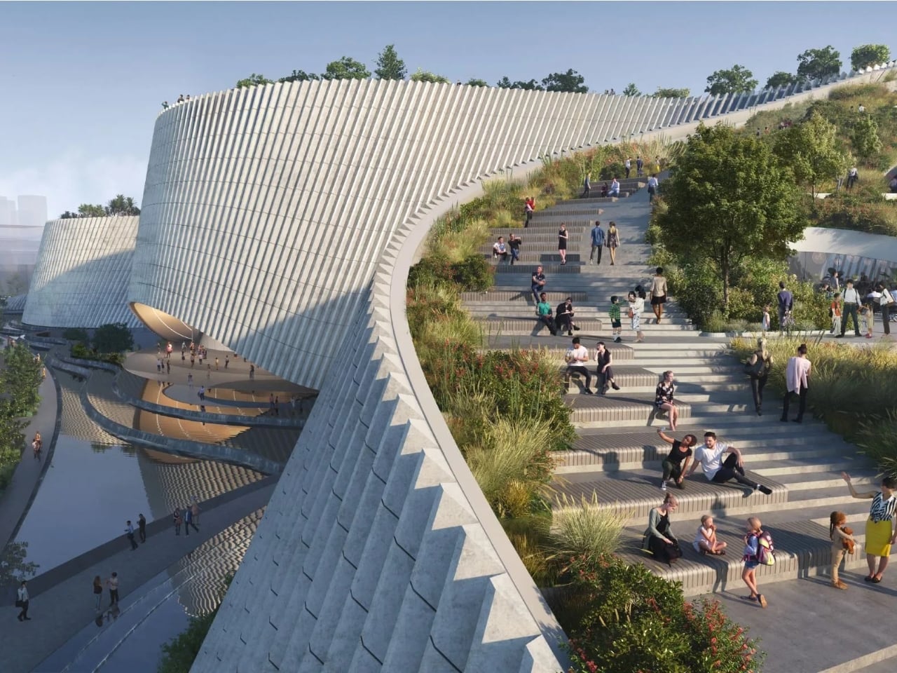
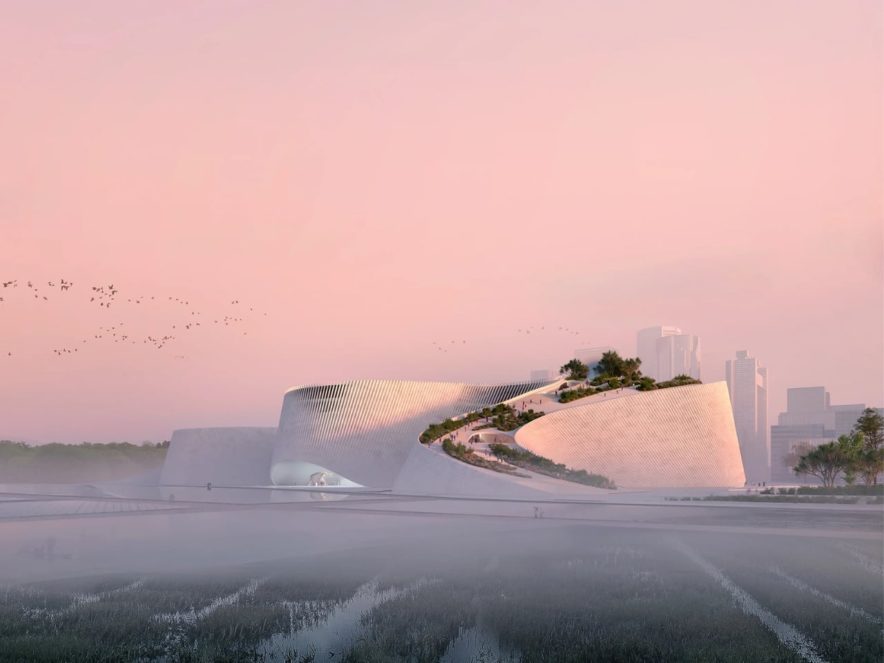
The Shenzhen Natural History Museum officially opened on July 28, 2026, in the Pingshan District of Shenzhen, China, and from the very first image you see of it, you understand that something fundamentally different was intended here. Designed by a consortium of 3XN, B+H Architects, and Zhubo Design, the 105,300-square-meter complex sits beside Yanzi Lake and rises in a series of fluid, granite-clad forms that look less like architecture and more like an ancient geological formation that was always meant to be there. That’s not an accident.

Designers: 3XN with B+H Architects and Zhubo Design

“Nothing in nature is square,” said 3XN founder Kim Herforth Nielsen. “Nature is amorphous, dynamic, and always in formation. From the beginning, the ambition was to create not a building, but a piece of landscape that had always been there, shaped by local geology, water and time.” That quote does a lot of heavy lifting, and the building earns it.

The design process was genuinely collaborative in a way that large-scale architecture rarely manages. 3XN led the concept design. B+H Architects handled project delivery, landscape, and interior expertise. Zhubo Design brought the local technical knowledge that a project of this scale in China absolutely requires. Construction began in March 2022 and wrapped up four years later. For a building that looks like a mountain range and functions like a public park, a museum, and a walking route all at once, that timeline is actually impressive.

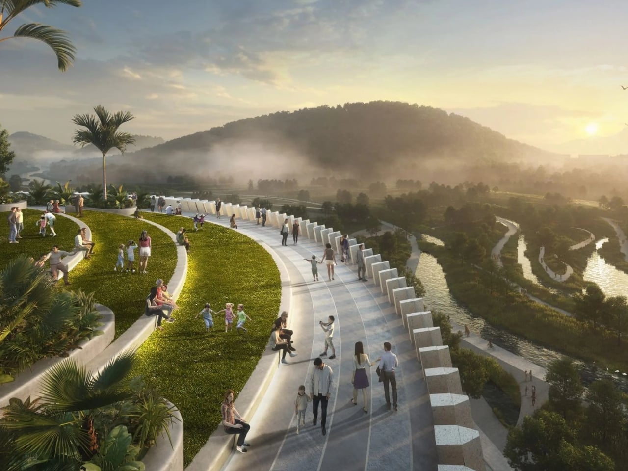
And yes, it functions like all three of those things simultaneously. The roof is walkable. The grounds are public. The building isn’t sitting behind a fence waiting for you to purchase a ticket before you’re allowed anywhere near it. It opens itself to the city, which feels like a deliberate philosophical statement about who science and natural history actually belong to. I appreciate that enormously. Too many cultural institutions operate like exclusive clubs dressed up as public spaces.

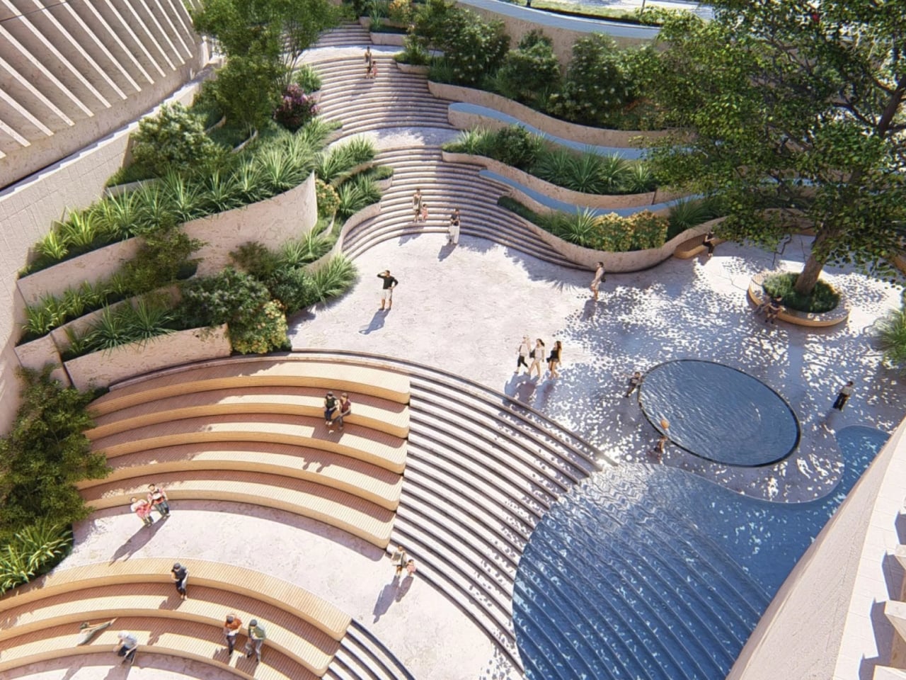
Inside, the experience continues the logic of the exterior. The exhibitions were developed with Atelier Brückner and Museum Studio, and the approach integrates the scenography directly with the architecture. Displays curve along the walls, rising through cone-shaped gallery spaces. Cinematic projections and immersive light installations make the galleries feel like environments you move through rather than rooms you stand politely in. If the outside of the building asks you to rethink what architecture looks like, the inside asks you to rethink what a museum visit feels like.

I’ll be transparent: I’ve seen the images, not the building. And images of architecture, especially this kind, are always a bit of a seduction. Photographs flatten and idealize. The real test of a building like this is whether it holds up over time, whether the crowds and the heat and the ordinary chaos of a functioning public institution diminish what feels, right now, like something genuinely extraordinary. That’s a fair question to hold.

But even accounting for that skepticism, the Shenzhen Natural History Museum makes a compelling argument for what museums can be when they stop treating their buildings as containers and start treating them as part of the story. Natural history is a story about a planet forming itself over billions of years. The building looks like a chapter of that story. That coherence is rare, and when architecture and content align that cleanly, it tends to produce something that lasts.

Shenzhen already has a reputation as a city that builds fast and builds bold. It’s the place where skylines get reinvented in a decade. But this museum isn’t bold for the sake of attention. It’s bold because the subject demanded it. And that distinction, quiet as it is, makes all the difference.

The post A Natural History Museum That Actually Looks Like Nature first appeared on Yanko Design.
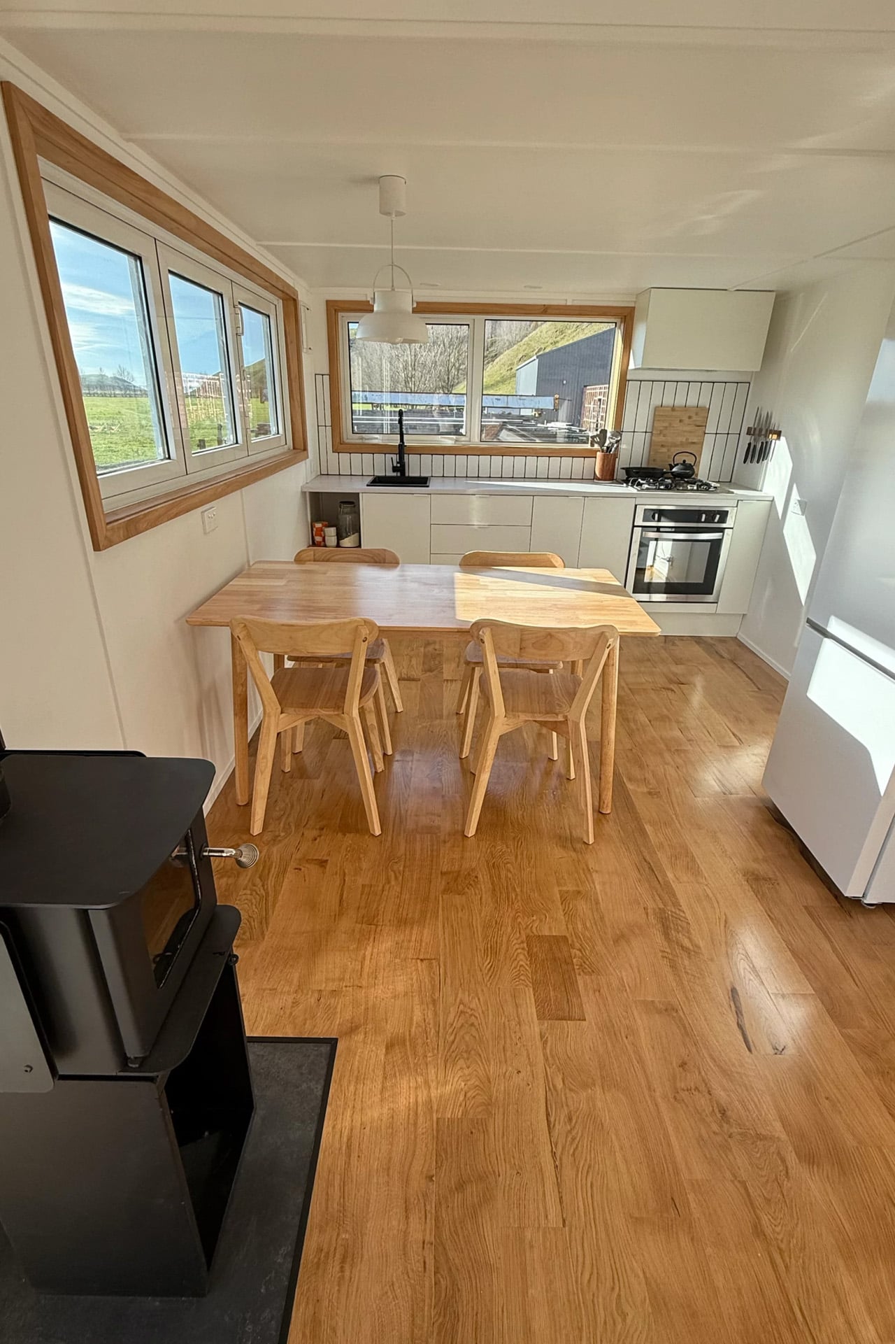
Escape’s eBoho Go Proves You Don’t Need Much Space to Live Well

There’s a certain kind of freedom that comes with owning less. Escape’s eBoho Go leans into that idea with zero apology — a 16-foot, all-electric tiny home that packs a kitchen, bathroom, queen bed, and a surprising amount of breathing room into just 152 square feet. It starts at $39,440, and a production unit is currently available for $45,440. For context, that’s less than some high-end camping trailers, and considerably more livable than any of them.

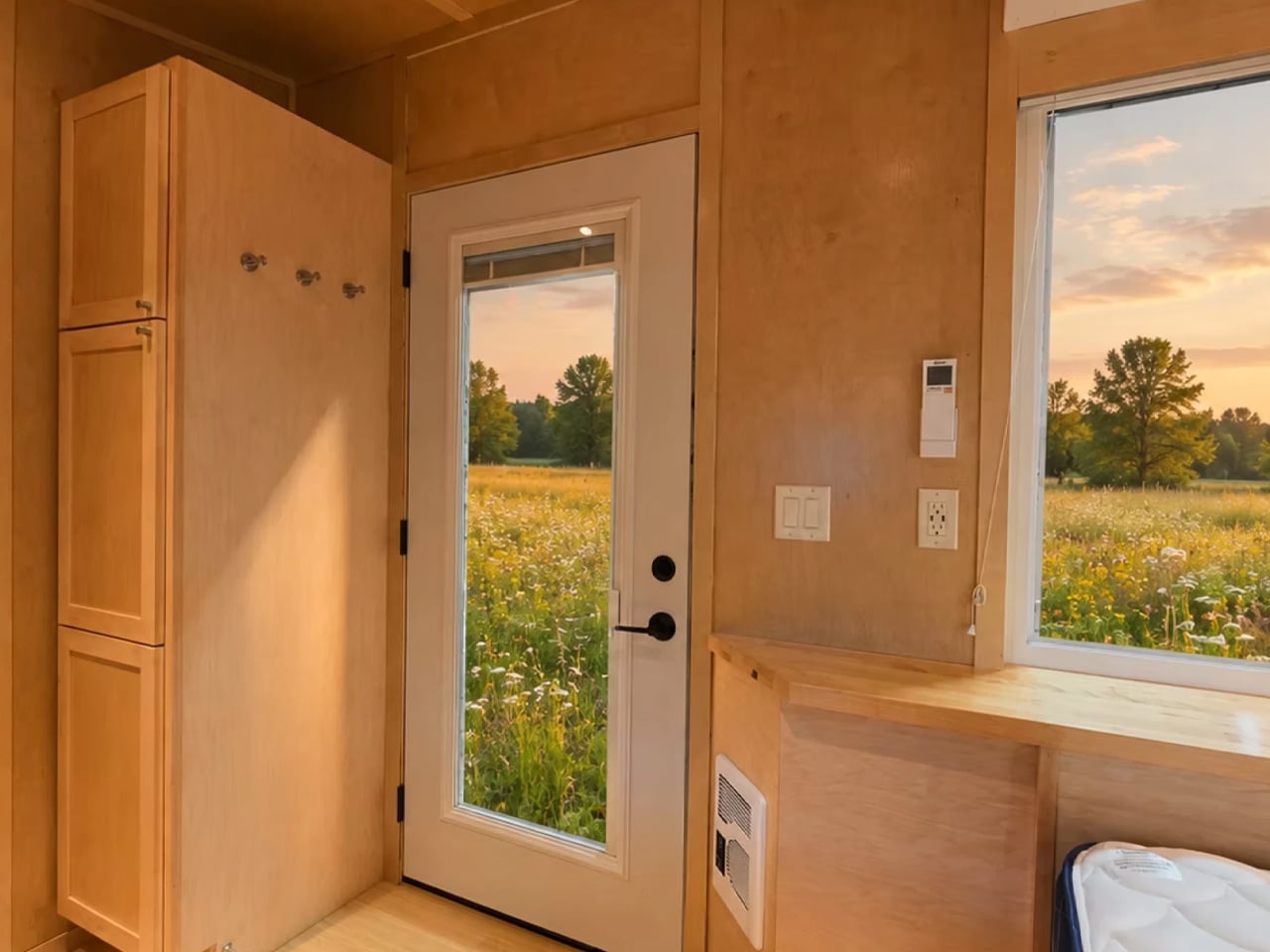
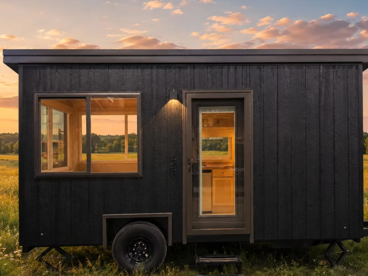
The eBoho Go rides on a single-axle trailer, making it one of the more portable tiny homes on the market. Escape clads the exterior in engineered wood siding and wraps it in large glazed panels that pull daylight deep into the interior. From outside, it reads as the smaller sibling of Escape’s premium N2 model — the same clean design language, just distilled down to its essentials. An all-steel roof caps the structure, giving it an architectural finish that most homes in this price range don’t deliver.

Designer: Escape

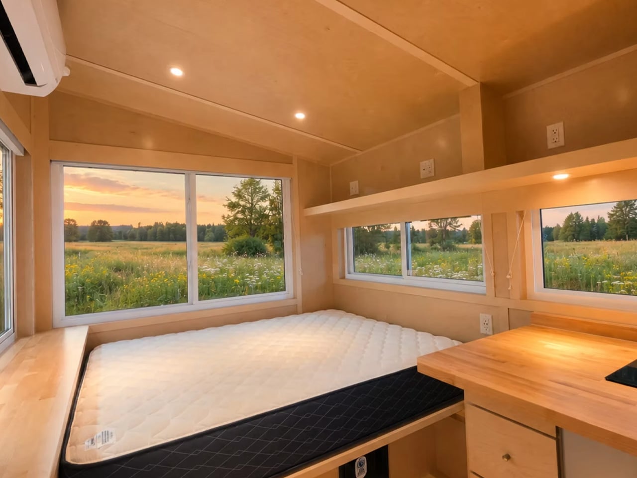
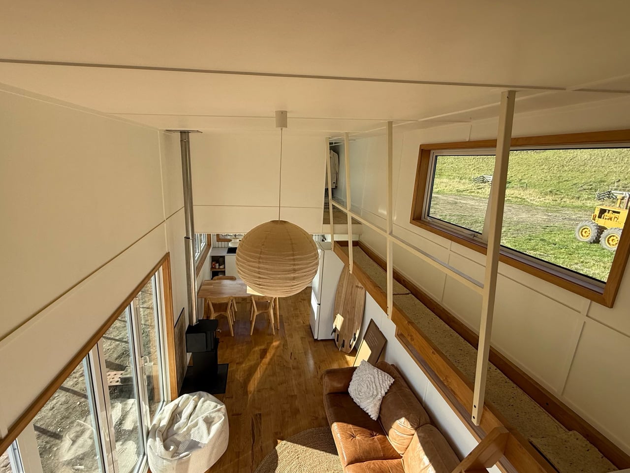
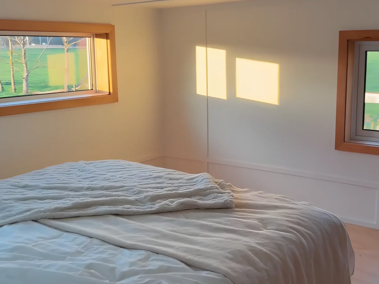
Inside, everything is finished in sealed birch — warm, tactile, and easy to maintain. The layout is a single floor, which is the right call for a home this compact. A dedicated living room would have been a compromise too far. Instead, the sleeping area earns its real estate twice over: the queen-sized bed anchors the space during the night and functions as the primary seating during the day, framed by multiple opening windows and integrated storage underneath and alongside. A mini-split AC unit handles climate control, and it’s more than sufficient for a footprint this size.

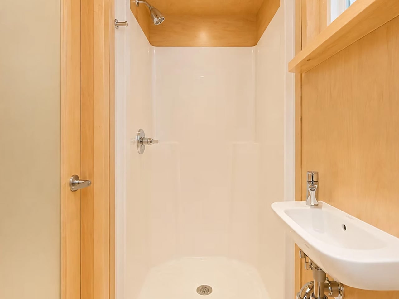
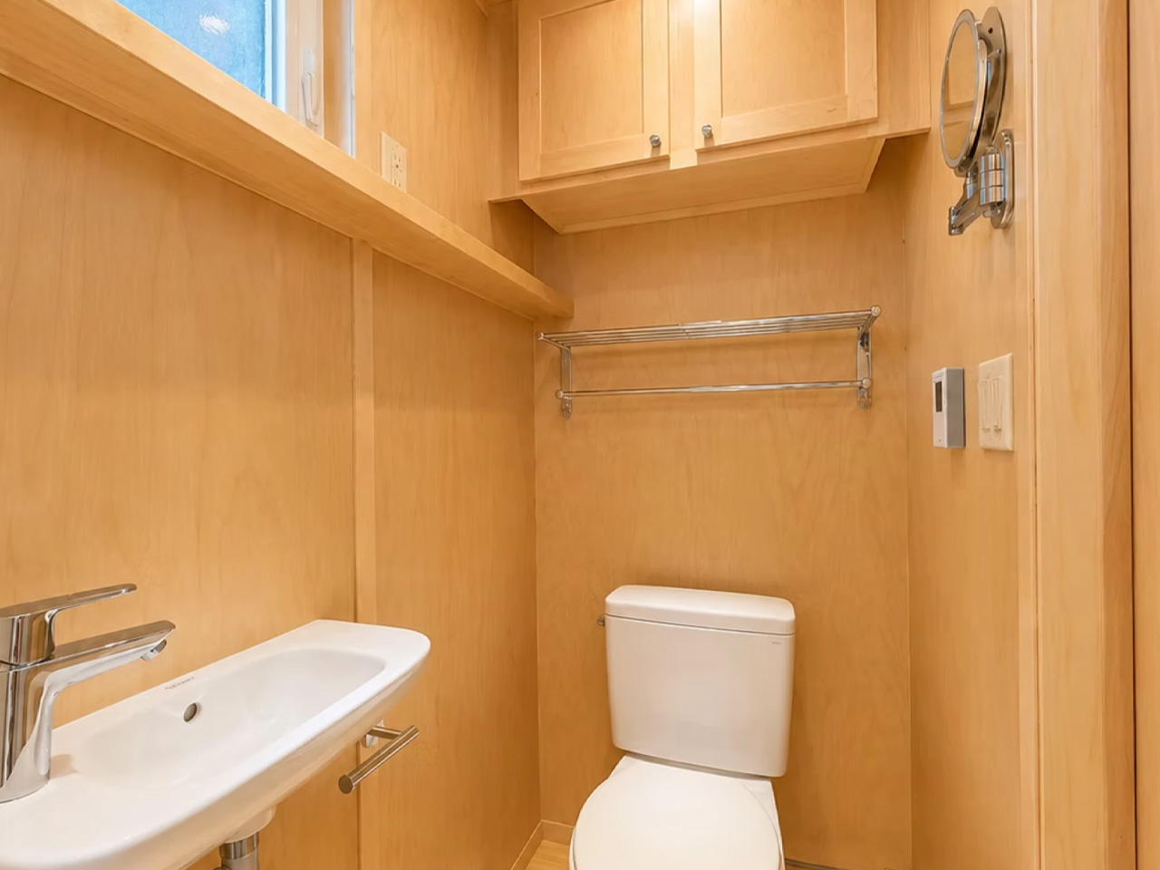
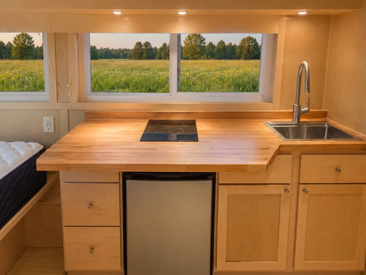
The kitchen is compact but complete. An induction cooktop, fridge/freezer, sink, and butcher block countertops sit along one wall, fronted by solid cabinetry. It won’t host dinner parties, but it handles daily life without friction. The bathroom, behind a wooden door, punches above its weight — walk-in shower, flushing toilet, vanity sink, heater, and a towel rack. Storage is tucked in wherever the geometry allows.

What makes the eBoho Go genuinely interesting isn’t just the footprint or the price. It’s that Escape built it as a real production unit — not a concept, not a preorder — powered entirely by electricity. The brand calls the lineup eESCAPE, and the Go is the entry point. As a rental unit, a guest house, or a private office dropped at the edge of a property, it makes a compelling case. Escape delivers nationwide, with costs depending on location.

At 152 square feet, it won’t suit everyone. But for those who’ve been waiting for a well-designed, genuinely affordable entry into the tiny home space, the eBoho Go might be the most honest answer yet.

The post Escape’s eBoho Go Proves You Don’t Need Much Space to Live Well first appeared on Yanko Design.
Funnels That Harvest Rain and Solar Power While Shading a Public Plaza

Water scarcity and urban heat are two separate crises that public infrastructure rarely addresses together. Most public spaces are designed primarily for social use, with sustainability features treated as additions bolted on during planning approvals. The result is civic furniture that looks environmentally conscious on paper but often functions in ways that keep each system largely isolated from the others.

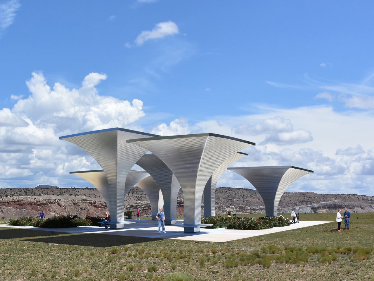
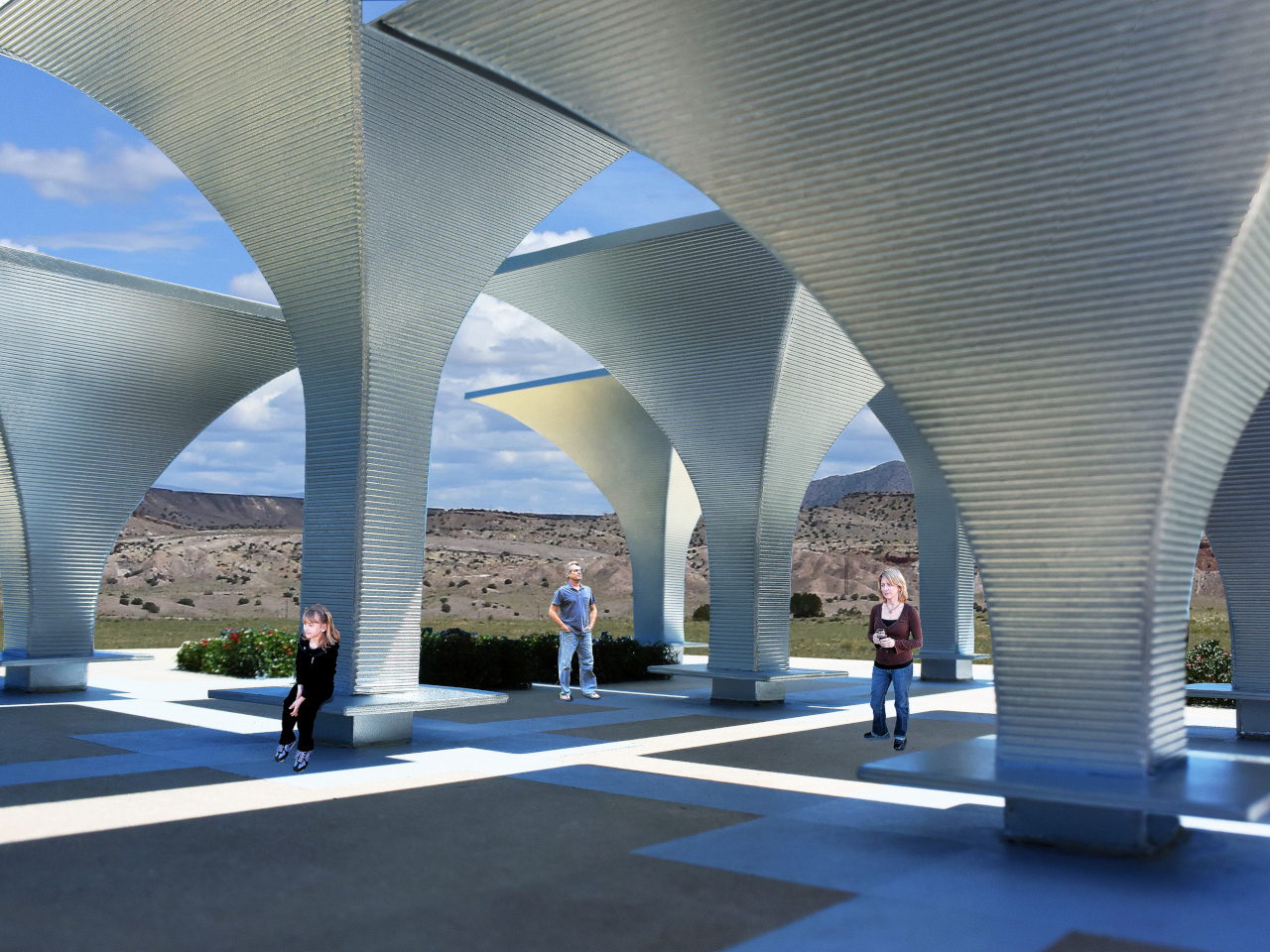
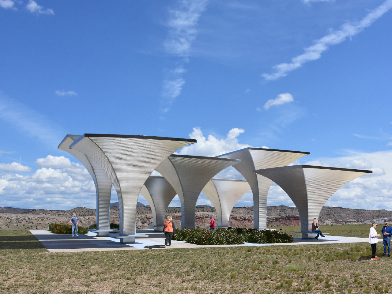
The Solar Rain Funnels propose a different model. Each funnel-shaped structure is a prefabricated, modular unit made from galvanized steel that collects rainwater, generates solar electricity, and provides shaded public seating, all from the same form. Rather than treating harvesting and gathering as separate programs, the design bundles them into a single object that does each job without architectural compromise.

Designer: Michael Jantzen

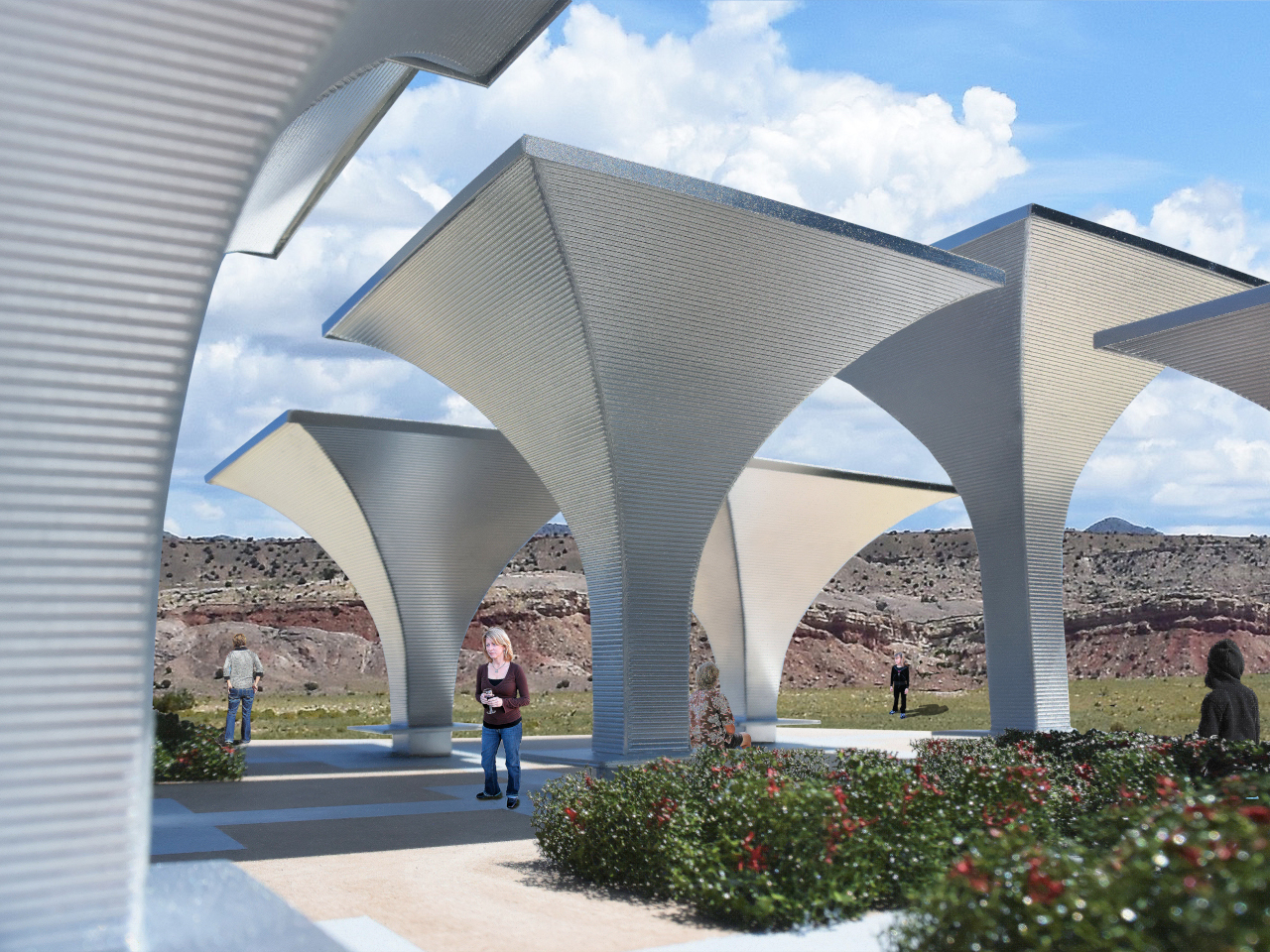
The form does most of the work. Each funnel is wide at the top and narrows toward the base, which means its surface naturally directs rainfall inward and downward into collection channels. Solar cells line the top edge, capturing sunlight from the same surface that intercepts rain. A bench is mounted around the perimeter at the base, completing the third function without requiring a separate structure.

What’s collected below the surface matters as much as what happens above it. Rainwater storage containers, or diversion channels connecting to off-site containment, are installed under the plaza to hold water for later community use. The solar electricity powers the pump that moves water from storage and lights the funnels after dark. Excess power feeds into the local grid, and on-site batteries let visitors charge devices.

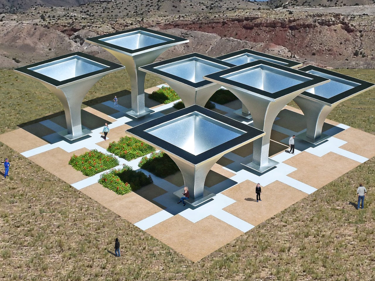
The prefabricated and modular nature of the design means installation doesn’t require building a new structure from scratch each time. Each funnel arrives at the site in pre-made sections that bolt together, and any number of units can be arranged into any configuration the site allows. In the reference proposal, seven funnels are arranged in a grid over a plaza, with drought-tolerant garden plantings filling the spaces between them.

That plaza arrangement gives visitors something more useful than just shade. The overhead canopy formed by the funnel array blocks enough direct sunlight to make the space comfortable in hot, arid conditions, which is significant given that the concept is intended for communities experiencing water stress. Gardens planted with low-water-consuming species fill the gaps between funnels, making the plaza functional as a green space even in dry climates.

Size is treated as a variable rather than a fixed specification, because the concept anticipates installation across different kinds of sites. A smaller cluster of funnels might serve a neighborhood corner or transit stop, while a larger array could anchor a civic plaza or regional park. The galvanized steel construction and bolted assembly make each installation relatively straightforward to adapt, scale, and transport to wherever it’s needed most.

The concept is currently unbuilt, but what distinguishes it from other multi-function proposals is that each function follows directly from the form rather than being added to it. The wide, concave top collects rain. The exposed edge holds solar cells. The shaded base provides seating. Nothing requires the structure to be shaped any differently to perform those jobs, which is the kind of efficiency that makes a proposal feel plausible.

The post Funnels That Harvest Rain and Solar Power While Shading a Public Plaza first appeared on Yanko Design.
Students Built the Best Seat at This Music Festival From Scraps

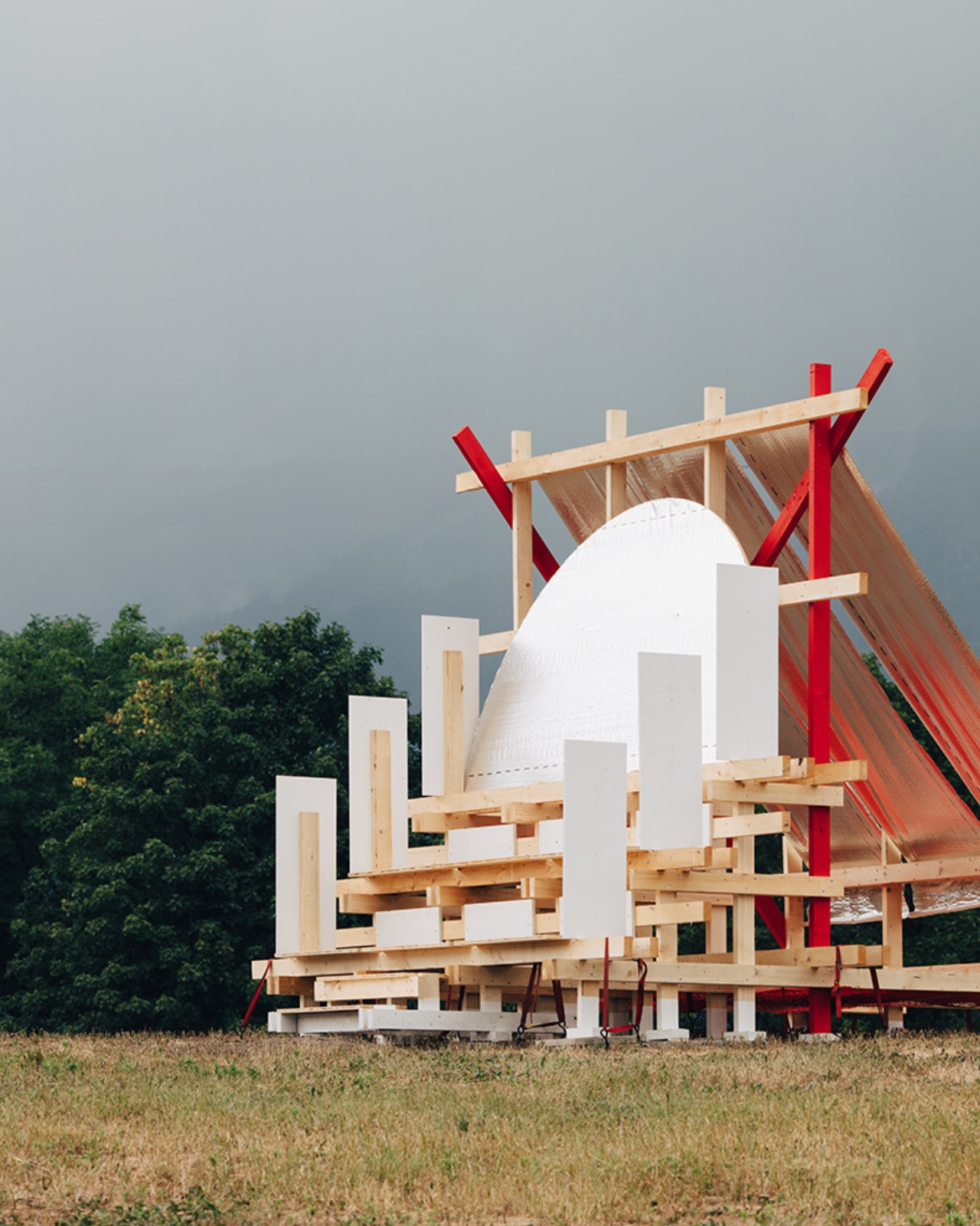
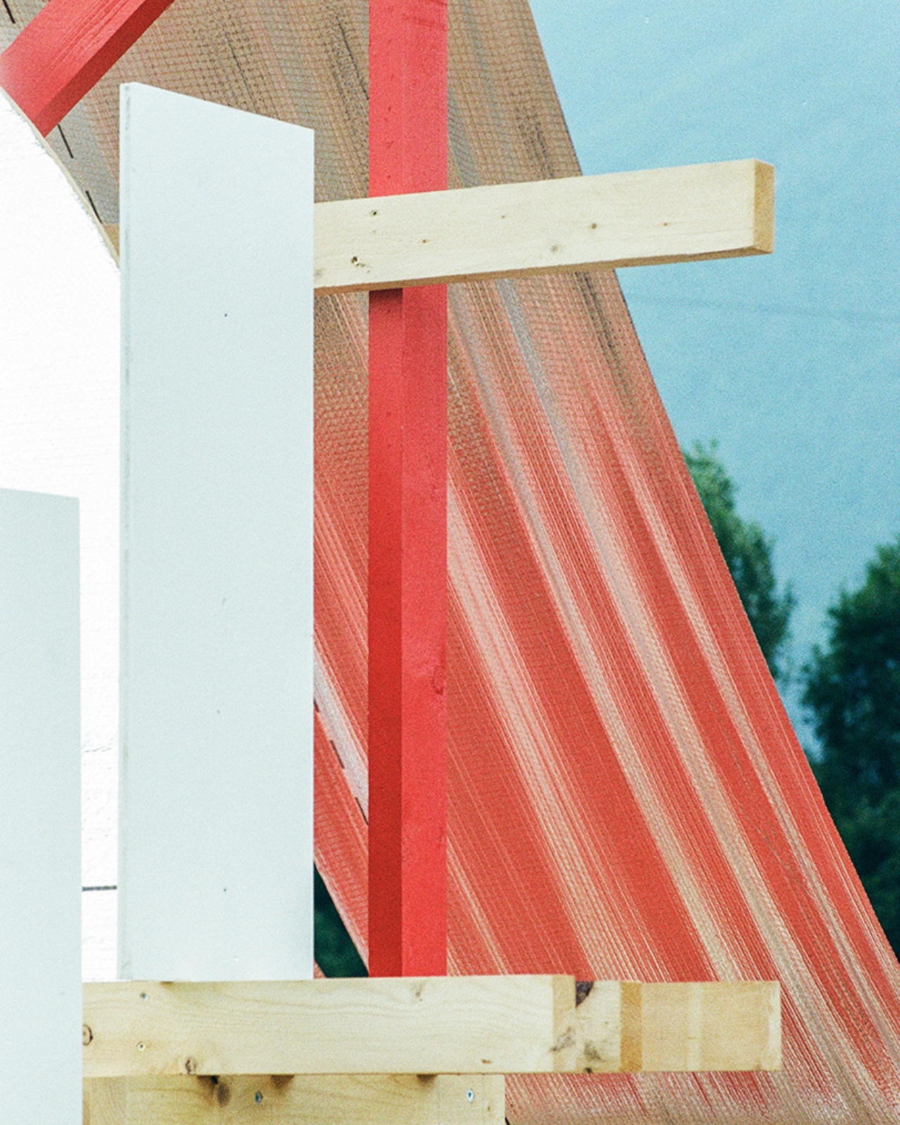
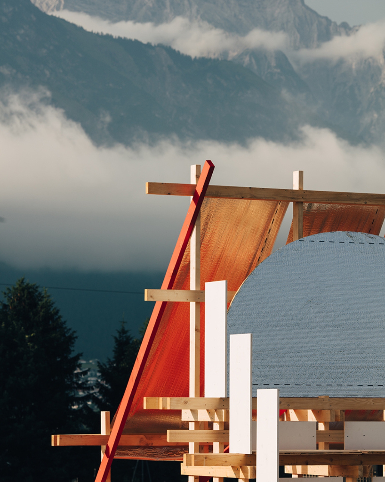
Music festivals spend a lot of money on stages. Big rigs, elaborate lighting systems, branded tents that block your view of the mountains. And then someone comes along with 4-meter timber beams, an orange safety net, and a sheet of reflective construction foil, and quietly outdoes all of it.

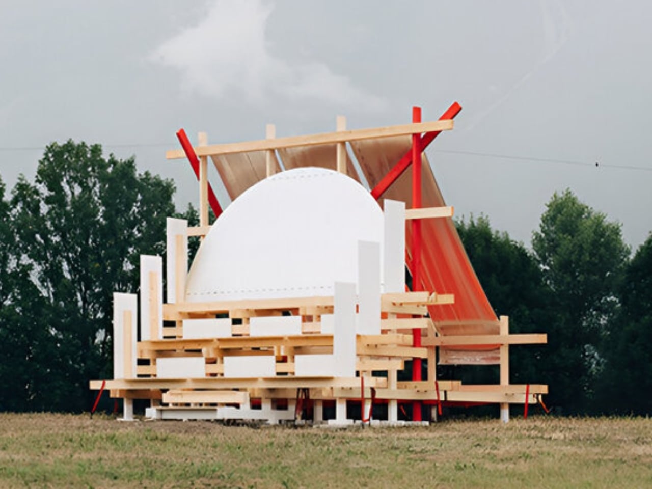
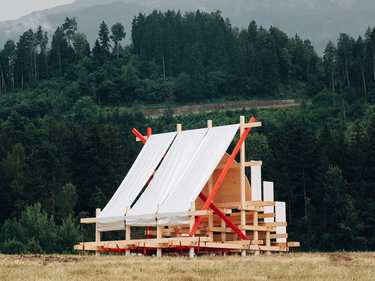
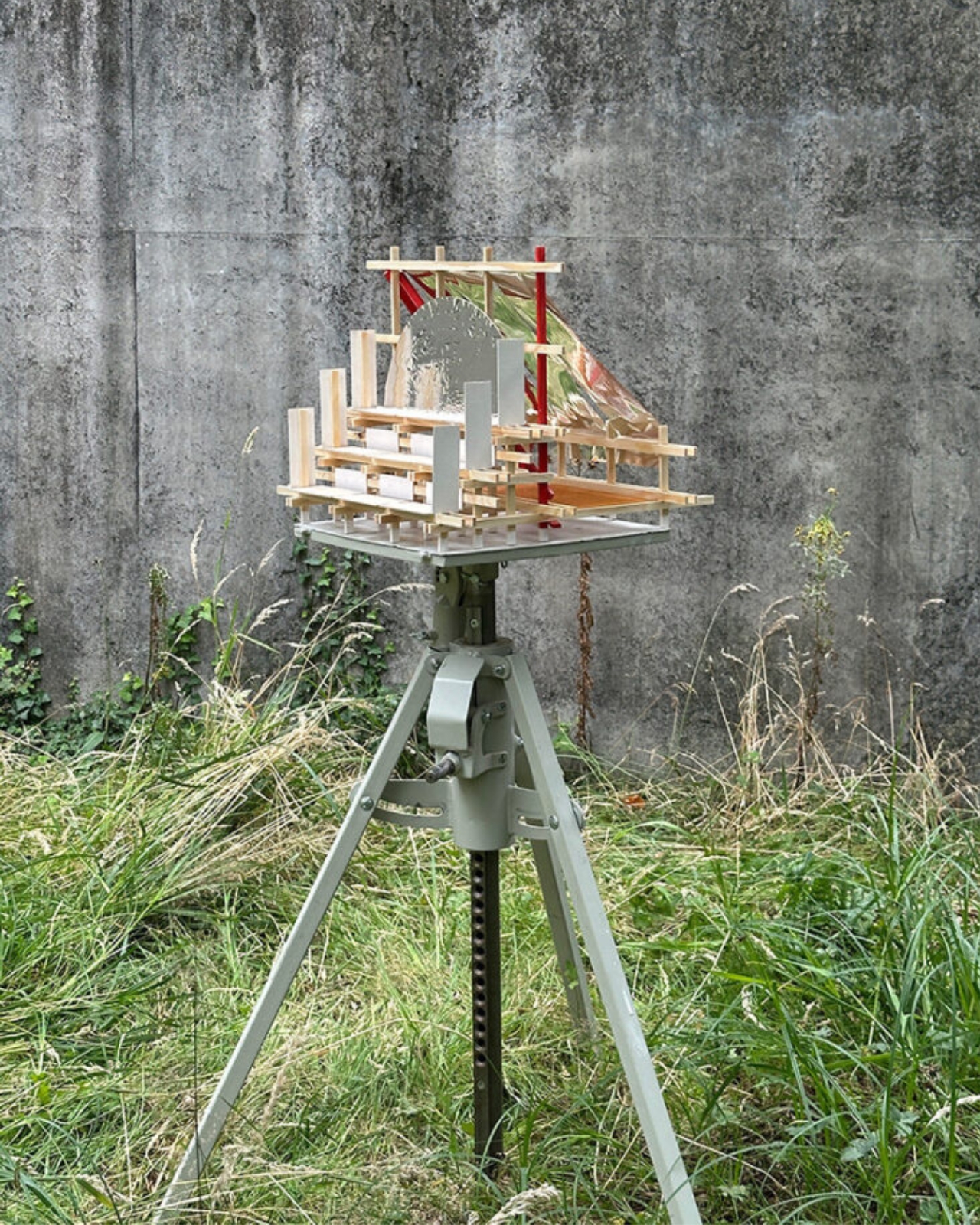
The Gabonsa Pavilion is exactly that kind of project. Designed and built by architecture students from Hochschule Kaiserslautern University of Applied Sciences, in collaboration with Innsbruck-based collectives Gans Anders and Bonanza, this 16-square-meter structure showed up at the Gabonsa Music Festival in Innsbruck, Austria, and became the most interesting thing on the grounds. Not because it was the biggest or the most polished, but because it was genuinely, almost stubbornly, thoughtful.

Designer: Hochschule Kaiserslautern University of Applied Sciences

The festival itself is held at the Rossau Recreation Centre, a former municipal landfill site that the collectives have been working to reactivate as a public space through cultural events. That context matters. You’re not designing for a pristine meadow or a curated urban plaza. You’re working with land that carries industrial history, that still has a certain transience to it. The students leaned into that instead of fighting it.

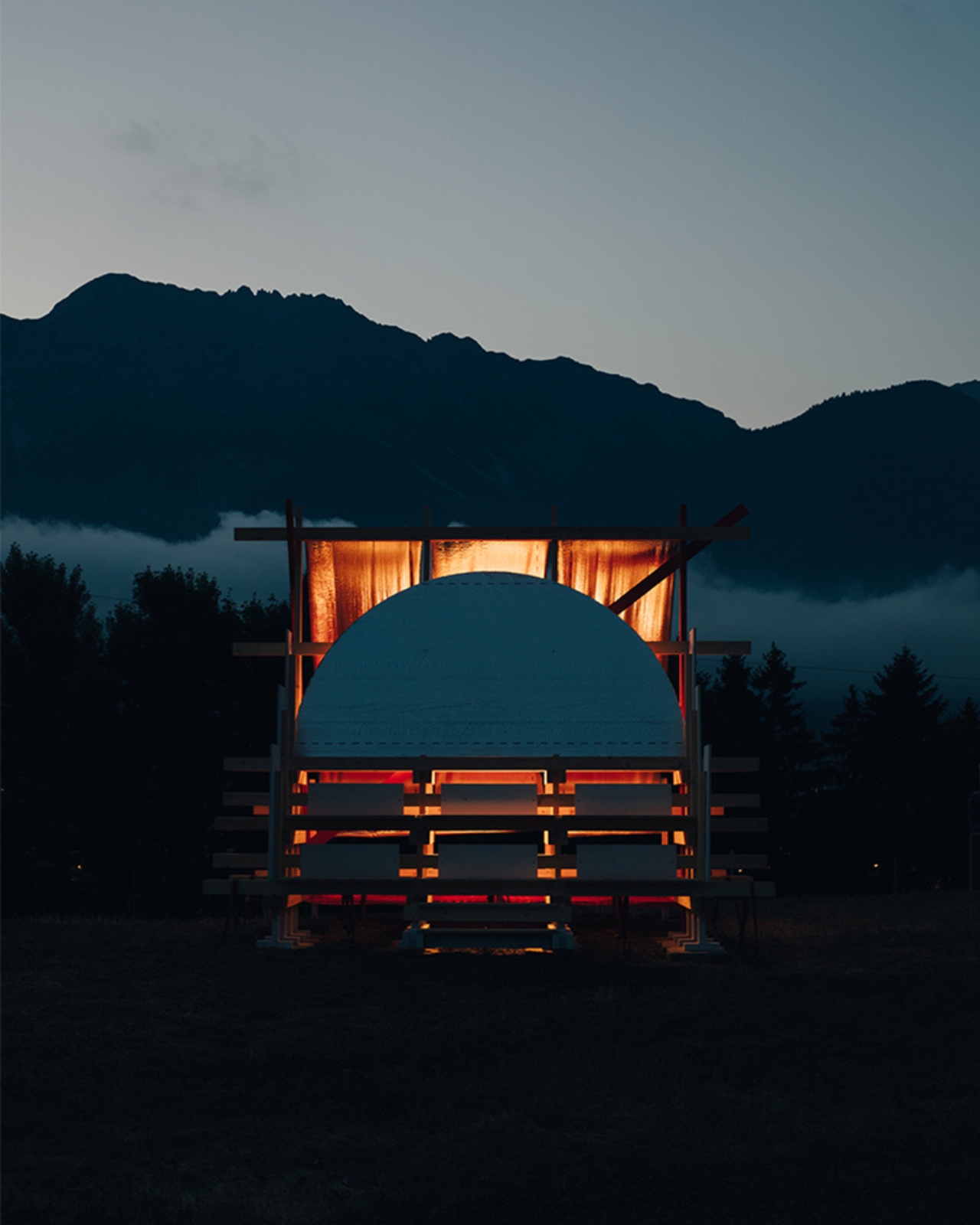
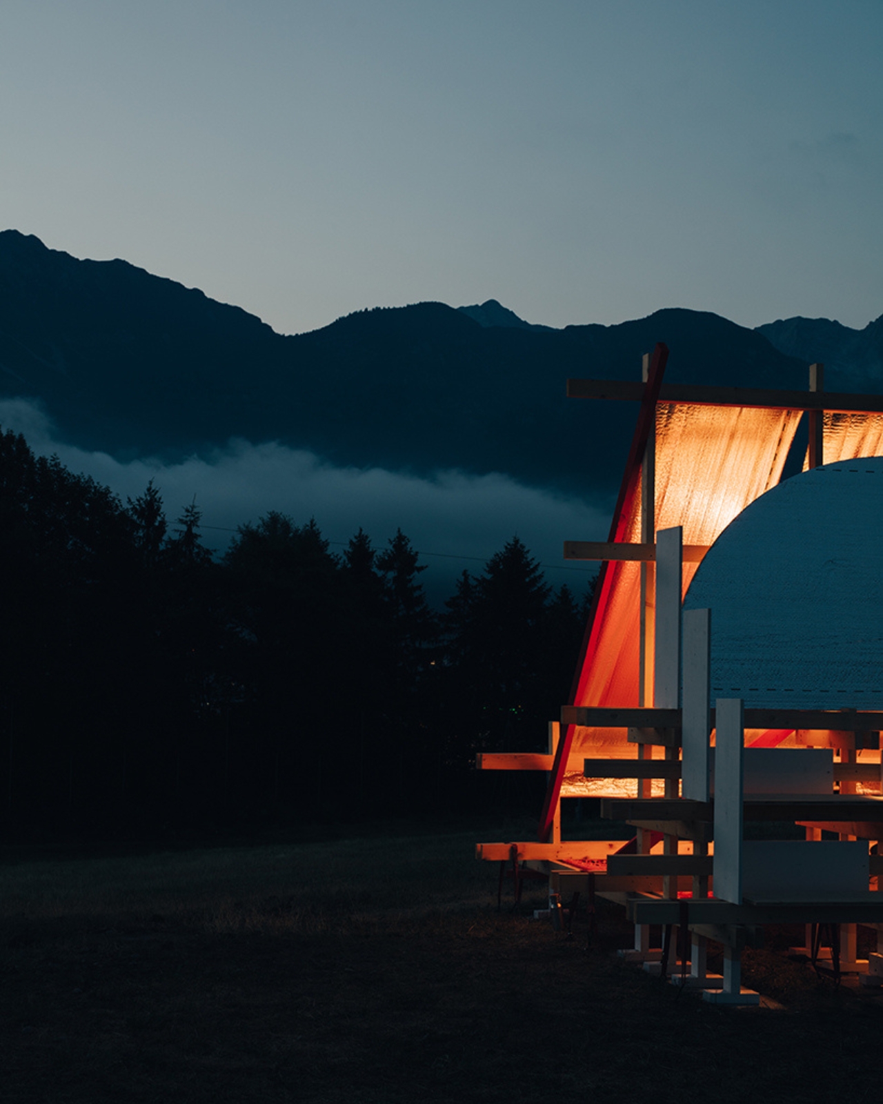
The pavilion is hard to place in a single category. The architects describe it as a hybrid structure at the intersection of furniture, installation, and architecture, and that’s probably the most accurate way to put it. It’s terraced and positioned on a small hill between the festival’s main stage and workshop area, so it functions as a seating landscape, a gathering point, a vantage spot, and a visual landmark, all at once. On paper, that sounds like a design student brief. In practice, it actually works.

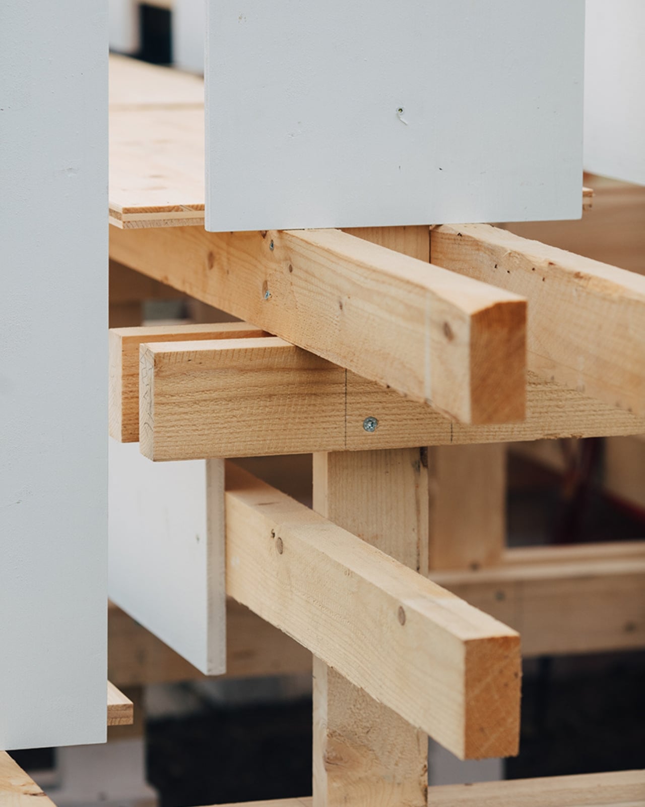
What makes it interesting isn’t the scale. It’s the material logic. The whole thing is built from 4-meter timber beams connected with screw joints, no adhesives, no cast connections, nothing that would prevent you from taking it apart later. Most of the timber was cut only where structurally necessary, meaning the beams can be reused after the festival in nearly their original form. For a student project, that level of discipline around circular construction is impressive. It’s one thing to talk about sustainability in a presentation. It’s another to build it into the fasteners.

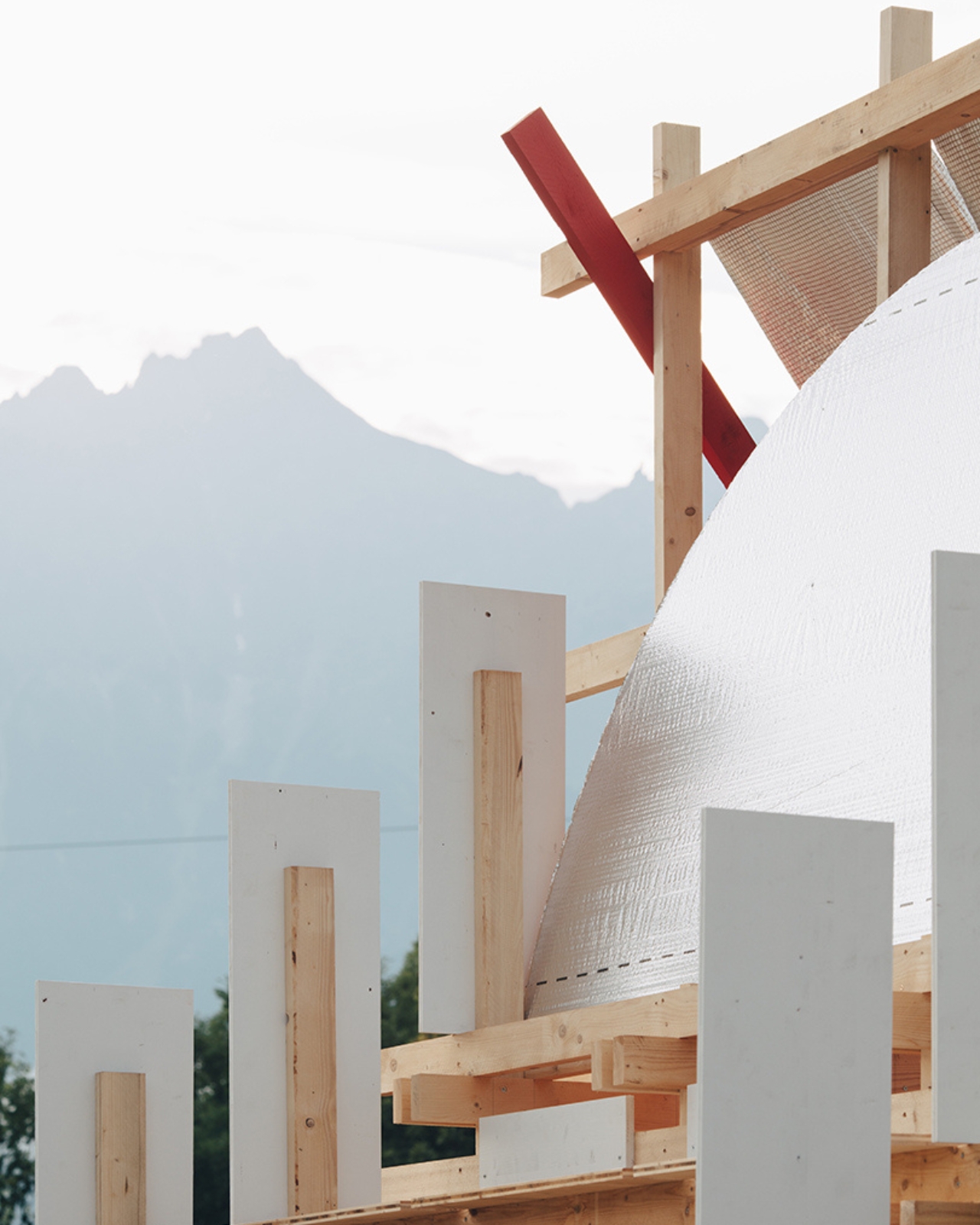
The materials push it further. A semicircular element clad in reflective construction foil catches the sky and the surrounding mountain landscape, turning an ordinary building wrap into something that genuinely earns its place on the site. A canopy made from aluminium vapour barrier creates shade. Hanging beneath that canopy is an orange construction safety net, repurposed as a hammock. Red-painted bracing elements make the structure legible, turning the engineering into part of the aesthetic. None of these are precious materials. They’re the kind of things you’d find on any construction site. But here they’ve been treated with enough intention that they read as deliberate design, not improvisation.

I think that’s what distinguishes student work at this level: the willingness to be modest about means without being modest about ideas. The Gabonsa Pavilion is not trying to be a statement pavilion. It’s not angling for an architecture prize or an Instagram moment. It’s trying to do a specific job well, serve people at a festival, occupy a complicated site with some grace, and leave without making a mess of it. That’s a harder design brief than it sounds.

The project also says something worth noting about the current direction of temporary architecture. Festival infrastructure has long defaulted to either the spectacular (giant LED structures with five-figure budgets) or the disposable (generic tents and fencing that treat space as neutral background noise). The Gabonsa Pavilion proposes a third option: something careful, context-aware, and genuinely reusable. Whether that becomes a model or remains an exception probably depends on whether the people commissioning festival spaces start asking different questions. For now, 16 square meters of timber, foil, and net made one Innsbruck landfill feel worth sitting in. That’s not nothing.

The post Students Built the Best Seat at This Music Festival From Scraps first appeared on Yanko Design.
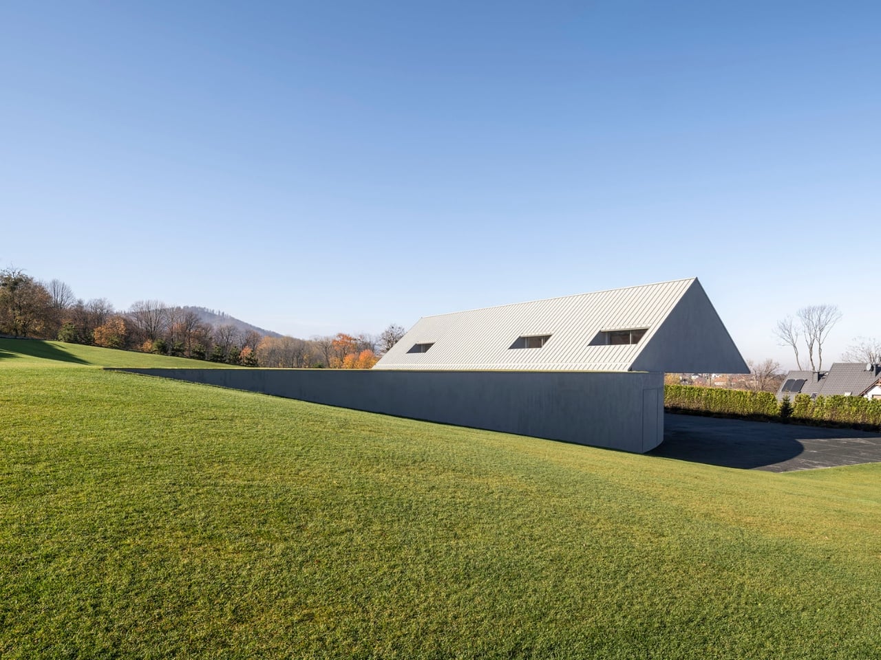
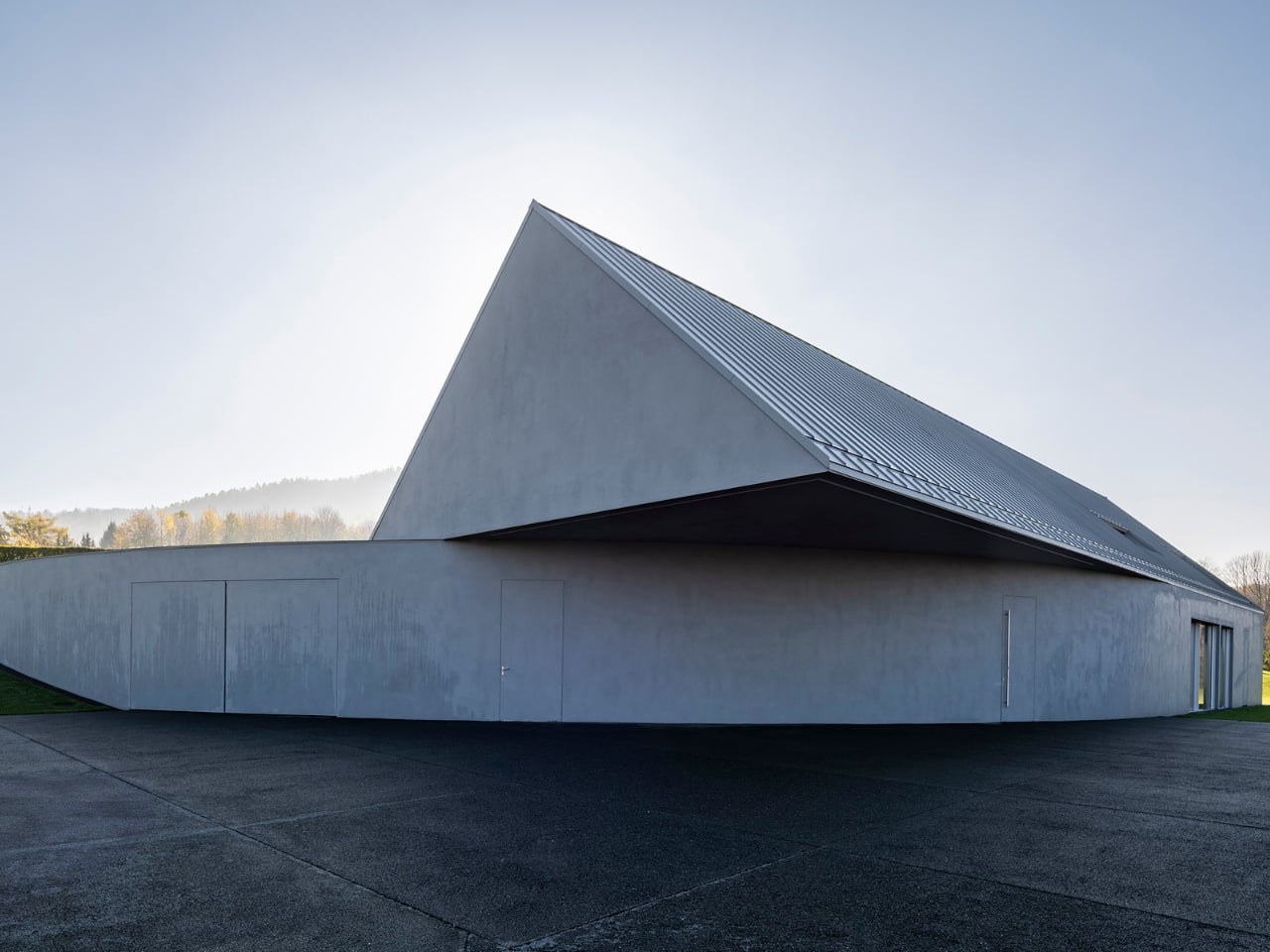
A Polish Architect Rotated His House to Hide It in the Hill

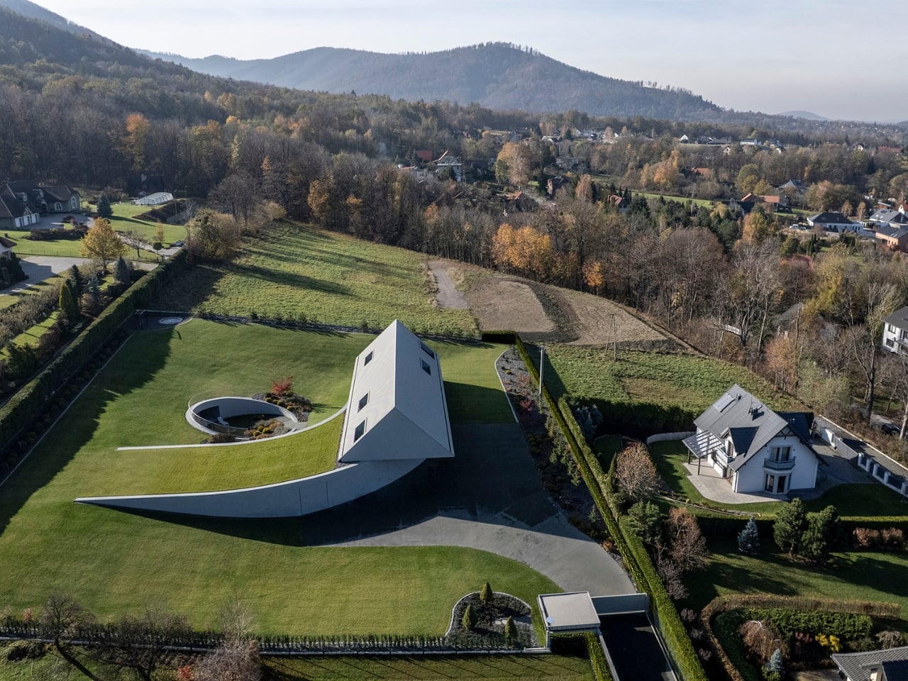
Most house designs start with a shape and then find a place for it. What KWK Promes did with the Yaw House, completed in 2025 and nestled in Poland’s Beskid Mountains, is almost the reverse. They let the land tell the building what to do, and the building listened.

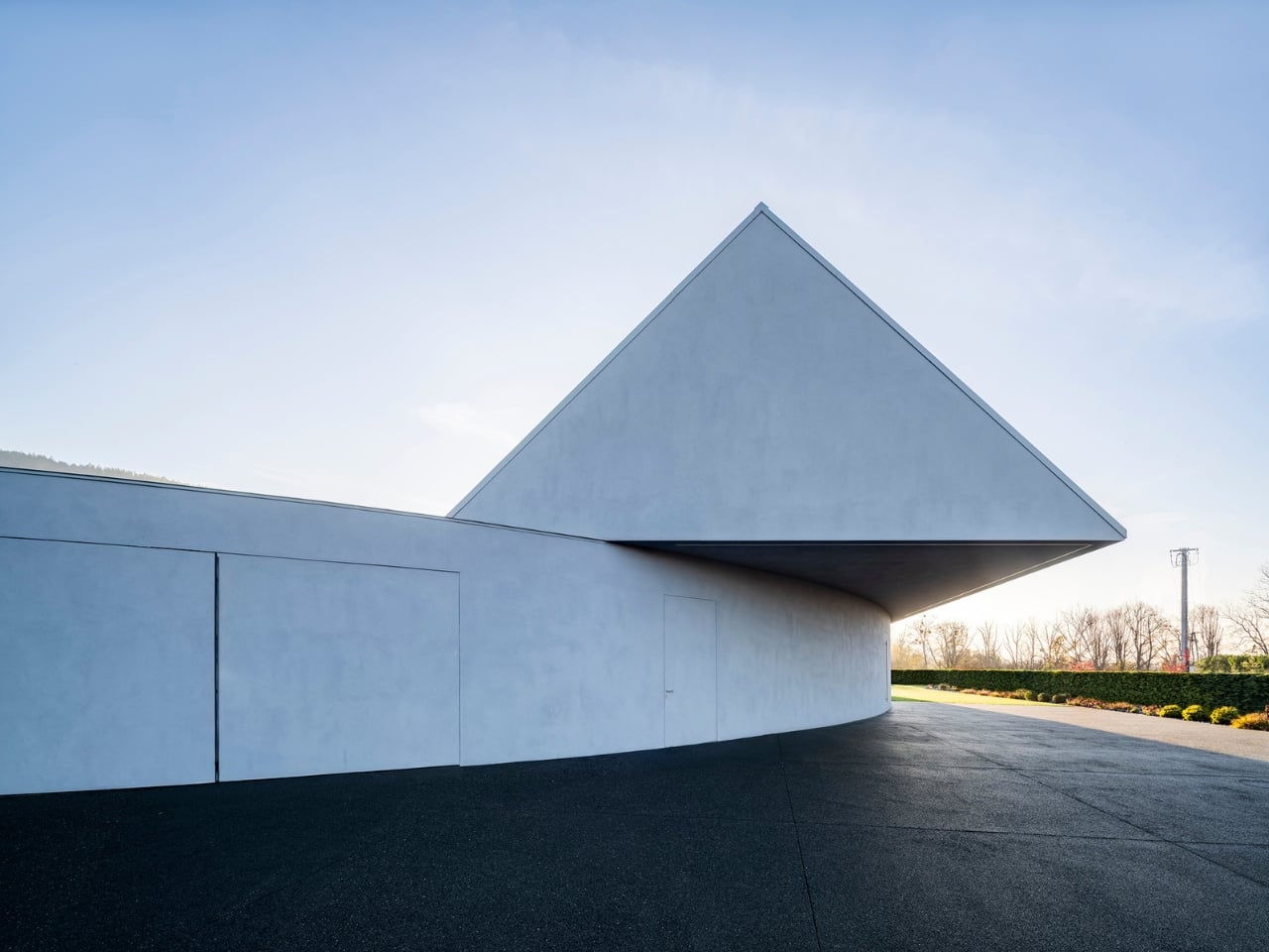
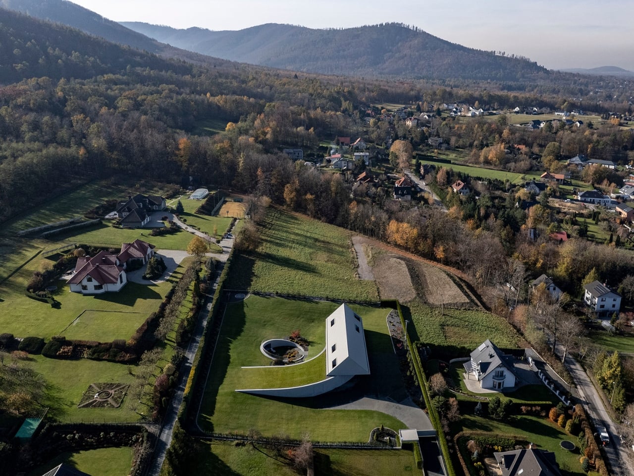
The project began conventionally enough. The original concept was a classic gabled form, set parallel to neighboring structures, the kind of thing that blends politely into a mountain village. Respectable. Contextual. Probably a little forgettable. But the terrain wasn’t playing along. The plot has a pronounced slope, and rather than flattening it or working around it, architect Robert Konieczny rotated the entire structure. He literally yawed it, which is where the name comes from: yaw, the aeronautical term for rotation along a vertical axis. The gabled roof pivoted, the building reoriented toward sun and valley views, and something altogether different emerged.

Designer: KWK Promes

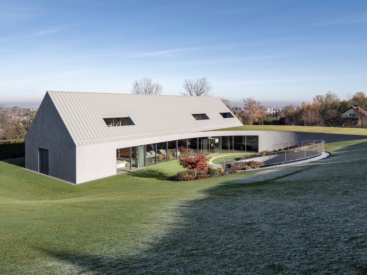
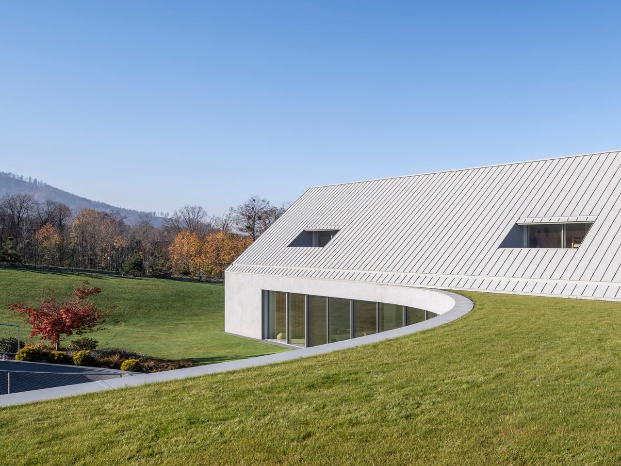
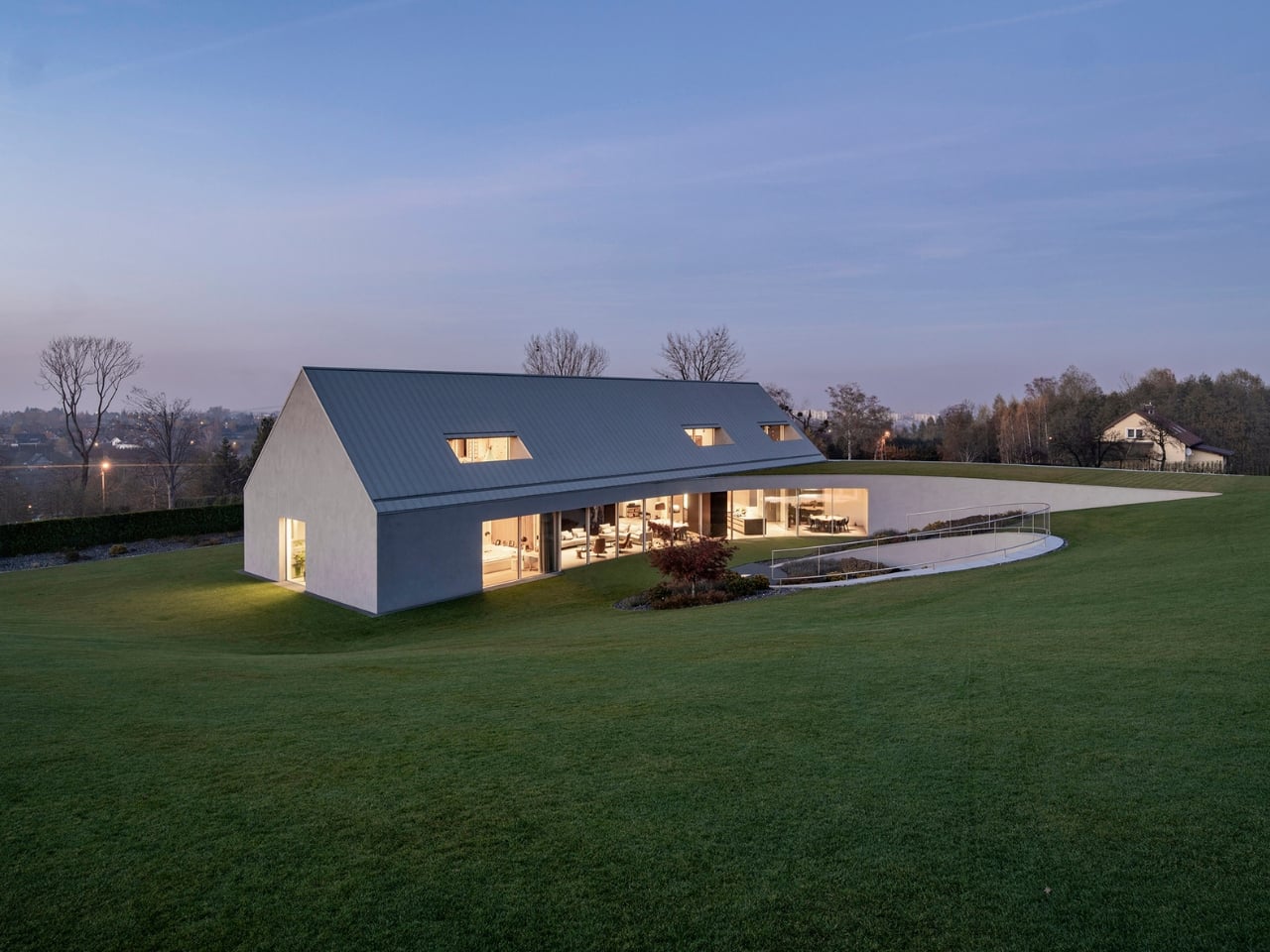
The result is a C-shaped house that embeds itself into the hillside rather than sitting on top of it. One corner barely makes contact with the ground. The rest of the structure hovers, tucks, leans in, to the point where the roofline peels away from the hill and dissolves into the surrounding lawn. Grass grows over it. The house doesn’t end where the mountain begins; they merge. From certain angles, you might not even register it as a building at first. That reads as a loss for anyone who wants their home to make a statement, but a quiet kind of brilliance if you’re more interested in belonging to a place than dominating it.

Interiors follow the geometry of the rotation, which gives the spaces a curved, almost circular quality that feels unusual for a residential home. On the ground floor, the orientation prioritizes what actually matters: greenery, natural sunlight, and wide views of the valley below. Private areas sit elsewhere in the plan, separated naturally by the structure’s layering into the slope. It doesn’t feel like a floor plan that was drawn and then decorated; it feels like one that was discovered.

The material choices reinforce all of this. Pine wood runs throughout, with plywood panels used for both the facade and interior walls. It’s warm, honest, and completely in line with the mountain setting. No marble-and-steel contrast trying to signal luxury, no jarring material moments designed to photograph well for social media. The palette is consistent because the thinking behind it is consistent.

I’ve been some residential architecture lately that feels performative, houses where the drama is the point and the living comes second. Yaw House is a useful counterargument. It makes bold moves, and rotating an entire structure to negotiate a difficult slope is not a timid decision, but it does so entirely in service of something real. The circular interior spaces aren’t there to be interesting in a magazine spread; they exist because the geometry demanded them. The green roof isn’t a lifestyle statement; it’s the terrain reclaiming its surface.

KWK Promes has a track record of this kind of thinking. Robert Konieczny’s firm has long been drawn to the challenge of how a building should respond to its specific conditions rather than impose a predetermined vision onto them. The Yaw House feels like a mature expression of that philosophy, one that is both technically ambitious and architecturally generous.

What stays with me, after reading more about this project, is how much restraint it takes to make something that disappears. Our instinct with ambitious architecture is to look for the spectacle. And yes, the Yaw House is spectacular if you know where to look. But it earns that quality quietly, through proportion, orientation, and a refusal to treat the landscape as a backdrop. The mountain isn’t framed in a window here. It’s invited in through the floor plan. That might be the most interesting thing a house can do.

The post A Polish Architect Rotated His House to Hide It in the Hill first appeared on Yanko Design.
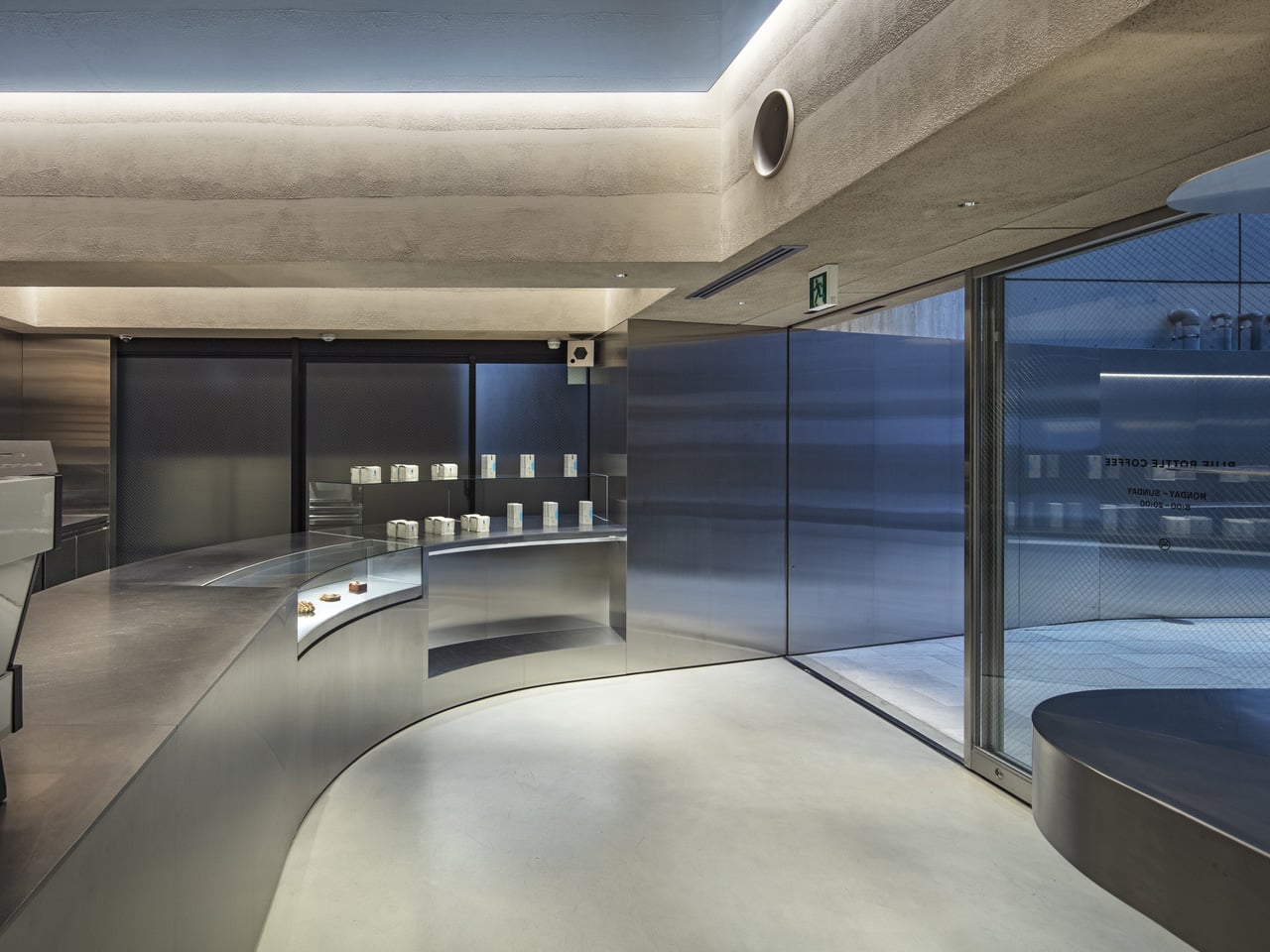
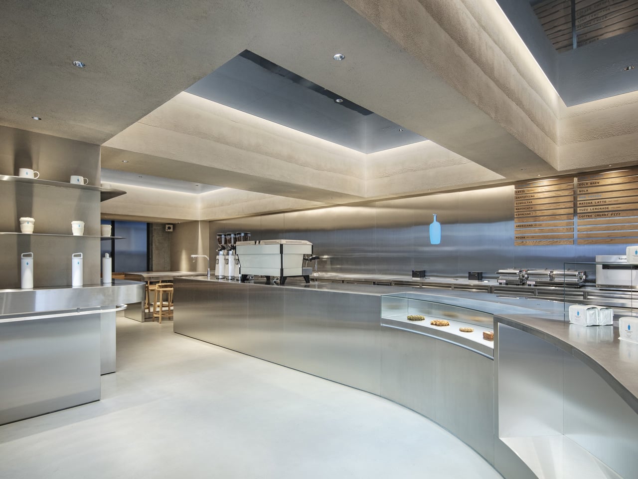
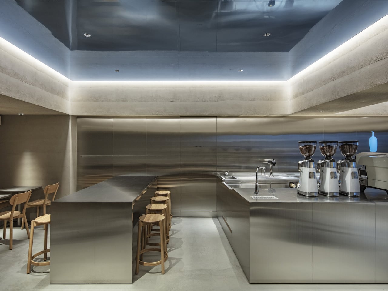
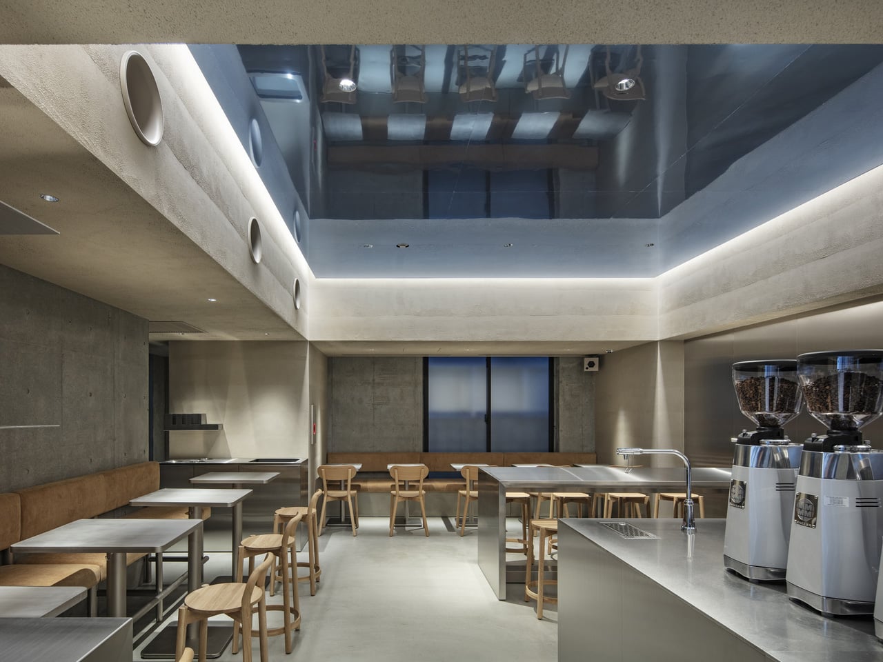
Blue Bottle Coffee’s Harajuku Cafe Is a Study in Restraint Done Right

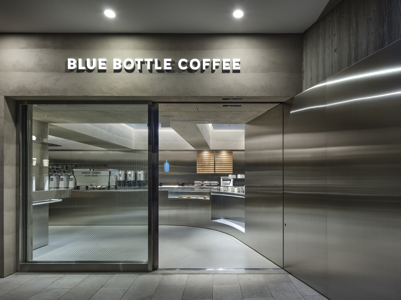
Walk into most cafes, and they’re already selling you something — exposed brick, neon signs, mismatched furniture, a playlist that changes every twenty minutes. Then there’s the Blue Bottle Coffee Harajuku cafe by TEKI Design, which says almost nothing, and means all of it.

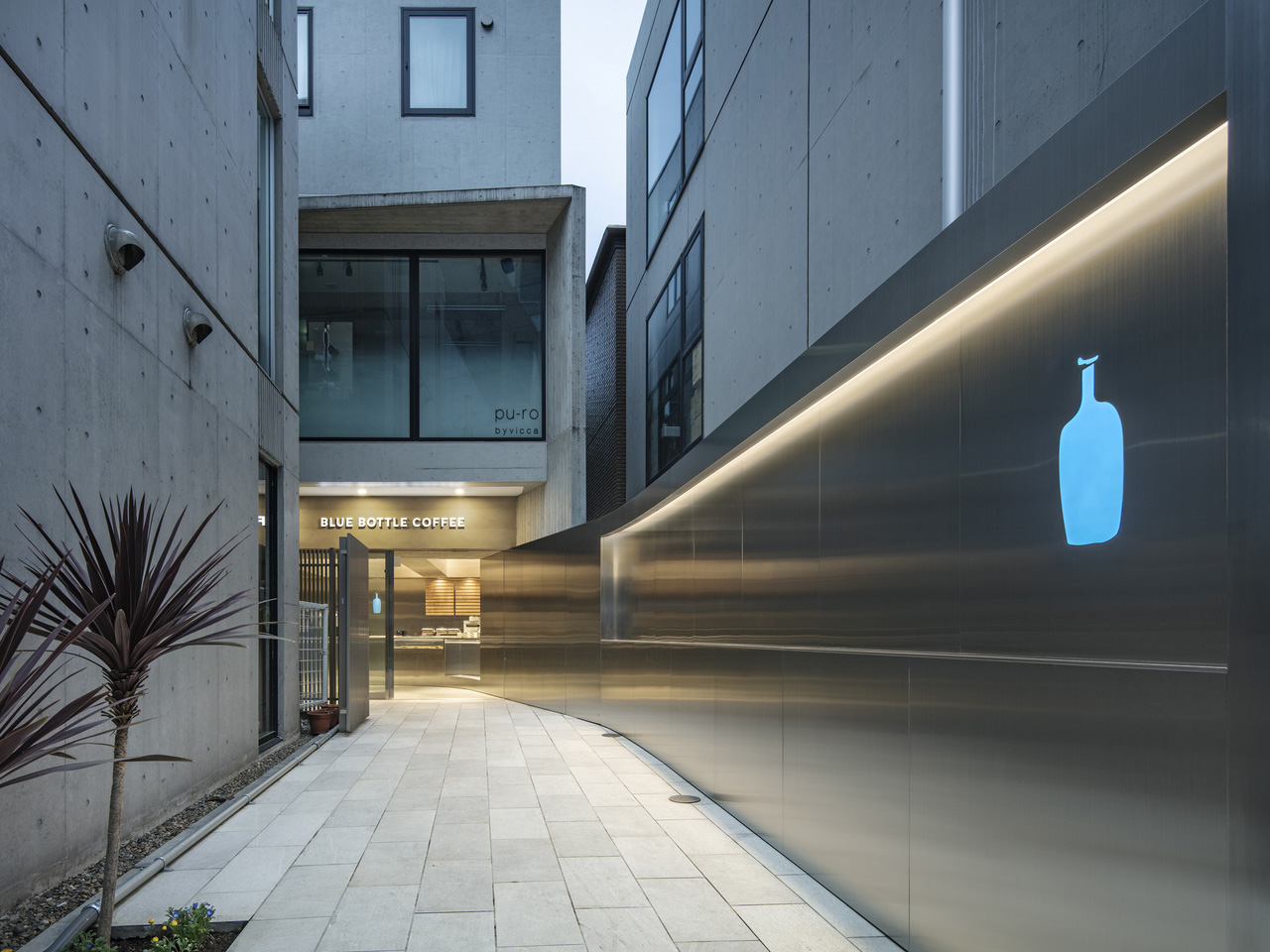
Tucked into one of Tokyo’s most visually chaotic neighborhoods, the Harajuku outpost functions as a deliberate counterweight to its surroundings. Harajuku is a place of spectacle — streetwear drops, cosplay, fashion tribes colliding on narrow sidewalks. TEKI Design’s response was to strip everything back. The cafe earns its calm rather than performing it.

Designer: TEKI Design

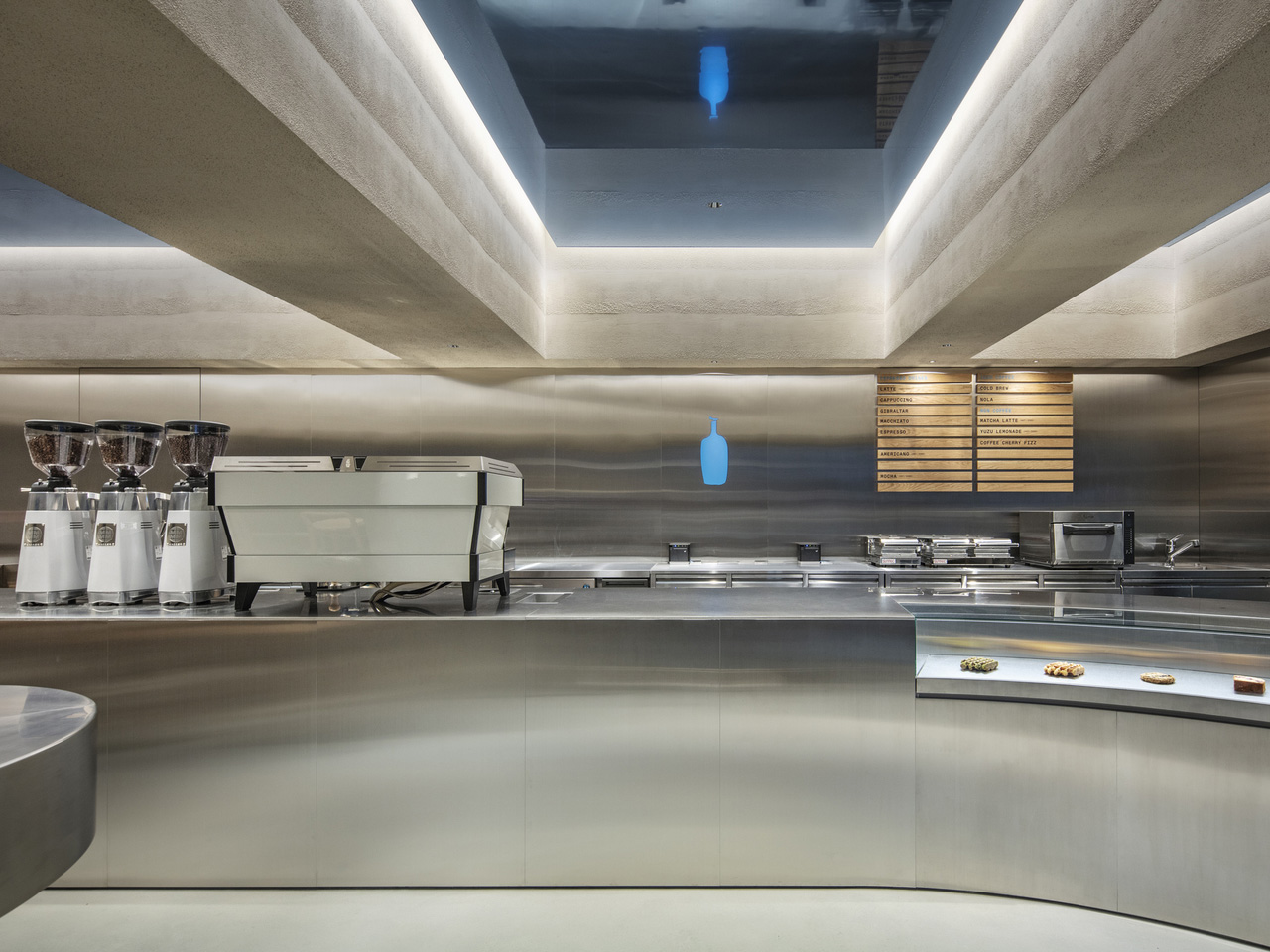
The interior leans into a vocabulary that feels distinctly Japanese in its economy of means. Clean lines, natural materials, and a spatial arrangement that prioritizes the ritual of coffee over the theatre of the brand. Light enters the space softly, falls across surfaces without drama, and leaves the room feeling like something you want to stay inside of. That quality — the sense of earned stillness — is harder to design than it looks.

TEKI Design has long understood that in a city as dense and stimulating as Tokyo, the most radical gesture a space can make is to ask nothing of you. The Harajuku cafe does exactly that. There’s no moment where the architecture competes with the coffee, or the coffee competes with the conversation. Each element holds its position and then steps aside.

Blue Bottle’s presence in Japan has always felt more considered than its American counterparts. The brand arrived in Tokyo in 2015 with a clear awareness that it was operating in a country with a coffee culture that predated its own by decades. That awareness shows up in spaces like this one — not as deference, but as genuine dialogue. The Harajuku cafe doesn’t try to look Japanese. It simply engages with what good Japanese design has always understood: that space is as much about what you remove as what you place.

The result is a cafe that photographs beautifully and experiences even better. A single cup of their single-origin pour-over, consumed in a room this quietly composed, lands differently than the same cup consumed anywhere noisier. That’s not pretension. That’s design working exactly the way it should — invisibly, in service of the thing you came for. In a neighborhood built on maximalism, TEKI Design and Blue Bottle Coffee have made the smallest possible move. It turns out that was the boldest one available.

The post Blue Bottle Coffee’s Harajuku Cafe Is a Study in Restraint Done Right first appeared on Yanko Design.
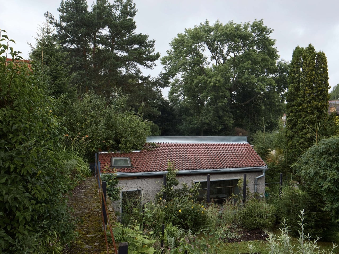
A Czech Pigsty, Raw Concrete, and 32 Square Meters of Restraint

Most summer houses get built by tearing something old down and putting something new up. Lenka Milerová did the opposite. She found a crumbling pigsty in Panoší Újezd, a small village in the Czech Republic, and asked what it could become rather than what it should be replaced with. The answer turned out to be one of the most quietly compelling small buildings I’ve come across this year.

The backstory matters here. The client, referred to as Mrs. F., had inherited a property she found too large. Rather than sell or renovate the whole thing, she pared it back to just the old pigsty and a small garden patch. It’s the kind of decision that sounds impractical until you see the result. On paper, it reads as radical downsizing. In person, it apparently reads as near-total reconstruction, carried out brick by brick, mason by mason, over a project that kept growing beyond its original brief.

Designer: Lenka Milerová Architektka

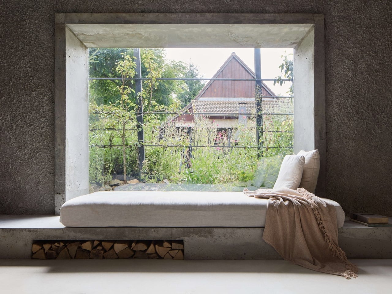
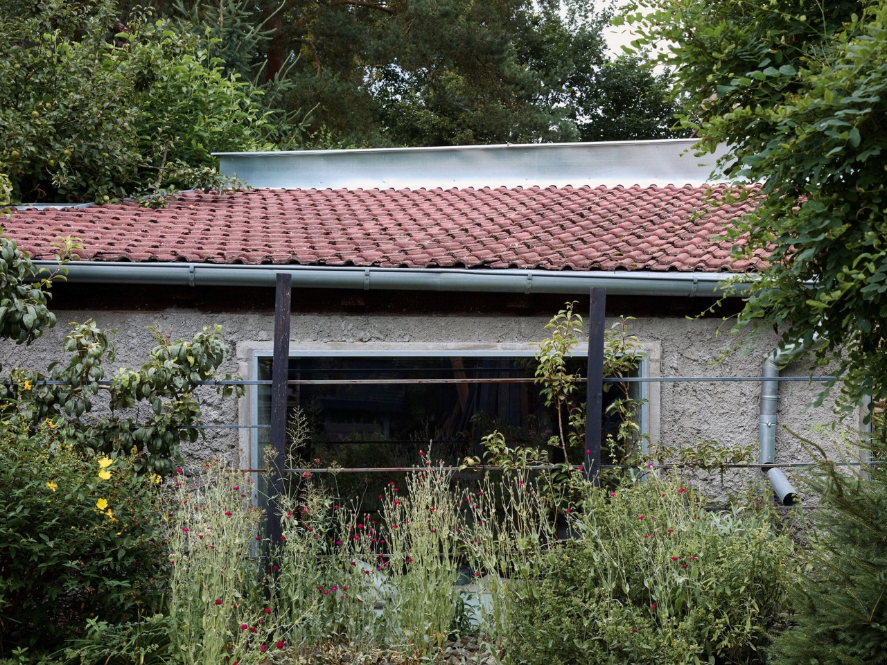
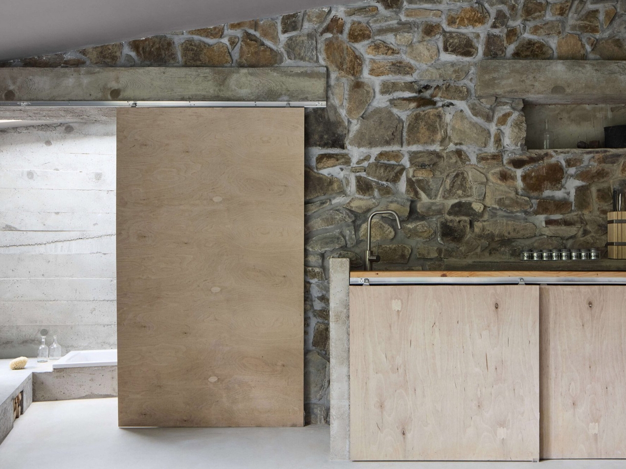
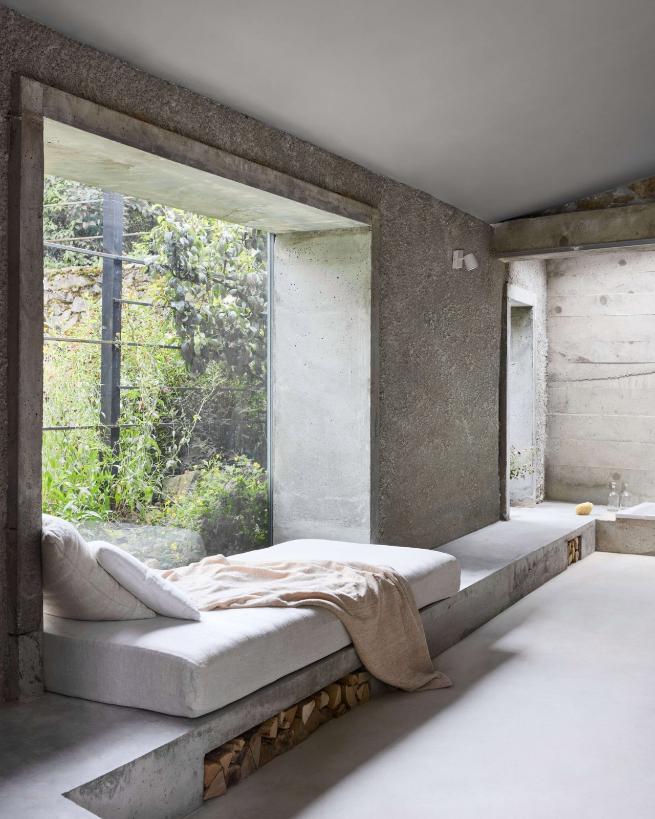
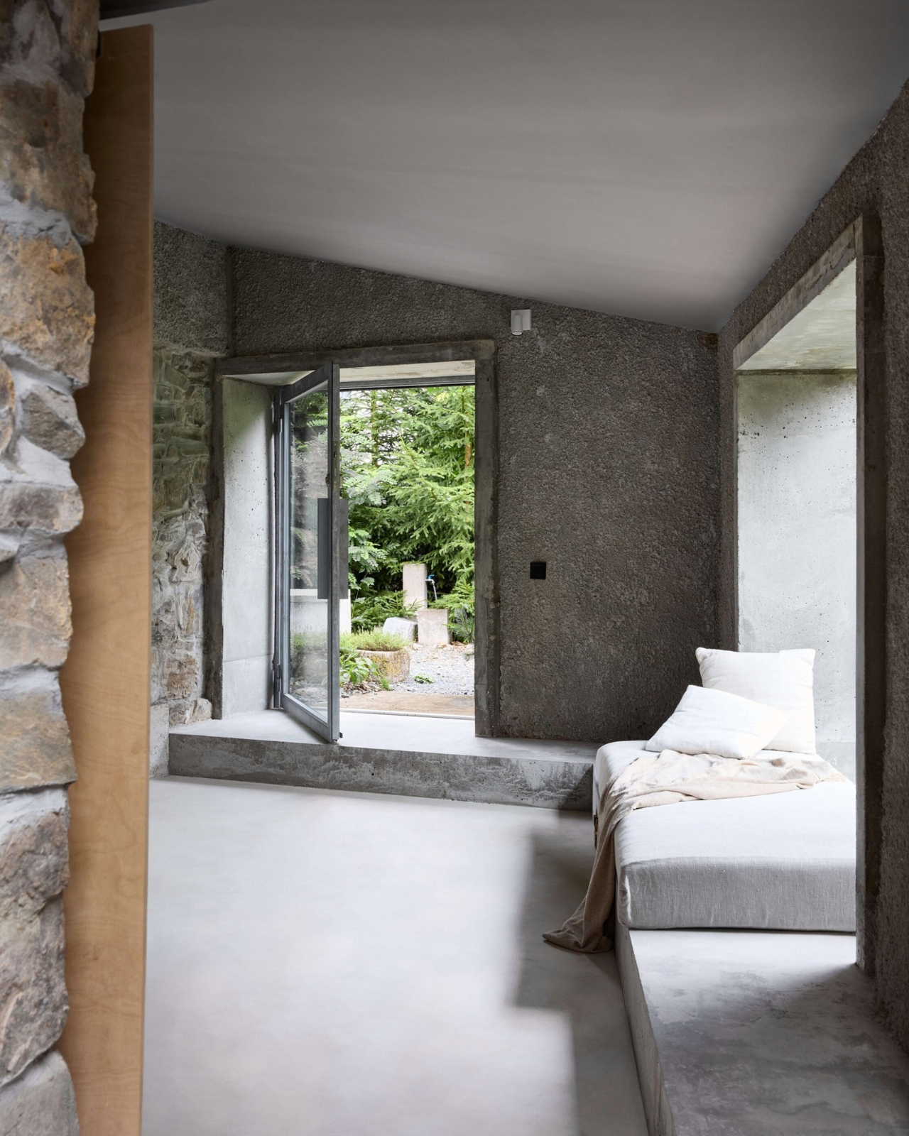
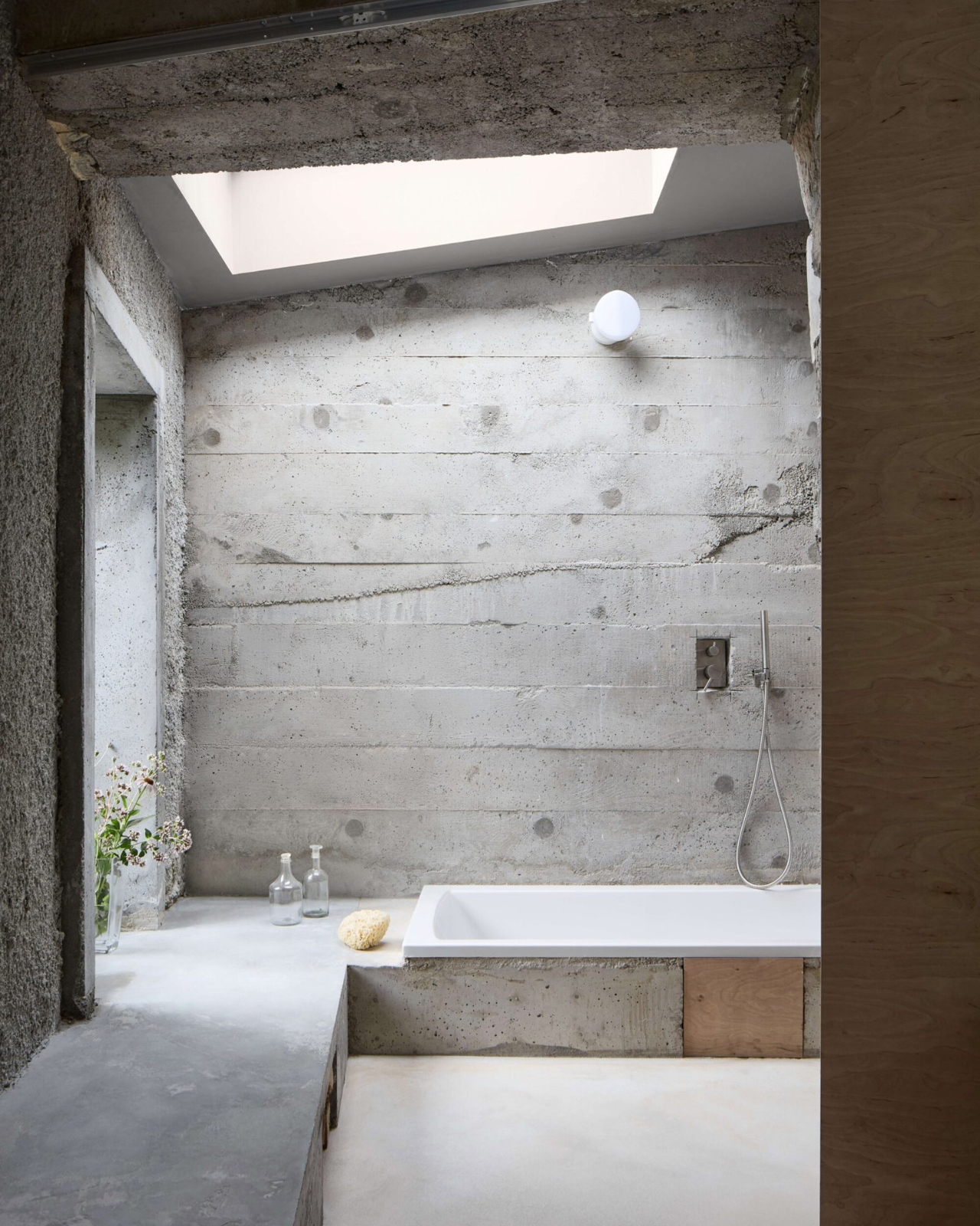
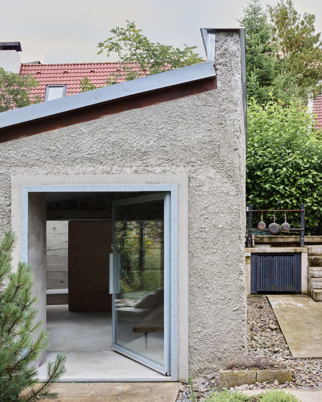
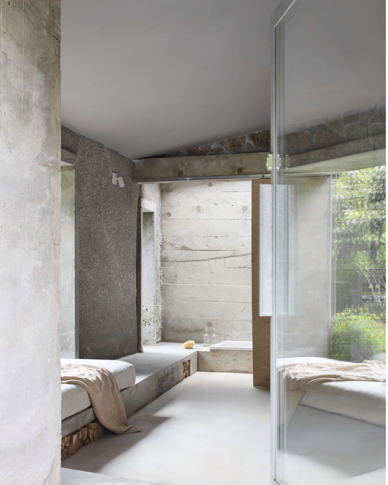
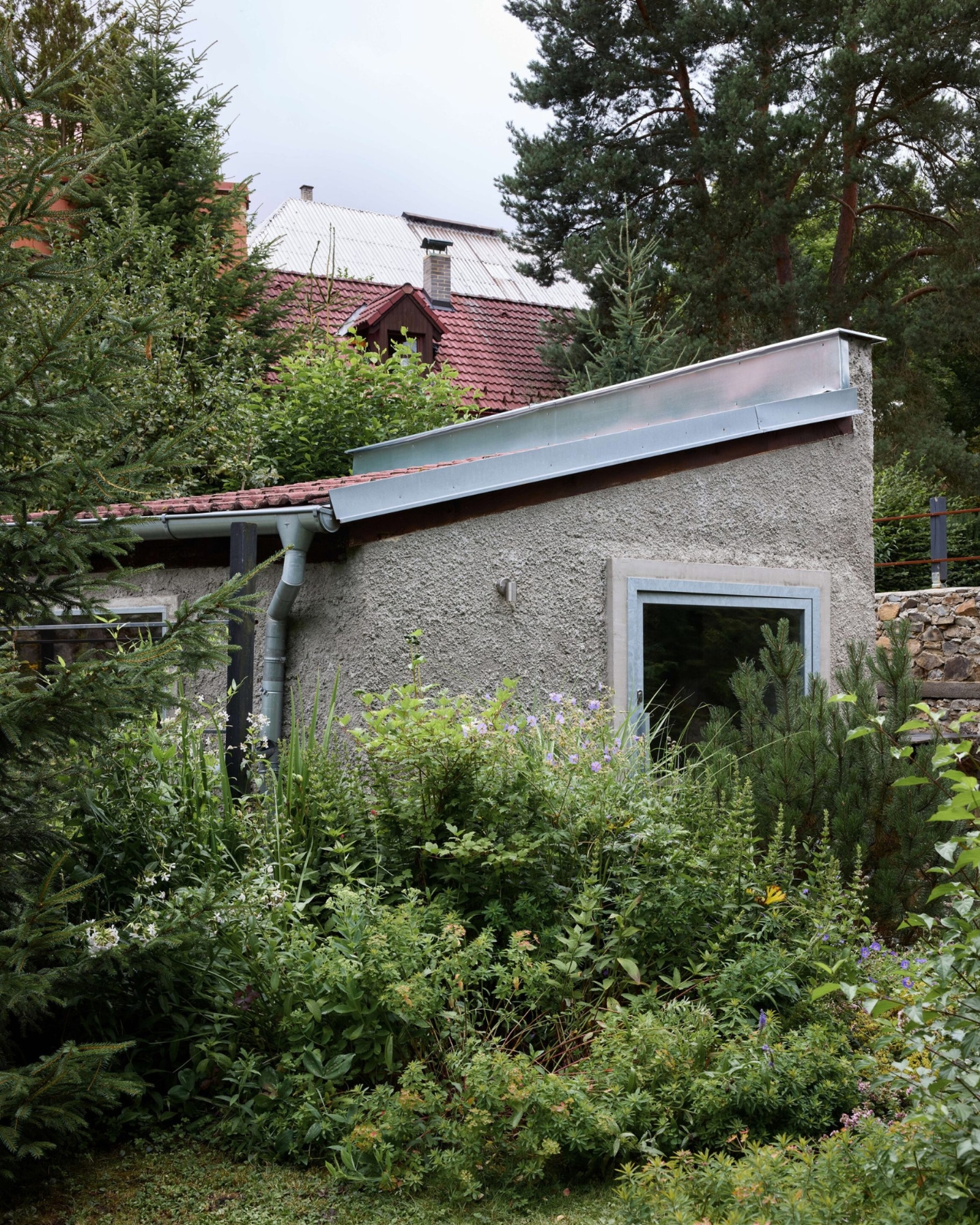
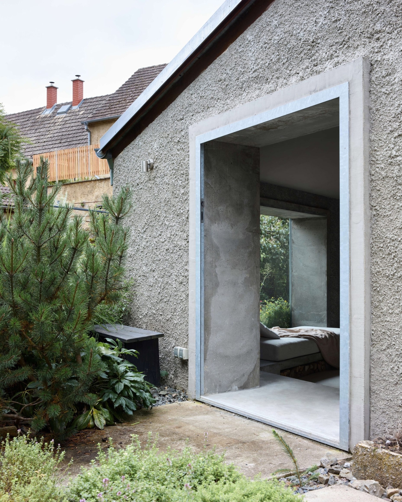
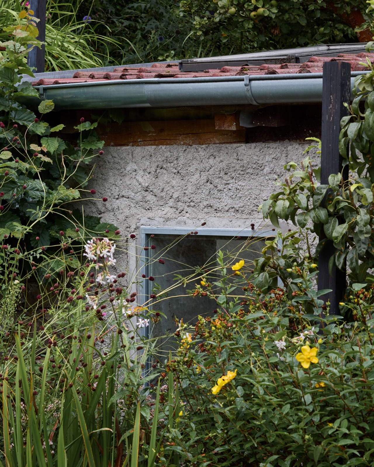
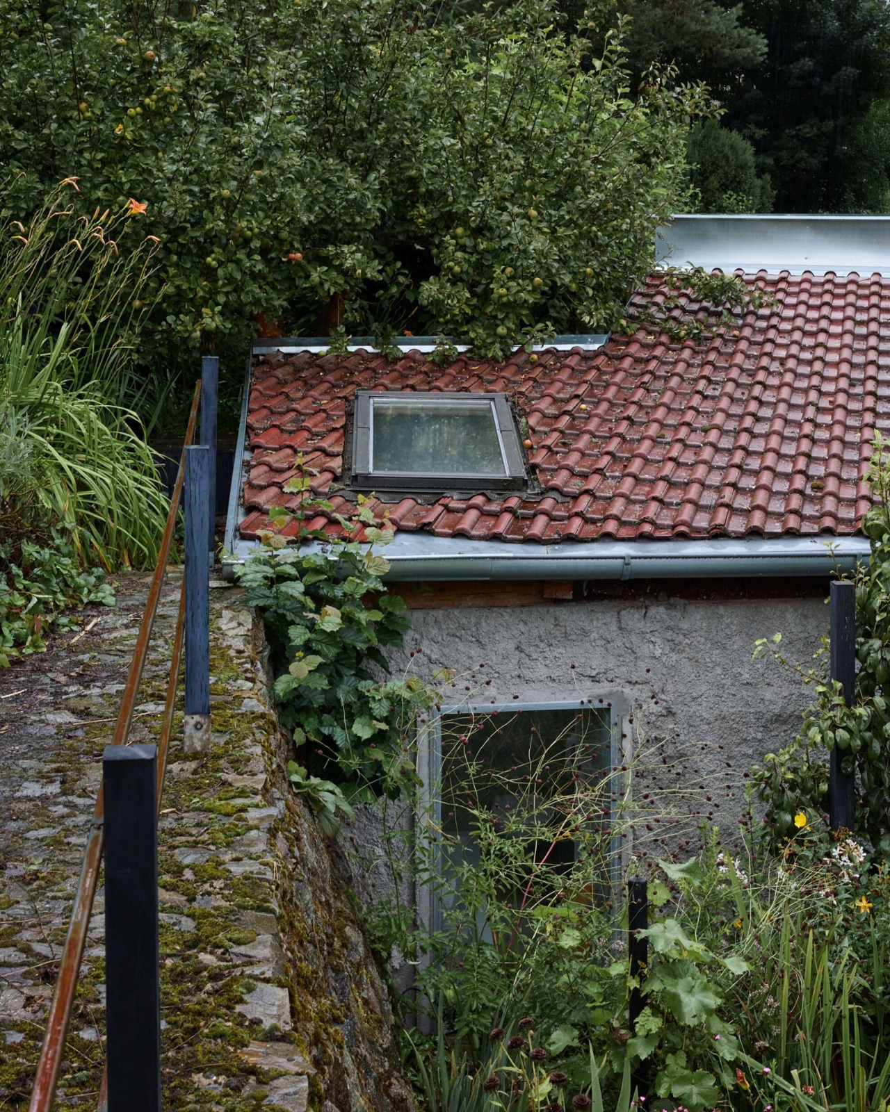
What came out of that process is a 32-square-meter summer house (22 square meters of usable space) that holds a single main room. The existing stone walls stayed. They received a cement spray finish that gives the exterior a rough, almost weathered unity without erasing what was already there. New window openings were cut into the walls, each one framed by monolithic concrete jambs that flow directly into a concrete bench running the full perimeter of the room. That bench does everything: it’s a step, a sofa, a storage unit for firewood, and yes, it also holds a bath. One continuous gesture, one continuous material.

I’ll be honest about my bias here. Raw concrete in small spaces has been done to death, and badly, by enough designers to make me skeptical whenever it shows up. But Milerová earns it. Her statement about the project puts it plainly: “The architectural approach centered on exposing the structural materials and utilizing the most basic construction techniques. Concrete became the medium for detail.” That’s not a vague philosophical statement. You can see exactly what she means in the way the window reveals and the interior bench are cast from the same pour, the same thinking, the same hand.

The windows themselves are steel profiles without a thermal bridge, supplied by Kaltmeyer using Jansen systems. Because this is a summer house, Czech building codes don’t require the same thermal performance standards as a year-round residence. That exemption sounds like a loophole, but here it’s actually design freedom. It means the frames can be honest about what they are. No layered insulation, no concealed systems, no pretense.

The personal dimension of this project is what gives it something extra. Milerová is from the same district as her client, and her father welded the steel brackets that mount the front door. That level of handmade involvement, where the architect’s own family literally built parts of the building, isn’t something you see in most residential projects, let alone ones that end up on Dezeen. It pulls the whole thing closer to craft than to architecture in the institutional sense, which I think is exactly the right register for a building this small and this specific.

The outdoor kitchen sits alongside the entrance, with hanging pots and an open-air sensibility that makes clear this isn’t a house trying to be a house. It’s a summer place. It knows its season and its purpose.

Panoší Újezd Summer House completed in 2024, photographed by Radek Šrettr Úlehla, and it’s been making the rounds online for good reason. At 32 square meters, it proves that scale is the wrong measure of ambition. The better question is whether a building knows what it is and commits to it fully. This one does, without apology and without excess.

The post A Czech Pigsty, Raw Concrete, and 32 Square Meters of Restraint first appeared on Yanko Design.
This 341-Square-Foot Tiny Home Proves You Don’t Need More Space — Just Smarter Space

Most tiny homes ask you to forgive something. The Amelia doesn’t. It speaks that language fluently — treating constraint as a design language rather than something to apologize for.

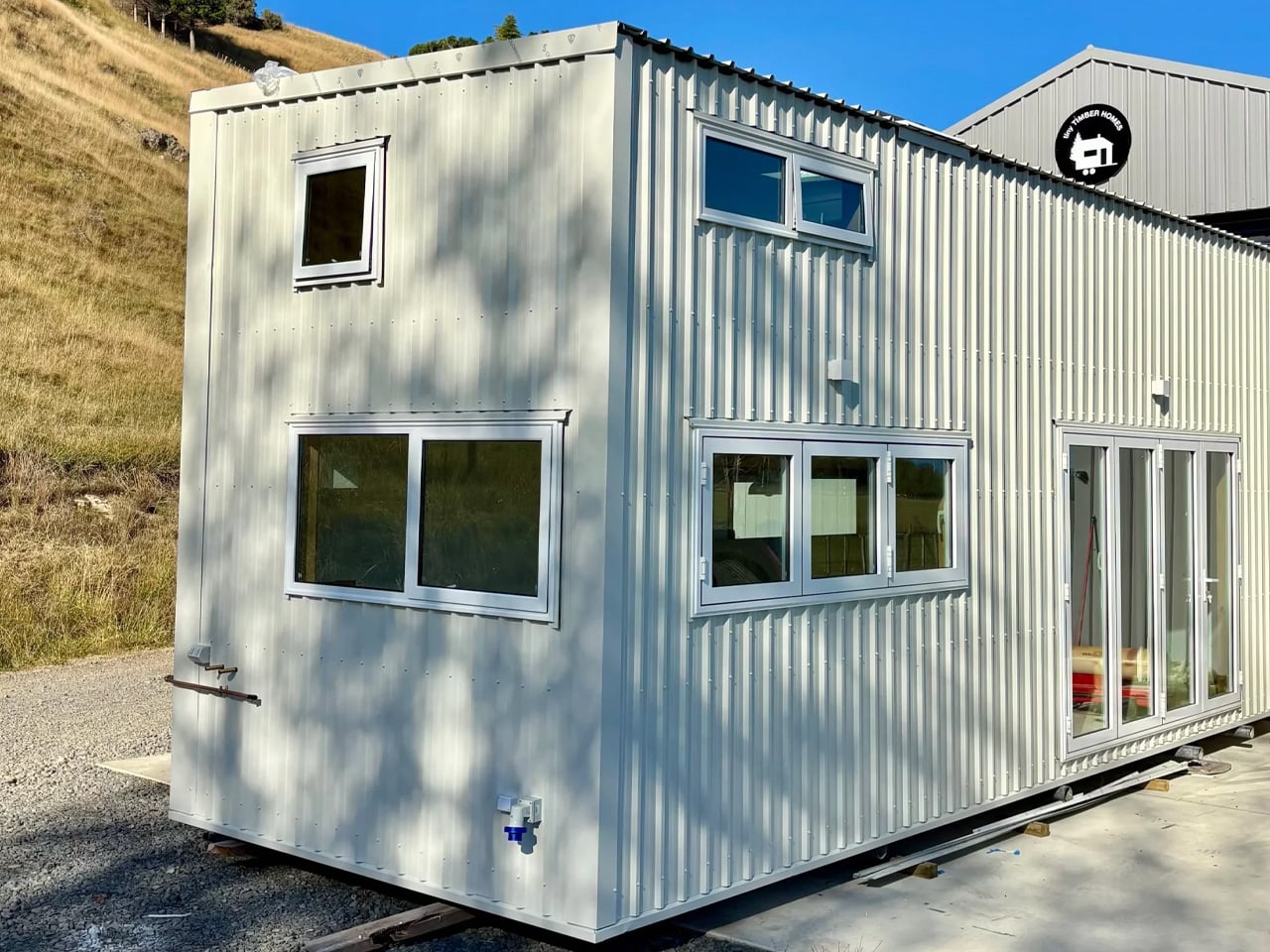
Stretching 26 feet long and 8.5 feet wide, the Amelia sits on a double-axle trailer and clocks in at 341 square feet of living space. It wears white board-and-batten siding with a maintenance-free steel base and a snap-lock metal roof — clean, unfussy, built to hold up wherever you put it. The kind of exterior that looks deliberate rather than compromised.

Designer: Teacup Tiny Homes

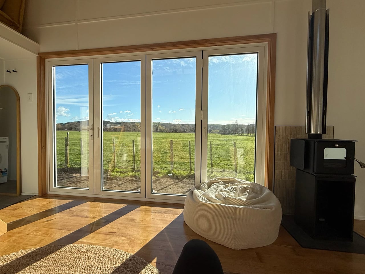
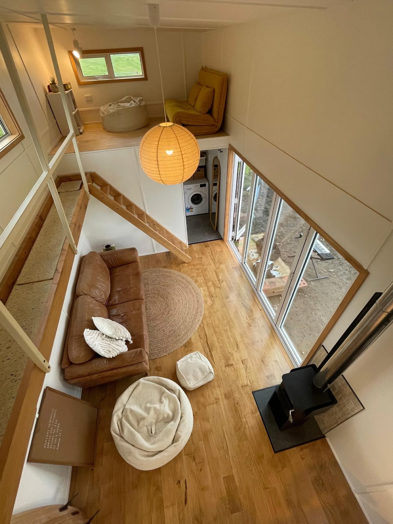
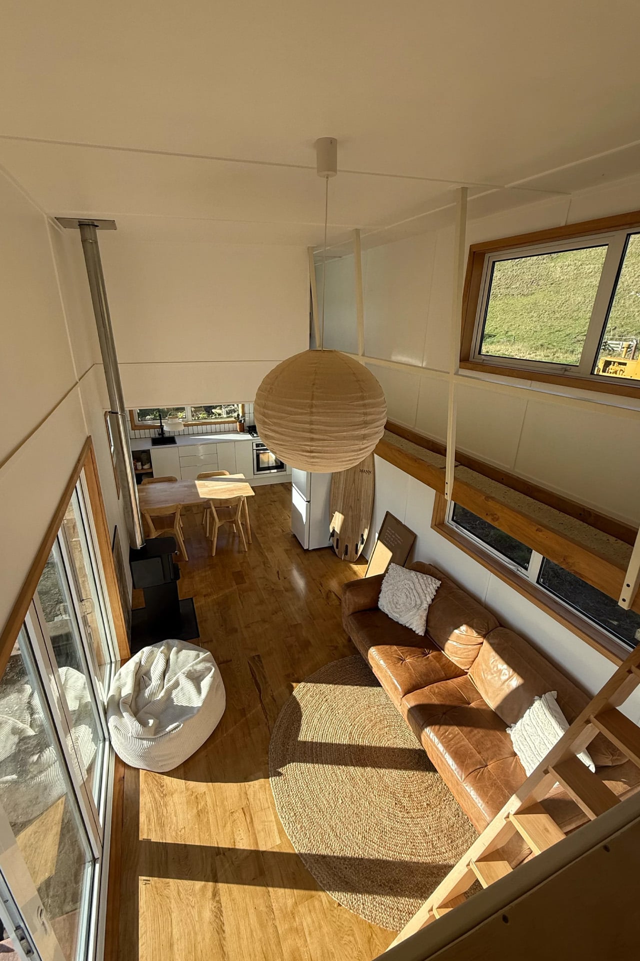
Step inside and the first thing you notice is the light. Generous dual-pane, low-E windows fill the living room with natural brightness, and the layout feels considered rather than cramped. There’s room for a full sofa — a sofa bed is available as an upgrade — alongside a large storage unit. A propane-powered underfloor heating system keeps the ground level comfortable year-round, complemented by a mini-split air conditioning unit and a Lunos heat recovery ventilator for air quality. The Amelia was built for Canadian winters, and it shows.

The kitchen sits just past the living area and does not ask you to compromise. A white apron-front farmhouse sink anchors the space, joined by a four-burner Furrion propane range, an oven, a fridge-freezer, a stainless over-the-range microwave, and a large pull-out pantry. Waterfall-edge marble-like countertops run along the perimeter, with an eating bar doubling as a workstation. Every detail, from the soft-close cabinet doors to the black Kohler pull-down faucet, feels chosen rather than settled for. It is the kind of kitchen that makes cooking feel like something worth doing.
A sliding door connects the kitchen to the bathroom — a thoughtful detail that keeps the living zone open. Inside, a 30×30 stand-up shower with easy-clean fiberglass walls, a custom vanity with a rectangular vessel sink, and an oversized round medicine cabinet handle the essentials without feeling like a compromise. There is also a laundry rough-in for those who want to add machines later.

Two loft bedrooms occupy the upper level. The main loft, positioned over the kitchen, fits a king-size bed behind a slatted privacy wall. The secondary loft, accessed by a removable wooden ladder above the living room, handles a queen or king with room to spare. A storage-integrated staircase is available as an upgrade and is worth it for full-time living.

The Amelia starts at roughly US$102,000 and is available for delivery across the United States and Canada. Teacup Tiny Homes, a 100% female-owned Alberta-based builder operating since 2016, offers significant customization across layouts, materials, and finishes. For a home this size, it carries a lot of conviction.

The post This 341-Square-Foot Tiny Home Proves You Don’t Need More Space — Just Smarter Space first appeared on Yanko Design.