Nike Just Turned Air Into Team USA’s Smartest Olympic Jacket

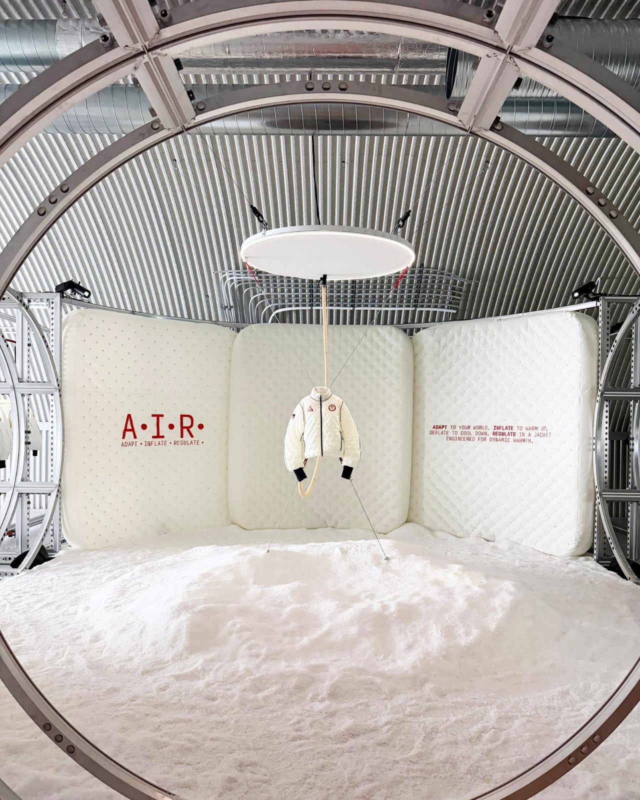
Remember when Nike introduced the Air Milano jacket a few months back? The inflatable jacket that promised to solve the age-old runner’s dilemma of overheating mid-run? Well, it just made its official debut at the 2026 Winter Olympics in Milan, and Nike’s chief design officer Martin Lotti is making it clear: this isn’t some novelty stunt.

The jacket’s now being worn by Team USA athletes during medal ceremonies, which is pretty much the ultimate endorsement for any piece of sportswear. But beyond the Olympic spotlight, there are some fascinating new details emerging about why this jacket matters more than you might think.

Designer: Nike
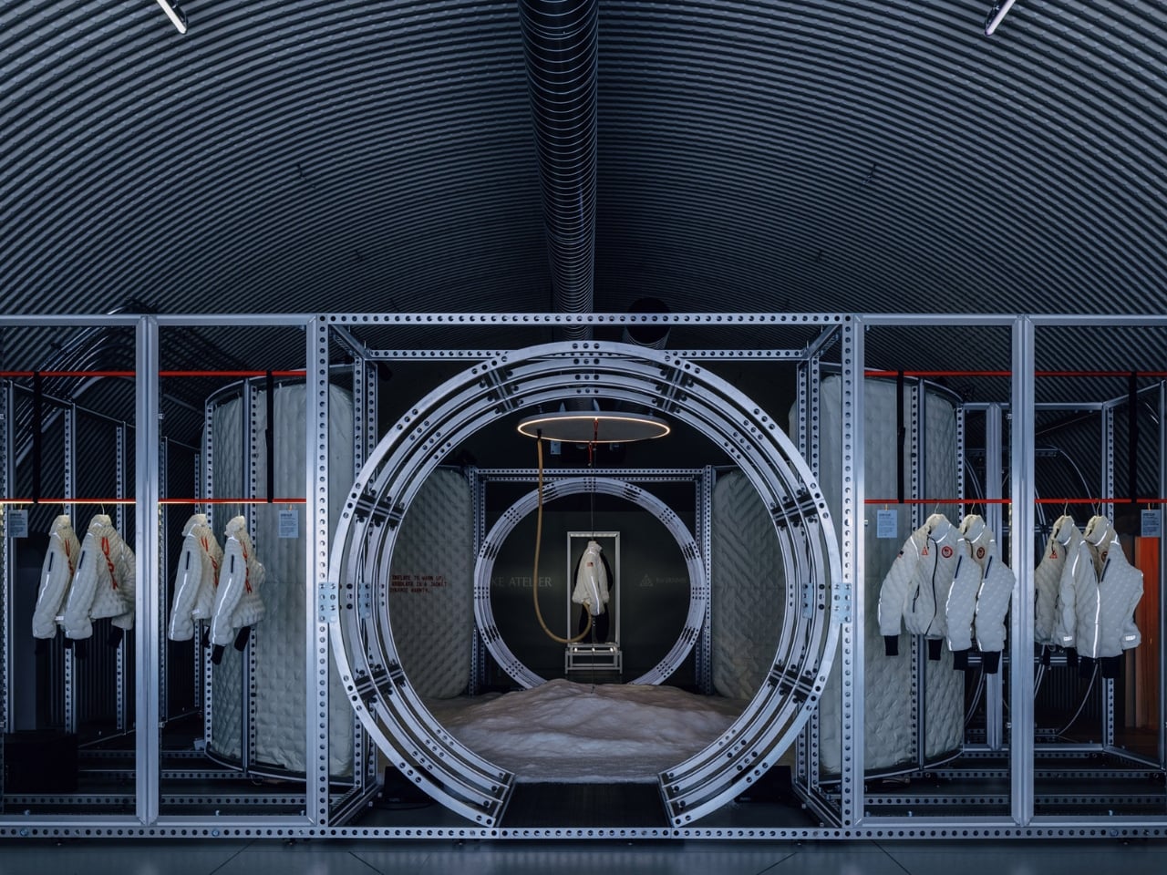
Lotti explained that Nike has been working with air as a cushioning technology in footwear for half a century, but they’ve barely scratched the surface of what air can do. The interesting twist? From a design perspective, they’re working with a medium that’s completely invisible. You can’t see air, you can’t touch it in the traditional sense, yet it’s proving to be one of the most versatile materials in their arsenal.

The real game changer here is how the jacket addresses temperature regulation. According to Lotti, runners face this problem constantly. You start your morning run when it’s cold, you warm up as you go, and then what? Most of us just tie the jacket around our waist without thinking about it. It’s such an automatic response that we don’t even realize we’re settling for an imperfect solution.
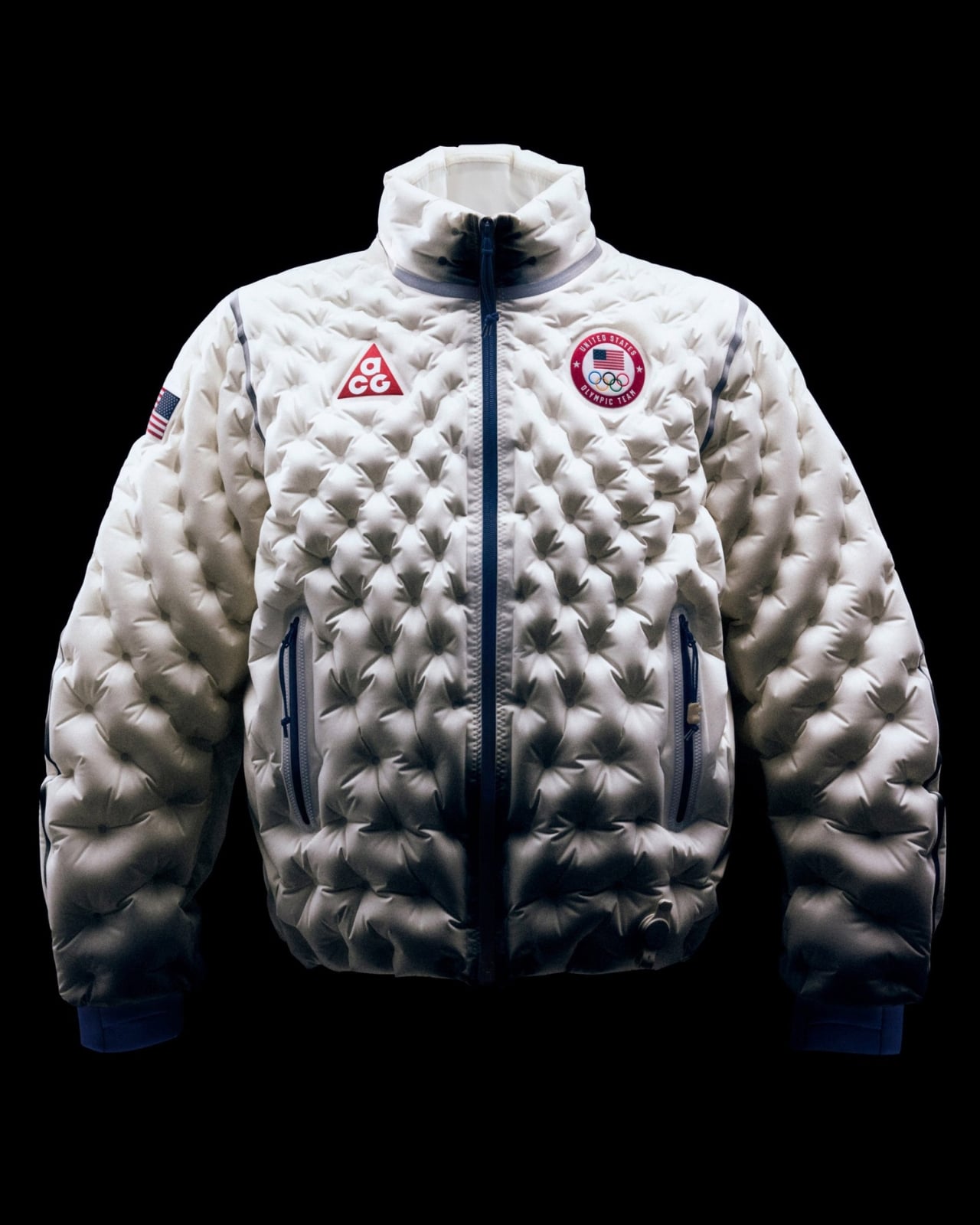
With the Air Milano, that problem disappears. The jacket inflates with a small battery-powered fan through a valve on the front, and it takes about 20 seconds to go from windbreaker to mid-weight puffer. Need to cool down? Press the same valve and gradually release the air. The whole process happens while you’re moving, which means you can adjust your warmth on the fly without breaking stride or stopping to fuss with layers.

One of the most compelling arguments for this technology is the weight-to-warmth ratio. Traditional down puffers have a fatal flaw: when they get wet, they lose their insulating properties. The feathers clump together, the jacket gets heavy, and suddenly you’re wearing a soggy, useless shell. Because the Air Milano uses actual air as insulation, water doesn’t compromise its performance. It stays light, it stays warm, and it doesn’t wet out.
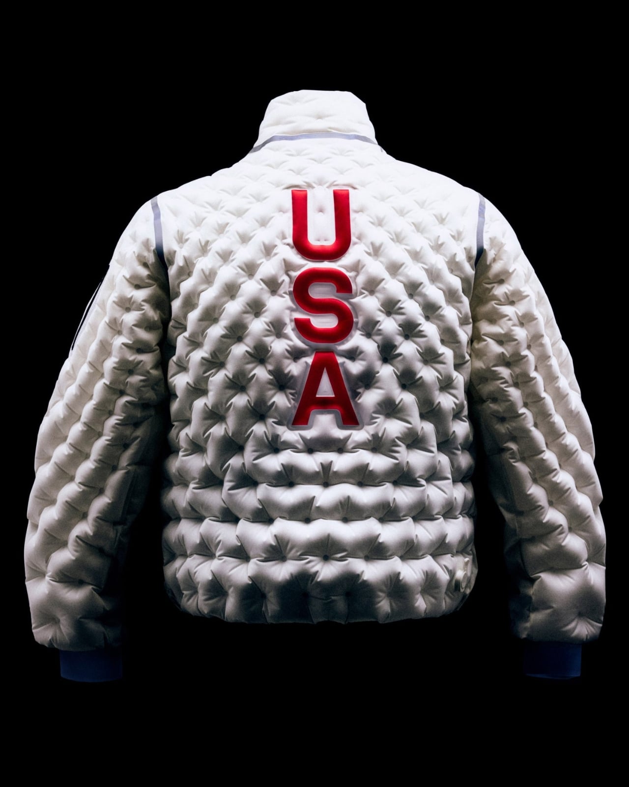
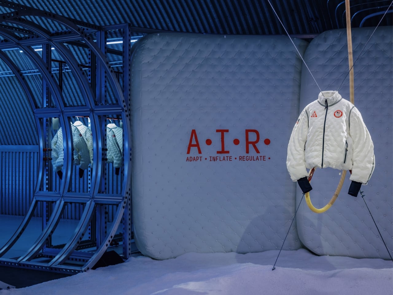
Nike also revealed that this jacket showcases what they’re calling A.I.R. Technology, which stands for Adapt, Inflate, Regulate. The whole design is informed by body mapping data from Nike’s Sport Research Lab and uses computational design to create those sculptural baffles you see on the surface. It’s not just about making something that looks cool; it’s about strategically placing air where your body needs warmth most.

The Team USA version comes with some exclusive touches that weren’t part of the original announcement. There are sculpted design elements, a custom ACG pump (instead of the generic battery-powered fan initially mentioned), metallic twill branding, and an interior lining graphic depicting the Garden of the Gods in Colorado Springs, where Team USA trains. More importantly, Nike built in accessibility features like interior thumb loops on the bottom hem and a magnetic zipper specifically designed to help Paralympic athletes put on and close the jacket independently.
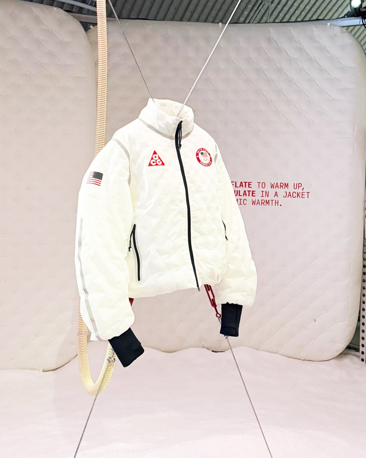
What’s particularly interesting is that this isn’t Nike’s first rodeo with inflatable outerwear. They’ve been experimenting with this concept for 20 years, starting with the ACG Airvantage jacket and continuing with the ISPA Adapt Sense Air. But the Air Milano represents a major evolution in both technology and wearability. It’s lighter, faster to inflate, and actually solves a practical problem instead of just being a technical curiosity.
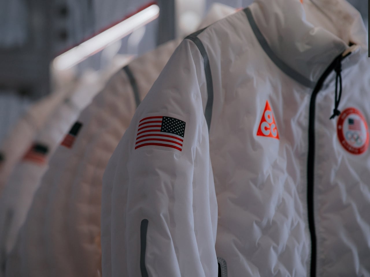
Lotti’s perspective on this is refreshing. He’s adamant that the Air Milano isn’t a gimmick because it addresses a real issue that athletes face every single time they go for a run. That’s the difference between innovation for innovation’s sake and design that actually improves how people move through the world.
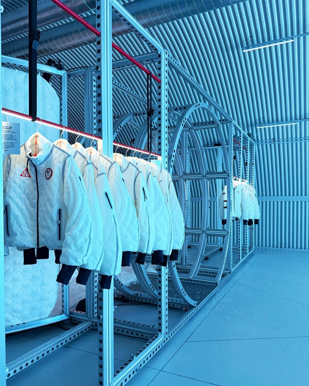
The jacket is positioned as part of Nike’s broader FIT system of apparel, which includes Therma-FIT insulation, Aero-FIT cooling, Dri-FIT moisture-wicking, and Storm-FIT weather protection. It’s not meant to replace every jacket you own, but rather to fill a specific need for adaptive warmth in changing conditions.

Seeing Team USA athletes wearing these jackets on the podium in Milan gives the whole project a very different context. It’s not just a prototype or a concept piece anymore. It’s performance gear that’s being tested at the highest levels of athletic competition, which means Nike has confidence it can handle real-world demands.
The post Nike Just Turned Air Into Team USA’s Smartest Olympic Jacket first appeared on Yanko Design.
FloX: The Hair Tool That Thinks Like a Tech Product

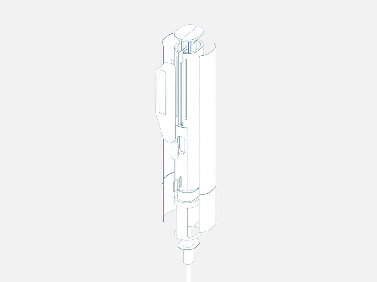
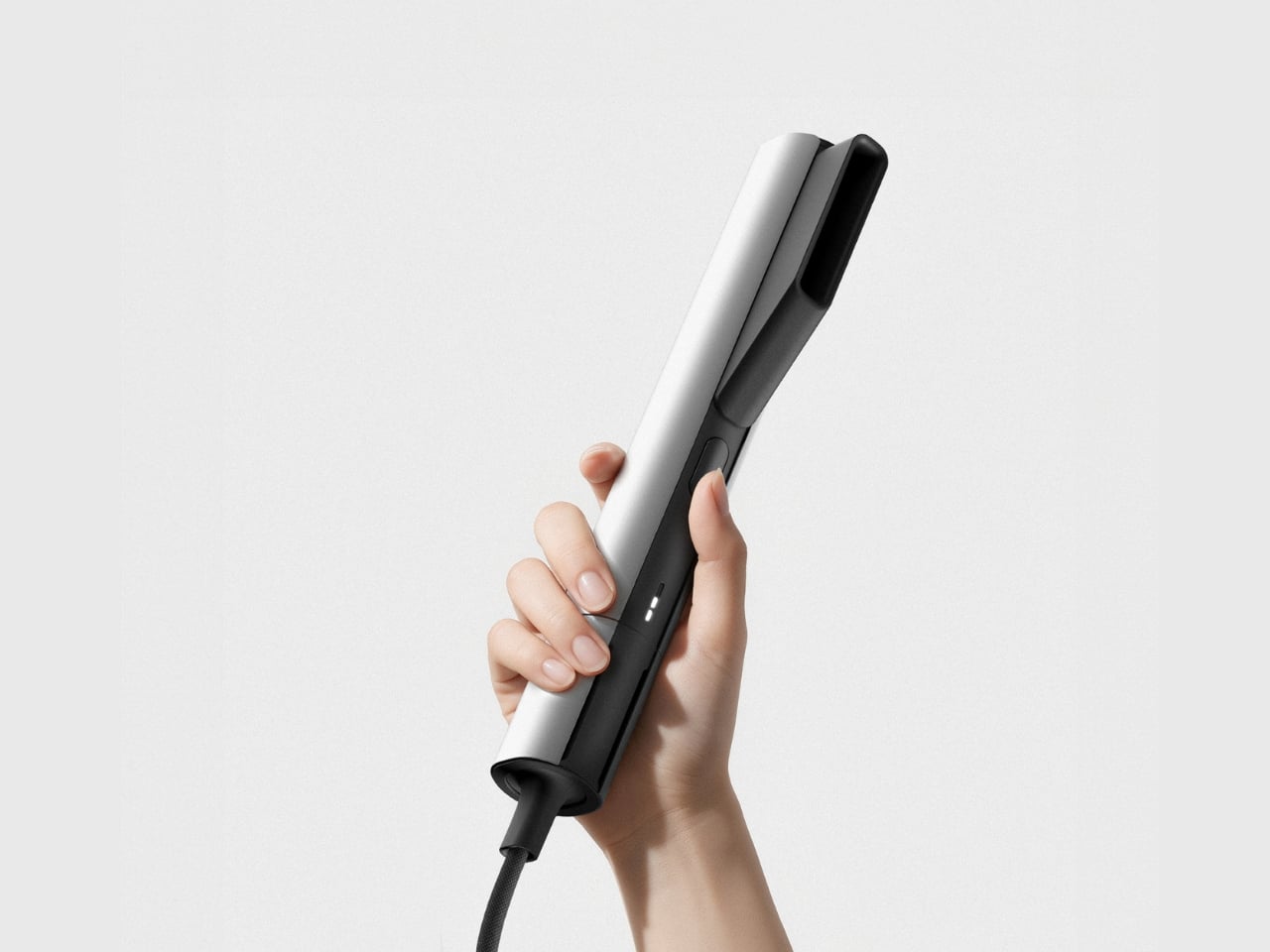
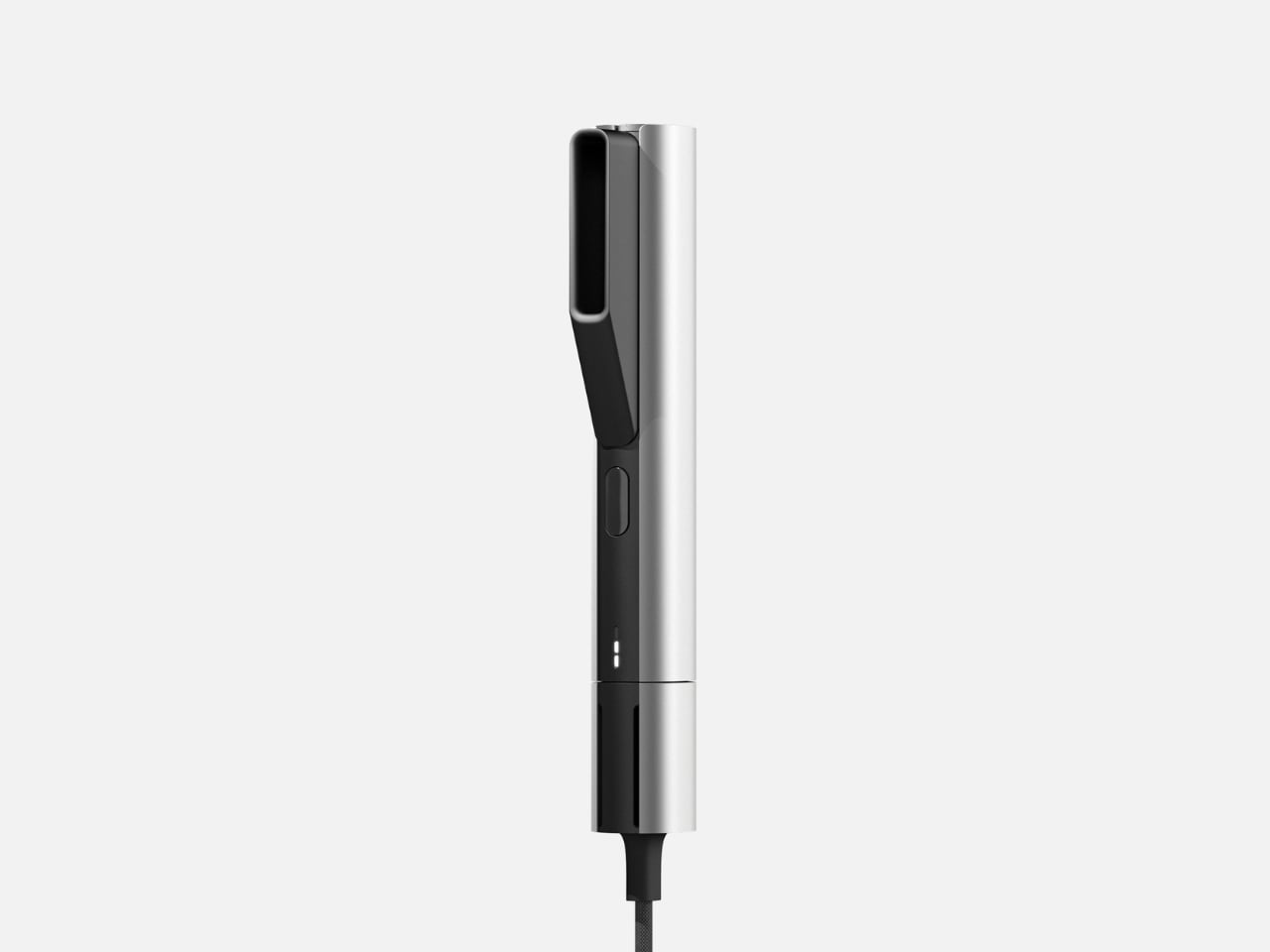
There’s something refreshing about a hair tool that doesn’t try to hide what it is. FloX, designed by Hyeokin Kwon, sits comfortably at the intersection of industrial design and everyday beauty routine, looking more like a precision instrument than another pink gadget drowning in curved plastic. It’s the kind of product that makes you stop and think about why we’ve accepted mediocre design in our bathrooms for so long.

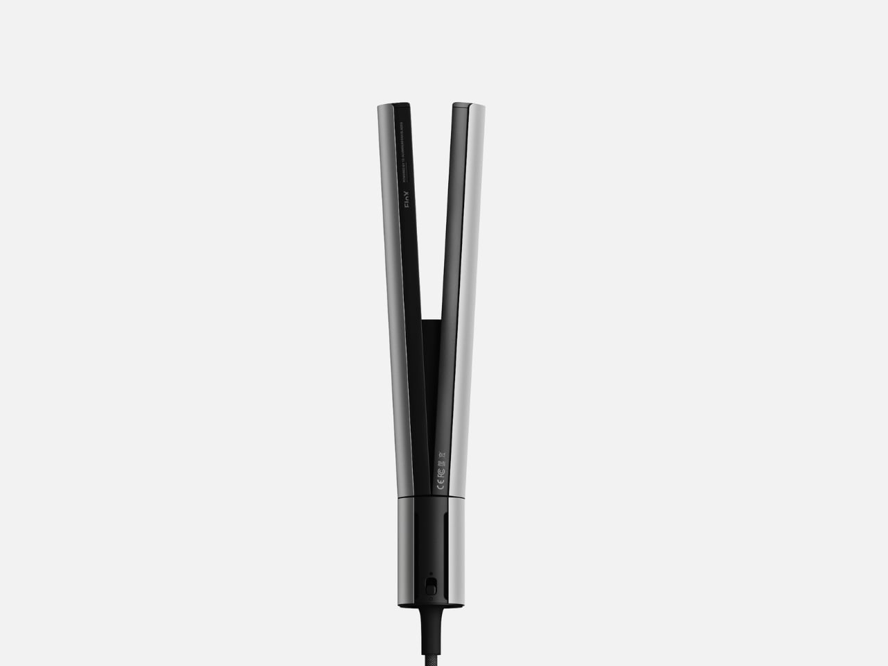
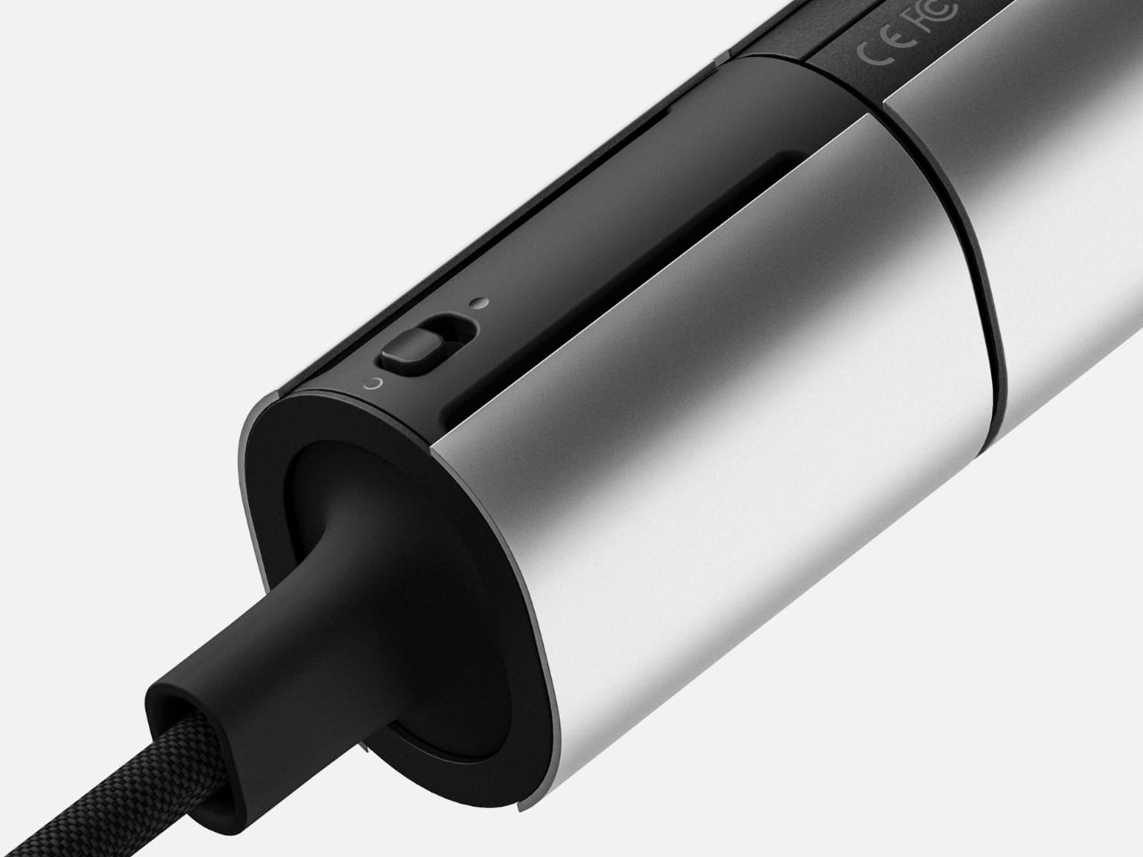
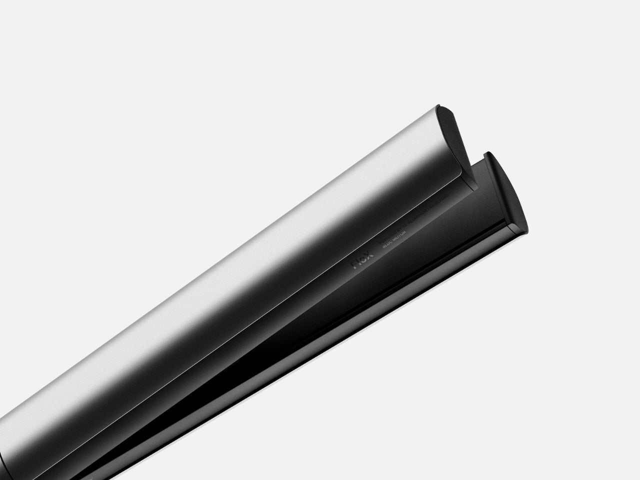
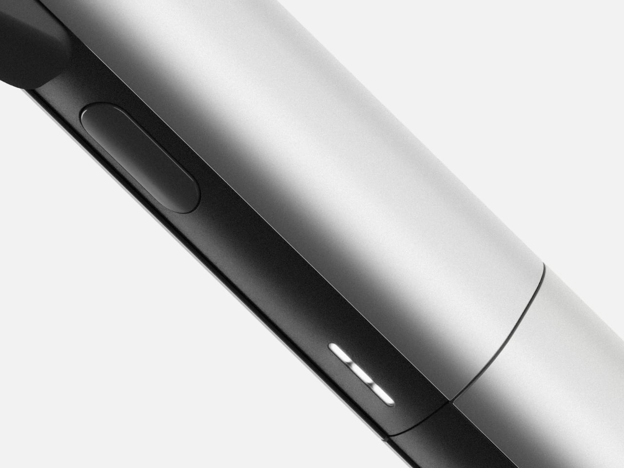
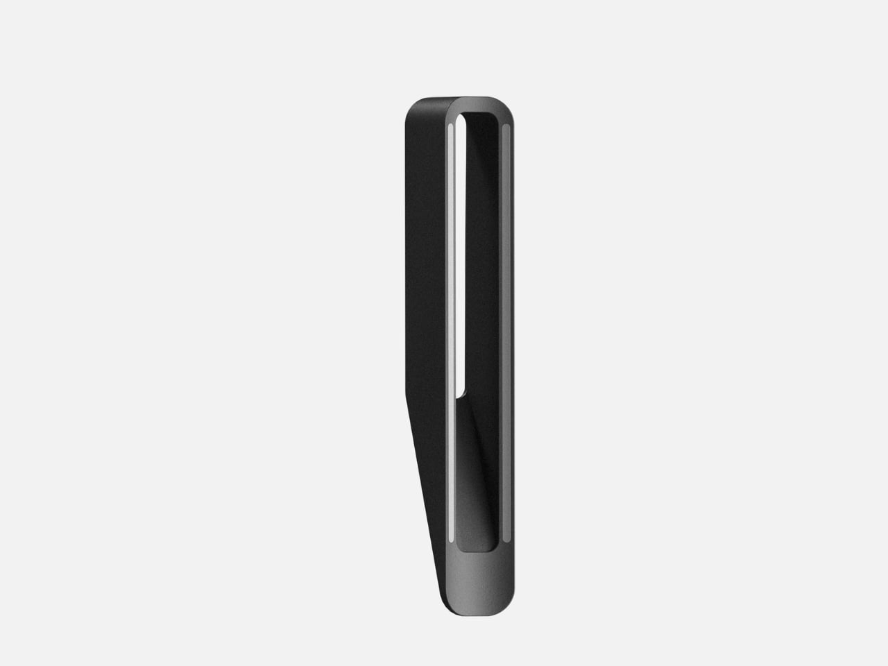
At first glance, FloX reads as almost severe in its minimalism. The body splits into two distinct halves: a cool silver exterior paired with matte black accents that house the business end of the tool. This isn’t decorative contrast for the sake of looking expensive. The two-tone design actually signals function, showing you exactly where to grip and where the heat lives. It’s honest design that respects your intelligence.

Designer: Hyeokin Kwon

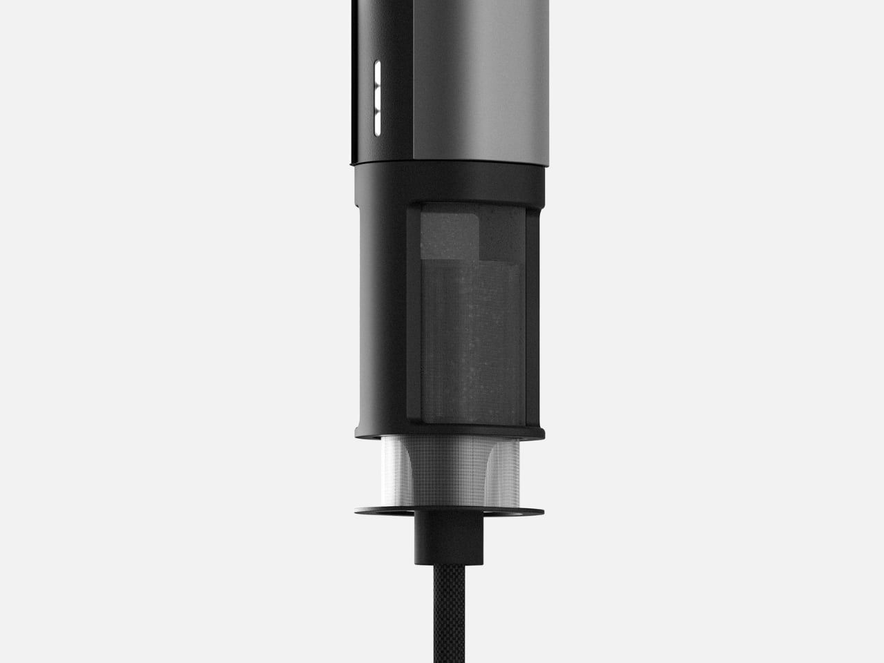
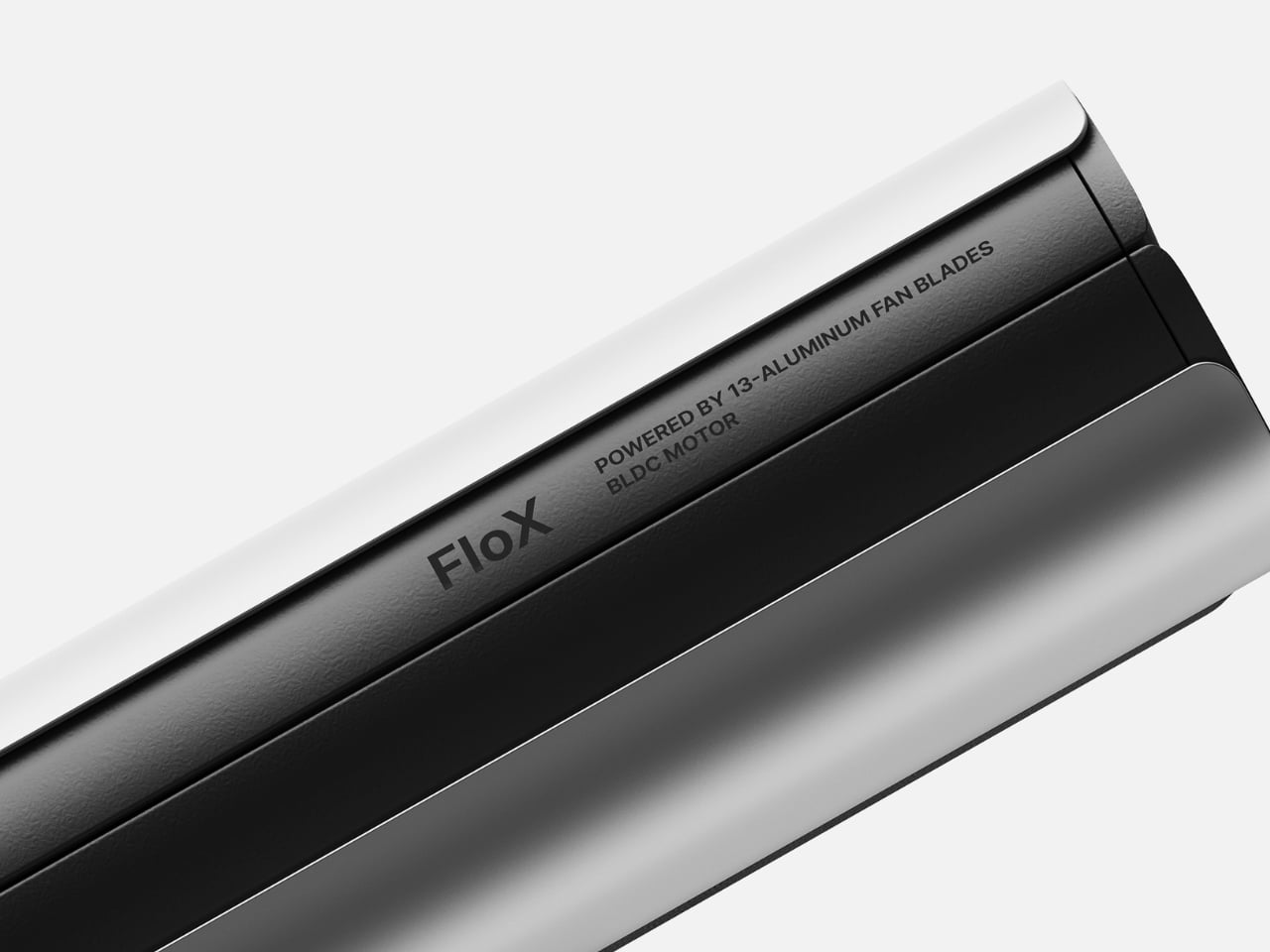
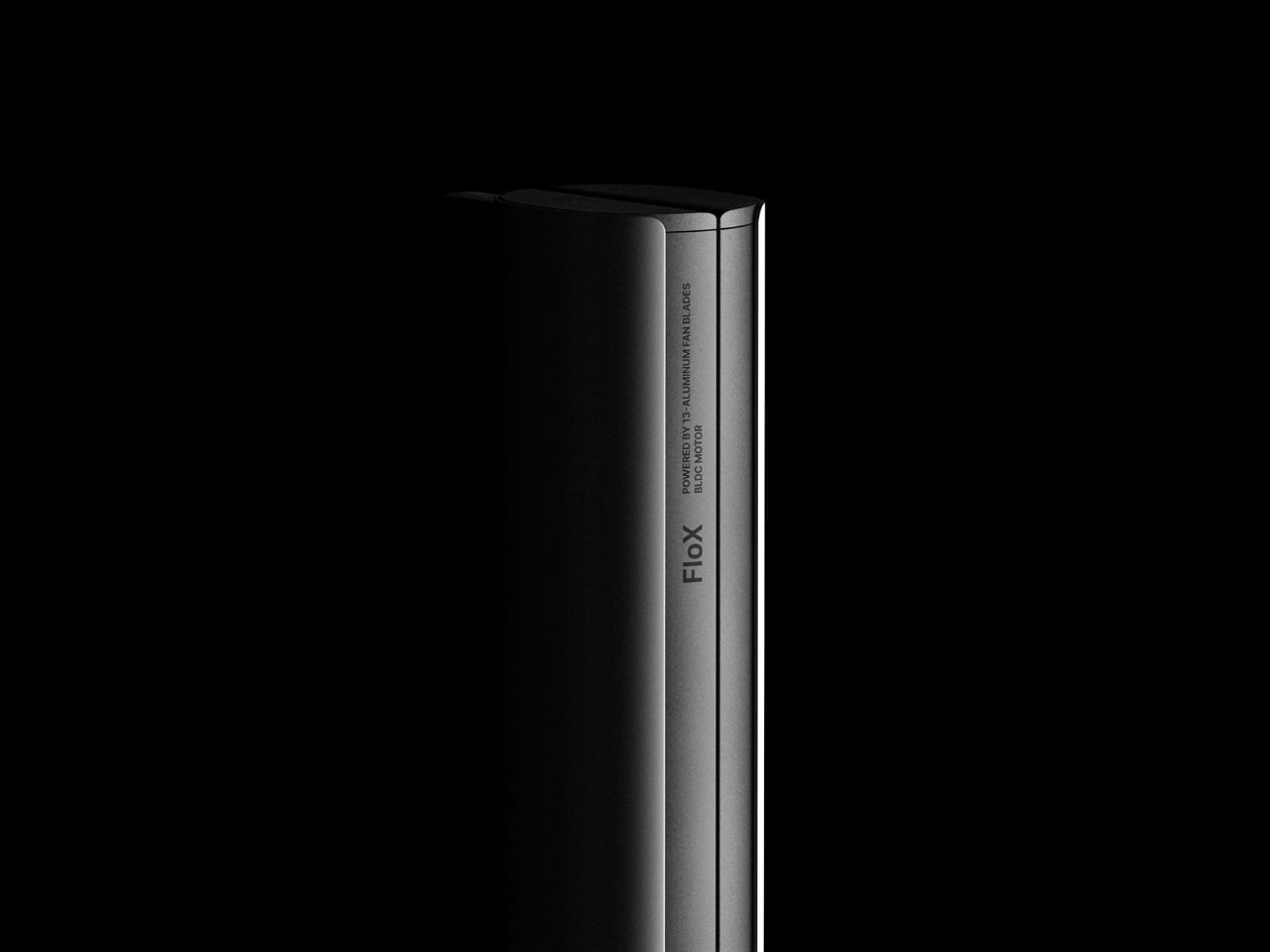
What really sets FloX apart lives inside that sleek body. Kwon has integrated 13 aluminum fan blades powered by a BLDC motor, the same type of brushless technology you’d find in electric vehicles or high-end drones. This isn’t just spec sheet bragging. Those fans actively cool the device while you’re using it, addressing one of the most annoying aspects of hair styling tools: the fact that they get uncomfortably hot to hold and can turn your bathroom into a sauna.

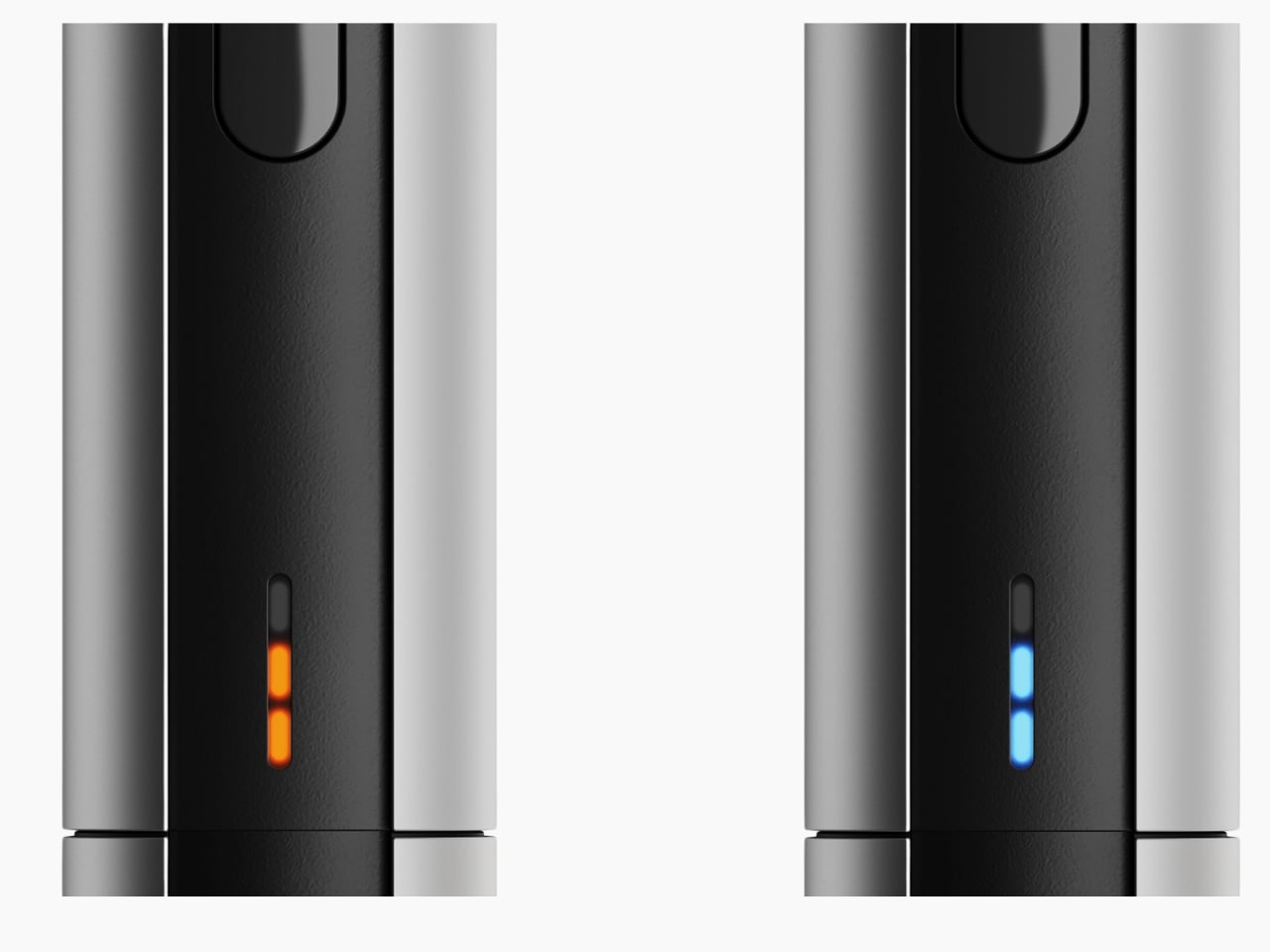
The technical sophistication continues with the temperature indicator system. Instead of a clunky digital display or vague heat settings, FloX uses a subtle LED strip that glows orange for hot and blue for cool. It’s intuitive without being childish, giving you the information you need without cluttering the design. The indicator sits flush with the body, maintaining those clean lines even when the device is active.

Look at the head of the tool and you’ll see Kwon has rethought the traditional straightener form. The plates have a gentle taper rather than being perfectly parallel, which means you can create straight styles or loose waves without needing a separate curling iron. It’s versatility built into the geometry itself, not added as an afterthought with a bunch of attachments you’ll lose within a month.

The ergonomics deserve attention too. FloX has this balanced weight distribution that makes it comfortable to hold at different angles, which matters more than you’d think when you’re working on the back of your head or trying to get volume at the roots. The grip area has a subtle texture that keeps the tool secure in your hand without resorting to rubberized grips that inevitably get grimy or sticky over time.

What strikes me most about FloX is how it treats hair styling as a legitimate design challenge rather than a frivolous women’s product that doesn’t deserve serious engineering. The hair tool market has been stuck in a pattern of adding more colors, more “technology” buzzwords, and more unnecessary features while ignoring fundamental issues like overheating, poor weight balance, and cluttered interfaces. Kwon strips all that away and focuses on what actually matters: precision heating, active cooling, and a form that makes sense for how people actually use these tools.

The monochromatic photography in the design presentation reinforces this approach. By removing color from the context, Kwon forces you to look at form, shadow, and proportion. It’s a confident move that shows the design can stand on sculptural merit alone. You could display this on a shelf next to a nice speaker or a piece of modern furniture and it wouldn’t look out of place.

This is industrial design thinking applied to personal care, and it points toward a more interesting future for everyday objects. When designers stop assuming that products for styling, beauty, or self-care need to be softened or feminized or hidden away, they can create tools that are genuinely better. FloX proves that a hair straightener can be as thoughtfully designed as a smartphone or a coffee maker, with the same attention to materials, mechanics, and user experience.

Whether FloX makes it to production remains to be seen, but as a design statement, it’s already succeeded. It challenges both the industry to do better and consumers to expect more from the objects they use every day. Sometimes the most radical thing a product can do is simply be well designed without apology.

The post FloX: The Hair Tool That Thinks Like a Tech Product first appeared on Yanko Design.
This $129 Bag Lets You Play Music Without Opening It

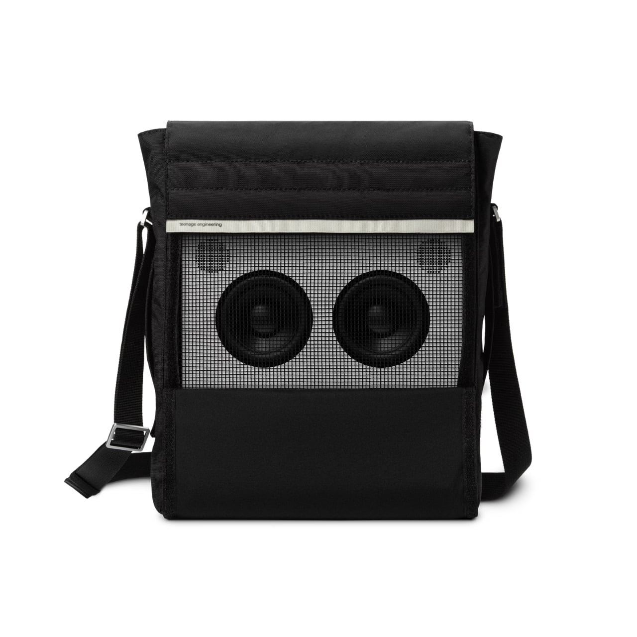
There’s something fascinating about watching a tech company obsess over the mundane. While most electronics brands treat bags as afterthoughts (slap a logo on generic nylon, call it a day), Teenage Engineering went ahead and designed a shoulder bag that’s as thoughtful as their cult-favorite synthesizers. The Field OB-4 shoulder bag isn’t trying to be your everything bag, and that specificity is precisely what makes it interesting.

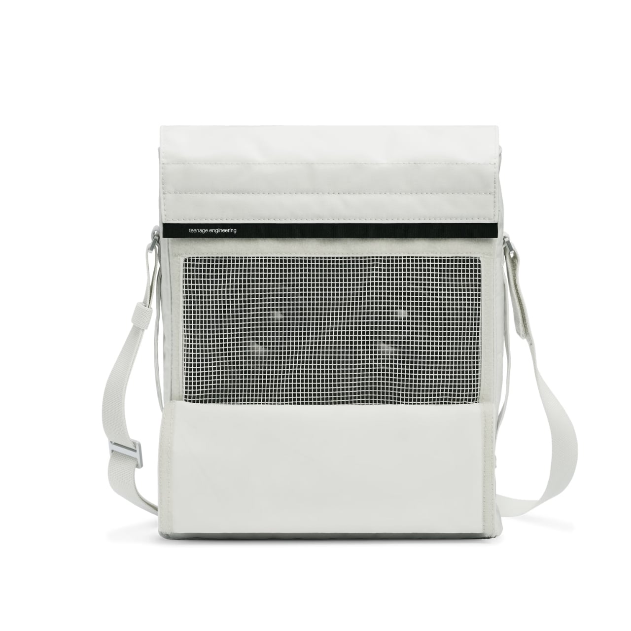
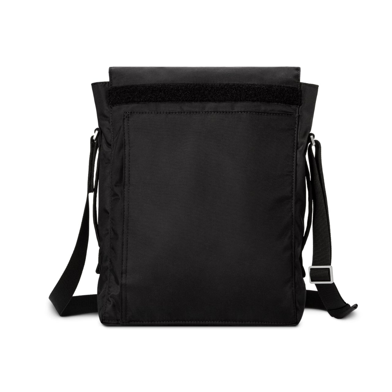
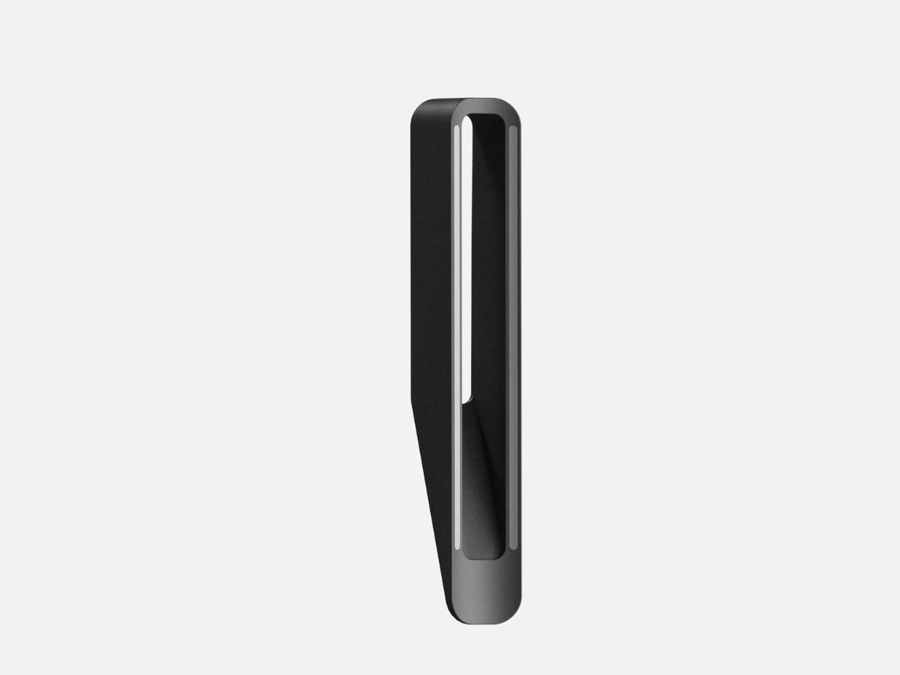
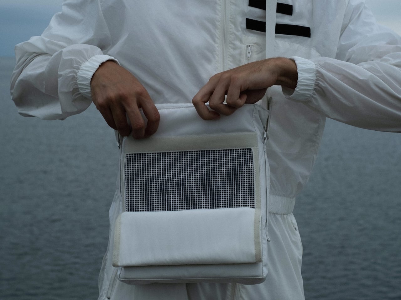
Built primarily to carry the OB-4 Magic Radio, this $129 shoulder bag features a mesh front panel that lets you play music while your device stays tucked inside. Think about that for a second. Most bags are designed to protect and conceal. This one wants you to use what’s inside without ever taking it out. It’s the kind of detail that separates product design from problem-solving.

Designer: Teenage Engineering

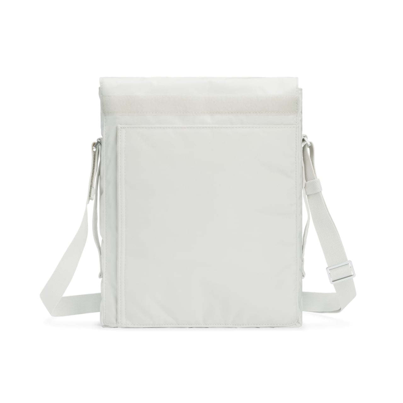
The construction tells you everything about Teenage Engineering’s priorities. The shell uses tear and abrasion-resistant nylon 66 with a fire retardant treatment and PU backing for water repellency (1500 mm rating on the black version, 3000 mm on the white). These aren’t vanity specs. They’re the materials you’d find on technical outdoor gear, applied to something that’ll probably spend more time on subway cars than mountain trails. It’s overbuilt in the best possible way.

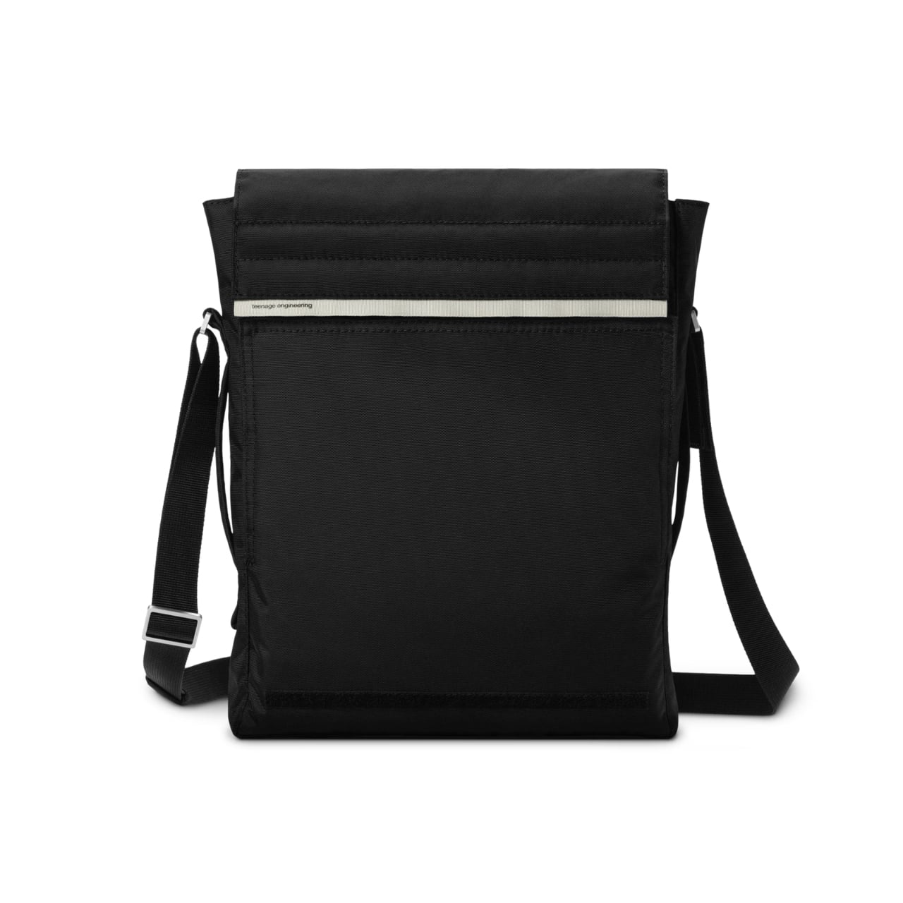
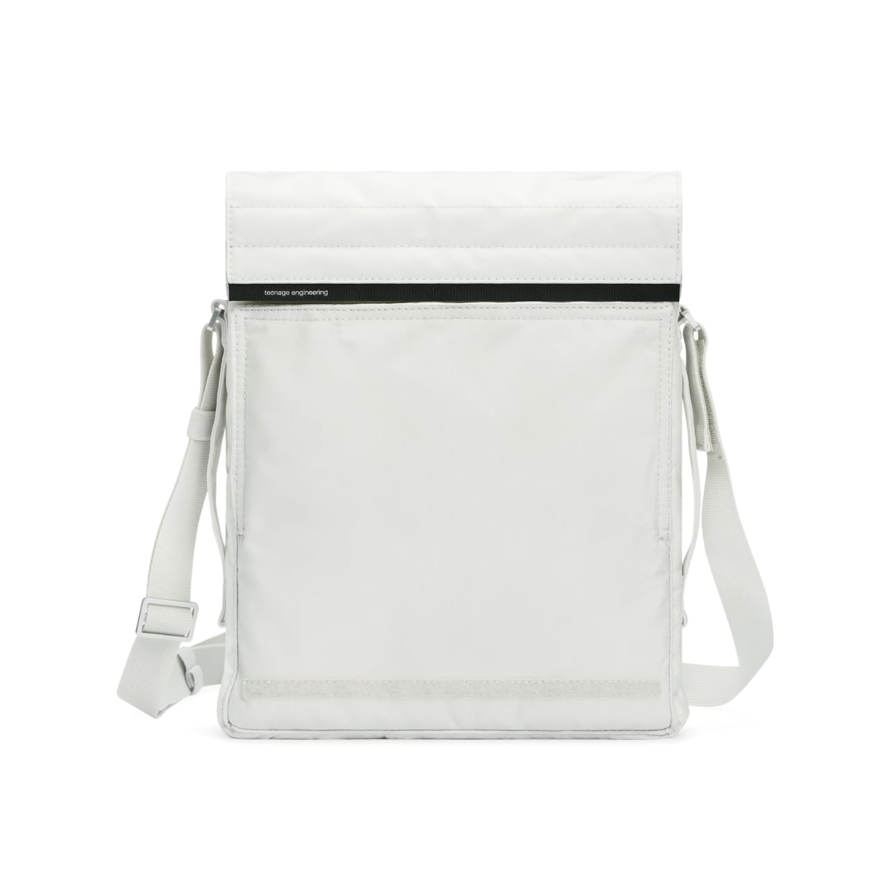
The bag features a roll-down covered opening that gives you variable capacity depending on what you’re carrying. There’s an internal pocket for your everyday small items (keys, wallet, that tangle of earbuds you swear you’ll organize someday). The back pocket uses hook-and-loop closure and is specifically sized for cables and the Ortho remote. Again, that specificity. Teenage Engineering could have made generic pockets, but they measured their own accessories and built compartments around them. You can wear it crossbody style or grab the side handle for hand-carry mode. The adjustability matters because context shifts throughout your day. Crossbody when you’re navigating crowds, hand-carry when you’re sitting at a cafe. The bag adapts rather than forcing you to commit to one carrying style.

What’s compelling here is how Teenage Engineering approaches accessories. This isn’t merchandising. It’s extension of philosophy. The same company that makes the OP-1 synthesizer (a device that prioritizes tactile joy and visual clarity) isn’t going to phone in a bag design. They’re known for products that look like nothing else on the market, that Dieter Rams-meets-Nintendo aesthetic that either clicks with you immediately or leaves you cold. The Field OB-4 shoulder bag comes in black or white, maintaining that minimal color palette Teenage Engineering loves. Custom-made aluminum hardware and YKK EXCELLA zippers keep everything smooth and reliable. These are components you’d find on high-end luggage, the kind of details most people won’t notice until they’ve used cheaper alternatives.

Is this bag essential? Absolutely not. You could carry an OB-4 in any number of generic shoulder bags. But you’d lose the mesh front functionality. You’d lose the precise pocket sizing. You’d lose that feeling of using a complete system where everything has been considered. Teenage Engineering has always existed in this interesting space where consumer electronics meet design objects. Their products cost more than alternatives because they’re selling coherence, not just capability. The Field OB-4 shoulder bag extends that logic into accessories. It’s designed for people who already bought into the ecosystem, who appreciate when someone sweats the details nobody asked them to perfect.

At $129, it’s positioned as a premium accessory, not an impulse add-on. That pricing filters for the audience who gets it, who understands why you’d spend serious money on a bag for a portable speaker. It’s the same crowd that bought the OB-4 in the first place, people who could’ve gotten a Bluetooth speaker for fifty bucks but wanted something with personality instead. Whether you need this bag depends entirely on whether you value design specificity over universal functionality. For the right person, this is exactly what they’ve been looking for. For everyone else, it’s an interesting case study in how far product design can go when companies refuse to take shortcuts.

The post This $129 Bag Lets You Play Music Without Opening It first appeared on Yanko Design.
These LEGO Brick Crocs Cost $150 and Look Exactly as Weird as You’d Expect

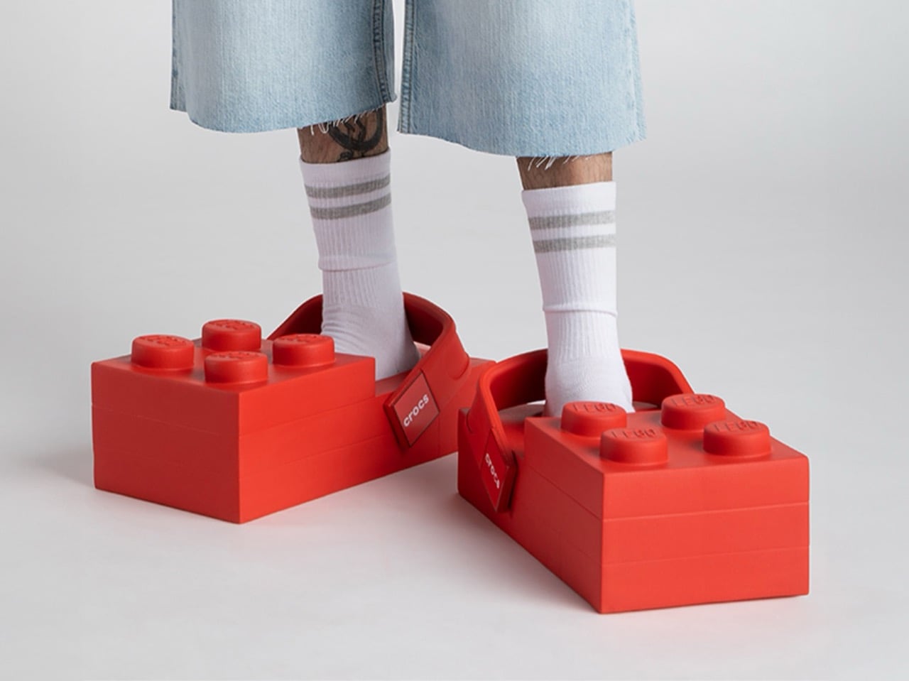
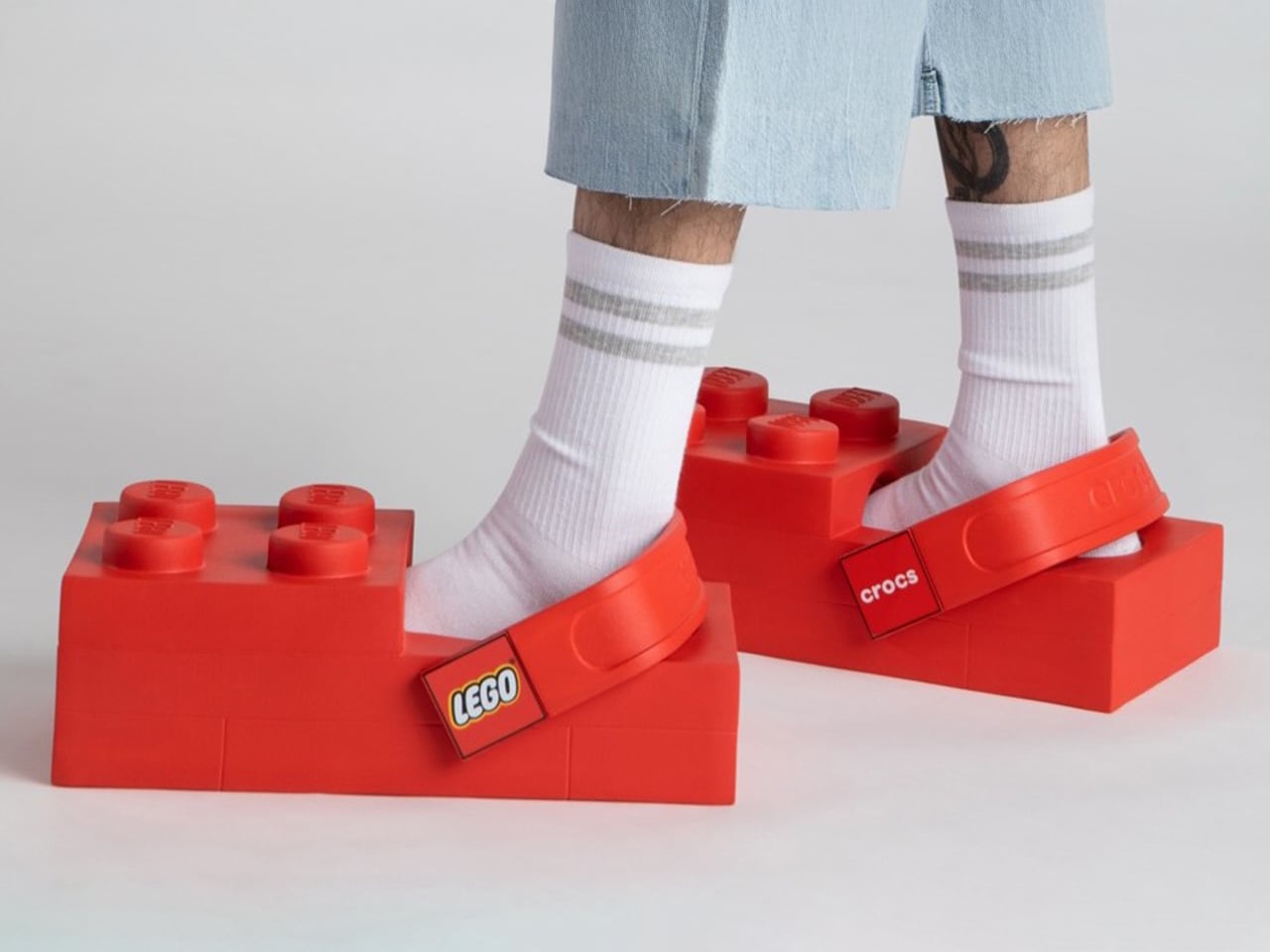
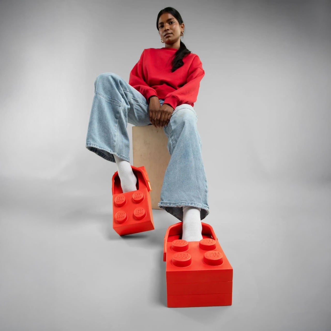
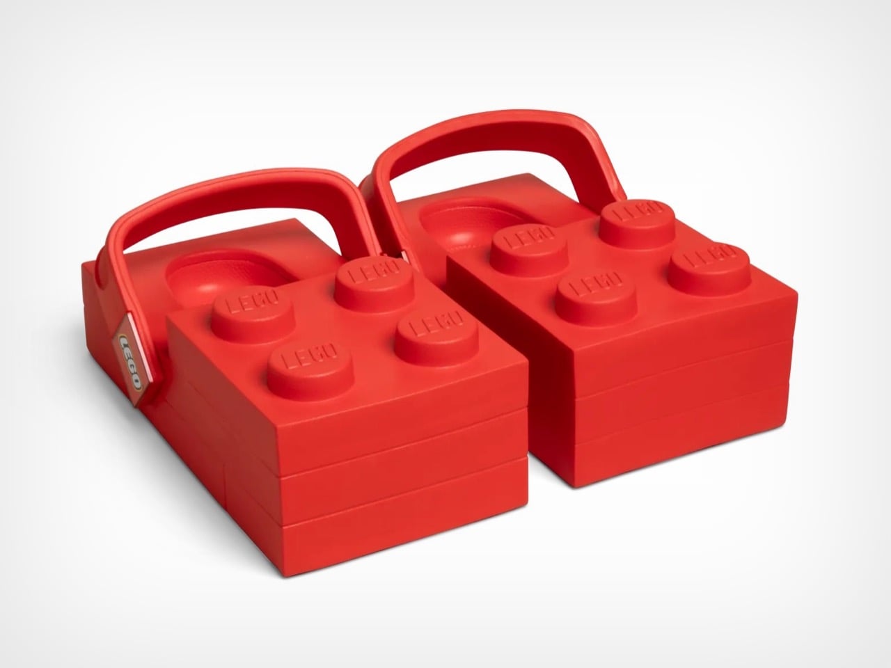
The LEGO Brick Clogs are not subtle. They are not refined. They are giant red rectangles that you strap to your feet, complete with four oversized studs jutting from the top like a toddler’s building block scaled up for adult wear. This is footwear that makes no apologies for its absurdity. Your feet disappear entirely into chunky brick shapes that add inches of height and pounds of visual weight, transforming your lower legs into what looks like a sight gag from a cartoon.

Both LEGO and Crocs seem thrilled by how ridiculous this looks. The design commits fully to the brick concept, maintaining the rectangular shape from every angle and ensuring that yes, you will absolutely look like you raided a giant’s toy chest. The studs aren’t decorative accents. They’re prominent, impossible to miss, and stamped with the LEGO logo so everyone knows exactly what you’ve done to your feet. Crocs even admits these aren’t meant for all-day wear, which feels like the understatement of the year when you’re essentially walking on building blocks.

Designers: LEGO X Crocs

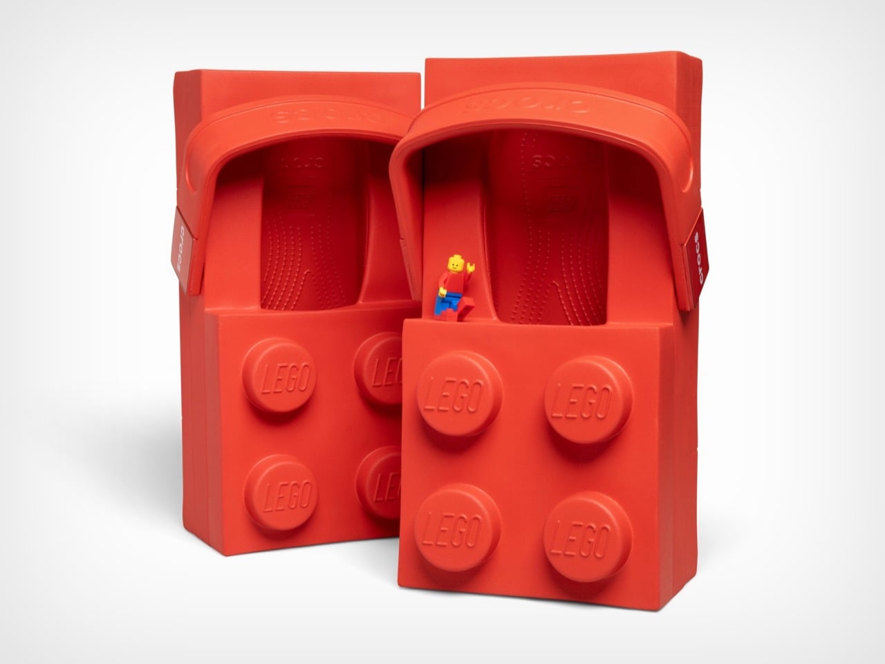
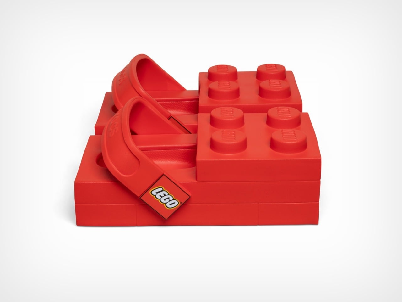
These launch February 16th at $149.99 on Crocs’ site and $199.99 on LEGO’s store, a price discrepancy nobody seems able to explain. They’re available in women’s sizes 7 through 12 and men’s sizes 5 through 13, which means a decent range of people can participate in this social experiment. Each pair includes a LEGO minifigure wearing matching tiny brick clogs because apparently the joke needed extending beyond your actual feet. The shoes use Crocs’ standard Croslite foam material, so they’ll presumably be comfortable despite looking like orthopedic nightmares. The heel strap pivots just like regular Crocs, with one side branded LEGO and the other Crocs, because why choose when you can advertise both brands simultaneously.

From a design perspective, these things are fascinating disasters. The 2×4 brick silhouette creates a platform that extends well beyond normal shoe boundaries, adding considerable visual bulk to an area of the body that most footwear tries to streamline. The four studs on top serve zero functional purpose but dominate the entire aesthetic, sitting roughly where your toes would be if your feet were actually brick-shaped. Inside, you get standard Crocs Croslite foam, the same cushioned EVA material that made the brand famous for comfort. The heel strap pivots like any other Croc, with Crocs branding on one side and LEGO on the other, a small detail that somehow makes the whole package feel even more committed to the bit.

Rapper Tommy Cash debuted them at Paris Fashion Week on January 21st, which tracks perfectly. These needed a runway moment, needed to exist in a context where people expect the unexpected. The fashion world has spent decades normalizing increasingly bizarre footwear, from Balenciaga’s platform Crocs to various luxury brands’ takes on chunky dad shoes. The LEGO Brick Clogs fit right into that lineage while simultaneously mocking it. They’re high fashion and low culture colliding at maximum velocity, wrapped in a bright red package that costs as much as a decent pair of running shoes.

The multi-year partnership promises more releases beyond this initial brick clog, with additional drops planned for spring 2026. Both companies hint at customizable Jibbitz charms made from actual LEGO brick plastic, which could genuinely be interesting if they figure out the attachment mechanism. The collaboration might seem random until you consider that both brands built empires on letting people express themselves through unconventional means. LEGO gives you infinite creative possibilities with plastic bricks. Crocs gave the world permission to prioritize comfort over convention and then added holes for decorative charms. Put them together and you get footwear that dares you to take it seriously while simultaneously proving it doesn’t care if you do.

The post These LEGO Brick Crocs Cost $150 and Look Exactly as Weird as You’d Expect first appeared on Yanko Design.
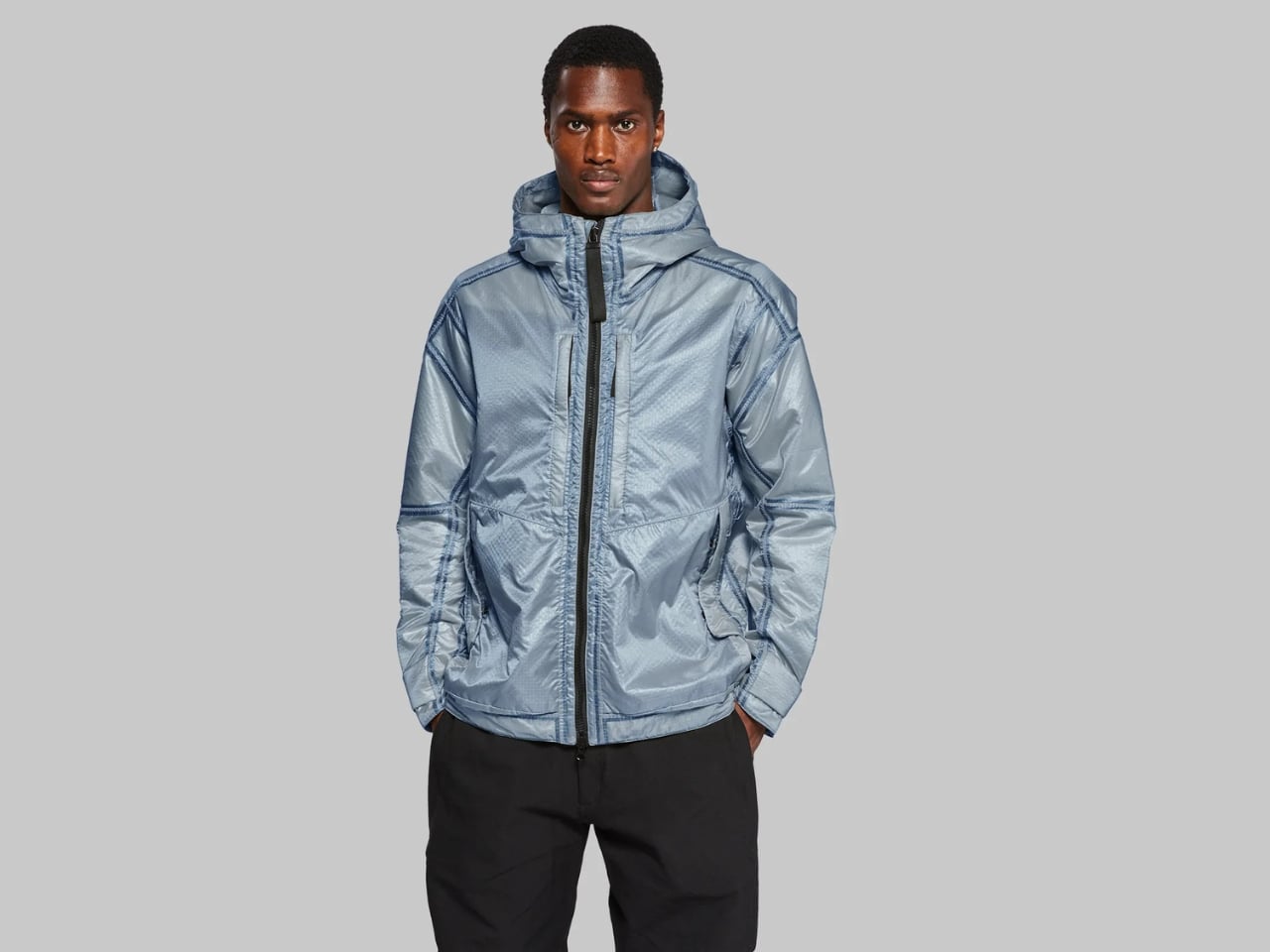
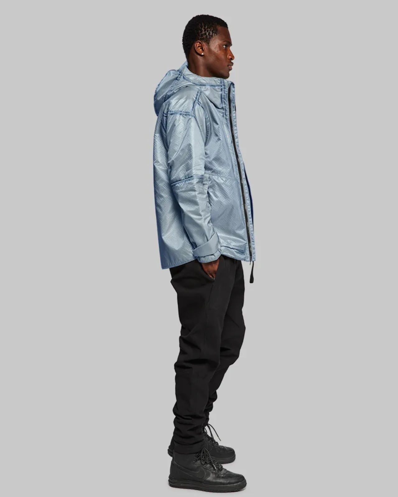
This $3,295 Elysium Blue Jacket Uses Tech That’s Actually on Mars

Let me tell you about a jacket that’s so technologically advanced, the only component you won’t find on Mars is the zipper. Yes, you read that right. Vollebak’s Martian Aerogel Jacket in Elysium Blue is literally made from the same materials currently exploring the Red Planet and it’s one of the most fascinating pieces of design I’ve come across in a while. Well, at least when it comes to jackets.

Here’s the wild part. The outer shell is woven from hypersonic parachute fabric, the exact same material NASA uses to land probes on Titan and Mars Rovers on the Martian surface. Inside, you’ll find aerogel insulation developed by the same team engineering heat shields for the next Mars Rover mission. This isn’t just marketing speak or space-inspired aesthetics. This is actual aerospace hardware transformed into something you can wear on Earth.

Designer: Vollebak

Vollebak released this Elysium Blue edition exactly 846 days after launching their first Martian Aerogel Jacket, which happens to be the same amount of time it takes to travel from Earth to Mars twice. The attention to detail is absolutely incredible, and it shows how much thought went into not just the technology but the storytelling behind it.

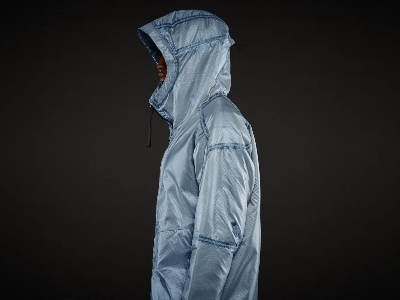
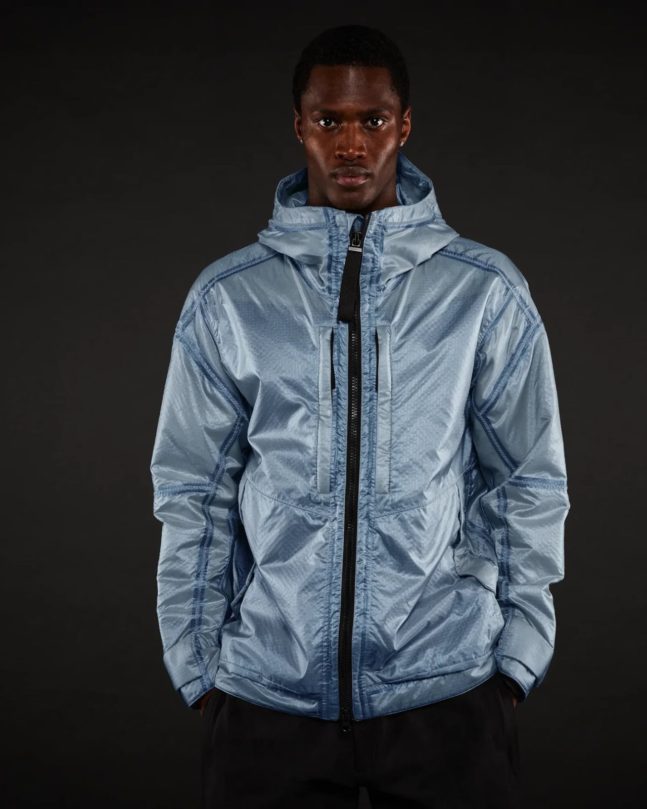
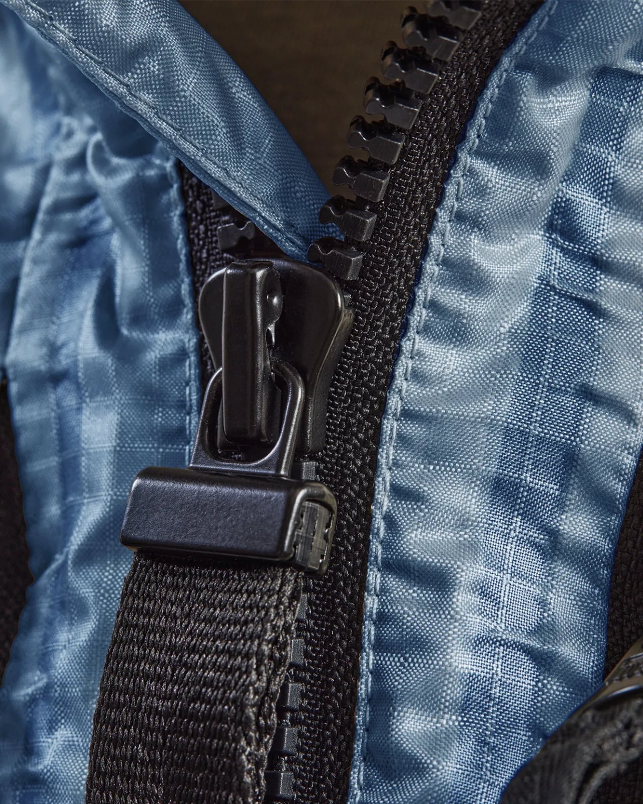
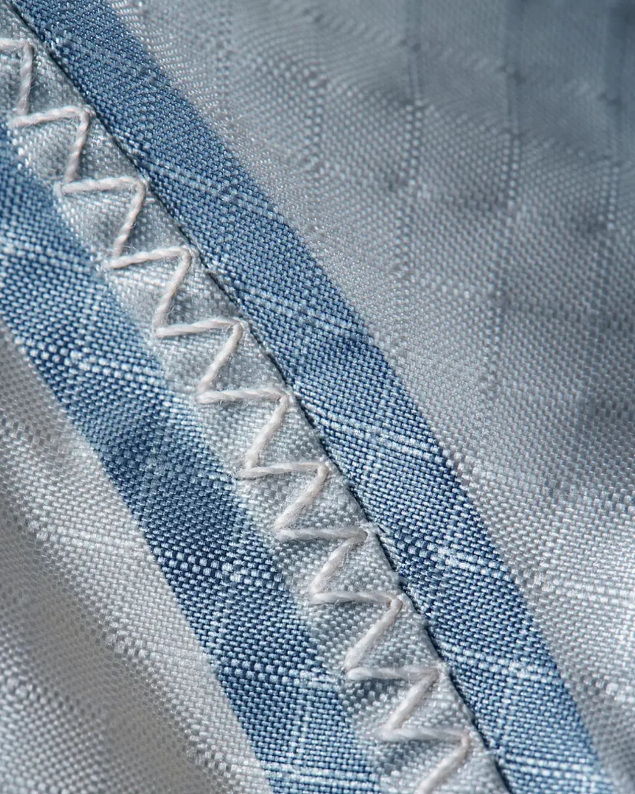
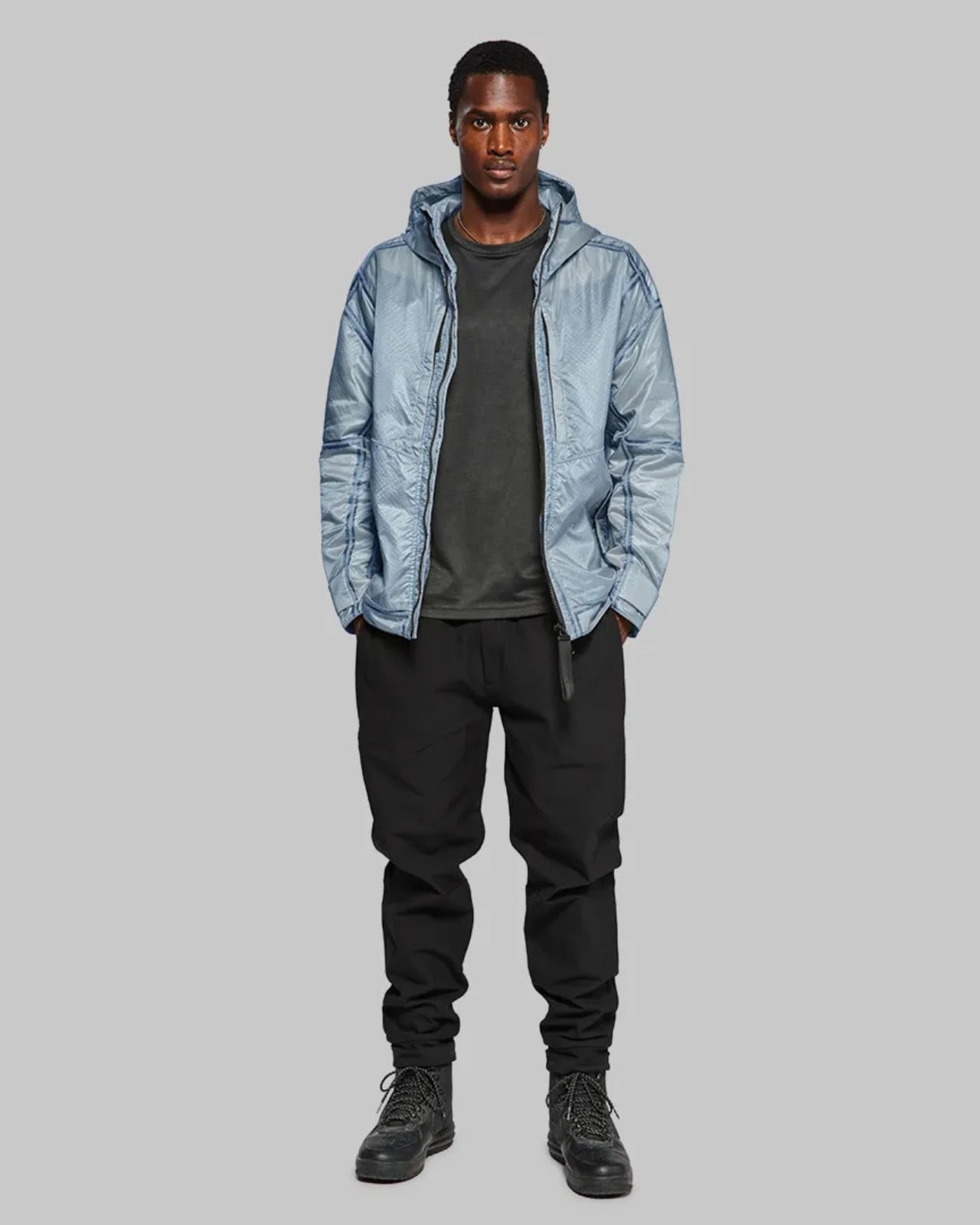
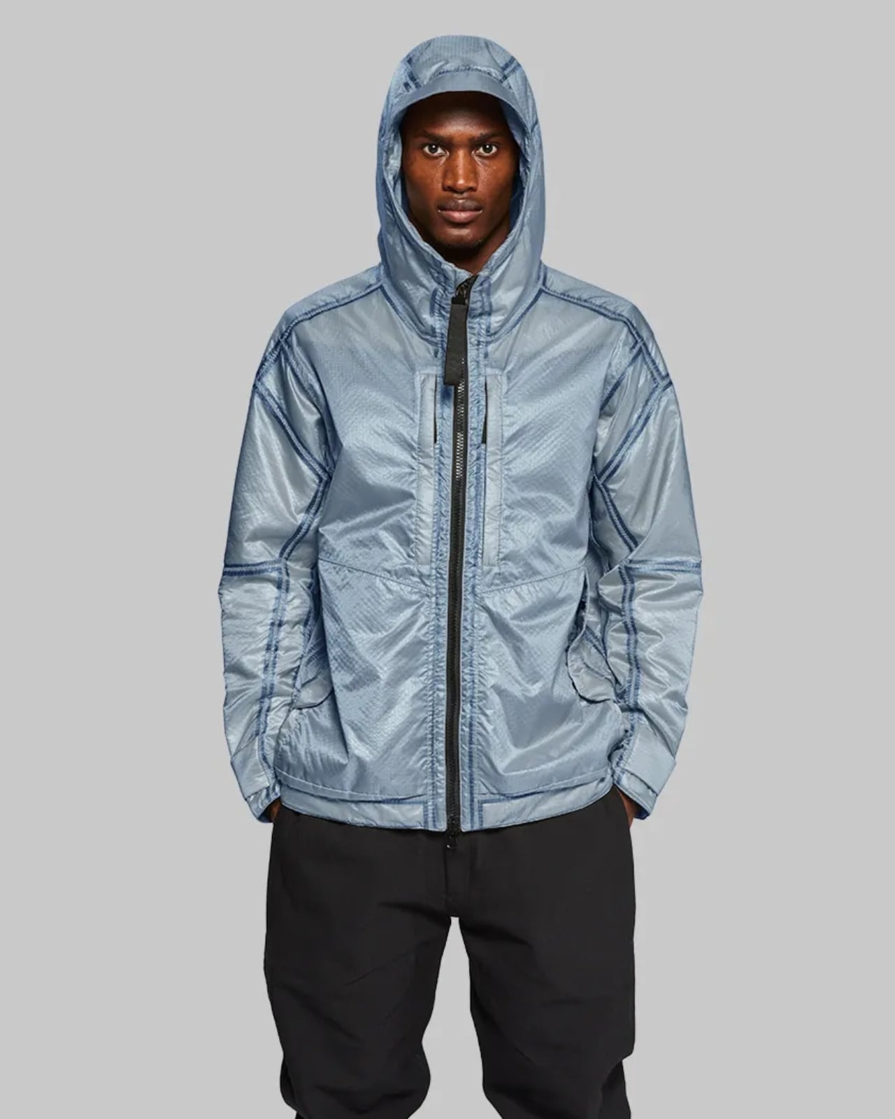
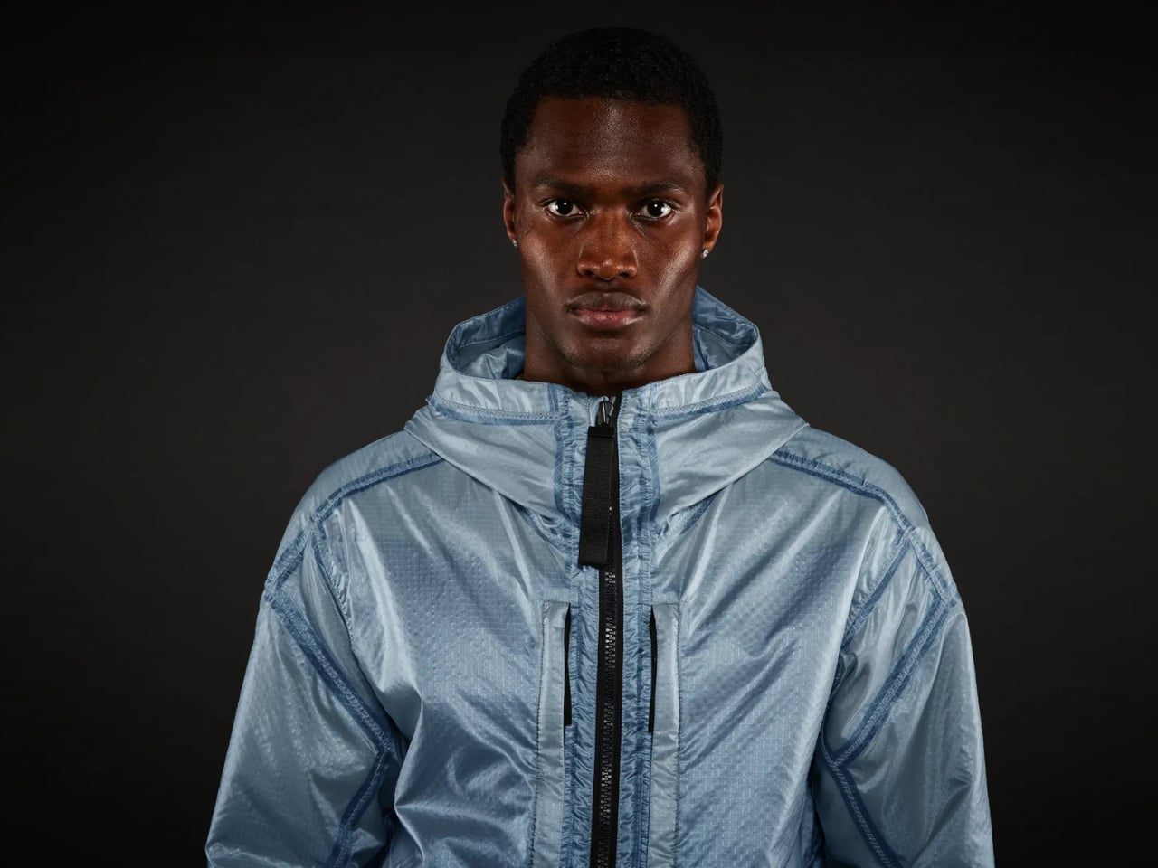
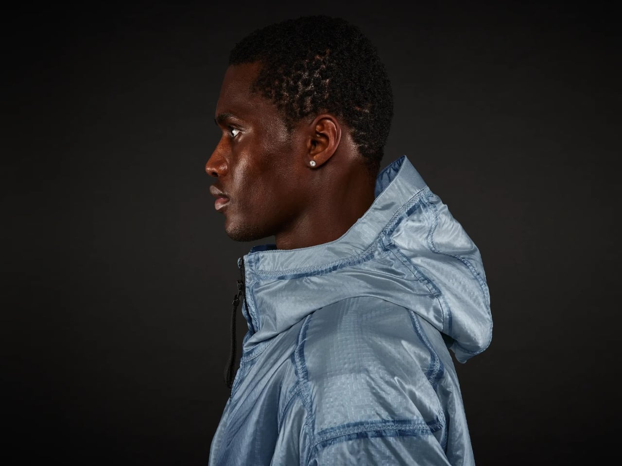
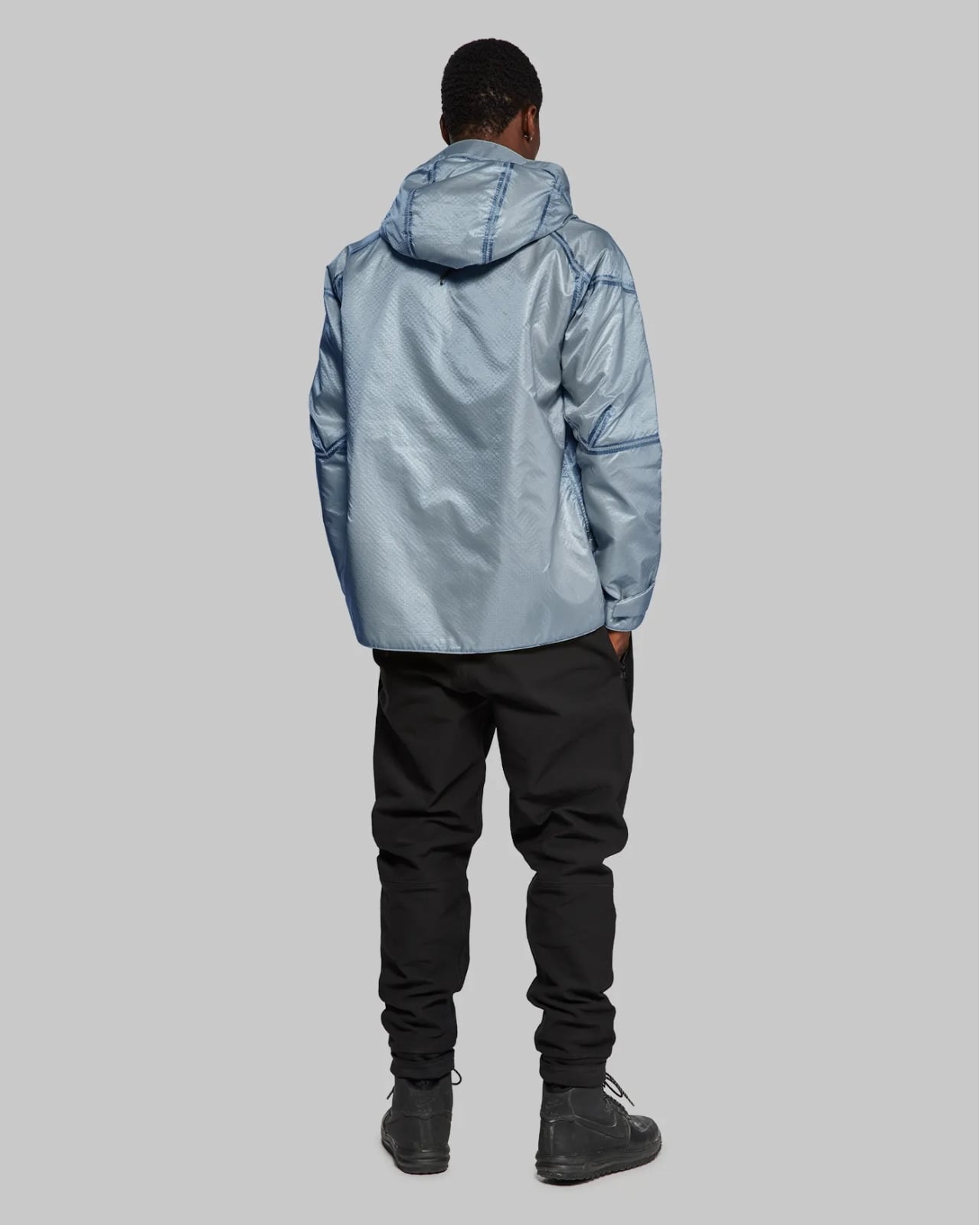
The color itself is stunning. While previous editions came in Mercury silver, Stealth Black, and Rover Orange, this Elysium Blue offers something more versatile and wearable for everyday life. The soft metallic blue finish creates this beautiful shimmer that catches the light, contrasted perfectly against black seam taping and zigzag stitching throughout. The design pays homage to Project Mercury spacesuits from the early days of space exploration, specifically inspired by the aluminized nylon and angled zippers that protected the first astronauts.

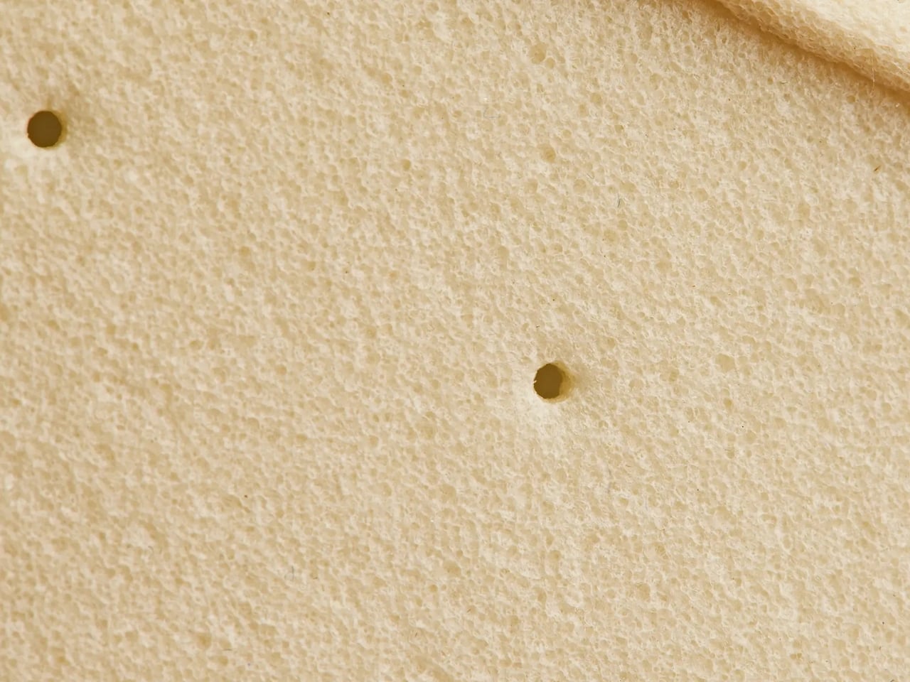
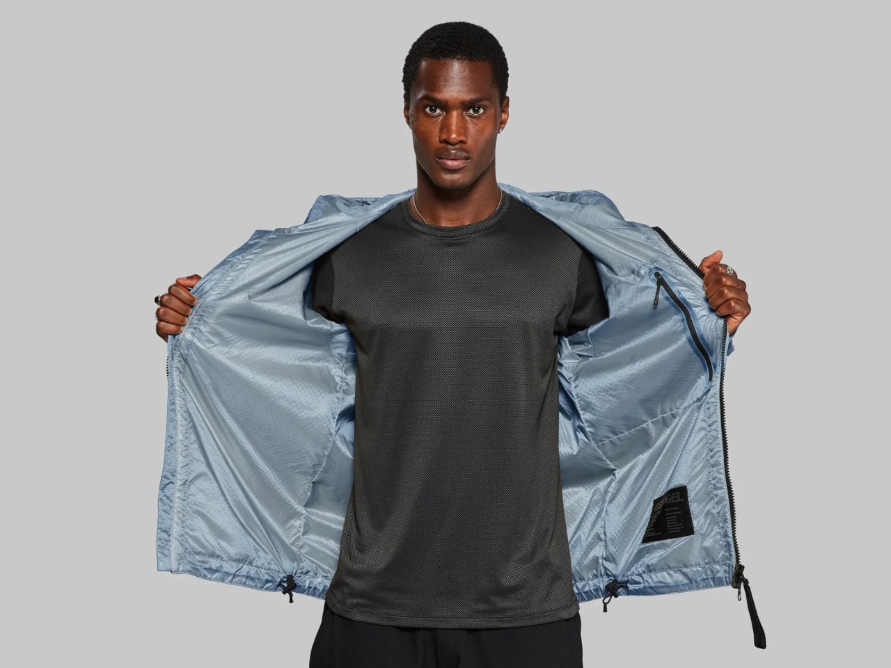
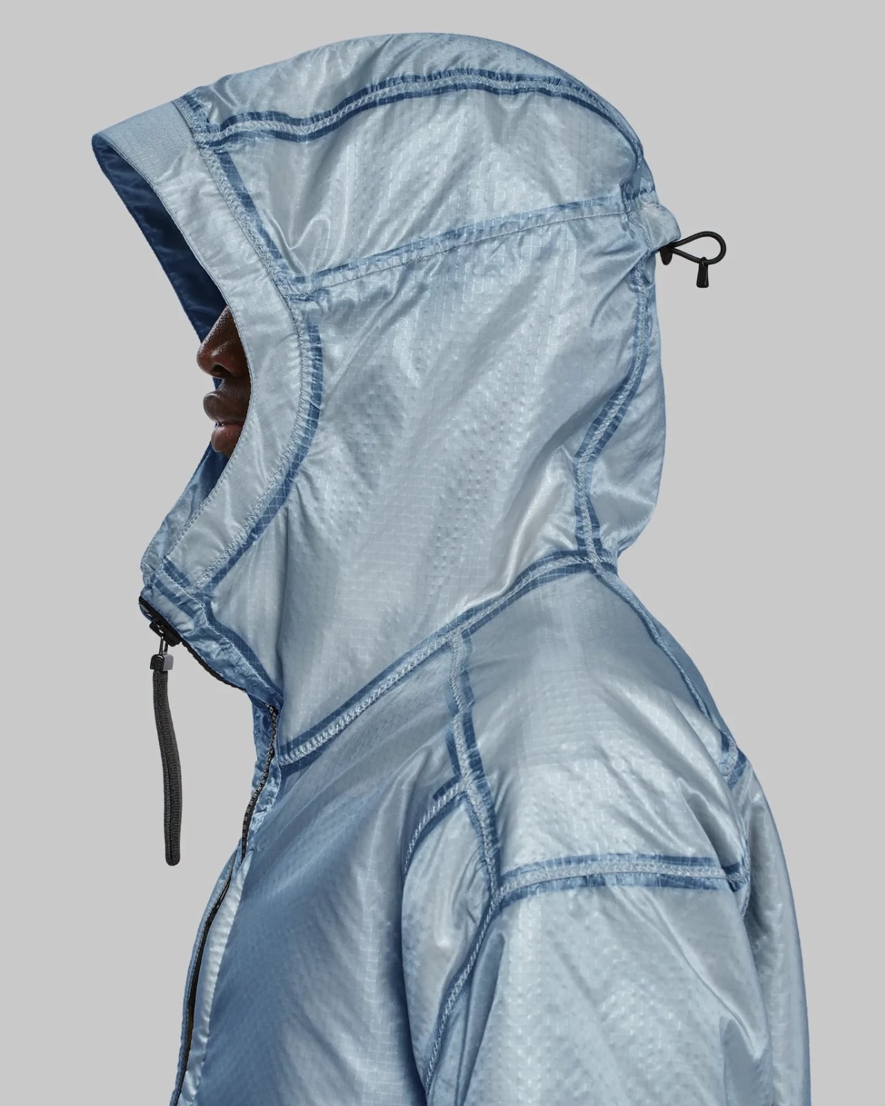
What really sets this jacket apart visually is the transparent finish on the outer shell. It literally gives you a window into the laser-drilled aerogel technology underneath. You can actually see the advanced engineering that makes this piece work. It’s like wearing a piece of functional art that reveals its secrets instead of hiding them. Now let’s talk about what makes aerogel so special. This material is incredibly lightweight yet provides serious insulation. The construction features laser-drilled micropores that allow breathability while still keeping you warm, which solves one of the biggest problems with traditional insulated jackets. You won’t overheat when you’re moving, but you’ll stay toasty when you’re standing still.

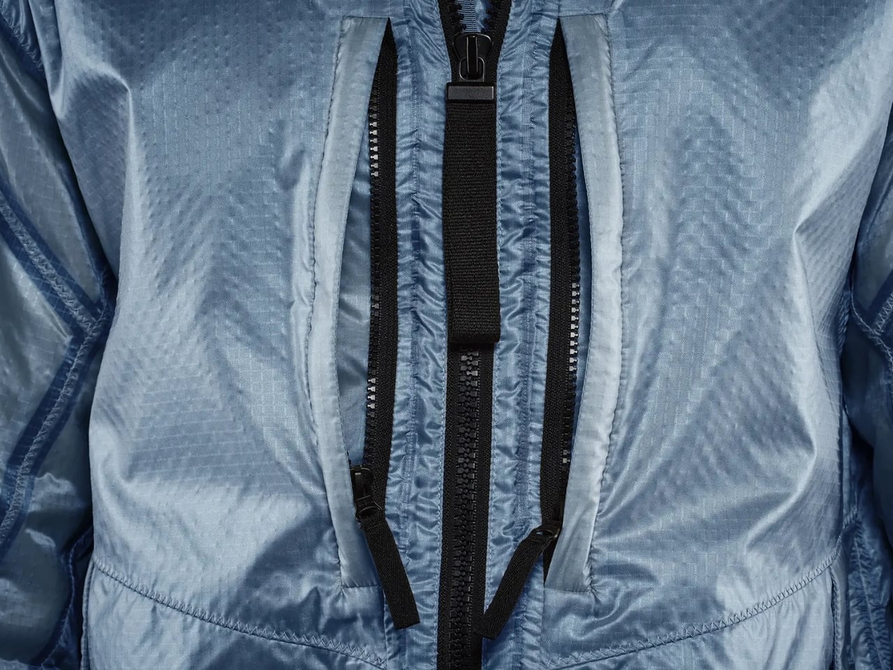
The practical features are equally impressive. You get five zipped pockets total, including two large side pockets with storm flaps that close with metal snaps, two chest pockets perfect for your phone and wallet, and an interior pocket on the left side. The peaked hood is lined with the same aerogel insulation as the rest of the jacket, and there are cord adjusters at the hood and hem to seal out cold air. The cuffs close with metal snaps to create a tight seal around your wrists.

My favorite detail is the two-way front zipper comes with an oversized pull cord specifically designed so you can operate it while wearing thick gloves. It’s these kinds of thoughtful touches that show this jacket was designed for actual performance, not just to look cool (though it absolutely does both). The materials breakdown is fascinating too. The insulation is made in the US from 80% organic rubber foam and 20% silica aerogel, while the outer material and lining are 100% polyamide made in the UK. This jacket is designed to survive downpours while keeping you warm and dry, making it genuinely functional for extreme weather conditions.

At $3,295, this is definitely an investment piece. But you’re not just buying a jacket. You’re buying a conversation starter, a piece of aerospace history, and genuinely cutting-edge technology that performs in real-world conditions. It’s where fashion meets function meets the future of space exploration.

Whether you’re a design enthusiast, a tech lover, or someone who appreciates the intersection of innovation and style, the Martian Aerogel Jacket in Elysium Blue represents something truly special. It’s proof that the most exciting design happens when we push boundaries and ask what’s possible when we bring technology from other worlds into our everyday lives.

The post This $3,295 Elysium Blue Jacket Uses Tech That’s Actually on Mars first appeared on Yanko Design.
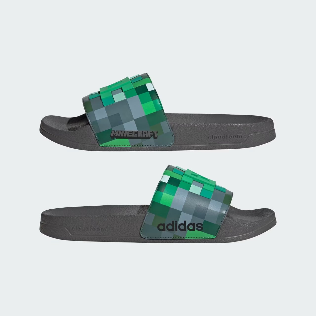
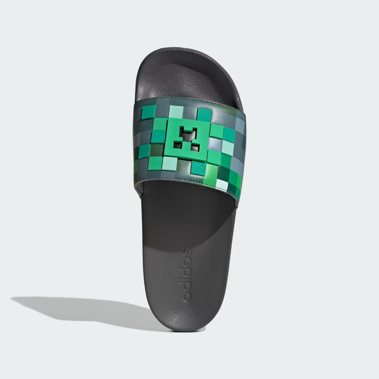
Adidas Just Turned Minecraft Creepers Into $40 Holiday Sneakers

Remember when video game merchandise meant cheesy graphic tees at the mall? Those days are officially over. Adidas just quietly dropped a massive holiday collection with Minecraft that turns pixelated game creatures into surprisingly wearable sneakers, and honestly, it’s kind of brilliant.

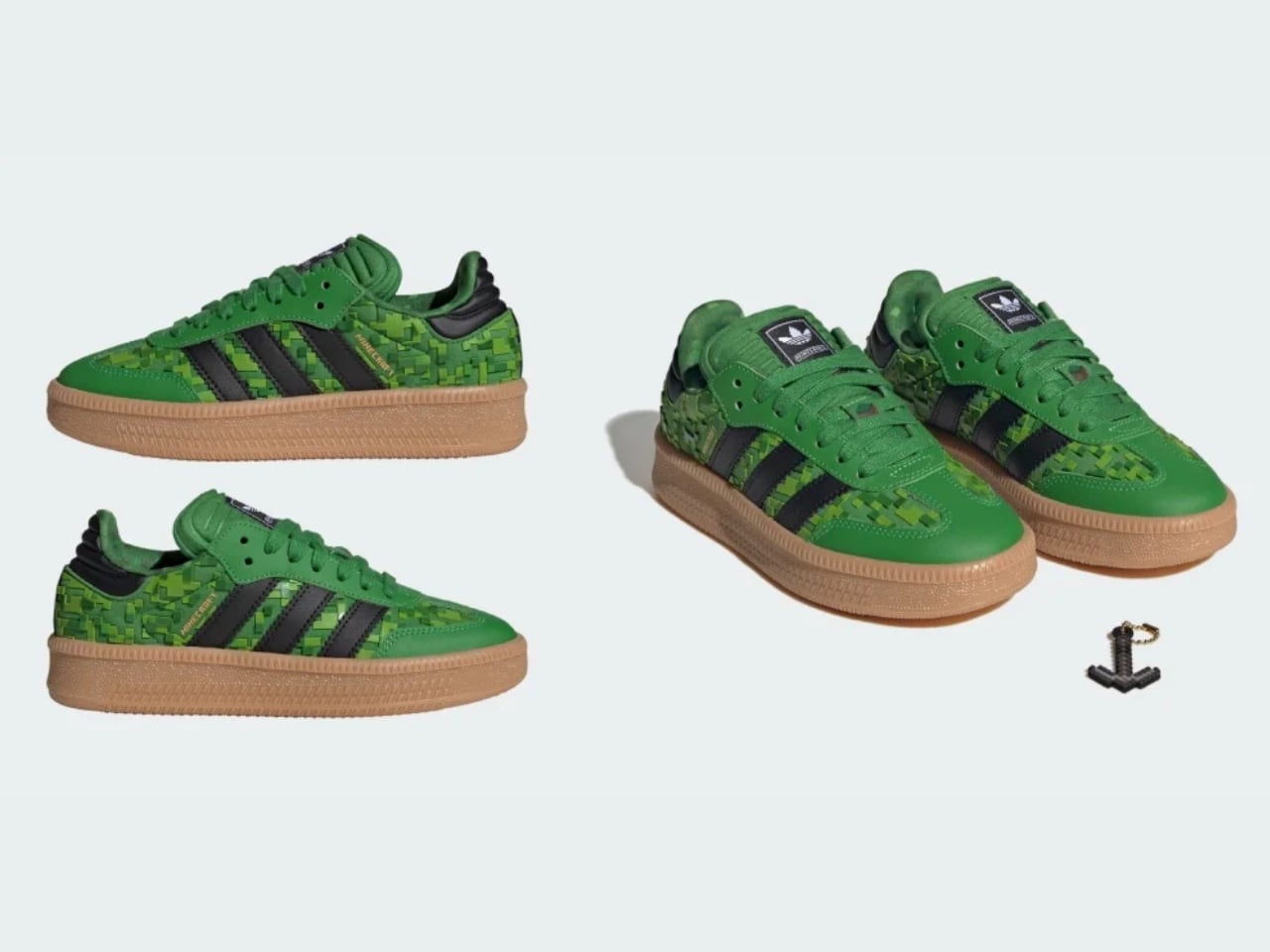
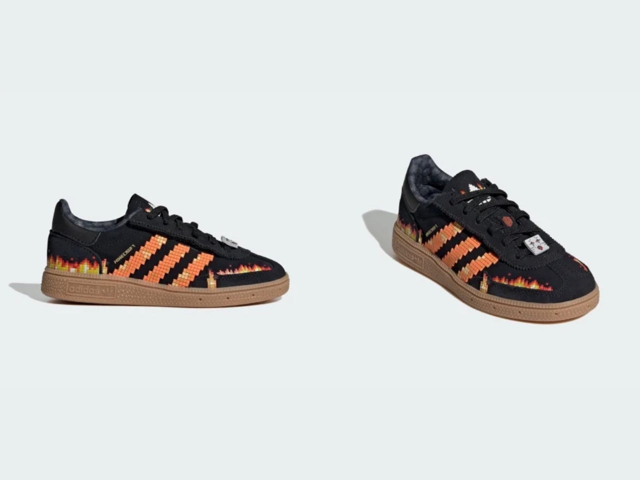
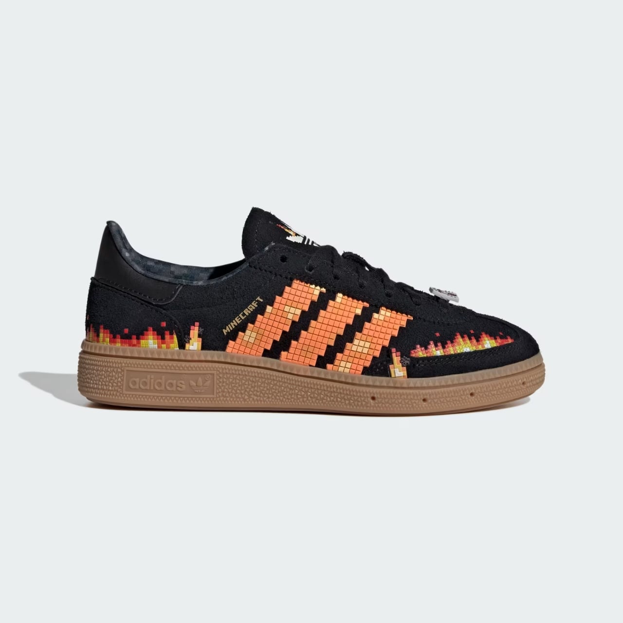
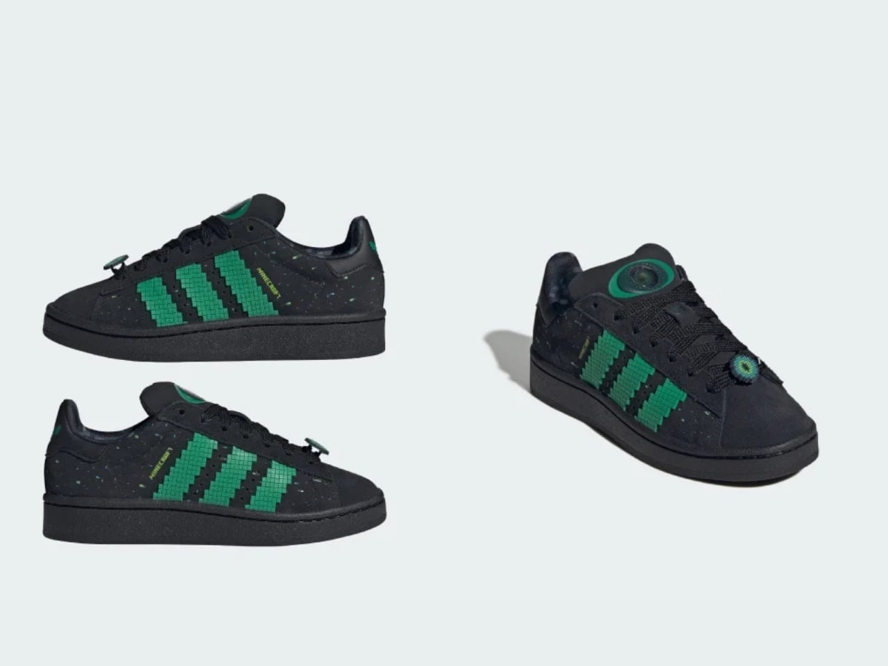
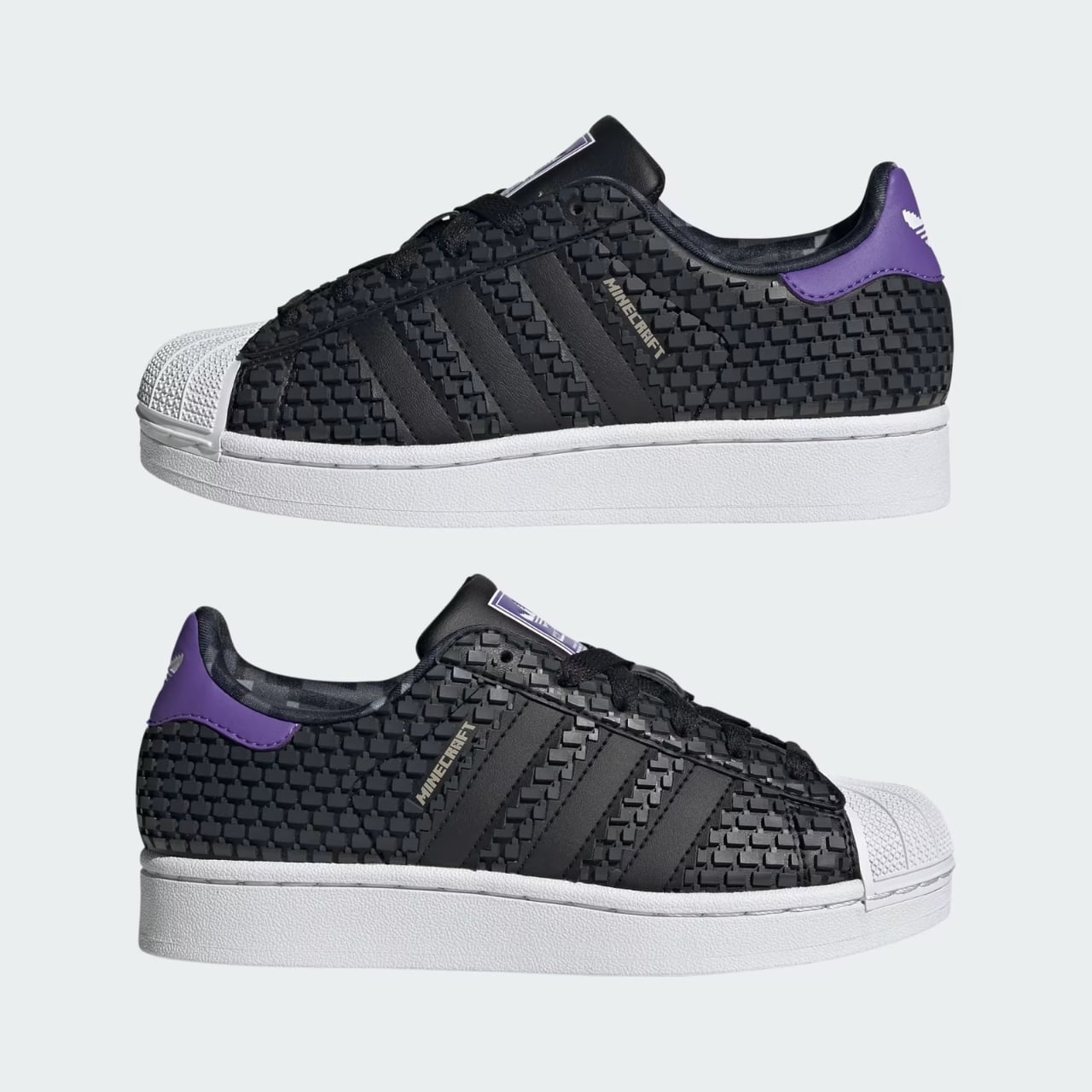
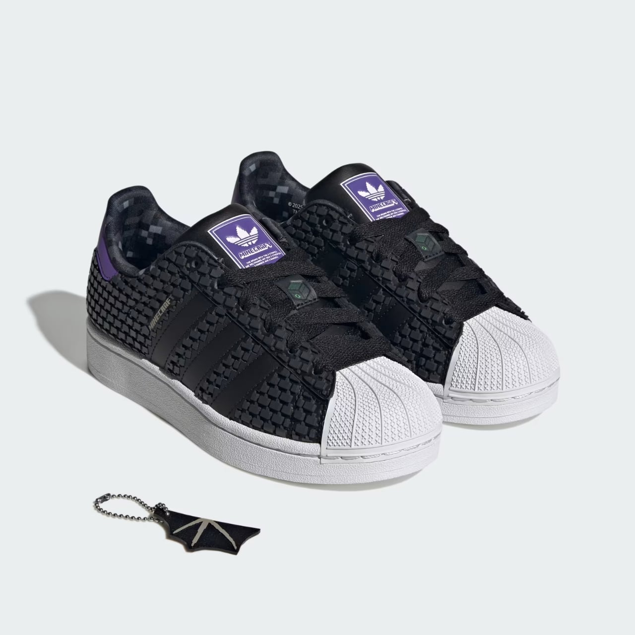
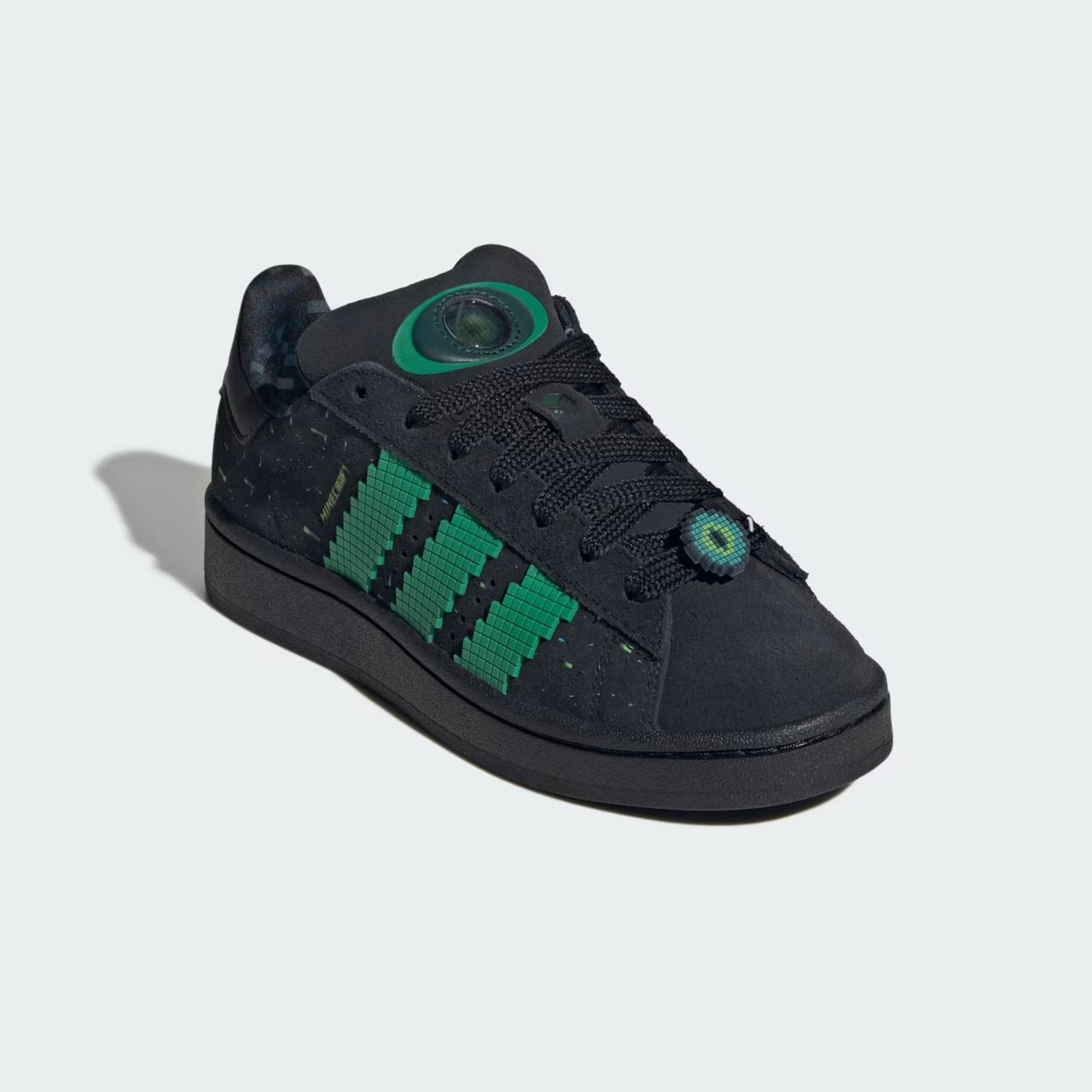
The collaboration reimagines some of Adidas’ most iconic silhouettes through the blocky, digital lens of Minecraft’s universe. We’re talking the Samba XLG, Handball Spezial, Campus 00s, Superstar II, and even those beloved Adilette slides, each one carefully themed around specific Minecraft mobs and in-game elements. What makes this partnership work so well is how thoughtfully each shoe connects to its source material without losing the essence of what makes these Adidas classics so enduringly popular.

Designer: Adidas

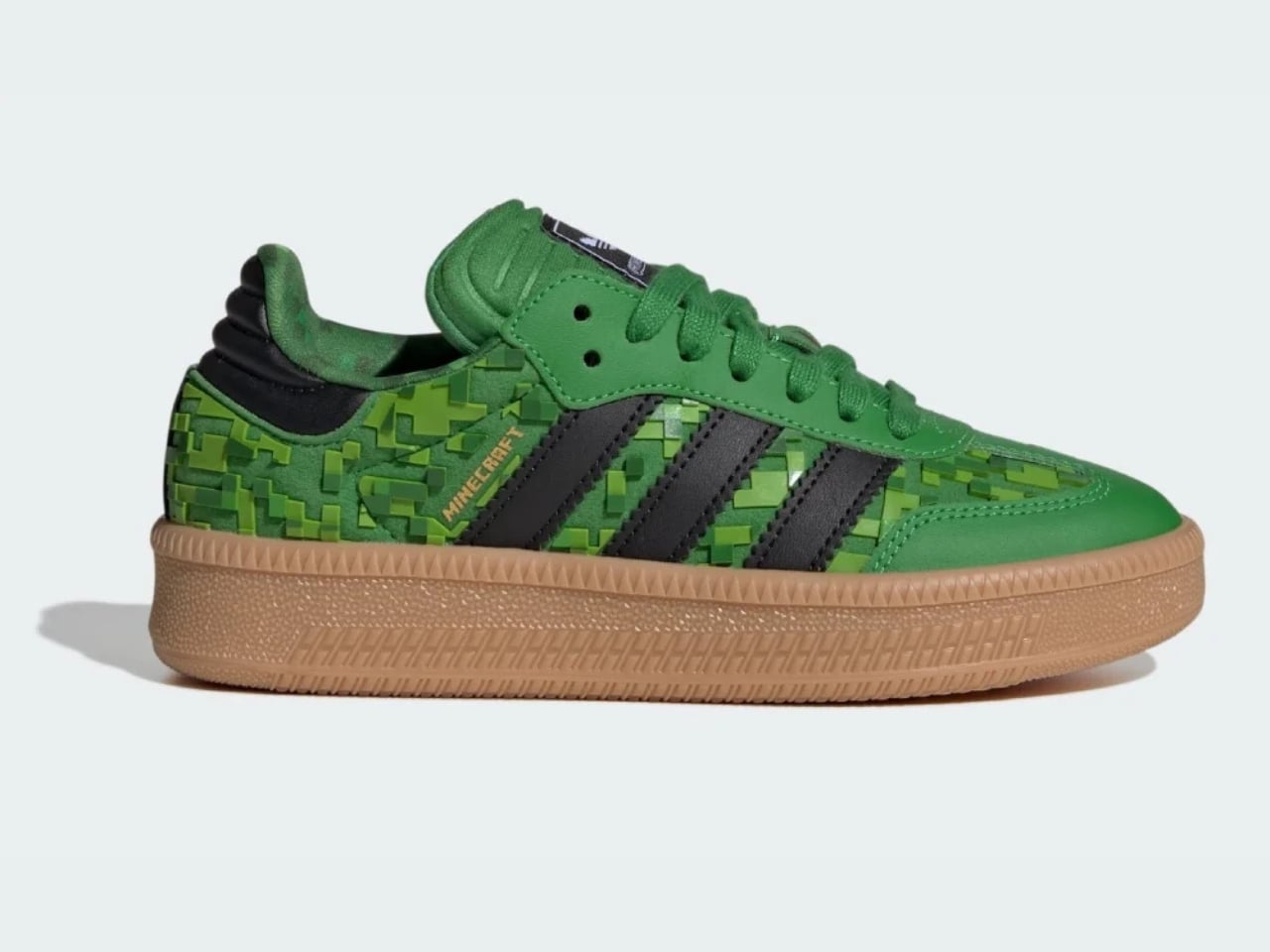
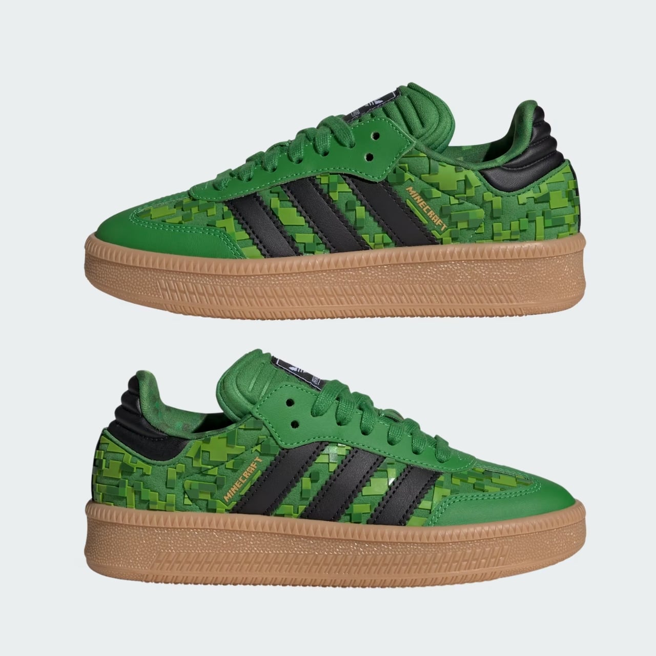
Take the Samba XLG inspired by the Creeper, arguably Minecraft’s most recognizable character. The shoe arrives in that signature explosive green colorway with blocky graphics spread across the upper, while a gum sole keeps things grounded in classic Samba DNA. It’s playful without being costume-y, which is exactly the balance you want in a collaboration like this.

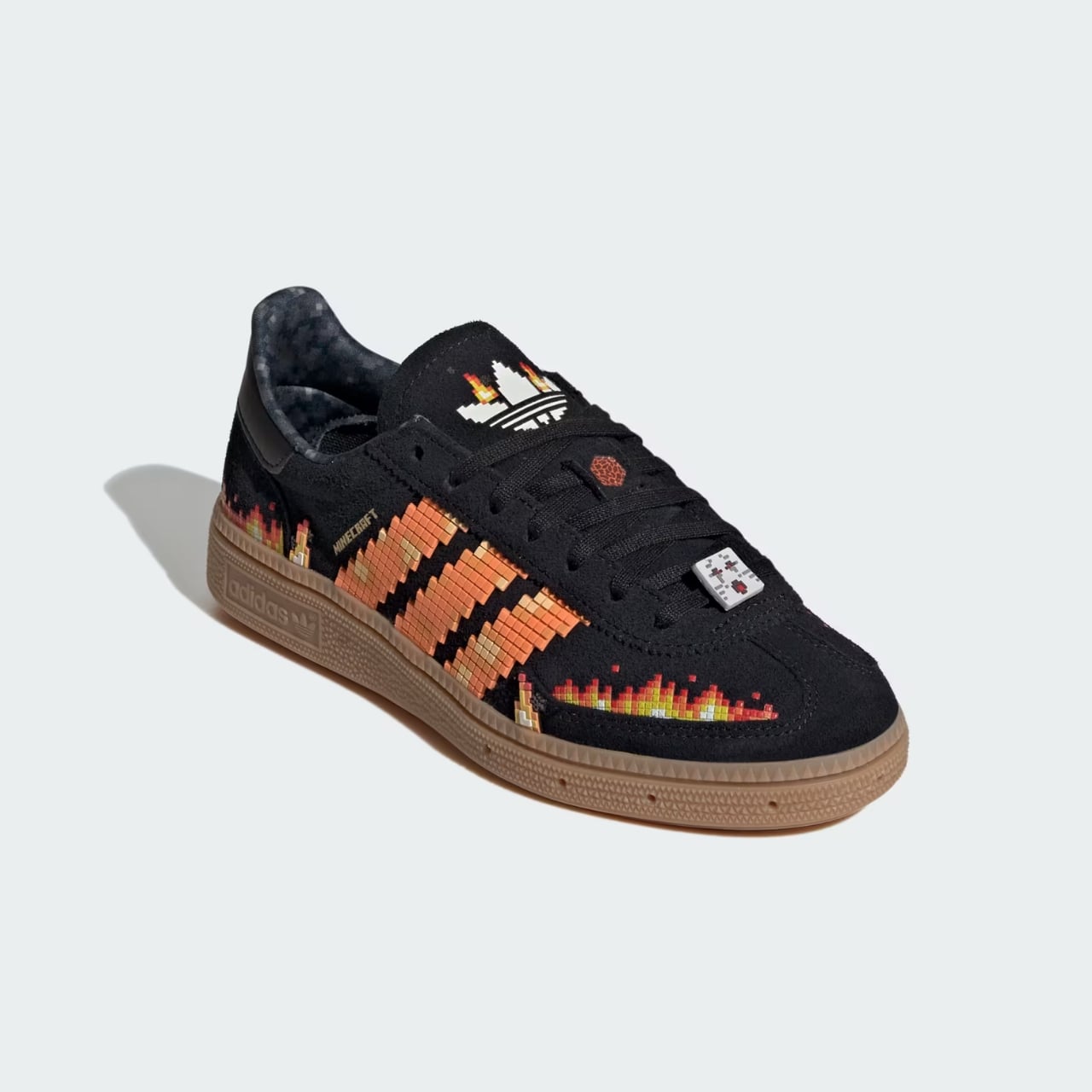
The Handball Spezial takes a different approach with its Ghast theme. For those not fluent in Minecraft speak, the Ghast is that floating, fireball-spewing creature you encounter in the game’s Nether dimension. Flame graphics dance across the shoe while an illustrated Ghast appears on the laces, giving the piece a narrative quality that goes beyond simple branding.

Then there’s the Campus 00s channeling the Eye of Ender aesthetic with its black and green palette, and the Superstar II drawing inspiration from the Ender Dragon itself. The Superstar features black, block-like scales that translate the dragon’s texture into something you can actually wear on city streets. The Adilette slides circle back to Creeper territory, with the mob’s iconic face prominently displayed on the strap.

But here’s where things get really interesting from a design perspective. The packaging deserves its own spotlight. Adidas designed the boxes to resemble Minecraft’s in-game storage chests, extending the conceptual thread beyond just the product itself. This kind of attention to detail elevates the entire unboxing experience and shows a genuine understanding of what makes Minecraft’s visual language so compelling.

There’s a caveat worth mentioning, though. The entire footwear collection comes exclusively in youth and children’s sizing. While this might disappoint adult collectors hoping to snag a pair for themselves, it actually makes strategic sense. Minecraft’s core audience skews younger, and positioning these as wearable extensions of the game rather than adult collectibles keeps the collaboration authentic to its roots. Plus, prices ranging from forty to ninety-five dollars make these accessible holiday gifts rather than hype-beast grails.

The sneaker world has seen its fair share of video game collaborations over the years, but most lean heavily into nostalgia for retro gaming. This partnership feels refreshingly current. Minecraft remains one of the most played games globally, with a massive cultural footprint that extends far beyond gaming circles. By tapping into this active, engaged community rather than mining the past, Adidas positions itself at the intersection of contemporary gaming culture and street style.

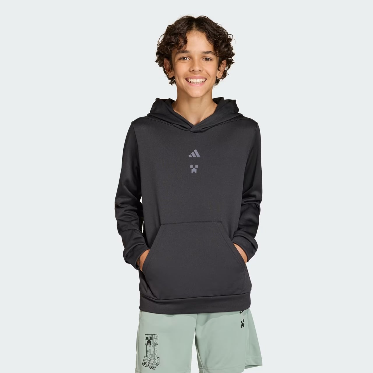
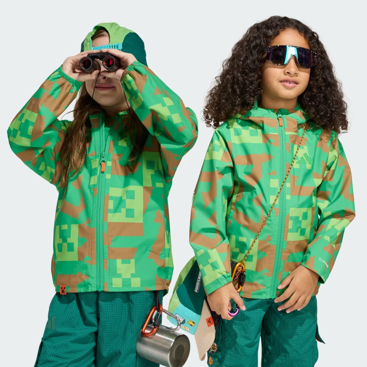
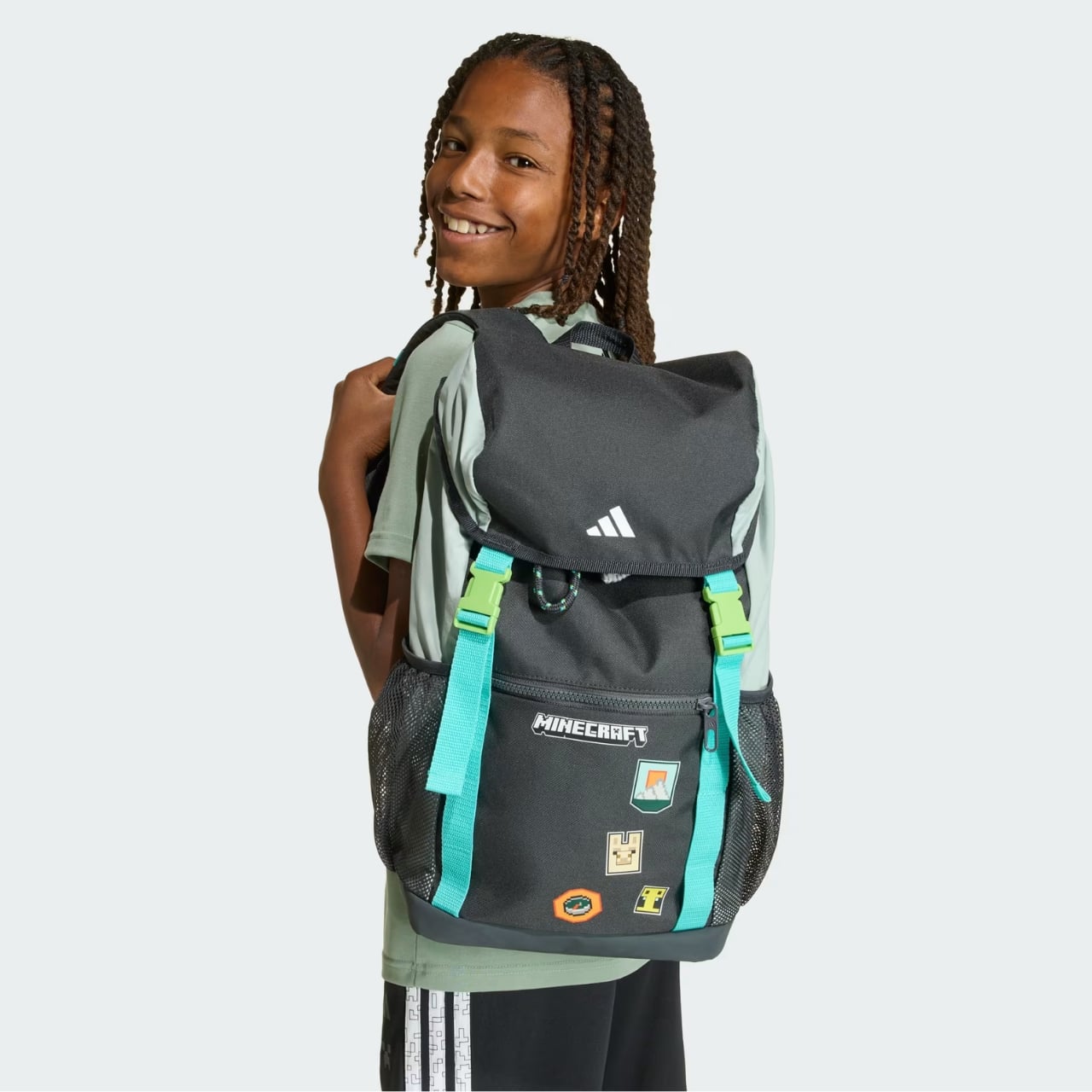
What’s particularly clever is how the collection works on multiple levels. Die-hard Minecraft fans get references they’ll immediately recognize and appreciate. Meanwhile, someone who’s never played the game might just see a cool green Samba or a sleek black Superstar with interesting texture details. The designs don’t require insider knowledge to work aesthetically, which broadens their appeal considerably. The collection also includes complementary apparel pieces, creating a full lifestyle offering that lets young fans dress head to toe in Minecraft-inspired gear. This comprehensive approach transforms the collaboration from a simple licensing deal into something that feels more like a genuine creative partnership.

Brand collaborations drop constantly and often feel forced but the Adidas x Minecraft holiday collection stands out by actually making sense. Both brands benefit from the association, the design execution shows real thought and craft, and the end result offers something genuinely fun in a sneaker landscape that sometimes takes itself way too seriously. Available now through the Adidas webstore, these pieces prove that when gaming and footwear cultures collide thoughtfully, everyone wins, especially the kids who get to wear their favorite game on their feet.

The post Adidas Just Turned Minecraft Creepers Into $40 Holiday Sneakers first appeared on Yanko Design.
Ovme Smart Mirror System Lets You See, Feel, and Fit Virtual Outfits

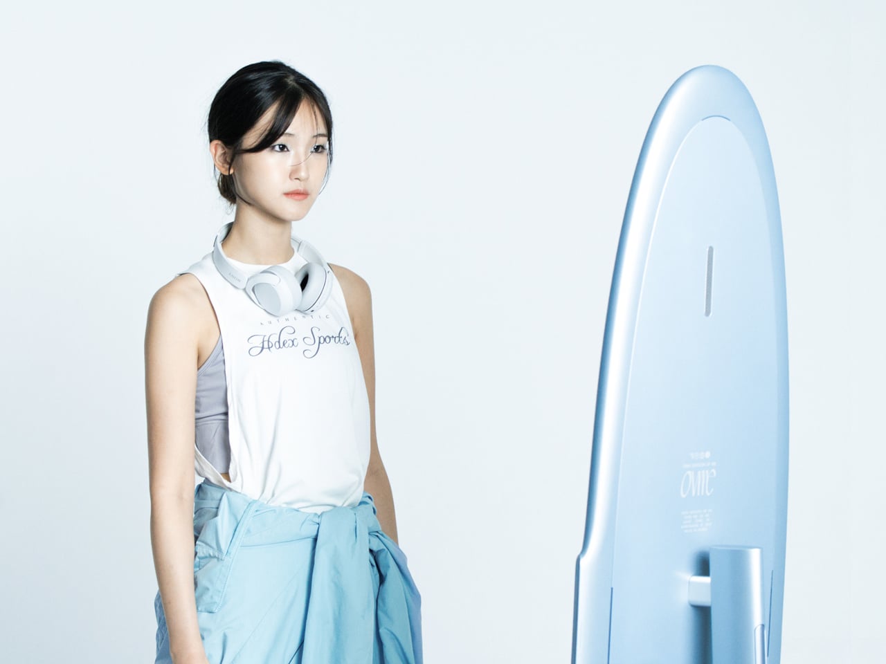
The everyday “what should I wear today?” moment has gotten more complicated by online shopping. You can scroll endless outfits, but a screen cannot show how something fits, feels, or plays with what you already own. Ovme is a concept that treats the mirror as a missing link between your closet, your feed, and your actual body, closing the gap between seeing and knowing.

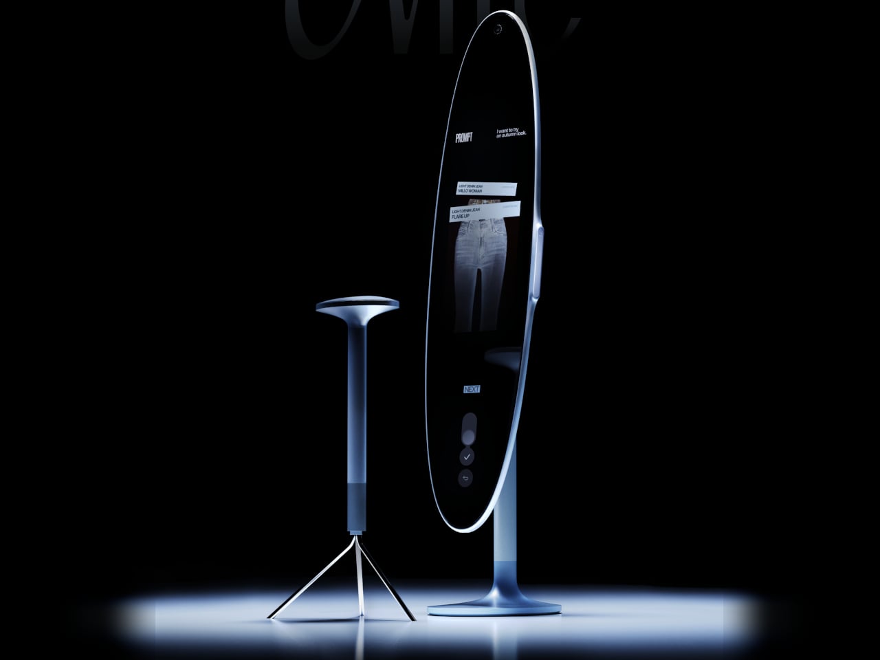
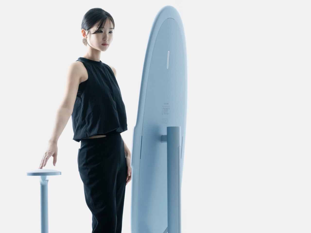
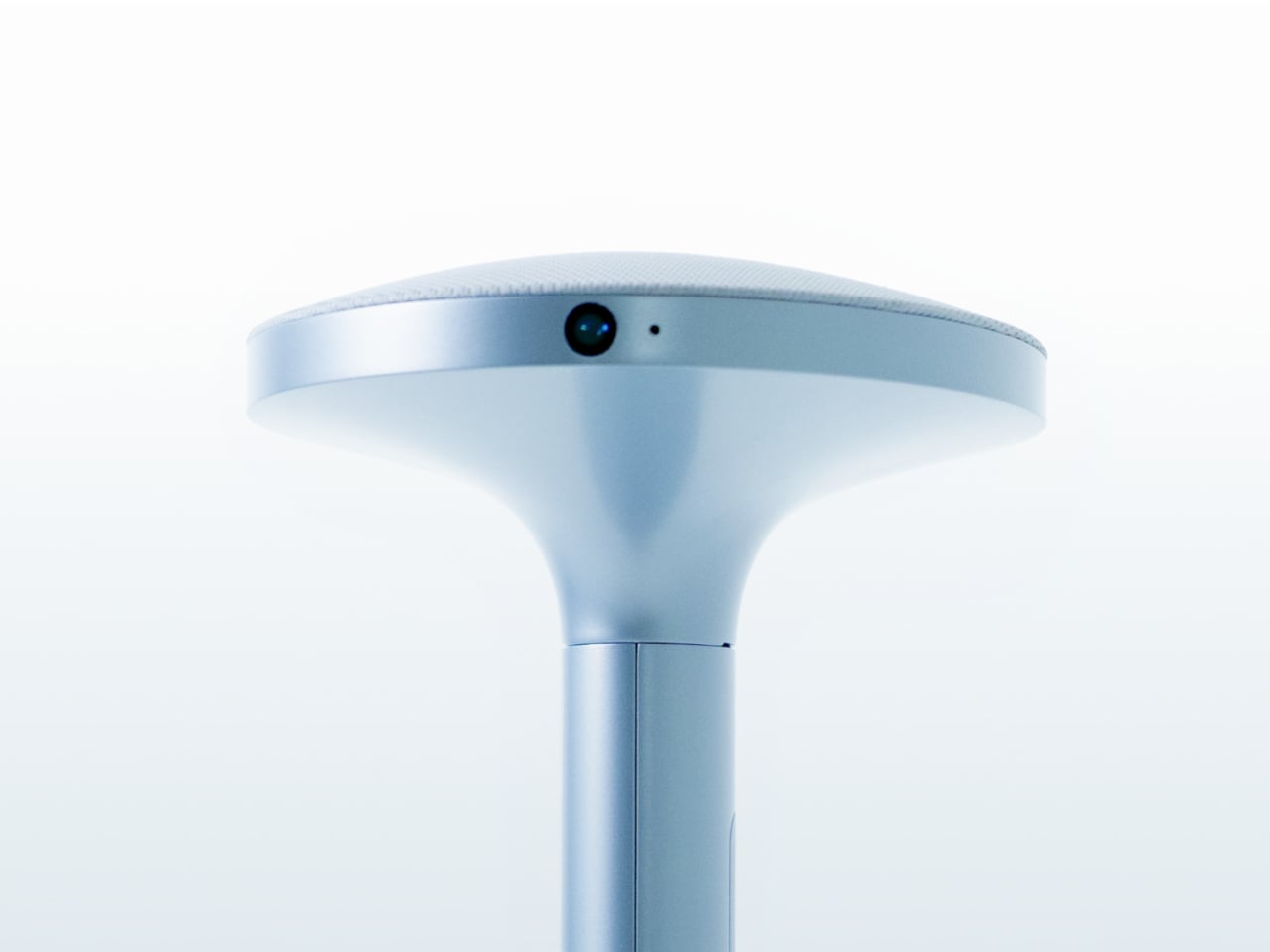
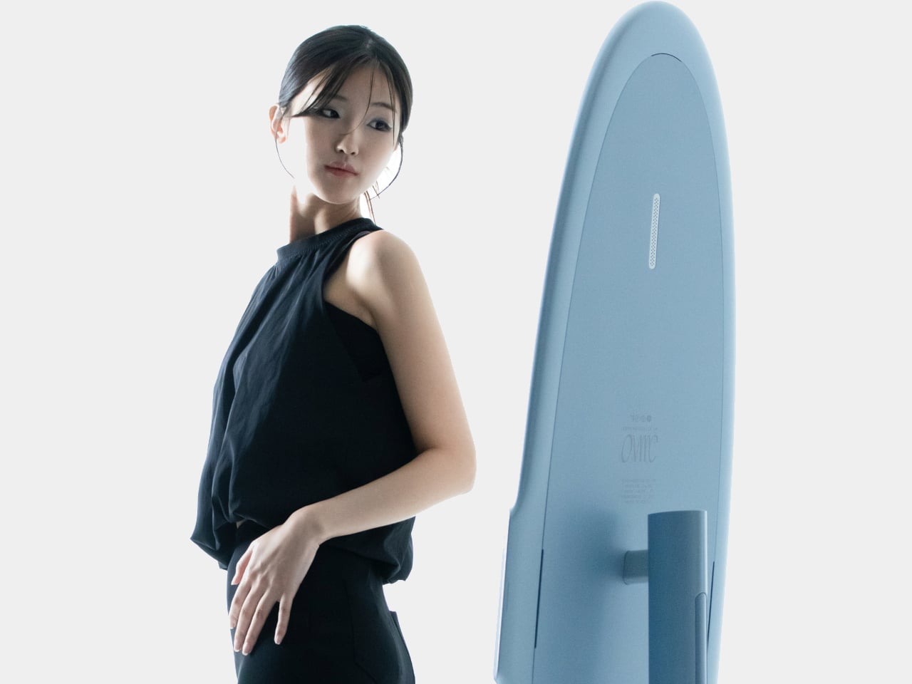
Ovme is an AR smart mirror ecosystem built around three objects: a full-height mirror, a sensor-laden fitting belt, and a haptic tactile table, plus a companion app. The name stands for “Own version of me,” and the system is designed to help you find new styles, feel how they fit, and touch virtual fabrics before you ever click buy or open your wallet.

Designers: Daun Park, Seyeon Park, Chawon So, Yewon Shim, Yejin Hong

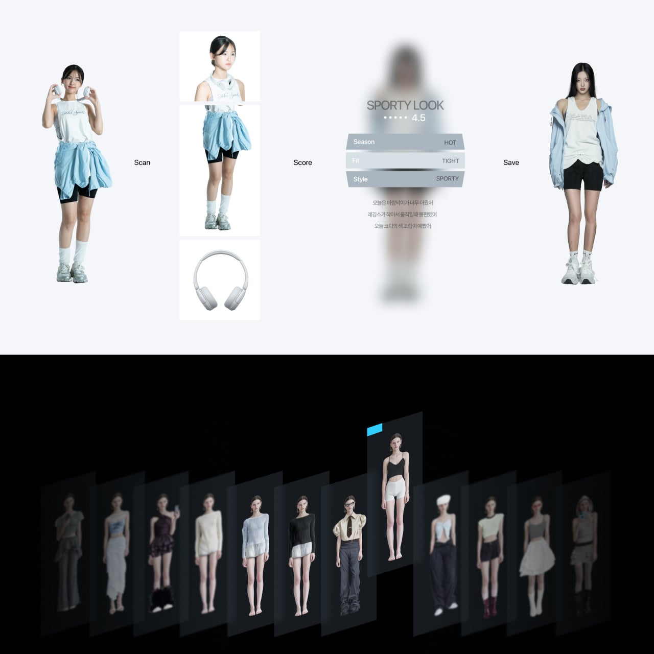
The mirror acts like a personal stylist, overlaying outfits on your reflection and pulling from three sources: new looks, your existing wardrobe, and reference images you feed it. You can swipe through categories like formal, sporty, or feminine, and see complete outfits assembled around your silhouette, then save the ones that feel right into a virtual closet for later when you need inspiration or want to revisit.

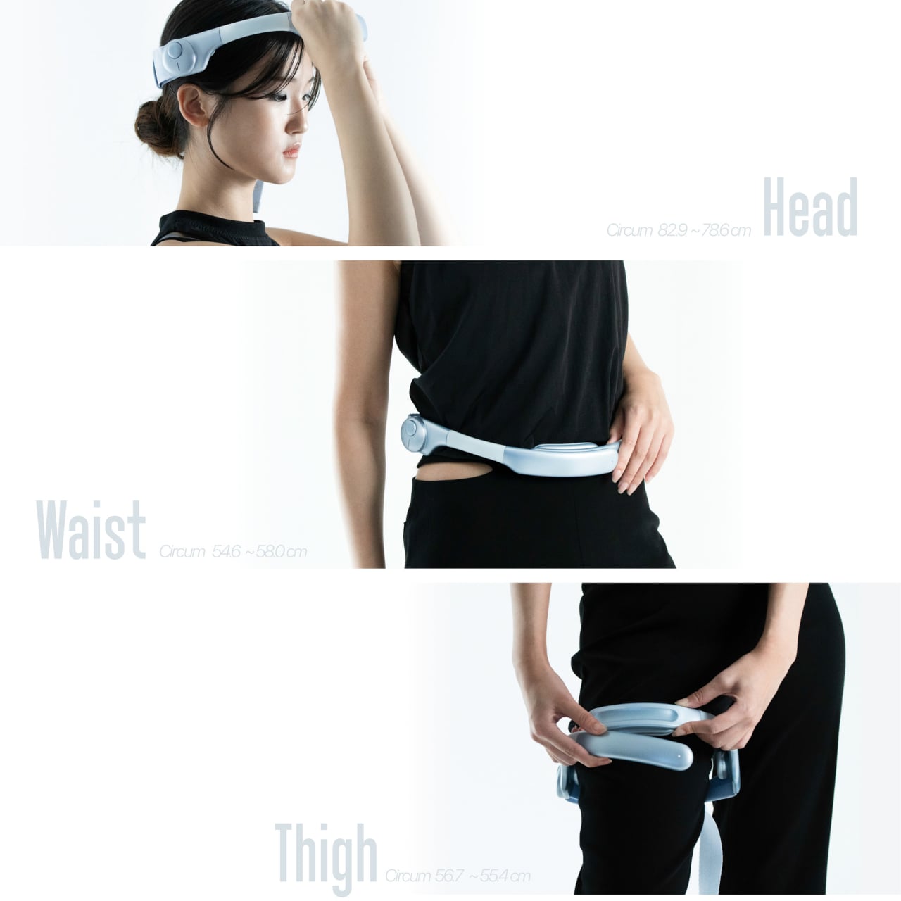
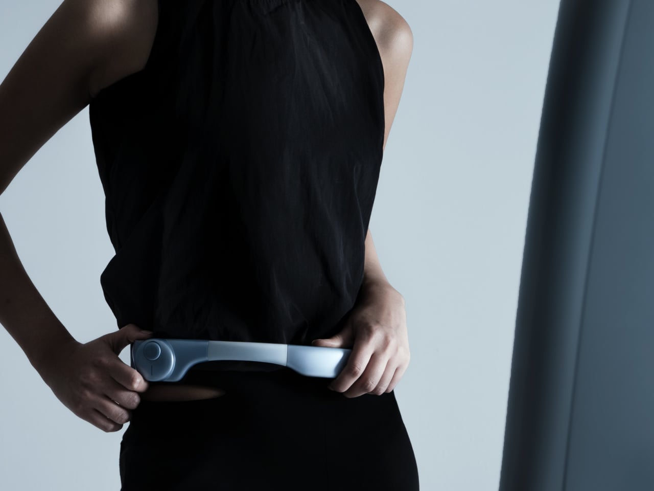
The fitting belt is a flexible band with sensors that can wrap around your head, waist, or thigh. It measures circumference and applies gentle pressure, tightening or loosening to simulate how a garment would hug or hang on that part of your body. On the mirror, the virtual outfit responds in real time, turning fit from a guess based on size charts into something your body can actually sense.

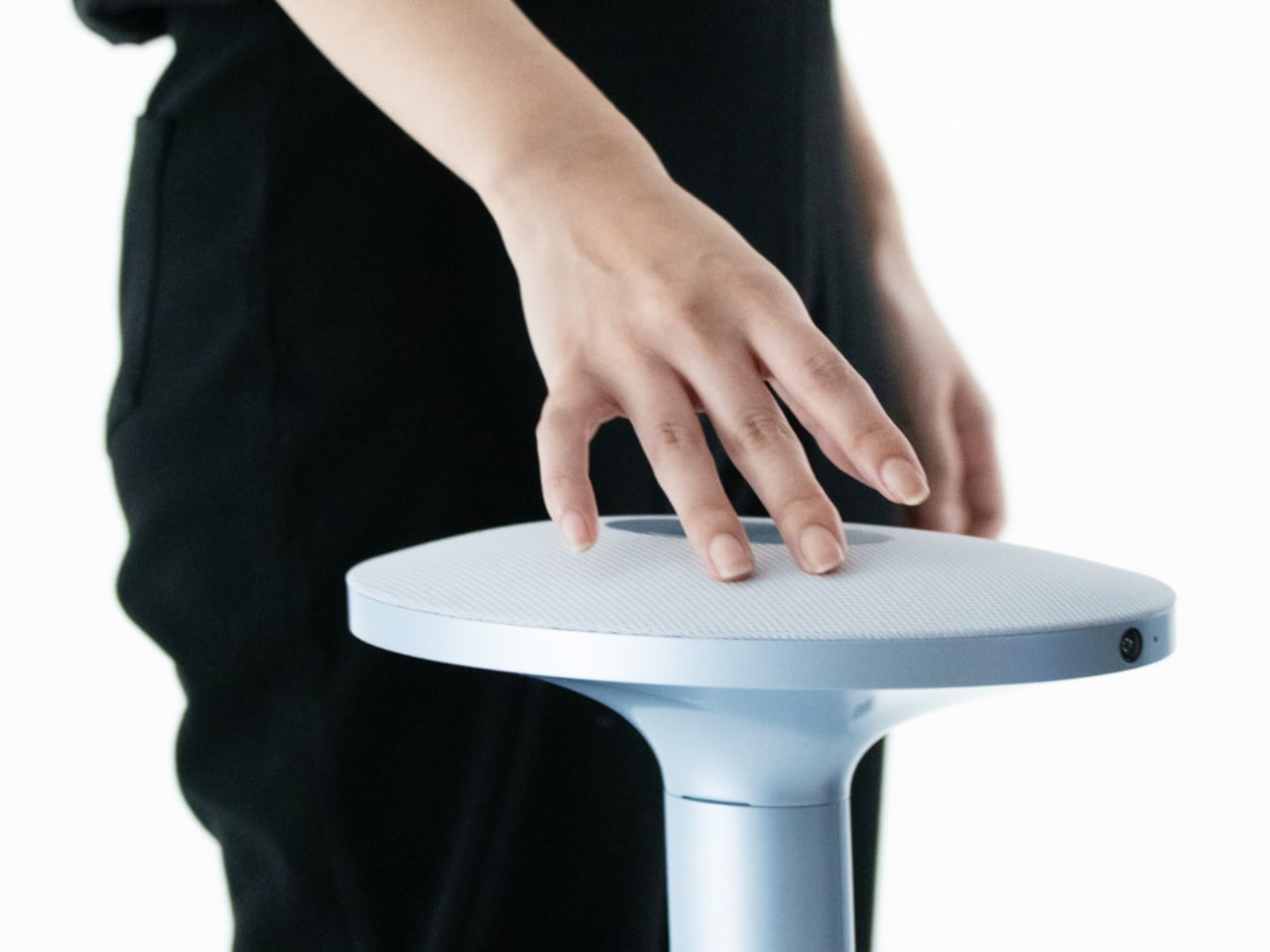
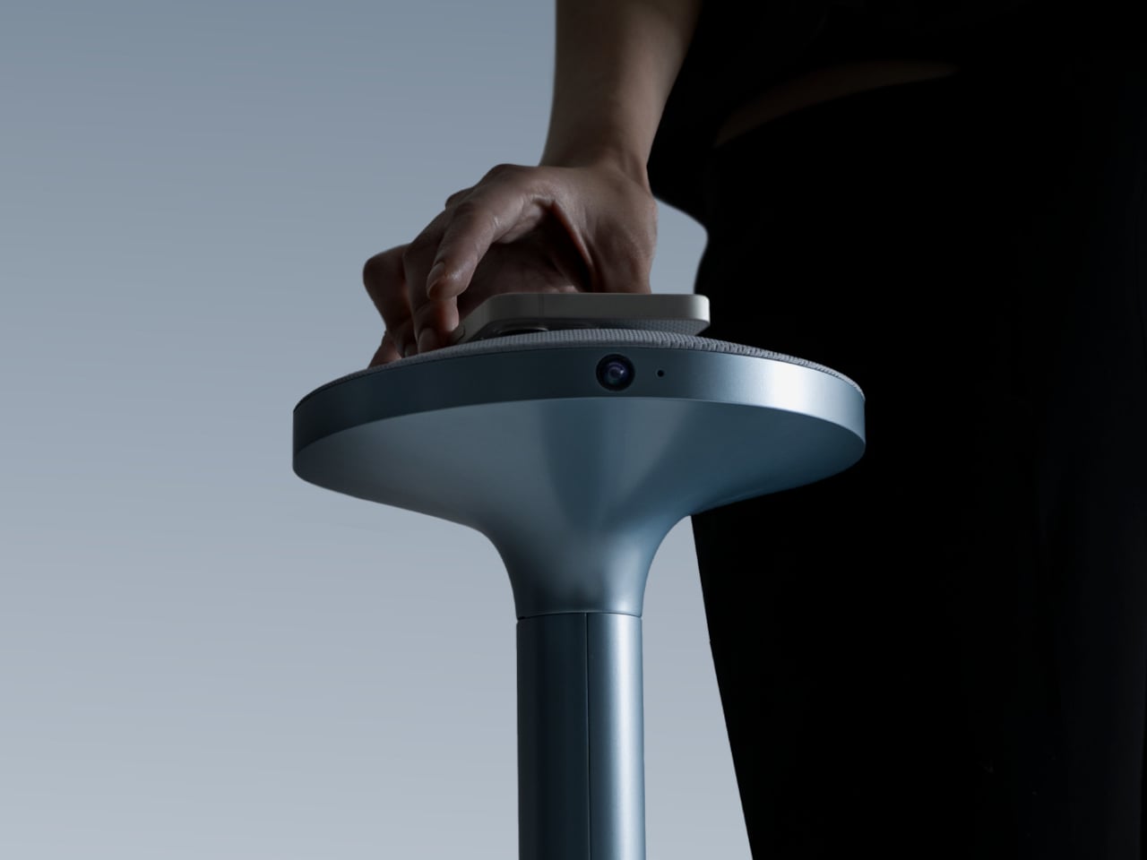
The tactile table is a slim pedestal with a haptic surface that uses electro-tactile feedback to mimic fabric textures. When you place your hand on it, the system can suggest sensations like smooth silk, textured knit, or structured leather in sync with what you see in the mirror. It attempts to close the gap between seeing a material and knowing how it might feel against your skin or draped over your shoulders.

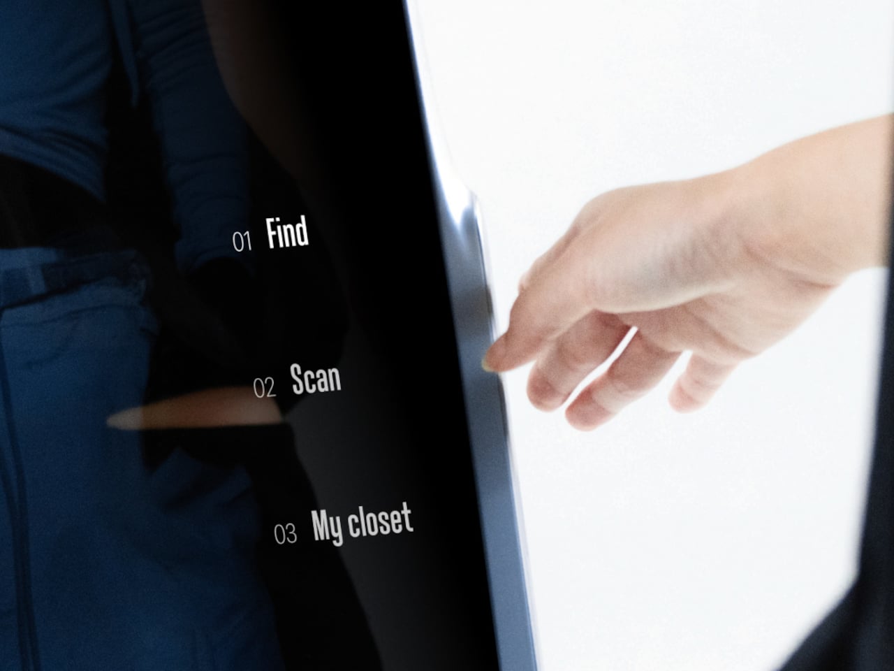
Ovme also acts as a style diary. It can scan what you are wearing today, score the outfit, and save it to a timeline called My Closet, so you can revisit past looks and see patterns in what you actually wear. A social layer called OvUS lets you browse other people’s saved styles and mood boards, turning the mirror into a place to share and borrow ideas rather than stare at yourself alone.

Ovme treats getting dressed as an ongoing design process, not a daily panic, and uses AR, haptics, and sensing to give online fashion some of the feedback loops of a real fitting room. Whether or not this exact hardware ever ships, the idea of a home mirror that helps you experiment, feel, and remember your style captures a direction that deserves attention, especially as wardrobes become more scattered across platforms and shopping becomes more remote.

The post Ovme Smart Mirror System Lets You See, Feel, and Fit Virtual Outfits first appeared on Yanko Design.
The Dial That Swallowed the Watch

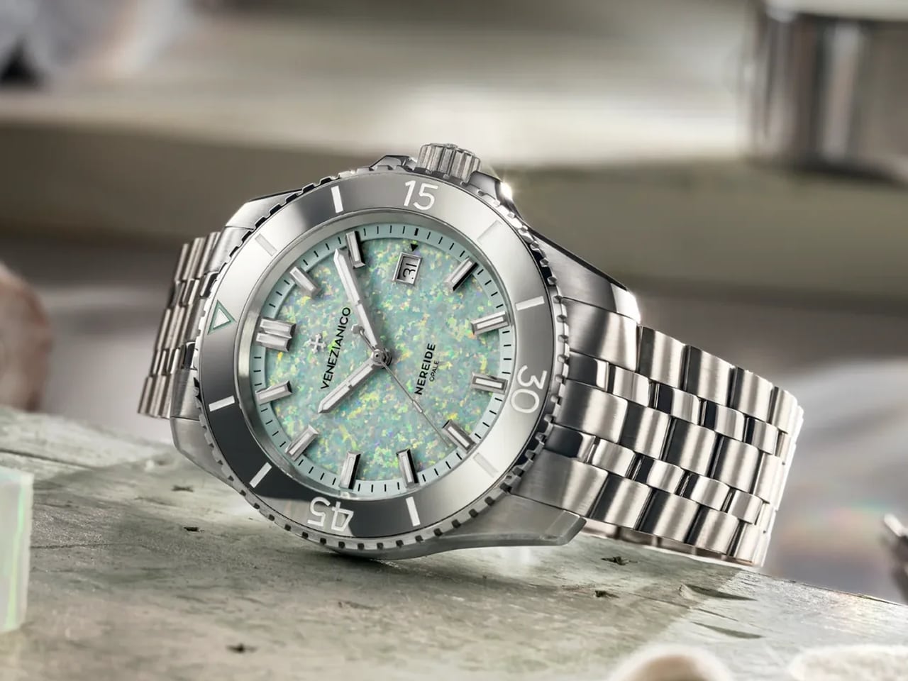
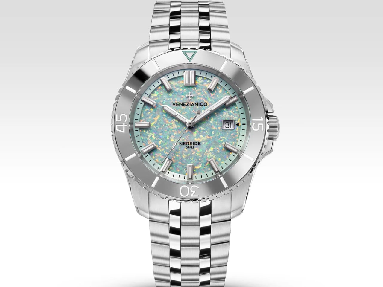
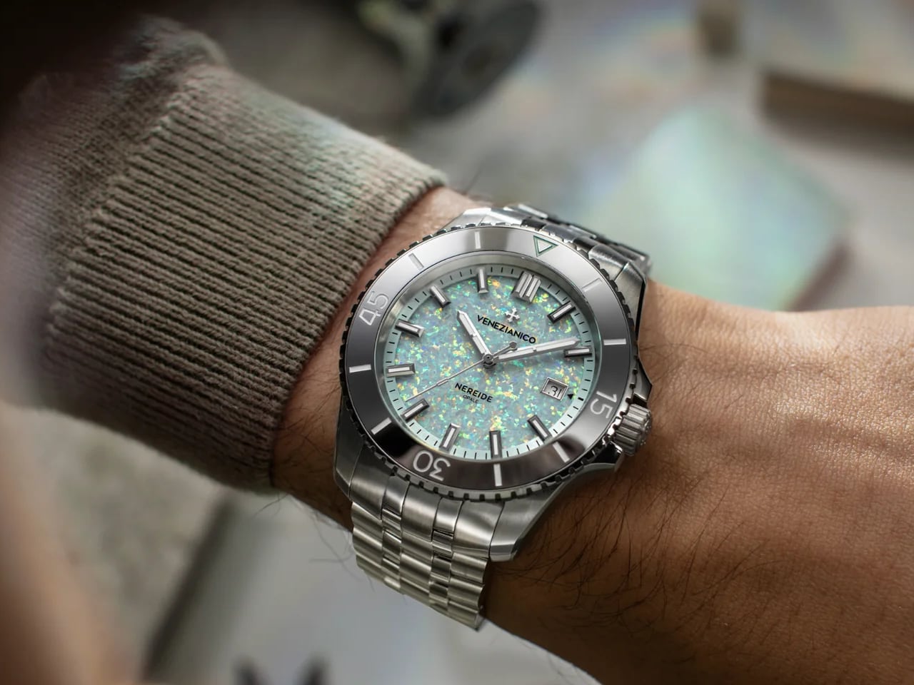
Most dive watches announce themselves through function: rotating bezels, legible numerals, confidence-inspiring depth ratings. The Nereide Opale acknowledges all of that, then pivots. Venezianico constructed a 200-meter tool watch with a tungsten bezel and Swiss automatic movement, but none of those details survive first contact. The dial dominates. Blue shifts to green shifts to purple shifts to pink as the wrist rotates, a geometric light show housed in familiar steel.

Designer: Nereide Opale

The design bet is specific. Venezianico assumes a buyer who already owns the matte-dial diver, the heritage reissue, the affordable Swiss workhorse. This watch exists for the collector who wants to break the pattern, to own something that photographs like nothing else in the box.

Kyocera’s Controlled Chaos

Natural opal presents challenges for production watchmaking. According to the Gemological Institute of America, high heat or sudden temperature changes can fracture opal and cause crazing, a network of fine cracks that destroys the stone’s visual appeal. Add the inconsistency of natural specimens, where one piece might display dramatic fire and the next a muddy gray, and the material becomes impractical for a 500-piece limited run. Venezianico needed opal’s visual effect without the gemstone’s vulnerabilities.

Kyocera, the Japanese ceramics company, developed an alternative decades ago. Their lab-grown material reproduces the layered internal structure that creates opal’s color play: light enters, bounces between microscopic layers, and exits as a spectrum of shifting hues. The composition, 80 percent silica and 20 percent clear resin according to Venezianico’s specifications, yields a dial plate stable enough to machine cleanly and survive the thermal cycles a dive watch encounters.

The result reads differently than natural stone. Where a mined opal might show soft, nebulous color zones, the Kyocera material presents sharper facets, more crystalline geometry. The rainbow effect is more deliberate, more designed. Some buyers will prefer the organic randomness of natural opal. Others will appreciate that each of the 500 Nereide Opale dials carries unique patterning without the lottery of stone selection.

Practical concerns disappear. The dial survives the thermal cycles a dive watch encounters. It accepts the date aperture at three without cracking. And Venezianico can promise visual consistency across a limited run, something impossible with harvested material.

Steel as Stage

Every design decision surrounding the dial serves a single purpose: stay neutral. The 42mm case wears a mix of brushed flanks and polished bevels, the standard dive-watch treatment, but entirely in silvered steel. The five-link Sansovino bracelet continues the theme: metallic, reflective, monochrome. No color. No contrast. No competition.

The hands required particular care. Venezianico chose an obelisk profile, tapering to a point, finished in mirror polish. Against the shifting opal, they occasionally catch light and flash, but they never anchor the eye. Applied baton hour markers follow the same logic: minimal, metallic, filled with Super-LumiNova for low-light legibility but invisible against the dial’s daytime performance.

Typography stays restrained. The applied cross logo at twelve uses the same polished metal as the hands. The date window at three sits in a polished frame that matches the logo. A colored date wheel, a contrasting brand name, any additional detail would fracture the opal’s dominance. Venezianico understood this and resisted.

The overall effect is a watch that reads as a single material statement. Steel holds the opal. Opal performs. Everything else recedes.

Tungsten as Anchor

The bezel insert breaks the monochrome, but only in value, not hue. Tungsten’s deep gray sits between bright steel and the kaleidoscopic dial, a tonal step-down that prevents the transition from feeling jarring. The material choice is also functional: tungsten rates 9 on the Mohs hardness scale against stainless steel’s 5, making the rotating bezel highly scratch resistant in normal daily wear.

The 60-minute dive scale, the lume pip at twelve, the coin edge for grip: none of this is novel. But tungsten elevates familiar geometry. The material carries literal weight, densifying the watch’s top half, and perceptual weight, grounding a piece that might otherwise feel purely decorative.

The Workhorse Inside

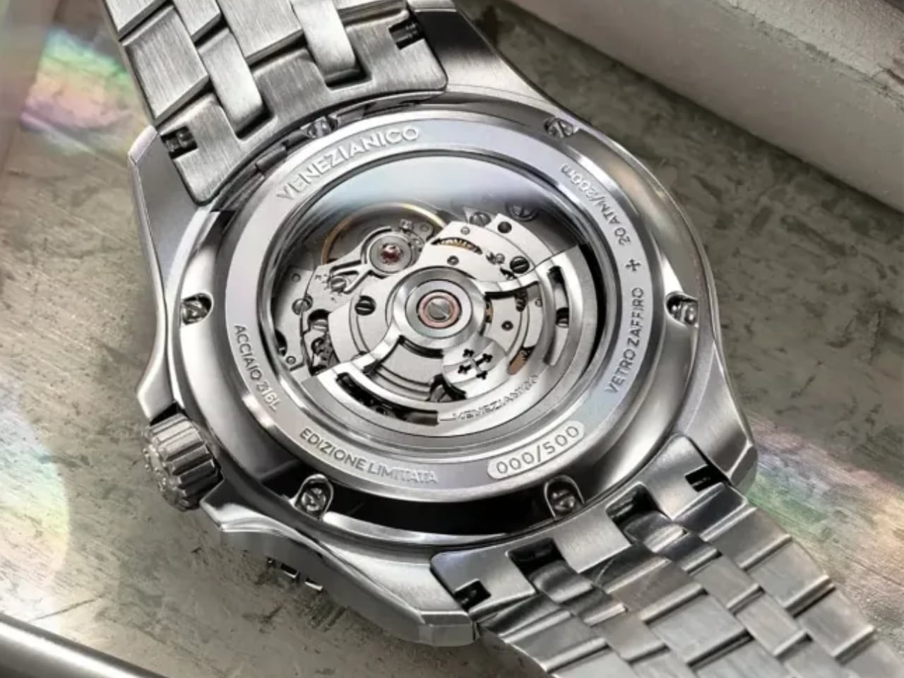
Venezianico selected the Sellita SW200-1, the Swiss automatic that powers divers from Christopher Ward to Marathon to Unimatic. The 4Hz beat rate represents proven reliability, not innovation. Power reserve figures vary across coverage, with some outlets reporting 38 hours and others 41, and Venezianico’s official spec sheet omits the number entirely. Expect something in that range. The movement answers mechanical questions without drama, leaving the dial to carry the conversation.

Through the exhibition caseback, a customized rotor appears with radial Côtes de Genève finishing, a gesture toward decoration that stops short of competing with the front side. The rotor treatment suggests care without demanding attention, exactly the balance the watch needs.

The movement choice anchors value. At 1,395 USD (1,295 EUR), the Nereide Opale occupies the same price bracket as competitors using conventional dials. The Kyocera opal and tungsten bezel represent material upgrades at cost parity, the kind of calculation that rewards enthusiasts who know what they are giving up (nothing) and what they are gaining (a dial that behaves like no other in the segment).

Five Hundred Pieces, One Specific Buyer

Venezianico caps production at 500 numbered examples, with preorders opening December 24. The exact time varies by source: Venezianico’s communications indicate 3:00 PM GMT+1, while at least one outlet reports 2:00 PM GMT. If timing matters to you, confirm directly on Venezianico’s signup page before the window opens. The scarcity is real but modest: enough to create urgency, not so limited that secondary market access disappears entirely.

The tension in this watch is deliberate. Dive watches earned their reputation through legibility and durability, through being tools that happen to look good. The Nereide Opale inverts the formula: it is a visual object that happens to function as a tool. The 200-meter rating is real. The tungsten bezel will survive years of daily wear. The SW200-1 will keep time reliably. But none of that is why someone buys this watch.

The buyer profile is narrow. Collectors seeking another black-dial diver will find nothing here. Those who treat watches as mechanical jewelry, as objects that reward attention, will find a dial that changes with every movement, backed by engineering that does not apologize for the spectacle.

Venezianico’s bet is straightforward: a dial material can carry a watch in a market saturated with homages and heritage plays. The Nereide Opale stakes everything on that slab of lab-grown stone. The case, the bracelet, the bezel, the movement: all of it exists to frame the opal and let the color do the work.

The post The Dial That Swallowed the Watch first appeared on Yanko Design.
When Fashion Becomes a Safety Net: The Jacket That’s a Tent

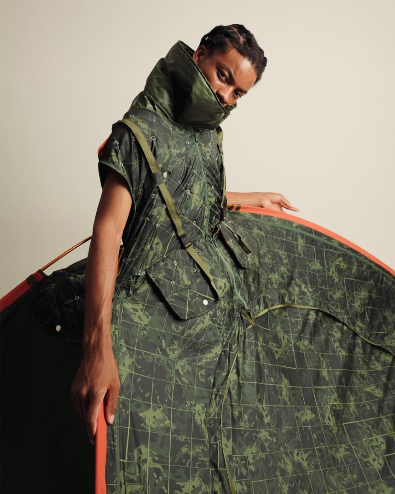
What if your jacket could save your life? Not in the metaphorical sense, but literally. Tokyo-based fashion student Yoon Myat Su Lin has designed something that sounds like it belongs in a sci-fi movie but is rooted in very real human need. It’s called Shelter Wear, and it’s exactly what it sounds like: a wearable garment that transforms into a functional tent.

The concept didn’t come from a design studio brainstorm or a trendy pitch deck. It came from memory and trauma. Yoon experienced an earthquake in Myanmar, where she witnessed people suddenly displaced, left scrambling for safety without any temporary shelter. That image stuck with her. She started thinking differently about what clothing could do, beyond looking cool or expressing identity.

Designer: Yoon Myat Su Lin

What if the thing you’re already wearing could become the thing you desperately need? And that’s where Shelter Wear gets interesting. It challenges the entire idea of what fashion is supposed to be. We’re used to clothes being decorative, seasonal, expressive. But Yoon flips that script. She’s asking: why can’t a garment be infrastructure? Why can’t your outfit double as your emergency kit?

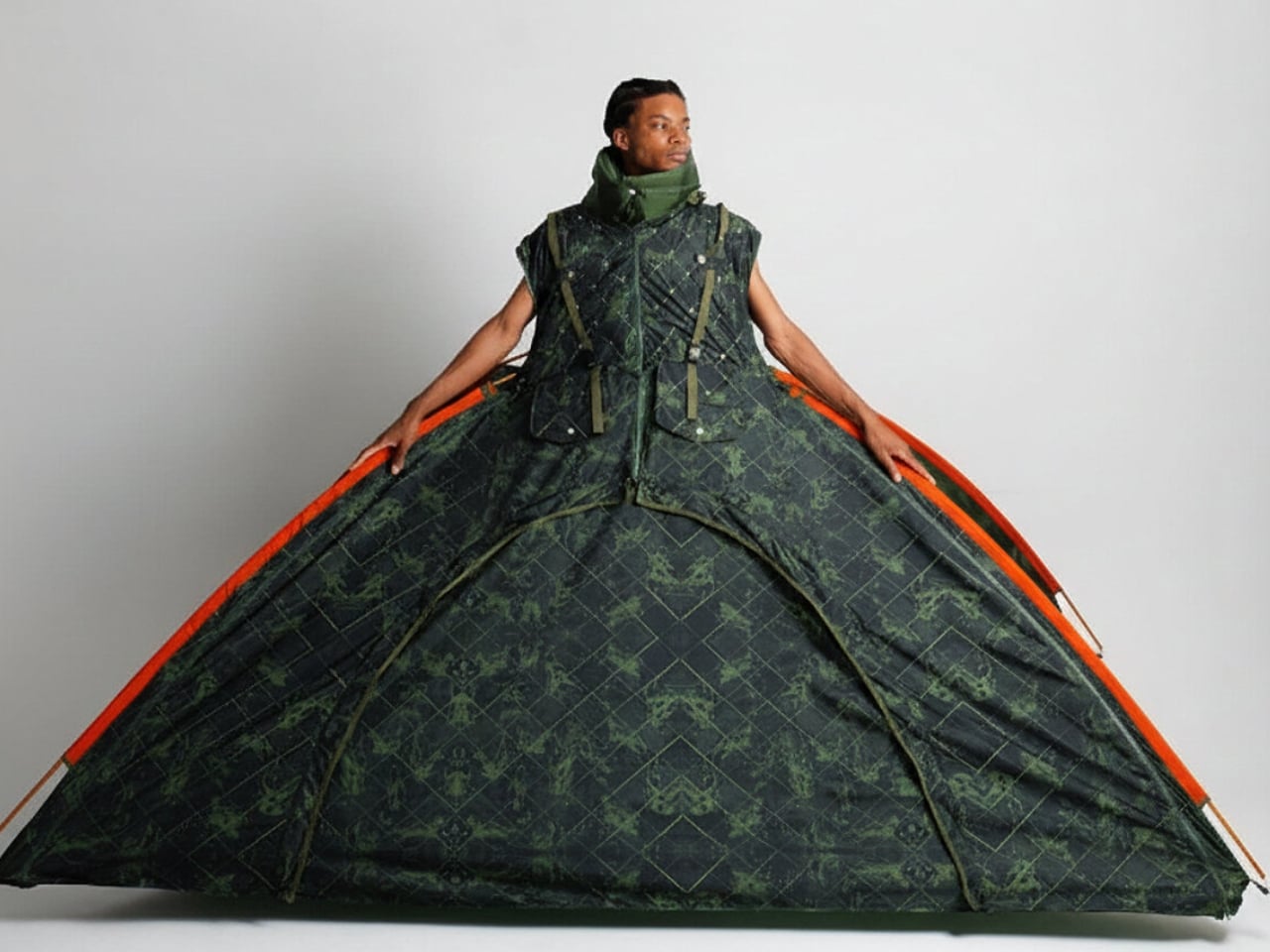
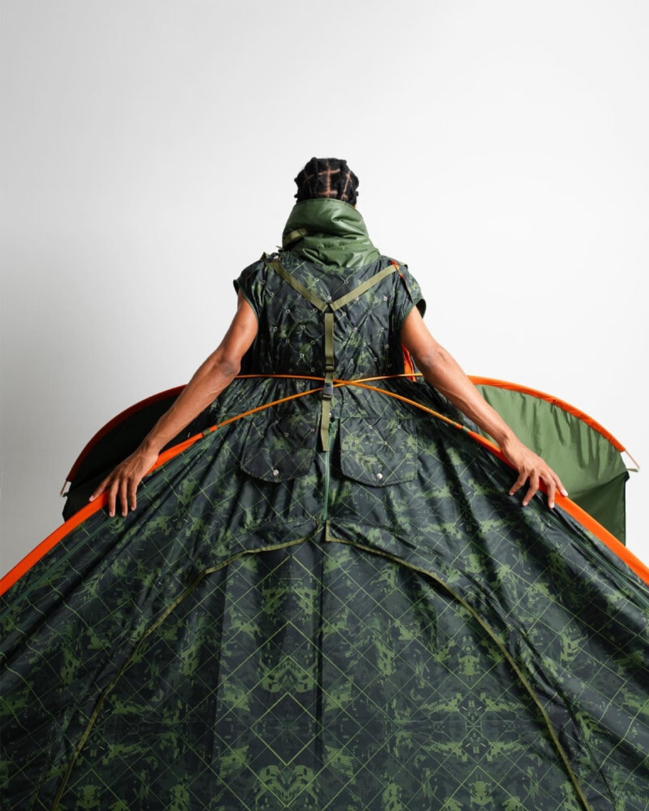
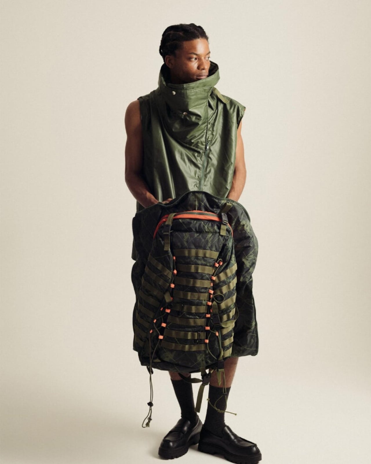
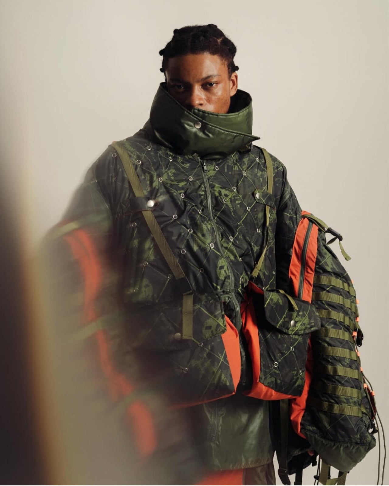
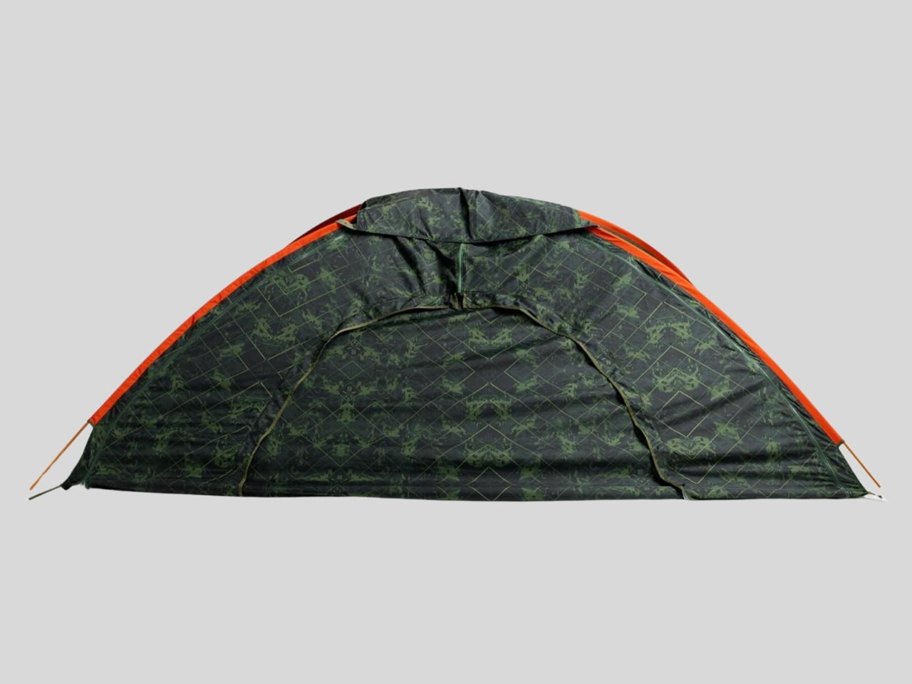
When you first look at Shelter Wear, it reads as a structured, utilitarian vest. Think sleeveless outerwear with a high protective collar and some seriously intentional paneling. It’s got that techwear aesthetic, the kind of thing you’d see on someone who’s into urban exploration or just really likes pockets. But here’s where it gets wild: those sleeves? They’re detachable backpacks. You’re literally wearing your storage.

Then comes the transformation. Unclip a few buckles, unfold the structure, and suddenly you’re inside a triangular tent that expands around your body. It’s not a gimmick or a prototype that barely works in controlled conditions. It’s a legitimate shelter that offers protection when everything else has failed. The tent resembles a wide skirt when worn, blending into the garment’s silhouette until you actually need it.

This isn’t about camping trips or festival fashion. This is crisis design. It’s for the moments when help hasn’t arrived yet, when infrastructure has collapsed, when all you have is what’s on your body. In those first critical hours after a disaster, traditional emergency supplies might be inaccessible. But if you’re already wearing your shelter, you’ve bought yourself time and safety. Yoon drew inspiration from designer Aojie Yang, who also works in the space of functional, transformative fashion. But where some conceptual designs feel distant from real application, Shelter Wear feels grounded. It’s portable without being bulky. It’s practical without sacrificing design integrity. And it makes you rethink the relationship between body and architecture.

Because that’s really what this is about. The body as the first architecture. When buildings fall, when homes are destroyed, your body remains. Shelter Wear treats that body as a moving site of refuge. It’s a radical reframing of what clothing infrastructure can mean in vulnerable communities. The design also won the YKK Special Prize at the 25th YKK Fastening Award, which makes sense when you think about the engineering involved. This isn’t just fabric and good intentions. It’s ripstop materials, strategic folding mechanisms, and fasteners that need to hold up under actual emergency conditions.

But beyond the technical specs, Shelter Wear is a gesture of solidarity. It acknowledges that displacement is real, that climate disasters are increasing, that millions of people worldwide face housing insecurity. Instead of looking away, Yoon designed toward that reality. Does it solve homelessness? No. Will it prevent earthquakes? Obviously not. But it does something equally important: it expands our imagination of what design can do. It proves that fashion students in Tokyo are thinking about Myanmar earthquakes, about refugee crises, about what happens when safety disappears. And they’re making things that might actually help. That’s the power of design when it refuses to just be decorative. When it insists on being useful, urgent, and human.

The post When Fashion Becomes a Safety Net: The Jacket That’s a Tent first appeared on Yanko Design.
Saucony and Lay’s collaborate for food-inspired sneakers with regional flavors in China

Around 2020 – give or take a year or two – when I was just getting into writing about sneakers, I read about Dunkin’ collaborating with Saucony (an athletic footwear brand I had only just discovered), for a marathon in Boston. At the time, I wasn’t convinced that food and shoes, an odd pairing, could really find common ground for a collaboration. Nearly a decade later, Saucony finds itself in the middle of another food-themed partnership. This one is specific to China, but it’s likely to interest foodies and sneakerheads far beyond the region.
Saucony this time has teamed up with Lay’s to develop a trio of sneakers inspired by the potato chip brand’s three regional flavors. Since, the silhouettes are made exclusively for the Chinese market, it is not yet confirmed if the sneakers will be sold outside of the country. The interested collectors would have to look at the resale websites and markets for these pairs.

Designer: Saucony x Lay’s

Food-inspired sneakers are not only limited to a company per se. Over the years, we have seen many brands combine the two, at various occasions, to create surprisingly great results. These pairs either derive names for their colorway from tasty treats or are licensed to sell in collaboration with a food item or a restaurant. The iconic potato chip brand here finds room in the sneaker culture with the partnership.

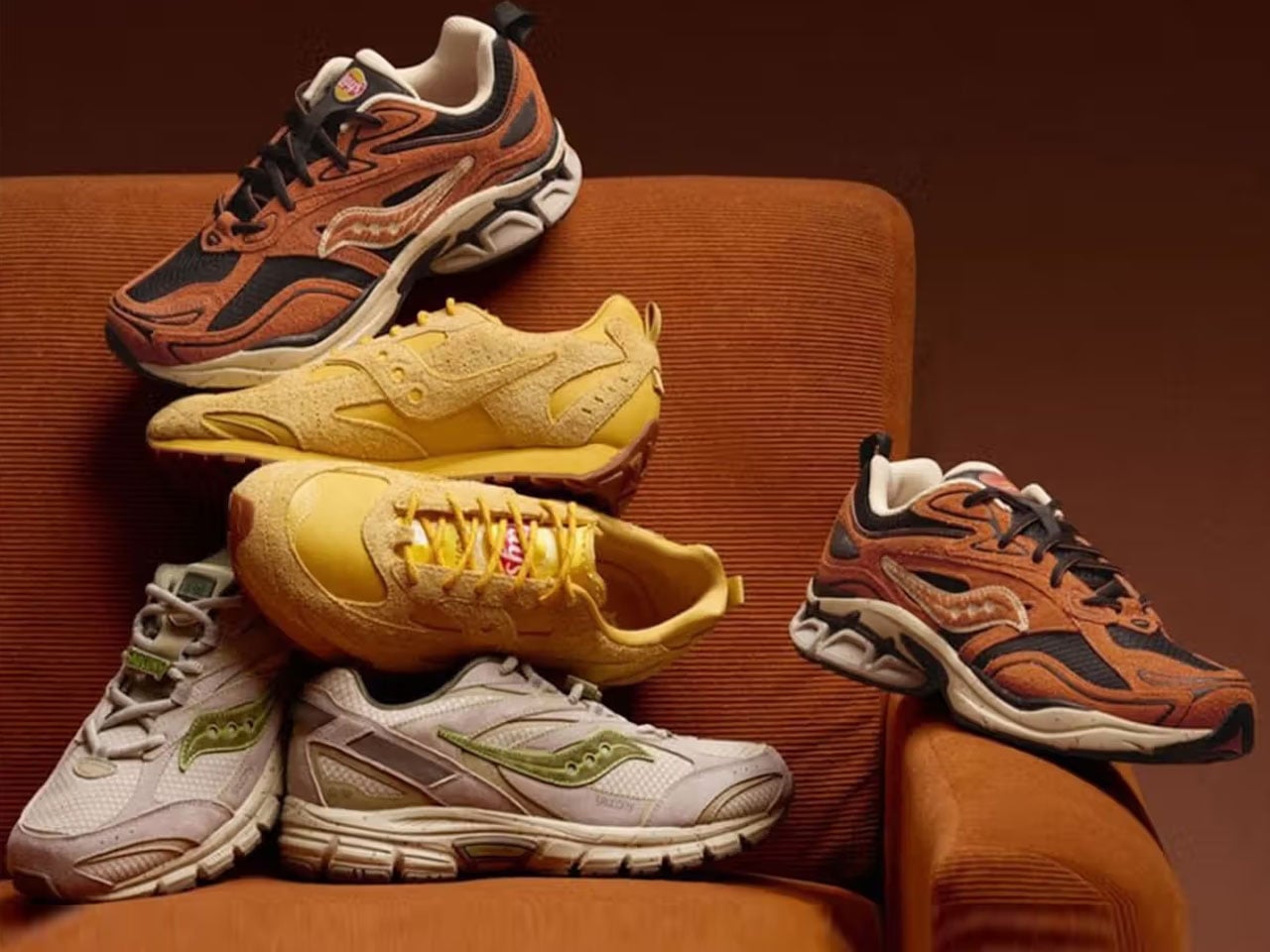
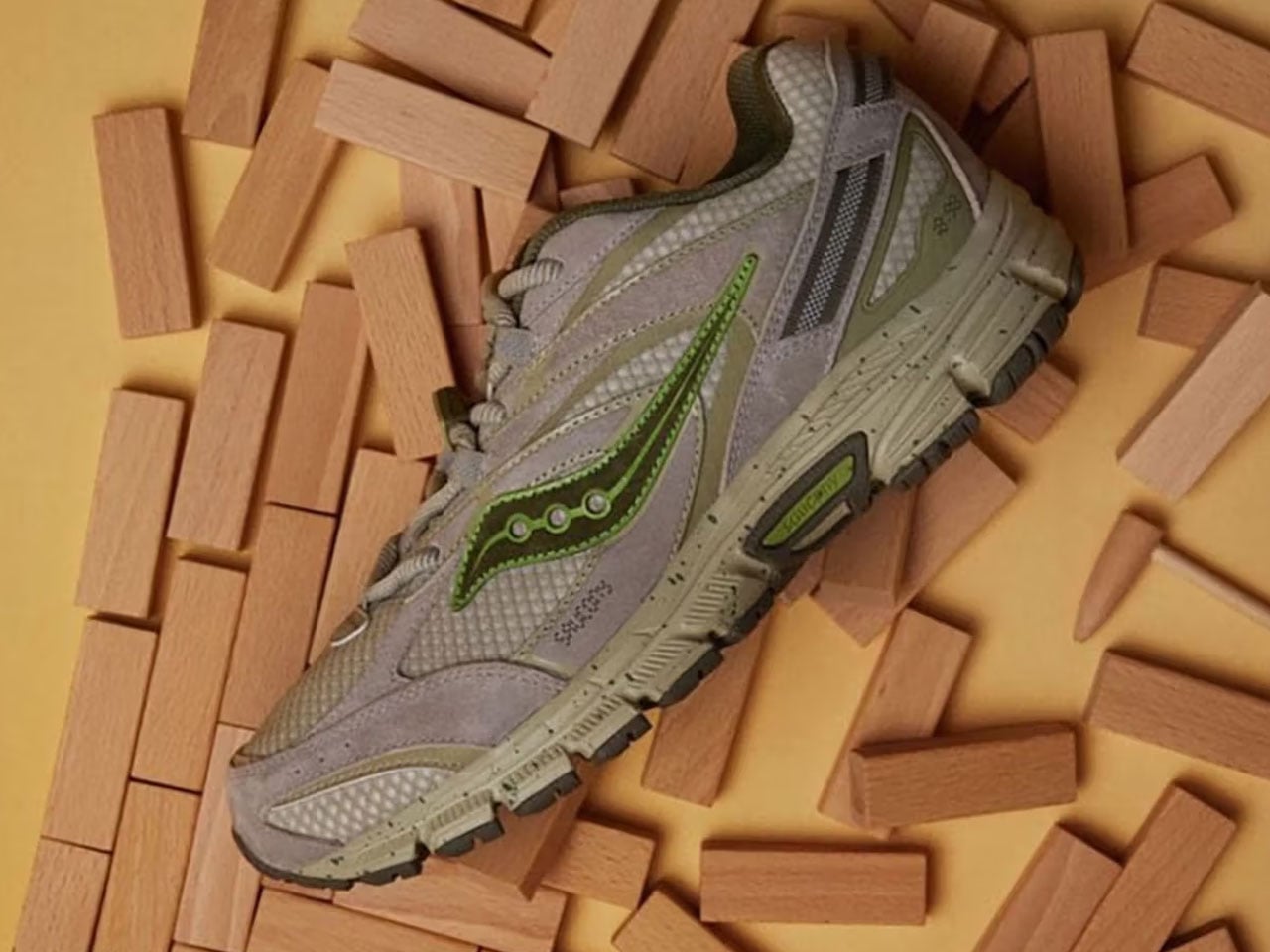
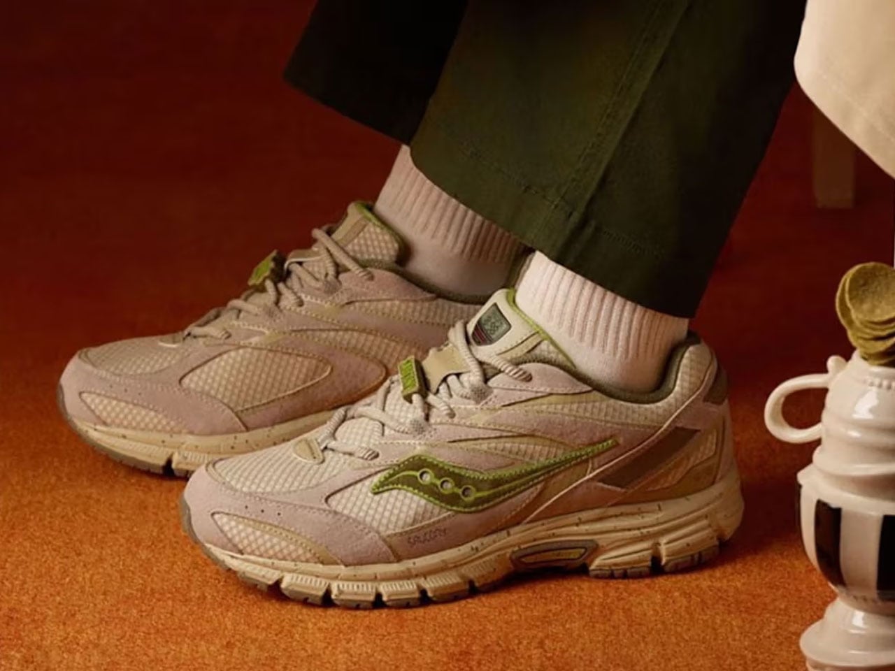
The three sneakers launched in this collection include a Cohesion 2K, Grid Fusion, and the more globally recognized Trainer 80X. The first in the trio is the Saucony Cohesion 2K, which is inspired by the popular seaweed flavor. It features a grey mesh and suede upper with a few green accents all around, which includes the Saucony logos.

The next in the collection is the Grid Fusion, designed after the spicy crayfish. The essence of the spicy crayfish is exquisitely carried in this pair, which feature warm brown swede and dark mesh in the upper and hints of its in the midsole. The soft beige on the midsole and the other accents complete the look.

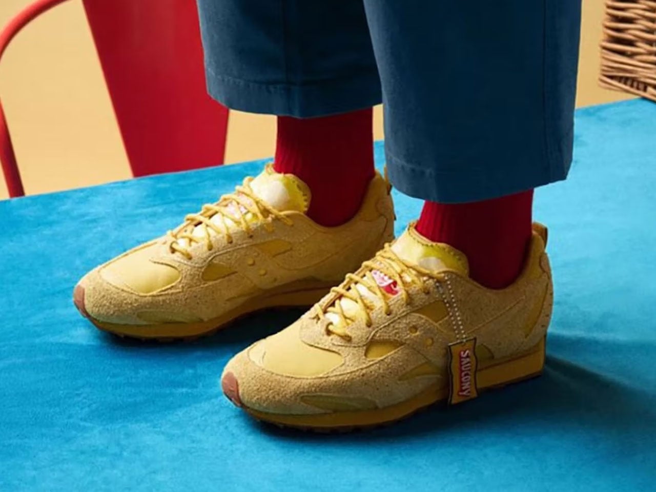
The third pair in the series is the Trainer 80X which is instinctively identifiable with its classic yellow of a Lay’s potato chip bag. It has a gum sole and a yellow leather and suede upper. What really ties the three pairs together at the playful chip bag-like hashtags and exclusive co-branding. There is no word on when these silhouettes will be available or how each one of them will be priced. But one thing we are sure of is that we can only admire these food-inspired sneakers, there is no way these are crossing the shores of China.

The post Saucony and Lay’s collaborate for food-inspired sneakers with regional flavors in China first appeared on Yanko Design.