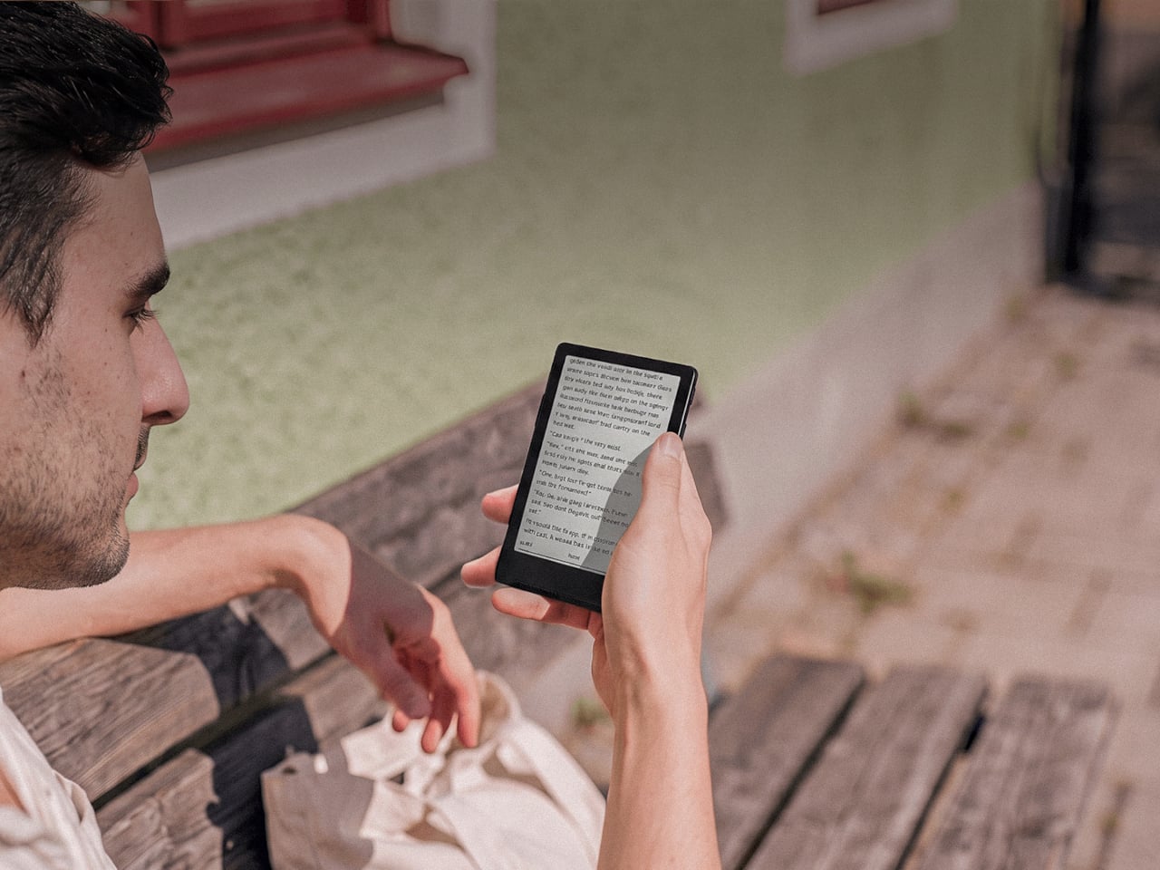
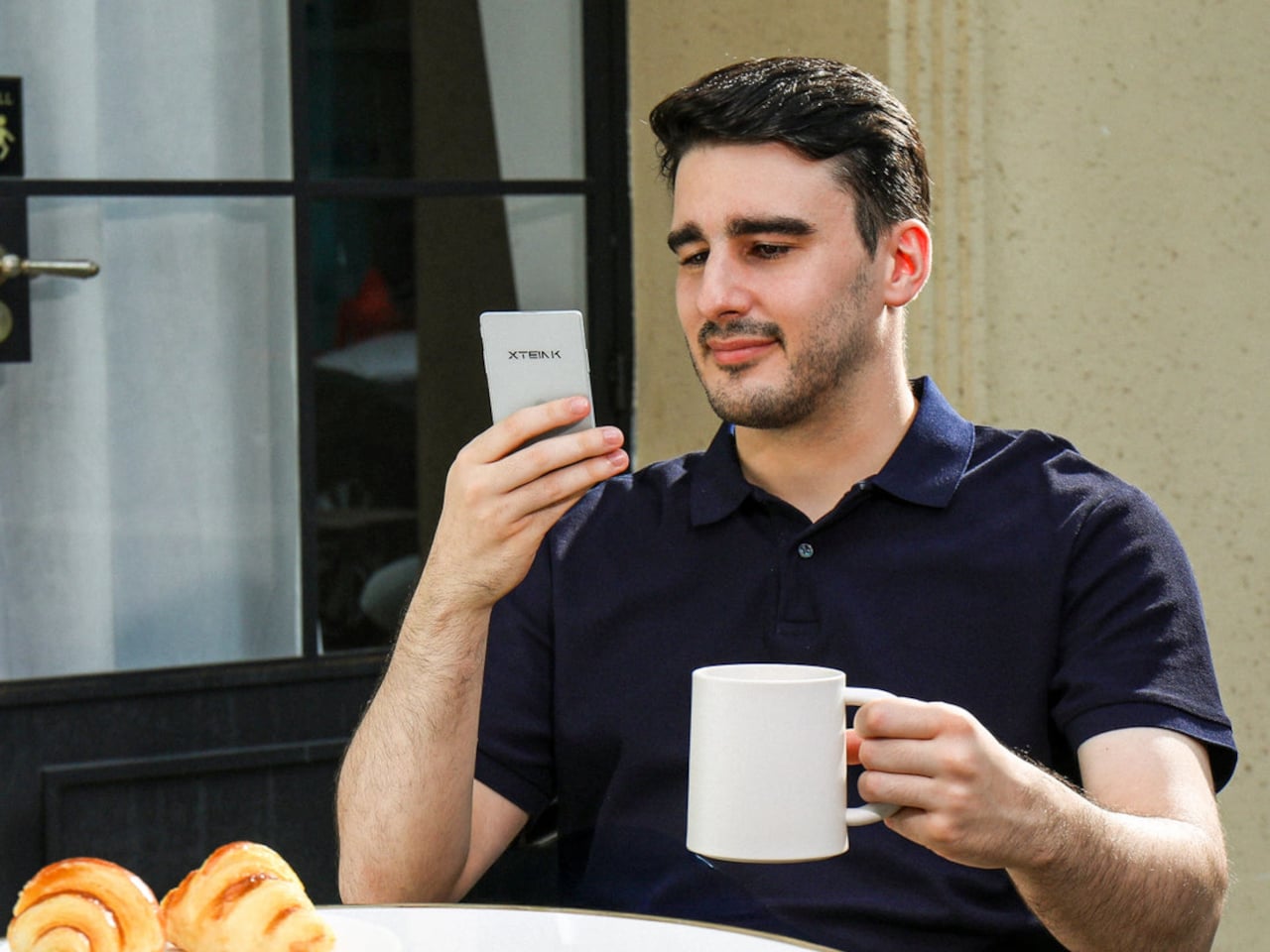
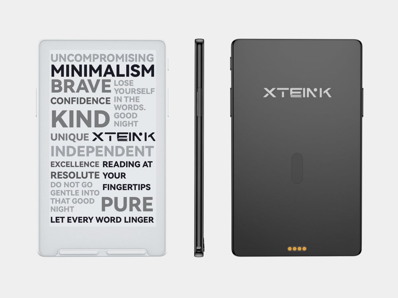
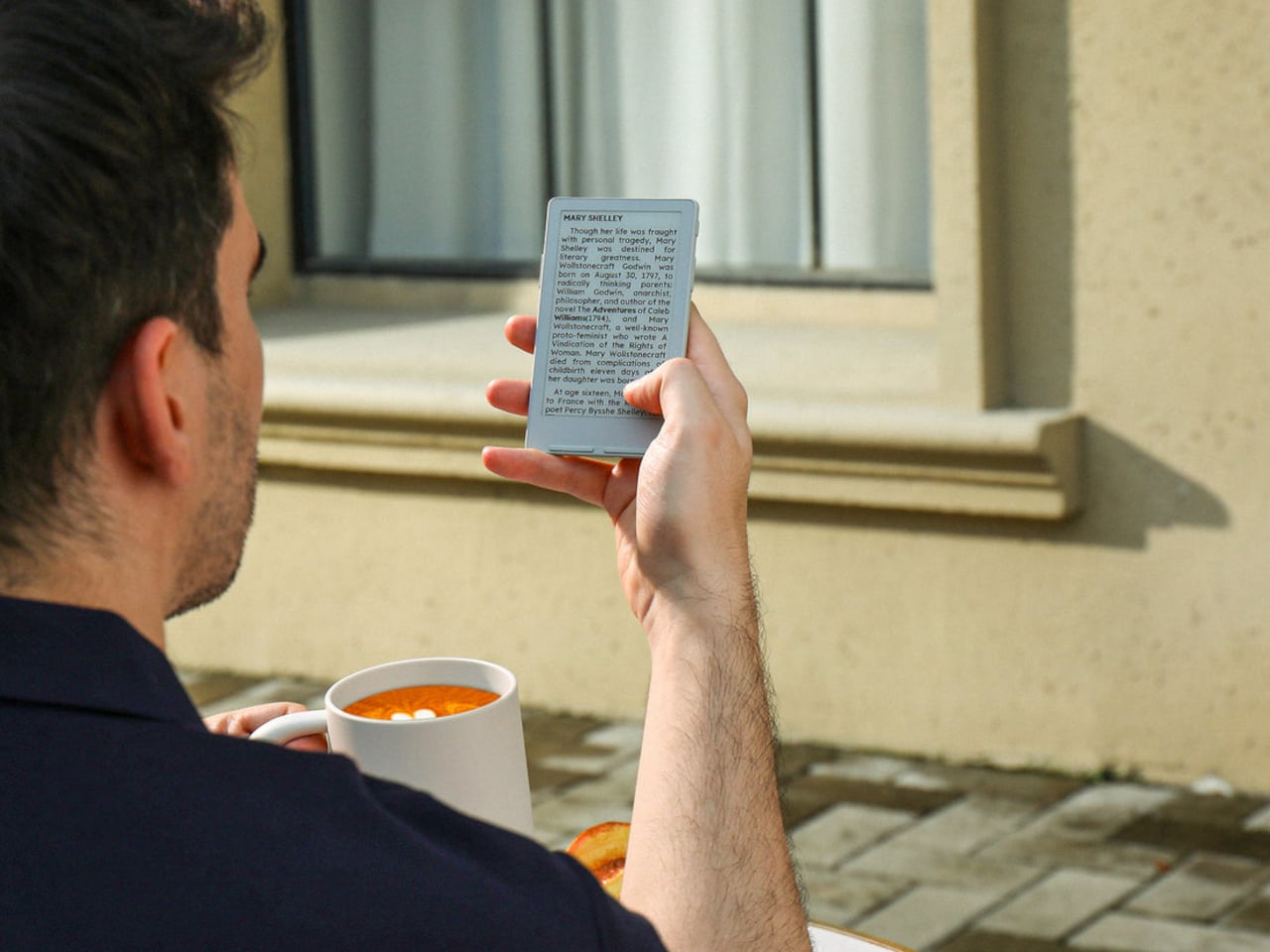
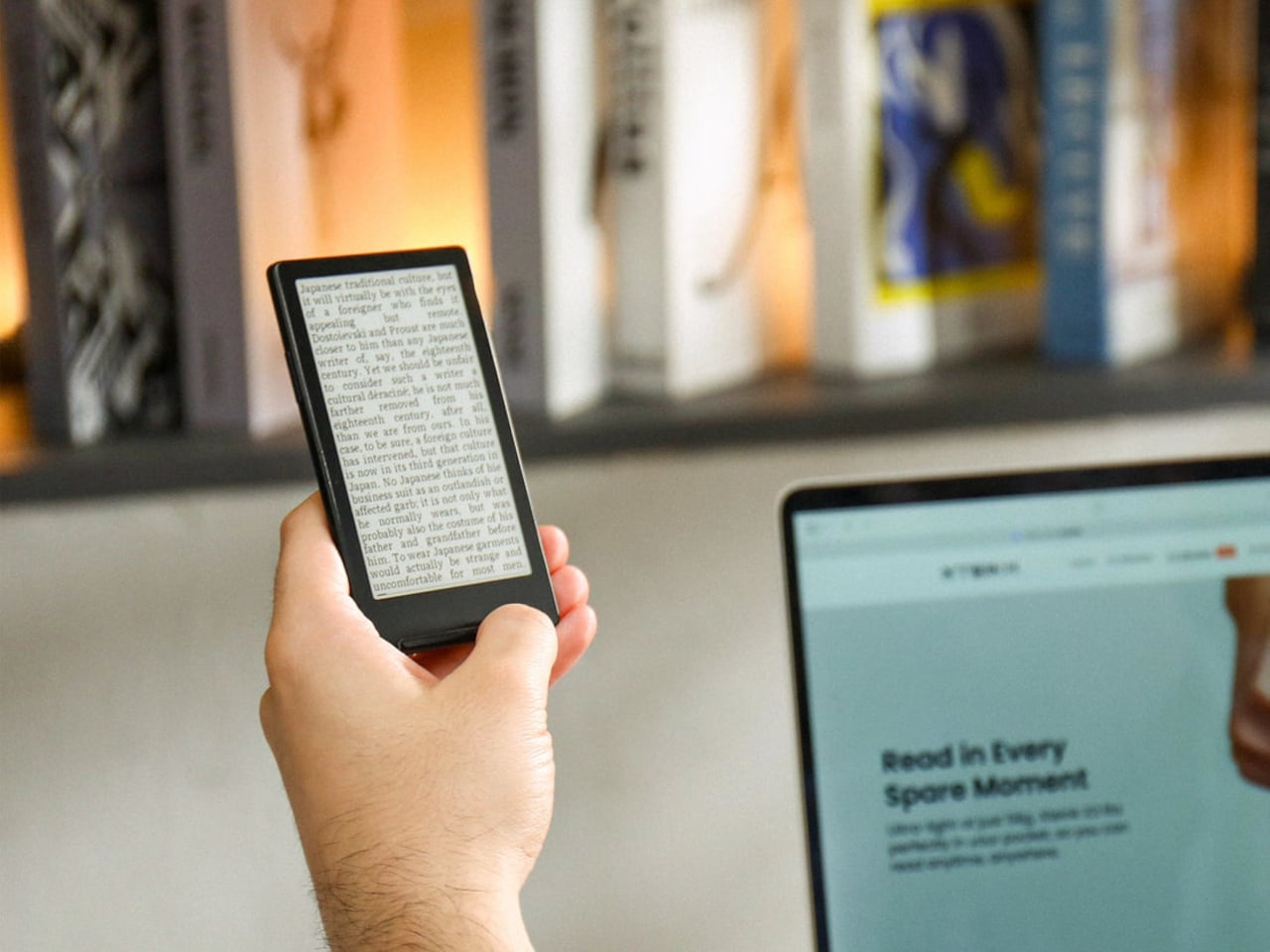
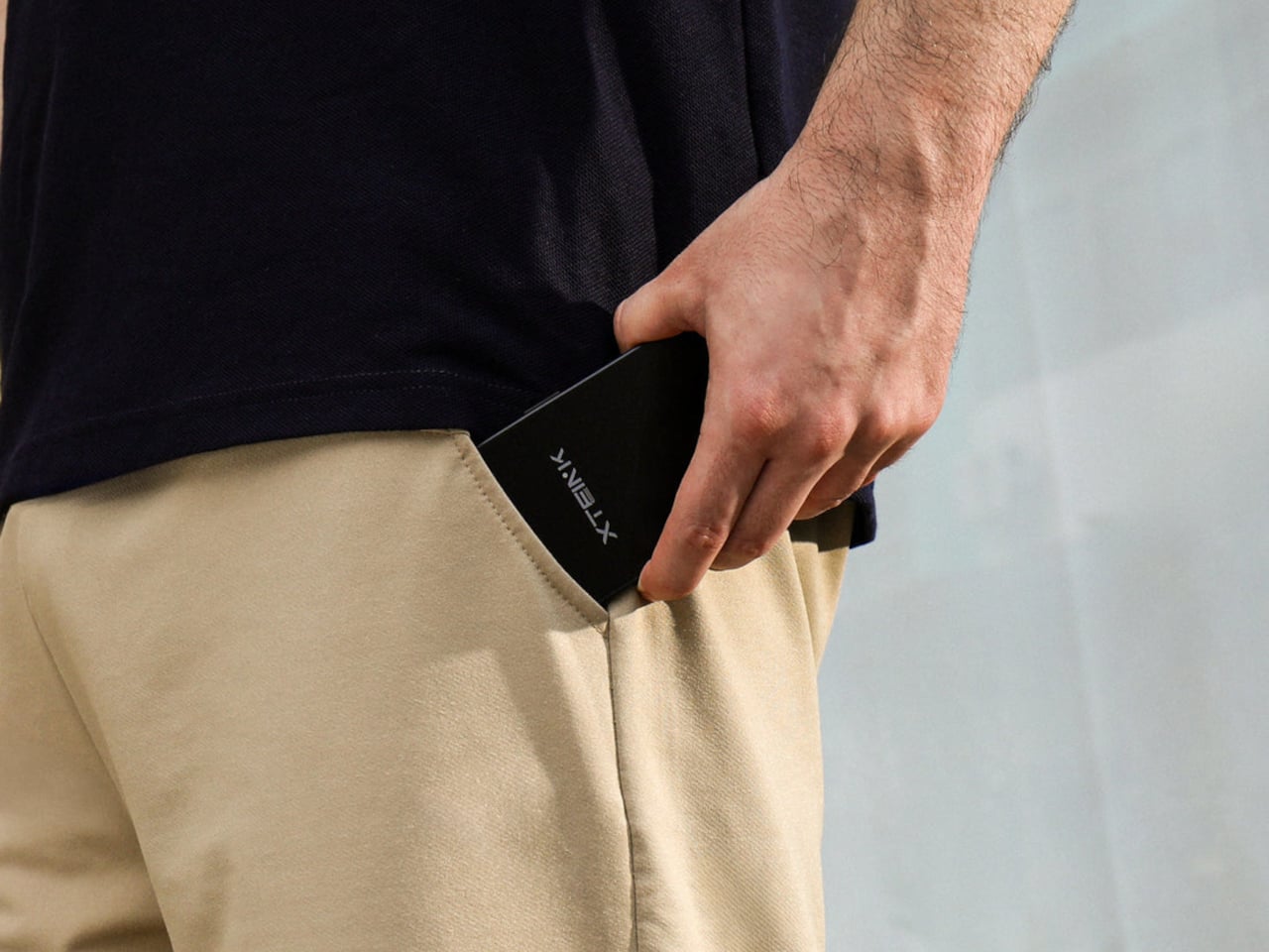
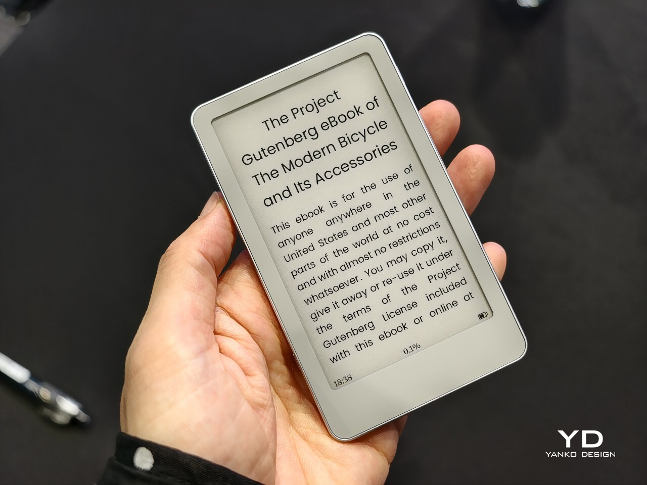
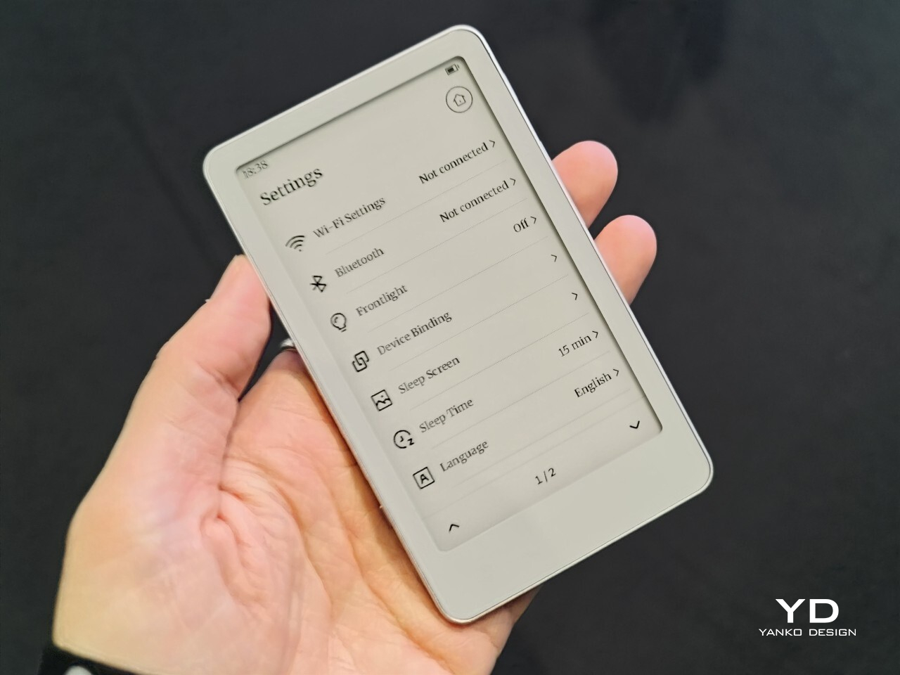
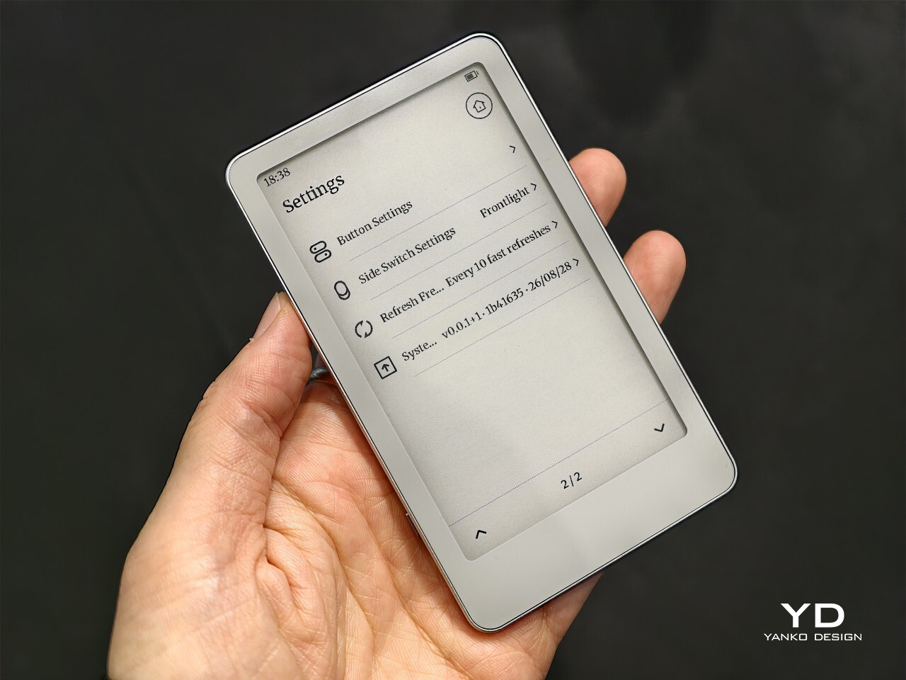
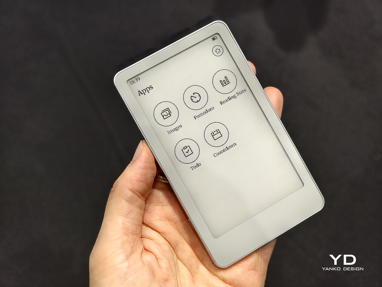
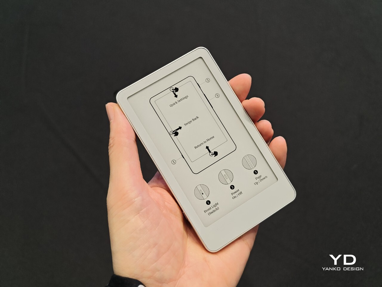
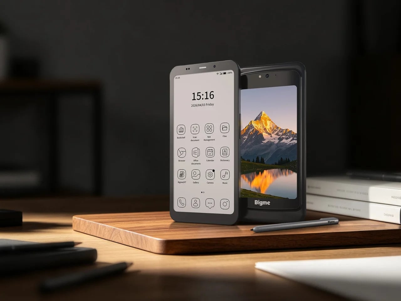
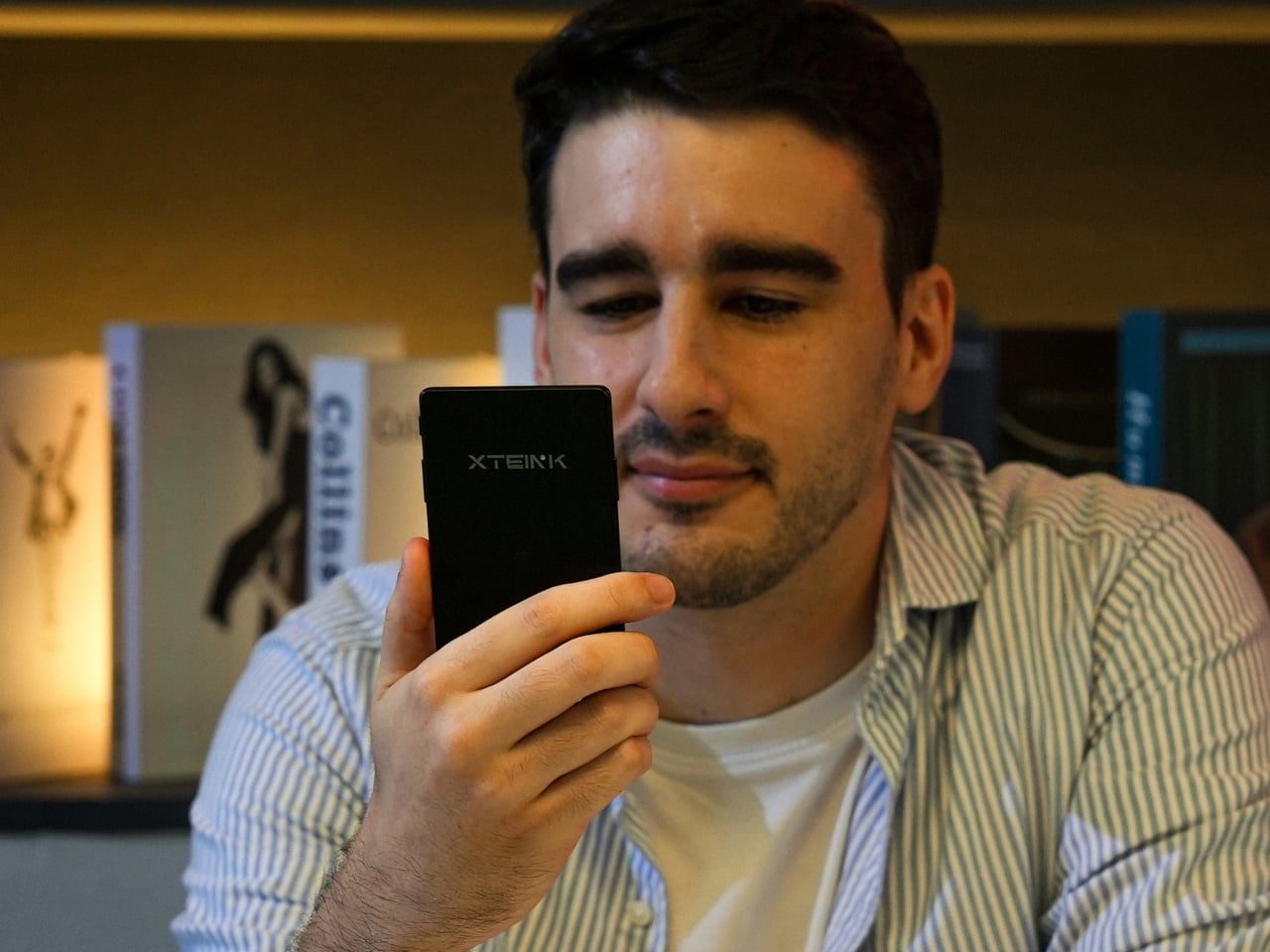
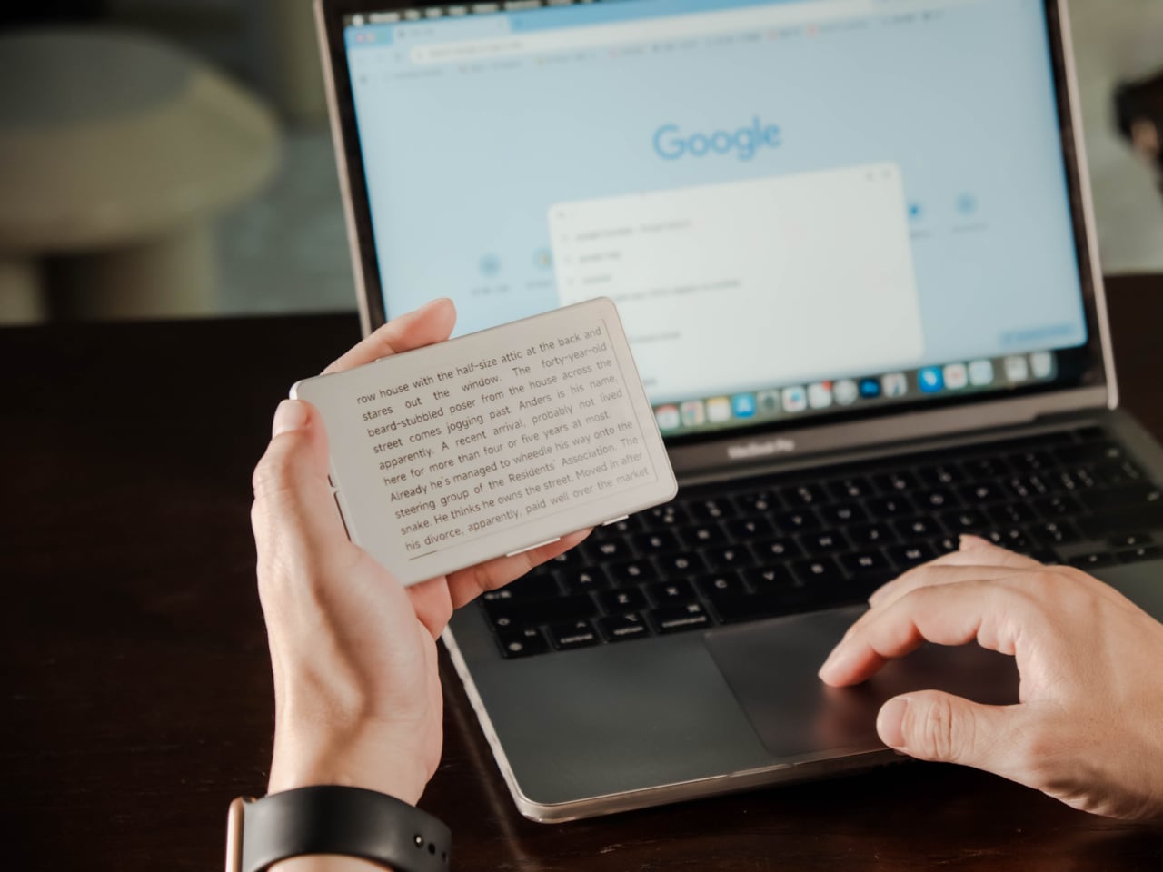
Most gadget refreshes add something: a brighter screen, an extra sensor, a higher price tag. The XTEINK X4 Classic does the opposite, and that’s precisely the point. It keeps the same 4.3-inch E Ink display, the same buttons-only interface, and the same $79 price as the original X4, while quietly upgrading the chip, the battery, and the body underneath. The result is a pocket reader that feels more refined without feeling more complicated.
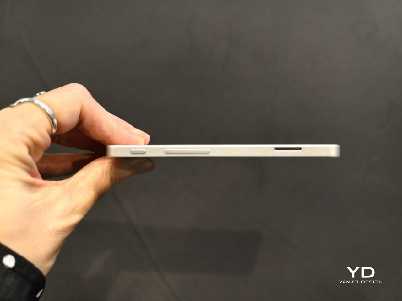
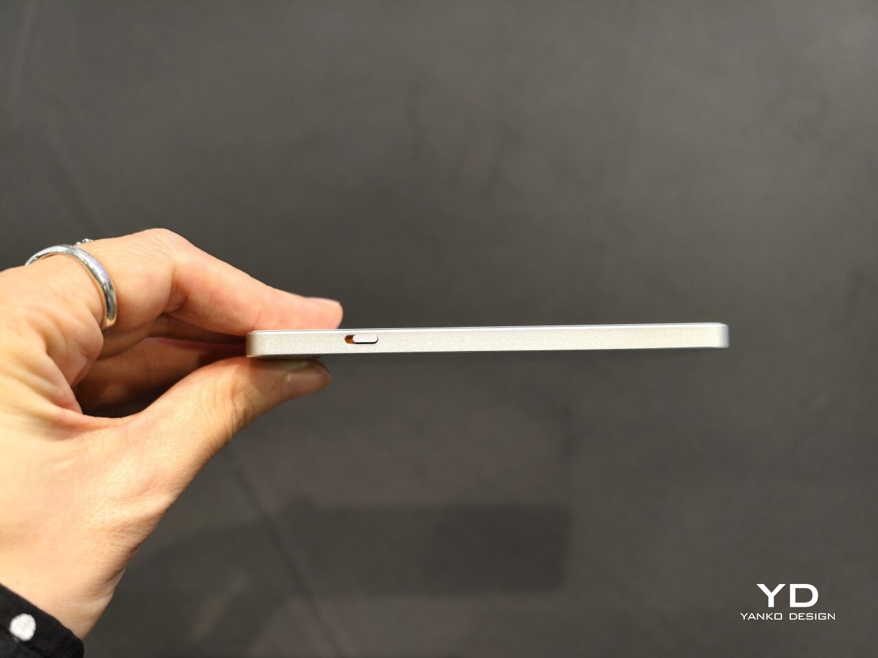
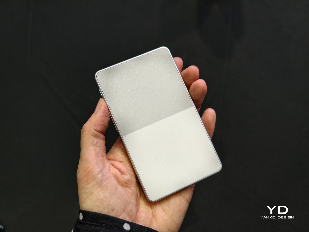
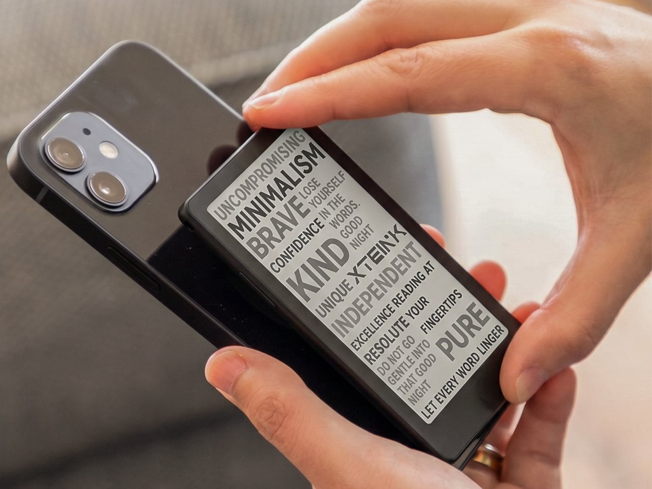
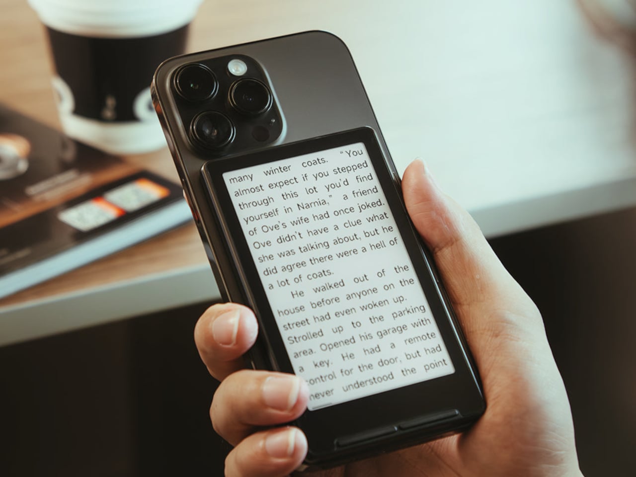
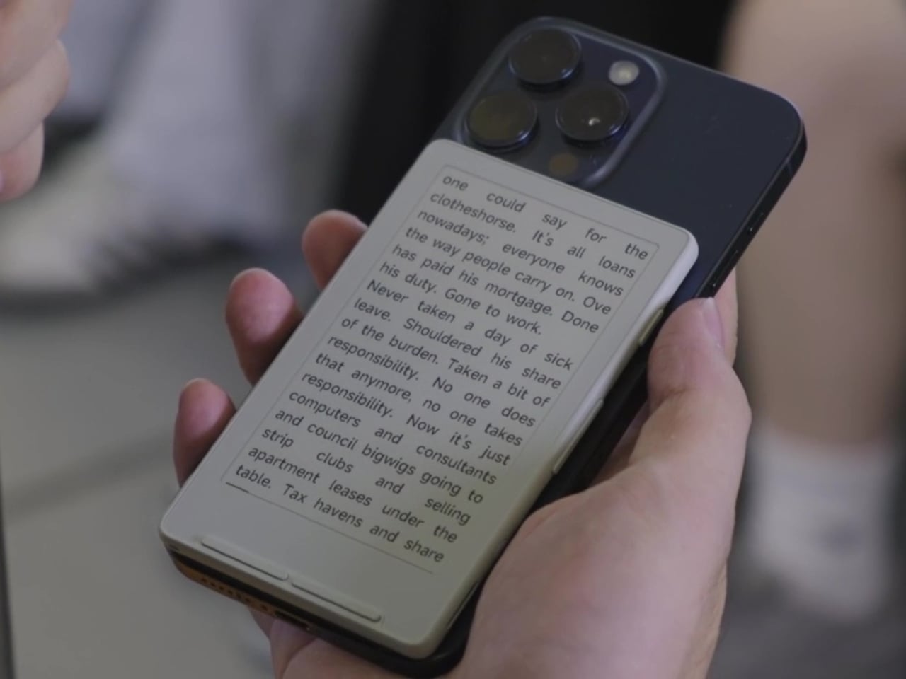
Slimming down to 4.9mm and 68g doesn’t sound dramatic on paper, but it changes how the device behaves in daily use. A magnetic backplate lets it snap onto the back of any smartphone, MagSafe included, turning your phone case into a bookshelf you never have to think about. Pull it off before a commute, let it ride along through a museum visit, or leave it clipped to a bag strap so it’s never more than an arm’s length away.
That magnetic system carries over from the original X4, but XTEINK reinforced the hold this time around, a significant upgrade more than you’d expect. A phone accessory that occasionally slides off with a slight wiggle isn’t an accessory people trust. A firmer grip means the reader stays put through a subway ride or a bike commute, exactly the fragmented pockets of time this device is built to fill.
Inside, a faster chip and a bigger battery replace the original hardware, translating into quicker page turns and a longer stretch between charges. It’s something you’d feel more than think, especially on a transatlantic flight or a week of packed commutes. Reading in short bursts stops feeling like a compromise when the device itself gets out of the way that quickly.
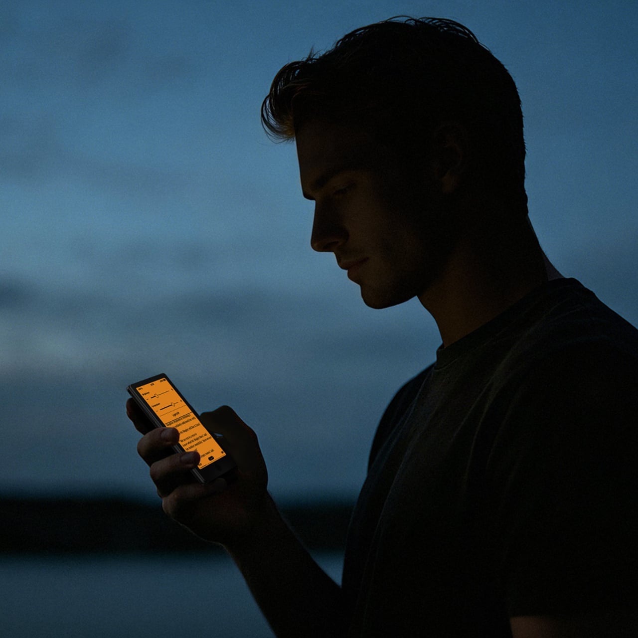
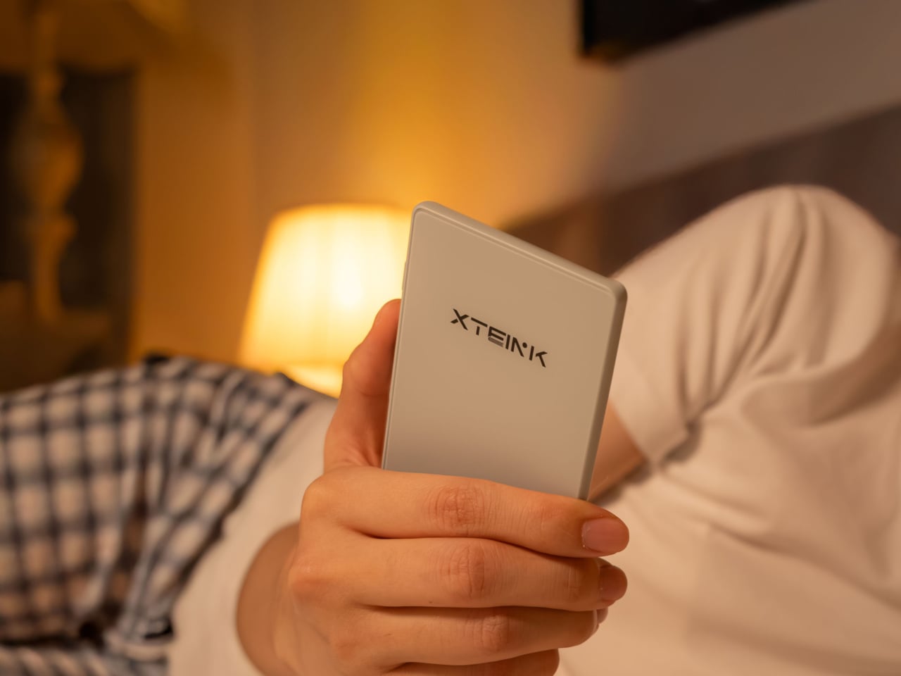
There’s no touchscreen here, and no front light either, and that’s a deliberate omission rather than some cost-cutting measure. Physical buttons handle every page turn, keeping your thumb in one place and your eyes on the text instead of hunting for a tap target. Anyone who’s ever fumbled a touchscreen ereader while lying in bed with the lights off knows how the tactile approach actually wins over advanced features.
The smaller 4.3-inch canvas does mean less text per page compared to a standard-sized ereader, so pages turn more often. That trade-off only works because the X4 Classic isn’t trying to replace a full-sized reader. It’s built for the reading that already happens in stolen minutes: a chapter on a train platform, a few pages before a meeting starts, a bedtime scene squeezed in before the lights go out.
What makes the X4 Classic worth paying attention to isn’t a headline feature. It’s the discipline behind leaving features out while still making the hardware measurably better. In a category where every new release tends to pile on screens, sensors, and price increases, holding the line at $79 while improving the parts that matter most is its own kind of design statement.
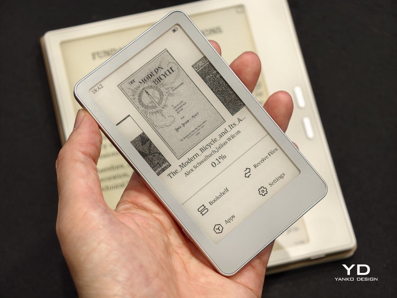
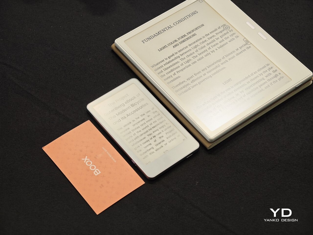
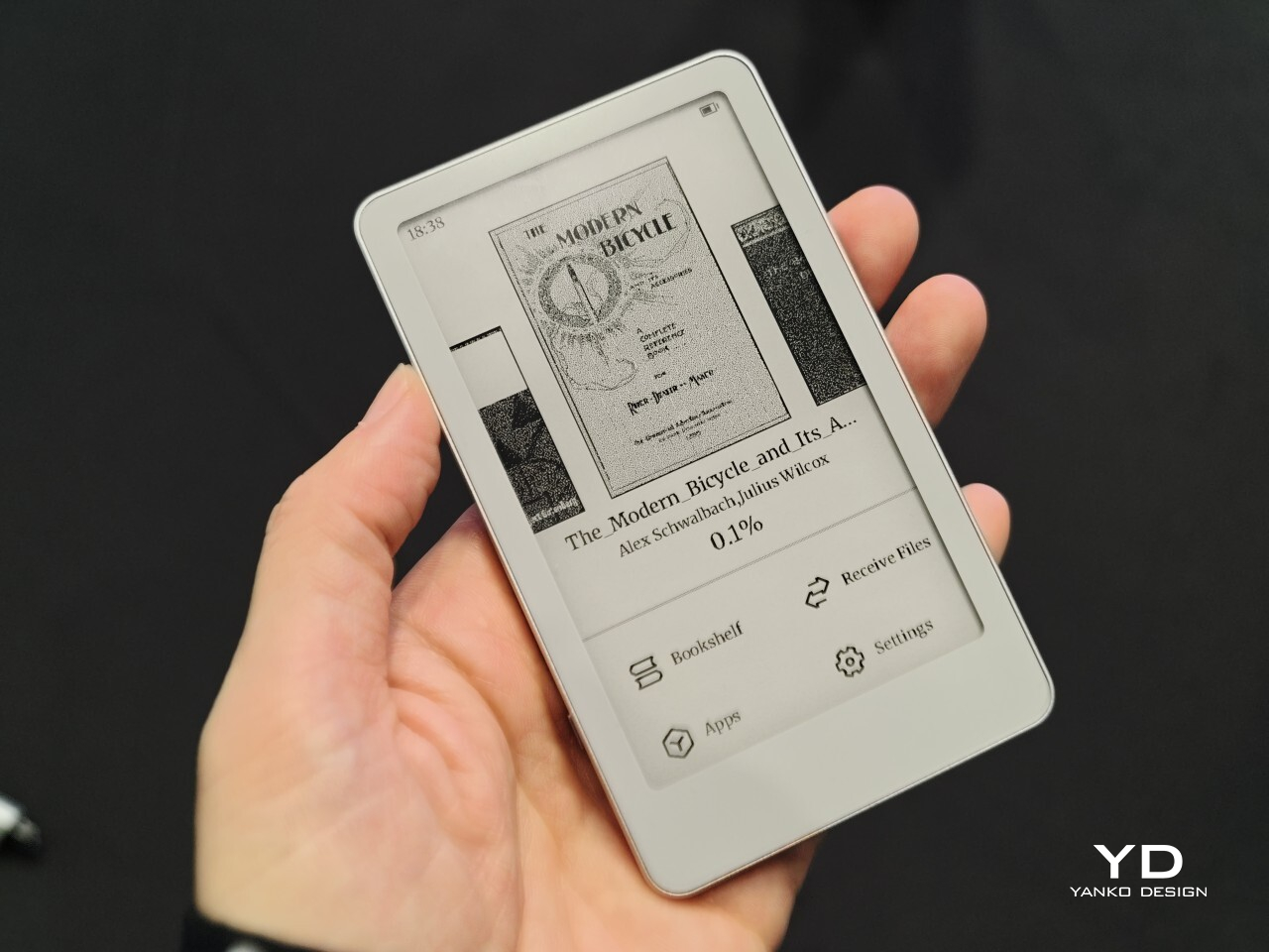
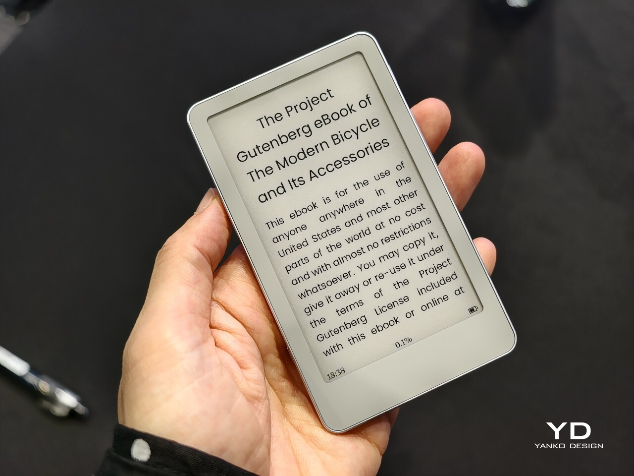
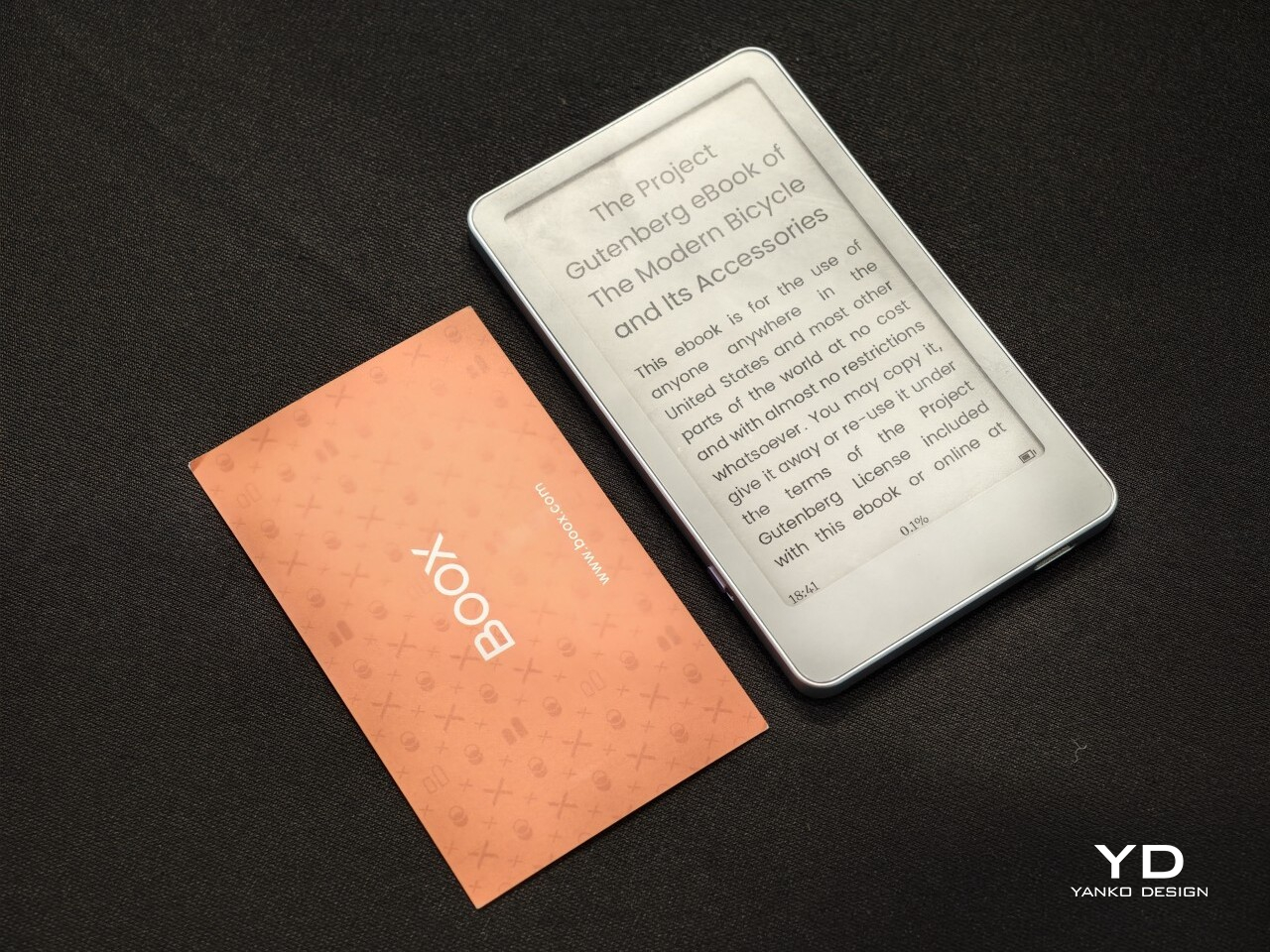
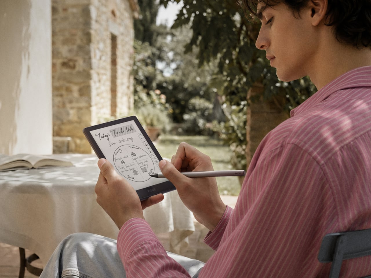
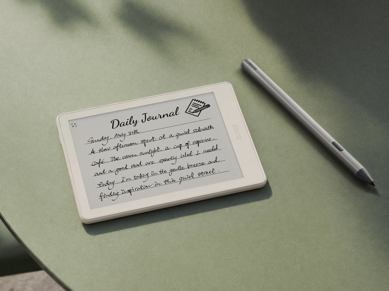
Word is spreading out of IFA 2026 about a tiny e-reader that fits in a pocket the way a stick of gum does, and it’s already reframing what a dedicated reading device should look like. The BOOX Picco pairs a 3.97-inch E Ink touchscreen with a footprint closer to a smartphone than a book. It’s a shape decision, not a spec sheet decision, and it changes how the device fits into a day.
Pick it up next to one of BOOX’s larger notebook-style readers and the size difference stops being subtle. The Picco disappears into a coat pocket or sits flat against a wallet, while its sibling devices demand a bag. That physical gap is the whole pitch. A book you have to remember to bring competes with a phone you never put down. A book that already lives in your pocket doesn’t need to compete with anything.
Designer: BOOX
Physical buttons run along one edge, tuned for page turns with separate short-press and long-press actions, so a thumb can move through the buttons on a train platform without needing to squint at a menu. A front light switch and power button sit alongside them, laid out as simple raised circles rather than crowded icons. The touchscreen handles gestures like swiping back or returning home, giving the Picco two ways to get around depending on the situation.
Storage stays refreshingly analog. Instead of packing in onboard memory, the Picco leans on a microSD card, treating your library as something swappable rather than sealed in. Files move over via USB-C or WiFi through a companion app, both quicker options than earlier tiny readers offered. It’s a small engineering choice that says something about who this device is built for: people who already have a shelf of digital books and just want a lighter way to carry them.
The software strips things down further. Instead of a full Android build, the Picco runs on a leaner Linux-based system, and the interface reflects that restraint. Icons for a handful of apps, Images, Pomodoro, Reading Stats, Todo, and Countdown, sit as plain circles on a clean home screen. There’s no algorithmic feed hiding behind a swipe, just a bookshelf, a settings menu, and a way to receive files.
None of this reads as a shrunken flagship. It reads like a device built around a single decision: reading should require less friction than checking a phone, not more. A commute, a waiting room, a lunch break; the Picco is sized for exactly those in-between stretches where a full-size reader feels like overkill and a phone feels like a trap.
Pricing chatter points to around $100 (roughly matching entry-level tablets), with a possible release by the end of 2026, though BOOX has yet to confirm the finer details. What’s already clear from the hands-on looks is that the design logic holds up. Small screens force fewer words per page, but they also force fewer excuses not to read at all.
The e-reader has been one of the most static product categories of the past two decades. Since the first Kindle appeared in 2007, the form factor has barely evolved: a single screen, a flat back, and dimensions roughly matching a paperback. These devices have gotten lighter, sharper, and more waterproof, but the fundamental design assumption has stayed the same. They’re books without the book part.
A growing number of designers have been working on a different premise: what if an e-reader actually opened like a book? One with two E Ink panels and a real hinge, held the way you’d hold a paperback, where left and right pages exist as physical space. That shared ambition has driven a small but serious cluster of projects building quietly over the past five years.
The proof that e-paper could bend
The idea of folding an E Ink display isn’t new. Back in 2020, E Ink Corporation demonstrated a hinged prototype showing that a bending e-paper panel could survive the mechanical stress of being folded. It never reached retail shelves, but it answered the one question that mattered most at the time: whether the material itself could handle the geometry of a real book.
Designer: E Ink
That prototype didn’t solve everything. It was a controlled demonstration with no commercial roadmap, no software, no battery life to speak of, and no clear form factor beyond the fold itself. What it gave the industry was proof that flexible e-paper was a viable building block rather than a permanent research curiosity. Every foldable E Ink project that came after built on that understanding.
The book illusion finally made real
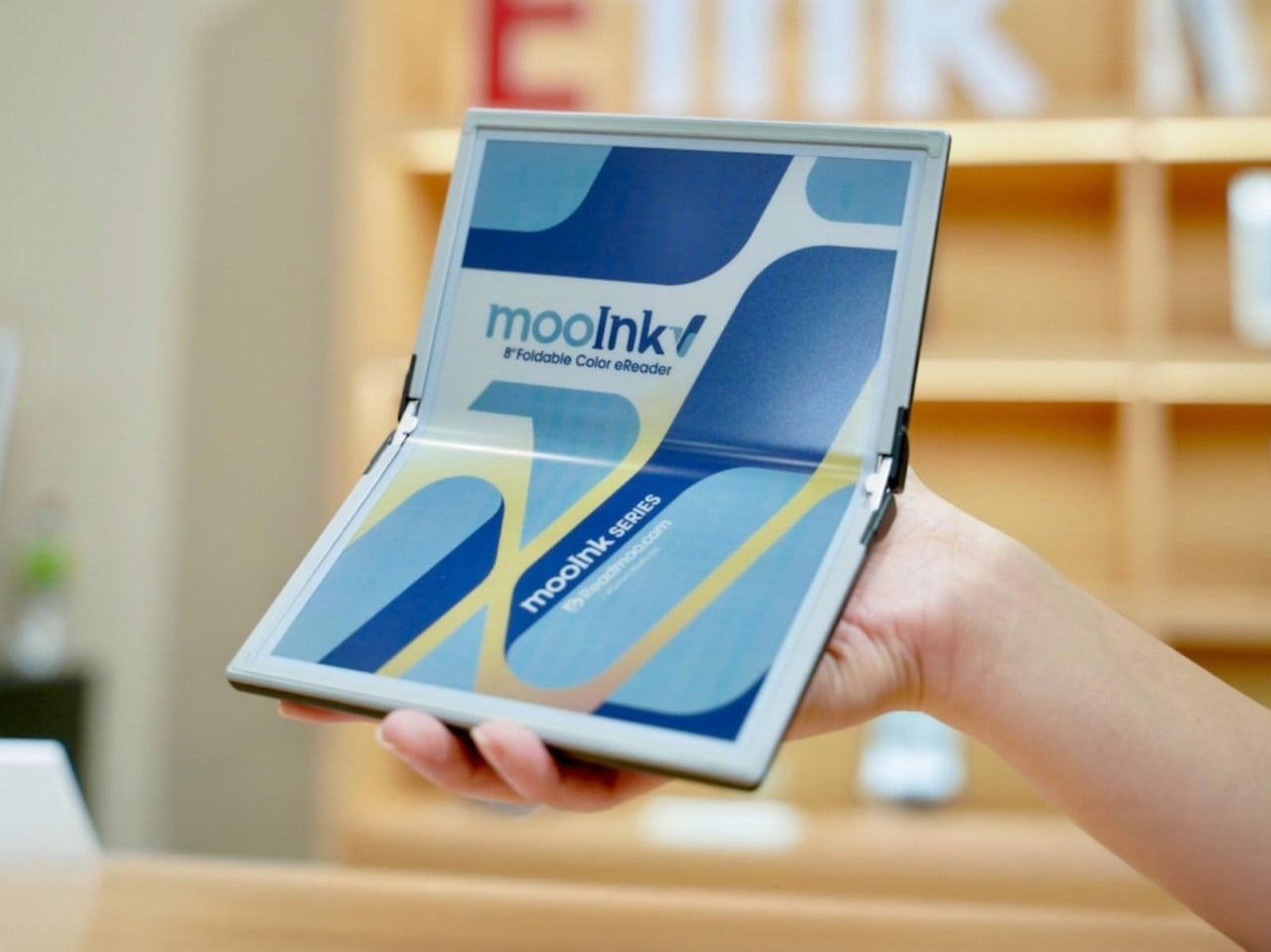
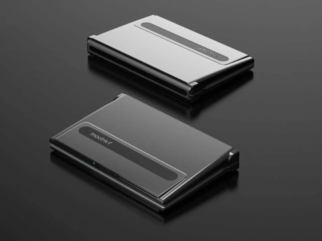
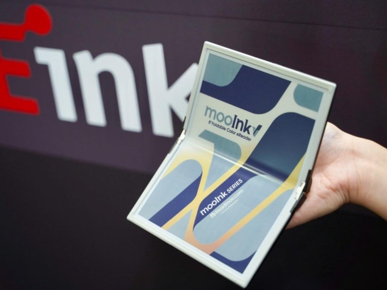
Readmoo’s Mooink V was the first design to make the flexible E Ink concept feel emotionally legible to a general audience. It’s built around an 8-inch Gallery 3 color e-paper display developed in collaboration with E Ink, one that folds down the middle to make the device small enough to pocket when closed and wide enough to feel like a slim paperback when open.
The color display matters more than it might seem. Gallery 3 renders close to 50,000 colors at 300 PPI, expanding the format beyond plain text to illustrated books, comics, and magazines. The fold reportedly passed 200,000 bending tests during development, and when fully open, the crease isn’t dramatic enough to register as a flaw so much as an honest design trade-off.
Mooink V hasn’t had the smoothest road to market, though. Despite genuine buzz at trade shows including Touch Taiwan and SID Display Week, no confirmed retail availability or street price had materialized as of mid-2026. The design made the foldable E Ink book look and feel tangible in a way earlier prototypes hadn’t. Whether it gets there commercially is a different and still open question.
Two screens, no crease
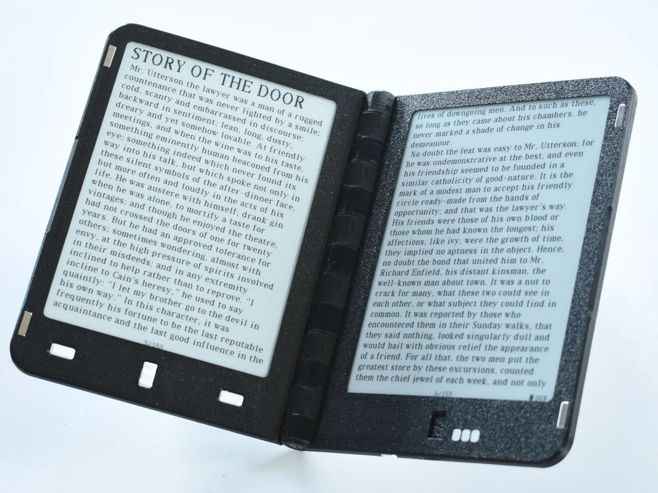
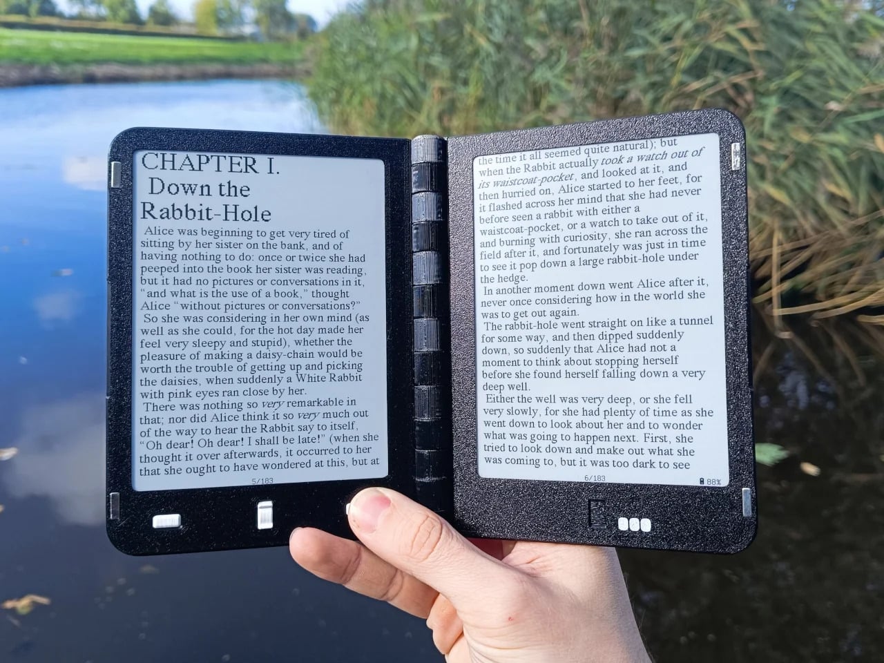
Not everyone building a book-shaped e-reader was willing to bet on a single flexible panel. A parallel design school took a more pragmatic approach: pair two conventional E Ink screens with a well-engineered hinge and let the gutter do the work. The result avoids crease anxiety entirely since neither panel has to bend, though it trades the seamless page illusion for a visible seam you’d have to accept.
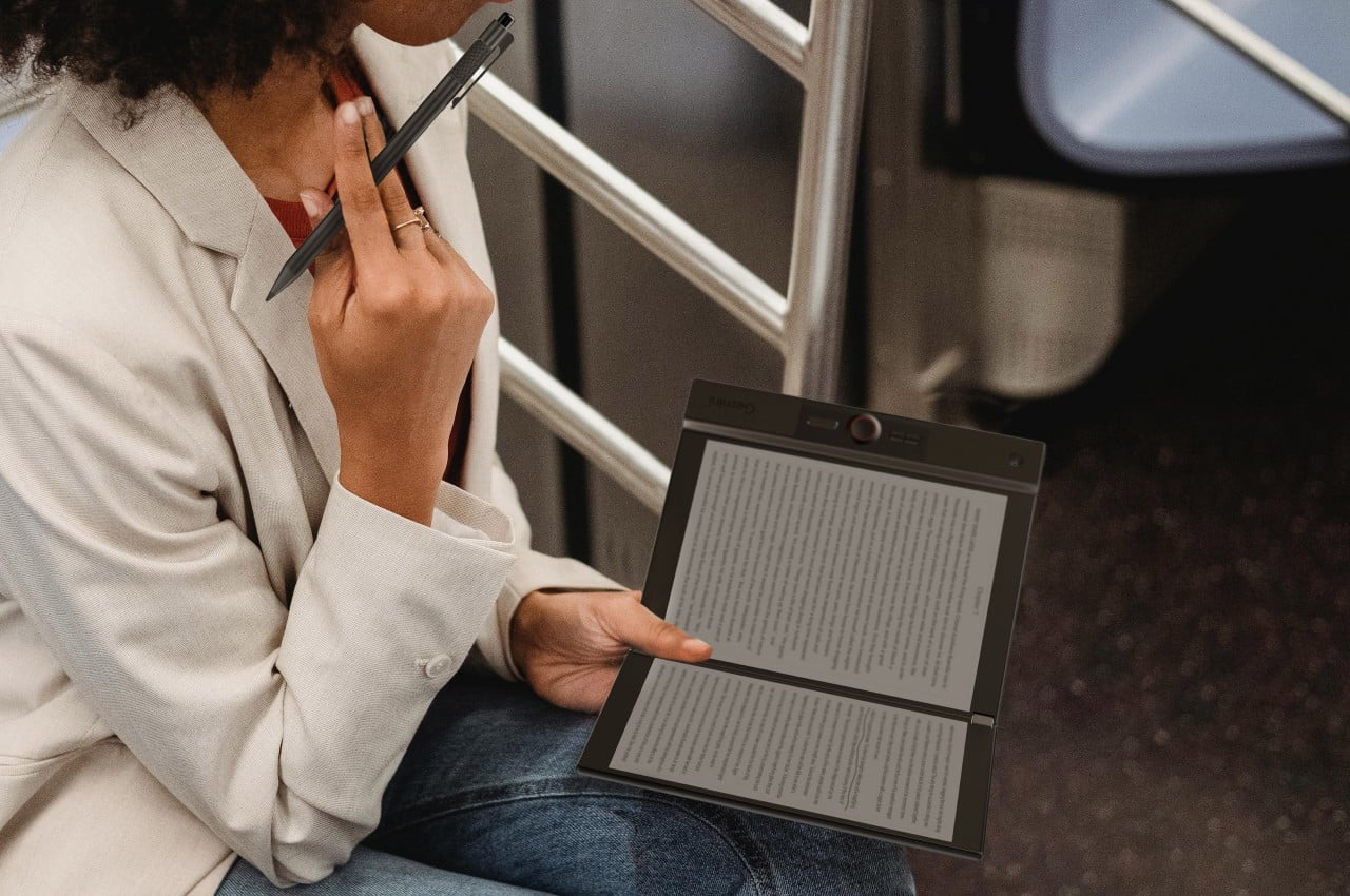
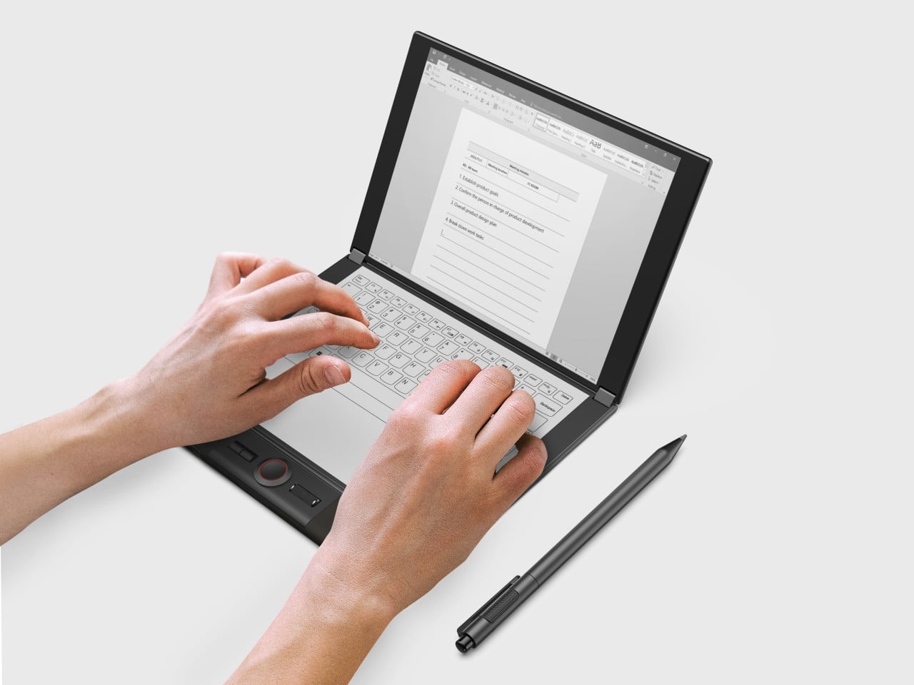
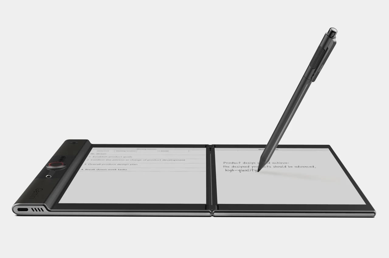
LCFC’s Gemini took the productivity angle furthest, giving both E Ink panels enough real estate to function almost like a laptop, with reading material open on one side and an active workspace on the other. The InkReader Duo concept took a more compact approach, fitting two E Ink screens into a phone-sized form, which made it feel less like a desk tool and more like a pocket notebook.
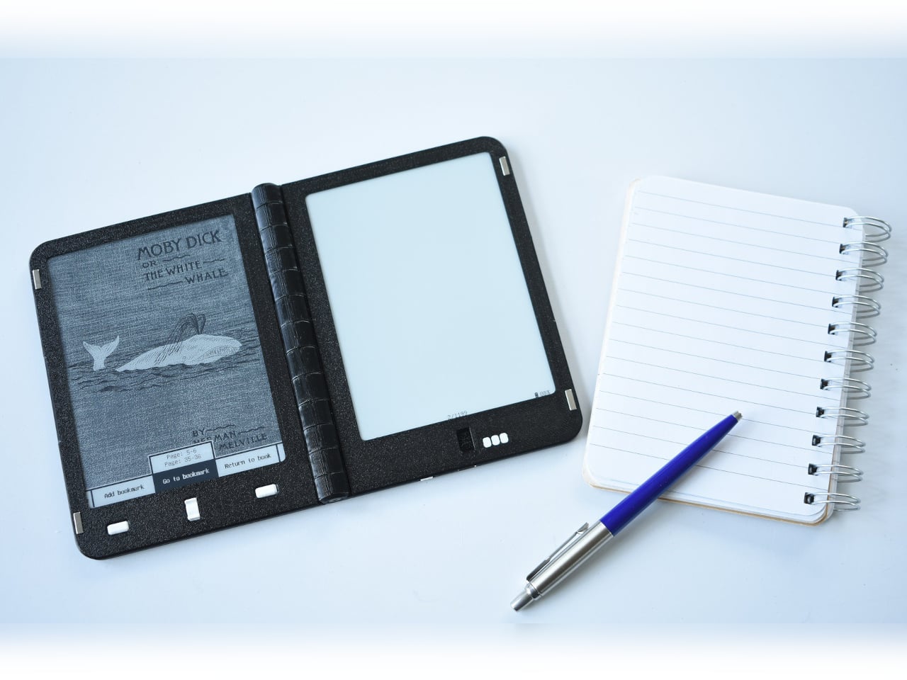
Diptyx went in a different direction altogether. Rather than chasing consumer polish, the project leaned into open-source principles, building a two-panel hinged e-reader without the lock-in that defines most commercial platforms. It isn’t the most refined interpretation of the book-shaped reader, but it made a clear point: the hardware problem was increasingly solvable, and the real challenge was getting the software and ecosystem right.
Not every dual-screen device fits cleanly into this story. The Bluegen OKPad pairs an E Ink panel with a regular LCD screen, which makes for a versatile tablet but undermines the unified reading experience that makes an E Ink book feel coherent. Switching between two fundamentally different display types introduces a visual disconnect that software bridging alone can’t fully smooth over.
Bigme’s HiBreak Dual 2 runs into a different kind of problem. It’s a smartphone with a secondary E Ink display on the back, which is a genuinely clever idea for managing notifications and extending battery endurance, but it’s shaped and used like a phone rather than a book. A second screen doesn’t automatically recreate the spatial logic of reading a bound object.
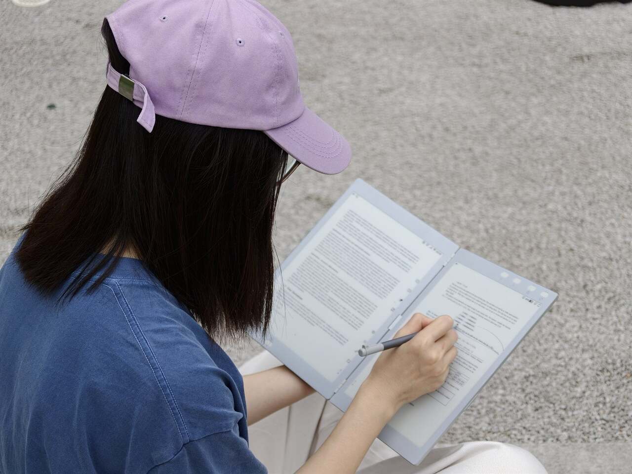
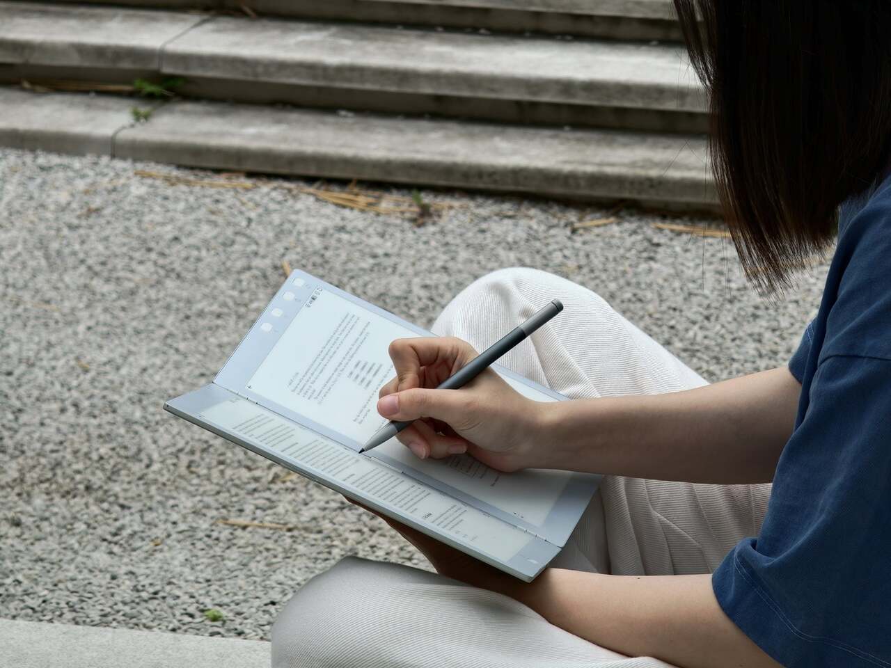
Inkleaf is the most pragmatic entry in the foldable E Ink space so far. Instead of chasing a seamless fold, it pairs two 10.3-inch Carta E Ink panels in a notebook-style hinge, with one side for reading and the other for writing. The seam between them works as a gutter rather than a flaw, and the design doesn’t try to hide it.
That workflow proposition is what makes Inkleaf interesting beyond its form factor. Having reference material on one panel while taking notes on the other removes a friction point that every single-screen reader quietly ignores. You don’t need to switch apps, scroll back, or memorize what you just read before writing something down. It’s aimed at a different kind of reader than a Kindle typically serves.
Inkleaf is currently collecting early-access signups ahead of an August 2026 launch, with a broader public release targeted for 2027. That’s a staggered timeline worth noting: the hardware still has to prove itself beyond initial demos, and the software will matter as much as the panels themselves. Carta E Ink is a sensible fit for a writing-focused device, but actual daily use remains the real test.
What Kindle still has to answer for
None of this means the Kindle is suddenly irrelevant. Amazon’s device still wins on price, ecosystem depth, and a friction-free reading experience built up through years of software refinement. If all you want to do is buy a book and read it on a train, nothing in this group of foldable experiments beats a Paperwhite for simplicity. The incumbents aren’t losing sleep yet.
What these devices do expose is a design gap Amazon hasn’t seriously tried to close. A Kindle displays text efficiently, but it doesn’t recreate the spatial logic of reading a bound book: two visible pages, a sense of position, a natural place for margin thoughts. Those aren’t features that get patched in through a software update, which is why the form-factor conversation is overdue.
That’s what this group of foldable and dual-screen E Ink devices has been quietly building toward for the past five years. Not a product category defined by any single winner, but a shared argument about what a digital reading device could look like if it started from the book rather than the screen. Whether any of them fully delivers on that is a question 2027 will help answer.
Pocket-sized e-readers have existed in one form or another for years, but most have struggled to be genuinely pocketable. Anything much larger than a phone immediately stops feeling like a carry-anywhere device and starts feeling like something you have to plan around. The original Xteink X4 built a loyal following by treating compact form and distraction-free reading as non-negotiables, with physical buttons, a clean 4.3-inch E-Ink screen, and a $69 price that was hard to argue with.
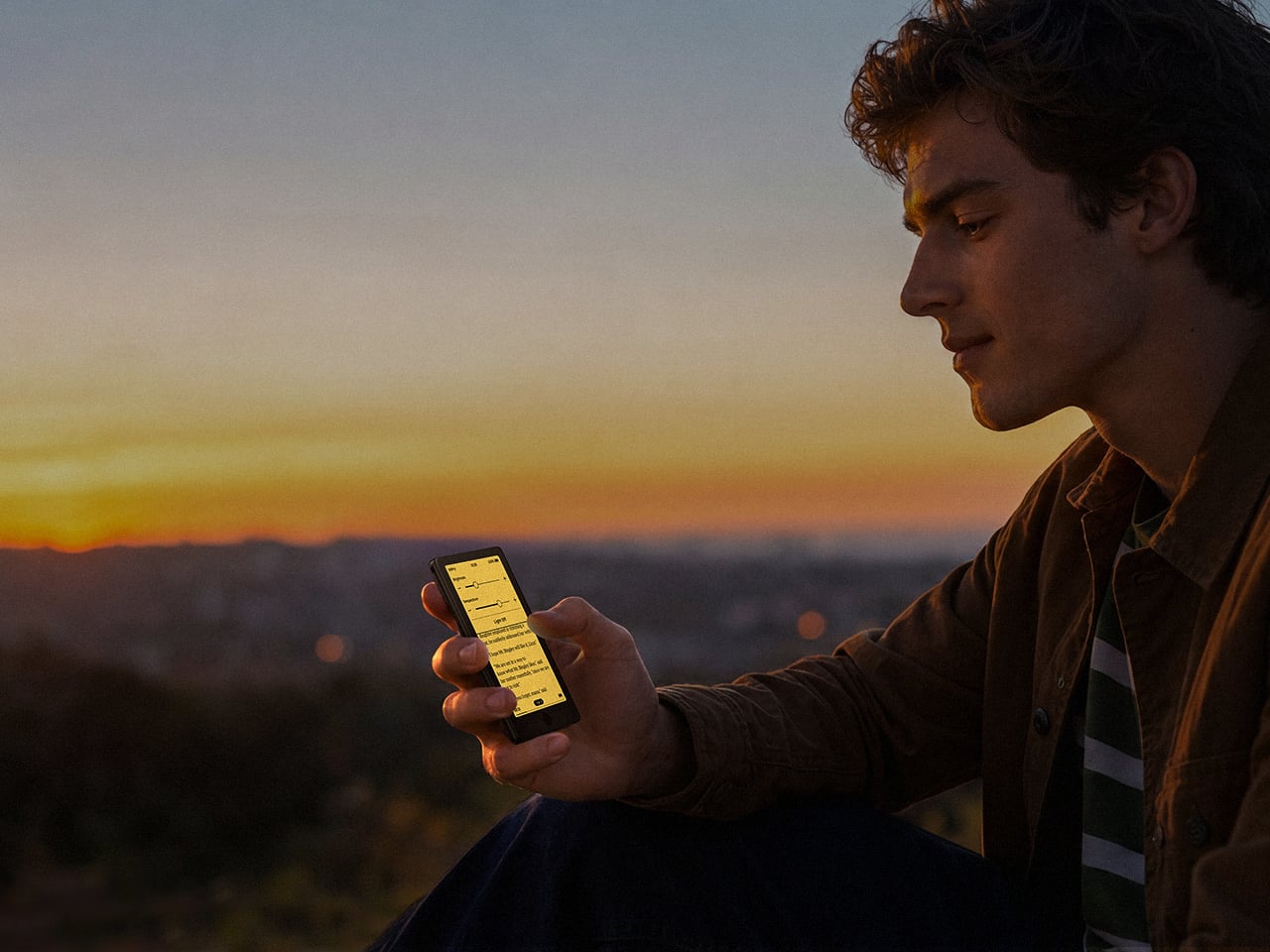
The one complaint that kept surfacing was the absence of a frontlight. Reading in dim conditions meant clipping on a separate lamp or giving up entirely, which was an odd gap for a device otherwise built around serious reading habits. The Xteink X4 Pro addresses that directly. It launches at $99 with an adjustable warm-to-cool front light built in, removing the need for any workarounds when the lighting situation isn’t ideal.
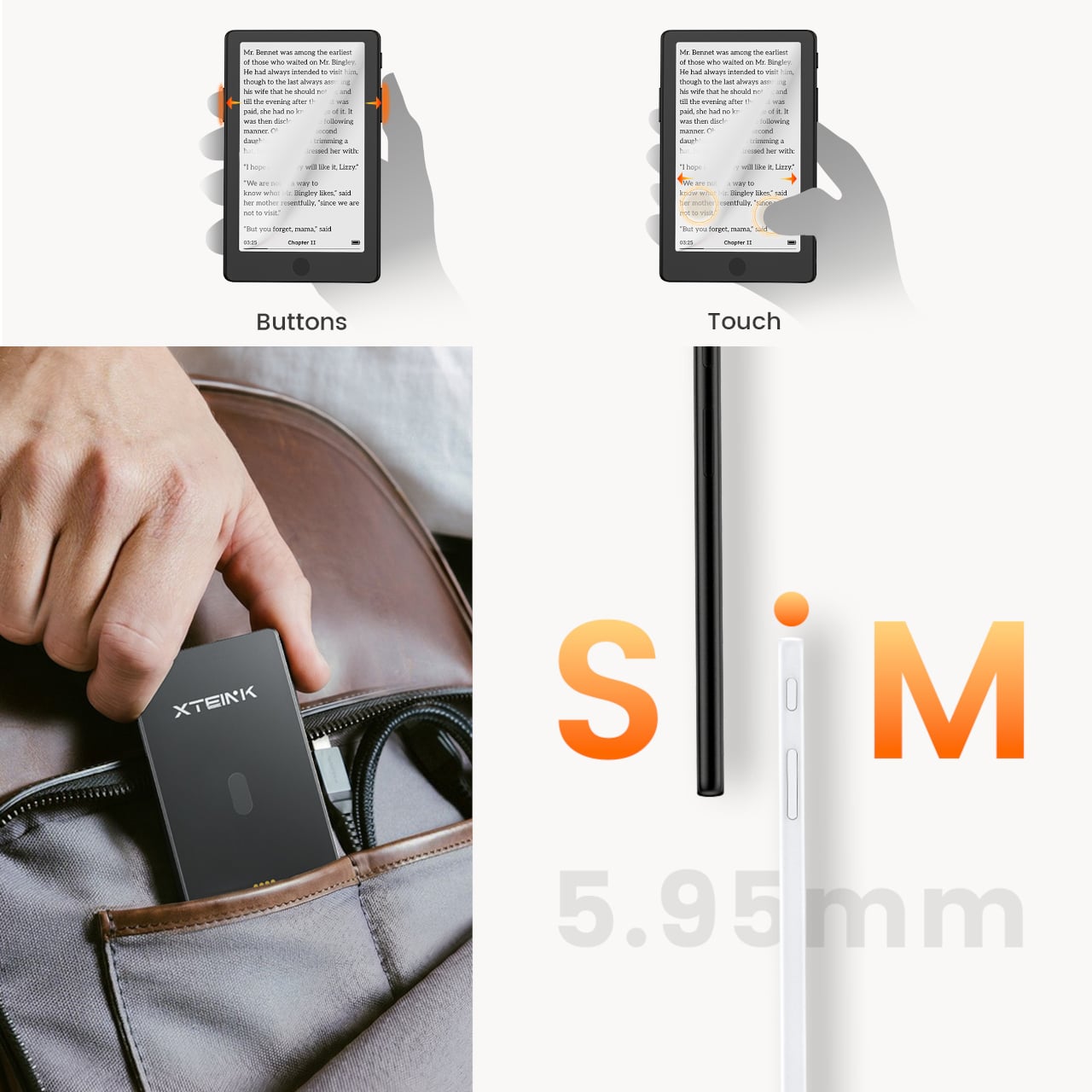
The frontlight isn’t the only addition. The X4 Pro also introduces a touchscreen for navigation, though it retains physical page-turn buttons along the sides for anyone who’d rather not tap the display while reading. That combination matters because part of what made the standard X4 appealing was the tactile, no-swipe experience. The Pro doesn’t discard that, but it layers touch navigation on top for people who want it.
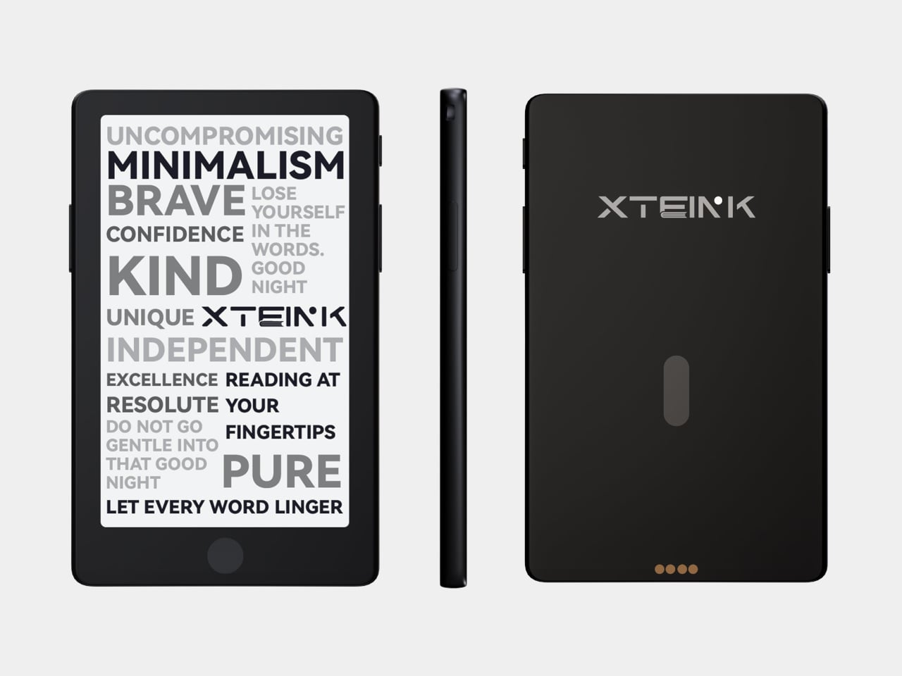
The trade-offs are real and worth noting. The front navigation buttons that sat below the screen on the original have been removed on the Pro, replaced by the touchscreen. More significantly, the USB-C port is gone, swapped out for a proprietary pogo-pin magnetic connector. That means carrying a specific cable rather than reaching for any USB-C cord already in a bag. The X3 has used the same pogo-pin setup since its release, so it’s a known quantity, but it’s still a step backward in convenience for anyone who valued USB-C universality.
The physical footprint barely changes. Despite adding layers for the light and touch sensor, the X4 Pro is actually marginally thinner at 5.95mm versus the X4’s approximately 6.4mm, and sheds a couple of grams to land at 72g. The same 4.3-inch, 220-PPI E-Ink display carries over, and battery life holds steady at around 14 days per charge. Storage remains the same 16GB microSD configuration with expansion support.
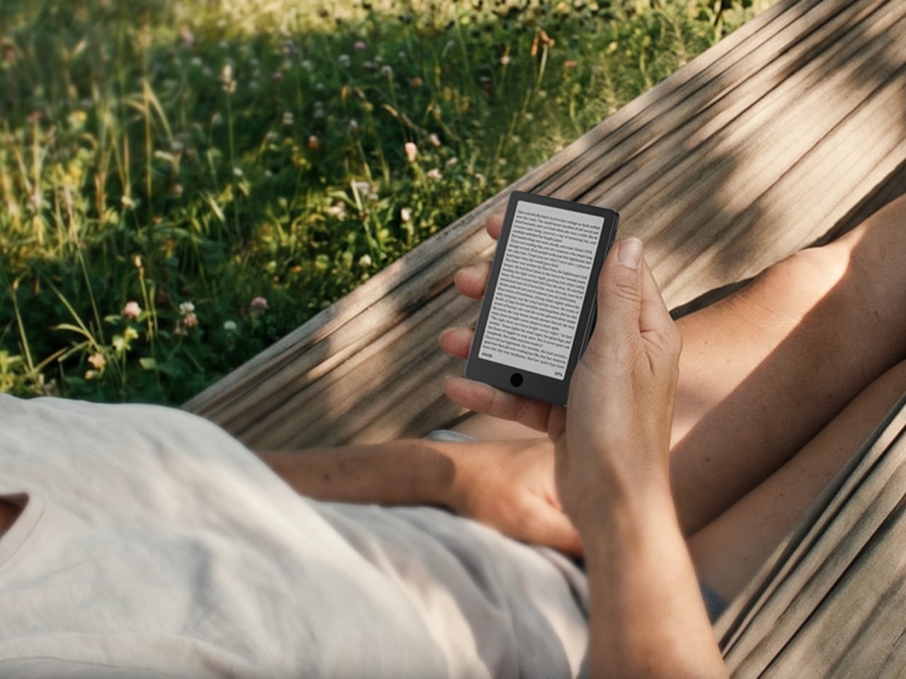
It’s a focused upgrade rather than an overhaul. The X4 Pro doesn’t try to compete with full-featured six-inch Kindles or Android-based E-Ink tablets. It stays small, stays quiet, and now stays lit, at $99 for people whose reading life regularly extends past sunset.
For existing X4 owners, the calculus comes down to one question: how often does dim lighting stop you from reading? If the answer is rarely, the base X4, for $30 less with USB-C and front buttons intact, still has a strong case. For anyone who’s been waiting to pick up an Xteink device but held off specifically because of the missing frontlight, the Pro closes that gap without fundamentally changing what the device is about.
Most dedicated e-readers exist at the opposite ends of a familiar spectrum. Closed-ecosystem devices like the Kindle keep things deliberately simple and locked in, while Android-based tablets offer full flexibility but grow too large to carry comfortably in a pocket. The gap between those two has always been somewhat underserved, especially for anyone who wants true portability alongside a genuinely open operating system.
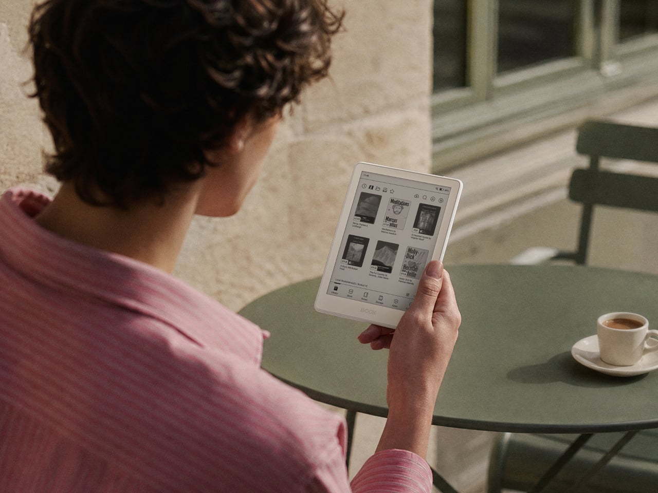
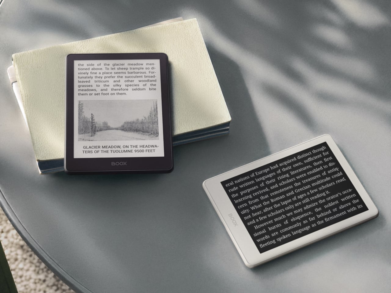
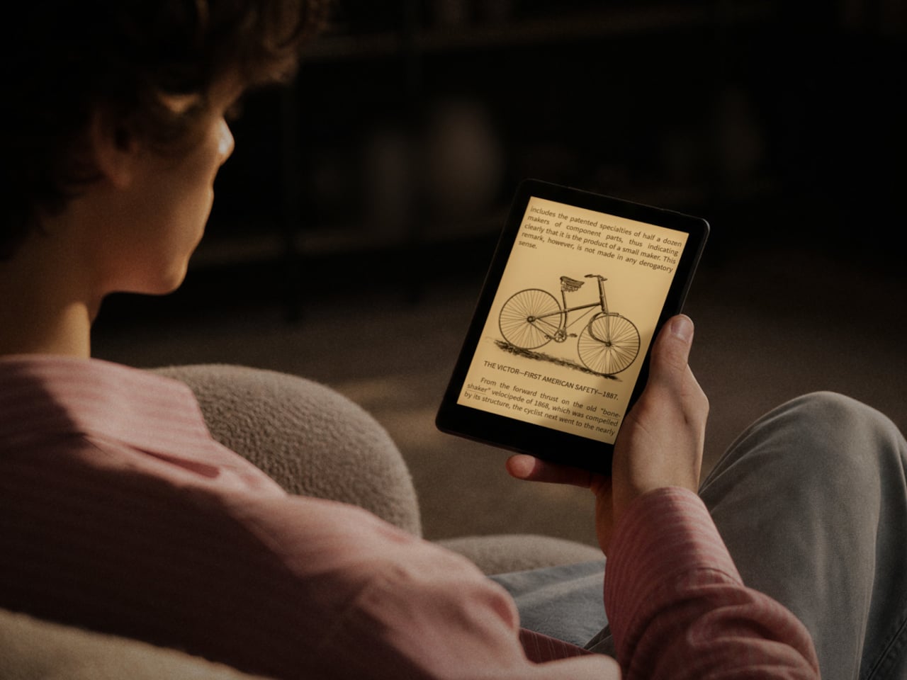
BOOX’s Go 6 (Gen II) is the second generation of its most pocketable e-reader, arriving with upgrades that make that middle ground considerably more appealing. Built around a 6-inch, 300 ppi E Ink display and running Android 11 with full Google Play access, it’s aimed at readers who want their device to be both portable and versatile, without having to choose one over the other.
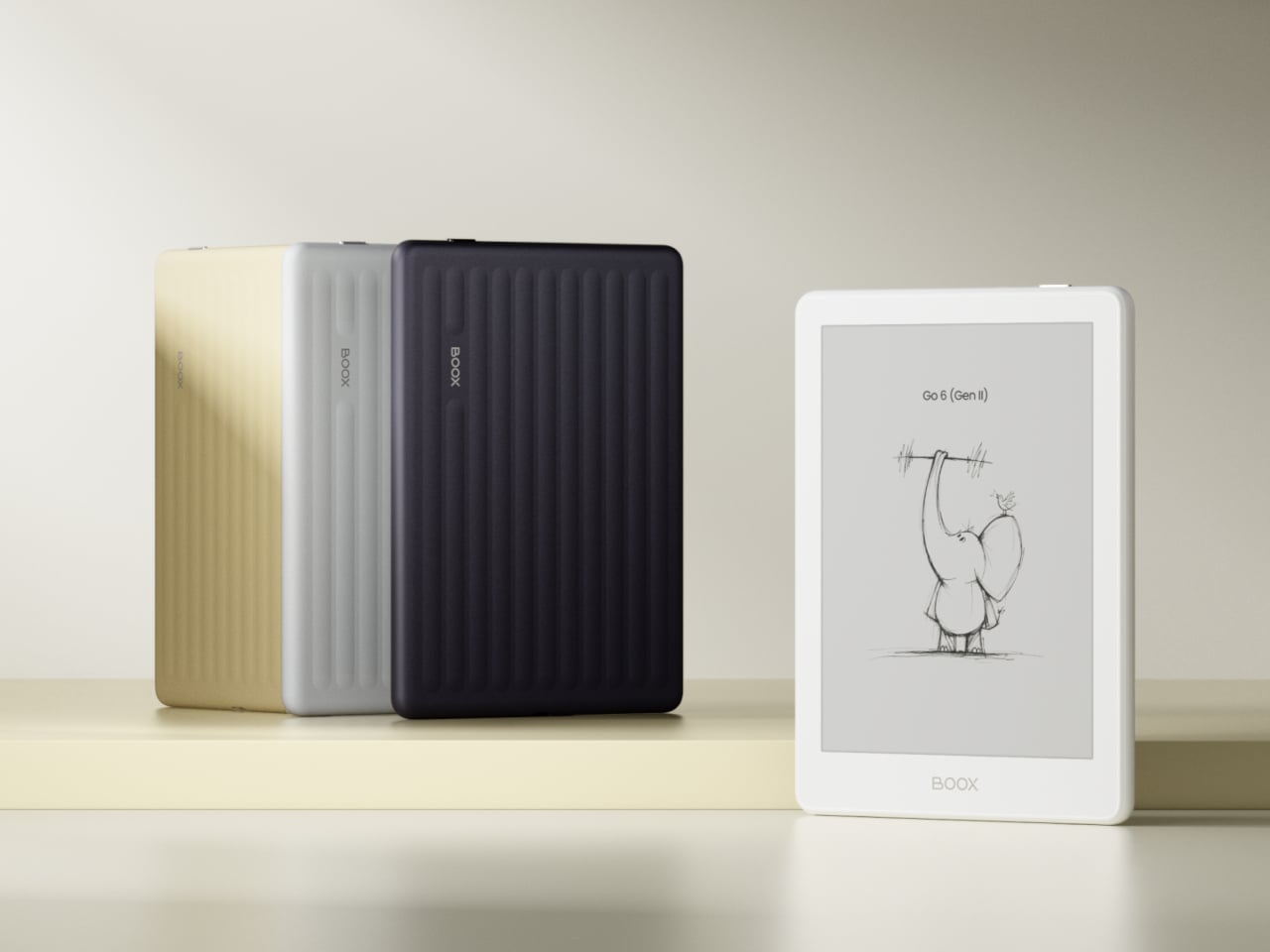
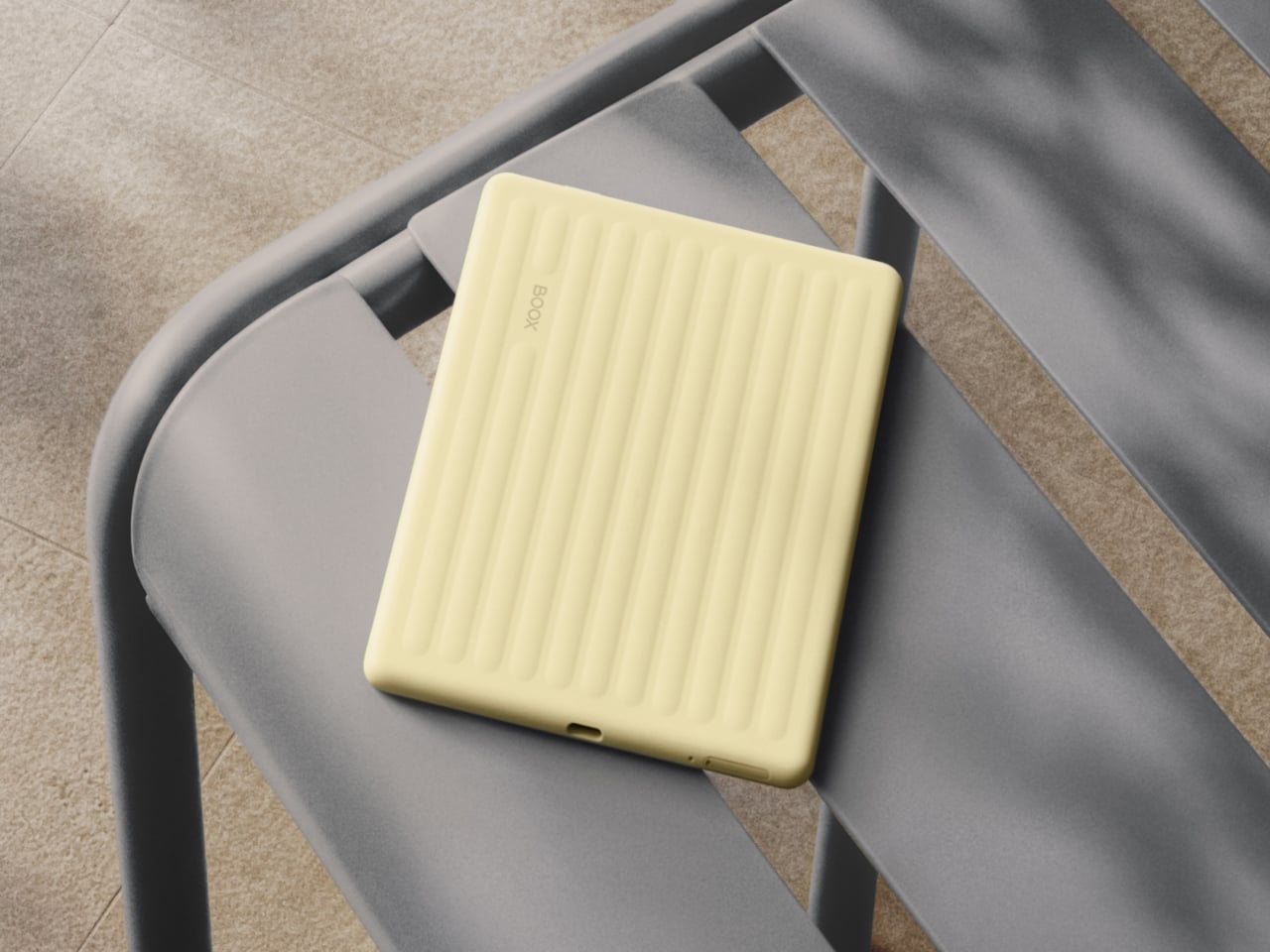
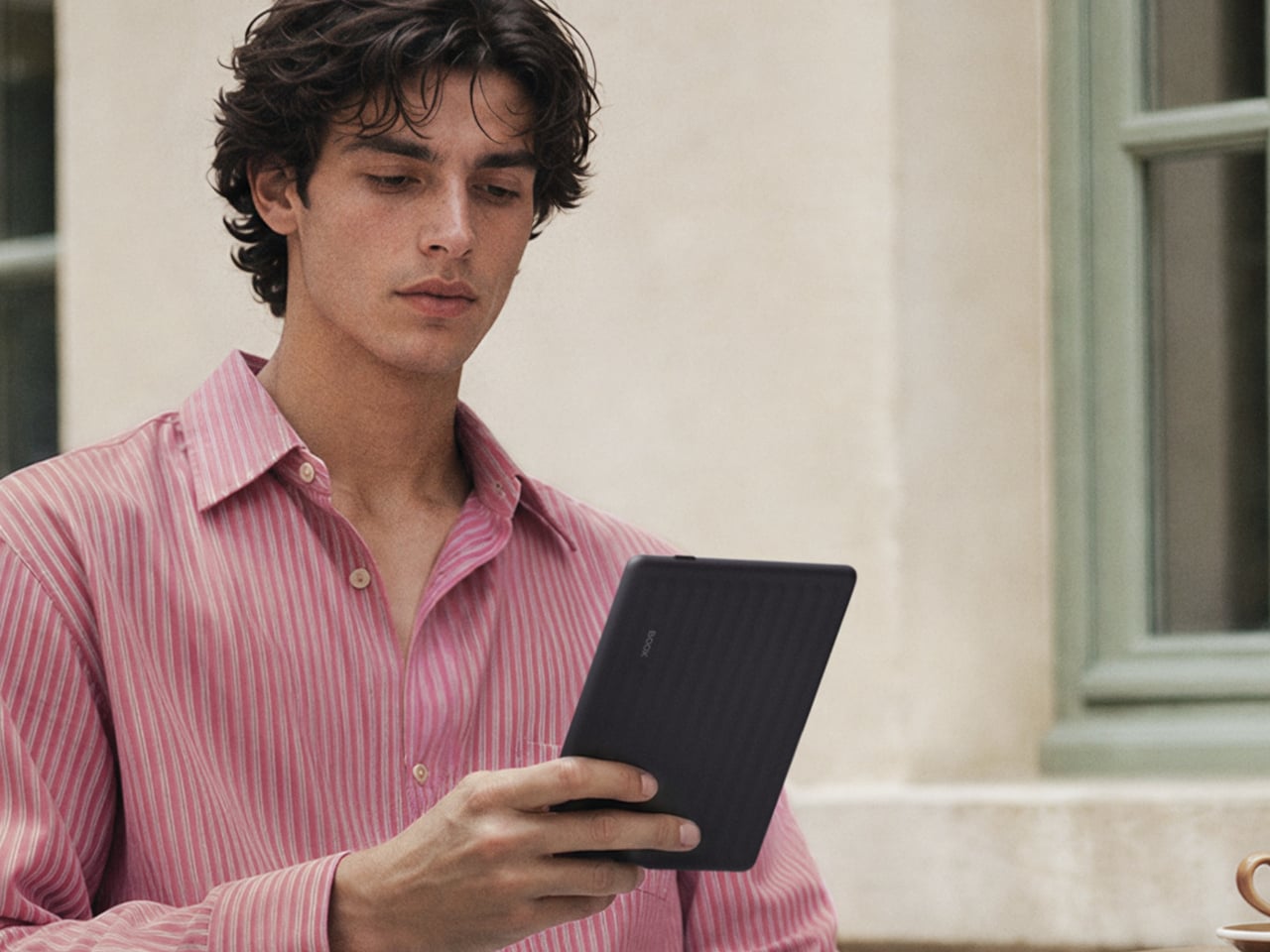
The first thing you’ll notice about the Gen II is that it doesn’t look like a standard e-reader. The redesigned textured rear shell has a suitcase-inspired aesthetic that feels more deliberate than the plain black slab of the first generation. It comes in four muted color options: Plum, Stone, Shell, and Custard, all suggesting a device meant to slip into a bag and come with you wherever you go.
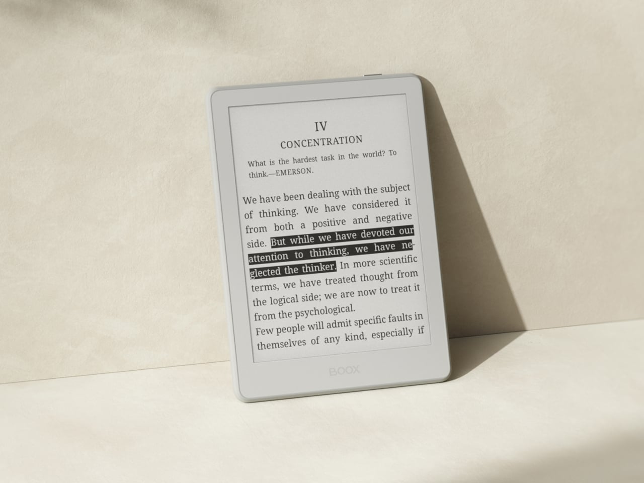
The screen gets a meaningful upgrade with this generation. The Gen II adds anti-glare (AG) glass to its 300 ppi E Ink panel, reducing reflections when you’re reading in direct sunlight on a patio or near a bright window. The adjustable front light handles both warm and cold color temperatures, letting you read comfortably at night without straining your eyes against harsh lighting.
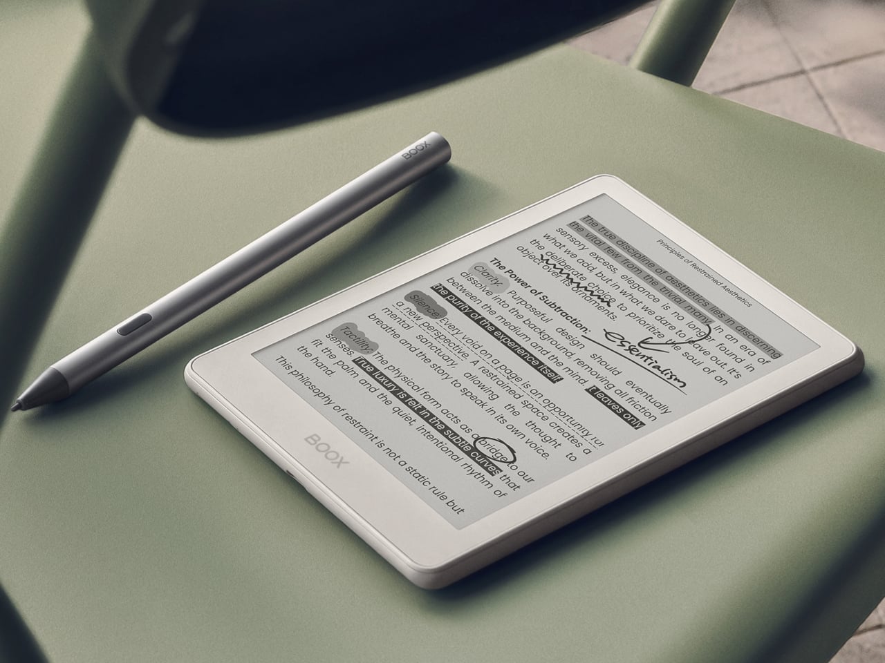
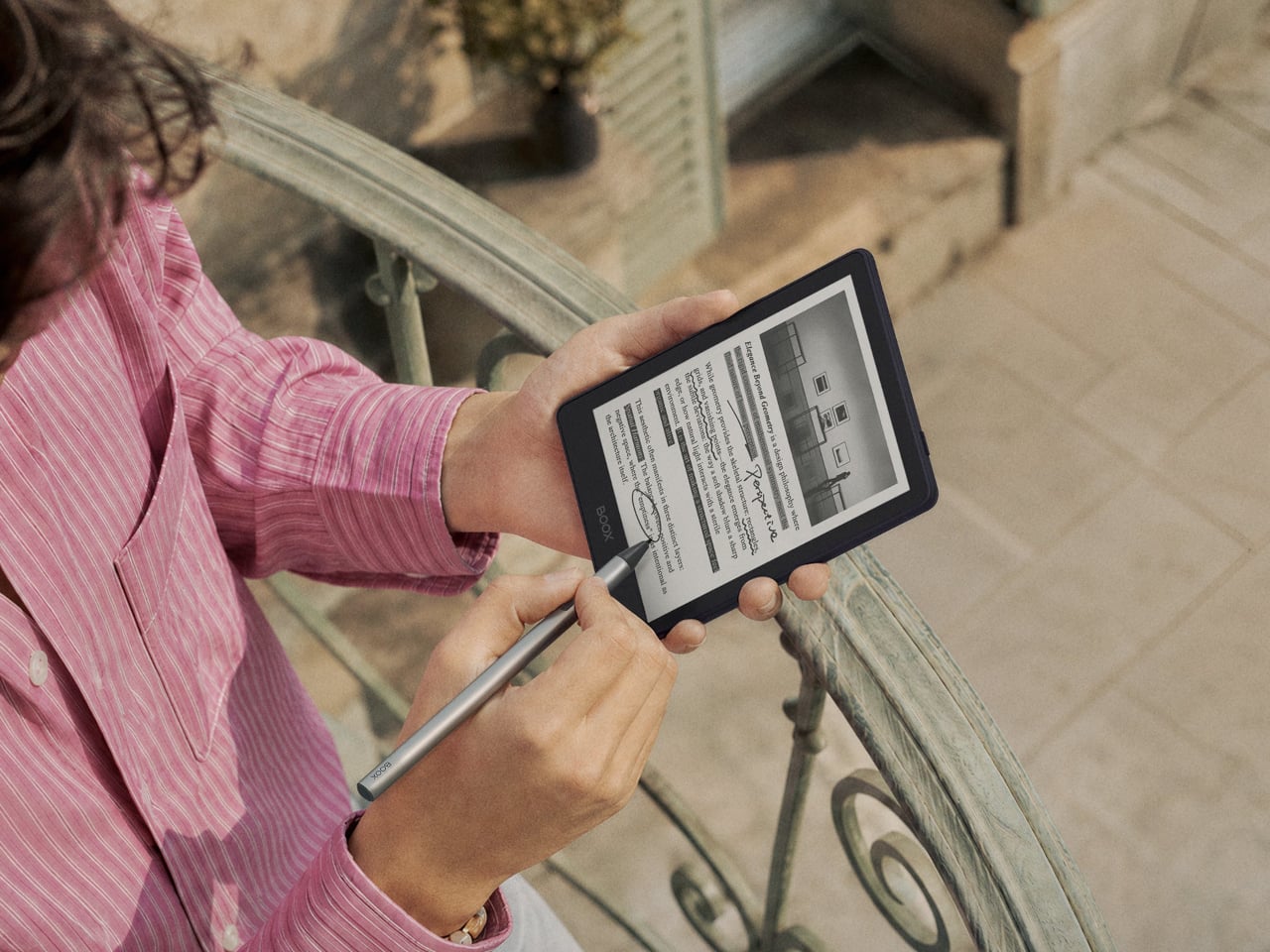
The more surprising addition is stylus support, which is uncommon at this screen size. The Go 6 (Gen II) is compatible with BOOX’s InkSense Plus stylus, an active pen with 4,096 levels of pressure sensitivity that lets you annotate directly in books, mark up PDFs, or take handwritten notes on a screen small enough to fit in a jacket pocket. It connects directly to the device and charges via USB-C.
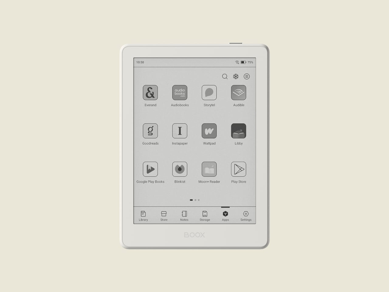
Running open Android 11 with a built-in Google Play Store means you aren’t locked into any one reading platform. BOOX’s NeoReader app handles 20 document formats natively, including PDF, EPUB, MOBI, and DJVU, and supports dark mode for lower-light reading. Install the Kindle app, Kobo, Libby, or anything else you’ve been using, and your existing library follows you without having to start over from scratch.
At 160 grams and 6.8mm thin, the BOOX Go 6 (Gen II) fits in a jacket pocket without making its presence felt. A microSD card slot supplements the 32 GB of built-in storage, and the USB-C port doubles as an audio jack for wired listening. The 1,500 mAh battery holds up well through long reading sessions, largely because E Ink uses so little power compared to a conventional backlit screen.
The BOOX Go 6 (Gen II) is still primarily a reader’s device, but the combination of Android OS, stylus compatibility, and anti-glare glass packed into a pocket-friendly body gives it a range that most devices at this size simply don’t attempt. It’s currently available for pre-order through the official BOOX store, arriving at a moment when the 6-inch e-reader category could use a reminder of what it can still do.
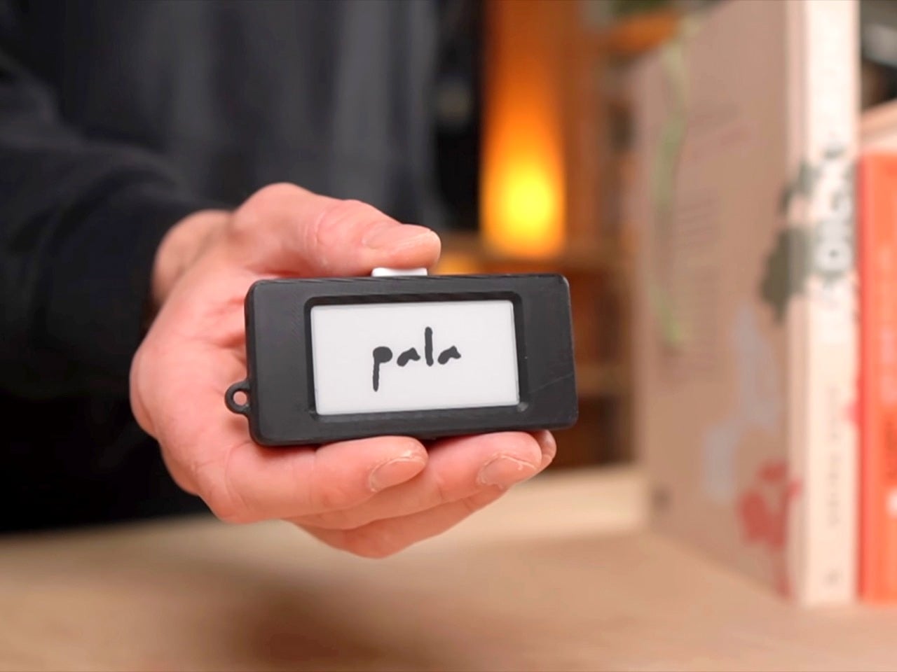
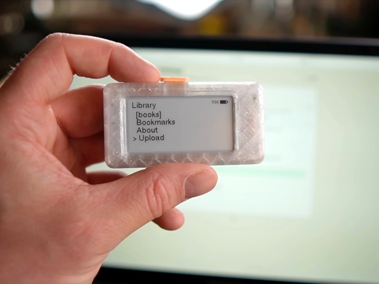
There was a period in the early 2000s when having your entire music library in your pocket felt like a miracle. The iPod did not invent portable music, but it made the experience so frictionless and so pleasurable that it genuinely changed how people related to listening. Nobody predicted that a click wheel and a hard drive would rewire an entire generation’s relationship with an art form. Paul Lagier has built something that carries a similar energy, except the art form is reading, and the device is roughly the size of a large stick of gum.
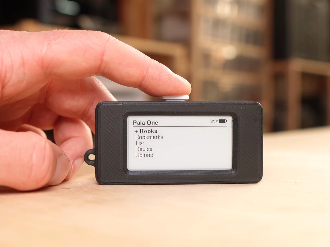
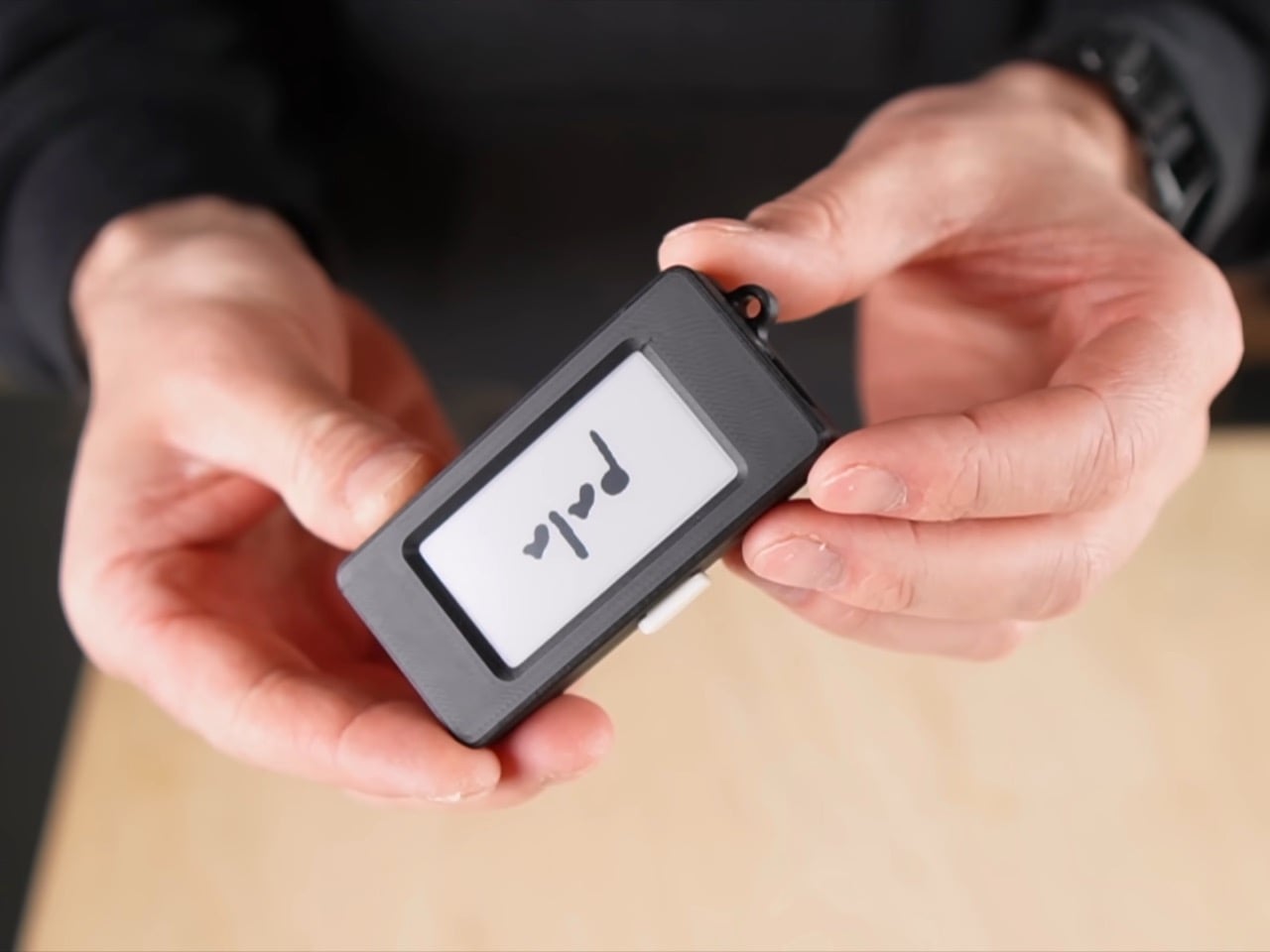
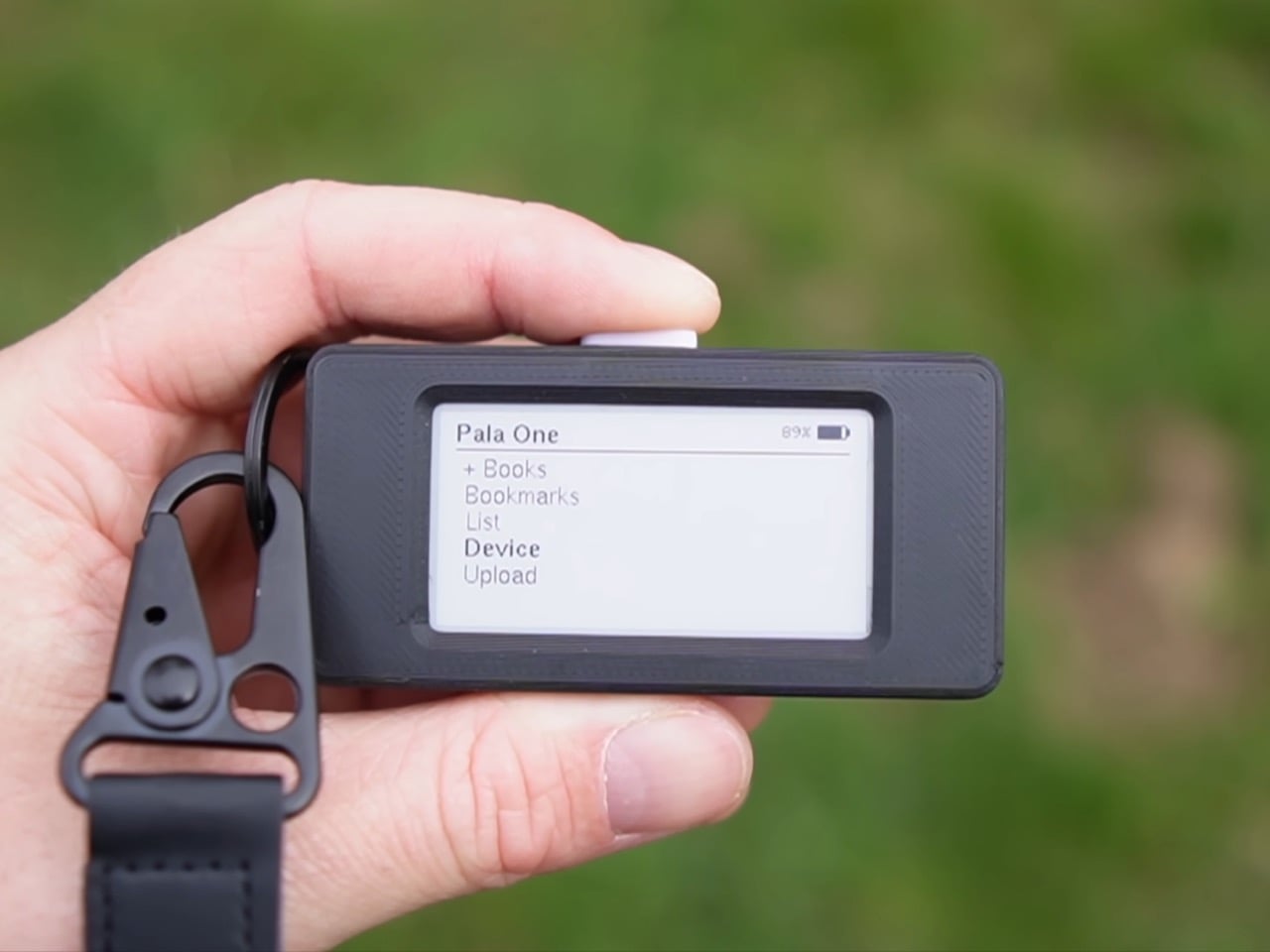
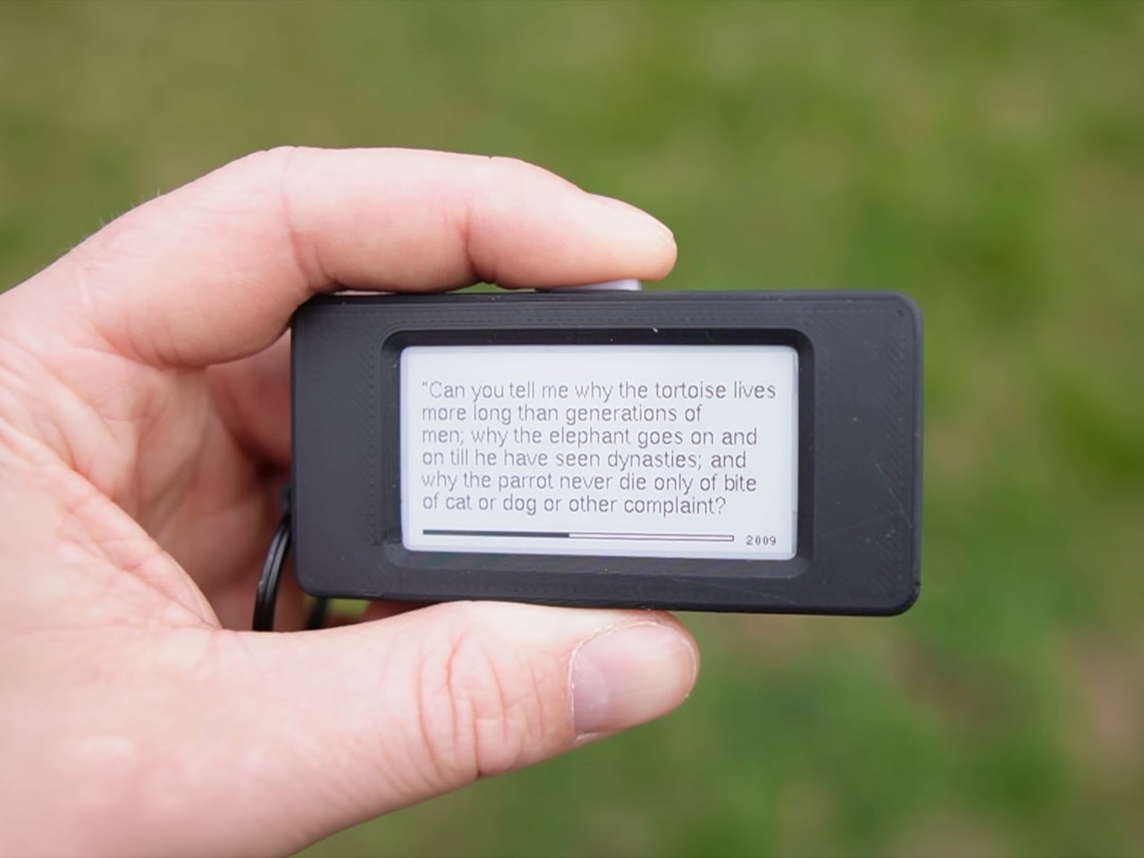
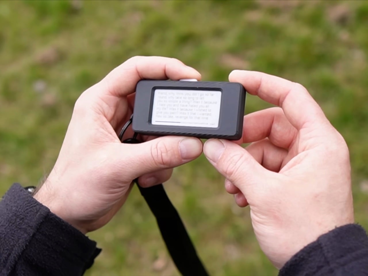
The Pala One is a fully functional e-reader that fits in a closed fist. Lagier 3D-printed the case, built the firmware around an ESP32 microcontroller, and designed the whole interaction model around a single physical button. The screen is small, the library caps out at six to ten books, and the interface is deliberately minimal. What it trades in screen real estate it returns in portability so complete that the device clips to a keychain and disappears into daily life. Lagier rebuilt it from scratch after the first version went viral in maker communities, and version two firmware adds folder support, list-making, faster load times, and a properly printable case. He has read over a thousand pages on it personally, and credits the Pala One’s size for making that possible.
Designer: Paul Lagier
The case snaps together using one sliding piece on one side and screws on the other, a redesign driven entirely by community feedback after builders reported that the original pin system was unreliable on cheaper printers. M2 threaded inserts are optional but give the finished object a product-grade solidity that the first version lacked. A small loop on the chassis lets you run a lanyard or keychain through it, which sounds like a minor detail until you realise it is actually the whole point. A device that lives on your keys or your bag strap is a device that is genuinely always available, and availability is the entire thesis of the Pala One.
Lagier discovered, embarrassingly late by his own admission, that the ESP32’s 8 MB of onboard flash was being allocated so inefficiently that only 1.5 MB was actually available for books. By repartitioning the storage and adding automatic compression on upload, he pushed usable book storage up to around 5.5 MB. A typical 300 to 400 page book compresses down to roughly 0.5 MB, which means the device comfortably holds a small personal library. A storage indicator in the web interface keeps the math visible. Books load instantly even from deep within the text, bookmarks sync reliably, and a new position-jump feature handled through the web viewer means you are never stranded inside a long chapter with no way to navigate.
Lagier added a dedicated list section to version two, letting you create to-do lists, shopping lists, or anything else in the web interface and check items off directly on the device. Combined with folders for organising your library and bulk bookmark export for pulling your annotations out all at once, the Pala One starts to feel less like a gadget and more like a considered companion object. The single button controls everything, cycling through menus and pages with a logic that becomes muscle memory within minutes. There is something almost meditative about an interface with exactly one input.
The Kindle is a genuinely good product. So is the Kobo. Both are vastly more capable than the Pala One in every measurable specification, and neither of them has gotten me to read more. The Pala One’s entire argument is that the best reading device is the one that is physically present when the impulse to read strikes, and a device the size of an AirPods case wins that argument by default. Lagier has made the files available on his Ko-fi page, with a one-time purchase granting access to all future updates. If you own a 3D printer and have an afternoon free, the most compelling reading device of 2025 costs you almost nothing to build.
Reading seriously on a tablet means fighting the device as much as the text. Notifications creep in, brightness is calibrated for apps rather than paper, and the browser is always one tap away. E-ink devices have been solving that distraction problem for years, but most are sized for novels rather than the dense PDFs, research papers, and annotated books that require space to actually work on.
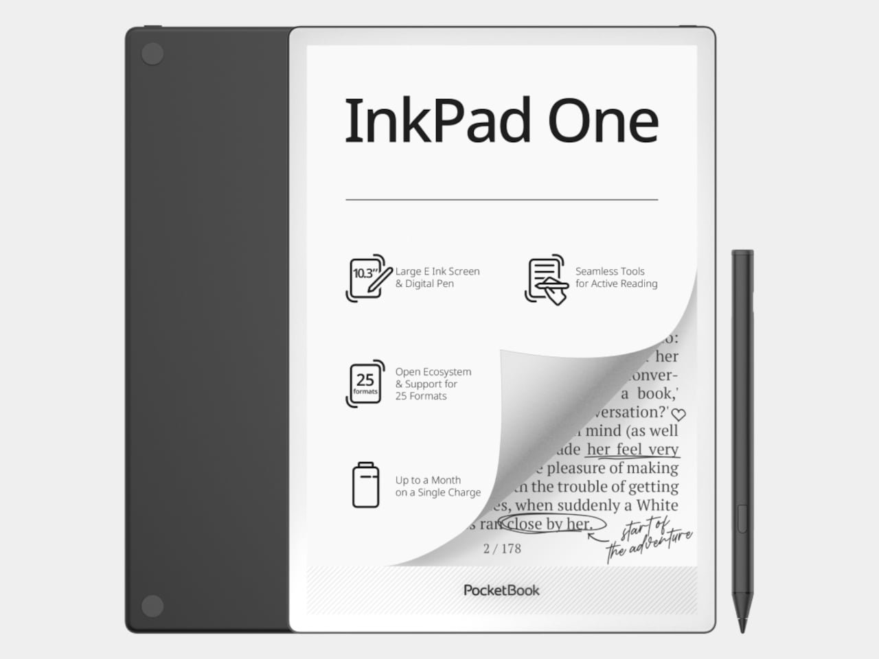
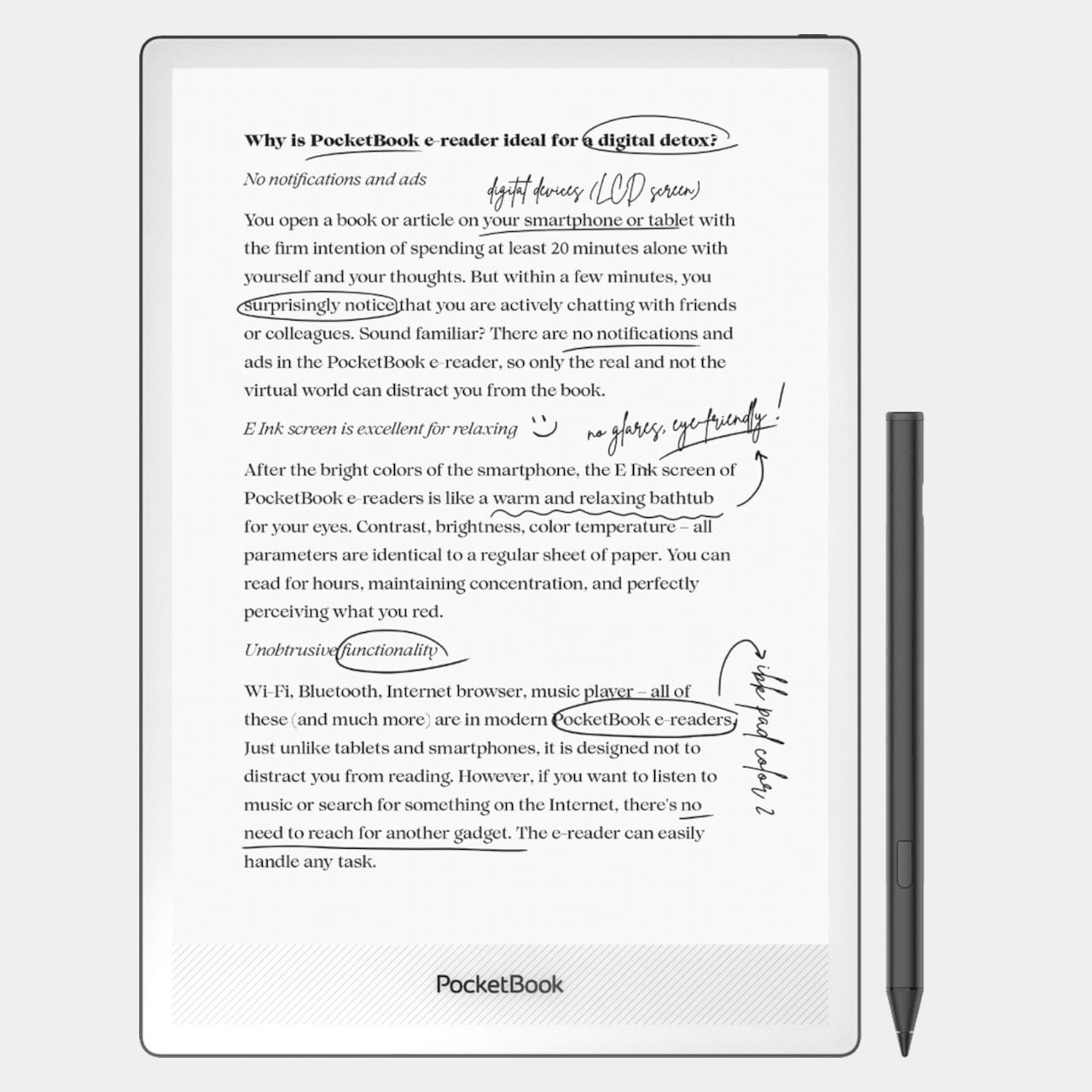
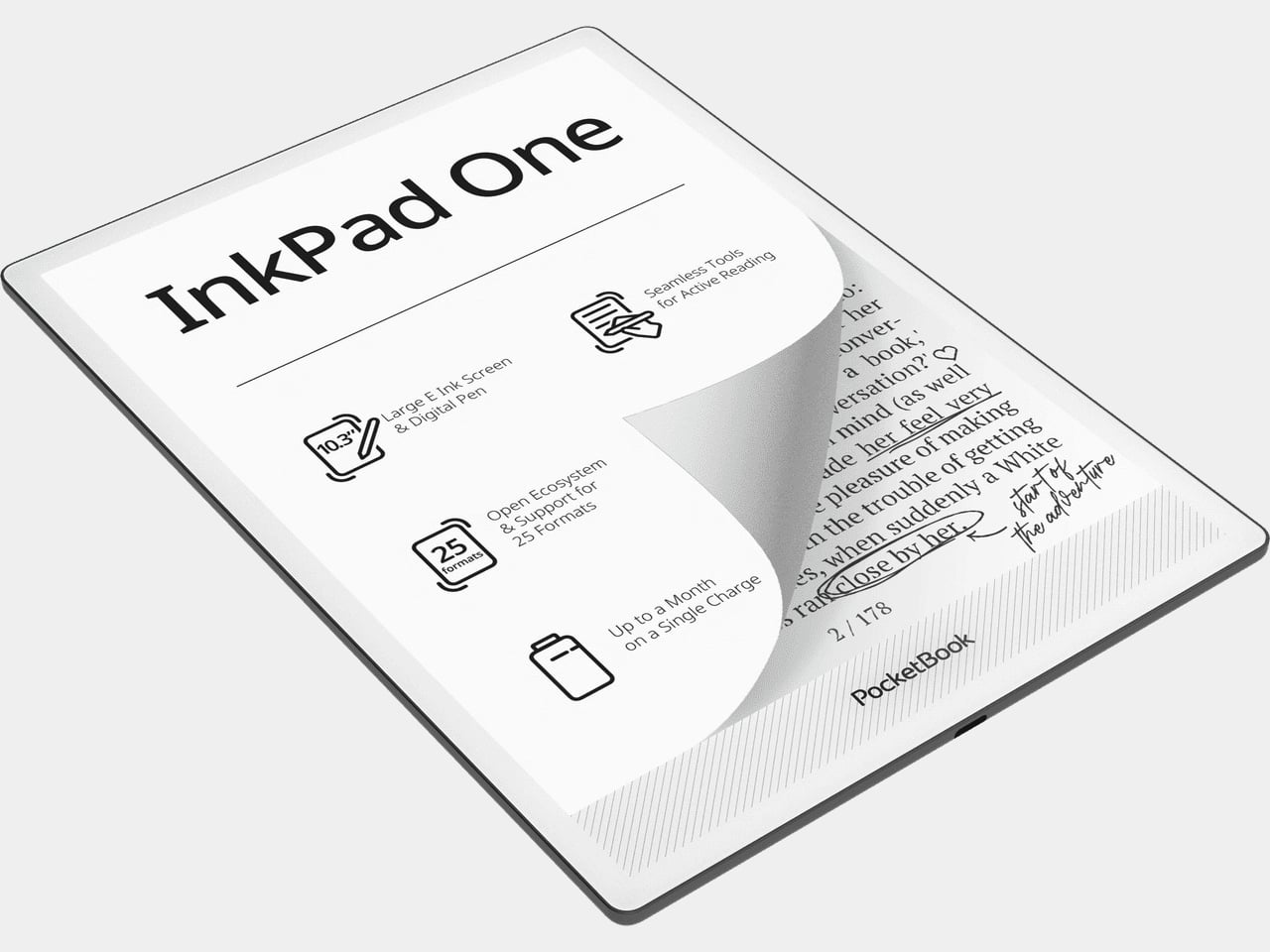
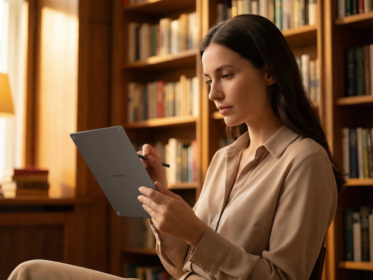
The PocketBook InkPad One is a 10.3-inch e-ink slate with a stylus, running a Linux-based reading interface instead of an Android tablet OS. The aluminum frame is 5.15mm thin and wraps an E Ink Mobius display, which uses a plastic substrate rather than glass, making it lighter and more resistant to the casual impacts that happen in bags and on desks.
The key interaction design choice is “Comment Mode,” where finger touch handles page navigation and the stylus handles everything else, highlights, notes, and annotations on the same page you’re reading. That split means you can navigate naturally without accidentally triggering the pen, which matters when 60-page PDFs are the main material. The included PocketBook Stylus 2 is positioned as a reading-first annotation tool rather than a speed-writing device.
The E Ink Mobius panel runs at 1404×1872 resolution and 226 ppi, with SMARTlight adjusting both brightness and color temperature together. Long evening sessions of marking up papers under warm indoor light are where color temperature adjustment earns its presence. Battery life is rated at up to two months on a single charge, backed by a 3700mAh cell.
The open ecosystem is where InkPad One separates from store-locked readers. It supports 25 file formats natively without conversion, including EPUB, PDF, CBR, CBZ, and AZW, plus Adobe DRM and LCP DRM for protected content. Library borrowing via Libby is built in, so you can borrow from a public library and read on the same device where your own PDFs live, without format gymnastics.
Bluetooth 5.0 and built-in Text-to-Speech round out the feature set. TTS reads aloud any text file and resumes from where you stopped, useful when switching from reading to listening during a commute. Audiobook formats including M4A, MP3, and OGG are supported natively alongside the reading library, all synced via PocketBook Cloud and compatible with Dropbox.
InkPad One sits in a useful gap, less locked-in than store-driven readers like Kindle, less Android-cluttered than BOOX or Bigme devices, and bigger than most small e-readers for anything involving dense text and active annotation. It’s a calm, thin tool for people who want to work with what they read rather than just collect it.
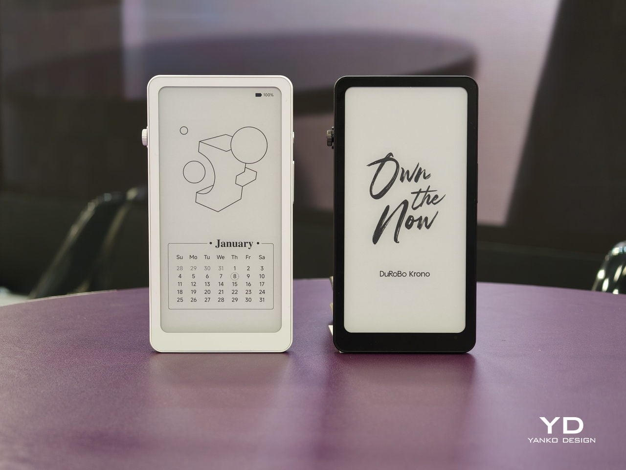
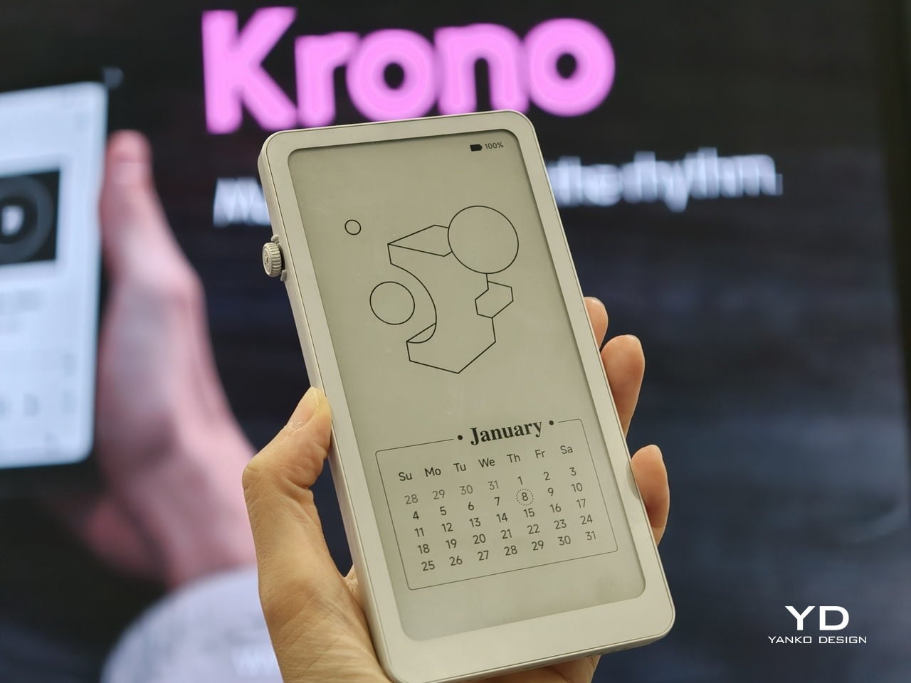
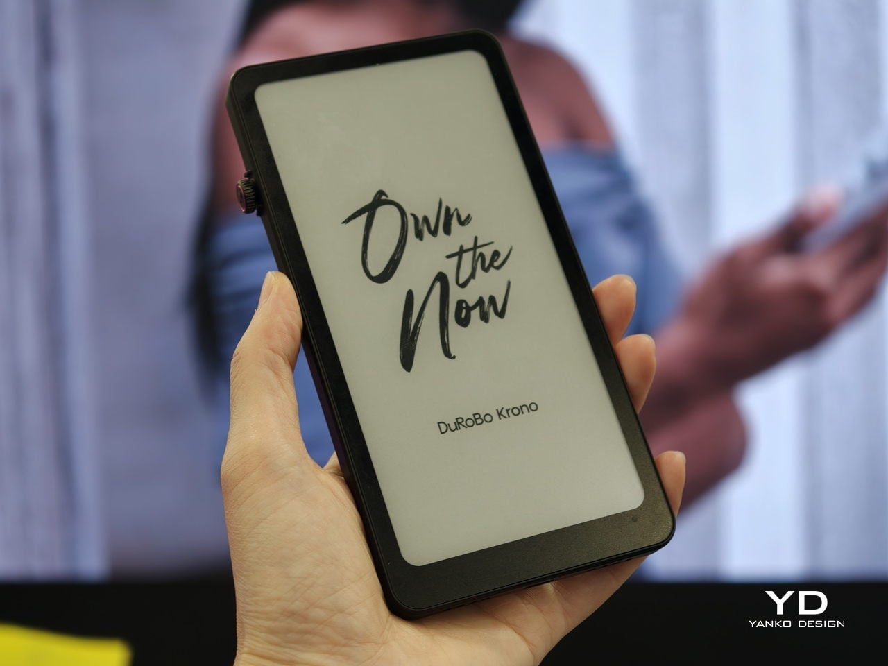
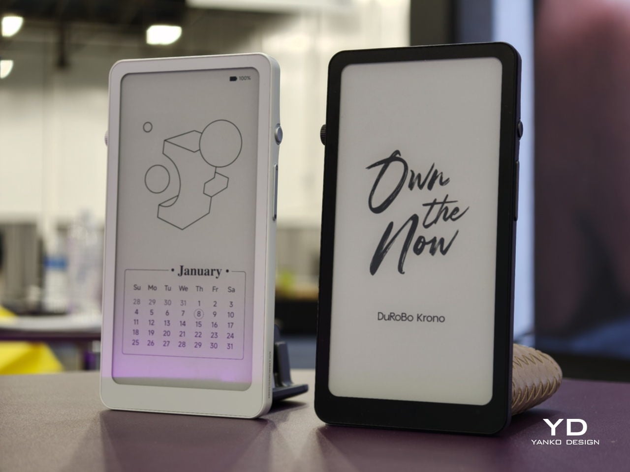
Trying to read or think on a phone never quite works. Notifications interrupt articles halfway through, feeds wait one swipe away from whatever you were concentrating on, and even long reads become just another tab competing for attention. E‑readers tried to solve this, but most stopped at books and stayed locked into one ecosystem. DuRoBo, a Dutch e‑paper specialist, is bringing Krono to CES 2026 in Las Vegas with a different ambition, treating focus, reflection, and idea capture as equally important.
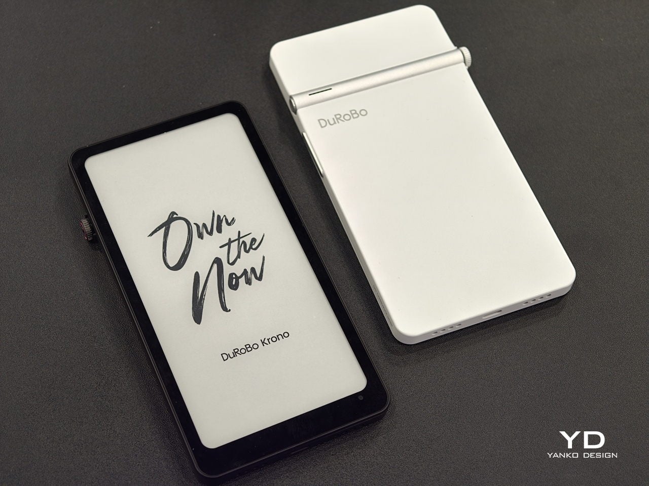
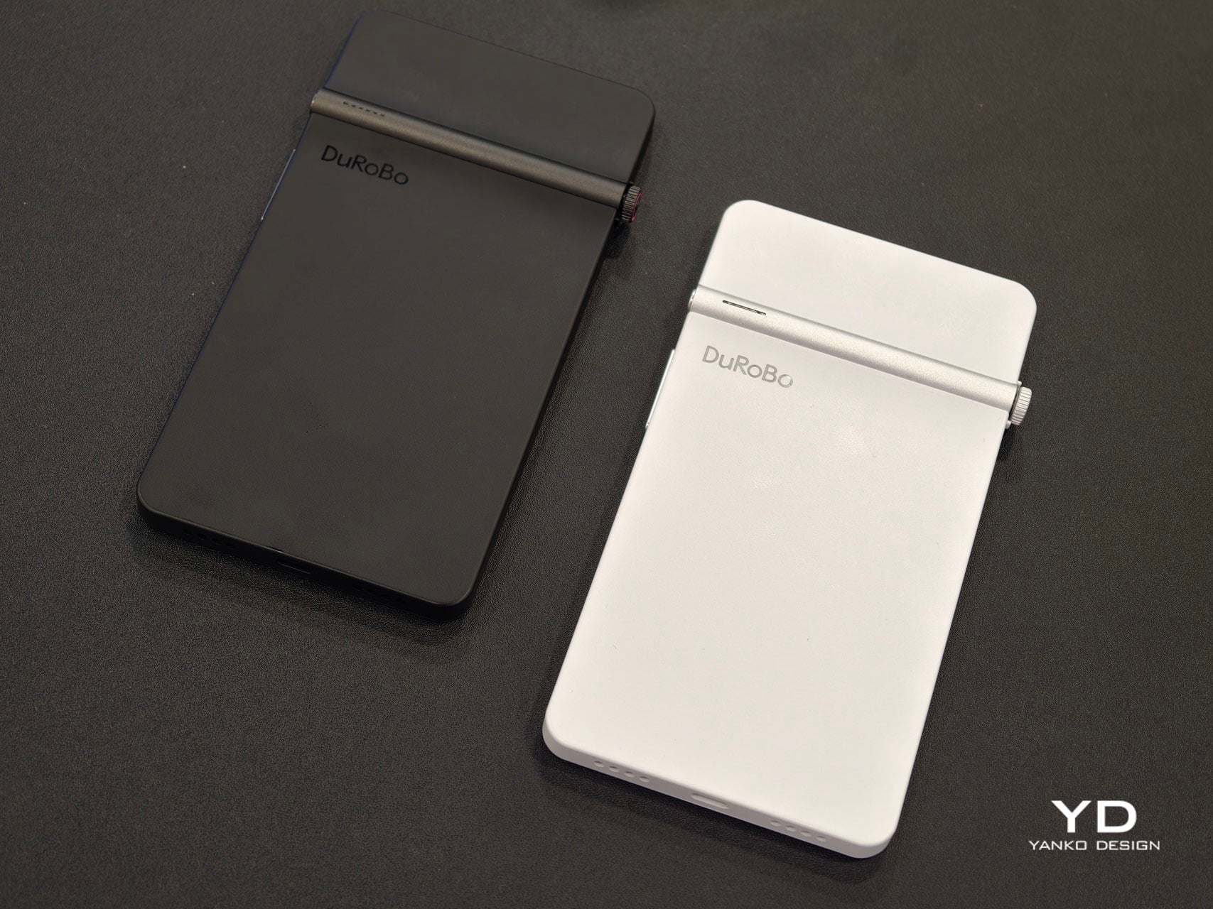
Krono is a pocket‑sized smart ePaper focus hub that has made waves in Europe and is now entering the US market. It wraps a 6.13‑inch E Ink Carta 1200 display with 300 PPI clarity into a minimalist, mechanical‑inspired body that measures 154 × 80 × 9 mm and weighs about 173 g. It is for capturing and shaping thoughts with on‑device AI, ambient audio, and a Smart Dial that feels more tactile than tapping glass.
The paper‑like screen, anti‑glare etching, and dual‑tone frontlight make it comfortable for long reads, whether books, saved articles, or PDFs. The compact body feels closer to a large phone than a tablet, which encourages carrying it everywhere as a dedicated space for slower content. The display mimics paper well enough that you can read for hours without the eye strain from backlit screens.
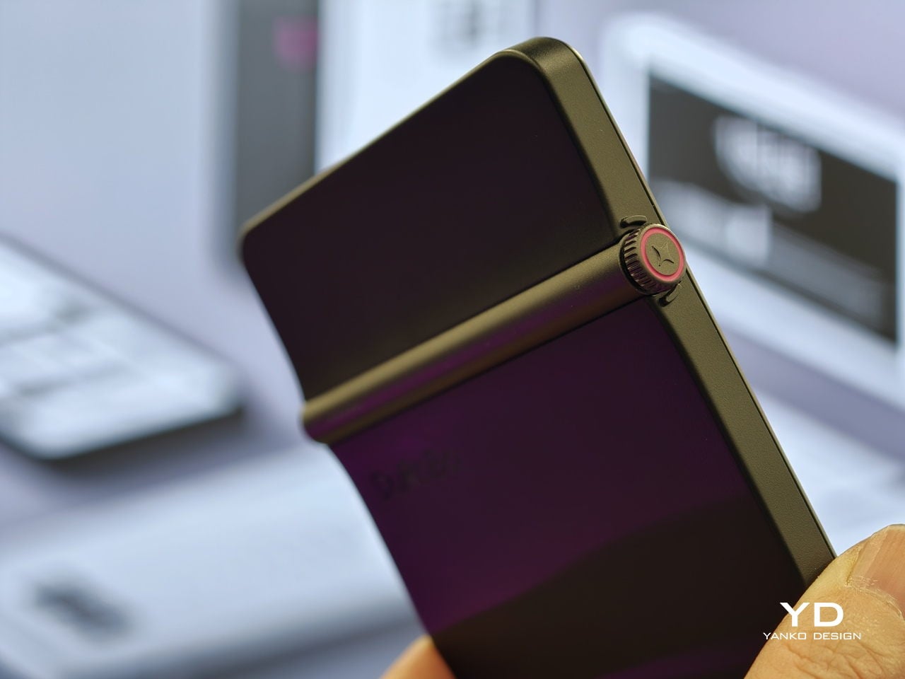
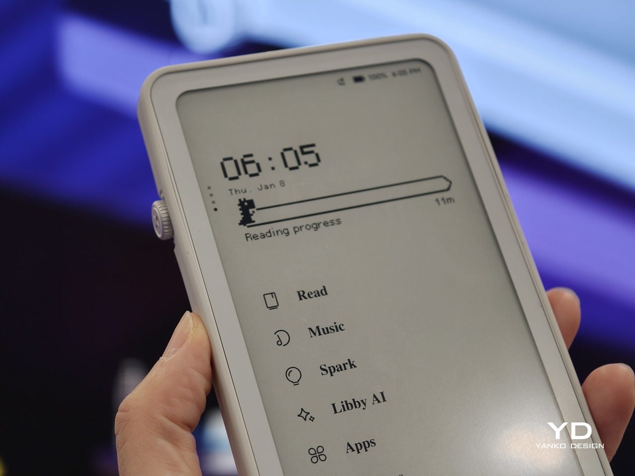
The Smart Dial and Axis bar are the main interaction story. The dial lets you flip pages, adjust brightness or volume, and, with a long‑press, open Spark, Krono’s idea vault. The Axis along the top rear houses eight breathing lights that glow subtly while you read or work, reinforcing the sense of a calm, separate device. The dial and lights give Krono a more analog feel, turning navigation and focus into something you do with your hand.
Spark is where AI enters. Press and hold the dial to dictate a thought, meeting note, or passing idea, and Krono records it, transcribes it with speech‑to‑text, and runs an AI summary that turns it into a structured note. Text Mode lets you refine that note on the e‑paper screen. The whole process happens on‑device, keeping ideas private and the interface calm.
Libby AI is the on‑device assistant that answers prompts and helps with outlines or clarifications without dragging you into a browser. Krono runs Android 15 with full Google Play Store access, powered by an octa‑core processor, 6 GB of RAM, and 128 GB of storage, so it can run Kindle, Notion, or other tools. DuRoBo’s own interface keeps the experience geometric and minimal.
The built‑in speaker and Bluetooth audio are part of the focus story. You can listen to music, podcasts, or audiobooks while reading or writing, turning Krono into a self‑contained environment for commutes or late‑night sessions. The 3,950 mAh battery and tuned refresh algorithms support long stretches of use, not constant app‑hopping, which is what you want from a device that is supposed to be a reprieve from the usual screen.
Krono’s CES 2026 appearance is more than just another e‑reader launch. It is DuRoBo’s attempt to give US readers and thinkers a pocketable device that treats focus, reflection, and idea capture as first‑class design problems. The specs matter, but the real promise is a small, quiet object that can sit between a book and a phone, borrowing the best of both without inheriting their worst habits.
You buy a Kindle or Kobo, load it with books, then leave it on a nightstand while your phone follows you everywhere. Reading apps on phones compete with notifications and social feeds, so you end up doomscrolling instead of finishing that novel you downloaded. Xteink’s X4 tries to solve that by becoming a tiny, magnetic e‑ink sidekick that literally rides on the back of your phone, going wherever it goes.
The Xteink X4 is an ultra-thin magnetic back eReader with a 4.3-inch e‑ink screen and a footprint closer to a deck of cards than a tablet. At 114 by 69 by 5.9 millimeters and just 74 grams, it snaps onto MagSafe or Qi2 compatible phones, or onto any handset using the included adhesive magnetic ring, turning your phone into a dual-screen reading machine without much extra bulk.
The 220 ppi e‑ink display is not as sharp as a Paperwhite, but it is perfectly fine for text at this size. There is no touchscreen and no frontlight, just physical page turn buttons and a power key, so it behaves more like a tiny paperback than a gadget. You need ambient light to read, but in return, you get a very focused, distraction-free surface that does not glow or buzz at you.
The internals are minimal: an ESP32 processor, 128 megabytes of RAM, and a bundled 32GB microSD card with support up to 512GB. The 650mAh battery lasts up to fourteen days with one to three hours of reading per day. It charges over USB-C and connects via 2.4GHz Wi‑Fi and Bluetooth for file transfers, so you can grab books wirelessly or just swap the microSD card.
The X4 only supports EPUB and TXT for documents, plus JPG and BMP for images, and does not run third-party apps or connect to any bookstore. You sideload everything, either over Wi‑Fi or by copying files to the card. For people tied to Kindle or Google Play, this is a hurdle, but for readers with DRM-free libraries, it feels refreshingly simple and vendor-neutral, just you and your files.
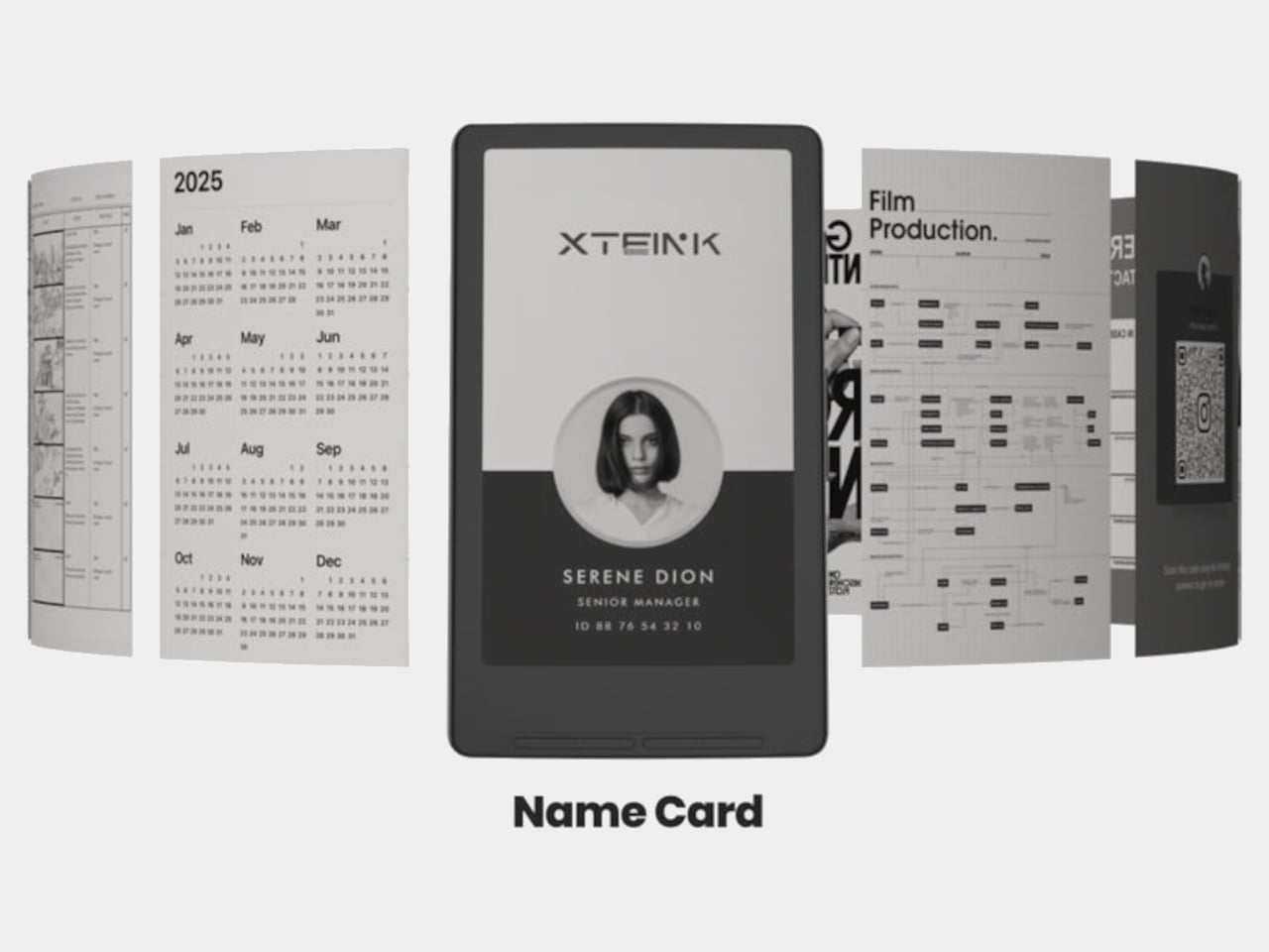
Xteink markets it as “More Than a Reader,” suggesting you use the X4 as a digital business card, a tiny calendar, a film production workflow board, or a reference screen for notes and checklists. Because it displays static images and text, it doubles as a little always-on panel you can stick to a monitor, fridge, or phone, not just a book page. The magnetic back makes those experiments feel natural and reversible.
The X4 is really for minimalists, tinkerers, and people who like the idea of a dedicated reading screen that goes everywhere their phone does. It is quirky, with no light, no touch, and no store, but those constraints are the point. It is a tiny reminder to read instead of scroll, thin enough to forget until you need a page instead of a feed, and cheap enough at $69 that the experiment feels worth trying even if you already own a proper eReader gathering dust at home.
Palmtops and UMPCs are experiencing a quiet resurgence among people who want something more focused than a laptop and more tactile than a phone. Compact e-ink devices and tiny Bluetooth keyboards have become affordable building blocks for exactly this kind of project, letting makers combine them into pocketable machines tailored to writing, reading, or just tinkering. The result is a small but growing wave of DIY cyberdecks and writerdecks that feel like modern reinterpretations of classic Psion palmtops.
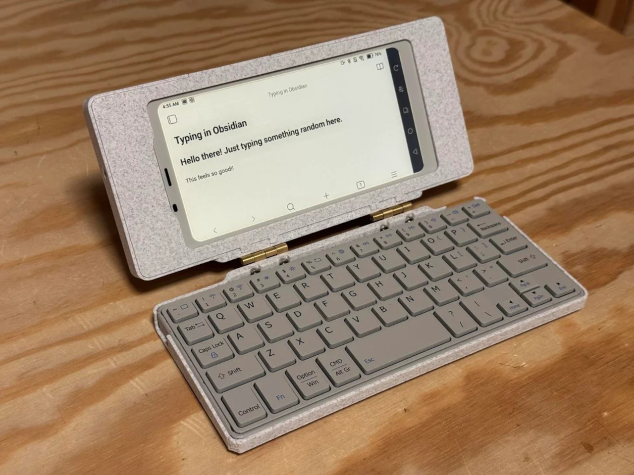
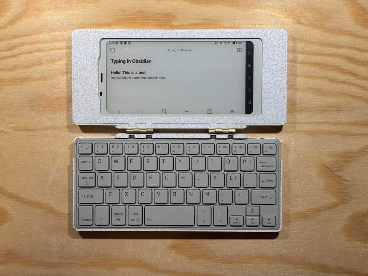
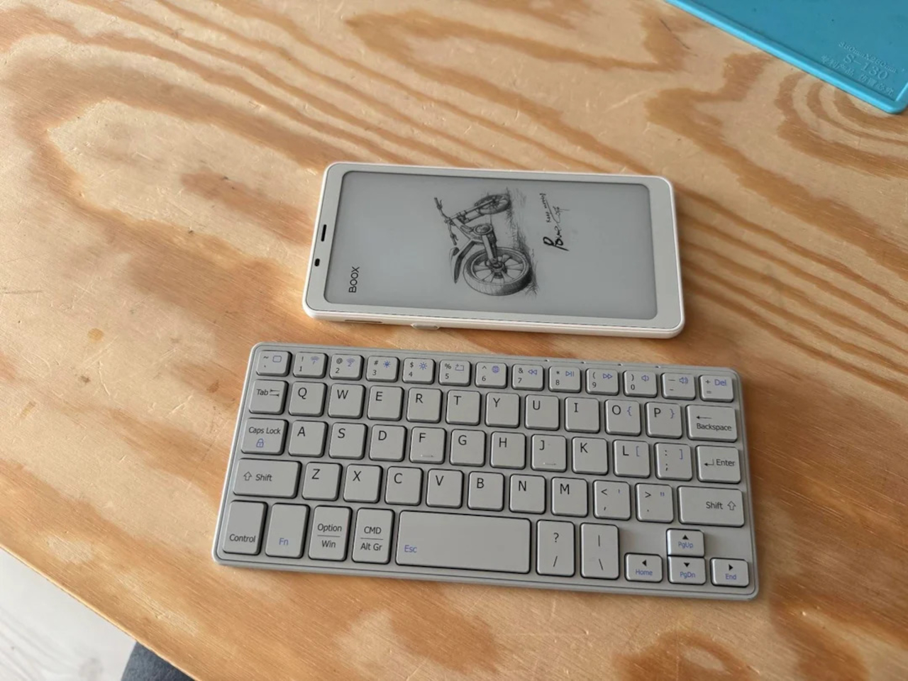
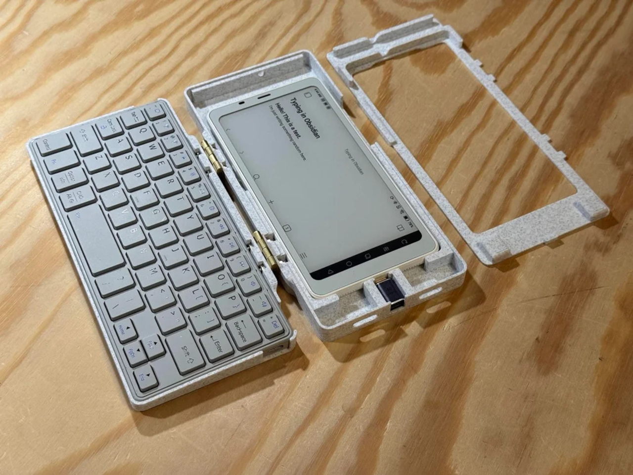
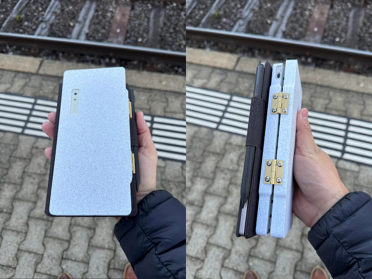
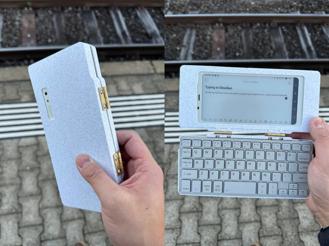
The Palm(a)top Computer v0 is one of those projects, born on Reddit when user CommonKingfisher decided to pair a BOOX Palma e-ink Android phone with a compact Bluetooth keyboard and a custom 3D-printed clamshell case. The result looks like a cross between a vintage Psion and a modern writerdeck, small enough to slide into a jacket pocket but functional enough to handle real writing and reading sessions on the go.
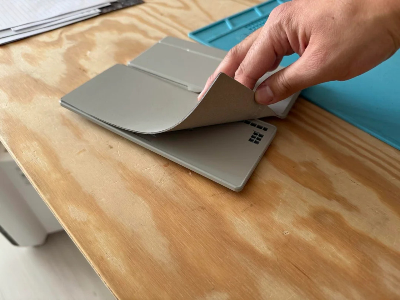
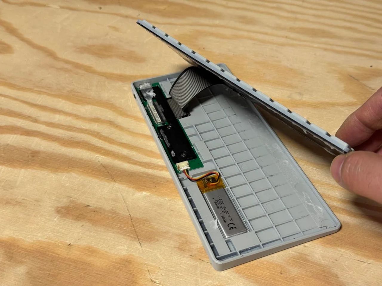
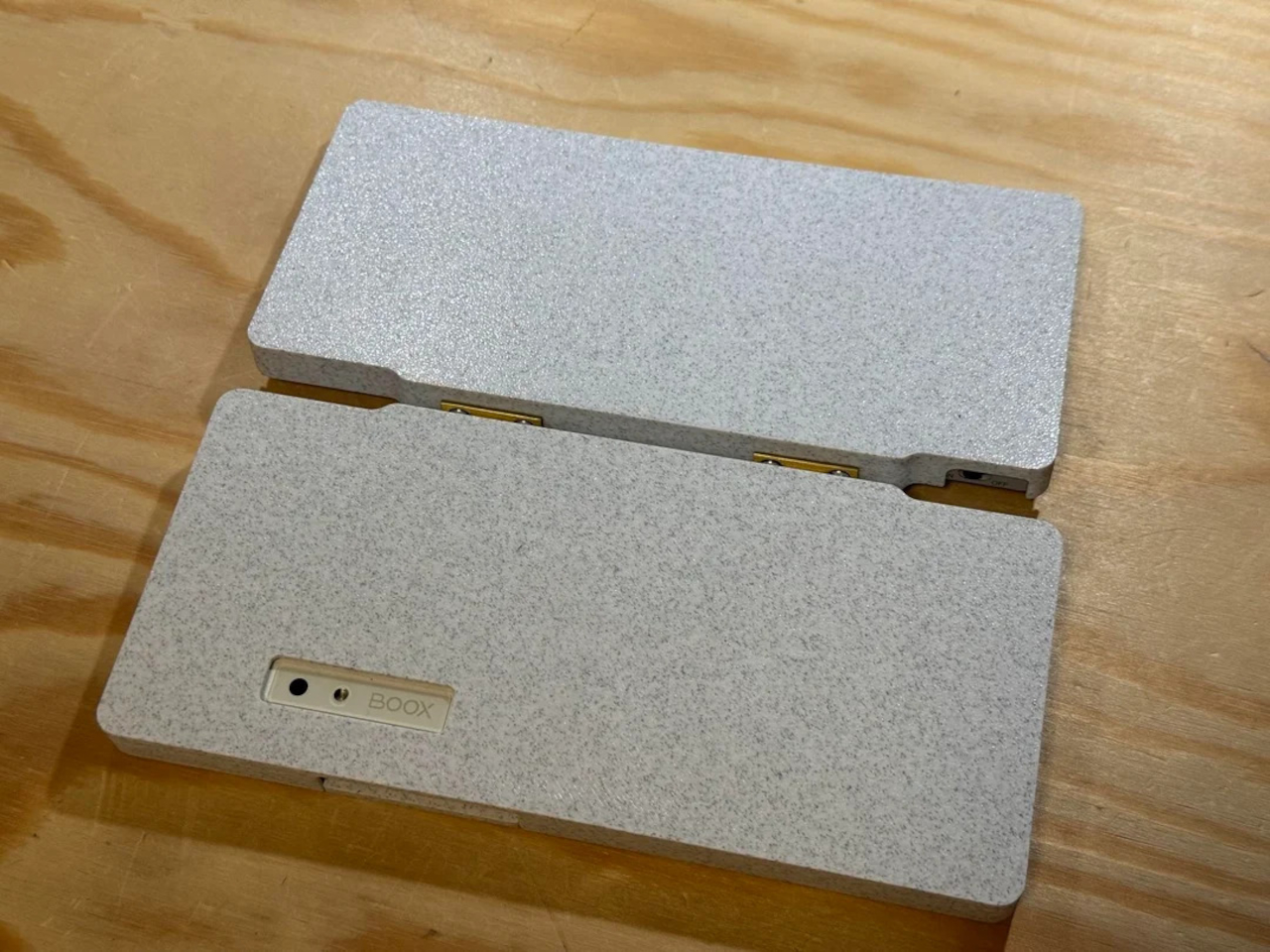
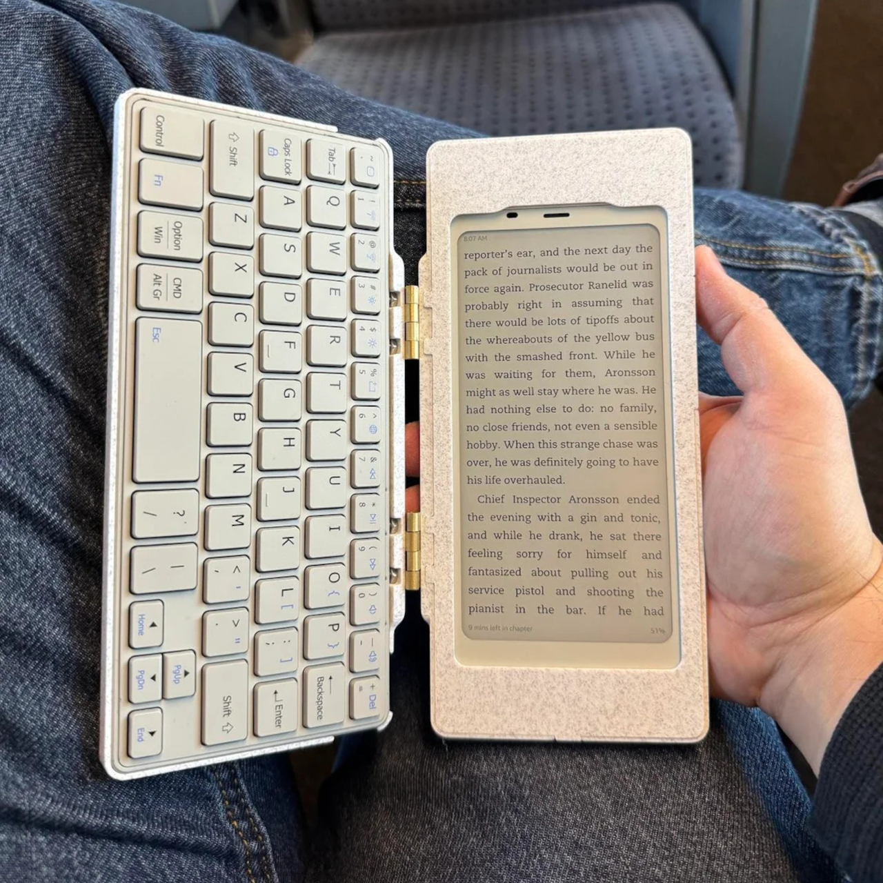
The core hardware is straightforward. The BOOX Palma sits in the top half of the shell, while a CACOE Bluetooth mini keyboard occupies the bottom half. The keyboard was originally glued into a PU-leather folio, which the maker carefully peeled off using gentle heat from a hair dryer to expose the bare board. When opened, the two halves form a tiny laptop layout with the e-ink screen above and the keyboard below.
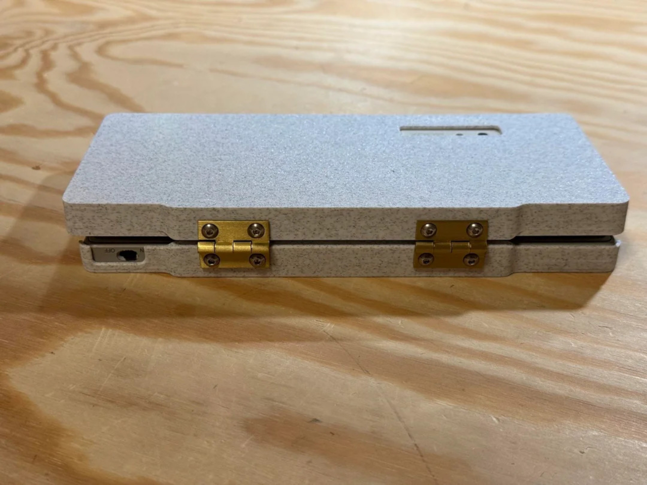
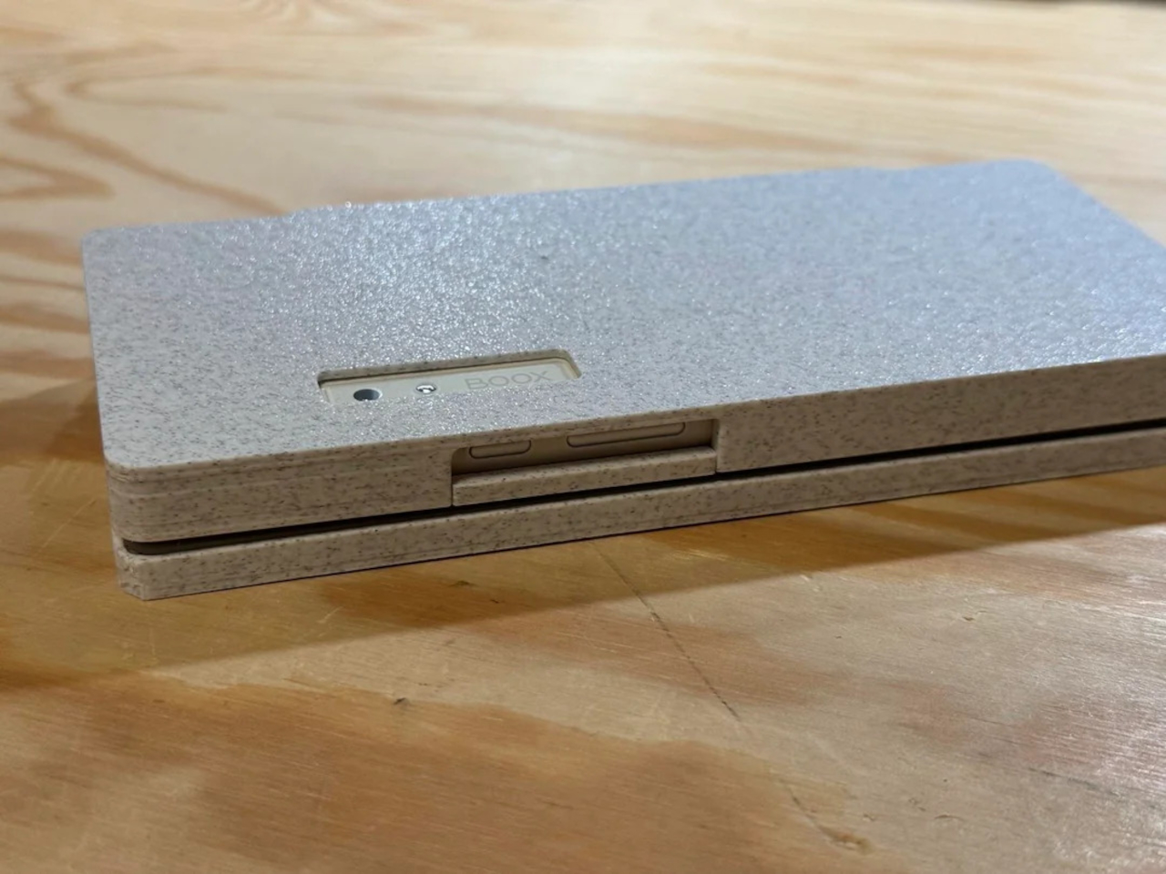
The clamshell itself is 3D-printed in a speckled filament that looks like stone, with two brass hinges along the spine giving it a slightly retro, handcrafted feel. Closed, it resembles a small hardback book with the Palma’s camera cutout visible on the back. Open, the recessed trays hold both the screen and keyboard flush, turning the whole thing into a surprisingly polished handheld computer, considering it’s a first prototype.
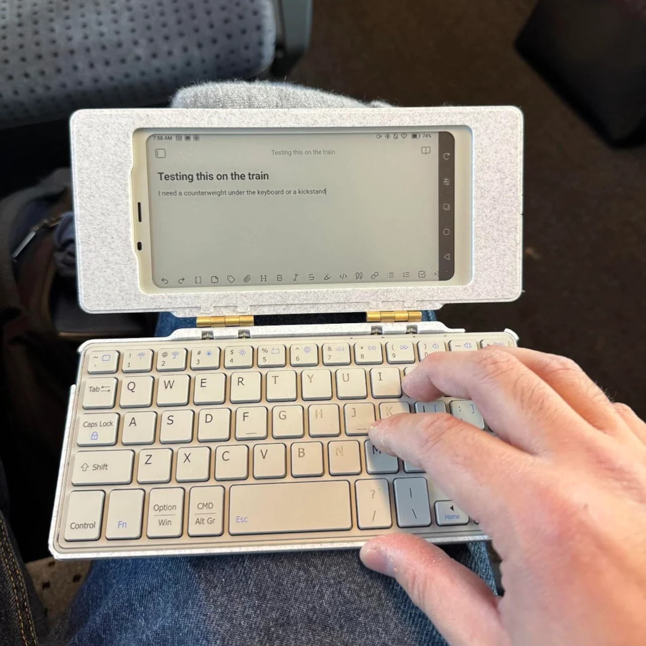
The typing experience is functional but not perfect. The maker describes it as “okay to type on once you get used to it,” and thumb typing “kinda works,” though it’s not ideal for either style. You can rest the device on your lap during a train ride and use it vertically like a book, with the Palma displaying an e-book and the keyboard ready for quick notes or annotations.
The build has a few issues that the maker plans to fix in the next version. It’s top-heavy, so it needs to lie flat or gain a kickstand or counterweight under the keyboard, possibly a DIY flat power bank. The hinge currently lacks friction and needs a hard stop around one hundred twenty degrees to keep the screen upright. There are also small cosmetic tweaks, like correcting the display frame width.
Palm(a)top Computer v0 shows how off-the-shelf parts and a 3D printer can turn a niche e-ink phone into a bespoke palmtop tailored to one person’s workflow. Most consumer gadgets arrive as sealed rectangles you can’t modify, but projects like this embrace iteration and imperfection. It’s less about having all the answers and more about building something personal that might inspire the next version.