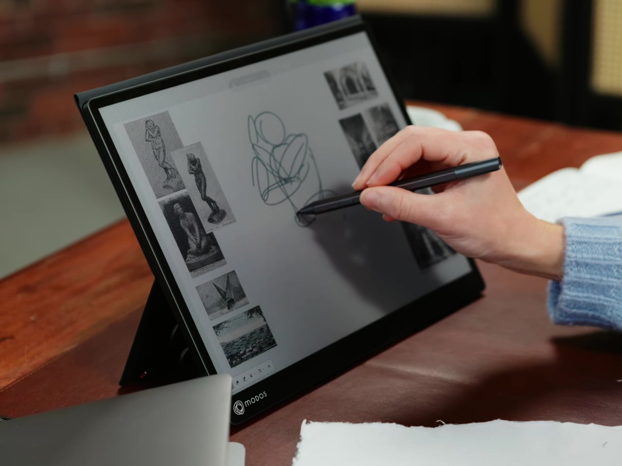
There’s a particular kind of frustration that comes with trying to take notes on a device that also wants to tell you about emails, calendar reminders, and a dozen app updates. A general-purpose tablet is extraordinary for many things, but for someone who simply wants to write, it’s often too much. That gap is exactly where reMarkable has built its reputation, and the Paper Pure is its clearest statement yet.
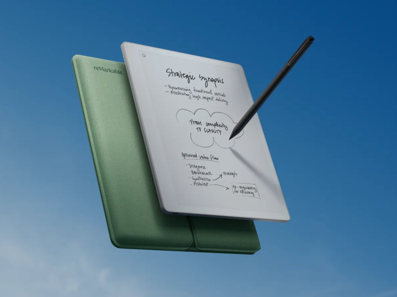
The Paper Pure launched as the direct successor to the reMarkable 2, priced at $399 with a Marker stylus and six replacement tips included. A $449 bundle adds the Marker Plus, which features a built-in eraser, along with a Sleeve Folio for protection. It’s a focused proposition for a focused device: write, read, annotate, and essentially nothing more.
Designer: reMarkable
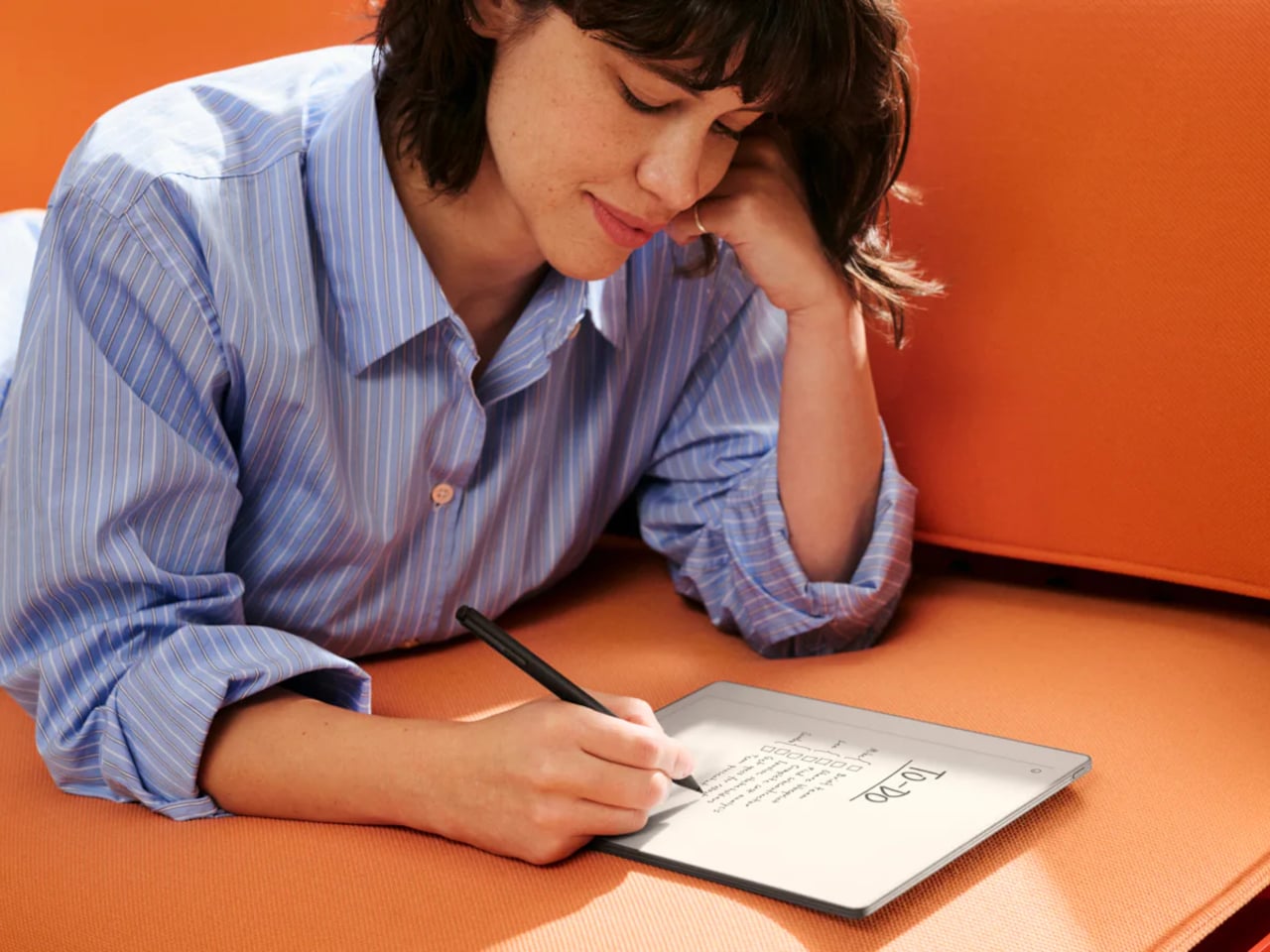
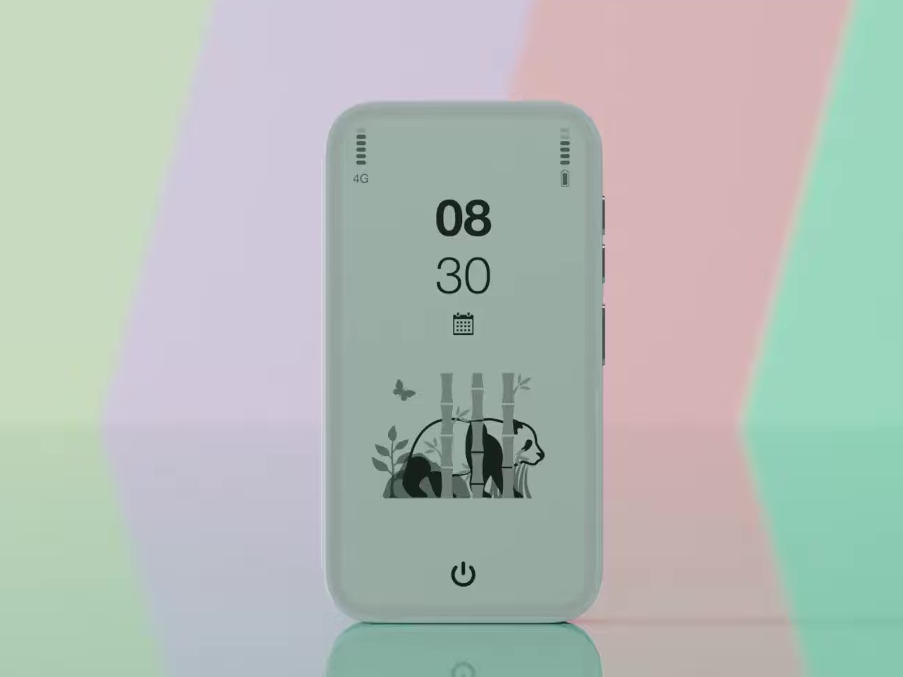
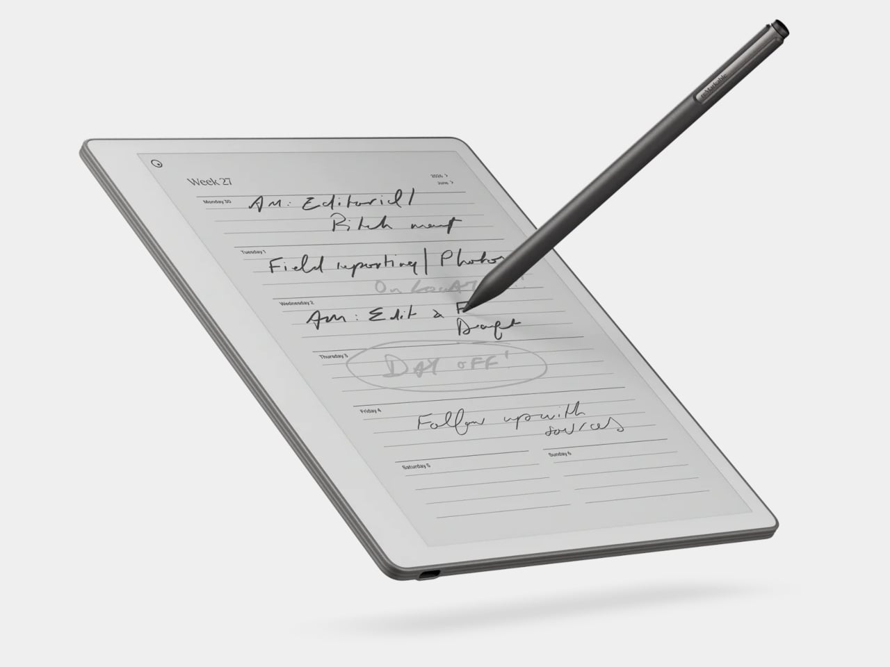
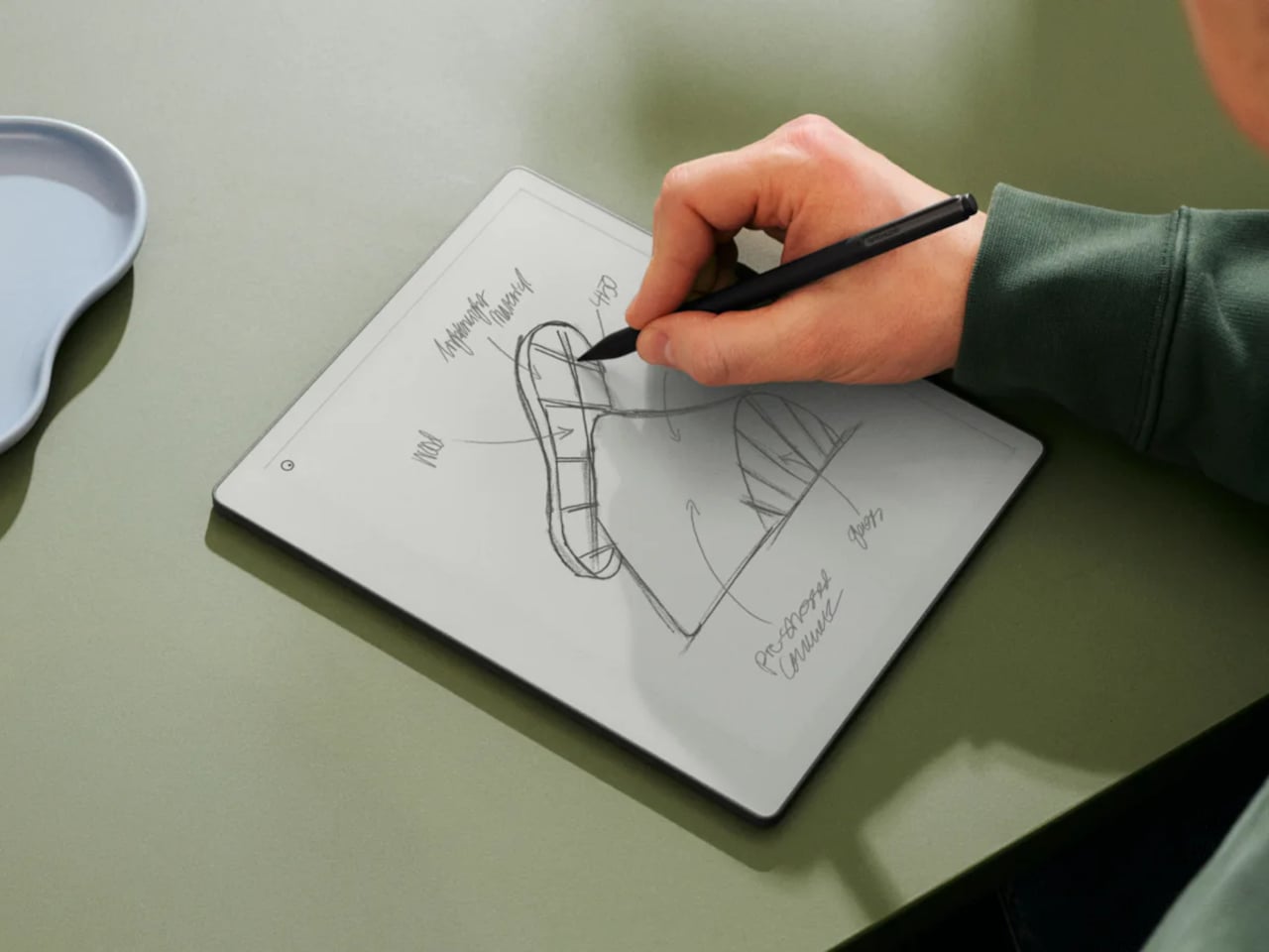
The display is the centerpiece of what’s improved, which reMarkable calls a third-generation Canvas screen, built on E Ink’s Carta 1300 panel and delivering 20% more contrast than the reMarkable 2’s display. Ink promises to appear darker and crisper on a background that reads as noticeably whiter and more paper-like. An adjustable reading light is new to this form factor in the lineup, finally making the device usable in dim rooms.
Writing responsiveness matters as much as display quality on a device like this, and the Paper Pure advertises 21ms of latency. That’s fast enough to feel genuinely natural, especially combined with the textured surface that gives the Marker tip just enough drag to mimic paper. The Marker now recharges magnetically when attached to the side of the tablet, so there’s no separate cable to manage.

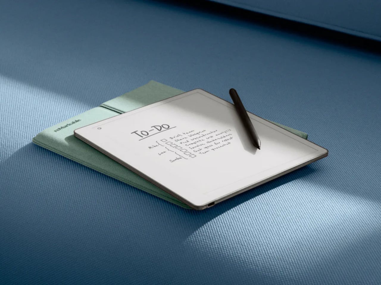
A three-week battery rating changes how you think about the device entirely. You stop treating it like a phone that needs a nightly top-up and start treating it more like a paper notebook you just pick up and toss in a bag. The internal storage also grew from 8GB to 32GB, and RAM doubled from 1GB to 2GB, both contributing to a noticeably snappier experience.
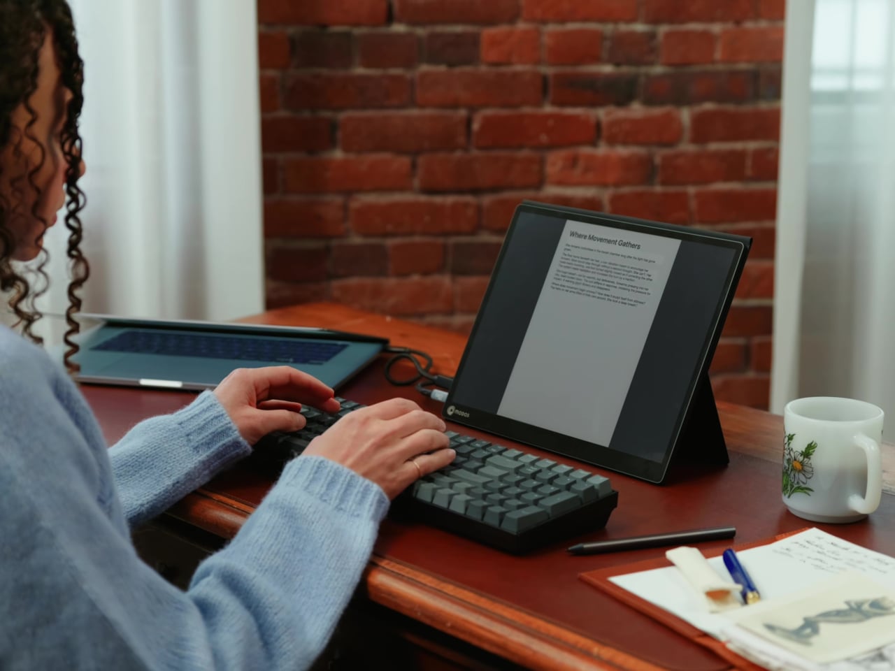
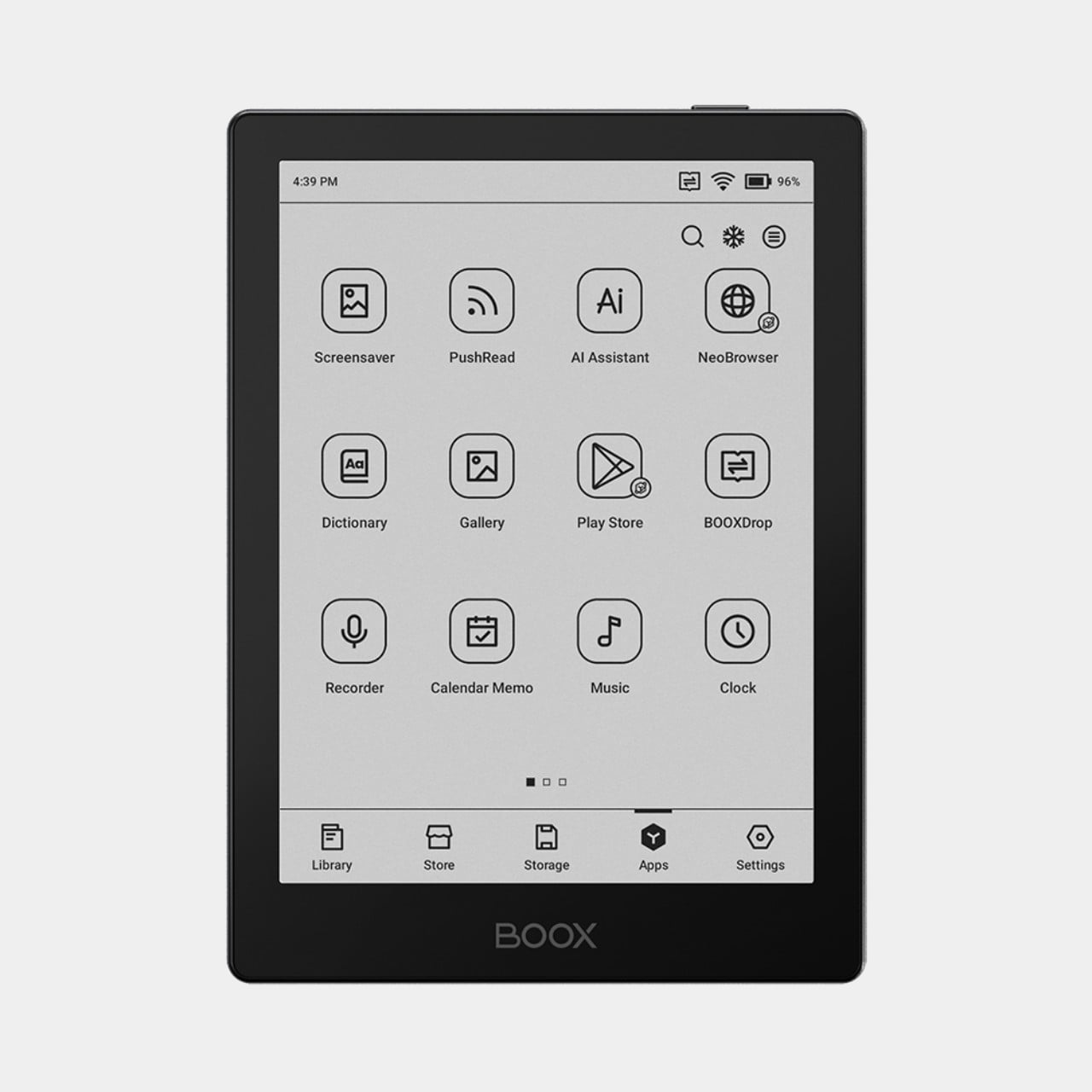
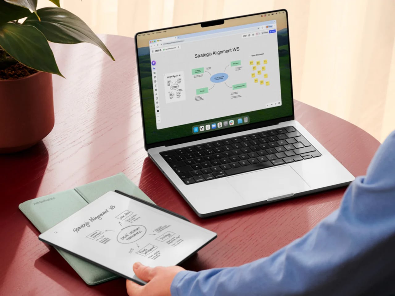
Notebooks sync to your phone or desktop through the reMarkable apps, and a Connect subscription unlocks cloud storage and handwriting-to-text conversion. The operating system stays deliberately out of the way, offering no browser, no email, and no app store. Whatever you write on the Paper Pure stays on the Paper Pure unless you choose to share it, which turns out to be a surprisingly refreshing constraint.
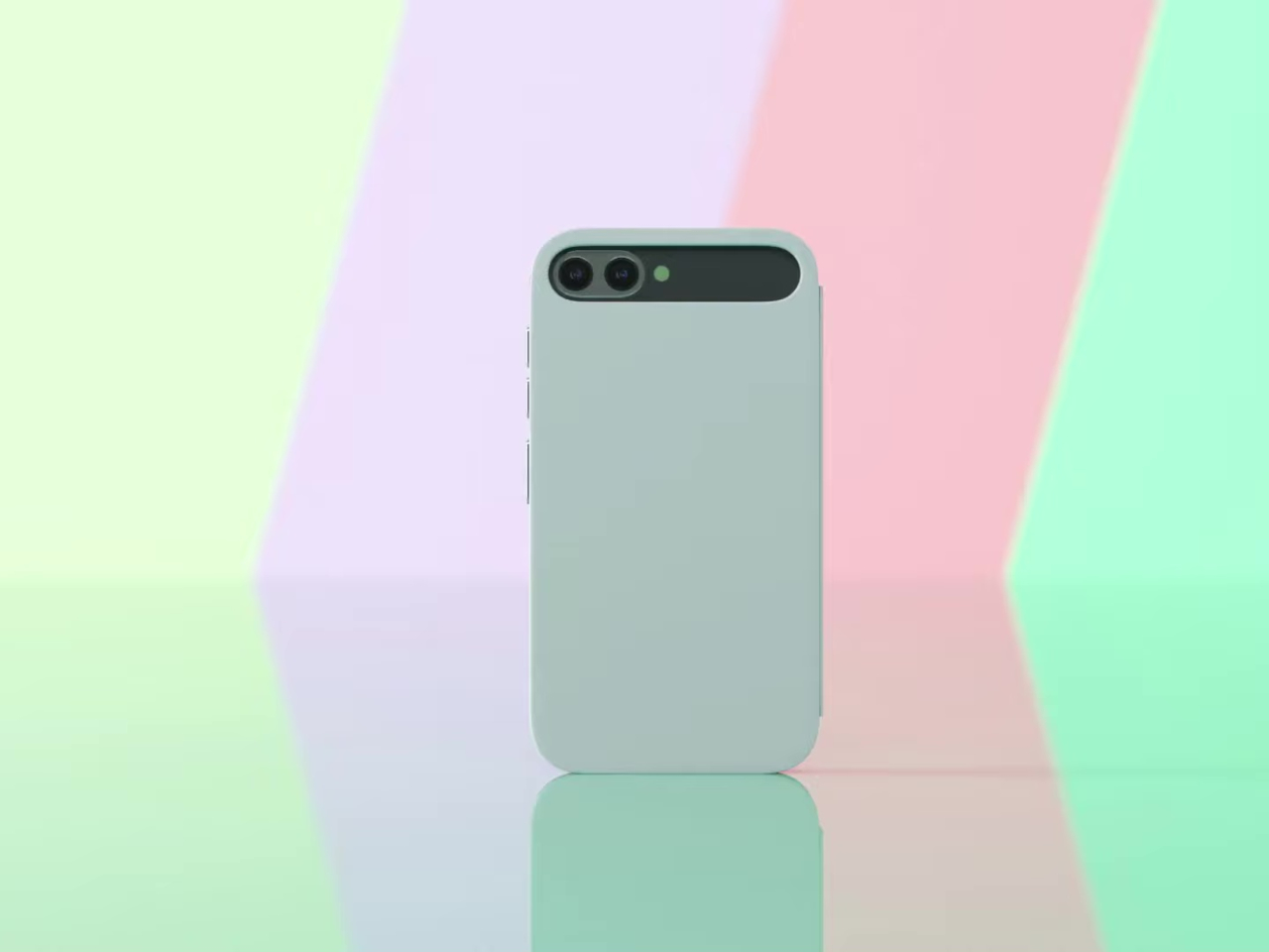
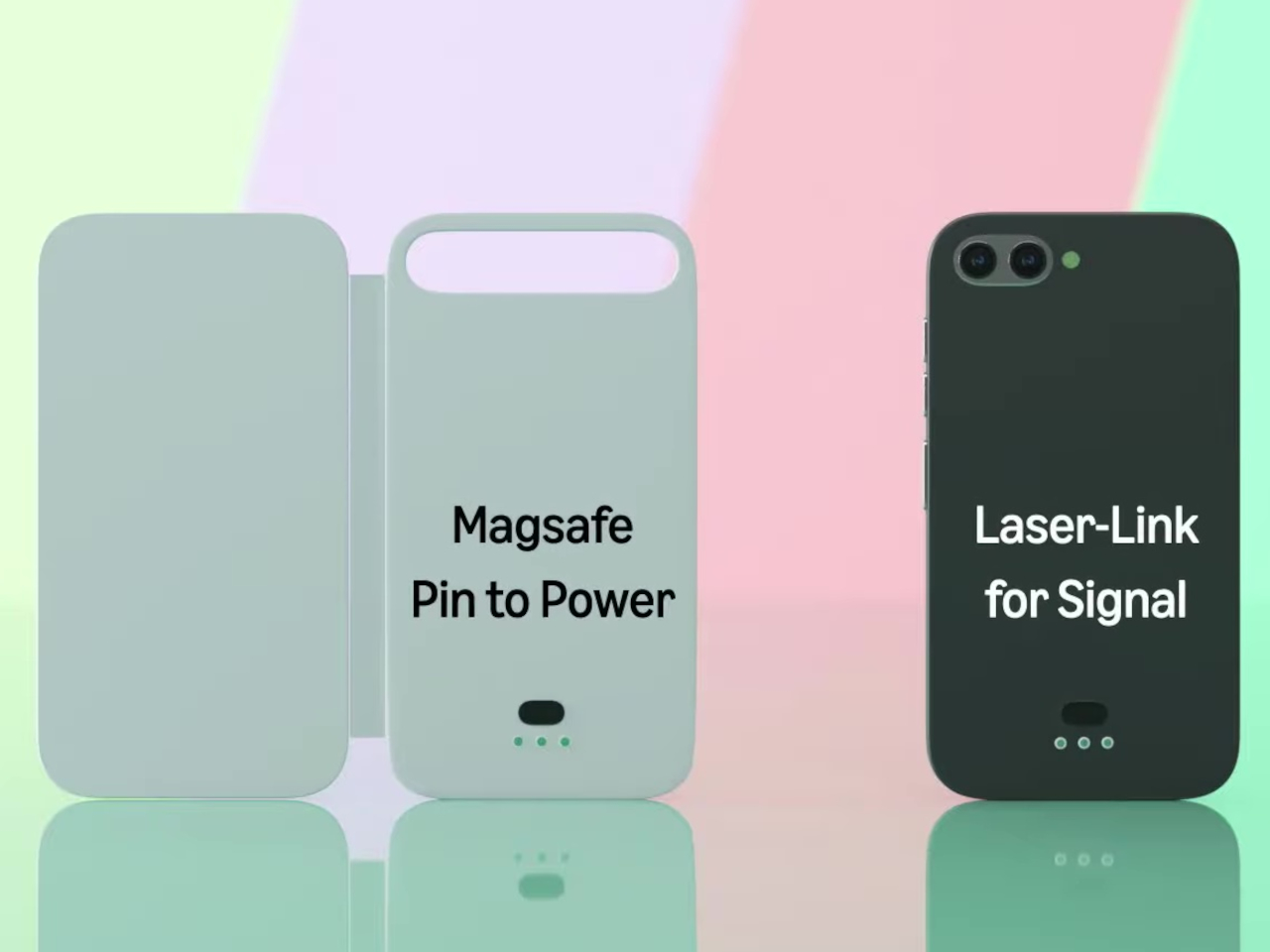
The back panel is now fully plastic, which sounds like a downgrade but actually makes the device more durable in everyday use. It’s also 44g lighter than the reMarkable 2, landing at around 360g total. What’s intentionally gone is support for keyboard accessories and the pogo pins that enabled them; those features belong to the Pro lineup, and the Paper Pure isn’t trying to compete.
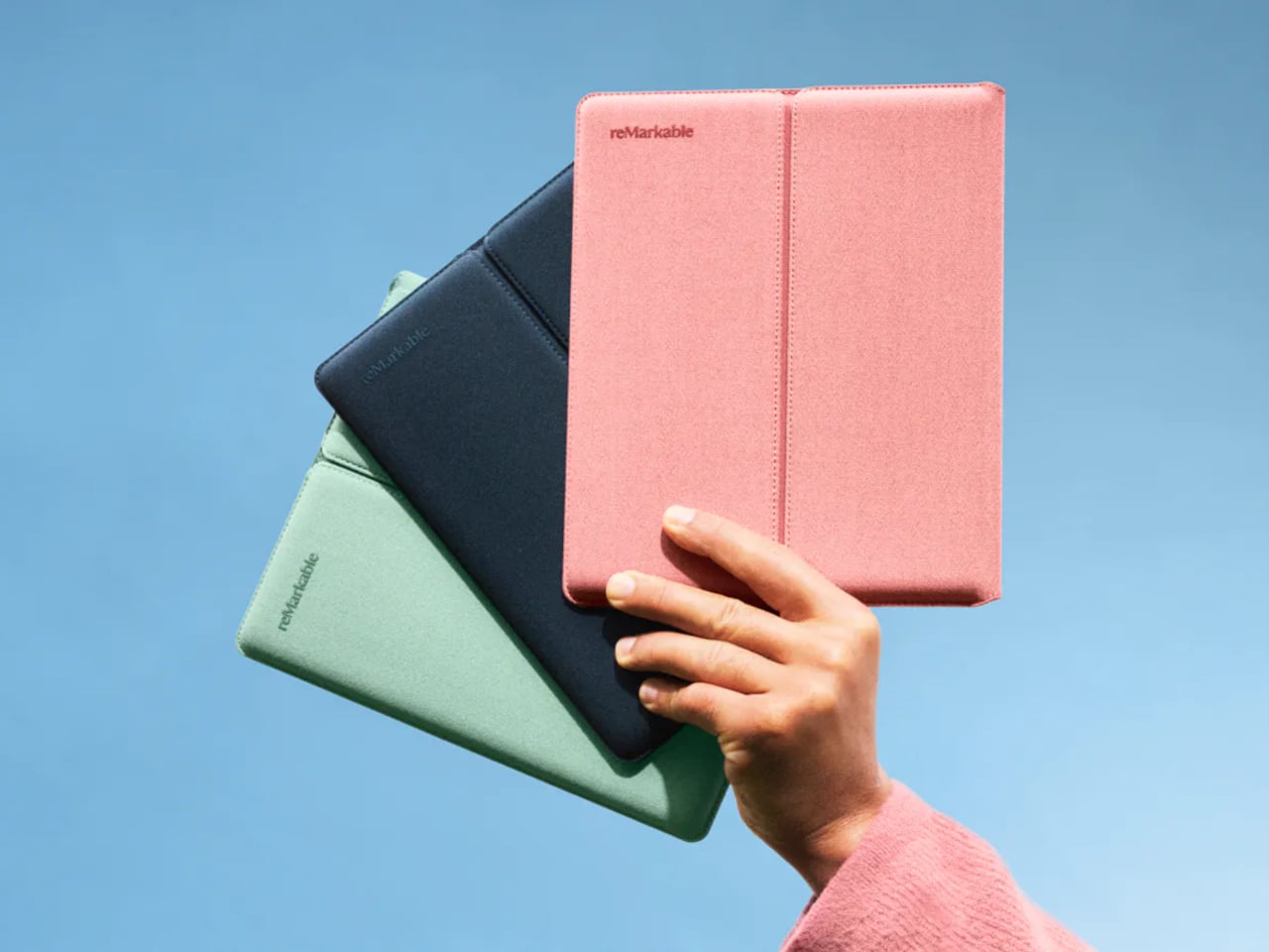
It comes in Ocean Blue, Mist Green, and Desert Pink, three colors with more personality than the reMarkable line has typically offered. Orders opened on May 6, with first shipments expected in early June. At $399, it’s the most accessible entry into reMarkable’s current lineup, and for anyone whose main reason for wanting a tablet was always just to write, it makes a compelling argument for simplicity.
The post reMarkable Just Made a $399 Writing Tablet That Won’t Distract You first appeared on Yanko Design.