5 Furniture Pieces So Geometric They Could Hang in a Gallery

Geometry has always been the silent language of design. Across architecture and interiors, shapes define how spaces feel, function, and flow. Today, furniture design is embracing this language more boldly than ever, transforming basic forms into expressive, functional art pieces. Clean lines, curves, grids, and volumes are no longer just structural tools as they are becoming the identity of objects themselves.

This shift reflects a deeper cultural move, especially among Gen Z sensibilities, toward objects that are aesthetic and meaningful. Furniture is no longer passive as it speaks, interacts, and often challenges traditional expectations of form and function.

1. Modular Furniture Designs

Modular furniture draws heavily on geometric logic, using repeatable units such as cubes, rectangles, and grids to create flexible systems. These pieces adapt to changing needs, allowing users to rearrange and reconfigure spaces effortlessly. Geometry here is not just visual but it becomes a tool for customization and efficiency.

This approach suits modern living, where adaptability matters more than permanence. Modular designs turn furniture into a dynamic system rather than a fixed object. The clean geometry ensures visual harmony, while the flexibility aligns with evolving lifestyles, making design intelligent and responsive.
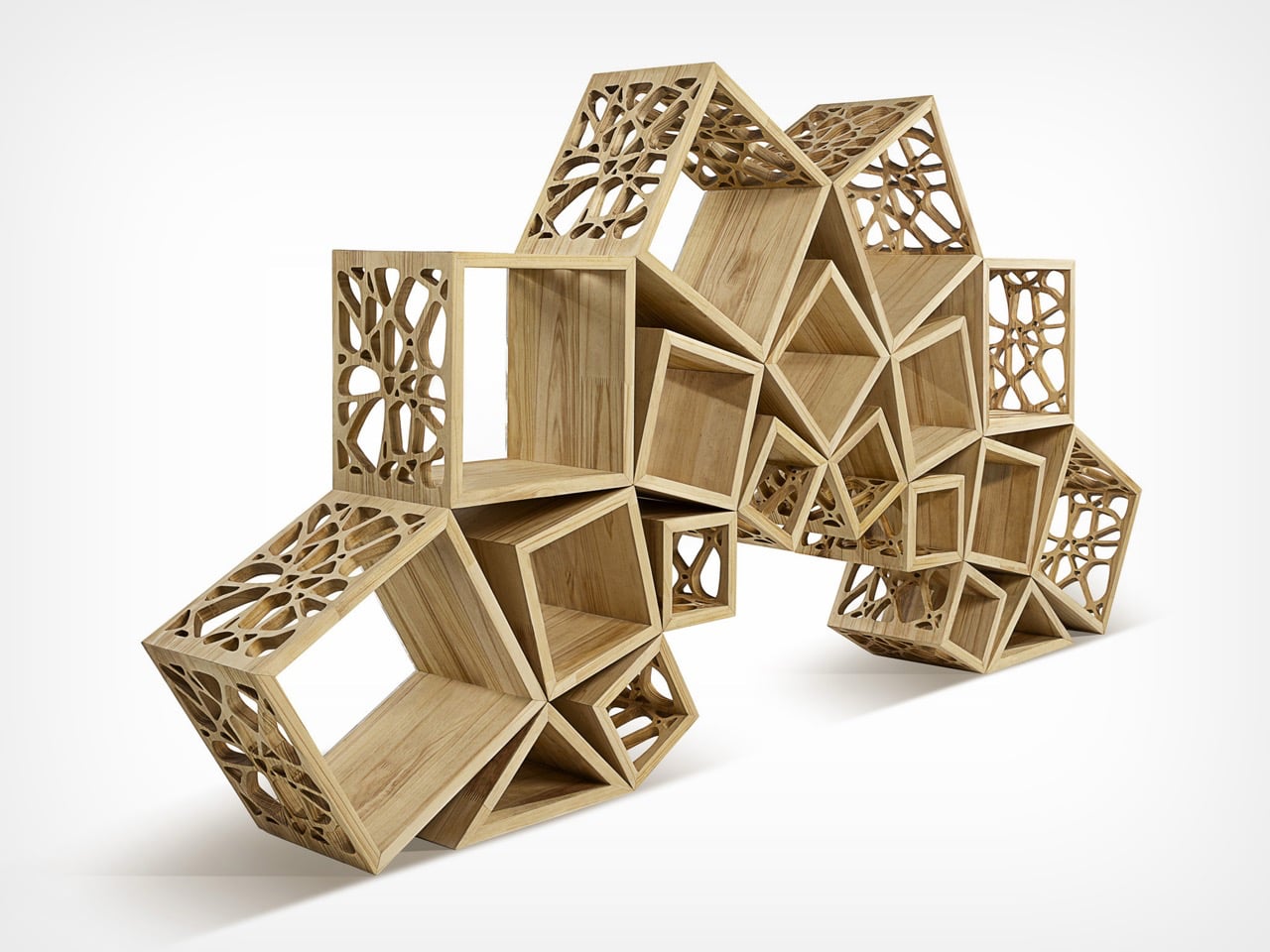
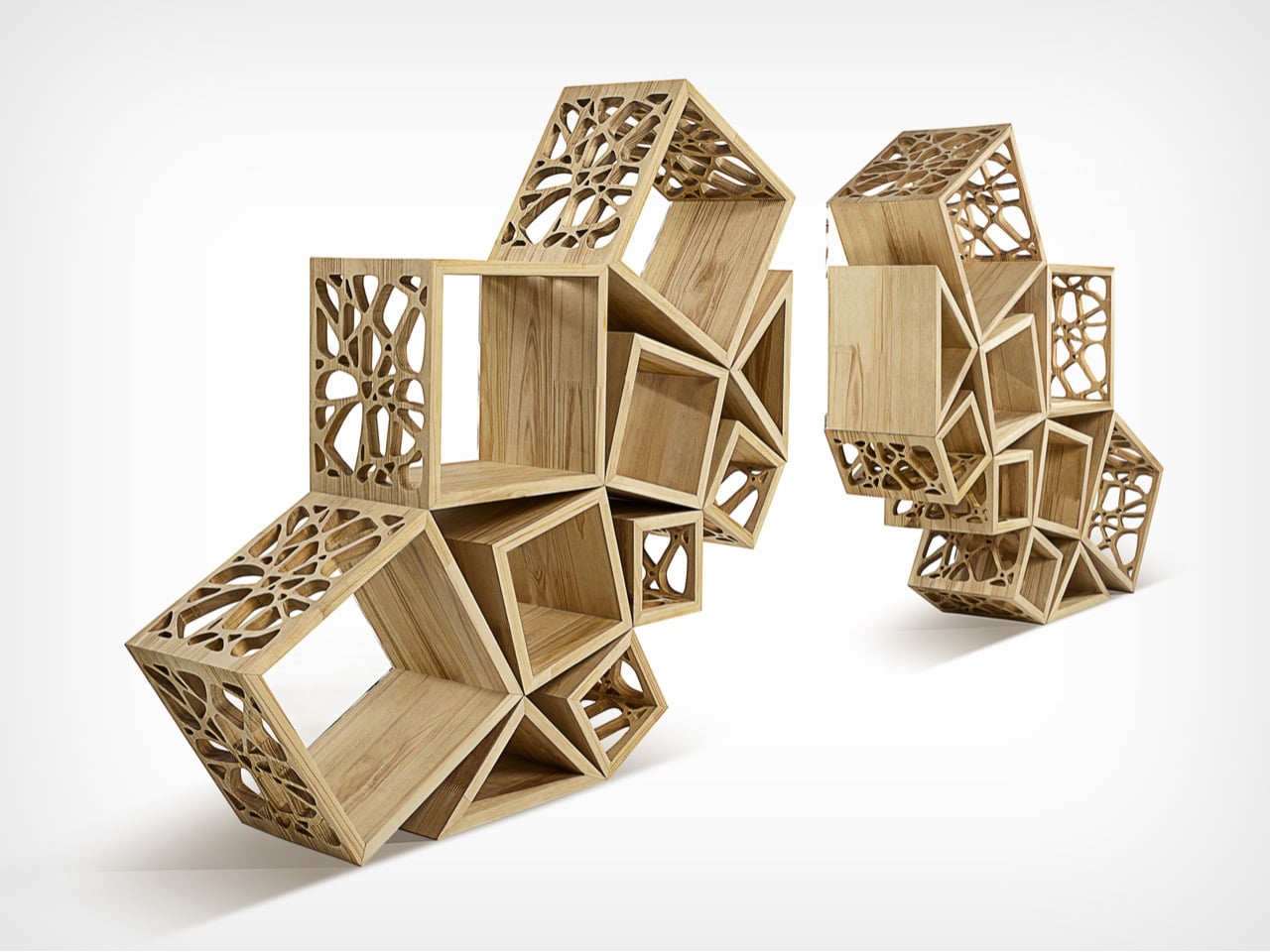
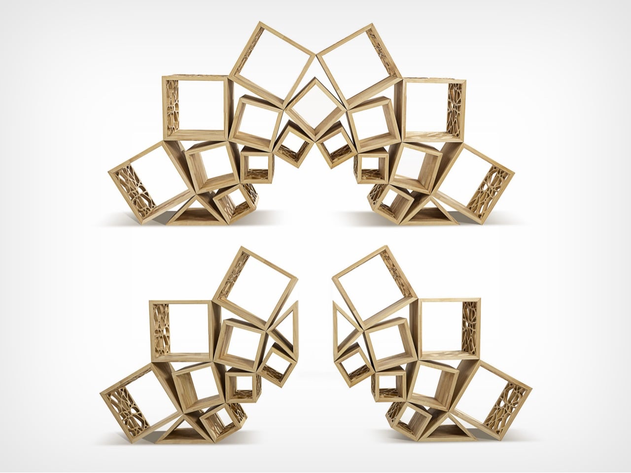
Fractal 9 is defined by its strong geometric identity, where form is driven by precision and not just decoration. The design builds on fundamental shapes like the square, structured through proportions influenced by the golden ratio and the recurring logic of the number nine. These elements guide the composition, creating a balanced system of volumes that feels both ordered and visually dynamic. The result is a piece where every line, angle, and intersection contributes to a cohesive geometric language, giving the object a sculptural clarity that stands out in any space.
This geometric thinking extends into its modular structure, allowing the form to shift while maintaining harmony. Inspired by fractal patterns, the design repeats and scales its geometry in a way that feels consistent across configurations. Whether assembled as one unit or divided into parts, the proportions remain intact, preserving visual rhythm. The transparency of acrylic elements further highlights the geometry, making connections and alignments visible, turning the structure itself into the defining aesthetic feature.

2. Playful Shapes That Feel Fun

Playful furniture explores geometry with curiosity and experimentation. Bold shapes like spheres, arcs, and asymmetrical forms create pieces that feel lively and unexpected. These designs blur the line between art and utility, inviting interaction and emotional connection.

Such furniture often appeals to a younger audience seeking individuality and expression. Bright colors and unconventional forms transform everyday objects into conversation starters. Geometry becomes less rigid and more expressive, proving that functionality does not have to come at the cost of creativity or joy.
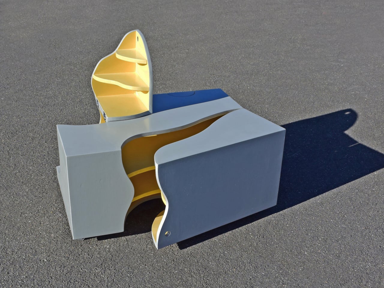
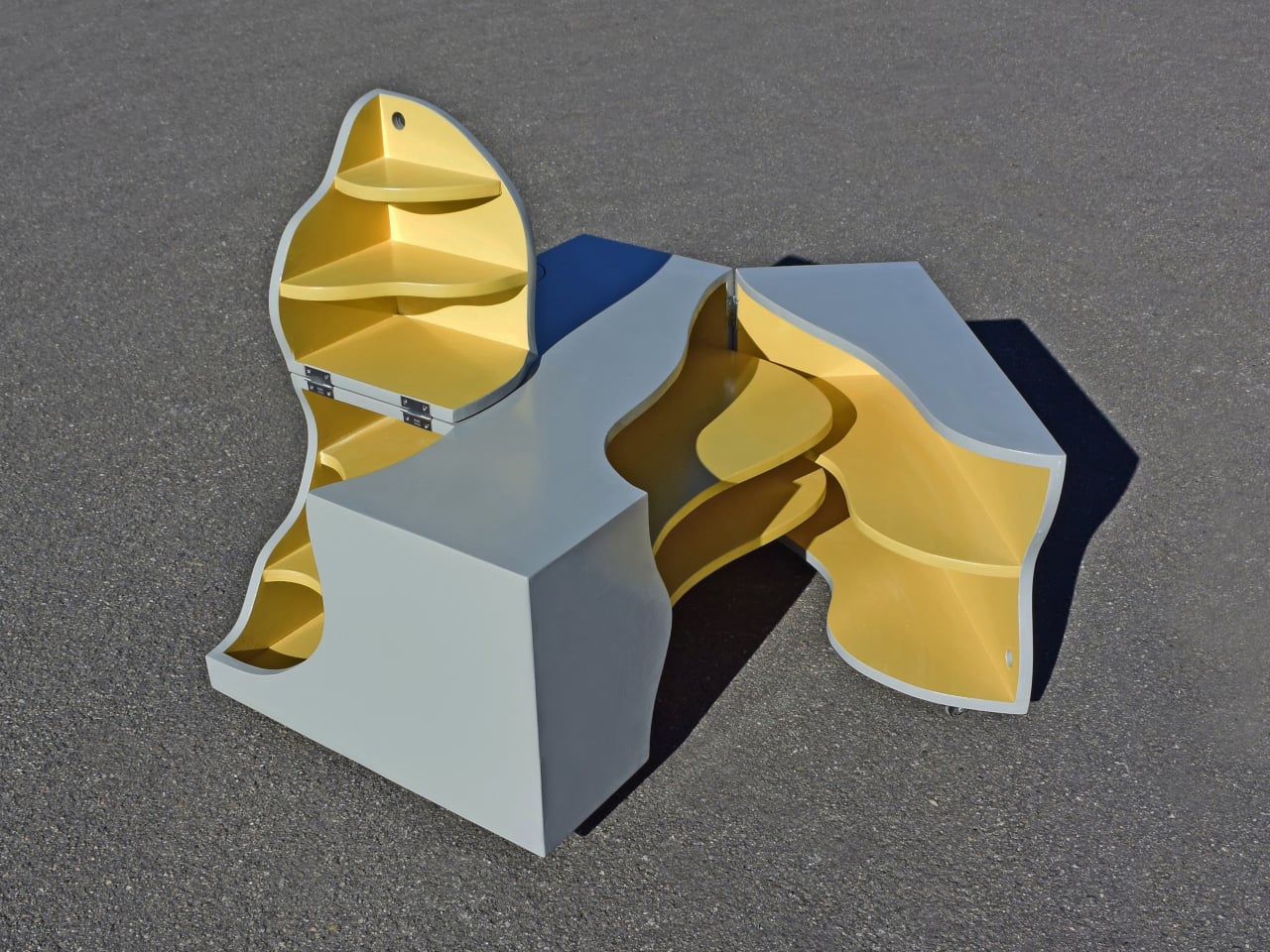
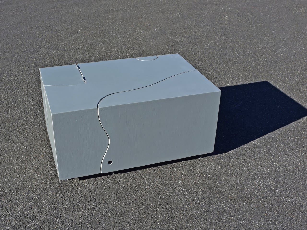
Most furniture stays predictable and is fixed in form and limited in function. The Interactive Transformation Table by Michael Jantzen breaks that pattern by turning a simple object into an evolving, geometry-driven product. At first, it appears as a compact wooden box defined by clean proportions and subtle curved cut lines. These incisions are not random as they introduce a layered geometric logic where straight edges meet flowing curves. The exterior reads as a solid volume, yet the visible seams suggest hidden movement, creating a sense of tension between stability and transformation.
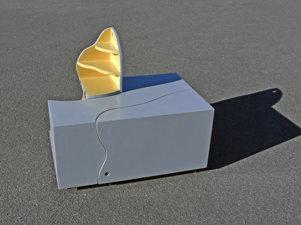
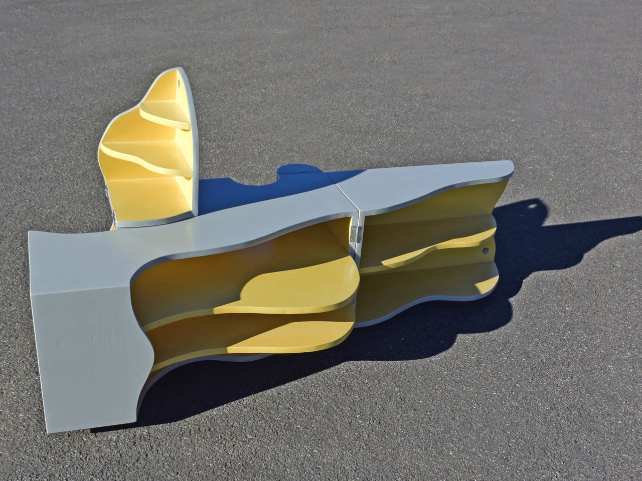
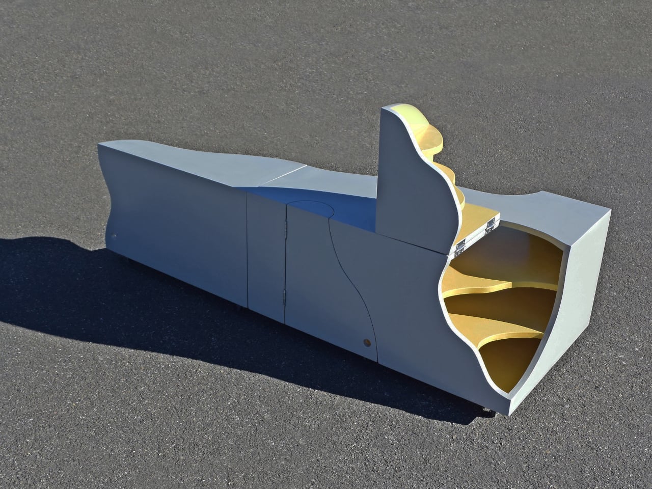
Once engaged, the table unfolds into multiple sections, revealing a complex geometric composition in motion. Hinged parts rotate and expand along precise axes, shifting from a compact rectangular form into a series of organic, interlocking shapes. The contrast between linear geometry and fluid curves becomes more pronounced, while bright interior shelves emphasize depth and structure. Each configuration maintains balance despite constant change, showing how geometry can be both controlled and expressive. The result is a product that uses transformation as its core design language.

3. Smart Storage With Style

Storage solutions are increasingly defined by geometric precision. Shelving units, cabinets, and organizers use grids, hexagons, and intersecting planes to create visually structured systems. These designs bring order not just physically, but visually, making spaces feel organized and intentional.

At the same time, geometric storage enhances spatial efficiency. By maximizing volume through structured forms, these pieces make better use of available space. The result is storage that is practical and sculptural, turning necessity into a design feature and not something to hide.
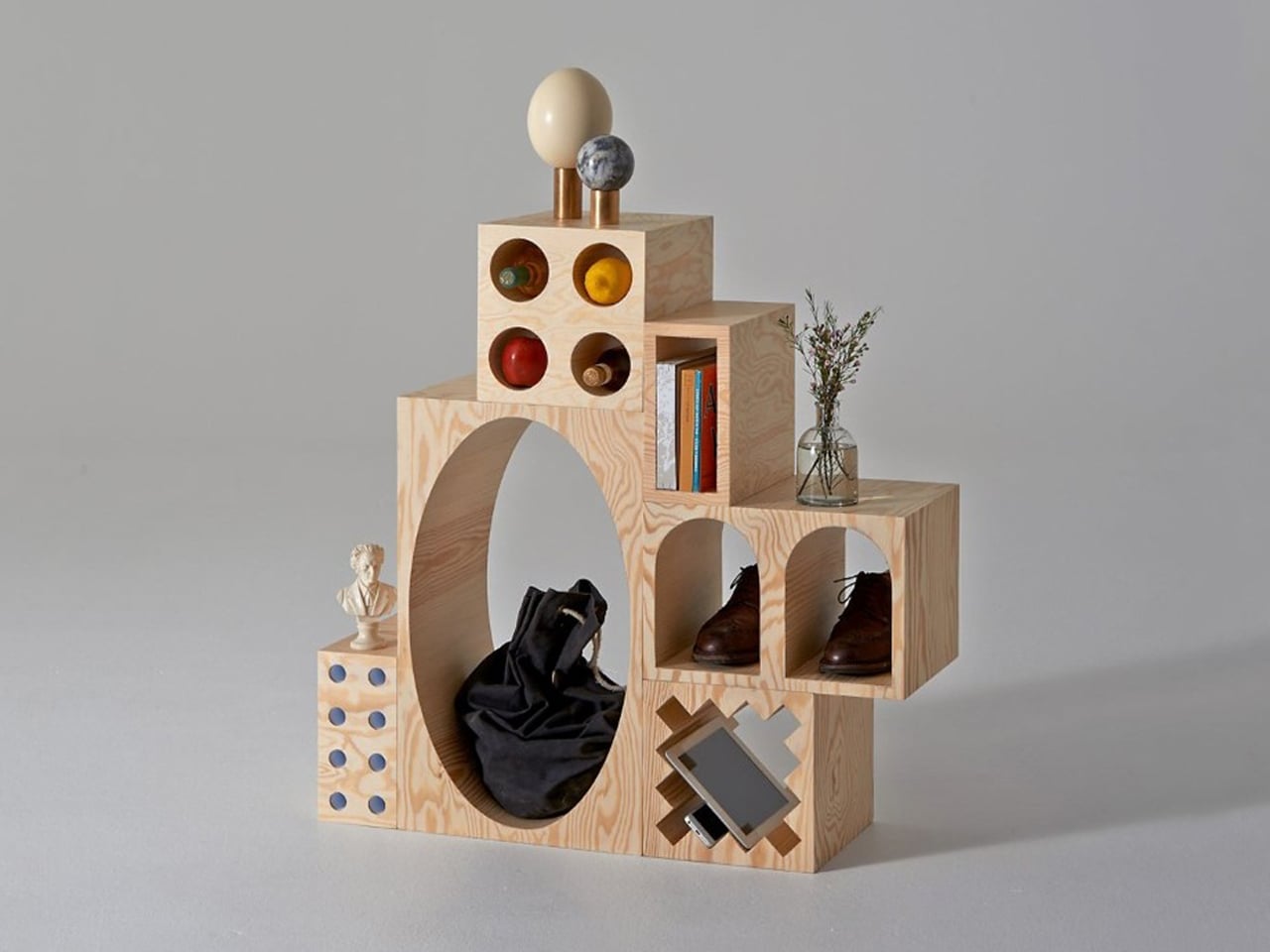
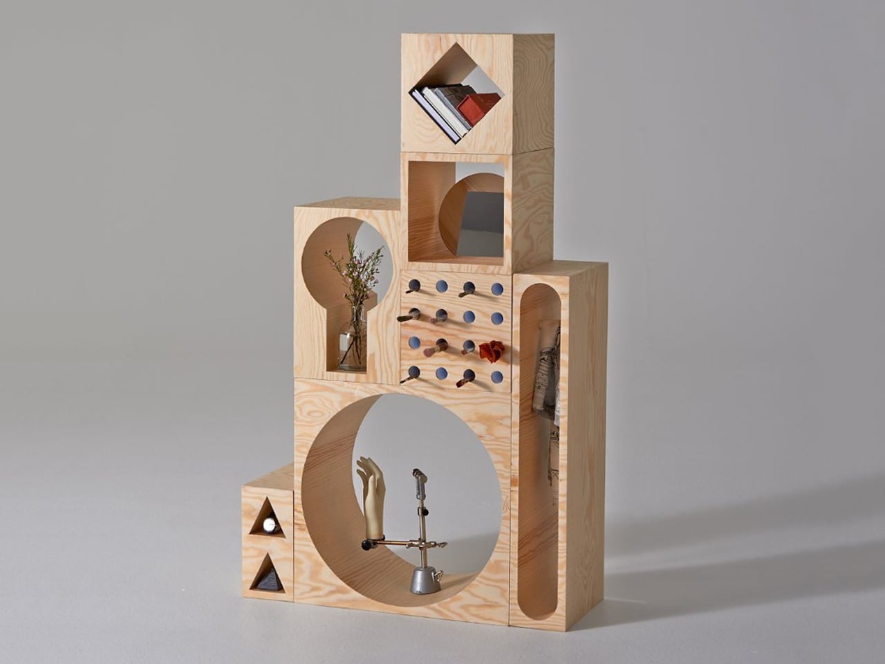
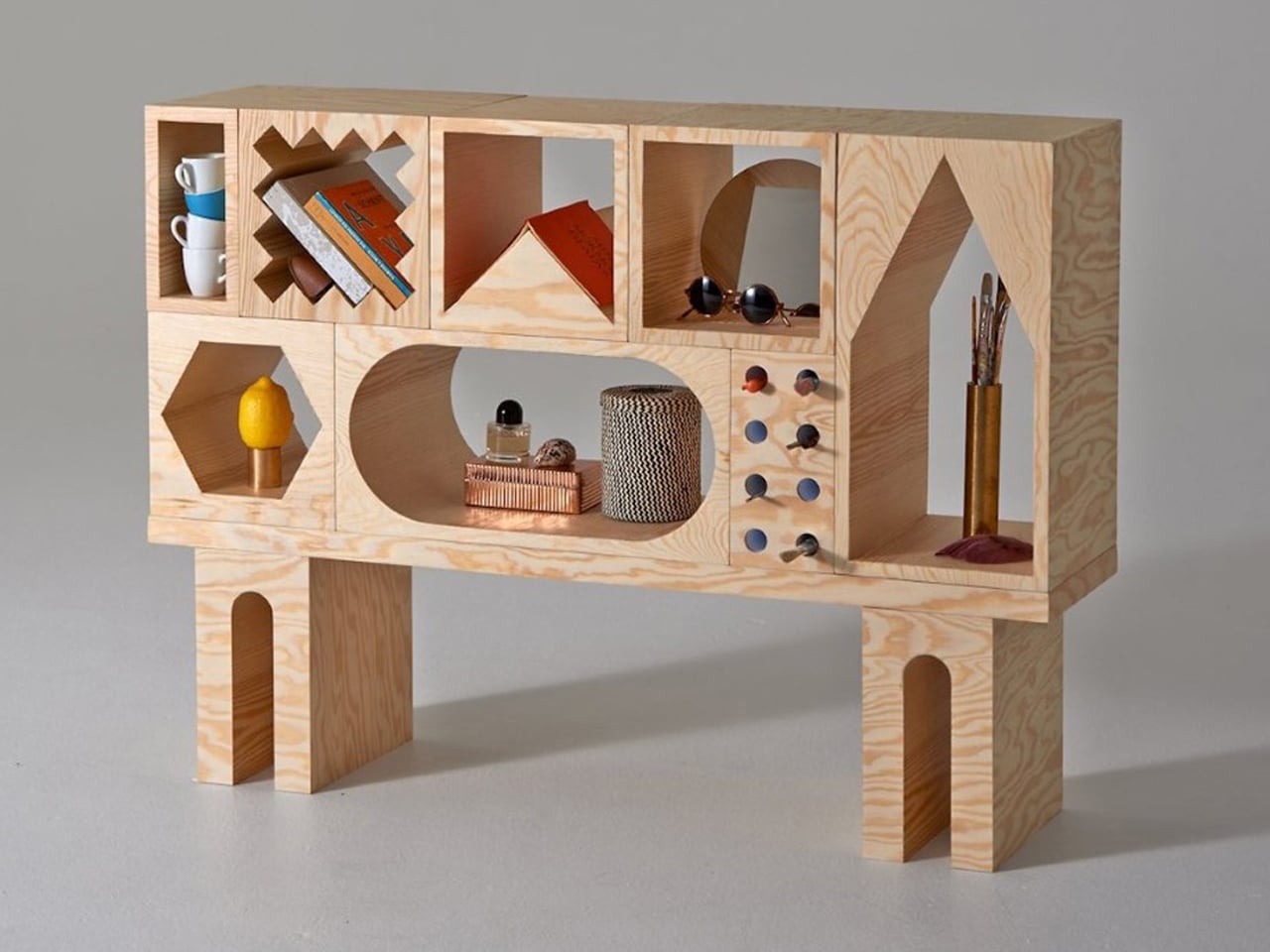
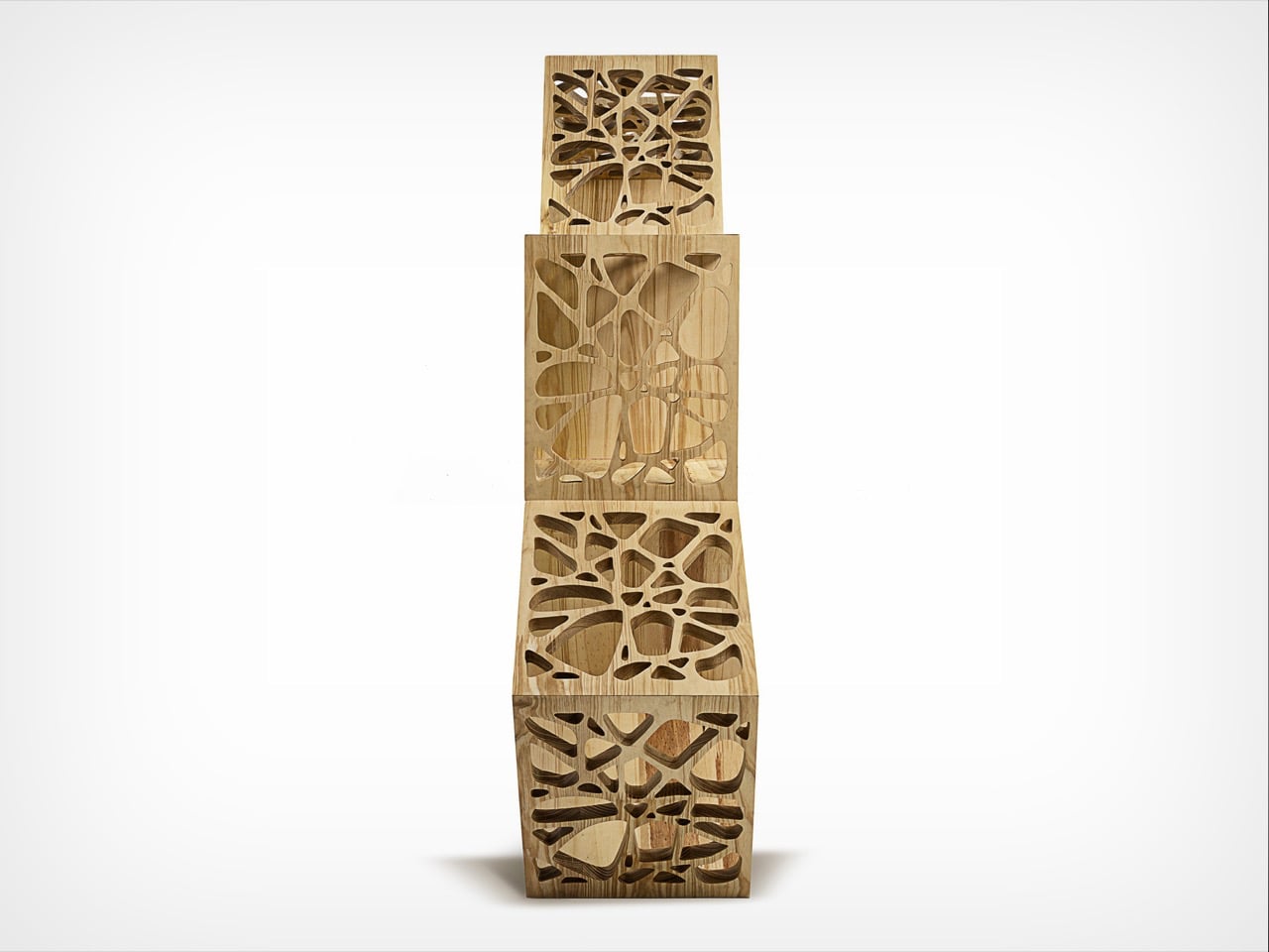
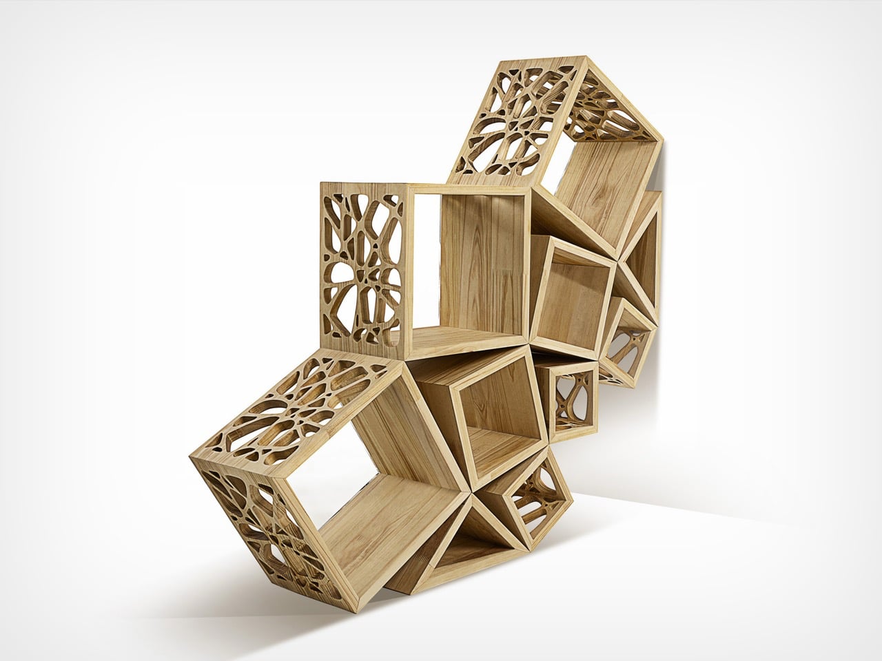
Simple yet unexpected, the ROOM Collection by Erik Olovsson and Kyuhyung Cho redefines furniture through a strong geometric lens. At its core, the system is made of modular wooden blocks, each carved with distinct geometric voids. These negative spaces range from familiar squares and rectangles to more expressive circles, triangles, and hexagons. The contrast between solid mass and carved geometry gives every block a unique identity, turning storage into a study of form, proportion, and spatial rhythm.
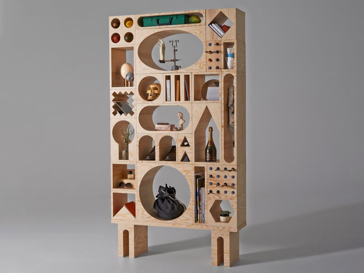
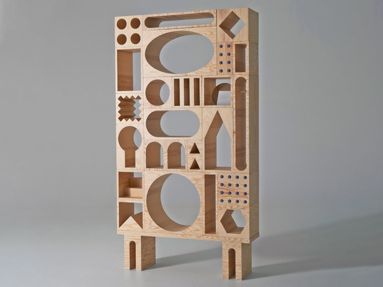
As the blocks are stacked and arranged, they create a dynamic composition of interlocking shapes, almost like a three-dimensional geometric collage. Each cutout acts as a “room,” designed to hold objects while contributing to the overall visual balance. The geometry not only defines function but also drives aesthetics, transforming shelves into architectural compositions. Crafted in plywood with a pine veneer, the system feels structured and playful.

4. Masters Who Shaped Design

The work of Frank Lloyd Wright demonstrates how geometry can shape both architecture and furniture seamlessly. Wright often designed furniture as an extension of his buildings, using strong linear forms and geometric patterns to create a unified visual language.

His furniture was not decorative but integral, reinforcing spatial harmony and function. By aligning form with structure, he showed how geometry could guide design at every scale. This approach continues to influence contemporary designers, proving that thoughtful geometry can transform furniture into enduring functional
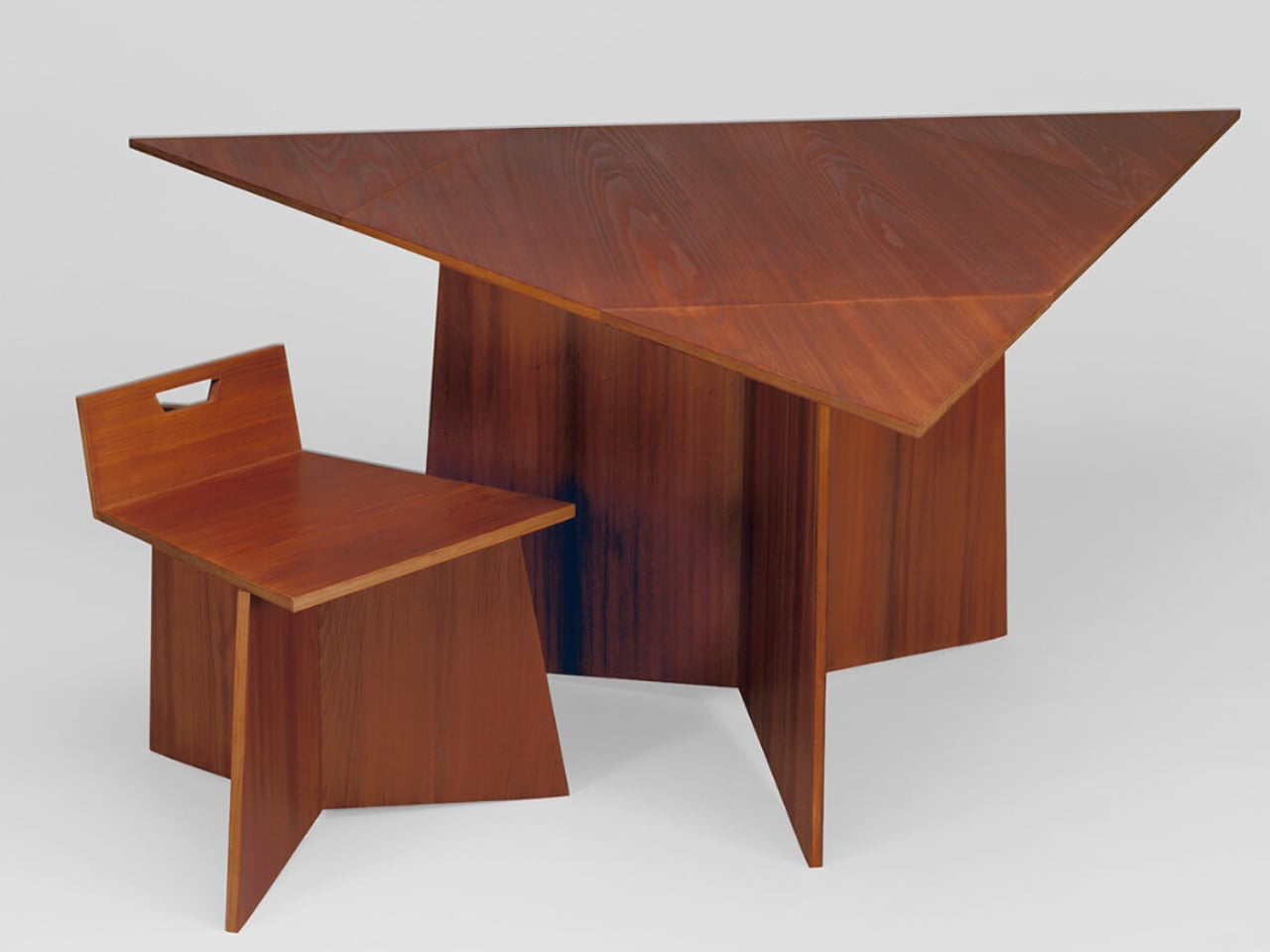
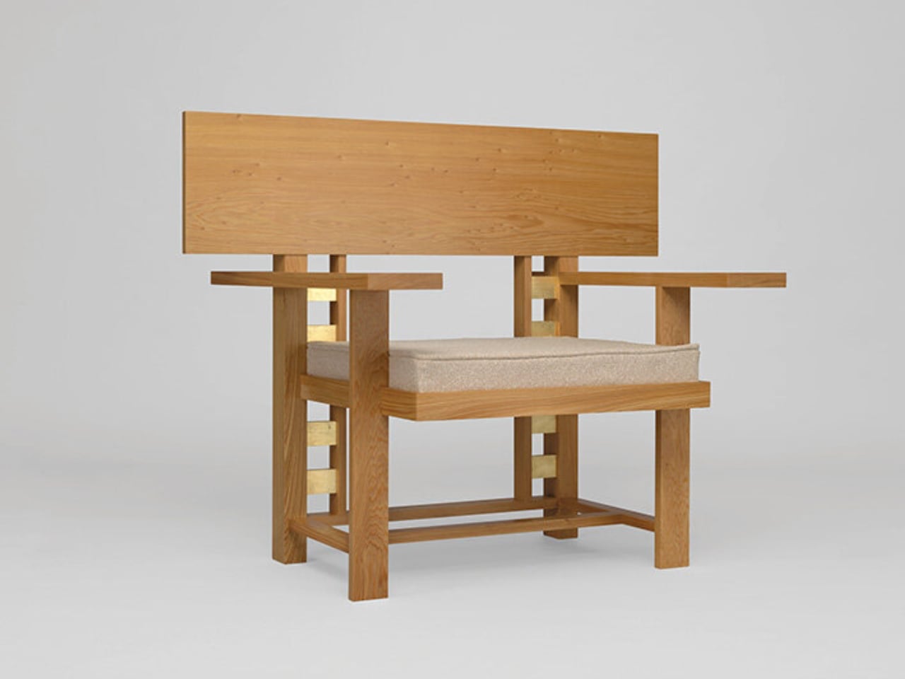
The Museum of Wisconsin Art unveils a remarkable chapter of Frank Lloyd Wright’s legacy by presenting chairs that never moved beyond sketches during his lifetime. Hidden in archives for over seventy years, these designs were reconstructed in 2025, offering a rare glimpse into Wright’s unrealized furniture ideas. The exhibition, Frank Lloyd Wright: Modern Chair Design, features over forty works, including newly fabricated pieces based on his original drawings. Rather than revisiting his well-known furniture, the show highlights concepts that remained incomplete, revealing a deeper layer of his creative vision.
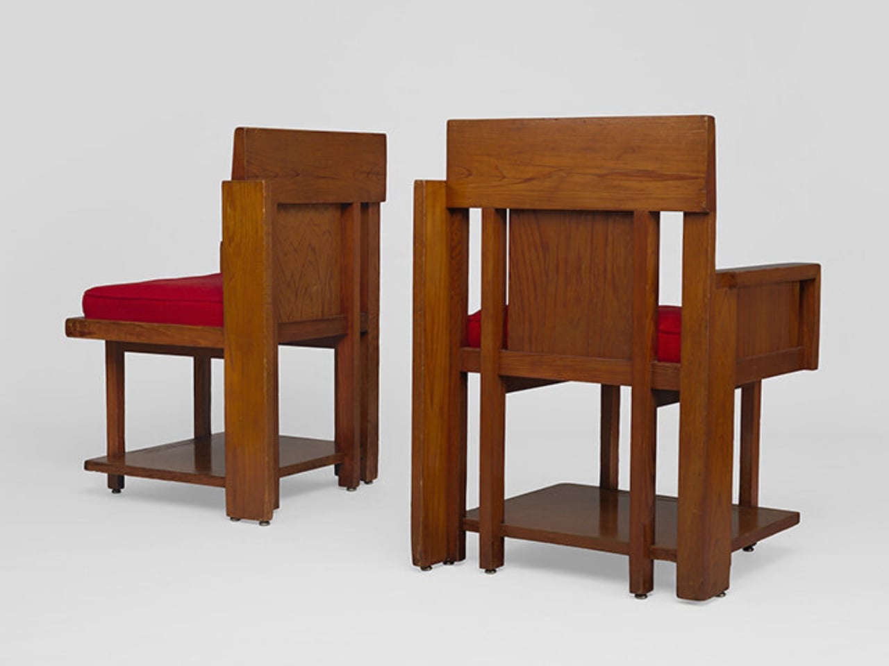
The reconstructed chairs trace Wright’s evolution from early geometric Prairie-style forms to more fluid, organic expressions. Developed through collaboration with the Frank Lloyd Wright Foundation and skilled craftsmen, the pieces combine traditional techniques with modern precision.

5. Minimal Lines Create Big Impact

Minimalist furniture relies on geometry to achieve clarity and balance. Straight lines, simple planes, and proportion-driven forms eliminate excess while maintaining a strong visual presence. The beauty lies in precision, where every angle and dimension serves a purpose.

This approach creates calm, uncluttered environments that feel refined and timeless. Geometry becomes the backbone of simplicity, ensuring that even the most minimal pieces remain impactful. It reflects a mindset that values quality, intention, and the quiet power of well-resolved design.
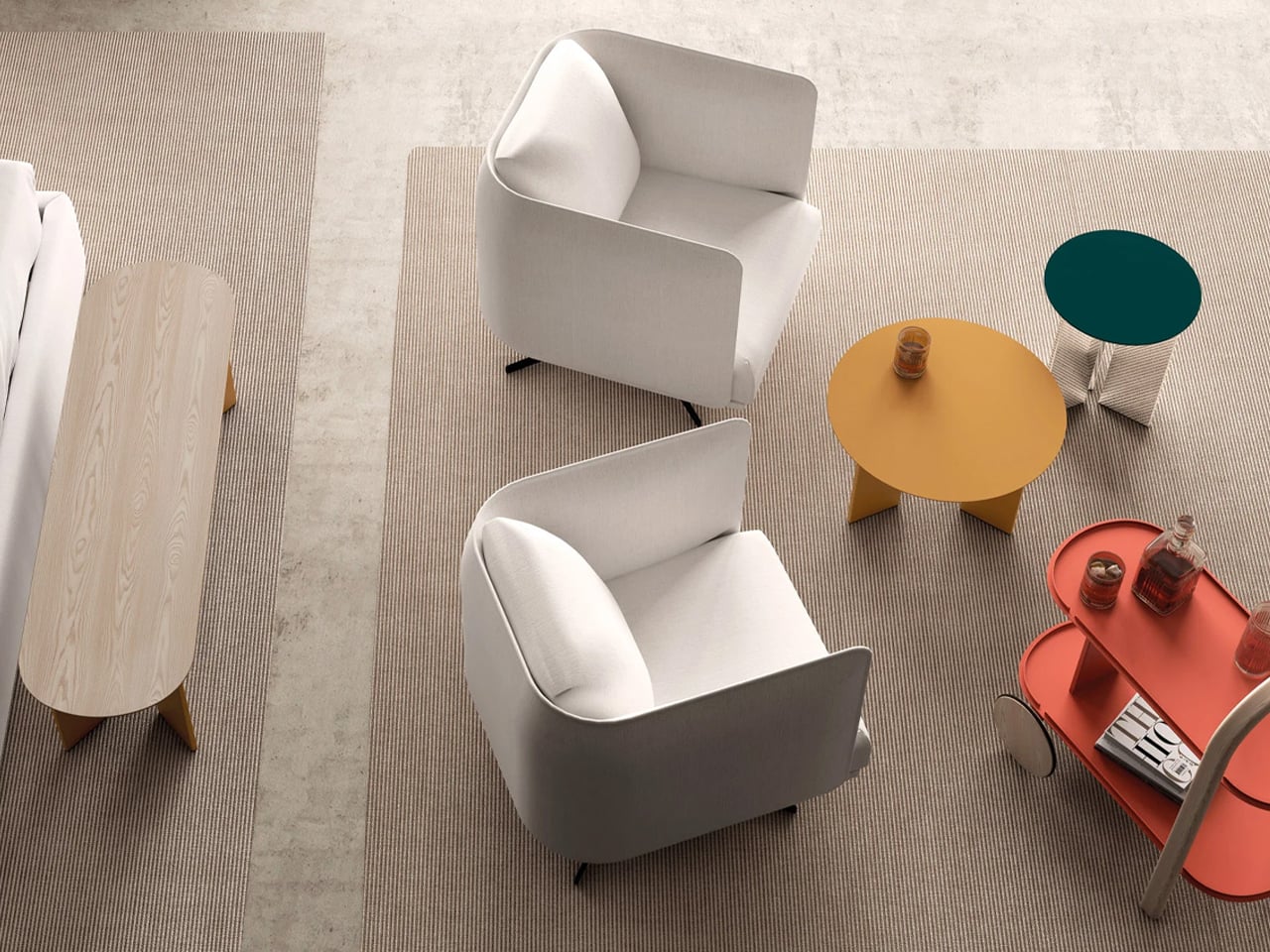
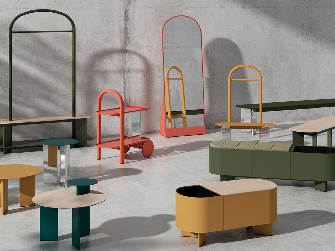
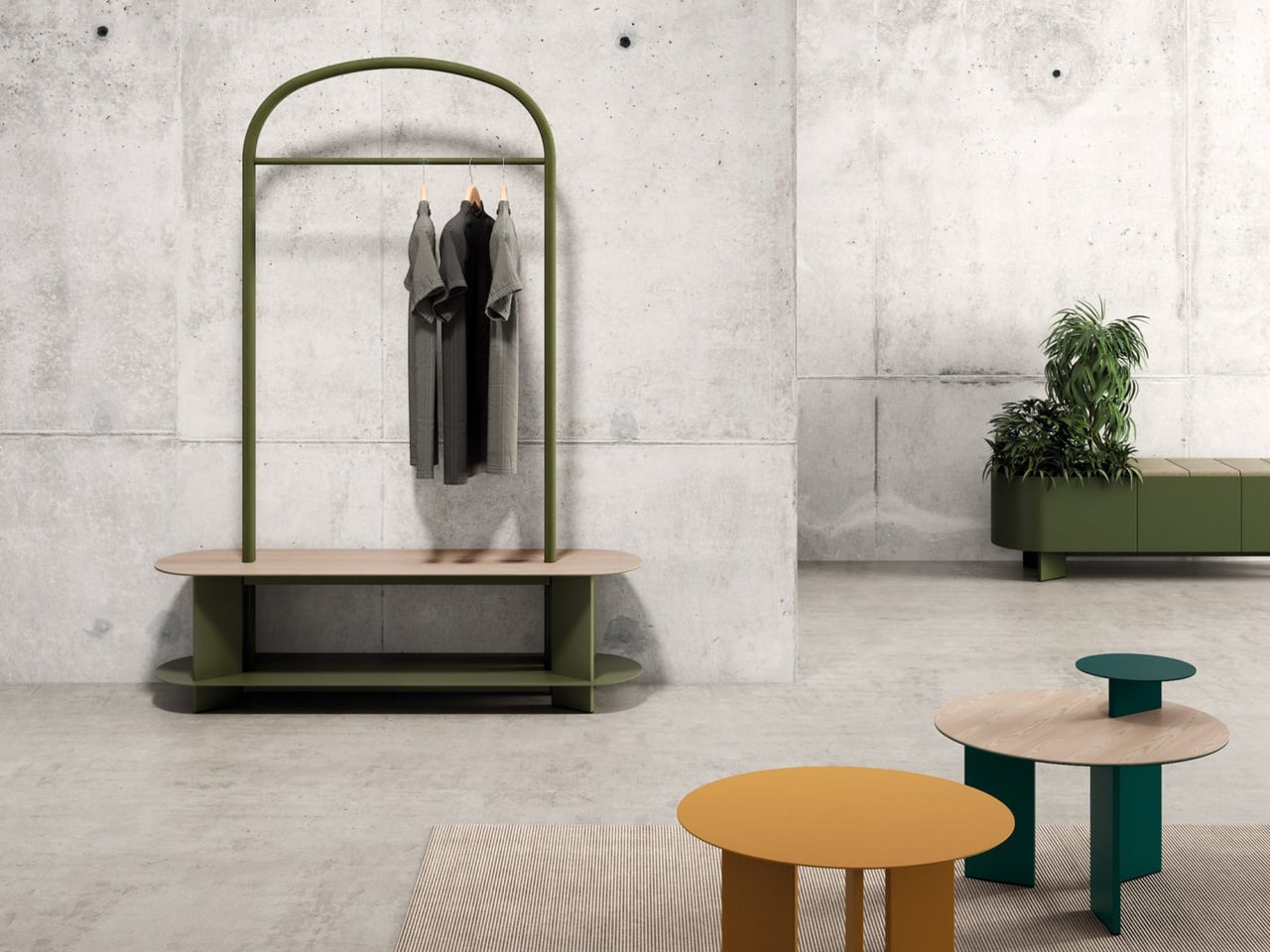
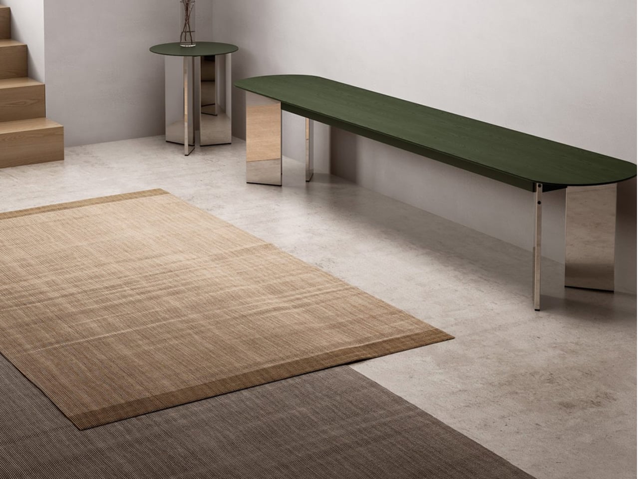
The Croma collection, designed by Lagranja Design for Systemtronic, is defined by a clear and consistent geometric language. Each piece is built around soft curves, circular forms, and gently arched profiles, creating a visual rhythm that feels structured and fluid. The design uses geometry as its core identity, balancing straight lines with rounded edges to achieve a sense of proportion and harmony. This approach allows the furniture to feel minimal yet expressive, with every curve and junction carefully resolved.
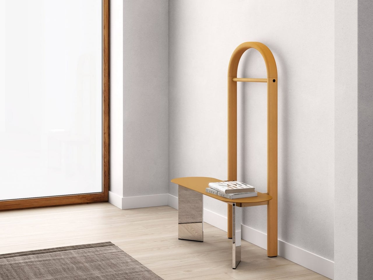
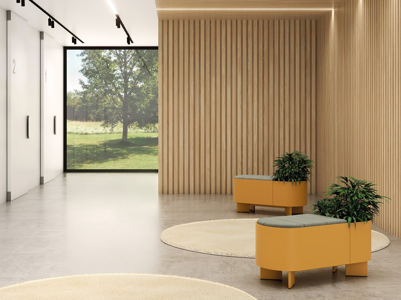
The product range translates this geometry across multiple typologies, including circular tables, arched wardrobes, rounded benches, mirrors, and trolleys. Repetition of forms creates cohesion, while subtle variations keep the collection visually engaging. Materials like ash wood and aluminum further highlight the geometry, contrasting warmth with precision. Each piece functions independently yet fits seamlessly into a larger system, where geometry dictates usability and aesthetics, turning the collection into a unified, sculptural composition.

These concepts show how geometry transforms furniture into purposeful art, where form drives function and emotion. Thoughtful shapes create adaptable, expressive pieces that redefine everyday living, turning spaces into dynamic reflections of design and individuality.

The post 5 Furniture Pieces So Geometric They Could Hang in a Gallery first appeared on Yanko Design.
This Doughnut Chair Has One Bite Missing, and That’s Your Seat

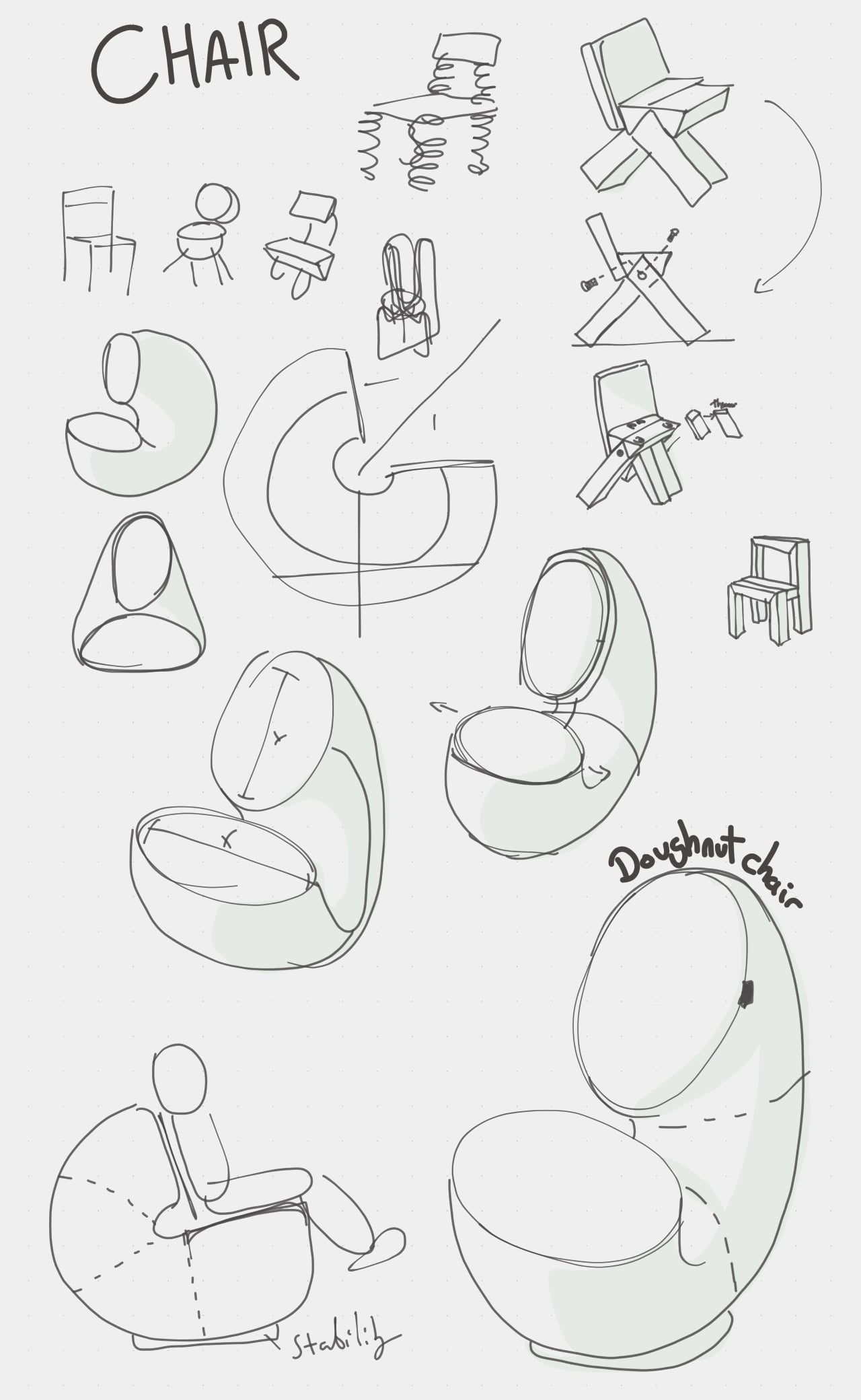
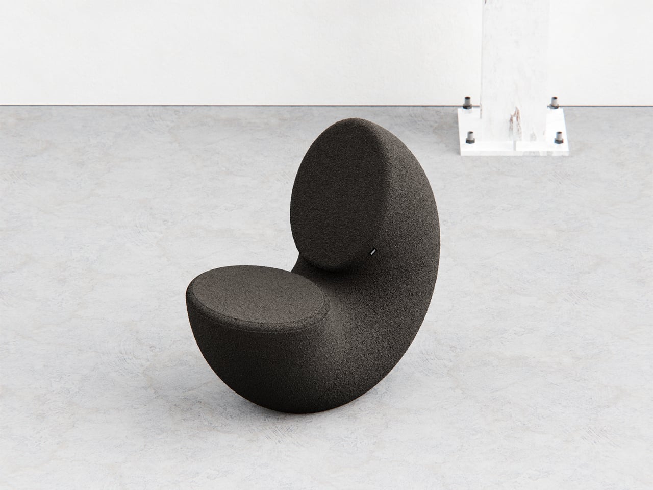
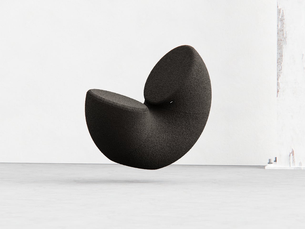
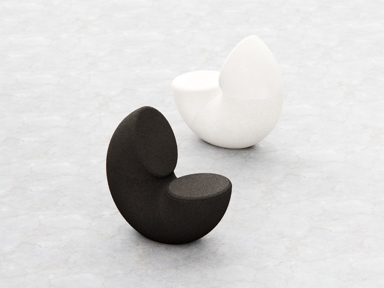
Most chairs are clearly assembled objects, with legs, a seat, and a backrest, all stacked and joined together. Sculptural lounge pieces sometimes flip that script and feel more like a single volume that has been carved or sliced. Chunk is a concept that leans into that second approach, imagining seating as a doughnut with a bite taken out rather than a frame with cushions bolted on, treating furniture as something you edit rather than assemble.

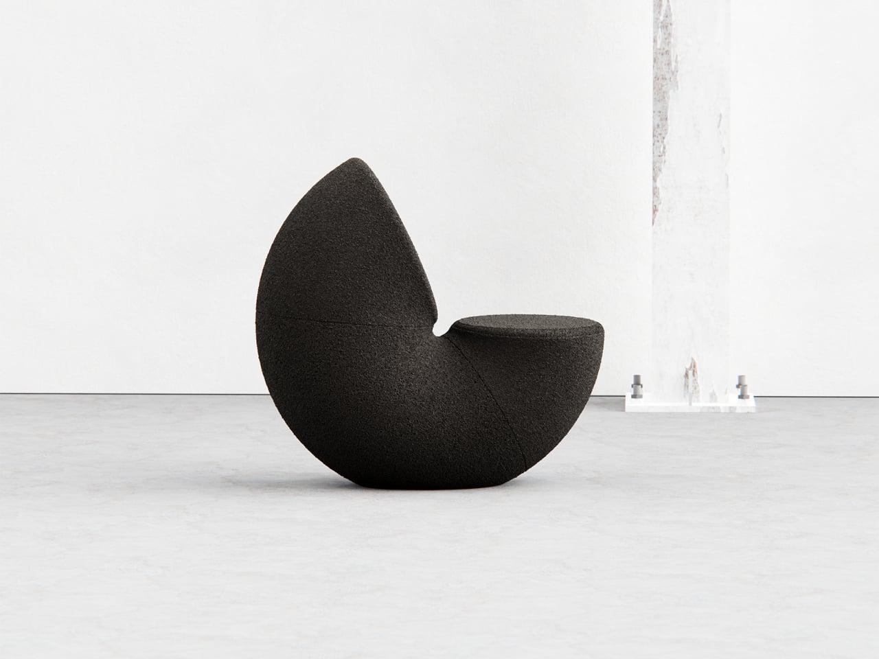
The designer imagined a chair that looks like a doughnut with a chunk removed. The missing piece becomes the seat and the opening for the backrest, while the rest of the ring wraps around in a continuous loop. The concept is less about novelty and more about seeing how far a single looping form can be pushed into something you can actually sit in, where the absence of material defines the place for the body.

Designer: Liam de la Bedoyere

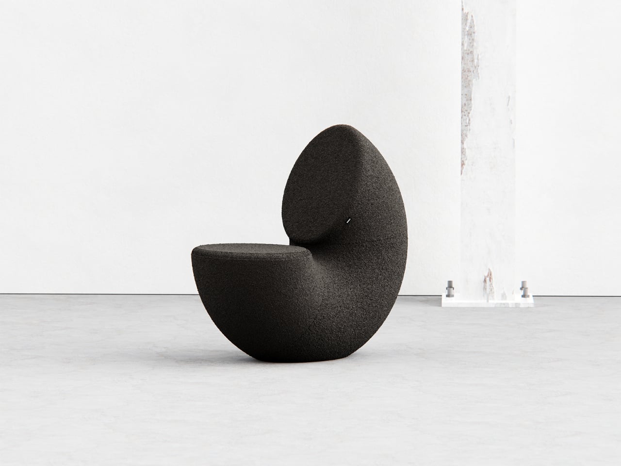
Both the seat and backrest share the same oval cross-section, but as the base curves up to become the backrest, that oval quietly swaps its length and width. It is wide and low where you sit, then gradually becomes tall and narrow as it rises behind you. The section never breaks; it just morphs along the path, which gives the chair a sense of motion even when it is still and empty.

The “bite” creates a bowl-like seat that cradles the hips and thighs, while the rising loop offers a relaxed backrest rather than a rigid upright. The proportions suggest a low, lounge-style posture, closer to a reading chair or a corner piece in a living room than a dining chair. The continuous curve encourages you to lean back and sink in, not perch on the edge ready to stand again.

A near-cylindrical form can look like it might roll away, but the geometry and internal structure are tuned to keep the center of gravity low and slightly behind the seat. The base is subtly flattened, and a denser core at the bottom would keep it from tipping forward when someone leans back. The result is a chair that looks precarious from some angles but behaves like a grounded lounge piece once you sit.

The monolithic upholstery, a textured fabric that wraps the entire volume without obvious breaks, reinforces the idea of a single chunk of material. The form reads differently as you move around it, sometimes like a shell, sometimes like a curled leaf, sometimes like a coiled creature. It is the kind of chair that anchors a corner or gallery-like space, inviting you to walk around it before you decide to sit down and settle in.

Chunk uses subtraction as its main design move, starting from a complete ring and then removing just enough to create a place for the body. For a category that often defaults to adding parts, there is something satisfying about a chair that feels like it has been edited down to a single, looping gesture, with one decisive bite turning an abstract volume into a place to rest, read, or just sink into for a while.

The post This Doughnut Chair Has One Bite Missing, and That’s Your Seat first appeared on Yanko Design.
Mid-Century Clock and Watch Tell Time With Shapes, Not Numbers

Most clocks and watches fade into the background, quietly marking the hours without much personality or visual presence on your desk or wrist throughout the day. But what if timekeeping could be playful, sculptural, and as expressive as the rest of your space or personal style choices? What if checking the time felt less like a utilitarian glance and more like appreciating a piece of functional art?

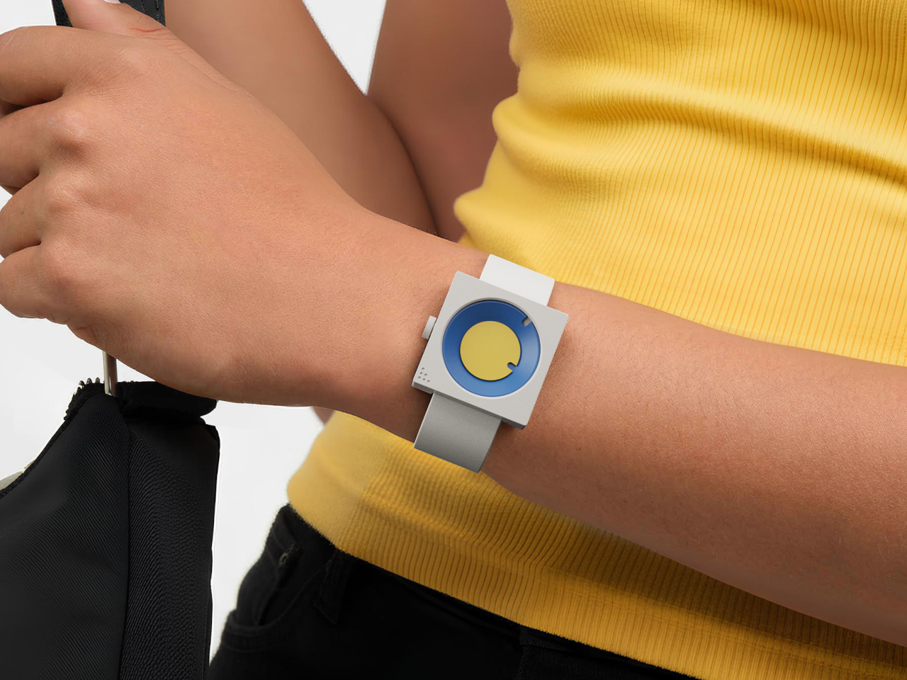
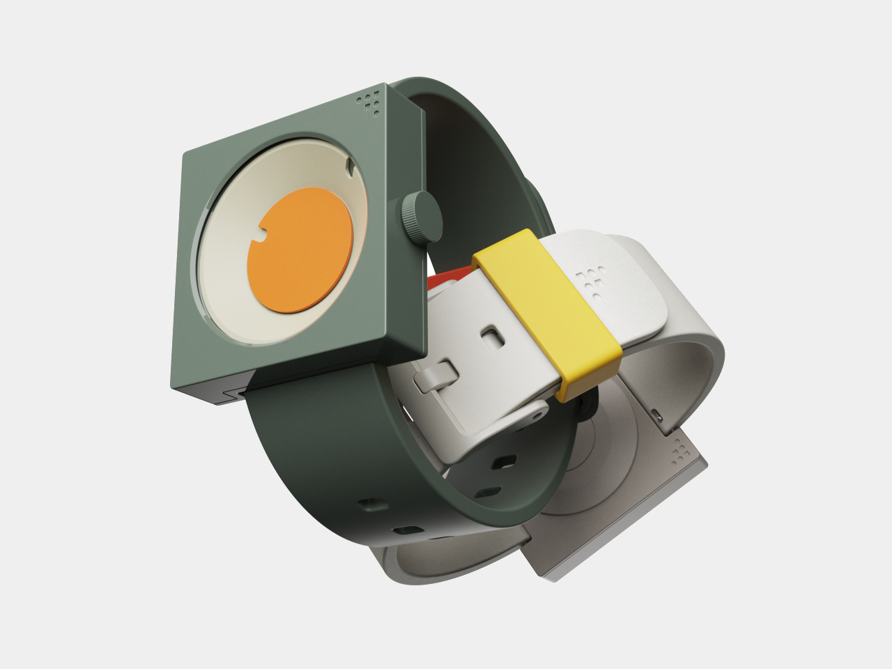
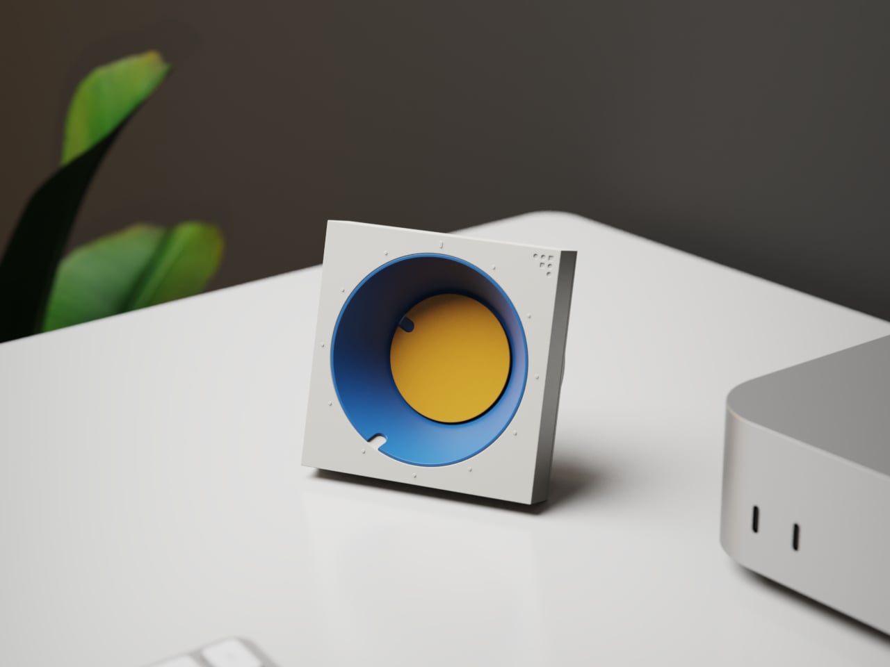
The FC-30 Desk Clock and FW-50 Wrist Watch concepts flip the script on conventional timekeeping, using bold geometry, vibrant color, and tactile design to turn telling time into a daily ritual worth savoring. Inspired by mid-century modern design principles from the 1950s and 60s, both pieces are as much about art as they are about function, bringing sculptural presence to everyday moments throughout your routine.

Designer: Sidhant Patnaik

Create your own Aesthetic Render: Download KeyShot Studio Right Now!

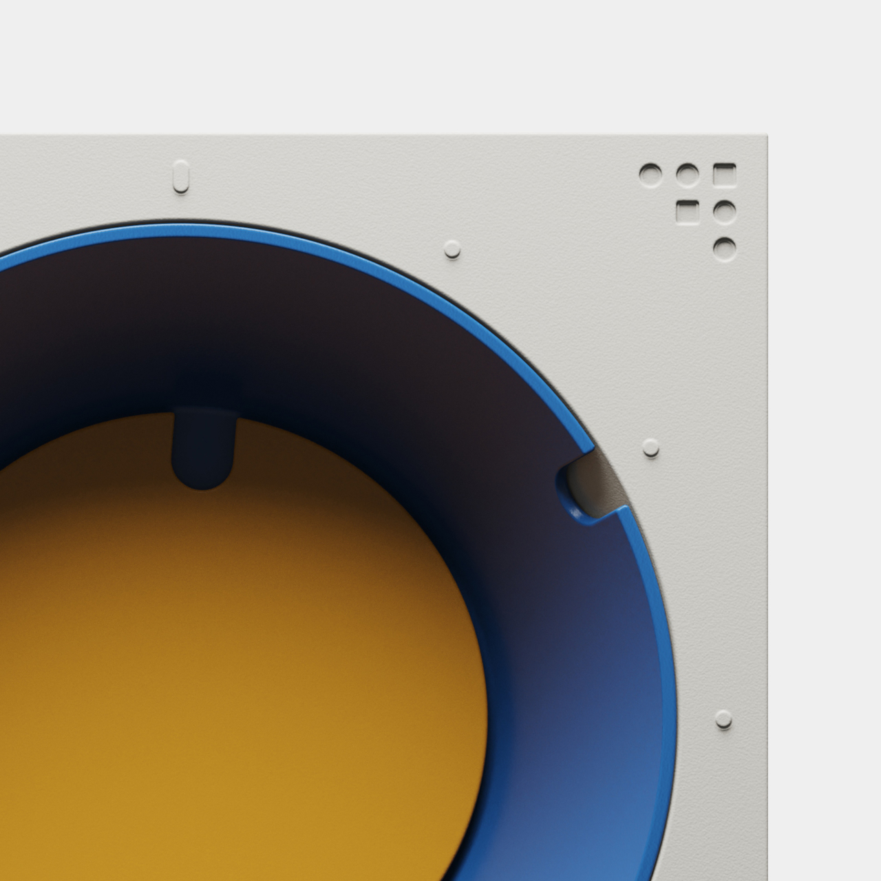
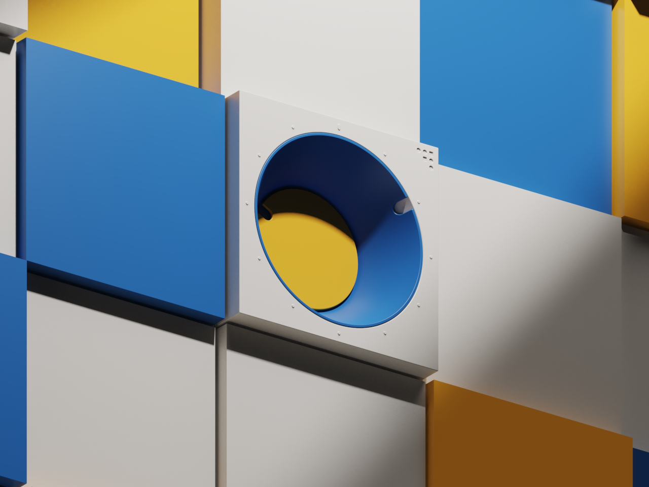
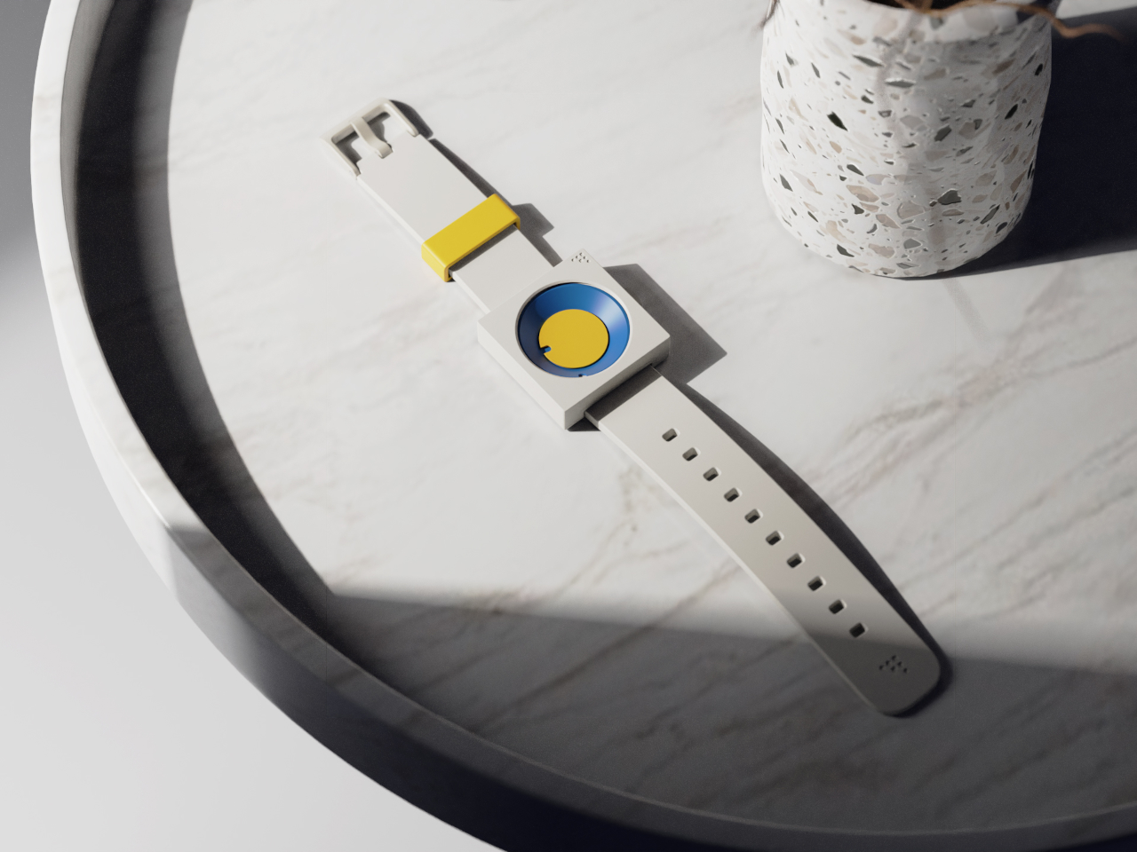
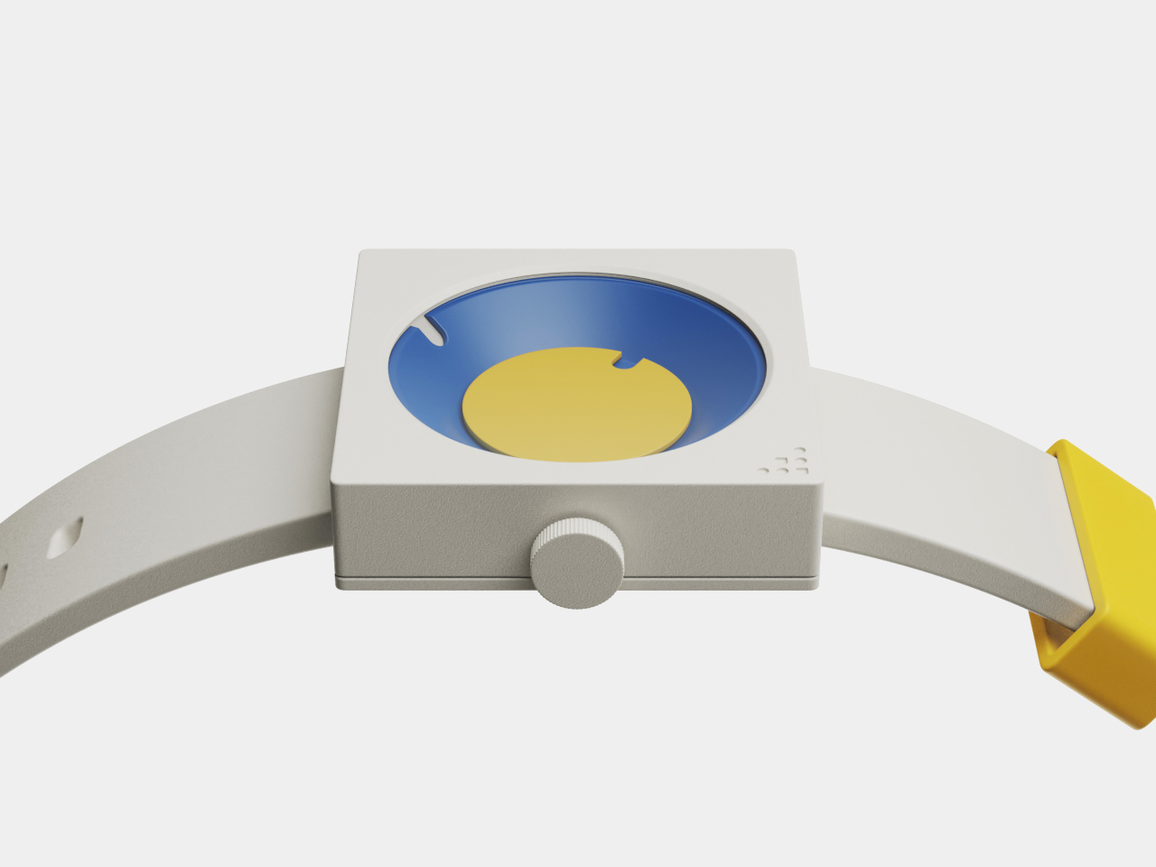
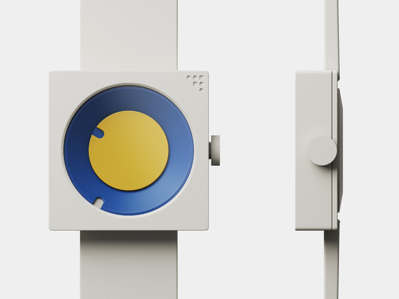
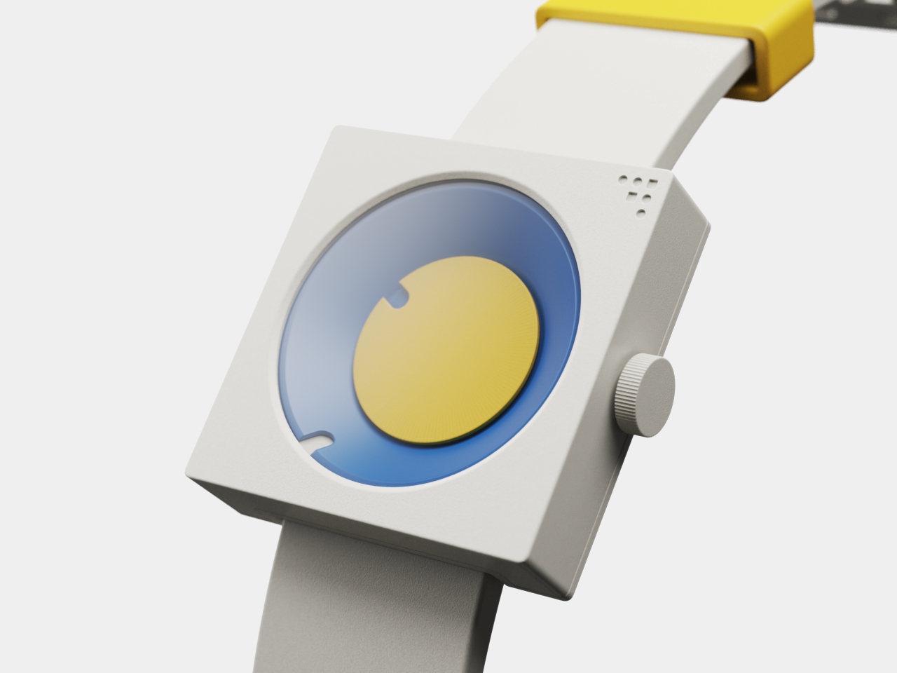
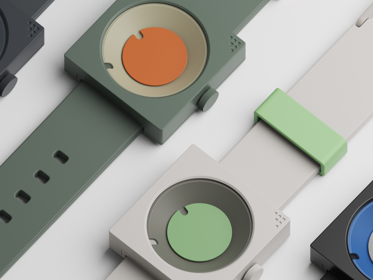
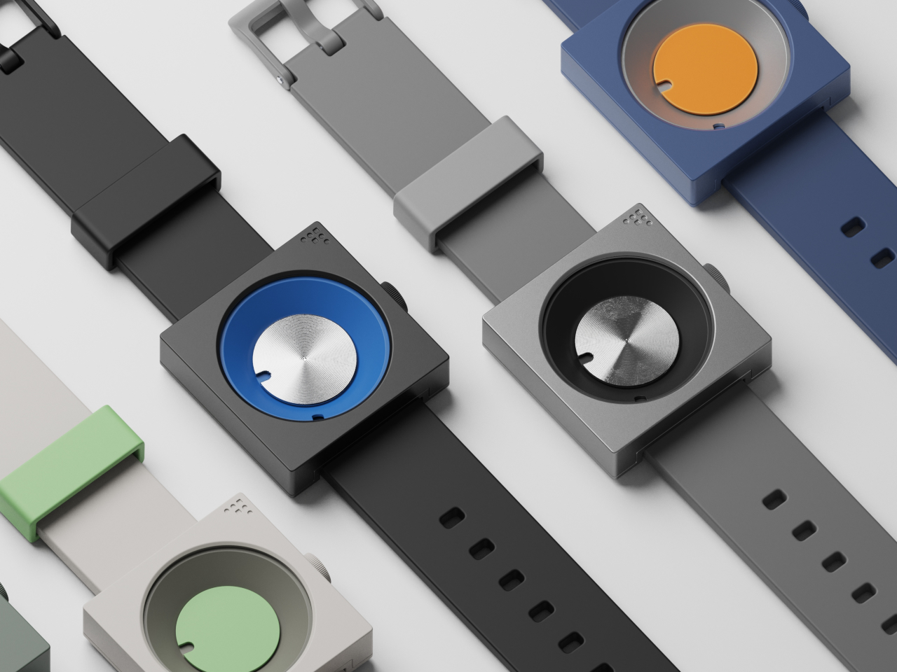
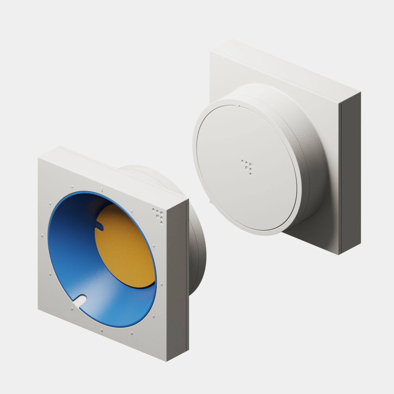
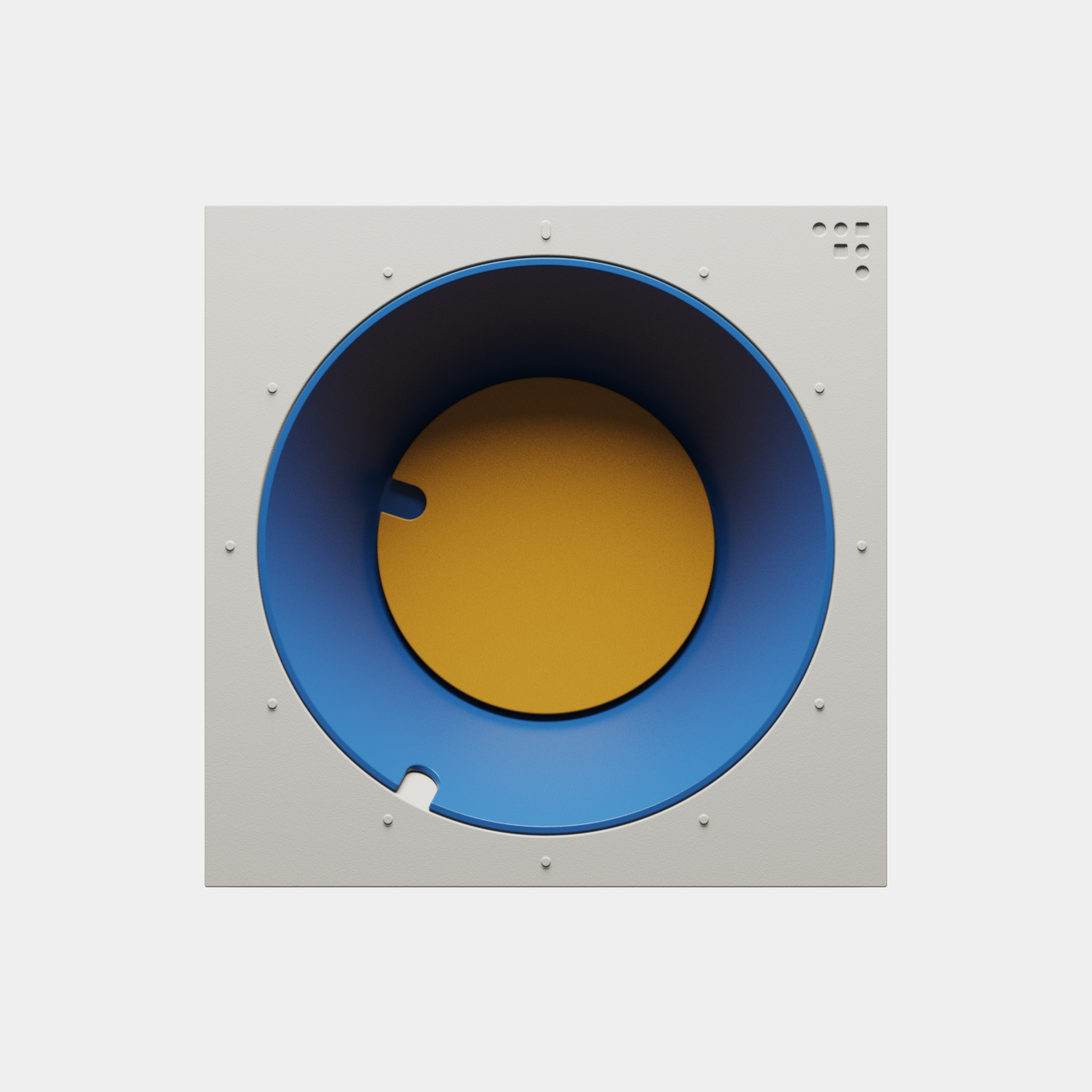
Both pieces are built around the frustum, a geometric form with an angled face that creates visual interest and dynamic readability throughout the day. The FC-30 uses a 30-degree incline for the minute indication, while the FW-50 adapts the idea to a 50-degree angle optimized for wrist wear and comfort. The hour is shown by a colored disc housed inside the frustum, while the sloped edge indicates minutes.

The result is a visual experience that feels fresh and interactive, inviting you to engage with the object every time you check the hour rather than passively glancing at digits. The unconventional layout is intuitive once you spend a moment with it, turning time-telling into something more tactile and memorable than reading digital numbers or traditional clock hands that blend into the background of modern life.

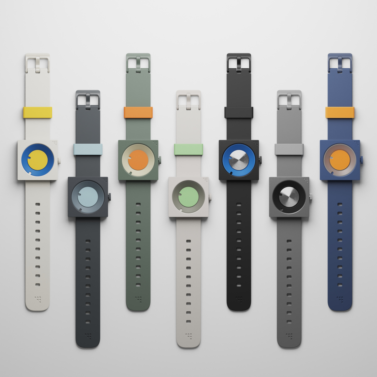
Inspired by mid-century modern classics from the golden age of product design, both the clock and watch feature a palette of bold blues, yellows, greens, and oranges, set against matte white or gray cases with clean edges and visible fasteners. The color blocking and clean lines make each piece stand out visually, whether positioned on a desk, mounted on a wall, or worn on the wrist.

The FC-30’s sculptural form with its angled frustum is as much a statement piece as a practical timekeeper for workspace organization and visual interest. The FW-50’s playful colorways, ranging from sage green to vibrant orange, and tactile crown turn a daily accessory into a personal expression of style and taste. Both designs celebrate the visual language of functional design from classic mid-century product eras.

The absence of numerals and reliance on form and color encourage users to interact with the pieces differently from conventional timepieces. The disc hour and sloped minute readout are learnable at a glance, but different enough to spark curiosity and conversation with visitors or colleagues. Both designs can be oriented or worn in multiple ways for varied visual effects, depending on mood.

The FC-30 and FW-50 concepts bring a little more art into daily routines and personal environments for those who appreciate design. For anyone curating a workspace or searching for a unique statement piece, these timepieces offer a compelling vision where timekeeping becomes an opportunity for visual and tactile delight rather than just a practical necessity.

The post Mid-Century Clock and Watch Tell Time With Shapes, Not Numbers first appeared on Yanko Design.
Bowl-shaped chair concept offers geometric beauty at the expense of ergonomics

Just like a table, the most basic requirements for a chair are quite simple. It needs to be strong and stable enough to actually sit on, but comfort and convenience seem to be more open to interpretation than any other design element. Some brutalist designs look a little painful to sit on, meeting only the bare minimum of a chair, while others let your body literally sink inside its plushy cushions and make it difficult to pull yourself out quickly. And then there are designs like this concept that espouse simplicity and minimalism to convey a sense of beauty, but the end result, while visually successful, also raises concerns about its actual usefulness and comfort.

Designer: Mauricio Coelho

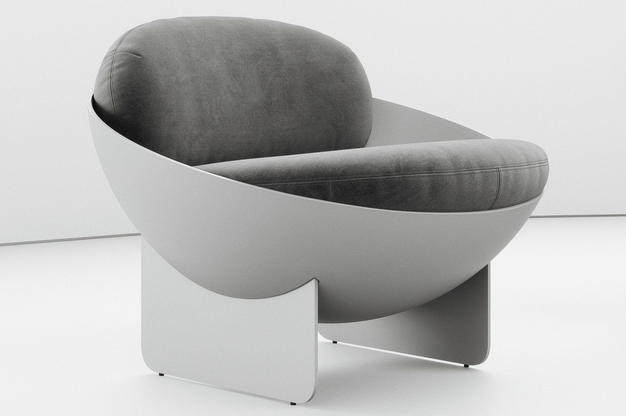
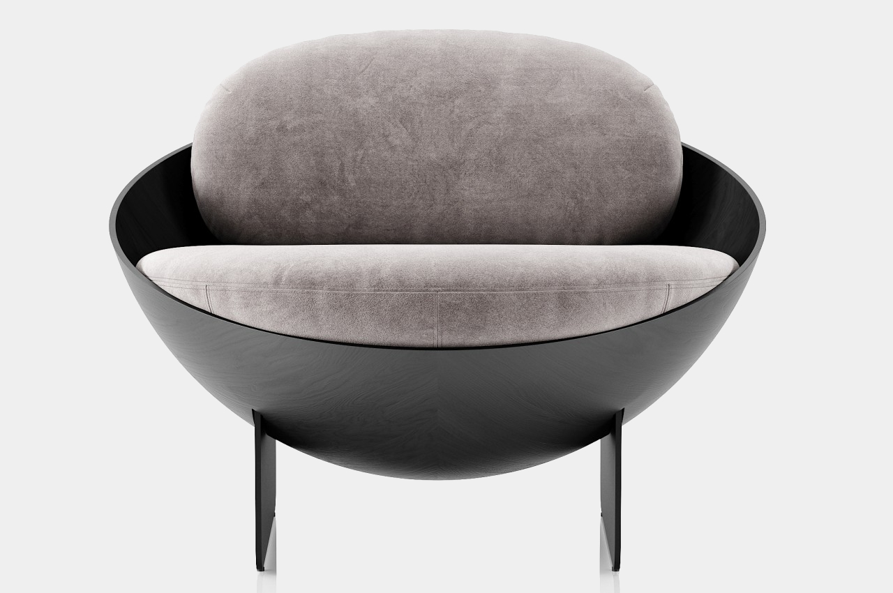
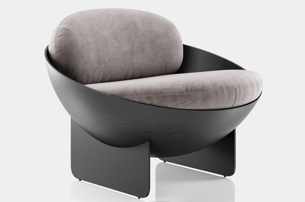
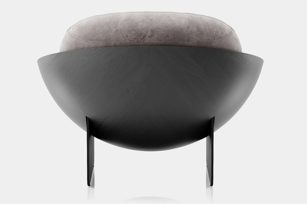
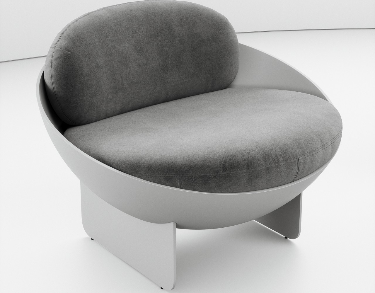
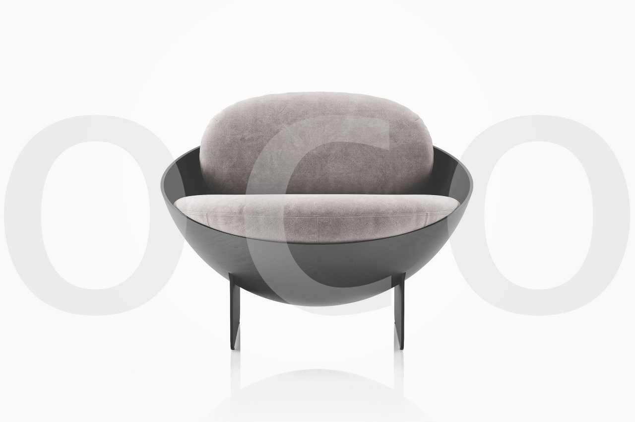
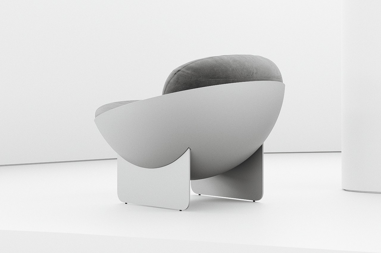
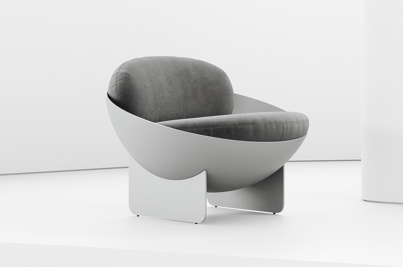
A chair isn’t a simple form that can be expressed in a single shape. After all, there are a few interconnecting planes needed to give it legs and an actual seat. A backrest is common but not obligatory, and armrests are even more optional. The Oco chair concept comes close to that simplicity of form while still providing a visually interesting piece, and it accomplishes that by employing a shape you wouldn’t always associate with a chair.

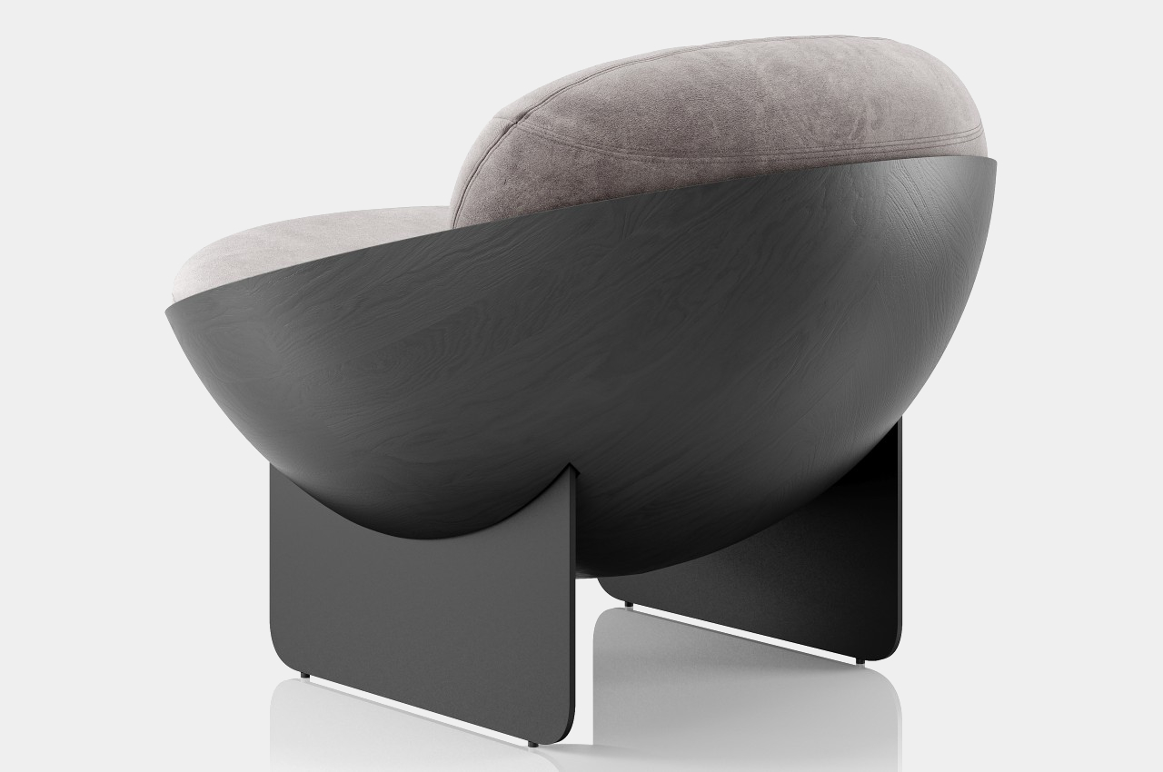
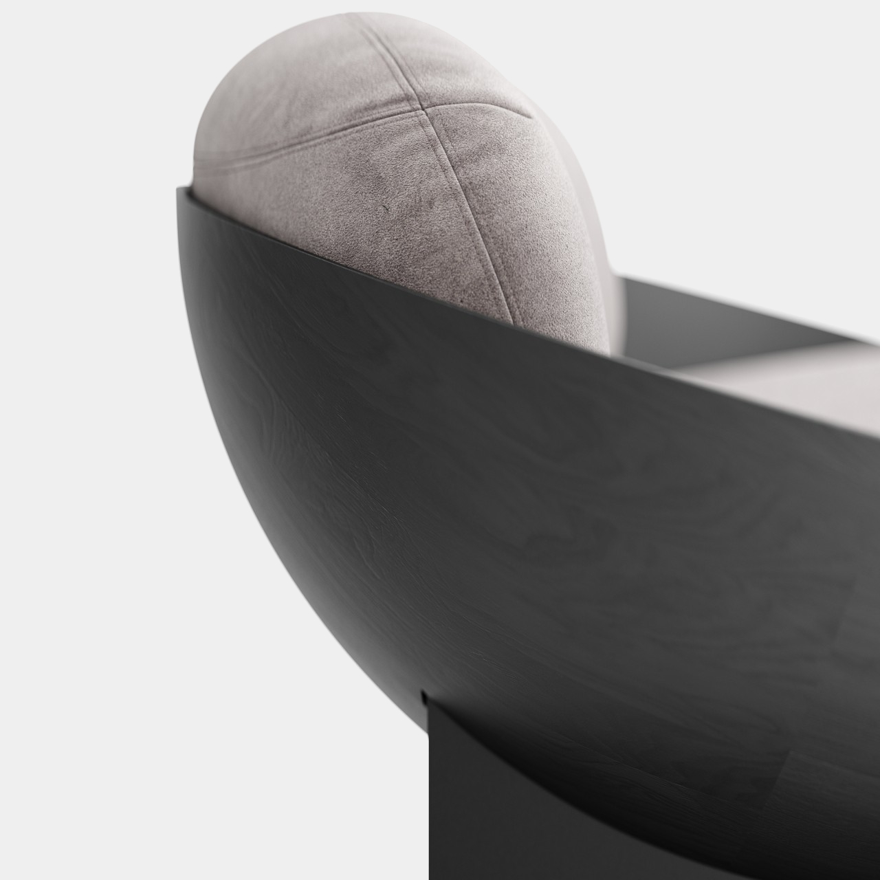
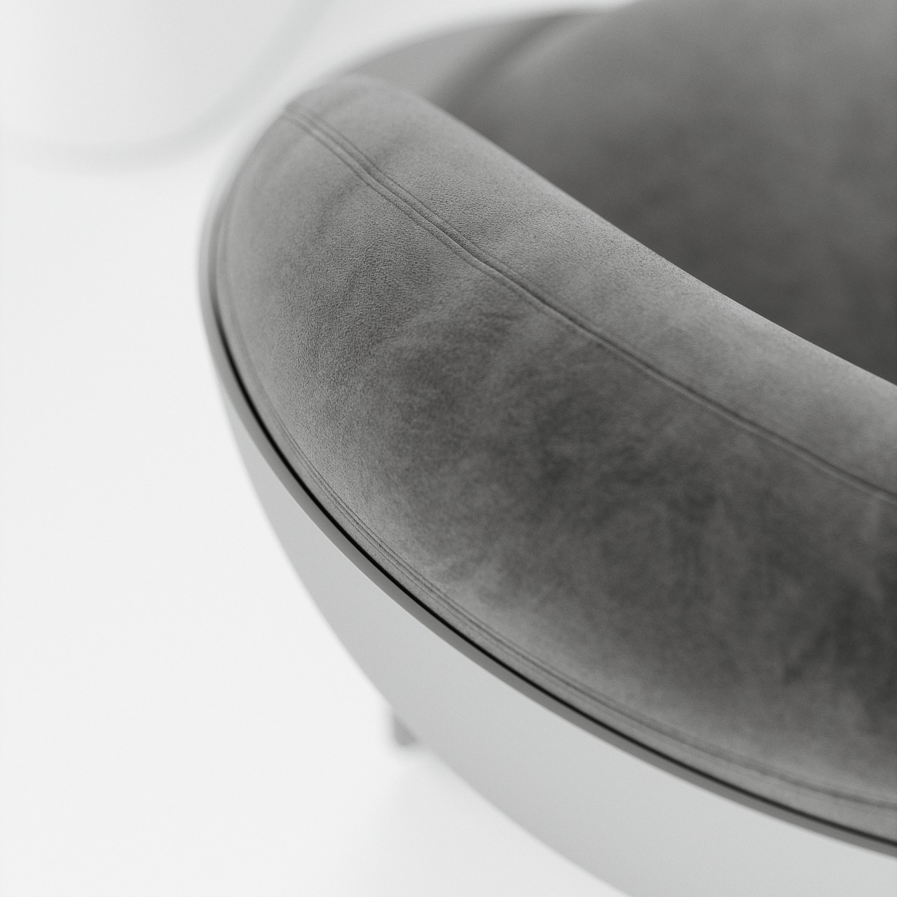
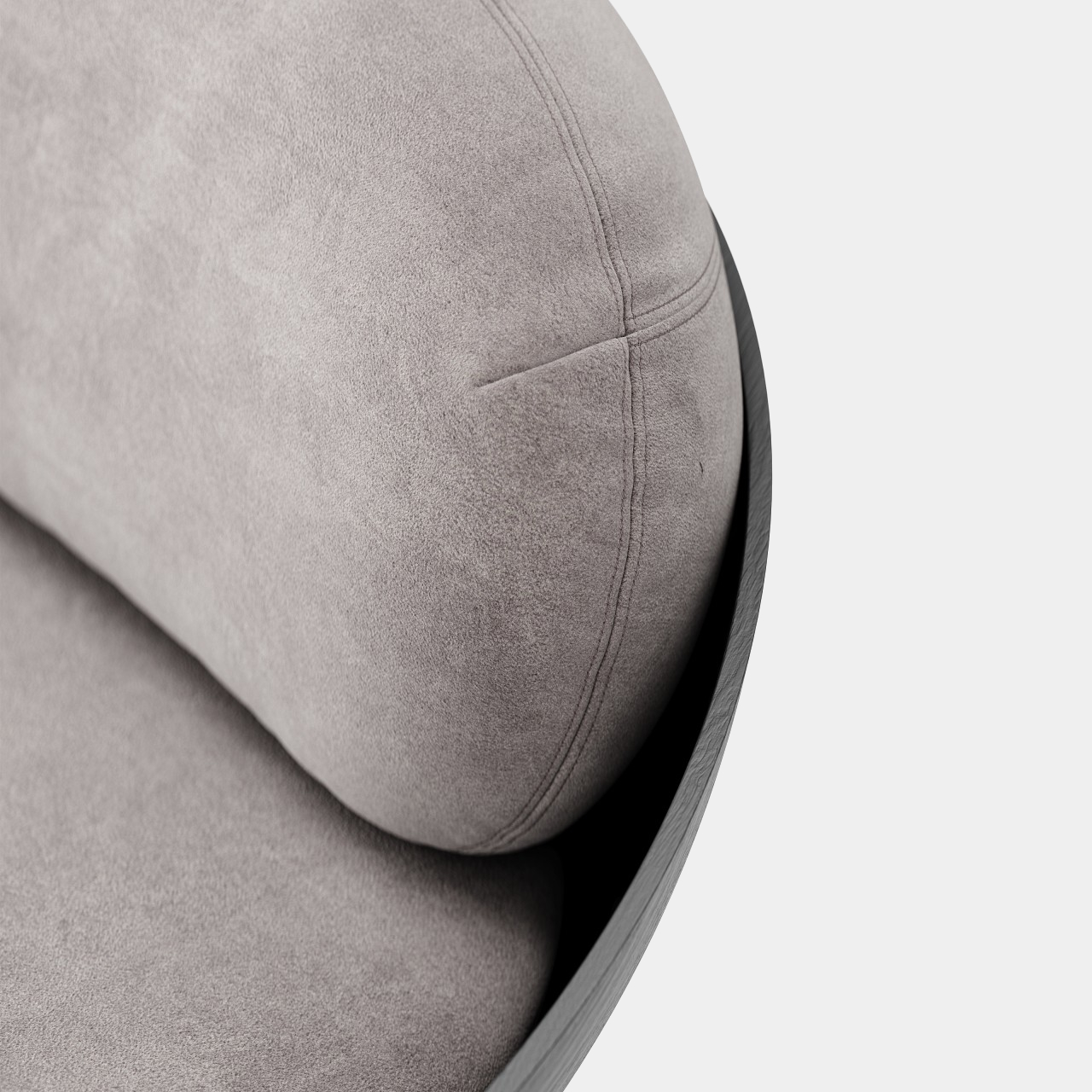
Bowl-shaped chairs are uncommon probably for a reason. A hollow half-sphere might not be the most comfortable thing to sit in unless you fill that space with cushions like what the Oco chair does. With extremely thin planes for legs, the bowl almost looks like it’s floating in mid-air. Made using carbon steel and fiberglass, the chair brings structural stability while also providing some subtle material details, like the wood-like grains of the spherical body.

But while it is indeed a sight to behold, closer inspection might make you rethink the comfort it promises. The thick cushions do look plus, but they might not provide enough support for the person’s back. Or at the very least the back cushion doesn’t have enough height to support someone leaning back, forcing them to sit upright without proper support, straining their body over time.

The bowl’s edges are also left exposed, which could scratch, cut, or press on a person’s skin, especially on the back of the legs and forearms. A few slight modifications, like lining the edges with soft fabric or changing the angle of the bowl could help improve the ergonomics of the design without ruining the simple geometric beauty that this concept wishes to convey.

The post Bowl-shaped chair concept offers geometric beauty at the expense of ergonomics first appeared on Yanko Design.
Geometric chair concept almost looks like an Escherian optical illusion

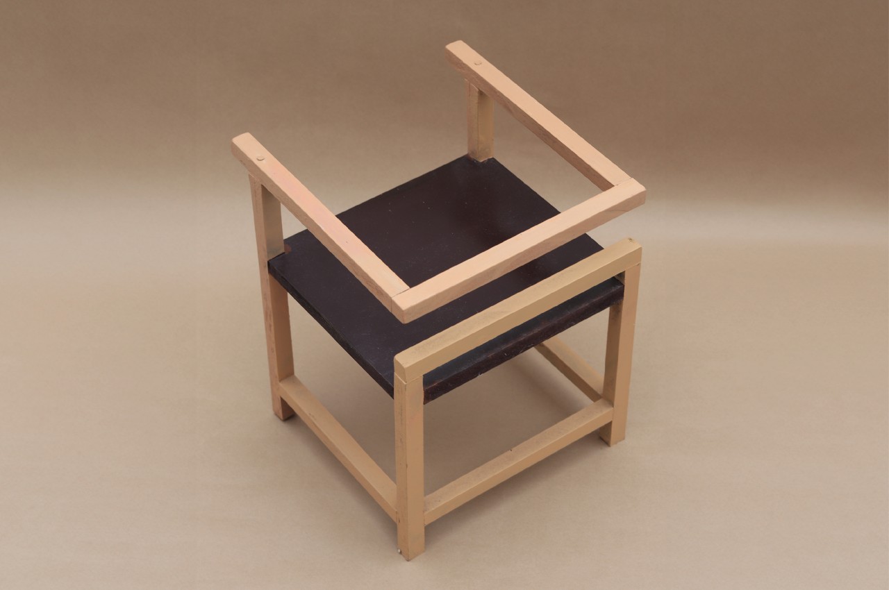
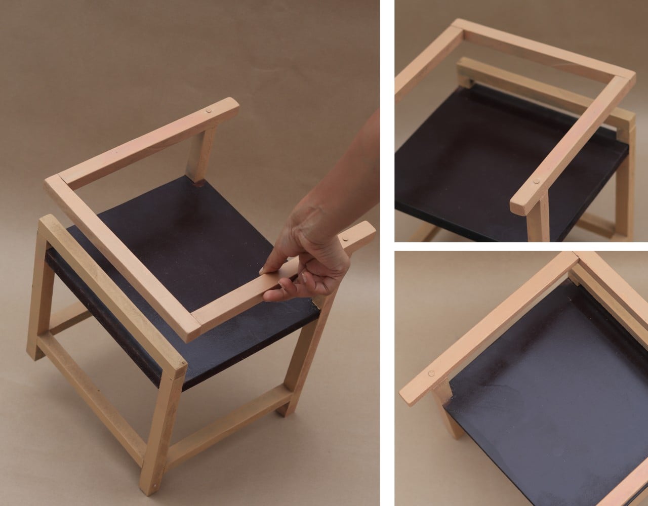
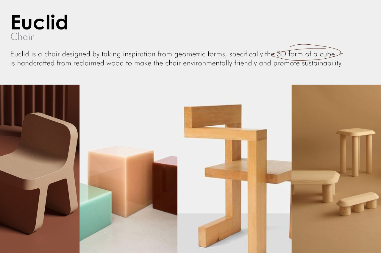
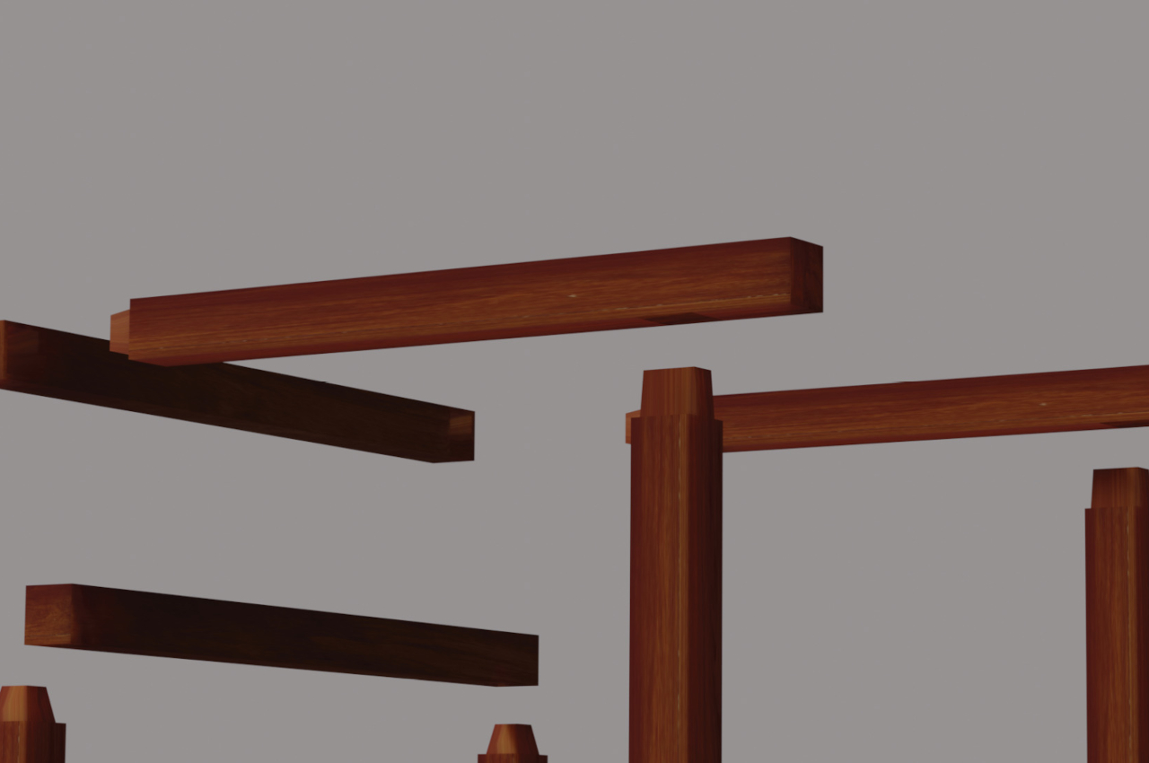
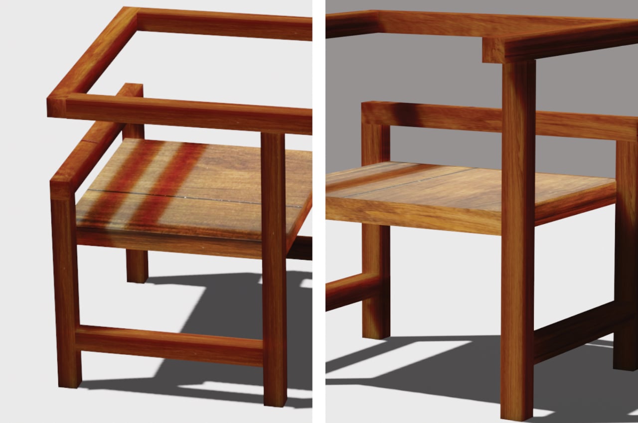
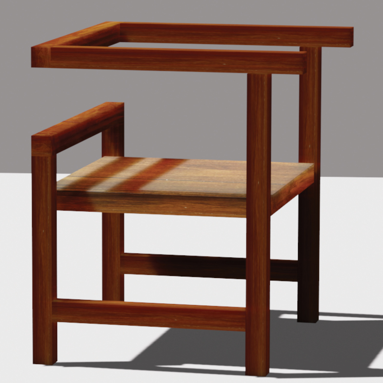
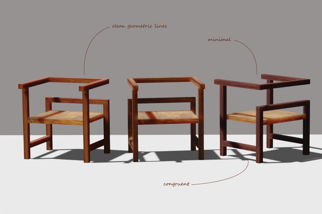
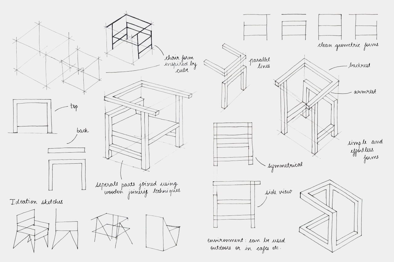
Chairs can come in all shapes and sizes. Some can take on complicated and organic forms, while others can be extremely minimalist or even brutally raw. They can range from designs that take inspiration from nature to those that adhere to simpler geometric shapes. The Euclid concept is one of the latter, aptly named after the ancient Greek mathematician. But while it draws its shape from a simple cube, its execution sparks a bit of wonder and curiosity as it resembles more the skeleton or wireframe of the shape, represented by almost unbroken lines that are reminiscent of Escher’s famed optical illusion, the impossible cube.

Designer: Sonakshi Gupta

Admittedly, it’s a bit difficult to see the Euclid chair as a cube, since most of us have this idea of a cube as having 12 lines that are all connected at eight corners to form six faces. Then again, that popular Escher object already shows an impossible depiction of that shape, and those familiar with that print might see some of that characteristic in this chair when viewed from certain angles. Overall, it creates a dynamic form that has your eyes following the lines and moving all over the place, sometimes confused about where the front and back sides are.

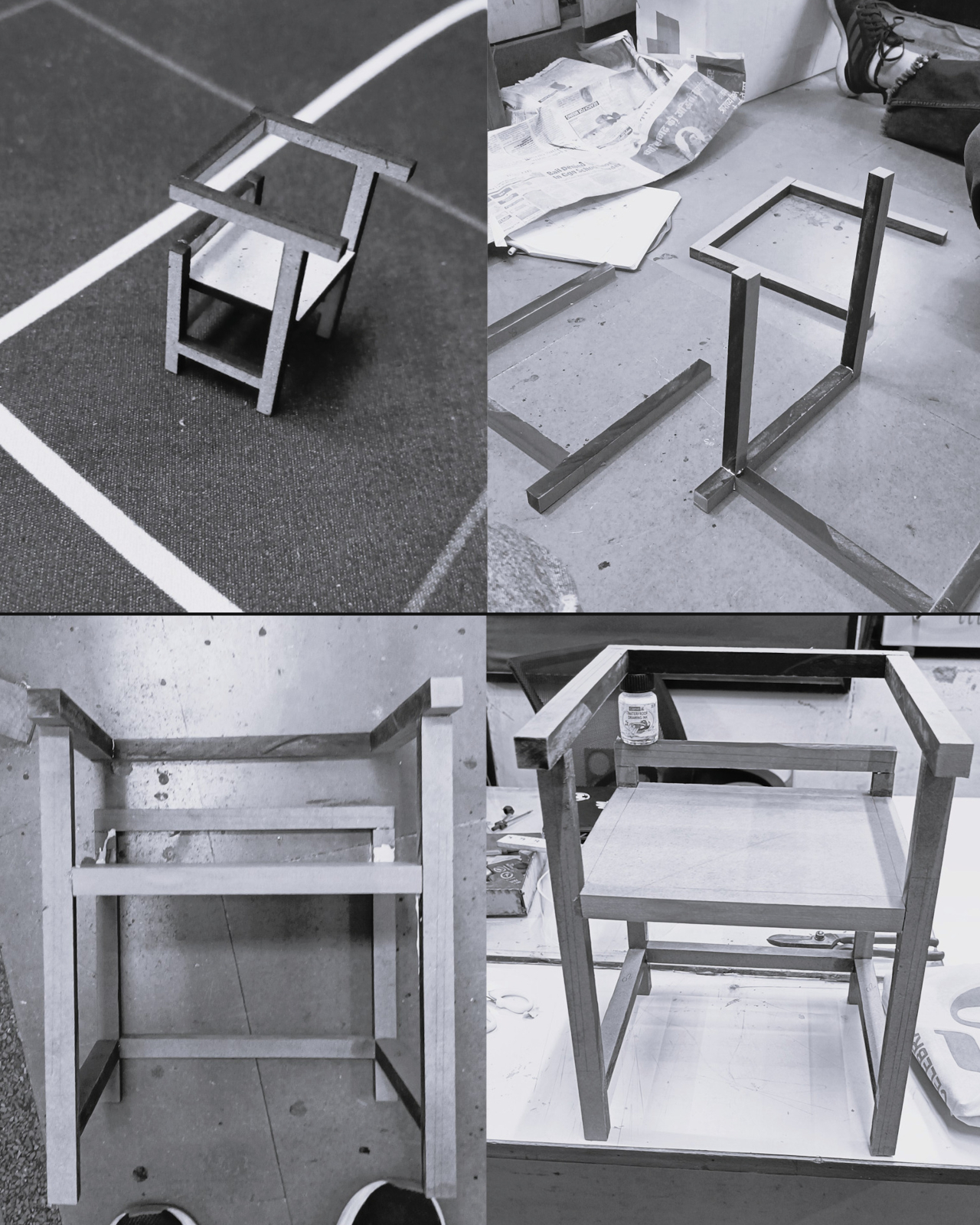
Its unique form isn’t the only notable thing about this concept, however. Its use of reclaimed wood gives it more than a sustainable character. That material, in a way, carries some history from what it was before becoming a part of this chair. Even if that past is unknown to the new owner, simply knowing it has one could give each Euclid chair its own unique charm.

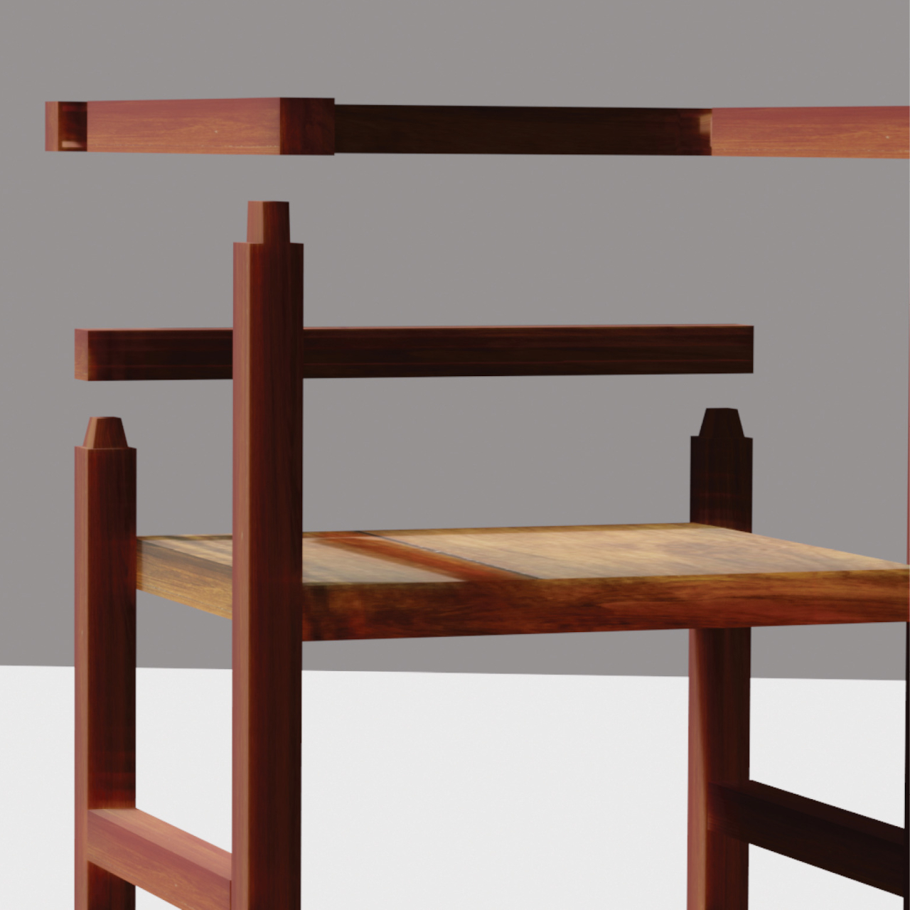
And then there’s the method used to bring all the pieces together. Instead of requiring screws or even glue, a mortise and tenon joinery is used to provide stability without introducing complicated mechanisms. In theory, this could make it easy to later take the chair apart if some pieces need to be replaced, though that could also start to weaken the connection over time if done too frequently.

The Euclid concept chair offers a design that is minimalist, sustainable, and visually interesting. Whereas a cube is pretty much the epitome of symmetry, the missing edges and disconnected faces give the chair a bit more volatility. That said, it doesn’t seem like the most comfortable chair to sit on. Even if you put a cushion on the seat, the hard edges of the armrest and especially the backrest could give your body some grief after a long period of time.

The post Geometric chair concept almost looks like an Escherian optical illusion first appeared on Yanko Design.

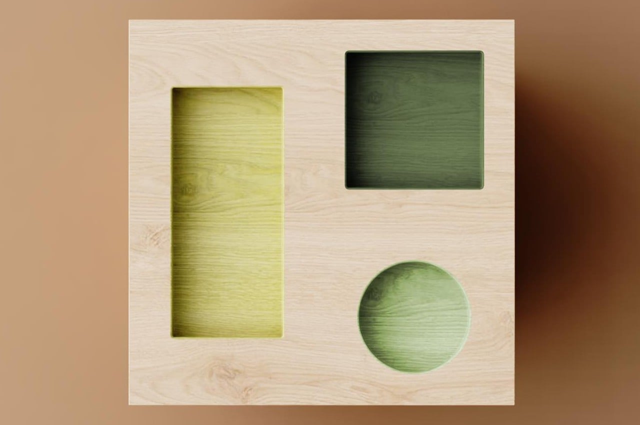
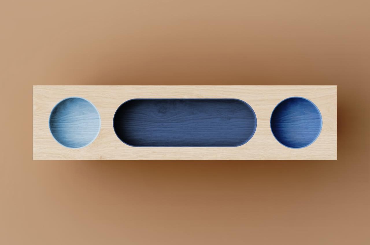
Quirky wooden side tables bring delight with geometric holes like a kid’s game

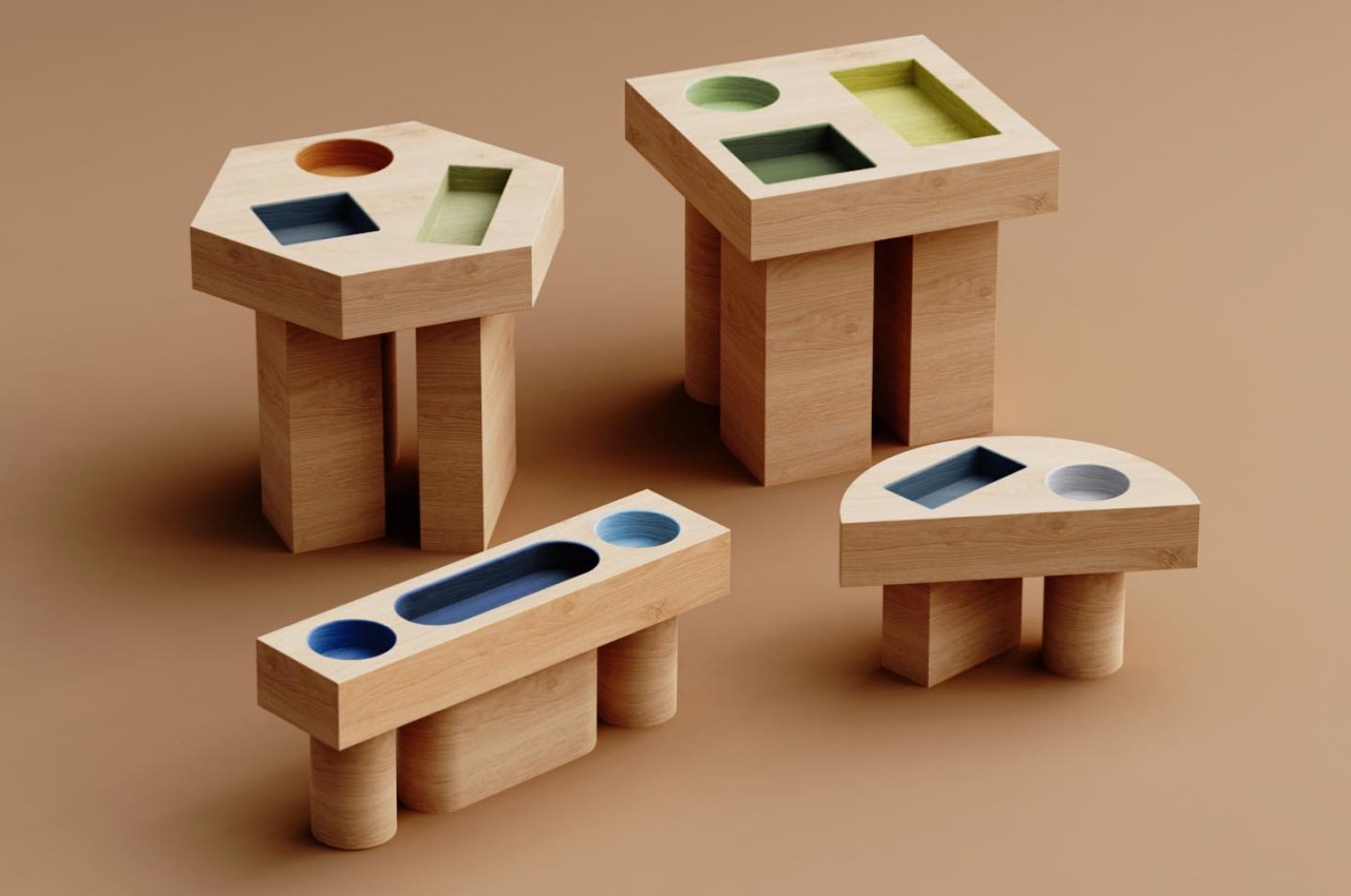
Almost all tables have tops that are flat and horizontal mostly because of the function they serve. You wouldn’t want your glass to tilt over or your phone to slide down just because of an uneven or inclined surface, right? But as long as you are able to place things down on the table without having them wobble, fall, or roll off to the side, then the tabletop can almost be open to any design or shape. That seems to be the reasoning behind these fun-looking side tables that, at first glance, don’t look reliable or functional, at least until you realize that using them is almost like playing that educational game of fitting shapes inside the right holes.

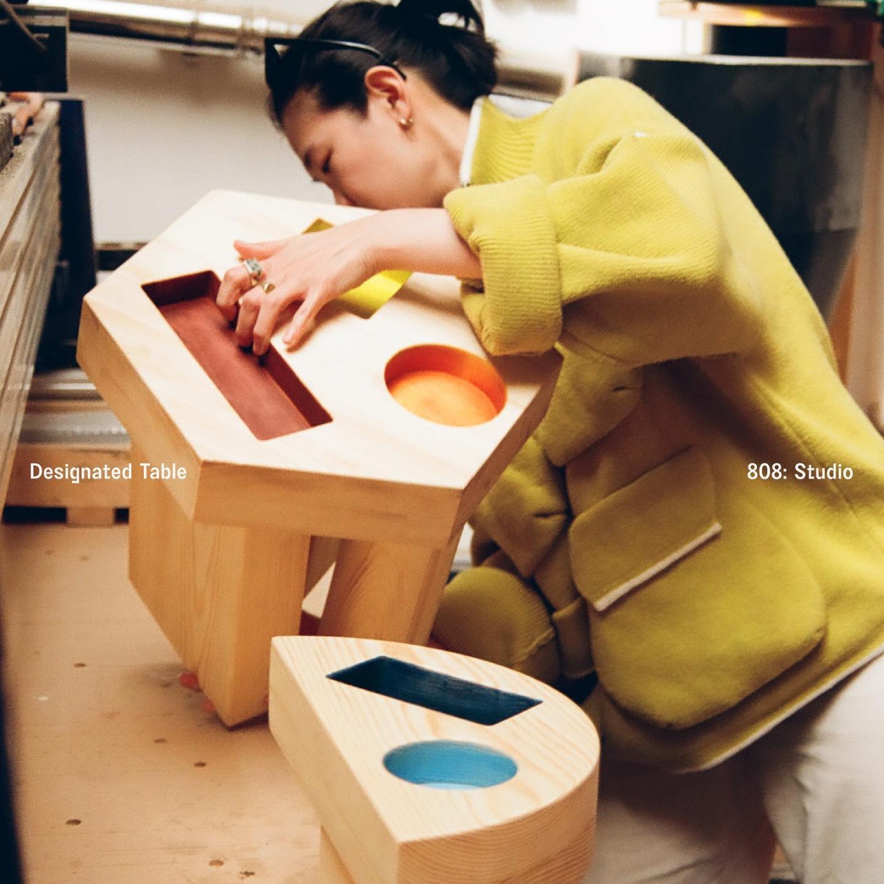
Designer: Chien Yuoning

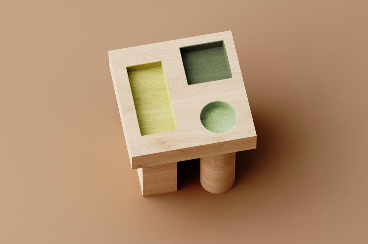
Many parents or even kids might be familiar with that toy where you have holes in a geometric shape and you’re supposed to drop matching geometric blocks inside them. This side table collection might immediately remind people of those toys and, unfortunately, might also give them the wrong impression of the practicality of such a design. Fortunately, it isn’t just a whimsical decision as these geometric holes can actually act as helpful organization aids in addition to being quite interesting to look at.
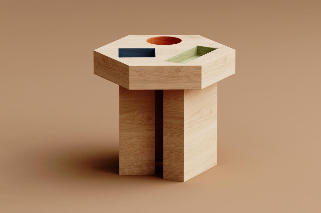
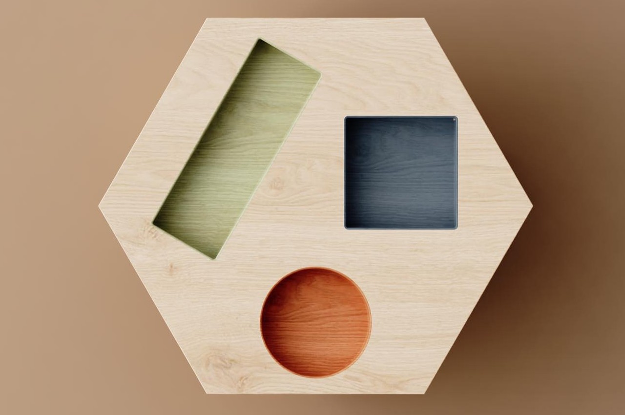
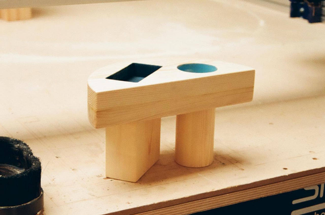
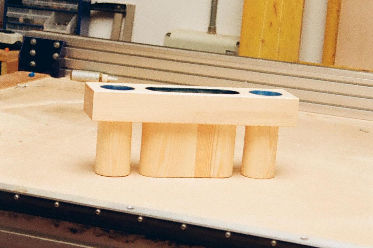
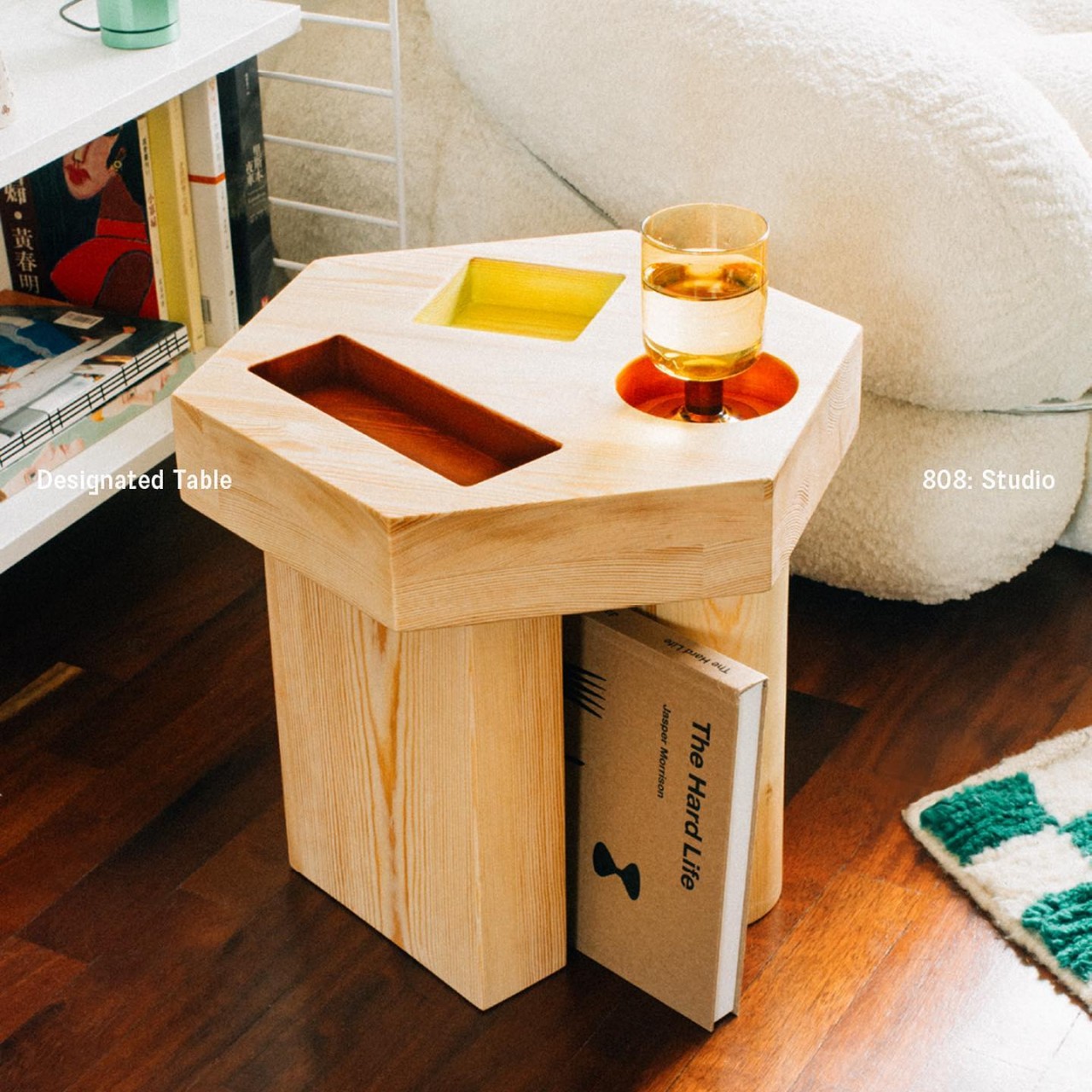
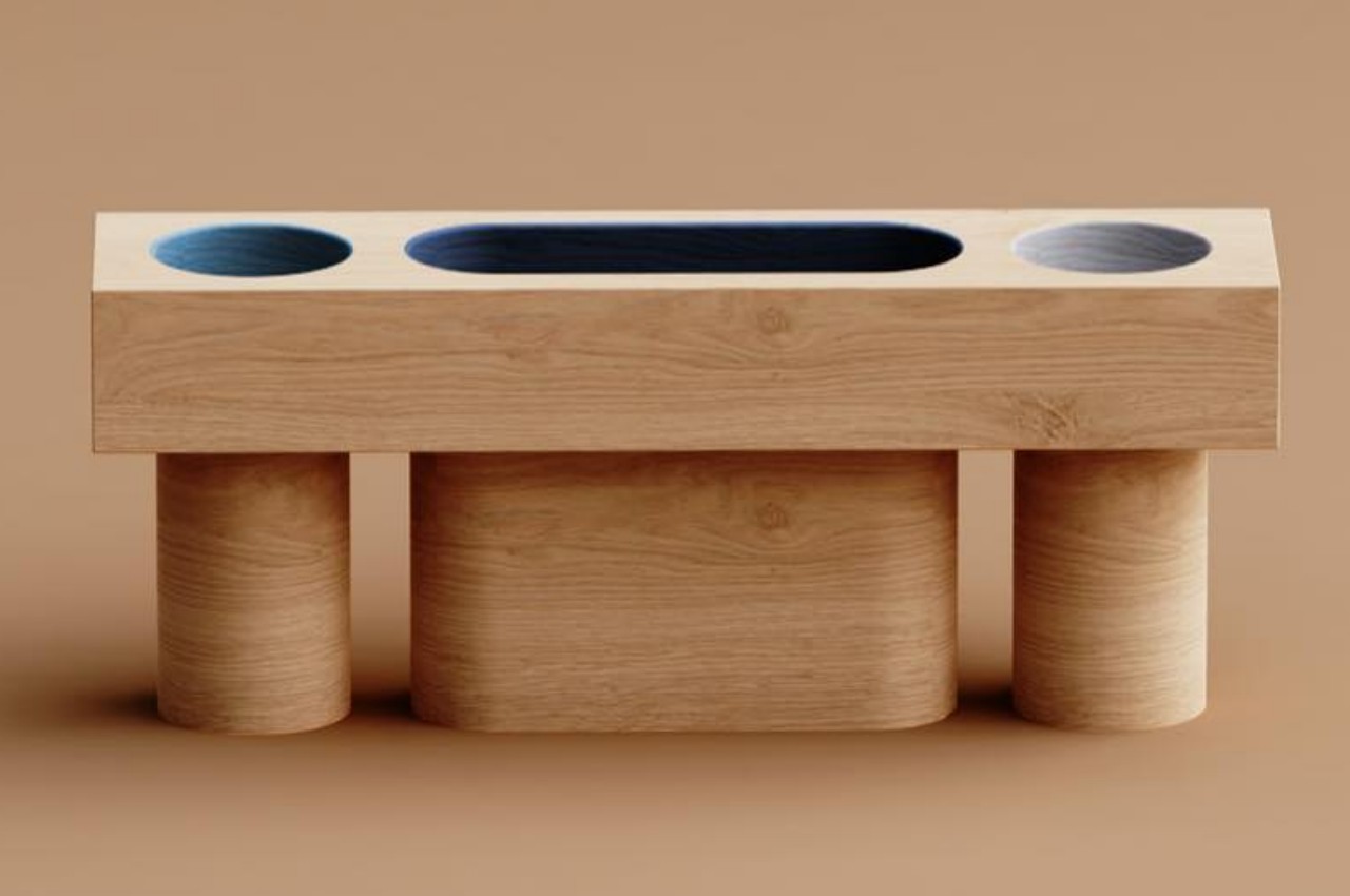
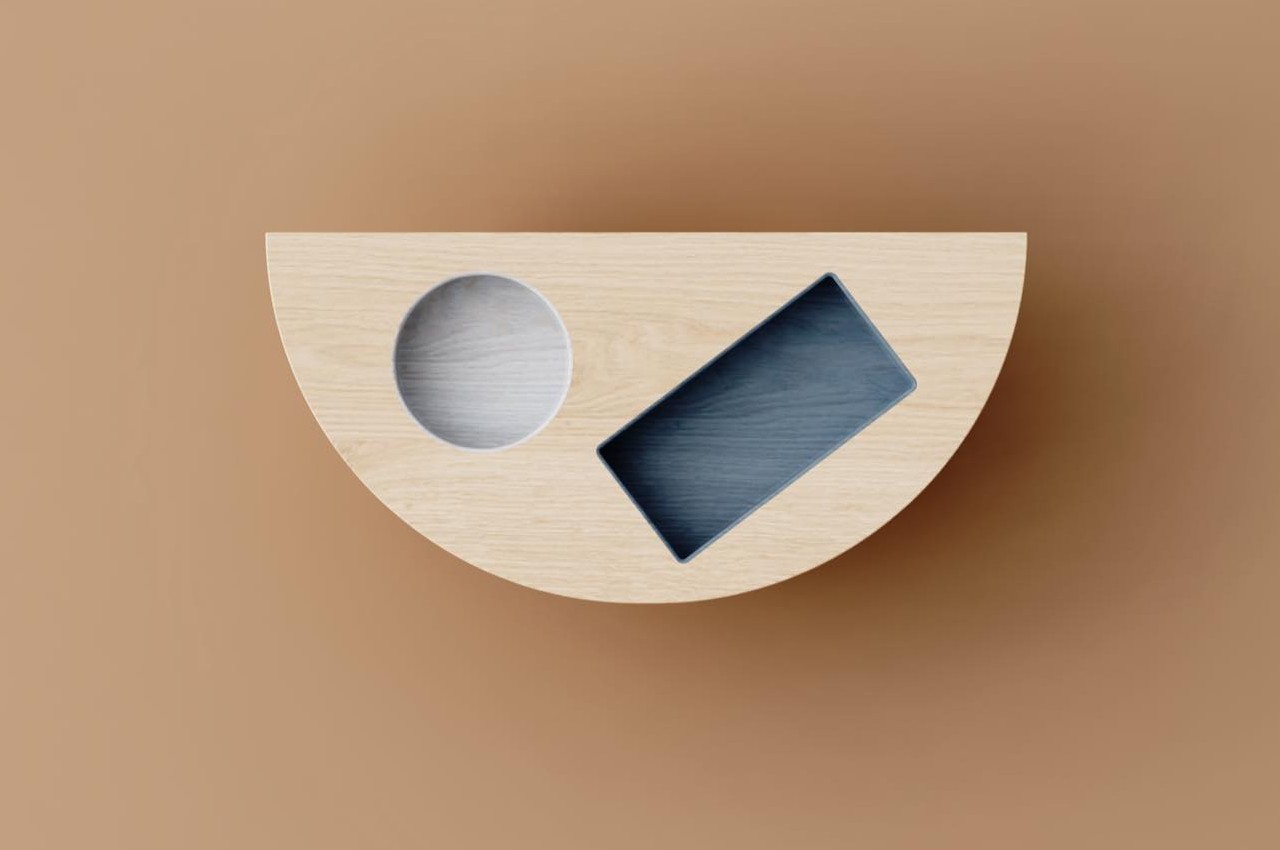
The Designated Table collection has geometric shapes like circles, squares, rectangles, and even pills cut out from the tabletop. While they might look like a loss in terms of usable space, they act as designated containers for things like glasses, phones, books, or whatnot. These compartments let you separate different things while also providing a bit of support to some extent. It’s harder for a glass to topple over if its area is constricted.

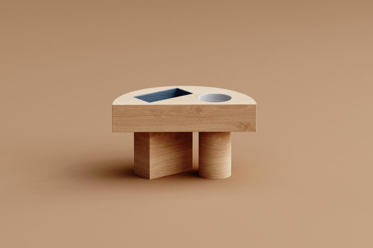
At the same time, the shapes add a playful character to the tables, especially since the shapes have a different color from the natural finish of the rest of the wooden table. The tables themselves come in different shapes, including a hexagon and a half circle, doubling the fun factor of each side table. That, however, also determines where some of these side tables can be placed, like the hexagon-shaped side table making a poor fit for a nightstand or anywhere the table needs to be flush against a flat surface like a wall, a couch, or a bed.

Another interesting aspect of the Designated Table’s design is that the legs follow the shape and orientation of those seemingly random shapes. That makes it feel like the wooden legs flow from these geometric indentations or vice versa, giving the tables an almost whimsical flavor that doesn’t sacrifice their stability. The gaps between the legs can even become a place for magazines, taking advantage of the narrow space. The geometric design of the Designated Table feels jovial and delightful but still makes the side tables completely functional and, perhaps, even more effective in keeping your things in their proper places.

The post Quirky wooden side tables bring delight with geometric holes like a kid’s game first appeared on Yanko Design.