Furniture manufacturing has a quiet waste problem that rarely makes it into the marketing copy. Most pieces require significantly more raw material than what ends up in the finished product, with offcuts, excess, and scraps treated as an acceptable cost of doing business. Some studios have started designing around this inefficiency, treating material constraints not as a limitation but as a creative starting point.
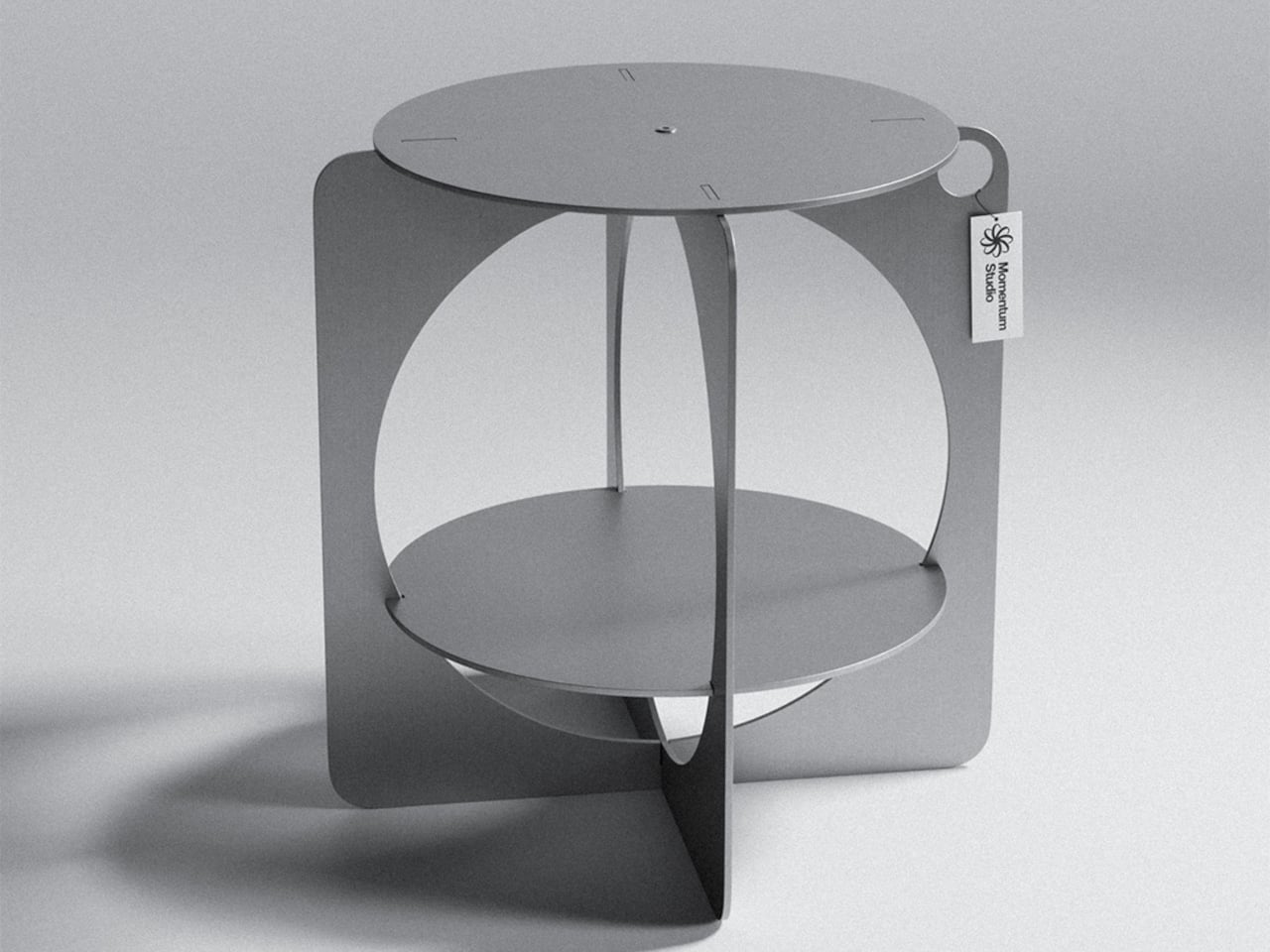
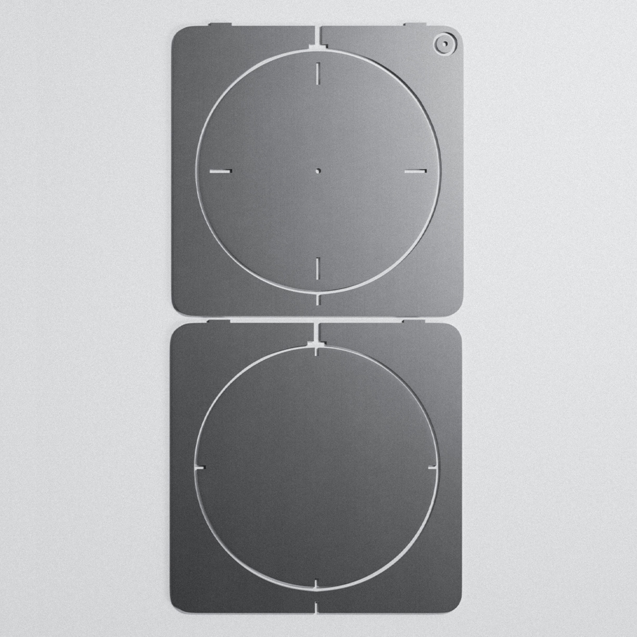
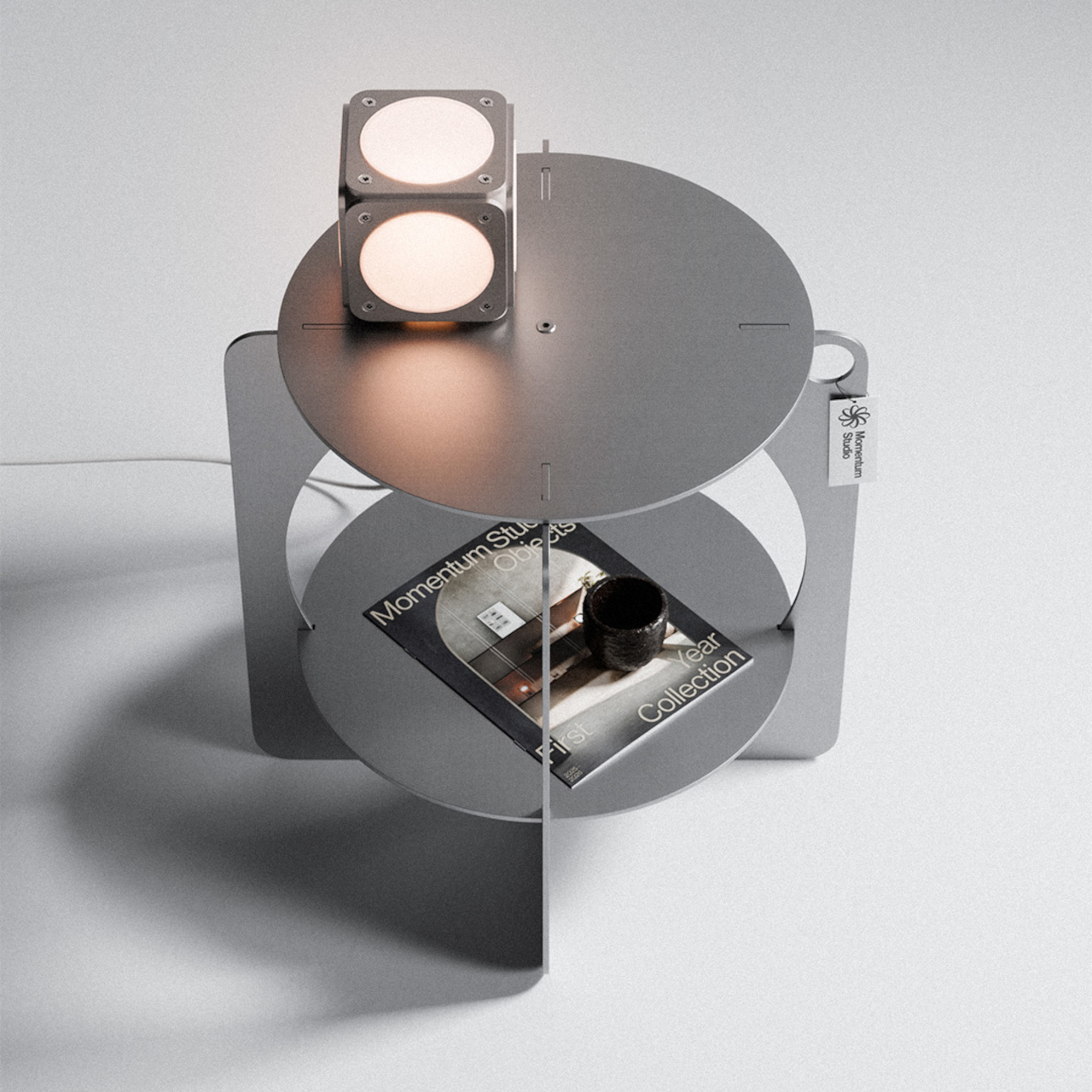
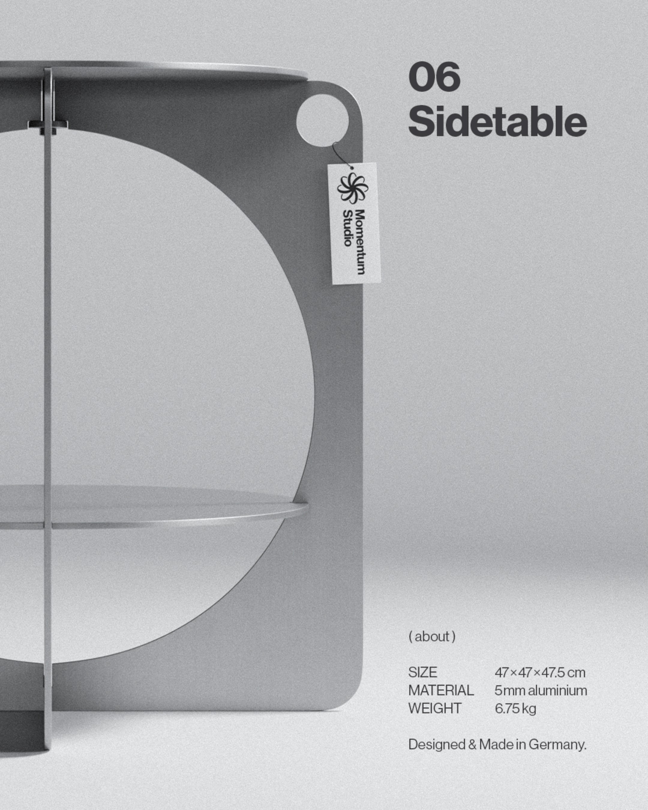
Germany-based Momentum Studio took exactly that approach with its 06 Side Table. Rather than designing a form and then figuring out how to cut it from aluminum, the studio worked the problem in reverse, focusing on how to extract a meaningful shape from a flat sheet with as little waste as possible. The result is a table that looks like it came from a sketch, not a spreadsheet.
The laser-cut parts were nested with enough precision to use 96% of the raw aluminum area, leaving just 4% as offcuts. That figure wasn’t incidental; it was a major focus during development. By designing the two flat panels to fit together as efficiently as possible, the studio kept material costs low enough to offer the piece at €265 while keeping the entire production strictly made in Germany.
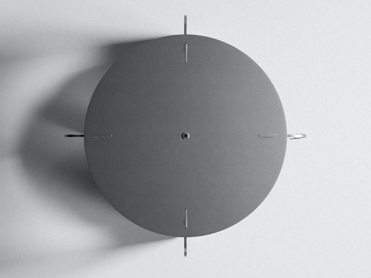
What emerged from that constraint is a silhouette that could easily pass for something from the Bauhaus era. The outer body is formed from two rectangular panels with softly rounded corners, each carrying a large circular cutout that creates an opening through the structure. A circular shelf sits midway inside, and a round tabletop closes the form at the top. The geometry is simple but hard to reduce further.
The material is Aluminium AlMg3, hand-brushed and waxed for what Momentum Studio calls a raw finish. That deliberate restraint means the aluminum will develop a natural patina over time, something the studio frames not as a defect but as part of the piece’s evolving character. The screws are stainless steel, and the assembled table weighs 6.75kg at 47cm x 47cm x 47.5cm.
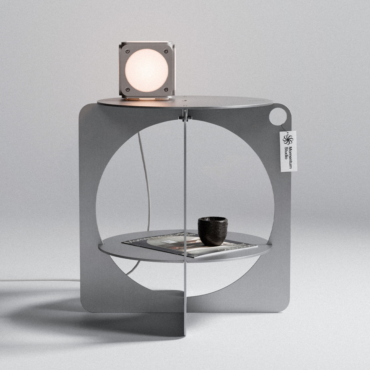
The table ships flat-packed and goes together without any tools in about five minutes. That’s a practical bonus for a piece that doesn’t look like it should be easy to put together. The lower circular shelf is sized well enough for a book, a small object, or whatever habitually ends up beside a reading chair or bed. The tabletop above handles whatever you’d normally want within arm’s reach.
The design commitment extends to its broader material philosophy, which the studio describes as selecting materials for their permanence rather than their convenience, aiming to create objects designed to age with dignity and outlast generations. It’s the kind of table that stays in a room for a long time, which seems to be exactly the point. For a piece built from raw, waxed aluminum, that ambition doesn’t seem far-fetched.
The coffee table is the hardest surface in the living room to get right. Put too much on it, and it looks like a staging mistake. Put too little and the room reads unfinished. The minimalist approach settles this by demanding each object justify its place twice — once as something useful, once as something worth looking at. Every product on this list earns on its own terms.
These five objects were chosen because they share a logic rather than a matching aesthetic. A kinetic toy, a modular ceramic, a structural tray, a floating mobile, a handpoured candle vessel — different categories, different price points, one consistent standard. Each one does more than its category suggests, and none of them requires anything around it to look complete. That is the whole point of a surface that does more by doing less.
1. ClearMind Kendama
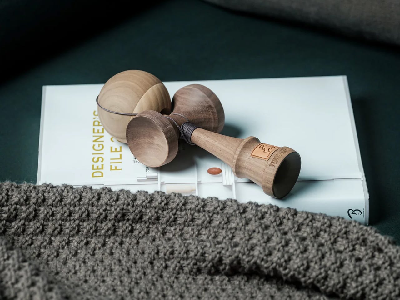
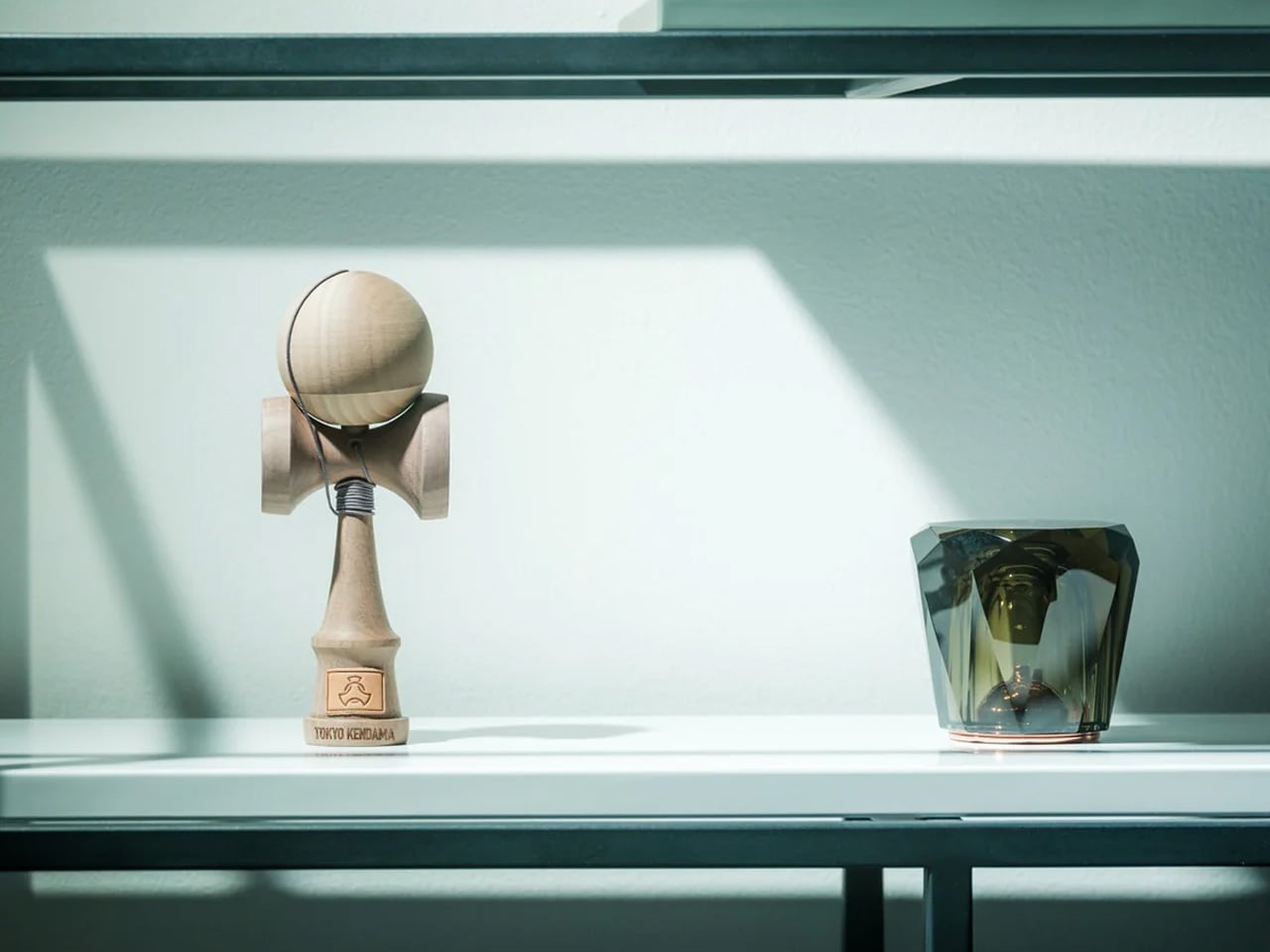
The ClearMind Kendama is the object on this list that will raise the most eyebrows and earn the most genuine conversation. Crafted in Tokyo from solid, unpainted walnut and maple, it’s a Japanese skill toy that sits on a minimalist coffee table the way a chess set sits on a side table — quietly suggesting a way of spending time that isn’t a screen. The two-tone wood grain reads as sculpture when it’s at rest, and the proportions are tight enough that it occupies almost no footprint while contributing significant material presence and warmth to the surrounding surface.
What makes the Kendama work as a coffee table object rather than just a novelty is the quality of its materials and the honesty of its finish. Walnut and maple at this weight don’t look like toys — they look like considered objects, which is exactly what they are. The practice itself is deliberately simple: the ball catches on the cup, the spike, the base plate. Each successful catch requires a small act of focus that pulls you out of passive consumption and toward something genuinely present. On a minimalist table, it functions as an invitation — to pick up, play, put down — and every time it rests, it returns to being a beautiful wooden form that needs no explanation.
The unpainted natural wood reads as a sculpture at rest
The meditative play pattern offers something no other object on this list provides
What we dislike:
The cup-and-ball proportions are an acquired taste for anyone who associates kendamas with children’s toys
The string can feel visually busy if left extended rather than gathered
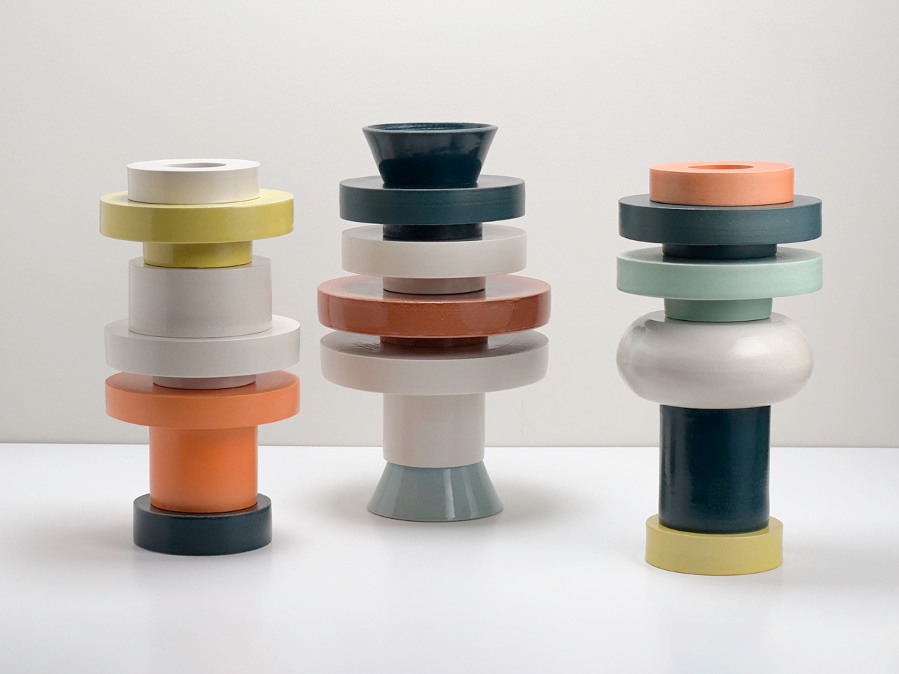
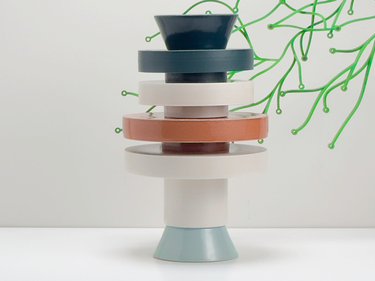
2. Torre Modular Ceramic Vase
The Torre Modular Ceramic Vase by Scott Newlin for Dudd Haus is the most expensive object on this list by a significant margin, and the one that earns that price most transparently. Each piece is hand-thrown at Powerhouse Arts in Brooklyn and arrives as a set of stackable ceramic modules — two, three, or four components depending on the configuration — that interlock through consistent diameters and lipped rims. The forms are architectural, muted, and deliberately quiet: off-white, sand, stone. On a coffee table, they read as a composed sculpture from any angle, at any height.
What sets the Torre apart from a standard ceramic vase is that it offers a choice every time you approach the table. Stack the modules high for a vertical moment, separate them into a low cluster, or pull one aside entirely and set a dried stem inside the remaining piece. The act of rearranging them is part of the object’s value — it rewards attention in a way that static objects never can. For a minimalist surface, the price demands justification, and it finds it here: the Torre is three objects in one, each configuration as resolved as the last, none of them requiring anything around them to look finished. It is the closest thing on this table to pure design.
What we like:
Each reconfiguration creates a genuinely different visual read
The hand-thrown ceramic carries natural variation that improves with close attention
What we dislike:
At $1,200, it is a significant commitment for a surface object
The off-white and sand palette, while intentional, can disappear on lighter table materials
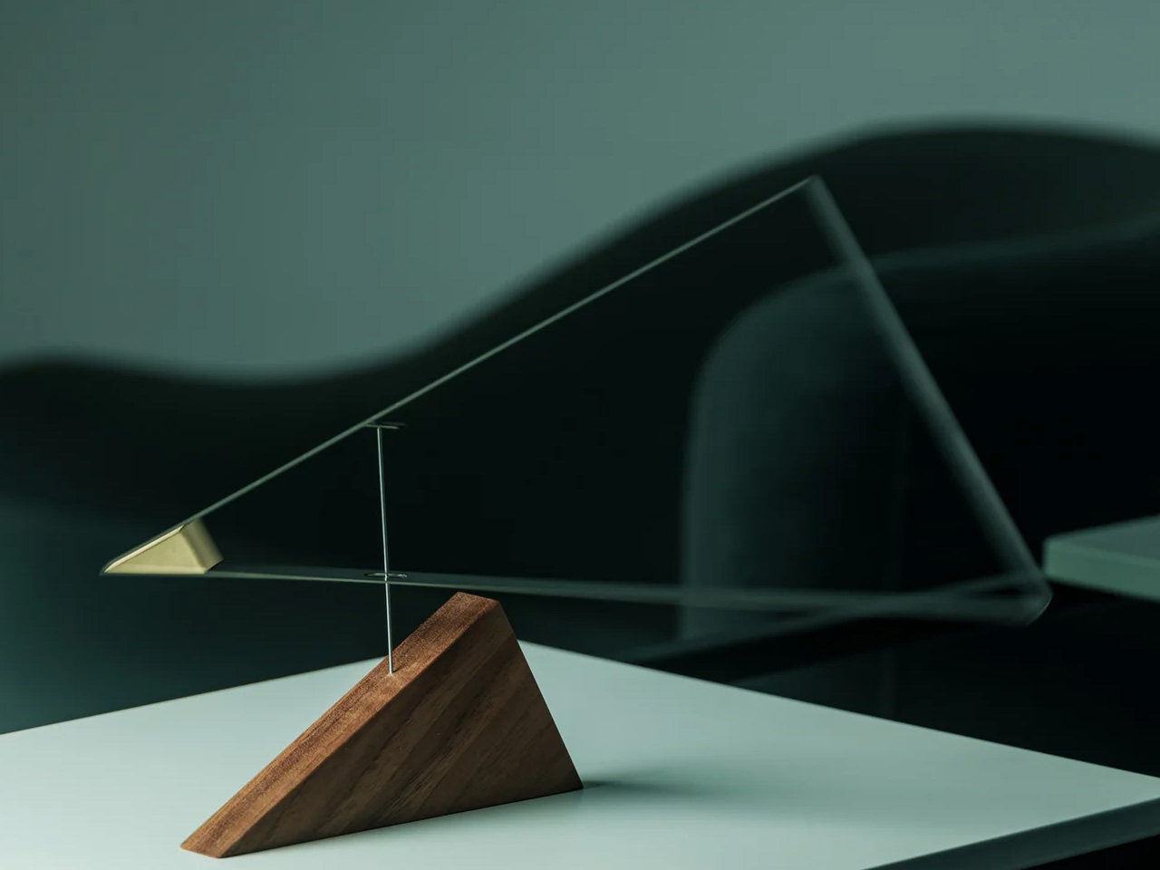
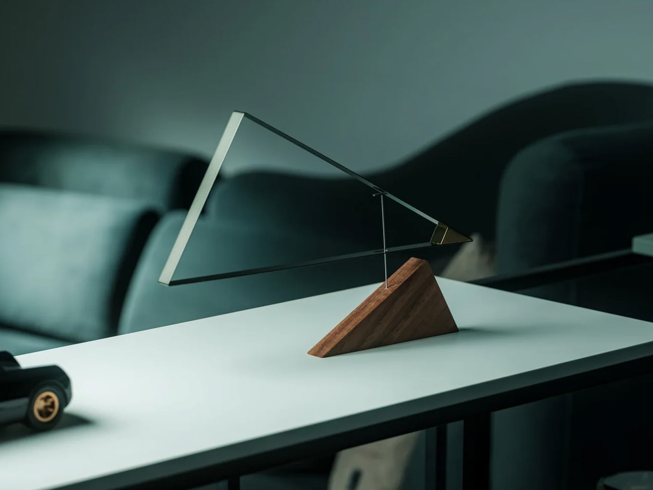
3. Sail Away Tranquility Mobile
The Sail Away Tranquility Mobile is the only object on this list that moves, and movement is precisely why it belongs here. Three balanced triangular forms — drawn from the geometry of sailboats — hang in calibrated tension and respond to the slightest air current in the room. On a coffee table, it introduces a kinetic quality that no static object can replicate: the table becomes the most animated surface in the living room without adding any visual weight. The proportions are compact enough for a tabletop, the construction is clean, and the physics are genuinely surprising the first time you see it shift in still air.
What makes the Sail Away work as a minimalist object is its restraint. The movement is subtle rather than theatrical — a slow drift rather than a spin — and it never demands attention so much as rewards it, which is the correct register for a surface meant to feel considered rather than performed. At $145, it occupies a different design category from every other object on this list: not sculpture exactly, not functional exactly, but somewhere between the two that feels honest rather than decorative. Set at the far edge of the Platform Tray, it creates a vertical moment that anchors the whole composition without competing with anything around it.
The kinetic movement brings a living quality to the table that no static object can match
The geometric forms hold their visual logic from any angle
What we dislike:
The mobile requires a stable surface — consistent vibrations from foot traffic or sound can overanimate it
The string suspension looks considered but feels delicate in a high-use living room
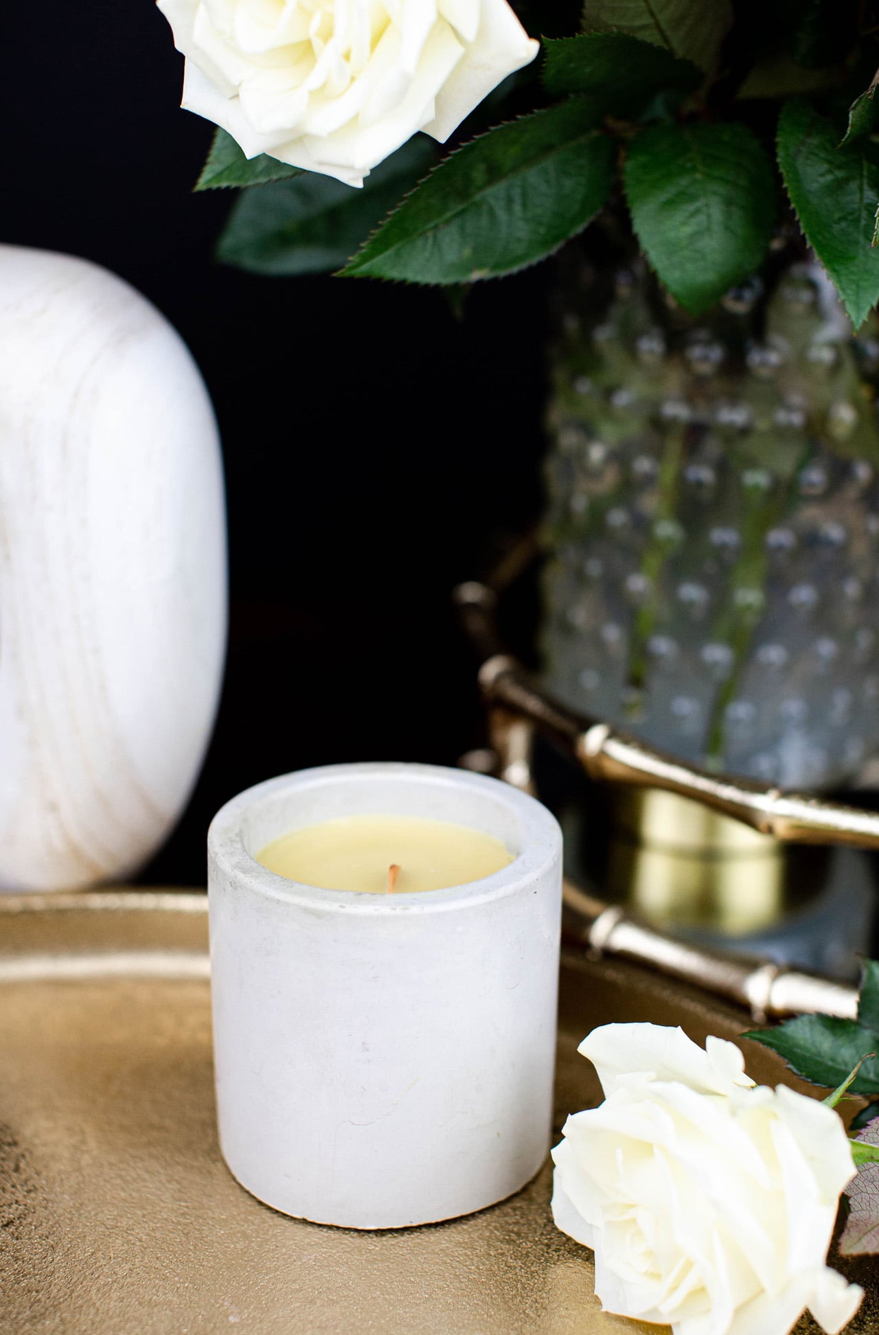
4. Simple Candle Co. Concrete Vessel
The Simple Candle Co. Concrete Vessel is the most affordable object on this list and the one that punches furthest above its price. Each vessel is hand-poured in small batches from a grey concrete body with a short soy wax wick and no label. The scent runs deliberately clean — white linen, cashmere cedar, or unscented — and the vessel itself is the product as much as the candle inside it. At $20, it brings concrete’s material seriousness to the table at a price that makes it easy to keep two: one lit, one resting, both earning their place on the surface.
The concrete body doesn’t get hot to the touch during burning, which is a practical advantage that most candle vessels at three times the price can’t claim. Burn time runs approximately 25 to 30 hours, and when the wax is finished, the bowl stays. Rinse it out, and it becomes a catch-all for a matchbox, a small stone, a ring. That second life is built into the object from the first glance — the vessel was always the point, and the candle is what justifies buying it for $20 rather than considerably more. Alongside the Kendama’s natural wood and the Torre’s matte ceramic, the concrete introduces a third material that completes the tactile range without competing for visual dominance.
What we like:
The vessel earns its place before and after the candle burns
The concrete stays cool during use, which is a genuine functional advantage over glass and ceramic alternatives
What we dislike:
The scent throw is intentionally subtle and reads as ambient rather than strongly aromatic
The hand-pour process means each vessel varies slightly, so a replacement may not match an existing piece exactly
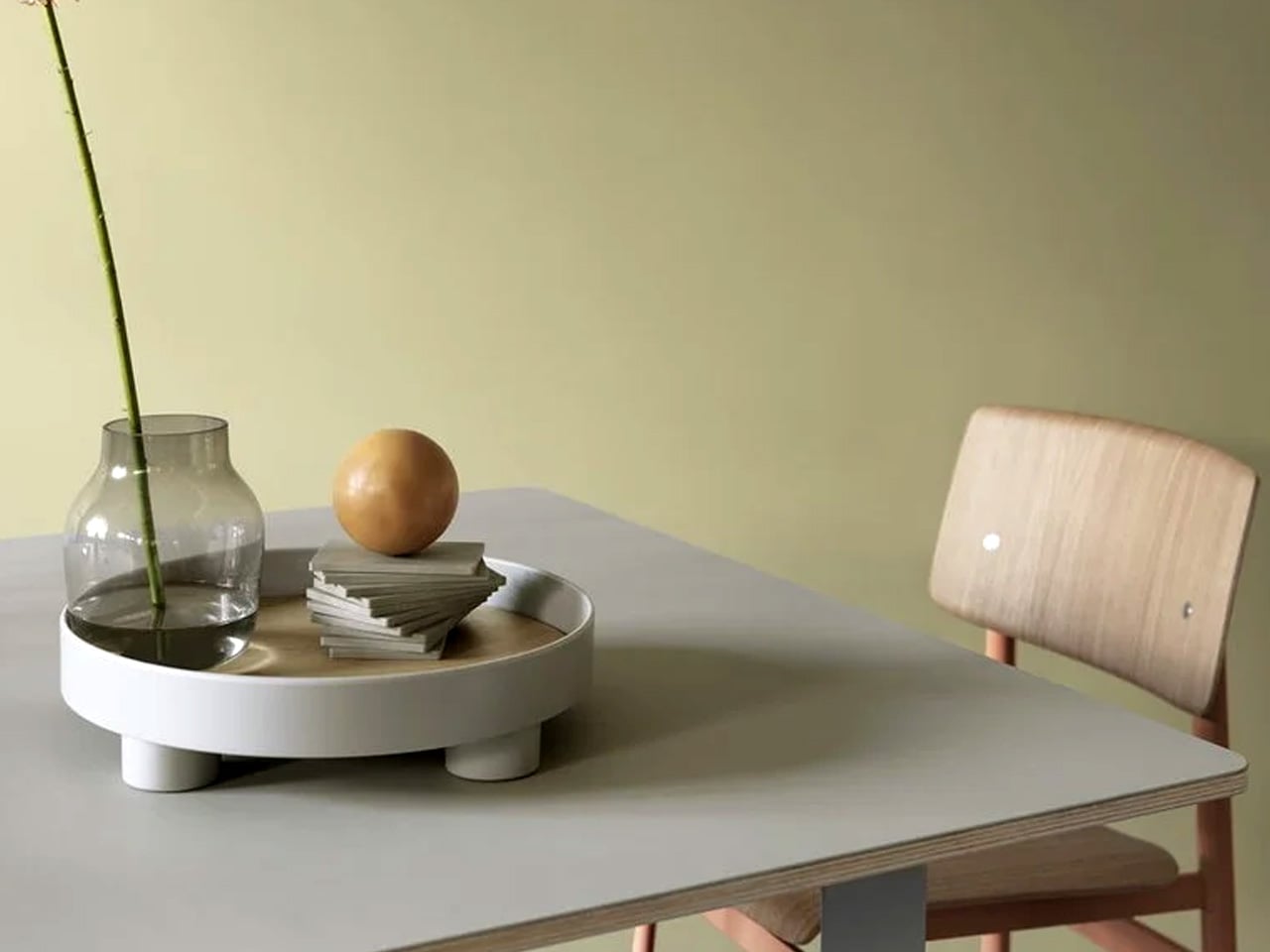
5. Muuto Platform Tray — Grey
The Muuto Platform Tray is the object that makes every other object on this list look better. Available at Finnish Design Shop for $109 in grey, it’s a round tray with an oak veneer surface and small metal legs that lift it just enough off the table to create a clear visual boundary between the objects inside and the surface beneath. That boundary does more compositional work than it should — it turns a group of objects into a considered arrangement rather than a collection of things that happen to be sitting on the same surface. The grey metal and warm oak read well together, and the form is simple enough to disappear.
In practical terms, the Platform Tray is the anchor. The candle vessel sits inside it. The Kendama rests at its edge. The mobile grounds one end. The tray doesn’t organize these objects so much as it frames them, and the difference between a frame and a container is the difference between editorial and domestic. The oak veneer surface develops warmth over time, and the small legs mean it can be lifted off the table intact when the surface needs to be cleared without disturbing the composition it holds. At $109, it is the least visually dramatic piece on this list and almost certainly the most indispensable one.
What we like:
The oak veneer surface brings warmth to a mixed material setup
The raised legs separate the composition from the table surface with minimal visual noise
What we dislike:
The round form can feel restrictive on a narrow or strongly rectangular table
It comes in one size, so there’s no option to scale up for a larger surface
The Only Five Objects Your Coffee Table Needs
Five objects, five categories, one shared logic. The tray frames. The candle grounds. The mobile moves. The Kendama invites you to participate. The Torre rewrites what a vase can be. Together they fill a coffee table without crowding it, and none of them needs the others to look resolved. That is the discipline a minimalist surface asks for, and these five meet it.
The full build comes to $1,444, with the Torre carrying most of that weight. Buy the other four first — at $344 combined, they build one of the strongest minimalist coffee table setups available at that price — and treat the Torre as the object you earn over time. Start with the Platform Tray. Everything else finds its place from there.
Say the name out loud. NjommNjomm. Go ahead. It sounds exactly like what you think it sounds like. Nom nom. Like something chewing. Like something very happily eating. And once you see what this coffee table concept actually does, you’ll understand that the name is entirely intentional and absolutely perfect.
Stuttgart-based designer Deniz Aktay, who goes by dezinobjects online, studied architecture and urban planning at the University of Stuttgart before turning his focus to furniture and object design. He has built a quiet but devoted following with pieces that feel more like riddles than furniture. His previous work includes tables named “Bookpet” and “Nessie,” and an award-winning piece called “Overlap.” The man clearly has a sense of humor, and with NjommNjomm, he’s leaning all the way into it.
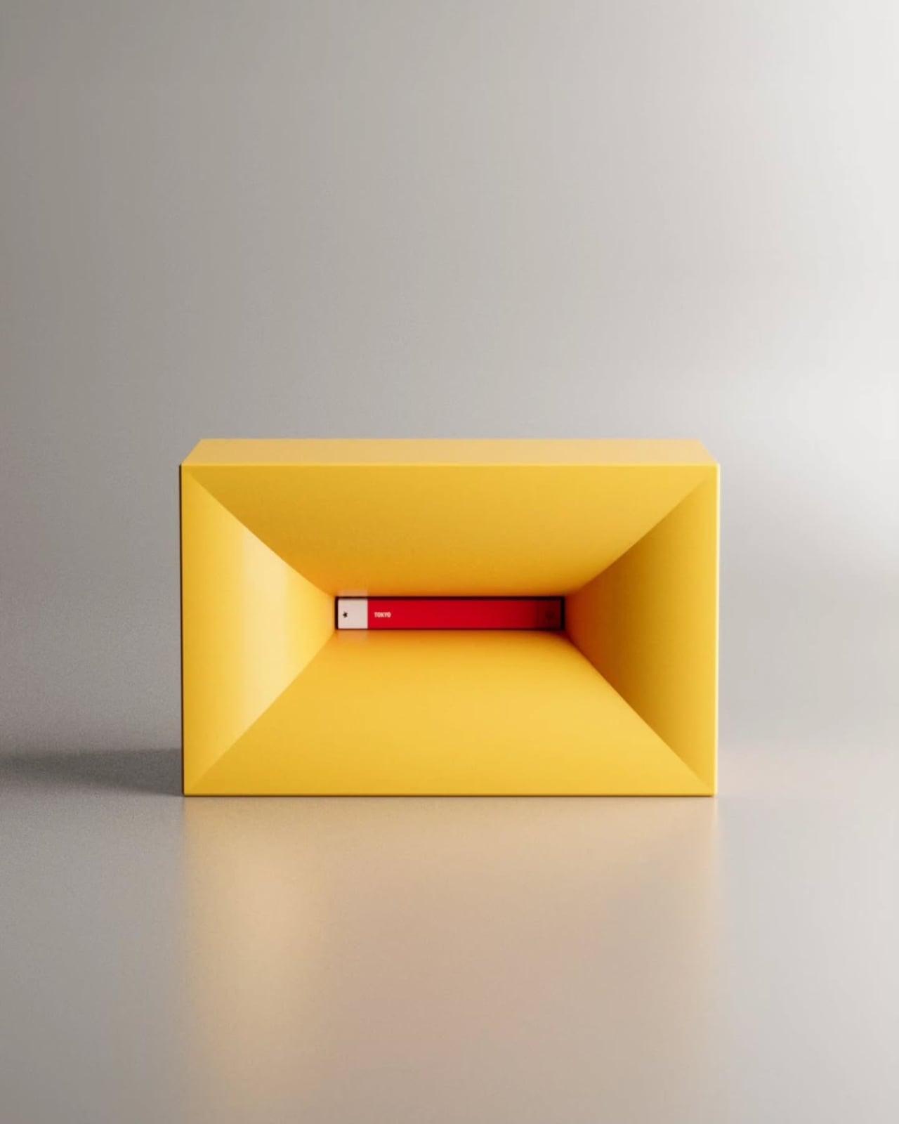
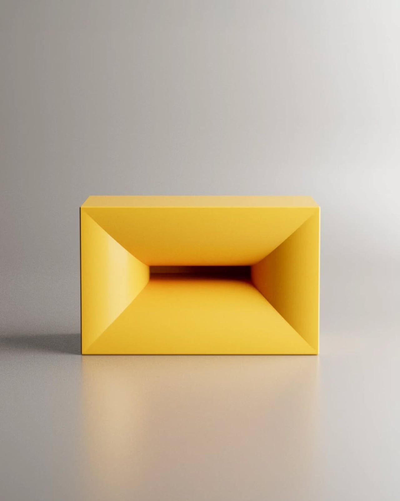
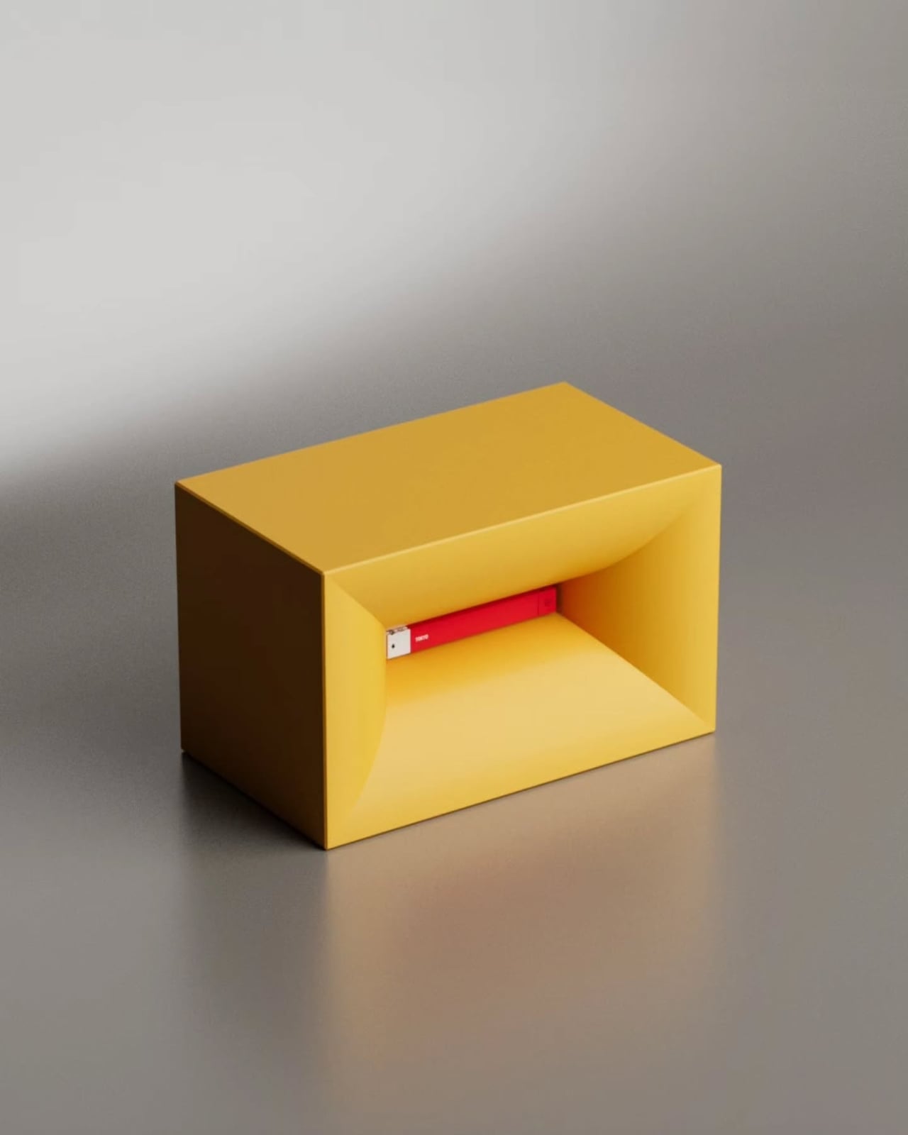
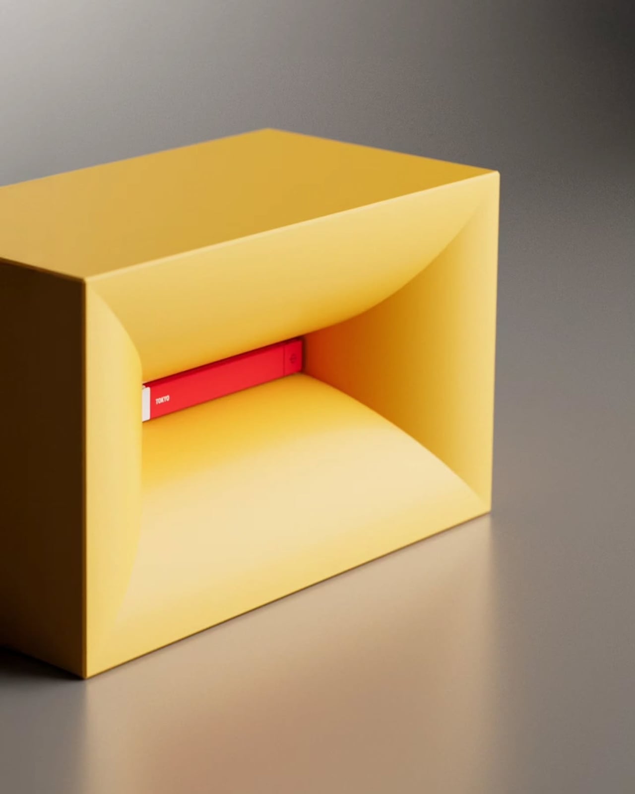
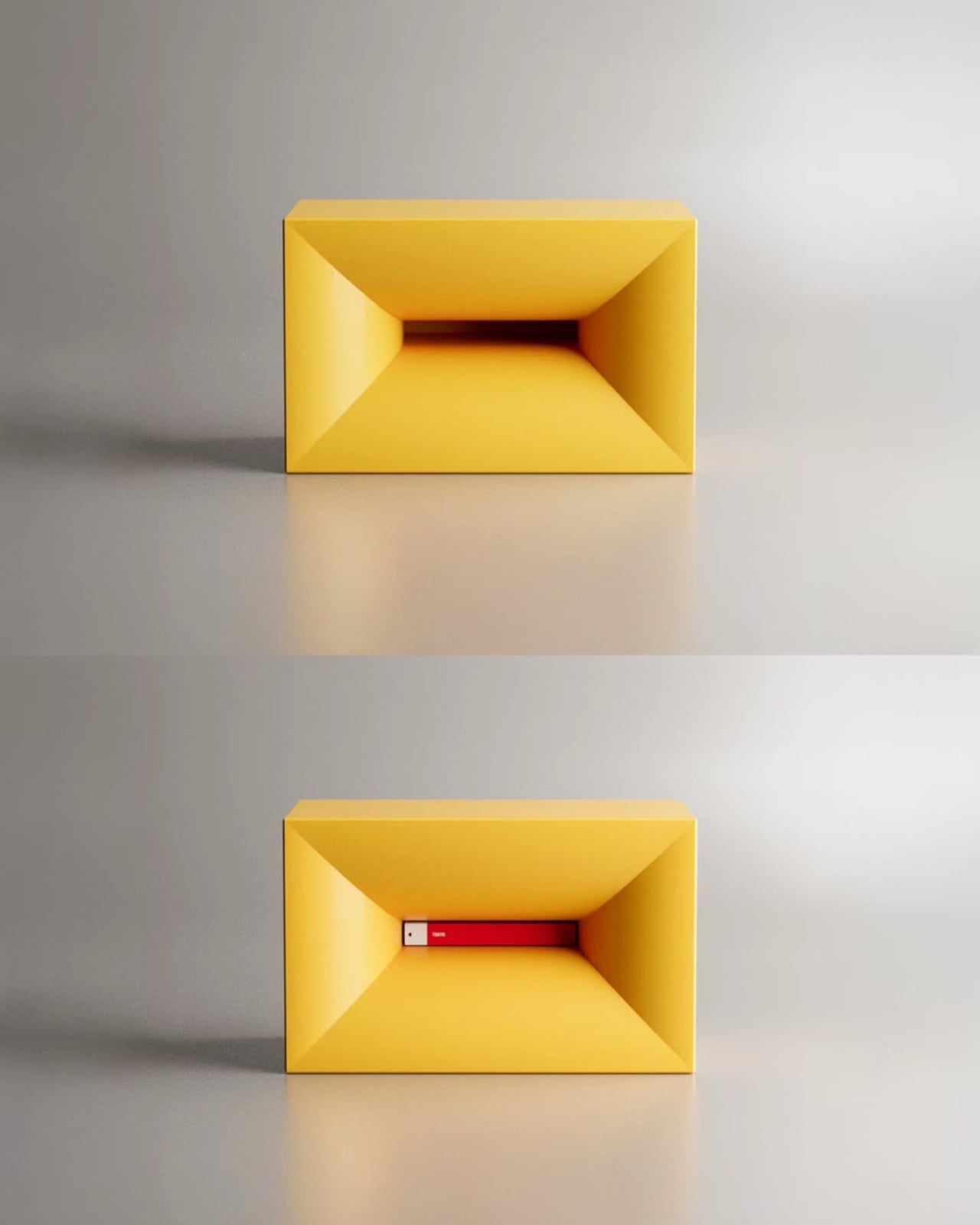
The concept is deceptively simple. NjommNjomm is a cuboid coffee table made from sustainable plastics. It has a clean, minimal silhouette, and nothing about it screams “look at me” from across the room. But tucked inside is a bevelled storage compartment, and when you slide a book of just the right size into it, something kind of surreal happens. The book appears to disappear into the table. The table appears to have swallowed it. Nom nom, indeed.
It’s the kind of visual trick that makes you do a double-take, and then immediately want to show everyone who walks into your living room. That impulse is actually one of the more underrated qualities a piece of furniture can have. Most objects just sit there. NjommNjomm performs.
The optical illusion comes from the bevelled cut of the internal compartment, which creates a striking contrast against the clean outer form. The book doesn’t just sit inside the table. It looks consumed, tucked away by the table itself. There’s a small theatrical quality to it that elevates it well beyond a storage solution and into something closer to a stage prop, except it lives in your living room and holds your coffee.
I’ll admit, my very practical brain did pause for a moment to wonder about the mechanics of it all. How exactly do you get the book in? Do you slide it through the opening? Is there a specific angle? And when you want to actually read it, does retrieving it break the illusion entirely? I genuinely don’t know, and I find myself hoping the answer is something elegantly simple, because the last thing this design needs is a frustrating extraction process every time you want to pick up where you left off.
Beyond the trick, the design is genuinely practical in other ways. The cuboid shape means it can be positioned horizontally as a traditional coffee table or flipped vertically to change its function entirely, making it more adaptable than most single-use furniture. For smaller spaces especially, that kind of flexibility matters. Being made from sustainable plastics also puts it in line with where furniture design is heading broadly, with more and more designers prioritizing materials that don’t cost the planet what they cost the consumer.
Aktay’s body of work says a lot about what he values as a designer. His pieces consistently sit at the intersection of wit and function, which is a harder balance to achieve than it looks. It’s easy to make something clever. It’s harder to make something clever that also works as real furniture in a real home. NjommNjomm feels like it manages both.
What makes the concept particularly compelling right now is the timing. The conversation around coffee tables in 2026 has largely been about sculptural forms and pieces that feel more like objects of art than pieces of furniture. NjommNjomm fits into that moment without trying too hard to belong to it. It’s minimal, almost to the point of invisibility, and then it does its little trick, and you realize it was never trying to be quiet at all.
For those of us who stack books on every available surface, there’s something poetic about a table that embraces the book as part of its identity rather than treating it as clutter. NjommNjomm doesn’t just hide the book. It celebrates it by making it look like the table chose to eat it.
It’s currently a concept, and Aktay shares his work on Instagram where designs like this tend to get picked up quickly by communities who recognize a good idea when they see one. Whether it eventually moves into production or stays in concept territory, it’s already done what great design is supposed to do. It made me stop scrolling. It made me think. And it made me want one.
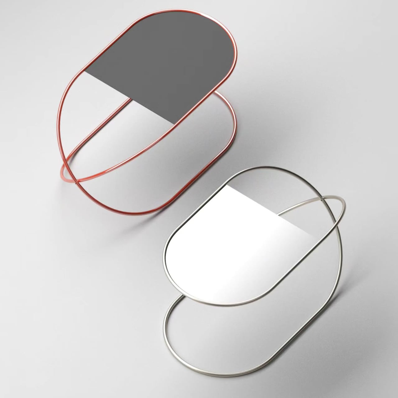
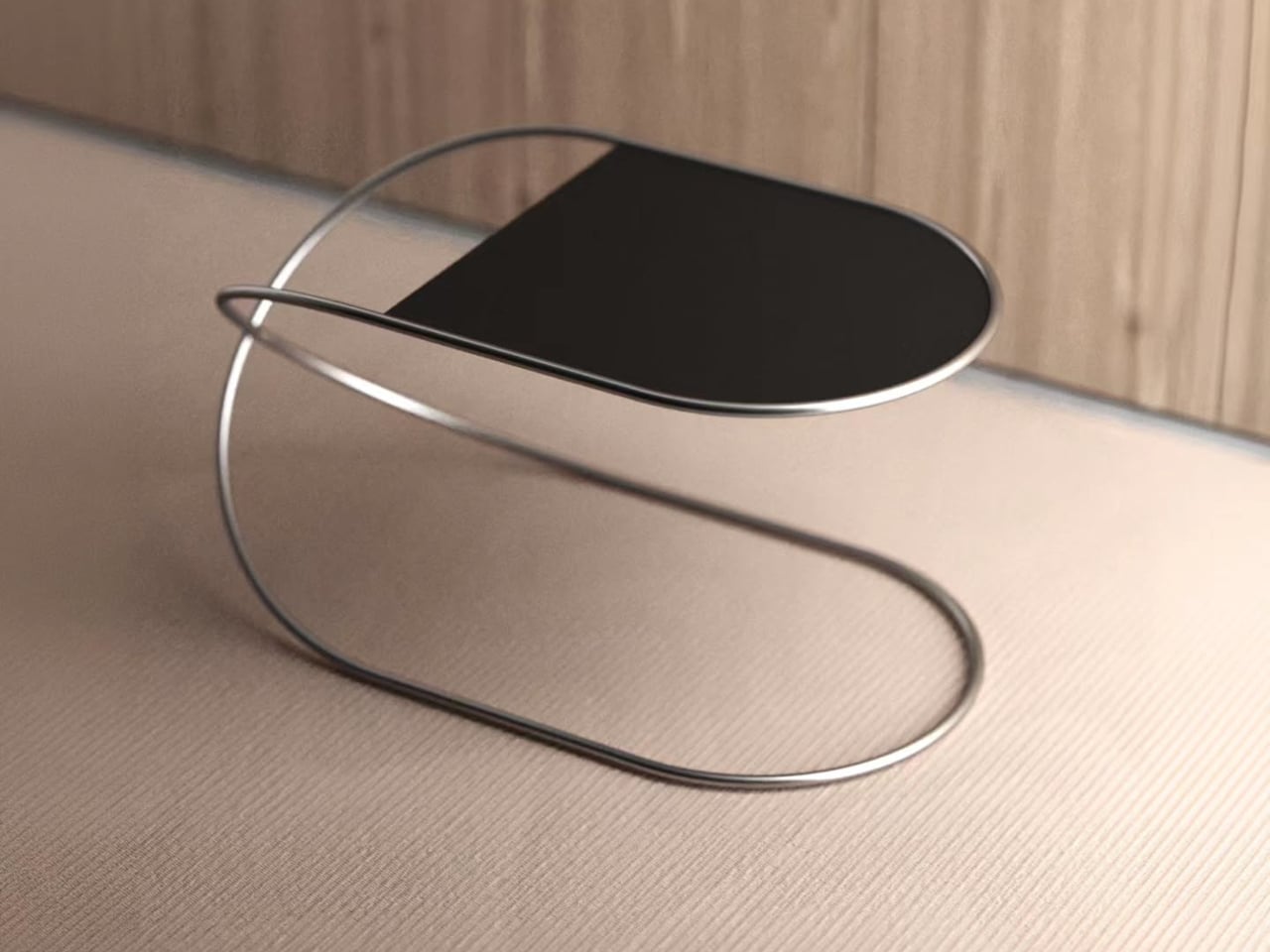
Side tables have a bit of an identity problem in furniture design. Most treat them as purely functional afterthoughts, giving you a flat surface at the right height and not much else. The ones that do try to stand out tend to overcorrect, piling on decorative legs, unusual proportions, or materials that compete with everything else in the room. Very few ask whether the structure itself could be the point.
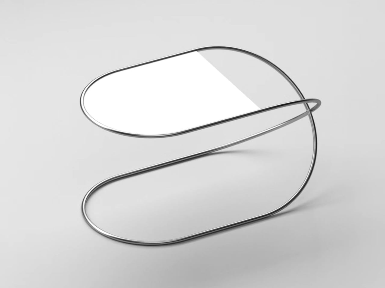
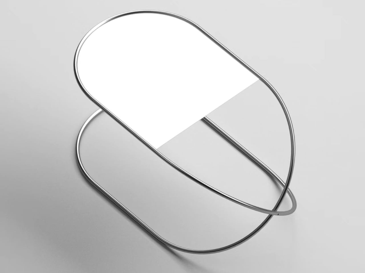
That’s the question Stuttgart-based designer Deniz Aktay explores with the Whisk table, a side table built around a single continuous tube that does all the heavy lifting. Aktay’s work consistently gravitates toward pure lines and the expressive potential of a single well-chosen material. The Whisk is one of his cleaner expressions of that thinking.
The tube bends into two rounded loops stacked at different heights, forming an S-curve when viewed from the side. One loop reaches the height of a standard side table and cradles the tabletop. The other sweeps back to the floor, forming the base. The whole thing reads as one fluid gesture rather than a frame assembled from parts, which is very much the point.
Where it gets interesting structurally is at the center, where the tube crosses itself. That crossing point isn’t decorative; it’s what keeps the table stable. The two loops work against each other in a way that resists rocking or shifting, so you get a table that looks almost impossibly light while still holding its ground next to a sofa or armchair without wobbling every time you set something down.
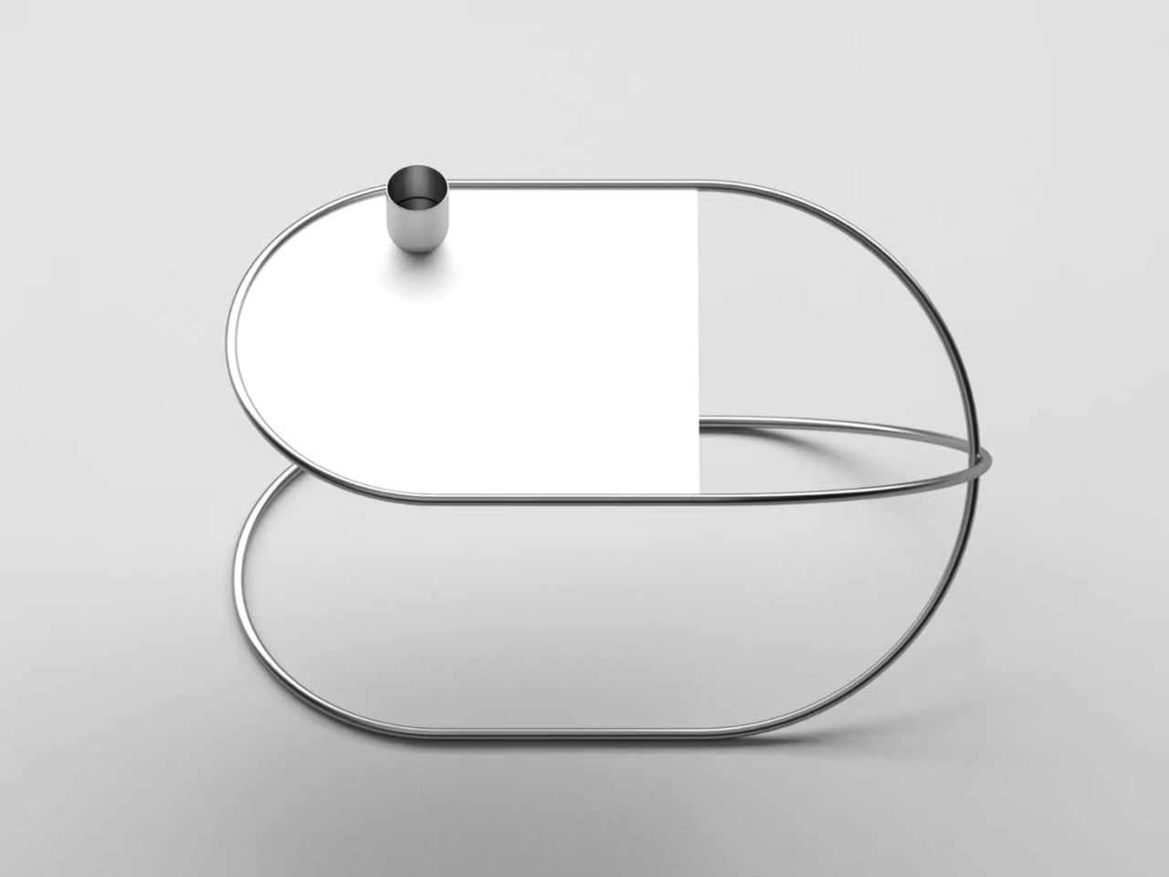
The tabletop is designed to stay in the background. It fits within the upper loop and matches its rounded profile, so the two read as a single shape rather than two components joined together. The surface adds just enough contrast to define the functional plane without competing for attention. The tube does the work; the top is simply where you put your coffee, your book, or a small lamp.
As a side table, the Whisk works in less space than you’d expect. Its footprint is compact enough for tight spots beside a lounge chair or at the end of a bed, and the open structure doesn’t crowd the room the way solid-legged tables often do. It comes in a polished silver finish and a warm red option, giving it a bit more personality for spaces that can take it.
The Whisk explores what a single material or fabrication method can do without adding more than it needs to. It’s a single tube, bent twice, crossed once. It’s the kind of idea that sounds almost too simple to work, until you’re actually using it and realize that nothing about it needed to be more complicated.
Side tables have a bit of an identity problem in furniture design. Most treat them as purely functional afterthoughts, giving you a flat surface at the right height and not much else. The ones that do try to stand out tend to overcorrect, piling on decorative legs, unusual proportions, or materials that compete with everything else in the room. Very few ask whether the structure itself could be the point.
That’s the question Stuttgart-based designer Deniz Aktay explores with the Whisk table, a side table built around a single continuous tube that does all the heavy lifting. Aktay’s work consistently gravitates toward pure lines and the expressive potential of a single well-chosen material. The Whisk is one of his cleaner expressions of that thinking.
The tube bends into two rounded loops stacked at different heights, forming an S-curve when viewed from the side. One loop reaches the height of a standard side table and cradles the tabletop. The other sweeps back to the floor, forming the base. The whole thing reads as one fluid gesture rather than a frame assembled from parts, which is very much the point.
Where it gets interesting structurally is at the center, where the tube crosses itself. That crossing point isn’t decorative; it’s what keeps the table stable. The two loops work against each other in a way that resists rocking or shifting, so you get a table that looks almost impossibly light while still holding its ground next to a sofa or armchair without wobbling every time you set something down.
The tabletop is designed to stay in the background. It fits within the upper loop and matches its rounded profile, so the two read as a single shape rather than two components joined together. The surface adds just enough contrast to define the functional plane without competing for attention. The tube does the work; the top is simply where you put your coffee, your book, or a small lamp.
As a side table, the Whisk works in less space than you’d expect. Its footprint is compact enough for tight spots beside a lounge chair or at the end of a bed, and the open structure doesn’t crowd the room the way solid-legged tables often do. It comes in a polished silver finish and a warm red option, giving it a bit more personality for spaces that can take it.
The Whisk explores what a single material or fabrication method can do without adding more than it needs to. It’s a single tube, bent twice, crossed once. It’s the kind of idea that sounds almost too simple to work, until you’re actually using it and realize that nothing about it needed to be more complicated.
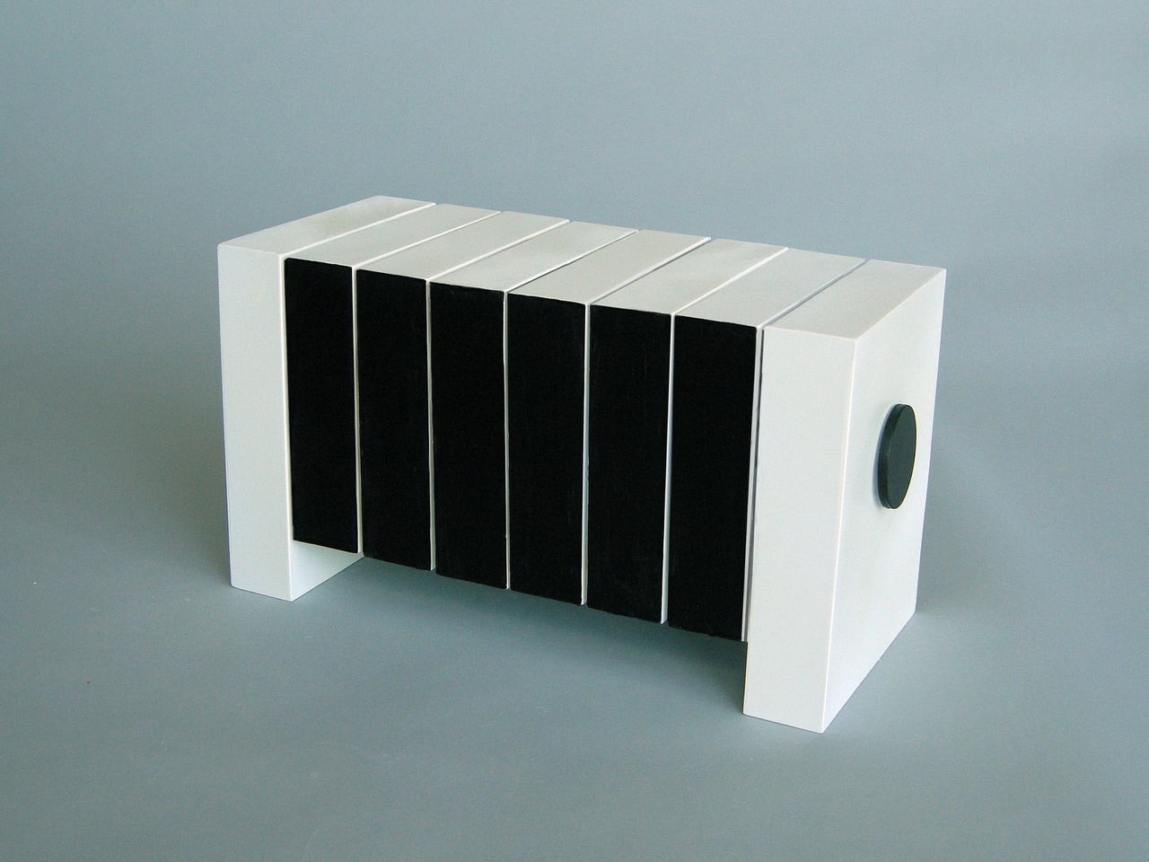
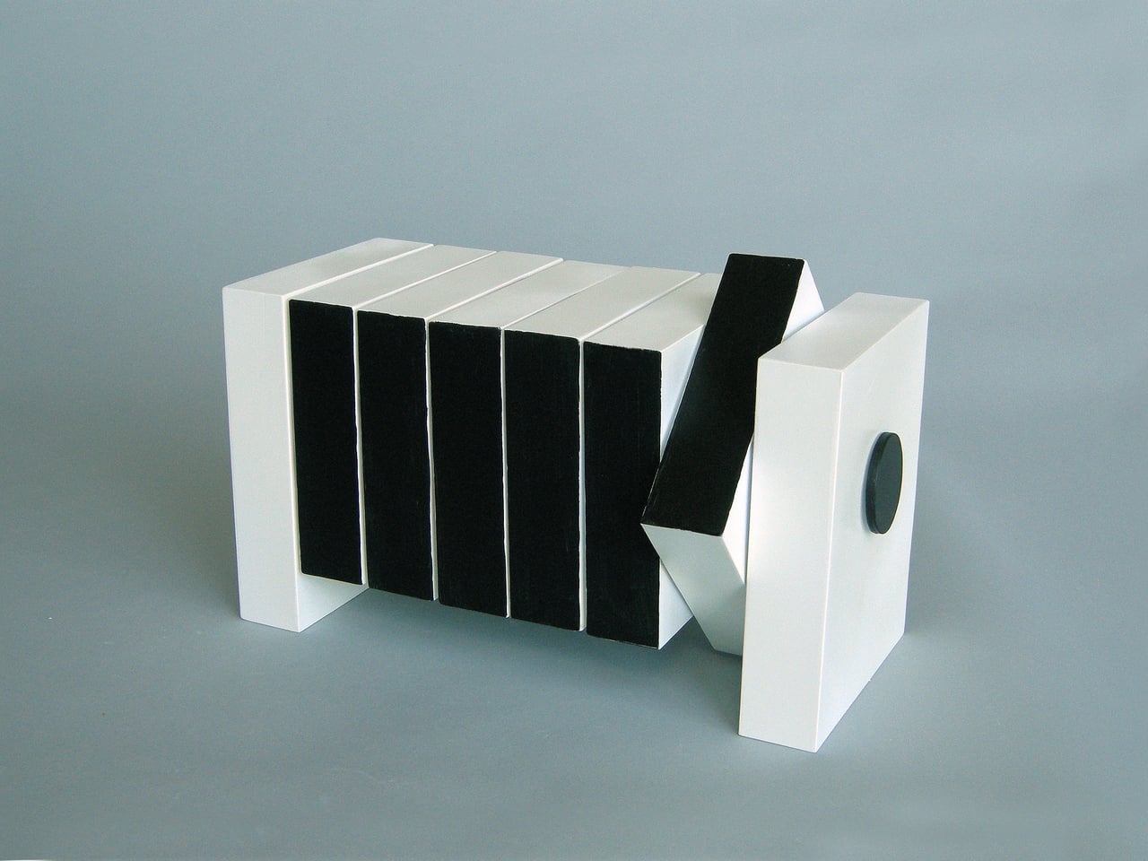
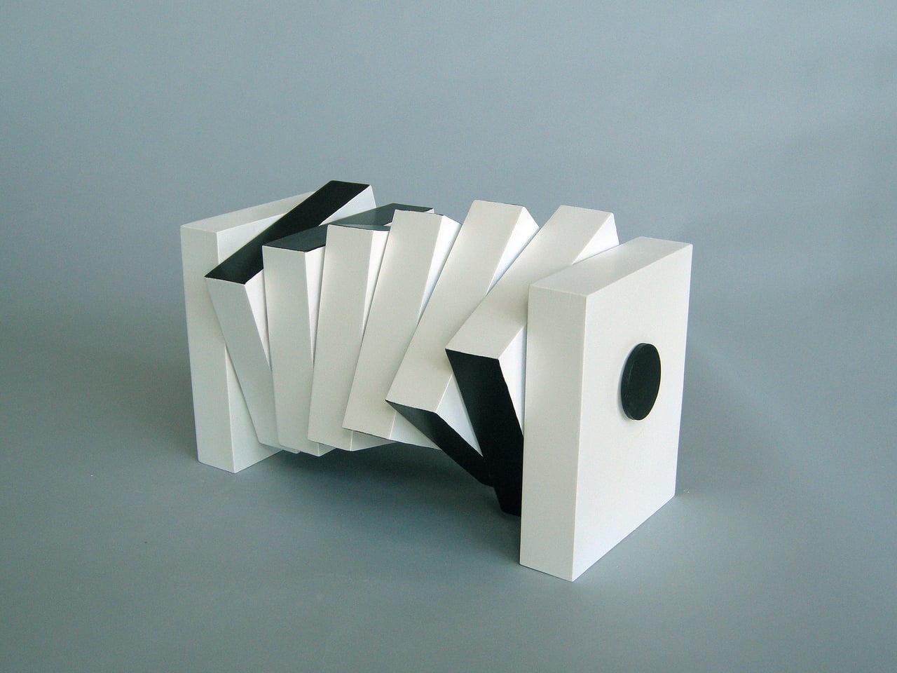
Furniture has always had a love-hate relationship with art. Some pieces are so carefully considered in form that they become objects of admiration, almost too precious to actually use. Others are purely utilitarian and couldn’t care less about looking good. Few pieces try to genuinely blur that line, but that’s the territory experimental artist and designer Michael Jantzen has been working in for decades.
His Interactive Segmented Tables are a compelling example of that approach. These aren’t concepts or prototypes; they’re actual, built furniture that sits in a room and waits for you to decide what they should be. At any given moment, they can work as a proper low table for a drink or a book, and with a few turns of their knobs, transform into something that belongs in a gallery.
The mechanism behind this is disarmingly simple. Each table is made up of identical segments threaded along a center support rod, held in place by two disc-shaped knobs on either end. Loosen those knobs, and you can rotate each segment independently into any configuration you like. Each segment has at least one flat side, so aligning enough of them with flat faces pointing upward turns the whole thing into a stable surface.
This is where the tables stop being passive objects and start being tools of expression. You might rotate the segments into something visually striking when guests arrive, then pull them flat when you need an actual surface for a lamp or a tray. The piece adapts to the occasion rather than the other way around, which is rarely something a table can honestly claim to do.
What makes this even more interesting is that the segments are two-toned, so rotating them doesn’t just change the table’s shape; it also shifts its color pattern. A configuration that shows one dominant tone can open up into a mix of both with a single rearrangement. You could work with the same piece for years and never feel like you’ve fully exhausted what it can look like.
The Interactive Segmented Tables also aren’t locked into a single form factor. Jantzen designed them to be available in many different sizes and table shapes, and they can be made from a range of materials. This means the same essential concept can translate into very different objects, depending on what a space or an owner calls for, without losing what makes them worth owning in the first place.
For anyone tired of furniture that commits too hard to a single personality, these tables offer something different. There’s a quiet pleasure in knowing you can reach down, loosen two knobs, and change what’s sitting in your living room without buying anything new. Few objects manage to be this honest about the fact that taste and function aren’t always fixed, and that’s a more useful quality than it sounds.
Coffee tables quietly witness mornings, late-night emails, and weekend calls with people in other cities. Time passes on screens and clocks on walls, but the table itself usually pretends it has nothing to do with any of it. It just holds mugs and magazines while the hours slip by unnoticed. There’s something interesting about furniture that builds time into its structure instead of ignoring it completely.
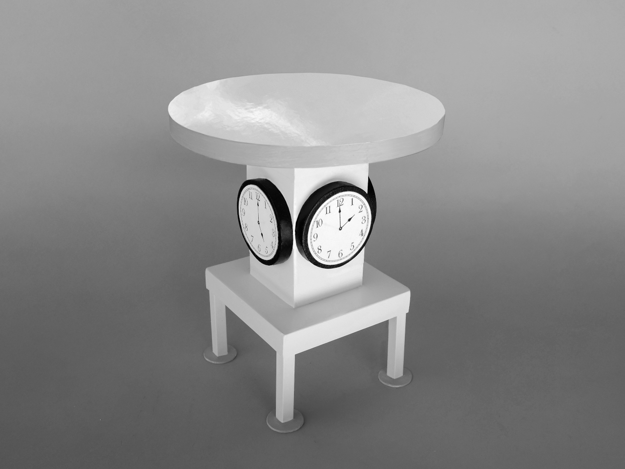
Michael Jantzen’s Timetables are a series of functional art furniture pieces designed to “celebrate the passage of time.” Four are coffee tables, and one is an end table, all made of wood, metal, and glass, with battery-powered clocks that you can access to change batteries and set the time. They’re meant to be used, not just looked at, even as they behave like small time sculptures.
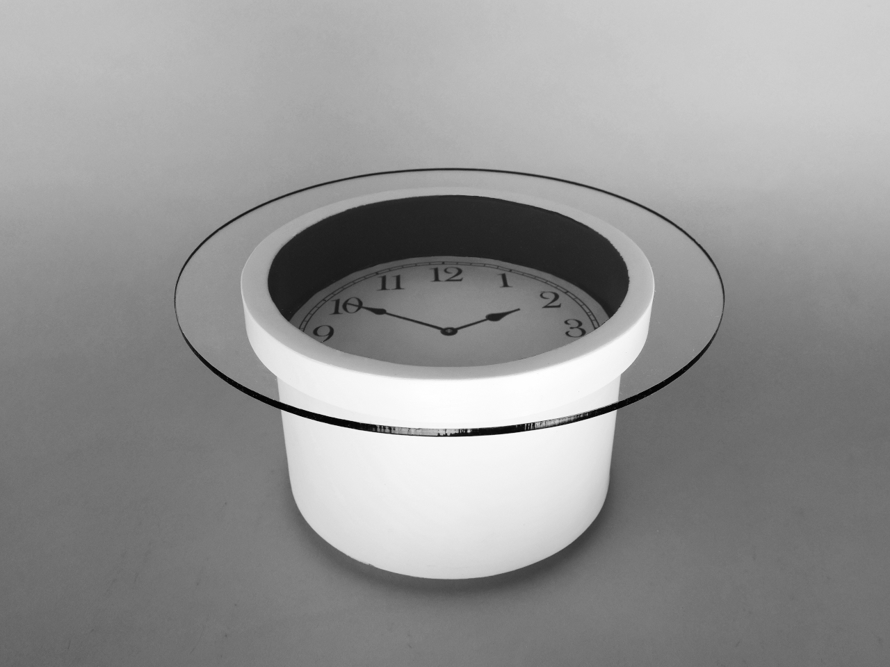
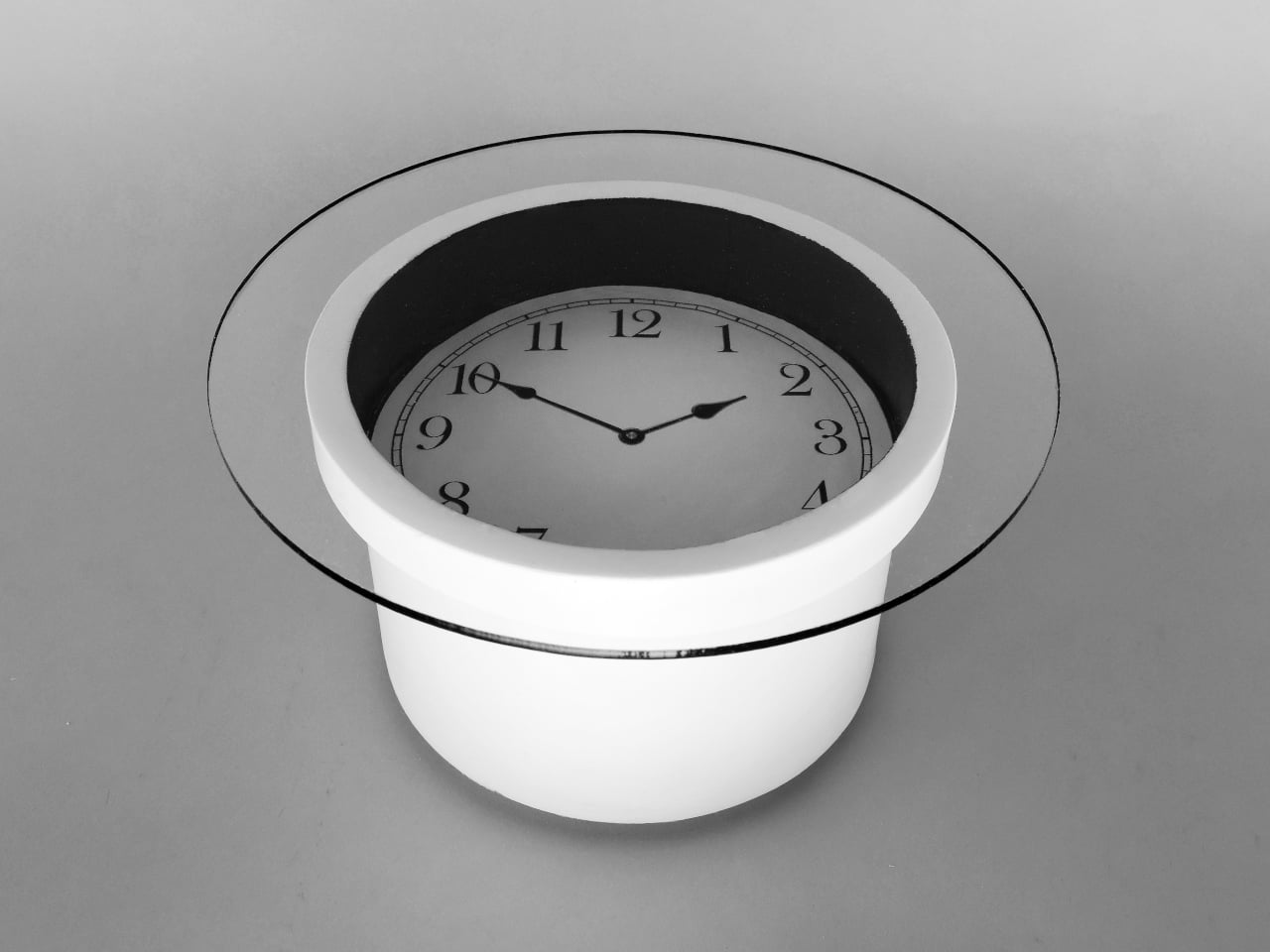
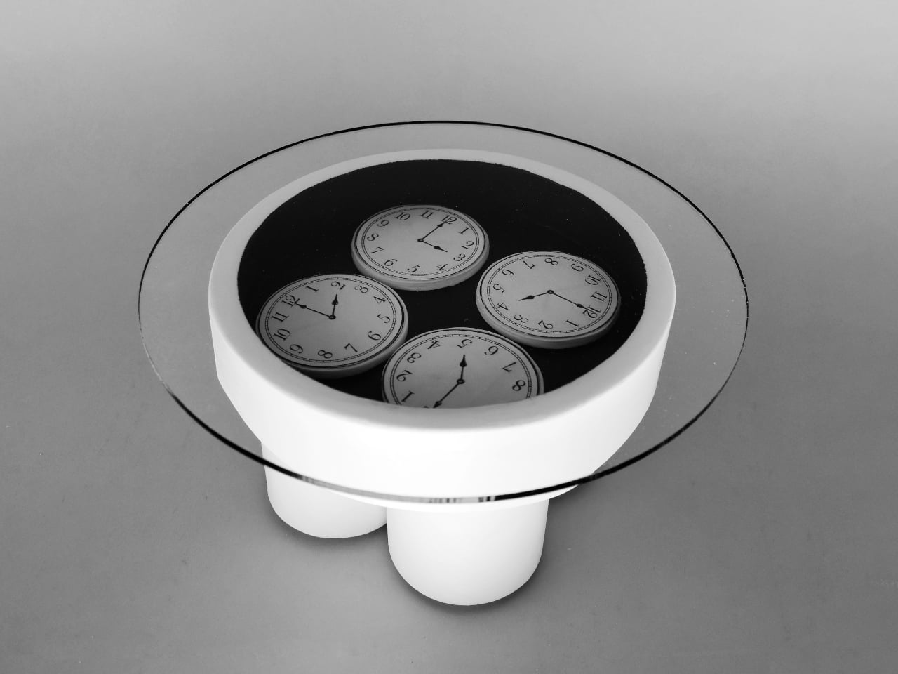
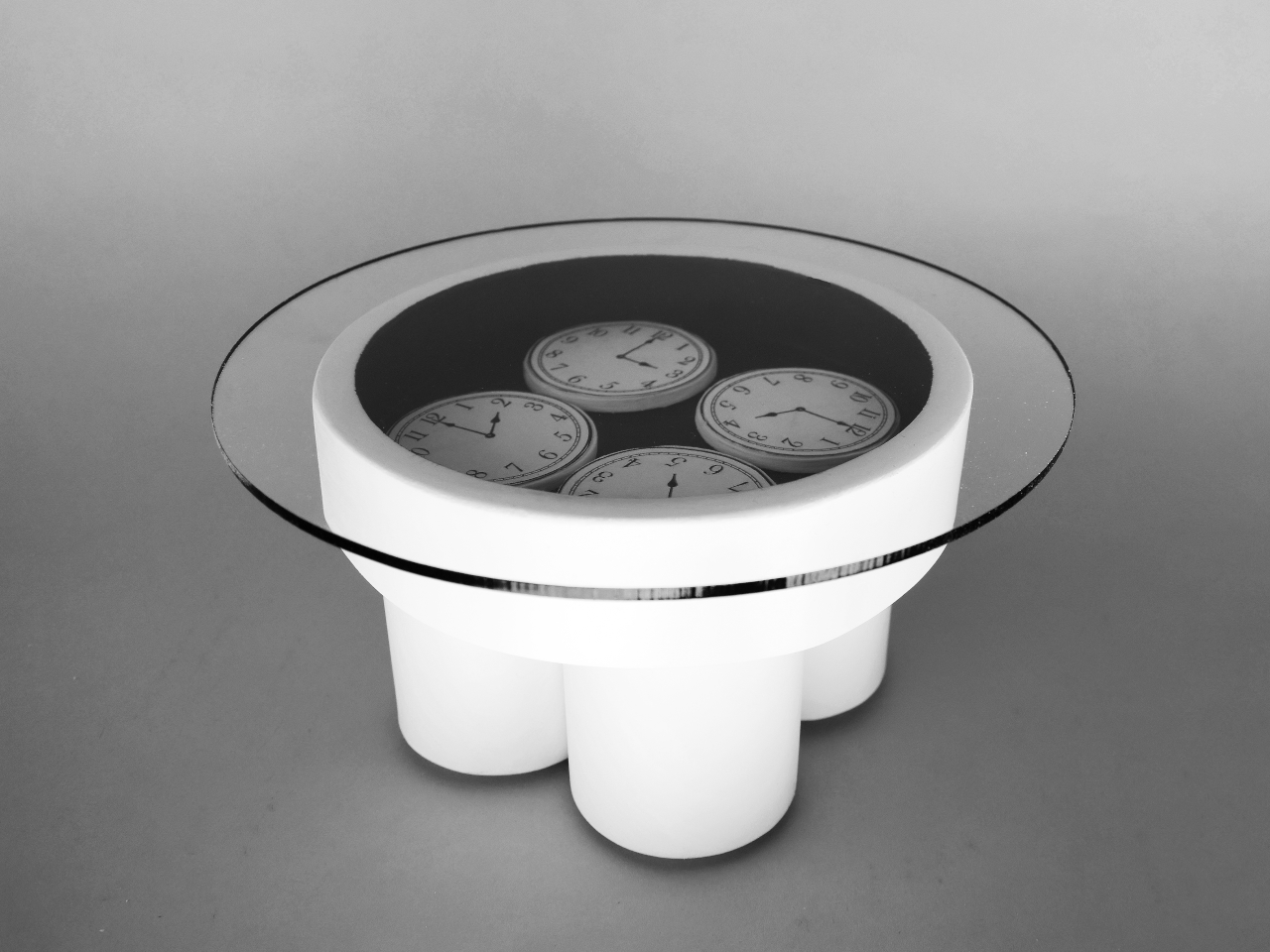
The cylindrical coffee table called Local Time has a single large clock embedded at its center under a glass top. It celebrates the local time of wherever it sits, turning the table into a kind of domestic sundial. Every mug, book, or laptop you set down hovers over that one reference point, a quiet reminder that this particular moment is anchored to this particular place.
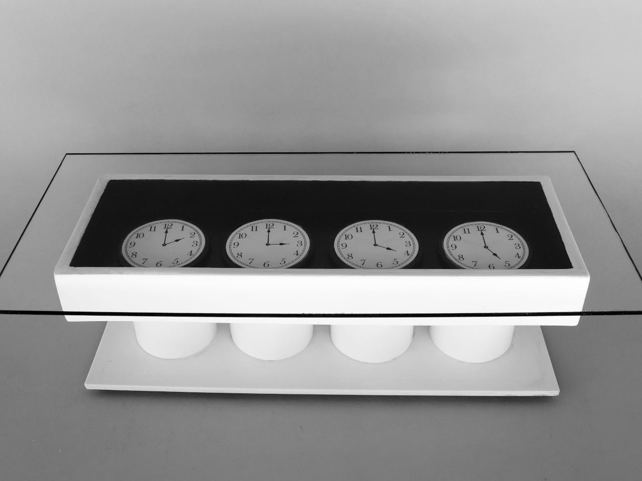
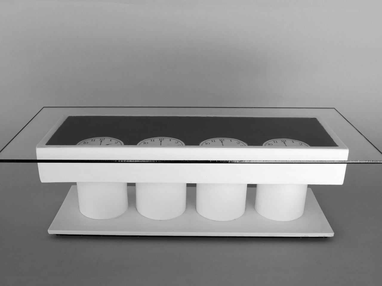
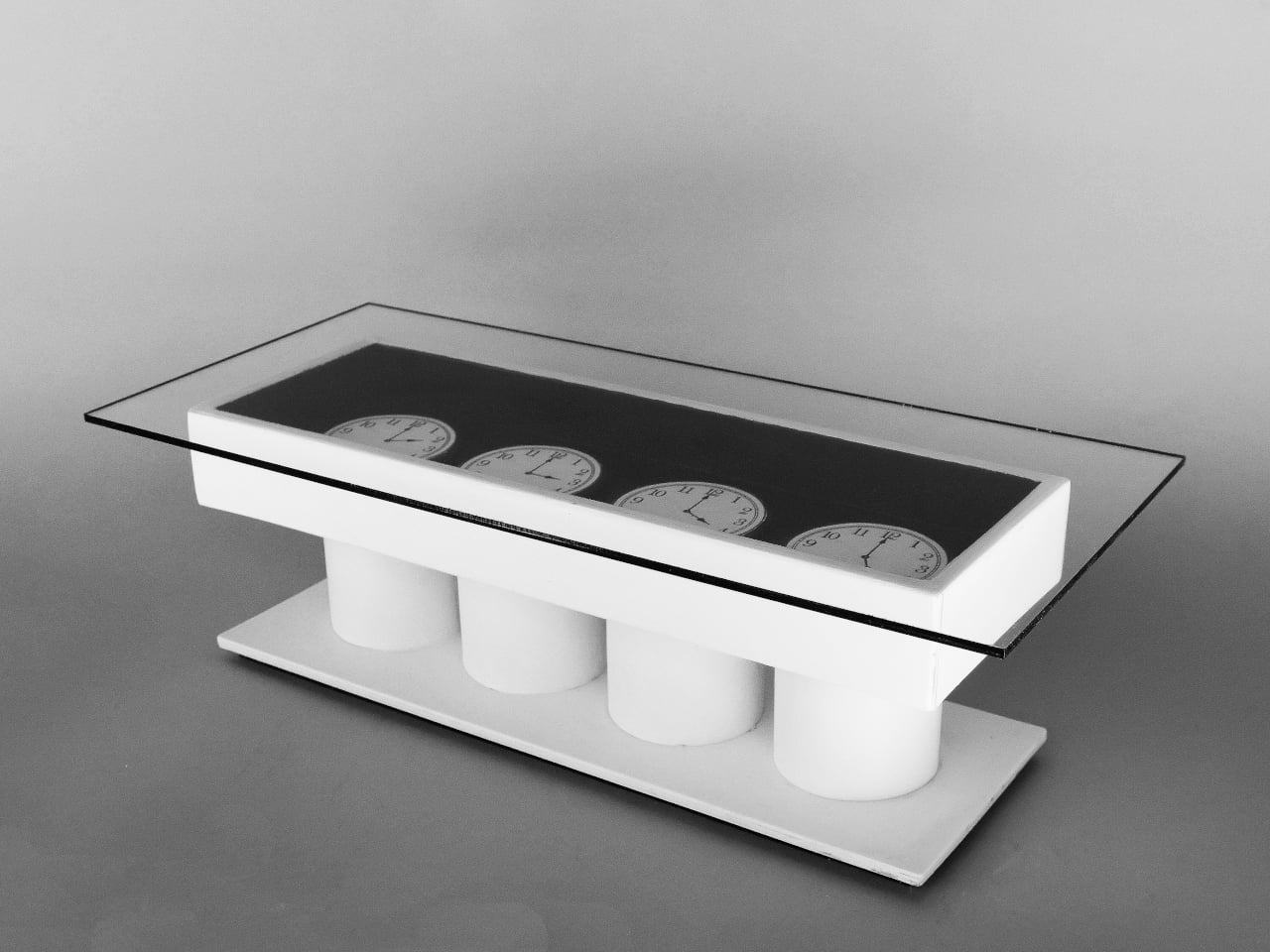
Two pieces stretch awareness across a country. Four Times is a circular coffee table that carries four clocks, each set to Pacific, Mountain, Central, and Eastern time. Timeline takes the same four zones and arranges them in a long rectangle, like a horizontal strip of the US Both tables make sense in homes or studios that constantly juggle calls and deadlines across those zones.
The square end table called Clock Tower has a disc top and a central rectangular column that holds four clocks, one on each face, again set to the four U.S. time zones. It behaves like a miniature city clock tower pulled into the living room. Walk around it, and you see different times, a small physical reminder that even within one country, the day is staggered in four slices.
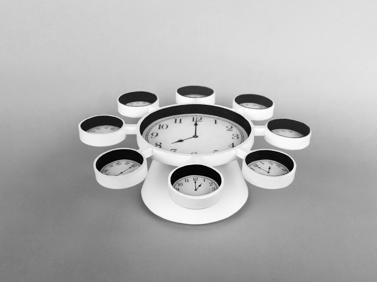
International Time is where the series goes global. A larger central clock is surrounded by eight smaller ones, all supported by a cone-shaped column. The center shows local time, while each smaller clock is set to a different major city around the world and labeled accordingly. Sit at this table, and you’re always aware that somewhere else it’s morning, or late at night, or already tomorrow.
Timetables shift clocks from wall-mounted afterthoughts into part of the surfaces you actually use. The restrained white forms, black clock faces, and clear glass tops keep the pieces calm enough for daily life, while the multiple time references quietly expand your sense of where you are in the day. It’s furniture that does what tables do, but also keeps you gently tuned to a wider, ticking world.
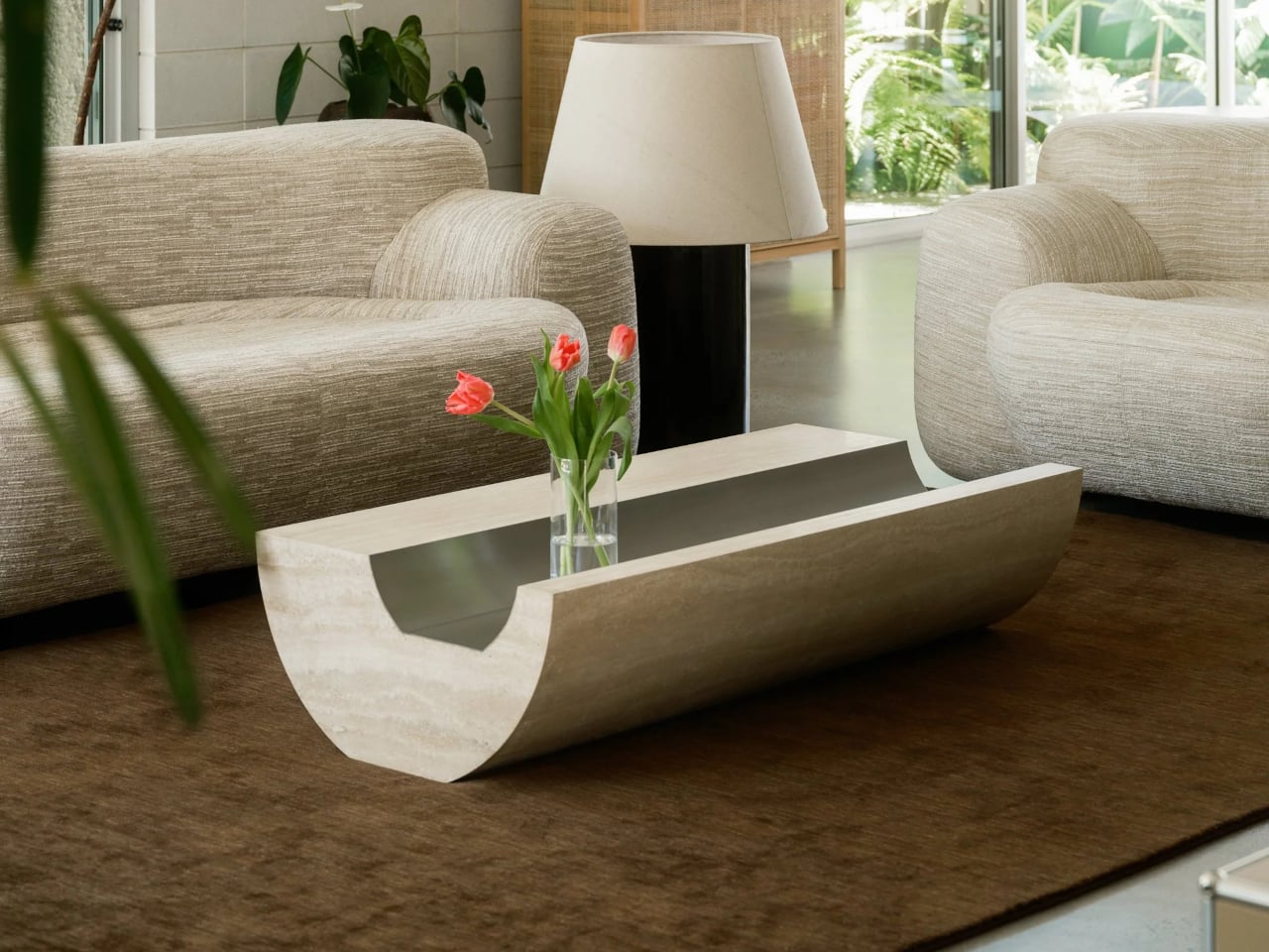
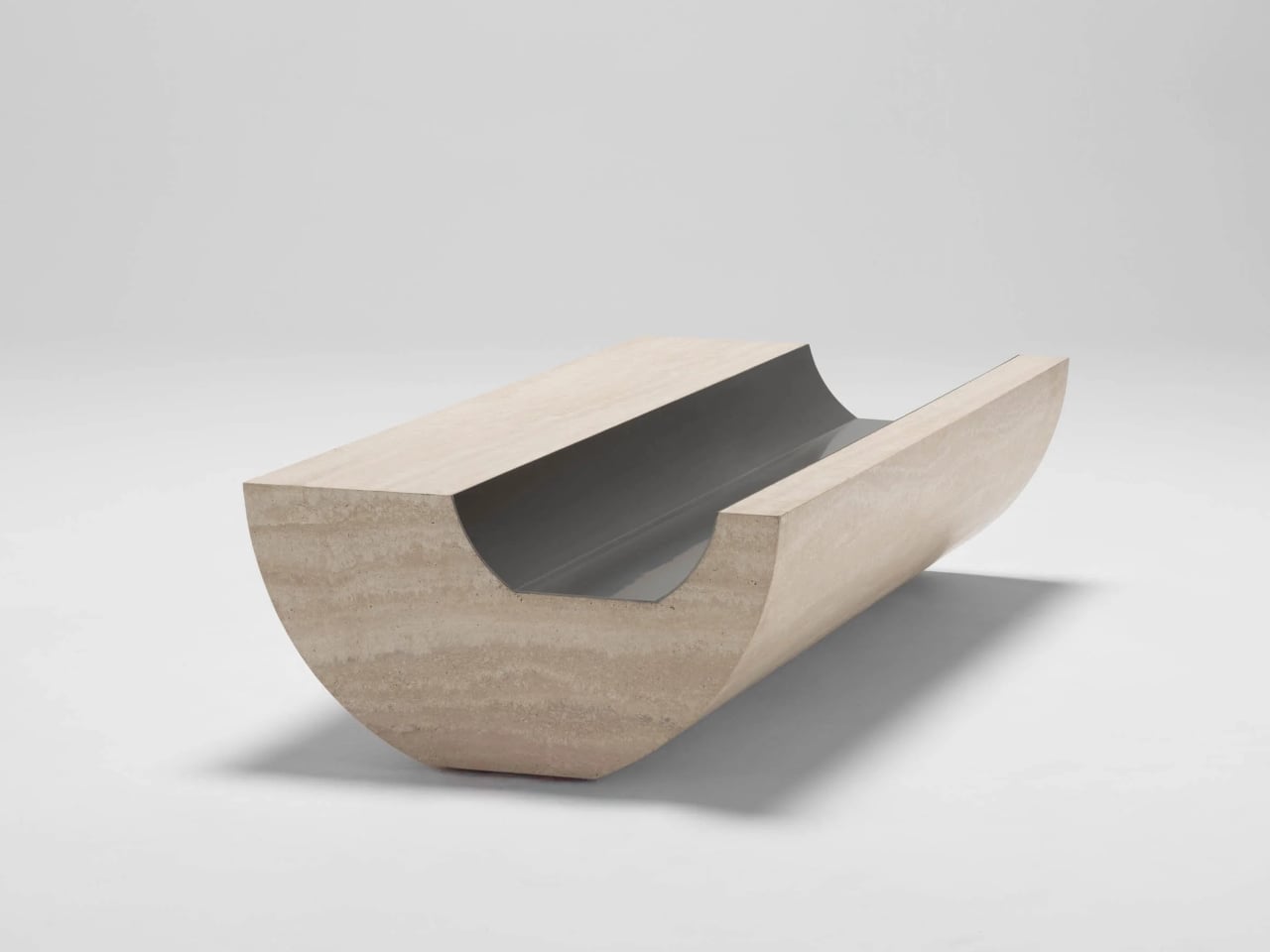
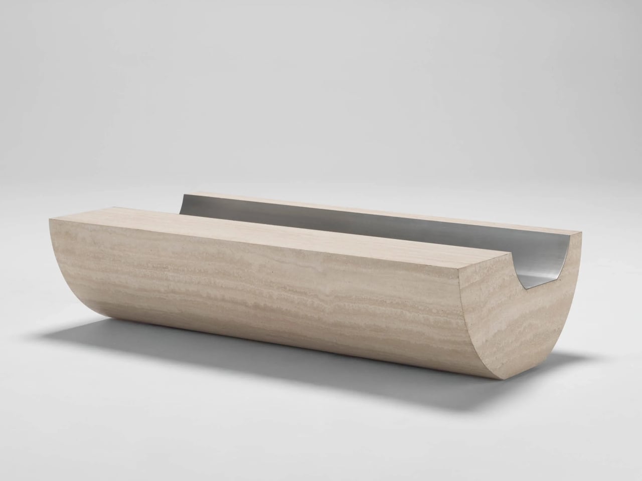
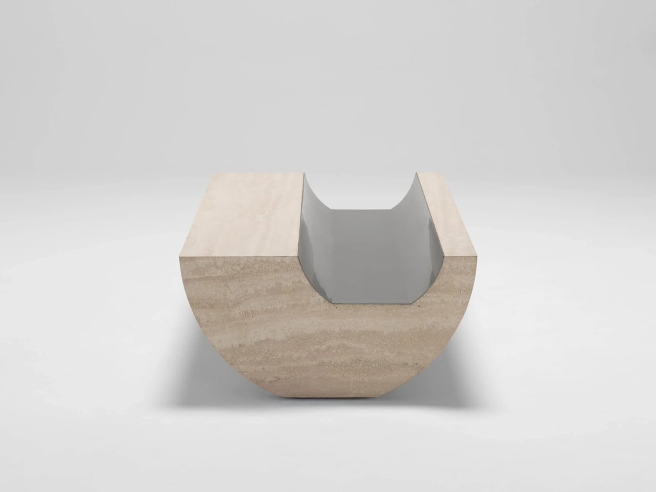
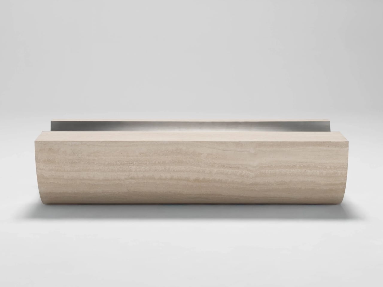
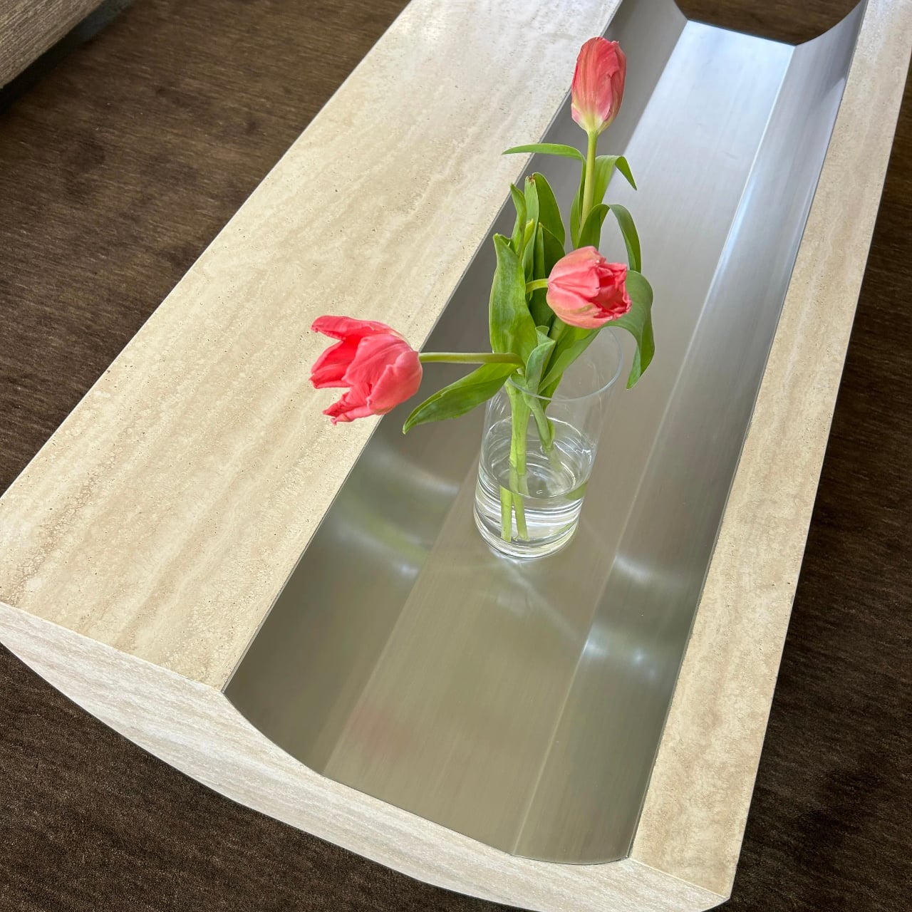
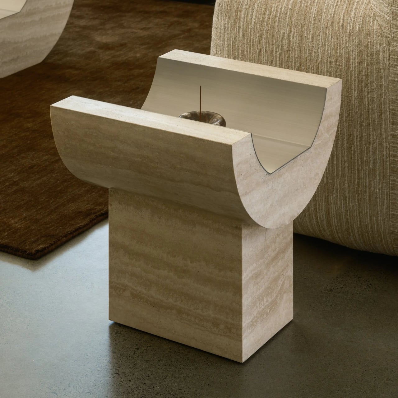
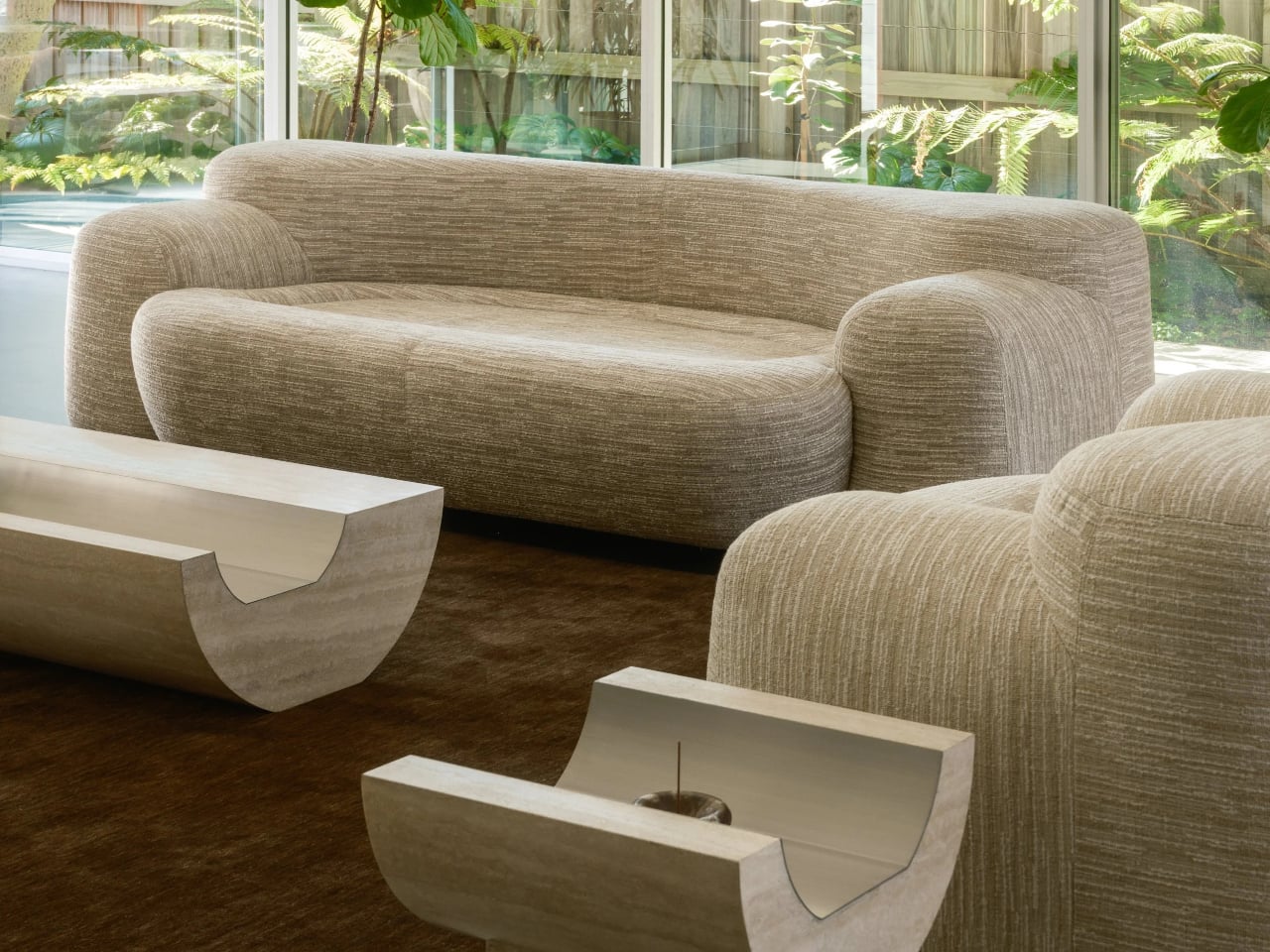
Stone coffee tables often default to simple slabs or blocks, heavy objects that sit on the floor and announce their weight. More interesting pieces treat stone as something to carve and balance, not just to drop into a room. Coffee Table 01 and Side Table 01 by Tom Black lean into that second approach, using one curved gesture to make Italian travertine feel lighter, paired with a contrasting metal inlay that turns solid into void.
Coffee Table 01 is an exploration of form with a classic Italian materiality, carved from travertine with a soft curvature to the underside that gives a sense of floating and elevation. The top is not a flat slab, but a long trough lined with brushed metal, and this inverse layering of a metal finish into stone sets up a contrast in both finish and form, cool against warm, reflective against matte.
The underside curve lifts the edges off the floor so the table reads as a solid volume that barely touches the ground. The concave channel on top mirrors that curve, turning the center into a controlled void rather than a flat surface. The metal inlay sharpens that void, catching light differently from the travertine and making the negative space feel as intentional as the stone around it, a second reading of the same carved gesture.
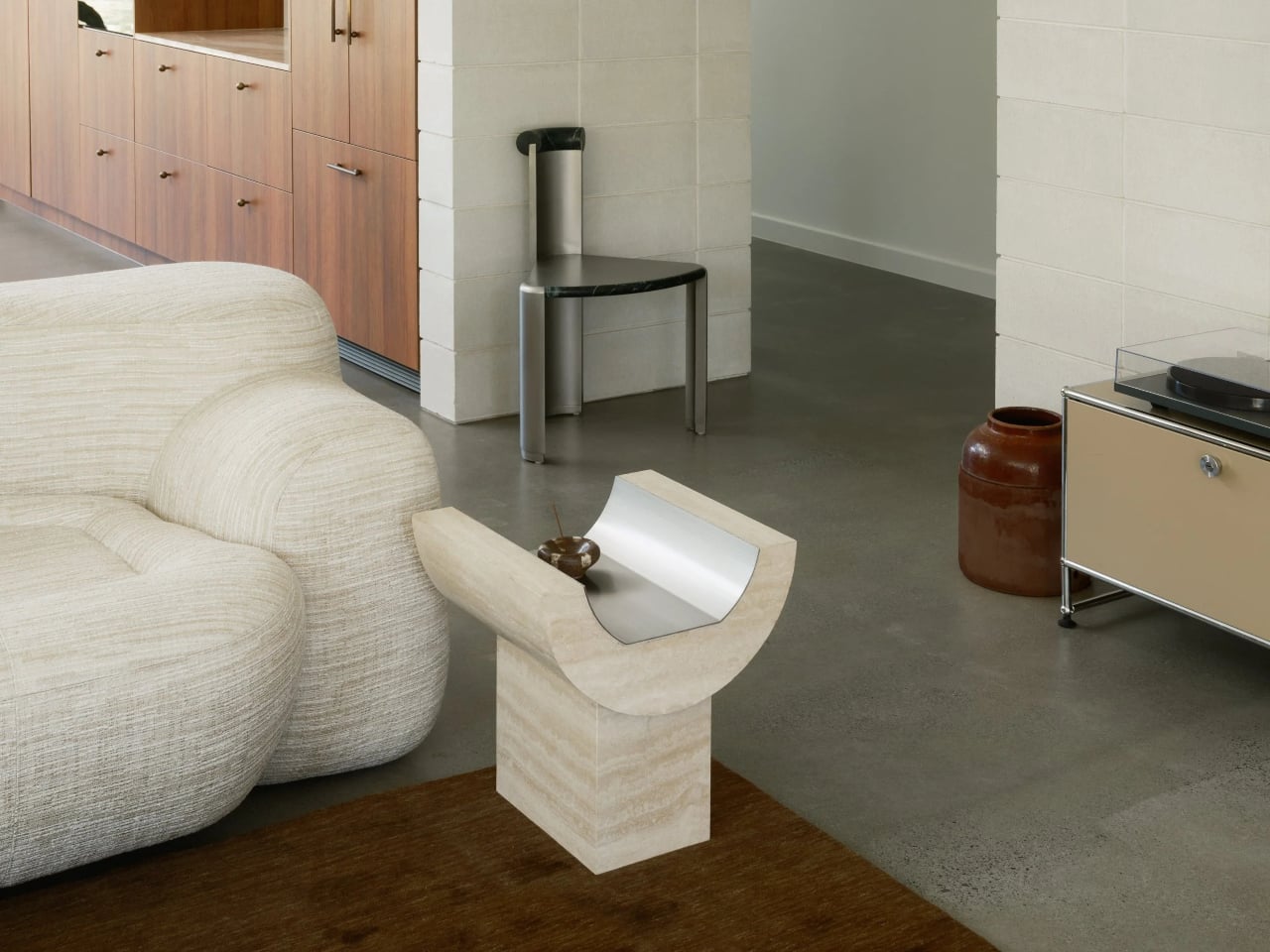
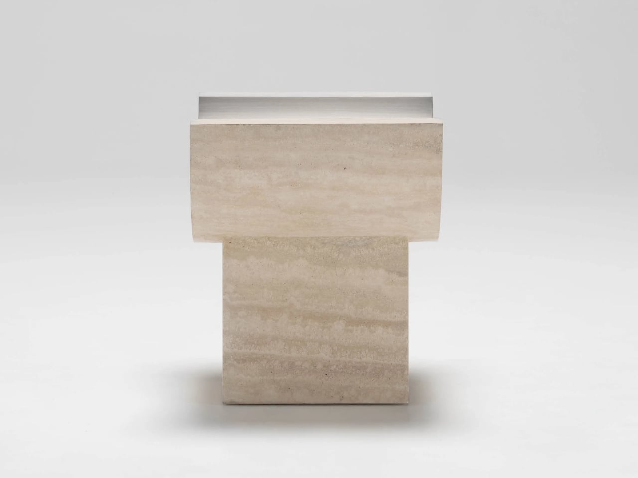
Side Table 01 is designed as the partner to Coffee Table 01 that can also stand alone. It shares the same exploration of form and material but takes a different approach to curvature. Instead of resting directly on the floor, the curved upper element sits on a rectangular base, and that base is what highlights the juxtaposition between curve and block, between the flowing top and the grounded plinth beneath.
The side table effectively rotates the coffee table’s gesture into a more vertical, totem-like object. The travertine trough becomes shorter and more upright, while the rectangular base grounds it. The relationship between the two parts, curved top and rectilinear plinth, makes the piece read as a small monument, echoing the coffee table’s floating mass but with a different emphasis in the room, more punctuation than sprawl.
The choice of Italian travertine brings a sense of permanence and architecture, with its horizontal veining and warm tone playing against the cool, brushed metal inlay. The stone offers classic materiality, while the metal introduces a precise, almost industrial note. Together, they feel less like a decorative veneer and more like a small section cut from a larger, imagined building, where structure and surface are the same thing.
Coffee Table 01 and Side Table 01 operate as a family. The coffee table stretches low and horizontal between seating, the side table stands as a vertical accent beside a sofa or chair, and both share the same carved gesture and material palette. For anyone who likes furniture that behaves like small pieces of architecture, these two feel like a quiet study in how far one curve can go when you pair it with the right material and the right inlay to make the mass feel like it might lift off the floor.
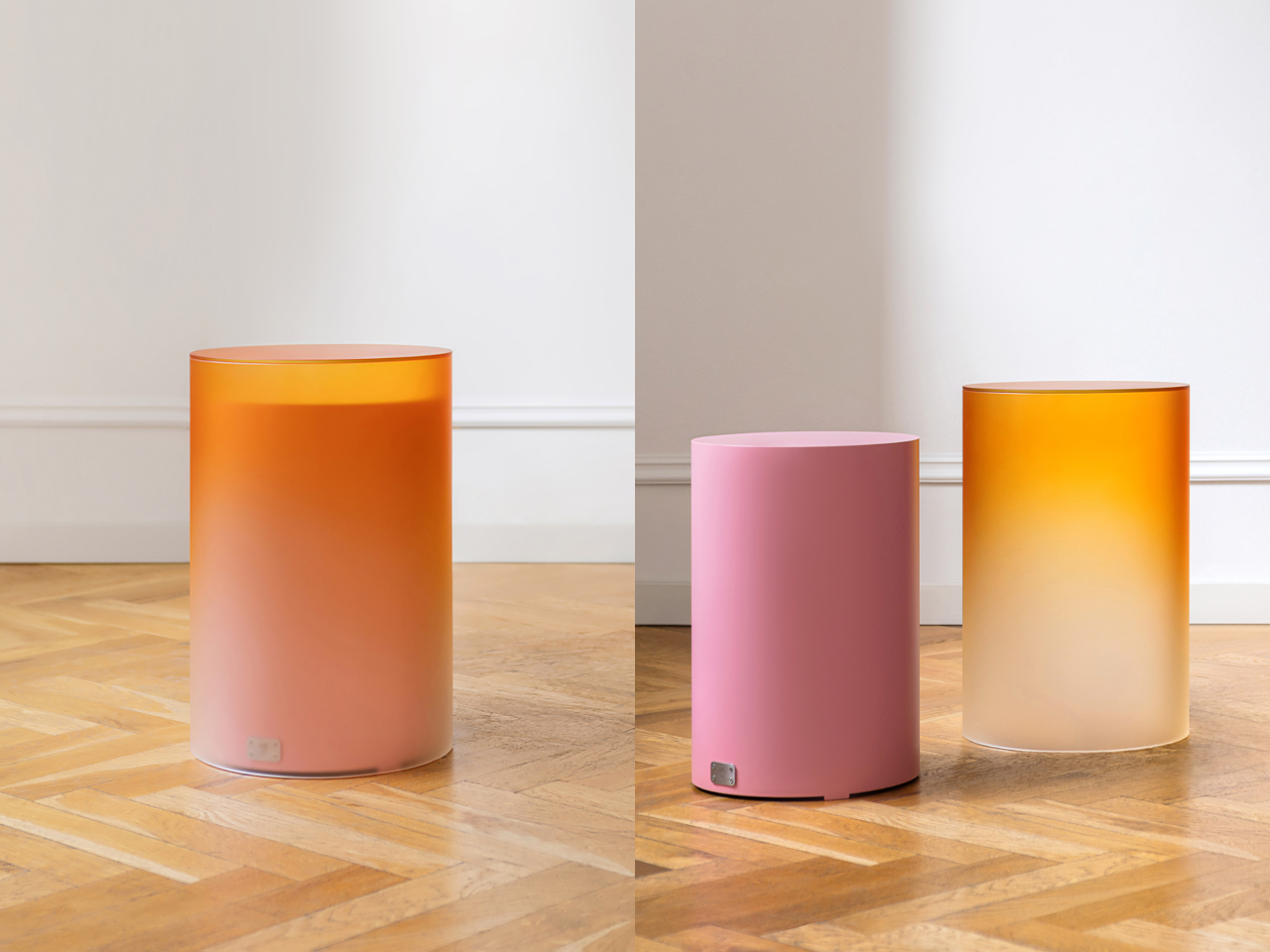
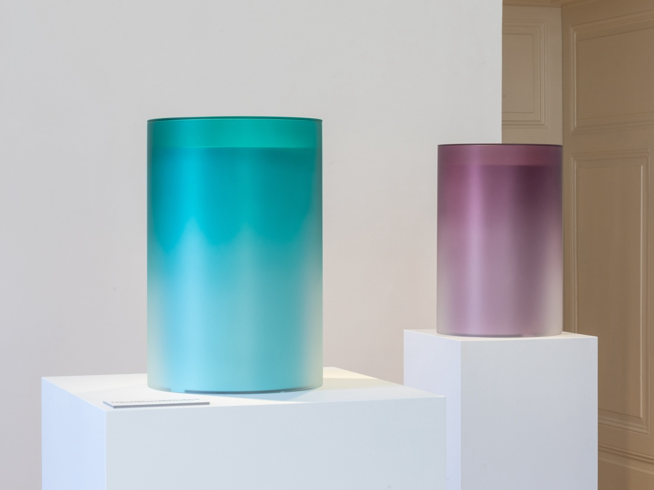
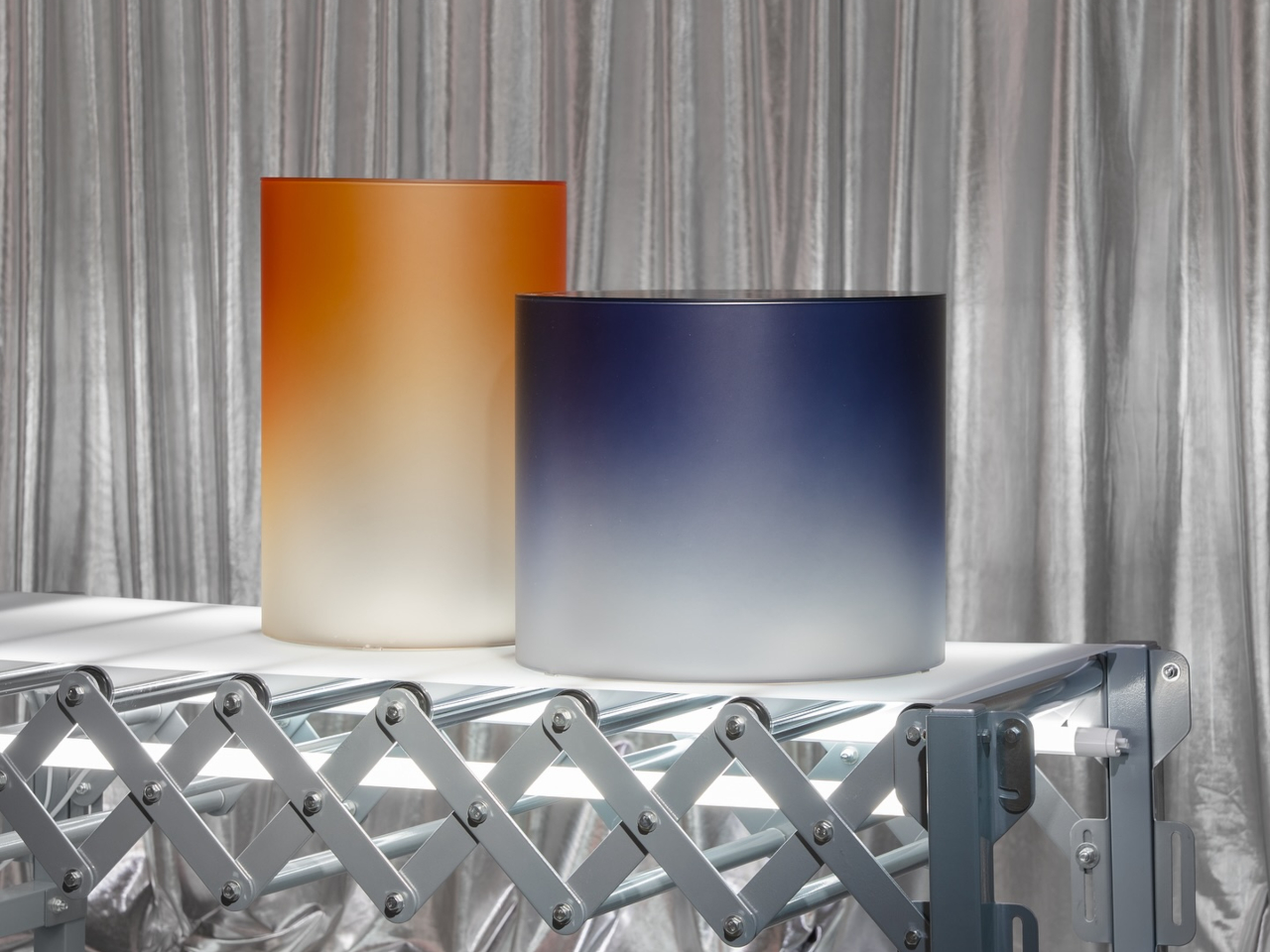
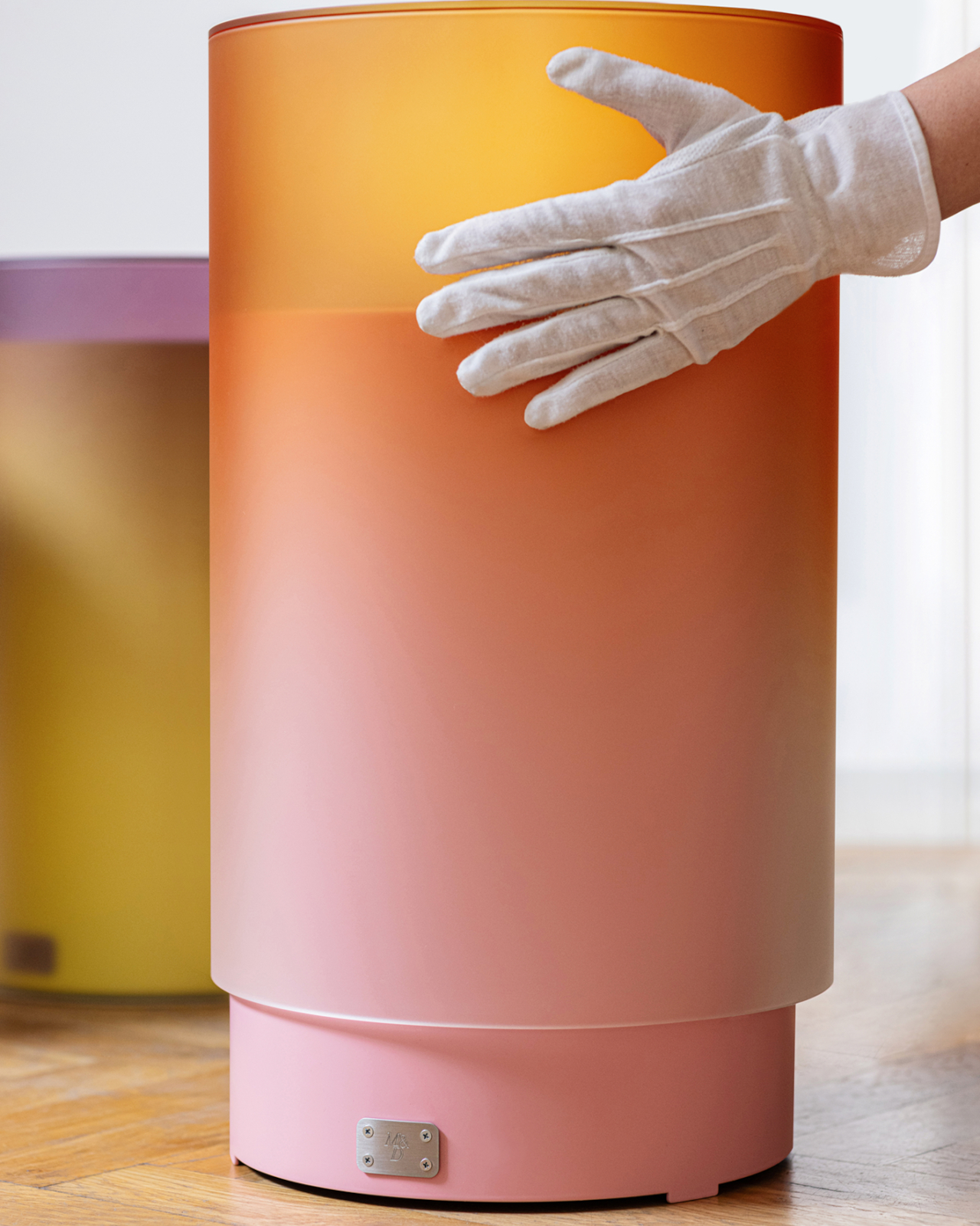
Tables come in a wide variety of designs ranging from the basic flat surface on a stand to elaborate sculptural objects. There is also a spectrum of colors and materials, like wood, plastic, metal, or glass. Given their permanent functions, you’re often forced to choose one of these permutations upon purchase and be stuck with them forever.
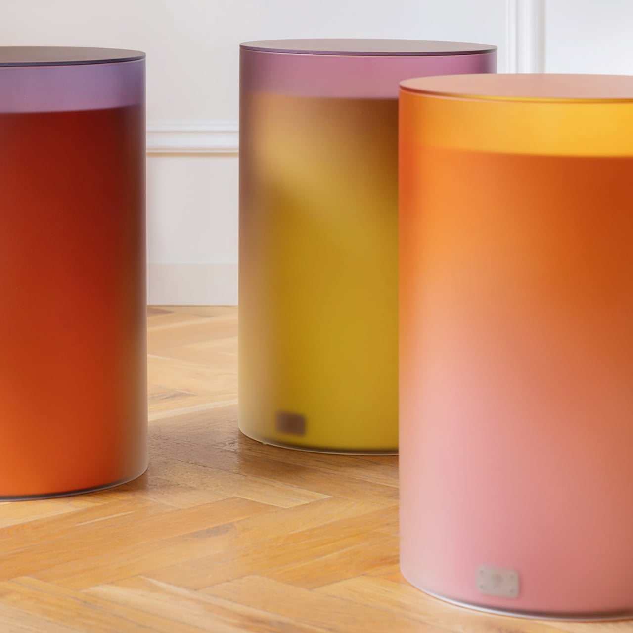
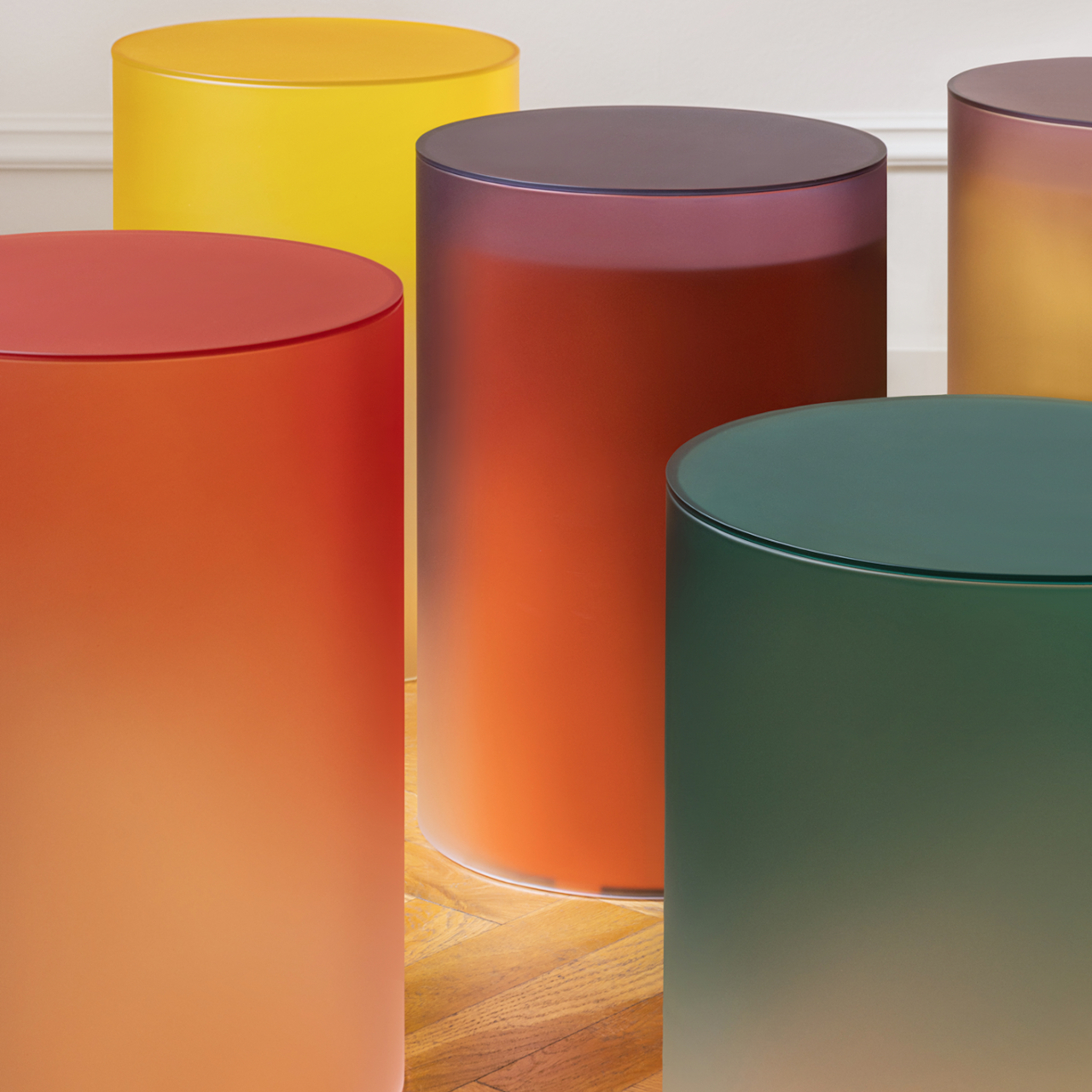
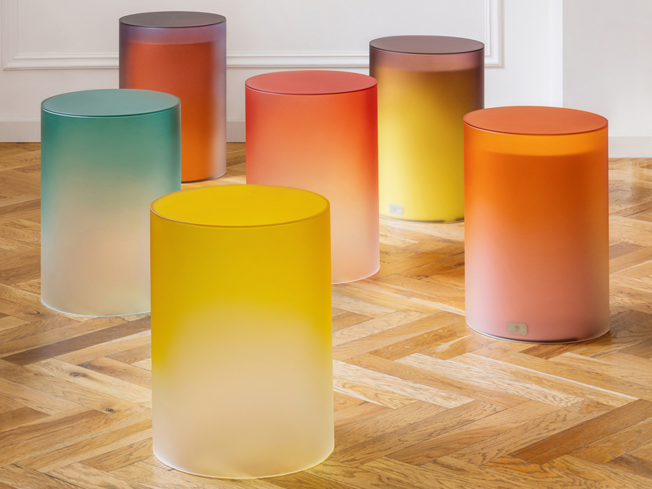
Fortunately, there are some creative ways to get around that with a simple play of color and materials. These cylindrical side tables might look simple in their forms, but their playful colors give life to the room. Putting one inside the other, however, creates an almost magical appearance that also looks good enough to lick, though we definitely don’t recommend it, no matter how tempting it might seem.
In terms of function, the Candy Tables collection is pretty basic. It comes in two variations – a solid cylindrical side table and a slightly larger hollow cylinder with an open bottom. They can be used independently, leaving you with two tables, but they can also be nested inside each other if you need to save space.
The magic happens through their colors, using a simple principle we all learn in grade school art class. Mixing two colors together creates a third color, depending on the ratio. In this case, the taller cylinder made of glass lets the metallic table inside show just a little of its color, mixing the two to create a visual effect that almost looks like hard candy.
The collection is available in six smaller metal tables and six larger glass cylinders. You can mix and match them, provided you have more than one pair, to create different combinations as the need arises. Or you can also just nest tables with the same hues to really highlight the color. It still looks pretty either way.
Candy Tables combines simple shapes and color theory to create a very pleasing and interesting aesthetic. The design also cleverly offers the benefit of having two tables or a single one, depending on the need and situation. More importantly, the lively design brings joy into any space, be it residential or commercial, completely transforming the room without complicated and sophisticated gimmicks.
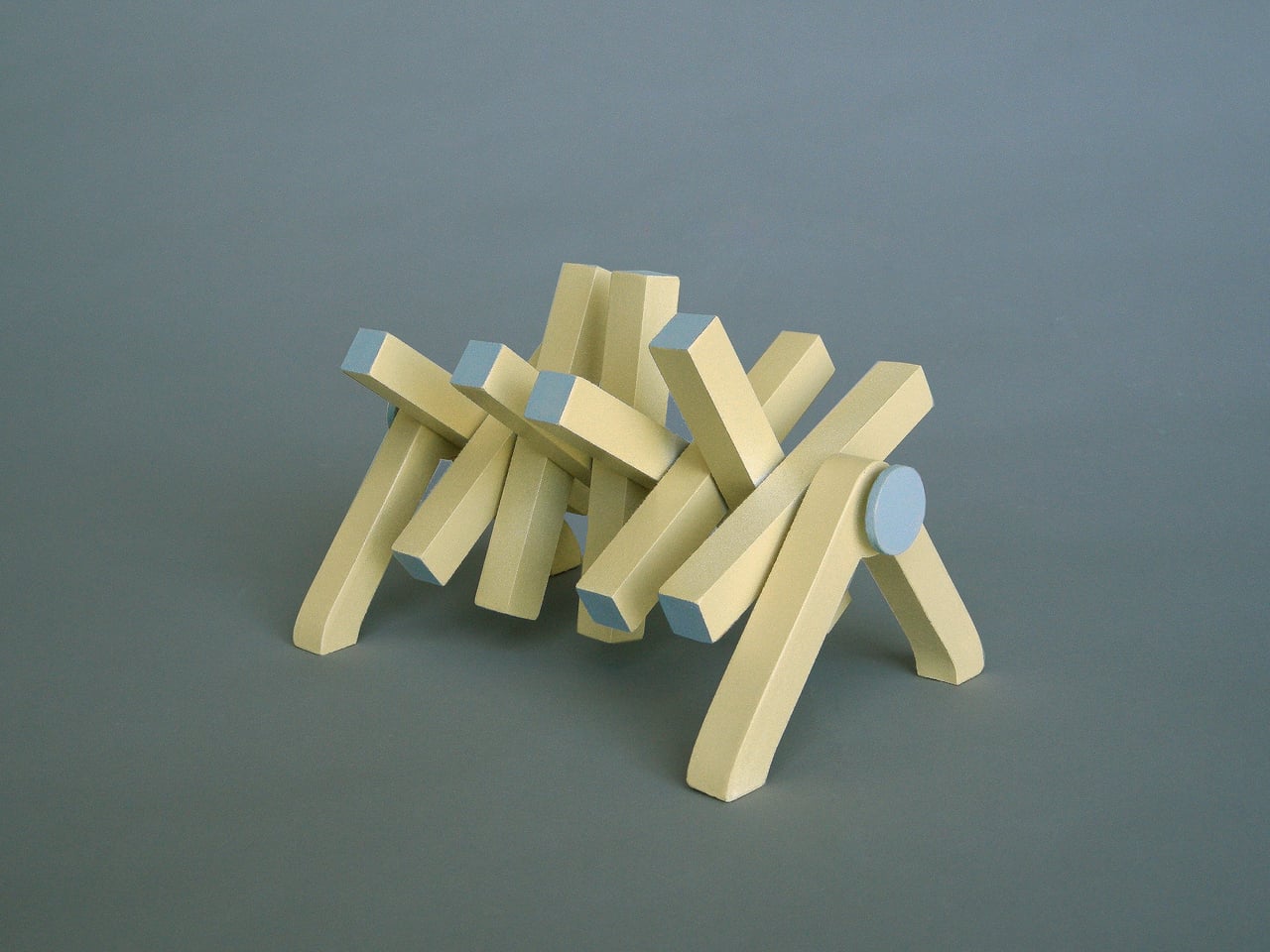
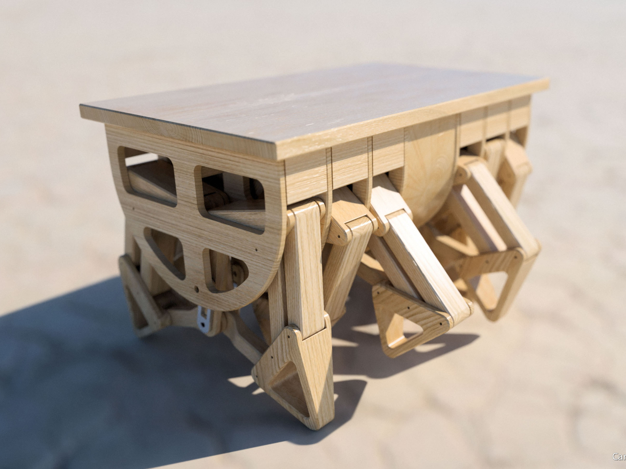
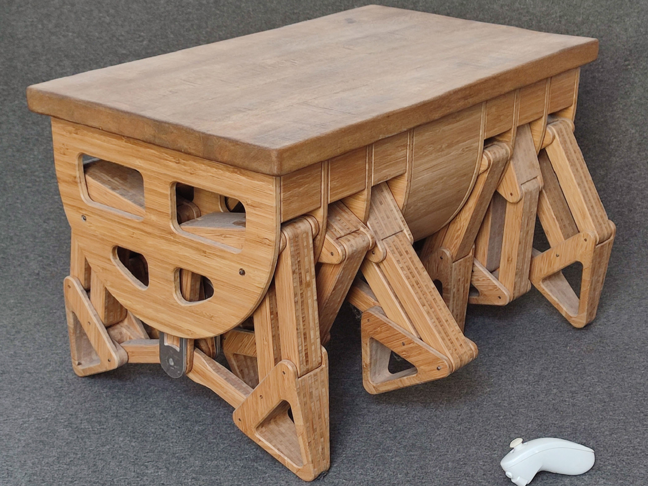
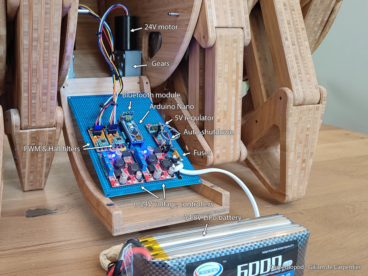
In the prehistoric past, man’s survival relied on preserving as much energy as possible by using the least amount of effort possible to complete a task. Today, that might sound a little like laziness, but it was that spirit of necessity that gave birth to many of humanity’s greatest inventions, from cars to smartphones to this rather ingenious walking wooden table. A product of passionate craftsmanship, computer wizardry, and creative imagination, the Carpentopod and its 12 crawling legs could be the semi-automated table you’ve dreamed of that will bring your snack and drink at your command, or a sci-fi nightmare come to life that will haunt your waking hours.
Given our advancements in robotics, you might think that making a table walk would be a trivial pursuit, but unlike a wobbling and bouncing quadruped, a table needs to be stable and level if it’s to be useful. The biggest puzzle to this project, therefore, is designing legs that would move the table without jiggling and potentially spilling its contents. To solve this, computer software was used to generate thousands of leg linkage variations and have them compete with each other based on certain criteria. In other words, a kind of machine learning to create the best leg design that can move smoothly in a horizontal direction.
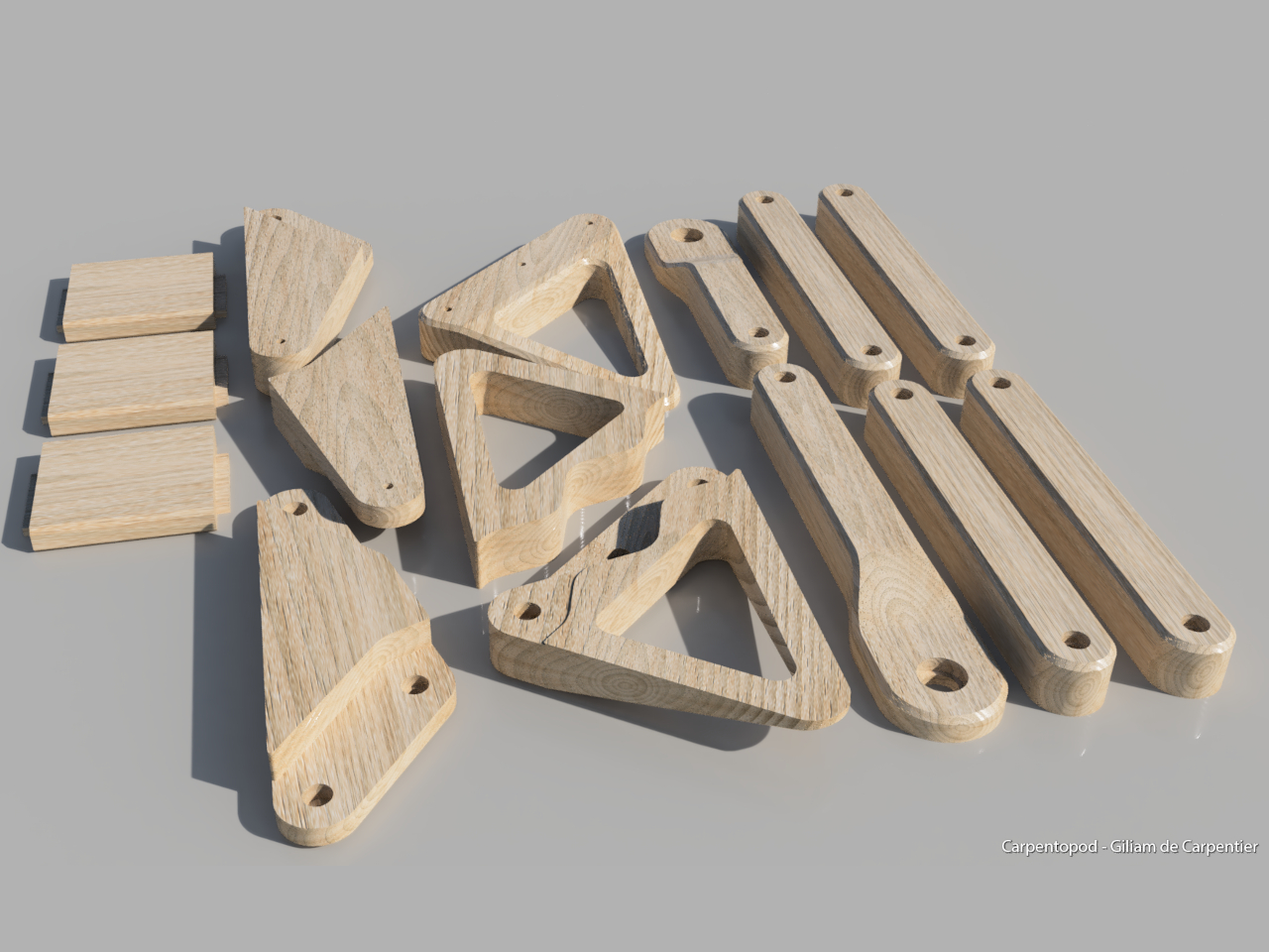
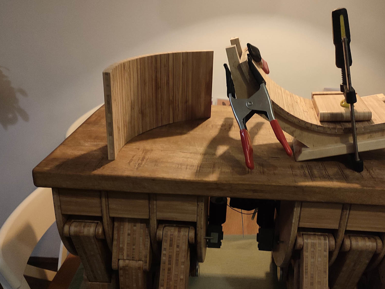
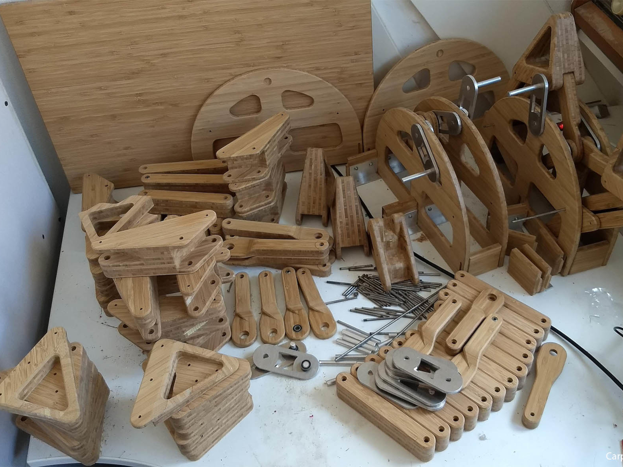
The result is a design that looks like a fusion of Theo Jansen’s iconic Strandbeest mechanism and the movement of multi-legged creatures like centipedes. The table moves with no less than 12 legs in four groups, as each leg can only do a third of the walk cycle on the ground. As you can imagine, the assembly of this wooden machine is no trivial task. The leg linkages themselves were CNC’ed from laminated bamboo for the sake of precision. All in all, There were more than a hundred bamboo parts involved in the construction, each of which was sanded and lacquered.
The Carpentopod isn’t just a mechanical wooden sculpture, however. There are motors used to move the legs, specifically the smooth, brushless motors used for automated curtain products. There’s also plenty of electronics involved, though the majority of them are for controlling the table remotely. Curiously, these non-wooden parts are all hidden inside a central hollow compartment, almost like the belly of the beast, so to speak. The table can be controlled using a custom wand-like remote not unlike a Wii-mote.
It’s definitely mind-blowing how the table can walk so smoothly without toppling things on top of it or spilling their contents. There’s still a bit of shaking, of course, but still within safe ranges. One can only imagine how the basic design of the Carpentopod could be improved with some sensors and automation, delivering your food while you sit on your couch and then parking itself away once its job is done.