Moisture is the secret ingredient in Midea’s award-winning air fryer

Steaming is about as old as Chinese cooking gets. Bamboo baskets stacked over a wok have been turning out buns, dumplings, and whole fish for centuries, so it makes sense that a Chinese appliance giant would want that steam inside its air fryer. Midea’s new Humidity-Controlled Air Fryer does exactly that, pairing hot air with Smart Moisture Technology that can air fry, steam, or blend the two. The pitch is simple: crunch where you want crunch, juice where you want juice. Your bao and your chicken wings can finally share a counter spot, and nobody has to fight over the steamer.

Smeg’s steam air fryer and Xiaomi’s Mijia Pro Steam and Bake both bolted water tanks onto air fryers this year, and both leaned hard on the crispy wings pitch. Midea treats steaming as a full cooking mode, which tracks for a product designed around China’s multi-person households. The 8-liter (about 8.5-quart) cooker comes from Midea’s Shunde-based cooking division and won a 2026 Red Dot in the Design Concept competition’s Ready For Market category, reserved for designs that are nearly or fully developed but not yet on sale. Two transparent windows let you watch dinner without letting the steam out. There’s no price or US release date yet, which is my only complaint so far.

Designers: Peng Xi, Wang Jin, Ma Yufeng, Jo Jeongmin, Peng Yunyun & Chen Hailong (Midea)
Midea has been sneaking water into air fryers for a while now. Its European 7.5-liter model offers separate Moisture and Air Fry functions with automatic steam injection, and in China the 6-liter KZC6019D steam air fryer sells on JD for 308 yuan, roughly $43. The new design scales that idea up to 8 liters and hands humidity control to Smart Moisture Technology, which dynamically regulates moisture so the chamber can run wet, dry, or a mix of both in one cycle. In practice, that could mean steaming a batch of frozen dumplings until tender, then switching to dry heat so their bottoms crisp up, potsticker style. Your standalone steamer can finally retire.

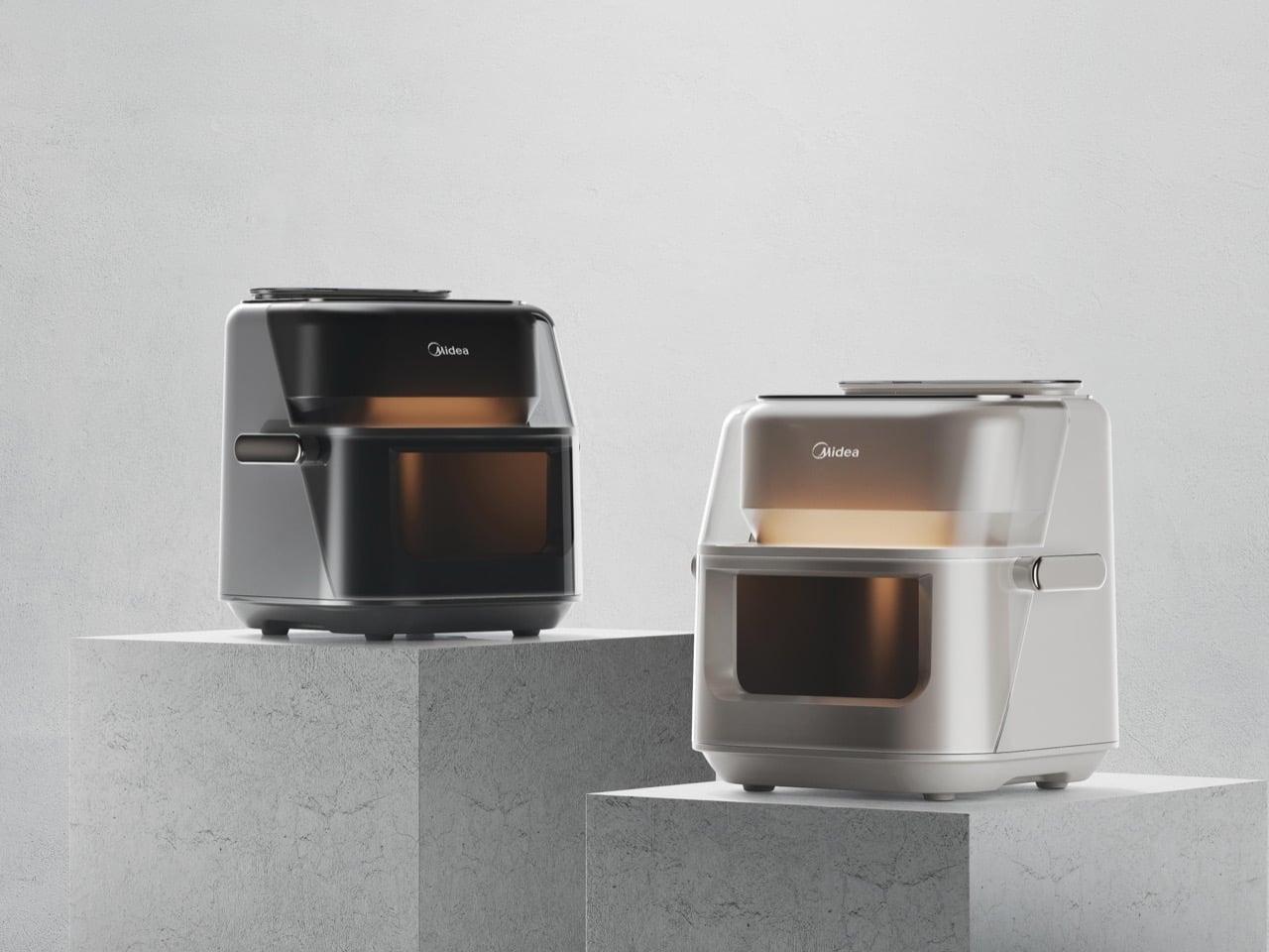
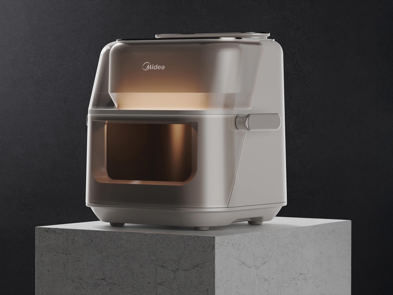
The two transparent windows do serious functional work on a steam cooker. Every time you yank open an air fryer basket to check on dinner, you dump the hot, humid air the machine just spent minutes building up. Midea’s lower window looks straight into the basket, so you can watch the browning happen without breaking the seal. Above it sits a tinted, translucent hood that gives a second view into the cavity, with a conical housing glowing amber behind it. Chronic basket-pullers like me finally get to keep our hands to ourselves, and the steam gets to stay put.
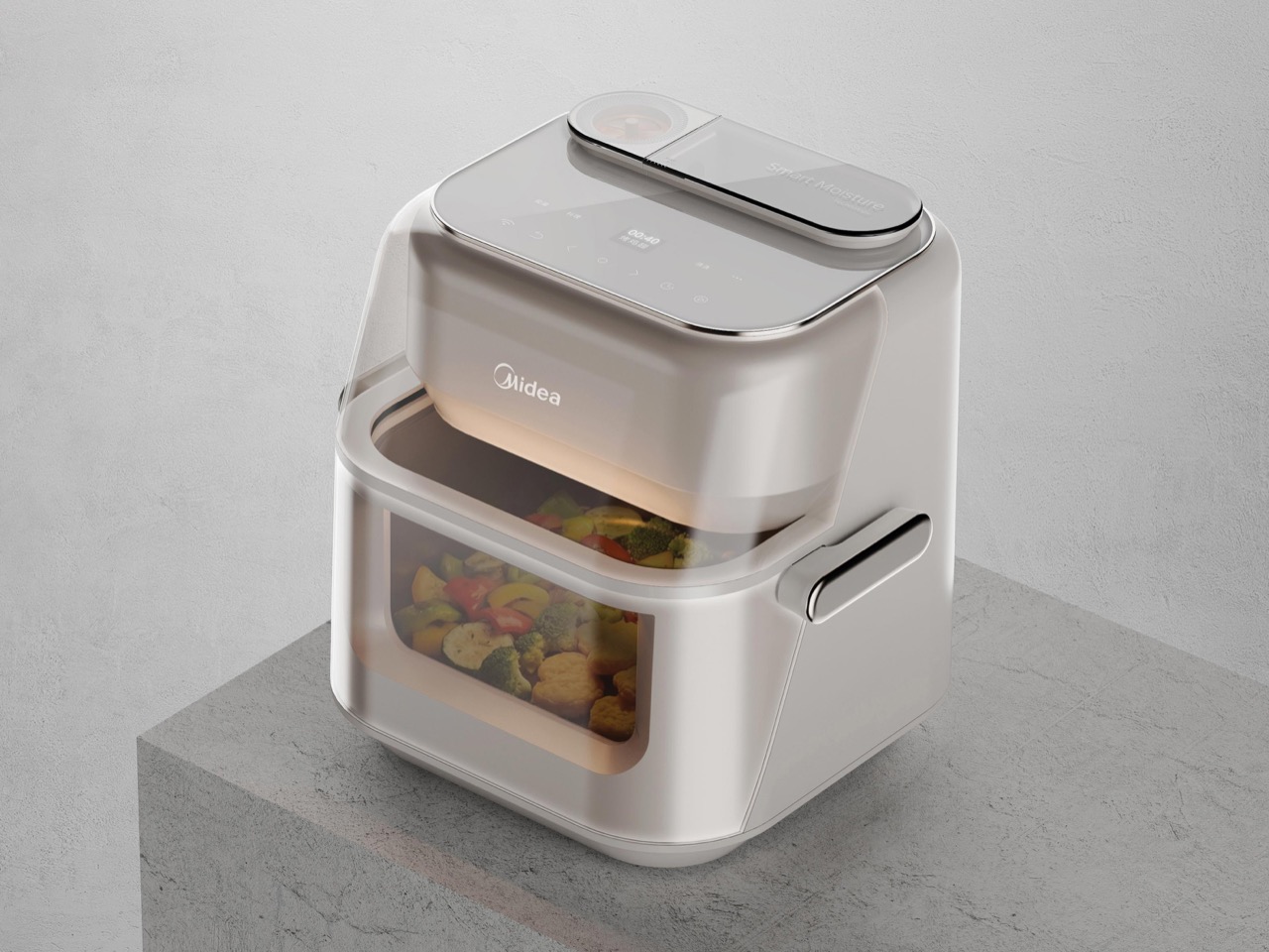
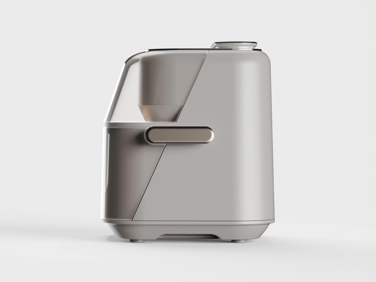
A sharp diagonal seam runs down each side, splitting the translucent upper hood from the solid lower body and giving it a forward lean, like it’s mid-stride toward your plate. The handle, a champagne-finished pill, sits on that seam at the center of the side panel. Centering it makes sense for an 8-liter basket loaded with a family dinner, since the weight stays balanced instead of tipping toward your wrist. On top, a glass deck carries touch controls and a timer display, with a Smart Moisture module and what looks like a water fill cap at the back. Midea renders it in warm white and dark gunmetal, a welcome break from the glossy black boxes crowding most counters.

The steam air fryer category now has three clear personalities. Xiaomi’s 6.5-liter Mijia Pro chases value after crowdfunding in China at 559 yuan, around $81, Smeg’s 7-liter AFC01 chases style at £199.95 in the UK, roughly $265, and Midea’s 8-liter design chases capacity and visibility. Midea already sells dual-zone air fryers in the US, though it hasn’t announced US plans for this one. Red Dot’s Ready For Market jurors judge whether a product can ship within about 12 months, and the China-first brief hints at where it lands first. Somewhere, a bamboo steamer is watching all this with mild amusement, having figured out wet heat centuries before anyone plugged it in.
The post Moisture is the secret ingredient in Midea’s award-winning air fryer first appeared on Yanko Design.
Toyota’s ‘Wheel-less’ Wheelchair wins the 2026 Red Dot Concept Luminary Award

Somewhere around age eight, I decided the coolest vehicles in the universe all had legs. The AT-ATs in The Empire Strikes Back, the mechs in every anime I wasn’t supposed to be watching, all of them walked where cars couldn’t. Toyota apparently had the same childhood, because its four-legged ‘walk me’ chair just won the 2026 Red Dot: Luminary, the highest honor at the Red Dot Award: Design Concept. The difference is that Toyota pointed its walking machine at something useful, helping people with limited mobility get up stairs and over curbs. Meanwhile, the Empire is still building walkers purely for invading ice planets.

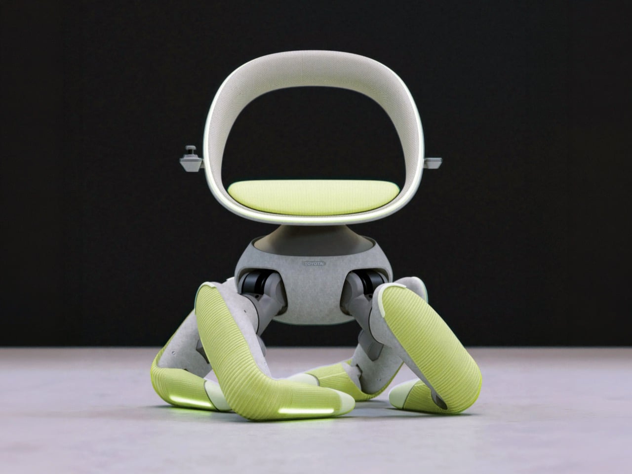
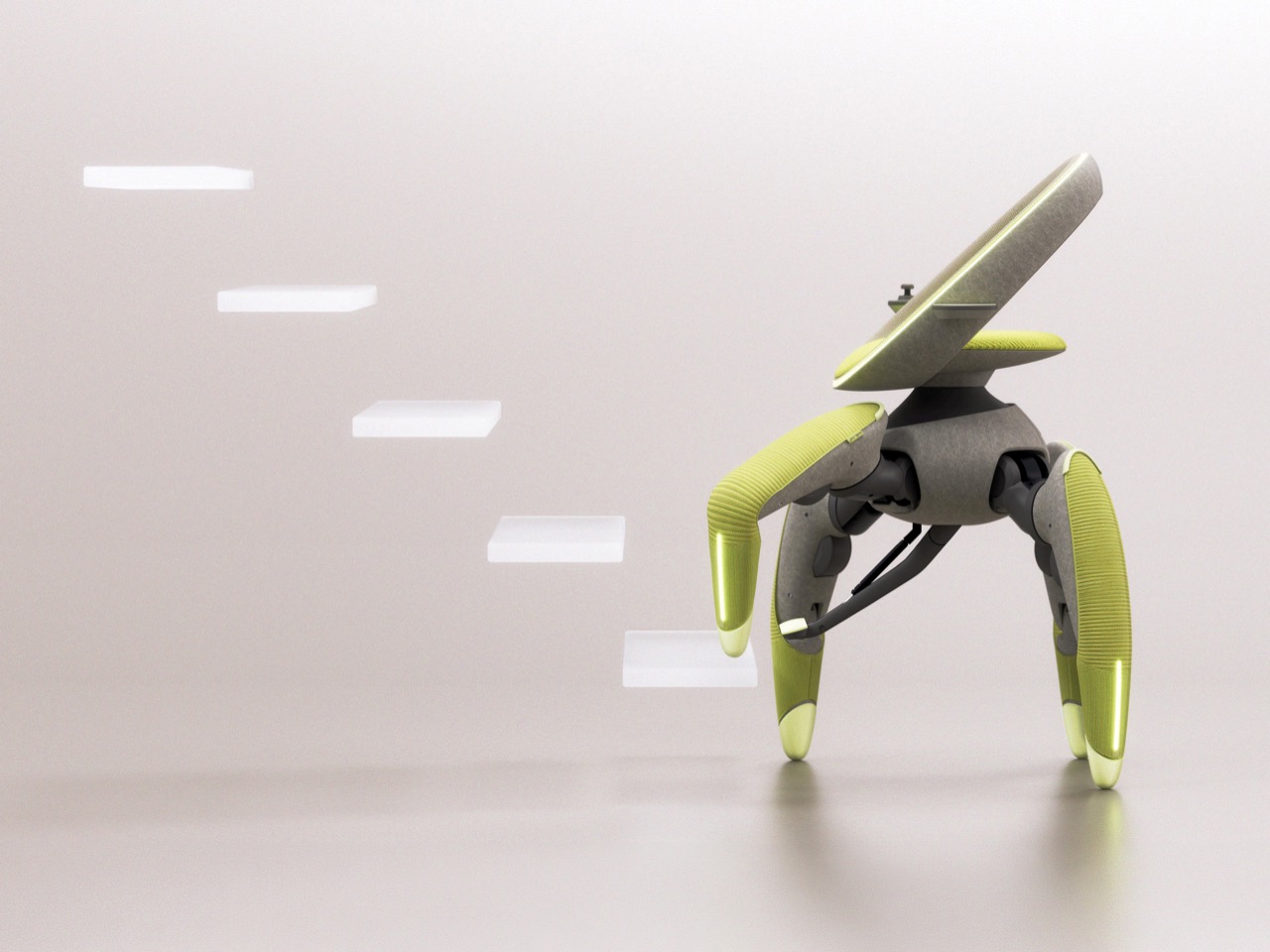
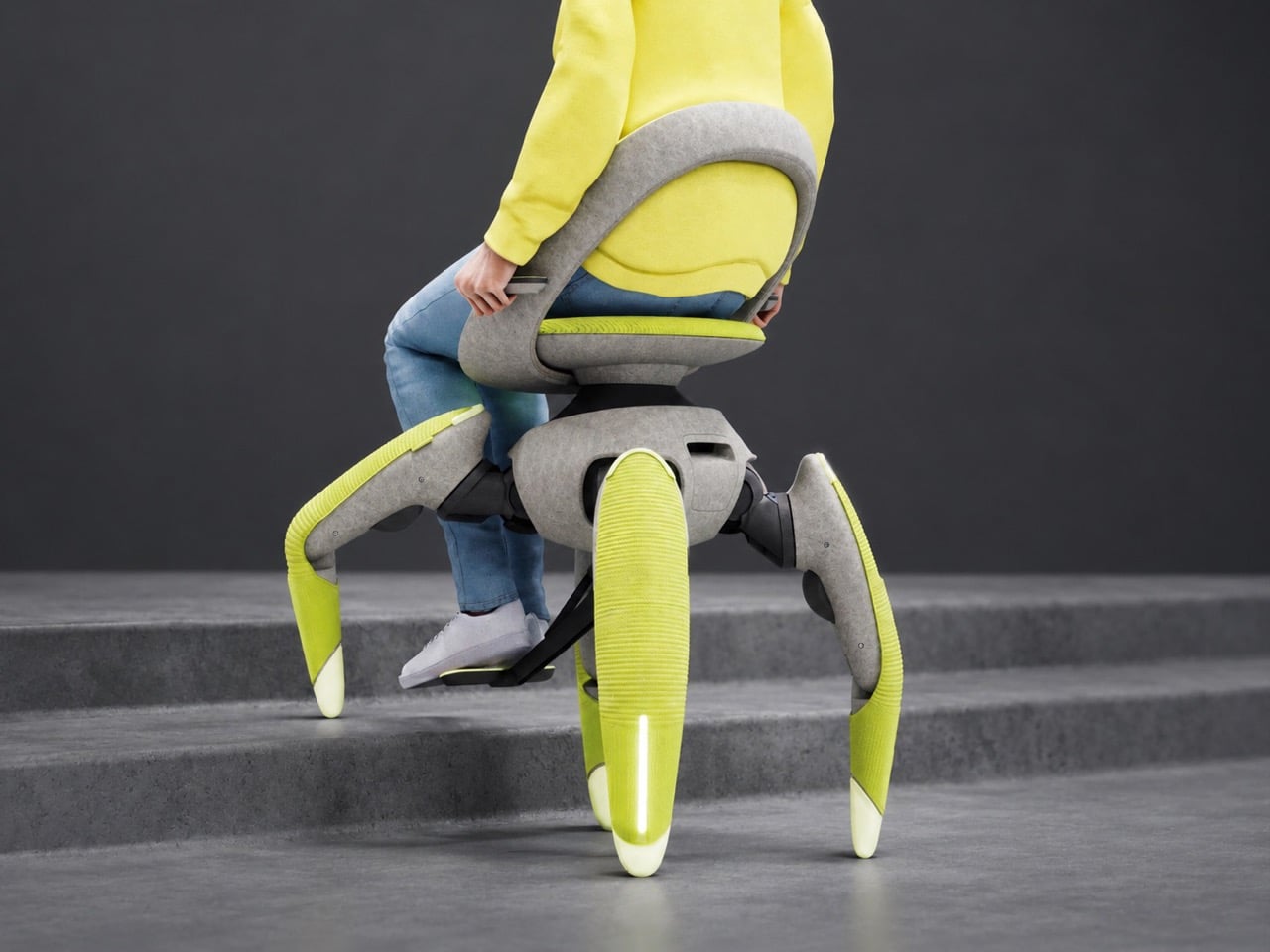
Designed by Misako Kawata under team lead Takashi Nishimura, walk me trades the wheelchair’s wheels for four robotic legs that step up stairs, shuffle sideways in tight spaces, and lift the seat to eye level with standing pedestrians. Toyota skipped the menacing chrome and went soft instead, wrapping the joints in 3D-knitted fabric and a felt-like body with bright chartreuse legs. The result looks like a friendly piece of furniture that happens to climb things. It debuted at last year’s Japan Mobility Show as a concept, and Toyota has announced no price or release date. Mobility for All is the company’s stated mission here, and for once the slogan comes with legs.

Designer: Toyota Motor Corporation

Four Legs are far superior than Four Wheels

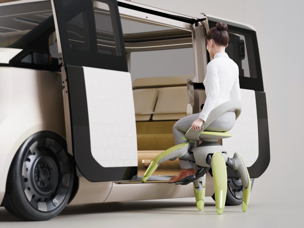
Stairs create psychological barriers long before they create physical ones, and Toyota’s own design brief says as much. A wheel looks at a staircase and gives up, so the rider plans the whole day around avoiding them. Walk me swaps the wheels for four robotic legs, which lets one machine link indoor floors, outdoor paths, cars, and public transit. It climbs steps, slides sideways through tight spaces, and generally refuses to treat architecture as a personal insult. Anyone who has ever hunted for the one accessible entrance around the back of a building will understand the appeal.

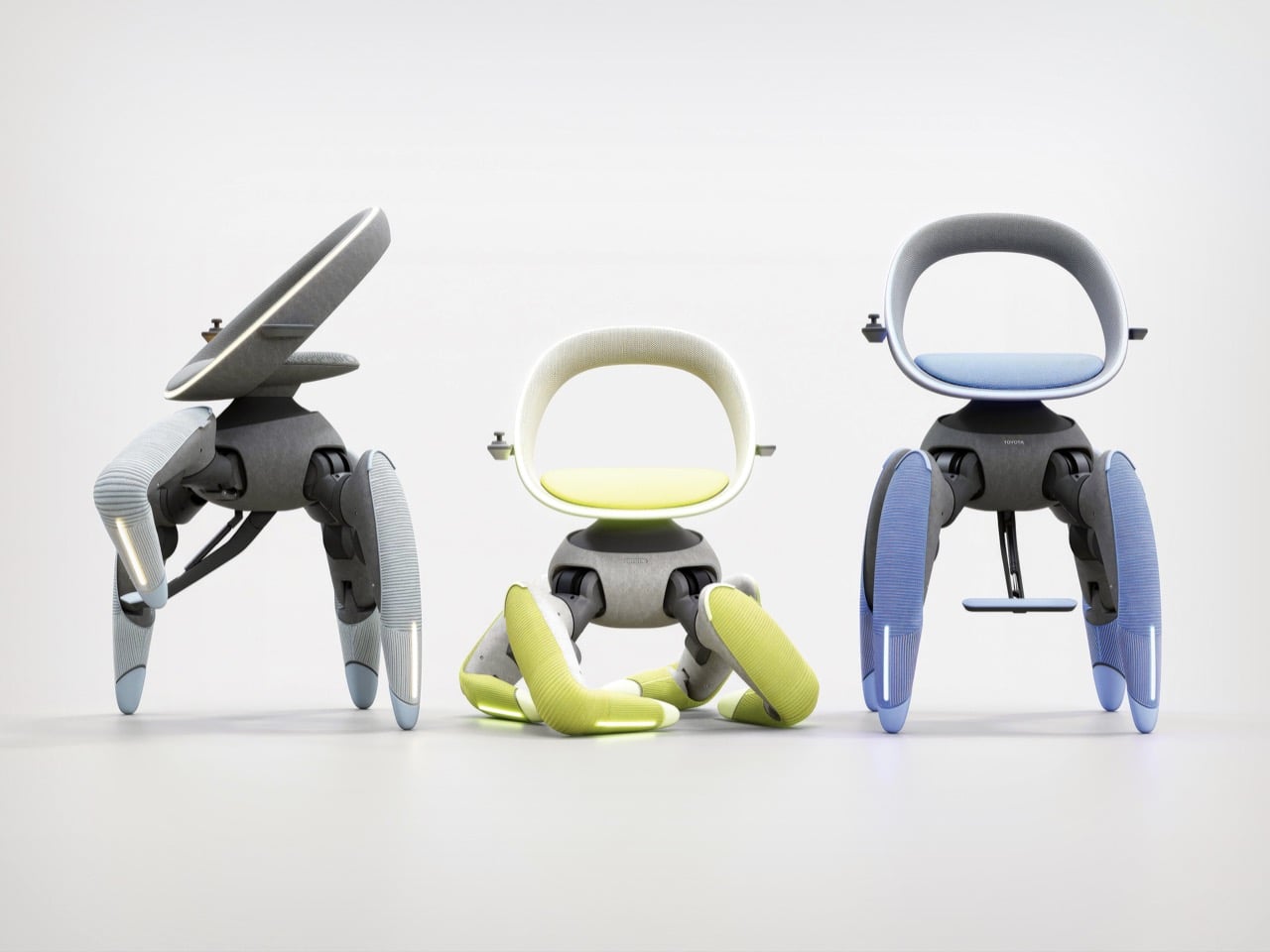
Four legs can crouch for boarding and stand tall to put the rider at eye level with pedestrians, which fixes a problem wheelchairs have carried forever. Anyone who has spent a whole conversation craning upward at a taller friend knows the strain. Wheelchair users deal with that angle daily, and a chair that rises to meet the conversation changes the dynamic. Toyota says the same leg movement also makes getting on and off the chair easier. It’s a small social fix tucked inside a big mechanical one, and I’d argue it’s the most human detail in the whole design.

A polite Japanese gesture, wrapped in 3D-knitted fabric

Toyota built the posture around omotenashi, the Japanese spirit of hospitality, so the chair’s stance resembles a polite bow that welcomes its rider. A 3D-knitted fabric covers the mechanical joints, while the warm, felt-like body gives it a friendly, furniture-like silhouette. In the images, the gray hip housing and seat shell read like a premium lounge chair, and the ribbed chartreuse legs add a pop of color that says friendly rather than clinical. I never expected to call a robot cozy, but here we are. Nobody has ever been intimidated by a sweater, and that is very clearly the strategy.

Toyota started as a loom maker under Sakichi Toyoda, so wrapping a robot in knitted fabric reads as a family tradition. Its own Japan Mobility Show booth traced the company’s robotics roots back to the Toyoda Automatic Loom Type G. A century on, textile know-how and robotics meet in a chartreuse-legged chair that bows at strangers. Beneath the fabric sits a topologically optimized internal frame that keeps the structure strong and light while staying completely hidden. Toyota wants you to see an armchair with ambition, and the skeleton is nobody’s business but the robot’s.

Ten months, AI gait control, and a very promising future

Toyota took walk me from idea to working prototype in just 10 months, which is wild for a machine that has to balance a human being on four legs. AI gait control and low-waste metal additive manufacturing made that pace possible, compressing years of R&D into weeks, according to Toyota. The company calls the chair its North Star for human-centered technology. That technology is meant to deliver dignity, hope, and independence alongside plain old movement. Red Dot’s concept award honors prototypes and ideas rather than shipping products, so the Luminary measures vision more than store-shelf readiness.

Hyundai’s Elevate walking car put wheels at the end of long robotic legs, and Kawasaki’s CORLEO robot horse offers a rideable quadruped for off-road thrills. Those machines chase rescue missions and rugged trails. Walk me points similar legwork at a living room staircase, which is arguably the more relatable terrain. Among this year’s Red Dot: Best of the Best winners, it’s the one the jury crowned with the top prize. It remains a concept with no price, release date, or production plans, but a robot that bows, climbs, and wears a knitted sweater has me convinced that the future of mobility might finally have good manners.

The post Toyota’s ‘Wheel-less’ Wheelchair wins the 2026 Red Dot Concept Luminary Award first appeared on Yanko Design.

This Blade-Like eVTOL Makes the Cybertruck Look Like A Child’s Sketch

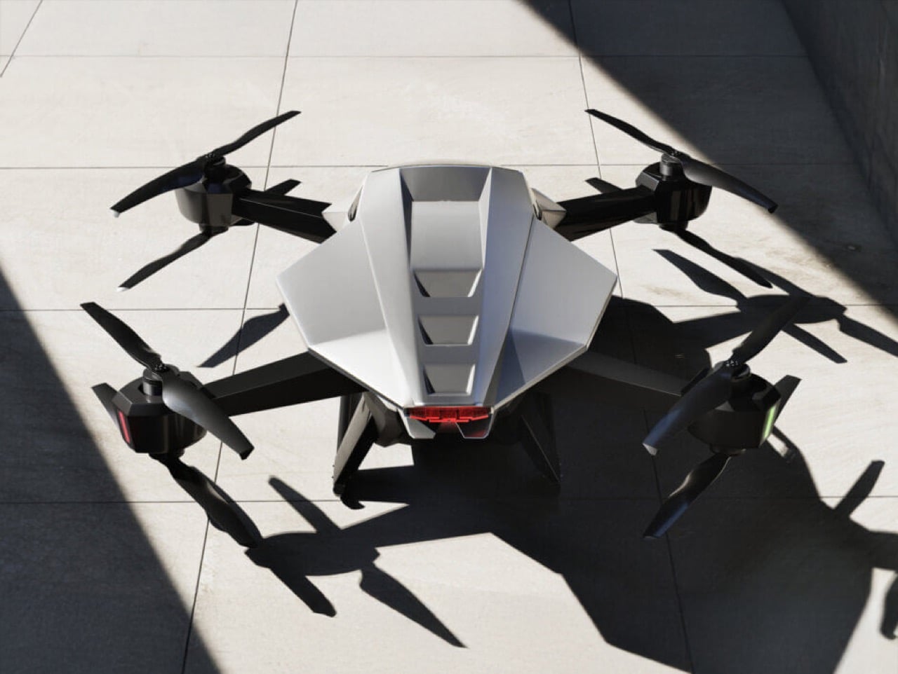
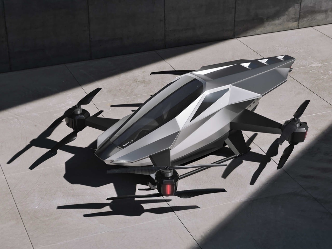
Flying cars have been vaporware for so long that most concepts blur together into the same generic pod-on-rotors aesthetic. Then MOSTAVIO’s MX1 lands in your feed, and suddenly you’re reminded why great industrial design still matters. The angular, almost origami-like bodywork earned this Toronto startup the 2025 Red Dot Award: Design Concept, validating what your eyes already know. Unlike the Cybertruck’s deliberately unfinished brutalism, the MX1 feels thought through to the last crease. Every facet serves both form and function, channeling the legendary design philosophy of masters like Giugiaro and Gandini.

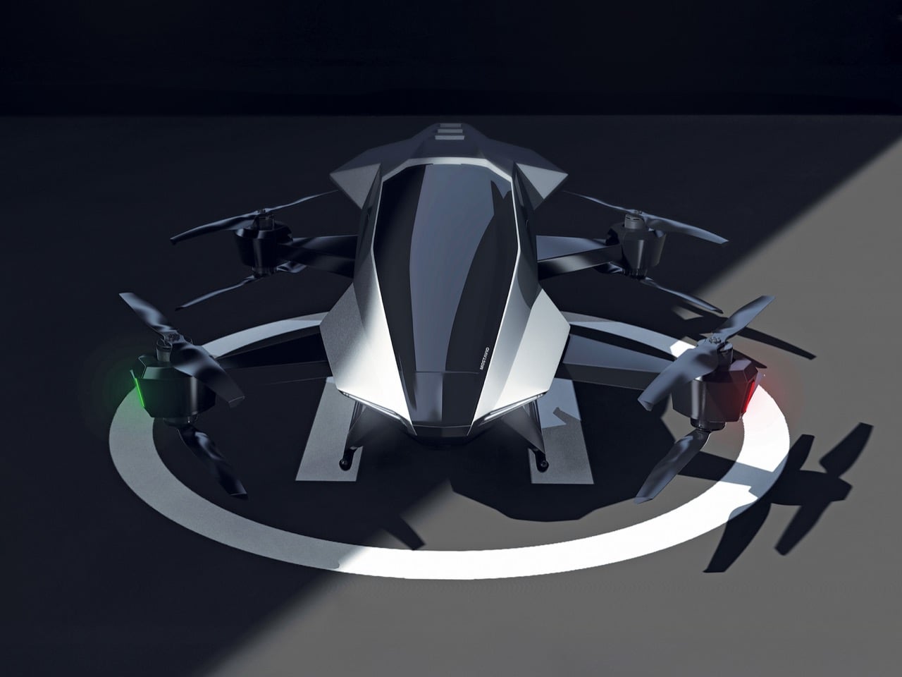
The single-seat cockpit opens like a fighter jet, the panoramic window stretches wide for an unobstructed view, and the whole package sits on co-axial rotors that look more like sculptural elements than utilitarian hardware. MOSTAVIO wrapped these features in composite bodywork that appears to shift in the light, aggressive yet refined. The VR-based autonomous control system means you don’t need a pilot’s license to appreciate what they’ve built here, just an appreciation for design that refuses to compromise. This is what happens when someone actually cares about making future mobility look like it belongs in the future.

Designer: MOSTAVIO

What makes the angularity work here, where other attempts have failed, is the controlled complexity of the surfacing. The body isn’t made of simple, flat planes. Look at the way light travels across the fuselage in the photos; you can see subtle curvature and tension in every facet, creating highlights that define the form. This is sophisticated stuff, the kind of surfacing you see on a Lamborghini, where every crease is intentional and contributes to the whole. It’s a design that looks like it was sculpted, not just extruded. The result is a visual language that feels lightweight, technical, and incredibly sharp, like a high-end piece of architectural hardware given flight.

That design discipline extends to the integration of functional parts. The co-axial rotor arms blend into the body with carefully managed fillets, making them feel like organic extensions of the main form instead of bolted-on appendages. The canopy shut-lines follow the body creases perfectly, and the single rear light is tucked neatly into the tail. This is the hard part of vehicle design, where engineers and designers usually fight to a clumsy compromise. Here, it feels like the designers won. They took the necessary components of a quadcopter and made them integral to the aesthetic, creating a cohesive object that looks right from every angle.

Of course, winning a Red Dot for a concept is the design world’s equivalent of getting a screenplay optioned. It doesn’t mean the movie is getting made tomorrow, but it confirms the script is brilliant. So before you get your wallet out, know that the MX1 is a proof-of-concept. You can’t buy one. Its job is to attract attention, secure funding, and serve as a design study for a future 2-3 passenger vehicle that MOSTAVIO plans to develop. It’s a physical mission statement, a declaration of intent. And as far as intentions go, this one is about as compelling as it gets. We’ll be watching.

The post This Blade-Like eVTOL Makes the Cybertruck Look Like A Child’s Sketch first appeared on Yanko Design.

This Fire Extinguisher Might Actually Make You Want One at Home

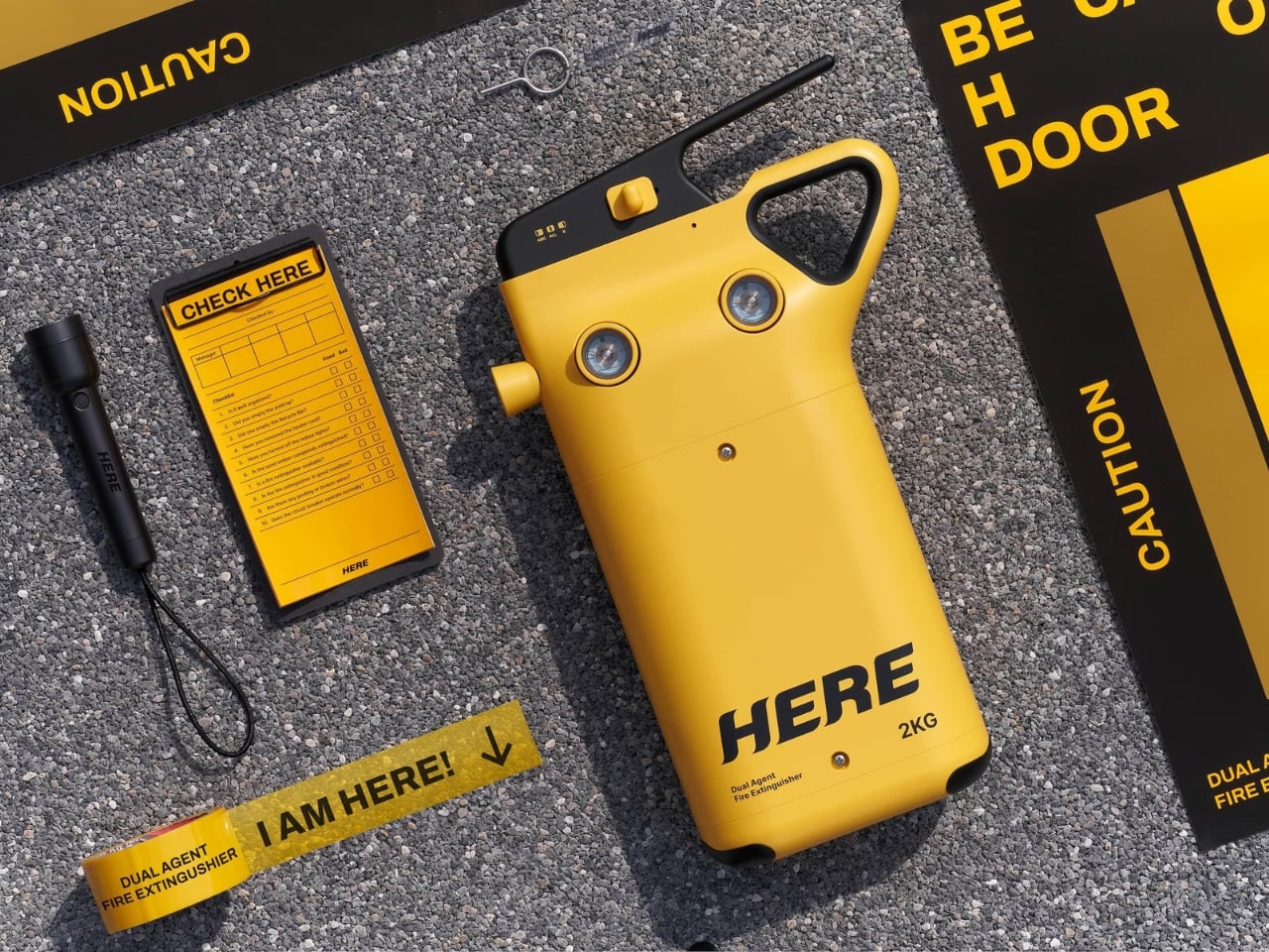
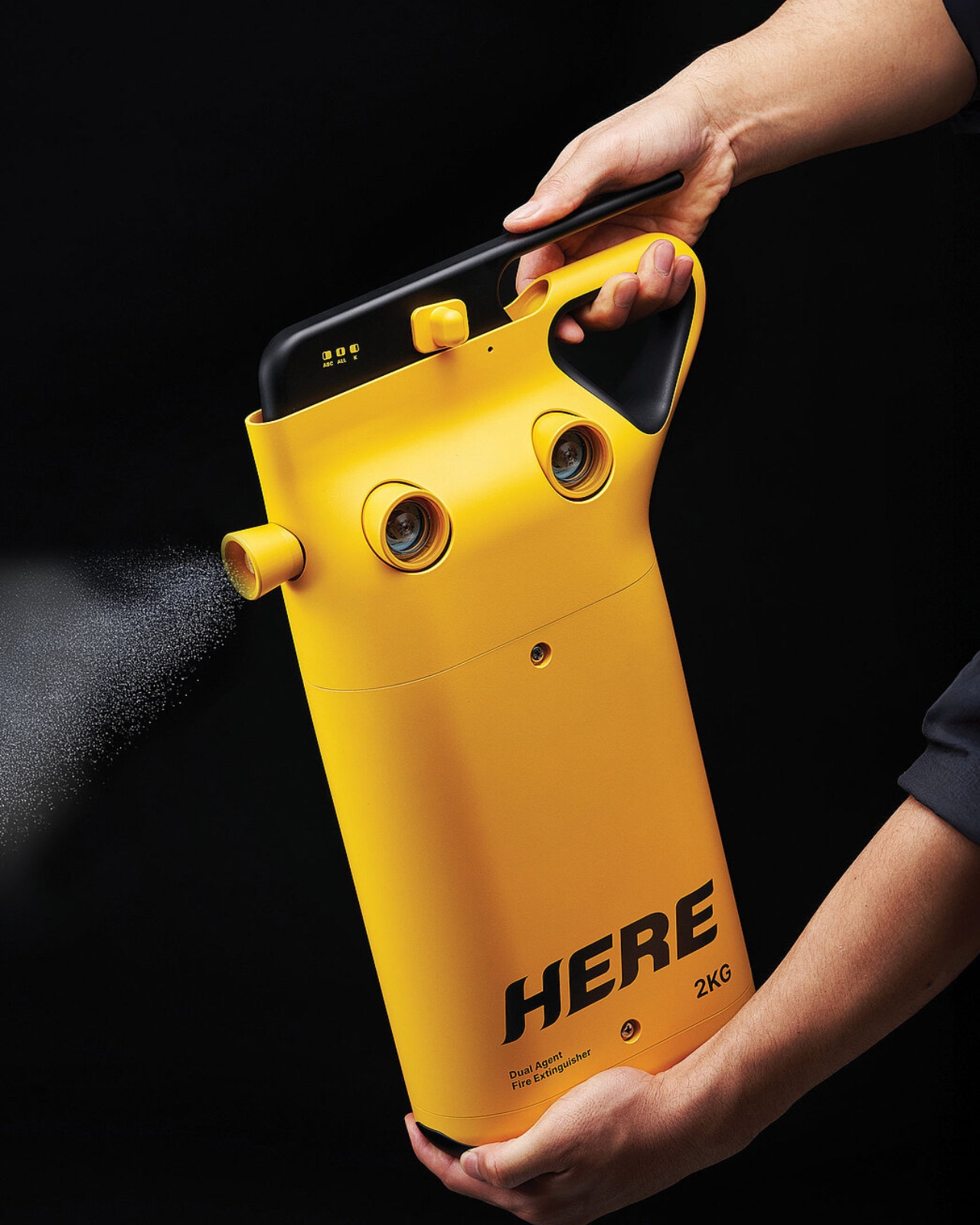
Let’s be honest, fire extinguishers are one of those things we know we should have but rarely think about until we actually need one. They’re bulky, confusing, and usually tucked away somewhere collecting dust. But what if a fire extinguisher could be both smarter and easier to use? That’s exactly what designers Song Kyuho and Kim Jungu set out to create with HERE, a dual-agent fire extinguisher that’s rethinking safety equipment for modern life.

The problem with traditional fire extinguishers is pretty straightforward. That standard red canister sitting in your hallway might work great for a paper fire, but it could be completely useless against a kitchen grease fire. Different fires need different solutions, which technically means you should have multiple extinguishers throughout your home. But realistically, who does that? It’s expensive, takes up space, and adds another layer of complexity when you’re already panicking because something’s on fire.

Designers: Song Kyuho and Kim Jungu for Found Founded

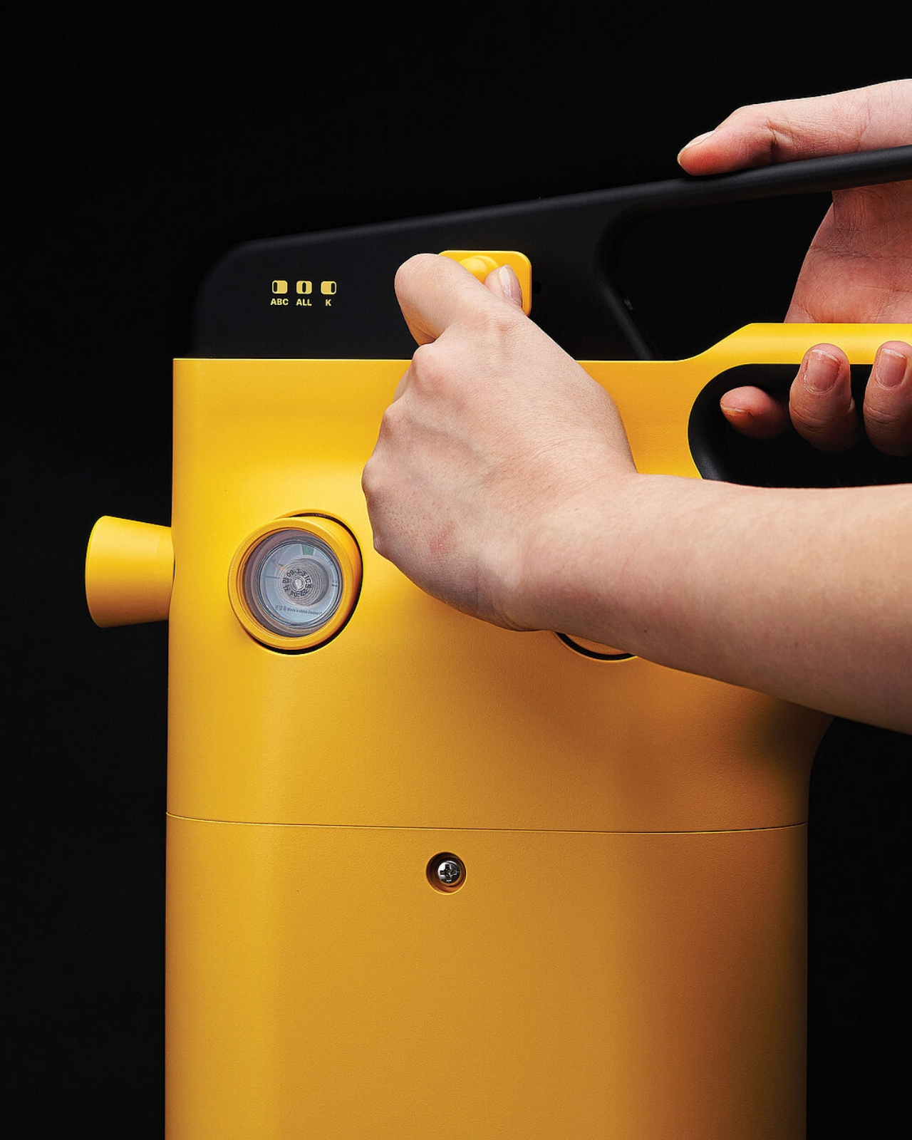
HERE tackles this head-on with an ingenious dual-chamber design. Inside this single unit, you’ve got ABC powder for general fires like wood, paper, and electrical blazes, plus a liquid agent specifically designed for kitchen fires involving cooking oil. Think about how much safer that makes your home. When that pan of oil overheats, you’re not stuck frantically trying to remember which extinguisher works for which fire type. You’ve got both options literally at your fingertips.

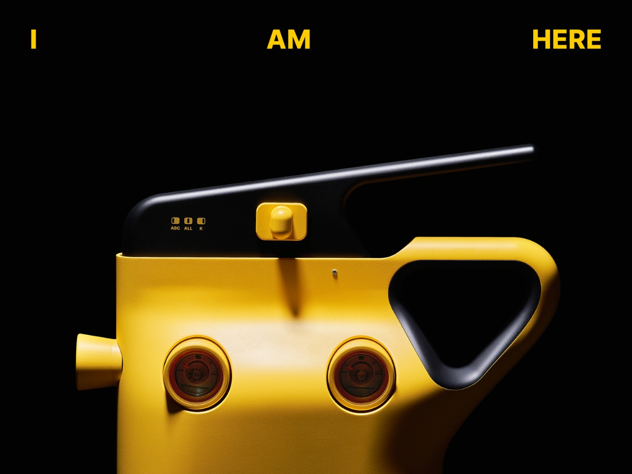
What really stands out is how intuitive the whole system is. There’s a single lever operation, but you can choose which agent to deploy or use both simultaneously. Small indicator lights labeled ABC, ALL, and K make it crystal clear which option you’re selecting. In an emergency situation, that kind of clarity matters. You’re not reading lengthy instructions or second-guessing yourself. You grab it, select what you need, and go.

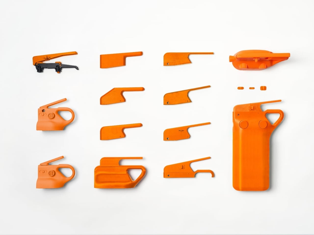
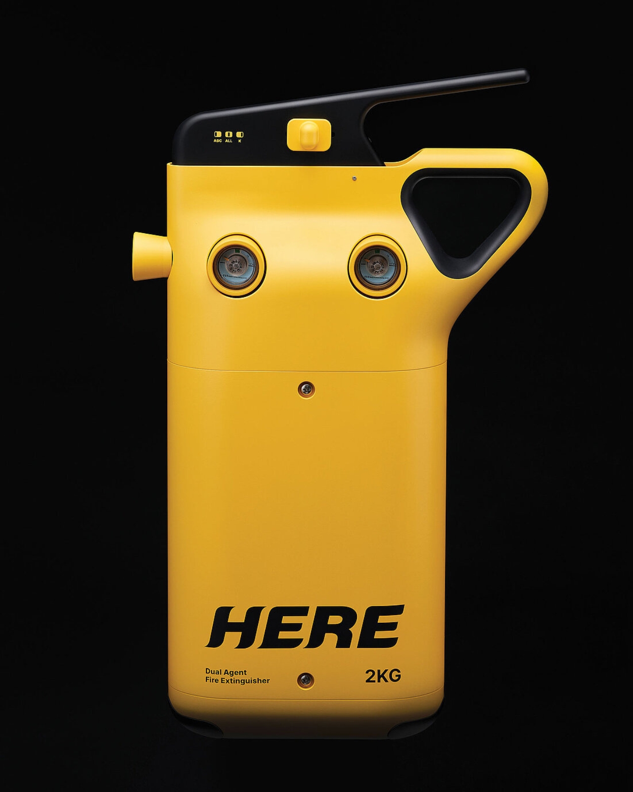
But here’s where the design gets really interesting. Anyone who’s ever handled a fire extinguisher knows they’re not exactly user-friendly. They’re heavy, awkward to grip, and honestly kind of intimidating. The designers didn’t just solve the dual-agent challenge, they completely reconsidered how we interact with these devices. That distinctive triangular grip you see wrapping around the canister? That’s the result of extensive usability testing with 30 different people.

The testing revealed something important. When you’re dealing with a required minimum of 2 kilograms of extinguishing agent, the weight becomes a serious usability issue. Traditional designs put all that strain on your wrist and back. The ergonomic handle on HERE distributes the weight more naturally, making it genuinely easier for anyone to use, regardless of their size or strength. It’s the kind of thoughtful detail that separates good design from great design.

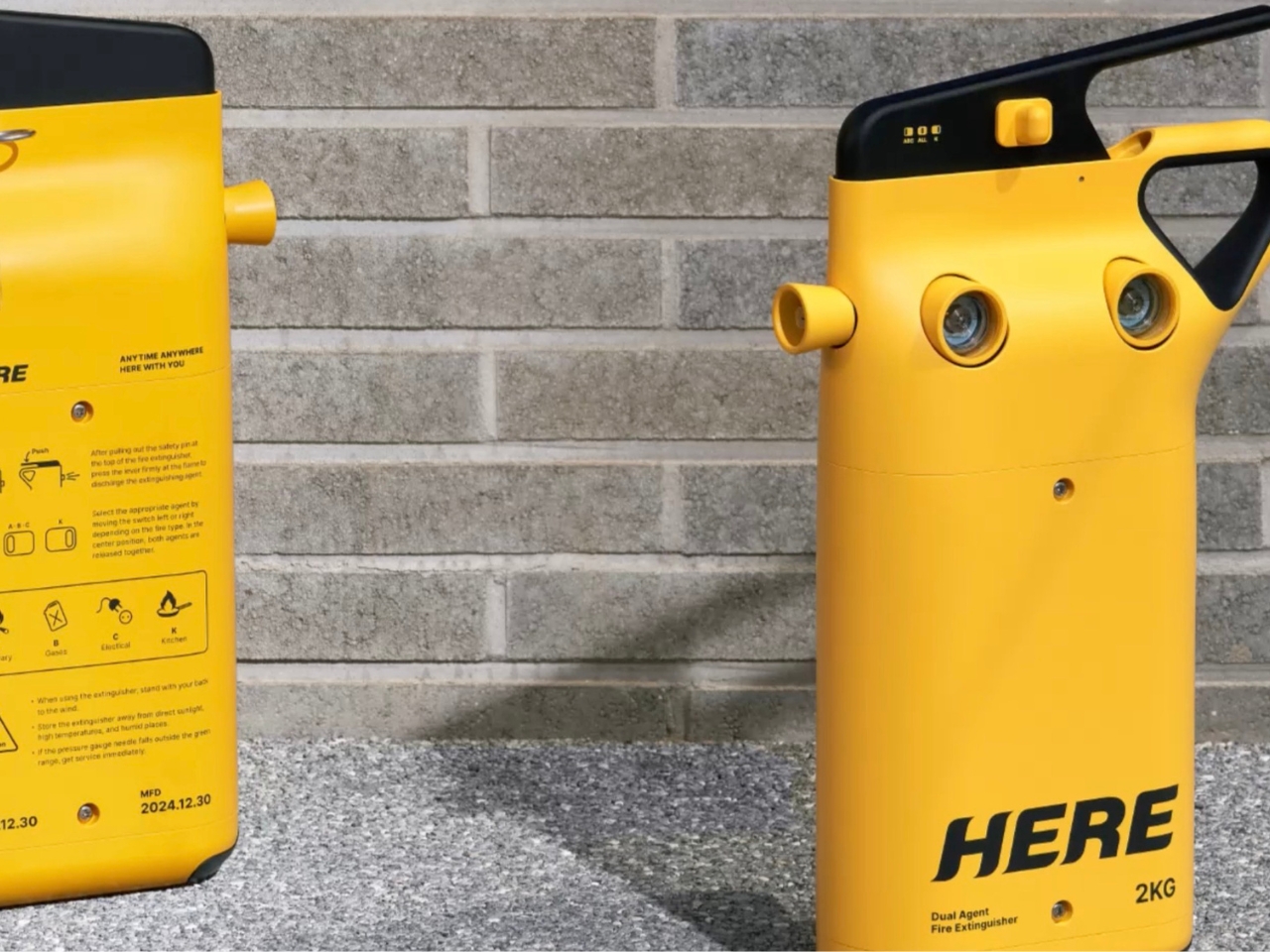
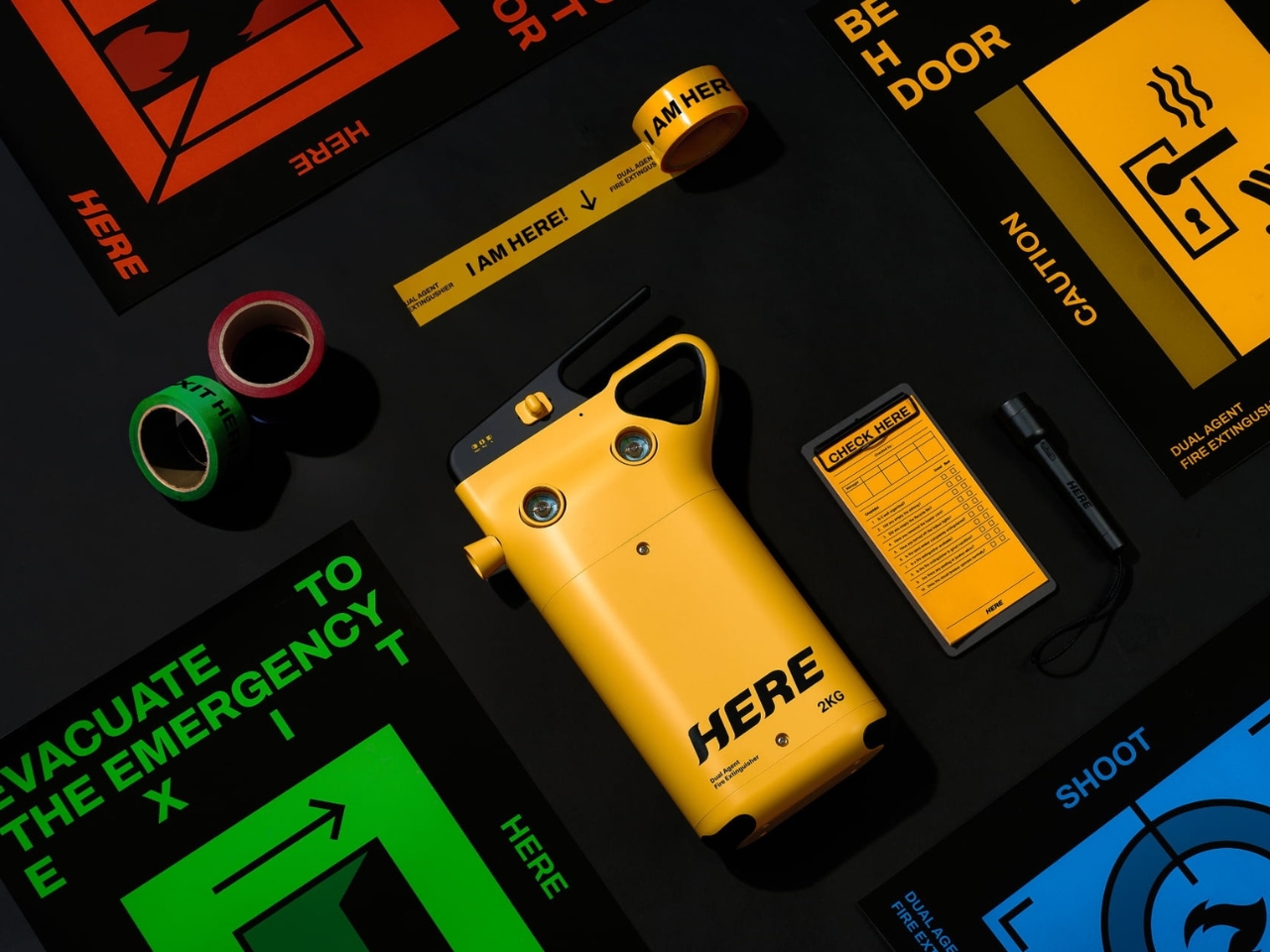
Let’s talk about the aesthetics too, because they matter more than you might think. Fire extinguishers have traditionally been designed to be noticed in emergencies, hence the bright red. But that often means they’re eyesores you want to hide. HERE takes a different approach with its vibrant yellow body and sleek, almost gadget-like appearance. It looks modern, approachable, and honestly pretty cool. The bold branding and clean lines give it a contemporary tech product vibe rather than industrial safety equipment.

Those two circular gauge windows on the front add a touch of personality while serving a practical purpose, letting you monitor the pressure levels at a glance. The overall form is surprisingly compact considering it houses two separate agent systems. It’s the kind of object you might not mind keeping visible in your kitchen or hallway. This project earned recognition at the Red Dot Design Awards, and it’s easy to see why. It represents exactly the kind of innovation we need in everyday safety products. The designers identified real pain points (multiple extinguisher types, difficult operation, poor ergonomics) and delivered solutions that make the product genuinely better without overcomplicating it.

Since we’re at the time now where we’re constantly redesigning everything from doorknobs to kitchen appliances, it’s refreshing to see safety equipment getting the same thoughtful treatment. HERE proves that even something as utilitarian as a fire extinguisher can be smarter, more beautiful, and more human-centered. It’s a reminder that good design isn’t just about aesthetics or clever features. It’s about making things work better for real people in real situations, especially when those situations might save lives.

The post This Fire Extinguisher Might Actually Make You Want One at Home first appeared on Yanko Design.

This New Bone-Healing Patch Turns Broken Bones Into Superpowers

Anyone who’s spent time around a child with a broken bone knows the drill. There are the doctor visits, the X-rays, the anxious waiting to see if everything is healing properly. And for kids? The whole experience can be genuinely frightening. But what if medical monitoring could look less like intimidating equipment and more like something a superhero might wear?

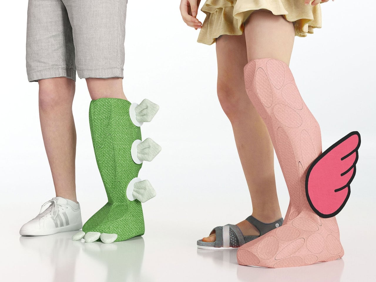
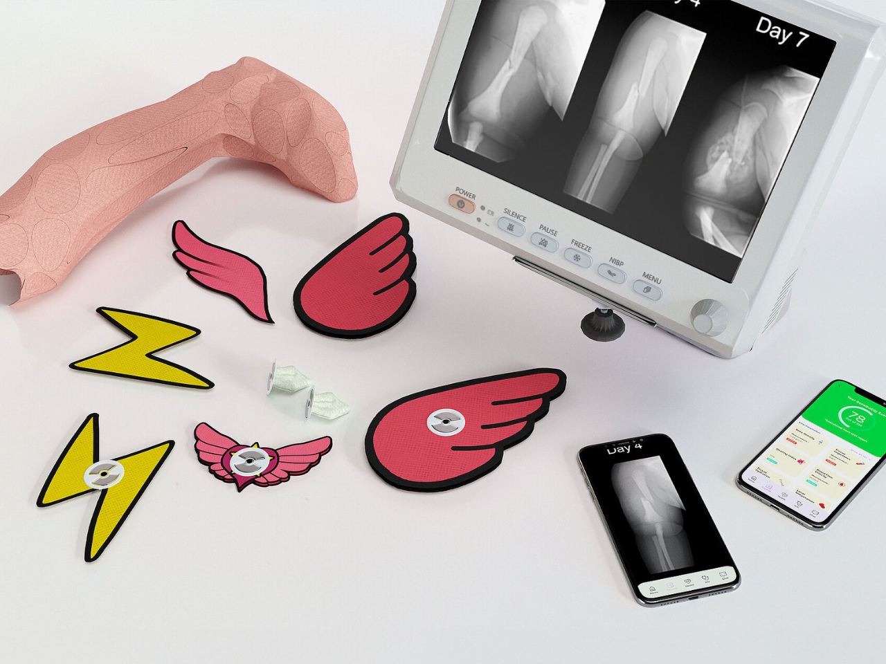
That’s exactly what designer Xu Yudian had in mind with BoneBuddy, a wearable medical device that’s rethinking how we approach pediatric care. At first glance, it looks like the kind of accessory you’d find in a cartoon. There are bright colors, playful shapes, and customizable patches featuring lightning bolts and wings. But underneath that cheerful exterior is some seriously sophisticated technology.

Designer: Xu Yudian

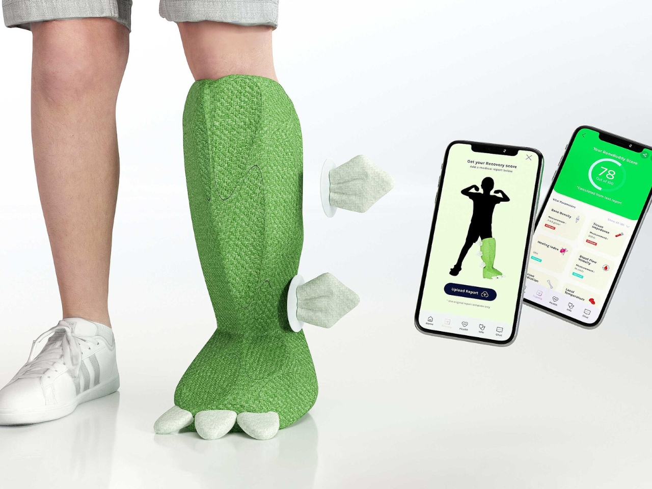
BoneBuddy uses bioelectrical impedance technology to monitor bone recovery in real time. If that sounds complicated, here’s the simple version: it sends low-frequency electrical currents through bones and tissues to measure impedance, which gives doctors valuable insights into bone density and how tissues are changing during the healing process. All of this data gets transmitted wirelessly to a mobile device, so parents and healthcare providers can track recovery without constant trips to the hospital.

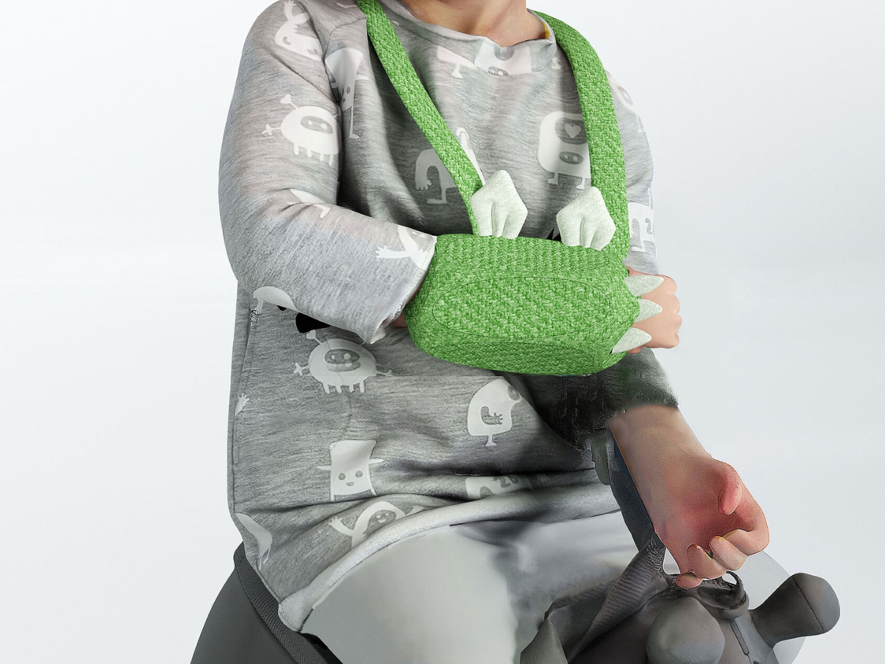
The genius here isn’t just in the tech itself but in how it’s been packaged. The device comes in a soft, hypoallergenic patch that wraps around injured limbs. Instead of looking clinical and scary, it’s available in vibrant greens and pinks. Kids can personalize their BoneBuddy with velcro accessories shaped like wings or lightning bolts, essentially turning their medical device into a fashion statement. Suddenly, monitoring bone recovery becomes something a child might actually want to wear rather than something they’re forced to endure.

This kind of thoughtful design matters more than you might think. Medical anxiety in children is a real issue that can affect treatment compliance and overall recovery. When kids are scared of their medical equipment, they’re less likely to wear it consistently or cooperate with monitoring. By making BoneBuddy feel more like a toy than medical equipment, Xu Yudian has addressed a psychological barrier that traditional healthcare devices often ignore.

The design has already earned recognition from the Red Dot Awards, one of the most prestigious international design competitions. But what makes BoneBuddy particularly notable is how it represents a broader shift in medical device design. For too long, pediatric medical equipment has essentially been adult devices scaled down or made in “kid-friendly” colors. BoneBuddy takes a different approach by starting from scratch with children’s needs and preferences at the center.

The wireless connectivity adds another layer of convenience that modern parents will appreciate. Instead of relying solely on scheduled appointments to check healing progress, caregivers can monitor data continuously through a connected app. This means potential issues can be spotted earlier, and doctors can make more informed decisions about treatment adjustments without requiring the child to sit through another round of X-rays.

What’s particularly clever is how the device manages to be both high-tech and low-stress. The soft materials make it comfortable enough for all-day wear, and the fun design elements give kids a sense of ownership over their recovery process. They’re not just passive patients anymore. They’re active participants with cool gear that tracks their progress. This project also highlights an important truth about good design: it’s not just about aesthetics or even functionality in isolation. It’s about understanding the complete user experience, including the emotional and psychological dimensions. A medical device that works perfectly but terrifies children isn’t actually working perfectly at all.

As wearable technology continues to evolve and become more integrated into healthcare, projects like BoneBuddy show us what’s possible when designers think beyond technical specifications. The best innovations don’t just solve problems. They solve problems in ways that make people’s lives genuinely better and easier. For kids recovering from bone injuries, BoneBuddy represents something more than just another piece of medical equipment. It’s a companion in their healing journey, a conversation starter, and proof that medical care can be both effective and kind. And in a world where healthcare can feel impersonal and intimidating, especially for the smallest patients, that’s no small achievement.

The post This New Bone-Healing Patch Turns Broken Bones Into Superpowers first appeared on Yanko Design.

This First-Response Drone’s Bladeless Design Could Change Emergency Rescue Forever

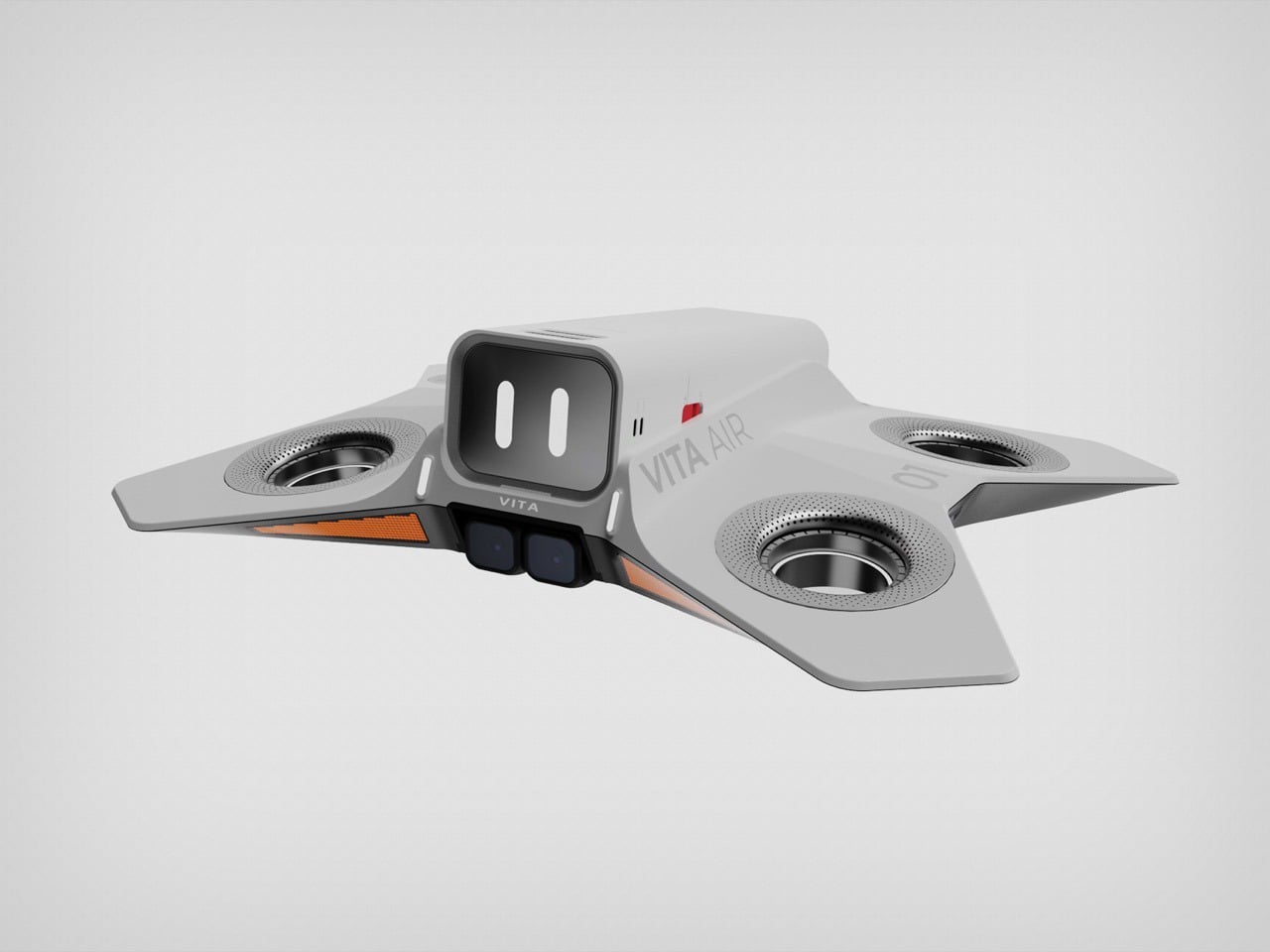
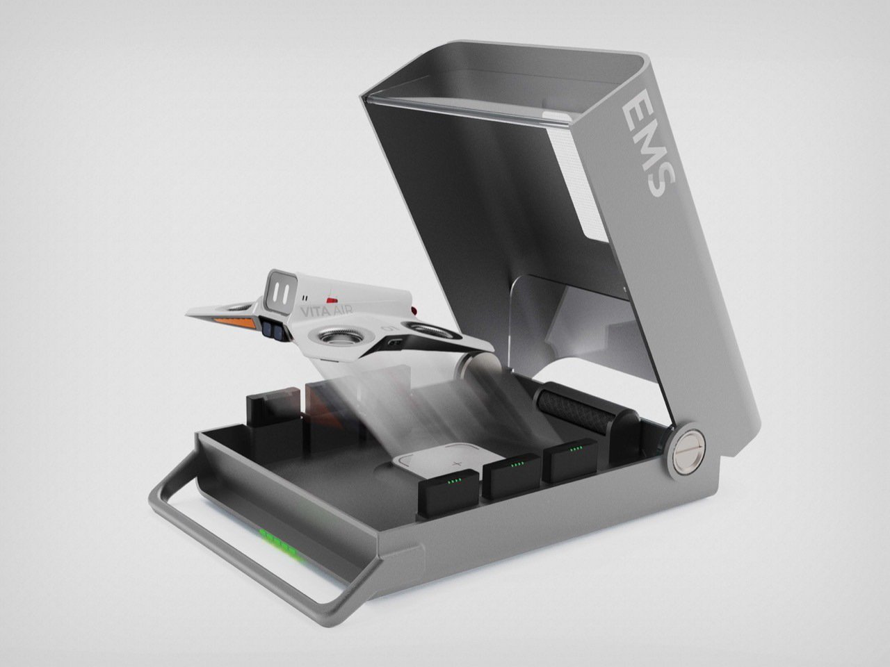
You know, we see a lot of drone concepts float across our screens, and most of them look like they were designed by either the military or an insect. They’re all sharp angles, matte black paint, and an unnerving number of sensors. Then you see something like VITA, an EMS drone that just won a Red Dot award, and the first thing you notice is that it has a face. A simple, friendly, almost disarming little face.

And that’s the whole point. It’s literally user-centric, given that this drone was designed as a first-responder aerial unit. If this thing is going to land at a chaotic accident scene, the last thing it should do is add to the panic. The designers clearly thought about the human side of the equation. It’s a little detail that tells you everything you need to know about the project’s philosophy: this is about making high-tech emergency care feel helpful, not hostile.

Designer: Hongyi Sun

That friendly face is doing some heavy lifting. Imagine you’re at the scene of an accident; you’re disoriented, maybe hurt, and suddenly a machine descends from the sky. If it looks like a weaponized hornet, your instinct (fueled by hundreds of sci-fi movies) is to back away. But if it looks like a helpful little robot from a movie, you’re far more likely to approach it. This is functional empathy built right into the industrial design. The goal is to get people on the ground to trust it instantly, so they can follow instructions from a remote paramedic or grab the life-saving equipment it’s carrying without a second thought.

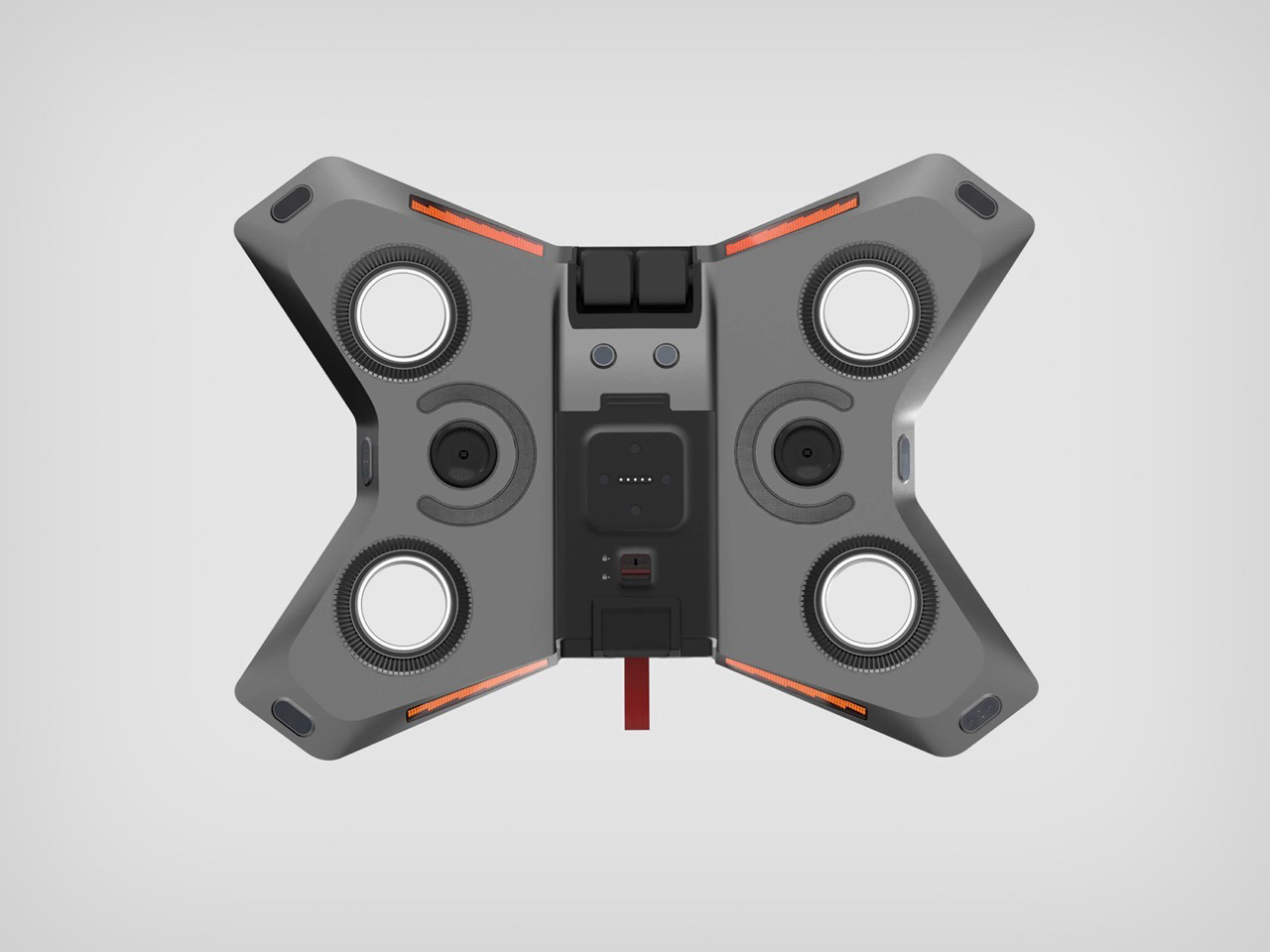
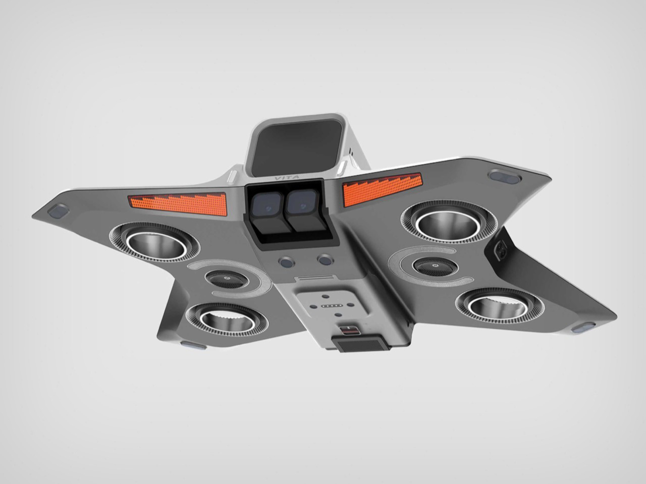
The cleverness doesn’t stop at the surface. The design backs up that friendly promise with some serious safety engineering. VITA uses ducted fans instead of the exposed, spinning blades we see on nearly every consumer drone. This is a massive deal. It means you, or a first responder, or even a child, could walk right up to it without the risk of getting seriously injured. In the unpredictable environment of a crash site, where people are moving around and debris is everywhere, eliminating that obvious hazard is a non-negotiable feature. It’s the kind of practical, real-world thinking that separates a cool render from a viable concept.

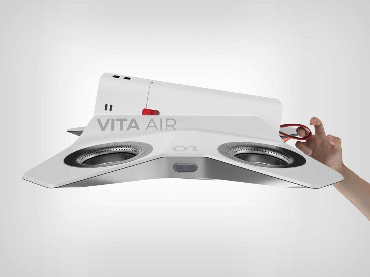
When you see the renders showing VITA being held in one hand, it all clicks into place. This isn’t some huge, intimidating aircraft; it’s a nimble and accessible tool. It’s small enough to get into tight spaces between cars and light enough for anyone to handle. Every element, from the approachable face and safe rotors to its compact size and clear markings, works together to serve one mission: delivering critical aid as quickly and safely as possible. VITA isn’t just another concept for a delivery drone; it’s a cohesive vision for how we can design automated systems to work with us, not just for us, especially when it matters most. That’s what makes it stand out.

The post This First-Response Drone’s Bladeless Design Could Change Emergency Rescue Forever first appeared on Yanko Design.
Is This The Most Ergonomic Mouse Ever Designed Or Just Another Ambitious Idea?

Memory foam mattresses have continuously been pitched as the most ergonomic surfaces to sleep on. The way they work is by being a standard shape, but contouring to your body when you lie down on them, adapting exactly to your profile. It’s a brilliant example of a cookie-cutter product that is truly ergonomic for almost everyone. Somehow consumer tech didn’t get the memo on this…

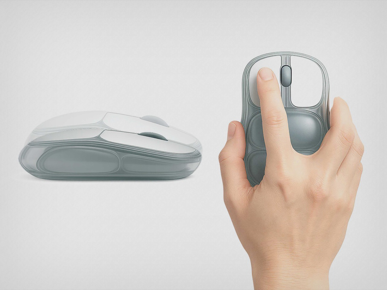
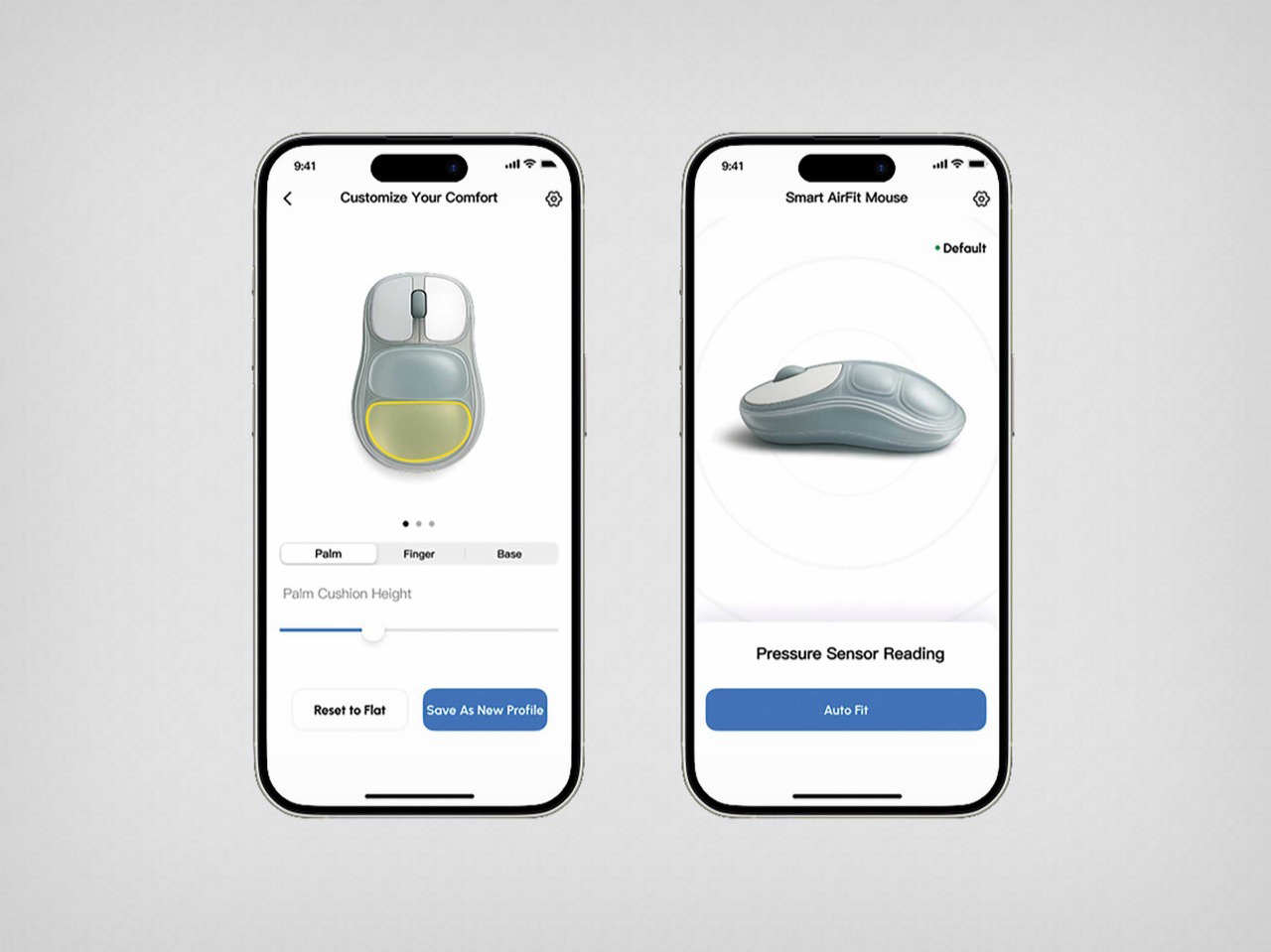
Last week I covered this ‘hideous but comfortable’ ergonomic mouse, designed using play dough and 3D printing. The problem with such a mouse is that it took ergonomics too seriously, and still resorted to a rigid 3D printed outer shell. But what if you just applied memory-foam-style ergonomics to consumer tech? What if you could make a mouse that just fits to the shape of your hand rather than the other way around? This Red-Dot Award-winning ergonomic mouse proposes something pretty clever – a computer peripheral with an inflatable body that you can ‘adjust’ to the shape of your palm. Two cushions, both independently adjustable, give you a mouse that’s made for YOU, not a mouse that touts ergonomics but may or may not work for your hand shape, wrist flexibility, or finger size.

Designer: iRest Health Science and Technology Co., Ltd.

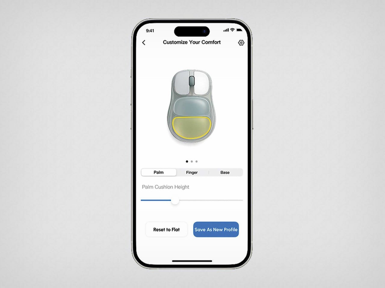
The mouse, designed by iRest Health Science and Technology, is just a concept for now, but it does make a fairly radical proposal that a lot of companies could consider for breaking the mold on ergonomic devices. The mouse looks standard at first, but the palm rest features two air-filled cushions that can be adjusted via a smartphone app. Increase or decrease their size through the app, and the shape of the mouse inherently changes, fitting your palm just the way you need it. The result is a mouse that’s calibrated to YOUR hand.

Admittedly, the idea is fabulous but the execution is a little janky. This mouse would effectively need air pumps to intake or release the air, which would result in a severe drain on batteries while complicating the build. The immediate solution is to not use air at all, but rely on something more convenient. In-ear monitors rely on silicone gel implants for a bespoke fit, but those are administered by medical professionals. However, imagine a mouse with a silicone outer shell that can be molded to your hand. Or perhaps a series of mechanical parts that can be adjusted to shape the mouse based on palm height, etc – sort of like how you adjust parts on an ergonomic chair.

For now, this is just a concept, but it proposes a fairly new idea as far as ergonomic tech is considered. For too long, we’ve seen ergonomic tech that is painstakingly designed for the 95th percentile, but seldom is as comfortable as something that is truly tailor-made FOR you. We’ve covered inflatable mice before, funnily enough, and those concepts were manually inflated, which also sounds like a fairly good option. I wouldn’t mind someone actually building a prototype!

The post Is This The Most Ergonomic Mouse Ever Designed Or Just Another Ambitious Idea? first appeared on Yanko Design.

Pininfarina’s Foldable Trailer Homes combine Electric Mobility and Off-Grid Luxury Living

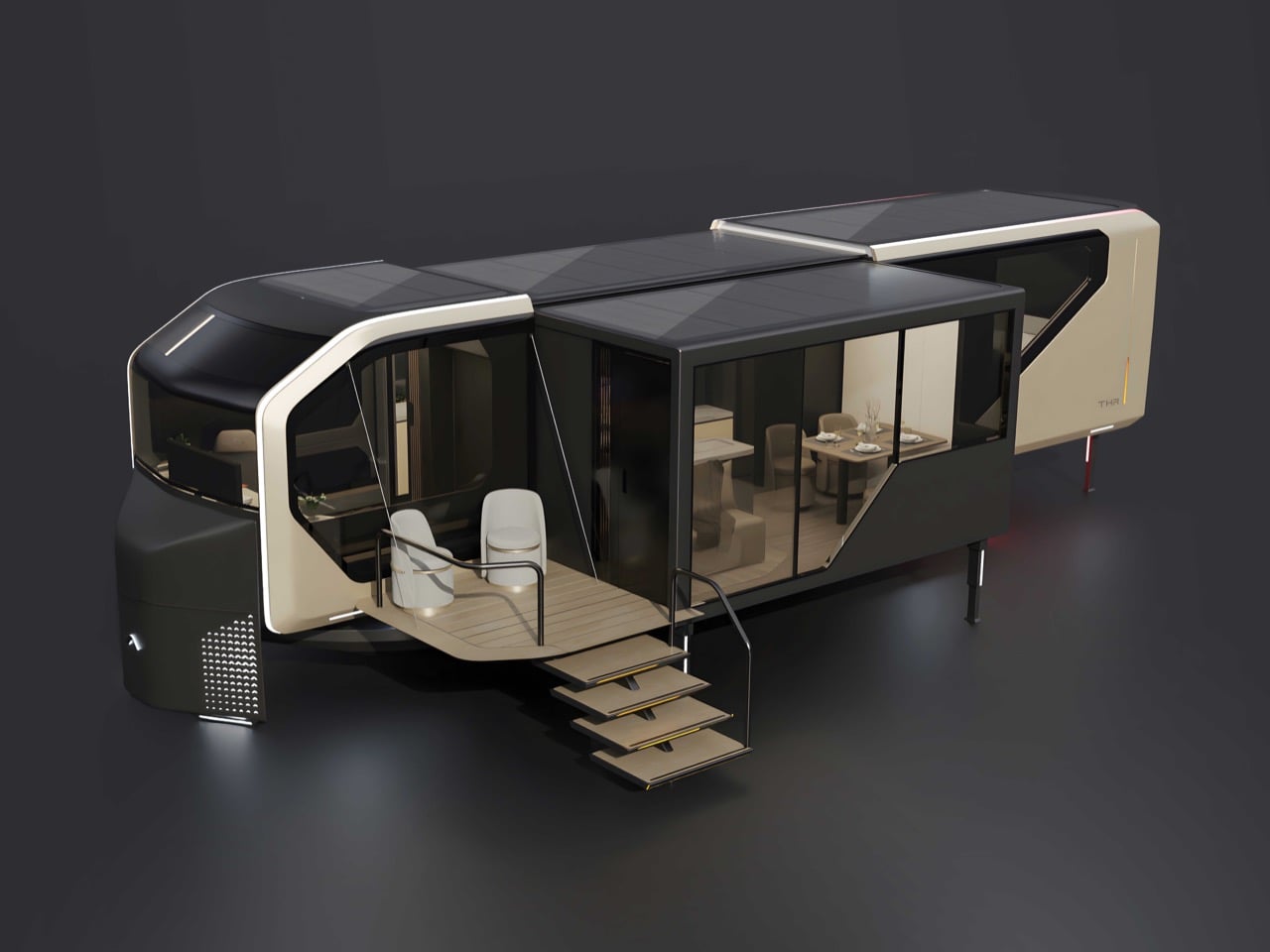
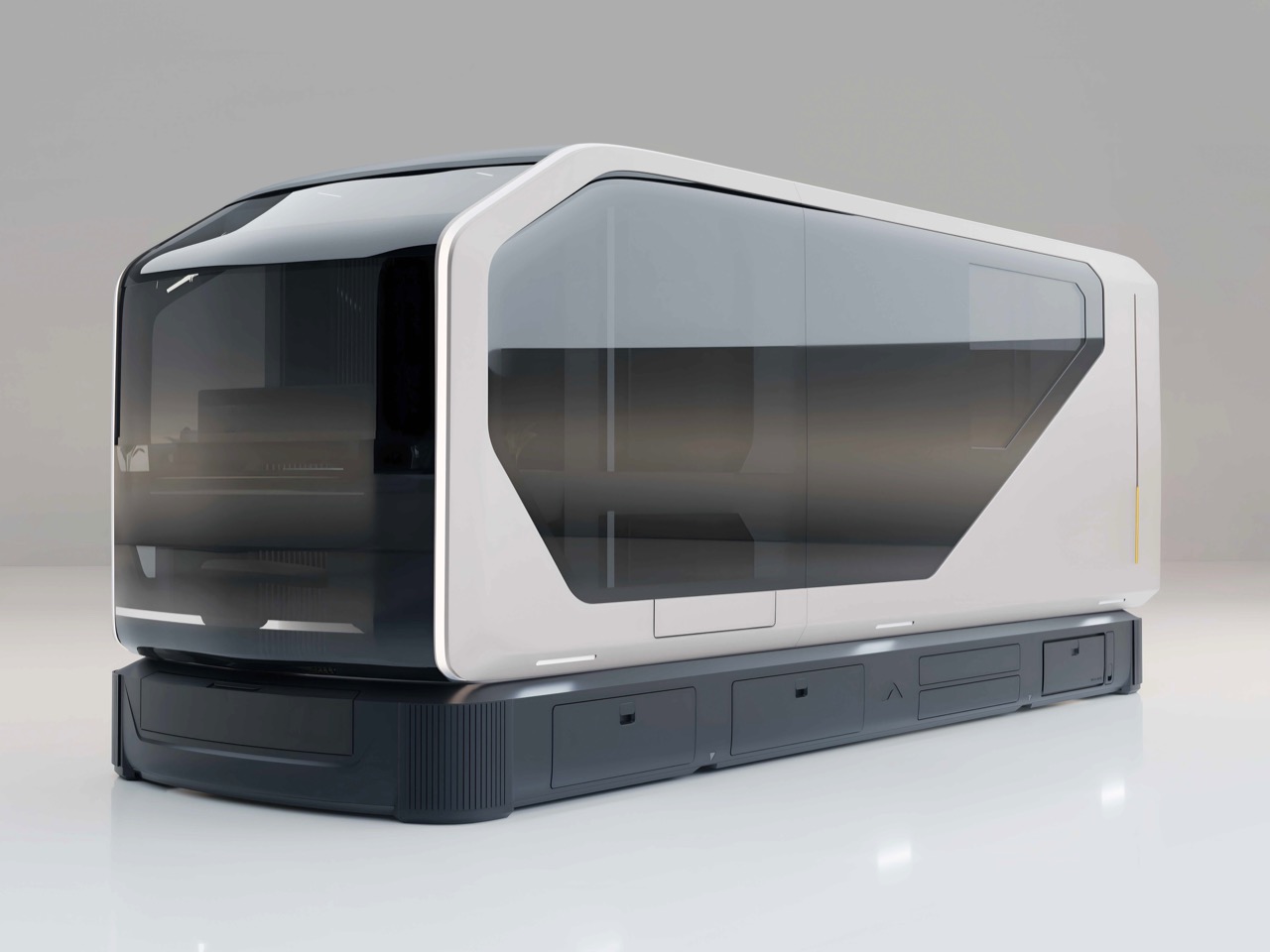
Pininfarina’s design legacy spans eight decades of automotive excellence, but the firm has increasingly turned its attention to spaces people inhabit rather than just vehicles they drive. The AI Transformer Home series marks the studio’s most ambitious exploration of that territory yet: modular, expandable dwellings that treat mobility as a core feature instead of an afterthought. Working with AC Future, Pininfarina applied its signature approach to proportion, surface treatment, and user experience, creating homes that look equally compelling whether compressed for travel or expanded for living.

The three models share a flexible platform but serve distinct use cases. The AI-THu functions as a 400-square-foot smart ADU, ideal for backyard installations or temporary deployments. The AI-THt eliminates the driving cabin entirely, relying on patented expansion technology to maximize interior volume when towed to a destination. The AI-THd combines both worlds, offering self-contained mobility with EV or diesel power and three-sided expansion that converts a compact motorhome into a surprisingly spacious residence. All three earned the 2025 Red Dot Design Concept Award, validating their blend of engineering innovation and aesthetic refinement.

Designer: Pininfarina for AC Future

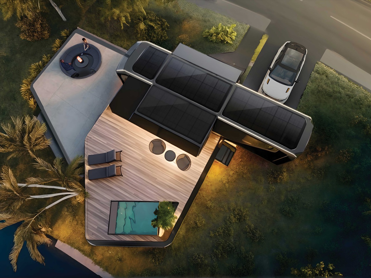
That drivable AI-THd is the one that really grabs your attention, because it’s a direct shot across the bow of the entire luxury RV market. The specs are wild. It expands on three sides to create a 400-square-foot living space from a vehicle that starts at 26 feet long. AC Future is quoting a starting price of $328,000, which puts it in direct competition with high-end Class A motorhomes and premium Airstream trailers. The key difference is that a traditional RV’s slide-outs give you a few extra feet of width, while this thing nearly doubles its physical footprint. Its cockpit even converts into a separate room, a clever use of space that most motorhomes completely waste once parked.

This whole concept hinges on the expansion mechanism, which is far more sophisticated than a simple slide-out. The AI-THt trailer, without a cab to worry about, is the purest expression of this technology. It’s a 24-foot towable box that unfolds into a legitimate small apartment. You are seeing a level of mechanical articulation that feels more like something from a sci-fi movie than a product you can actually reserve. The engineering challenge is immense: you have to manage plumbing, electrical, and structural integrity across moving walls and floors. AC Future’s patented system seems to have solved this, creating a rigid and fully insulated living space that deploys in minutes.

Beyond the mechanical wizardry, the off-grid capability is what pushes this into a new category. The homes are equipped with solar awnings that deploy during expansion and an atmospheric water generation system that literally pulls drinking water from the air. An onboard AI manages these resources, learning your habits to predict power and water needs, so you aren’t constantly checking gauges. This is true self-sufficiency, allowing for extended periods off-grid without sacrificing the comforts of a modern home, like a full-size kitchen and dual-zone climate control. It’s a closed-loop living system on wheels.

So who is actually buying this? The price tag puts it out of reach for the average van-lifer, and its high-tech complexity might intimidate the traditional RV crowd. AC Future is likely targeting a niche market of affluent digital nomads, tech entrepreneurs, and design aficionados who want a mobile base of operations that reflects their aesthetic and technological values. This is less a vehicle for visiting national parks and more a statement piece for living and working wherever you want. It’s a halo product, designed to showcase what’s possible when you fuse automotive design with smart architecture, pushing the entire industry to think beyond the beige fiberglass box.

The post Pininfarina’s Foldable Trailer Homes combine Electric Mobility and Off-Grid Luxury Living first appeared on Yanko Design.
This Massive Robot Wants To Replace An Entire Restaurant

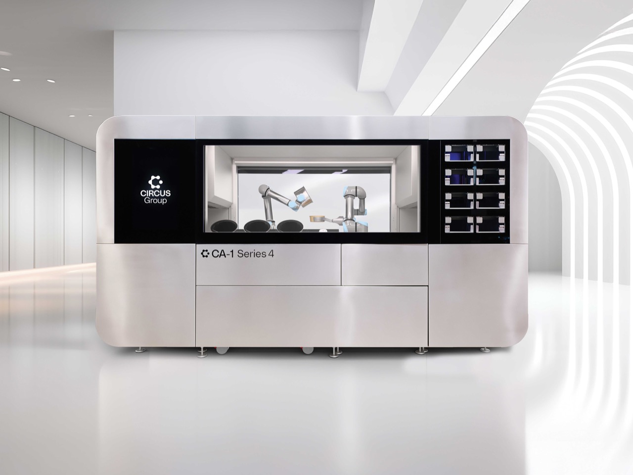
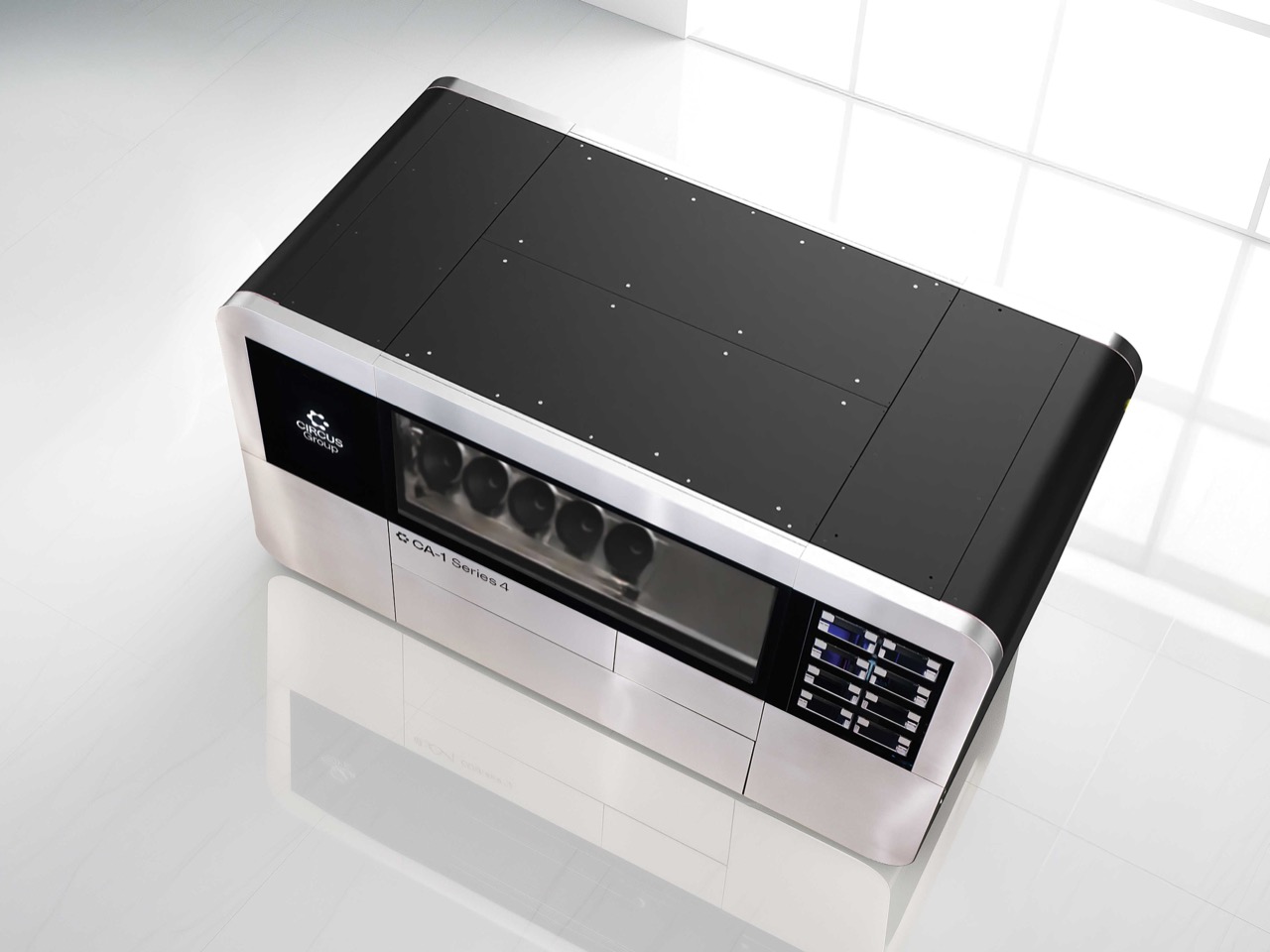
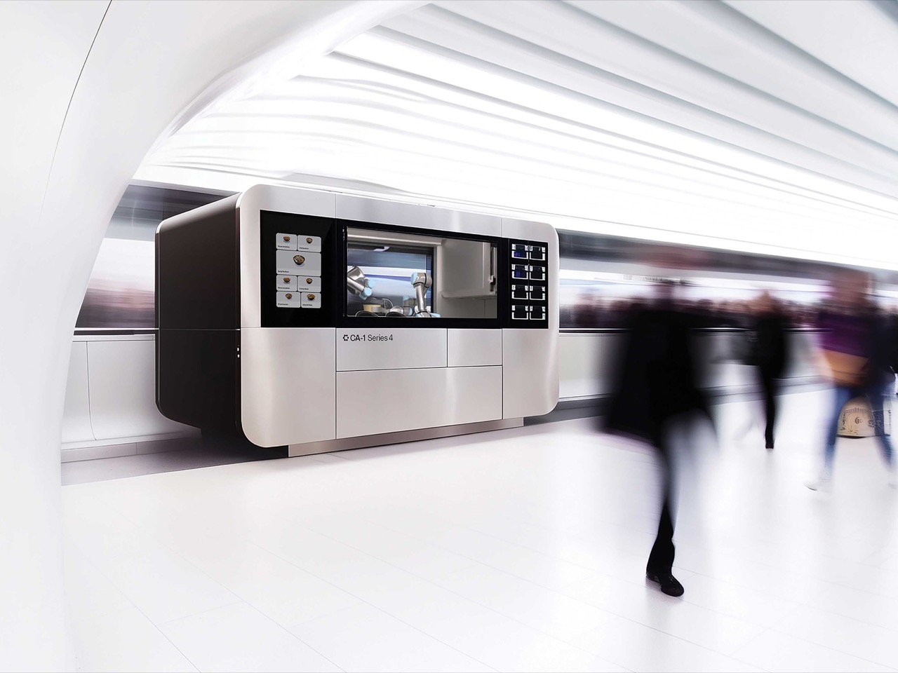
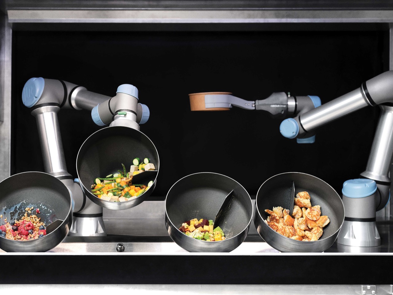
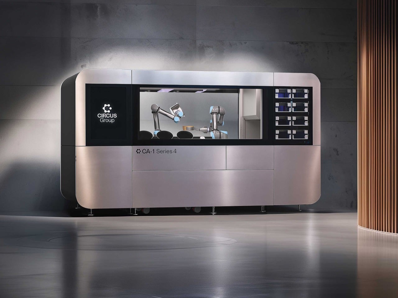
Inside a seven-square-meter glass enclosure, two robotic arms move with startling precision. One retrieves ingredients from climate-controlled silos, another works over a heating element, and within minutes, a perfectly assembled, hot meal is delivered to a collection window. There are no chefs, no line cooks, and no human intervention whatsoever. This is the Circus Autonomy One, a robot designed with a single, ambitious goal: to automate every step of the food production process, from inventory management to cooking and even cleaning. It’s not a kitchen assistant; it is a full-stack replacement, and it represents one of the boldest attempts yet to redefine what a restaurant can be.

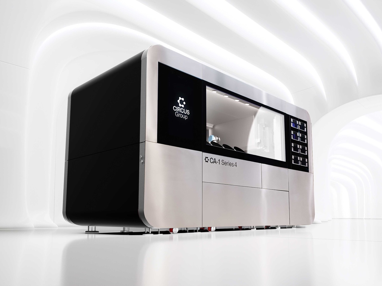
The company behind this, Munich-based Circus SE, is pushing the narrative that this solves labor shortages and boosts efficiency. They are not wrong, but that is an incredibly sanitized way of looking at what is essentially a job-elimination machine. The CA-1 is a marvel of industrial design, a self-contained unit powered by a proprietary AI called CircusOS that makes adaptive decisions in real time. With its pilot program already running in German REWE supermarkets, this isn’t some vaporware concept sitting in a lab. It is a commercially deployed system that is actively taking orders and feeding people, and that means we need to talk about what it is actually doing.

Designers: Gustavo Kemmerich and Circus SE Team

Seven square meters is the entire footprint. You could barely fit a decent-sized walk-in closet in that space, yet the CA-1 can pump out 120 dishes an hour from it. That breaks down to a meal every 30 seconds, a rate of production that most human-staffed kitchens would struggle to match without breaking a sweat. The whole operation is a sterile, closed loop of logic. Ingredients are tracked and stored in smart silos, the robotic arms handle the assembly and cooking, and an integrated Winterhalter commercial dishwasher cleans up after. From an engineering perspective, it is a cold, hard box of ruthless efficiency designed to extract maximum value from minimum space.

You do not achieve that level of optimization without a body count, metaphorically speaking. Forget the sanitized PR about “solving labor shortages.” The CA-1 is designed to eliminate labor, period. It replaces the prep cook, the line cook, the expeditor, and the dishwasher in one fell swoop. This is not a collaborative robot, or “cobot,” built to assist a human worker. It is a fully autonomous system engineered from the ground up to make a whole class of kitchen staff obsolete. For every one of these units installed in a supermarket, hospital, or university, a handful of jobs simply evaporate. The efficiency it provides comes at a direct and obvious cost.

So what we are really looking at here is a ghost kitchen in a box, a blueprint for the future of automated food service. Its successful deployment in a major European supermarket chain is a powerful proof of concept, and you can bet that fast-food executives and large-scale catering operators are paying very close attention. Circus SE even lists the defense sector as a potential market, which is its own can of worms. This machine is a stark reminder that automation doesn’t ask for permission. The CA-1 is a brilliantly engineered answer to a question that maybe we shouldn’t be so eager to ask.

The post This Massive Robot Wants To Replace An Entire Restaurant first appeared on Yanko Design.

This quaint Indoor Wind Chime automatically rings by sensing outdoor wind speeds

Wind chimes have a rather understated charm. They can have a very calming effect on you, helping keep anxiety and stress away – but what if you’re in an enclosed area? You couldn’t possibly have a wind-chime in a room that doesn’t receive any wind, right? Well, the folks at Fujitsu may have developed the first wind chime to work without wind…

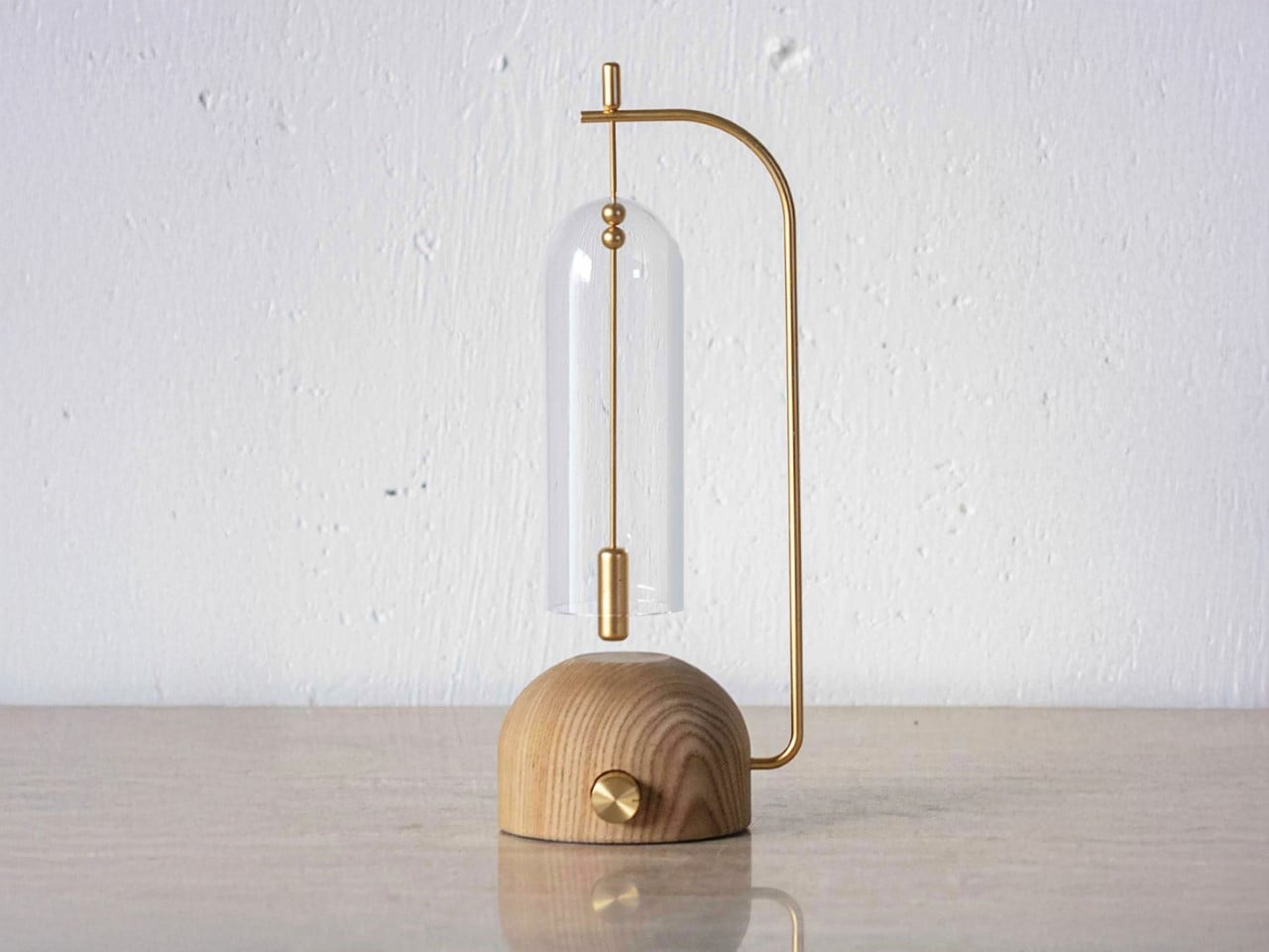
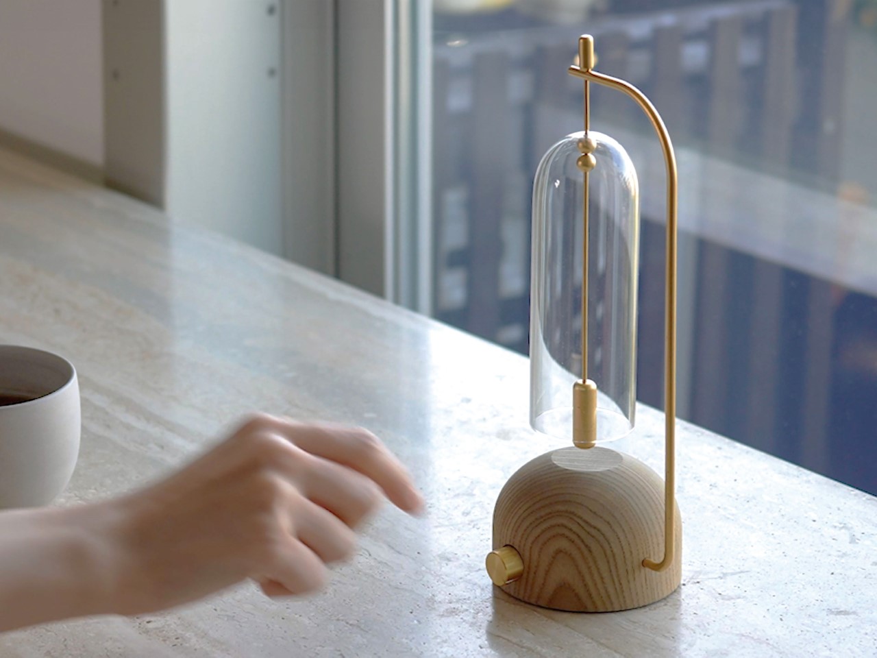
Meet the LIIN, an indoor wind chime that works autonomously by sensing outdoor wind. Designed to work in enclosed environments or in spaces with not much cross-ventilation, the LIIN’s chime works on cue as soon as you switch it on. In fact, think of it as the audio version of a sun-lamp. A sun-lamp mimics the sun in rooms without sunlight – similarly, the LIIN mimics the auditory effects of a breeze, even when there isn’t any.
Designer: Fujitsu Limited

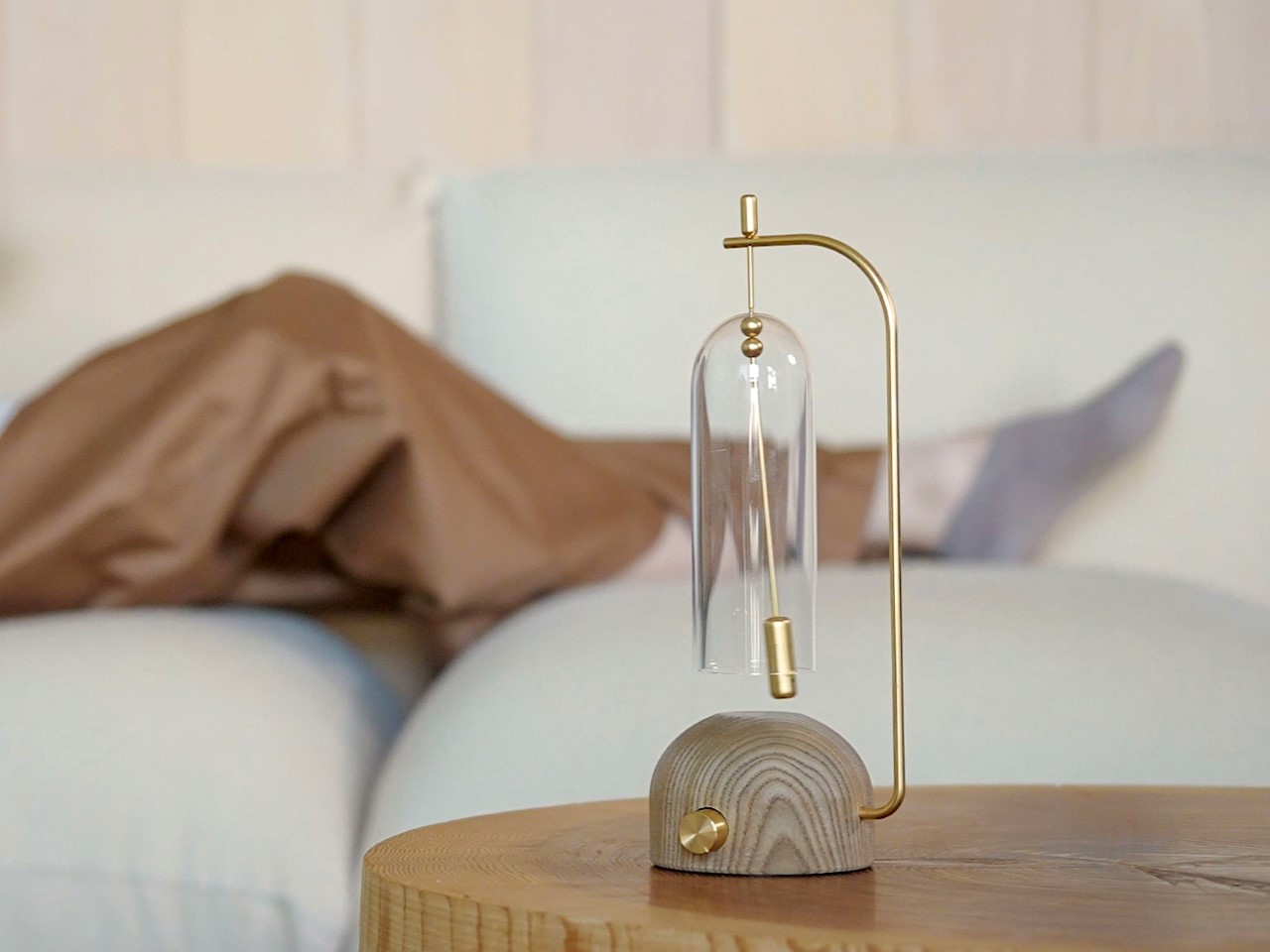
The chime works in tandem with an outdoor sensor that detects wind speeds. Switch the chime on and an internal clapper swings gently, ringing against the outer glass bell cover, creating a graceful, pleasant sound. The entire device works on an automated pendulum motion, which goes fast or slow depending on the wind speeds outside. This means you could sit in a cushy air-conditioned office but still enjoy the musical effects of the outdoor breeze!

A winner of the Red Dot Award: Design Concept for the year 2024, the LIIN is Japanese minimalism at its finest. While most wind-chimes are inherently minimalist, this tabletop objet d’art really does have an understated charm. The wooden base sports a simple geometric form that shows off the wood grain wonderfully. Brass elements like the clapper and the switch/knob on front contrast wonderfully against the wood, and the glass bell gives the overall product a light, see-through aesthetic. I imagine the sound produced by the borosilicate glass is just as zen-inducing too!

The post This quaint Indoor Wind Chime automatically rings by sensing outdoor wind speeds first appeared on Yanko Design.