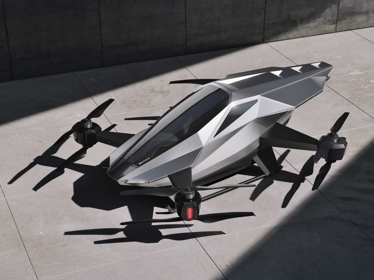
Flying cars have been vaporware for so long that most concepts blur together into the same generic pod-on-rotors aesthetic. Then MOSTAVIO’s MX1 lands in your feed, and suddenly you’re reminded why great industrial design still matters. The angular, almost origami-like bodywork earned this Toronto startup the 2025 Red Dot Award: Design Concept, validating what your eyes already know. Unlike the Cybertruck’s deliberately unfinished brutalism, the MX1 feels thought through to the last crease. Every facet serves both form and function, channeling the legendary design philosophy of masters like Giugiaro and Gandini.
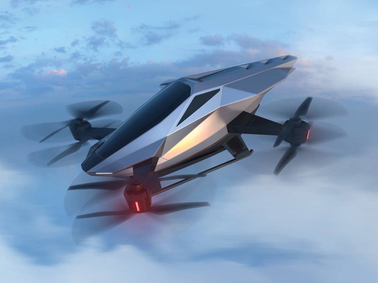
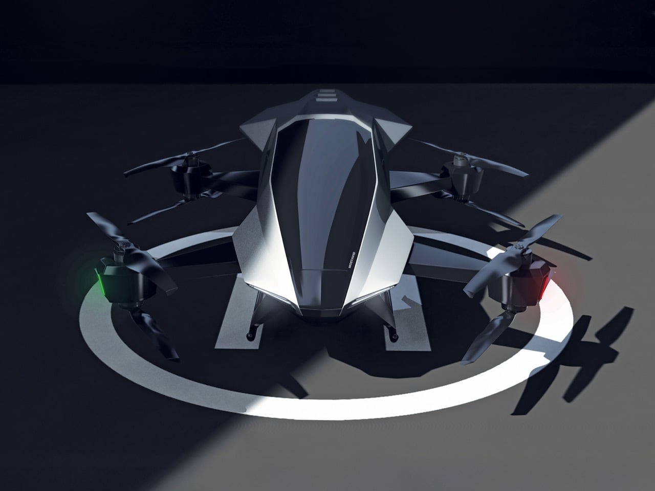
The single-seat cockpit opens like a fighter jet, the panoramic window stretches wide for an unobstructed view, and the whole package sits on co-axial rotors that look more like sculptural elements than utilitarian hardware. MOSTAVIO wrapped these features in composite bodywork that appears to shift in the light, aggressive yet refined. The VR-based autonomous control system means you don’t need a pilot’s license to appreciate what they’ve built here, just an appreciation for design that refuses to compromise. This is what happens when someone actually cares about making future mobility look like it belongs in the future.
Designer: MOSTAVIO
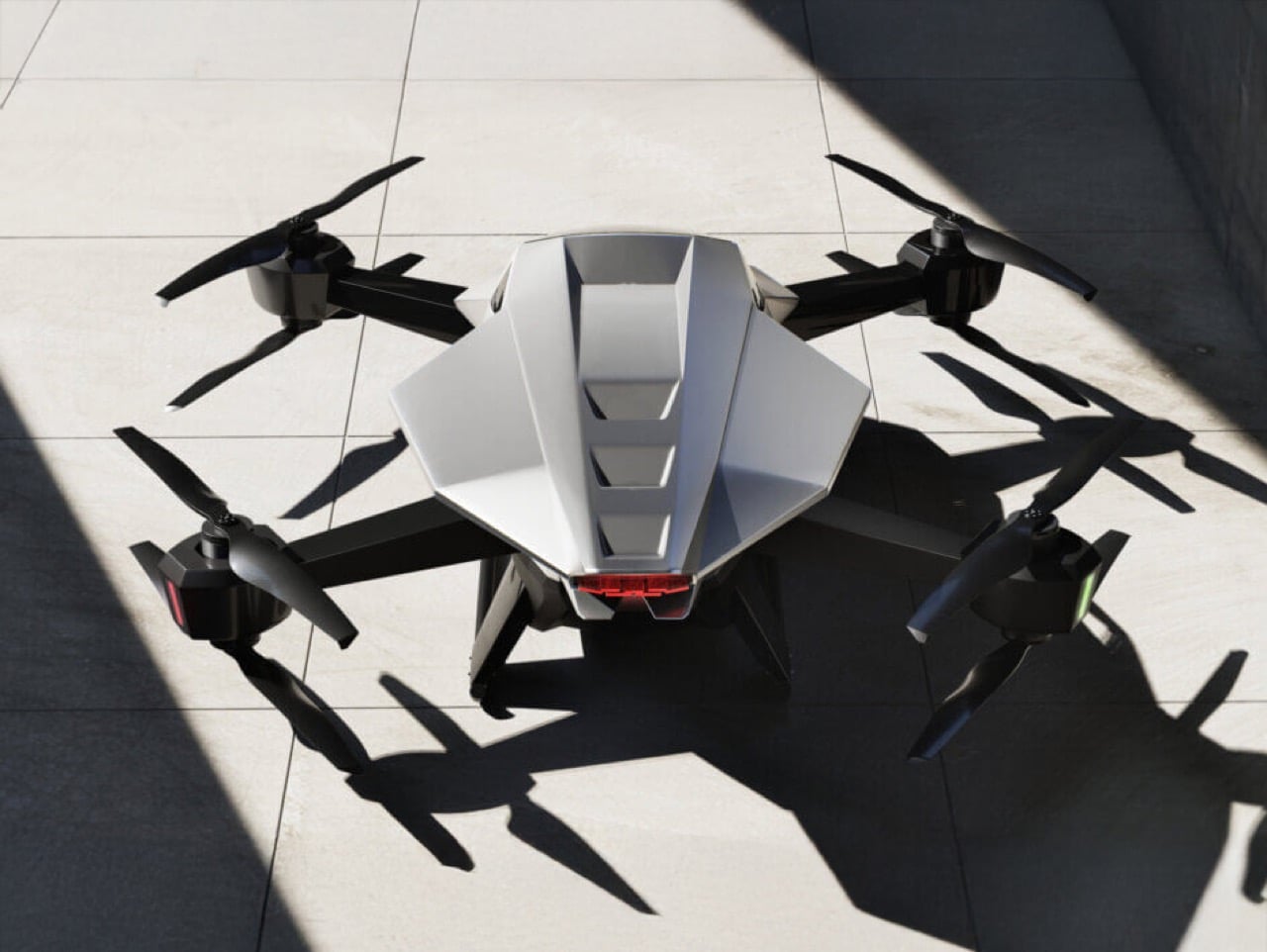
What makes the angularity work here, where other attempts have failed, is the controlled complexity of the surfacing. The body isn’t made of simple, flat planes. Look at the way light travels across the fuselage in the photos; you can see subtle curvature and tension in every facet, creating highlights that define the form. This is sophisticated stuff, the kind of surfacing you see on a Lamborghini, where every crease is intentional and contributes to the whole. It’s a design that looks like it was sculpted, not just extruded. The result is a visual language that feels lightweight, technical, and incredibly sharp, like a high-end piece of architectural hardware given flight.
That design discipline extends to the integration of functional parts. The co-axial rotor arms blend into the body with carefully managed fillets, making them feel like organic extensions of the main form instead of bolted-on appendages. The canopy shut-lines follow the body creases perfectly, and the single rear light is tucked neatly into the tail. This is the hard part of vehicle design, where engineers and designers usually fight to a clumsy compromise. Here, it feels like the designers won. They took the necessary components of a quadcopter and made them integral to the aesthetic, creating a cohesive object that looks right from every angle.
Of course, winning a Red Dot for a concept is the design world’s equivalent of getting a screenplay optioned. It doesn’t mean the movie is getting made tomorrow, but it confirms the script is brilliant. So before you get your wallet out, know that the MX1 is a proof-of-concept. You can’t buy one. Its job is to attract attention, secure funding, and serve as a design study for a future 2-3 passenger vehicle that MOSTAVIO plans to develop. It’s a physical mission statement, a declaration of intent. And as far as intentions go, this one is about as compelling as it gets. We’ll be watching.

The post This Blade-Like eVTOL Makes the Cybertruck Look Like A Child’s Sketch first appeared on Yanko Design.